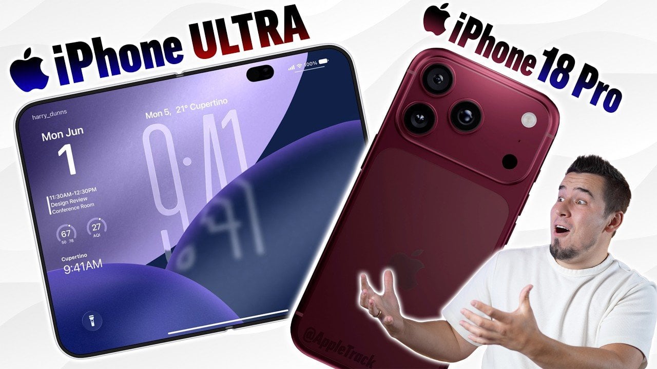
Apple’s much-anticipated September event is poised to unveil significant advancements across its flagship devices, including the highly awaited iPhone 18 Pro Max and the innovative iPhone Ultra. With a focus on innovative technology, refined design and enhanced user experience, Apple is set to make a bold statement in the tech industry. Below is a detailed […]
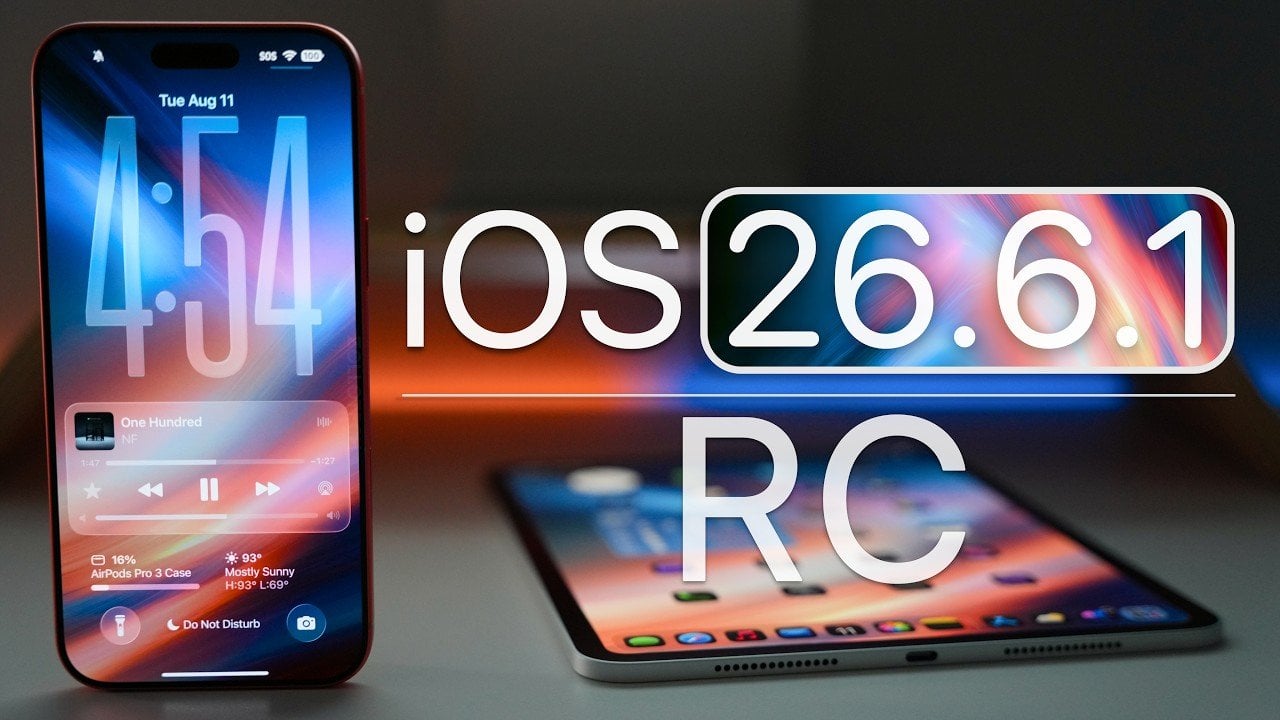
Apple has officially released iOS 26.6.1 RC (Release Candidate), marking the final stage before the public rollout. This update is now available to developers and public beta testers, emphasizing critical security patches and system refinements. While it doesn’t introduce major new features, it plays a pivotal role in making sure your device’s stability, security and […]
Smartphones have never been smarter, but they’ve also never been more demanding. Bigger screens, algorithmic feeds, and relentless notifications aren’t design oversights. They’re deliberate, built to keep you engaged for as long as possible. The prevailing logic is that longer screen time is better, and most phones are optimized around that, pulling you back in every time you try to put them down.
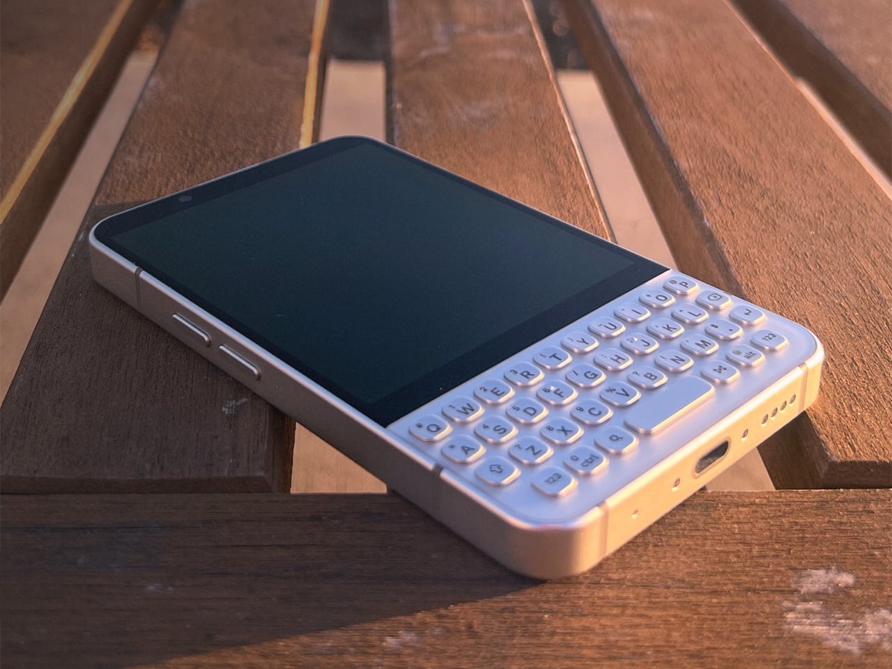
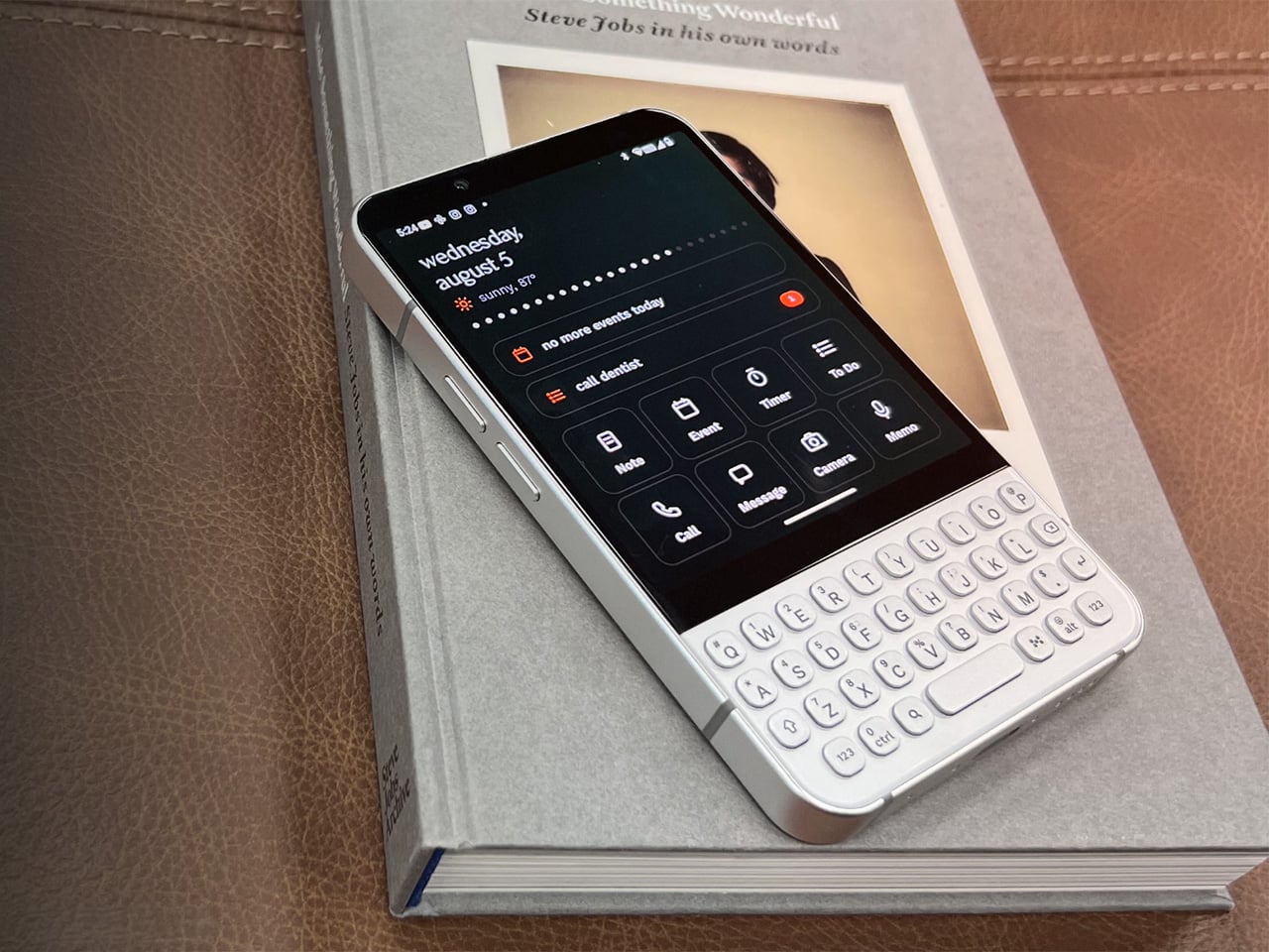
The Minimal Phone 2 is a different kind of proposition. It’s a modern 5G Android phone built around the opposite idea: that a phone should serve you and then get out of the way. It pairs a compact AMOLED display with a full physical QWERTY keyboard and a custom OS called Minimal OS, designed to make daily interactions faster, more deliberate, and less compulsive.
The keyboard is the phone’s most striking feature, and also its most considered. It’s a full QWERTY board integrated directly into the phone, about 69mm wide, with backlit keys whose legends are laser-etched into the keycap surface rather than printed on top, so they won’t fade with use. Each row fans outward slightly, and the keycaps are sculpted to guide your thumbs naturally.
What a physical keyboard really changes is the relationship between picking up your phone and doing something on it. When the keyboard is always there, typing becomes the default instinct instead of scrolling. You reach for the phone with something in mind, do it, and put it down. That shift sounds subtle, but over the course of a day, it changes how the device feels.
Minimal OS reinforces that instinct with its command bar, which lets you do most things without opening an app at all. Start with a symbol, type what you want, and the OS handles the rest. Typing “@jason on my way” sends a text. Typing “#lauren” places a call. A hyphen adds a to-do, an asterisk creates a calendar event, and an exclamation mark saves a note.
Communication is pulled together in something called the Minimal Hub. Swipe right from the home screen, and you get a single, unified list of everything that’s come in: emails from every account, texts, missed calls, voicemails, and calendar invitations. You can read and reply without opening a separate app, which makes a full inbox feel like clearing a short list rather than bouncing between five different places.
Two quieter features round out the software side. The Activity Bar puts 24 dots on the home screen, one per hour. Each turns white when your time stays focused, and red when the hour slips into social apps or media. The notification LED lets you assign colors and patterns to specific contacts and apps, so a glance at your desk tells you what’s actually waiting.
The hardware underneath makes it a credible daily driver. A 3.92-inch AMOLED at 1080×1240 pixels and 90Hz, a MediaTek Dimensity 8300 processor, 8GB of RAM, and 256GB or 512GB of storage make up the core. Connectivity covers 5G, Wi-Fi 6E, and NFC. The rear camera is 50MP, the front has a 20MP shooter, and there’s both 27W wired and 15W wireless charging, as well as a 3.5mm headphone jack.
The phone sits in an aluminum frame measuring 122.6mm x 72mm x 9.48mm, in three finishes. Pearl is a brushed light alloy in a warm off-white. Onyx is an anodized alloy in a deep near-black. Ember is an anodized minimal orange, offered as a launch exclusive. The design language is restrained throughout, with nothing calling for attention except the keyboard, which announces itself plainly.
What’s interesting about the Minimal Phone 2 is that its restraint doesn’t feel punishing. It still runs full Android, so banking apps, navigation, music, and messaging are all there. What changes is how you arrive at them. Rather than a phone that sprawls into your day uninvited, this one waits to be needed, which in a landscape of devices competing for attention, feels unusual.
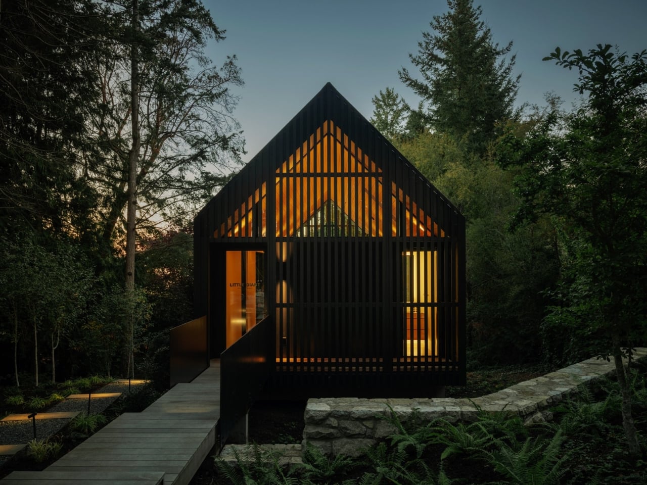
Most architects design spaces for other people. It’s the nature of the job. You read a brief, interpret a client’s vision, and find a way to translate someone else’s life into built form. So when Calgary-based studio Little Giant designed a workspace for themselves, perched above a forest floor on Vancouver Island, it felt less like a commission and more like a confession, a rare opportunity to say: this is actually what we believe. And what they believe, it turns out, is that quiet is not just a benefit of good design. It’s an ingredient.
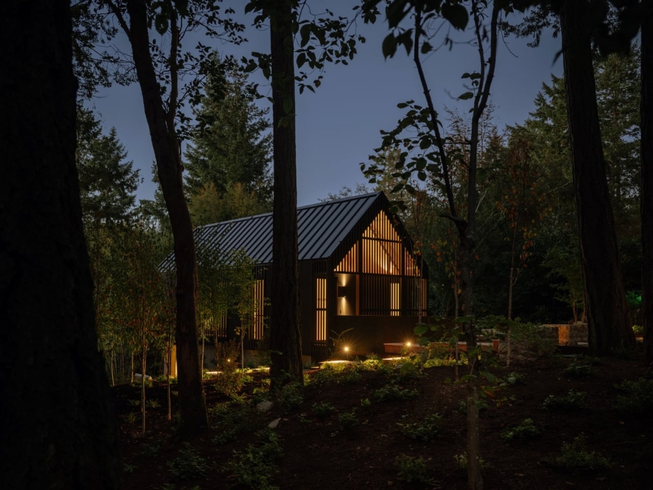
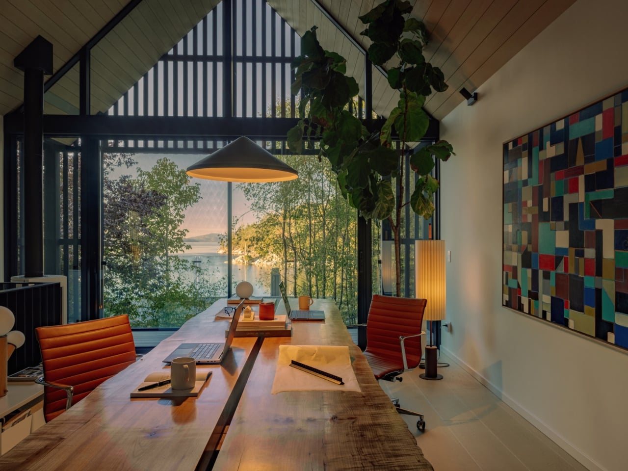
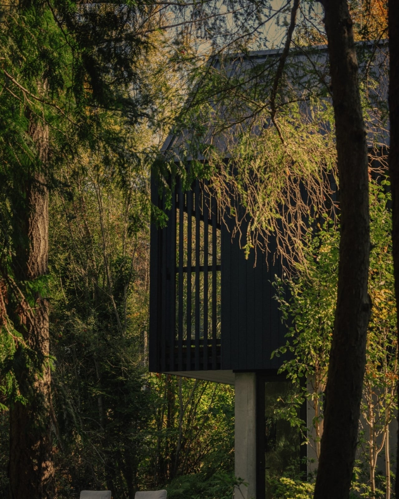
Completed in 2024, the Forest Studio sits on a sloped, wooded peninsula just outside Victoria, British Columbia, tucked between cedar and Douglas fir trees on a site overlooking Saanich Inlet. At 967 square feet across two levels, it’s not a grand gesture. It doesn’t try to be. Founder and principal Mark Burkart describes the studio’s philosophy as “touching the ground lightly,” and that thinking is visible in nearly every decision made here.
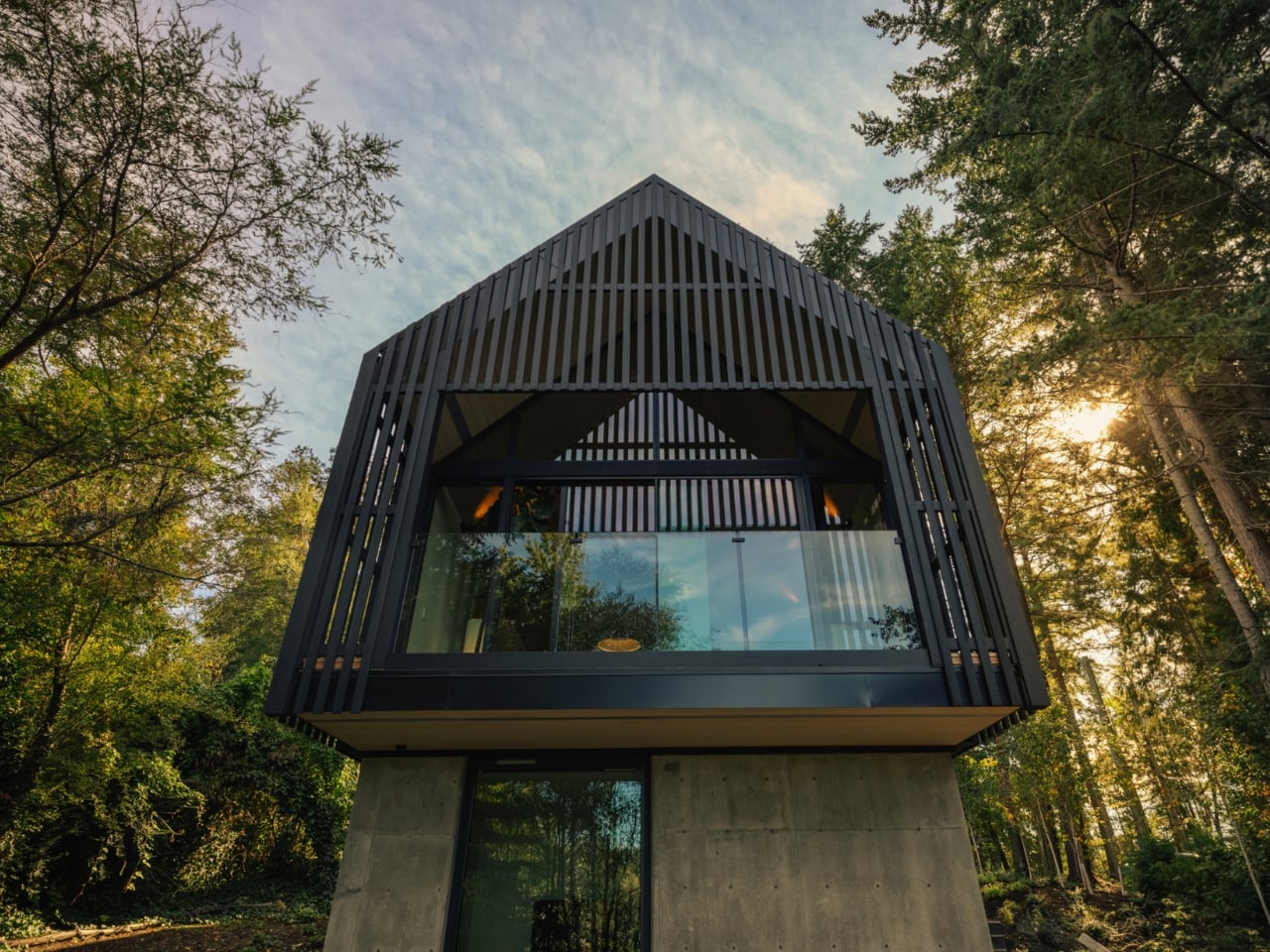
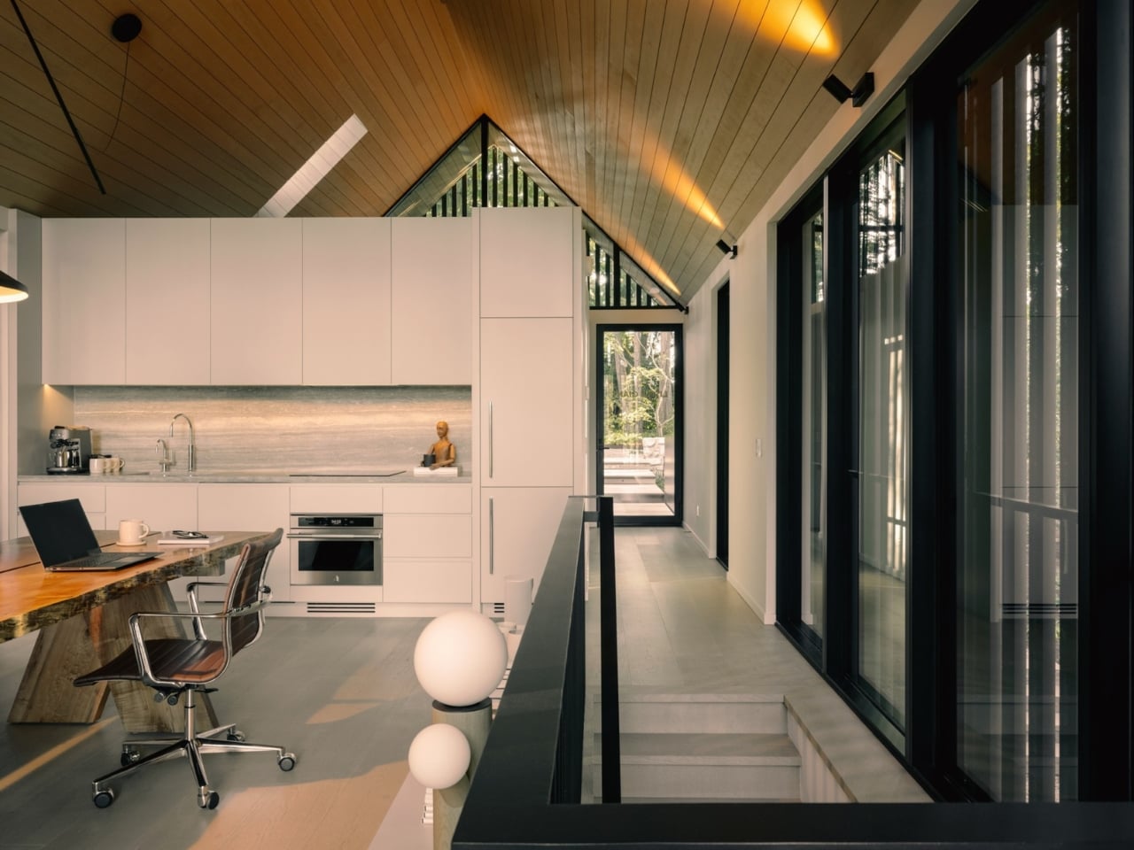
The building is accessed by an elevated walkway that heightens the sensation of arrival, as if you’re stepping into a treehouse rather than walking into an office. That’s deliberate. Little Giant drew on the “spirit of a treehouse” as the conceptual starting point, and the result is a structure that feels genuinely suspended within its environment. A recessed concrete base, tinted grey to echo the local rocky outcrops, anchors the lower level into the slope while the upper volume appears to float above the understory below. Cantilevered beams and parallel trusses keep the interior open, allowing daylight to filter through the gabled ends without interruption.
The exterior is the project’s most striking decision. Cedar siding and screens wrap the upper floor in deep charcoal, mirroring the verticality and tonal depth of the surrounding tree trunks. It’s a building that doesn’t announce itself. It absorbs. During the hours when light hits the forest at a low angle, it can almost disappear into the canopy entirely, which is exactly the point.
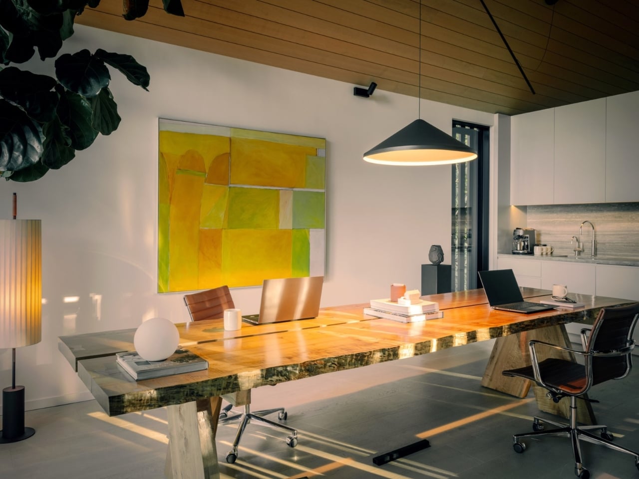
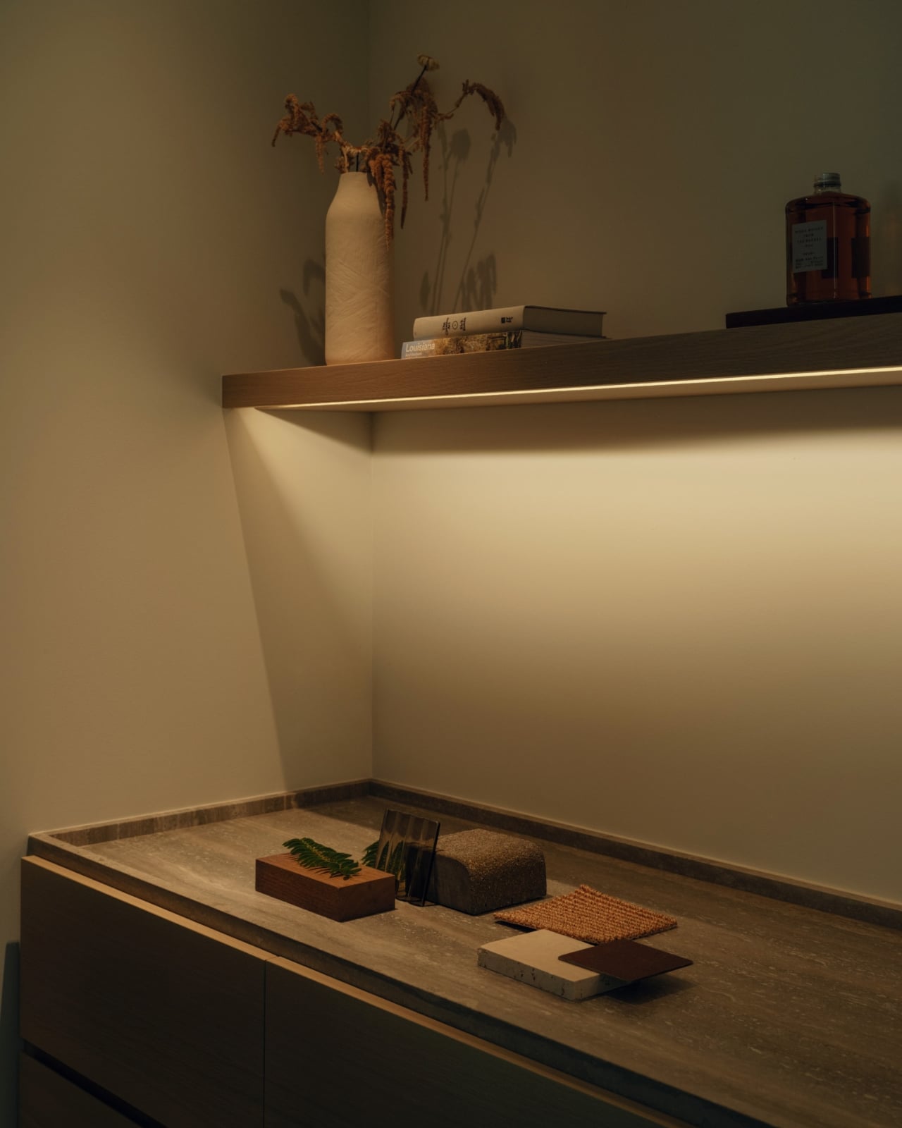
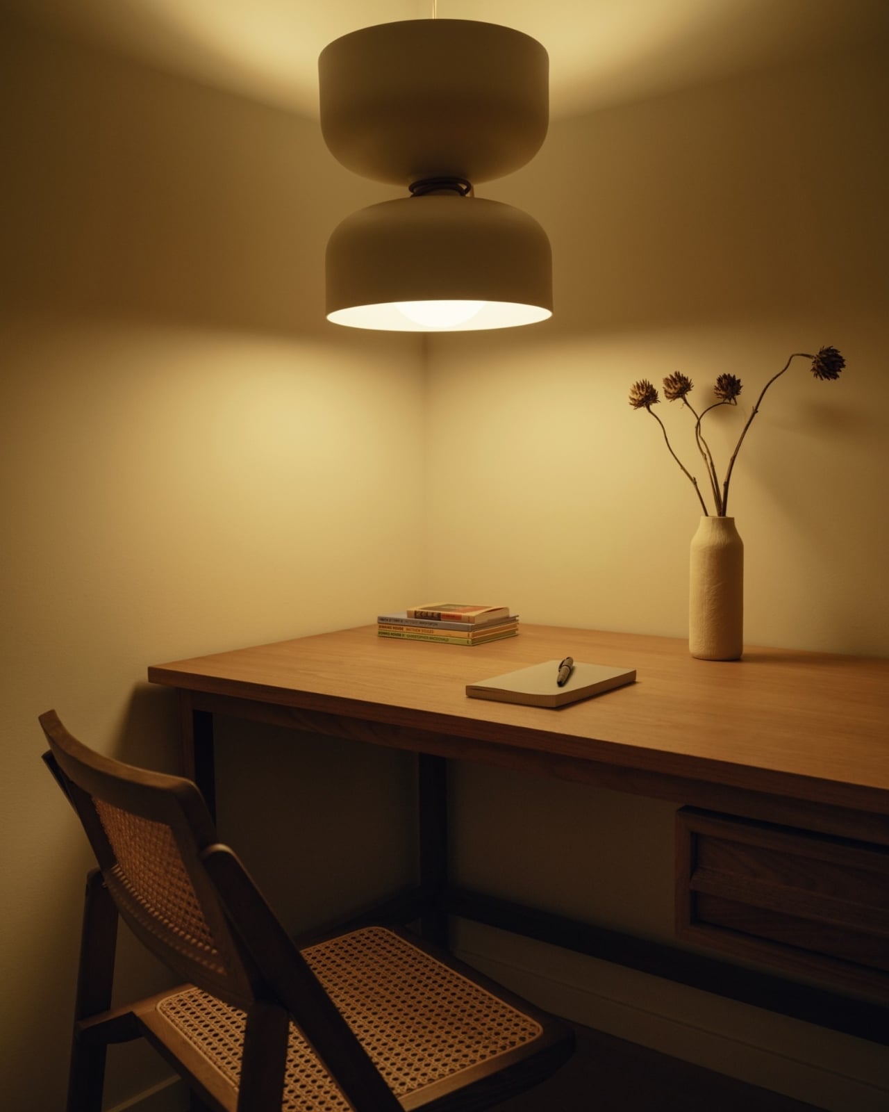
Inside, the material choices are just as considered. Light-hued finishes, hemlock ceilings, and travertine countertops build what Little Giant calls a feeling of “luminous neutrality,” a palette designed to receive the forest light rather than compete with it. The upper level holds a working studio, a kitchenette, a powder room, and a small room with a Murphy bed. A balcony extends the workspace into the treetops. The lower level is more flexible: currently a meeting room, it could just as easily become a bedroom, a bar, a recording space. The building was designed to evolve, and that flexibility is more forward-thinking than it might initially seem.
I keep returning to that adaptability as one of the more honest things about this project. So much of contemporary architecture is frozen at the moment of completion, fully resolved and unable to absorb change without a renovation. The Forest Studio, by contrast, was built with its own future in mind. Guest house, artist’s studio, rentable space: the options are baked in. That’s not hedging, it’s wisdom.
The studio’s reference points are grounded in regional history. Little Giant looked to the utilitarian structures of the Pacific Northwest, specifically historic timber mills and coastal canneries, not to reproduce them but to distill them into a spare, familiar silhouette. The gabled form feels native to the landscape without being nostalgic, and the decision to preserve the existing tree canopy rather than work around it adds to the sense that this building was invited in rather than imposed.
Burkart has said that the creative act at Little Giant is fundamentally an act of exploration. The Forest Studio is what happens when that idea is applied to the studio itself. It’s a building that asks a simple question: what would a workspace look like if it genuinely respected the land it stood on? The answer, apparently, looks like a treehouse with travertine countertops, filtered light, and a deep commitment to getting out of the forest’s way. That’s not a retreat from ambition. It’s a different kind of it.
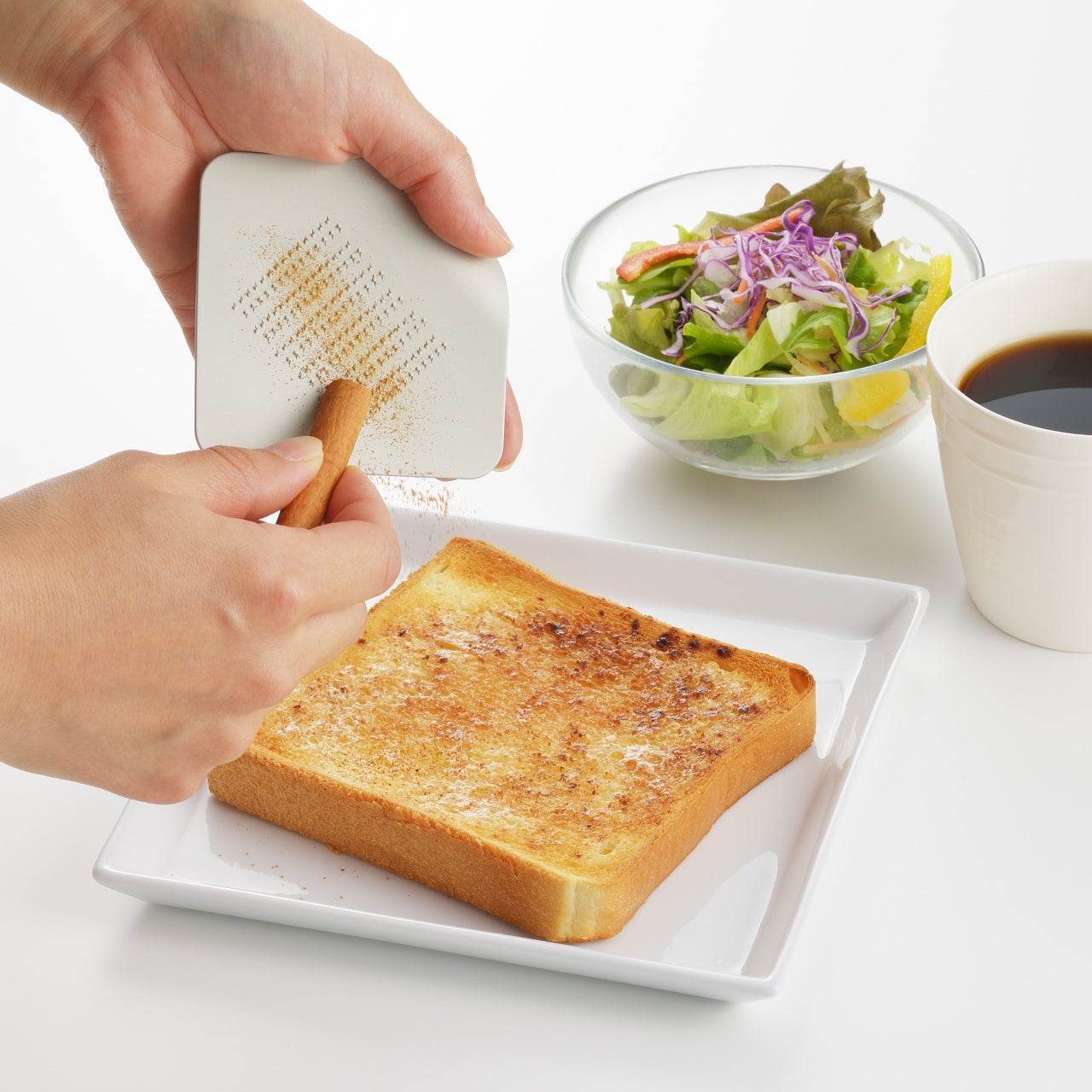
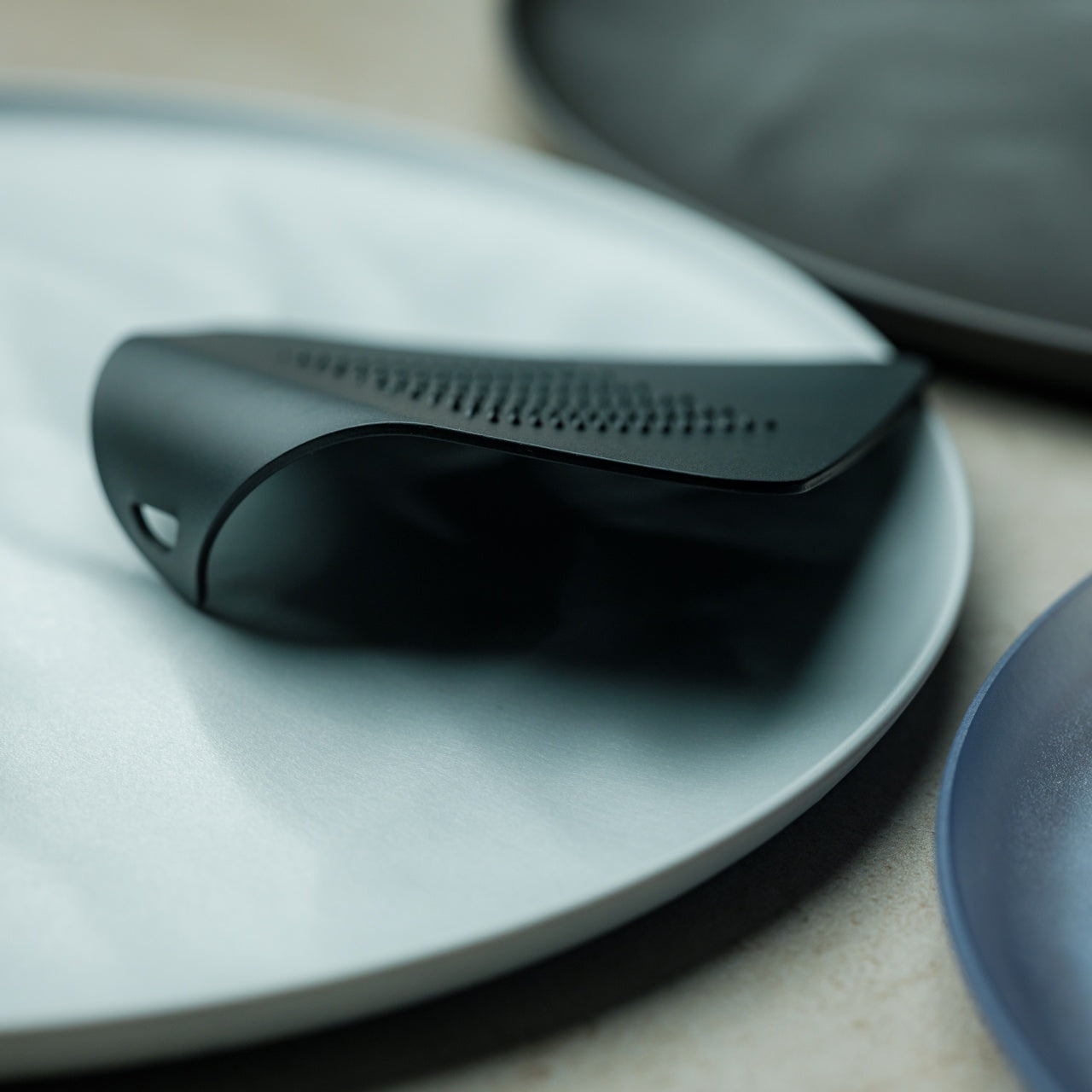
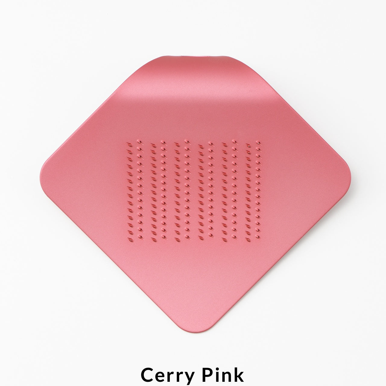
Most graters are a negotiation. The box grater comes out, takes up half the counter, threatens your knuckles on every pass, and goes back in the cabinet the moment you are done. The result is a tool that earns its reputation for being more trouble than it should be. This palm-sized aluminum grater starts from a different premise entirely, one where the object fits the hand that is actually doing the work, rather than the other way around.
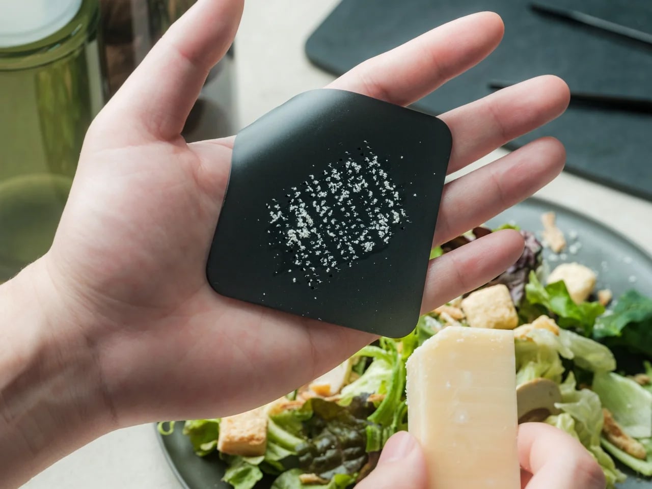
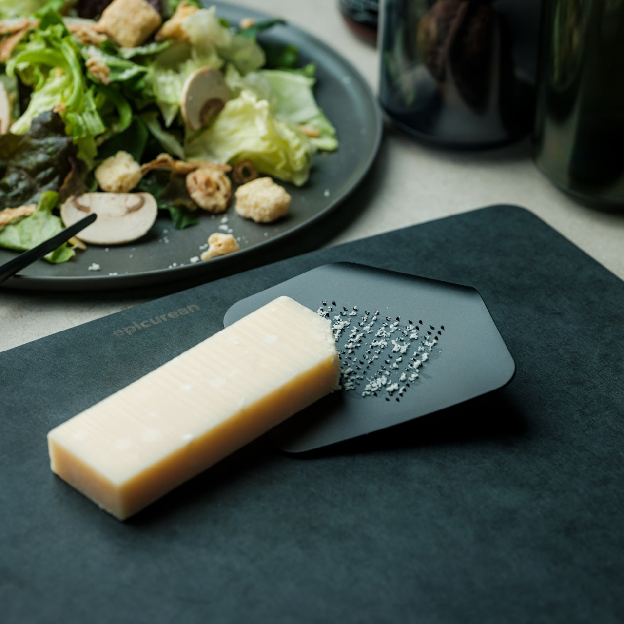
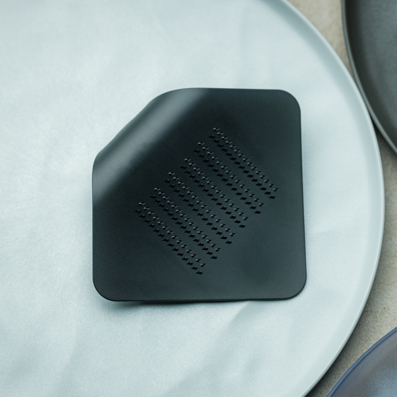
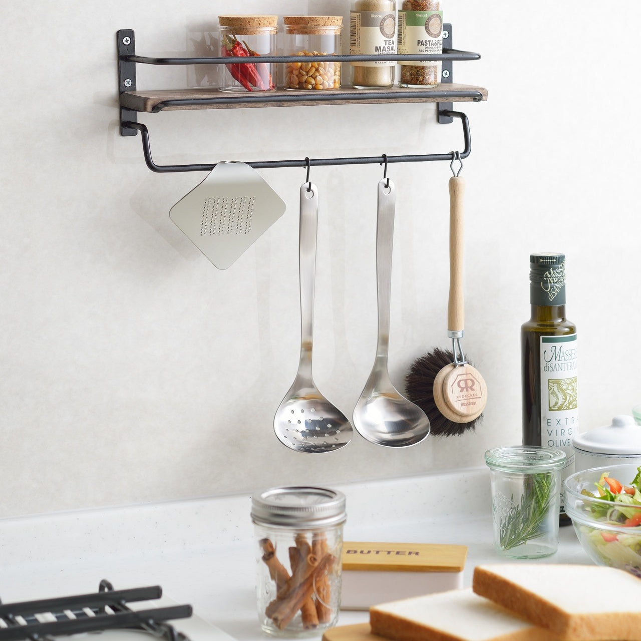
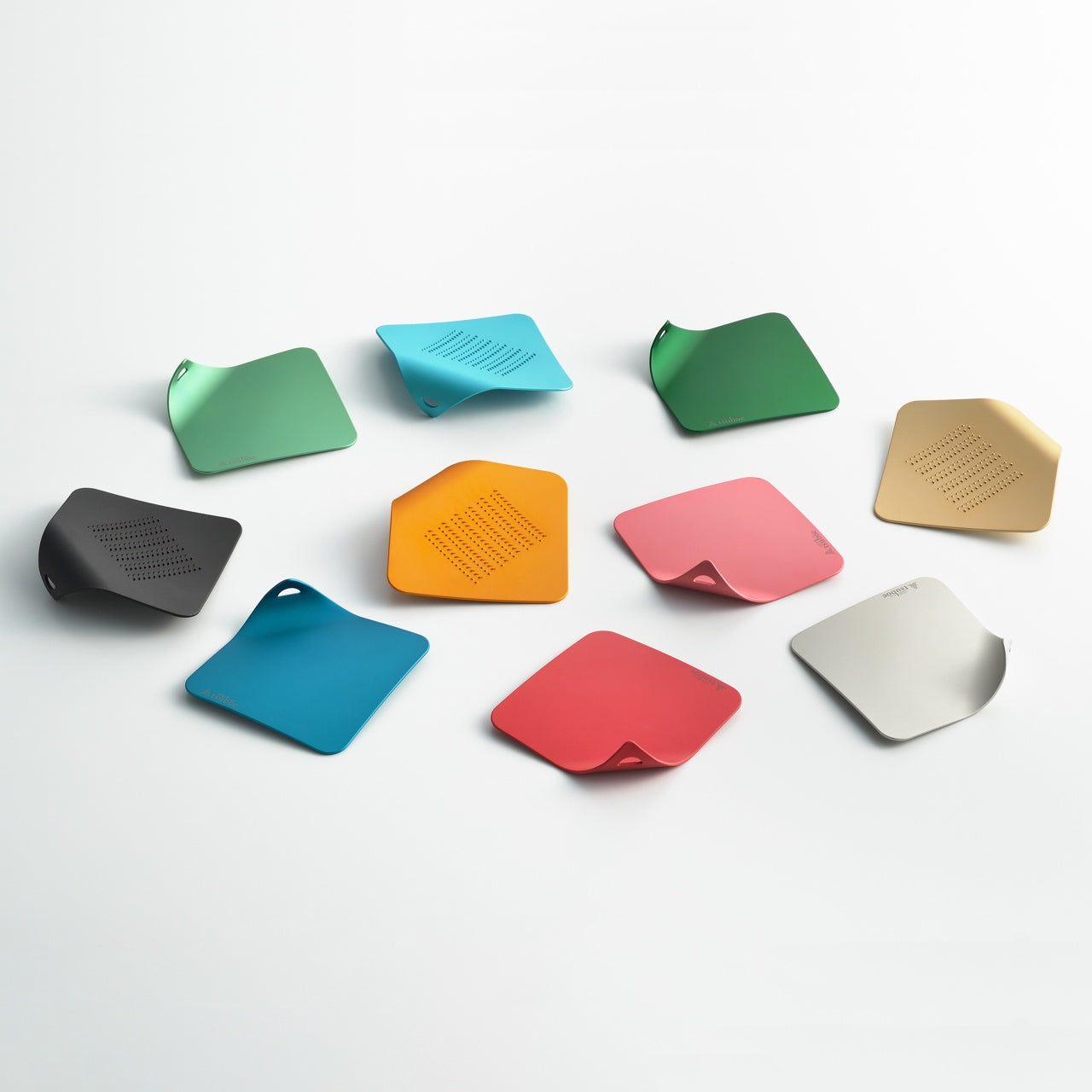
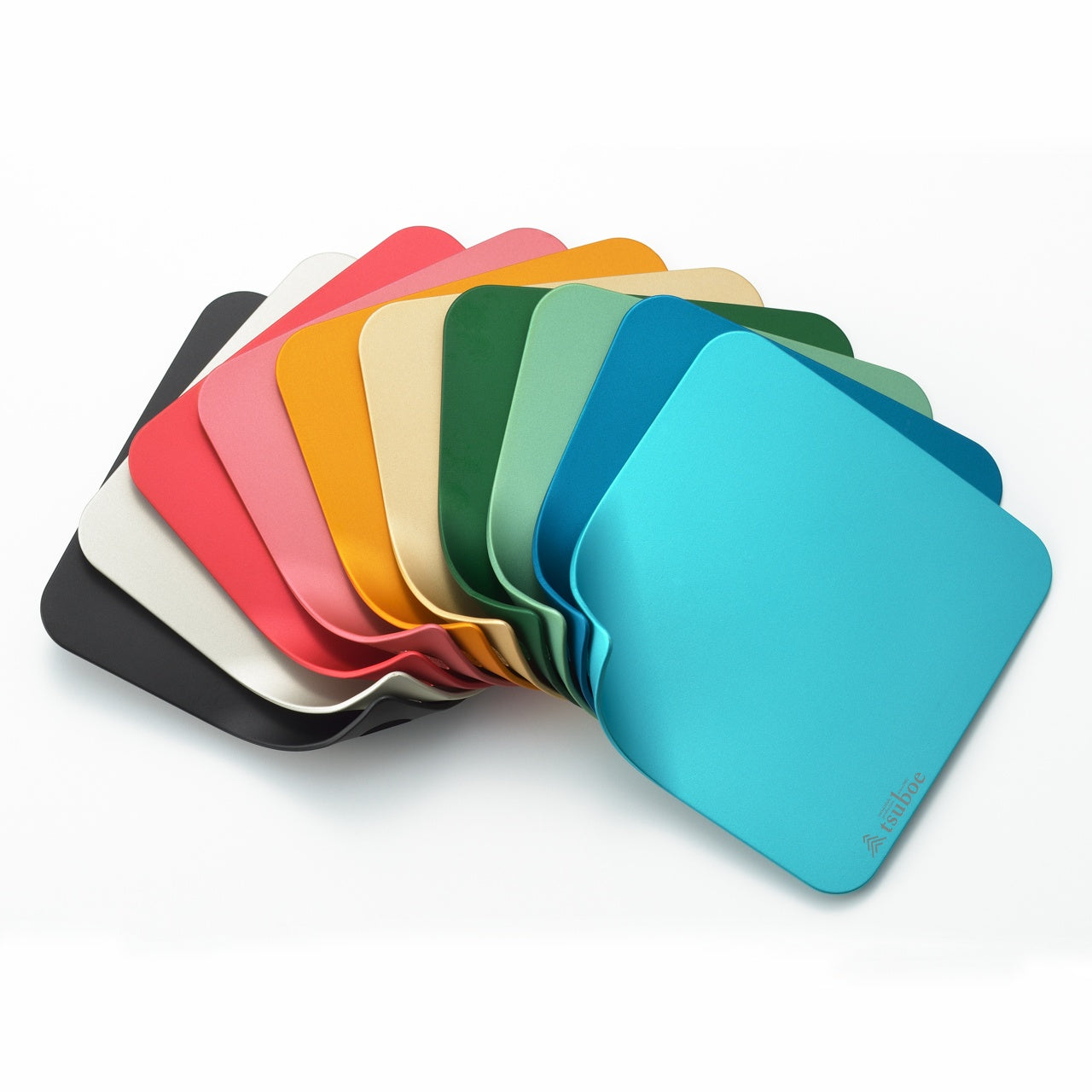
The design takes its form from a piece of paper curling at the corner, and that shape is doing more than looking interesting. Held in the palm, the curve keeps fingers clear of the grating surface, controls the angle naturally without you having to think about it, and makes the whole act of grating something you might actually offer to a guest rather than hide in the back of a drawer. It comes in a range of colors lively enough to leave on the counter without apology.
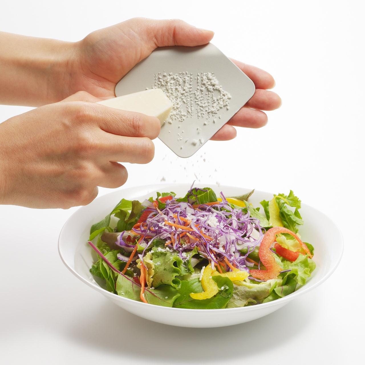
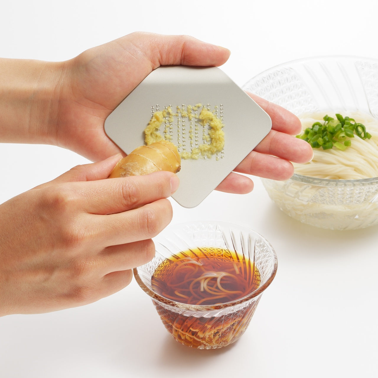
The ergonomics here are not incidental. The curled profile positions the grating surface at an angle the palm controls without adjusting, which means less effort per stroke and more even results across cheese, vegetables, and anything else you run across it. The form also creates a natural guard between fingers and the grating teeth, which removes the usual tension from the process. Grating stops being something you do carefully and becomes something you do quickly, cleanly, and without thinking twice about it.
One Plate. No Assembly.
Stamped from a single aluminum alloy plate, the grater has no joints to loosen, no separate parts to track, and no assembly required before or after use. Rinse it, dry it, put it down. The construction keeps it light enough that it disappears into a bag or a drawer and honest enough that it does not pretend to be more than it is. A single well-made surface that does one thing consistently well is a more useful kitchen object than a multi-function tool that hedges every task.
What We Like
Palm-fit ergonomics: the curled form positions the grating surface naturally in the hand, keeps fingers clear of the teeth, and removes the usual caution from the process without any adjustment required
Single-piece aluminum construction: no joints, no parts to lose, no reassembly after washing. The simplicity of the build is the point, and it makes the tool genuinely easier to maintain
Color range: available in options lively enough that leaving this on the counter is a reasonable choice, which is not something most kitchen graters can claim
What We Dislike
Single grating coarseness: one surface means no adjustment between a fine dusting and a coarser grate. Useful for most tasks, but not for a kitchen that needs both regularly
Volume ceiling: the palm-sized format is ideal for finishing and garnishing. For grating in quantity, it will take more passes and more time than a larger tool
The Kitchen Object That Earns the Counter
The best kitchen tools are the ones that stay out. Not because there is nowhere to put them, but because putting them away feels like the wrong decision. This grater earns that position through a combination of form, color, and a construction clean enough that it looks as considered as anything else on the counter.
Whether it is finishing a pasta dish, dusting a salad, or handing it to a guest who wants to do the honors themselves, it handles the task without making anything of it. That is exactly the kind of object a well-run kitchen benefits from having within reach.
Most musical instruments communicate one thing very clearly before you even touch them: you have to earn this. The arrangement of knobs, the wall of technical labeling, the thick manual sitting smugly beside the unit. It is an initiation ritual disguised as product design, and for most people, it works exactly as intended. They back away.
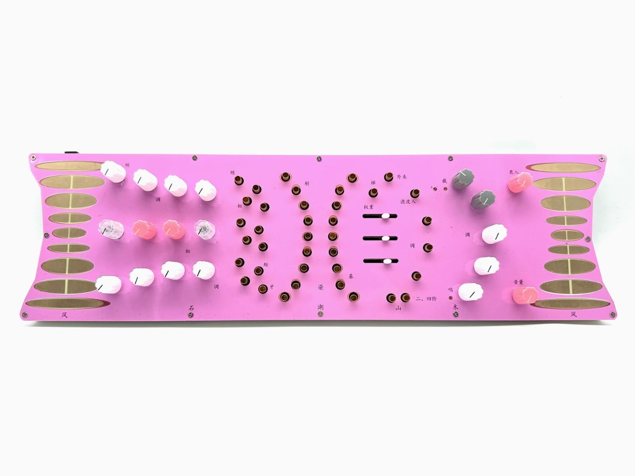
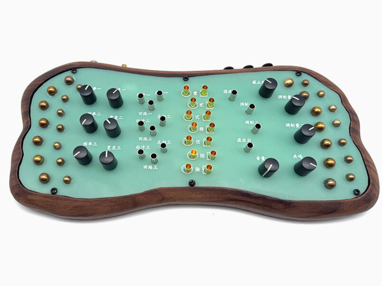
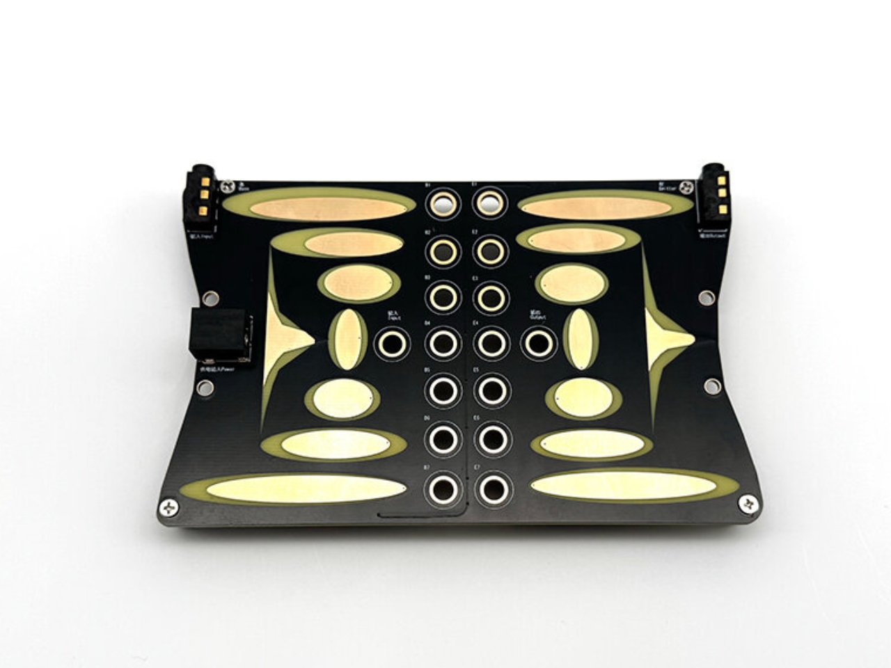
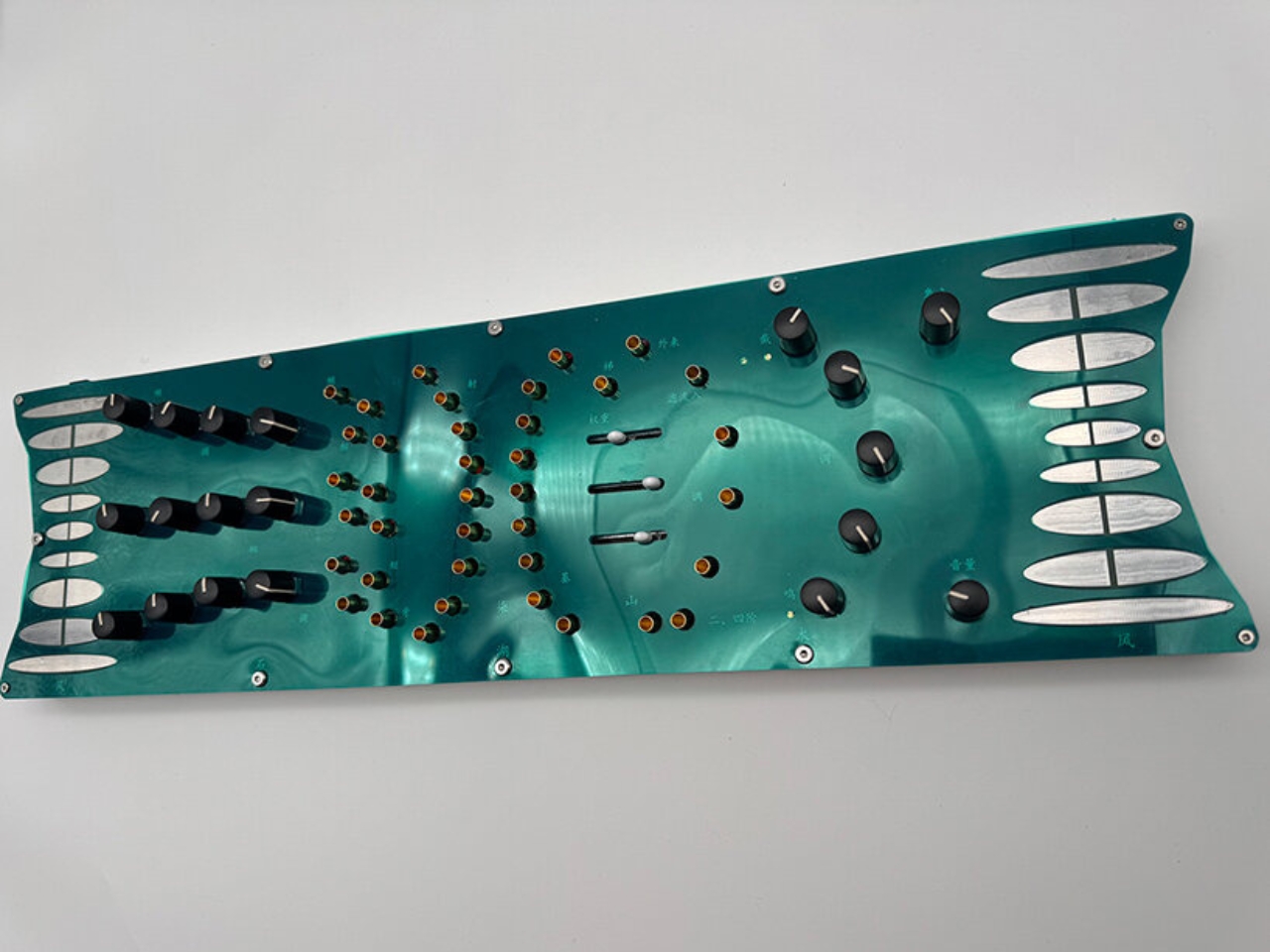
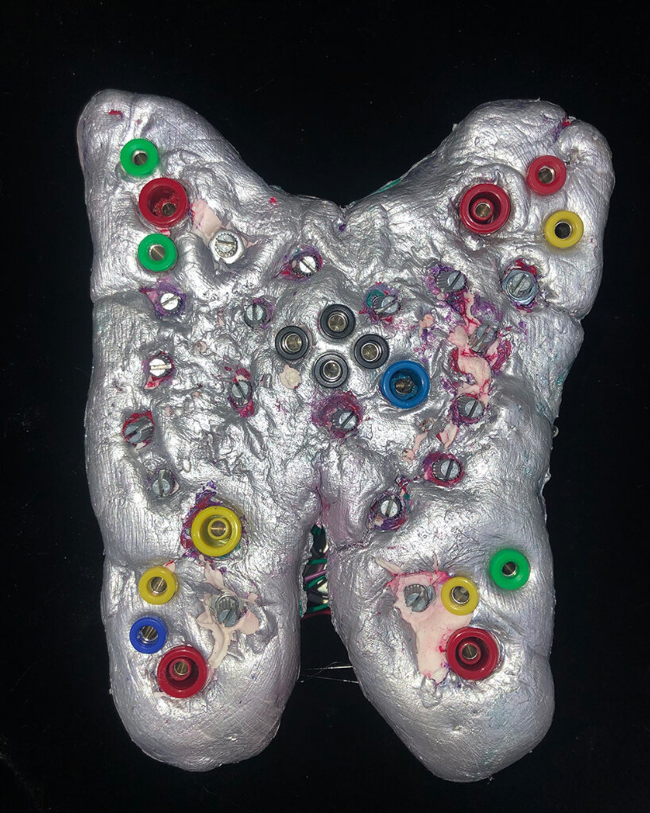
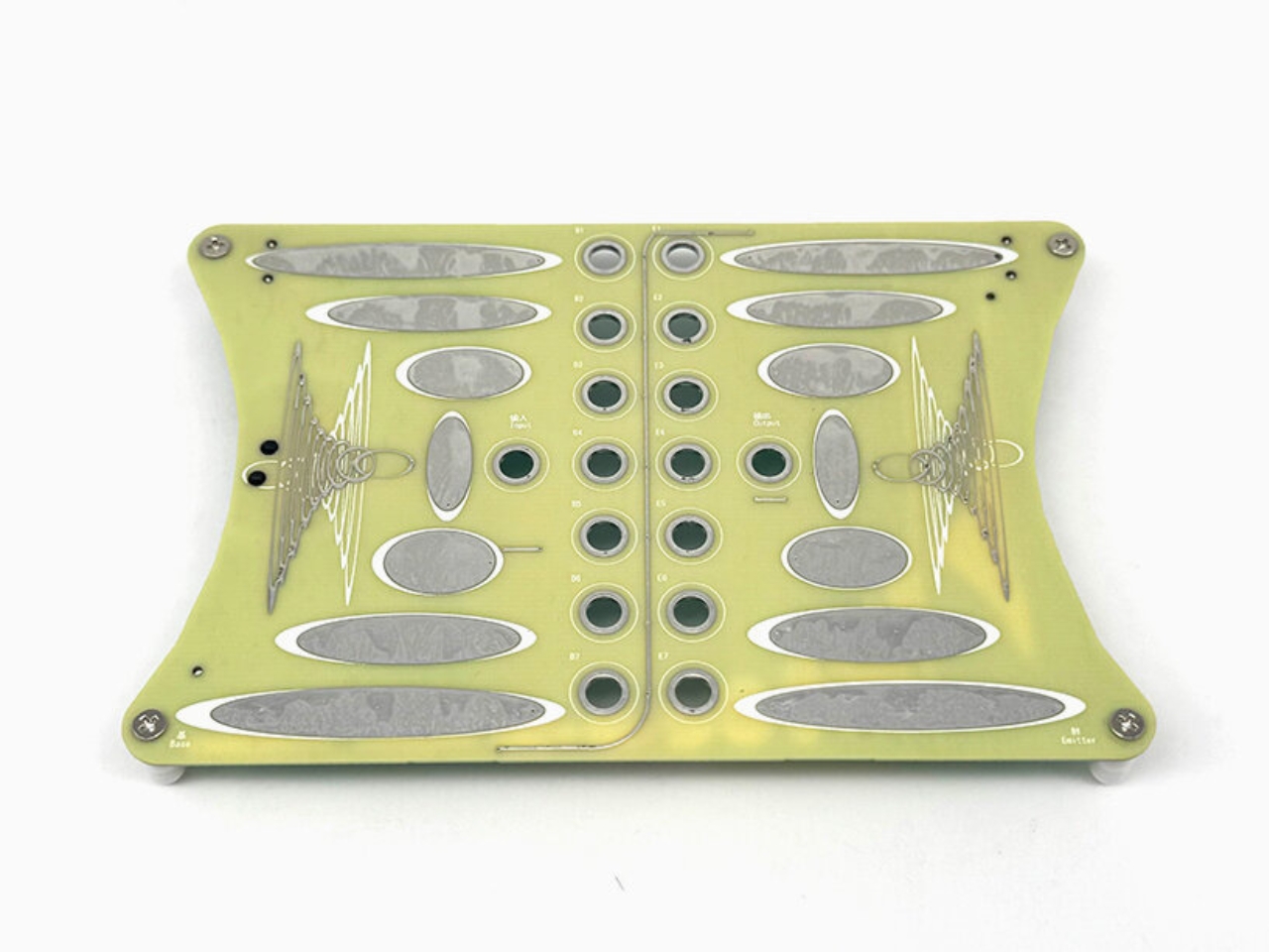
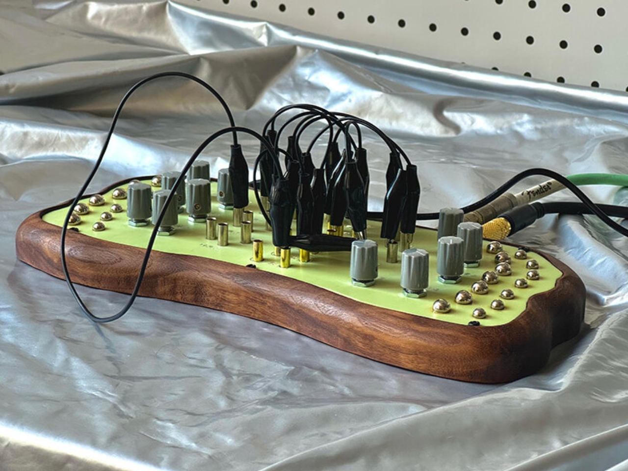
Madkids Empire, a studio founded by a designer named Xam, has built something that works in the opposite direction. Their collection of analog synthesizers is covered in illustrated surfaces, organic silhouettes, and, deliberately, Chinese annotations that describe functions through metaphor rather than engineering terminology. Instead of telling you what a knob controls, the labeling hints at what it feels like. It is the difference between reading a recipe and being handed a fork.
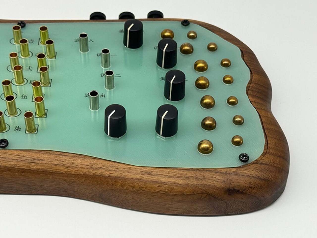
The visual language alone is worth paying attention to. Each instrument looks less like a piece of audio equipment and more like an illustrated landscape you could reach into. Wooden frames and brass details soften what would otherwise read as industrial objects. The shapes curve and flow in ways that suggest something natural rather than manufactured, which is intentional. Xam builds the design around the circuit itself, starting with the technical structure of the sound and then finding a natural concept that mirrors it. A lake. A mountain. A tree. The interaction you have with the synth is meant to feel connected to that concept, so patching a cable or turning a dial carries a kind of environmental logic, even if you could not explain exactly why.
The result is an instrument that looks like you are supposed to explore it, and the collection does not disappoint on that expectation. The flowing silhouettes and playful interfaces do not just look inviting; they function that way too. Xam has said that what they want users to understand is that musical knowledge is not the entry point. Curiosity is. When someone hears a sound they like during experimentation, they have made something entirely their own, something they arrived at through play rather than study. That reframing matters more than it might initially seem.
Most design conversations around synthesizers orbit gear obsession and technical hierarchy. How many oscillators, what filter topology, which vintage unit did it draw from. Madkids Empire does not seem particularly interested in that conversation. The chaos baked into these instruments, and yes, chaos is a deliberate design choice here, provides feedback that evolves with what you are doing. Unlike randomness, which offers no relationship between action and outcome, the unpredictability here responds to you. You become part of the system. It is closer to improvising in a new environment than operating a machine.
That philosophy has a real audience right now. The broader design and tech world has spent years talking about removing barriers and making things accessible, but the actual execution is usually just simpler interfaces with less functionality. Madkids Empire took a different approach: keep the depth, remove the intimidation, and replace the instruction manual with the experience of discovery itself. The instruments are not dumbed down. They are just designed with a different entry point in mind.
The aesthetic choices also position these synths somewhere unusual on the cultural map. They are not vintage recreations chasing the warmth of a classic unit, and they are not sleek minimalist tech objects trying to disappear into a desk setup. They are objects you would notice on a shelf. Objects that invite a question. That sense of presence, the feeling that a thing has a personality before you interact with it, is genuinely rare in hardware design.
Xam has built something that sits at the crossroads of instrument, sculpture, and game. The synthesizer as landscape. The knob as terrain. Whether or not you ever make music with one, the thinking behind Madkids Empire’s work is the kind that deserves to travel beyond the synthesizer community and into a wider conversation about what it means to design something people actually want to touch.