This $60 Apple Watch Case Is the iPod Apple Never Replaced

There’s a specific kind of nostalgia attached to the original iPod’s click wheel that has very little to do with the music. It had to do with the feeling. Scrolling through a playlist with a thumb, hearing and feeling that resistance, navigating a menu without looking away from the wheel; it was one of the few moments in early consumer electronics where a device felt as good to hold as it did to use. Touchscreens solved a lot of problems, but they quietly retired that particular quality.

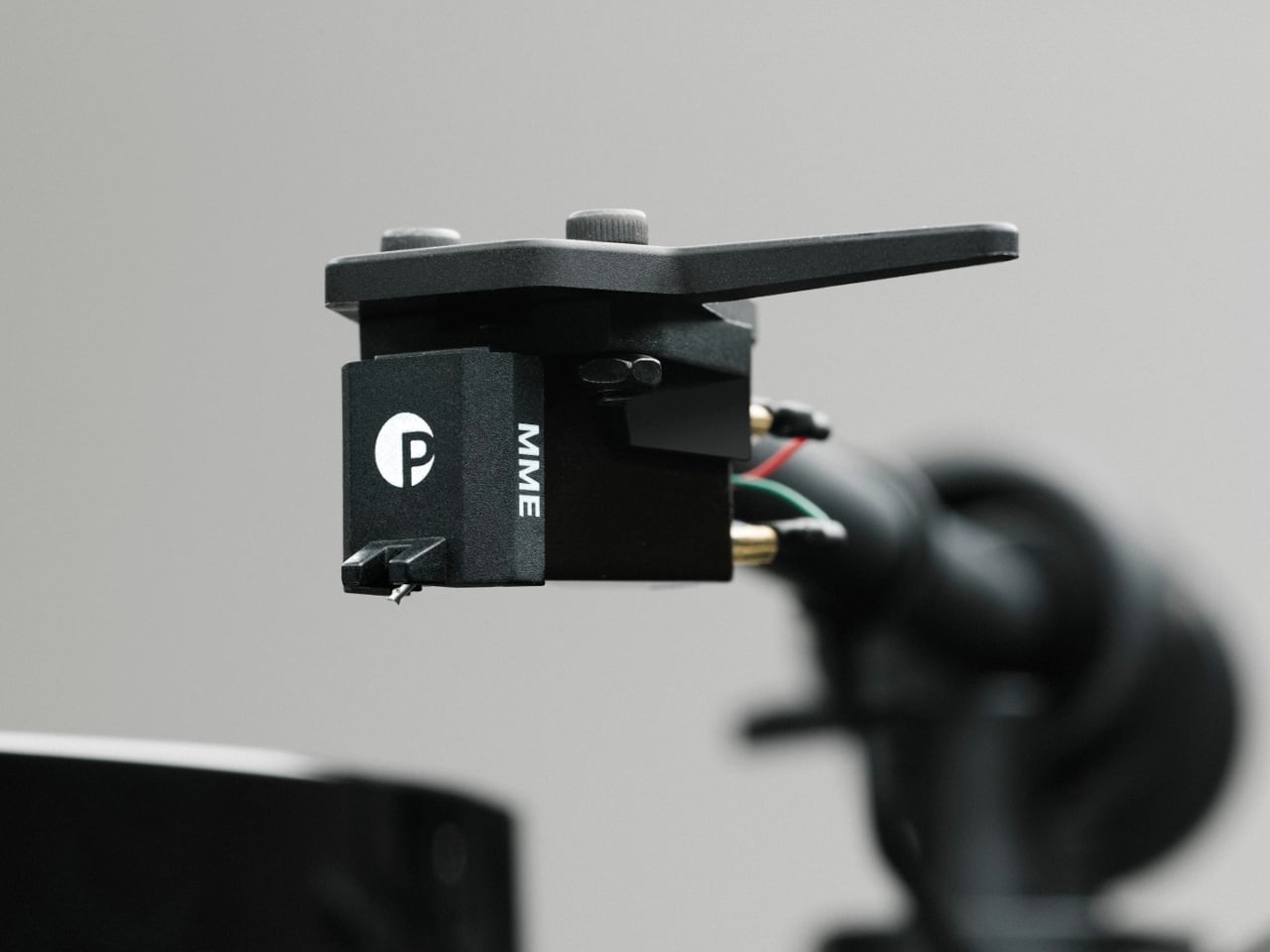
The RePod C1 is a CNC-machined aluminum case for the Apple Watch that rebuilds that tactile experience from scratch. The outer shell gives the watch the proportions and visual language of a classic iPod, and the click wheel around it is mechanically linked to the Apple Watch’s Digital Crown, so turning it actually does something. It’s not decorative. The scroll feedback comes from real physical interaction with the watch’s native controls, which makes the nostalgia feel a bit less hollow than it might have been.

Designer: Techpod

The case doesn’t ask the Apple Watch to give anything up. All of its sensors remain accessible through an open-back design, which means heart rate monitoring, ECG, and NFC for Apple Pay all continue to work normally. Antenna cutouts preserve Wi-Fi, Bluetooth, and cellular connectivity, so messages, calls, and Siri stay intact. The only thing that changes is the shell around the watch and the way it sits in your hand.

That second part matters more than it sounds. One of the more interesting things the RePod C1 does is turn the Apple Watch into a pocket device rather than exclusively a wrist device. Slide it into a pocket during a run, a commute, or an errand where pulling out a phone feels like too much, and the watch does most of what needs doing. Music plays back offline with Apple Music or Spotify Premium, notifications come through, and payments work at the counter. The phone can stay home, or at least in a bag.

Charging works through a built-in magnetic connector that sits flush in the frame, so the case doesn’t have to come off to top up the battery. The aluminum body also helps manage heat during fast charging, which the original iPod obviously never had to think about. The case is available in sizes covering everything from the Apple Watch Series 4 through the Series 11 and both Apple Watch Ultra models, with prices starting at $59.90 for standard sizes and $69.90 for the 49mm Ultra variant.

The iPod itself was discontinued in 2022 after 21 years, and Apple made no announcement about anything replacing it. The click wheel, as a piece of interaction design, has no current first-party home in any product. The RePod C1 doesn’t try to be a real iPod or pretend the Apple Watch needs help. It’s just a case that noticed the gap between what modern devices can do and what they feel like to use, and made a deliberate choice about which side it wanted to be on.

The post This $60 Apple Watch Case Is the iPod Apple Never Replaced first appeared on Yanko Design.

A $129 Music Player Built for People Done With Phone Distractions

Dedicated music players gradually faded from use once streaming apps turned every smartphone into an on-demand jukebox. Carrying a separate device for audio began to feel redundant. That attitude has slowly changed. Growing numbers of listeners, tired of notifications and algorithm-driven queues, have started reaching for standalone players again, ones that let music be the only thing competing for their attention.

The Hidizs AP30 Music Boy addresses that growing appetite, though it does so in a way that isn’t easy to overlook. Rather than adopting the clean, minimal aesthetic common to most digital audio players, it draws heavily from the visual language of retro handheld gaming. The result is a device that looks playful and compact but carries serious audio hardware inside.

Designer: Hidizs

Physical directional buttons and a 2.0-inch IPS display give the AP30 an immediately tactile quality that touchscreen-only devices often lack. The plastic version weighs just 56g, while the CNC aluminum edition comes in at 80g. A small whale motif on the back adds a quiet nod toward environmental awareness, giving the device one more detail that makes it memorable beyond the spec sheet.

The “wearable” part of the AP30’s pitch has practical implications. It clips to bag straps, hangs from a neck lanyard, or attaches magnetically to the back of a phone via an optional case, keeping it physically accessible during exercise, commutes, or any activity that doesn’t leave a free hand. Storage starts at 128GB built-in and expands to 256GB via a microSD slot.

Behind the gaming console’s exterior is a Cirrus Logic CS43198 DAC paired with an RT6863 amplifier, supporting DSD256, PCM at 24-bit/192kHz, and lossless formats including FLAC, WAV, and ALAC. Everyday headphones connect to the 3.5mm single-ended output, while the 4.4mm balanced connection offers meaningfully stronger output for listeners using higher-end in-ear or over-ear monitors, with room to grow as their setup does.

Bluetooth 5.3 with LDAC handles wireless listening without much compromise in audio quality, and the USB-C port doubles as a DAC input for computers and phones. Connect it that way, and the AP30 draws its own power, sparing the host device’s battery. The 1,200mAh cell manages 10 to 12 hours of continuous playback in single-ended mode and charges back to full in about one hour.

HidizsOS, the player’s Linux-based operating system, keeps the interface focused entirely on music rather than apps or streaming services. Customizable EQ presets and switchable digital hardware filters give listeners control over how their music sounds, and a built-in block puzzle game is a fitting Easter egg on a device with this much retro DNA. Both plastic and aluminum editions retail at $129.

There’s no streaming service, no social feed, and no notification waiting to derail the listening session. The AP30 runs on a locally stored library and asks for nothing more than a decent pair of earphones. For anyone who’s ever put a phone on silent just to get an hour of uninterrupted music, it makes a compelling case for carrying two things instead of one.

The post A $129 Music Player Built for People Done With Phone Distractions first appeared on Yanko Design.

These $69 ANC Headphones for kids are so good, I might use them myself: iClever Q950 Hands-on

Designing for children is a unique challenge. Kids are clumsy, impatient, and have a remarkable talent for forgetting to charge their devices. This reality often seems lost on product designers, who shrink adult technology and call it a day. The result is usually a frustrating experience for both parent and child, filled with confusing touch controls and the inevitable silence of a dead battery. It’s a cycle of minor tech annoyances that feels all too familiar in the modern family home.

The iClever QuietShield Q950 feels like it was designed by someone who has actually spent time with kids. The controls are large, satisfying physical buttons, a smart choice for small hands that lack fine motor precision. Bluetooth pairing notifications are delivered in a friendly child’s voice, a small detail that makes the headphones feel truly personal. Best of all, the auxiliary input works even when the power is off, providing a practical backup for those very conceivable moments when charging is forgotten. These are the kinds of thoughtful, practical choices that make a product genuinely useful.

Designer: iClever

At $69.99, the Q950 makes a strong first impression. You get the headphones, a matching soft-shell carrying case, a USB-C charging cable, and an AUX cable, which already makes the package feel more complete than many headphones in this range. The case is especially nice, with a clean zippered form factor and enough room for the cables and paperwork in a mesh pocket. It is the sort of inclusion that makes the Q950 feel less like a basic kids’ accessory and more like a proper travel-friendly headphone package.

The design itself strikes a nice balance between playful and polished. In the blue finish, the two-tone color treatment gives the Q950 a softer, more approachable look, while the metallic-looking frame pieces that connect the earcups to the headband add a slightly more premium touch. Even though the construction is plastic, nothing about it feels cheap. The headband and earcups are cushioned well, the structure feels solid in hand, and nothing creaks or feels flimsy. I still hope replacement earcups are available, because that would make the product easier to recommend for long-term use, but the initial build quality is genuinely impressive.

That premium feel carries over into the controls. iClever made the right call by skipping touch panels entirely and using dedicated buttons for power, volume, and listening modes. Touch controls can be annoying even on adult headphones, so physical buttons make far more sense for kids. They are easier to find by feel, harder to trigger accidentally, and generally more forgiving. Just as importantly, there is no smart assistant toggle here, no Hey Siri shortcut, and no dedicated button that could accidentally send a child wandering into a voice assistant rabbit hole. They also look cute in a way that suits the Q950’s overall design language.

Bluetooth connectivity worked flawlessly in my time with the headphones. Pairing was quick, the connection stayed stable, and I did not run into any hiccups. Sound quality was also better than expected. To be honest, it held up surprisingly well against my Soundcore Space One in casual listening. I am not going to nitpick too much here because these are headphones for kids, not audiophiles, but there were no complaints on audio quality. They sounded clean, balanced, and perfectly good for movies, educational content, and everyday listening.

The volume does max out a little lower than the average pair of headphones, but that is clearly by design. iClever is positioning the Q950 around an 80dBA safe listening limit, and in practice that lower ceiling feels intentional rather than frustrating. The active noise cancellation helps here, because kids do not need to crank the volume as much in noisy environments just to hear what they are watching. That is the real advantage of pairing hearing protection with ANC instead of relying on a volume cap alone.

ANC is easy to access through the center button on the earcup, and transparency mode is available too, which is useful for keeping kids aware of their surroundings when needed. That setup feels much more practical than burying everything inside an app. The Q950 also supports wear detection, which worked well overall. There is one small quirk, though. If you place the headphones on a table with the earcups facing downward, the sensor can mistake the surface for your head and assume the headphones are still being worn. It is a minor issue and did not feel like a dealbreaker, but it is the kind of behavior you notice quickly in real use.

One of my favorite details is the AUX support. The headphones work passively over a wired connection even when they are powered off, which is genuinely useful if the battery dies because a kid forgot to charge them. That means the Q950 still works in a pinch instead of becoming dead weight during a flight or car ride. Of course, features like ANC and wear detection do not work when the headphones are off, because they still need power, but wired playback alone is a great fallback to have. If the headphones still have charge and are powered on, iClever says ANC can also work in wired mode.

The company claims up to 60 hours of playback with ANC off and 35 hours with ANC on, which is within the ballpark of what I got with my week’s worth of testing. The presence of AUX backup already removes a lot of battery anxiety.

For $70, the iClever QuietShield Q950 feels like a steal. You get a thoughtful set of features, reliable Bluetooth, effective ANC, a kid-safe volume cap, and a design that feels more premium than expected at this price. More importantly, it feels like a product built around how kids actually use headphones, and how parents actually worry about them.

The physical ANC button lets you toggle transparency

iClever delivers the Q950 in a gorgeous soft-shell case that kids can carry around with them.

The post These $69 ANC Headphones for kids are so good, I might use them myself: iClever Q950 Hands-on first appeared on Yanko Design.

A Design Student Just Imagined the Perfect Vinyl Turntable

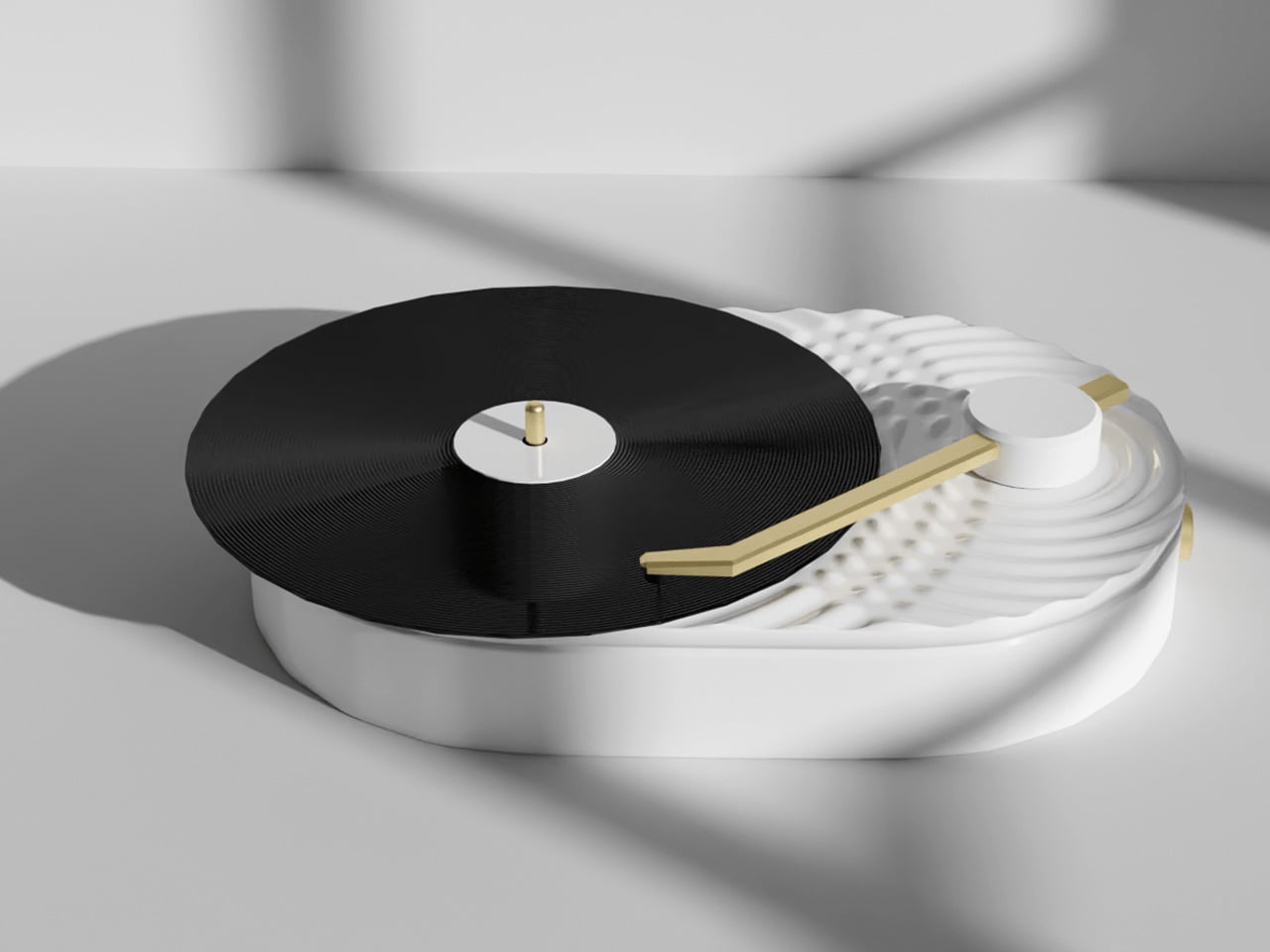
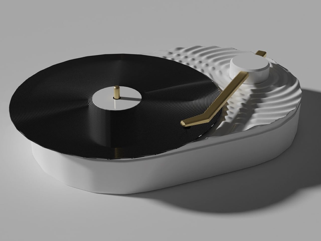
Sungwoo Choi is an industrial design student with one question: what if Nothing made a turntable? The answer is Turntable (1), a personal concept project with no official ties to the brand, and it’s been circulating online as exactly the kind of render that makes you briefly annoyed it doesn’t actually exist.

If you’ve spent any time in the vinyl revival conversation, you know most turntables fall into two camps: the warm, retro-wood-and-brass kind that lean hard into nostalgia, or the cold, purely utilitarian kind that audiophiles swear by but would never put on display. Very few designs ask the question that good industrial design should always ask. Can this be both beautiful and functional, without being precious about either? Choi’s concept does exactly that, in a visual language drawn directly from Nothing’s aesthetic, and it reads more resolved than many products that actually ship.

Designer: Sungwoo Choi

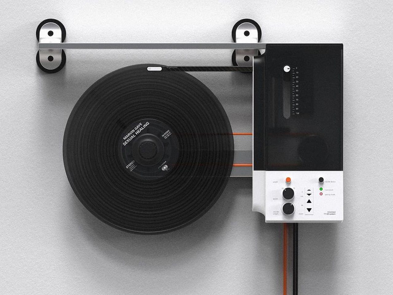
The design is clean in a way that reads as deliberate rather than sparse. The chassis is white with silver-tone aluminum accents, flat and rectangular with gently rounded module insets that divide the deck into distinct functional zones. The platter is rimmed in a transparent acrylic ring that catches light in a way that makes the whole unit feel alive without being showy. The tonearm is machined and substantial, seated on a circular mount encircled by concentric transparent rings, a detail that looks pulled from a scientific instrument. Nothing has built its entire reputation on making the internal visible, on transparency as both a literal and conceptual design choice, and Choi translates that language fluently into a format where seeing the mechanics only deepens the ritual of listening.

The control layout is where the concept gets genuinely interesting. Size (7/12) and Speed (33/45) dials are housed in a recessed rounded module, labeled with a matter-of-fact clarity that feels more like precision calibration than consumer product design. The volume knob is large and satisfying, surrounded by a clear acrylic trim ring and a small dot-matrix display panel marked “MUSIC-AR,” presumably a nod to some form of augmented reality integration. A flush-mounted speaker sits directly in the deck surface, making Turntable (1) a genuinely self-contained system. A Play/Stop button and a power button occupy the front-facing panel with quiet authority, like the designer knew exactly which controls needed physical presence.

The naming is the detail that does the most work quietly. Turntable (1). Choi borrows Nothing’s signature naming convention deliberately: Phone (1), Ear (1), Ear (stick). The convention carries a specific kind of promise. The (1) implies a (2). It implies a roadmap, a lineage, a commitment to return. By applying it here, Choi isn’t framing this as a one-off fan exercise. He’s imagining an entire product category for a brand that has already proven it can take commoditized consumer electronics and make people genuinely want to look at them.

The vinyl market argument practically makes itself. Records have been in cultural resurgence for well over a decade now, and the market is robust enough to support a premium, design-forward turntable aimed at people who care as much about what sits on their shelf as what comes out of their speakers. Nothing’s core audience, younger buyers who are design-literate and culturally engaged, are the exact crowd that has been rediscovering vinyl. The overlap isn’t a stretch. In retrospect, it feels like an obvious move for the brand.

Choi’s Turntable (1) is a concept, not a product, and carries no official connection to Nothing. That distinction matters. But the best concepts are the ones that make you slightly resentful they don’t exist yet. The work is confident, cohesive, and rooted in a genuine understanding of both the format and the brand he chose to draw from. It’s built on the logic of Nothing’s identity rather than just borrowing its aesthetic surface. It isn’t the spectacle of the render that earns attention. It’s the quality of the thinking behind it. Someone at Nothing should be paying attention.

The post A Design Student Just Imagined the Perfect Vinyl Turntable first appeared on Yanko Design.

This Award-Winning Guitar Ditches the Strings, the Frets, and Most of the Body, and I Kind of Love It

Look at RIFFMATE for a second and try to name what is missing. No strings. No fretboard bristling with metal wire. No solid slab of tonewood. What remains is the silhouette of an electric guitar sketched in mid-air, a skeletal frame that holds the double-cutaway outline everyone recognizes while hollowing out almost everything inside it. Those sweeping arms curving off the body trace exactly where a guitar’s shoulders and horns would sit, and then they float, framing empty space instead of filling it.

It takes real confidence to design an instrument by subtraction, and the RiffmateGT01 pulls it off with a straight face. Built by Shanghai’s Wo Tan Ni Chang Technology with industrial design from LKK Design Beijing, it collapses the guitar into two pieces, a slim touch-strip neck and a central pod holding the speaker, electronics, and acoustic chamber. The neck wears Roman numerals from I to VII where frets used to sit, and you play it by touch rather than by plucking steel. An AI layer shapes the sound and flattens the brutal learning curve that sends most beginners quitting by their fourth barre chord.

Designers: LKK Design Beijing

One-key disassembly lets the neck separate from the body, so the whole instrument folds into a small carry-on bag and clicks back together in seconds. Anyone who has wrestled a guitar into an overhead bin understands why that matters more than it sounds. The shells pop off too, which is where the personality lives, with RIFFMATE rendering in matte black, crisp white, a purple gradient, sunshine yellow, a blue-to-silver fade, and a warm walnut finish. Swapping those panels lets owners recolor the instrument or replace a scuffed part, stretching its lifespan instead of sending it to landfill. Modularity turns the guitar from a fixed object into a system that grows and changes with the person holding it.

The transparent render exposes a properly engineered acoustic cavity inside that central pod, with dedicated internal channels feeding a front-firing driver. That makes RIFFMATE self-amplifying, able to fill a room without an external amp or a tangle of pedals. The body wears a matte frosted texture over soft, rounded contours, sitting closer to a well-resolved Bluetooth speaker than to a slab-bodied Stratocaster. Those friendly surfaces read as age-agnostic, pitched at a curious ten-year-old and a lapsed forty-year-old guitarist alike. The whole object invites handling, exactly what an instrument built to lower the stakes should do.

Smart guitars have inched toward this moment for years, and LAVA did much of the groundwork by wrapping carbon fiber around a built-in touchscreen and turning the instrument into a full software ecosystem. RIFFMATE pushes that lineage somewhere stranger, questioning whether a guitar needs strings or a body at all, and joining a small wave of stringless designs rethinking the form from scratch. The honest caveat is that this remains award-stage industrial design, so we are judging intent and renders rather than a shipping spec sheet. As a vision, it lands as one of the boldest reinterpretations of the guitar to cross my desk in a while. Whether Wo Tan Ni Chang can build the object as beautifully as LKK drew it is the question worth watching.

The post This Award-Winning Guitar Ditches the Strings, the Frets, and Most of the Body, and I Kind of Love It first appeared on Yanko Design.

A Craftsman Just Turned Dead Car Engines Into One-of-a-Kind Guitars

I’ve been thinking about this one for days. A Slovenian craftsman named Vlado Plateis is turning discarded car engine heads into fully playable electric guitars, and every time I look at the photos, I still can’t decide if I’m staring at a musical instrument or a sculpture. Maybe that’s exactly the point.

The design logic here is deceptively simple: take the engine head as the body of the guitar, preserve its raw industrial form, and build around it rather than in spite of it. Nothing is polished away, sanded smooth, or disguised. The cast metal arrives with its own surface history of machined edges, bolt holes, and combustion chamber cavities, and all of it stays. The visible scars and geometry of the original part become the visual language of the finished instrument. That restraint is a design decision, and it’s a brave one. Most makers would be tempted to refine. Plateis resists that impulse entirely.

Designer: Vlado Plateis

What makes the objects so visually arresting is the tension between their two identities. The pickups, tuning pegs, and strings are all standard guitar hardware, clean and purposeful. Set against the rough, irregular topography of the engine casting, they create a contrast that reads as almost confrontational. One material is mass-produced and precise. The other is heavy, asymmetrical, and marked by mechanical life. Together, they don’t clash so much as they hold a conversation, and that conversation is what you keep looking at.

Each engine head also brings an entirely different geometry to the design, which means every guitar has a silhouette that could never be repeated. A guitar built from a Toyota Corolla head looks nothing like one built from a Mitsubishi Colt. The donor car determines the form. The bolt pattern, the fin arrangement, the overall mass and proportion are all inherited rather than designed, which paradoxically makes the final object feel more authored, not less. Plateis isn’t imposing a shape. He’s discovering one that was already there.

The weight is part of the design too, and I think it matters more than people initially consider. These are dense, substantial objects. You don’t pick one up and forget what it’s made from. That physicality communicates something about permanence that most contemporary design actively avoids. We’re so conditioned to lightweight, minimal, and frictionless that an object with genuine heft feels almost transgressive. It asks you to be present with it.

I also want to talk about what Plateis doesn’t do, because restraint is underrated in design. He doesn’t paint the metal. He doesn’t add decorative elements that aren’t structurally necessary. He doesn’t try to make the engine head look like something it isn’t. The honesty of the material is the aesthetic. That’s a philosophy rooted in the same tradition as Shaker furniture and Braun electronics, the idea that a thing should look exactly like what it is and nothing more. Applied to a guitar made from automotive scrap, it produces something genuinely unexpected.

Upcycling in design is popular right now, often to the point of feeling performative. Brands slap the word “reclaimed” on something and call it sustainable, but the object itself is forgettable. Plateis sidesteps all of that because the material isn’t incidental to the design. It is the design. Because every engine head has a different geometry, every guitar is structurally and visually unique. You cannot order the same one twice. The scarcity isn’t manufactured. It’s inherent to the process.

As someone who pays close attention to design, I think Plateis Guitars represents something genuinely interesting happening at the intersection of material culture, craft, and form-making. It’s a reminder that the most compelling design doesn’t always come from the biggest studios or the most advanced technology. Sometimes it comes from someone in Slovenia, a scrapped engine head, and a very considered eye for what already exists inside a piece of discarded metal.

Whether or not you play guitar, whether or not you care about cars, these objects deserve your attention. They are proof that constraints can be generative, and that found form, treated with patience and respect, can produce something completely new.

The post A Craftsman Just Turned Dead Car Engines Into One-of-a-Kind Guitars first appeared on Yanko Design.

CRKD Just Built a $135 Guitar Controller Around a Real Gibson Les Paul

Rhythm games went through a period where they were everywhere, then went quiet, and now they’re back in a way that feels more persistent than the last time. Fortnite Festival brought the genre back to a mainstream audience, Clone Hero and YARG kept a dedicated community alive through the lean years, and Rock Band 4 never really went away. The one thing that has lagged behind the revival is the hardware, with most players making do with aging instruments or basic alternatives that don’t feel particularly inspired.

The CRKD x Gibson Les Paul Olive Drab Pro Edition is a guitar controller that takes the instrument side of that equation seriously. Built on the silhouette of the actual Gibson Les Paul Olive Drab electric guitar and officially licensed by both Gibson and Xbox, it’s designed for Xbox Series X|S, Xbox One, and PC, with a finish that stands apart from the more conventional options the brand has previously released.

Designer: CRKD x Gibson

The two hardware decisions that define the playing experience are the EZ Glide mechanical fret buttons and the Hall Effect strum bar. The fret buttons use mechanical switches rather than the rubber membranes found in standard guitar controllers, giving each press a tactile click that registers precisely and consistently. The strum bar relies on Hall Effect technology rather than physical contacts, which means it doesn’t degrade with repeated use, and its sensitivity and actuation points can be dialed in through the CRKD app.

That companion app also handles everything the previous model’s physical 9-mode dial used to cover. CRKD removed that dial from the Olive Drab Pro Edition after extended playtesting found it added friction to getting started. Game presets, button remapping, custom profiles, and firmware updates now all live in the app. For players who want the depth, it’s all still there, and for those who just want to plug in and play, nothing stands in the way.

Connectivity covers three modes: wired via USB-C, low-latency 2.4 GHz wireless through the included USB dongle, and Bluetooth. The package also comes with a shoulder strap and a removable rechargeable battery. Rapid polling technology keeps response times tight across all connection methods, which matters considerably once you’re trying to hit precise timing windows in harder difficulty tiers.

The Olive Drab colorway is worth noting as more than just an aesthetic decision. CRKD has positioned this release as the first in an evolving line of Pro Edition controllers, setting up the platform for Stage Tour, its upcoming rhythm game, which the hardware will also support. It’s a calculated move to give players both a current controller that works across today’s library and a stake in whatever the next chapter of rhythm gaming looks like.

Production is limited to a single batch, priced at $134.99 USD, €149.99, or £129.99 depending on region. Compatible games include Fortnite Festival, Rock Band 4, Clone Hero, YARG, and the upcoming Stage Tour. CRKD has confirmed this is strictly a one-run release, shipping now while stock holds. For anyone who’s been waiting for a guitar controller worth taking seriously, this is about as deliberate a design statement as the category has produced.

The post CRKD Just Built a $135 Guitar Controller Around a Real Gibson Les Paul first appeared on Yanko Design.

Olivia Rodrigo’s New LEGO Collection Hides Loads of Easter Eggs, Just Like Her Music Videos

Heartbreak made Olivia Rodrigo famous, then rage made her interesting. SOUR arrived as a teenage gut-punch of betrayal and longing, all trembling ballads and bedroom devastation. GUTS answered it two years later with distortion pedals and a sneer, the sound of someone who had cried enough and picked up an electric guitar instead. The whiplash between those two modes is the most compelling thing about her, and any tribute worth its salt has to hold both at once.

The new LEGO Editions Olivia Rodrigo collection gets that completely. Across five collectible sets, the range swings from soft to loud and back again, and the flagship Dual Guitar build (43031) literally splits the difference, fusing an acoustic and an electric into one 1,228-piece object that opens to reveal hidden stage scenes inside. It is a collection that understood the assignment was always about duality, right down to the minifigures and their two faces. And like the best Rodrigo music videos, every set is salted with easter eggs you are meant to hunt down, the kind of buried references the Livies will be freeze-framing and cataloguing for weeks.

Designer: LEGO Group (Amy Corbett – Senior Design Manager)

That duality is a genuine milestone too, because Rodrigo becomes the first musician in history to receive multiple dedicated LEGO sets in one go, arriving with five new minifigures modeled on her most recognizable stage looks. The detail I keep grinning at is that every one of those minifigs carries two different facial expressions, so you can flip a single character between the wide-eyed ballad version and the snarling festival version depending on which Olivia the scene calls for. Amy Corbett led the design direction and worked directly with Rodrigo to refine each element, and that collaboration shows in how much of the collection is built around slow discovery rather than instant payoff.

The clearest proof of that is a clever piece of industrial sleight-of-hand in the LEGO Botanicals Flower Bouquet (11507). Rodrigo is the first partner LEGO has ever let personalize one of its Botanicals sets, and rather than a generic posy, the 400-piece arrangement is built around a striking purple flower assembled out of electric guitars, with further floral nods to her Filipino heritage threaded through the petals. It is the kind of part-repurposing that makes a designer grin, taking an instrument silhouette and coaxing it into a botanical form. Look closely and you will find a tiny visitor buzzing around the stems, which is exactly the sort of easter egg the Livies will lose their minds over.

The Concert Moon (43029) is the showstopper for me, a 670-piece recreation of that viral GUTS tour moment where Olivia drifts above the crowd on a giant glowing moon. What elevates it past a static diorama is the engineering tucked behind the spectacle, with hidden drawers and picture holders worked into the body of the thing, so the prop that floated over a stadium doubles as a tiny functional curio on your shelf.

The Dual Guitar (43031) earns its flagship billing the longer you sit with it, because the headline trick from up top, an acoustic and an electric fused into one 1,228-piece instrument, turns out to be only half of it. The body opens to reveal hidden stage scenes, backstage details, and secret storage compartments waiting to be decoded, one side soft and dreamy, the other ready to make some noise. From there the range dials down with the Vinyl (43028), which compresses her career into a 360-piece brick-built record display salted with callbacks and fresh clues hinting at what is still to come. And the Secret Storage (43030) closes things out, gathering her signature symbols into one 1,085-piece collectible, the red festival-tour guitar, the GUTS megaphone, a notebook pulled from those handwritten SOUR lyric books, each prop hiding a compartment that keeps it doing double duty.

So much of this collection is mechanism disguised as merchandise. A pop-star tie-in could so easily have been five pretty busts and a logo, but Corbett and her team kept asking what each object could do, which is why you get faces that swap, drawers that slide, guitars that open, and a moon that hides its own secrets. Pitched at ages nine to fourteen but plainly aimed at the adult collectors who grew up alongside this music, the sets read as display pieces with a puzzle-box heart.

The collection launches globally on August 1, 2026, at LEGO.com, LEGO stores, and selected retailers, with the Dual Guitar, Concert Moon, and Flower Bouquet already up for pre-order. Prices run from a friendly 34.99 USD for the Vinyl to 119.99 USD for the Dual Guitar, which feels fair for what is essentially a working brick instrument. If I had one wish, it would be a single playable string on that Dual Guitar, some tiny Technic mechanism that lets it twang just once. Give me that, and this goes from a great tie-in to an instant classic.

The post Olivia Rodrigo’s New LEGO Collection Hides Loads of Easter Eggs, Just Like Her Music Videos first appeared on Yanko Design.

The 21.5-Inch Transparent Speaker That Animates Lyrics to Match Your Music

Most home speakers today have settled into a comfortable invisibility. Whether they’re slim soundbars pushed against a wall or cylindrical mesh towers parked on a bookshelf, the design goal is essentially the same: stay out of the way. They’re meant to be heard and rarely looked at, and even the ones that look interesting rarely offer much to see once the music starts.

MorningBlues has a clear thesis about music, and it has a lot to do with how the things we listen to can also be things worth looking at. Its SonicGlass A1 is a hi-fi speaker built around a transparent glass driver that lets you watch sound in motion as music plays. It’s the kind of object that sits on a shelf the way art does, with intention, and with something to say even before you press play.

Designer: MorningBlues

Click Here to Buy Now: $646 $999 (35% off). Hurry, only 16/205 left! Raised over $360,000.

The SonicGlass A1’s front face is a 21.5-inch TFT panel with high-transparency tempered glass, framed in black with over 90% light transmission. The transparent driver sits behind it, fully visible, which is both an acoustic feature and a design statement. There’s no grille hiding anything, no fabric obscuring the view. What you see is the working interior of the speaker, presented like an exhibit rather than concealed like a component.

When a song plays, lyrics appear across the glass surface in motion styles drawn from the track’s rhythm, pace, and emotional character. MorningBlues calls this MoodLyric, built on data from hundreds of millions of playbacks to animate text in ways that feel tied to what the song is actually doing. All lyrics are licensed through LyricFind, meaning the display does right by the artists whose words it borrows.

Beyond the lyrics, a feature called SceneSync adds a visual layer that responds to music genres. Pop, hip-hop, R&B, and rock each trigger different visual aesthetics on screen, generated in real time by AI. The idea is that the speaker shouldn’t just play a song; it should match the world the song is coming from. It’s a more cinematic take on the standard music visualizer.

The MorningBlues app lets you upload a personal photo that AI uses to place your face inside a genre-matched music video, displayed on the speaker’s screen. It’s the kind of feature that’s genuinely fun at a gathering, or just for yourself on a slow afternoon. You can also load the speaker with your own photos and videos to use as background content, turning it into a personal display.

When the music stops, the SonicGlass A1 doesn’t go blank. It has ambient display settings that keep it working as a room fixture, with options like ambient backgrounds, dynamic clock faces, and an ASMR sleep mode for winding down at night. That always-on character makes the speaker feel less like a device you switch off and more like something that already belongs in the room.

Pair the A1 with a microphone, and it becomes a home karaoke setup with licensed lyrics scrolling on screen in sync as you sing. The MorningBlues Music Hub 1, a dedicated controller for phone-free playback, rounds out the experience by letting you manage everything from a single tactile device, so your phone doesn’t need to be part of the evening at all. The large glass screen handles the rest.

The SonicGlass A1 isn’t angling to be the most powerful speaker in the room or the one with the most impressive spec sheet. It’s made for people who think about music the way they think about other things they choose to live with, considering both what those things do and how they look doing it. MorningBlues is asking a direct question: what if your speaker was worth watching?

Click Here to Buy Now: $646 $999 (35% off). Hurry, only 16/205 left! Raised over $360,000.

The post The 21.5-Inch Transparent Speaker That Animates Lyrics to Match Your Music first appeared on Yanko Design.
Jacksonville Built a Music Garden That Grows With Its City

Most public art arrives fully formed. It gets unveiled, photographed, written about, and then gradually becomes part of the background noise of a city. You stop seeing it the way you stop noticing the paint color in your living room. A Cappella, a new permanent installation along Jacksonville’s riverfront, was designed to resist exactly that fate.

Created by Brooklyn-based studio The Urban Conga and situated within the Jacksonville Riverfront Music Garden along the St. Johns River, A Cappella does something most permanent installations don’t dare to do: it was built to remain unfinished. Not as an artistic statement about incompleteness, but as a genuine structural decision baked into every layer of the project. The installation draws from a collection of 84 songs by more than 60 local artists, spanning an entire century of Jacksonville music from the 1920s all the way to the 2020s. Those songs aren’t decoration. They’re the architecture.
Designer: The Urban Conga

The physical space is carved into the landscape in the shape of a musical note, which already tells you this project takes its metaphors seriously. But what makes it compelling beyond the clever concept is how it’s organized. The installation is divided into four sections that mirror the movements of a symphony: motivation, home, love, and freedom. Each carries its own emotional register, its own atmosphere and pacing. Walking through the space isn’t like looking at a gallery wall. It moves like a piece of music does, with energy and momentum in the early sections giving way to something more contemplative and expansive toward the end. You’re not just reading about the city. You’re moving through its emotional history.

The studio is led by Ryan Swanson and Maeghann Coleman, AIA, NOMA, and The Urban Conga’s whole philosophy centers on what they call “open-ended play” and the idea of building what they describe as playable cities. This isn’t decoration for decoration’s sake. Their work consistently asks what happens when a designed space actually invites people to engage, interact, and contribute rather than simply observe. A Cappella is perhaps the clearest expression of that philosophy yet.

The sourcing of the content is the part that deserves more attention than it usually gets. Jacksonville residents themselves identified the songs and lyrics that shaped this installation through an extensive public engagement process, before a single panel was placed. That distinction is easy to gloss over, but it shouldn’t be. A lot of public art about a community is really just art placed near a community. The difference between being consulted and being included is everything, and this project sits firmly on the included side.

The visual design reflects that same openness. Dichroic and reflective panels shift with changing light, meaning the installation looks genuinely different depending on when you arrive. That’s a detail worth noting, because it means repeat visits reward you with something new. The space doesn’t freeze time; it moves with it.

And then there’s the detail that separates A Cappella from most permanent public installations: it’s designed to accommodate new artists over time. As Jacksonville’s music scene evolves, so does the work. New songs can be added. The story doesn’t end with the ribbon cutting. That’s either a very bold design choice or an obvious one, depending on how you look at it. Either way, it’s rare, and it’s right.

We talk a lot about public space and who it belongs to. Too often the answer is technically “everyone” but practically “no one in particular.” A Cappella makes a real argument that a city’s sonic history is worth preserving with the same seriousness as its built one. Jacksonville has contributed more to American music than it usually gets credit for, and having that legacy embedded in the riverfront landscape, available to anyone walking past on any given afternoon, feels like a meaningful act of civic pride rather than a token gesture. Public art can be many things. At its best, it makes you feel like you belong somewhere. A Cappella seems to be aiming for exactly that.

The post Jacksonville Built a Music Garden That Grows With Its City first appeared on Yanko Design.