Clock Makes Hours Appear and Disappear Through Moiré Patterns

Most clocks are content to quietly tick away in the background, marking the hours with little more than a glance from you throughout the day and night. But what if telling time could be mesmerizing instead, an experience that draws you in, sparks curiosity, and turns your wall into a living gallery worth watching? What if checking the time felt less like a chore and more like appreciating kinetic sculpture?

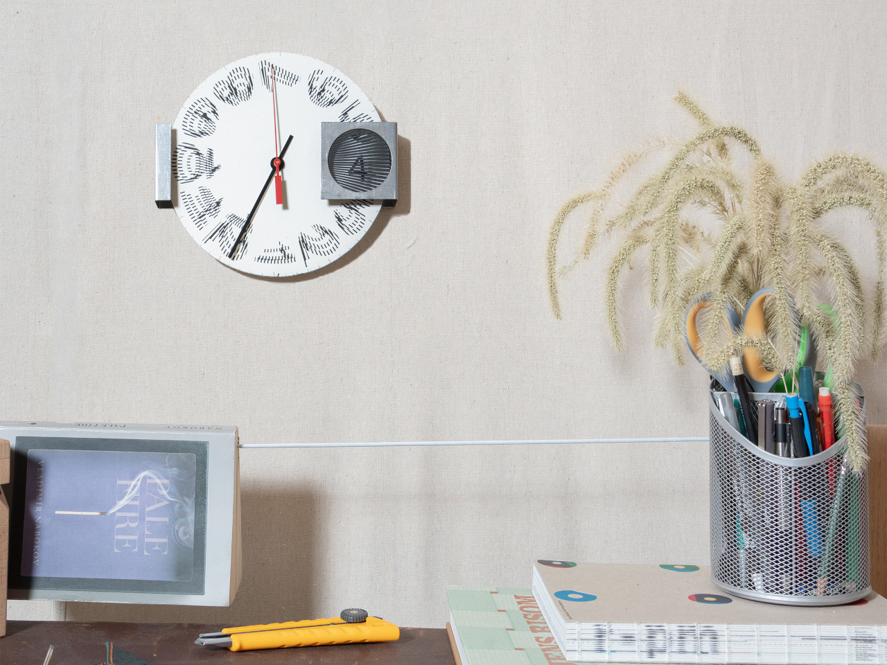
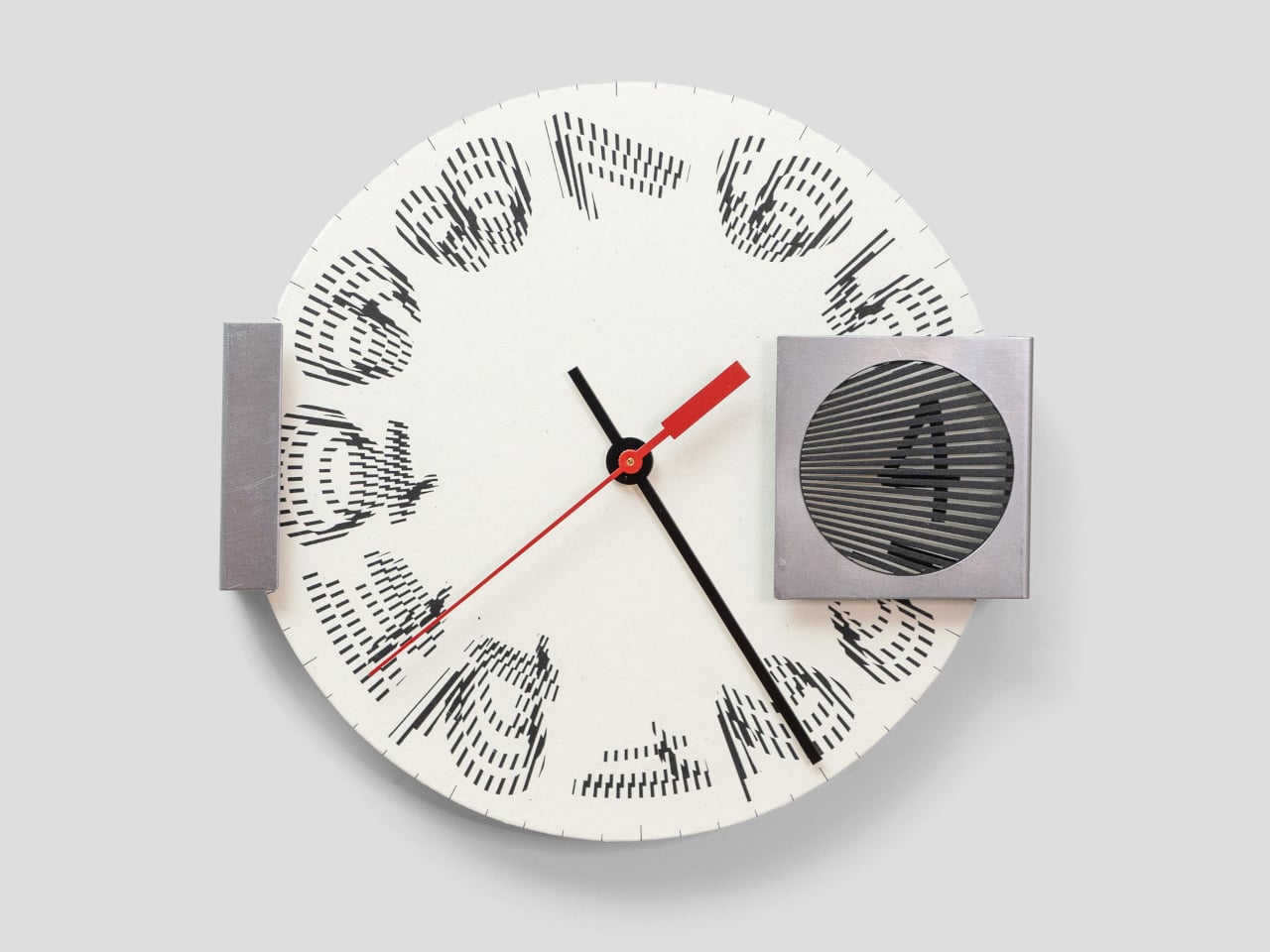
The Moiré Clock is a kinetic timepiece that turns the passage of time into a visual illusion worth watching throughout your day. Using overlapping patterns and continuous motion behind a striped filter, it animates each hour through optical phenomena, making time feel less like a number on a dial and more like a moment to savor. The design explores how perception and movement can create meaning beyond simple functionality.

Designers: Felix Cooper, Amber Li (STATION Design)

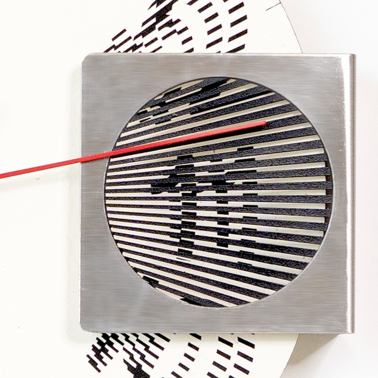
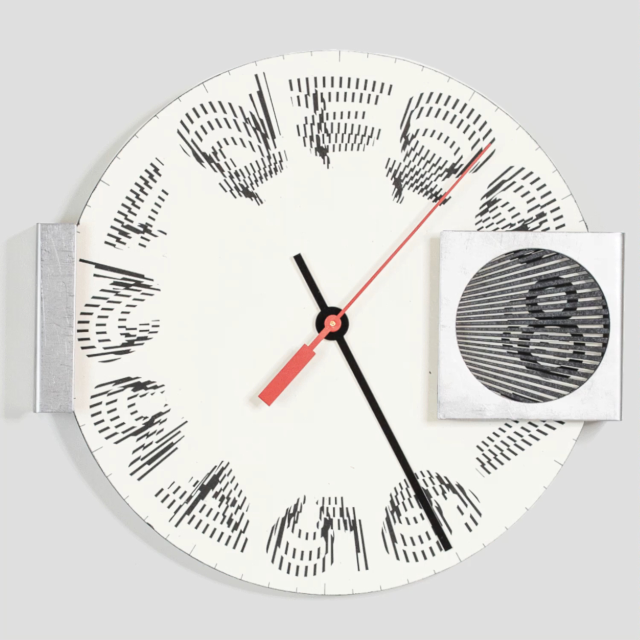
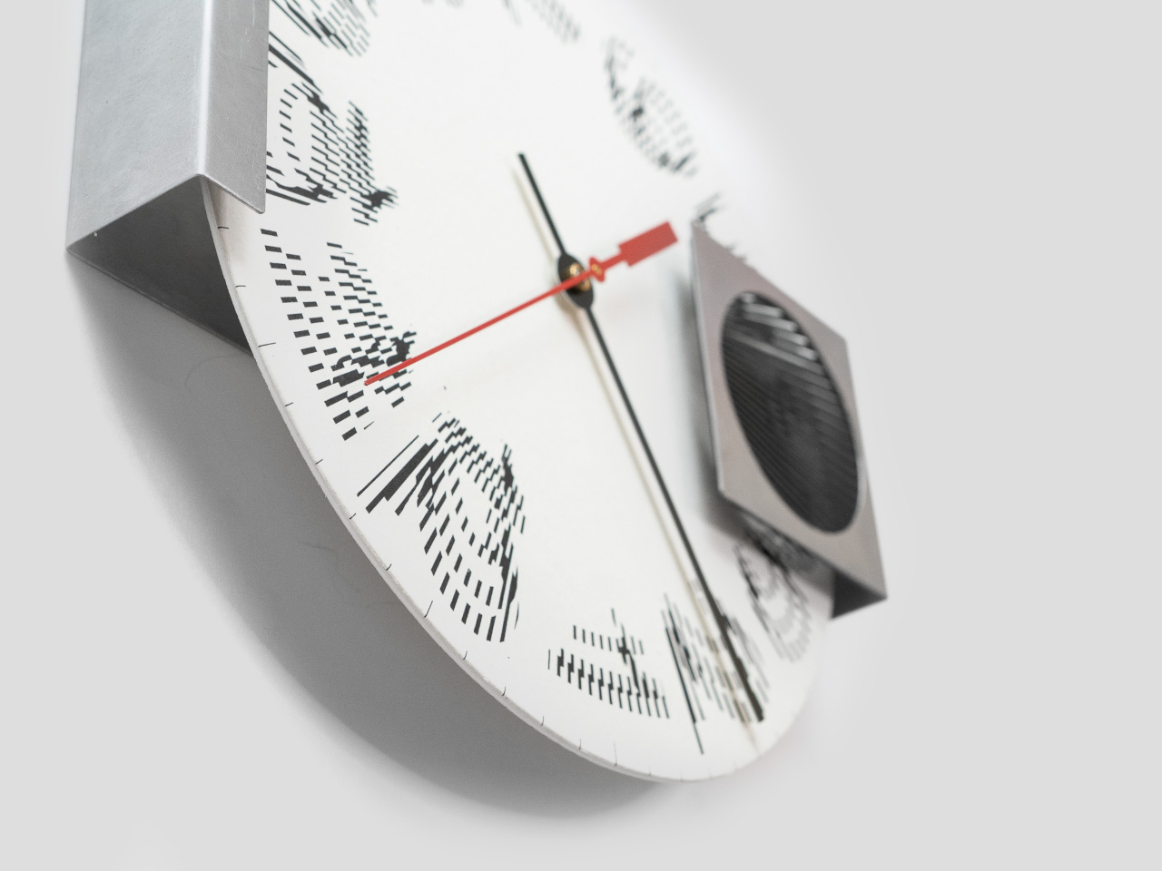
At the heart of the Moiré Clock is a rotating paper disc, printed with custom numerals and set behind a striped steel window that creates the optical magic through interference patterns. As the disc turns throughout the day, the moiré effect causes the hour numerals to morph, dance, and reveal themselves in a hypnotic display that changes with every passing minute behind the filter screen.

The minute and second hands ground the illusion in familiar movement while the hour appears and disappears in a mesmerizing rhythm behind the stationary filter window. The bold red second hand adds a pop of color and visual anchor, making the clock easy to read despite its unconventional hour display created by optical interference. The interplay between traditional clock elements and the animated moiré numerals creates a unique timekeeping experience.

The clock is a study in material contrasts between industrial and artisanal manufacturing traditions. Crisp white paper milled by French Paper Company in Michigan, American-made steel sourced from Pennsylvania, and a quartz movement from Takane, the last US manufacturer of clock mechanisms still producing domestically. The tactile paper face and brushed steel housing give the piece a sense of warmth and industrial substance that goes beyond typical wall clocks.

At 8.5 inches wide and just 2.5 inches deep, it’s compact enough for a home office, studio, or hallway without dominating the wall space, but bold enough to stand out as functional art that deserves attention. Setting up the clock is straightforward: add a single AA battery, set the time using the rear dial, and hang it with a nail or push pin. The paper components invite gentle handling.

The kinetic numerals and bold red second hand make each glance at the clock a small event worth experiencing, turning routine time checks into moments of visual delight throughout your day at home or in creative spaces. For anyone who wants their home to feel creative and alive with kinetic energy, the Moiré Clock brings a sense of play and wonder that traditional clocks simply cannot match or replicate with static designs.

The post Clock Makes Hours Appear and Disappear Through Moiré Patterns first appeared on Yanko Design.

Mid-Century Clock and Watch Tell Time With Shapes, Not Numbers

Most clocks and watches fade into the background, quietly marking the hours without much personality or visual presence on your desk or wrist throughout the day. But what if timekeeping could be playful, sculptural, and as expressive as the rest of your space or personal style choices? What if checking the time felt less like a utilitarian glance and more like appreciating a piece of functional art?

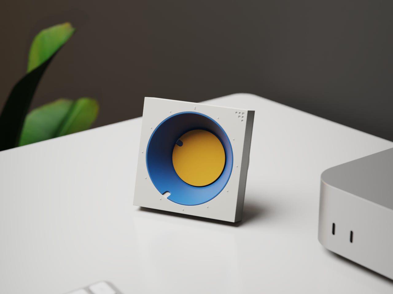
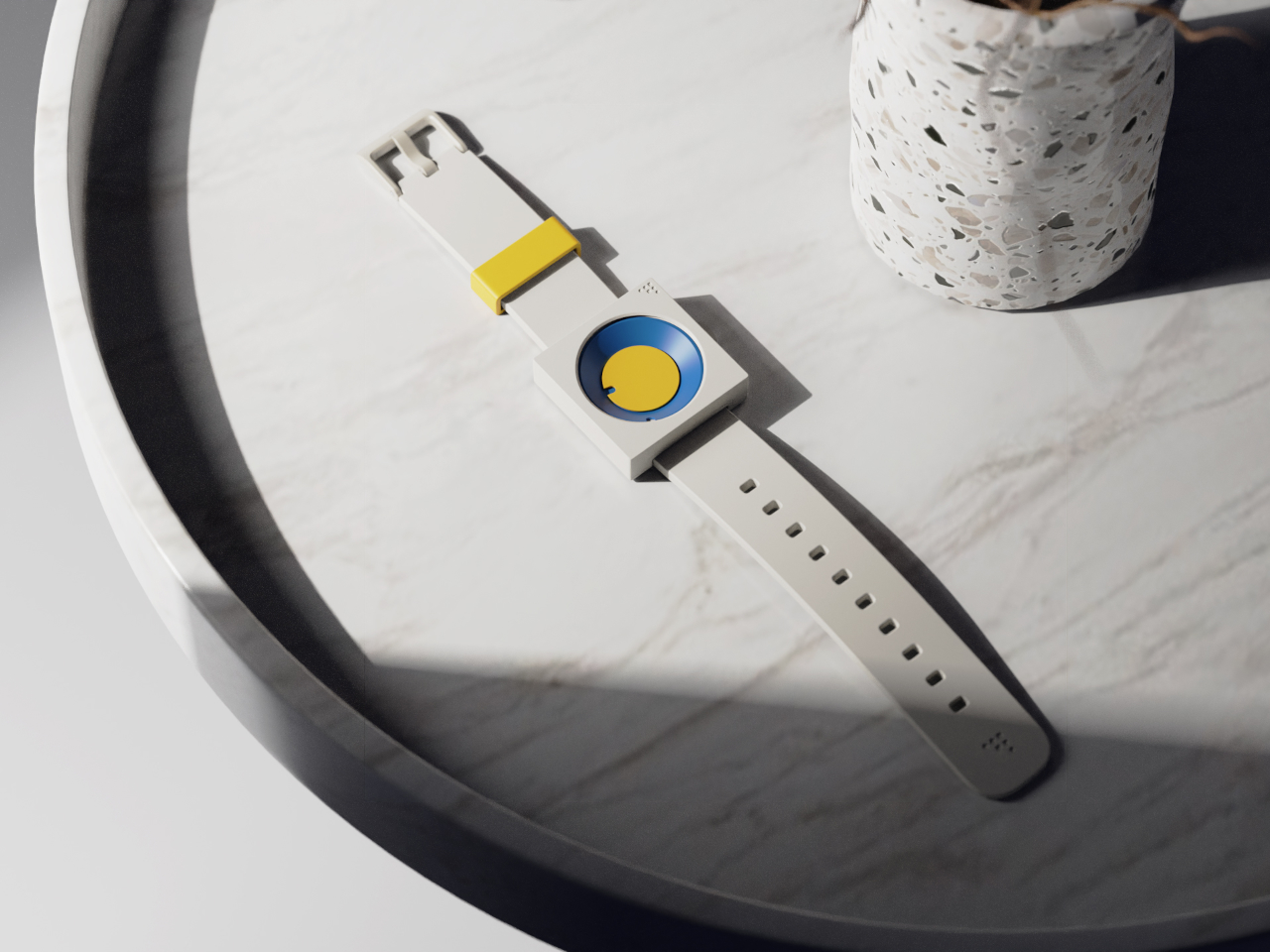
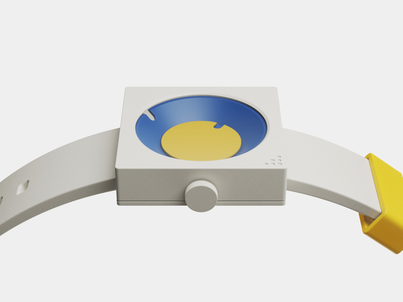
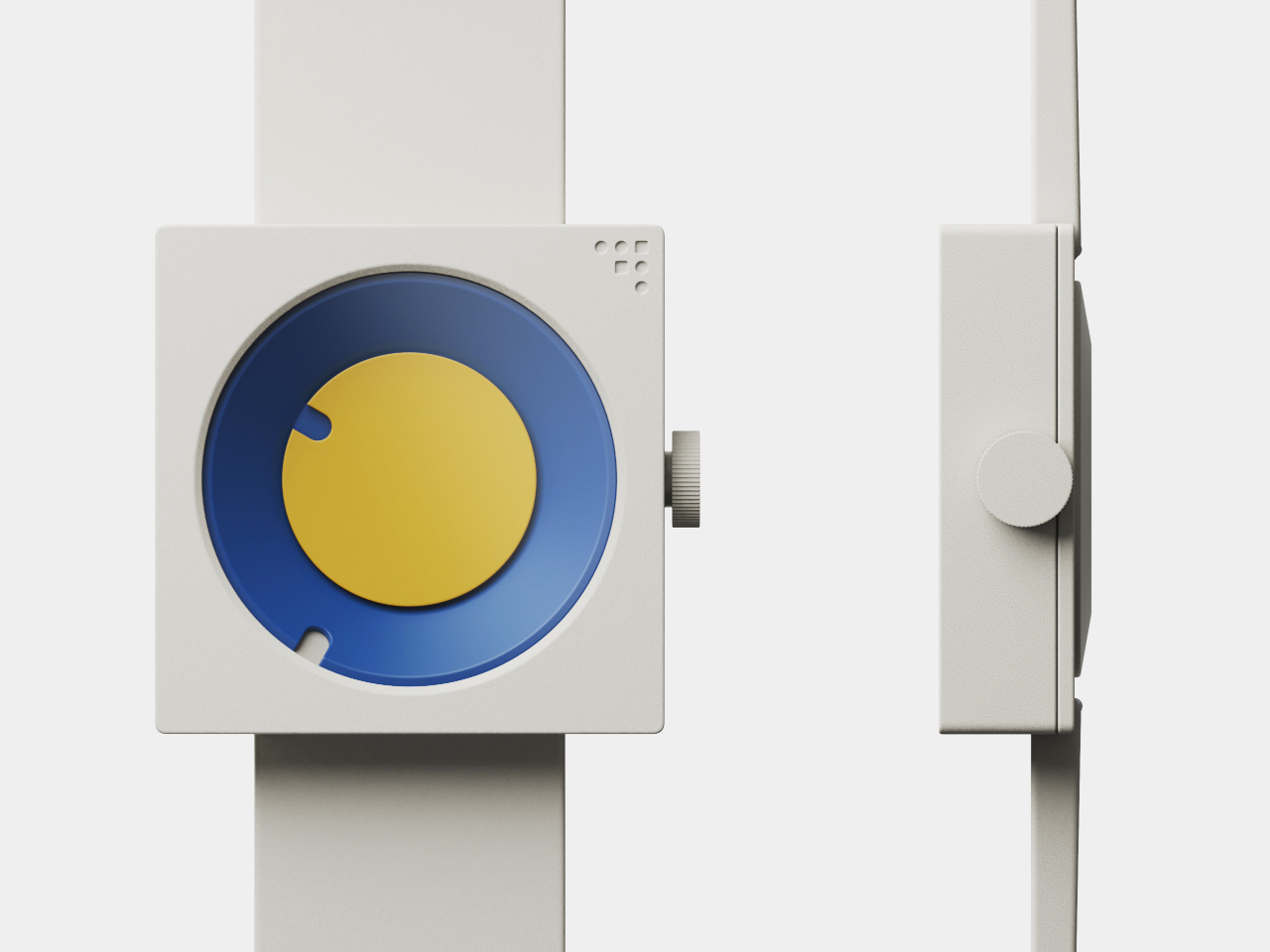
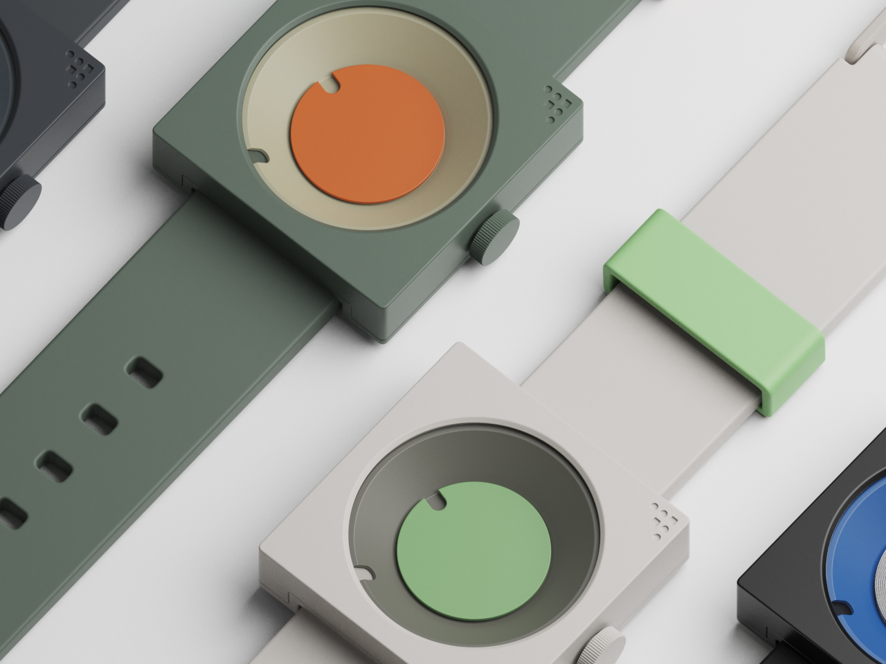
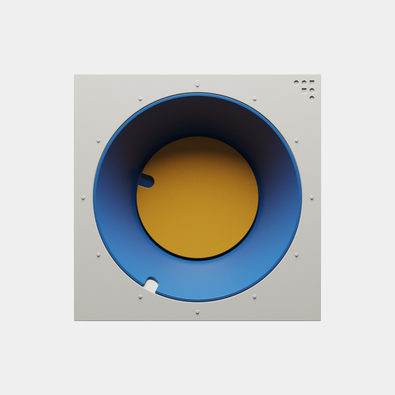
The FC-30 Desk Clock and FW-50 Wrist Watch concepts flip the script on conventional timekeeping, using bold geometry, vibrant color, and tactile design to turn telling time into a daily ritual worth savoring. Inspired by mid-century modern design principles from the 1950s and 60s, both pieces are as much about art as they are about function, bringing sculptural presence to everyday moments throughout your routine.

Designer: Sidhant Patnaik

Create your own Aesthetic Render: Download KeyShot Studio Right Now!

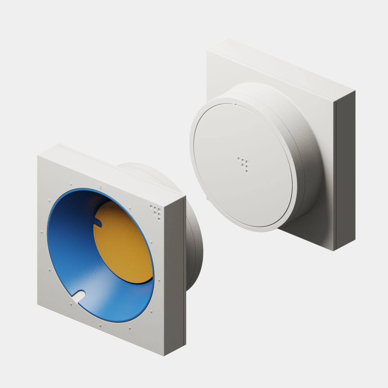
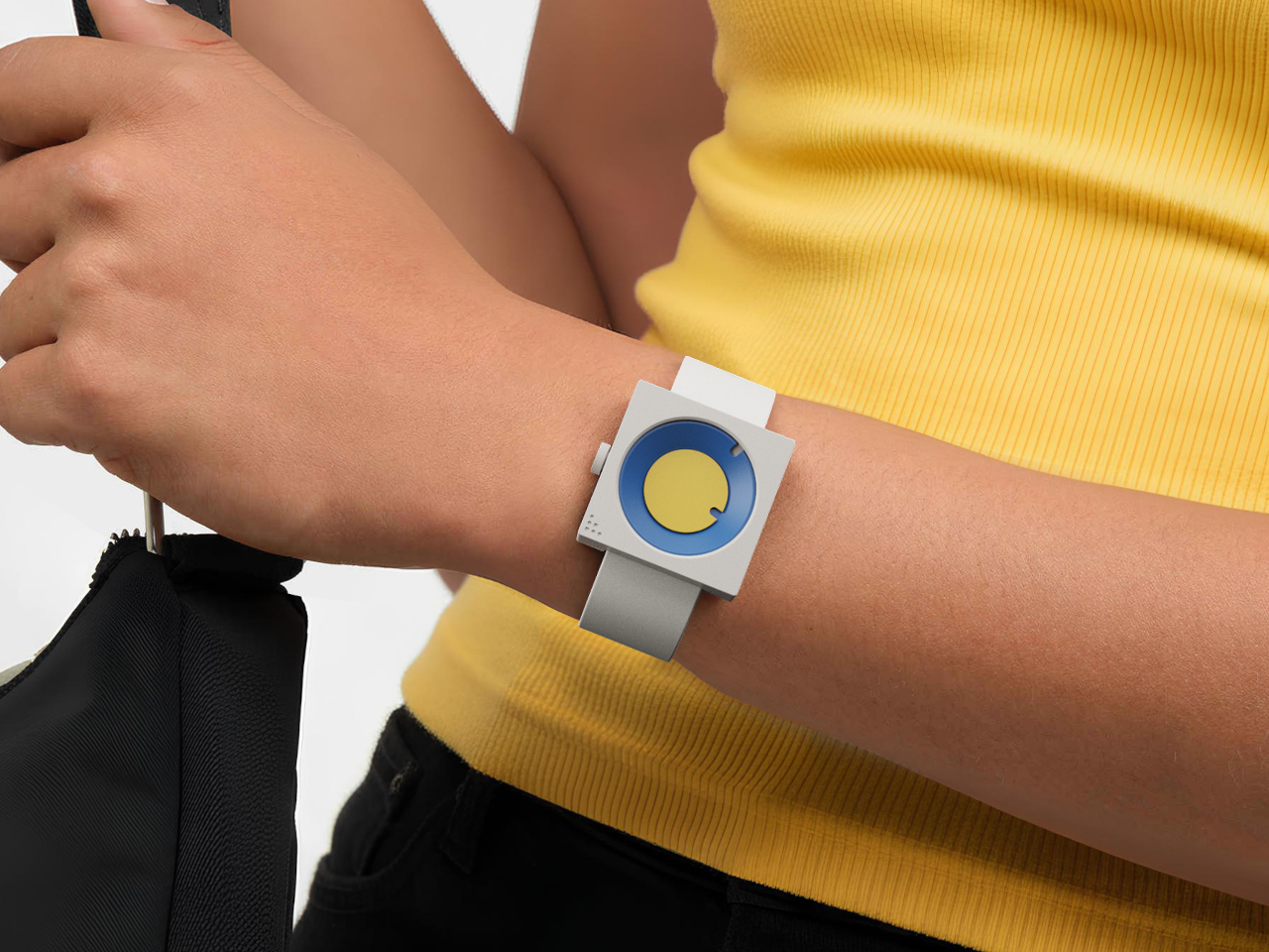
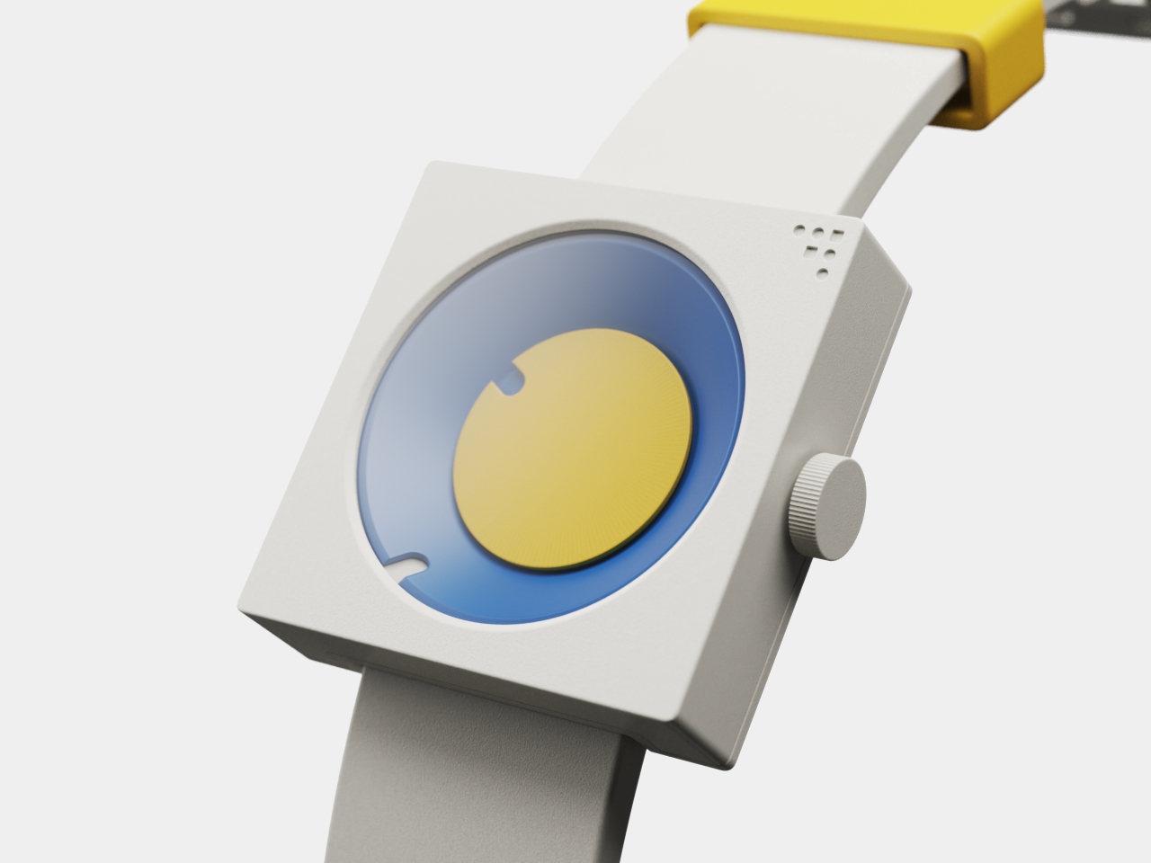
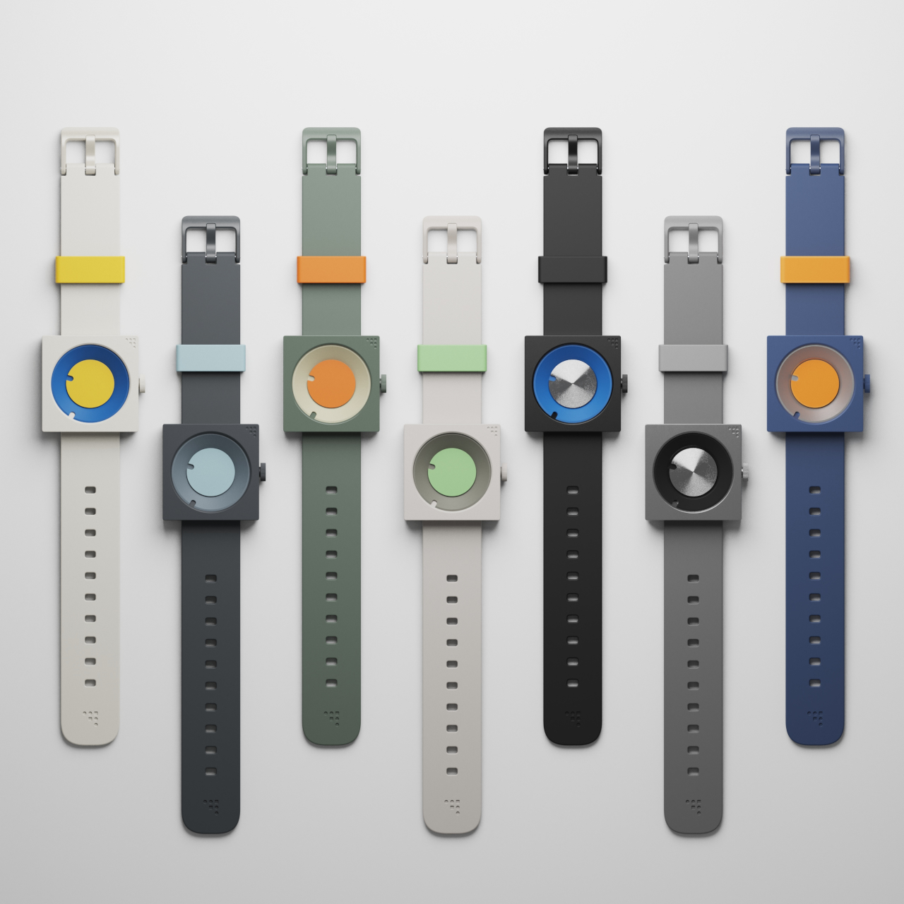
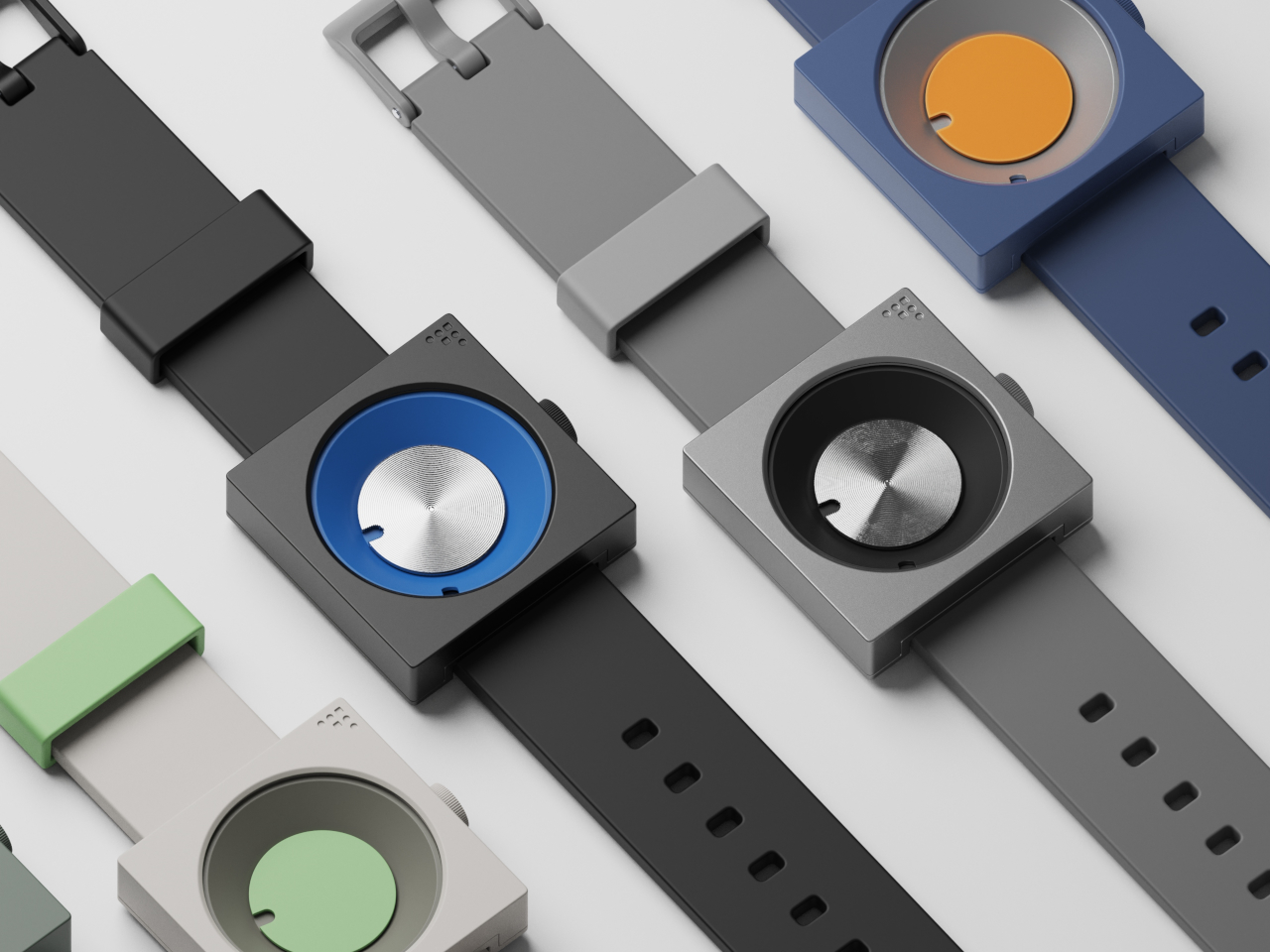
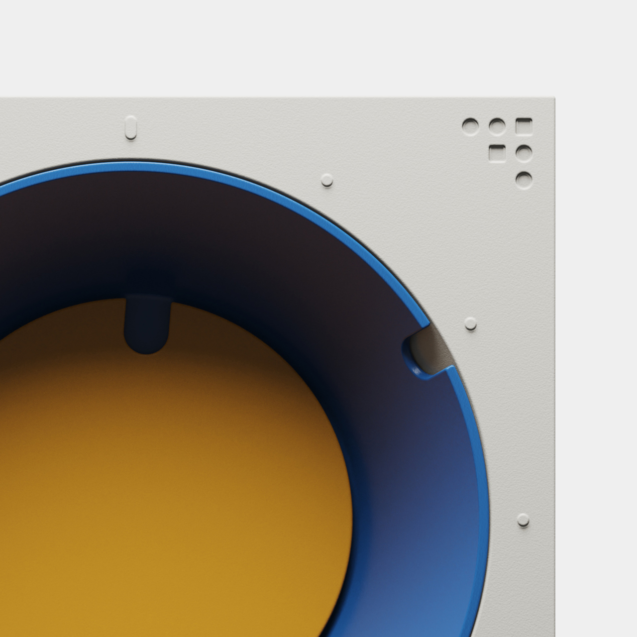
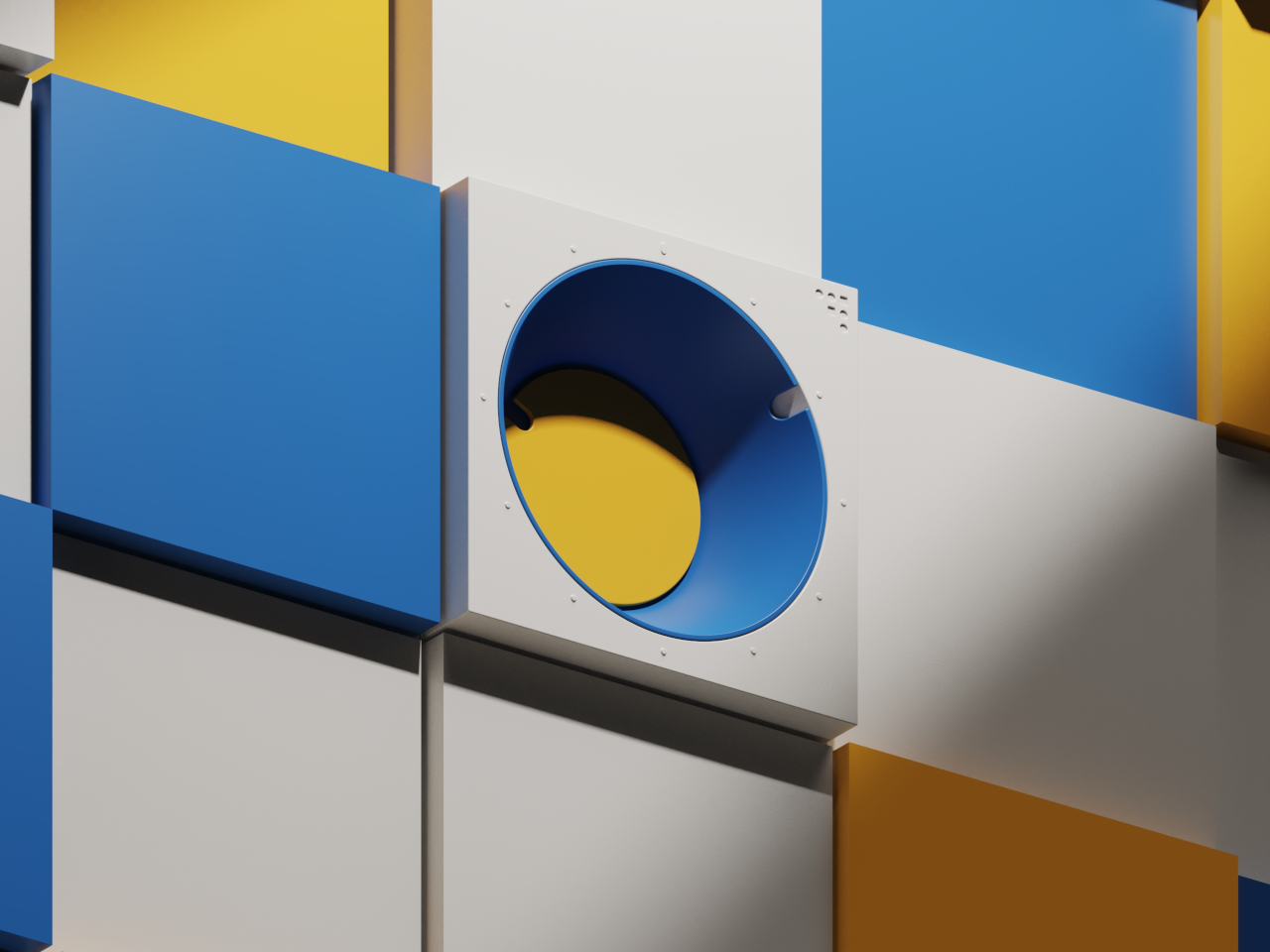
Both pieces are built around the frustum, a geometric form with an angled face that creates visual interest and dynamic readability throughout the day. The FC-30 uses a 30-degree incline for the minute indication, while the FW-50 adapts the idea to a 50-degree angle optimized for wrist wear and comfort. The hour is shown by a colored disc housed inside the frustum, while the sloped edge indicates minutes.

The result is a visual experience that feels fresh and interactive, inviting you to engage with the object every time you check the hour rather than passively glancing at digits. The unconventional layout is intuitive once you spend a moment with it, turning time-telling into something more tactile and memorable than reading digital numbers or traditional clock hands that blend into the background of modern life.

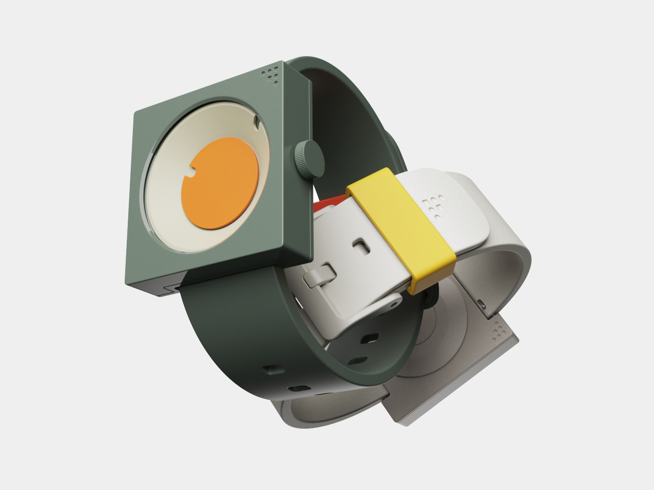
Inspired by mid-century modern classics from the golden age of product design, both the clock and watch feature a palette of bold blues, yellows, greens, and oranges, set against matte white or gray cases with clean edges and visible fasteners. The color blocking and clean lines make each piece stand out visually, whether positioned on a desk, mounted on a wall, or worn on the wrist.

The FC-30’s sculptural form with its angled frustum is as much a statement piece as a practical timekeeper for workspace organization and visual interest. The FW-50’s playful colorways, ranging from sage green to vibrant orange, and tactile crown turn a daily accessory into a personal expression of style and taste. Both designs celebrate the visual language of functional design from classic mid-century product eras.

The absence of numerals and reliance on form and color encourage users to interact with the pieces differently from conventional timepieces. The disc hour and sloped minute readout are learnable at a glance, but different enough to spark curiosity and conversation with visitors or colleagues. Both designs can be oriented or worn in multiple ways for varied visual effects, depending on mood.

The FC-30 and FW-50 concepts bring a little more art into daily routines and personal environments for those who appreciate design. For anyone curating a workspace or searching for a unique statement piece, these timepieces offer a compelling vision where timekeeping becomes an opportunity for visual and tactile delight rather than just a practical necessity.

The post Mid-Century Clock and Watch Tell Time With Shapes, Not Numbers first appeared on Yanko Design.

Mudita’s $553 Minimalist Watch Has No Logo, No Apps, and 300% More Peace Of Mind

Your phone tracks your steps. Your smartwatch tracks your heart rate. Your earbuds track your location. At some point, we stopped using technology and started being used by it. Mudita Radiant is a field watch for people who’ve had enough. Built in Switzerland with the same minimalist philosophy that made Mudita’s “dumbphones” award-winners, it’s a mechanical timepiece that promises exceptional legibility, everyday durability, and absolutely zero notifications. Available now on Kickstarter in five nature-inspired colors and three sizes, it’s already raised over $58,000, proof that the anti-smartwatch revolution is just getting started.

If you don’t know Mudita, here’s the quick version: they’re the Polish company founded by Michał Kiciński (yes, the CD Projekt Red guy who helped create The Witcher) that’s been championing digital minimalism through products that harmonize with your life instead of competing for your attention. Their Mudita Kompakt phone features an E Ink® display and an Offline+ switch that cuts all wireless signals at the hardware level. Their previous watch, the Mudita Element, launched on Kickstarter and hit “Fully funded” in 23 minutes. They’ve won awards from the Calm Tech Institute for respecting attention and peace of mind. Now they’re applying that same philosophy to a proper field watch.

Designer: Mudita

Click Here to Buy Now: $553 $806 ($253 off). Hurry, only 1/80 left! Raised over $58,000.

What makes the Radiant watch actually interesting is how it fits into Mudita’s broader ecosystem. Their phones use E Ink® displays, hardware-level privacy switches, and custom operating systems designed to minimize distraction. Their alarm clocks use breathing features and calming interfaces. Everything they make pushes back against the attention economy. The Radiant continues that philosophy on your wrist. It’s mechanical, so there’s no battery to charge, no software to update, no notifications to silence. You set it, you wear it. The automatic movement keeps running because you’re moving, which is a level of symbiosis that smartwatches can only simulate with step counters and haptic feedback.

The Radiant runs on a Sellita SW 200 Elaboré movement, the enhanced grade that’s regulated in three positions instead of the standard two. It beats at 28,800 vph, giving you that smooth seconds sweep, with accuracy rated at ±7 to ±20 seconds per day and a 38 to 41 hour power reserve. The movement is protected by an Incabloc shock protection system, which is exactly what you want if this watch is actually going to see daily wear. Everything is manufactured and hand-assembled by Chrono AG, a company that’s been making Swiss Made private-label watches since 1981. Their headquarters sits in a historic building from 1915 that once housed one of Switzerland’s first watchmaking schools, which feels appropriately poetic for a watch that’s trying to return to fundamentals.

The Radiant comes in 32mm, 37mm, and 40mm case diameters, all with a profile between 10 and 10.5mm. Finding a 32mm automatic field watch is nearly impossible in 2025, when most brands seem convinced everyone wants a 42mm wrist anchor. Mudita clearly designed this to actually fit different wrists, which sounds obvious until you realize how few brands bother. The case is brushed 316L surgical-grade stainless steel with different finishing techniques: circular brushing on the case top and crown, linear brushing on the sides. The brushed finish serves a practical purpose beyond aesthetics, it masks the inevitable minor scratches and fingerprints that come with daily wear. There’s also a crown guard, which protects against accidental bumps without making the watch look like it’s trying too hard to be tactical.

Given that dumbphones still have screens but watches don’t, a lot went into channeling Mudita’s minimalist philosophy into the watch’s dial. There’s no logo. None. The only branding is a small lotus carved into the crown, which you’ll feel when you wind the watch but won’t see unless you’re looking for it. The dial uses a custom Mudita typeface with a full 12-hour layout, every number present and accounted for, which makes reading the time genuinely effortless. The hands and hour markers are coated with Swiss Super-LumiNova BGW9, one of the brightest luminescent materials available. Mudita tested this thing in various lighting conditions, from bright sunlight to total darkness, and paired the lume with a sapphire crystal that has triple anti-reflective coating. The sapphire rates 9 on the Mohs hardness scale, second only to diamond, so unless you’re deliberately trying to scratch it, the crystal should stay clear for years.

The dial’s colors tell you everything about Mudita’s design ethos. Natural White like fresh snow, Sand Beige like silent coastlines, Moss Green drawn from forest trails, Baltic Blue mirroring the ocean, and Charcoal Black echoing raw charcoal texture. These aren’t vibrant, look-at-me colors. They’re muted, grounded tones that pair with the six available strap colors, which include all five dial colors plus Pebble Gray. The straps use a quick-release mechanism, so swapping straps takes seconds without tools. This matters more than it sounds because it means the watch adapts to different contexts without requiring you to own multiple watches.

Water resistance sits at 10 ATM, which translates to 100 meters. That’s enough for rain, hand washing, swimming, even a shower if you’re not fiddling with the crown underwater. It’s not a dive watch, but it’s legitimately waterproof for everyday life, which is exactly what a field watch should be. The caseback features a unique engraved number for each watch, making every Radiant technically a limited edition piece. Mudita is transparent about this being a collectible item, but they’re not using artificial scarcity as a marketing gimmick. The numbering is there because they’re making these in controlled batches, not churning out thousands.

Searches for “dumbphones” have risen over 300% in the past year. Feature phone sales in the UK reached 450,000 units in 2024. This isn’t a niche movement anymore – people are genuinely exhausted by devices that demand constant attention, and Mudita is building products for that exhaustion. The Radiant isn’t trying to replace your smartphone or compete with your Apple Watch. It’s trying to be the thing you wear when being punctual is important, nothing else. Not your fitness, not your step count, not your Slack or Teams notifications, and not someone calling you on your phone and having a buzzing sensation on your wrist. In other words, it’s trying to be what watches used to be before technology somehow convinced us it could be everything else.

The Ultra Early Bird tier sits at €479 ($556 USD), saving €220 off the planned retail price of €699 ($810 USD). There’s also a Bundle option at €879 for two watches, which saves a decent chunk off retail if you’re buying pairs. All tiers include a 14-day trial period where you can return the watch for a full refund if it’s undamaged, and all prices include taxes and duties, no surprise tariffs suddenly catching you off guard. Mudita is committing to delivering every single watch by May 31, 2026, although they’re aiming for a moonshot of delivering it just before Christmas this year. They’ve however offered backers a full money refund just in case shipping doesn’t work out pre-Christmas. Either that, or hold on to your pledge and you’ll definitely get the watch before May 31st, 2026.

Click Here to Buy Now: $553 $806 ($253 off). Hurry, only 1/80 left! Raised over $58,000.

The post Mudita’s $553 Minimalist Watch Has No Logo, No Apps, and 300% More Peace Of Mind first appeared on Yanko Design.

Louis Erard Brings Astro Boy to Swiss Watchmaking

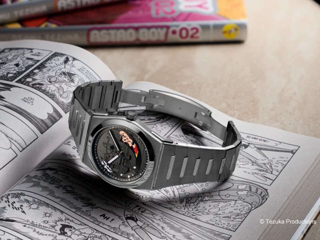
Manuel Emch still remembers rushing home from school to catch the latest Astro Boy episode. That childhood ritual, shared by millions across generations, now finds its way onto your wrist through Louis Erard’s latest collaboration with Tezuka Productions. This isn’t just another licensed character watch. It’s a thoughtful exploration of how nostalgia, craftsmanship, and cultural heritage can coexist on a 40mm canvas.

Designer: Louis Erard x Tezuka Productions

The Dial: Layered Storytelling in Metal and Color

The dial construction here deserves your attention. Louis Erard didn’t simply print Astro Boy’s image and call it done. Instead, the brand created a multi-layered stage where each element exists in three-dimensional space. The base dial carries Metro City’s vertical satin-brushed finish, stamped with the iconic urban backdrop that defined Osamu Tezuka’s futuristic vision. Those parallel lines create texture and depth while staying subtle enough that Astro Boy and the villain read clearly. The stamped buildings and urban elements provide context without becoming busy. This textured foundation provides depth before you even notice the characters.
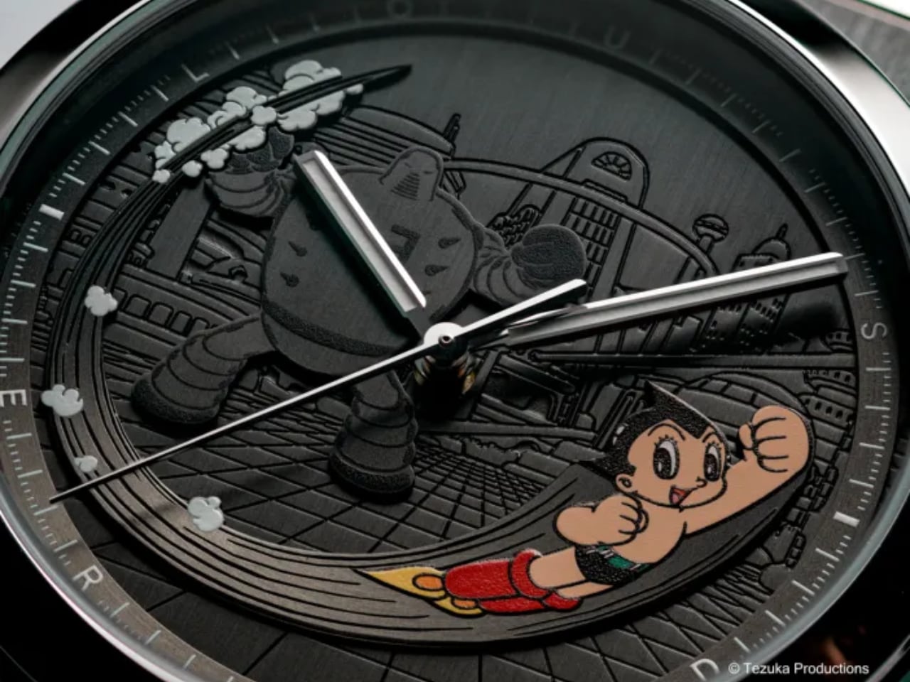
Astro Boy himself appears as a fully applied element, not a flat print. He bursts from the six o’clock position in full color, captured mid-flight with his signature red boots and determined expression. Behind him, a monochrome robot villain looms in black, creating visual tension between hero and threat. The satin-brushed finish on these applied elements creates distinct shadow lines that change with wrist angle. This isn’t decorative layering for its own sake. Louis Erard built genuine depth into the dial architecture, with the Metro City backdrop recessed, the robot villain raised slightly, and Astro Boy’s appliqué sitting highest. The hands float above all of it without visual interference.

The artwork comes from Tezuka Productions’ archives, based on early illustrations by the manga master himself. A raised circular rehaut frames the scene, printed with a white minutes track and filled with Super-LumiNova C1 for blue nighttime glow.
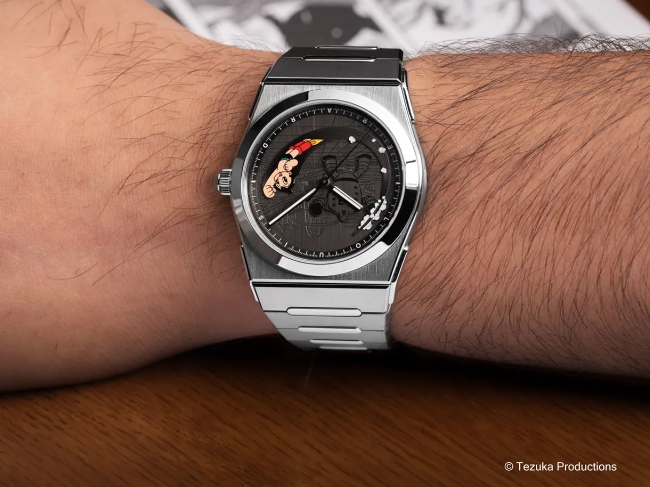
What makes this dial work is restraint. There are no indexes cluttering the composition. No date window interrupting the narrative. The rhodium-plated hands with diamond-cut edges float above the scene without competing for attention. With Super-LumiNova C1 on just the hands and minutes track, the watch remains legible at night while Astro Boy stays visible in color against the dark dial. If they’d added lume plots or traditional indexes, this balance would collapse into visual noise. The blue glow complements rather than competes with the manga artwork. Louis Erard understood that when your dial tells a story, everything else should step back and let it speak.

The Case: 2340 Architecture Meets Hybrid Materials

The 2340 case represents Louis Erard’s first integrated bracelet design, and it brings legitimate technical interest to the table. The case body uses brushed titanium, keeping weight down to levels that disappear on your wrist. The crown, bezel, and lugs switch to polished steel, creating contrast without the flashy two-tone look that dominated the 1980s.
At 40mm in diameter and 8.95mm thick, the proportions work for most wrists without making compromises. The case shape follows the integrated bracelet design language that’s dominated sports watch design since the Royal Oak rewrote the rules. Louis Erard’s interpretation doesn’t reinvent this formula, but the execution is clean. The transitions from case to bracelet flow smoothly, and the finishing quality on the alternating brushed and polished surfaces shows attention to detail.

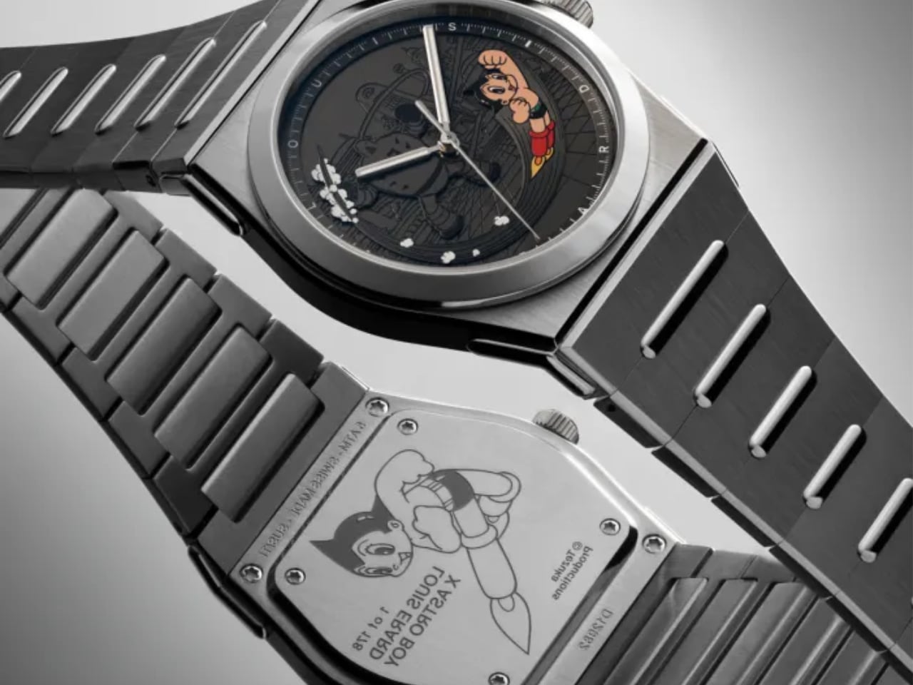
The sapphire crystal carries anti-reflective treatment on both sides, which matters more than most people realize. When your dial features this much visual information, glare becomes your enemy. Louis Erard addressed this properly. The caseback features a custom Astro Boy engraving showing him in his classic flying pose with the Louis Erard collaboration text. The engraving quality shows crisp detail with good depth, a nice touch for collectors even if you won’t see it during normal wear.

Water resistance sits at 5 bar (50 meters), which translates to splash resistance in practical terms. This isn’t a dive watch, and the hybrid titanium-steel construction makes that clear. It’s designed for daily wear with careful handling near water.

The Bracelet: Three Years of Development Shows

Louis Erard spent three years developing this integrated bracelet, and that investment shows in the details. The links combine brushed titanium and polished steel in a pattern that mirrors the case treatment. The 2340 case handles the integrated bracelet challenge by echoing the case angles without copying Genta’s Royal Oak geometry. The alternating brushed and polished surfaces on both titanium and steel create visual rhythm down the bracelet, and the link width taper from 28mm at the case to 20mm at the clasp looks proportional rather than forced.
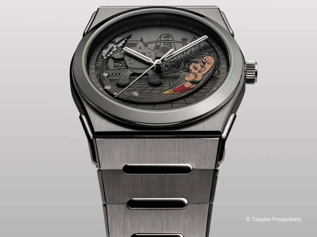
Each link tapers from 28mm at the case to 20mm at the clasp, following the gradual taper that helps a watch hug your wrist naturally. The butterfly folding clasp uses a spring-blade mechanism rather than traditional push-button deployment. This approach provides smoother operation and reduces the number of moving parts that could wear over time. Torx screws handle the bracelet attachment points, signaling serious intent about secure attachment over easy adjustment. You’ll need the proper tool for sizing, but you also get more secure connections than traditional spring bars.

The bracelet length measures 220mm total, accommodating most wrist sizes with proper link removal. The titanium construction keeps overall weight down despite the integrated design’s typically chunky appearance. When you pick up the watch, the lightness surprises you given the visual mass.

What This Collaboration Actually Means

Louis Erard positions this release as more than a one-off character watch. Manuel Emch frames it as the first step in a long-term creative direction, working with cultural references that shaped his generation. The 2340 case becomes a canvas for these collaborations, with Astro Boy leading a planned series that will include video games and other cult icons from collective memory.
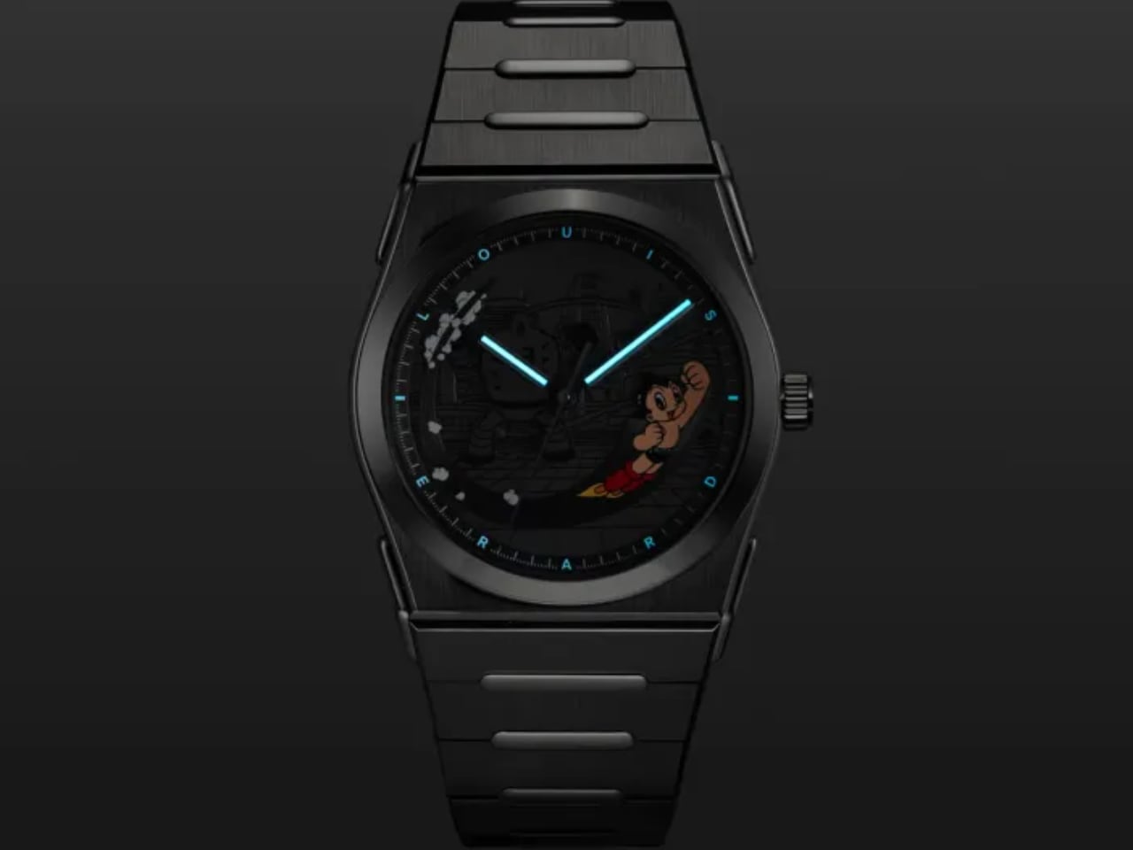
The limited production of 178 pieces ties to Astro Boy’s atomic power level in the original manga (100,000 horsepower, which somehow equals 178 pieces in collaboration logic). At CHF 3,990 before taxes, the pricing sits below the CHF 4,000 threshold while delivering legitimate watchmaking through the Sellita SW300-1 élaboré grade movement. That automatic caliber provides 56 hours of power reserve and runs at 28,800 vibrations per hour, which translates to reliable daily performance.

The Design Verdict

This collaboration succeeds because it respects both the source material and the craft of watchmaking. Louis Erard understood that dial storytelling requires hierarchy, contrast, and negative space. They resisted the temptation to fill every millimeter with manga references, keeping the composition focused on Astro Boy’s dynamic pose against a thoughtfully detailed backdrop. Tezuka Productions provided original artwork rather than generic licensing assets. Louis Erard invested in three-dimensional dial construction rather than taking the easier print-and-forget route. The 2340 case architecture provides a solid foundation that could support future collaborations without feeling like a gimmick.
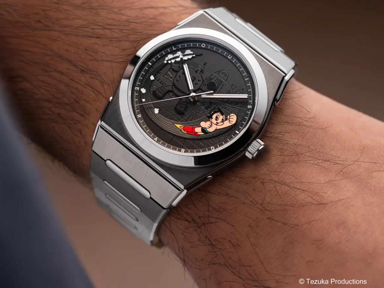
The watch will connect most strongly with the generation that grew up watching Astro Boy, the same people who now have the disposable income to spend four thousand Swiss francs on nostalgia. But even without that emotional connection, the technical execution and finishing quality deliver enough substance to justify the price. The dial craftsmanship alone demonstrates why Swiss watchmaking maintains its reputation, even in an entry-level collaboration piece.

Louis Erard x Astro Boy Ref. 35123TA23.BMT12 arrives as a 178-piece limited edition at CHF 3,990. It launches with the 2340 integrated case in brushed titanium and polished steel, housing a Sellita SW300-1 automatic movement. The applied dial elements create three-dimensional storytelling depth, while the three-year-developed bracelet proves that even character collaborations can demonstrate legitimate horological craft.

The post Louis Erard Brings Astro Boy to Swiss Watchmaking first appeared on Yanko Design.
Casio ring watch offers a playful yet practical way to tell the time

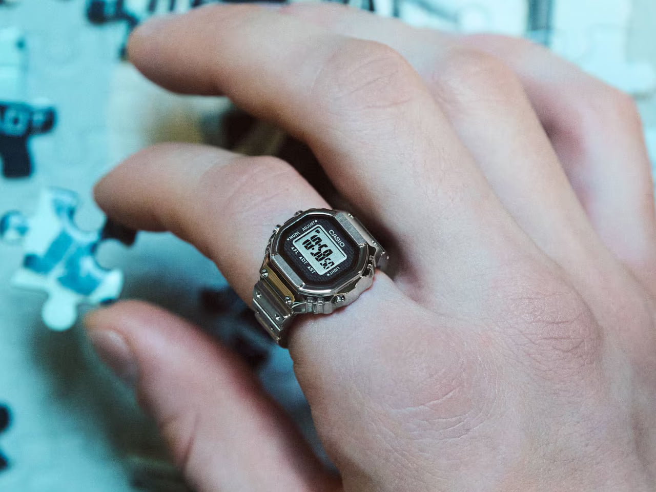
Smart rings are now being positioned to replace smartwatches but only in terms of tracking the wearer’s health and activities. They can’t tell the time like smartwatches, at least not until they’re able to show a tiny display that’s still readable. There might be a way around that limitation, but it will make you look like you’re wearing a shrunken wristwatch on your finger.

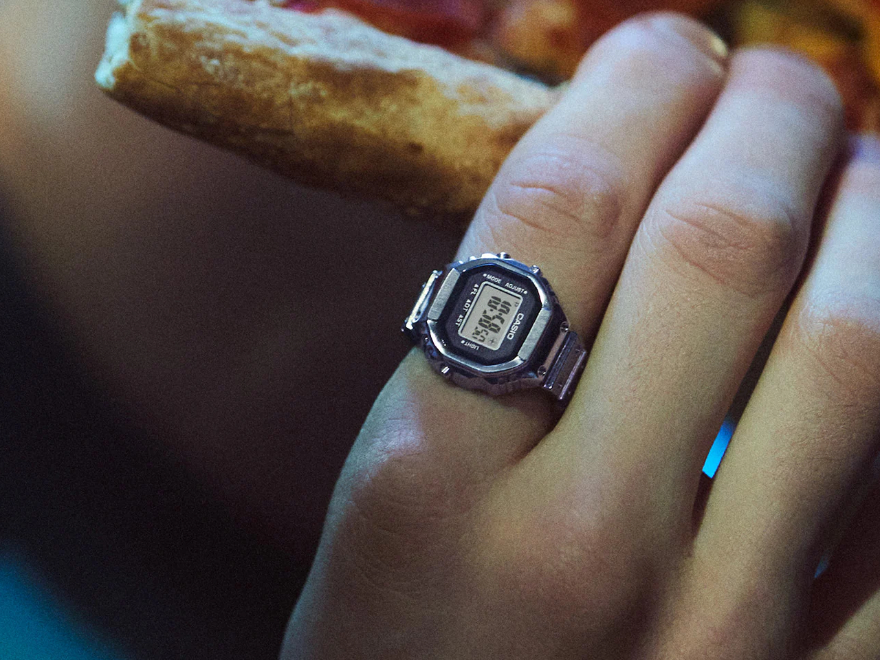
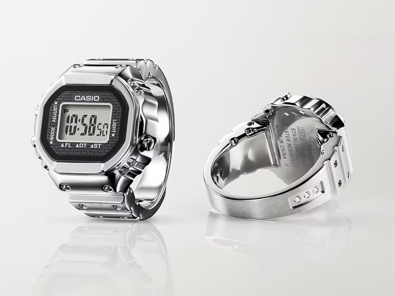
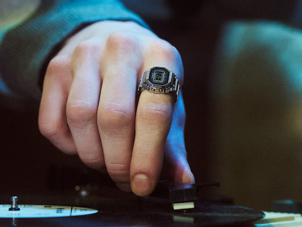
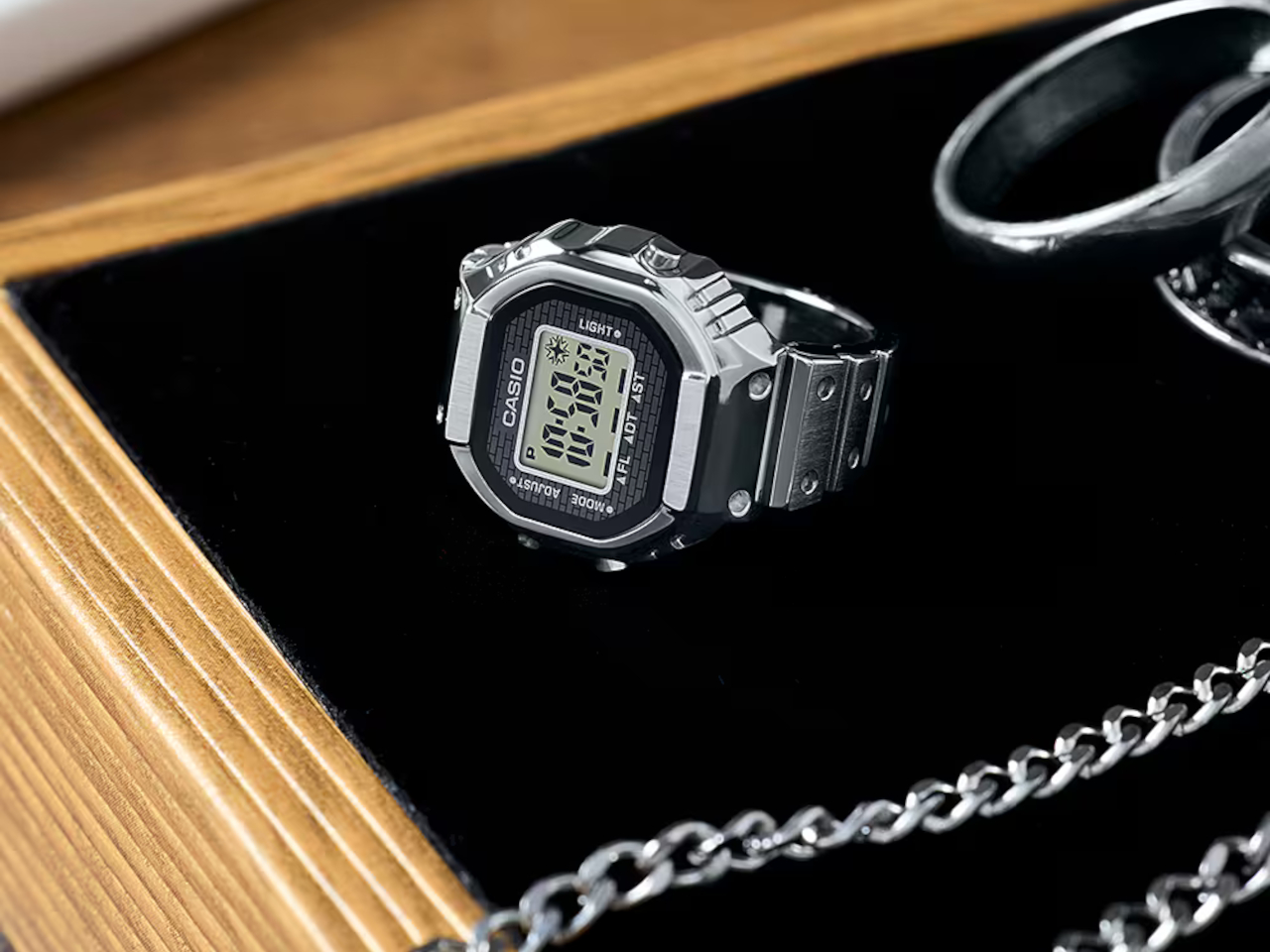
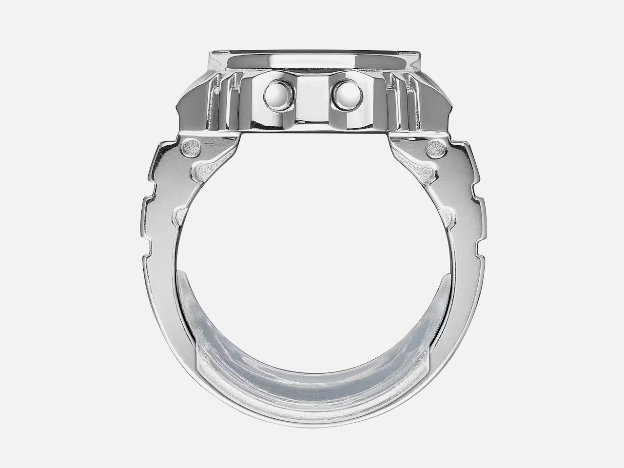
That’s pretty much the case for the new Casio Ring Watch CRW-001-1JR, practically a miniature version of the classic Casio digital watch. It has a full watch face, just smaller, that you can clearly read at a glance. Ironically, it doesn’t have any sensors, but that could be a possibility in the future given how large it is anyway.

Designer: Casio

To be really blunt, this “finger watch” is more of a cute and funny novelty than something you’d really want to depend on. It’s meant to celebrate the 50th anniversary of Casio’s digital watch business, which is why it tries to stick as close as possible to that design. It is also functional, though comfortable use is obviously out of the question.

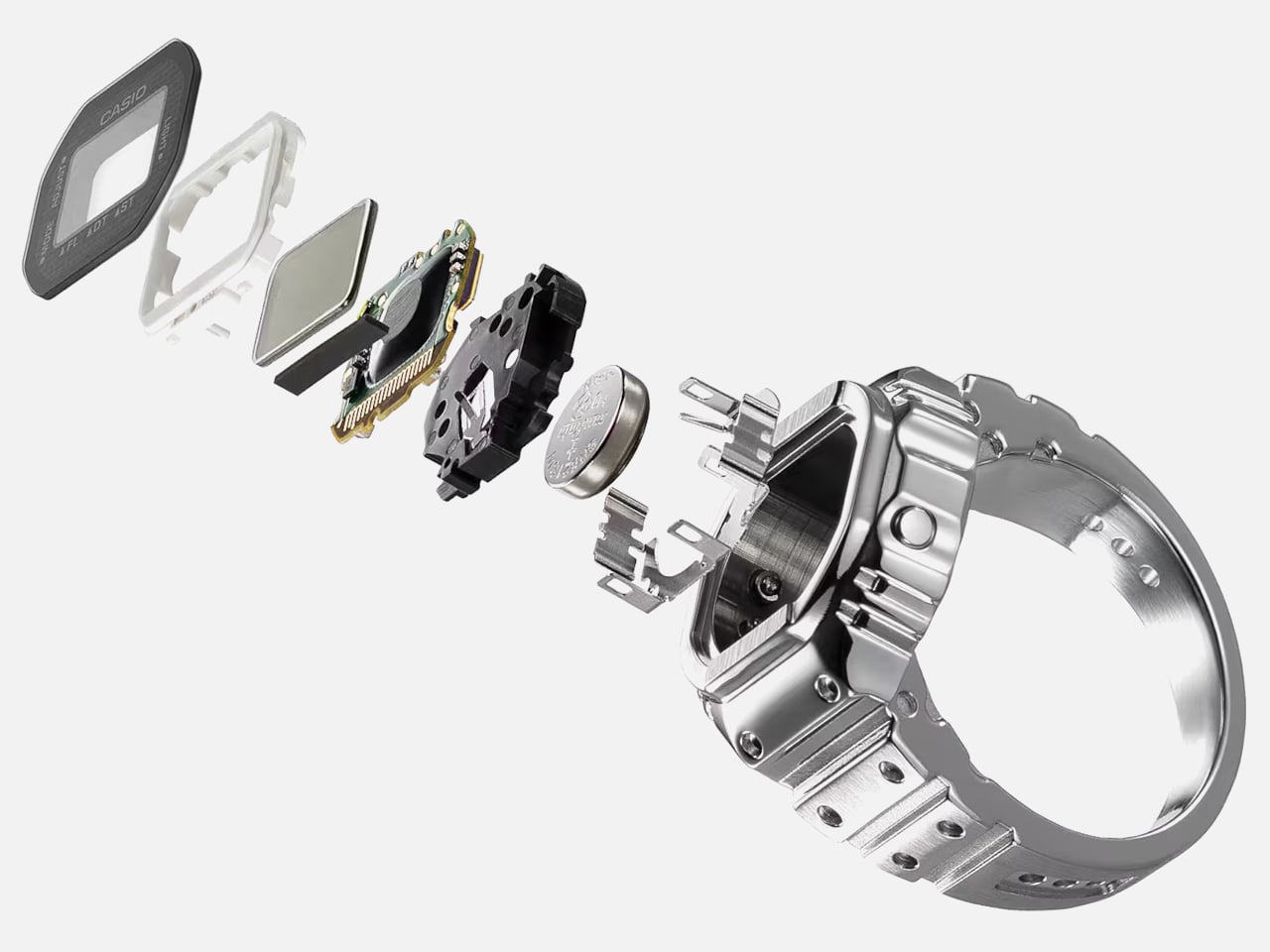
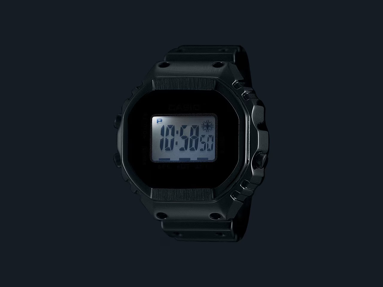
With a display that’s almost an inch in size, the Casio Ring Watch manages to squeeze in a 7-segment LCD that can display hours, minutes, and seconds. There are also multiple modes, including dual-time, alarm, and a stopwatch. Yes, it has an alarm, but rather than cramming a tiny and terrible speaker, it just flashes the screen to get your attention.

The Casio Ring Watch is roughly 1/10th the size of a regular Casio digital watch, but to accommodate that unusual design, which includes three physical buttons, the company opted to have a single ring size. It’s equivalent to US size 10.5 or 20mm inner diameter, but the package includes two spacers for those with smaller finger sizes. Unfortunately, that design does mean that larger fingers are out of luck.

This odd “smart” ring is more of a collectible product rather than an everyday wear anyway. Since we humans use our hands a lot, such a large ring will get in our way often. It is advertised to be waterproof, though, but the exact rating isn’t disclosed. It runs on a replaceable battery that is also stated to last at least two years before needing a substitute. The Casio Ring Watch will be launching next month with an SRP of 19,800 JPY, roughly $128. International availability is still unknown.

The post Casio ring watch offers a playful yet practical way to tell the time first appeared on Yanko Design.
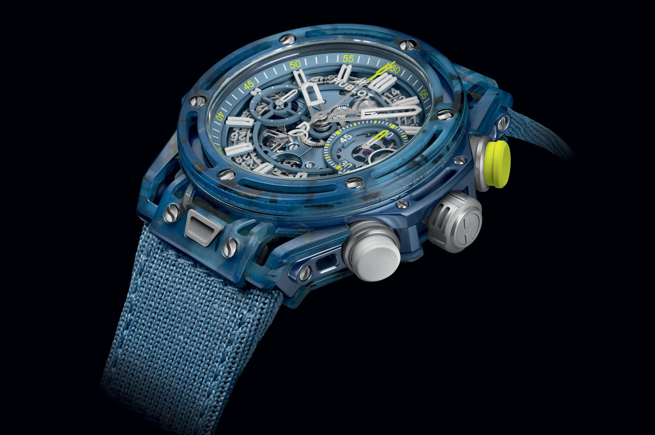
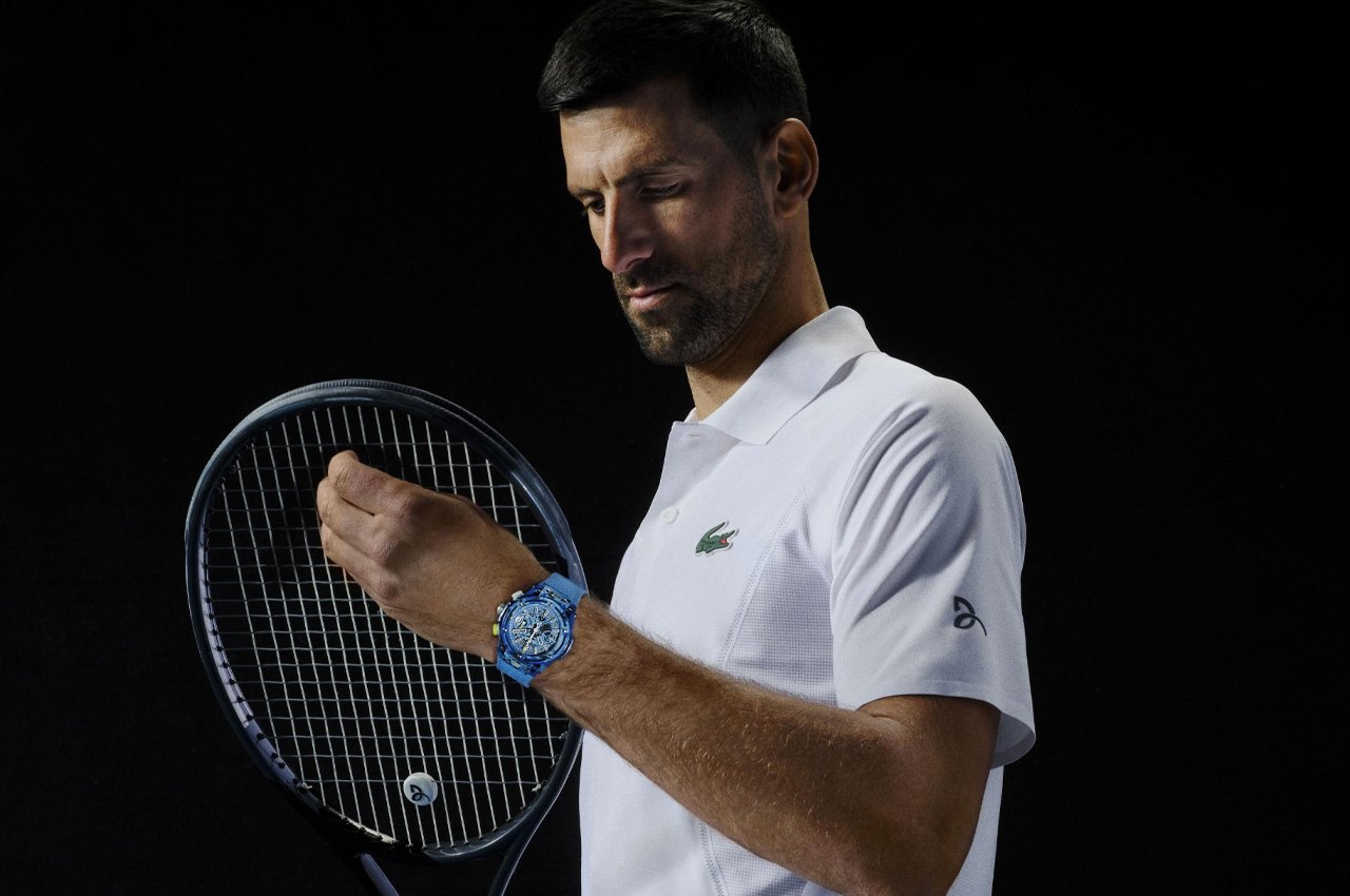
Hublot celebrates tennis legend Novak Djokovic with Big Bang Unico made from his racquets and polos

There are two interesting facts about the tennis GOAT: Novak Djokovic. He is one of the only five players in the history of the game to win all four grand slams and the Olympic gold medal in singles event. And that he is the brand ambassador of the watchmaking legacy at Hublot. The horologist has been on the wrist with the achievements of the 24-time grand slam winner Djokovic since they served the partnership ace in 2021.

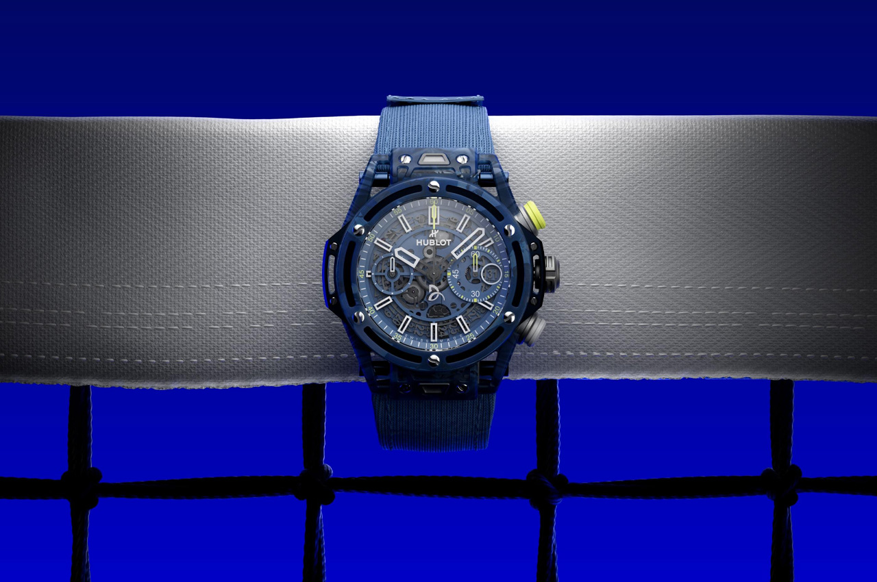
Hublot is now substantiating its commitment toward the Serbian legend and honoring his achievements – including the Golden slam and Olympic medal at the gaming extravaganza in Paris – with the launch of Big Bang Unico Noval Djokovic. The watch inspired by Djokovic’s record-breaking achievements is Hublot’s attribute to the tennis great’s agility on the court and its inclination toward sustainable innovations in watchmaking.

Designer: Hublot

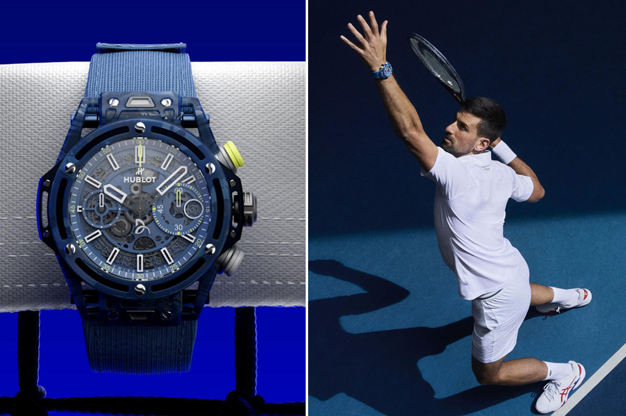
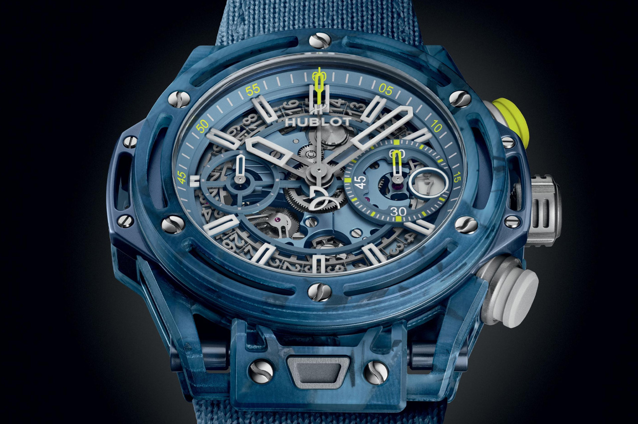
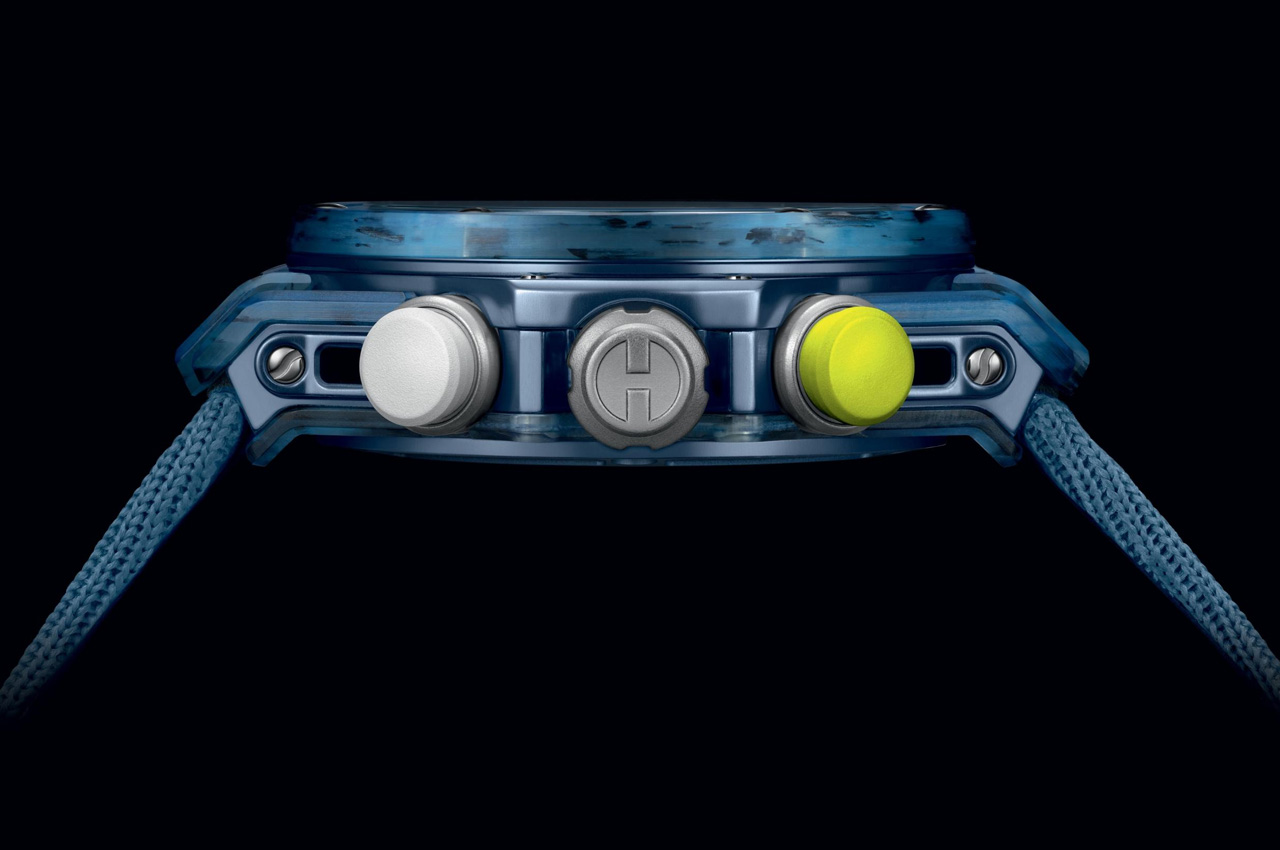
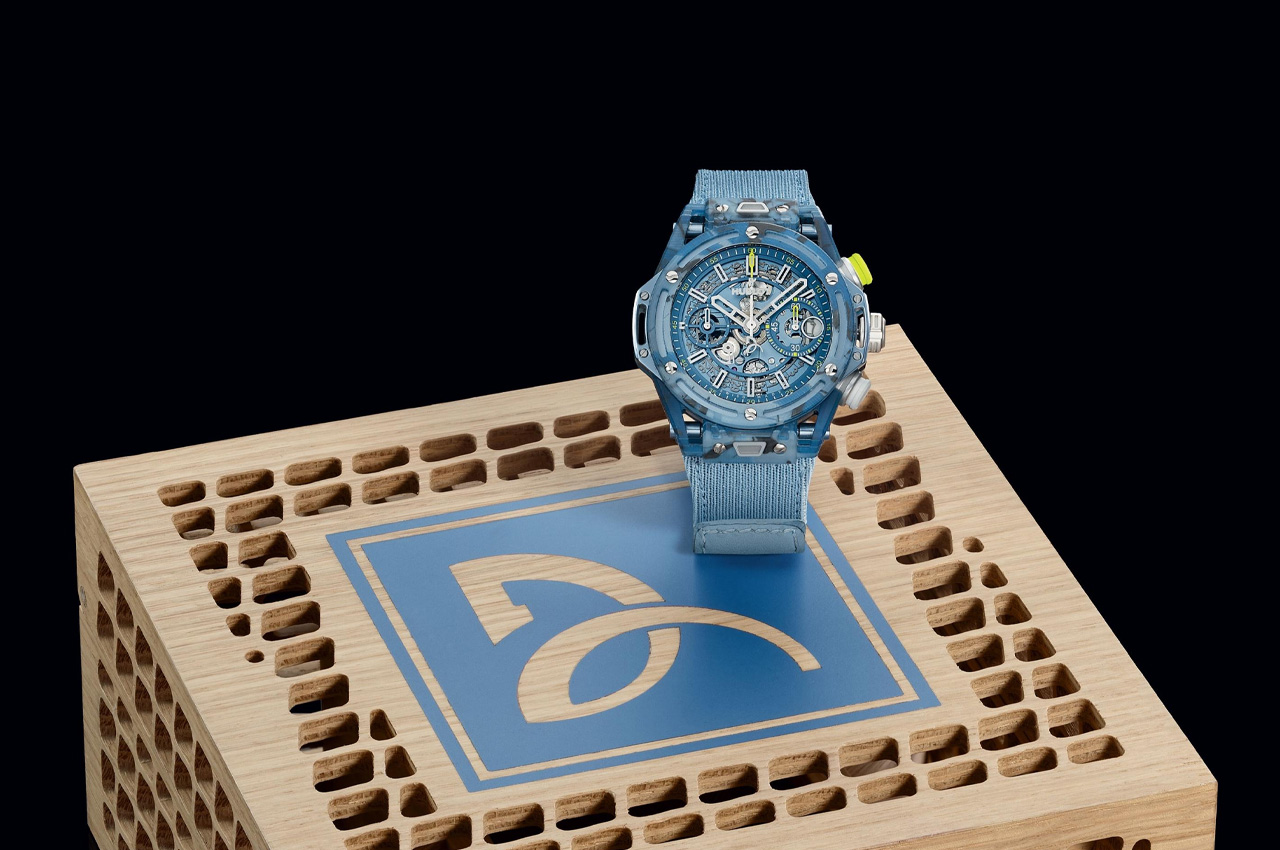
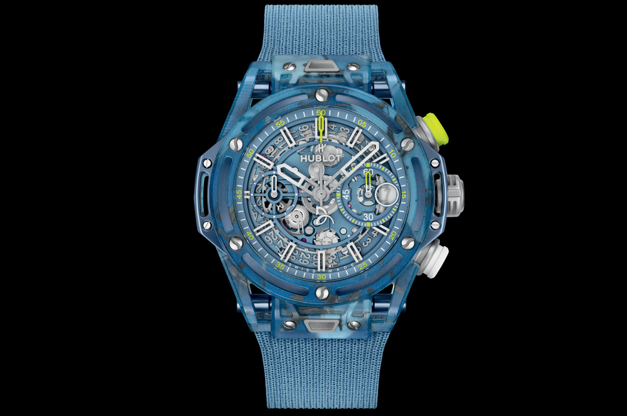
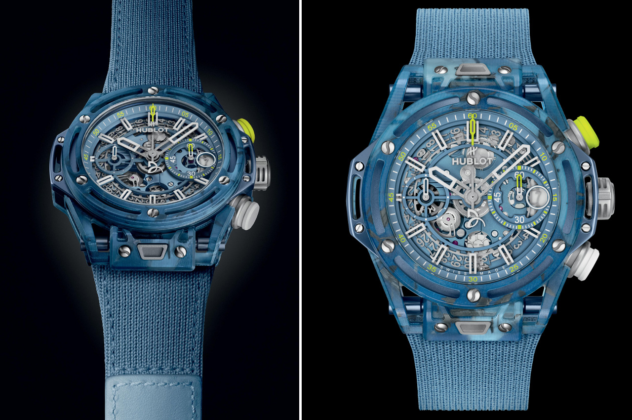
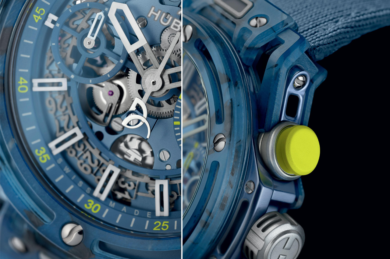
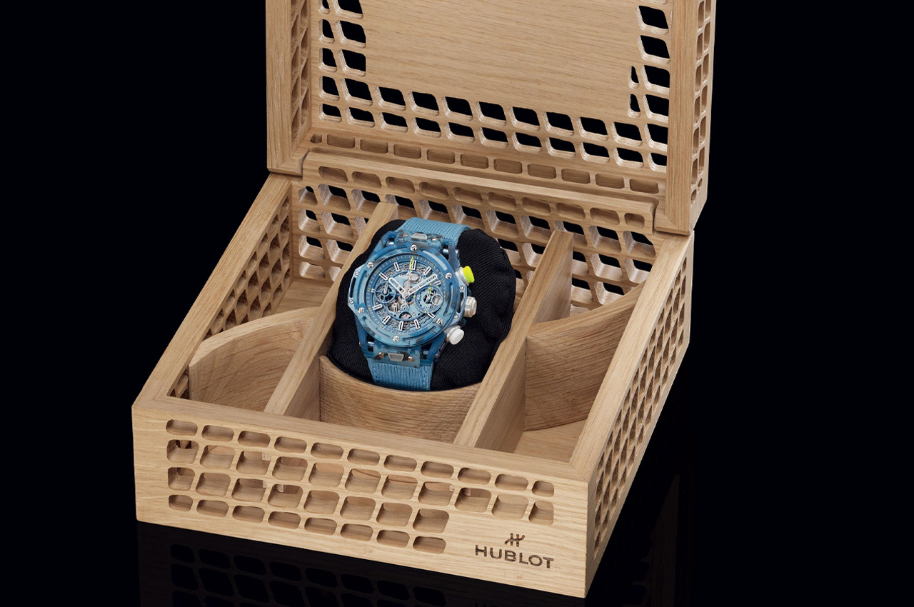
To that accord, the Big Bang Unico Novak Djokovic has been made from parts of his actual rackets and on-court kits. The 42mm case Hublot with Djokovic’s name, measures 14.5mm at the thickest point, and features an epoxy resin base with quartz powder reinforcement. It has been fused with the recycled fragments of 25 HEAD racquets and 32 Lacoste polos (17 dark blue and 15 light blue) that Djokovic used in the 2023 season to complete the matte blue recycled composite case and bezel of the watch.

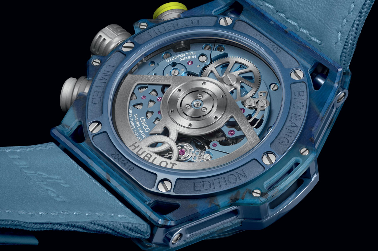
The skeletonized dial of the watch, with yellow seconds pusher and bezel screws curved to mimic a ball, makes clever references to tennis. It rests under a tempered Gorilla glass that replaces the sapphire glass from the previous Big Bang’s. The Big Bang Unico Novak Djokovic has been created lighter than a tennis ball at just 49.5g and is powered by a PVD-finished in-house self-winding Unico manufacture chronograph movement offering up to 72 hours of power reserve.

While Djokovic fans would do anything to get this piece of historic relevance on their wrist, not all would have the pleasure of it. Hublot strictly limits production of the Big Bang Unico Novak Djokovic to 100 examples at AUD78,700 (approximately $51,000) each. If you happen to chance upon one, you will have the option to take it home on one of the four straps: elastic sweatband, Velcro strap, white rubber strap, and a Lacoste strap.

The post Hublot celebrates tennis legend Novak Djokovic with Big Bang Unico made from his racquets and polos first appeared on Yanko Design.

Casio calculator watch pays homage to the world’s first pocket calculator

It’s almost too easy to take for granted the conveniences we enjoy today thanks to modern devices like computers and calculators. Calculators might be a common sight these days, even on smartphones as a pre-installed app, but there was actually a time when these counting machines were only found in offices. Their bulky designs and expensive components limited their availability to businesses that could afford them, forcing other people to depend on manual calculations.

The first generation of personal calculators, large as they may be by today’s standards, truly revolutionized this industry, making it easier for professionals, students, and practically anybody to make complicated calculations in just seconds. To recognize one of these trailblazers, Casio just released a new version of its odd calculator watch, taking its design cues from its own Casio Mini pocket calculator from the 70s.

Designer: Casio

Wristwatches that cram tiny calculator keys in a small space aren’t exactly new. Whether they’re actually practical or convenient is hardly a concern, as they give watch lovers and Casio fans something to cherish. Especially in an age where everyone can use their phones for the same purpose, these timepieces become designs that combine nostalgia and novelty in one package.

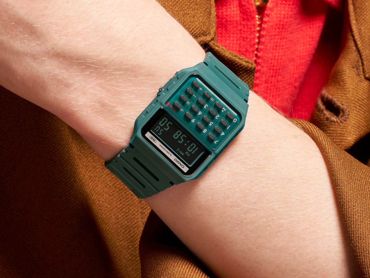
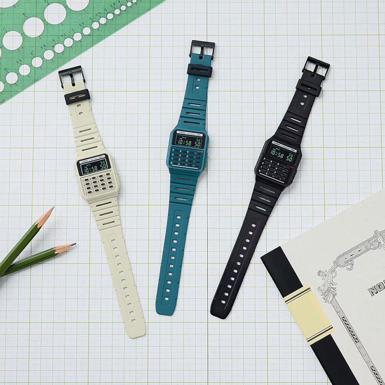
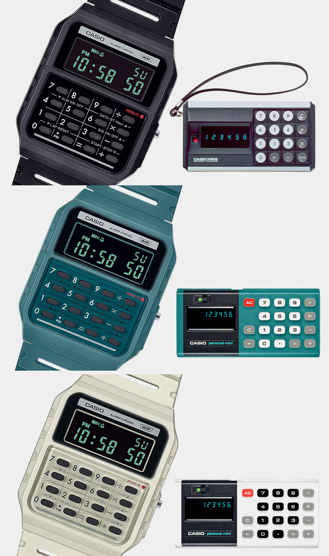
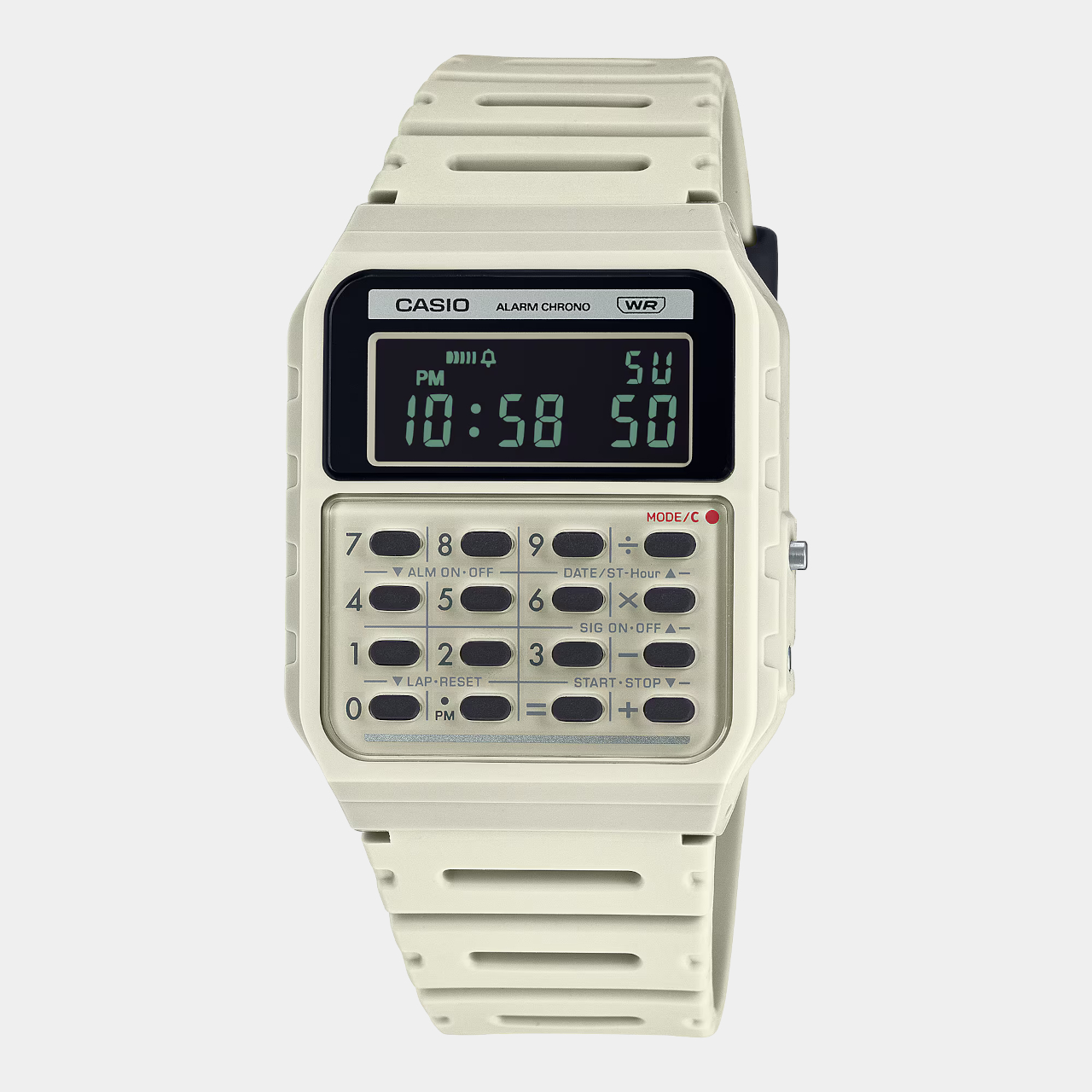
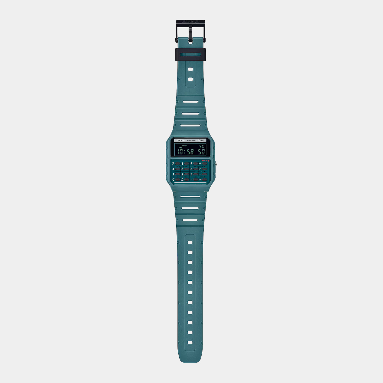
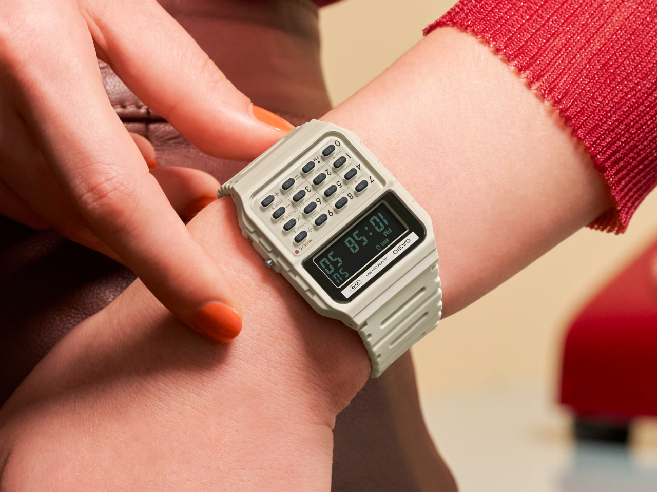
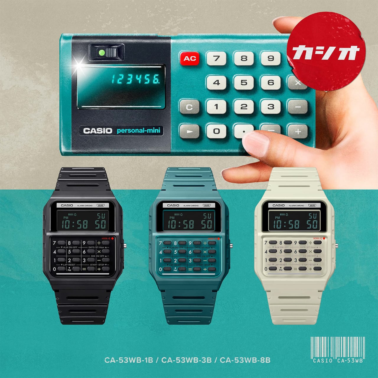
The new arrivals to this set don’t actually add new functionality, which would ruin the charm of this device, but tweak the design a bit for an even more retro look. The Casio CA-53WB watches specifically adopt the design elements of the Casio Mini from 1972, starting with the three color options available back in 1972: ivory, black, and blue-green. Unlike the other Casio calculator watches, these three use green text on a negative LCD, just like those old-school displays.

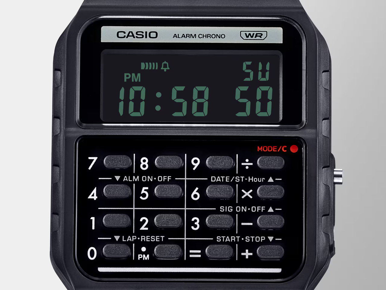
There are also more subtle design cues that might be more familiar to those who remember the original calculators. The number buttons, for example, are separated by grid lines, and the mode indicator uses a red color to emulate the power indicator of the old calculator.

In terms of functionality, the Casio CA-53WB is exactly like the other models, supporting up to eight digits for calculations and providing features like a stopwatch and an alarm. One modern improvement in the design is the use of bio-based resin for the watch band, reducing the product’s environmental impact. This blast from the past calculator watch costs $36, a few bucks more than the regular Casio calculator watches.

The post Casio calculator watch pays homage to the world’s first pocket calculator first appeared on Yanko Design.
Casio calculator watch pays homage to the world’s first pocket calculator

It’s almost too easy to take for granted the conveniences we enjoy today thanks to modern devices like computers and calculators. Calculators might be a common sight these days, even on smartphones as a pre-installed app, but there was actually a time when these counting machines were only found in offices. Their bulky designs and expensive components limited their availability to businesses that could afford them, forcing other people to depend on manual calculations.

The first generation of personal calculators, large as they may be by today’s standards, truly revolutionized this industry, making it easier for professionals, students, and practically anybody to make complicated calculations in just seconds. To recognize one of these trailblazers, Casio just released a new version of its odd calculator watch, taking its design cues from its own Casio Mini pocket calculator from the 70s.

Designer: Casio

Wristwatches that cram tiny calculator keys in a small space aren’t exactly new. Whether they’re actually practical or convenient is hardly a concern, as they give watch lovers and Casio fans something to cherish. Especially in an age where everyone can use their phones for the same purpose, these timepieces become designs that combine nostalgia and novelty in one package.

The new arrivals to this set don’t actually add new functionality, which would ruin the charm of this device, but tweak the design a bit for an even more retro look. The Casio CA-53WB watches specifically adopt the design elements of the Casio Mini from 1972, starting with the three color options available back in 1972: ivory, black, and blue-green. Unlike the other Casio calculator watches, these three use green text on a negative LCD, just like those old-school displays.

There are also more subtle design cues that might be more familiar to those who remember the original calculators. The number buttons, for example, are separated by grid lines, and the mode indicator uses a red color to emulate the power indicator of the old calculator.

In terms of functionality, the Casio CA-53WB is exactly like the other models, supporting up to eight digits for calculations and providing features like a stopwatch and an alarm. One modern improvement in the design is the use of bio-based resin for the watch band, reducing the product’s environmental impact. This blast from the past calculator watch costs $36, a few bucks more than the regular Casio calculator watches.

The post Casio calculator watch pays homage to the world’s first pocket calculator first appeared on Yanko Design.

MoonSwatch Mission to Earthphase Review: Bringing Earth and Moon Phases to Your Wrist

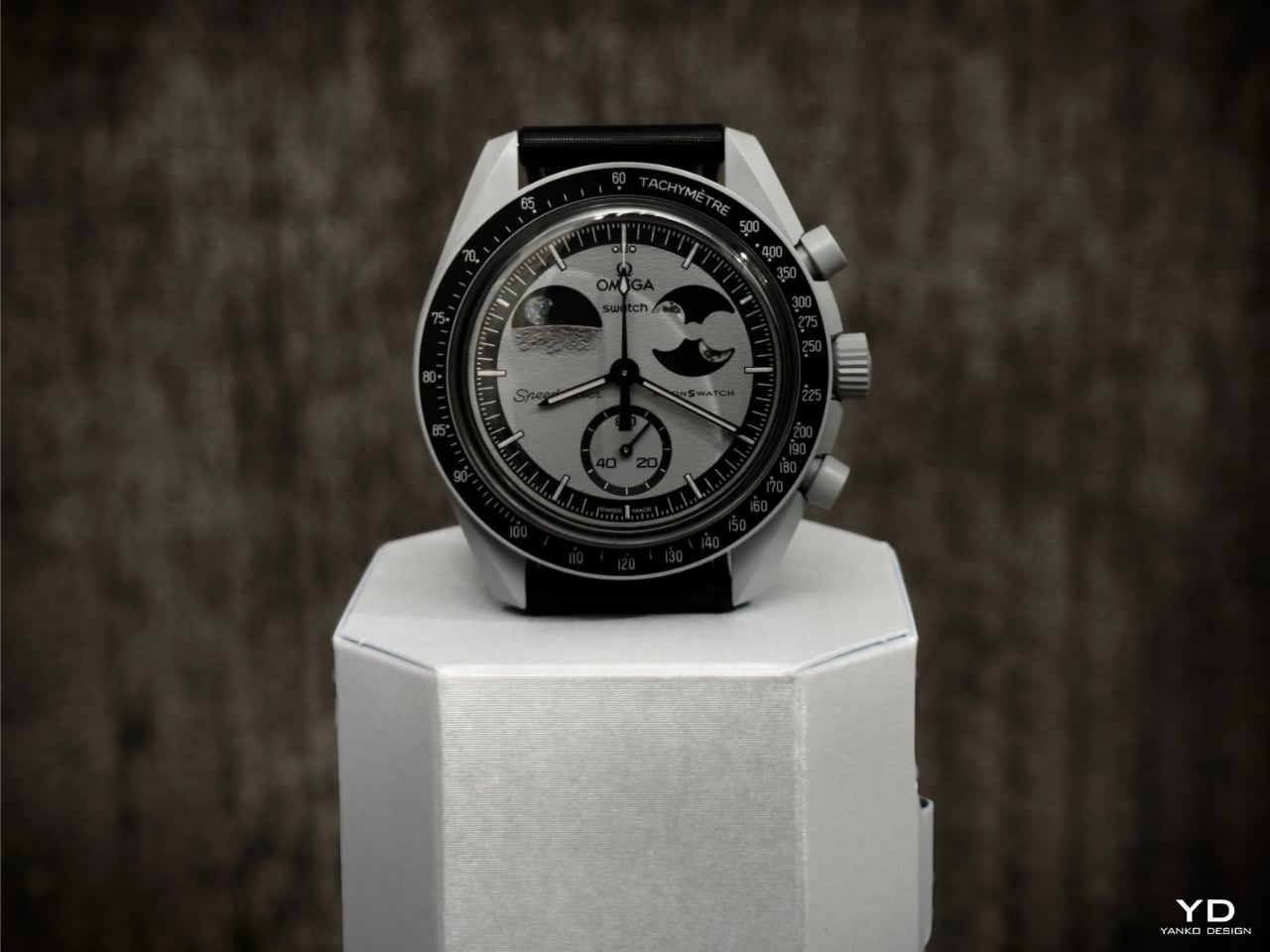
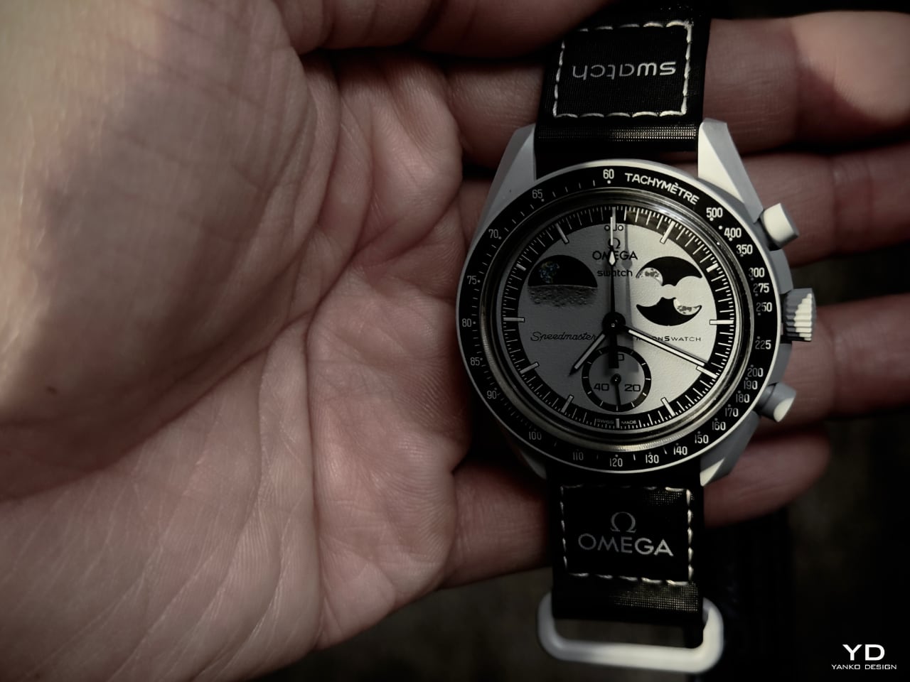
Swatch’s Bioceramic MoonSwatch Mission to Earthphase feels like it was made with a focus on minimalist design—the same kind of style we value at Yanko Design. Its clean, monochromatic light gray and black look perfectly fits a modern, understated approach. This color scheme is my personal favorite. It’s subtle yet makes a strong impression without needing flashy colors or details. Swatch and Omega have managed to create something visually striking while staying grounded.

PROS:


  1. Earth and Moon Phases: Unique, dual-phase display that’s visually engaging.

  2. Monochromatic Look: The gray and black theme is sleek and modern.

  3. Eco-Friendly Bioceramic: Durable and sustainable material choice.

  4. UV-Responsive Earth Phase: Adds a fun glow-in-the-dark feature.

CONS:


  1. Higher Water Resistance: More than 3 bar would improve versatility.

  2. Leather Strap Option: A leather strap alternative would add elegance and versatility.

RATINGS:

AESTHETICS
ERGONOMICS
PERFORMANCE
SUSTAINABILITY / REPAIRABILITY
VALUE FOR MONEY

EDITOR'S QUOTE:

OMEGA x Swatch’s Mission to Earthphase stuns with the world’s first Earth and Moon phase design—bringing the beauty of cosmic cycles to your wrist.

award-icon

Designer: OMEGA x Swatch

From the dial’s lunar-inspired texture to the unique Earth and Moon phase indicators, this watch matches the design we feature at Yanko Design. For anyone who appreciates simplicity with a touch of curiosity, this watch combines style and exploration elements.

Design

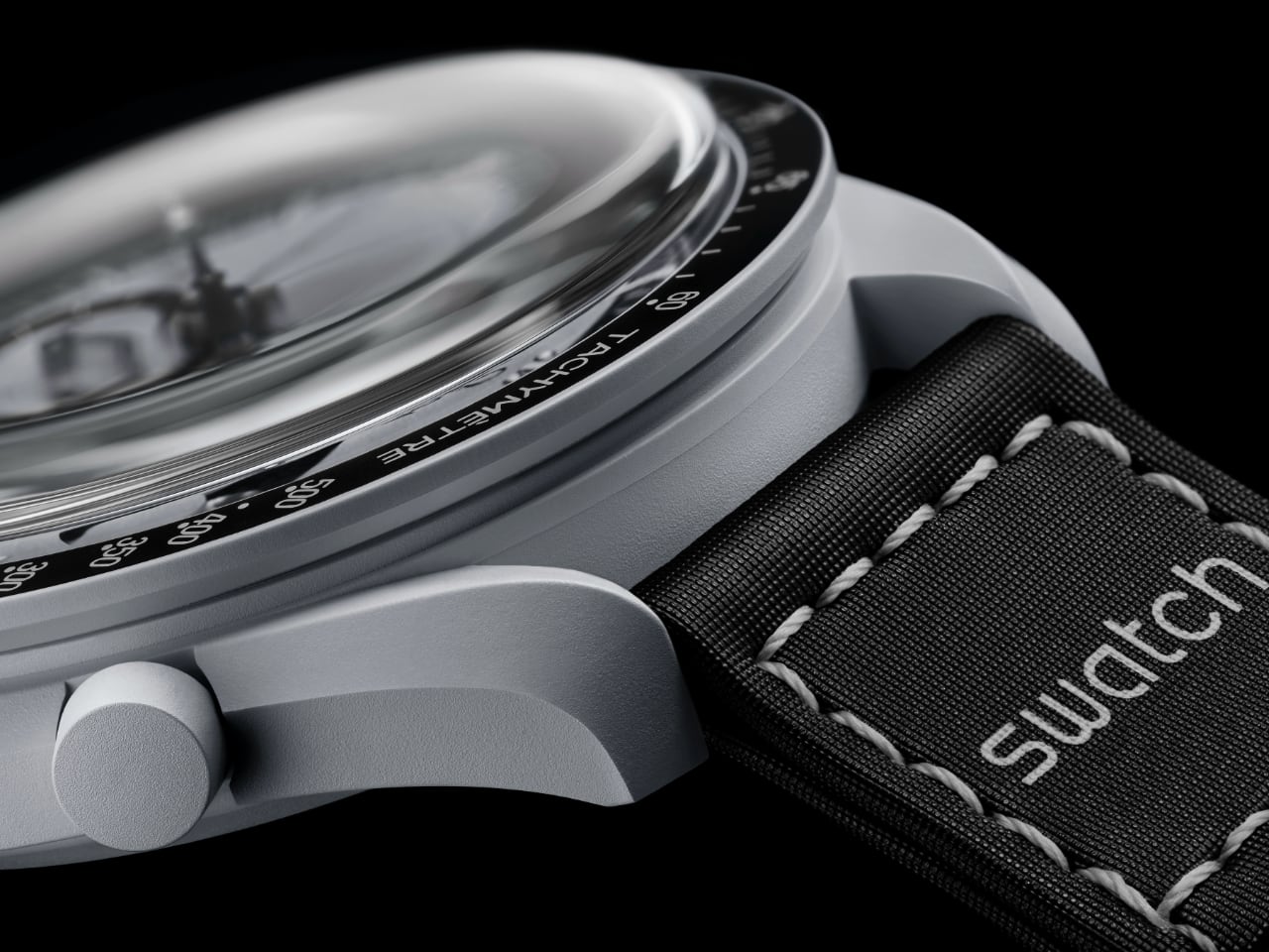
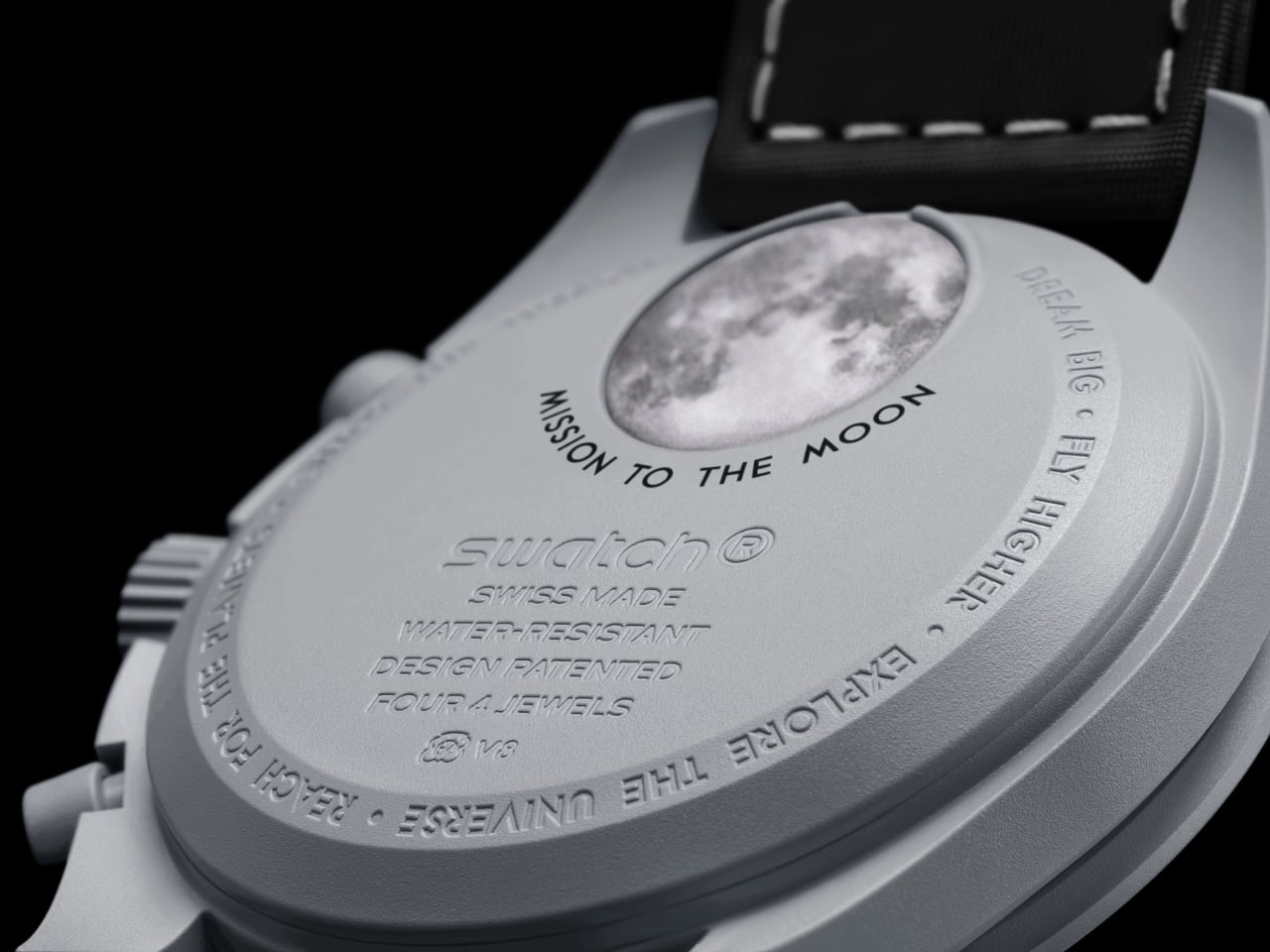
The Bioceramic MoonSwatch Mission to Earthphase combines Swatch’s playful side with Omega’s tribute to space exploration. The case is made from Swatch’s Bioceramic—a mix of ceramic and bio-sourced materials—giving the watch a durable yet lightweight feel. The light gray color sets the stage for the watch’s unique details without overpowering them.

OMEGA x Swatch: MoonSwatch Mission to Earthphase

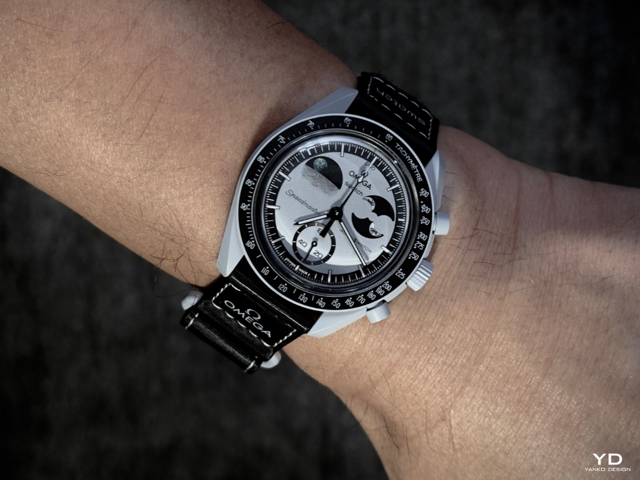
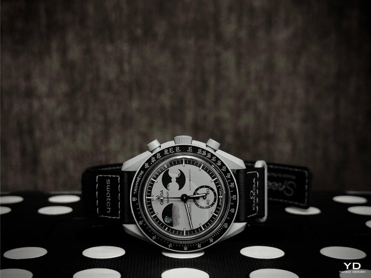
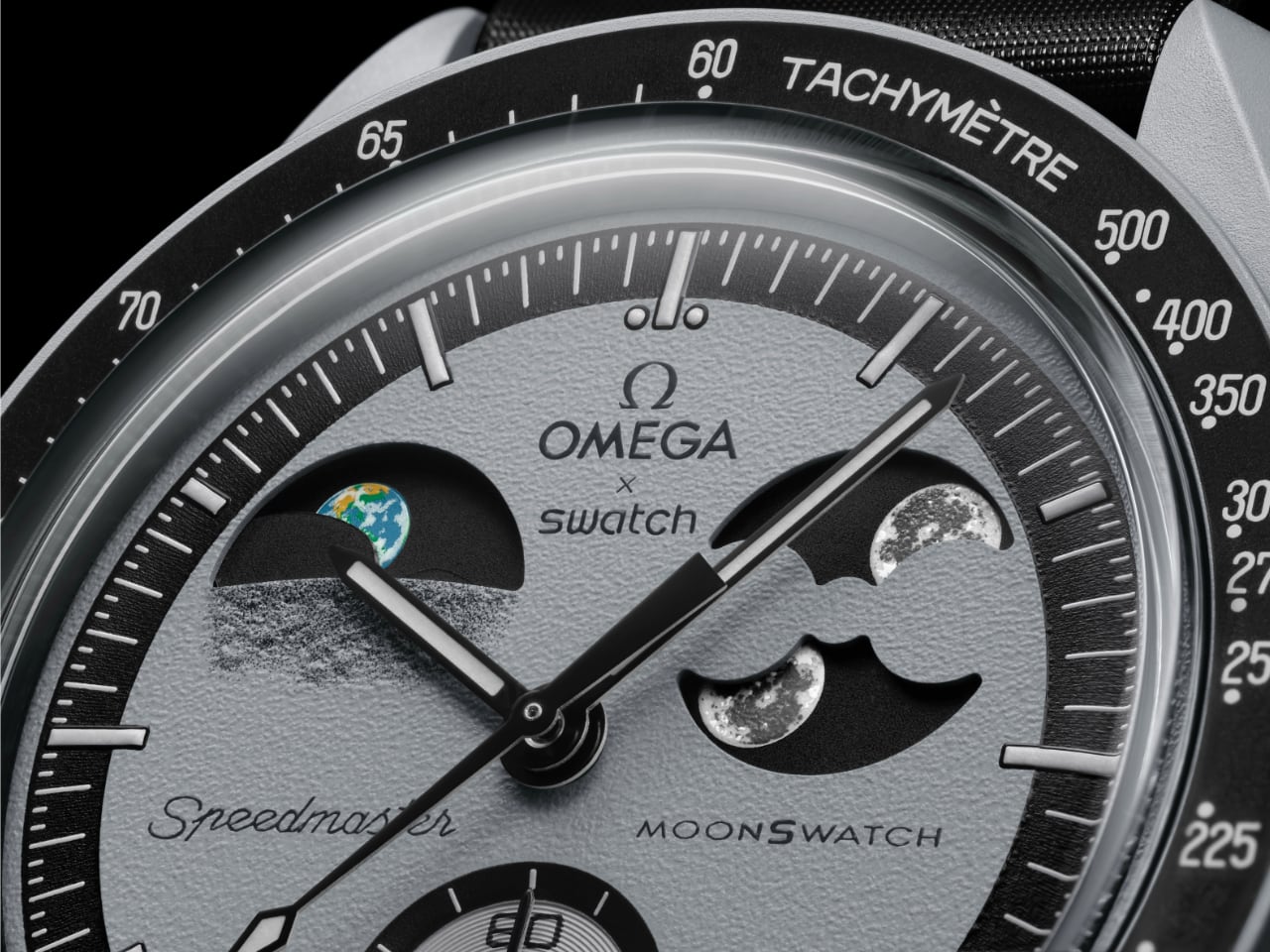
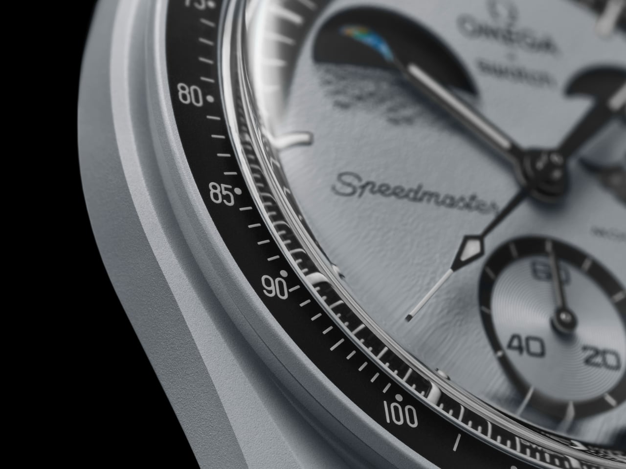
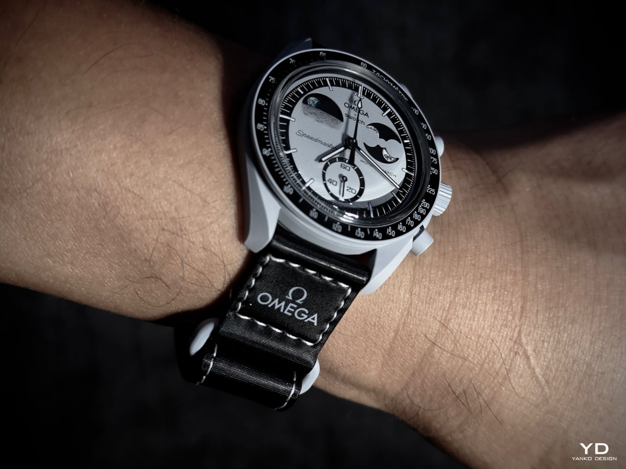
The black tachymeter bezel is a key part of the design, which includes Omega’s iconic “dot over ninety,” a small but recognizable touch connecting this watch to Omega’s history. The black bezel contrasts nicely with the light gray case, improving readability and adding depth to the look. Swatch’s attention to detail shines through on the dial, with a grainy, lunar-like texture achieved through digital printing. This adds a sense of depth and a hint of the Moon’s rugged surface.

Image: OMEGA x Swatch

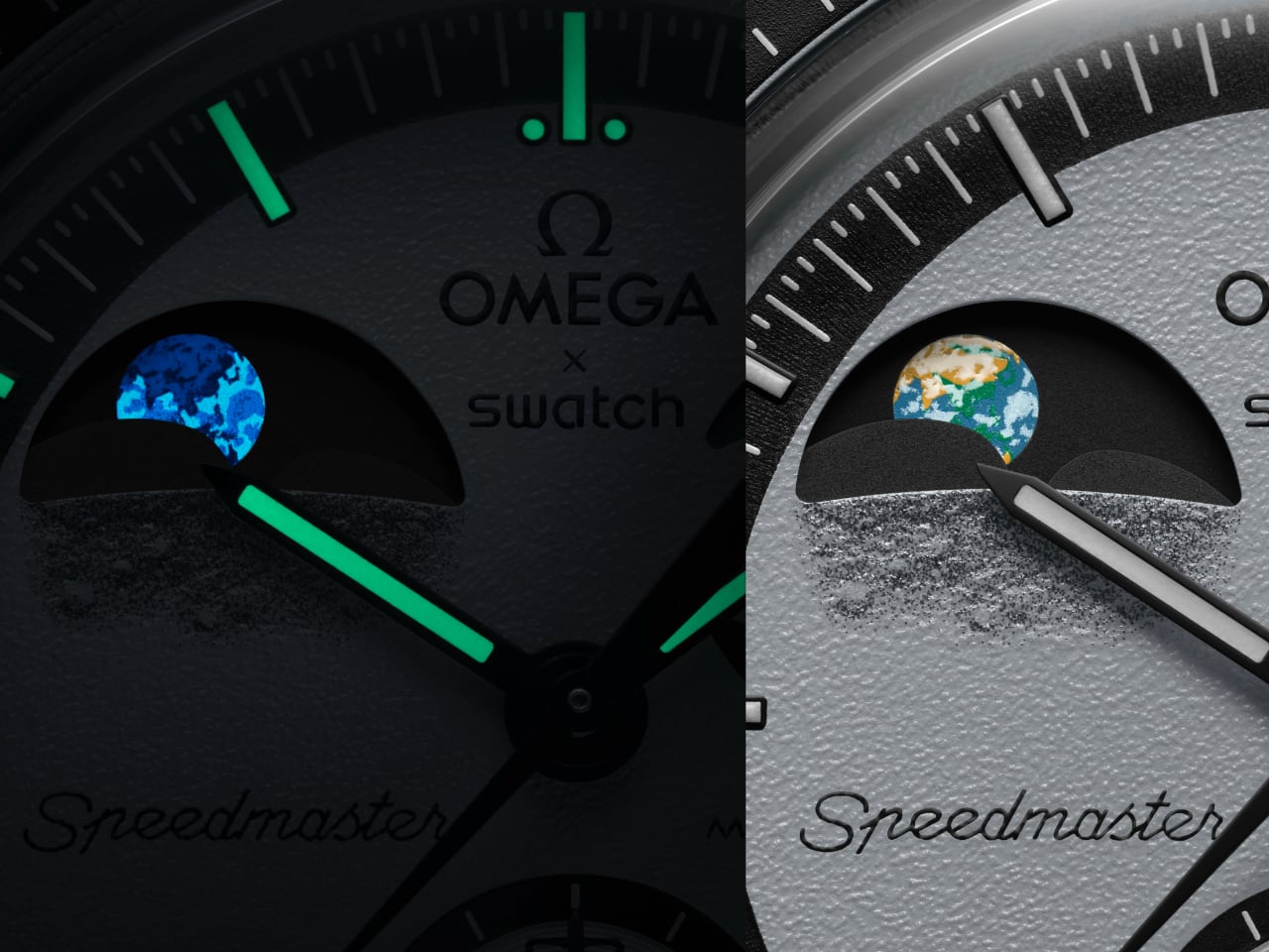
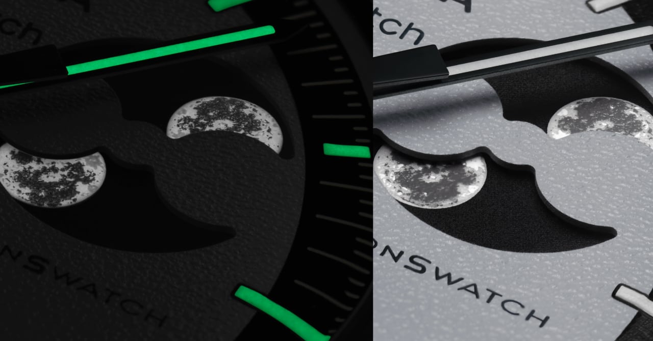
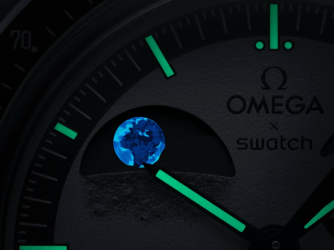
The dual-phase indicators bring the design to life. At two o’clock, the Moon Phase shows how the Moon looks from Earth, while at ten o’clock, the Earth Phase shows Earth as seen from the Moon. This Earth indicator is a Swatch patent, with colors that reflect the oceans, forests, and deserts. It even glows under UV light, adding a cool effect in dark settings. The two indicators move in opposite directions, showing the relationship between the Earth and the Moon and following a 29.5-day cycle.

Image: OMEGA x Swatch

Ergonomics and Dial Clarity

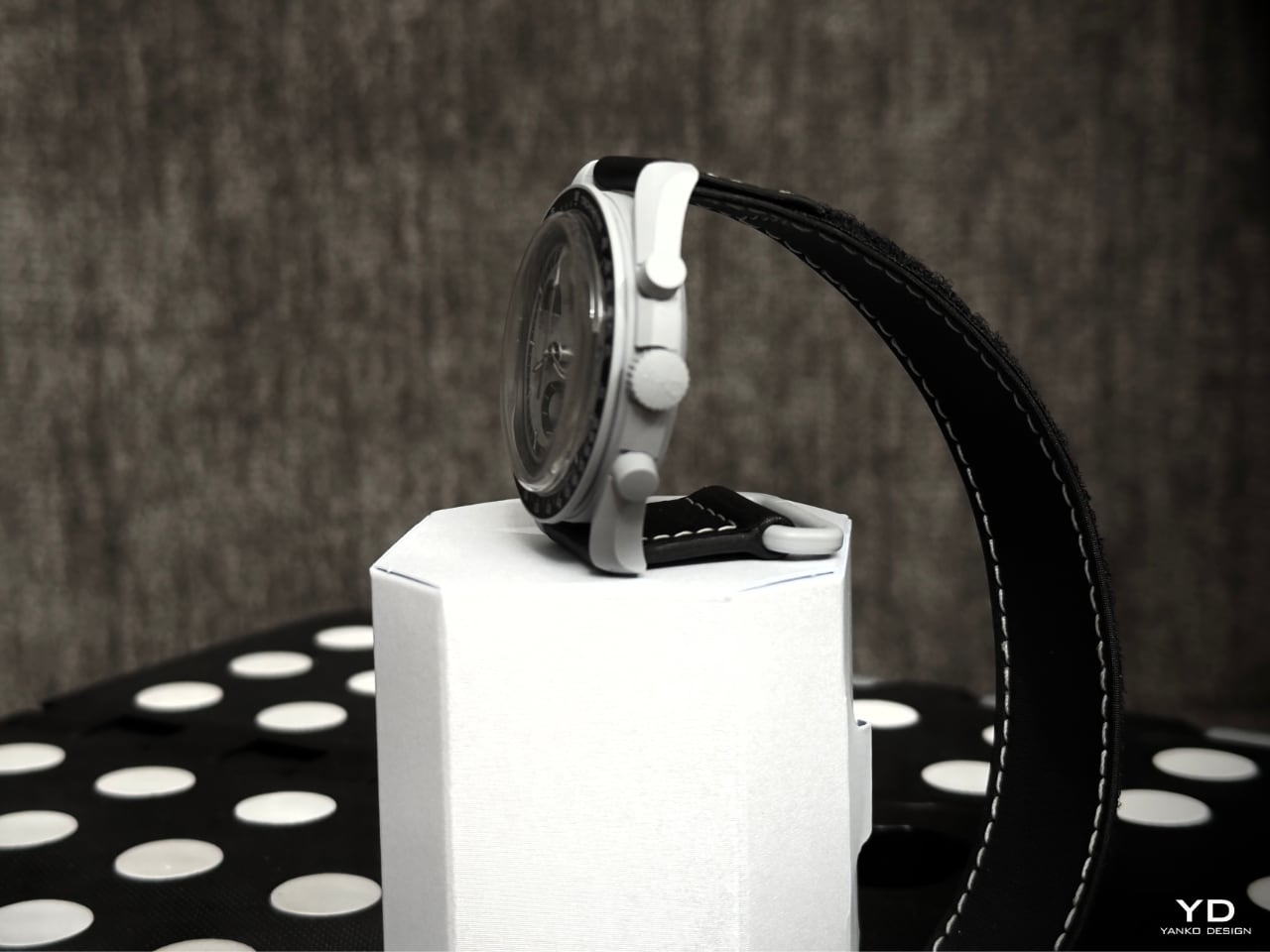
The Mission to Earthphase is comfortable to wear. Its 42 mm case feels balanced, and Swatch’s Bioceramic material keeps the weight down, so it sits nicely on the wrist. Inspired by Omega’s Speedmaster, the asymmetrical case shape makes it easy to wear and adds a unique touch. The rounded edges ensure there’s no discomfort, making it great for daily wear.

OMEGA x Swatch: MoonSwatch Mission to Earthphase

The dial is easy to read, even with its textured surface. Swatch has used a high-contrast black and gray color scheme, making each element stand out. Despite having multiple subdials, the Moon and Earth phases are clearly visible without overcrowding the design. Swatch applied Grade A Super-LumiNova to the hands and markers, which means it’s readable even in low light, with a green glow that fits the space theme.

Image: OMEGA x Swatch

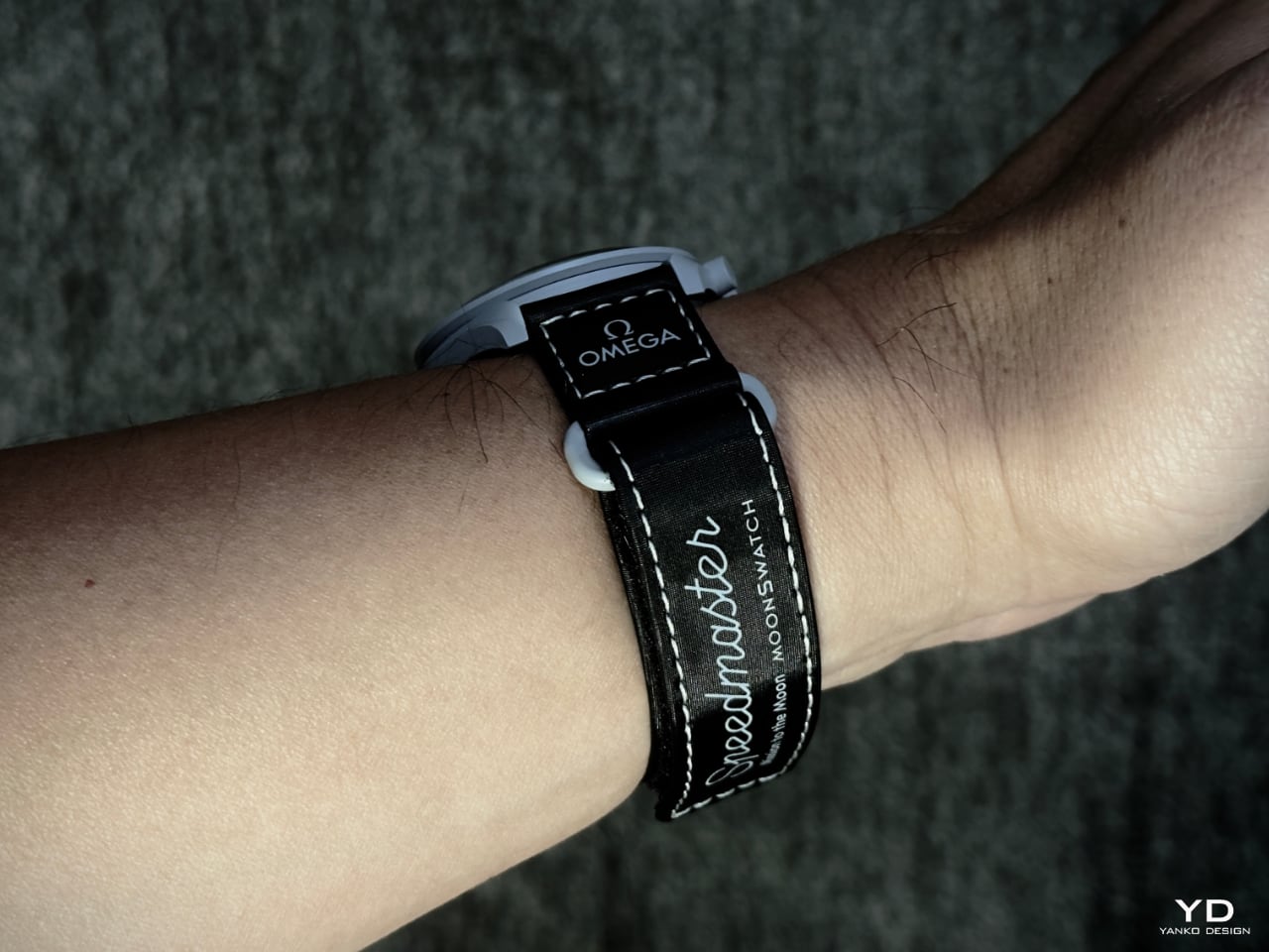
Swatch paired the watch with a black Velcro strap with light gray stitching. The strap matches the overall design and adds a bit of rugged charm. The Velcro material is practical and adjustable, providing a secure fit for wrists of all sizes. A Bioceramic loop stamped with the Swatch logo completes the look, adding a small branding detail without overdoing it.

Performance

The Mission to Earthphase runs on a quartz movement, keeping it accurate and reliable. Swatch’s choice of quartz over mechanical means this watch doesn’t need frequent maintenance, making it easy to rely on day-to-day. The quartz powers the main display and the additional features, like the chronograph and the dual phase indicators.

OMEGA x Swatch: MoonSwatch Mission to Earthphase

The Moon and Earth phase indicators follow a 29.5-day cycle, moving in opposite directions. The Moon Phase shows the Moon as it appears from Earth, while the Earth Phase shows how Earth would look from the Moon’s perspective. This feature is both visually interesting and scientifically accurate. The Earth Phase uses UV-reactive ink, so the oceans glow under UV light, adding an extra interaction layer.

OMEGA x Swatch: MoonSwatch Mission to Earthphase

OMEGA x Swatch: MoonSwatch Mission to Earthphase

The watch also has a seconds-only chronograph function, allowing simple timekeeping tasks. With a water resistance rating of 3 bar, it’s built for daily use and can handle splashes, though it’s not meant for swimming or diving. The Velcro strap stays secure even during activity, while the quartz movement keeps everything running smoothly and reliably.

Sustainability

Swatch made a responsible choice by using Bioceramic, a mix of ceramic and bio-sourced materials, for the case. This helps lower the watch’s environmental impact without sacrificing quality or durability. By including bio-sourced materials, Swatch shows that eco-friendly design doesn’t have to compromise on style or function.

The Super-LumiNova used on the hands and markers is also environmentally safe, non-toxic, and long-lasting. This glow-in-the-dark feature doesn’t fade quickly, so there’s no need for frequent replacements. Swatch has managed to bring sustainability into the Mission to Earthphase naturally without making it feel like a forced addition.

Image: OMEGA x Swatch

Value and Wrap-Up

The Mission to Earthphase offers a strong mix of style, function, and sustainable design at a price that feels accessible. Every detail, from the UV-reactive Earth Phase to the durable Bioceramic case, adds something special. The monochromatic color scheme echoes Yanko Design’s focus on simplicity and balance, bringing a fresh and refined look without relying on excess. This watch celebrates its theme and brings the Earth-Moon relationship to life on the wrist.

For those who appreciate space, science, or simply a design that doesn’t try too hard, the Mission to Earthphase is an enjoyable experience. Swatch has created a piece that invites you to take a closer look at its details, delivering a unique and practical wristwatch.

The post MoonSwatch Mission to Earthphase Review: Bringing Earth and Moon Phases to Your Wrist first appeared on Yanko Design.
TAG Heuer’s New Carrera x Senna Edition Combines Luxury and Legacy for the Ultimate F1 Watch

The new TAG Heuer Carrera Chronograph Tourbillon x Senna is as much a watch as it is a celebration of Ayrton Senna’s enduring legacy in Formula 1. With only 500 pieces available, TAG Heuer has pulled out all the stops to create a timepiece that merges high-end design, cutting-edge mechanics, and a rich sense of history. Crafted from lightweight grade-2 titanium, this Carrera model is bold yet comfortable, setting a durable stage for some impressive features that pay tribute to the iconic Brazilian driver’s career and style, timed perfectly around Netflix’s upcoming documentary on the racing legend.

Designer: Tag Heuer

Fans of Senna will immediately spot the references to his racing persona in the watch’s aesthetic. The 44mm case is framed by a sleek carbon bezel engraved with Senna’s name, and its tachymeter scale is a playful nod to F1 speed, allowing measurements up to 400 km/h. The dial is where things get even more interesting: a yellow sub-dial at the nine o’clock position not only provides functional contrast but also recalls Senna’s racing colors. Paired with a blue rubber strap and accented in green, the color scheme echoes Senna’s legendary racing livery while maintaining the watch’s modern, sleek appearance.

Inside, TAG Heuer has equipped the watch with its top-tier Calibre TH20-09 movement, a tourbillon that promises both accuracy and sophistication. A tourbillon isn’t just a showpiece; it’s a mechanism that compensates for gravitational errors in timekeeping, making this model as precise as it is visually compelling. The movement delivers 65 hours of power reserve, allowing users the luxury of taking it off for a couple of days without resetting the time. This blend of practical power and refined engineering is a perfect tribute to Senna’s relentless pursuit of perfection.
Turning the watch over, owners will find another personal touch: a sapphire crystal case back engraved with Senna’s image, showing him in his helmet. It’s a nod to the Brazilian driver’s legendary presence on the track, adding an intimate connection for those who wear it. The Carrera Chronograph Tourbillon x Senna also offers 100 meters of water resistance, making it ready for a variety of real-world conditions beyond the racetrack. This is not just a display piece—it’s designed for active use while preserving its commemorative value.

To coincide with the watch’s release, TAG Heuer timed this launch to match a Netflix series on Senna, hoping to captivate both long-time fans and newer followers of his legacy. Priced at $37,900, the Carrera Tourbillon is undoubtedly an investment, but for fans and watch collectors, it represents something beyond luxury. It’s a way to own a part of the legend’s story, embodied in a timepiece that’s built with the same intensity and focus Senna brought to the sport.

For those who seek not only a high-performing watch but also a connection to one of motorsport’s greatest icons, the Carrera Chronograph Tourbillon x Senna offers just that—a bridge between high watchmaking and the thrilling legacy of Formula 1.

The post TAG Heuer’s New Carrera x Senna Edition Combines Luxury and Legacy for the Ultimate F1 Watch first appeared on Yanko Design.