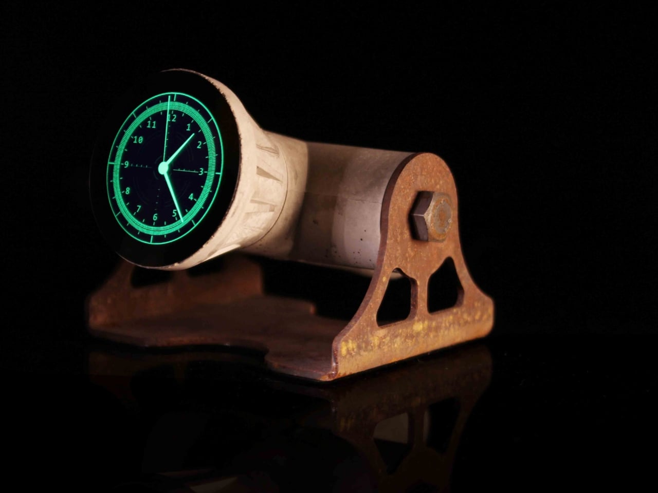
Not every luxury piece earns the word “meaningful.” Beautiful, yes. Covetable, absolutely. But meaningful is a harder category to land in, and the Louis Vuitton Unity Time Object lands there without trying too hard about it.
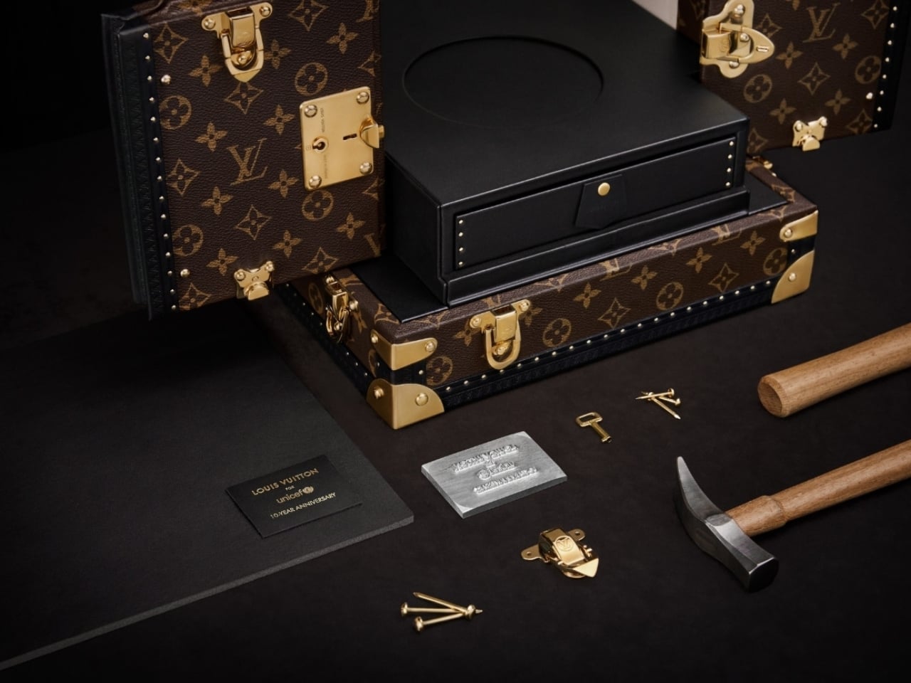
Unveiled at the Fall-Winter 2026 Men’s Fashion Show in Paris, the piece was created to mark ten years of the Louis Vuitton for UNICEF partnership. A decade of fundraising, direct action, and advocacy for vulnerable children around the world. That’s the kind of milestone that deserves more than a press release, and Louis Vuitton clearly agreed.
Designer: Louis Vuitton
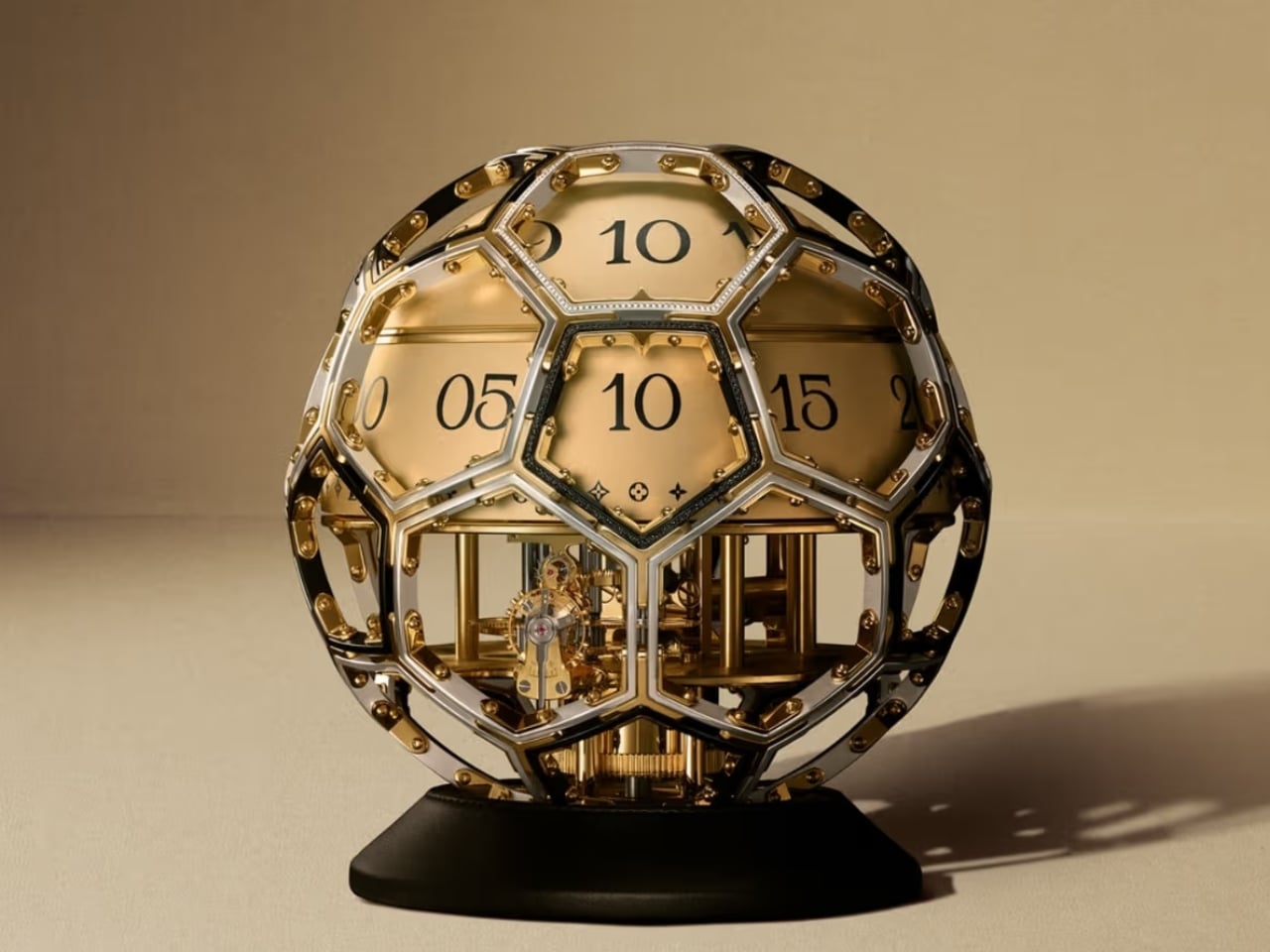
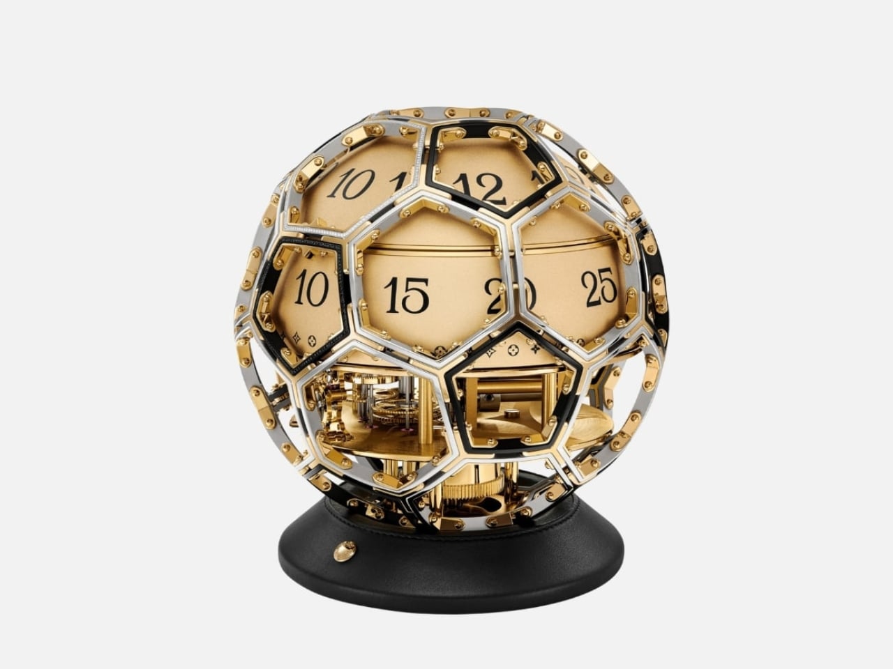
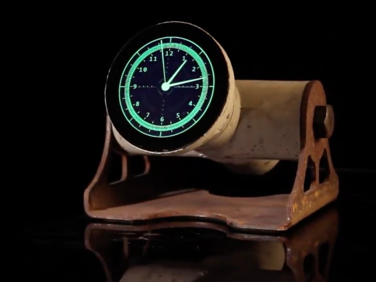
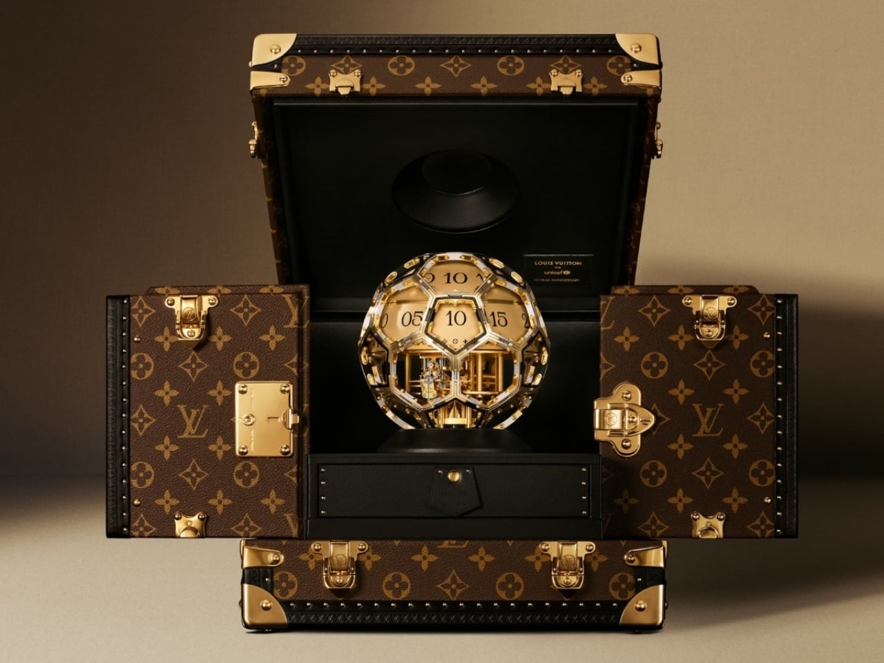
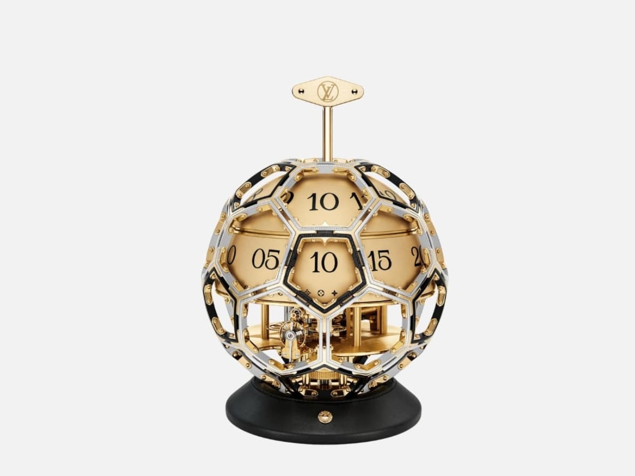
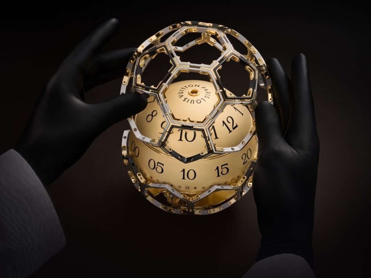
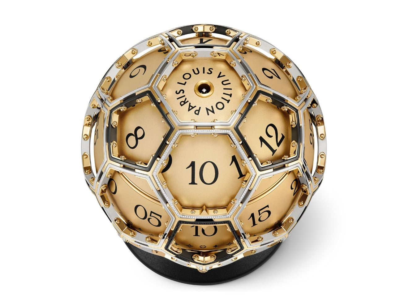
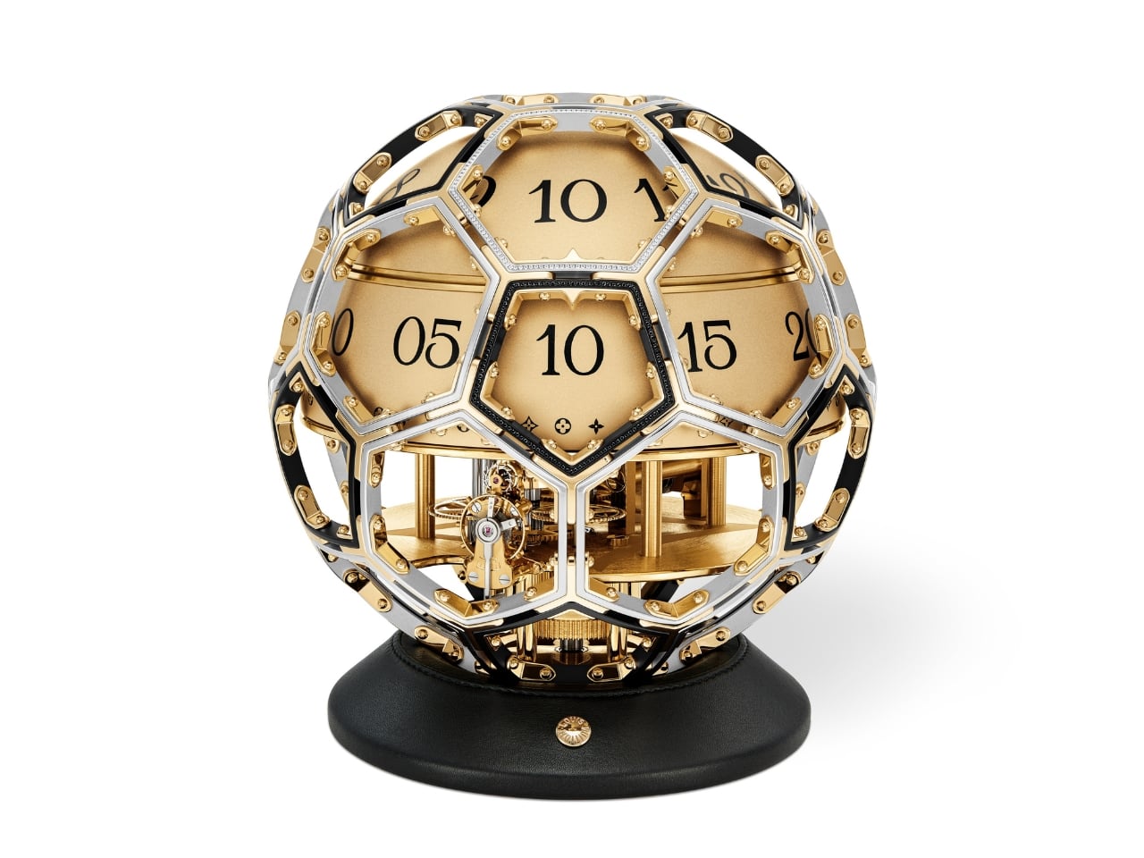
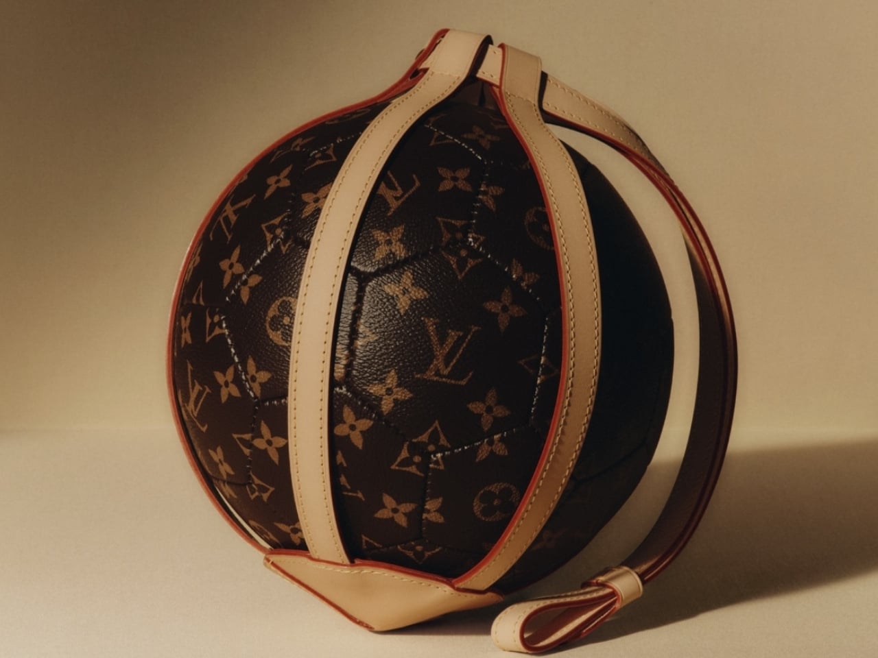
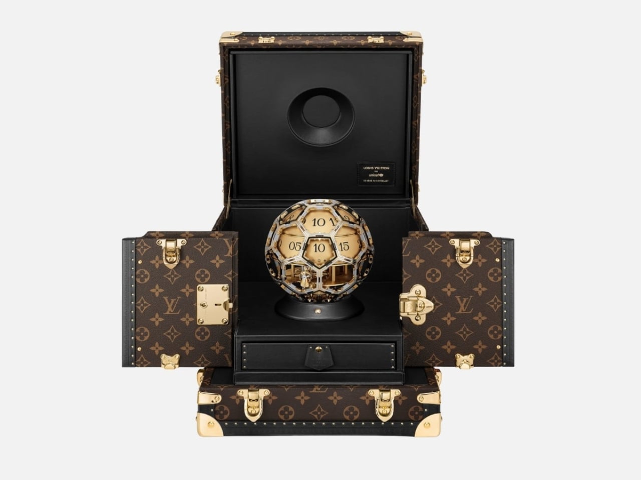
The form alone is worth sitting with for a moment. The clock takes its shape from the LV Soccer Ball, one of the house’s most recognized sporting objects, now reimagined as a sculptural timepiece that functions equally as objet d’art and design statement. A sphere has no front or back, no implied hierarchy, no right way to face. It looks the same from every corner of the room, every corner of the world. For a partnership rooted in the idea that every child deserves access and dignity regardless of where they were born, the shape isn’t just aesthetic. It’s a quiet argument made in steel and gold.
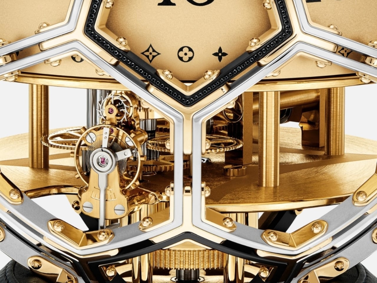
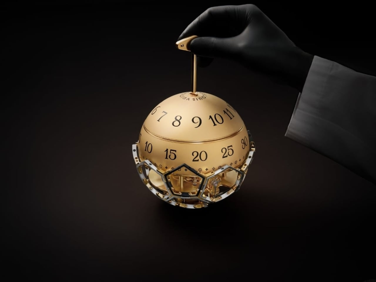
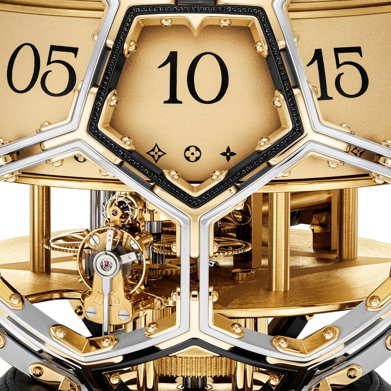
Time on the Unity Time Object is told through two rotating cylinders rather than conventional hands. A sculpted golden steel dome forms the upper half of the clock, and beneath it, one cylinder tracks the hours while the other handles the minutes. The minute cylinder is engraved with Louis Vuitton’s Monogram motif and flowers, with “Louis Vuitton Paris” running along its top. You wind it with a key inserted at the side or top, and the act carries an almost ceremonial quality. It asks you to slow down, to pay attention. In a product era built on digital convenience, that small ritual feels genuinely countercultural.
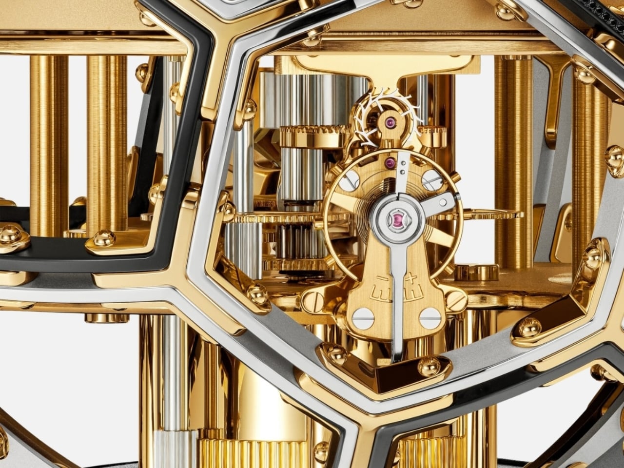
The movement was developed in collaboration with L’Épée 1839, the Swiss clockmaker with nearly two centuries of history behind it. It’s entirely visible through the skeletonized structure, with every screw and movement plate worked with the Monogram flower. Diamond-set details add richness without overwhelming the mechanical poetry underneath. The whole piece reads like a conversation between decoration and precision, and neither side loses.
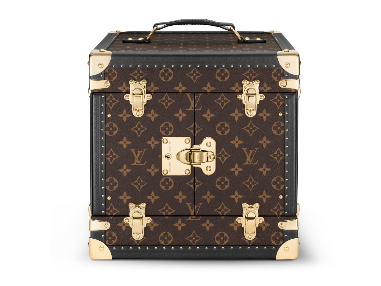
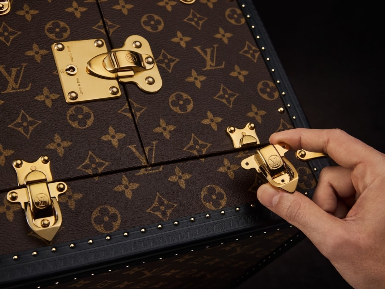
The clock arrives in a trophy-style trunk made from Louis Vuitton’s Monogram canvas, handcrafted at the house’s historic Asnières workshop. The brass corner protectors, lock, and clasps are the same ones found on Louis Vuitton trunks going back to the 1860s. A display case built with 160 years of muscle memory, housing an object shaped like a ball. It shouldn’t cohere as well as it does, and yet here we are.
The Unity Time Object is classified as a pièce unique at Sotheby’s, meaning one exists in the world, full stop. It goes to auction on June 9, 2026, with the sale closing June 18, and all proceeds going directly to UNICEF and its work supporting children globally. The estimate is available upon request, which is auction-house language for a number most of us should simply appreciate from a respectful distance.
What I keep returning to is the simplicity of the choice. Louis Vuitton could have marked a ten-year UNICEF partnership with a capsule line or a limited-edition accessory. Something accessible, something scalable. Instead, they made a single, unrepeatable object with no commercial return for the house. Every dollar from the sale goes to the cause. That kind of gesture is rare in luxury, where even the most philanthropic moves tend to benefit the brand as much as the cause.
Good design holds meaning without over-explaining it. The Unity Time Object doesn’t need paragraphs of context to communicate its weight. A sphere. A clock. A trunk built by the same craftspeople who have been making trunks for generations. Whether you’re drawn to the horology, the design, or just the idea of what luxury could stand for at its very best, the Unity Time Object makes a compelling case that beauty and purpose don’t have to be separate conversations.
The post Louis Vuitton Just Made a One-of-a-Kind Clock for UNICEF first appeared on Yanko Design.