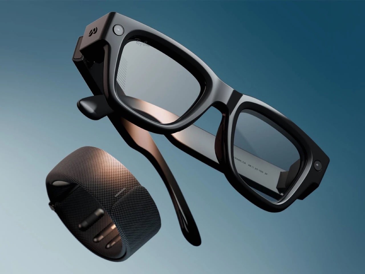
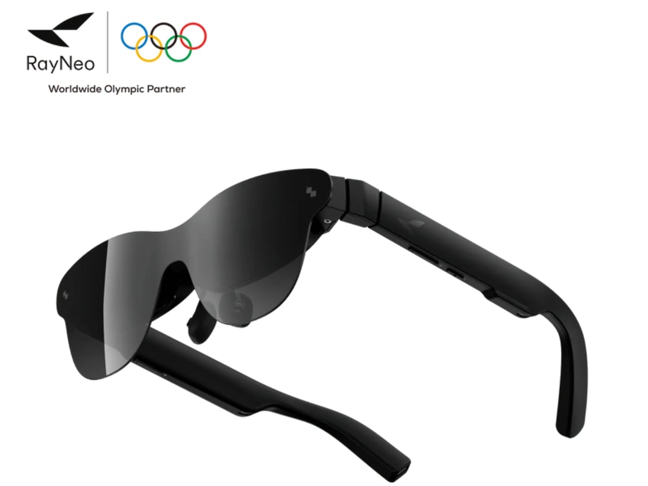
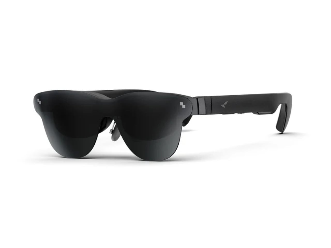
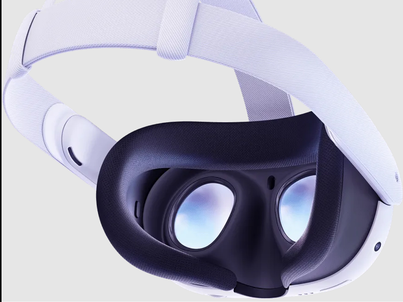
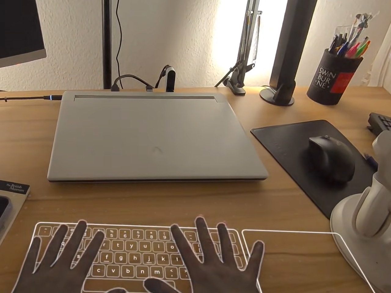
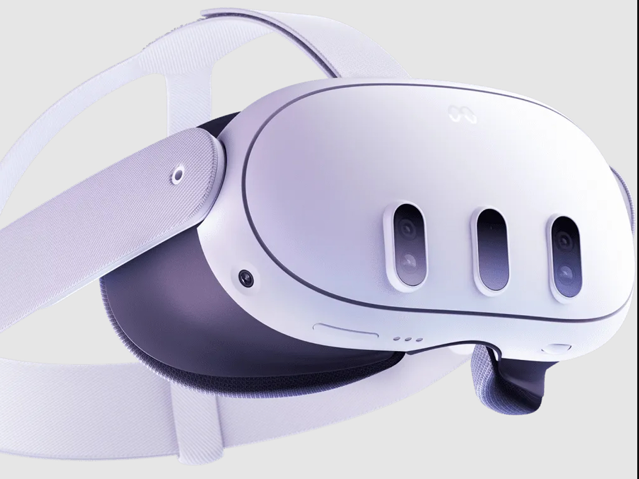
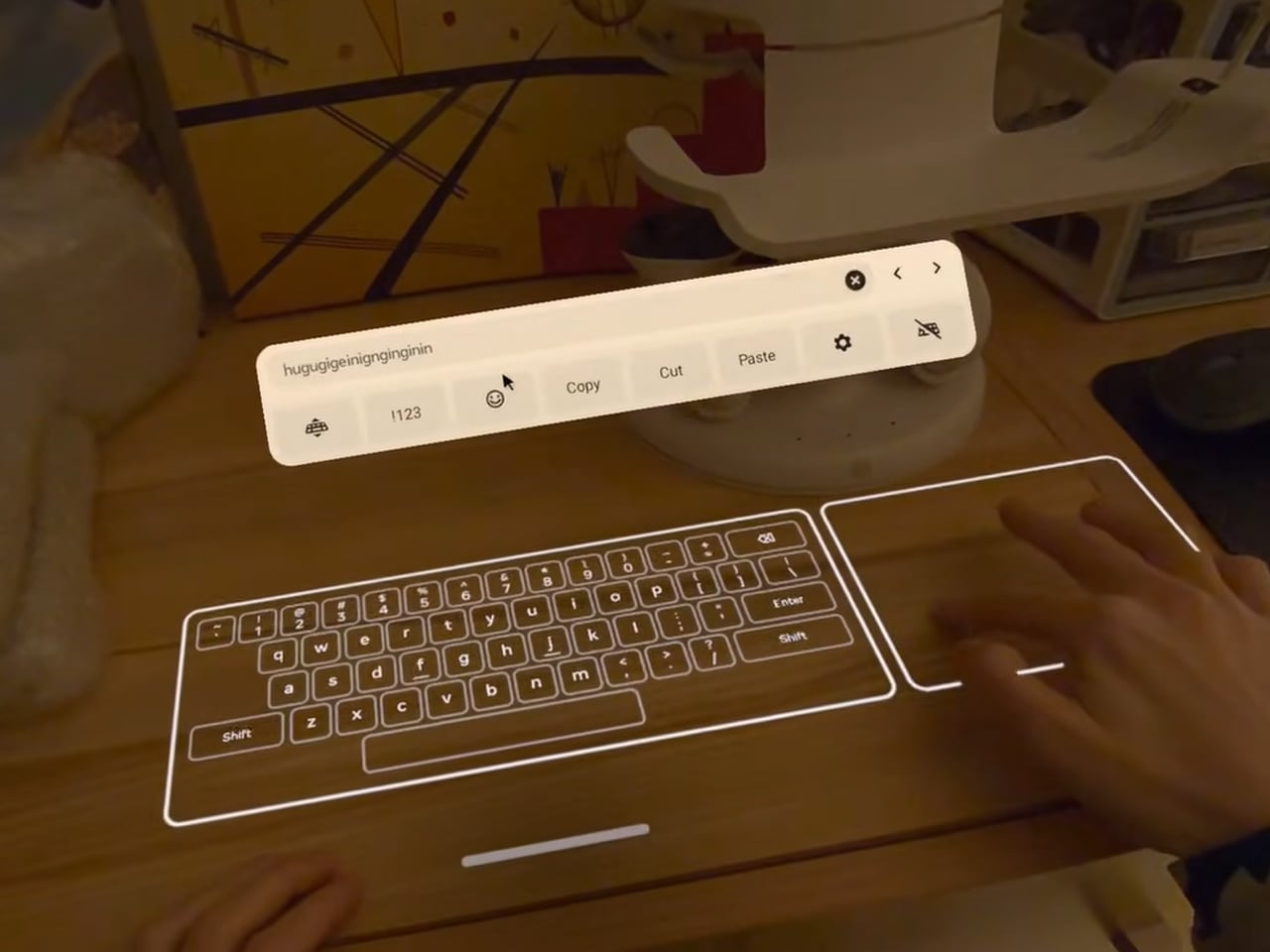
These 95g AR Glasses Replace VR Headsets with a 300-Inch Screen

Portable entertainment has split into two unsatisfying extremes. AR glasses feel like oversized phone screens floating in front of your face, and VR headsets are immersive but too heavy, bulky, and isolating for everyday use. There is a desire for something that feels like a real cinema experience but can be used on a couch, in bed, on a plane, or in a café without suiting up or strapping a helmet to your face.

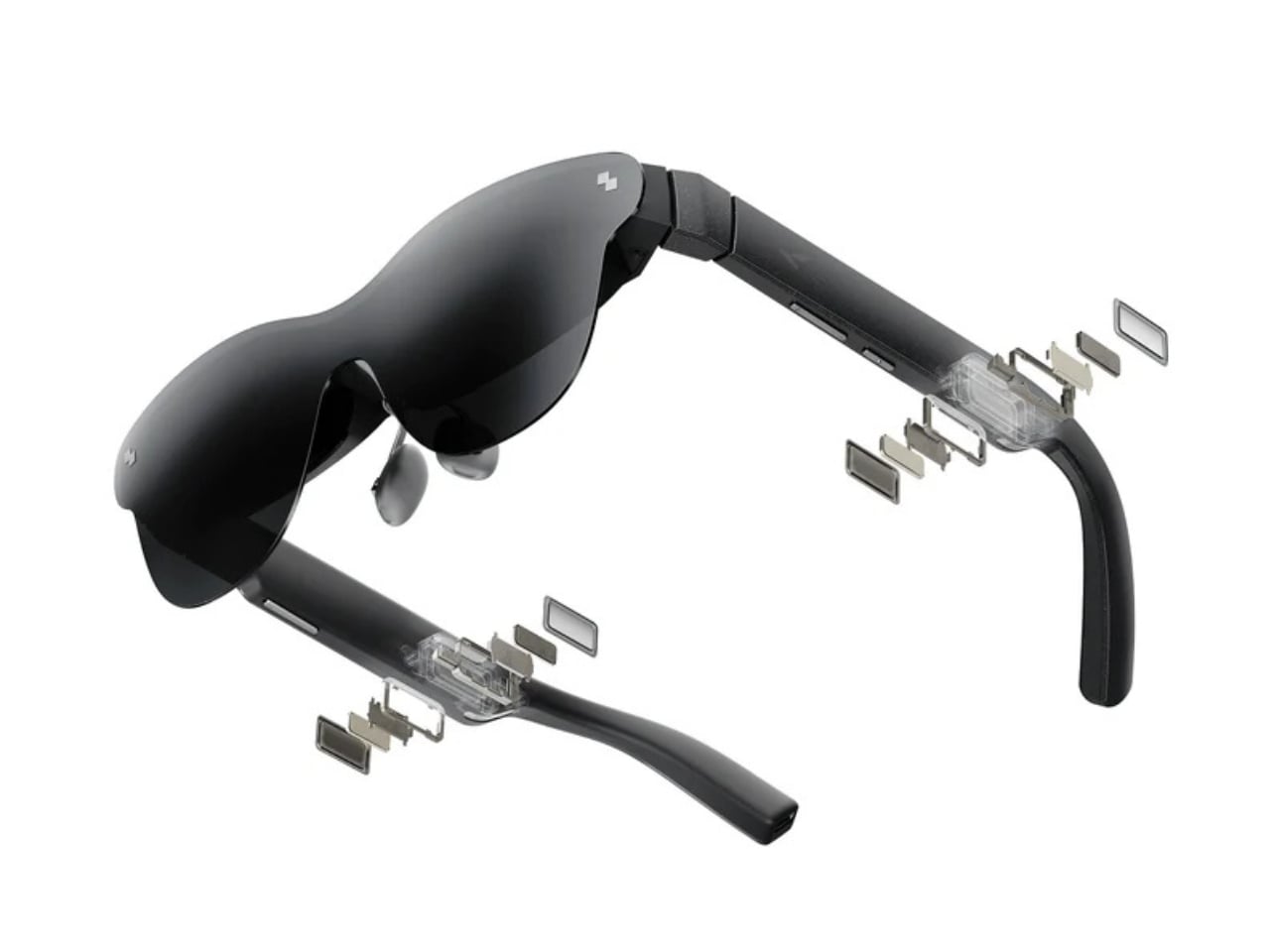
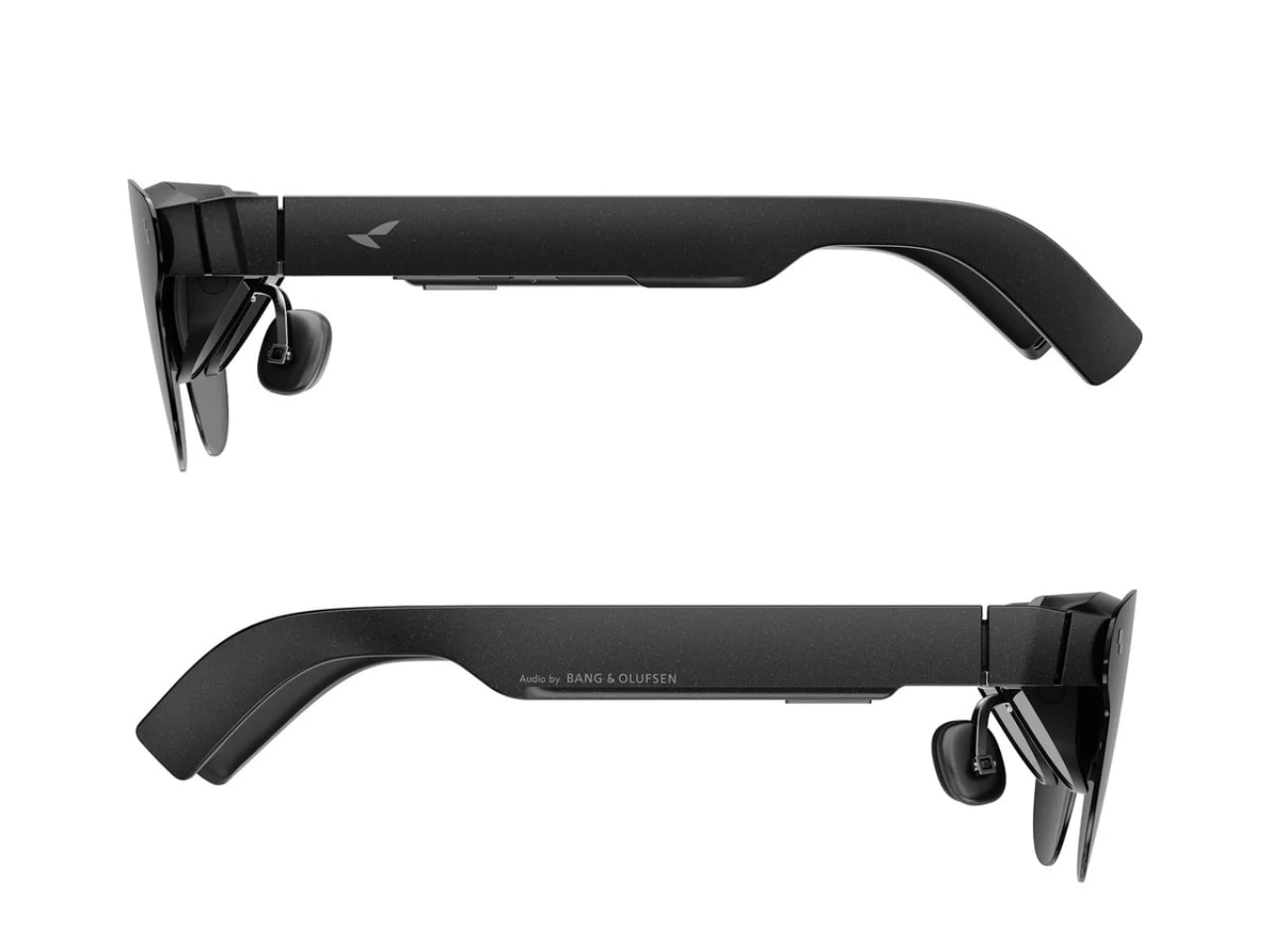
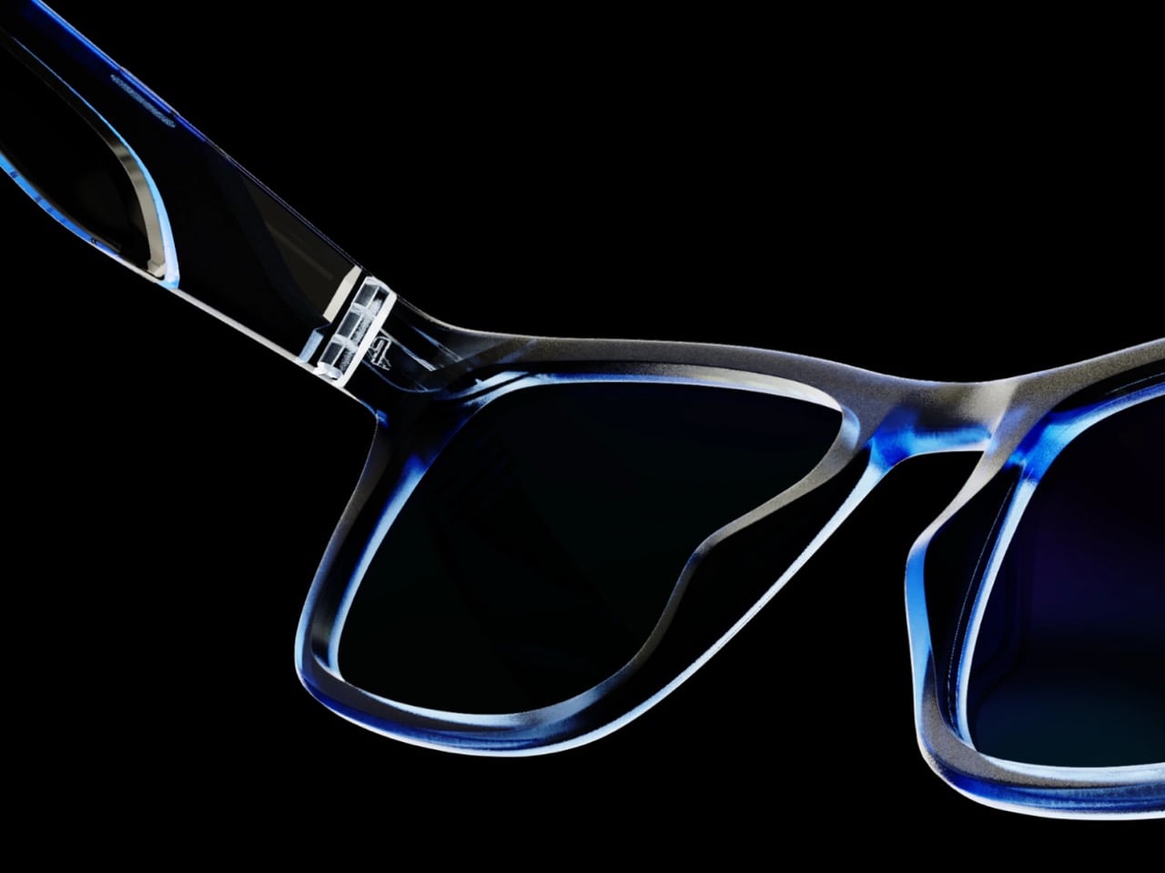
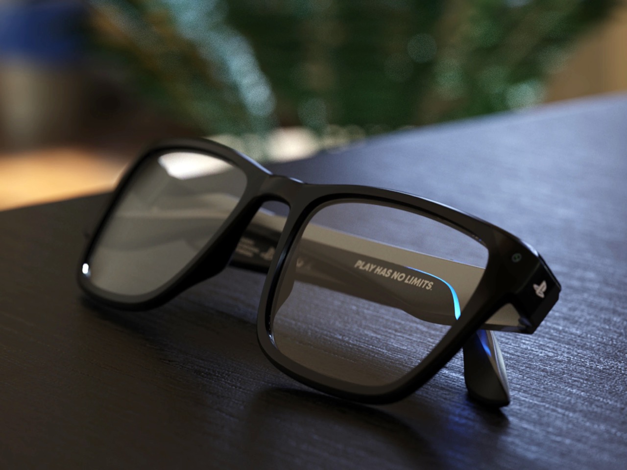
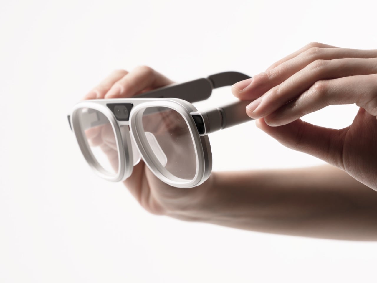
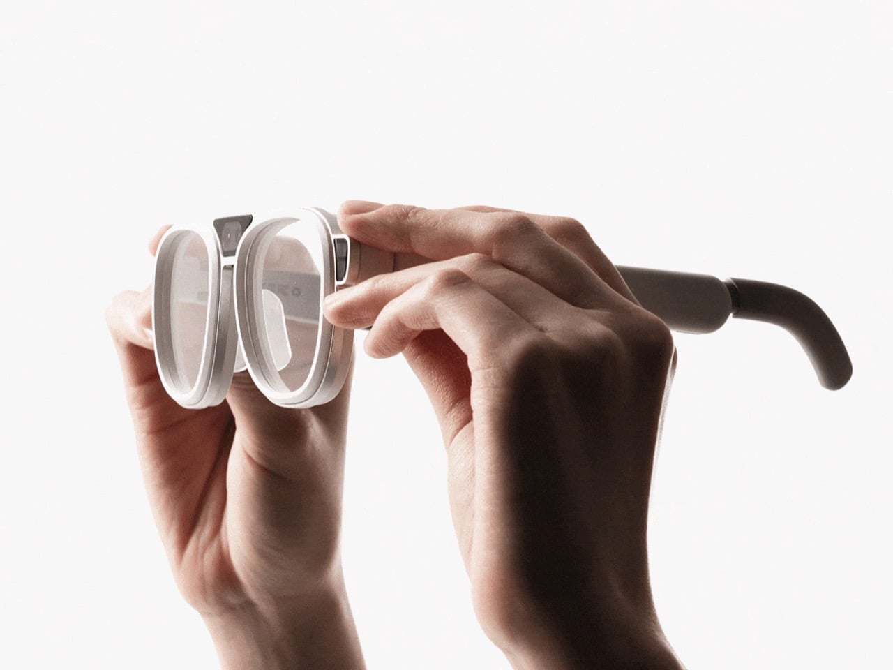
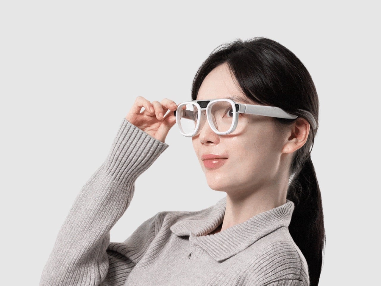
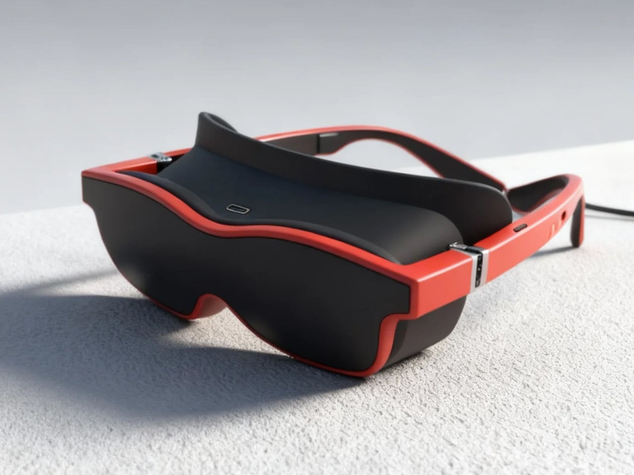
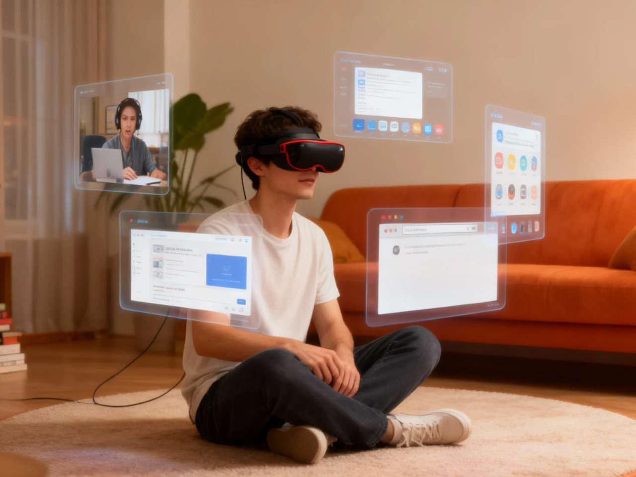
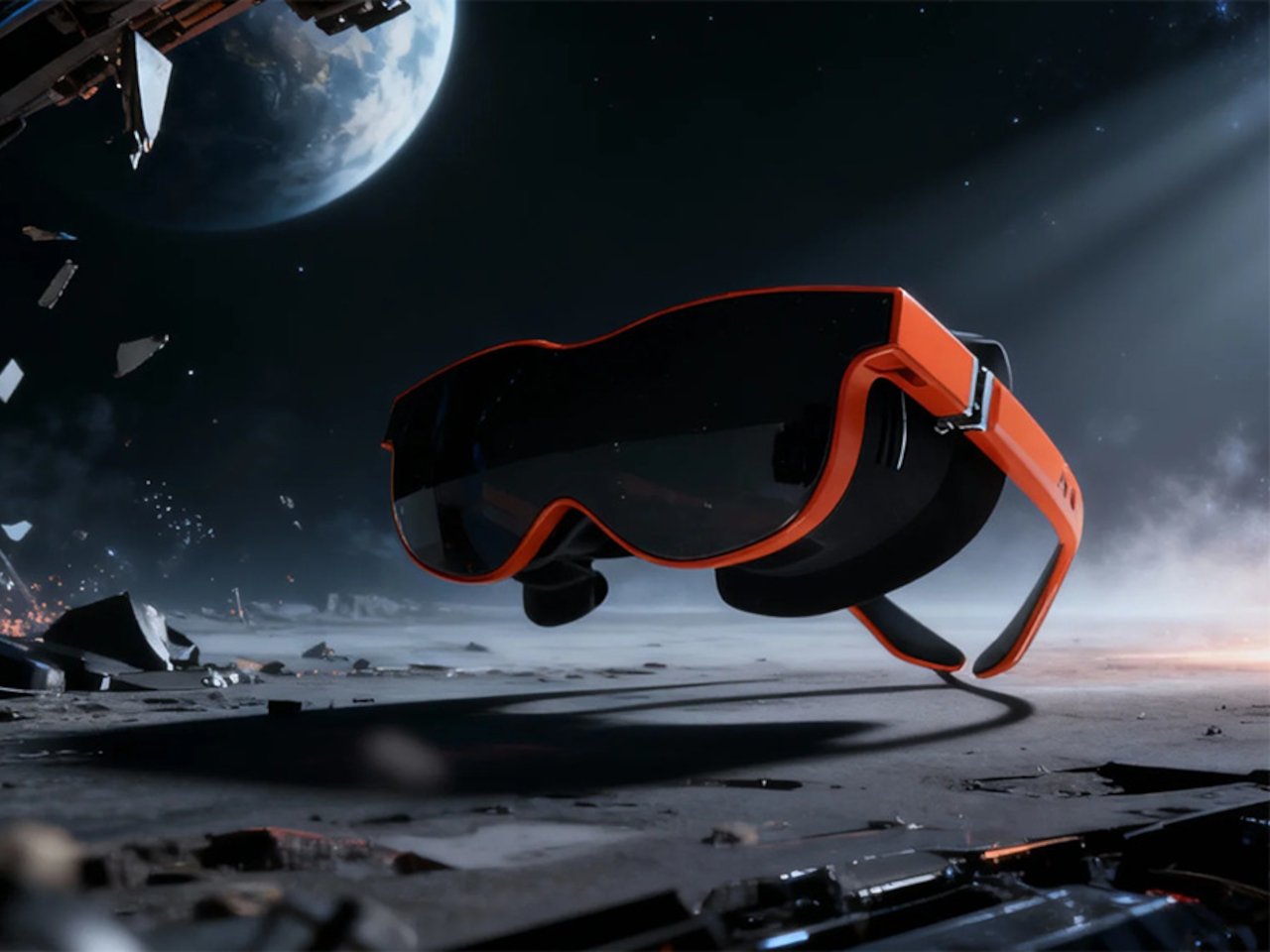
Xynavo is a pair of lightweight AR glasses built around lightweight immersion, private audio, and expandable functionality. It offers a 70-degree field of view and dual 4K micro-OLED displays, creating a virtual screen equivalent to more than 300 inches, yet weighs only 95g. The goal is to turn whatever you already own into a cinema-scale display you can wear, without the weight and noise of a full headset.

Designer: Xynavo

Click Here to Buy Now: $299 $499 ($200 off). Hurry, only a few units left! Raised over $199,200.

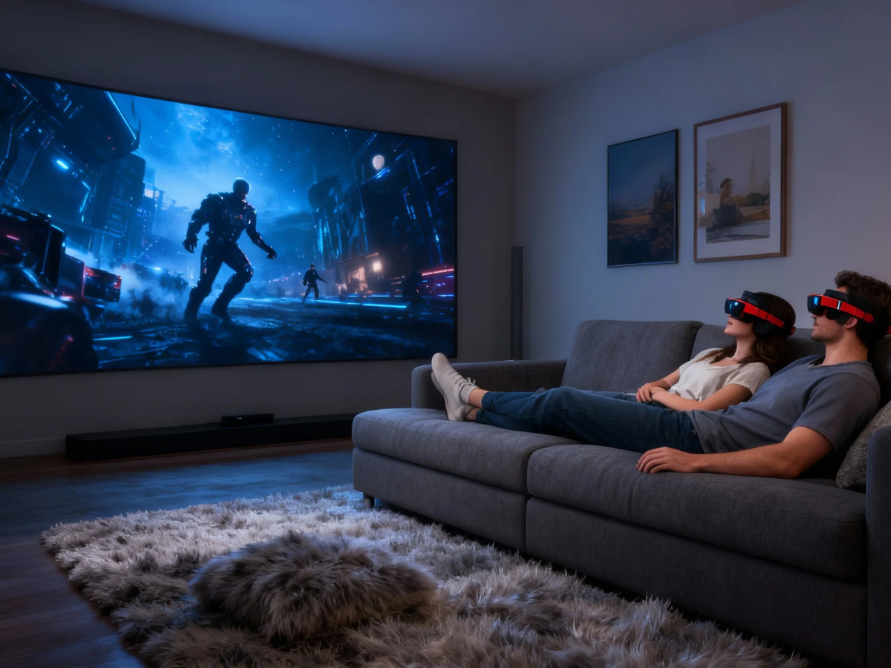
Xynavo fits into evenings at home, where couples can use a multi-device adapter to connect two pairs and share the same screen, playing on a Nintendo Switch or Steam Deck together or watching films and series side by side. Parents and children can share animated movies and family comedies, or connect a game console for interactive play, with private audio and a huge virtual screen.

Late nights or quiet weekends alone, you put on Xynavo and relax on the couch or in bed watching NBA, NFL, or UEFA Champions League games, or diving into action movies and sci-fi series. The dual 4K clarity and private audio turn it into a theater experience made just for you, without needing to dedicate a room or disturb anyone else in the house.

1

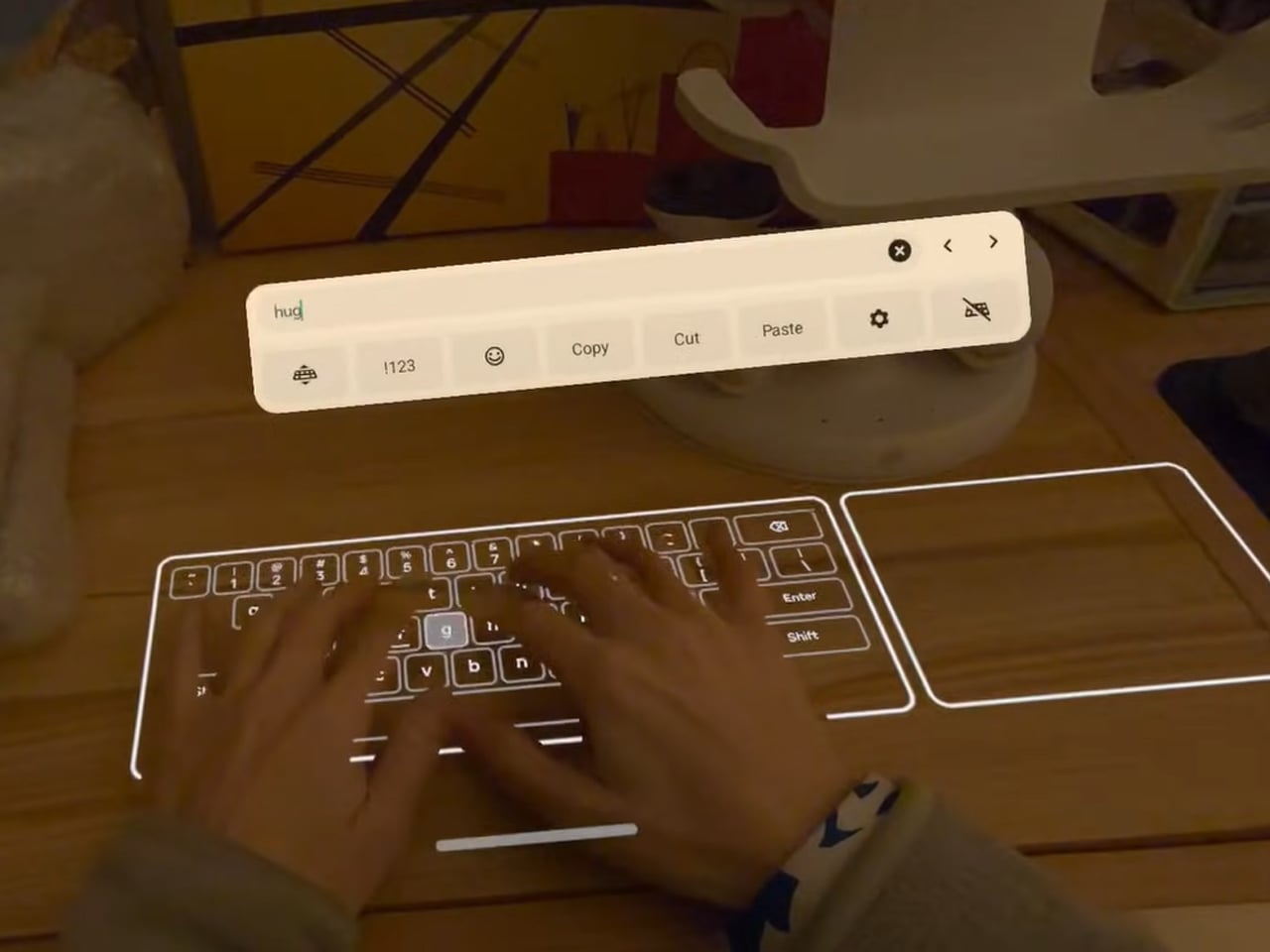
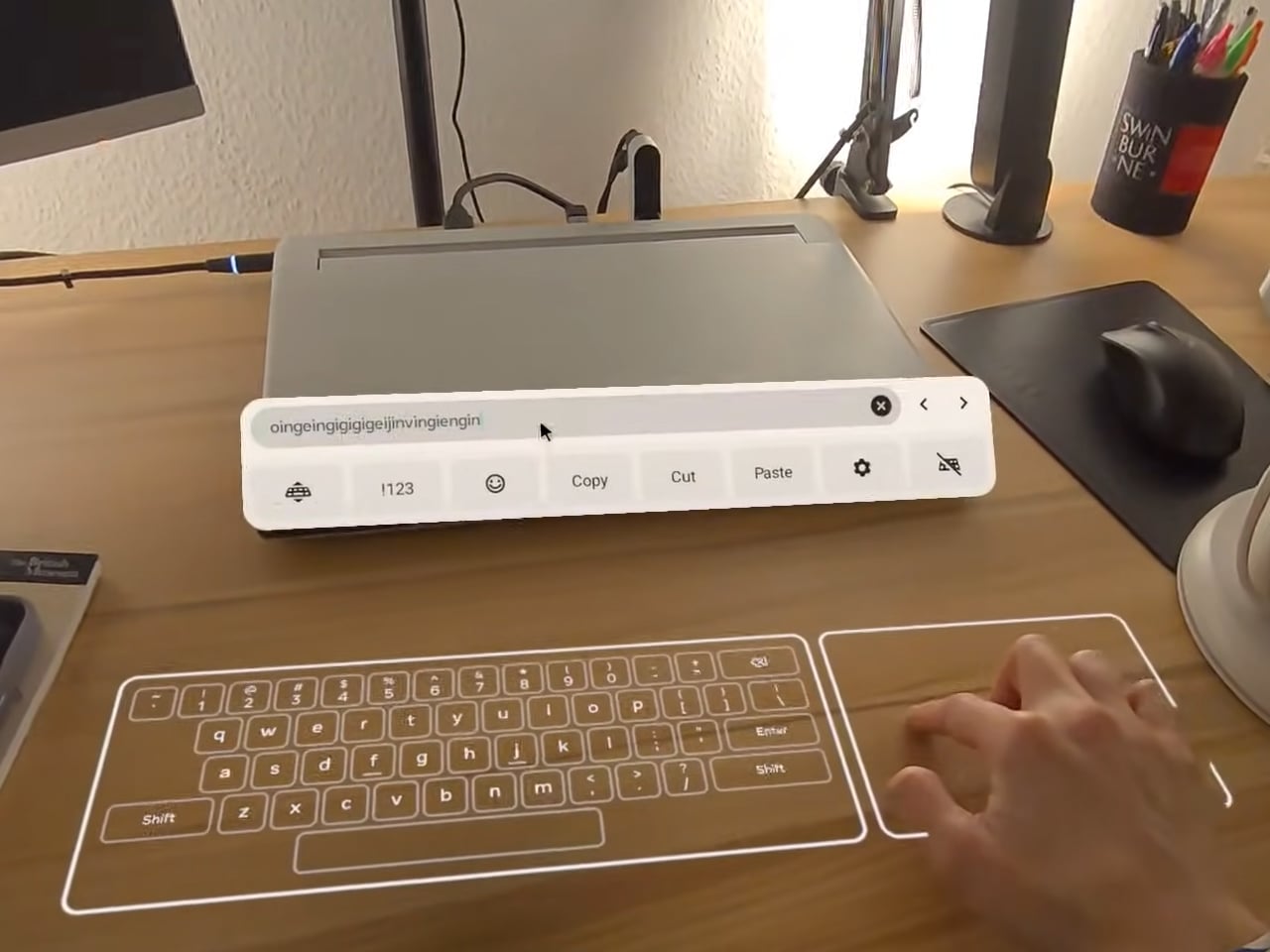
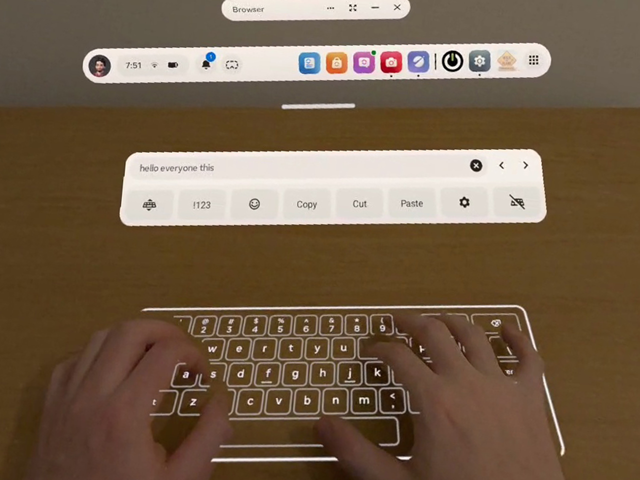
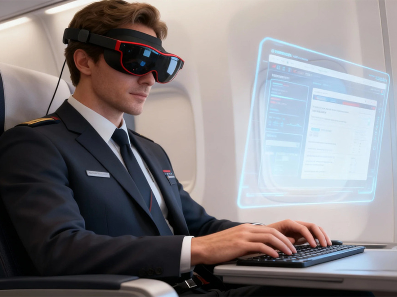
On planes, high-speed trains, or in hotel rooms, you connect a laptop via USB-C or the included HDMI adapter, pair a wireless keyboard, and handle email or browsing. Then you switch seamlessly to movies or games, all while the glasses stay light enough to wear for full episodes or matches without headband fatigue. The 95 g weight makes hours-long sessions feel manageable instead of exhausting.

Most AR glasses offer a narrow field of view that feels like a big phone, while Xynavo’s 70-degree FOV and dual 4K panels fill your vision with a cinema-scale scene. The high pixel density keeps text crisp and motion smooth, avoiding screen-door effects. A +2D to -6D diopter adjustment range lets many users dial in crystal-clear focus without wearing prescription glasses underneath, making the fit more comfortable.

1

Open-ear AR audio often leaks sound and struggles in noisy or very quiet spaces. Xynavo uses magnetic in-ear modules designed for noise isolation and zero sound leakage, keeping audio clear on trains and planes and private next to someone sleeping. That makes shared spaces and late-night use realistic, without headphones or disturbing people nearby.

Two built-in 3D split-screen modes, 3840×1080 and 1920×1080, let you watch a wider range of 3D content. A long press switches formats, while the dual 4K panels maintain depth and clarity across both modes. This flexibility means more 3D videos, apps, and playback sources work without workarounds or format hunting.

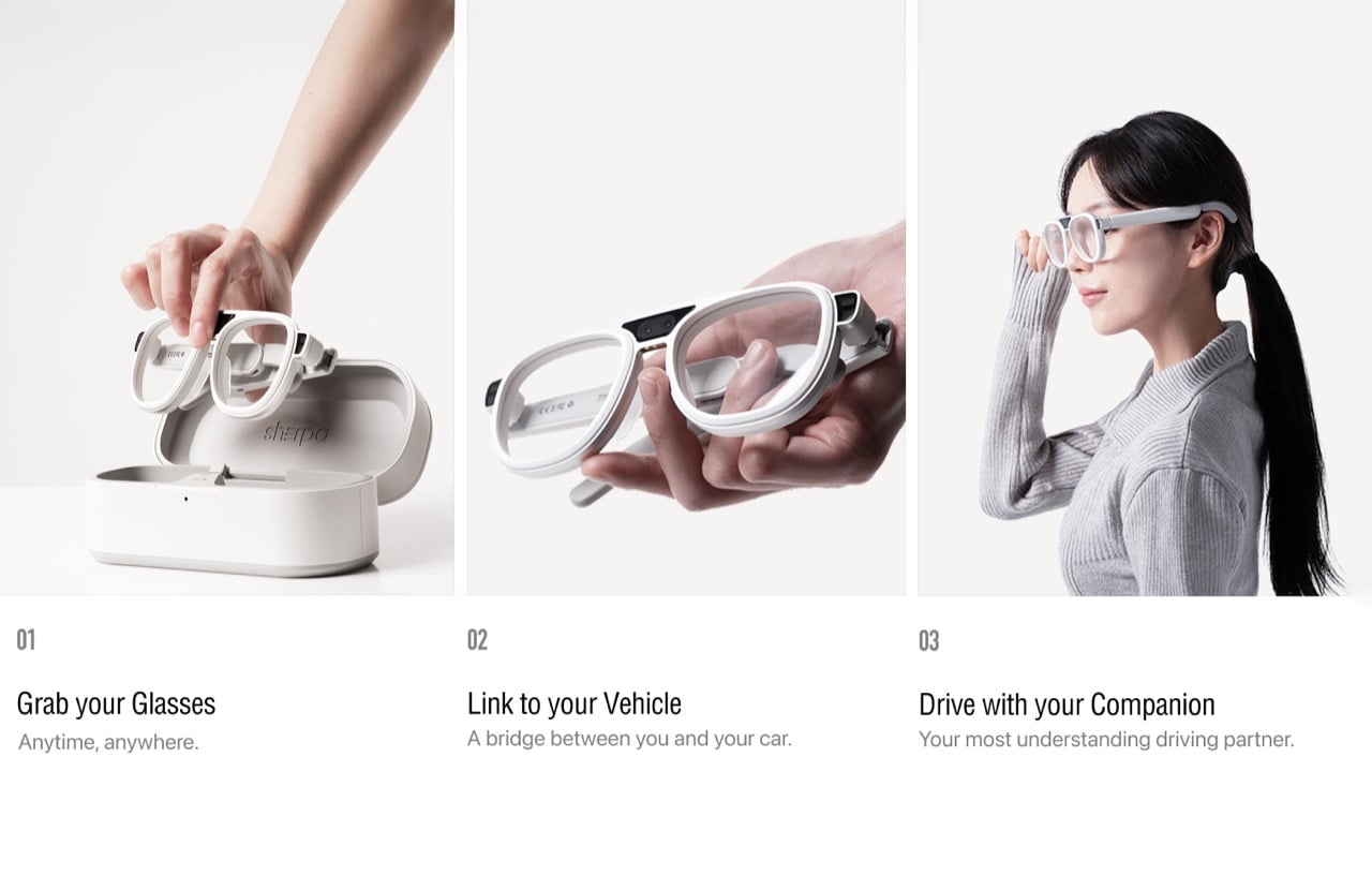
Xynavo connects to smartphones, handheld consoles, tablets, laptops, gaming systems, and PCs via its Type-C cable and included HDMI adapter, working as a plug-and-play external display without special apps or pairing. It is designed as an expandable Type-C vision platform, with support planned for external modules like cameras, night vision, and thermal imaging. That hints at a future where the same lightweight frame can grow with whatever you want to see next.

Click Here to Buy Now: $299 $499 ($200 off). Hurry, only a few units left! Raised over $199,200.

The post These 95g AR Glasses Replace VR Headsets with a 300-Inch Screen first appeared on Yanko Design.
This AR Ski Helmet Finally Lets Rescuers Control Tech By Eye

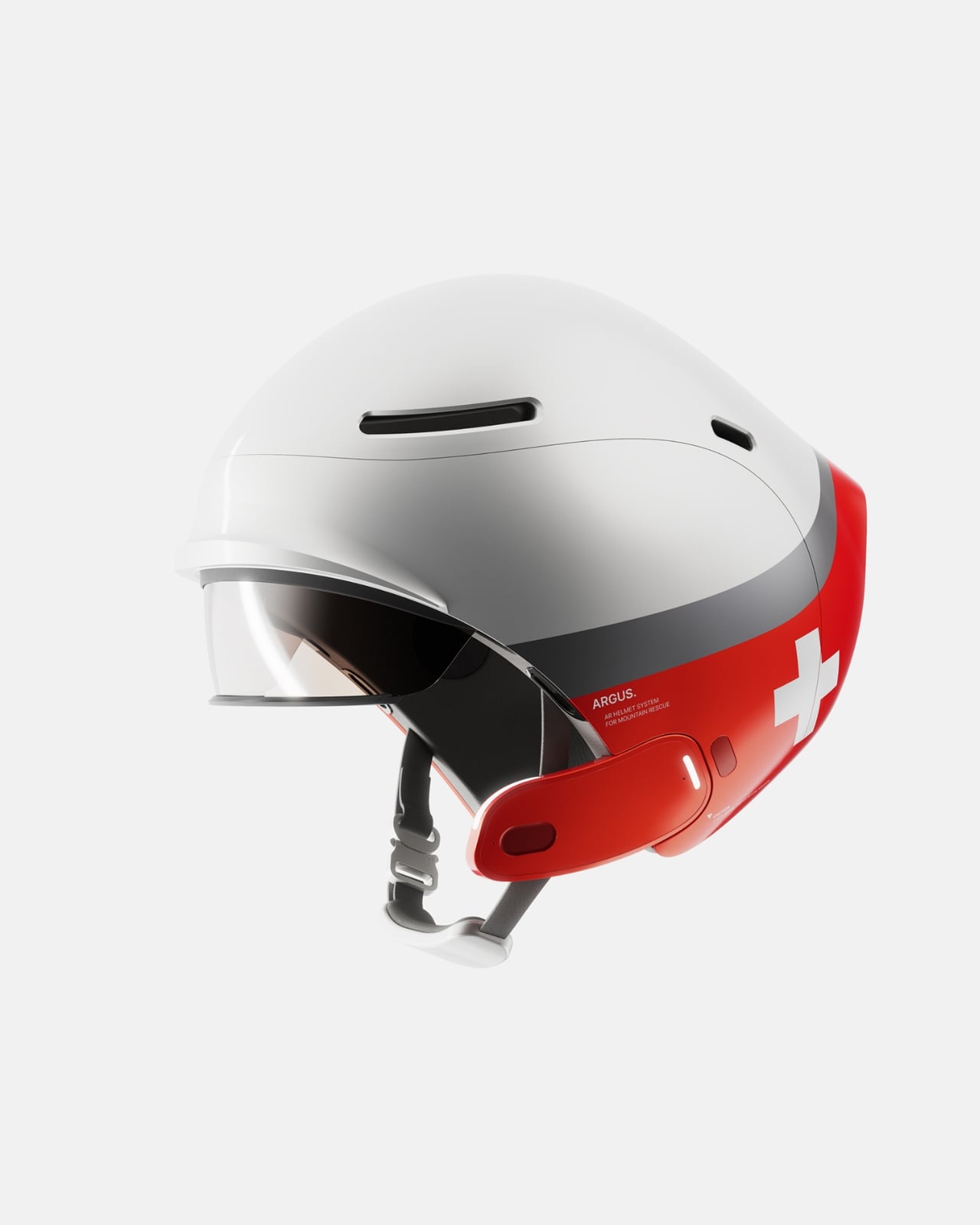
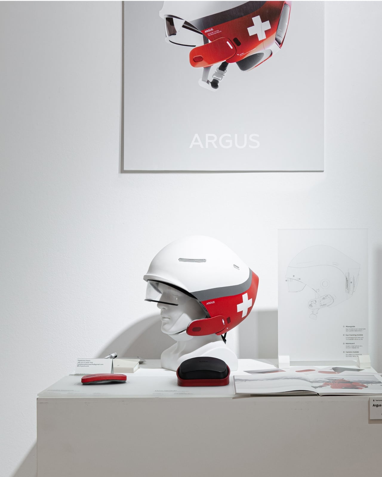
Imagine being a ski patrol responder racing toward an injured skier on a freezing mountain. Your hands are gripping poles, your attention is split between the terrain and the emergency ahead, and your radio crackles with critical information. Now imagine if you could access maps, communicate with your team, and log vital data without ever touching a device. That’s exactly what the Argus AR Helmet promises to deliver.

Designed by Hyeokwoo Kwon and Junho Park, Argus is a concept that reimagines what rescue technology can look like when you strip away everything unnecessary and focus on the moment that matters most. This isn’t just another gadget trying to cram features into a helmet. It’s a thoughtful response to a real problem: how do first responders stay connected and informed when their hands are literally full and seconds count?

Designers: Hyeokwoo Kwon and Junho Park

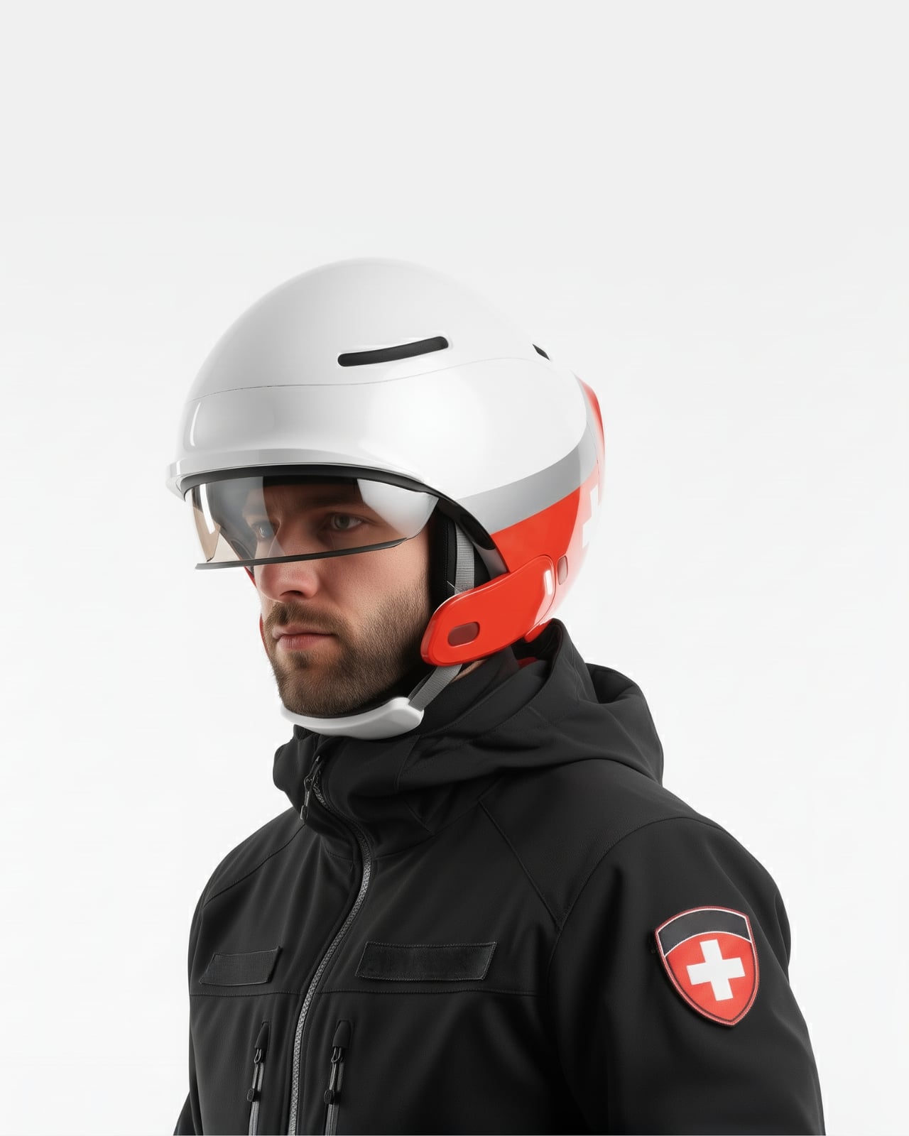
The helmet’s standout feature is its eye-tracking interface. Instead of fumbling with buttons or voice commands that get lost in howling wind, users control the AR display simply by looking at what they need. Want to view a map overlay of the ski area? Glance at the navigation icon. Need to send a message to base? Your eyes do the work. The system is built around the idea that in high-stress, time-critical situations, the fewer steps between thought and action, the better.

What makes this particularly clever is how it handles communication in one of the noisiest work environments imaginable. Mountains are loud. Wind, equipment, helicopters, and panicked voices create a constant wall of sound that makes radio communication frustrating at best and dangerous at worst. Argus addresses this with real-time conversation-to-text conversion. Spoken words are automatically transcribed and displayed on the visor, ensuring that critical information doesn’t get lost or misunderstood. In an emergency where “stop the area” versus “stop near the area” could mean completely different courses of action, that clarity is potentially lifesaving.

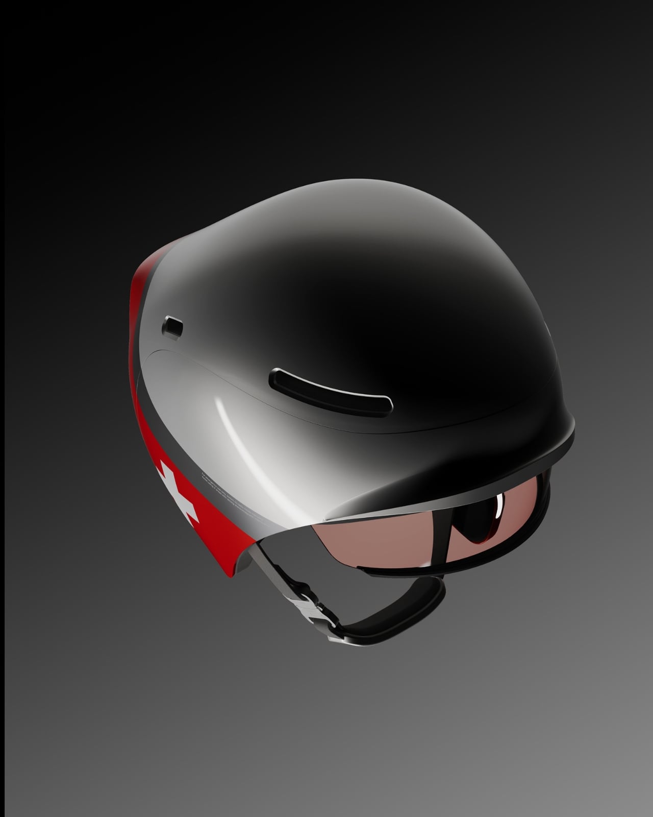
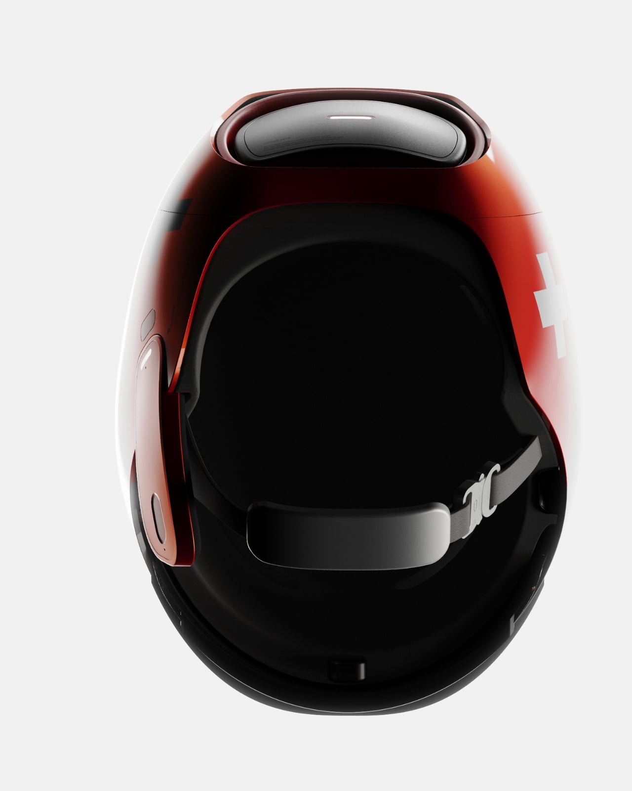
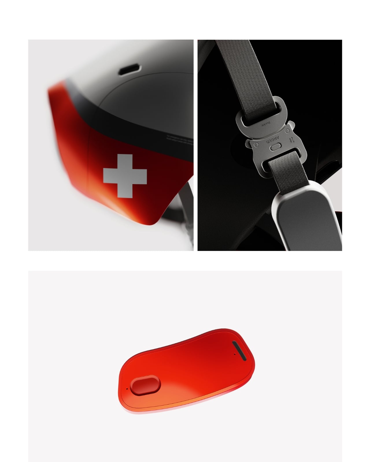
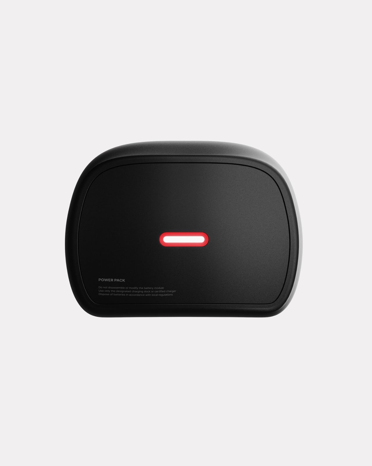
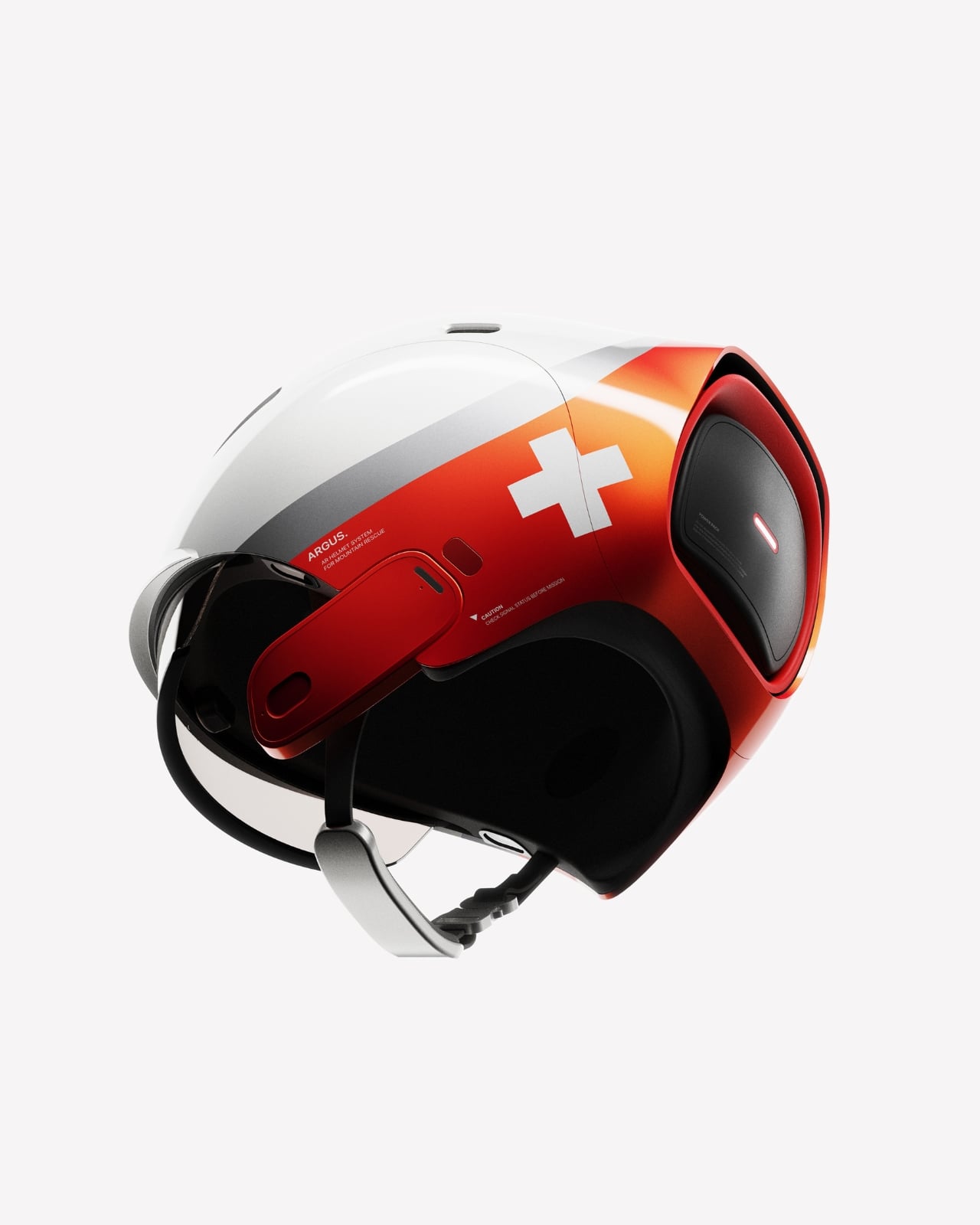
The design itself strikes a balance between futuristic and functional. The white shell with bold red accents and Swiss cross branding gives it a clean, authoritative look that fits naturally into the visual language of emergency services. The transparent visor integrates the AR display without creating the bulky, intrusive appearance that often plagues wearable tech. There’s a modularity to the system too, with a detachable power pack that ensures the helmet remains comfortable for long shifts while providing enough battery life to last through demanding rescue operations.

From a practical standpoint, Argus is designed to support ski patrol operations across experience levels. A rookie responder gets the same information overlay and guidance as a veteran, creating a more consistent standard of care. Route optimization, hazard warnings, victim location data, and communication logs all live within the user’s field of vision, accessible without breaking focus from the task at hand.

But beyond the specific use case of ski patrol, Argus represents something larger about where wearable technology is headed. We’re moving past the era of tech that demands our attention and toward interfaces that disappear into the background until we need them. Eye-tracking isn’t new, but applying it to life-or-death situations where gloves, weather, and adrenaline make traditional controls impractical shows how design thinking can solve problems that raw computing power can’t.

There’s also something refreshing about seeing concept design tackle unglamorous but essential work. We’re used to seeing AR prototypes aimed at gaming, shopping, or entertainment. Those have their place, but projects like Argus remind us that the most meaningful applications of emerging technology often happen in fields where people are doing difficult, dangerous work that most of us never see.

Will we see Argus helmets on mountains anytime soon? As a concept, it still needs to navigate the long road from design portfolio to production reality, including challenges around durability, battery life in extreme cold, and integration with existing rescue protocols. But as a vision of what’s possible when designers deeply understand the context they’re designing for, it’s compelling. It shows that the future of wearable tech might not be about adding more features, but about making the right information available at exactly the right moment, controlled by something as simple and intuitive as where you look.

The post This AR Ski Helmet Finally Lets Rescuers Control Tech By Eye first appeared on Yanko Design.
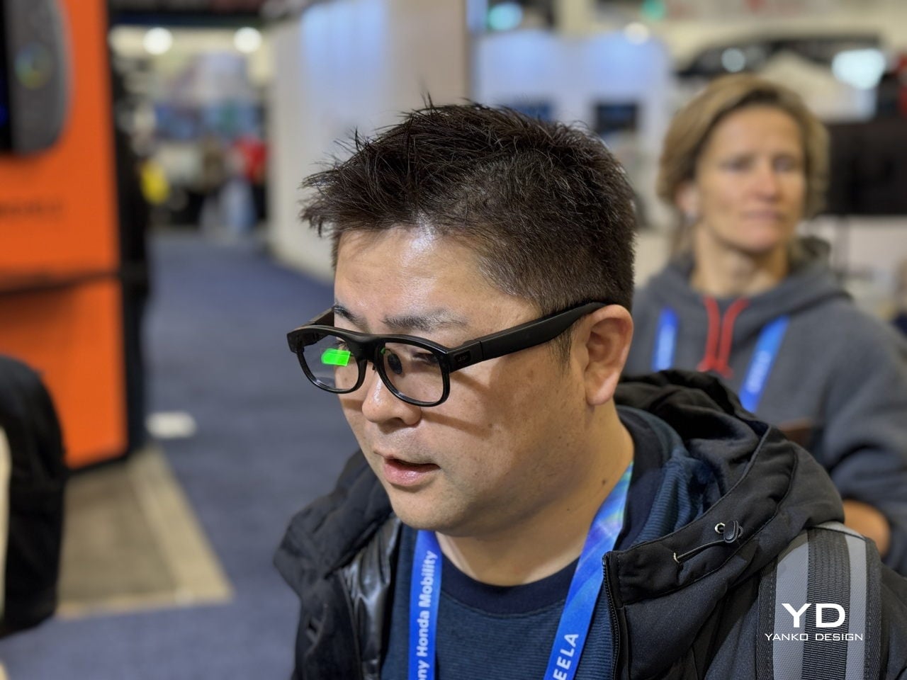
Leion Hey2 Brings First AR Glasses Built for Translation to CES 2026

Cross-language conversations create a familiar kind of friction. You hold a phone over menus, miss half a sentence while an app catches up, or watch a partner speak fast in a meeting while your translation lags behind. Even people who travel or work globally still juggle apps, hand-held translators, and guesswork just to keep up with what is being said in the room, which pulls attention away from the actual conversation.

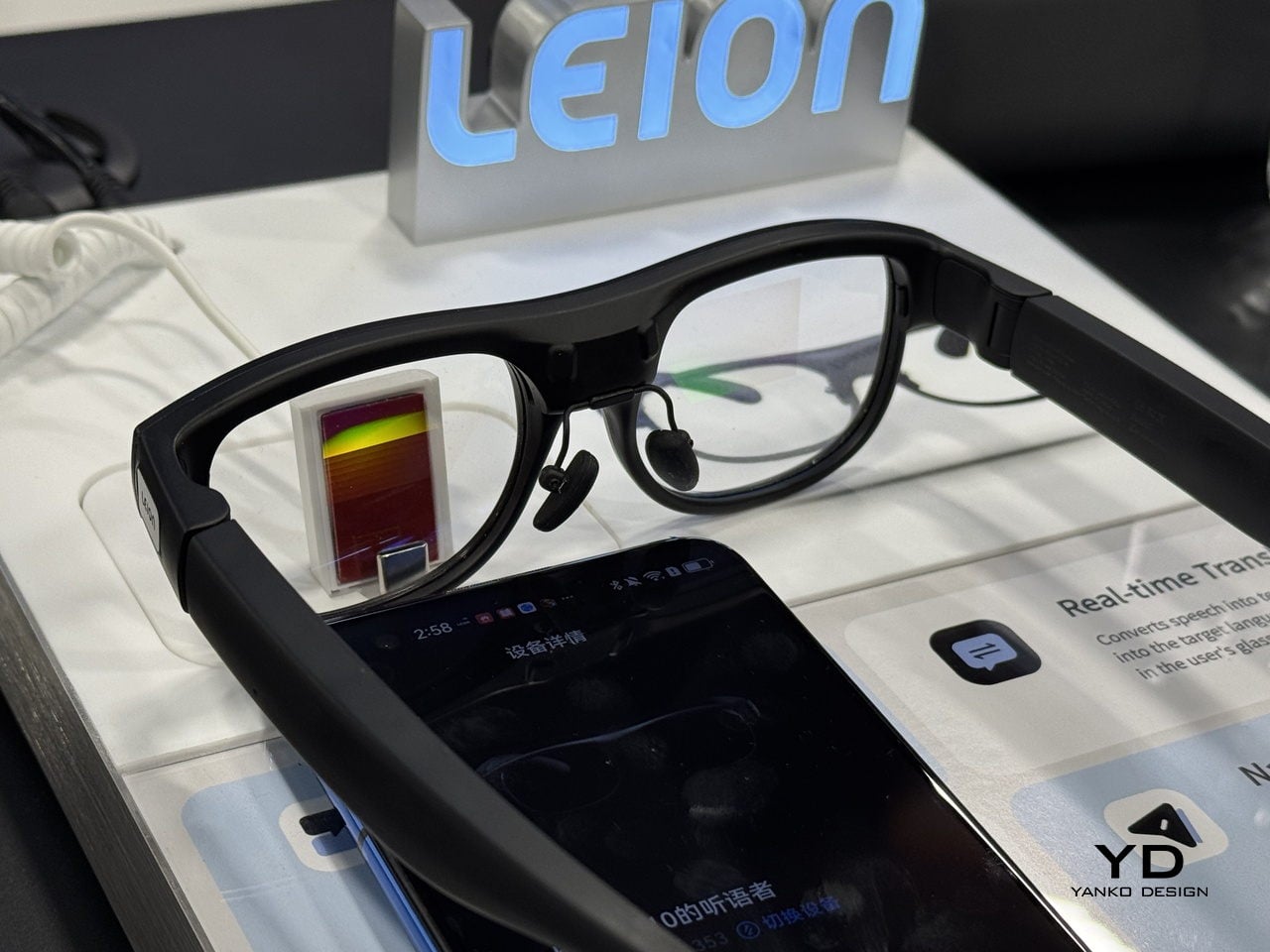
Leion Hey2 is translation that lives where your eyes already are, in a pair of glasses that quietly turns speech into subtitles without asking you to look down or pass a device back and forth. The glasses were built for translation first, not as an afterthought on top of entertainment or social features, and they are meant to last through full days of meetings or classes instead of dying halfway through, when you need them most.

Designer: LLVision

Click here to know more.

Glasses That Care About Conversation, Not Spectacle

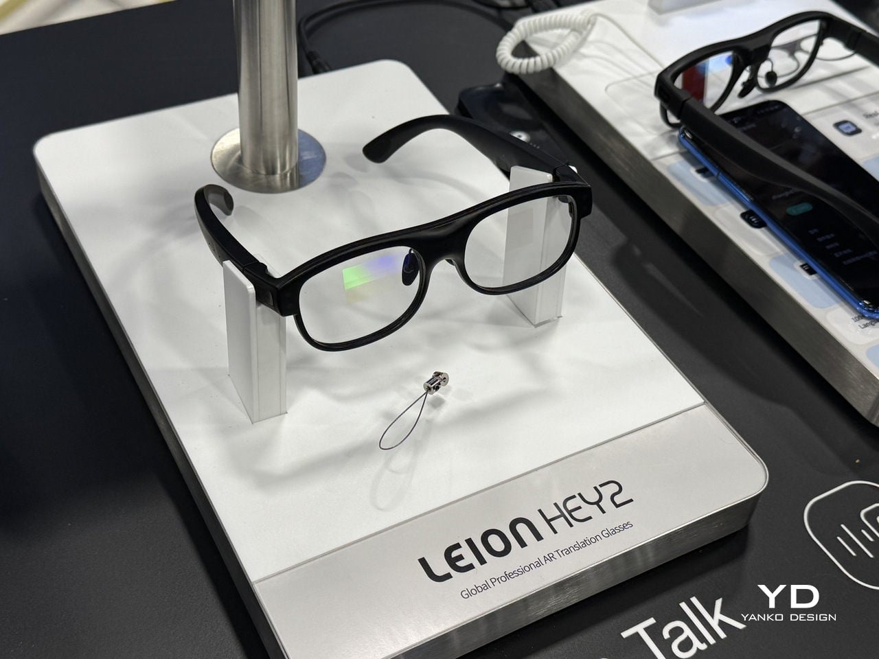
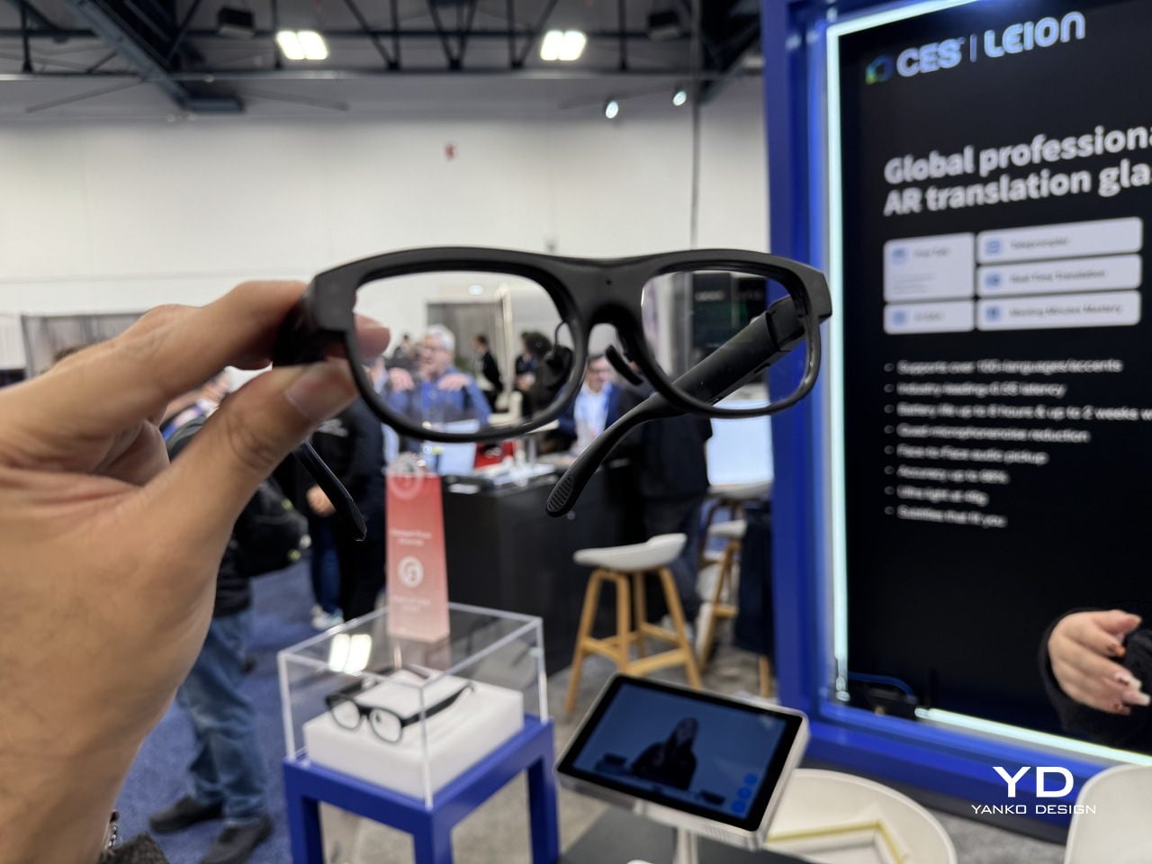
Leion Hey2 is a pair of professional AR translation glasses from LLVision, a company that has spent more than a decade deploying AR and AI in industrial and public-sector settings. Hey2 is not trying to be an all-in-one headset; it is engineered from the ground up for real-time translation and captioning, supporting more than 100 languages and dialects with bidirectional translation and latency under 500 ms in typical conditions, plus 6–8 hours of continuous translation on a single charge.

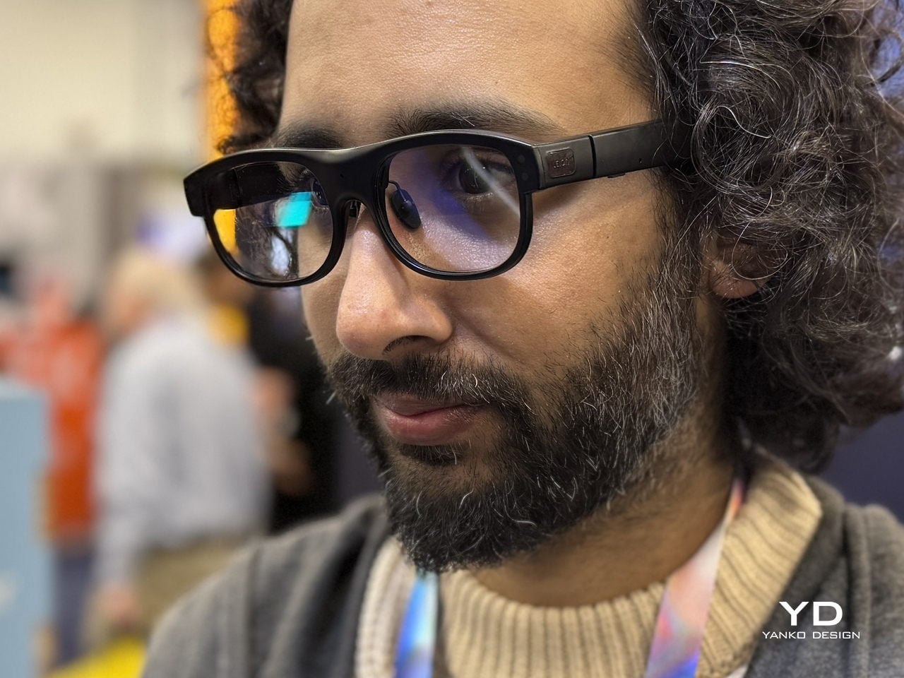
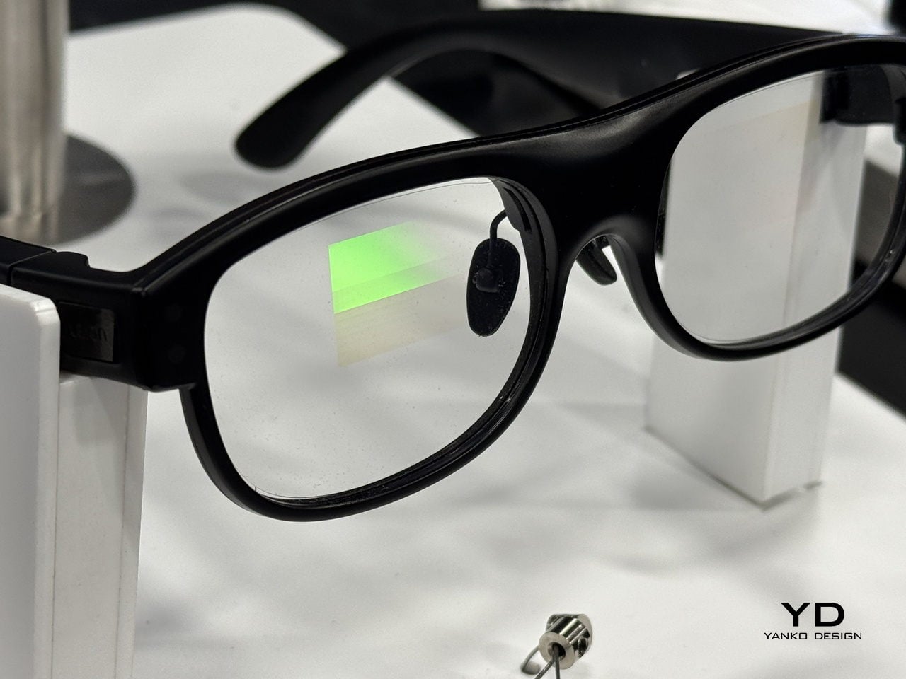
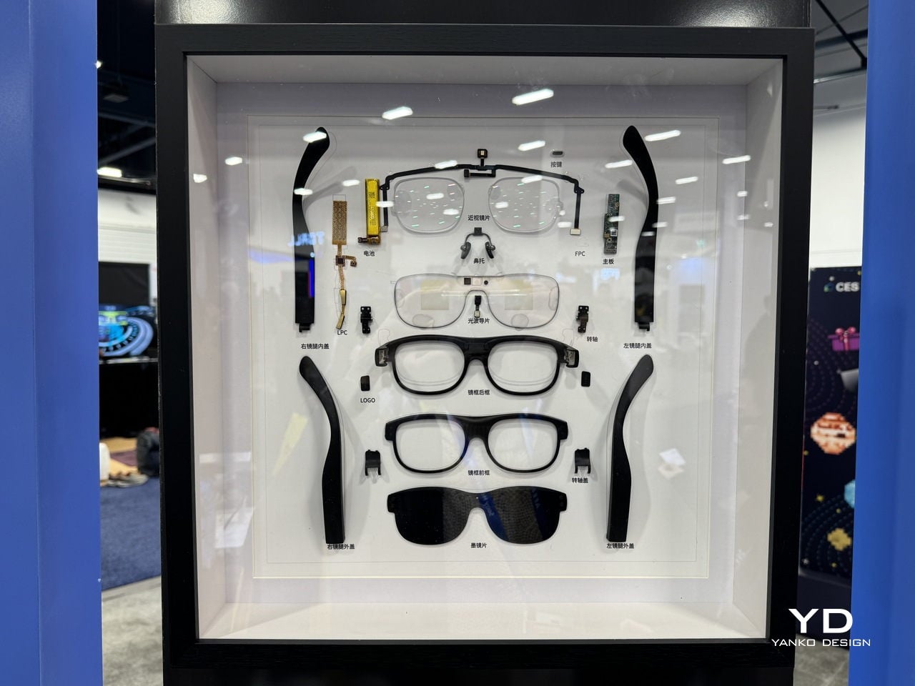
Hey2 is designed to wear like everyday eyewear rather than a gadget. The classic browline frame, 49g weight, magnesium-lithium alloy structure, and adjustable titanium nose pads are all chosen to make it feel like a normal pair of glasses you forget you are wearing. A stepless spring hinge adapts to different faces, and the camera-free, microphone-only design, which follows GDPR-aligned privacy principles and is supported by a secure cloud infrastructure built on Microsoft Azure, helping keep both wearers and bystanders more comfortable in sensitive environments.

Subtitles in Your Line of Sight

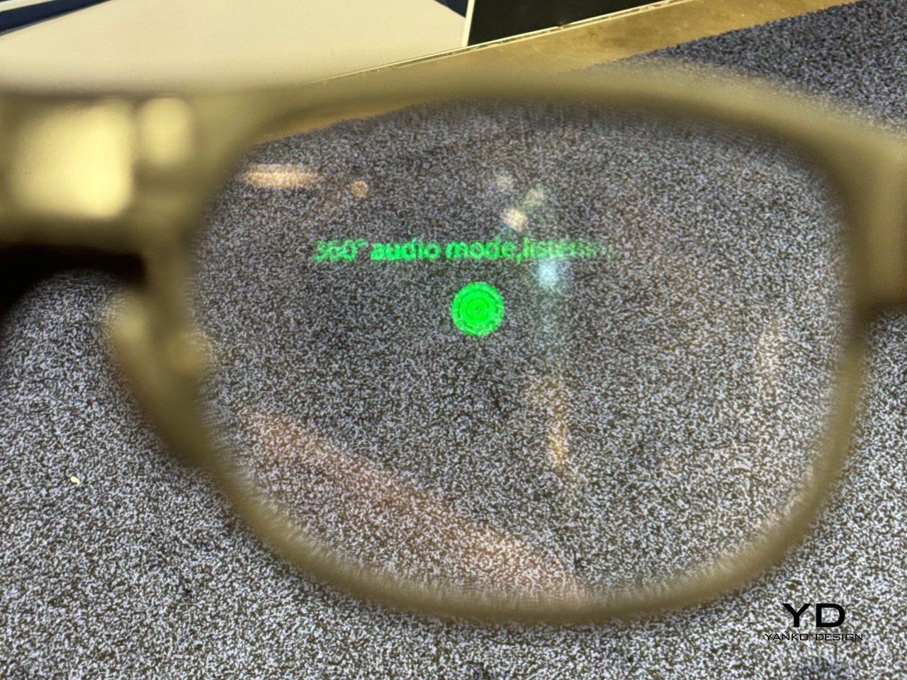
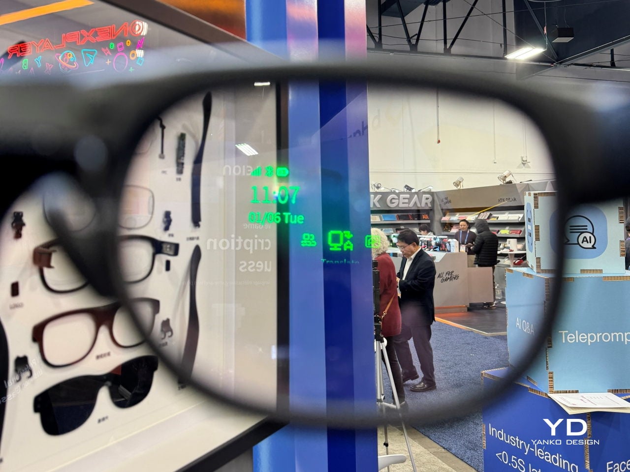
Hey2 uses waveguide optics and a micro-LED engine to project crisp, green subtitles into both eyes, with a 25-degree field of view and more than 90% passthrough so the real world stays bright. The optical engine is tuned to reduce rainbow artifacts by up to 98%, keeping text stable and readable in different lighting conditions, while three levels of subtitle size and position let you decide how prominently captions sit in your forward field of view.

The audio side relies on a four-microphone array that performs 360-degree spatial detection to identify who is speaking, while face-to-face directional pickup prioritizes the person within roughly a 60-degree cone in front of you. A neural noise-reduction algorithm uses beamforming and multi-channel processing to isolate the main voice, which helps in noisy restaurants, busy trade-show floors, or classrooms where questions come from different directions, without forcing you to constantly adjust settings.

Modes That Support Work, Learning, and Accessibility

In translation and Free Talk modes, foreign speech is converted into your language as subtitles in your line of sight, so you can mix languages freely and still follow long-form speech without constantly checking a screen. In Free Talk, Hey2 provides subtitles for what you hear and spoken translation for what you say, turning a two-language conversation into something that feels more like a normal chat than a tech demo, with the charging case extending total use to 96 hours across 12 recharges.

Teleprompter mode scrolls your script in your line of sight and advances it automatically as you speak, useful for lectures, pitches, or keynotes where you want to keep eye contact without glancing at notes. AI Q&A, triggered by a temple tap, taps into ChatGPT-powered answers for discreet look-ups, while Captions mode turns fast speech into clean text, helping students, professionals, and Deaf or hard-of-hearing users stay on top of what is being said, even in noisy environments where handheld devices struggle.

A Different Kind of AR Story

When Leion Hey2 steps onto the CES 2026 stage, it represents a quieter kind of AR story. Instead of chasing spectacle, it narrows the brief to something very human, helping people speak, listen, and be understood across languages and hearing abilities. For a show that often celebrates what technology can do, Hey2 is a reminder that sometimes the most interesting innovation is the one that simply lets you keep your head up and stay in the conversation.

Click here to know more.

The post Leion Hey2 Brings First AR Glasses Built for Translation to CES 2026 first appeared on Yanko Design.
Razer’s Project AVA Brings Holographic AI Companions to Your Desk

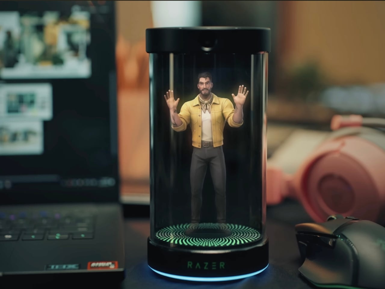
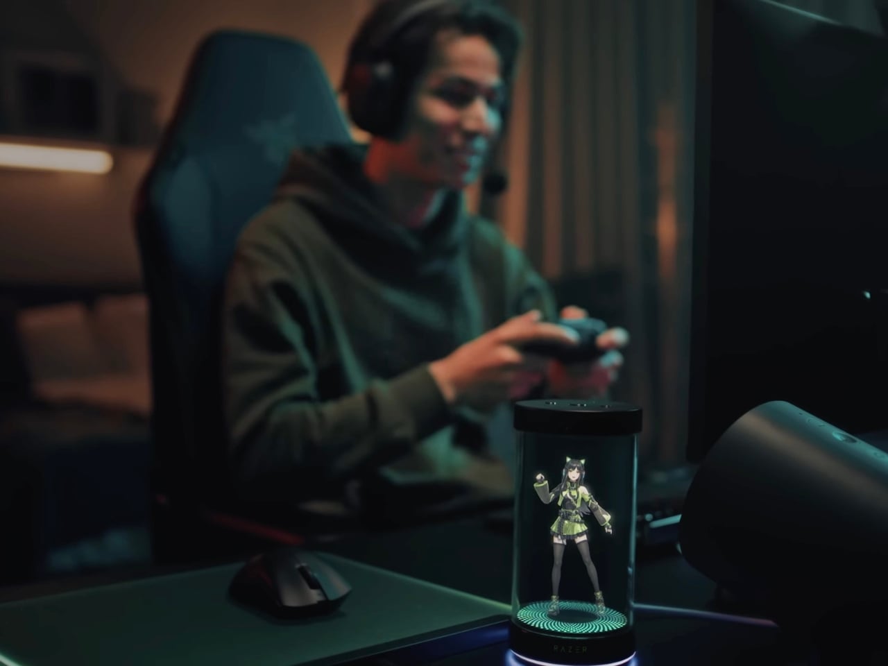
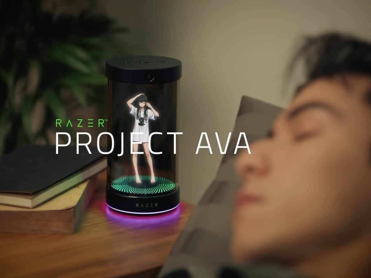
Remember watching sci-fi movies as a kid and dreaming about the day you’d have your own holographic assistant? Well, that future just arrived, and it’s cuter than we ever imagined. Razer unveiled Project AVA at CES 2026, and honestly, it’s giving us all the futuristic vibes we didn’t know we needed.

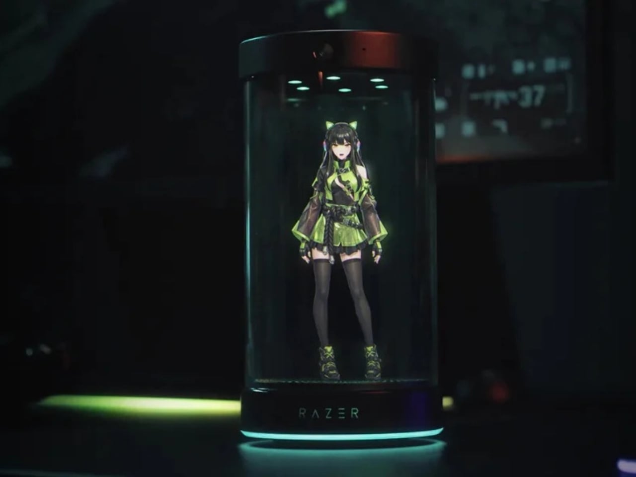
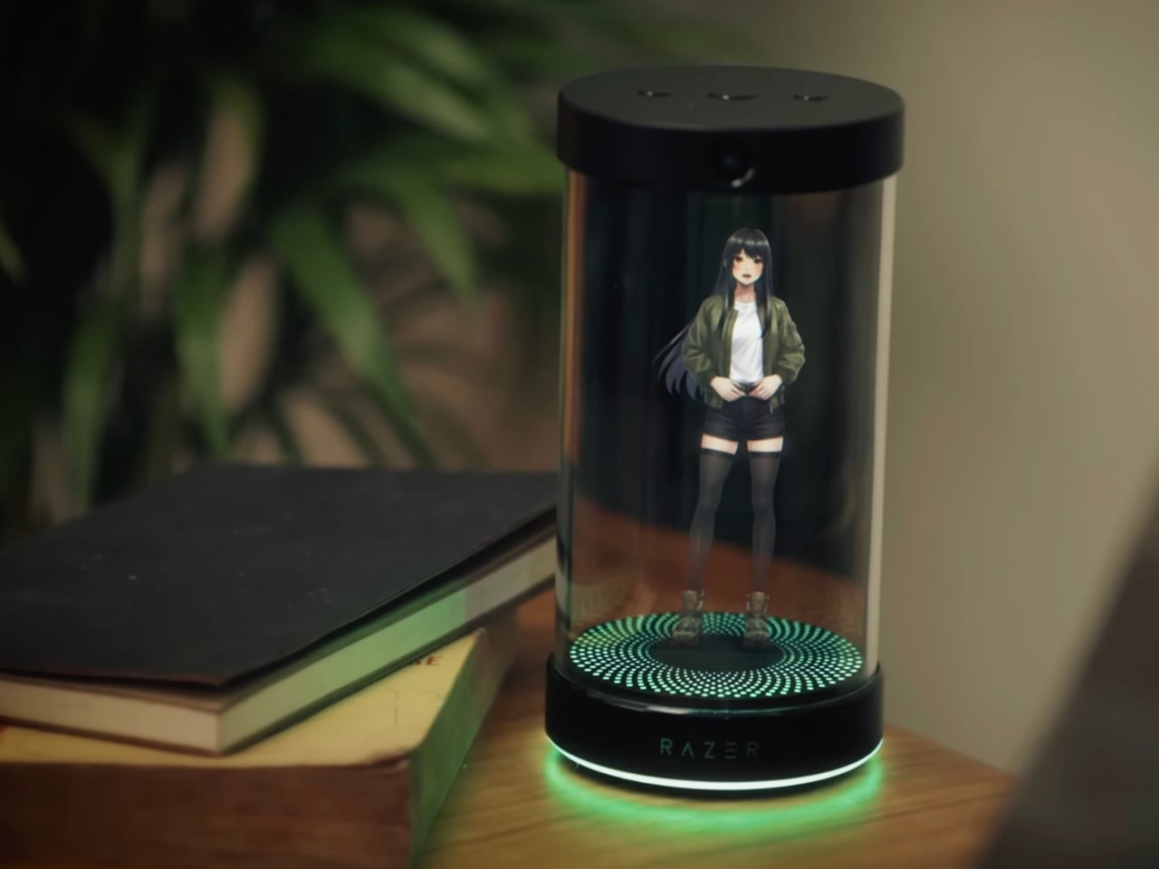
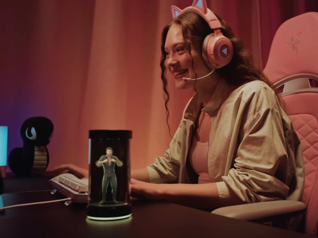
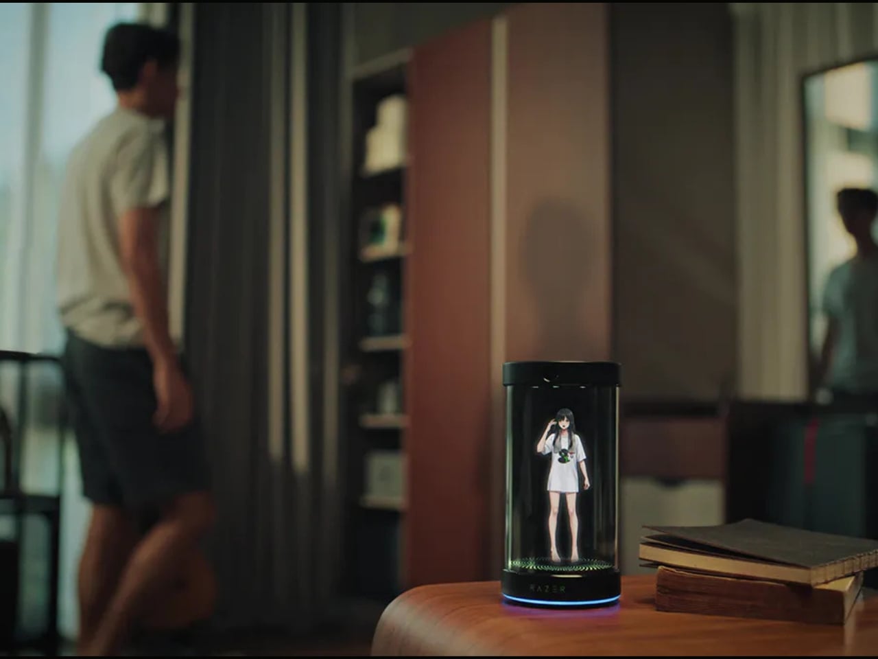
Picture this: a sleek cylindrical device sitting on your desk, projecting a 5.5-inch animated 3D hologram that actually talks to you, learns your habits, and becomes your daily companion. It sounds like something straight out of a Black Mirror episode, but in the best possible way.

Designer: Razer

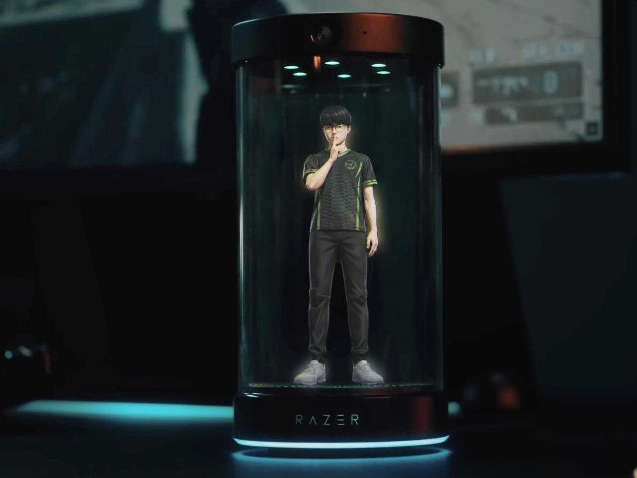
What makes Project AVA so fascinating isn’t just the holographic technology itself (though let’s be real, that’s pretty spectacular). It’s how Razer has reimagined what AI companionship could look like in our physical spaces. Unlike Siri hiding in your phone or Alexa trapped in a speaker, AVA exists as a visible presence on your desk. She has facial expressions, tracks eye movement, and her lips actually sync when she talks. It’s the kind of detail that transforms a gadget into something that feels surprisingly alive.

The personality customization is where things get really interesting. You can choose from different avatars, each with their own distinct personality. There’s Kira, an anime-style character perfect for gaming enthusiasts. There’s Zane for those wanting a more professional vibe. And then, in what might be the most genius collaboration ever, there’s an avatar modeled after League of Legends legend Lee “Faker” Sang-hyeok, plus characters from Sword Art Online. Razer clearly understands its audience, and they’re leaning hard into gaming and anime culture in the best way possible.

But here’s what really sets AVA apart: she’s powered by xAI’s Grok engine, which gives her some seriously sophisticated AI capabilities. This isn’t just a voice assistant that sets timers and plays music. AVA learns from your interactions and evolves her personality based on how you communicate with her. She can help organize your schedule, brainstorm creative projects, analyze data, and even provide real-time gaming coaching by actually watching your screen and offering strategic advice.

The gaming features deserve special attention because they’re genuinely innovative. Through what Razer calls “PC Vision Mode,” AVA can analyze your gameplay in real-time and offer coaching tips. Before you worry, Razer has been clear that AVA is designed as a coach and trainer, not an automated playing tool, so she won’t get you banned from competitive games. She’s more like having a knowledgeable friend watching over your shoulder, offering helpful suggestions.

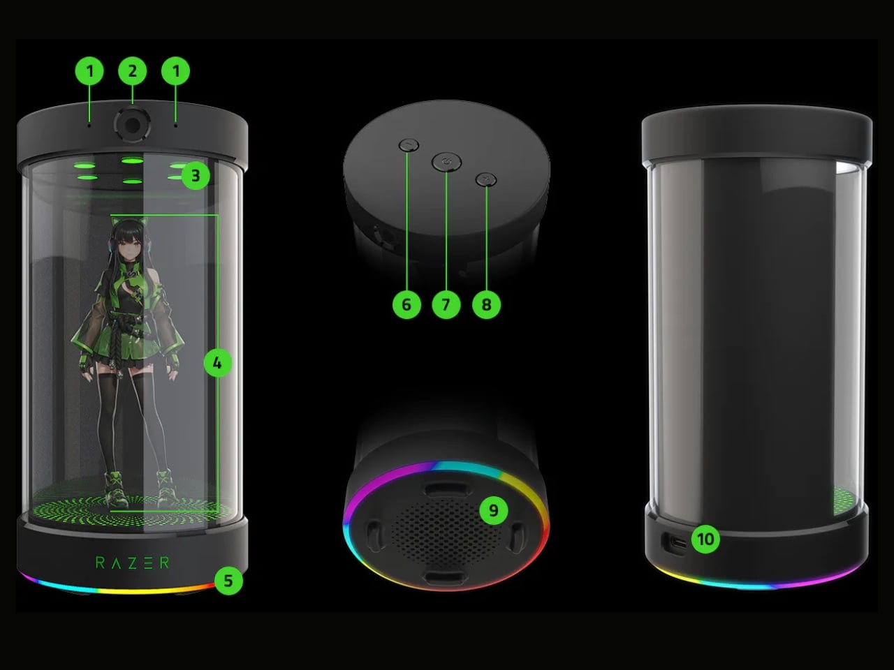
From a design perspective, the cylindrical unit houses impressive tech: dual far-field microphones, an HD camera with ambient light sensors, and of course, Razer’s signature Chroma RGB lighting because aesthetics matter. The device connects to your Windows PC via USB-C, ensuring the high-bandwidth data transfer needed for those real-time features to work smoothly.

What’s particularly clever about Project AVA is how it addresses something we’ve all experienced with traditional AI assistants: the disconnect. When you’re talking to a voice in a speaker, it feels transactional. But when there’s a holographic character making eye contact and responding with facial expressions, the interaction becomes more engaging and, dare I say, more human.

Razer is calling AVA a “Friend for Life,” which might sound like marketing hyperbole, but it hints at something bigger happening in tech culture. We’re moving beyond thinking about AI as tools and starting to explore how they might serve as companions in our daily lives. It’s a fascinating cultural shift that raises interesting questions about how we’ll interact with technology in the coming years.

For anyone interested in being part of this next wave of AI innovation, reservations are open now for a $20 deposit, with the device expected to launch in late 2026. Whether you’re a tech enthusiast, a collector of innovative gadgets, or just someone who’s always wanted their own holographic companion, Project AVA represents something genuinely new in the consumer tech space.

The post Razer’s Project AVA Brings Holographic AI Companions to Your Desk first appeared on Yanko Design.
Best Tech Gadgets of 2025: 10 Innovations You Need to See

Technology moves fast, but 2025 feels like a distinct era. This year brought gadgets that challenged convention rather than followed it. From keyboards that fold into phone cases to power banks that communicate through light, these innovations prove that great design starts with questioning what we’ve accepted as normal. The products ahead represent a shift in thinking about portability, interaction, and what our devices should actually do for us.

What makes these ten gadgets stand out isn’t just their novelty. Each one addresses a real frustration with current tech, offering solutions that feel both refreshingly simple and genuinely innovative. Whether you’re tired of touchscreen typing, craving better smartwatch docks, or looking for portable computing power, these designs rethink familiar categories from the ground up. They remind us that the future of technology lies in thoughtful problem-solving, rather than merely adding more features.

1. Plumage: The Keyboard-Case Hybrid That Actually Makes Sense

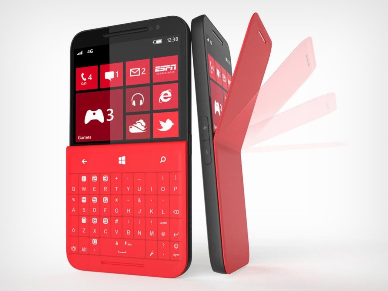
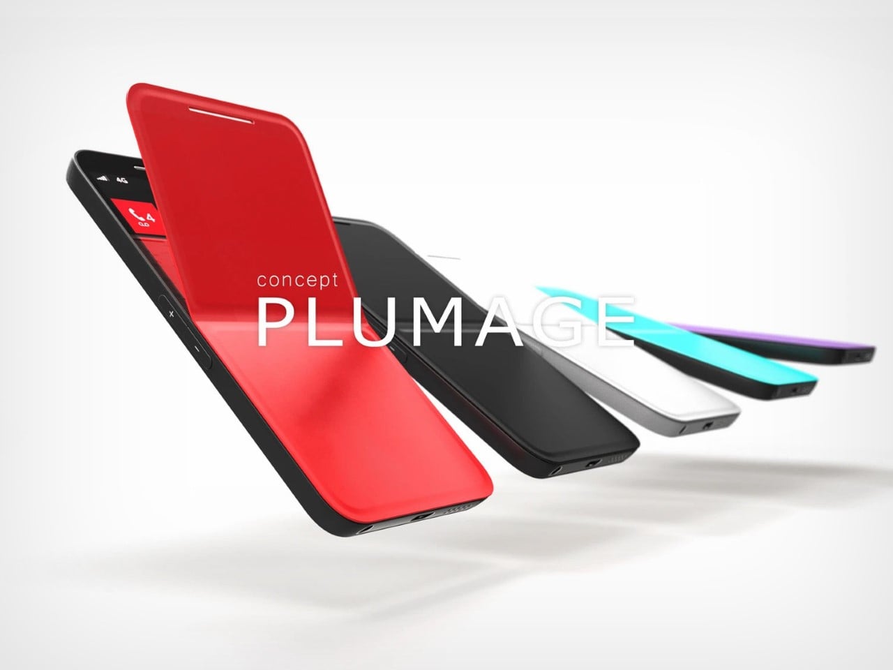
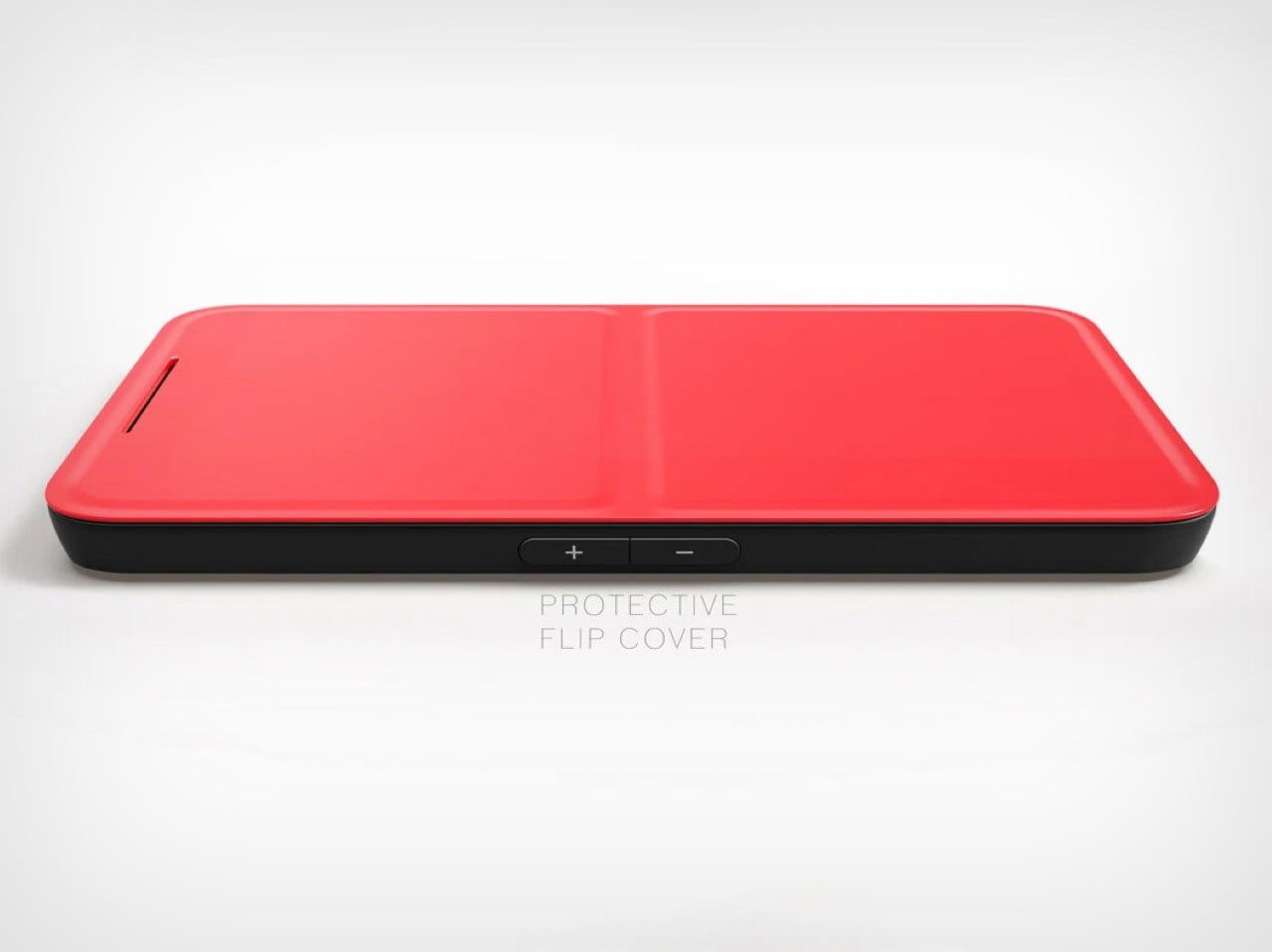
Typing on touchscreens has never felt right, and bolt-on keyboard solutions create phones that resemble small tablets. The Concept Plumage solves both problems by integrating a physical keyboard directly into a phone case without extending the device’s footprint. Originally designed by Jet Weng in 2013, this concept flips open like peeling a banana to reveal a Blackberry-style layout with a screen on top and tactile keys below. The phone stays compact when closed, transforms for serious typing when open.

What makes this design brilliant is its acknowledgment that screens don’t need to cover every inch of our phones. The half-screen approach feels counterintuitive until you realize most typing happens in apps where the keyboard covers half the display anyway. Flip it open for confident typing during emails or messaging, navigate with the touch-sensitive upper screen, then flip it shut for pocket-friendly portability. This concept deserves resurrection because it prioritizes how people actually use their phones over chasing edge-to-edge displays.

What we like

  • The keyboard integrates without adding bulk to the phone’s footprint
  • Physical keys enable fast, accurate typing without sacrificing screen real estate when closed

What we dislike

  • The half-screen design requires adjusting expectations about display size
  • The flip mechanism could introduce durability concerns with repeated daily use

2. MSI Gaming PC Watch: When Wearables Go Full Desktop

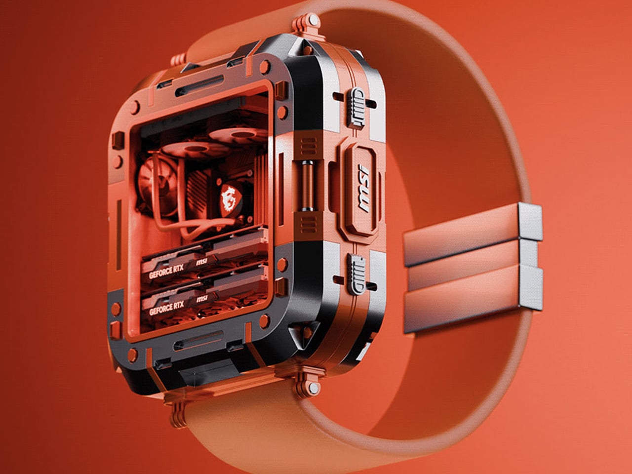
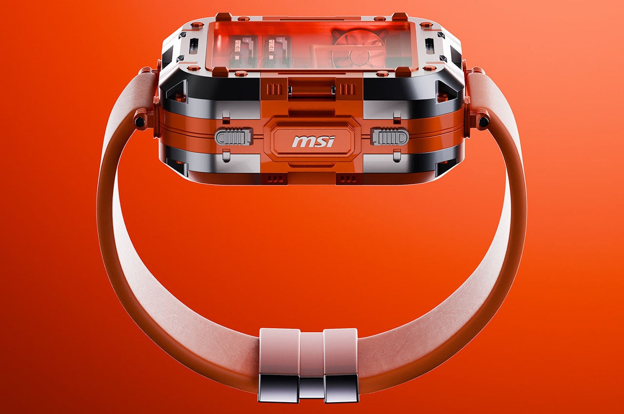
Smartwatches pretend to be tiny phones strapped to your wrist, but the MSI Gaming PC Watch takes a radically different approach. This concept treats your wrist as a platform for an actual computer, complete with visible fans, graphics components, cooling systems, and motherboard elements right through the watch face. The design features subtle analog watch hand annotations and four side pushers for navigation. The metal alloy case proudly displays the MSI logo at 3 o’clock, where a traditional crown would sit.

This wearable computer represents a philosophical departure from smartphone-on-your-wrist thinking. By embracing computer periphery ideology rather than mimicking phone interfaces, the Gaming PC Watch suggests an alternative path for wearable innovation. The transparent components aren’t just aesthetic flourishes; they telegraph the device’s identity as genuine computing hardware miniaturized for portability. Whether checking system performance, monitoring temperatures, or simply appreciating the engineering, this watch makes technology itself the main attraction rather than hiding it behind glossy screens.

What we like

  • The transparent design showcases actual computing components with visual appeal
  • It reimagines the smartwatch’s purpose beyond smartphone replication

What we dislike

  • The gaming aesthetic may not suit professional or formal settings
  • Visible internal components could raise questions about durability and water resistance

3. Nothing Power 1: The Battery Bank That Speaks Through Light

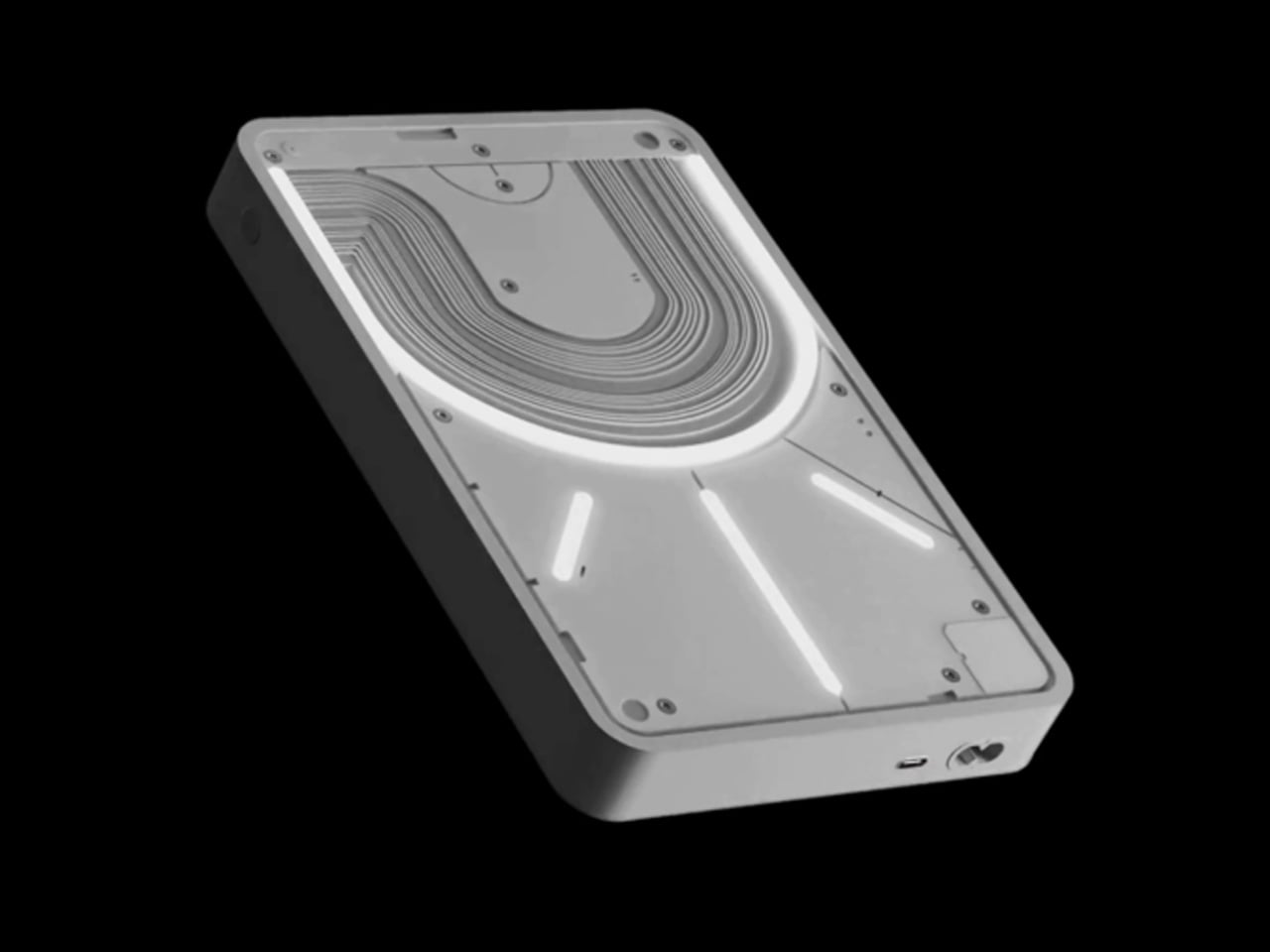
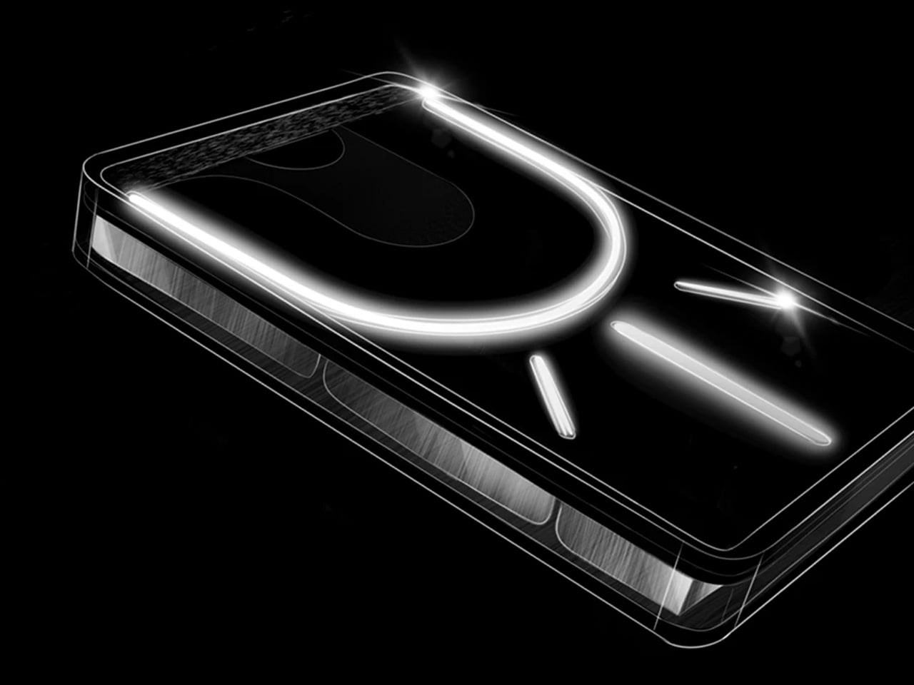
Power banks typically hide their technology behind opaque shells, but the Nothing Power 1 concept revives the glyph interface that made the Nothing Phone famous. This 20,000 mAh battery bank features transparent layers with bold light paths that transform illumination into precise information. Every light on the back panel serves a purpose, indicating battery levels, charging status, and even smartphone notifications when connected. The design language echoes the circuit pathways and physical logic of Nothing’s original phone, maintaining the brand’s commitment to meaningful transparency.

Fast charging at 65W means reaching 50% capacity in under 20 minutes, while the substantial battery capacity delivers at least three phone charges before needing a refill. The glyph interface goes beyond simple battery indication by connecting with your smartphone to display alerts and charging progress through purposeful light patterns. This approach makes waiting for your phone to charge more informative and visually engaging. The design proves that power banks don’t need to be boring rectangular slabs; they can communicate status elegantly while celebrating the technology inside.

What we like

  • The glyph interface turns light into precise, purposeful information
  • The 20,000 mAh capacity with 65W fast charging delivers both power and speed

What we dislike

  • The transparent design may show dirt and fingerprints more readily
  • The unique aesthetic might not appeal to users who prefer minimal, discreet accessories

4. Oakley Aether: The AR Glasses Google Should Have Built

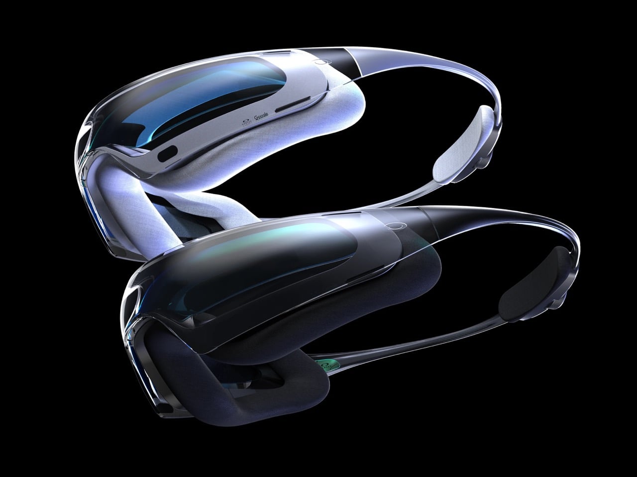
Google once led the smart headset space before abandoning it for one-off experiments, but the Oakley Aether concept imagines an alternate timeline where Google remained committed. Modeled after ski goggles, these performance-driven glasses enclose your eyes in a protective bubble with 100% visibility enhanced by Android AR and Gemini AI integration. The design suggests what happens when you combine Oakley’s athletic expertise with Google’s software prowess, creating headsets that reimagine movement, insight, and precision through immersive technology.

The goggle format provides advantages traditional glasses can’t match: full environmental protection, expanded display real estate, and room for cameras, LiDAR, and other sensors essential for convincing AR. Pop them on and view the world through a heads-up display showing contextual information, notifications, and activity recordings for later analysis. Gemini AI integration enables natural conversation with your headset, creating interactions reminiscent of talking to JARVIS in Iron Man. This concept proves that AR glasses don’t need to look like traditional eyewear; embracing the goggle format opens new possibilities for capability and comfort.

What we like

  • The goggle format allows superior sensor integration and displays real estate
  • Gemini AI enables natural voice interaction for hands-free control

What we dislike

  • The ski goggle aesthetic may feel too sporty for everyday urban use
  • The enclosed design could cause comfort issues during extended wear

5. TWS ChatGPT Earbuds: AI That Sees What You See

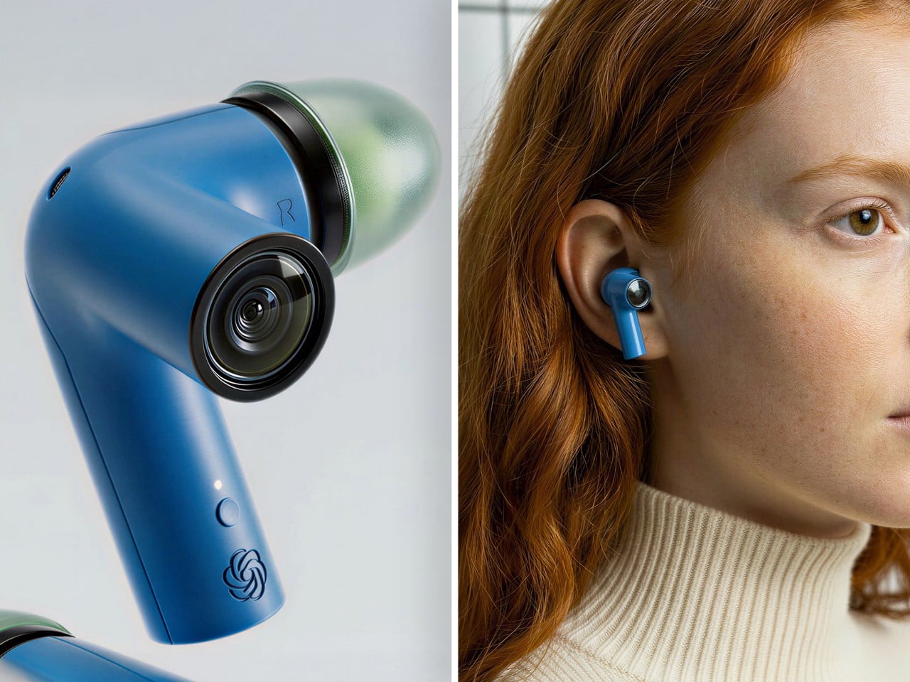
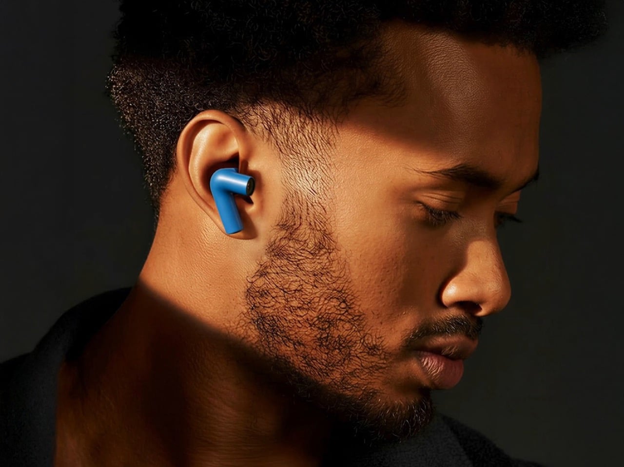
Most wireless earbuds focus exclusively on audio, but this concept adds cameras to each stem, positioned near your natural sight line. Paired with ChatGPT, those lenses become a constant visual feed for an AI assistant living in your ears. The system can read menus, interpret signs, describe scenes, and guide you through unfamiliar cities without requiring you to hold up your phone. The form factor stays familiar while the capabilities feel genuinely new, making AI feel less like a demo and more like a daily habit.

The industrial design resembles a sci-fi inhaler in the best possible way. Each lens sits at the stem’s end like a tiny action camera, surrounded by a ring that doubles as a visual accent. The colored shells and translucent tips keep the aesthetic playful enough to read as audio gear first, camera second. This positioning matters because cameras in your ears feel less invasive than cameras on your face. You maintain eye contact during conversations, avoid the social stigma of face-mounted recording devices, and gain AI vision capabilities that activate only when needed.

What we like

  • The ear-mounted cameras feel less socially awkward than face-mounted alternatives
  • ChatGPT integration provides practical AI assistance for navigation and information

What we dislike

  • Privacy concerns may arise from cameras pointed at people during conversations
  • Battery life could suffer from powering both audio and visual processing

6. Gboard Dial: When Keyboard Design Gets Delightfully Absurd

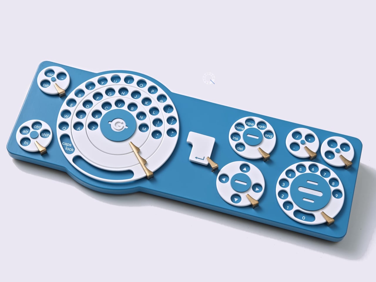
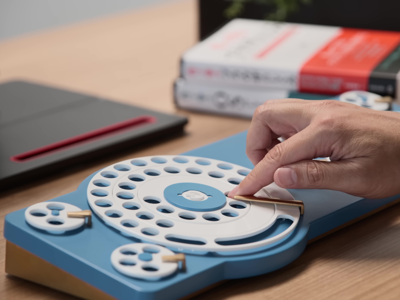
Google Japan’s annual keyboard concepts embrace playful absurdity, and the Gboard Dial Version spins this tradition in a new direction. Released on October 1st to honor the classic 101-key layout, this 14th entry features a wonderfully over-engineered dial mechanism where users insert fingers into positioned keyholes and rotate to select characters. The three-layer dial structure supposedly delivers three times faster input with parallel operation capability. The nostalgic grinding sound becomes a feature rather than a bug, promoting what the team calls a calmer thinking and input experience.

This satirical concept follows memorable predecessors like the Gboard Teacup, Stick, Hat, and Double-Sided keyboards. While obviously impractical for actual productivity, the Dial Version raises interesting questions about input methods and the assumptions we make about efficiency. The deliberate slowness forces more thoughtful composition, and the physical interaction provides tactile satisfaction missing from touchscreens and flat keyboards. Sometimes the best tech concepts aren’t meant for production; they’re meant to make us reconsider what we’ve accepted as optimal.

What we like

  • The playful design challenges assumptions about keyboard efficiency and input methods
  • The tactile interaction provides satisfying physical feedback

What we dislike

  • The intentionally slow input method makes it impractical for actual work
  • The three-layer dial mechanism would likely be fragile with regular use

7. NightWatch: The Apple Watch Dock That Does Everything Right

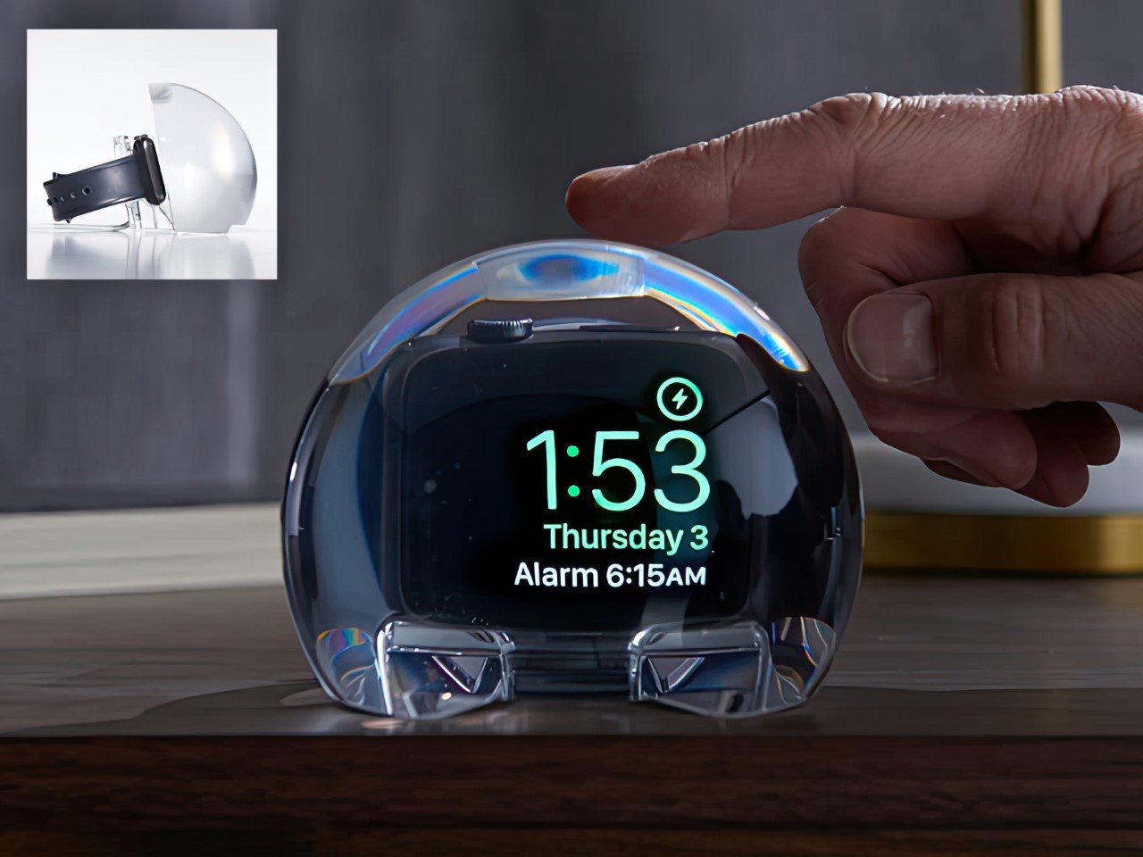
Charging docks for smartwatches typically amount to simple stands with integrated power, but the NightWatch transforms your Apple Watch into a proper bedside alarm clock through clever design. This solid lucite orb magnifies your watch screen, making the time clearly legible from several feet away. Strategic channels under the speaker units amplify sound naturally, similar to cupping your hands around your mouth, ensuring your alarm actually wakes you. The entire transparent sphere is touch-sensitive, allowing a simple tap to wake the watch display.

The brilliance lies in its simplicity. There are no hidden components, no electronic trickery, just thoughtful application of physics and material properties. The lucite magnification works optically, the sound amplification happens through shaped channels, and the touch sensitivity uses the material’s properties. Your Apple Watch docks inside, charges overnight, and becomes infinitely more useful as a bedside timepiece. The transparent design lets you appreciate the watch itself, while the orb form creates an appealing sculptural presence on your nightstand.

What we like

  • The optical magnification makes the time readable from across the room
  • Natural sound amplification ensures alarms are actually audible

What we dislike

  • The large orb form takes up significant nightstand space
  • The design works exclusively with the Apple Watch, limiting its audience

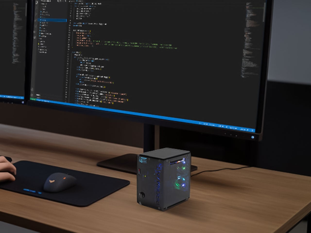
8. Pironman 5-MAX: Turning Raspberry Pi Into a Desktop Powerhouse

The naked Raspberry Pi 5 board looks humble, but the Pironman 5-MAX case transforms it into a legitimate desktop computer packed with serious capabilities. This miniature rig features dual NVMe SSD slots for lightning-fast storage, support for AI accelerators like the Hailo-8L for machine learning workloads, and clever design features that maximize the Pi’s potential. The compact desktop form factor punches well above its weight, proving that mini machines can handle tasks once reserved for full-sized computers.

What makes this case special is how it treats the Raspberry Pi with the seriousness of proper desktop hardware. The dual NVMe support brings storage speeds and capacity that enable media servers, project development, and even AI experimentation within this tiny chassis. Adding AI acceleration capabilities means your Pi 5 can tackle machine learning tasks, opening possibilities that seemed absurd for single-board computers just years ago. This case doesn’t just protect your Pi; it unlocks its full potential as a capable, expandable desktop machine.

What we like

  • Dual NVMe SSD slots deliver professional-grade storage speed and capacity
  • Support for AI accelerators enables machine learning on a compact platform

What we dislike

  • The added hardware increases the overall cost beyond the base Pi 5 investment
  • The compact form factor may limit cooling efficiency under sustained heavy loads

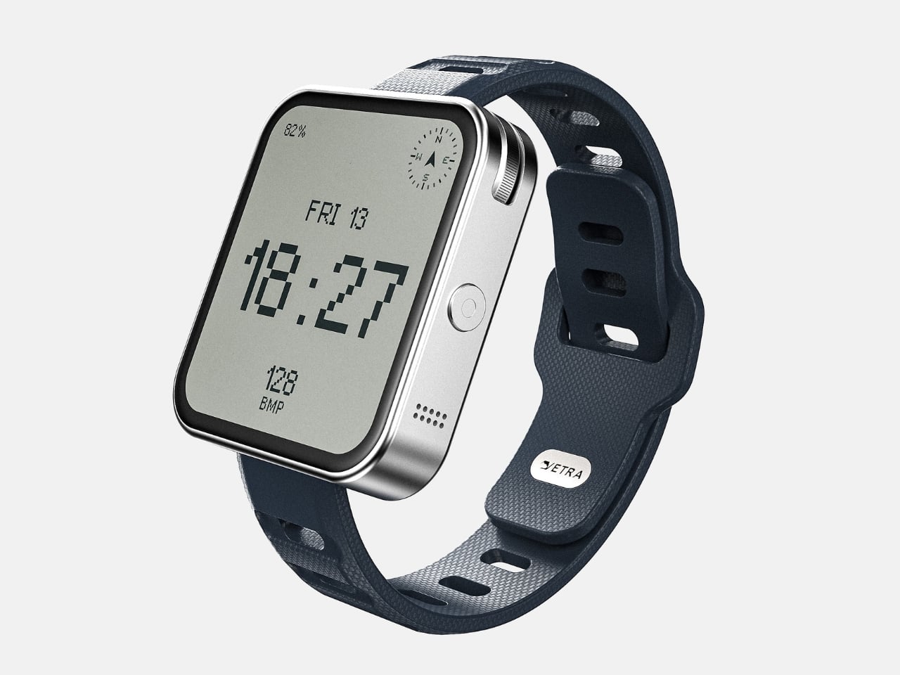
9. Vetra Orbit One: Minimalism Meets Tactile Smart Technology

The Vetra Orbit One concept smartwatch steps away from attention-grabbing screens toward satisfying physical interaction blended with forward-thinking features. Imagine a rotating bezel providing nuanced control, textured surfaces offering rich sensory feedback, and design elements evoking classic timepiece pleasure. This approach integrates the satisfying feel of traditional watchmaking into modern smart technology without simply replicating the past. The minimalist aesthetics reject overwhelming visual noise in favor of clean lines, subtle details, and essential information presentation.

This philosophy prioritizes clarity and elegance, ensuring the watch functions as a sophisticated accessory rather than a distracting wrist billboard. The tactile nostalgia isn’t about rejecting progress; it’s about preserving what made traditional watches satisfying to wear and use. The concept combines physical interaction satisfaction with smart capabilities, creating a device that feels good to touch and operate. When every smartwatch chases more screen space and brighter displays, the Orbit One suggests that sometimes less really is more.

What we like

  • The tactile interface provides satisfying physical interaction, missing from touchscreen-only devices
  • Minimalist aesthetics create an elegant, unobtrusive accessory

What we dislike

  • Limited screen space may restrict app functionality compared to larger smartwatches
  • The focus on physical controls could slow certain interactions requiring screen input

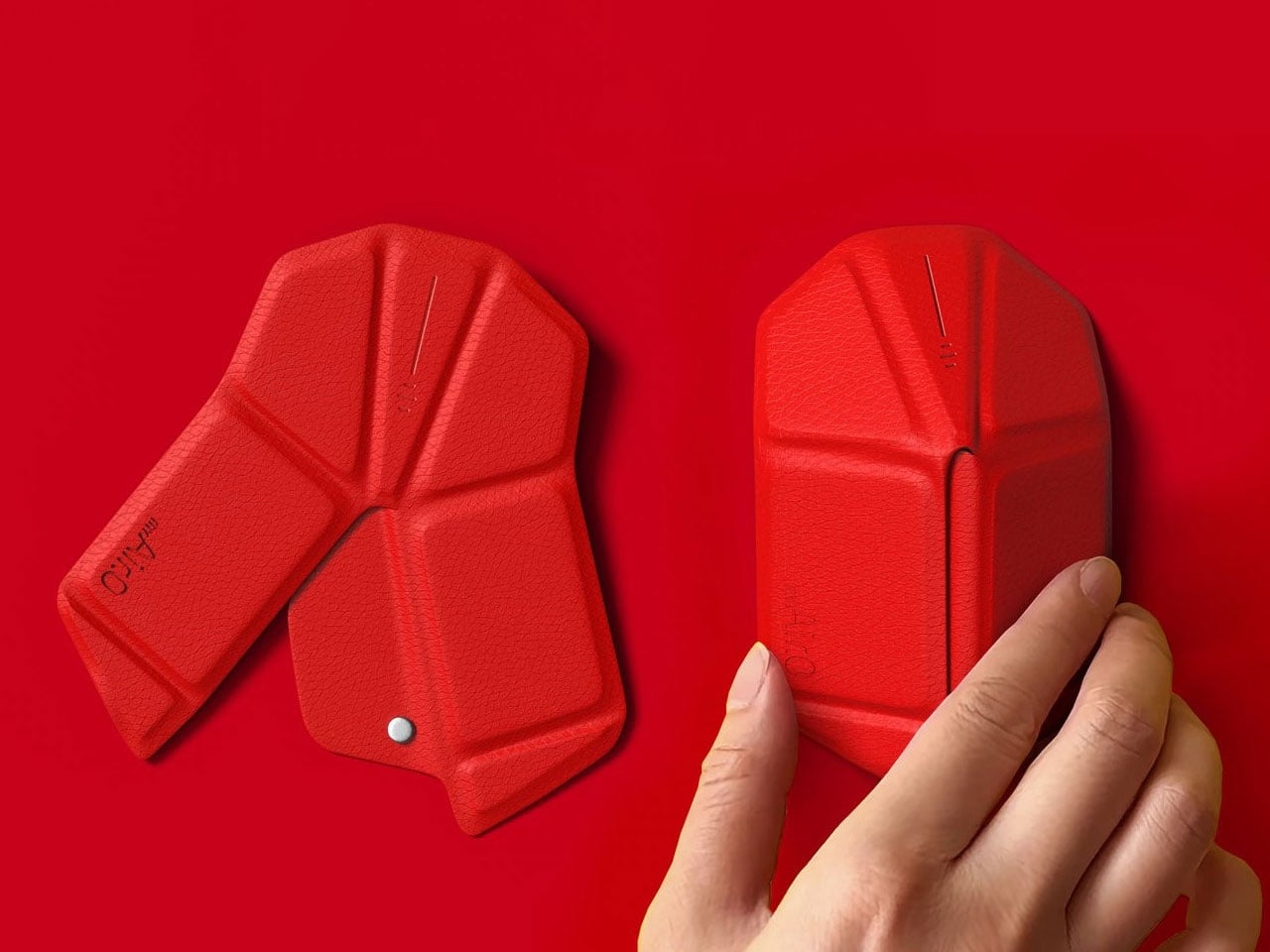
10. OrigamiSwift: The Folding Mouse That Fits Anywhere

Most portable mice compromise on either size or comfort, but OrigamiSwift solves this dilemma through an origami-inspired folding design. This Bluetooth mouse delivers full-sized comfort and precision when deployed, then folds completely flat to slip into any bag or pocket. The transformation happens in under 0.5 seconds with a simple flip, instantly activating the device for use. At just 40 grams with an ultra-thin profile, it’s barely noticeable until you need it, making it ideal for digital nomads, frequent travelers, and anyone who works from multiple locations.

The triangular origami structure provides surprising durability despite its folding nature, maintaining shape through repeated daily use. Soft-click buttons and smooth gliding work across various surfaces for responsive, discreet operation. The USB-C rechargeable battery lasts up to three months per charge, eliminating disposable battery waste. Designed by Horace Lam, OrigamiSwift reflects the harmony between artistry and practicality, where intricate folds echo timeless elegance while sleek lines embody modern minimalism. This mouse becomes more than a tool; it’s a statement about refined portable tech.

Click Here to Buy Now: $79.00

What we like

  • The folding design offers full-sized comfort that collapses to pocket-portable dimensions
  • Three-month battery life provides long-term reliability between charges

What we dislike

  • The folding mechanism introduces potential durability concerns with intensive daily use
  • The origami-inspired form may not suit users who prefer traditional mouse shapes

The Future Feels Different This Year

These ten innovations share a common thread beyond their 2025 release timing. Each one questions assumptions we’ve made about how technology should look, feel, and function. They prove that innovation doesn’t always mean adding more features or making screens larger. Sometimes the most exciting advances come from designers willing to completely rethink categories we thought were settled.

What excites me most about these gadgets is their willingness to be different. They embrace tactile feedback when everyone else chases touchscreens, add cameras to earbuds while others focus solely on audio, and turn power banks into communication devices through light. These products suggest that the next decade of technology will be defined less by raw specifications and more by thoughtful design that genuinely improves daily experience. That’s a future worth getting excited about.

The post Best Tech Gadgets of 2025: 10 Innovations You Need to See first appeared on Yanko Design.
Ovme Smart Mirror System Lets You See, Feel, and Fit Virtual Outfits

The everyday “what should I wear today?” moment has gotten more complicated by online shopping. You can scroll endless outfits, but a screen cannot show how something fits, feels, or plays with what you already own. Ovme is a concept that treats the mirror as a missing link between your closet, your feed, and your actual body, closing the gap between seeing and knowing.

Ovme is an AR smart mirror ecosystem built around three objects: a full-height mirror, a sensor-laden fitting belt, and a haptic tactile table, plus a companion app. The name stands for “Own version of me,” and the system is designed to help you find new styles, feel how they fit, and touch virtual fabrics before you ever click buy or open your wallet.

Designers: Daun Park, Seyeon Park, Chawon So, Yewon Shim, Yejin Hong

The mirror acts like a personal stylist, overlaying outfits on your reflection and pulling from three sources: new looks, your existing wardrobe, and reference images you feed it. You can swipe through categories like formal, sporty, or feminine, and see complete outfits assembled around your silhouette, then save the ones that feel right into a virtual closet for later when you need inspiration or want to revisit.

The fitting belt is a flexible band with sensors that can wrap around your head, waist, or thigh. It measures circumference and applies gentle pressure, tightening or loosening to simulate how a garment would hug or hang on that part of your body. On the mirror, the virtual outfit responds in real time, turning fit from a guess based on size charts into something your body can actually sense.

The tactile table is a slim pedestal with a haptic surface that uses electro-tactile feedback to mimic fabric textures. When you place your hand on it, the system can suggest sensations like smooth silk, textured knit, or structured leather in sync with what you see in the mirror. It attempts to close the gap between seeing a material and knowing how it might feel against your skin or draped over your shoulders.

Ovme also acts as a style diary. It can scan what you are wearing today, score the outfit, and save it to a timeline called My Closet, so you can revisit past looks and see patterns in what you actually wear. A social layer called OvUS lets you browse other people’s saved styles and mood boards, turning the mirror into a place to share and borrow ideas rather than stare at yourself alone.

Ovme treats getting dressed as an ongoing design process, not a daily panic, and uses AR, haptics, and sensing to give online fashion some of the feedback loops of a real fitting room. Whether or not this exact hardware ever ships, the idea of a home mirror that helps you experiment, feel, and remember your style captures a direction that deserves attention, especially as wardrobes become more scattered across platforms and shopping becomes more remote.

The post Ovme Smart Mirror System Lets You See, Feel, and Fit Virtual Outfits first appeared on Yanko Design.
Apple Vision Pro M5: How Tungsten, Knit, and Silicon Finally Make Spatial Computing Livable


The first time I strapped on Apple’s original Vision Pro, I almost waved to the nonexistent crowd watching me in that demo. It was that breathtaking an introduction to futuristic technology. But thirty minutes later, reality set in. That curved laminated glass and aluminum shell felt less like a window into the future and more like a beautiful brick bolted to my forehead.

Designer: Apple

Apple’s M5 Vision Pro refresh doesn’t change the object language. It still reads like a sci-fi ski goggle crossed with a premium camera body: all that curved glass, recycled aluminum, and fabric-wrapped interface that refuses to acknowledge gaming headset aesthetics exist. What Apple has done instead is far more interesting from a design standpoint. They’ve attacked the two biggest experiential flaws (visual fidelity under load and sustained wear comfort) through a combination of silicon headroom and, surprisingly, soft goods engineering.

The result is a product story that shifts from “breathtaking demo” to “actually livable spatial computer”: a device that doesn’t just show you other worlds but gives you psychological real estate to inhabit them. And that shift has everything to do with how Apple thinks about weight, balance, and the invisible physics of putting a computer on your face.

The Shell Stays the Same, The Experience Doesn’t

The M5 Vision Pro maintains the core silhouette that made the original so visually striking. That curved laminated glass front still acts as both visor and UI canvas for EyeSight, letting the device communicate outward while you compute inward. The aluminum frame still wraps the optics with the kind of machining tolerances you’d expect from Apple’s camera and audio hardware. If you put the M2 and M5 side by side, you’d struggle to spot the difference.

But inside that familiar shell, the micro-OLED optics now render roughly 10 percent more pixels than the original. That’s not Apple chasing field-of-view gimmicks. It’s a design decision aimed at reducing the cognitive friction of spatial computing. Higher pixel density and refresh rates up to 120 Hz for passthrough and Mac Virtual Display mean less motion blur, less eye strain, and less of that “I’m clearly looking at a screen” sensation that pulled you out of the experience on the M2.

Apple is using resolution and refresh as ergonomic features, not just spec bumps. They’re making the same industrial shell more transparent and less perceptible in daily use.

The M5 Chip as Comfort Feature

Apple’s M5 plus R1 pairing is positioned as a “dual-chip architecture”: one brain handles spatial computing while the other maintains that 12-millisecond photon-to-photon latency. That’s essentially a UX decision framed as silicon.

The 10-core CPU, 10-core GPU, hardware-accelerated ray tracing, and 16-core Neural Engine give Apple headroom for denser environments, more dynamic lighting, and heavier AI-assisted interactions without dropping frames. But the design-workflow angle is what matters here:

  • Sharper typography and UI chrome in floating windows, which is critical for Mac Virtual Display and creative tools
  • Higher, more flexible refresh rates (90/96/100/120 Hz), tuned to reduce blur when you’re looking through to the real world as much as at virtual content

You can frame the M5 not as “faster chip” but as “making the headset behave more like a neutral lens,” removing perceptible latency and grain from spatial interfaces until the technology itself becomes forgettable.

But visual clarity is only half the comfort equation. The other half is physical.

The Weight Problem Was Never Really About Weight

The original Vision Pro’s biggest experiential flaw wasn’t that it weighed too much. It was that it weighed too much forward. All that glass and optics cantilevered off your face, and after 30 to 60 minutes, you felt it in your cheekbones, your neck, your desire to take the thing off.

The battery is still external on the M5, with similar runtime: about 2.5 hours general use, 3 hours video. So the way the device sits on the skull is the only real comfort lever Apple can pull this generation. They’ve pulled it hard.

The first-gen straps forced an uncomfortable choice. The Solo Knit Band was soft but floppy. It worked for short sessions but couldn’t distribute load for extended wear. The Dual Loop Band was secure but clampy, leaving pressure lines and pushing users toward third-party halo straps and CPAP-style hacks.

Apple’s answer is the Dual Knit Band. And it’s the most “design-nerd” detail in the entire M5 product story.

Dual Knit Band: Tungsten, Torque, and Perceived Weight

The Dual Knit Band introduces a two-strap geometry where upper and lower straps are 3D-knitted as a single piece into what Apple calls a “dual-rib structure.” One strap cups the back of the head, the other runs over the crown, creating a cradle that triangulates the headset’s mass around the skull instead of hanging it from the face.

But here’s where it gets interesting: the lower strap hides flexible fabric ribs embedded with tungsten inserts that act as counterweights. They literally pull some of the load backward and down to reduce the forward torque on your neck.

Apple is manipulating the moment arm via hidden dense material so the device feels lighter without actually being dramatically lighter. It’s a borrowed-from-watchmaking move. Tungsten is what you use for rotor weights and balance wheels when you need maximum density in minimum space. It’s visually invisible but functionally critical.

The real-world effect is that the Dual Knit Band doesn’t change the number on the scale, but it changes where you feel those grams. A front-heavy visor becomes something closer to a weighted pair of headphones. Two-hour sessions feel normal instead of like a tech demo punishment.

Soft Goods as Core UX

Apple describes the Dual Knit Band as soft, breathable, and stretchy: 3D-knitted from performance yarns similar to the Solo Knit Band. The dual-rib knit structure is designed for cushioning and airflow. Reviewers and users commonly reported that earlier bands ran hot and left pressure lines; this one appears to address both complaints through textile engineering.

The Fit Dial mechanism uses a metal core with a textured outer ring and a slight pull-to-unlock action. Push to adjust one axis, pull to adjust the other, letting you independently tune top and back tension with one control. Micro ratchets give tactile feedback, and the push-pull gesture mirrors the Digital Crown’s multifunctionality elsewhere in Apple’s ecosystem.

Read together, Apple appears to be treating knit textiles, counterweights, and mechanical dials as part of the interface surface area, not just an accessory. That signals a philosophical shift: comfort isn’t something you tolerate to use Vision Pro. It’s designed into the product with the same rigor as the silicon.

Retrofit Ergonomics: The Cheapest Upgrade

The Dual Knit Band attaches to the Audio Straps via a simple, secure mechanism with release tabs, preserving the modular ecosystem introduced with the first Vision Pro. It ships in small, medium, and large sizes, comes included with M5 by default, and is sold separately as an upgrade that’s fully compatible with the original M2 model.

That compatibility is an important design signal. Apple is treating headbands as swappable “ergonomic modules” rather than disposable accessories. The Dual Knit Band becomes a retrofit that can rehabilitate earlier hardware, extending the life and desirability of equipment people already own.

If you already have the first Vision Pro, the cheapest way to “upgrade” isn’t the new chip. It’s this strip of knit and tungsten that quietly rehabilitates the hardware you already have.

What Changes in Practice

The M5 with Dual Knit Band finally makes Vision Pro something I can wear for hours. Less cheek pressure, less neck fatigue, and none of that “face is sliding off my skull” sensation that defined first-gen fit. People who tried 3D-printed hacks and CPAP-style mods say this is the first official strap that beats their DIY solutions, which is high praise from tinkerers.

A recent cross-country test made the difference concrete. Economy class, Dallas to New York and back. Sold-out flight, middle seat, hostile in every physical dimension. But with Vision Pro strapped on, the environment selector became an escape hatch. Moon surface, Yosemite, Mount Hood: each one a functional retreat that made a miserable seat survivable. The hardware disappeared; the space remained. For a four-hour flight wedged between strangers, I was effectively in my own private cabin.

One small design detail made the in-flight experience smoother: when Vision Pro detects motion (plane, car, train), rotating the Digital Crown surfaces a Travel Mode prompt. No fumbling with eye tracking while the cabin shakes. Just turn the crown, tap confirm, and the headset stabilizes for a moving environment. The button just works.

That’s the psychological real estate concept paying off in practice. The immersive environments aren’t screensavers. They’re functional escapes that only work when the hardware is comfortable enough to forget. When you can wear Vision Pro for an entire cross-country flight without wanting to rip it off, the environments graduate from novelty demo to genuine utility.

The combined story is holistic: fewer pressure points, less motion blur, and less cognitive friction all point to longer, more natural sessions. Multi-hour productivity runs and movie marathons feel more plausible because comfort and visual stability are both improved. Five or six hours in a day with minimal discomfort would have been unthinkable with the old strap without modifications.

The real story isn’t that Vision Pro gained new tricks. It’s that the things people already loved doing in it (3D movies, floating Mac screens, immersive photos) no longer come with the same physical tax.

Still a Computer on Your Face

Even with the improvements, the headset is still big, still expensive at $3,499 for 256GB, and still leaves some marks under the eyes for certain faces, just less aggressively than before. Some users report needing to fine-tune fit over a few days, especially when finding the right light seal and tension balance. There’s also the hair situation: if I had short hair, the Dual Knit Band would probably bother me more. With longer hair, everything just gets pushed back and settles into place. Vision Pro hair is a thing, but it’s not as bad as hat hair. I can tolerate it.

It’s still very much a computer on your face, not a magic pair of AR glasses. But the Dual Knit Band and M5’s visual stability nudge Vision Pro out of “showpiece gadget” territory and closer to something you can actually live in.

The post Apple Vision Pro M5: How Tungsten, Knit, and Silicon Finally Make Spatial Computing Livable first appeared on Yanko Design.
Shoei GT-Air 3 Smart helmet comes with integrated AR display for safer, smarter riding

Shoei has long been known for blending craftsmanship with subtle yet meaningful innovation, often pushing helmet design forward without relying on gimmicks. That legacy has included advancements in aerodynamics, visor clarity, and long-distance comfort – traits that touring riders have come to trust. EyeLights, on the other hand, has built a reputation for compact augmented-reality systems designed to keep information within a rider’s natural field of view.

Their paths converging was almost inevitable, and the result is a smart accessory for riders that shifts helmet technology into an entirely new category. The Shoei GT-Air 3 Smart takes the familiar touring shell and transforms it into the first full-face helmet with a fully integrated AR heads-up display, created to deliver essential riding data without ever diverting attention from the road.

Designer: Shoei and EyeLights

Developed jointly by Shoei and EyeLights, the GT-Air 3 Smart embeds a nano-OLED microdisplay directly into the visor structure. The projection appears about three meters ahead of the rider’s line of sight, presenting speed, navigation cues, call notifications, radar alerts, and even a compact map overlay. The Full HD display uses a 3,000-nit output so the information stays visible in strong daylight, and EyeLights claims the system can reduce reaction time by more than 32 percent compared to glancing down at external screens. Beneath the new visual technology, the helmet maintains Shoei’s established safety foundation. Its shell is constructed from the brand’s Advanced Integrated Matrix composite, which is an engineered blend of fiberglass and organic fibers used across the GT-Air 3 lineup. Apparently, it carries both DOT and ECE 22.06 certifications. Ventilation comes from a wide lower intake and upper intake with internal channels cut into the EPS liner, along with exhaust ports that release heat and moisture. A quick-release CNS-1C face shield with Pinlock support and an integrated QSV-2 sun visor maintains clarity across changing weather and lighting.

Communication features are built in through EyeLights’ Bluetooth system, supporting unlimited users and effectively unlimited range through cellular connectivity, with an offline mesh fallback when service drops. The audio kit includes speakers positioned within dedicated ear pockets and a microphone with active noise cancellation for clear conversations at speed. Voice control works with both Siri and Google Assistant to reduce rider input and keep focus ahead. The HUD, intercom, and audio system are powered by an internal battery designed to last more than ten hours under mixed use.

Charging is handled through a compact USB-C port positioned discreetly along the lower edge. The smart helmet retains the comfort and protection expected from the GT-Air line while introducing a fluid way to see essential data without shifting attention downward. For long-distance riders and daily commuters alike, the integration feels like a natural evolution rather than an add-on, offering a clearer, safer way to stay informed while riding. Shoei offers the helmet in White, Matte Black, Matte Metallic Blue, Matte Metallic Gray, and Realm TC10, with sizes ranging from S to XXL. Pricing starts at US$1,199, with a limited EICMA edition for those who like to ride differently.

The post Shoei GT-Air 3 Smart helmet comes with integrated AR display for safer, smarter riding first appeared on Yanko Design.
Samsung’s ‘Advanced Hinge’ Patent Could Finally Make Smart Glasses Comfortable for All-Day Wear

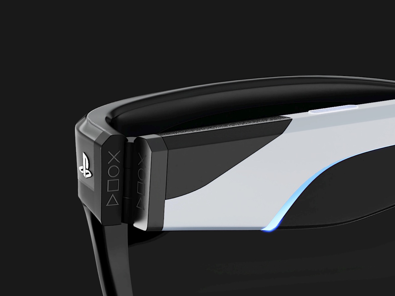
Samsung just published a patent for smart glasses with a pulley-and-cable hinge system, which sounds about as exciting as reading appliance manuals until you realize it’s solving the problem that kills most wearables: they don’t actually stay on your head comfortably. The mechanism synchronizes both temple arms so when one adjusts, the other follows automatically. This matters because smart glasses tend to slide around the moment you tilt your head or start moving, and no amount of fancy AR features can compensate for constantly pushing them back up your nose.

Here’s why this is so interesting. Meta’s Ray-Ban glasses have quietly sold over 2 million pairs, growing 60 percent year over year, which means there’s actually a market for this stuff when done right. Samsung’s apparently aiming for a 2026 launch at around $379 with a 50-gram frame, photochromic lenses, a 12MP camera, and Gemini AI handling translations and notifications. They’re partnering with Gentle Monster and Warby Parker, which suggests someone there finally understood that tech specs don’t matter if people feel ridiculous wearing them in public.

Designer: Samsung

The patent itself (image above) shows Samsung thinking through actual wearing scenarios rather than just cramming in features. The dual-axis hinge distributes pressure evenly and prevents the kind of hotspots that develop after an hour of wear. They’ve also filed separate patents for bone conduction audio, eye-tracking, and clip-on prescription lenses. Taken together, these aren’t random experiments but a systematic approach to the basic problems that have kept smart glasses niche.

This fits into Samsung’s broader XR strategy with Google and Qualcomm. They’ve already launched the $1,799 Project Moohan headset with 3,000 DPI micro-OLED displays, undercutting Apple’s Vision Pro while actually beating it on resolution density. The smart glasses represent the opposite end of that spectrum, trading immersion for something you might actually wear outside. Both products target a market expected to hit $1.7 trillion by 2032, up from $131 billion in 2024, which explains why everyone’s suddenly interested in getting the fundamentals right.

Samsung’s planning a screenless version first, then a display-equipped model in 2027. Starting without a screen is probably smart. Getting people comfortable with the form factor and basic features before adding display complexity gives them room to iterate on fit and battery life without dealing with every problem simultaneously. It’s less exciting than promising the future immediately, but it’s also how you avoid launching something that gets used twice and forgotten.

The hinge patent won’t make headlines, but it represents the unglamorous engineering that actually determines whether such products succeed (we covered another patent on Samsung’s audio tech advancements for smart glasses). Plenty of companies can build a prototype that impresses in a demo. Far fewer can make something comfortable enough that people choose to wear it every day for months. Samsung seems to be betting that solving fit and comfort first, then adding features, beats the alternative of spectacular demos followed by drawer-dwelling devices.

(Images visualized using AI)

The post Samsung’s ‘Advanced Hinge’ Patent Could Finally Make Smart Glasses Comfortable for All-Day Wear first appeared on Yanko Design.
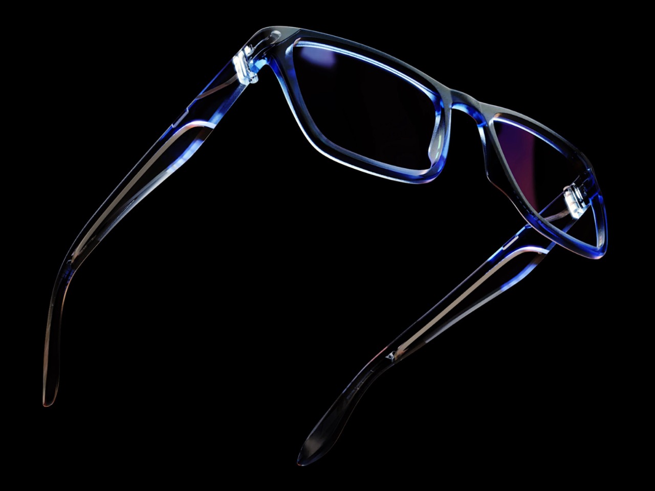
Favor AR Pen Lets You Draw Messages in Air, Print as Photo Cards

Most of our gifts to friends now are quick messages, emojis, or mobile vouchers that arrive instantly and disappear just as fast. They’re convenient but rarely feel as meaningful as a handwritten note or a physical card you can pin to a wall. Favor AR Message is a concept that tries to bring some of that effort and ceremony back into how Gen Z says thank you, sorry, or congratulations, without abandoning phones entirely.

Favor is a speculative system built around three parts: an AR pen, a tiny photo printer, and a mobile app. You use the pen to draw messages in augmented reality, the app to decorate and package them, and the printer to turn them into physical photo cards. The recipient scans the card with their phone to see the hidden AR message floating above it, like a secret that only appears when you know where to look.

Designers: Junseo Oh, Seungyeon Hong, Yoojin Lee, Youn Taejune

The AR pen, called LIT, is a slim wand that the phone’s camera tracks while you draw in the air. In the app, your strokes become floating 3D text and graphics, animated with light and particles. The designers call this process “LITing,” and it turns writing a message into a small performance, closer to painting with light than typing into a chat window or firing off another text you’ll forget about ten minutes later.

The printer is a compact, pastel-colored box that takes your AR composition and links it to a printed photo card. You can choose selfies, pet photos, or travel shots, then layer stickers and assets on top. On the surface, the card looks like a cute mini print, but when the recipient scans it with the app, the hidden AR message appears in space above the card, like a secret only they can unlock.

The app’s flow is straightforward. You pick a friend, choose a template, LIT your message with the pen, and send or print the card. When your friend receives it, they scan to reveal the AR content, then record a reaction video and send it back. The concept even imagines smart lights in the room reacting when a new Favor is opened, turning the exchange into a tiny event.

The visual language is deliberately playful. The hardware uses soft rectangles, rounded corners, and gentle gradients in lilac and mint, while the app leans into bold purple, bubbly 3D type, and oversized icons. Everything is designed to feel approachable and fun, more like a toy or cosmetic gadget than a piece of serious tech that takes itself too seriously.

Favor AR Message is a thought experiment about how we might make digital communication feel more like a ritual again. By asking you to stand up, wave a pen, design a card, and wait for a reaction, it slows the process down just enough to feel intentional. Whether or not something like this ever ships, the idea of turning AR into something you can hold and revisit is an appealing twist on how we say “this is for you.”
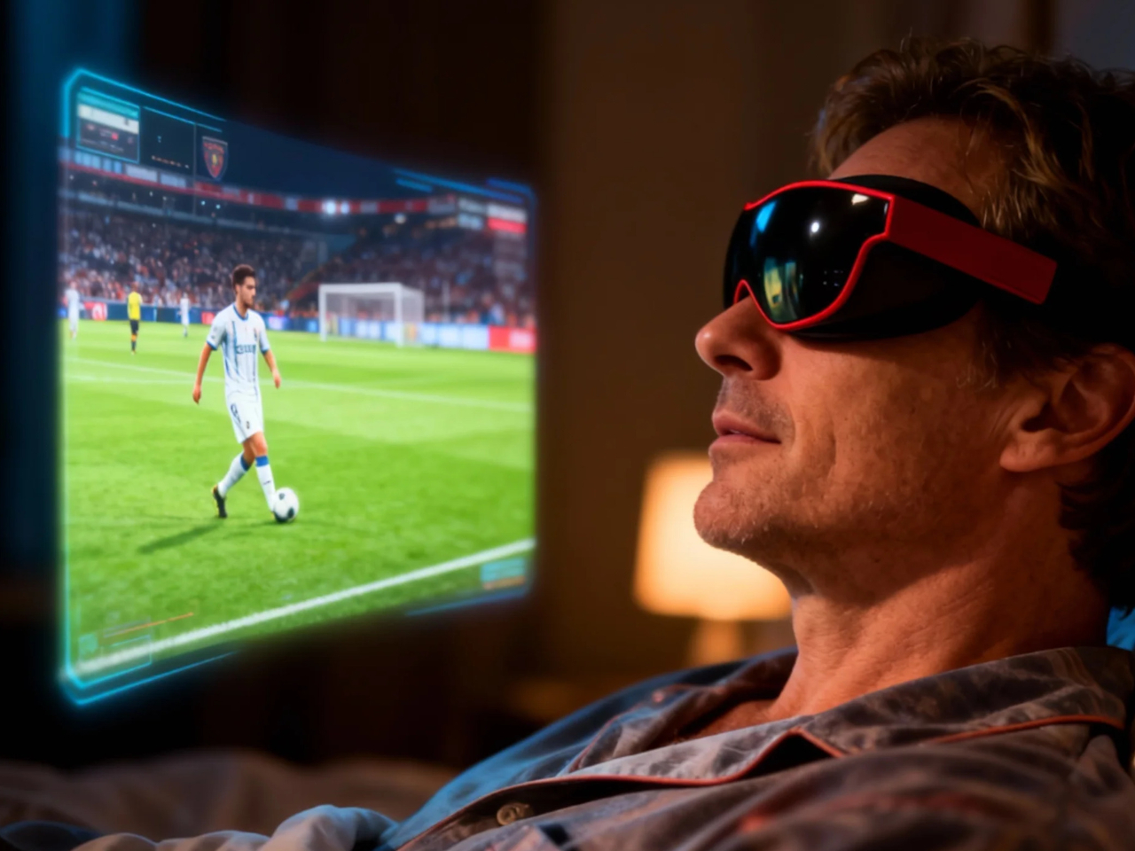
The post Favor AR Pen Lets You Draw Messages in Air, Print as Photo Cards first appeared on Yanko Design.