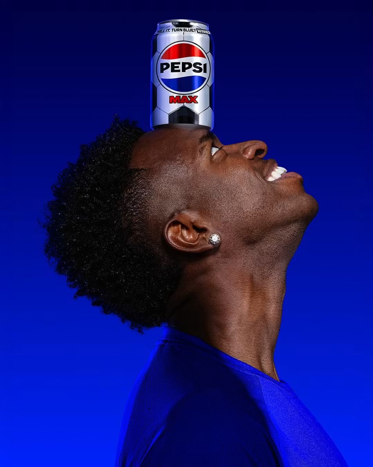
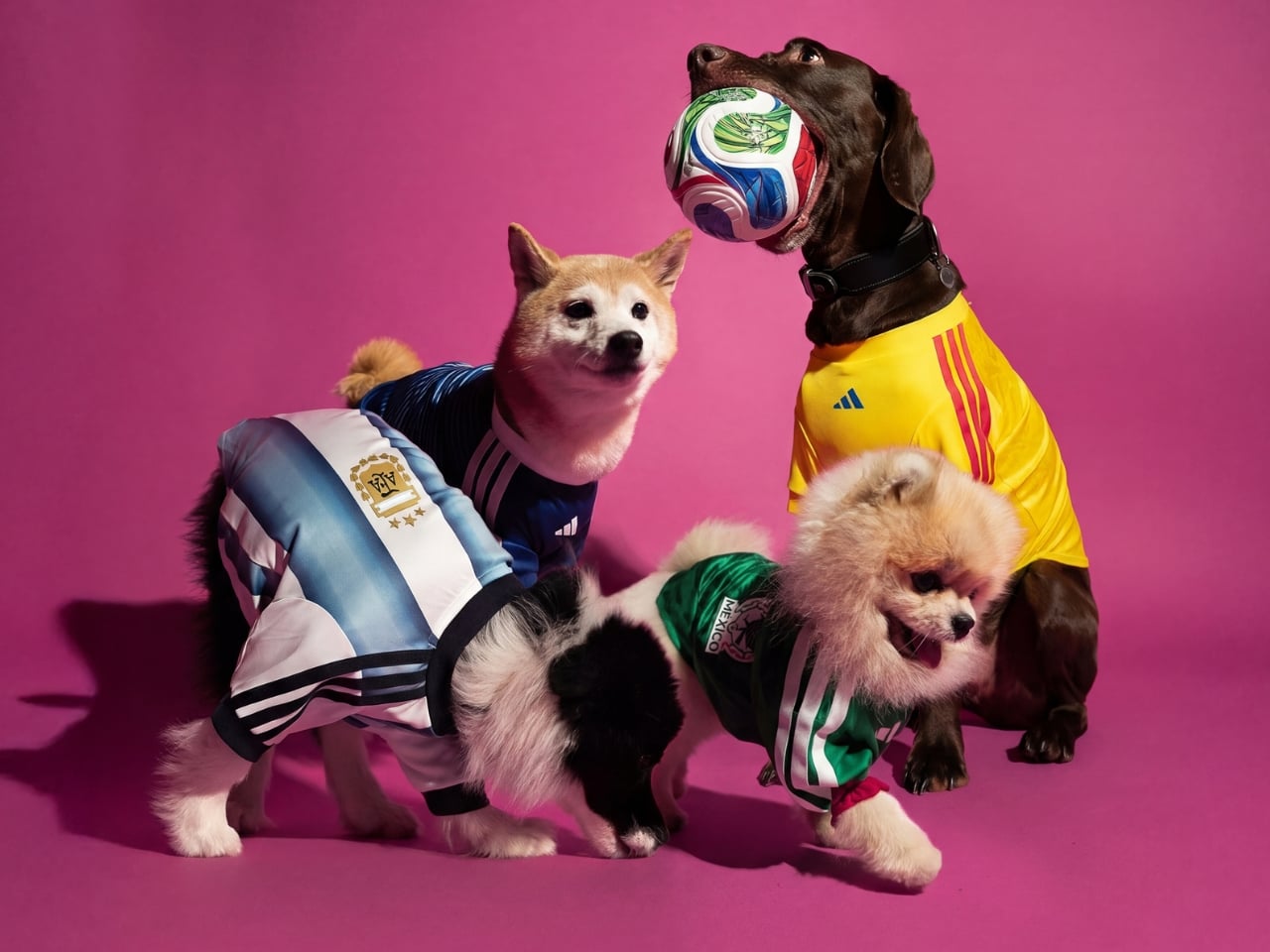
Most of us don’t think twice about the can we grab from the fridge. You reach, you pop, you drink. But Pepsi Max is betting that at least some of us will stop, look twice, and maybe even squeal a little when the can in our hand starts changing colour right before our eyes.
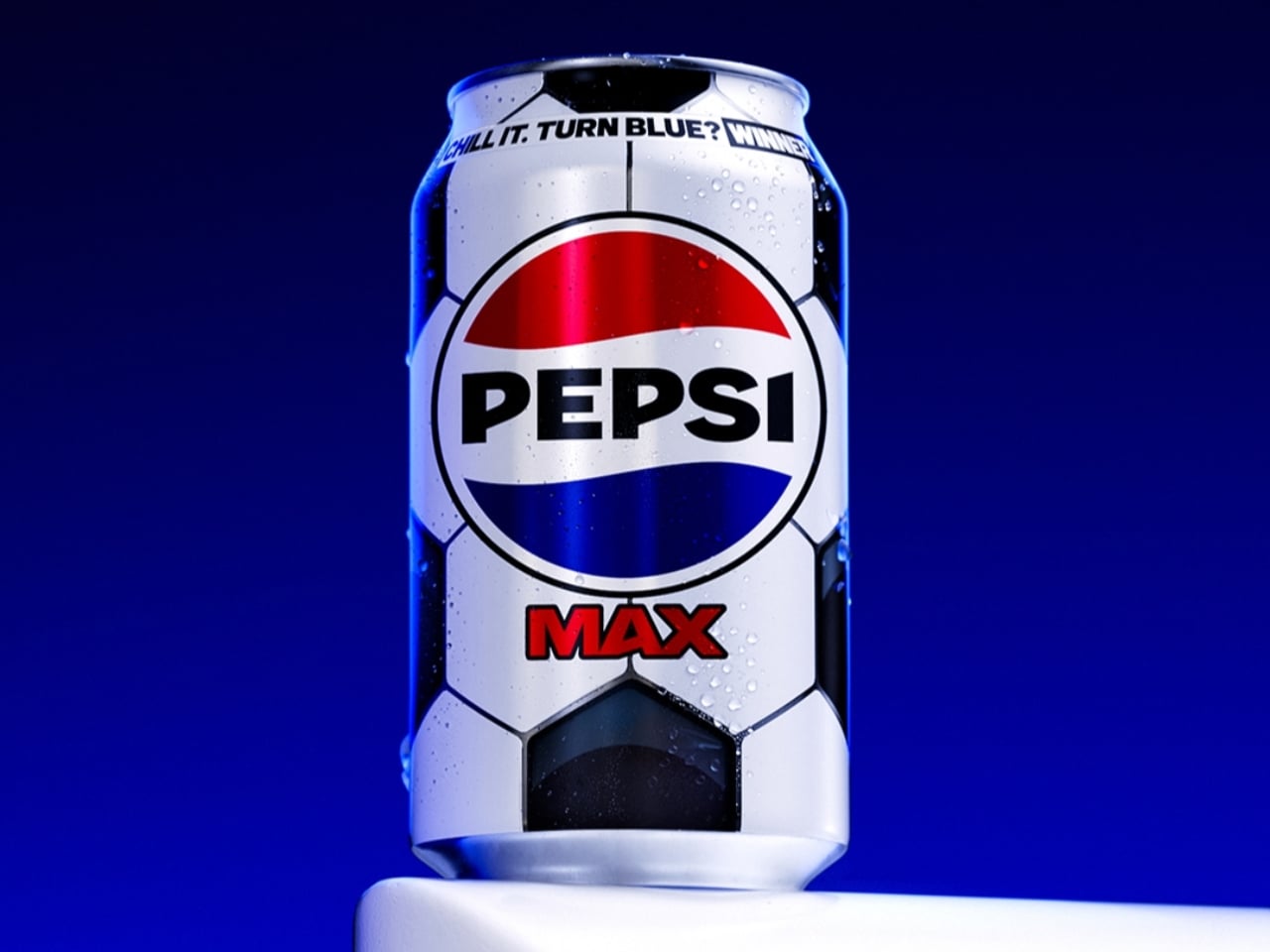
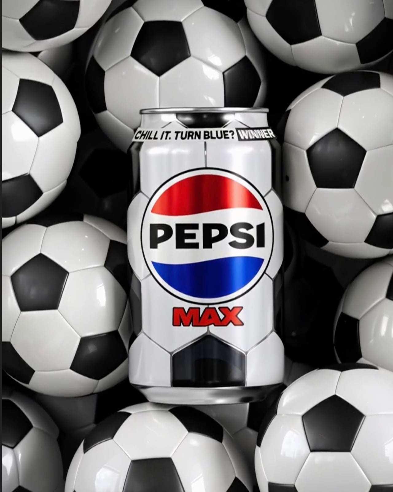
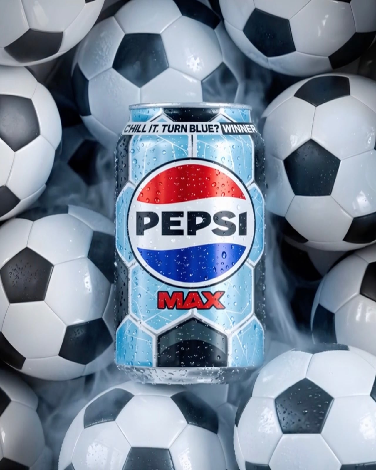
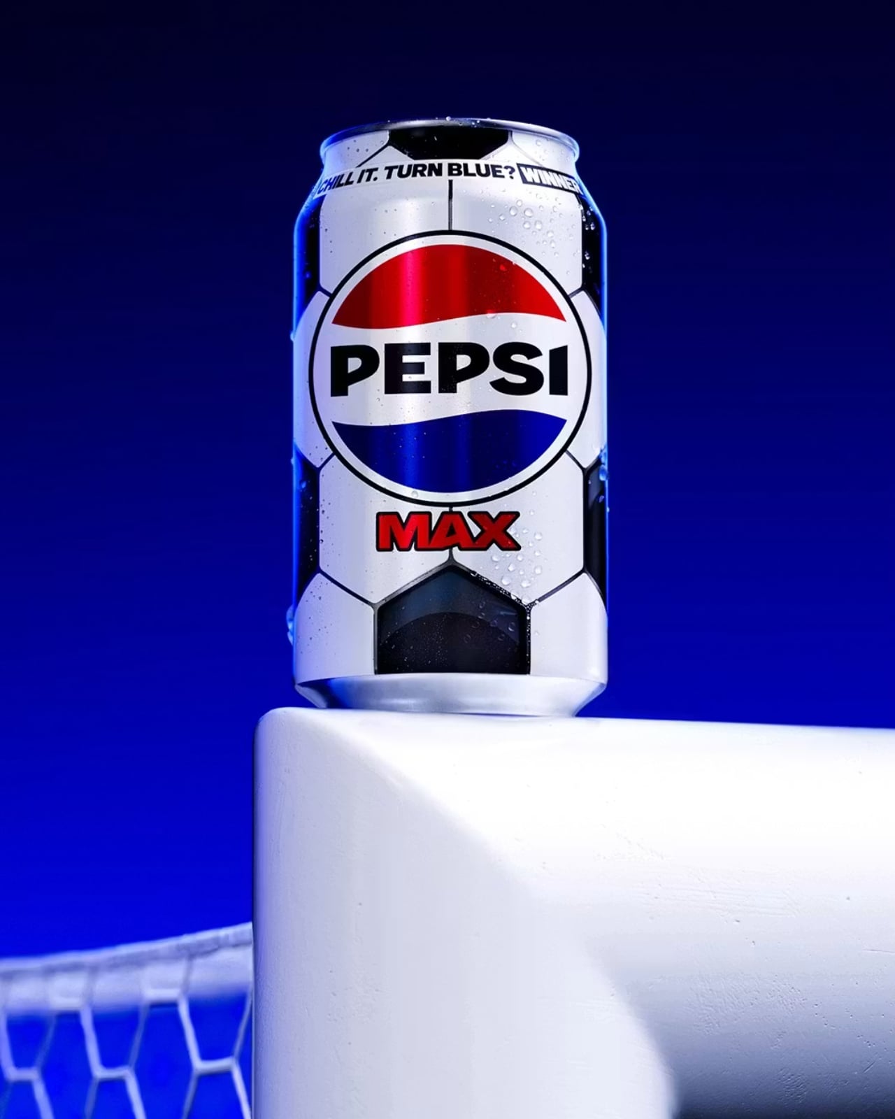
That’s the premise behind Pepsi Max’s new Perfect Chilled variant, launched as part of the brand’s wider Pepsi Football Nation campaign ahead of the 2026 FIFA World Cup. Out of 86 million football-themed cans hitting shelves across the UK, only 150,000 carry something extra: thermochromic ink that begins to shift at 12°C and turns a full, vivid blue at 8°C, the temperature Pepsi considers optimal for drinking. In other words, the can tells you when it’s ready.
Design: Pepsi
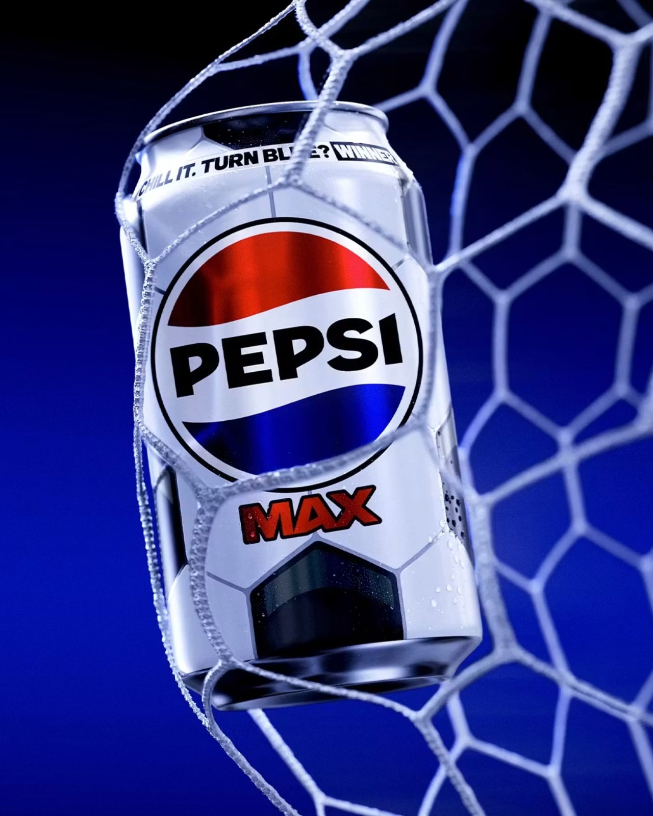
The design itself is clean and considered. The 330ml can wears the classic black-and-white pentagon pattern of a traditional football, a smart visual shorthand that doesn’t need any explanation. It’s immediately recognisable, seasonally relevant, and works beautifully with the colour-change mechanic. The graphic language is minimal without being plain, and the blue reveal against the black-and-white base is genuinely satisfying. When that blue kicks in, it’s not subtle. It’s the kind of visual shift that makes you want to show someone standing next to you.
The Perfect Chilled variant also doubles as a prize trigger. Finding one means you’re entered into a competition where prizes include £5,000 towards a home entertainment bundle, football tickets, Pepsi Football Nation merchandise, and vouchers. So the colour change does two things at once: it signals peak drinking temperature, and it reveals whether you’re holding a winner. That’s a neat piece of design thinking, making a single moment do a lot of heavy lifting without feeling gimmicky.
I’ll admit I have a soft spot for thermochromic packaging. It made waves in mainstream consumer consciousness back in the 2000s with Coors Light’s cold-activated mountains, and various brands have been picking it up ever since. But Pepsi’s version feels more purposeful than most. Rather than just being a party trick, the temperature cue here is tied to a genuine product promise: that Pepsi Max is best at 8°C, and the can will tell you when you’ve hit it. That’s functional design, not just fun design, and the difference matters.
The scarcity piece is where the campaign gets genuinely clever. At 150,000 Perfect Chilled cans out of 86 million, the odds aren’t outrageous, but they’re not guaranteed either. It creates just enough tension to make you actually look at the packaging, which is something brands have been desperately trying to achieve in the era of eyes-down, scroll-while-shopping retail behaviour. When your product can make someone pause on the way to the checkout, you’ve done something right.
Pepsi didn’t stop at the can, either. The campaign includes a browser extension for Chrome and Firefox that replaces the word “soccer” with “football” on any webpage, a nod to the ongoing, completely unresolvable debate that football fans clearly feel strongly enough about to install software over. It’s a small touch, but it speaks to the same sensibility running through the whole campaign: know your audience, and then give them something that feels made for them specifically.
Packaging rarely gets the cultural credit it deserves. It’s the thing you throw away, the design you never frame, the object that lives in your hand for about four minutes before it goes in the recycling. But at its best, it does what this Pepsi Max can does: it turns a routine moment into a small, unexpected experience. For a product that’s been on shelves since the 1990s, making a can feel exciting again is no small feat. And if the price of admission is putting your Pepsi in the fridge before a football match, well, you were probably doing that anyway.
The post Pepsi Max’s New Can Turns Blue When It’s Cold Enough to Drink first appeared on Yanko Design.

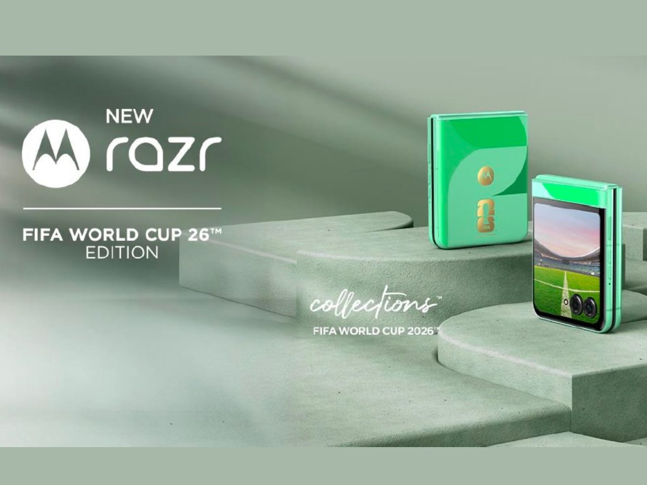
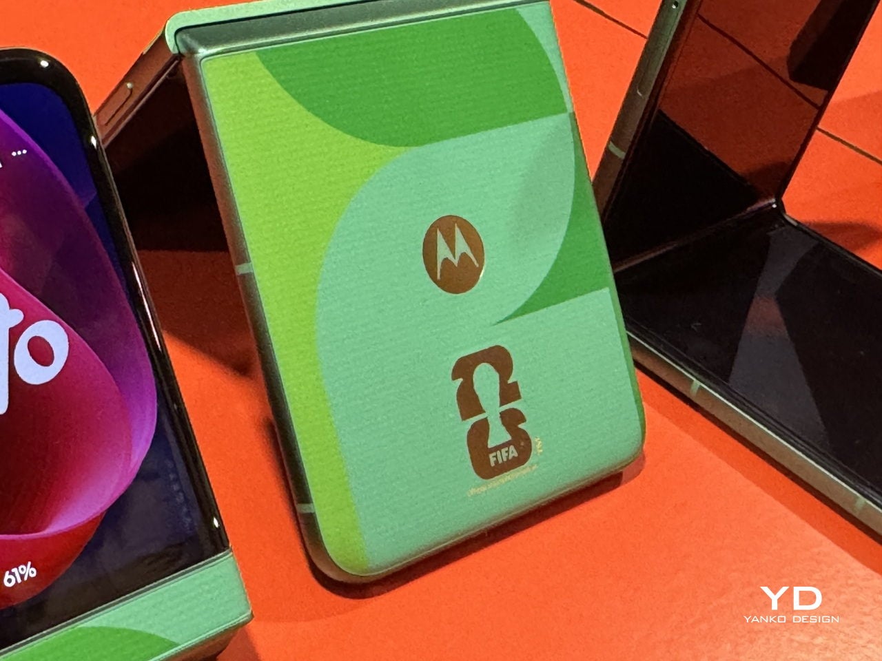
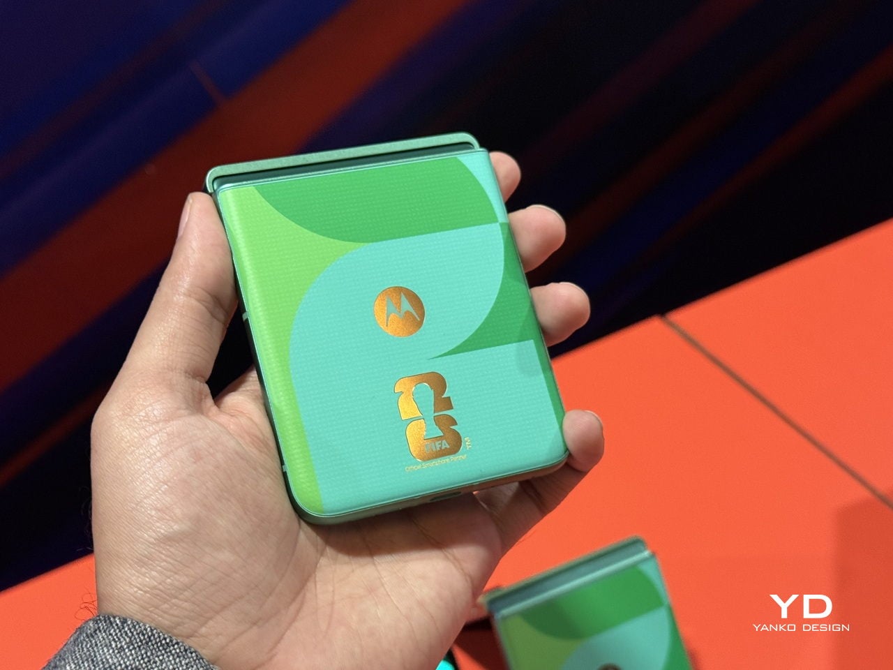
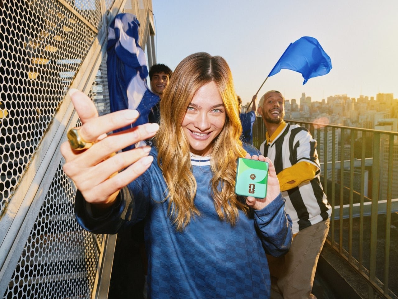
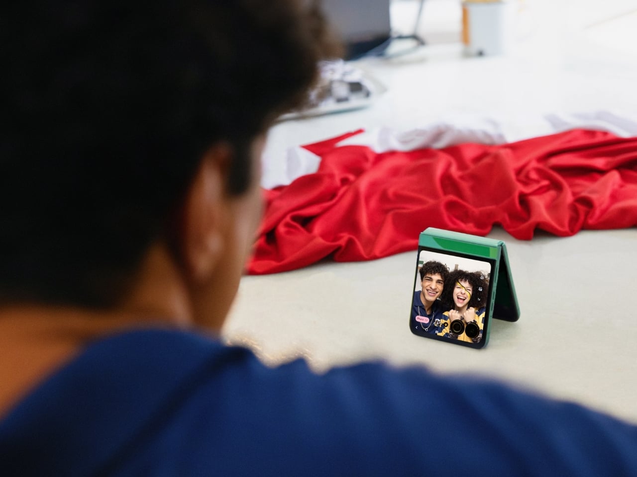
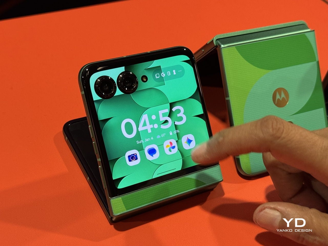
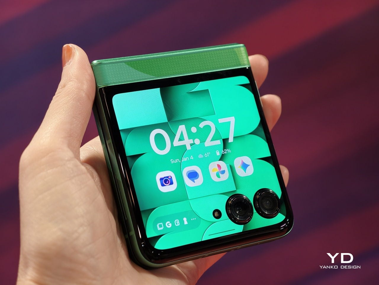
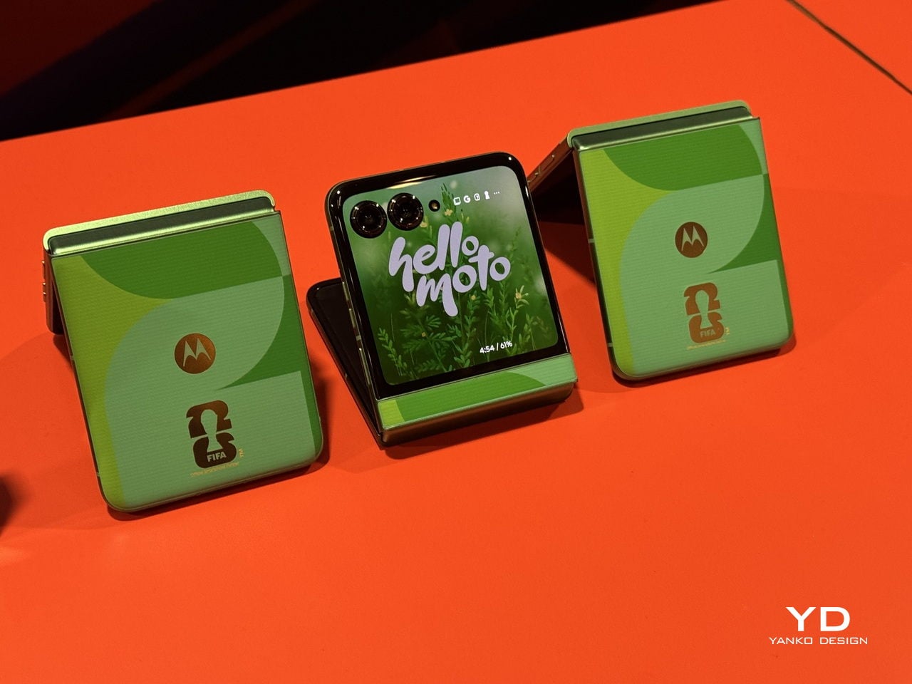
 Edition is a limited-edition collectible device that celebrates the first-ever 48-team FIFA World Cup. It is a mobile phone that’s designed for soccer fans who are excited about the upcoming tournament and for anyone who loves things where technology meets sports culture.
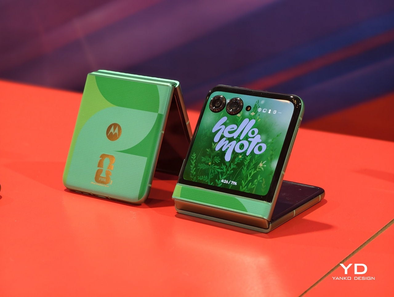

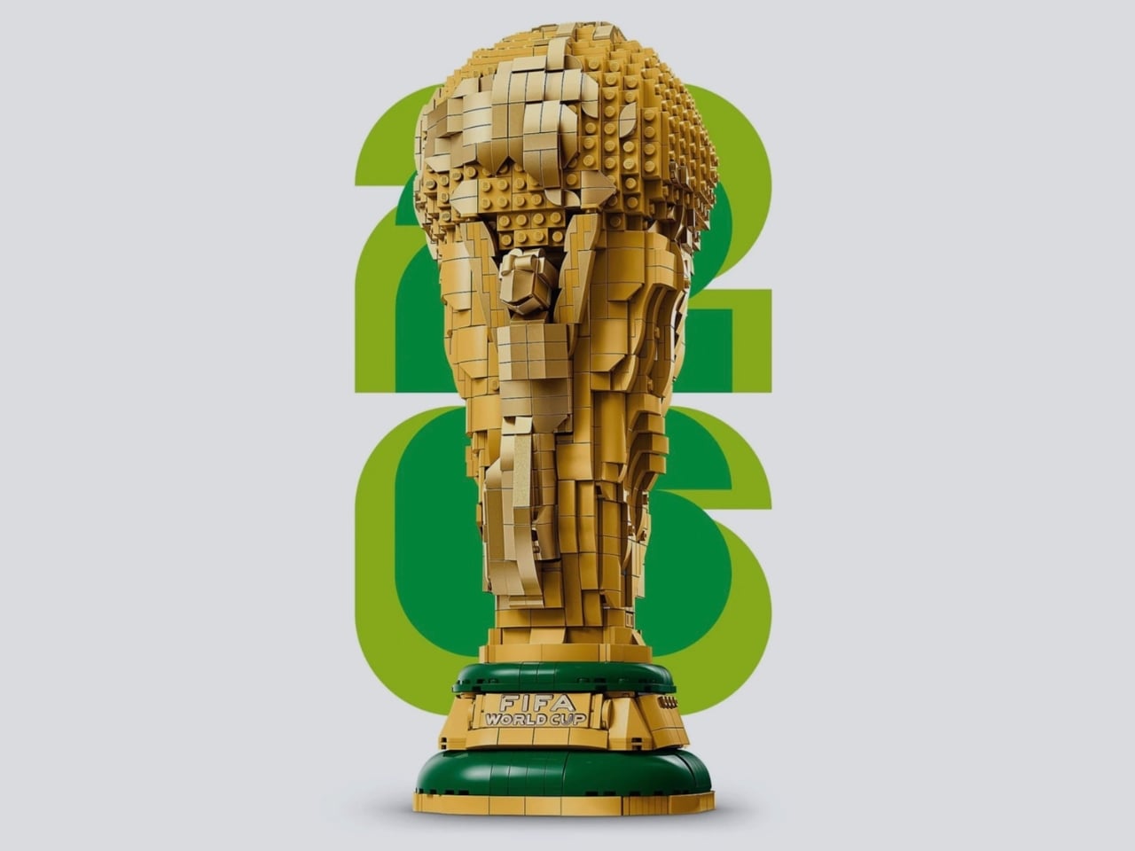
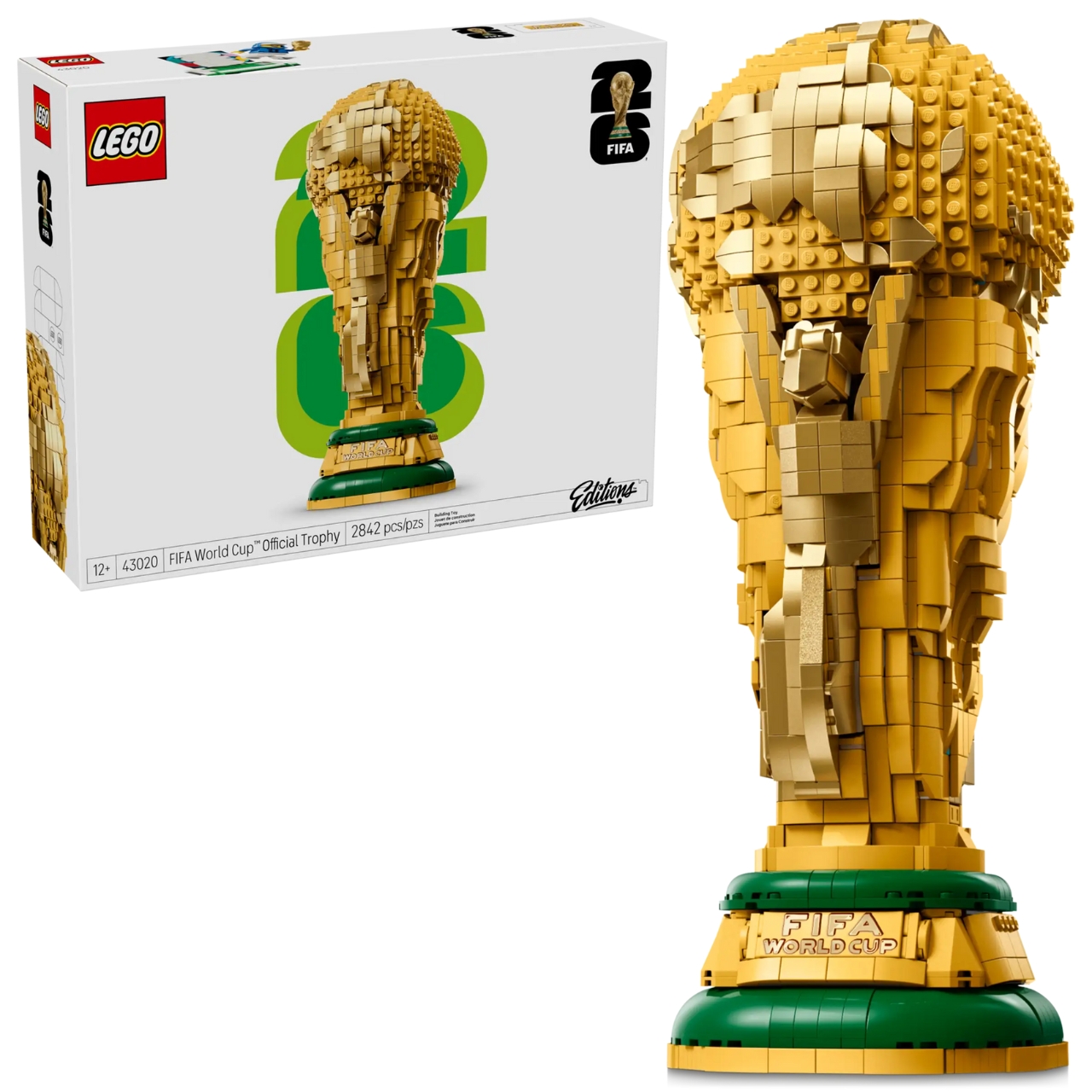
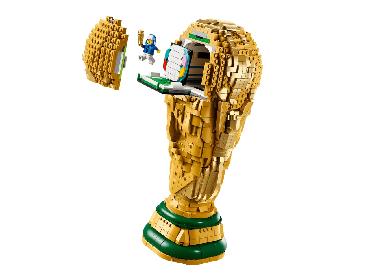
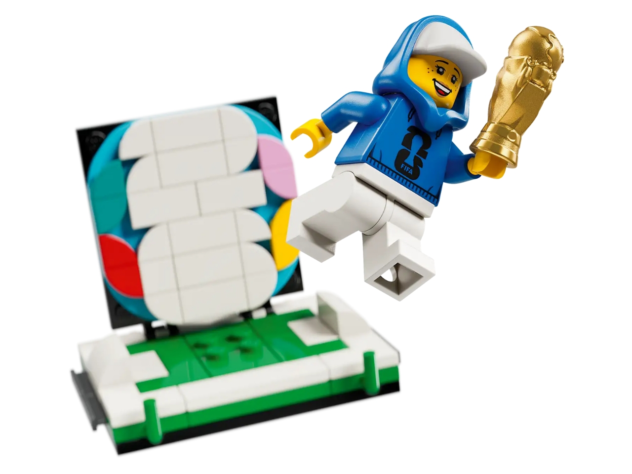
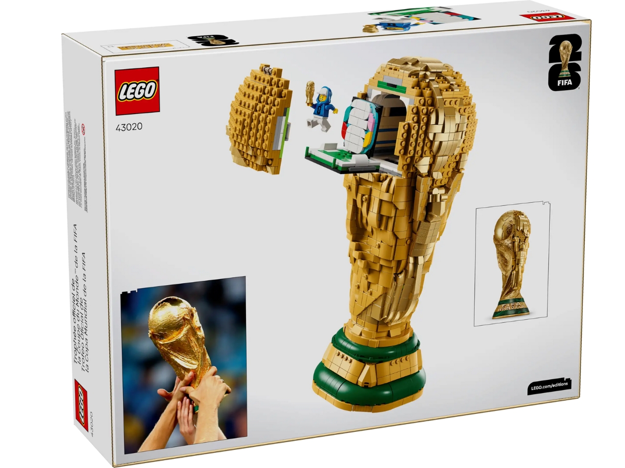
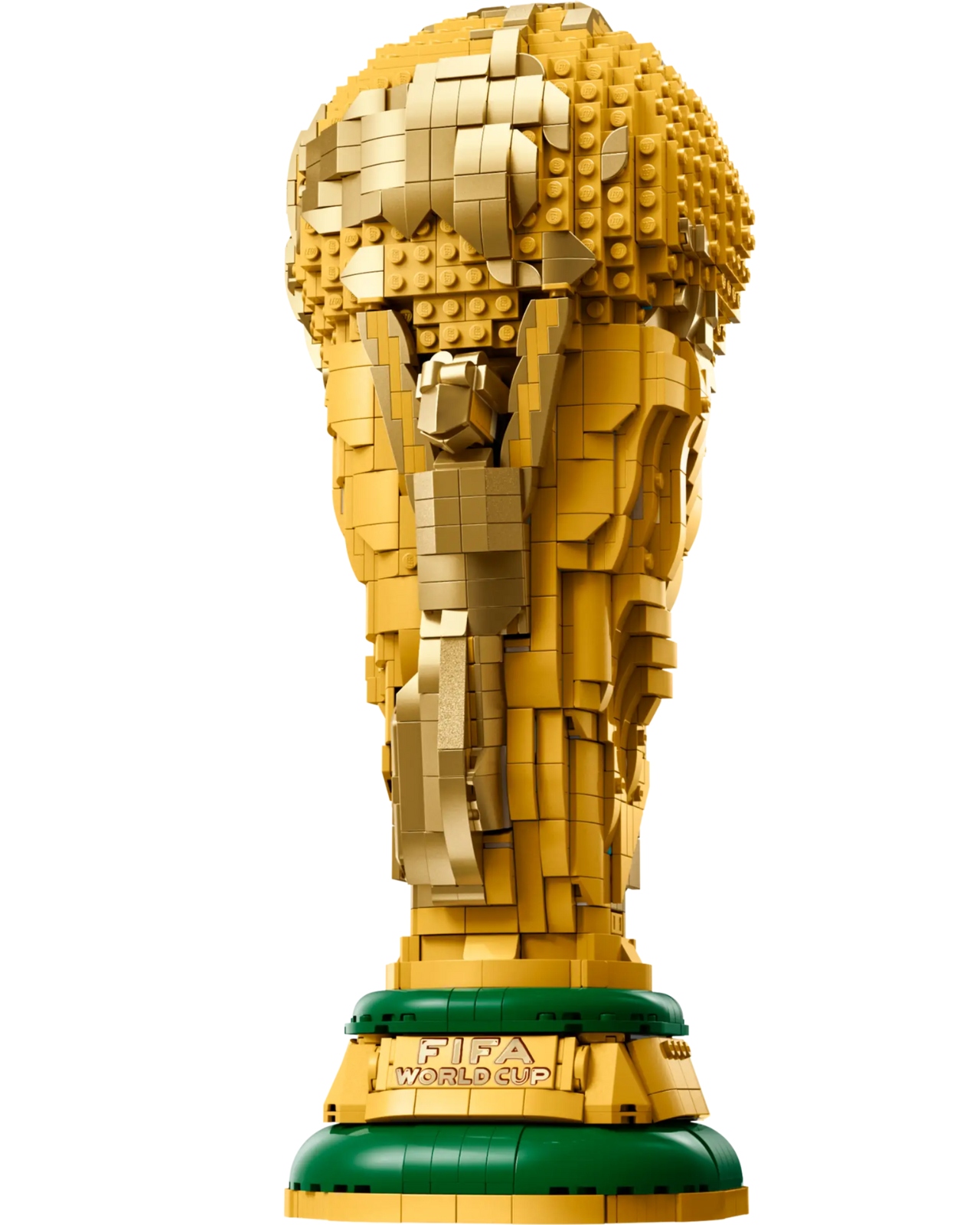
 Official Trophy (43020) is for the soccer (or football, as the rest of the world calls it) fan in you that would love to display the trophy on your shelf. It’s meant to hype up the 2026 World Cup tournament happening in the US, Canada, and Mexico in June-July 2026, which is one of, if not the world’s most popular sporting tournament. It’s a LEGO-fied replica of the trophy, featuring authentic details that capture the essence of the real thing. In case, like me, this is the closest you’ll ever come to actually touching this prestigious trophy, at least you can say you built it brick by brick with your own hands.