A Double-Sided Clock That Turns Walls into Living Moments of Time

Double-sided wall clocks are not new. They have existed for decades, quietly moving between public and private spaces. While many people associate them with railway stations and institutional corridors across Europe, they also made their way into homes in earlier times, often as decorative yet functional pieces in hallways or larger living spaces. Over time, however, they faded out of domestic interiors, replaced by flatter, more minimal wall clocks designed to sit quietly against a surface.

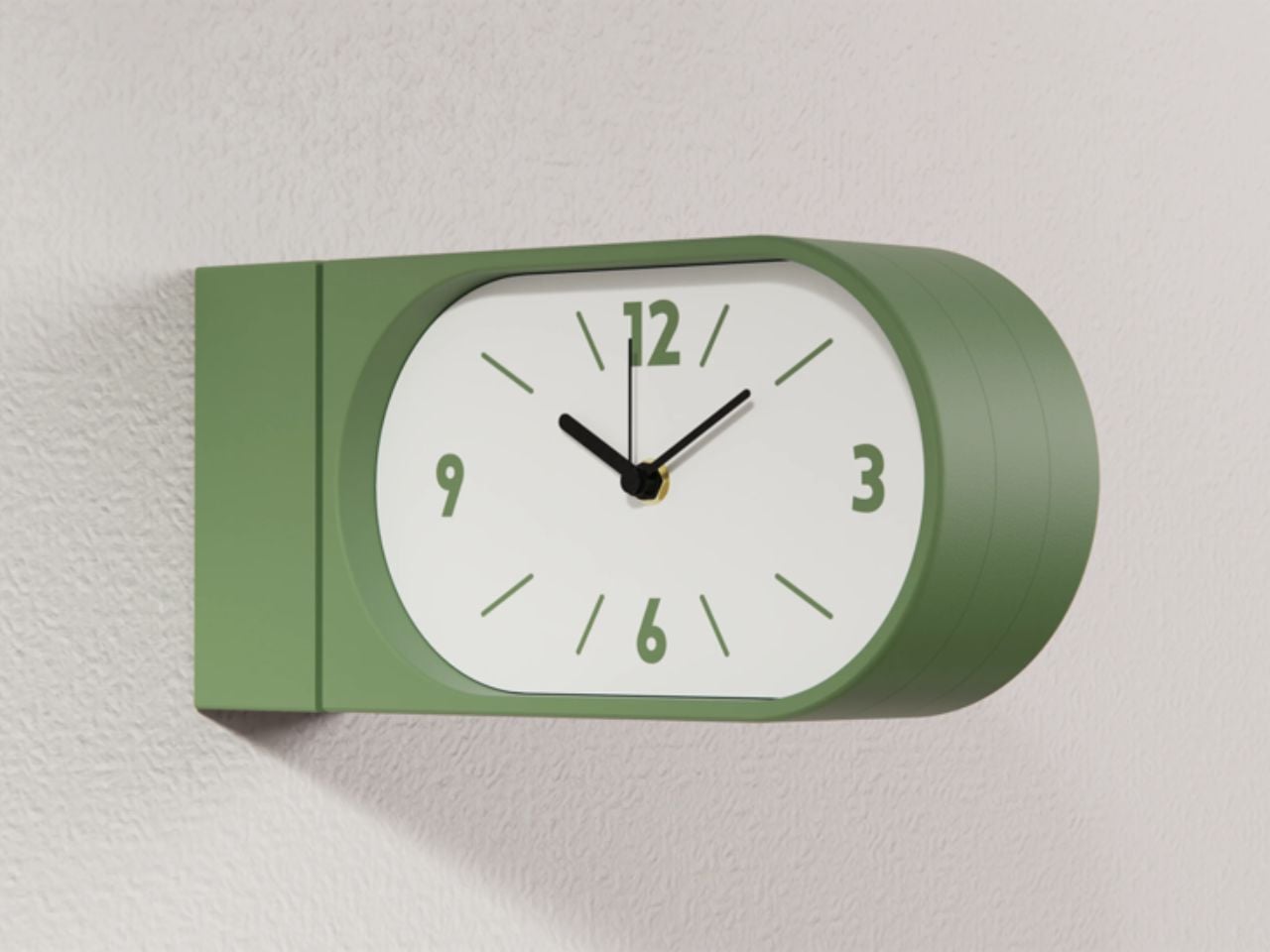
Turin-based brand Goofball is bringing this format back, but with a distinctly modern lens. Their Perch clock does not just revive an old idea; it reframes it for how we live today.

Designer: Goofball

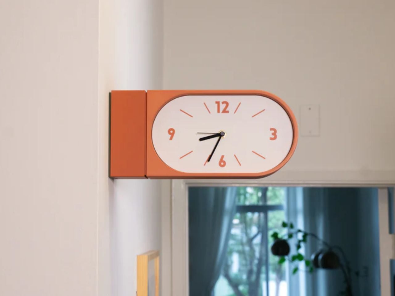
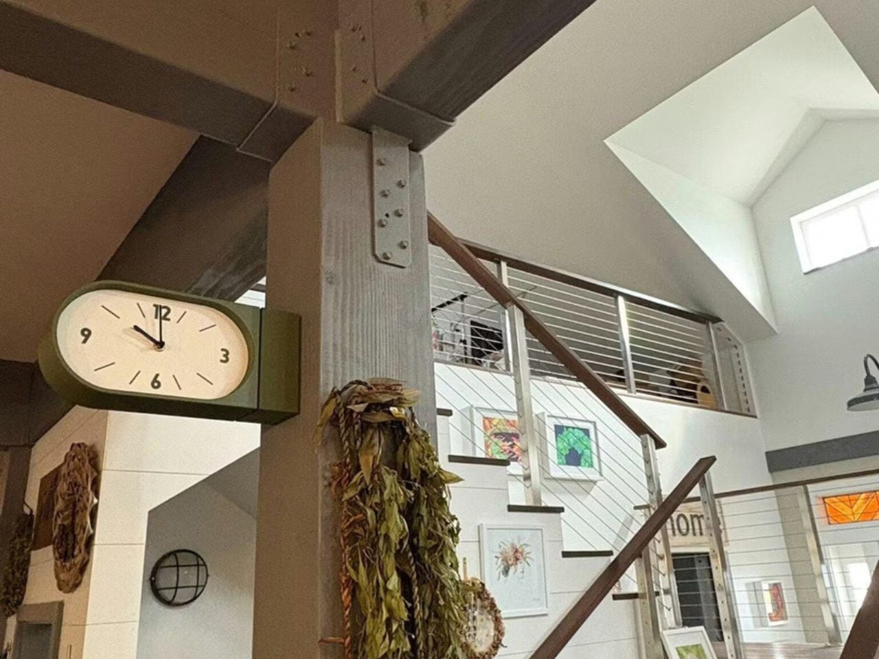
At first glance, the concept feels familiar. A clock that extends out from the wall, visible from both sides. But in a home setting, this simple shift changes everything. Instead of being something you look at from one fixed position, the clock becomes part of how you move through a space. Whether you are walking into a room, passing through a corridor, or glancing back as you leave, time is always within sight. It feels less like an object placed on a wall and more like something integrated into the rhythm of the room.

The functional decisions are just as thoughtful. The clock runs on two AA batteries, which means there is no need for wiring or complicated installation. It hangs on a bracket and can be easily lifted off when the batteries need to be changed. It is the kind of detail that you might not notice immediately, but it makes living with the product feel effortless.

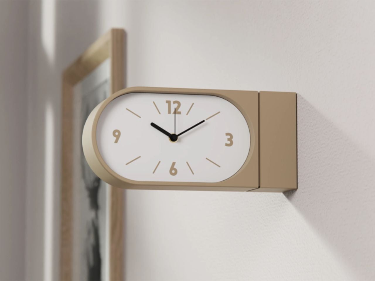
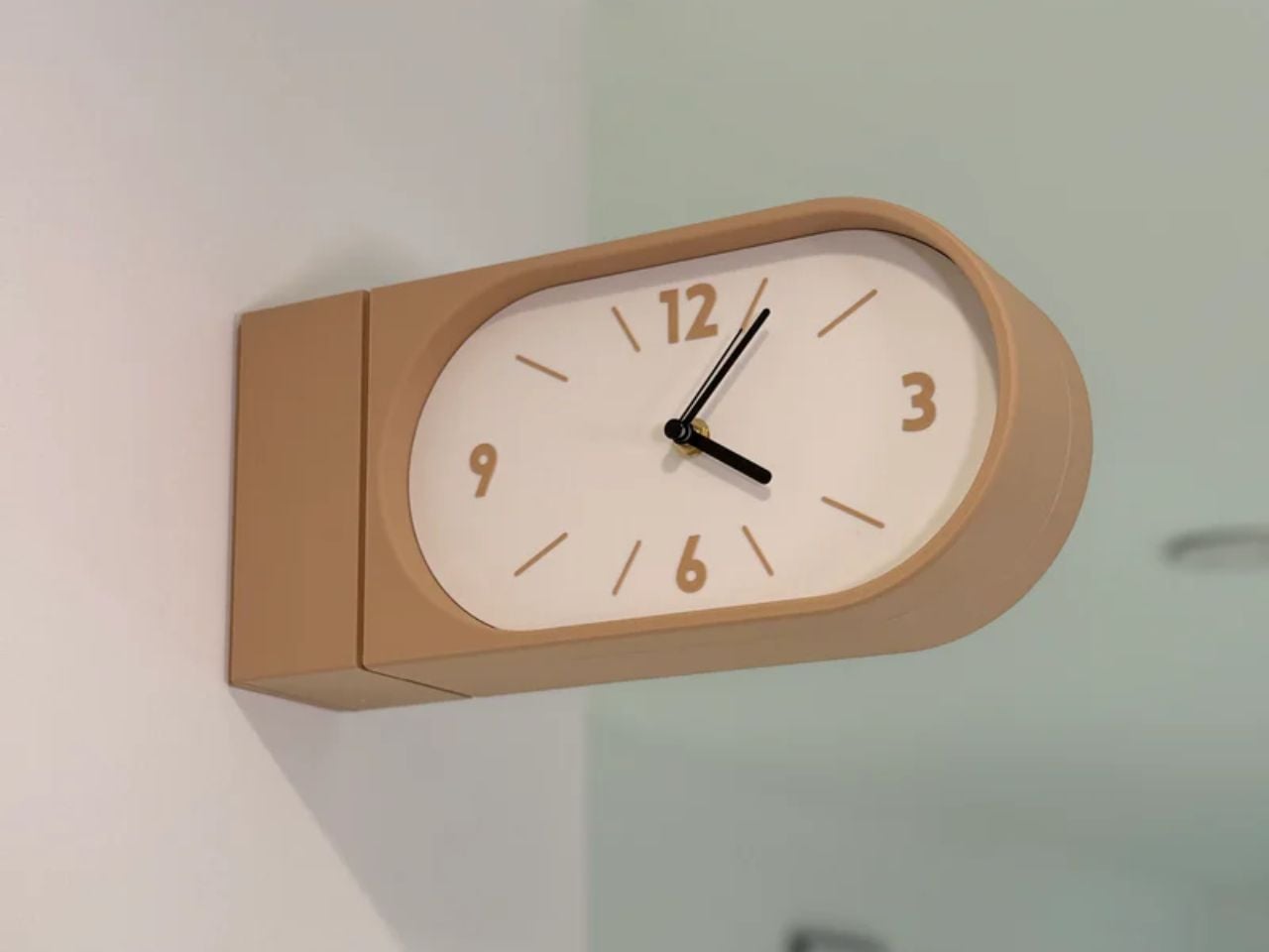
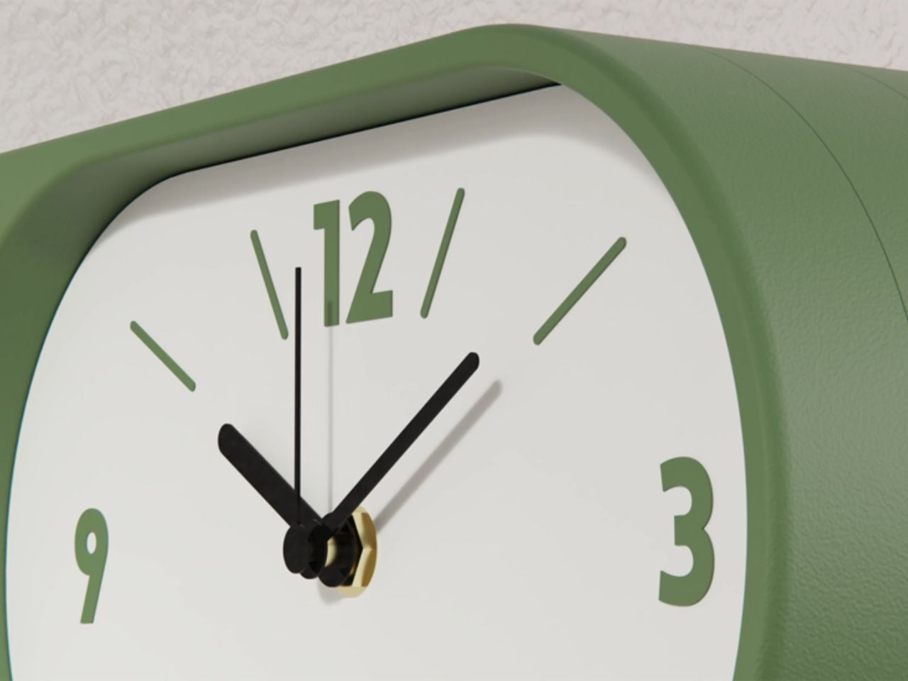
Visually, the Perch clock embraces minimalism in a way that feels warm rather than clinical. It comes in three colors, allowing it to blend into different interiors while still holding its own presence. The design is clean and restrained, making it suitable for contemporary homes, yet it carries a quiet reference to its past. There is something unmistakably reminiscent of old railway clocks, those objects that once defined shared notions of time and movement.

That sense of nostalgia is part of its charm. It brings a subtle character into a space without feeling overly decorative. It introduces depth to a wall, quite literally, and creates a small moment of curiosity. Guests notice it. People interact with it differently. It becomes a conversation piece without trying too hard.

What makes this product particularly compelling is how it challenges a default assumption. We have grown used to thinking of wall clocks as flat, one-directional objects. This design questions the norm and reminds us that even the most familiar objects can be reimagined.

The response so far reflects this shift in perspective. The first batch sold out quickly, suggesting that people are ready for products that feel both nostalgic and new at the same time. Goofball is currently preparing the second batch, expected to be available in the coming weeks.

In the end, this clock is more than just a timekeeping device. It is a small but meaningful intervention in how we experience space. It takes something we already know, brings back its forgotten domestic presence, and gives it a contemporary voice. It does not just sit on a wall. It changes how the wall and the room around it are perceived.

The post A Double-Sided Clock That Turns Walls into Living Moments of Time first appeared on Yanko Design.

A Transforming Table-Chair That Turns Tradition into Space-Saving Intelligence

At a time when living spaces are shrinking while expectations from them continue to expand, this design presents a thoughtful response that is both rooted in tradition and aligned with contemporary needs.

Emerging from the context of rising housing pressures in Taiwan, where compact homes are increasingly becoming the norm, the project addresses a fundamental question: how can furniture adapt to limited space without compromising comfort or experience? Rather than treating furniture as static, single-purpose objects, the designer reimagines them as dynamic systems capable of transformation.

Designer: Che-Chia Hsu

At the heart of this piece lies a deep engagement with traditional Chinese woodworking techniques, particularly the precision of tenon joints. These joints move beyond being structural solutions and become expressions of calculated craftsmanship, where geometry, material behavior, and human interaction converge. The result is a construction that feels both minimal and robust, relying on accuracy instead of excess.

The furniture set is designed to integrate storage and seating within a compact footprint. A chair is concealed within the table and can be pulled out, unfolded, and expanded into a functional seat. The process is intuitive: the chair is extracted, the seat and backrest are opened, and the backrest angle is adjusted using velcro. The transformation is smooth and unobtrusive, allowing the object to shift roles effortlessly.

What distinguishes this design is its reliance on the user’s own body as part of the structural system. Instead of depending entirely on rigid supports, the chair uses the tension generated by the sitter to stabilize the backrest. This introduces a subtle interaction between user and object, where the act of sitting becomes integral to how the design performs. The experience feels efficient, responsive, and quietly intelligent.

Material choices reinforce this balance between function and experience. Lightweight pine wood panels provide durability while ensuring ease of movement. Paired with gray cotton linen fabric, the design introduces a tactile softness that enhances comfort. The fabric is breathable and visually understated, complementing the natural warmth of the wood. Together, these materials create a calm, cohesive aesthetic suited to contemporary interiors.

The development of the project reflects a layered and rigorous process. The designer began by studying traditional joinery techniques through literature, followed by hands-on training under a woodcraft master. This immersion enabled a deeper understanding of the craft beyond theory. Building on this foundation, the designer explored ways to translate these techniques into a modern, functional context through research and experimentation.

What emerges is a design that treats constraint as a starting point rather than a limitation. The piece brings together traditional knowledge and contemporary living patterns, shaping an object that adapts, responds, and participates in everyday use. It reflects a way of designing where space, material, and human interaction are considered together, resulting in furniture that feels considered, purposeful, and in tune with the realities of modern living.

The post A Transforming Table-Chair That Turns Tradition into Space-Saving Intelligence first appeared on Yanko Design.

A Ferrari-Inspired Speaker That Turns Motion Into Light and Sound

Some objects simply exist in a space, while others carry a presence even before they are used. ROSSO belongs firmly in the latter. It does not read as a conventional speaker. It feels composed, deliberate, almost cinematic in the way it occupies a room. Inspired by the rear light signature of the Ferrari F8 Tributo, the design does not just borrow from automotive styling. It translates the emotional language of performance into a completely different context. What emerges is less of a consumer electronic and more of a captured moment of motion.

The most striking element is the dual circular illumination, which immediately draws attention not as decoration, but as identity. The rings echo Ferrari’s iconic taillights, yet here they take on a new role. They feel rhythmic, almost like a pulse, suggesting energy even in stillness. There is a quiet confidence in this decision. Instead of blending into interiors, ROSSO chooses to stand out, using light to create a focal point that feels engineered and intentional.

Designer: Royal Tyagi

The form itself resists stillness. Surfaces stretch and taper, edges feel pulled forward, and the overall silhouette carries a strong sense of direction. This is not accidental. It stems from an ideation process rooted in the geometry of the Ferrari F8, where circular light elements evolve into a broader architectural language. Over time, the design moves away from literal references and instead captures something more abstract. The feeling of speed, tension, and control. The result is a speaker that appears to be in a constant state of readiness, as if it could accelerate at any moment.

Materiality deepens this experience. The ROSSO CORSA finish, with its high gloss metallic lacquer, creates a depth that feels almost liquid, allowing light to glide across the surface and amplify its sculptural quality. It is bold, expressive, and unmistakably tied to Ferrari’s heritage. In contrast, NERO VELO offers a quieter interpretation. Its satin, soft touch matte coating absorbs light, shifting the focus from visual drama to tactile interaction and restraint. CARBON FORMA introduces a more technical layer through its carbon fiber-inspired textured grille, grounding the design in a language of precision and performance.

What makes ROSSO compelling is how these elements come together to shape not just how the object looks, but how it feels. The illuminated rings begin to act as a visual extension of sound, suggesting vibration and energy. The speaker becomes more than a device. It becomes a multi-sensory experience. There is an underlying idea that sound can have a visible presence, that it can be anticipated before it is heard.

In a market where many products aim to disappear into their surroundings, ROSSO takes a different stance. It embraces visibility, emotion, and expression. It does not attempt to be neutral. Instead, it invites attention and rewards it. By translating the essence of automotive performance into a domestic object, it challenges what a speaker can be. Not just a tool for listening, but a sculptural artifact that carries speed, power, and intent into everyday life.

The post A Ferrari-Inspired Speaker That Turns Motion Into Light and Sound first appeared on Yanko Design.

Vases That Stretch Color Until Form Disappears and Perception Takes Over

In a design landscape increasingly obsessed with clarity, function, and hyper legibility, Stretch Color resists the urge to explain itself. Instead, it lingers in ambiguity, somewhere between object and illusion, material and mirage. What at first glance appears to be a series of vases slowly reveals itself as something far more elusive: a study of perception itself.

The collection operates in a delicate tension between two dimensions and three-dimensional form. From certain angles, the pieces flatten into what feels like a planar artwork, almost painterly, like gradients suspended on an invisible canvas. Shift your position slightly, however, and the illusion collapses into volume. The vases re-emerge as sculptural objects, reclaiming their presence in space. This oscillation is not accidental; it is the core language of the work.

Designer: Bo Zhang

Crafted through a combination of acrylic layering and spray coloration, each vase carries a gradient that transitions from dense pigment to complete transparency. But this gradient is not merely decorative; it performs. Color appears to stretch, almost as if pulled across the object’s surface and into the surrounding space. The deeper hues anchor the form, while the fading edges dissolve it, creating a visual tension between presence and absence.

This local disappearance is perhaps the most compelling aspect of the collection. Portions of the vase seem to vanish, not through physical subtraction, but through optical diffusion. The structure is still there, yet it evades the eye. What remains is a ghost of form, an outline that flickers between visibility and invisibility. In doing so, the vases challenge one of the most fundamental expectations of objects, that they should be fully knowable.

The three varying sizes in the series amplify this effect. Rather than simply scaling the object, each size interprets the idea of stretch differently. Smaller forms feel more concentrated, their gradients tighter and more immediate, while larger pieces allow the color to breathe, elongating the visual pull across space. Together, they create a rhythm, a sequence of expansions and dissolutions that feel almost cinematic.

What makes Stretch Color particularly resonant today is its subtle commentary on how we experience objects in an increasingly mediated world. Much like digital interfaces that flatten depth or augmented realities that overlay perception, these vases blur the boundary between what is physically present and what is visually perceived. They invite the viewer to move, to question, and to reorient themselves in relation to the object.

There is also a quiet emotional undercurrent to the work. The fading gradients and disappearing forms evoke a sense of ephemerality, of things slipping just beyond grasp. Yet, this is not a loss; it is a transformation. The vases do not vanish entirely; they redistribute themselves into space, into light, into perception.

Stretch Color moves away from the idea of the vase as a static container and leans into it as a shifting experience, something that unfolds only when the viewer participates. The object does not simply sit in space; it negotiates with it, stretching color, dissolving edges, and quietly asking the viewer to look again, and then look differently.

The post Vases That Stretch Color Until Form Disappears and Perception Takes Over first appeared on Yanko Design.

A Whale Lamp That Transforms Ocean Vastness into a Gentle Bedside Glow

There is something quietly radical about a whale that does not belong to the ocean. Not because it has been displaced, but because it has been reimagined. COSIN DESIGN’s whale lamp is not an imitation of nature. It is a reinterpretation of how we feel about it. We are used to whales as symbols of magnitude. Vast, powerful, unknowable. They belong to depths we cannot reach. Yet here, that same creature is reduced in scale, softened in form, and placed gently on a bedside table. It no longer overwhelms. It comforts, and that shift in perception feels intentional.

The lamp captures a whale mid-leap, its body curved in a suspended gesture that feels both dynamic and still. The lines are fluid and uninterrupted, almost meditative. There are no sharp edges, no visual noise, just a continuous surface that invites the eye to move along with it. It feels like a sculpture before it feels like a product, and that is what gives it presence even when it is not turned on.

Designer: COSIN DESIGN

The real transformation happens with light. It seeps through the semi-transparent abdomen, not as a beam but as a soft diffusion that spreads slowly and evenly. It does not try to dominate the room or claim attention. Instead, it settles into the space, creating a calm and ambient glow. There is something almost alive about it, as if the whale carries light within itself, like a quiet presence from the deep sea. In that moment, the object shifts from something you look at to something you feel, and that emotional transition is where the design becomes meaningful.

For a long time, lamps have been about control. Adjustable brightness, direction, and precision. But there has been a noticeable shift toward lighting that feels more atmospheric and emotionally aware. The whale lamp sits comfortably within this shift. It does not attempt to do everything. It focuses on creating a specific feeling, and it does so with clarity and restraint. The design does not rely on complexity or excess detail. Instead, it leans into softness, both in form and in function.

Nature plays an important role here, but not in a literal sense. The whale is recognizable, yet simplified just enough to feel universal. It is less about replicating an animal and more about capturing a sense of calm, depth, and quiet strength. That balance allows the lamp to exist across different environments without feeling out of place. It feels just as appropriate in a child’s room, where its gentle glow can provide comfort at night, as it does in a more mature, minimal interior where it reads as a sculptural object.

The availability of four color options adds to this flexibility. Each variation subtly changes the mood of the piece, allowing it to align with different interior styles and personal preferences. Whether placed in a playful setting or a more subdued one, the lamp adapts without losing its identity.

What lingers most, however, is the way the design translates something vast into something intimate. A whale, typically associated with scale and distance, becomes a small, glowing presence that quietly occupies a personal space. It turns awe into reassurance and transforms something distant into something familiar. In doing so, it reflects a broader shift in how we approach design today, where emotional resonance matters just as much as function.

Not everything needs to be louder or brighter to be effective. Sometimes, the most powerful design choice is to soften, to create objects that do not demand attention but instead become part of the atmosphere. The whale lamp does exactly that. It does not insist on being noticed, yet over time, it becomes something you grow attached to.

The post A Whale Lamp That Transforms Ocean Vastness into a Gentle Bedside Glow first appeared on Yanko Design.

A Billiards Table That Refuses to Be Played Without Being Experienced

Most billiards tables do not ask much of you. You walk up, take your shot, and move on. They are designed to be neutral, quietly functional, almost invisible. This one is not interested in being invisible at all.

Designed in Shengfang, Hebei Province, and later exhibited in Beijing, this Chinese billiards table does something rare. It slows you down. It makes you look. And if you stay with it long enough, you begin to notice that the experience extends beyond the game itself.

Designer: Mingzhi Cai and Fengshi Li

The inspiration comes from Journey to the West, a myth that sits deeply in Chinese cultural memory. Instead of simply referencing it, the designers have broken it apart and rebuilt it into the object. The table is wrapped in six narrative panels, each capturing a different moment, whether it is the intensity of the Bull Demon King, the burning of Guanyin Temple, or the surreal calm of Little Western Heaven. They do not read as surface decoration. They feel like scenes you move around, almost as if the table is holding fragments of a larger story.

This aligns naturally with how billiards is played. Every shot resets the situation. Every angle shifts your perspective. As you circle the table, the imagery changes with you, creating a rhythm between movement and narrative. The experience becomes less about a fixed viewpoint and more about continuous discovery.

There is a quiet intelligence in how symbolism is built into the structure. The six legs are shaped after the Sea God Needle, a mythological object associated with strength and transformation. Above, the six column relief references the six senses in Buddhist philosophy. It is a subtle layer, but it reframes the object. What you see, how you move, and how you interpret begin to feel connected.

The level of craft holds everything together. The reliefs are hand carved before being translated into production. The tabletop uses walnut wood, bordered with mother of pearl abalone shell inlays, a detail often found in royal furniture traditions. The paintings themselves are selected from hundreds of artists, then carefully scanned and embedded into the surface. Even the stone slabs are polished repeatedly until they reach the right balance of smoothness and durability.

Despite this richness, the table remains highly functional. The sound of the ball striking is crisp, and the movement across the surface is smooth and controlled. The visual intensity does not interfere with the game. It sits alongside it.

Color plays a similar role. The deep green and gold palette feels grounded and weighty, while the blue antique bronze variation introduces a quieter, more atmospheric tone. As light shifts across the surface, the table reveals different depths, allowing the imagery to feel active rather than static.

What becomes noticeable over time is how deliberately the design moves away from contemporary minimalism. Instead of reducing the object to its essentials, it builds layers of meaning, craft, and narrative into every surface. The process itself reflects this approach, with over 700 days of research, hundreds of iterations in modeling, and continuous refinement through collaboration.

That sense of time and attention is present in how the table is experienced. It does not reveal itself all at once. It asks for movement, for observation, for a willingness to engage with it beyond its immediate function. The act of playing becomes intertwined with noticing, reading, and interpreting.

Somewhere between the first shot and the next, the table shifts from being a surface you play on to something you are moving through.

The post A Billiards Table That Refuses to Be Played Without Being Experienced first appeared on Yanko Design.

A Chair Shaped by the Soft Curves of a Classic British Scally Cap

In a market full of furniture that competes loudly for attention, the pieces that often stay with us the longest are the ones that begin with a simple idea and a strong story. The Scally Chair is a beautiful example of this kind of design thinking. Its inspiration comes from something very familiar in British culture, the classic men’s scally cap. What is fascinating is how a small everyday object, such as a cap, can inspire the form of a chair and translate into a thoughtful piece of furniture.

The starting point of the design is an image. Instead of beginning with strict structural rules or purely functional decisions, the designer began with the recognizable shape of the scally cap. These caps are known for their soft, rounded crown and their distinct front visor. They have personality and a casual confidence that people instantly recognize. The Scally Chair translates these qualities into furniture in a subtle and elegant way.

Designer: Julia Kononenko

The rounded backrest is the most noticeable expression of this inspiration. It curves around the seat in a gentle way that recalls the soft crown of the cap. The form feels inviting and protective, almost as if the chair quietly embraces the person sitting in it. This small gesture adds a sense of intimacy and comfort while maintaining a clean and confident silhouette.

Another thoughtful detail appears at the front of the seat. The edge is slightly lifted in a gentle curve that echoes the visor of the cap. At first glance, the detail is subtle and easy to miss, but once you notice it the connection becomes clear. Instead of making the design too literal or predictable, this small reference adds character to the chair without overwhelming its form. It also introduces a sense of lightness and movement to the silhouette, making the chair feel more dynamic and visually balanced.

Material plays an important role in the experience of the Scally Chair. The use of wood brings warmth and authenticity to the design. Wood has a timeless quality that connects furniture to craftsmanship and longevity. It adds natural texture and depth to the chair while grounding the form in something familiar and tactile. The presence of wood also allows the chair to age gracefully over time, making it feel like a lasting object rather than a temporary trend.

The muted tones used in the chair are equally important. Instead of relying on bold colors to stand out, the design embraces restraint. These softer tones allow the chair to blend naturally into different environments. In modern and contemporary interiors, this quality becomes incredibly valuable. The chair does not try to dominate the room. Instead, it quietly complements the space around it.

Because of this, the Scally Chair works beautifully in many settings. It can sit comfortably in a minimalist living room, a warm Scandinavian-inspired interior, or even a more contemporary dining space. Its presence feels calm and balanced rather than loud. It supports the atmosphere of the room while still offering a strong sense of design.

What makes the chair particularly interesting is how the story behind it changes the way we experience it. Once you know about the scally cap inspiration, you begin to notice the details more carefully. The curve of the backrest, the slight lift of the seat, and the careful proportions suddenly feel intentional and thoughtful. The experience of the chair becomes more layered.

This is what gives the Scally Chair its quiet strength. It shows how everyday objects can inspire other everyday objects in unexpected ways. A familiar cap becomes the starting point for a piece of furniture that feels both contemporary and timeless. Through subtle form, warm materials, and restrained color, the chair proves that thoughtful design does not need to demand attention. Sometimes the most meaningful designs are the ones that simply fit into our spaces and lives with effortless ease.

The post A Chair Shaped by the Soft Curves of a Classic British Scally Cap first appeared on Yanko Design.

A Hotel in Greece That Hides Inside the Cliff Instead of Sitting on It

On a quiet stretch of coastline on the Greek island of Syros, a new resort seems to almost disappear into the landscape. Designed by the Athens-based firm Ateno Architecture Studio, Olen is a small seven-suite hotel that has been carefully carved into the rocky cliffs overlooking the Aegean Sea. Instead of standing out as a bold architectural object, the project quietly blends into its surroundings, allowing the landscape to remain the star of the show.

The site itself is relatively untouched, with rugged terrain and uninterrupted views across the sea. For the architects, this meant approaching the project with sensitivity. The aim was not simply to build a luxury retreat, but to do so in a way that respected the existing character of the place. Rather than placing a large structure on top of the land, the design tucks much of the building into the hillside so that the architecture feels like part of the terrain.

Designer: Ateno Architecture Studio

What makes Olen particularly interesting is the way the architecture is composed. Instead of focusing on striking building forms, the design is shaped through terraces, retaining walls, and subtle cuts into the earth. These elements create a series of spaces that unfold gradually across the cliff. The result is a composition that feels embedded in the landscape rather than imposed on it.

The resort steps down the slope in what the architects describe as an amphitheatre-like arrangement. As you move through the site, open terraces reveal sweeping views of the Aegean while more private rooms are tucked deeper into the hillside. The walls throughout the project are finished with textured render in warm, earthy tones, which helps the architecture blend naturally with the surrounding rock.

The layout of the resort is organised into three distinct parts called The Plane, The Line, and The Point. These areas are connected by a winding path that gently guides guests down the hillside. As you move lower on the site, the spaces become increasingly private.

At the very top sits The Plane, which acts as the social heart of the resort. A curved retaining wall wraps around a generous terrace that opens out toward the sea. Here, a sculptural pergola shaped like a leaf provides shade while a pool reflects the blue horizon beyond. Beneath this terrace, shared living areas and one bedroom are tucked into the hillside. Nearby, three additional bedrooms extend outward in simple cubic forms that frame the sea views.

The sweeping curve of the retaining wall is one of the most memorable features of the project. It creates a sense of enclosure and protection while still allowing the terrace to remain completely open to the landscape and the vast sea beyond.

Further down the hill is The Line, which contains two larger underground suites. These can operate as separate accommodations or be combined to form a larger living unit. Both open onto a shared terrace with a long, narrow infinity pool that stretches toward the horizon.

At the very bottom of the site lies The Point, the most secluded part of the resort. This independent guesthouse is framed by a curved stone wall and features a small circular pool. The exposed stone here provides a subtle contrast to the rendered walls used elsewhere across the project.

Inside the resort, the interiors are designed to feel calm and light despite the fact that many of the spaces sit within the hillside. Soft off-white tones reflect natural light throughout the rooms, while pale stone flooring connects indoor spaces with the terraces outside. This continuity helps blur the boundary between interior and exterior and keeps the atmosphere relaxed and airy.

In many ways, Olen feels less like a building placed on the landscape and more like an extension of it. The architecture follows the natural slope, opening itself gradually to the sea while remaining quietly anchored to the cliff. Guests move through terraces, shaded paths, and hidden rooms carved into the hillside, constantly aware of the surrounding horizon. The experience becomes less about staying in a hotel and more about inhabiting the landscape itself.

The post A Hotel in Greece That Hides Inside the Cliff Instead of Sitting on It first appeared on Yanko Design.

AI Earbuds Designed Like Fine Jewelry, Not Consumer Electronics

In most cases, wearable technology still announces itself as technology. Plastic shells, visible sensors, and utilitarian forms often make devices feel separate from the way people dress or present themselves. The AI Smart Gemstone Earpiece takes a different path. Instead of asking users to accommodate technology, it integrates technology into the language of personal adornment. Designed specifically with female users in mind, the earpiece approaches wireless audio as something that can live comfortably within fashion, jewelry, and everyday styling.

At first glance, the device does not read as a pair of earbuds at all. It looks remarkably similar to earrings. The form, scale, and surface detailing borrow directly from fine jewelry traditions rather than consumer electronics. Each earpiece is constructed from a copper acoustic chamber plated with eighteen karat white gold and inlaid with rare celestial gemstones, including meteorite fragments, tiger’s eye, opal, zircon, and obsidian. These materials introduce depth, color, and subtle light reflections that shift as the wearer moves. The result is a small object that sits on the ear like an accessory rather than a gadget.

Designer: Of Hunger

This shift in visual language matters. For many users, particularly women, accessories are an intentional part of how an outfit comes together. Traditional earbuds often interrupt that balance. They can feel out of place with formal clothing, evening wear, or carefully styled looks. The gemstone earpiece approaches the problem from the opposite direction. Instead of trying to hide technology, it celebrates it through jewelry craftsmanship. The gemstones and polished metal surfaces allow the device to complement clothing choices, hairstyles, and other jewelry pieces. Worn on the ear, it reads as something chosen for style as much as for function.

The experience begins even before the earbuds are worn. The charging case is designed to resemble a jewelry box rather than an electronics case. Opening it feels less like accessing a gadget and more like opening a pair of earrings. The earbuds rest neatly inside the case, echoing the presentation of high jewelry. This small gesture transforms a technical action such as charging into a familiar ritual. It reinforces the idea that the device belongs in the same category as personal accessories, objects that people care for and keep close.

Behind this jewelry-like presence lies a sophisticated technological system. The device operates on Qualcomm Snapdragon Sound architecture and uses thirteen millimeter dual magnet dynamic drivers paired with a HiFi grade composite diaphragm. This combination produces clear, balanced audio with a sense of spatial depth. The system also uses Open Wearable Stereo technology and air conduction sound transmission, allowing users to remain aware of their surroundings while listening. A three-dimensional sound field tuned by a professional acoustic laboratory with more than twenty-five years of experience ensures that the listening experience feels expansive and natural.

Interaction with the device remains simple and discreet. A touch-sensitive back panel on each earbud allows users to control playback or activate artificial intelligence features. The earbuds connect instantly through Bluetooth five point three when removed from the charging case. A spring-loaded mechanical structure allows the device to be worn with a single smooth motion, balancing comfort with stability. Each earbud weighs between twelve and fifteen grams, making it light enough for extended wear.

Artificial intelligence is deeply embedded in the experience. The system integrates ChatGPT and DeepSeek as its neural core, enabling functions that go far beyond music. Through the companion application, users can access real-time translation, intelligent conversation assistance, and meeting transcription. The application also allows users to customize acoustic equalization and connect to larger AI computing systems that power these features.

Battery performance supports everyday use without demanding constant attention. The earbuds offer approximately six to eight hours of listening time, while the charging case extends the total usage to around twenty hours. A ten-minute quick charge provides about one hour of playback, making the device practical for fast-paced daily routines.

The product itself emerged through a foresight-driven design process that explored how women might interact with wearable technology in an increasingly AI-supported world. The development team combined expertise in materials science, industrial design, acoustic engineering, and artificial intelligence. Several technical challenges had to be solved along the way, including integrating precious metals and gemstones with miniature electronics, creating an ergonomic wearing structure, and embedding acoustic modules alongside AI chips within a compact form.

Seen through a design lens, the AI Smart Gemstone Earpiece represents a subtle but meaningful shift in wearable technology. It treats personal devices not simply as tools but as objects that participate in how people dress, move, and present themselves. In doing so, it blurs the boundary between jewelry and electronics, suggesting a future where technology becomes something we wear with the same care and intention as the rest of our style.

The post AI Earbuds Designed Like Fine Jewelry, Not Consumer Electronics first appeared on Yanko Design.