Accessibility in design has historically been treated as a functional requirement or a compliance-driven afterthought – rather than a source of creativity or innovation. Today, this mindset is shifting. Designers and manufacturers are embracing a “Braille-first” philosophy, where touch, haptic feedback, and tactile cues become primary tools for interaction. By prioritizing the senses of touch alongside vision, products can communicate function, orientation, and usability intuitively. This approach transforms everyday objects from passive tools into interactive, human-centred devices, making design inherently inclusive while enhancing precision, confidence, and user satisfaction.
Rooted in material authenticity and ergonomic clarity, Braille-first design emphasizes textures, weights, and tangible feedback. Whether in a sculpted control dial, a textured grip, or a responsive surface, these products indicate how touch becomes a critical channel for understanding and navigating products.
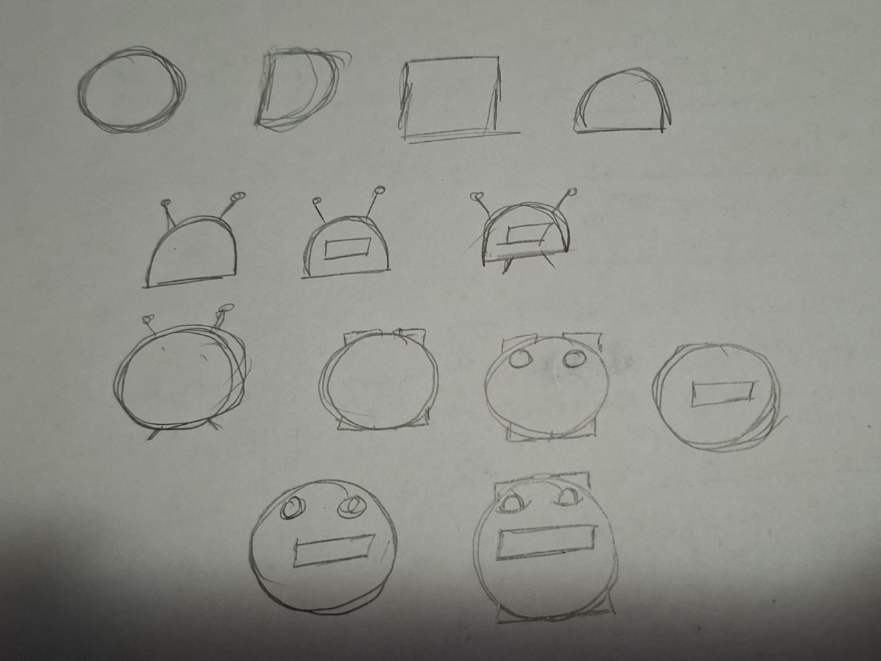
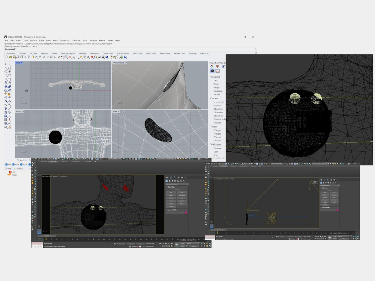
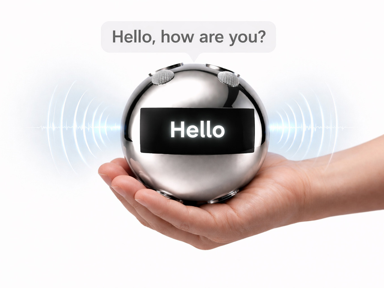
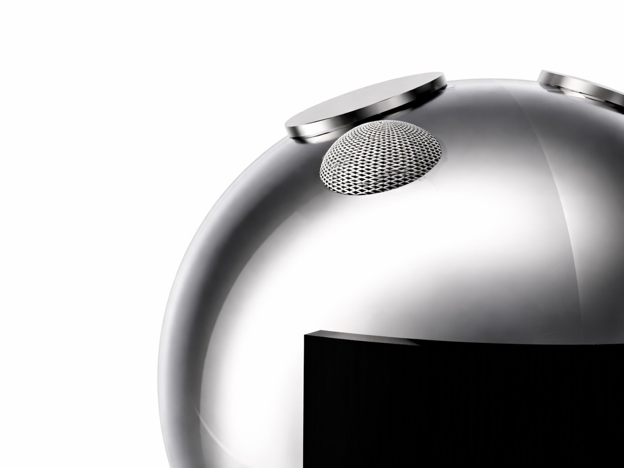
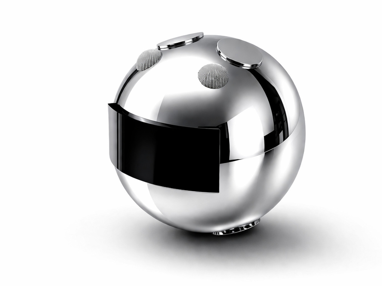
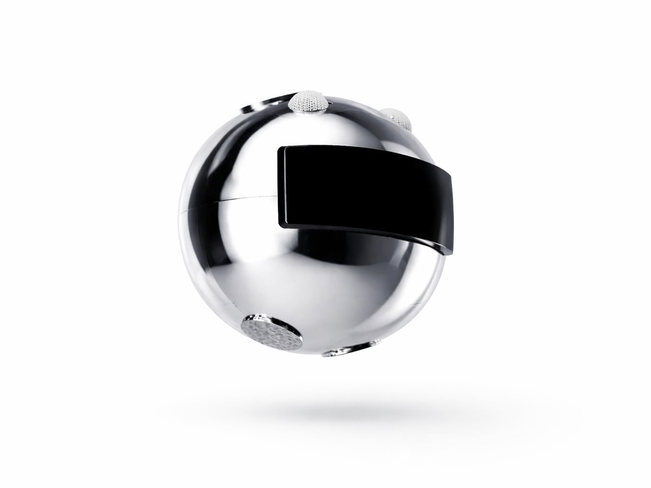
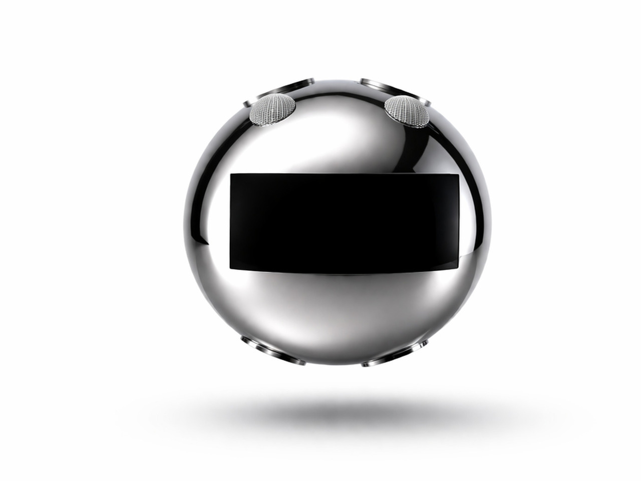
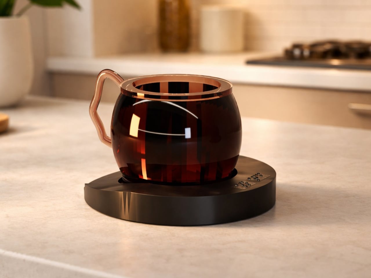
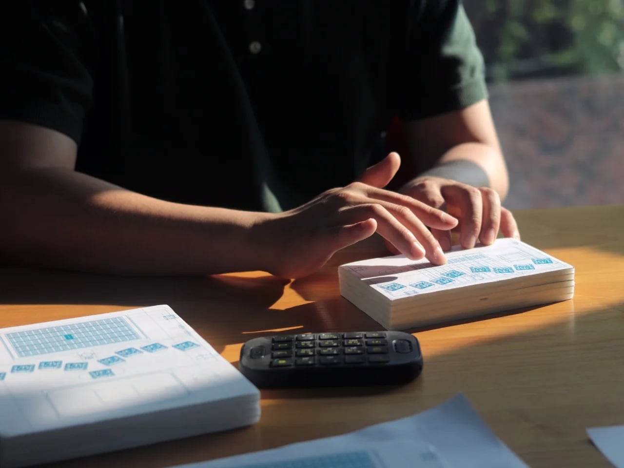
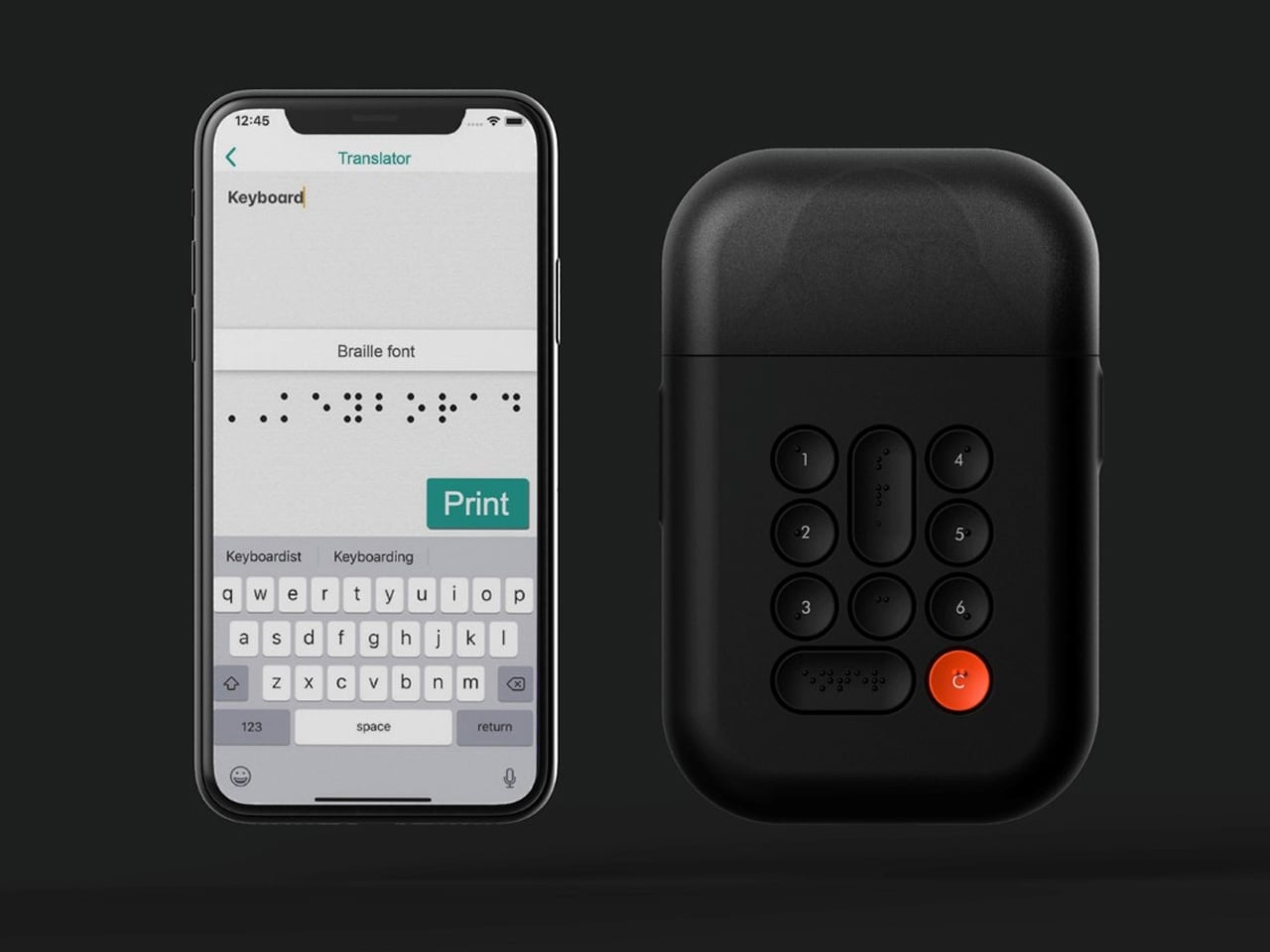
1. Friendly Braille-Reader
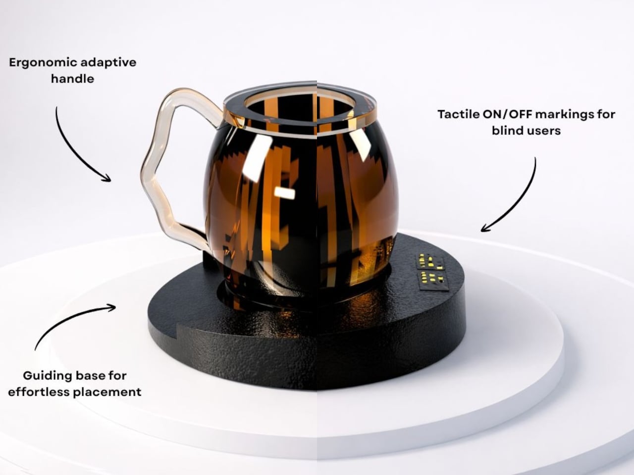
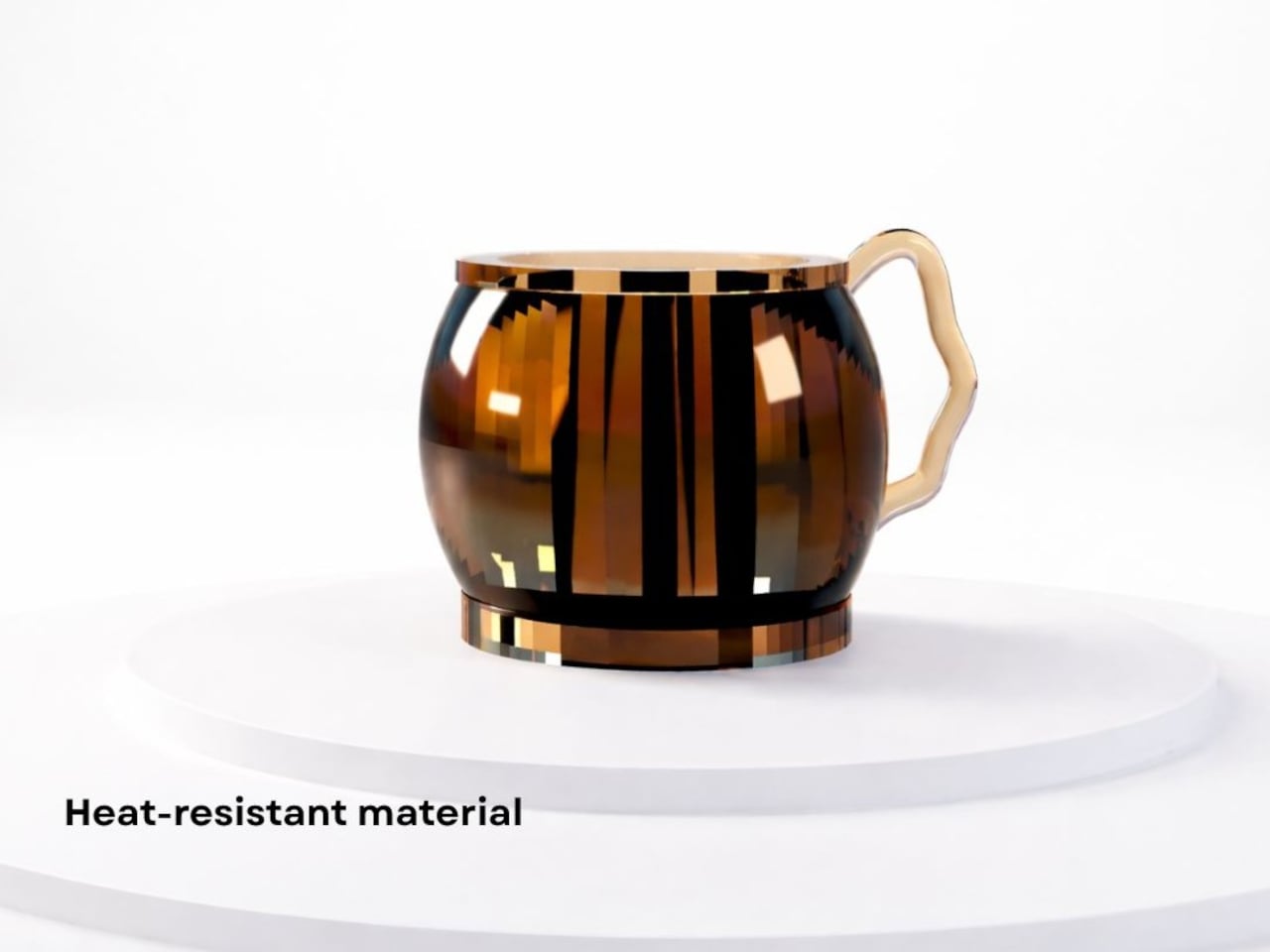
Tactile spatial language in product design uses touch as the primary guide for interaction. Surfaces, controls, and interfaces are shaped to be understood through the hands rather than visual cues alone. Raised markers, textures, and Braille elements are integrated directly into products, allowing users to navigate functions intuitively and confidently.
The intent is not compliance, but refinement. When tactile cues are built into materials such as metal, wood, or molded composites, they feel deliberate and well-crafted. Accessibility becomes a design asset, enhancing usability, product quality, and long-term user trust.
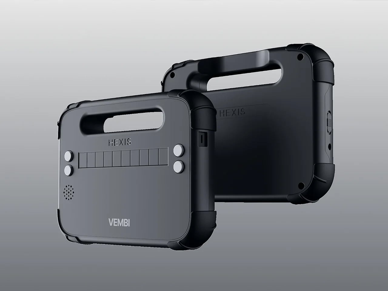
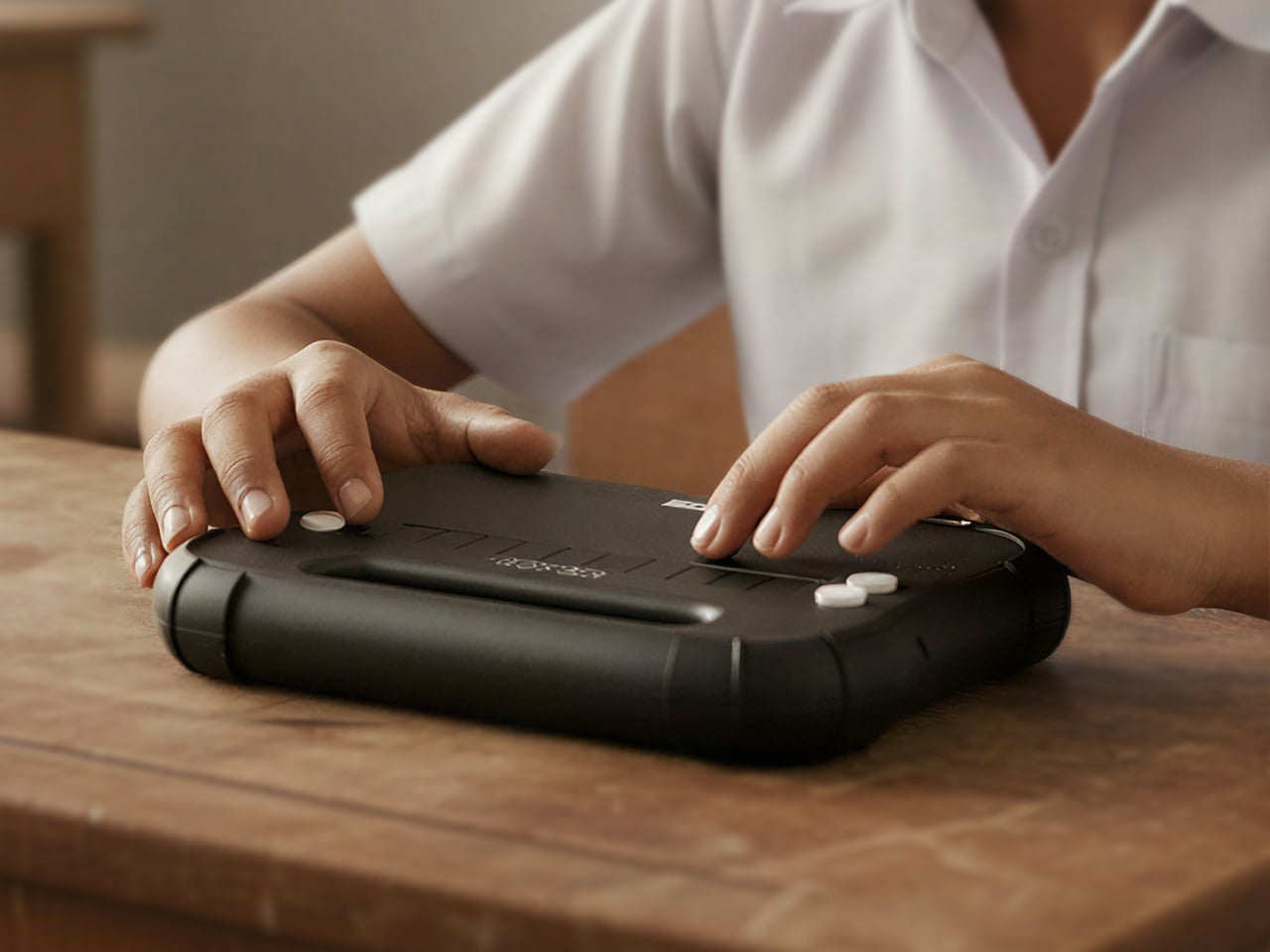
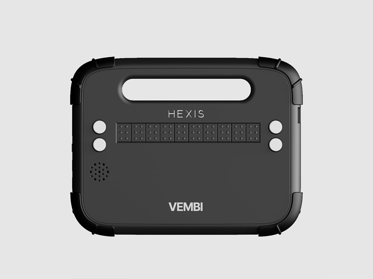
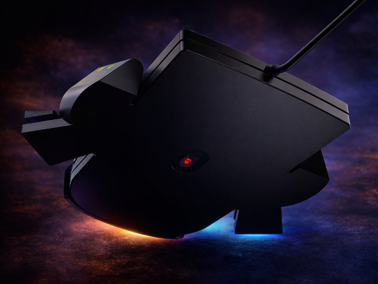
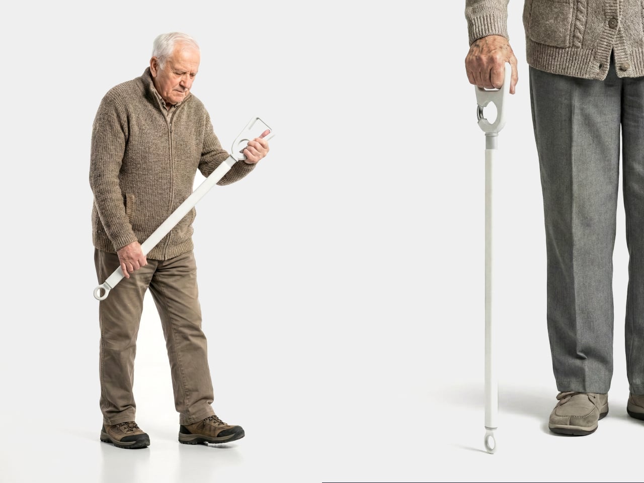
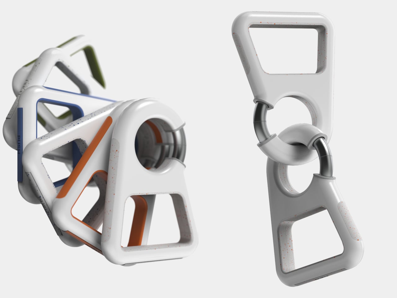
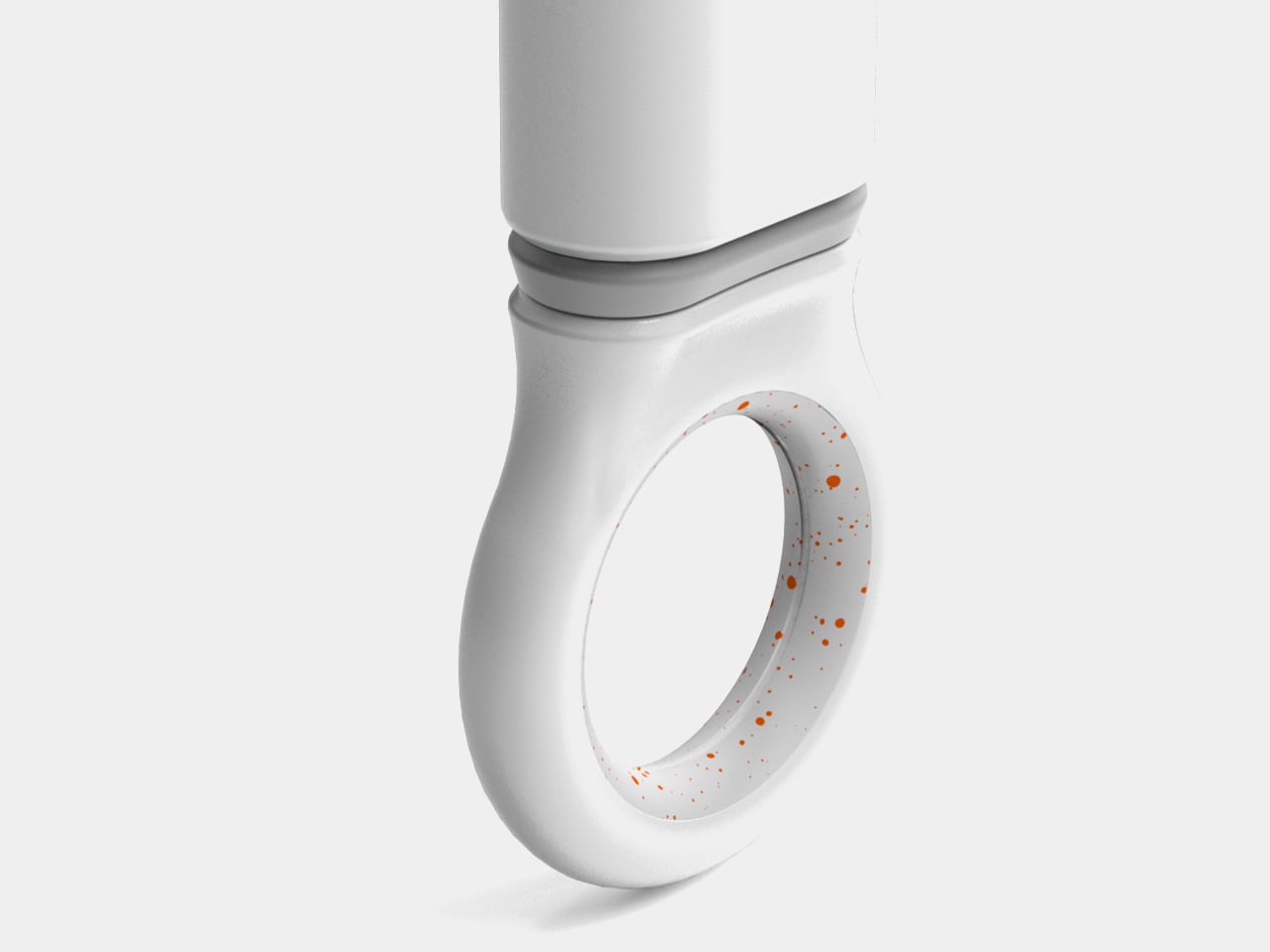
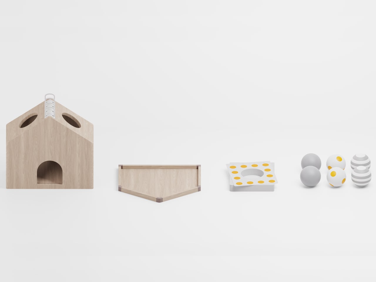
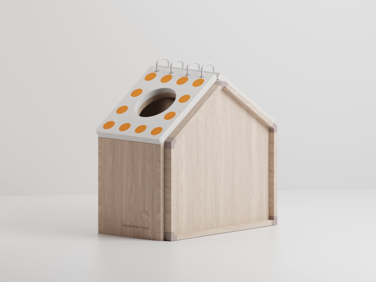
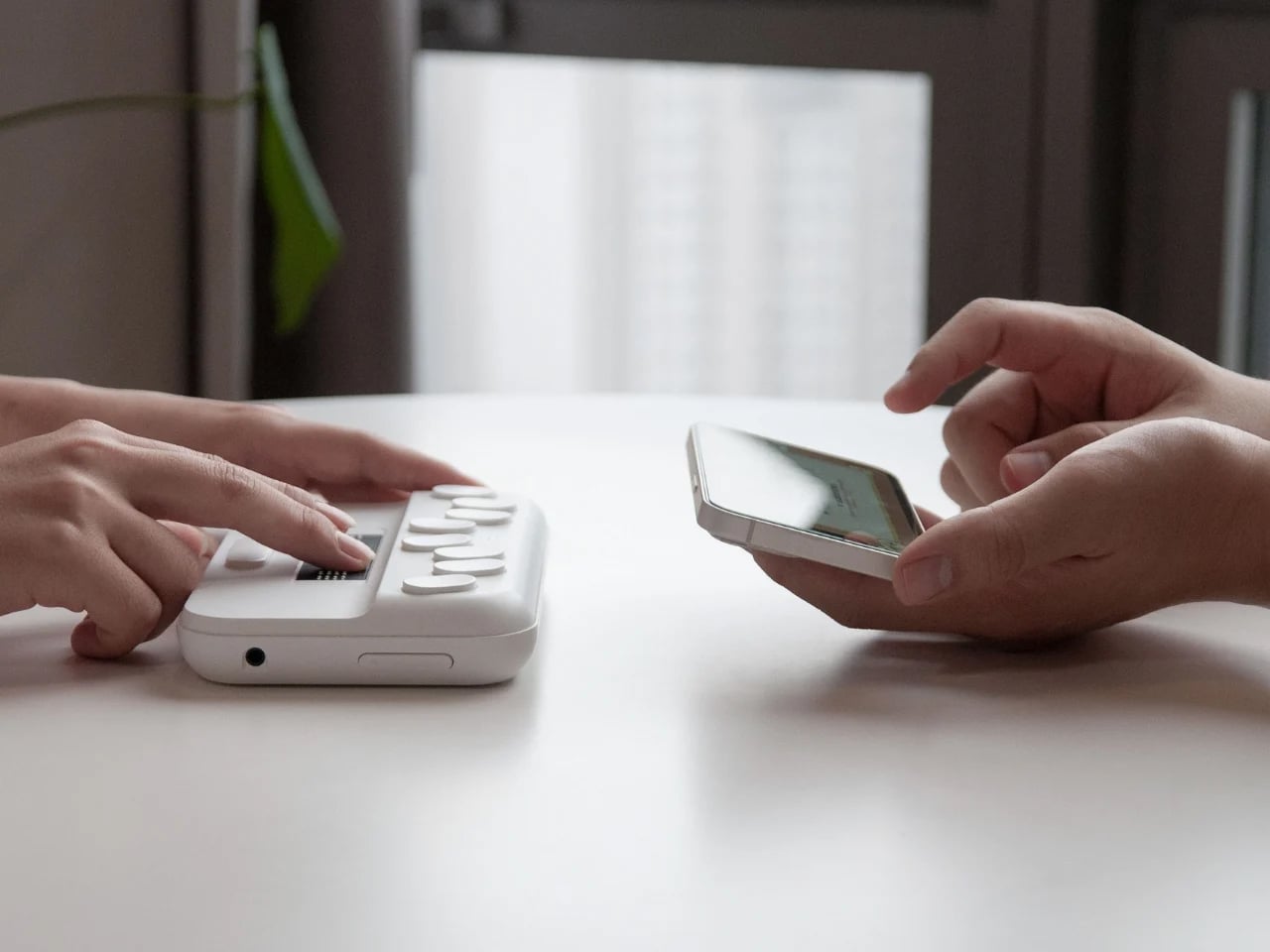
Blind students often rely on expensive embossers, special paper, and slow production cycles to access Braille content, while most assistive devices remain bulky, fragile, and designed for adult use. These tools rarely suit the realities of school life, where children move between classrooms, share crowded spaces, and carry everything in backpacks. This mismatch reveals a clear gap between what visually impaired children actually need and what assistive hardware typically offers.
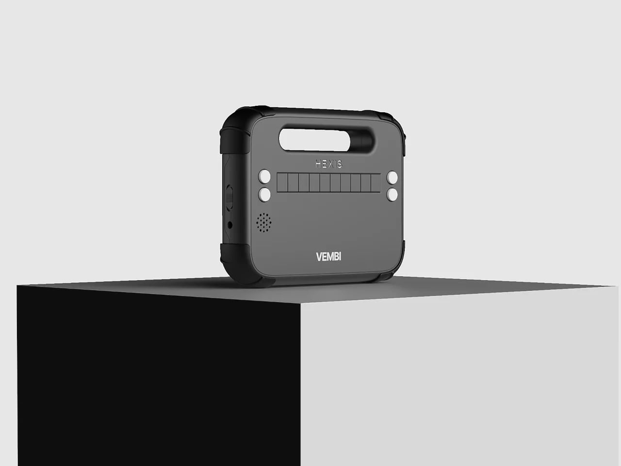
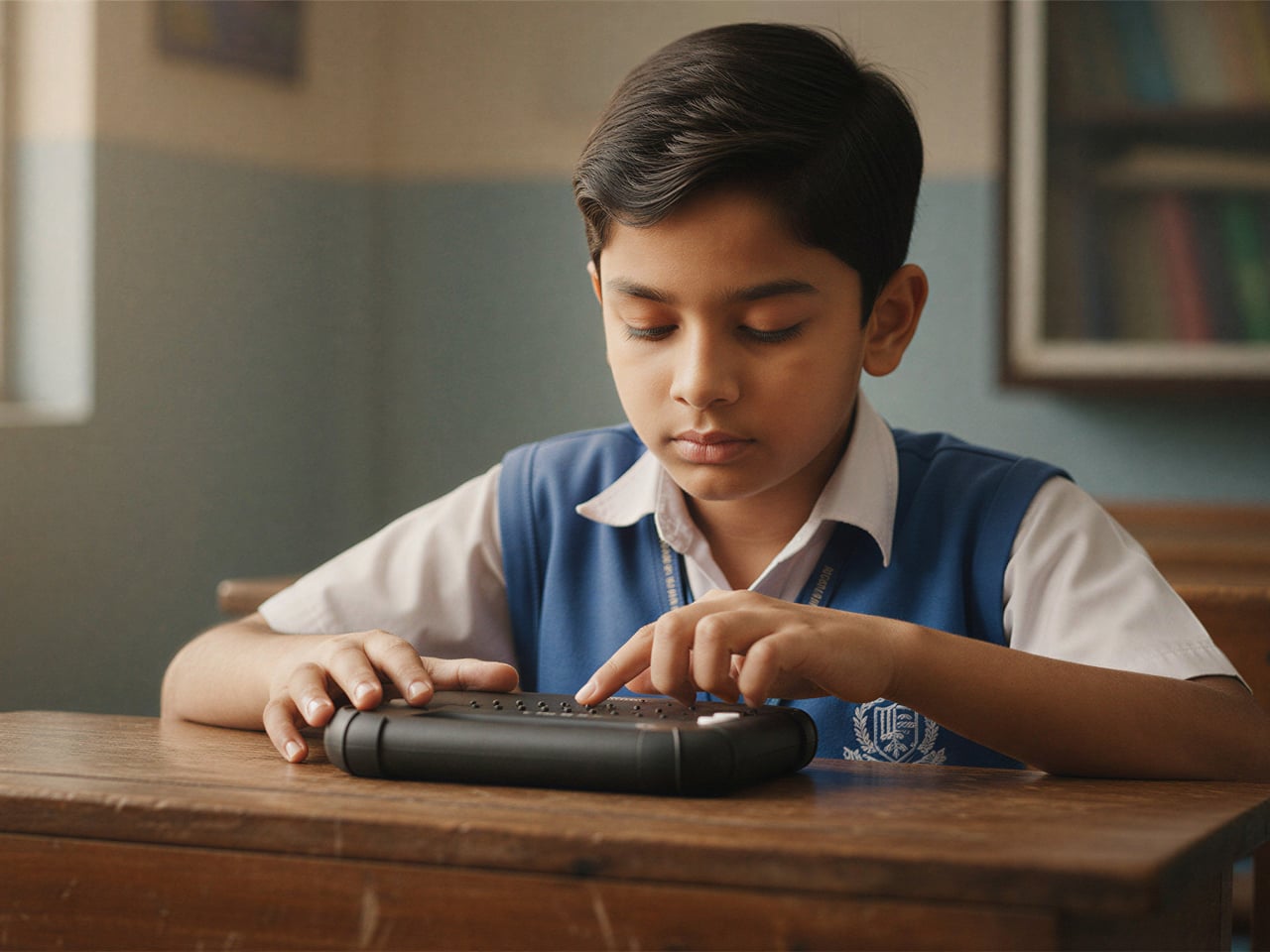
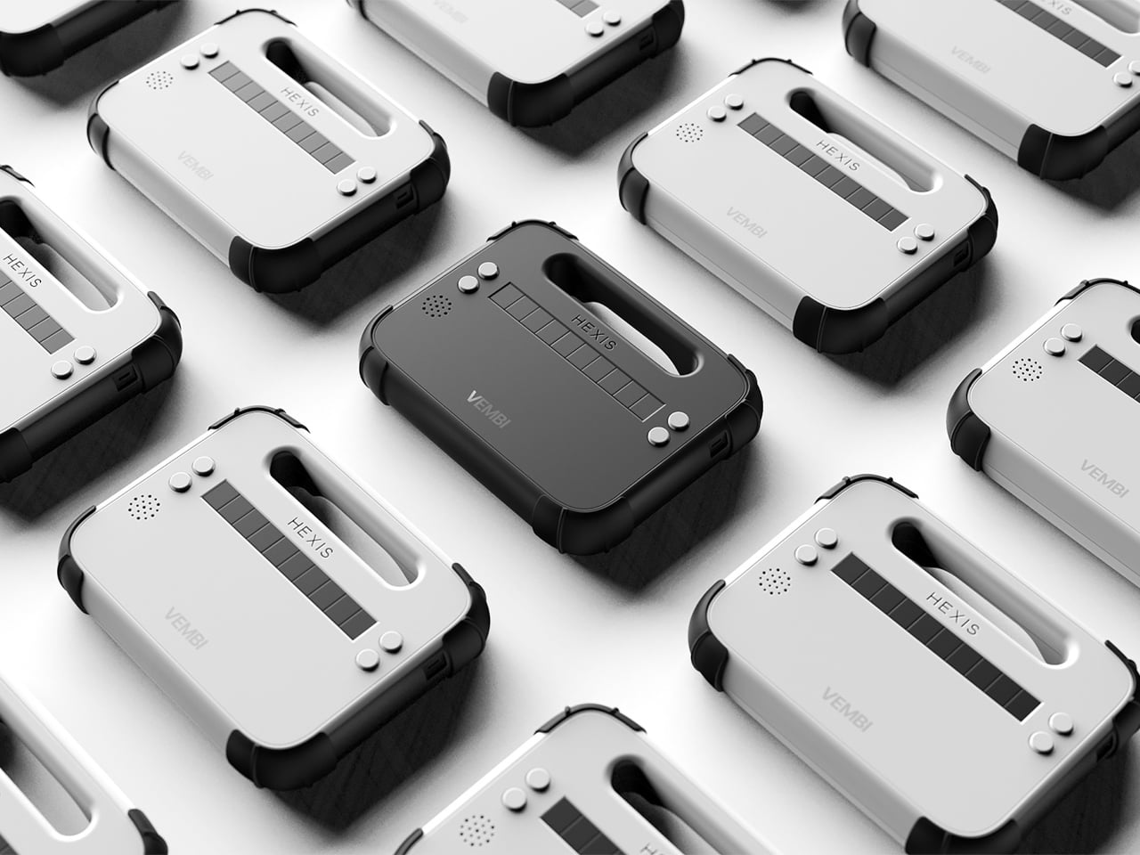
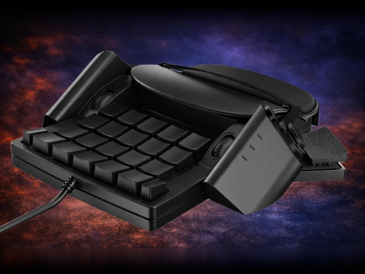
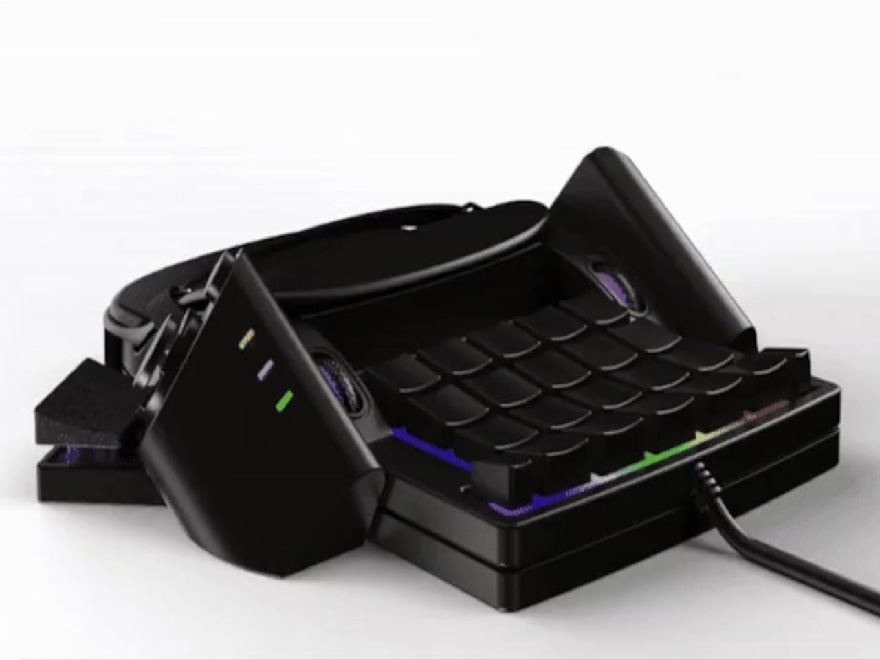
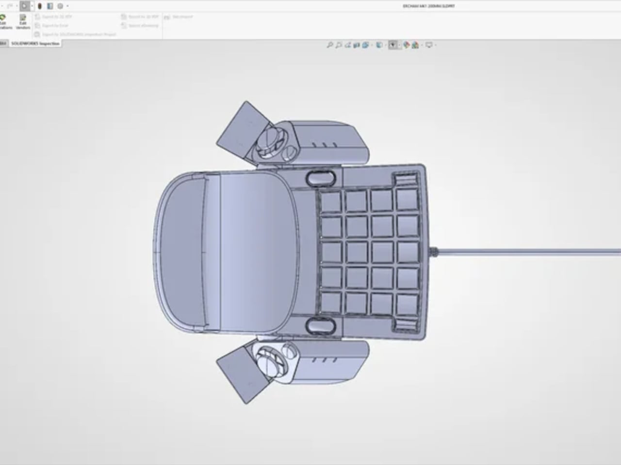
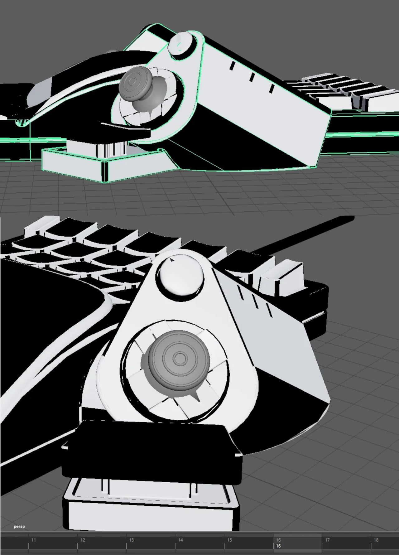
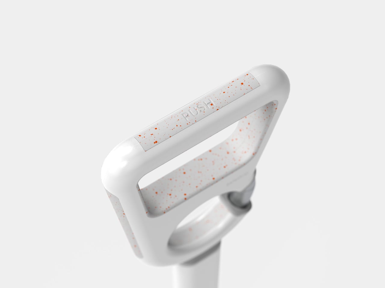
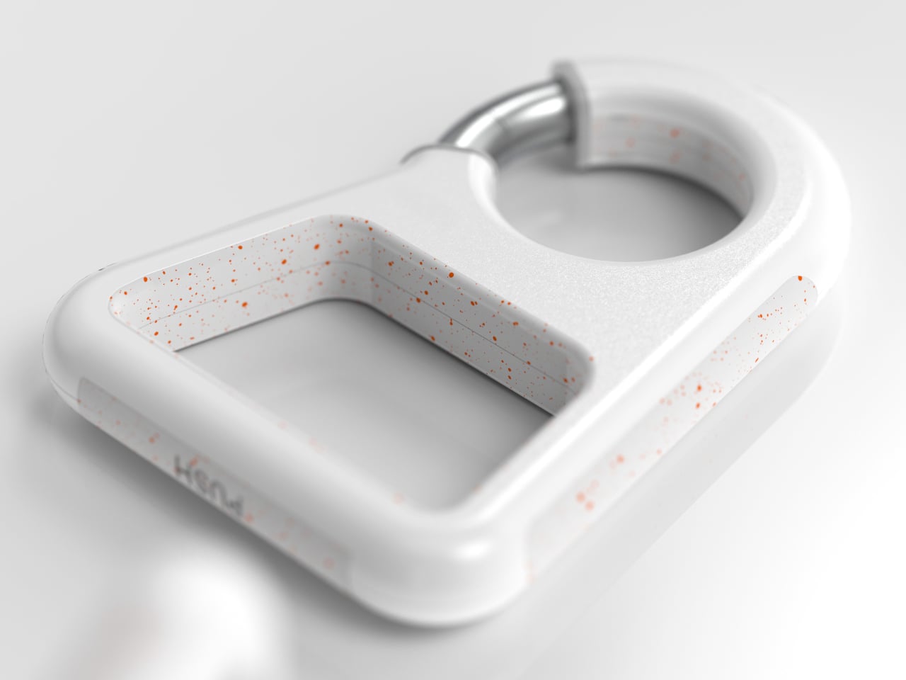
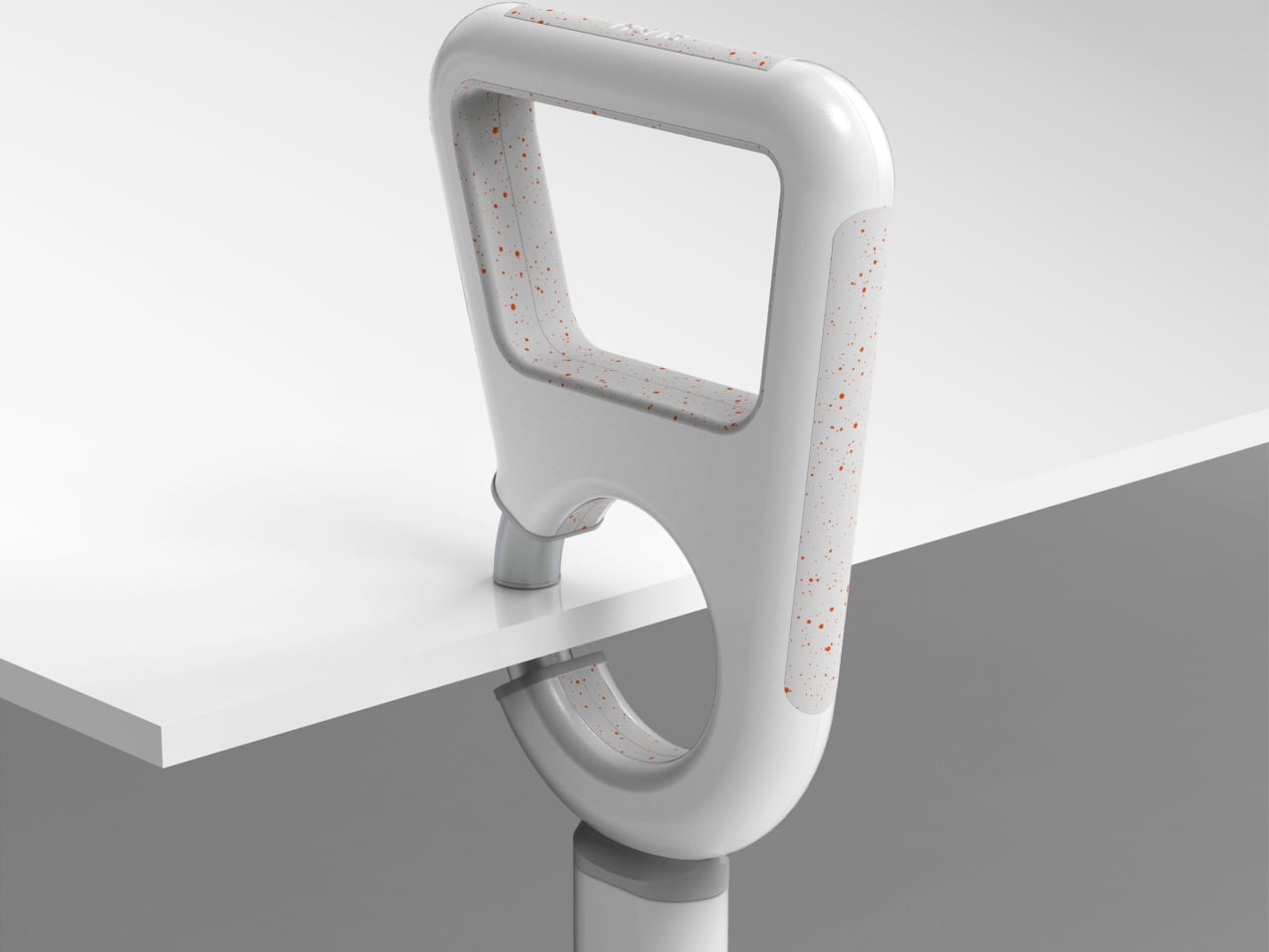
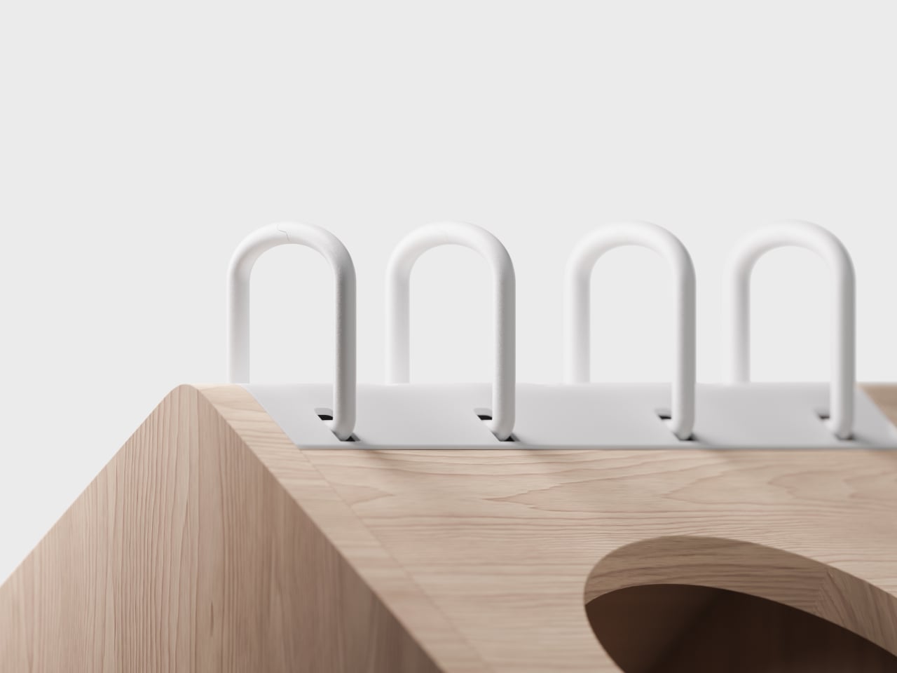
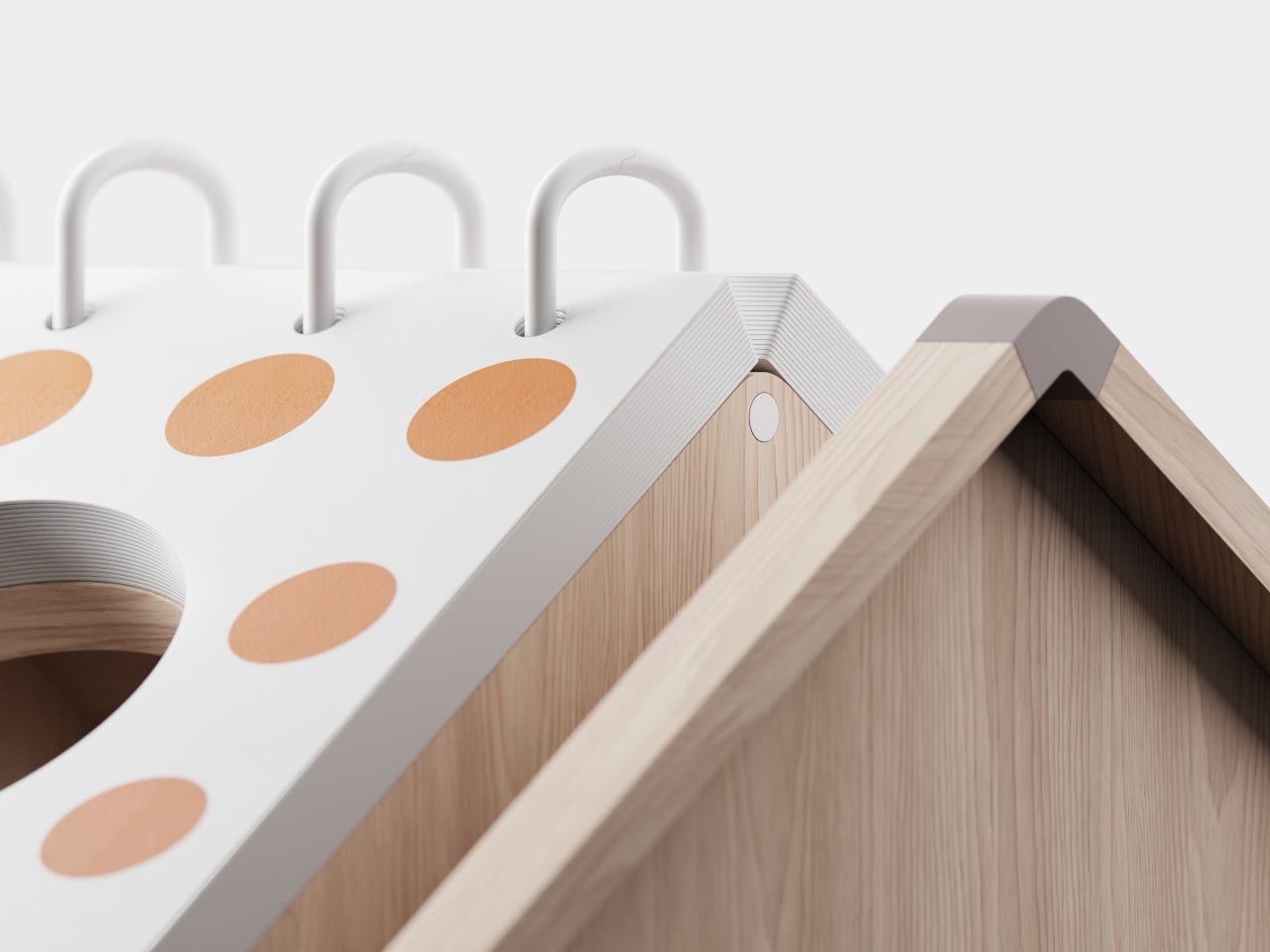
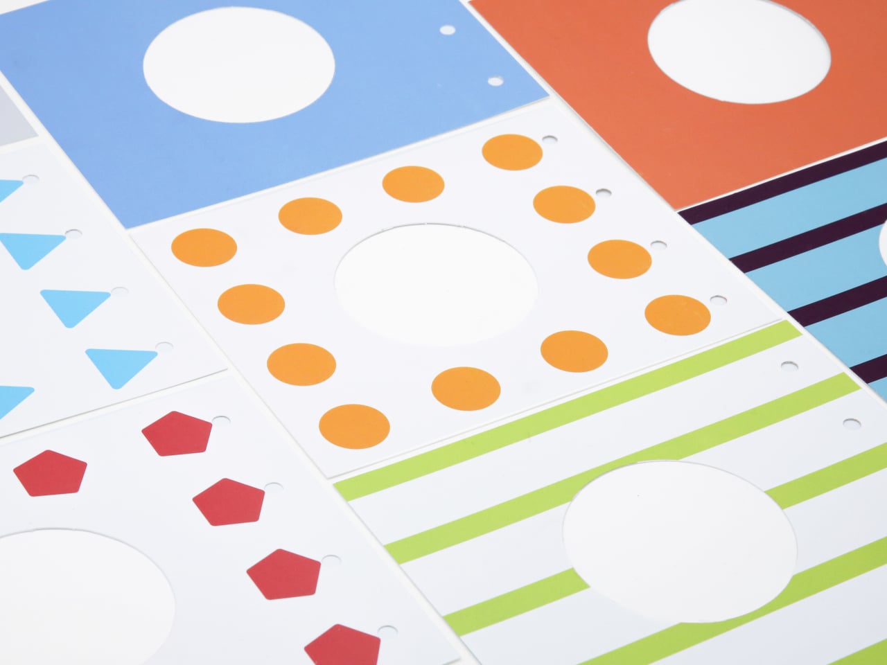
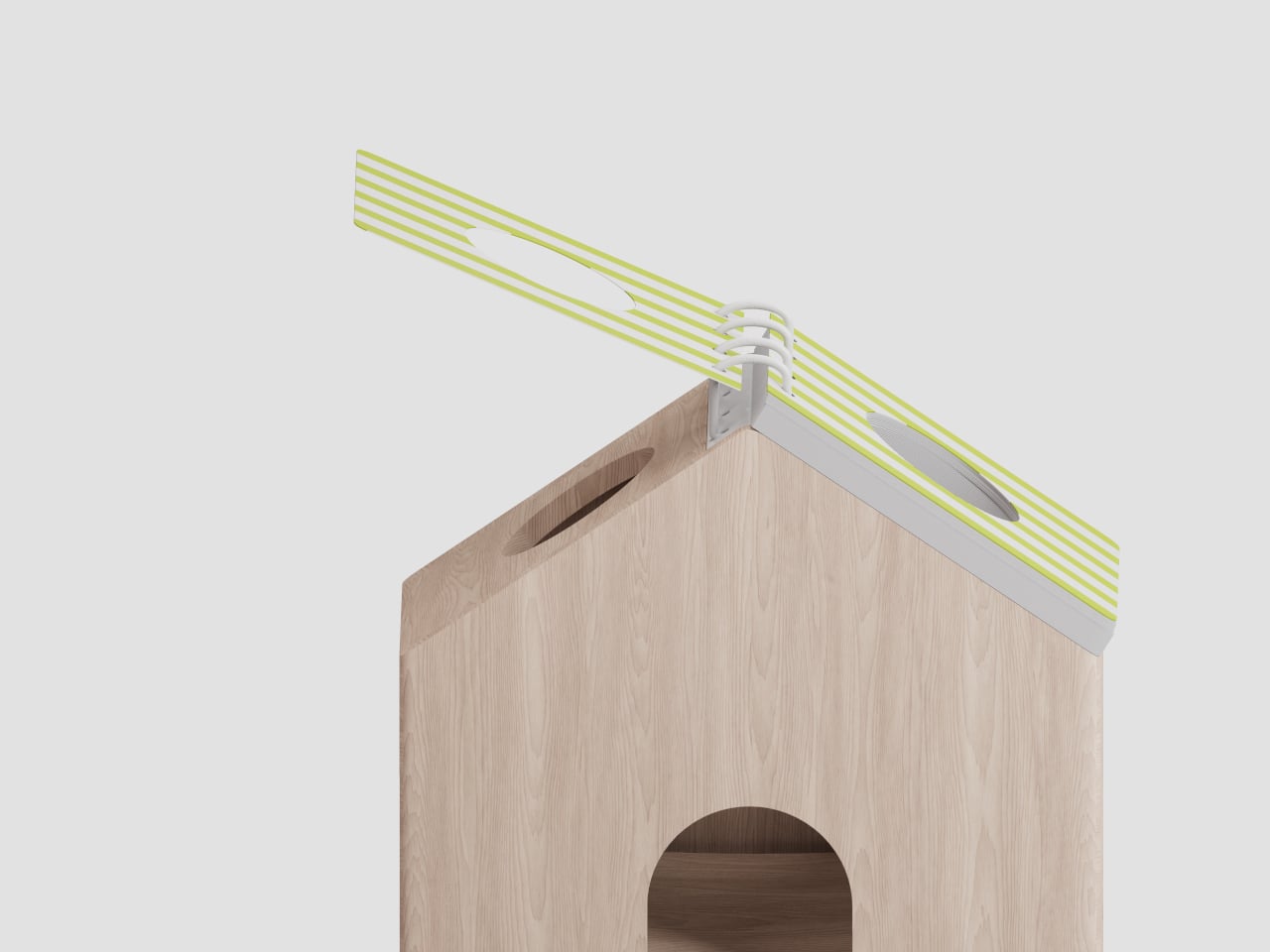
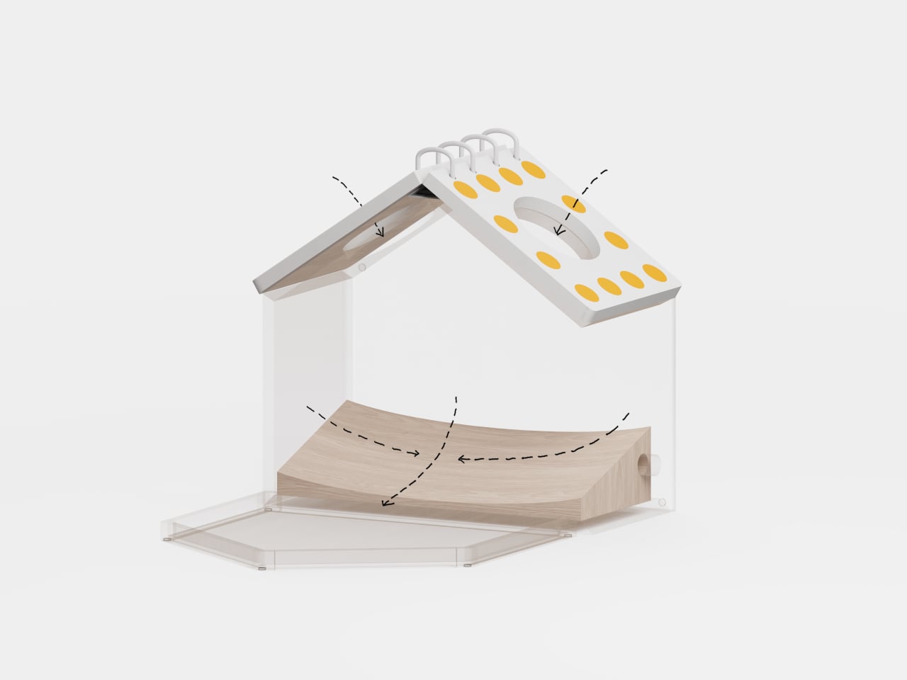
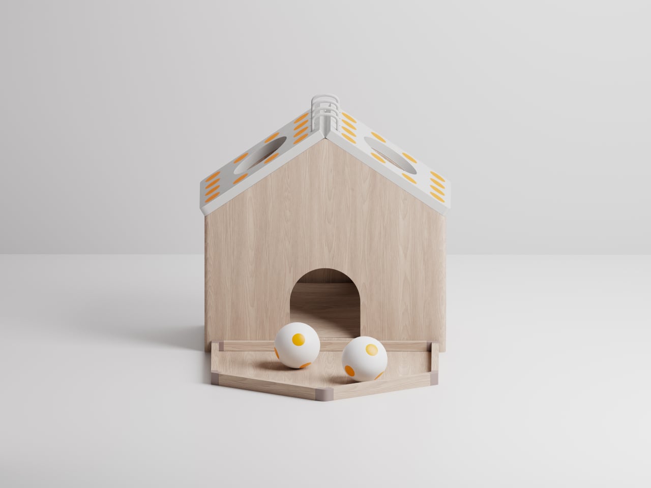
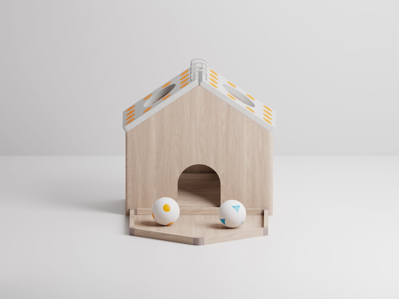
Vembi Hexis bridges this gap with a Braille reader designed specifically for children by Bengaluru-based Vembi Technologies, with industrial design by Bang Design. It converts digital textbooks and notes into refreshable Braille across multiple Indian languages and English. Compact, rugged, and affordable, Hexis features soft geometry, protective bumpers, tactile surface cues, and an integrated carry handle. Wi-Fi connectivity enables seamless content delivery via the Antara cloud platform. Widely adopted by schools and NGOs, Hexis feels like a natural classroom companionb which is durable, approachable, and designed to fit in.
2. Tactile Learning Devices
Learning devices that prioritize tactile interaction exemplify how touch can replace or complement visual input. Materials are selected not just for durability or aesthetics but for their ability to convey function, hierarchy, and spatial logic. Different textures, raised surfaces, and subtle temperature variations signal transitions, guiding learners intuitively without reliance on sight.
Knurled surfaces, raised patterns, and carved textures act as tactile landmarks, providing orientation and feedback. These cues help users differentiate functions and reinforce memory, turning touch into a primary channel for exploration. By integrating tactile logic into product design, learning devices offer an intuitive, multisensory experience that builds confidence and enhances comprehension.
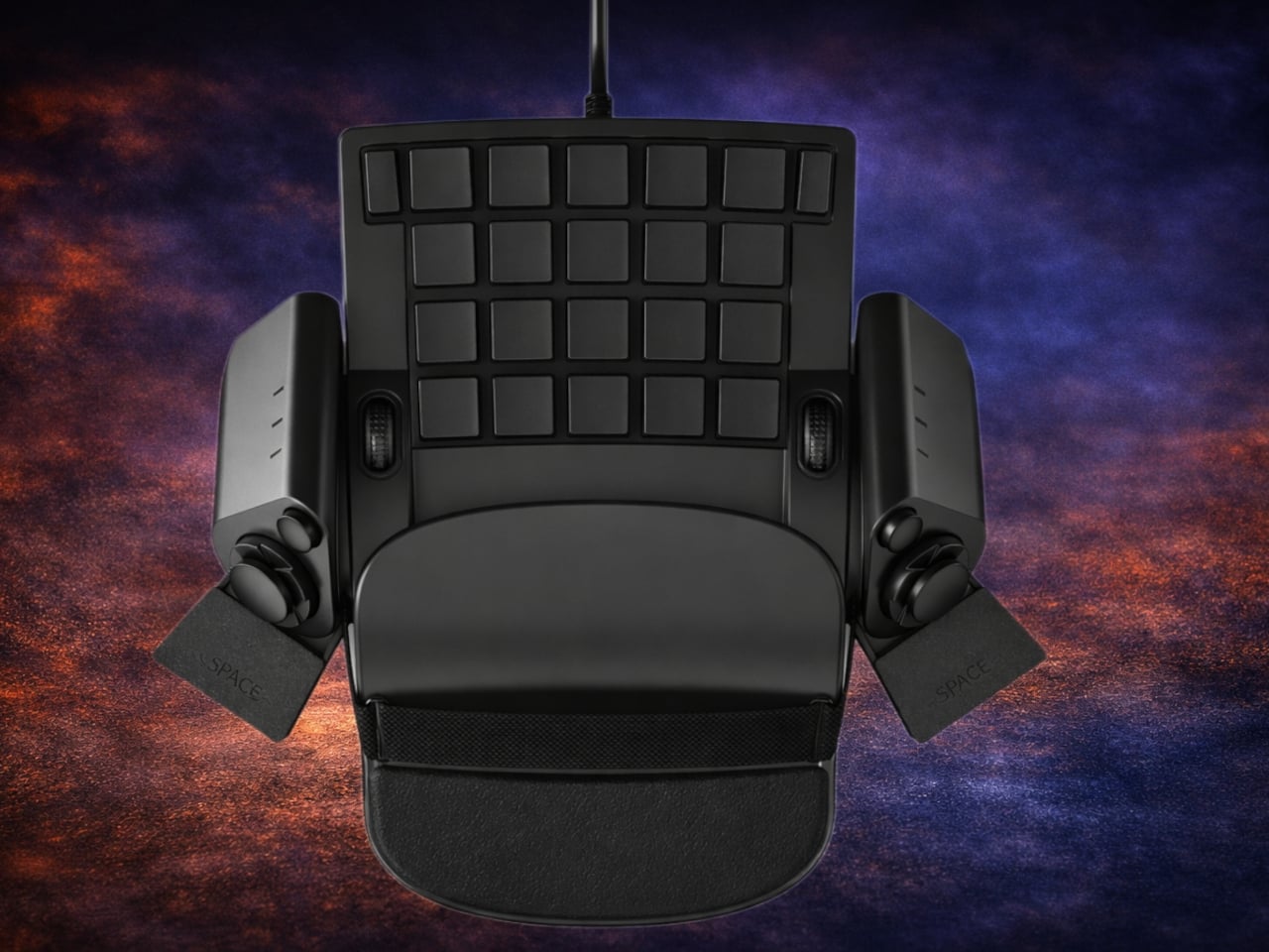
Many assume that learning Braille is easy for visually impaired users, but learners often report that existing tools are far from intuitive. Overly complex or cluttered devices can be overwhelming, increasing cognitive load and making navigation through touch more difficult. Instead of supporting learning, poorly designed tools can slow progress and discourage engagement. This gap has encouraged designers to rethink how Braille education devices communicate information through touch, simplicity, and clear spatial organisation.
SMARTIO EDU is a conceptual Braille education device designed to reduce tactile noise for both students and teachers. It uses soft, rounded contours and subtle tactile cues to guide fingers and improve readability. Clearly placed buttons on the top act as functional controls and navigation aids, while discreet surface markers help users identify orientation and key interfaces.
3. Braille Musical Instruments
Musical instruments offer an extraordinary opportunity to translate tactile feedback into skill and expression. Sensory acoustic layers allow learners to experience sound through touch as well as hearing. Vibrations, resonance, and textures from strings, drum skins, and keys provide continuous tactile feedback, helping users intuitively understand tone, pitch, and dynamics.
Textured grips and responsive surfaces allow learners to feel subtle variations in sound and force, while the instrument itself communicates through touch. This approach transforms musical instruments into fully sensory learning tools, where haptic feedback complements auditory cues. The result is an inclusive experience that teaches skill, expression, and musical understanding simultaneously.
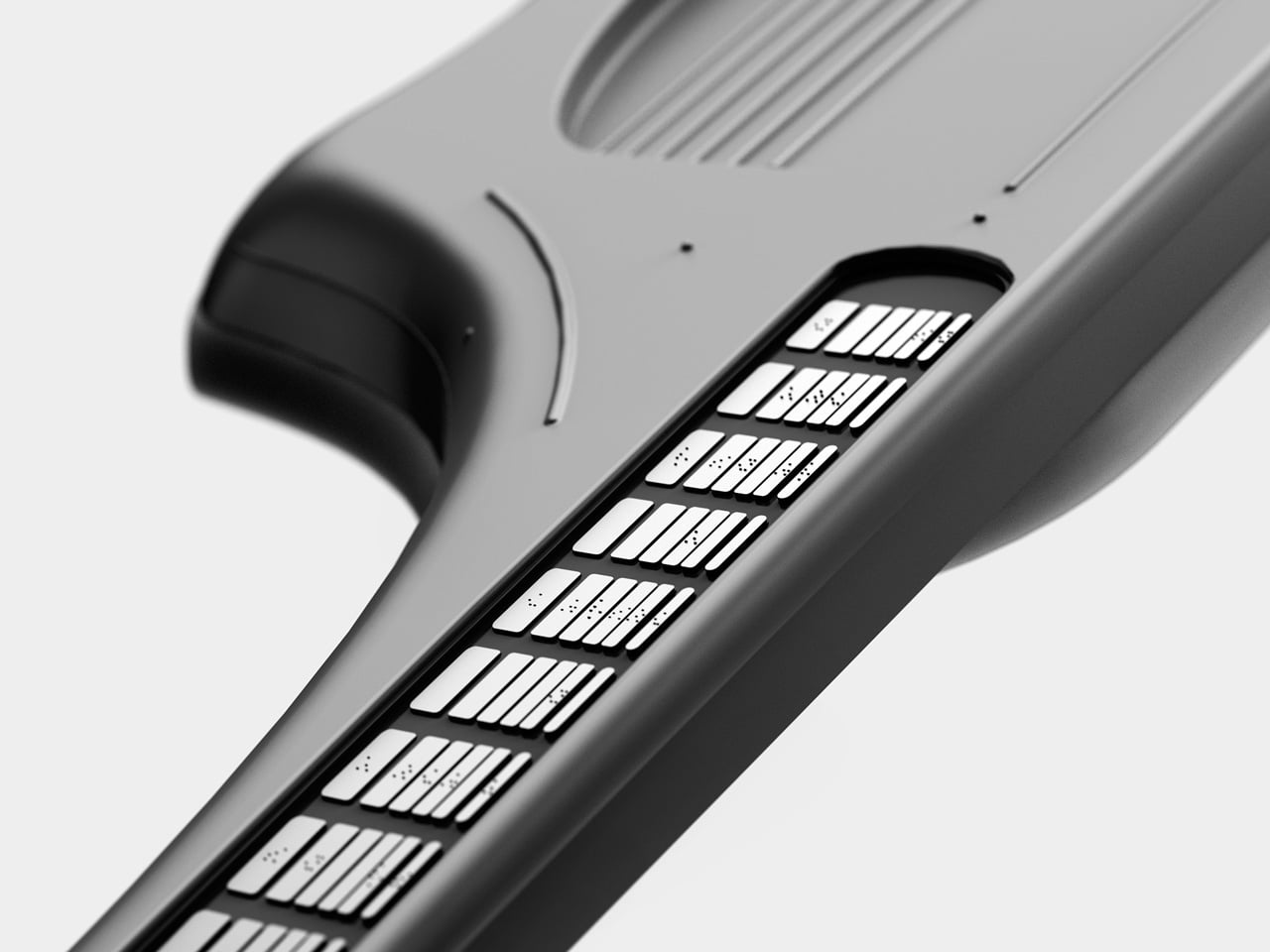
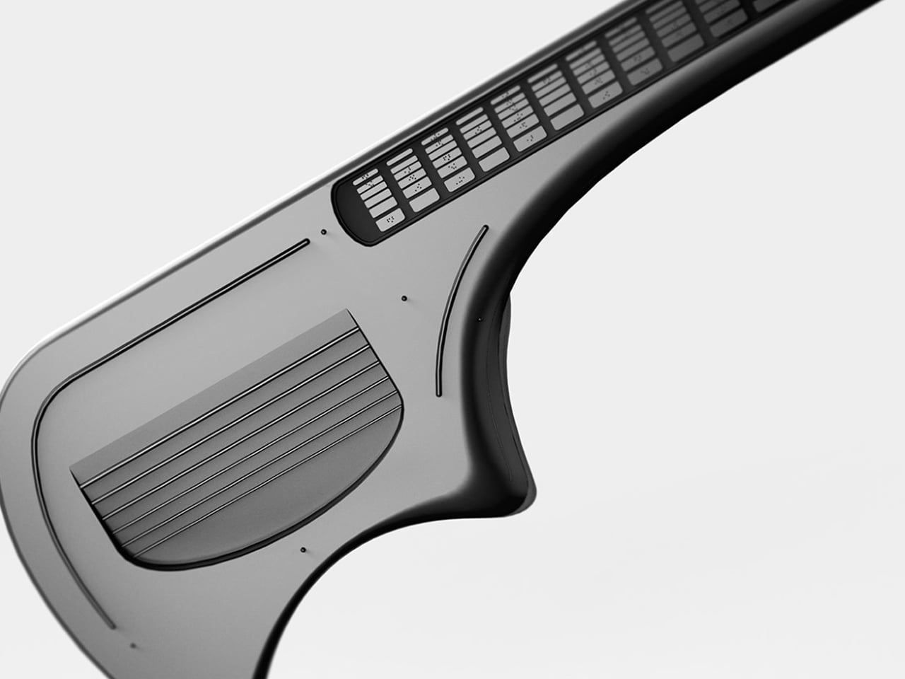
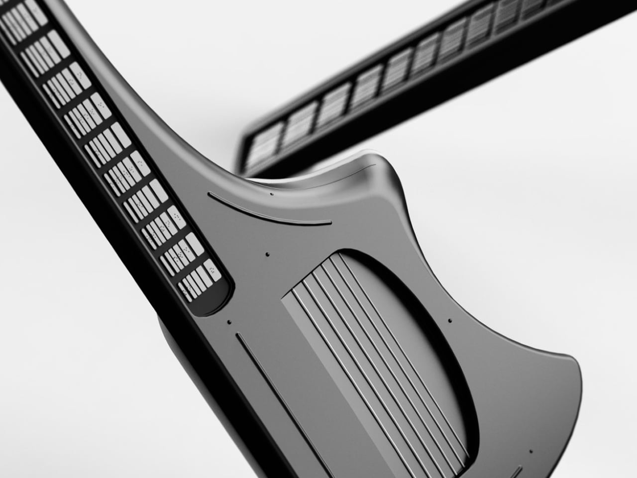
Simply colour-coding or backlighting parts of an instrument may help sighted beginners, but such solutions offer little value to visually impaired musicians. Vitar addresses this gap by rethinking the guitar interface altogether. Instead of relying on visual cues, it features a fretboard fully embedded with Braille keys, enabling blind and low-vision users to navigate notes through touch. Notably, Vitar is not a traditional electric guitar but a guitar-shaped MIDI instrument, allowing it to interface with digital audio workstations and expand into the realm of electronic music.
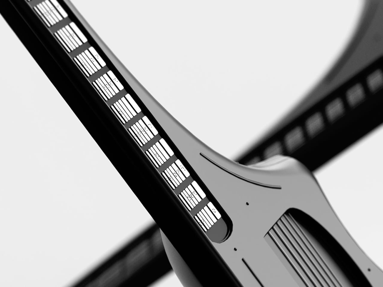
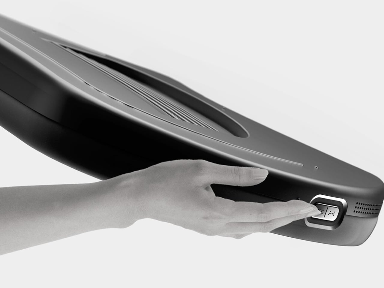
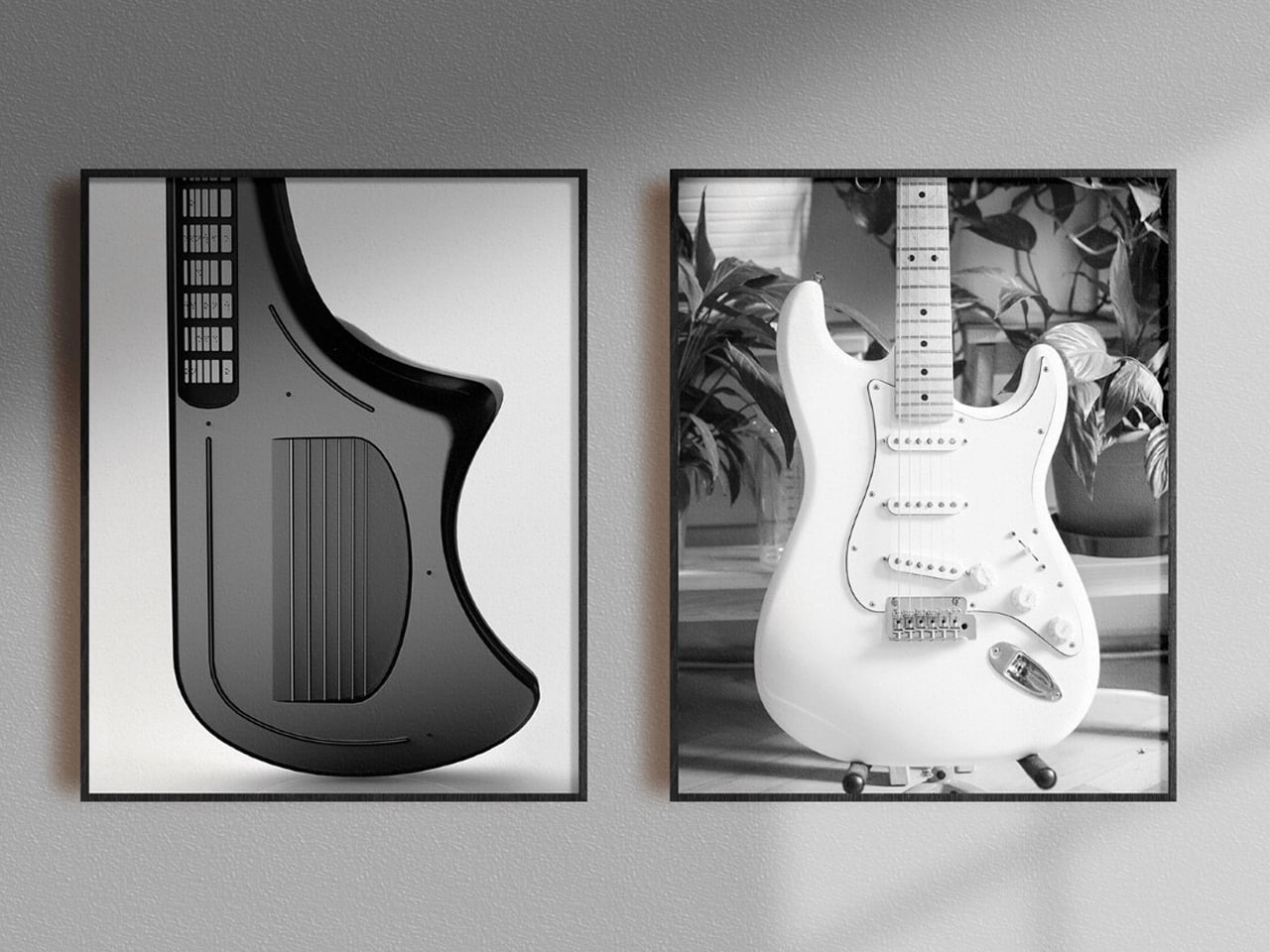
Intuition rather than acoustics drives Vitar’s unconventional form. Notes are triggered by pressing keys on the fretboard, each embossed with a Braille letter for clear identification. An asymmetrical body guides correct orientation, while recessed strings, tactile guidelines, and defined resting points reduce uncertainty and speed up learning. By transforming note recognition into a tactile, button-like interaction, Vitar lowers the learning curve for beginners.
4. Human-Centred Tools
Human-centred product design prioritizes autonomy, dexterity, and intuitive interaction. Custom-crafted devices respond naturally to the user’s hand, allowing control, navigation, and operation without visual guidance. Thoughtfully designed tactile features make interaction instinctive, comfortable, and accessible.
Tactile interfaces replace smooth, touch-sensitive screens with knurled dials, haptic-feedback buttons, and textured grips. Shadowed recesses and raised edges guide the hand, creating predictable pathways for interaction. This thoughtful integration of form and function ensures that usability does not compromise aesthetics.
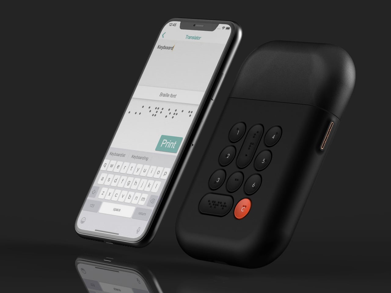
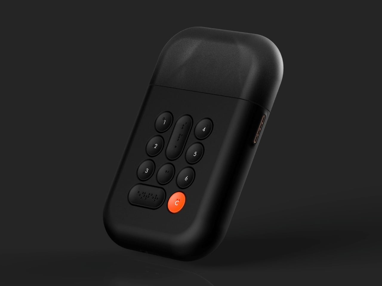
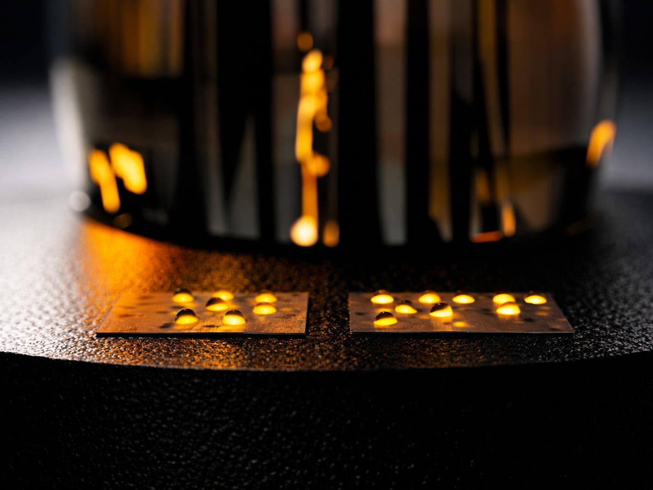
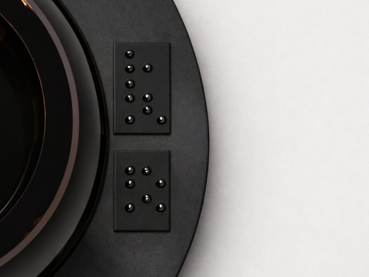
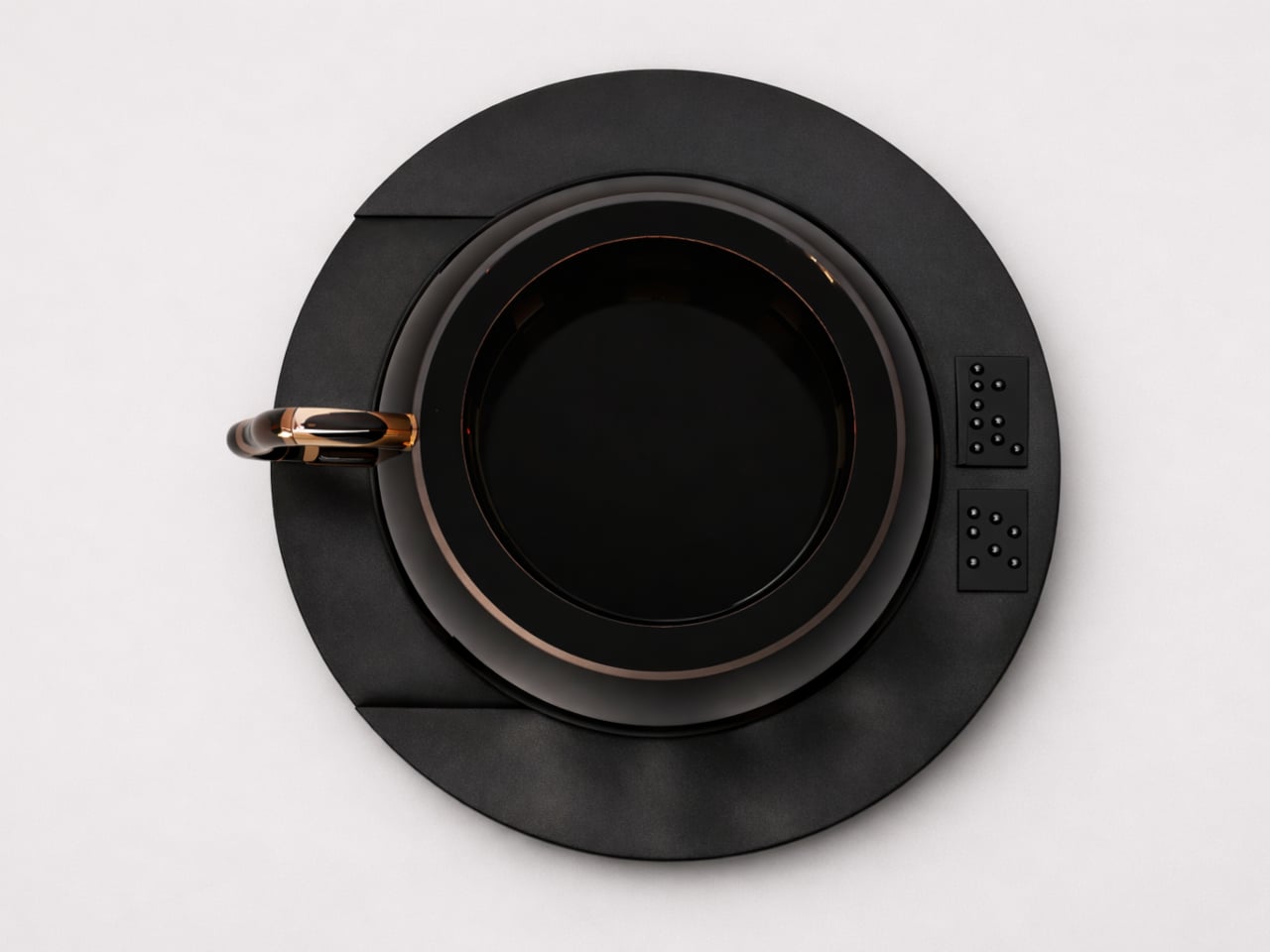
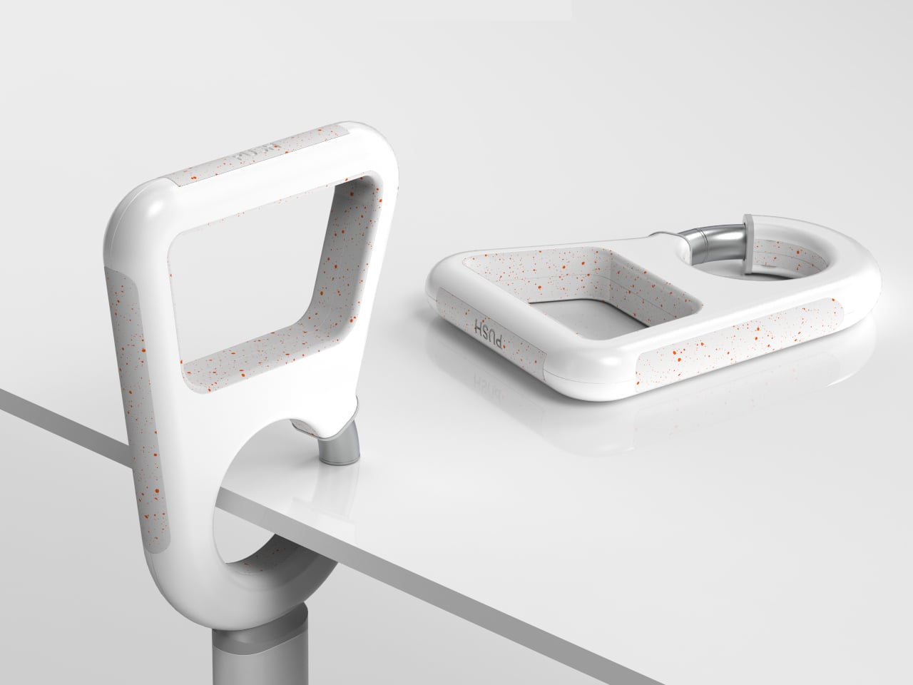
The conventional label maker, while practical, relies heavily on visual interaction and therefore excludes visually impaired users. The Braille Label Maker addresses this limitation by enabling the creation of tactile labels that can be read through touch. It features a streamlined, non-cluttered interface with recessed concave buttons that support intuitive, eyes-free operation. Labels can be created directly on the device or via a companion smartphone application with an accessibility-optimised keyboard, and are printed on adhesive-backed, Braille-compatible paper.
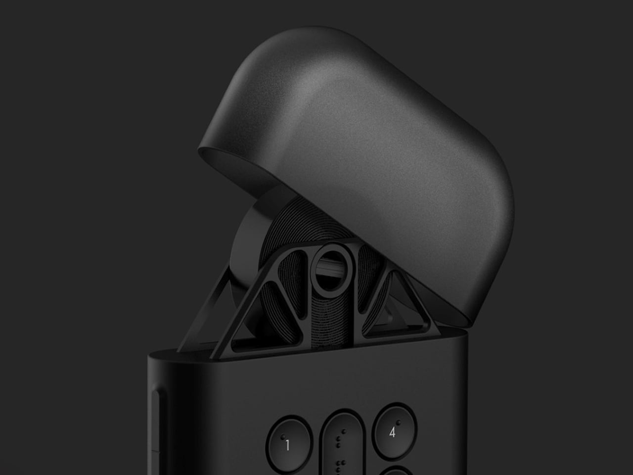
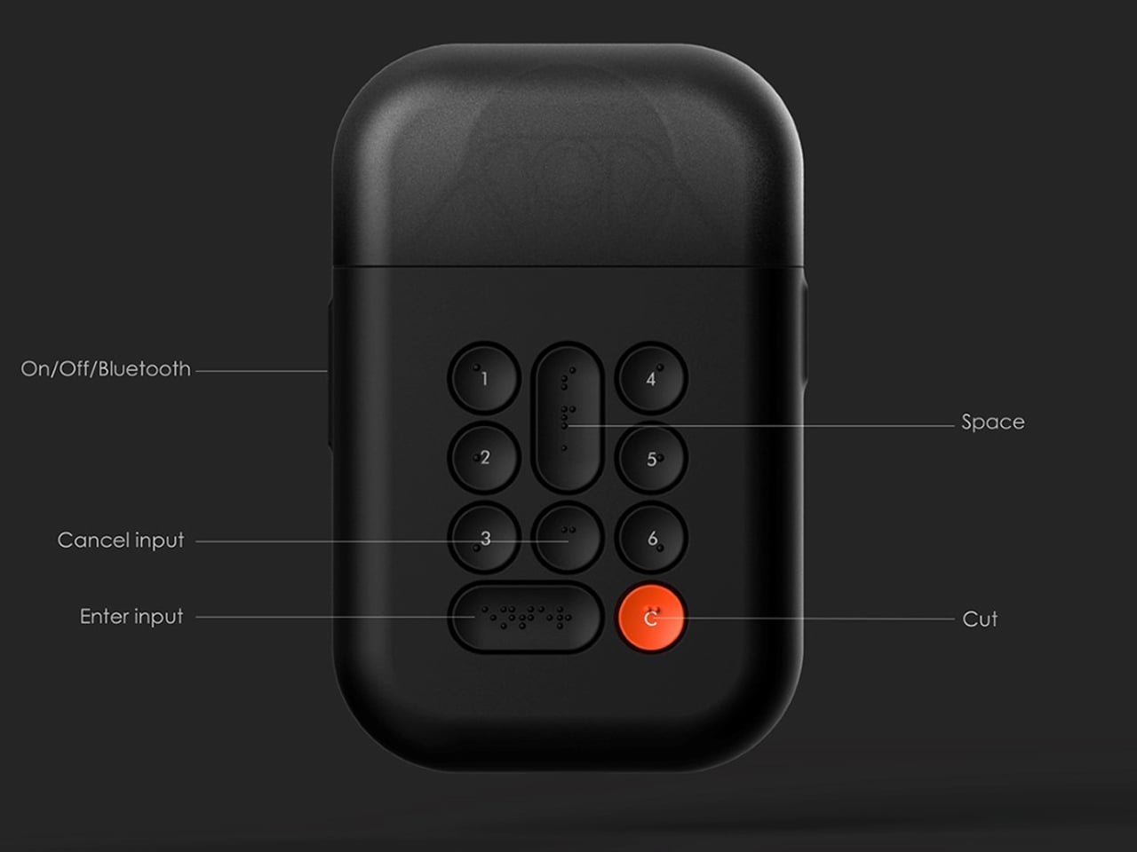
The product is defined by a clear focus on tactile usability. Its curved form ensures comfortable handling, while a minimal keyboard with Braille markings helps reduce input errors. A top-mounted hood neatly houses the paper roll, maintaining a compact and organised form. The design prioritises physical interaction over visual cues, with details such as a connector-pin charging port further enhancing ease of use for visually impaired users.
5. Smart Inclusive Products
As smart devices proliferate, tactile differentiation and haptic feedback are redefining intuitive interaction. Smooth, minimal surfaces often prioritize visual sleekness but can be inaccessible to many users. By introducing raised textures, relief patterns, and responsive feedback, smart products become physically communicative, supporting interaction beyond sight alone.
Textured controls, haptic alerts, and material variations allow users to perceive function, status, and orientation non-visually. Logical sequencing of these cues ensures interaction is fluid and predictable. In effect, intelligence is expressed physically, not just through software, enabling confidence, autonomy, and inclusivity. Smart design is no longer a visual exercise alone as it becomes a multisensory experience.
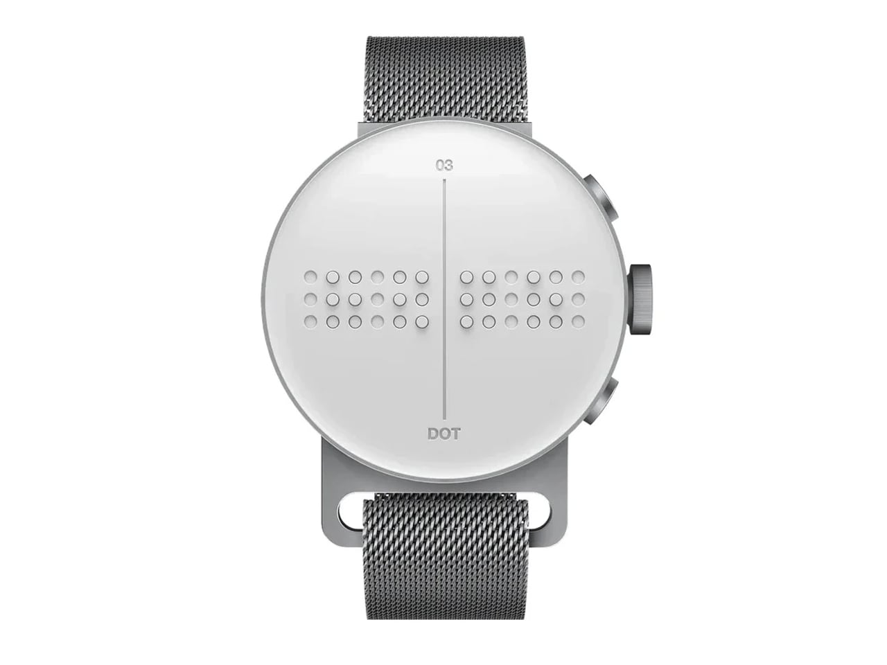
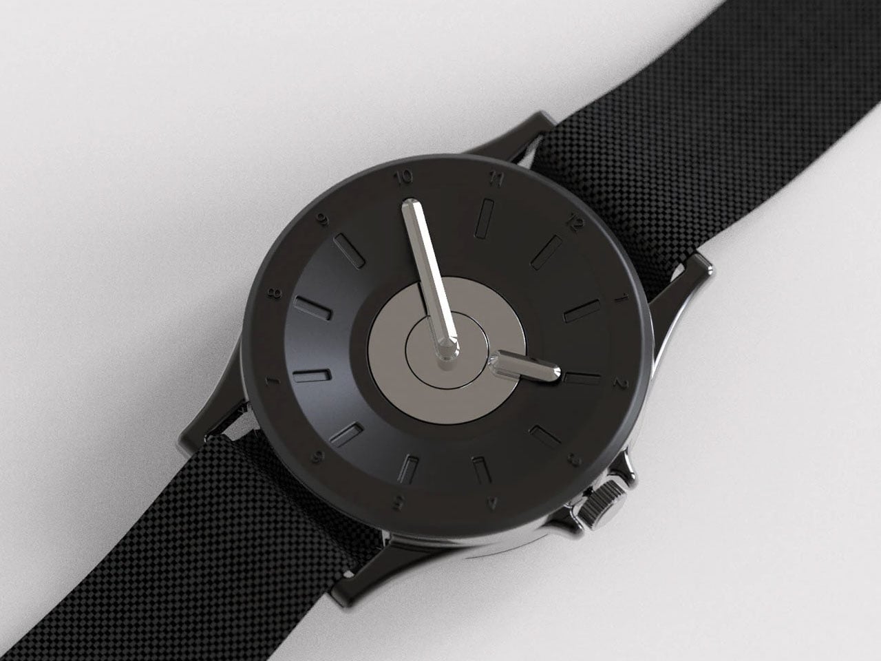
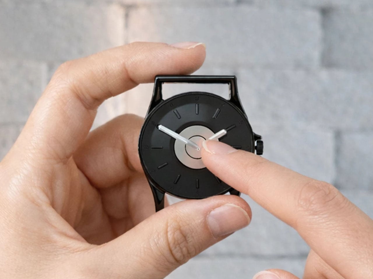
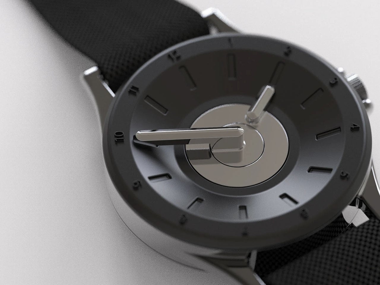
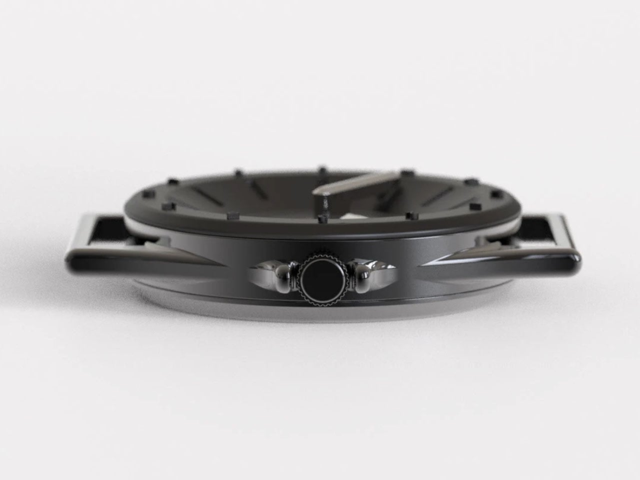
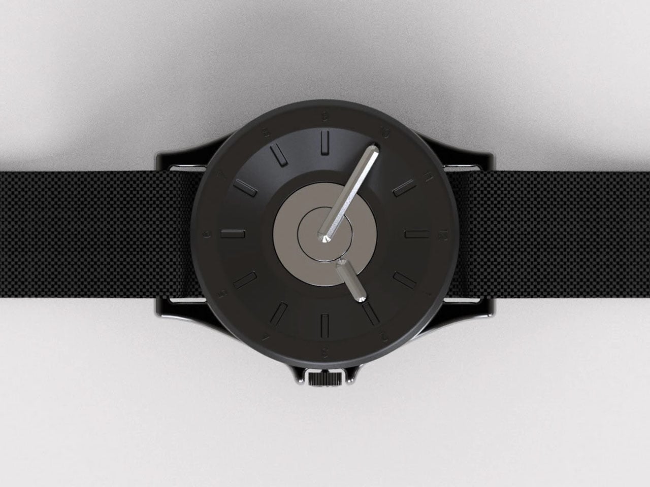
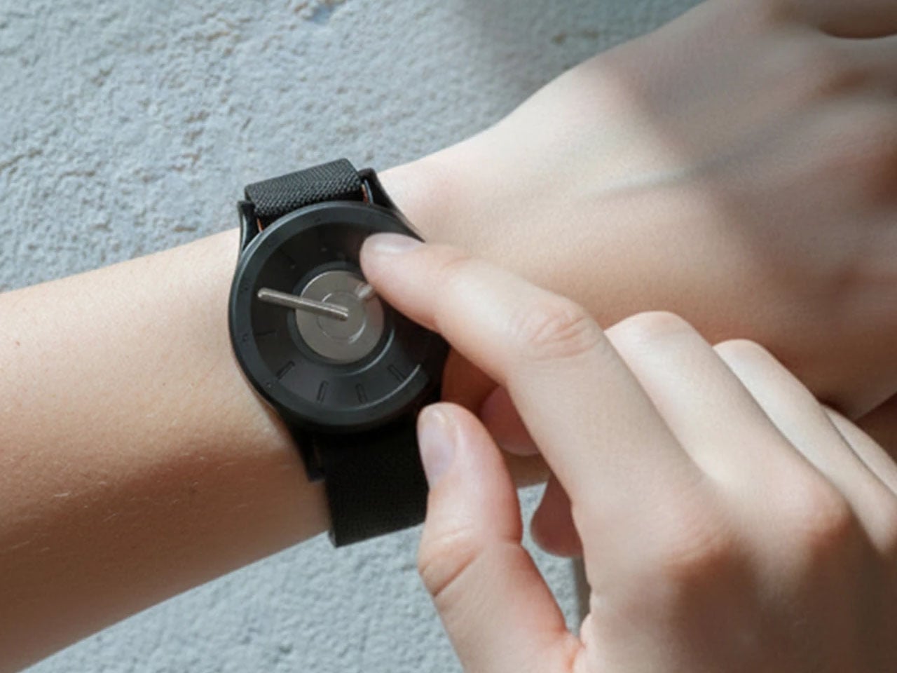
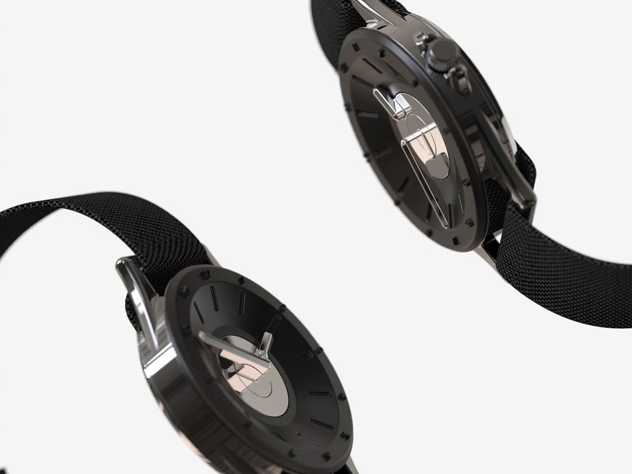
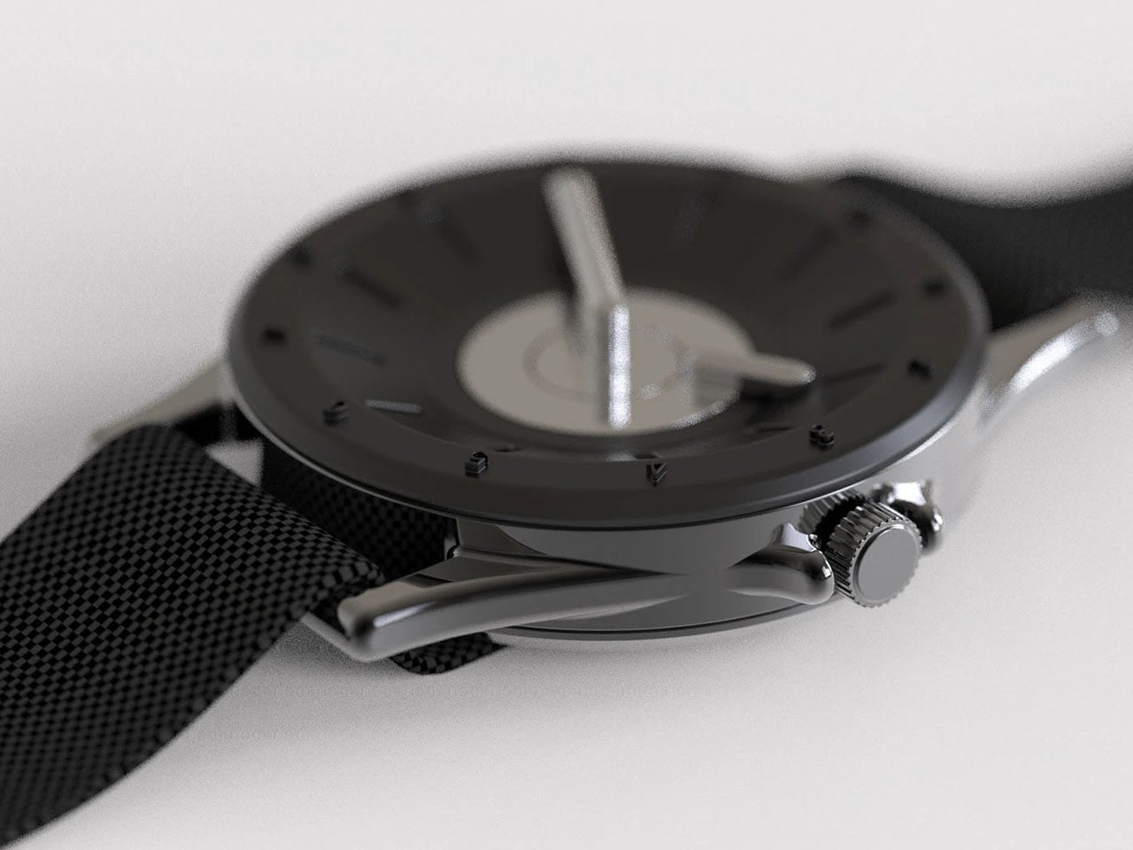
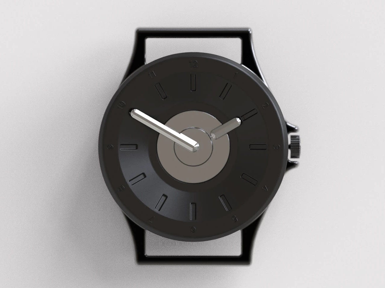
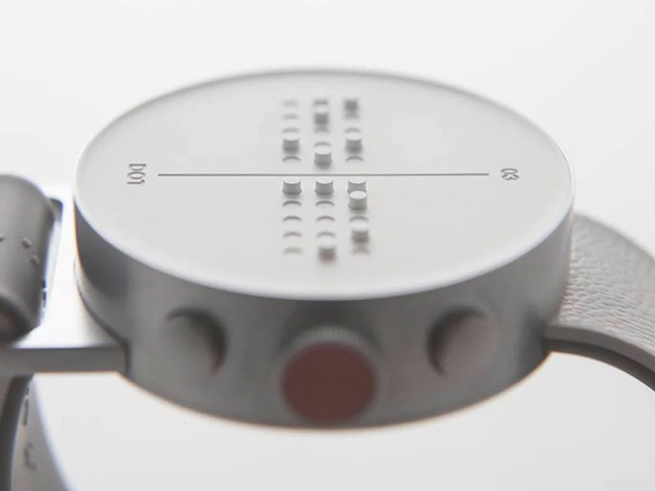
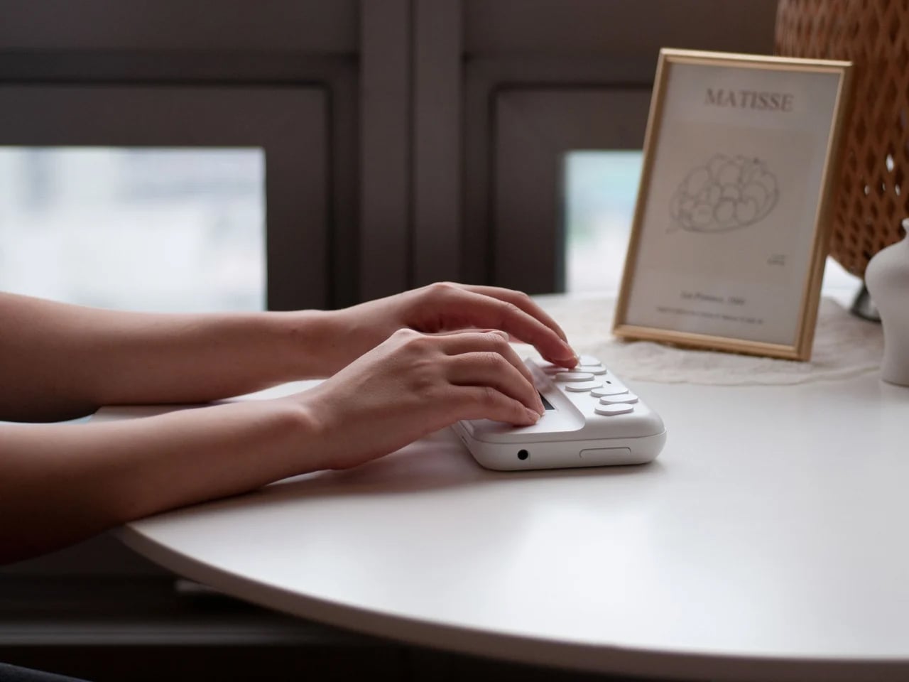
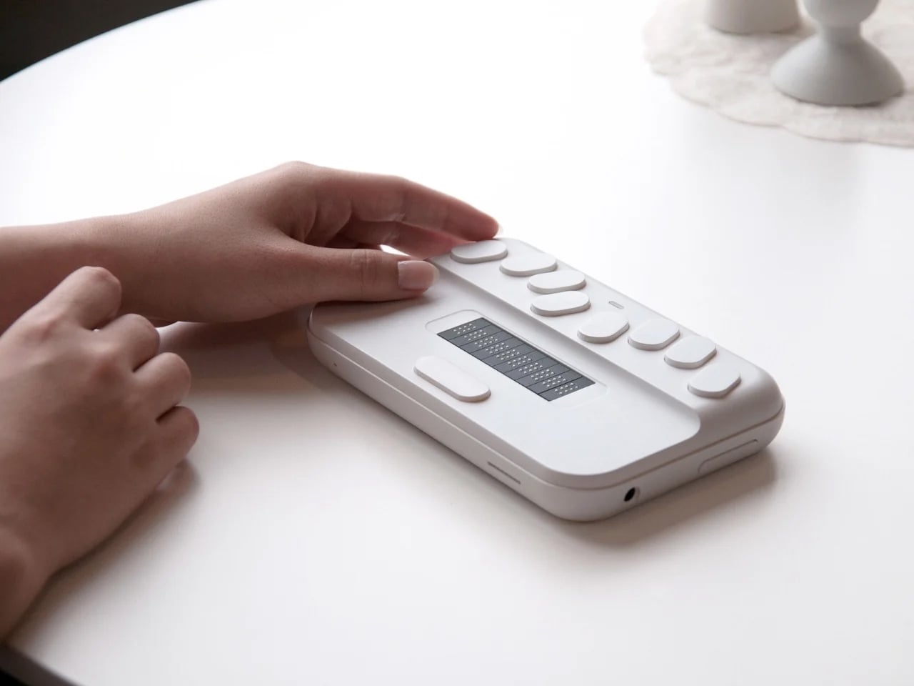
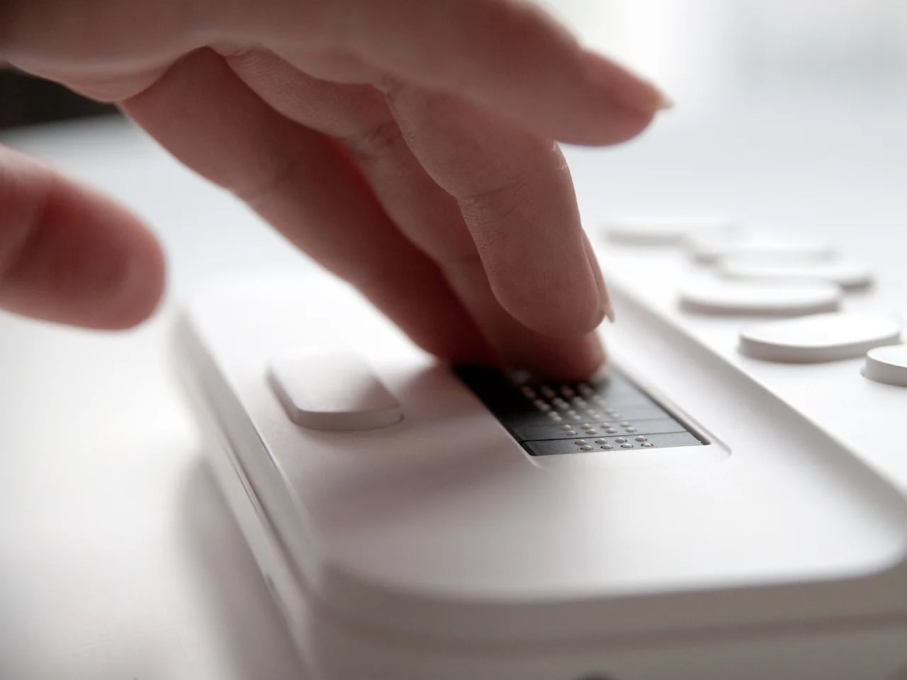
Although Braille functions as a coded system rather than a spoken language, it continues to be essential for individuals with little or no vision, even in an increasingly digital world. Despite ongoing interest in assistive technologies, many Braille-based product concepts fail to reach production. High costs, limited availability, and the perception that Braille is outdated have contributed to nearly 95% of blind users discontinuing Braille education, underscoring the need for accessible and well-considered solutions.
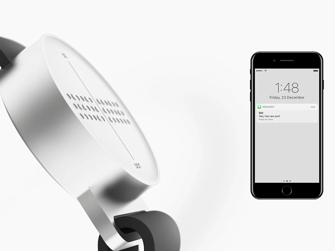
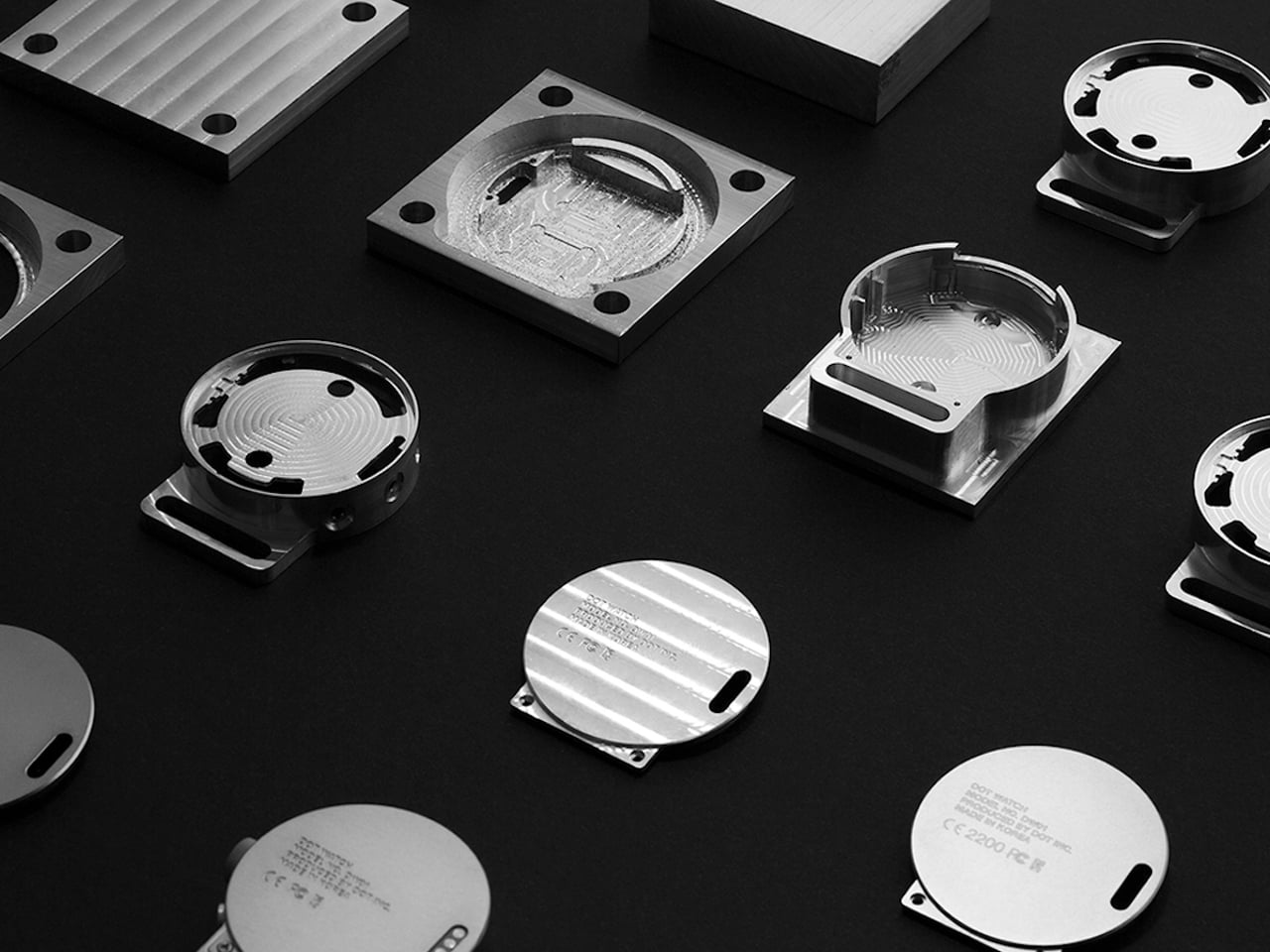
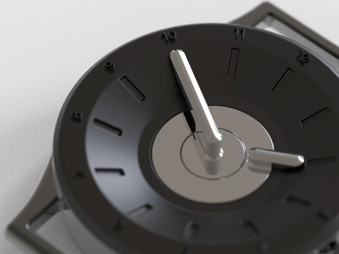
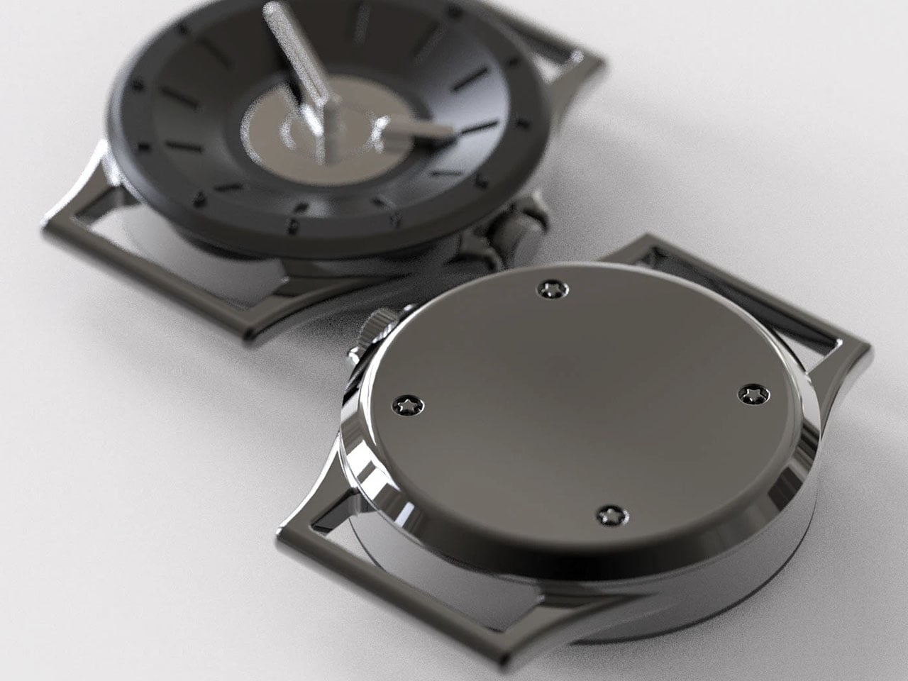
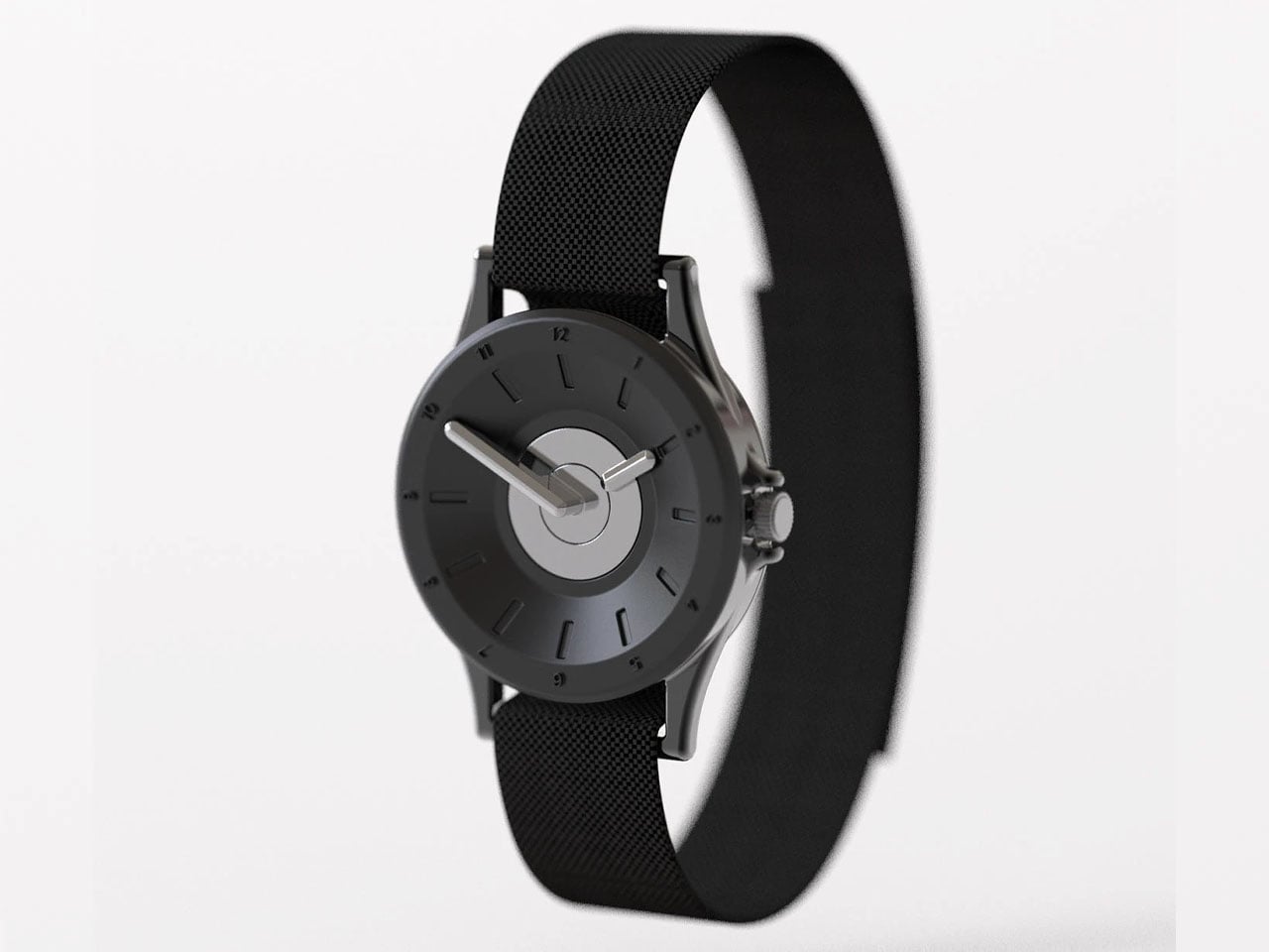
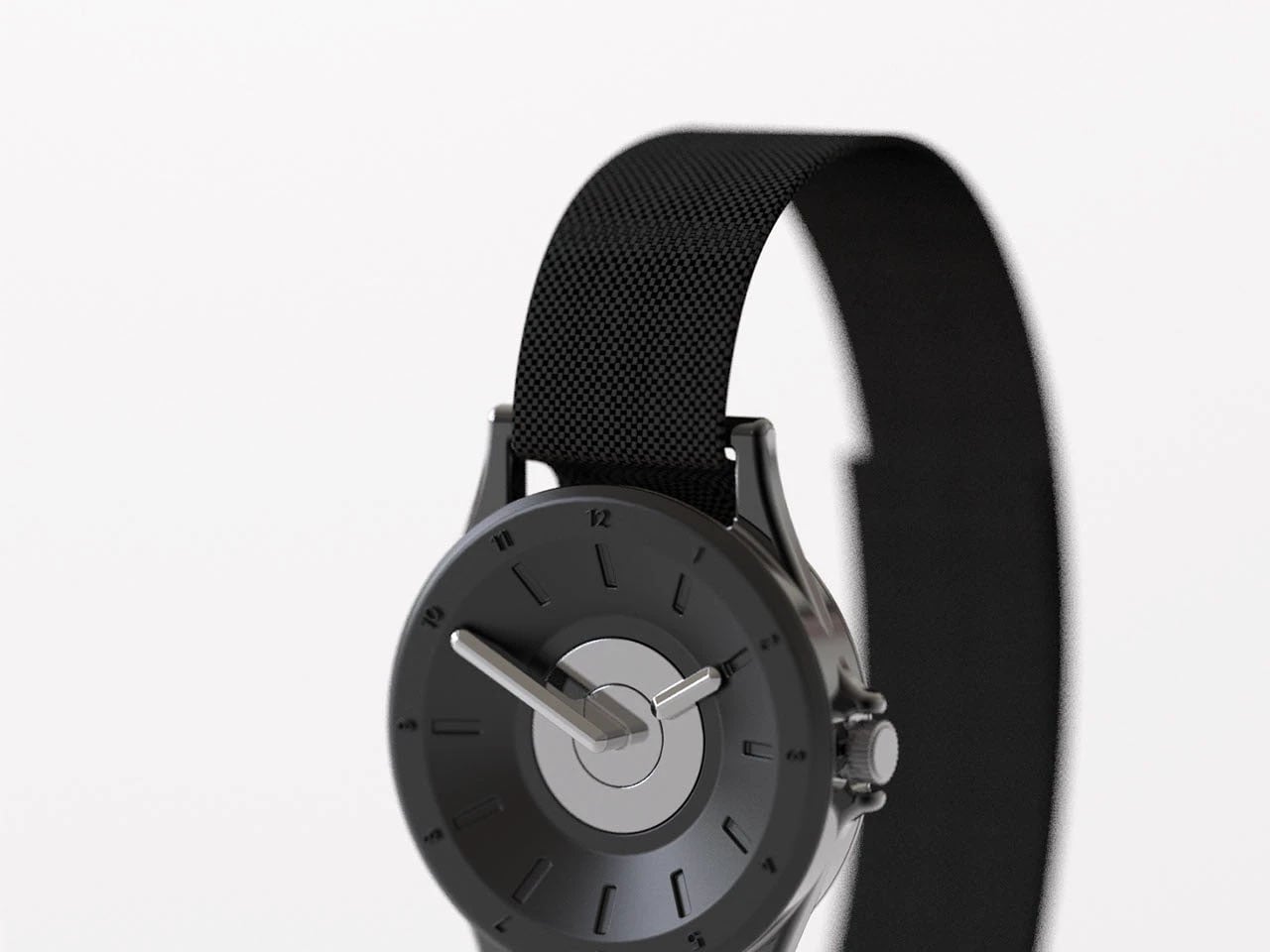
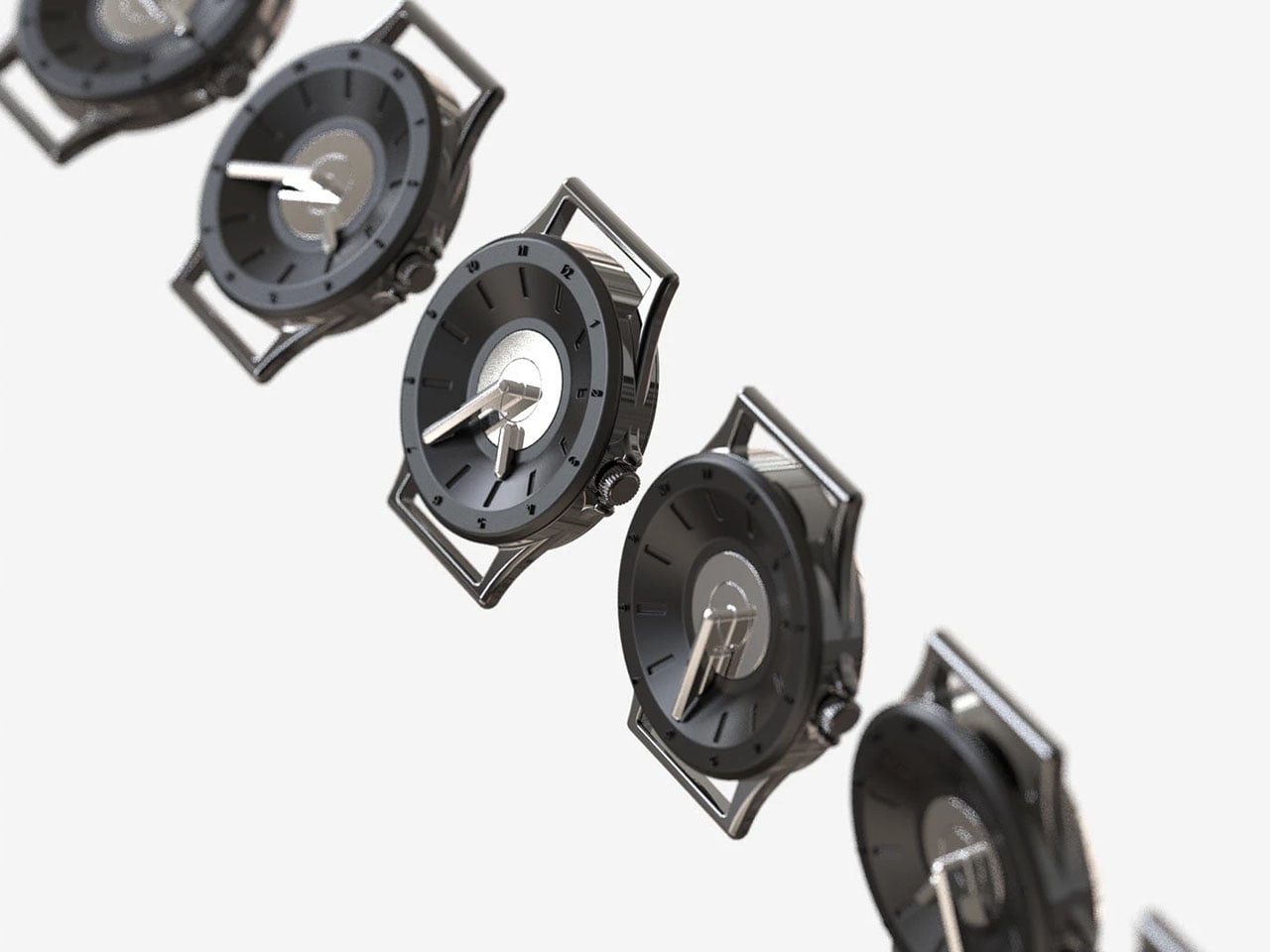
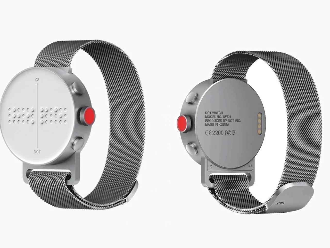
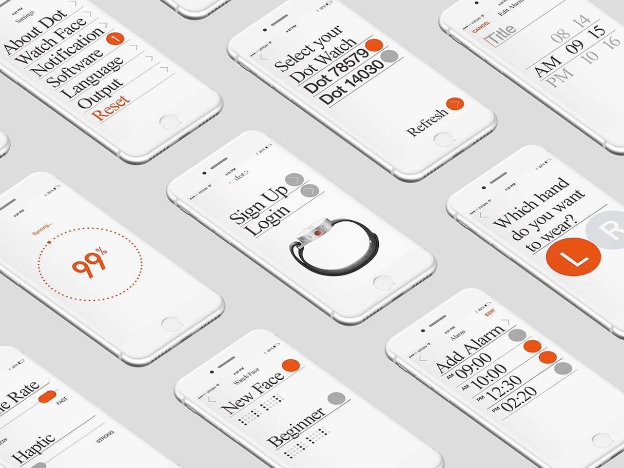
The Dot Watch responds to this challenge as one of the world’s first moving Braille smartwatches designed specifically for visually impaired users. It features a four-cell Braille display, touch-sensitive gesture controls, and a lightweight 29-gram construction. Using compact Braille cell technology and Bluetooth connectivity, the watch translates smartphone notifications and messages into readable Braille. With intuitive controls, adjustable auto-scroll, and message storage, the Dot Watch demonstrates how contemporary product design can preserve the relevance of Braille while supporting everyday communication.
Braille-first thinking is not a limitation but an expansion of product design language. By prioritizing touch, material integrity, and haptic feedback, products become more resilient, intuitive, and human-centred. “Touch to access” demonstrates that the most refined products are those felt, understood, and trusted, celebrating the full spectrum of human interaction.
Across learning devices, musical instruments, human-centred tools, and smart products, tactile logic enhances usability, precision, and user confidence. It transforms inclusion from a compliance requirement into a core design principle, proving that accessibility and elegance can coexist. The future of product design is tactile, intuitive, and inclusive, where touch guides, informs, and delights its end users.
The post 5 Inclusive Products That Prove Braille Design Is the Future of Every Device first appeared on Yanko Design.