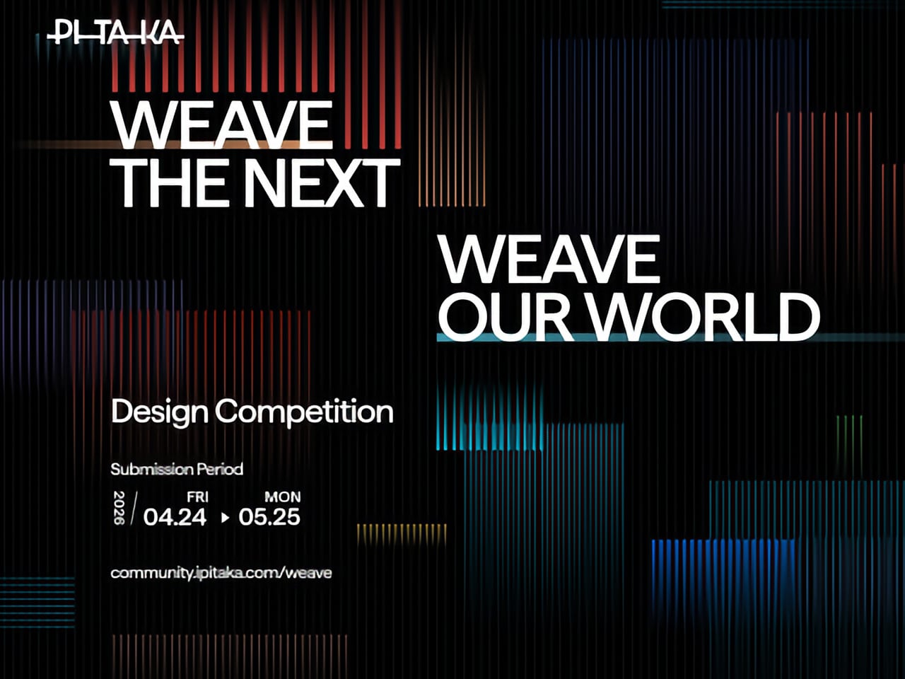
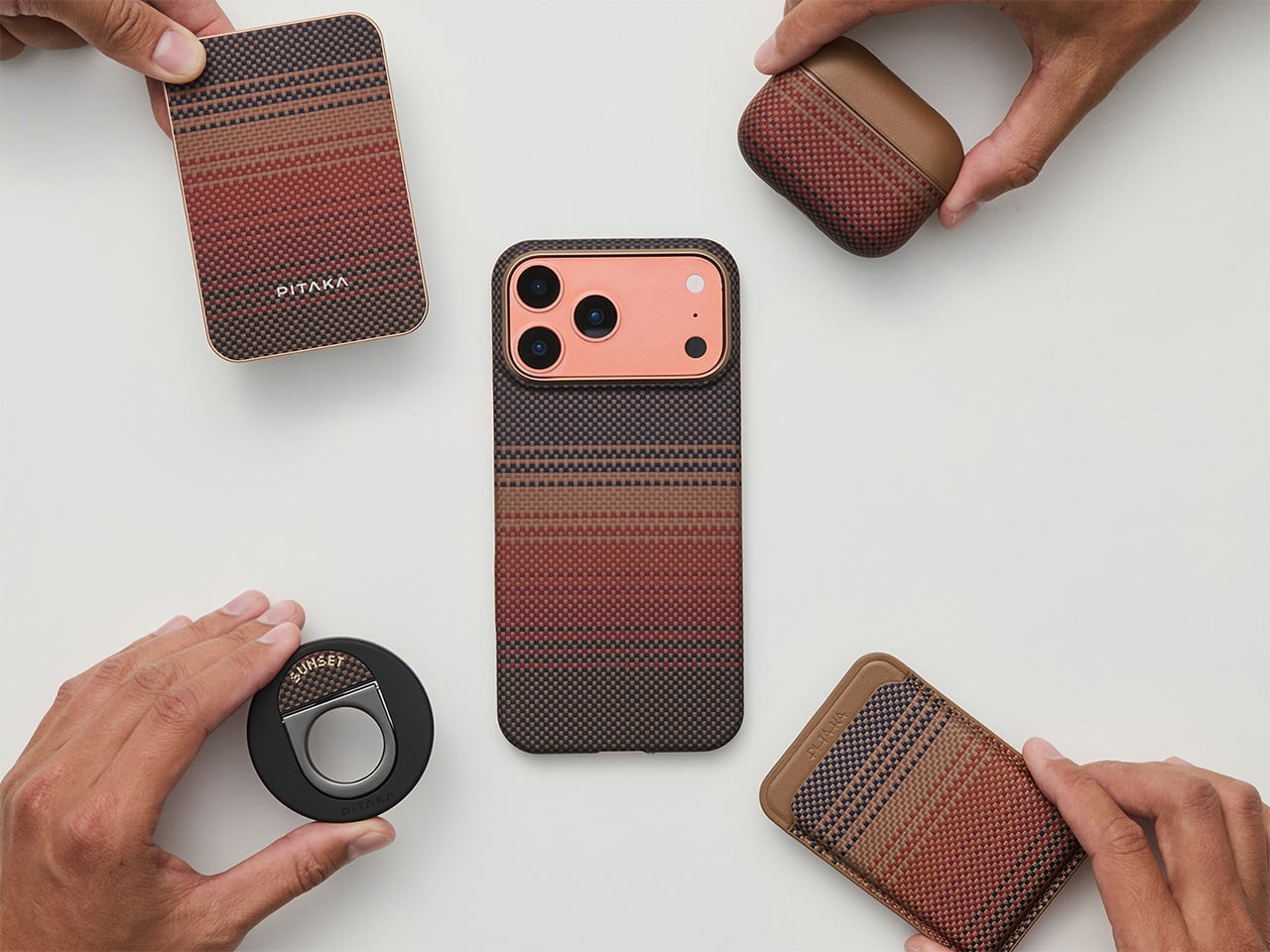
Tech accessories have hit a curious inflection point. The last year trained us to worship thinness and glass, but somewhere between the tenth identical ‘Air’ or ‘Edge’ smartphone and the fifteenth glossy case, a countermovement quietly took root. Texture matters again. Grip, weave, and tactile identity are no longer afterthoughts, they’re the differentiators that keep objects from sliding into the sea of sameness. PITAKA, a brand built on aerospace-grade aramid fiber and what it calls “fusion weaving,” has spent years proving that phones don’t have to feel like jewelry-store display pieces. Now, with the launch of “Weave the Next, Weave Our World,” the company is turning that philosophy outward, inviting designers worldwide to imagine the surfaces and visual languages that will define the next generation of tech we carry, hold, and interact with every day.
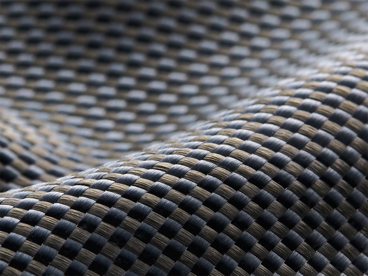
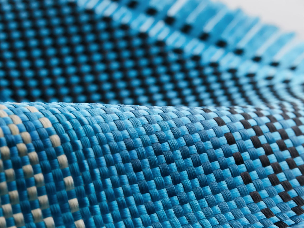
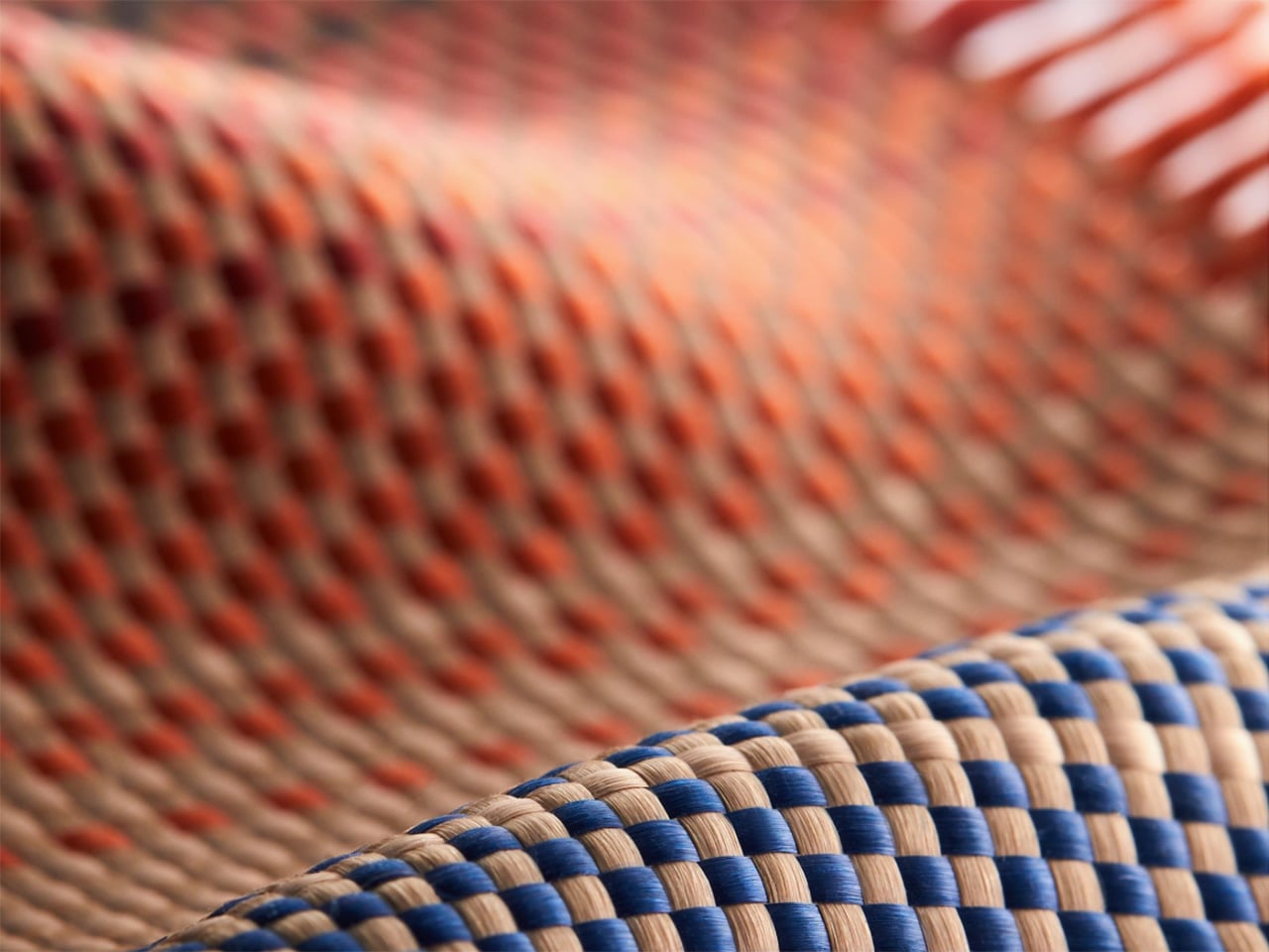
Launching April 24th, 2026, the competition is framed explicitly around the intersection of technology and art, which is less marketing speak and more PITAKA’s operational DNA. The brand’s cases have always leaned hard into material science, using woven aramid fibers (the same stuff in bulletproof vests and aircraft components) that are five times stronger than steel and a fraction of the weight. But strength alone doesn’t sell. What makes PITAKA cases notable is the texture vocabulary they’ve developed over years of refining weave patterns, experimenting with 600D and 1500D aramid densities, and pushing techniques like “fusion weaving,” where multiple patterns coexist on a single loom to create intricate, layered surface designs. “Weave the Next, Weave Our World” extends that exploration beyond the company’s internal design studio and into the hands of students, professionals, and independent creators who might see texture, pattern, and tactility from entirely different cultural or aesthetic starting points.
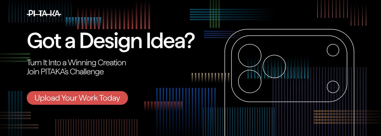
PITAKA’s “Weave the Next, Weave Our World” global design competition invites designers to create texture and visual language systems for the brand’s future product series, positioned explicitly at the intersection of technology and art. Participants choose from four thematic directions: “These Moments,” which captures the raw beauty and shifting rhythms of the natural world; “Timeless Threads,” weaving stories of culture, memory, and human journeys; “Beyond Tomorrow,” exploring visionary futures where innovation reshapes daily life; or “Roots of Rhythms,” celebrating the textures, symbols, and spirit born from each land’s heritage. The competition aims to explore emerging global trends in tactile and visual design, strengthen PITAKA’s art-tech identity, and potentially commercialize winning designs through royalties, co-branding, and official recognition.
How To Participate
Visit the official competition website or Dribbble page to submit your entry
Provide participant information and upload your texture designs
Include a written design explanation with your submission
Entries will be evaluated through a combination of professional jury review and public voting
Winners will be announced and showcased in an online exhibition
Competition Dates
Competition Launch: April 24, 2026
Submission Period: April 24 – May 25, 2026
Judging Period: May 26 – May 31, 2026
Winners Announcement: June 9, 2026
Jury Panel
Qiongzhi Xie (Artist; Founder of Daxing Jizi Studio)
Matteo Menotto (Head of Design, Prints & Textile Accessories at Bulgari)
Sarang Sheth (Editor-in-Chief, Yanko Design)
James (Founder / CEO, PITAKA)
Important Information
The most compelling entries are likely to do three things at once:
Treat texture as a system, not a single image
PITAKA’s products live across multiple form factors, so a strong entry will propose a visual/tactile system that can scale and adapt, not just a one-off pattern.
Anchor the concept in one of the four themes without being literal
“These Moments” does not need a photo-real print of a wave; “Roots of Rhythms” does not need a direct copy of a folk motif. Abstraction, distillation, and translation into a tech-accessory context will matter.
Consider manufacturability and user experience
Even in a speculative competition, the jury includes industrial design and brand leadership. Textures that look stunning in render but collapse in real material or feel uncomfortable in hand will likely be deprioritized.
If you already experiment with materials, parametric patterns, or culturally rooted visual systems, “Weave the Next, Weave Our World” is essentially an invitation to push that work into a space where it might actually ship.
Tech accessories have hit a curious inflection point. The last year trained us to worship thinness and glass, but somewhere between the tenth identical ‘Air’ or ‘Edge’ smartphone and the fifteenth glossy case, a countermovement quietly took root. Texture matters again. Grip, weave, and tactile identity are no longer afterthoughts, they’re the differentiators that keep objects from sliding into the sea of sameness. PITAKA, a brand built on aerospace-grade aramid fiber and what it calls “fusion weaving,” has spent years proving that phones don’t have to feel like jewelry-store display pieces. Now, with the launch of “Weave the Next, Weave Our World,” the company is turning that philosophy outward, inviting designers worldwide to imagine the surfaces and visual languages that will define the next generation of tech we carry, hold, and interact with every day.
Launching April 24th, 2026, the competition is framed explicitly around the intersection of technology and art, which is less marketing speak and more PITAKA’s operational DNA. The brand’s cases have always leaned hard into material science, using woven aramid fibers (the same stuff in bulletproof vests and aircraft components) that are five times stronger than steel and a fraction of the weight. But strength alone doesn’t sell. What makes PITAKA cases notable is the texture vocabulary they’ve developed over years of refining weave patterns, experimenting with 600D and 1500D aramid densities, and pushing techniques like “fusion weaving,” where multiple patterns coexist on a single loom to create intricate, layered surface designs. “Weave the Next, Weave Our World” extends that exploration beyond the company’s internal design studio and into the hands of students, professionals, and independent creators who might see texture, pattern, and tactility from entirely different cultural or aesthetic starting points.
PITAKA’s “Weave the Next, Weave Our World” global design competition invites designers to create texture and visual language systems for the brand’s future product series, positioned explicitly at the intersection of technology and art. Participants choose from four thematic directions: “These Moments,” which captures the raw beauty and shifting rhythms of the natural world; “Timeless Threads,” weaving stories of culture, memory, and human journeys; “Beyond Tomorrow,” exploring visionary futures where innovation reshapes daily life; or “Roots of Rhythms,” celebrating the textures, symbols, and spirit born from each land’s heritage. The competition aims to explore emerging global trends in tactile and visual design, strengthen PITAKA’s art-tech identity, and potentially commercialize winning designs through royalties, co-branding, and official recognition.
How To Participate
Visit the official competition website or Dribbble page to submit your entry
Provide participant information and upload your texture designs
Include a written design explanation with your submission
Entries will be evaluated through a combination of professional jury review and public voting
Winners will be announced and showcased in an online exhibition
Competition Dates
Competition Launch: April 24, 2026
Submission Period: April 24 – May 25, 2026
Judging Period: May 26 – May 31, 2026
Winners Announcement: June 9, 2026
Jury Panel
Qiongzhi Xie (Artist; Founder of Daxing Jizi Studio)
Matteo Menotto (Head of Design, Prints & Textile Accessories at Bulgari)
Sarang Sheth (Editor-in-Chief, Yanko Design)
James (Founder / CEO, PITAKA)
Important Information
The most compelling entries are likely to do three things at once:
Treat texture as a system, not a single image
PITAKA’s products live across multiple form factors, so a strong entry will propose a visual/tactile system that can scale and adapt, not just a one-off pattern.
Anchor the concept in one of the four themes without being literal
“These Moments” does not need a photo-real print of a wave; “Roots of Rhythms” does not need a direct copy of a folk motif. Abstraction, distillation, and translation into a tech-accessory context will matter.
Consider manufacturability and user experience
Even in a speculative competition, the jury includes industrial design and brand leadership. Textures that look stunning in render but collapse in real material or feel uncomfortable in hand will likely be deprioritized.
If you already experiment with materials, parametric patterns, or culturally rooted visual systems, “Weave the Next, Weave Our World” is essentially an invitation to push that work into a space where it might actually ship.
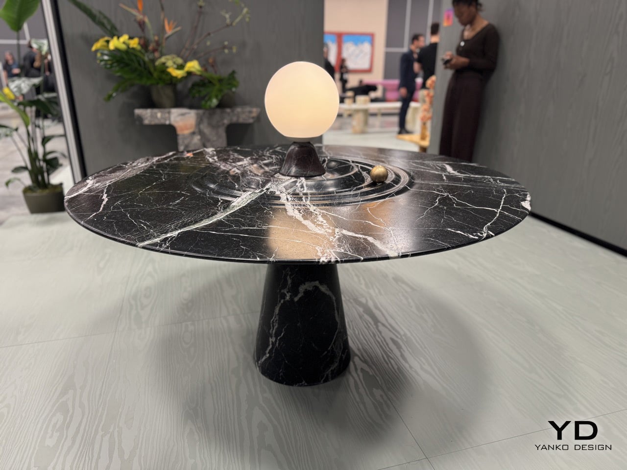
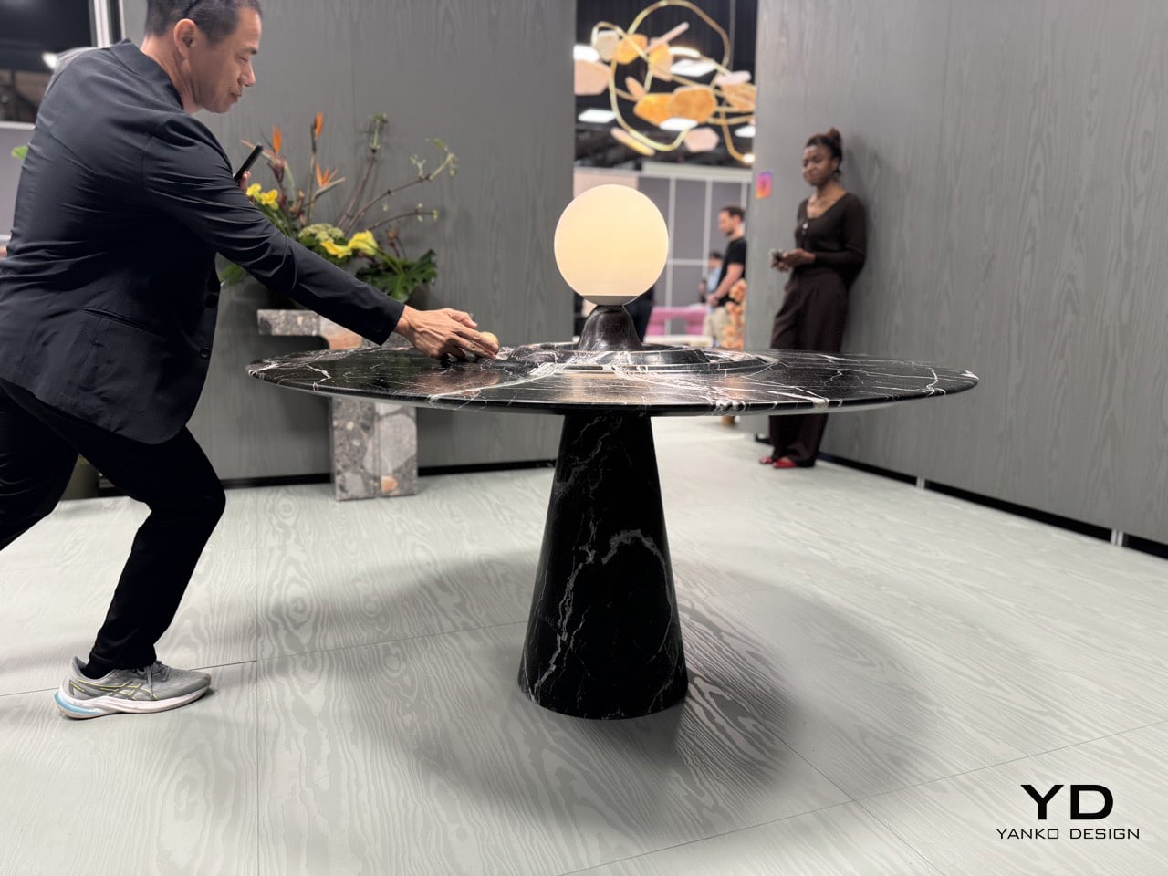
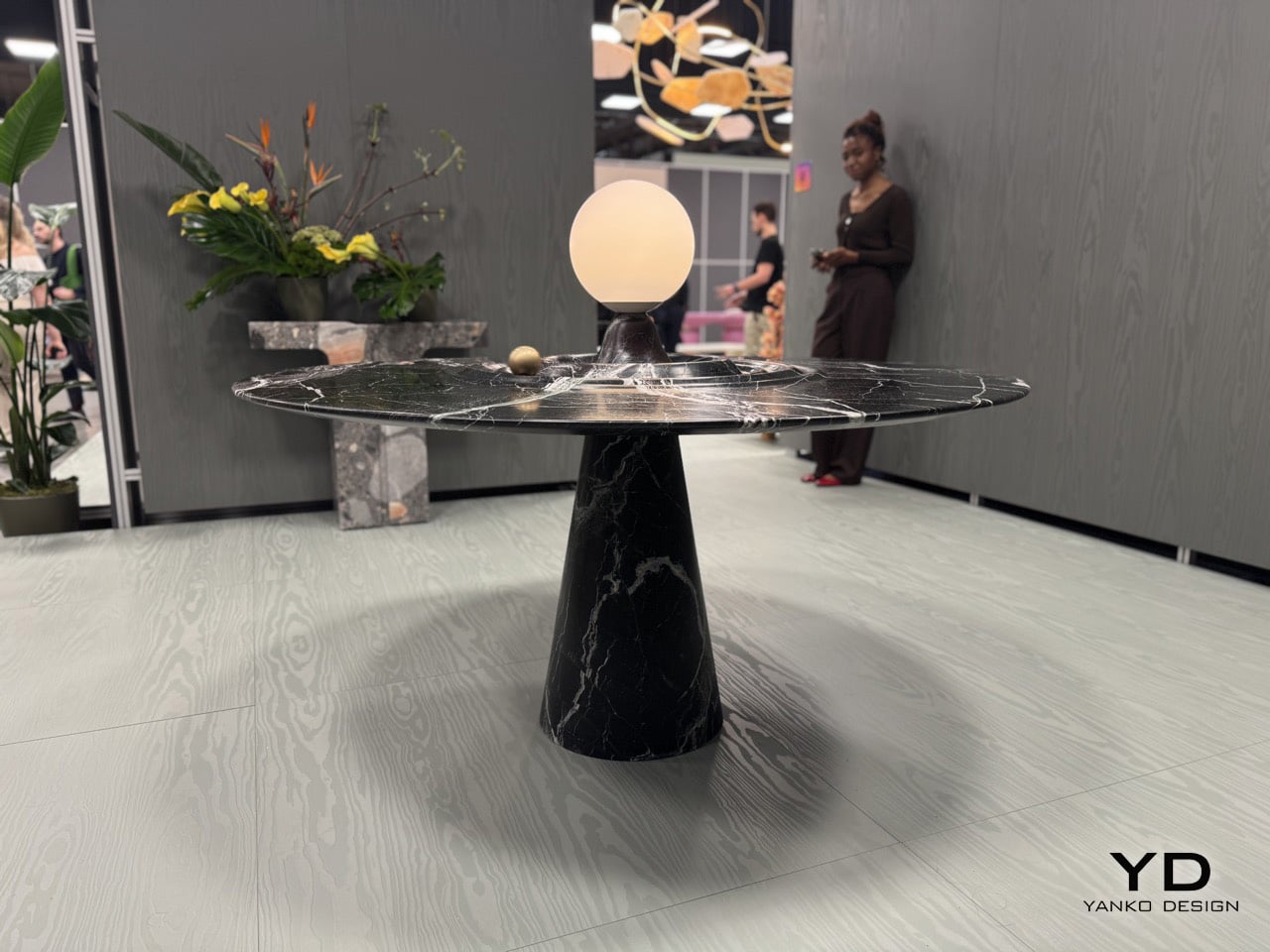
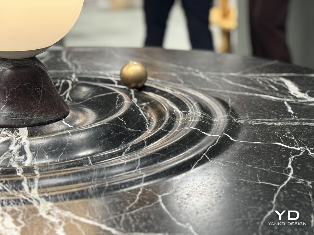
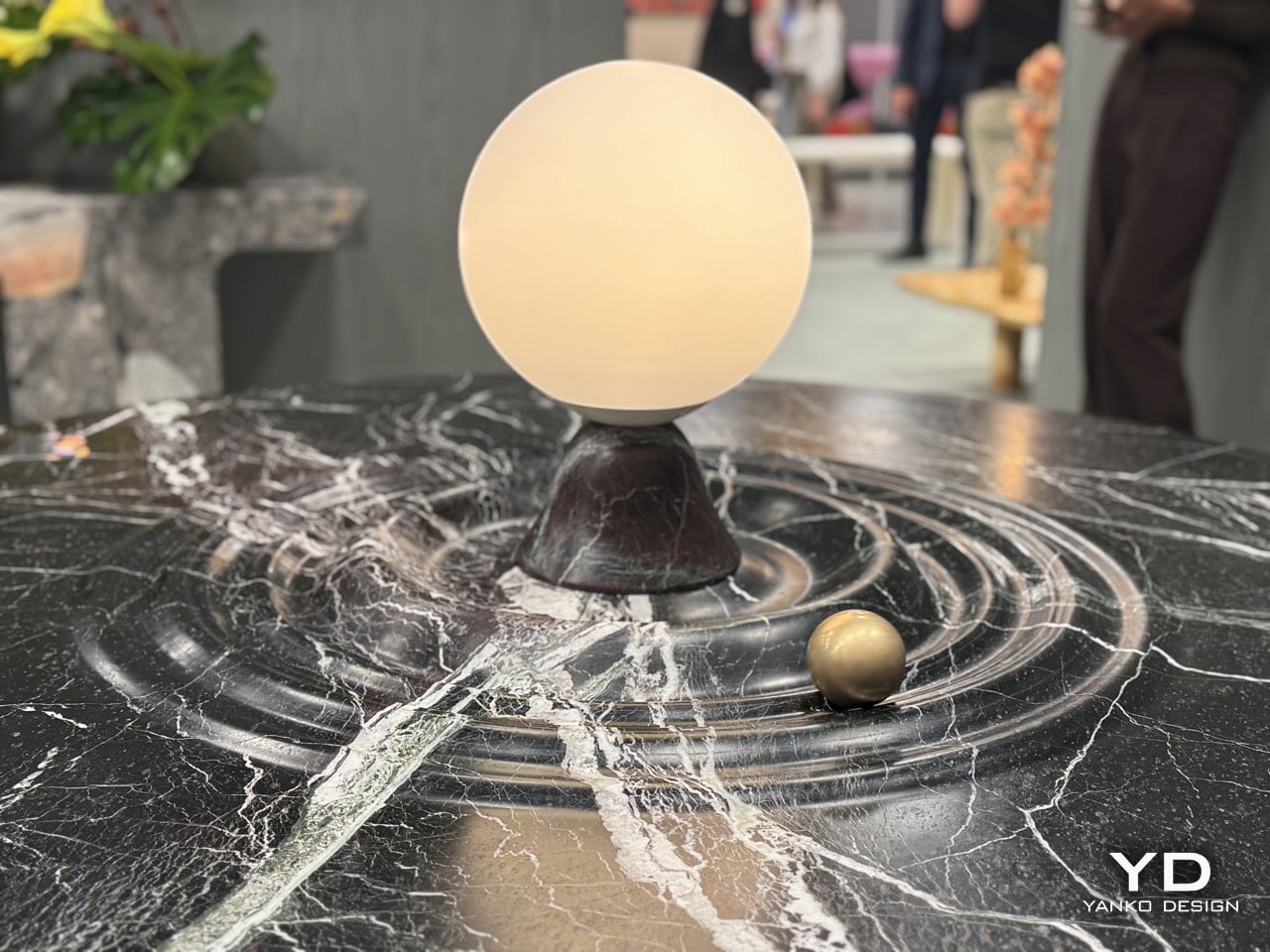
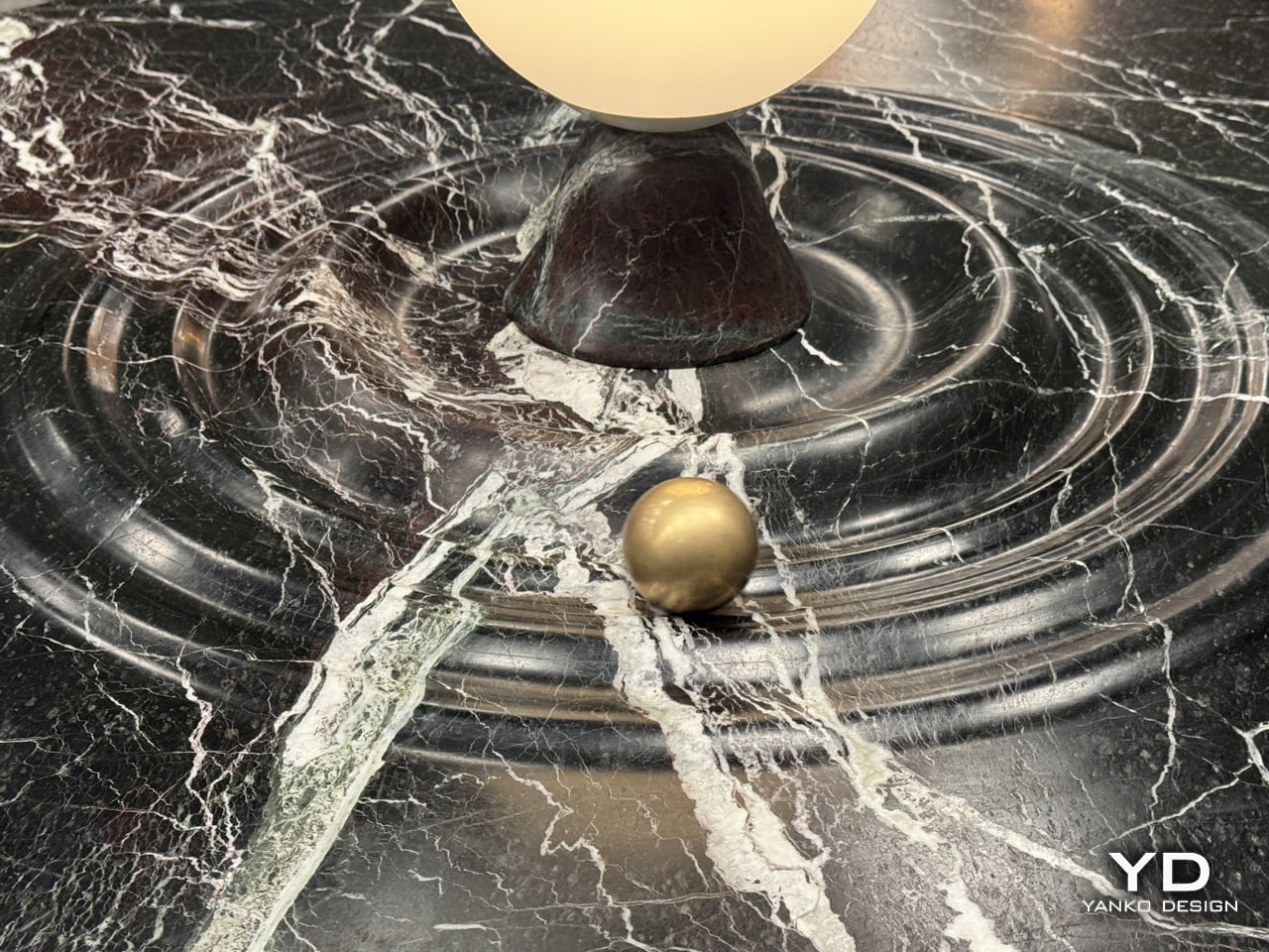
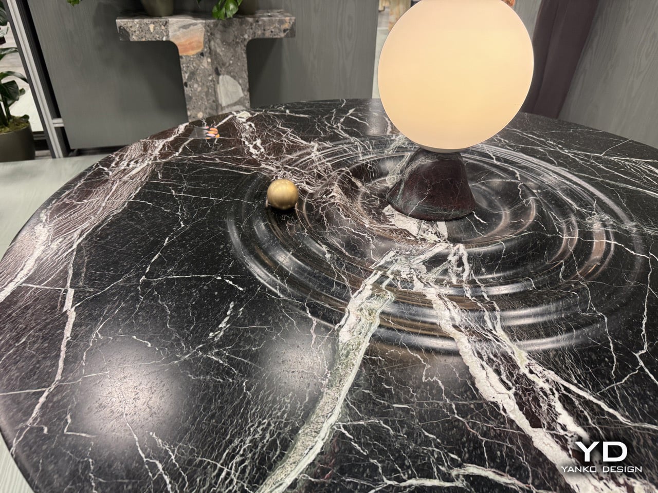
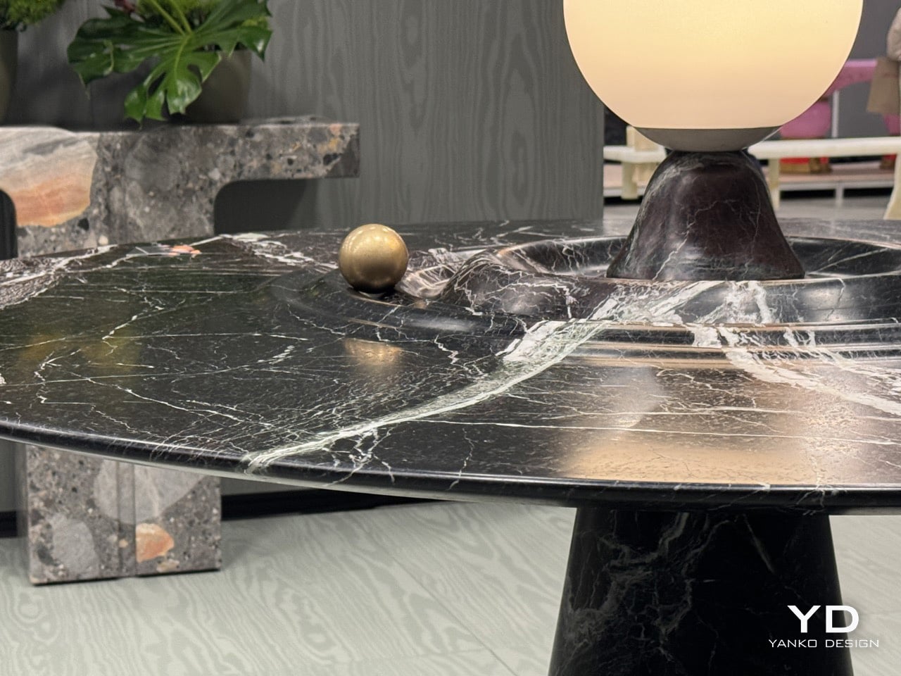
Furniture should probably stay still. That’s the basic contract between you and the table: it holds your dinner plates, you don’t worry about physics. Alessio Scalabrini decided that contract was negotiable. The Animo table, produced by Italian marble workshop Serafini, features a brass sphere that rotates around a central lamp fixture, tracing concentric ripples carved into the marble surface like a tiny planet orbiting its sun. The table functions perfectly well as a static dining surface, but it also invites you to set something in motion every time you walk past it, turning what could’ve been another high-end marble slab into an interactive kinetic object that happens to hold glassware.
Named after the Italian word for Soul, the Animo table adds some animated joy with a dash of luxury to your space. The table, made entirely from Italian Rosso Levanto marble, is hand-finished with ripples that break the illusion of stillness, making it look fluid. Nestled in one of those ripples is a brass sphere, adding a dash of gold to the table’s ultra-dark burgundy and white-vein design. The result is furniture you can fidget with. It’s art and play combined brilliantly, with the kind of craftsmanship you can only expect from an Italian brand showcasing at Salone del Mobile!
Designer: Alessios Calabrini for Serafini
The table first attracts you with how it looks, then how it feels. The marble finish is impeccable, with the ripples crafted to absolute perfection. The perfection plays an important part here, because a brass sphere needs to seamlessly roll around the table, with the smoothness of a fidget spinner. The sphere has solid heft to it, giving it a fair amount of momentum when you nudge it around the table. It moves with little to no effort, completing tens of rotations before coming to a very gradual halt. Any other material would falter. Wood might end up deforming after years, metal would make the table feel unpleasant, rough stone wouldn’t cause the sphere to move as freely.
The central lamp adds another layer of functionality, illuminating the table from within while serving as the gravitational anchor for the sphere’s orbital path. The whole composition balances three distinct roles: functional dining surface, sculptural marble centerpiece, and interactive kinetic object. Most designers would’ve picked one and committed. Scalabrini made all three work simultaneously.
Scalabrini runs a Paris-based design studio with 18 years of experience merging traditional craftsmanship with contemporary fabrication technology, and that dual approach is visible throughout the Animo. The table uses Serafini’s established production methods, combining precision CNC machining with hand-finishing by Italian artisans who’ve been working marble their entire careers.
If you want to see the Animo table in person and experience the satisfying physics of that brass sphere yourself, Serafini is showing it at Salone Raritas during Salone del Mobile. The difference between seeing photos and actually pushing that orb around the channels is substantial. Photos capture the visual design, but they can’t communicate the tactile satisfaction of setting something that heavy into smooth, controlled motion.
Flowers are beautiful. They’re also gone by the following weekend. The best Mother’s Day gifts aren’t the ones that arrive in the most dramatic packaging — they’re the ones that earn a permanent place in her life. On the counter, hanging on the wall, slipping quietly onto her finger, or sitting on the mat she unrolls every morning. These ten were chosen because they’re designed well enough to deserve that space.
Built to last, considered in detail, and useful in the kind of way that compounds over time. A bouquet says you remembered. These say you paid attention. Each one earns its place differently — on a shelf, at the airport, on a yoga mat, in a morning coffee ritual — but they share the same quality: design that works as hard as she does, and only looks better with every passing year.
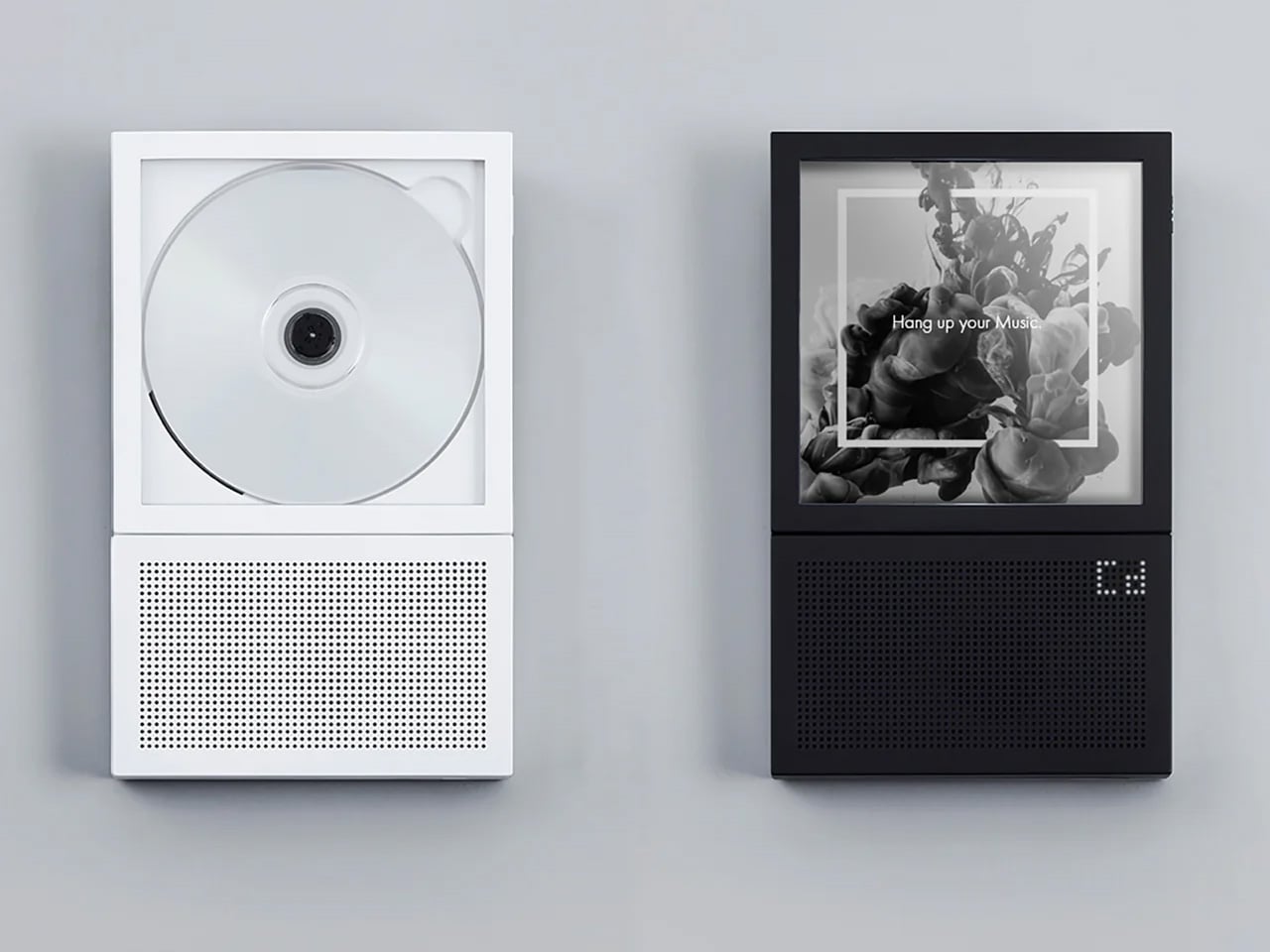
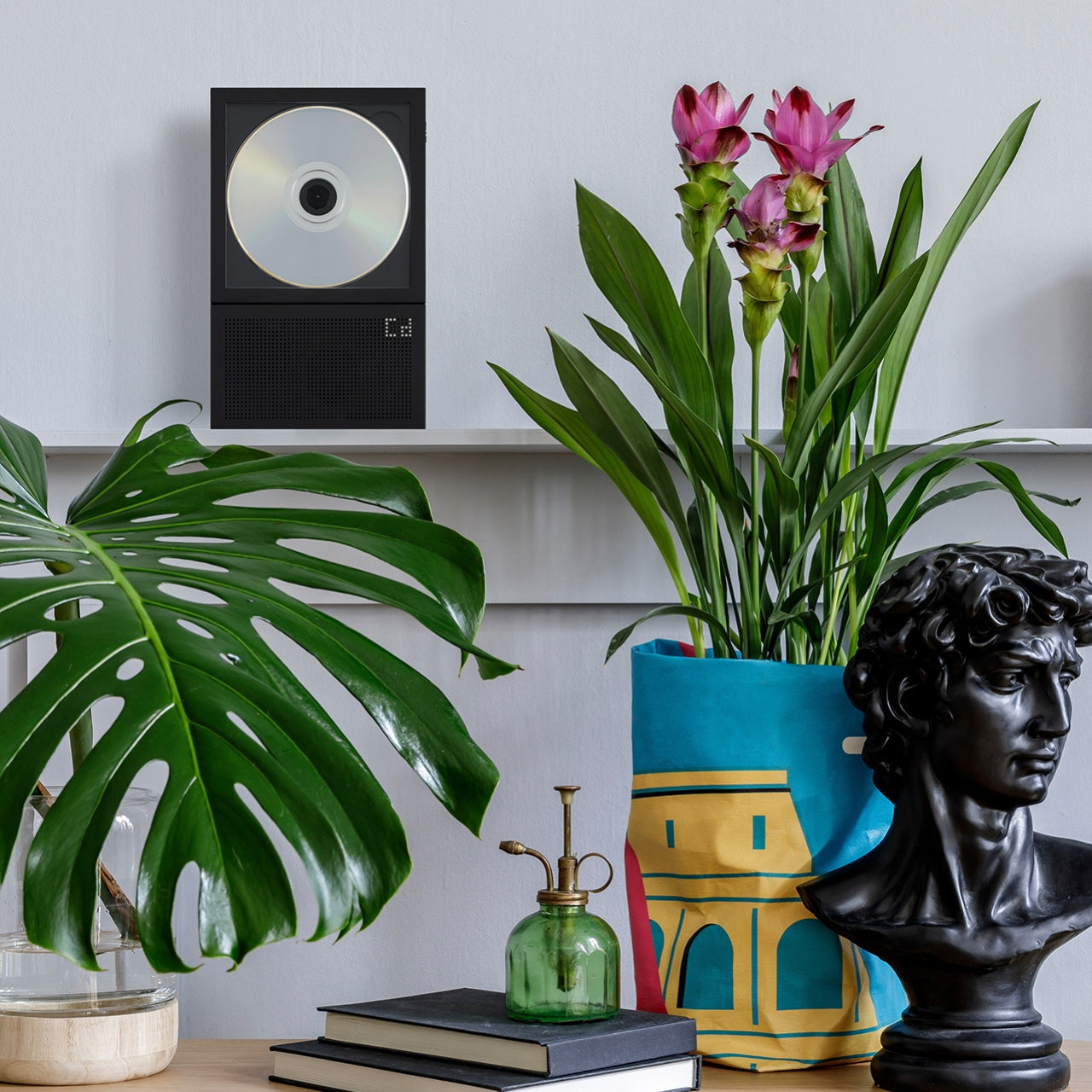
1. Portable CD Cover Player
There’s a certain kind of person who still believes the best way to listen to music is the right way, not just the convenient one. The Portable CD Cover Player speaks directly to that person. It plays audio CDs through a built-in speaker while keeping the jacket art on full display in a front-facing pocket, turning the listening experience into something visual, tactile, and genuinely decorative. For a mom who connects music to memory, this is the gift that puts those memories where they belong: out in the open, where everyone can see them.
What makes it worth giving is the thinking behind the design. Most audio devices ask you to choose between portability and display. This one refuses that compromise. It runs on a rechargeable battery, so it travels freely, and its wall-mountable form lets it live as a piece of decoration when it’s not in her hands. The CD art becomes part of the room, and the room sounds better for it. A speaker that’s also an object worth looking at is rarer than it should be.
Built-in speaker and rechargeable battery deliver music anywhere without cords
Wall-mountable design doubles as a decorative display piece for any room
What We Dislike
The wall mount bracket is sold separately
Best suited for someone who still owns a physical CD collection
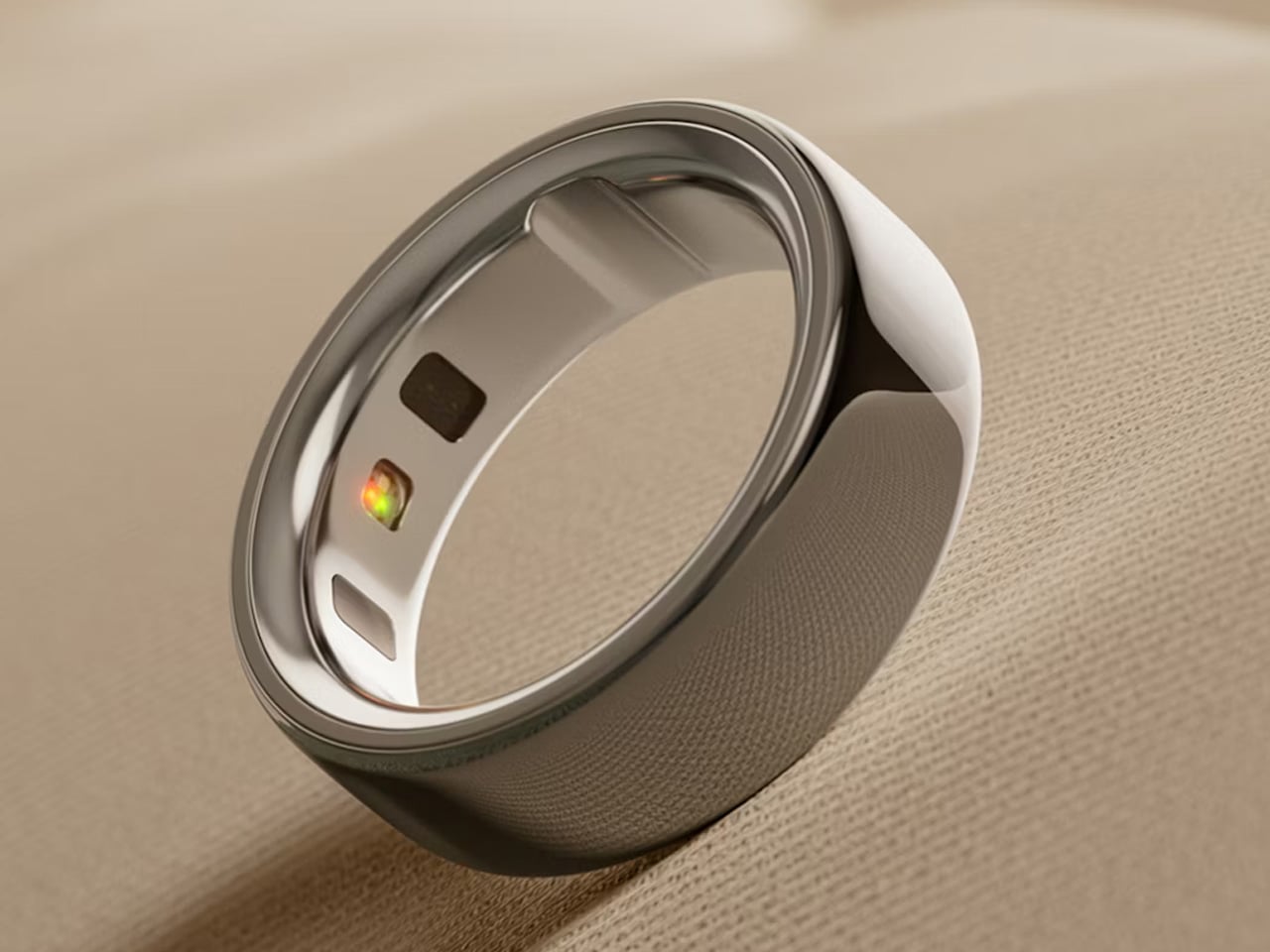
2. Oura Ring 4
The Oura Ring 4 fits on the finger like a piece of considered jewelry and spends every hour doing something useful. It tracks over 50 health and wellness metrics across sleep, activity, stress, heart health, and women’s health, then synthesizes those into personalized insights through the app. The AI-powered Oura Advisor refines its understanding of her patterns over time, so the guidance she receives in month six is more relevant and more precise than what arrives on day one. For a mom who rarely makes time for herself, this is the gift that quietly makes the case for it.
The fully-titanium construction keeps the ring lightweight enough to forget entirely, and Smart Sensing technology improves the accuracy and depth of every reading. Battery life runs five to eight days per charge, outlasting most weekends away without needing a top-up. It comes in silver, gold, stealth, and rose gold, and reads more like a deliberate accessory than a fitness tracker. She wears something beautiful and actually understands how she’s doing. That combination is harder to find than either thing on its own.
What We Like
Tracks 50+ health metrics with AI-powered insights that grow more personalized over time
Fully titanium construction wears like jewelry with 5 to 8 days of battery life per charge
What We Dislike
Full feature access requires an ongoing membership subscription
A free sizing kit must be ordered before purchasing the final ring
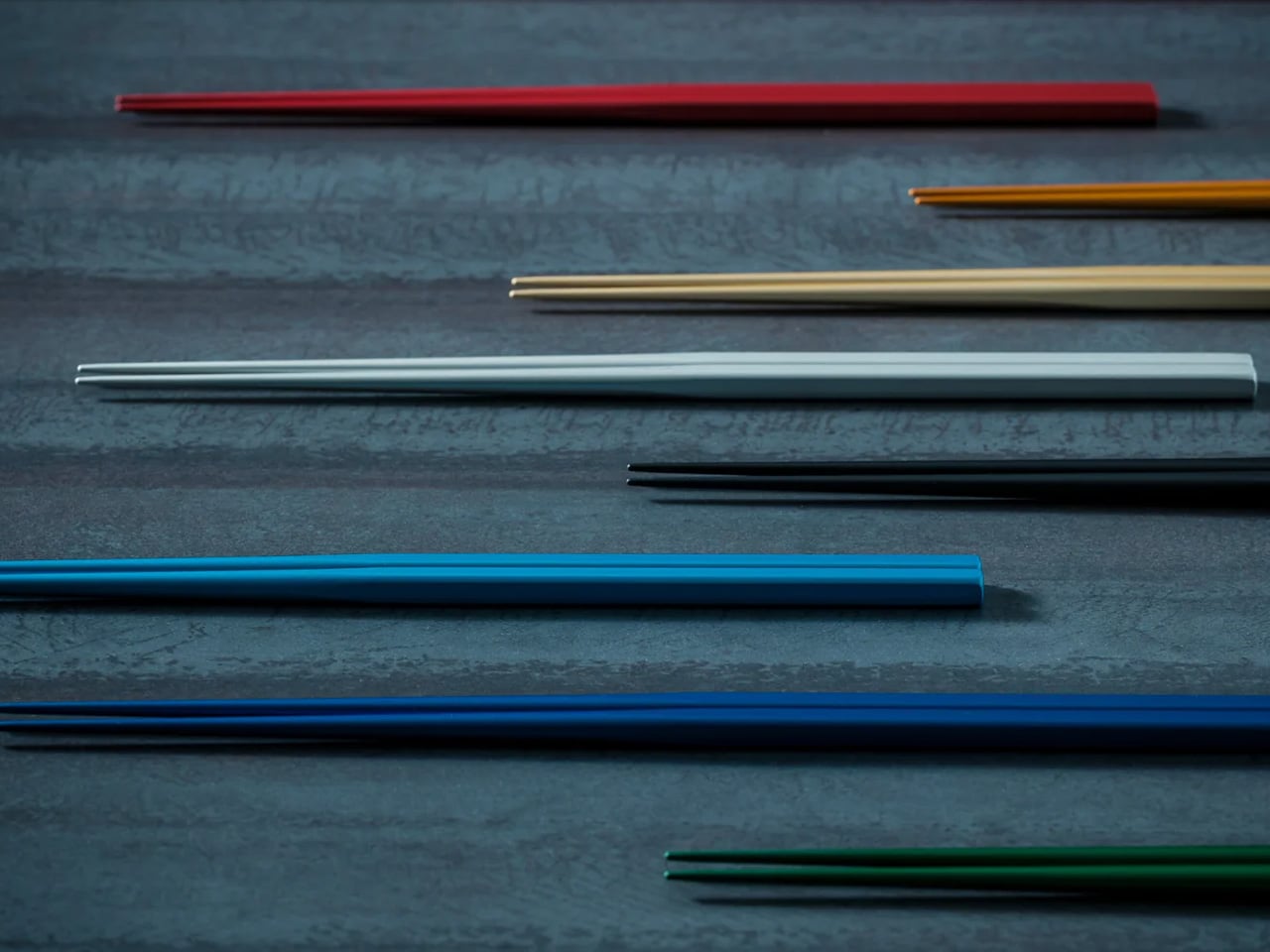
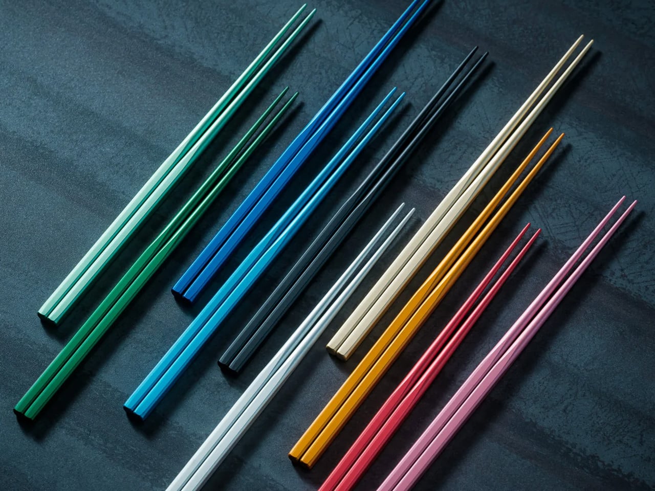
3. FineLine Aluminum Chopsticks
Most chopsticks are never thought about twice. The FineLine Aluminum Chopsticks earn a second look the moment you pick them up. Tapered to a 1.5mm tip, refined through repeated 0.1mm adjustments, they handle delicate food with the kind of precision that makes even a simple meal feel composed. The slim, faceted profile rests naturally between the fingers, with flat surfaces providing just enough resistance to prevent the rotation common in round chopsticks. For a mom who appreciates the way things are made, these reward that attention with every single meal.
The balance settles immediately. Tips align cleanly, the motion carries through without interruption, and nothing about the grip asks for correction once it finds its place. Sashimi holds. Noodles lift without slipping. Smaller pieces stay controlled through the full arc of the movement. Crafted from aluminum, they’re slim and lightweight enough to disappear from your awareness entirely, which is exactly the point. A utensil like this is considered and doesn’t demand to be noticed. It simply makes everything you do with it feel more precise, more deliberate, and more satisfying.
1.5mm tapered tip provides a clean, controlled grip on even the most delicate food
Faceted profile prevents rotation for a consistently secure and stable hold
What We Dislike
Aluminum construction may not suit those who prefer natural materials like wood or bamboo
Premium price point for a utensil category rarely treated as a design investment
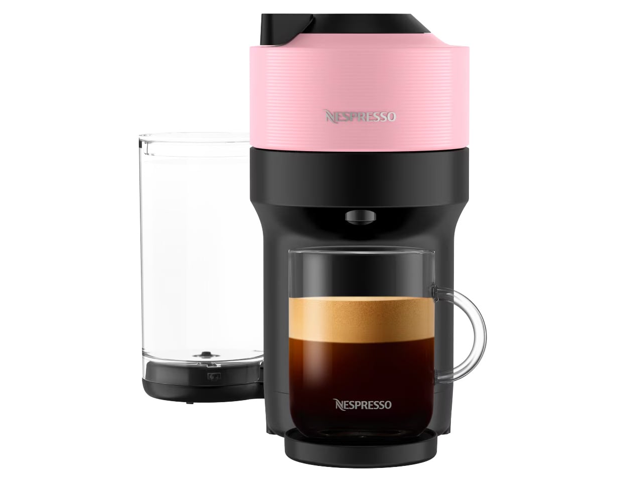
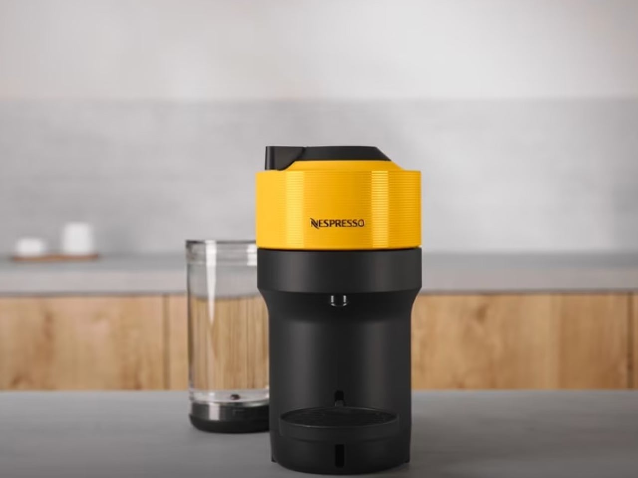
4. Nespresso Vertuo Pop+
The Nespresso Vertuo Pop+ is the most color-forward machine in the Vertuo lineup and one of the most capable compact brewers at its size. It brews five sizes of coffee, hot or iced, using centrifusion technology that reads the barcode on each capsule and automatically sets temperature, volume, and spin speed. No adjustments. No guesswork. No machine is crowding the counter between uses. For a mom who starts every morning the same way, this turns that ritual into something she can feel genuinely good about the moment she walks into the kitchen.
Deluxe models add chrome accents and a larger 37oz water tank, reducing refills without changing the footprint. The color range runs from Candy Pink to Aqua Mint to Coconut White, designed to complement a kitchen rather than compete with it. It heats in about 30 seconds and keeps used capsules in a built-in container for clean, one-step disposal. It’s the kind of appliance that earns permanent counter space because it earns it practically, aesthetically, and every single morning that she uses it.
What We Like
Per-capsule automated brewing means no settings adjustments are ever required
Wide color range designed to complement rather than clash with any kitchen aesthetic
What We Dislike
Pods are proprietary to the Nespresso Vertuo range, limiting third-party alternatives
Ongoing capsule costs add up over time compared to traditional brewing methods
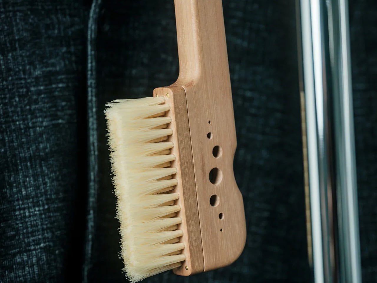
5. AromaCraft Clothes Brush
The AromaCraft comes from the Miyakawa Hake Brush Workshop, a family-owned business that has been making brushes in Japan since 1921. Each one is hand-crafted using the traditional Tsubokiri method, where every bristle is individually planted to prevent shedding and extend the brush’s working life. The bristles are white boar hair, firm enough to lift dust and pollen from deep within fabric fibers, and gentle enough not to cause damage. For a mom who takes care of what she wears, this is the kind of object that makes the act of getting dressed feel more intentional.
What separates it from a standard garment brush is the aromatic paper insert. It accepts a few drops of any essential oil, allowing a light fragrance to transfer with each stroke, so clothes come away cleaner and subtly scented. The walnut wood handle is finished with shea butter, durable in material, and beautiful in hand. It’s made to be kept, not replaced. For a gift that brings over a century of Japanese craft into a morning routine that usually goes unnoticed, the AromaCraft offers something genuinely rare: everyday luxury that doesn’t announce itself.
Traditional Tsubokiri hand-planted bristles prevent shedding and extend the brush’s lifespan
Customizable aromatic insert accepts any essential oil for a fully personalized scent experience
What We Dislike
Aromatic inserts require periodic replenishment depending on the frequency of use
Handcrafted production means availability can be limited at any given time
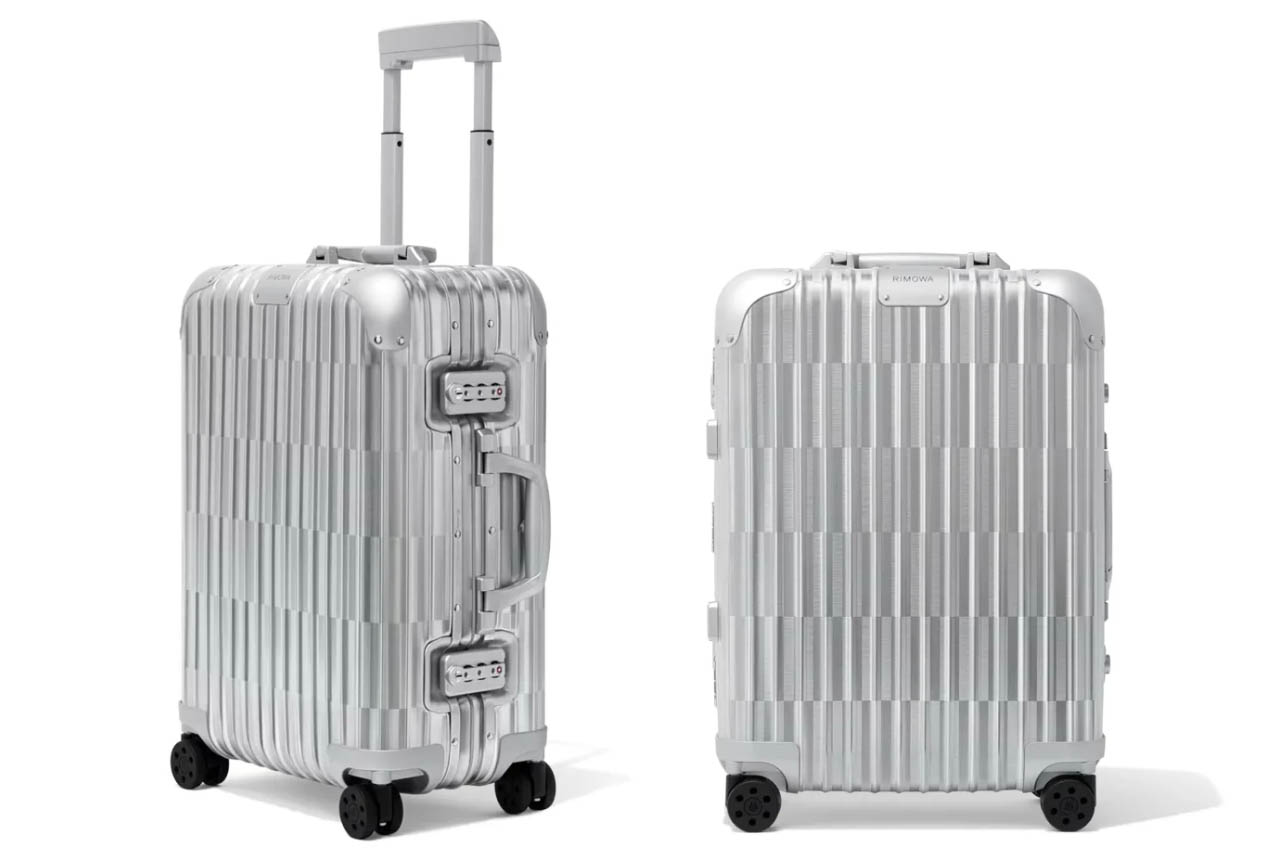
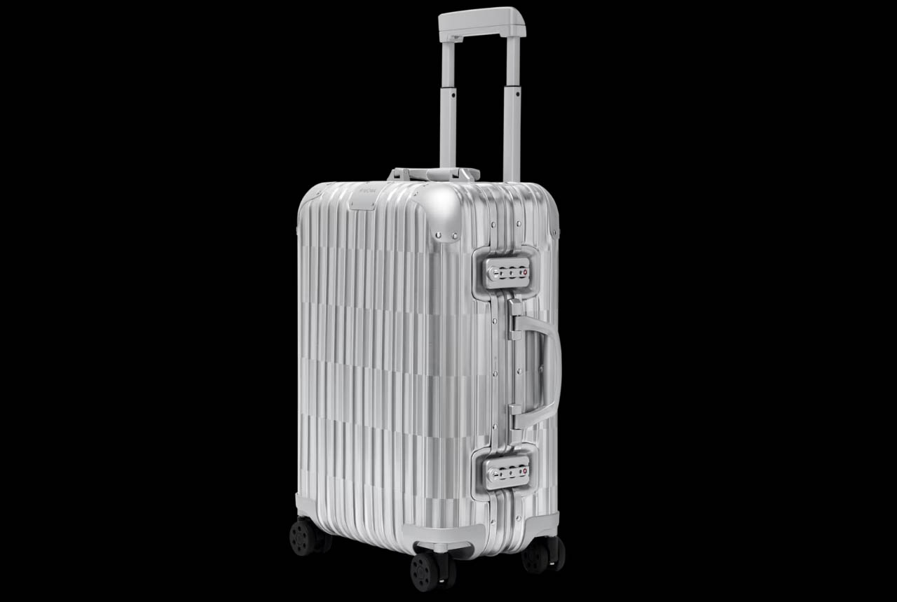
6. RIMOWA Original Cabin Optical
RIMOWA has been making aluminum suitcases long enough for the grooves to become iconic. The Original Cabin Optical does something more interesting than refining them. Using an alternating brushed finish on the anodized aluminum exterior, it creates the optical illusion of the grooves disappearing entirely, giving the suitcase a shimmering effect that reads differently depending on angle and light. At the airport, in a hotel lobby, or in the corner of a room, it looks like it’s in motion even when it’s standing perfectly still. For a mom who travels and understands that details matter, this is the carry-on that turns heads before a word is spoken.
The construction is the same high-end anodized aluminum RIMOWA has built its reputation on, and the Cabin Optical sits as a refined variant within the Original lineup. The optical effect isn’t a print or a surface treatment applied afterward. It’s built directly into the material through the brushing technique itself, which means it won’t fade, wear off, or lose its effect over years of use. The illusion is structural. For a suitcase she’ll carry for a decade, this offers something luggage rarely does: a design that stays more interesting the longer you look at it.
What We Like
Alternating brushed finish creates a structural optical illusion that cannot fade or wear off with use
High-end anodized aluminum construction is built to withstand years of regular travel
What We Dislike
Premium price point makes this a considered investment rather than a casual occasion gift
The optical effect reads most dramatically in directional or strong lighting conditions
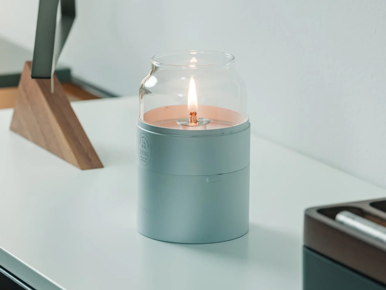
7. Fire Capsule Oil Lamp
The Fire Capsule is a minimalist oil lamp designed to do something most candles and electric alternatives can’t manage together: create a genuinely warm, candle-like glow that also functions as a scent diffuser. With an 80ml capacity, it burns for up to 16 hours on a single fill. The precision-engineered lid keeps the glass chimney dust-free between uses, so it stays clear and immaculate every time it’s lit. For a mom who curates her home environment, this is a ritual object, not just a lamp, and it earns its place on any surface it occupies.
The cylindrical form is clean enough to live on a shelf, a dining table, or a bedside surface without looking out of place. Outdoors, paraffin oil with insect-repelling properties makes it useful on a patio long after dark. The flat-topped design allows for stacking, the construction travels well, and a protective drawstring pouch is included. Paraffin burns clean and odorless, which keeps the fragrance from competing with anything underneath it. The included aroma plate accepts any scent she chooses, making the light and fragrance a single, fully personalized experience every time.
80ml capacity provides up to 16 hours of continuous clean, odorless light per fill
Aroma plate accepts any fragrance, making every use fully customizable to her preference
What We Dislike
Paraffin oil requires a separate purchase and ongoing replenishment
Open flame requires careful placement in households with young children or pets
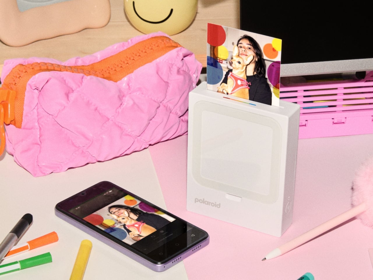
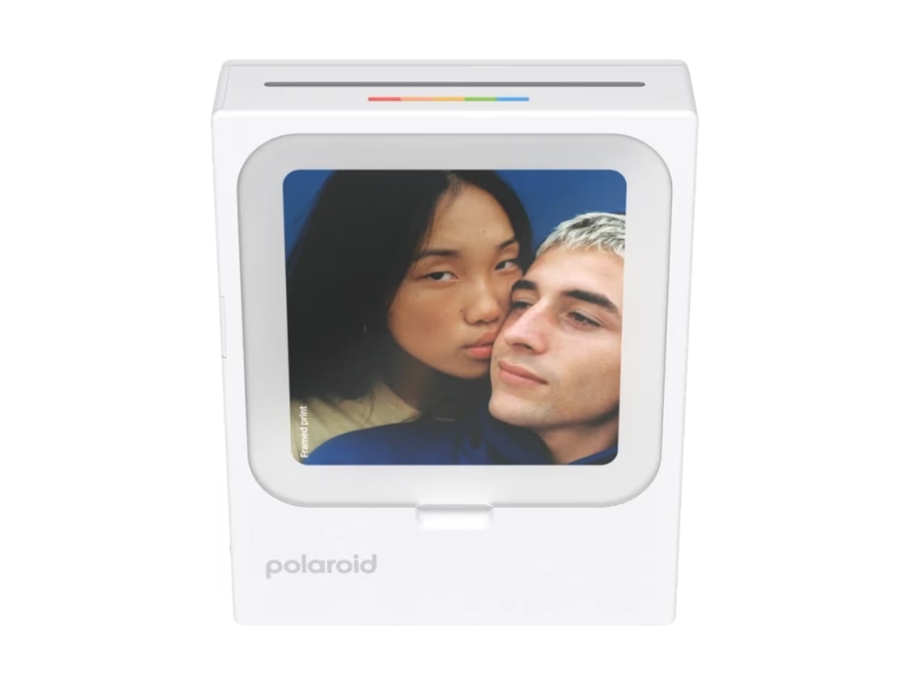
8. Polaroid Hi-Print 3×3
The Polaroid Hi-Print 3×3 is a compact smartphone photo printer that turns digital images into 3-inch square prints with a peel-and-stick backing. It connects to the free Hi-Print app on iOS and Android, which lets you add templates, stickers, and decorative frames before printing, so each image carries personality before it reaches the page. The prints are borderless and edge-to-edge, giving them a clean, modern look. For a mom who documents the family through her phone but never actually prints anything, this makes those images real in a way the camera roll never does.
The 3×3 format fills the space between the 2×3 pocket printer and the 4×6 desktop model in the Hi-Print family, making it particularly well-suited to square compositions. The peel-and-stick backing means prints go straight onto a wall, a journal spread, or a scrapbook page without tape, pins, or frames getting in the way. It’s for the memory books that keep getting started and the walls that stay blank because printing always felt like more effort than it was worth. This removes that friction entirely, and the results look good enough to take seriously.
What We Like
Peel-and-stick backing lets prints go directly onto any surface with no additional tools
Hi-Print app allows creative customization with templates, stickers, and frames before printing
What We Dislike
Requires ongoing purchase of Polaroid Hi-Print paper cartridges for continued use
Print quality suits creative and casual applications rather than archival or high-resolution output
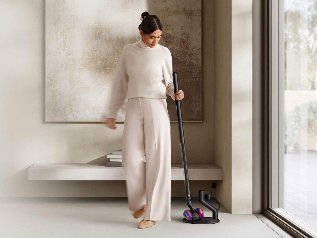
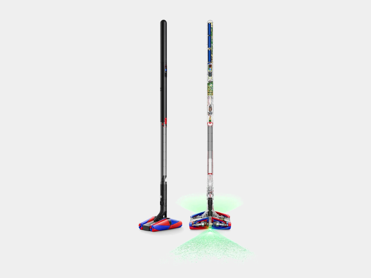
9. Dyson PencilVac
Dyson’s PencilVac is the world’s slimmest cordless vacuum cleaner, measuring just 38mm in diameter, comparable to the Dyson Supersonic hair dryer, and weighing approximately 1.8 kilograms. Inside that slim form sits the newly developed Hyperdymium motor, the smallest and fastest Dyson has produced, spinning at 140,000 RPM to deliver 55 air watts of suction power. The design lies nearly flat with an operational height of less than 10cm, reaching under furniture and into tight spaces that other vacuums cannot access. For a mom who keeps a tidy home, this is the vacuum that respects the spaces it cleans.
At 1.8 kilograms, it’s light enough to carry between rooms without it becoming its own task, and the cordless format removes the boundary between where cleaning starts and where inconvenience usually ends. The PencilVac was built for compact living spaces and for homes where form matters as much as function. It stores cleanly, moves with ease, and the industrial design holds up to scrutiny in a way most domestic appliances never attempt. The slim profile isn’t purely aesthetic. It’s what allows it to work precisely in the places that nothing else can reach.
What We Like
World’s slimmest cordless vacuum at 38mm diameter with an operational height under 10cm
Hyperdymium motor delivers 55 air watts of suction despite the ultra-compact form factor
What We Dislike
Battery life specifications are limited at launch and worth confirming for longer cleaning sessions
55 air watts may underperform compared to larger Dyson models on deep-pile carpet surfaces
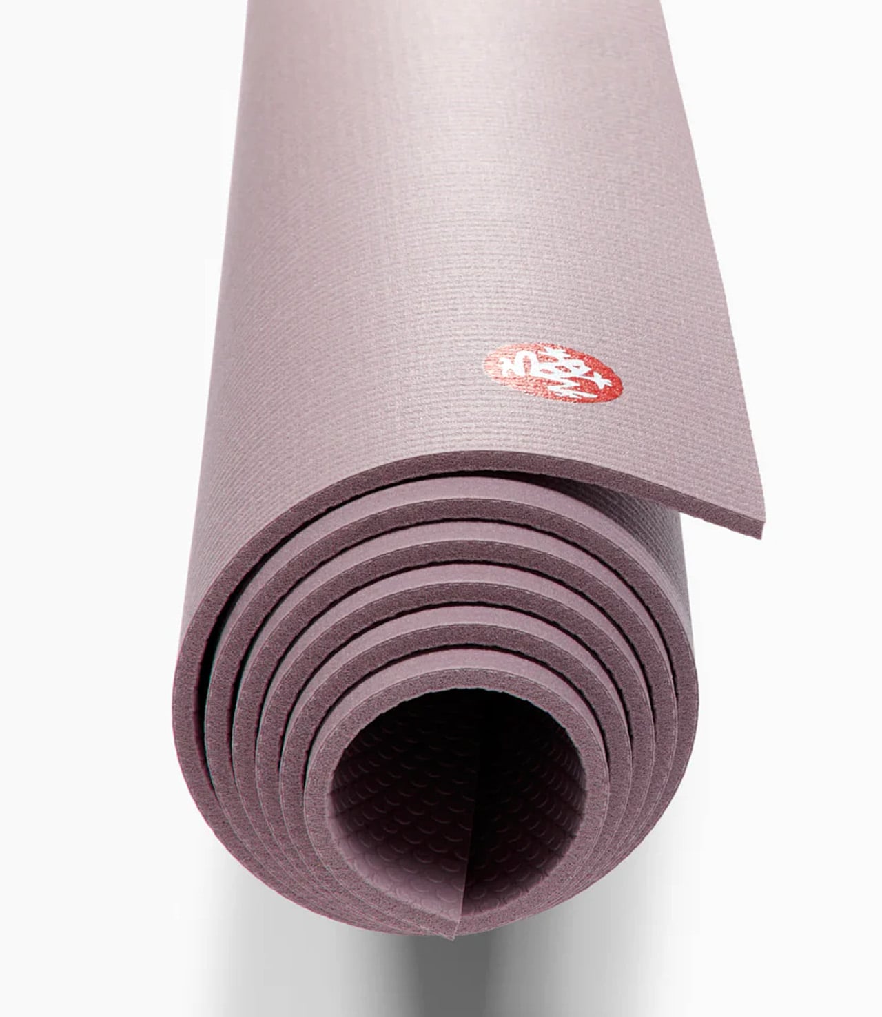
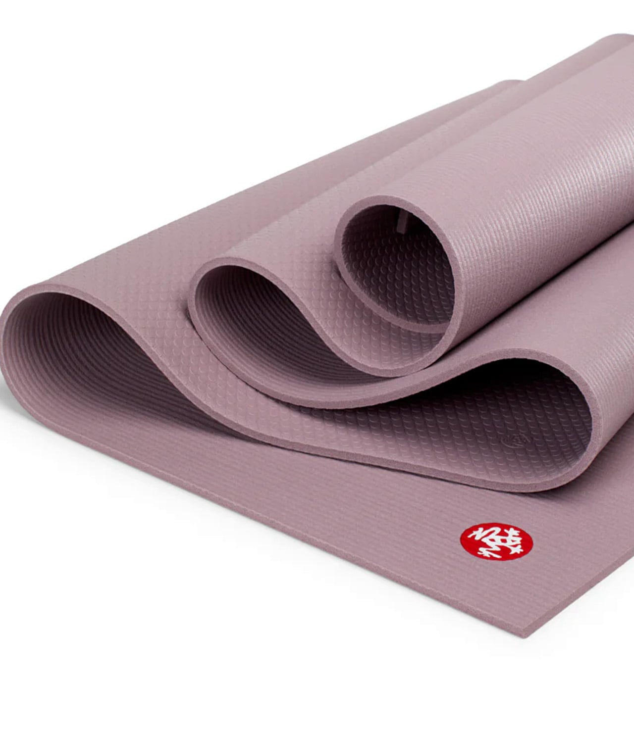
10. Manduka PRO Yoga Mat
The Manduka PRO yoga mat has been crafted in Germany since 1997, and the lifetime guarantee isn’t a marketing footnote. It’s a commitment built into a high-density construction that holds its form through years of daily practice without compressing, peeling, or pilling. At 6mm thick, it delivers floor-like stability with enough cushioning to protect joints through longer sessions, and the closed-cell surface keeps sweat, moisture, and bacteria out of the mat entirely. For a mom building a home practice, or deepening one she already has, this is the mat that removes every reason to stop.
The PRO is the number one mat recommended by yoga teachers worldwide, and the reasoning is straightforward: it performs consistently whether the practice is restorative or physically demanding. Limited-Edition mats in marbled and striped colorways are hand-processed, meaning each one carries a unique pattern that won’t match the image exactly. That’s not a flaw. It’s the point. For a gift that will be used thousands of times over the years, the Manduka PRO is one of those rare purchases that costs less over a lifetime than everything it replaces, and looks better doing it.
What We Like
Lifetime guarantee backed by high-density construction that resists compression through years of use
Closed-cell surface actively prevents sweat, moisture, and bacteria from penetrating the mat
What We Dislike
At over seven pounds, it’s better suited to a home practice than a mat that travels regularly
Surface requires time to fully break in before reaching peak grip performance
The Gift That Stays
The best thing about giving something well-designed is that the moment doesn’t end when the wrapping comes off. It extends into the morning, she reaches for that coffee machine, the evening she lights the oil lamp, and the quiet hour spent on the yoga mat. These gifts don’t just mark an occasion. They become part of her routine, her space, and the way she moves through every single day long after.
That’s the real difference between a beautiful gift and a lasting one. A lasting gift still earns its place long after the occasion that inspired it. Whether it’s the ring she never takes off, the suitcase she grabs without thinking, or the mat she returns to every morning — the best gifts don’t fade. They settle in. They become hers. And years from now, she’ll still be glad you chose well.
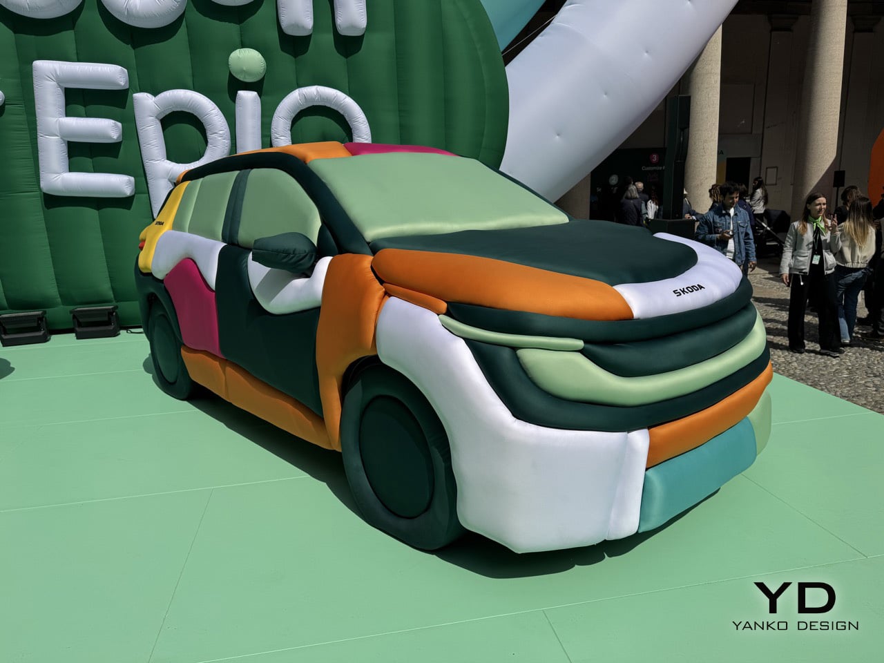
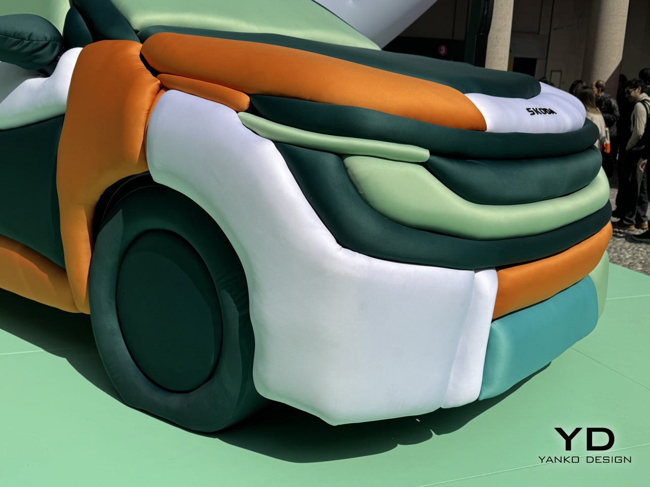
Cars belong to the world of hard surfaces, precision tolerances, and engineering constraints measured in fractions of millimeters. Ulises Studio works in the opposite direction. The Barcelona-based spatial design practice has spent years creating immersive environments that transform architecture into something tactile and experiential, turning rigid spaces into soft, inviting landscapes. Their installations have activated cultural venues and public spaces across Europe, and their approach is immediately recognizable: inflatable forms, vibrant color palettes, and a commitment to making people rethink how they interact with the built environment. When Skoda asked them to collaborate on an installation for Milan Design Week 2025, they brought that same philosophy to something designers rarely get to touch: an actual production car.
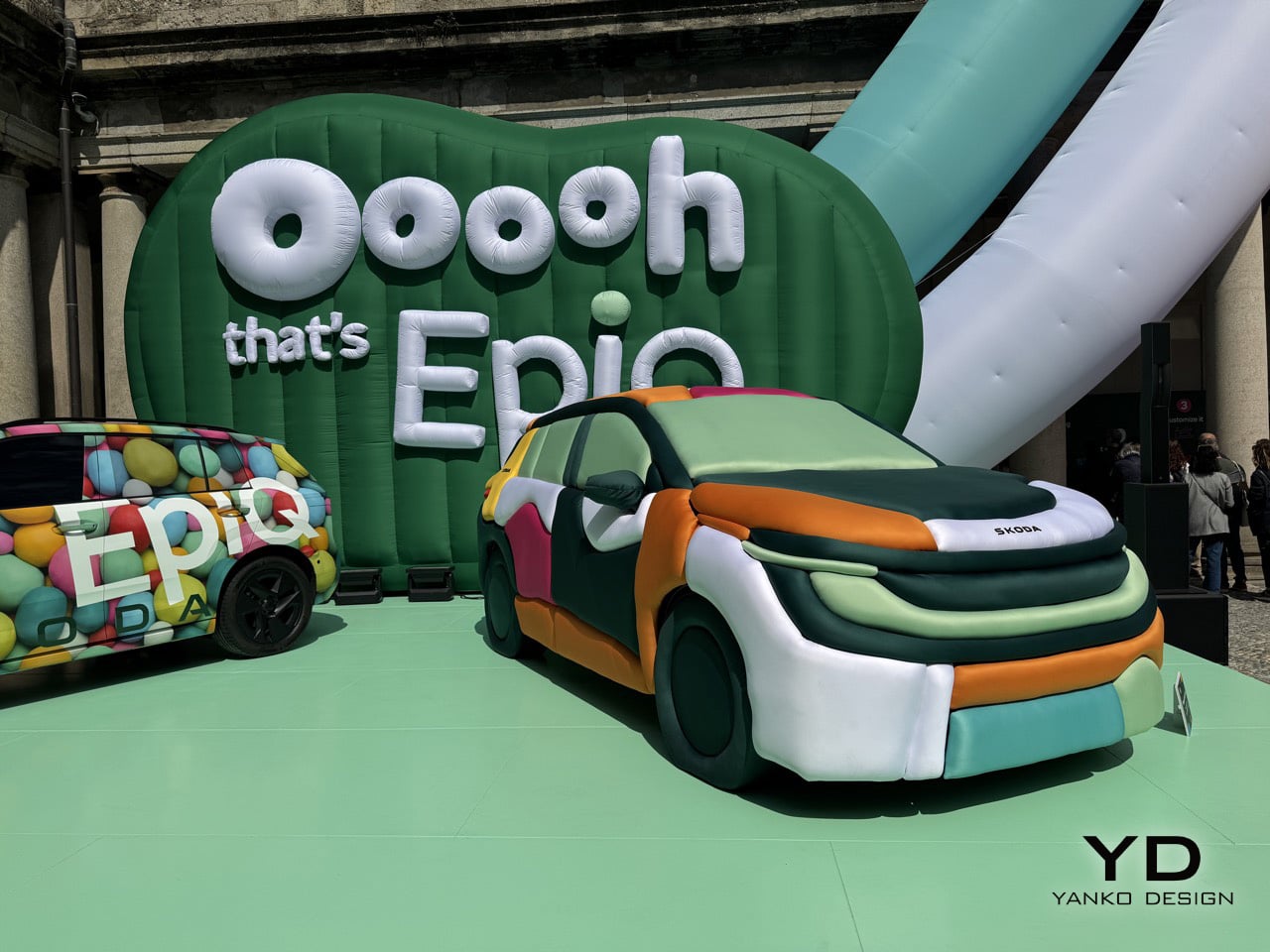
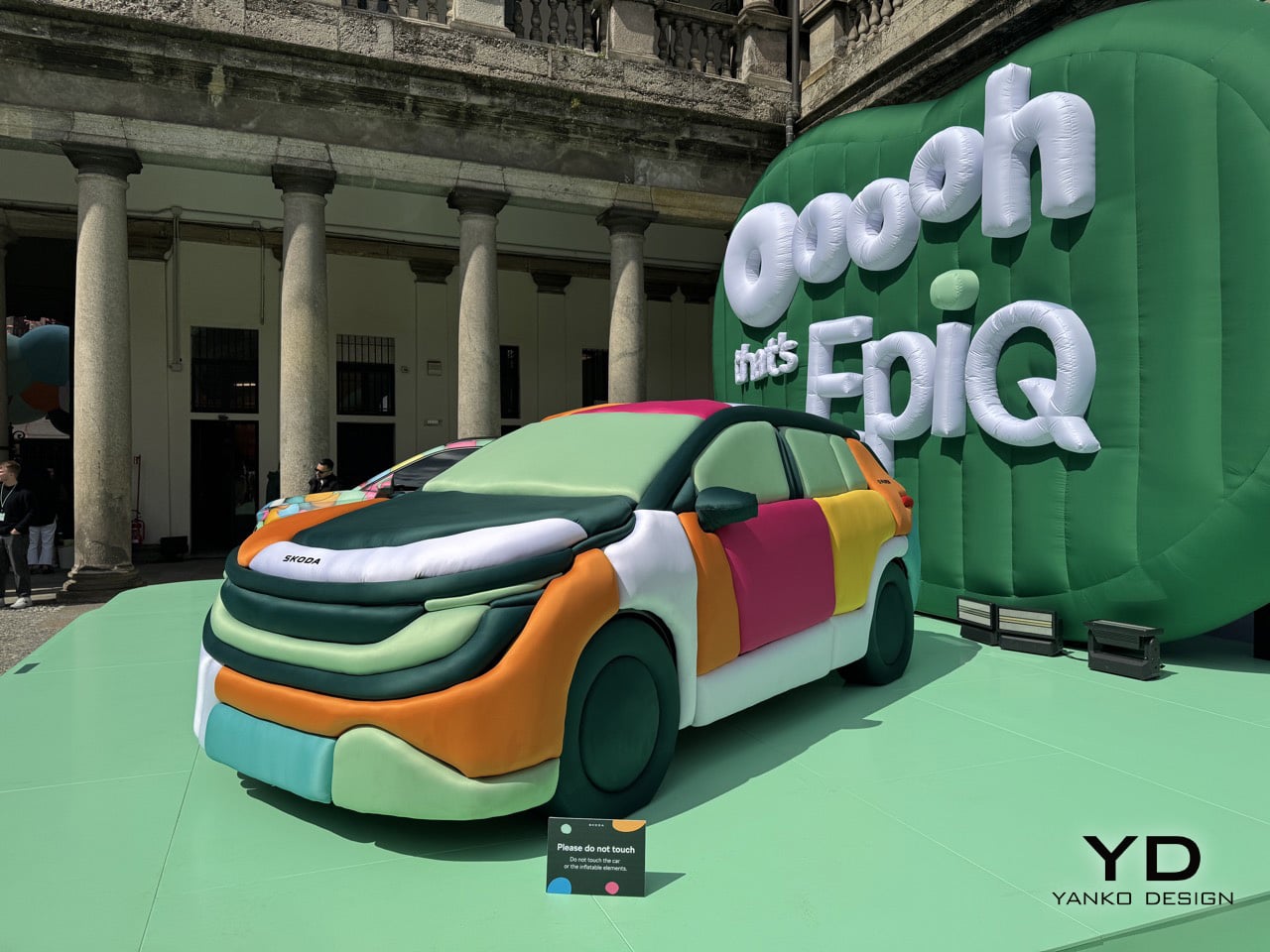
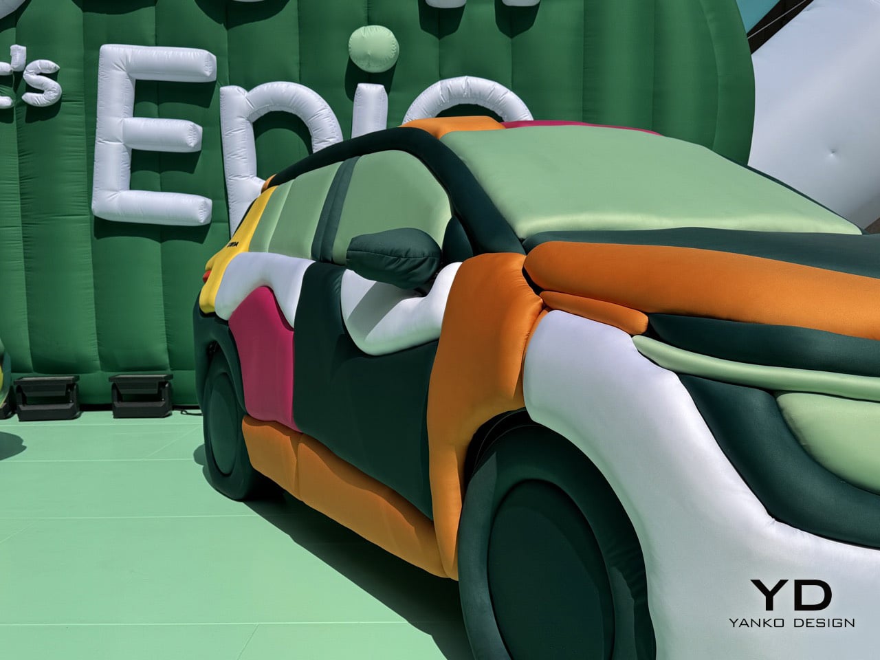
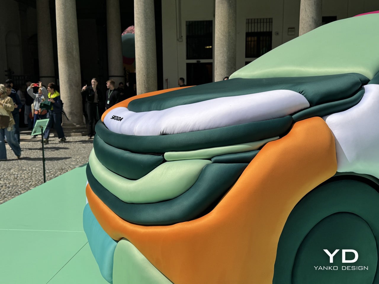
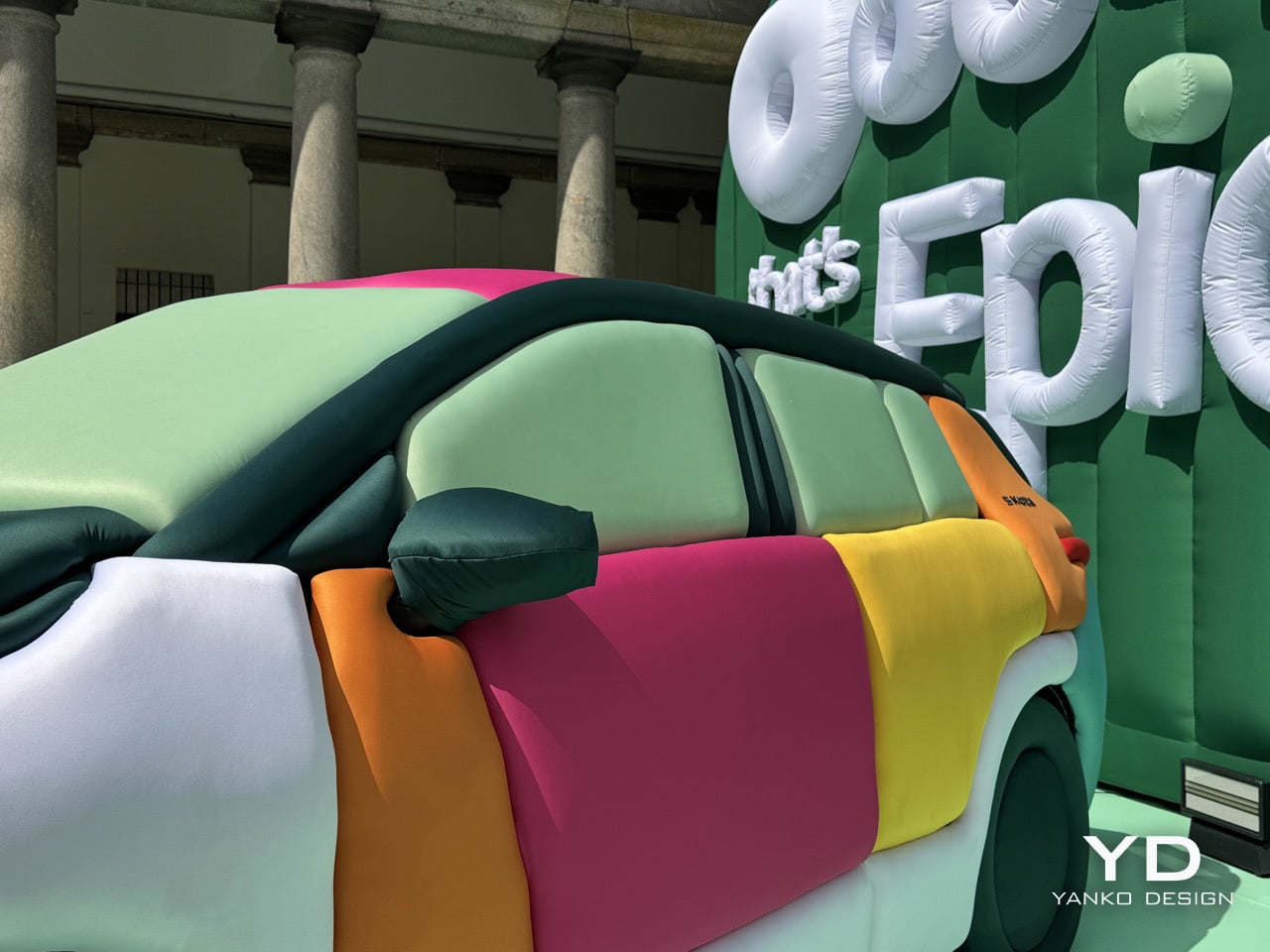
The Epiq, Skoda’s new electric SUV, became the canvas. Ulises Studio covered it entirely in inflatable fabric panels, each one a horizontal tube running across the body in a sequence of cheerful colors. Mint green, burnt orange, soft pink, butter yellow, pale turquoise. The effect is disarming. What should feel like a parked vehicle instead reads as a sculpture, a comment on automotive design language filtered through the lens of spatial intervention. Skoda staged it at Palazzo Senato with multiple Epiq vehicles, each wrapped in different inflatable treatments, creating a dialog between the engineered reality and Ulises Studio’s playful reinterpretation.
Designers: Ulises Studio & Skoda Design
The genius of the installation lies in how completely it transforms the car’s character without altering its underlying form. Every crease, every character line, every panel gap gets translated into soft, pillowy geometry. The horizontal tubes follow the Epiq’s actual contours, which means the inflatable version retains the proportions and stance of the real thing. You can still read it as a compact SUV, but now it feels approachable in a way sheet metal never could. The tactile quality is impossible to ignore. Your brain knows you’re looking at air-filled fabric wrapped around a vehicle, but your hands want to reach out and squeeze it anyway.
Ulises Studio didn’t stop at wrapping cars. They transformed the entire courtyard at Palazzo Senato into what they’re calling a “clay landscape,” an inflatable environment that extends the material language across the entire space. Oversized typography spelling out “Ooooh, that’s EpiQ” dominates one wall, each letter constructed from the same air-filled tubes. Smaller inflatable elements populate the courtyard like sculptural furniture, creating zones where visitors can pause and take in the installation from different angles. The floor itself gets treated to a matching mint-green surface that ties the whole environment together. This is spatial design at its most comprehensive, where every element reinforces the central idea.
What makes the collaboration work is that Ulises Studio treats the Epiq as part of a larger environmental narrative rather than the hero object that everything else orbits around. The cars are embedded in the landscape, surrounded by inflatable forms that share their material language and color palette. This creates a sense of cohesion that most automotive installations never achieve, where the vehicle feels like it genuinely belongs in the space rather than being awkwardly dropped into it. The studio’s background in creating immersive experiences shows in how they choreograph movement through the courtyard, using the placement of vehicles and sculptural elements to guide visitors through different zones of the installation. You don’t just look at the inflatable Epiq, you move around it, through the landscape it inhabits, encountering different perspectives and color relationships as you navigate the space.
Ulises Studio has always understood that spatial design is a form of storytelling. Their inflatable installations communicate ideas about accessibility, transformation, and how we experience objects in space. The Epiq installation applies that same thinking to automotive design. By swapping metal and glass for inflatable fabric, they strip away the aggression and seriousness that define most car launches and replace it with something genuinely delightful. The oversized inflatable typography spelling out “Ooooh, that’s EpiQ” reinforces the tone in a fairly Gen-Z coded way, allowing the brand to resonate with younger generations. This is design as spatial play, a reminder that objects can be functional and joyful simultaneously.
You’re an expert editor/blogger with a profound understanding of human psyche as well as Google SEO. Now generate 10 catchy, attention-grabbing, mildly provocative titles that are SEO-friendly too. Make your titles have natural language but craft them so they rank high on google News and Discover as of March 2026. Do your SEO research. Make them natural language, simple, yet captivating