Public art has long served as a cultural mirror, reflecting what a society chooses to honor. As climate change intensifies and cities face mounting pressure to decarbonize, questions about what our monuments should stand for are getting harder to ignore. Most renewable energy infrastructure stays invisible, buried in utility corridors or mounted on rooftops, rarely acknowledged as something worth celebrating in public spaces.
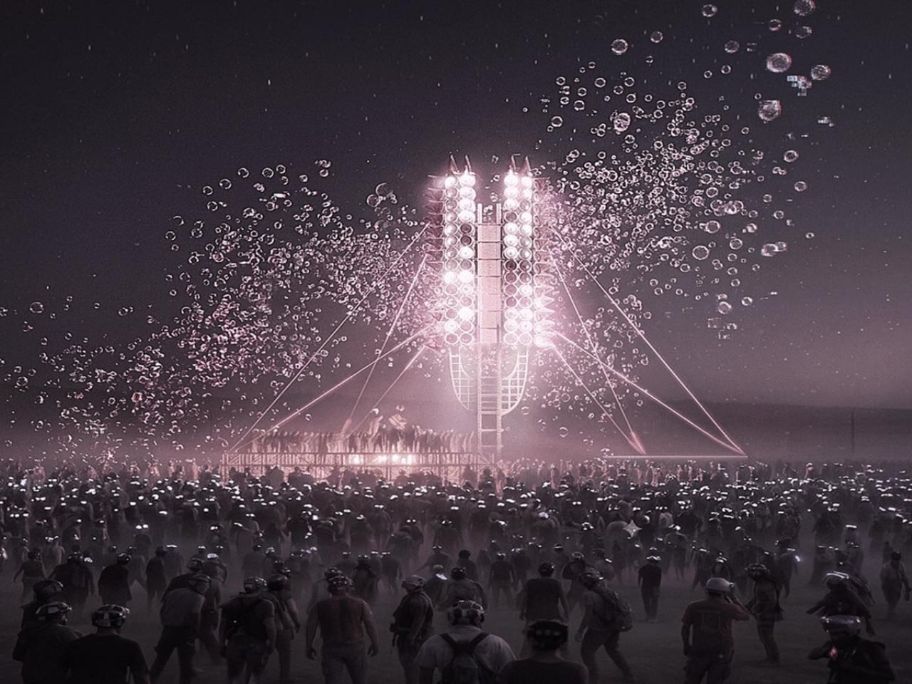
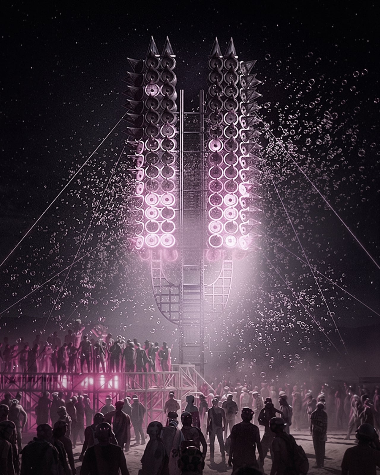
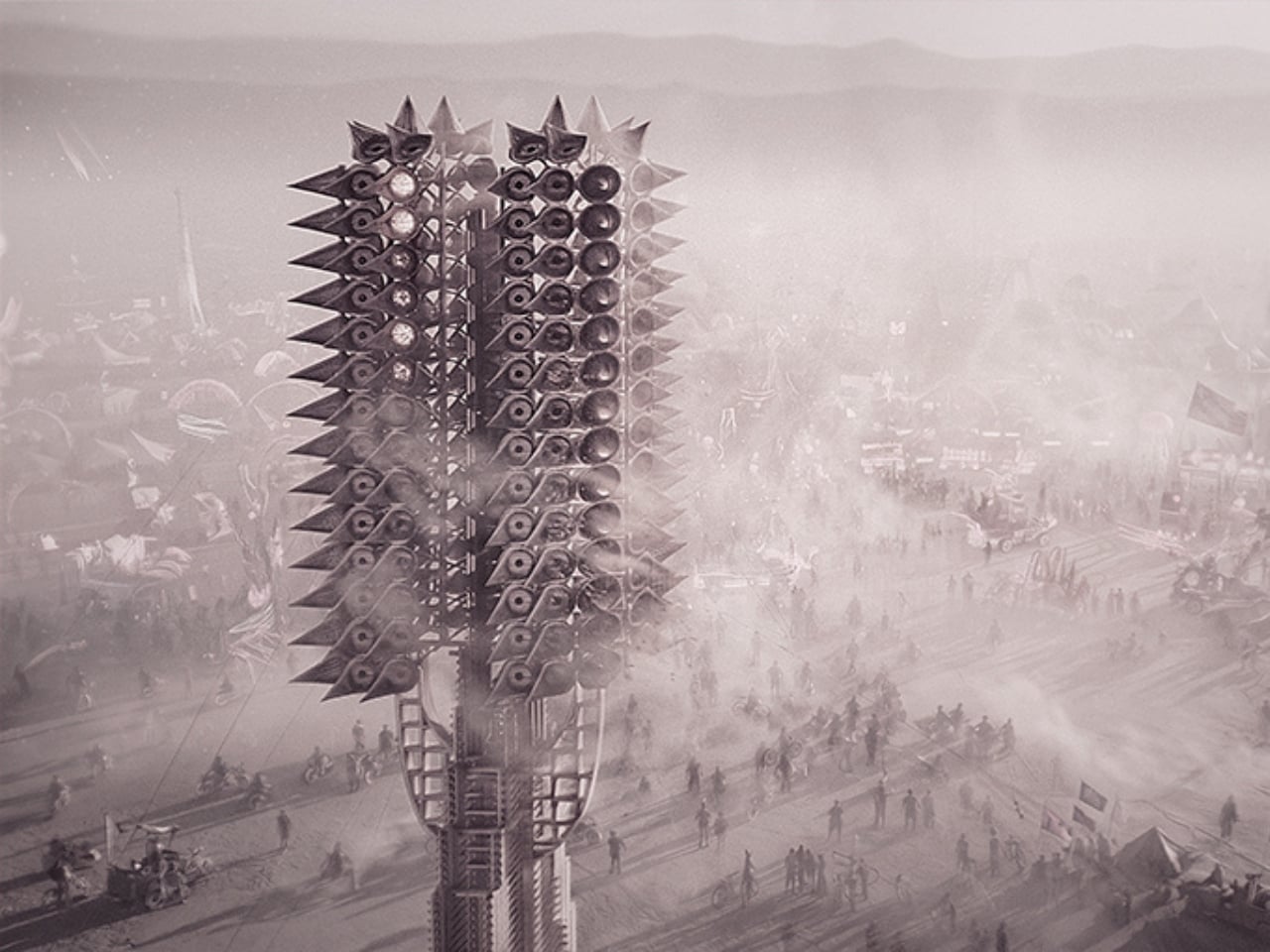
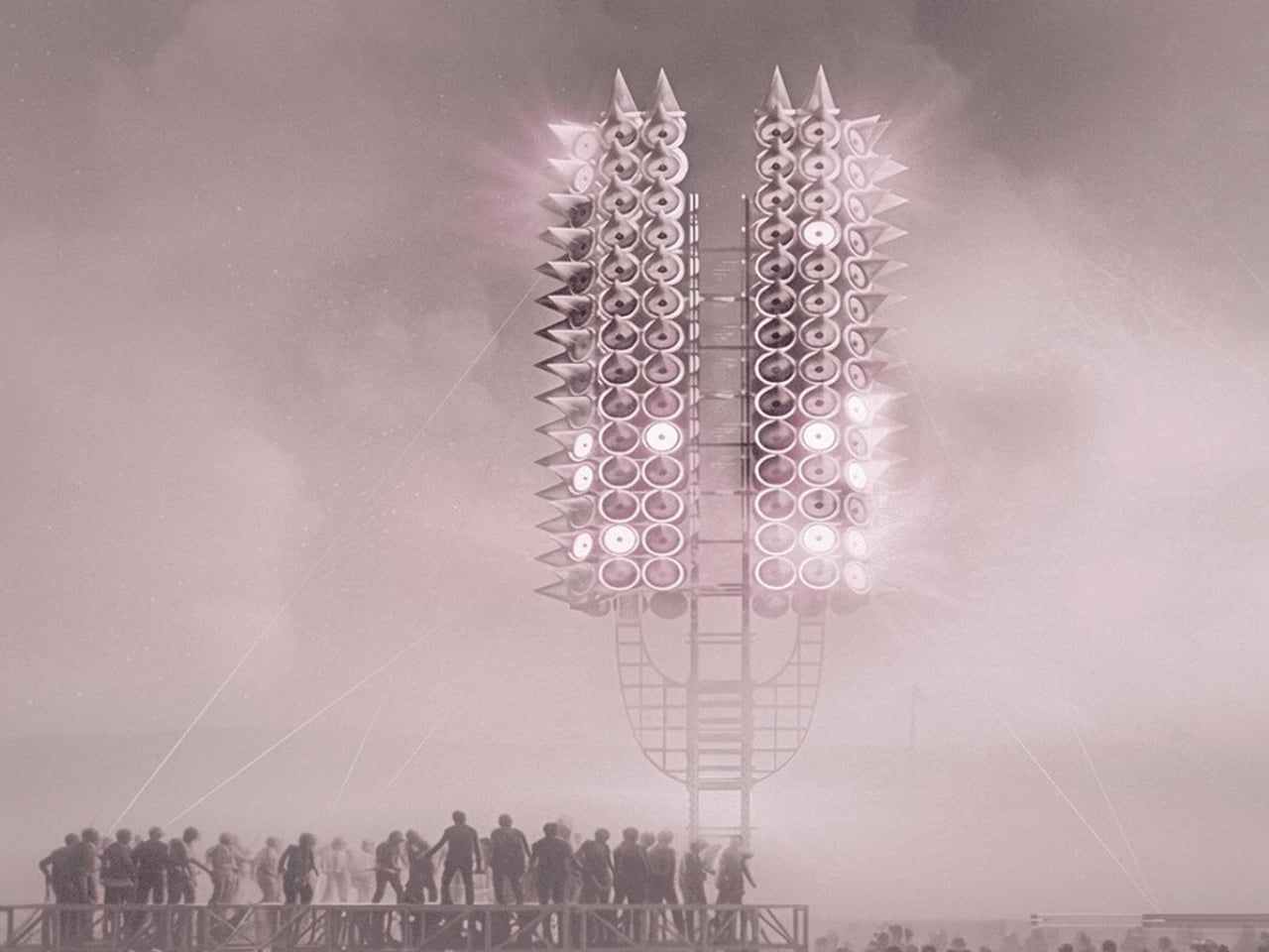
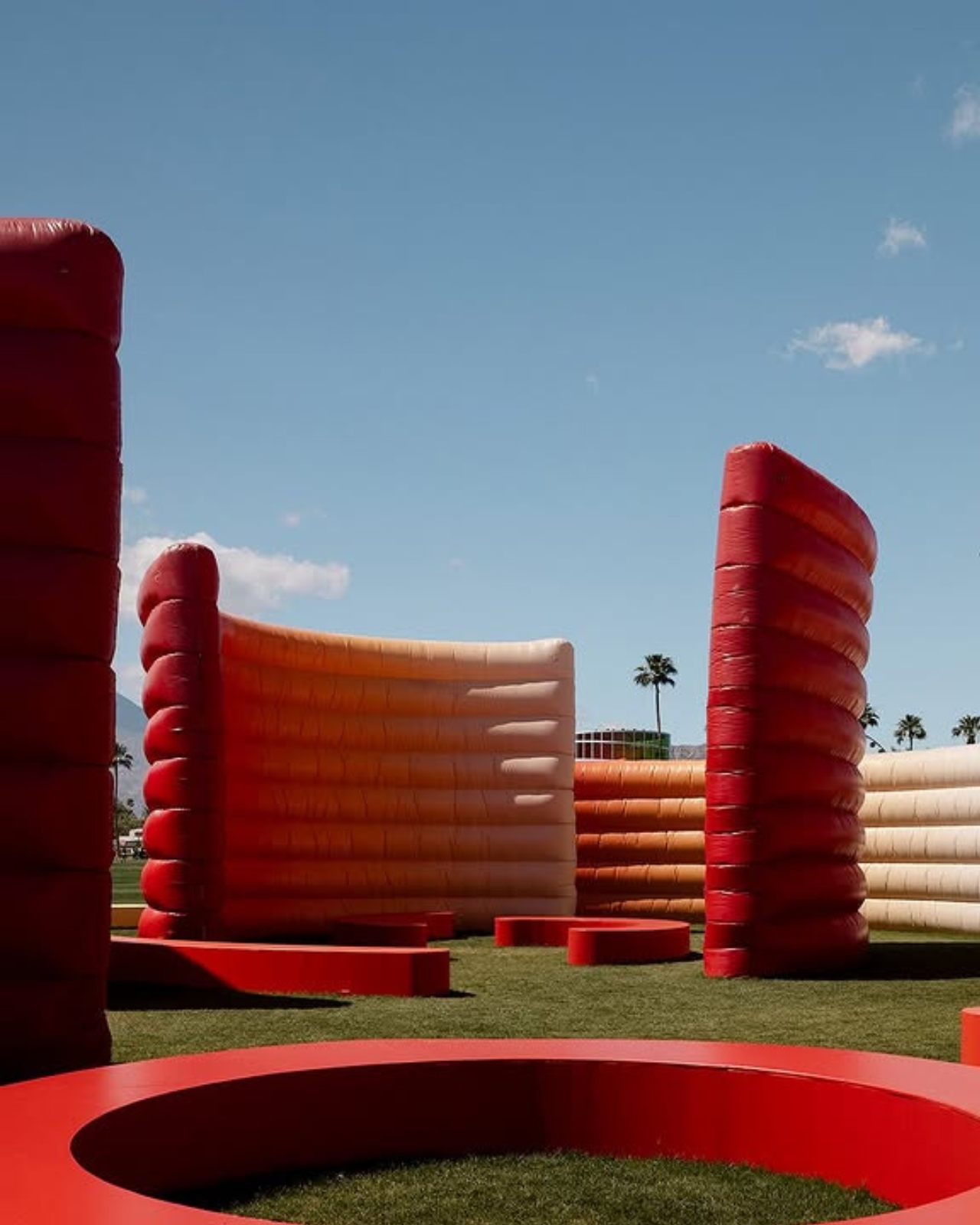
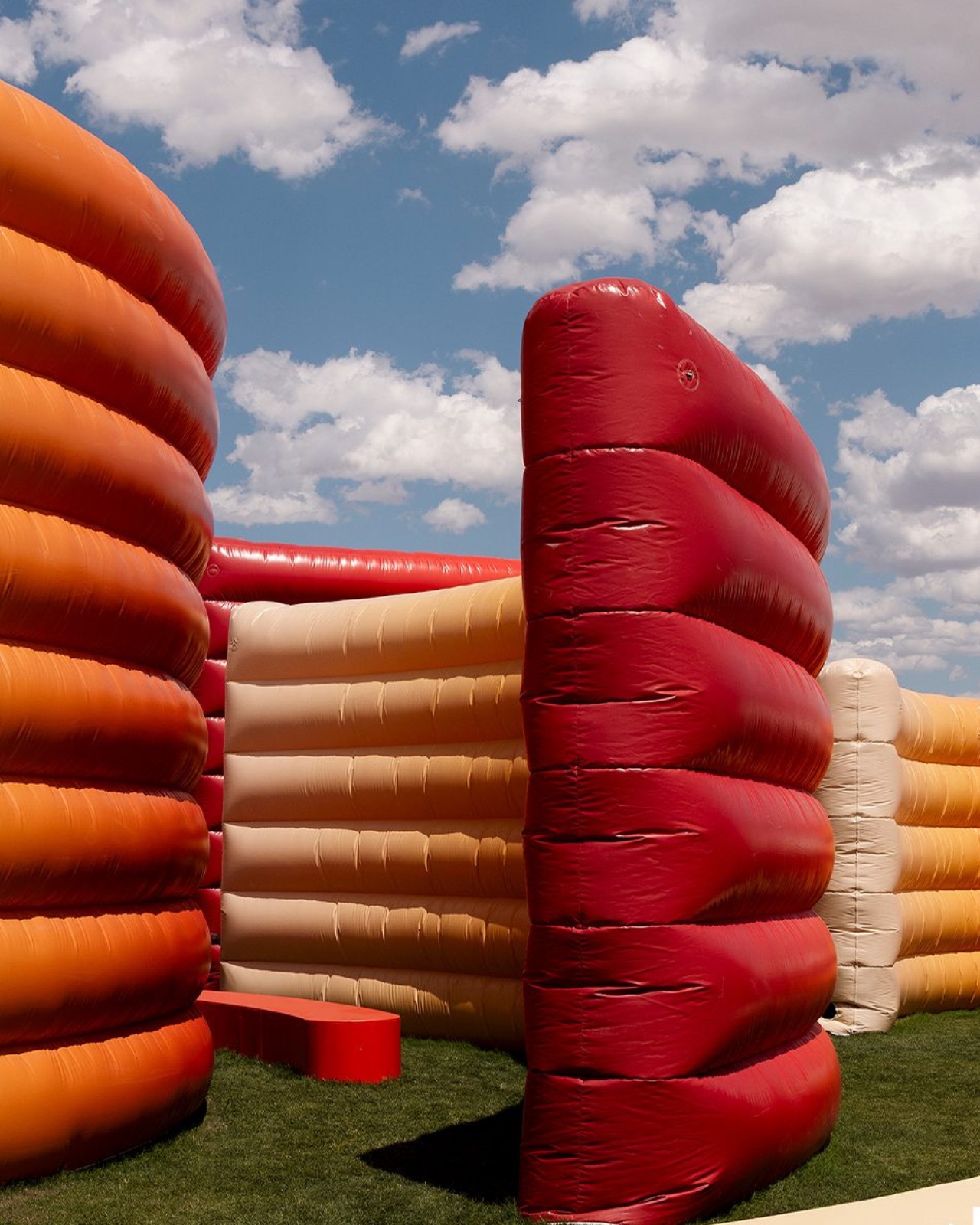
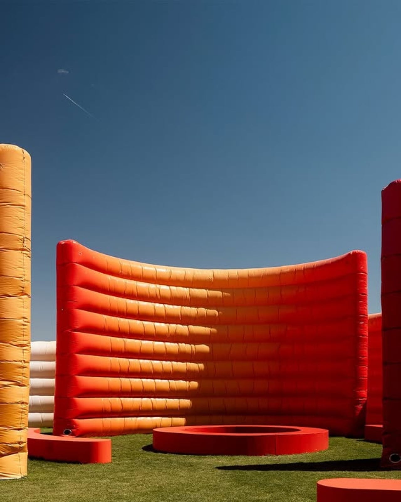
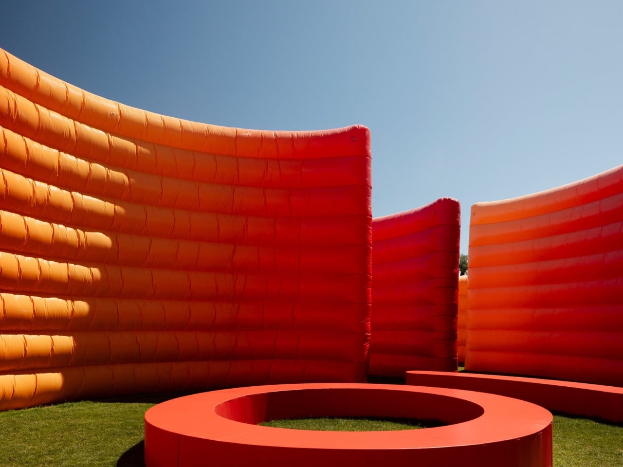
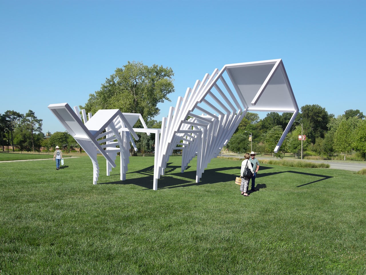
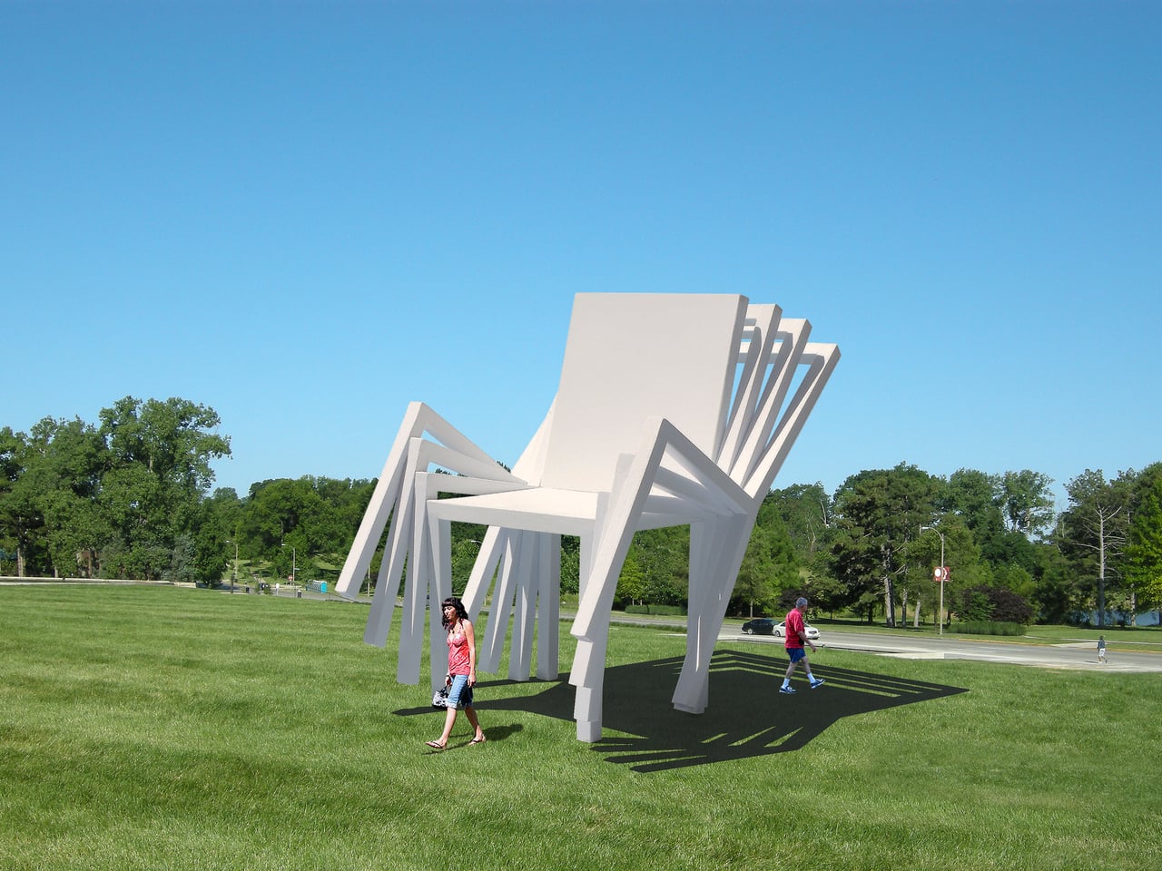
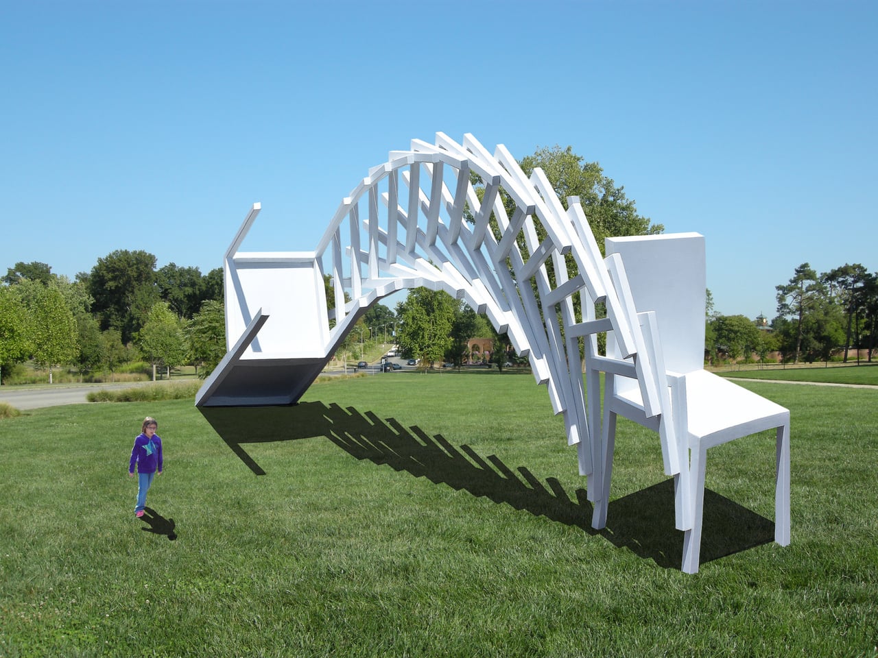
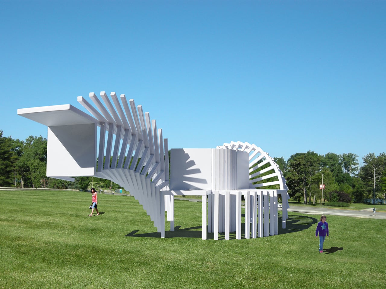
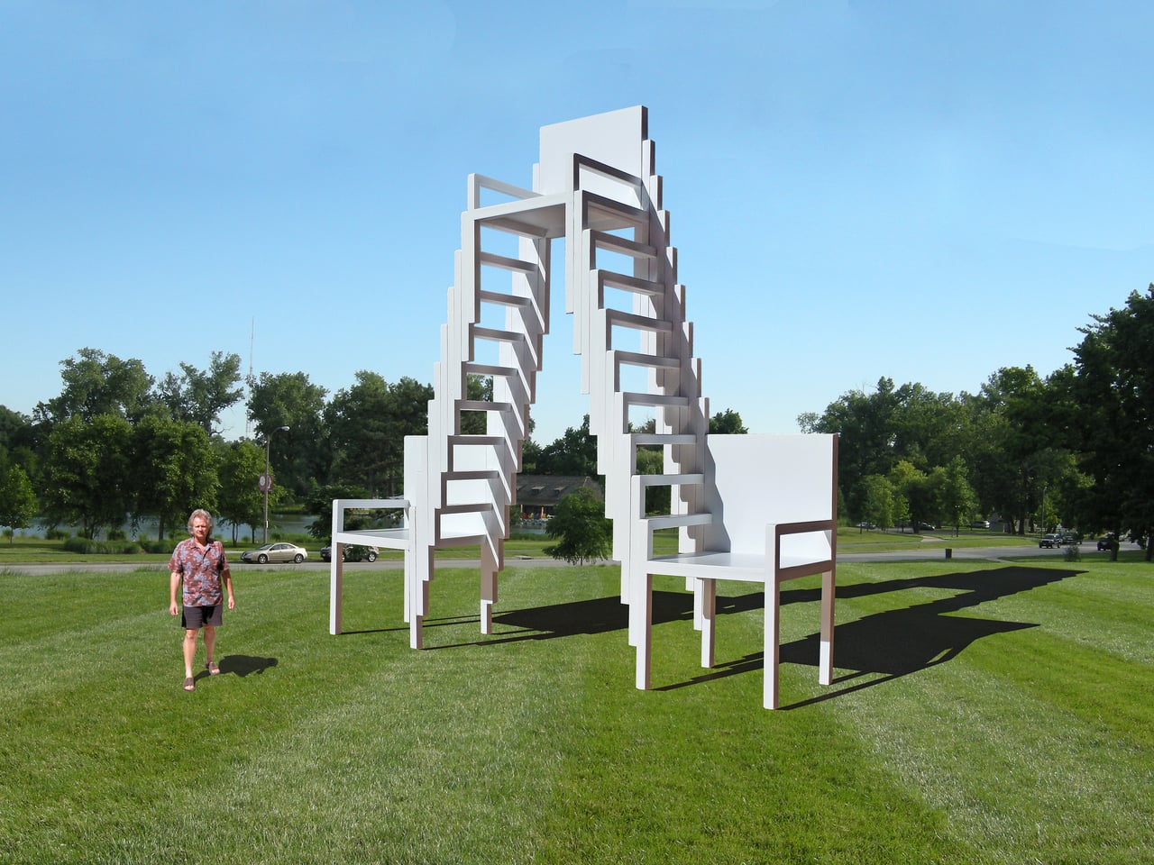
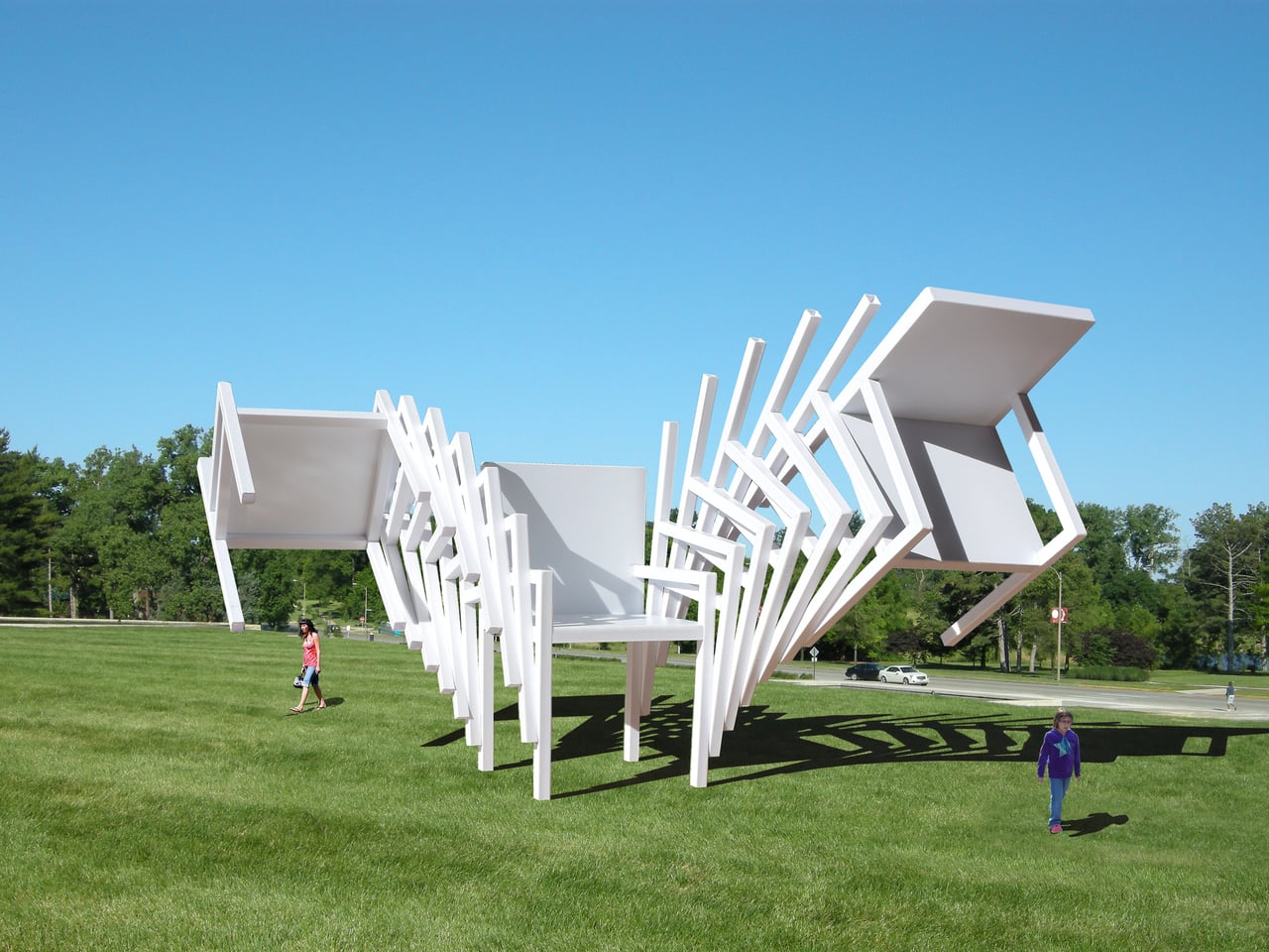
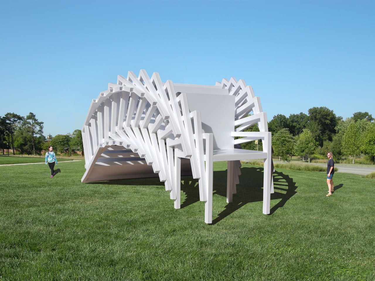
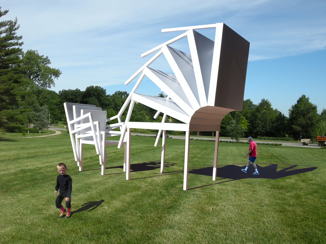
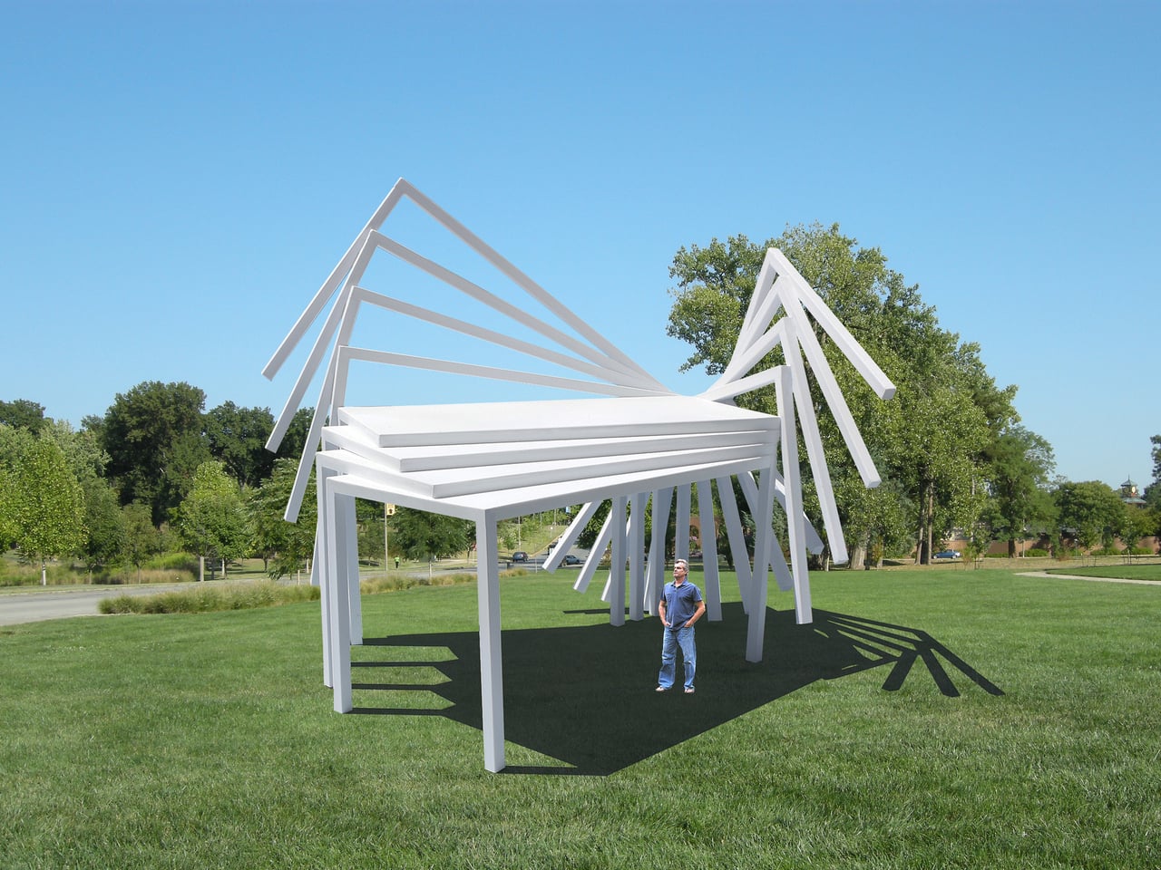
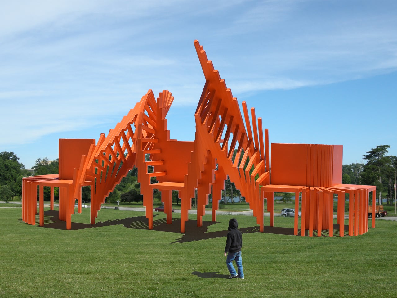
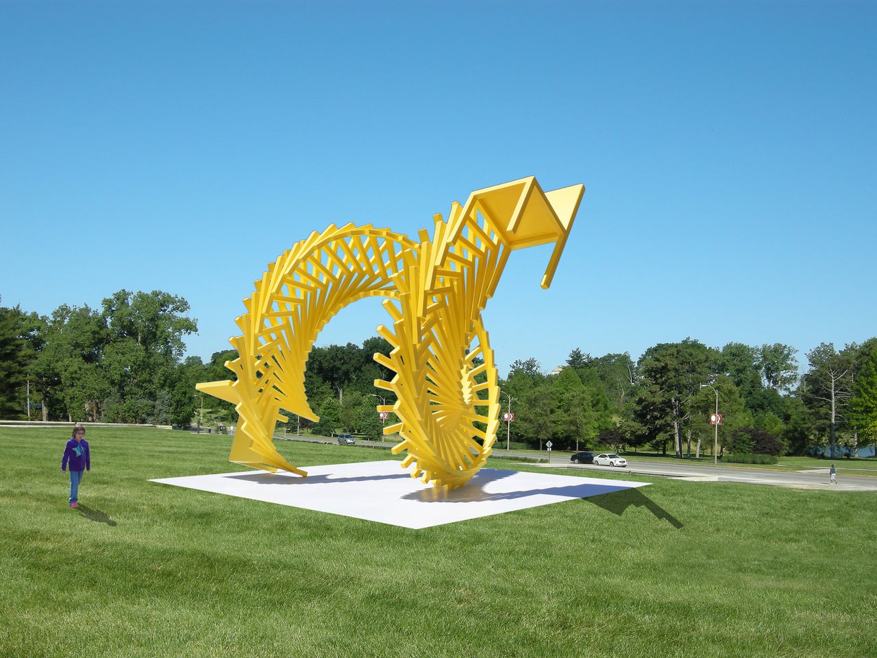
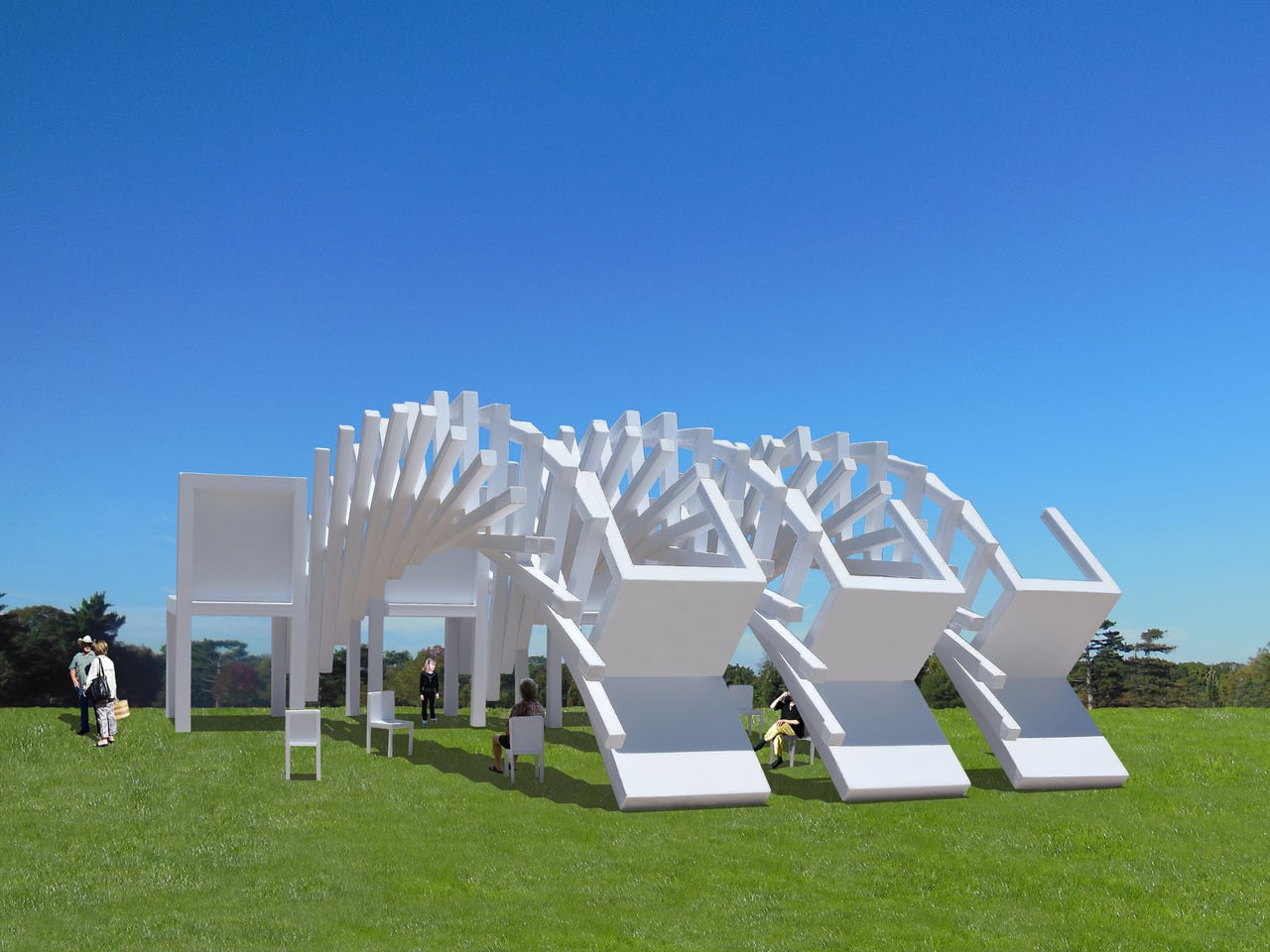
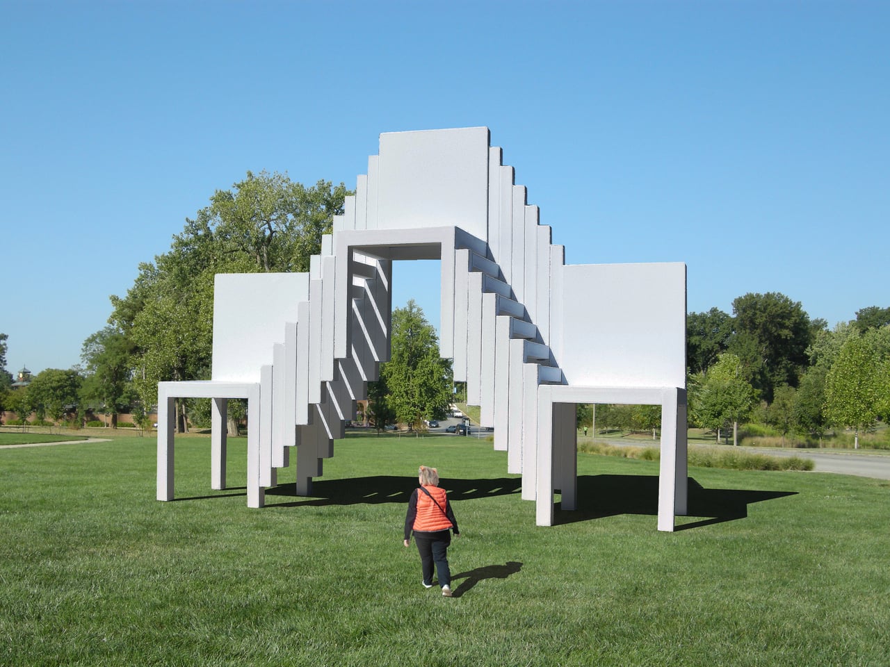
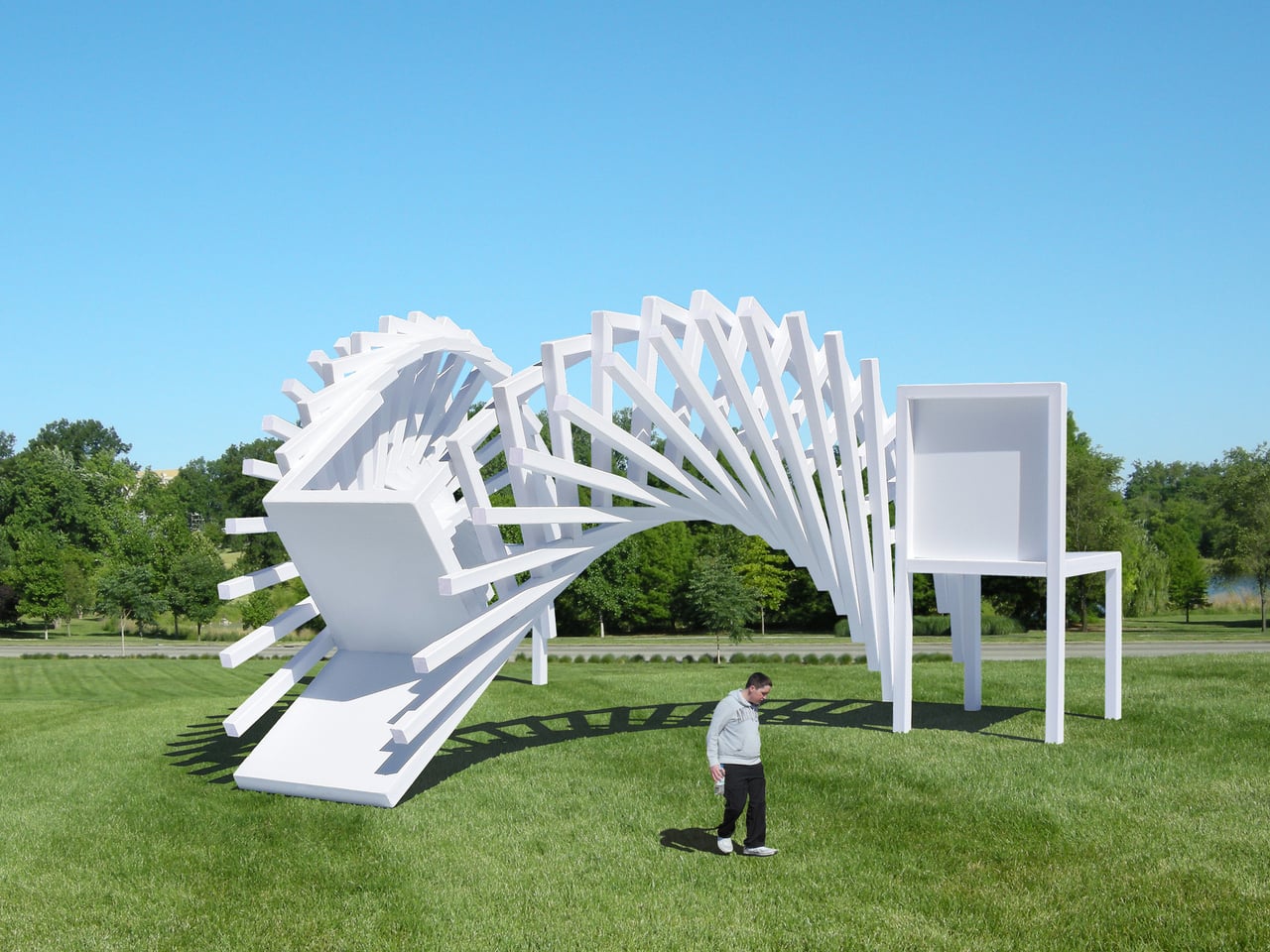
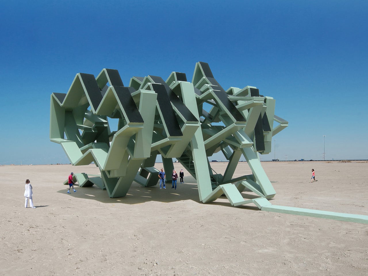
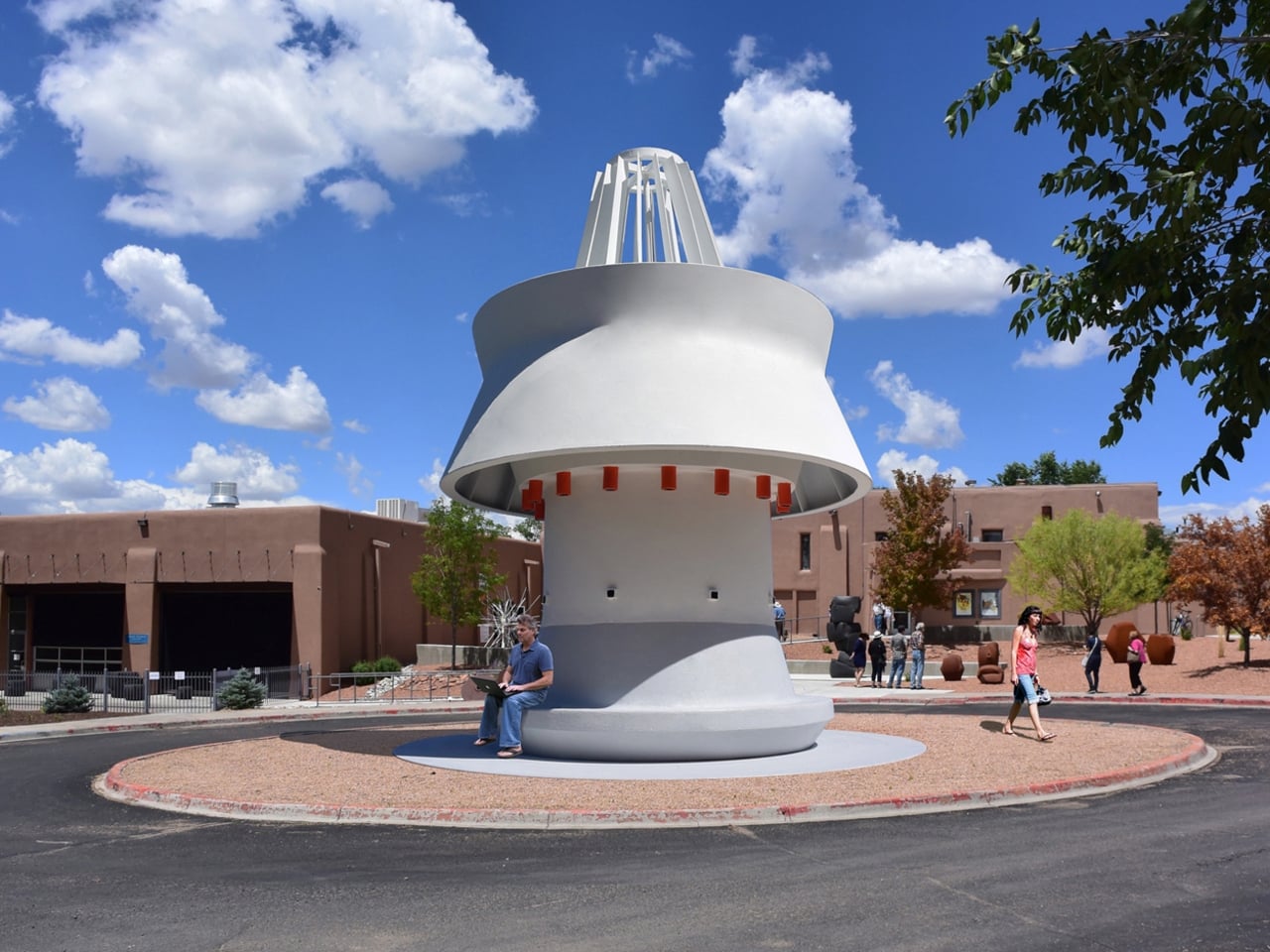
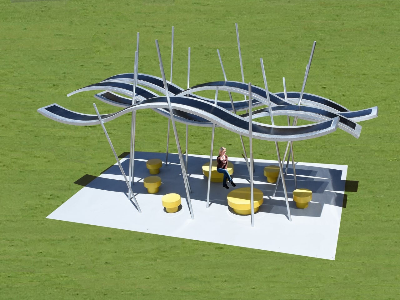
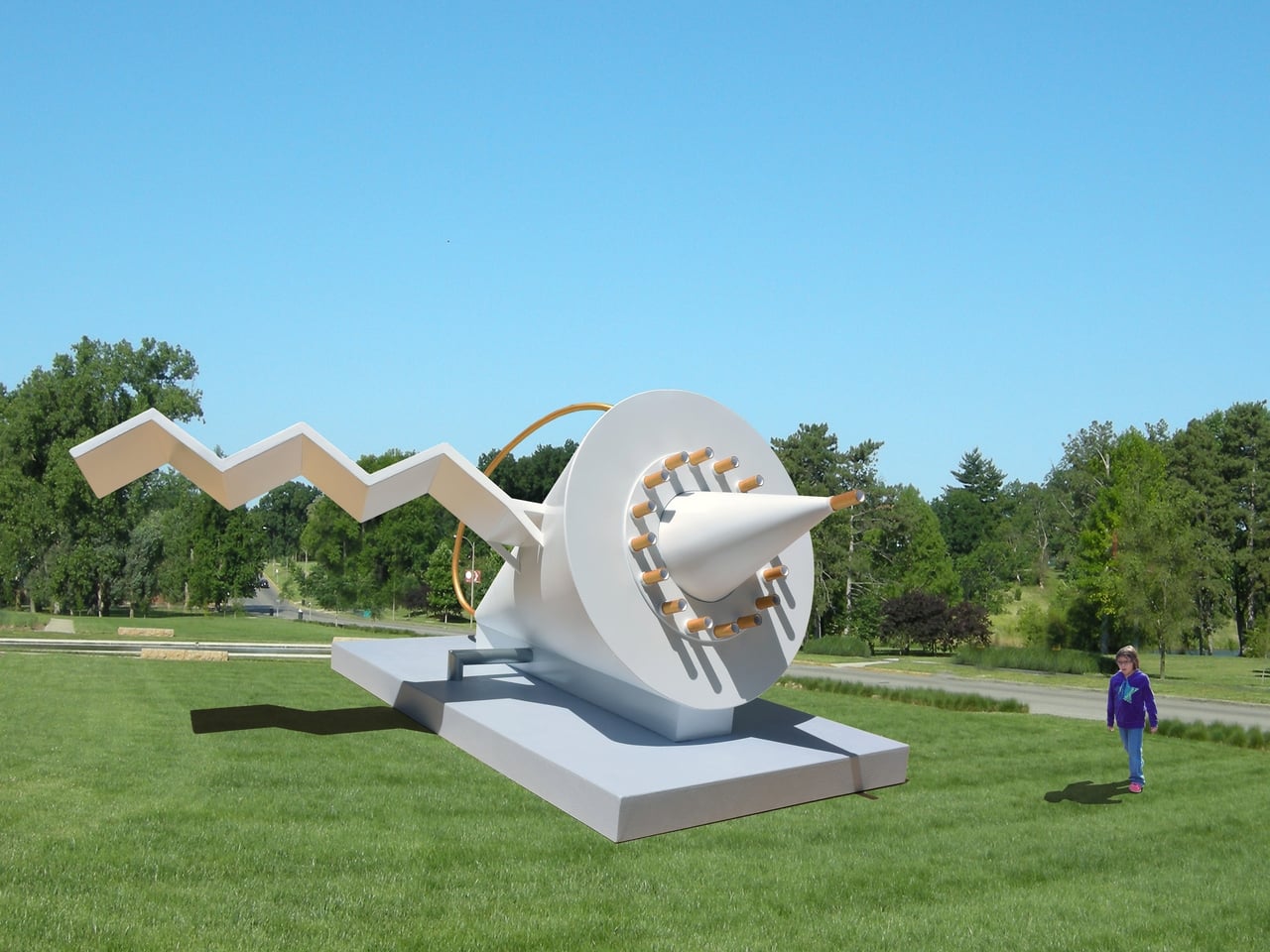
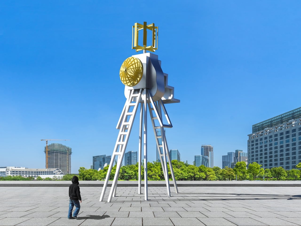
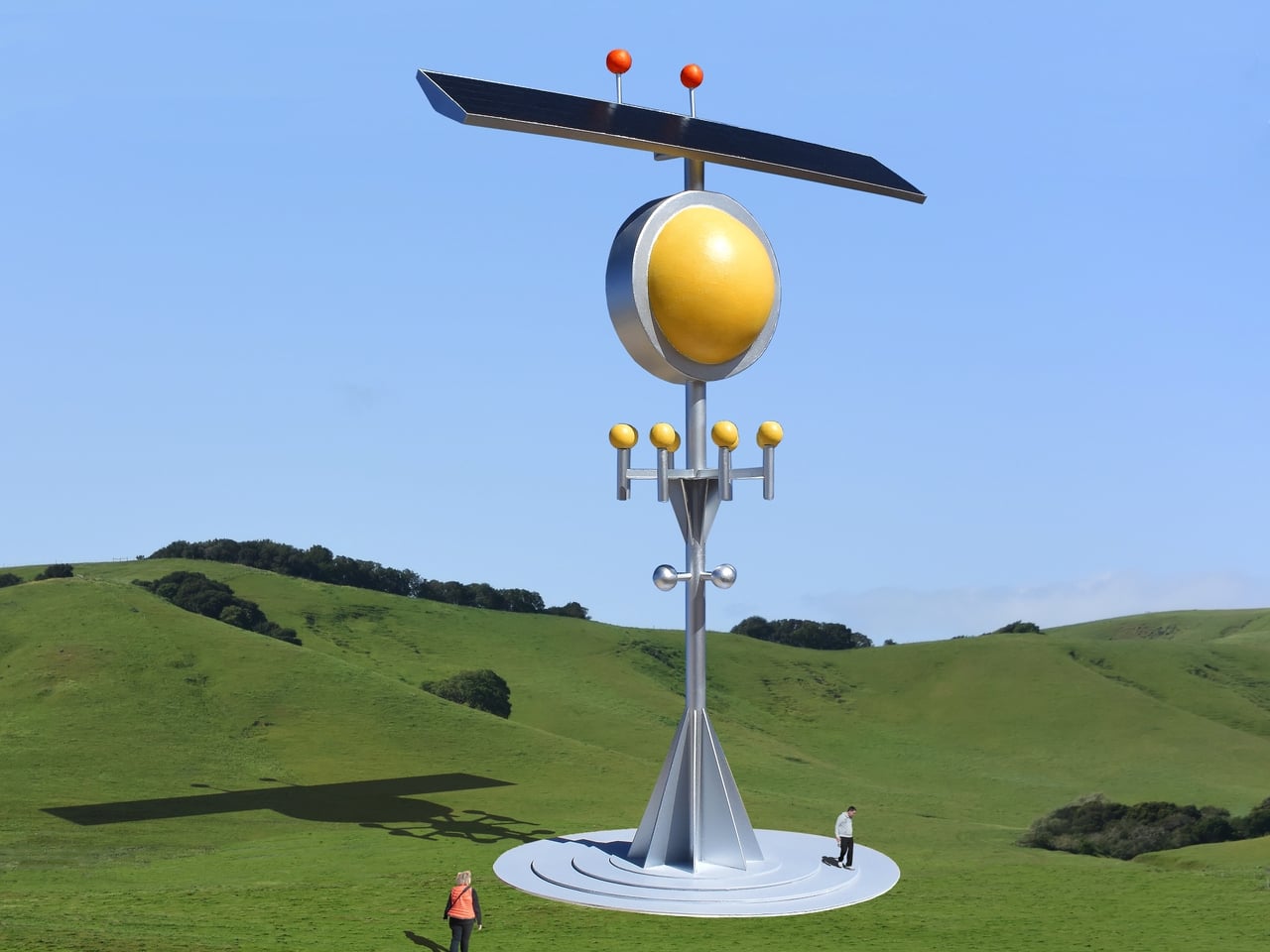
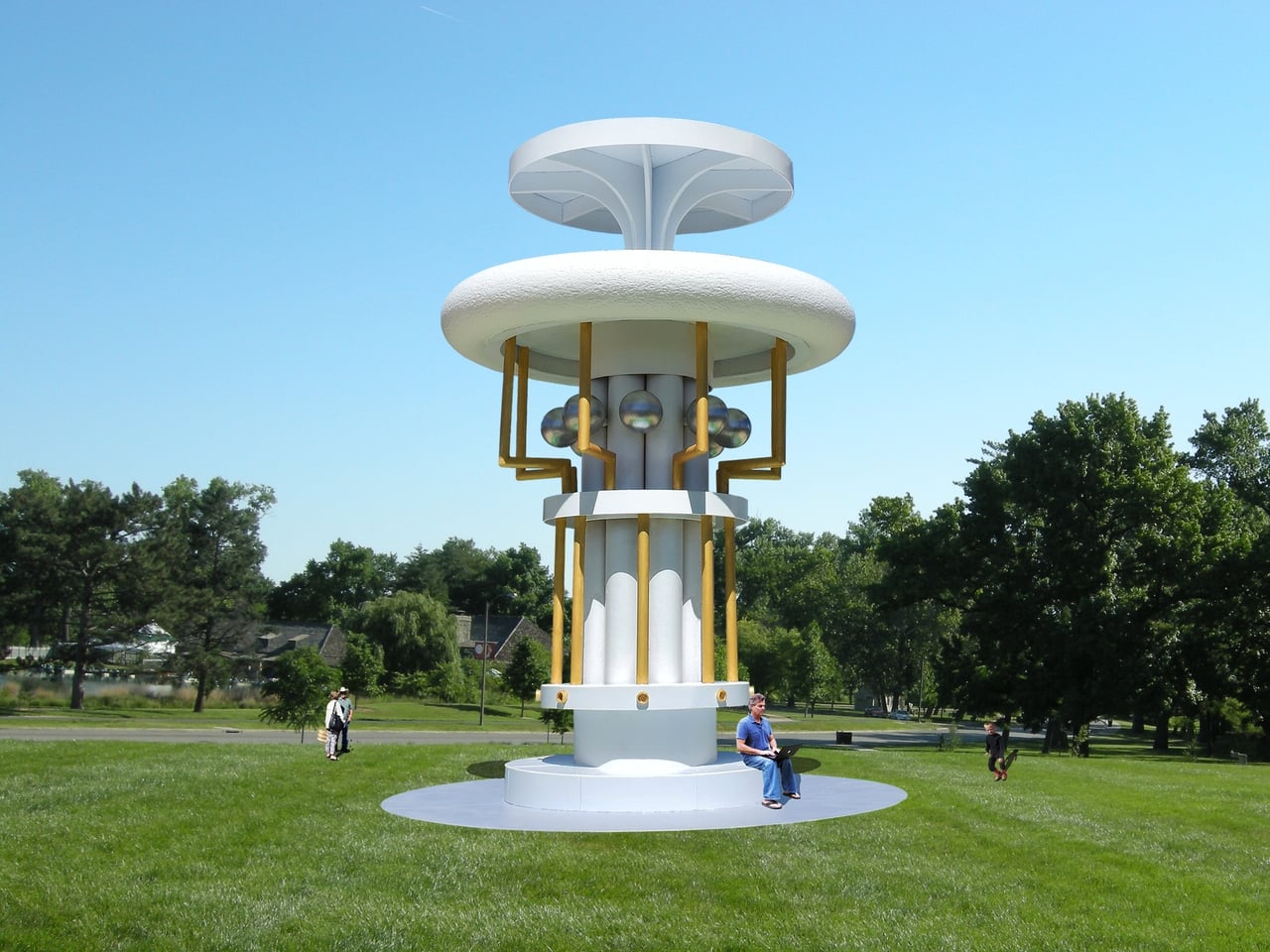
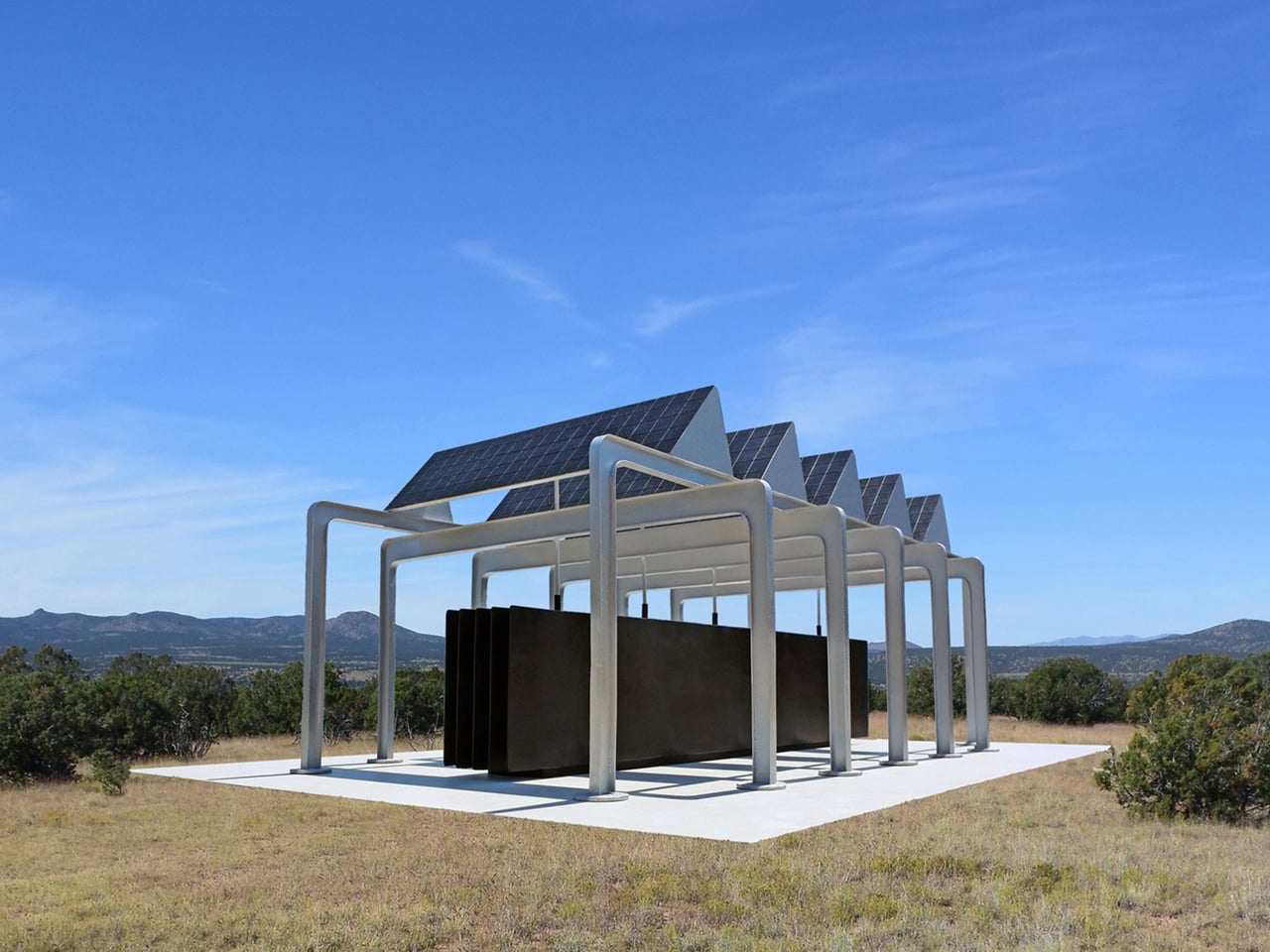
Santa Fe-based artist Michael Jantzen has spent years addressing exactly that through his Public Eco-Art Proposals. The series imagines a different kind of monument, one that doesn’t merely symbolize sustainability but actively practices it. Each proposal takes the form of a sculpture or pavilion that generates electricity from the sun or wind, collects rainwater, stores energy in batteries, and sometimes sends power into the local grid.
Designer: Michael Jantzen
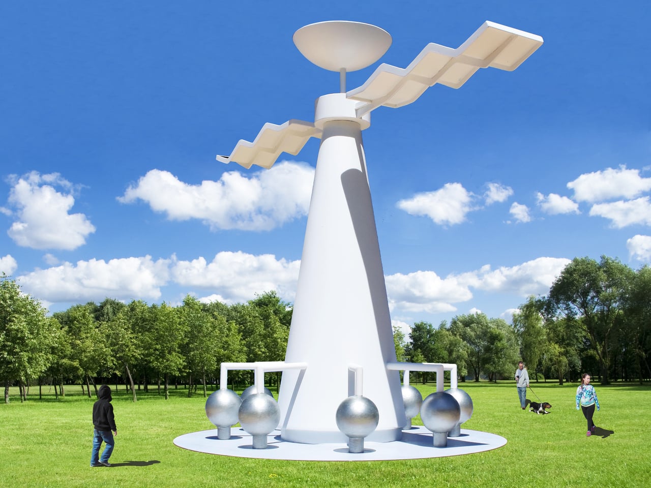
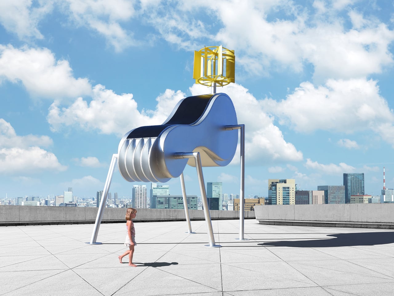
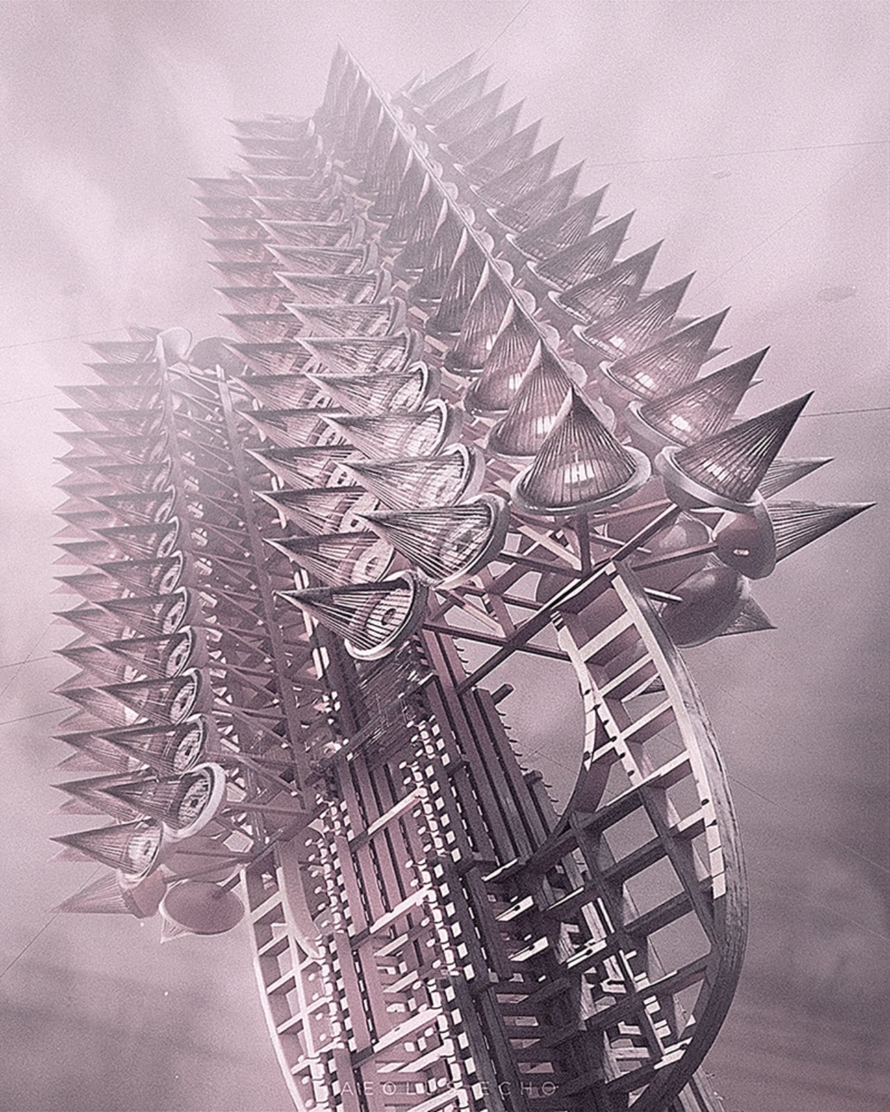
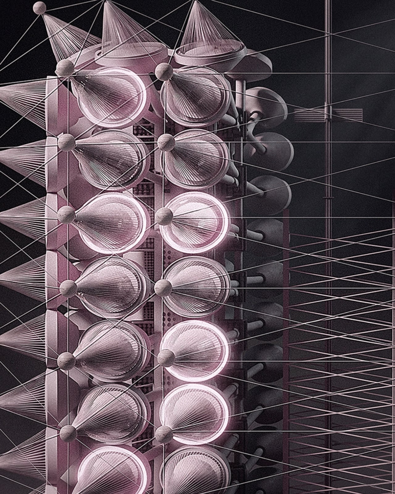
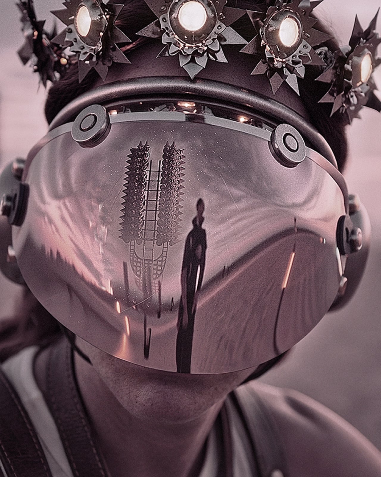
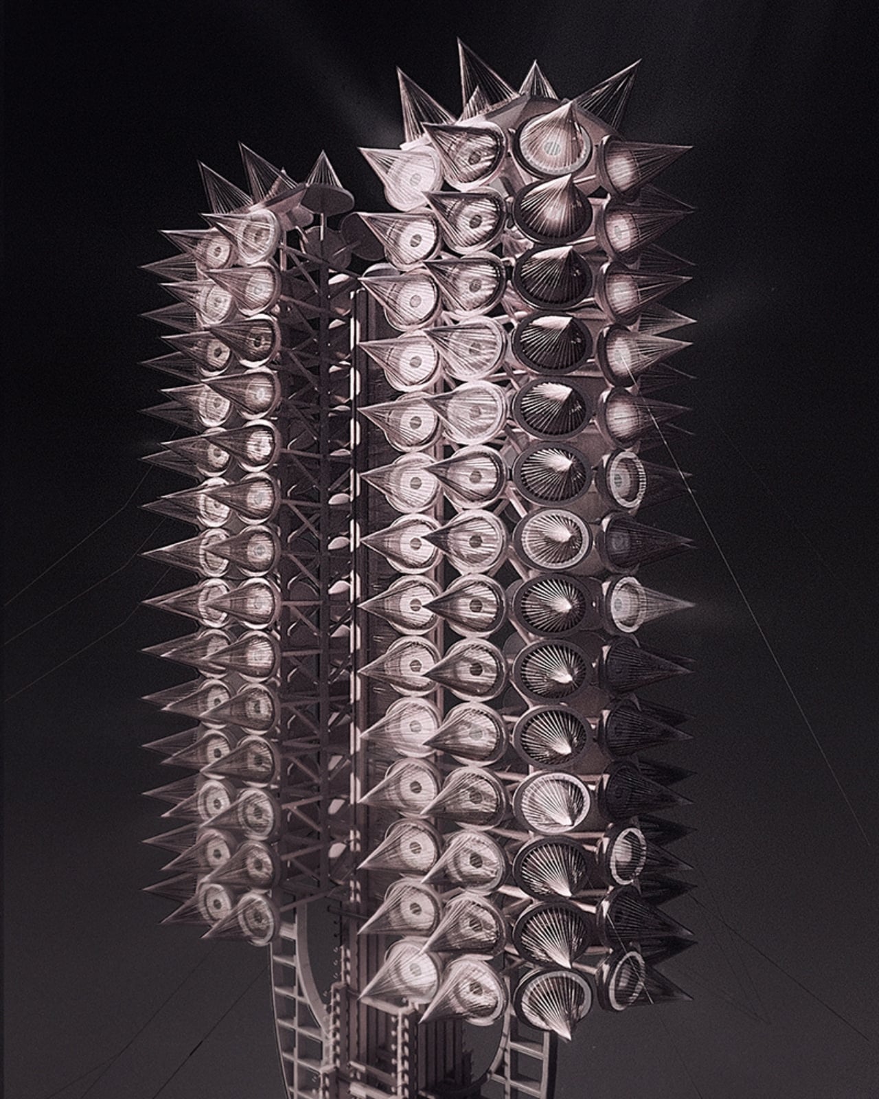
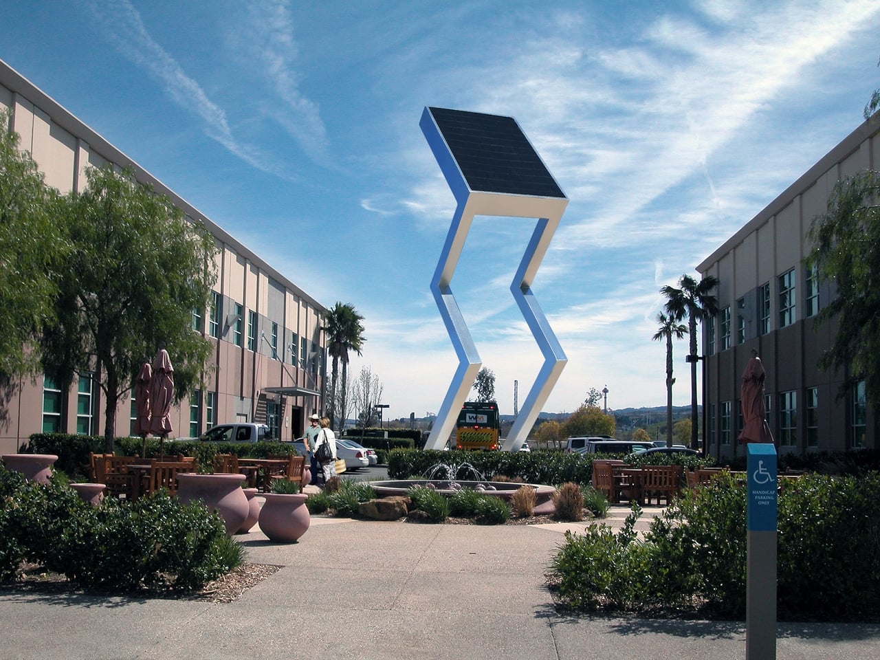
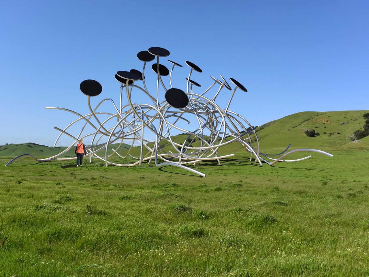
Jantzen gives his work an aesthetic freedom that most utility-driven designs don’t have. Rather than concealing the mechanics, he treats solar panels, wind turbines, and structural frameworks as sculptural elements in their own right. The visual language is deliberately technological and mechanical, blurring the line between a functional energy structure and art worth stopping for.
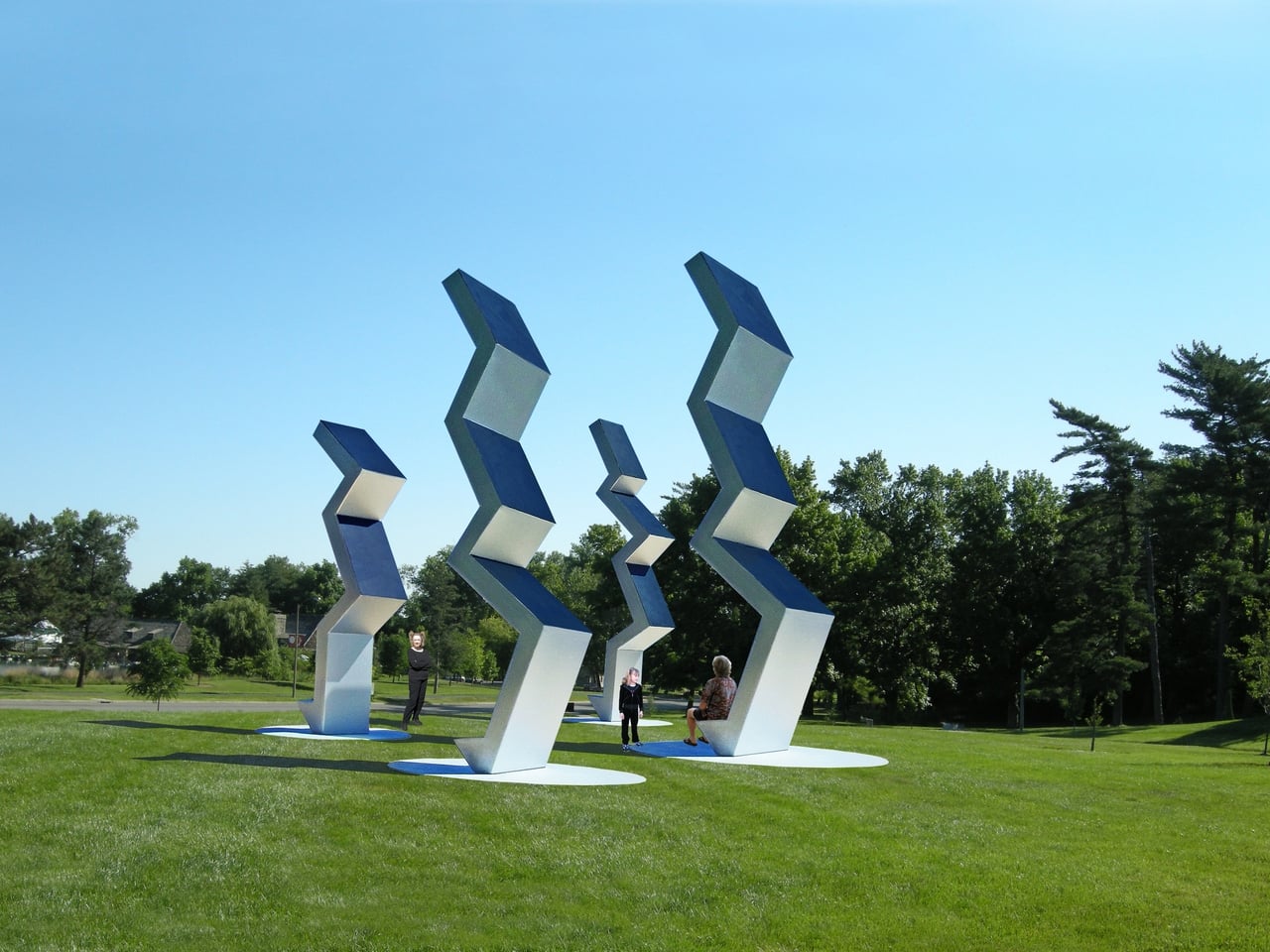
Walk through one of these proposed spaces, and you might find yourself beneath a pavilion whose curved solar canopy quietly feeds electricity back to the neighborhood. Or stop to look at a series of angular sculptures lined up across a park, their solar-panel tops tracking the light. What looks like a meditation on shape and form turns out to be a modest power station doing actual work.
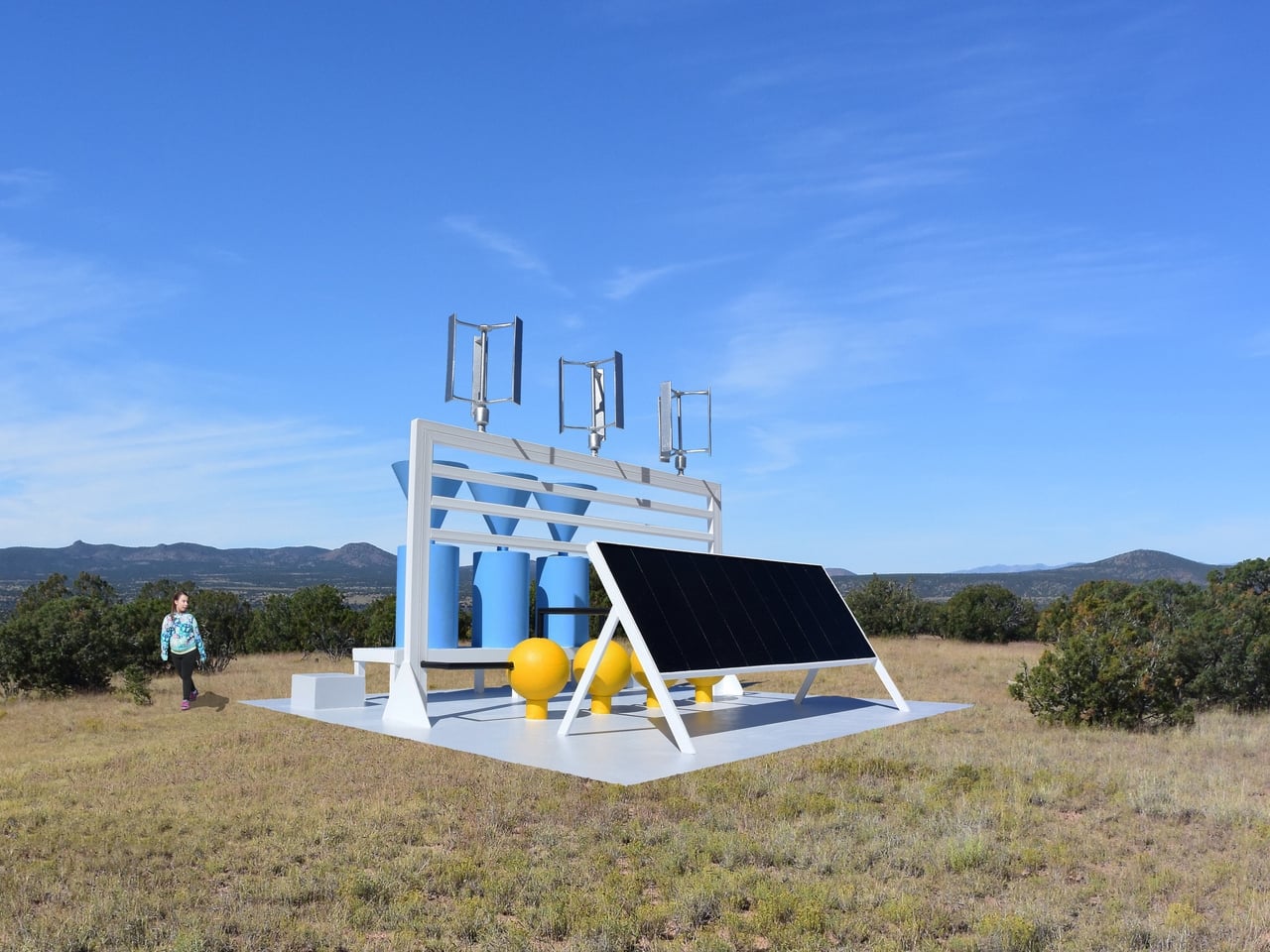
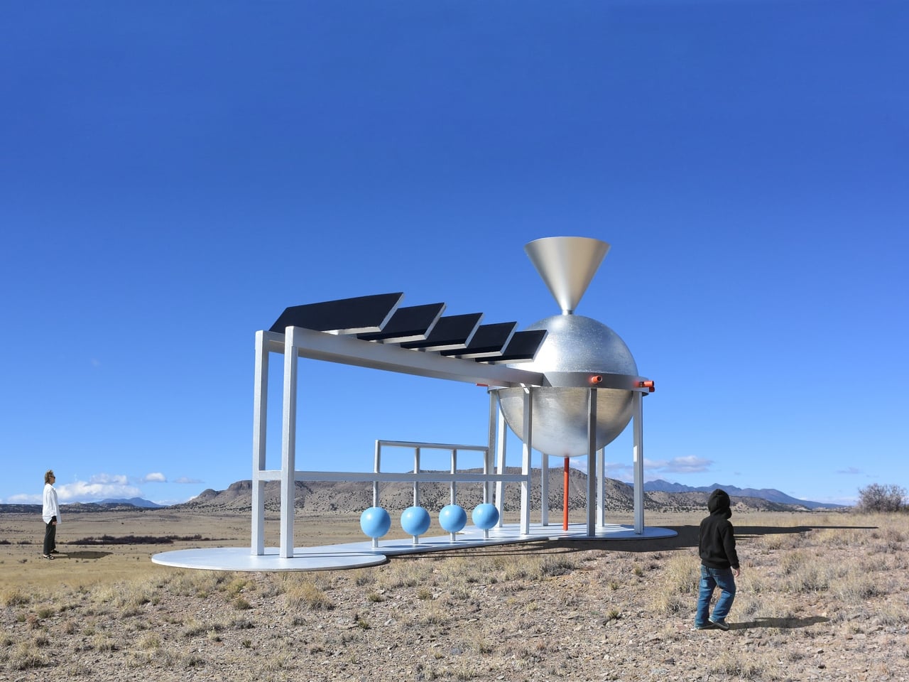
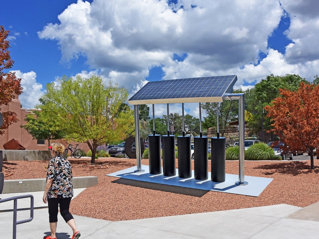
The proposals span a wide range of environments. Some are designed for open fields or public parks, while others imagine coastal settings with floating platforms supporting wind and water energy structures. A chevron-shaped sculpture with a solar panel at its angular peak stands in what appears to be a university courtyard. Another piece holds solar panels above cylindrical battery storage pods, blending the practical business of energy collection with an unexpectedly considered form.
This approach also reframes the relationship between art and urban infrastructure. Municipalities already commission sculptures for parks and plazas; so why shouldn’t those commissions do more? A solar-powered gathering space generates electricity, makes clean technology approachable, and sparks conversations among the millions of people who walk through it, most of whom would otherwise never engage with energy infrastructure at all.
Jantzen’s vision extends beyond any single installation. He imagines these structures placed in cities and parks worldwide, shifting how communities relate to the energy they consume by making that relationship visible and beautiful. For him, celebrating sustainability means building things worth caring about, giving clean energy a presence that people can gather around, the way they’ve always done with the landmarks that define a place.
The post What If City Monuments Generated Power Instead of Just Looking Good? first appeared on Yanko Design.