A new app will notify users if smart glasses are likely nearby. The aptly named Nearby Glasses was developed in response to media coverage outlining how glasses like Meta's Ray-Bans have been used to film people without their consent.
As first reported by 404 Media, the app detects the unique Bluetooth signature emitted by smart glasses and sends a push alert that someone wearing the device may potentially be nearby. “I consider it to be a tiny part of resistance against surveillance tech,” the app's developer Yves Jeanrenaud told 404 Media.
Smart glasses have sparked increased privacy concerns, especially as Meta is reportedly working to add facial recognition technology to its Meta Ray-Bans. OpenAI is also reported to have a pair of smart glasses in the works. It bears mentioning that false positives may occur, including from VR headsets.
This article originally appeared on Engadget at https://www.engadget.com/apps/someone-made-an-app-to-warn-you-if-smart-glasses-are-nearby-183359723.html?src=rss
The team behind the beloved Dark Sky weather app has announced a new iPhone app called Acme Weather. The release comes after Apple's 2020 acquisition of Dark Sky, which it ultimately shut down in 2022 after integrating much of its tech into the native iOS Weather app.
Acme Weather is primarily designed to address the uncertainty inherent in most forecasts, as different models yield disparate results and no two weather apps seem to report the same thing. Acme’s answer to this issue is “Alternate Predictions,” which shows users a range of possible outcomes alongside the app's core forecast line throughout the day. If the lines are arranged together tightly, it means the app has high confidence in the forecast at that time. When those lines start to diverge, the app is signaling lower confidence while showing users alternate predictions for that time of day.
The app also supports community reporting, seeking to do for weather what Waymo did for traffic. Users can share real-time conditions in their area using icons or emojis, helping increase accuracy when conditions are changing quickly. Like most weather apps, there is also a map component with layers for radar, lightning, rain and snow totals, wind and more.
Acme leverages notifications to help make sure you don't miss important changes to the forecast or weather alerts. Grossman says they are comprehensive and should help you avoid getting caught in the rain unawares. Notifications also include community reports, government weather alerts and even experimental tools from "Acme Labs" like rainbow and beautiful sunset alerts.
Acme offers a two-week free trial, then costs $25 a year. The iOS version is available now and an Android is forthcoming.
This article originally appeared on Engadget at https://www.engadget.com/apps/the-creators-of-dark-sky-have-a-new-weather-app-155426063.html?src=rss
Apple’s AirTag is designed to help people keep track of personal belongings like keys, bags and luggage. But because AirTags and other Bluetooth trackers are small and discreet, concerns about unwanted tracking are understandable. Apple has spent years building safeguards into the AirTag and the Find My network to reduce the risk of misuse and to alert people if a tracker they don’t own appears to be moving with them.
If you’re worried about whether an AirTag or similar tracker might be following you, here’s how Apple’s unwanted tracking alerts work, what notifications to look for and what you can do on both iPhone and Android.
How AirTag tracking alerts work
AirTags, compatible Find My network accessories and certain AirPods models use Apple’s Find My network, which relies on Bluetooth signals and nearby devices to update their location. To prevent misuse, Apple designed these products with features that are meant to alert someone if a tracker that isn’t linked to their Apple Account appears to be traveling with them.
If an AirTag or another compatible tracker is separated from its owner and detected near you over time, your device may display a notification or the tracker itself may emit a sound. These alerts are intended to discourage someone from secretly tracking another person without their knowledge. Apple has also worked with Google on a cross-platform industry standard, so alerts can appear on both iOS and Android devices, not just iPhones.
How to make sure tracking alerts are enabled on your iPhone
If you use an iPhone or iPad, tracking notifications are on by default, but it’s worth confirming your settings.
To receive unwanted tracking alerts, make sure that:
Your device is running iOS 17.5 or later (or iPadOS 17.5 or later). Earlier versions back to iOS 14.5 support basic AirTag alerts, but newer versions add broader compatibility with other trackers.
Bluetooth is turned on.
Location Services are enabled.
Notifications for Tracking Alerts are allowed.
Airplane Mode is turned off.
You can check these by opening Settings, then navigating to Privacy & Security, Location Services and Notifications. Apple also recommends turning on Significant Locations in the System Services menu, which helps your device determine when an unknown tracker has traveled with you to places like your home.
Go to Settings, tap Privacy & Security, then select Location Services.
Toggle Location Services on.
Scroll down and tap System Services, then toggle Significant Locations on.
If these settings are disabled, your iPhone may not be able to alert you when an AirTag or similar device is nearby.
What tracking alerts look like
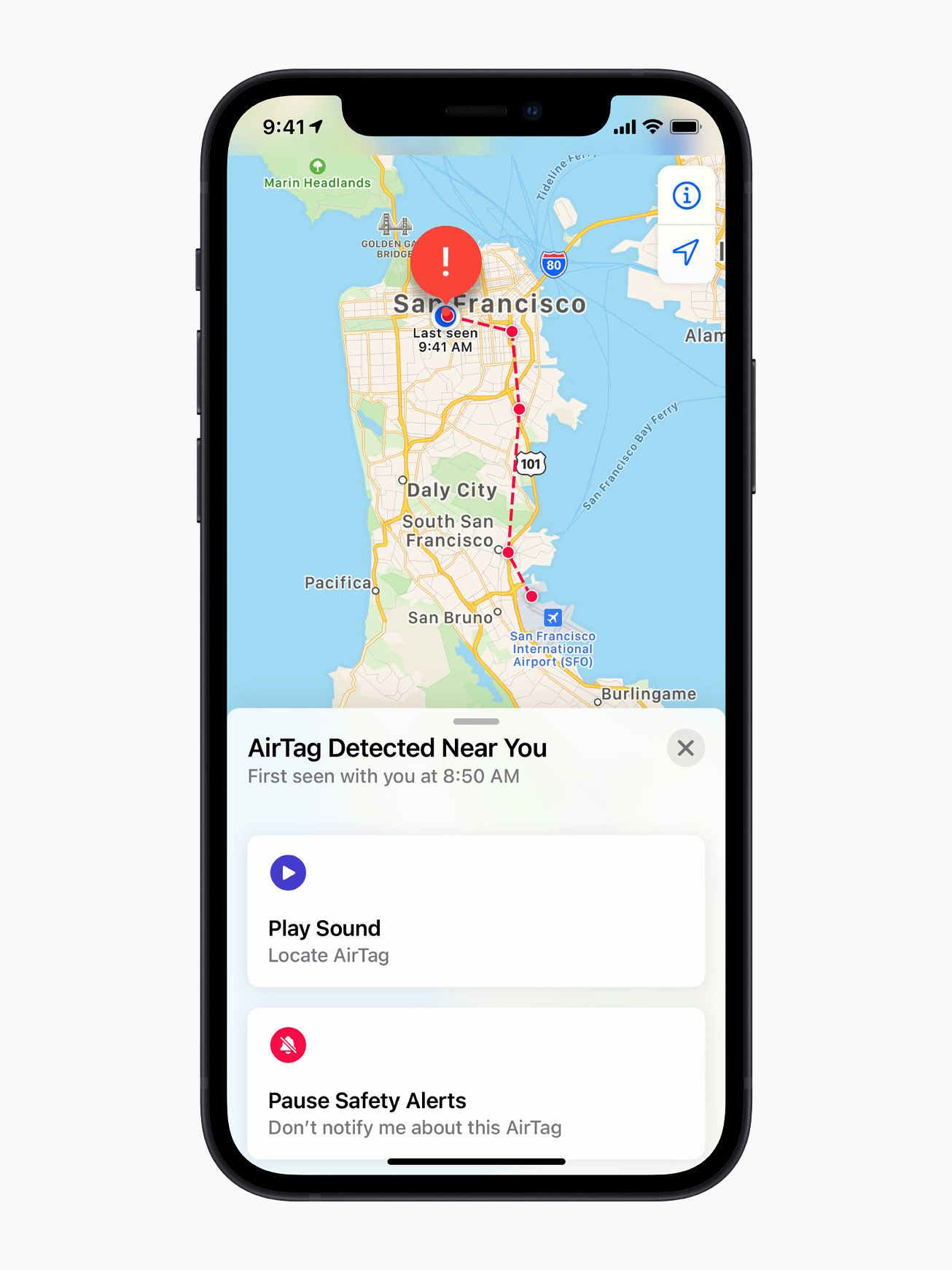
If your iPhone detects a tracker that doesn’t belong to you moving with you, you may see a notification such as:
AirTag Found Moving With You
AirPods Detected
“Product Name” Found Moving With You
Unknown Accessory Detected
Tapping the alert opens the Find My app, which shows a map of where the item was detected near you. The map uses dots to indicate locations where your device noticed the tracker nearby. This doesn’t mean the owner was actively watching your location at those times, only that the tracker was detected in close proximity.
In some cases, the alert may have an innocent explanation. For example, you might be borrowing someone else’s keys, bag or AirPods. If the item belongs to someone in your Family Sharing group, you can temporarily pause alerts for that item by tapping the notification and opting to turn off alerts for that item either for one day or indefinitely.
What to do if you hear an AirTag making a sound
If an AirTag or compatible tracker has been separated from its owner for a period of time and is moved, it may emit a sound on its own. This is another built-in safety feature meant to draw attention to the device.
If you hear an unfamiliar chirping or beeping sound, especially from a bag, jacket pocket or vehicle, it’s worth checking your belongings to see if there’s an AirTag or similar tracker inside.
How to find an unknown AirTag or tracker
If you receive an alert and believe the tracker is still with you, the Find My app offers tools to help locate it.
From the alert, you can choose to play a sound on the device to help pinpoint where it’s hidden.
Tap the alert.
Tap Continue and then tap Play Sound.
Listen for the sound or play it again to give yourself more time to find the item.
If the tracker is an AirTag and you have a compatible iPhone with ultra wideband connectivity, you may also see a Find Nearby option, which uses Precision Finding to guide you toward it with distance and direction indicators.
Tap the alert.
Tap Continue and then tap Find Nearby.
Follow the onscreen instructions. You may need to move around the space until your iPhone connects to the unknown AirTag.
Your iPhone will display the distance and direction of the unknown AirTag, so you can use that information to identify where the unknown AirTag is. When the AirTag is within Bluetooth range of your iPhone, you can tap the Play Sound button to listen for it. You can also tap the Turn Flashlight On button to provide more light if it’s needed.
If neither option is available, or if the tracker can’t be located electronically, manually check your belongings. Look through bags, pockets, jackets and vehicles. If you feel unsafe and can’t find the device, Apple recommends going to a safe public place and contacting local law enforcement.
The new Apple AirTag that works with Find My app.
Apple
How to get information about an AirTag
If you find an unknown AirTag, you can learn more about it without needing to unlock it or log in.
Hold the top of your iPhone, or any NFC-capable smartphone, near the white side of the AirTag. A notification should appear.
Tap the notification to open a webpage with details about the AirTag. This page includes the serial number and the last four digits of the phone number associated with the owner’s Apple Account.
If the AirTag was marked as lost, the page may also include a message from the owner explaining how to contact them. This can help determine whether the situation is accidental or intentional.
How to disable an AirTag that isn’t yours
If you confirm that an AirTag is tracking you and it doesn’t belong to you, you can disable it so it stops sharing its location.
From the Find My alert or information page, select Instructions to Disable and follow the steps provided. For an AirTag, this usually involves removing the battery, which immediately stops location updates. Disabling Bluetooth or turning off Location Services on your phone does not stop the AirTag from reporting its location. The device itself must be disabled.
Android devices running Android 6.0 or later can also receive alerts if a compatible Bluetooth tracker, including an AirTag, appears to be moving with you. These alerts are enabled automatically on supported versions of Android.
Android users can also manually scan for unknown trackers at any time. Additionally, Apple offers a free Tracker Detect app on the Google Play Store. The app allows Android users to scan for AirTags and Find My network accessories within Bluetooth range that are separated from their owner. If Tracker Detect finds a nearby AirTag that’s been with you for at least 10 minutes, you can play a sound to help locate it.
Wrap-up
While no system is perfect, Apple has built multiple layers of protection into AirTag and the Find My network to reduce the risk of unwanted tracking. With alerts, audible warnings and cross-platform detection on both iOS and Android, most people will be notified if a tracker they don’t own is moving with them. Knowing what these alerts look like and how to respond can help you stay informed, avoid unnecessary panic and take appropriate action if something feels off.
This article originally appeared on Engadget at https://www.engadget.com/computing/accessories/how-to-know-if-an-airtag-is-tracking-you-130000764.html?src=rss
A recent Amazon Web Services (AWS) outage that lasted 13 hours was reportedly caused by one of its own AI tools, according to reporting by Financial Times. This happened in December after engineers deployed the Kiro AI coding tool to make certain changes, say four people familiar with the matter.
Kiro is an agentic tool, meaning it can take autonomous actions on behalf of users. In this case, the bot reportedly determined that it needed to "delete and recreate the environment." This is what allegedly led to the lengthy outage that primarily impacted China.
Amazon says it was merely a "coincidence that AI tools were involved" and that "the same issue could occur with any developer tool or manual action." The company blamed the outage on "user error, not AI error." It said that by default the Kiro tool “requests authorization before taking any action” but that the staffer involved in the December incident had "broader permissions than expected — a user access control issue, not an AI autonomy issue."
Multiple Amazon employees spoke to Financial Times and noted that this was "at least" the second occasion in recent months in which the company's AI tools were at the center of a service disruption. "The outages were small but entirely foreseeable," said one senior AWS employee.
A builder shares why their workflow finally clicked.
Instead of jumping straight to code, the IDE pushed them to start with specs. ✔️ Clear requirements. ✔️ Acceptance criteria. ✔️ Traceable tasks.
The company launched Kiro in July and has since pushed employees into using the tool. Leadership set an 80 percent weekly use goal and has been closely tracking adoption rates. Amazon also sells access to the agentic tool for a monthly subscription fee.
However, Amazon disagrees with the characterization of certain products and services being unavailable as an outage. In response to the Financial Times report, the company shared the following statement, which it also published on its news blog:
We want to address the inaccuracies in the Financial Times' reporting yesterday. The brief service interruption they reported on was the result of user error—specifically misconfigured access controls—not AI as the story claims.
The disruption was an extremely limited event last December affecting a single service (AWS Cost Explorer—which helps customers visualize, understand, and manage AWS costs and usage over time) in one of our 39 Geographic Regions around the world. It did not impact compute, storage, database, AI technologies, or any other of the hundreds of services that we run. The issue stemmed from a misconfigured role—the same issue that could occur with any developer tool (AI powered or not) or manual action. We did not receive any customer inquiries regarding the interruption. We implemented numerous safeguards to prevent this from happening again—not because the event had a big impact (it didn't), but because we insist on learning from our operational experience to improve our security and resilience. Additional safeguards include mandatory peer review for production access. While operational incidents involving misconfigured access controls can occur with any developer tool—AI-powered or not—we think it is important to learn from these experiences. The Financial Times' claim that a second event impacted AWS is entirely false.
For more than two decades, Amazon has achieved high operational excellence with our Correction of Error (COE) process. We review these together so that we can learn from any incident, irrespective of customer impact, to address issues before their potential impact grows larger.
Update, February 21 2026, 11:58AM ET: This story has been updated to include Amazon's full statement in response to the Financial Times report.
This article originally appeared on Engadget at https://www.engadget.com/ai/13-hour-aws-outage-reportedly-caused-by-amazons-own-ai-tools-170930190.html?src=rss
Google has announced that with the help of AI, it blocked 1.75 million apps that violated its policies in 2025, significantly down from 2.36 million in 2024. The lower numbers this year, it said, are because its "AI-powered, multi-layer protections" are deterring bad actors from even trying to publish bad apps.
Google said it now runs more than 10,000 safety checks on every app and continues to recheck them after they're published. Its use of the latest generative AI models helps human reviewers discover malicious patterns more quickly, it added. The company also blocked 160 million spam ratings, preventing an average 0.5-star rating drop for apps targeted by review bombing. Finally, Google stopped 255,000 apps from gaining excessive access to sensitive user data in 2025, down from 1.3 million the year before.
Meanwhile, Google Play Protect, the company's Android defense system, sniffed out over 27 million new malicious apps, either warning users or preventing them from running. The company added that Play Protect's enhanced fraud protection now covers 2.8 billion Android devices in 185 markets and blocked 266 million risky "side-loading" installation attempts.
"Initiatives like developer verification, mandatory pre-review checks, and testing requirements have raised the bar for the Google Play ecosystem, significantly reducing the paths for bad actors to enter," the company said its blog. "This year, we’ll continue to invest in AI-driven defenses to stay ahead of emerging threats and equip Android developers with the tools they need to build apps safely."
Google has steadfastly justified its relatively high fees on app purchases and subscriptions by touting its investments in app safety. However, its Play store has been under pressure from regulators in Europe and other regions that claim it amounts to a monopoly. Last year, the company changed its fee structure for developers using alternative payment channels, but EU regulators recently claimed the company still isn't complying with Digital Markets Act regulations.
This article originally appeared on Engadget at https://www.engadget.com/apps/google-play-used-ai-to-help-block-175-million-bad-apps-in-2025-102208054.html?src=rss
Meta is shutting down the standalone Messenger website, according to a company help page. The website will disappear in April, though web users will still be able to send and receive messages within Facebook.
"After messenger.com goes away, you will be automatically redirected to use facebook.com/messages for messaging on a computer," the help page reads. "You can continue your conversations there or on the Messenger mobile app."
Users will be able to restore their chat history after switching to the app by entering a PIN number. This is the same PIN that was used to initially create a backup on Messenger. It can be reset for those who simply don't have the bandwidth to remember yet another six-digit code.
This comes just a few months after Meta shut down Messenger's standalone desktop apps. At that time, Meta directed existing users to Facebook to continue using the service and not the dedicated Messenger website. In other words, the writing has likely been on the wall since October.
Messenger has had a long and storied history. The platform first launched as Facebook Chat all the way back in 2008. Facebook Messenger became a standalone app in 2011. The company has long-tried to make Messenger a thing outside of Facebook. It removed messaging capabilities from the main Facebook app in 2014 and began directing users to the Messenger app. Meta began reintegrating Messenger back into the Facebook app in 2023 and now here we are.
This article originally appeared on Engadget at https://www.engadget.com/apps/meta-is-shuttering-messengers-standalone-website-which-is-a-thing-that-exists-191808134.html?src=rss
Google has announced that using its newly incorporated Lyria 3 model, Gemini users will be able to generate 30-second music tracks based on a prompt, or remix an existing track to their liking. The new model builds on Gemini's pre-existing ability to generate text, images and video, and will also be available in YouTube's "Dream Track" feature, where it can be used to generate detailed backing tracks for Shorts.
Like some other music generation tools, prompting Gemini doesn't require a lot of detail to produce serviceable results. Google's example prompt is "a comical R&B slow jam about a sock finding their match," but after playing with Lyria 3, you can definitely get more granular about individual elements of a track — changing the tempo or the style of drumming, for example — if you want to. Outside of text, Gemini can also generate music based on a photo or video, and tracks can be paired with album art created by Google's Nano Banana image model.
Google says that Lyria 3 improves on its previous audio generation models in its ability to create more "realistic and musically complex" tracks, give prompters more control over individual components of a song and automatically generate lyrics. Gemini's outputs are limited to 30-second clips for now, but given how Google's promotional video shows off the feature, it's not hard to imagine those clips getting longer or the model getting incorporated into other apps, like Google Messages.
Like Gemini's other AI-generated outputs, songs made with Lyria 3 are also watermarked with Google's SynthID, so a Gemini clip can't as easily be passed off as a human one. Google started rolling out its SynthID Detector for identifying AI-generated content at Google I/O 2025. The sample tracks Google included alongside its announcement are convincing, but you might not need the company's tool to notice their machine-made qualities. The instrumental parts of Gemini’s clips often sound great, but the composition of the lyrics Lyria 3 produces sounds alternately corny and strange.
If you're curious to try Lyria 3 for yourself, Google says you can prompt tracks in Gemini starting today, provided you're 18 years or older and speak English, Spanish, German, French, Hindi, Japanese, Korean or Portuguese.
This article originally appeared on Engadget at https://www.engadget.com/ai/gemini-can-now-generate-a-30-second-approximation-of-what-real-music-sounds-like-204445903.html?src=rss
Ticketing marketplace SeatGeek has announced a partnership with Spotify that will direct an artist's fans to its platform from the Spotify app. The integration is currently limited to a few participating venues for which SeatGeek is the primary ticket seller.
While SeatGeek is one of the largest online marketplaces for the secondary ticketing market, the company's announcement makes clear that this Spotify integration only applies to venues where it's the primary ticketing company. For now, that's just 15 US partner venues, primarily professional sports arenas like AT&T Stadium in Arlington, Texas.
Spotify has experimented with direct ticket sales in the past, but now focuses on signing on partners to integrate into the streaming experience. The company currently lists 46 ticketing partners, including Ticketmaster, AXS and others. The app also allows users to follow specific venues to be notified about upcoming concerts and events.
This article originally appeared on Engadget at https://www.engadget.com/entertainment/streaming/spotify-debuts-seatgeek-integration-for-concert-ticket-sales-162248870.html?src=rss
This provides several benefits for the end user. It lets people switch seamlessly between watching and listening, in addition to offering a horizontal full display option. It'll also make both video and audio streams available to download for offline viewing. This wasn't possible with the previous streaming method, which pulled content from an RSS-like feed. RSS is still available as a distribution option, but HLS definitely brings some advantages
The technology integrates picture-in-picture for multitasking on products like the iPad. Finally, the updated app will automatically adjust the picture quality to ensure smooth playback in various network conditions, including both Wi-Fi and cellular.
The update will be available on most platforms, including iOS, iPadOS, visionOS and the web. It's in beta right now, but the company plans a major rollout this spring as part of the upcoming 26.4 operating systems.
This article originally appeared on Engadget at https://www.engadget.com/apps/apples-podcasts-app-now-supports-http-live-streaming-video-technology-182605460.html?src=rss
Recently we were introduced to OpenClaw, an AI that allows users to create their own agents to control apps like email, Spotify and home controls. Now, Sam Altman has announced that OpenAI has absorbed OpenClaw by hiring developer Peter Steinberger "to drive the next generation of personal agents," he wrote on X. Steinberger confirmed the news on his own blog. "I’m joining OpenAI to work on bringing agents to everyone. OpenClaw will move to a foundation and stay open and independent."
Steinberger was also in talks to join Meta, with both companies reportedly making offers in the "billions," according to Implicator.AI. The primary attractant was said to be OpenClaw's 196,000 GitHub stars and 2 million weekly visitors rather than its codebase.
OpenClaw became buzzy in the last few weeks thanks to its multifaceted ability to carry out tasks. People have used it to create agents that can write code, clear their inboxes, do online shopping and other assistant-like jobs. On its website, OpenClaw touts its ability to interact with popular apps and sites including WhatsApp, Discord, Slack, iMesage, Hue and Spotify.
Peter Steinberger is joining OpenAI to drive the next generation of personal agents. He is a genius with a lot of amazing ideas about the future of very smart agents interacting with each other to do very useful things for people. We expect this will quickly become core to our…
OpenClaw was recently called "Clawdbot" but Anthropic forced a name change due to similarities with its "Claude" branding. OpenClaw is often compared to Claude Code by "vibe coders" seeking to automate website development and other programming chores.
In his announcement, Altman said that "the future is going to be extremely multi-agent and it's important to support open source as part of that," adding that "OpenClaw will live in a foundation as an open source project" supported by Open AI. Steinberger, meanwhile, said that "what I want is to change the world, not build a larger company and teaming up with OpenAI is the fastest way to bring this to everyone."
This article originally appeared on Engadget at https://www.engadget.com/ai/openai-has-hired-the-developer-behind-ai-agent-openclaw-092934041.html?src=rss