36 Apartments, Six Clusters, One Printer: Denmark Just Built Europe’s Largest 3D-Printed Village

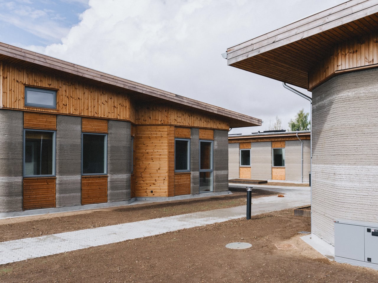
There’s a moment when a technology stops being a proof of concept and starts being someone’s home. That moment arrived in Holstebro, Denmark, with the completion of Skovsporet — 36 student apartments built almost entirely by a robotic printer, making it one of the largest 3D-printed housing projects in the world.

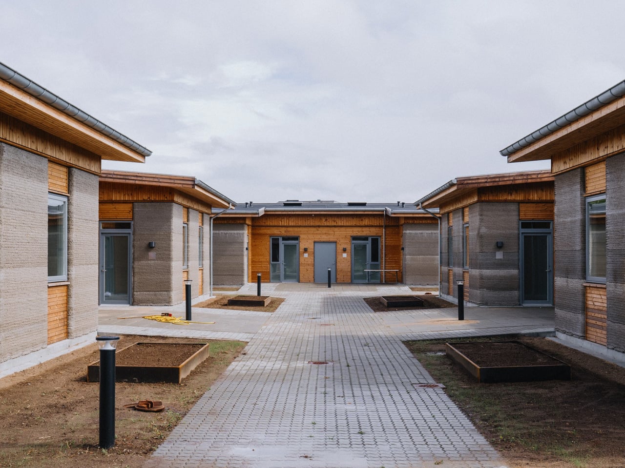
The project was commissioned by NordVestBO and delivered by 3DCP Group, with architecture from SAGA Space Architects and MS+. It sits close to VIA University College, which makes the location feel intentional rather than incidental — a student village that grew from the ground up, literally. The name Skovsporet translates loosely to “forest track,” and the design leans into that softness. Six low-rise clusters, each holding six apartments, wrap around shared courtyards and landscaped gardens. Walking paths and bicycle parking thread through the site, creating the kind of everyday rhythm that makes a place feel lived-in rather than installed.

Designer: 3DCP Group, SAGA Space Architects & MS+
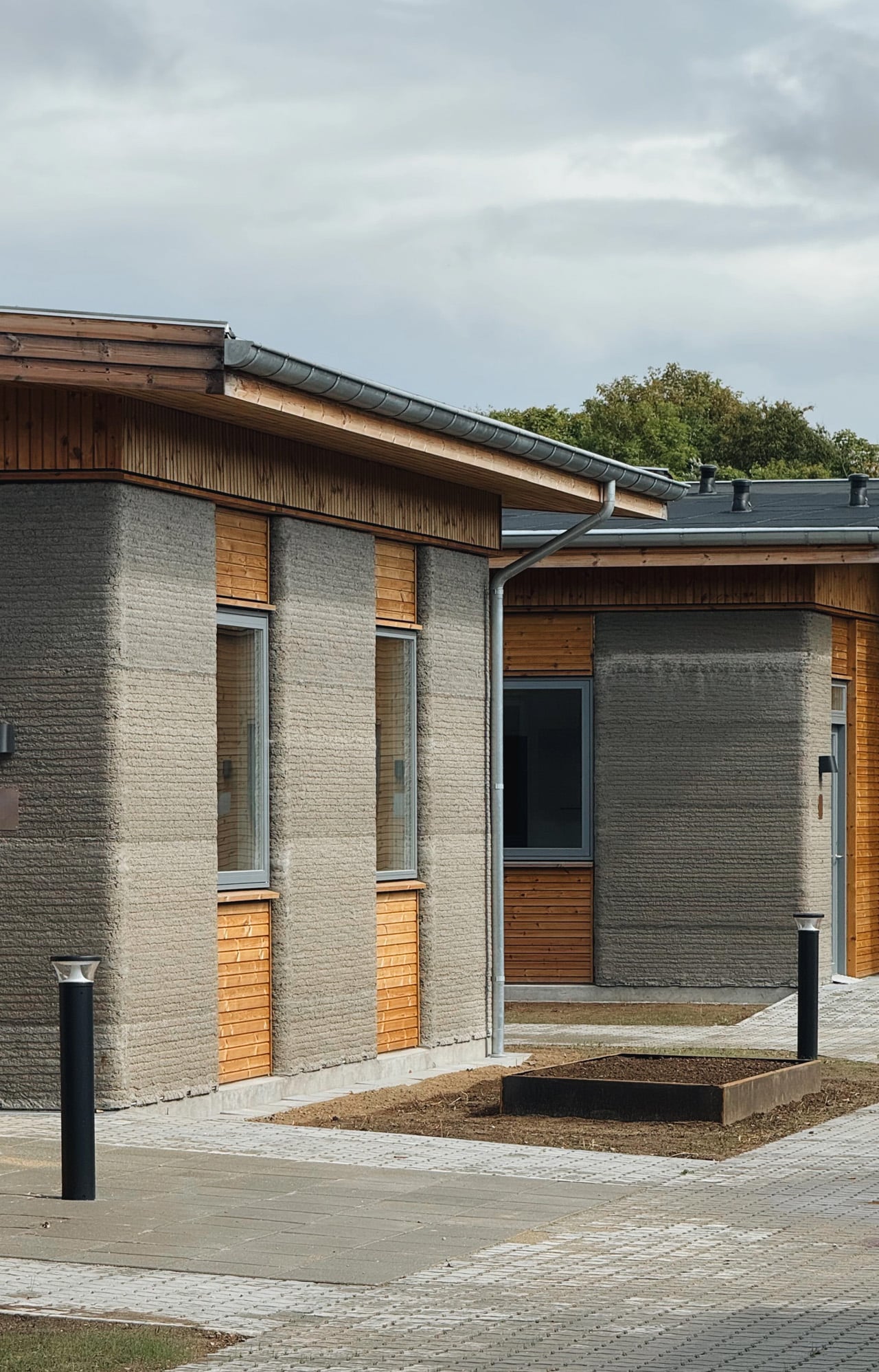
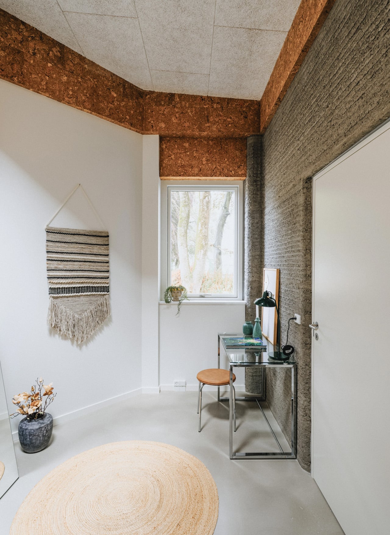
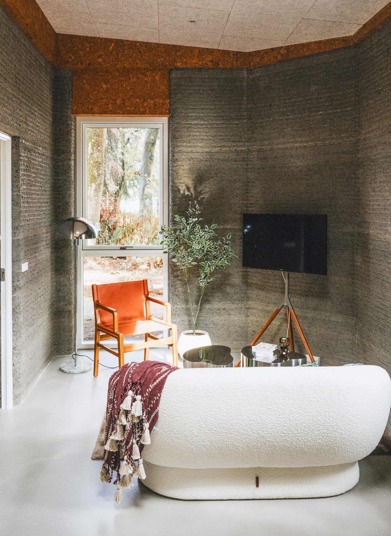
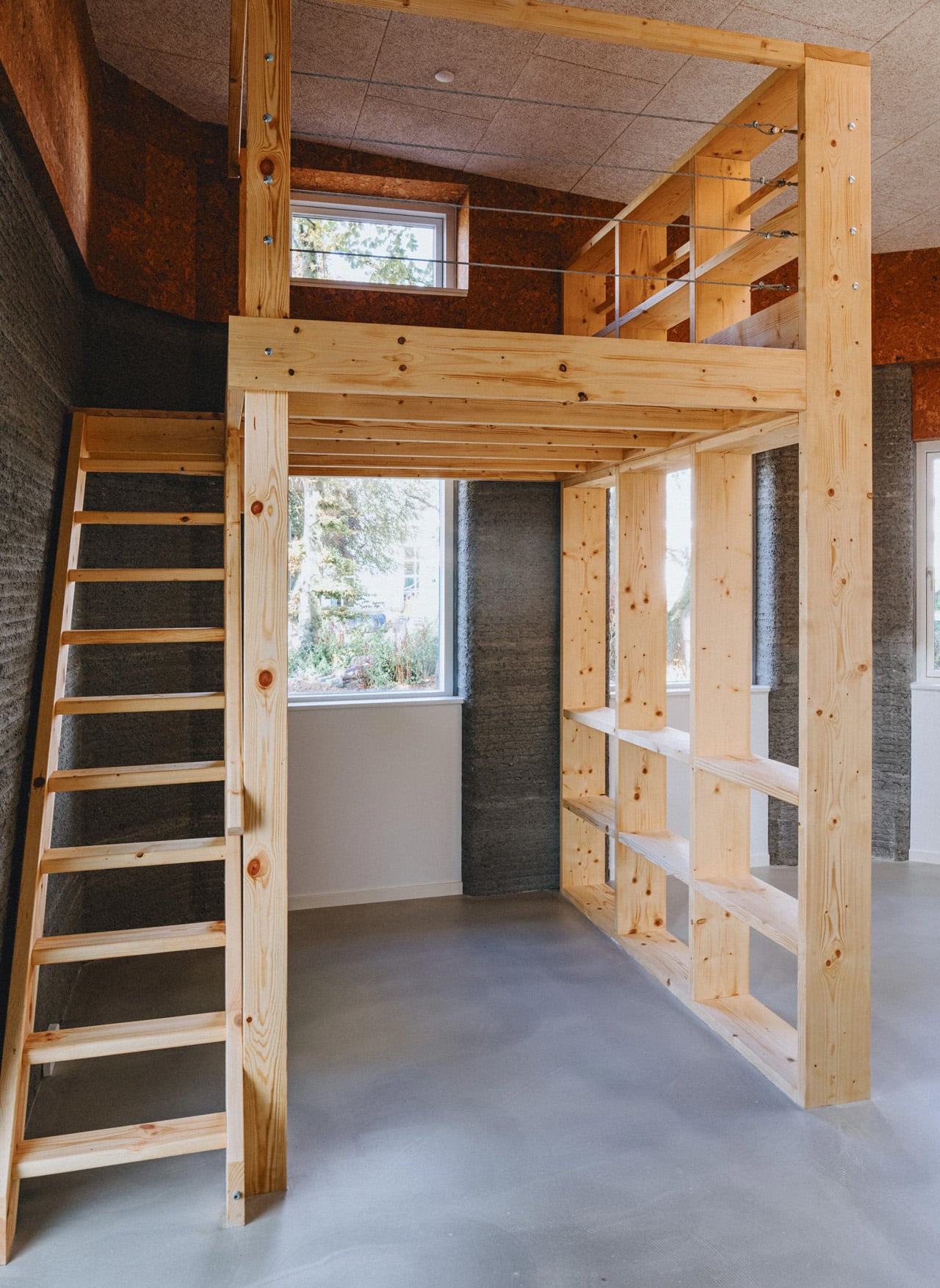
At 1,650 square meters across 36 units ranging from 39 to 50 square meters, the scale is modest by development standards. But that restraint is the point. Each apartment is self-contained — full kitchen, study area, sofa lounge, bathroom with shower, and a proper double bed. It’s everything a student actually needs, without excess. The architecture doesn’t perform ambition; it delivers it quietly.

The structural walls were printed on-site using a COBOD BOD3 printer operated by a three-person team, achieving millimeter-level accuracy across the entire build. The concrete mix, D.fab, contains FUTURECEM — a lower-carbon cement developed by Aalborg Portland — reducing the environmental footprint without compromising structural integrity. The bicycle shed pushed things further, using 3D-printed elements containing zero cement, achieving an 84% reduction in CO₂ emissions compared to traditional concrete. That’s not a marketing footnote. That’s a material shift.
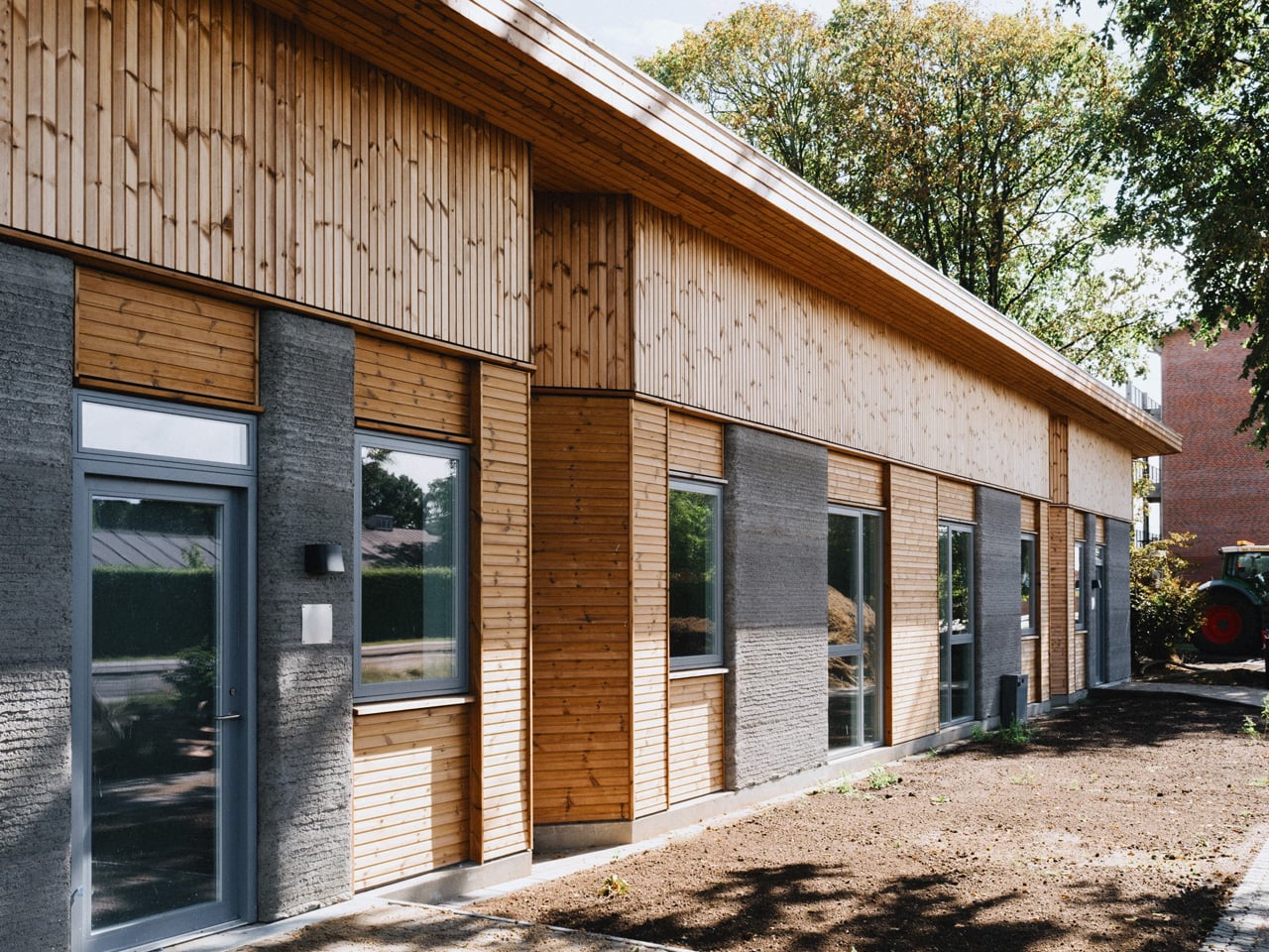
“We have gone from printing small prototypes to creating 36 real homes and an entire community. That is the scale where technology starts to matter as a serious tool for architecture,” – Sebastian Aristotelis, Co-Founder and Lead Architect of SAGA Space Architects, said it plainly. The technical breakthrough wasn’t a single successful print. It was repeating that success 36 times over 12 months without losing control of the outcome.

Construction is now complete, with students set to move in. 3DCP Group and SAGA are already researching new material configurations for future projects, treating Skovsporet not as a destination but as a baseline. That’s the right instinct. When a neighborhood built by robots starts to feel normal, you know the technology has finally grown up.
The post 36 Apartments, Six Clusters, One Printer: Denmark Just Built Europe’s Largest 3D-Printed Village first appeared on Yanko Design.
This House Makes You Sweat, Then Harvests That Energy to Power Itself

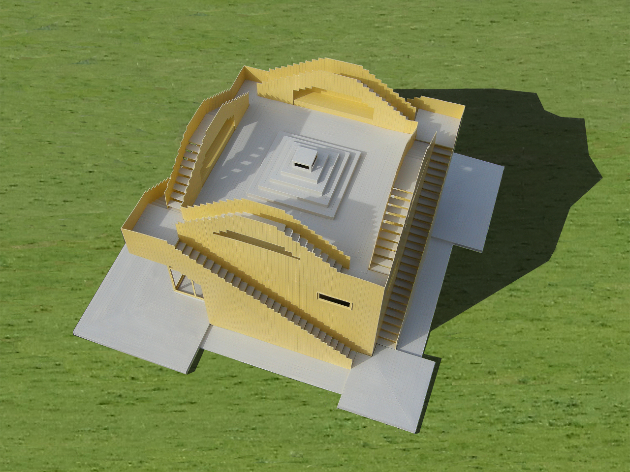
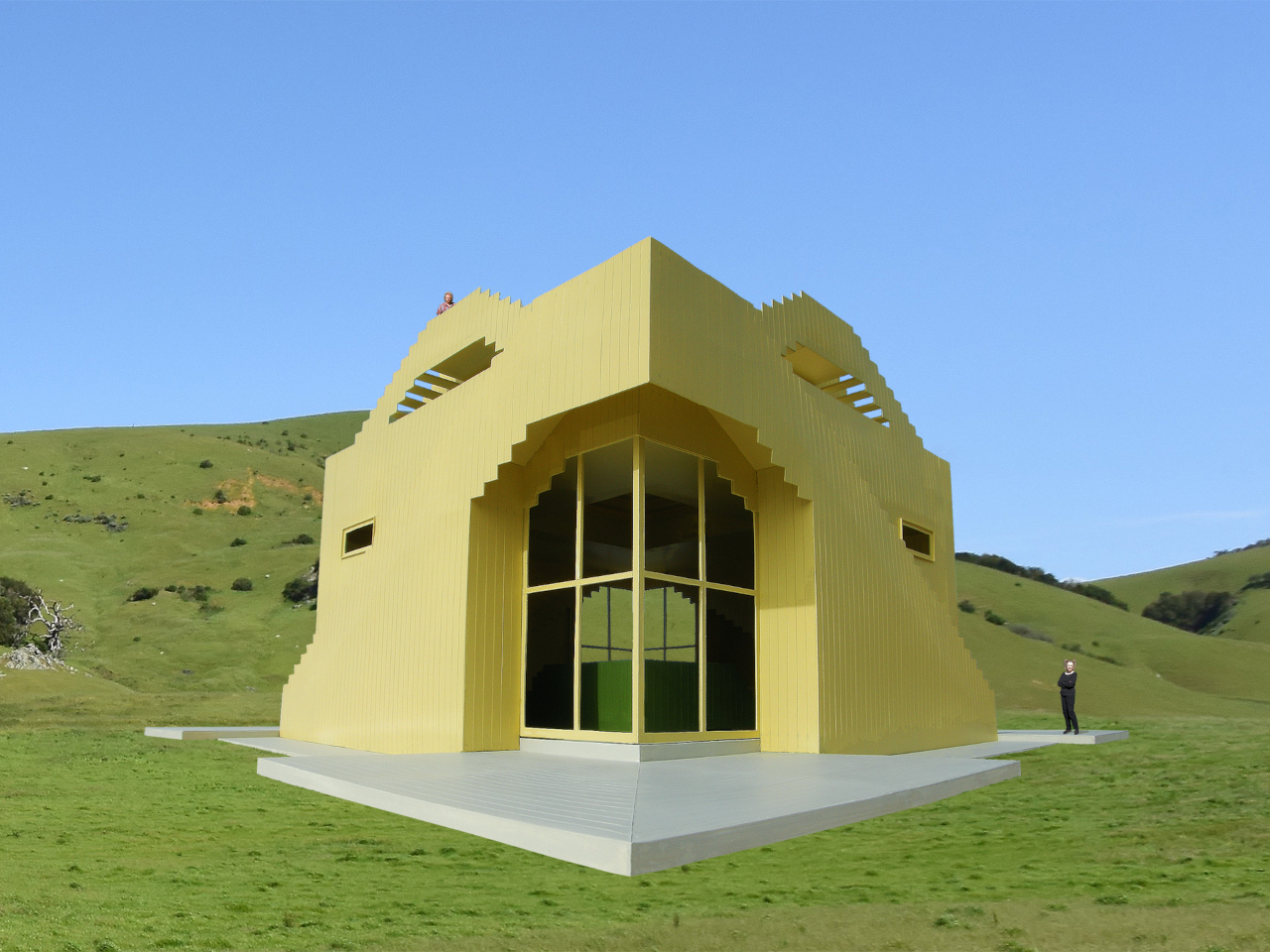
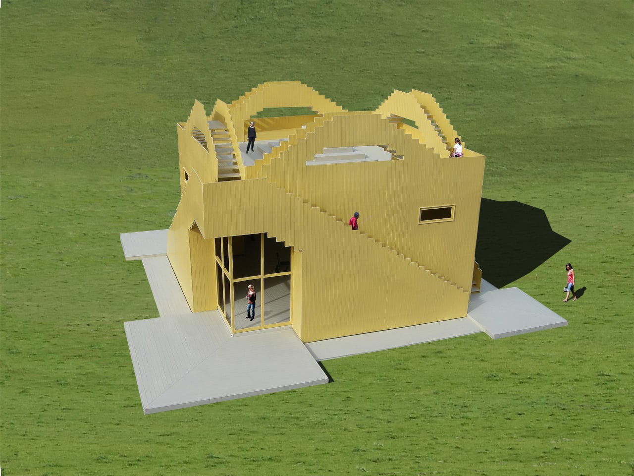
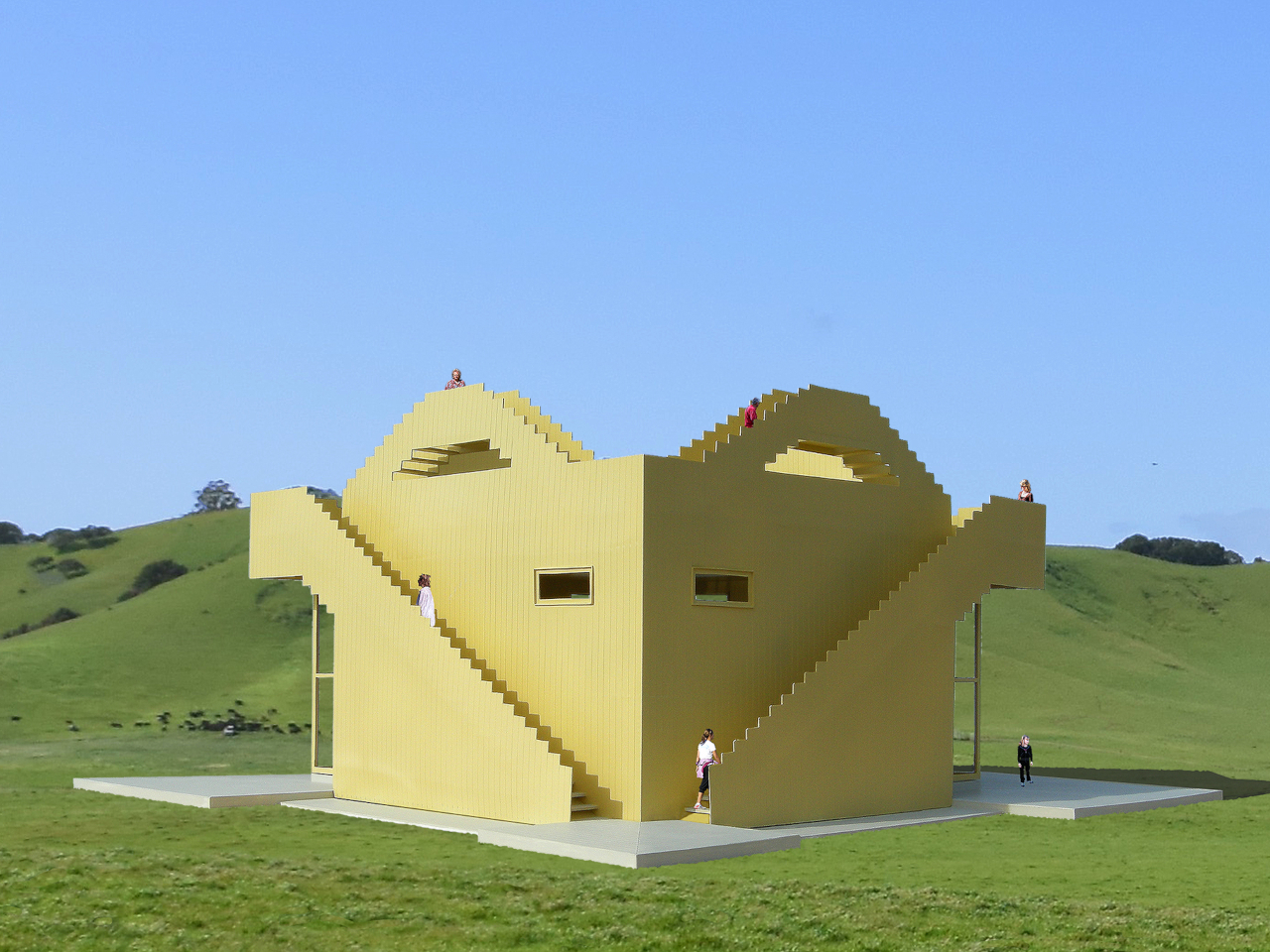
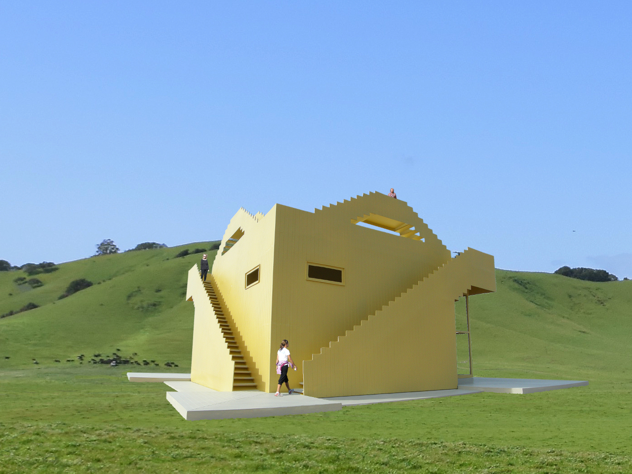
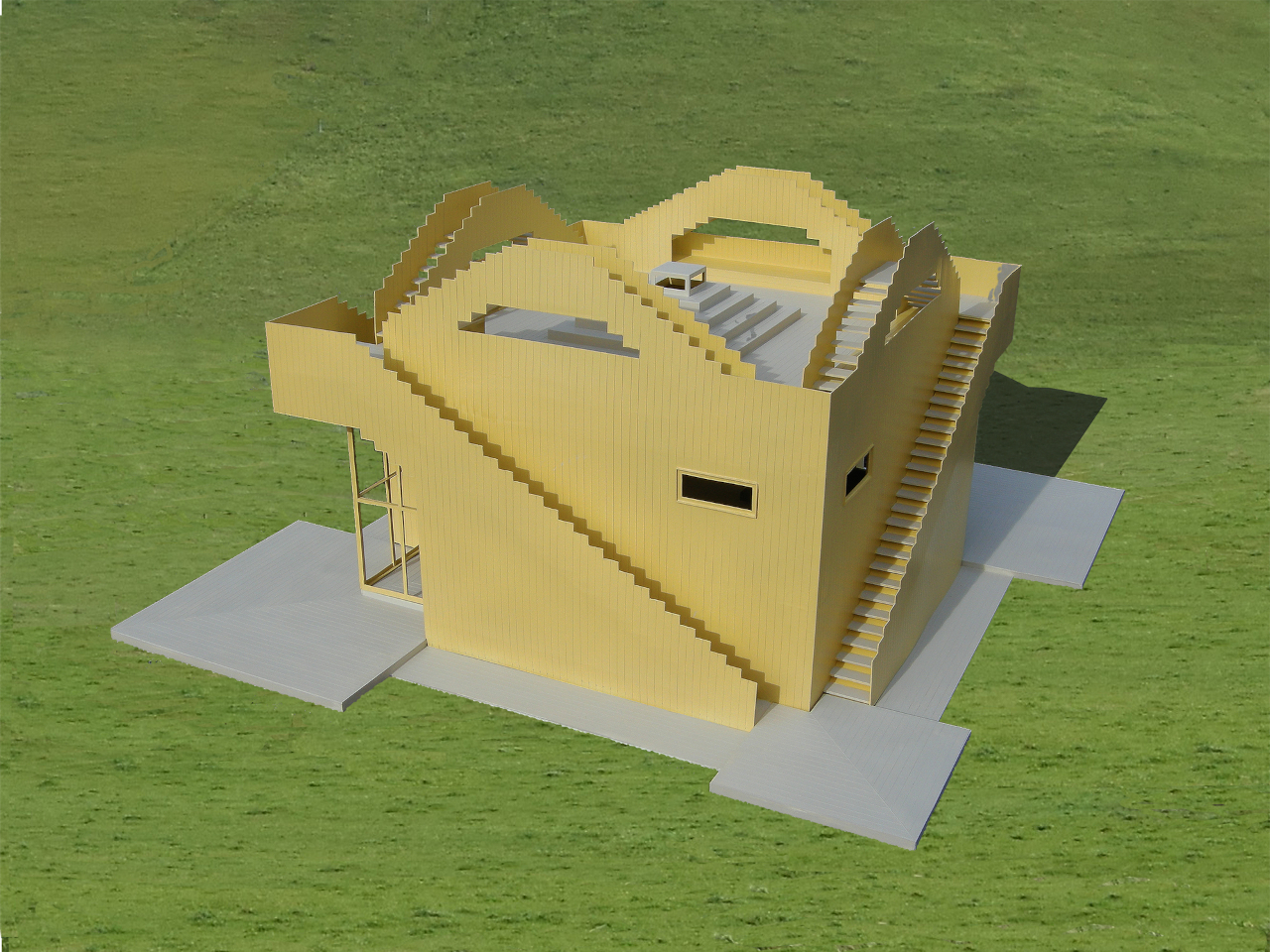
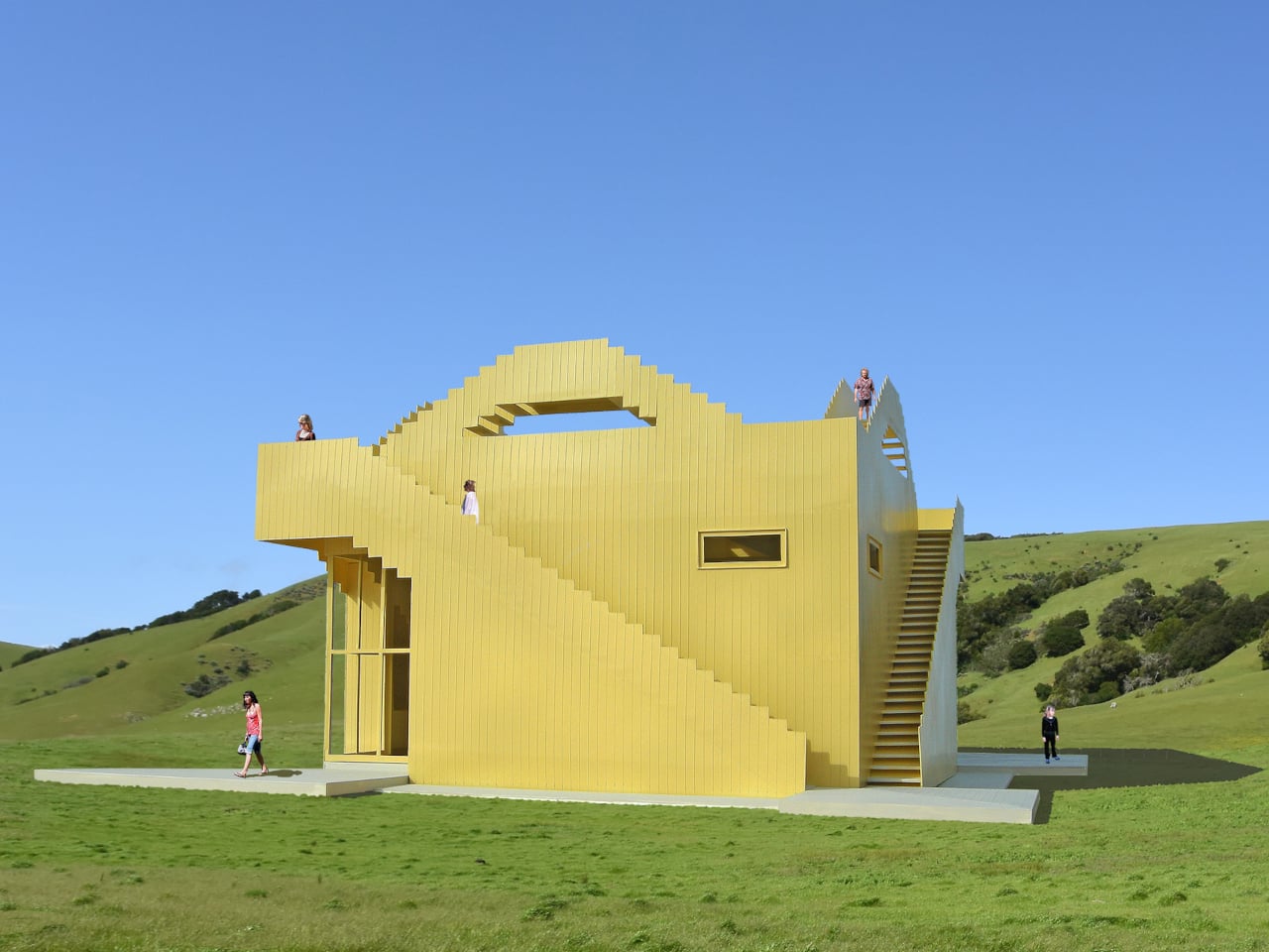
Most houses ask you to sit still. The Staircase House asks you to climb. This small, unbuilt concept wraps 180 wooden steps around a simple 1,000 sq ft cube, turning the entire building envelope into a piece of exercise equipment that also happens to keep the lights on. It’s a house shaped by staircases and about them.

Every one of those steps hides a piezoelectric tread plate underneath the surface, converting the weight of a footstep into a small charge of electricity. That energy gets stored in onsite batteries and folded back into the house’s power supply, a modest amount per step, but multiplied across 180 treads and however many trips residents make up and down them. The building quietly rewards the exact behavior it was designed to encourage.

Designer: Michael Jantzen

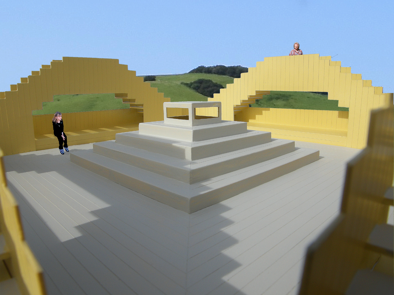
Climb high enough, and the stairs deliver you to an open rooftop deck built with benches and storage cabinets tucked into the framing. Four wooden decks wrap the ground floor as well, so the house offers outdoor space at both its base and its summit, connected by the staircases running up its exterior walls. You could start a morning on the roof and end an evening on the ground, using the same climbing structure to bridge both.

Down at ground level, four oversized sliding glass doors mark the entry points at two corners, letting the interior breathe and stay naturally ventilated without mechanical assistance. Inside, a large central skylight repeats that same logic overhead, pulling daylight down through a stepped shaft that echoes the stair motif one more time before it reaches the floor.

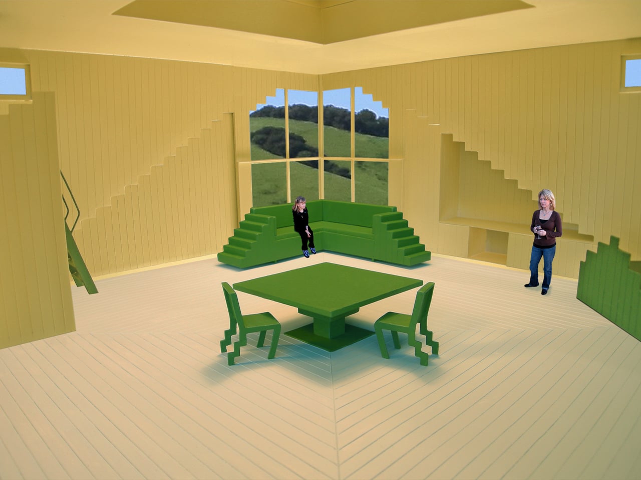
Practical rooms get folded into the leftover space beneath the exterior staircases rather than competing with them. An office, food preparation area, storage, and entertainment space are all built into the walls under those stair volumes, while a compact bathroom module stands apart in one corner with a guest bed positioned on top of it. Nothing about the layout wastes the odd geometry the stairs create.

Even the furniture inside carries the theme forward. Every piece was shaped to visually reference climbing in some way: benches that step down like miniature staircases, tables whose legs echo the same stacked rhythm found on the exterior. It’s a small detail, but it keeps the concept from feeling like a gimmick bolted onto an otherwise ordinary house.

Built entirely from sustainably grown, painted or stained wood, the structure treats sustainability as something achieved through use as much as through materials. A retreat, studio, office, or guesthouse could all fit comfortably inside this footprint, and the house doesn’t really distinguish between those uses and the act of physically moving through it. The whole structure works like a machine built to be lived in and worked out on at the same time.

The post This House Makes You Sweat, Then Harvests That Energy to Power Itself first appeared on Yanko Design.

A Designer Just Freed Wood From Every Straight Line in This Home

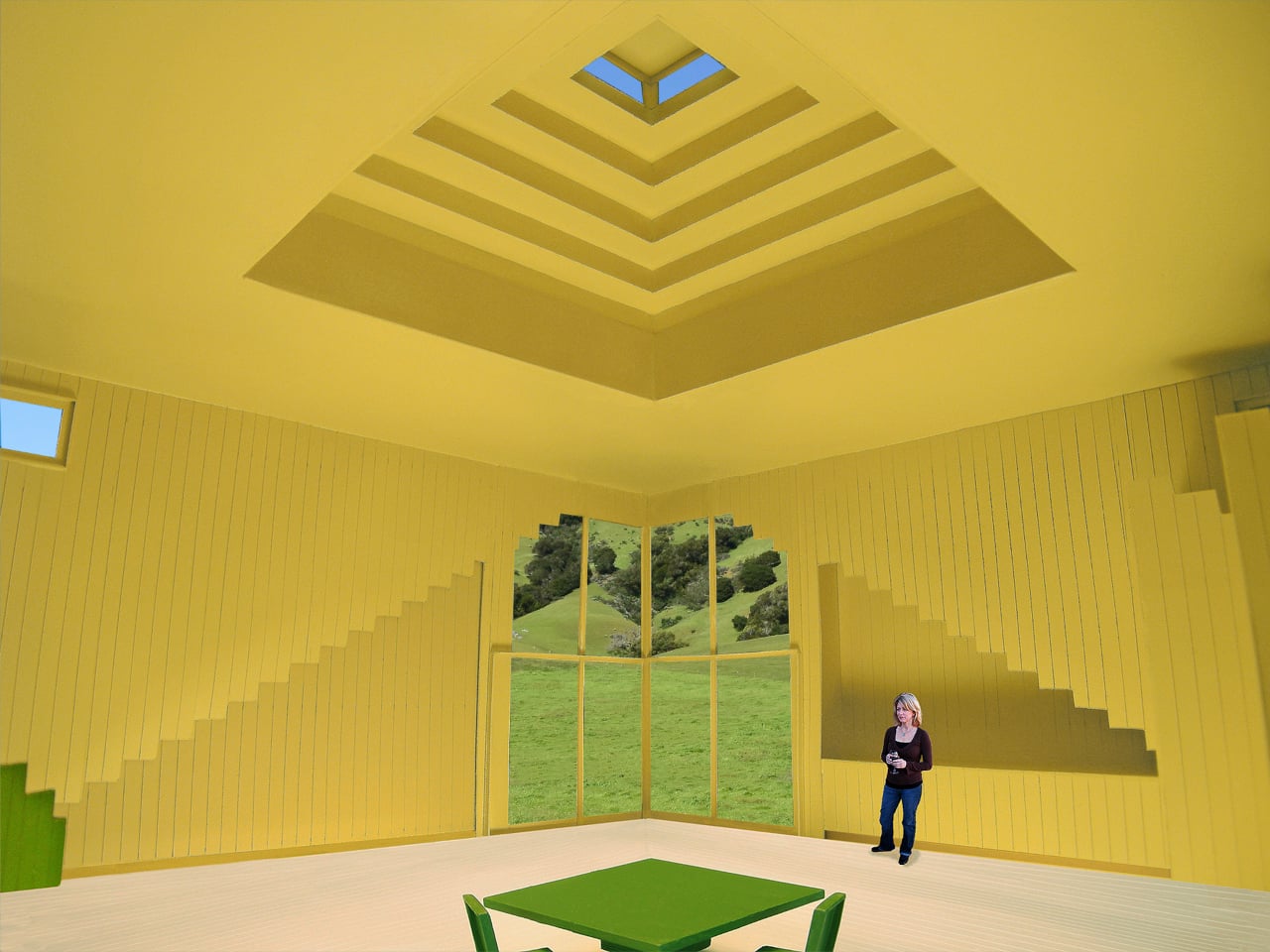
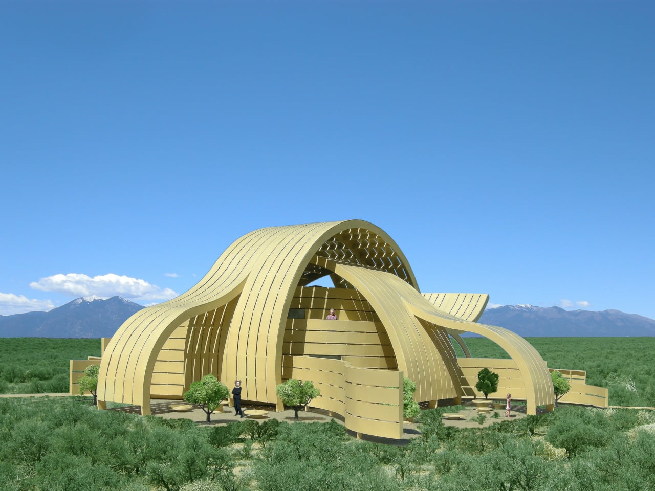
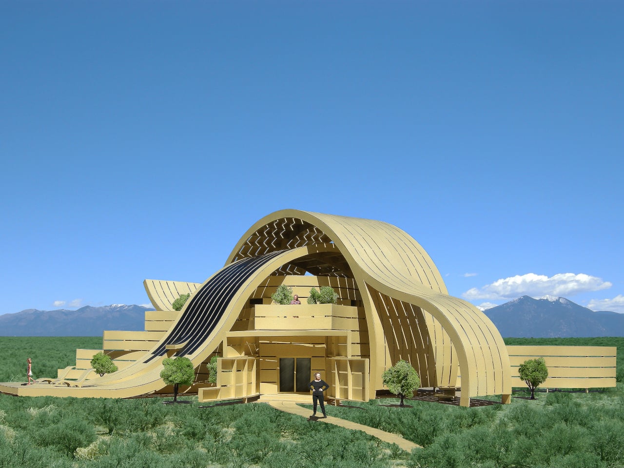
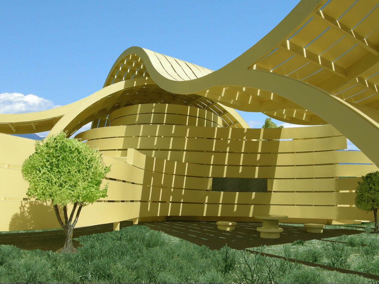
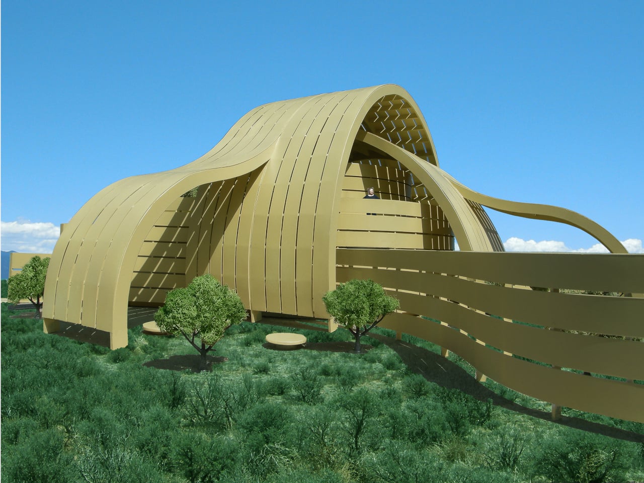
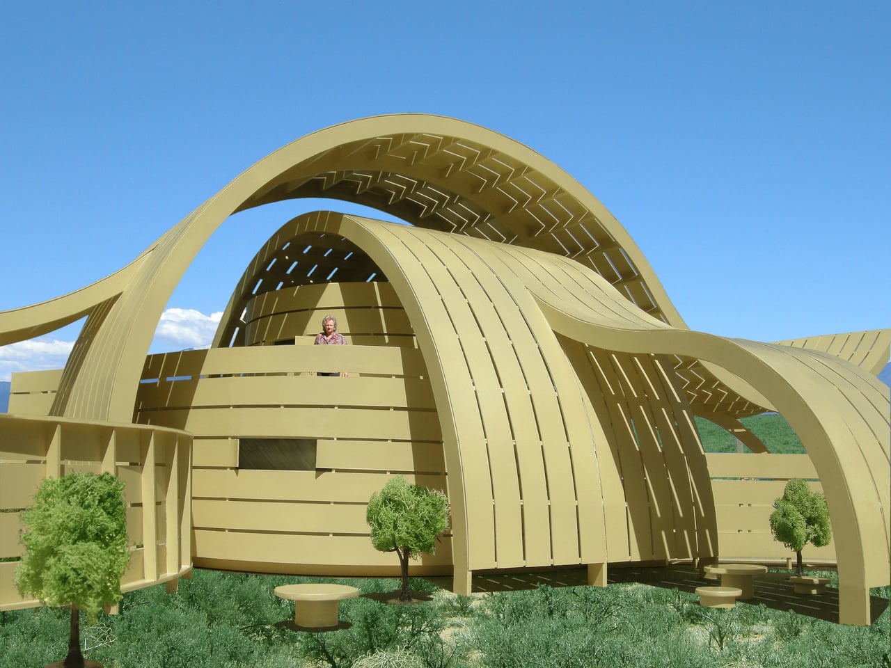
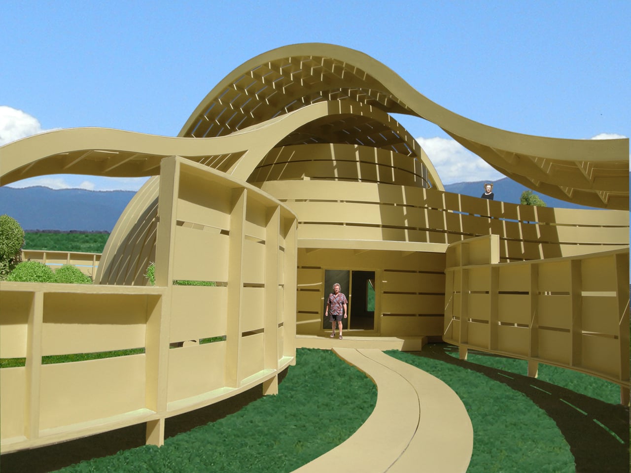
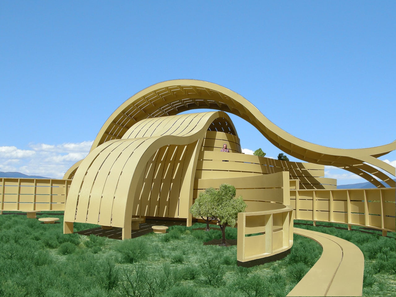
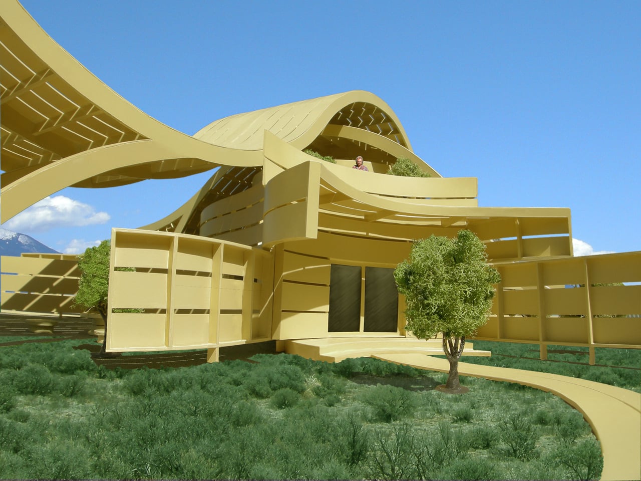
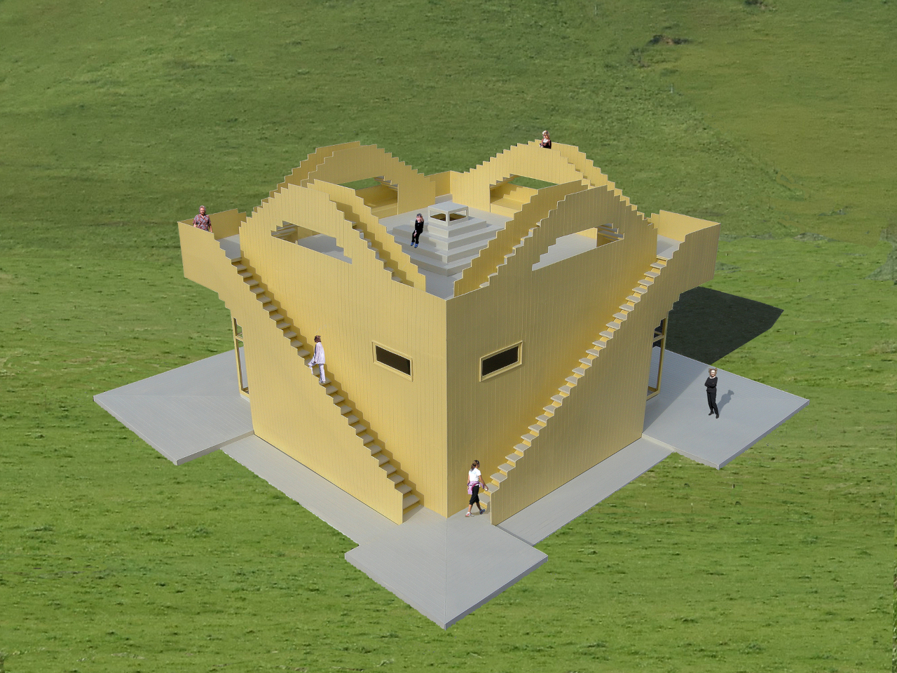
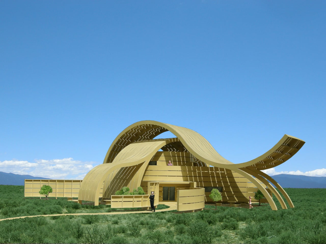
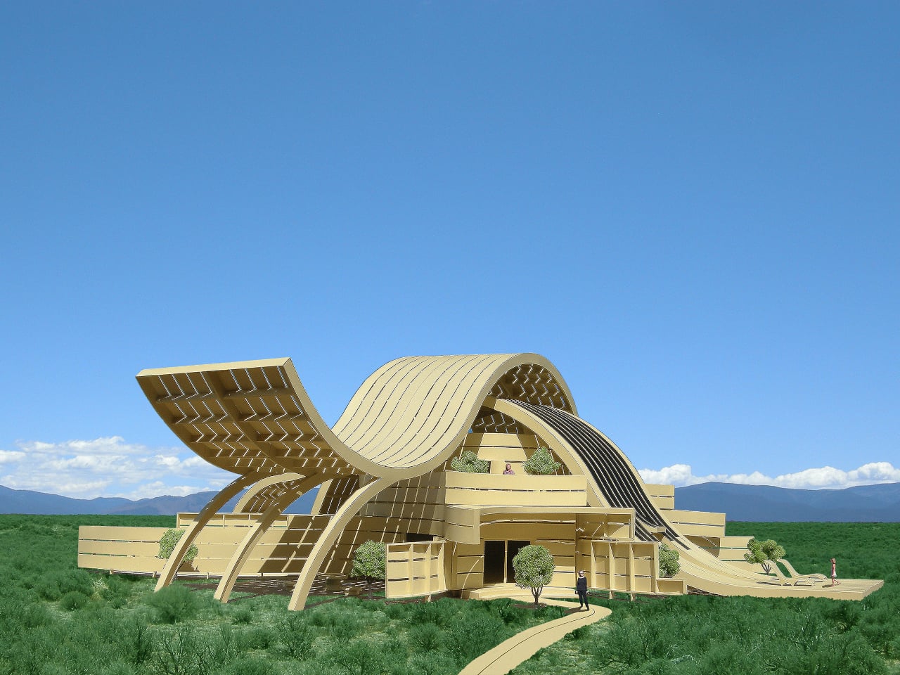
The Curved Wood House concept reimagines what a home can look like when wood is freed from rigid, rectilinear frameworks. Designed for a high desert setting, this unbuilt vision uses sustainably grown engineered lumber to create a structure made entirely of interwoven curves that sweep across walls and arc overhead. It’s the kind of design that makes you question why anyone ever settled for boxes.

The high desert is a demanding place to build. Temperatures swing wildly between day and night, the sun is relentless, and shade is a genuine luxury. That context shapes every decision here. Large canopied areas wrap around the two-level interior, sheltered by sweeping curved forms that give the structure its dramatic silhouette. You’d end up spending as much time under those canopies as you would inside.

Designer: Michael Jantzen

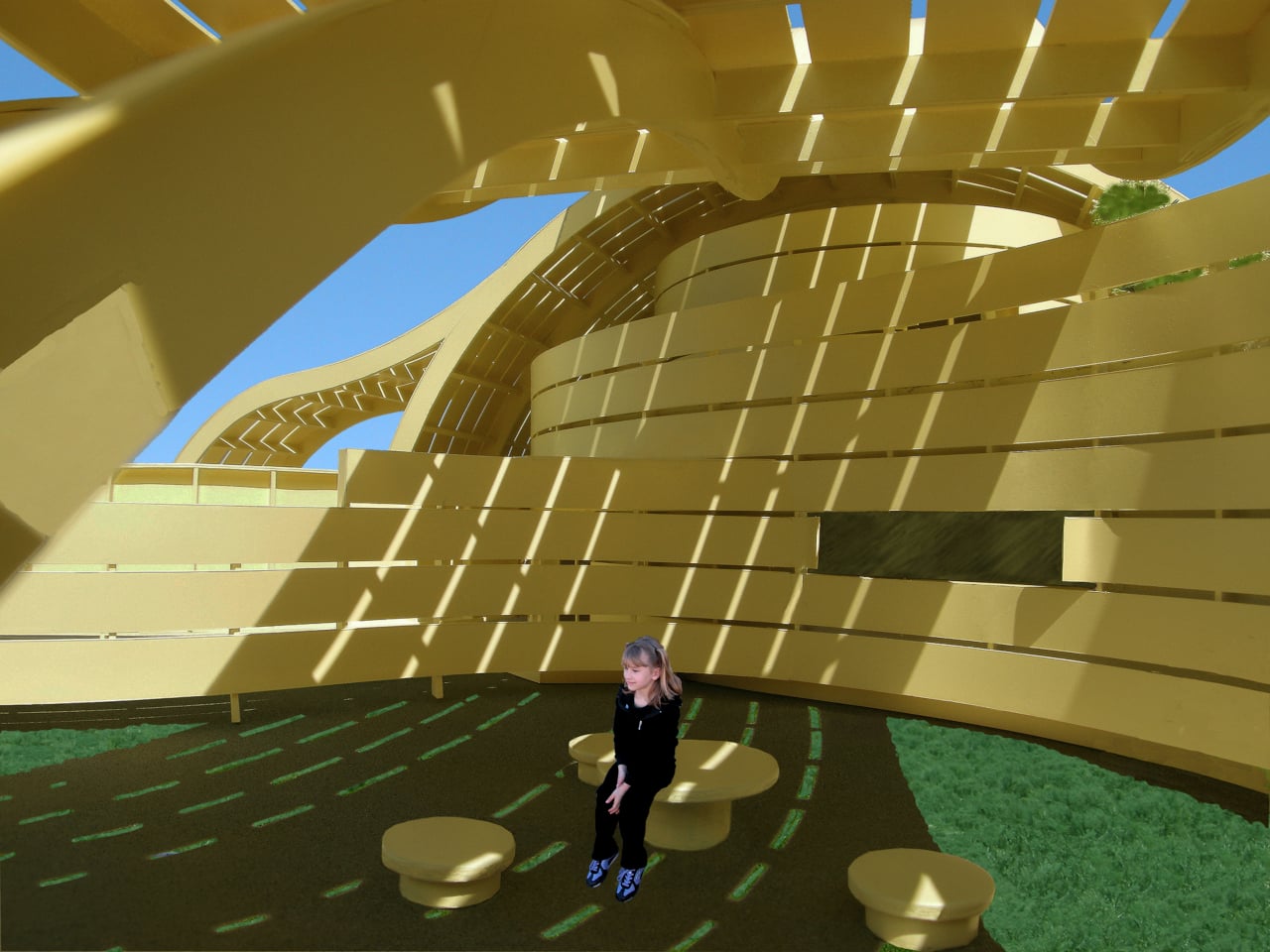
The key to all of it is engineered lumber, a material that can be laminated and bent into curves that solid timber simply can’t achieve. Every component, from the stacked planks that form the walls to the grand arching ribs overhead, shares the same warm, golden-yellow finish. The interlocking curves give the whole thing the impression of something that grew from the ground up.

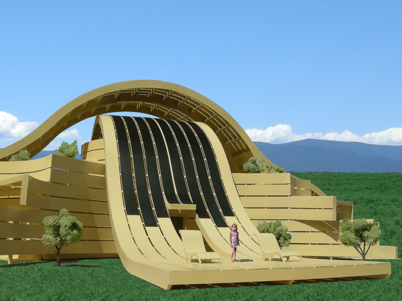
Sustainability runs deeper than just the choice of material. A bank of curved solar panels integrates directly into one of the south-facing arches, turning a structural element into the home’s power source. Desert trees and native vegetation weave through the composition as well, softening the boundary between built structure and landscape. The whole concept treats its site as a partner rather than a blank slate.

Those curved canopies do something practical beyond just looking extraordinary. They create generous shaded passages and outdoor gathering areas between the desert floor and the open sky, the kind of in-between spaces that most residential architecture doesn’t think to provide. Imagine eating breakfast or settling in for an evening out there, with desert trees growing in close and the whole structure arching above you.

The wooden construction also does something subtle with light. Gaps between the laminated planks and the open latticework of the curved forms mean sunlight doesn’t just enter from above but filters through the walls themselves, casting shifting patterns across the ground throughout the day. It’s the kind of atmospheric quality that sealed glass or solid concrete walls simply can’t replicate, no matter how clever their arrangement.

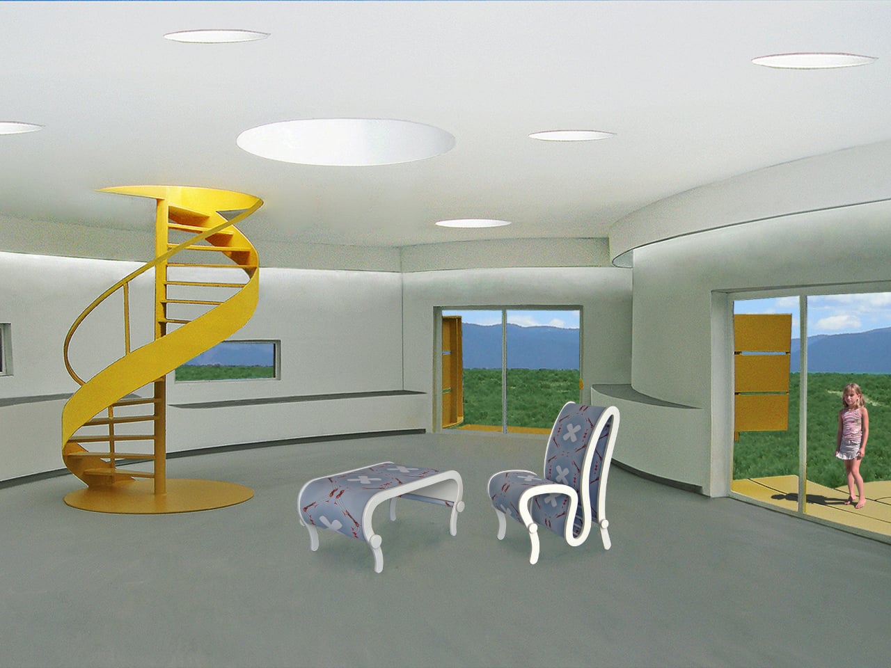
Cross the threshold and everything changes. The interior is deliberately minimal, with smooth white walls, white ceilings, and pale gray floors that let natural light do the work. After so much visual intensity outside, that restraint feels welcome. It’s a calm, clutter-free space designed for actual living, a place where you can think, sleep, and settle without the architecture competing for your attention.

What makes this concept worth taking seriously, even as an unbuilt proposal, is how much it asks of a single material. Engineered lumber has long been treated as a practical workhorse, a stand-in for steel or concrete rather than a medium for genuine architectural ambition. This concept argues otherwise, and it makes a surprisingly solid case that wood, given enough intention, can do just about anything.

The post A Designer Just Freed Wood From Every Straight Line in This Home first appeared on Yanko Design.
This 1970s Japanese Home Tore Out Every Wall and Came Back Better Than Ever

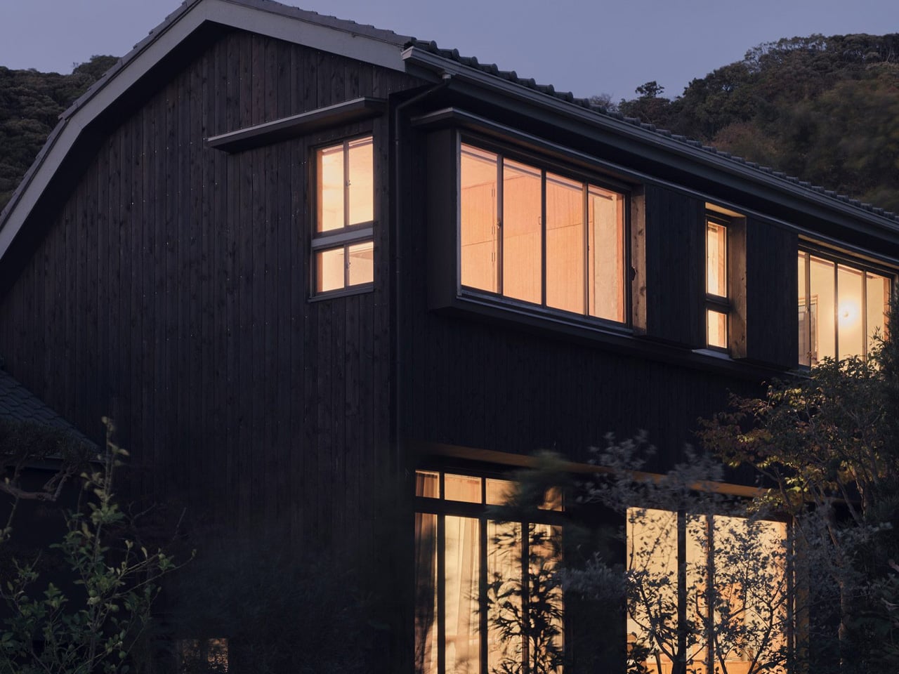
Renovation is harder than building from scratch. You inherit someone else’s decisions — structural, spatial, aesthetic — and you’re asked to make them feel new without erasing what made them worth saving. Studio HYAN understood that with the Green Sandwich House, a 1970s home in Hayama, south of Tokyo, renovated for the studio’s own founders: architect Anna Naganuma and designer Shohei Hasegawa.

The starting point, as Hasegawa puts it, was inheritance rather than demolition. “Preserving a 1970s house wasn’t the goal in itself; we wanted to read the potential of the existing frame and update it for how we live today.” That clarity of intent matters. A lot of renovations get lost between nostalgia and novelty. This one knew exactly what it was doing.

Designer: Studio HYAN

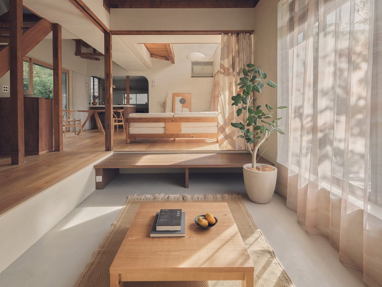
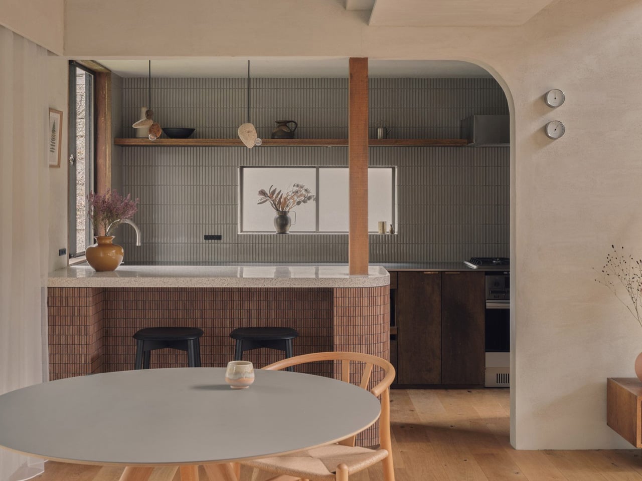
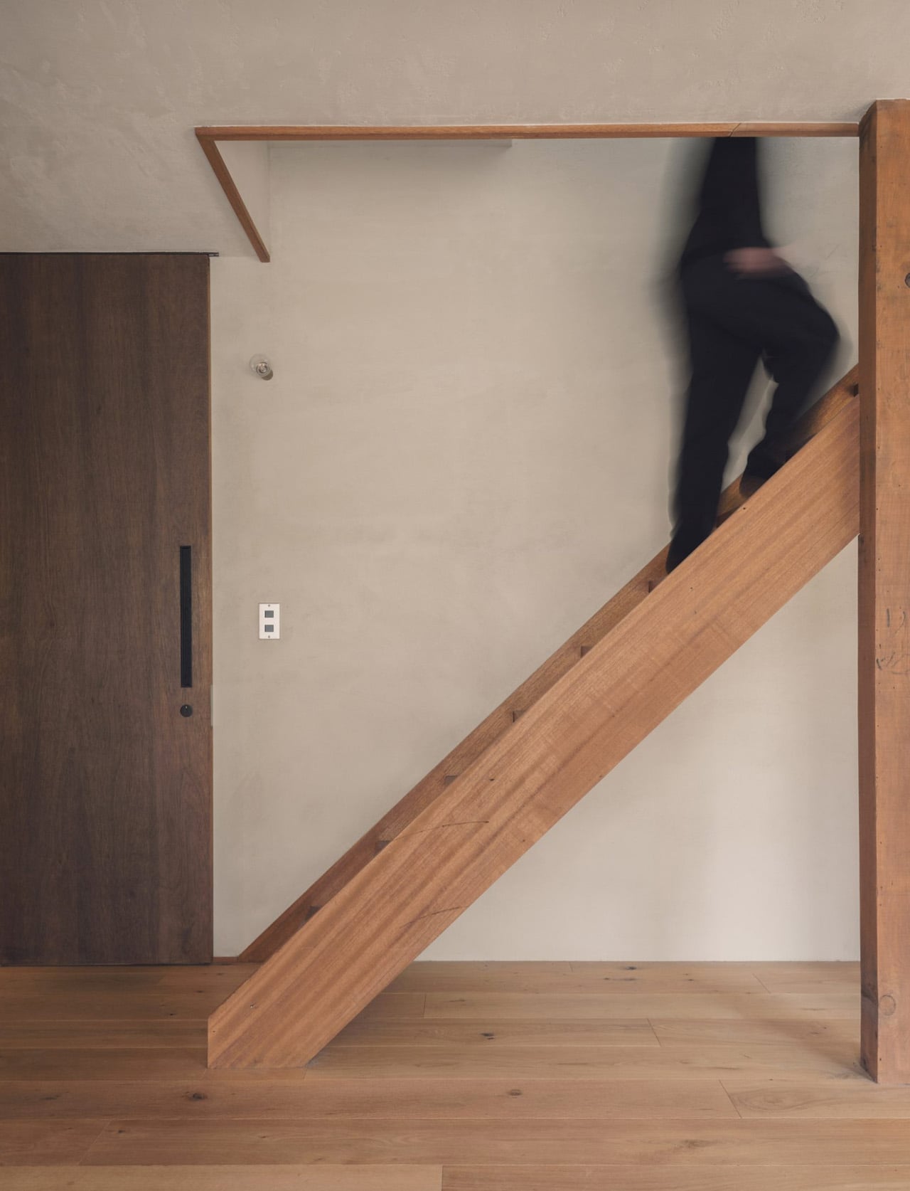
The home required significant structural reinforcement to meet modern seismic codes — a constraint HYAN turned into an opportunity. Rather than hiding the work, they built around it. The retained timber columns and roof beams are left exposed throughout, quietly tracing where the old partition walls once stood. The structure becomes the architecture. Almost every internal partition on the ground floor was removed, replaced by a single, flowing living, dining, and kitchen space where zoning is handled through changes in floor level and ceiling height rather than walls.

The living area occupies a double-height volume beside the kitchen and dining zone, while the floor steps down slightly to form a lounge with a daybed nook, closed off when needed by patterned curtains. It’s a spatial move that feels considered rather than open-plan for its own sake. Work, daily life, hosting — everything overlaps naturally, the way it actually does in a home people live in fully.

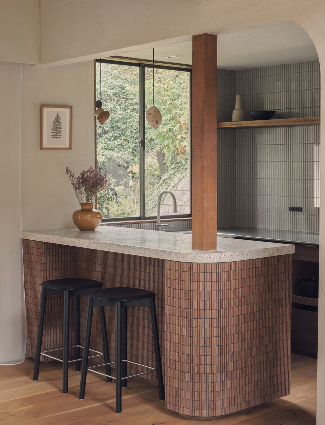
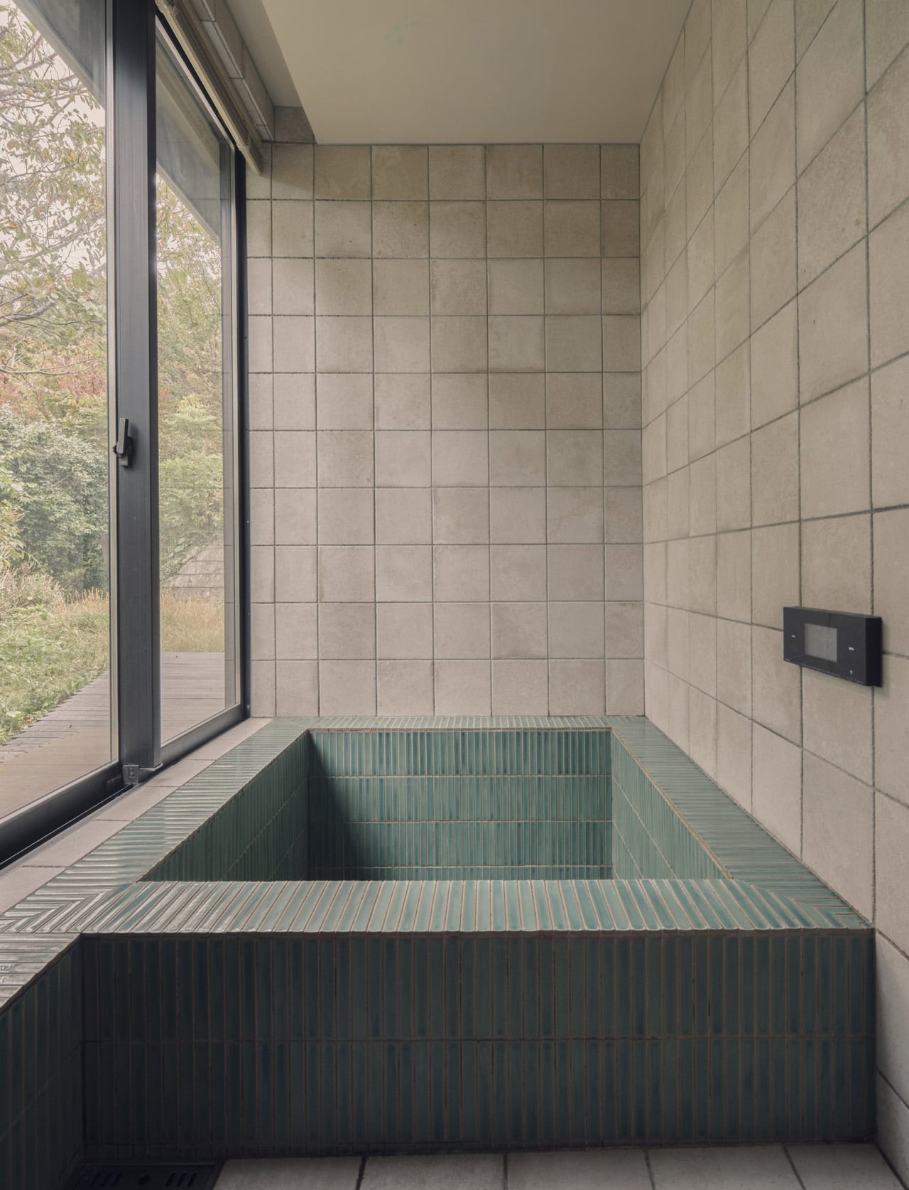
Materials carry the warmth the bare frame alone couldn’t. Pale plastered walls, timber floors, coloured tiles and terrazzo in the kitchen and bathroom — a restrained palette chosen for how surfaces catch light through the large windows and surrounding trees rather than for how they photograph. The wooded hills of Hayama are present throughout the day in the way the light shifts across those surfaces, tying the interior to the landscape without a single piece of statement furniture doing the heavy lifting.

Upstairs, the more private rooms — bedrooms, a study overlooking the double-height living space below — step back from the openness of the ground floor without feeling disconnected from it. Hasegawa describes the house not as a finished work but as one that grows with daily life. For a home this attuned to how its spaces breathe and change with the seasons, that feels exactly right.

The post This 1970s Japanese Home Tore Out Every Wall and Came Back Better Than Ever first appeared on Yanko Design.
This Hidden London Home Lives Behind a Garden Wall – And It’s Pure Genius

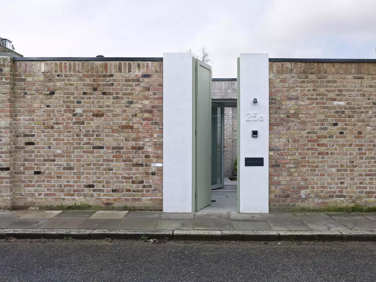
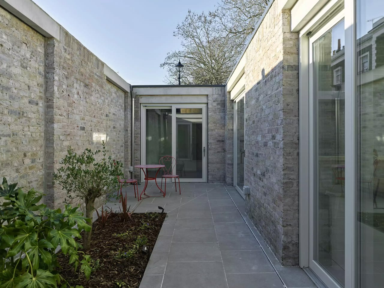
Just past the southeast corner of Cleaver Square in Kennington, south London, sits a weathered brick wall with a painted timber gate. From the street, it looks like nothing more than a garden boundary — unremarkable, quiet, entirely in keeping with the 18th-century square around it. Step through the gate and the story changes completely.

Behind it is the Walled Courtyard house, a single-storey, two-bedroom home designed by London-based architecture studio Inglis Badrashi Loddo (IBLA). It is the first new house built on Cleaver Square in over 175 years — and it was designed to be invisible.

Designer: IBLA

The site, a modest 63 square metres, was formerly a car park. It once formed part of the walled garden of the Grade-II listed Georgian townhouse that sits adjacent to it. The owners of that townhouse commissioned IBLA to design a separate, accessible dwelling on the land — compact, light-filled, and historically sensitive.

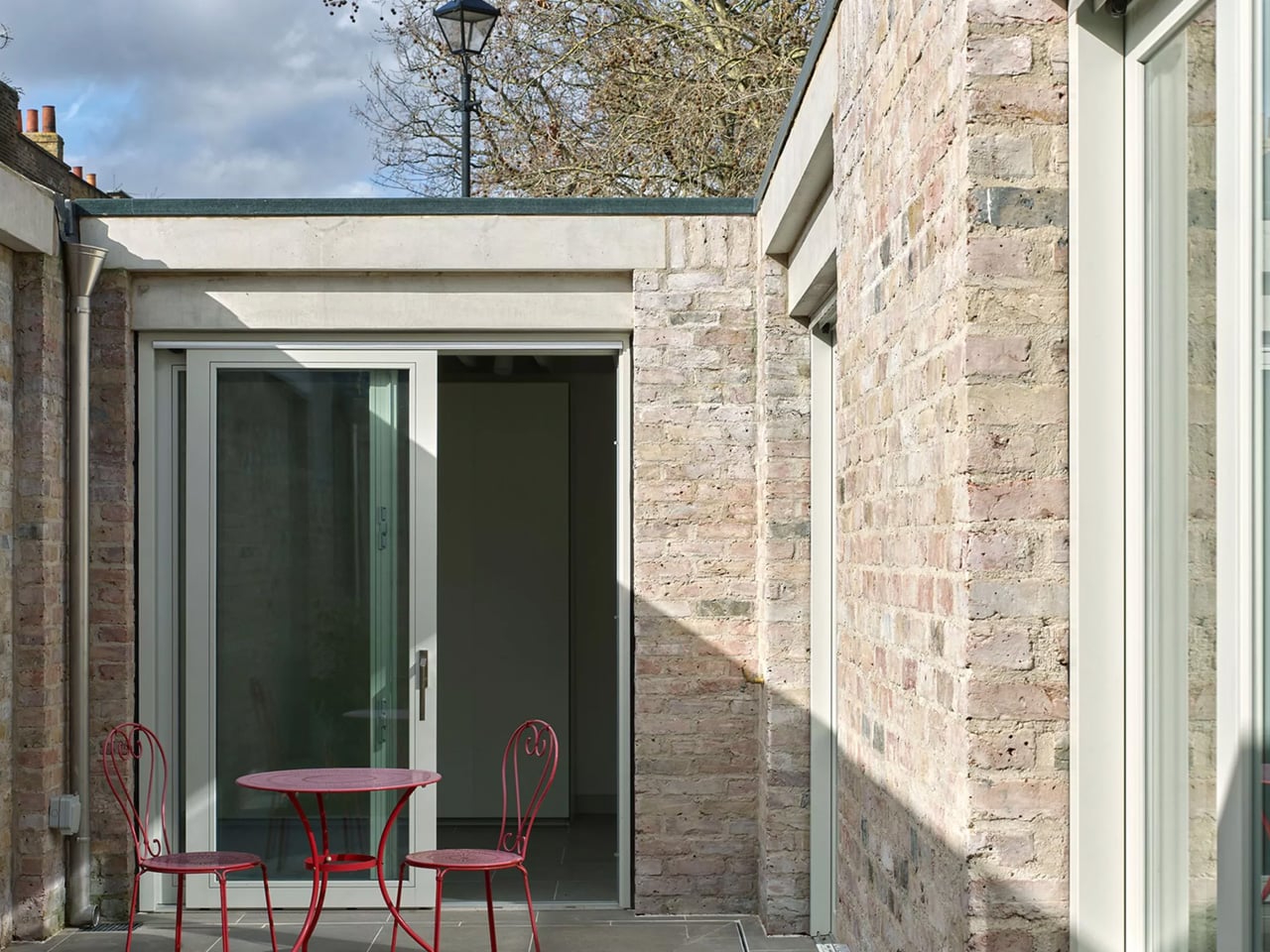
IBLA didn’t fight the enclosure. They embraced it. The boundary walls were reconstructed using a combination of salvaged and new London stock brick, deliberately left without windows so the exterior reads as one continuous garden wall. Inside, those same walls are washed in lime-mortar paint, pulling light inward and immediately shifting the atmosphere. “The site is very compact, completely enclosed and inward-looking — our main goal was to create a bright and light-filled home that felt expansive and generous, despite the constraints,” said IBLA director Kim Loddo.

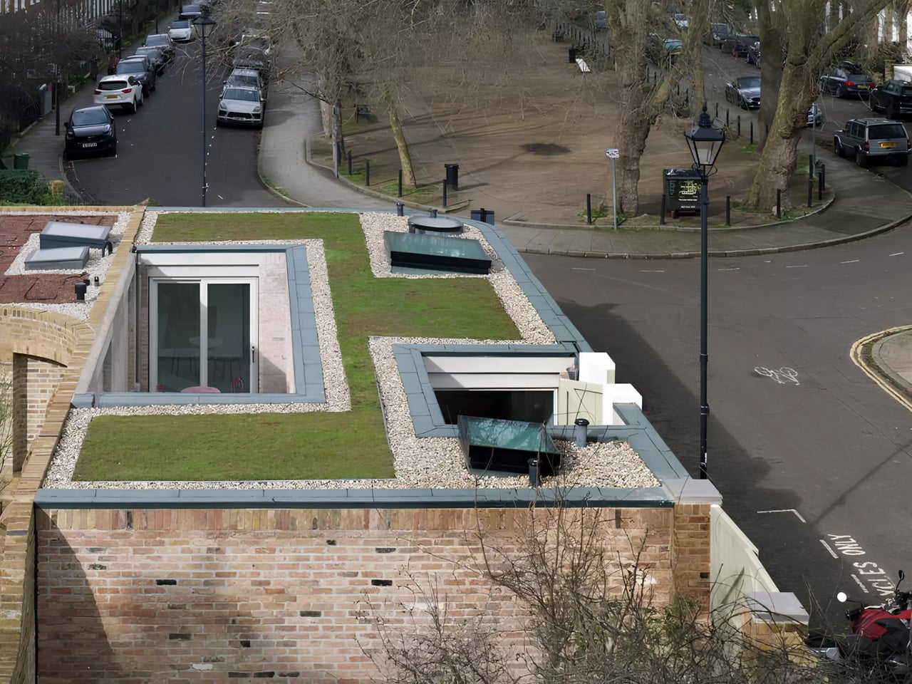
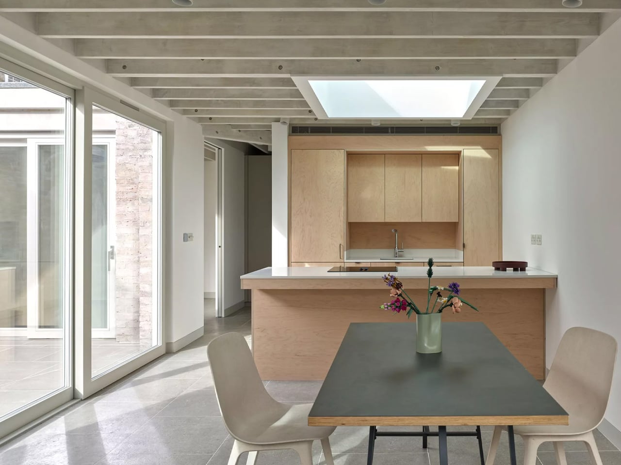
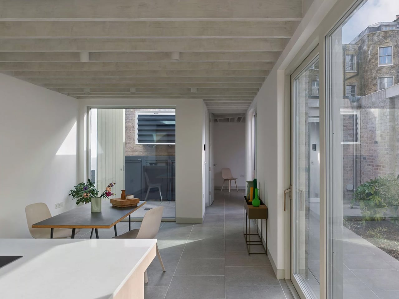
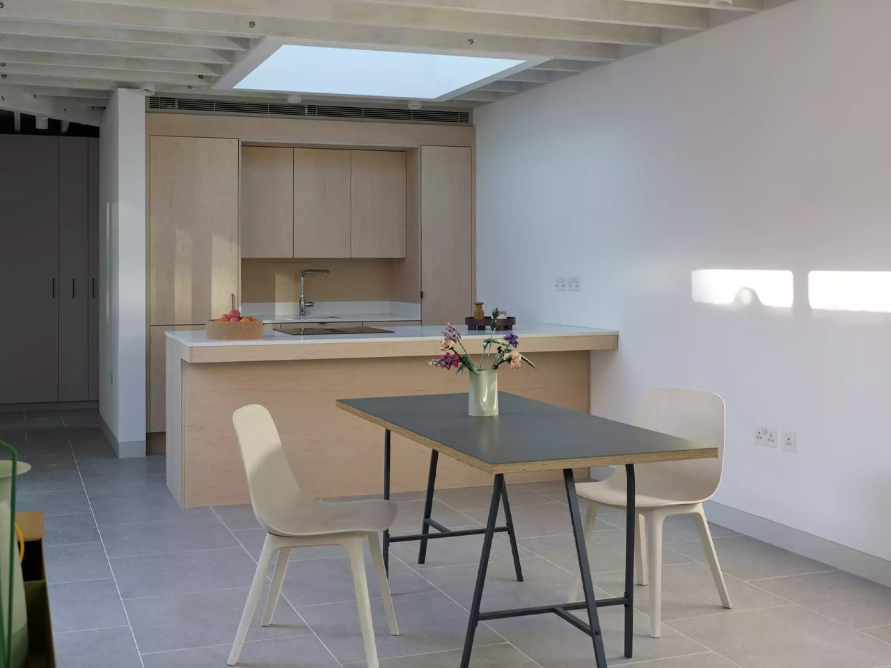
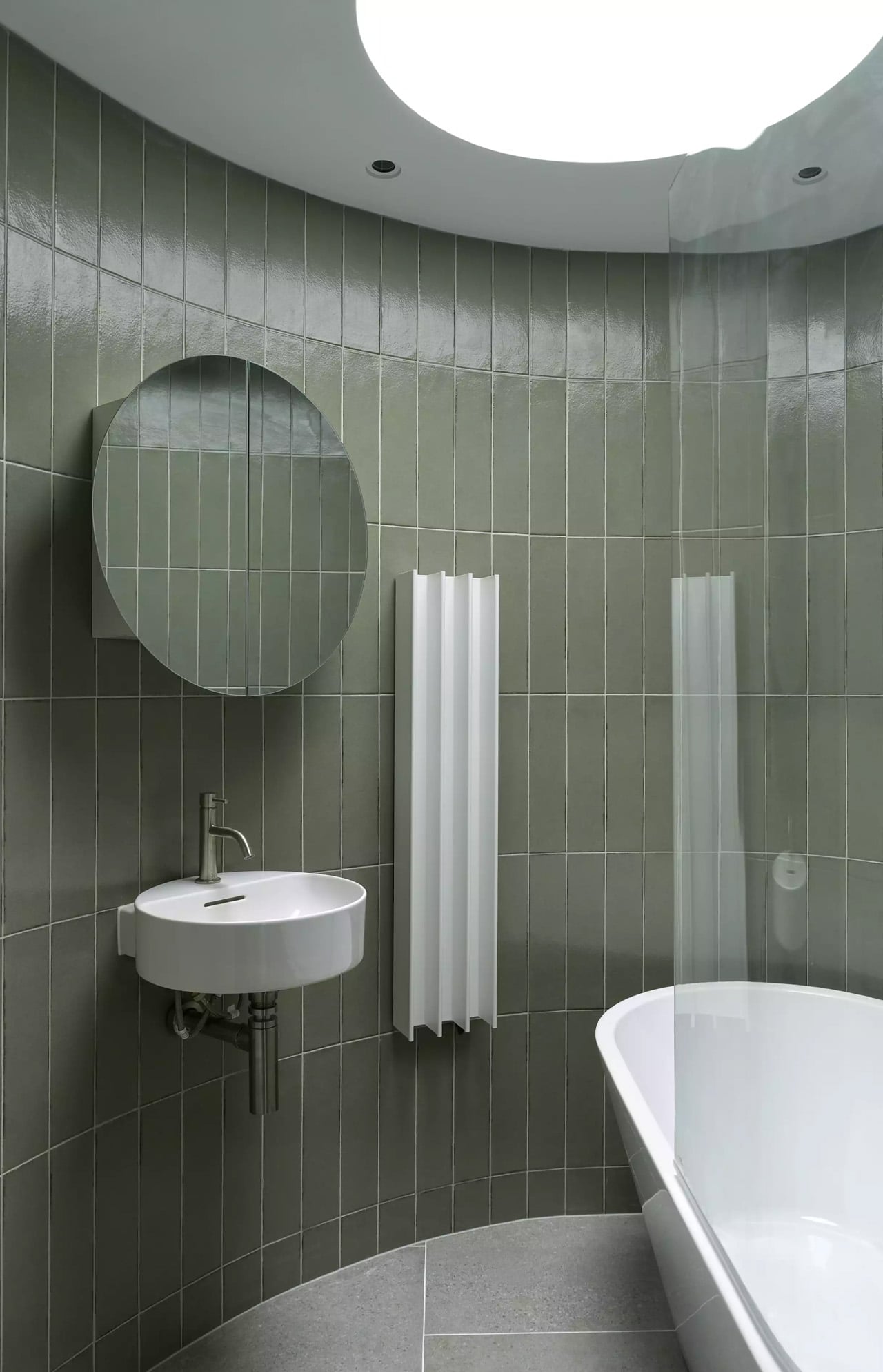
The layout unfolds around a central courtyard garden, with every main room connected to it through full-height sliding glass doors. The main bedroom and ensuite occupy the western end, with long sightlines running through to the kitchen and dining area at the centre. There, custom plywood cabinetry sits beneath a skylight that keeps the space bathed in natural light through the day. To the east, an adaptable room serves either as a second bedroom or a reading snug. The main bathroom, tucked into the curved corner of the site, is lit from above by a circular skylight.

A neutral palette runs throughout — white walls, whitewashed exposed timber roof joists, and grey porcelain flooring — with pocket doors that slide cleanly into wall recesses to keep sightlines open. The joists, as Loddo notes, do real structural work while lending the ceilings an honest rhythm.

For sustainability, the home relies on an air-source heat pump, underfloor heating, high-performance insulation, and a sedum roof that quietly completes its environmental credentials. What IBLA has built here is a masterclass in restraint. A home that holds its history close, hides from the street entirely, and reveals itself only to those who pass through the gate.

The post This Hidden London Home Lives Behind a Garden Wall – And It’s Pure Genius first appeared on Yanko Design.
Tucked Between Two Ancient Stumps, This House Barely Touches the Ground — And That’s Exactly the Point

Some buildings earn their names. The Floating House by Vancouver-based SMStudio — completed in 2023 on the western ridge of Bowen Island, British Columbia — is one of them. Bowen Island sits just 20 minutes by ferry from Vancouver’s Horseshoe Bay, close enough for a commute, far enough to feel like another world.

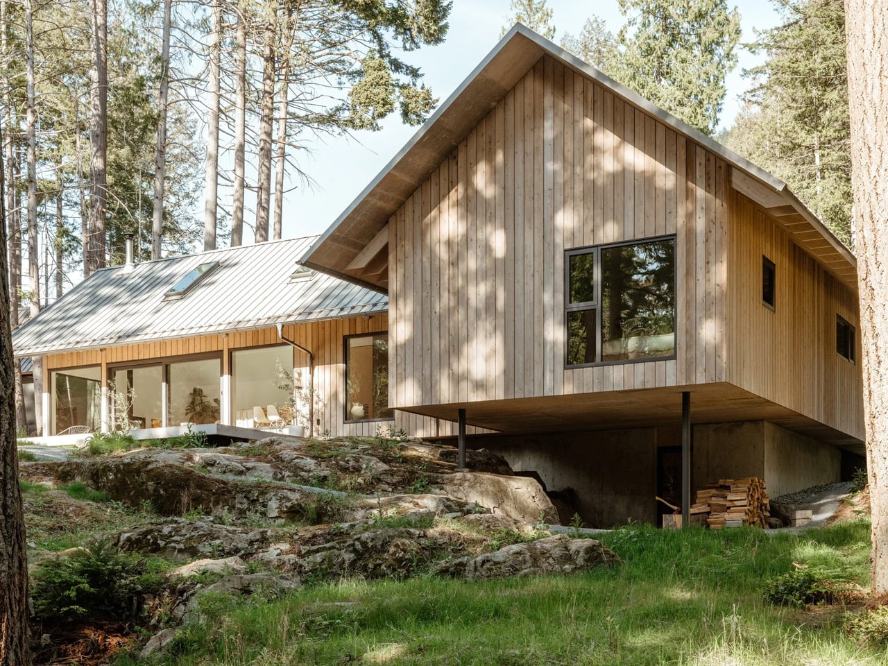
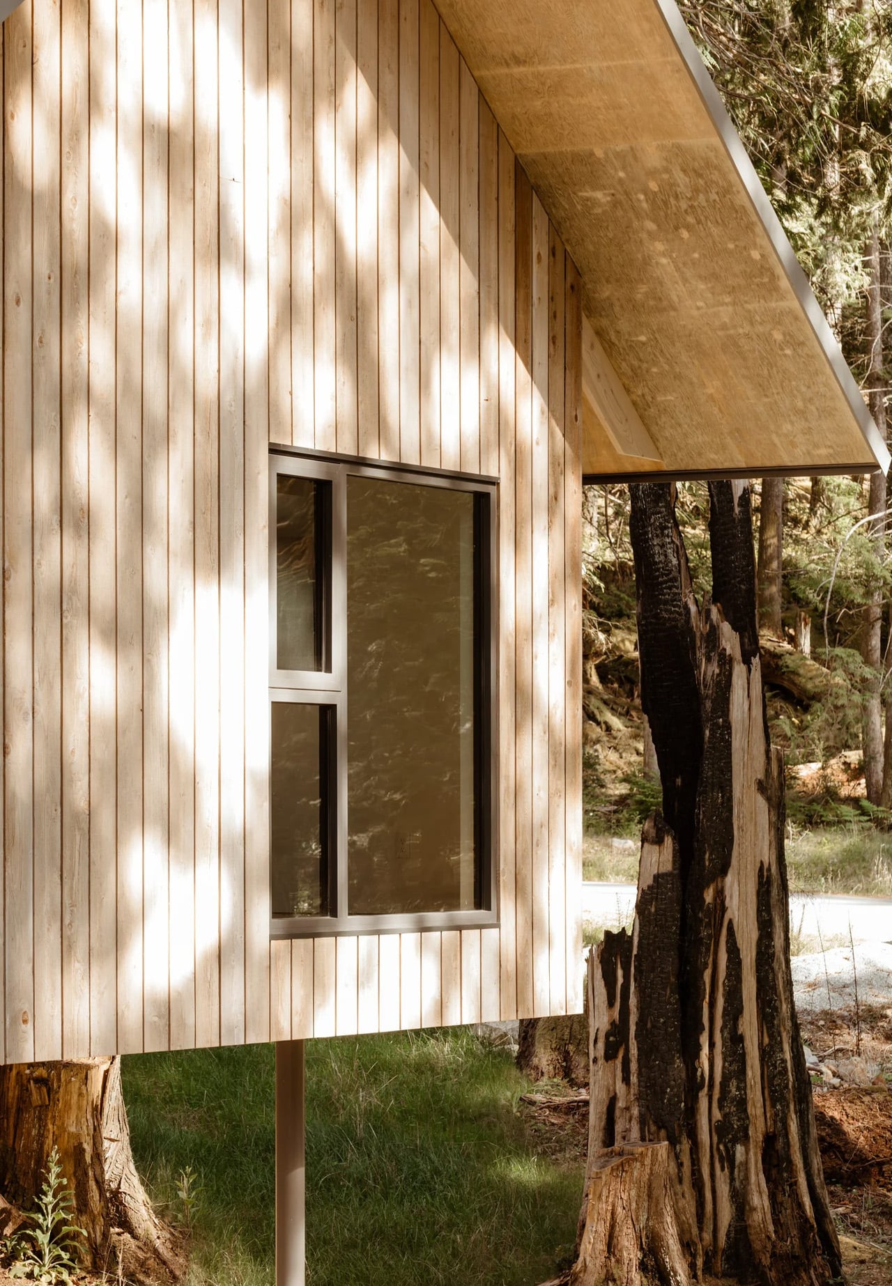
SMStudio founder Simon Montgomery found a site on a rocky ridge where two ancient, burnt-out old-growth stumps stand like sentinels over the land. Rather than clear them or work around them, he positioned the house directly between them. The building wasn’t placed on the land so much as fitted into it.

Designer: SMStudio

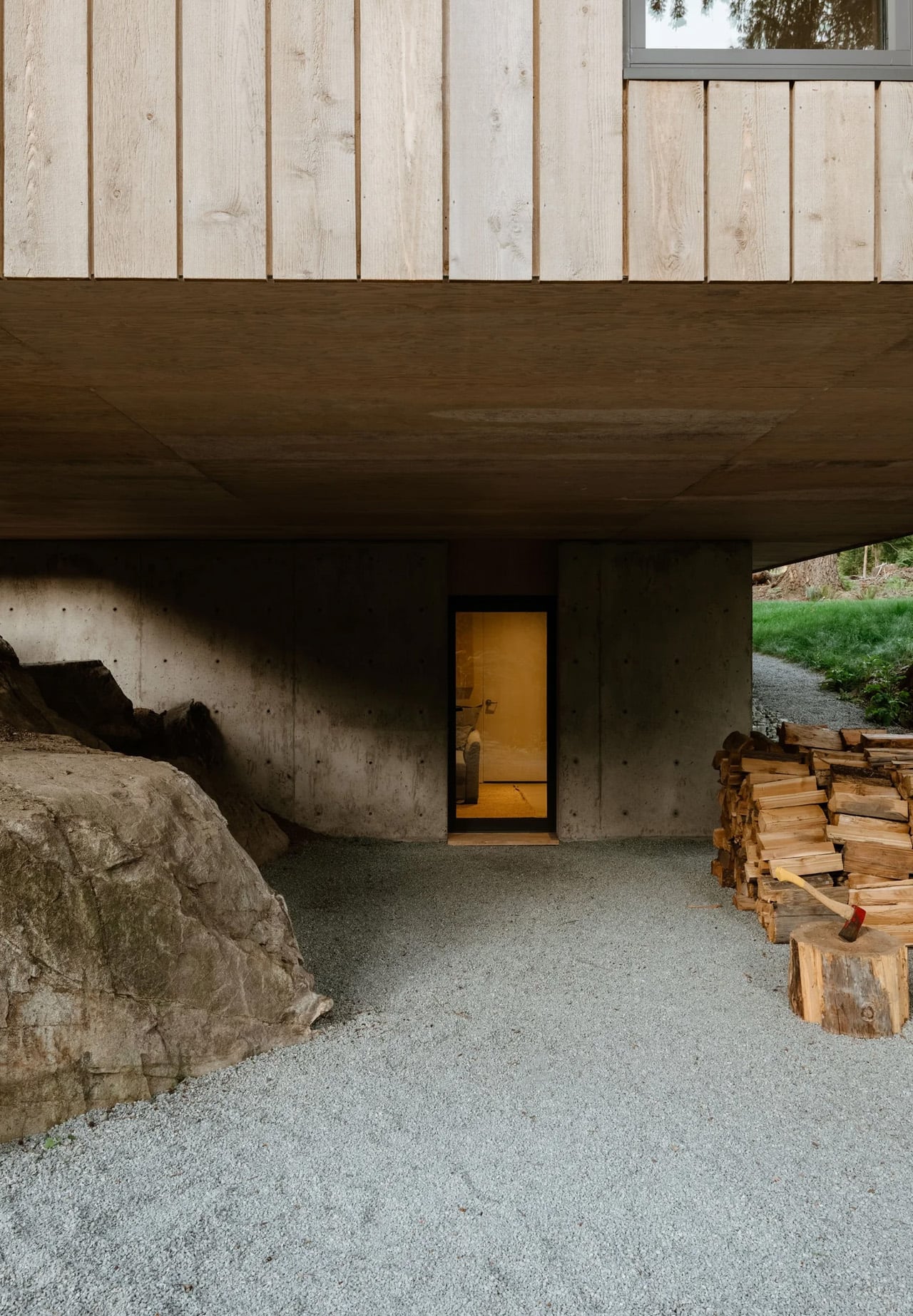
The name earns its keep. A cantilever lifts the structure fractionally off the bedrock, leaving a deliberate shadow gap at the base — a move that is at once structural and philosophical. The house appears to hover, weightless above the ground it occupies. It’s a gesture borrowed from Japanese spatial thinking, where the relationship between a building and its site is considered with almost ceremonial care.

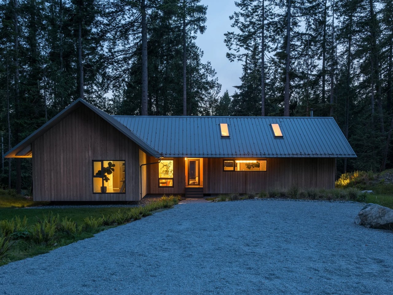
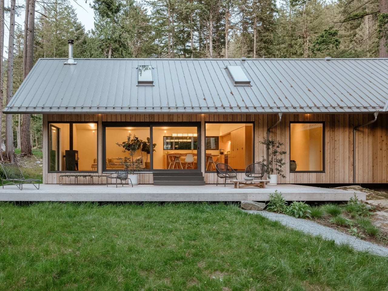
The exterior reads as elemental: a steeply pitched gable roof clad in steel standing-seam panels, cedar walls left to weather naturally into the forest palette, and a form so spare it borders on sculptural. There is no decorative noise here. Every decision is load-bearing, aesthetically speaking. The plan is simple and asymmetrical, its two wings arranged to navigate the site’s dual elevations — a higher forested platform and an open field below that drops away to reveal sky and distant treeline.

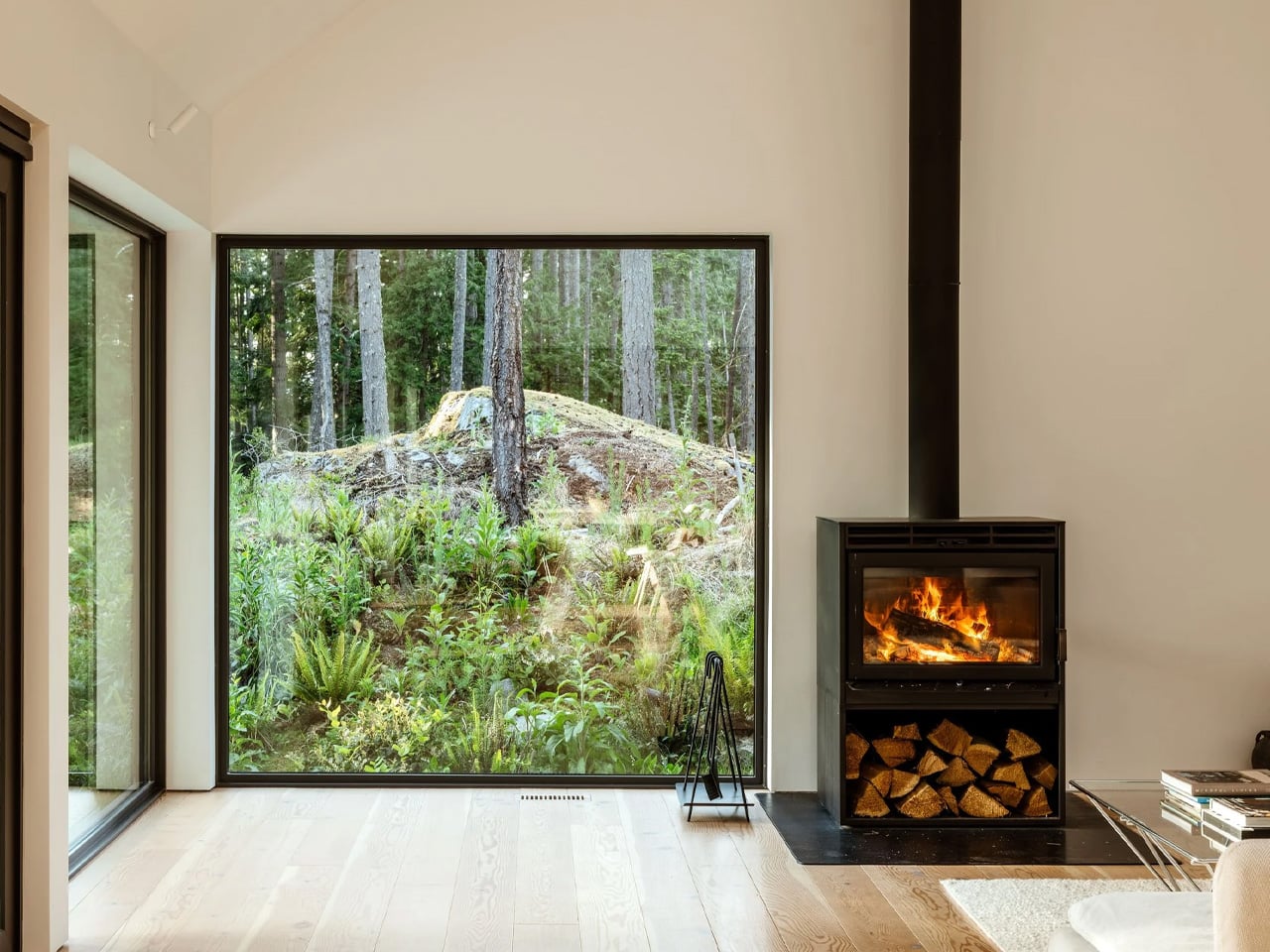
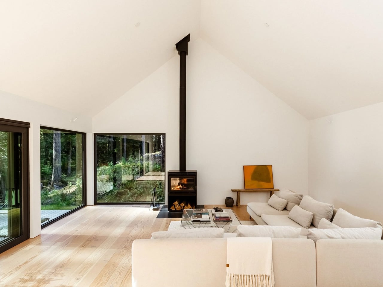
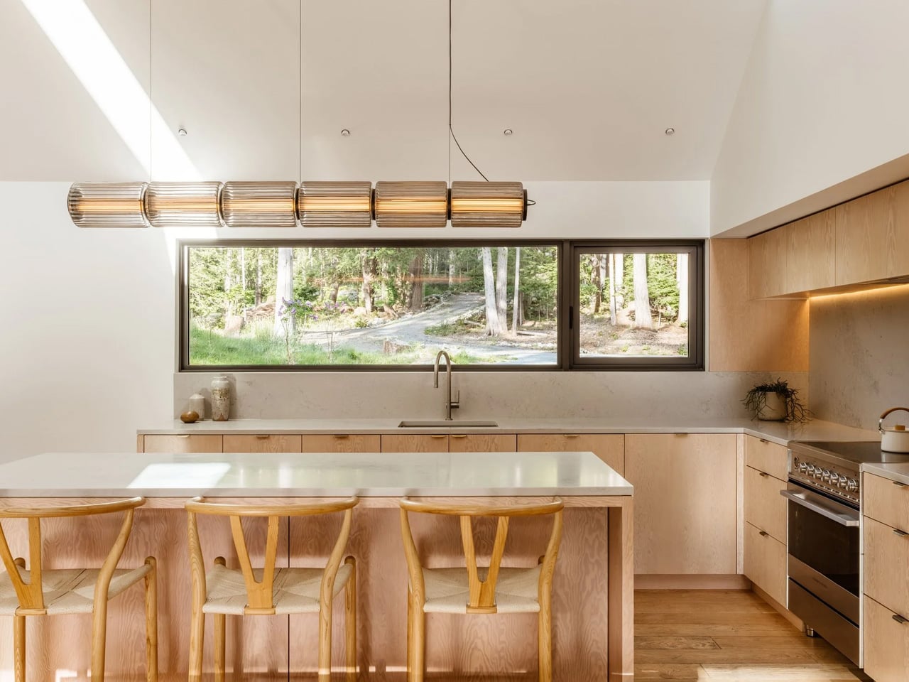
Inside, Douglas fir surfaces carry the warmth that the cedar exterior withholds. Natural light is controlled and considered, the forest pressing in from every side without ever feeling intrusive. It is the kind of interior where you notice the quality of light before you notice the furniture.

What makes the Floating House significant isn’t scale or spectacle — it’s discipline. Montgomery resisted the temptation to over-design a site that was already extraordinary. The result is a house that amplifies its surroundings rather than competing with them. In an era when architecture often mistakes loudness for confidence, that kind of restraint is genuinely rare. The Floating House is currently listed for $2.1 million through West Coast Modern.

The post Tucked Between Two Ancient Stumps, This House Barely Touches the Ground — And That’s Exactly the Point first appeared on Yanko Design.
This 1910 Melbourne Corner Shop Is Now a Three-Story Home With a Garden as Its Front Door

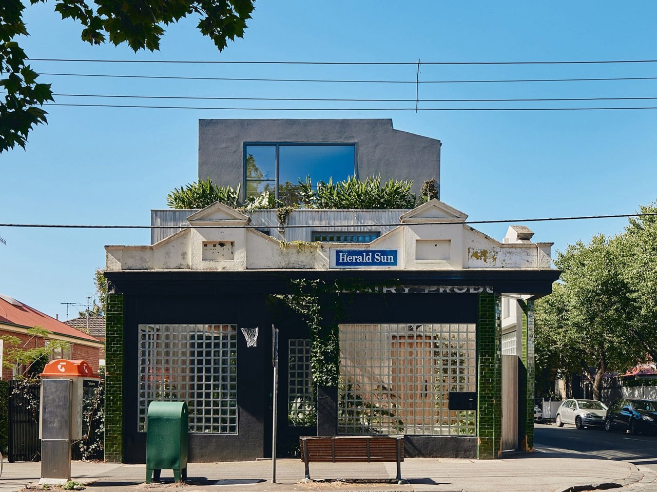
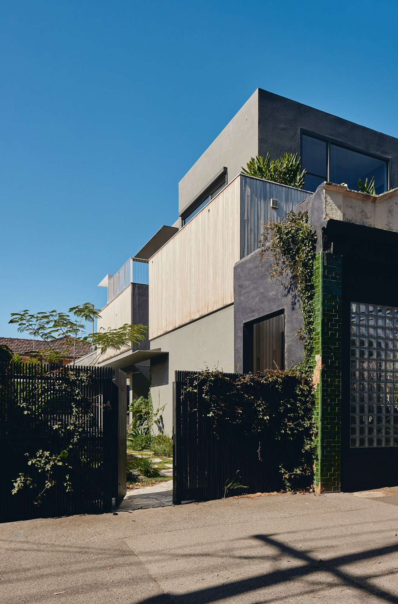
For over a century, a modest corner shop at the intersection of Murray and York streets in Melbourne’s Prahran suburb sold milk, bread, and the kind of everyday essentials that knit neighborhoods together. It closed in 2016, briefly reopened as a café, and then sat waiting. Kister Architects founder Ilana Kister saw something in it — and then decided to move in.

The project, aptly named The Corner Shop, is Kister’s own home, designed for herself and her daughters. It is a three-story residence carved out of the original 287-square-metre plot, expanded by an adjacent 90-square-metre lot that became available during construction and was immediately absorbed into the design as a garden. That garden is not a feature — it is the entire logic of the building.

Designer: Kister Architects

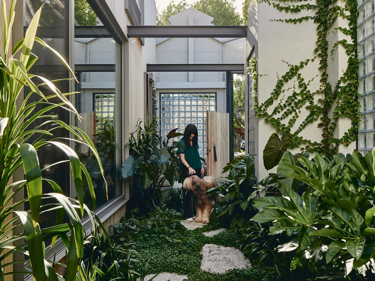
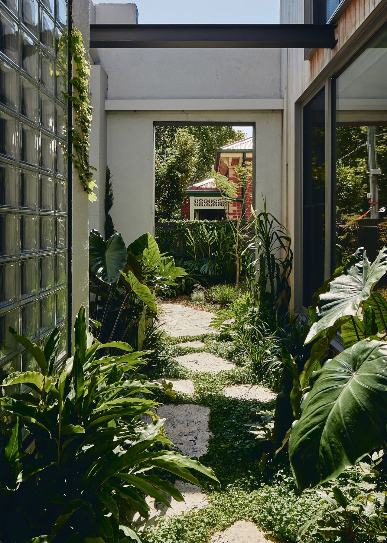
“Making the entry a courtyard was the single most important decision in the project,” Kister told Dezeen. “Entering through the original milk bar door, you land in the garden, not a hallway or foyer. By the time you reach the interior, you’ve already been outside — that sequence sets the tone for the whole house.”

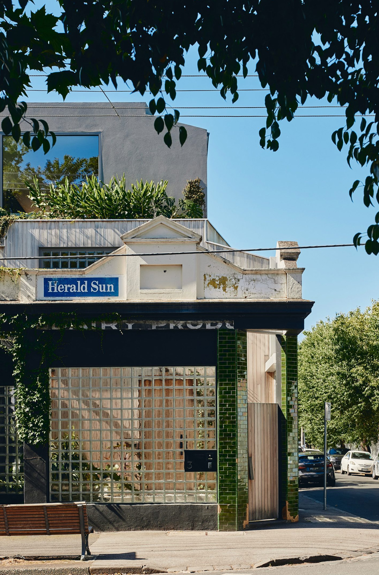
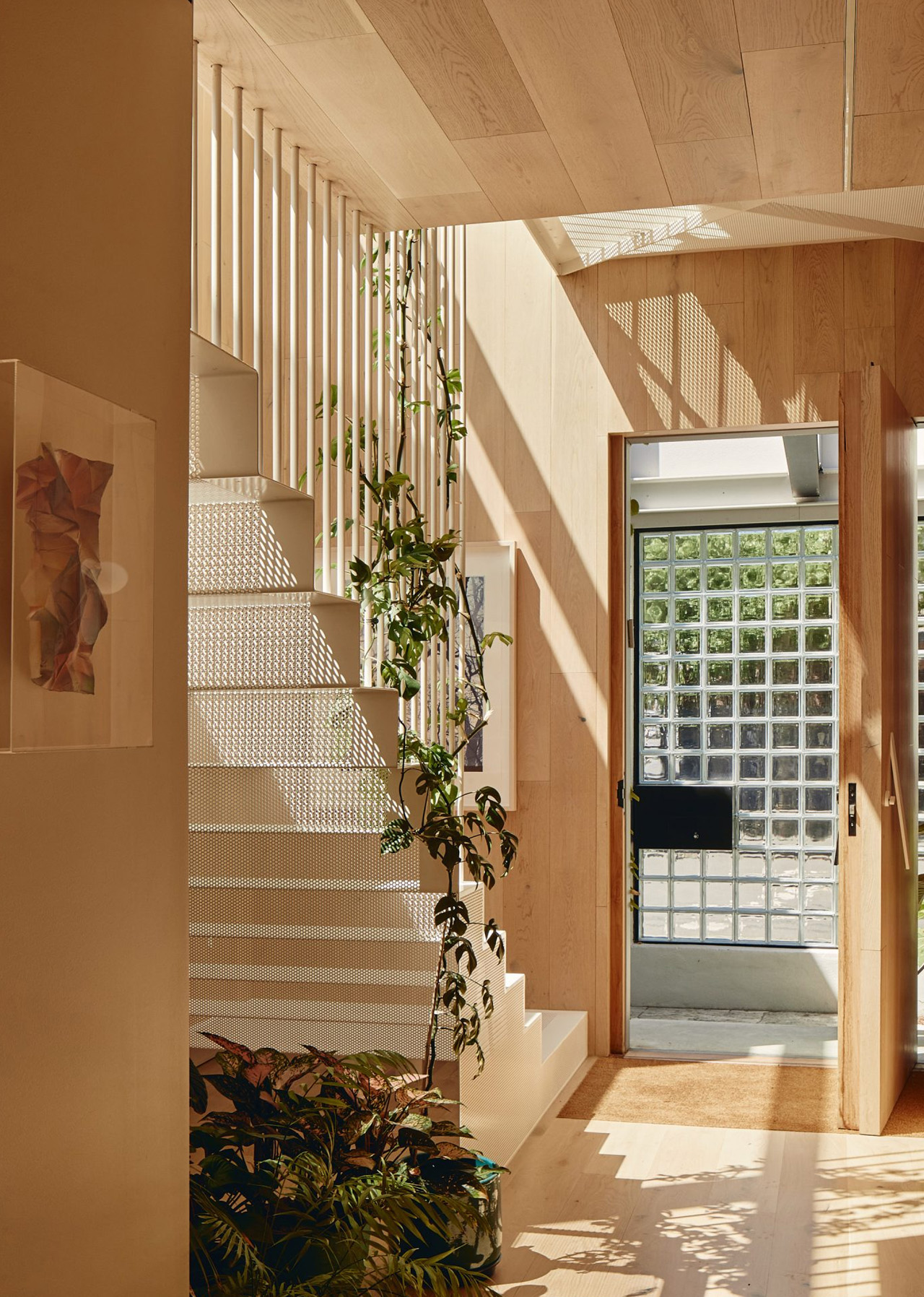
The original shopfront façade has been preserved in full, bottle-green tiles and all. Street-facing windows were replaced with glass bricks — a move that keeps the building reading as a corner shop from the outside while flooding the interior with diffused, dappled light. The external palette layers grey and black render against silvertop ash timber cladding, with climbing vegetation threading through the surface and rooftop planting crowning the upper levels. Wherever you look, something is growing.

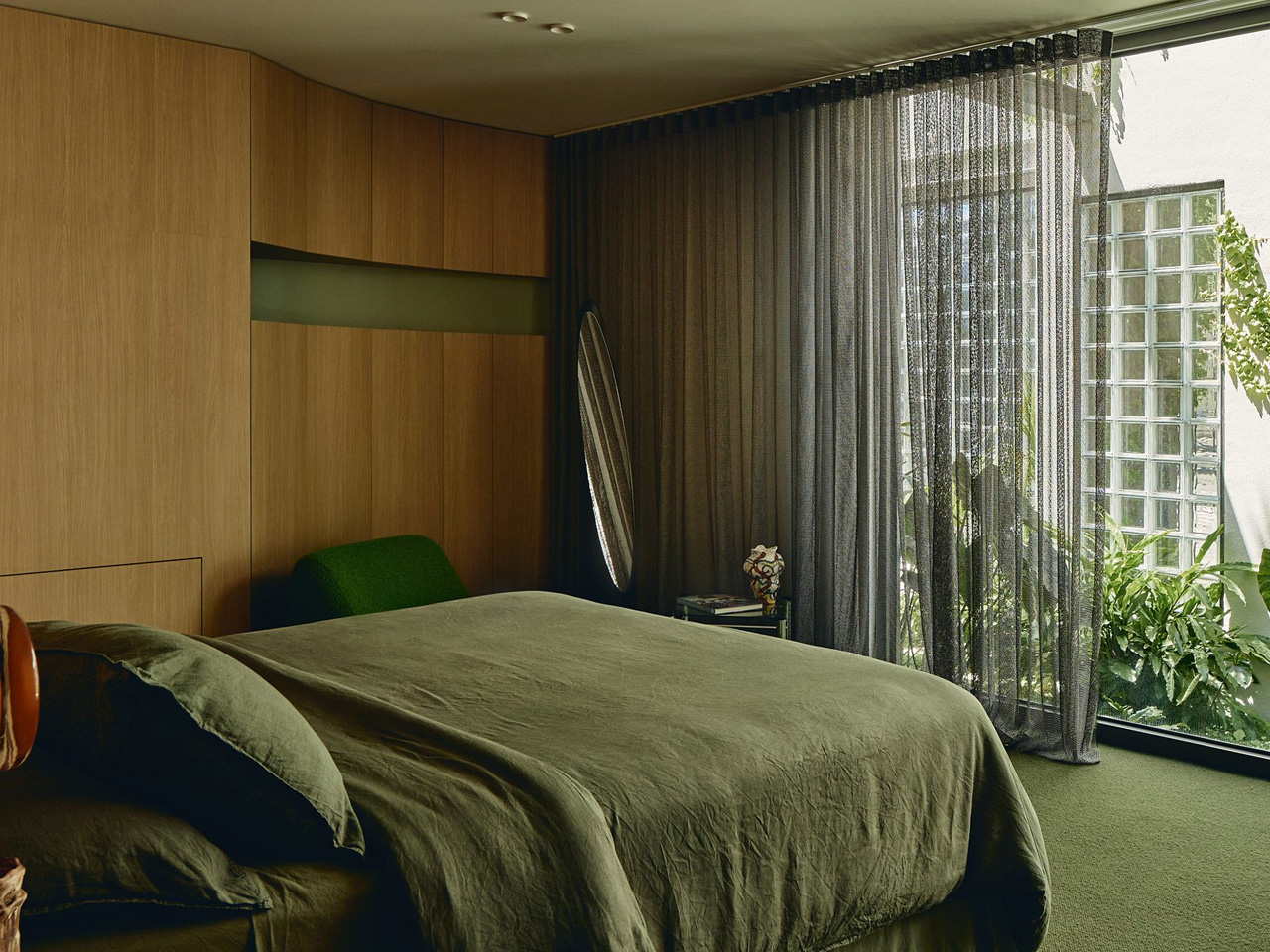
Inside, a white perforated steel staircase rises through all three floors, lit from above by a sequence of triangular skylights. Oak covers the floors, walls, and ceilings, anchoring the interior in warmth. On the second floor, three bedrooms, a family bathroom, and a living space are dressed in timber panelling and mossy-green carpet, with floor-to-ceiling windows drawing the outside in. The colour palette is deliberately restrained — natural materials do the work.

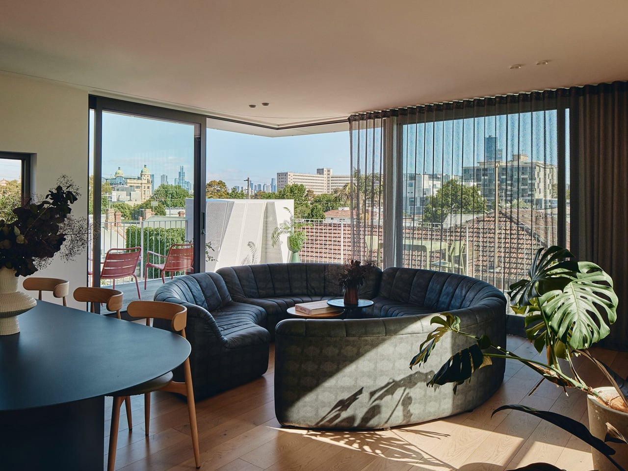
The third floor opens everything up. An open-plan kitchen, dining, and living space spills onto a silvertop ash deck with treetop views and sightlines to Melbourne’s city skyline. Below, the back garden holds a swimming pool, outdoor seating, and the kind of quiet that inner-city addresses rarely afford.

Green roofs, vertical gardens, and planted internal screens mean that no matter where you stand in the house, you can see something alive. That is not incidental — it is the brief. Kister built a home where nature is the architecture, and the century-old corner shop is simply its best possible frame.

The post This 1910 Melbourne Corner Shop Is Now a Three-Story Home With a Garden as Its Front Door first appeared on Yanko Design.
This House on Lake Memphremagog Was Designed to Disappear

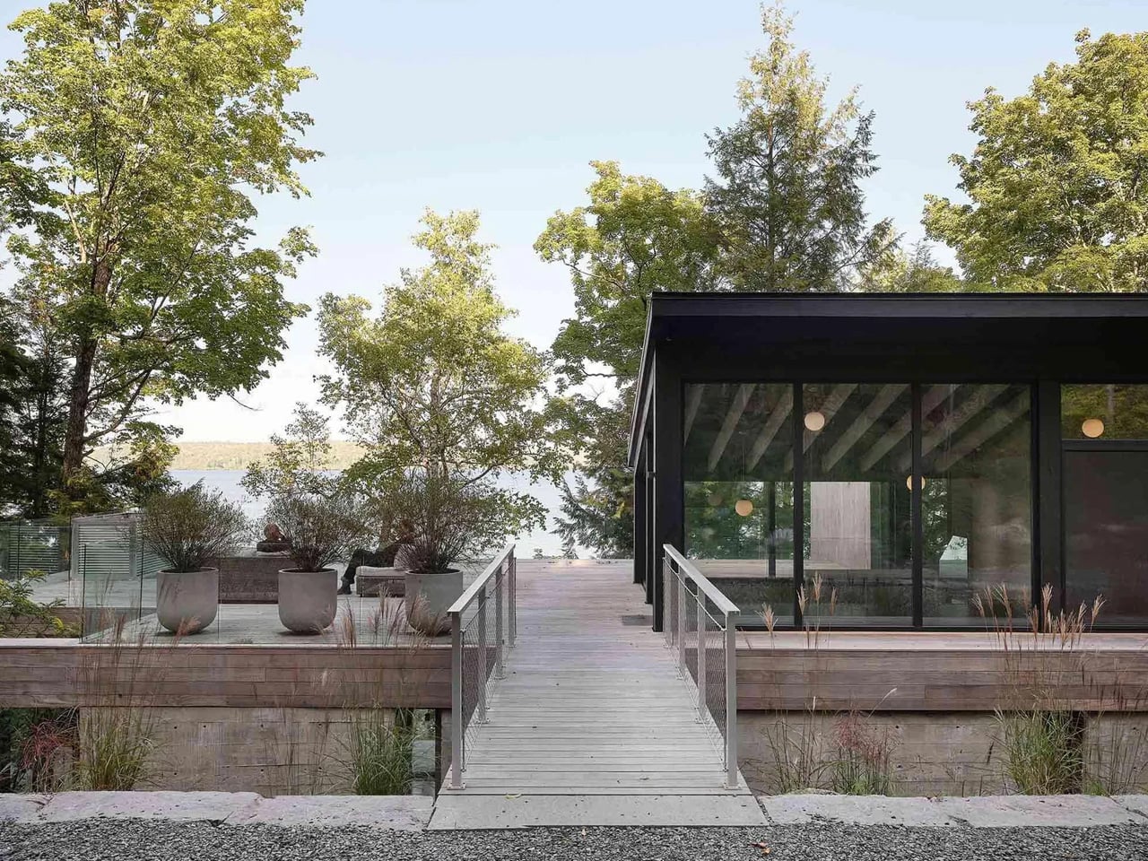
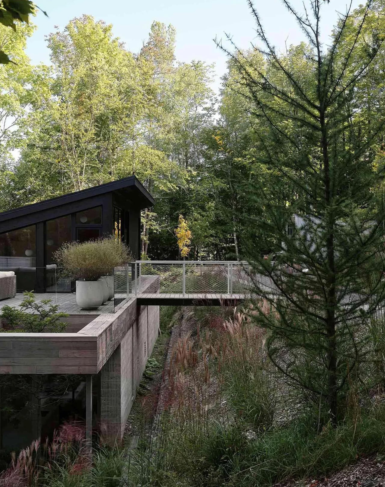
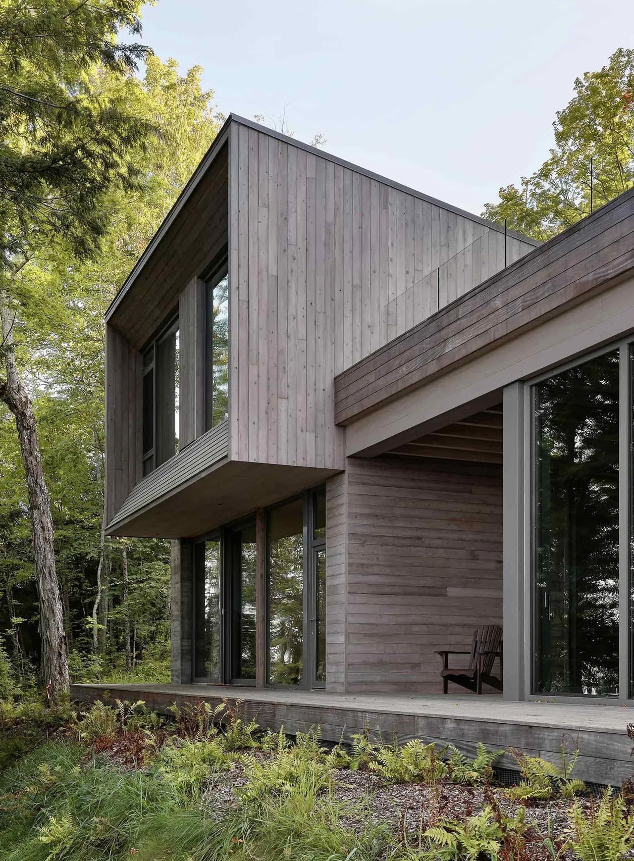
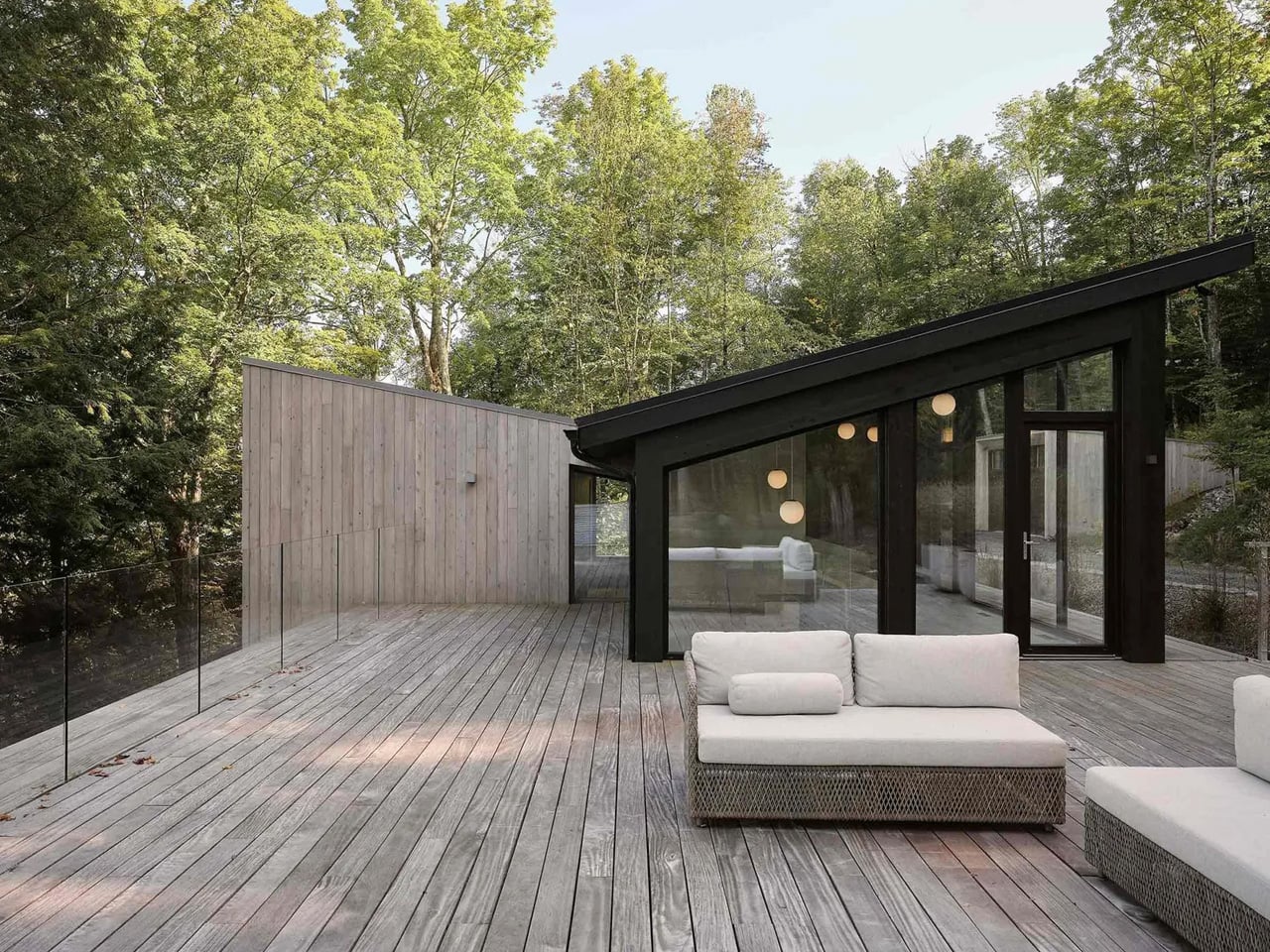
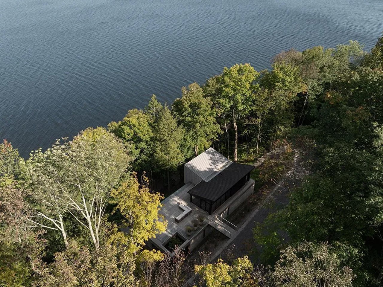
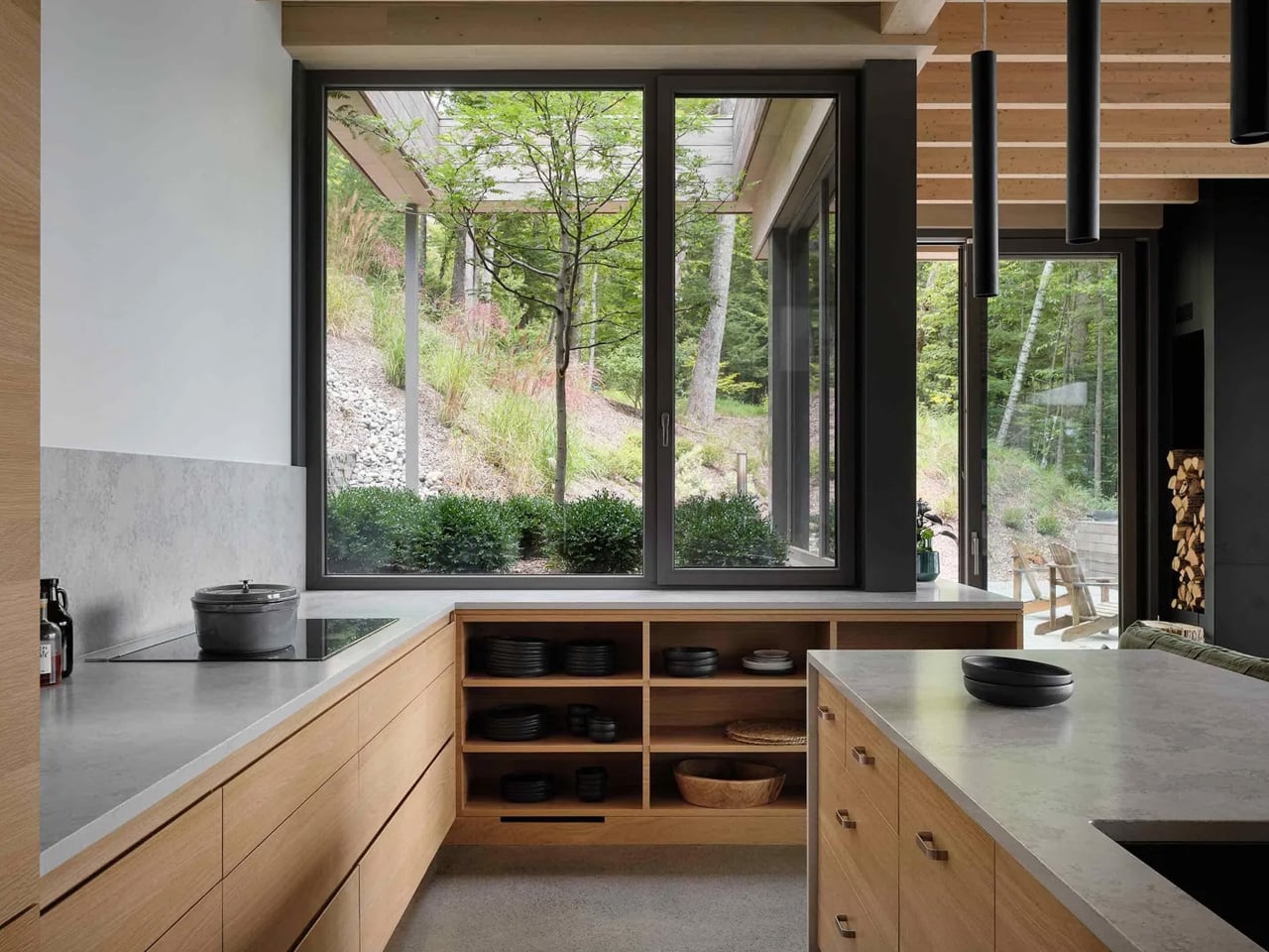
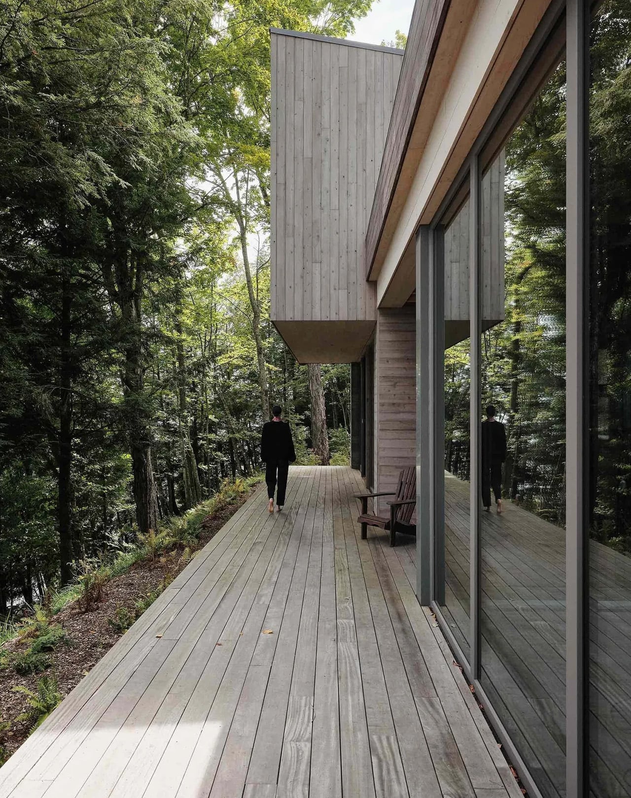
Most houses on a lake want you to know about it. The Counter-Slope House by Montreal-based yh2 Architecture is the opposite — perched on a steep slope along the southern shore of Lake Memphremagog in Potton, Quebec, it earns your attention precisely because it doesn’t demand it.

Completed in 2024 across 4,530 square feet, the residence sits within one of Canada’s most geographically charged landscapes: a terrain of dense woodland, dramatic gradients, and mountain-cast shadows. The studio, led by founding principals Marie-Claude Hamelin and Loukas Yiacouvakis, approached the site not as something to build upon, but as something to negotiate with. The result is architecture that reads less like an imposition and more like a considered guest.

Designer: yh2 Architecture

The plan breaks into two distinct volumes, each stepping gently into the slope to follow the contours of the land rather than flatten them. Above each volume, a subtly shifting dual-pitched roof reduces the building’s perceived mass while quietly echoing the topography that surrounds it. It’s a move that feels almost camouflaging — the house belonging to the hillside rather than sitting on top of it.

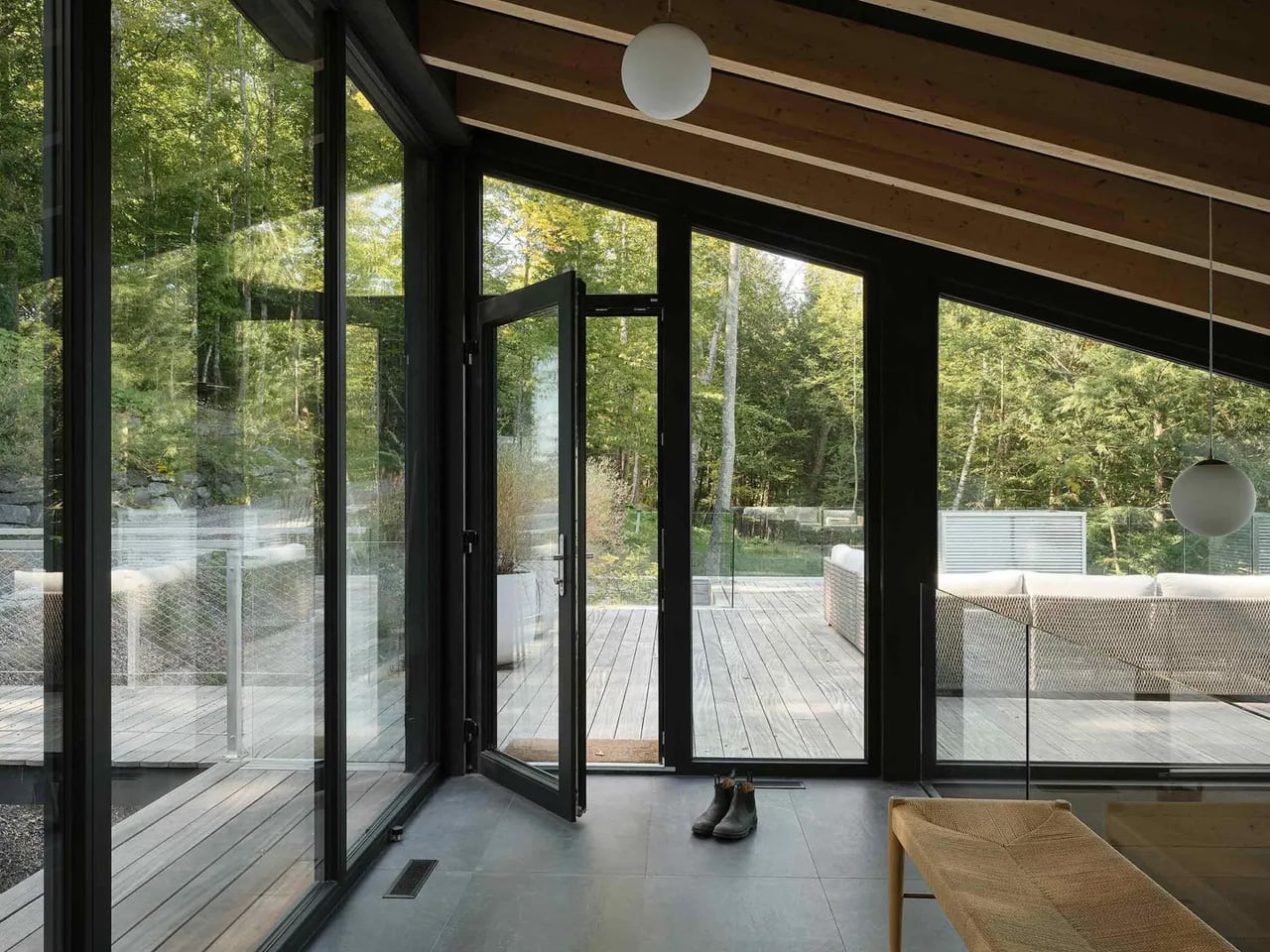
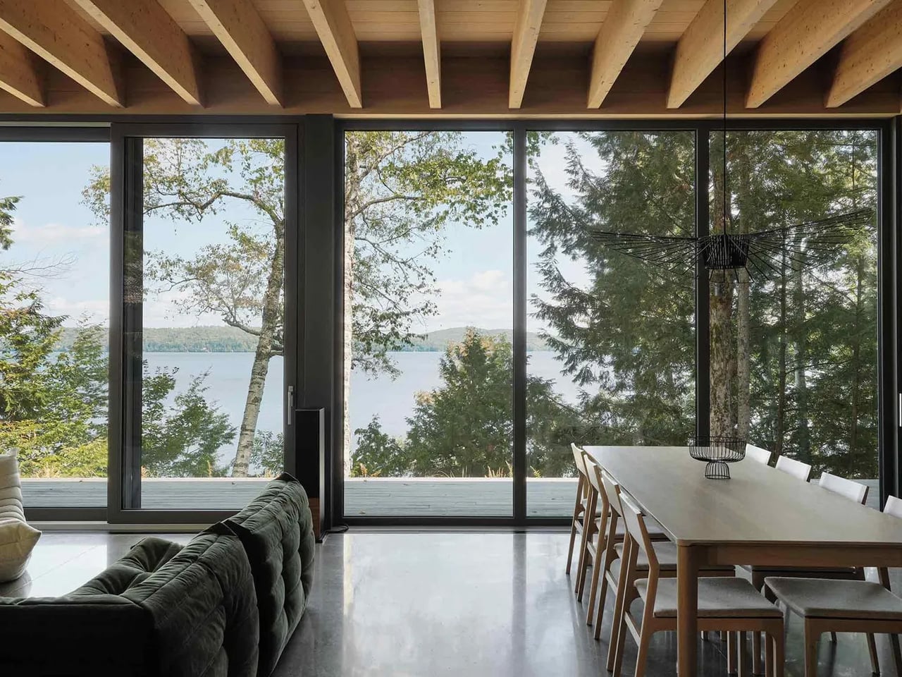
A dense treeline separates the structure from the lake, and YH2 turned this threshold into an architectural tool. Windows are positioned not to frame the water directly, but to catch glimpses of it through the leaves — shimmering and partial, like something discovered rather than displayed. Light enters from the opposite direction, filtering softly through the interior and shifting across the day. The experience of the house becomes tied to time, season, and the slow movement of the natural world outside.

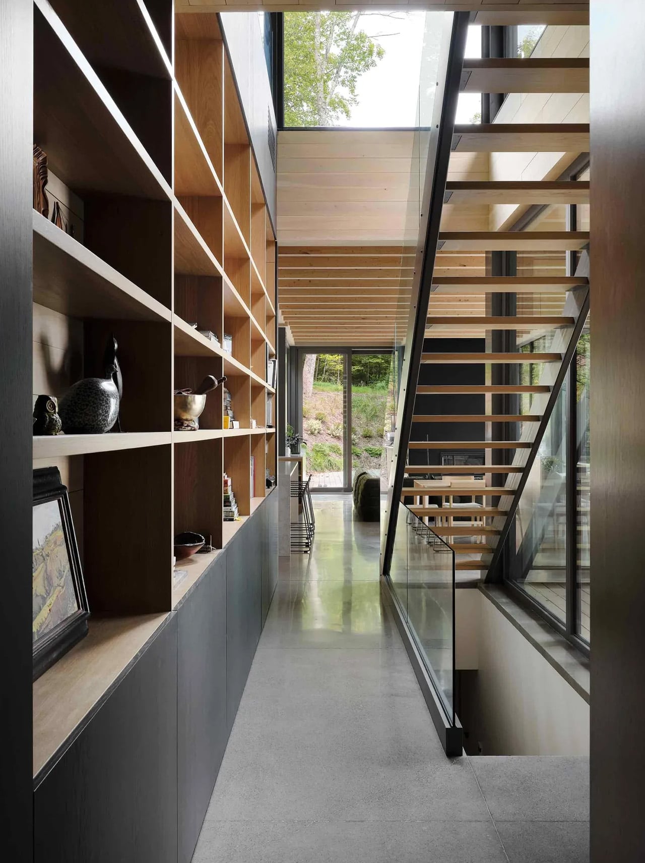
Materials were chosen with the same economy. Weathered cedar wraps the exterior, its tone and texture fading into the surrounding woodland without ceremony. Inside, white oak and an exposed timber structure give the spaces warmth and rhythm. The wood is left unfinished — honest about what it is, and precise in how it performs. Black architectural elements appear selectively throughout, acting as framing devices that sharpen the relationship between interior space and landscape view.

The Counter-Slope House doesn’t try to resolve the tension between architecture and nature. Instead, it holds that tension open, letting both exist on their own terms. For a studio with three decades of critically recognized work behind it, this project feels like a distillation — proof that restraint, when applied with conviction, is its own form of ambition.

The post This House on Lake Memphremagog Was Designed to Disappear first appeared on Yanko Design.
Tetro Arquitetura’s Xingu House Turns a Complex Brazilian Hillside Into Something Extraordinary

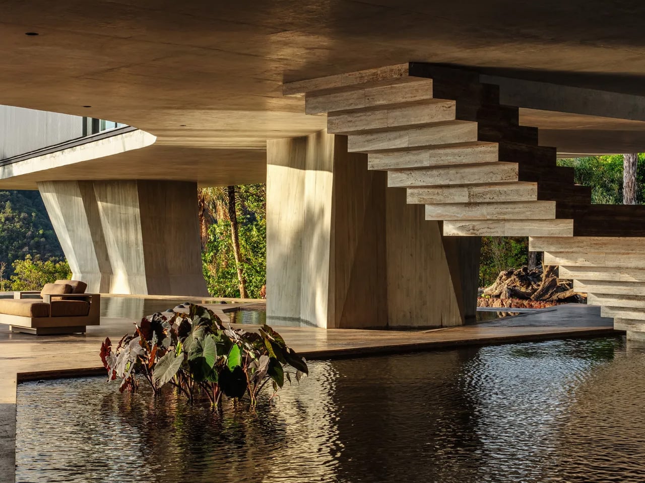
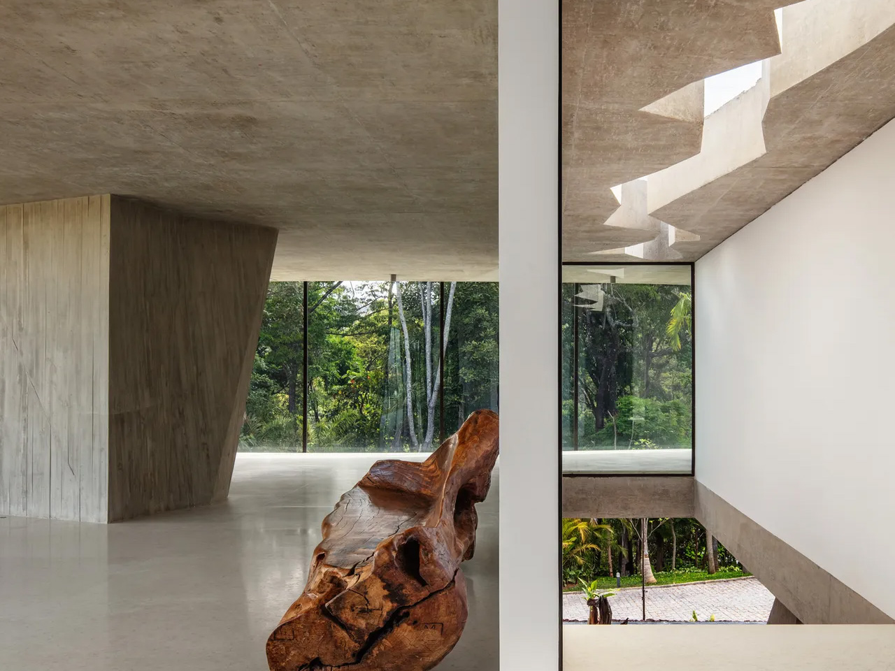
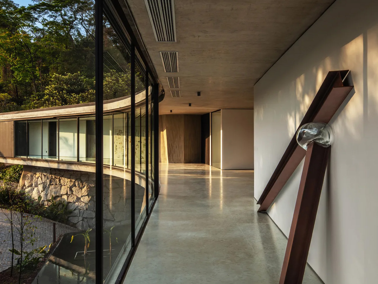
Perched above ancient stone walls in Nova Lima, Minas Gerais, the Xingu House reads less like a building and more like a geological event. Designed by Belo Horizonte–based studio Tetro Arquitetura — led by principal architects Carlos Maia, Débora Mendes, and Igor Macedo — the residence occupies an 8,000-square-meter plot that arrives with its own history, its own landscape, and its own set of demands.

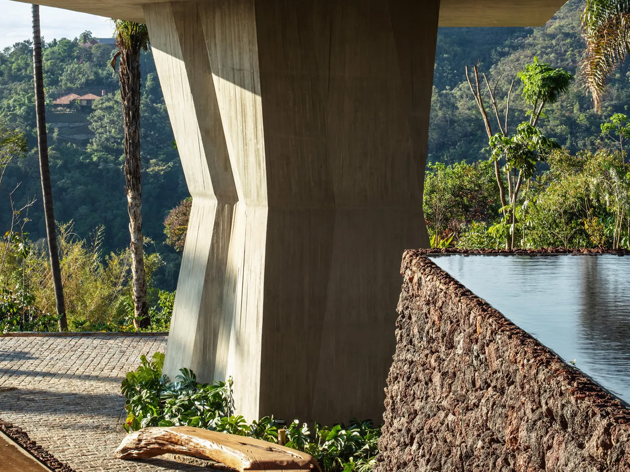
The site is layered in a way that most architects only dream about. Stone walls left over from a previous structure carve through the terrain, native forests press in from the edges, grassy plateaus open to sweeping mountain views, and somewhere beneath it all, a cave sits waiting — earmarked as the home’s future winery and cheese cellar. Tetro didn’t try to simplify any of it. The shape of the house is a direct answer to every peculiarity the land threw at the team.

Designer: Tetro Arquitetura

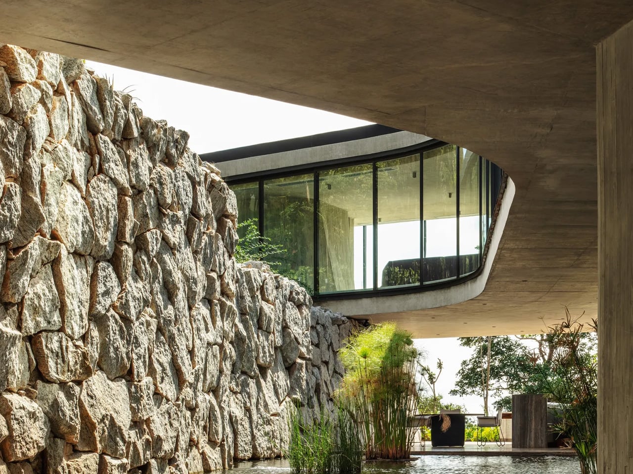
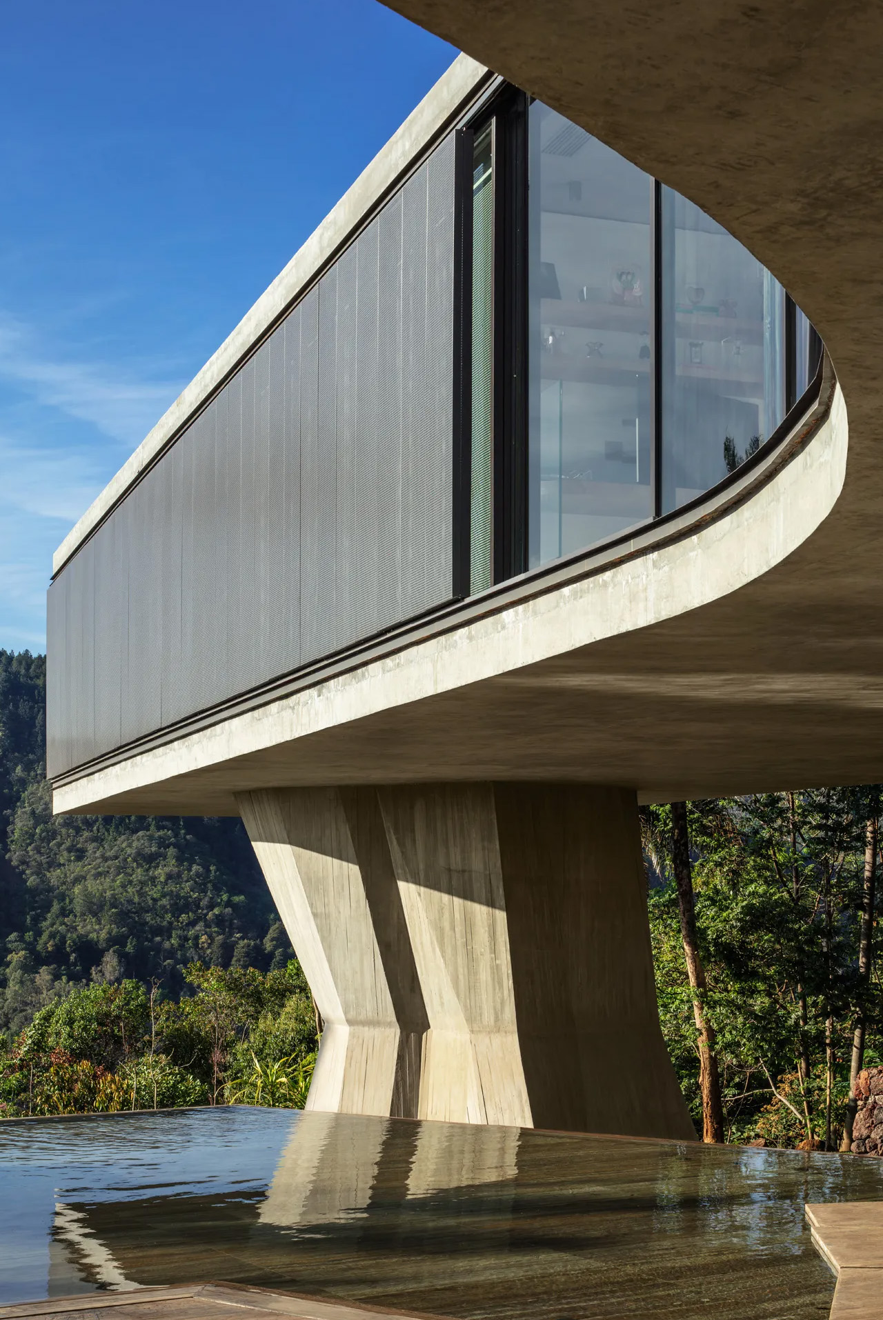
The studio’s starting point was straightforward: find the best view and push the residents toward nature at every opportunity. That intent shaped everything. The main volume of the house lifts six meters above the natural ground level, floating over the old stone walls and giving the two primary suites an uninterrupted panorama of the surrounding mountains. What makes this possible are the thick, irregularly-shaped concrete pillars rising from below — structural forms that pull double duty by housing bathrooms, the staircase, an elevator, and service areas within their mass.

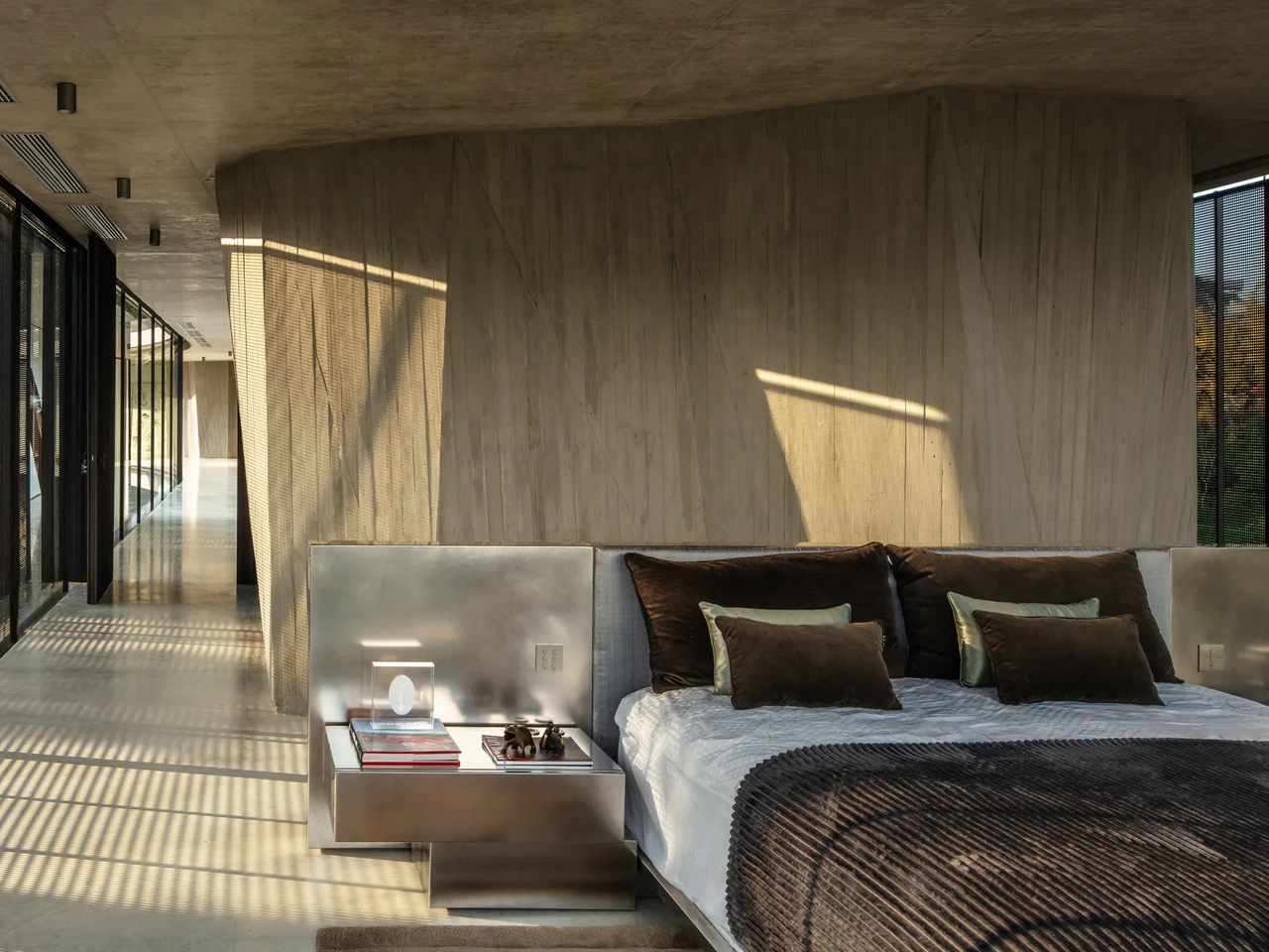
The program is divided across three distinct sectors, referred to internally as “tips.” The elevated main volume holds the primary suites; the other two tips extend outward and settle onto the plateau created by the old stone walls, containing the guest accommodation. The result is a home that doesn’t sit on its land so much as reach across it — arms extended, each pointed toward a different fragment of the terrain.

The relationship between structure and nature becomes even more deliberate at the spa. Rather than attach it to the main house, Tetro designed it as an entirely separate volume — one that threads itself between existing trees rather than displacing them. Inside, a sauna, changing rooms, a resting area, and a gym make up the program, all sheltered within a shape that responds to the forest rather than imposing on it.

At 1,500 square meters, the Xingu House carries the kind of complexity that can easily become noise. Tetro keeps it quiet — letting raw concrete, native landscape, and a clear sense of purpose do the talking.

The post Tetro Arquitetura’s Xingu House Turns a Complex Brazilian Hillside Into Something Extraordinary first appeared on Yanko Design.
Young Projects’ Cut Out House Proves Subtraction Is the Most Powerful Tool in Architecture

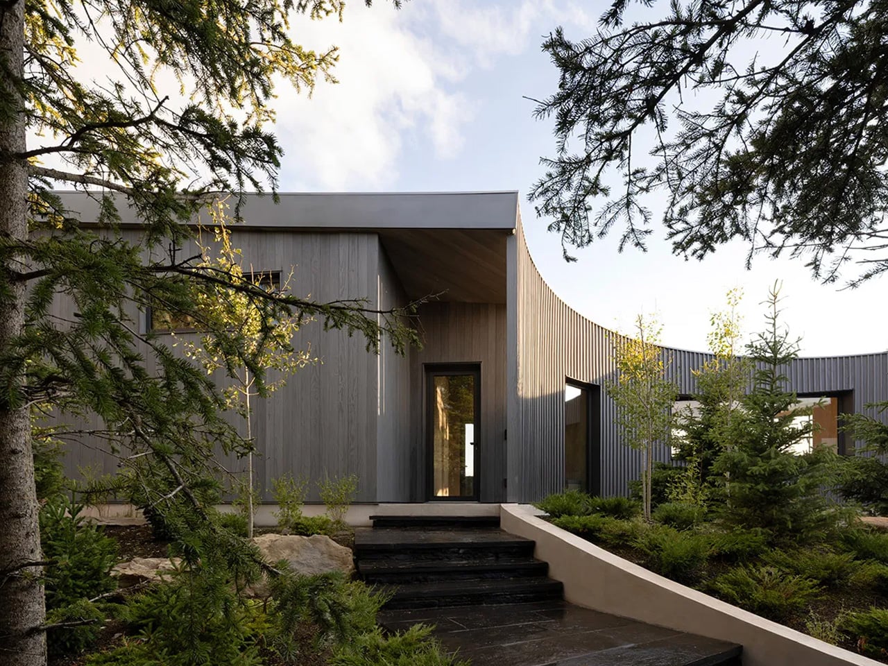
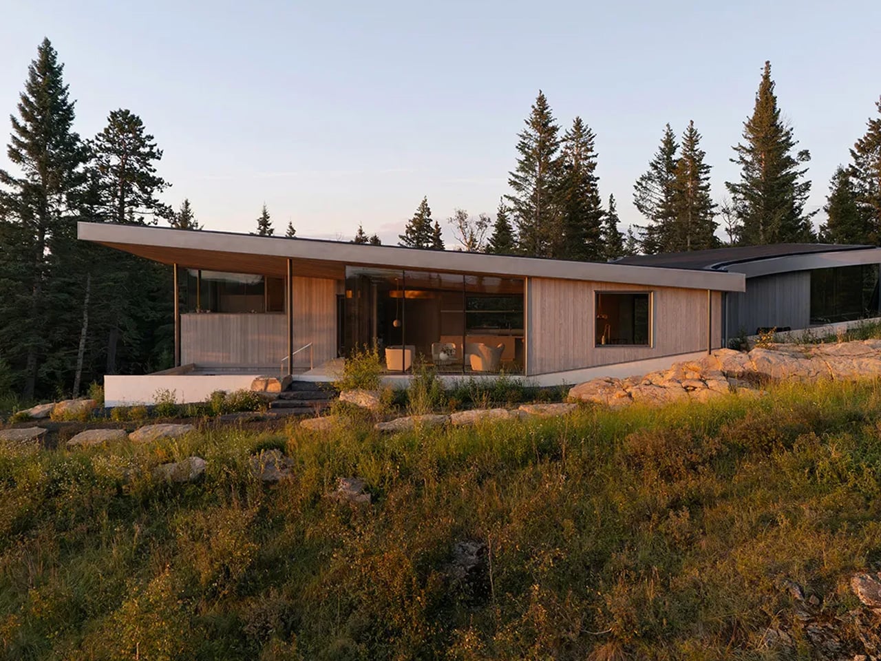
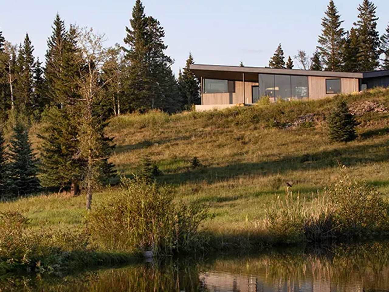
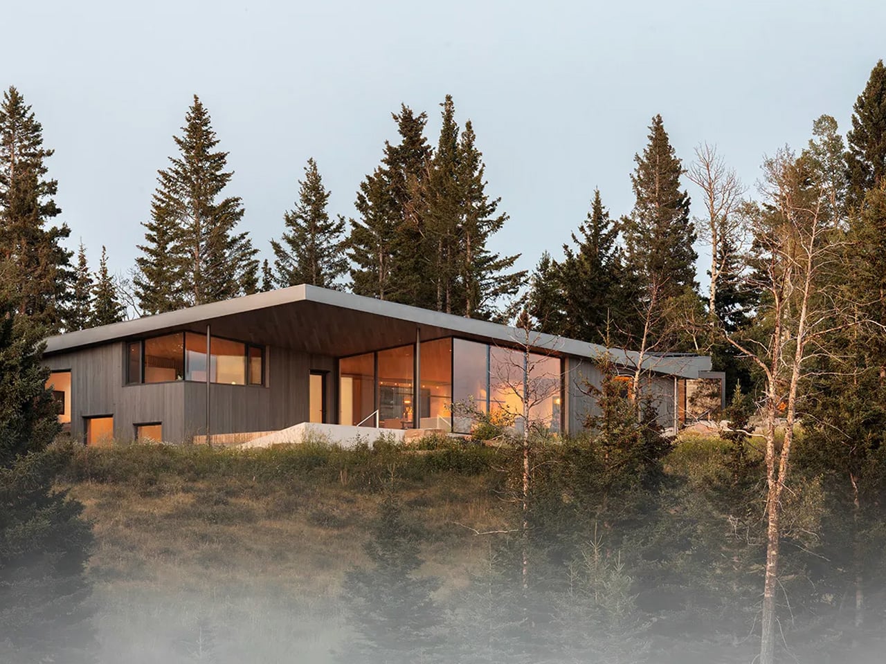
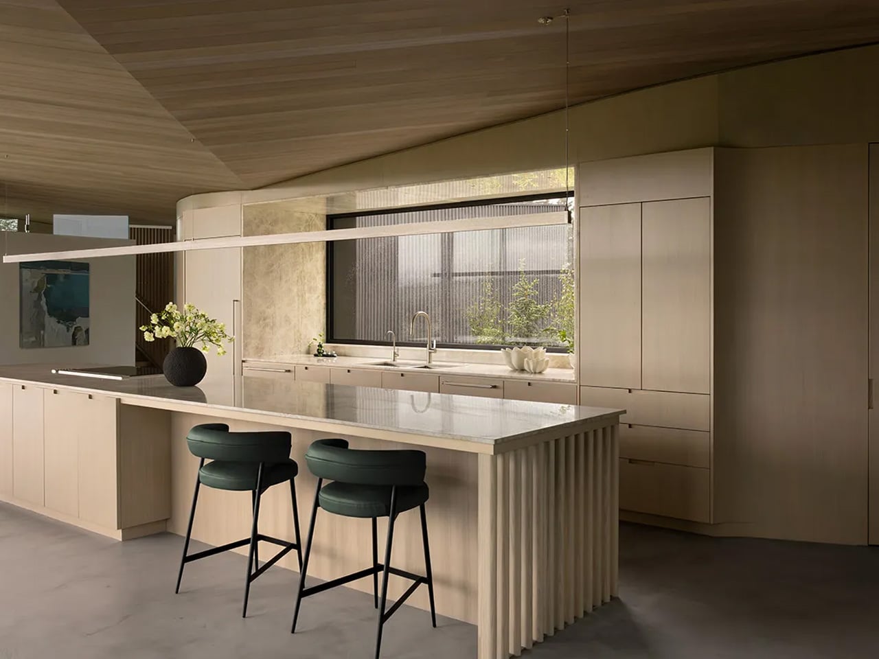
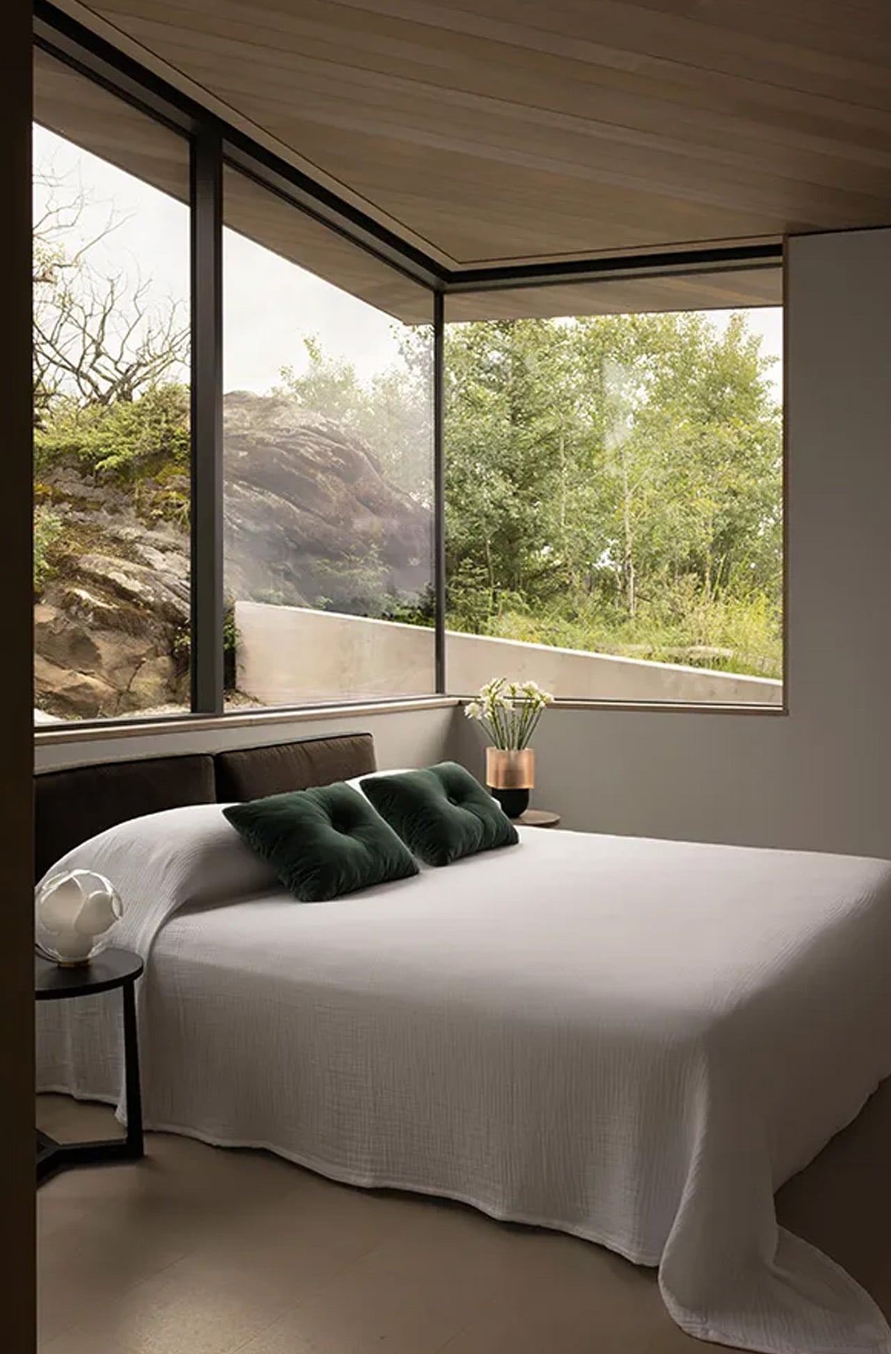
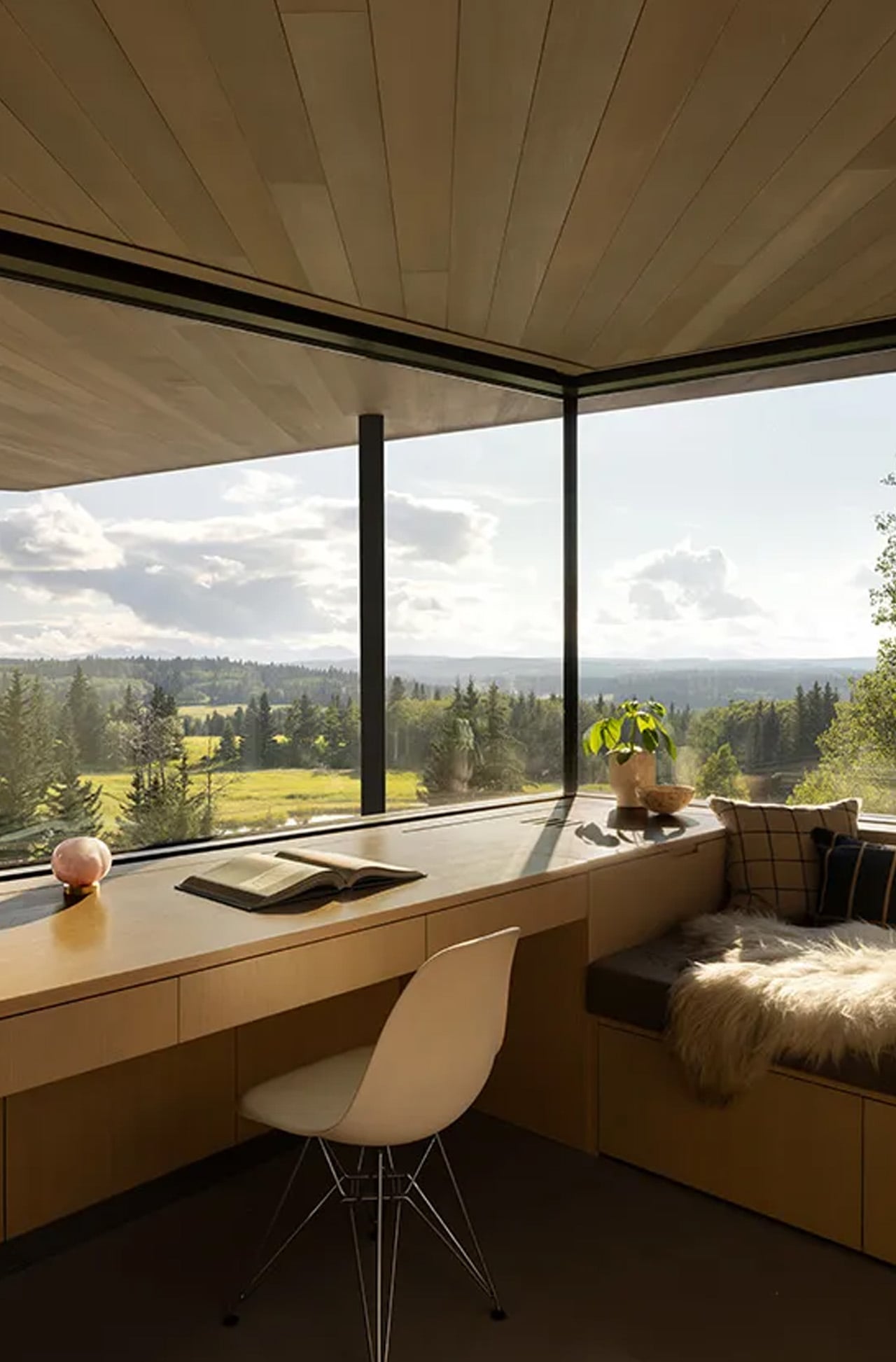
Most mountain houses try too hard. Cut Out House, designed by New York-based studio Young Projects, does the opposite — it sits in the foothills of the Canadian Rocky Mountains, tucked into a low-density development where the land does most of the talking.

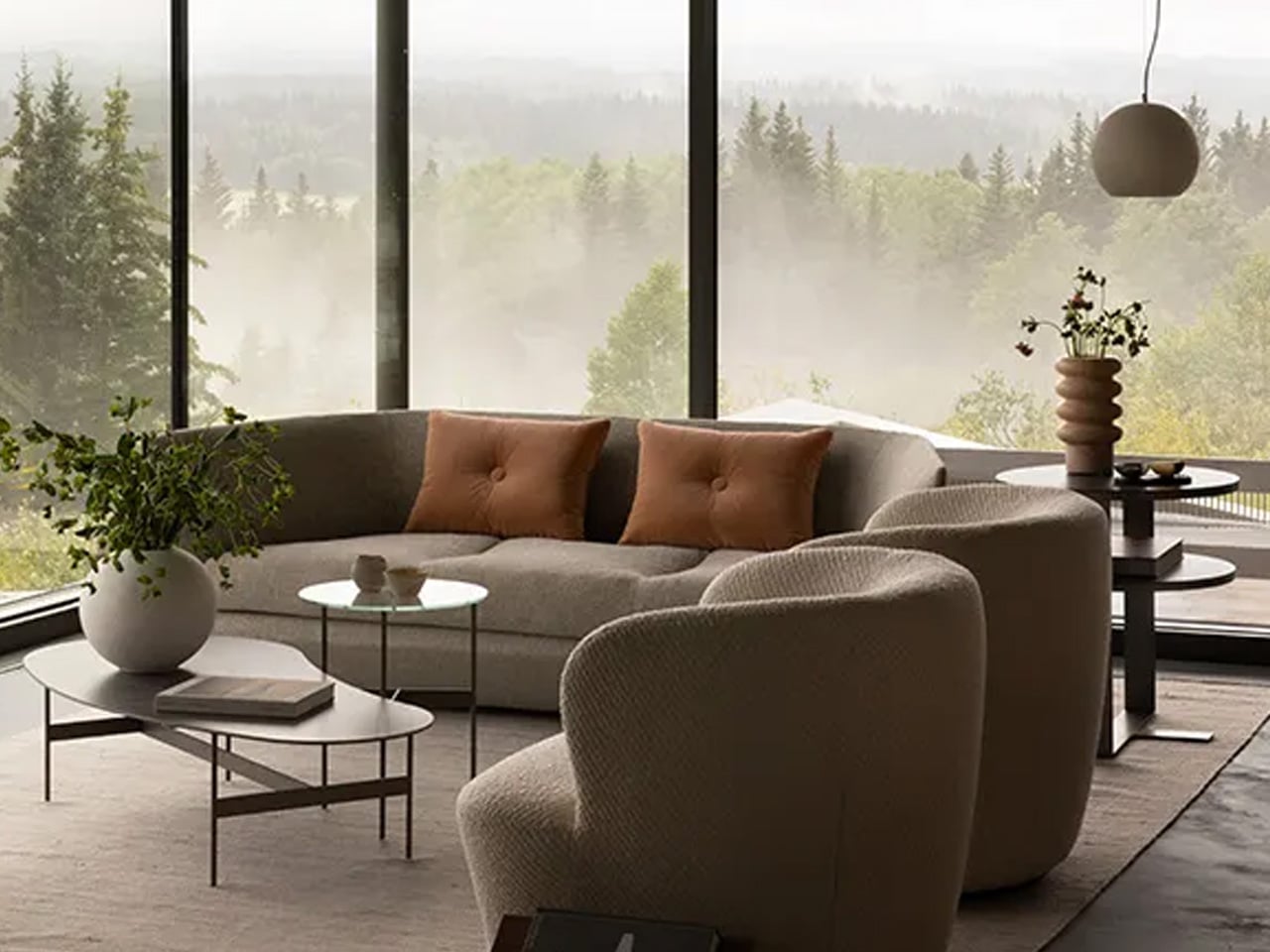
The project was conceived as a family vacation home, and it wears that intention openly. Rather than asserting itself against the landscape, the house responds to it — balancing intimate spaces oriented toward the dense surrounding woodland with communal areas that open dramatically toward the mountains. That duality is the architecture. Everything else follows from it.

Designer: Young Projects

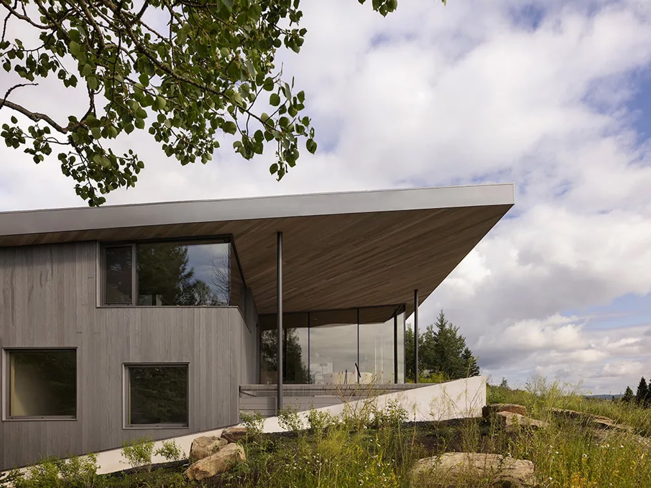
The defining move is the butterfly roof, which Young Projects uses not just as a formal gesture but as a tool for orchestrating experience. The angled planes slope in opposite directions, directing views outward from within while reflecting the terrain’s gradient from outside. Where the roofline climbs, communal living spaces claim the panoramic views. Where tree density compresses the sightlines, private bedrooms pull back into quieter, more sheltered corners of the plan. The roof, in a sense, is the planner.
The “cut out” in the name refers to a series of subtractions carved from the building’s overall volume — openings and recesses that give the house its sculptural character without overworking it. This is a form shaped as much by removal as by addition. The result reads as something confidently simple, which is the harder thing to achieve. Most houses at altitude either defer too much to the landscape or compete with it. Cut Out House does neither.

Gray Accoya wood clads the exterior, a material choice that ages gracefully and lends the structure a tonal continuity with the rock and timber of the surrounding terrain. It doesn’t announce itself. From across a nearby body of water, the butterfly roofline is the first thing you read — a dynamic silhouette that shifts with the light and suggests movement even when the house is still.

Bryan Young founded Young Projects in New York in 2010, and the studio has built a reputation for work that thinks carefully about the relationship between built form and context. Cut Out House extends that sensibility into alpine territory, where the stakes of getting that relationship wrong are immediately visible in every window. The house doesn’t compete with the Rockies. It leans into them, shapes itself around them, and in doing so becomes something more interesting than a retreat — it becomes a calibrated act of looking.

The post Young Projects’ Cut Out House Proves Subtraction Is the Most Powerful Tool in Architecture first appeared on Yanko Design.