There’s a certain kind of freedom that only comes when you stop trying to fit your life into more square footage than you actually need. Rolling Bear Tiny Homes understood that when they built the Koala Bear, a compact, mobile dwelling designed specifically for solo adventurers and couples who’d rather wake up to a new view than a fixed address.
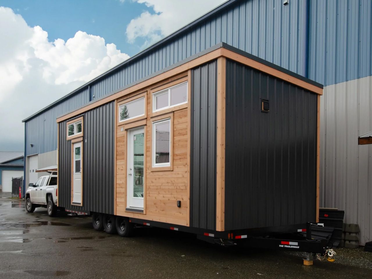
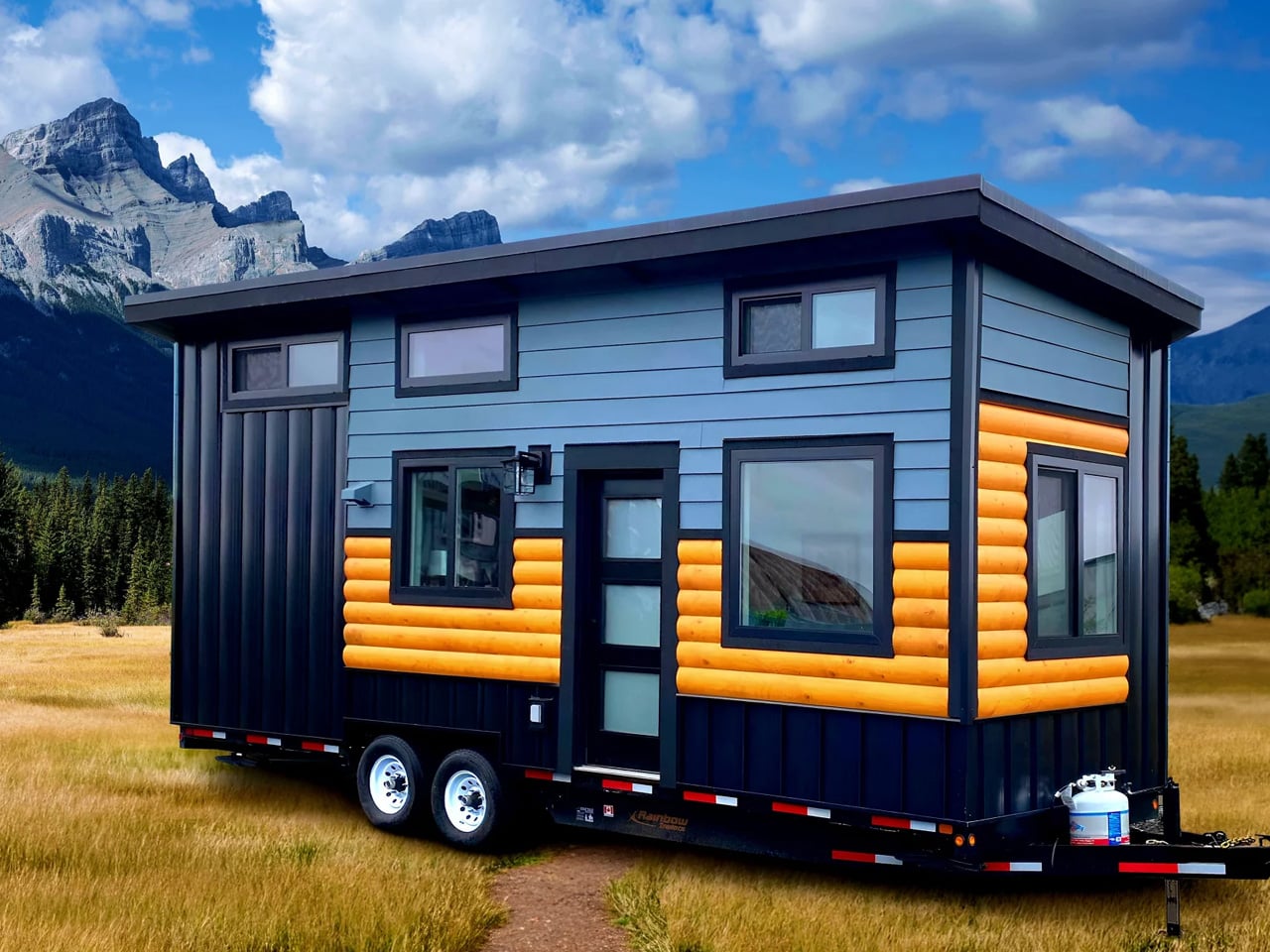
Rolling Bear Tiny Homes is a custom builder based in Richmond, British Columbia, operating under the umbrella of Rolling Bear Construction Inc. The brand has built a reputation across BC for crafting tiny homes that don’t compromise on quality, and the Koala Bear might be the clearest expression of that philosophy yet. At 26 by 8.5 feet, it packs up to 250 square feet of thoughtfully designed living space into a form that’s road-ready and genuinely livable.
Designer: Rolling Bear Tiny Homes
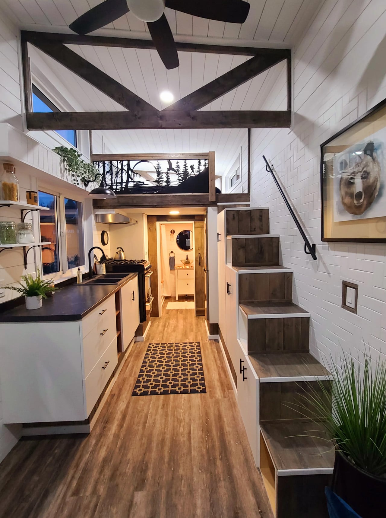
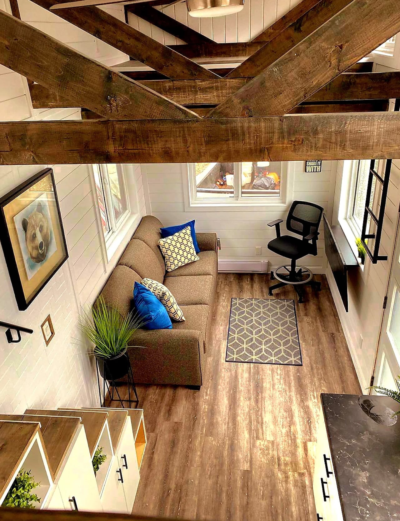
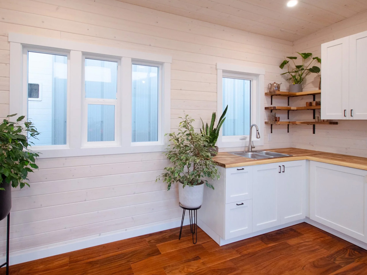
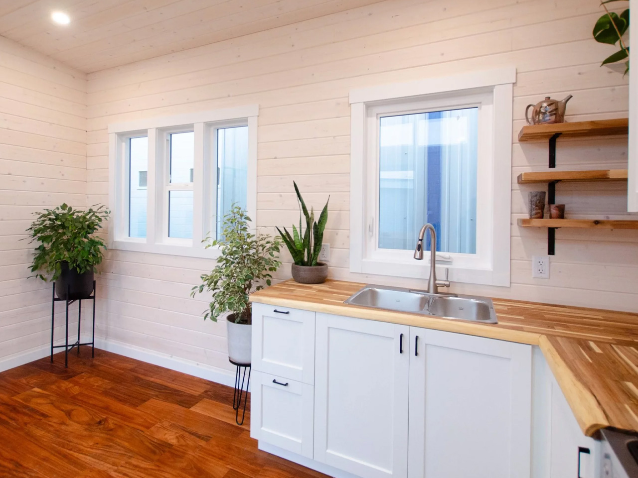
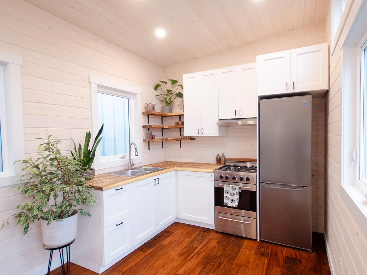
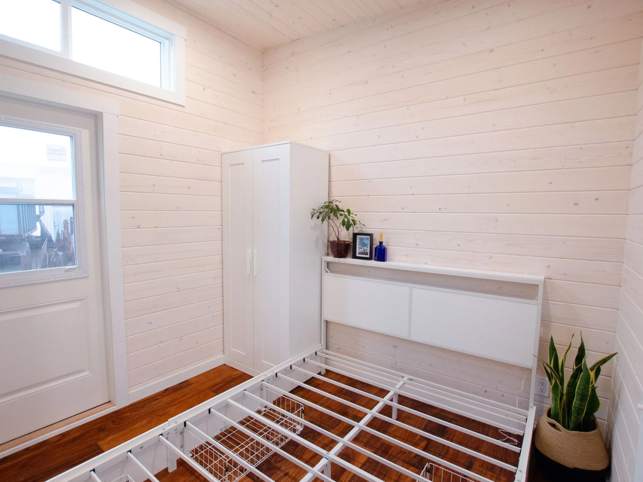
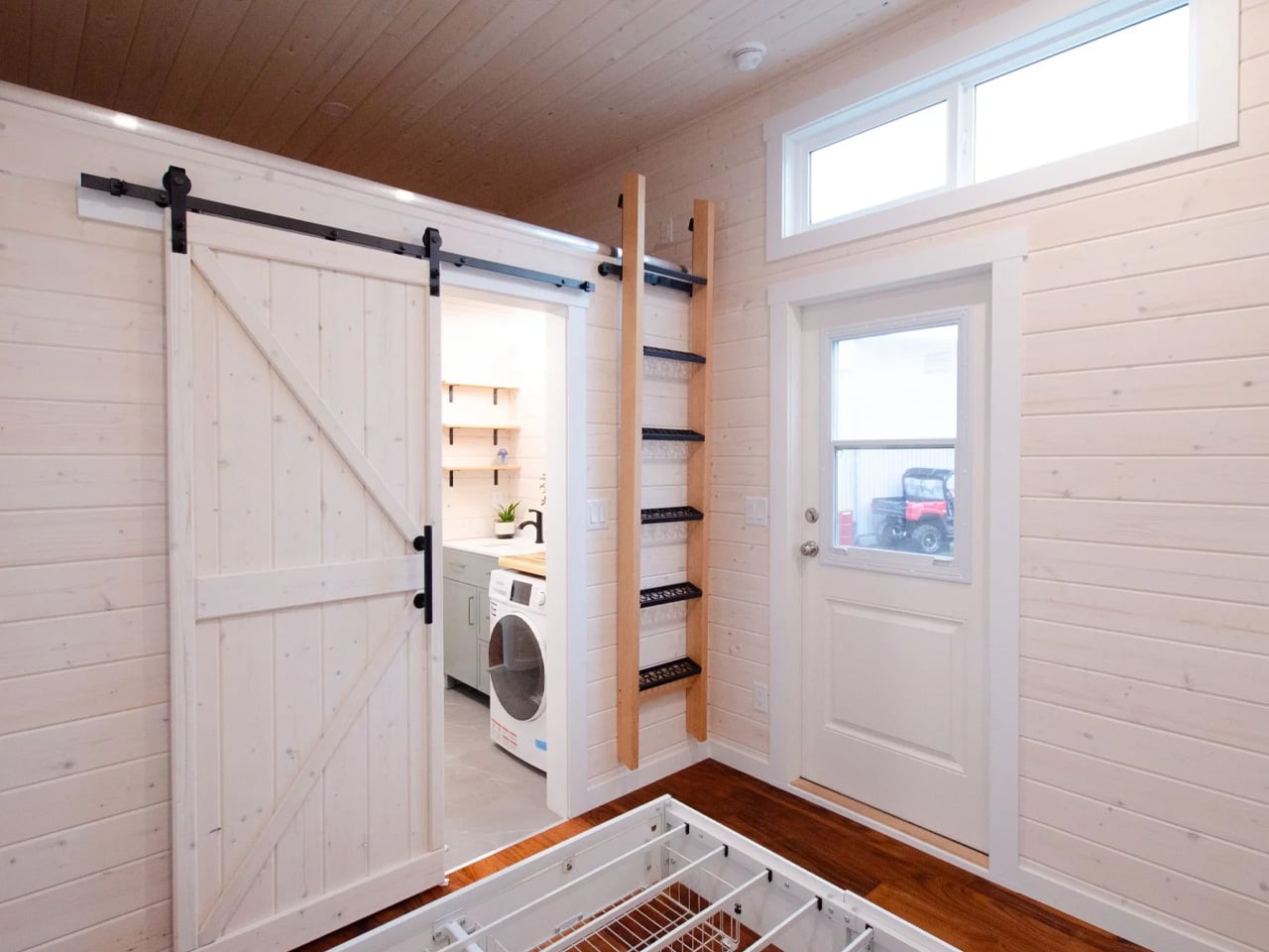
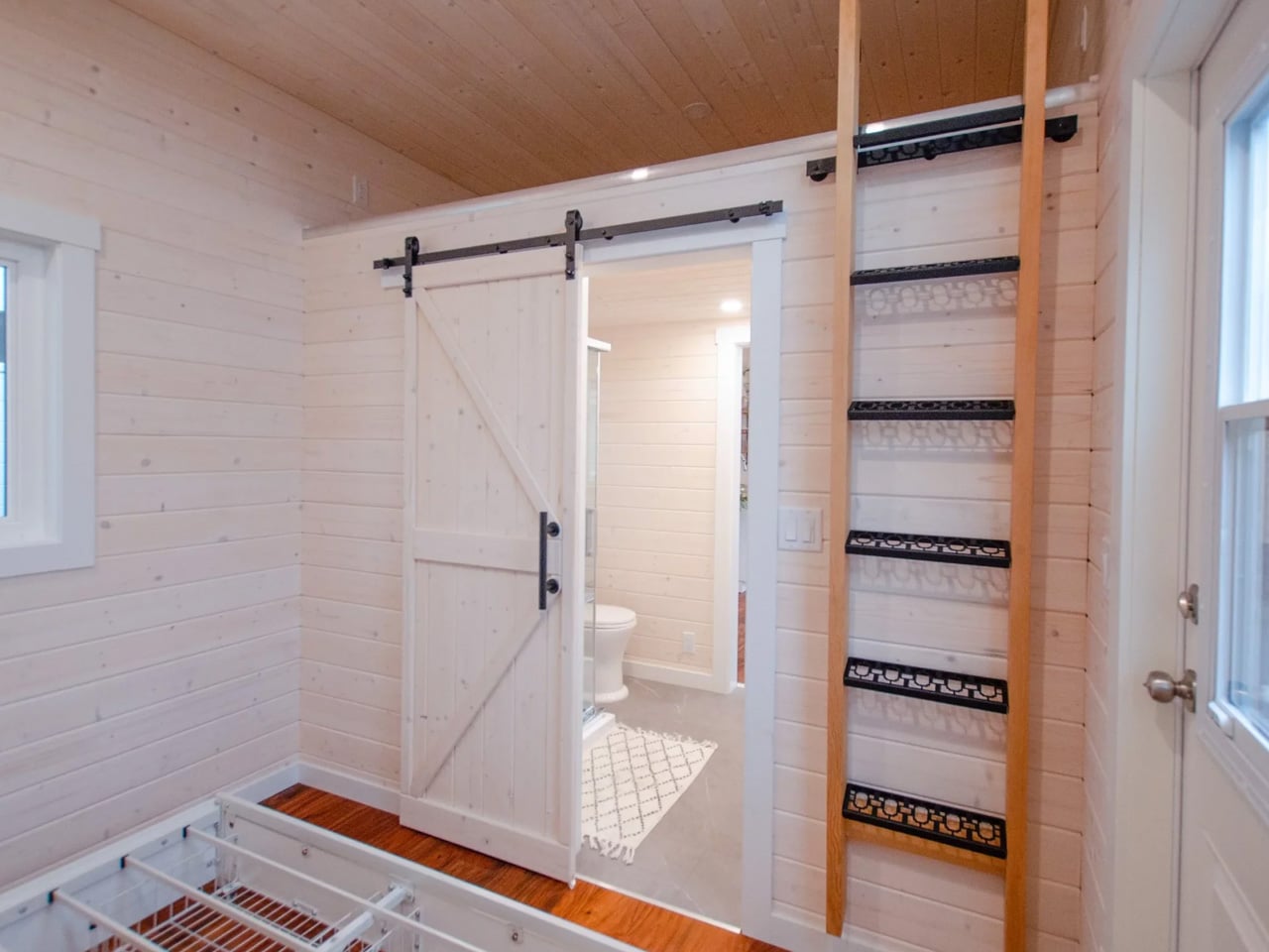
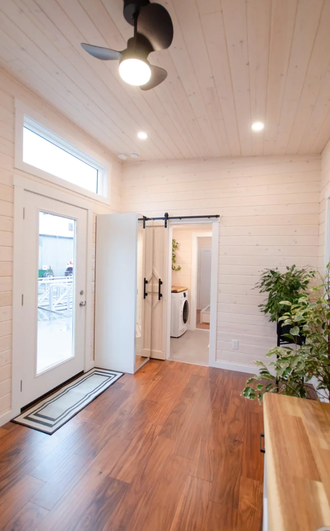
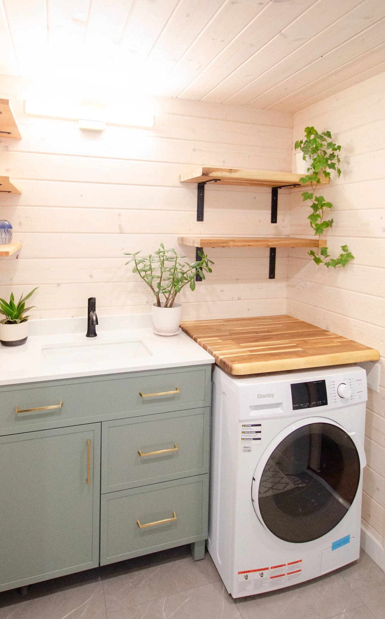
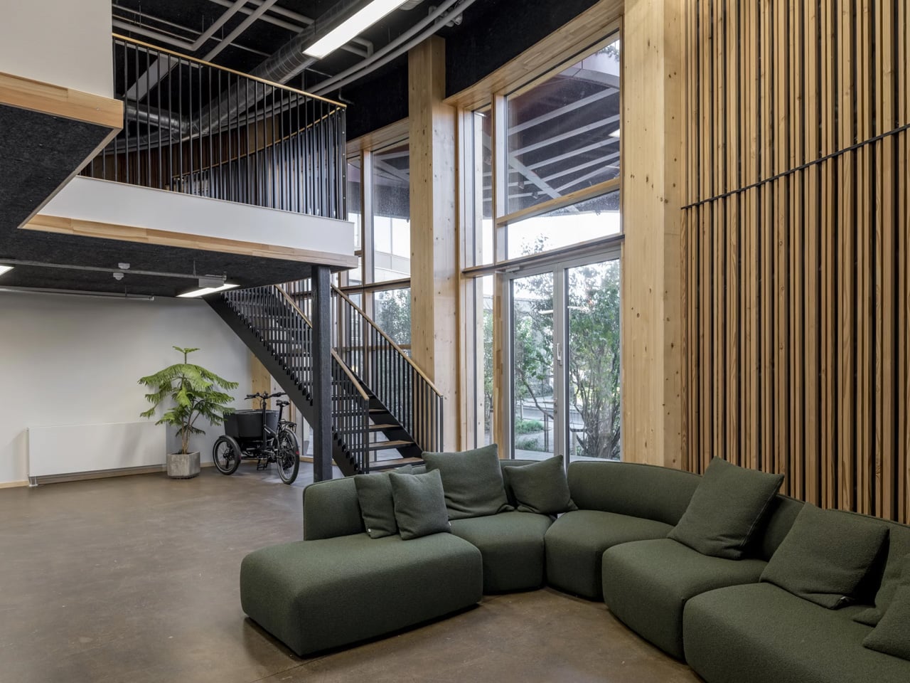
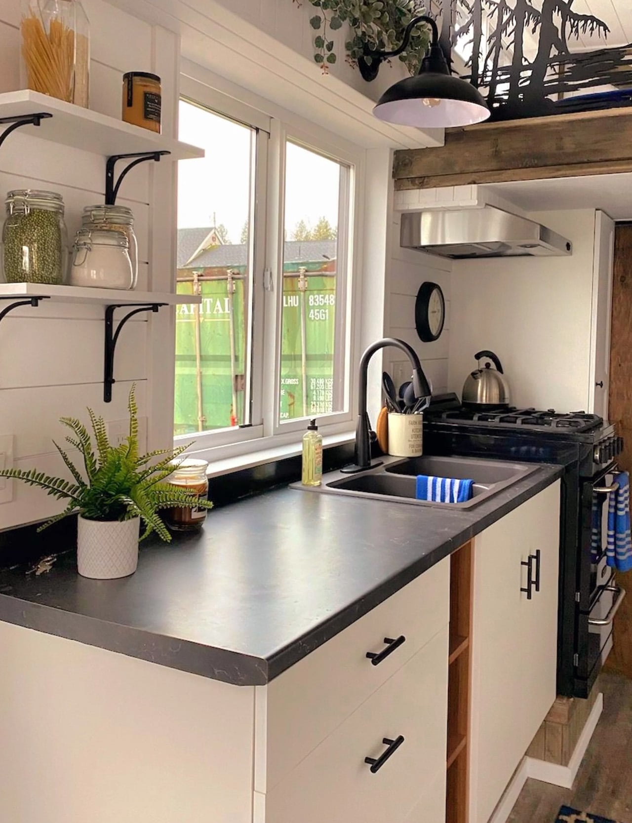
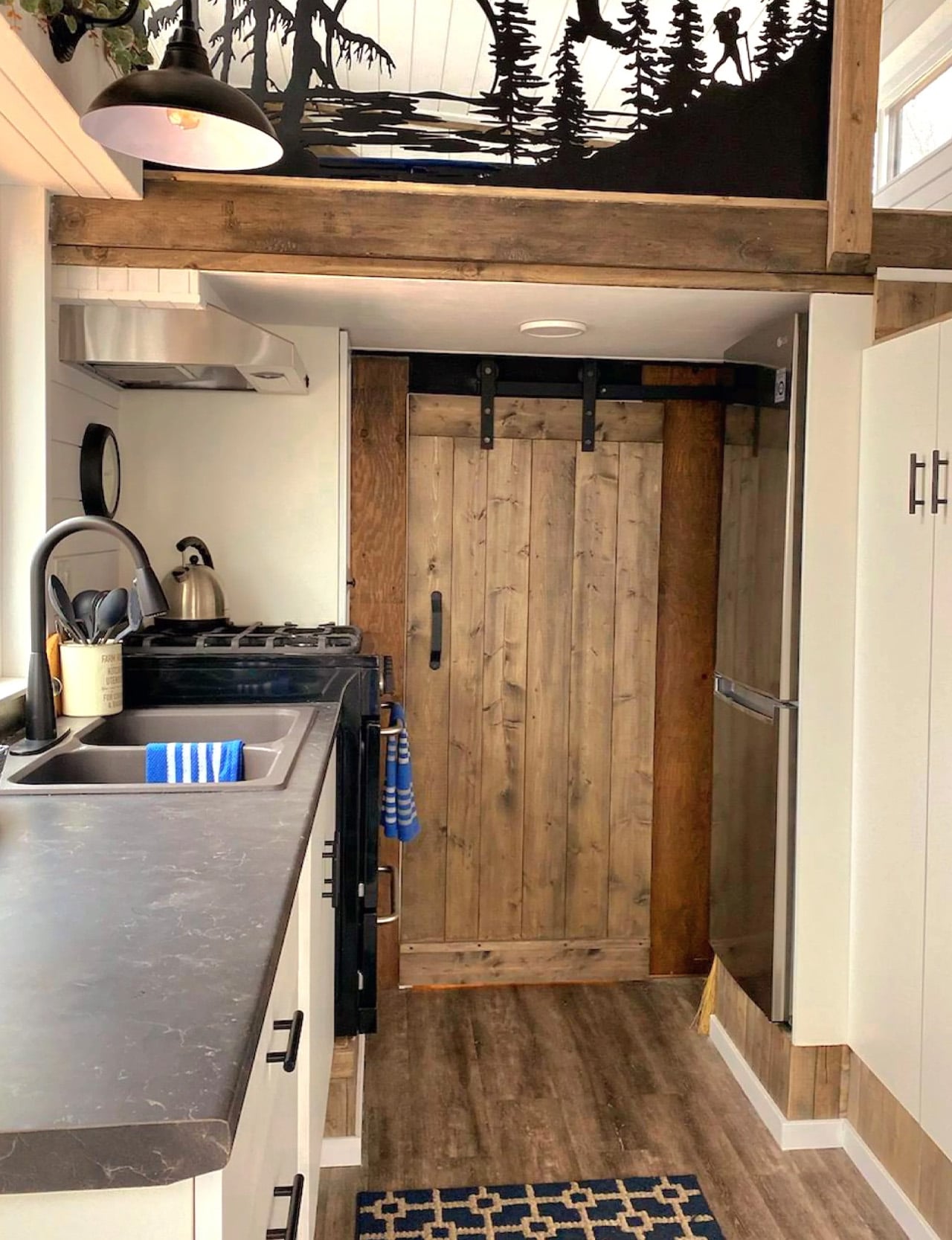
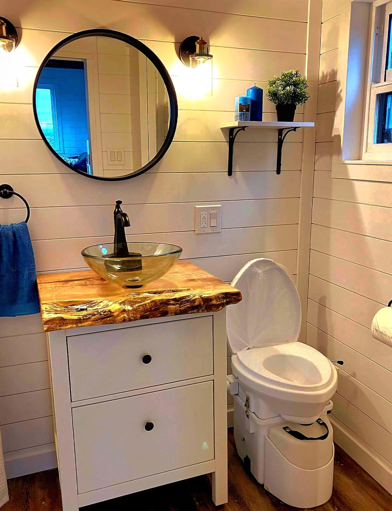
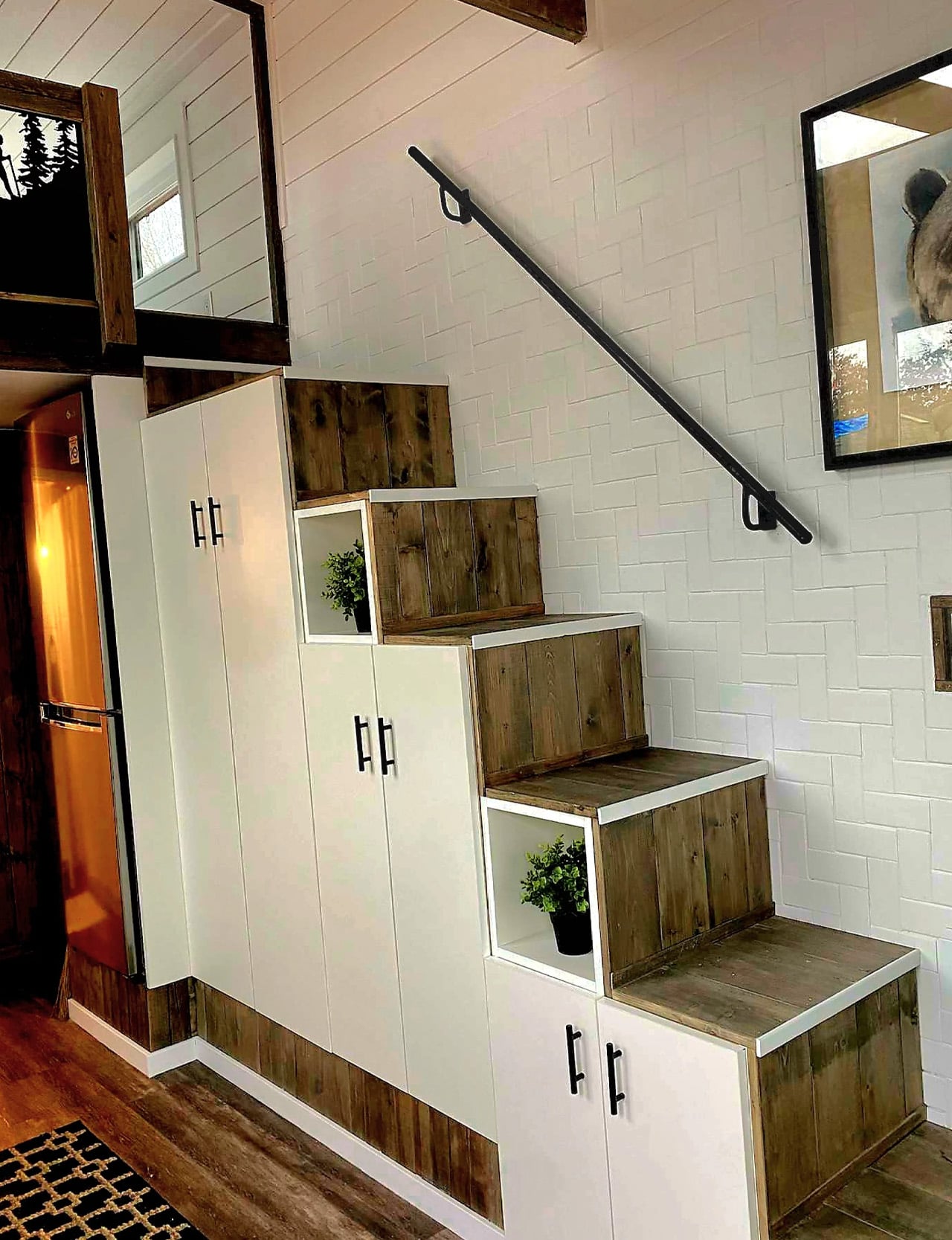
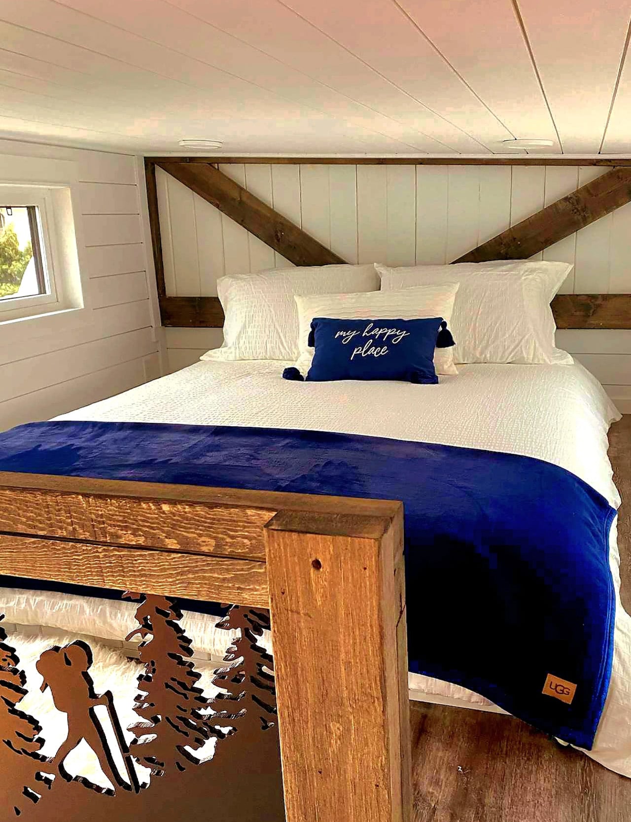
The interior doesn’t feel like a compromise. Custom joinery, premium finishes, and artisanal detailing run throughout, giving the Koala Bear an aesthetic that reads more like a well-edited apartment than a mobile shelter. The layout includes a comfortable bedroom, a fully equipped kitchenette, and a living area designed around how people actually move through a small space, not just how it photographs. Every inch is accounted for without ever feeling claustrophobic.
On the technical side, the Koala Bear is built to exceed both CAD Z240 RV and Canadian Building Code guidelines, and it’s constructed to meet NOAH certification standards. That matters more than most buyers initially realize. It’s the difference between a home that holds up through BC winters and one that doesn’t. A state-of-the-art HVAC system and a sustainable water-heating solution handle year-round climate control, while a full suite of energy-efficient appliances keeps utility costs low.
For solo travelers and couples, the appeal goes beyond the specs. The Koala Bear is built around the idea of flexibility, the ability to be parked along a coastline one season and nestled near a mountain trail the next. Rolling Bear offers delivery and setup services, which removes a significant logistical barrier for first-time tiny home buyers.
Priced at approximately at US$87,000 with financing available, the Koala Bear sits at an accessible entry point for the Rolling Bear lineup. For what it offers, craftsmanship, mobility, and a design sensibility that doesn’t ask you to sacrifice style for size, it makes a compelling case that the best homes aren’t always the biggest ones. Sometimes, they’re exactly the right size.
The post The Koala Bear Is the Tiny Home Built for People Who’d Rather Move Than Settle first appeared on Yanko Design.