This Furniture System Uses Just 2 Materials and No Glue

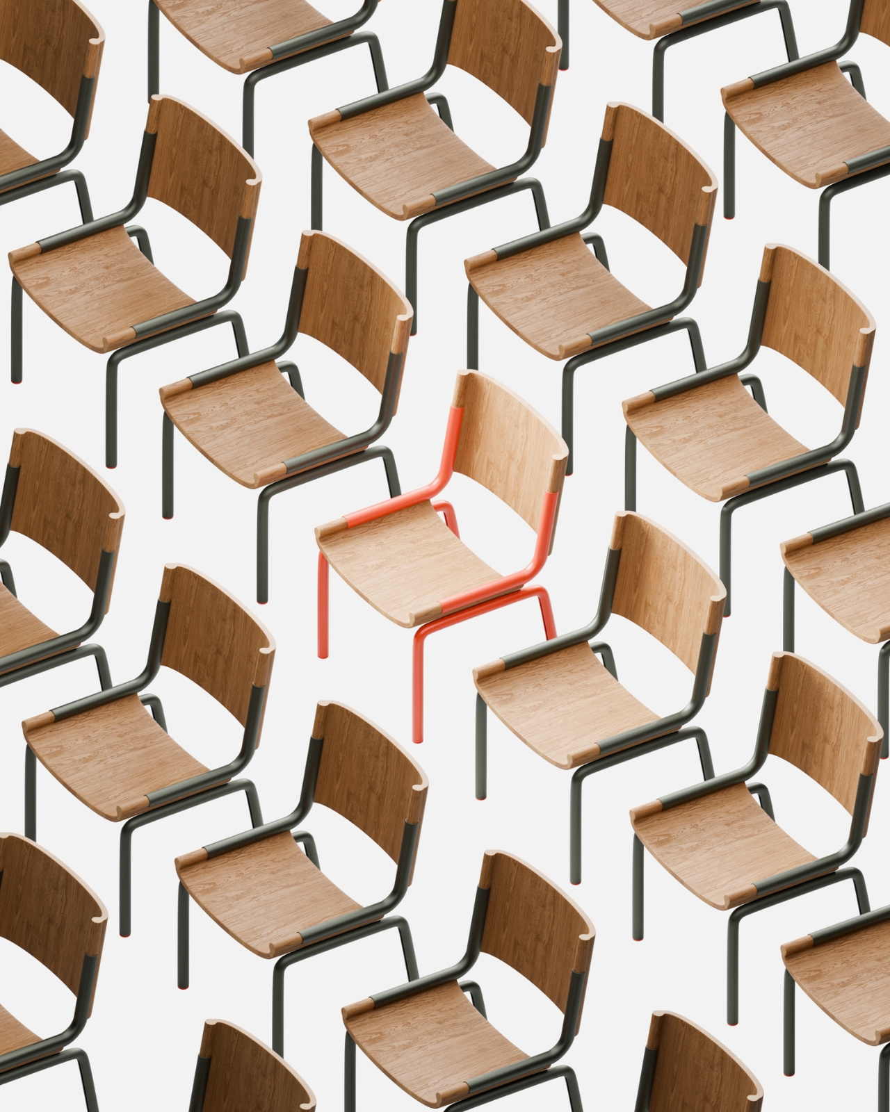
Let’s be real about furniture for a second. Most of us want pieces that look great, last forever, and don’t cost as much as a vacation. But we also want to be able to move without having to hire a team of professionals just to disassemble the bookshelf. Oh, and while we’re at it, can it also not destroy the planet? Apparently, that’s been too much to ask. Until now.

Meet LinumTube, a furniture system that manages to check all those impossible boxes at once. This isn’t your typical design project. It’s a collaboration between Studio Jonathan Radetz and the Fraunhofer Institute for Wood Research in Germany, and it’s rethinking what furniture can be from the ground up.

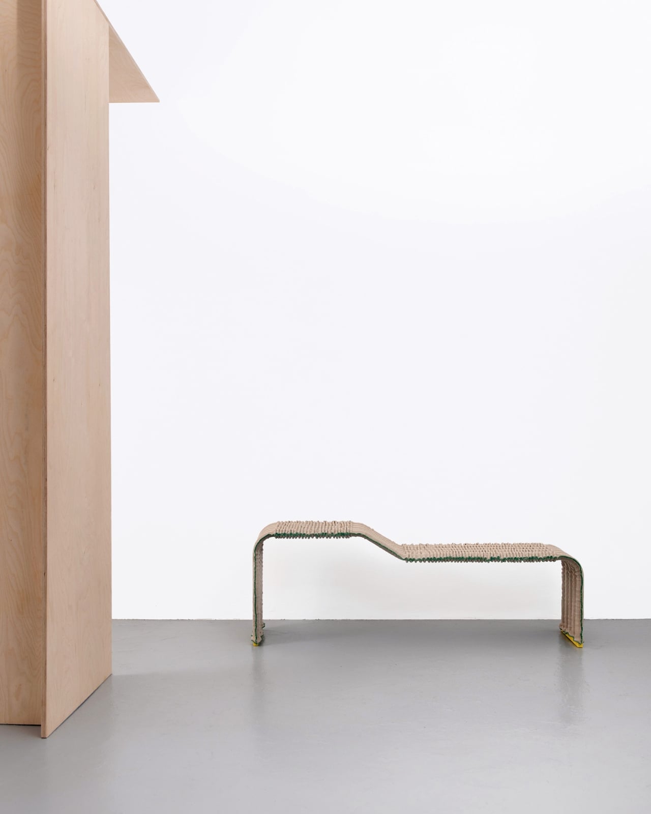
Designers: Studio Jonathan Radetz and Fraunhofer Institute for Wood Research

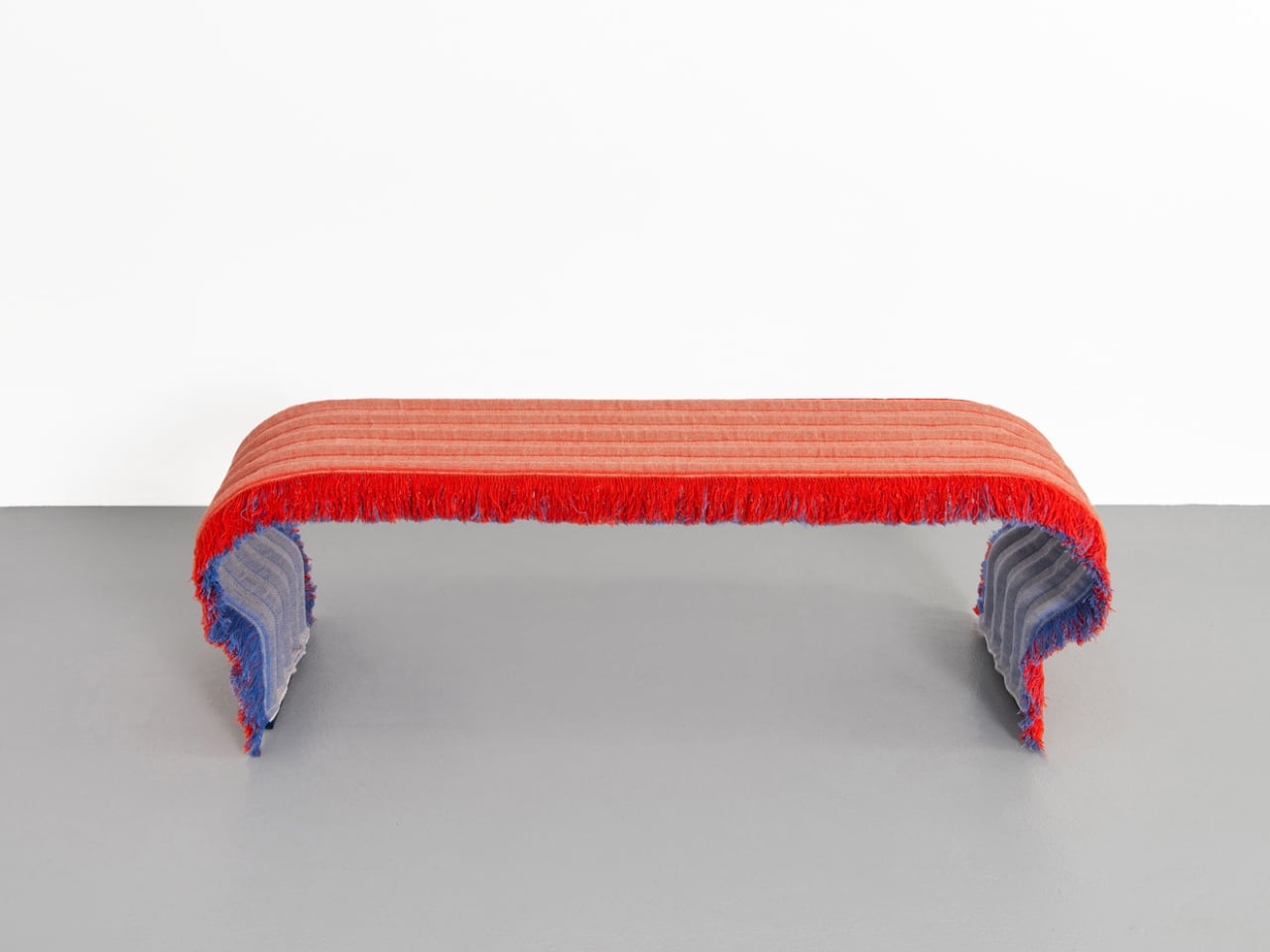
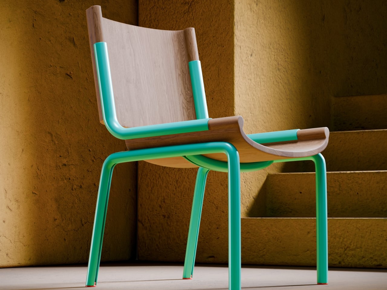
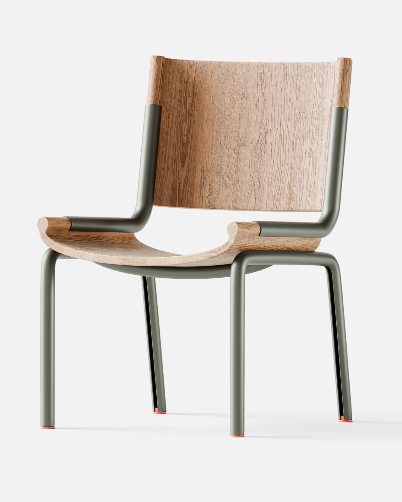
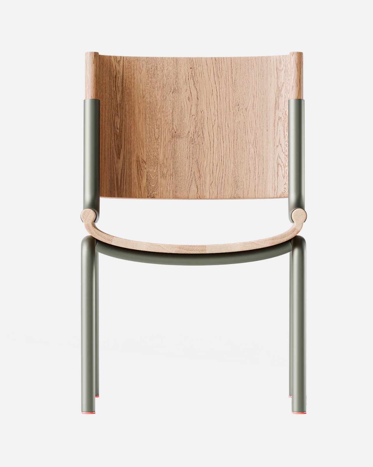
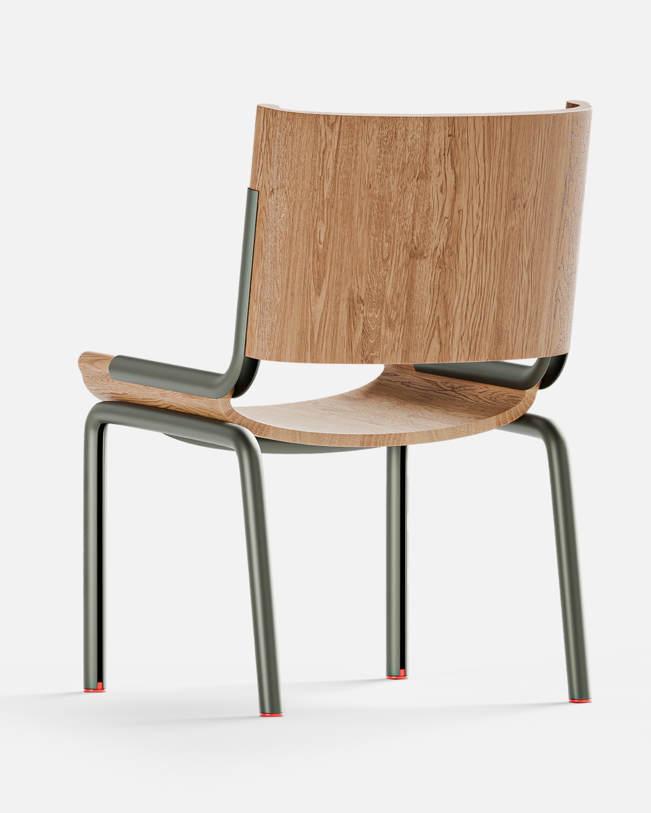
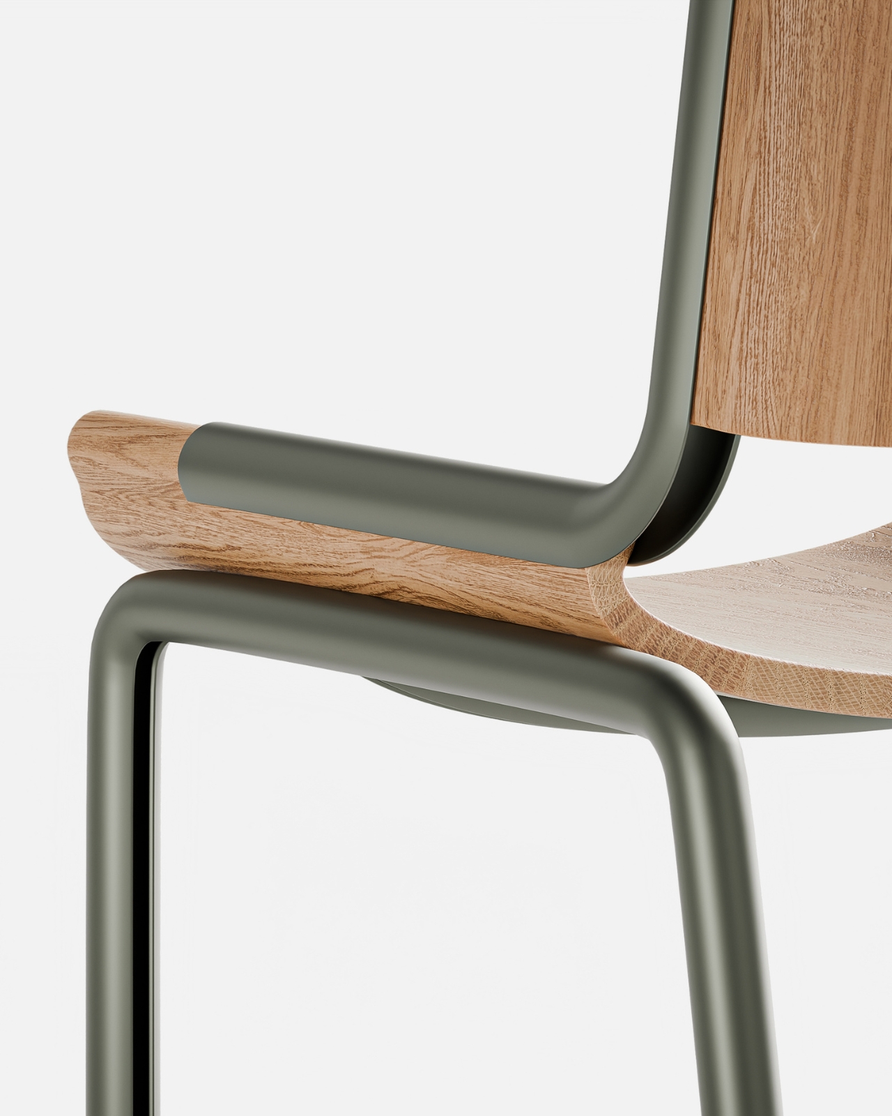
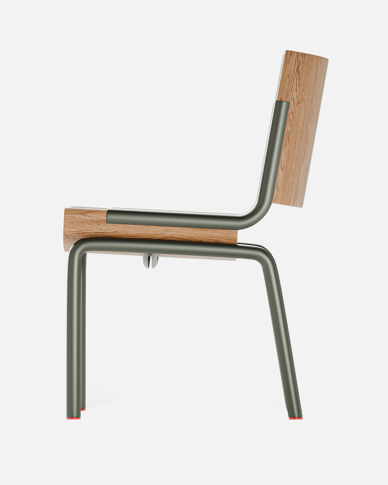
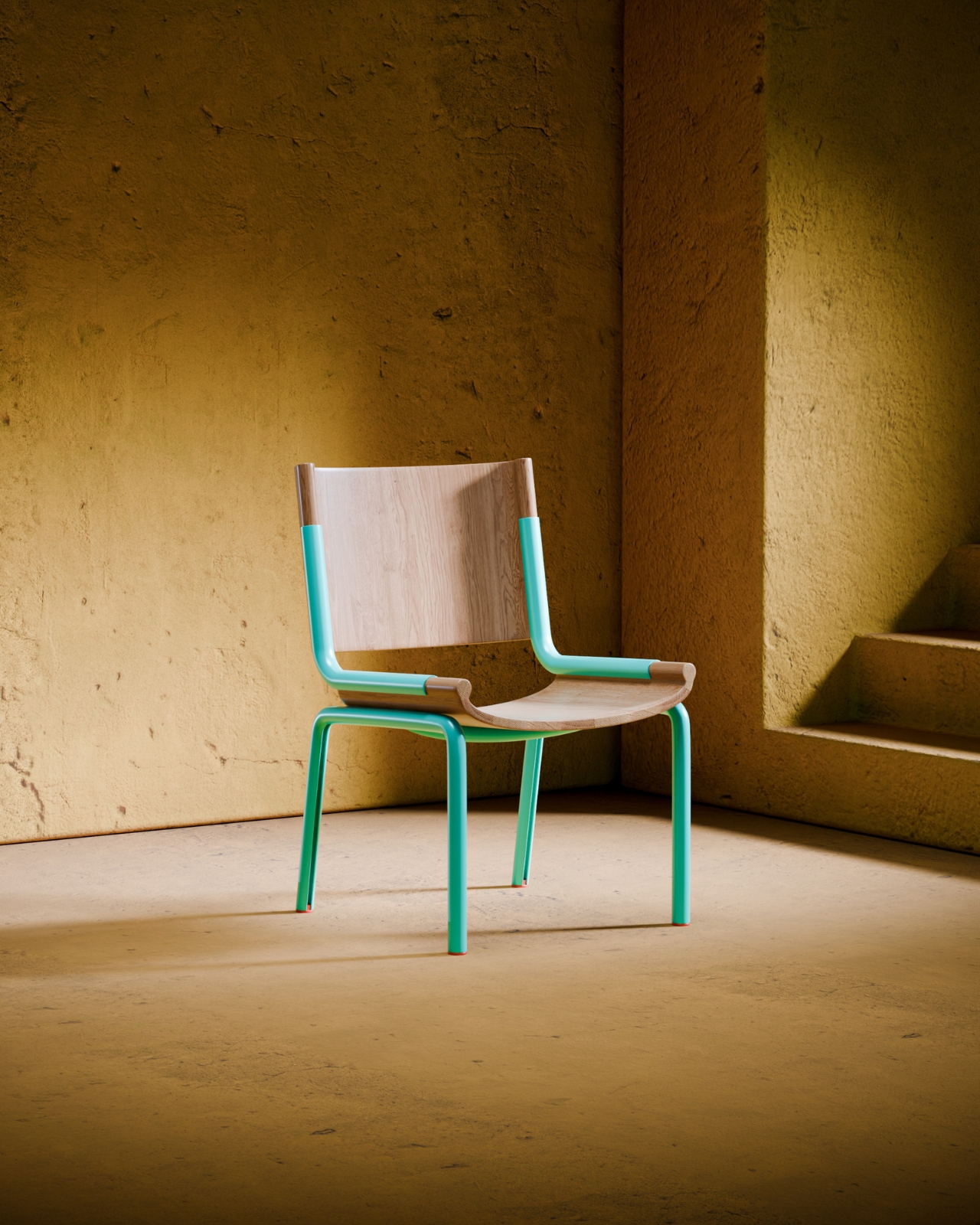
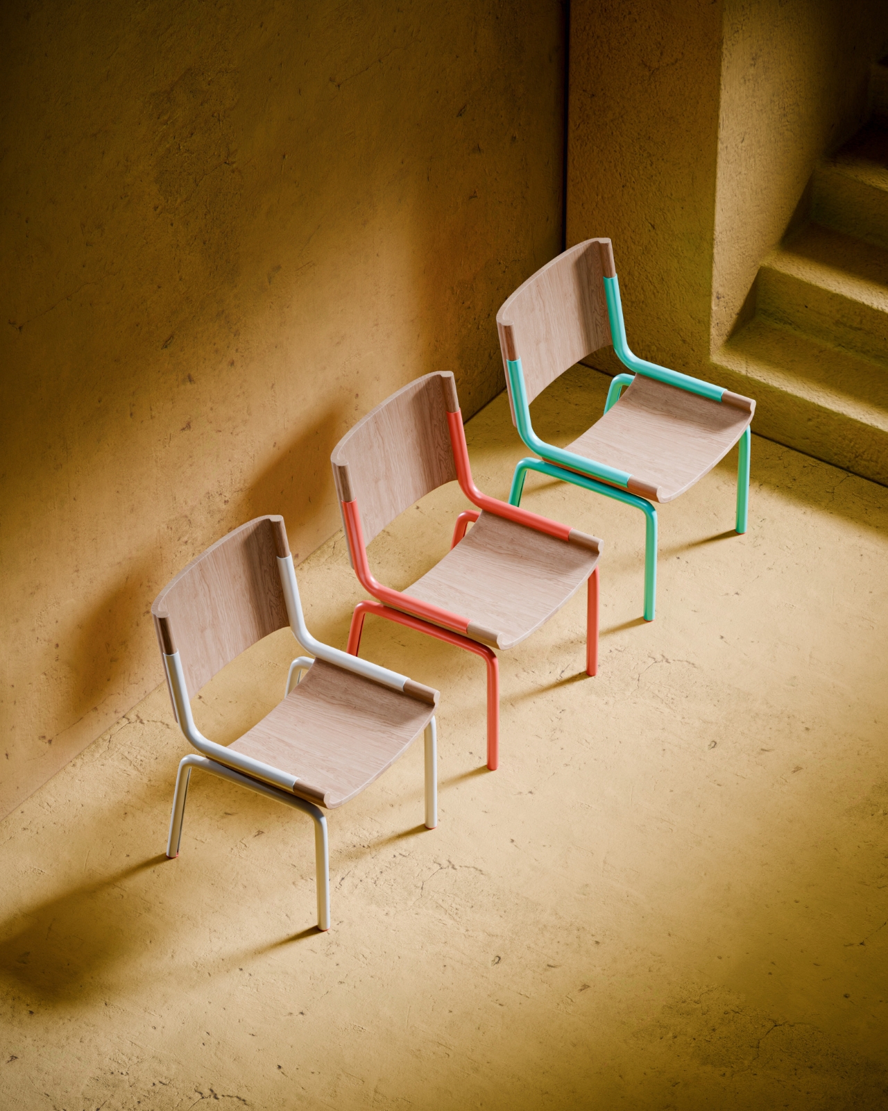
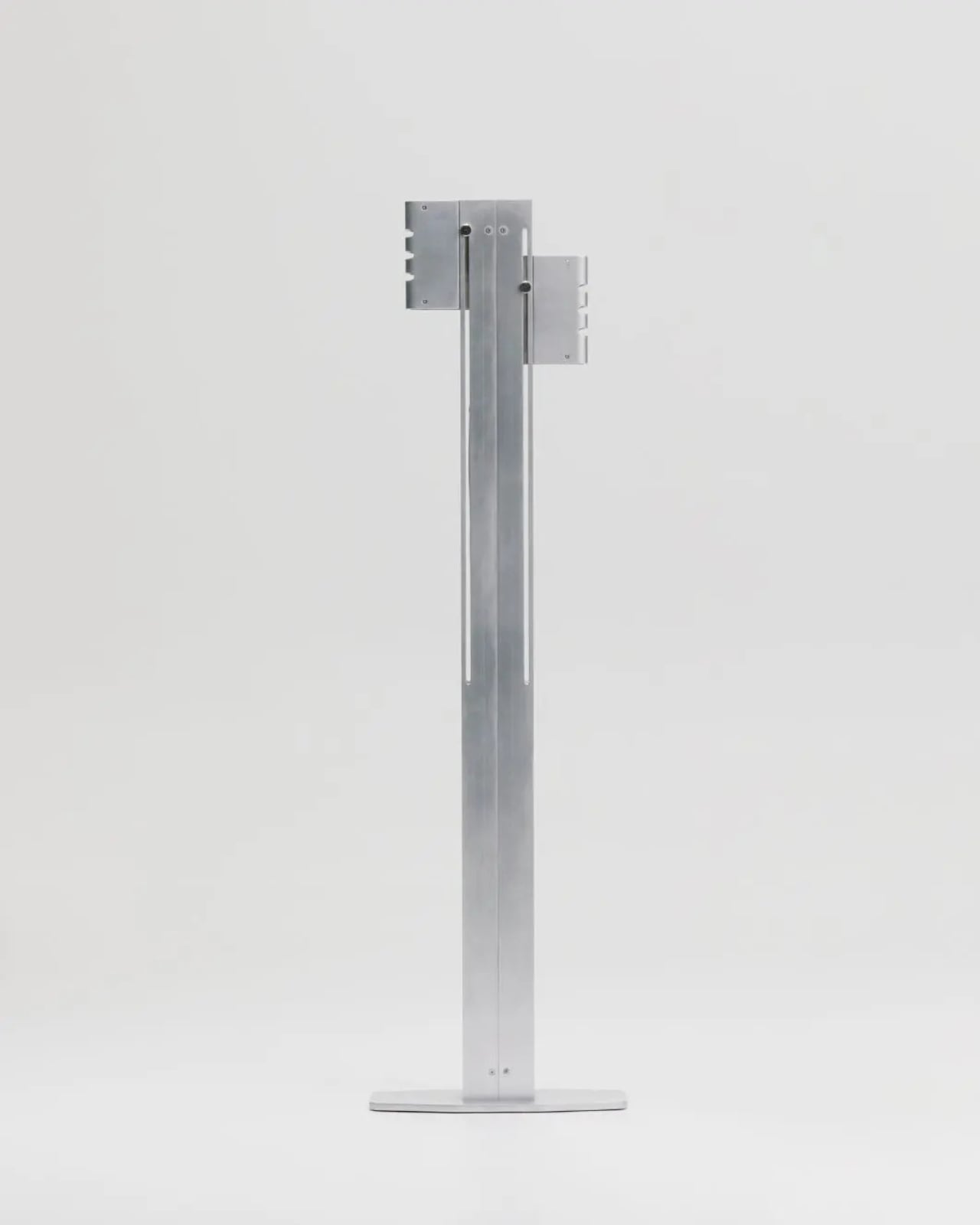
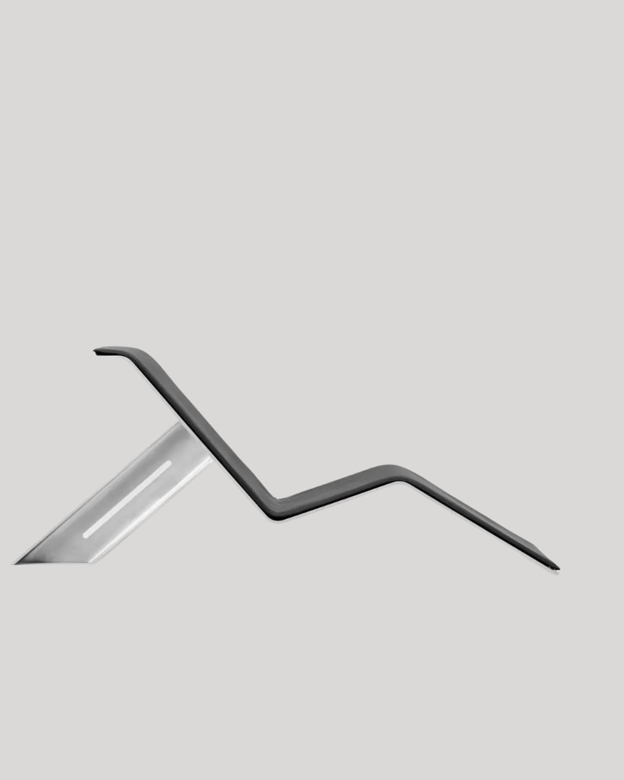
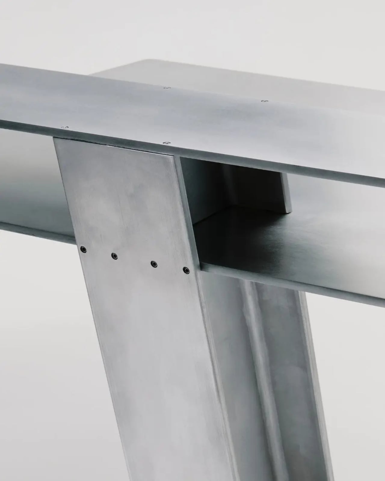
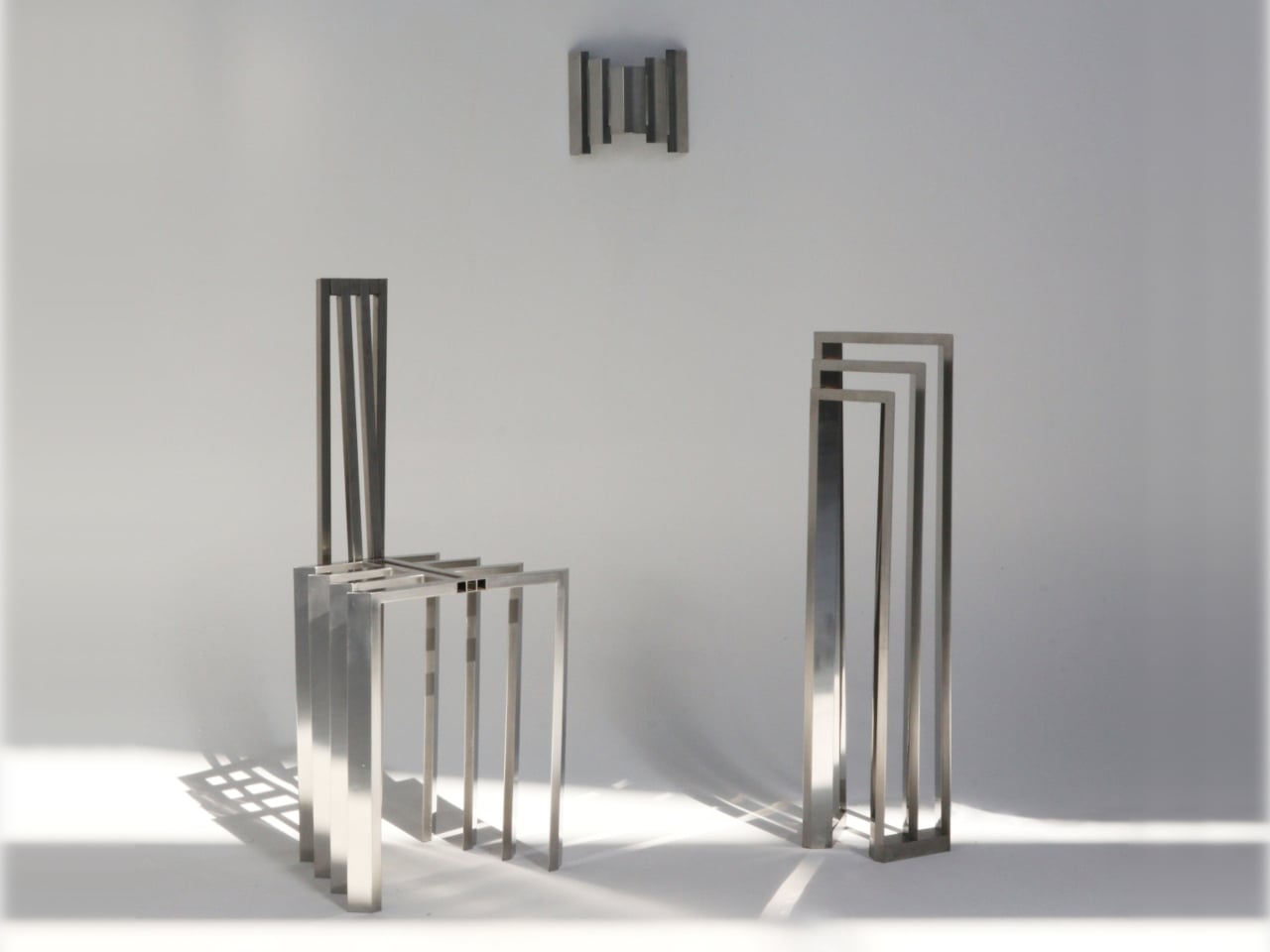
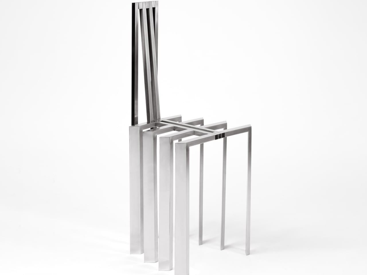
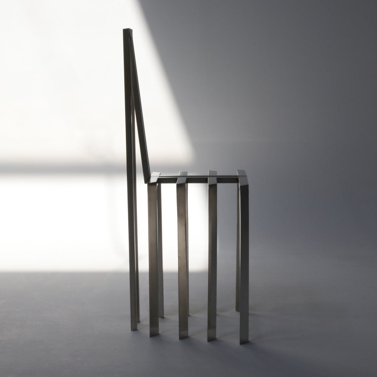
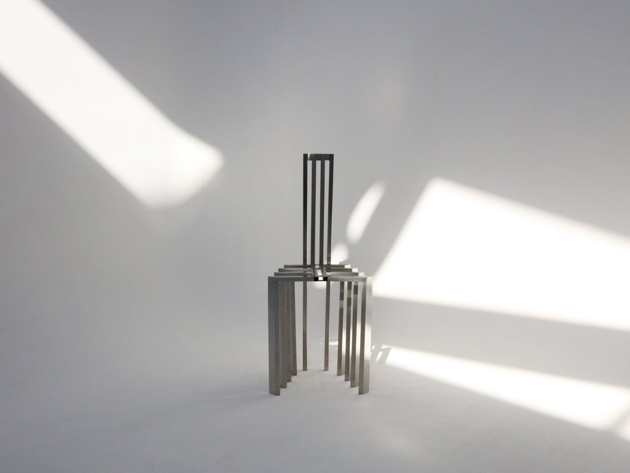
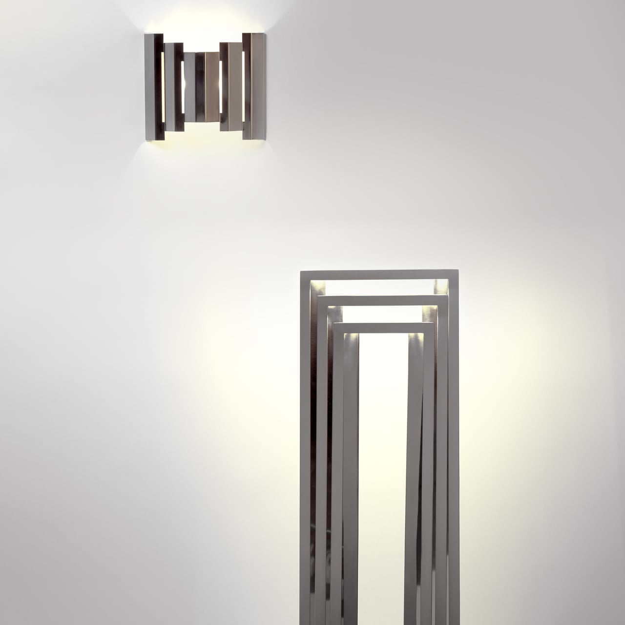
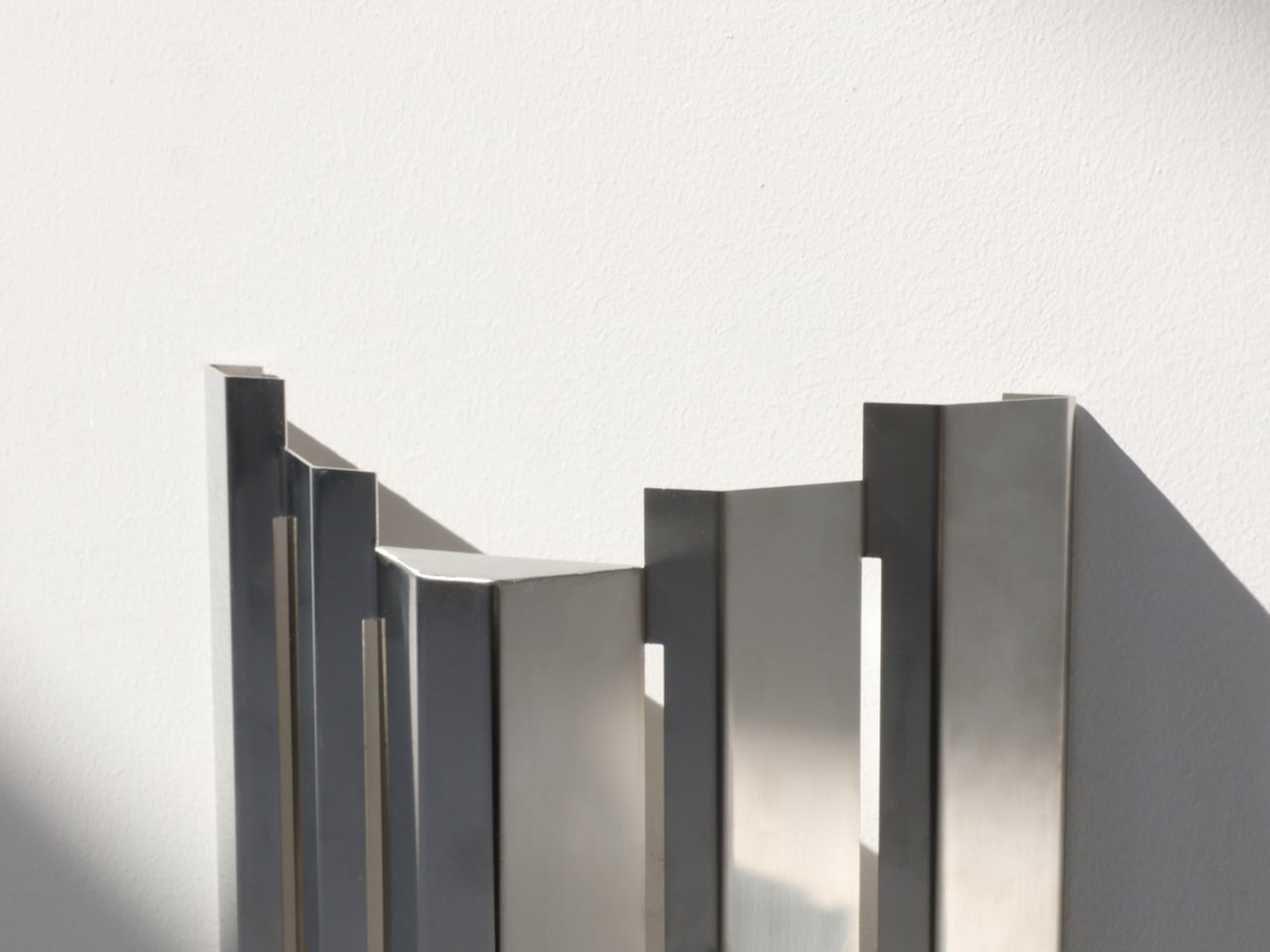
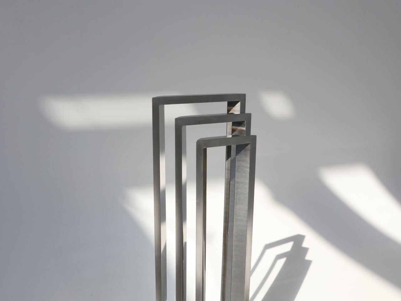
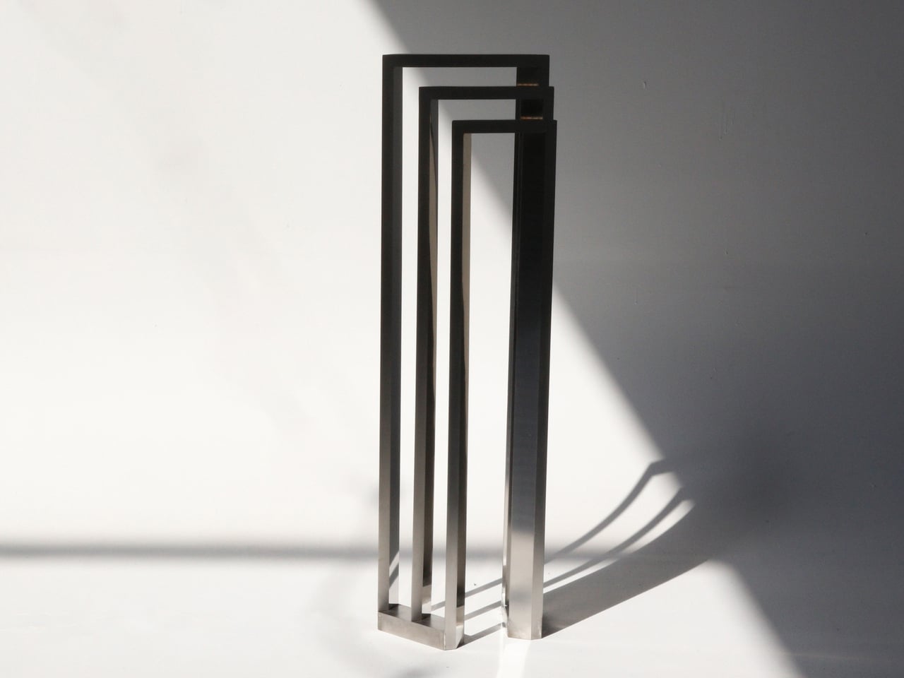
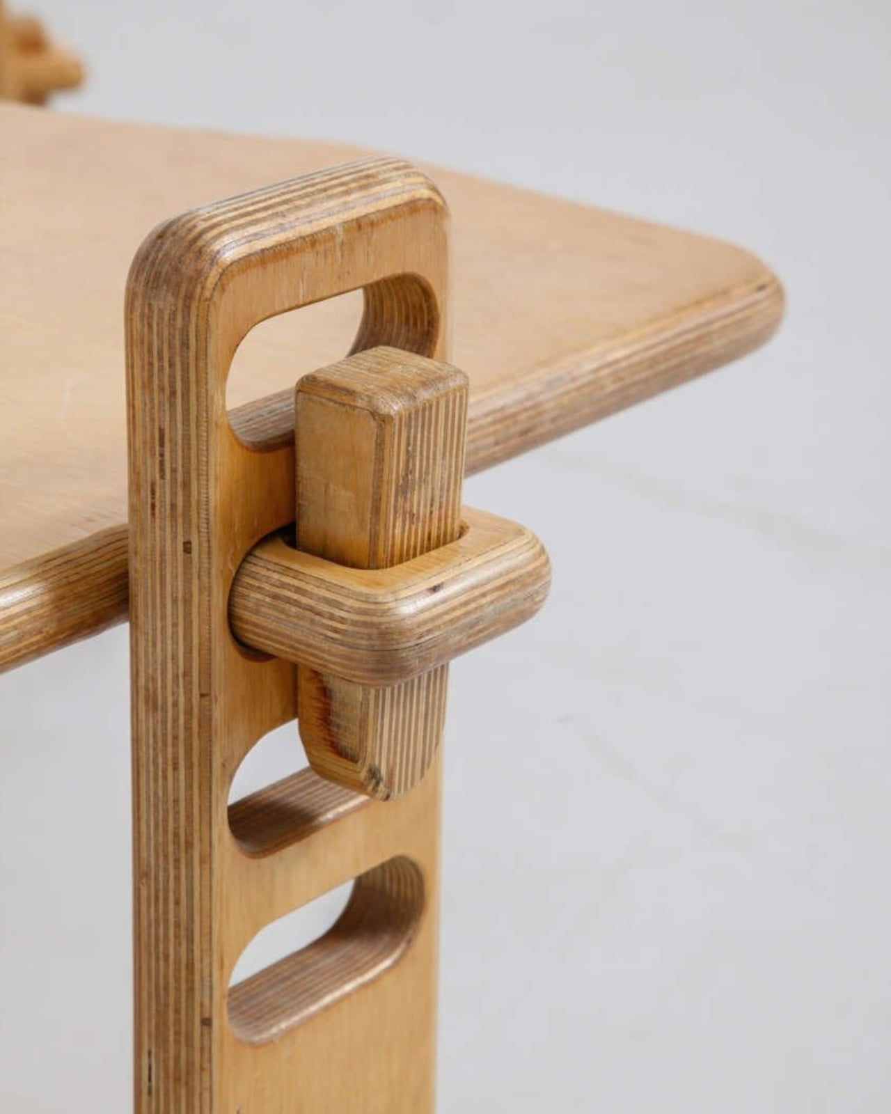
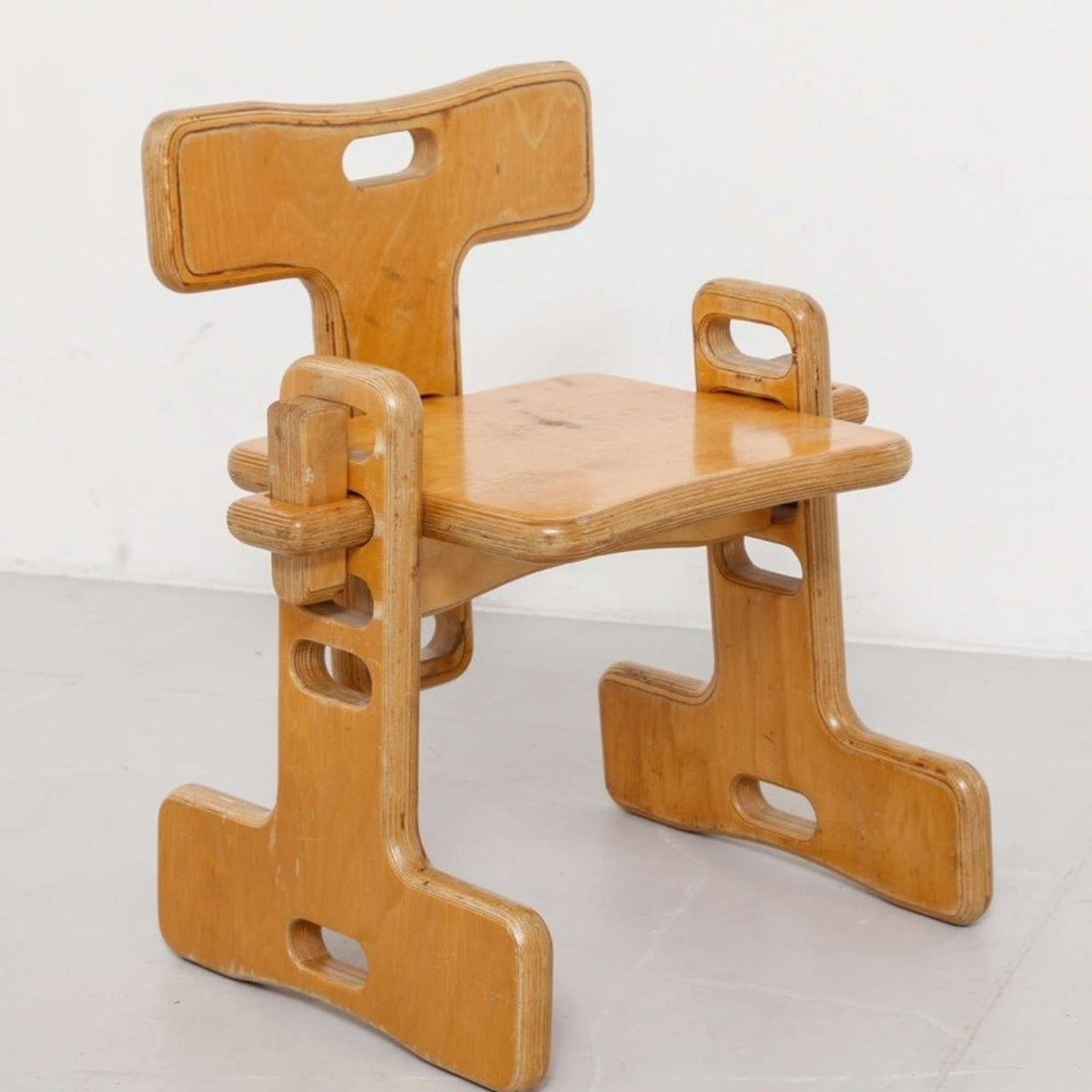
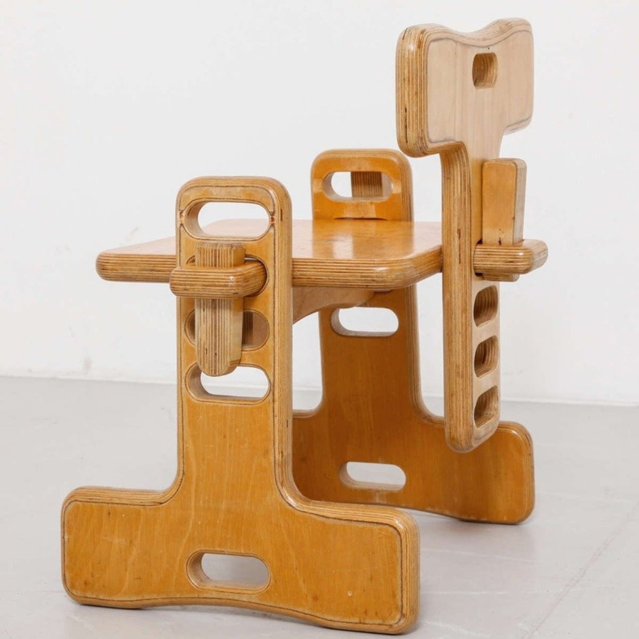
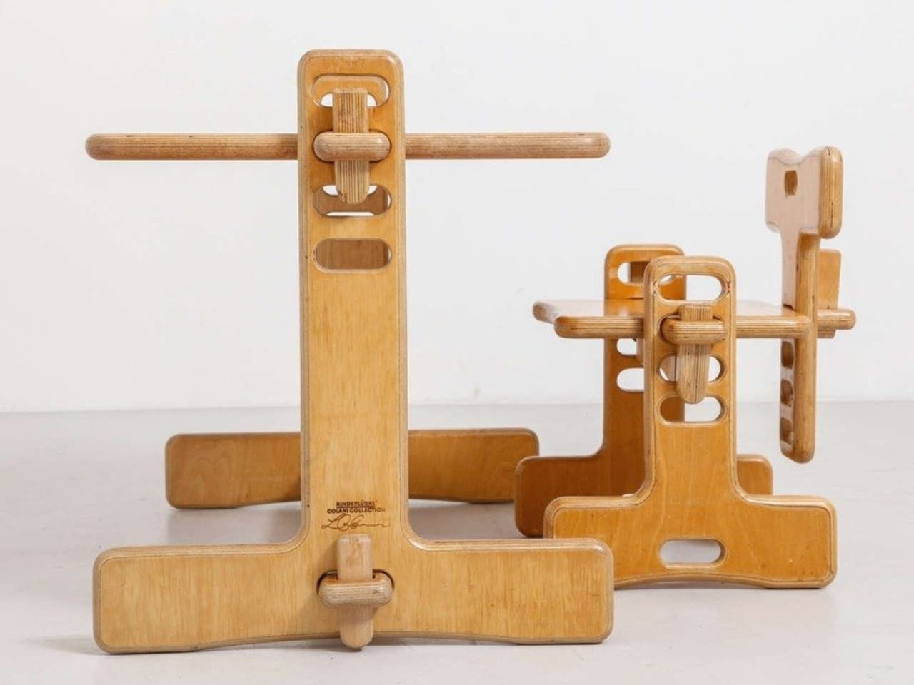
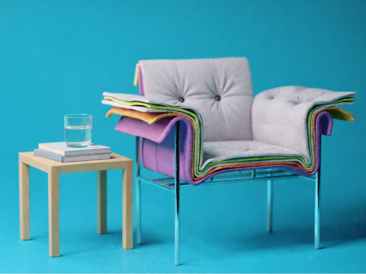
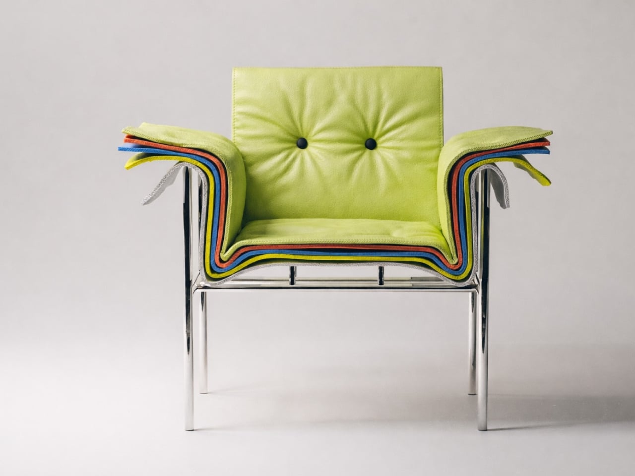
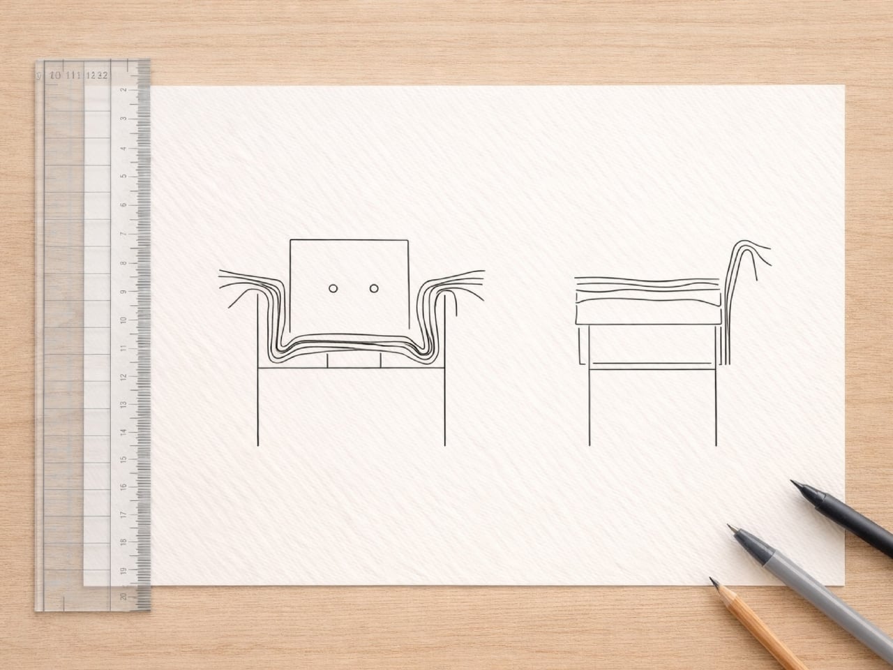
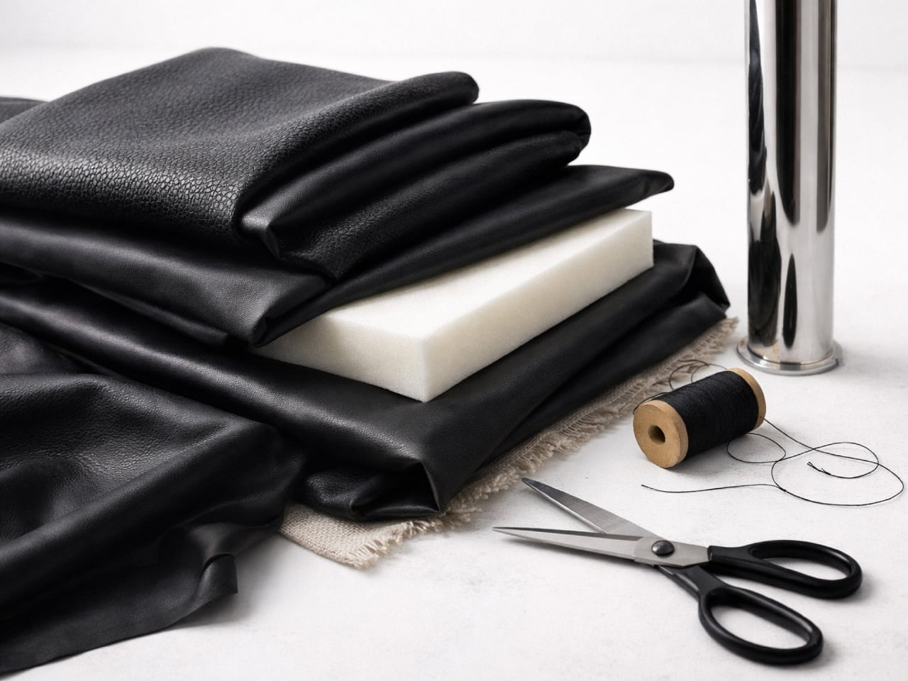
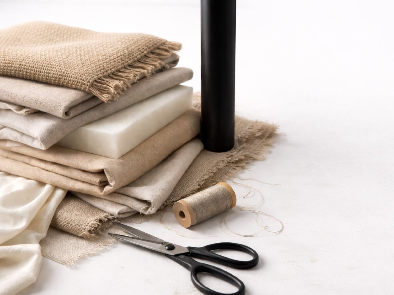
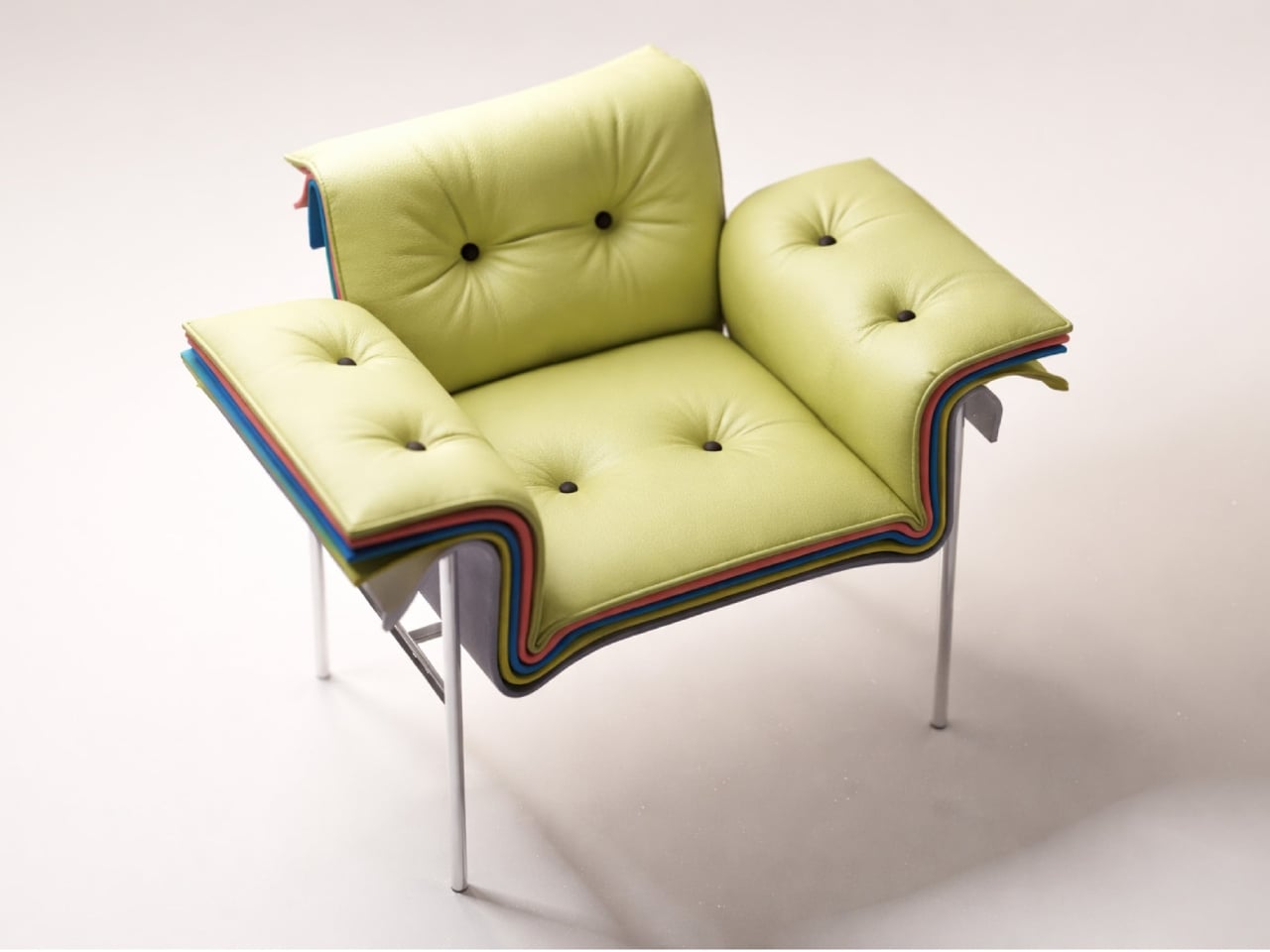
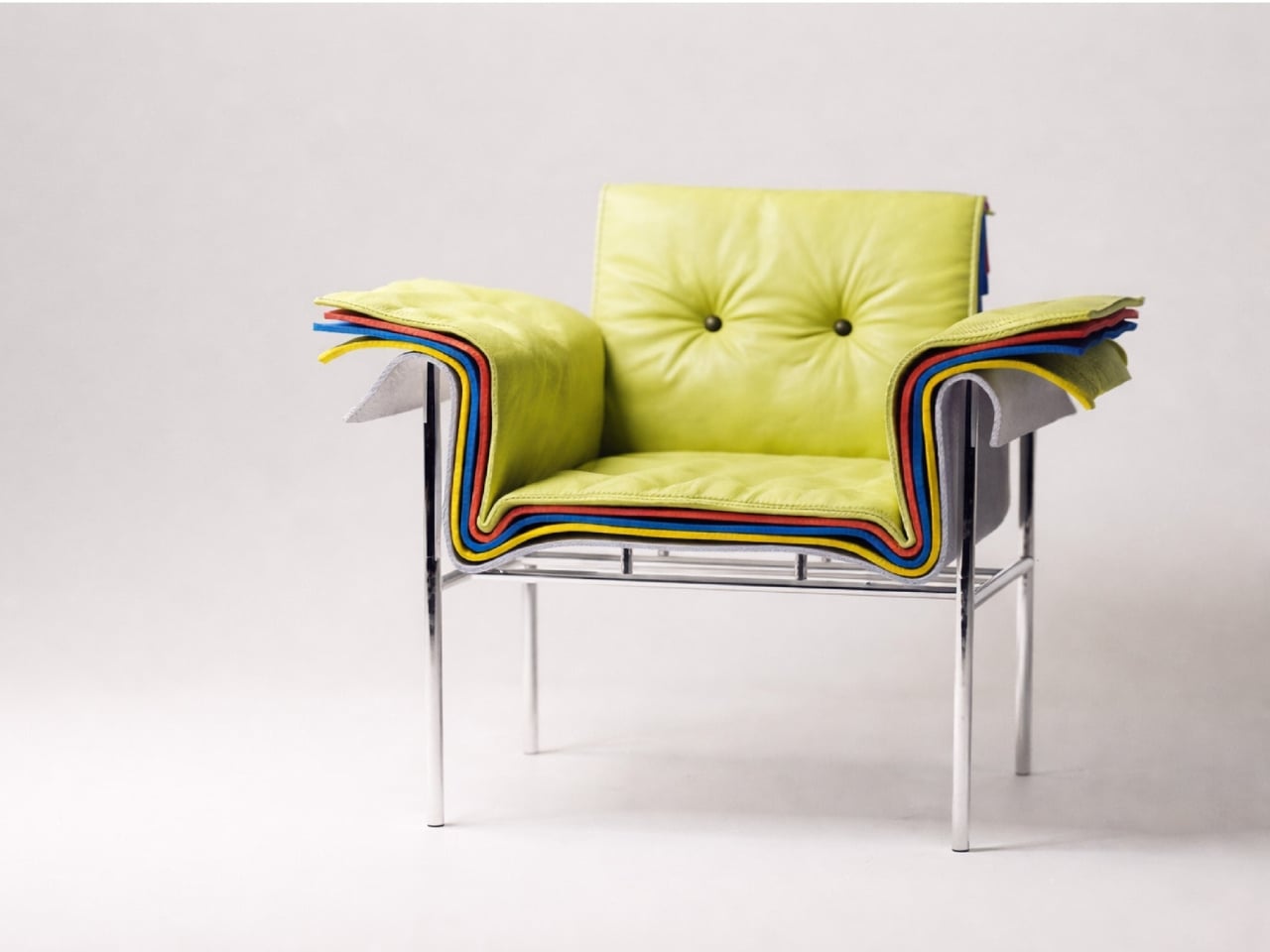
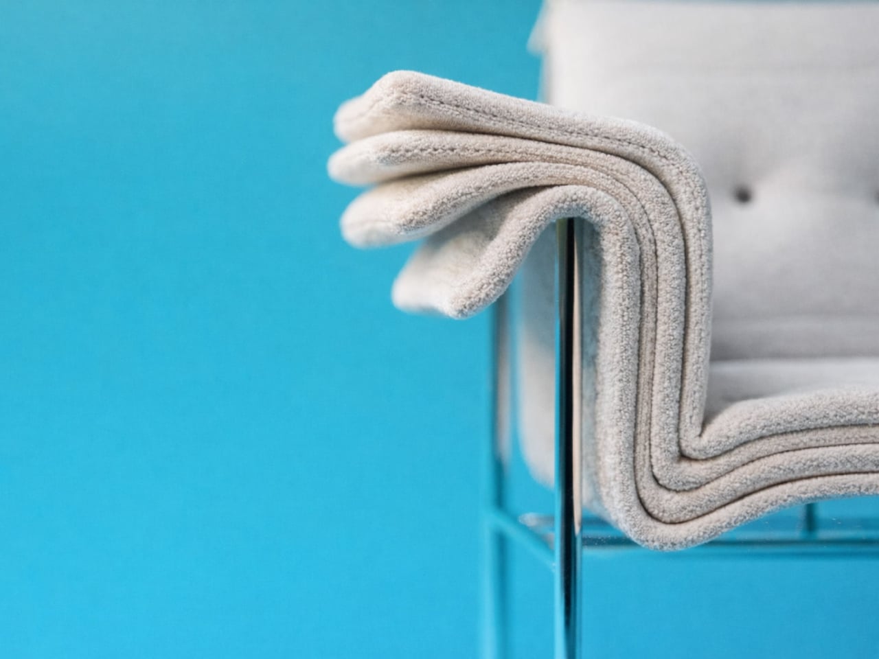
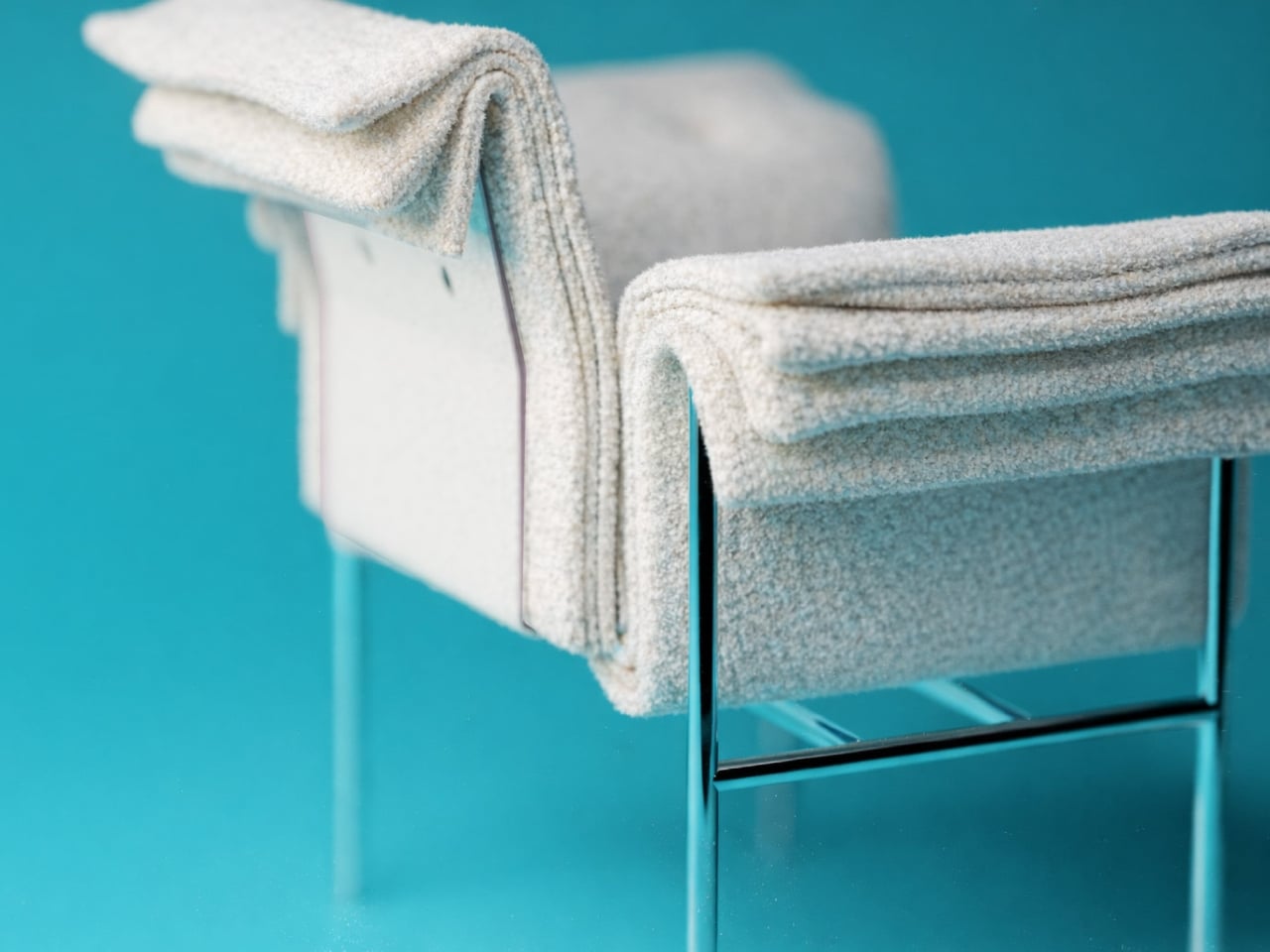
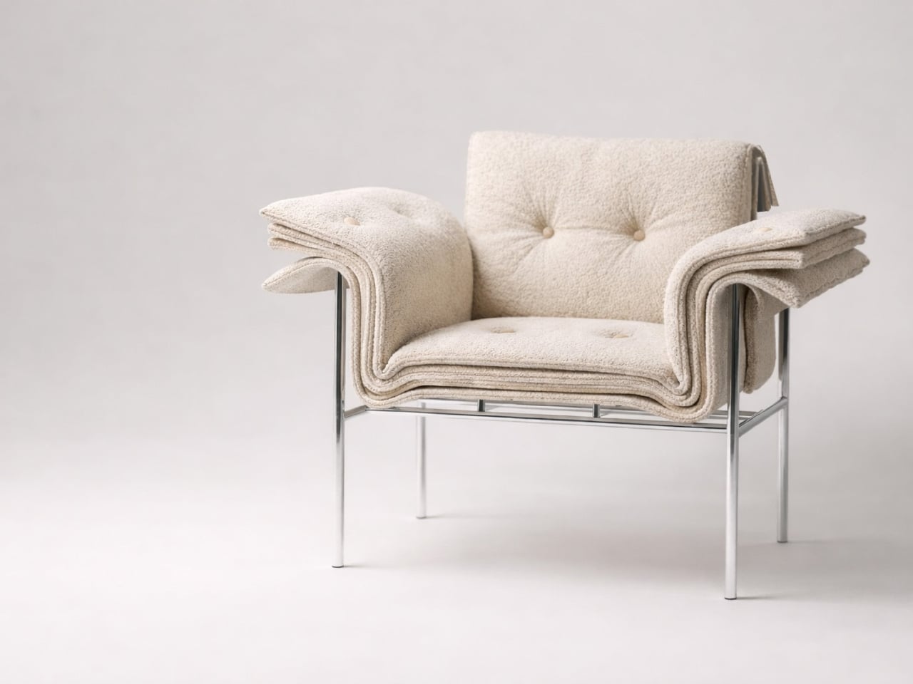
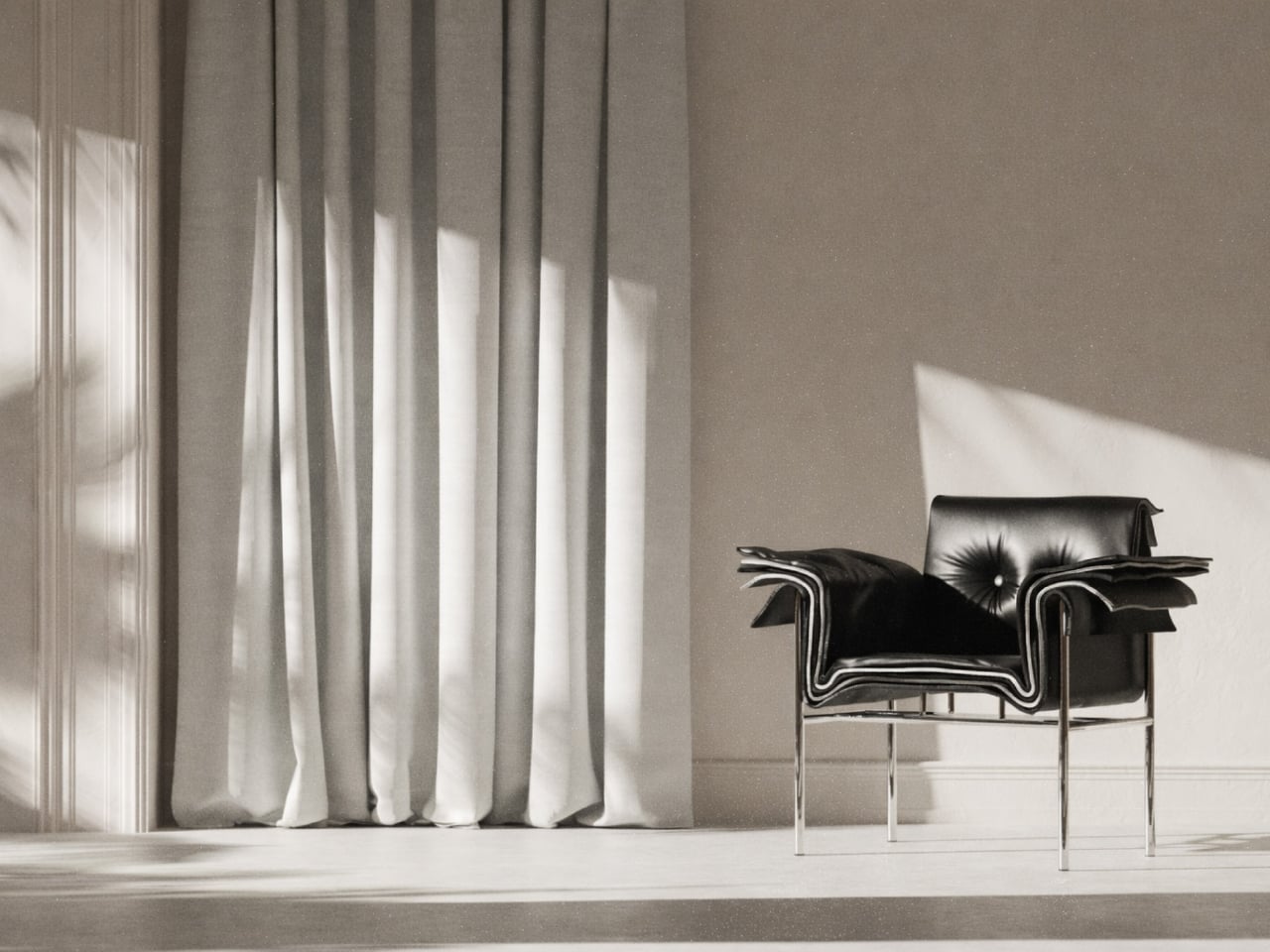
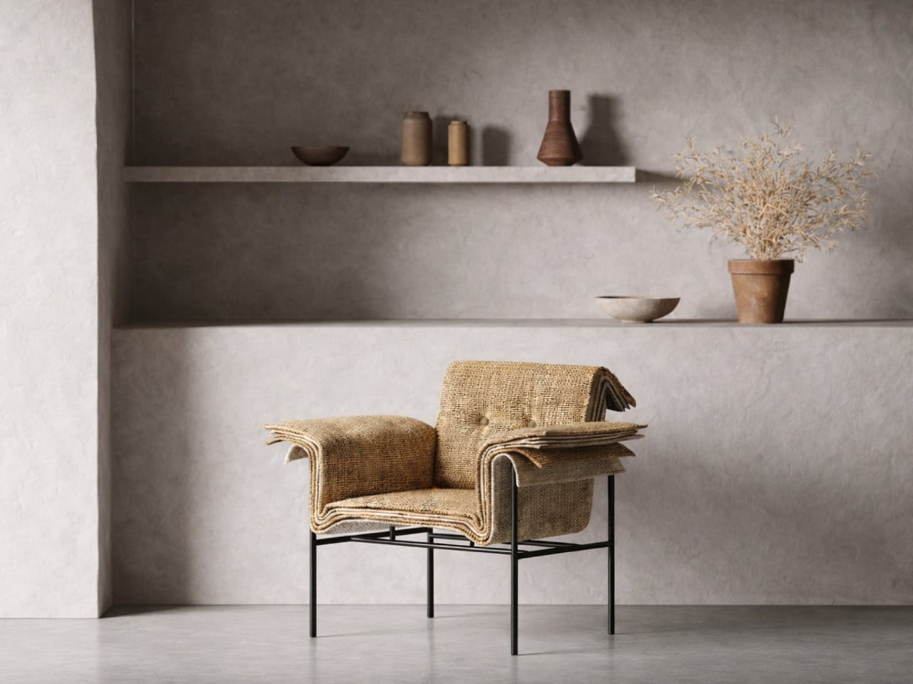
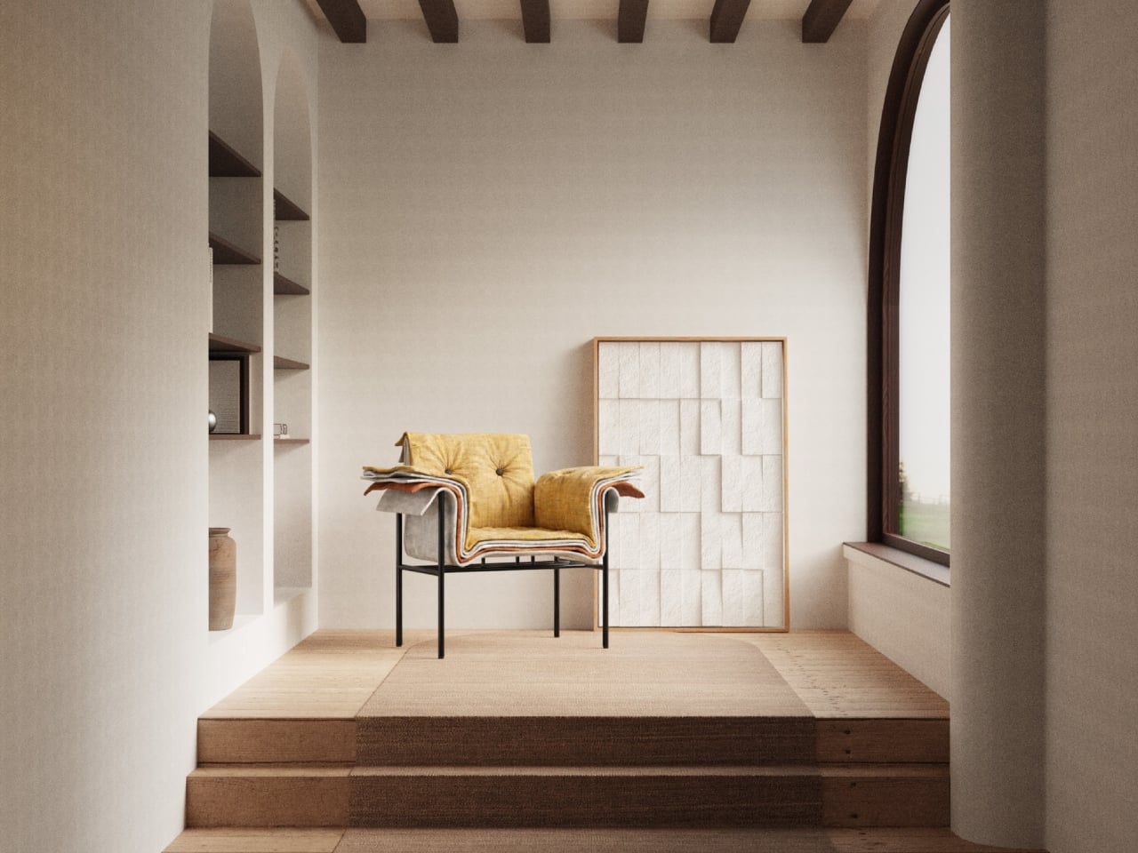
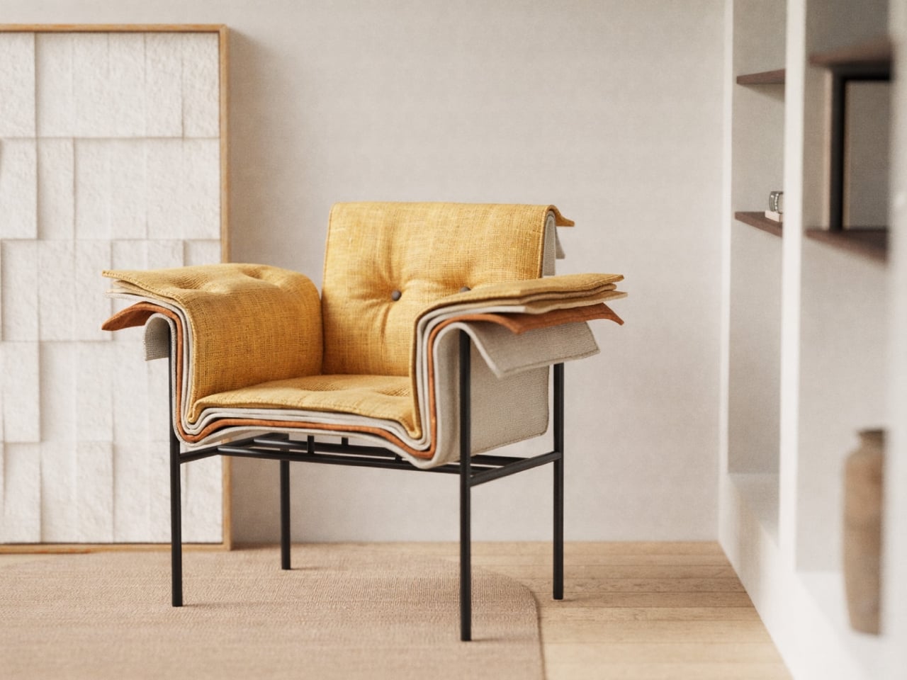
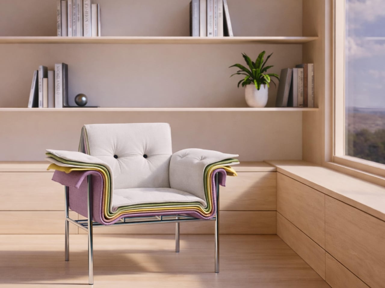
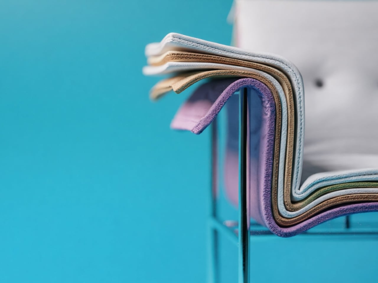
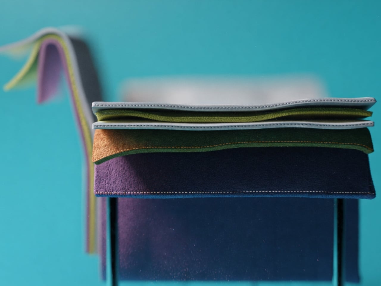
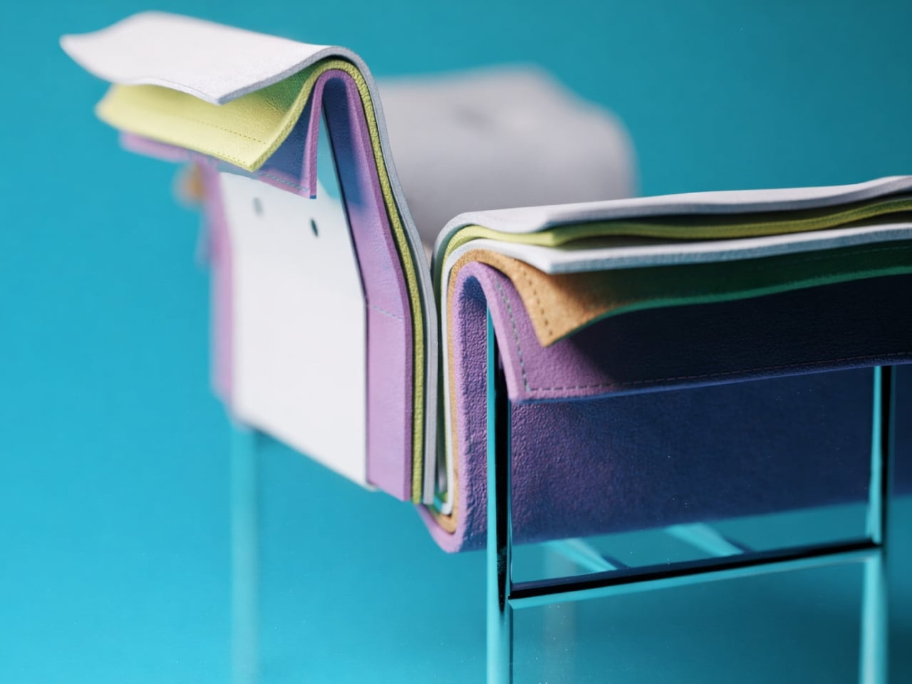
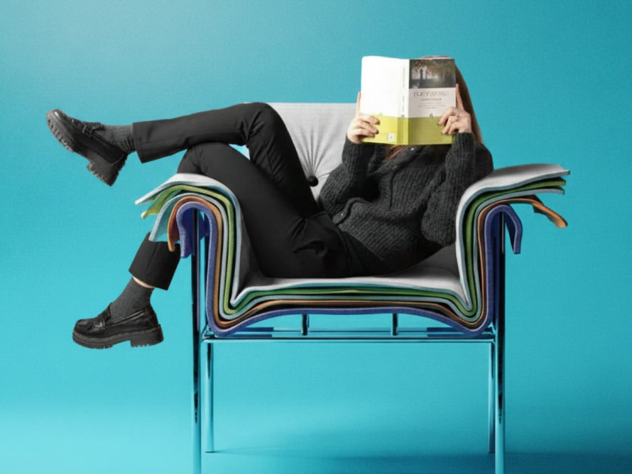
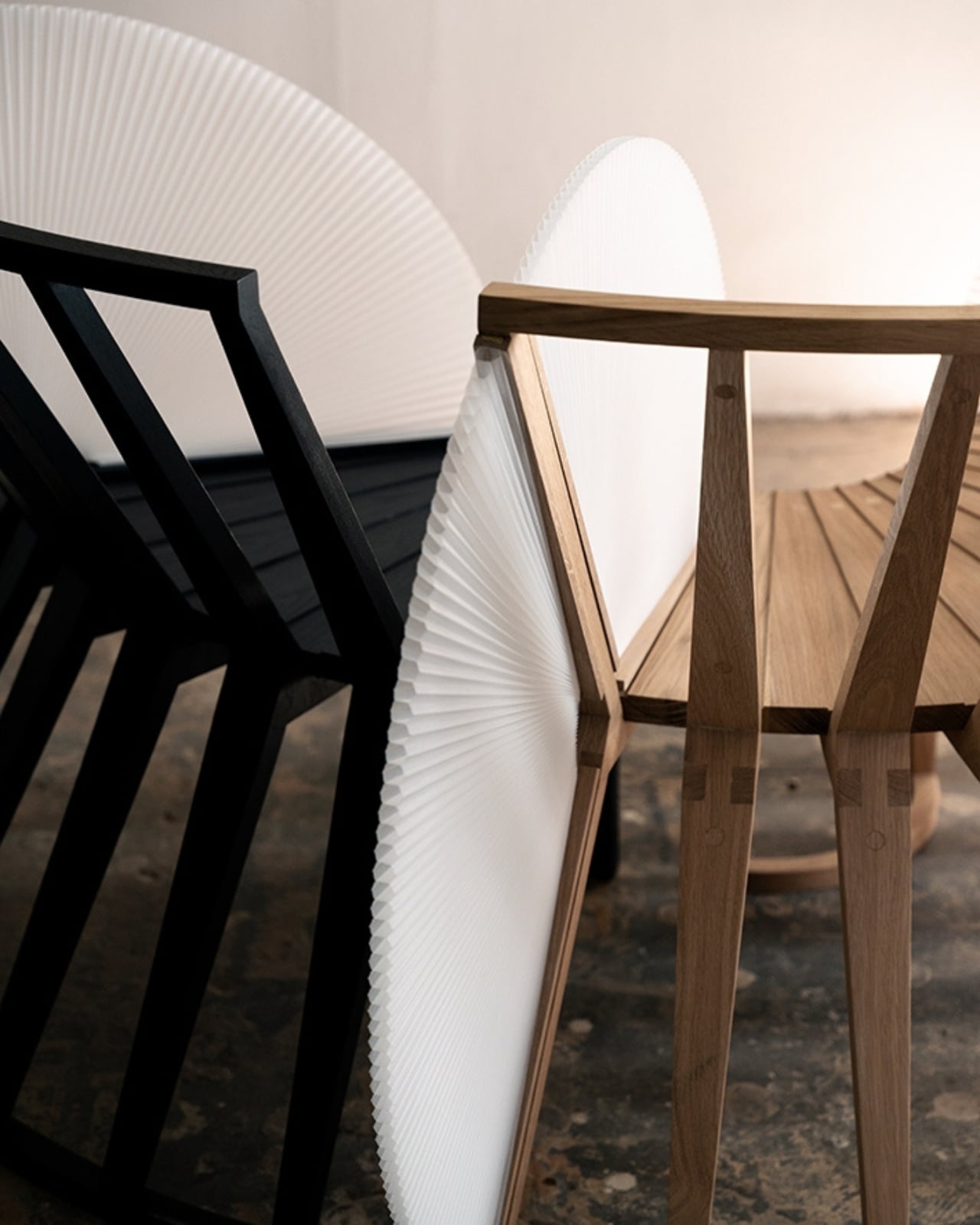
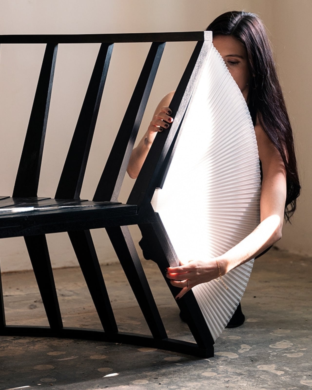
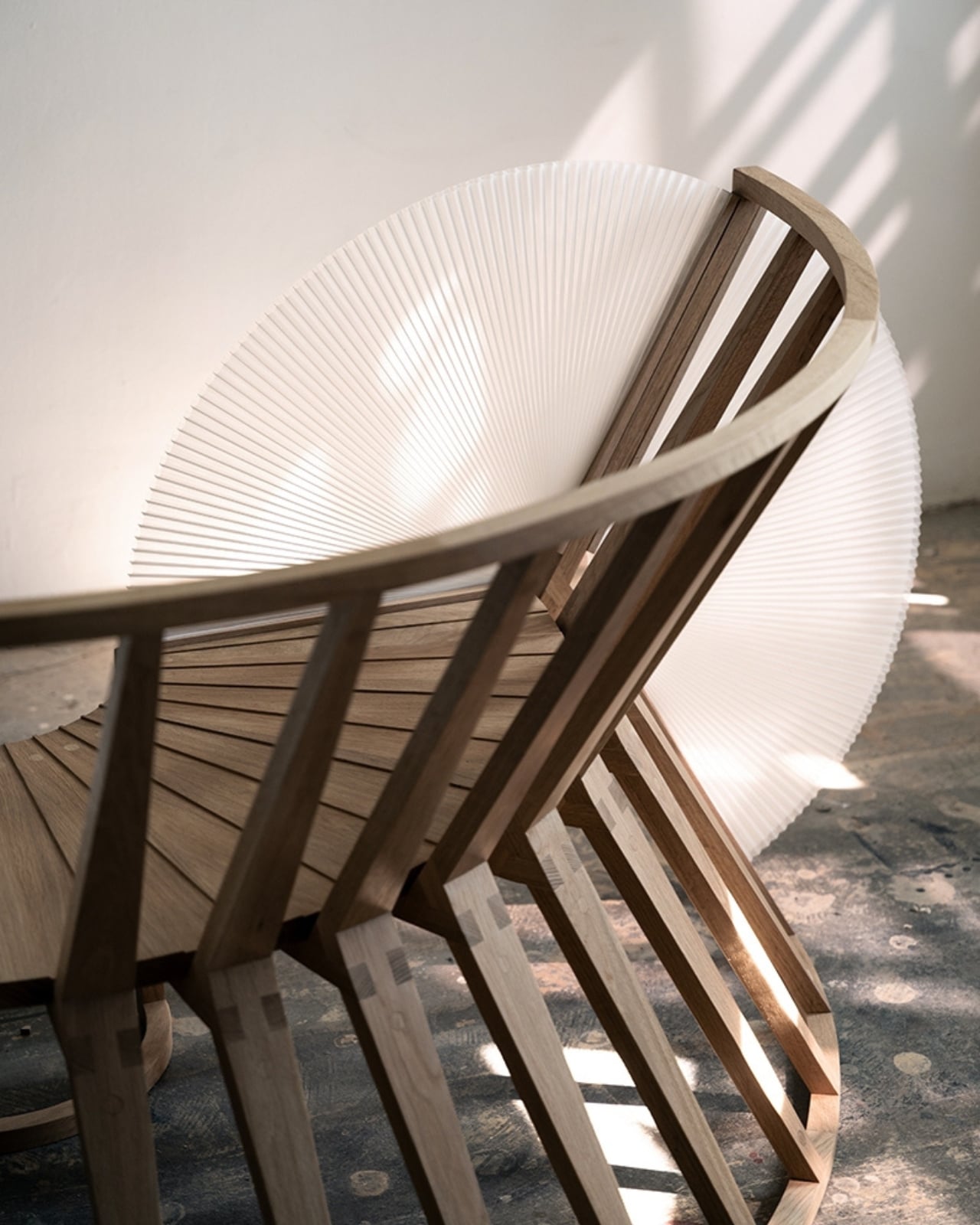
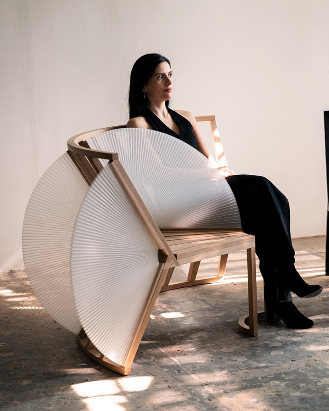
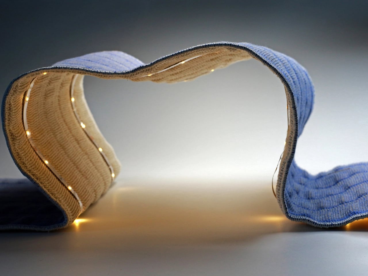
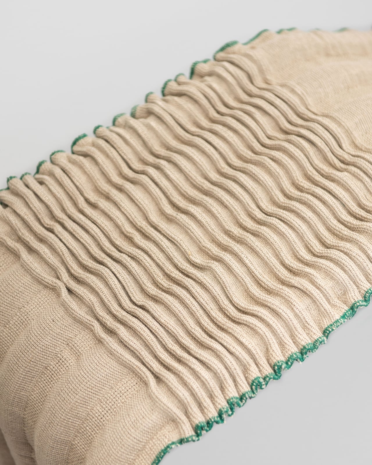
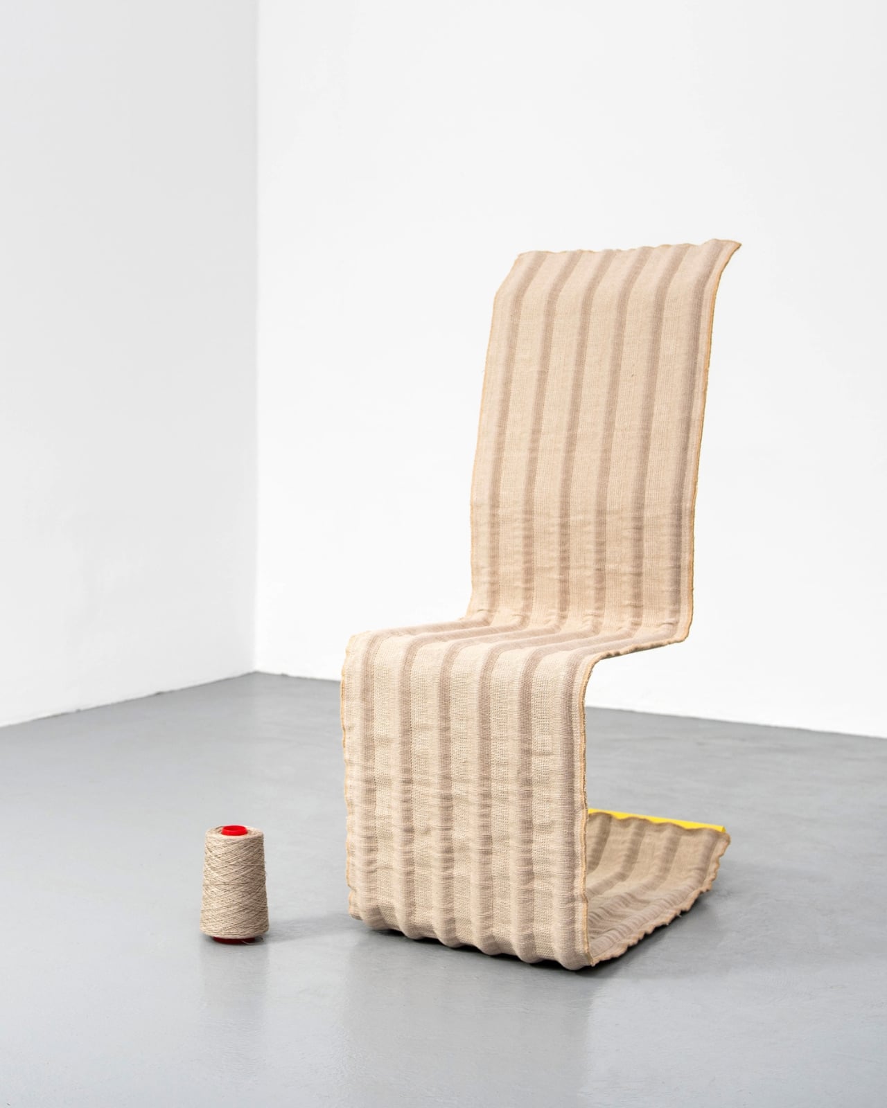
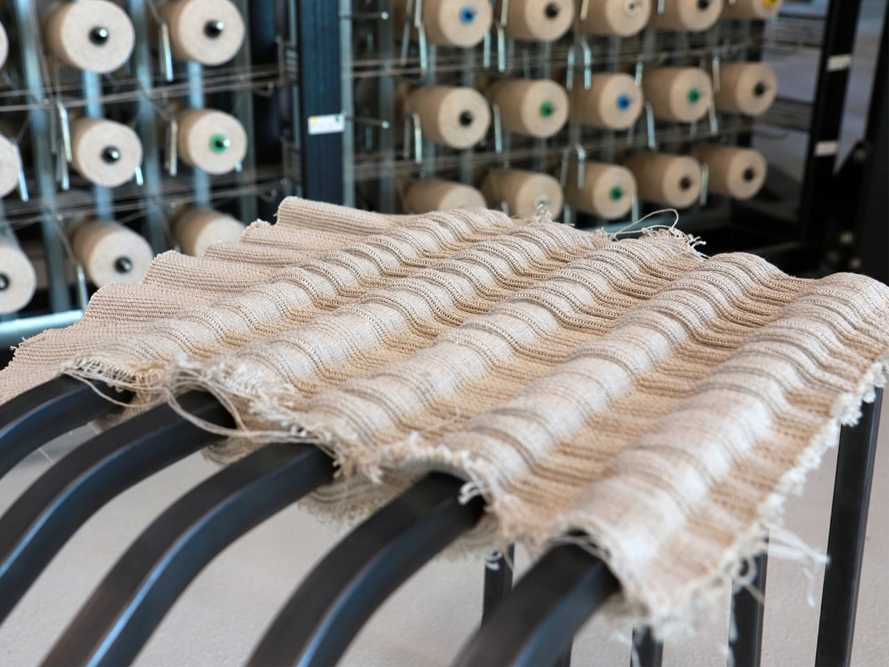
The concept is beautifully simple. The furniture, which includes benches, chairs, and stools, is built from just two materials: steel tubes and multilayer flax fabric. That’s it. No glue, no bolts, no complicated hardware that you’ll lose during your third apartment move. The flax fabric wraps around the tubular steel frame, creating a self-supporting structure that stays stable through clever engineering rather than industrial adhesives.

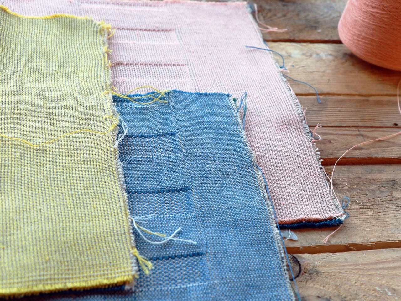
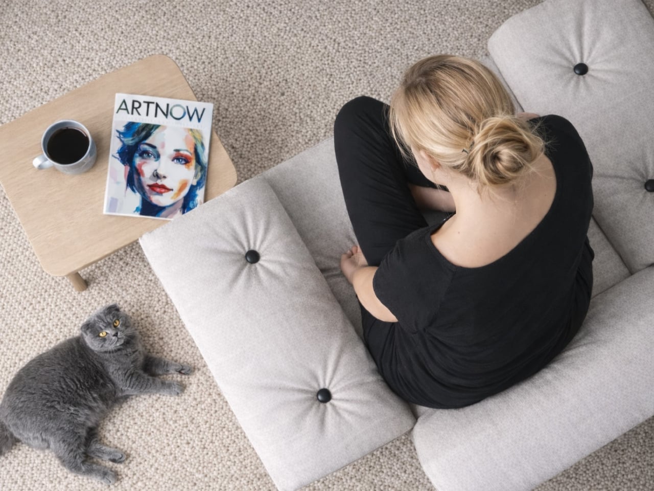
What makes this particularly clever is the fabric itself. The team at Fraunhofer developed a specialized multilayer flax textile with open constructions and integrated channels that interact with the steel tubes to create varying levels of stiffness. This means you get support exactly where you need it without adding extra materials or complexity. The seating surface can even be customized with a lamellar structure that provides additional cushioning for those of us who like to linger.

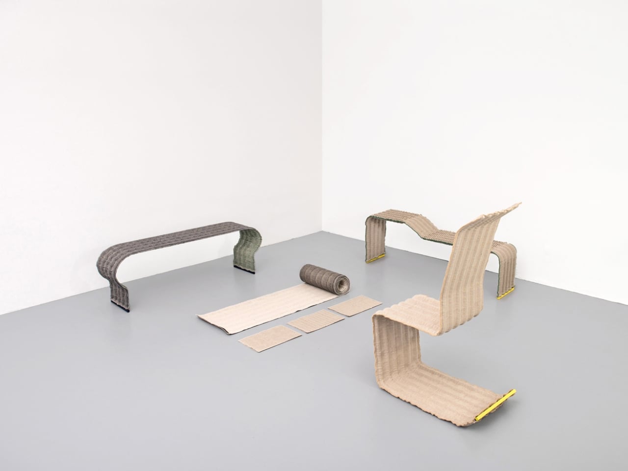
The whole system is modular and completely reversible. Researcher Christina Haxter explains that the goal was to design seating furniture that allows for quick assembly, disassembly, and rearrangement, making it easy to take apart when moving. You can reconfigure pieces depending on your space, separate everything by material type at the end of its life, and send each component back into its own recycling stream. Steel stays with steel, flax goes back to being flax. It’s circular design at its most practical.

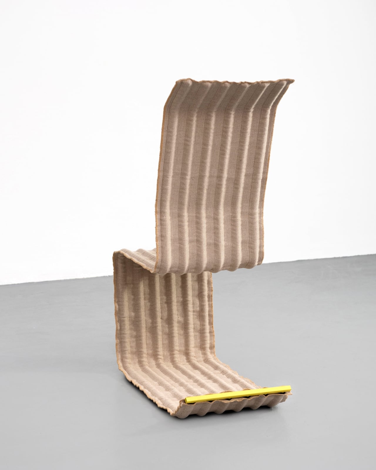
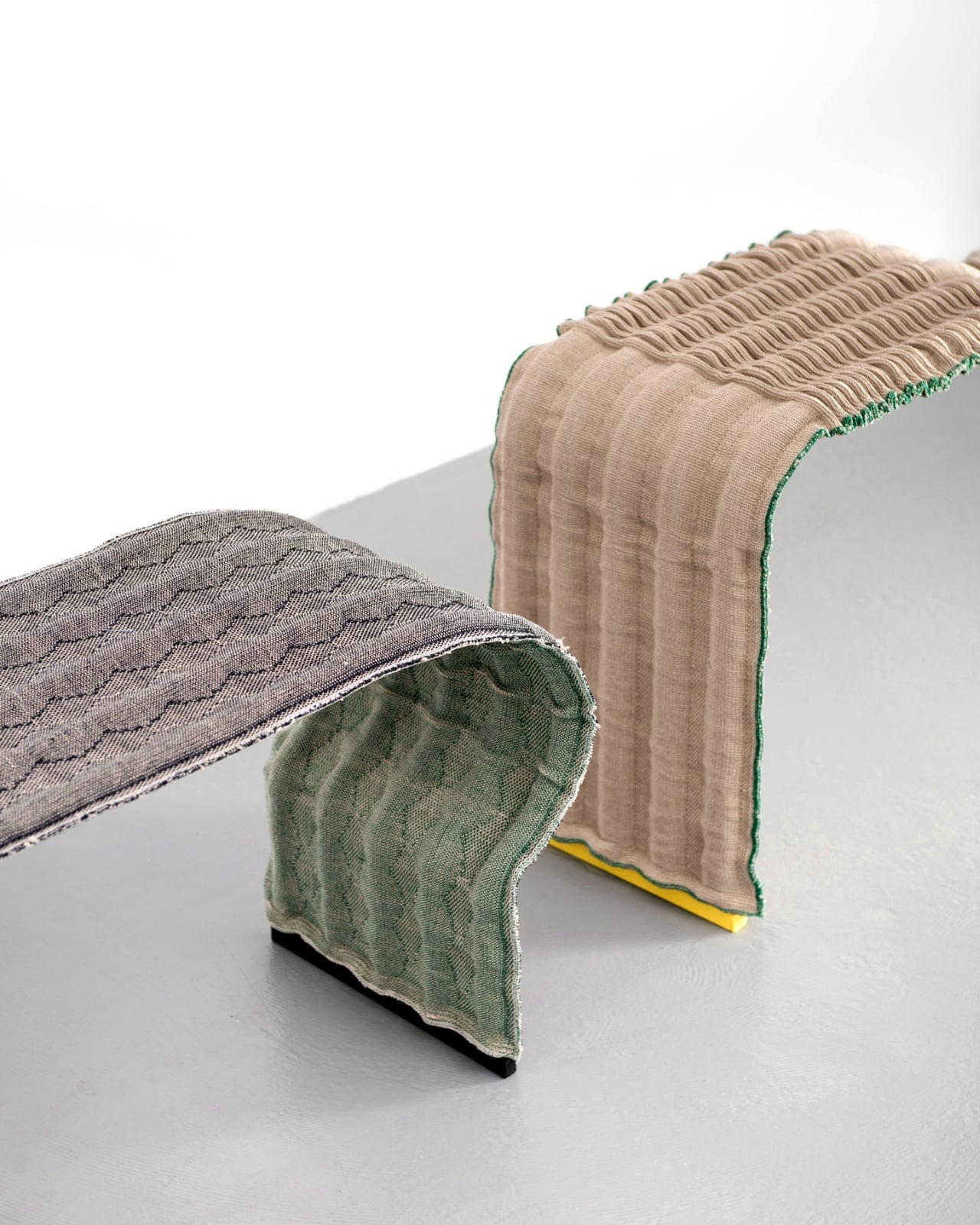
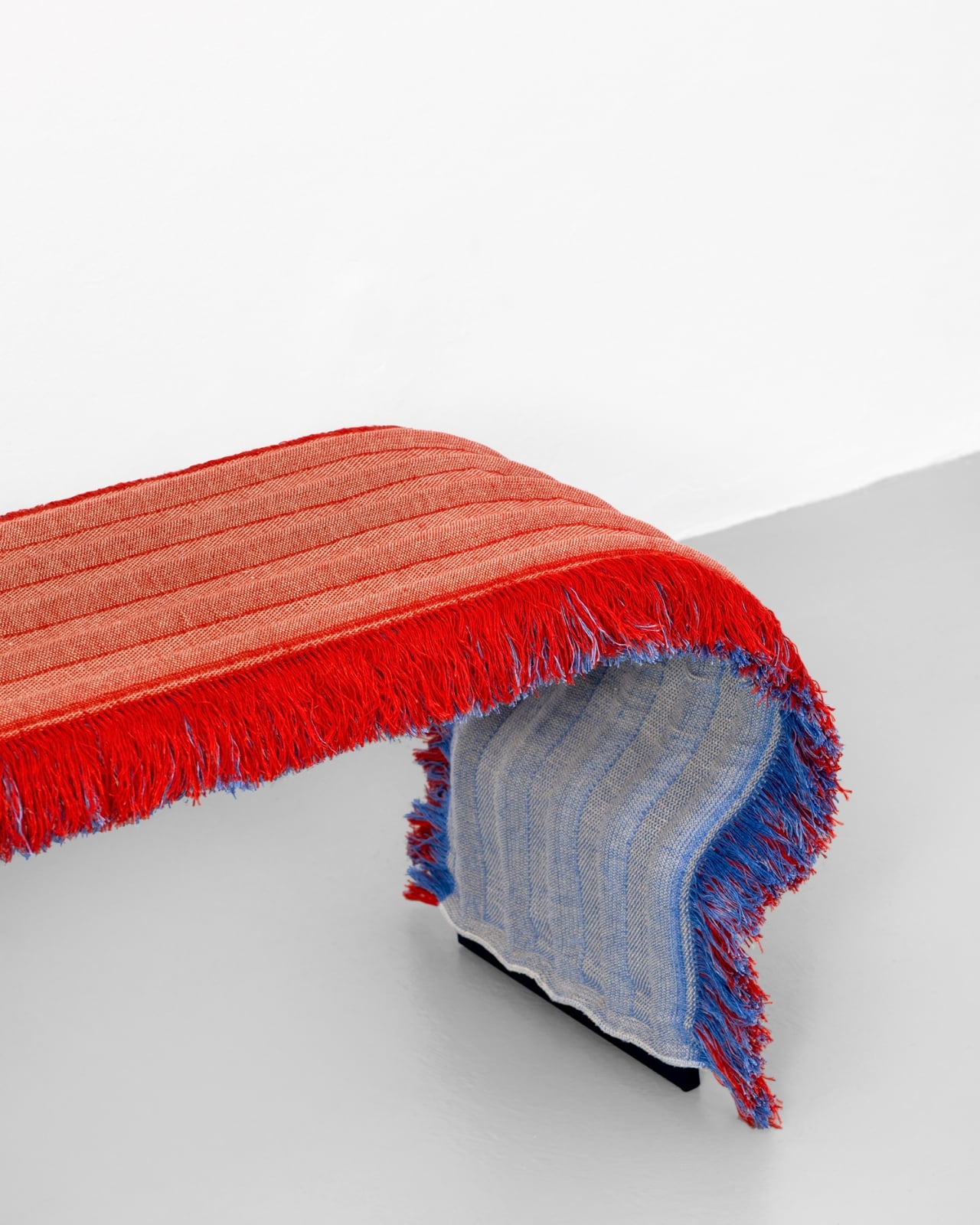
But here’s where LinumTube really shines: it doesn’t look like a sustainability lecture. The covers come with or without fringes and are available in both multicolored and natural pastel tones. The aesthetic is minimalist but warm, the kind of thing that would fit just as easily in a modern office lobby as it would in your living room. There’s even an option for integrated LED lighting woven into the fabric, because why shouldn’t sustainable furniture also have a bit of flair?

The project received funding from the German Federal Ministry of Education and Research, and was unveiled at Milan Design Week 2025 during the Materially exhibition. It represents a genuinely different approach to how we think about furniture design. Instead of creating objects meant to be used and discarded, LinumTube embraces the idea that furniture should evolve with us. Need more seating? Add another module. Moving to a smaller place? Reconfigure what you have. Done with it entirely? Return everything to the material cycle without guilt.

This is the kind of innovation we need more of. Not flashy tech for tech’s sake, but thoughtful problem solving that addresses real challenges without sacrificing style or functionality. Furniture has been essentially the same for decades, built on a model of planned obsolescence and complicated assembly instructions. LinumTube proves there’s another way: lighter, smarter, and infinitely more adaptable.

The best part? This doesn’t feel like a compromise. You’re not choosing between design and sustainability, or between affordability and quality. You’re getting furniture that works better precisely because it was designed with all those constraints in mind from the beginning. That’s the kind of thinking that actually changes industries. So next time you’re wrestling with an Allen wrench at 2 a.m., wondering why furniture has to be this complicated, remember that someone out there is already building the alternative. They’re using flax, steel tubes, and some seriously smart engineering to prove that better is possible.

The post This Furniture System Uses Just 2 Materials and No Glue first appeared on Yanko Design.

This Chair Looks Skeletal But That’s Exactly the Point

There’s something satisfying about watching minimalism meet function in furniture design, and Denis Zarembo’s Insero Chair does exactly that with an unexpected twist. Based in Moscow, Zarembo has created a piece that challenges how we think about sitting, proving that sometimes the most interesting designs come from playing with basic shapes in not-so-basic ways.

The Insero Chair isn’t trying to reinvent the wheel. Instead, it’s reimagining the seat, backrest, and frame through a lens of geometric precision that feels both contemporary and surprisingly timeless. What makes this design stand out on Behance, where it’s already racked up dozens of appreciations and hundreds of views, is how it balances visual lightness with structural integrity.

Designer: Denis Zarembo

At first glance, the chair appears almost skeletal. Clean lines intersect at deliberate angles, creating a framework that looks like it could have been sketched in a single, confident stroke. But look closer and you’ll notice the thoughtfulness behind each junction point, each curve, each decision about where material exists and where it’s been carved away. This isn’t minimalism for minimalism’s sake. It’s reduction with purpose.

The name “Insero” comes from Latin, meaning “to insert” or “to place within,” which gives us a clue about Zarembo’s design philosophy. The chair seems to explore the relationship between positive and negative space, between what’s there and what’s deliberately absent. The seat appears to nestle within the frame rather than simply sit on top of it, creating an integrated whole that feels more like sculpture than traditional furniture.

What’s particularly clever is how the design manages to look both delicate and sturdy. The slender proportions suggest lightness and mobility, which is increasingly important in our flexible living spaces where furniture needs to work harder and move more freely. Yet the geometric construction hints at strength, with forces distributed through the frame in ways that are as much about engineering as aesthetics.

The chair exists at that sweet spot where industrial design meets art object. You could absolutely see it in a modern apartment or a minimalist office, but you could just as easily imagine it cordoned off in a design museum, being studied for its formal qualities. That dual nature is what makes pieces like this so compelling. They don’t just serve a function; they start conversations.

Zarembo’s work fits into a larger tradition of designers who understand that chairs are never just chairs. They’re statements about how we live, how we work, how we relax. From Charles and Ray Eames to contemporary makers pushing digital fabrication techniques, chair design has always been a proving ground for new ideas. The Insero Chair continues that lineage while speaking in a distinctly current visual language.

The rendering quality also deserves mention. The way Zarembo has presented the chair on Behance shows it from multiple angles, letting viewers appreciate how the geometry shifts depending on perspective. Sometimes it looks almost two-dimensional, like a line drawing come to life. From other angles, the complexity reveals itself, showing depth and dimension you might not initially expect. This careful presentation isn’t just about showing off. It’s essential for understanding how the piece actually works in three-dimensional space.

There’s no information yet about whether the Insero Chair will move into production, but that’s almost beside the point. Concept furniture serves an important role in pushing the conversation forward, in asking “what if?” even when “when?” remains unanswered. These designs influence other makers, spark ideas, and gradually shift our collective sense of what’s possible.

For anyone interested in where contemporary furniture design is heading, pieces like the Insero Chair offer valuable clues. We’re seeing a move away from bulky, overwrought designs toward cleaner silhouettes that don’t sacrifice comfort or functionality. We’re seeing digital tools enable precision that would have been difficult or impossible with traditional methods. And we’re seeing designers like Zarembo who understand that good design doesn’t shout. It speaks clearly, confidently, and leaves room for you to fill in the meaning yourself.

Whether the Insero Chair ends up in living rooms or remains in the realm of conceptual exploration, it’s already doing what good design should: making us look twice, think differently, and reconsider something as everyday as where we choose to sit.

The post This Chair Looks Skeletal But That’s Exactly the Point first appeared on Yanko Design.

Aram Just Released a Numbered Edition of This 100-Year Chair

Aram just dropped something special for design collectors: an exclusive limited edition of Eileen Gray’s iconic Bibendum chair, released to celebrate the 100th anniversary of its 1926 debut. This isn’t your standard reissue. This is a numbered, centenary edition of one of modernism’s most distinctive pieces, and it’s the kind of release that serious furniture enthusiasts have been waiting for.

The Bibendum chair has always been a statement maker. With its plump, upholstered cushions stacked like inflated tubes and cradled by a sleek chromium-plated steel base, it looks like the Michelin Man decided to become furniture. Gray herself named it after Bibendum, the tire company’s puffy white mascot, because the resemblance was too perfect to ignore. But what started as a cheeky observation became one of the most recognizable silhouettes in design history.

Designer: Aram and Eileen Gray

Now, a full century after Gray first created this rebellious piece, Aram is honoring the milestone with a limited production run that’s already generating buzz among collectors. The centenary edition represents something rare in the furniture world: a chance to own a specially designated version of an icon, not just another reproduction. At £6,750, it’s positioned squarely in the collector’s market, where provenance and exclusivity matter as much as the design itself.

What makes this limited edition significant goes beyond the anniversary stamp. Gray’s original vision was uncompromising. When she met with Zeev Aram in the 1970s to approve contemporary production of the chair, she demonstrated exactly how exacting her standards were. After sitting in the prototype, she paused, considered, and declared it needed to be precisely two centimeters wider. Not roughly wider. Not “a bit more comfortable.” Exactly two centimeters. That level of perfectionism is built into every Bibendum, and this centenary edition carries that legacy forward.

The chair’s history adds layers to its collectibility. It made its debut in Gray’s design for Madame Mathieu-Lévy’s Rue de Lota apartment, sharing space with Gray’s famous Brick screen and an extraordinary glass floor lit from beneath. When L’Illustration magazine photographed the apartment in 1933, the Bibendum commanded attention among an entire room of daring modernist pieces. It wasn’t just furniture. It was a statement about rejecting the hard-edged machine aesthetic that dominated the era.

That’s part of what makes this limited edition so compelling right now. We’re in another moment where design trends lean heavily toward minimalism and restraint. The Bibendum’s generous curves and unapologetic presence offer a counterpoint. It refuses to disappear into a room. It anchors it. The tubular steel base keeps it grounded in modernist principles, but those voluptuous upholstered cushions deliver comfort that feels almost decadent.

For collectors, limited editions like this serve multiple purposes. There’s the obvious appeal of scarcity. Numbered pieces from a commemorative run will always carry different weight than standard production models. But there’s also the narrative value. This chair tells a story about a woman designer who pushed boundaries in a field dominated by men, who insisted on curves in a world obsessed with angles, who believed comfort and beauty didn’t have to be mutually exclusive.

Gray’s career spanned lacquerwork, rug design, furniture, and architecture. The Bibendum embodies her refusal to be categorized or constrained. It’s modernist but not austere. It’s luxurious but not fussy. It’s sculptural but supremely functional. That complexity is what keeps it relevant a century later.

The standard Bibendum continues to be available in various leathers or wool felt, with polished chrome or matte black lacquered bases. But this new centenary limited edition is different. It’s not just about owning a beautiful chair. It’s about owning a specifically designated piece of design history, part of a finite release created to mark a hundred years of influence.

For design enthusiasts who’ve been watching the market, this release represents the kind of opportunity that doesn’t come around often. A century milestone for an icon like the Bibendum only happens once. Aram’s decision to commemorate it with an exclusive limited edition gives collectors something tangible to mark the moment. It’s not just furniture. It’s a rebellion wrapped in cushions, a reminder that sometimes the most radical thing you can do is insist on taking up space. And now, for a limited time, you can own a numbered piece of that rebellion.

The post Aram Just Released a Numbered Edition of This 100-Year Chair first appeared on Yanko Design.

These Chairs Are Made From the Steel That Holds Up Buildings

There’s something beautifully rebellious about taking the skeleton of a building and turning it into something you’d actually want in your home. That’s exactly what designer Marquel Williams has done with his Beams collection, a furniture series that proves industrial components can have serious aesthetic game.

Williams built this entire collection around one specific element: the I-beam. You know, those steel supports that hold up skyscrapers and warehouses. The same component that was patented back in 1849 by Alphonse Halbou and has been refined over nearly two centuries to become the gold standard for structural efficiency. But instead of leaving these beams to do their usual heavy lifting in the background, Williams pulled them into the spotlight and transformed them into chairs, lamps, desks, and lounge seating.

Designer: Marquel Williams

The collection includes five distinct pieces, each one using the I-beam as its structural foundation alongside metal sheets and black leather upholstery. What makes this approach so compelling is how Williams managed to create such diverse pieces from a single standardized part. Each item has its own personality despite sharing the same DNA.

Take the Beam Chair, for instance. It’s monochromatic metal at its finest, with precisely angled I-beams and laser-cut aluminum sheets. The whole thing is treated with a waxed finish that balances rigid industrialism with actual functionality. Looking at it, you might think it would be uncomfortable with all that sharp geometry and metal, but there’s an intentional restraint in its design that makes it striking.

Then there’s the Chaise Longue, which takes an entirely different approach. While the chair feels rigid and precise, the chaise has this relaxed, almost delicate equilibrium going on. The leather upholstery softens the whole vibe, making it feel more approachable while still maintaining that industrial edge.

But the real showstopper might be the Floor Lamp. This piece gets technical in the best way possible, featuring adjustable height shades with a cantilever system. Here’s the kicker: the electrical cord isn’t hidden away like usual. Instead, it’s framed right inside the beam as a visible design detail. It’s that kind of thoughtful touch that shows Williams isn’t just using industrial materials for aesthetic novelty; he’s actually thinking about how to integrate every functional element into the design language.

Williams’s philosophy here is all about standardization and what you can do when you commit to a single industrial component as your foundation. The I-beam represents nearly 200 years of industrial production refinement, the absolute peak of standardized structural efficiency. By using it in unexpected ways, Williams subverts its typical purpose and transforms it into a vehicle for creativity and self-expression.

This approach isn’t entirely new in the design world. Italian designer Enzo Mari explored similar territory with his own I-beam experiments (called “putrella” in Italian), creating bowls and trays for dining tables by simply bending the extremities upward. Mari’s research into semi-finished products aimed to highlight the formal worth of industrial components and transform them into contemporary design icons. Williams is working in that same tradition but pushing it further by creating an entire cohesive furniture system.

The collection is handcrafted by Caliper in Spain and produced in very limited quantities, which makes sense given the level of craftsmanship required. These aren’t mass-produced pieces; each one requires careful fabrication and finishing to achieve that balance between industrial rawness and refined design.

What Williams has ultimately created is a collection that makes you rethink the materials around you. Those structural supports holding up buildings? They have untapped aesthetic potential. That standardized industrial component? It can be the basis for something truly unique. The Beams collection proves that creativity isn’t about reinventing the wheel; sometimes it’s about looking at the wheel differently and imagining what else it could become.

The post These Chairs Are Made From the Steel That Holds Up Buildings first appeared on Yanko Design.

These Steel Chairs and Lamps Look Like Sitting Inside a Pergola

Walking under a pergola or slatted canopy, sunlight breaks into stripes, and the structure feels more like a drawing in space than a solid roof. That rhythm of beams and shadows is both architectural and strangely calming, turning overhead shelter into something closer to a pattern you move through. Foln takes that outdoor language and shrinks it down into objects you can live with indoors.

Jiyun Lee’s Foln series is a family of three stainless-steel pieces: the Linear Chair, a floor lamp, and a wall lamp, all built from folded metal lines. Each element is made entirely of stainless steel, with dimensions that keep it slender and vertical. The project is less about adding another chair or lamp to the world and more about importing a structural idea into a domestic scale, treating furniture and lighting as small frameworks you inhabit or move around.

Designer: Jiyun Lee

Encountering the Linear Chair, you see a small framework first, a set of repeated uprights and crossbars that read like a fragment of pergola. Only when you get closer does the seat reveal itself as a crossing of beams, with the back continuing the same rhythm upward. It is clearly functional, but it also feels like sitting inside a drawing, surrounded by lines and the shadows they cast on the floor and wall behind you.

The floor and wall lamps extend the same language into light. The floor lamp becomes a vertical corridor where illumination travels up and down between nested frames, while the wall lamp compresses that idea into a compact cluster that hovers off the surface. In both cases, lighting is less about a glowing bulb and more about how brightness slips between the metal and onto nearby surfaces, treating the surrounding wall as part of the composition.

Foln changes as you move around it. From one angle, the lines stack and the pieces look dense, almost solid; from another, they open up and nearly disappear. The designer’s statement that shadows become architectural elements in their own right comes through when you realize the real composition includes the dark stripes on the floor and wall as much as the polished steel itself, rewriting the room with every shift in daylight.

Stainless steel, sharp geometry, and unpadded surfaces mean Foln is not chasing ergonomic softness or maximum light output. The chair will feel firm, and the lamps will behave more like ambient or accent pieces than task lights. That trade-off is intentional, prioritizing a contemplative, spatial experience over conventional comfort and placing the series closer to collectible design than everyday contract furniture you buy in bulk.

Foln reframes interiors as places where structure, light, and emptiness can be as present as color or texture. By borrowing the pergola’s rhythm and translating it into folded metal, the series turns a familiar outdoor gesture into a quiet indoor ritual. Rhythm is not only seen in the lines of steel but felt in the way light and shadow keep rewriting the room around them, turning simple objects into small, inhabitable frameworks that change how you read the space they sit in.

The post These Steel Chairs and Lamps Look Like Sitting Inside a Pergola first appeared on Yanko Design.

This 1970s Kids’ Desk Flatpacked Before IKEA Even Existed

Here’s something to blow your mind: decades before IKEA convinced us all that assembling furniture with an Allen wrench was somehow fun, a visionary designer named Luigi Colani was already flatpacking children’s furniture in the 1970s. And get this, it wasn’t just about convenience. His Tobifant desk and chair set was actually genius problem-solving at its finest.

If you know anything about Luigi Colani, you know he was the king of curves and organic shapes. This is the guy who designed everything from streamlined trucks to futuristic cameras, always with that signature bio-design aesthetic. But with the Tobifant collection, created for West German children’s furniture brand Kinderlübke, he tackled a problem every parent faces: kids grow way too fast.

Designer: Luigi Colani

The Tobifant set came flatpacked (yes, in the ’70s!), but that was just the beginning of its brilliance. Made from beech plywood, both the desk and chair featured height-adjustable frames, so you could raise the seat, backrest, and writing surface as your child sprouted upward. Instead of buying new furniture every couple of years, parents could invest once and adjust as needed. It was sustainable before sustainability became a design buzzword.

Think about what a radical concept this was. It was a time when most children’s furniture was either cheap throwaway pieces or expensive heirlooms that kids outgrew almost immediately. Colani created something practical, beautiful, and adaptable. The furniture could literally grow with your child, which meant it could potentially serve them from toddlerhood through their early teens.

But wait, there’s more. Colani didn’t just stop at smart construction. He actually specified that each Tobifant desk should come with one kilogram of modeling clay and three wooden tools. Because apparently he understood that a desk isn’t just a place to do homework. It’s a creative laboratory, and kids need to be encouraged to make things, to experiment, to get their hands dirty (or clayey, as it were). How many furniture designers think about what happens after the sale? Colani was playing 4D chess while everyone else was still figuring out checkers.

The flatpack design wasn’t just about shipping efficiency, though that was certainly a bonus. It was about democratizing good design. By making the furniture easy to transport and assemble, Colani made it more accessible to regular families. This was thoughtful, human-centered design at work.

What’s really striking when you look at photos of the Tobifant set today is how modern it still looks. The clean lines, the warm plywood finish, the elegant simplicity of the adjustable mechanism… it could easily sit in a contemporary home without looking dated. That’s the mark of truly timeless design. While so much ’70s furniture screams its decade with harvest gold upholstery and chrome everywhere, the Tobifant feels almost minimalist in its restraint.

The set went into production in the late 1970s, and today surviving examples pop up on vintage reseller sites, often commanding impressive prices from collectors. It makes sense. Original Colani pieces are increasingly rare, and the Tobifant represents such a perfect intersection of form, function, and forward-thinking design philosophy.

What’s fascinating is how Colani’s approach predated so many trends we think of as recent innovations. Flatpack furniture? Check. Modular, adjustable design? Check. Sustainability through longevity? Check. Child-centered functionality that doesn’t sacrifice aesthetics? Double check. He was essentially doing what today’s best furniture startups are trying to do, except he did it before many of them were even born.

So next time you’re wrestling with those cryptic IKEA instructions, spare a thought for Luigi Colani and his Tobifant collection. He proved that flatpack furniture could be more than just affordable practicality. It could be beautiful, innovative, and genuinely improve how families live. That’s the kind of design legacy that deserves way more recognition than it gets.

The post This 1970s Kids’ Desk Flatpacked Before IKEA Even Existed first appeared on Yanko Design.

This Chair Looks Like a Material Swatch Book

You know those material swatch books at fabric stores where every color fan out in perfect rainbow order? Designer Fatih Demirci apparently looked at one and thought, “What if that was a chair?” The result is the Kartela Chair, a concept design that turns the humble material sample into something you’d actually want to sit on.

Let’s be real. Most furniture design either plays it safe with neutrals or goes so wild that you’d only see it in a modern art museum. The Kartela Chair manages to walk this delightful line between practical and playful. Looking at it feels like stumbling upon a design secret, where function meets whimsy in the most unexpected way.

Designer: Fatih Demirci

The concept is brilliantly simple yet visually striking. The chair features layers upon layers of cushioned upholstery stacked together, creating this incredible rainbow effect along the edges. Each layer represents a different color or texture, much like flipping through pages in a designer’s sample book. It’s the kind of thing that makes you do a double take. From one angle, you see a sophisticated seating piece with a clean, minimalist frame. From another, you catch those vibrant cascading layers that give it personality and depth.

What really gets me about this design is how it celebrates the materials themselves. Usually, upholstery is hidden away, tucked and stapled underneath where no one sees the construction. Demirci flips that script entirely. Here, the layers become the main event. Every fold, every color transition, every texture is on full display. It’s like the chair is saying, “Hey, look how I’m made, and isn’t it beautiful?”

The Kartela Chair comes in different colorways, which honestly makes it even more fun. There’s a lime green version that practically vibrates with energy, perfect for someone who wants their furniture to make a statement. Then there are softer pastel combinations in lilacs, blues, and creams that feel more serene but still maintain that playful edge. And for those leaning toward earthy vibes, there are warm tones in mustards, tans, and terracottas that bring all that visual interest without overwhelming a space.

The frame itself keeps things grounded. Slim metal legs in either white or black powder coat give the chair an airy, almost floating quality. It’s a smart move. With all that cushioned drama happening above, a heavy base would make the whole thing feel clunky. Instead, the minimal structure lets those colorful layers take center stage while still providing solid support.

From a practical standpoint, this concept is interesting because it challenges how we think about customization. Imagine being able to choose your layer combinations like picking nail polish colors. Want more blues? Go for it. Prefer a monochromatic fade? That works too. The design naturally lends itself to personalization in a way that most furniture doesn’t.

There’s also something nostalgic about the aesthetic. Those tufted buttons on the seat and back cushions give off vintage vibes, like something your cool aunt might have had in her 70s living room, but updated for today. It’s retro without being costume-y, which is a hard balance to strike.

Of course, this is still a concept design, which means we’re looking at rendered images rather than something you can order online tomorrow. But that’s part of what makes furniture concepts so exciting. They push boundaries and make us reconsider what’s possible. Even if the Kartela Chair never makes it to mass production, it’s already done its job by sparking conversation and inspiring other designers to think outside the traditional furniture box. Whether this chair ever graces showroom floors or remains a digital darling, Fatih Demirci has created something that makes people smile. And in the end, isn’t that what good design should do?

The post This Chair Looks Like a Material Swatch Book first appeared on Yanko Design.

Furniture That Dances: The Moon Series Reimagines Seating

There’s something almost poetic about furniture that moves. Not in the literal sense, but in the way it invites you to play, rearrange, and reimagine your space. The Moon Series from Craft of Both and MADE does exactly that, and honestly, it’s one of the most captivating furniture concepts I’ve seen in a while.

Picture this: a chair that unfolds like a Chinese paper fan, its pleated form spreading out in a graceful arc. That’s the essence of the Moon Series, designed by Christina Standaloft and Jay Jordan. The collection features two core pieces, the Moon Chair at 60 degrees and the Moon Bench at 120 degrees, both built on radial geometry that gives them this incredibly sculptural quality.

Designers: Christina Standaloft, Jay Jordan

What makes these pieces special isn’t just how they look (though they’re absolutely stunning). It’s how they work. The designers describe the interaction as a “meditative fan dance,” which might sound a bit flowery until you actually see someone adjusting the modules. There’s something genuinely calming about sliding those pleated panels along the wooden framework, customizing the backrest to exactly how you want it. It’s tactile design at its finest.

The modularity here goes way beyond what we usually see in flexible furniture. Each piece can be constantly redefined, changing both its physical form and the amount of space it occupies. Want more privacy? Add modules. Need a more open feel? Remove some. The radial structure means every adjustment changes not just comfort but the entire aesthetic of the piece.

But here’s where it gets really interesting. When you start combining multiple Moon Chairs or Benches together, you’re essentially creating sculptural landscapes in your living space. The arrangement of those fan-like elements determines everything: how the pieces orient toward each other, how much privacy each seating area has, the comfort level, and the overall visual impact. It’s like being handed a set of beautiful building blocks and being told to go wild.

The technical execution is impressive too. Those 60-degree and 120-degree angles aren’t arbitrary. They’re precisely calculated to allow the pieces to connect and configure in multiple ways. A full circle is 360 degrees, so you could theoretically arrange six Moon Chairs or three Moon Benches to create a complete circular seating area. Mix and match them, and the possibilities multiply exponentially.

What strikes me most about the Moon Series is how it bridges Eastern and Western design sensibilities. The inspiration from Chinese paper fans brings this delicate, almost ceremonial quality to the pieces. Yet the execution feels very contemporary, with clean lines and that minimalist aesthetic we’ve come to associate with modern Scandinavian or Japanese design. The wooden slats radiate outward like sunbeams, and those pleated paper or fabric panels catch the light beautifully.

There’s also something refreshingly honest about the design. You can see exactly how it works. The structure is exposed, the modularity is obvious, and the craftsmanship is on full display. In an era where so much furniture hides its mechanics behind upholstery and veneers, this transparency feels almost rebellious. From a practical standpoint, this kind of modular system makes a lot of sense for how we actually live today. Smaller spaces, frequent moves, evolving needs… furniture that can adapt alongside us isn’t just clever, it’s necessary. But the Moon Series doesn’t sacrifice beauty for function. If anything, the functionality enhances the beauty.

The partnership between Craft of Both and MADE brings together thoughtful design philosophy with production expertise, and it shows. These aren’t concept pieces that will never make it past the design blog circuit. They’re real, functional furniture that you could actually live with. I keep coming back to those images of someone adjusting the fan modules, their hands gently pulling the pleated material into place. There’s an intimacy there, a personal relationship between user and object that most furniture just doesn’t offer. Your Moon Chair becomes uniquely yours through how you configure it, day by day, mood by mood.

The Moon Series offers something different when we’re used to flat-pack sameness. It’s furniture that invites participation, rewards creativity, and somehow manages to be both statement piece and practical seating. That’s not an easy balance to strike, but Standaloft and Jordan have done it with grace.

The post Furniture That Dances: The Moon Series Reimagines Seating first appeared on Yanko Design.

Atlanta Airport Has Chairs Made From Campus Trash. They’re Gorgeous

There’s something quietly radical about sitting in a recycled Adirondack chair while you’re waiting for your flight at the world’s busiest airport. Plastic Reimagined transforms locally sourced plastic waste into full-scale seating prototypes, bridging design education, material research, and civic infrastructure at Hartsfield-Jackson Atlanta International Airport, and honestly, I can’t stop thinking about how clever this is.

Here’s what happened. Assistant Professor Hyojin Kwon, founder of the research-oriented practice Pre– and Post–, developed this through a graduate design research studio at Georgia Tech’s School of Architecture, where students took a very practical question and turned it into something beautiful. What if all that plastic waste from campus could actually become something useful again?

Designer: Hyojin Kwon (curator and instructor)

Graduate students collected post-consumer HDPE and PLA from campus makerspaces, waste collection streams, and local recycling facilities. Think about that for a second. The plastic cups from the student union, 3D printing scraps from late-night projects, all that everyday campus detritus that usually ends up in a landfill. Instead of being tossed, the materials were shredded, pressed into sheets, milled with CNC routers, or cast into volumetric forms.

What I love most is that they didn’t try to hide the recycled nature of these pieces. Surface variations, including marbled color patterns and irregular textures, were retained as integral elements of the final designs, so each chair has this gorgeous, swirly aesthetic that screams “I used to be something else.” The imperfections became the personality.

The project started modestly enough. It was first exhibited at Atlanta Contemporary from June to September 2025, where a series of Adirondack chairs and collective seating elements were presented as both design artifacts and material propositions. But then it went public in a bigger way. During SITE 2025 at the Goat Farm Arts Center, the chairs were installed across the 12-acre property during a one-night arts festival and encountered by over 4,000 visitors who could actually sit on them, touch them, use them in the wild.

Now comes the really exciting part. Plastic Reimagined transitioned into a long-term civic setting as part of TRANSPORT | Transform | TRANSCEND, a year-long exhibition partnership between Georgia Tech Arts and Hartsfield-Jackson Atlanta International Airport, installed in Terminal T and on view through November 2026. That means millions of travelers from around the world will see these chairs, and maybe pause long enough to wonder about their own relationship with plastic waste.

As Kwon noted, “These post-consumer materials were coming from our campus, our students’ everyday life. By repurposing them, we created meaningful research outcomes.” There’s something deeply satisfying about that circularity. The students created the waste, then figured out how to give it a second life as functional furniture that other people can actually use.

The individual pieces have names and personalities. There’s Vincent, with its hand-shaped forms and marbled surfaces. There’s Modu-Chair, built from cubic modules that echo quilting patterns. And Framework, a translucent lattice structure that reimagines what an Adirondack chair can even be. Each one asks the same question in a different way: what if we stopped seeing plastic as garbage and started seeing it as potential?

Across its transitions from gallery to festival to global transit hub, Plastic Reimagined argues for sustainability as infrastructural literacy rather than aesthetic signaling. This isn’t performative environmentalism. It’s practical, tangible, and sitting right there in the airport terminal where anyone can plop down and rest their feet.

This project proves something I’ve always believed: the best design solutions come from constraints, not abundance. When you have to work with what’s already there, you get creative in ways you never would with unlimited resources. These Georgia Tech students turned their campus waste stream into a civic contribution, and now their work is literally supporting weary travelers at one of the planet’s busiest crossroads.

The post Atlanta Airport Has Chairs Made From Campus Trash. They’re Gorgeous first appeared on Yanko Design.