Michael Jantzen Just Turned Solar into a 16-Arm Moving Sculpture

Most renewable energy systems hide in plain sight. Rooftop solar panels blend into shingles, batteries sit in containers behind fences, and wind turbines spin in distant fields. They quietly do their jobs without helping anyone understand what happens inside them, which feels like a missed opportunity when you are trying to build support for systems that might keep the planet livable for another generation or two.

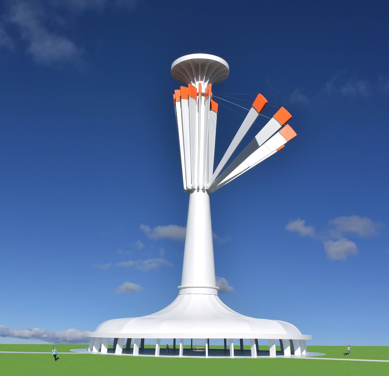
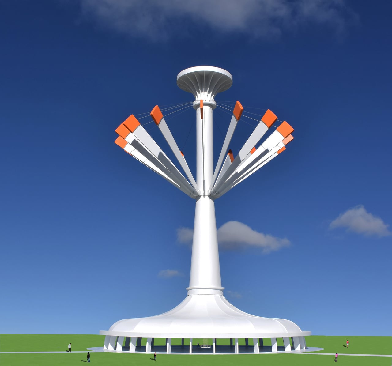
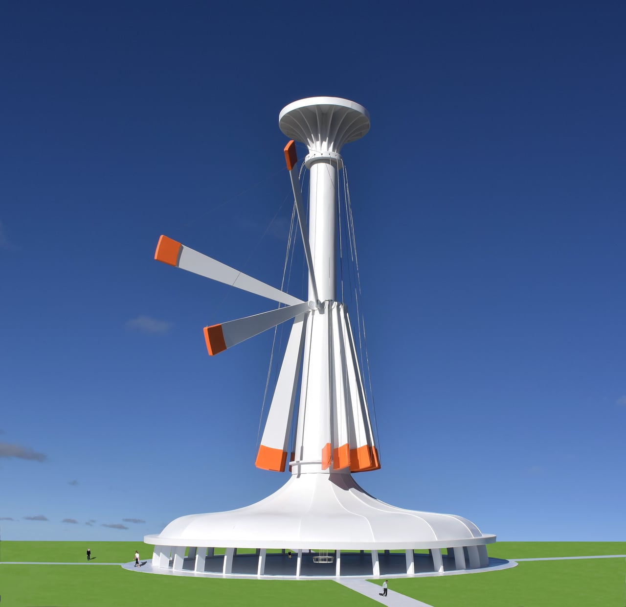
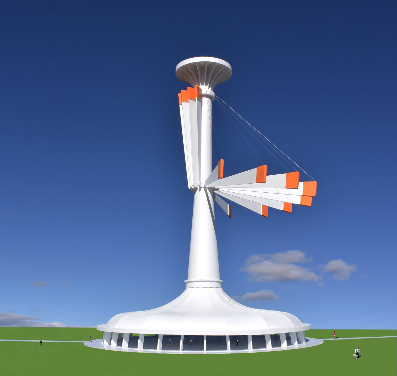
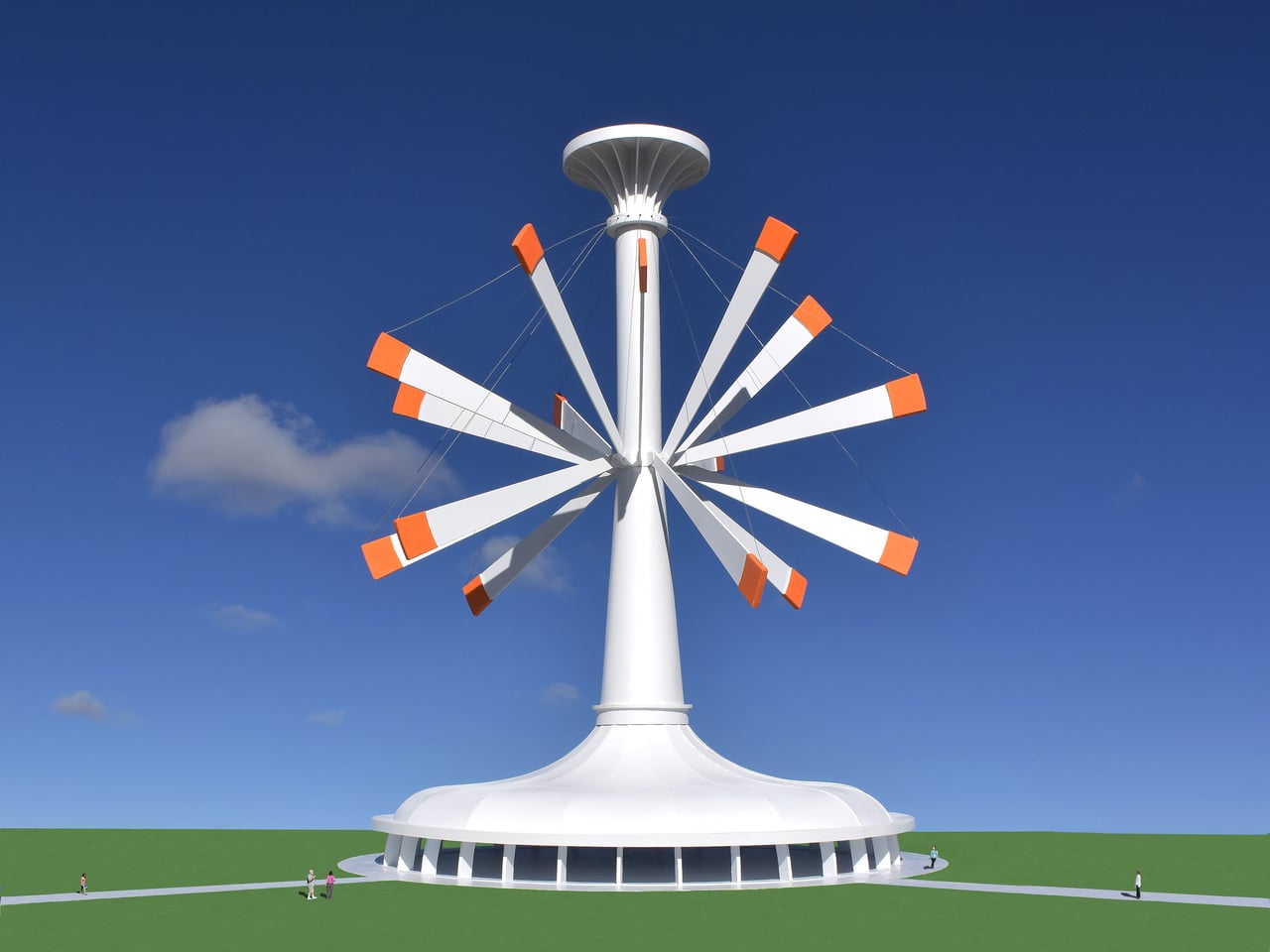
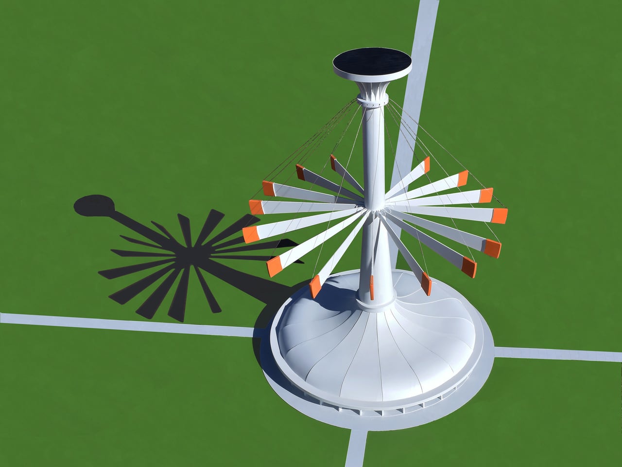
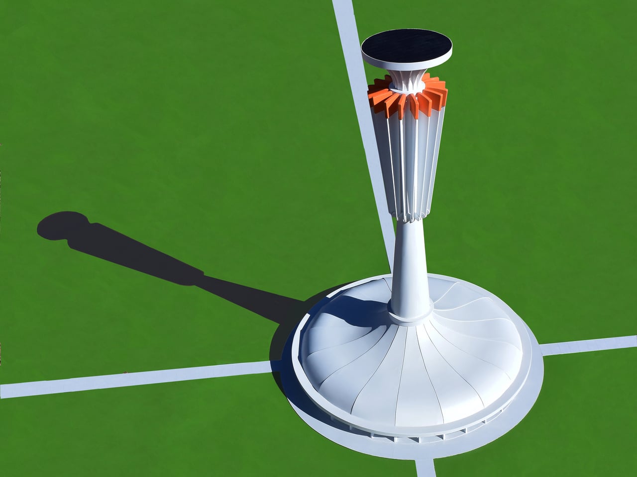
Michael Jantzen’s Solar and Gravity Powered Art and Science Pavilion treats that visibility problem as a design challenge. The conceptual structure combines a public exhibition space under an umbrella-shaped roof with a tall central tower supporting 16 long, weighted steel arms. Those arms lift and lower throughout the day, creating shifting silhouettes while demonstrating how solar power and gravity work together as a functional energy system rather than just theoretical concepts.

Designer: Michael Jantzen
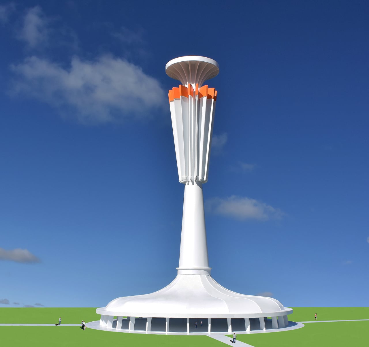
The cycle works simply enough. A solar cell array at the top powers 16 winches that pull the weighted arms upward, storing potential energy. When the pavilion needs electricity, or when someone wants to change its shape, the arms fall back down under gravity. Their descent drives 16 generators that feed power to the building or local grid, turning stored height into usable electricity without batteries or other complex systems getting in the way.
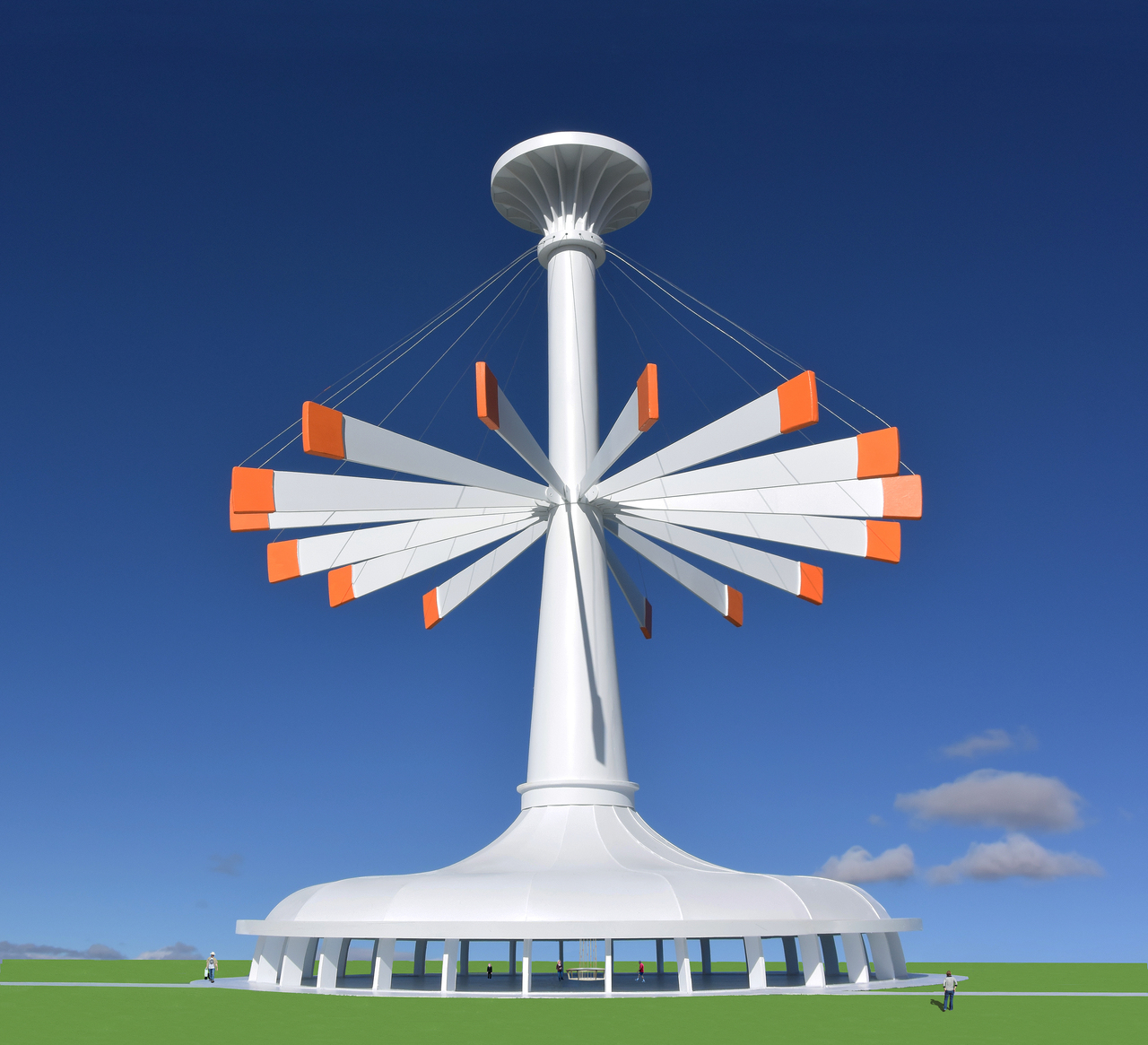
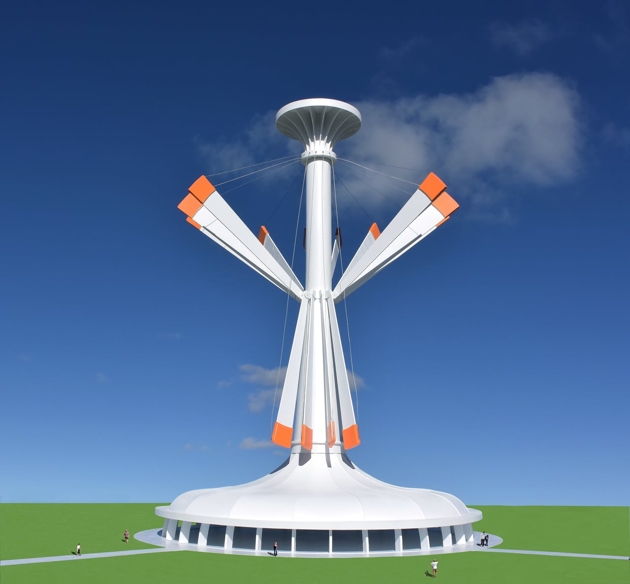
Arriving on a sunny afternoon, you would see the arms at different angles around the tower, sometimes clustered vertically, sometimes fanned out like a mechanical flower. The shifting positions are not just decorative but are the visible result of energy being stored and released. You can read the building’s energy state in its skyline without needing a diagram, which turns out to be a surprisingly rare thing for infrastructure to offer at any scale.
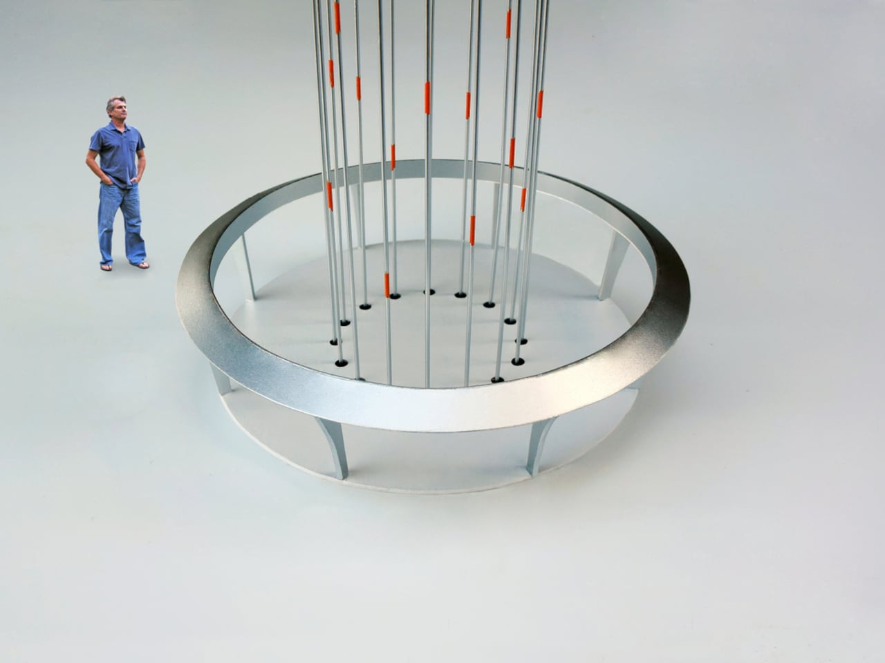
Inside, the umbrella roof shelters a large floor for exhibitions, lectures, or performances. At the center, 16 cables drop through holes in the floor, each marked with an orange spot matching the orange-tipped arms outside. Those cables connect to winches and generators below, making the mechanical core part of the exhibition rather than something hidden. Visitors can track which arms are up or down by watching cables move, turning passive observation into something closer to active participation.
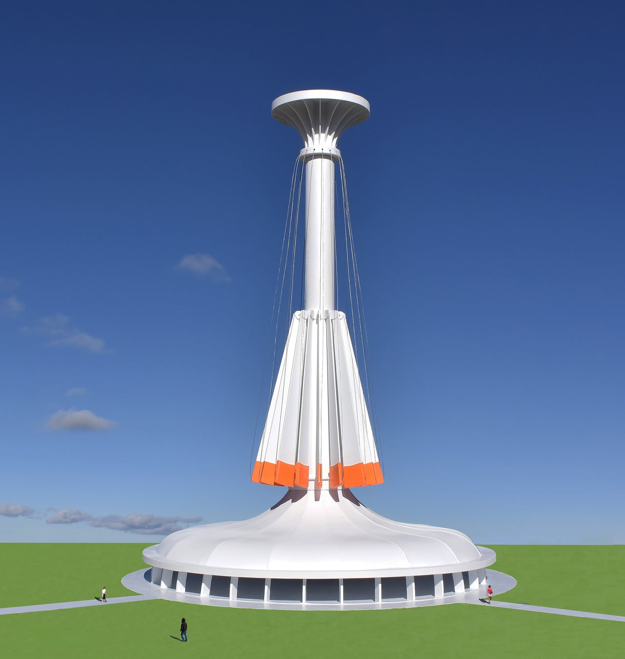
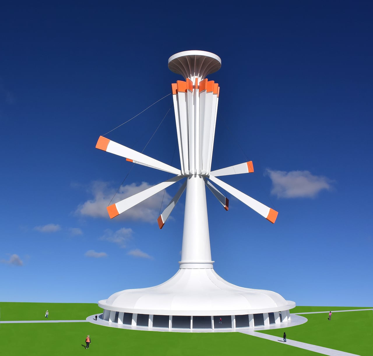
Of course, the setup means the building becomes a working model while hosting events about climate or technology. People walk through exhibitions while the structure demonstrates solar capture and gravity storage without needing to explain every detail. The pavilion functions as a tourist attraction, classroom, and public art that teaches through motion instead of asking you to absorb paragraphs about conversion rates nobody remembers afterward.

Jantzen’s proposal might never be built as drawn, but treating energy flows as choreography feels worth exploring. It hints at a future where infrastructure does not just work efficiently behind walls, it performs visibly in ways that invite people to understand systems that usually stay hidden until something breaks. Making those processes watchable might matter more than squeezing out another efficiency percentage point, which is something worth considering the next time we design places meant to teach.
The post Michael Jantzen Just Turned Solar into a 16-Arm Moving Sculpture first appeared on Yanko Design.
This Steppe Visitor Center Treats a Volcano as Landscape, Not Landmark

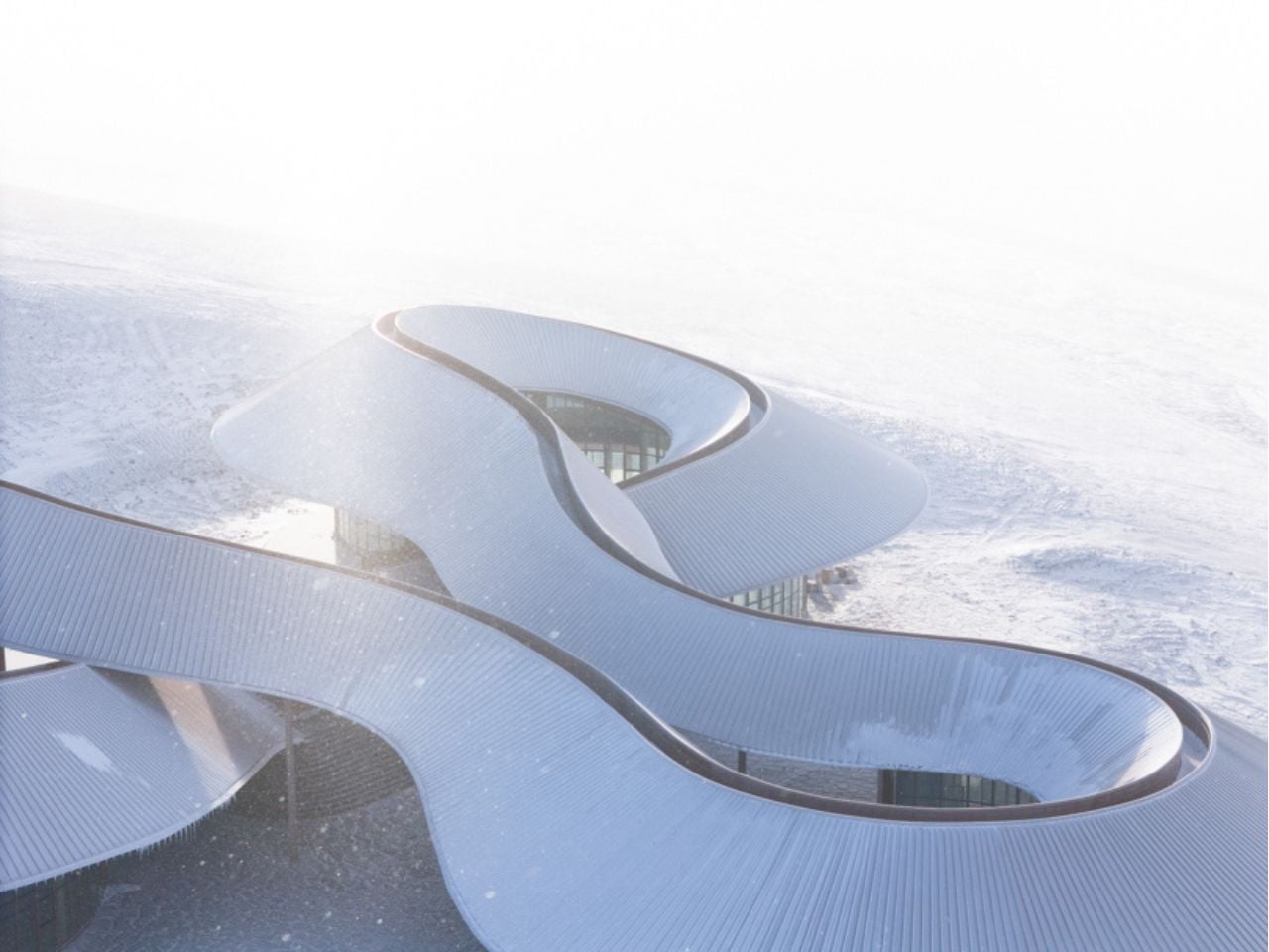
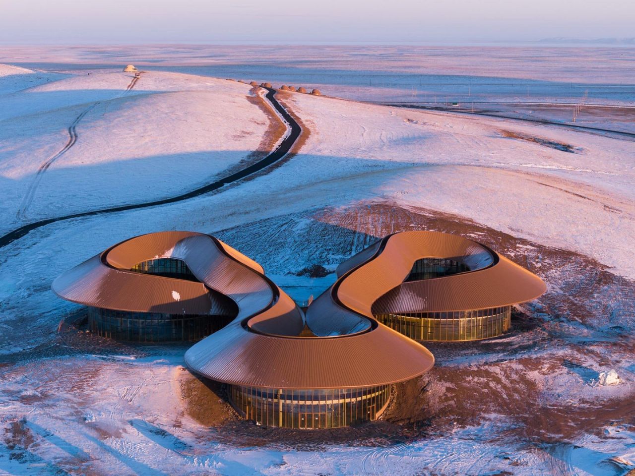
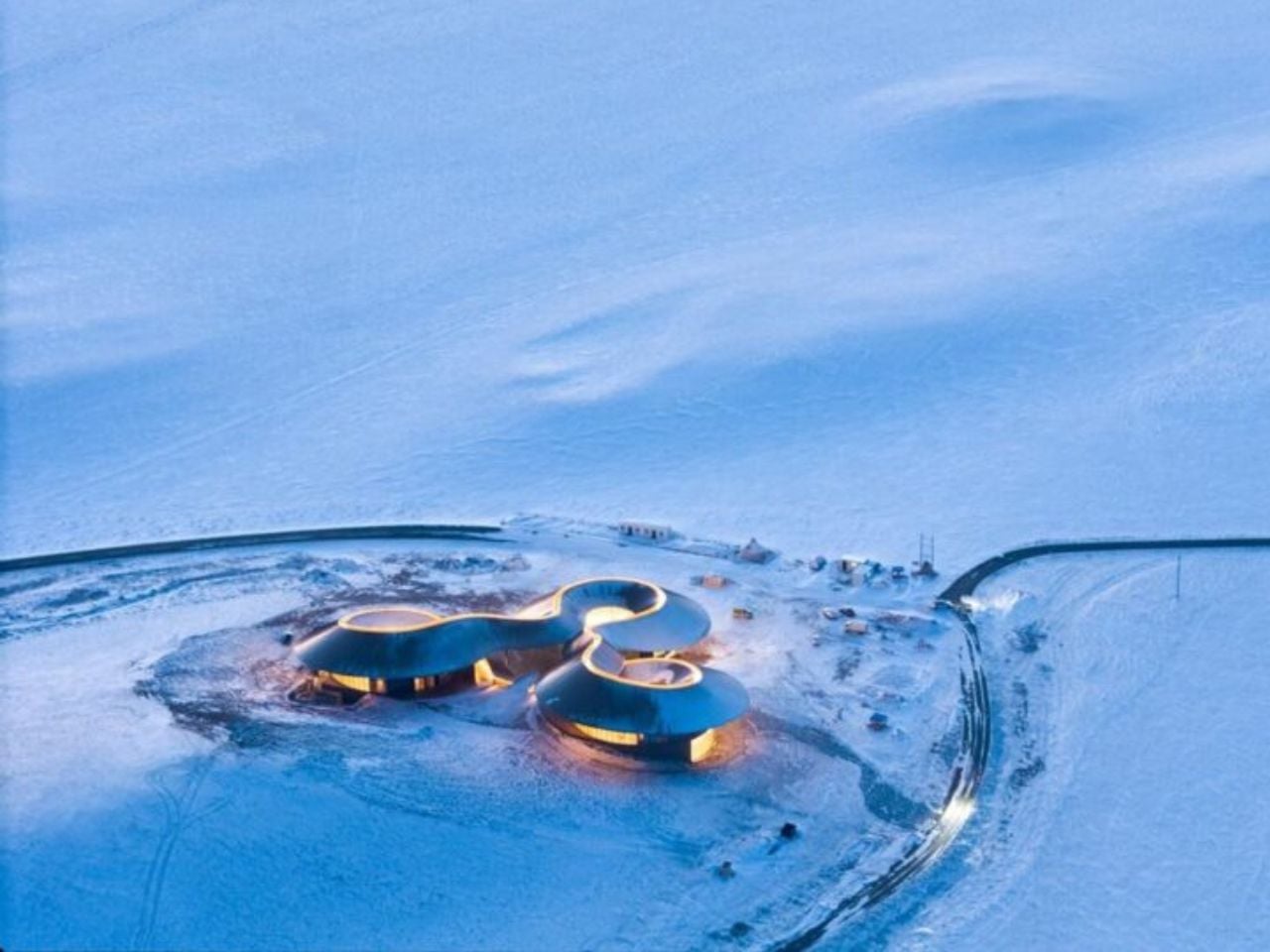
On the southern edge of the Xilingol Steppe in northern China, architecture does not arrive as an interruption. It emerges as a continuation of the land itself. The Volcano In Visitor Center by PLAT ASIA is embedded within the geological structure of a C-shaped extinct volcano formed nearly 150,000 years ago during the Pleistocene Epoch. Here, design is guided not by monumentality, but by a careful negotiation with time, terrain, and climate, framing architecture as co-growth rather than construction.

Completed in December 2025 as part of the first phase of the Baiyinkulun Steppe and Volcano Tourism Resort, the project occupies a rare and expansive geological context. The Baiyinkulun Steppe and Volcano Area is home to 108 volcanoes and lies approximately 380 kilometers north of Tiananmen Square. The surrounding landscape is a mosaic of ecosystems, including wetlands, forests, lakes, open steppe, sandy land, and seasonal snowfields, where environmental fragility and vast scale exist side by side.

Designer: PLAT ASIA

PLAT ASIA began working in the region in 2021, when early site surveys revealed a large excavated area to the west of the volcanic cone. Exposed for nearly a decade, this disturbed ground had become vulnerable to erosion. Rather than expanding into untouched terrain, the architects deliberately chose to build on this damaged site, using architecture as a stabilizing presence. The visitor center thus becomes part of a broader ecological strategy, limiting further impact while supporting long-term landscape recovery.

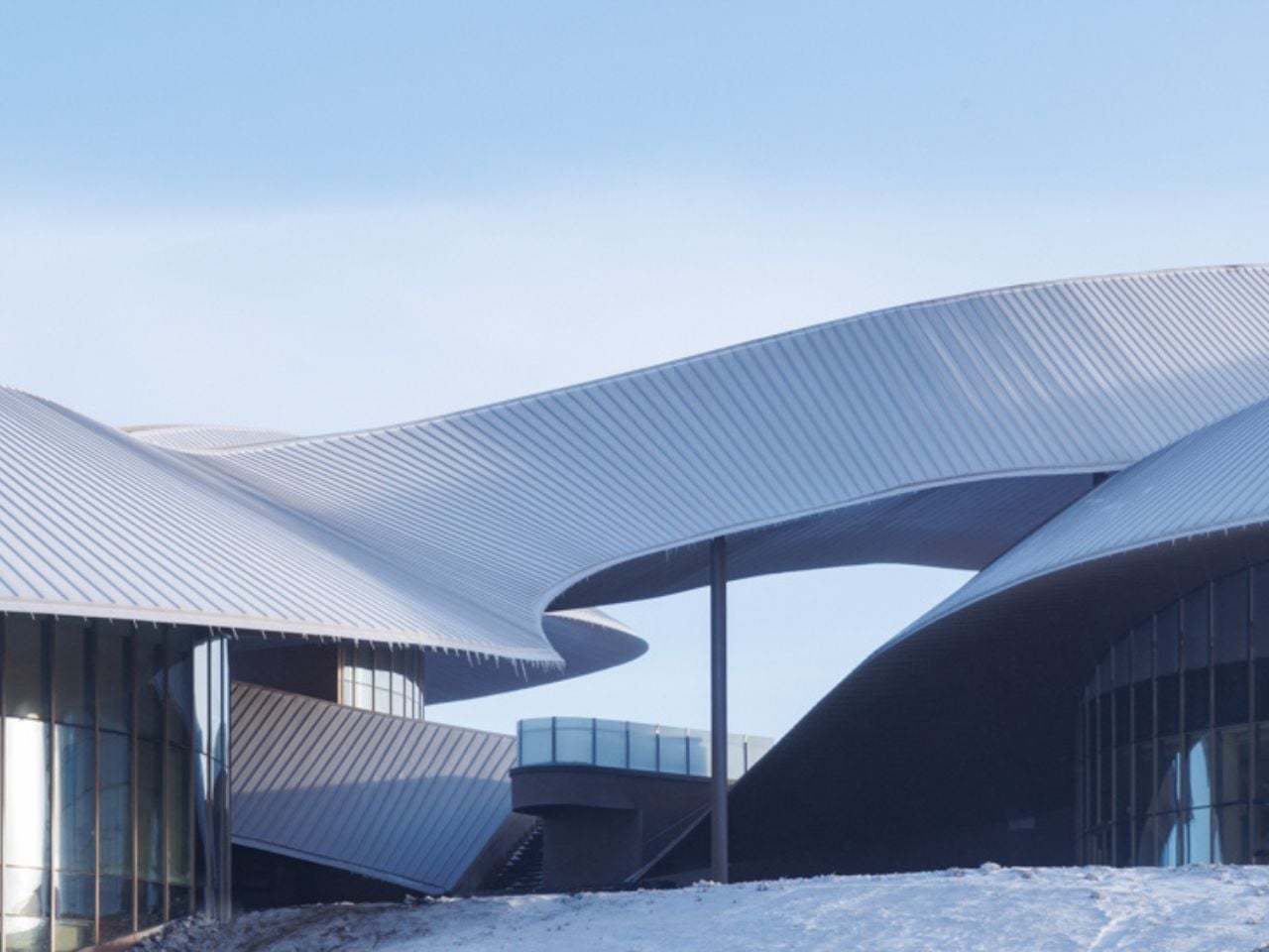
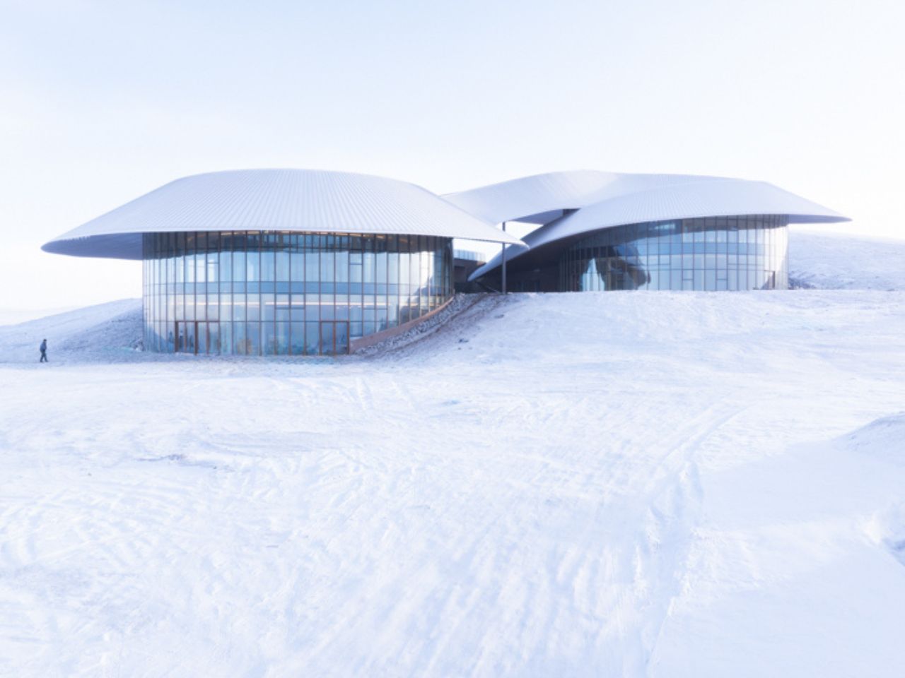
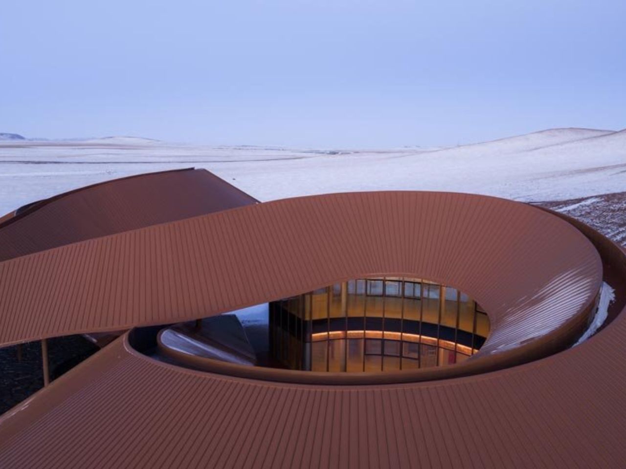
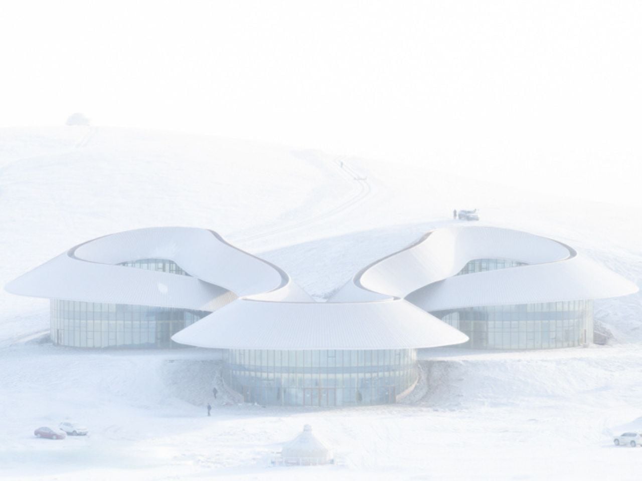
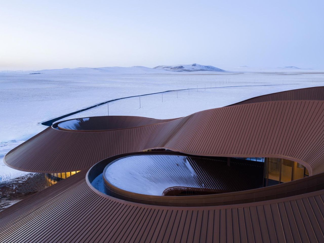
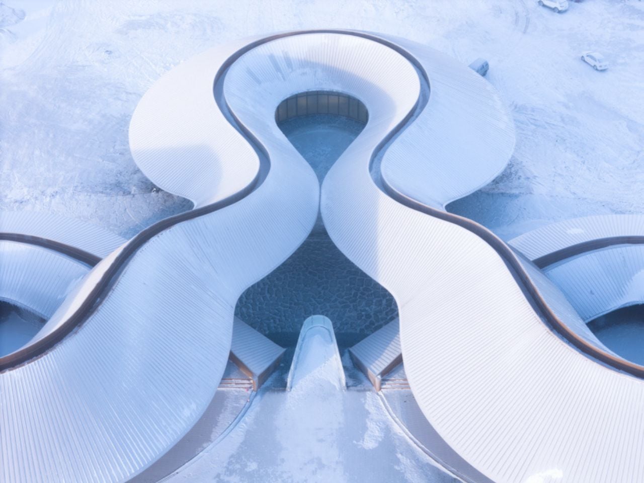
Formally, the volcano itself becomes the primary design reference. The architecture follows the existing topography through a continuous curved roof and three circular volumes positioned at different elevations. Together, these elements trace a conical silhouette that echoes the geometry of the volcanic landform. A winding corridor measuring 274 meters connects the volumes into a continuous loop, guiding visitors around the volcanic ash ring. Movement is central to the experience. The project is designed to be walked, circled, and gradually revealed.

As visitors move along the roof corridor, expansive views unfold toward the surrounding steppe, sandy land, lakes, and neighboring volcanoes. In contrast, inward-facing spaces form a crater-like enclosure that houses the program, including visitor services, a cafe, a bookstore, exhibition spaces, administrative offices, and a restaurant. This spatial rhythm shifts between openness and enclosure, mirroring the volcanic landscape itself.

Outdoor spaces are seamlessly integrated into the architectural layout. A visitor service courtyard accommodates temporary events such as art fairs, while an open square between the exhibition and restaurant volumes functions as an outdoor theater. Eco bleachers embedded into the eastern slope provide seating oriented toward both the roof structure and the wider landscape, reinforcing architecture as a viewing framework rather than an isolated object.

Climate plays a defining role in shaping the project. The region experiences a temperate continental climate with strong winds and heavy snowdrifts in winter and spring. Temperatures can drop as low as- 43 degrees Celsius. The building’s curved profile reduces wind pressure and shear forces, while extended roof eaves protect outdoor spaces from snow accumulation and frame expansive views of the steppe. Weather-resistant metal panel cladding improves thermal performance, while glass curtain walls reflect the volcanic terrain and maintain visual continuity between interior and exterior spaces.

Material choices further ground the project in its context. Locally sourced volcanic stone is used across the site to define pathways and public squares through thin stone slabs laid close to the ground. Weathering steel platforms are embedded directly into the terrain, allowing the architecture to age alongside the landscape over time.

Rather than asserting itself as a singular landmark, the Volcano In Visitor Center establishes a spatial framework that responds to geology, climate, and movement. It positions architecture as a restrained extension of the volcanic environment, inviting exploration while preserving a deep and lasting connection between people and the ancient ground beneath their feet.

The post This Steppe Visitor Center Treats a Volcano as Landscape, Not Landmark first appeared on Yanko Design.

This Award-Winning Bookstore Looks Like a Portal to Outer Space

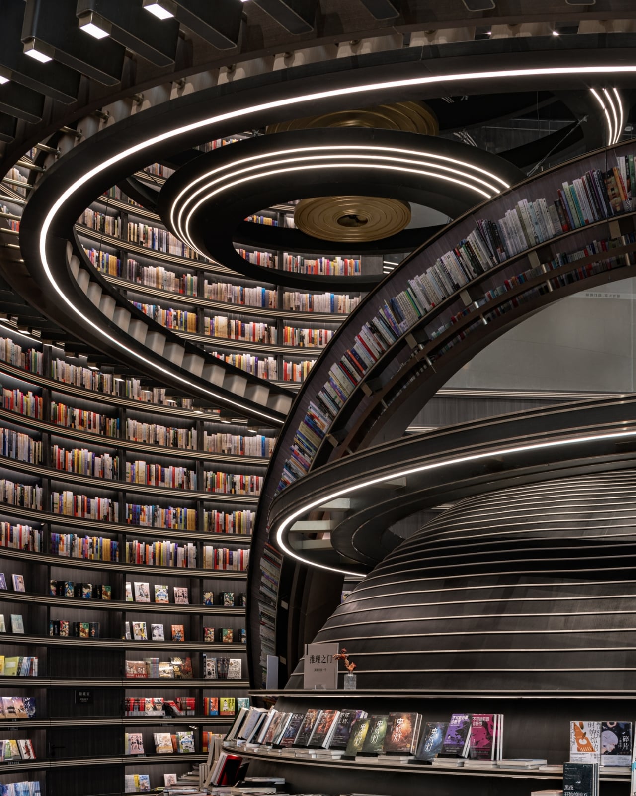
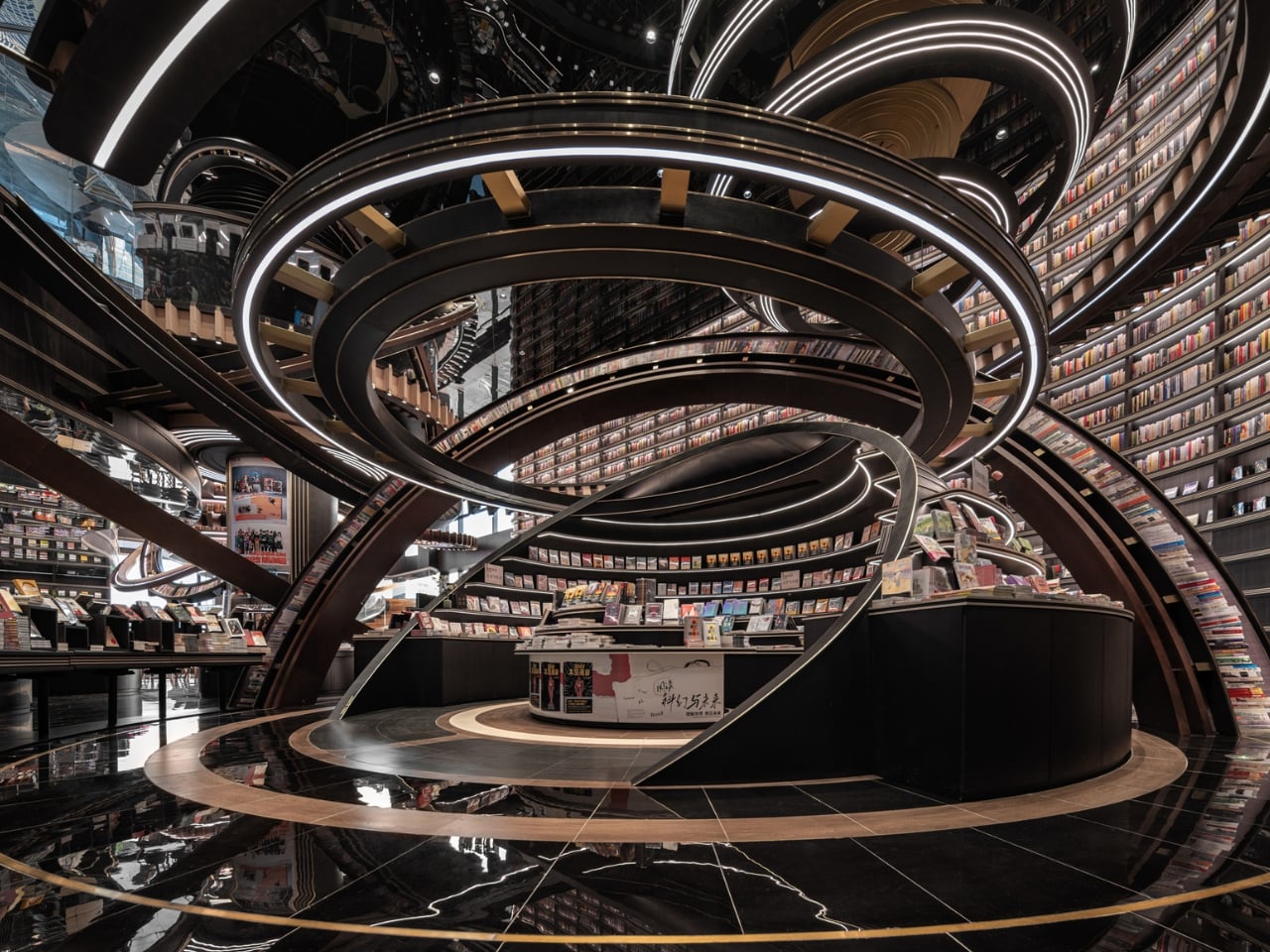
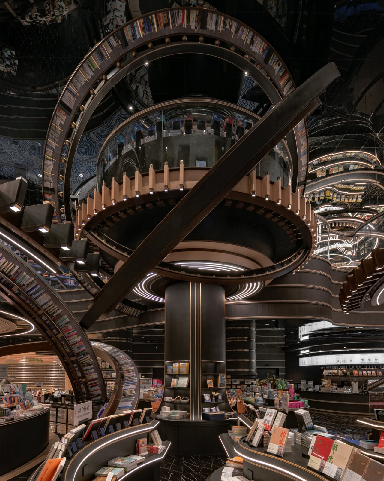
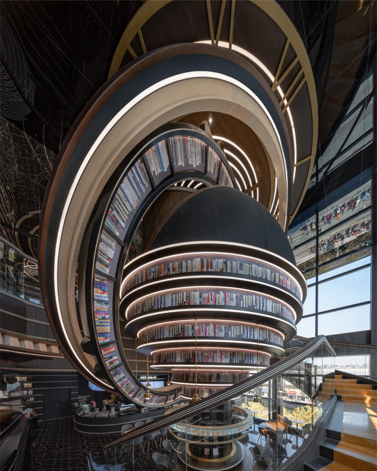
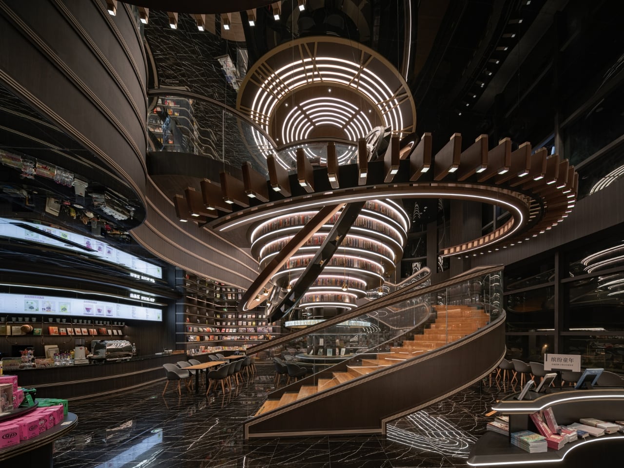
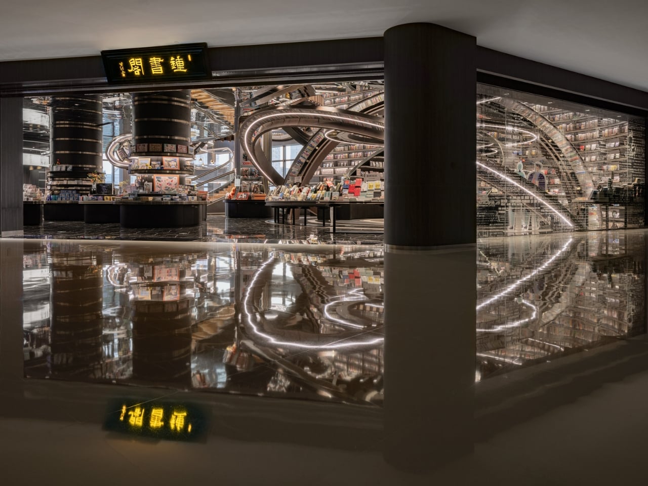
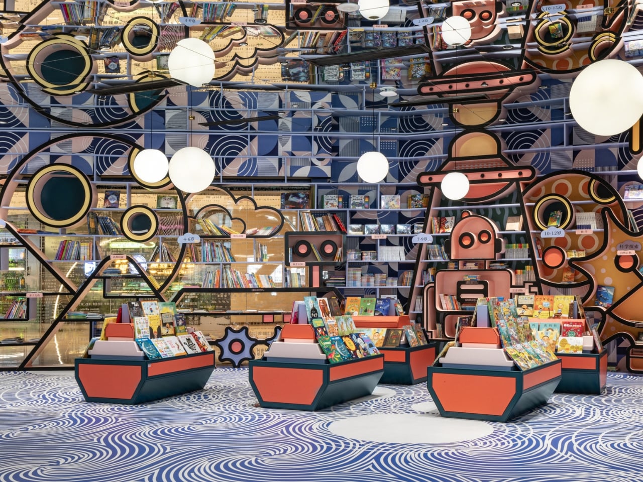
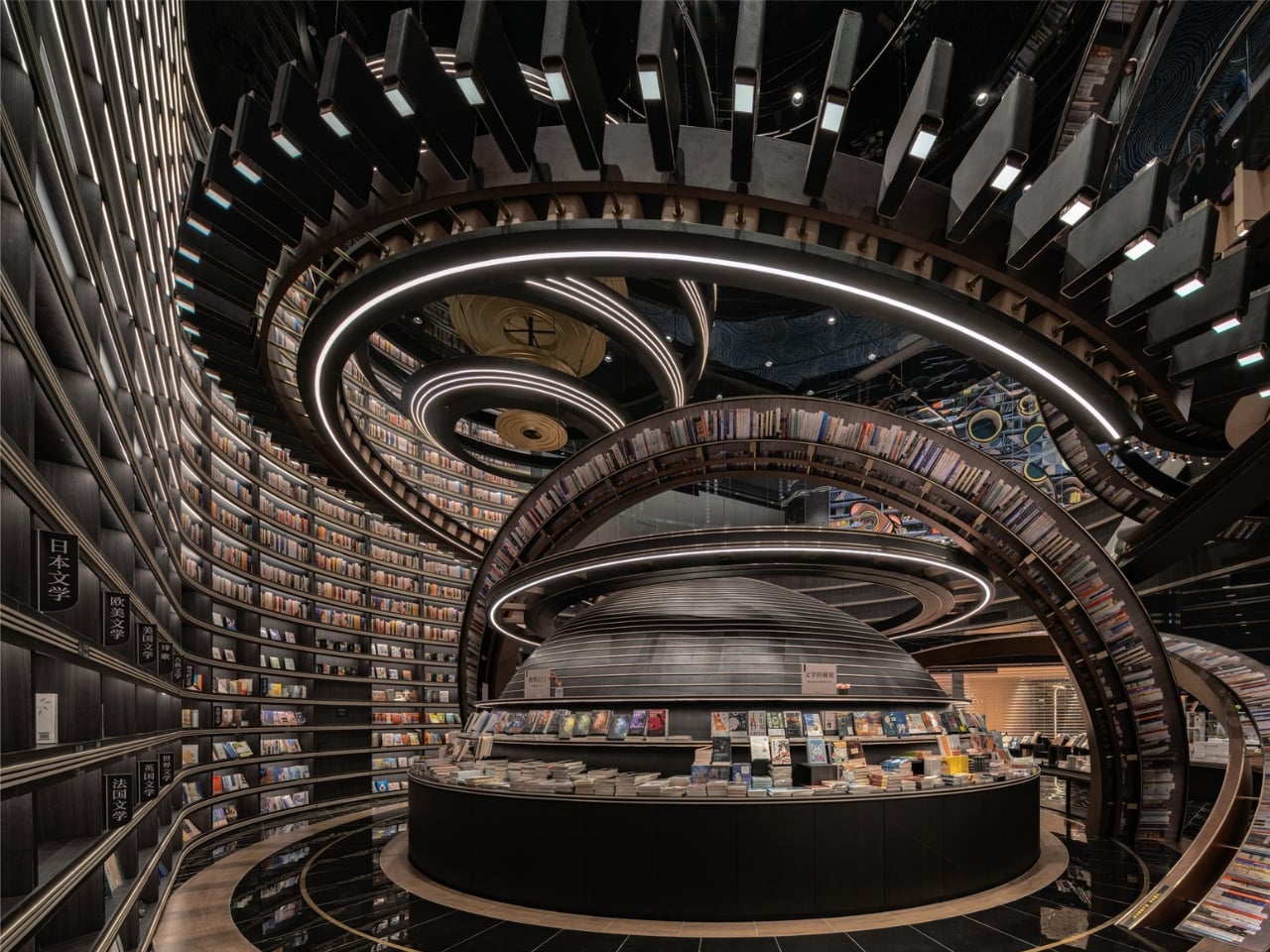
Picture walking through a bustling marketplace in China and suddenly stumbling upon what looks like a giant celestial machine that’s crashed through the ceiling. That’s exactly the vibe designer Li Xiang was going for with the Huai’an Zhongshuge Bookstore, and let me tell you, this place is absolutely wild.

Located in Jiangsu Province and completed in 2023, this isn’t your typical cozy corner bookshop with reading nooks and potted plants. Instead, Li Xiang of X+Living studio created something that feels like you’ve stepped through a portal into another dimension. The bookstore just snagged the 2025 Platinum A’ Design Award in Interior Space and Exhibition Design, which is basically the design world’s way of saying “this is incredibly special.”

Designer: Li Xiang

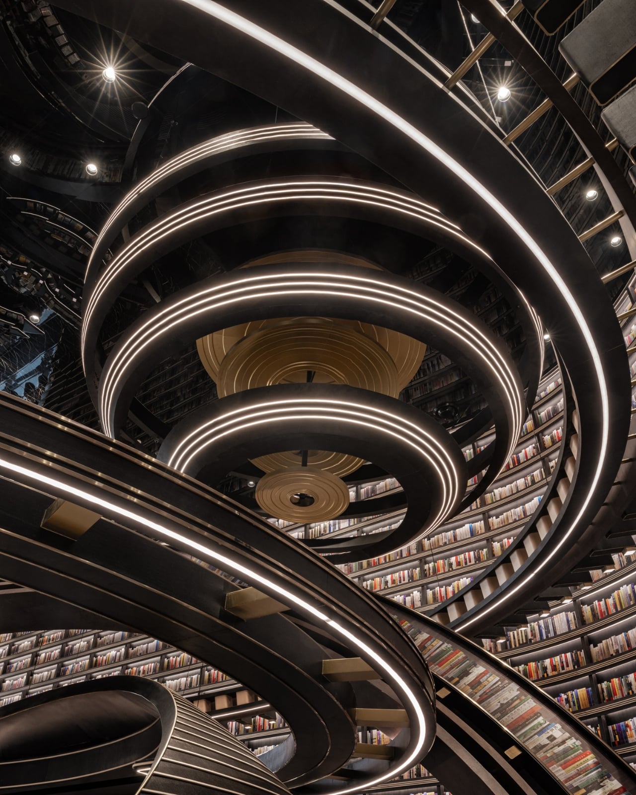
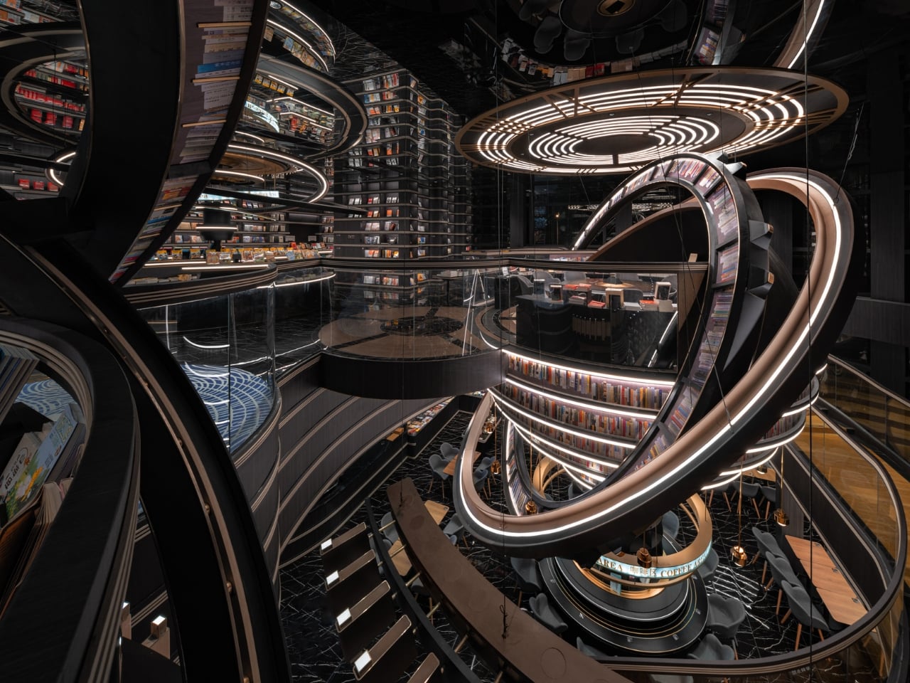
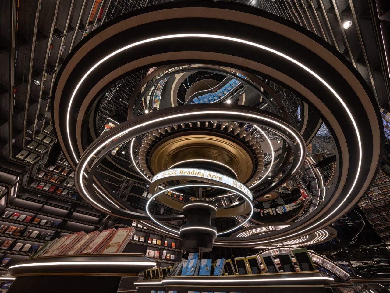
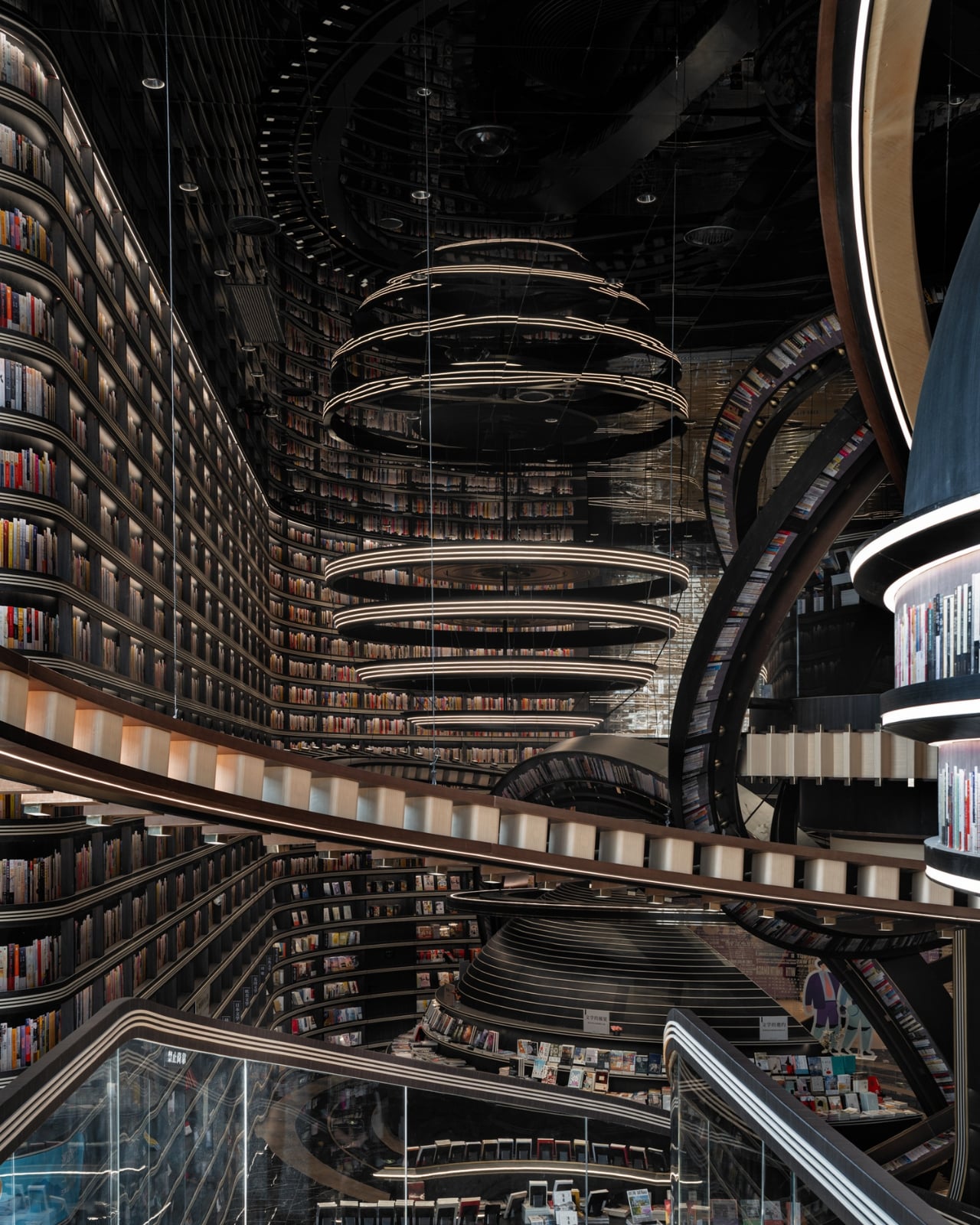
What makes this space so mind-blowing? It’s all about those massive three-dimensional structures that look like astronomical instruments floating inside the store. Imagine concentric rings and geometric forms inspired by celestial mechanics, all reimagined as bookshelves and display areas. The books themselves seem to defy gravity, positioned on these dramatic structures in ways that make you feel like you’re browsing a library floating somewhere in deep space.

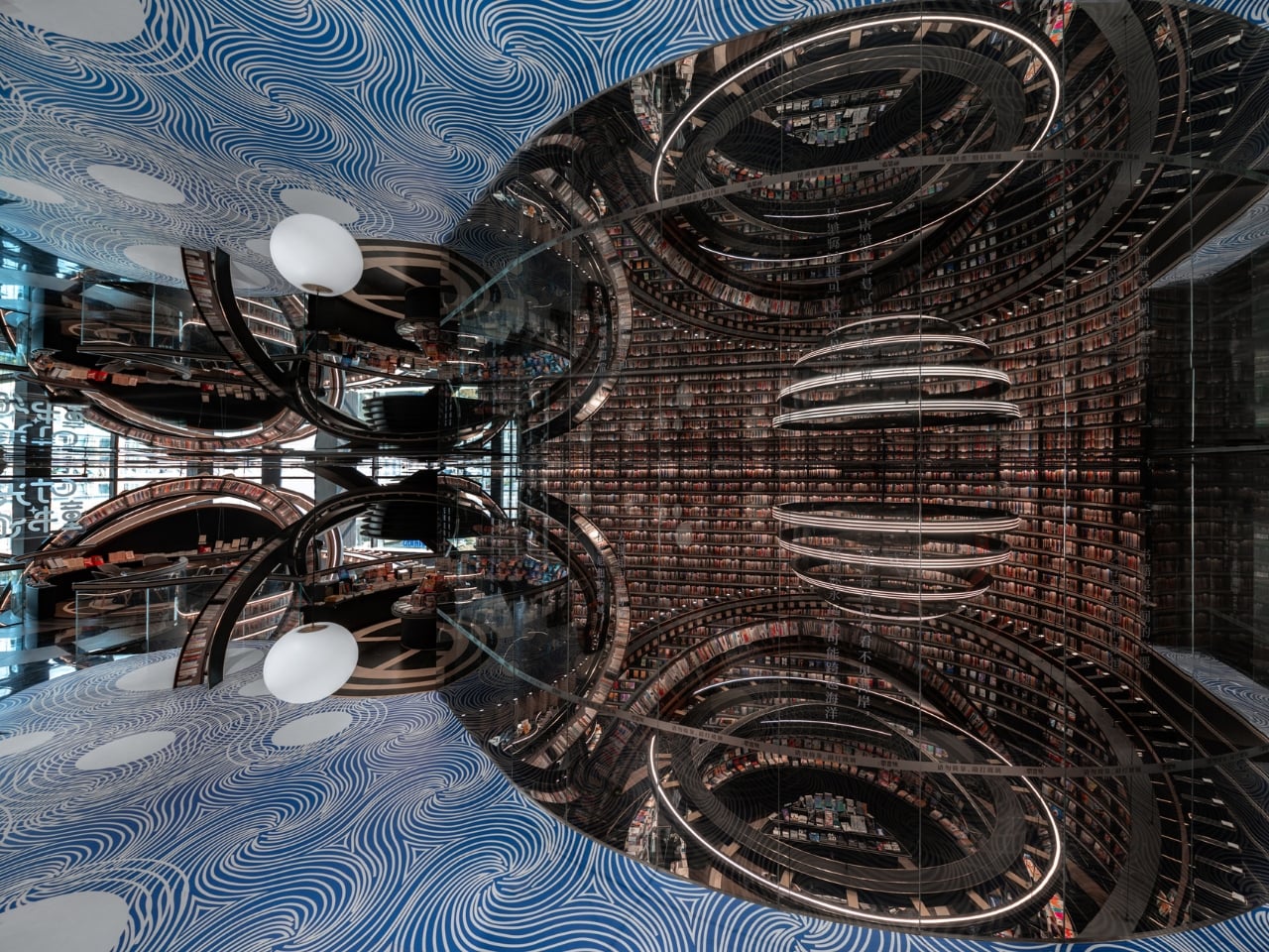
But here’s the thing that really gets me about this design. Li Xiang didn’t just want to create something that looked cool for Instagram (though it absolutely does). There’s a deeper philosophy at work here. He describes the project as tearing open a spacetime rift in the midst of everyday city life, which sounds dramatic but actually makes total sense when you think about it.

Li Xiang believes that in our fast-paced modern world, many people have lost the ability to dream. We get stuck in routines, moving through identical concrete cityscapes, dealing with the mundane realities of daily life. His idea was to create a space where people could detach from all that, even just briefly, and rediscover something more imaginative within themselves. As he puts it, the architectural space becomes an extension of dreamlike reality, a spiritual revelation suspended above the ordinary city below.

That’s pretty powerful stuff for a retail space, right? But it works because the design truly commits to the concept. Those exaggerated celestial forms aren’t just decoration. They break up the monotony of reinforced concrete and rectangular spaces that dominate urban architecture. When you’re surrounded by these cosmic structures, your brain kind of has no choice but to shift gears and enter a different mental space.

What I really appreciate is how this fits into the broader Zhongshuge philosophy. This bookstore chain follows a principle of “chain but not replicate, each store with its own cultural style.” So while there are other Zhongshuge locations across China, each one tells its own story and creates a unique experience. The Huai’an location chose to go full sci-fi spectacular, and the results speak for themselves.

From a technical standpoint, pulling this off wasn’t simple either. The project had to overcome some seriously complex spatial and structural challenges to create that feeling of cosmic vastness within what’s actually a confined retail area. Those massive rings and irregular geometric forms needed precise engineering to work safely while maintaining that surreal, gravity-defying aesthetic.

There’s something really special about seeing retail design pushed this far. We’re used to stores being functional, maybe pleasant, occasionally stylish. But Li Xiang took a different approach entirely, creating an environment that prioritizes experience and emotion over conventional retail logic. It’s architecture that values your mental space, that wants you to feel something beyond just the transaction of buying books.

If you’re someone who gets excited about the intersection of design, technology, and culture, this bookstore represents something important. It shows us that commercial spaces don’t have to be boring or predictable. They can be destinations, experiences, even forms of art that make us think differently about the everyday spaces we move through. And maybe, just maybe, they can help us remember how to dream a little.

The post This Award-Winning Bookstore Looks Like a Portal to Outer Space first appeared on Yanko Design.
This Museum Was Designed for 25,000 Birds, Not Humans

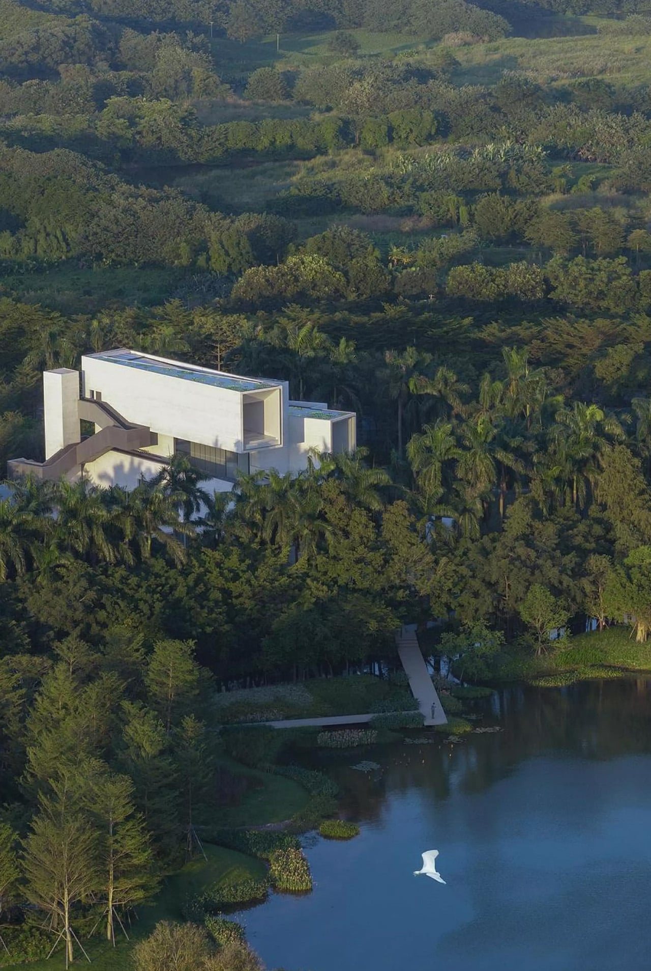
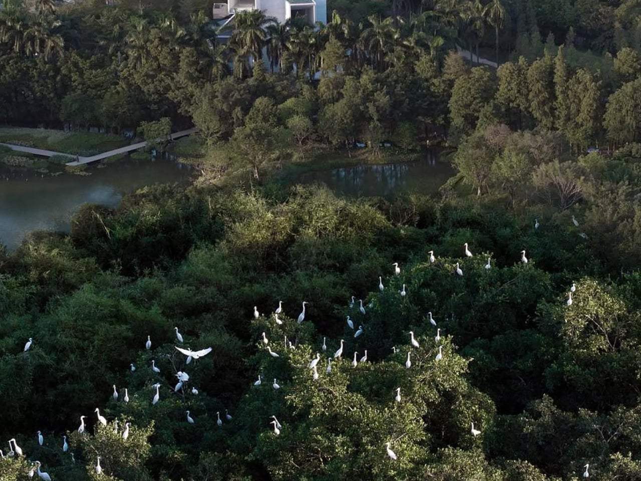
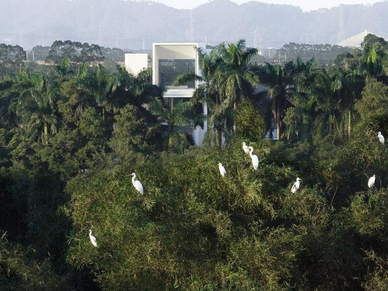
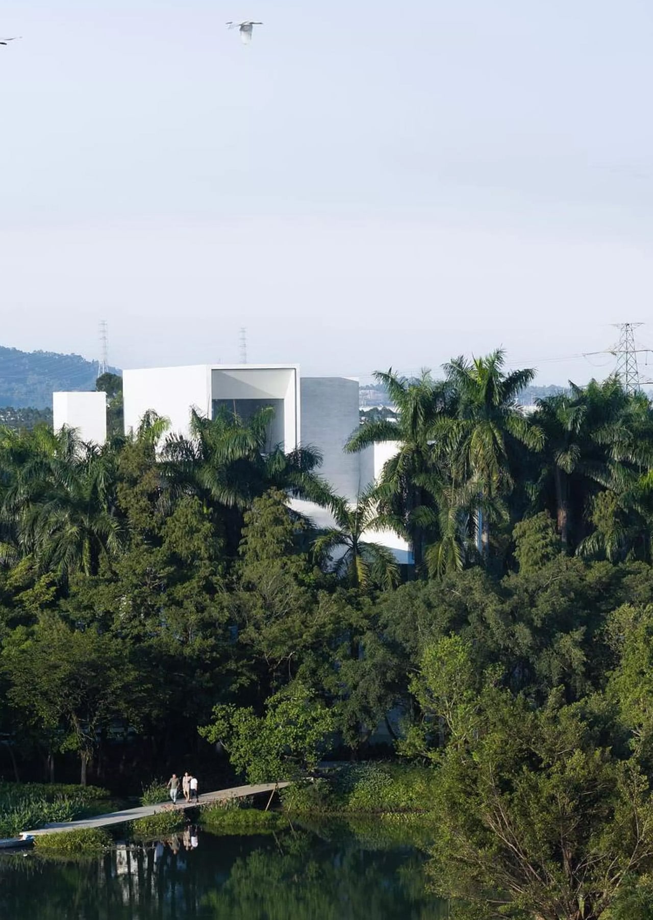
Nestled within the lush landscape of Yunlu Wetland Park in China’s Pearl River Delta, Studio Link-Arc’s latest project redefines what it means to design for wildlife. The Shunde Yunlu Wetland Museum sits quietly behind a row of cedar trees, deliberately concealing itself from view. This isn’t a building seeking attention. It’s architecture that understands its place in an ecosystem where 25,000 egrets take center stage.

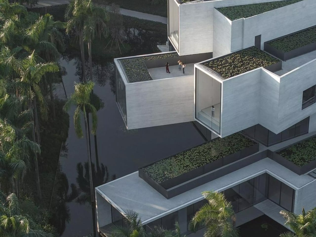
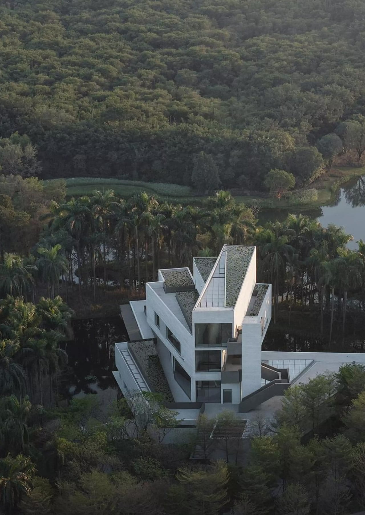
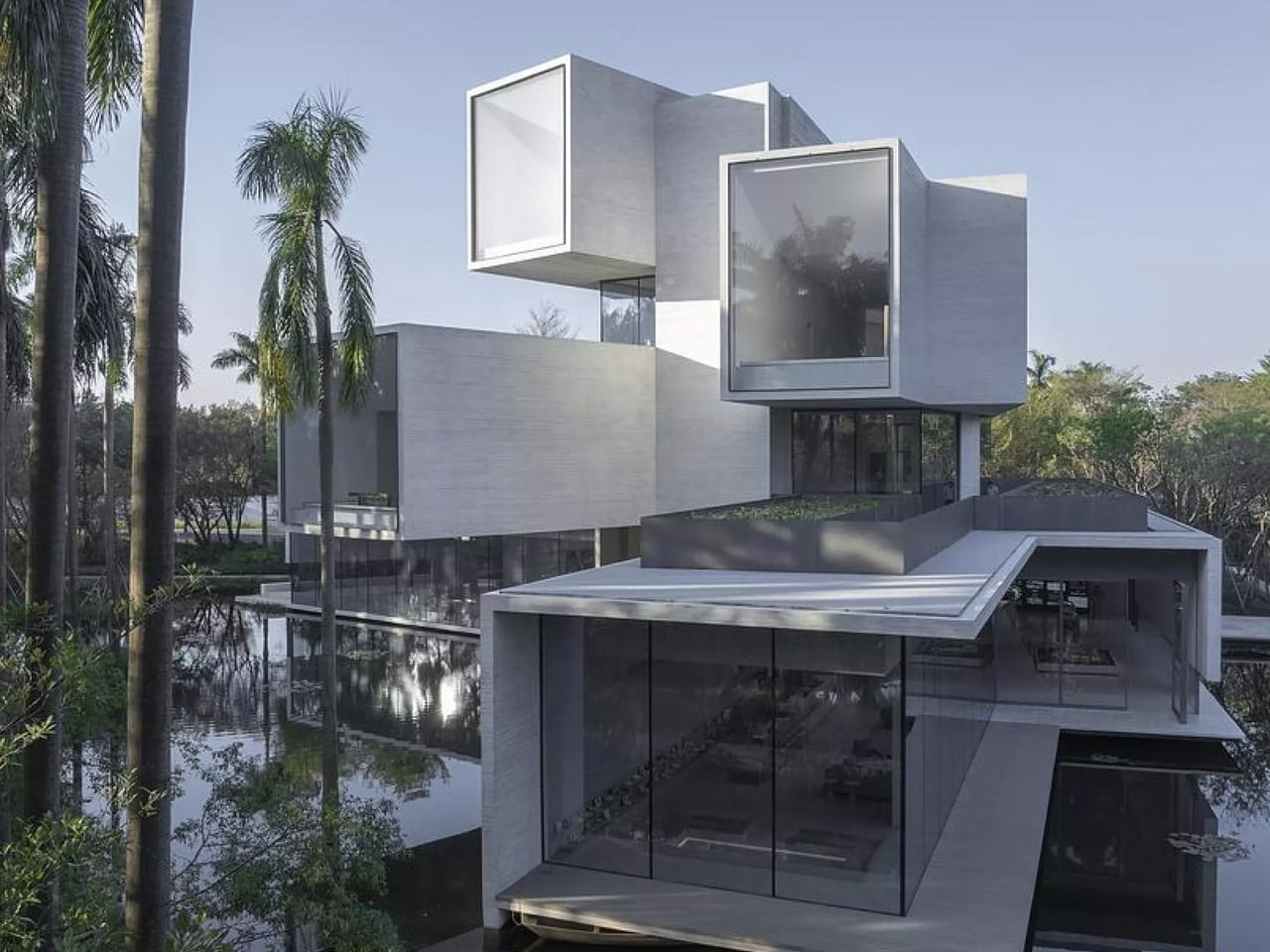
The design challenges conventional architectural thinking. Where most museums position themselves as cultural landmarks, this one retreats. The New York-based firm conceived the structure as four concrete tubes stacked vertically, each rotated to frame a different layer of the forest. The first floor gazes at tree roots. The second captures trunks. The third finds the crowns. The fourth reaches the treetops. Each level acts as a rotating lens, offering visitors perspectives that mirror the egrets’ own experience of their habitat.

Designer: Studio Link-Arc

This rotation creates something beyond visual interest. The cantilevered volumes give the building a sense of kinetic energy, as though the structure itself is adjusting to follow the birds’ movements across the water. The stepped form settles into the wetland’s natural density, absorbed by tall vegetation and reflective water surfaces that blur the boundary between built and natural environments. Each tube functions as a box structure, with sidewalls, roofs, and floors working together to support these dramatic projections.

Inside, a triangular atrium slices through all four floors, connecting the scattered perspectives into a single spatial experience. Sunlight filters through high skylights, softened by deep concrete beams before reaching the interior. Standing in this vertical space, visitors can simultaneously look through multiple tubes, each framing a different view of the wetland. The traditional hierarchy of architectural viewpoints dissolves into something more democratic, more aligned with the rhythms of the landscape itself.

The roof carries a lotus pond, adding another water layer to the composition. This gesture proves essential when viewing the building from paths and bridges throughout the park. The rooftop water merges visually with the wetland below, reducing the structure’s vertical impact and allowing it to read as part of the continuous water system rather than an interruption.

The project emerges from decades of conservation efforts. A local resident known as Uncle Bird spent years transforming this site into an urban sanctuary for egrets. The Shunde government later expanded the protected area thirteenfold, partnering with scientists and designers to restore water systems and bamboo forests. Studio Link-Arc’s museum completes this vision, offering a space where human visitors can observe and learn while remaining secondary to the site’s true inhabitants. The building asks a question rarely posed in contemporary architecture: What happens when we design for the birds first?

The post This Museum Was Designed for 25,000 Birds, Not Humans first appeared on Yanko Design.
This €43,000 Tiny House Fits Two Bedrooms Into Just 20 Feet

The tiny house movement continues to evolve with innovative designs that maximize every inch of space, and the Tiny Rubik by Romania’s Eco Tiny House stands as a remarkable example of what’s possible within just 6 meters of length. This compact dwelling proves that downsizing doesn’t mean sacrificing comfort or style, offering an eco-friendly solution for those seeking simplicity and financial freedom.

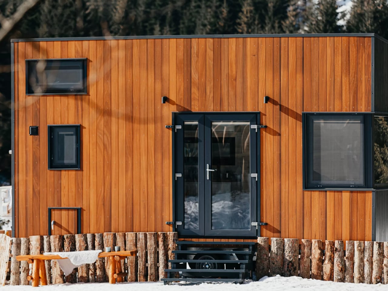
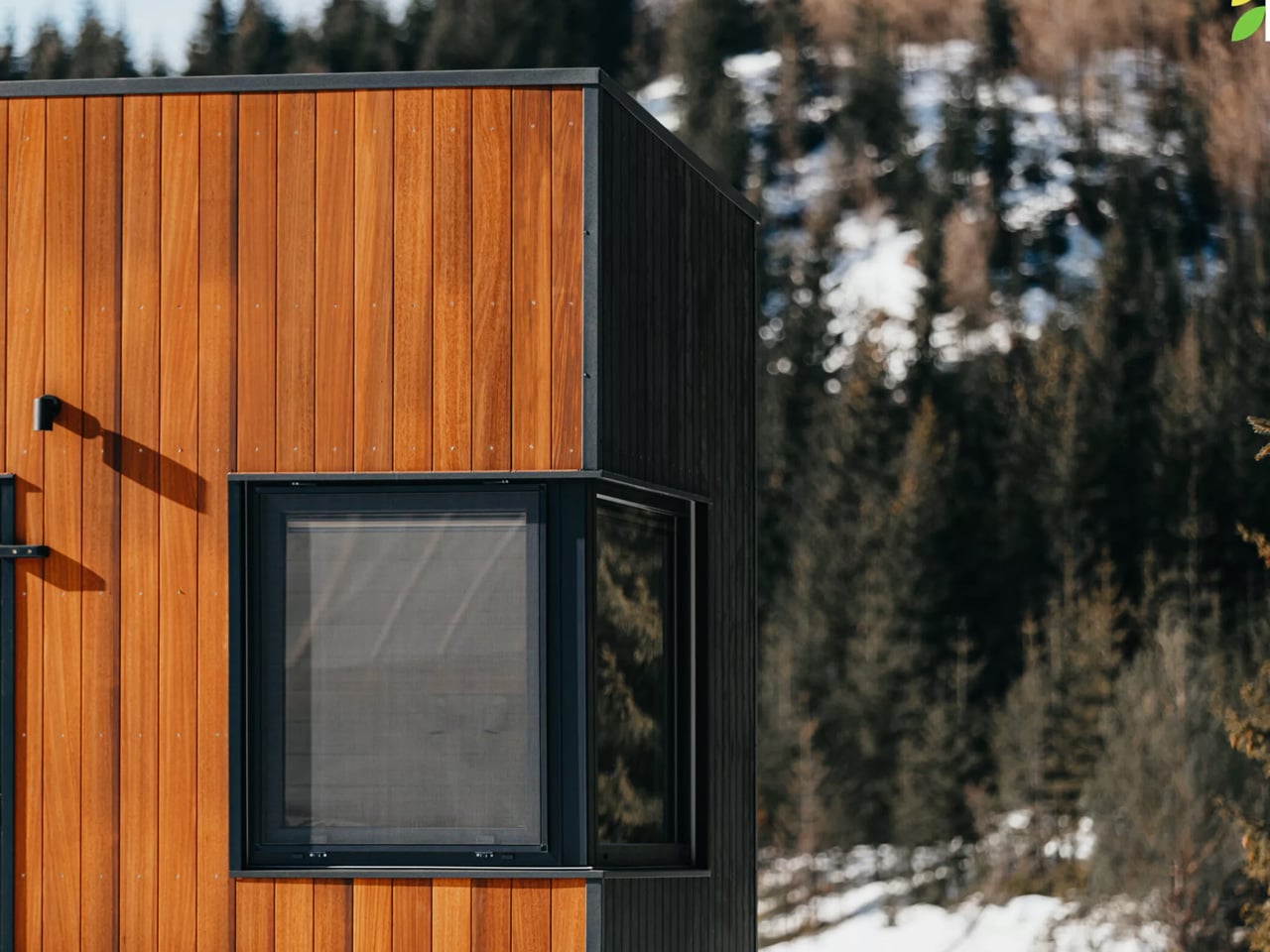
Measuring just 20 feet long and built on a double-axle trailer, the Tiny Rubik provides 16 square meters of thoughtfully designed living space that can accommodate up to three people. The exterior features engineered wood siding paired with a metal roof, creating a modern aesthetic that’s both durable and environmentally conscious. What sets this tiny house apart is its ability to incorporate two separate sleeping areas despite its modest footprint, a feat that requires clever spatial planning and design ingenuity.

Designer: Eco Tiny House

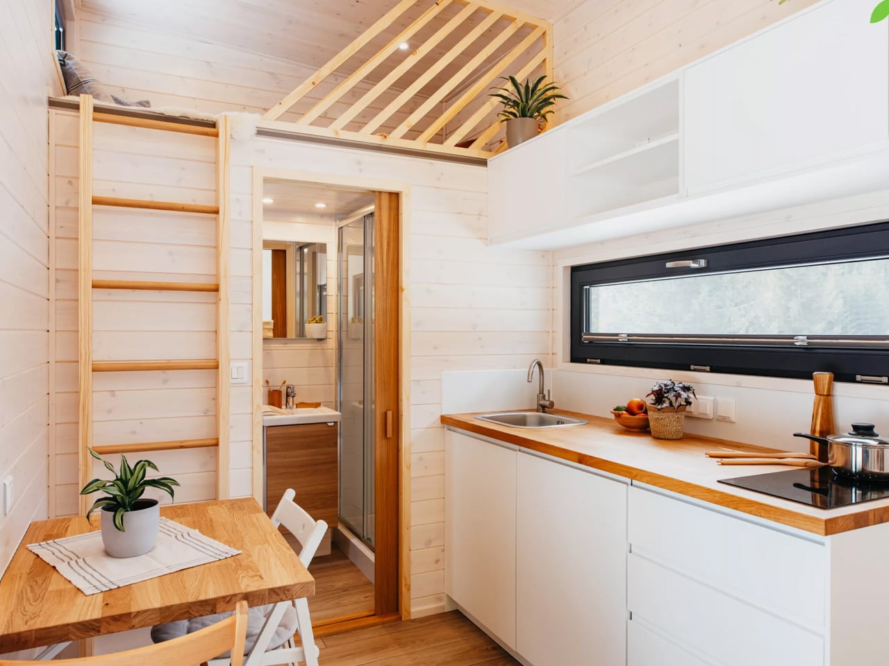
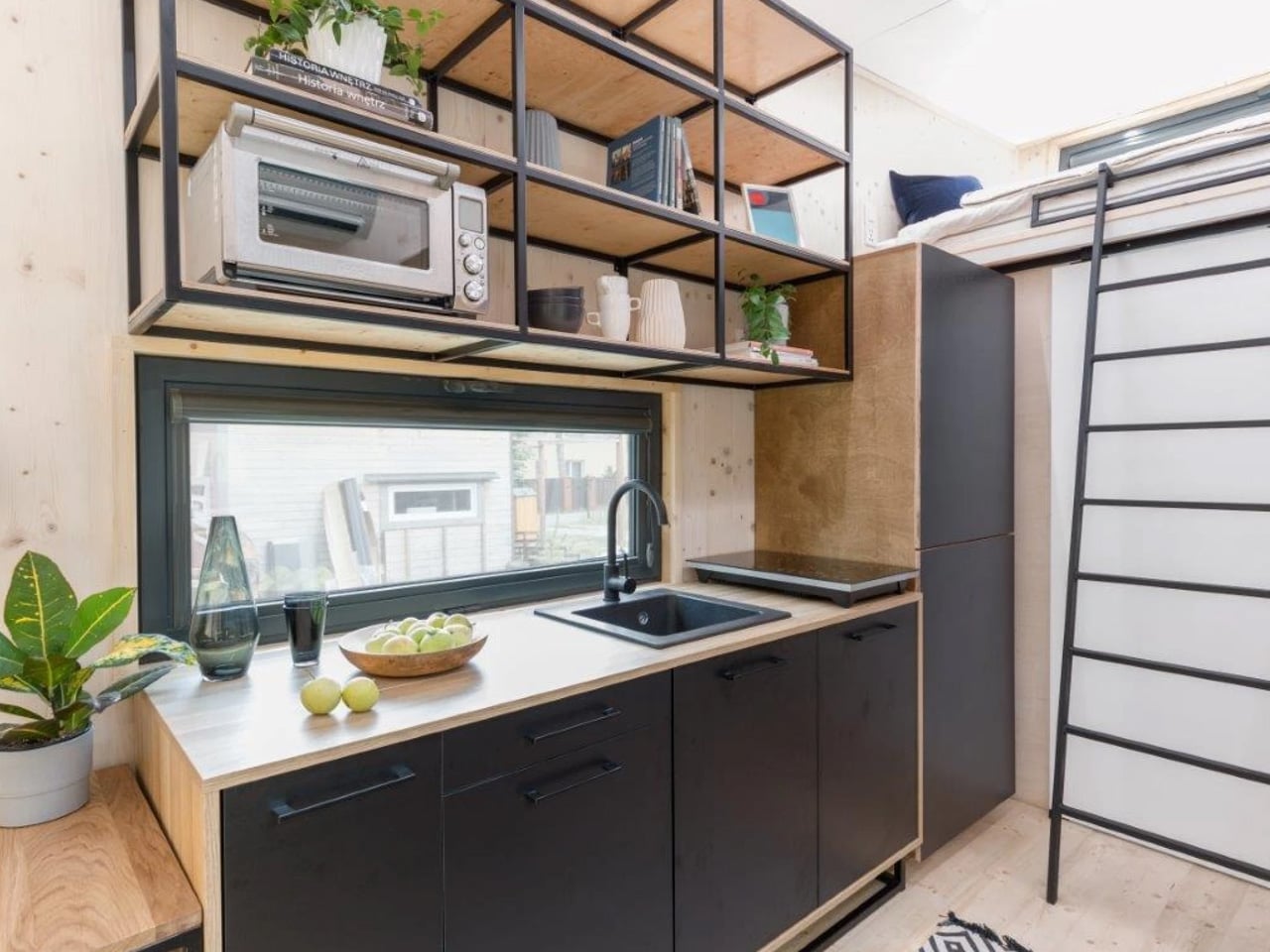
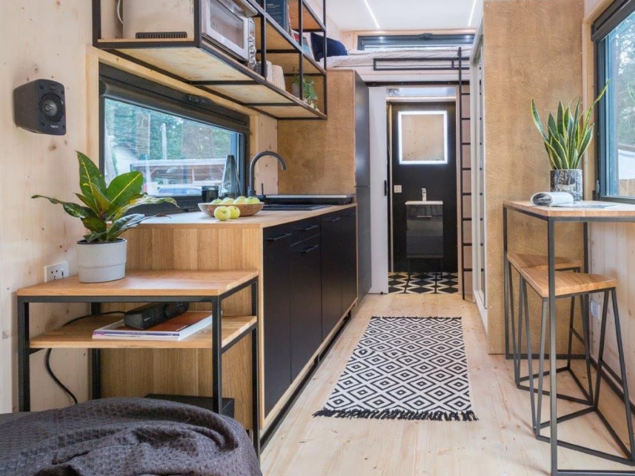
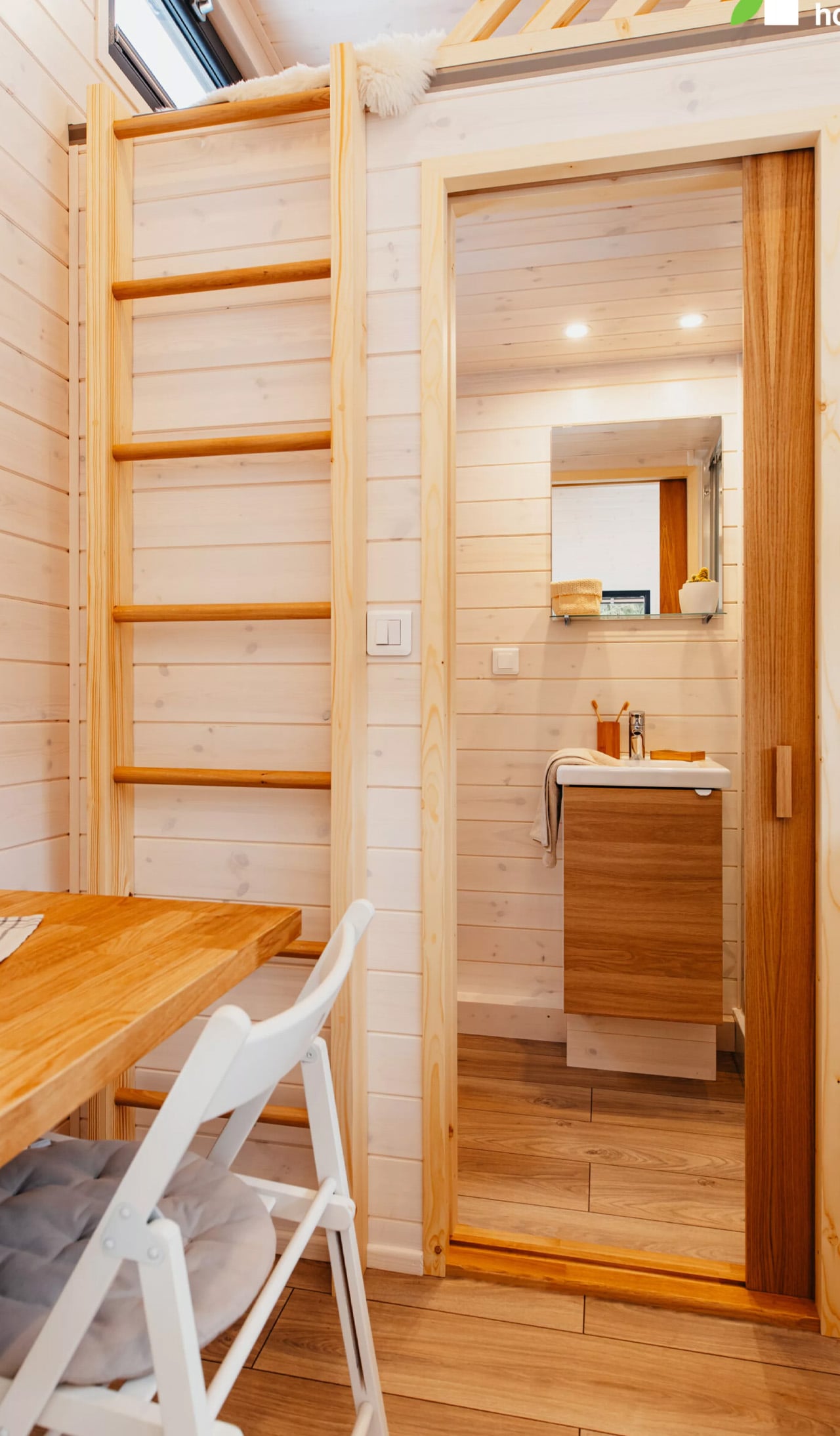
The interior layout revolves around a centrally positioned kitchen that serves as the home’s functional heart. This strategic placement maximizes efficiency while maintaining an open feel throughout the space. The kitchen comes fully equipped with an electric induction cooktop, a built-in sink, and both upper and lower cabinetry for storage. A built-in refrigerator ensures all essential appliances are included without cluttering the limited square footage.

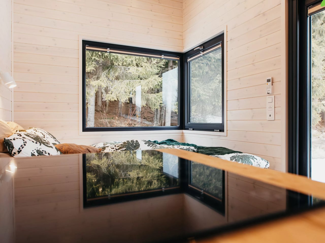
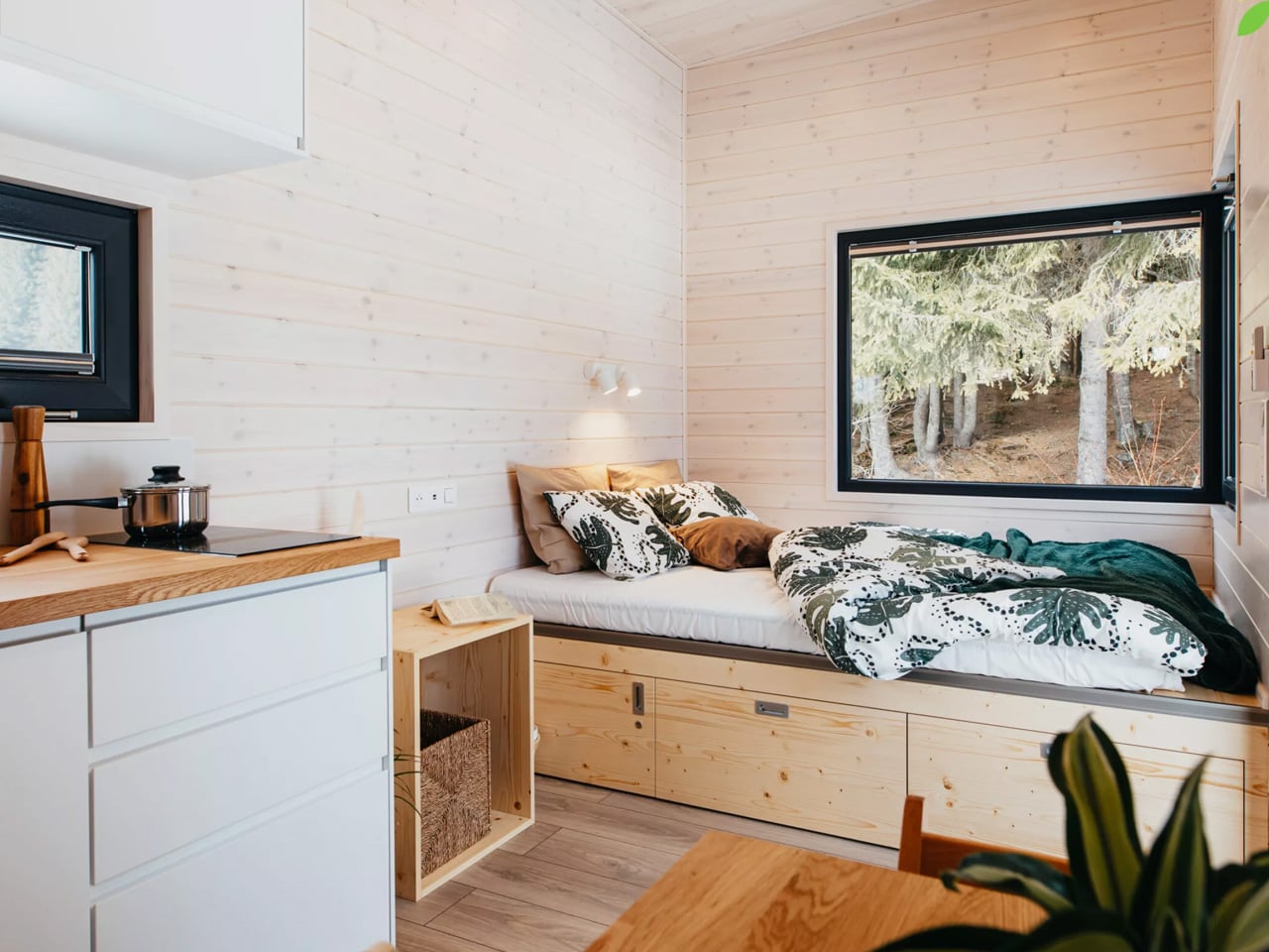
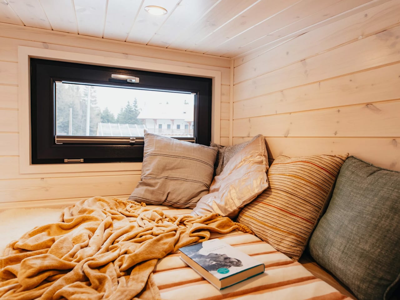
One of the Tiny Rubik’s most impressive features is its dual sleeping arrangement. The main bedroom occupies the ground floor, offering easy accessibility and convenience for everyday living. A loft bedroom sits above, protected by wooden railings and accessible via a ladder. When not needed for sleeping, this upper level transforms into a versatile reading nook or additional storage space, demonstrating the multifunctional approach necessary in compact living.

Climate control hasn’t been overlooked either. The Tiny Rubik includes a Samsung air conditioning unit, ensuring year-round comfort regardless of the season. For those seeking complete independence from traditional utilities, off-grid capabilities are available through optional solar panels and off-grid systems. An innovative storage box integrated into the trailer tongue provides additional space for outdoor gear or seasonal items.

Since its founding in 2017, Eco Tiny House has built a reputation for delivering beautiful, comfortable, and sustainable tiny homes to clients across Europe. The company was established by tiny house owners and enthusiasts who understand the practical needs and desires of the tiny living community. The Tiny Rubik starts at approximately 43,378 euros, positioning it as an accessible entry point for those ready to embrace minimalist living. This meticulously crafted dwelling represents more than just a place to sleep. It’s a lifestyle choice for eco-conscious individuals, adventurers seeking mobility without sacrificing comfort, and anyone looking to reduce their environmental footprint while maintaining quality of life. The Tiny Rubik proves that thoughtful design can create a fully functional home in even the most compact dimensions.

The post This €43,000 Tiny House Fits Two Bedrooms Into Just 20 Feet first appeared on Yanko Design.
This 3D-Printed Roof Is Saving 2,000-Year-Old Roman Tombs

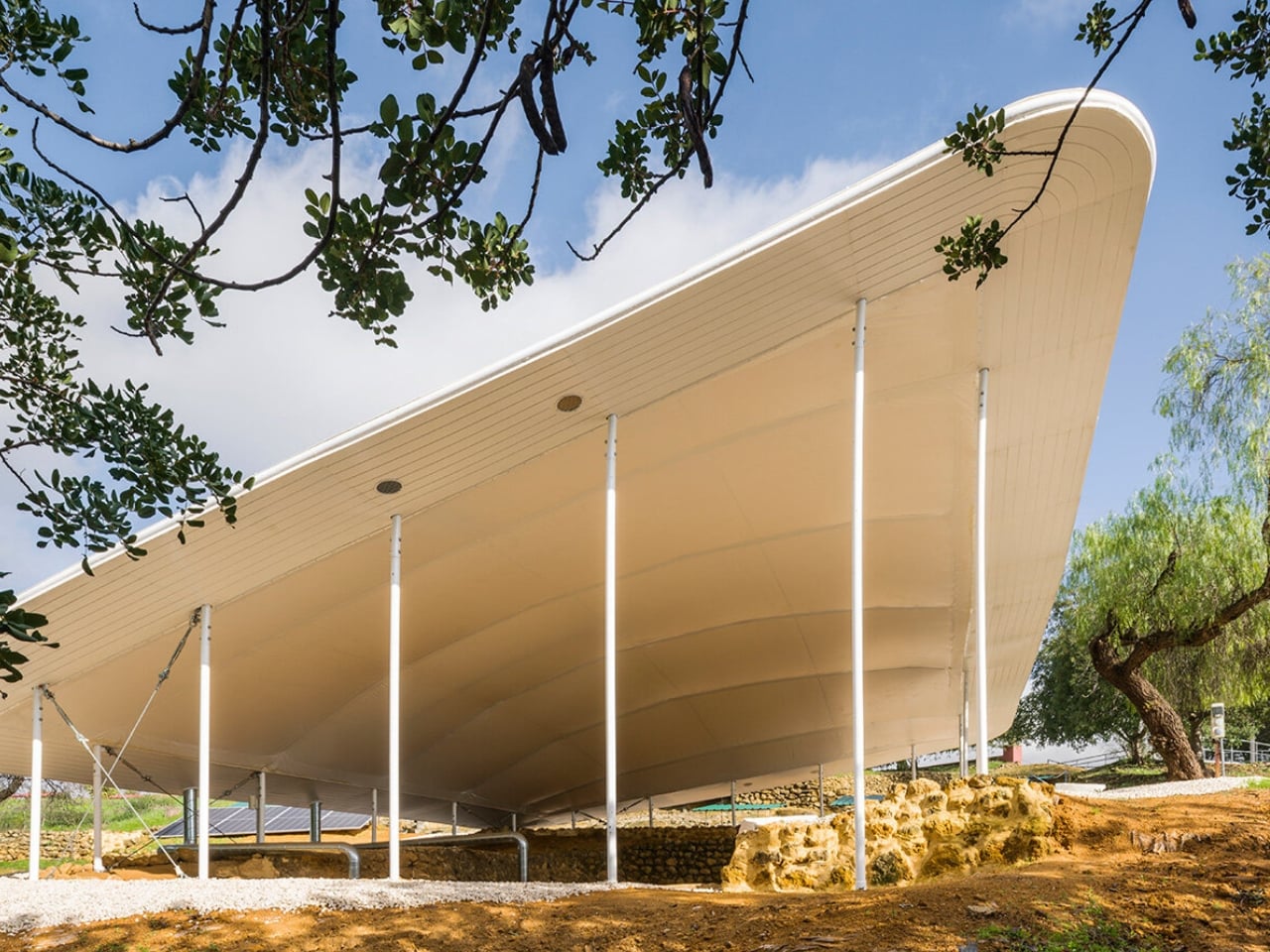
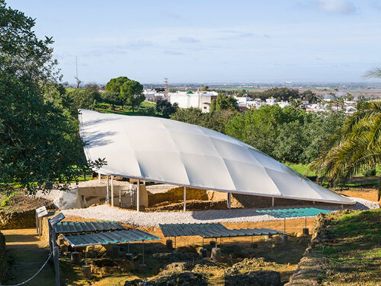
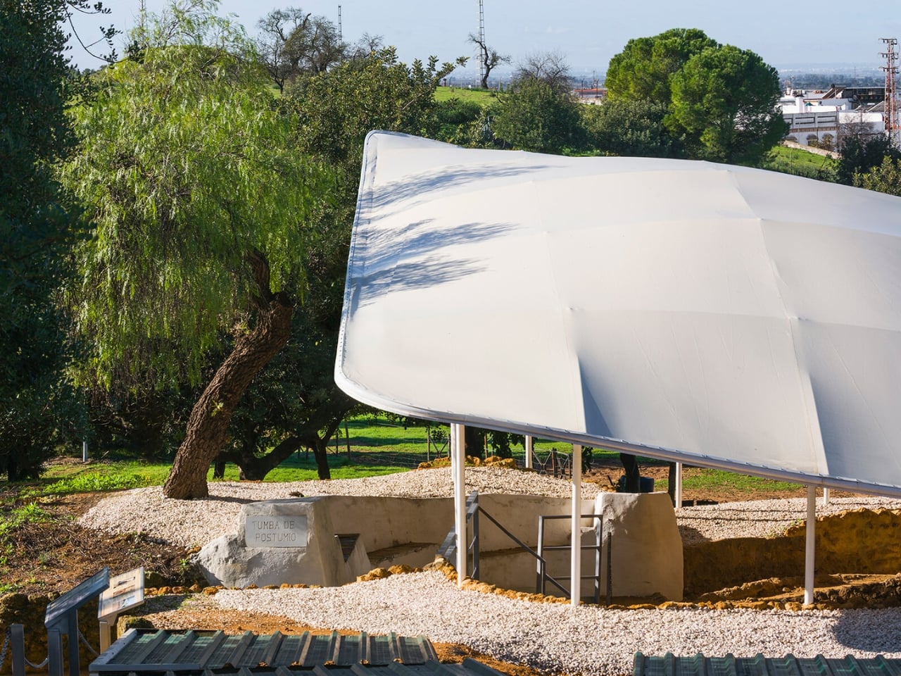
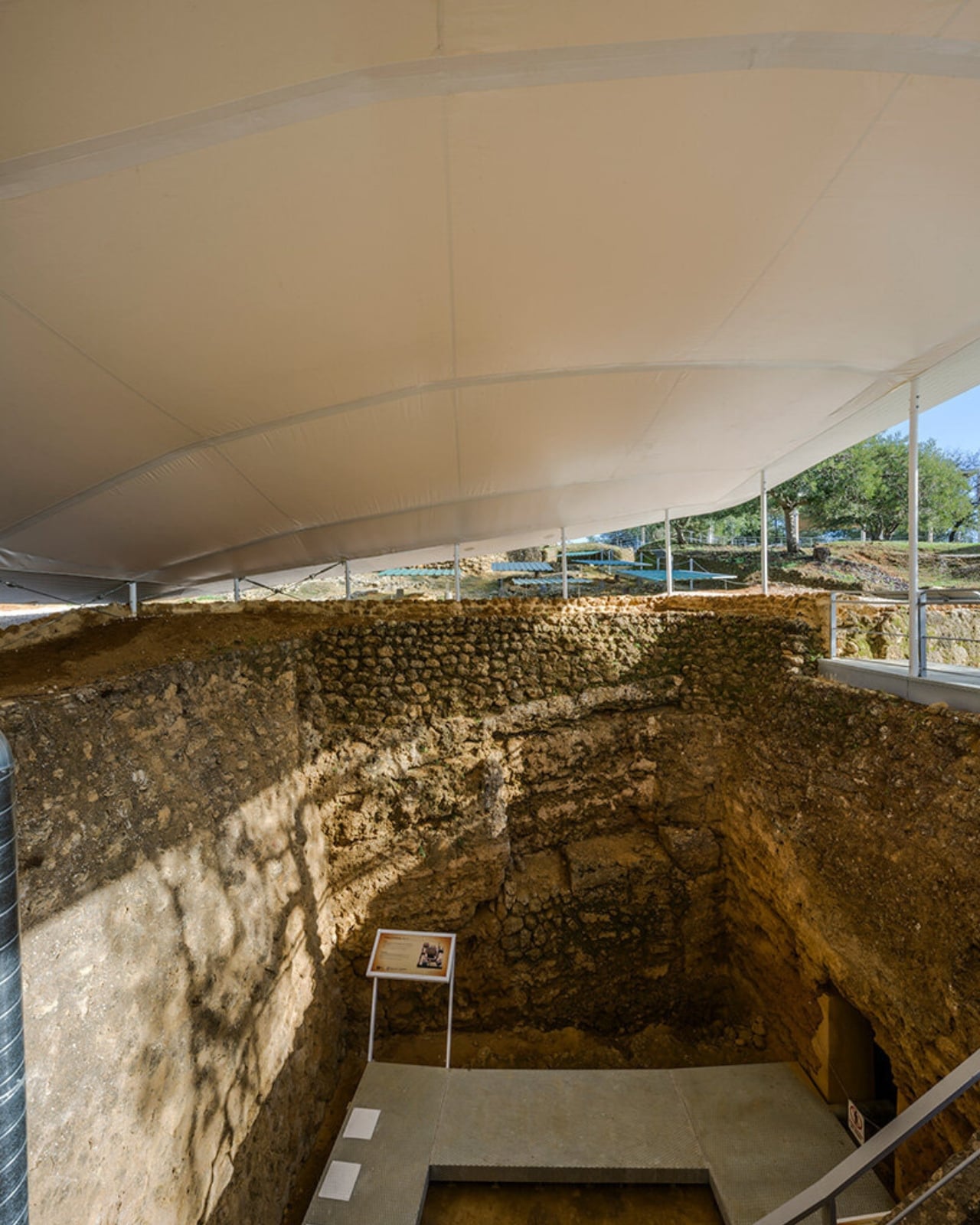
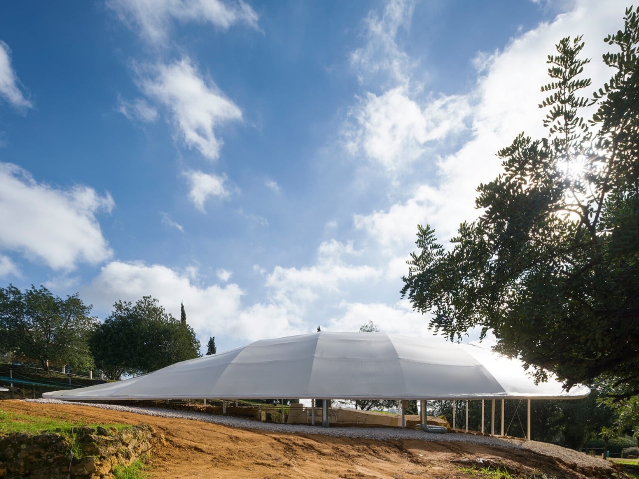
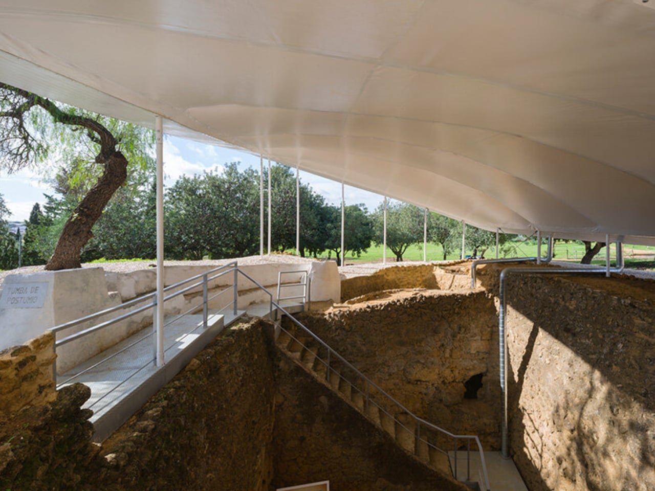
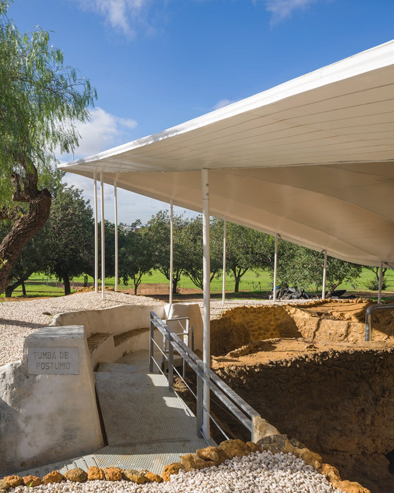
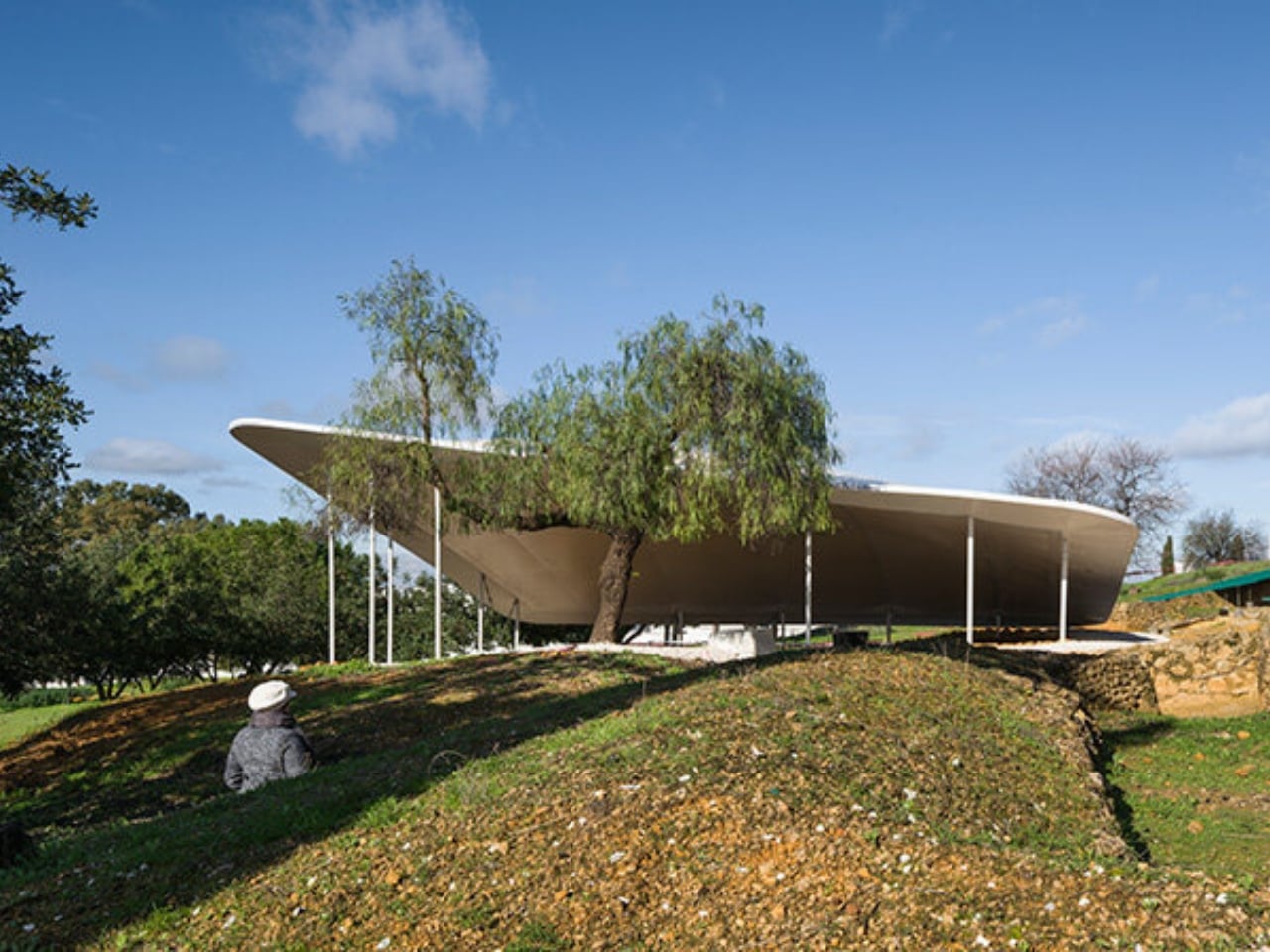
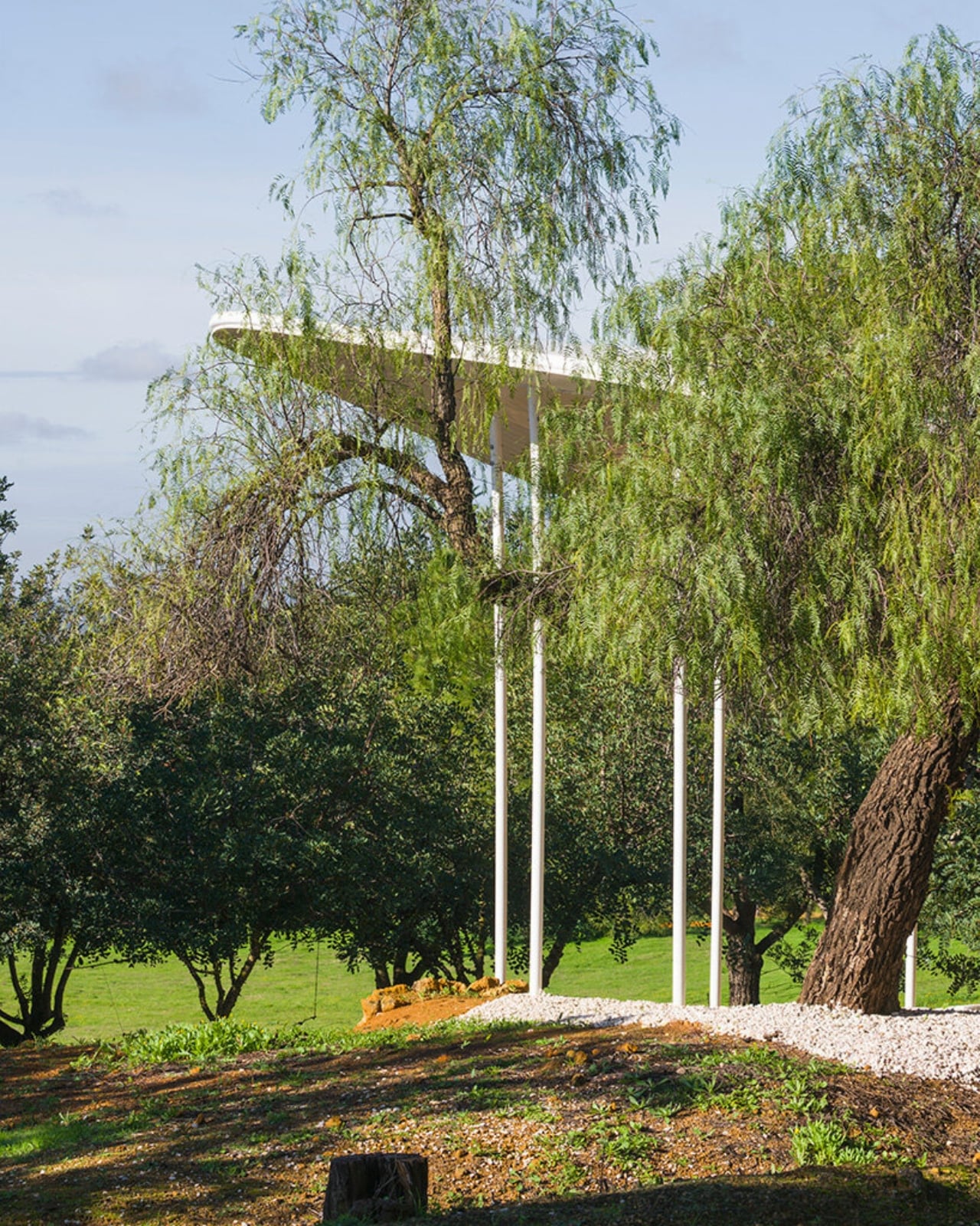
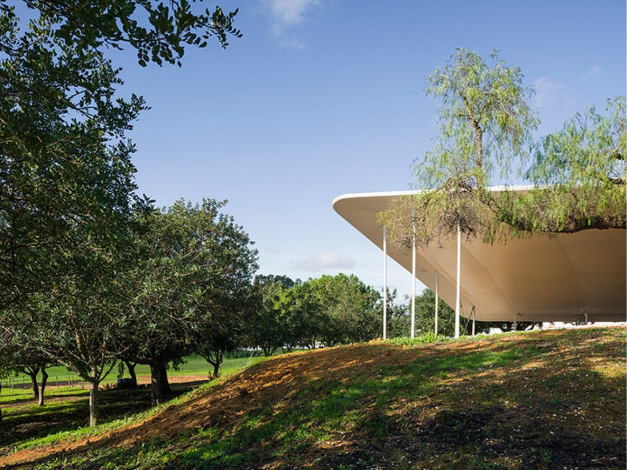
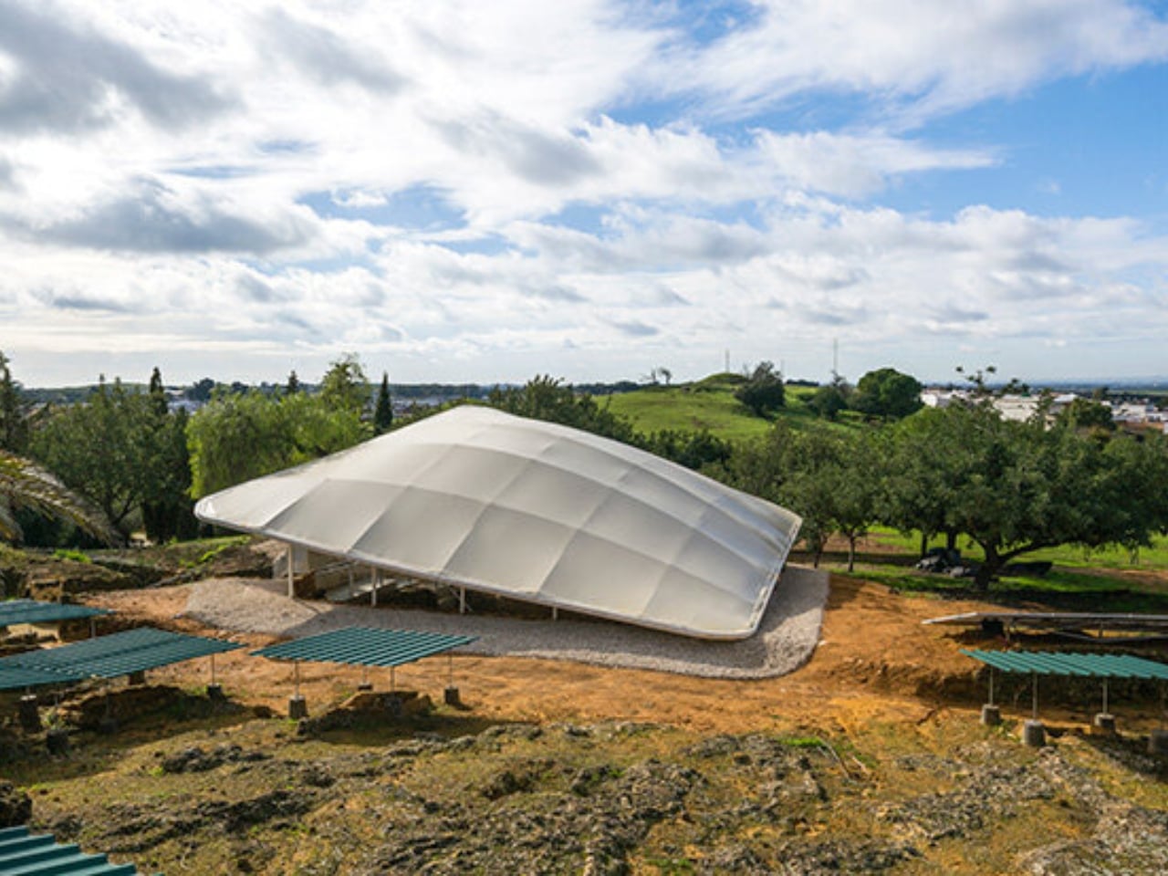
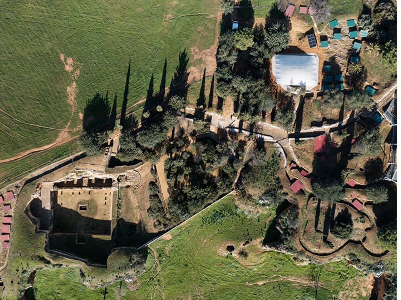
There’s something beautiful about watching cutting-edge technology come to the rescue of ancient artifacts. At the Archaeological Complex of Carmona in Spain, architects Juan Carlos Gómez de Cózar and Manuel Ordóñez Martín have created a stunning example of this intersection by designing a 3D-printed canopy that protects Roman tombs while barely making its presence known.

The project tackles a challenge that archaeologists face worldwide: how do you preserve delicate historical sites without turning them into enclosed museum pieces? These Roman tombs have survived centuries, but exposure to the elements continues to threaten their integrity. The solution needed to be protective yet unobtrusive, functional yet respectful of the site’s historical significance.

Designers: Juan Carlos Gómez de Cózar and Manuel Ordóñez Martín (photography by Jesús Granada)

What makes this canopy special isn’t just that it uses 3D printing technology, though that’s certainly impressive. It’s the way the designers thought about the entire system. Rather than simply throwing a roof over the tombs and calling it a day, they created what’s essentially a climate-control system disguised as architecture.

The canopy features a double-layer envelope that does way more than keep rain off ancient stone. Built into this roof are ventilation and air extraction components that actively regulate temperature and humidity. Think of it like a thermostat for history, maintaining the stable conditions these tombs need to survive another few centuries. The system works passively, meaning it doesn’t require constant energy input to function, which is both environmentally smart and practical for a site that needs long-term, low-maintenance protection.

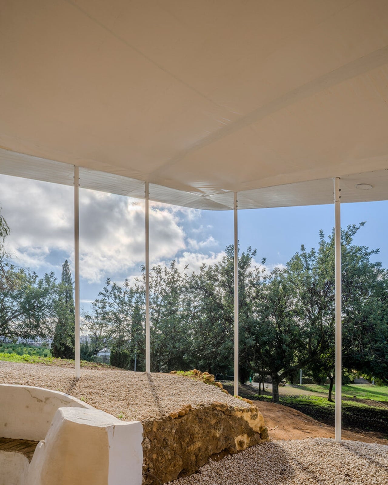
From a design perspective, the structure manages to be both present and invisible. The architects minimized the number of supports needed, creating an open, continuous space above the tombs rather than a forest of columns that would obstruct views and interrupt the spatial experience of the site. When you’re standing there, you get shelter and the tombs get protection, but the visual focus remains on the archaeology, not the modern intervention.

The use of 3D printing technology opens up possibilities that traditional construction methods can’t match. The canopy’s components could be fabricated with complex geometries optimized for both structural efficiency and environmental performance. This level of customization would be prohibitively expensive or simply impossible using conventional building techniques. Plus, the printing process allows for precision and repeatability, ensuring each element fits together exactly as designed.

Another thoughtful touch is that the entire system is reversible. This might not sound exciting, but it’s actually a big deal in heritage conservation. The principle of reversibility means that if better technology comes along, or if the site’s needs change, this intervention can be removed without damaging the original tombs. It’s a humble approach to design, acknowledging that today’s cutting-edge solution might be tomorrow’s outdated method.

This project sits at a fascinating crossroads of disciplines. It required archaeological expertise to understand the site’s needs, architectural skill to design an elegant solution, engineering knowledge to make it structurally sound, and technological savvy to leverage 3D printing capabilities. The fact that two PhD architects pulled this together speaks to the increasingly interdisciplinary nature of modern design work.

For anyone interested in how technology shapes our relationship with the past, this canopy offers a compelling case study. It proves that preservation doesn’t have to mean freezing things in time or hiding them away. Instead, smart design can create conditions where ancient sites remain accessible and experiential while getting the protection they need.

As 3D printing technology becomes more accessible and sophisticated, we’ll likely see more projects like this one. The ability to create custom, site-specific solutions for complex problems is exactly what heritage sites need. These tombs in Carmona are getting a second chance at longevity, wrapped in a protective embrace that honors both their ancient origins and our modern capabilities.

The post This 3D-Printed Roof Is Saving 2,000-Year-Old Roman Tombs first appeared on Yanko Design.

Rain, Light, and Lunch: Inside Ubud’s Circular Bamboo Oasis

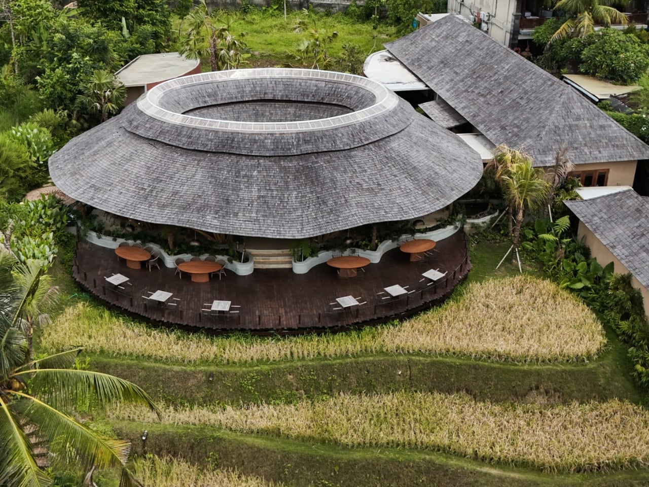
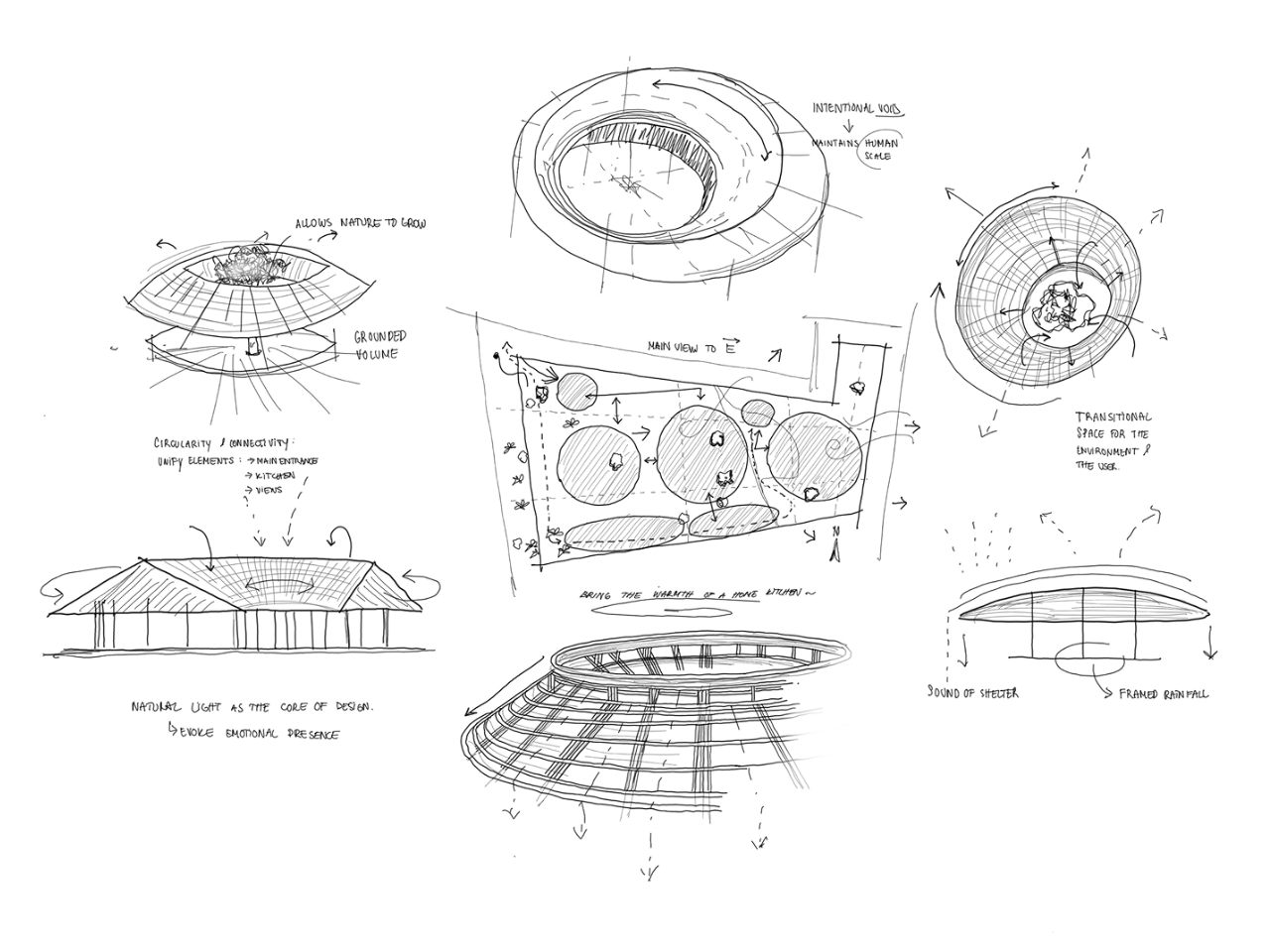
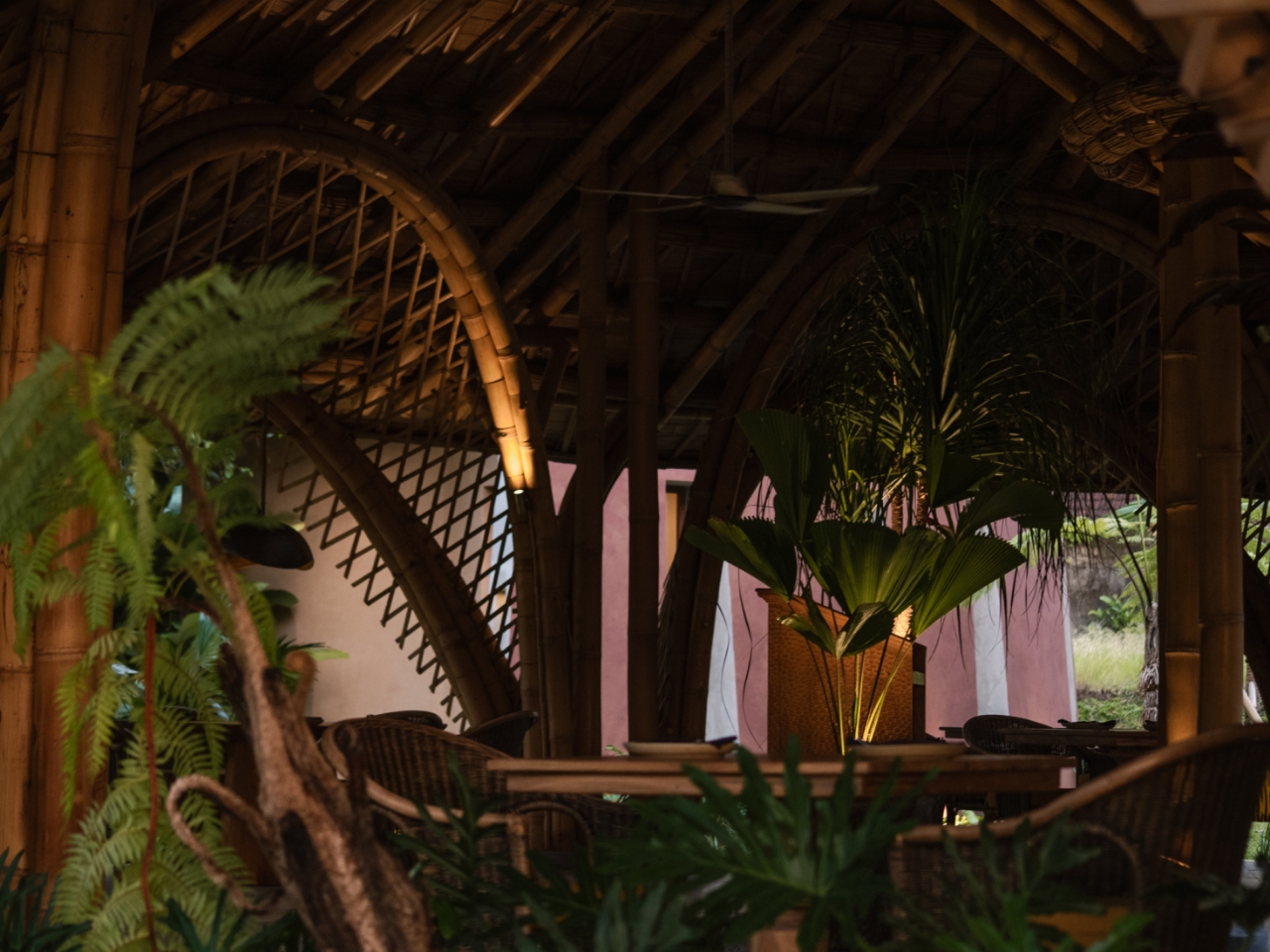
There is a moment at Juna Ubud when you forget whether you’re indoors or out. You’re sitting at your table, the air is soft, the light is filtered, and above you a circular bamboo roof seems to hover, tiered like a rice terrace in the sky. Somewhere overhead, rain is quietly being choreographed.

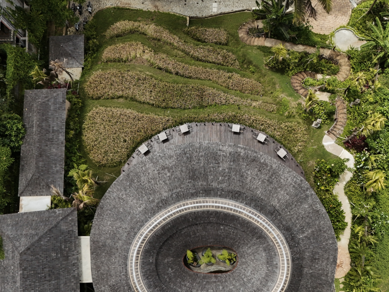
Designed by Pablo Luna Studio, Juna is a Balinese restaurant that treats climate as its main collaborator. The building is essentially a circle, pulled open and layered so light, air, and water can move through it with almost theatrical precision.

Designer: Pablo Luna Studio

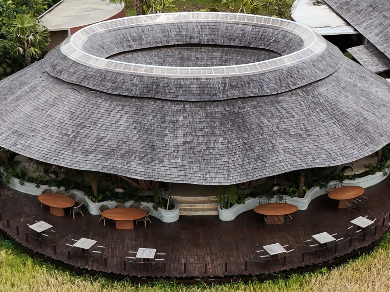
Instead of a heavy roof that just keeps weather out, Juna’s canopy funnels rain toward a central point. The tiers step and vent toward the middle, so water is guided inward while views and breezes stay open at eye level. The effect is part stadium, part shrine, part sci‑fi pavilion. You feel sheltered but not sealed.

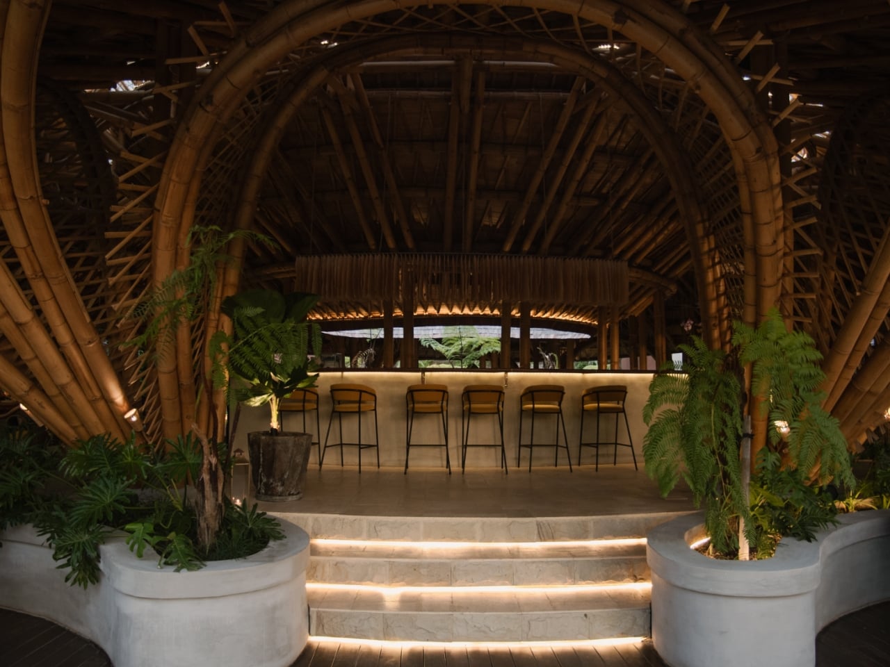
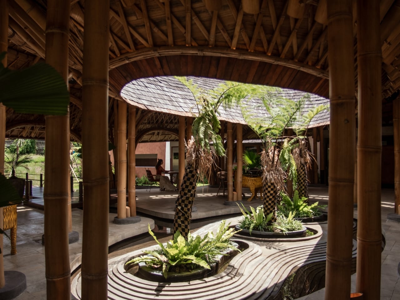
At the core sits a courtyard with a pond and lush planting, the kind of green pocket that makes you slow down whether you meant to or not. This is where that carefully collected rain completes the story, feeding a micro‑landscape that cools the air and mirrors the roof above. It is climate control as choreography: water falls, air flows, light shifts, and the architecture simply sets the stage.

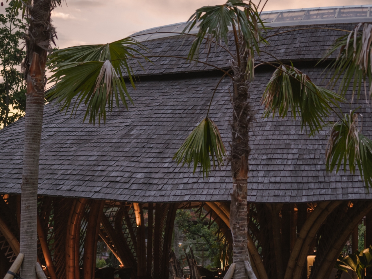
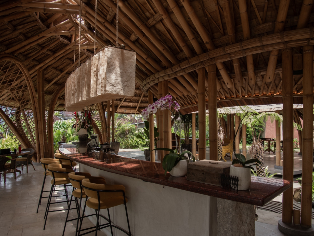
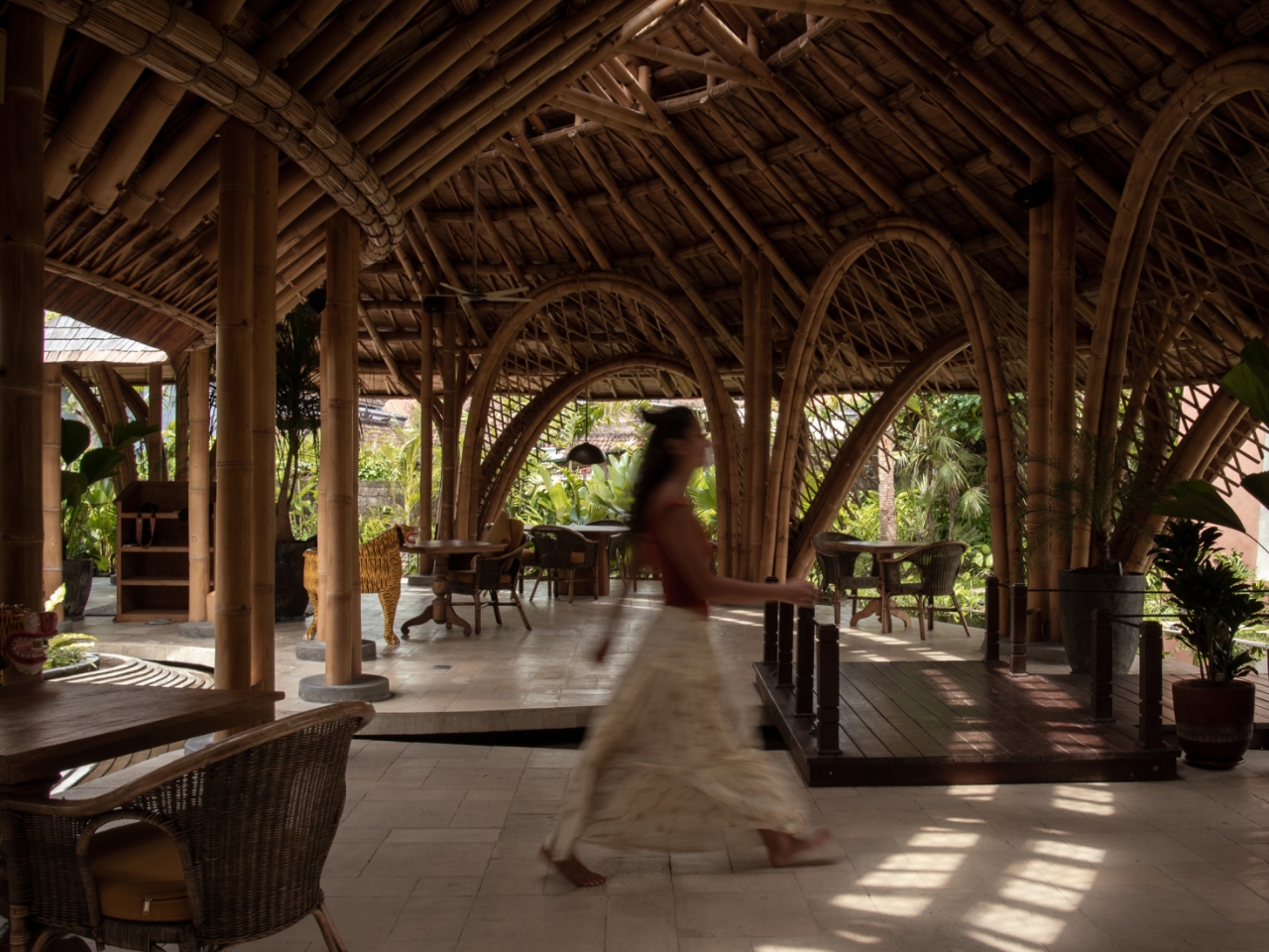
The structure itself is a study in how “natural” can still feel sharply designed. A forest of bamboo arches and A‑frames defines the dining space, but the geometry is crisp, almost graphic. The bamboo isn’t rustic background texture; it behaves like a drawn line, tracing curves, spans, and thresholds. Look closely and you see intricate joinery, where each connection feels both handcrafted and engineered.

On top of that bamboo skeleton, the roof is finished with ulin wood shingles, crafted by local artisans. The shingles give the whole volume a tactile, scaled surface, like a creature that has grown here over time. Near the center, a skylight made from clear panels sits on a steel frame that has been finished to visually melt into the bamboo, keeping the roof watertight without breaking the illusion of an all‑natural canopy.

For a restaurant, all of this could have turned into spectacle. Instead, the architecture mostly frames what’s around it. The site is on an elevated stretch of Ubud, with views westward over a river and rice fields. The building doesn’t compete with that; it edits it. Open sides and carefully placed arches direct your sightlines out toward the landscape, so a casual glance from your seat becomes a composed view.

What’s interesting here for anyone into design is how Juna feels like a quiet rebuttal to the glass‑box global aesthetic. This is not a sealed, air‑conditioned capsule that dominates its plot. It rides the existing contours and leans on passive strategies: shade from the broad roof, cross‑ventilation through the open sides, evaporative cooling from the central pond. The “technology” is mostly physics, material intelligence, and local craft.

Yet the project doesn’t romanticize tradition. The hybrid of bamboo, steel, engineered skylight panels, and carefully detailed shingles is a reminder that sustainable architecture today is rarely about going backward. It is about stacking old knowledge and new tools until they click into something that feels both inevitable and fresh. There is also a social scale question that Juna answers with surprising clarity. The circular plan pulls people into a shared field of view, but the layered roof and arches break the space down into more intimate pockets. You’re aware of the room as a whole, yet your table still feels like its own scene. For a restaurant, that balance is gold: collective energy without the food‑court vibe.

Juna fits into a growing fascination with eco‑spectacle spaces, the kinds of venues that show up endlessly in travel reels and architecture feeds. But what makes it more than a backdrop is that the photogenic moves are doing real work. The halo of bamboo, the stepped roof, the reflection of the pond, the dappled light; all of it is performance with purpose, tuned to climate, craft, and comfort. If you’re into design, this is a case study in how a single strong gesture a circle in plan, a ring in section, a crown in elevation can carry an entire project. If you lean more toward tech, it is a reminder that sometimes the smartest system is the one that requires no app, no interface, no instructions. Just gravity, airflow, and a roof that knows what to do when it rains.

The post Rain, Light, and Lunch: Inside Ubud’s Circular Bamboo Oasis first appeared on Yanko Design.

Vagabond Haven’s Evergreen Trades Wheels for Space in Modular Tiny House Debut

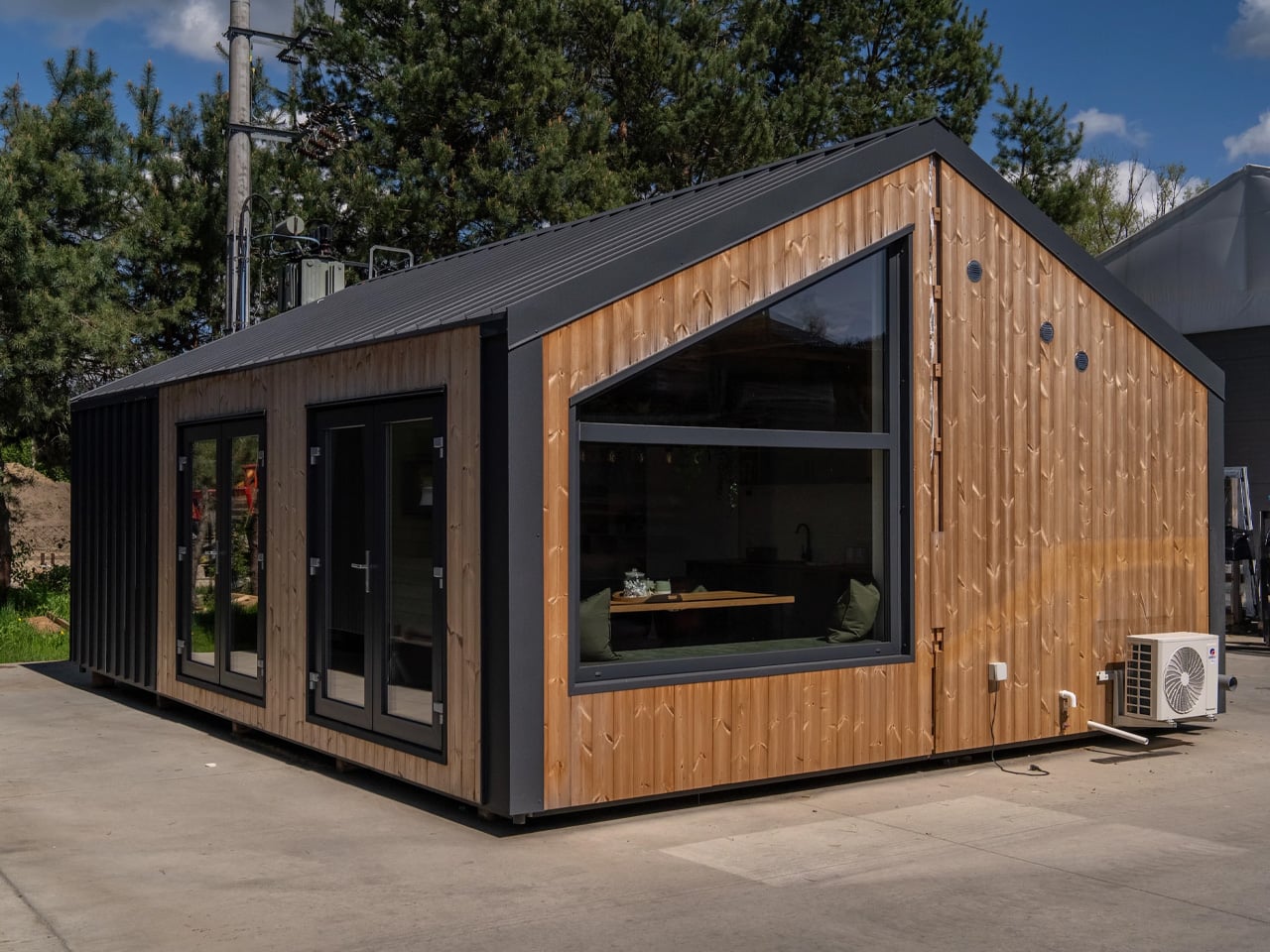
Vagabond Haven has stepped away from wheels with the Evergreen, their first modular tiny house that prioritizes space over portability. The Swedish company, known for its mobile tiny homes built for Scandinavian conditions, designed this two-module dwelling for those who want the tiny house lifestyle without the constraints of road-legal dimensions. The Evergreen represents a deliberate shift in the tiny house market, acknowledging that not everyone needs mobility but still wants the benefits of compact, efficient living.

The difference is immediately apparent in the measurements. While the Evergreen’s length sits at a modest 8.3 meters, the width stretches to 6 meters, more than double what you’d find in a towable tiny house. This generous footprint translates to 41 square meters of living space, making it the largest offering in Vagabond Haven’s modular category. The two seamlessly connected modules create an interior that feels surprisingly conventional rather than cramped, offering room to breathe and move without the spatial compromises typical of road-restricted designs.

Designer: Vagabond Haven

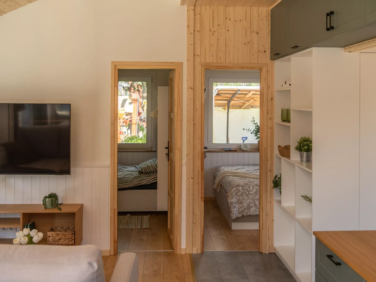
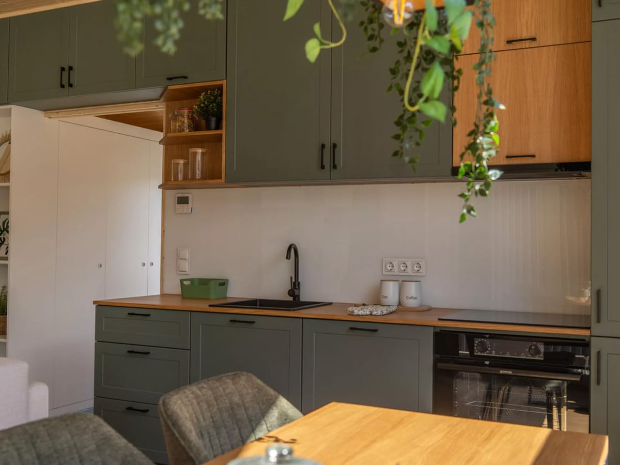
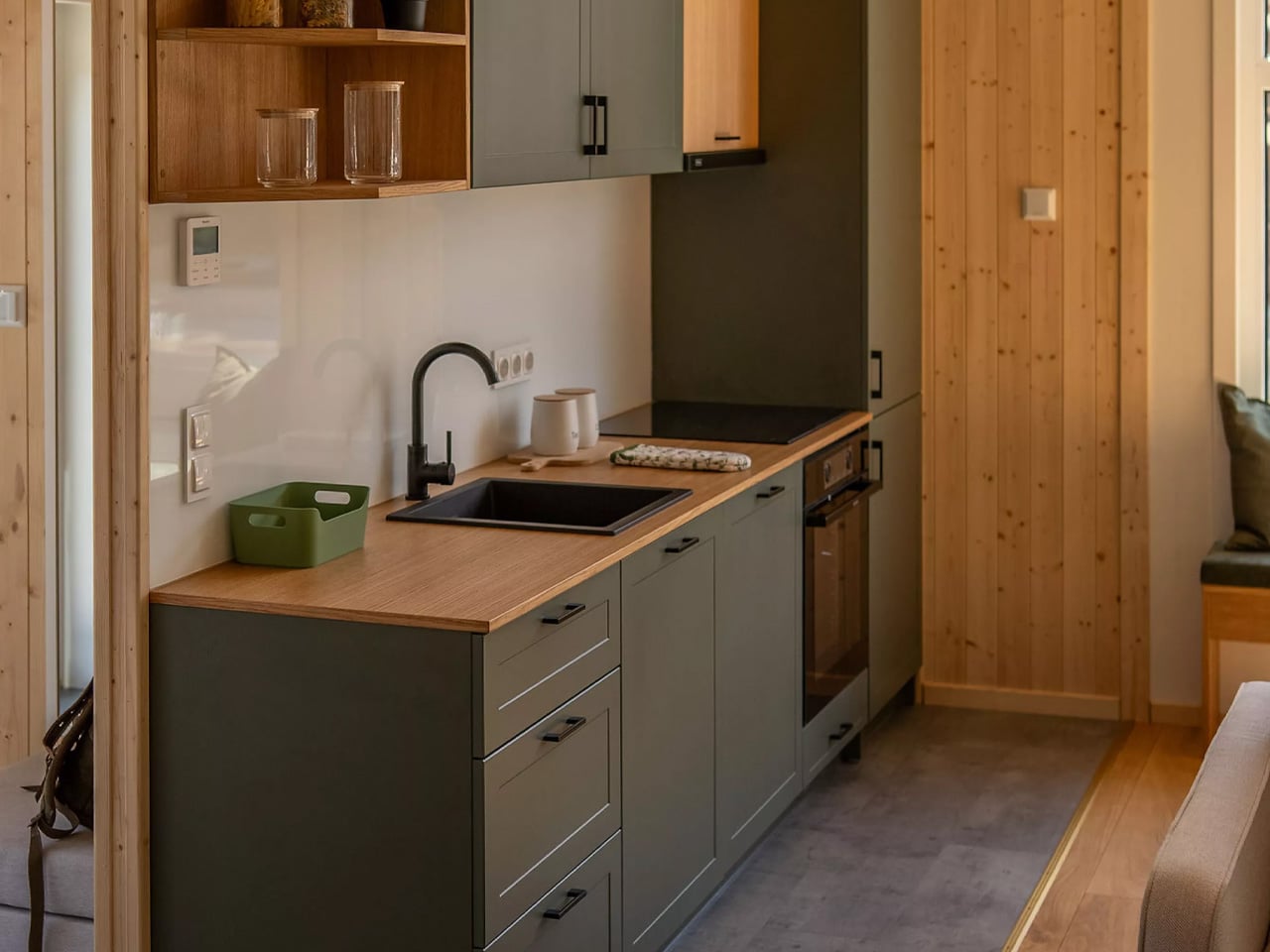
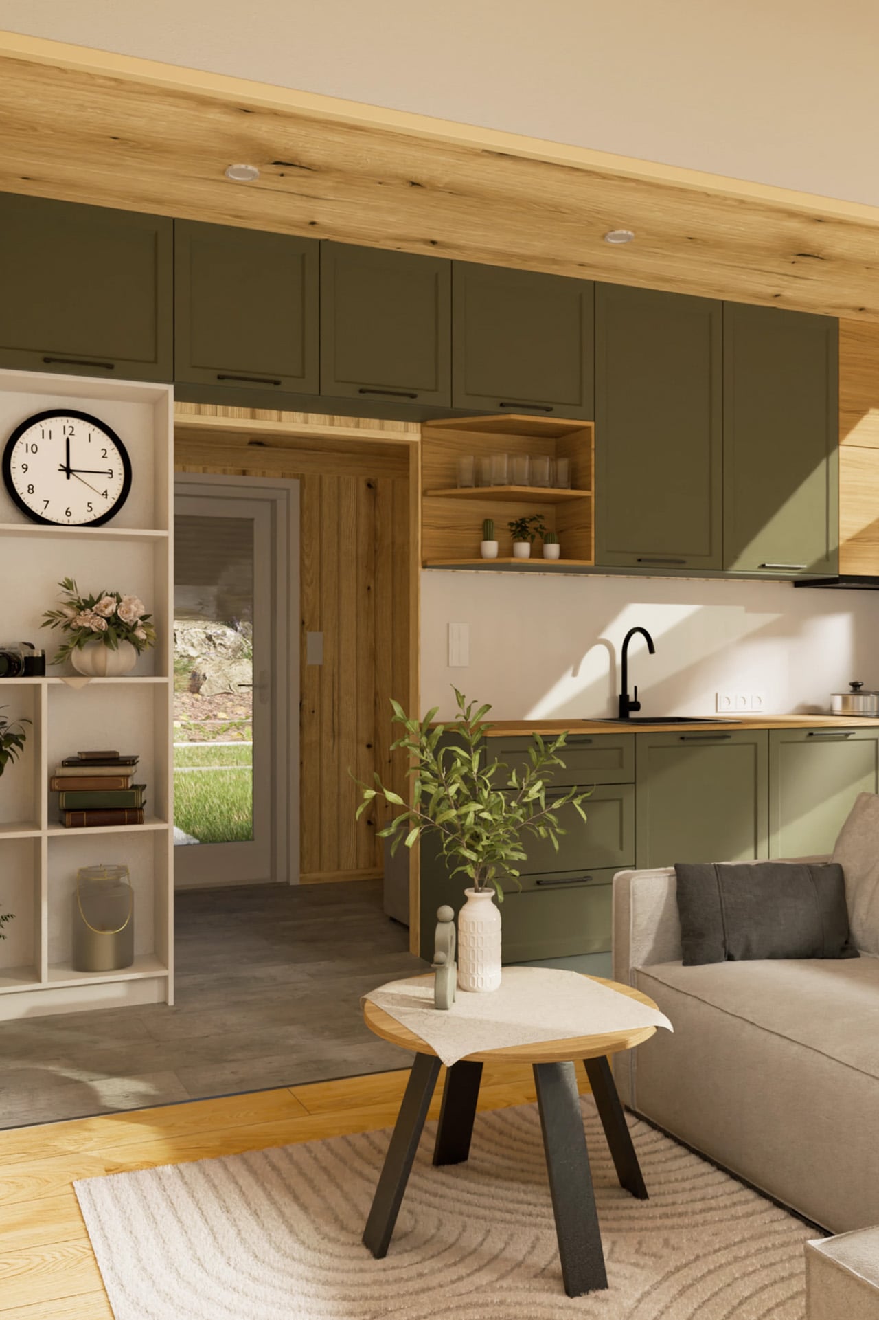
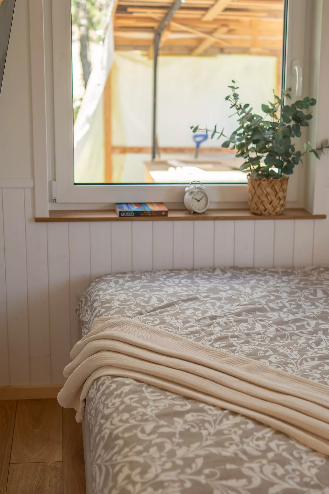
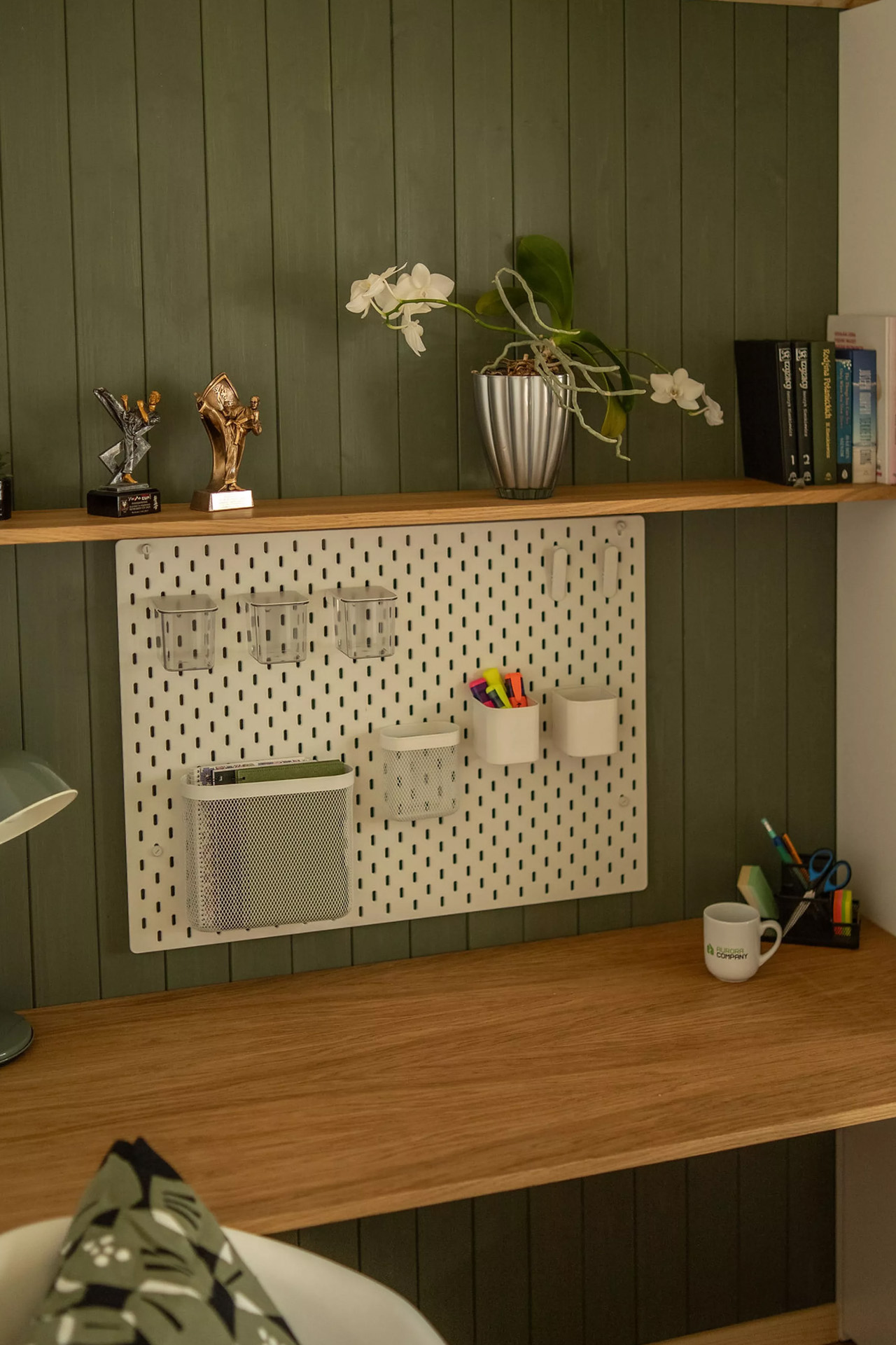
The layout takes full advantage of this extra room with a single-floor design that avoids the loft bedrooms common in mobile tiny houses. The living area features an L-shaped sofa arrangement with space for both a coffee table and entertainment center. The kitchen doesn’t skimp on storage, offering more cabinetry than you’d typically find in compact homes of this size. Two bedrooms occupy separate zones of the house. The master bedroom accommodates a double bed with integrated storage, while the smaller second bedroom fits a single bed with a lifting frame, desk, armchair, and bookcase. This makes the Evergreen practical for couples, small families, or anyone needing dedicated office space alongside sleeping quarters.

Vagabond Haven carried over the same craftsmanship and attention to sustainability that defines their mobile homes. The technical specifications include LED lighting with dimmers, options for solar systems, and a rainwater harvesting setup. Ventilation runs through the living room, kitchen, and bathroom, with a recuperator system managing air quality. Buyers can choose between electric or gas water heaters, and the plumbing uses stainless steel pipes throughout. These features ensure the home performs well in various climates while maintaining eco-friendly credentials.

The company offers full customization of furniture colors and flooring, letting owners personalize the aesthetic to match their preferences. The home arrives via truck and sits on a concrete platform rather than a trailer foundation. For those curious about the space before committing, Vagabond Haven provides a virtual 3D tour on their website. Ready-built models are available with delivery times ranging from two to four weeks when units are in stock.

The Evergreen splits the difference between mobile tiny houses and traditional construction, offering factory-built quality and relatively quick installation without the permanent commitment of conventional building. Some buyers simply want efficient, well-designed small homes that maximize every square meter without the engineering compromises required for highway travel. The modular approach delivers exactly that, creating homes where space and comfort take priority over portability.

The post Vagabond Haven’s Evergreen Trades Wheels for Space in Modular Tiny House Debut first appeared on Yanko Design.
Japan’s Pokémon Hotel Rooms Put 100+ Characters on Your Ceiling (And Gyarados in Your Bathroom)

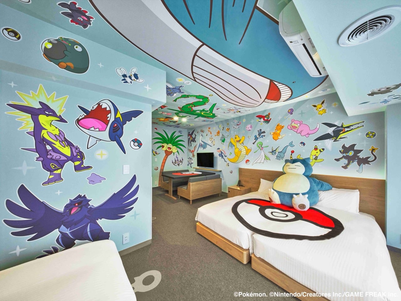
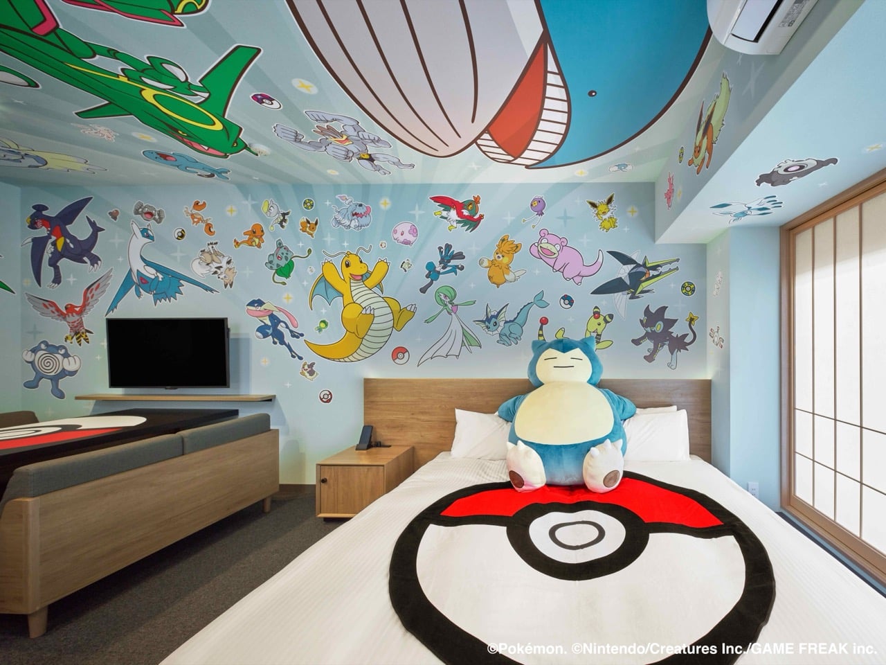
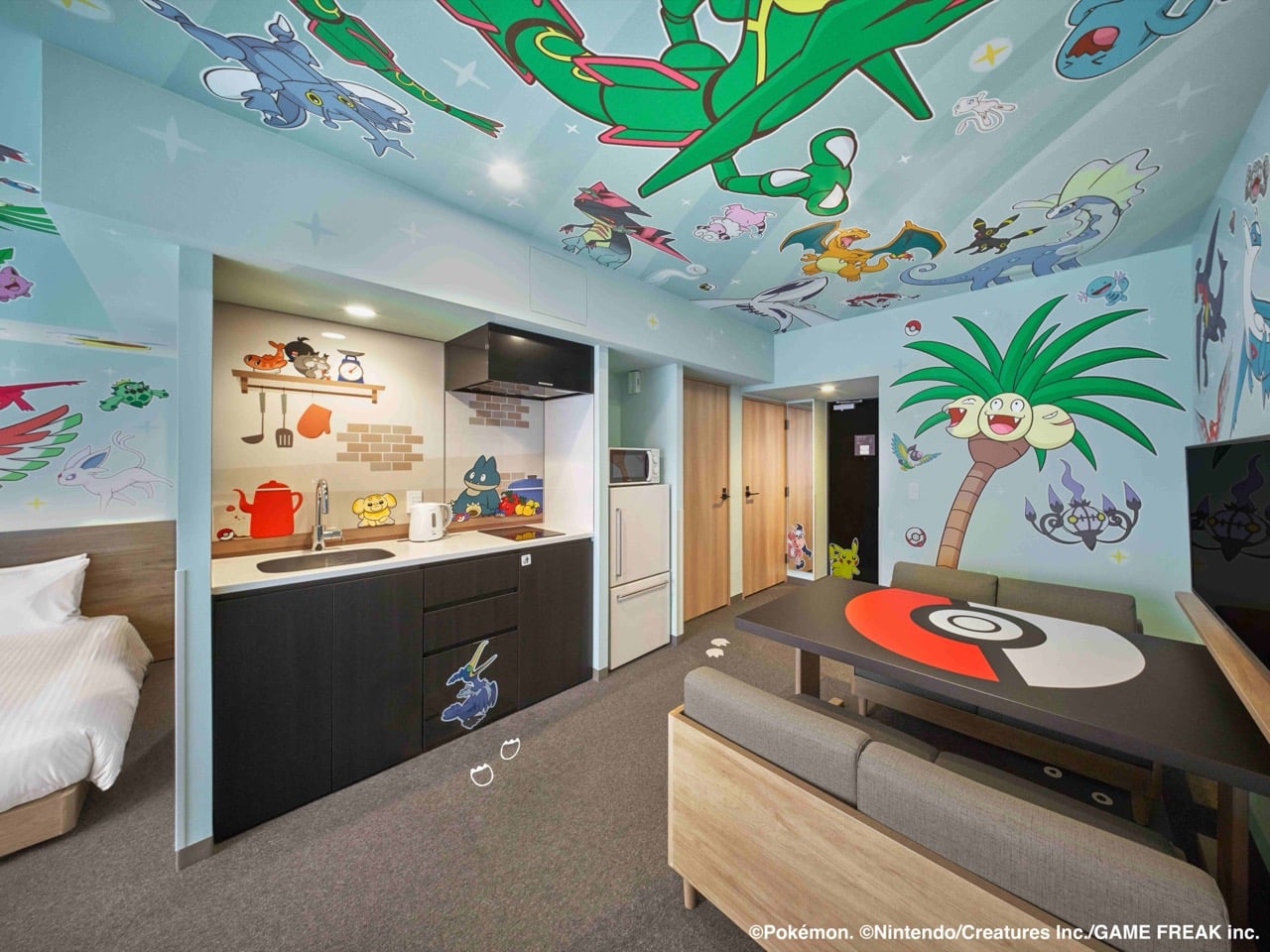
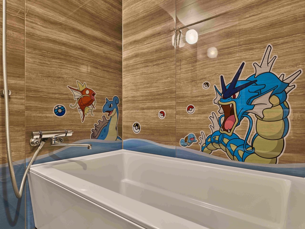
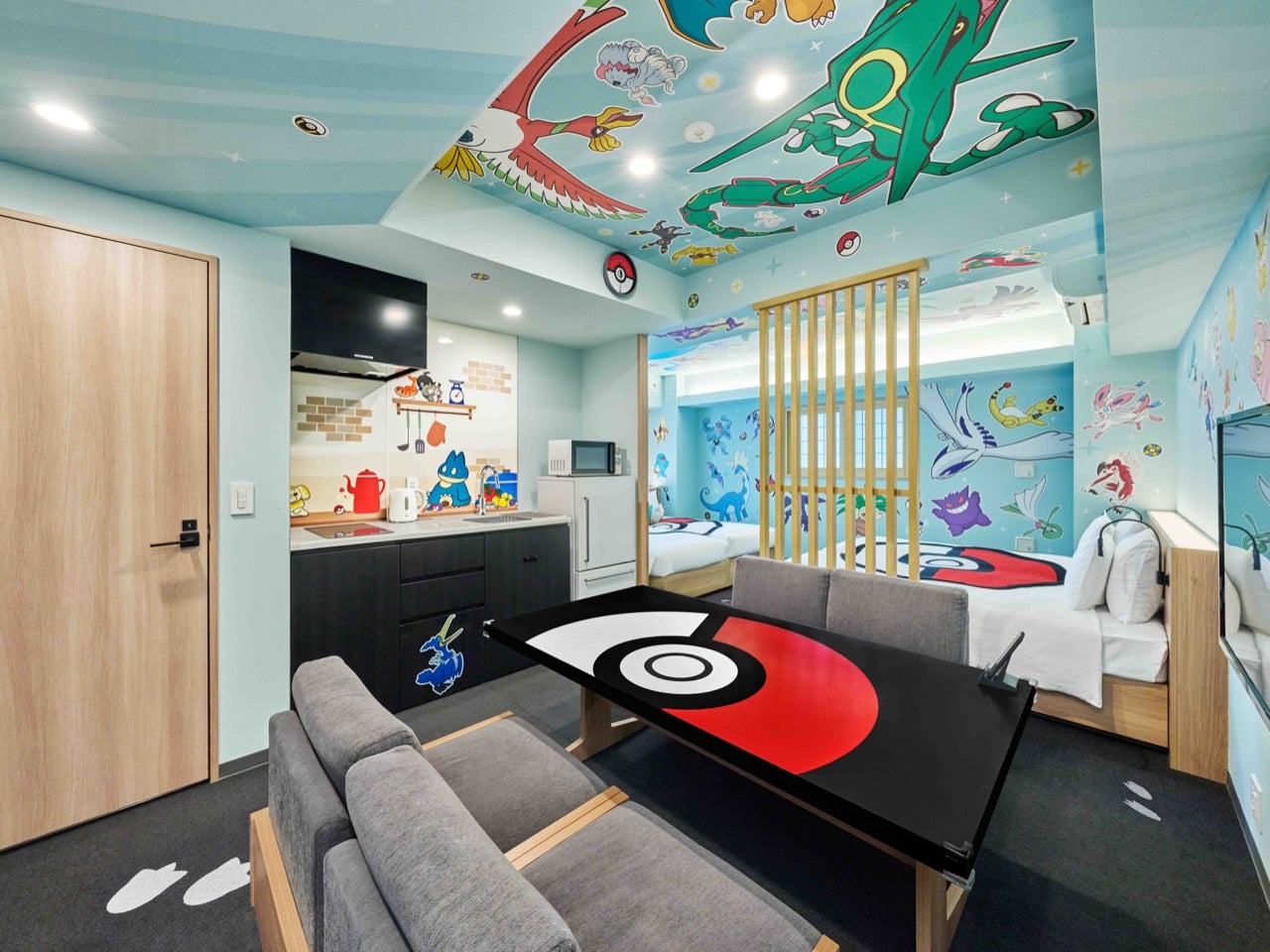
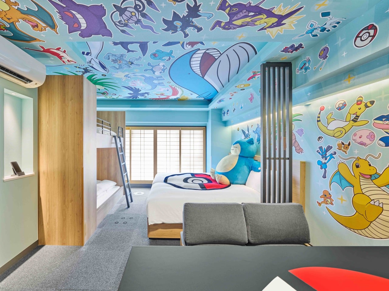
Snorlax is napping on your bed. Rayquaza soars across the ceiling. Gyarados splashes through your bathroom walls. This is not a fever dream—this is checking into a MIMARU Pokémon Room, where over 100 beloved characters have escaped their Poké Balls to transform apartment-style hotels across Japan into immersive wonderlands.

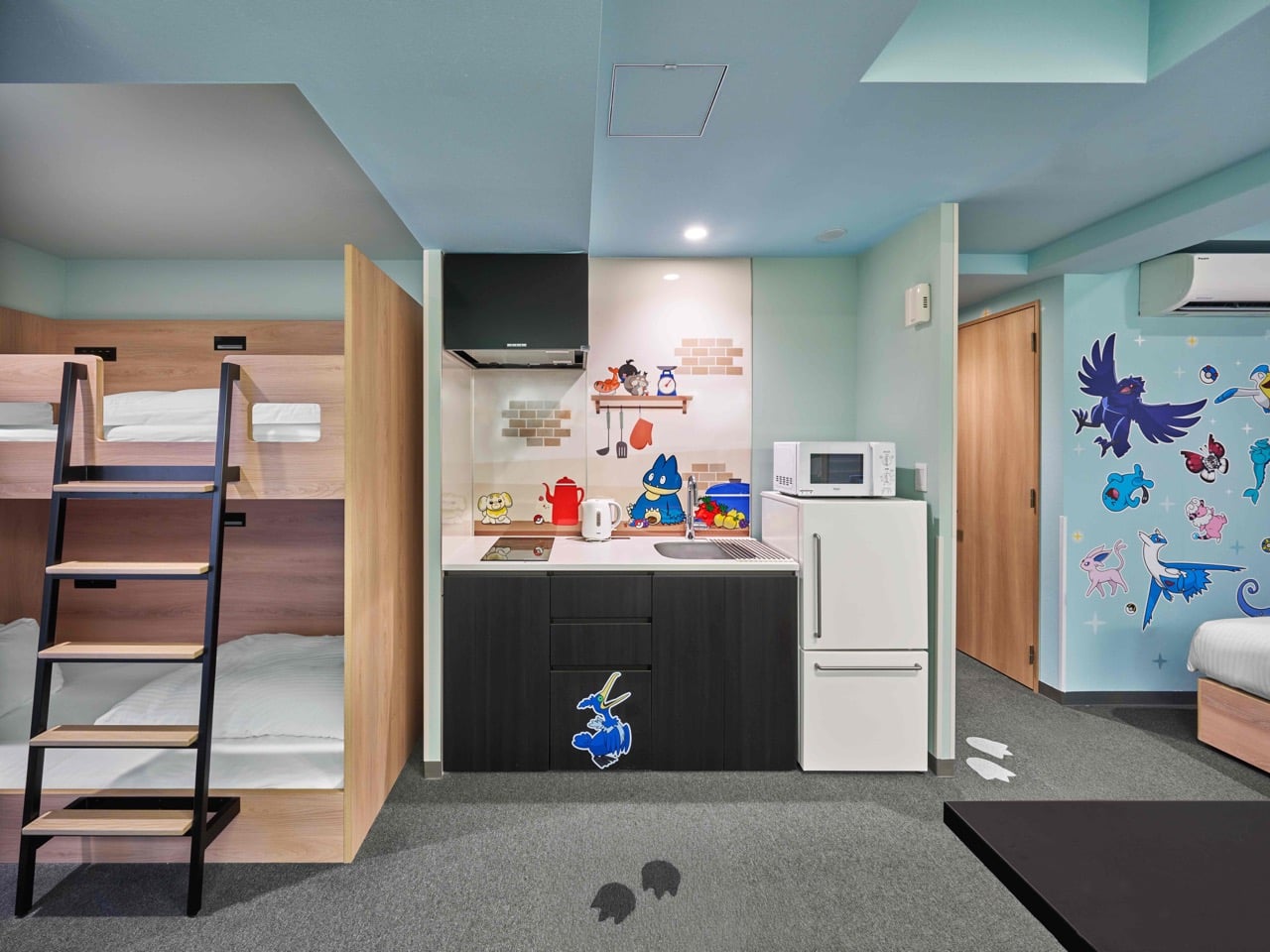
Since their 2019 debut, these themed accommodations have evolved from a novel concept into a hospitality phenomenon, now spanning 10 properties in Tokyo, Kyoto, and Osaka. The latest renovation doubles down on what made them irresistible: more Pokémon, more family-friendly spaces, and meticulous attention to detail. Water-types gather in bathrooms. Food-loving characters populate kitchens. Even the dining table and tableware echo the iconic Poké Ball design. For families seeking more than generic hotel rooms and Pokémon fans wanting to live inside their childhood obsession, MIMARU has created something genuinely special.

Designers: Nintendo & Mimaru Hotels

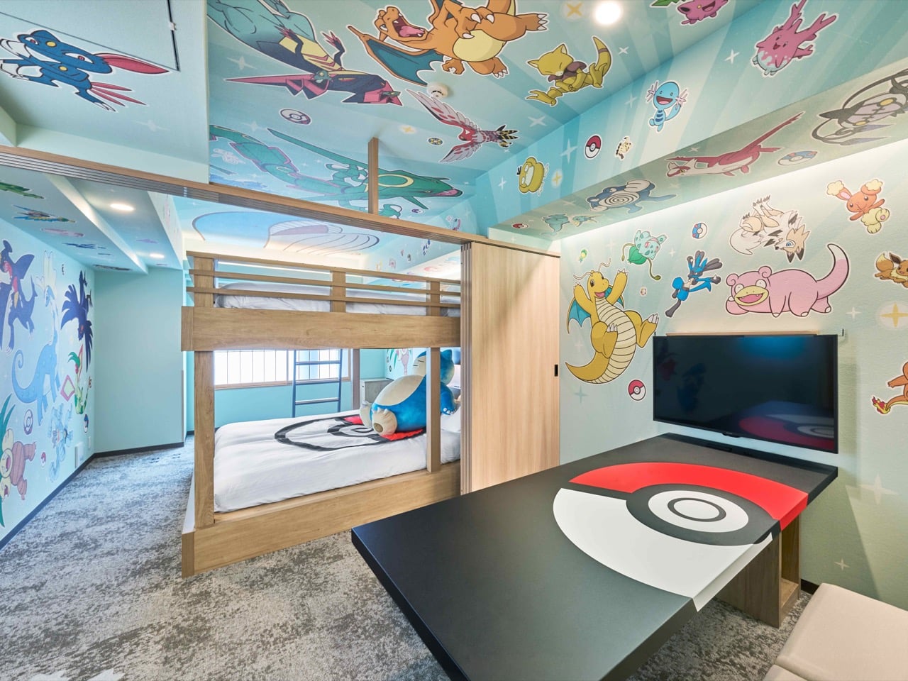
Most themed hotels give you a logo on the wall and call it a day. MIMARU went full maximalist and put 100+ Pokémon across every available surface including the ceiling, which most designers treat like dead space. The apartment format solves the actual problem of traveling with kids or groups: you need a kitchen, you need separate sleeping areas, you need room to exist without climbing over each other. Scaling from the 2019 launch to 10 properties across Tokyo, Kyoto, and Osaka means this concept is making serious money. Hotels kill ideas that don’t work. They expand what drives bookings.

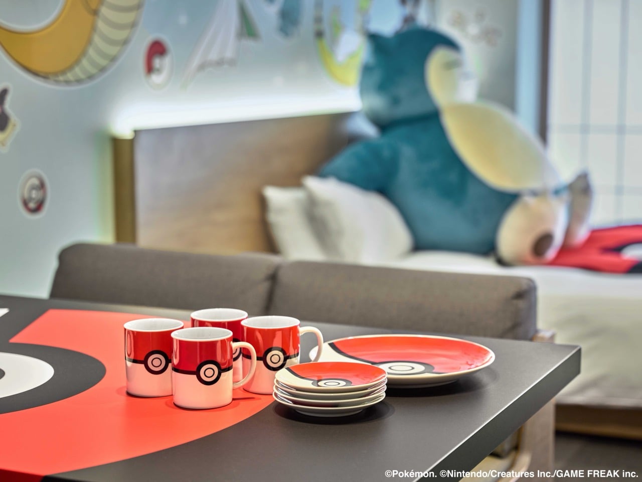
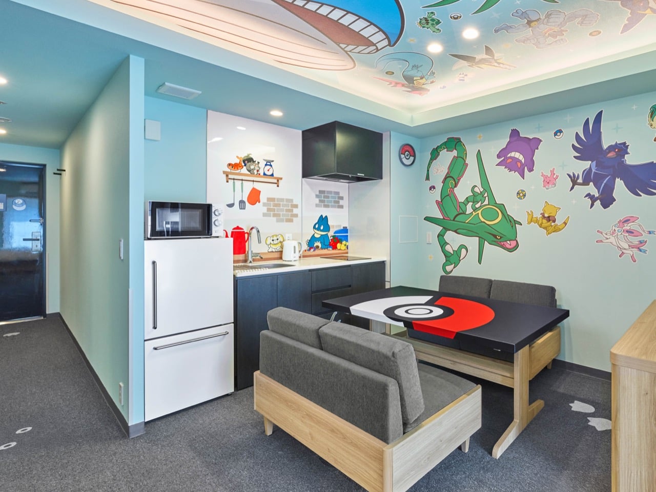
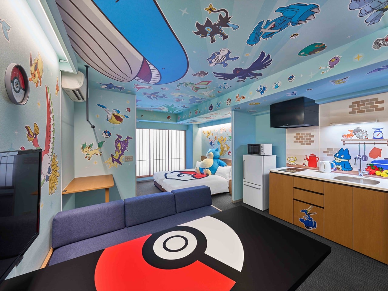
Custom Poké Ball plates and mugs mean you’re eating breakfast off themed dinnerware. The dining table itself has the circular red and white design built in. These aren’t afterthought details or cheap branded merchandise they threw in a gift shop basket. The tableware extends the experience into every meal without being obnoxious about it. You’re drinking coffee from a Poké Ball mug while surrounded by wall art of Charizard and Dragonite. The layering works because each element reinforces the others instead of competing for attention.

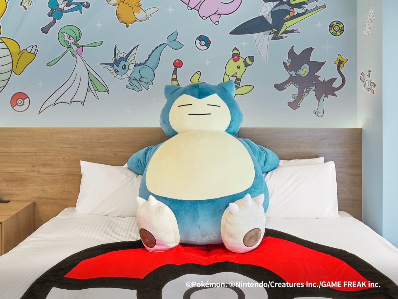
You walk in and there’s a massive Snorlax plushie sprawled across Poké Ball bedding. Every guest photographs this thing. Every review mentions it. It’s become the signature element that people specifically request when booking. The plushie works because it’s tactile, huggable, and perfectly in-character for Snorlax to be permanently napping on your bed. It’s also shameless Instagram bait, which means free marketing from every family that stays there. The design team knew exactly what they were doing when they made this the centerpiece.

Water-types live in the bathroom. Food-obsessed Pokémon populate the kitchen. Flying and legendary types take over the ceiling murals. Someone actually thought about spatial logic instead of randomly slapping characters everywhere like a kid with stickers. Lapras and Magikarp around the bathtub makes intuitive sense. Pikachu hanging out near the dining table with other food-loving characters feels natural when you’re making breakfast. This kind of ecosystem thinking is rare in themed spaces, which usually prioritize maximum logo visibility over coherent storytelling. The renovation team understood that immersion breaks when placement feels arbitrary.

Every stay includes MIMARU-exclusive merchandise you can’t get anywhere else. Limited edition fabric bags, collectible items that only guests receive. This is retention marketing dressed up as a perk, and it’s extremely effective. People collect these things. They post about them. They keep them as physical reminders of the experience, which triggers “remember when we stayed at the Pokémon hotel” conversations years later. Creating scarcity around a hotel stay is smart business. Making guests feel like they’re part of something exclusive rather than just renting a room builds the kind of emotional attachment that drives repeat bookings.

The properties sit near major tourist hubs and transportation centers, which balances fantasy with practicality. You can spend your day exploring Shibuya or Kyoto’s temples, then return to your Pokémon sanctuary at night. International families especially appreciate the apartment setup because it lets them cook meals and avoid the exhausting hotel-restaurant cycle. Guest feedback consistently uses phrases like “living in the Pokémon world,” which is the gold standard for themed hospitality. You want people feeling transported, not just tolerating cute wallpaper for a night.

The post Japan’s Pokémon Hotel Rooms Put 100+ Characters on Your Ceiling (And Gyarados in Your Bathroom) first appeared on Yanko Design.
Dark Vader Tiny Home Crosses to the Dark Side of Small Living with Bold Black Design

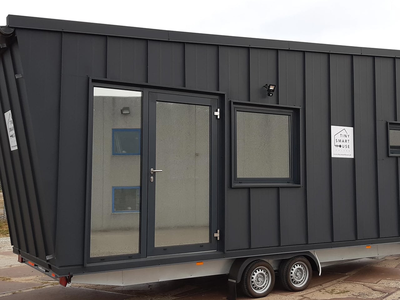
When Poland’s Tiny Smart House unveiled the Dark Vader, they created something truly exceptional in the world of compact living. This mobile dwelling isn’t your typical tiny home with cutesy charm and rustic wood siding. Instead, it channels the intimidating presence of one of cinema’s most notorious villains, transforming that dark energy into a sophisticated living space that commands attention wherever it travels. The inspiration is obvious from the name alone, yet the design team showed restraint by avoiding kitsch Star Wars memorabilia, focusing instead on capturing the essence of power and sleekness associated with the iconic character.
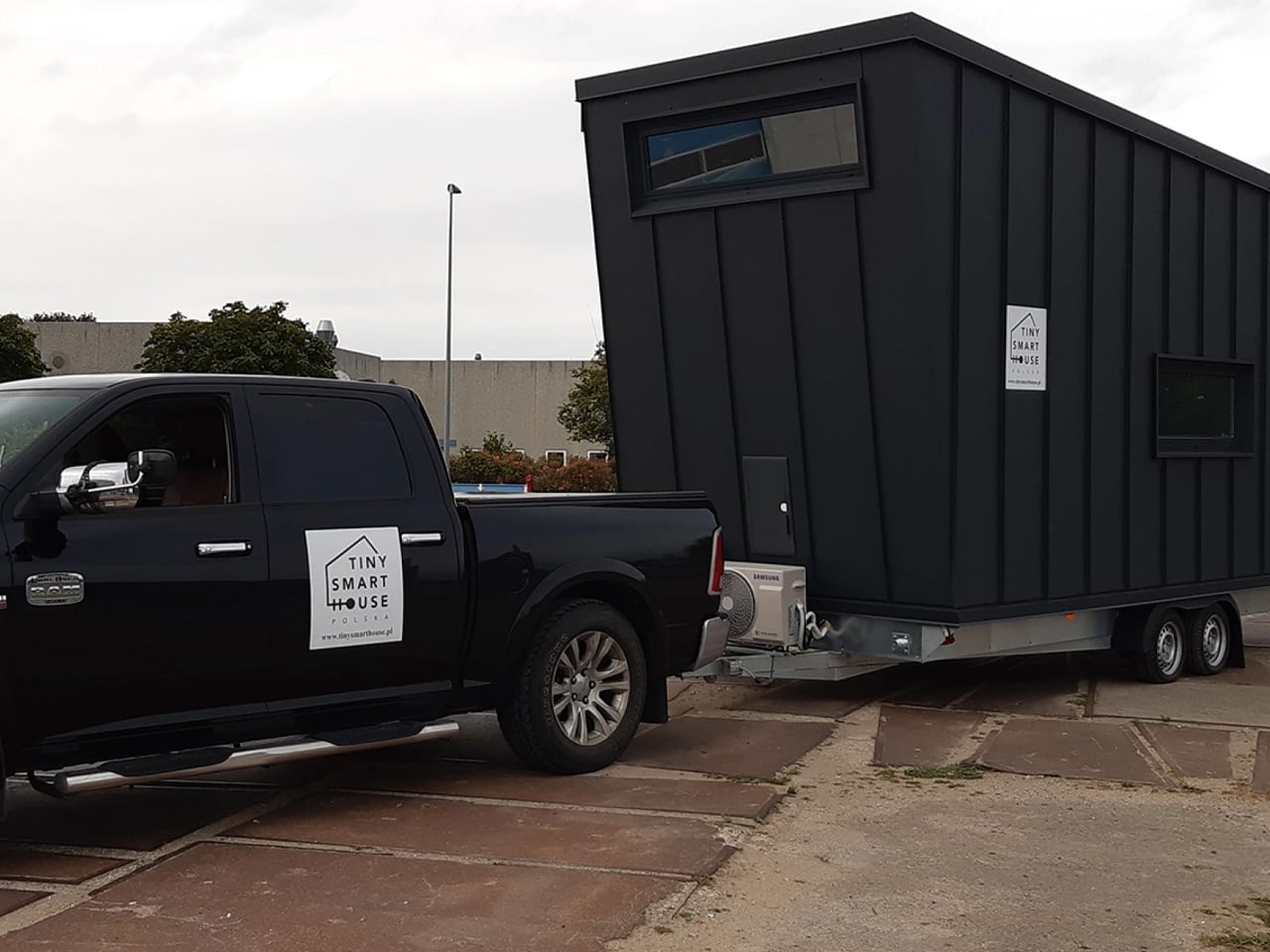
The exterior is where this tiny home truly makes its statement. Wrapped entirely in black sheet metal, the Dark Vader creates an imposing silhouette that stands in stark contrast to the cheerful pastels and natural wood tones dominating most tiny house communities. This bold material choice isn’t just about aesthetics; the metal cladding provides durability and weather resistance while maintaining that distinctive edge. Mounted on a double-axle trailer foundation, the structure spans six meters, which translates to roughly twenty feet of living space. While this dimension might seem modest, especially when compared to the forty-foot behemoths common across North America, it represents the sweet spot for European tiny house design, balancing mobility with livability.

Designer: Tiny Smart House

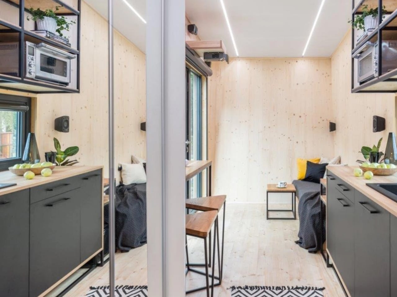
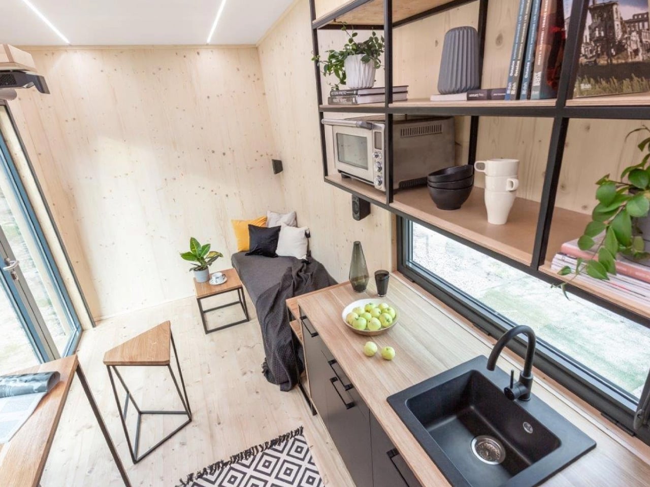
Step inside, and you’ll discover an unexpected contrast to the menacing exterior. The interior spaces showcase beautiful spruce wood throughout, creating warmth and organic texture that immediately softens the industrial vibe. Large windows punctuate the walls, flooding the compact floor plan with natural light and preventing any sense of claustrophobia. This juxtaposition between dark and light, industrial and natural, demonstrates sophisticated design thinking that elevates the Dark Vader beyond novelty status into genuine architectural achievement.

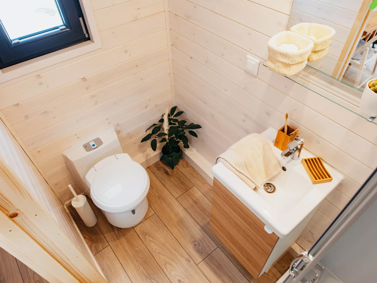
The main level houses the primary living spaces with impressive efficiency. A comfortable sofa anchors the living room alongside a petite coffee table, creating an intimate gathering spot perfect for unwinding after work or hosting friends for evening conversations. The kitchen area integrates seamlessly into the open layout, while the bathroom surprises with full-sized amenities including a proper walk-in shower, contemporary vanity sink, and standard flushing toilet. These features matter tremendously in tiny living, where many occupants struggle with composting toilets and cramped shower stalls.

Above the main living area, a sleeping loft provides private quarters accessed through an ingeniously designed staircase. Rather than using a space-wasting ladder or simple steps, the builders incorporated extensive storage directly into each riser, creating cubbies and compartments that swallow clothing, books, linens, and countless other items that would otherwise clutter the limited square footage. The bedroom ceiling sits low, as physics demands in these compact structures, but the trade-off grants valuable storage throughout the home’s vertical circulation path.

This particular Dark Vader found its permanent home in Denmark after successful completion, though its influence ripples through the tiny house community worldwide. The design philosophy behind this project celebrates authenticity and creative expression, proving that alternative housing can embrace personality and fun without sacrificing functionality. Whether serving as a bachelor pad, artist’s retreat, or minimalist primary residence, the Dark Vader demonstrates how tiny living can align with bold personal style while meeting all practical needs of modern life.

The post Dark Vader Tiny Home Crosses to the Dark Side of Small Living with Bold Black Design first appeared on Yanko Design.