New Powerful NotebookLM Updates for Workflow, Outputs, Slide Decks, Mind Maps & More

New Powerful NotebookLM Updates for Workflow, Outputs, Slide Decks, Mind Maps & More Discover Sources view combining web results and Google Drive files to add references for a research brief.

NotebookLM has undergone significant changes since its initial release, evolving into a platform that prioritizes precision and structured outputs for professionals. Jeff Su explores how the latest updates, such as the introduction of a three-panel workflow, enhance its usability and adaptability. This redesign organizes tasks into distinct panels for managing sources, interacting through queries and […]

The post New Powerful NotebookLM Updates for Workflow, Outputs, Slide Decks, Mind Maps & More appeared first on Geeky Gadgets.

Posted in Uncategorized

What If Google’s Server Heat Became Its Most Prominent Design Feature?

Most conversations about Big Tech and sustainability follow a familiar script: a company announces a carbon pledge, releases an environmental report full of impressive-sounding numbers, and everyone moves on. What rarely gets discussed is the messy, unglamorous reality sitting right at the center of it all: the data server room. That’s exactly where two design students decided to start, and the result is one of the most visually striking workplace concepts I’ve seen in years.

Lia Hur and Michell Hur, both from the Savannah College of Art and Design, began with a straightforward question: what do you do with all the heat that data servers constantly produce? The answer they arrived at wasn’t purely mechanical. It was spatial, experiential, and genuinely beautiful. Their Google Sustainable Headquarters concept won two awards at the European Product Design Award 2025, covering both Architectural and Building Design and Interior Design categories, and it’s easy to see why.

Designeres: Lia Hur, Michell Hur

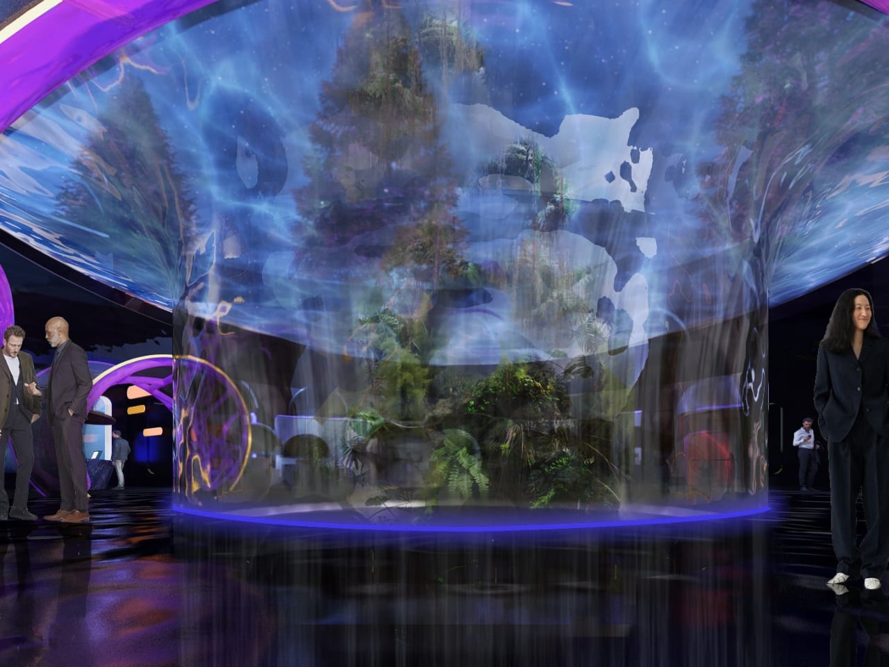
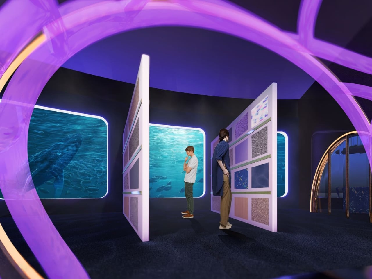
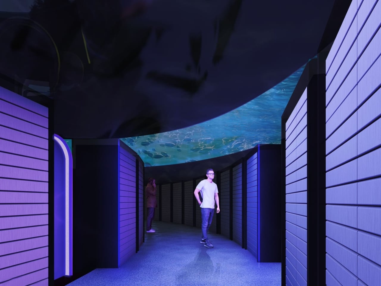
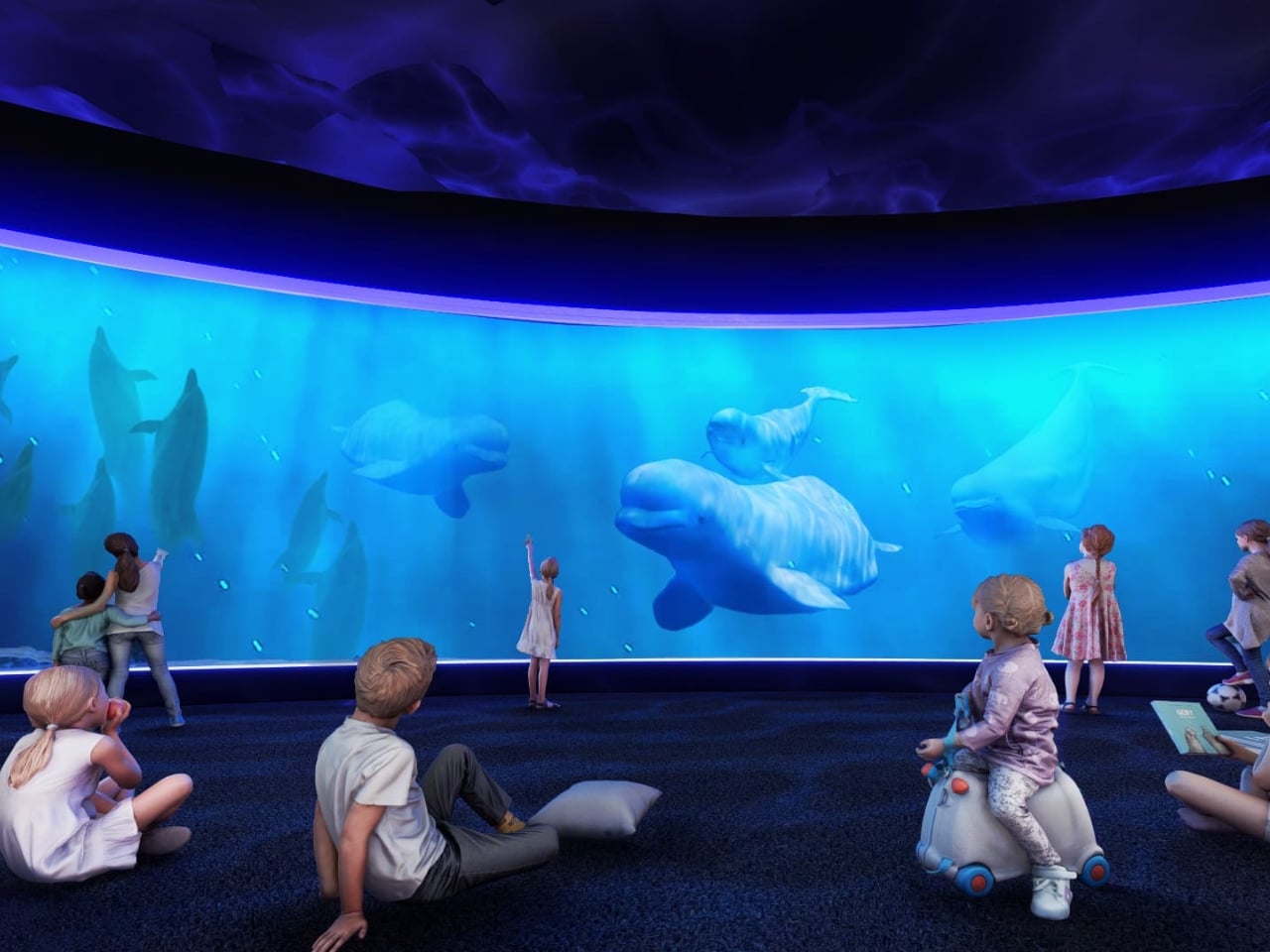
The first thing that strikes you when you look at the concept renderings is the ocean. Not metaphorically. The entire design language of the building is built around the visual world of the deep sea. Curved panoramic screens wrap around rooms showing beluga whales gliding through blue water. Children sit on the floor of an immersive theater-like space, completely surrounded by marine life projected at scale. In the server corridor, where rack upon rack of hardware lines both sides of a narrow hallway, the ceiling opens up into a curved screen of swimming fish, as if the infrastructure beneath the ocean surface and the ocean itself had somehow merged into a single space.

It’s an unexpected choice, and it works precisely because it’s unexpected. Data centers and ocean imagery have no obvious connection, until you start thinking about cooling systems, water usage, and the thermal logic that governs how these buildings function. The Hurs don’t explain the metaphor didactically. They just build the world and let you inhabit it.

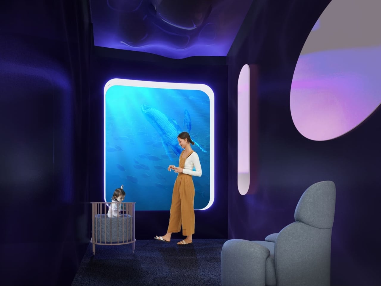
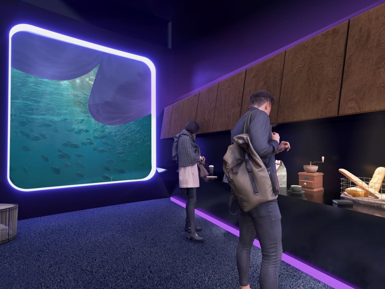
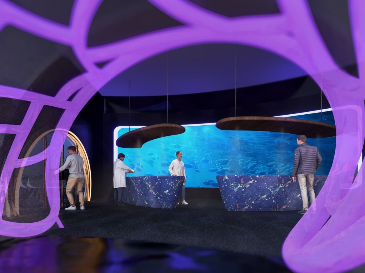
The interior language carries this through every zone of the building. The reception lobby, viewed through an oversized organic lattice structure that reads like coral or a cross-section of a neural network, features terrazzo-style desks in deep ocean blue and warm wooden disc pendants floating overhead. A café break area has a single rounded square window framing an underwater manta ray, glowing white against dark walls. A mother’s room has the same window format, this time showing a humpback whale drifting slowly past, turning what could have been a purely functional space into something quietly meditative.

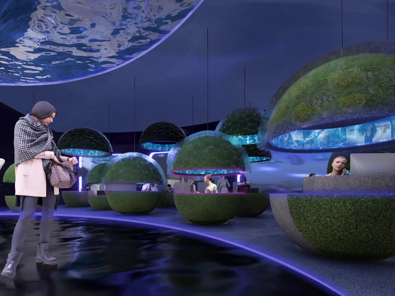
The workspace pods are where the concept gets most sculptural. Spherical forms covered in live moss float through an open floor plan, each one glowing from a lit band around its middle, like a planet seen from space. Workers tuck themselves inside. The ceiling above them ripples with projected water. It feels less like an office and more like an ecosystem you happen to work inside.

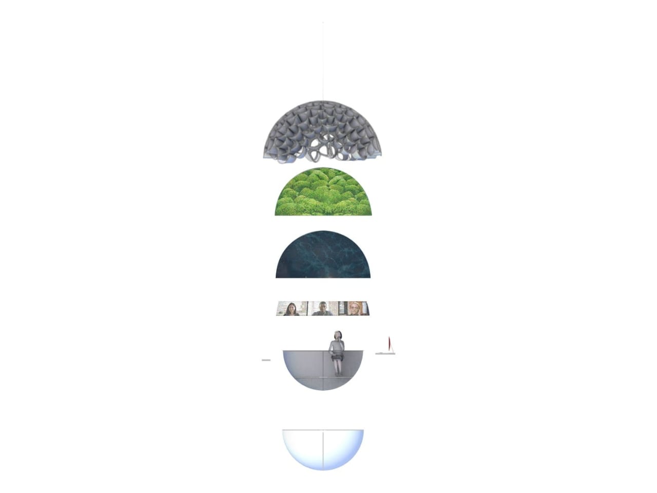
What I find most compelling is the section diagram the designers included. Stripped down to its basic geometry, the building reads as a stacked series of layers: a textured structural dome at the top, a living green layer beneath it, a dark water layer below that, and then human occupation at the base. It’s a quietly radical idea. The building isn’t sustainable because it has a green roof or offsets its emissions. It’s sustainable because it’s organized around natural systems at a structural level, with heat, water, and living material all functioning together as a closed loop.

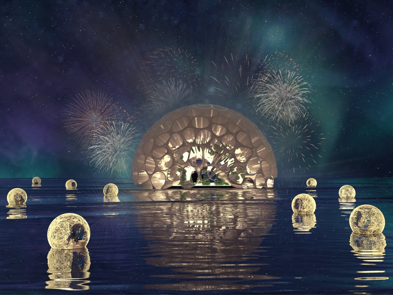
The exterior pulls all of it together. A large dome structure sits directly on water, its skin formed from interlocking bubble-like cells that glow from within. Smaller spherical pods float on the surface around it. Looking at it under a sky of northern lights, it reads more like a research station on another planet than a corporate headquarters.

That’s not a criticism. It’s a sign that Lia and Michell Hur weren’t trying to design a building that looks sustainable. They were trying to design one that makes you feel what sustainability could actually mean, and that’s a much harder thing to do. They pulled it off.

The post What If Google’s Server Heat Became Its Most Prominent Design Feature? first appeared on Yanko Design.

The $599 MacBook Neo is Here: Is it Actually Better Than a MacBook Air?

The $599 MacBook Neo is Here: Is it Actually Better Than a MacBook Air? MacBook Neo

Choosing between the MacBook Neo and the MacBook Air models (M1, M3 and M5) requires careful consideration of your specific needs and priorities. The MacBook Neo, starting at $599 ($499 for students), is Apple’s most affordable laptop, offering a lightweight aluminum design and exceptional portability. In contrast, the MacBook Air lineup delivers superior performance, advanced […]

The post The $599 MacBook Neo is Here: Is it Actually Better Than a MacBook Air? appeared first on Geeky Gadgets.

Posted in Uncategorized

How LangSmith Fleet Manages AI Agents with Memory & User Approvals

How LangSmith Fleet Manages AI Agents with Memory & User Approvals Slack and Gmail integration flow showing an agent reading messages and drafting responses for user approval.

LangChain introduces LangSmith Fleet, a platform for creating, deploying and managing AI agents tailored to business needs. At its core, LangSmith Fleet employs two distinct agent types: Assistants, which adapt to individual user credentials for personalized interactions and Claws, which use fixed credentials to perform standardized tasks. This structure enables businesses to balance flexibility and […]

The post How LangSmith Fleet Manages AI Agents with Memory & User Approvals appeared first on Geeky Gadgets.

Posted in Uncategorized

iPhone Security Alert: Apple Patches Major WebKit Flaw in iOS 26.3.1 (a)

iPhone Security Alert: Apple Patches Major WebKit Flaw in iOS 26.3.1 (a) Featured image for iOS 26.3.1(a) Released - DO THIS Immediately !

Apple has officially released iOS 26.3.1(a), a crucial security update aimed at addressing vulnerabilities and improving the stability of devices running iOS 26. While this is not a major version upgrade, it is an essential patch that enhances your device’s security framework and overall reliability. If you are currently using iOS 26.3 or an earlier […]

The post iPhone Security Alert: Apple Patches Major WebKit Flaw in iOS 26.3.1 (a) appeared first on Geeky Gadgets.

Posted in Uncategorized

Build an Excel Dashboard That Pulls CSV Data Without Opening Files

Build an Excel Dashboard That Pulls CSV Data Without Opening Files Excel settings panel showing locale options for dates and number formats when importing regional CSV files.

Working with CSV files in Excel often involves repetitive imports and manual updates, which can be both time-consuming and error-prone. Leila Gharani introduces a practical solution using Excel’s `IMPORTCSV` function, which allows you to dynamically link CSV files directly into your workbook. For example, you can set up dropdown menus to switch between files without […]

The post Build an Excel Dashboard That Pulls CSV Data Without Opening Files appeared first on Geeky Gadgets.

Posted in Uncategorized

The Samsung Galaxy Watch 9’s Secret Weapon: 30% Better Efficiency with Snapdragon Elite

The Samsung Galaxy Watch 9’s Secret Weapon: 30% Better Efficiency with Snapdragon Elite Close view of a Samsung Galaxy Watch showing battery specs, highlighting the rumored 435mAh rated capacity increase.

Samsung is poised to redefine the wearable technology landscape with two highly anticipated devices: the Galaxy Watch 9 and its rumored AI-powered smart glasses. These devices aim to deliver a seamless blend of advanced functionality, sleek design, and improved battery performance. By focusing on hardware efficiency and innovative AI integration, Samsung is positioning itself as […]

The post The Samsung Galaxy Watch 9’s Secret Weapon: 30% Better Efficiency with Snapdragon Elite appeared first on Geeky Gadgets.

Posted in Uncategorized

What Donut Labs Data Shows on Solid-State Battery Energy Density

What Donut Labs Data Shows on Solid-State Battery Energy Density Graphic explains the 400 Wh/kg claim and where losses can occur from packaging and safety margins.

Donut Labs has unveiled what it claims to be the world’s first solid-state battery, promising significant advancements in energy storage with an energy density of 400 Wh/kg, far surpassing the typical 250–300 Wh/kg range of conventional lithium-ion batteries. Ziroth examines the chemistry behind this breakthrough, highlighting the absence of detailed voltage profiles, a key metric […]

The post What Donut Labs Data Shows on Solid-State Battery Energy Density appeared first on Geeky Gadgets.

Posted in Uncategorized

XPPen’s 4K Display Fixes the One Thing That Ruins Digital Art: Color

Finishing a piece of digital artwork only to discover that the colors on your client’s monitor look nothing like what you spent hours calibrating is a particular kind of frustration. It’s not dramatic. It just quietly drains trust in your tools and your process. The XPPen Artist Pro 27 (Gen 2) is a drawing display built around the premise that color accuracy, at a professional level, should be the starting point rather than an expensive add-on you negotiate into a purchase.

At 26.9 inches with a 3840×2160 resolution and a 120Hz refresh rate, the display gives designers, artists, and digital content creators sufficient room to work at a scale that feels genuinely close to physical media. That kind of canvas matters when you’re sketching compositions or reviewing color grading frame-by-frame on an animation timeline, where pixel-level decisions compound quickly, and a cramped workspace turns into a liability.

Designer: XPPen

The color story is where XPPen is making the most aggressive claims. The 10-bit panel covers 99% of Adobe RGB and sRGB, and 97% of Display P3, all with a Delta E of less than 1, independently verified through Calman. For designers working across print, digital, and video deliverables simultaneously, that breadth matters more than any single gamut number. One device that holds accurate across three standards removes a class of color-management guesswork from the workflow entirely.

Getting there does require some setup. Activating the full 10-bit depth means going into display settings manually, and advanced color calibration through the bundled XPPen ColorMaster software requires a Calman colorimeter purchased separately. The hardware is capable; the software is ready. What XPPen doesn’t hand you automatically is the calibrated result itself, so buyers expecting out-of-the-box perfection should factor in that extra step and cost.

The display surface uses a new-gen luminous etched glass panel 0.7 mm thick, which XPPen claims offers 30% more light transmittance than its predecessor while keeping the anti-glare, paper-like texture. That texture is what keeps pen-on-glass from feeling clinical, and the thinner glass reduces the gap between pen tip and cursor, a physical detail that sounds minor until you’ve spent a session fighting it. Brightness is 350 nit, which positions this squarely as a studio tool.

Two styli ship with the unit: the X3 Pro Smart Chip Stylus with a standard silicone grip, and the narrower X3 Pro Slim Stylus, tapered at 26° to keep the tip in view during detailed line work. Both operate at 16,384 pressure levels with 3g activation force and 60-degree tilt sensitivity. A wireless shortcut remote with a 10 × 4 grid of programmable keys and a dial is also included, covering most of what keeps artists reaching for the keyboard mid-session.

The X-Touch multitouch system handles ten simultaneous touch points with native gesture support on Windows and macOS, customizable touch zones, and a floating shortcut menu accessible by gesture or button. Pen-priority mode suppresses accidental inputs while drawing. That last feature is the one that separates a touch-enabled display that genuinely fits a drawing workflow from one that just adds friction to it.

The post XPPen’s 4K Display Fixes the One Thing That Ruins Digital Art: Color first appeared on Yanko Design.

Samsung Finally Did It: The Galaxy Z Fold 8’s 5,000mAh Battery Revealed

Samsung Finally Did It: The Galaxy Z Fold 8’s 5,000mAh Battery Revealed Hand holding a compact clamshell foldable with a slimmer hinge area representing the Galaxy Z Flip 8 design push.

The Samsung Galaxy Z Fold 8 is poised to reshape the foldable smartphone landscape with notable advancements in design, battery performance and overall usability. By addressing the limitations of its predecessor, the Z Fold 7, Samsung aims to strengthen its position as a leader in this rapidly growing segment. With competition heating up, particularly with […]

The post Samsung Finally Did It: The Galaxy Z Fold 8’s 5,000mAh Battery Revealed appeared first on Geeky Gadgets.

Posted in Uncategorized