This $1,500 Korean Chair Is Built More Like a House Than a Couch

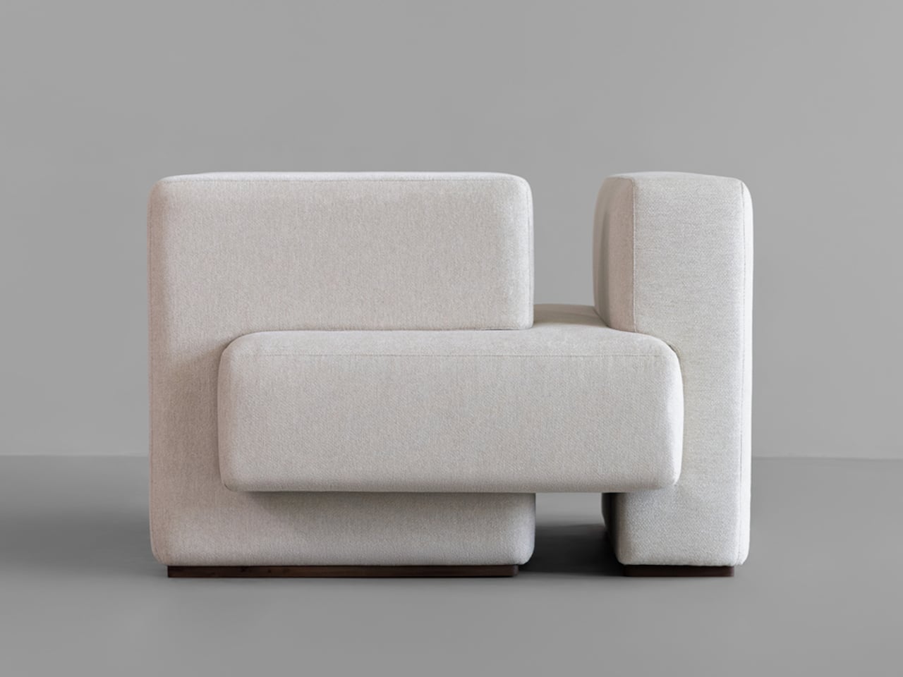
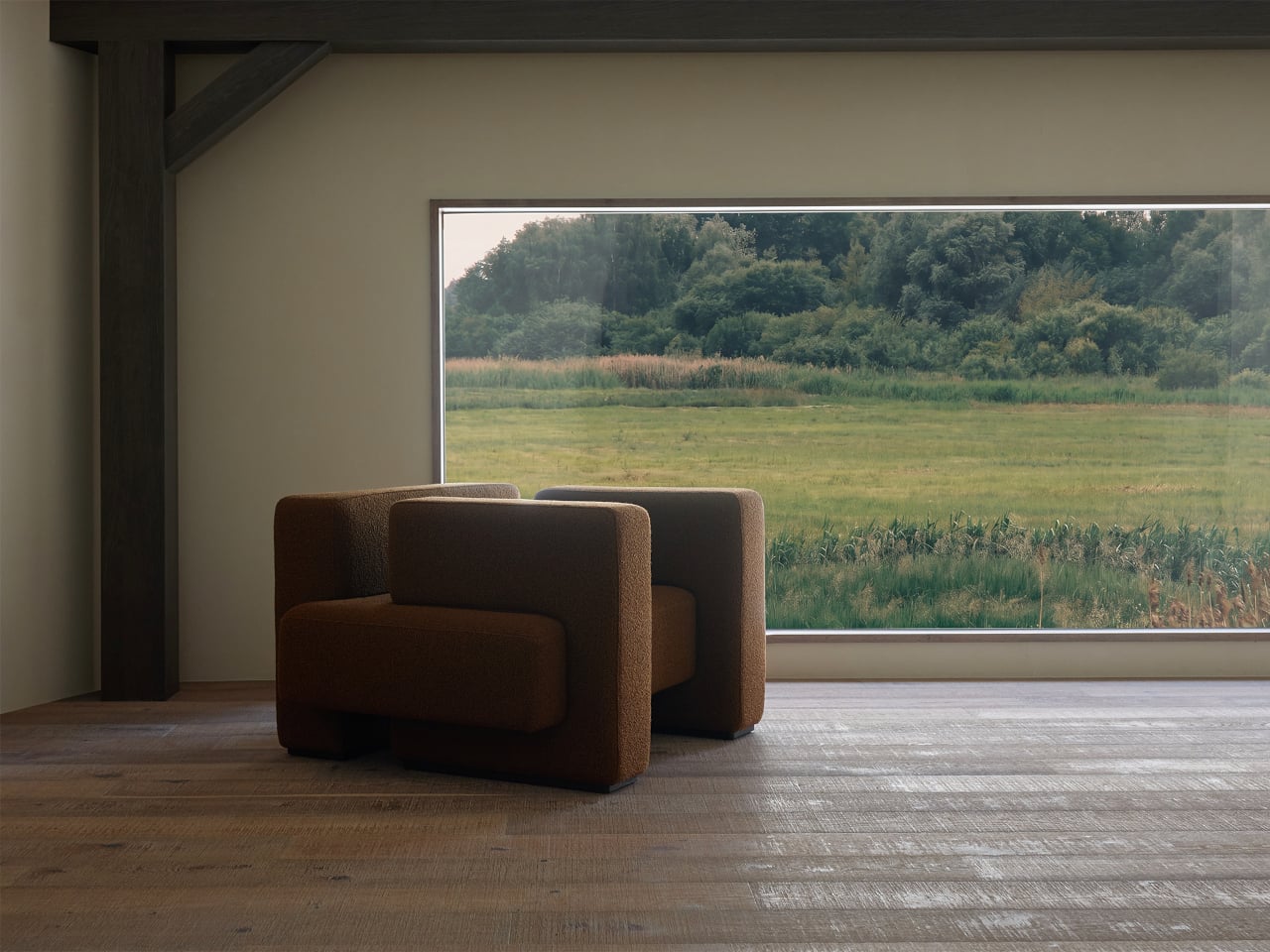
A sofa usually hides its structure beneath cushions, leaving you to think about it only when something creaks. Haesi’s Gyeolgu one-seater brings that structure into the conversation, borrowing the logic of traditional Korean hanok construction for an upholstered chair. Its seat, backrest, and arms meet as distinct volumes, so the furniture feels assembled rather than molded into one anonymous cushion.

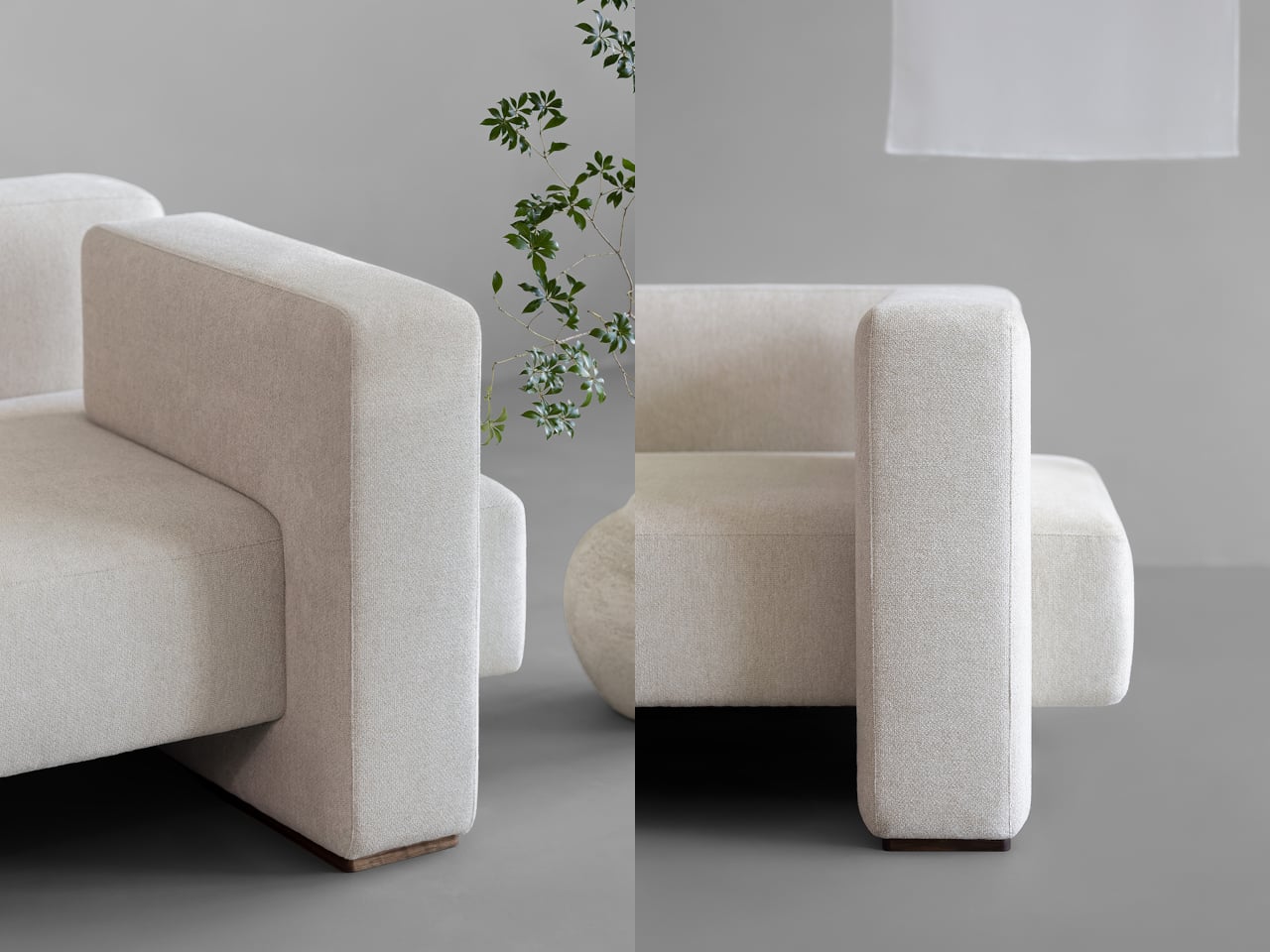
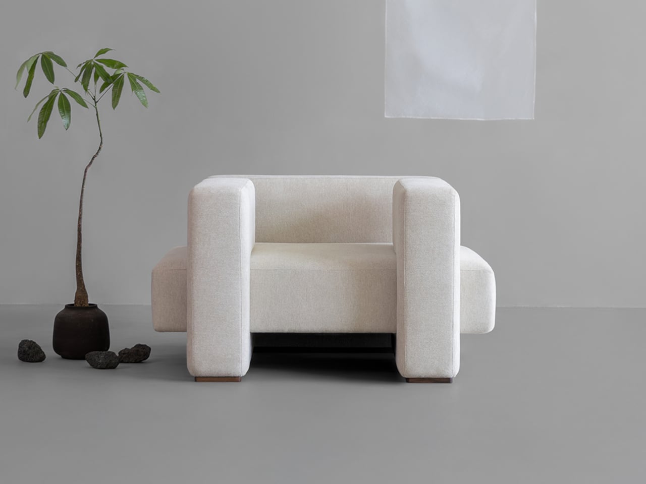
The connection to architecture isn’t about putting a miniature house in your living room. Hanok buildings rely on parts meeting with care, and Gyeolgu translates that relationship into thick, intersecting upholstered forms. Two upright armrests frame the seat, while the backrest completes the arrangement behind it. You can follow how each element meets the next, even though their actual construction stays beneath the fabric.

Designers: Jaewon Yeo, Byungwook Gang, Kikang Kim (GANG Studio) for Haesi
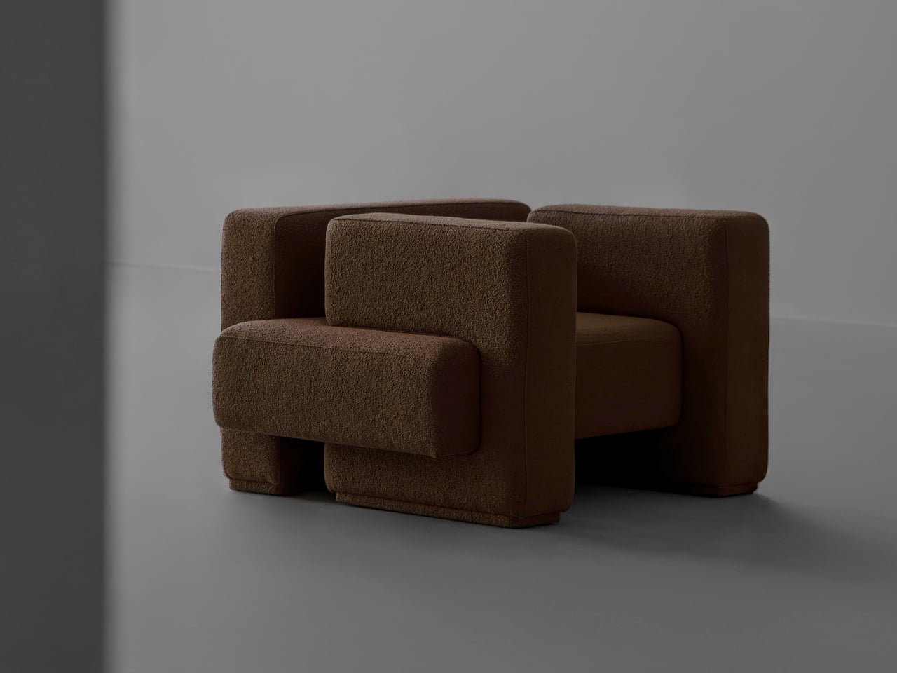
That arrangement gives the chair an unexpectedly generous presence. At about 47 inches wide and 40 inches deep, this is a seat for one that asks for space around it. Yet it rises only about 26 inches, keeping its profile low enough to avoid dominating the room. The seat sits around 16 inches from the floor, inviting you to pause rather than perch.

Set it near a window with a book, and the broad arms make a frame around your little corner of the room. They don’t promise room for a cup or replace a side table; their purpose is to support the seated arrangement and give your hands somewhere to settle. The seat projects beyond those uprights, adding a little visual tension to an otherwise quiet piece.
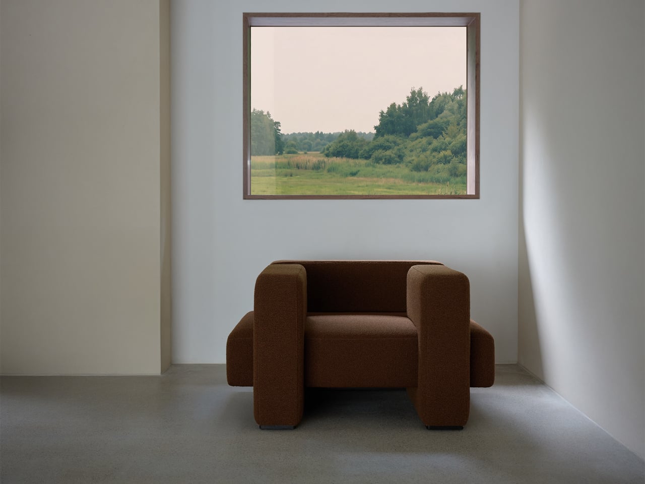
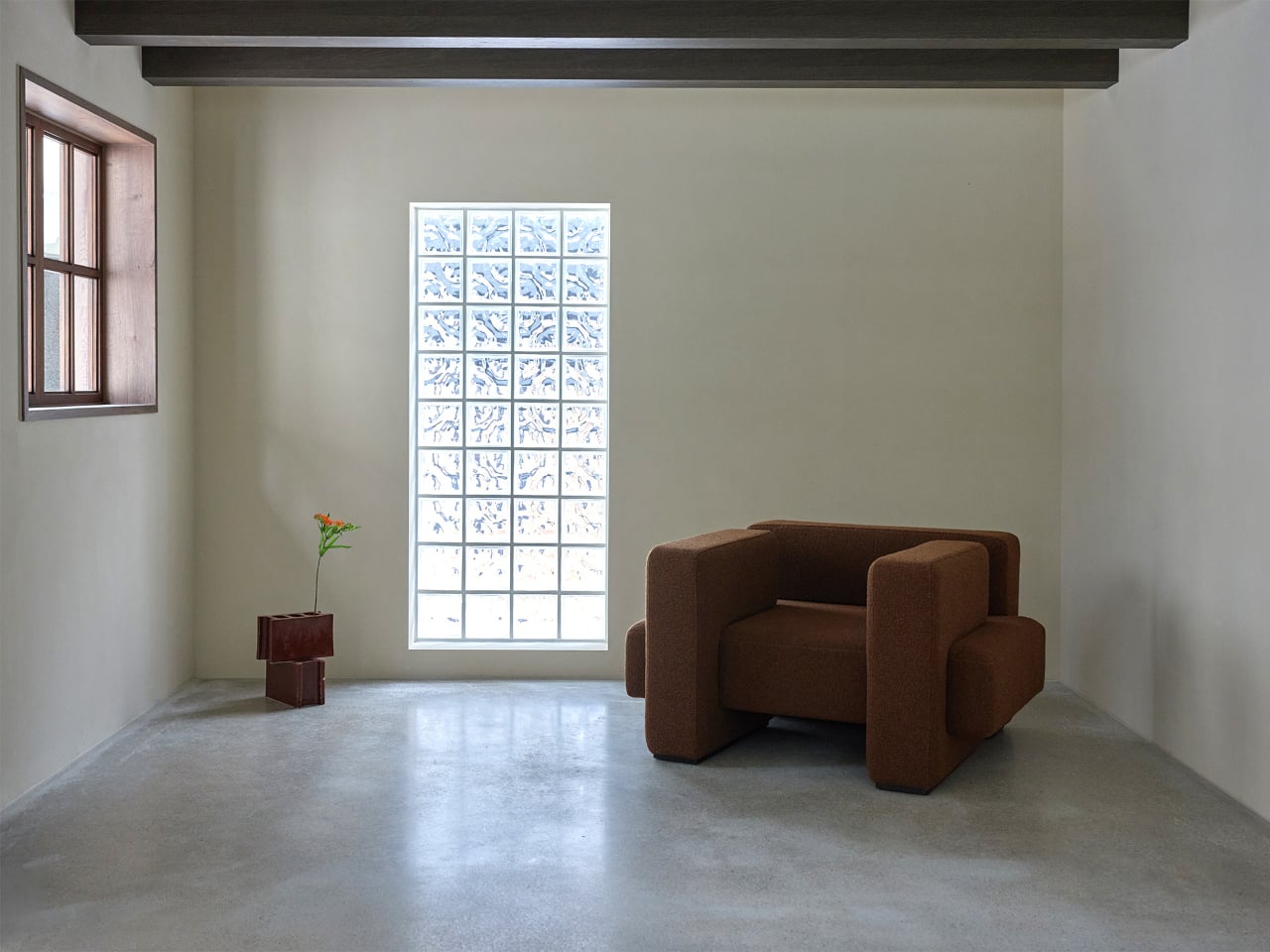
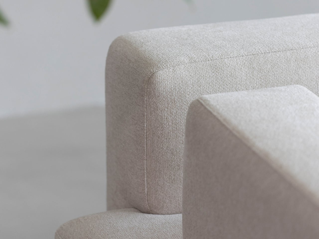
Softness keeps the architectural idea from feeling too stern. The upholstery can be ordered in functional fabric, vegan leather, or bouclé, whose nubby surface draws attention to the rounded edges. A chocolate-brown version feels especially grounded, while pale upholstery lets the forms feel lighter. Underneath, engineered wood and polyurethane foam provide structure and cushioning, rather than the exposed timber the inspiration might suggest.

Haesi’s store lists the one-seater at ₩2,100,000 (about $1,500), so it isn’t the sort of purchase you’d make on looks alone. It also takes up considerably more space than a compact accent chair, especially if that corner has to accommodate other furniture. Its low back may appeal beside a window, although anyone seeking shoulder support should sit in it before deciding where it belongs.
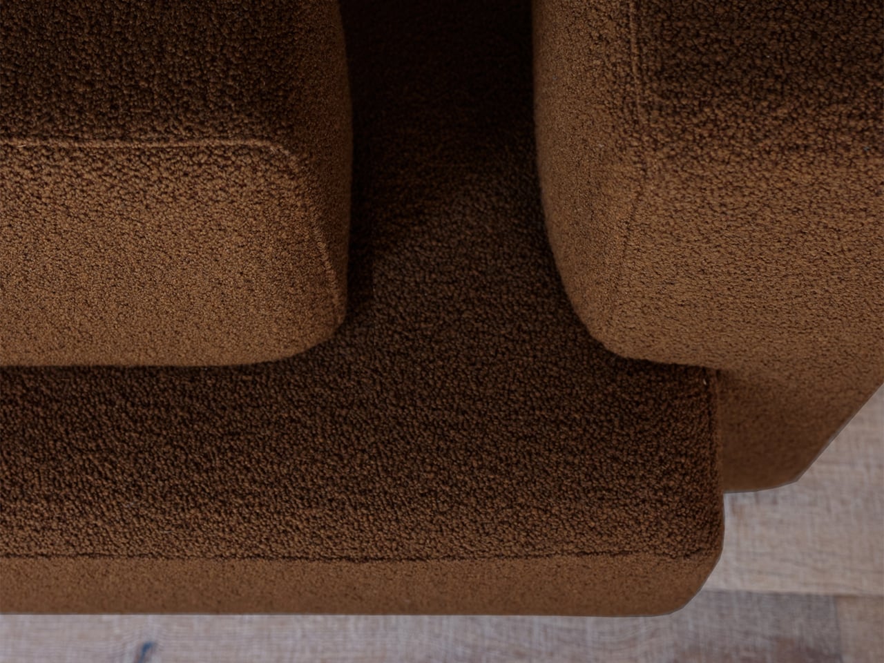
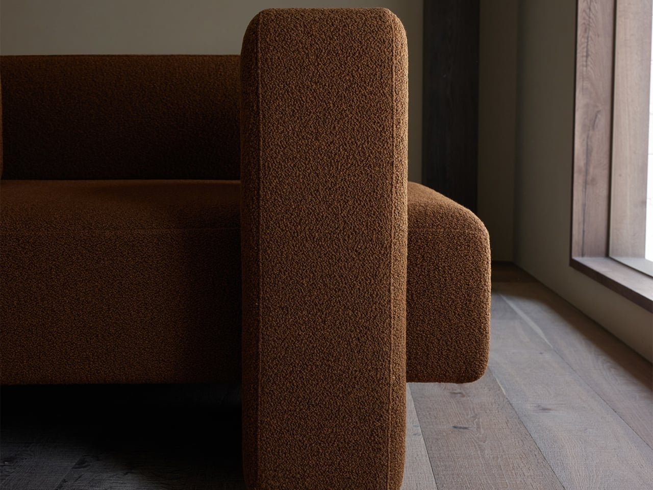
Gyeolgu works best as a quiet place with room to breathe, where its overlapping forms can give a corner its own sense of order. Sit down and the elaborate reference to architecture becomes something simpler: a seat with substantial arms, soft upholstery, and a generous footprint. The idea of parts holding together remains, but now it’s there to hold you for a while.
The post This $1,500 Korean Chair Is Built More Like a House Than a Couch first appeared on Yanko Design.
Korean Hanok Design Just Landed in a Moscow Apartment

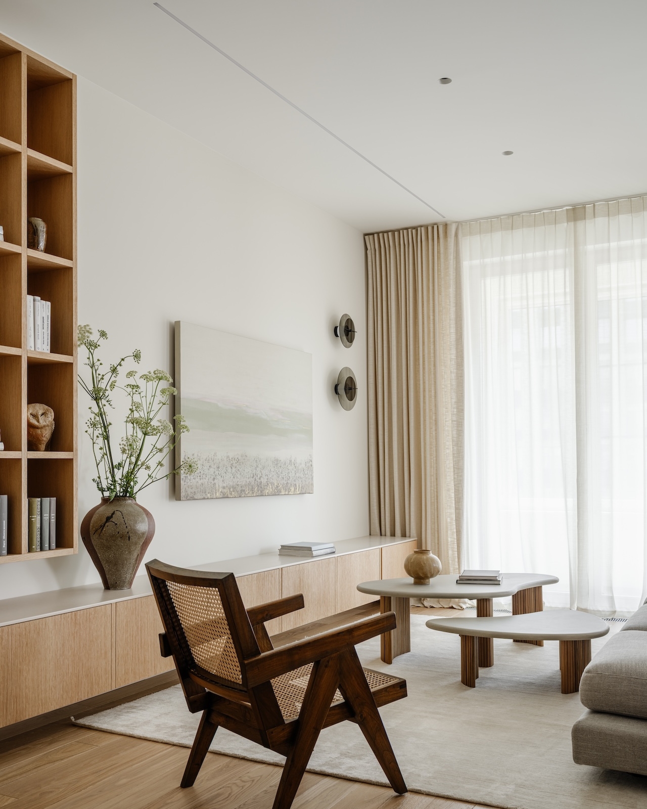
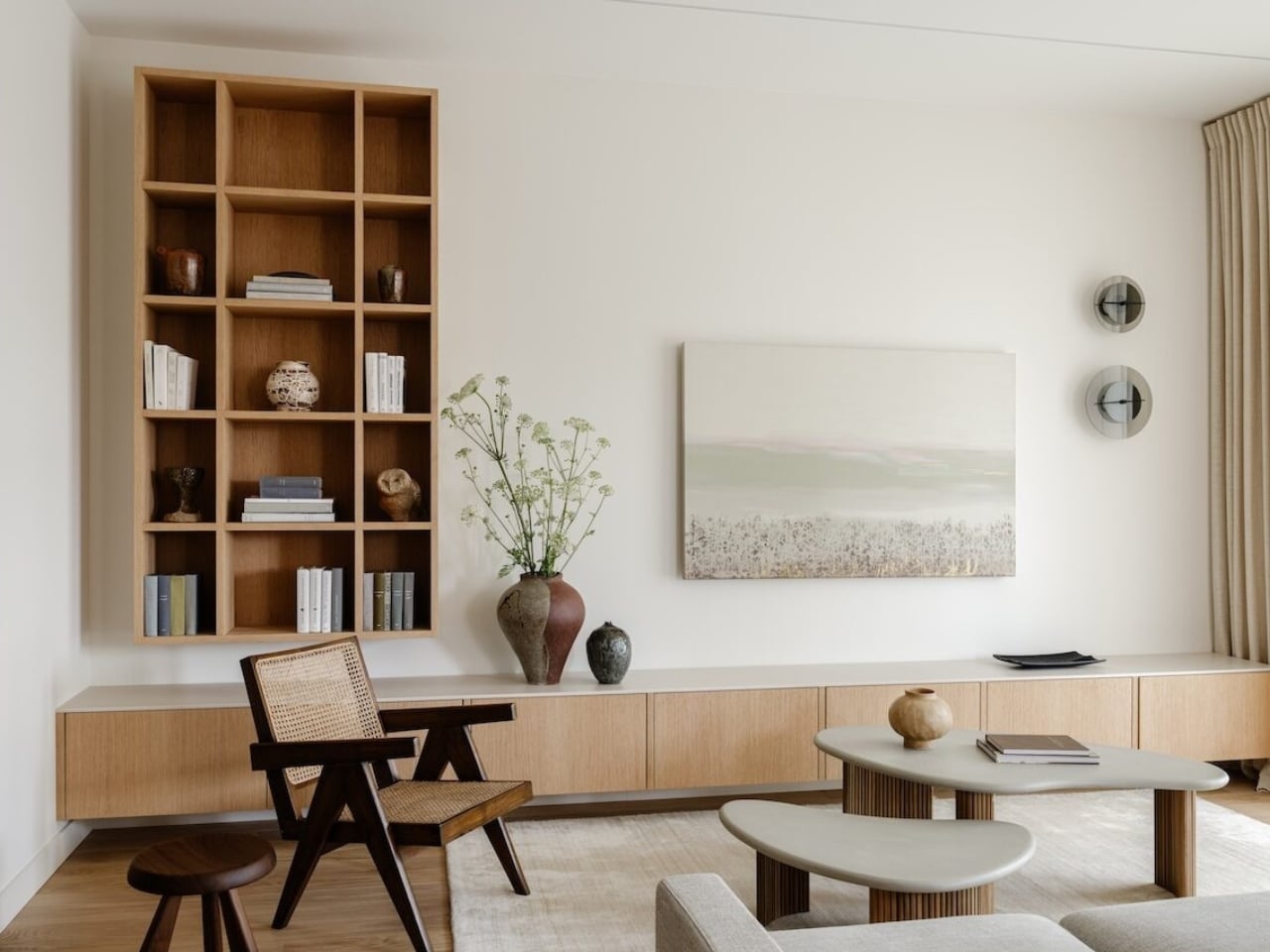
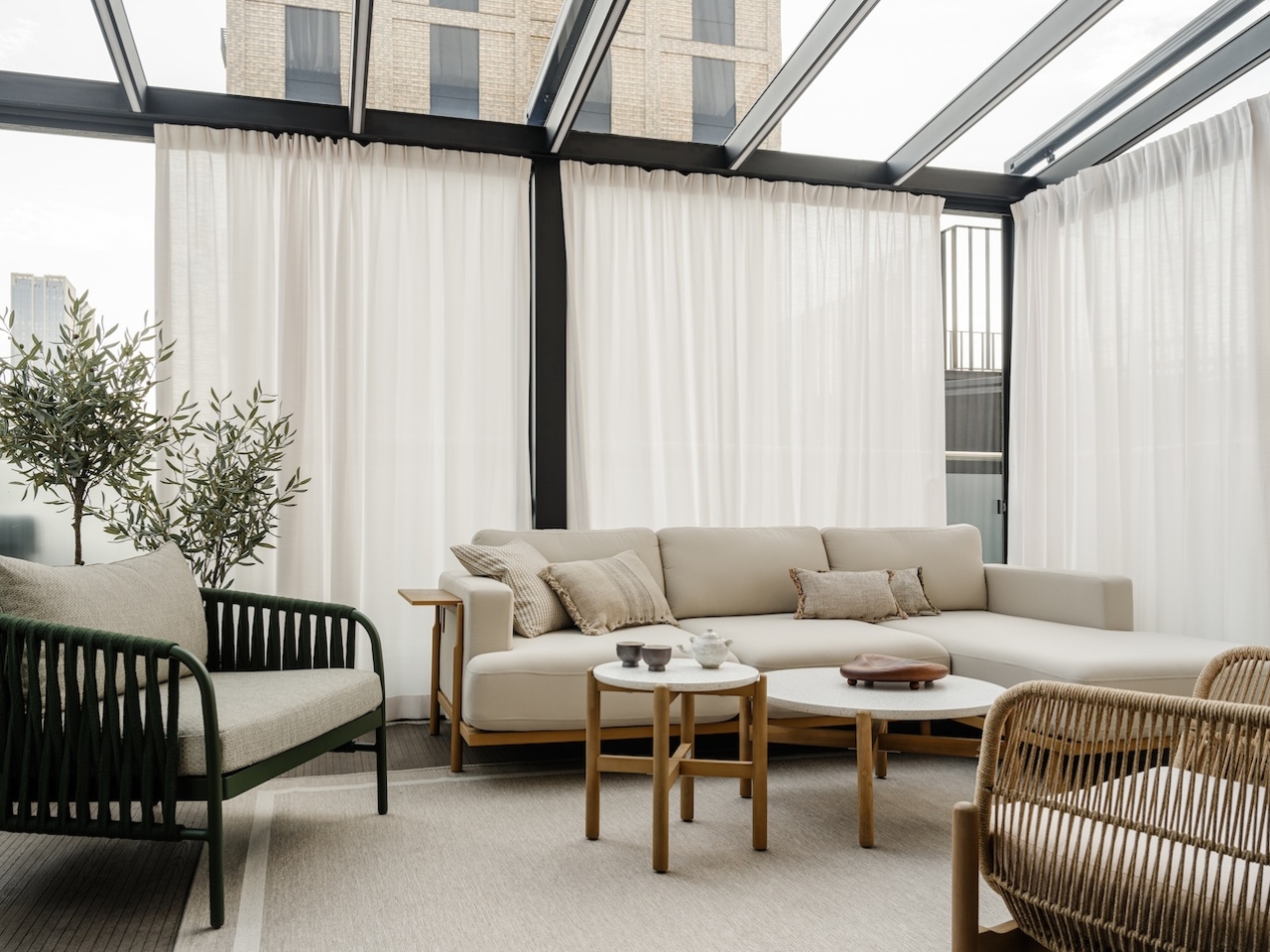
Architecture has always been one of the most honest forms of cultural expression. It tells you what a people value, how they move through space, and what kind of relationship they want with the world outside their walls. So when a Korean couple settled in Moscow and commissioned designer Inga Kordya to create their home, the brief was never simply about aesthetics. It was about belonging. The result is Residence Open, and it’s the kind of project that quietly reframes what we mean when we talk about culturally informed design.

Kordya’s starting point was the Korean hanok, the traditional dwelling that has defined Korean domestic architecture for centuries. The hanok isn’t a rigid style so much as a philosophy: rooms that flow into one another, spaces defined by natural light rather than solid walls, a constant conversation between interior and exterior. These are principles that could easily be flattened into trend-driven styling. Inga Kordya did something far more considered than that.

Designer: Inga Kordya (photos by Mikhail Loskutov)

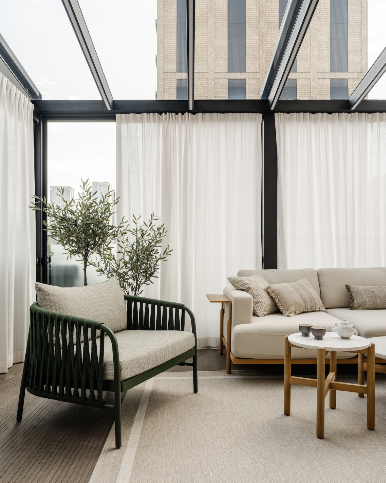
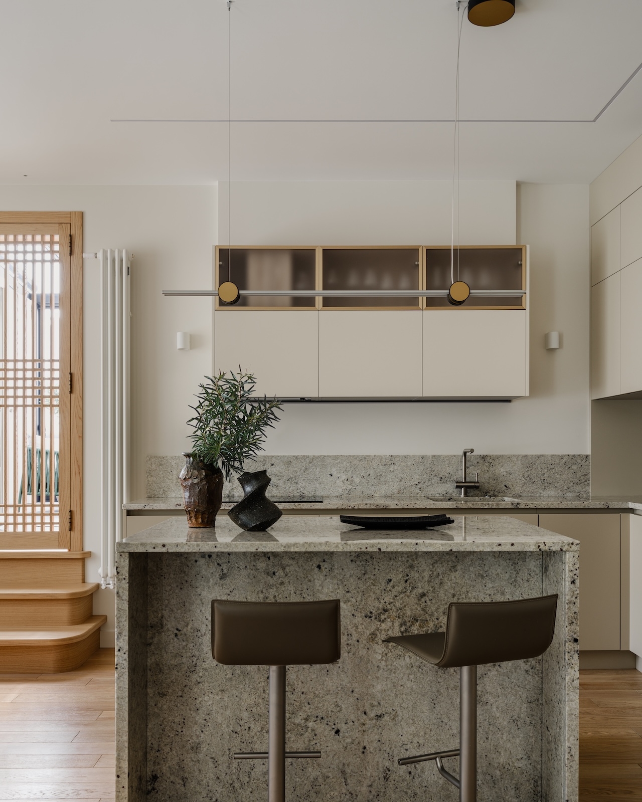
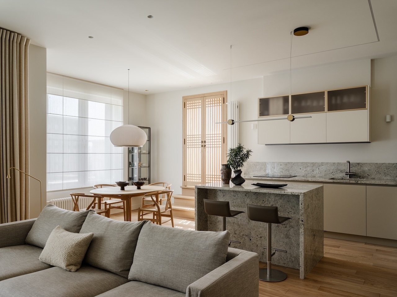
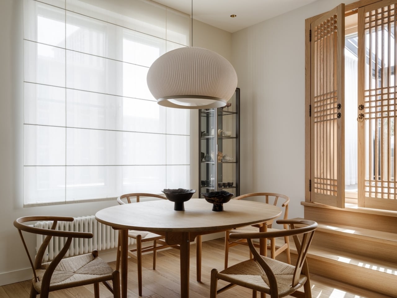
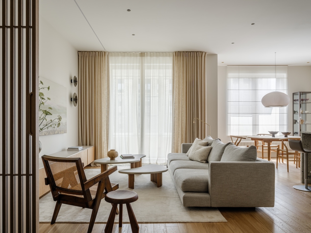
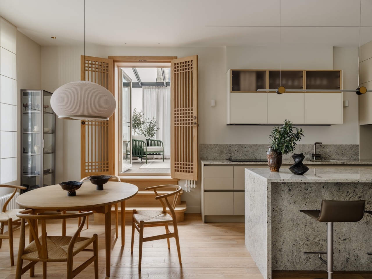
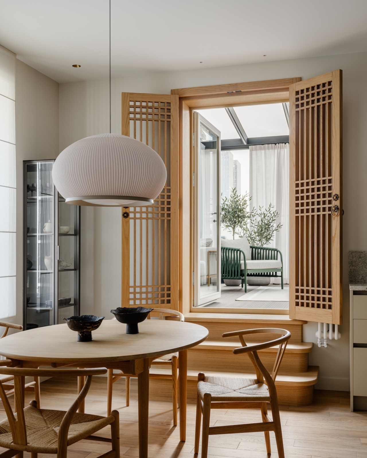
The apartment is organized around filtered light. It moves through the space the way it might move through the latticed wooden screens of a hanok in Seoul, diffused and soft, never harsh. A set of custom oak shutter doors in the living room does much of this work, drawing directly from traditional Korean door design and becoming, in the process, one of the most quietly beautiful features of the entire apartment. They don’t shout for attention. They earn it.

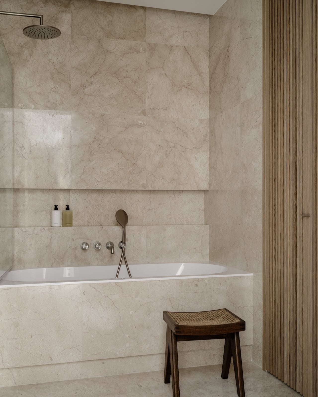
The material palette follows the same logic. Marble, granite, natural wood, brass, ceramics, linen. Nothing synthetic, nothing that flattens texture or pretends to be something it isn’t. These materials read as both internationally sophisticated and grounded in something older and more specific. They’re the kind of choices that age well, which matters enormously in a family home built for the long term.

Speaking of family, the spatial planning for the two daughters is worth pausing on. Their rooms are separated by sliding partitions that open into a shared play area, an idea borrowed directly from the hanok’s flexible interior logic. Spaces in a hanok weren’t locked into single functions. A room could be a sleeping space by night and a social one by day. Kordya applies this thinking to the children’s zone with genuine intelligence, giving the girls independence and togetherness at the same time. That’s not just good design theory. That’s good parenting, built into the walls.

The broader conversation this apartment opens up is one that design has been circling for years: how do you honour cultural heritage without turning it into decoration? Plenty of projects get this wrong. They borrow the visual language of another culture, strip it of meaning, and call it a mood. Kordya avoids this entirely by working from the inside out, from principles and values rather than surfaces. The hanok’s spatial logic, its relationship to light, its flexibility and restraint, these things translate because they were never just visual to begin with.

Context matters more than design writing usually admits. Moscow is not Seoul. The climate is different, the architectural tradition is different, the cultural references a visitor would bring to the space are different. And yet, within the apartment, you feel transported. Not in a theatrical way, not in a way that announces itself. It’s a quieter sensation, more like a shift in atmosphere. The light changes, the materials soften, and the rhythm of moving through the rooms feels deliberate and calm. That quality of calm is the hanok’s deepest gift, and Kordya has managed to carry it across an extraordinary distance.

Residence Open is a reminder that the most interesting design conversations happen at the intersection of cultures rather than within any single one. It takes confidence to root a home this deeply in a tradition that isn’t local, and clarity to translate that tradition faithfully rather than decoratively. Inga Kordya brought both. The result is a home that knows exactly where it comes from, and is completely at ease with where it ended up.

The post Korean Hanok Design Just Landed in a Moscow Apartment first appeared on Yanko Design.
This Korean Hat Was Always Meant to Be a Lamp and Finally Became One

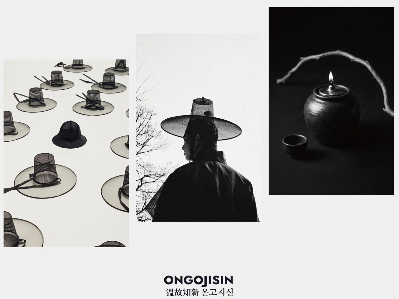
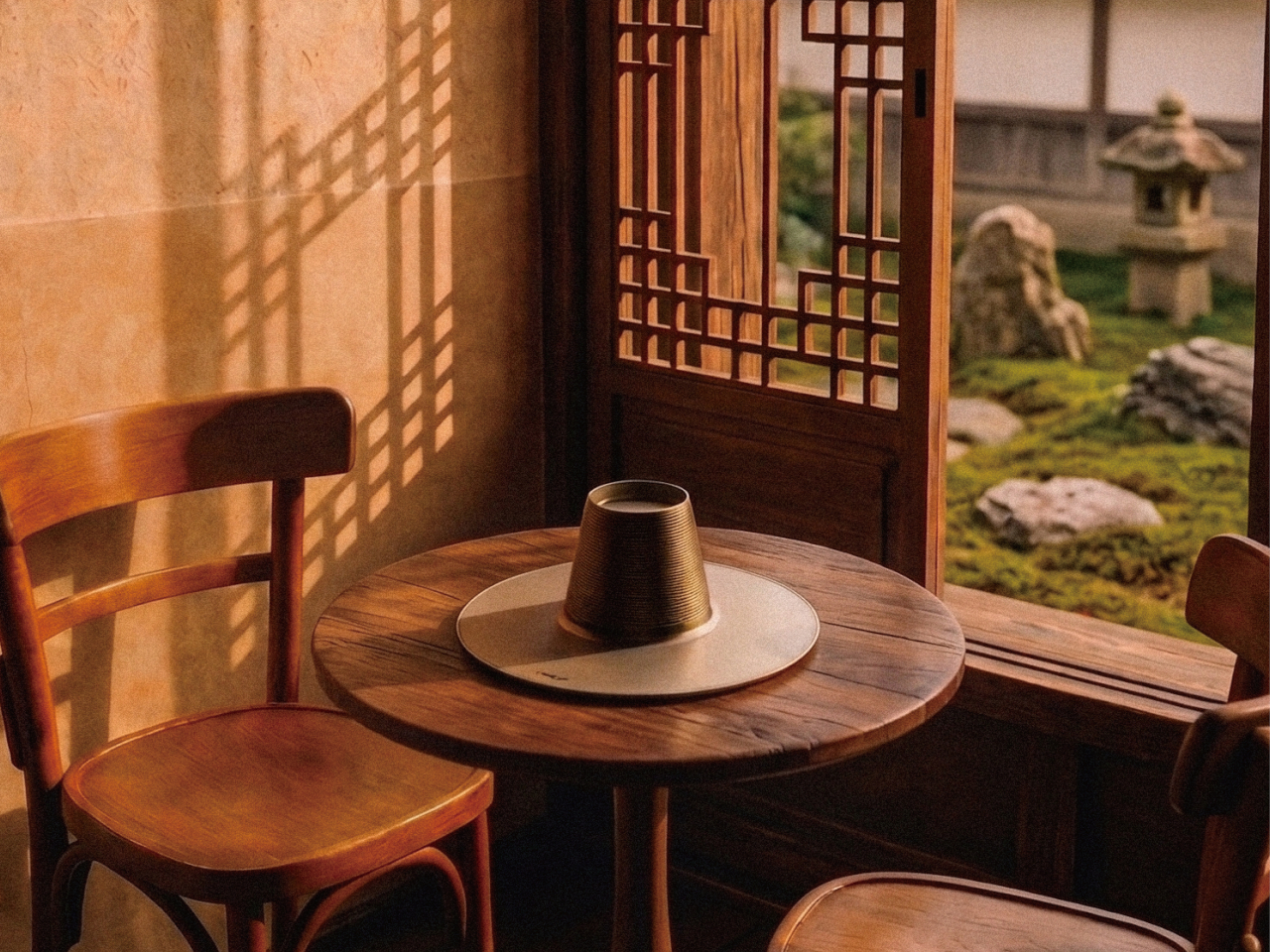
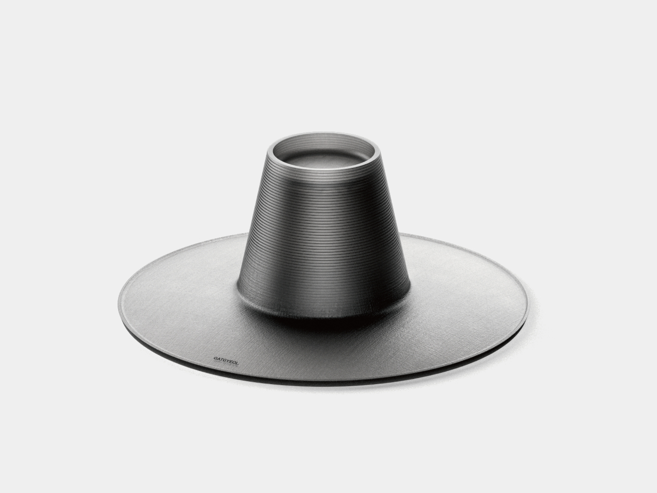
The gat is one of the more distinctive objects in Korean material culture. Woven from horsehair and bamboo and worn by scholars and noblemen during the Joseon Dynasty, it communicates social standing through form alone. Its silhouette, a tall cylindrical crown on a flat, wide brim, is immediately recognizable. What that shape might become in a different time is a question the GAT lamp was designed to answer.

The lamp takes its name and form from the gat, guided by the concept of Ongojisin, a Confucian idea about discovering new value through tradition rather than reproducing it. The central body replicates the gat’s tall crown, covered in fine horizontal ridging that echoes the woven texture of traditional horsehair. The broad disc below re-creates the brim as a gently expanding, dish-like volume.

Designer: SAQ Design

Ongojisin is usually translated as “warming the old to know the new.” The product title treats that not as a passive historical sentiment but as an active design instruction. Rather than styling a lamp to look vaguely traditional, the GAT takes the gat’s actual structure and recomposes it into a functioning lighting object, keeping every proportion and surface detail connected to a specific precedent.

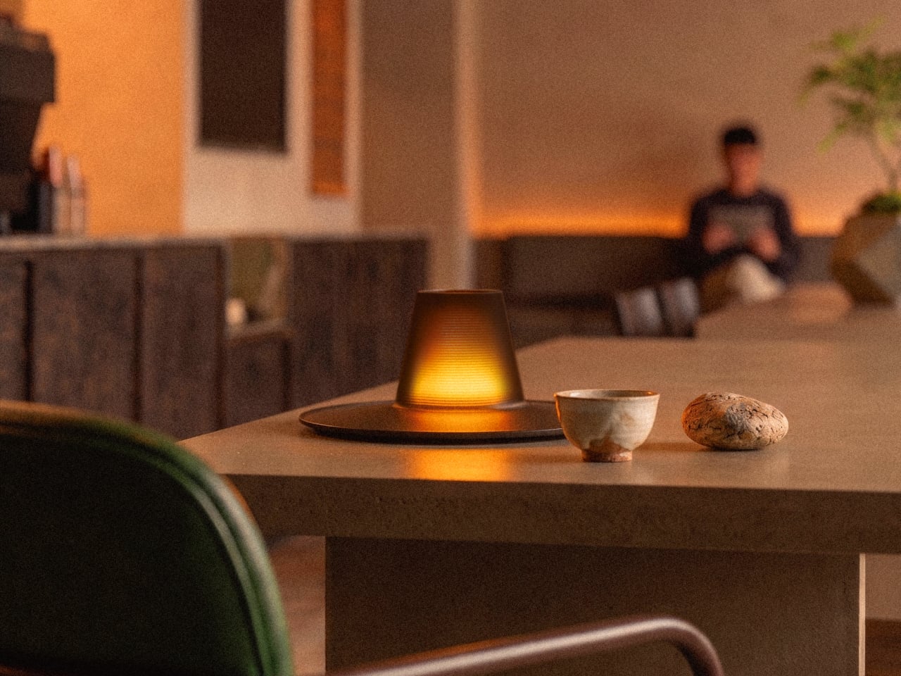
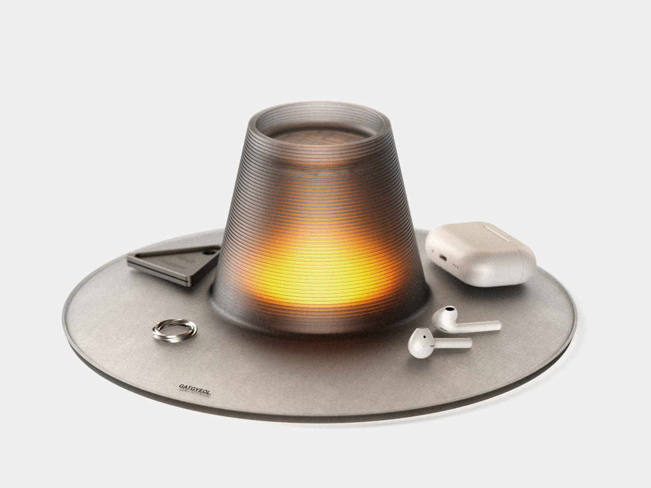
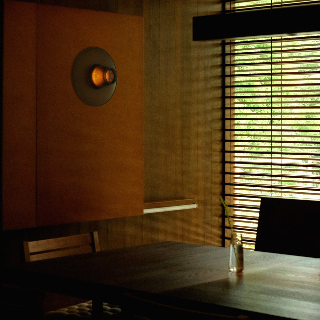
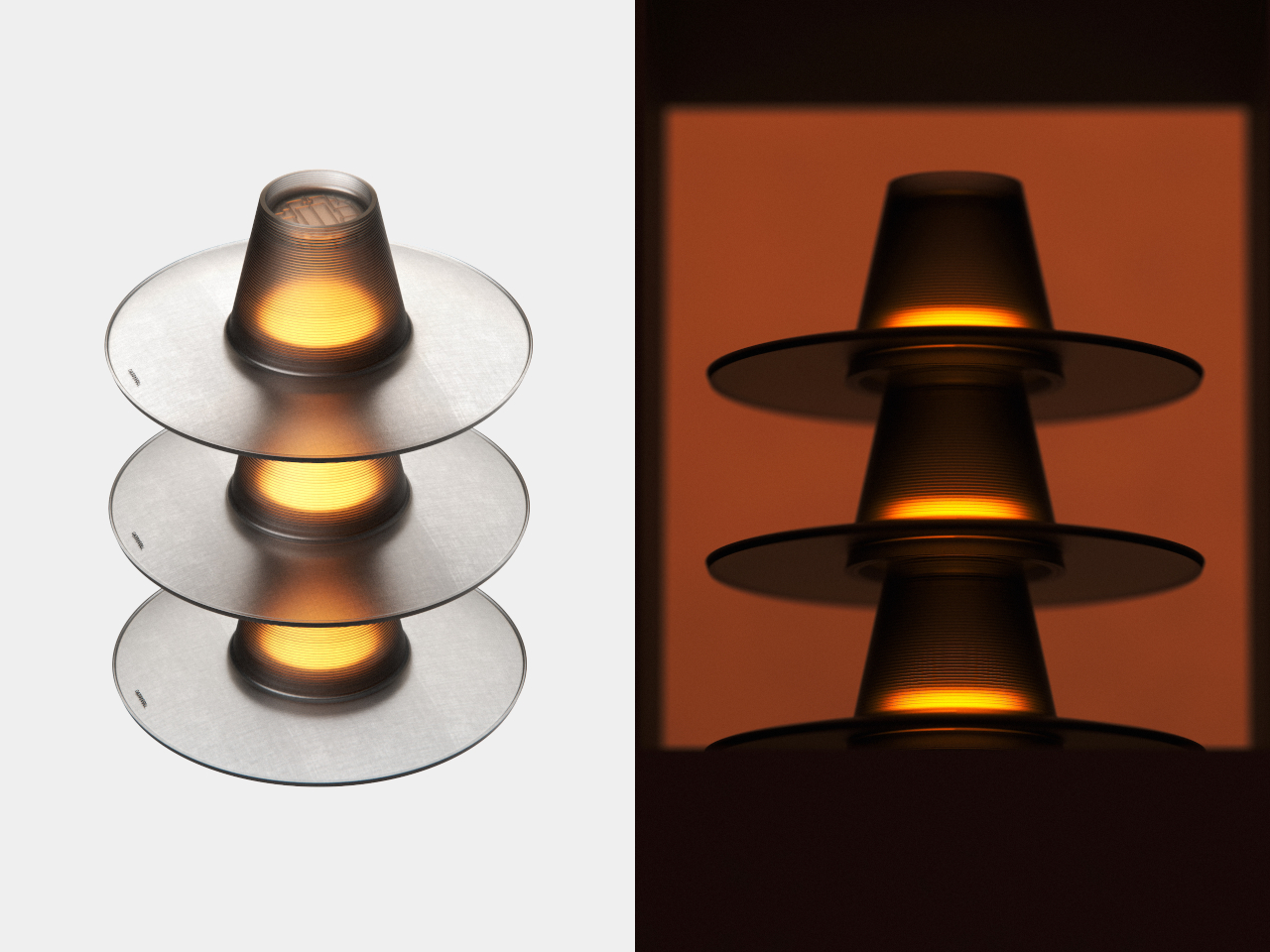
The interior of the crown carries a lattice pattern drawn from traditional Korean window screens, invisible in ordinary light. Switched on, warm amber filters through the ribbed surface much as it once moved through hanji paper, producing the same quality of diffused, indirect glow that gave candlelit rooms their particular atmosphere. Off, the lamp holds its form as a sculptural object without needing to perform.

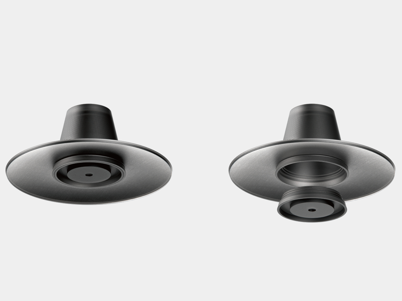
The wide disc does more than anchor the form. It serves as a tray, holding rings, earbuds, and whatever accumulates beside a lamp. Combining lighting with surface storage in a single object is uncommon in its category, and the gat’s broad brim is a natural vessel for it. An object worn historically to signal status is repurposed to hold what you put down at the end of the day.

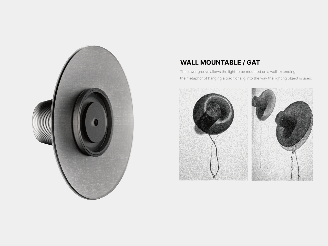
A groove on the underside allows the lamp to mount on a wall. A gat hung on a wall is a familiar image in traditional Korean households; the mounted lamp reproduces that image exactly but as a functioning light. The object becomes what the mounted gat always was: something that signals presence and considered taste in a room without requiring any explanation from its owner.

The lighting module attaches by twisting into place, mirroring how a traditional gat settled on the head: placed, rotated, secured. Multiple units can be stacked together. At no point does the design lose sight of the original. The horizontal ridging, the lattice pattern inside, the brim that becomes a tray, the groove that becomes a wall hook; each element traces back to the form it came from.

A gat was historically placed over a lamp to diffuse its flame; the hat and the light were always paired. The name for what covers a flame and the name for what sits on the head are the same word. The GAT lamp closes that loop, making the act of wearing light not a metaphor but the actual, literal function of the object.

The post This Korean Hat Was Always Meant to Be a Lamp and Finally Became One first appeared on Yanko Design.
The Obongdo Painting Inspired Set of Jars Brings The Korean Culture Into Your Kitchens

In a world where traditions serve as the foundation for contemporary innovations, the Obongdo-inspired seasoning jars stand out as a captivating example of how ancient artistry can influence modern functionality. Drawing inspiration from the illustrious Korean painting ‘Ilwol-Obongdo,’ these jars seamlessly weave together tradition, art, and practicality to create a unique and visually stunning kitchen accessory.

Designer: YoonJeong Lee

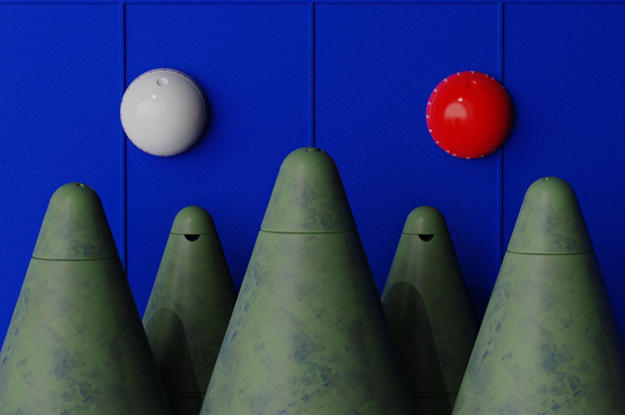
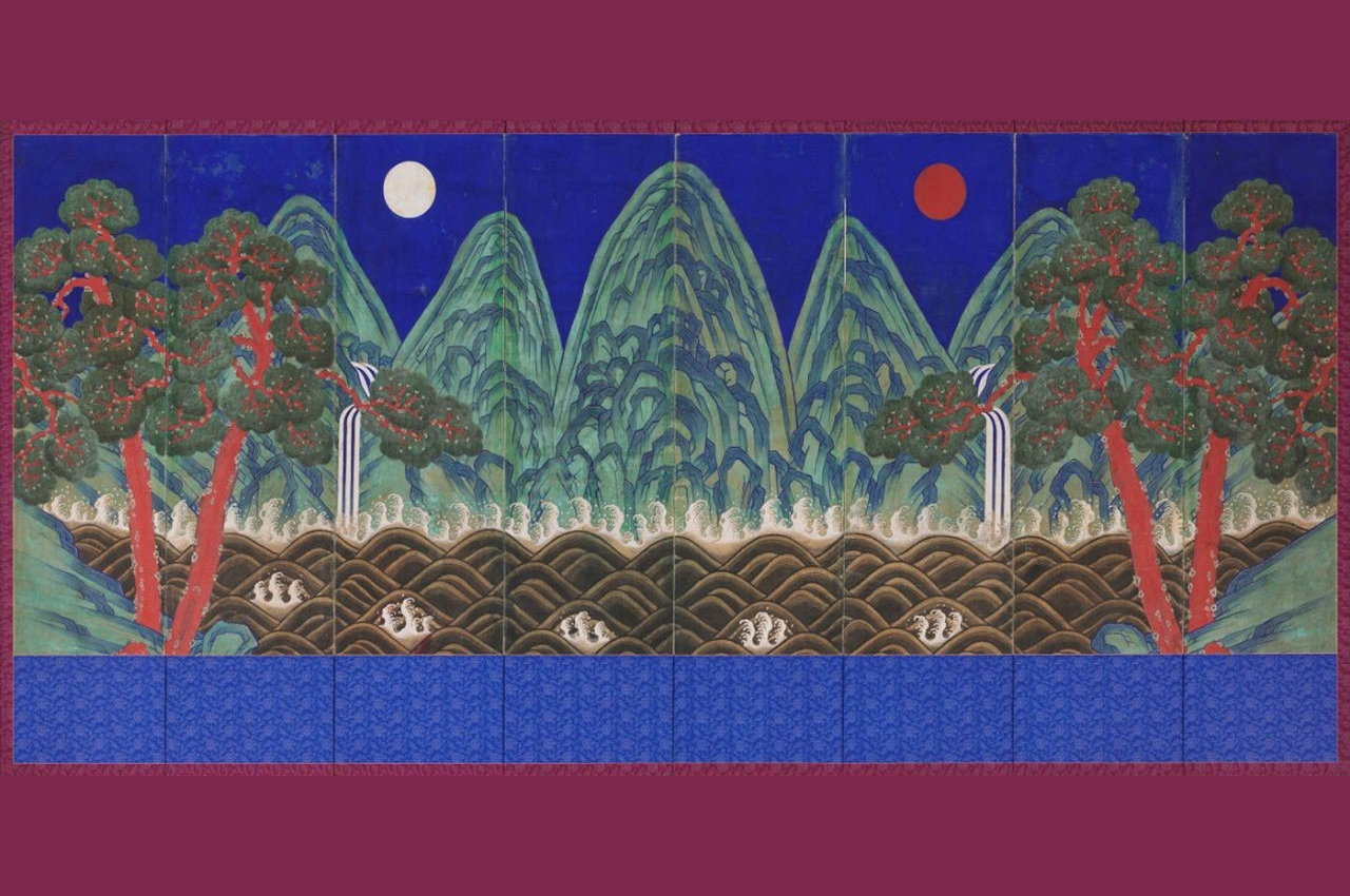
Ilwol-Obongdo, a landscape masterpiece from ancient Korea, portrays five majestic mountain peaks, the sun, the moon, and pine trees. Originally crafted as a decorative piece behind the king’s seat during the Joseon Dynasty, the painting symbolizes the ruler’s centrality in the universe and signifies the enduring legacy of the dynasty. The Obongdo seasoning jars pay homage to this rich heritage by incorporating the essence of the ancient painting into contemporary kitchenware.

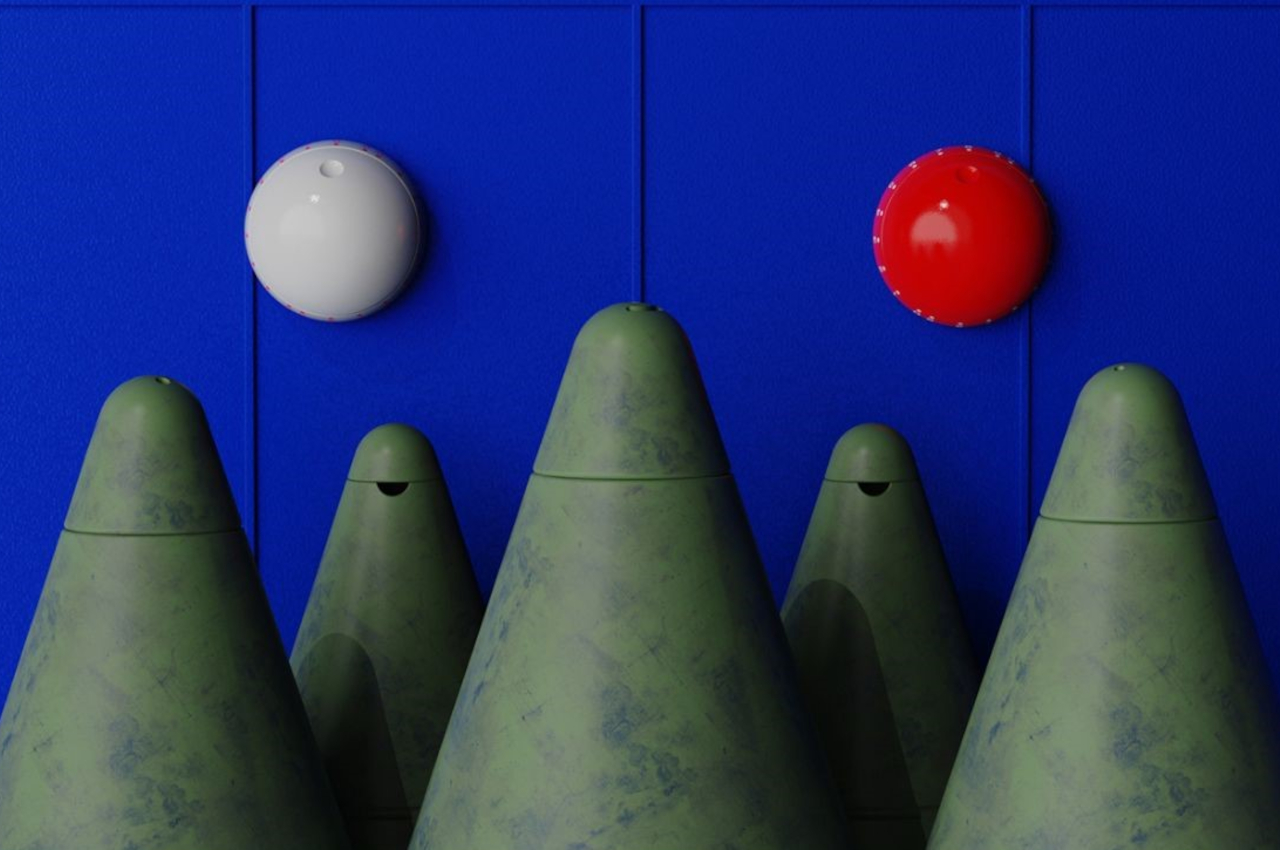
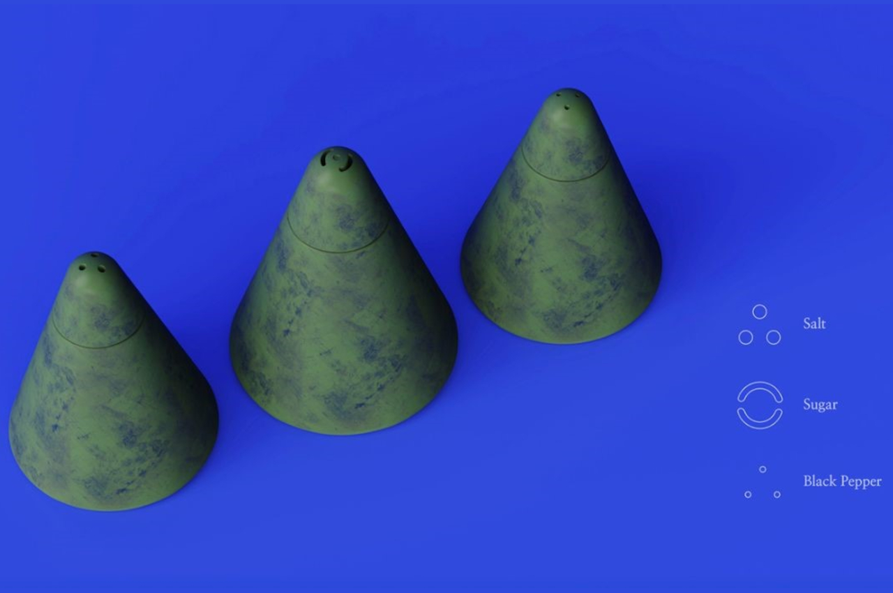
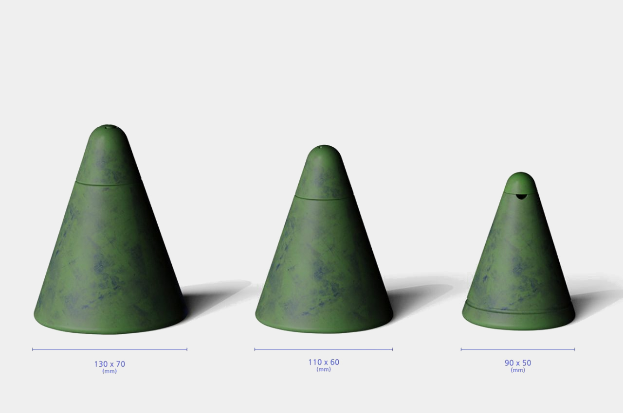
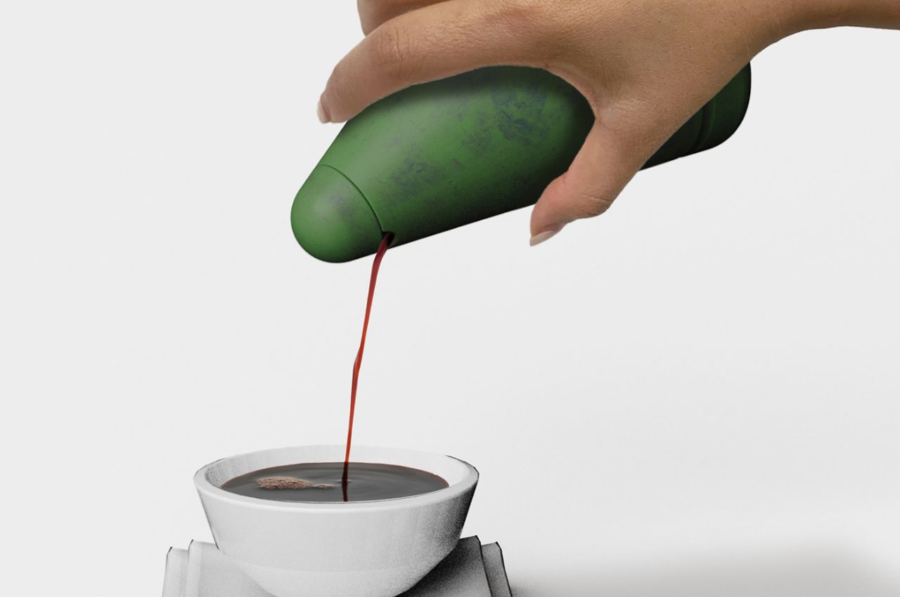
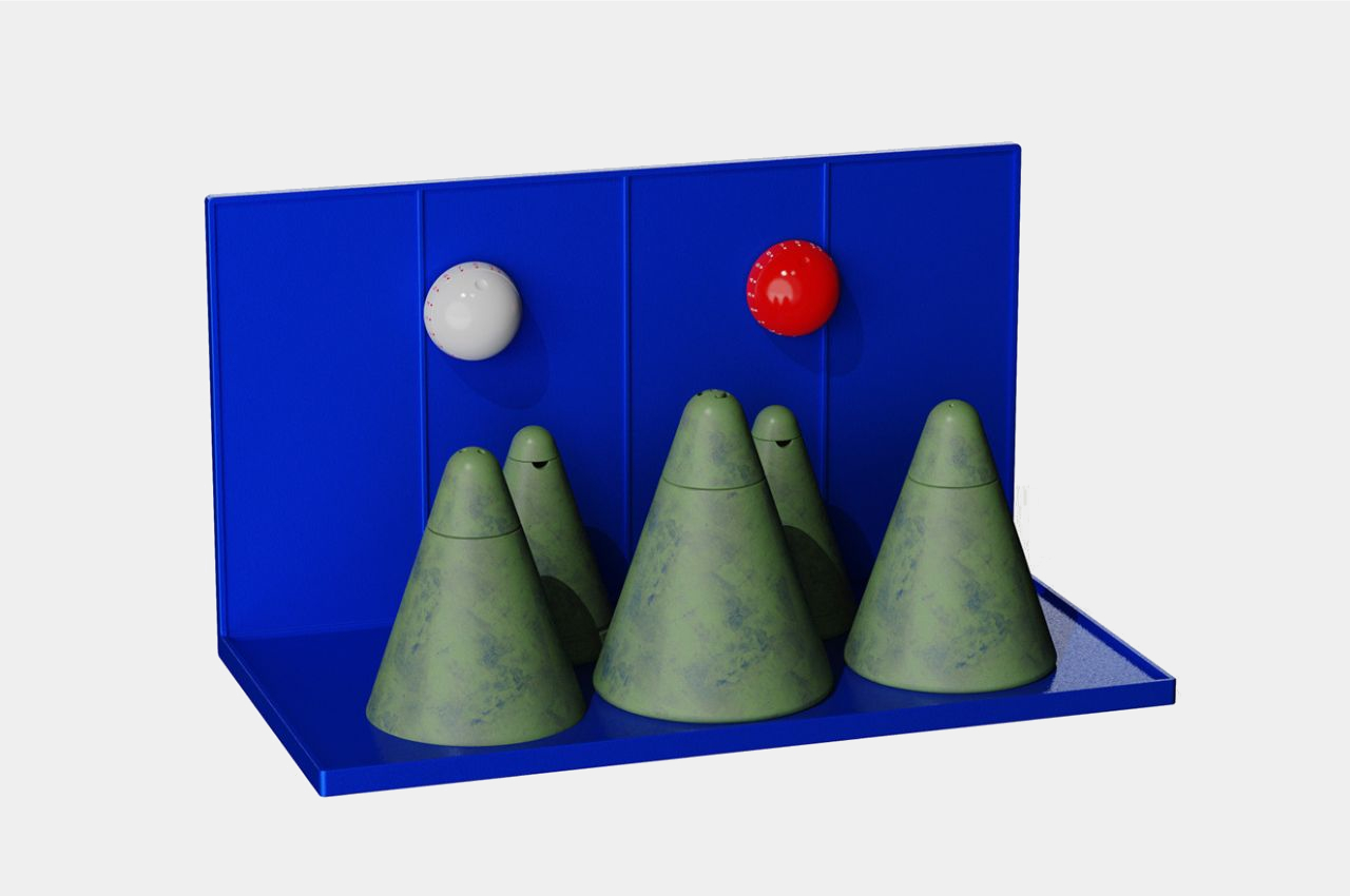
The Obongdo seasoning jars consist of a set of containers designed to hold various cooking spices and a pair of cooking timers, inspired by the ‘sun’ and ‘moon’ elements in the painting. The jars, resembling mountain peaks, come in three different sizes, catering to the varied requirements of different ingredients. This not only adds a touch of artistry to the kitchen but also ensures practicality by accommodating the diverse needs of culinary enthusiasts.

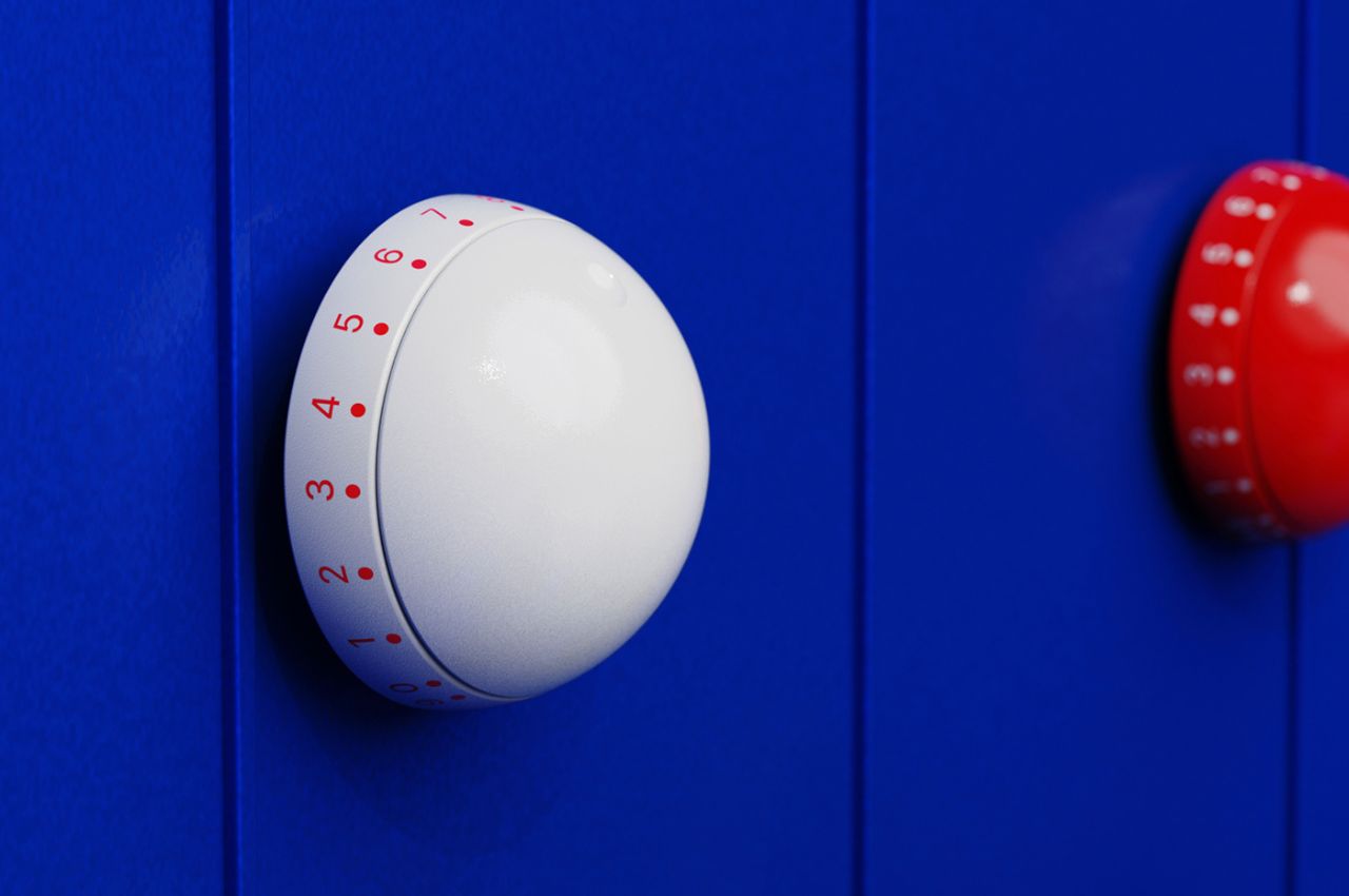
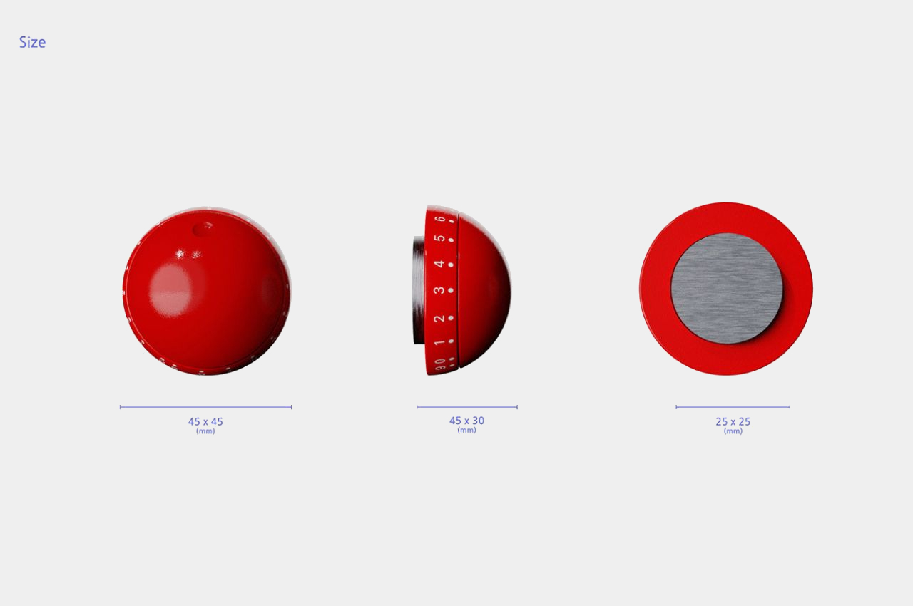
The ‘sun’ and ‘moon’ cooking timers, adorned in two distinct colors, serve both a functional and symbolic purpose. Beyond their time-keeping utility, they bring forth the significance of the celestial elements in the original painting, connecting the user to the cultural roots of the inspiration. These timers facilitate precision in cooking, allowing users to keep track of their recipes effortlessly.

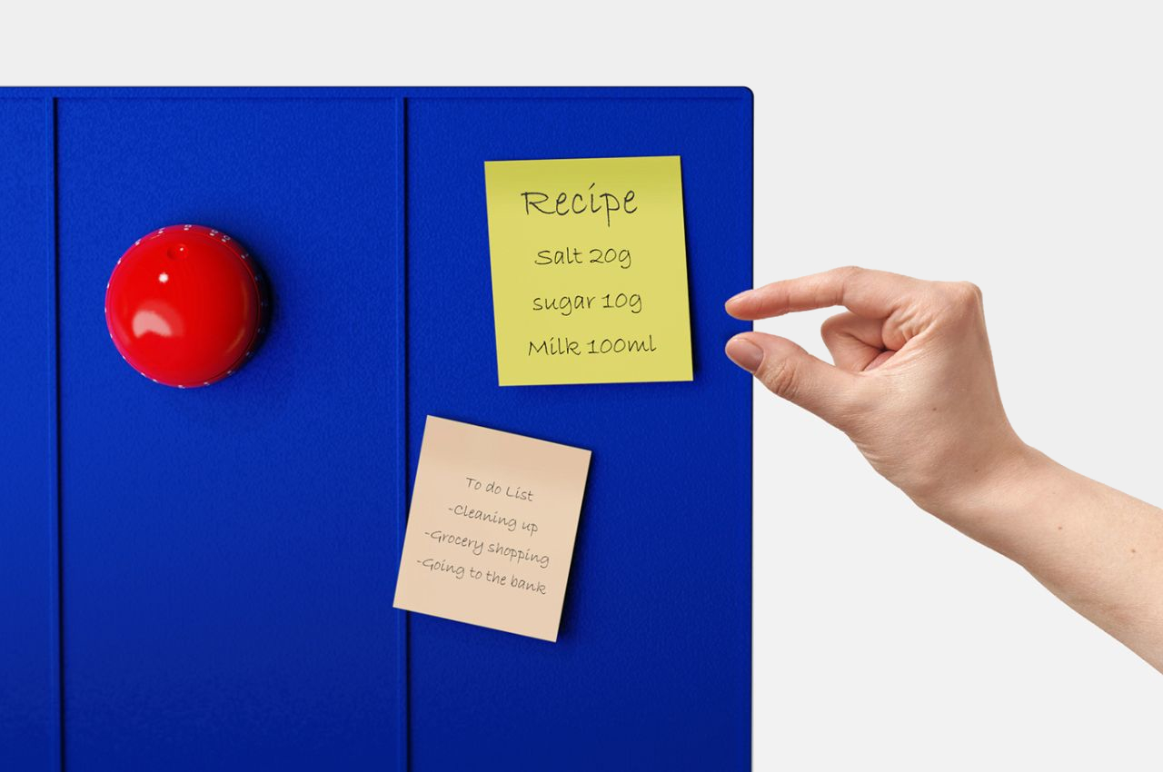
One of the standout features of these seasoning jars is the magnetic board incorporated into the design. The entire back of the set serves as a magnetic surface, providing a convenient platform to attach the timers. This not only enhances the usability of the timers but also introduces a multi-purpose aspect to the product.
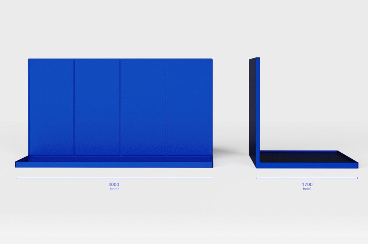
The magnetic board opens up new possibilities for kitchen organization. Users can attach sticky notes or use magnets to display their everyday to-do lists or grocery lists, transforming the seasoning jars’ set into a versatile and space-efficient tool. This thoughtful addition reflects a commitment to maximizing functionality in the modern kitchen.

The Obongdo-inspired seasoning jars successfully bridge the gap between tradition and contemporary living, bringing a piece of Korean heritage into the heart of the kitchen. With a design inspired by the timeless Ilwol-Obongdo painting and practical features like varied jar sizes, cooking timers, and a magnetic board, these jars not only celebrate the beauty of the past but also elevate the user’s culinary experience. As we continue to navigate the intricate balance between tradition and innovation, these seasoning jars stand as a testament to the enduring appeal of art and culture in our everyday lives.

The post The Obongdo Painting Inspired Set of Jars Brings The Korean Culture Into Your Kitchens first appeared on Yanko Design.