This Bauhaus Pen Holder Has 2 Cones: One for Chaos, One for THE Pen

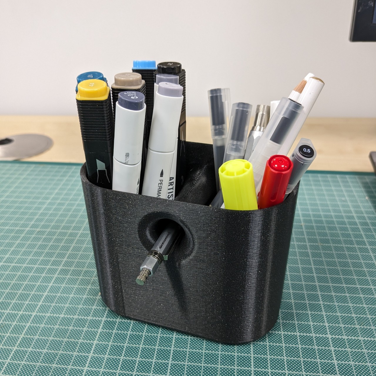
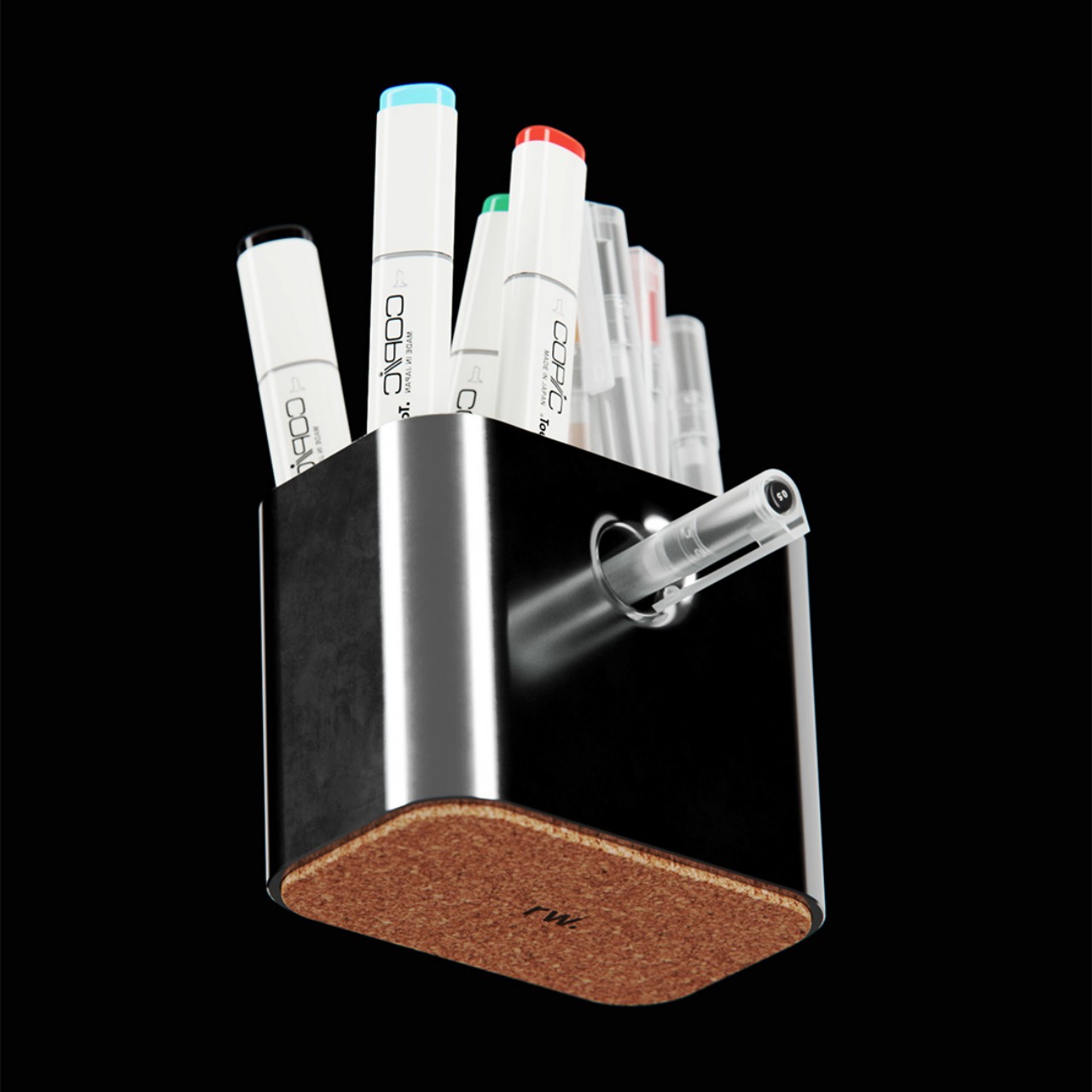
Most desk pen cups end up as graveyard storage for half-dead markers, random pencils, and that one pen you actually like, buried somewhere in the mix. The usual cylinder treats every tool the same, even though your hand instinctively knows which pen feels right for signing documents or writing notes that matter. A little hierarchy on the desk might do more to calm the visual noise than another storage bin that just shuffles the clutter around.

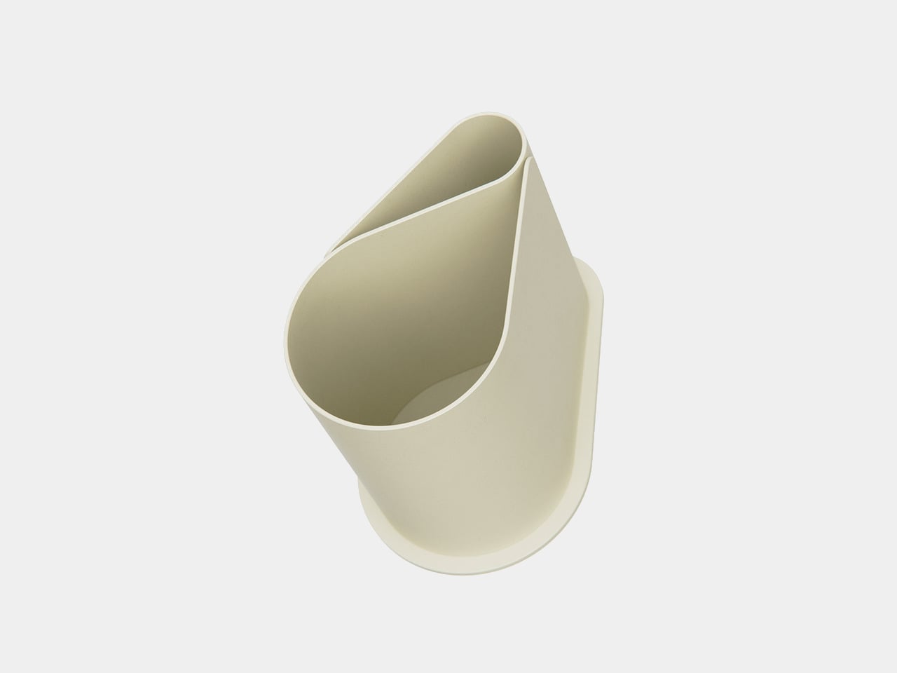
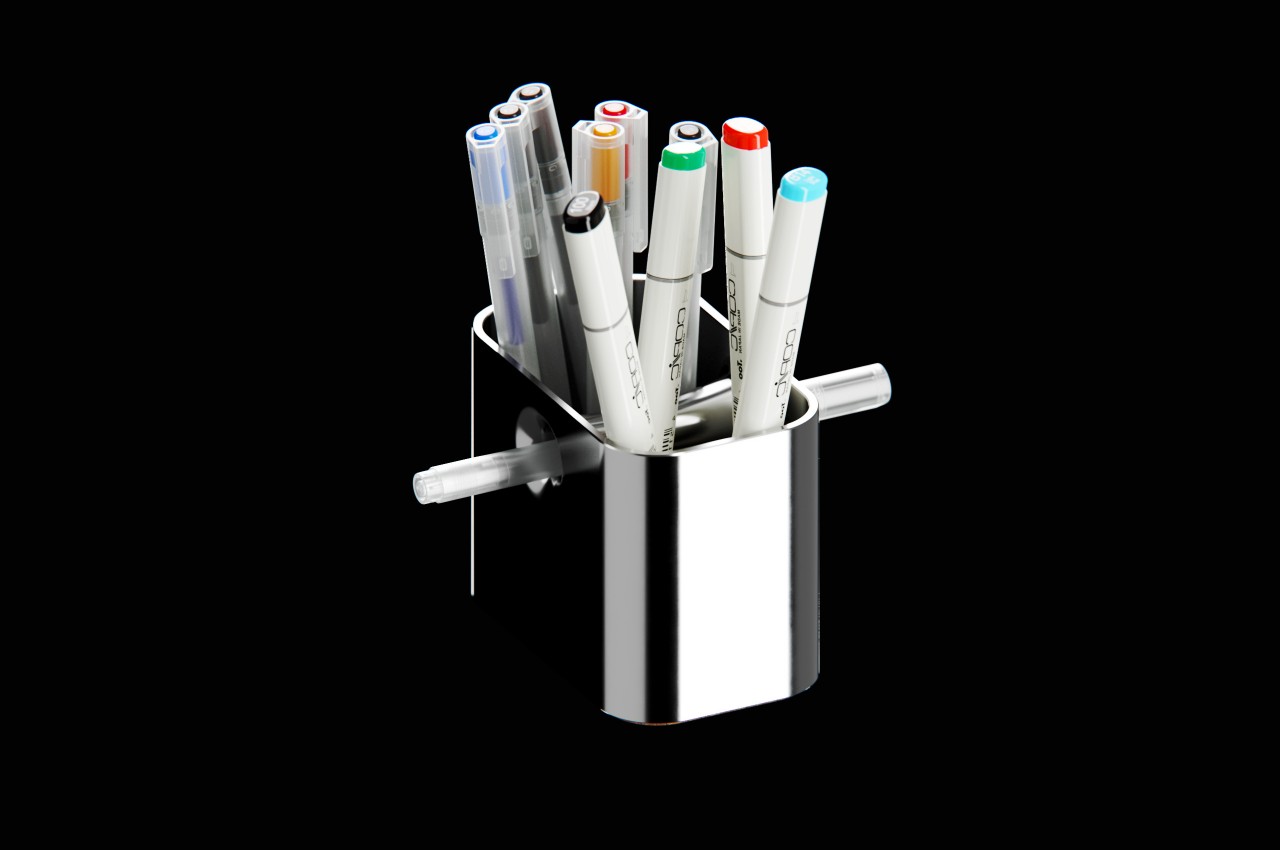
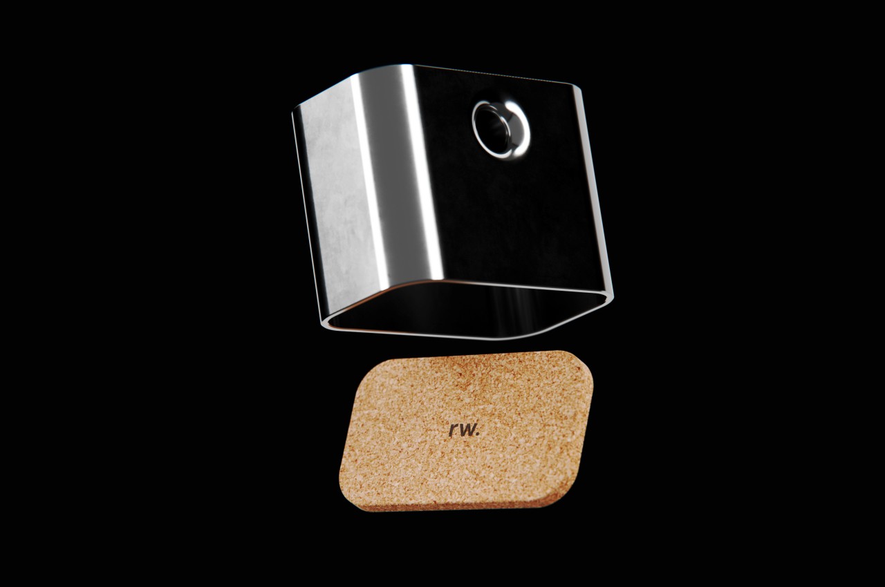
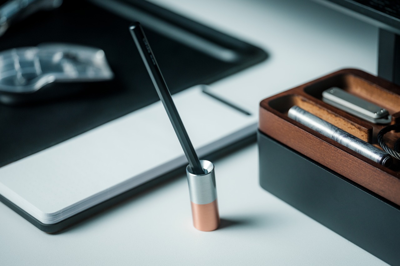
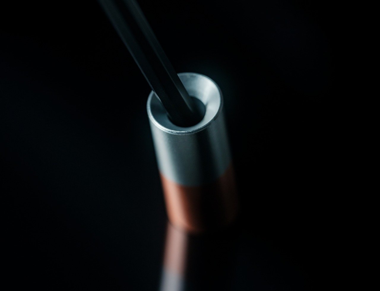
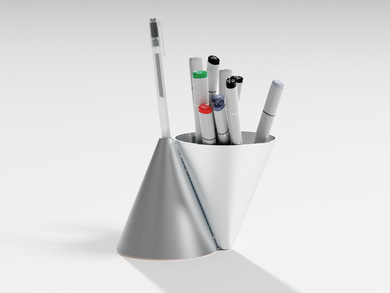
Konus is an aluminum pen holder that takes Bauhaus principles seriously rather than using them as decoration. Designed by Liam de la Bedoyere, it is built from two inverted cones, one hollowed out to hold everyday tools, the other reduced to a single aperture for a chosen pen. It is a personal project, which gives it permission to be a bit more pure and uncompromising than mass-market organizers that try to please everyone and end up feeling generic.

Designer: Liam de la Bedoyere

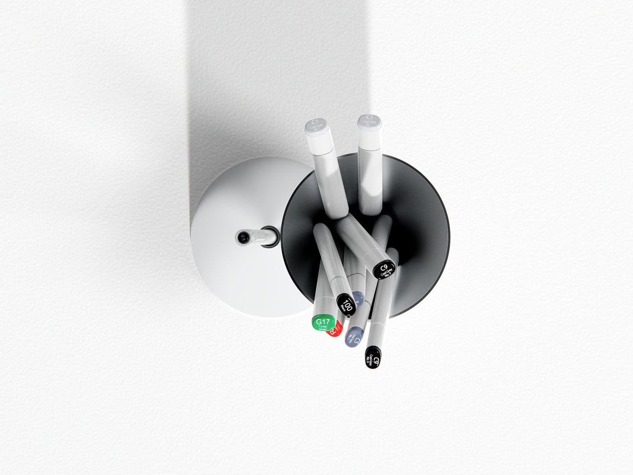
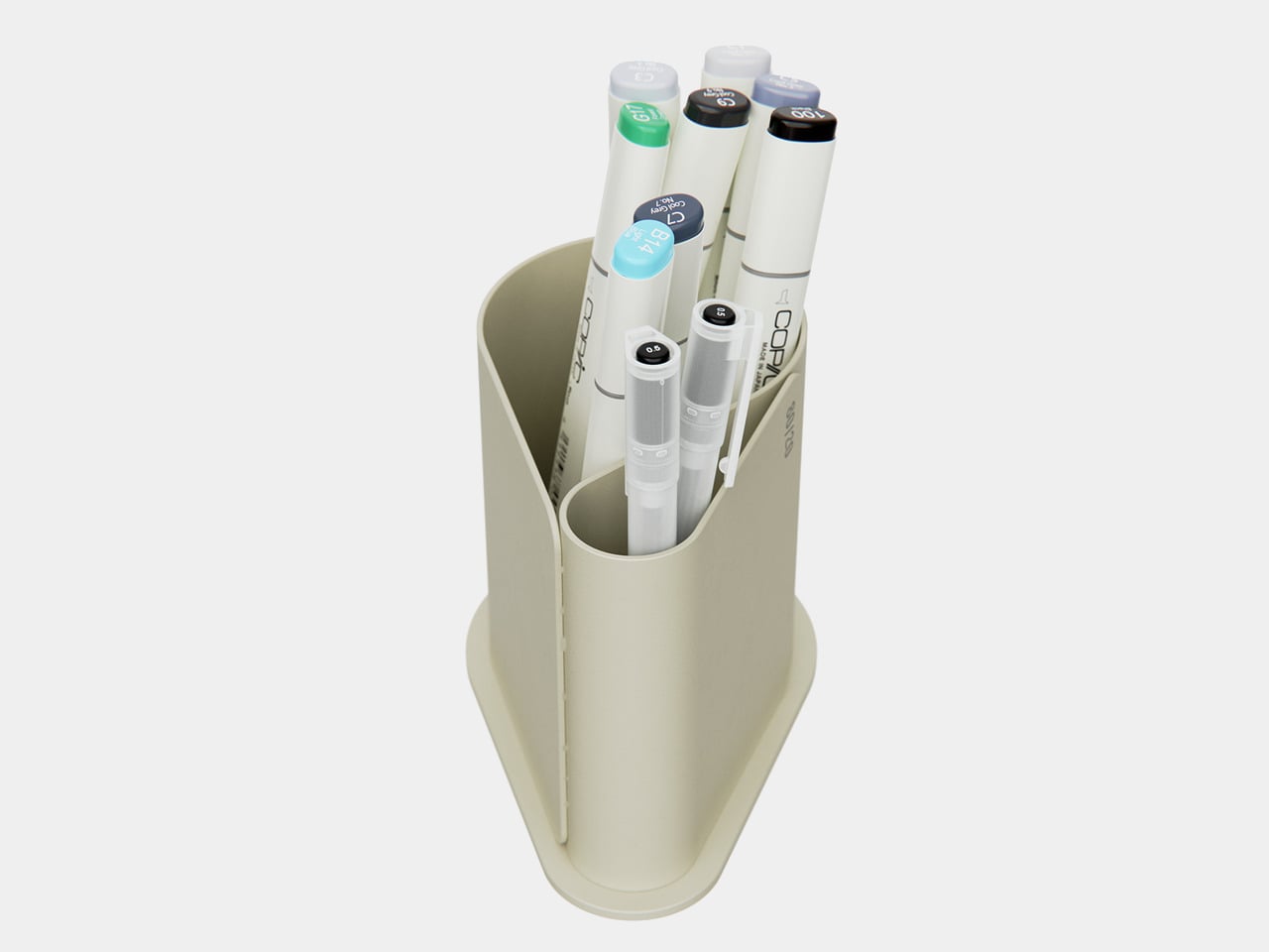
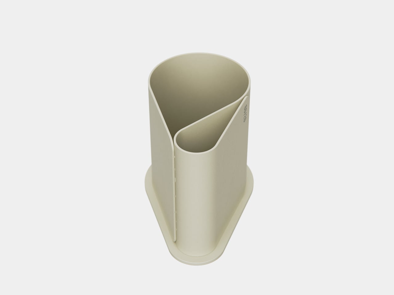
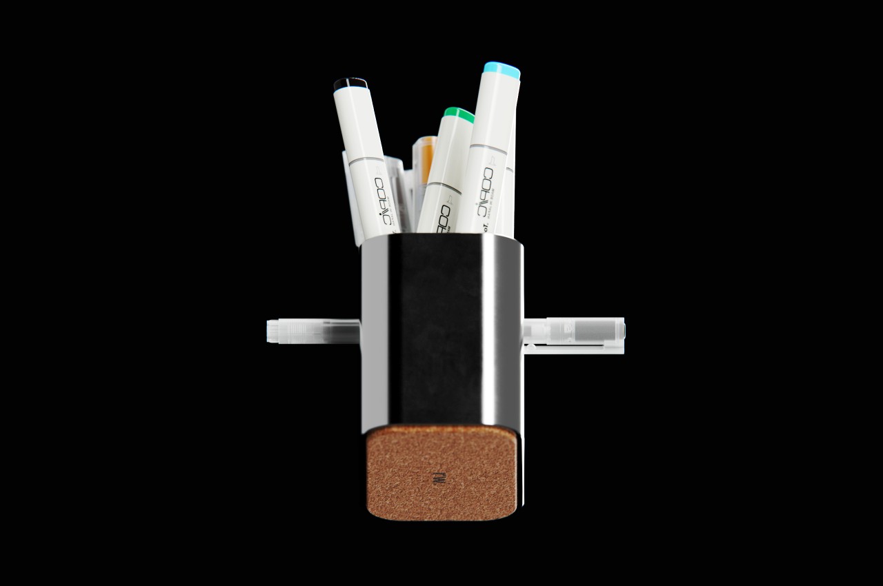
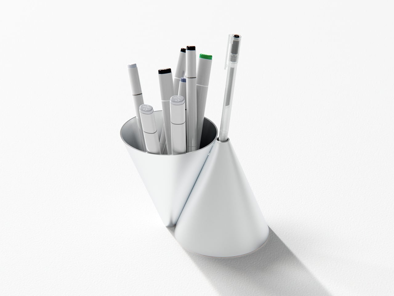
The larger cone becomes the communal container, swallowing the usual mix of pens and markers without complaint. The smaller cone acts like a tiny plinth for one special pen, the good ballpoint or fountain pen that always ends up lost under papers when you need it. This simple split creates a visual and functional hierarchy, your hand learning that the main cone is for grabbing anything, while the smaller one is where the favored pen lives, ready when you need it.

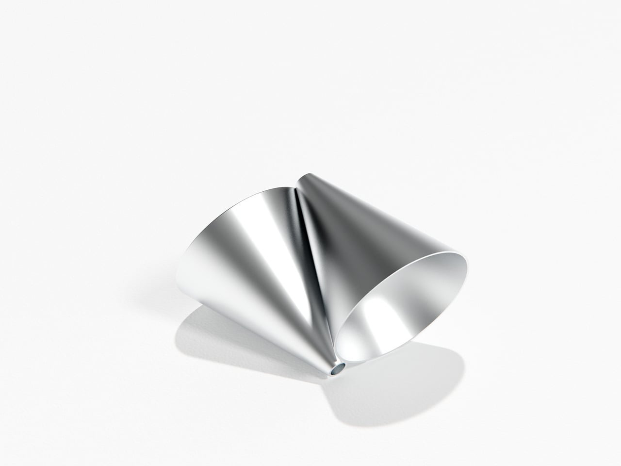
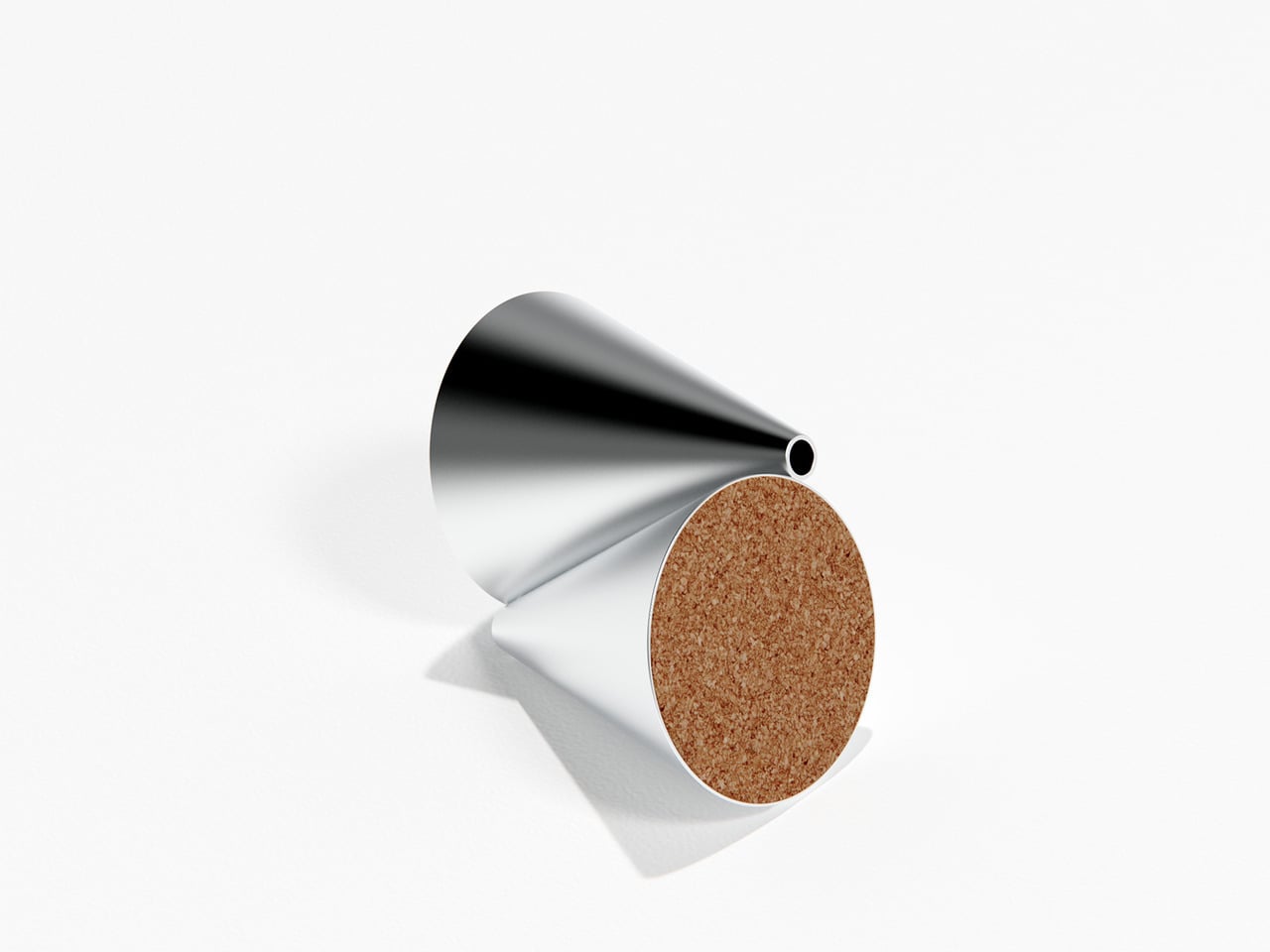
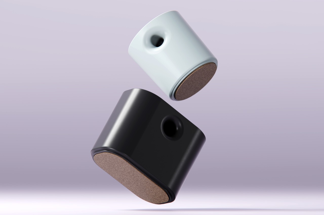
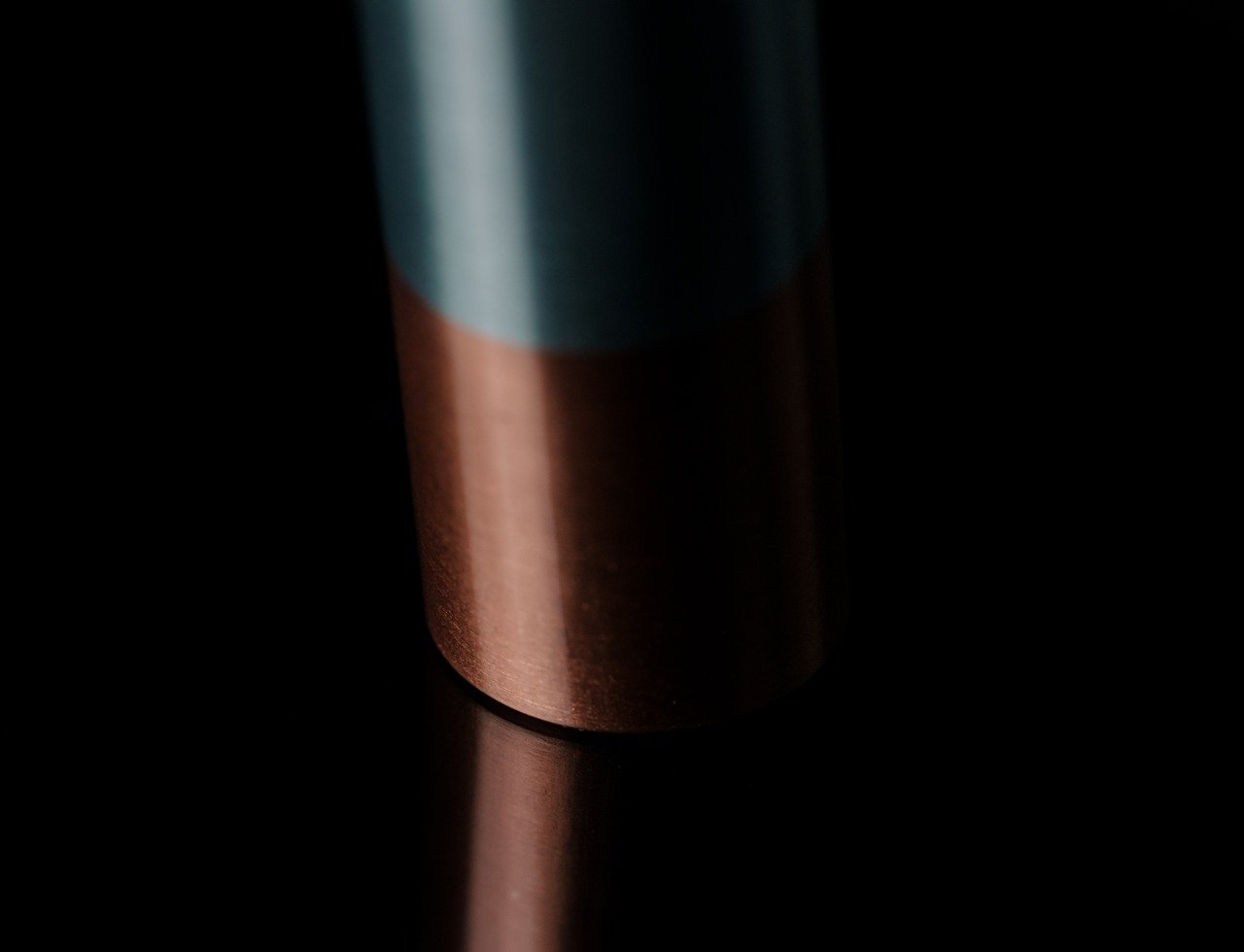
Konus is machined from aluminum with a satin finish that catches light softly rather than shouting for attention. The cork base keeps it from sliding on smooth desks and adds a bit of warmth against hard surfaces. Together, the cool metal and warm cork make it feel more like a small piece of desk architecture than a plastic cup, something you notice without it becoming a distraction or requiring constant attention.

A typical day with Konus on the desk means the main cone slowly fills with whatever pen you grabbed last, while the single aperture keeps your favorite anchored in one place. There is a small pleasure in always knowing where that pen is, and the object quietly nudges you to put it back in its slot instead of letting it disappear under papers or into a drawer where it will live for weeks before you find it again.

The cones embody that Bauhaus idea of form leading function without relying on labels or moving parts. Dropping tools into the big opening is effortless, but placing a pen into the small aperture feels deliberate, almost like docking a tiny instrument. Over time, that difference turns into a quiet ritual that organizes both the desk and your habits, making you slightly more intentional about which tools stay within reach and which ones can live in a drawer.

The post This Bauhaus Pen Holder Has 2 Cones: One for Chaos, One for THE Pen first appeared on Yanko Design.

Pareto Pot Uses the 80/20 Rule to Give Your Favorite Pens a Better Home

Most creative desks have a cup overflowing with pens, markers, and tools, even though you reach for the same few every day. There is the Muji gel pen for sketches, a couple of render markers you trust, and then about 15 other things you keep just in case. The Pareto Principle says 80 percent of your output comes from 20 percent of your stationery, which feels accurate once you notice how often you dig past everything else.

Pareto Pot is a stationery holder designed around that rule. Designer Liam de la Bedoyere noticed his own reliance on a handful of hero tools and built a pot that prioritizes those while still keeping essential counterparts within reach. It is a small desk object that treats hierarchy as a feature rather than pretending every pen deserves equal billing, using form and compartment size to make your most-used tools easier to grab.

Designer: Liam de la Bedoyere

Sitting down to sketch or render, your main pen and key markers naturally drop into the larger front compartment, while backup colours, fineliners, or highlighters slide into the smaller rear section. Without thinking about it, you end up with a front row of tools you use constantly and a supporting cast that is still close but not fighting for attention every time you reach for something.

The object is made from bent and welded sheet metal, forming a nested, teardrop-like footprint that balances minimalism with clear function. The outer shell wraps around an inner wall to create two compartments in one continuous gesture, so it reads as a single form rather than a cluster of tubes. The result feels industrial and precise but not cold or overdesigned, more like a small sculpture that happens to organize your pens.

The base is wide enough to stay put when you grab a handful of markers, and a cork underside protects the desk and adds grip. The height keeps pens upright and visible without making them wobble or tip when you pull one out in a hurry. It is the kind of object you can slide around a crowded workspace without worrying about tipping or scratching the surface underneath.

A small “80/20” mark on the side acts as a quiet nod to the idea driving the form, not a loud logo. It is a reminder that the pot is not just another cylinder; it is a physical diagram of how most of us actually work, a big space for the few tools that matter most, and a smaller one for everything else.

Pareto Pot is less about storing as many pens as possible and more about making it easier to focus on the ones that pull most of the weight. It does not tell you which tools to love; it just gives them a better spot to live in. For anyone trying to tame a chaotic pen cup without giving up their favourite analog tools, that feels like a quietly smart upgrade.

The post Pareto Pot Uses the 80/20 Rule to Give Your Favorite Pens a Better Home first appeared on Yanko Design.

Odd pen holder has a unique way to showcase your favorite writing tool

The key design elements for a pen holder or pen pot are pretty simple. It just needs to be tall enough to support writing instruments of different heights without them tipping over and would have enough room for at least a handful of pens, pencils, markers, and the like. Beyond that, the designer is free to interpret the shape of the container, and some even have dividers to segregate the different tools. But while pen holders are a convenient way to keep your pens together, they don’t really make it easy to pick out your favorite one from among the bundle. Some people would use a separate stand just for that single pen, which takes up unnecessary space on your desk. This concept design has a rather curious answer to the problem, one that pretty much leaves a conspicuous hole in the middle of the pill-shaped pot.

Designer: Liam de la Bedoyere

Usually, having a hole in the middle of a container is considered to be a defect, one that not only weakens the structure of the shape but also mars its visual integrity. After, something that cuts through an otherwise clean and whole form is sure to bother one’s aesthetic sense. In this case, however, that hole is not only intentional but also functional, setting the Void Pen Pot apart from your run-of-the-mill pen holders.

The hole that runs through the body of the pill-shaped container actually provides a convenient resting place for your most-used pen or pencil. Instead of wasting time and effort looking for that pen among half a dozen similar-looking rods, you can simply pull it out from its hole and start using it immediately. And when you’re done, you can just shove it back in to wait for the next time you need it.

Since that hole practically bisects the container, it also acts as a built-in divider that lets you group your pens into two. That said, this also means you’re not able to maximize the entire space of the container for your pens, specifically the area above and below the “tunnel” made by this hole.

The concept comes in two flavors, four if you consider the pen holder can be pill-shaped or a conventional can. One design employs a polished chrome body, while the other tries to adopt Japanese minimalist brand MUJI’s signature frosted polypropylene, both with cork bottoms. While the function of having an odd yet special place for your favorite pen is definitely useful, it still raises the question of whether such a quirky design will be appealing or off-putting instead, with a pen sticking out from an otherwise blemish-free surface.

The post Odd pen holder has a unique way to showcase your favorite writing tool first appeared on Yanko Design.

This ultra-minimalist pen stand makes your writing partner the center of attention

We all have our favorite writing instruments, be it an heirloom fountain pen or even a number 2 pencil. You’ll probably just stuff the latter in drawers or leave them strewn on your desk, but the pen that has been with you for years is something you’ll probably want to show off while keeping it within easy reach. Pen stands exist for that exact purpose, but some of them try to compete with the pen for attention. They have extravagant and luxurious designs that defeat the intention of putting your favorite pen on a pedestal. That’s the trap that this tiny pen stand tries to avoid by practically removing all non-essential features that prevent you from showing off your trusty writing partner.

Designer: Kairi Eguchi

Click Here to Buy Now: $35 $39 (10% off at checkout). Hurry, deal ends in 24 hours!

What stand could be simpler than an upright cylinder with a whole in the middle that’s just enough to fit a single pen? After all, a pen stand’s purpose is to hold the writing tool for easy access while showing it off when not in use. Anything else is just excess and waste that burdens the product both visually and functionally. That’s the kind of minimalist design that this small and simple stand embraces, but that doesn’t mean it’s a plain and boring desk accessory. In fact, it is ironically one of the most beautiful pen stands around, especially if you favor minimalist designs.

Your eyes will be immediately drawn to the stand’s diminutive size. At only 52.5mm (around 2 inches) tall, it has just enough space to hold a small portion of the pen, leaving the majority of the barrel unobstructed and free for everyone to behold. Despite its small size, however, the stand is able to, well, stand without tipping over due to the weight of the pen. In fact, the stand itself tilts a little bit to one side, an intentional design that makes it easier to pull out the pen quickly when you need to jot something down.

The trick to the Centroid Stand’s unbelievable feat is in its construction, which also accounts for its two-tone color finish. The top half of the stand is made from polished aluminum which gives it a stylish luster, while the lower half is made from heavier copper that shifts the center of gravity lower, making it more stable regardless of its tilt or the weight of the pen that it holds. These two dissimilar materials, joined together using a friction welding process, give the stand a rather distinct flavor, one that is both playful and elegant at the same time. Copper also develops a unique patina over time, adding to the stand’s character as it grows old with you.

Showcase your Everlasting All-Metal Pencil with the ultimate stand.

Beautiful in its simplicity and ingenious in its functionality, this ultra-minimalist pen stand offers a perfect view of the writing instrument that it holds. Due to its minimalist design, it is the perfect complement to equally minimalist pen designs, such as the Everlasting All-Metal Pencil that will last as long as this unconventional stand. It is a glowing example of how simple designs, when done right, can exude a kind of beauty that gently draws your eyes without distracting from the attention that your favorite pen or pencil rightfully deserves.

Click Here to Buy Now: $19.95.

The post This ultra-minimalist pen stand makes your writing partner the center of attention first appeared on Yanko Design.