The Aluminum Pen That Actually Lets You See What You’re Drawing

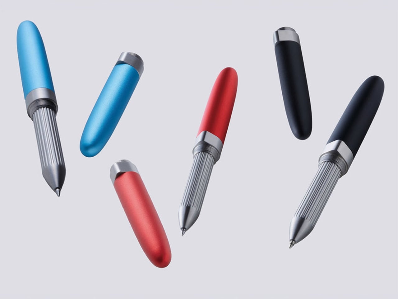
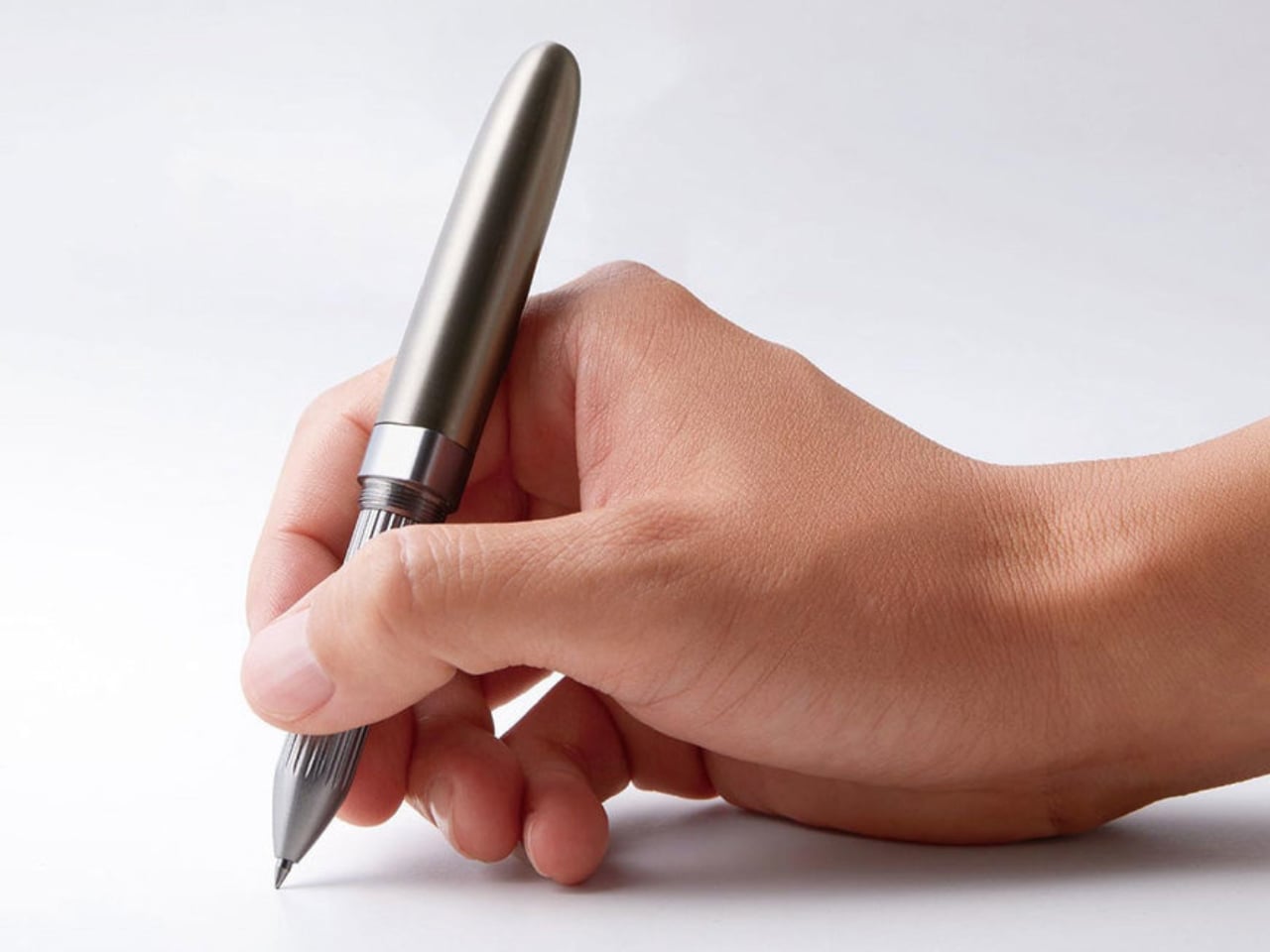
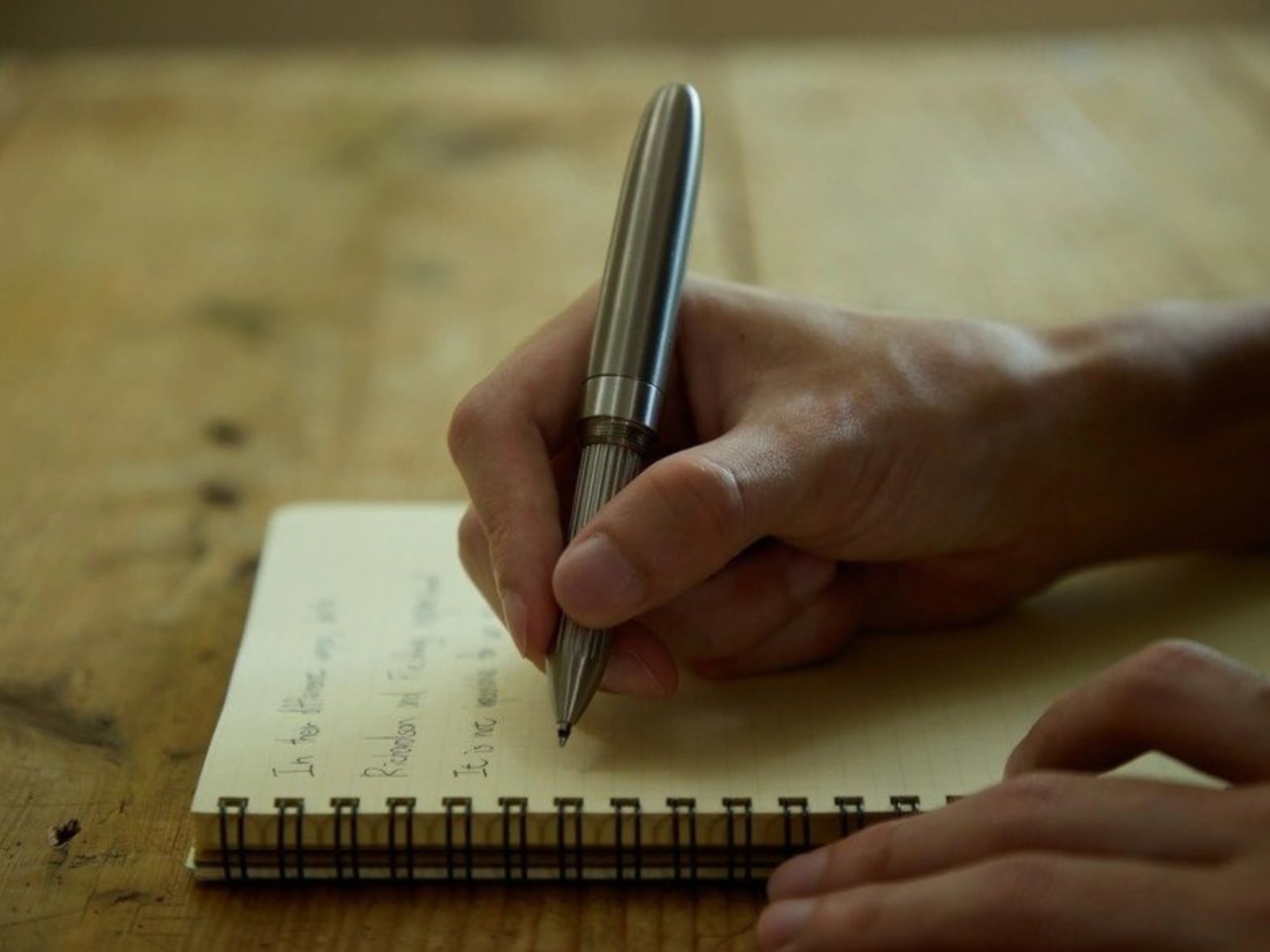
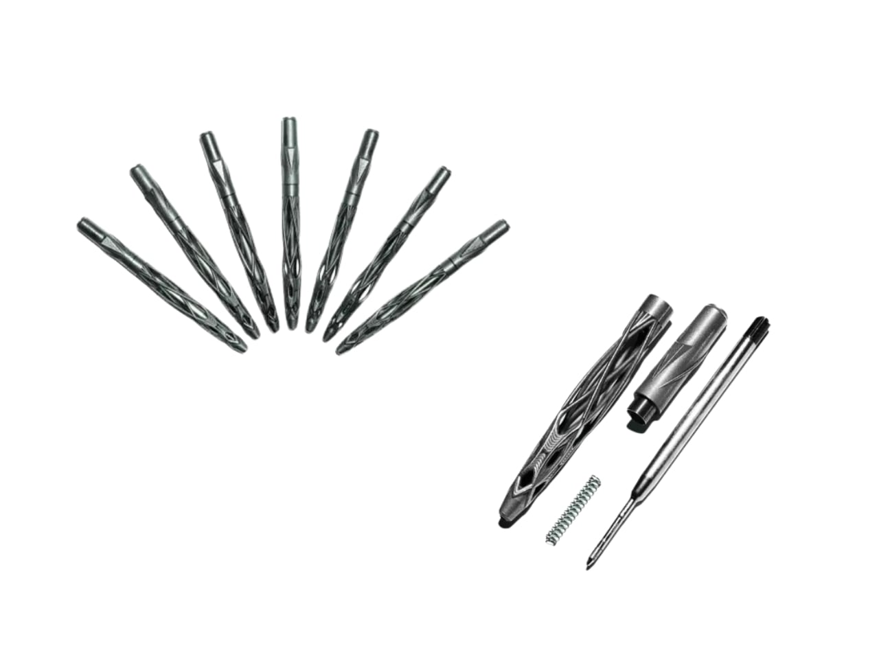
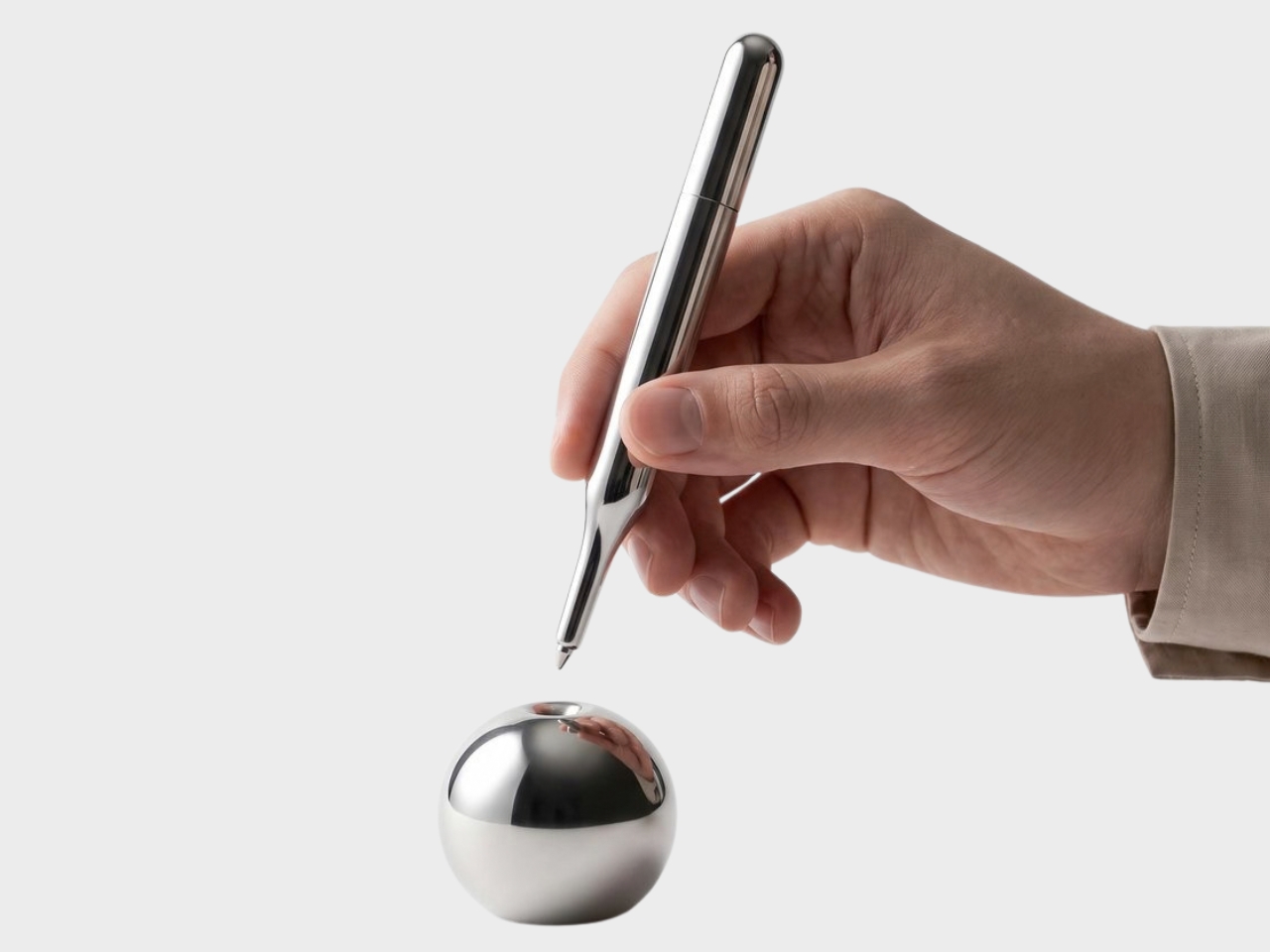
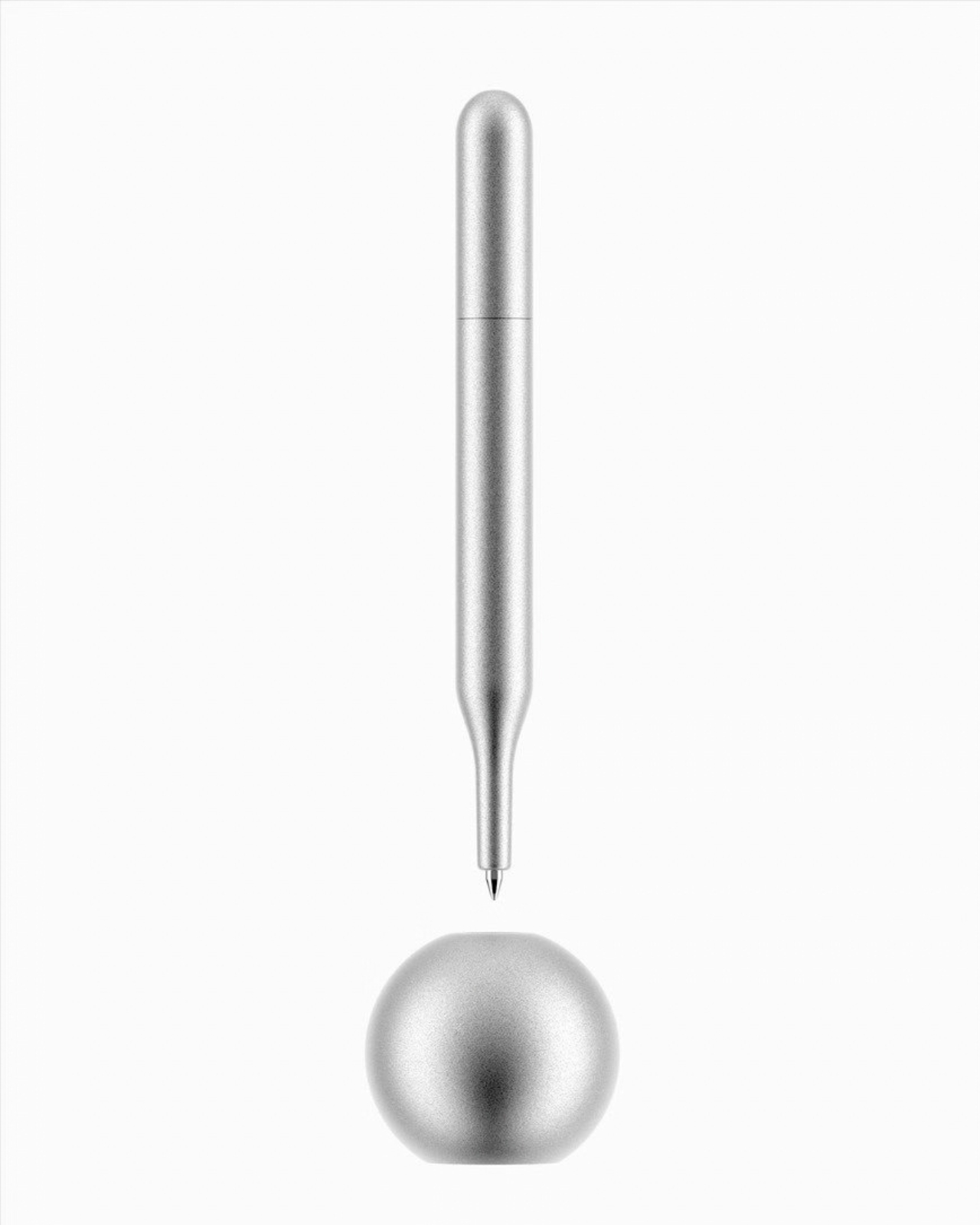
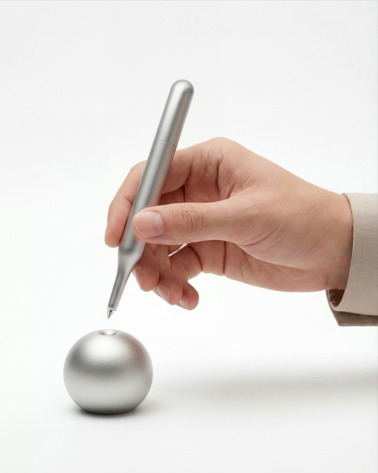
Every designer who has ever sketched with a fat marker or a clumsy ballpoint knows the same small frustration. The barrel gets in the way of the exact point you’re trying to control, and by the time you glance past your own knuckles, the line has already wandered somewhere you didn’t plan. That is the specific annoyance Milan-based industrial designer Alberto Essesi set out to fix with the Exclamation Pen, a slim aluminum instrument built around one idea: let the person holding it see straight down to the tip, every single time.

Most pens are not designed for sketching. They are designed for writing, which is a different task with different demands. A note-taker doesn’t need to watch the nib travel across the page with surgical precision. A designer roughing out a form, a joint, or a curve does. Essesi, who has spent his career working across design and technology companies before starting his own studio, apparently got tired of choosing between tools that felt good in the hand and tools that actually showed him where the line would land. So he machined his own answer.

Designer: Alberto Essesi
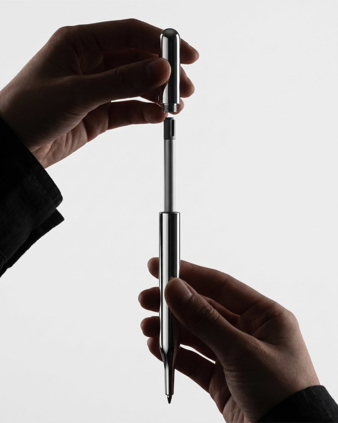
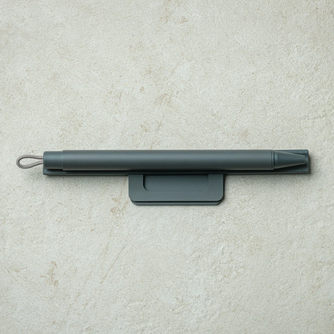
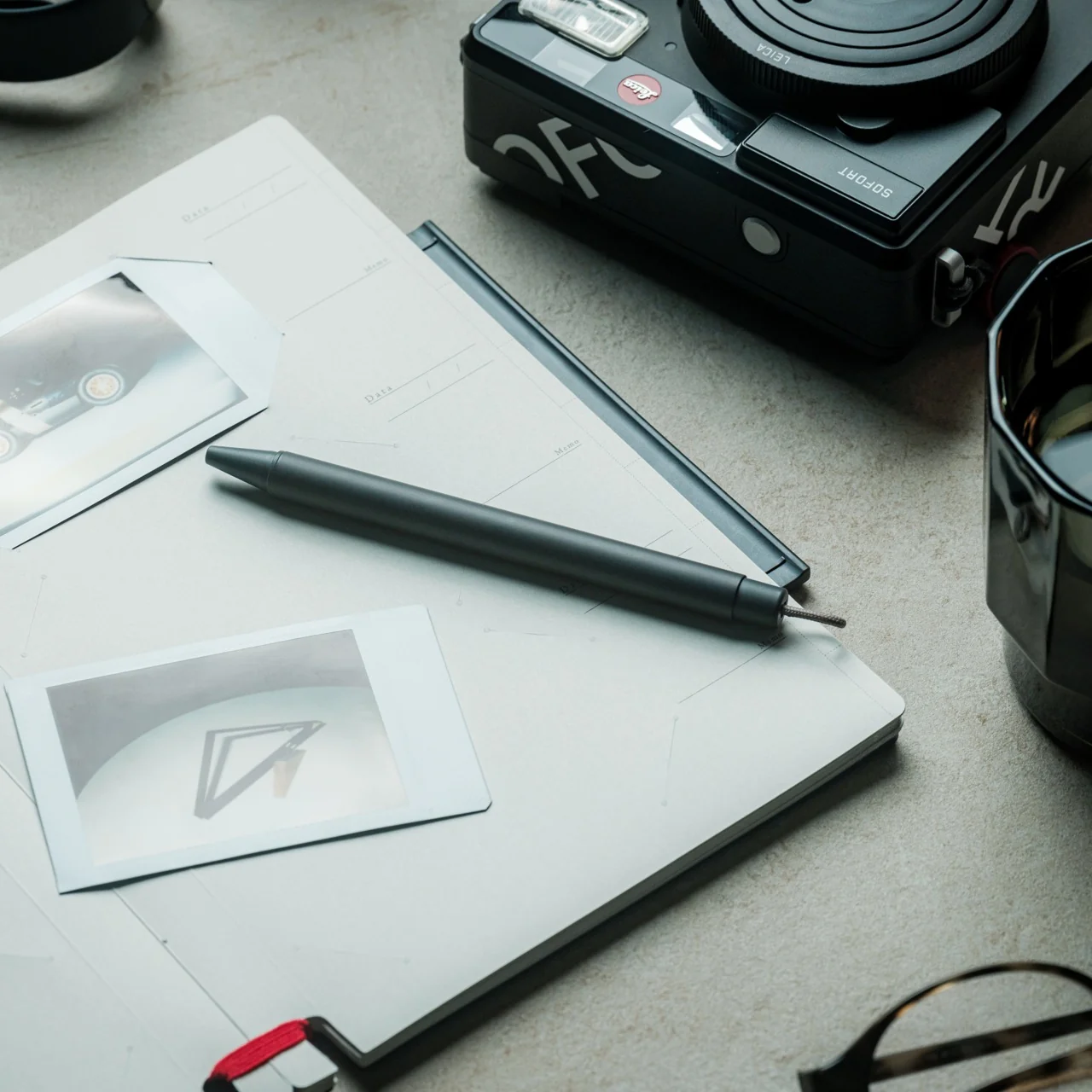
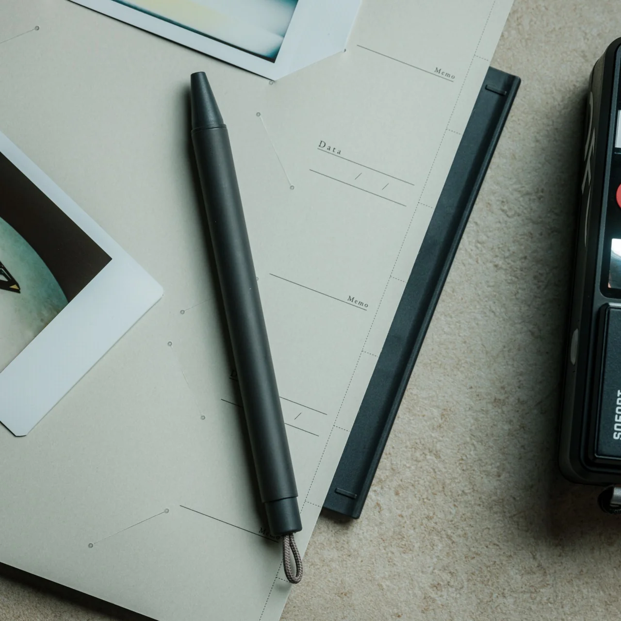
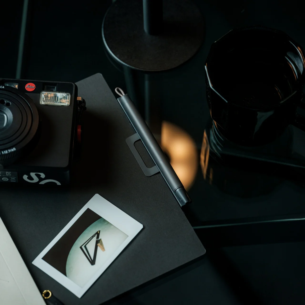
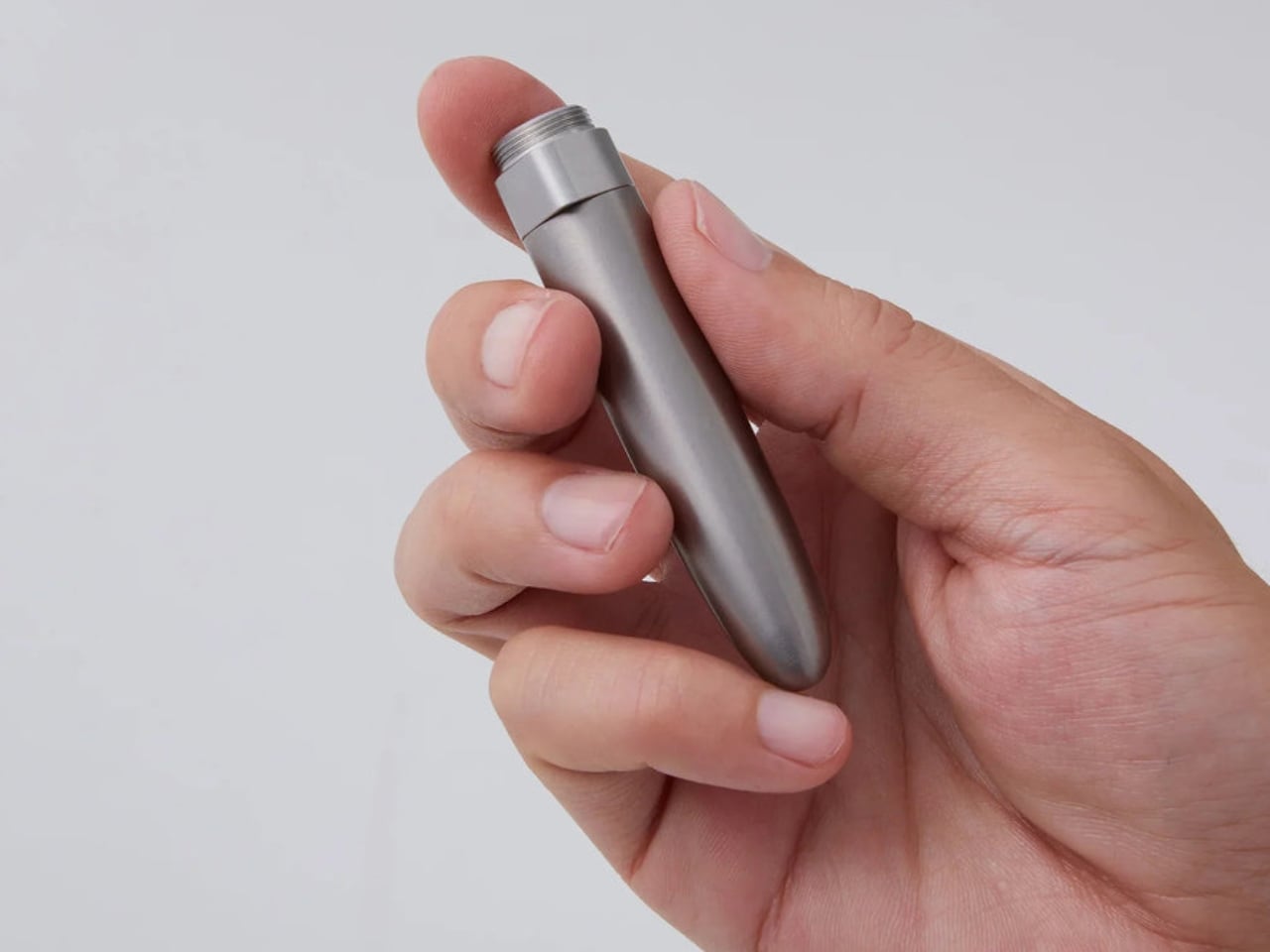
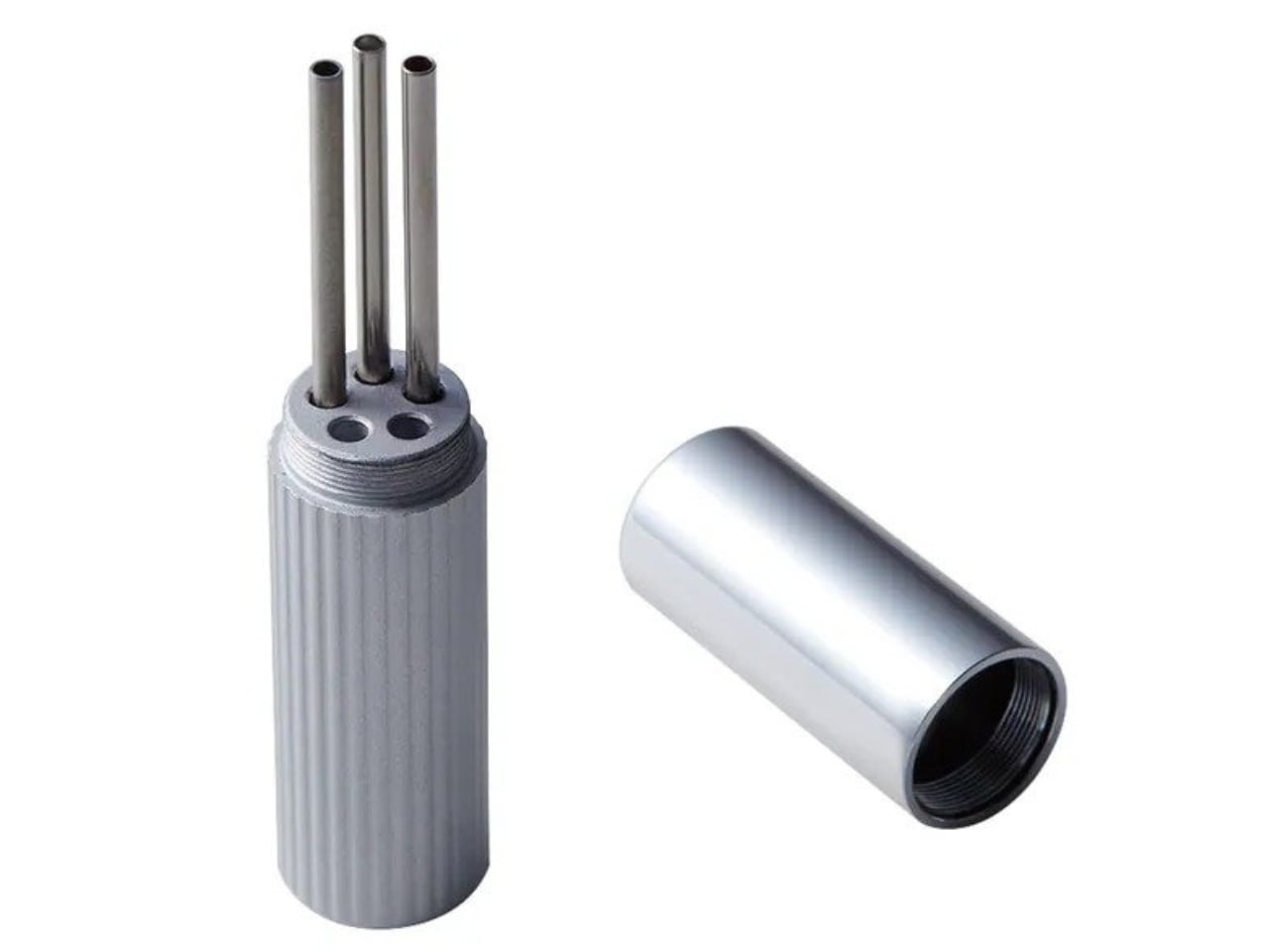
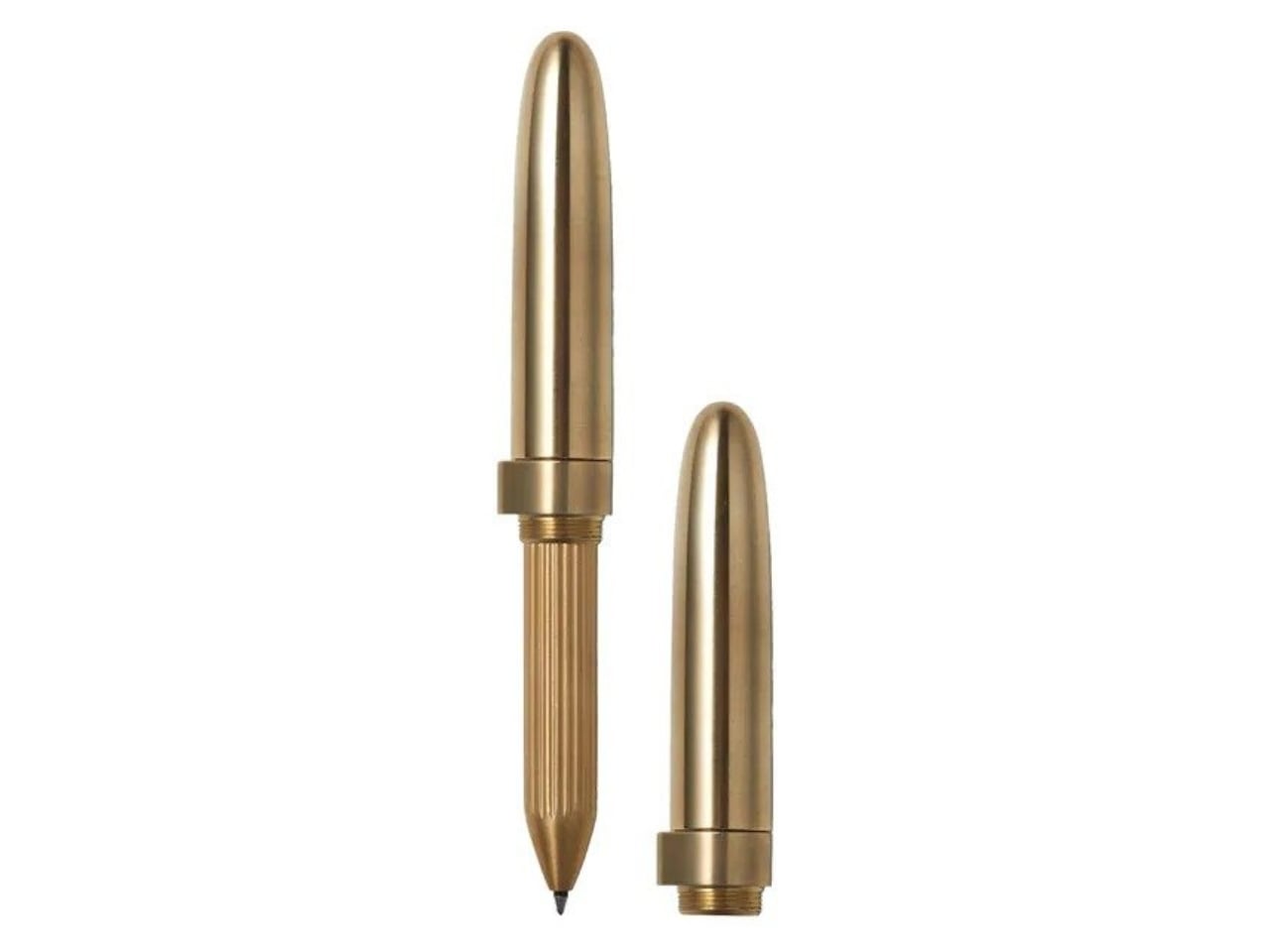
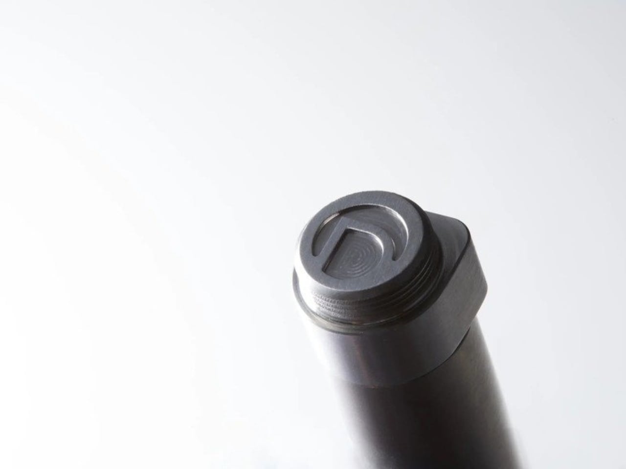
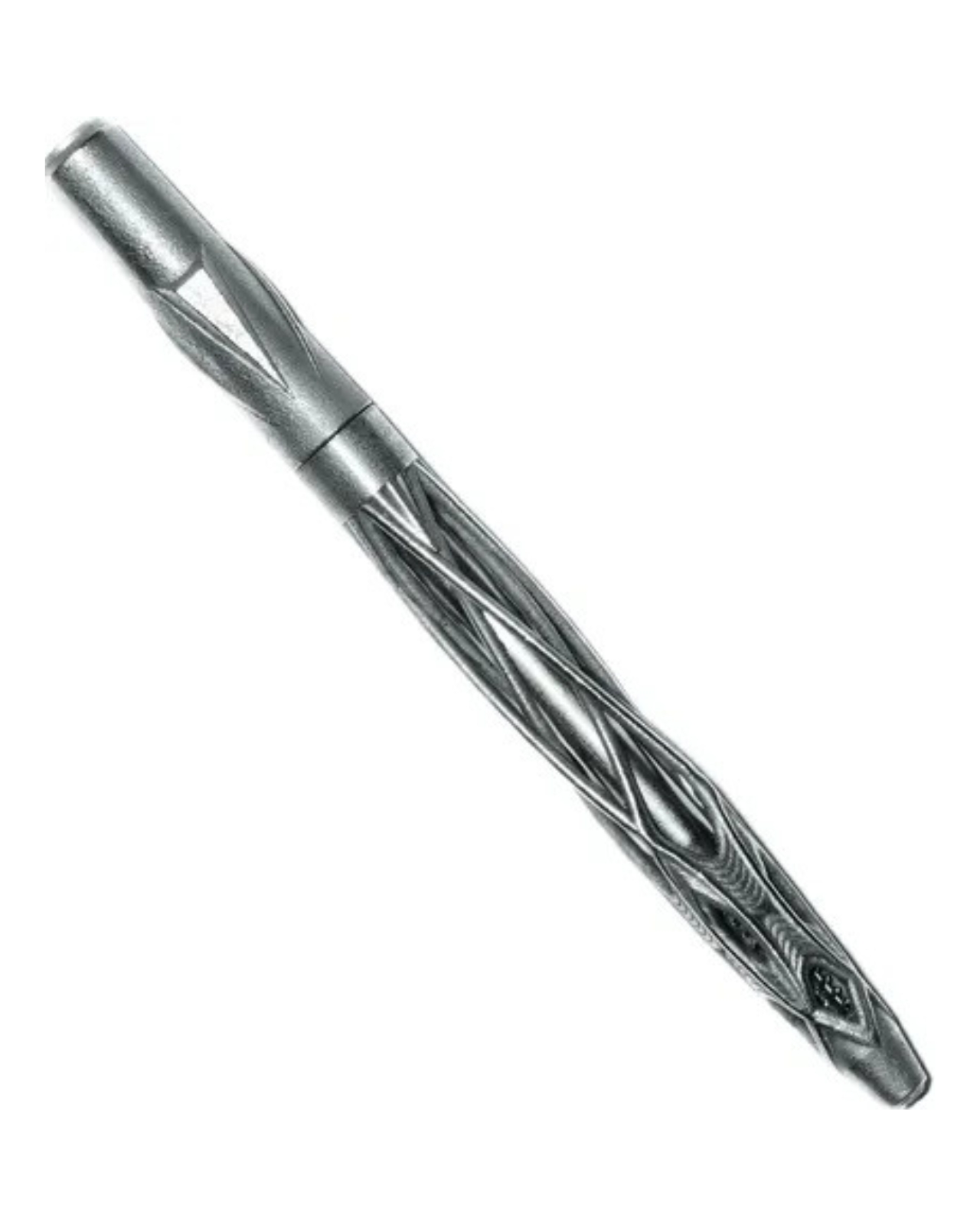
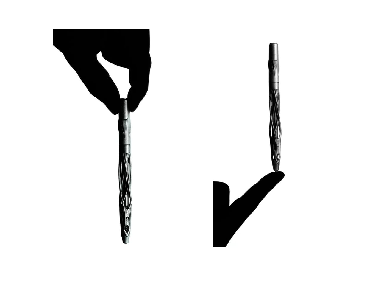
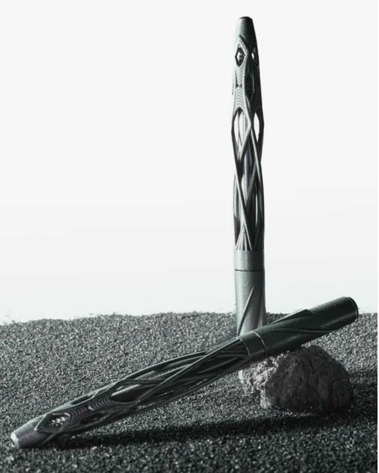
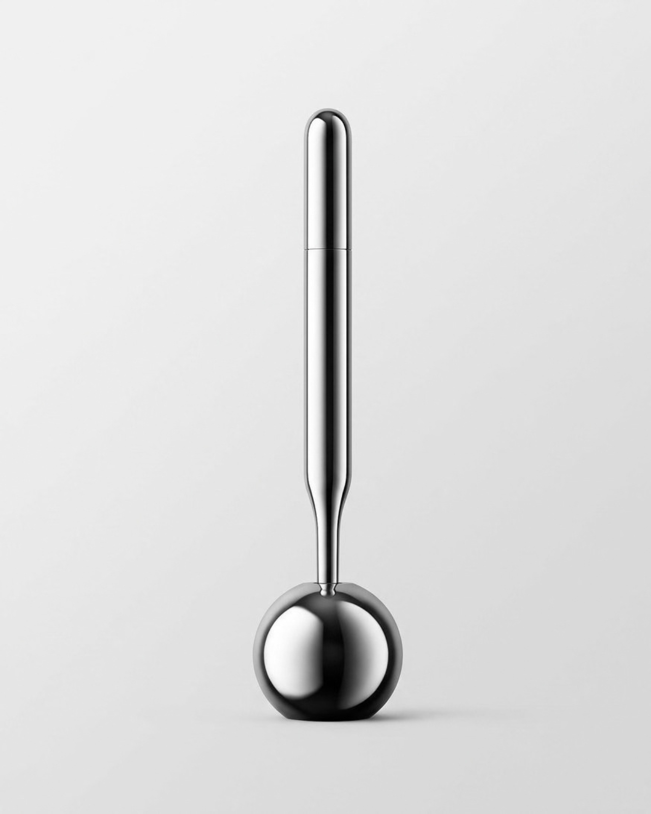
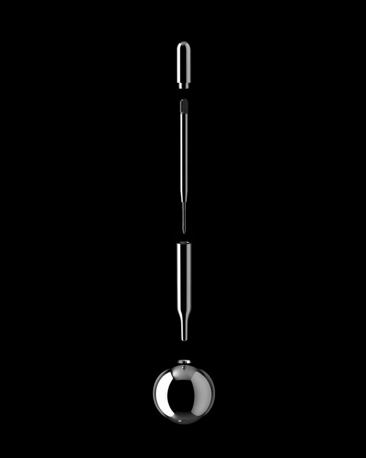
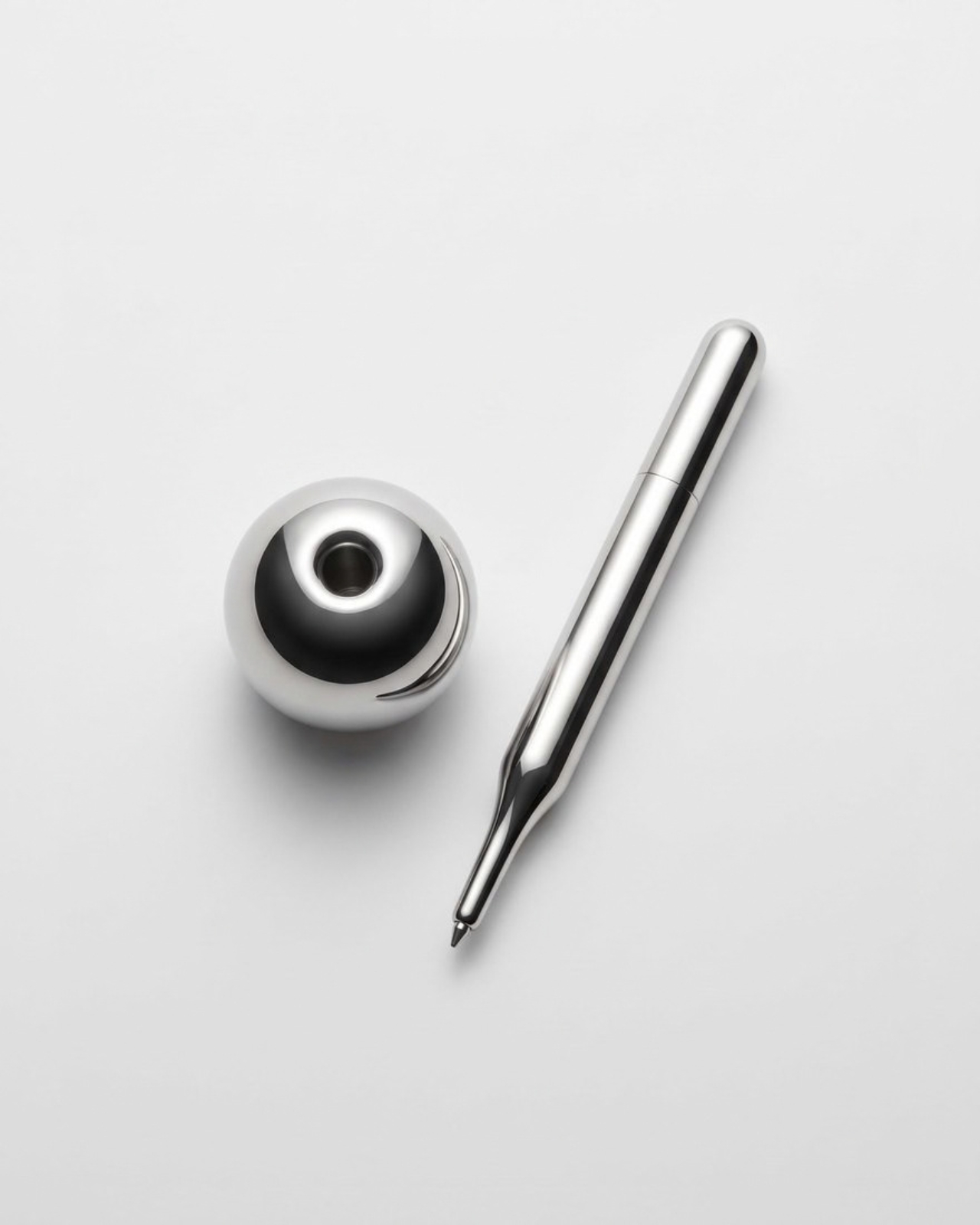
The pen itself is carved from solid aluminum blocks and finished in a matte satin coat, and it comes apart into three simple pieces, including a stand that doubles as a cap. The tip is severely tapered, almost aggressively so, which is the whole point. That taper is what clears the sightline and lets the tip stay visible no matter the angle of the hand. When the pen and its stand are placed together, the silhouette reads like a punctuation mark, which is where the name comes from. It’s a small joke buried in a very serious object, and it works because the pen never oversells the gag. The humor sits quietly in the shape, not in the marketing copy.
What strikes me most about this project is how confidently it ignores trends. Pen design right now is dominated by refillable systems, smart pens, and gadgets that track your handwriting for an app you’ll open twice. Essesi went the opposite direction and stripped a writing tool down to geometry and material, betting that the right taper and the right balance point matter more than any added feature. I happen to think that bet pays off. There is something satisfying about a tool that solves a real, physical problem instead of inventing a digital one to sell you a subscription for.
The pen also isn’t new to Essesi’s practice. Around a year before the Exclamation Pen appeared, he shared an earlier, rougher concept online, inspired by a documentary about how early humans used rocks to mark walls. That instinct, wanting a tool stripped back to its most basic gesture, clearly followed him into this refined version. It’s rare to watch a designer’s idea mature in public like that, from a raw sketching stick to a numbered, limited-run object sold through Normal Objects for $168.
And limited is not an exaggeration. Essesi self-produces every batch, and the first three runs reportedly sold out before he could restock. He’s now considering a mirror-polished version alongside the current satin finish, which tells me demand caught even him off guard. There’s a version of this story where that scarcity feels like a marketing trick, but knowing this is a one-person operation machining aluminum by hand, it reads more like a production bottleneck than a strategy.
None of this makes the Exclamation Pen a mass-market object, and it probably shouldn’t be. It’s priced and positioned for people who already care about how a tool feels between their fingers, the same audience that lines up for a well-made notebook or a Japanese mechanical pencil. But the underlying idea, that visibility at the tip is worth designing an entire object around, is one that any pen maker could learn from. Sometimes the most useful design decision isn’t adding something new. It’s removing whatever was blocking the view in the first place.
The post The Aluminum Pen That Actually Lets You See What You’re Drawing first appeared on Yanko Design.
This $20 Pen Finally Fixed the Problem Every Notebook User Accepts

Even though I have tons of pens in my collection, there are still times I find myself without one outside of my home. Whether it’s because I left my pen case at my desk or I changed bags and didn’t have the usual suspects in my bag pockets, it can be annoying to be without one when I need to write on my planner or journal. Obviously, the best thing would be to have a pen semi-permanently attached to a notebook, but there aren’t a lot of great options out there.

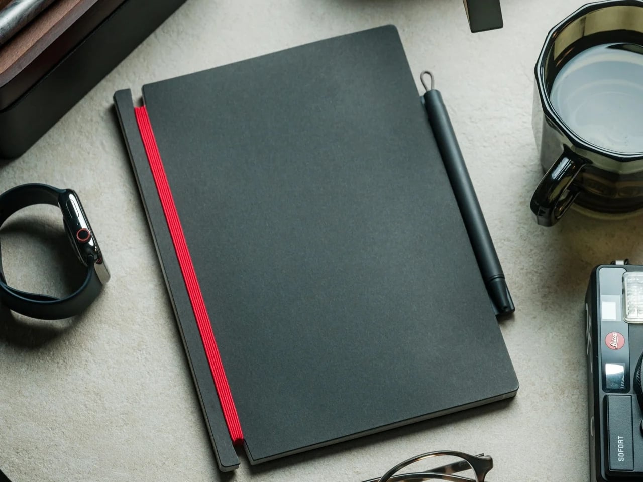
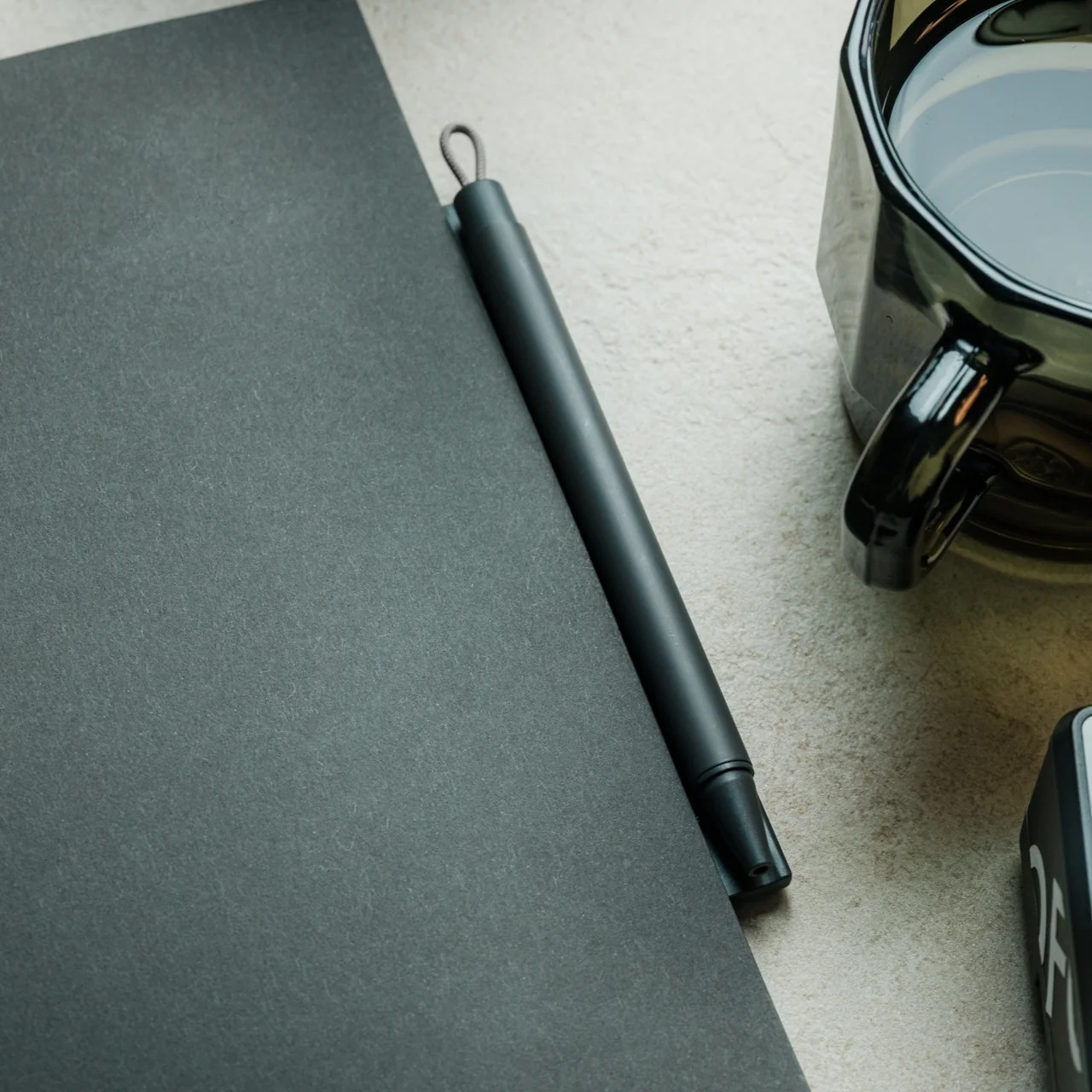
The Inseparable Notebook Pen is for people like me who can be a bit forgetful when it comes to bringing pens wherever I go. As its name suggests, it’s a pen that attaches itself to whatever notebook you’re currently using or bringing with you on the go. This way you will be able to jot down your to-do lists, thoughts and feelings, grocery lists, or brain dumps whenever you need it since your notebook always has a pen clinging to it.

Click Here to Buy Now: $19.95

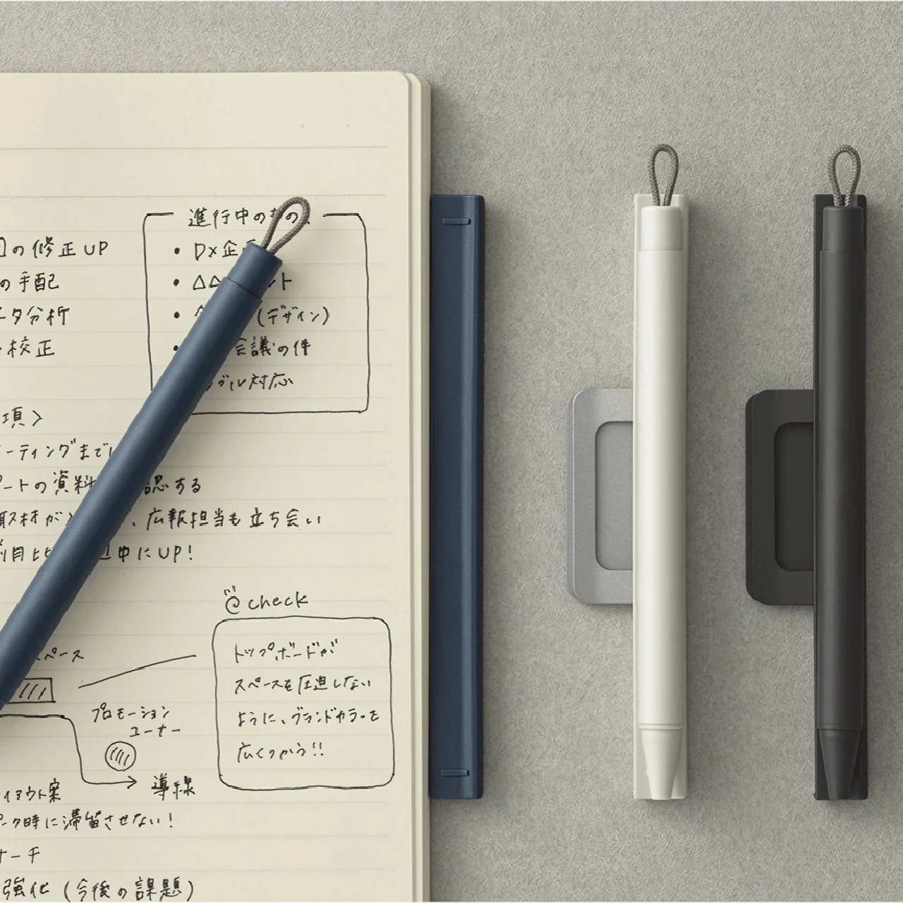
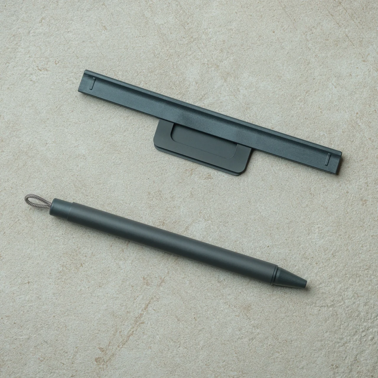
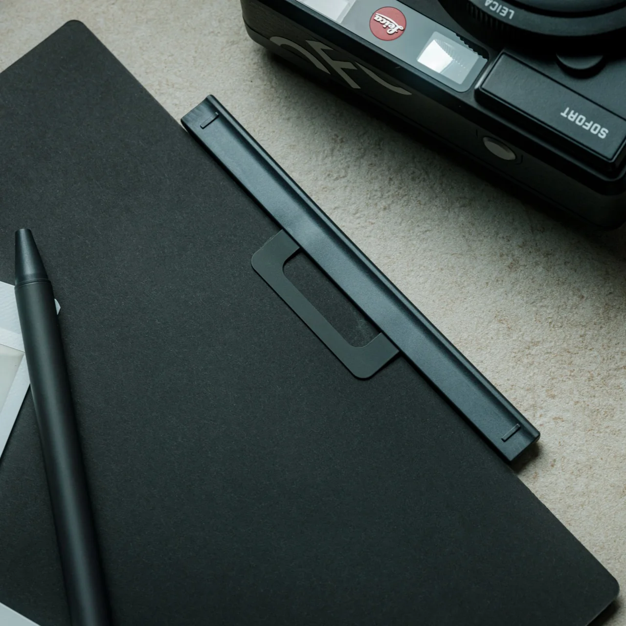
The pen is encased in a magnetic case with a clip that is securely attached to your notebook. There is a plastic clip that you can put on your notebook before attaching the magnetic clip to protect the cover or paper from creasing. It’s such a simple but elegant piece of craftsmanship that lets the pen be a seamless part of your notebook and your productivity or journaling (or both) needs. It also makes you wonder why there aren’t more similar products in the market, since it’s such a thoughtful solution.

Design-wise, it’s very minimalist and sleek with a timeless aesthetic that should be able to match your notebook, whether it’s a business planner or a cute journal. The magnetic case also has a built-in silencer that makes attaching and detaching the pen an even more seamless and quiet experience for those who prefer it that way (although I personally like hearing the satisfying click when I’m dealing with my pens). It comes in several colors: black, white, blue, and orange.

What I also appreciate is how the three-part system comes together so intuitively. You have the plastic protector, the metal magnetic clip, and the pen itself, three components that work in perfect harmony. The protector goes on first to shield your notebook cover from any potential wear, the metal clip snaps securely over it, and the pen just stays put. Firmly. It also works on practically any notebook, whether soft- or hard-bound, which gives it a universal appeal that stationery lovers and collectors will definitely appreciate.

It’s a bit like how the Apple Pencil sits on the side of an iPad, always there, always ready, just waiting to be grabbed the moment inspiration strikes. The big difference? This one doesn’t need charging, and it works with any notebook you already own and love. For those of us who like our tools to be as low-maintenance as possible, that’s already a win.

As a pen collector, I’ll admit I initially wondered whether a ballpoint refill would do such a beautifully designed system full justice. But the more I think about it, the more I realize the Inseparable Notebook Pen isn’t really competing in the fine-writing category. It’s solving a practical, everyday problem with incredible elegance. And honestly? For something priced at under $20, the writing experience is smooth, reliable, and more than adequate for daily note-taking.

If you’re someone who journals daily, hauls a planner everywhere you go, or simply wants to stop the endless search for a stray pen (we’ve all been there), the Inseparable Notebook Pen is absolutely worth adding to your everyday carry. At just $19.95, it’s one of those rare finds that’s clever, beautifully designed, and genuinely useful all at once. It may be a small thing, but making sure your pen and your notebook are always, inseparably, together? That’s exactly the kind of thoughtful problem-solving we love to see in the stationery world.

The post This $20 Pen Finally Fixed the Problem Every Notebook User Accepts first appeared on Yanko Design.
The $20 Pen That Makes a Very Loud Case for Minimalism

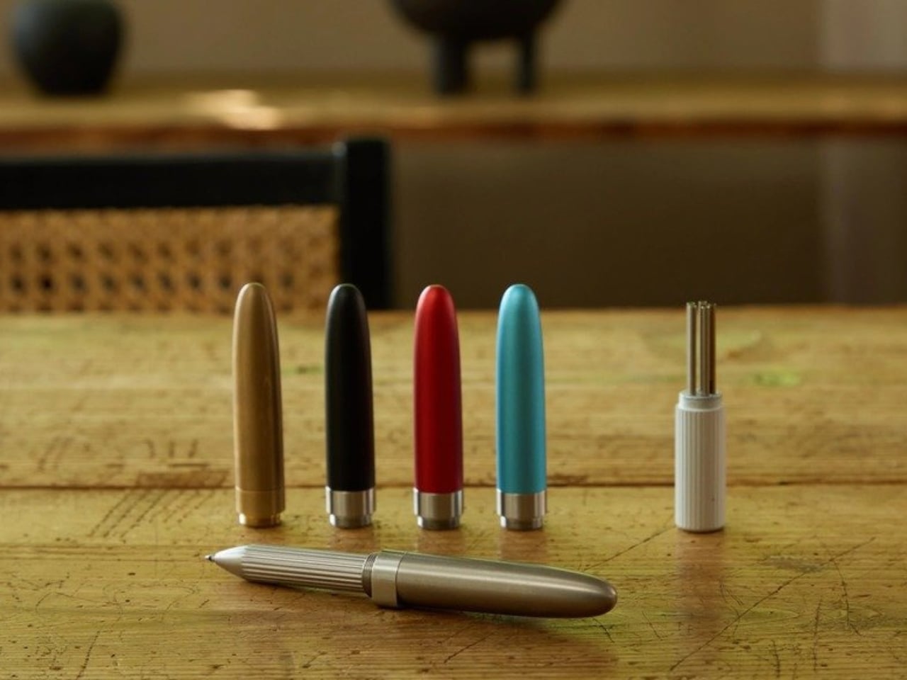
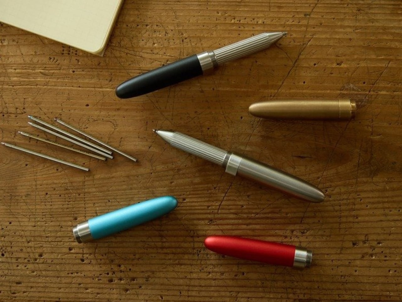
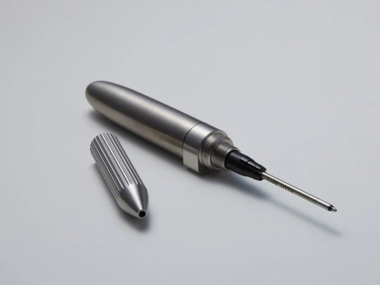
At 75mm, DeFF’s Refill Pen Jacket Extra Short is roughly the length of a thumb. Closed up, it sits in your palm like a pocket-sized secret. Open it, cap flipped to the back end, and it extends to 125mm, long enough to write comfortably, short enough to forget you’re carrying it. That particular trick, the transformation from almost-nothing to just-enough, is the whole point.

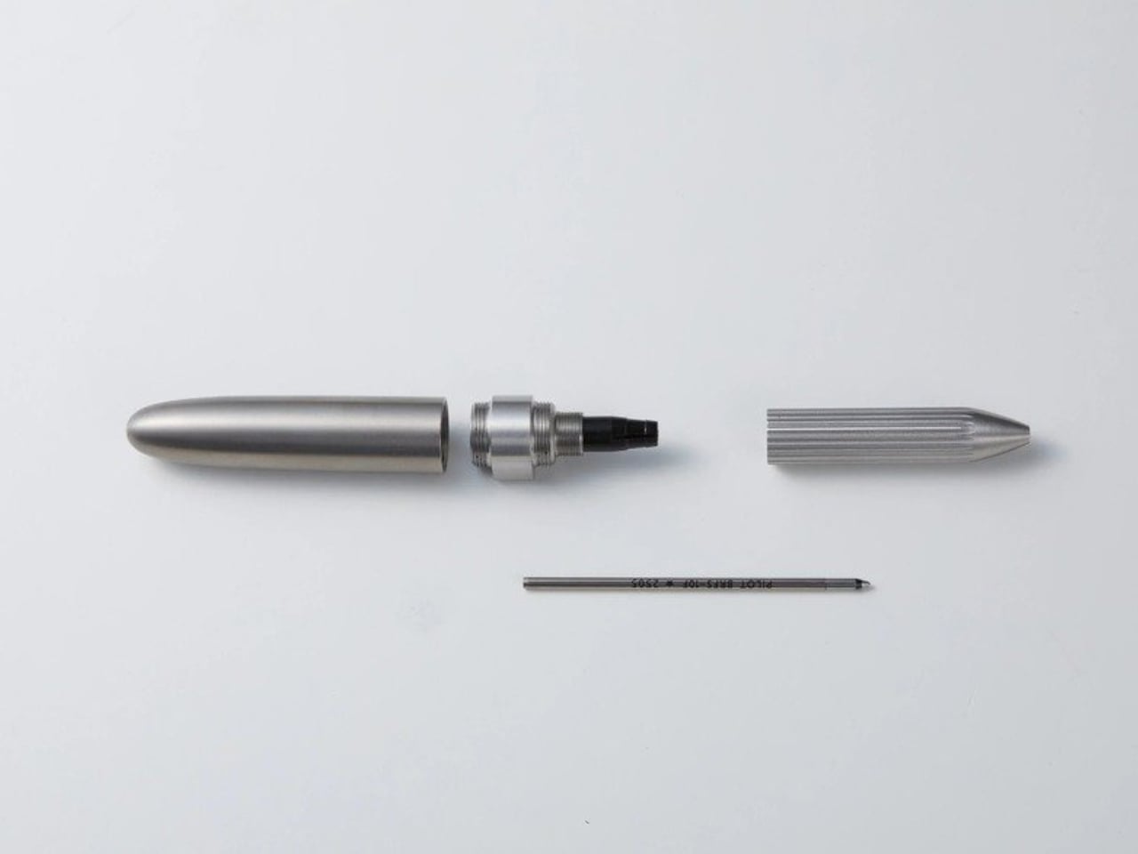
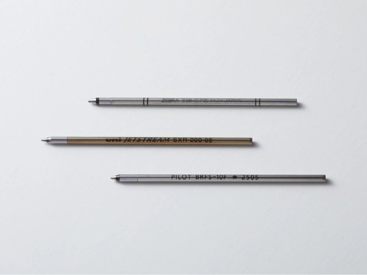
DeFF is a Japanese design firm that has been quietly building a reputation around the idea that the tools you carry every day deserve more thought. The Refill Pen Jacket concept is clever at its core: rather than designing a pen from scratch, they designed a jacket, a precision-crafted body that wraps around whatever standard refill you already love. You’re not locked into DeFF’s ink. You’re not buying a disposable. The jacket works with D1 (ISO) and 4C (JIS) standard refills, covering a staggering range of off-the-shelf options. You bring the ink. They bring the experience.

Designer: DeFF

The Extra Short version takes that idea and compresses it further, prioritizing portability without sacrificing the writing feel. And it works. Knurled grip, balanced weight, magnetic cap snap, a collet structure that holds your refill without any modification needed. All of it feels deliberate rather than decorative. It doesn’t feel like a product that was engineered and then handed off to a designer to make pretty. It feels like it went the other direction entirely.

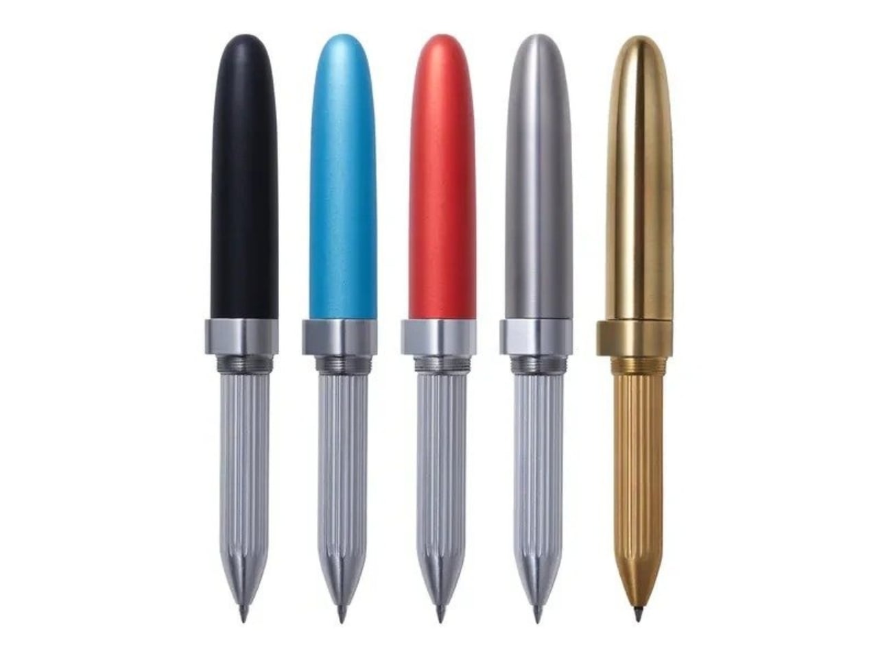
Materials matter here in a real way. DeFF offers the Extra Short in aluminum (jet black, aquamarine blue, and ruby red), brass, titanium gray, natural wood including ebony, and carbon fiber. Each one wears differently, weights differently, and will age differently. The brass version is the most compelling to me personally. It will patina. It will develop character. You’ll use it for years and it won’t look the same as the day you bought it, which is either a selling point or a dealbreaker depending on who you are. I happen to think it’s a selling point.

Pricing starts at $19.99 for the aluminum model, which makes this genuinely accessible. The more premium finishes push the price higher, but the entry point is honest. And it’s worth noting that the Refill Pen Jacket Extra Short won the iF Design Award 2026, one of the most recognized design prizes in the world. That context matters. It’s not a novelty or a clever gimmick. It was evaluated alongside global competition and came out on top. For a pen that fits in the breast pocket of your shirt, that’s a significant thing to carry around.

The engraving option is worth a mention too. Custom engraving turns this from a premium daily carry into a gift that actually lands. Not a generic gift, either. Giving someone a beautifully made writing instrument personalized with their name or a date is a completely different category of thoughtful, and it’s the kind of thing people keep in a drawer for years before deciding it’s too good not to use every day.

There’s a larger conversation embedded in a product like this. We spend a lot of time talking about sustainability in broad strokes, in systems and policies, but very little time thinking about how individual design choices contribute to the same goal. A pen jacket, by definition, asks you to stop throwing away the whole thing when the ink runs out. The object stays. Only the cartridge changes. That’s a small shift in behavior, but it’s also a shift in how you relate to the things you carry. You’re not using it up. You’re carrying it forward.

For anyone who writes by hand regularly, whether you’re a journaler, a designer who sketches on paper, or just someone who prefers the feel of pen over stylus, the Extra Short is the kind of object that rewards attention. It doesn’t announce itself. It doesn’t need to. It isn’t trying to be the loudest thing in the room. It’s just trying to be the one you always reach for.

The post The $20 Pen That Makes a Very Loud Case for Minimalism first appeared on Yanko Design.
Varydes Built a Steel Pen Named After Rain That Never Falls

Pens have been essentially the same for decades. You pick one up, you write, you lose it in the bottom of your bag, and you move on. Nobody really thinks about what a pen looks like anymore because, for the most part, they all look the same. That’s exactly why Virga by Varydes stops you cold.

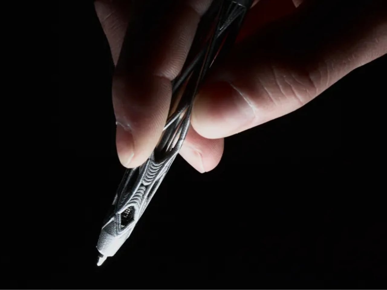
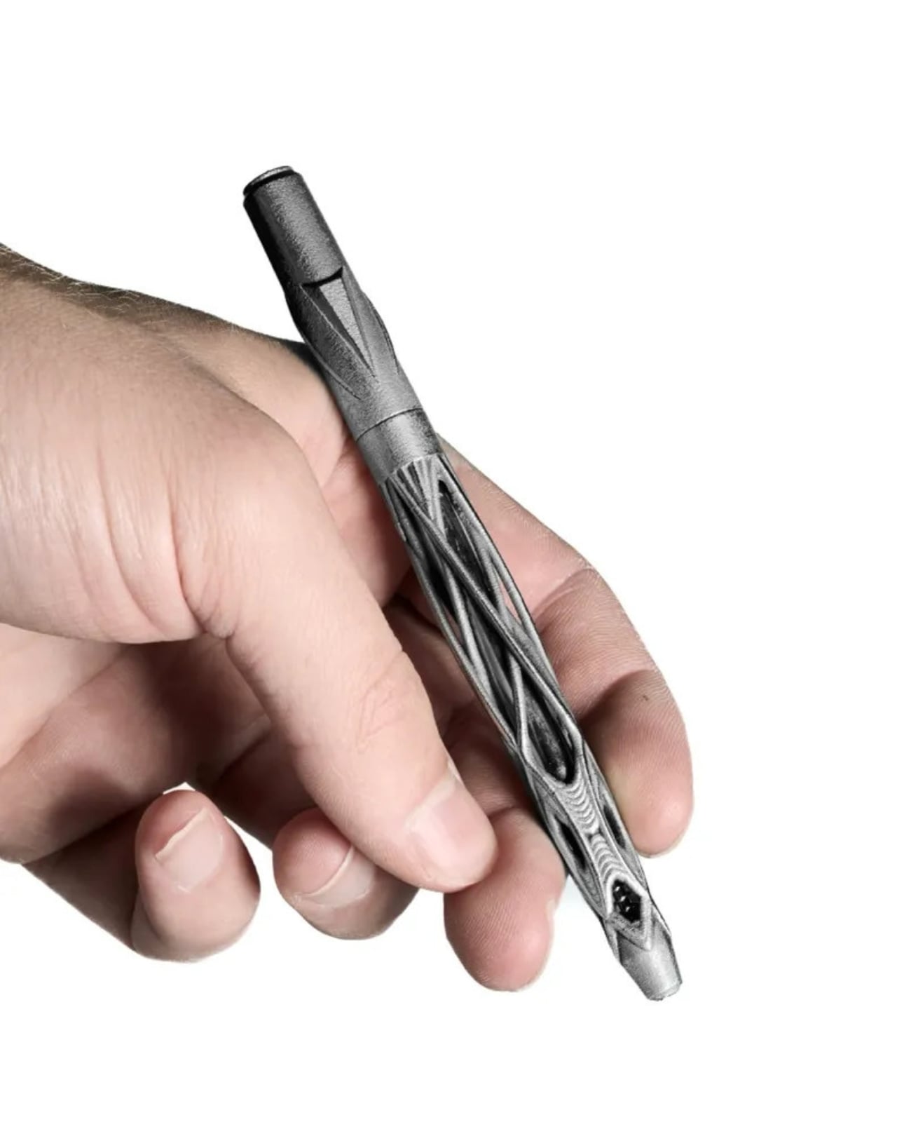
Designed by Kjell Semmer out of a Berlin studio, Virga is a ballpoint pen built from solid 316L stainless steel, shaped into an open lattice structure that looks less like it was engineered and more like it simply grew. The studio describes it as “grown, not manufactured,” and that’s not marketing language. When you look at the photographs, you genuinely see it. Fine steel strands weave together, pull apart, dense in some sections and open and airy in others. Rotate it even slightly in the light, and it shifts. You never quite see the same pen twice.

Designer: Kjell Semmer

The name, Virga, is borrowed from meteorology. It refers to precipitation that falls from clouds but evaporates before ever reaching the ground. Rain that exists but never lands. It’s a strange, beautiful thing to name a writing tool after, but it works. Like the weather phenomenon, Virga the pen exists somewhere between two states of form. It looks almost organic yet undeniably industrial. Precise, but it reads as wild. A piece of steel that somehow feels alive.

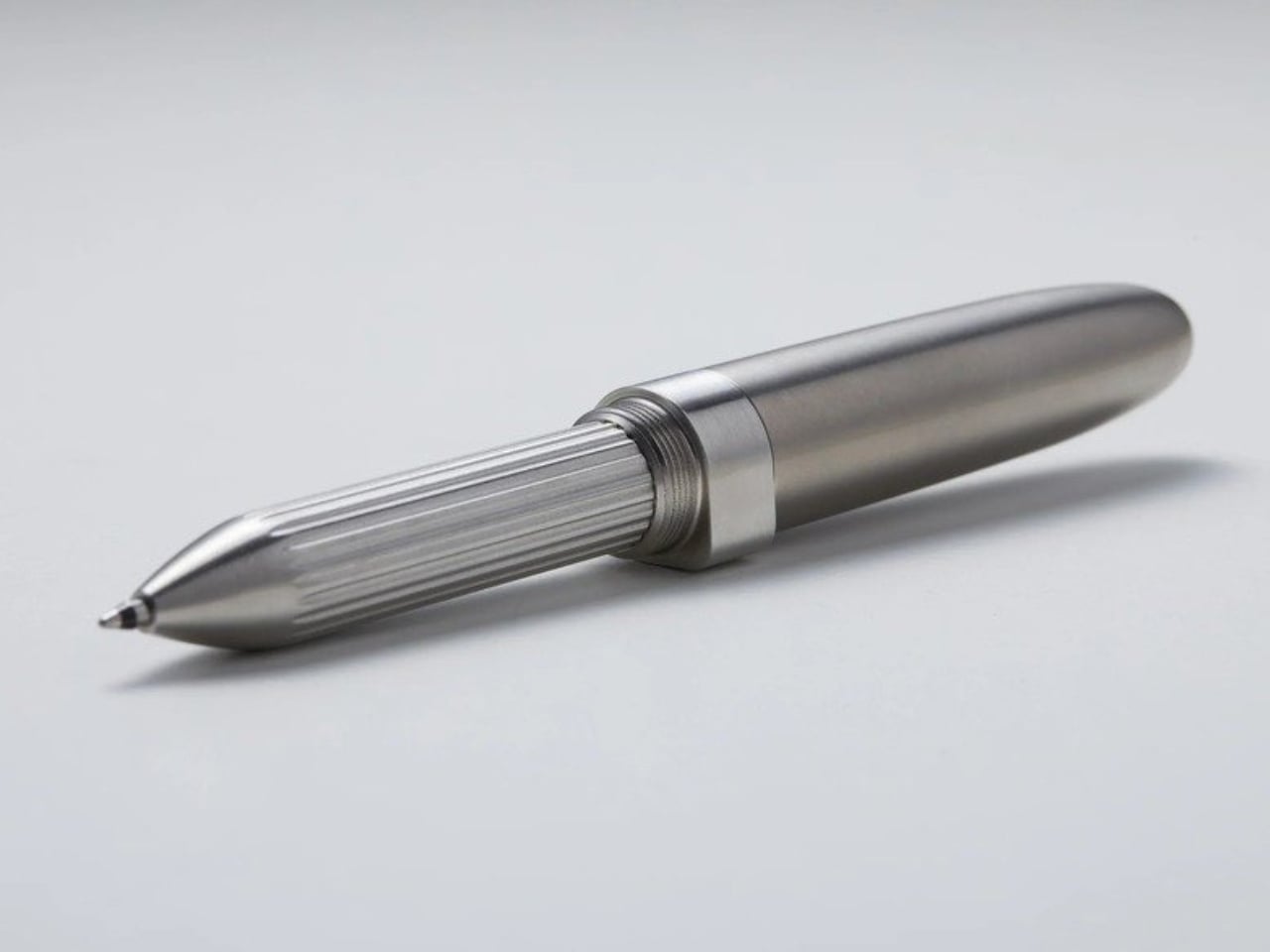
Functionally, Virga is straightforward and, in my opinion, that’s a smart choice. A smooth twist mechanism, a standard G2 refill, 12.7 centimeters long, and 39 grams of solid steel in your hand. It won’t disappear in your bag. You’ll know it’s there. The weight alone makes it feel like an object that matters, not a disposable instrument you swipe from a hotel reception desk.

Every piece is individually examined, assembled, and hand-polished in the Berlin studio before it ships. Varydes deliberately leaves the surface raw, honest about the metal it came from. That kind of intentional restraint is worth paying attention to. It would have been easy to buff the thing to a mirror shine and call it luxury. Instead, they stopped at the point where the steel still feels like steel. That’s a different kind of confidence.

The design falls into a category that I think deserves more attention: objects made to be owned, not just used. A G2 refill means you can use it indefinitely. Stainless steel means it won’t crack, warp, or age poorly. The 3D printing process allows the open lattice structure to exist in the first place, creating geometry that traditional machining simply couldn’t produce. So while Virga looks like sculpture, it’s also engineered to be a daily companion. Those two things usually don’t share the same sentence, and yet here we are.

It’s also worth saying that the pen space has quietly become one of the most interesting corners of design. Collectors, writers, designers, and everyday people who just like beautiful objects have built a real market around thoughtful writing instruments. Virga fits into that world comfortably, but it doesn’t look like anything else in it. Most premium pens signal luxury through traditional craftsmanship, fine materials, brand heritage. Virga arrives from a completely different angle. It signals thinking. It looks like someone asked a genuinely different question about what a pen could be and then had the ability to actually answer it.

Whether you’re the kind of person who collects objects, cares about design, or just wants to stop using pens that feel like they were never meant to last, Virga is worth watching. The name is more fitting than it might first appear. Virga is precipitation that never touches down, suspended between sky and earth. This pen lives somewhere between sculpture and tool, between wild nature and precise engineering. It occupies that space permanently, and it looks extraordinary doing it.

The post Varydes Built a Steel Pen Named After Rain That Never Falls first appeared on Yanko Design.
A Student Just Made a Pen From One Bamboo Stalk. No Factory Needed.

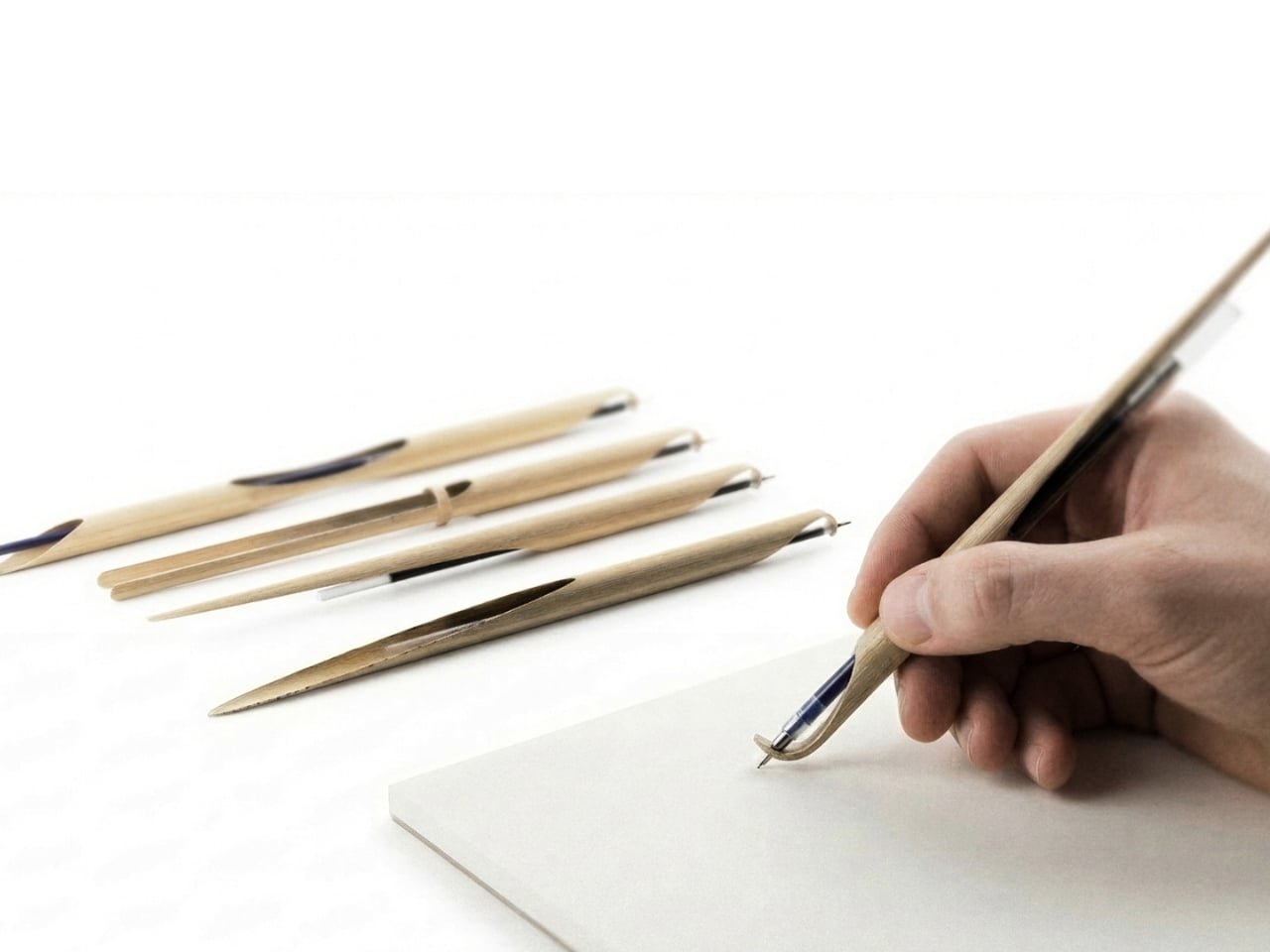
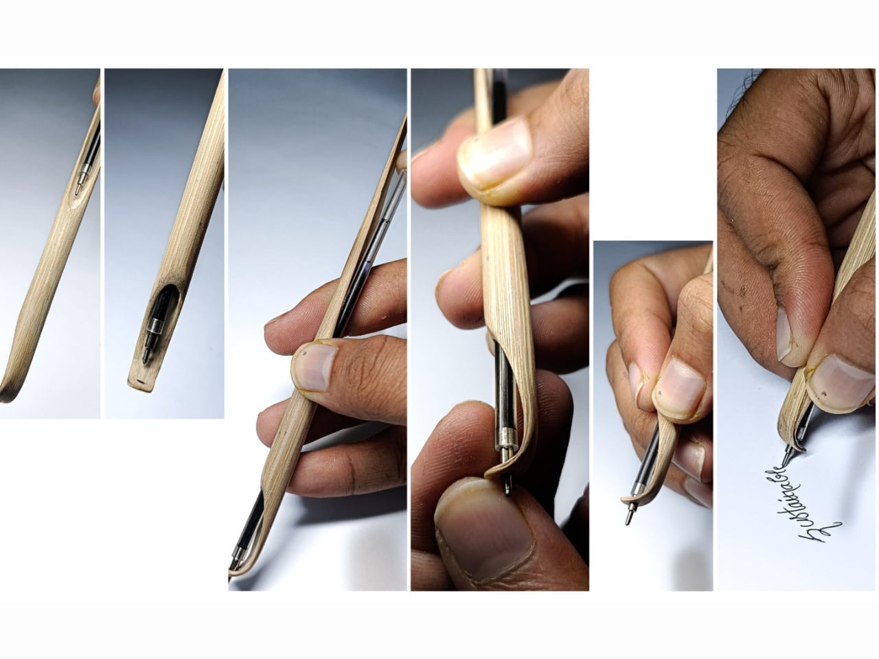
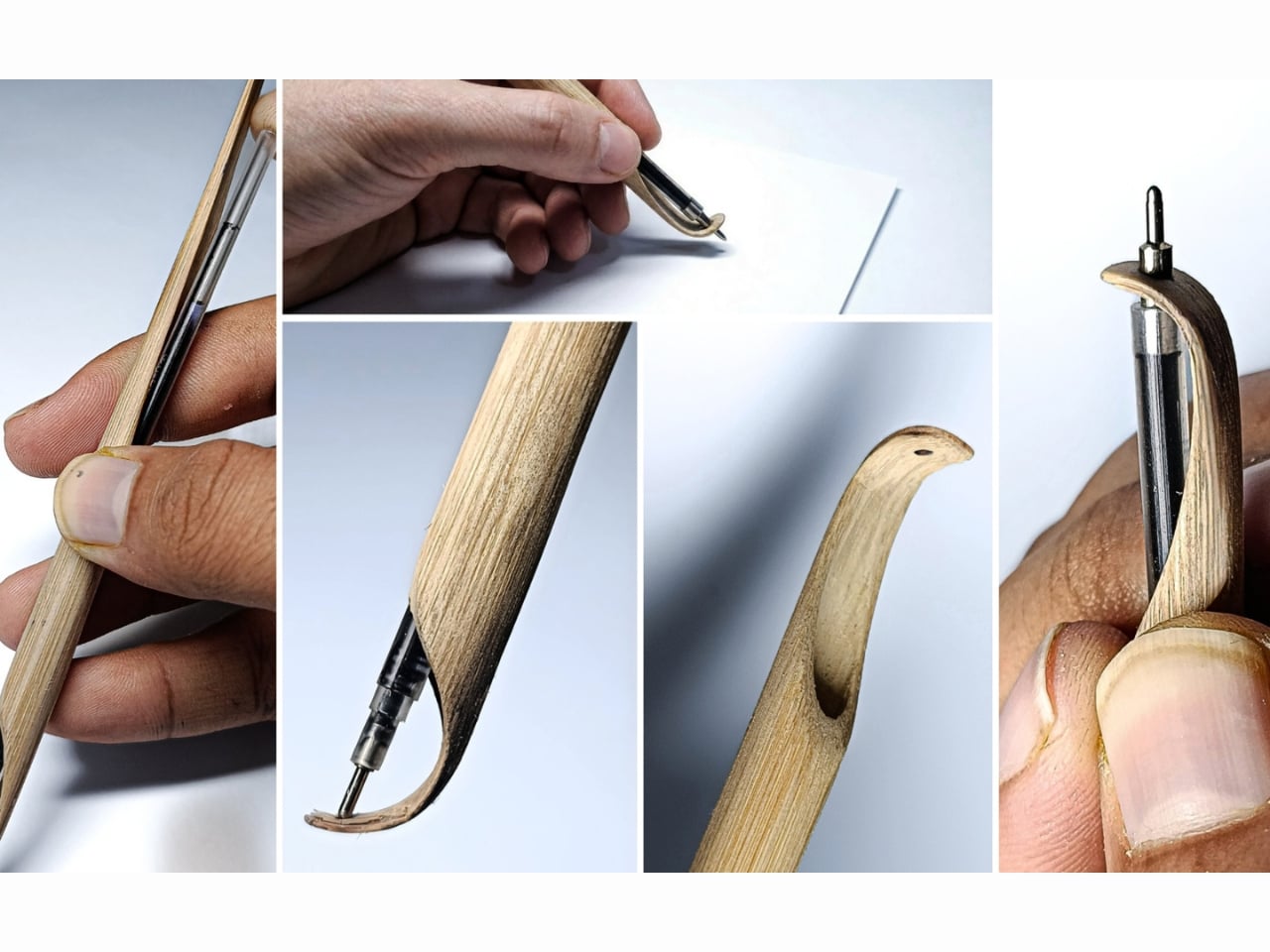
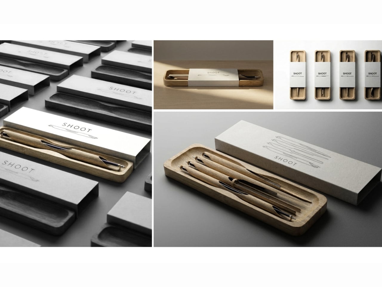
We don’t usually stop to think about pens. They show up in our bags, our drawers, the bottom of every tote we own, and when the ink runs out, they quietly end up in a landfill. That’s the mundane life cycle of the humble ballpoint, and most of us have just accepted it. Which is exactly why Shoot, a bamboo writing instrument designed by Sarthak Prajapati, feels like a quiet rebuke dressed up as a very beautiful object.

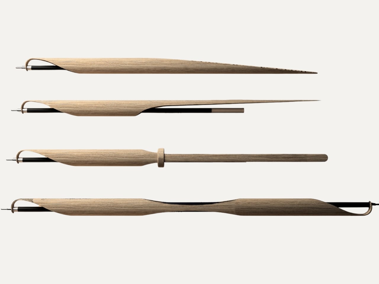
Prajapati is an Industrial Design undergraduate at the National Institute of Design in Assam, India, and Shoot is his entry in the 2026 Green Product Award, currently shortlisted as a finalist in the Consumer Goods category. At first glance, it’s a precision pen carved from a single piece of bamboo. But the more you learn about how it was made and why, the more it becomes a kind of design manifesto condensed into something you can hold in your hand.

Designer: Sarthak Prajapati

The name itself is a clever one. A “shoot” is the young, fast-growing sprout of a bamboo plant, and that material is the entire premise of the object. Bamboo is one of the fastest-regenerating plants on earth, and Prajapati uses it here not as a trendy green overlay but as a functional, structural choice. The bamboo handles the grip. The bamboo handles the form. The bamboo is the design. There’s no layer of branding on top trying to convince you it’s sustainable. The material speaks for itself.

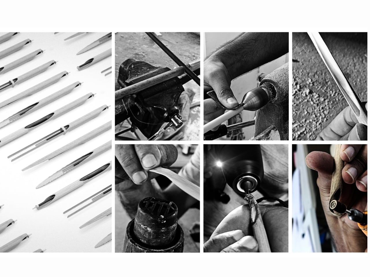
Shoot’s most compelling quality isn’t even the material. It’s the thinking behind how it was made. No electricity. No factory floor. No complex supply chain. Prajapati built this using low-energy, hands-on craft methods, which aligns with a wider movement in design circles pushing back against the idea that innovation always has to be high-tech to be meaningful. Sometimes innovation looks like stepping back and asking whether the thing we already have, meaning the plant, the material, the traditional skill, was actually good enough all along.

The pen is also refillable, which sounds like a small detail but isn’t. Disposable pens are a genuinely staggering problem. Billions are discarded every year globally, and most of them are made from mixed plastics that can’t be easily recycled. The refillable design of Shoot positions it directly against that culture of single-use convenience, and it does so without requiring the user to sacrifice function. You still get a proper writing instrument. You just don’t throw the whole thing away when it’s done.

I’ll be honest: I have a soft spot for design that comes from a student context. There’s a kind of fearlessness to it. Prajapati isn’t working within a corporate brief or trying to satisfy a retailer’s margin requirements. He’s solving a real problem the way he actually believes it should be solved, and the result has the clarity that comes with that freedom. The pen looks exactly like what it is. A bamboo stalk. A writing tool. Nothing more, nothing less, and somehow that is enough.

The Green Product Award itself, now in its eleventh year, evaluates submissions on approach, innovation, sustainability, and design. The fact that Shoot made the final shortlist tells you a lot about the kind of thinking that’s being rewarded right now. The jury isn’t looking for products that simply add a bamboo component to something otherwise unchanged. They’re looking for objects where the sustainability logic runs all the way through, from material to manufacturing to end of life.

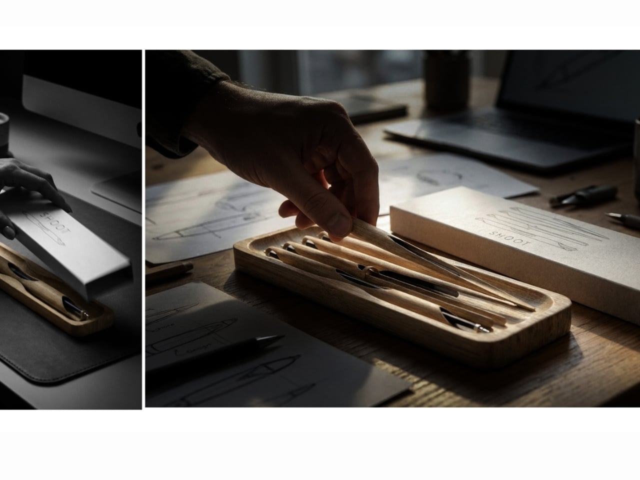
If Shoot ever goes into production, I’d buy one. Not because I’m trying to make a statement, but because it looks good, it works, and it represents a genuinely more considered way of making things. The design world produces a lot of concepts that never leave the rendering stage, but Shoot has a physicality and simplicity to it that makes it feel ready. It’s a pen. From a bamboo shoot. Made by hand. And right now, that feels surprisingly radical.

The post A Student Just Made a Pen From One Bamboo Stalk. No Factory Needed. first appeared on Yanko Design.
Pininfarina’s Forever Pen Needs No Ink, Ever

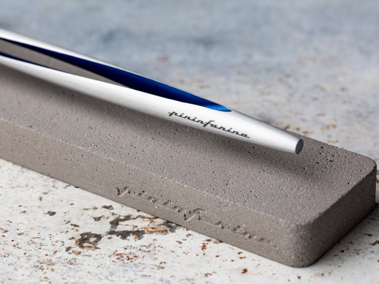
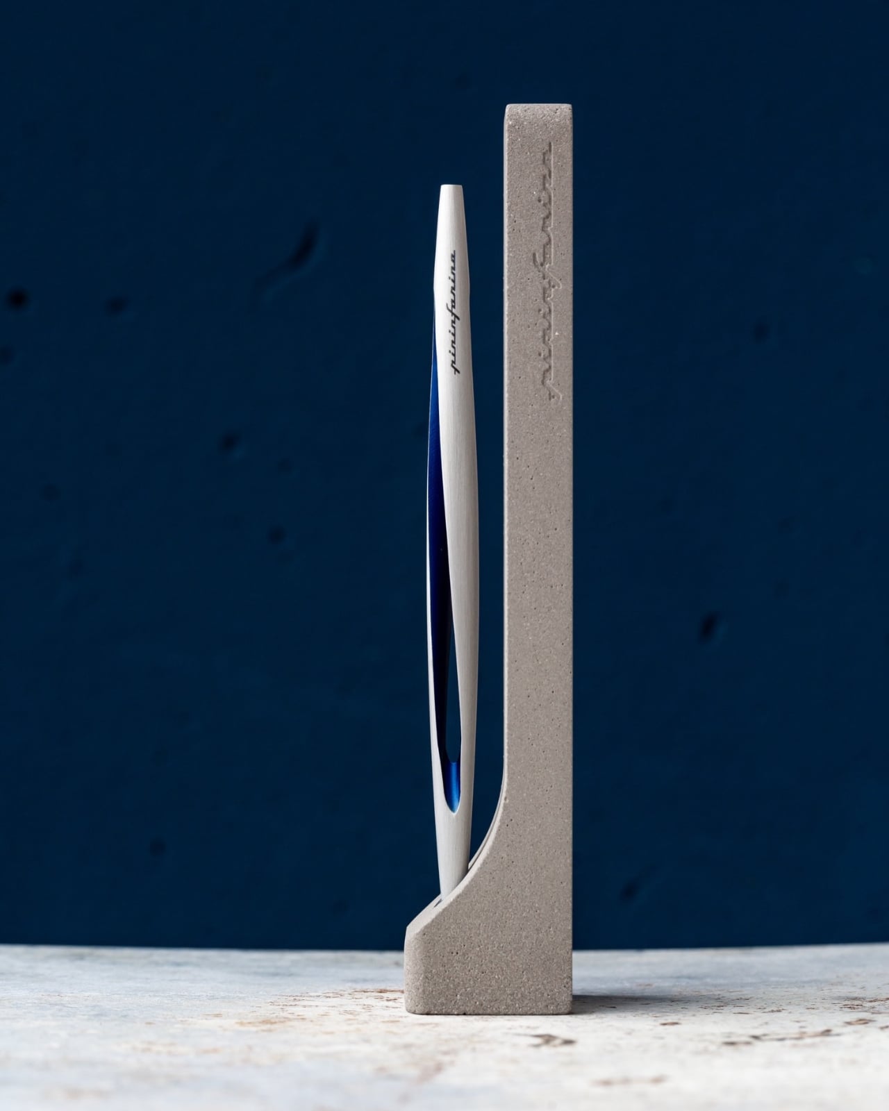
I’ve spent a lot of time thinking about what makes an object truly worth keeping. Not just useful, but worth keeping. The kind of thing you’d take with you when you move, that earns its place on whatever desk you end up at next, without ever needing to explain itself. The Pininfarina Aero Ethergraf is one of those objects, and the reason it works so well has everything to do with how quietly it dismantles what we think a pen is supposed to be.

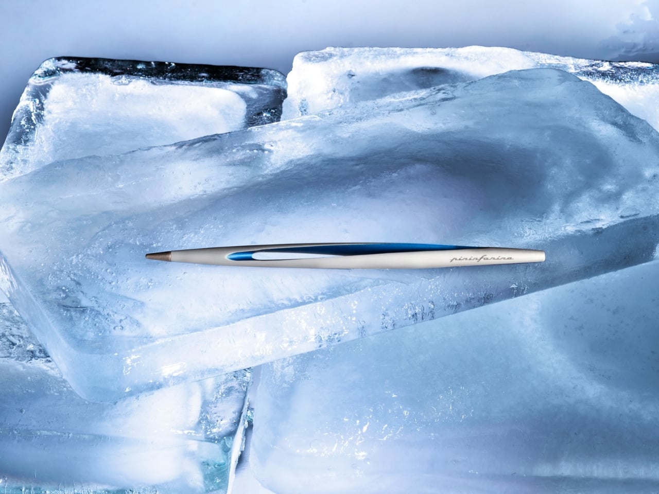
Let’s start with the most obvious thing: it has no ink. No cartridges, no refills, no cap to inevitably lose behind a couch cushion. The Aero Ethergraf writes through an Ethergraf® metal alloy tip that works via oxidation, leaving a graphite-like mark on paper through an ancient technique of letting metal trace itself across a surface. The result is a line that is light, precise, and smudge-proof. It doesn’t bleed through paper. It doesn’t dry out when left uncapped. And it never runs out, which is either deeply satisfying or slightly unnerving, depending on how much you’ve spent on fountain pen ink over the years.

Designer: Pininfarina

Pininfarina, for the uninitiated, is the Italian design house responsible for some of the most iconic automotive silhouettes ever made, including decades of Ferrari and Maserati bodies. Their design language has always been about the line: a single, confident stroke that communicates both speed and restraint at once. You can see that same philosophy in the Aero. The body is aerodynamic in a way that feels earned rather than decorative. Crafted from aerospace-grade aluminum, it weighs 17 grams and measures 160mm in length, and it sits in the hand with a kind of quiet, intentional presence.

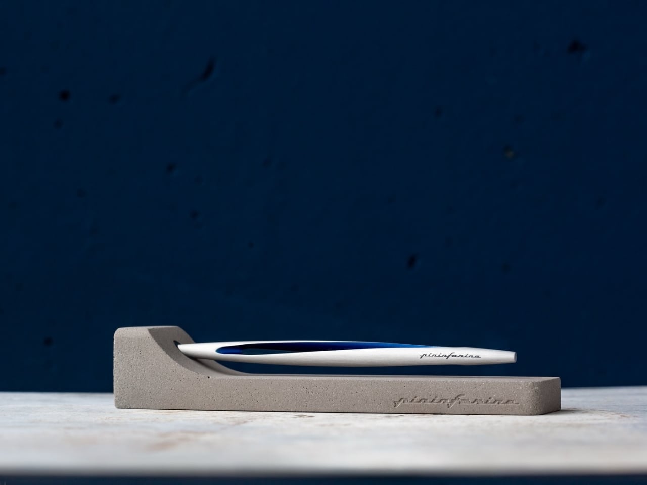
The pairing with the raw concrete stand is where the design story gets genuinely interesting to me. Concrete is heavy, permanent, and entirely unpretentious. It doesn’t try to impress you. Placed beside the precision-machined aluminum of the pen body, the contrast is deliberate and considered. One material is ancient and rough. The other is modern and precise. Together, they say something about the object’s relationship with time, and that feels like a very intentional editorial choice on Pininfarina’s part.

Most writing tools are built around the assumption of disposability. You use them, you lose them, you replace them. The Aero Ethergraf operates from an entirely different premise. It assumes you want to keep it. It assumes that the act of writing is not just a task to check off but a gesture with some weight behind it. Whether you’re signing something important, sketching an idea before it disappears, or just making a note to yourself at the end of a long day, the pen makes you feel like the action matters. That shift in expectation is subtle, but once you notice it, it’s hard to go back.

I’ll be honest about who this is for: there is a specific kind of person this appeals to, and I’m perfectly comfortable being that person. If you are deliberate about the objects around you, if the pen on your desk says something about how you approach your work, if you believe that design is never purely aesthetic but always also philosophical, then the Aero Ethergraf was made with you in mind.

It is also, genuinely, a beautiful thing to look at. The blue accent running along the aluminum body catches light the way a car door does at the right angle, which makes sense given the studio behind it. Sitting in its concrete cradle on a desk, it reads less like an office supply and more like a considered piece of sculpture.

Made in Italy, handcrafted, built to last without maintenance, and rooted in a technique far older than the ballpoint pen as we know it, the Pininfarina Aero Ethergraf is a quiet argument for choosing objects with intention. Not because they’re expensive or rare, but because some things genuinely deserve to stay.

The post Pininfarina’s Forever Pen Needs No Ink, Ever first appeared on Yanko Design.
Yamaha Just Made a Pen That Writes With a Beat

If you asked most people to name a Yamaha product, you’d probably get piano, guitar, or motorcycle long before anyone said pen. And yet here we are, talking about a writing instrument from one of the most iconic music and motor companies in the world. The Swing Scribe is not a gimmick. It’s a genuinely fascinating piece of design thinking, and it deserves far more attention than it’s been getting.

Part of Yamaha’s Scribe Tool Design 2024 project, the Swing Scribe is a collaboration between Yamaha Corporation and Yamaha Motor designers based in the US. The project’s premise is simple but surprisingly profound: in an age saturated with digital tools, what happens when you return to something as primitive as writing? And more importantly, what can you add to it, not to make it smarter or faster, but to make it more felt?

Designer: Yamaha

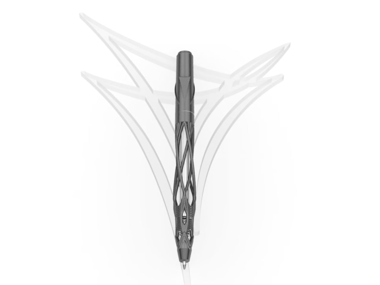
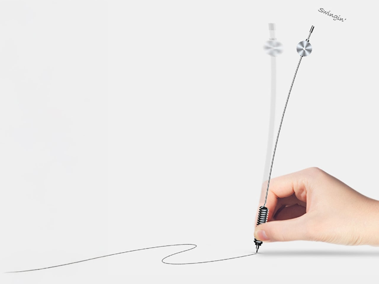
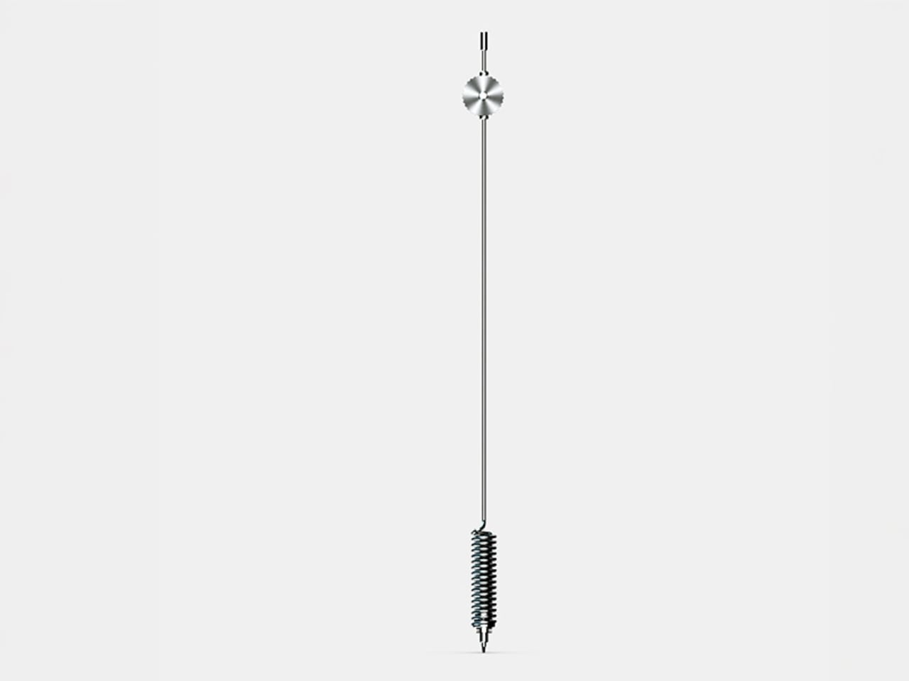
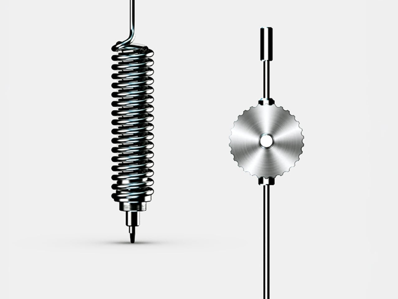
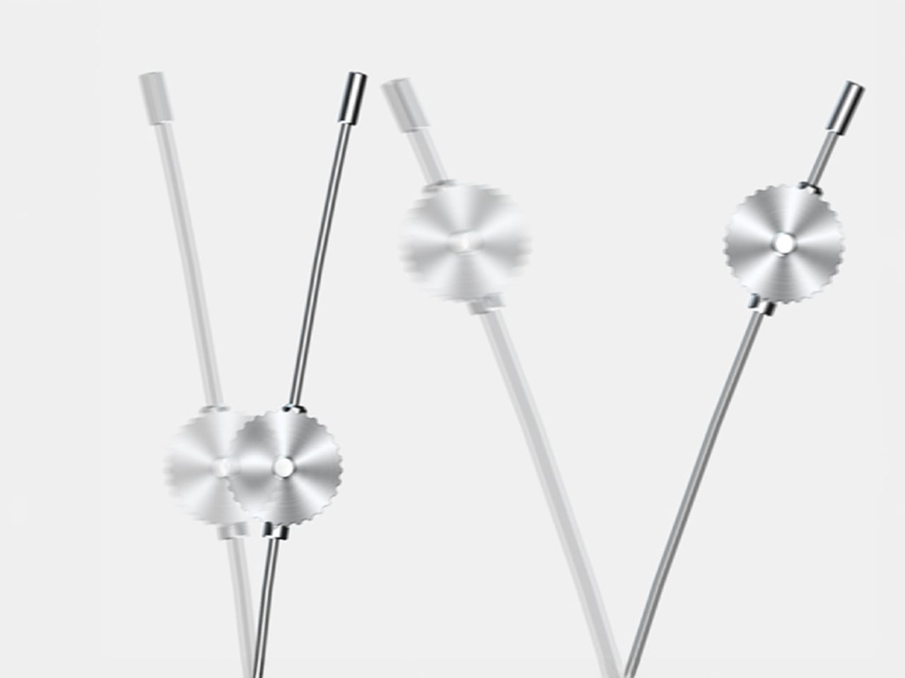
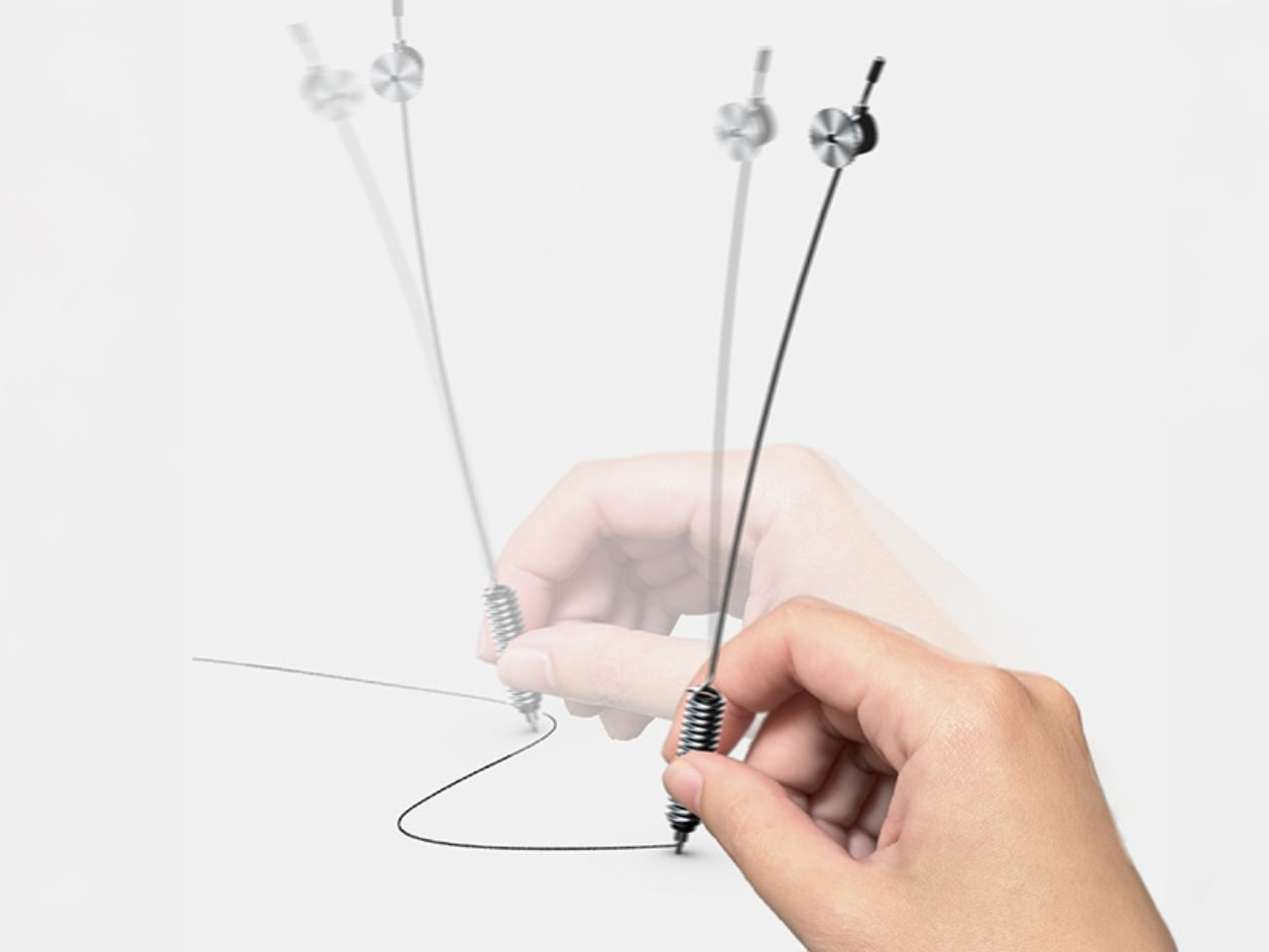
The Swing Scribe answers that question with a pen that behaves like a metronome. The design draws its inspiration from the quill, one of the oldest writing instruments in history. As you write, the natural wobble of the feather gives the pen rhythm through a small amount of air resistance. Yamaha took that phenomenon and made it intentional. A weighted tip is attached to a metal bar, and as you write, it swings. The small pendulum force produced by the weight and the movement gives a rhythm to the pen and the way it flows, feeding that beat back into your hand.

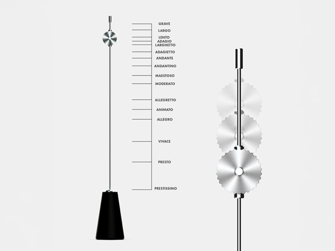
What’s particularly clever is the degree of control built into it. You can slide the weight along the bar to change the arc of the swing, adjusting resistance and tempo to match how you’re feeling at any given moment. Slow and contemplative? Let it swing wide. Fast and focused? Pull the weight closer. It sounds like a small, quiet thing, but it genuinely reframes the act of writing as something that has a beat, a pace, its own kind of mood.

This is deeply Yamaha. The company has a long-standing design philosophy rooted in the Japanese concept of Kando, which translates roughly to emotional excitement or deep resonance. The goal isn’t just functionality. It’s feeling. It’s the reason a Yamaha piano doesn’t only produce notes but creates a whole physical experience for the player, something that connects the body to the sound. The Swing Scribe takes that same philosophy and applies it to a writing tool.

I’ll admit my first reaction was skepticism. A pen that swings on a metal arm sounds like something you’d appreciate in a design exhibit and then immediately set down. But the more I thought about it, the more it made sense. We’ve spent years optimizing handwriting out of our lives. Keyboards are faster. Voice memos are easier. Dictation tools have gotten good enough to be genuinely useful. And yet journaling, sketching, hand-lettering, and analog note-taking are having a real cultural moment right now. People aren’t returning to pen and paper purely out of nostalgia. They’re returning because it feels different from every other thing they do. Because it slows them down in a way that makes room for actual thinking.

The Swing Scribe leans into that completely. It doesn’t try to make handwriting more efficient. It makes it more deliberate, more sensory, more present. And it does all of this with a mechanism that is elegant in its simplicity. No batteries, no Bluetooth, no companion app. Just physics. Not everything needs to be optimized. Some things are better when they resist you slightly, when they swing a little off-center, when they remind you that creating something by hand is its own reward. Yamaha, of all companies, probably understood that long before the rest of us caught up.

The post Yamaha Just Made a Pen That Writes With a Beat first appeared on Yanko Design.
This Award-Winning Pen Floats Like a Cloud on Your Desk

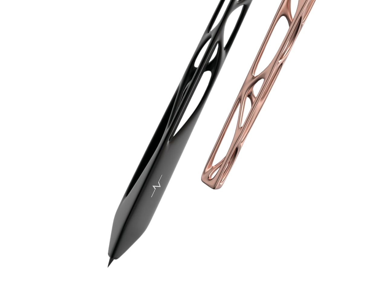
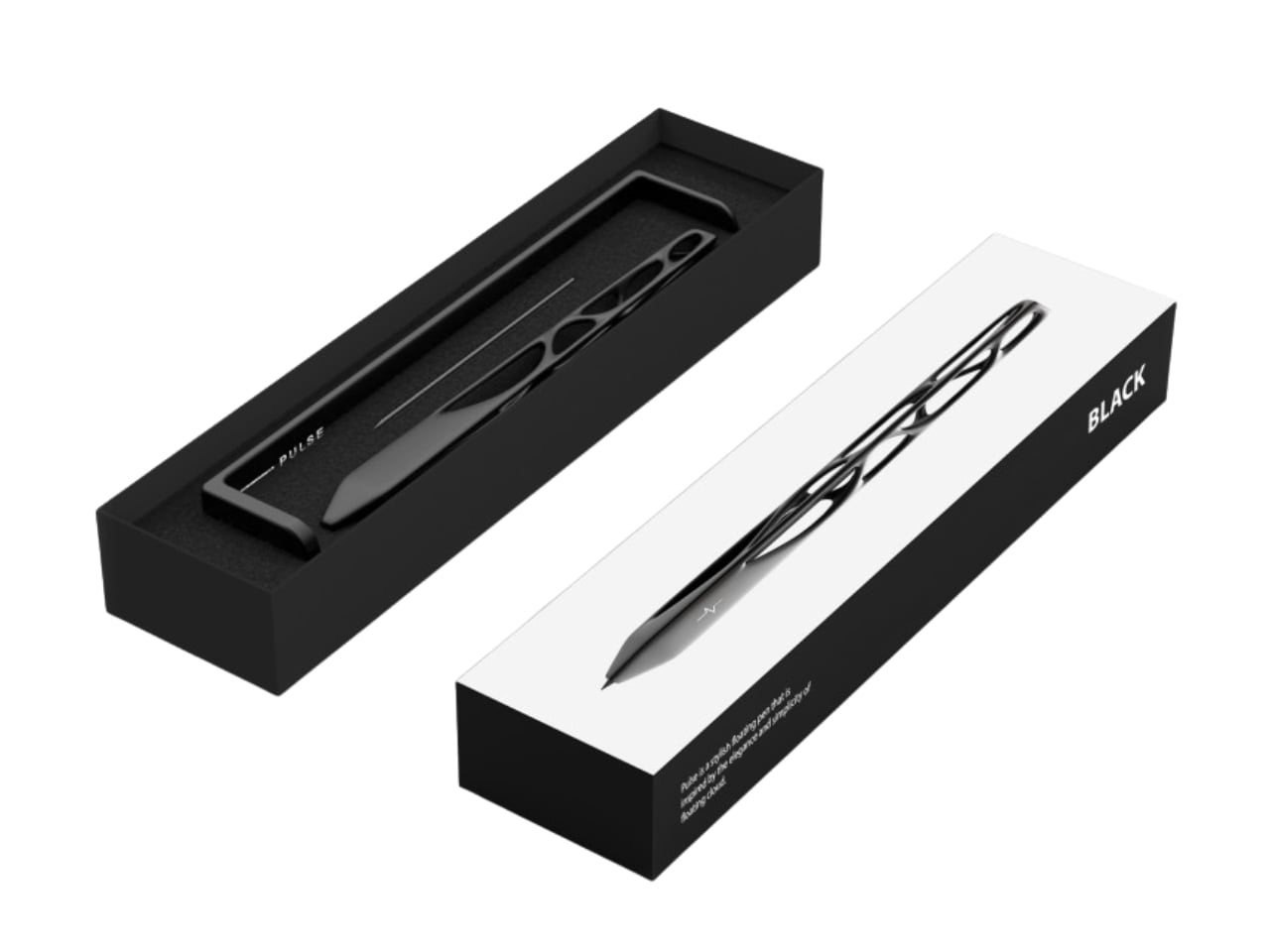
Remember the last time you picked up a pen and actually stopped to look at it? Most of us don’t. We grab whatever’s lying around, scribble a note, and move on with our day. But designer Leila Ensaniat is challenging that autopilot relationship we have with one of our most familiar tools. Her creation, Pulse, recently snagged the Golden A’ Design Award for 3D Printed Forms and Products, and it’s easy to see why this isn’t your average ballpoint.

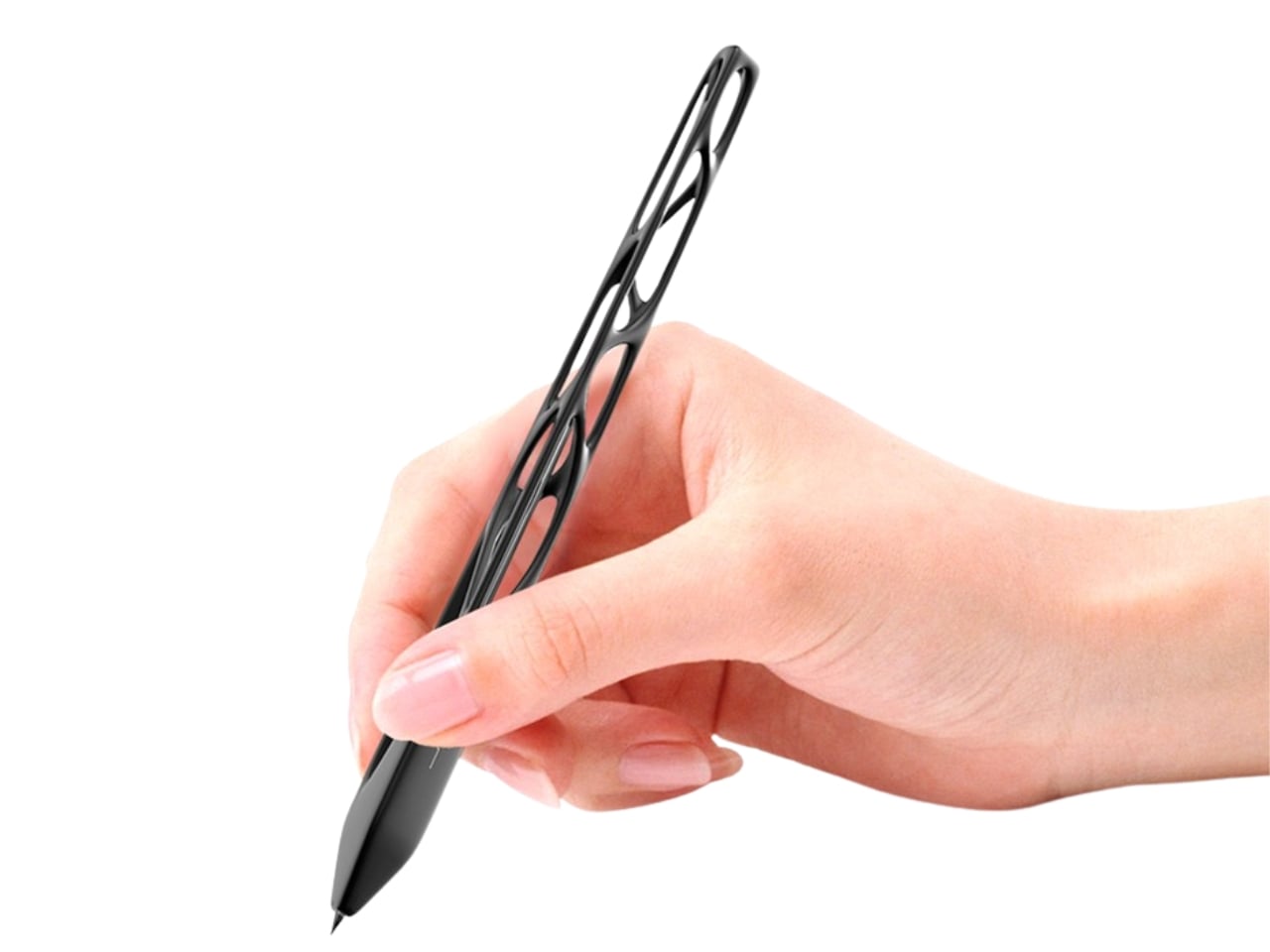
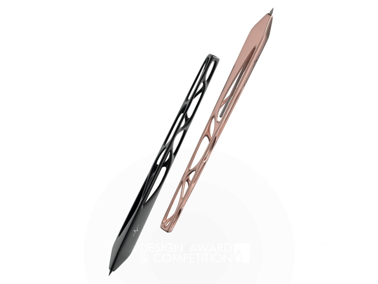
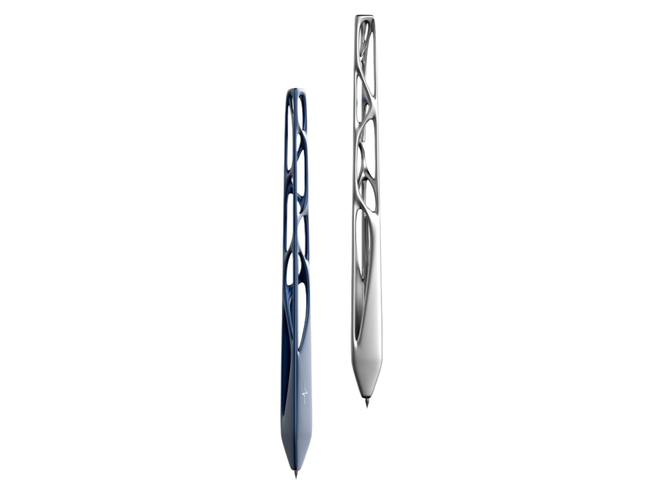
Pulse is what Ensaniat calls a “floating pen,” and that description actually makes sense once you see it. Drawing inspiration from the quiet, effortless drift of clouds, the pen feels less like a writing instrument and more like a small sculptural moment on your desk. It’s the kind of object that makes you pause, which is pretty rare when we’re talking about something as mundane as a pen.

Designer: Leila Ensaniat

What makes this design really interesting is how it blends old-school craftsmanship with cutting-edge technology. The pen features biomorphic patterns that look like they grew organically rather than being designed, and they’re created using lost wax casting in aluminum, silver, bronze, and gold. That’s a centuries-old metalworking technique typically reserved for jewelry and art pieces, not everyday writing tools. But that collision of traditional craft and contemporary design thinking is exactly what gives Pulse its unique character.

Ensaniat, who has a background as an industrial designer at Cisco specializing in consumer electronics, brings a tech-world sensibility to object design. Her approach centers on human-centered design, which basically means she’s thinking hard about how we actually interact with objects rather than just how they look on a shelf. With Pulse, that philosophy translates into something that feels natural in your hand while also making you reconsider what a pen can be.

The surface treatments are particularly thoughtful. Those nature-inspired patterns aren’t just decorative, they enhance both the visual appeal and the tactile experience of holding the pen. It’s a detail that matters more than you’d think. When an object feels good to touch, when it has texture and weight that seems intentional, it changes your relationship with it. You’re more likely to keep it on your desk, to reach for it specifically, to actually care about this tool that usually gets treated as disposable.

What’s fascinating about Pulse is how it sits at the intersection of sculpture and utility. The design explores that balance between being something you want to look at and something you actually need to use. Plenty of designer pens lean too hard into the luxury angle and end up feeling precious and impractical. Others focus purely on function and look forgettable. Pulse seems to nail that middle ground where form and function aren’t competing, they’re collaborating.

The project also gave Ensaniat deeper insight into the metal finishing and plating industry, which might sound technical but is actually important. Understanding how materials behave, how different metals can be worked and finished, how surface treatments hold up to actual use, that knowledge separates decorative design from functional design. A beautiful pen that tarnishes after a week or feels unbalanced when you write isn’t really good design, it’s just good marketing.

Created for her brand N I L A, which focuses on integrating technology seamlessly into everyday life, Pulse represents a broader design philosophy about making thoughtful, human-centered objects that solve real problems while also being distinct and meaningful. It’s an approach that feels increasingly relevant as we’re surrounded by more and more identical mass-produced stuff. Pulse won’t revolutionize how we write, and it’s not trying to. But it does suggest that even the most familiar, seemingly finished objects in our lives still have room for fresh thinking. Sometimes all it takes is a designer willing to ask why something has to be the way it’s always been, then having the skill to actually answer that question with something better.

The post This Award-Winning Pen Floats Like a Cloud on Your Desk first appeared on Yanko Design.
The Pen That Went to the Moon Just Got a Tactical Upgrade

Remember when you were a kid and someone told you about the space pen? You know, the one that writes upside down, underwater, and in basically any condition imaginable because NASA needed something reliable for astronauts? Well, Fisher Space Pen just dropped a new version that makes their legendary writing instrument even more ridiculously practical, and honestly, I’m kind of obsessed.

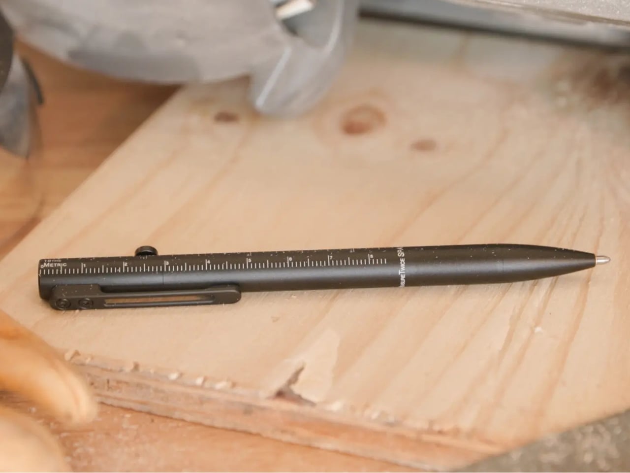
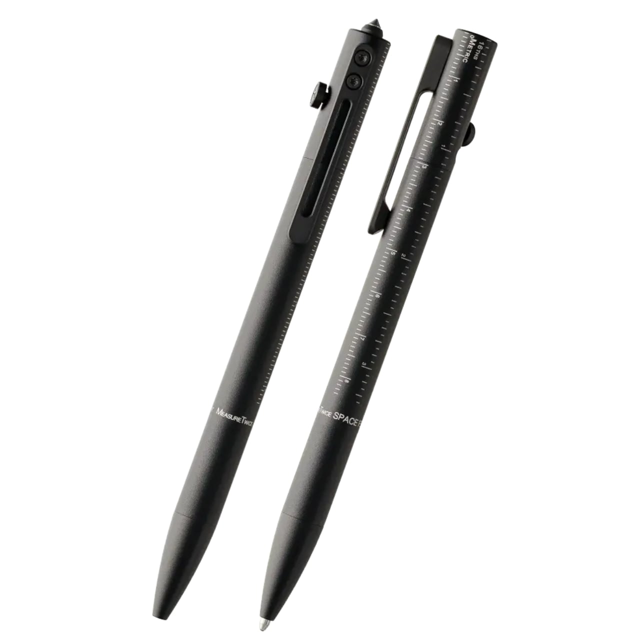
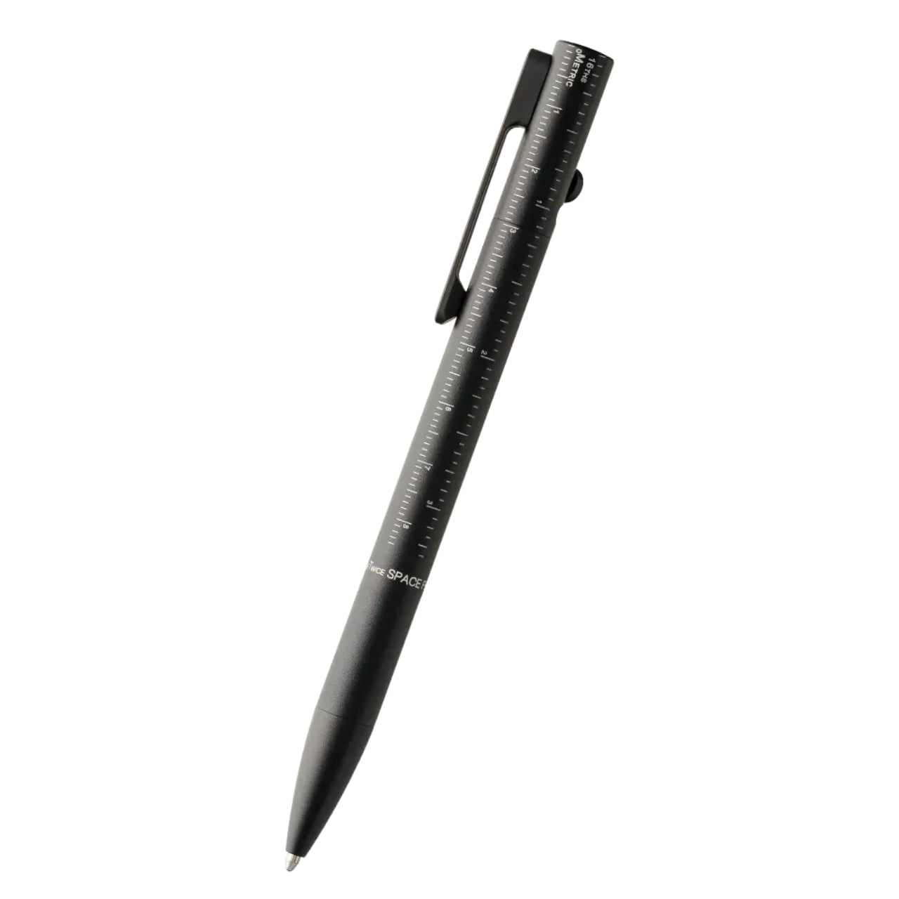
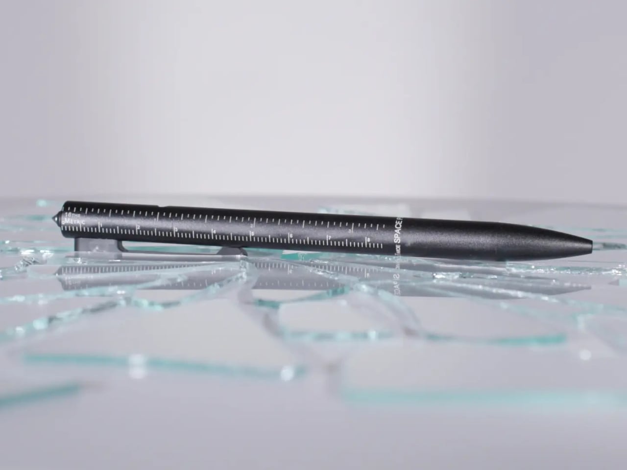
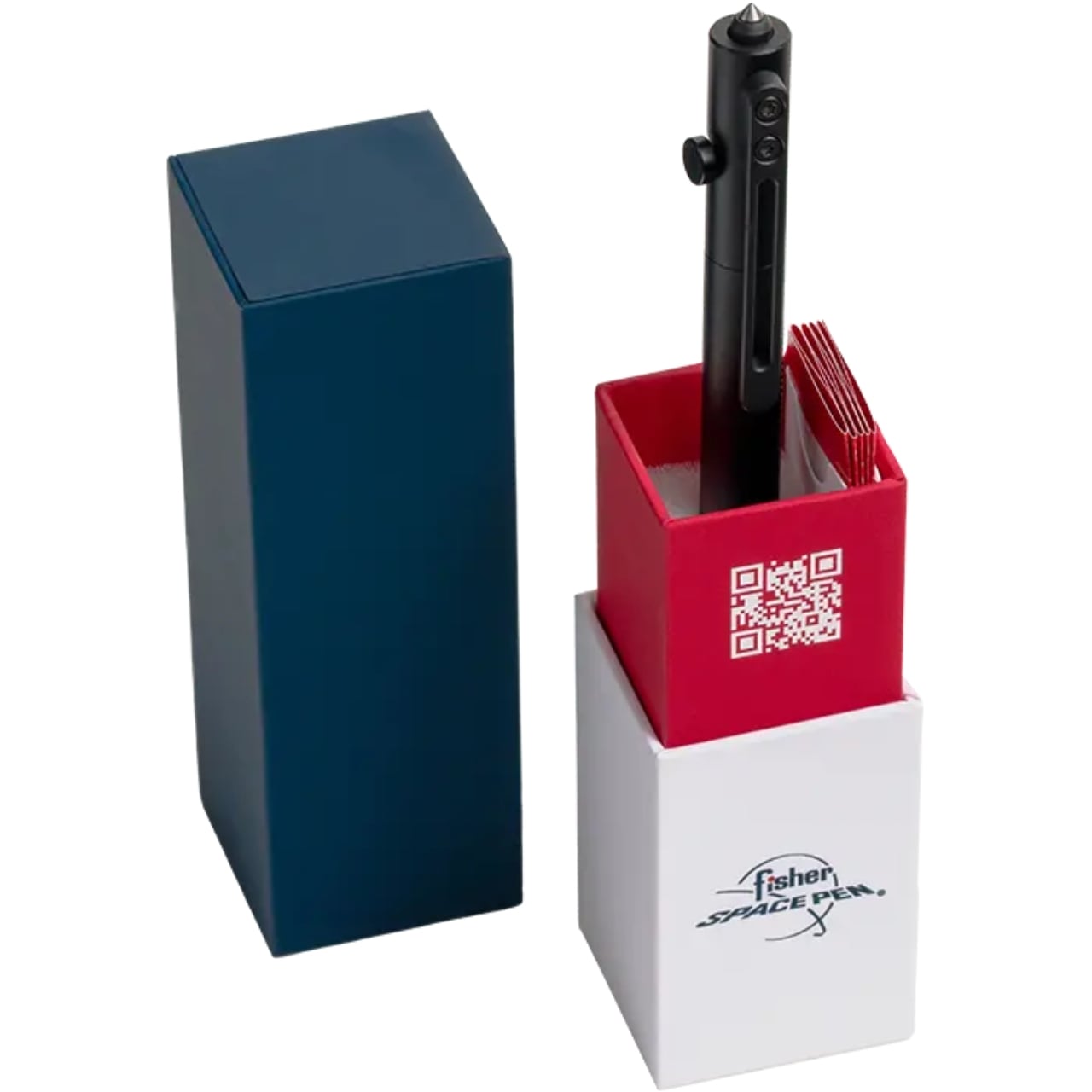
Meet the Measure Twice, a bolt-action tactical pen that’s basically the Swiss Army knife of writing instruments. At $69, it’s not your average drugstore pen, but hear me out because this thing is genuinely clever.

Designer: Fisher Space Pen

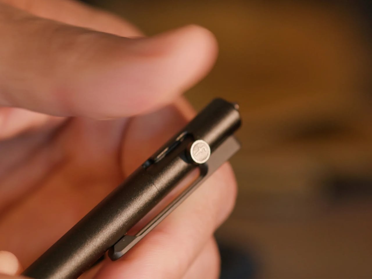
First, let’s talk about that bolt-action mechanism. If you’ve ever fidgeted with a pen during a long meeting or phone call, you know the appeal of a good click. But this takes it to another level. The bolt-action deployment is smooth, satisfying, and way more robust than a standard clicker. It’s the kind of tactile experience that makes you actually want to use a physical pen in our increasingly digital world. Plus, it just looks cool. There’s something inherently appealing about that tactical aesthetic without it being over the top or trying too hard.

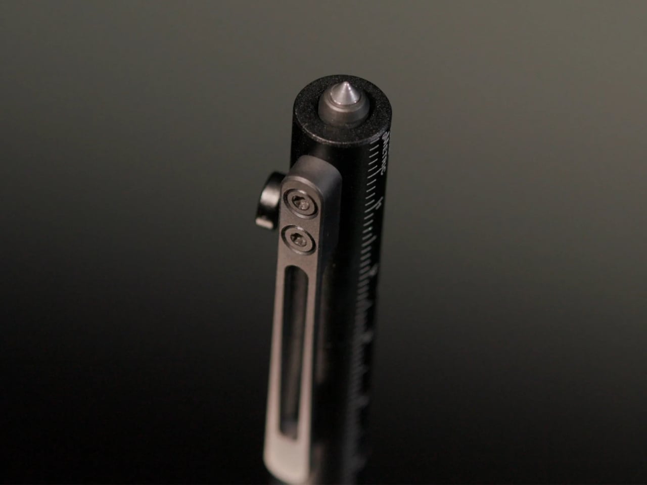
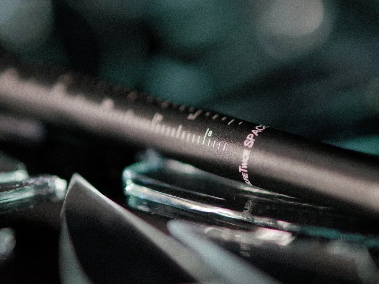
But here’s where it gets interesting. Fisher etched precision ruler markings right into the barrel of the pen. We’re talking both imperial measurements up to 3.5 inches and metric up to 9 centimeters. Think about how many times you’ve needed to measure something small and had to hunt around for a ruler or tape measure. Shopping for furniture online and need to visualize how big something is? Got it. Working on a craft project? Covered. Trying to figure out if that vintage frame will fit your photo? Done. It’s one of those features that seems almost too simple, but once you have it, you realize how often you actually need it.

The construction is pretty impressive too. Fisher switched from their traditional chrome-plated brass to anodized aluminum for this model. That means it’s lighter and more comfortable to carry all day, but still incredibly durable. The anodizing makes it resistant to scratches, corrosion, and impacts, so you can toss it in your bag or pocket without babying it. It’s designed to be used, not displayed on a shelf.

Now for the feature that really sets this apart: there’s a tungsten carbide glass breaker tip on the opposite end from the writing point. Yes, you read that right. This pen doubles as an emergency escape tool. In a car accident or emergency situation where you need to break a window, this could genuinely save your life. It’s the kind of thing you hope you never need, but knowing it’s there provides a weird sense of security. Plus, it speaks to the thoughtful design philosophy behind this pen. It’s not just about looking tactical or cool, it’s about actual functionality.

Of course, it still has all the legendary Space Pen technology that made the original famous. The pressurized ink cartridge writes upside down, works in extreme temperatures, functions underwater, and has a shelf life of over 100 years. That’s not marketing hype, that’s actual tested performance. These pens literally went to space and performed flawlessly in zero gravity.

What I really appreciate about the Measure Twice is how it represents a shift in how we think about everyday carry items. We’re constantly looking for ways to simplify what we carry, to have fewer, better things that do more. This pen nails that philosophy. It’s a precision writing instrument, a measuring tool, and an emergency device all in one sleek package that’s just over 5.5 inches long.

Fisher Space Pen took an icon and made it more relevant for 2026. The Measure Twice isn’t trying to replace your smartphone or be something it’s not. It’s just a really, really well-designed pen that happens to do a few extra things exceptionally well. And in a world of increasingly disposable products, there’s something genuinely appealing about a tool that’s built to last decades and actually earns its place in your pocket.

The post The Pen That Went to the Moon Just Got a Tactical Upgrade first appeared on Yanko Design.
This $89 Fountain Pen Shows You the Ink Flowing Through it’s 3D Printed Maze

Nib is the first thing I want right when choosing a fountain pen, then I look for its design and aesthetics afterwards. Endless Stationery, a Chennai, India-based global stationery brand, that successfully created a retractable fountain pen and raised close to $250,000 in funding for it in 2024, wants to change my idea in favor of aesthetics without compromising the writing experience.

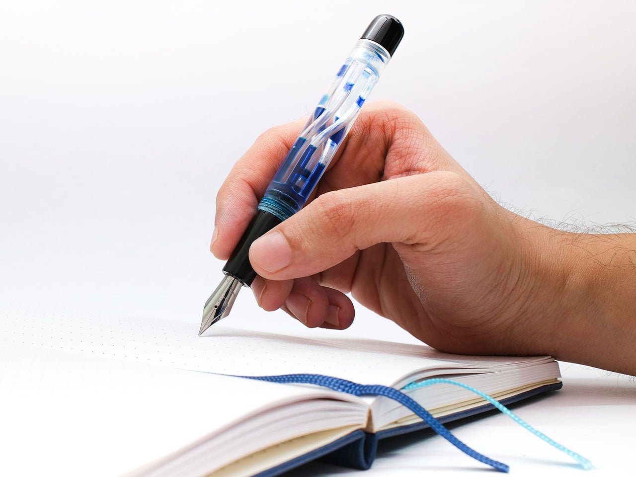
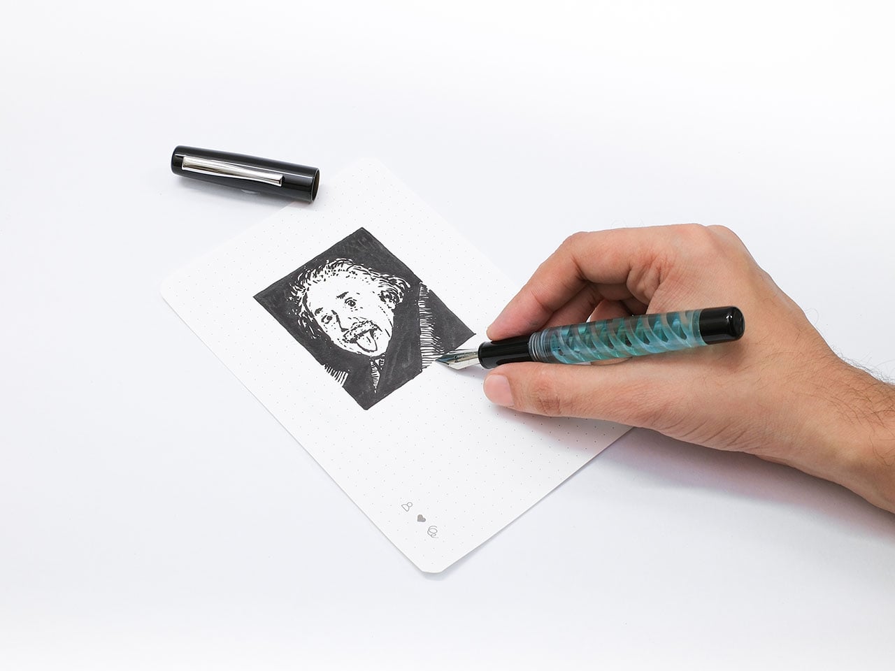
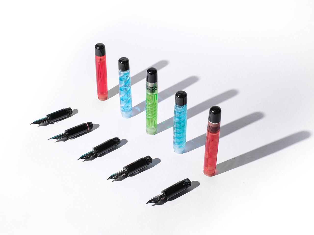
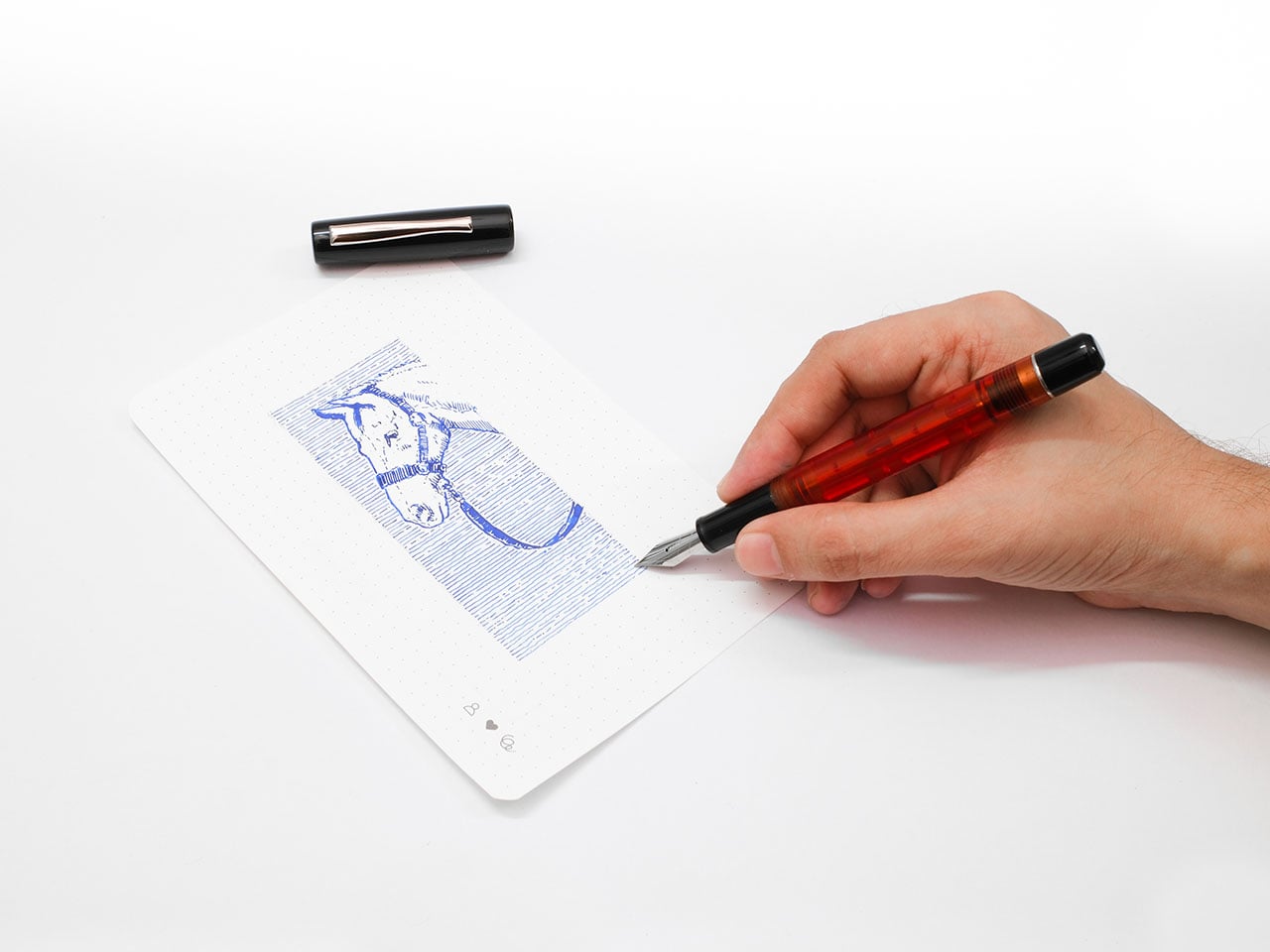
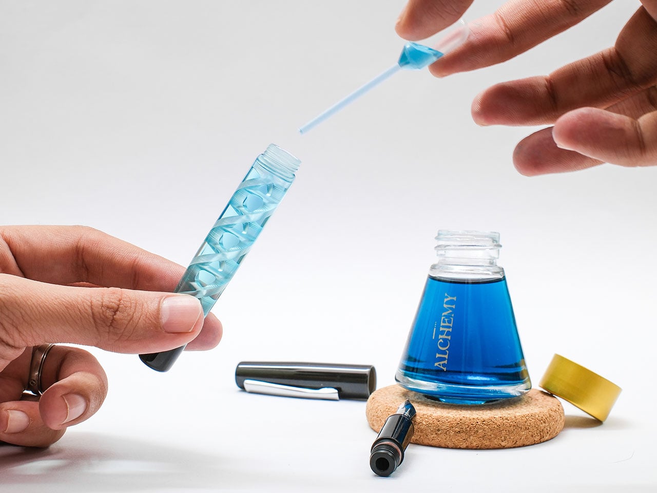
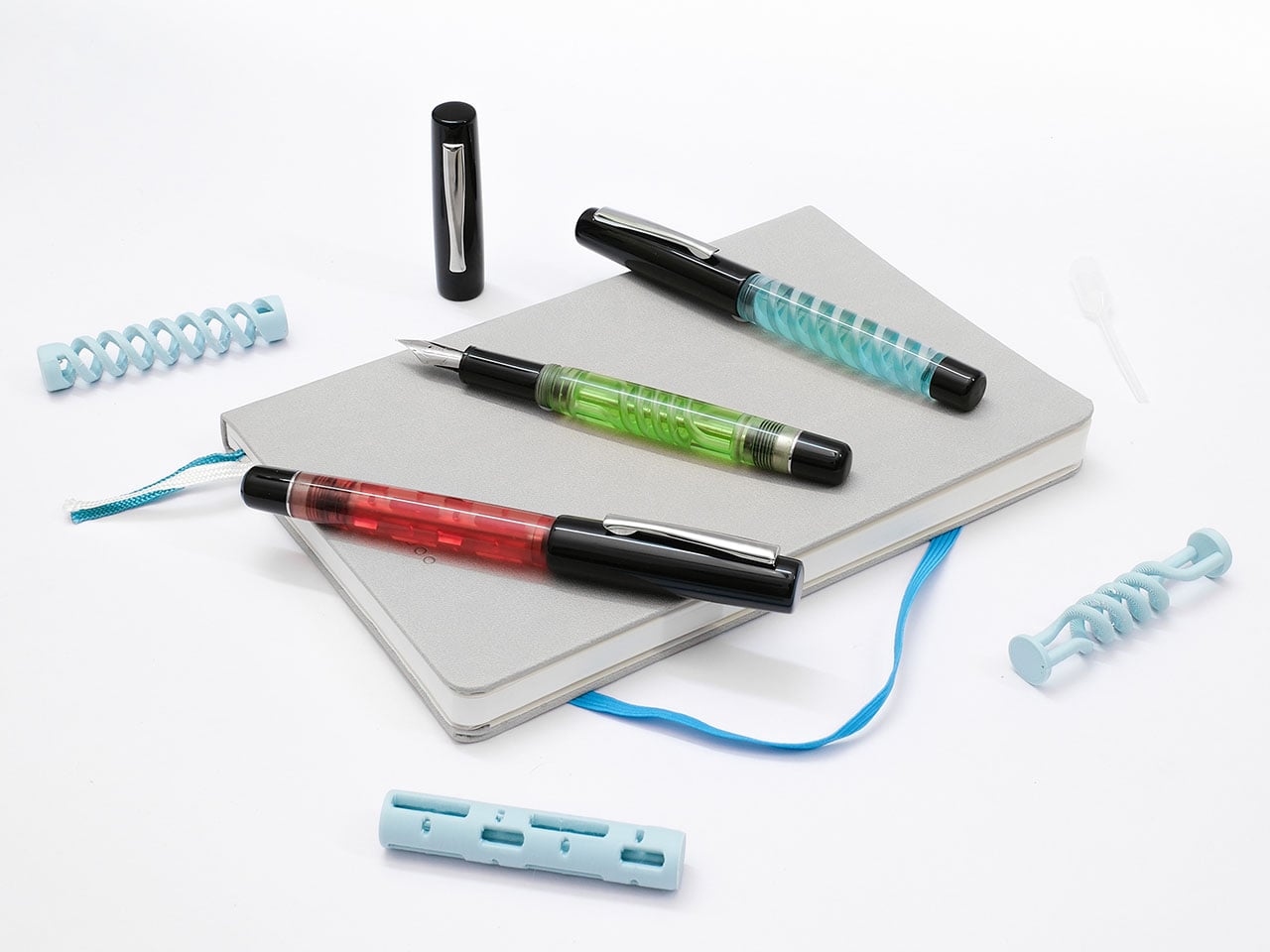
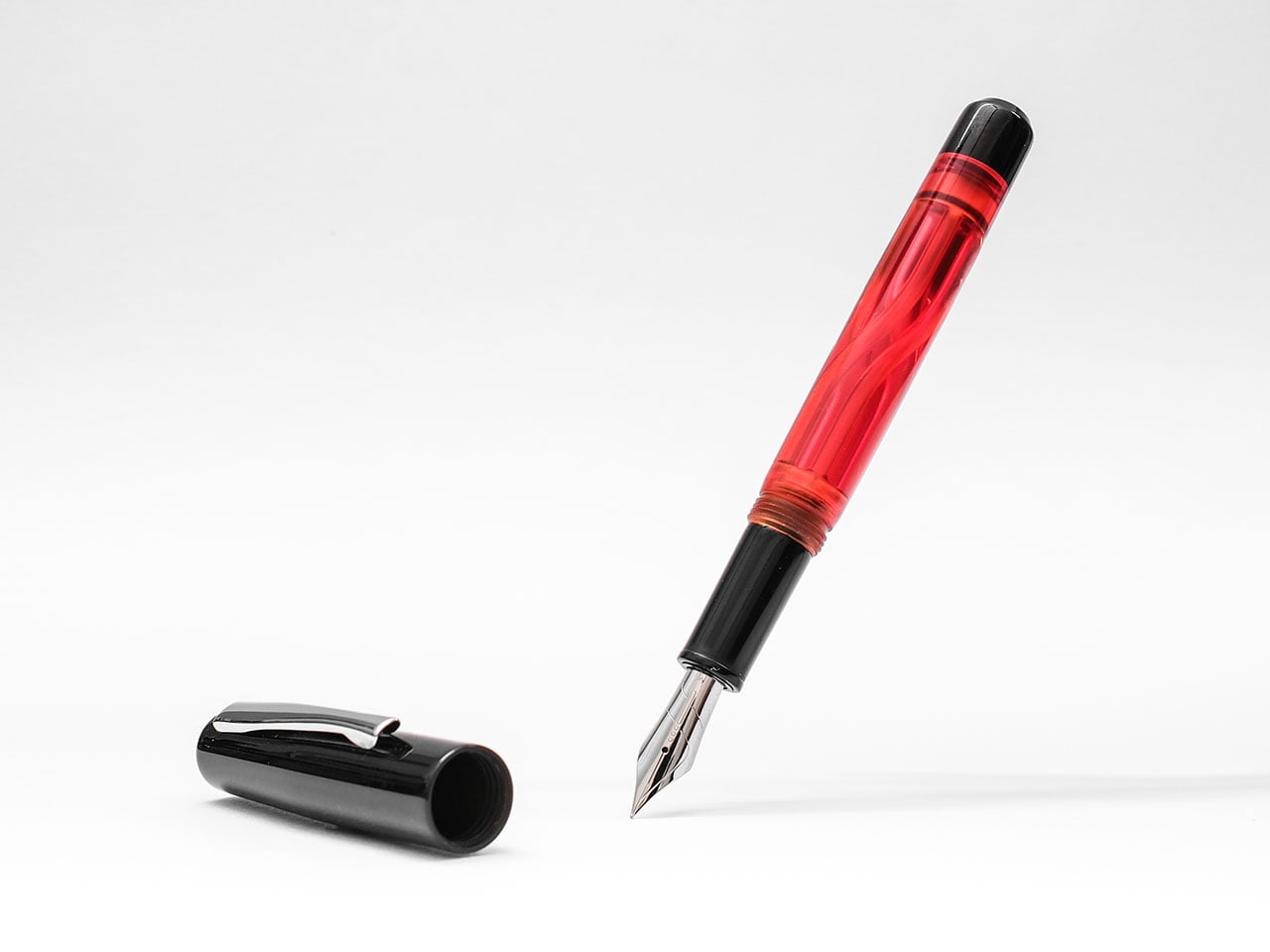
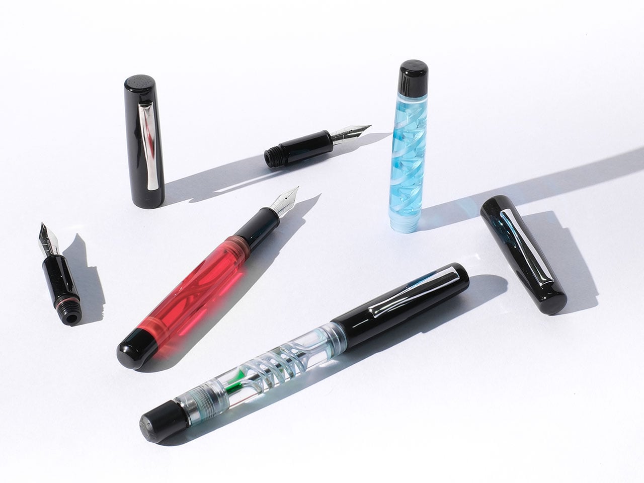
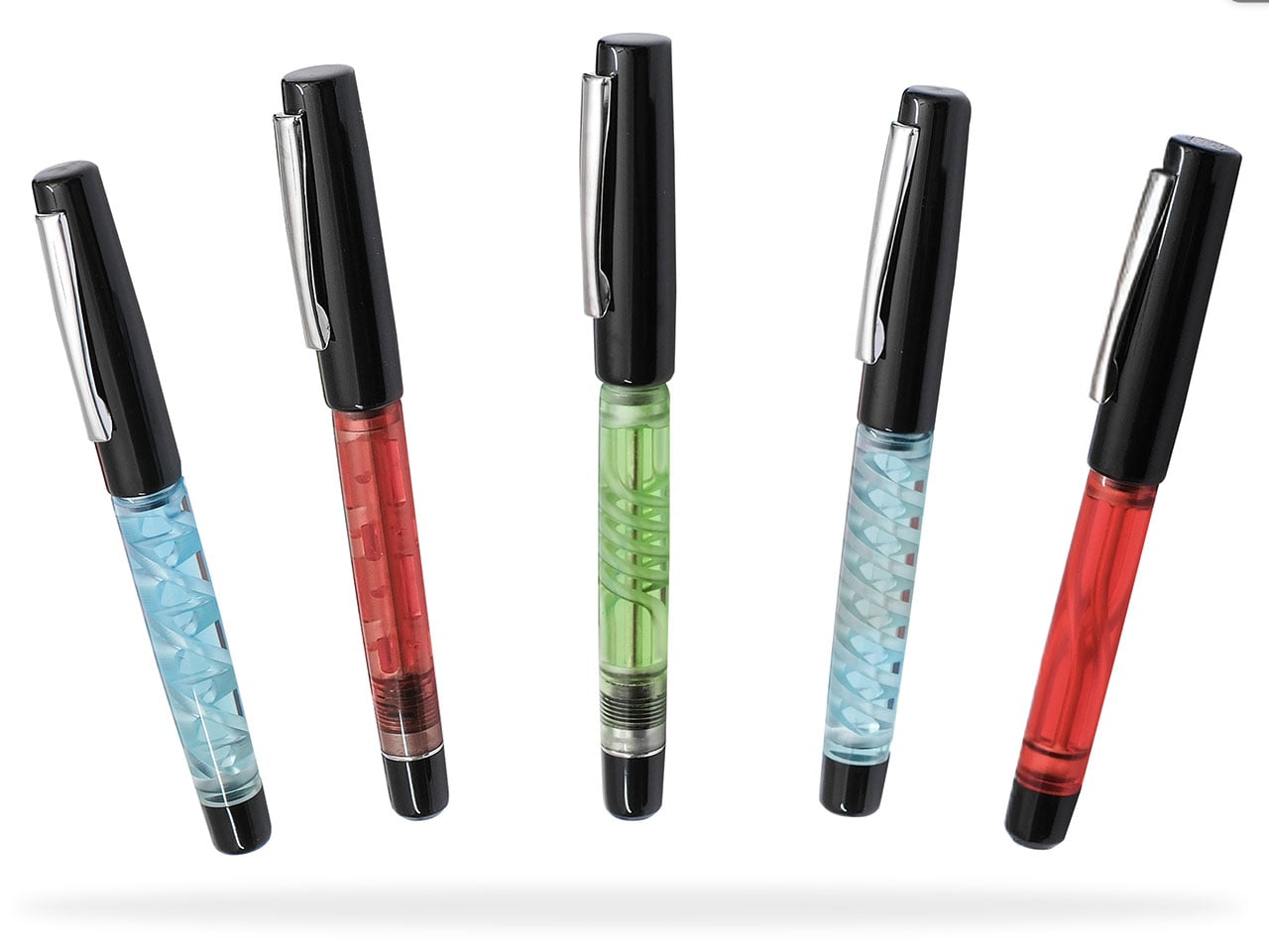
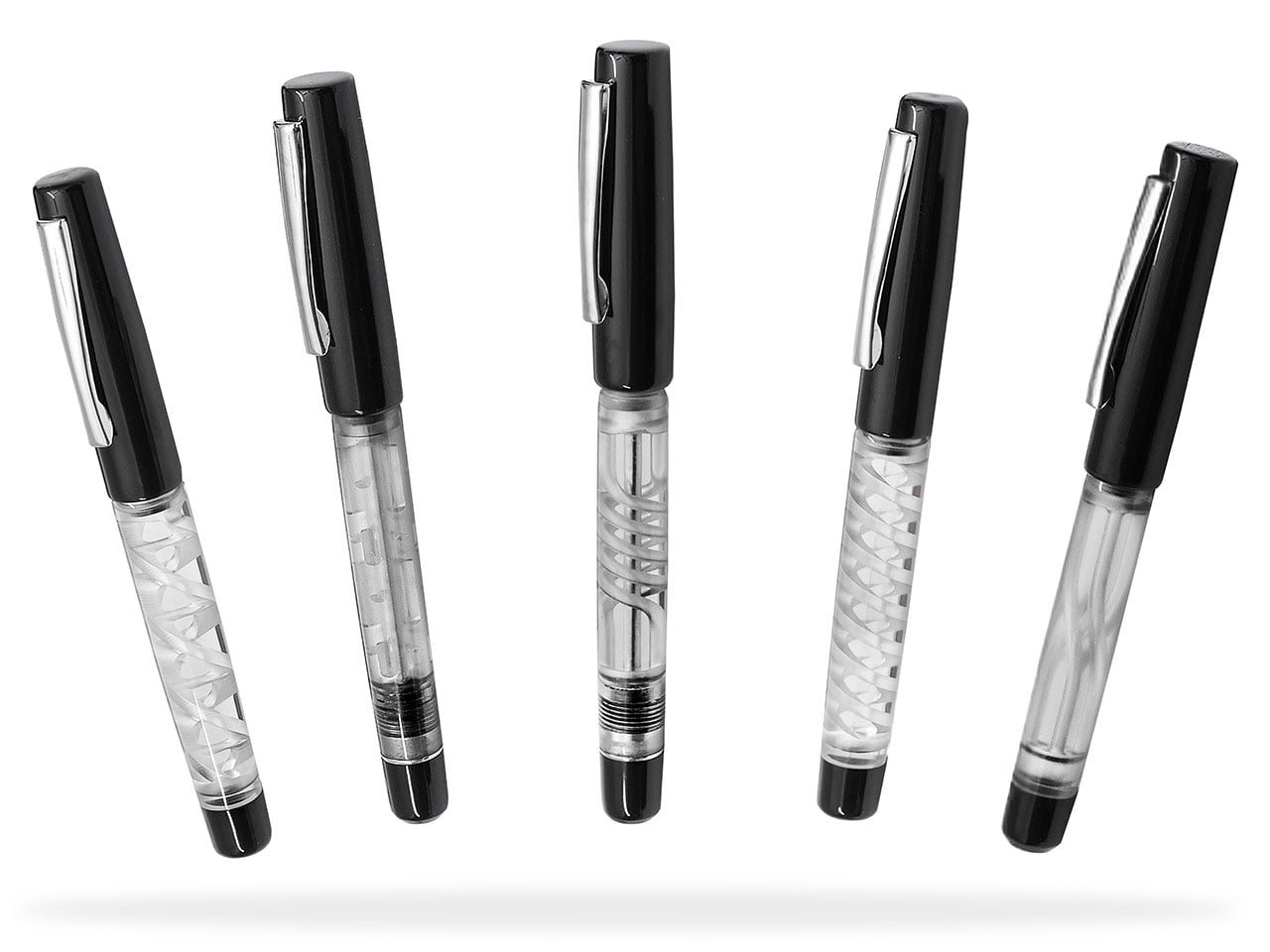
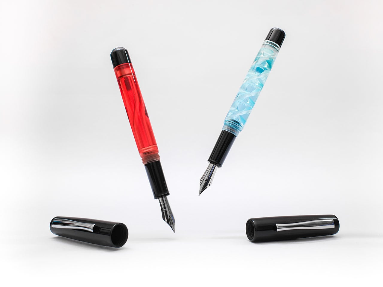
The company has partnered with 3D printing experts Arclayer to design and launch Maze fountain pen, which makes “what used to be hidden… the star of the show.” The new series of fountain pens has a see-through body, allowing you to gawk at the flowing ink within the geometric patterns 3D printed inside the pen.

Click Here to Buy Now: $89 $99 (10% off). Hurry! Raised over $280,000 already.

Arclayer is redefining the writing instrument as we know it through these visually appealing 3D-printed fountain pens for Endless Stationery. The Maze pen created in partnership, answers the simple question, “why can’t a pen be beautiful on the outside and the inside,” which the makers asked themselves before getting down to creating a fountain pen built from “light, resin, and imagination.”

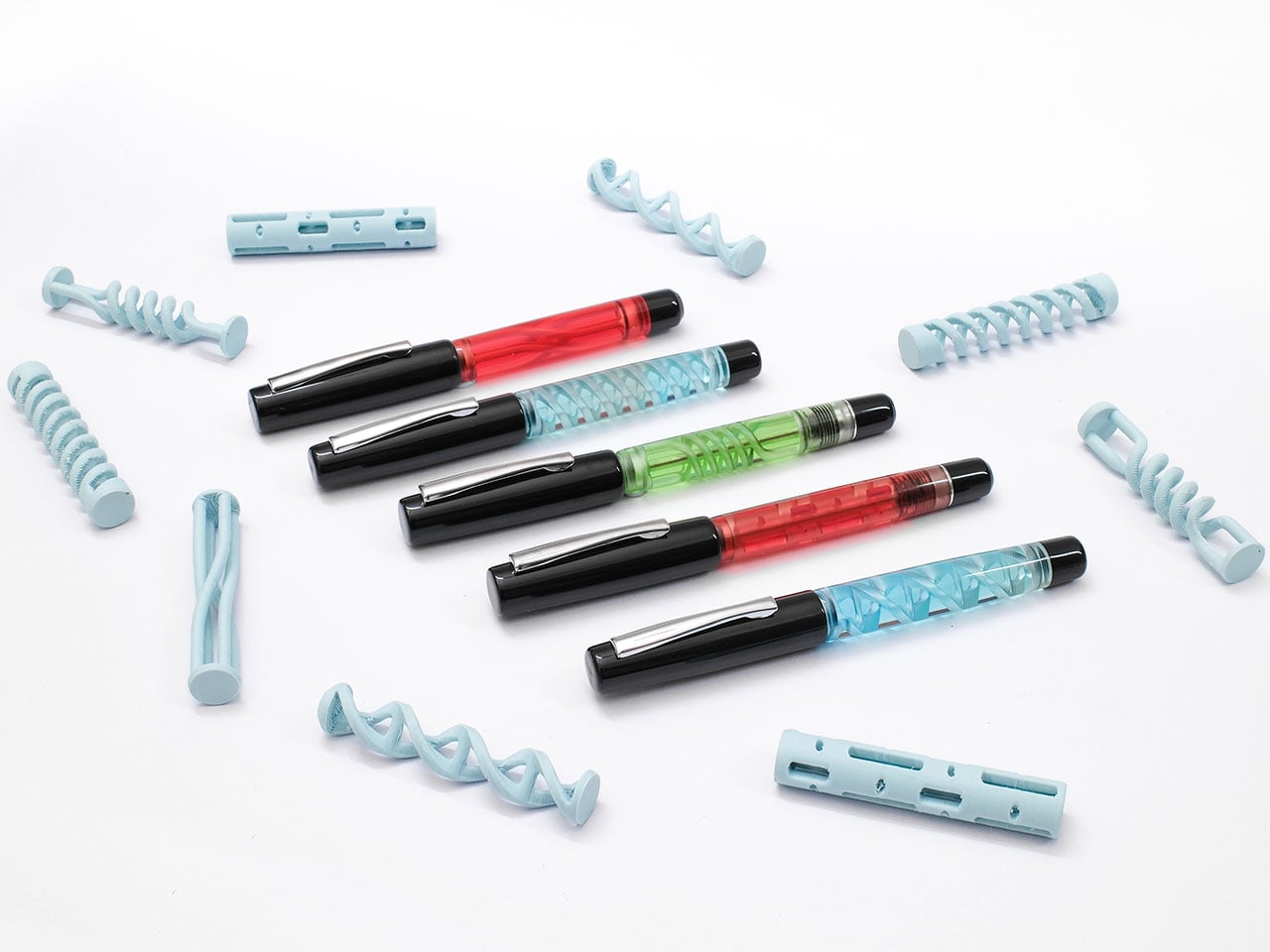
Within each Maze pen is a 3D printed architecture in the form of DNA, pattern or spiral, which allows the ink to flow through them, creating a visually exciting display unlike anything ever seen before in a pen. While Maze pens are standard, the Maze Pro features the Japanese eyedropper inking system that makes the pen easy to carry in movement-intensive journeys or even on airplanes; soring at high altitudes without worrying about the ink leaking at pressure changes.

For the design of these pens, the upper body and the grip section are made from acrylic, while the barrel is made by 3D printing resin. All the Maze pens are formed using resin printing, which makes it possible to have the ink chambers designed the way they are. 3D printing allows a clear finish and internal geometry without adding weight to the pen design. It comes in a special casing which doubles as a fidget toy, if that’s something you tend to spend extra on.
The pen interiors are lively and show the company’s own Alchemy Ink flow through the interesting architecture, yet the intriguing design is easy to clean. It can be rinsed with water to keep the ink flow smooth. The Maze pens come in five unique patterns, DNA, Morse, Twist, Coil, and Swirl and as many colors, with the choice to pick from extra-fine, fine, medium, broad, and a special architect nib.

Currently, the Maze and Maze Pro fountain pens are available for preorder through Kickstarter, where they are enjoying a successful crowdfunding campaign. You can preorder a Maze fountain pen starting $89, while the Maze Pro costs $10 extra. The campaign is also providing a celebratory Christmas combo, which you can get for $135 now. It includes a Maze Pro, a pen pouch, Alchemy Ink, and a set of Storyboard Pocket Notebook.
Click Here to Buy Now: $89 $99 (10% off). Hurry! Raised over $280,000 already.

The post This $89 Fountain Pen Shows You the Ink Flowing Through it’s 3D Printed Maze first appeared on Yanko Design.