This Vase Was Made From Aluminum Tubes That Would’ve Been Thrown Away

Vases occupy an awkward corner of product design. Most exist somewhere between functional and decorative without committing to either, and the result is a category that rarely surprises. Ceramic ones carry craft tradition, glass ones depend on color and transparency, and the novelty options try to be sculptural without much conviction behind them. It’s a crowded space that doesn’t often ask interesting questions.

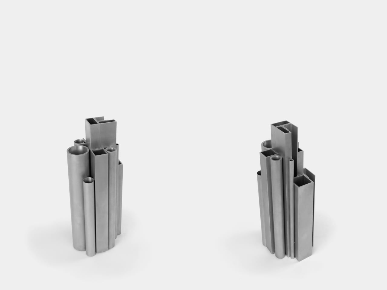
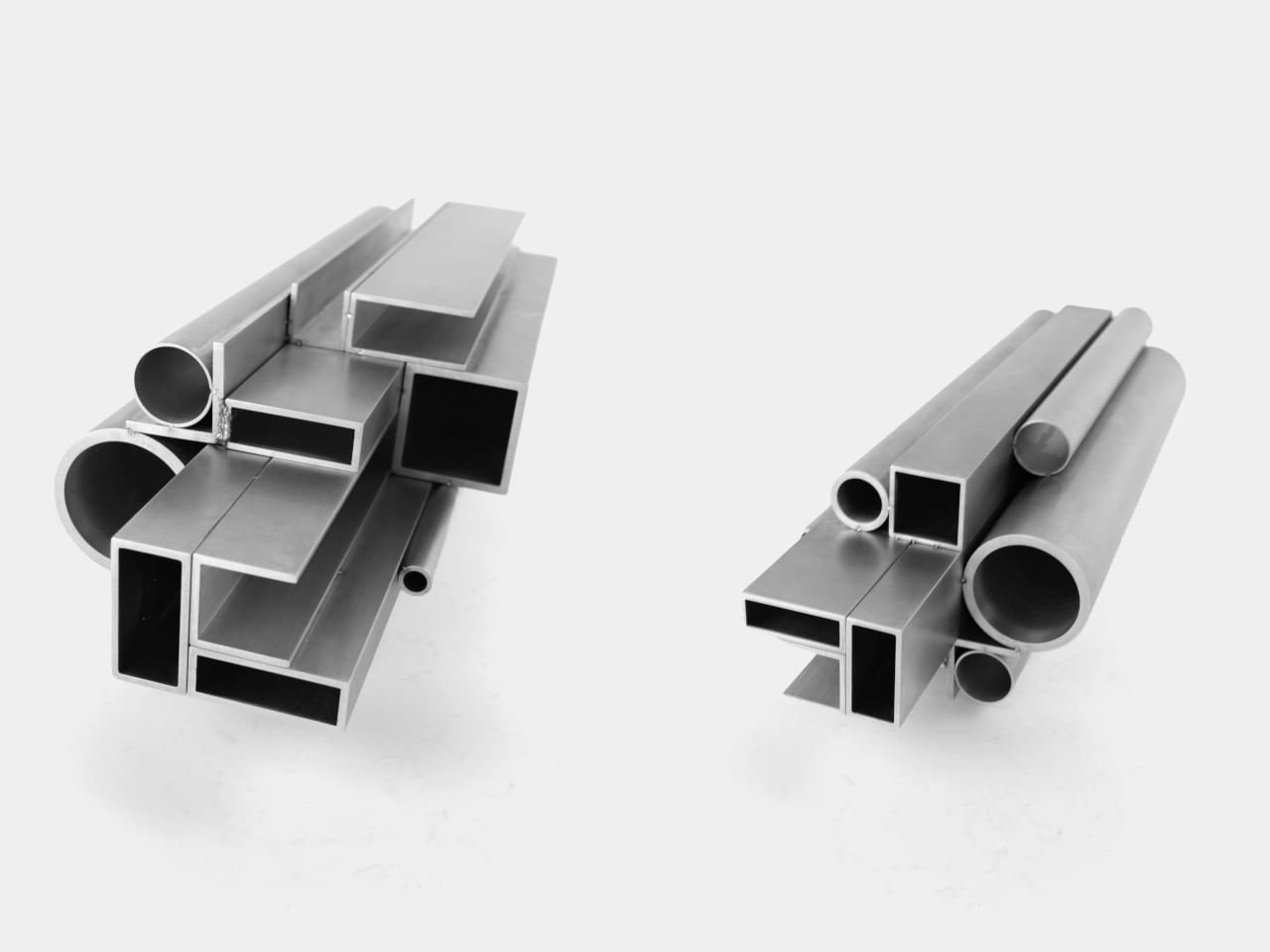
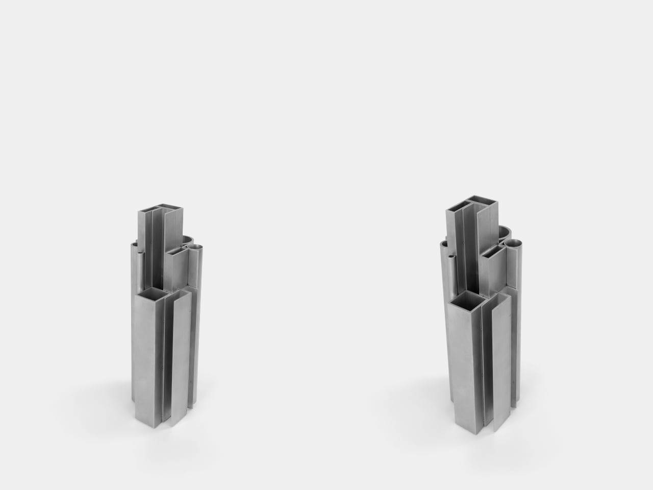
The Offcut Aluminum Vase starts from a different premise. Its form didn’t come from sketching vessel shapes or looking for the next minimalist curve. It came from staring at the end of a rack of industrial aluminum profiles, tubes, and sections waiting to be put to use. That cross-sectional view of bundled profiles, the overhead pattern nobody usually notices, is where the whole design began.

Designer: Raphael Klug

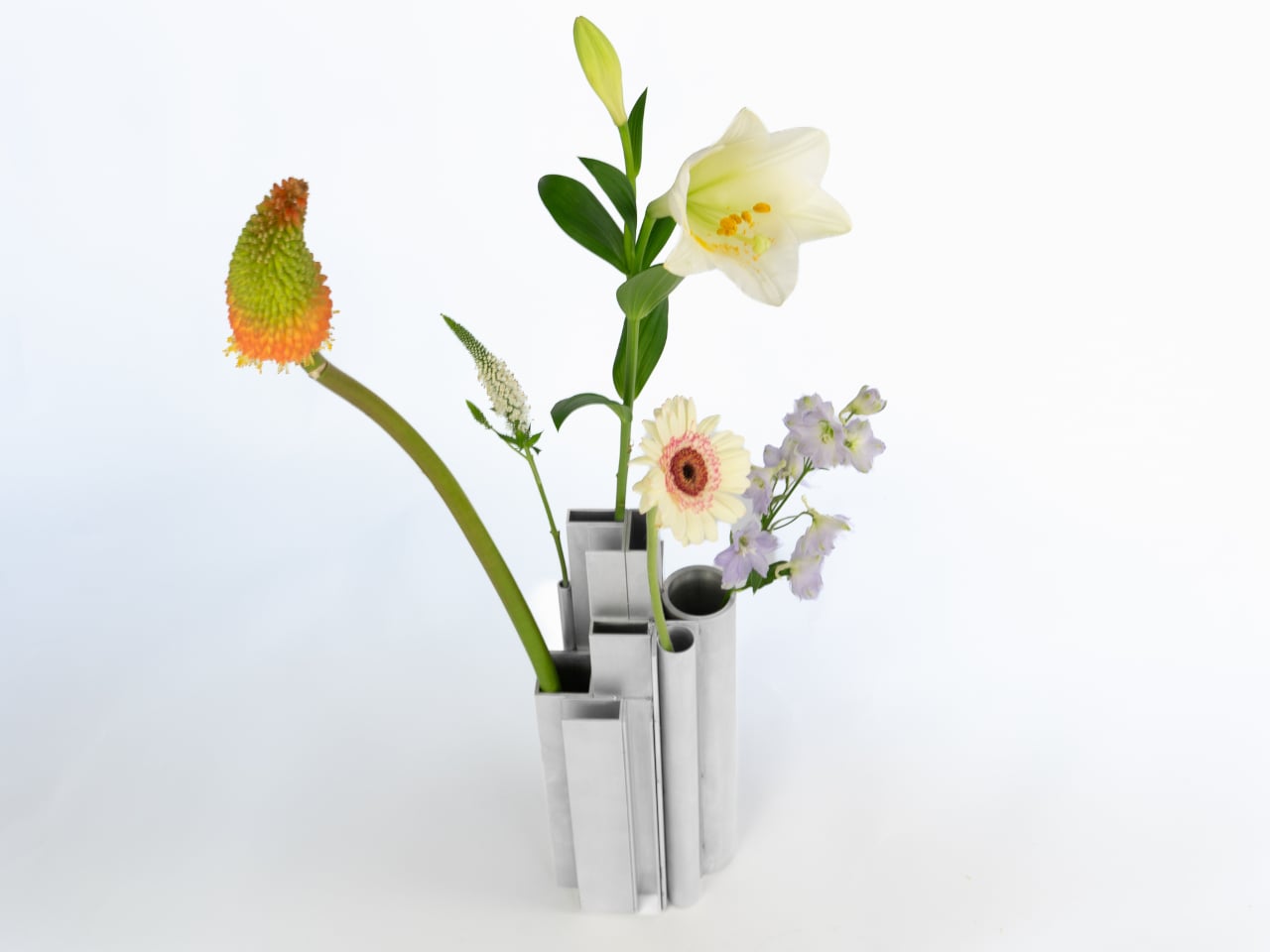
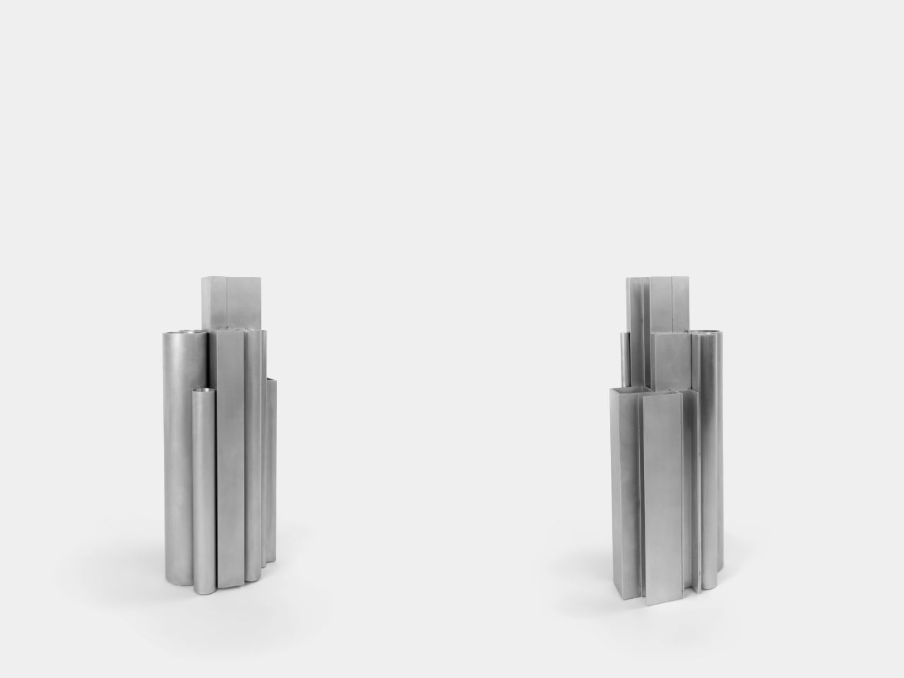
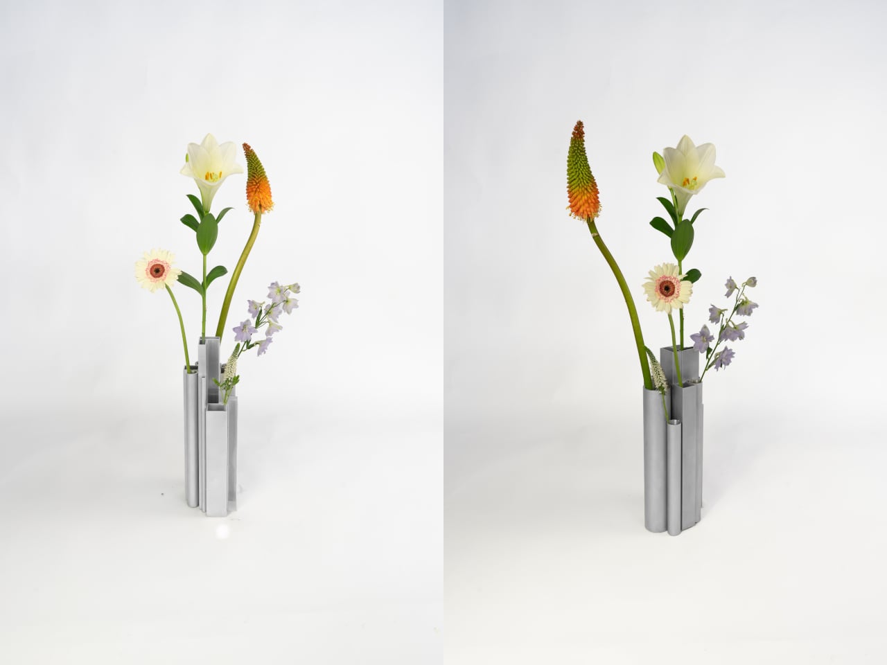
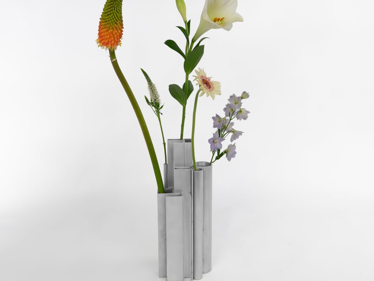
The construction is direct: actual aluminum offcuts bundled together, each piece a different cross-section. Circular tubes of varying diameters sit alongside square and rectangular hollow channels, all cut to different lengths that create a staggered, stepped silhouette when assembled. The look is instantly readable to anyone who has spent time near a metalworking shop or materials supplier, and distinctly strange to everyone else.

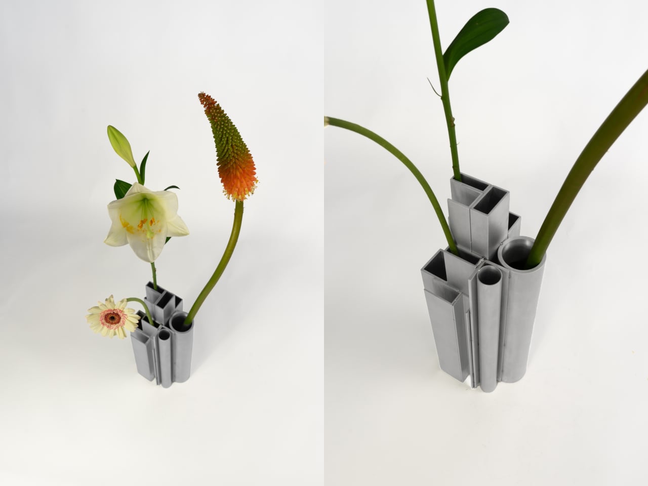
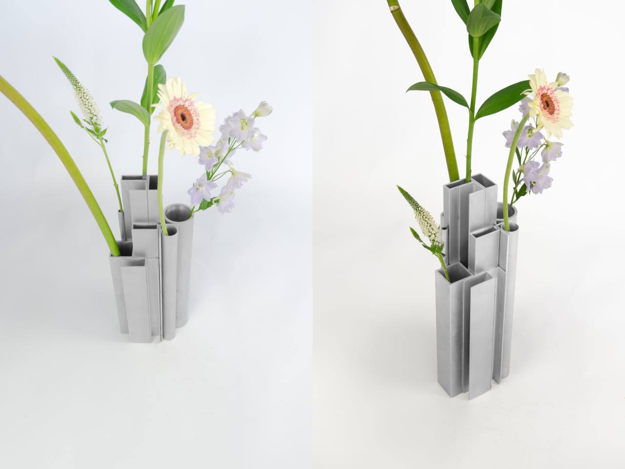
What’s surprising is how naturally it functions as a vase. Each opening, whether a round tube or a square channel, holds a single stem at a height set by that profile’s cut length. A tall flower finds one tube, a shorter bloom another, a delicate, small-stemmed flower a third. The structure of the object quietly distributes stems at different levels without any deliberate arrangement on your part.

The visual tension between the material and its setting is part of the appeal. Aluminum profiles don’t belong on a shelf with fresh flowers, and that friction is doing real work. The matte silver surface reads as cold and precise until something organic is placed inside it, and the contrast becomes the whole point. The industrial origin doesn’t disappear; it becomes what makes the flowers harder to ignore.

The choice to use actual offcuts rather than new aluminum cut to look like offcuts also matters. Most of this material would otherwise end up as leftover stock or be discarded at the end of a production run. Using it this way doesn’t require additional processing; the profiles arrive already shaped, already finished, and carrying the full character of their industrial origin without modification.

The vase holds its own even without flowers in it. The stepped arrangement of sections at different heights reads as a small sculptural object that could sit on a shelf as comfortably empty as it does full. The form doesn’t need flowers to complete it, which means that when you do add them, the combination feels considered rather than accidental.

It’s a rare thing when a design object’s material, form, and function all trace back to exactly the same source. Here they do. The offcuts are the structure, the structure is the form, and nothing about their industrial origin has been hidden or softened along the way. The workshop and the shelf turn out to have considerably more in common than most vases would ever admit.

The post This Vase Was Made From Aluminum Tubes That Would’ve Been Thrown Away first appeared on Yanko Design.
This Lamp Is Cast From Soda Can Trash But Looks Like Carved Stone

Upcycled materials have become a familiar part of sustainable design, but most of them still try to hide where they came from. The aluminum gets purified, the recycled plastic molded smooth, and the result looks clean and neutral but loses the story of its origins. Pairing genuine sustainability with aesthetic character turns out to be a harder problem than it looks, and most attempts quietly sidestep it.

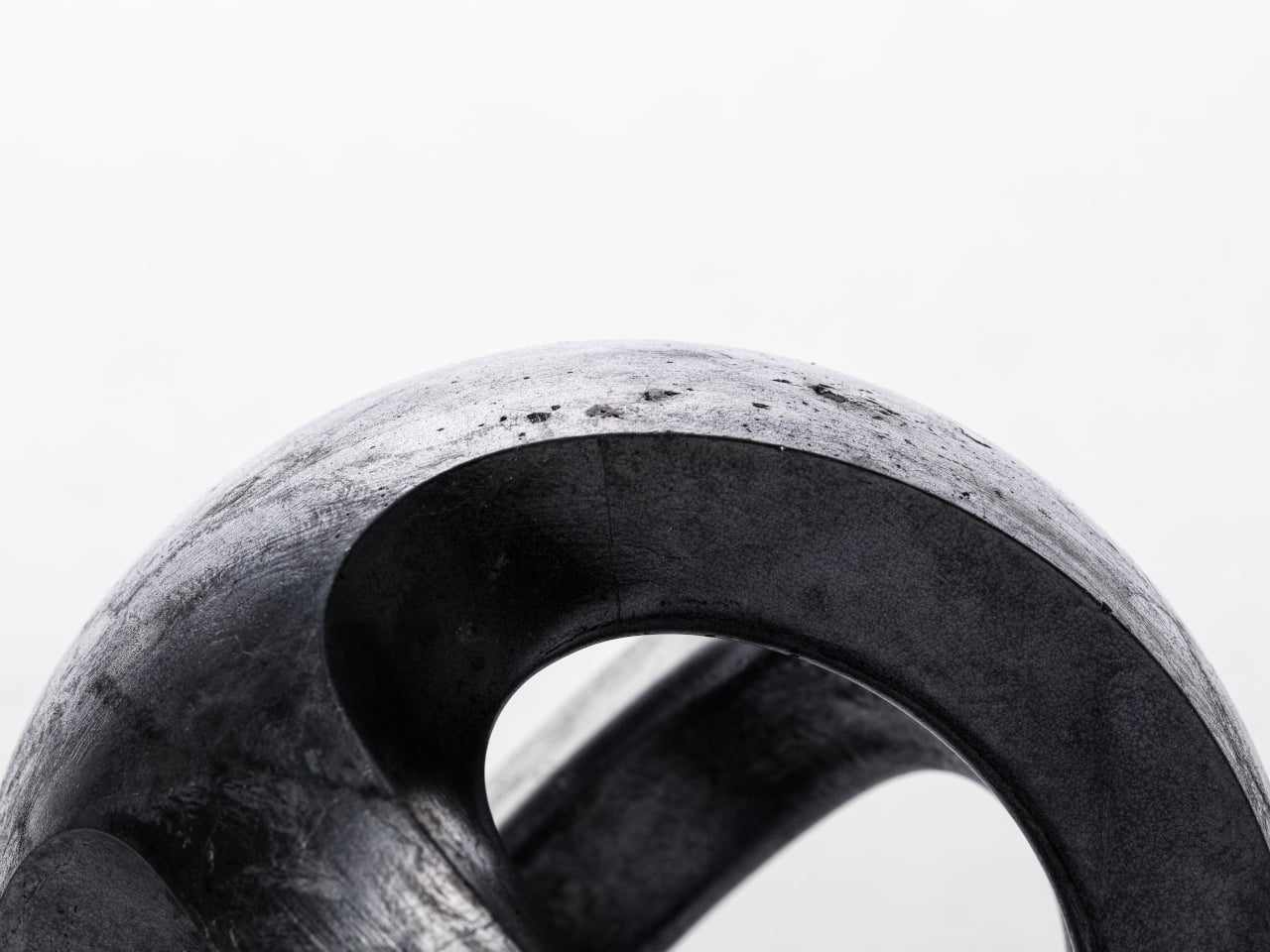
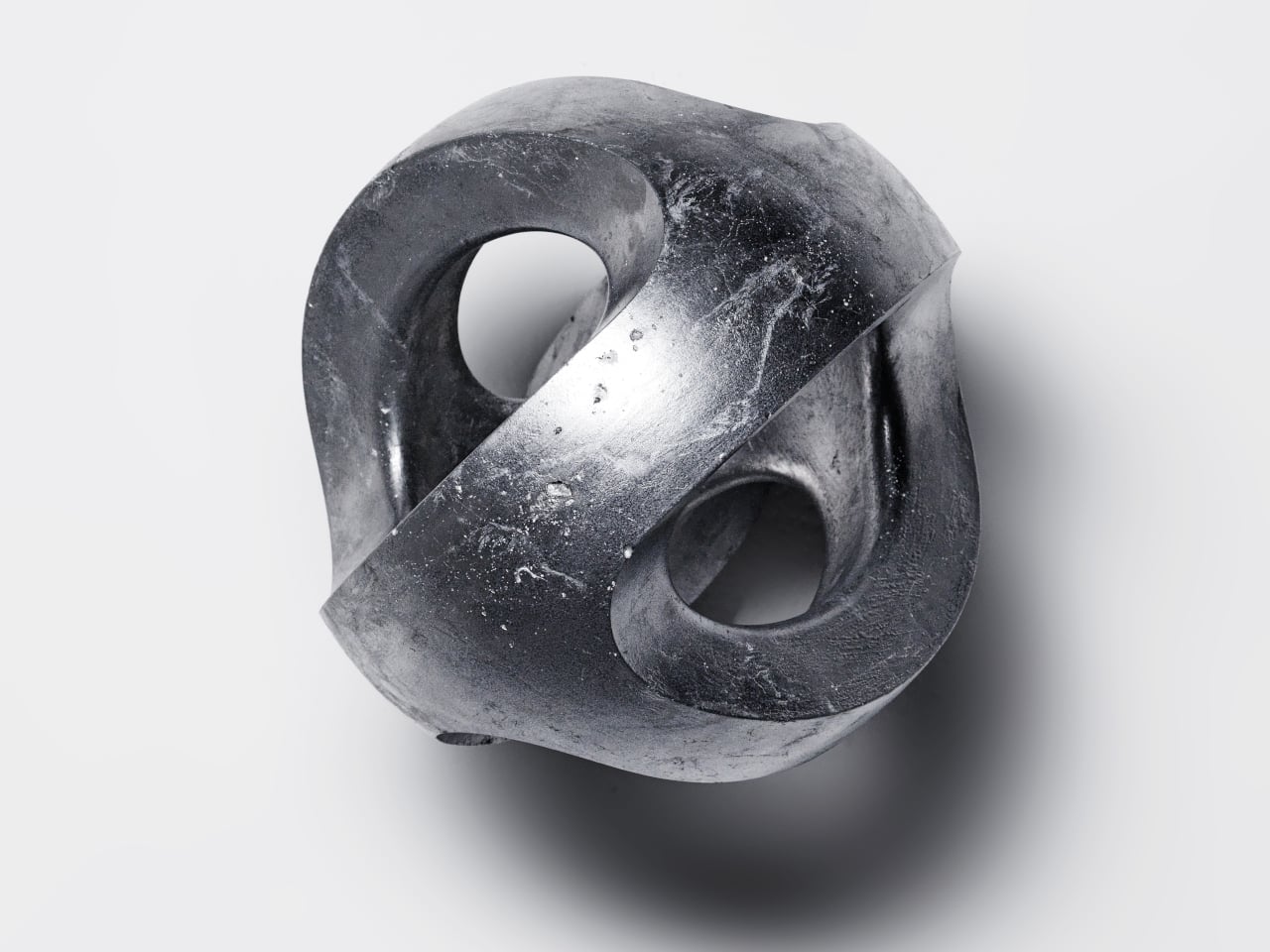
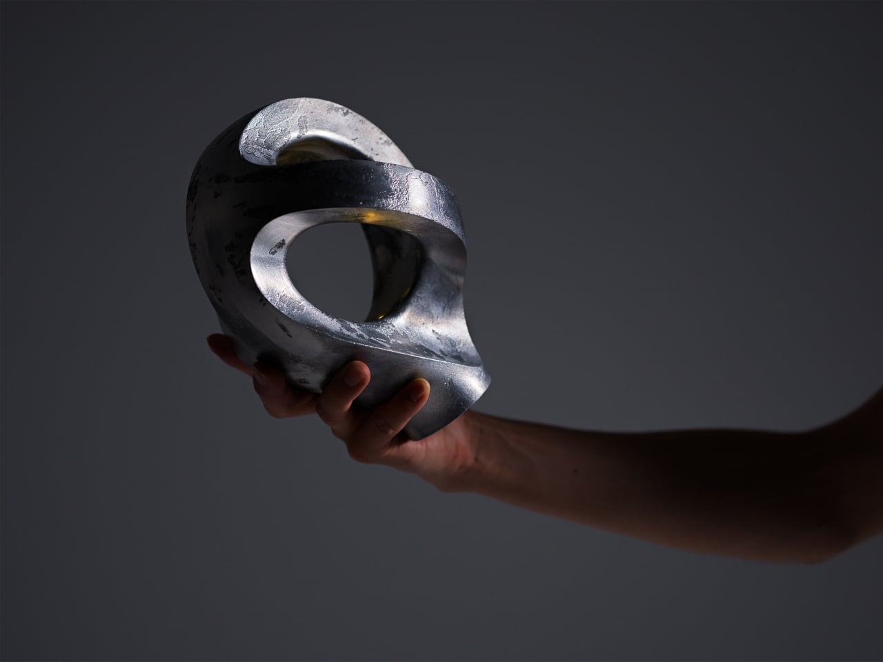
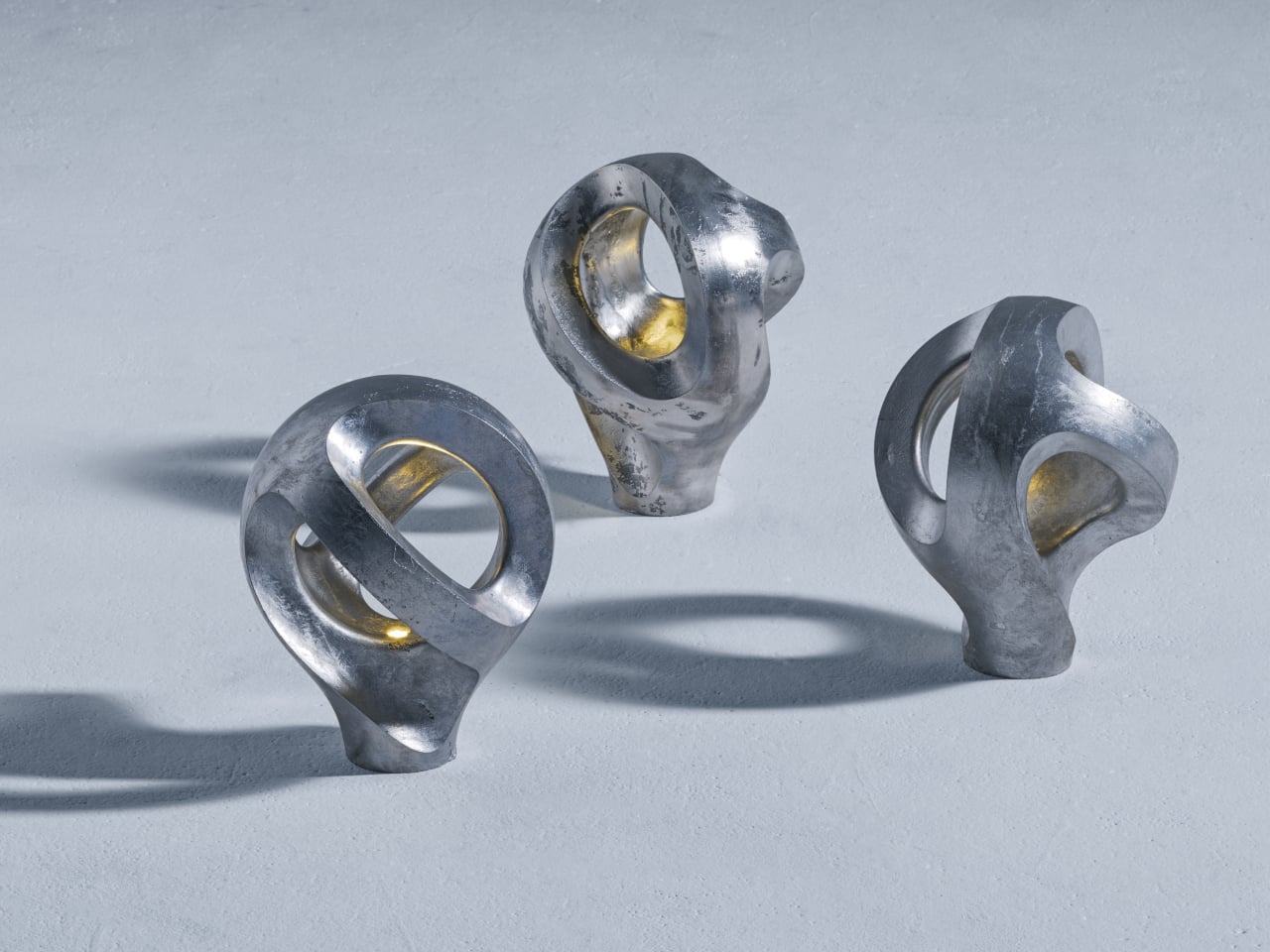
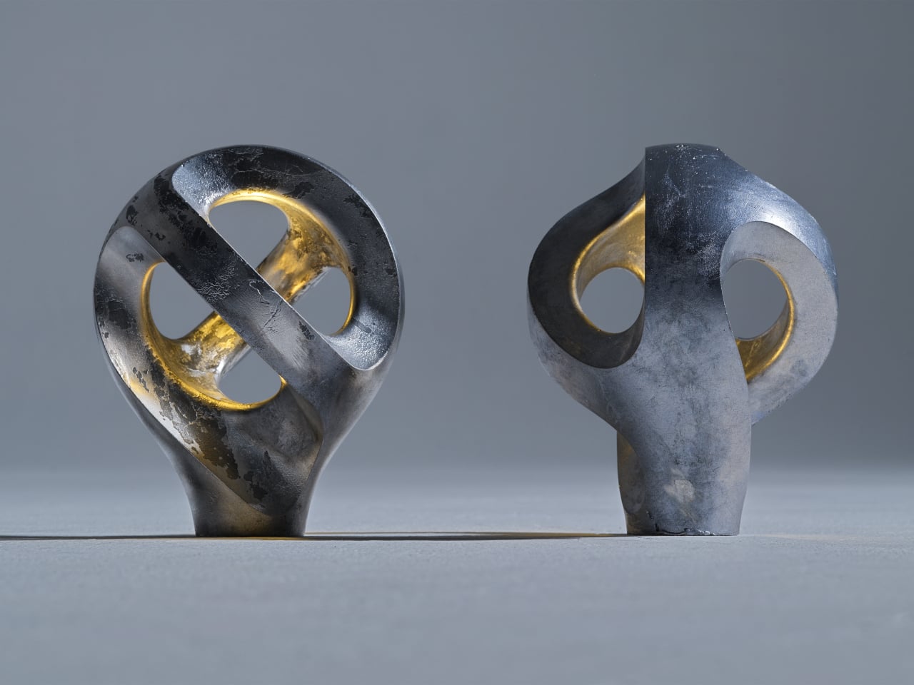
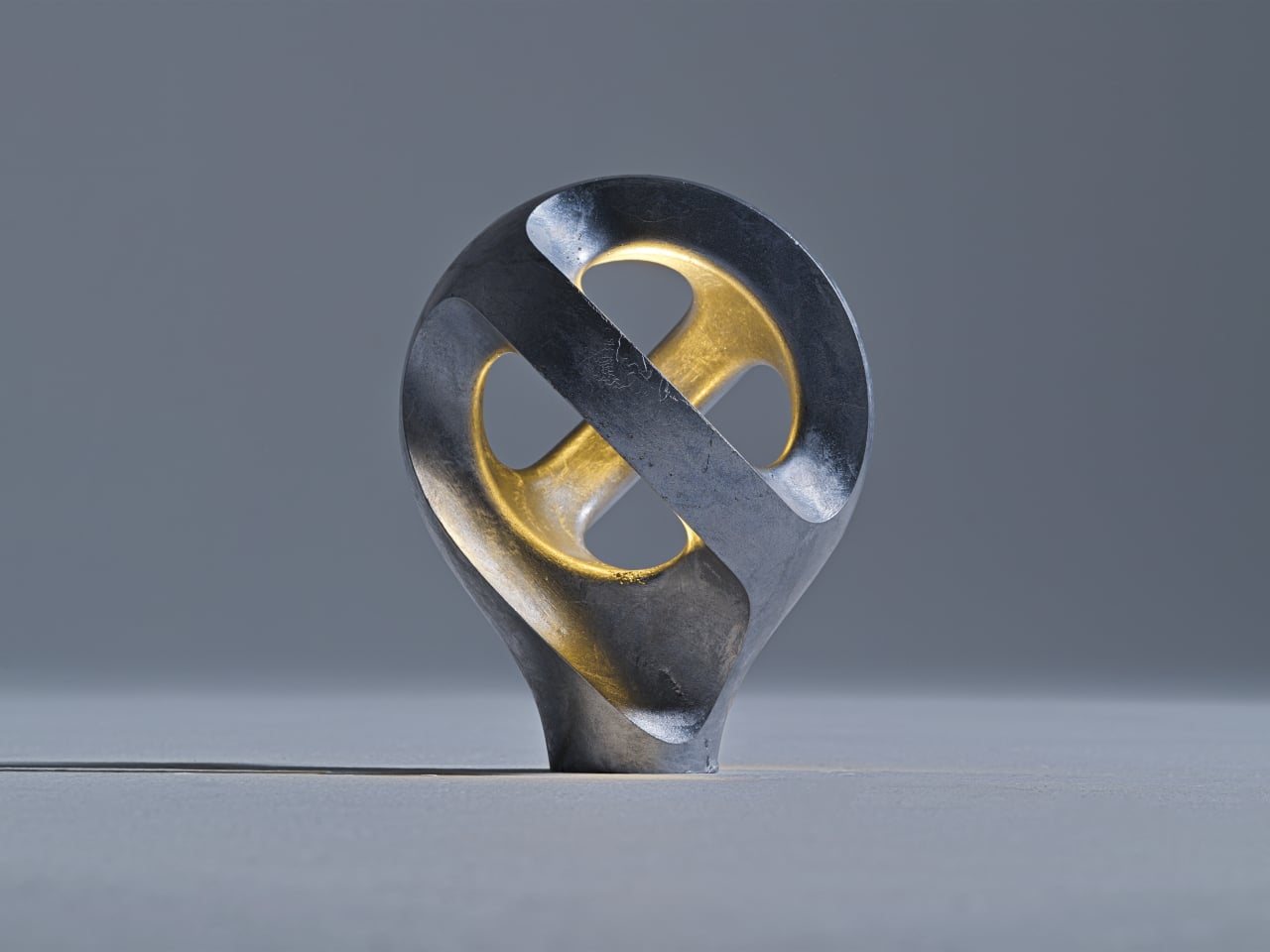
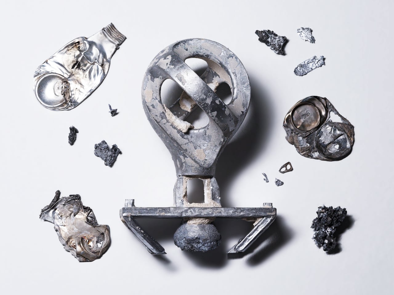
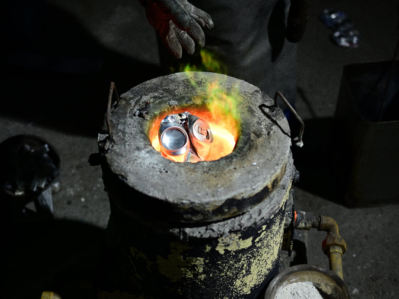
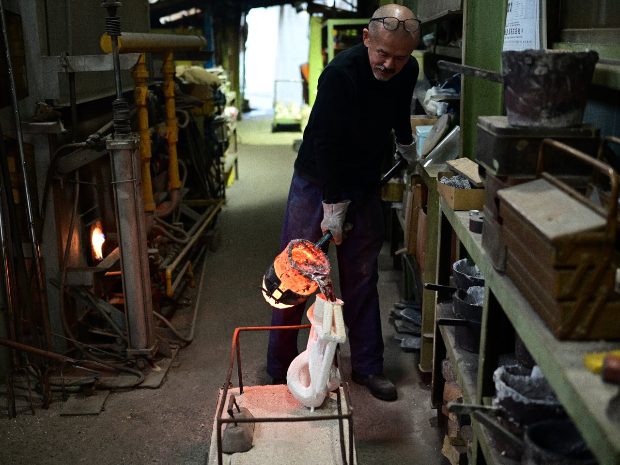
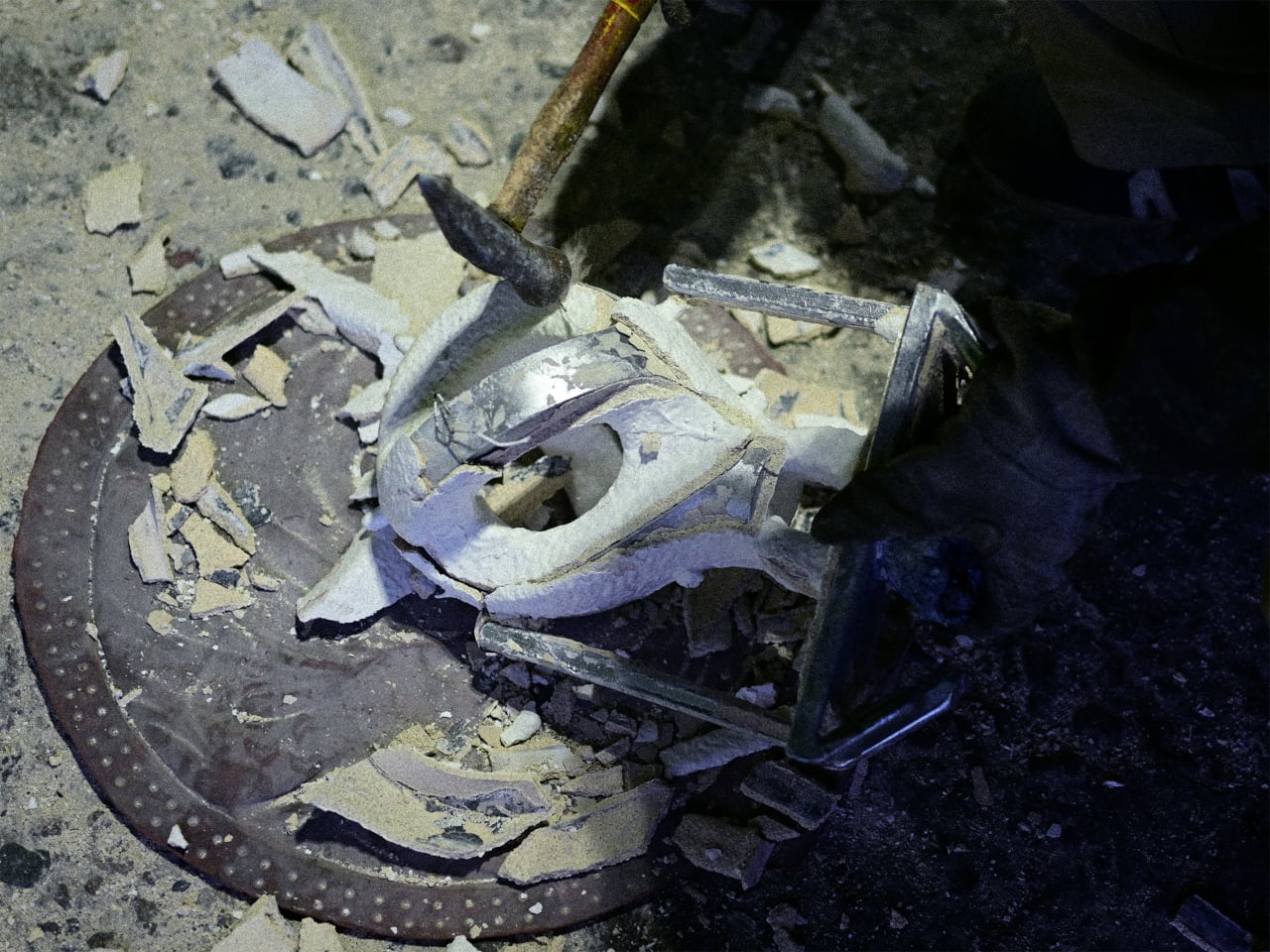
Tokyo-based product designer Kenji Abe took a different approach with Aperire, a lighting fixture cast entirely from discarded aluminum cans. Rather than refining the material beyond recognition, he deliberately left in the impurities. The wrinkles, air bubbles, and traces of ink from the original cans were preserved as surface texture, turning what most casting processes would filter out into the fixture’s defining character.

Designer: Kenji Abe

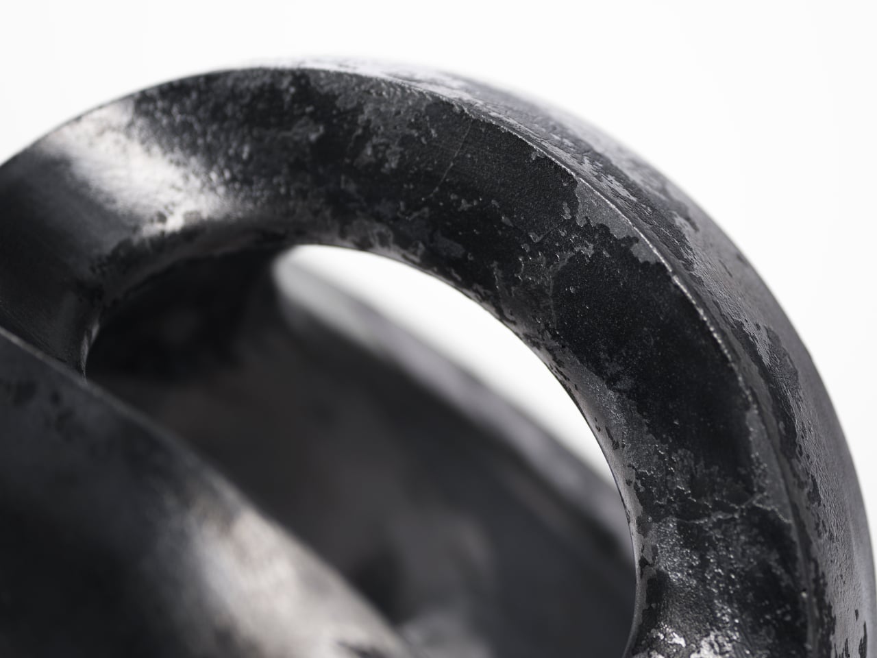
Melting the cans down without removing too many impurities is what produces that surface. Each piece ends up slightly different, carrying unpredictable marks that no two castings will ever replicate. Traces of ink from labels and other irregularities seep through the metal, and the result reads less like manufactured aluminum and more like weathered stone or bone. The artificial origin becomes genuinely difficult to place.

The finish that results reads almost like a natural material. The same surface might show shallow depressions, irregular ridges, or fine lines that look nothing like machined metal. Paired with the organic, chambered form, it makes Aperire genuinely hard to identify on first glance. The cans are unmistakably present in the material’s history, but they aren’t visible in what the object has become.

The shape itself draws from an equally unexpected source: foraminifera, the microscopic marine organisms whose skeletons are riddled with tiny holes and chambers. Combined with the rough appearance of eroded rock, the form was built through the deliberate addition and subtraction of geometric shapes. Light reflects inside the hollow interior and finds its way out through the openings, seeping gently outward rather than projecting.

The name carries a few threads that converge on the same idea. Aperire is Latin for “to open,” connecting to aperture, the camera mechanism that controls how much light passes through. It also traces back to April, the season when flowers open. For a fixture that lets light slowly leak outward rather than announce itself, the name seems less like branding than an accurate description of what the object does.

The fixture doesn’t make a loud case for sustainability as a concept; it just happens to be made from something that would otherwise be discarded, and it shows it. That quiet honesty gives it a credibility that purpose-built eco-aesthetic objects rarely manage. The cans stop being waste, stop being raw material, and become something that earns its place on a table or shelf without the sustainability narrative doing the heavy lifting. The object handles that part itself.

The post This Lamp Is Cast From Soda Can Trash But Looks Like Carved Stone first appeared on Yanko Design.
Momentum Studio’s Perpetual Calendar Clicks Into Each Day Like a Gear

Most people check the date by glancing at a phone, a laptop corner, or a watch. There’s no shortage of ways to know what day it is, yet somehow that information rarely feels anchored to anything. It arrives in a notification, floats on a lock screen, and disappears the moment you look away. The calendar has become the most forgettable object in modern life.

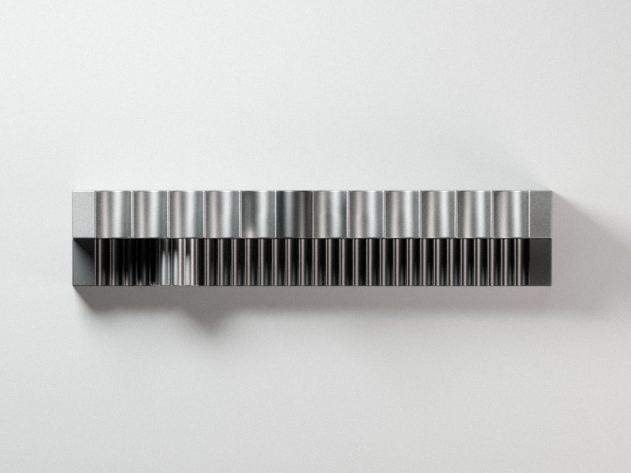
Momentum Studio, a German design firm, is treating that problem with a very physical antidote. The Momentum Calendar is the fifth object in the studio’s Object Collection, approaching timekeeping as a deliberate act rather than a passive glance. It’s a perpetual calendar machined from solid aerospace aluminum that requires you to move a marker by hand each morning, turning date-checking into something closer to a ritual.

Designer: Momentum Studio

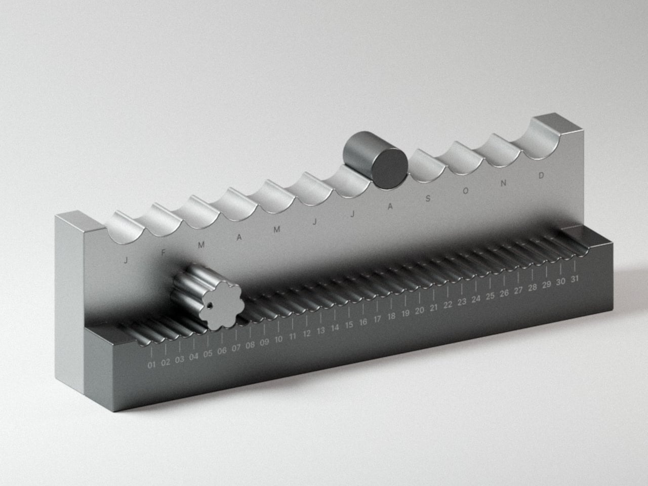
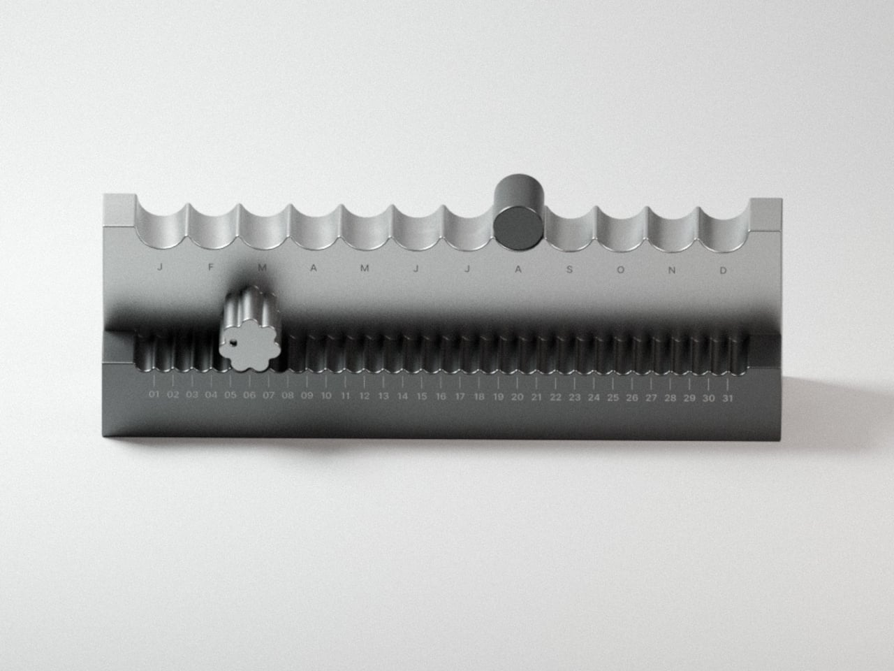
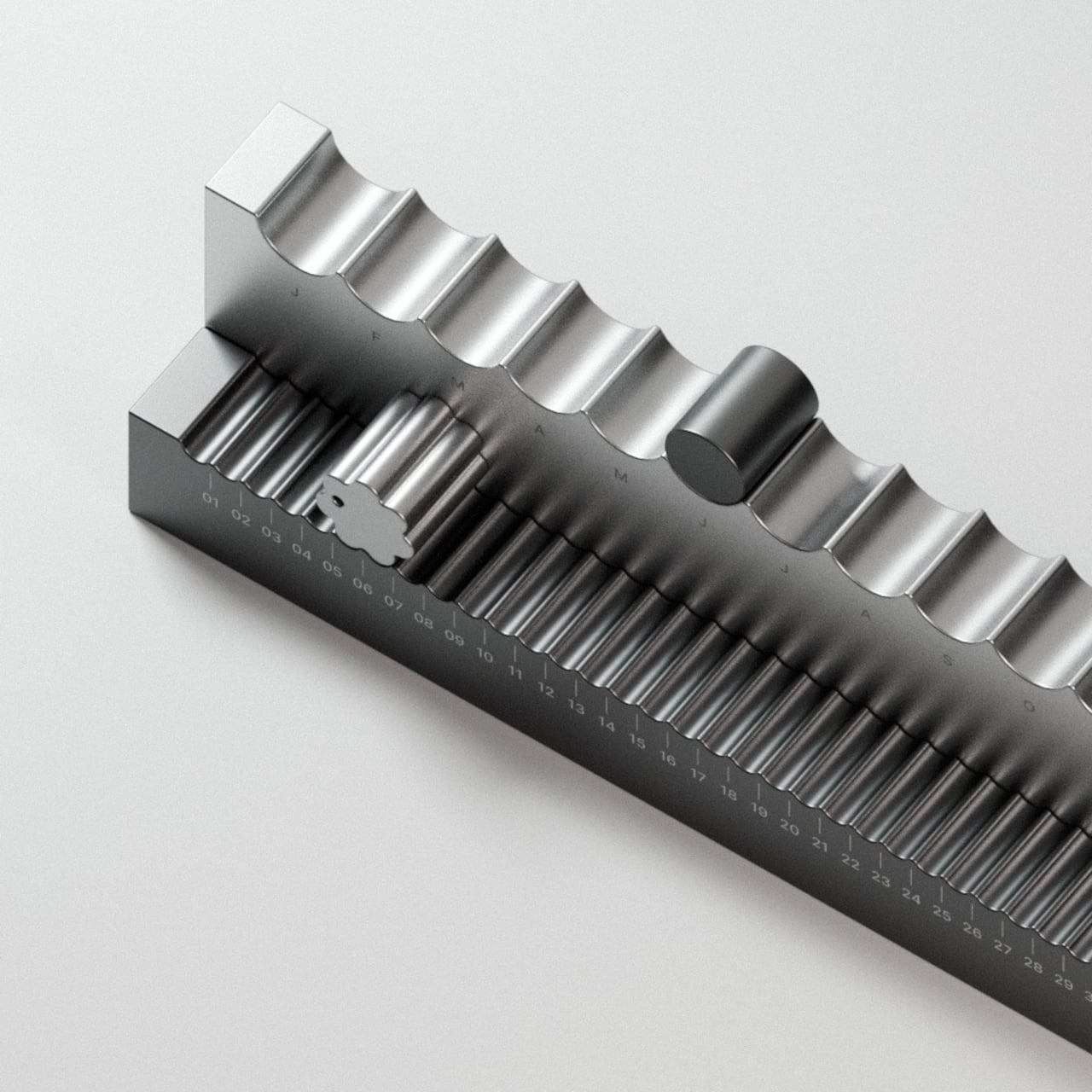
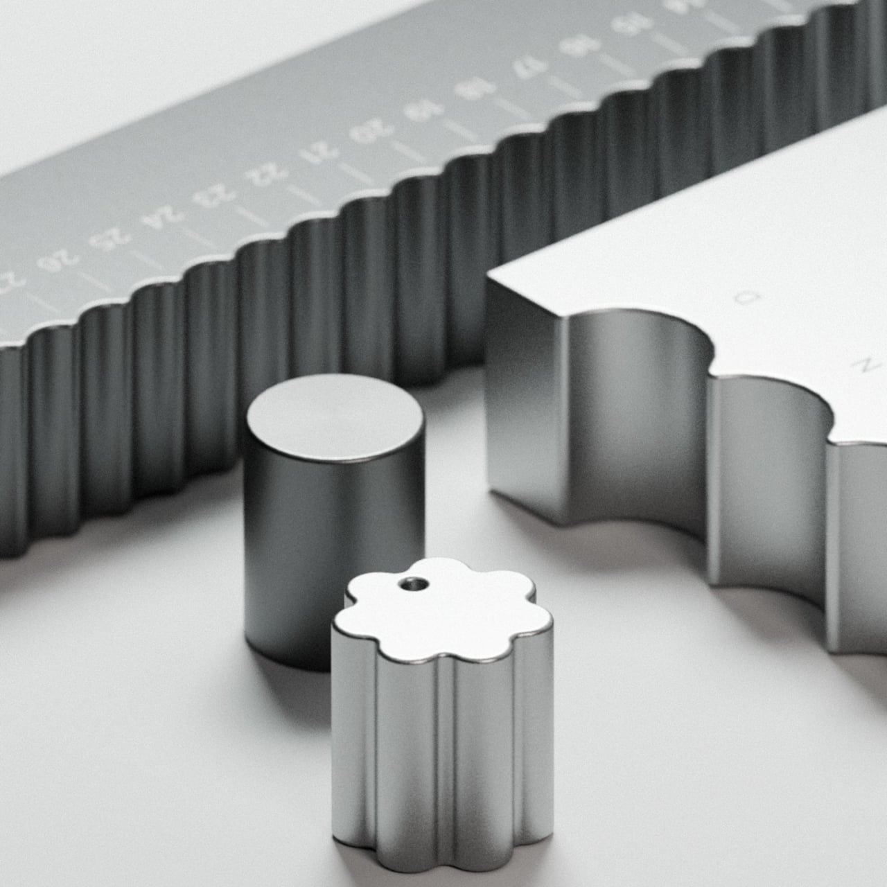
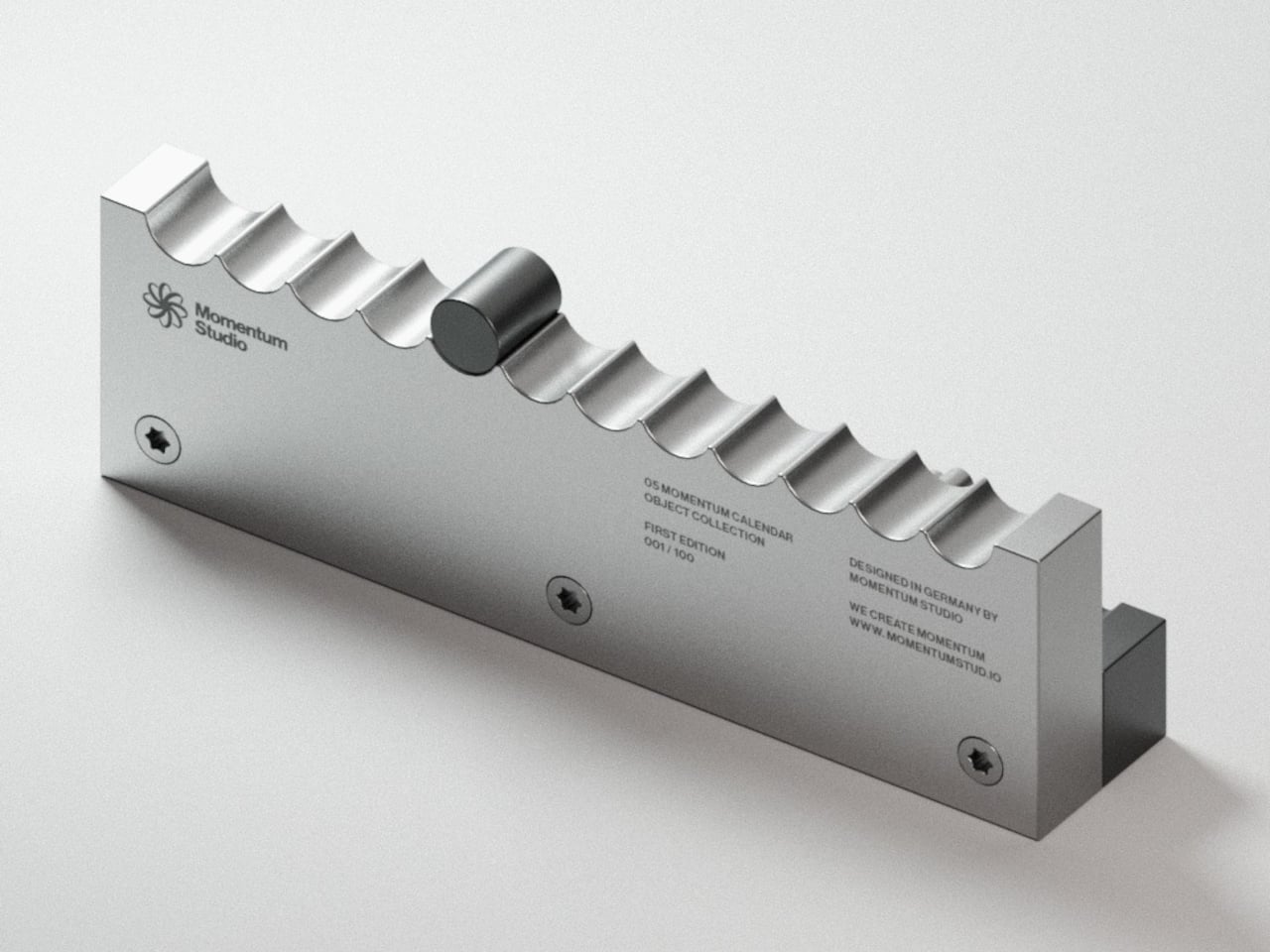
The calendar sits as a stepped aluminum block, angled so both tracks face you at once. The top holds 12 scalloped arches, one for each month, where a smooth cylindrical marker rests in a gentle depression. The front runs 31 ribbed channels numbered across the days, where a flower-shaped marker with corrugated edges clicks into each position like a gear finding its tooth.

That’s where the haptic element matters, and it’s more meaningful than it sounds. There’s something grounding about reaching over each morning to nudge a metal marker one slot further, feeling the resistance as it settles into place. It takes two seconds, but those two seconds make the date something you’ve done rather than something you’ve simply glanced at from across the room.

The studio calls it “a physical manifestation of time,” which might read as a lofty claim until you consider how little physical presence calendars have anymore. The Momentum Calendar doesn’t tell you the date so much as invite you to acknowledge it. On a desk or a shelf, it works as both a functional object and a sculptural piece, without pretending to be anything else.

The aluminum body reinforces that sense of permanence. Momentum Studio describes all objects in the collection as milled from solid blocks of aerospace aluminum, and the Momentum Calendar carries that weight literally. It’s the kind of material that makes something feel like it belongs on a shelf for good, rather than something you’d swap out seasonally. The ridged texture adds depth without veering into decoration.

The First Edition is limited to 100 numbered pieces, with each unit’s position in the run engraved onto the back. What’s interesting is that the calendar’s entire premise depends on you showing up for it every single day. A phone calendar stays current because a server keeps it that way. This one is only accurate because you chose to make it so, which might be the most honest thing any calendar has attempted.

The post Momentum Studio’s Perpetual Calendar Clicks Into Each Day Like a Gear first appeared on Yanko Design.
This €265 Aluminum Table Was Designed Backward to Waste Just 4%

Furniture manufacturing has a quiet waste problem that rarely makes it into the marketing copy. Most pieces require significantly more raw material than what ends up in the finished product, with offcuts, excess, and scraps treated as an acceptable cost of doing business. Some studios have started designing around this inefficiency, treating material constraints not as a limitation but as a creative starting point.

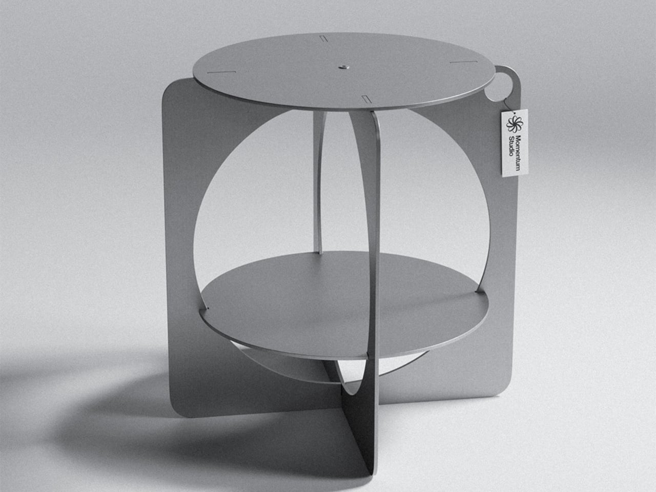
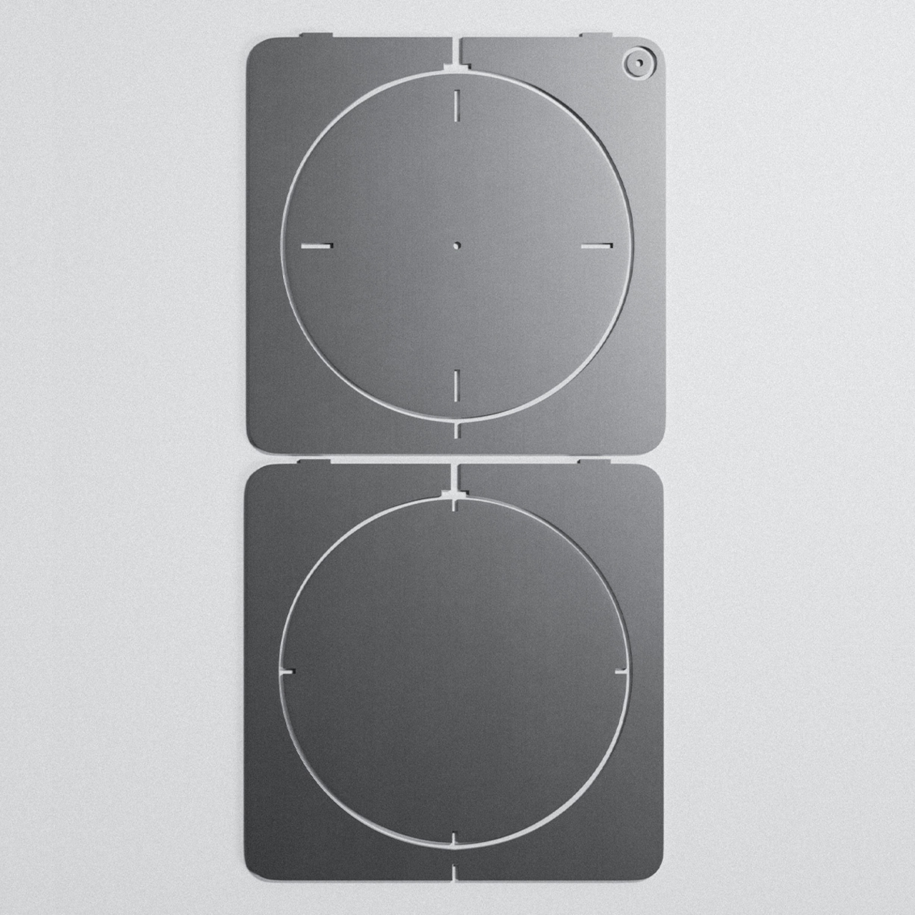
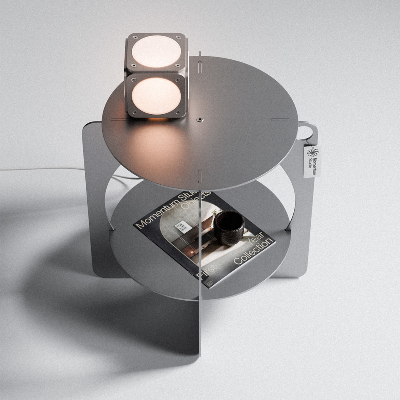
Germany-based Momentum Studio took exactly that approach with its 06 Side Table. Rather than designing a form and then figuring out how to cut it from aluminum, the studio worked the problem in reverse, focusing on how to extract a meaningful shape from a flat sheet with as little waste as possible. The result is a table that looks like it came from a sketch, not a spreadsheet.

Designer: Momentum Studio

The laser-cut parts were nested with enough precision to use 96% of the raw aluminum area, leaving just 4% as offcuts. That figure wasn’t incidental; it was a major focus during development. By designing the two flat panels to fit together as efficiently as possible, the studio kept material costs low enough to offer the piece at €265 while keeping the entire production strictly made in Germany.

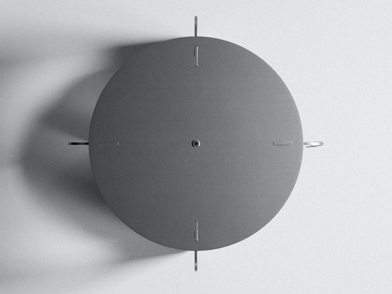
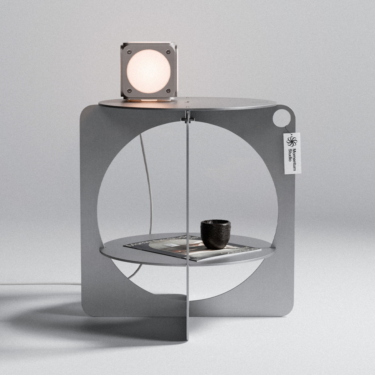
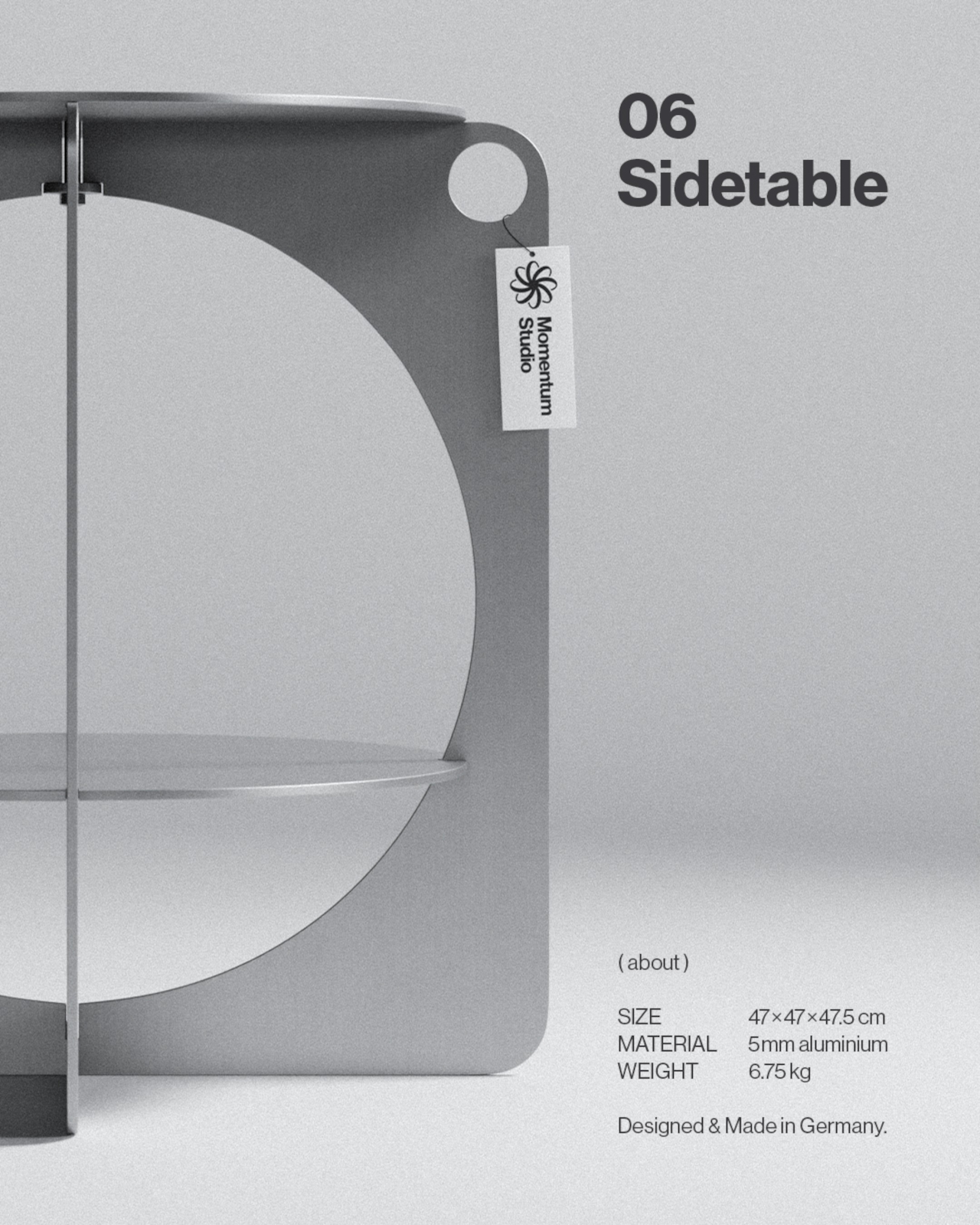
What emerged from that constraint is a silhouette that could easily pass for something from the Bauhaus era. The outer body is formed from two rectangular panels with softly rounded corners, each carrying a large circular cutout that creates an opening through the structure. A circular shelf sits midway inside, and a round tabletop closes the form at the top. The geometry is simple but hard to reduce further.

The material is Aluminium AlMg3, hand-brushed and waxed for what Momentum Studio calls a raw finish. That deliberate restraint means the aluminum will develop a natural patina over time, something the studio frames not as a defect but as part of the piece’s evolving character. The screws are stainless steel, and the assembled table weighs 6.75kg at 47cm x 47cm x 47.5cm.

The table ships flat-packed and goes together without any tools in about five minutes. That’s a practical bonus for a piece that doesn’t look like it should be easy to put together. The lower circular shelf is sized well enough for a book, a small object, or whatever habitually ends up beside a reading chair or bed. The tabletop above handles whatever you’d normally want within arm’s reach.

The design commitment extends to its broader material philosophy, which the studio describes as selecting materials for their permanence rather than their convenience, aiming to create objects designed to age with dignity and outlast generations. It’s the kind of table that stays in a room for a long time, which seems to be exactly the point. For a piece built from raw, waxed aluminum, that ambition doesn’t seem far-fetched.

The post This €265 Aluminum Table Was Designed Backward to Waste Just 4% first appeared on Yanko Design.
This Modular Teak and Aluminum Box Has a Lid That Folds Into a Table

The line between outdoor gear and everyday carry has never been blurrier. More people are treating their camping setups with the same discernment they’d bring to a wardrobe or a home office, hunting for things that work hard but also look intentional. The market has responded, and the range of portable gear sitting somewhere between rugged utility and refined object design has never been broader.

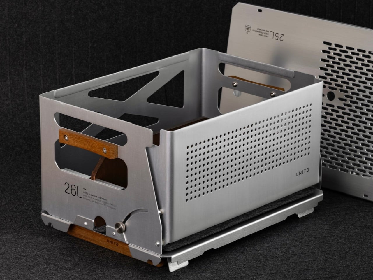
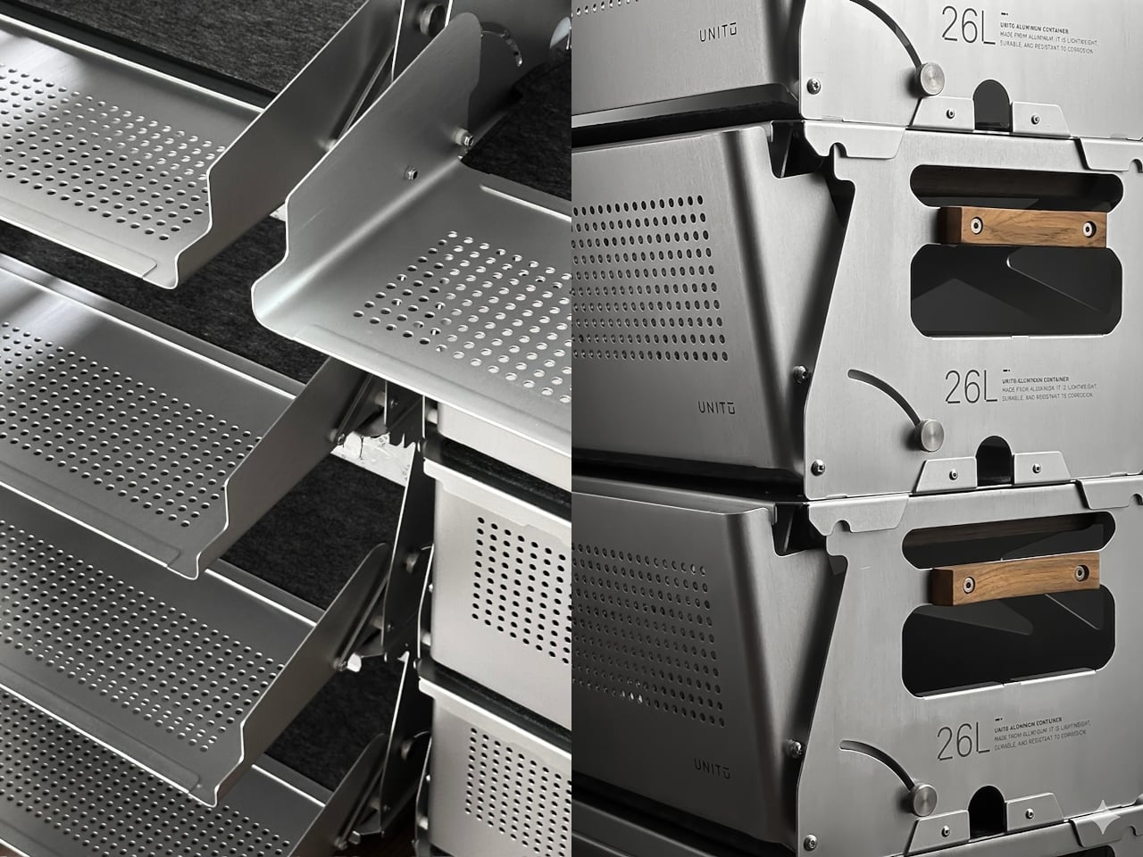
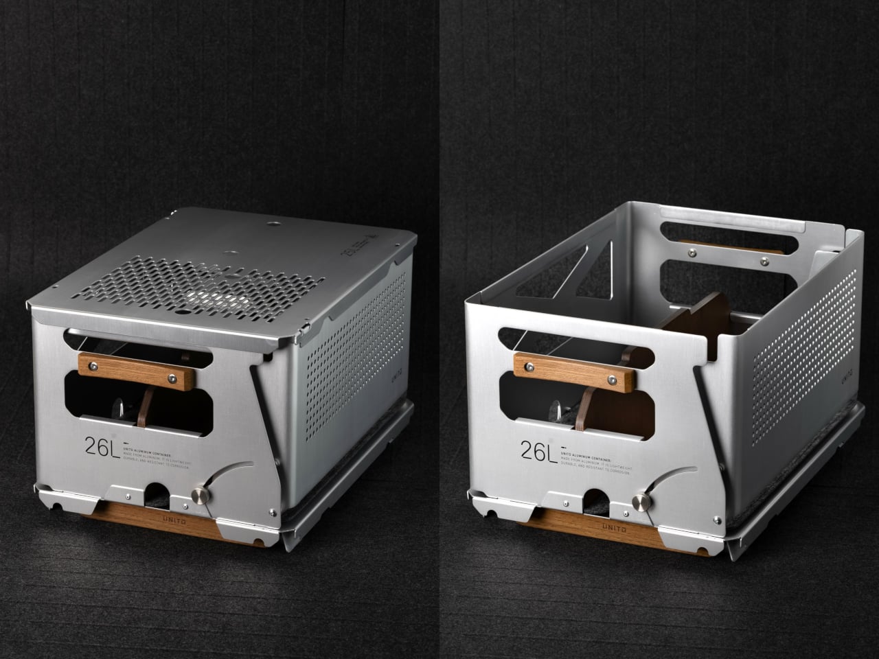
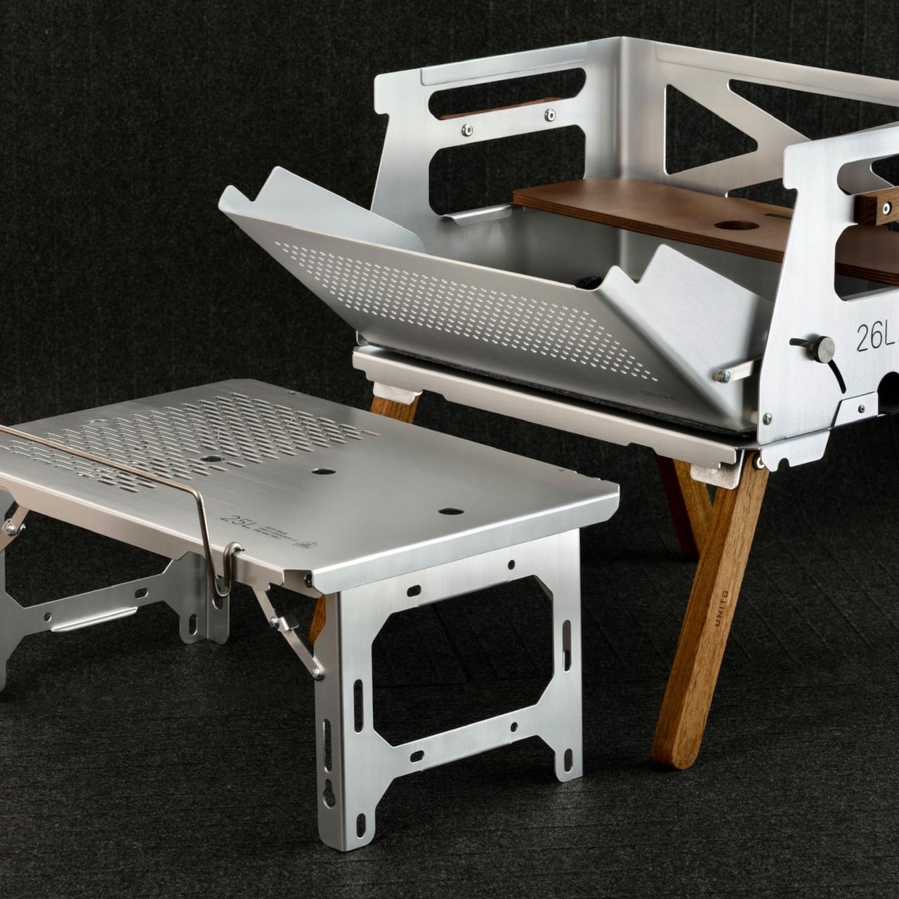
Unito, a Thailand-based brand, has positioned its Container 26L squarely in that territory. The box holds 26 liters of storage and comes loaded with teak wood accents, a foldable table lid, flip-out extension legs, a divider, and a soft pad, all in a full set that retails for $290. It’s built to adapt across environments rather than anchor itself to just one.

Designer: Unito

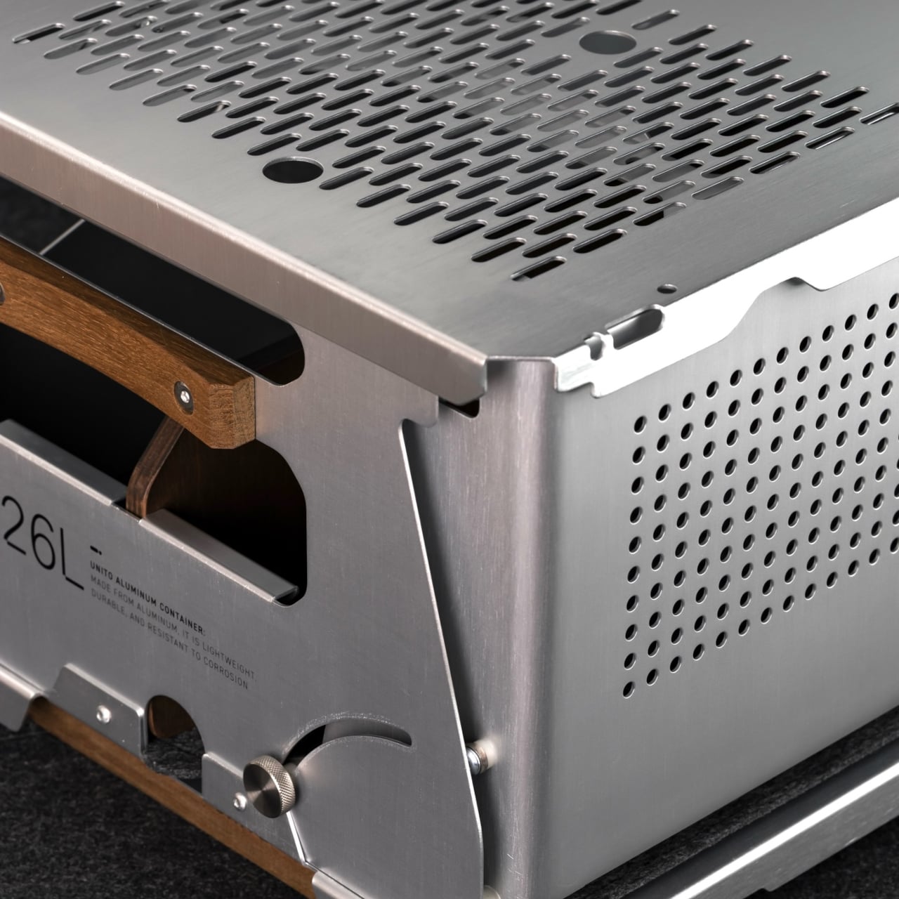
The choice of anodized aluminum for the body does a lot of the heavy lifting. The finish is more corrosion-resistant than bare metal and tougher than paint, which makes it well-suited for the kind of regular outdoor exposure that would start to wear down lesser materials. The silver anodized variant, in particular, has a clean industrial look that doesn’t try too hard and ages without embarrassing itself.

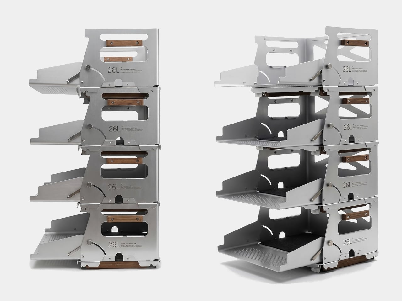
Teak handles sit on either side of the box, giving you a comfortable grip that reads differently against the metallic finish. The flip-out teak extension legs raise the container off the ground into a standing station. Unito supposedly sources the wood from managed plantation forests in Thailand, where the brand is made, addressing concerns about the choice of material.

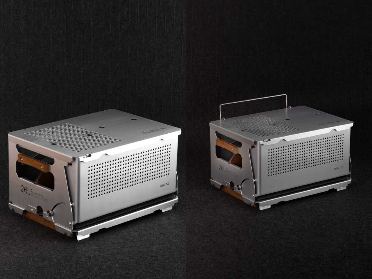
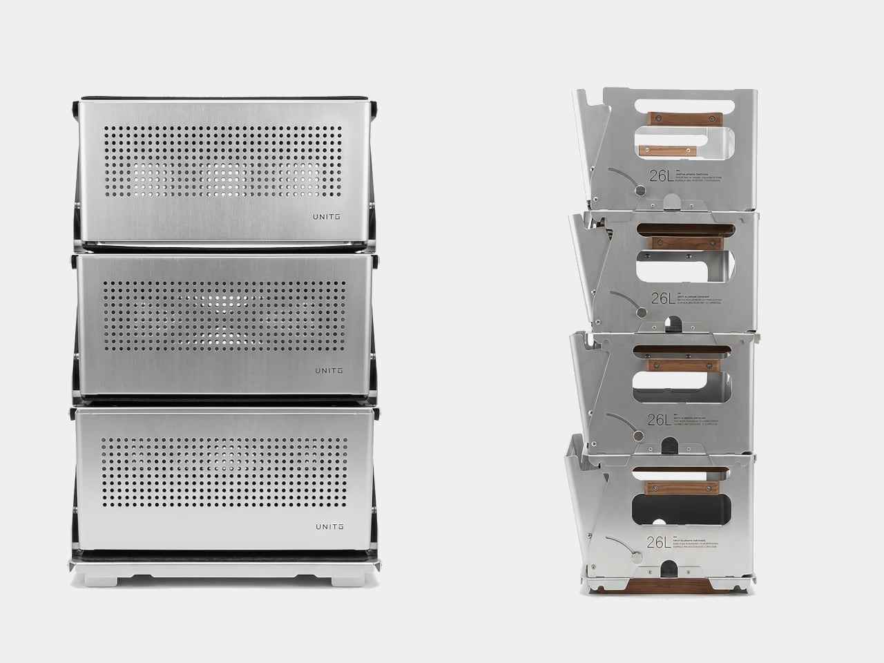
The Snow 25L is the lid that ships with the box, but calling it just a lid undersells what it does. It’s a foldable aluminum table weighing 950 grams, and it’s also compatible with Snow Peak’s 25L crate, which broadens the system’s appeal considerably. Stack two containers, and each lid still opens independently, so access isn’t sacrificed in the name of keeping the stack looking neat.

On a campsite, the legs deploy, and the box becomes a prep station for gear, food, or brew equipment. The perforated aluminum body lets air circulate, which matters when you’re storing anything prone to trapping heat or moisture. The included divider helps section off the interior, and a built-in carry handle means you’re not scrambling for a grip when it’s time to pack up.

Back in the studio or at home, the same container holds art supplies, camera gear, or electronics with enough structure to keep things sorted rather than thrown together. The modular system lets you pair containers, add accessories, or use just the box and lid without the legs. It’s the kind of setup that rewards people who’ve thought carefully about their gear.

The post This Modular Teak and Aluminum Box Has a Lid That Folds Into a Table first appeared on Yanko Design.
This Modular Teak and Aluminum Box Has a Lid That Folds Into a Table

The line between outdoor gear and everyday carry has never been blurrier. More people are treating their camping setups with the same discernment they’d bring to a wardrobe or a home office, hunting for things that work hard but also look intentional. The market has responded, and the range of portable gear sitting somewhere between rugged utility and refined object design has never been broader.

Unito, a Thailand-based brand, has positioned its Container 26L squarely in that territory. The box holds 26 liters of storage and comes loaded with teak wood accents, a foldable table lid, flip-out extension legs, a divider, and a soft pad, all in a full set that retails for $290. It’s built to adapt across environments rather than anchor itself to just one.

Designer: Unito

The choice of anodized aluminum for the body does a lot of the heavy lifting. The finish is more corrosion-resistant than bare metal and tougher than paint, which makes it well-suited for the kind of regular outdoor exposure that would start to wear down lesser materials. The silver anodized variant, in particular, has a clean industrial look that doesn’t try too hard and ages without embarrassing itself.

Teak handles sit on either side of the box, giving you a comfortable grip that reads differently against the metallic finish. The flip-out teak extension legs raise the container off the ground into a standing station. Unito supposedly sources the wood from managed plantation forests in Thailand, where the brand is made, addressing concerns about the choice of material.

The Snow 25L is the lid that ships with the box, but calling it just a lid undersells what it does. It’s a foldable aluminum table weighing 950 grams, and it’s also compatible with Snow Peak’s 25L crate, which broadens the system’s appeal considerably. Stack two containers, and each lid still opens independently, so access isn’t sacrificed in the name of keeping the stack looking neat.

On a campsite, the legs deploy, and the box becomes a prep station for gear, food, or brew equipment. The perforated aluminum body lets air circulate, which matters when you’re storing anything prone to trapping heat or moisture. The included divider helps section off the interior, and a built-in carry handle means you’re not scrambling for a grip when it’s time to pack up.

Back in the studio or at home, the same container holds art supplies, camera gear, or electronics with enough structure to keep things sorted rather than thrown together. The modular system lets you pair containers, add accessories, or use just the box and lid without the legs. It’s the kind of setup that rewards people who’ve thought carefully about their gear.

The post This Modular Teak and Aluminum Box Has a Lid That Folds Into a Table first appeared on Yanko Design.
Norm Lamp’s Body and Pods Are Cut From the Same Aluminum Tube

Many contemporary pendant lamps hide a surprising amount of complexity, multiple materials, custom housings, and plastic diffusers layered around a simple LED strip. That often leads to wasteful production and tricky recycling once the fixture breaks or goes out of style. Norm is a response that asks what happens if you commit to a single aluminum profile and let that decision drive both the form and the sustainability story, from manufacturing to the last scrap.

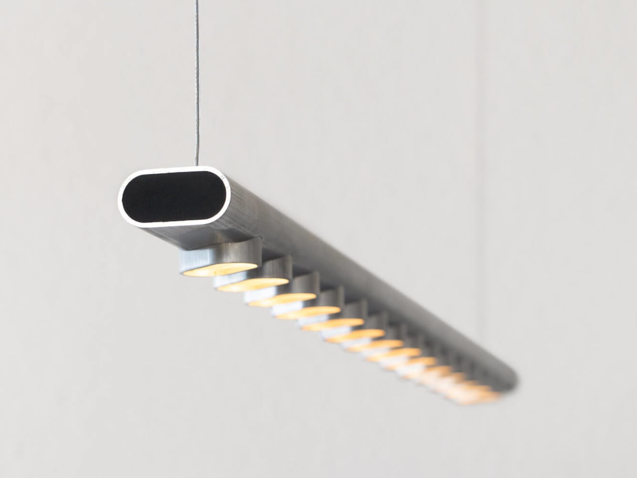
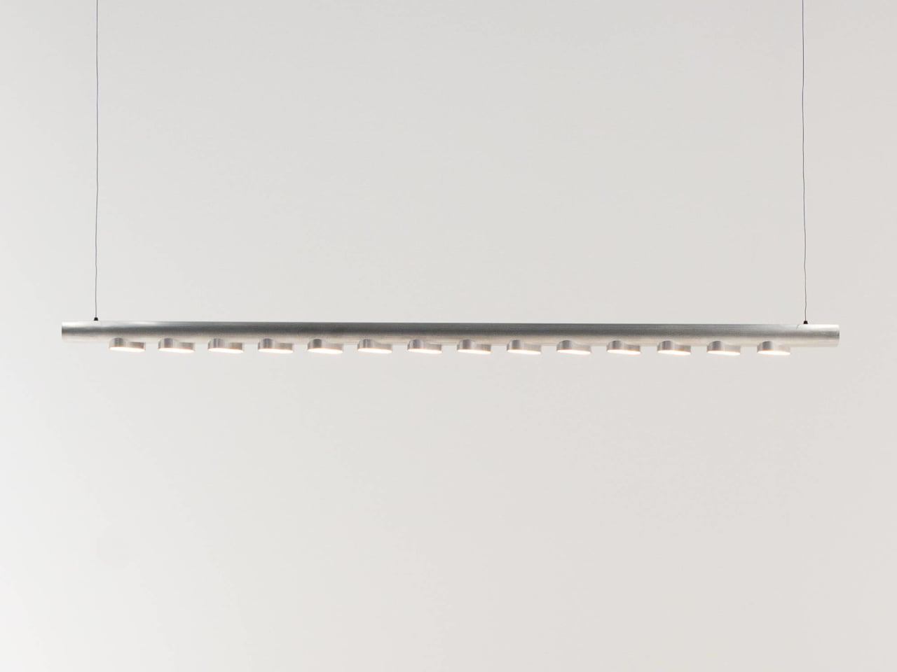
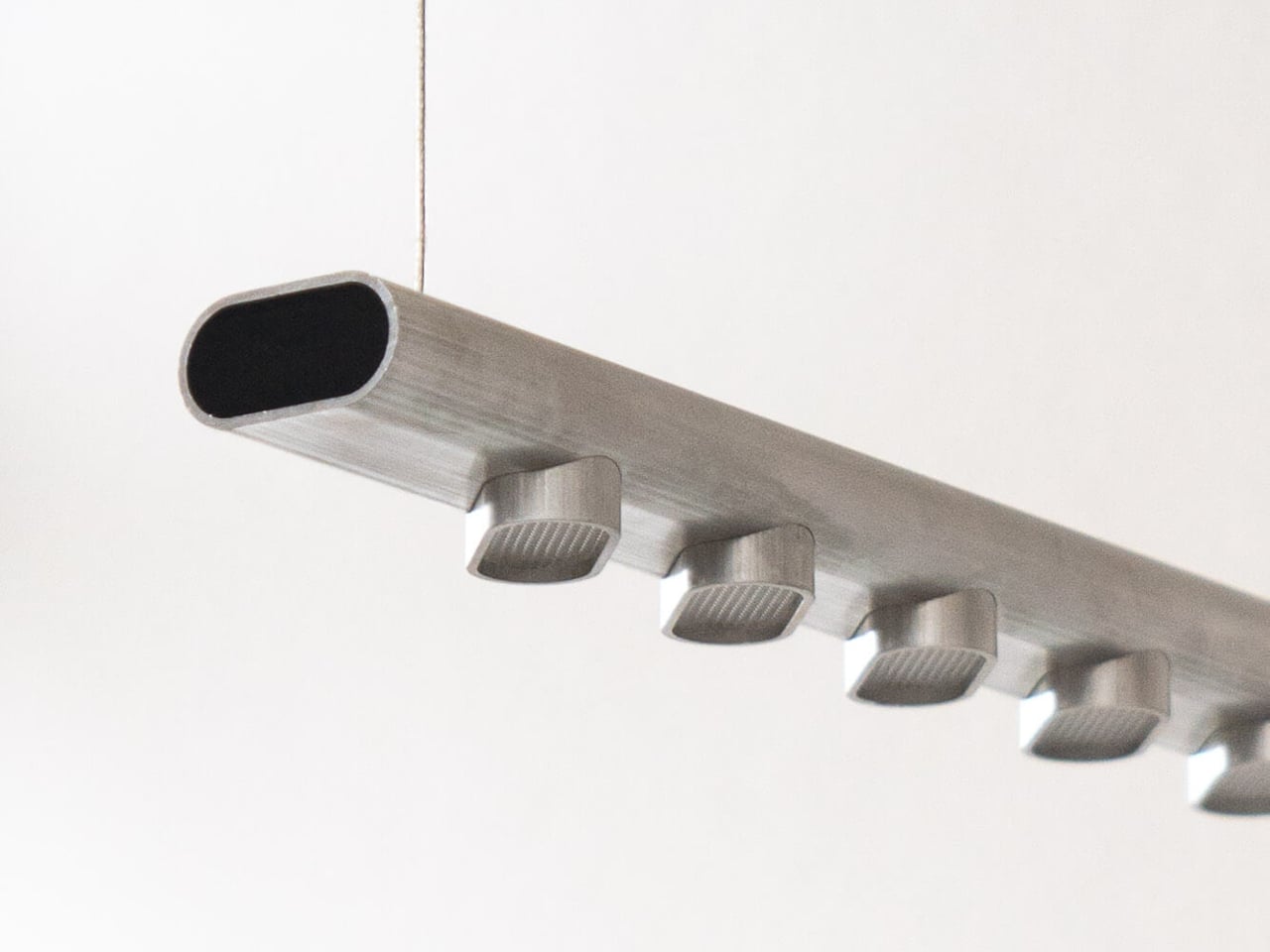
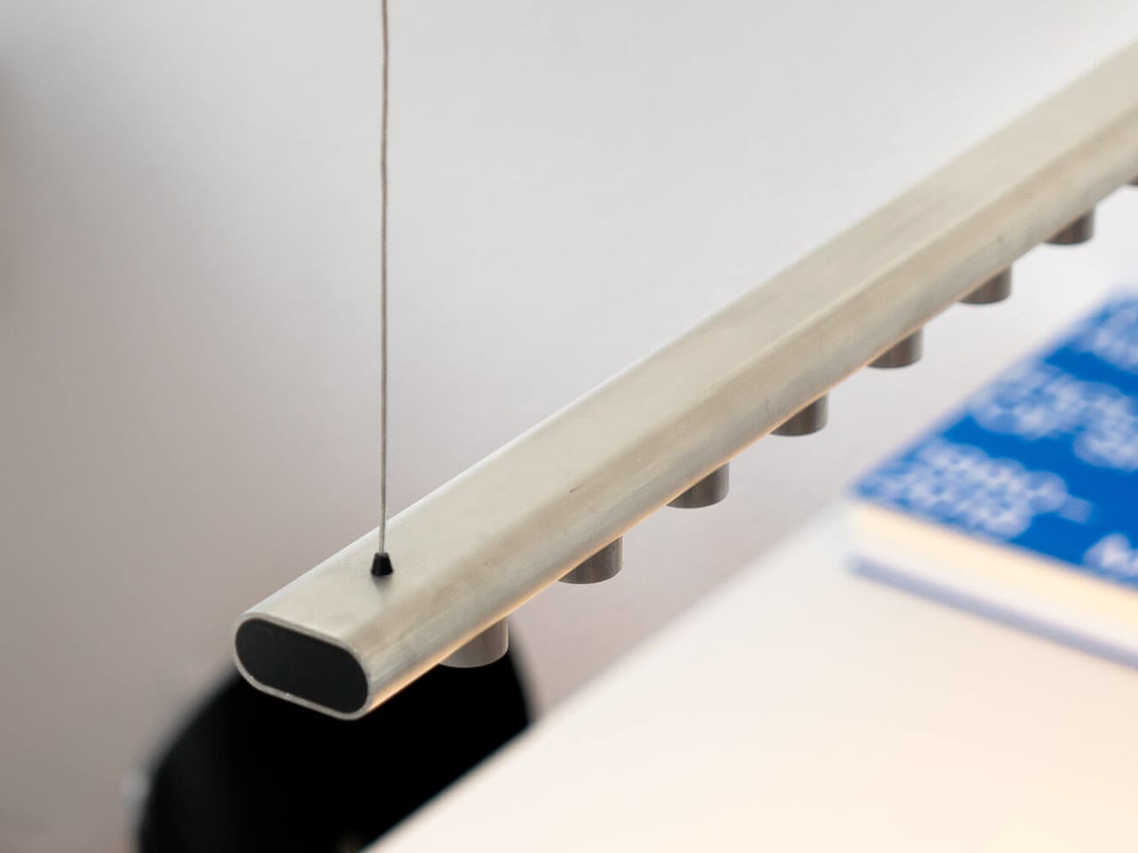
The Norm pendant lamp by Moritz Walter is a fixture whose entire outer body is made from one extruded aluminum profile. The same oval tube becomes the main beam and the housings for the LEDs, which keeps production simple and scrap low. The widespread LED array is tuned for both work and living environments, so it is not just a workshop experiment or a concept that sacrifices performance for purity of idea.

Designer: Moritz Walter

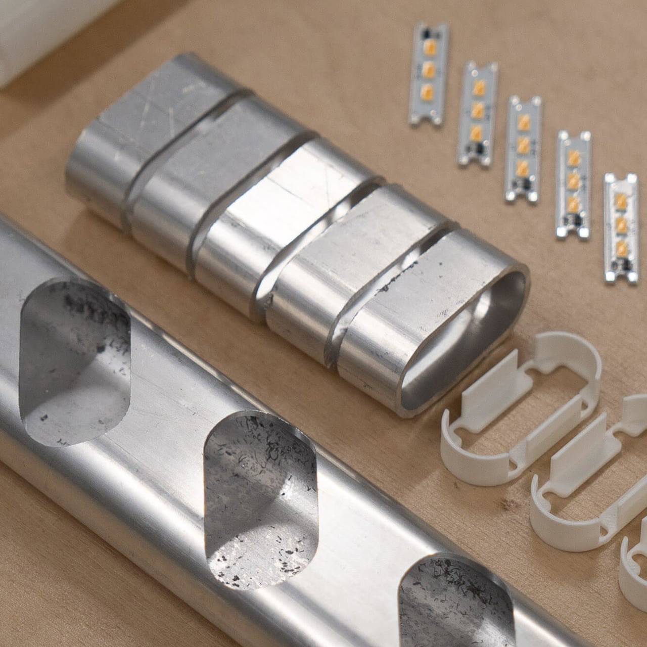
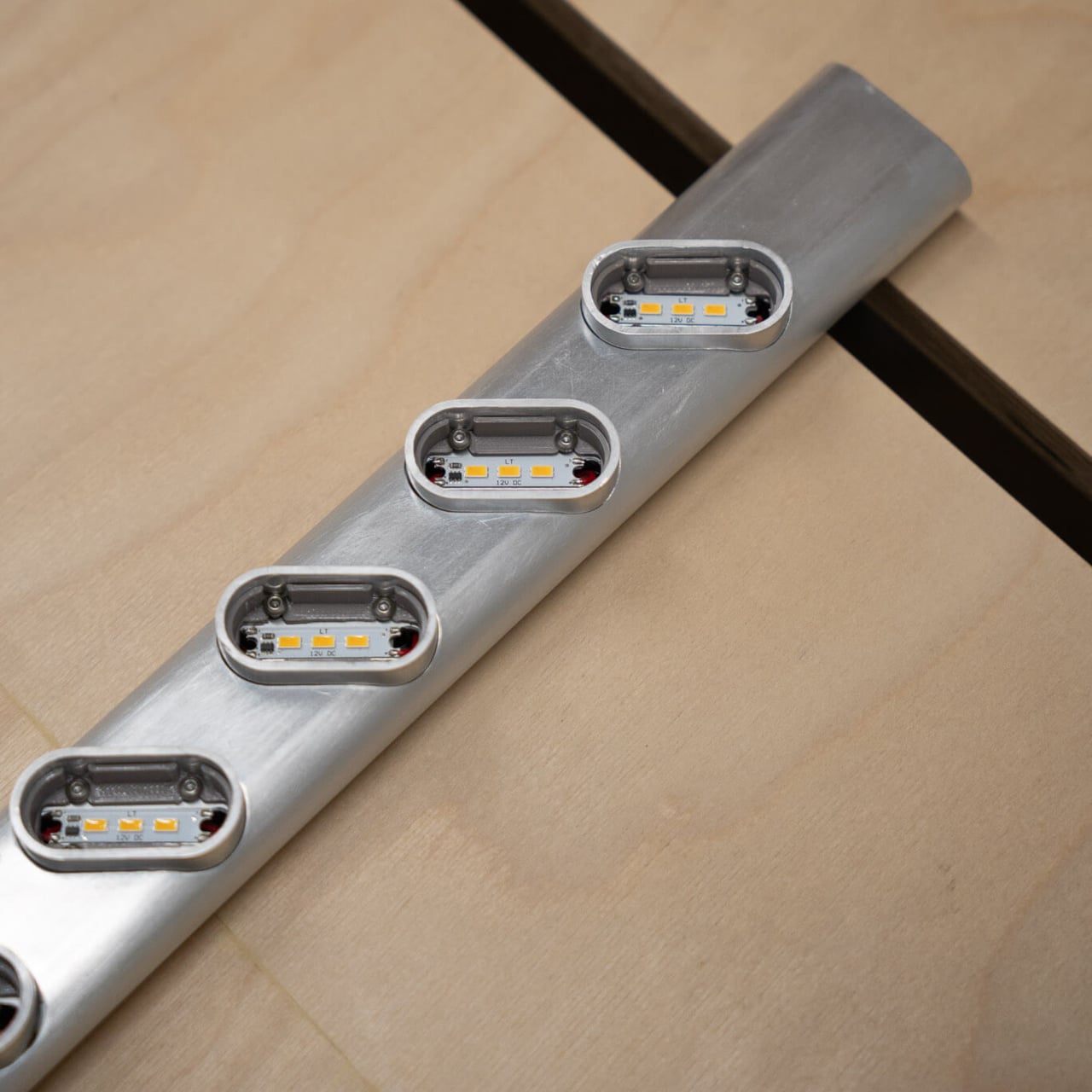
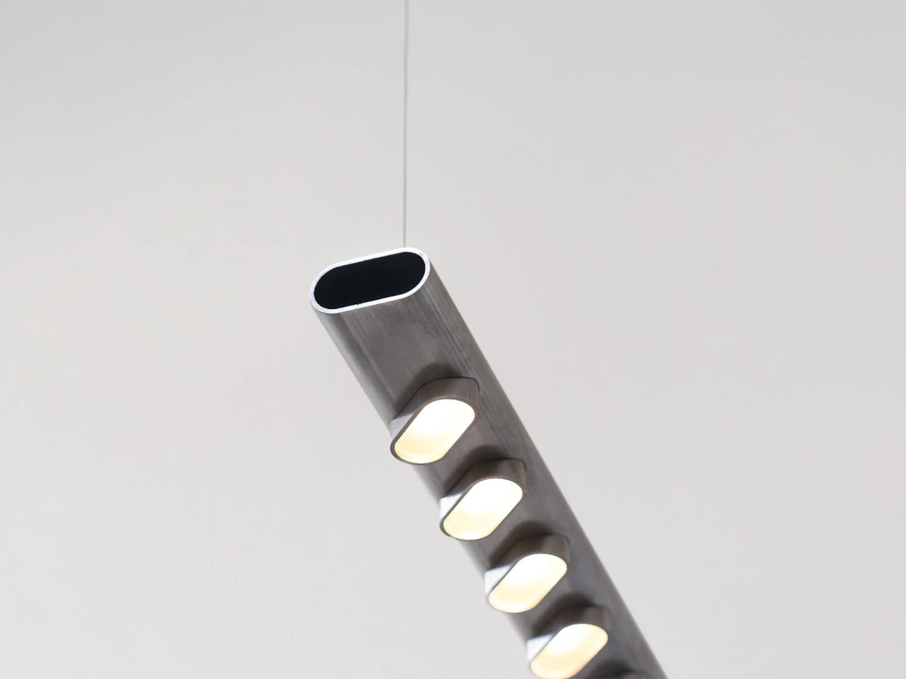
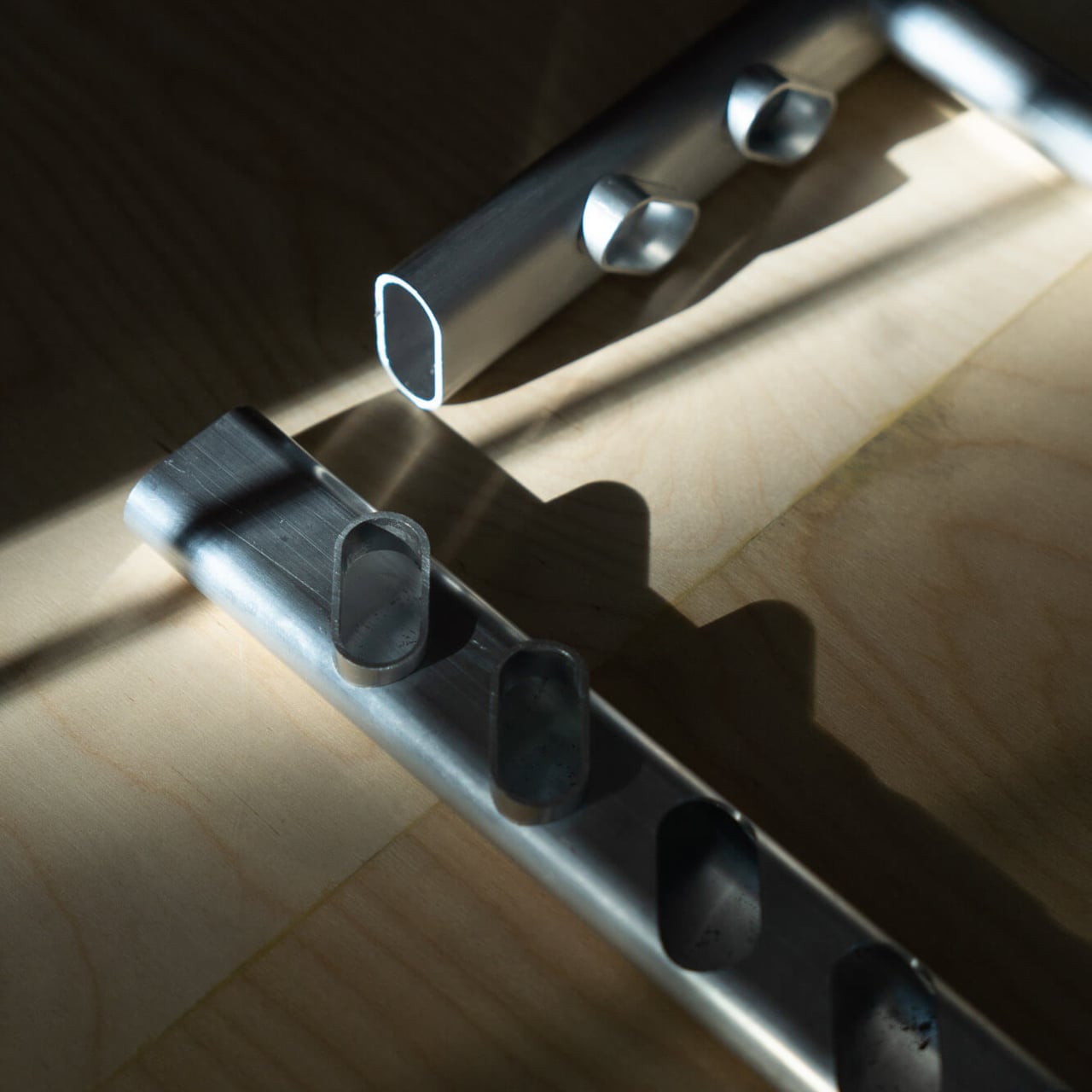
A straight length of the oval tube forms the pendant body, while shorter sections are cut, sliced, and re-attached as small pods along the underside. Those pods frame the LED boards and act as mini reflectors, directing light downward and shielding the diodes from direct view. The repetition of identical pieces creates a calm rhythm without introducing new geometries or extra parts, keeping the material strategy legible in the finished object.

Instead of a single continuous strip, Norm uses a series of small LED boards spaced along the beam, spreading light evenly across a desk or table. The pods help with glare control, making the lamp comfortable over workstations, dining tables, or kitchen islands. The color and intensity can be tuned to suit task lighting or softer ambient settings, so it can move between office and home without feeling out of place or overly industrial.

Using one aluminum profile for all visible parts simplifies tooling, reduces offcuts, and makes recycling straightforward. There is no mix of plastics and metals glued together, just an extruded tube and its derivatives acting as structure, housing, and heat sink. At the end of its life, the body can be disassembled and recycled as aluminum, which is a cleaner story than most multi-material luminaires can tell once they are thrown out.

The raw, brushed aluminum finish and soft rectangular cross-section keep the lamp from feeling too cold or technical. The extrusion lines and subtle tooling marks are left visible, turning the manufacturing process into part of the visual character. The overall effect is a slim, industrial bar of light that can disappear into a white ceiling or stand out over a warm wooden table, depending on how you style the space around it.

Norm shows that sustainability does not always require exotic materials or complex tech. Sometimes it is about committing to a simple constraint, in this case, one aluminum profile, and letting that rule shape everything from the silhouette to the way light is distributed. The idea of a pendant that is honest about how it is made, yet still precise and adaptable, feels quietly refreshing when so many fixtures are over-designed, hard to disassemble, and destined for a landfill within a few years.

The post Norm Lamp’s Body and Pods Are Cut From the Same Aluminum Tube first appeared on Yanko Design.
UNAVELA Machined This Cube Espresso Cup From One Aluminum Block

Espresso is a tiny daily ritual that usually happens in anonymous porcelain cups pulled from the cupboard without a second thought. More designers are turning their attention to these small moments, using precise materials and geometry to make them feel intentional rather than automatic. UNAVELA’s Aluminium Coffee Cup is one of those objects, taking something familiar and rendering it as a sculptural, almost architectural piece you’d want to keep visible on the counter.

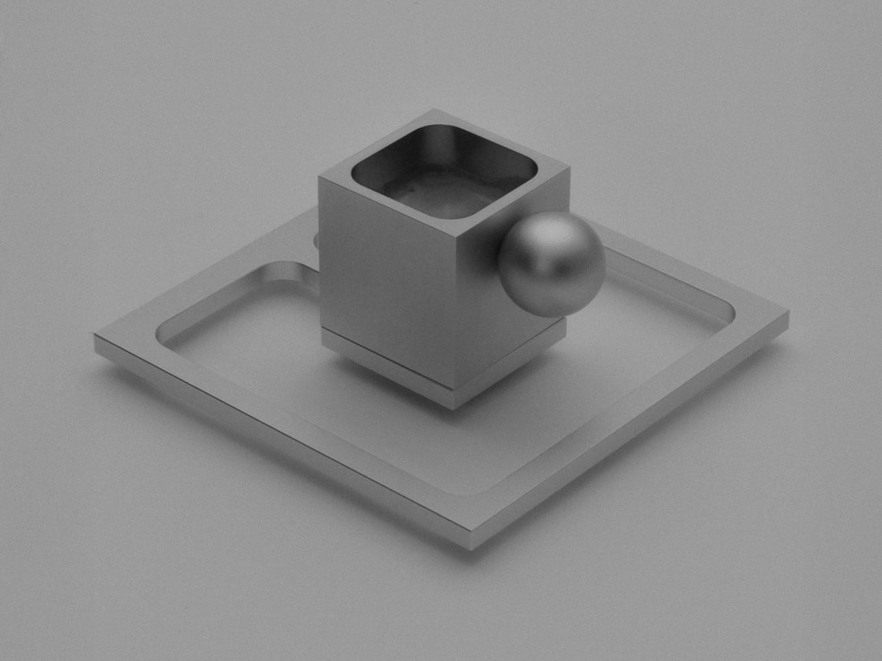
The cup comes from French-Spanish studio UNAVELA, founded by two aerospace engineers who now apply that rigor to everyday objects. The set consists of a cube-shaped aluminium cup with a spherical handle and a square frame saucer, all bead-blasted and anodized in matte silver. It’s designed to be used, noticed, and kept rather than forgotten in a cupboard, and it’s the first piece in a broader collection of functional objects.

Designers: Javier De Andrés García, Anaïs Wallet (Unavela)

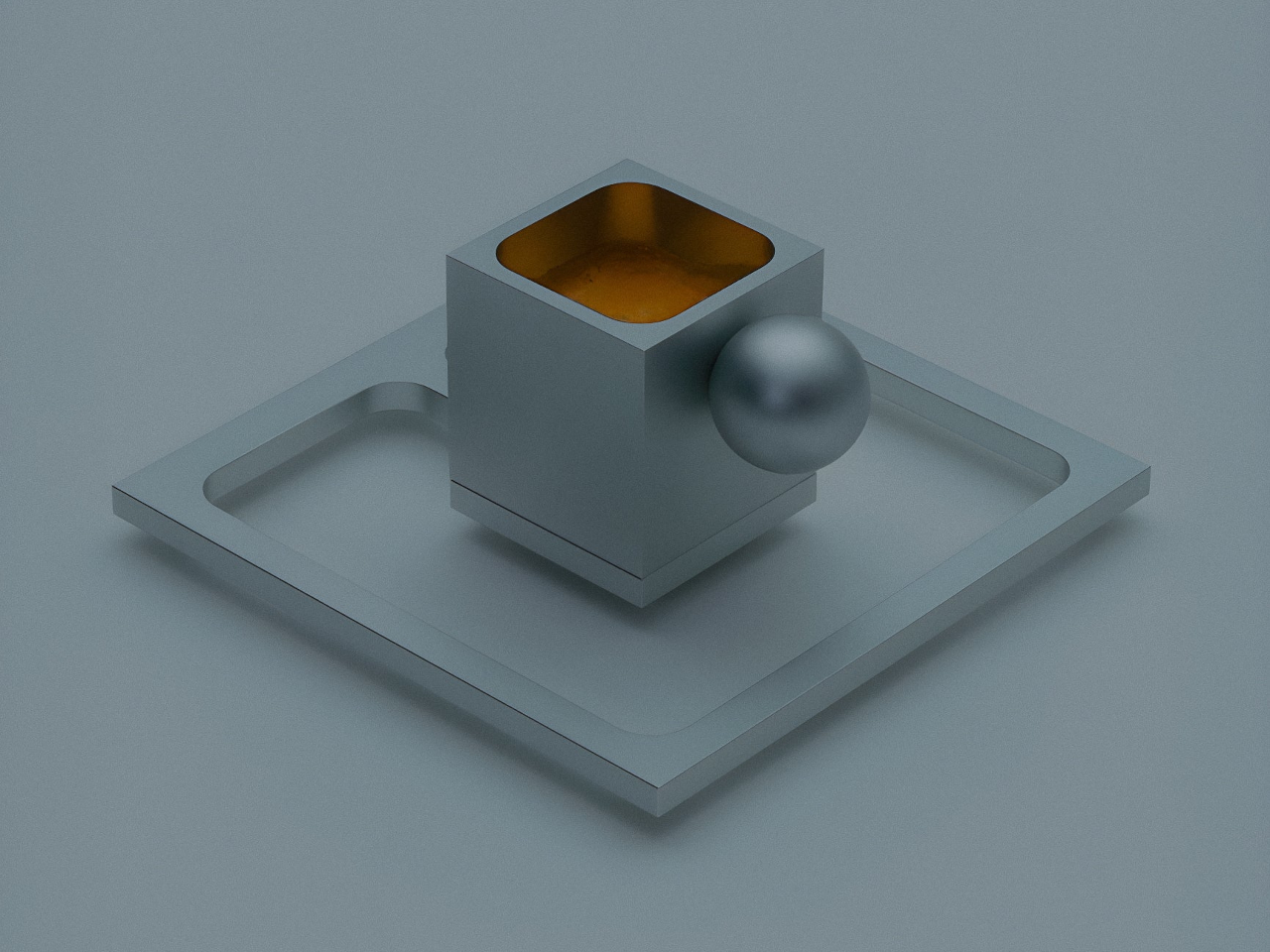
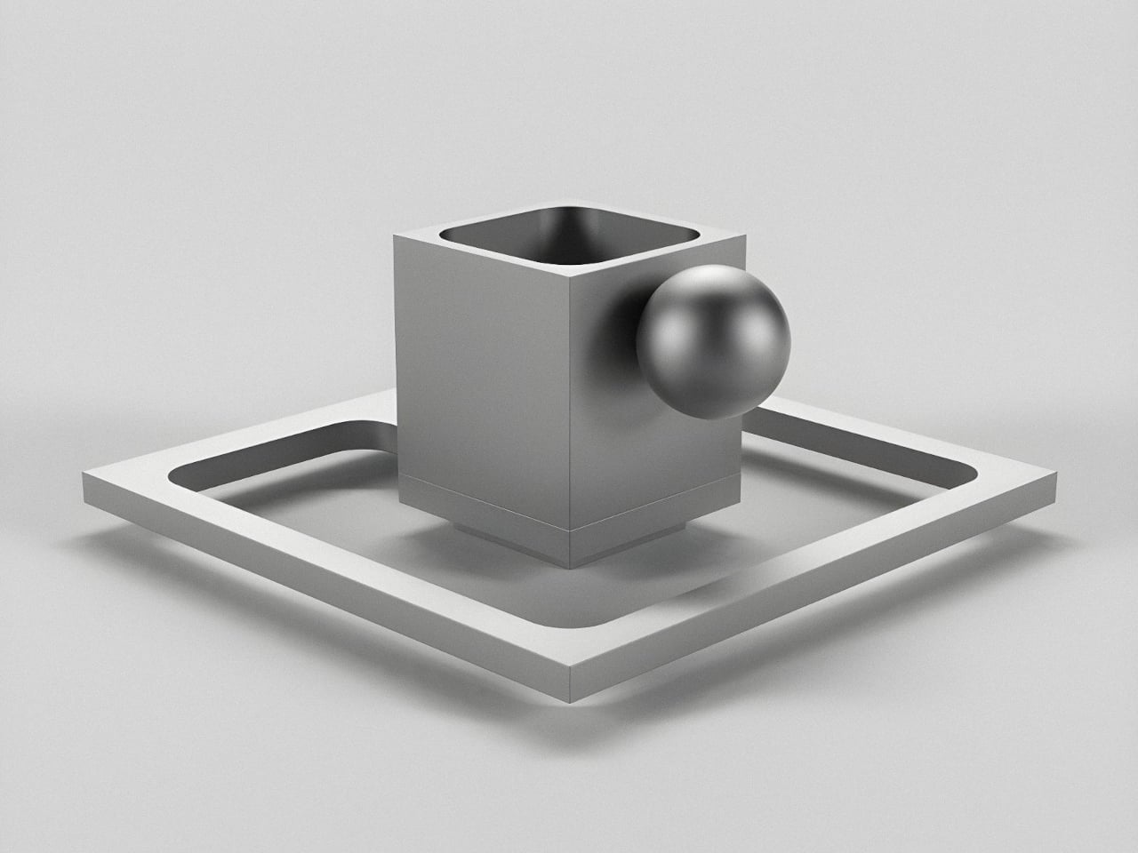
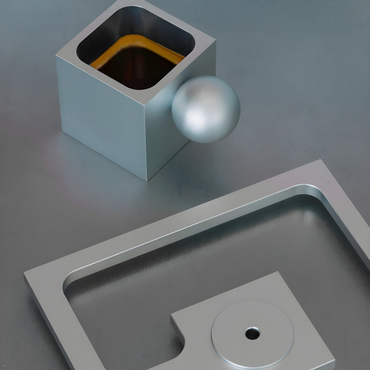
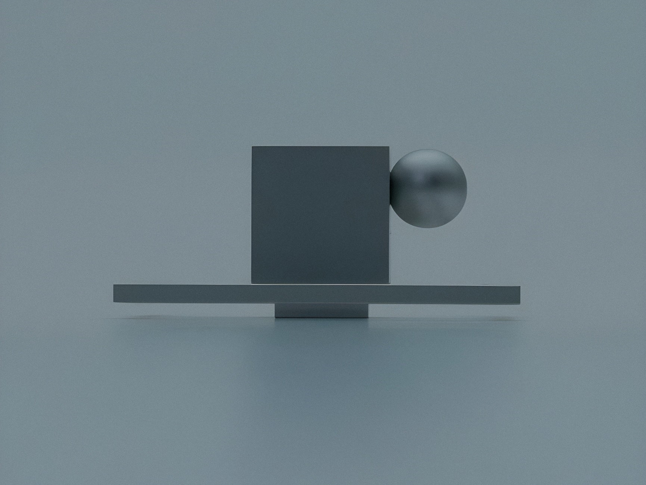
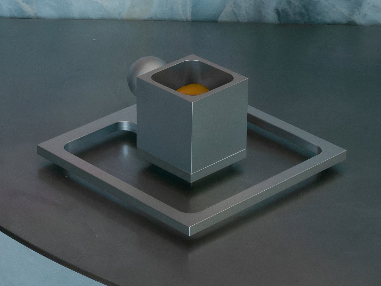
The cup itself is a tall, narrow cube machined from a single block of 6061 aluminium, with a square opening sized for a 50-milliliter shot. One face carries a solid metal sphere as a handle, creating a striking contrast between sharp edges and pure geometry. When filled, the silver interior reflects the warm color of the coffee, so the drink visually defines the inside rather than a separate finish or coating.

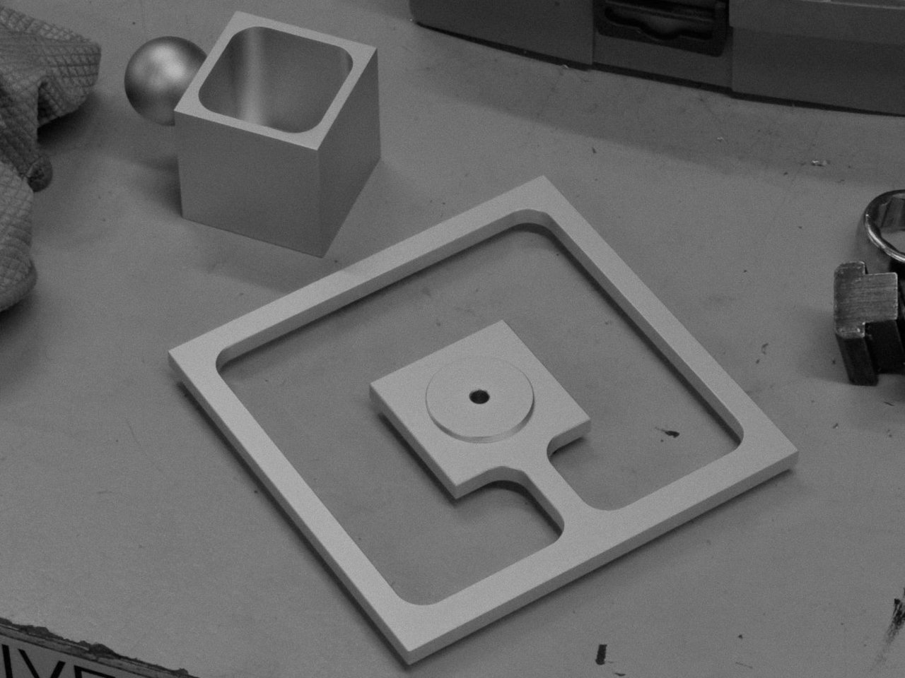
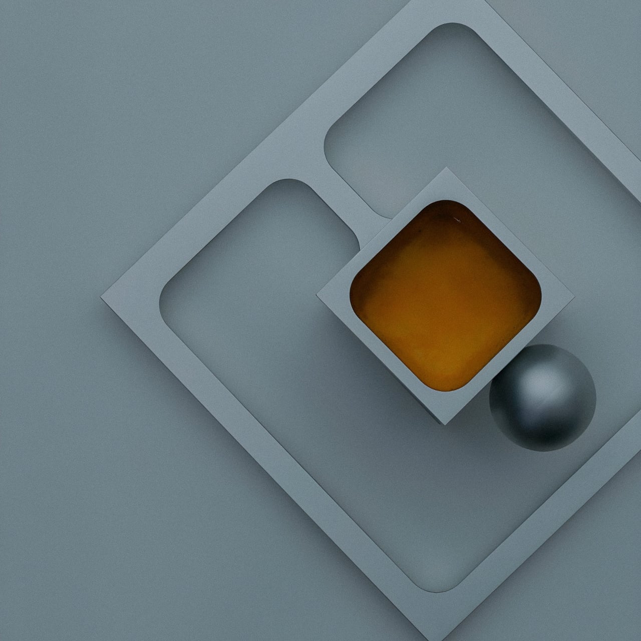
The saucer takes the form of a flat square frame with rounded rectangular cutouts and a central recess for the cup. From above, it looks like a thin border floating around the cube, especially when rotated into a diamond orientation. The open areas reduce visual weight and echo the cup’s square footprint, turning the saucer into more of a stage than a simple coaster or dish.

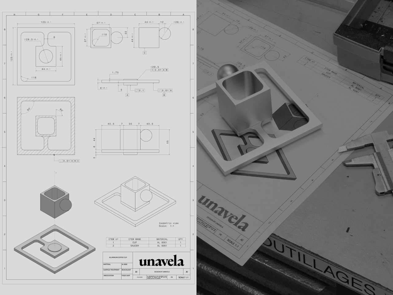
Of course, UNAVELA machines each cup from a single block using CNC technology, then bead-blasts the surface to achieve a soft satin texture that feels smooth in the hand. A transparent food-grade anodization protects the metal and keeps it safe for drinks, similar to traditional Italian moka pots. Each piece is assembled and checked by hand in their atelier in the south of France.

The cup isn’t too hot to hold; side-by-side tests with porcelain showed similar exterior temperatures. The anodized aluminium doesn’t affect taste and is safe for coffee. Despite the square opening, one side matches the average mouth width, so you drink from a flat edge rather than a corner, and the experience feels surprisingly normal when it touches your lips.

The cup should be rinsed with water only, no soap, dishwasher, or scouring pads, echoing the care routine of classic Italian coffee makers. The Aluminium Coffee Cup turns a quick espresso into a moment of interaction with geometry and material. It’s less about maximizing insulation or capacity and more about enjoying the shape of the ritual itself, holding something that feels as considered as the coffee inside it.

The post UNAVELA Machined This Cube Espresso Cup From One Aluminum Block first appeared on Yanko Design.
UNAVELA Machined This Cube Espresso Cup From One Aluminum Block

Espresso is a tiny daily ritual that usually happens in anonymous porcelain cups pulled from the cupboard without a second thought. More designers are turning their attention to these small moments, using precise materials and geometry to make them feel intentional rather than automatic. UNAVELA’s Aluminium Coffee Cup is one of those objects, taking something familiar and rendering it as a sculptural, almost architectural piece you’d want to keep visible on the counter.

The cup comes from French-Spanish studio UNAVELA, founded by two aerospace engineers who now apply that rigor to everyday objects. The set consists of a cube-shaped aluminium cup with a spherical handle and a square frame saucer, all bead-blasted and anodized in matte silver. It’s designed to be used, noticed, and kept rather than forgotten in a cupboard, and it’s the first piece in a broader collection of functional objects.

Designers: Javier De Andrés García, Anaïs Wallet (Unavela)

The cup itself is a tall, narrow cube machined from a single block of 6061 aluminium, with a square opening sized for a 50-milliliter shot. One face carries a solid metal sphere as a handle, creating a striking contrast between sharp edges and pure geometry. When filled, the silver interior reflects the warm color of the coffee, so the drink visually defines the inside rather than a separate finish or coating.

The saucer takes the form of a flat square frame with rounded rectangular cutouts and a central recess for the cup. From above, it looks like a thin border floating around the cube, especially when rotated into a diamond orientation. The open areas reduce visual weight and echo the cup’s square footprint, turning the saucer into more of a stage than a simple coaster or dish.

Of course, UNAVELA machines each cup from a single block using CNC technology, then bead-blasts the surface to achieve a soft satin texture that feels smooth in the hand. A transparent food-grade anodization protects the metal and keeps it safe for drinks, similar to traditional Italian moka pots. Each piece is assembled and checked by hand in their atelier in the south of France.

The cup isn’t too hot to hold; side-by-side tests with porcelain showed similar exterior temperatures. The anodized aluminium doesn’t affect taste and is safe for coffee. Despite the square opening, one side matches the average mouth width, so you drink from a flat edge rather than a corner, and the experience feels surprisingly normal when it touches your lips.

The cup should be rinsed with water only, no soap, dishwasher, or scouring pads, echoing the care routine of classic Italian coffee makers. The Aluminium Coffee Cup turns a quick espresso into a moment of interaction with geometry and material. It’s less about maximizing insulation or capacity and more about enjoying the shape of the ritual itself, holding something that feels as considered as the coffee inside it.

The post UNAVELA Machined This Cube Espresso Cup From One Aluminum Block first appeared on Yanko Design.
The Best Designer Box Cutter for a Stylish Package Opening Experience

Almost everyone has a tool to open packages, be it a cutter, a pair of scissors, or even a knife from the kitchen. Not all of these tools are appropriate for the job, though, especially when they are as likely to cut you as they are the packaging tape.
And those that are indeed designed to slice through these materials are often just shoved back into drawers after their use because they have no place or role to play in people’s lives in those moments. Taking inspiration from ancient tools, this distinctive box cutter defies misconceptions and expectations of what the tool should look like, offering a design that is every bit as functional as a standard unpacking knife but is also beautiful beyond measure as well.

Designer: AATISMO for Seiwa

Click Here to Buy Now: $99

The Problem: Boring Cutters are Always Out of Reach

Box and paper cutters often come as long rectangular implements whose blades slide out and in as needed. Unlike scissors or kitchen knives, these tools are specifically designed with that singular use case in mind, which means they often come with safety measures and ergonomic mechanisms to make the act of cutting through cloth, tape, or cardboard comfortable and convenient. Unfortunately, the majority of cutters also have designs intended to look practical, tactical, or industrial, which is why they often find themselves hidden in drawers or containers after their use.

This has the sometimes unintended effect of actually losing time looking for that cutter when you actually need it. Imagine feeling hyped after receiving a package, only for that excitement to die from annoyance when you can’t get your hands on your trusty cutter immediately.

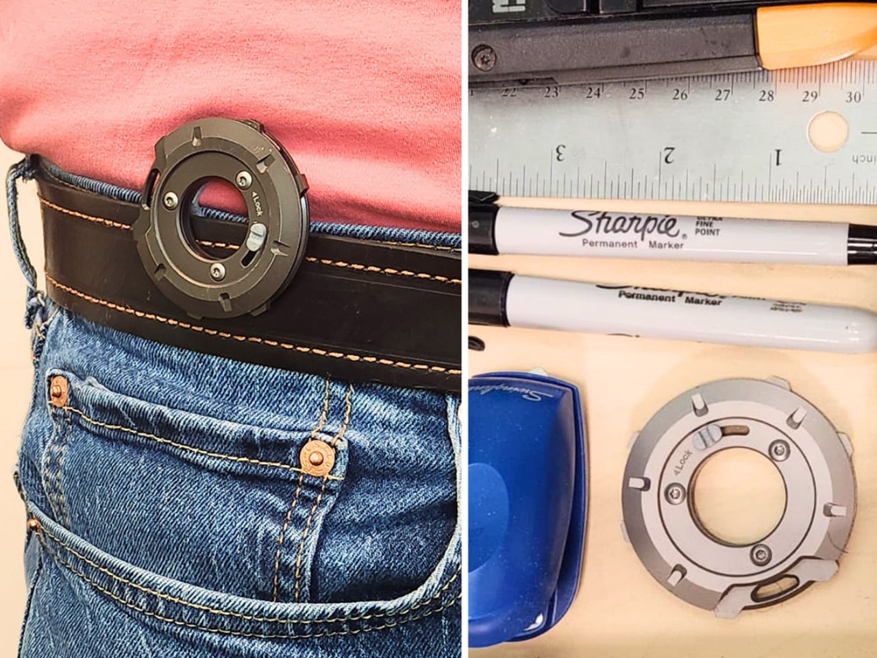
You could always just leave the unpacking knife on your desk, but not only is it a safety hazard, it can also be an eyesore against your beautifully maintained minimalist workspace.

Why is This the Best Aesthetic Box Cutter

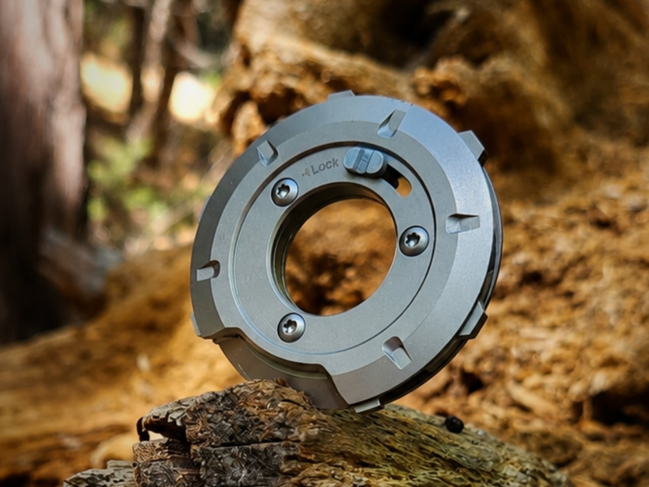
The OOPARTS-001 is a cutting tool that breaks free from the mold to present a functional yet also beautiful box cutter, and it takes inspiration from the unlikeliest source. Although made from metal, the disc-shaped object almost looks like those ancient tools carved from stone that our distant ancestors used to survive and thrive. There is a sense of raw power emanating from the form’s faceted surface, while at the same time exuding elegance and prestige thanks to the aluminum alloy’s shiny anodized finish.

Machined from a single block of metal, the process leaves traces of the cutting that become accents that give the cutter a unique character.

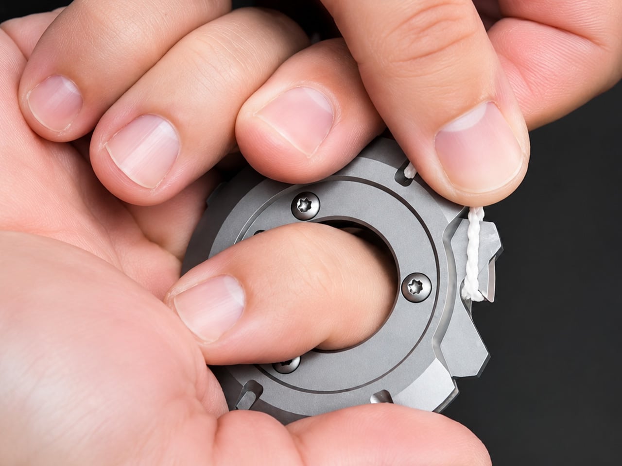
It isn’t all just looks, of course. It is also a sharp and safe tool for cutting through different kinds of packaging material, from tape to cloth to paper. The sharp tip of the knife is located in a single point only to avoid accidents, while the opposite edge acts as a guide that keeps the blade grounded and prevents it from slipping and injuring you.

The wave-like patterns on the front of the cutter aren’t just for show but help you get a more solid and stable grip. And when you’re done with the task at hand, you can simply place the box cutter on your desk or stand it up on its base, proudly showing off its aesthetic beauty for everyone to see.

Who This Aesthetic Box Cutter is For

Just because tools need to be functional doesn’t mean they can’t be beautiful as well. Sure, you’ll need to squeeze out some creative juices and think outside the box to get a design that meets both requirements equally, but as this Stone Tool-like Unpacking Knife proves, it’s definitely worth the effort. And you don’t even have to limit yourself to well-known design patterns from the past centuries, especially when the Stone Age can also be a treasure trove of unexplored sources of inspiration.

With this Aesthetic Box Cutter, not only do you get a sharp cutting tool that feels great in your hand, you also get an art object that you can display on your desk without shame, ensuring that you can quickly reach for it when your next exciting package arrives.

Click Here to Buy Now: $99

The post The Best Designer Box Cutter for a Stylish Package Opening Experience first appeared on Yanko Design.