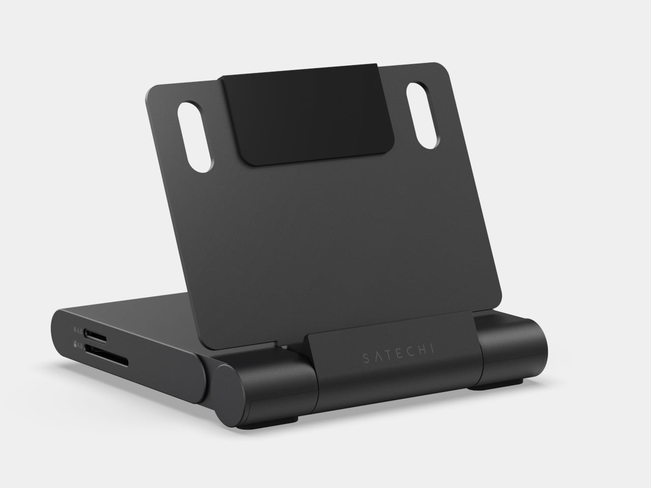
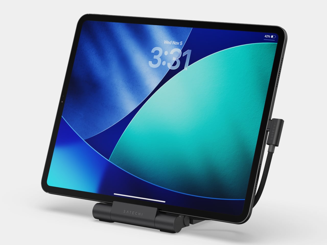
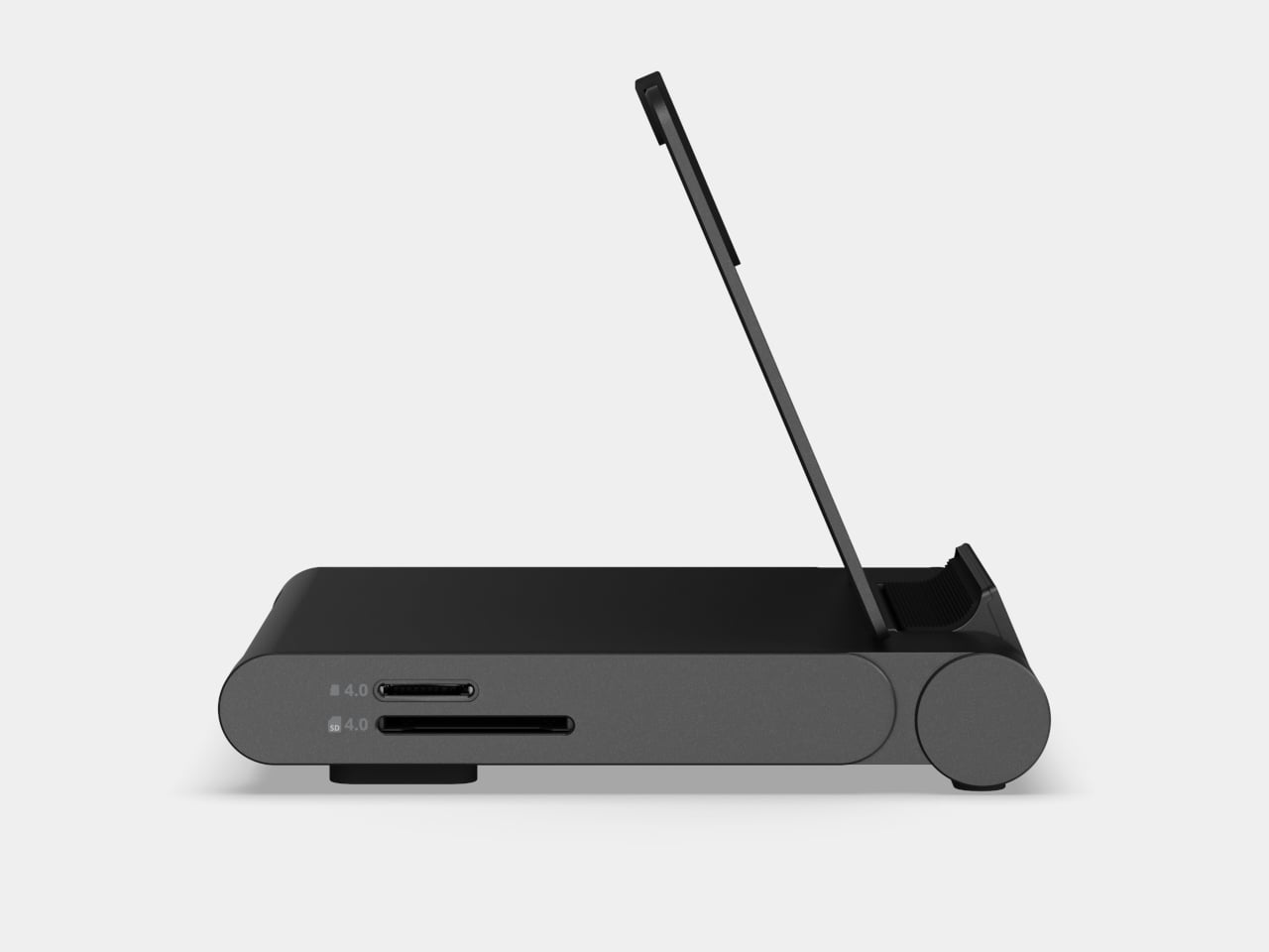
Packing a bag for a day of working away from a desk has become its own logistics puzzle. There is the hub for ports, the stand to prop the screen at a usable angle, the card reader for importing photos, and the charging cable to keep everything alive mid-session. Satechi’s OntheGo Foldable Stand Hub takes a direct swing at this by combining all of that into a single unit that folds flat to under 20mm and weighs just 187.5g.
The premise is simple. Unfold the stand, plug the attached 17 cm USB-C cable into a tablet or laptop, and the whole suite of ports is live: HDMI 2.0 output at up to 4K@60Hz, two 10 Gbps data ports (one USB-C, one USB-A), UHS-II SD and microSD slots at up to 312 MB/s, a 3.5mm audio jack, and 100W USB-C Power Delivery passthrough. That last feature delivers up to 85W to the host device, enough to sustain a MacBook Air or iPad Pro under a heavy session without draining the battery.
For photographers working on location, the card slots alone justify the bag space. Slide in a UHS-II SD card fresh from a camera, and the 312 MB/s ceiling means a full card of RAW files clears quickly. Connect a monitor through the HDMI port, and a hotel desk becomes something closer to a proper edit station, with the screen raised to a natural viewing height and footage already importing in the background.
Compatibility covers the expected range: iPad Pro, iPad Air, iPad mini (2021 and later), and recent iPhones. Worth noting: the iPad mini (2021) tops out at 5 Gbps on the data ports due to its own USB spec, not the hub’s. Outside of Apple’s garden, it also supports select Microsoft Surface Pro models and USB-C Android devices, especially ones that support Samsung DeX.
That last point is an important one. A compatible Samsung phone connected to an external monitor through this hub activates DeX mode, turning the phone into a desktop-style interface without needing a laptop at all. That said, you’ll need to hook up an external monitor to actually activate DeX mode.
At $79.99, the OntheGo Foldable Stand Hub sits in a space where stands and hubs are almost always sold separately, each typically running $30 to $60 on their own. What a spec sheet cannot answer is how the folding hinge holds up after months of daily packing and repacking, and whether the fixed 17cm cable length plays nicely with every desk configuration or occasionally creates its own awkward workarounds.
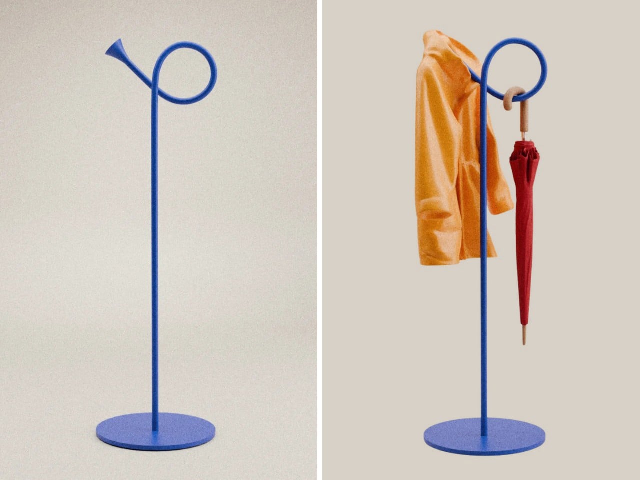
If you live in an apartment or a home with a narrow entryway, you know the struggle. Coats pile up on dining chairs. Umbrellas lean precariously against walls. Traditional coat racks with their sprawling arms take up precious floor space you simply don’t have. You need something that actually works without turning your entry into an obstacle course.
Enter The Bugle by Design by Joffey, a coat and umbrella stand that rethinks the entire concept by borrowing its form from an unlikely source: a brass musical instrument. This isn’t just clever design for the sake of being clever. It’s a genuinely smart solution to a problem that plagues anyone living in tight quarters.
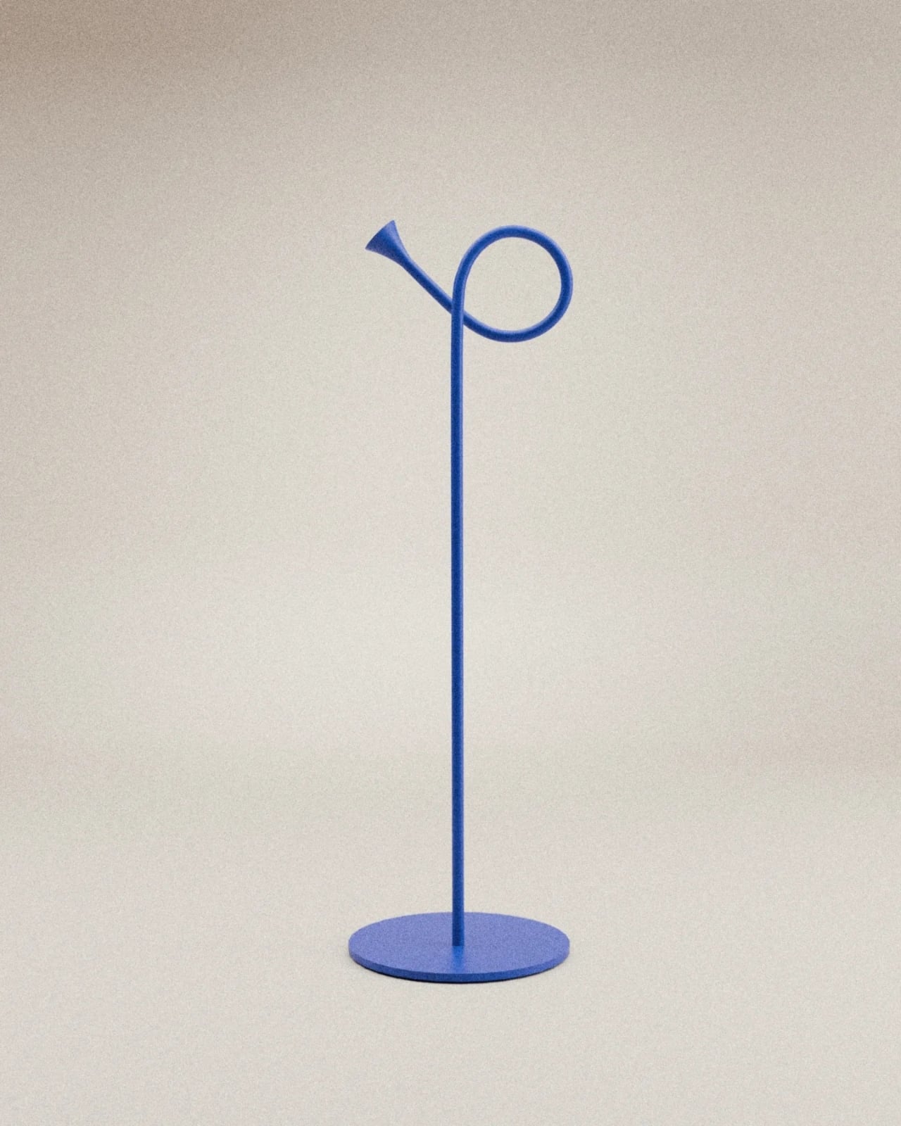
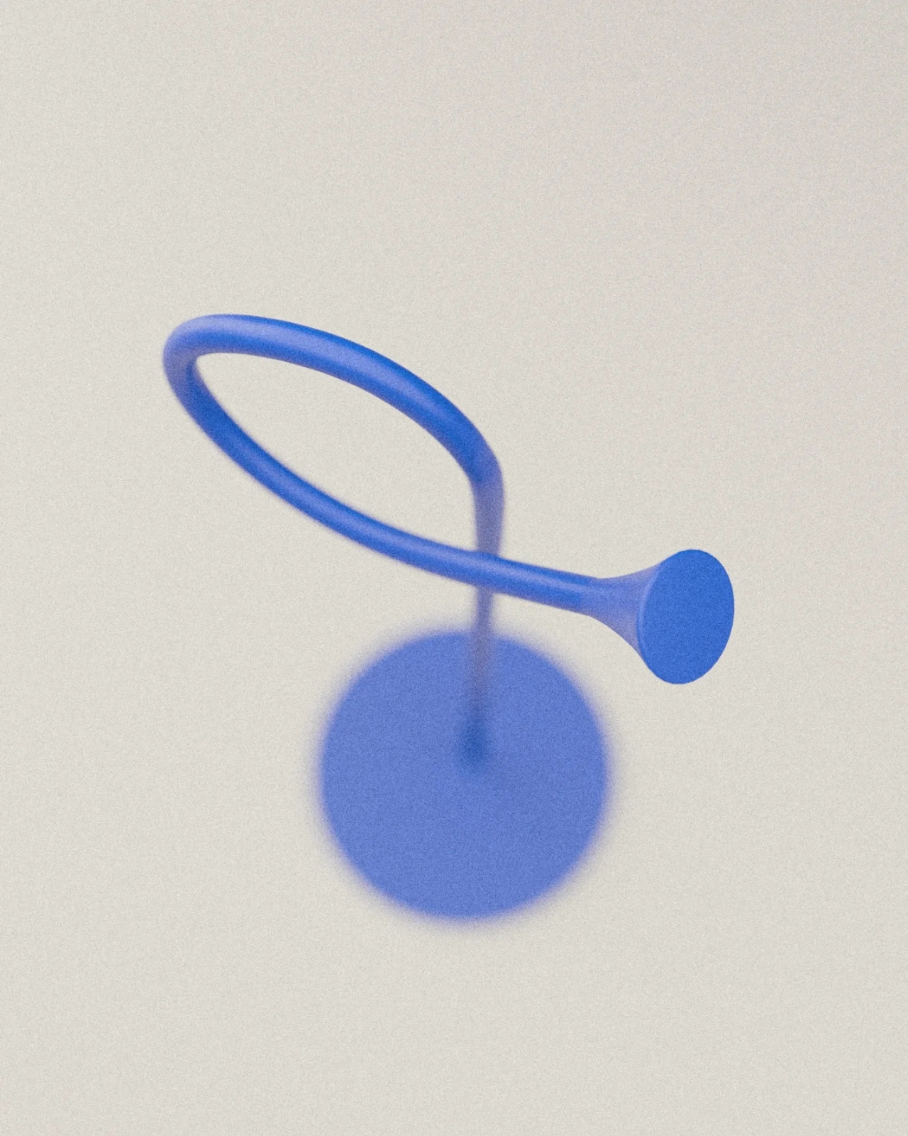
The beauty of this piece is in its vertical footprint. Where most coat stands spread outward with multiple arms jutting in different directions, The Bugle stays contained within a slim, elegant silhouette. A single curved loop rises from a slender pole, mimicking the distinctive shape of a bugle, complete with a flared bell detail at the top. Everything sits on a simple circular base that keeps it stable without hogging floor space.
That curved loop is where the magic happens. It’s perfectly sized to drape a jacket or hang a scarf, while a smaller ring positioned within the larger curve holds umbrellas upright. Two storage solutions in one compact design, occupying roughly the same footprint as a single dining chair but infinitely more functional and better looking.
The proportions feel just right because they’re borrowed from something that was already thoughtfully designed. Musical instruments like bugles have curves that exist for acoustic and ergonomic reasons. Those shapes have been refined over centuries to feel balanced and purposeful. By translating that form into furniture, Joffey taps into proportions that our eyes instinctively recognize as harmonious.
What really sets The Bugle apart is its ability to be both functional and sculptural. In a small entryway, every object needs to pull double duty. This piece stores your essentials while also acting as a visual anchor that defines the space. The saturated periwinkle blue gives it presence without overwhelming the room. That matte finish adds a contemporary softness that works with almost any decorating style, from Scandinavian minimalism to eclectic maximalism.
There’s something playful about the design that makes coming home a bit more enjoyable. Instead of generic IKEA-standard furniture, you get a conversation starter. Guests notice it immediately. The bugle reference is clear enough to be charming but abstract enough to feel sophisticated. It nods to vintage Americana, summer camps, and military ceremonies without being literal or kitschy about it.
From a practical standpoint, the compact design means you can tuck it into corners or narrow spaces where a traditional coat rack would never fit. Got a skinny hallway? A weird alcove by the door? A studio apartment where every inch counts? This works. And because it stays vertical rather than horizontal, it doesn’t interfere with foot traffic or make your entryway feel cluttered.
The restraint in this design is what makes it successful. There are no unnecessary embellishments, no gimmicks, no trying-too-hard details. Just a pure, confident form that solves a real problem beautifully. In an era where product design often veers toward the overly complex, The Bugle proves that simple ideas executed well will always win.
What I love most is that it demonstrates how everyday objects can be better. Your coat rack doesn’t have to be an eyesore you tolerate. It can be something you actively enjoy looking at, something that makes your tiny entryway feel more intentional and curated rather than cramped and chaotic.
Design by Joffey gets it. Small spaces need smart solutions, and smart solutions can also be delightful. The Bugle delivers on both fronts, turning a mundane necessity into a little moment of joy every time you walk through your door. And in a tiny apartment, those moments matter more than you’d think.
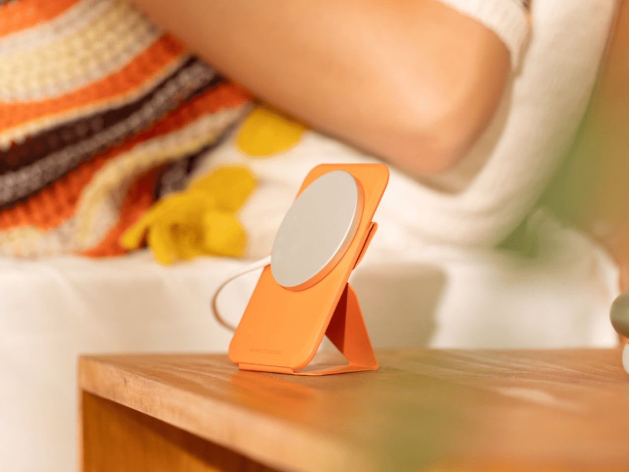
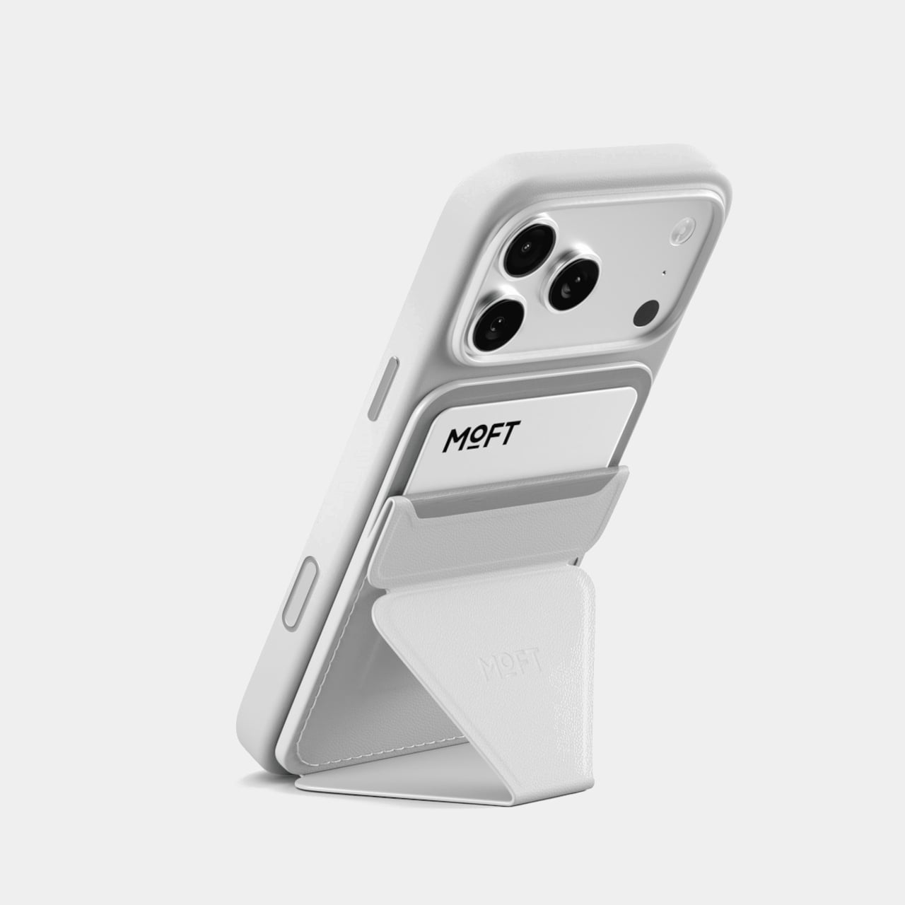
Leaving the house with just a phone and a slim MagSafe wallet is convenient until the jolt of realizing you have no idea where you left that combo. Most wallets and stands solve carry and comfort, but do nothing for the “where did I put it” problem. Moft’s trackable stand-wallet is a small tweak to that daily stack, adding a Find My brain without bulking up the back of your phone.
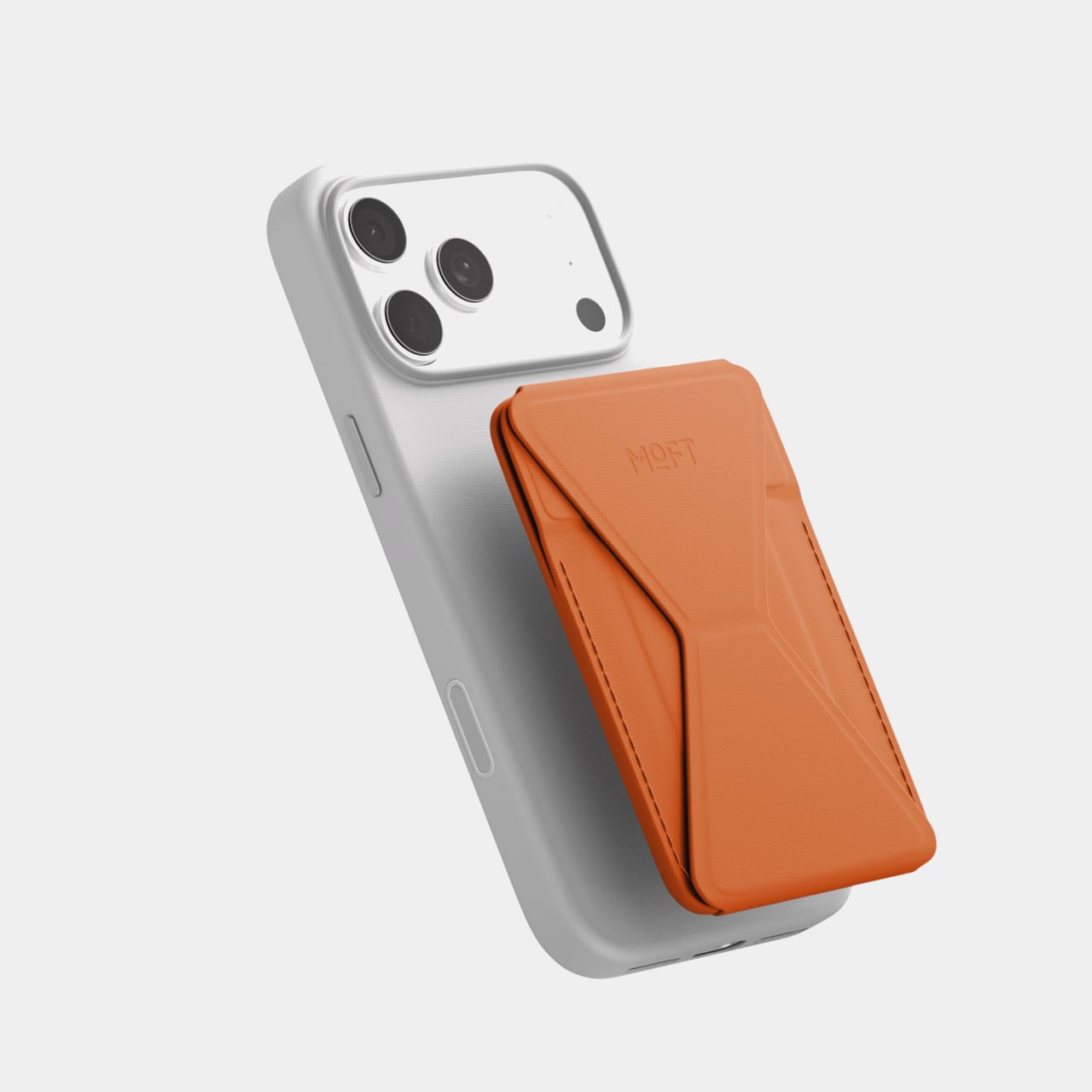
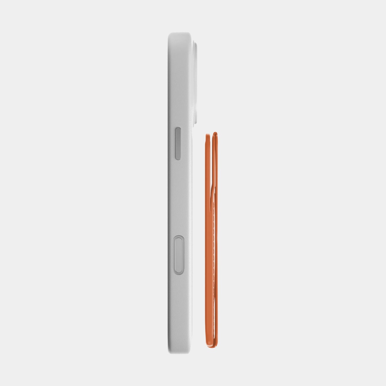
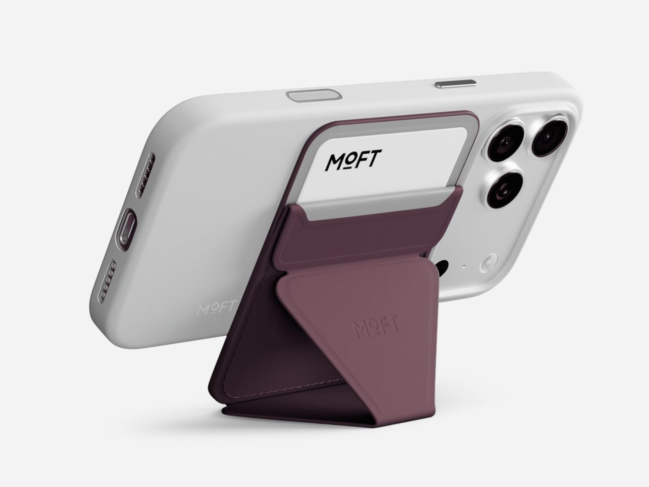
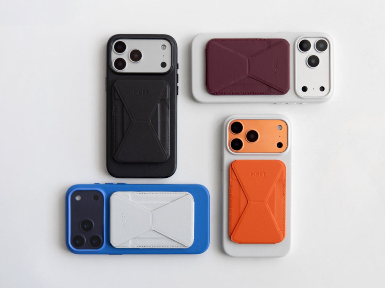
The Trackable Snap-on Phone Stand & Wallet is Moft’s thinnest design yet, just 0.25 inches thick and about the size of a credit card, managing to be a wallet, stand, and grip in one. It snaps onto a MagSafe-compatible iPhone, holds up to two cards, folds into three viewing modes, and quietly adds Apple Find My support so it shows up in the same app as your AirPods and trackers.
On a commute or a day at a café, the wallet is just there on the back of the phone. On the train, you flip it into portrait mode to read, at a desk you switch to landscape for a video, and during a call you use floating mode to prop the screen higher. Walking, the folded panel becomes a comfortable grip, making the phone feel more secure without adding a bulky case.
Realizing the phone-wallet stack is not where you thought it was means opening the Find My app to see its last location, triggering a 70dB alert to find it in a messy room, or relying on the Find My network if it is truly out in the world. The tracker runs for about six months on a wireless charge, and the app shows battery level, so it does not quietly die.
The magnets are tuned to around 15N of snap force, strong enough to trust when using it as a stand or grip. Because it is MagSafe-ready, you can snap a charger onto the back without dismantling your setup. The 0.25-inch profile and 62g weight mean it does not turn the phone into a brick, which matters if you are sliding it into a pocket or small bag.
The outer shell uses Moft’s MOVAS vegan leather with high stain resistance and color retention, handling coffee tables and travel without looking tired. Underneath are fiberglass, magnets, metal sheets, and a compact PCB. It comes in four colors that pair with Moft’s Snap Case line, so you can build a coordinated stack or mix tones for contrast without losing the clean geometry.
This is not a brand-new category. It’s a quiet upgrade to something many people already use. By folding a tracker into a stand-wallet that was already thin and useful, Moft makes the everyday phone-back accessory into a little piece of insurance. It does not ask you to carry more, just to expect a bit more from what you are already carrying every time you walk out the door.
Most entryways are chaos zones. Umbrellas lean against walls, keys land on whatever surface is closest, and the stand is usually just a metal tube catching drips in a corner nobody looks at twice. This corner of the home rarely gets the same design attention as the living room or kitchen, even though it is the first thing you see when you walk in and the last thing you touch before leaving.
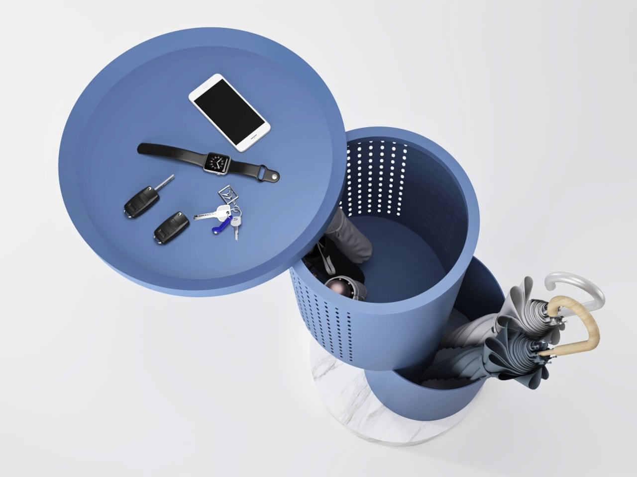
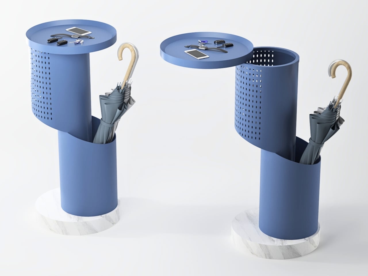
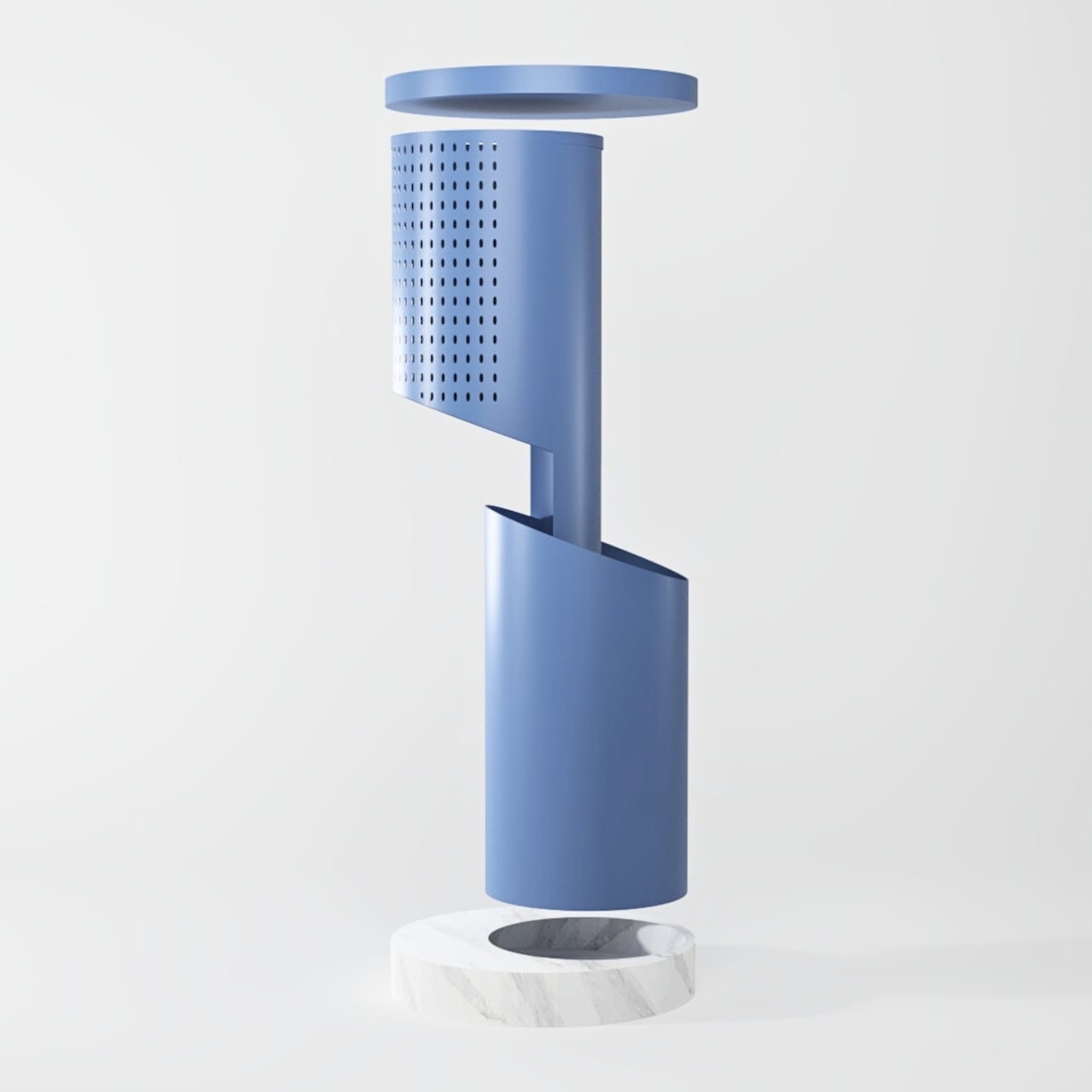
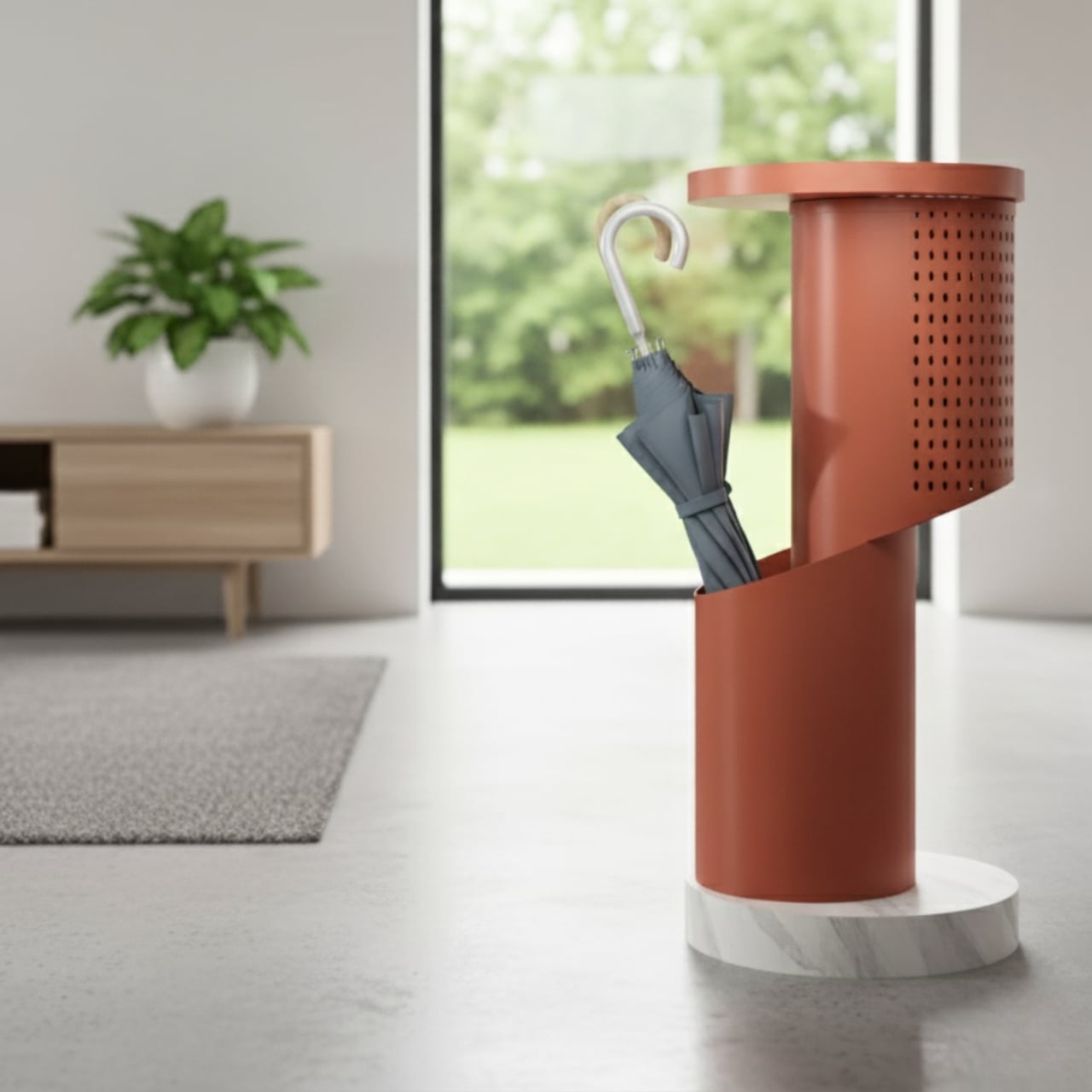
Split is an umbrella stand concept that behaves like a small, movable console. It is built around a sleek cylindrical form that opens with a pivoting lid, revealing storage for short and long umbrellas. When closed, the lid becomes a tabletop for keys, phones, or a wallet, turning the stand into a compact landing zone for everything you carry through the door, wet or dry.
The cylinder splits into two functional zones. An open lower section holds long umbrellas, keeping handles accessible and letting wet fabric breathe. A closed upper section stores compact umbrellas or other small items, hiding clutter without sealing it in a damp box. The geometry makes it obvious where things go, which is half the battle in keeping an entryway tidy without thinking about it every single time.
The perforated upper shell works like a pegboard and a vent at the same time. The grid of circular holes can accept hooks for hanging small items like dog leashes, lanyards, or lightweight bags, and it also lets air circulate through the closed space so damp umbrellas or gloves can dry. That detail keeps the object from becoming a humid box and gives it a subtle, graphic texture that reads well from across a room.
The pivoting lid turns a simple stand into something interactive. A quick swing of the lid reveals the inner compartment without forcing you to clear off the top first, and when it is closed, the flat surface is ready for keys, a phone, or a small tray. The motion adds a bit of ceremony to arriving home, making the act of putting things away feel deliberate instead of automatic or rushed.
The body is imagined in lightweight aluminum, which keeps it easy to move while resisting rust and corrosion from wet umbrellas. It sits on a heavier stone base that keeps it stable when loaded with multiple umbrellas and everyday items. The concept uses warm, modern colors like terracotta, mustard, and muted blue, so it reads as a small piece of furniture rather than a purely utilitarian object and can live comfortably in a hallway, living room corner, or office lobby.
Split reframes a neglected object. It does not try to reinvent storage, it simply layers a console, a pegboard, and a ventilated umbrella stand into one compact cylinder. It feels like a quiet but meaningful upgrade over the usual metal tube shoved in a corner. People who care about the small transitions in their day will love the idea of an entryway piece that catches umbrellas and everyday carry with a bit of elegance.
Most desks tell the same story. A monitor sitting too low, forcing you to hunch forward. A tangle of charging cables disappears behind the desk, where you’ll never find them again. Your phone wedged between the keyboard and a coffee cup, headphones draped over the back of your chair, and a growing pile of notebooks that never quite fit anywhere. It’s functional enough to get work done, but it’s also the kind of setup that makes you dread sitting down every morning.
The Setup Cockpit by BALOLO approaches this differently. Instead of adding more organizers that take up space or forcing you to commit to a fixed layout, it creates a foundation that adapts to however you work. The monitor stand itself is straightforward, a long walnut or oak shelf that raises screens to eye level while freeing up the desk underneath. What sets it apart is the patented mounting grid running along the bottom, a system of attachment points that lets you easily add accessories wherever they’re needed and rearrange them whenever your workflow changes.
The first thing you notice when unpacking the Setup Cockpit is how solid it feels. The wood is real American walnut or oak, hand-finished in Germany with natural oils and waxes that bring out the grain. The feet, made from MDF wood, are sturdy enough to keep the whole thing stable, even with two large monitors perched on top. It’s the kind of build quality you’d expect from furniture that costs a few hundred dollars, not something marketed as a desk accessory.
Setting it up is refreshingly simple. Slide your monitors onto the shelf, adjust the monitor height if needed, and tuck your keyboard underneath in the 3.9 inches of clearance. That alone transforms how your desk feels, raising screens to eye level and opening up space you didn’t realize you were wasting. But the real shift happens when you start adding accessories from BALOLO’s modular ecosystem, which is where the mounting grid earns its keep.
A laptop riser is perfect for those days when you need a second screen. A MagSafe holder keeps your phone charged and visible for notifications without cluttering the surface. Cable magnets attach to the grid, holding charging cables in place so they don’t slip behind the desk every time you unplug something. Heck, there’s even a headphone holder that keeps your cans within reach instead of draped over your monitor or tangled in your bag.
The modularity is what makes this feel genuinely useful instead of just another piece of furniture you buy once and forget about. Your workflow changes depending on what you’re working on, and the Setup Cockpit keeps up. Whether you need a tablet holder for sketching or more space for your accessories, the BALOLO Setup Cockpit lets you customize your desk to suit your preference, while leaving you with the freedom to expand and change it at any time.
What’s surprising is how much this changes the rhythm of your workday. Starting with a cleared surface instead of a pile of cables and peripherals makes sitting down feel less overwhelming. Everything has a spot, and that spot can change if you decide you want your phone on the left instead of the right. It’s the kind of flexibility most desks never offer, where adding one thing means removing something else or living with clutter.
The materials help too. The walnut finish warms up spaces that lean too heavily on black plastic and aluminum, while the oak or black-stained oak options fit minimalist setups without feeling cold. The wood is sealed, so spills and wear won’t ruin the finish, and the whole thing is built to support up to 50 pounds without wobbling. That’s reassuring when you’re stacking ultrawide monitors and laptops on top of a shelf.
The Setup Cockpit doesn’t reinvent what a monitor stand can do so much as it refines every detail until nothing feels compromised. BALOLO’s approach combines German craftsmanship with modularity that actually makes sense, creating furniture that transforms your desk without forcing you to tear everything apart first. It’s designed to adapt as your work evolves, which is exactly what premium workspace solutions should have been doing all along.
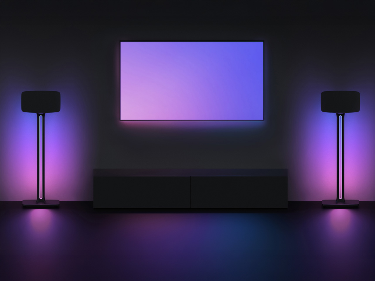
Black Friday deals usually mean hunting for discounts on the same boring products everyone already owns. TV mounts that do the bare minimum, speaker stands that hold things up and nothing more, and entertainment furniture that treats lighting as an afterthought. It’s all functional enough, but there’s rarely anything that makes you excited about setting up your living room. Most people settle for whatever gets the job done, then spend years looking at the same bland hardware every time they sit down to watch something.
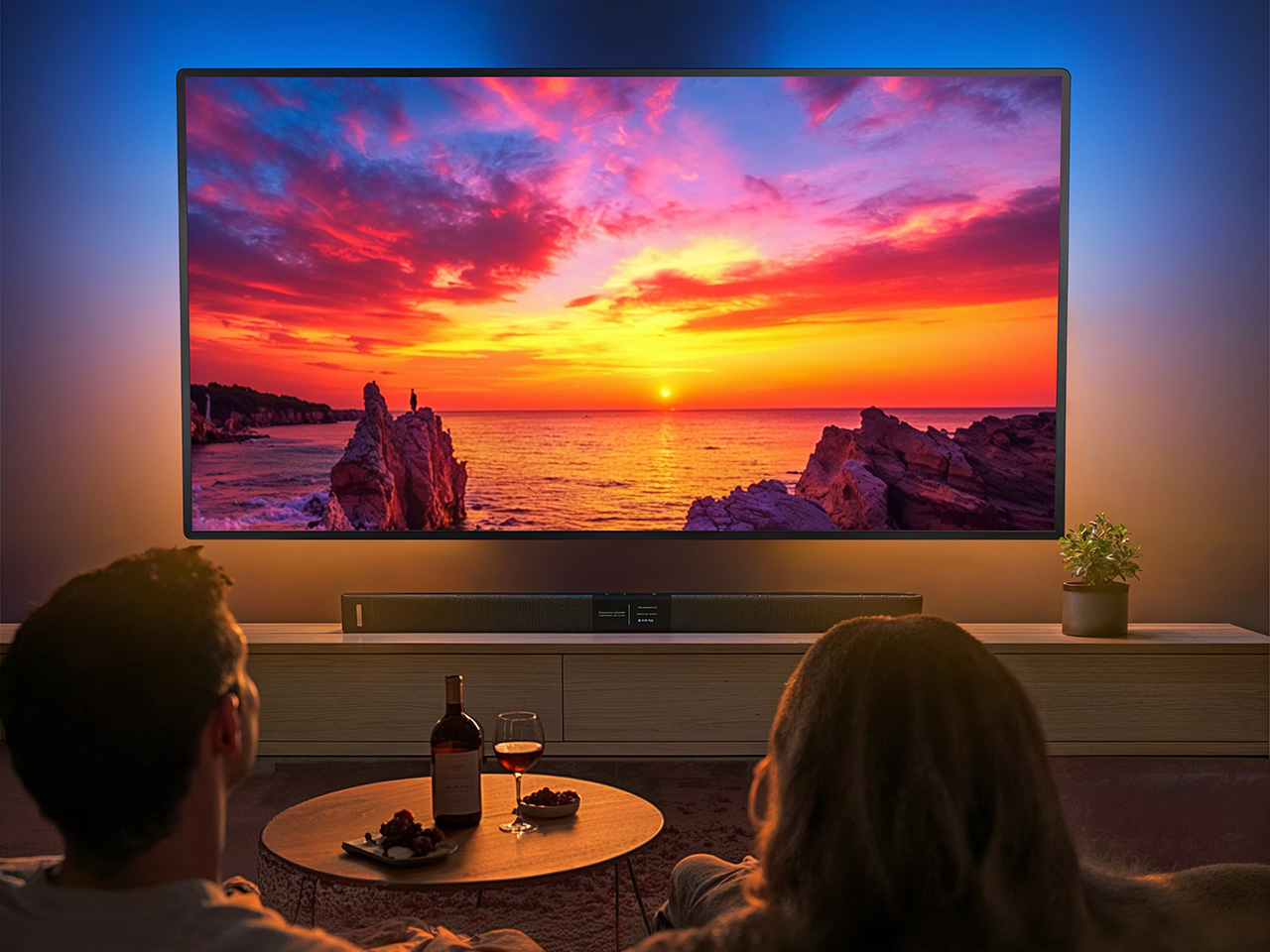
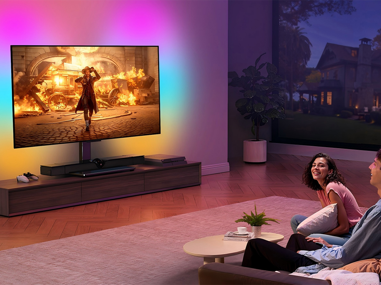
PERLEGEAR’s AuraFrame and SonicBeam collections take a different approach. Instead of treating mounts and stands as purely mechanical necessities, the brand integrates customizable RGB lighting that syncs with your music and creates actual ambiance. It’s the kind of upgrade that makes your entertainment space feel more intentional, turning functional hardware into something that enhances the entire experience. Heck, you might actually want to show off your setup for once instead of hiding cables and hoping nobody notices the generic black brackets holding everything together.
Designer: PERLEGEAR
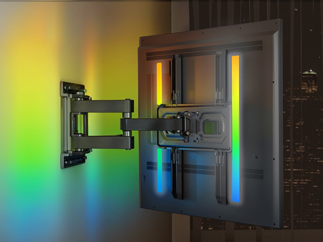
AuraFrame Pre-Assembled TV Wall Mount
The AuraFrame wall mount handles TVs from 26 to 65 inches and up to 99 pounds, with full-motion articulation that includes 16.4 inches of extension, 45-degree swivel, and tilting between negative 15 and positive five degrees. That flexibility is standard for premium mounts, but the integrated LED light bars are what set this apart. You get 16 million colors, multiple lighting modes, and music sync that pulses in rhythm with whatever you’re watching or listening to.
Installation is refreshingly straightforward thanks to pre-assembled arms and a wall plate that cuts setup steps by about 30 percent. The mount also includes three height settings and leveling adjustments, so you can fine-tune positioning even after everything’s mounted. The reinforced steel frame and thicker articulating arms mean the thing holds your TV securely without any wobbling, which is reassuring when you’re extending a 65-inch screen nearly a foot and a half from the wall.
For those who’d rather not drill into walls, the AuraFrame TV stand offers a floor-standing alternative that fits TVs from 32 to 75 inches and up to 110 pounds. The same RGB lighting system runs down both sides of the stand’s pillars, creating a backlight effect that’s controlled via app, remote, or in-line switch. The solid wood base adds a premium touch, and the entire setup feels stable enough to trust with larger screens.
What makes this stand genuinely practical are the 12 height configurations and the tilt and swivel adjustments. You can position the screen exactly where it needs to be for comfortable viewing, whether you’re sitting on the couch or standing in the kitchen. Cable management keeps wires hidden inside the stand’s frame, so you’re not looking at a tangled mess every time the lights are on.
The SonicBeam stands won an iF Design Award for their minimalist double-pole design, which makes sense once you see them in person. They’re slim, clean, and designed to blend into modern interiors rather than dominate them. Each stand supports up to 22 pounds and includes two top plates, one specifically shaped for the Sonos Era 300 and a universal flat tray for other speakers like the Era 100, HomePod, or KEF models.
The built-in RGB lighting runs vertically along both poles, syncing with your TV or audio content to create a cohesive audiovisual atmosphere. You can control everything through the app or remote, choosing from modes like Pure Color, Rhythm Pulse, or Music Sync. The aluminum alloy construction feels solid, and the dual-side cable channels keep wires completely out of sight. It’s the kind of setup that makes you realize speaker placement can actually contribute to a room’s aesthetic instead of just being another thing to work around.
This tabletop stand is the most compact option, fitting TVs from 32 to 70 inches and up to 88 pounds. The tempered glass base and alloy steel frame give it a sleek, modern look, while the integrated RGB lighting offers the same customization options as the other AuraFrame products. Nine height levels let you position the screen between 18 and 24.5 inches, with tilt and swivel adjustments for finding the right angle.
Assembly takes about 10 minutes with no tools required, which is almost suspiciously easy compared to most furniture you’d buy. The pyramid-shaped structure keeps everything stable, and there’s enough room underneath for soundbars or media players. It’s perfect for bedrooms, offices, or anywhere you want a TV without committing to wall mounts or floor stands.
Black Friday is one of those rare opportunities to upgrade your entertainment setup without immediately regretting the expense. PERLEGEAR’s lighting-integrated collection offers a way to do that while actually improving how your space looks and feels, not just adding more functional hardware that disappears into the background. Whether you’re mounting a TV, setting up speakers, or rearranging your living room layout entirely, having lighting that adapts to what you’re watching makes the whole experience feel more considered.
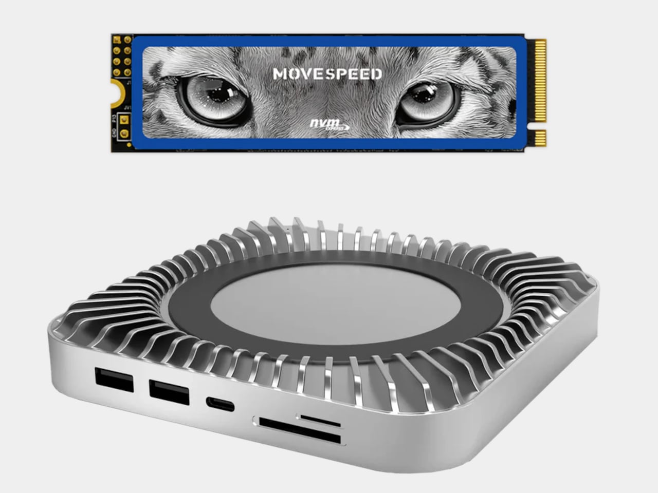
The popularity of the Mac mini has made small desktop computers quite the fad. Especially with small components getting more powerful, it’s now possible to have a decent desktop experience in a small box. What isn’t possible, however, is enjoying the same range and variety of ports available on towers, at least not without some outside help.
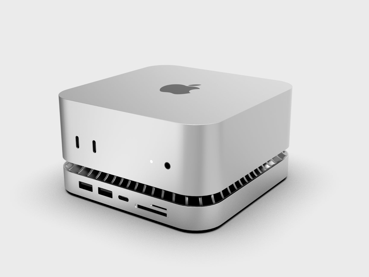
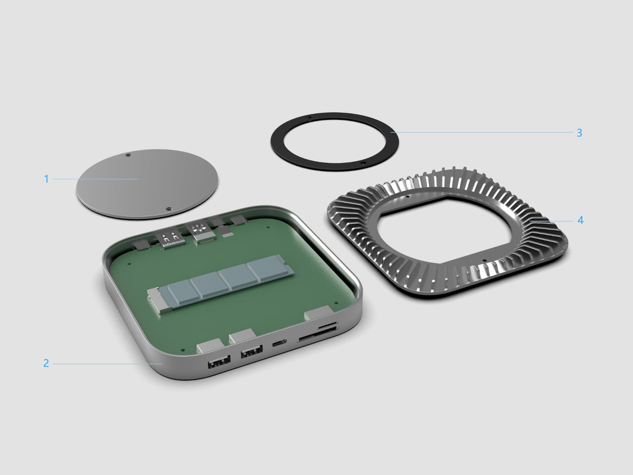
Docks for mini PCs aren’t new, but the Mac mini does present some very particular design challenges. How do you make a dock that isn’t just functional but also just as aesthetic as the Mac mini itself? That’s the puzzle that this new dock for the latest Apple mini computer tries to solve using a large number of ports, a hidden SSD enclosure, and a rather peculiar appearance.
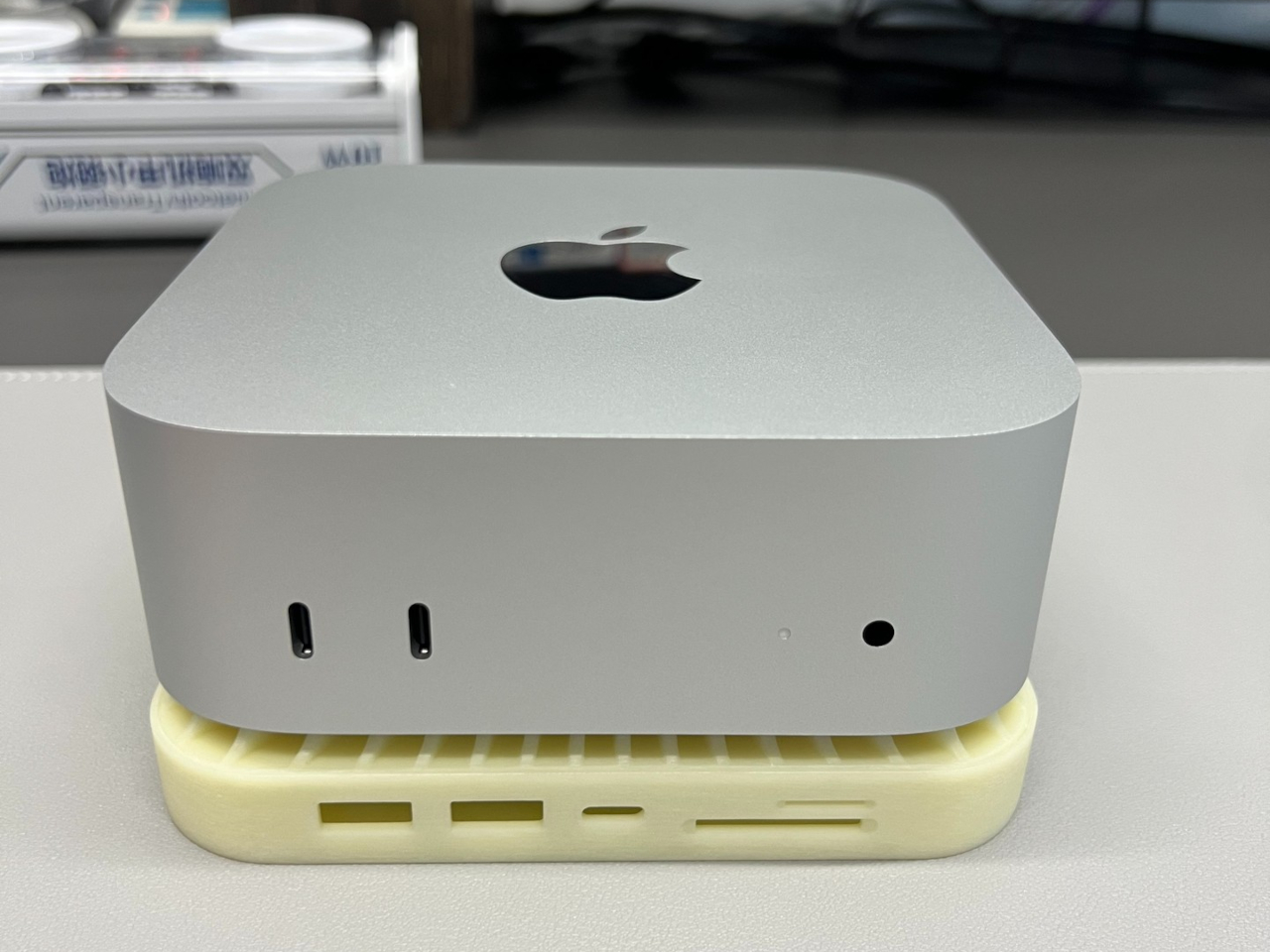
The Mac mini has always been designed to be discreet and subtle so it could be hidden from view while it does its job. Lately, however, the trend has been to actually show off the beautiful minimalism of these small boxes, though that also meant exposing hubs and docks that extend the modest port selection of the mini computer. Rather than those conventional long bars, hubs made specifically for the Mac mini are designed to sit beneath the computer, blending in as if part of Apple’s design itself.
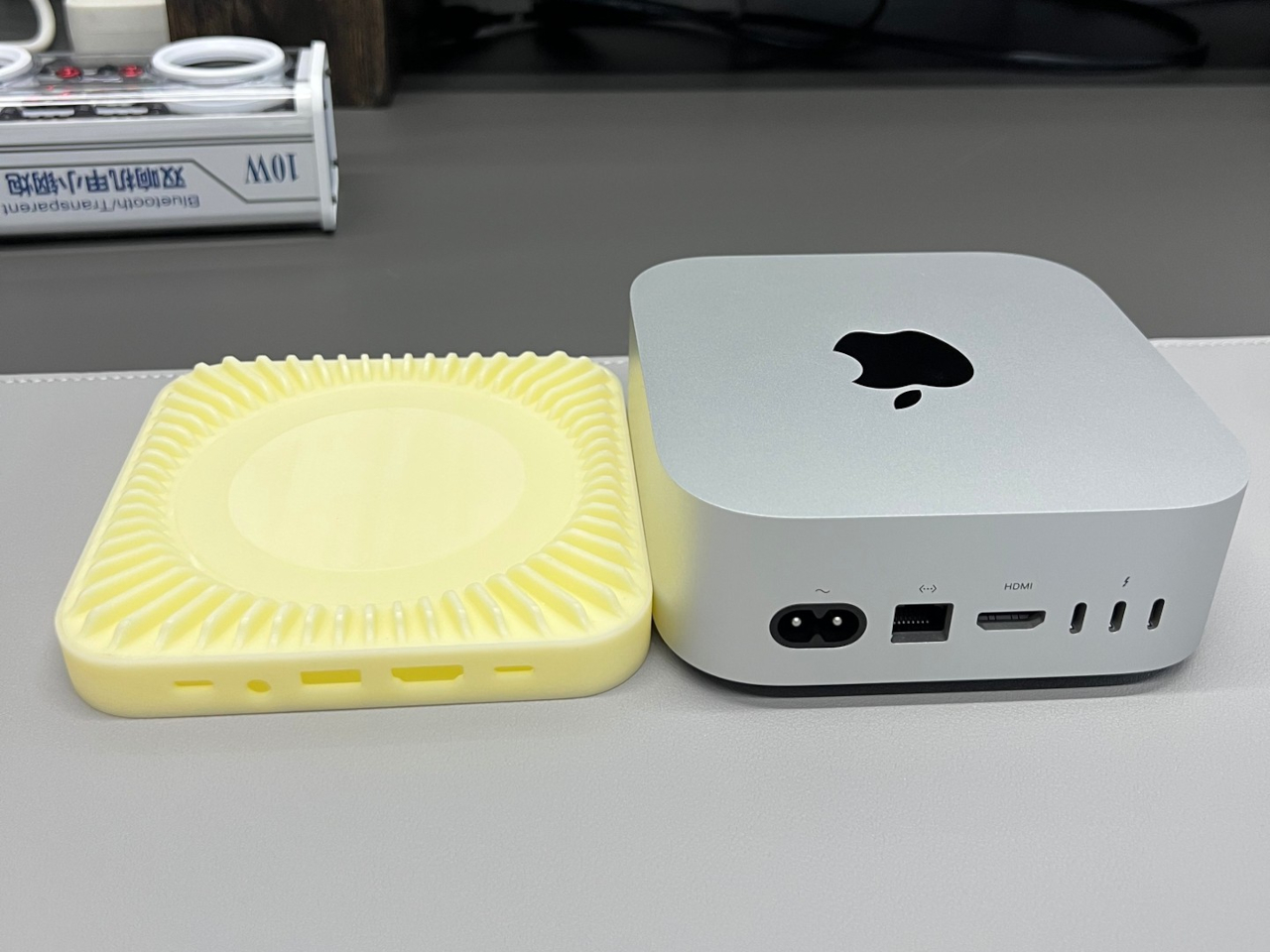
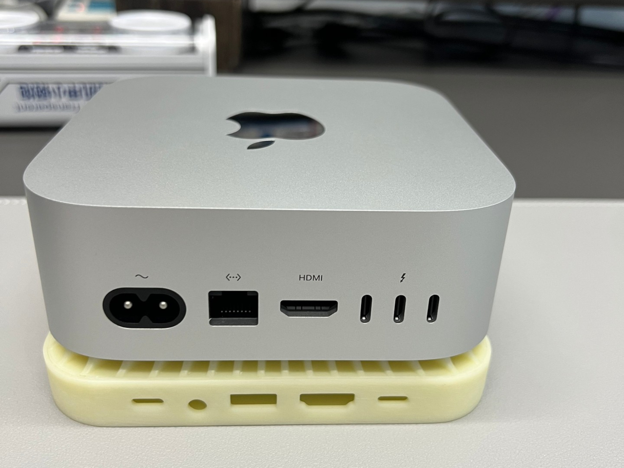
RayCue’s hub and stand for the newest Mac mini M4 and M4 Pro follow that trend, adopting the same silver colorway as the Mac mini itself as well as its length and width. It sits below the Mac mini, leaving a slight gap in between for better airflow. A rather interesting design choice, however, is the raised fins radiating from the center of the dock, perhaps acting as passive cooling for the small yet powerful computer.
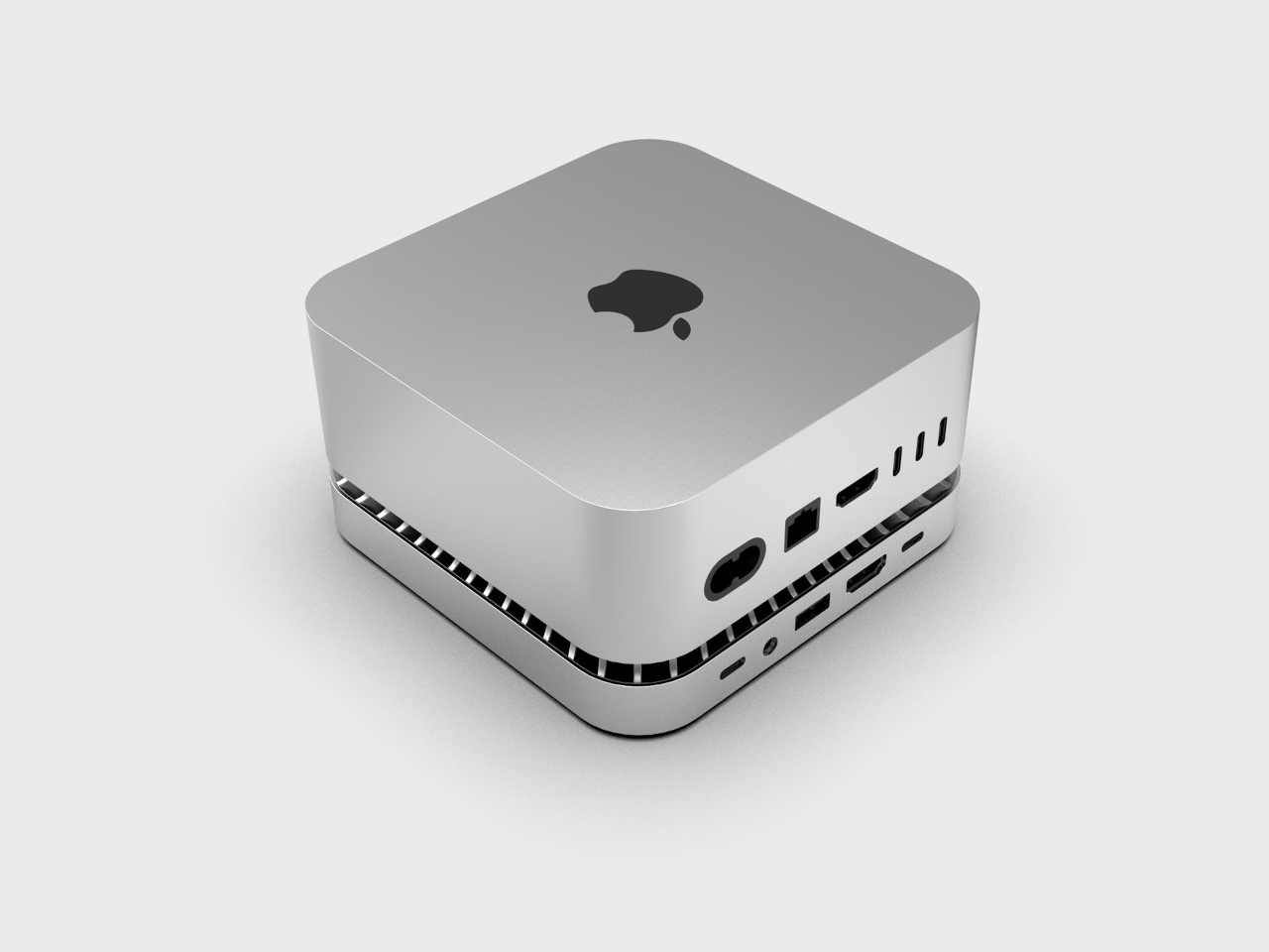
The RayCue Mac mini M4 dock expands the port selection with 10 different connectivity options, including an additional HDMI port for a dual display setup that doesn’t sacrifice a Thunderbolt port. Just like the Mac mini itself, it’s designed to have the most often accessed ports in the front, leaving the more “stationary” ones on the back.
Another trend in this product category is using the spacious dock for additional storage. The RayCue dock and stand supports a variety of M.2 NVMe SSD sizes up to 4TB in capacity, almost double the maximum Mac mini configuration available. Stylish and functional, it’s a perfect complement to the elegant Mac mini M4, one that will, however, cost you $99 without a $20 pre-order discount.
While many wars have been fought over different kinds of pens and their designs, some people still prefer the simplicity and unique texture of a good, old-fashioned, wooden pencil. Unfortunately, even die-hard pencil fans will admit that their favorite writing tool can sometimes be a pain to maintain. Not only do they tend to go missing exactly when you need them, they might also be too dull by the time you do find them among the pile of other writing instruments. You waste a lot of time fumbling with tools while your muse slips away before you have a chance to write the idea down on paper. Having your tools always within reach helps cut down on time and friction, and this striking minimalist design solves that by combining two of the most essential pencil accessories in one.
The Problem: Sharpeners are Unattractive, Inefficient, Out of Reach
A pencil is one of the most basic and most timeless writing instruments known to man. It has its own distinct charm that’s exhibited both by its graphite marks as well as the design of its barrel. That said, the pencil has also inherited the one flaw of its ancestors: the need for regular sharpening. Mechanical pencils try to offer an alternative design but also sacrifice the unique personality of the wooden pencil in favor of precision and convenience.
Sharpening a pencil isn’t exactly too much work, but scrambling to find the sharpener costs too much time and tension when you need to jot something down quickly. And that’s not even considering the time you spend actually looking for your pencil in the first place, especially if your favorite is lost among half a dozen barrels. A pencil and a pencil sharpener sound like two things that should go together, but there has never been a design that puts two and two together, at least until now.
Why is this the Best Pencil Sharpener?
This Upright Pencil Sharpener solves that by putting the sharpener where the pencil is or vice versa. Shaped like a disc or puck, the singular hole in the middle serves as a stand for your beloved writing tool, ready for you to pull it out when you need it. And should the pencil’s tip finally become too dull, you know exactly where to find the sharpener. No more searching inside drawers for a small metal or plastic box, or standing up to walk toward a mounted electric sharpener.
Despite its rather simple appearance, this pencil sharpener and stand in one is a prime example of great design. The base that holds the shavings is made from anodized aluminum with a matte black finish, while the cover that keeps the shavings from flying around is made from warm-toned walnut wood. A strong magnet keeps these two pieces together, so you don’t have to worry about accidentally knocking off the cover and spilling its contents. And when you are ready to empty the container, the 6cm diameter of the base makes it easy to throw everything out.
Who is this Pencil Sharpener for?
Pencil sharpeners are technically very utilitarian products, but this one easily sets itself apart with its elegance and appeal to the discerning, design-conscious pencil lover. The striking brass mechanism inside provides additional visual contrast to the darkness of the aluminum base. The angle of the blade inside is designed for optimal sharpening to reduce waste and prolong the pencil’s life. Simple, beautiful, and multi-functional, this pencil sharpener stand helps save you time and effort while allowing you to put your favorite pencil on display for everyone to see and appreciate.
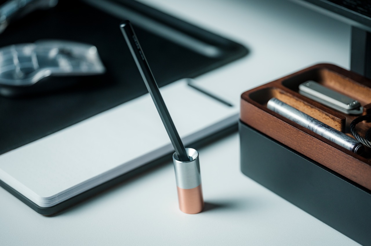
We all have our favorite writing instruments, be it an heirloom fountain pen or even a number 2 pencil. You’ll probably just stuff the latter in drawers or leave them strewn on your desk, but the pen that has been with you for years is something you’ll probably want to show off while keeping it within easy reach. Pen stands exist for that exact purpose, but some of them try to compete with the pen for attention. They have extravagant and luxurious designs that defeat the intention of putting your favorite pen on a pedestal. That’s the trap that this tiny pen stand tries to avoid by practically removing all non-essential features that prevent you from showing off your trusty writing partner.
What stand could be simpler than an upright cylinder with a whole in the middle that’s just enough to fit a single pen? After all, a pen stand’s purpose is to hold the writing tool for easy access while showing it off when not in use. Anything else is just excess and waste that burdens the product both visually and functionally. That’s the kind of minimalist design that this small and simple stand embraces, but that doesn’t mean it’s a plain and boring desk accessory. In fact, it is ironically one of the most beautiful pen stands around, especially if you favor minimalist designs.
Your eyes will be immediately drawn to the stand’s diminutive size. At only 52.5mm (around 2 inches) tall, it has just enough space to hold a small portion of the pen, leaving the majority of the barrel unobstructed and free for everyone to behold. Despite its small size, however, the stand is able to, well, stand without tipping over due to the weight of the pen. In fact, the stand itself tilts a little bit to one side, an intentional design that makes it easier to pull out the pen quickly when you need to jot something down.
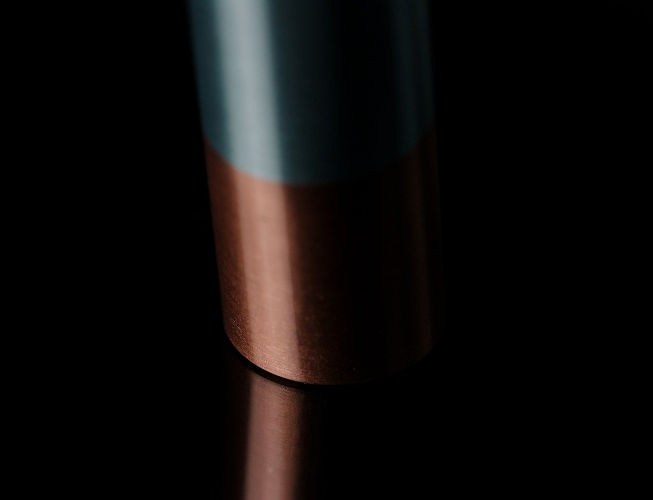
The trick to the Centroid Stand’s unbelievable feat is in its construction, which also accounts for its two-tone color finish. The top half of the stand is made from polished aluminum which gives it a stylish luster, while the lower half is made from heavier copper that shifts the center of gravity lower, making it more stable regardless of its tilt or the weight of the pen that it holds. These two dissimilar materials, joined together using a friction welding process, give the stand a rather distinct flavor, one that is both playful and elegant at the same time. Copper also develops a unique patina over time, adding to the stand’s character as it grows old with you.
Showcase your Everlasting All-Metal Pencil with the ultimate stand.
Beautiful in its simplicity and ingenious in its functionality, this ultra-minimalist pen stand offers a perfect view of the writing instrument that it holds. Due to its minimalist design, it is the perfect complement to equally minimalist pen designs, such as the Everlasting All-Metal Pencil that will last as long as this unconventional stand. It is a glowing example of how simple designs, when done right, can exude a kind of beauty that gently draws your eyes without distracting from the attention that your favorite pen or pencil rightfully deserves.
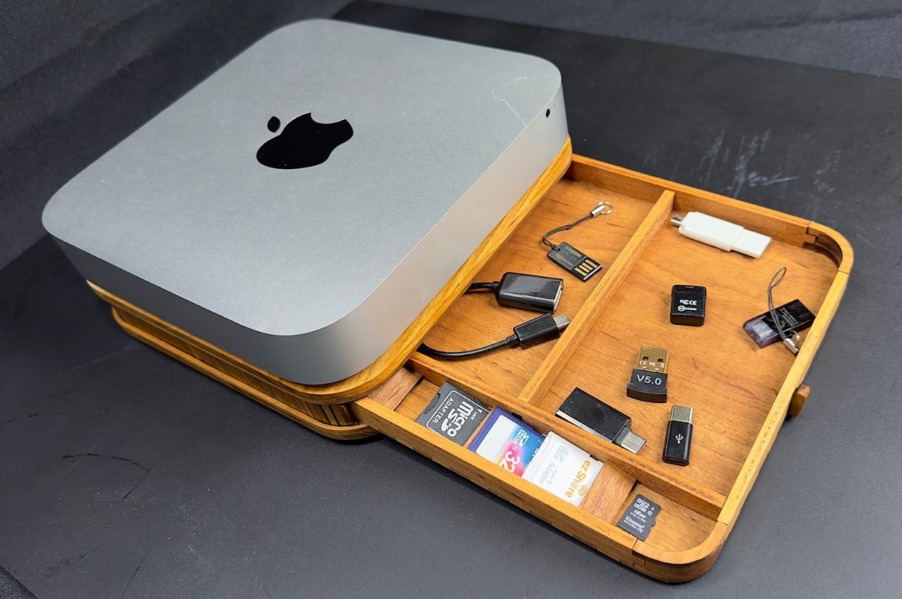
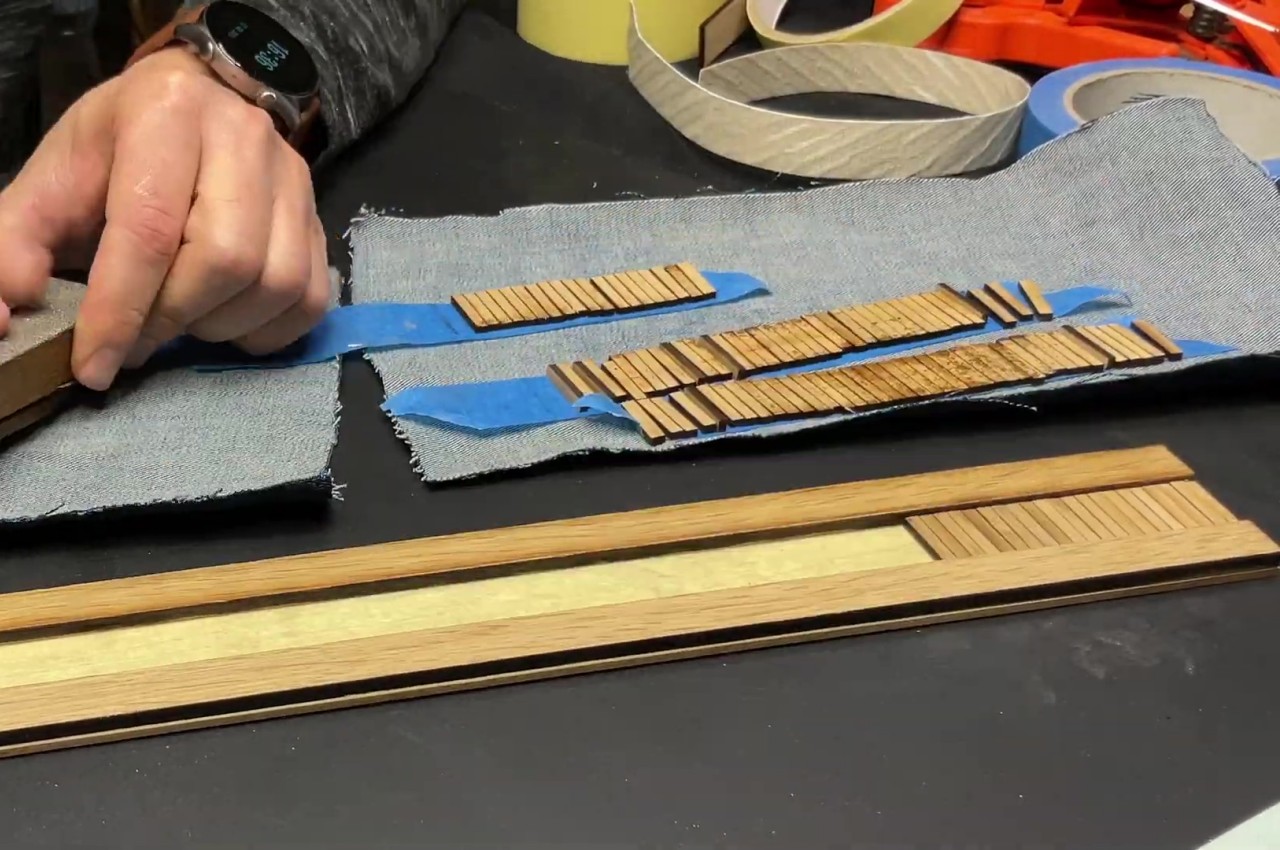
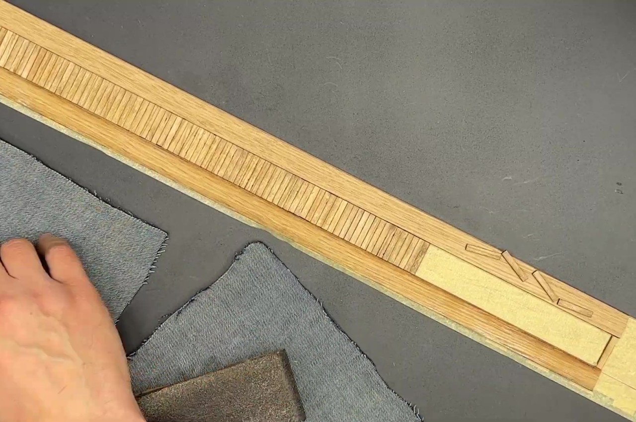
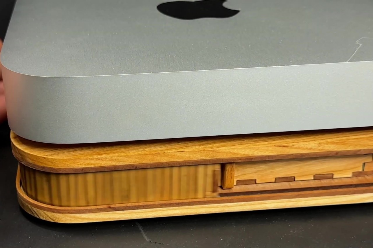
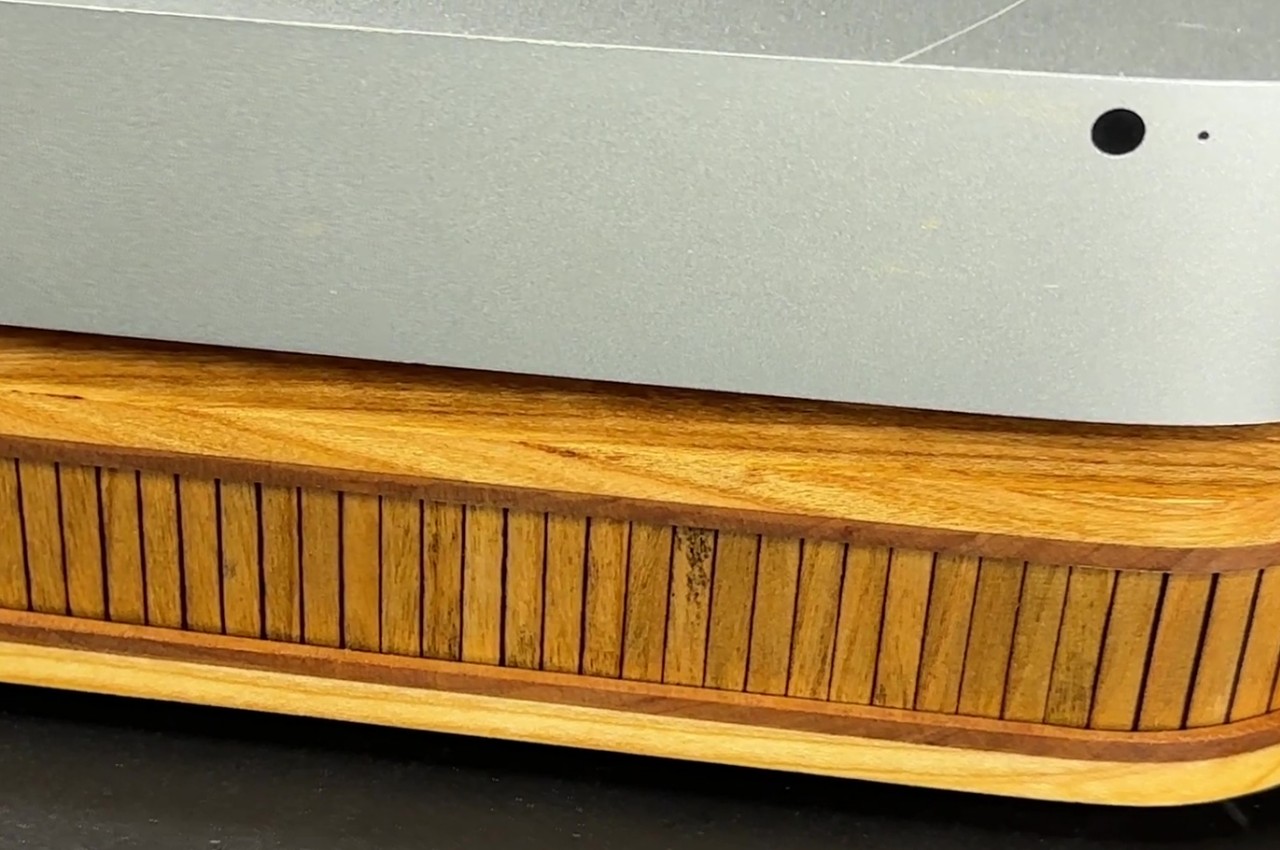
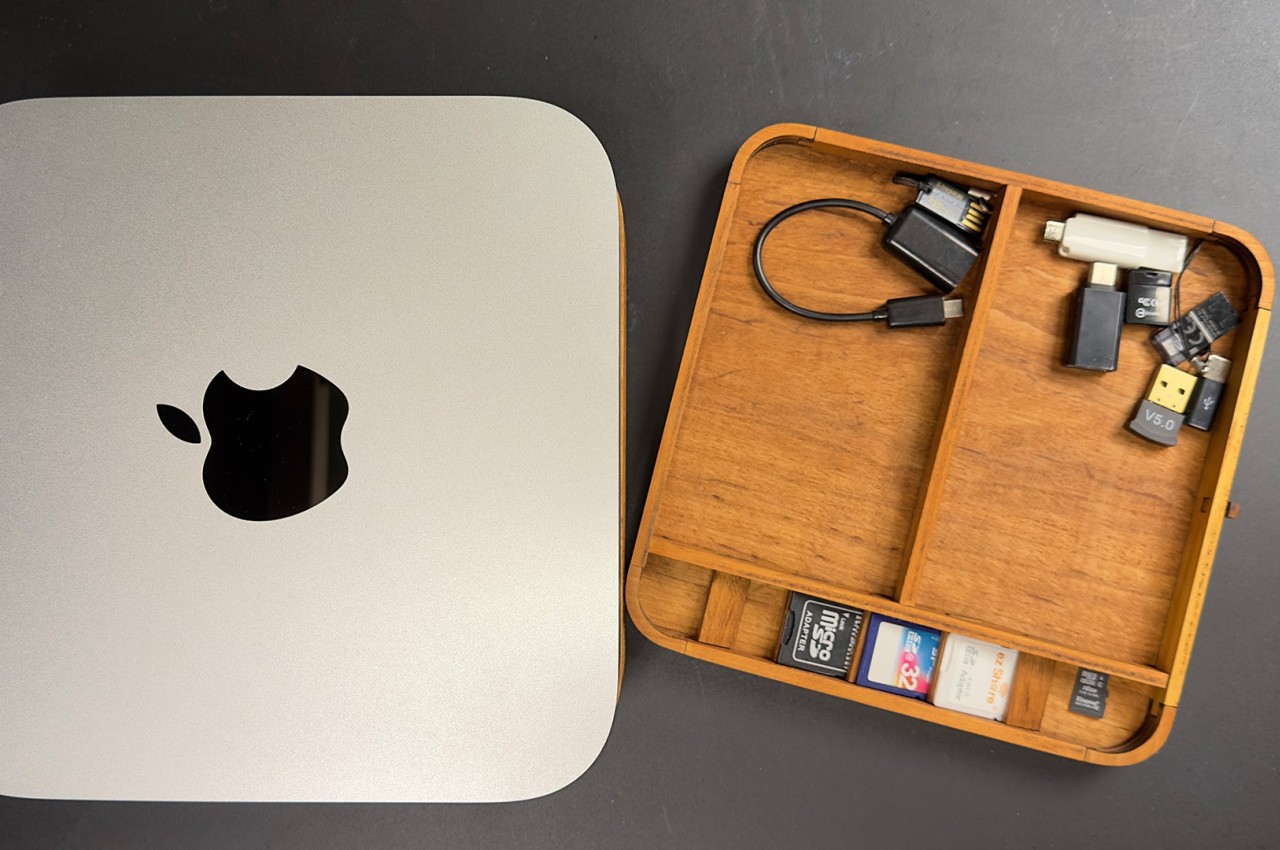
The Mac mini and its more powerful cousin, the Mac Studio, offer an Apple computing experience that prioritizes flexibility and your desk space over functionality you might not even need. Its compact form allows you to place it anywhere you want while also offering the freedom to connect any kind of monitor, keyboard, or peripheral you need to get done. At the same time, however, the mini PC form factor doesn’t have enough space to keep all these external devices always connected, and you will often find yourself repeatedly attaching and detaching bits and pieces as you work. Over time, these dongles, cards, and whatnot start to pile up and make a mess on your desk, which is where this handmade wooden organizer and riser comes in, offering a uniquely elegant solution to keep those tiny objects out of sight and out of mind.
Designer: Kostiantyn Andriiuk
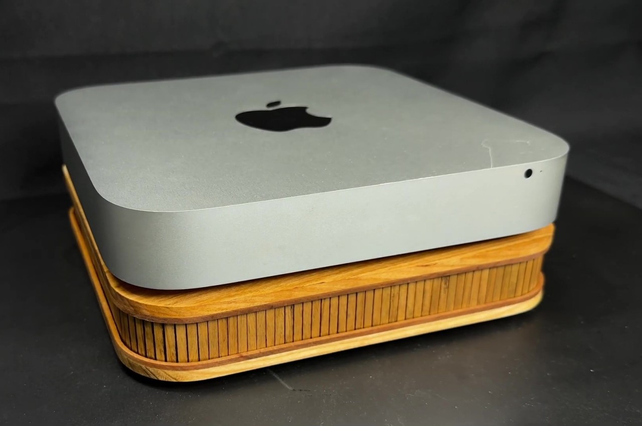
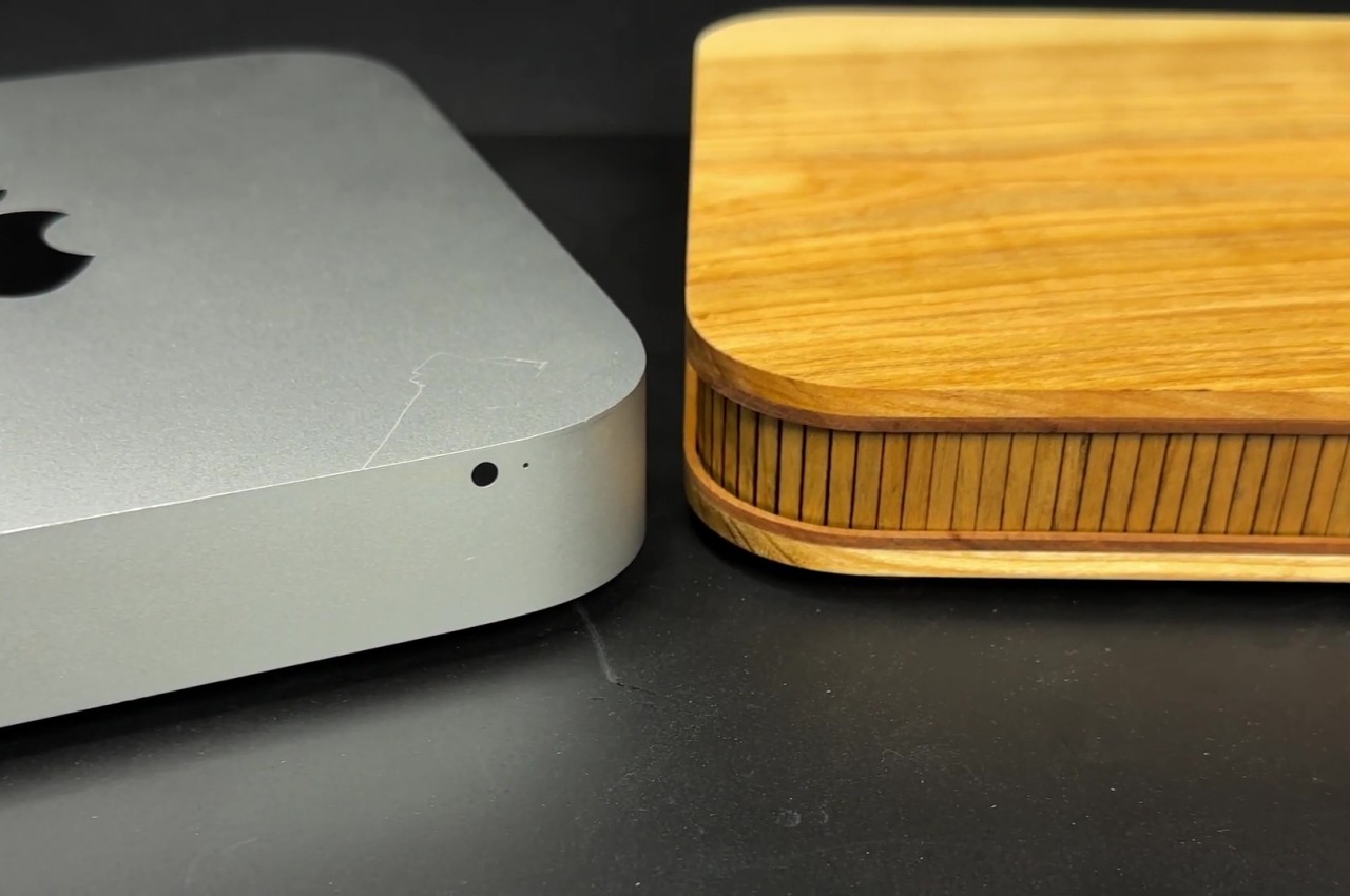
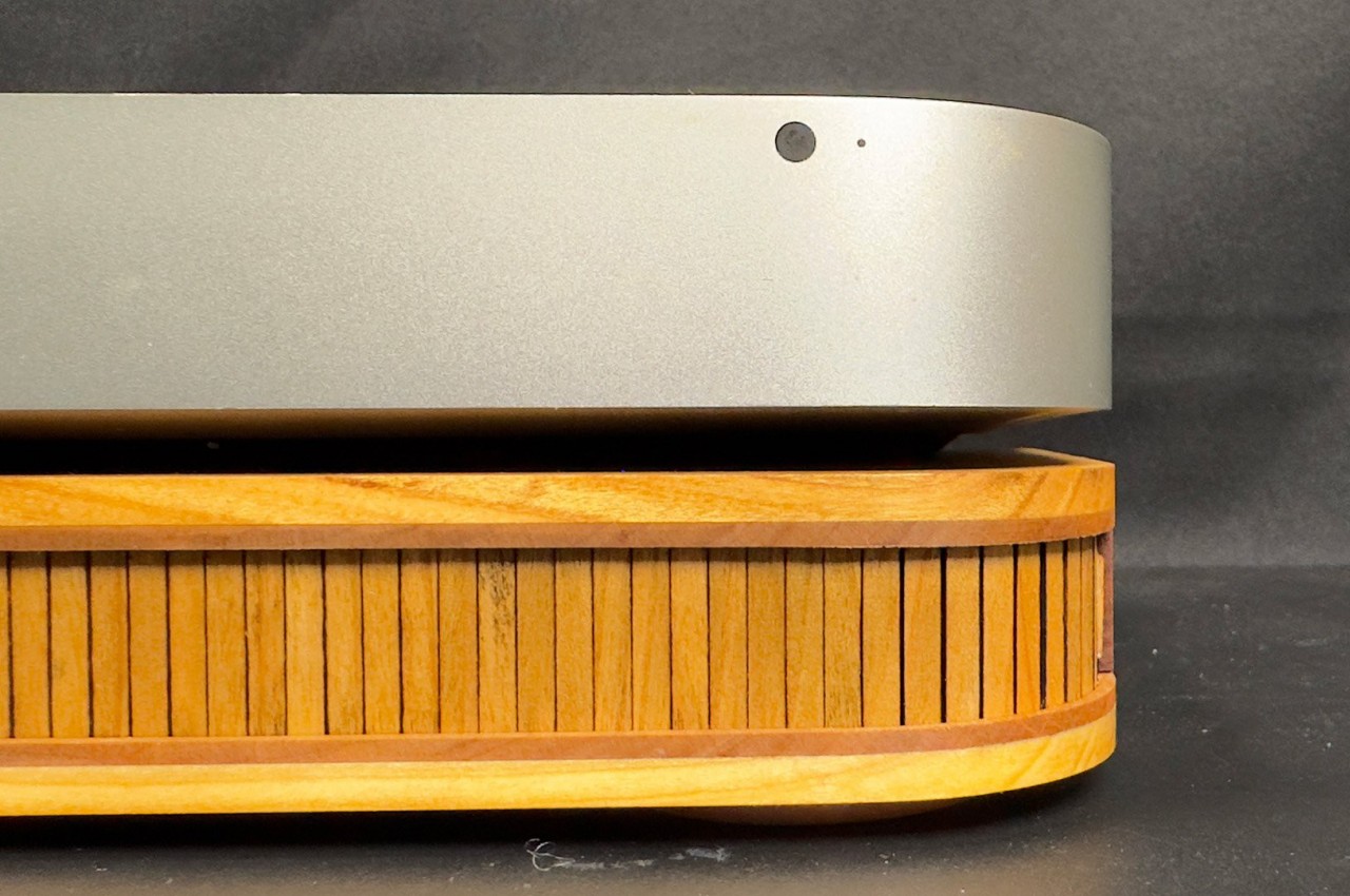
Although Apple designed the Mac Mini and Mac Studio to stand on their own, there are some desk setups and designs that require elevating these minimalist boxes a bit higher. In fact, their small bodies make it easy to place them on top of anything, but that doesn’t mean they’ll look good on it unless that “thing” was specifically made for the mini Macs. This handcrafted riser is made to match the dimensions of the Mac mini and elevates the metal box not just in height but also in style.
Made from Cherry and Alder veneers, the wooden stand exudes a warmth that contrasts with the cold silver exterior of the Mac mini while also perfectly complementing it at the same time. Both pieces carry an air of elegance, despite their different materials and creation processes. While the Mac mini is mass-produced in a factory, each piece of this wooden riser was measured and crafted manually.
The most interesting part of the riser, however, is the drawer inside that’s hidden behind a tambour door. Unlike a simple organizer that exposes its container for everyone to see, you have to slide the row of vertical slats out of the way first before you can pull out the drawer. The mechanism offers functionality that doesn’t take away anything from the design’s aesthetics, a philosophy that is perfectly in line with Apple’s own approach to designing products.
The design for this unique and distinctive tambour organizer stand is fortunately available for everyone to follow, but the painstaking process will probably scare all but the most seasoned makers. That said, it could be a source of inspiration for other accessory makers to make their own spin on the idea, especially the brands that pay a lot of meticulous attention to details, materials, and finishes that would perfectly match an Apple product.


 and SonicBeam