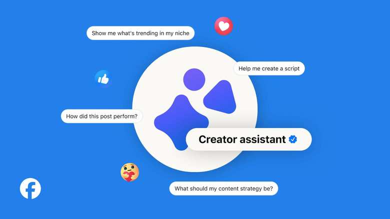
Meta’s latest AI tool gives creators a ‘brainstorming partner’
Meta's Creator Assistant AI can analyze your past posts to help with future content plans.
Product design has always been part craft, part communication. Getting a concept from sketch to client approval demands a level of visual storytelling that most designers simply haven’t had the budget or tools to manage on their own. Video production, in particular, has long been the step that gets quietly skipped, not because the ideas aren’t there, but because the process is expensive, slow, and complicated.
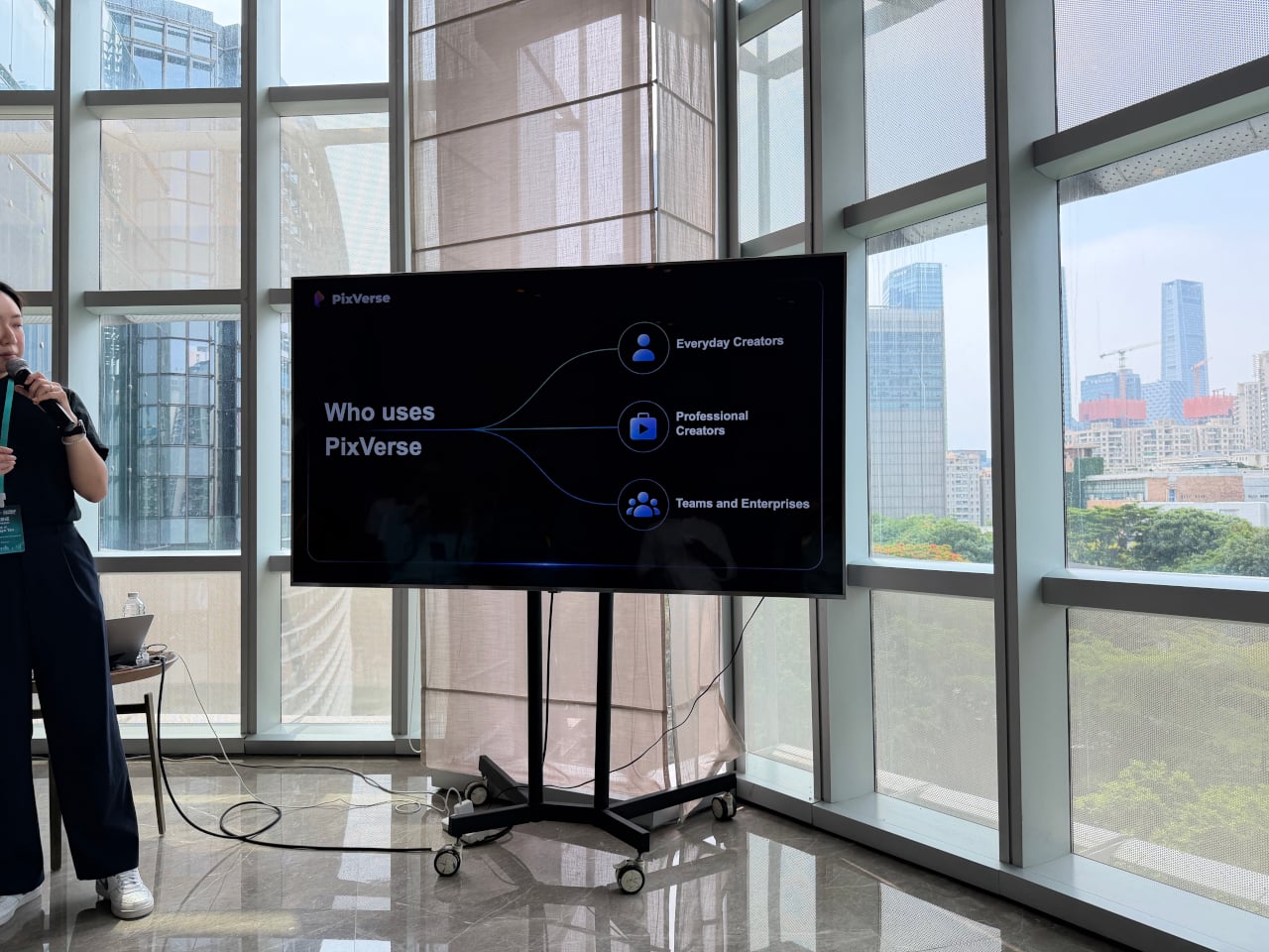
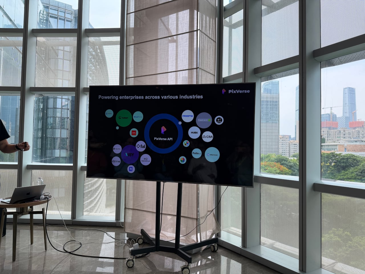
That’s a gap PixVerse has been working to close. Founded in 2023, the platform has grown to over 100 million users across 177 countries, powered entirely by proprietary models it builds in-house. At the iMpact Global Connect Show 2026, the company’s team walked through three distinct products that together make a compelling case for AI-generated video as a practical part of the design process.
Designer: PixVerse
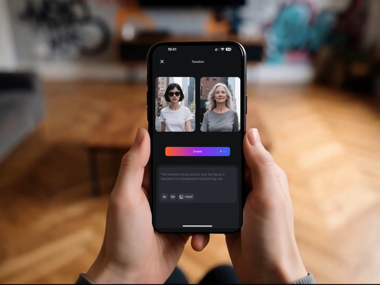
The most immediately useful of the three, at least for most designers, is V6. It’s the platform’s flagship model, and the latest update improves camera movement, character performance across scenes, and physical object interaction in noticeable ways. More significantly, V6 can now generate a complete multi-shot short film with native audio from a single prompt, without any separate editing or sound production steps involved.
Think about what that actually means for a product designer. A 30-second product video typically means writing a brief, hiring a videographer, sourcing music, shooting, and editing over several days or weeks. With V6, a designer who can clearly articulate how a product should look, move, and feel in context can produce that same result from a prompt and a reference image in considerably less time.
That kind of speed has obvious advantages for solo designers and small studios. A freelancer can arrive at a pitch with three distinct video directions instead of three mood boards. A startup preparing a crowdfunding campaign doesn’t need a separate production budget for a launch video. An in-house team can test how a product reads in a real context before committing to a full-scale shoot.
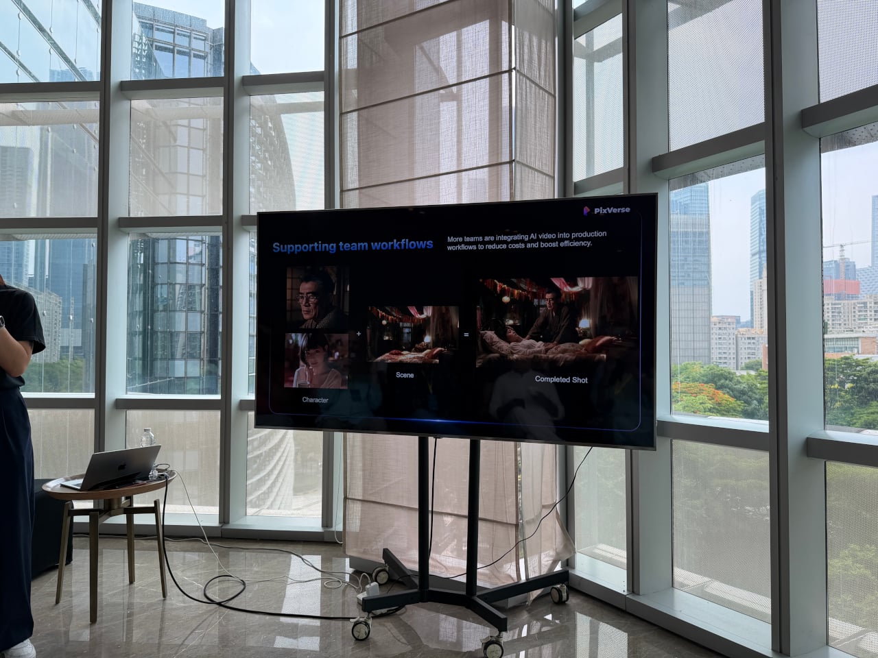
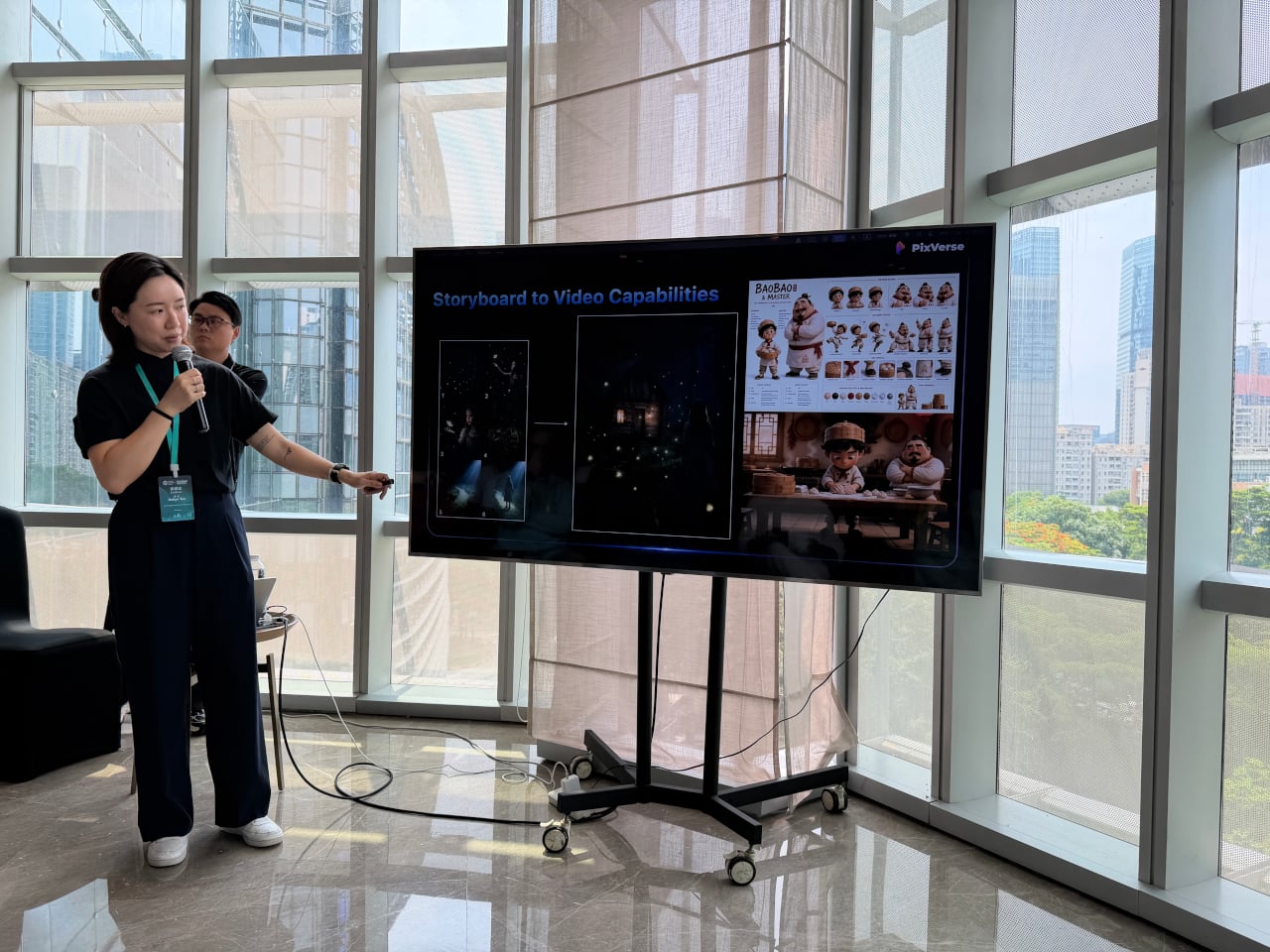
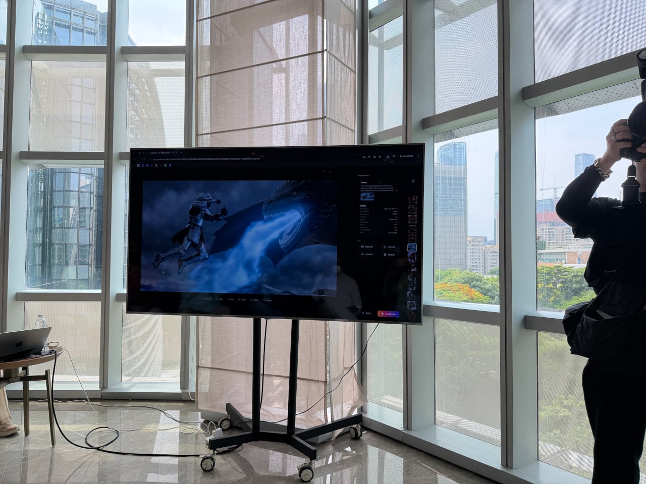
The second product, C1, goes further by targeting actual film production pipelines. It combines a cinematic visual effects system, an industrial-grade action engine, and a storyboard-to-video feature in a single workflow, letting production teams convert static panel layouts directly into continuous video sequences. Reference-guided generation also keeps characters and scenes consistent across shots, which has historically been one of the harder problems for AI video to solve.
For designers, that matters most when a concept already lives as a sequence of moments rather than a single frame. A transportation designer communicating a user journey, a consumer electronics team mapping how a device gets picked up, handled, and put down, or a lifestyle brand building a product narrative around daily routines, all of them are telling stories that C1 is built to handle.
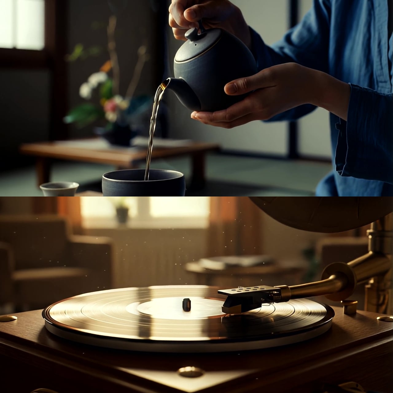
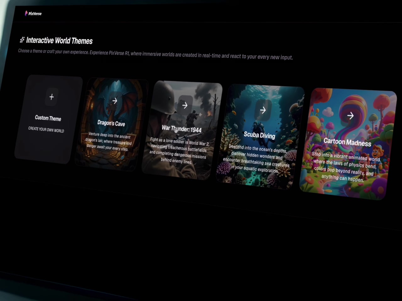
Then there’s R1, which doesn’t behave quite like any other AI video tool currently available. Rather than producing a fixed clip with a clear beginning and end, R1 generates a continuous, interactive visual environment that responds to user input as it runs. It’s less like watching a video and more like navigating a space that exists, evolves, and reacts, one that you can steer and share.
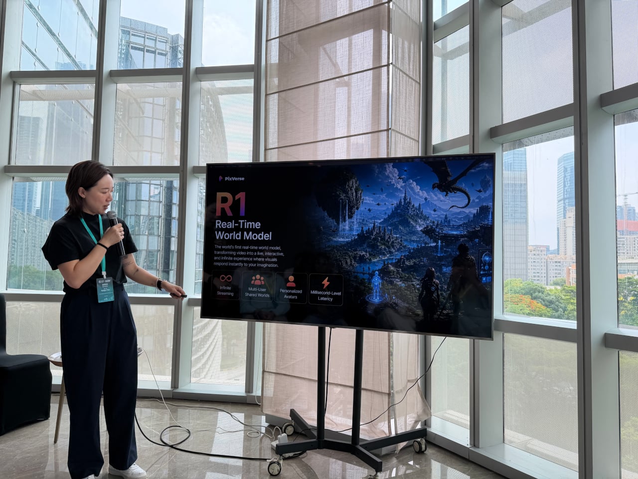
Users can build a personalized digital avatar from photos and enter these generated worlds alongside others in real time. During the demo, a shared environment called “Cat Takes Charge” had 118 users inside it at the same time, running continuously for over nine hours. Each participant could submit prompts into a live feed, with the AI realizing them as video within the shared space as they appeared.
For product designers, R1 opens up possibilities that a rendered video simply can’t replicate. Imagine walking a client through a simulated retail environment built around a new appliance, or letting a stakeholder explore a furniture concept in a living, reactive interior before a prototype even exists. It’s the kind of tool that starts to make spatial storytelling feel accessible at the concept stage, not just post-production.
What all three tools share is that they reward the same skill designers already rely on: clarity of intent. A well-constructed prompt isn’t a technical exercise; it’s a creative direction, not unlike a solid design brief. Companies integrating PixVerse into their workflows reportedly cut costs by 68% and finish work 57% faster than conventional production methods, a significant gain for teams of any size.
None of that requires a production background, and it doesn’t even require familiarity with video editing software. What it does require is the ability to describe a vision precisely, which is something designers do every single day across briefs, sketches, and presentations. PixVerse just moved video closer to the beginning of that process, somewhere between the first concept and the final approval, rather than as an afterthought at the very end.
The post PixVerse Just Made Product Videos as Easy as Writing a Brief first appeared on Yanko Design.
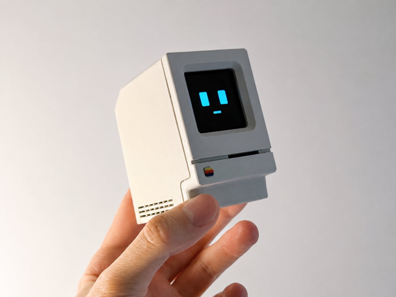
Smart speakers have become some of the most visually forgettable objects in modern homes. A cylinder, a puck, a fabric-wrapped drum, placed wherever the Wi-Fi is strong and largely invisible once the novelty wears off. They do their jobs well enough, but none of them look like they belong in a collection or on a desk that someone cares about. The hardware has always been purely functional, and the design has always shown it.
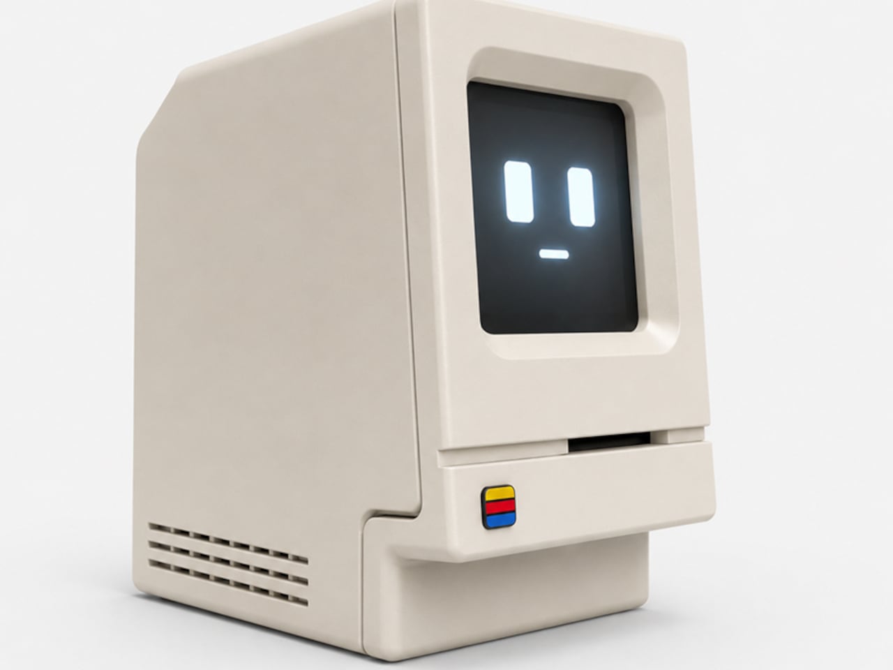
Alisher Ashimov approached the idea of a desk-based AI assistant from a completely different direction. Kira, his open-source project, takes its visual cues directly from the original 1984 Macintosh, a machine whose beige monolith silhouette is arguably the most iconic in personal computing history. The result is a voice-activated AI companion that looks more like a cherished collectible than a utility device.
Designer: Alisher Ashimov
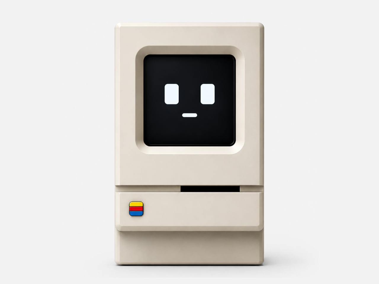
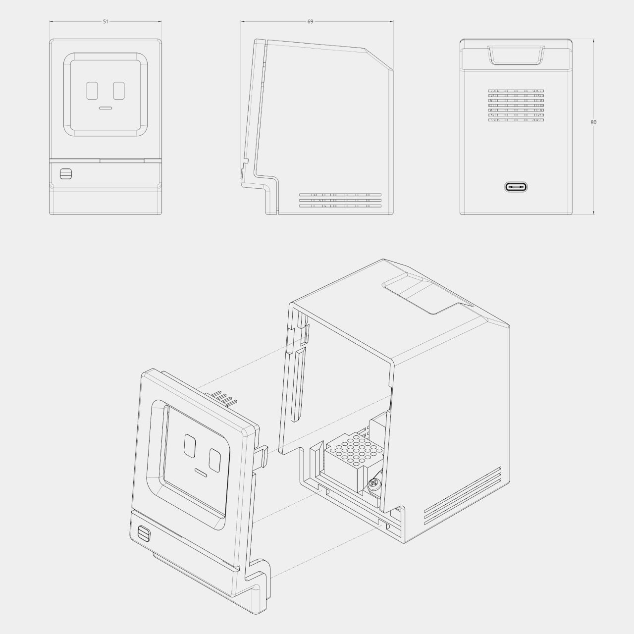
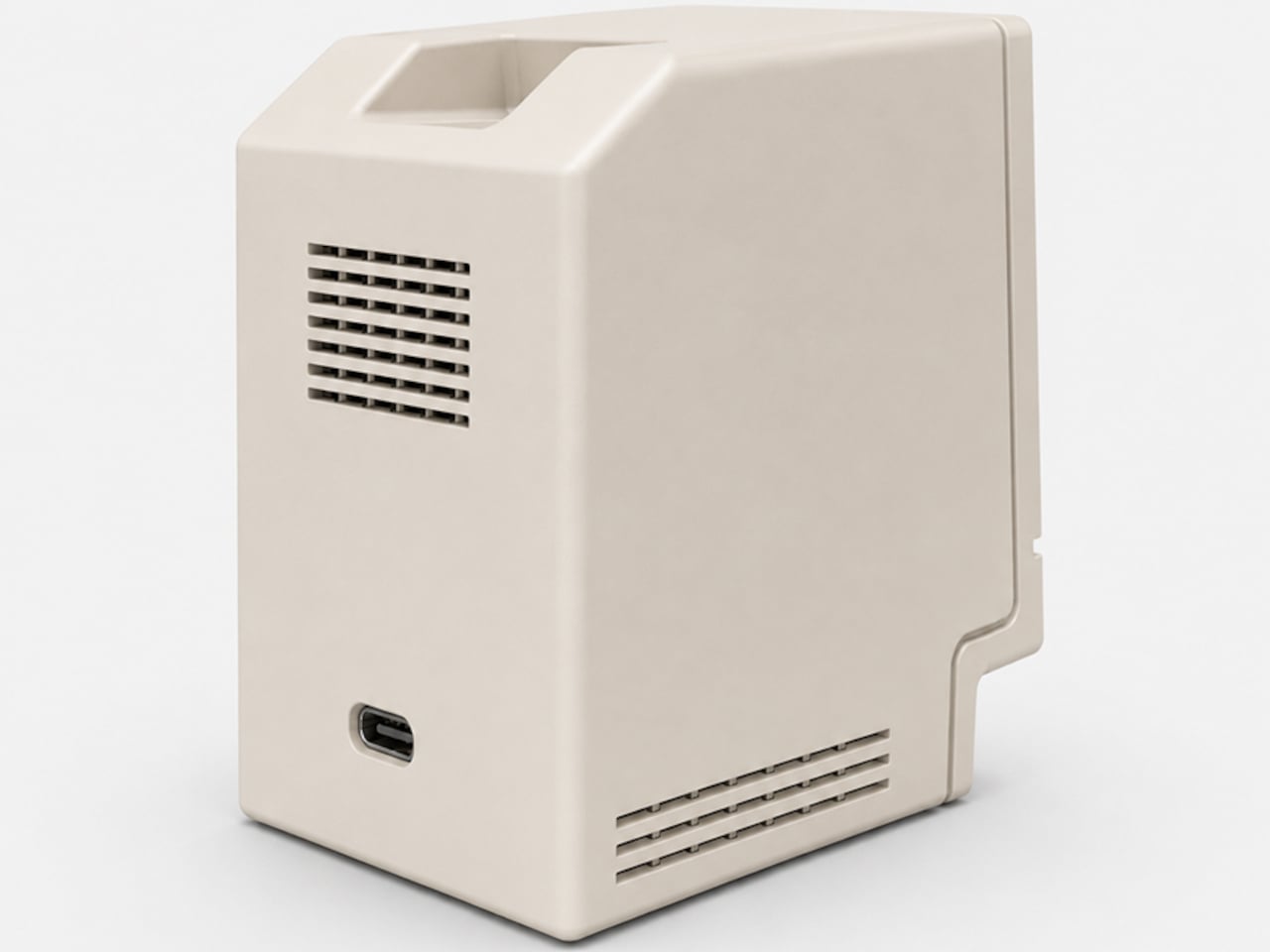
The enclosure is 3D printed in a single recommended filament color: Light Khaki matte PLA, the closest approximation of that distinctive Apple beige. Rounded top corners, a recessed front panel, horizontal side vents, and a decorative floppy-drive-style slot below the display all reproduce the original’s proportions at pocket scale, somewhere around 80mm wide. A small four-color badge on the lower front panel adds the final recognizable touch.
Where the original Macintosh showed a desktop environment, Kira shows a face. The 1.5-inch OLED display renders two rectangular eyes and a small dash mouth, animating expressively in response to interaction. The wake word is “Hey, Kira,” and from there, a built-in microphone picks up questions while a 4Ω, 3W speaker delivers spoken answers through the sculpted housing. It handles everyday voice queries the same way any smart assistant does, just with considerably more personality sitting on the shelf.
The electronics are deliberately approachable. The core is a Seeed Studio XIAO ESP32-S3 Sense, a capable and compact microcontroller with built-in Wi-Fi, Bluetooth, and a microphone. The rest of the bill of materials, a speaker, amplifier, SH1107 OLED module, mini breadboard, and jumper wires, are available on Amazon for modest amounts. The 3D-printed enclosure is optimized to print in about three hours across two plates with minimal support material, and an assembly guide walks builders through wiring, assembly, and firmware flashing.
The software carries the same open-ended spirit as the hardware. Voice, language, the assistant’s character, and memory settings are all user-definable, which means Kira isn’t locked into a single personality or a single cloud service. Tinkerers can tune the firmware directly. Ashimov has published the files freely, with no commercial barriers between the design and anyone with a printer and an afternoon to spare.
The objects people choose to keep on their desks tend to say something about them. A tiny Macintosh-shaped AI assistant that you built yourself and tuned to your own preferences says rather a lot. It combines a piece of design history, a genuinely capable voice interface, and an honest invitation to understand exactly how the thing works, all in a form that most people will stop and ask about the moment they see it.
The post This 3D-Printed Macintosh Replica Is Actually a Voice AI Assistant first appeared on Yanko Design.

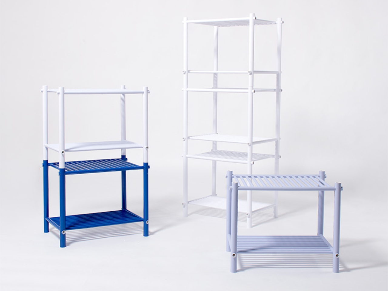
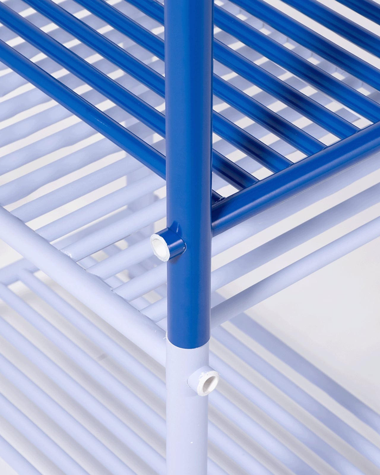
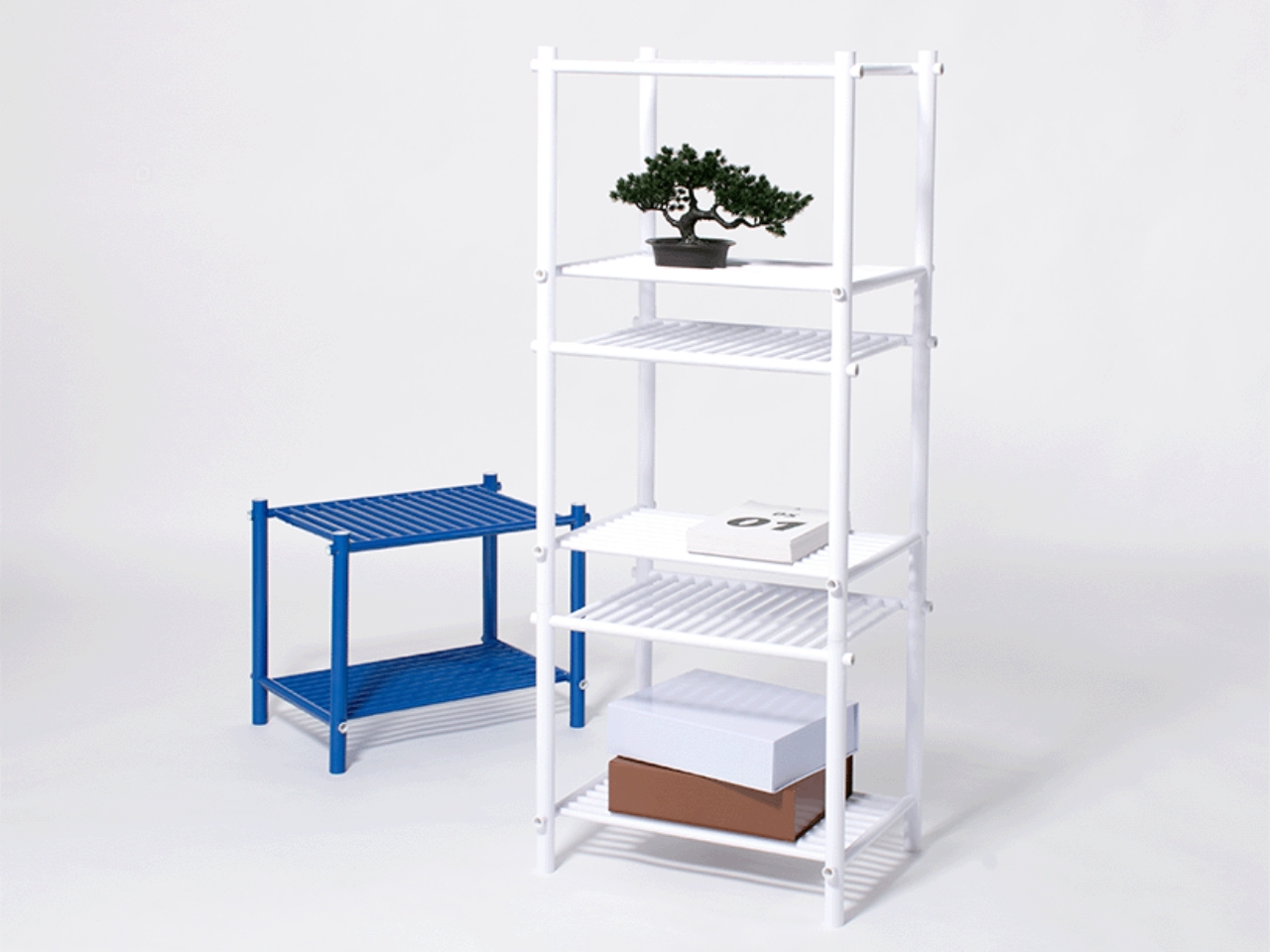
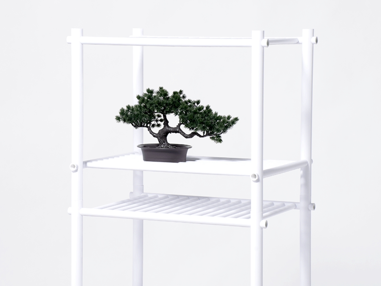
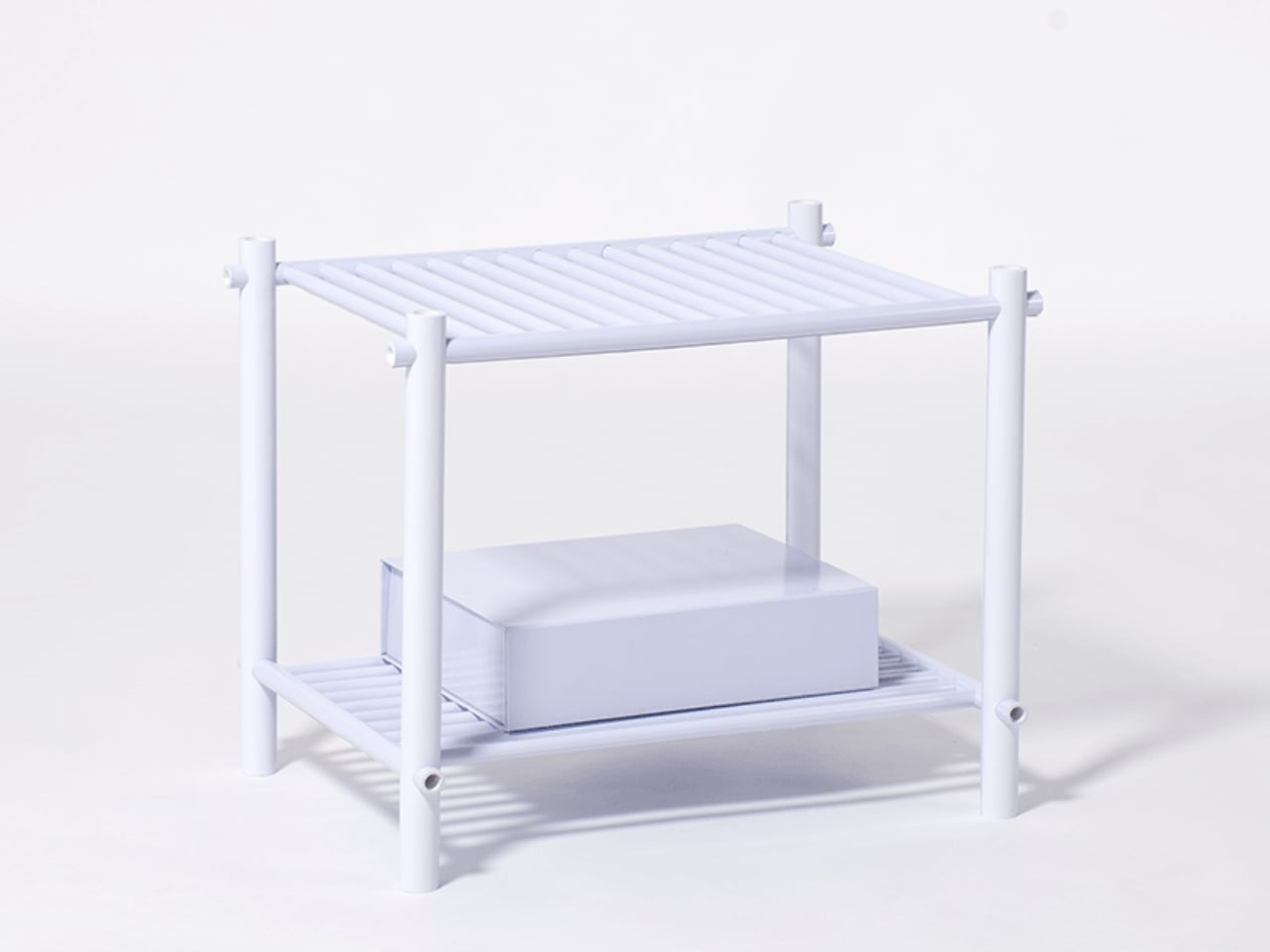
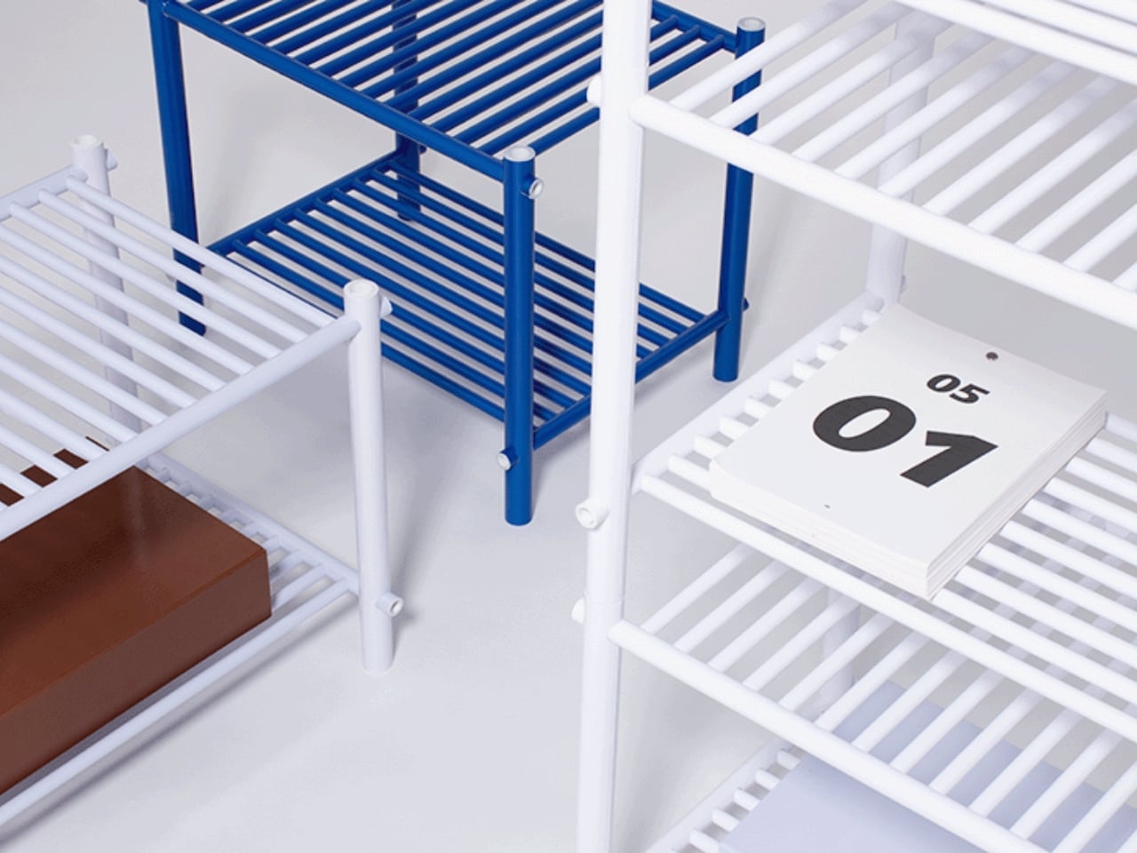
When Japanese designer Muto Yumi set out to make furniture from paper, the result was not what most people would imagine. No papier-mâché. No origami-inspired folding. No cardboard box aesthetics salvaged and called art. What she produced is a modular furniture system so structurally sound and visually precise that it makes you question almost everything you assume about material strength and decorative surface.
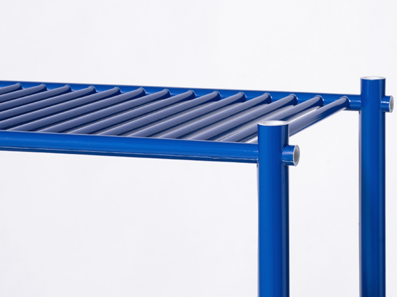
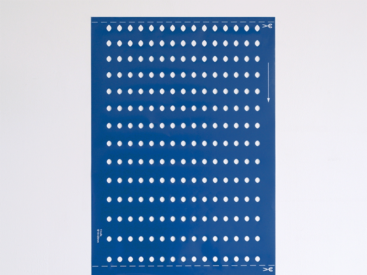
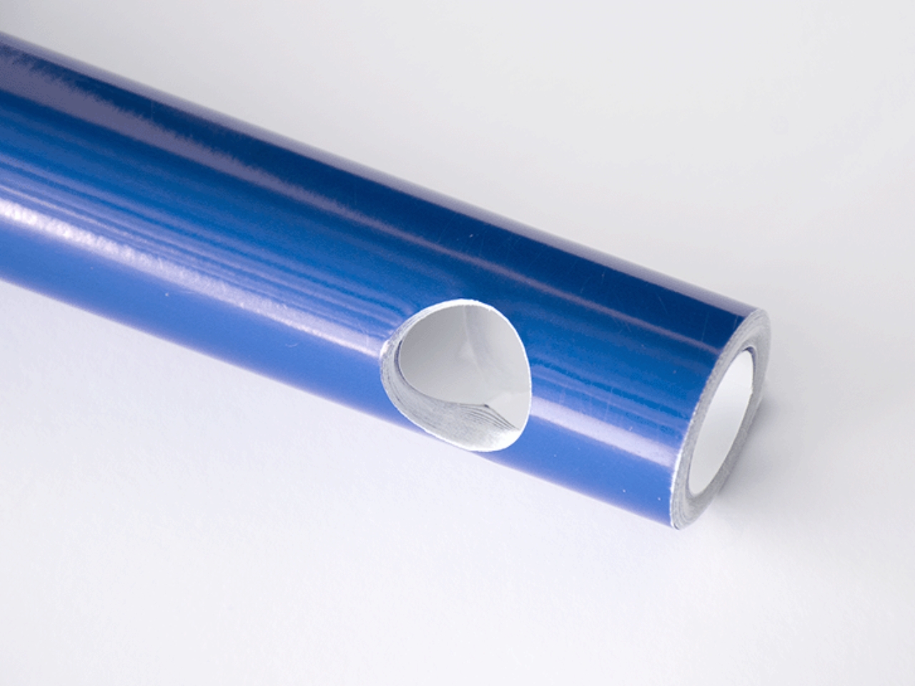
The project is called Pattern as Structure, and the name is not just poetic framing. It is literally the concept. Muto starts with flat sheets of paper pre-cut with holes arranged in a specific pattern. Roll that sheet tightly around itself, layer upon layer, and the paper transforms from something limp and delicate into a dense, rigid rod capable of bearing real weight. The physics of it are intuitive once explained, but watching it happen feels like a magic trick. A single sheet does nothing. Rolled and compressed, it becomes architecture.
Designer: Muto Yumi
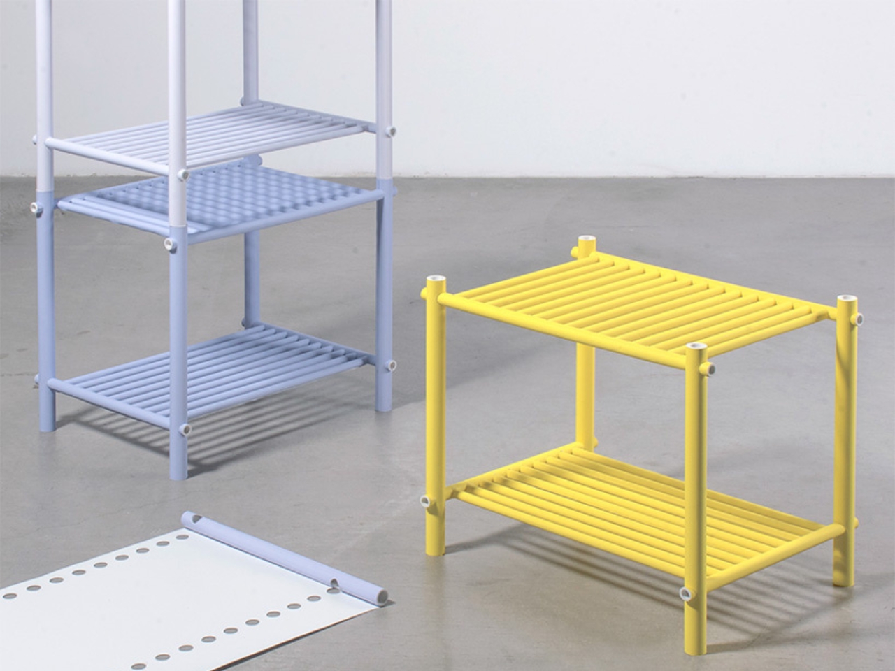
Here is where it gets more interesting. Those pre-cut holes that look like a graphic pattern on the flat sheet? Once the paper is rolled into a rod, those holes become tunnels running through its body. They are the connection points of the whole system. Other paper rods slot through them, linking one piece to the next without glue or hardware. The pattern was never just decoration. It was always the joint, the connector, the system’s logic. The aesthetics and the engineering are the exact same thing.
That kind of design clarity is genuinely rare. Most furniture design separates surface from structure, treating them as two different problems to solve. A frame holds the load; a finish makes it beautiful. Pattern as Structure collapses that division entirely. The surface IS the structure. The decoration IS the joint. You cannot take one away without destroying the other, and that coherence is what makes the project feel so resolved.
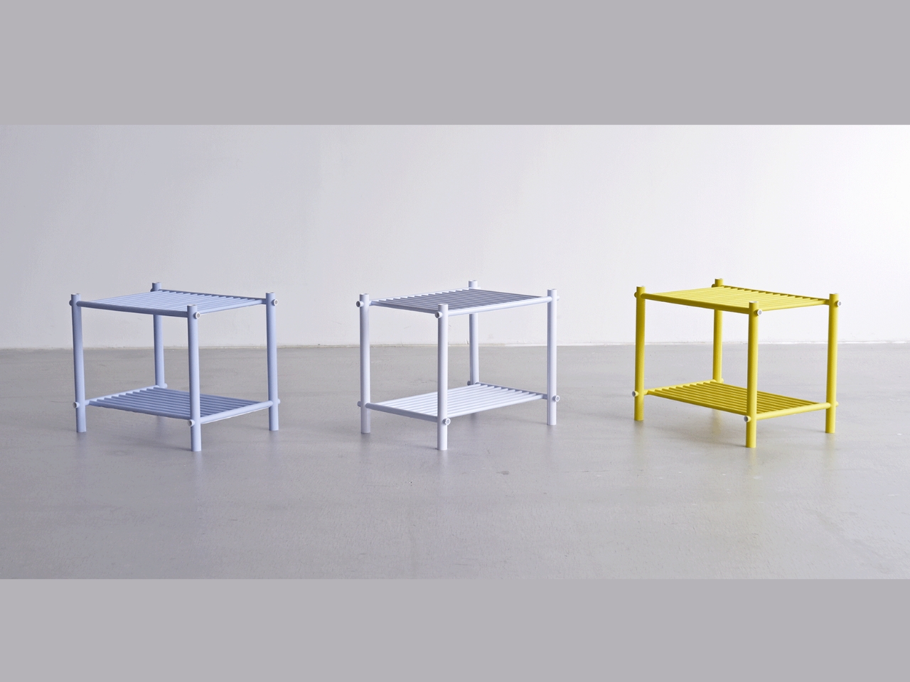
What Muto has produced so far is a family of open shelves in varying sizes. They look clean and slightly architectural, like something you would expect to find in a gallery or a well-curated apartment. But the real achievement here is not the object itself. It is the proof of concept. Because the rods are made from printed paper sheets, the color and graphics on the surface can change infinitely without altering the construction method at all. Want a shelf in deep terracotta? Stripe patterns? Illustrated surfaces? Print the sheet differently and roll it the same way. The structural logic stays identical. The visual language can do whatever it wants.
For anyone paying attention to design right now, this matters. The conversation around sustainable materials has become crowded with beautiful ideas that fall apart under practical conditions. Paper furniture is not new, but paper furniture that is also modular, reconfigurable, and visually customizable without requiring any change to its fabrication process? That is a more sophisticated argument. It asks whether we really need virgin timber, powder-coated steel, or injection-molded plastic to make things that last and look good. Muto’s answer is apparently no.
I keep returning to the honesty of the material choice too. Paper does not pretend to be something else. It does not mimic wood grain or stone texture or metal sheen. It is exactly what it is, and somehow that straightforwardness makes the furniture more interesting, not less. The pattern on each rod is visible. You can see the rolled layers at the cut ends. The making is part of the looking.
Design that is this conceptually tight often sacrifices warmth or approachability in the process. Pattern as Structure avoids that trap. The pieces feel considered without being cold. They feel experimental without being precious. And for a project made from something as unassuming as a sheet of paper with holes punched through it, that balance is quietly remarkable. Muto Yumi is someone worth watching. Not because she is working with expensive materials or chasing spectacle. But because she is asking better questions about what furniture is actually made of, and why.
The post Japanese Designer Just Built a Real Shelf From Rolled Paper Sheets first appeared on Yanko Design.
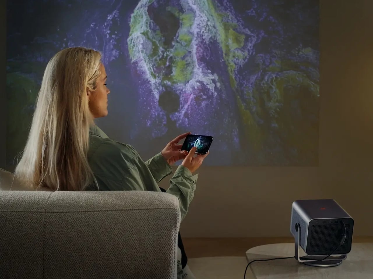
When Leica announced the Cine Compact 1, my first reaction landed somewhere between genuine curiosity and mild skepticism. Leica is a camera brand. A camera brand, the kind photographers carry like a quiet badge of honor, the kind that has defined a certain visual language for over a century. And now they want to replace my television?
Here is the thing: Leica has been making projectors since 1926. Before streaming was a concept, before most of us were born, they were already in the projection business. The Cine Compact 1 is not a prestigious camera brand drifting beyond its territory. It is one returning to an old, familiar one.
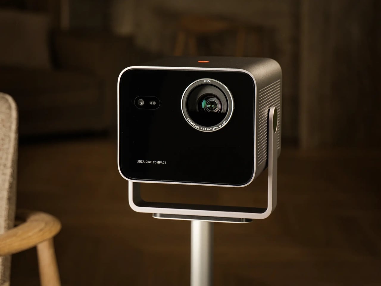
Designer: Leica
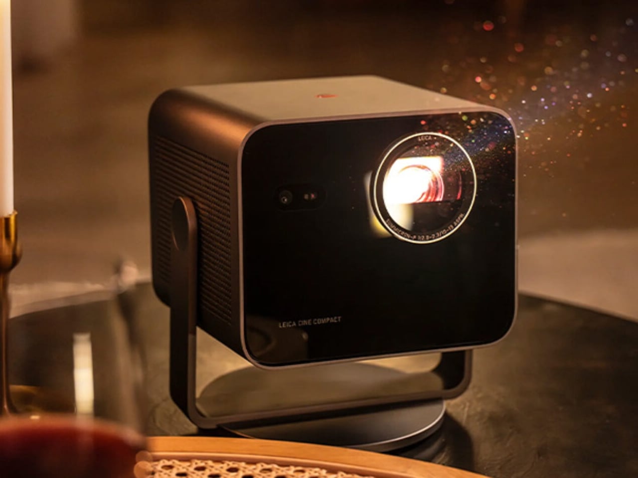
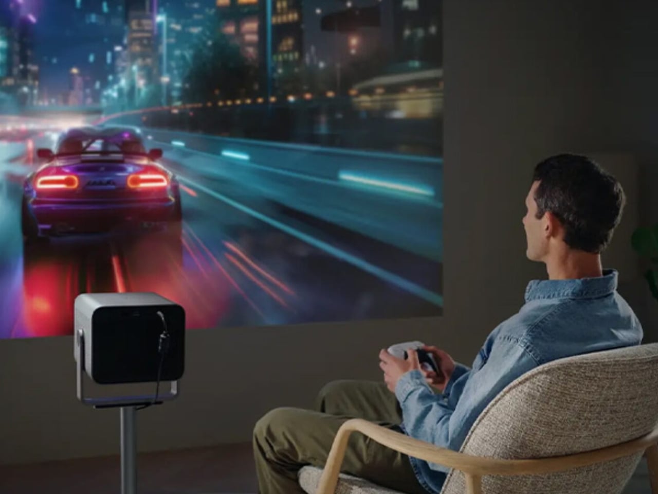
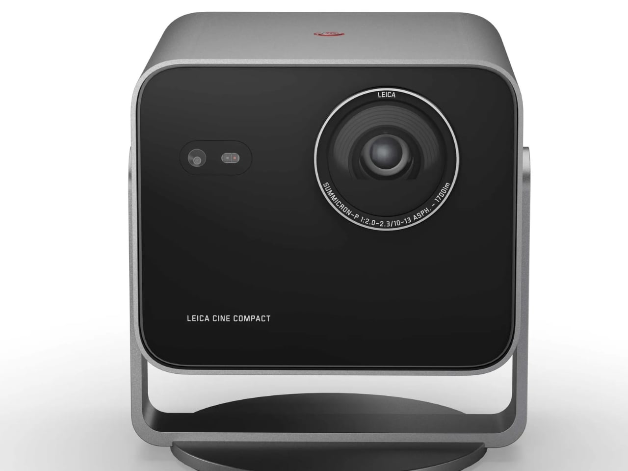
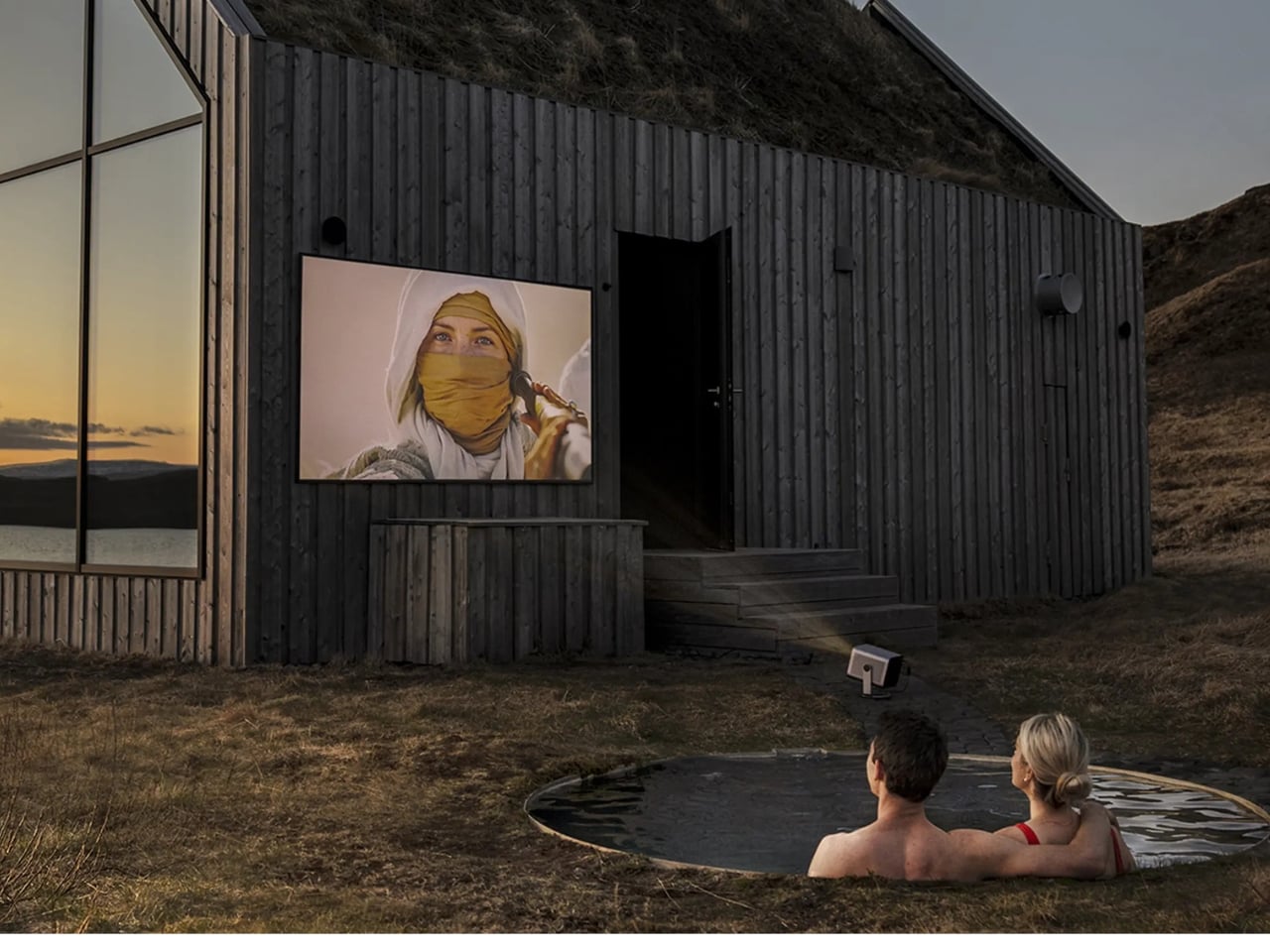
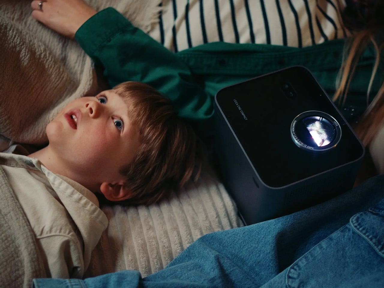
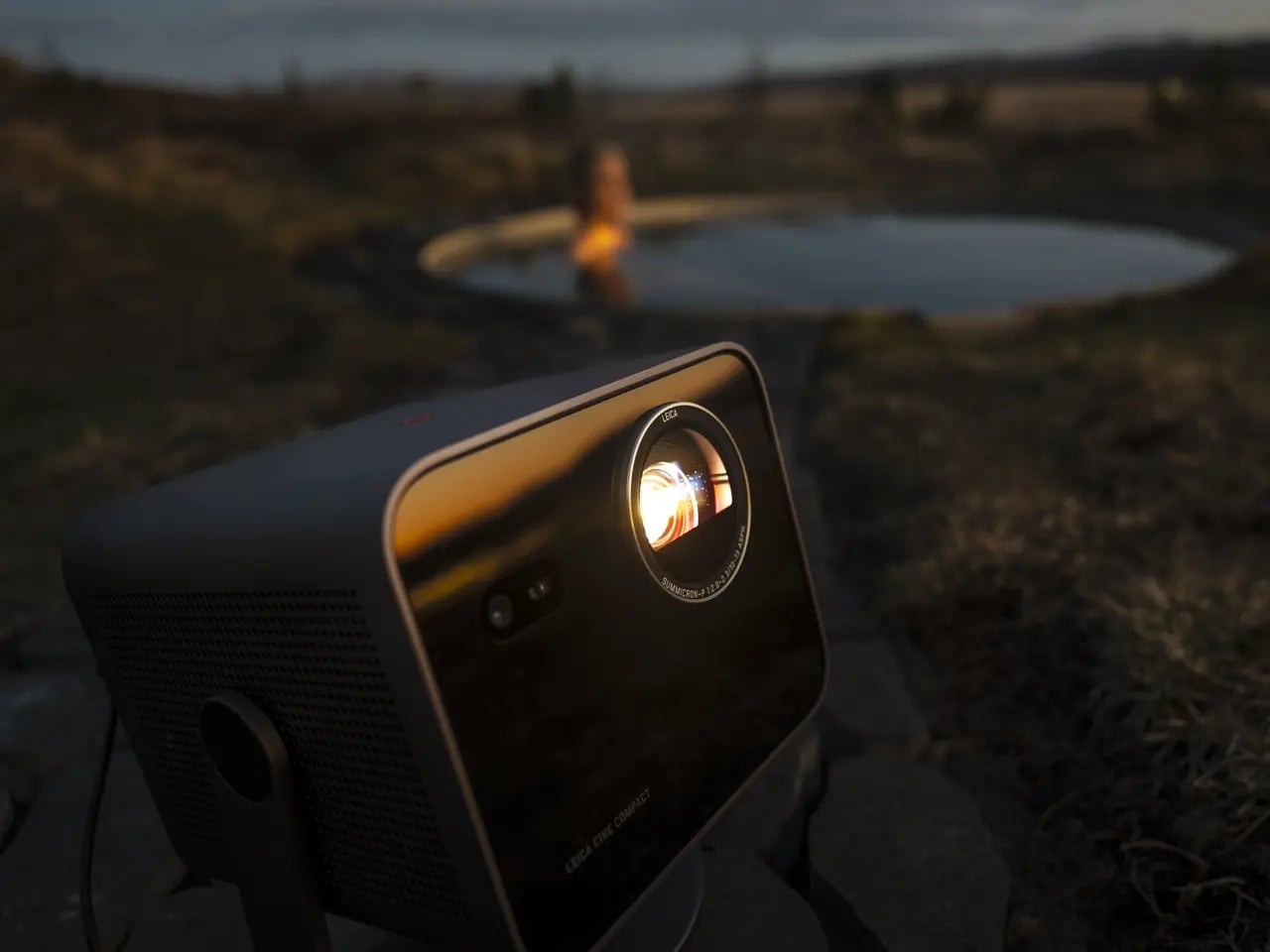
So what exactly is it? At the core, the Cine Compact 1 is a compact mini projector built around a Leica Summicron zoom lens with aspherical elements, a 0.47-inch DMD image chip, and Triple RGB laser technology. It delivers 4K resolution at up to 1,700 ANSI lumens, which is bright enough to produce a usable image in a room that is not completely blacked out. The maximum projection size is 220 inches diagonally, which is an absurd number for something small enough to sit on a coffee table.
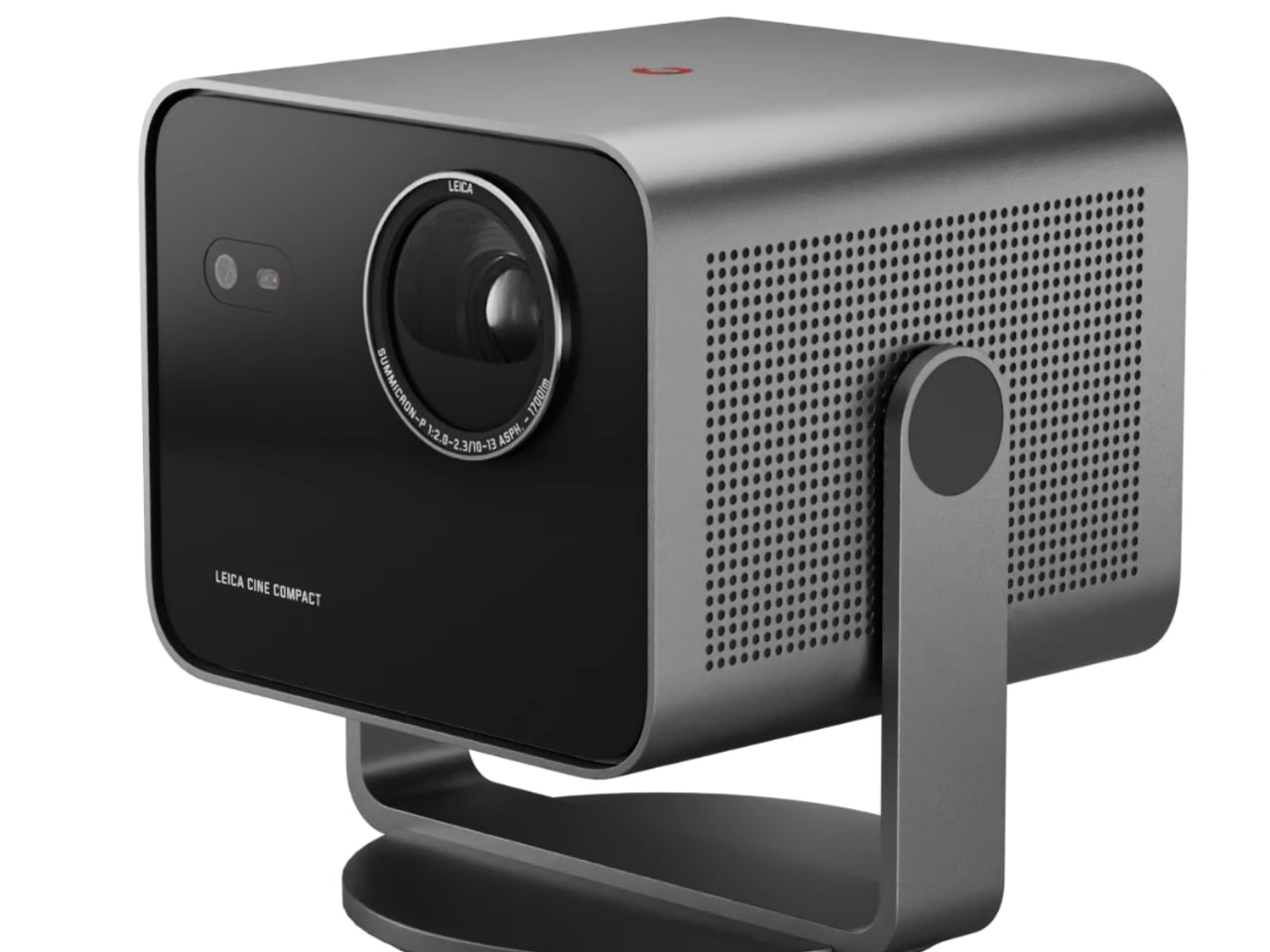
The 360-degree rotation system is the detail I keep thinking about. Most projectors are prisoners of their setup requirements: flat surface, blank wall directly ahead, dedicated space. The Cine Compact 1 abandons that formula entirely. Wall, ceiling, anywhere in between. That flexibility is not just a convenience feature. It actually changes your relationship with watching at home. Ceiling projection during a movie night is a categorically different experience from staring at a flat panel mounted above a console.
Leica also built in their proprietary image processing technology, called Leica Image Optimization (LIO), to maintain consistent picture quality regardless of projection size or location. Pair that with Dolby Vision for contrast and brightness precision, and Dolby Digital and DTS Virtual:X for audio, and this is not a glorified slideshow device. It is a serious piece of home cinema equipment disguised as a coffee table accessory.
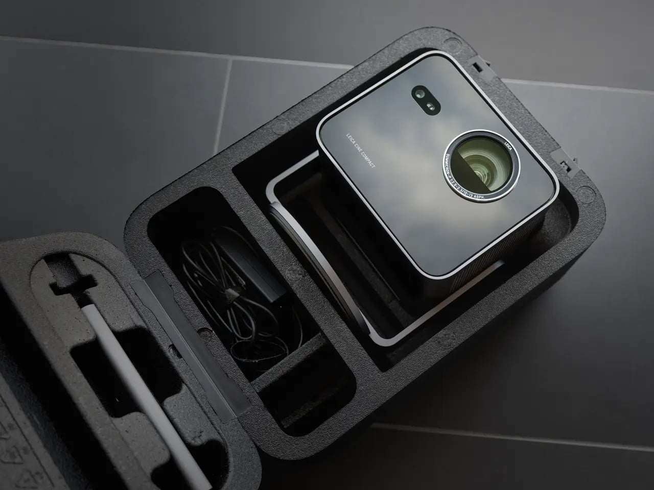
The design is Leica through and through: solid aluminum housing, a glass front, clean lines that read as refined rather than attention-seeking. Even switched off, it looks like it belongs on a shelf rather than something you drag out reluctantly. Its projected lifespan is 25,000 hours, which at a few hours of daily use amounts to decades of service. Smart streaming runs on VIDAA, so most of what you want to watch is accessible without plugging anything extra in.
My honest read on the Cine Compact 1 is that it is designed for a very specific kind of frustration: the one that comes from building your entire living space around a television. We spend years arranging furniture toward screens, painting walls in “TV-friendly” neutrals, negotiating actual square footage with a device that has one function. A projector like this shifts that equation. The screen exists when you need it. The room is yours the rest of the time.
Is it for everyone? No. Projectors still require more thought than a TV on a wall, and Leica’s pricing tends to reflect the brand’s premium heritage. But the people who will love this will love it unconditionally. The design-conscious person who thinks as carefully about how their space looks at two in the afternoon as they do at nine at night. The perpetually mobile person who wants a real cinema experience wherever they land. The person who is simply done negotiating living space with a large black rectangle.
Leica is not chasing a trend here. If anything, they are returning to something they were doing before most modern tech companies existed. The form is smaller, smarter, and more portable. The commitment to image quality behind it is exactly the same.
The post Leica’s 220-Inch Mini Projector Wants to Replace Your TV first appeared on Yanko Design.
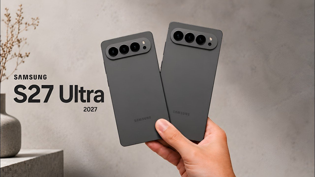
The Samsung Galaxy S27 Ultra is shaping up to be one of the most anticipated smartphones of the year, with industry insiders and enthusiasts buzzing about its potential to push the boundaries of mobile technology. Although Samsung has yet to officially reveal the device, leaks and reports suggest that it will deliver significant advancements in […]
The post The Samsung Galaxy S27 Ultra is Already Leaking: Here is What to Expect appeared first on Geeky Gadgets.