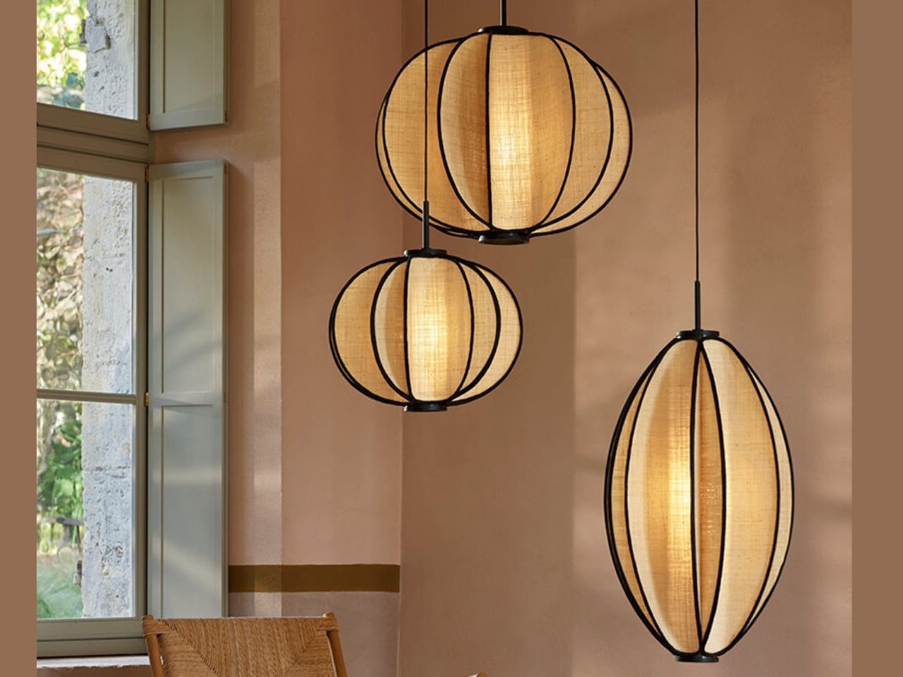
Forestier’s New Solis Pendant Looks Like a Seed, Then a Star

If you’ve ever stood in a room and felt the light fundamentally change your reading of the space, you’ll understand immediately why the Solis collection by Forestier stopped me in my tracks. Designed by German-born, Netherlands-based Jette Scheib, these pendant lights are doing something that most contemporary lighting design doesn’t bother to attempt anymore: they’re asking you to slow down and actually look at what’s above you.

Scheib has been a longtime creative partner with Maison Forestier, a French lighting brand founded in 1992 that has consistently built its identity around natural materials and handcraft. Their collaboration isn’t a commissioned-and-done arrangement; it’s a genuine alliance that has shaped the brand across multiple collections. Solis is the latest result, and it feels like the kind of piece that only comes from two parties who trust each other enough to take a real design risk.

Designer: Jette Scheib
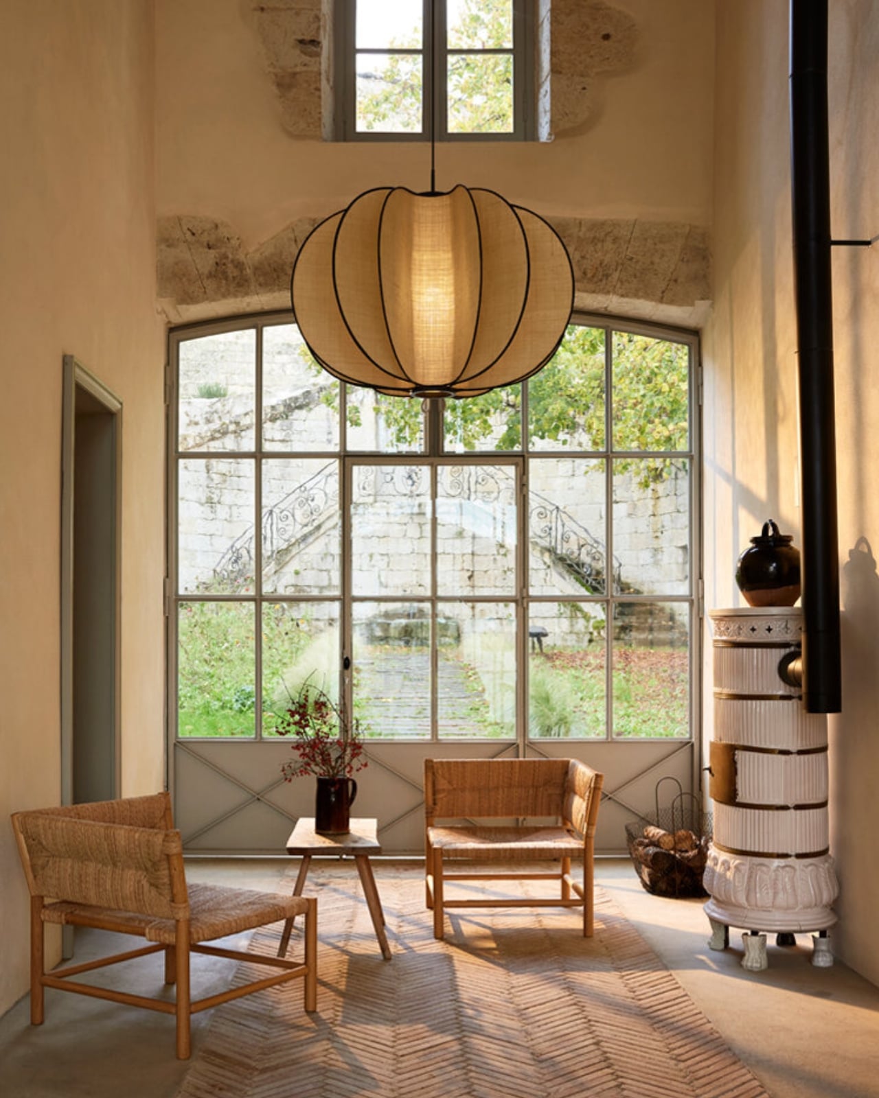
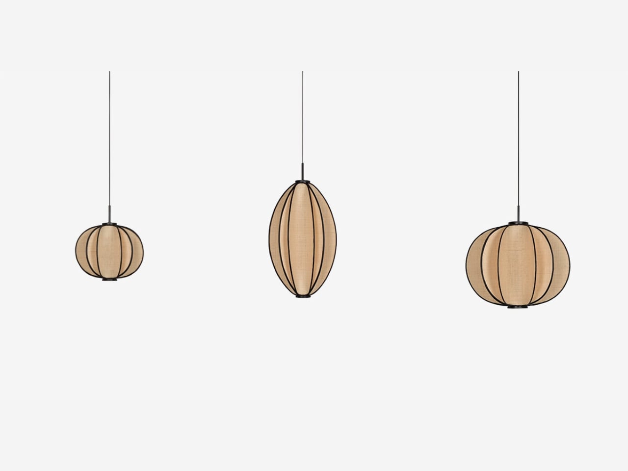
The design itself is deceptively simple. Organic plant fiber, specifically raphia, is hand-woven and stretched over rigid metallic frames, with fine black edging tracing the silhouette. The light that passes through is soft and diffused, mimicking the gentle warmth of late afternoon sun rather than the hard, directed brightness we’ve come to expect from modern interiors. That distinction matters more than people typically give it credit for. Most lighting design optimizes for performance. Solis optimizes for feeling.

The name gives it away, if you know where to look. Solis is Latin for sun, but Scheib built in a second layer of meaning that’s genuinely clever: it also alludes to what grows under the sun, the plant fibers that give these lamps their texture and warmth. A lamp named for both the light it casts and the material born from light. That kind of conceptual coherence is rare, and when it shows up, it elevates an object from product to something closer to poetry.
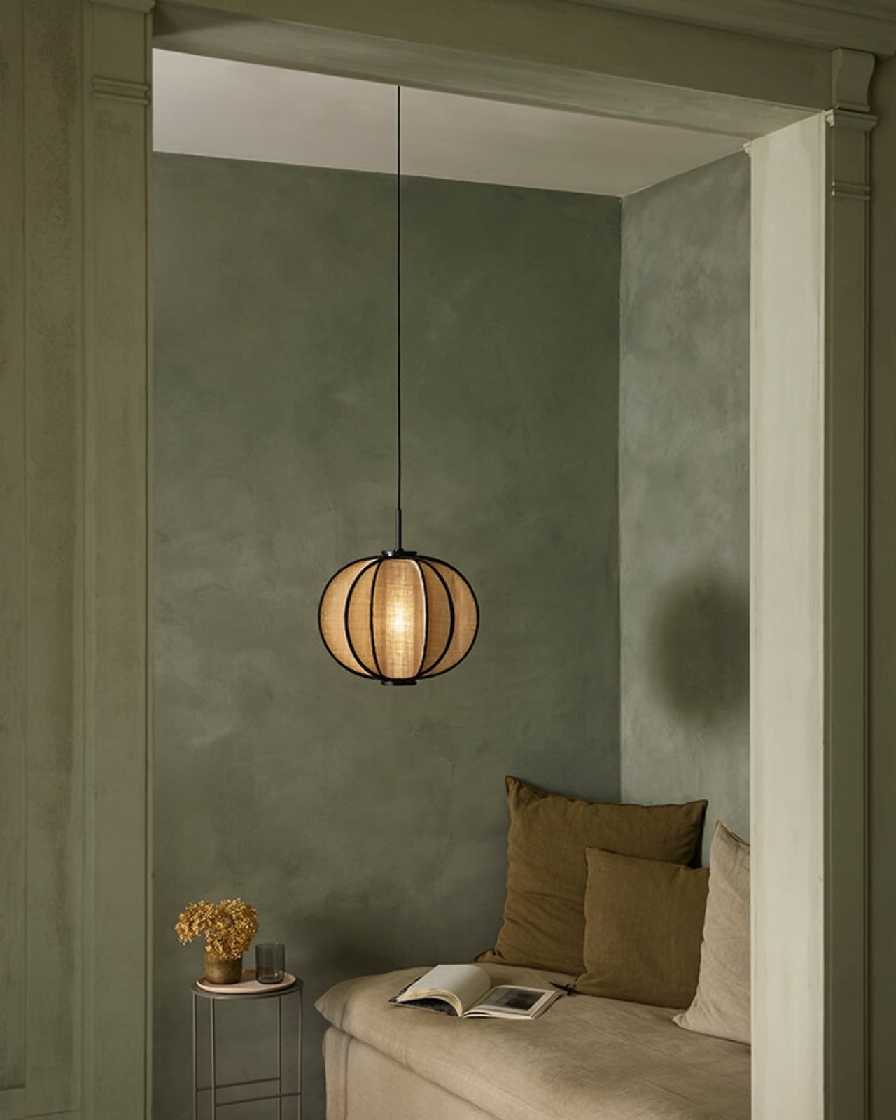
Solis behaves interestingly in space. The silhouettes shift subtly depending on your angle and the time of day, so the lamp you see at 9am is not quite the same lamp you see at 6pm. Volume appears to expand or contract; weight seems to change. The organic shape can read as a seed from one angle and something closer to a radiant star from another. Scheib’s stated focus was the tension between solidity and lightness, and she’s pulled it off in a way that doesn’t feel like a design statement, just a lamp that happens to feel alive. Because raphia carries natural irregularities, no two Solis pendants are identical either. Every one is technically its own object.

The craftsmanship behind the collection is rooted in a fifteen-year partnership with specialized workshops in the Philippines, where weaving and basketry skills have been passed down through generations. Aesthetics tend to dominate design coverage, but the provenance of an object like this deserves equal attention. The lamp isn’t just something to admire from across the room; it’s the physical result of skill that exists in specific places and specific hands. Forestier’s relationship with those workshops is long enough to be structural, and that’s the real difference between sourcing craft and actually valuing it.
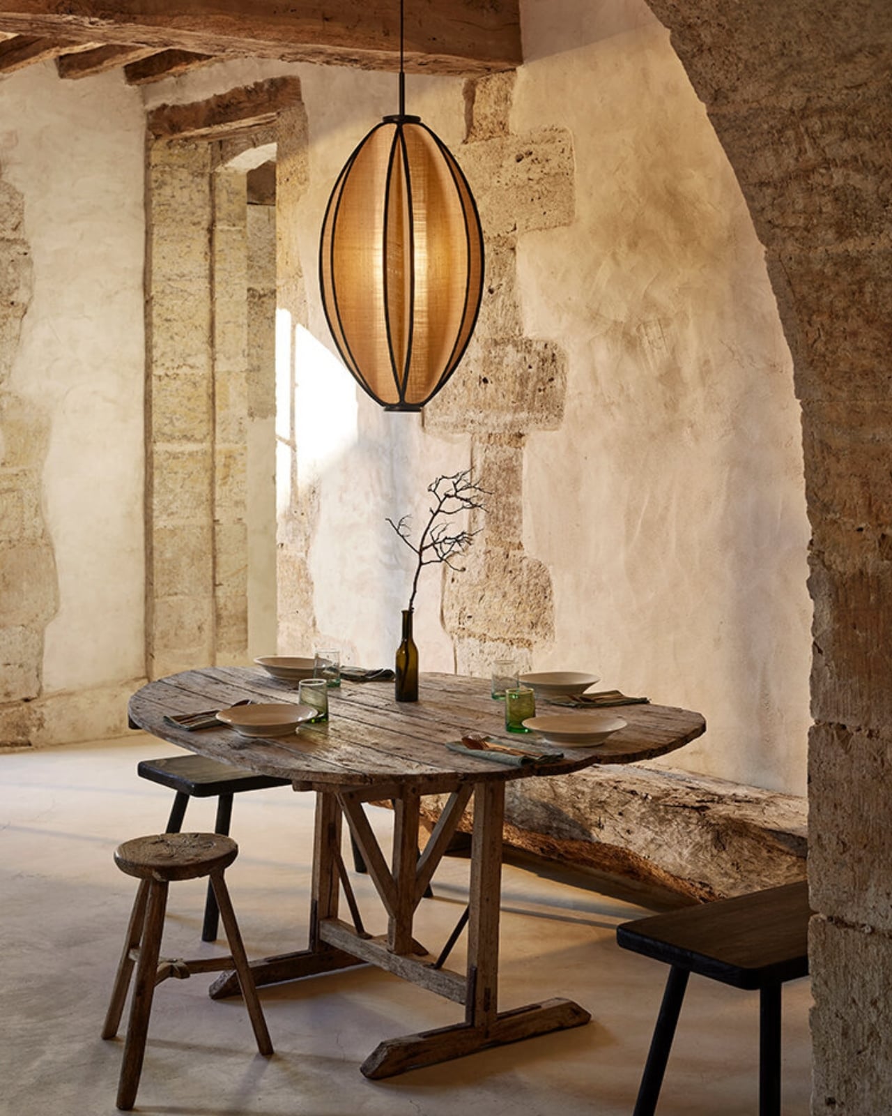
Solis is available in sizes from 40cm to 100cm in diameter, which makes it genuinely flexible. It can anchor a dining table or settle quietly in a corner without demanding attention. It reads well in both contemporary and rustic interiors without looking like it’s trying too hard to belong somewhere specific, which is rarer than it sounds in pendant lighting.

Design objects earn their place by doing more than filling space. The best ones shift your experience of a room, subtly enough that you might not even notice immediately. Solis does that. The light it casts is warm and a little sun-like. The form changes on you. The fiber holds the story of where it came from. That’s not a small thing for a pendant light to carry, and Scheib makes it look genuinely effortless.
The post Forestier’s New Solis Pendant Looks Like a Seed, Then a Star first appeared on Yanko Design.

Samsung Killed the Galaxy Note, but This S27 Concept Brings It Back

Samsung’s Ultra lineup has been on a gradual softening trajectory. The hard, squared-off corners that made early Galaxy S Ultra and Note phones feel deliberately architectural gave way to progressively rounder edges with each generation, culminating in the S26 Ultra’s fully rounded ergonomic corners. For users who preferred the original boxy confidence of those older devices, that direction has been a slow farewell to something they actually liked.

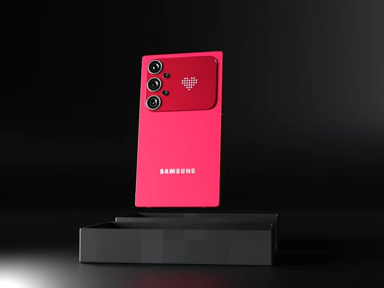
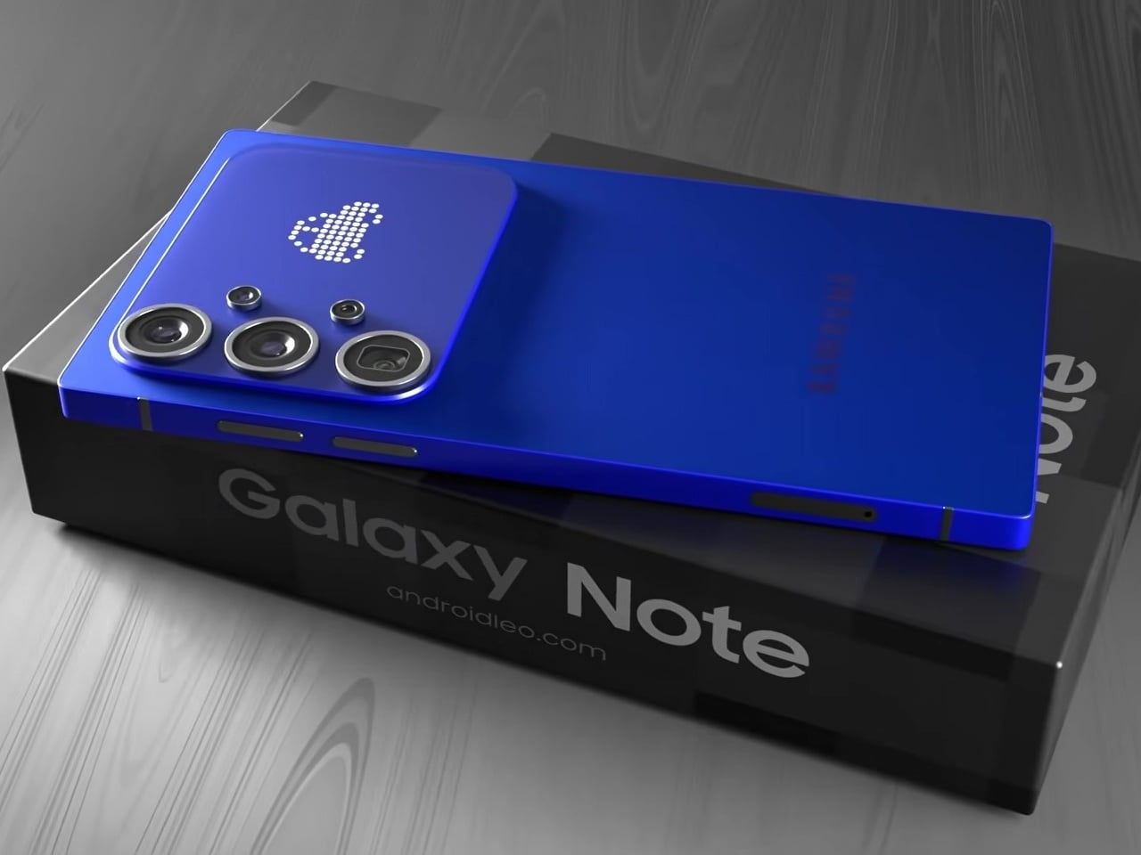
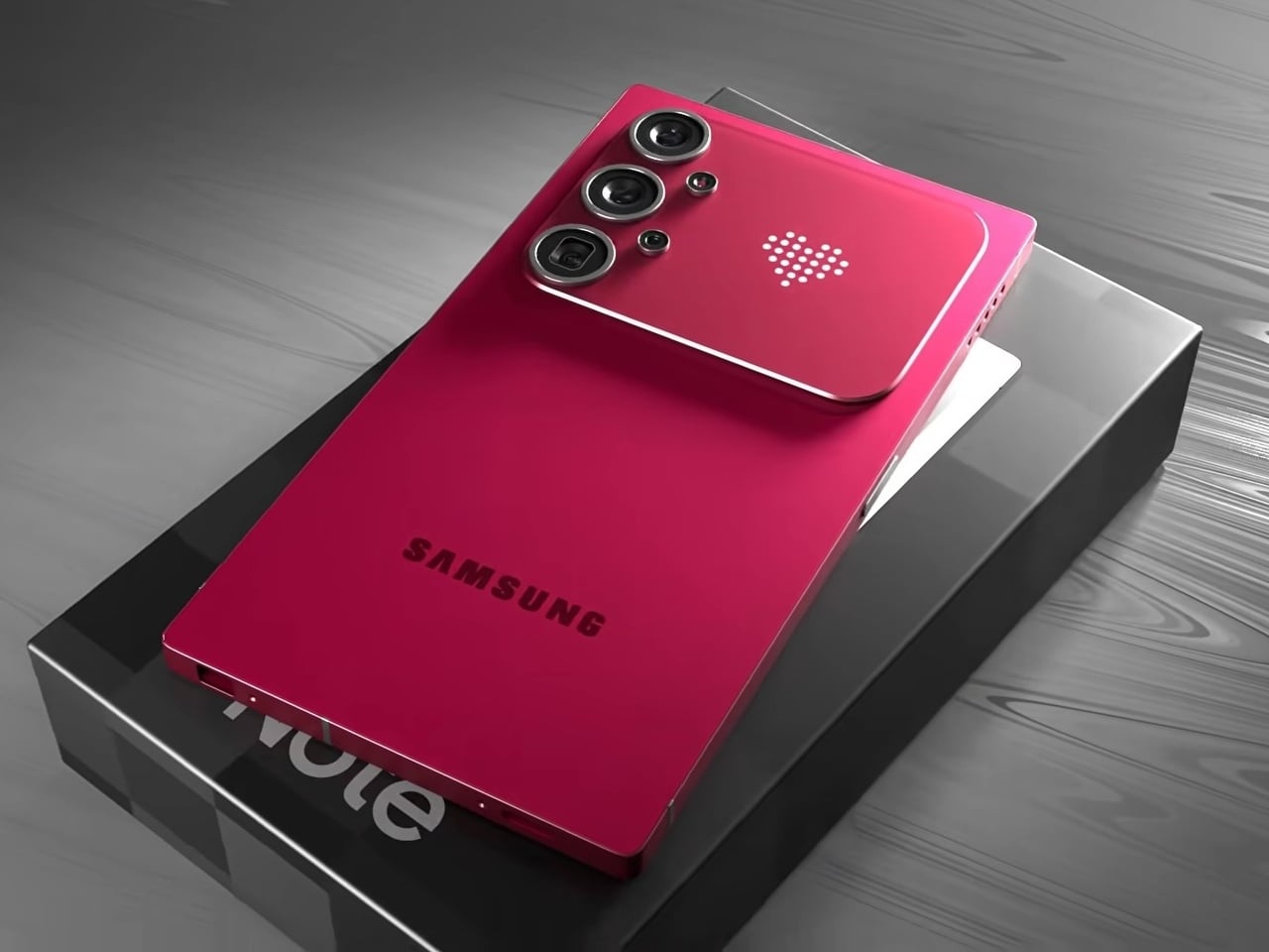
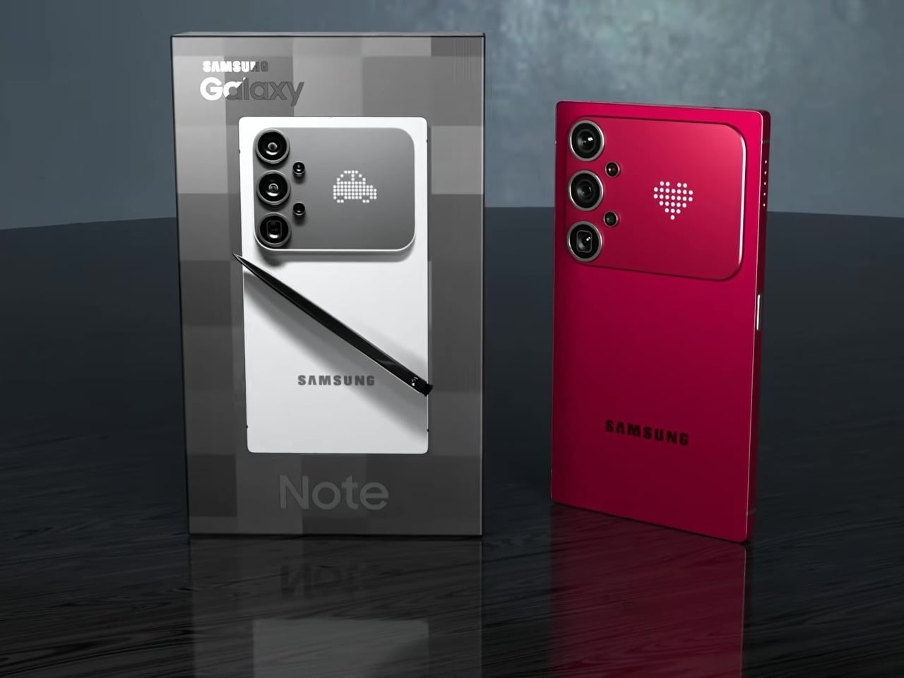
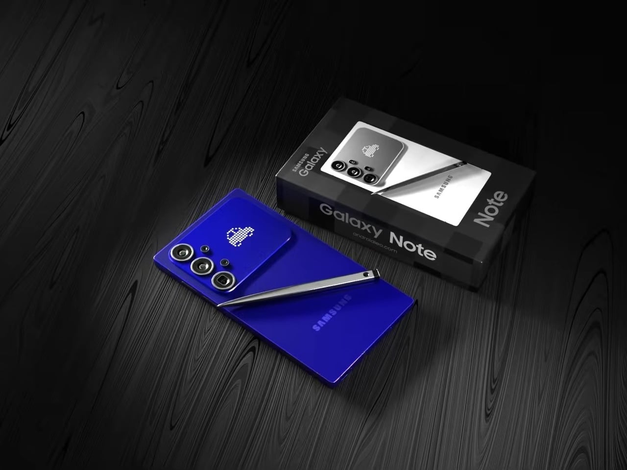
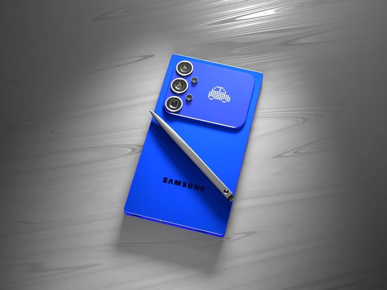
This concept for a Galaxy S27 Ultra reverses that. The sharp 90° corners are back, along with flat top and bottom edges that give the phone a distinctly geometric presence. The “Galaxy Note” name appears on the packaging, framing this as a full revival of Samsung’s discontinued productivity flagship identity rather than just another Ultra iteration. It’s a design argument about what the phone should have stayed.

Designer: AndroidLeo

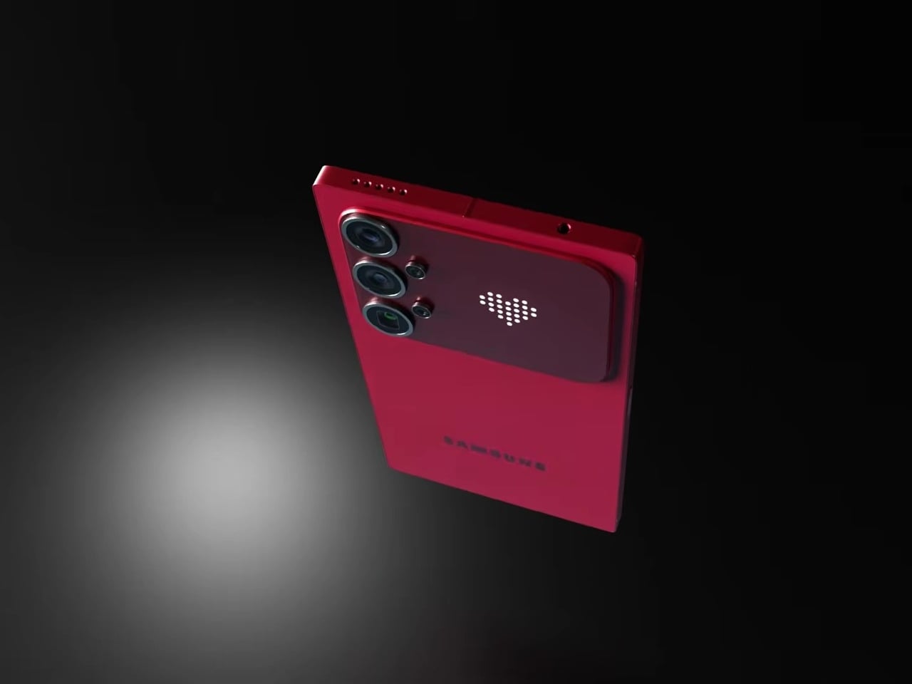
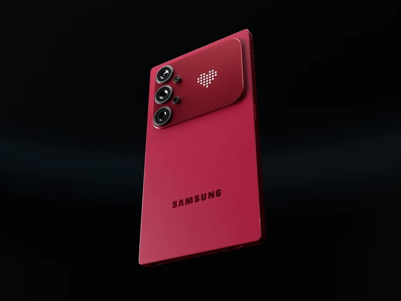
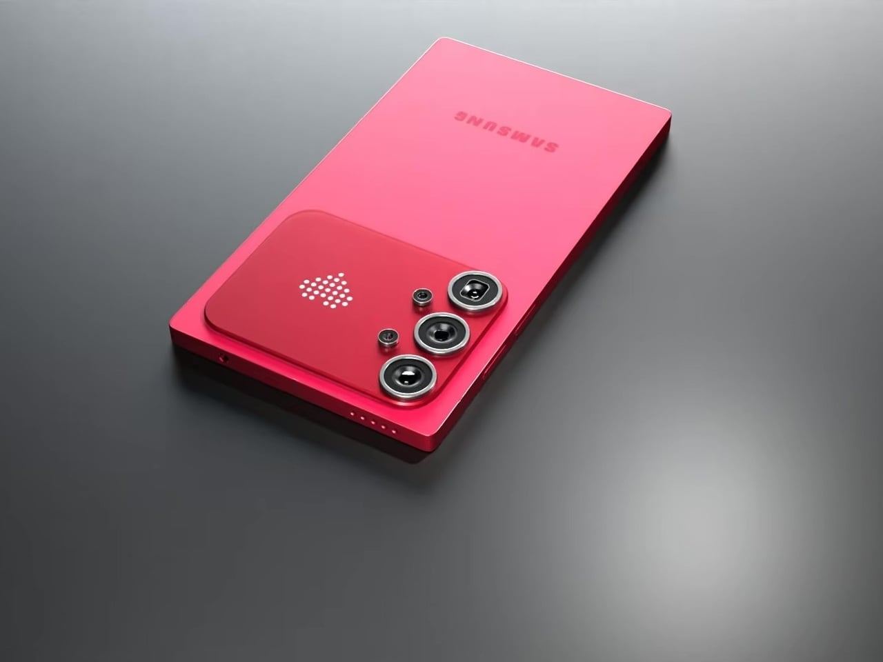
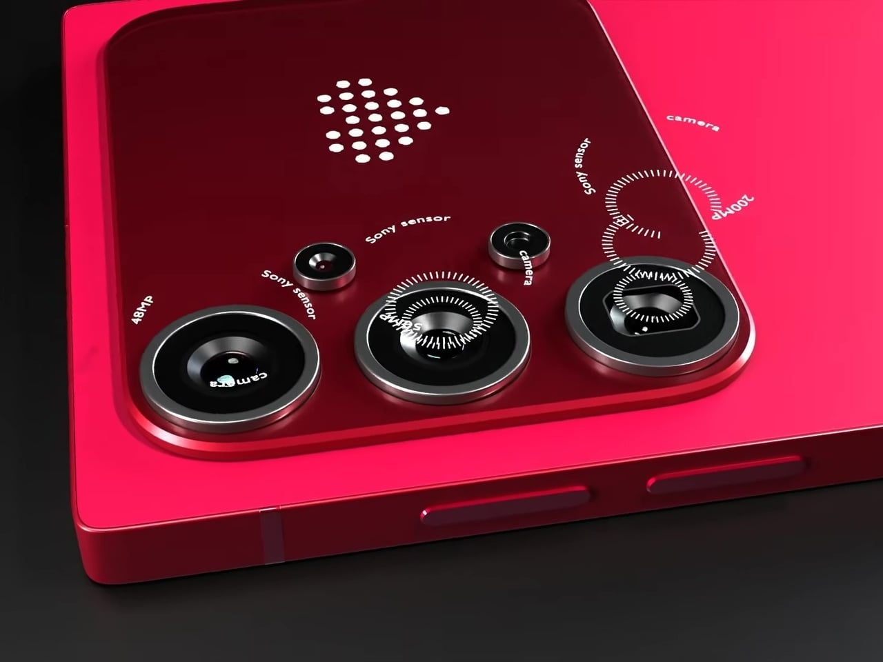
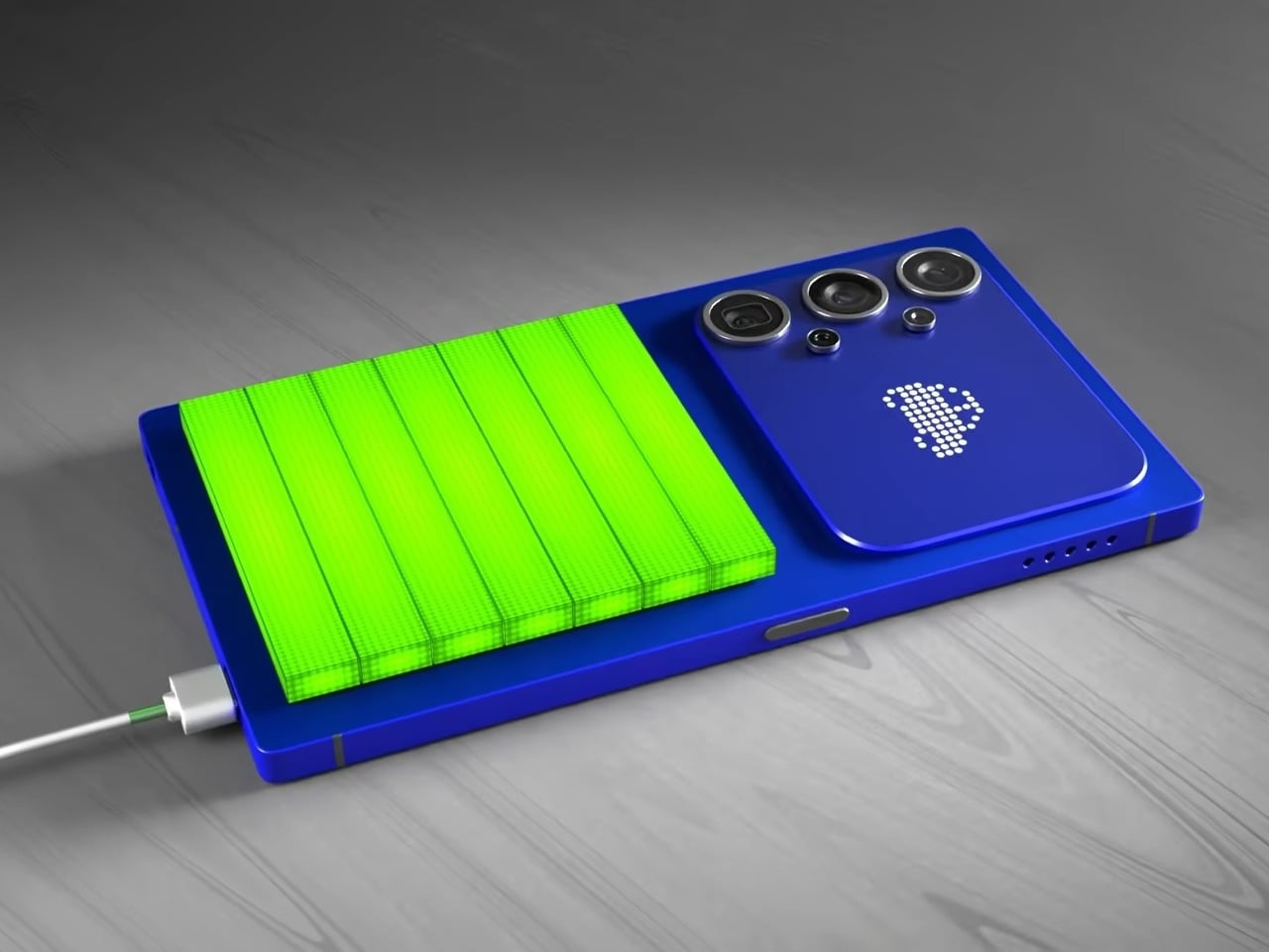
The most unexpected element on the back isn’t the camera. Nestled beside the vertical triple-lens array is a dot-matrix LED display that shows customizable pixel art animations, swapping between icons as conditions change. It’s the same logic that Nothing applied with its Glyph Matrix and that ASUS uses on ROG devices: the back of a phone has real estate that can do something, and simply leaving it matte glass feels increasingly like an opportunity missed.

In practice, that small display becomes a second layer of expression without pulling attention away from the main screen. Notification icons, charge indicators, and personalizable graphics all live on a surface that’s visible when the phone rests face down or sits on a desk, the exact moment when the front display is least useful. The concept proposes this as an attention filter as much as a personalization feature.

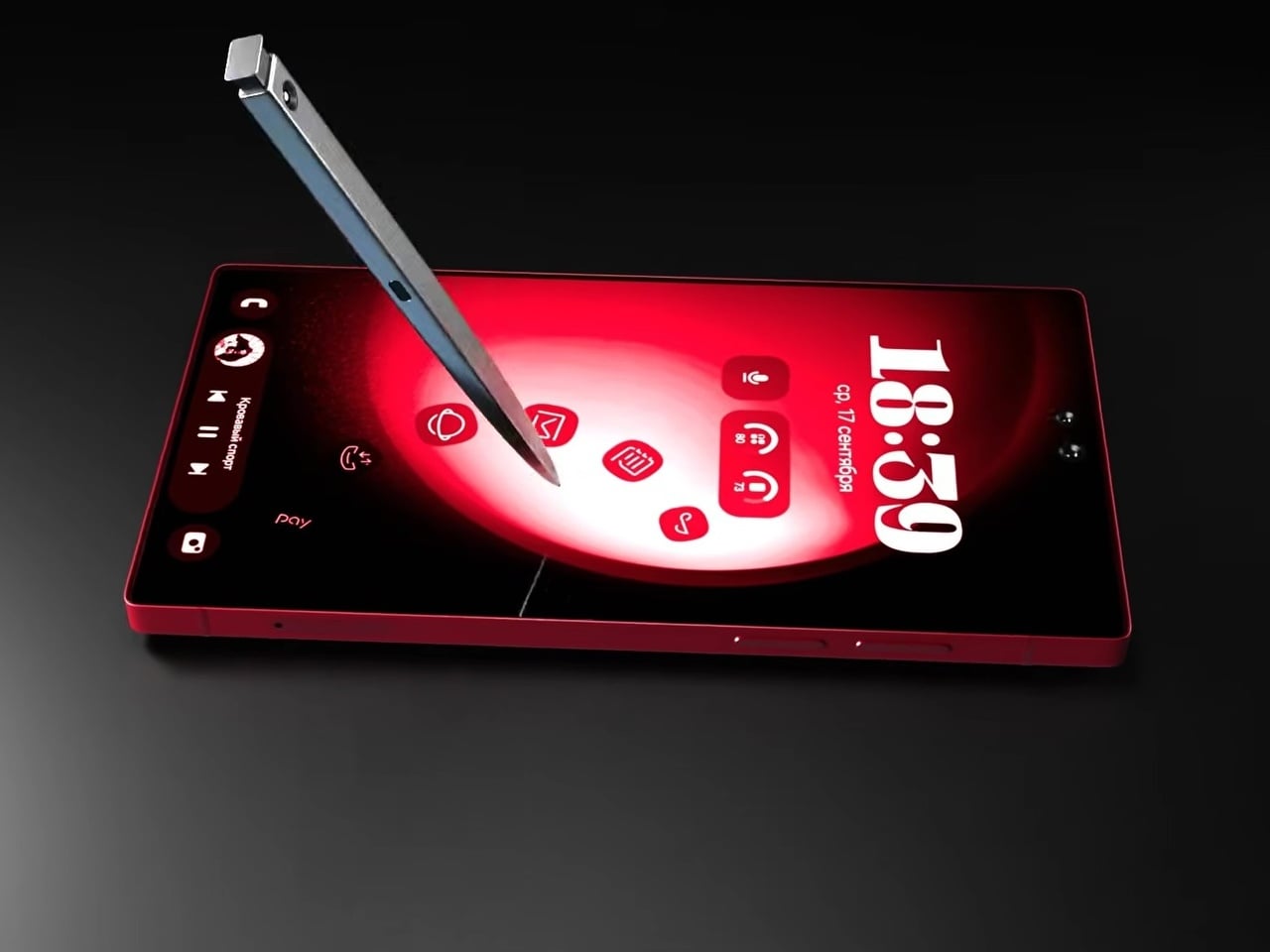
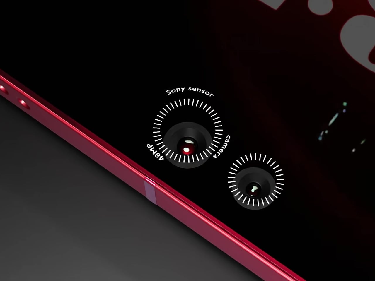
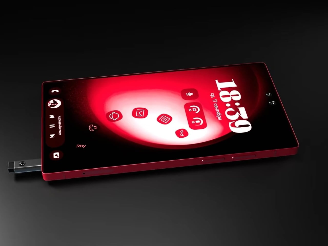
The S Pen slots into the bottom rail via a spring-ejected silo, appearing chunkier than the slim stylus Galaxy Note and Ultra users are familiar with, which may be more a rendering artifact than an intended design change. The front is a flat, edge-to-edge panel with a dual punch-hole selfie camera configuration at the top center, serving the kind of stylus-optimized interface that the Note series built its identity around. The high-contrast red UI reads as purpose-designed for wide-open canvas navigation.

Camera specifications go ambitious: a 200MP main sensor paired with 48MP Sony sensors and periscope telephoto optics round out the vertical lens configuration. The USB-C port, notably, isn’t centered on the bottom edge, a small but visible deviation from convention. And this is where the whimsical and fantastical nature of the design shows through.

None of this is real, of course. Samsung hasn’t announced any plans to revive the Note name, and the dot-matrix display exists in the realm of render enthusiasm rather than confirmed engineering. What the concept captures is a reasonable frustration: the Ultra line has drifted from the qualities that made it distinct, and features appearing elsewhere, like Nothing’s Glyph Matrix, suggest the broader market hasn’t fully moved past wanting the back of a phone to say something.

The post Samsung Killed the Galaxy Note, but This S27 Concept Brings It Back first appeared on Yanko Design.
The $499 E Ink Tablet That Runs Spotify, WhatsApp and Doesn’t Hurt

Screens have been the unresolved tension at the center of productivity for years. LCD and OLED displays do everything well except the one thing that matters most during a long reading or writing session: they don’t stop being screens. The brightness, the blue light, and the glare accumulate into eye fatigue that most people simply accept as part of working on a device all day. E Ink tablets have addressed that problem, but historically at the cost of color and app freedom.

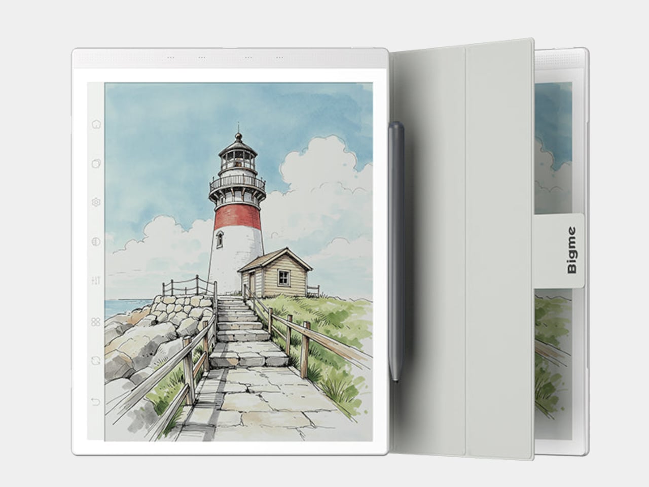
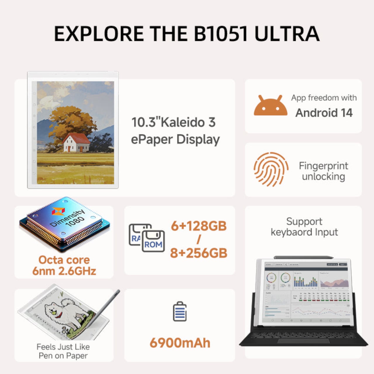
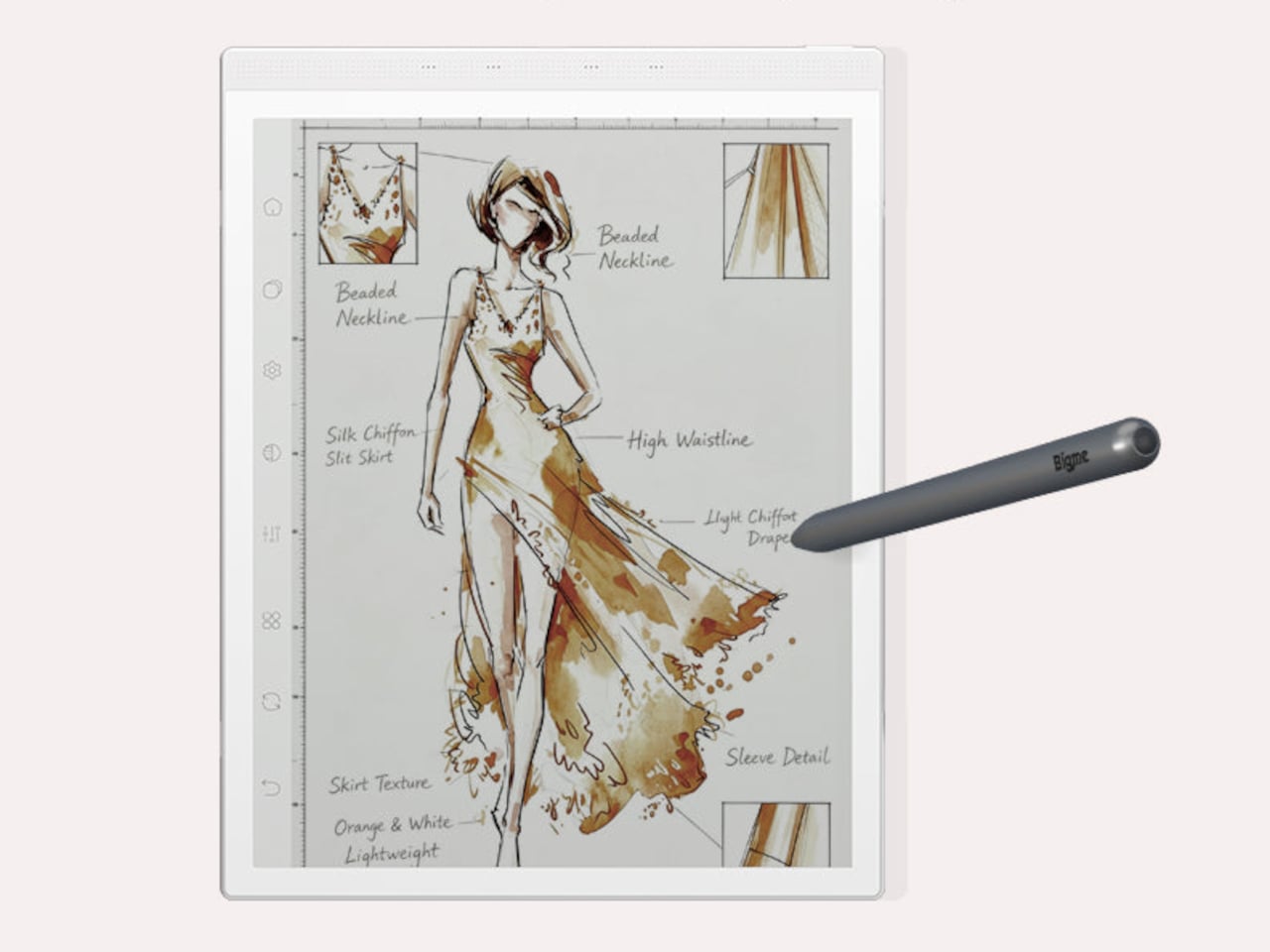
The Bigme B1051 Ultra is built on the premise that none of those trade-offs need to be permanent. Its 10.3-inch Kaleido 3 E Ink display is color-capable and glare-free, with an adjustable front light covering 36 levels of brightness in both warm and cool tones. The result is a surface that handles illustrated documents, annotated PDFs, and color-coded spreadsheets without sending the wearer reaching for eye drops an hour in.

Designer: Bigme

Color E Ink of any generation has historically been limited in brightness and saturation compared to traditional displays, and the Kaleido 3 panel doesn’t fully close that gap. What it does deliver is a dramatically more comfortable reading experience for long sessions, particularly in well-lit environments where conventional displays produce the most glare. For documents, annotations, and notes, the color rendering is more than sufficient to make the information readable without eye strain.

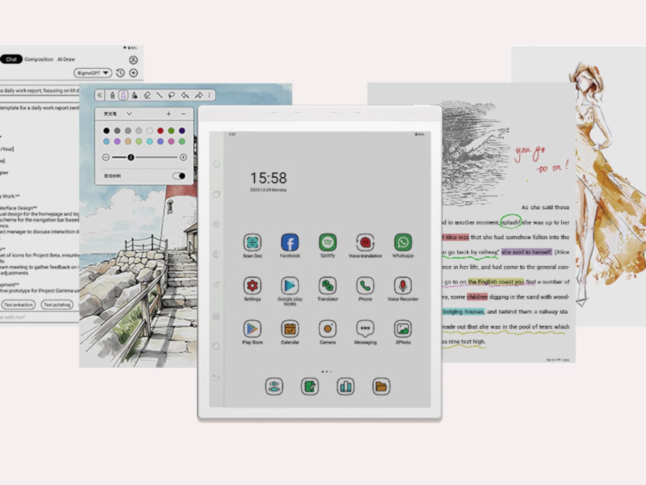
The hardware underneath is capable enough to run Android 14 without compromise. A MediaTek Dimensity 1080 octa-core chip running at 2.6GHz with up to 8GB of RAM handles third-party apps from Google Play without the sluggishness that plagued earlier E Ink Android devices. Spotify works. WhatsApp runs. The Google Play Store is fully accessible. A 6,900mAh battery supports the kind of all-day use the form factor implies.

Writing and sketching feel natural on the included stylus, which offers 4,096 levels of pressure sensitivity and a surface friction designed to replicate paper. An annotated legal document, a fashion sketch with labeled callouts, or a watercolor illustration all sit on the display with the same kind of grainless, paper-like quality. Bigme’s auto ghosting elimination technology handles the visual artifacts that have historically made fast stylus input on E Ink screens feel laggy or muddy.

The optional keyboard folio cover turns the B1051 Ultra into something that reads more like an e-paper laptop. A trackpad is built into the keyboard, and the folio supports dual-angle positioning for desk and lap use. Connecting to an external keyboard and looking at a dashboard of charts and figures across the full 10.3-inch surface is a different experience from doing the same work on an LCD that competes with every other light source in the room.

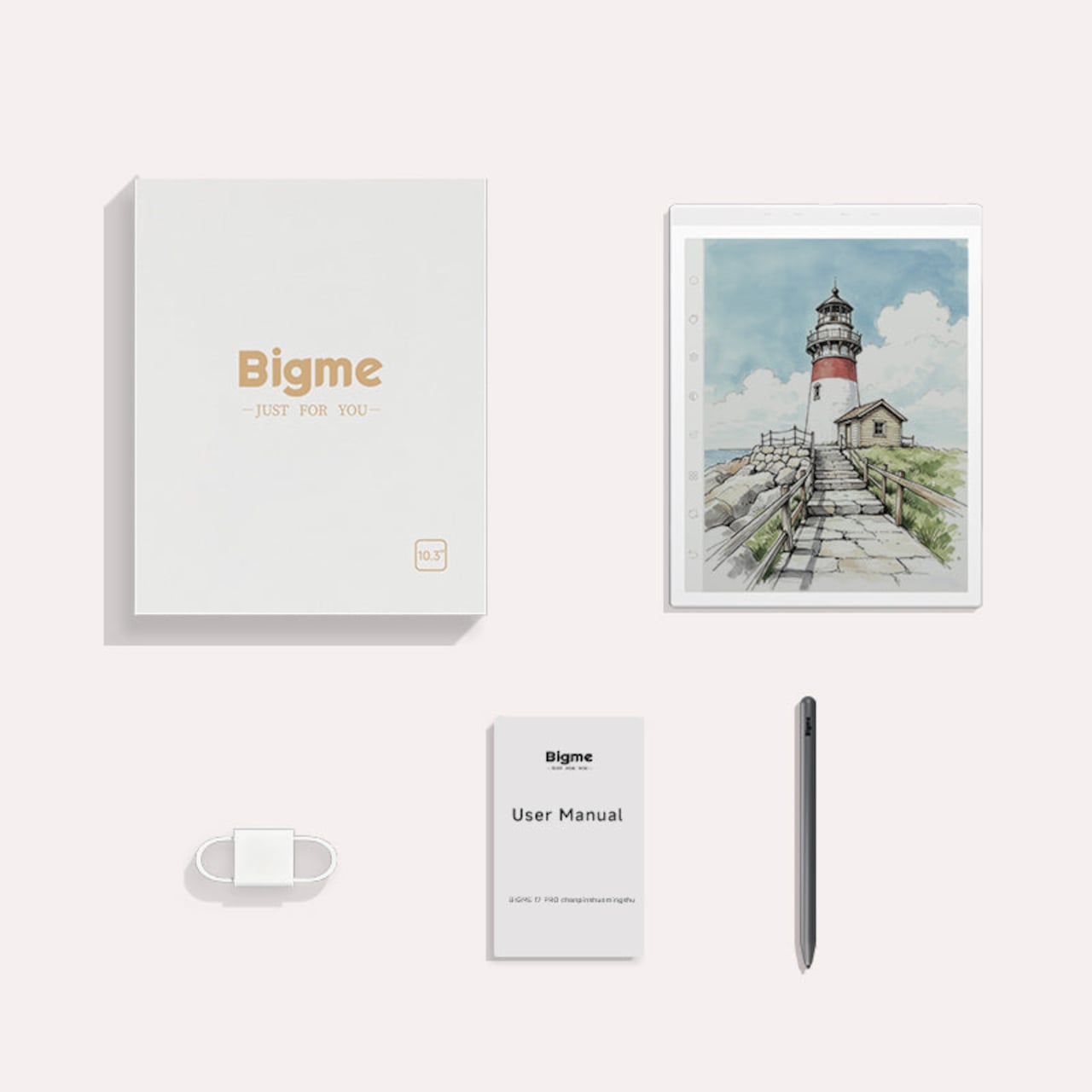
Integrated AI tools extend beyond the display and stylus. Text extraction, text polishing, AI-assisted drawing, and composition features are baked into the software layer. Fingerprint unlocking handles access. The B1051 Ultra is available starting at $499 for the device-and-case bundle, with the keyboard configuration adding to that. E Ink has always been the right technology for certain kinds of work, and the Bigme B1051 Ultra is one of the more complete arguments that it doesn’t need black-and-white e-readers to make that case convincingly.

The post The $499 E Ink Tablet That Runs Spotify, WhatsApp and Doesn’t Hurt first appeared on Yanko Design.