Wacaco Minipresso GR2: Better Coffee in a Smaller, Lighter, Portable Design

Good things take time. Whether it’s waiting minutes while your coffee brews, waiting weeks for new episodes of your favorite series, waiting years for tech to improve, or in the case of Wacaco, waiting 10 long years for their award-winning Minipresso to get its much-needed upgrade. Since its launch in 2014, the Minipresso has been perhaps the gold standard in outdoor portable espresso brewing. Wacaco designed the entire gizmo from the ground up, with a patented pressure-building system that worked without batteries. The Minipresso ran entirely on kinetic energy, using a hand-powered pump to generate up to 8 bars of pressure for the perfect brew. 10 years later, the Minipresso GR2 makes its debut, with a smaller, lighter design that accepts more coffee grounds than before, giving you more brew for your buck. It still runs on its classic hand-pumped design, but now also uses eco-friendly biomaterials in its design that reduce plastic consumption and waste.

Designer: Wacaco

Click Here to Buy Now: $59.90

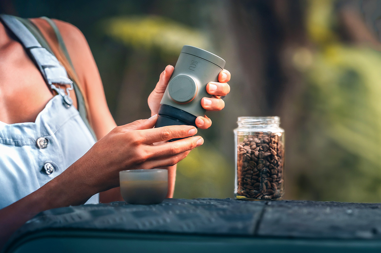
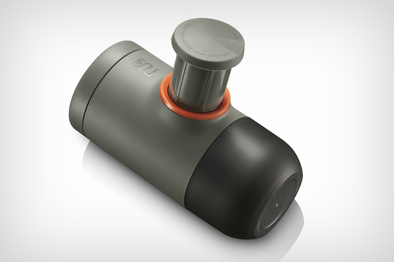
The challenge with the Minipresso GR2 was to pretty much create a version 2.0 of a product that was already pretty perfect. The first-edition Minipresso GR still is impressive for its size and capabilities, so going back to the drawing board wasn’t about problem-solving, it was about design-refinement and feature-addition. The Minipresso GR2 is now a whopping 5cm or 2 inches shorter than its predecessor, making it shorter than the average smartphone at just 4.9 inches in height. Designed originally for travel and outdoor use, this tinier design makes it much more space-efficient, allowing it to fit into handbags, backpacks, travel cases, duffels, or even in a jacket pocket for you to carry around. The smaller design is lighter too, weighing 285 grams or 0.63 lbs, but the small size doesn’t necessarily mean less coffee… in fact, it’s quite the opposite.

The Minipresso GR2 embodies user-friendliness, sturdy materials, and an elegant design, ensuring a flawless espresso brewing experience with every use.

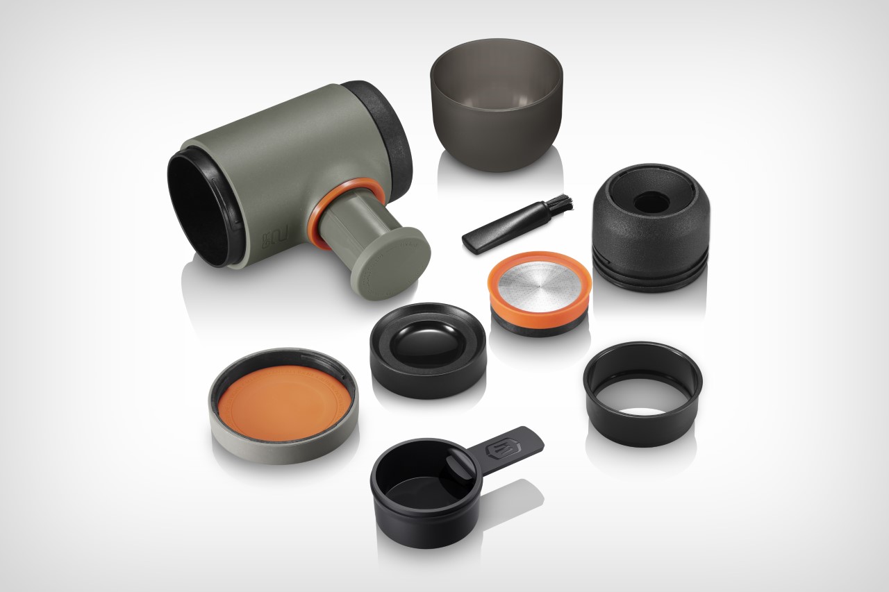
While the previous Minipresso GR accepted only 8 grams of coffee in its basket, the GR2 gives you the option of loading 12 grams of coffee grounds in for a stronger shot of espresso. The basket comes with a modular, height-adjustable design, letting you load either 8 or 12 grams of coffee into its basket. Depending on whether you like your coffee regular or strong (also depending on the roast you load into the Minipresso GR2), you have the option of brewing a lighter or bolder cup of coffee. The user experience is further enhanced with the integration of a water tank that also includes a dosing funnel and a drip tray.

This cutting-edge portable espresso maker incorporates our most advanced pumping system, which results from years of experience and innovation, ensuring optimal extraction efficiency.

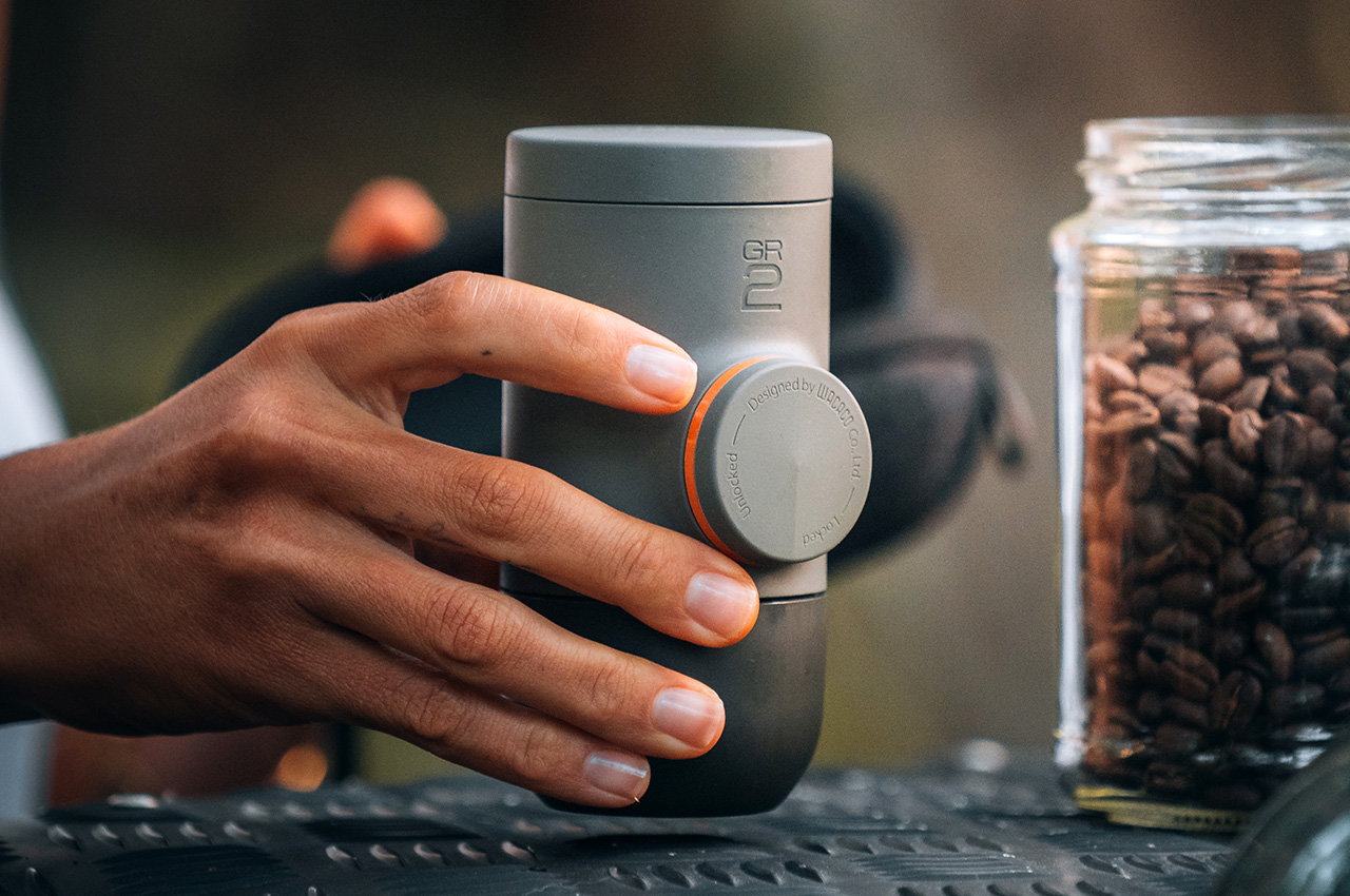
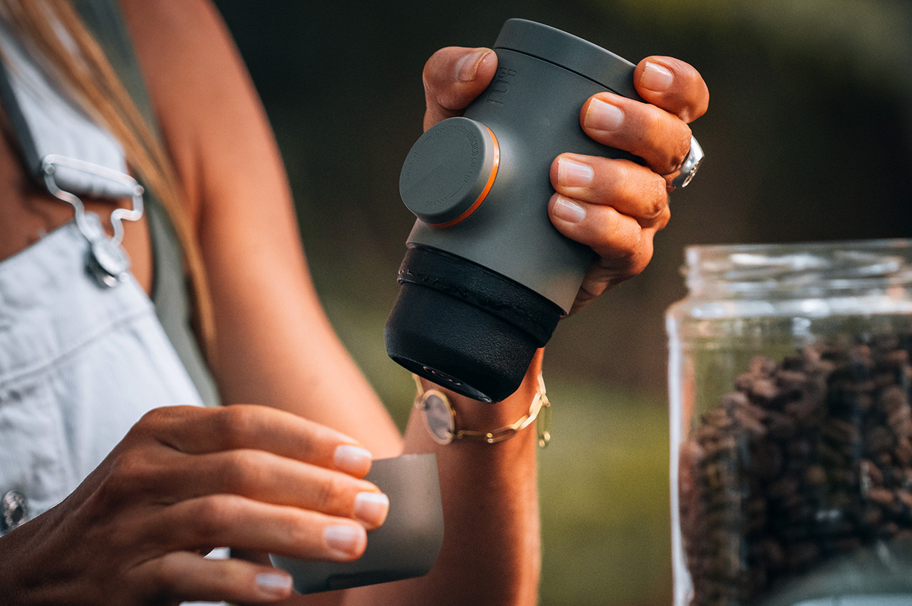
Brewing with the Minipresso GR2 hasn’t changed at all, helping users adjust to the newer design with no learning curve. The Minipresso GR2 disassembles to reveal its multiple parts. The upper double-walled flask holds up to 80ml of hot water, while the basket below it carries the coffee grounds. To brew your coffee, set up the pump by twisting it to have it pop out. Pump the Minipresso a few times to build the pressure needed for the espresso to brew perfectly, and use the included lid as an espresso cup to extract your coffee into. The process takes under a minute, and can be done without batteries or electricity, letting you brew fresh coffee on a beach, a campsite, a mountaintop, or heck, even inside an airplane so you don’t pay for the overpriced coffee they serve on flights.

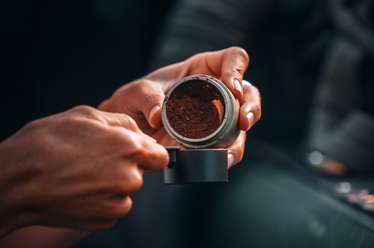
Measure your coffee.

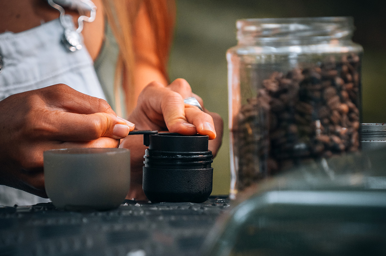
Get your coffee fix ready.
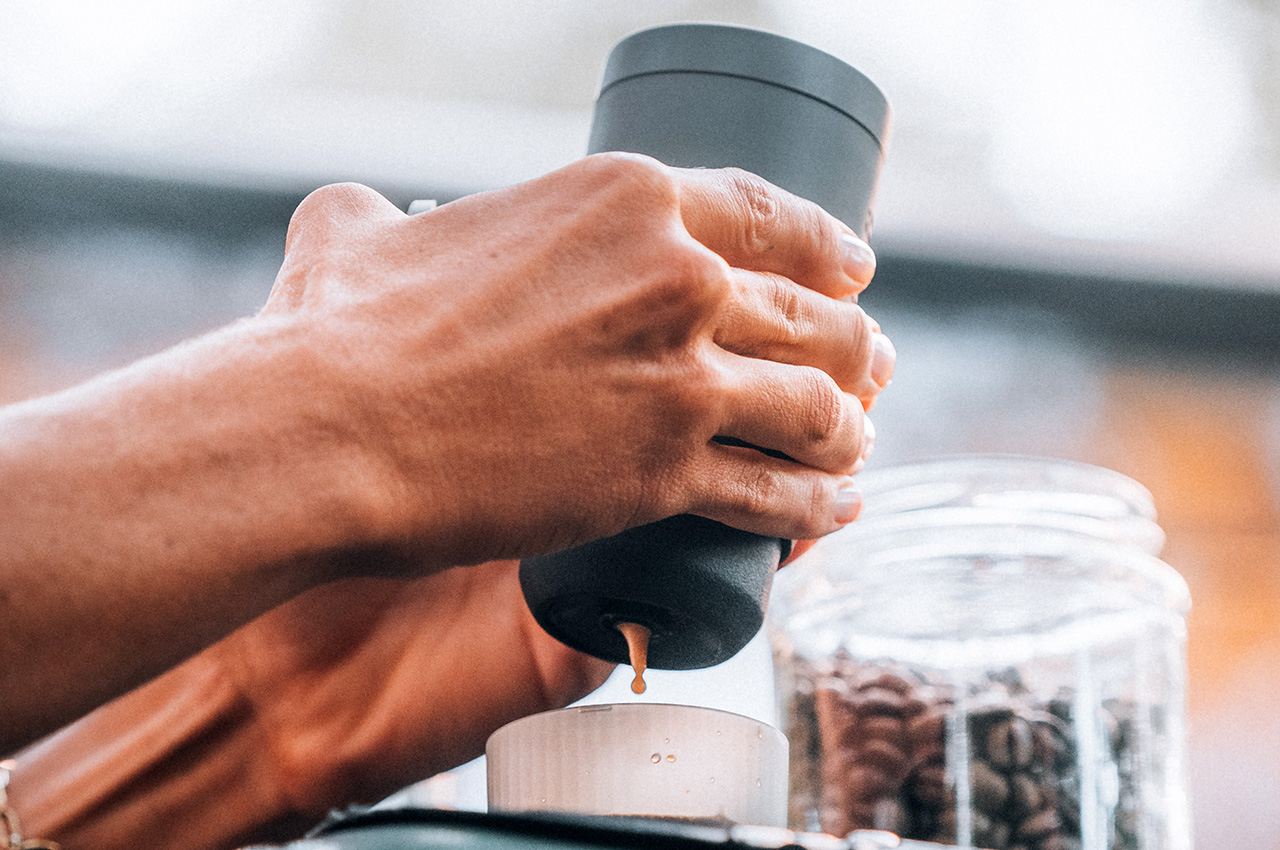
Enjoy your drink.

The tinier Minipresso GR2 comes with a new design too, boasting cleaner surfaces, minimal details, and an easy-to-clean format that makes maintenance a breeze. The double-wall design helps keep the hot water inside the Minipresso GR2 hot, while keeping the outer surface cool so you can brew your coffee without having to deal with a hot or warm device. The outer shell is also made from a new wheat-composite polymer as opposed to traditional petrochemical-based plastics. This bioplastic, along with the 30% smaller size helps the Minipresso GR2 have a much smaller climate impact than its predecessor… all while letting you brew more, better, stronger coffee. I guess that’s something worth waiting a few years for, right?
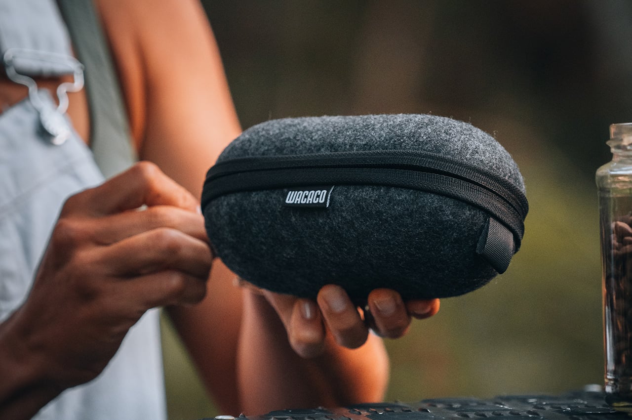
Handy cover.

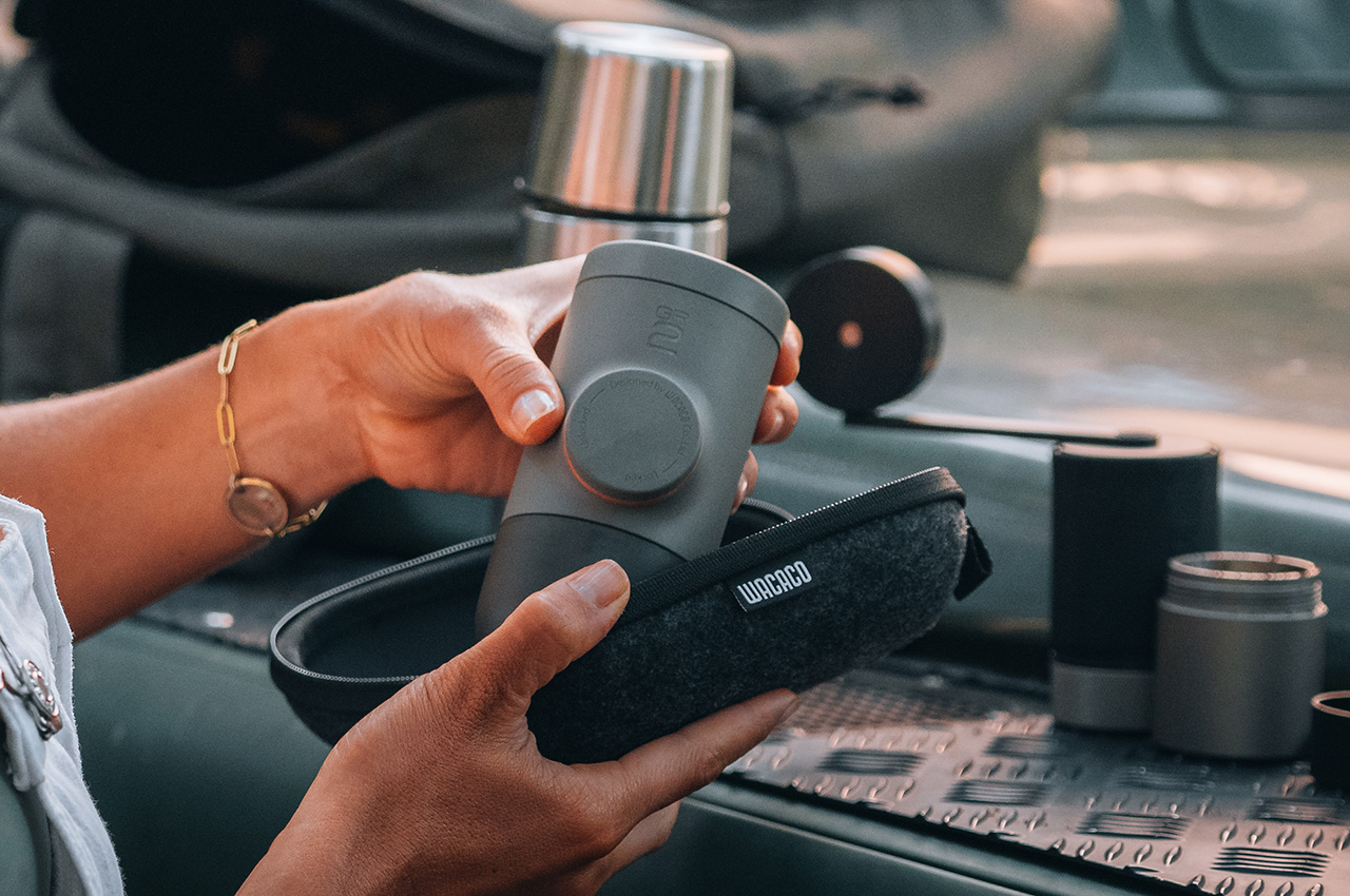
Photo credit: Garance Rx

Click Here to Buy Now: $59.90

The post Wacaco Minipresso GR2: Better Coffee in a Smaller, Lighter, Portable Design first appeared on Yanko Design.

LEGO Downton Abbey Set comes with detailed Minifigure cast and replica of Highclere Castle

Just in time to celebrate the show’s 15th anniversary next year, LEGO builder BRO3 decided to pay homage to historical drama series Downton Abbey with a dedicated LEGO set. The LEGO Ideas Downton Abbey set comes with an incredibly detailed build of the old Highclere Castle, along with all its occupants from the vast Crawley family to the butlers and castle caretakers who make up the cast of the show. The detailed model comes with multiple rooms, up to 15 minifigures (16 if you include the dog Pharoah), and even Lady Mary’s bench – an iconic part of the series!

Designer: BRO3

Although LEGO builder BRO3 doesn’t mention how many bricks make up the Highclere castle, it’s an impressively detailed piece of work, capturing the Jacobean architectural style that made its appearance during the Victorian periods. The castle exists even today, although the series depicts a fictional setup featuring the influential Crawley family. The front facade is remarkably intricate, with the grand entrance that opens to let the characters in.

Flip the castle over and you’re treated to 5 main rooms and 6 mini rooms that your characters can sit in. The main rooms include the Dining room, Kitchen, Lady Mary’s room, Guest room, and the Servants’ quarters. The smaller rooms located in the towers include Carson’s office, along with 5 other empty rooms that you can use to store minifigures that aren’t in use.

The 15 minifigures include the usual suspects of the series, from the 7 members of the Crawley family and Tom Branson (Lady Sybil’s husband), to the 7 staff members of the castle, including butlers, cooks, housekeepers, and the valet.

Lady Mary’s bench also gets its own mini build, paying tribute to the bench that has been a staple to many conversations, sage pieces of advice, and even brewing relationships! “I wanted to breathe the spirit of the place into the model, so I chose a heart-shaped plate and decorative bench handles,” says BRO3.

The LEGO Downton Abbey set is currently a fan-made submission on the LEGO Ideas website – a forum for LEGO builders to create their own unique builds and vote for their favorites. With 2,000 supporters, this MOC (My Own Creation) is slowly picking up traction, and if it hits the coveted 10,000 vote mark, LEGO’s internal team will review it with the possibility of also turning it into a box set! If you want to own your own replica of Highclere Castle and its residents, vote for the submission on the LEGO Ideas website here!

The post LEGO Downton Abbey Set comes with detailed Minifigure cast and replica of Highclere Castle first appeared on Yanko Design.

Le Creuset is launching Pokémon-themed cookware in Japan and I’m extremely jealous

Gotta Cook ’Em All!

An unlikely collaboration between two brands that have millennials obsessed, Le Creuset and the Pokémon company have joined forces to drop a limited-edition cookware collection featuring the iconic pocket monsters we know and love. From dutch ovens and saucepans to even kettles, plates, and cups, the Le Creuset x Pokémon collection artistically hat-tips Nintendo’s classic alternate-universe game, with Poke-ball-shaped plates, and Pikachu-themed pots. Don’t worry, no Pokémon was harmed in the making of this collection! The only thing being harmed are probably users around the globe that will probably never get to own any of this cookware given its limited-edition release only in Japan.

Designer: Le Creuset

The star of the show is likely to be the sunshine-yellow Cocotte cooking pot, featuring the instantly recognizable lightning bolt tail of Pikachu. Meanwhile, the black Marmite pot features a subtler nod to the franchise, with outlines of the original starter Pokémon – Bulbasaur, Charmander, and Squirtle – etched onto the lid alongside Pikachu and Snorlax.

Le Creuset isn’t stopping at pots. The collection also boasts a range of tableware, featuring colorful stacking mugs, plates, and rice bowls decorated with silhouettes of popular Pokémon characters like Pikachu, Snorlax, and the original starters. The playful touch continues with plates designed to resemble Poké Balls and Master Balls, the iconic tools used by Pokémon trainers to capture and store their companions.

The collection’s appeal extends far beyond its charming design. Le Creuset emphasizes the line’s potential to bring families together in the kitchen, with children likely to be drawn to the familiar characters. However, judging by the buzz on the Le Creuset subreddit, adults are just as eager to get their hands on these unique pieces.

With a limited release planned for select regions and a two-drop rollout across July and November, the Le Creuset x Pokémon collection is poised to become a collector’s item. It’s a clever collaboration that injects a dose of nostalgia and playful design into the kitchen, proving that even the most well-established brands can find innovative ways to engage with their audience.

The post Le Creuset is launching Pokémon-themed cookware in Japan and I’m extremely jealous first appeared on Yanko Design.

Mitsubishi Kaminari Concept: A Powerful Vision for the Future of Electric SUVs

Forget everything you thought you knew about SUVs. The Mitsubishi Kaminari concept is a breath of fresh air, a bold vision for electric vehicles that can conquer any path. The name “Kaminari” translates to “thunder” in Japanese, perfectly capturing the essence of this powerful and rugged concept. The design draws inspiration from classic Mitsubishi vehicles like the 1937 PX33, Japan’s first all-road car. This connection to the past ensures that the Kaminari feels like a true evolution of Mitsubishi’s DNA.

Designer: Stefan Syarov

Syarov dubs the Kaminari as a PUV or Performance Utility Vehicle. From the very outset, Syarov’s goal was to design a car that pushes off-road performance limits while honoring Mitsubishi’s proud history. The Mitsubishi Kaminari draws inspiration from the brand’s rich off-road racing heritage. Classic vehicles like the 1937 Mitsubishi PX33, Japan’s first all-road car, informed the design. This homage to legendary Mitsubishi models ensures the Kaminari respects the brand’s legacy while offering a thoroughly modern take on the off-road adventure vehicle.

The Kaminari’s silhouette boasts a bold presence with a dramatically sloped A-pillar flowing into a sleek, coupe-inspired roofline. A distinctive rear wing integrated seamlessly into the roof adds a touch of dynamism without sacrificing passenger headroom. This design journey, from initial sketches to final form, involved meticulous refinement. Collaboration with the Mitsubishi team during Syarov’s internship led to key improvements, including retaining the functional headroom spoiler, reinforcing the dynamic underbody protection, and incorporating unique design cues that echo Mitsubishi’s off-road heritage.

The spirit of collaboration is evident throughout the Kaminari’s development. The designer actively incorporated feedback from Mitsubishi enthusiasts worldwide. This two-way dialogue resulted in a concept that reflects not just the brand’s vision but also the desires of its loyal fanbase. Although the Kaminari isn’t an official Mitsubishi concept, it highlights what the brand has stood for all these years, while also envisioning what the brand could have been in an alternate reality where cars were designed not just for roads, but to dominate any surface they drove on.

Via Automotive Design Planet

The post Mitsubishi Kaminari Concept: A Powerful Vision for the Future of Electric SUVs first appeared on Yanko Design.

ADAM elements Ultra-Slim MagSafe Power Bank for iPhone – 5000mAh & Dual-Device Charging

Sort of like a Gatorade but for your phone, the GRAVITY C5 MagSafe Power Bank from ADAM elements gives your smartphone a burst of energy just when it’s down. Equipped with a 5000mAh battery on the inside, the GRAVITYC5 snaps to the back of your phone, wirelessly charging it to keep you going. It’s sort of like giving your phone an extra battery, without cables or charging bricks. Moreover, this ultra-slim power bank boasts a mere 8.7mm in thickness, making it easy to slip into a pocket, bag, or purse without adding bulk.

Designer: ADAM elements

Click Here to Buy Now: $58.65 $69 (15% off with coupon code “15OFFGC5AE”). Hurry, deal ends in 48-hours!

The MagSafe-compatible GRAVITY C5 boasts dual charging functionality, offering both 15W wireless charging and 20W USB-C wired fast charging. This allows you to power up two devices simultaneously, perfect for keeping your phone and wireless earbuds juiced on the go. The 5000mAh lithium battery packs enough punch to keep your devices running through a busy day, making it a reliable companion for travelers, commuters, or anyone who needs to stay connected.

Designed to be slimmer than your smartphone, the GRAVITY C5 snaps right to the back of your device, charging it even through MagSafe-compatible cases. Its slick profile makes it a dream to carry around, whether it’s in your backpack, in your pocket, or even attached to your phone. Rounded edges means the GRAVITY C5 slips right into your pocket without getting caught on the lining, something other bulkier sharper power banks tend to do as you put your phone into your pocket with the power bank attached.

The GRAVITY C5 sports a slick machined aluminum outer cover that allows it to match up to the metallic finish on the back of Pro iPhones. It does, however, also sport a range of anodized color options that give you a variety to choose from, so you’re not stuck with a plain black, white, or silver variant. The power bank comes in five colors – Pink, Blue, Purple, Red, and Gray – allowing you to choose a shade that matches your style. On the inside, it’s equipped with over-current protection (OCP), over-voltage protection (OVP), and Foreign Objects Detection (FOD). These features safeguard your devices against potential damage during charging, offering peace of mind.

The ADAM elements GRAVITY C5 is priced at $69, but YD readers can grab it for a discounted price of $58.65. For a complete charging experience, each package includes a storage pouch and a 200mm USB-C charging cable. Additionally, a one-year warranty provides assurance and reliable customer service.

Click Here to Buy Now: $58.65 $69 (15% off with coupon code “15OFFGC5AE”). Hurry, deal ends in 48-hours!

The post ADAM elements Ultra-Slim MagSafe Power Bank for iPhone – 5000mAh & Dual-Device Charging first appeared on Yanko Design.

What Apple’s WWDC got right… and what Google’s I/O got wrong

Exactly ten years ago, Google co-founder Sergey Brin jumped out of an airplane and parachuted down into a live event to present Google I/O. Cut to 2024, and Google arguably had one of the most yawn-inducing I/O events ever… but Apple, on the other hand, hat-tipped Brin by having senior VP of Software Engineering Craig Federighi jump out of a plane and parachute down into the Apple headquarters, kicking off the Worldwide Developer’s Conference (WWDC) event. If you were fortunate enough to sit through both Google’s I/O event for developers, and yesterday’s WWDC, chances are you probably thought the same thing as me – How did Google become so boring and Apple so interesting?

Google’s Sergey Brin skydiving into the I/O event wearing the radical new Google Glass in 2014

The Tale of Two Keynotes

Practically a month apart, Google and Apple both had their developer conferences, introducing new software features, integrations, and developer tools for the Android and Apple OS communities respectively. The objective was the same, yet presented rather differently. Ten years ago, Google’s I/O was an adrenaline-filled event that saw a massive community rally around to witness exciting stuff. Apple’s WWDC, on the other hand, was a developer-focused keynote that didn’t really see much involvement from the Apple consumer base. Google popularized the Glass, and unveiled Material Design for the first time, Apple, on the other hand, revealed OSX Yosemite and iOS 8. Just go back and watch the keynotes and you’ll notice how vibrant one felt versus the other. Both pretty much announced the same things – developer tools, new software versions, feature upgrades within first-party apps, and a LOT of AI… but Google’s I/O got 1.8 million views on YouTube over 3 weeks, and Apple’s WWDC sits at 8.6 million views in just one day. (As of writing this piece)

How Apple held the attention

Broadly, having seen both events, I couldn’t help but describe them differently. Google’s keynote seemed like a corporate presentation. Apple’s keynote felt like an exciting showcase. The language was different, the visuals were different, but most importantly, the scenes were different too. Google’s entire I/O was held in person, while Apple did have an in-person event, but the keynote was televised, showing different environments, dynamic angles, and great cinematography. Both events were virtually the same length, with Google’s keynote being 1 hour and 52 minutes long, while Apple’s was 1 hour and 43 minutes. Honestly, after the 80-minute mark, anyone’s mind will begin drifting off, but Apple did a much better job retaining my focus than Google. How? Well, it boiled down to three things – A. a consumer-first approach, B. simplified language, and C. a constant change of scenery.

Notice Apple’s language throughout the presentation, and you’ll see how the entire WWDC rhetoric was user-functionality first, developer-feature second. Whether it was VisionOS, MacOS, iOS, WatchOS, iPadOS, or even TV and Music, Apple’s team highlighted new features that benefit all Apple users first, then mentioned the availability of SDKs and APIs to help developers implement those features in their apps too. One could argue that a Worldwide Developer Conference should inherently be developer-first, but hey, developers are going to watch the keynote regardless. The fact that 8.6 million people (mostly Apple users) watched the WWDC keynote on YouTube shows that Apple wanted to make sure users know about new features first, then developers get their briefing. The fact that a majority of viewers were users also boils down to Apple’s language. There was hardly any technical jargon used in the Keynote. No mention of how many teraflops are used by Apple’s GPUs while making genmojis, what version number Sequoia is going to be, or what Apple Intelligence’s context window is, or whether it’s multimodal. Simple language benefits everyone, whether it’s a teenager excited about new iMessage features, a filmmaker gearing to make spatial content using iPhones or Canon cameras, or a developer looking forward to building Apple Intelligence into their apps. Even Apple Intelligence’s user-first privacy features were explained in ways everyone could understand. Finally, Apple’s production quality helped visually divide the keynote into parts so the brain didn’t feel exhausted. All the different OS segments were hosted by different people in different locations. Craig Federighi and Tim Cook made multiple appearances, but shifted locations throughout, bringing a change of scenery. This helped the mind feel refreshed between segments… something that Google’s in-person keynote couldn’t benefit from.

Where Google dropped the ball

A keynote that’s nearly 2 hours long can be exhausting, not just for the people presenting but also for the people watching. Having the entire keynote on one stage with people presenting in person can feel exactly like an office presentation. Your mind gets exhausted faster, seeing the same things and the same faces. Google didn’t announce any hardware (like they’ve done in past years) to break the monotony either. Instead, they uttered the word AI more than 120 times, while being pretty self-aware about it. The lack of a change of scenery was just one of the factors that made Google’s event gather significantly fewer eyeballs.

Unlike Apple’s presentation, which had a very systematic flow of covering each OS from the more premium VisionOS down to the WatchOS, Google’s presentation felt like an unplanned amalgamation of announcements. The event was broadly about three things – Google’s advancements in AI, new features for users, and new tools for developers – but look at the event’s flow and it feels confusing. I/O started with an introduction where Pichai spoke about multimodality and context windows, then progressed to Deep Mind, then to Search (a user feature), then Workspace (an enterprise feature), then Gemini (a user feature again), then Android (which arguably was supposed to be the most important part of the event), and then to developer tools. An Android enthusiast wouldn’t be concerned with DeepMind or Google Workplace. They might find Search interesting, given how core it is to the Google experience, but then they’d have to wait through 2 more segments before the event even GOT to Android. Search and Gemini are highly intertwined, but they weren’t connected in the keynote – instead, there was an entire 13-minute segment on Workplace in between.

If all that wasn’t fatiguing enough, Google’s I/O tended to lean into technical jargon describing tokens, context windows, and how the multimodal AI could segment data like speech and videos, grabbing frames, finding context, eliminating junk data, and providing value. There was also a conscious attempt at showing how all this translated into real-world usage, and how users could benefit from this technology too, but not without flexing terms that developers and industrial-folk would understand.

Although it’s natural to read through this article and conclude that one company did ‘a better job’ than another company, that isn’t really the case. Both Apple and Google showcased the best they had to offer on a digital/software level. However, the approach to these keynotes has changed a lot over the last 10 years. While Google’s I/O in 2014 had a lot of joie de vivre, their 2024 I/O did lack a certain glamor. Conversely, Apple’s WWDC had everyone at the edge of their seat, enjoying the entire ride. Maybe you got tired towards the end (I definitely did mid-way through the Apple Intelligence showcase), but ultimately Apple managed to deliver a knockout performance… and that’s not me saying so – just look at the YouTube numbers.

The post What Apple’s WWDC got right… and what Google’s I/O got wrong first appeared on Yanko Design.

IKEA VAPPEBY Bluetooth Speaker gets a 3rd Gen Redesign with a Clean Minimalist Makeover

If you remember the Vappeby speaker from not too long ago, it had this gorgeous boxy avatar with a volume speaker emanating from within the speaker’s fabric cover. The Vappeby of the past blended in the same way smart speakers did, using fabric to integrate into home decor, but not anymore. IKEA’s new VAPPEBY 8×8 has a bold design, with pronounced audio drivers standing out against a plain, boxy housing. The volume knob still stays there, but the new Vappeby gets a rigid, removable handle too, and also now supports the addition of a battery pack so you can unshackle your speaker and take it with you to parties, the poolside, or the backyard.

Designer: IKEA

The most striking feature of the Vappeby 8×8″ is its size. It’s the biggest Vappeby yet, measuring a substantial yet portable 8 inches by 8 inches (without the handle). Despite its size, the speaker retains the clean, minimalist design synonymous with IKEA furniture. However, unlike previous versions, this speaker evokes a certain industrial chic aesthetic, reminiscent of the Swedish design collective Teenage Engineering.

At 39 watts of peak power output, the Vappeby 8×8″ promises impressive audio for its size. A tweeter and a large subwoofer are housed within the minimalist casing, although the exact driver sizes are yet to be revealed by IKEA. A single knob controls volume and playback, while a 3.5mm jack allows for connecting wired audio sources.

For those who crave a truly immersive experience, two Vappeby 8×8″ speakers can be paired to create stereo sound. This functionality makes the speaker ideal for small gatherings or creating a wider soundscape in a personal space.

Powering the speaker is a choice between plugging it directly into a wall outlet or using an ENEBY battery pack (sold separately). The lack of a built-in battery might be a drawback for some, but it also keeps the price down. IKEA also offers a US$10 front panel for those who prefer a more finished look.

The Vappeby 8×8″ comes in black and white colorways and is priced at US$69.99. The speaker plugs into any wall outlet, but IKEA’s $28 Eneby battery pack fits into the base, giving you wireless audio capabilities. If you liked the original fabric-clad aesthetic, the company also sells a $10 cover that you can install on the front, in true IKEA fashion.

The post IKEA VAPPEBY Bluetooth Speaker gets a 3rd Gen Redesign with a Clean Minimalist Makeover first appeared on Yanko Design.