There was a time when LEGO sets lived in toy chests and were dismantled by Tuesday. That time is officially over. Today’s LEGO releases, along with the fan-designed Ideas submissions threatening to become tomorrow’s, are the kind of builds you display on a bookshelf, light dramatically, and absolutely do not let anyone touch. We’re talking Victorian Baker Street folded into a bookend, a cylindrical wizard’s tower sliced open to reveal a working light projector, and a Georgian manor house straight out of a Jane Austen novel. These aren’t sets for kids who want something to play with over the holidays. These are sets for people who have opinions about minifigure printing quality and a dedicated shelf with good lighting.
What makes this particular moment in LEGO history so exciting is that the creativity isn’t coming from just one direction. Official LEGO designers are pushing the format into genuinely new territory (the Book Nook concept alone is the kind of idea that makes you wonder why it took this long), while the LEGO Ideas community is doing what it does best: dreaming bigger, weirder, and more passionately than any corporate roadmap would dare to. This roundup covers eight sets and submissions that all share one quality: they stopped us mid-scroll and made us say wait, that’s a LEGO set? Some are available right now. Some are fan concepts inching toward the 10K milestone that could one day land on shelves. And one is a beautiful heartbreak of a project that got all the way to LEGO’s door and didn’t make it through. Read on, because your wishlist (and possibly your budget) is about to take a hit.
1. LEGO Sherlock Holmes: Book Nook

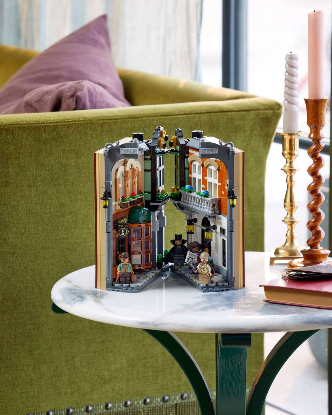
LEGO’s first-ever official Sherlock Holmes set arrives as part of a brand-new “Book Nook” format designed to slip between novels on your bookshelf. Priced at $129.99 and containing 1,359 pieces, this Icons-line set recreates a slice of Victorian Baker Street that folds flat into a bookend-style exterior decorated with a tiled silhouette of Holmes. When opened, it reveals a bookshop with a revolving display window, a shadowy terraced residence with a sliding front door, and a detailed recreation of Holmes’ iconic 221B apartment complete with a fireplace, clue board, and violin.
Five brand-new exclusive minifigures round out the set: Sherlock Holmes, Dr. Watson, Irene Adler, Professor Moriarty, and a Baker Street newcomer named Paige. The Book Nook concept bridges the gap between collectible and functional object. There’s no need for a dedicated display case, as the set is designed to live quietly on your shelf until someone spots it. LEGO is clearly committed to this format, releasing Lord of the Rings and Harry Potter Book Nooks alongside it.
What we like about it:
• The innovative Book Nook format is a fresh, shelf-friendly approach that doesn’t require dedicated display space. It blends right into your book collection.
• Five exclusive, never-before-made minifigures covering all the key Sherlock Holmes characters make this an instant collector’s milestone.
• The level of Victorian-era detail, from the revolving bookshop window to the 221B apartment interior, rewards close inspection.
What we don’t like about it:
• At $129.99 for what is essentially a compact facade, the price-per-visible-display ratio may feel steep to some, especially since the exterior is hidden when shelved as intended.
• Some details rely on stickers rather than printed elements (such as the front door), which can feel underwhelming on a premium adult-targeted set.
2. LEGO Harry Potter: Luna Lovegood’s House


After years of producing Hogwarts variants, Diagon Alley iterations, and Hagrid’s Hut rebuilds, LEGO has finally turned its attention to one of the most narratively important locations in Deathly Hallows: the Lovegood residence. This 764-piece set ($89.99) recreates the eccentric cylindrical tower as a cross-section, revealing meticulously crafted interiors across multiple floors including the kitchen, Xenophilius’s printing workshop/living room, and Luna’s bedroom. Five minifigures are included: Luna in her distinctive purple outfit, Xenophilius Lovegood, Harry, Hermione, and a Death Eater.
The standout feature is a working LEGO light brick projector that casts images from The Tale of the Three Brothers onto a wall panel inside the set, a functional gimmick that goes well beyond what anyone expected. The cross-section approach solves the architectural challenge of the cylindrical design while keeping the interior playable. At roughly 11.8 cents per piece, the pricing aligns with standard Harry Potter set economics, and at 29 cm tall, it commands shelf presence without dominating a display area.
What we like about it:
• The working light brick projector that casts the Deathly Hallows tale is a genuinely surprising and clever play feature that elevates the whole set.
• The cross-section design elegantly solves the challenge of the cylindrical architecture while making every interior floor accessible and displayable.
• It fills a long-overdue gap in the Harry Potter lineup, a location with huge narrative significance that was conspicuously missing from LEGO’s catalog.
What we don’t like about it:
• At 764 pieces, the set is on the smaller side for its price point, and the half-structure design may feel incomplete to display-focused collectors who want a full building.
• The set leans younger (ages 10+), which means some of the interior detailing may not reach the depth that adult Harry Potter collectors are accustomed to.
3. LEGO Ideas: Pemberley, Pride and Prejudice by Jane Austen


This LEGO Ideas submission by creator TJ Bricks brings Mr. Darcy’s grand Pemberley estate to life in brick form, inspired by Jane Austen’s beloved novel Pride and Prejudice. The project has achieved the coveted 10,000-supporter milestone and is currently under official LEGO review. The design celebrates Georgian architecture with a focus on symmetry, elegance, and the harmonious relationship between the estate and its natural surroundings, reflecting Pemberley’s role in the novel as the location that reshapes Elizabeth Bennet’s perception of Darcy.
The creator describes this as a deeply personal project, rooted in growing up watching Austen adaptations and later rediscovering the novels as an adult. The timing feels right, with renewed cultural interest in Austen through upcoming adaptations. If approved, this would represent LEGO’s first foray into the Jane Austen literary universe, a territory with a passionate, dedicated fanbase that has been largely untapped in the brick world.
What we like about it:
• A beautifully realized literary subject that taps into a massive and underserved fanbase. Jane Austen has never had an official LEGO set.
• The Georgian architecture translates well to LEGO, with clean lines and stately symmetry that would make for an impressive display piece.
• It has already passed the 10K supporter threshold and is in official LEGO review, giving it a real shot at production.
What we don’t like about it:
• As a fan concept still in review, the final design could change significantly or be rejected entirely. There’s no guarantee this version is what would reach shelves.
• The appeal may skew niche compared to more broadly recognized IPs, which could factor into LEGO’s commercial decision-making during review.
4. LEGO Ideas: The Inventor’s Mansion


Created by Takesz (a 10K Club Member), The Inventor’s Mansion is a massive steampunk-themed creation estimated at around 5,000 pieces. It has earned a LEGO Staff Pick designation. The build features an elaborate mansion packed with industrial-era machinery, moving functions, and nine minifigures, all designed with maximum playability in mind. The creator, a mechanical engineer turned computer scientist, channels a lifelong love of industrialization and steampunk aesthetics into what is described as the largest and most complex build they’ve ever attempted, virtual or physical.
The project currently sits at the 5K supporter level with 743 days remaining to reach 10K. The design balances heavy machinery and gritty industrial detailing with friendlier, livable spaces within the mansion. With three floors of interactive features and countless small interactions, this is positioned as both a display showpiece and an actual playset, a combination LEGO Ideas submissions don’t always manage to pull off.
What we like about it:
• The steampunk theme is gorgeously executed and fills a gap in LEGO’s current lineup. There’s nothing quite like this on shelves today.
• The sheer scale and detail at approximately 5,000 pieces, with nine minifigures and multiple moving functions, promises a deeply satisfying build experience.
• It earned a LEGO Staff Pick, signaling official recognition of its quality and design potential.
What we don’t like about it:
• At 5,000 pieces, a production version would likely carry a very high price tag that could limit its commercial audience.
• It still needs to reach 10K supporters to enter review, so there’s a long road ahead before this could become an official set.
5. LEGO Ideas: Upside-Down House: Bookstore


Created by YellowBox, this whimsical LEGO Ideas submission features a bookstore housed inside a building that appears to be completely flipped on its roof. The inverted roofline gives the structure the silhouette of an open book, a clever visual pun that ties the architecture to the bookstore theme. It has earned a LEGO Staff Pick. Inside, both floors are fully intact and functional despite the topsy-turvy exterior, with bookshop space on two levels, a rooftop garden for reading, and even a ground-floor bathroom.
The creator drew inspiration from real-world upside-down house attractions found across the globe and wanted to translate that playful architectural concept into LEGO form. Special attention was given to structural durability, since the inverted design means very minimal contact with the ground. The project currently sits at the 5K supporter level with 664 days remaining. It’s the kind of concept that catches the eye immediately on a shelf, a visual conversation starter that would pair well with LEGO’s growing catalog of architectural display builds.
What we like about it:
• The upside-down concept is immediately eye-catching and unlike anything in LEGO’s existing lineup. It’s a guaranteed shelf standout.
• The dual-purpose design as both a bookstore and an inverted house is a clever thematic marriage that gives the build narrative charm.
• The creator’s focus on structural stability despite the unusual form factor suggests thoughtful engineering.
What we don’t like about it:
• The novelty of the inverted concept might overshadow the interior detailing. There’s a risk the build is more impressive from the outside than the inside.
• Still at the 5K supporter stage, it has a substantial distance to cover before reaching LEGO review consideration.
6. LEGO Ideas: Welcome to Elvendale


Created by Tumble3D, this submission is a love letter to LEGO’s retired Elves theme (2015-2018), which was known for its vibrant colors and fantastical creatures. The build is a terrain piece that thoughtfully represents all four years of the Elves run, featuring Farran’s treehouse, the portal to Elvendale, Naida’s spa hidden within a mountain, the library of the Secret Marketplace, a goblin prison side-build, and elements from the final year of the theme. A small cart where Flamy the fox sells confections from the Magic Bakery adds extra charm.
The project currently sits at the 1K supporter level with 492 days remaining to reach 5K. For fans who mourned the cancellation of the Elves line, this represents a potential revival of a theme that carved out a unique identity during its short run. The creator’s effort to include references to every year of the theme’s existence shows a deep respect for the source material and its community of fans.
What we like about it:
• A thoughtful tribute to a beloved retired LEGO theme, carefully incorporating references from all four years of the Elves line.
• The terrain-piece format with multiple distinct locations (treehouse, spa, library, prison) offers variety and visual richness in a single build.
• It fills an emotional gap for Elves fans who have had no new official content since the theme’s 2018 cancellation.
What we don’t like about it:
• At only 1K supporters, this project has the longest road ahead of any on this list and faces an uphill battle to reach even the 5K milestone.
• The niche appeal of a retired theme that ran for only four years may limit the broader audience needed to push it through LEGO’s review process.
7. LEGO Ideas: Muppet Theatre, The Complete Playset


Created by LEE40 (a 10K Club Member), this is a redesigned and improved version of a previous Muppet Theatre submission that reached LEGO review but didn’t make the final cut. The new design features the exterior based on The Muppets Go to the Movies, with “1976” displayed at the top to honor the year The Muppet Show first aired. The modular-style build unfolds to reveal the iconic Muppet Theatre stage, contains just under 4,000 pieces on a 32×32 stud footprint, and includes two storage drawers for minifigures, six double-sided interchangeable stage backgrounds, and a complete scene-change mechanism.
This is a project with real pedigree. It has already been through the LEGO review process once, and the creator has used that feedback loop to substantially rework the design. The set currently sits at the 5K supporter level with 400 days remaining. The combination of a modular exterior that integrates with LEGO City displays and a fully functional theatre interior makes this one of the more ambitious and polished Ideas submissions currently active.
What we like about it:
• The redesigned build benefits from lessons learned in a previous review cycle, resulting in a more refined and feature-rich design than most first-time submissions.
• Six interchangeable double-sided stage backgrounds and built-in storage drawers show exceptional attention to playability and practicality.
• The Muppets are a deeply beloved, multigenerational IP that would resonate with both adult collectors and younger fans.
What we don’t like about it:
• At nearly 4,000 pieces, this would be a premium-priced set, and LEGO already passed on the previous version. There’s no guarantee the redesign changes that outcome.
• The Muppets licensing situation with Disney could complicate the path from fan project to official product, regardless of supporter numbers.
8. LEGO Ideas: Mary Poppins, Back to Cherry Tree Lane


Created by TheGlobeGuy (a Fan Designer and 10K Club Member), this project recreated Cherry Tree Lane from the Mary Poppins films with loving attention to detail. The build included references to both the 1964 original and the 2018 sequel, featuring 11 minifigures spanning both eras: Mary Poppins (1964 and 2018 versions), Bert, Jane, Michael, Mr. Banks, Admiral Boom, Mr. Dawes Jr., John, Annabel, and Georgie. The interiors were packed with scene-specific details including penguins, a carousel horse, a snow globe, and kites.
Unfortunately, despite reaching the 10,000-supporter milestone, this project was not approved during LEGO’s official review process. The review board acknowledged the achievement of reaching 10K supporters but ultimately decided it wouldn’t move forward as an official Ideas set. For fans of the project, it remains a testament to what the LEGO Ideas community can rally behind, a beautifully crafted homage to an intergenerational classic that simply didn’t clear LEGO’s final commercial and design hurdles.
What we like about it:
• The sheer scope of 11 minifigures covering both Mary Poppins films demonstrated an impressive commitment to honoring the full breadth of the franchise.
• The interior detailing packed with movie-specific Easter eggs (penguins, carousel horse, snow globe, kites) showed real passion for the source material.
• It successfully reached 10K supporters, proving strong community demand for Mary Poppins in LEGO form.
What we don’t like about it:
• The project was ultimately rejected during LEGO review, meaning this particular vision of Cherry Tree Lane will not become an official set.
• Disney licensing complexities likely played a role in the rejection, and those same hurdles would face any future Mary Poppins submission.
The post 8 LEGO Architecture Sets So Good They Belong in a Museum, Not a Toy Aisle first appeared on Yanko Design.