This Photographer Spent Weeks in a Suzhou Silk Studio. Here’s What He Found

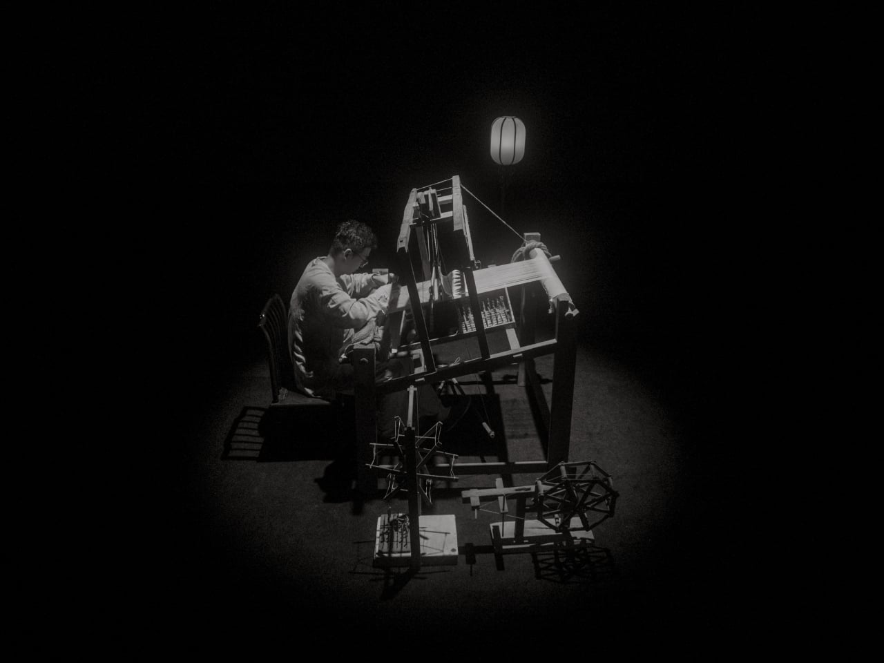
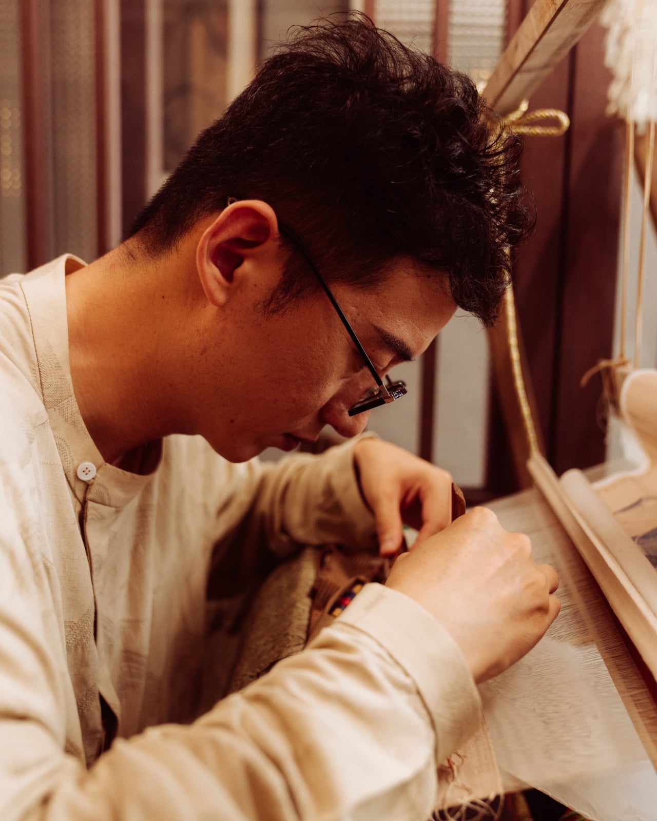
When Jing Huang walked into a kesi weaving studio in Suzhou, China, he made a decision that runs counter to almost everything happening in photography right now. He put away the instinct to explain and just started watching. For most photographers working today, that would feel like leaving something on the table. In a studio where a finished piece can take months to complete, it turned out to be the only approach that made sense.

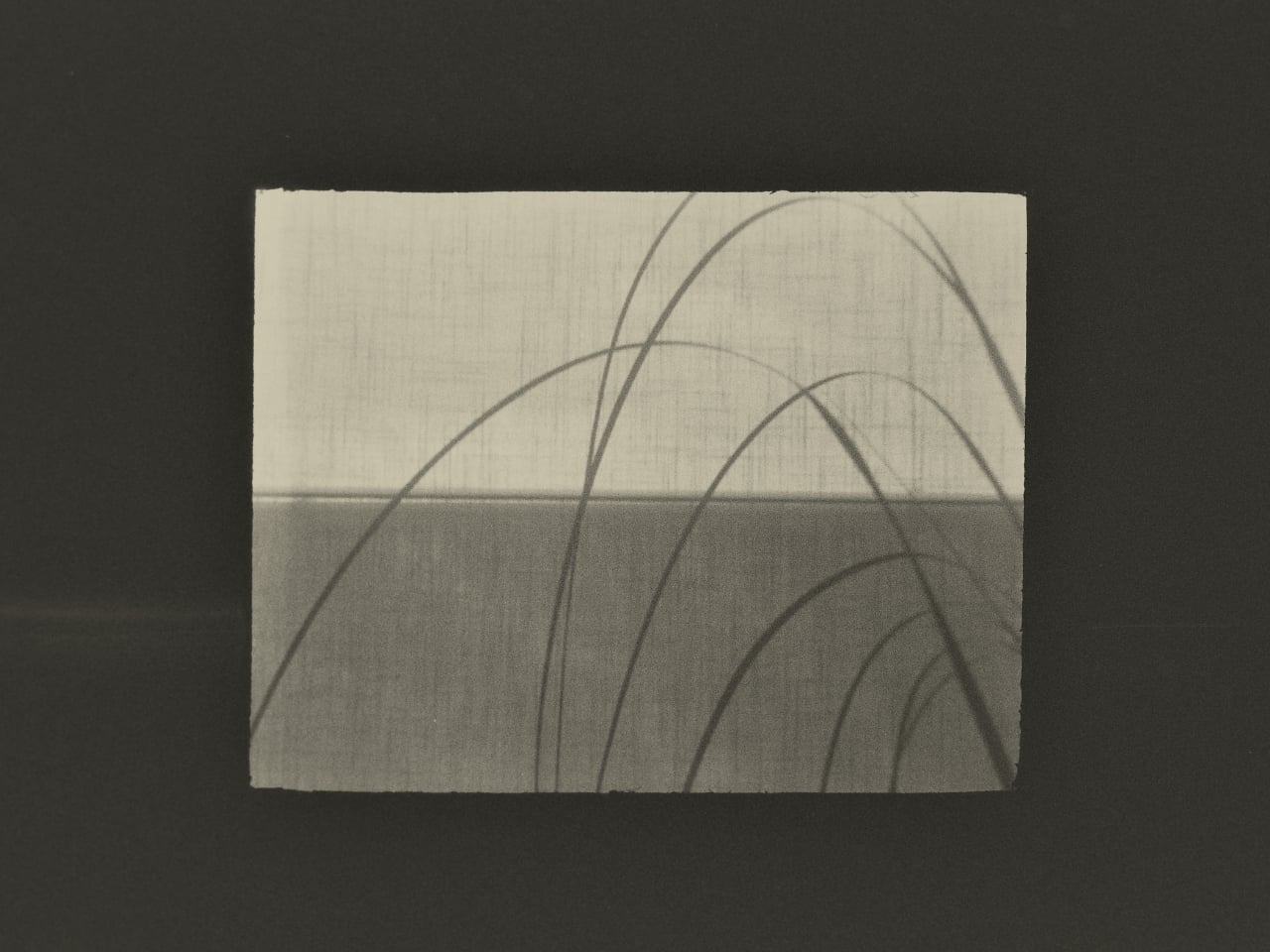
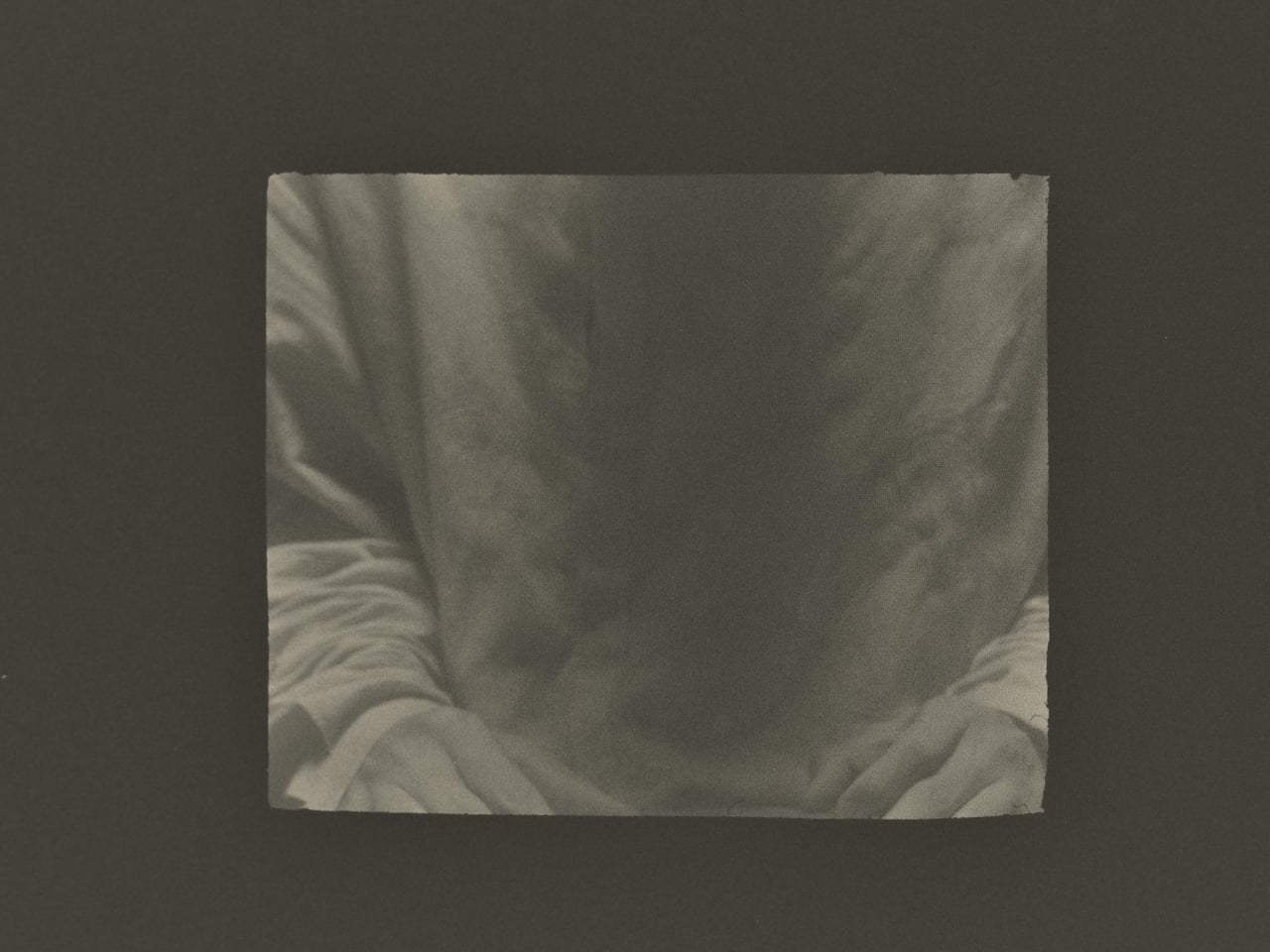
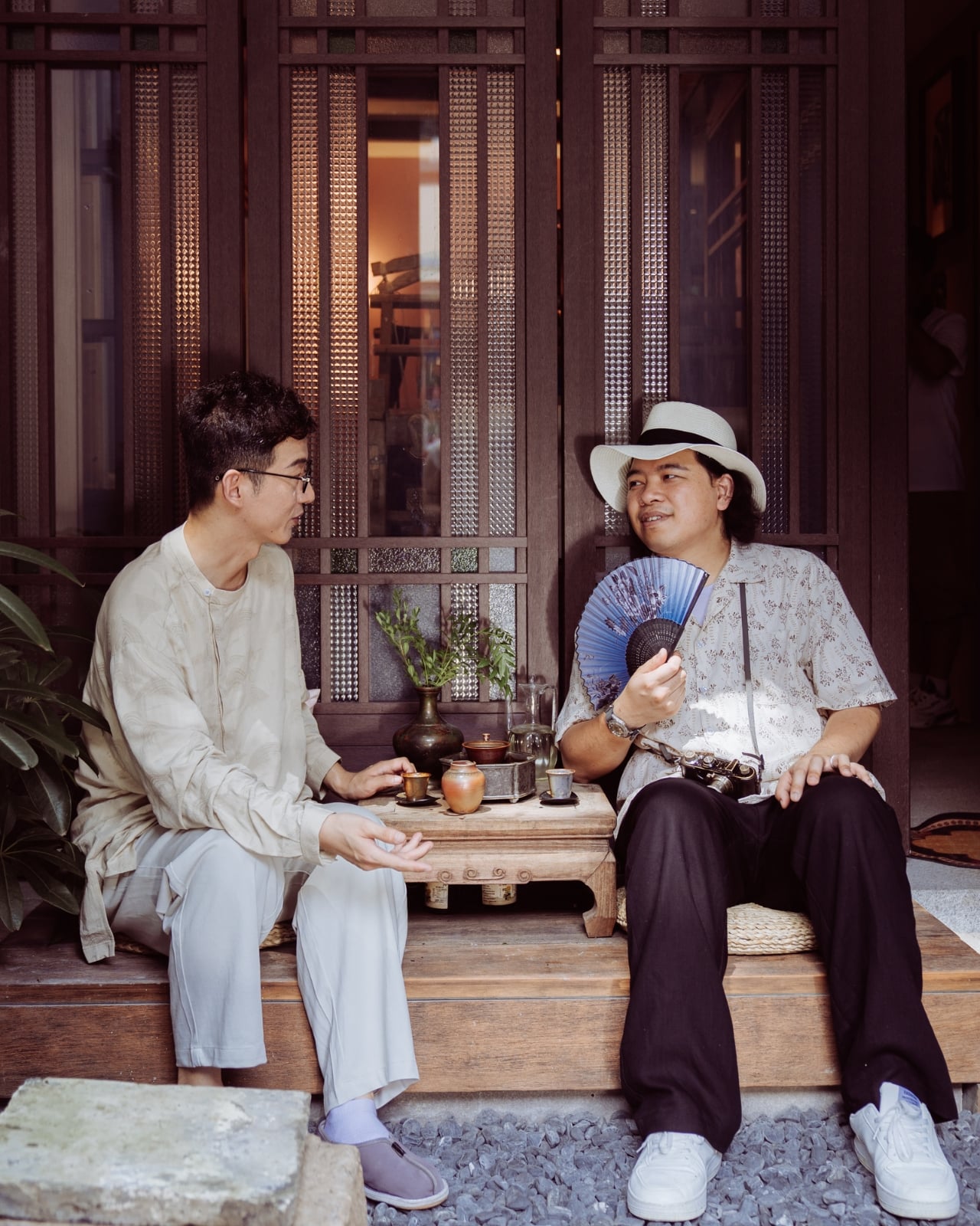
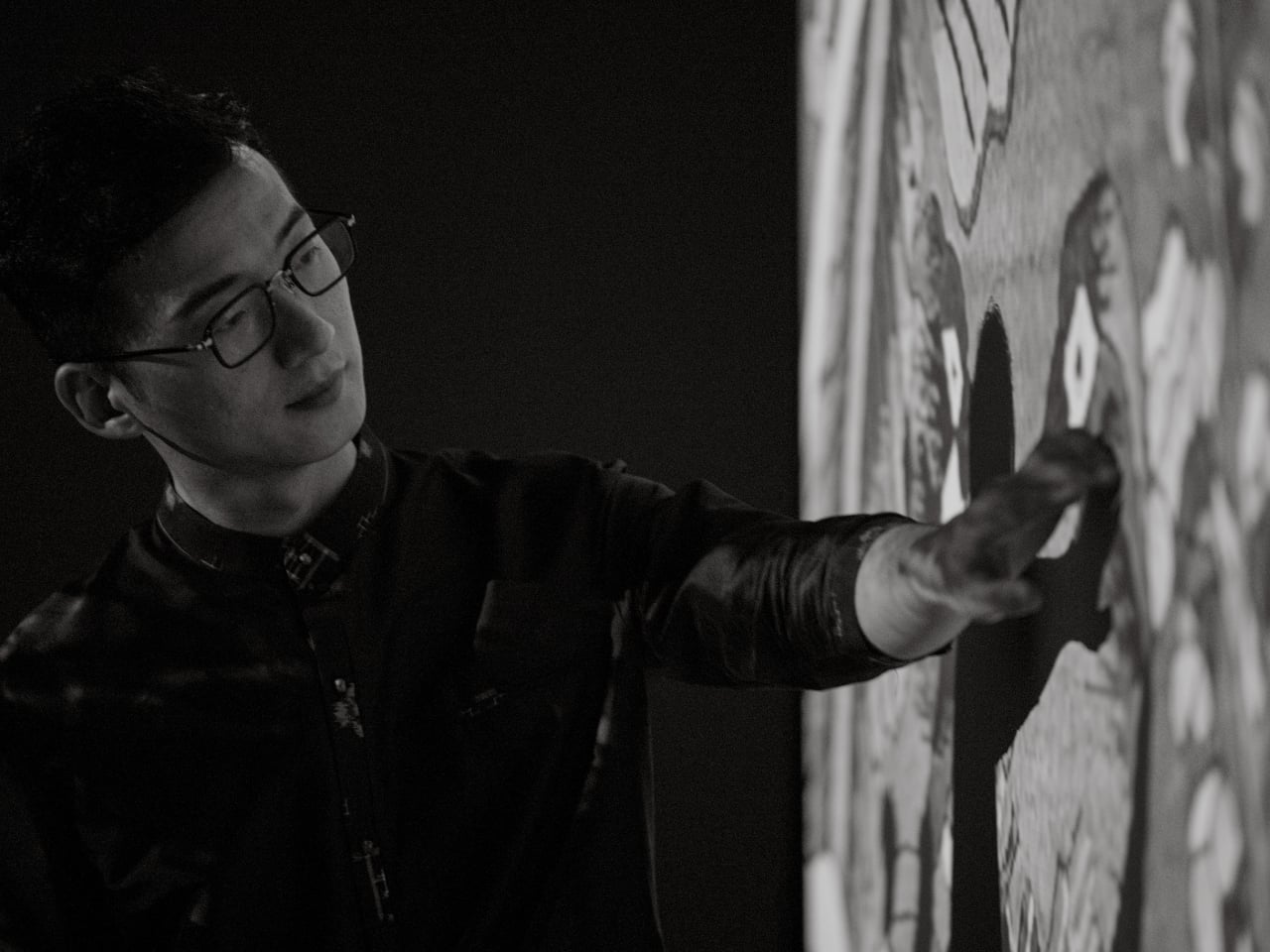
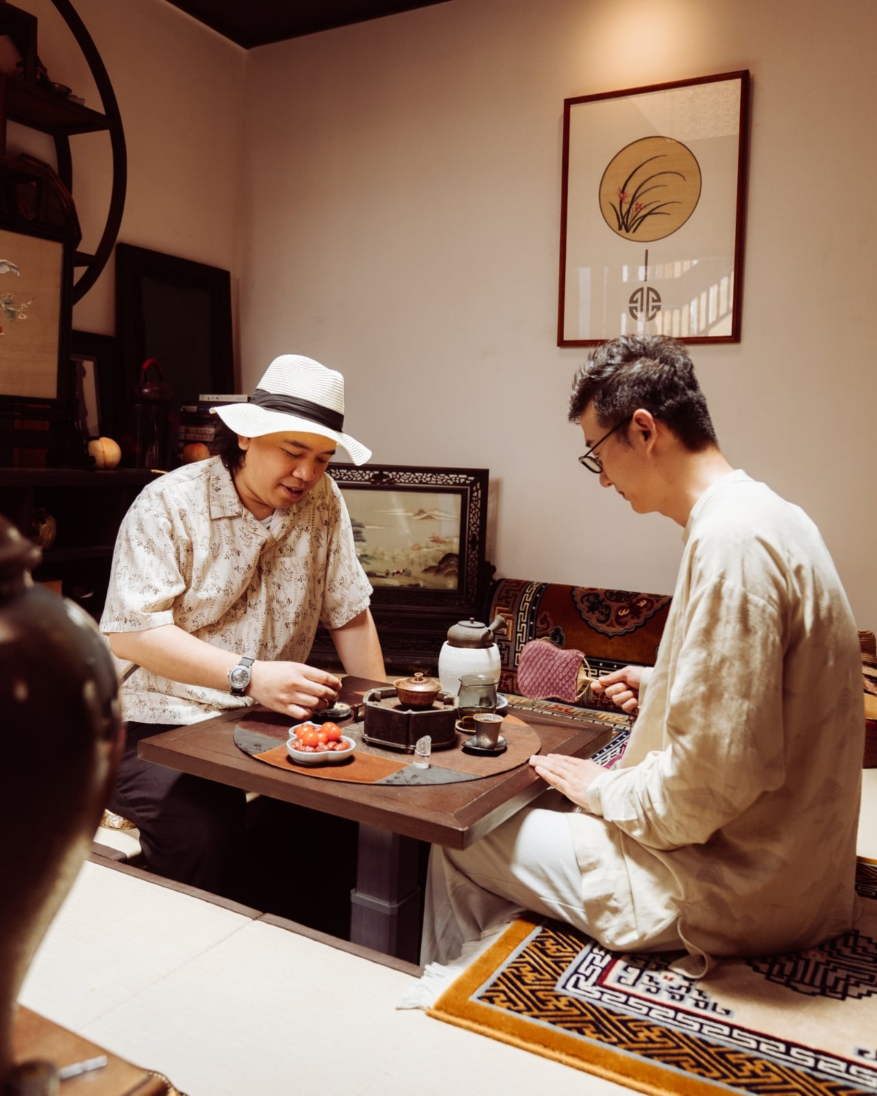
Huang is a photographer with serious credentials. He won the Leica Oskar Barnack Newcomer Award in 2011 for a series called Pure of Sight, and his visual style has always leaned toward stillness, restraint, and negative space rather than the kind of maximalist documentation that tends to flatten its subject. So when Lexar and Leica brought him to Suzhou to photograph kesi artist Hao Naiqiang, known professionally as Jingwei, the choice made sense on paper. What’s harder to predict is what happens when a photographer with that kind of discipline actually sits with a craft as slow and precise as kesi.

Artist: Hao Naiqiang (Jingwei) for Lexar and Leica

Photographer: Jing Huang
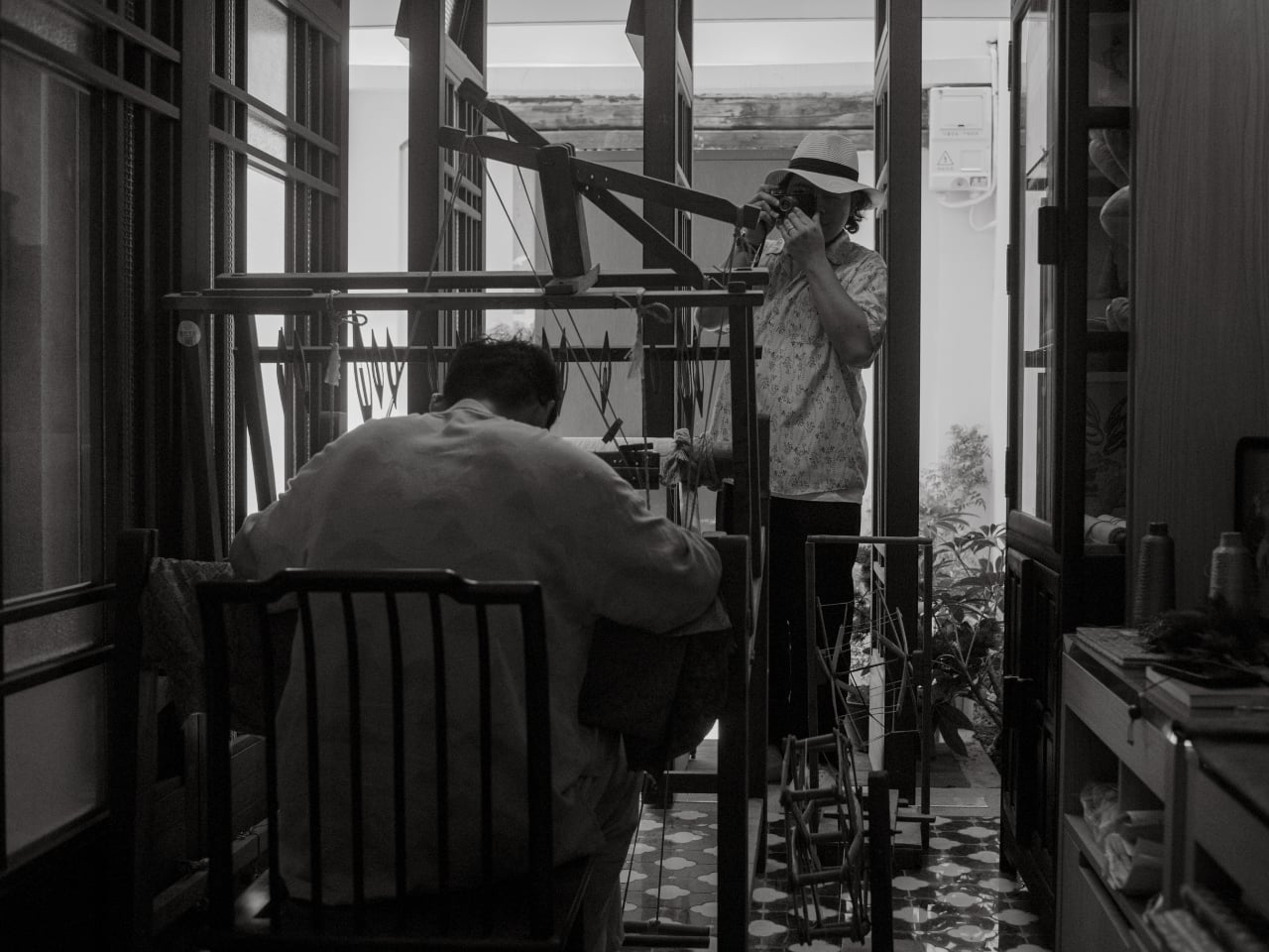
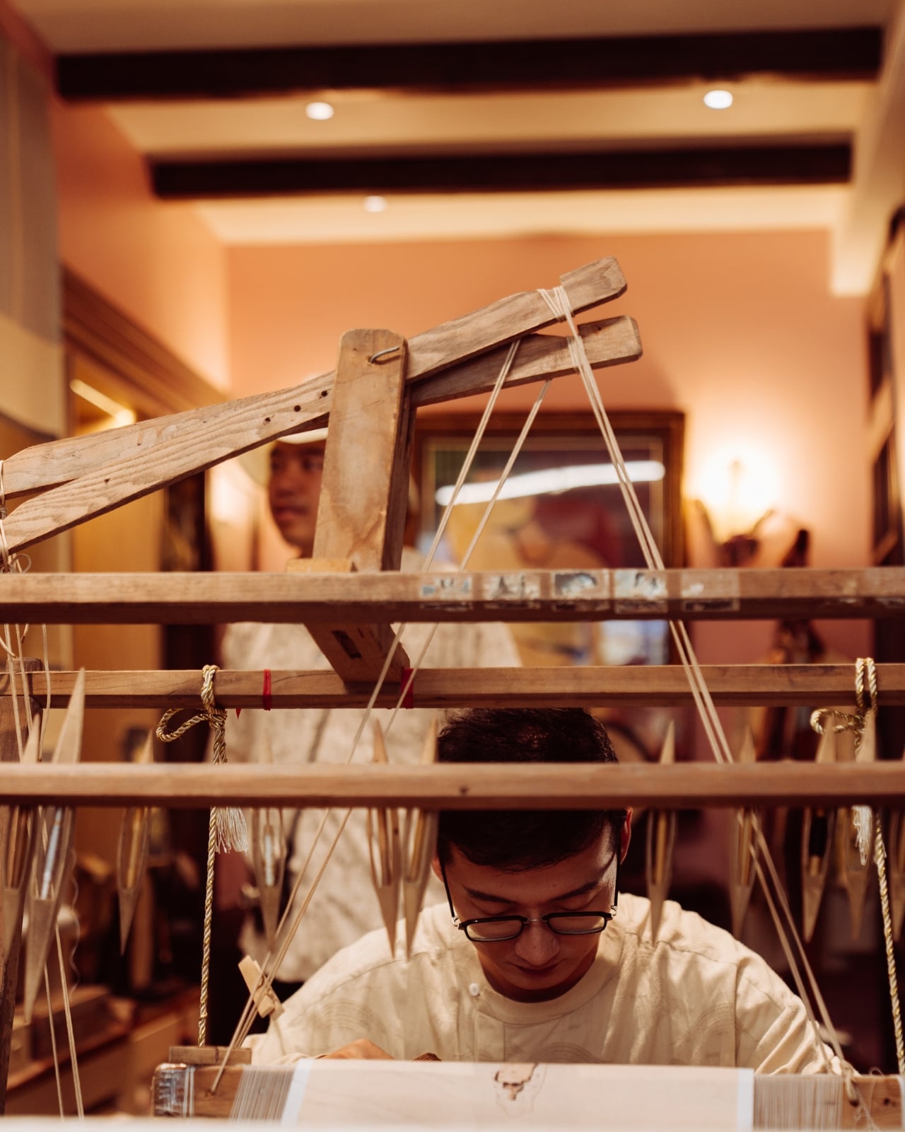
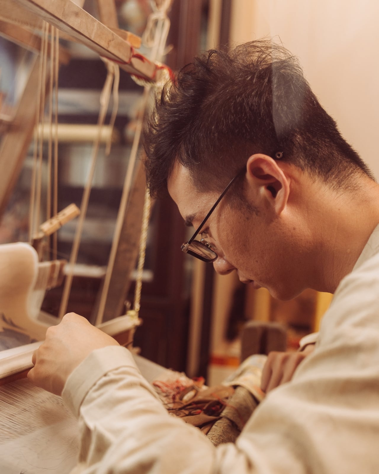
Kesi is a Chinese silk weaving technique that’s been around for centuries, and it operates on a logic completely alien to the way most things get made today. The artisan builds a piece thread by thread against a fixed warp, making constant decisions about color, contour, and rhythm with no automation, no shortcuts, and no undo button. There’s an old Chinese saying that captures it better than any technical description: an inch of kesi is worth an inch of gold. Jingwei has been practicing it for more than a decade and is formally recognized as a representative inheritor of the Suzhou tradition. Every finished piece represents a depth of time investment that genuinely earns that comparison.
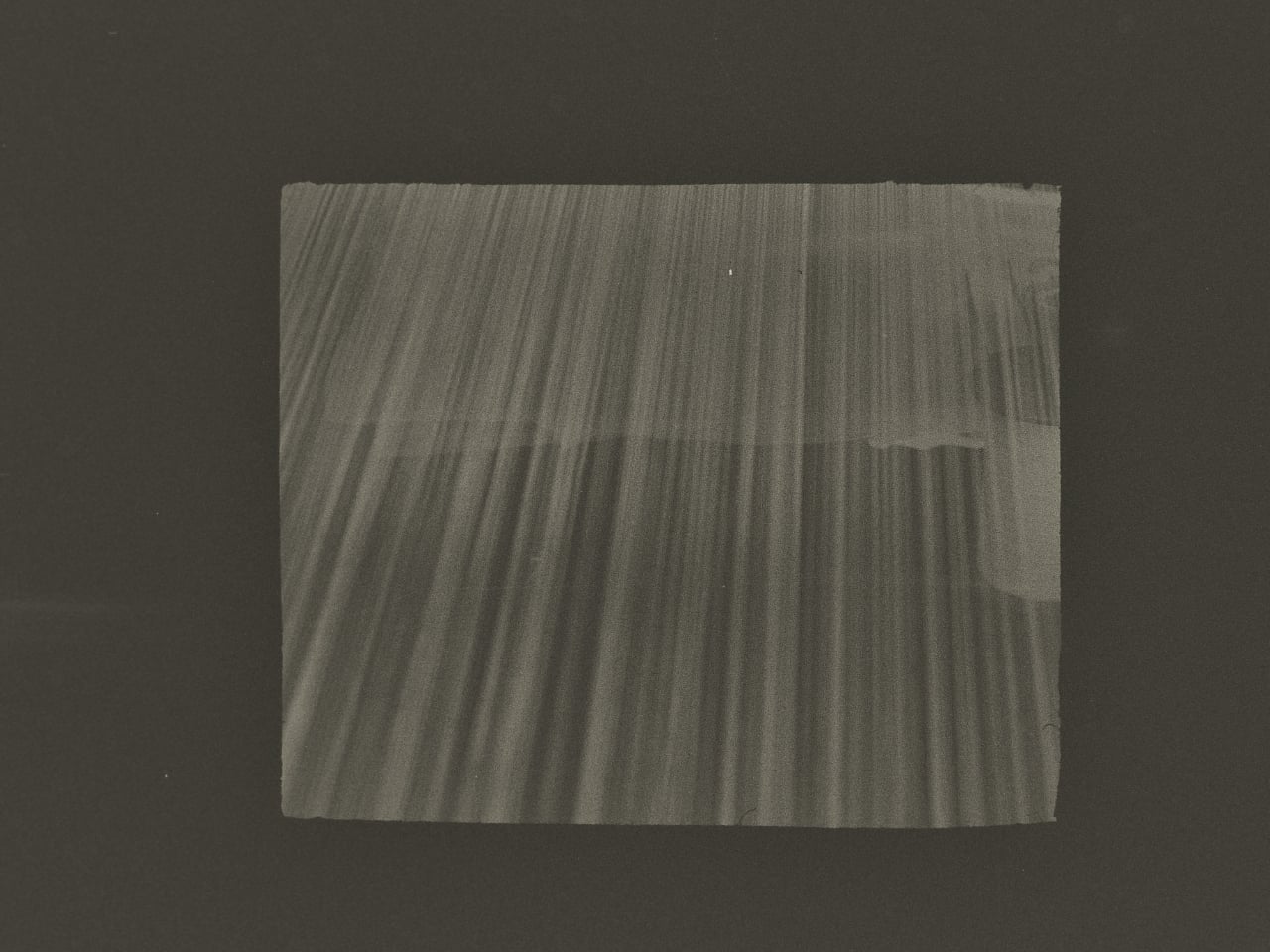
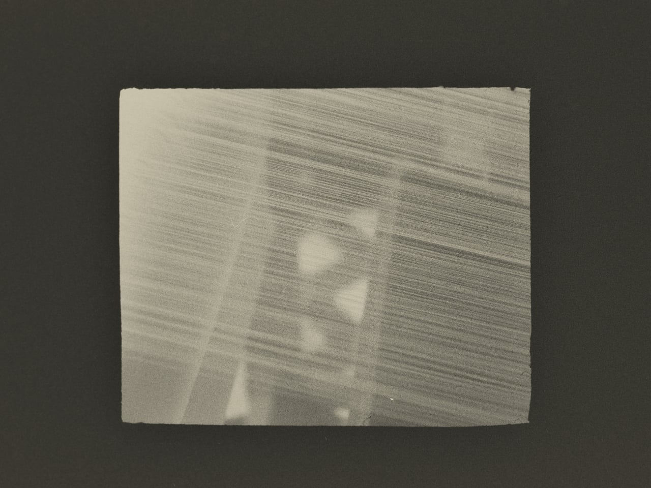
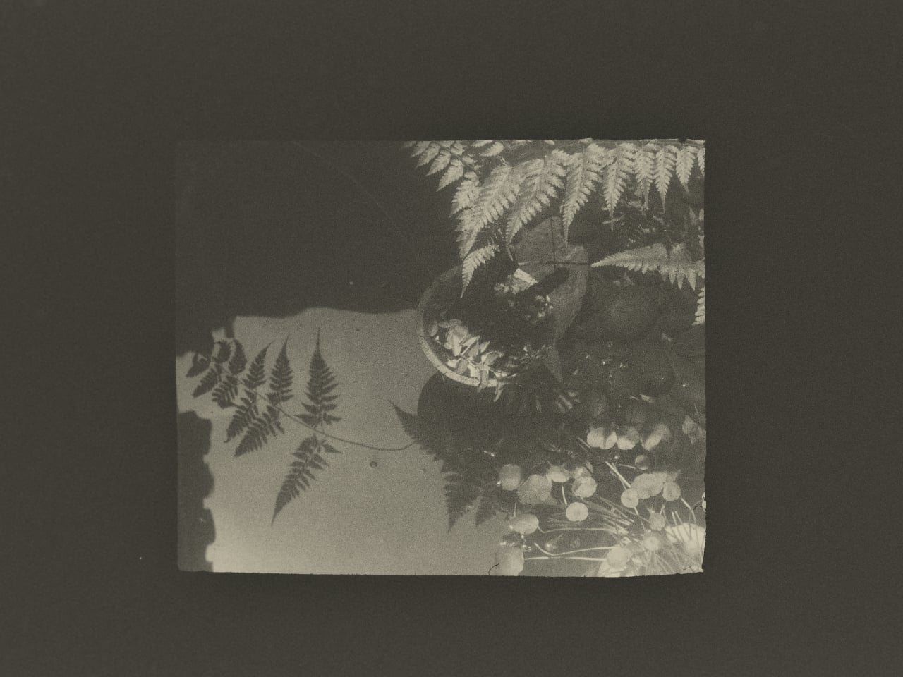
What Huang found in that studio wasn’t a process to document. It was an atmosphere to respond to. His photographs don’t walk you through kesi step by step the way a documentary would. They move between Jingwei’s hands, the threads, the studio details, and the quieter visual textures of Suzhou itself, using the same painterly restraint that shapes his broader work. He described his own approach in a way that cuts straight to the point: photography, he said, is sometimes about forgetting time rather than recording it. What stays in an image isn’t when it was taken but whether it still carries beauty once the moment is gone.
That’s a fairly specific thing to believe in 2026, when the surrounding conversation about images is almost entirely about speed and generation. Anyone can produce a technically competent photo of silk threads in soft light right now without a camera, a plane ticket, or a studio. What that won’t produce is the weeks of presence, of actually being in a room watching another person work, that shapes how Huang sees and frames a subject.
This is where Lexar’s role in the project stops being a footnote. Grace Su, who heads Lexar’s European operations, made the point directly: before any photograph becomes a print, a press image, or a cultural archive, it first exists as an original file that needs to survive. Leica captures the moment. Lexar protects the file behind it. It’s a clean division of labor that gives the brand a genuine reason to be part of this story rather than just attached to it for the optics.
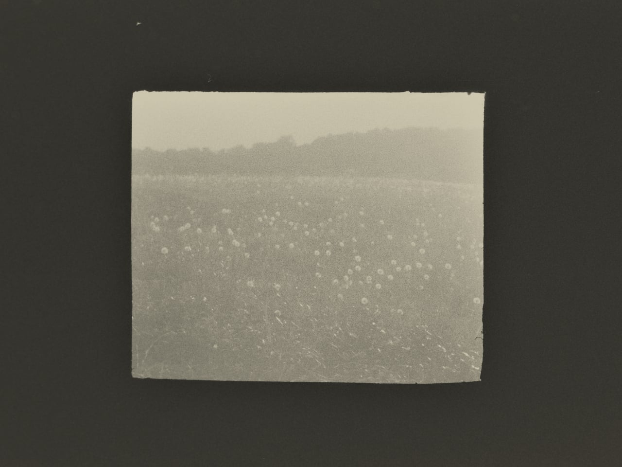
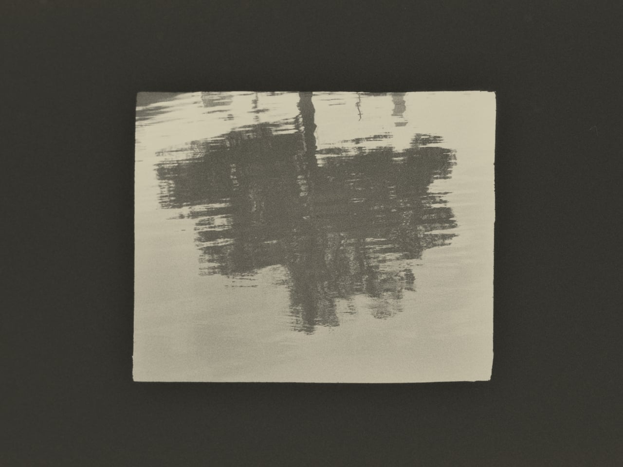
The show itself, titled Threads of Time: A Journey Through Silk and Lens, is presented at Leica Gallery Amsterdam and runs September 11 to 15. Curator Linda Warmerdam framed the exhibition as a dialogue between the photographer’s eye and the artisan’s hand, and that framing holds up, because both of those things require a body in a specific place at a specific time. No model trained on existing images can reproduce that.
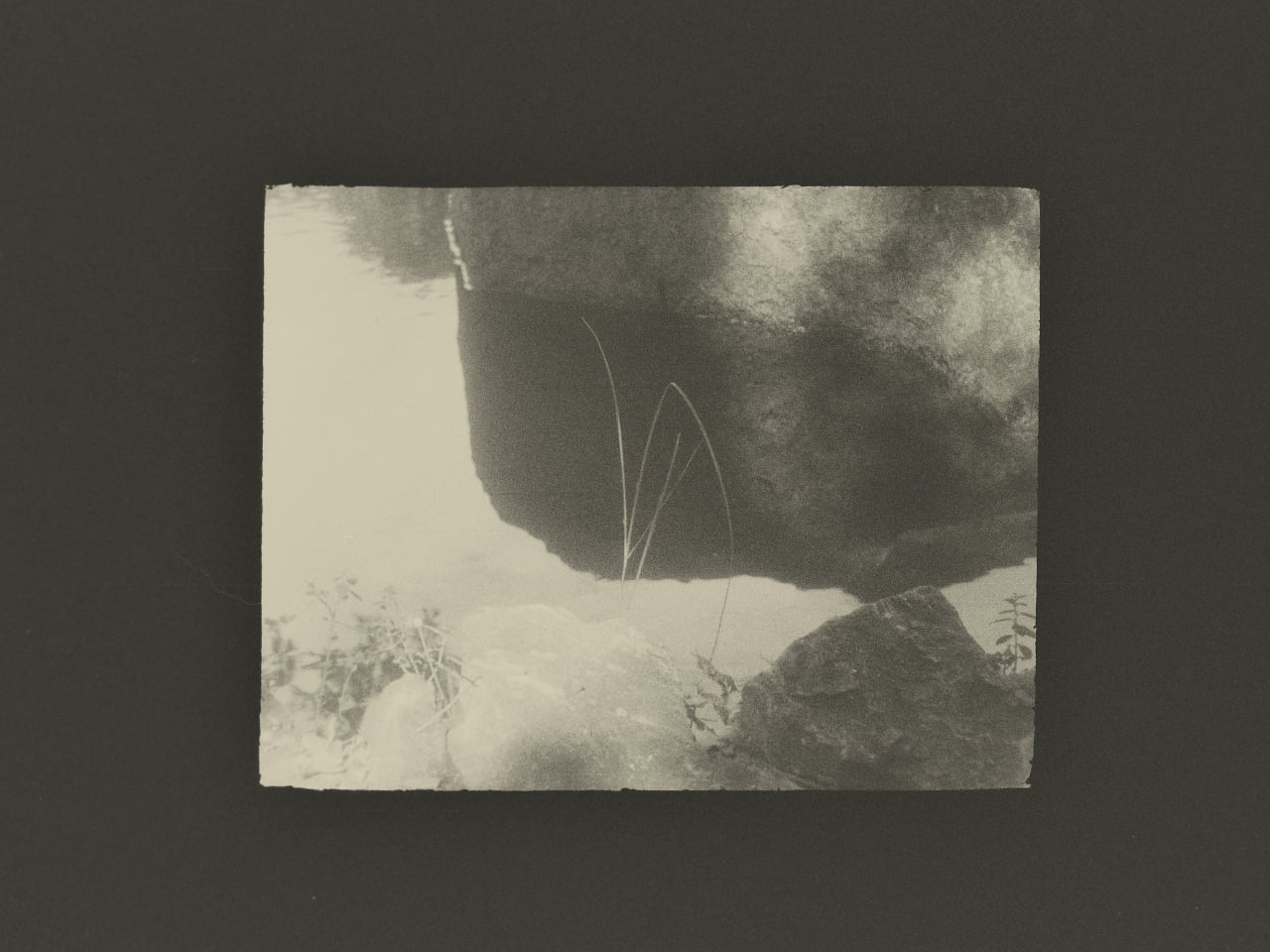
You don’t need to care about textile history or gallery culture for the underlying point to land. Some things take real time, happen once, and mean something precisely because they can’t be convincingly faked. Huang spent weeks in a Suzhou studio to understand what kesi actually is. The photographs are what he brought back.
The post This Photographer Spent Weeks in a Suzhou Silk Studio. Here’s What He Found first appeared on Yanko Design.
The 1960s Conversation Pit Is Back, and Milan Can’t Get Enough

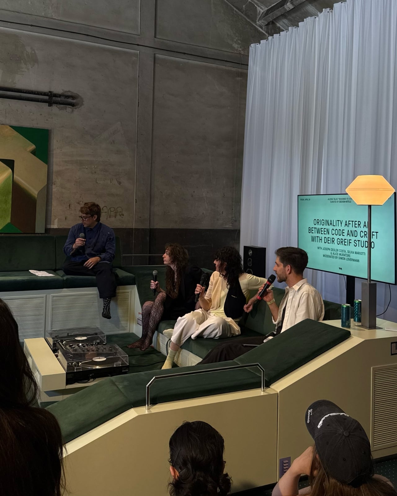
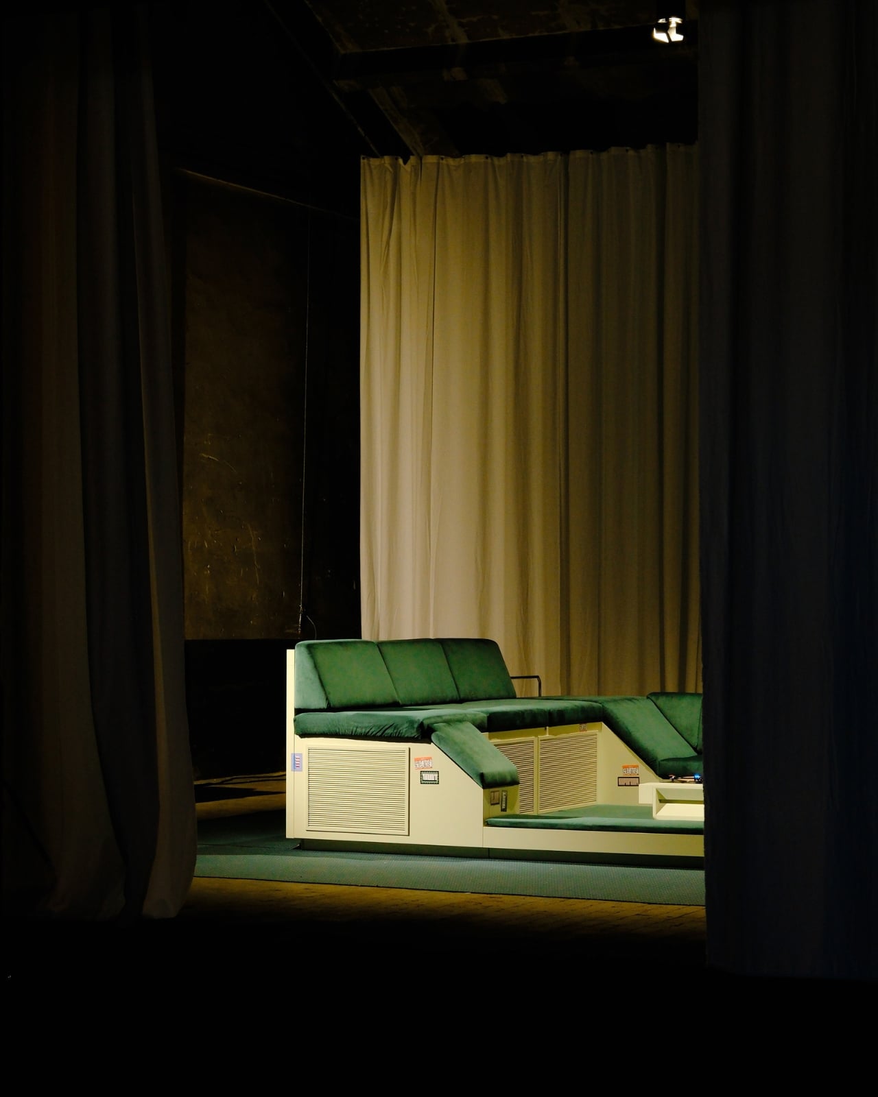
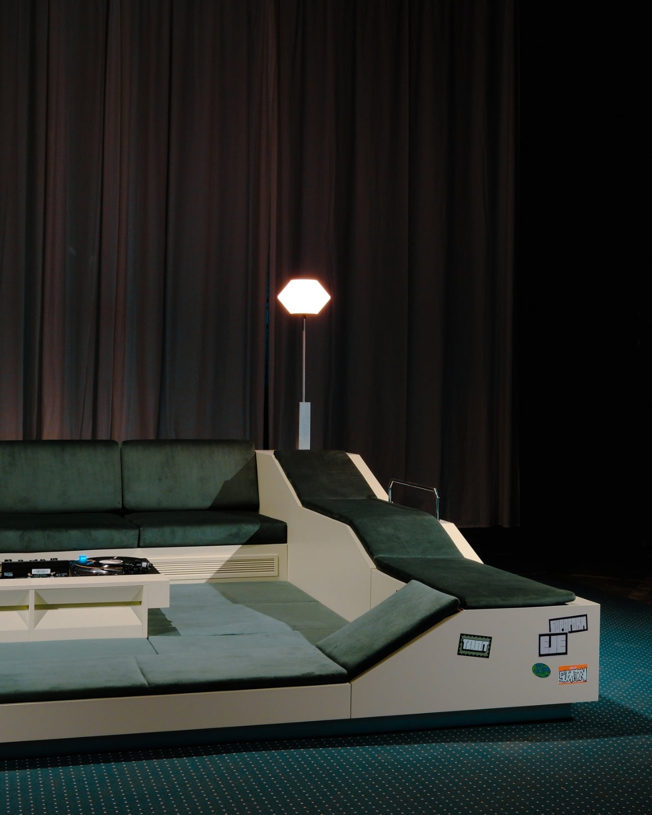
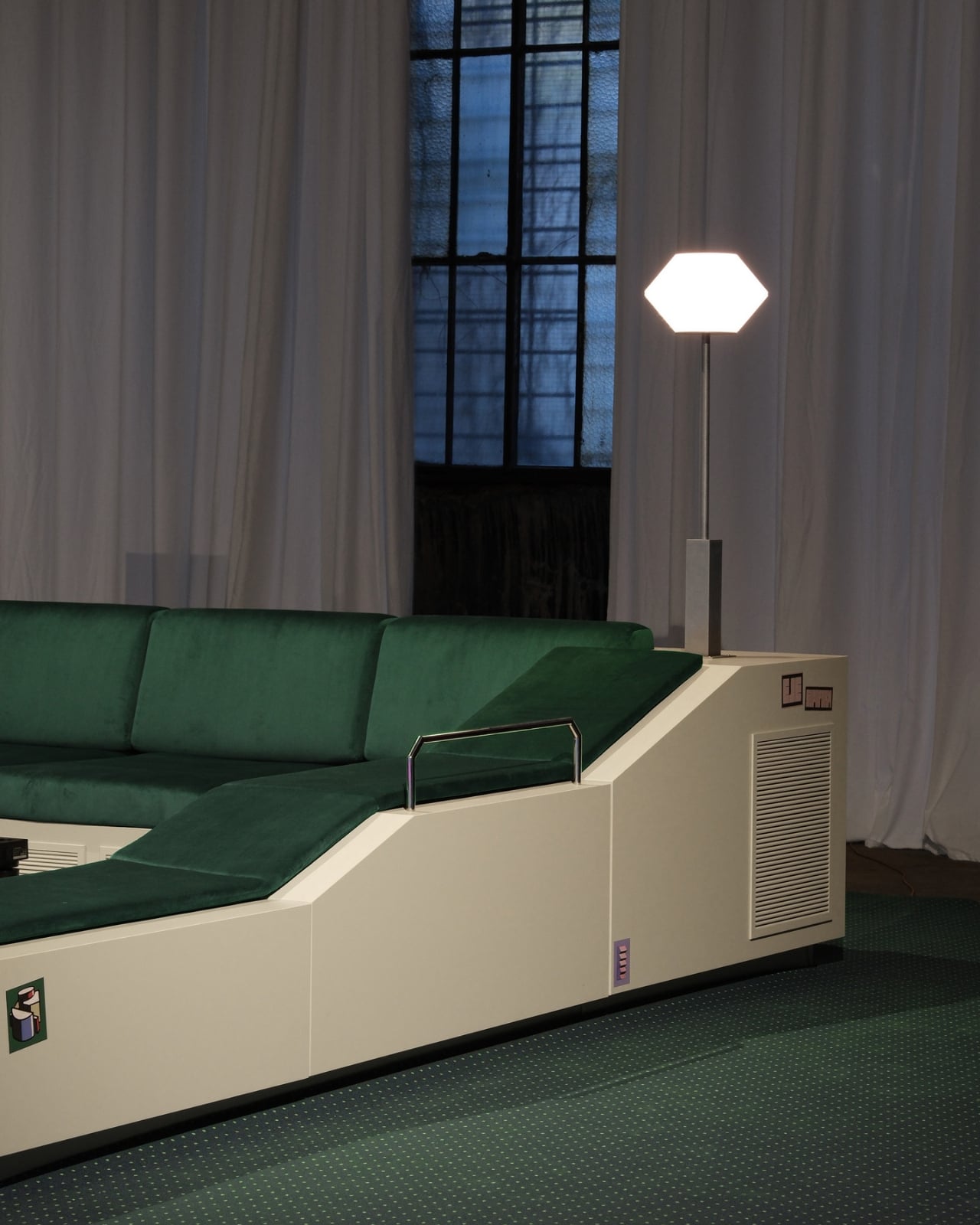
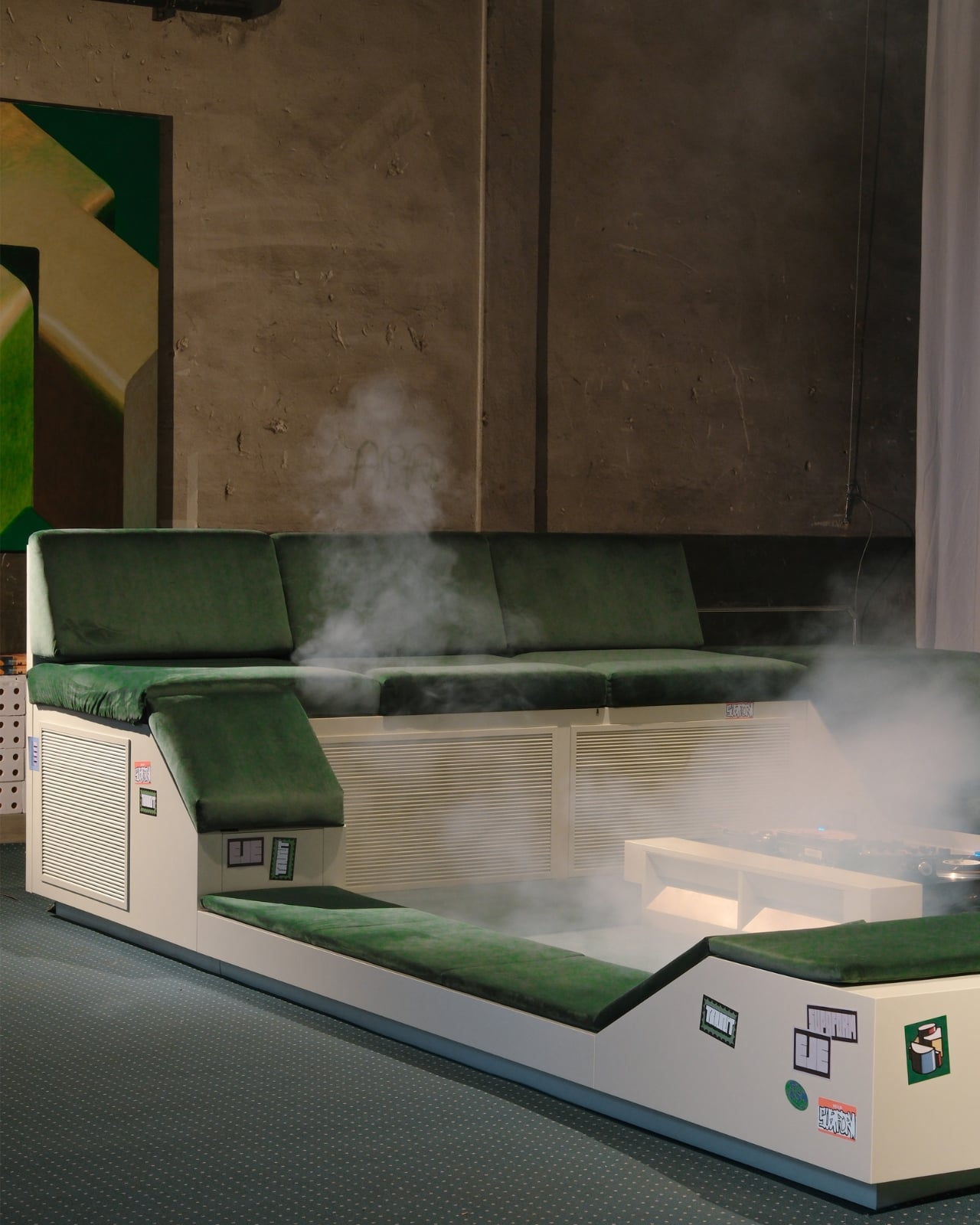
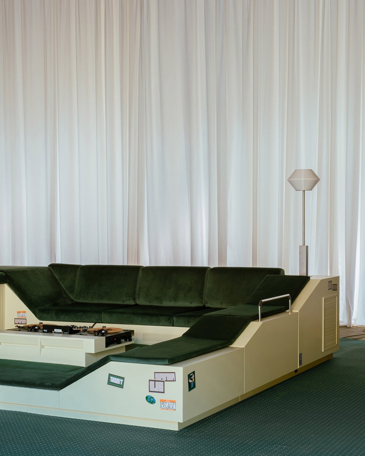
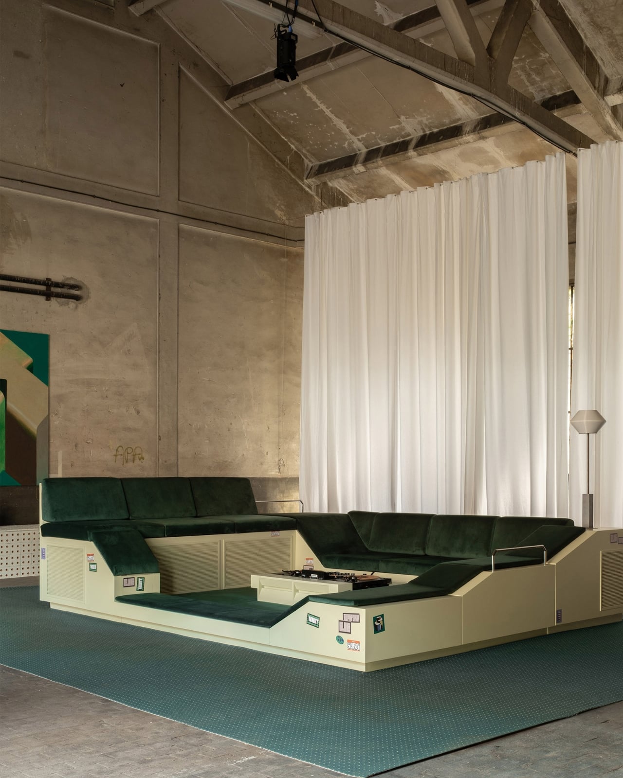
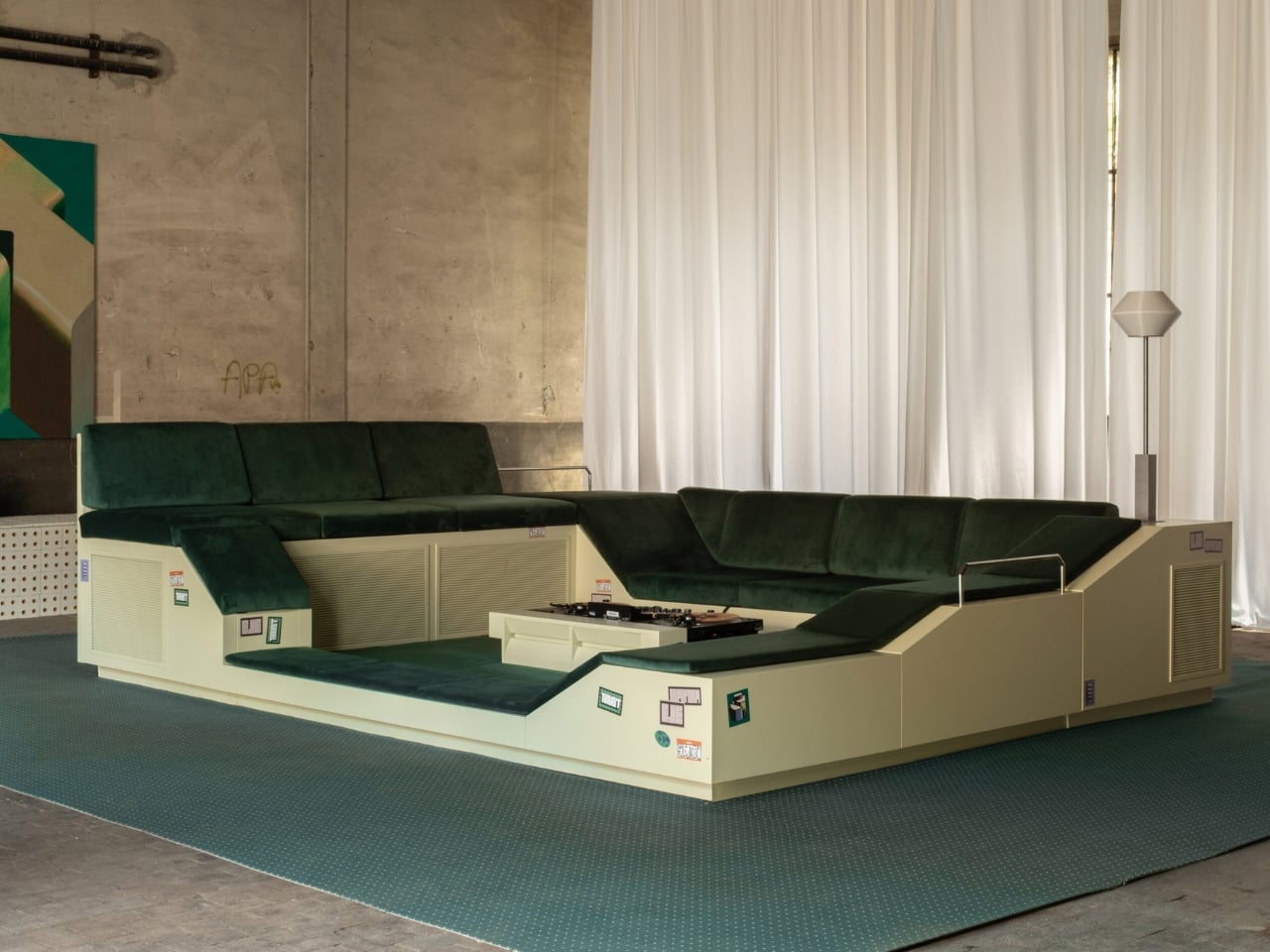
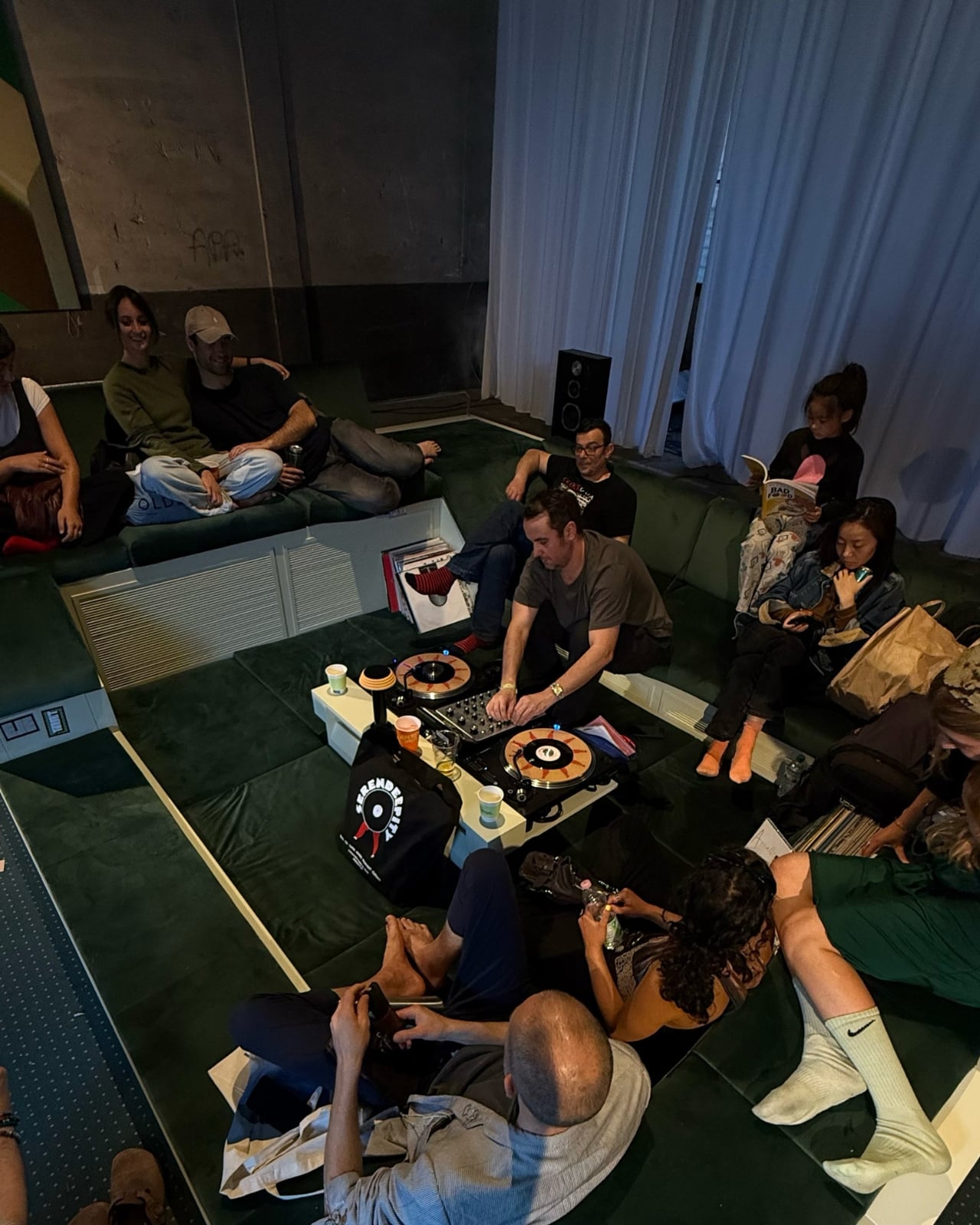
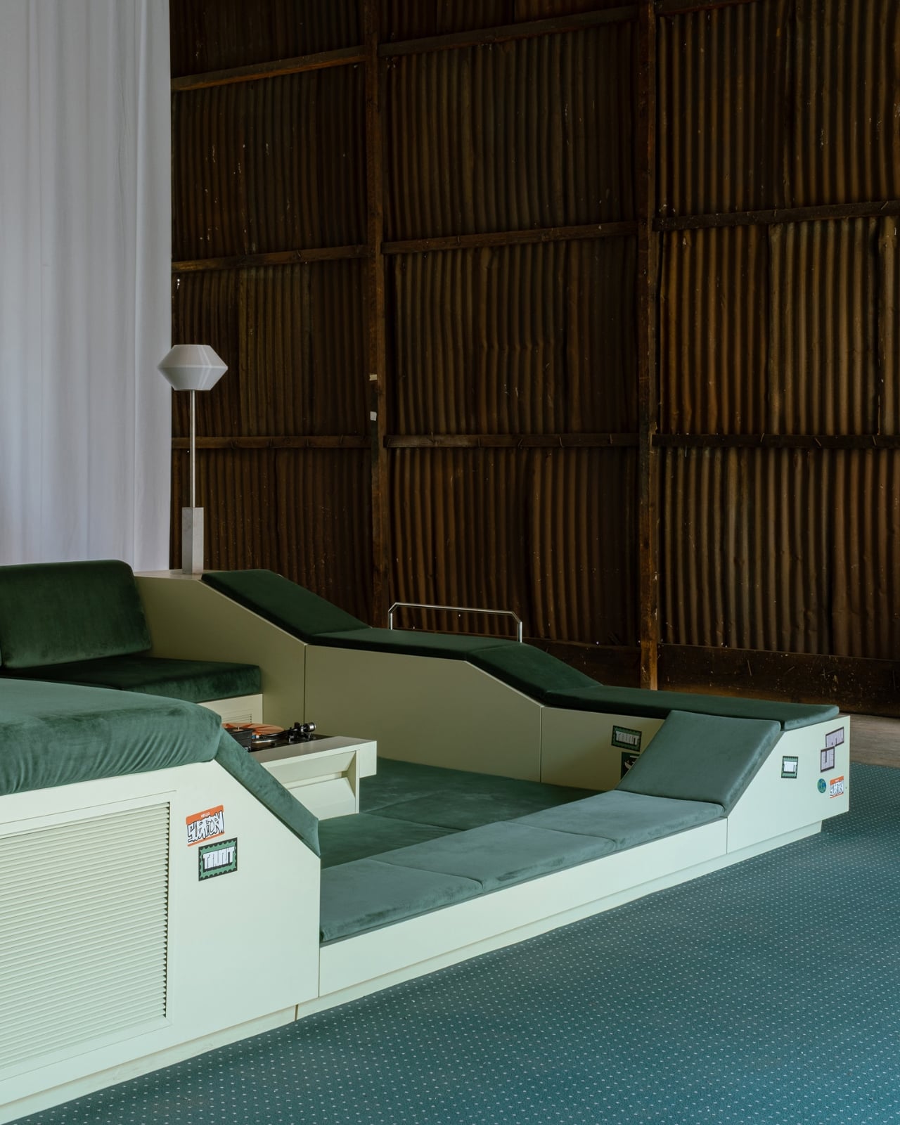
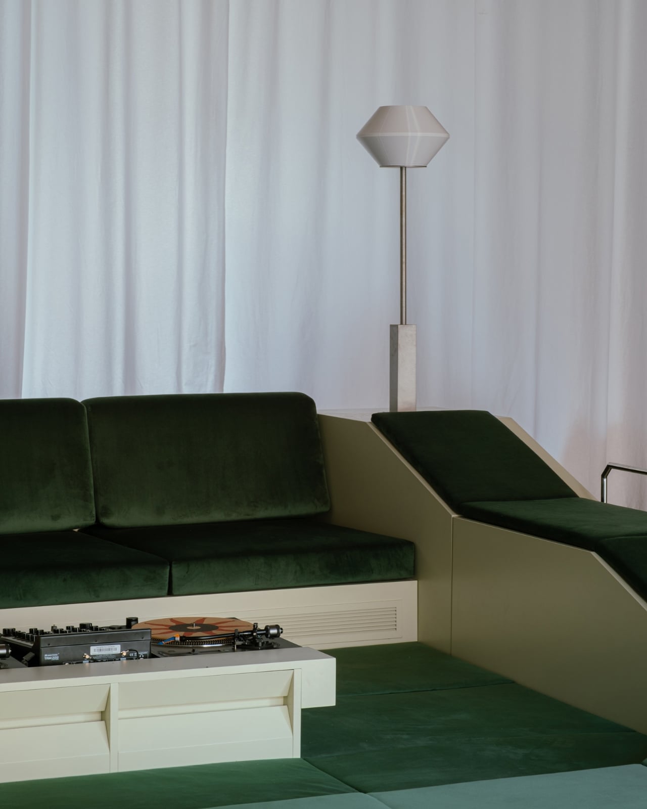
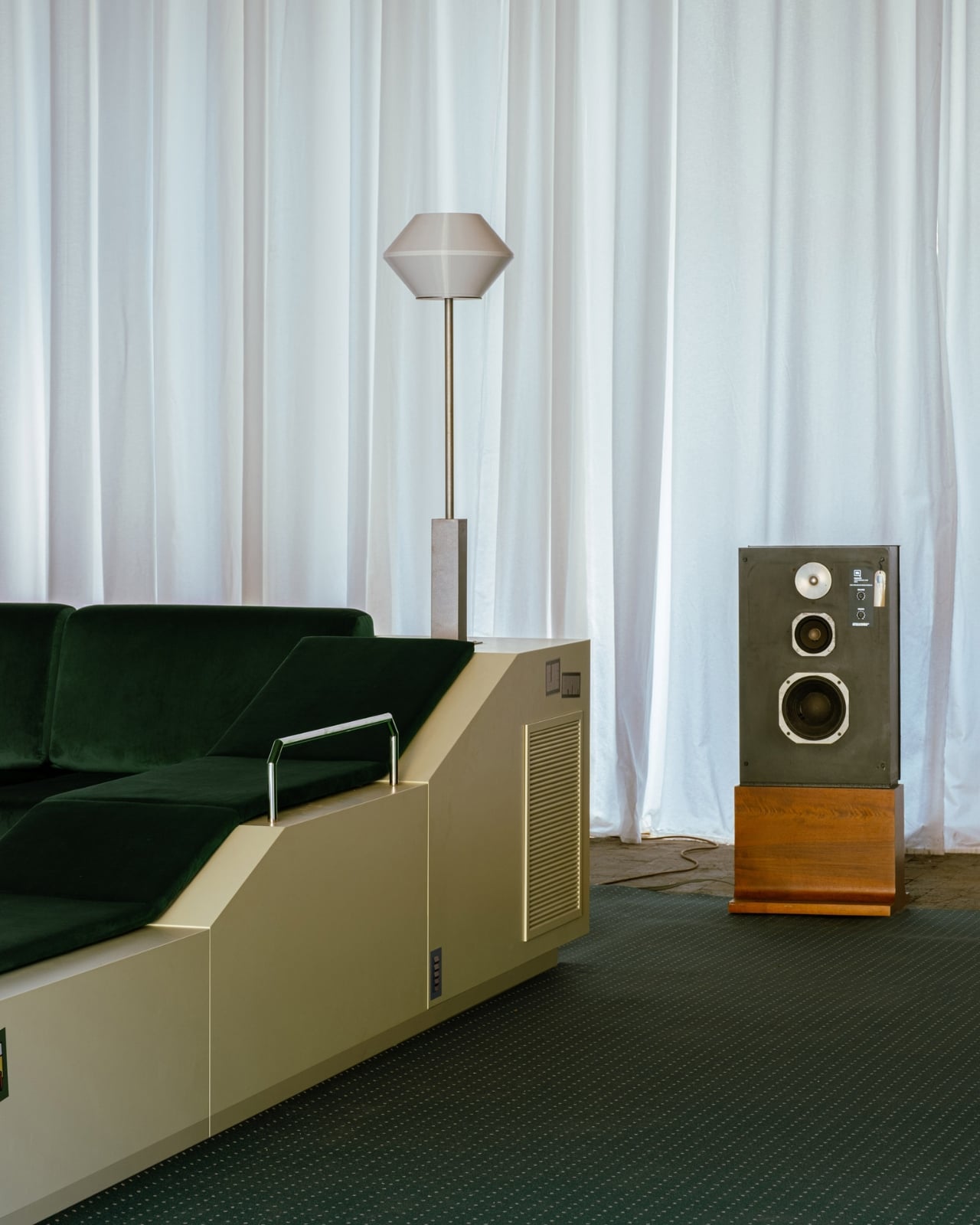
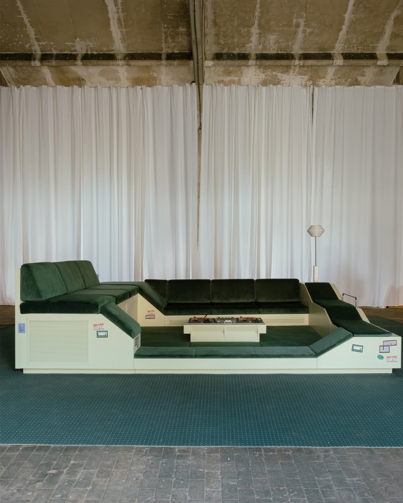
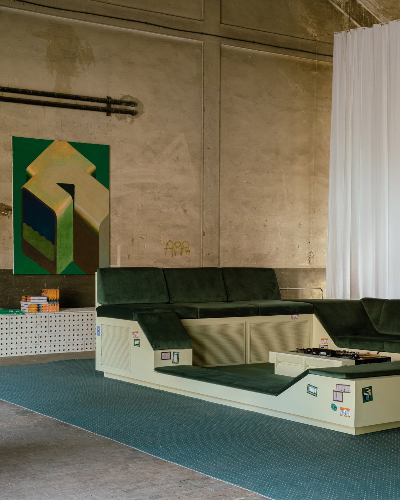
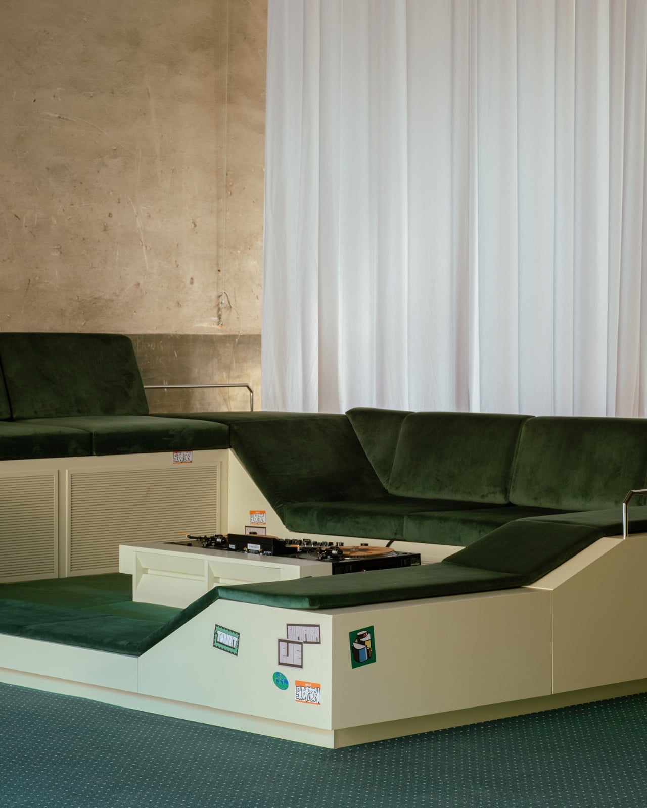
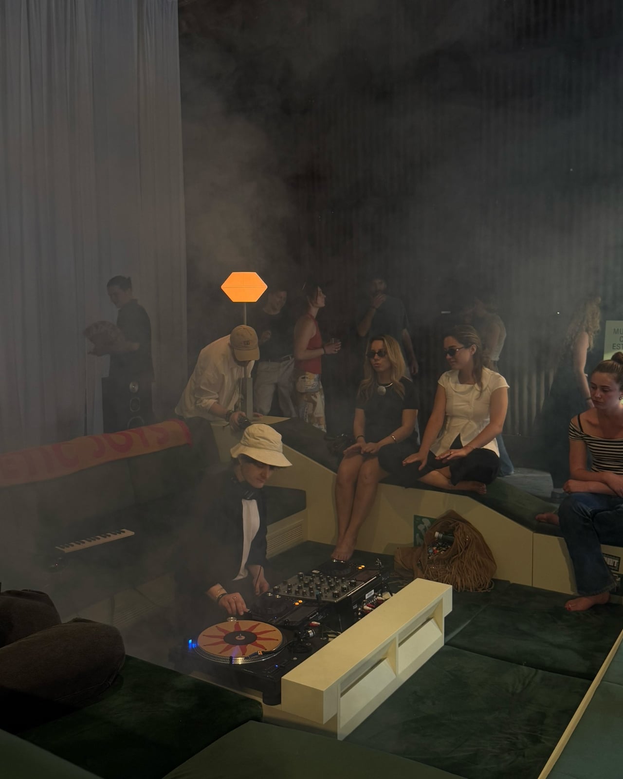
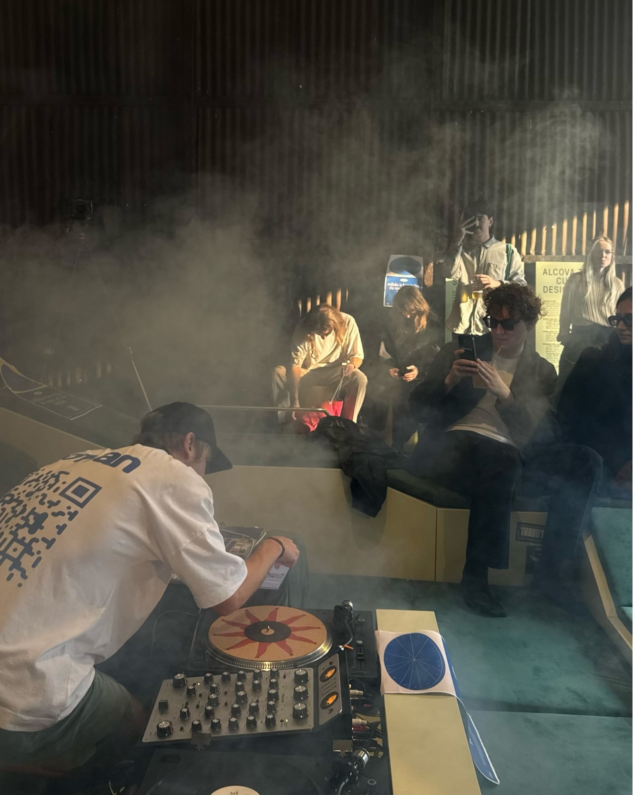
If you walked through Alcova at Milan Design Week this past April, odds are you found yourself gravitating toward a large green seating installation that seemed to have its own pull. People were sitting on it, around it, leaning against it. Conversations were happening. Music was playing. Nobody was rushing to the next booth. The piece was called Transit Encounters, and it was the work of Paris-based studio Supaform, led by designer Maxim Shcherbakov.

At its core, Transit Encounters is a seating landscape, a low-slung, communal structure that borrows from the mid-century idea of the conversation pit. If you’re not familiar with conversation pits, they were a design trend that had their heyday in the 1960s and 70s, those sunken, cushioned living room alcoves that gathered people inward, face to face, with no option for polite escape. They were a product of an era that genuinely believed design could engineer intimacy. And then, for decades, they fell out of favor, deemed impractical, difficult to clean, or just too aggressively retro.

Designer: Maxim Shcherbakov

Shcherbakov’s version isn’t literally sunken into the ground, but it operates on the same principle: create a space that removes you from the noise and draws you into a shared moment with whoever happens to be next to you. Set inside the former Baggio Military Hospital, one of Alcova’s most atmospheric venues, the installation sat within raw, almost abandoned architecture that made the softness and warmth of the green seating feel even more deliberate. The contrast alone told a story.

What makes Transit Encounters genuinely interesting, beyond its visual impact, is the thinking behind it. Shcherbakov noticed how a sofa’s boundaries aren’t really defined by its physical edges. People sit on the floor beside it. They lean against it. They occupy its orbit. He took that observation and ran with it, designing not just a piece of furniture but an entire social field. The result functions simultaneously as a stage, a lounge, and a gathering point, a piece of furniture that practically invites improvisation.

The title carries weight too. “Transit Encounters” points to something most of us have felt but rarely stop to name. We are constantly passing through spaces, airports, lobbies, plazas, and in those in-between places, we sometimes share moments with people we will never see again. There’s an intimacy to that kind of encounter that is entirely different from planned socializing. It’s more honest, somehow. Shcherbakov leans into that contradiction, the idea that transience and closeness can exist at the same time. The installation was developed in collaboration with Esthetic Joys and hosted DJ sets and talks with Design Hotels throughout the week, which means it was literally activated by those kinds of fleeting, unplanned connections.

I’ll admit I have a personal bias here. I think we lost something when the conversation pit fell out of fashion. Not because I’m nostalgic for shag carpeting or sunken living rooms specifically, but because the underlying idea, that furniture could be designed to make you slow down, turn toward each other, and actually talk, felt like a worthy ambition. Most contemporary furniture design optimizes for flexibility, portability, and individual comfort. Modularity is the buzzword. Everything folds, stacks, or wheels away. Transit Encounters isn’t interested in any of that. It’s a fixed, unapologetic invitation to stay.

Supaform sits at the intersection of art and design, and that positioning gives Shcherbakov the freedom to treat furniture less like a product and more like a proposition. With Transit Encounters, the proposition is simple but radical: what if a room’s centerpiece wasn’t a coffee table or a statement light fixture, but an intentional container for human connection? What if we designed less for how a space looks on camera and more for how it feels when it’s full of people?

Milan Design Week surfaces a lot of beautiful things every year. Transit Encounters was one of the few that made you want to stop, sit, and stay awhile. At an event where foot traffic is the currency, that alone says everything.

The post The 1960s Conversation Pit Is Back, and Milan Can’t Get Enough first appeared on Yanko Design.
The Hague Just Turned Air Into Its Most Exciting Museum

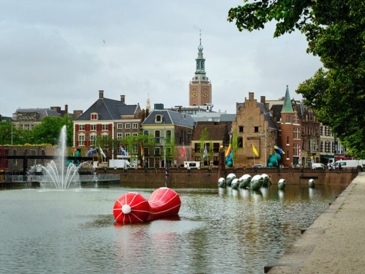
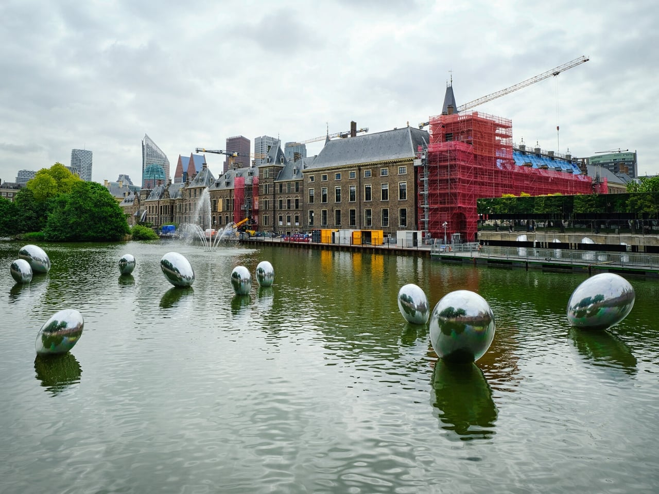
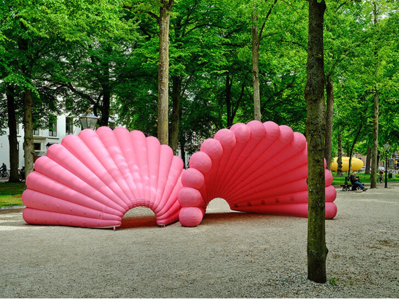
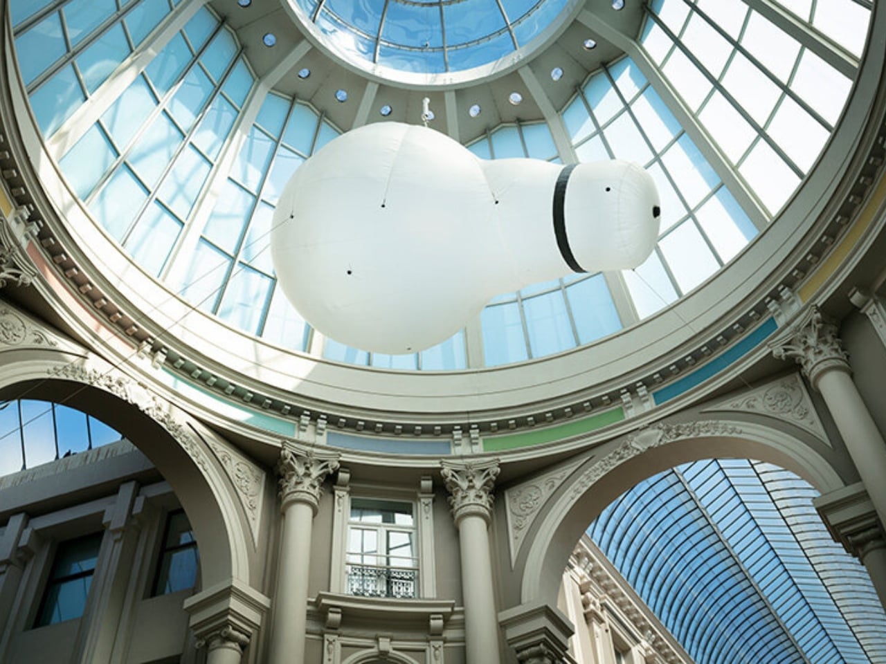
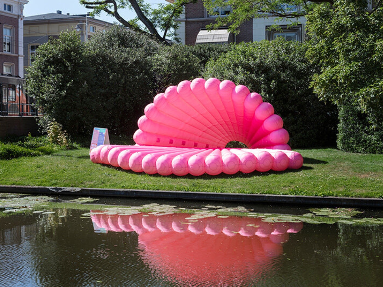
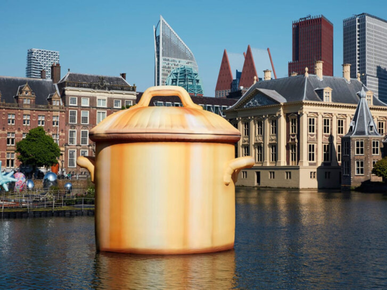
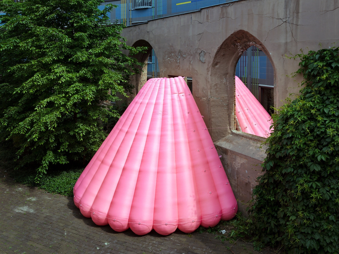
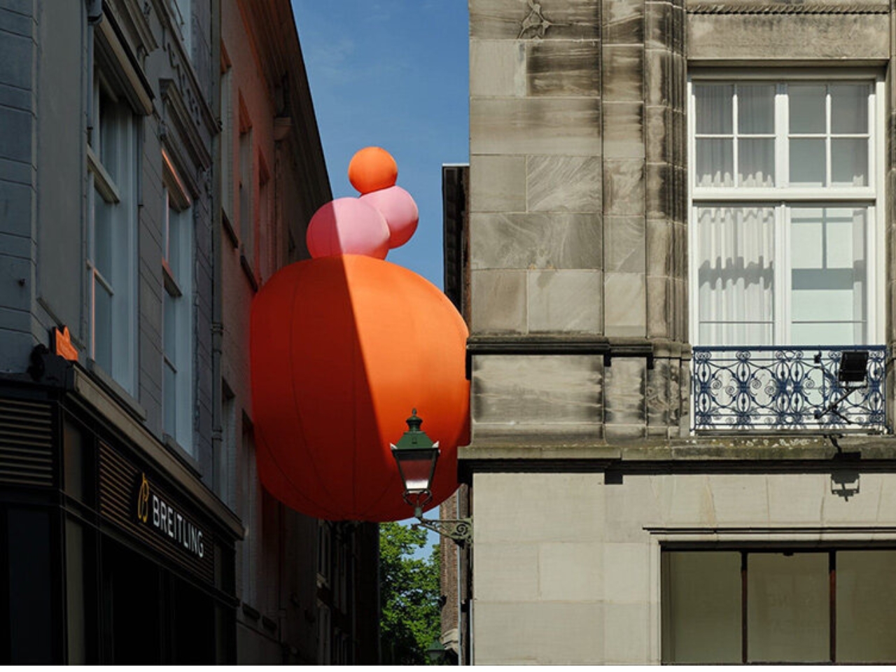
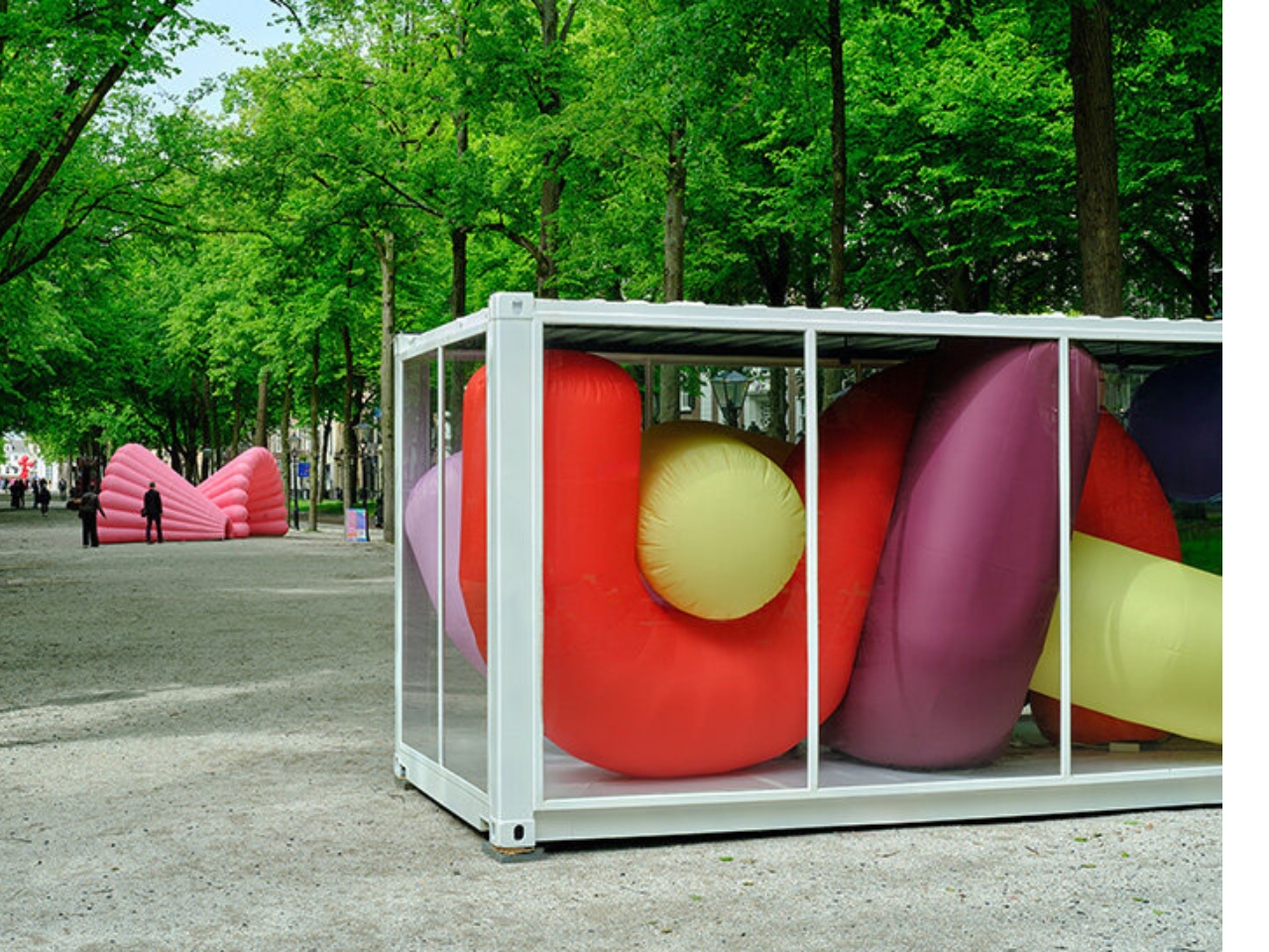
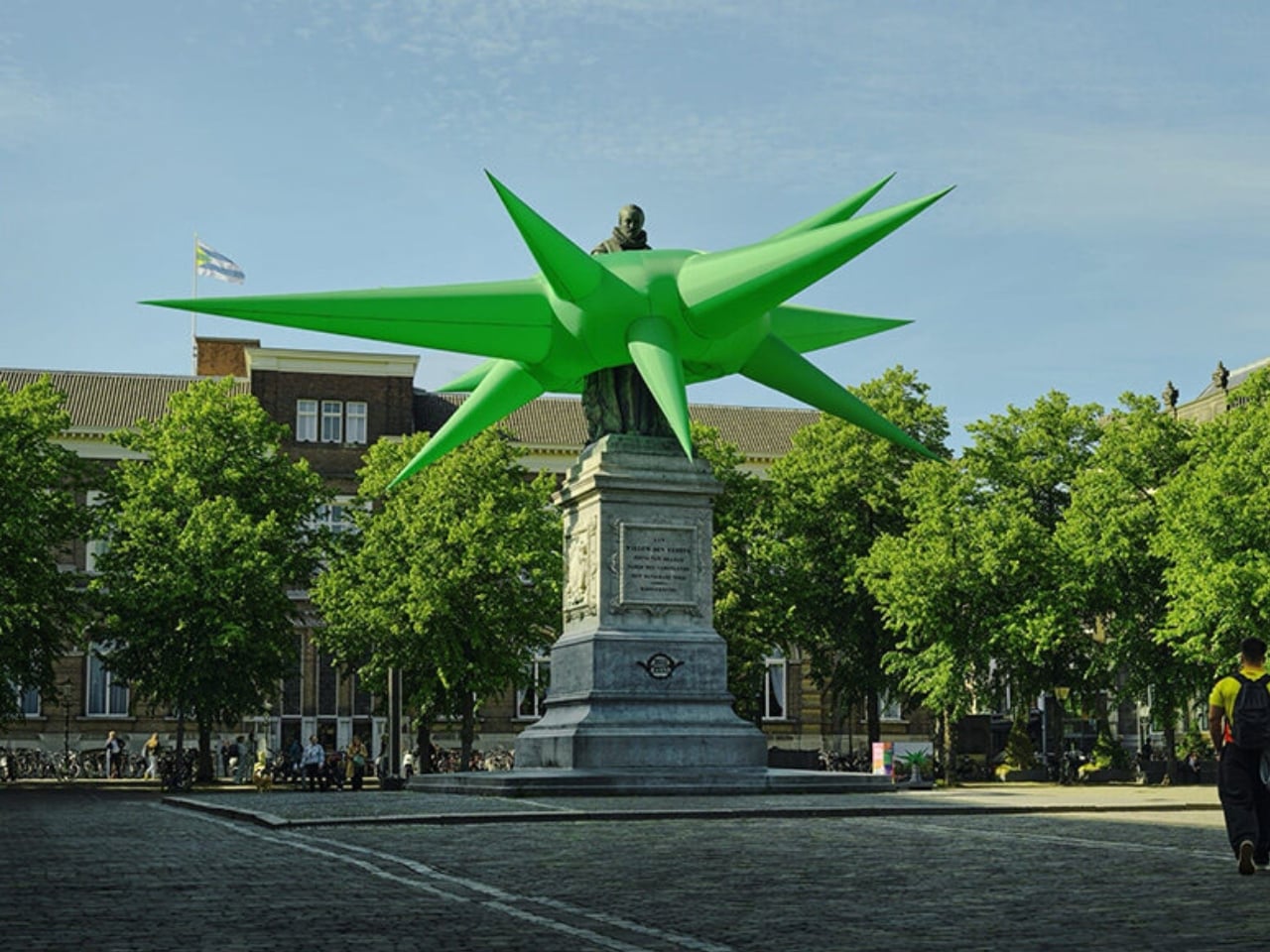
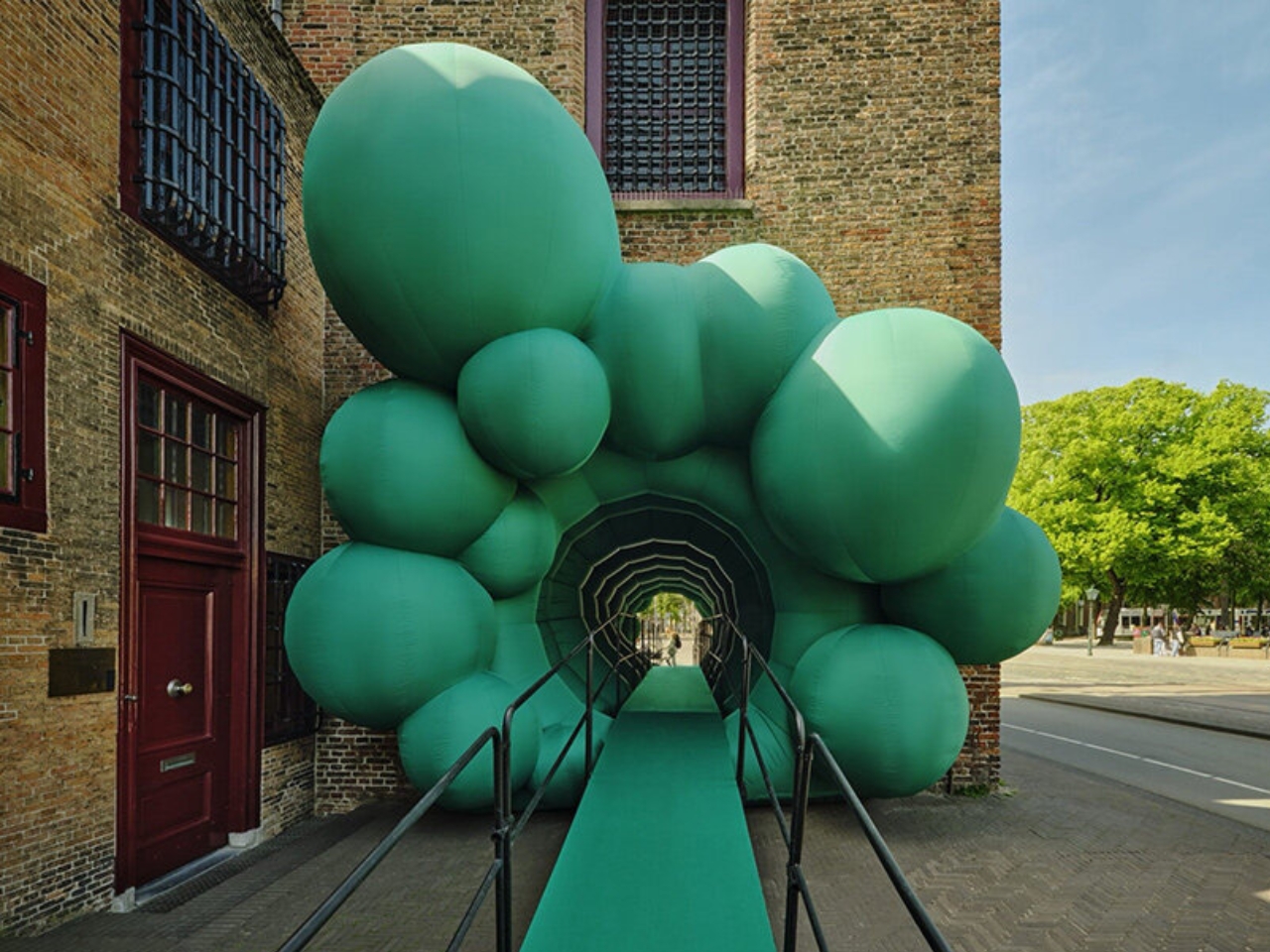
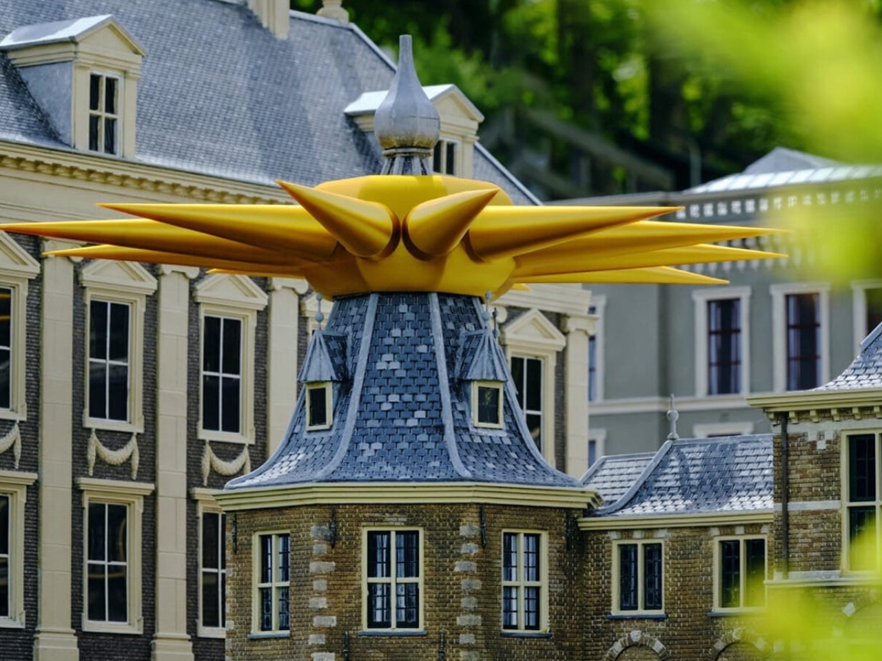
The Hague is not the first city you’d expect to reinvent what a museum looks like. But from May 22 to June 21, 2026, it might just be the most interesting one. BlowUp Jubilee, the fifth anniversary edition of BlowUp Art Den Haag, has filled the city’s historic Museum Quarter with 24 inflatable artworks from some of Europe’s most creative designers, and the result is one of the more quietly radical things happening in public art right now.

I want to start with the obvious, because the obvious is actually the point: these things are enormous. Steve Messam’s Crested rises above The Hague’s tree line as a vivid red spiked headdress. Studio Job sends an oversized cooking pot drifting across the Hofvijver. Marcel Wanders contributes a cluster of giant reflective Eggs that sit near centuries-old civic squares and somehow look completely at home. The sheer scale is part of the experience, but so is the material. Seeing something so large made of something so inherently light creates a kind of visual dissonance that’s hard to explain until you’re standing in front of it.

Designers: Various

Inflatable art has a reputation problem. For most people, that word conjures balloon animals or the kind of thrashing tube men outside car dealerships. What BlowUp Jubilee does is force a total rethinking of that association. When a floating cooking pot makes you stop mid-walk and laugh before you even think to analyze it, something worthwhile has happened. The best public art doesn’t ask you to be prepared. It just catches you off guard.

The whole exhibition started in 2022 as part of BinnenhofBuiten, an initiative by The Hague & Partners, commissioned by the municipality while the Binnenhof, the Netherlands’ historic political complex, undergoes major renovation. The closure could have left the area feeling hollow. Instead, curator Mary Hessing turned the absence into an opportunity, building a cultural walking route through the Museum Quarter that gave people a reason to keep moving through the neighborhood. What began with six artists has grown into a full five-year survey, with earlier works returning alongside new commissions.

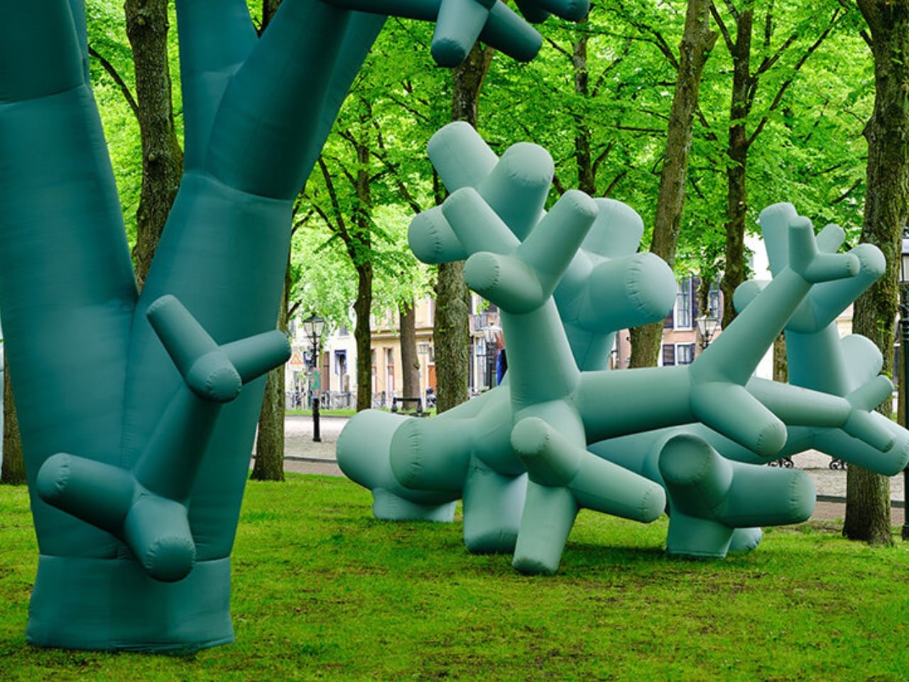
The artist list for this jubilee edition is genuinely varied. Raw Color brings graphic precision with Compressed Cylinders, Studio Ossidiana’s Softshell settles into its surroundings like something halfway between a creature and a building, and Studio Mieke Meijer’s Airboretum reinvents the idea of a tree entirely. Larissa Ambachtsheer’s Keep Me in Balance and Adrianus Kundert’s My First Inflatable lean into a lighter register. One of the most compelling additions is 21-year-old Eugenie Boon, whose piece Koncha pa Dilanti draws from her Curaçao heritage, filling an inflatable with scenes from the island’s food, parties, and community life. It’s a reminder that this format, when used thoughtfully, carries real cultural weight.

The question of access runs through everything BlowUp Jubilee does, and I think it’s the most underrated part. A museum asks you to go to it. This exhibition is simply there, spread across parks, along Lange Voorhout’s tree-lined stretches, near canals and building facades, and even inside a train station. You don’t buy a ticket to see Studio Job’s cooking pot. You just happen to look up on your way somewhere else. For anyone who finds gallery spaces quietly intimidating, that changes the entire relationship between a person and public art.

It also says something useful about how cities can respond to disruption. The Binnenhof renovation is an inconvenience, spatially and symbolically. BlowUp Art was the response that asked: what if we made the disruption into something worth seeing? Five years in, that bet has clearly paid off. By June 21, all 24 installations will be packed up and deflated, the whole spectacle compressed back into storage. Inflatable art lives on borrowed time by design. But the case BlowUp Jubilee makes for public art that is joyful, free, and genuinely oversized has a staying power that the materials don’t. Sometimes a museum doesn’t need walls. Sometimes it just needs air.

The post The Hague Just Turned Air Into Its Most Exciting Museum first appeared on Yanko Design.
The $899 Desktop CNC That Impressed Asia’s Biggest Tech Expo

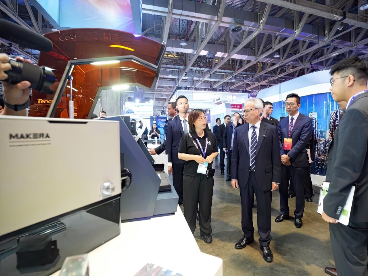
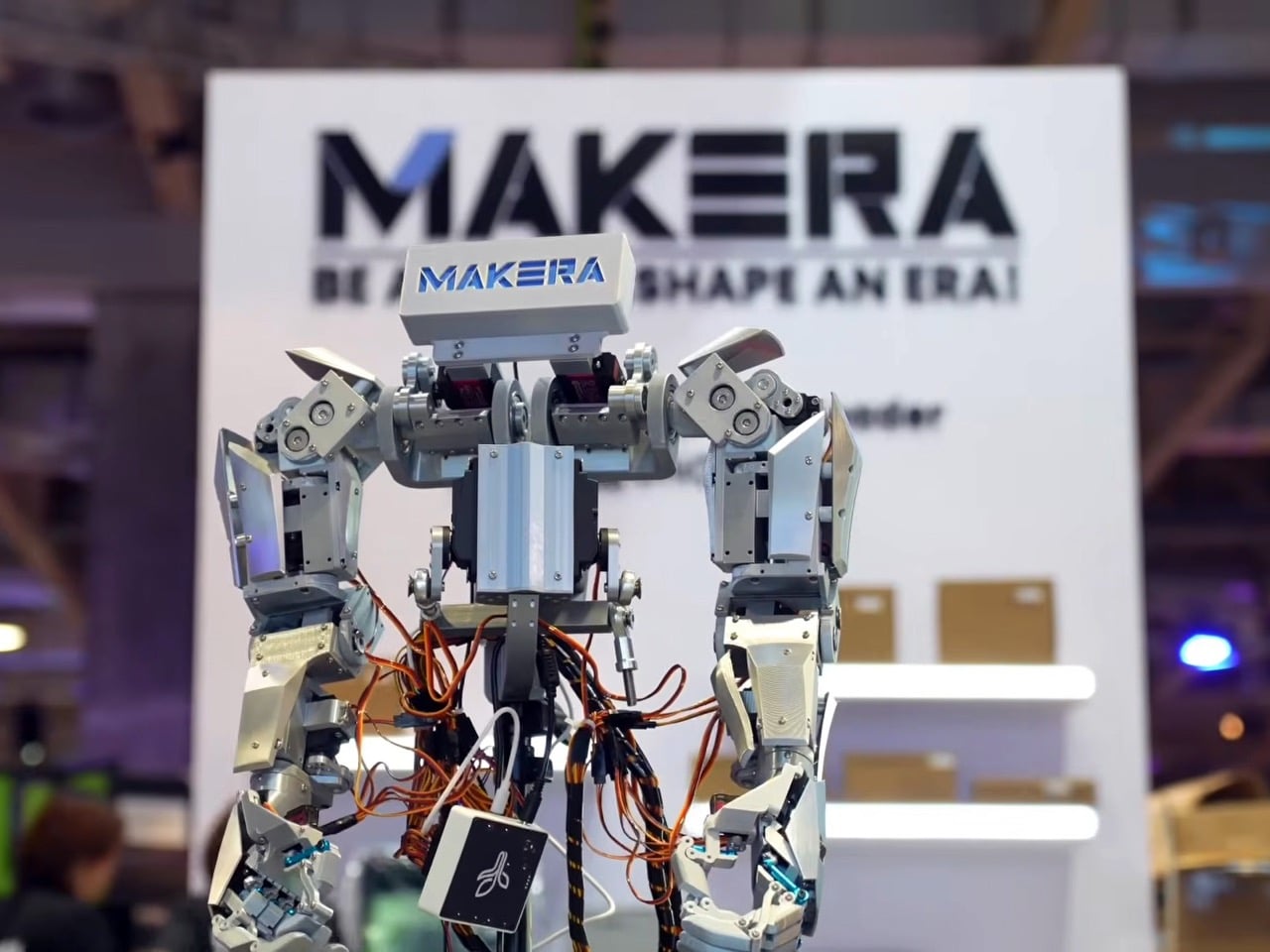
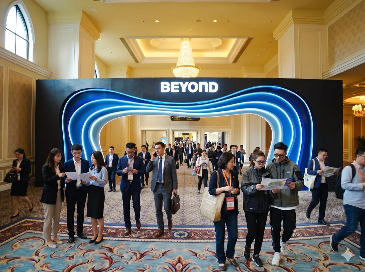
The guiding idea at BEYOND Expo 2026 was that AI software has finished its warm-up, and the main event is technology that acts in the physical world. Humanoid robots, intelligent wearables, and autonomous vehicles all made that case. So when the Makera Z1, a compact desktop CNC machine, won a Best of Innovation award, it felt less like a surprise and more like a statement.

This recognition was a direct nod to the expo’s central theme, “AI: Digital to Physical.” The Z1 is a tool of physicalization, a machine that takes a digital file and gives it mass, texture, and function by milling aluminium or wood. In a showcase built around moving intelligence beyond the screen, Makera’s device provided a clear, powerful example of what that transition looks like at a human scale.

Designer: Makera

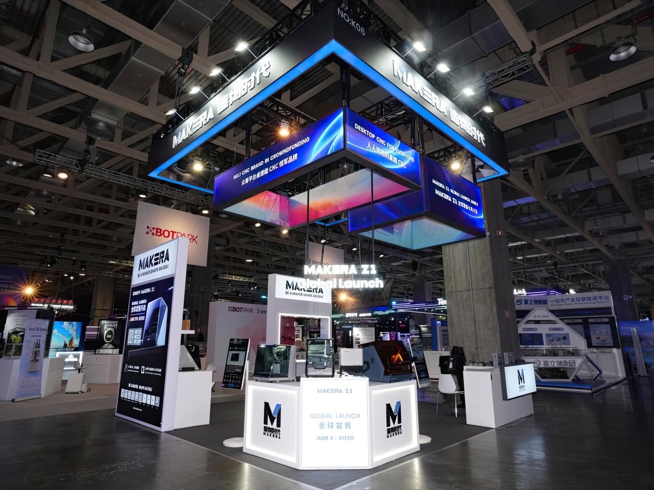
Four days at The Venetian Macao’s Cotai Expo brought together nearly 800 exhibitors, over 400 speakers, and more than 30,000 attendees from 120 countries and regions. Opening keynotes featured senior figures from NVIDIA, XREAL, Pudu Robotics, and the Linux Foundation, setting a tone built around industry direction rather than individual product announcements. Summits ran across seven main stages and covered embodied intelligence, spatial computing, AI agents, global capital flows, and cross-regional developer ecosystems. BEYOND co-founder Dr. Lu Gang described it as a moment where Asia is producing companies with real depth and global relevance, and the expo exists to show that to the world.

Over $10.2 million from nearly 7,000 backers is what the Z1’s Kickstarter campaign produced before closing in December 2025, a number that sits well above the typical ceiling for desktop hardware crowdfunding. IFA 2025 had already given the machine a “Best in Content Creation” Innovation Award before units shipped. The BEYOND recognition completes a three-stop credibility arc across Kickstarter, IFA, and Asia’s largest tech expo, a run few products in the desktop maker category have managed with this kind of consistency. As Makera’s third CNC machine, following the Carvera in 2021 and the Carvera Air in 2024, it carries a company track record behind it.

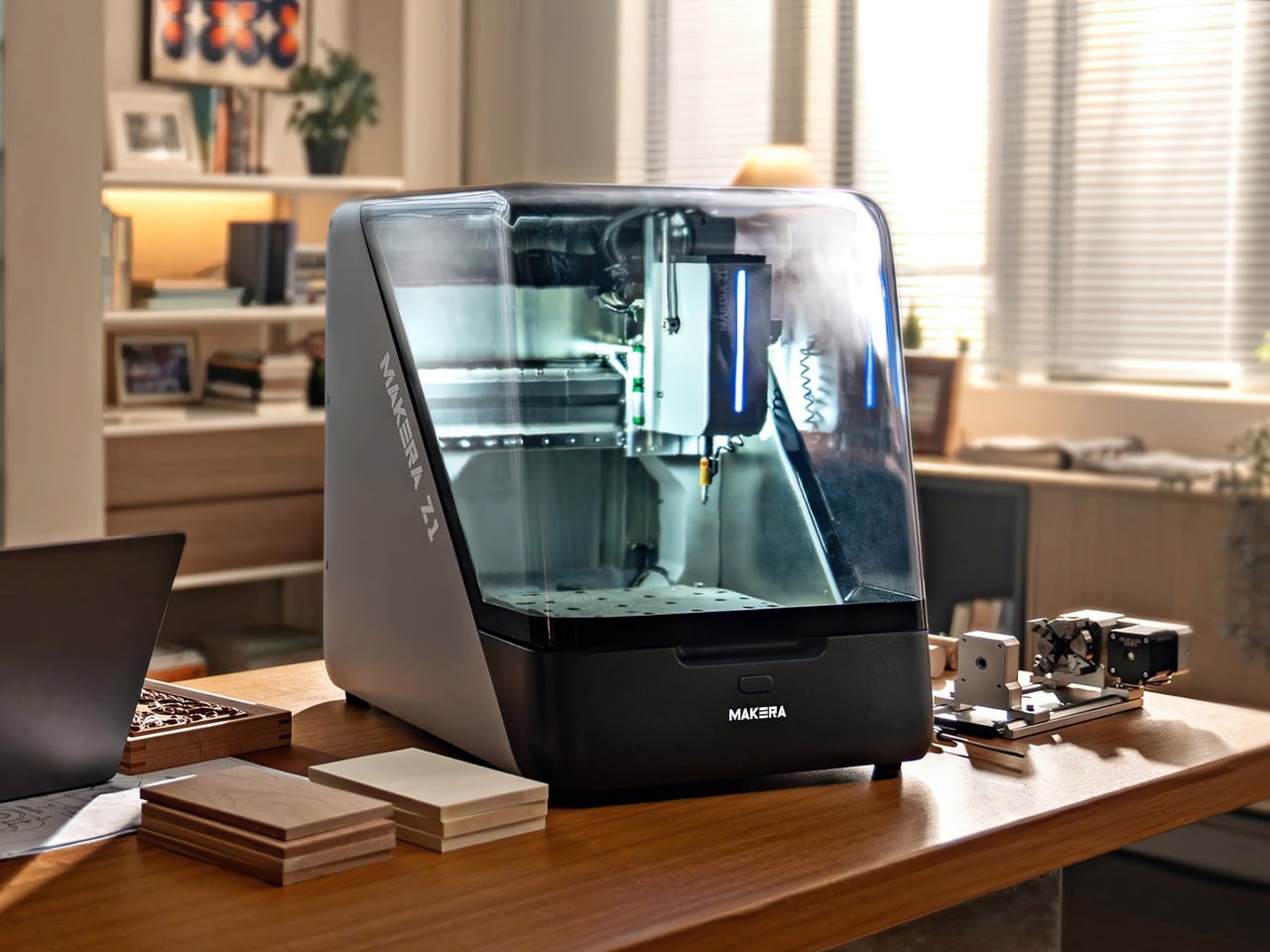
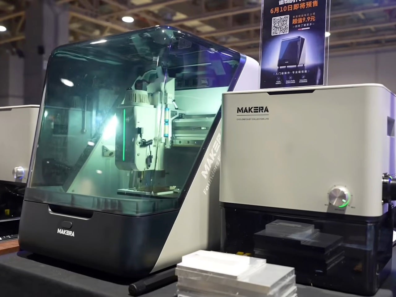
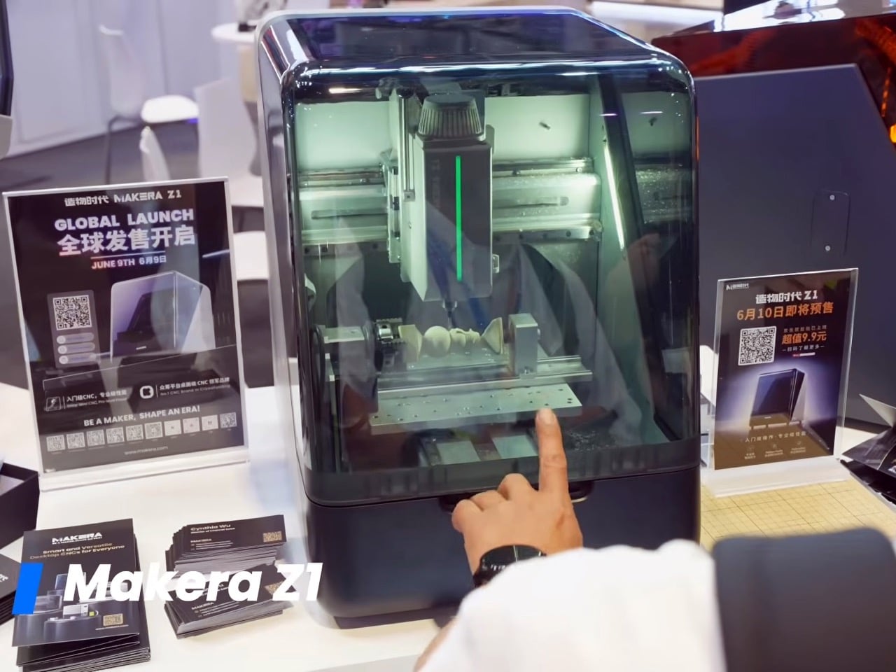
At $899 during its crowdfunding run, the Z1 targets a gap in desktop CNC that has historically been hard to fill. The machine carries a 200 x 200mm cutting area, a 100mm working depth, and a 150W spindle running at 13,000 RPM, handling materials from aluminium, brass, and copper to wood, PCBs, acrylic, and carbon fiber. With a claimed accuracy of 0.02mm, it sits in territory more commonly associated with machines priced two to three times higher. Automatic probing, levelling, a quick tool change system, and a built-in camera for real-time monitoring come standard, with an optional fourth axis, laser attachments, and dust collection available as add-ons.

Makera Studio handles toolpath generation automatically, and an AI-powered feature converts hand-drawn sketches or reference images into machinable 3D models, significantly lowering the barrier for anyone without a background in CAD software. A companion platform called Makerables extends this further, giving users access to a shared library of designs they can download, modify, and machine immediately. That full workflow, from a rough idea to a digital design to a finished physical object on a workbench, maps directly onto what “AI: Digital to Physical” was built to celebrate. Where many exhibitors at BEYOND demonstrated digital intelligence or physical hardware in isolation, the Z1 brought both into a single, compact package.

The Best of Innovation list at BEYOND 2026 included DEEPRobotics, Engine AI, iFLYTEK, Pudu Robotics, and AEROFUGIA alongside Makera, placing a sub-$1,000 desktop fabrication tool in the same frame as some of Asia’s most heavily funded hardware and AI companies. That company says something about where innovation appetite is moving at Asia’s largest tech gathering: toward tools that extend precision manufacturing beyond factory floors and into the hands of individual creators and small workshops. Whether the Z1 delivers fully on that promise across its growing user base is still being tested, but the BEYOND stage gave Makera a much bigger conversation to build from.

The post The $899 Desktop CNC That Impressed Asia’s Biggest Tech Expo first appeared on Yanko Design.
The 6.5-Meter See-Saw Sculpture Sydney Can’t Stop Talking About

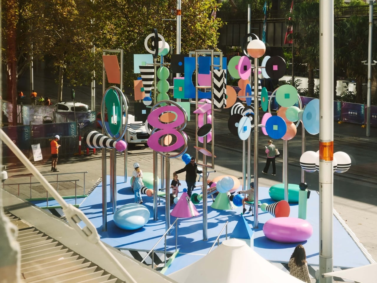
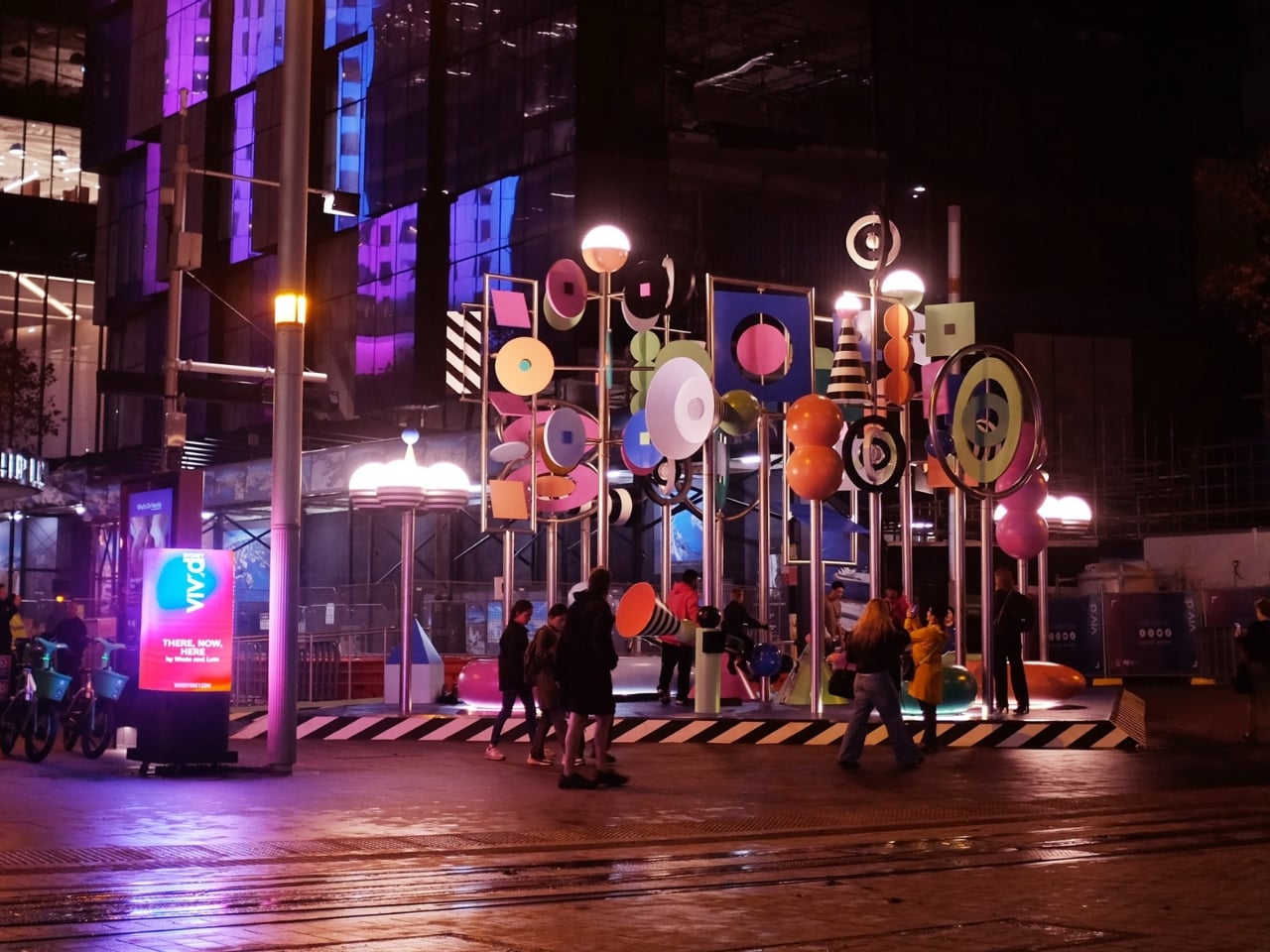
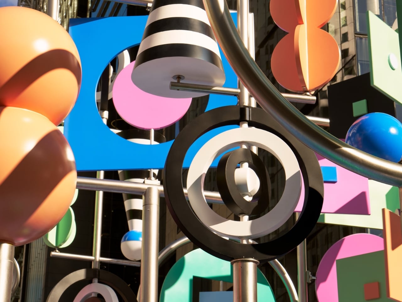
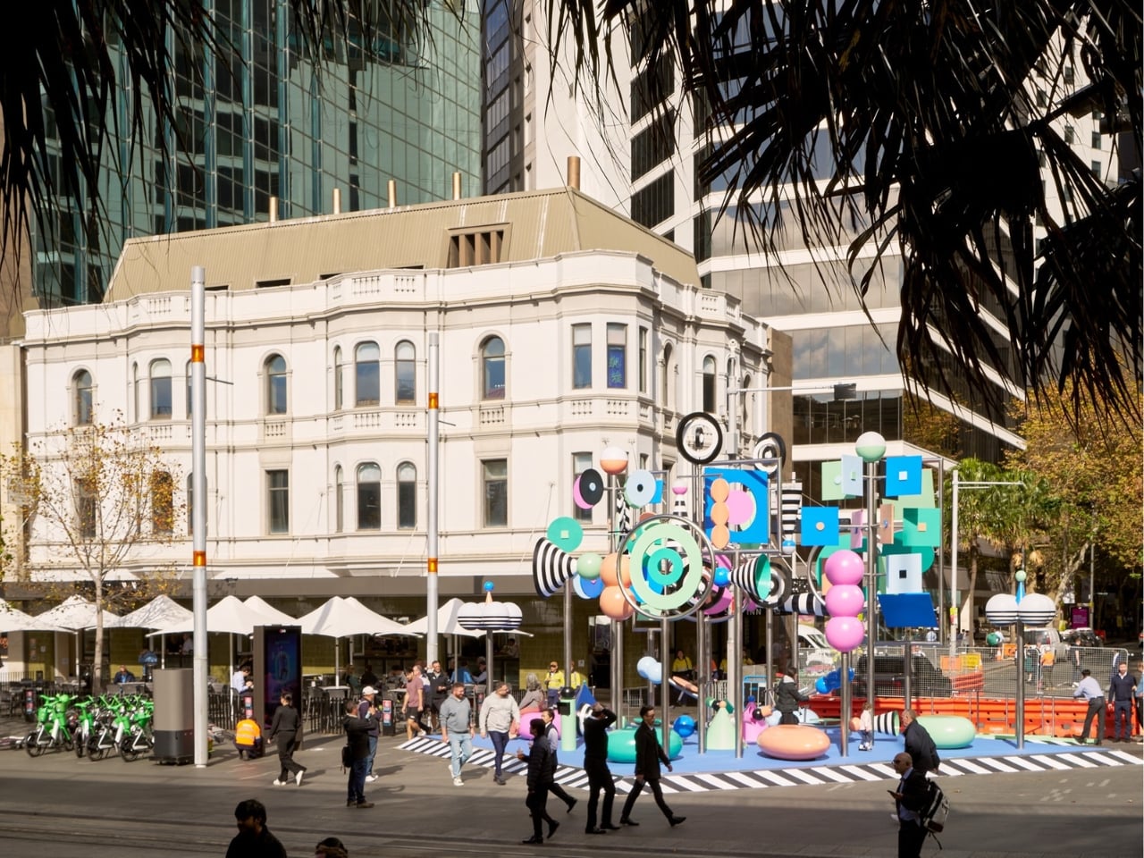
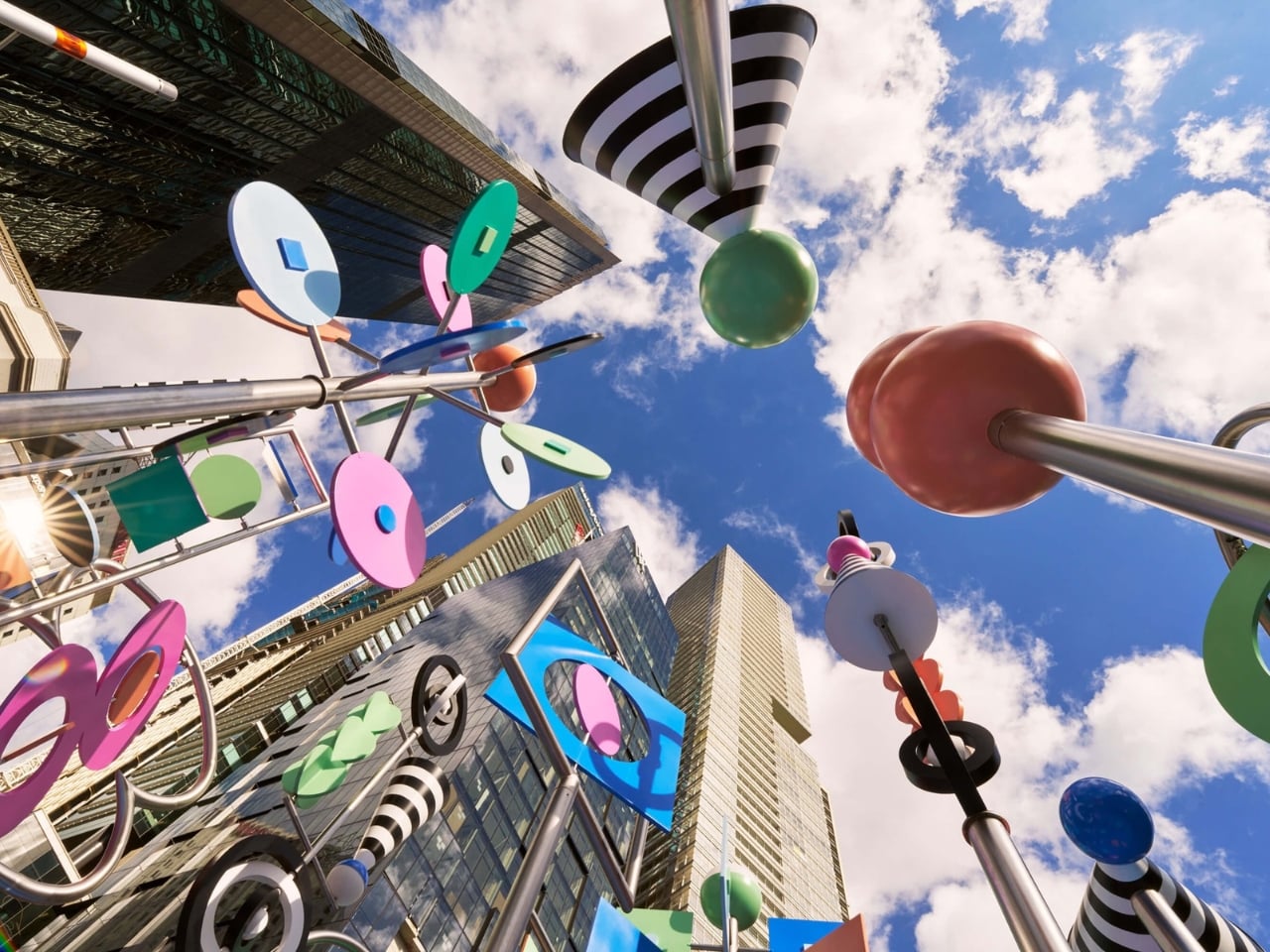
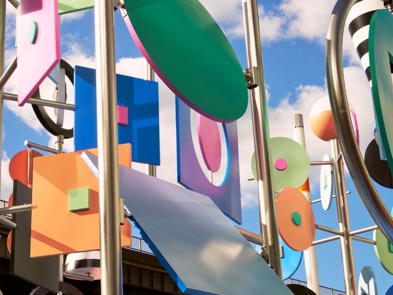
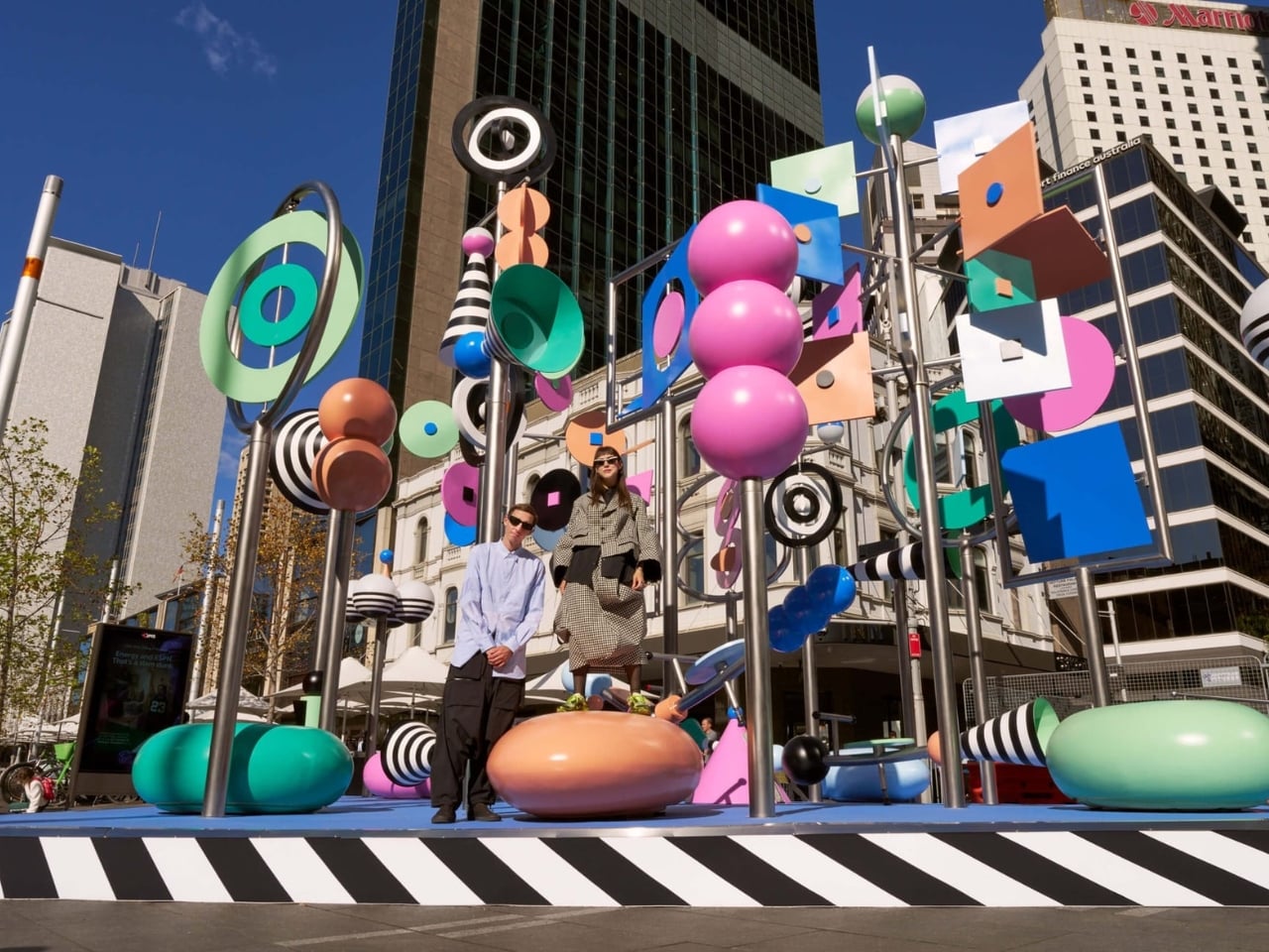
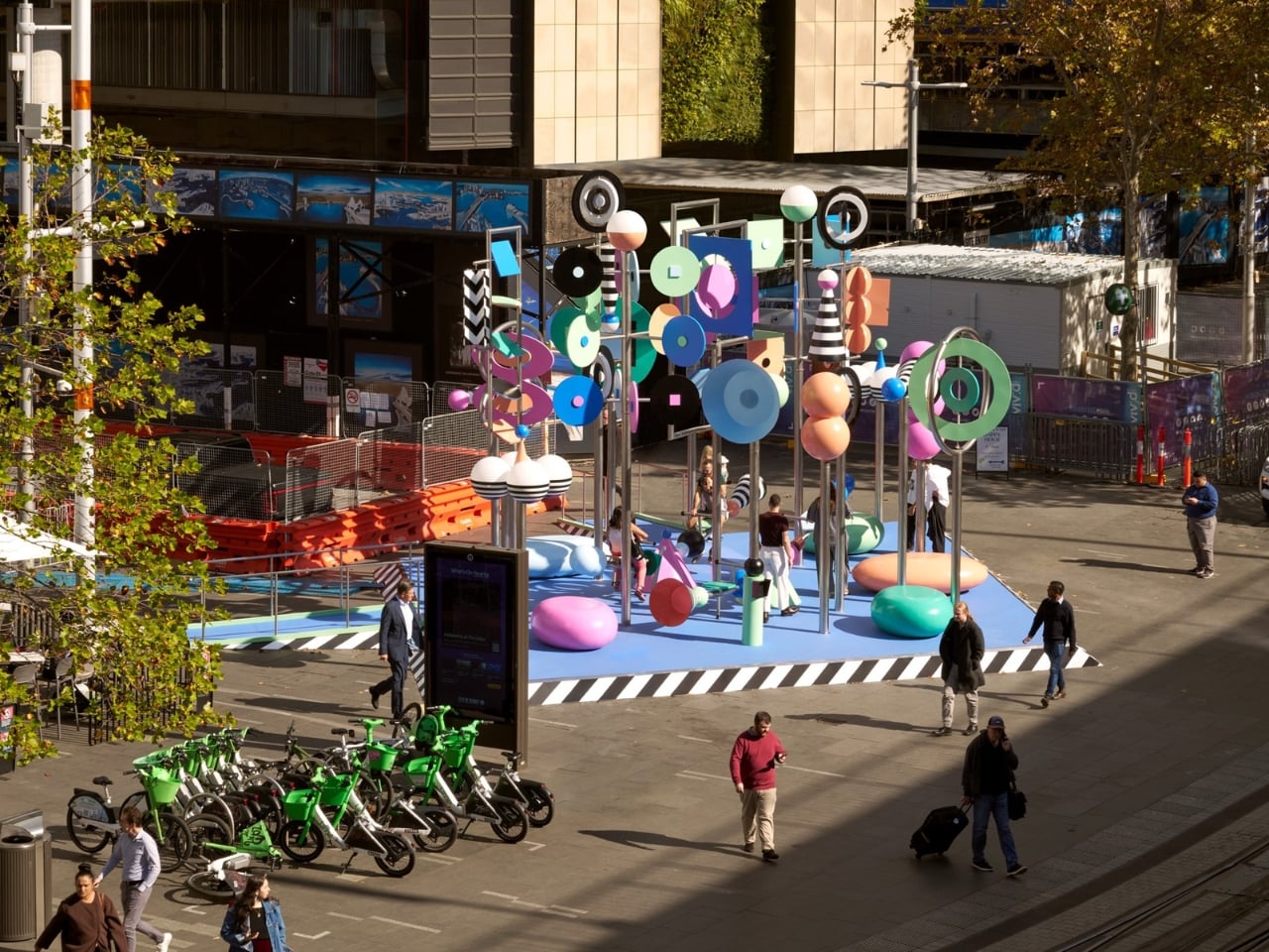
Public art often asks you to stop and stare. There, Now, Here asks you to grab a see-saw and get involved. At 6.5 meters tall, the kinetic installation from Brooklyn-based duo Wade and Leta is currently spinning, twirling, and tottering through Vivid Sydney at Circular Quay. It moves thanks to a combination of wind, motors, and willing passersby who hop on the see-saw built into its structure. The result is a sculpture that is never quite the same twice, always catching new angles of light, always mid-motion, always alive in the truest sense of the word.

That’s the kind of public art I love to see. Not something roped off and reverent, demanding a certain posture of appreciation, but something that genuinely asks the city to participate. When you can physically change the state of a piece of art just by sitting down and pushing off the ground, the line between audience and author starts to blur in the best possible way. Most public installations settle for being looked at. This one wants to be felt. That distinction matters more than it might seem.

Designers: Wade and Leta

The colors don’t just look good. They mean something. Wade and Leta pulled their palette from Dorothea Mackellar’s 1908 poem “My Country,” one of the most celebrated pieces of Australian writing and a poem many Australians know by heart. Mackellar’s famous “sunburnt country” inspired the installation’s muted, washed-out tones and black and white stripes, and the whole effect reads like a love letter to the Australian landscape written in a purely visual language. Two New York designers traveled to the other side of the world, studied a century-old poem, and turned it into spinning kinetic sculpture. That’s not lazy work. That’s genuine creative homework, and it shows.

Then there’s the sound component, designed by Josh Burgess, which takes the concept somewhere even more interesting. It captures the sonic texture of Circular Quay itself: the rush of water on rocks, the ding of the light rail, the chirp of the pedestrian crossing signal. Visitors can manipulate these sounds through accessible controls built into the installation, making the experience as interactive as you want it to be. But the lyrebird is the detail that really lands for me. Wade and Leta describe it as a nod to the “bush doof,” with the lyrebird’s sounds serving as the structural backbone of the whole audio experience. The lyrebird, for anyone unfamiliar, is an Australian bird so extraordinary at mimicry that it can replicate chainsaw sounds, camera shutters, and other birds with unnerving accuracy. Using one to anchor a soundscape about place and memory is not just a quirky design choice. It’s a quietly sharp observation about how culture and environment echo through each other in ways we haven’t always quite put into words.

Wade and Leta, the husband-and-wife creative studio known for large-scale work that balances rigorous design thinking with an almost giddy sense of play, are making their first public debut in Australia with this piece. As debuts go, it’s a confident one. Circular Quay is not a quiet corner of the city. It’s high-traffic, high-stakes public space, the kind of place where installations either disappear into the surrounding noise or assert themselves with real authority. There, Now, Here asserts itself. It doesn’t compete with the harbor for attention. It earns it.

Vivid Sydney has a strong track record of pulling in impressive international talent, but this feels like more than a festival commission. It feels like a genuine conversation between two outsiders and a place they took the time to understand, between movement and stillness, between a Brooklyn studio and the Australian bush. The title says it all in just three words. You don’t have to be from somewhere to make work that genuinely honors it. You just have to pay attention. The installation runs as part of Vivid Sydney’s 2026 program at Circular Quay. If you’re anywhere near it, go ride the see-saw.

The post The 6.5-Meter See-Saw Sculpture Sydney Can’t Stop Talking About first appeared on Yanko Design.
BEYOND Expo 2026: Asia’s Biggest Tech Event Just Told the World That AI Software Was Only the Warm-Up

Every major tech conference eventually finds its thesis statement. CES landed on “everything is connected.” SXSW staked out culture-meets-technology. BEYOND Expo‘s thesis for 2026 is more specific, and honestly more timely: AI has spent years proving itself in software, and the interesting question now is what happens when it leaves the screen. The official theme, “AI: Digital to Physical,” takes over from last year’s theme of Transforming Uncertainty into a Trigger for Innovation. Timed perfectly around the global speculation that AI’s a bubble, it’s a genuine reflection of where the most consequential AI work is actually happening right now, in robotics labs, automotive platforms, wearables, and manufacturing floors across the Greater Bay Area.

BEYOND has been building toward this moment since Dr. Lu Gang launched it during a global lockdown in 2021, a decision he’s called delusional in hindsight during an interview with Yanko Design, but with the kind of grin that says he’d do it again. The original problem he was solving was simpler than people realize: Asia’s most interesting founders kept showing up at CES and Web Summit as attendees rather than headliners. A hardware startup out of Shenzhen with genuinely world-class AI chops would get a 3×3 booth on a back wall while the stage went to the usual suspects. BEYOND was built to fix that imbalance, and five years in, it’s working.

Click Here to know more about the BEYOND Expo 2026

The 2026 edition is aiming for 30,000 attendees, a significant jump from 2024’s 20,000, and the programming reflects a maturing event that knows its own strengths. The summit lineup spans Humanoid Robotics and Embodied AI, Enterprise Agentic Workflows, Autonomous Driving, AI-Integrated Wearables, and a PayFi and Decentralized AI track that will either feel prescient or premature depending on your priors. What ties all of it together is the through-line of AI becoming something you interact with physically, not just through a chat interface. That’s a meaningful editorial choice, and one that puts BEYOND in a different conversation than conferences still treating large language models as the whole story.

The most interesting addition this year is the GBA Innovation Tour, which gives international attendees direct access to Greater Bay Area manufacturing infrastructure. This matters more than it might sound. Lu Gang has argued for years that what makes Asia’s tech ecosystem genuinely different isn’t just the innovation pipeline, it’s the compression of the distance between idea and physical product. Watching an AI concept move from prototype to production in a Shenzhen facility in weeks rather than months is something you can describe in a keynote, but apparently you need to see it to really understand the scale and speed involved. The tour is BEYOND’s way of making that argument visceral rather than theoretical.

Last year’s theme, “Unveiling Possibilities,” was about reframing uncertainty as creative fuel, which was the right message for a chaotic moment. “AI: Digital to Physical” is more declarative, more confident. It names a specific transition that the industry is mid-stride through, and plants BEYOND squarely in the middle of it. Registration and exhibition details are live at beyondexpo.com.

Click Here to know more about the BEYOND Expo 2026

The post BEYOND Expo 2026: Asia’s Biggest Tech Event Just Told the World That AI Software Was Only the Warm-Up first appeared on Yanko Design.
ecal x Google Just Imagined 10 Phones Beyond the Slab

At ECAL’s collaboration with Google’s Industrial Design team, the smartphone is no longer treated as a fixed icon of consumer tech. In A Message from Tomorrow, it becomes something far more fluid, a design question that deserves to be reopened. The brief invited ECAL’s Master Product Design students to develop mobile-focused concepts inspired by daily rituals, with an emphasis on storytelling and the human dimension of technology. That framing gives the exhibition its real energy. Instead of chasing the usual upgrades in speed, resolution, or sleekness, the projects ask how mobile devices might evolve if they were designed around touch, companionship, movement, energy, and the subtle gestures that shape everyday life.

That shift feels especially relevant now. Smartphones have absorbed nearly everything, from cameras and maps to notebooks, music players, and assistants, yet the object itself has become strangely stagnant. For all the complexity hidden inside, the form remains stubbornly familiar, a smooth slab built around endless visual attention. A Message from Tomorrow pushes against that stagnation by imagining mobile hardware as a much broader territory. Here, devices can be expressive, self-sufficient, spatial, tactile, or emotionally responsive. The exhibition does not present one neat answer to the future of the phone. It presents a series of alternate directions, each exposing something our current devices no longer do well.

Deigner: ECAL/University of Art and Design Lausanne x Google ID

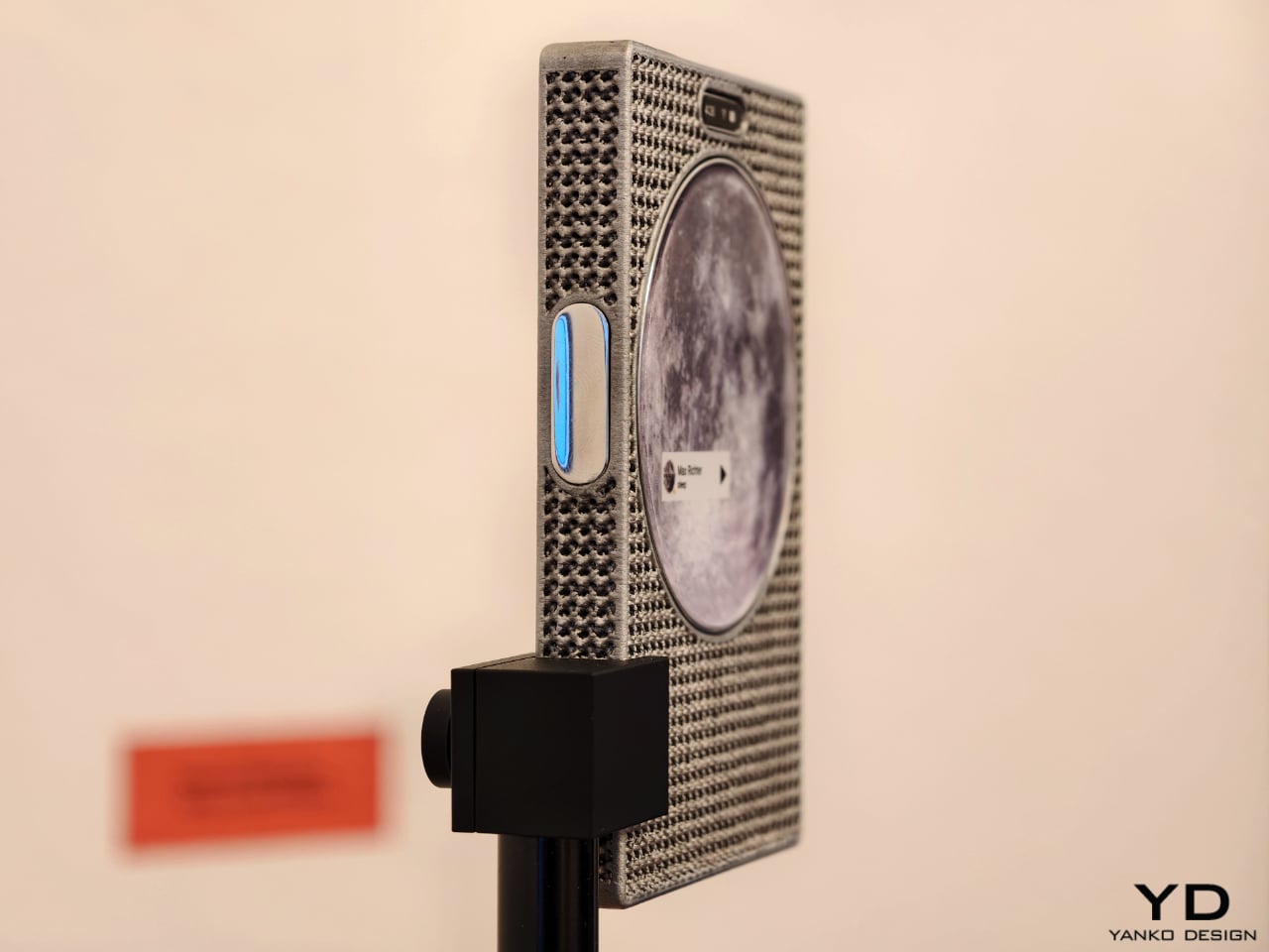
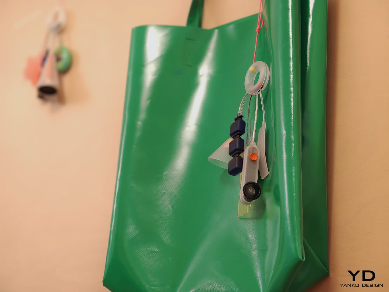
One of the show’s strongest ideas is that the future of mobile technology may not be screen-first at all. Several projects deliberately loosen the screen’s dominance and focus instead on sound, physical presence, or integration with the surrounding world. Sound Machine, by Xose Lois Piñeira, rebuilds the phone around voice. Its 3D-printed aluminum lattice body is acoustically transparent, allowing sound to move through a layered assembly while a contact transducer on the back transmits audio through surfaces or through the body when worn against the sternum. A small circular screen handles only the essentials. It is a compelling proposition because it refuses the idea that a phone must always function as a miniature display first and everything else second.

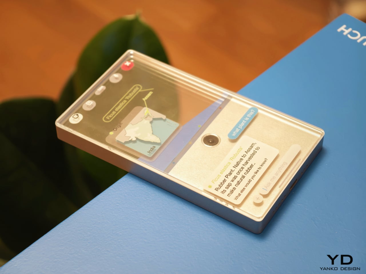
Liminal Frame, by Ehrat Lee, offers another escape from flat-screen logic. Its four-layer display can shift between opaque and transparent states, letting digital content coexist with the physical world rather than replacing it. The device allows users to look through the phone, place information in space, and return to it later without relying on a headset. It turns the phone into a kind of portal rather than a closed surface. In a moment when spatial computing is often imagined through bulky wearables, this project feels especially elegant. It suggests that the phone itself could evolve into a lighter and more natural bridge between digital and physical experience.

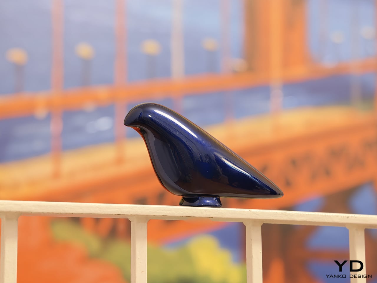
Some of the exhibition’s most memorable concepts explore personality as much as function. Robin, by Gyuhan Park, imagines a mobile device modeled on pet-bird behavior. Cameras become eyes, a beak-like feature acts as sensor and speaker, and the object communicates like a companion rather than a conventional assistant. It can tease, joke, or sulk while also helping with planning, messages, and everyday tasks. The concept is playful, but it also raises a serious question about the future of devices. As AI becomes more embedded in daily life, will our relationship with technology become less transactional and more behavioral.

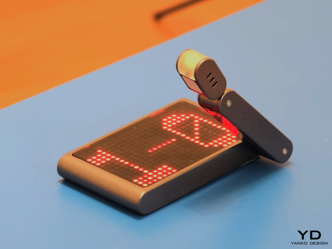
That same willingness to rethink familiar habits appears in The Finger Phone by Hugo Von Hofsten. Starting from the frustration that phones always need to be held, it introduces an animated finger-like extension carrying a camera, light, and touchpad. The idea is delightfully odd, but also surprisingly practical. It imagines a device that can stand on its own, assist in small moments, and illuminate more than just its own screen. In a market dominated by polished uniformity, The Finger Phone feels refreshingly unconcerned with conventional elegance. It is willing to be useful, strange, and memorable all at once.

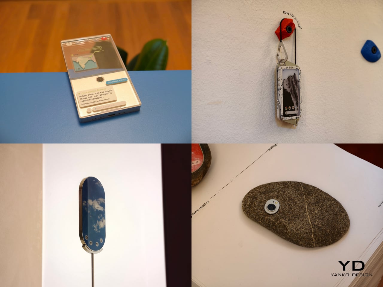
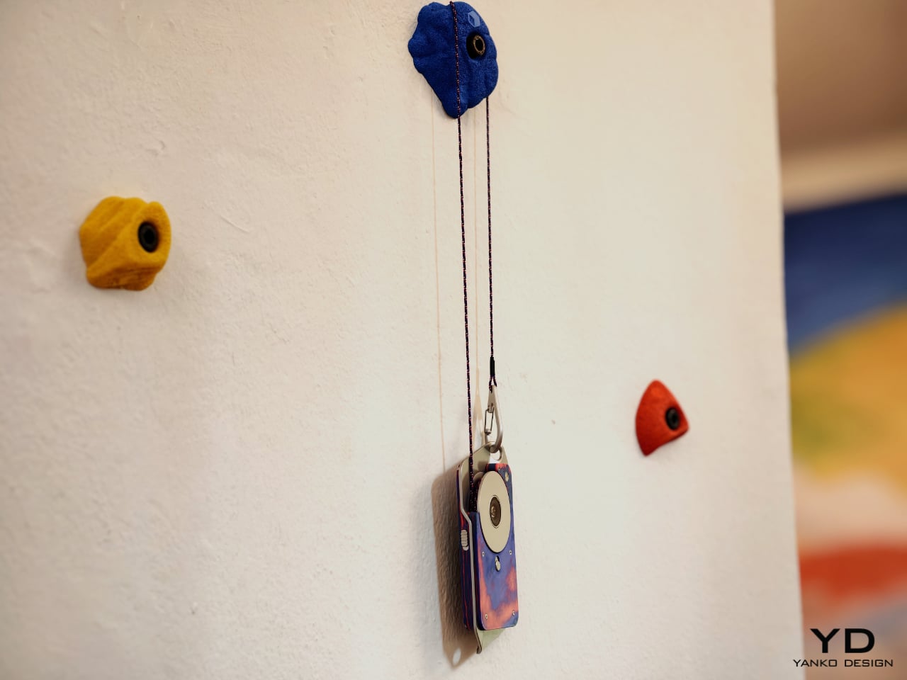
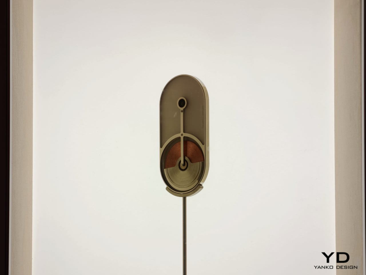
The exhibition also includes projects that challenge the smartphone’s dependence on charging infrastructure and standardized use cases. Rove, by Moritz Engel, is designed for off-grid wilderness and uses a pull-cord system to generate power through an axial flux generator. One minute of pulling creates twenty minutes of battery life, while the Dyneema cord doubles as a carrying strap and the spool becomes a tactile control wheel. Dyno, by Julia Siebert Cáceres, tackles the same problem from a more everyday angle, using body movement and electromagnetic induction to generate electricity throughout the day. Its visible rotor and magnet system make the act of charging tangible rather than hidden, giving the device an honesty that most sealed electronics lack.

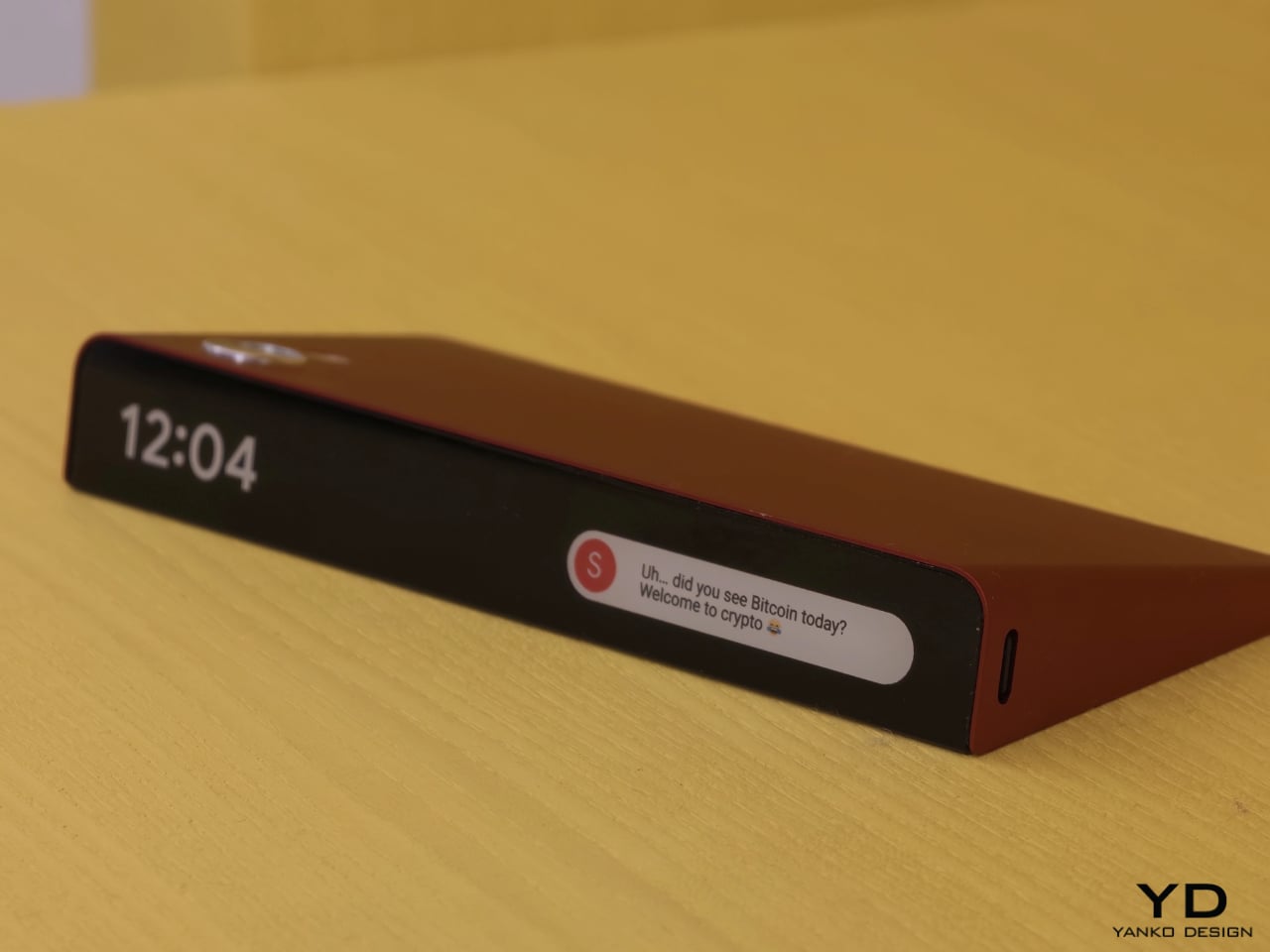
Other projects focus on what the phone means as a physical object in domestic and personal life. Everydaycarry, by Motong Yang, critiques the smartphone as a standardized entity that contains everything yet expresses very little. It proposes a more adaptive device whose character can still reflect the identity of the person carrying it. Totem, by Paul Quentin, reshapes the phone into a wedge so it can function more naturally as a tabletop object for video calls, media viewing, or AI assistance. When laid flat, its edge becomes a subtle notification interface. These projects are not simply formal experiments. They rethink how devices occupy space, signal presence, and fit into routines beyond the hand and pocket.

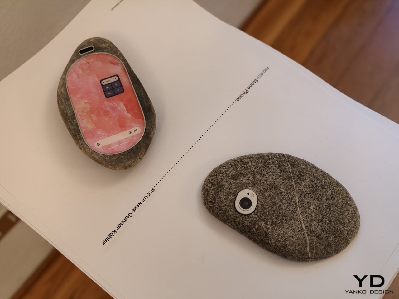
Then there is Stone Phone by Gunnar Kähler, one of the exhibition’s most quietly affecting concepts. Inspired by the instinctive act of picking up a stone from a beach or riverbank and choosing the one that feels right in the hand, the project imagines smartphones in an endlessly varied range of shapes. Instead of accepting industrial uniformity as a given, Stone Phone suggests that users might choose a device based on texture, comfort, and tactile pleasure. It blurs the line between archaic tool and advanced technology, making the smartphone feel less like a mass-produced command and more like a personal object discovered through touch. In a show full of speculative gestures, this one stands out for its simplicity. It reminds us that before a device does anything, it is first something we hold.

What makes A Message from Tomorrow compelling is not that every concept seems ready for mass production. It is that each one identifies a real tension in our relationship with mobile technology and gives it a physical form. Together, the projects reveal how narrow the current smartphone archetype has become. More importantly, they show that industrial design still has the power to meaningfully reshape our technological future. In an era when innovation is often framed as software alone, this exhibition argues that form, material, behavior, and ritual still matter deeply.

The post ecal x Google Just Imagined 10 Phones Beyond the Slab first appeared on Yanko Design.
Issey Miyake’s Most Beautiful Material Was Always the Scrap

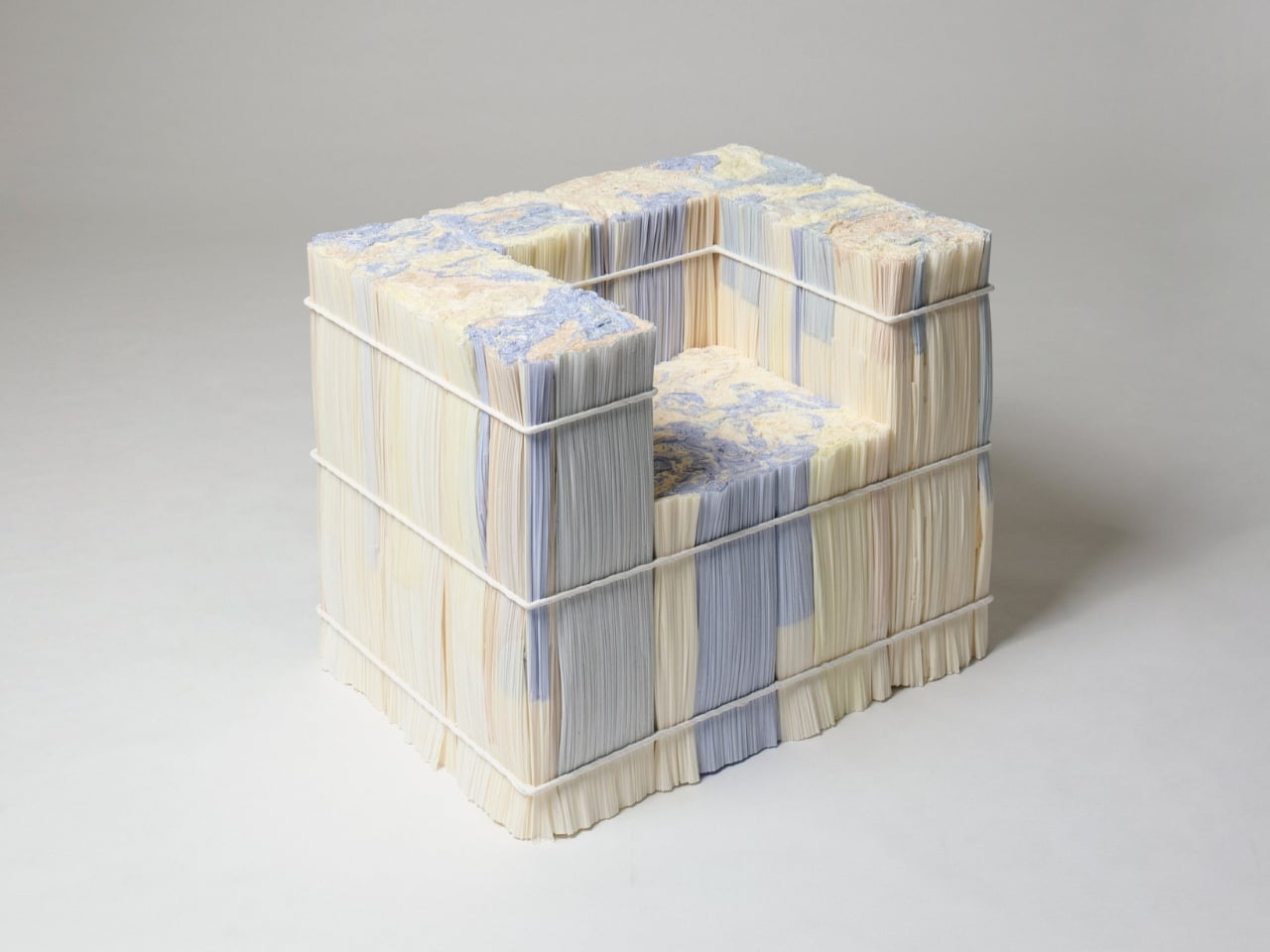
If you’ve ever watched the pleating process behind ISSEY MIYAKE’s iconic garments, you already know it’s one of the most satisfying things in fashion. The fabric goes in, it comes out textured and alive, and for decades, that has been the whole story. Satoshi Kondo, one of the design directors at MIYAKE DESIGN STUDIO, chose to flip the script. He looked not at the pleated garment coming off the machine, but at what was left behind: compressed rolls of wafer-thin paper, stacked and destined for the bin.

The result is The Paper Log: Shell and Core, a special exhibition running at the ISSEY MIYAKE Milan store this April, timed to coincide with Milan Design Week 2026. And it’s the kind of project that makes you want to rethink every process you’ve ever considered mundane.

Designer: Satoshi Kondo of MIYAKE DESIGN STUDIO

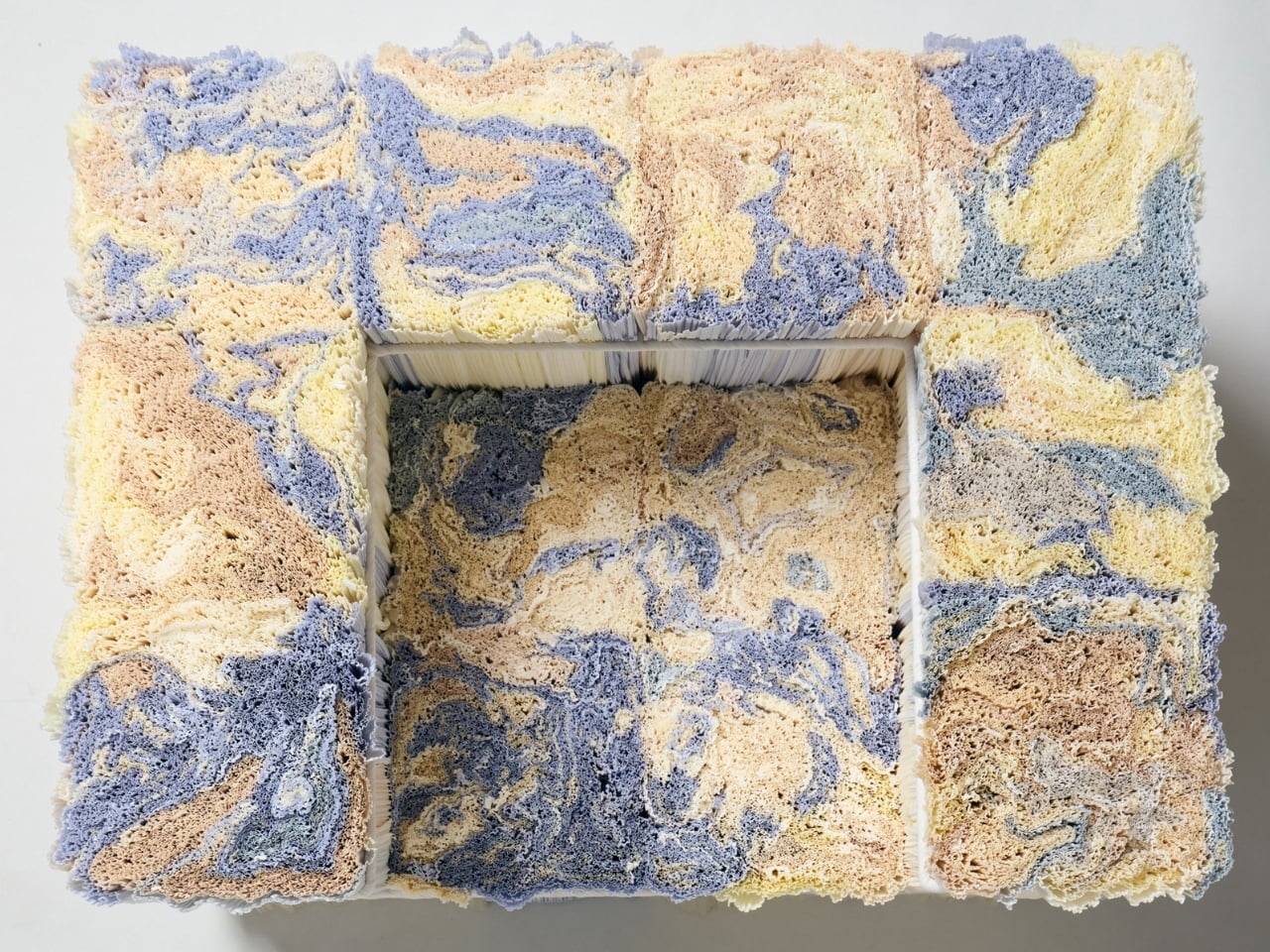
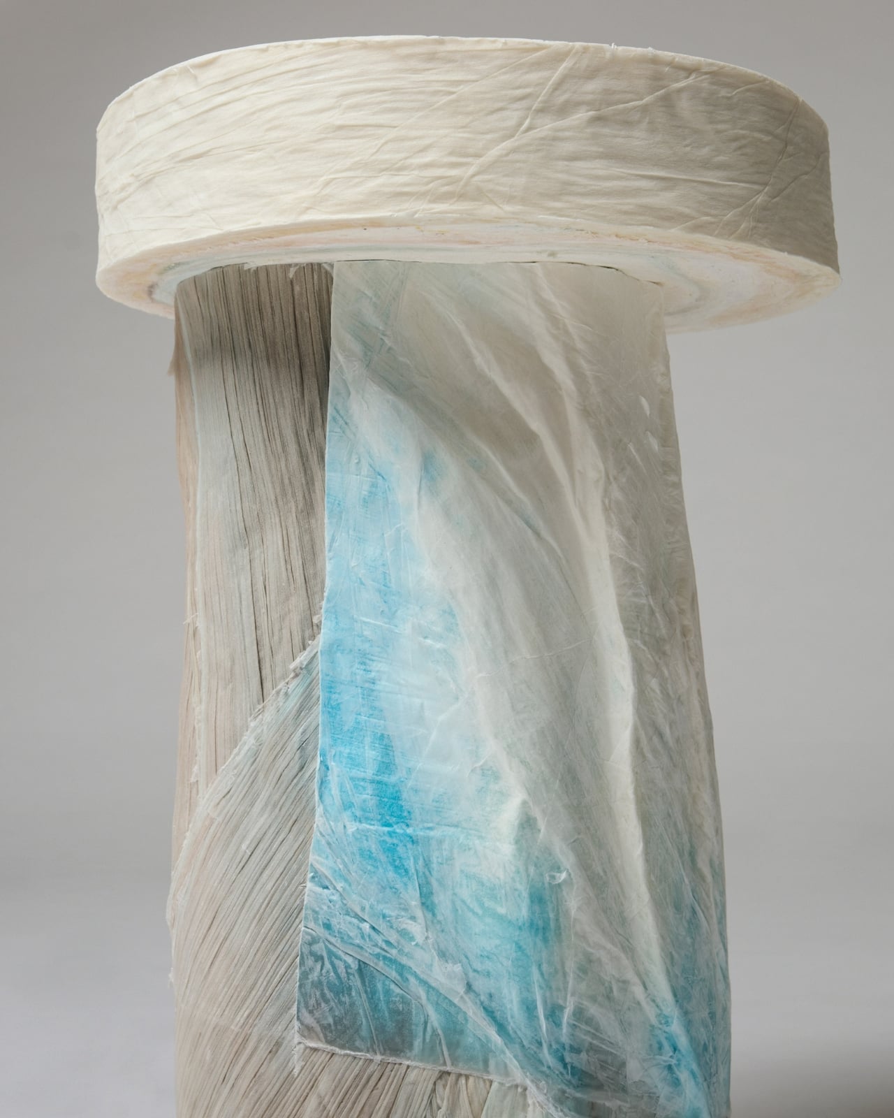
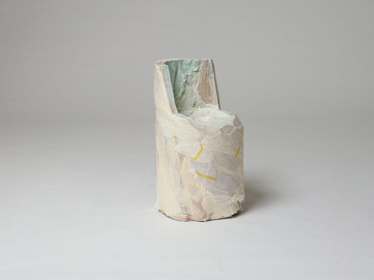
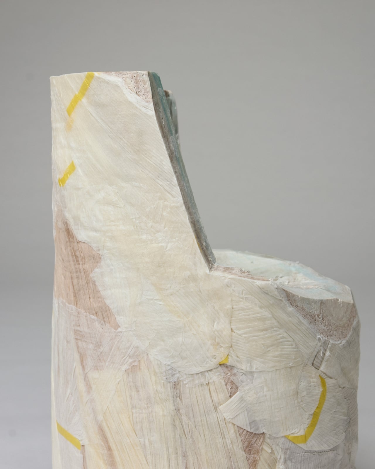
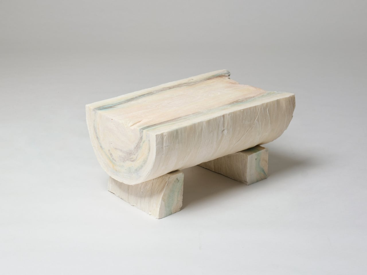
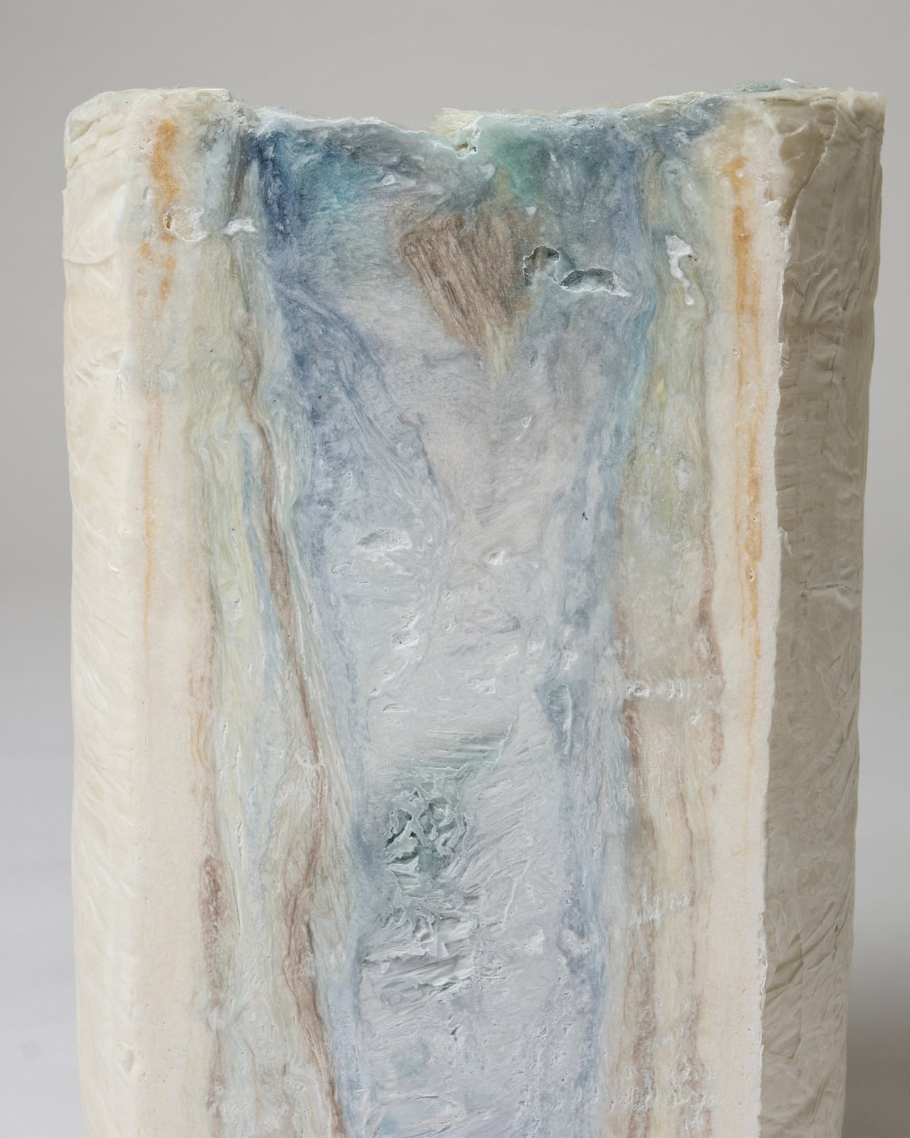
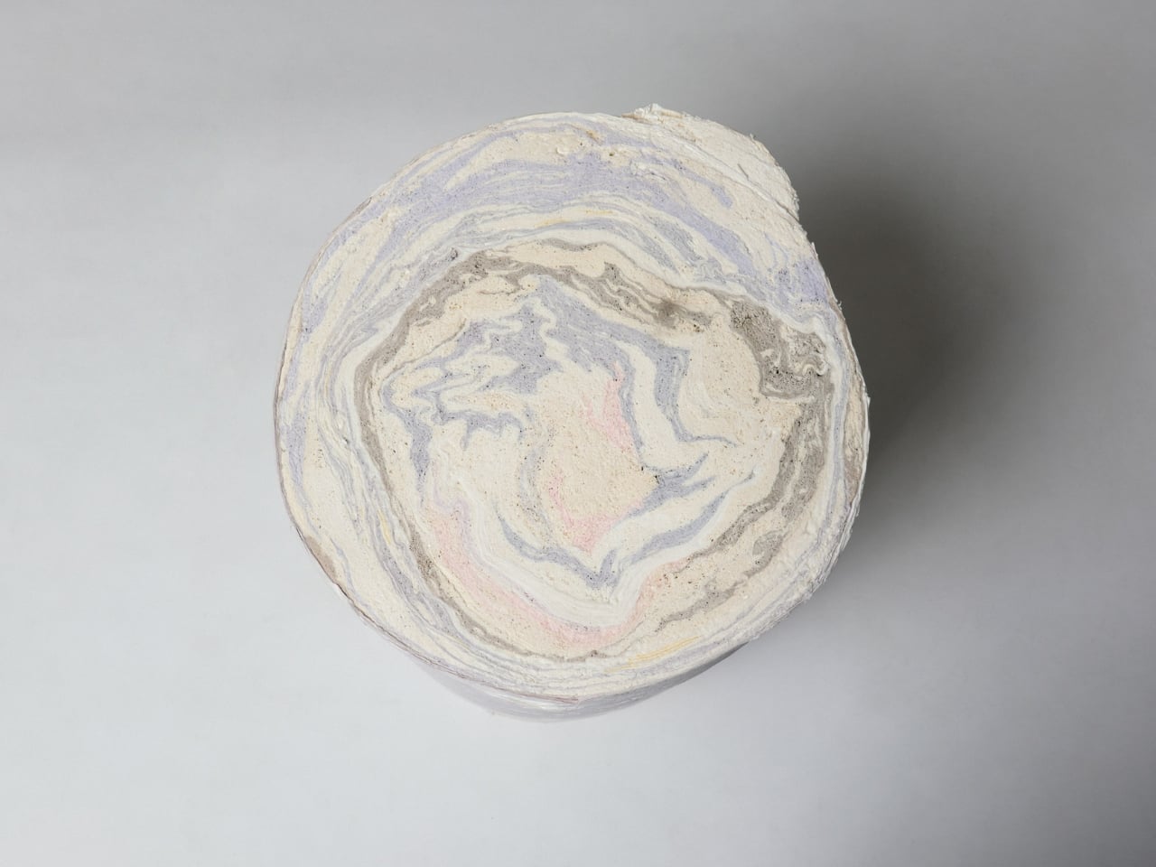
The paper in question is a production byproduct. These thin sheets are used to protect the fabric as it moves through the pleating machine, and when the garments are done, the sheets are rolled up, compressed, and typically moved off-site for recycling or disposal. What Kondo noticed during a visit to the manufacturer, though, was that these rolls look like logs. Not metaphorically, but structurally. Each compressed roll stands 80 cm tall and 40 cm wide, and when you look at the end of one, the layered paper creates a marbled, circular pattern that resembles the growth rings of a tree. Hence the name.

That visual parallel carries real weight. The Paper Log doesn’t just look like a tree trunk; it shares its logic. Growth rings mark time in a living thing, and the layers of the Paper Log carry the memory of every garment made at the house. It’s a surprisingly poetic idea from an industry that usually discards its footnotes.

For the exhibition, Kondo brought in Spanish architecture office Ensamble Studio to develop two distinct bodies of work from the same material. The first, Shell, takes the paper log apart and treats it like a sculptural material, creating crisp, delicate objects that feel frozen mid-process. They’re almost ghost-like, holding a shape the way paper holds a crease. The second body of work, Core, goes in the opposite direction. Here the paper is treated as structure, forming actual furniture prototypes including stools, chairs, and tables. Robust and handcrafted, these pieces sit in direct contrast to the fragility of Shell, and that tension is very much the point.

The installation is arranged throughout the store to play Shell and Core against each other, presenting opposing ideas side by side: ephemeral versus concrete, delicate versus robust. I find this curatorial framing genuinely effective. It’s rare to see a single waste material handled in ways that feel this philosophically distinct, and rarer still to see a fashion house direct that kind of rigorous design thinking toward something that would otherwise not exist at all.

What makes The Paper Log worth your attention beyond the visual spectacle is the quiet insistence that process deserves as much consideration as product. Issey Miyake has always been a house obsessed with how things are made. The pleating technology itself is a kind of philosophy, a belief that the mechanics of creation are as meaningful as the finished object. Applying that thinking to the waste materials of that same process feels less like an act of sustainability and more like an act of honesty.

Whether or not furniture made from fashion scraps becomes a commercial category (and it absolutely could), The Paper Log: Shell and Core operates primarily as a provocation. It asks what we overlook when we’re focused on the final product, and suggests that the answer might be the most interesting material in the room. The exhibition runs at the ISSEY MIYAKE Milan store on Via Bagutta 12, from April 21 to May 5, 2026.

The post Issey Miyake’s Most Beautiful Material Was Always the Scrap first appeared on Yanko Design.
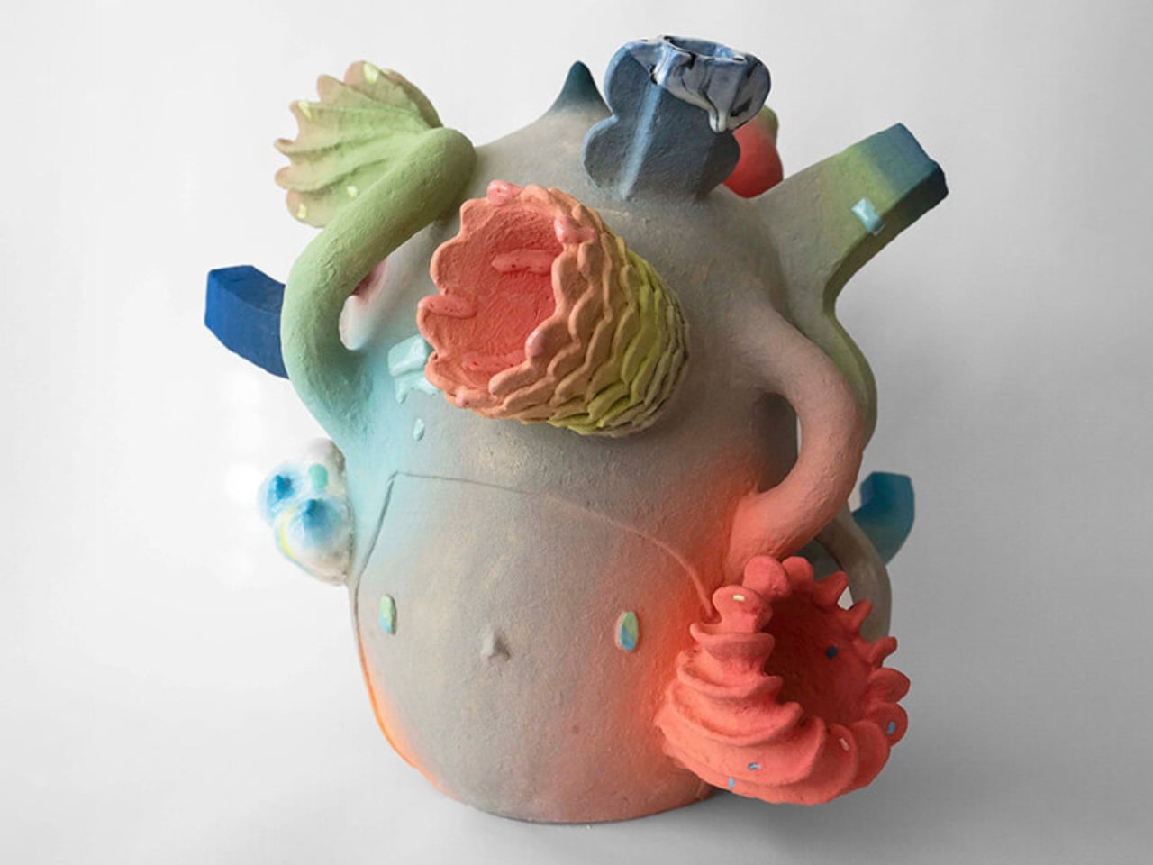
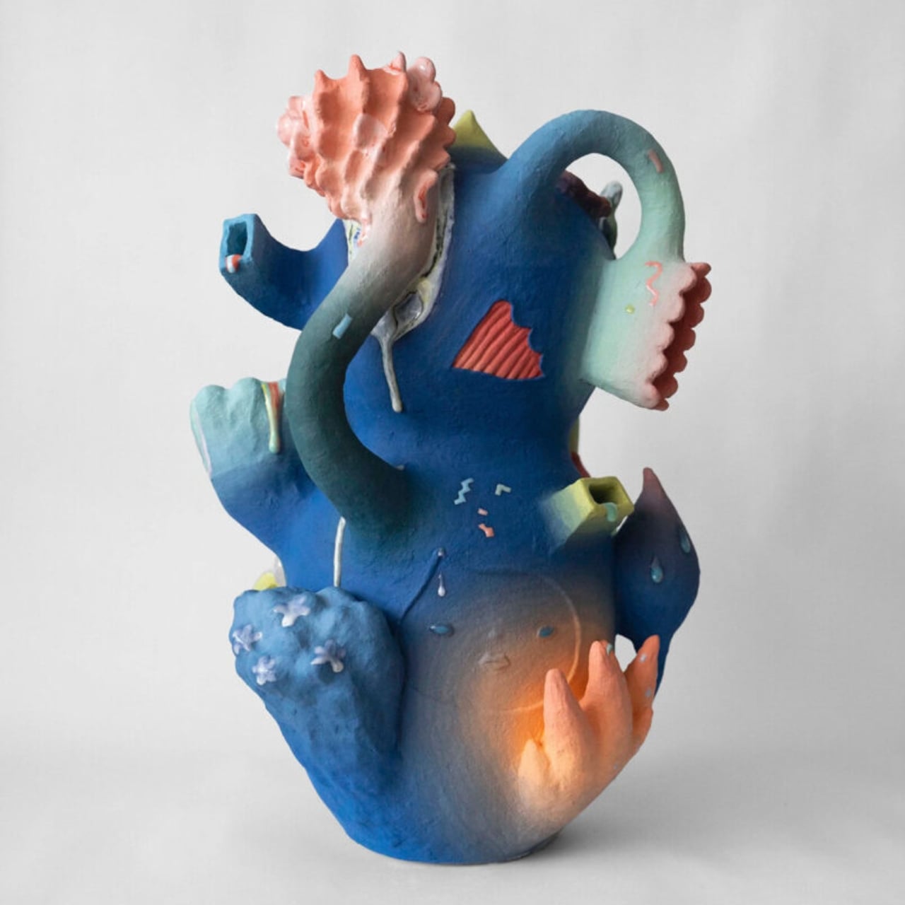
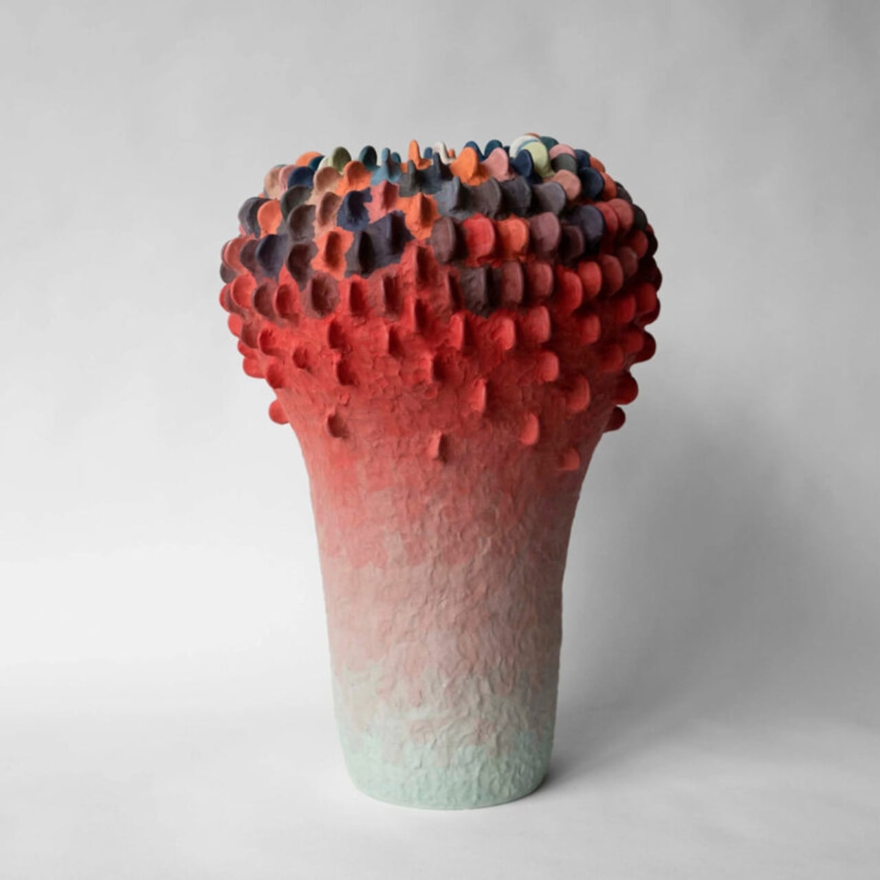
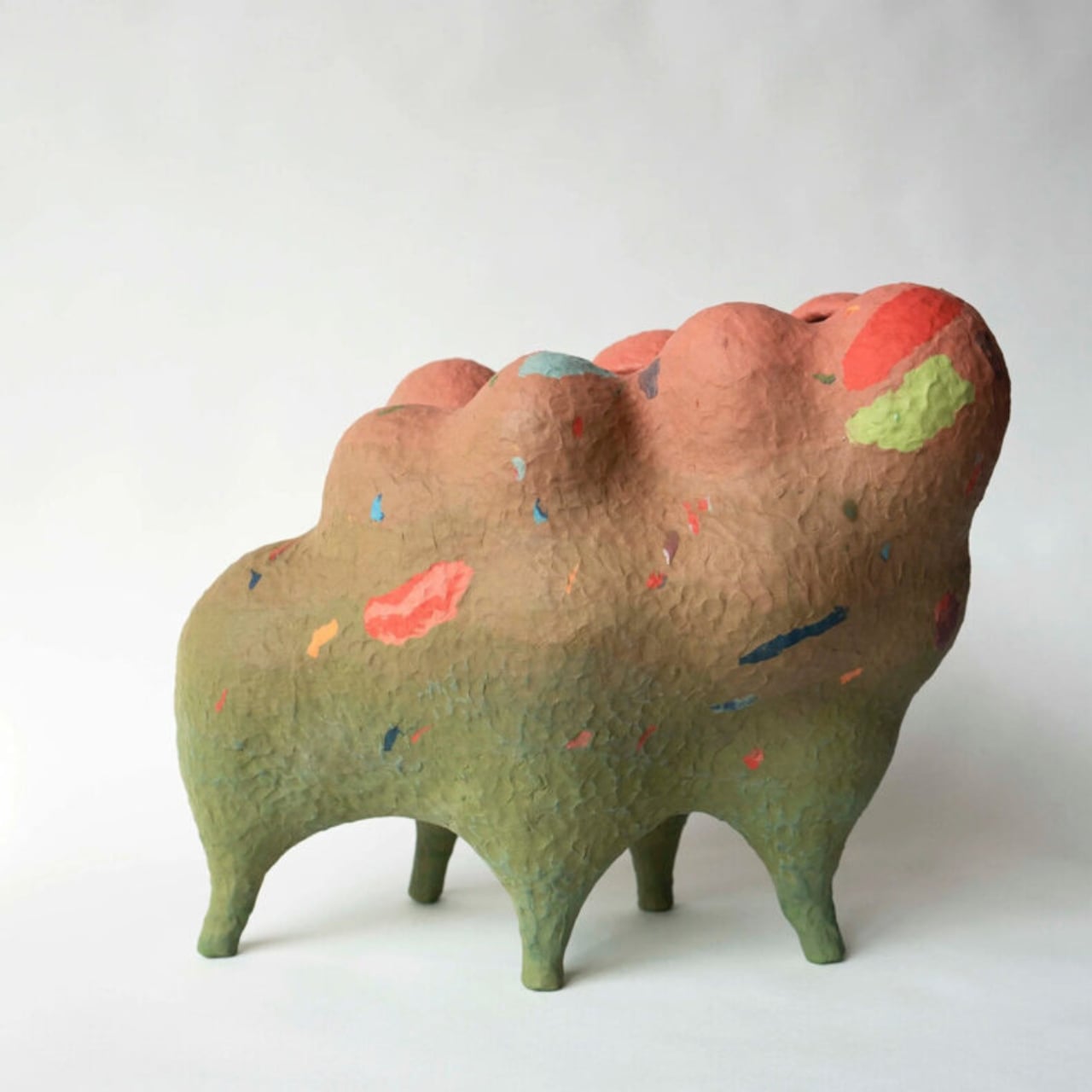
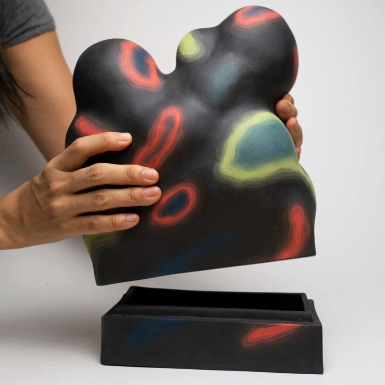
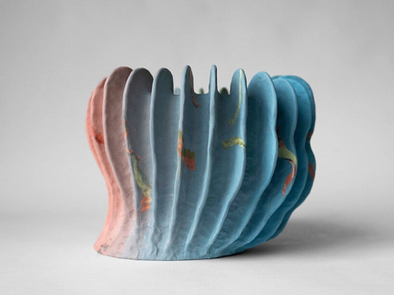
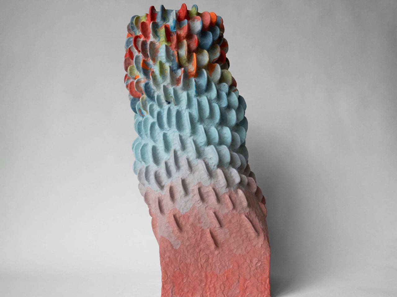
Janny Baek’s Ceramics Look Like They’re Still Evolving

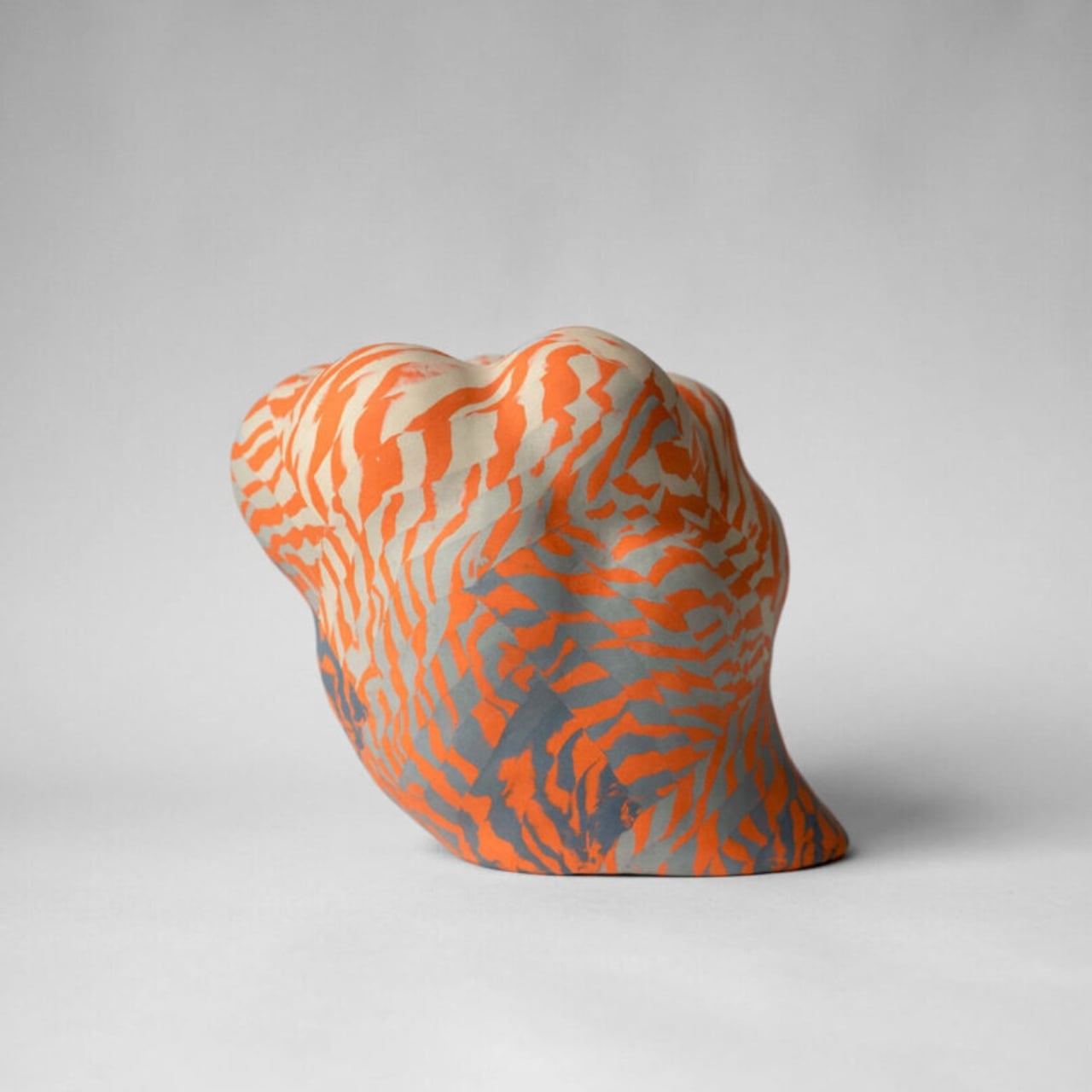
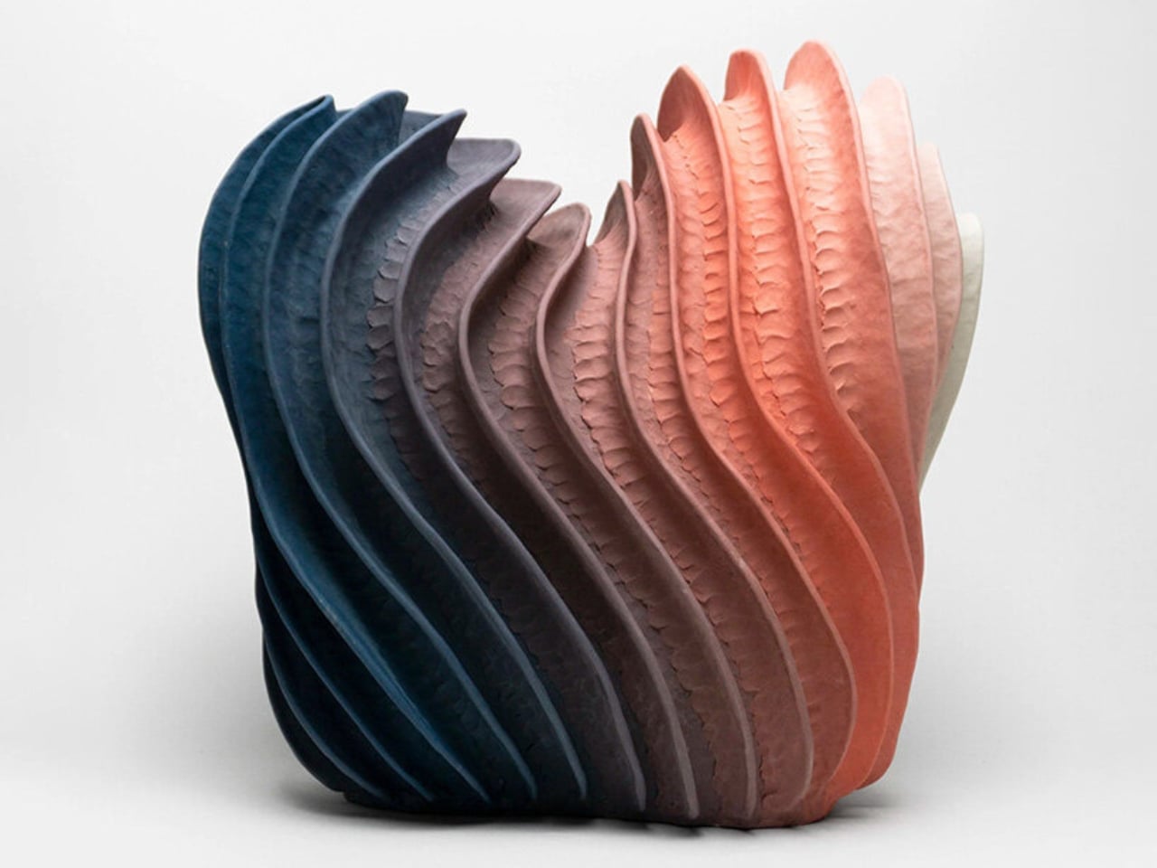
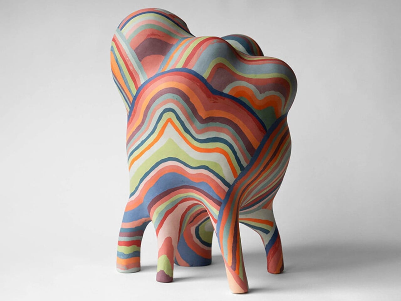
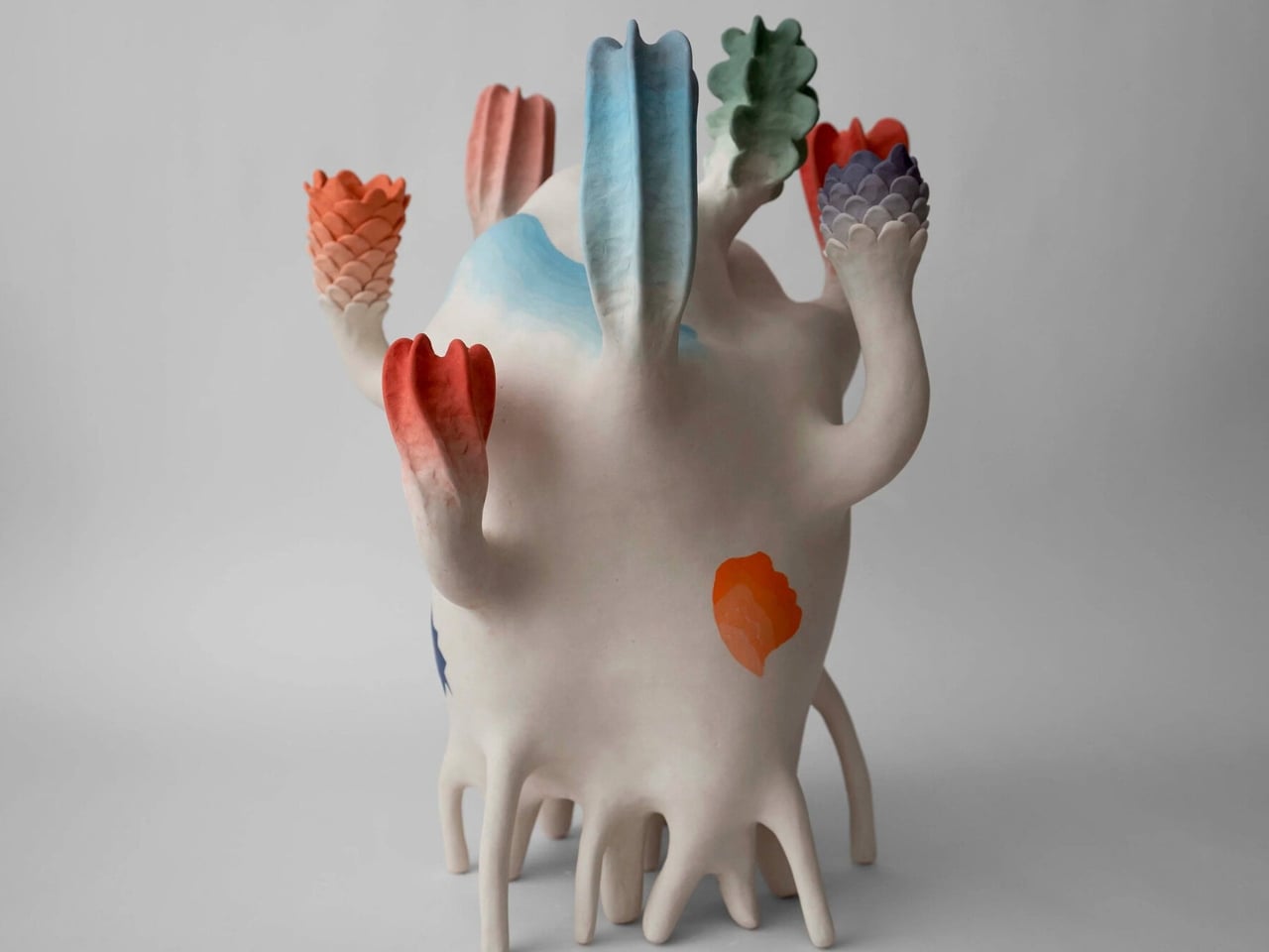
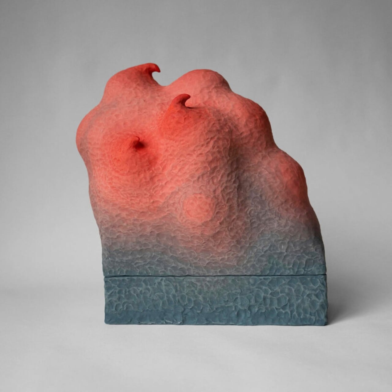
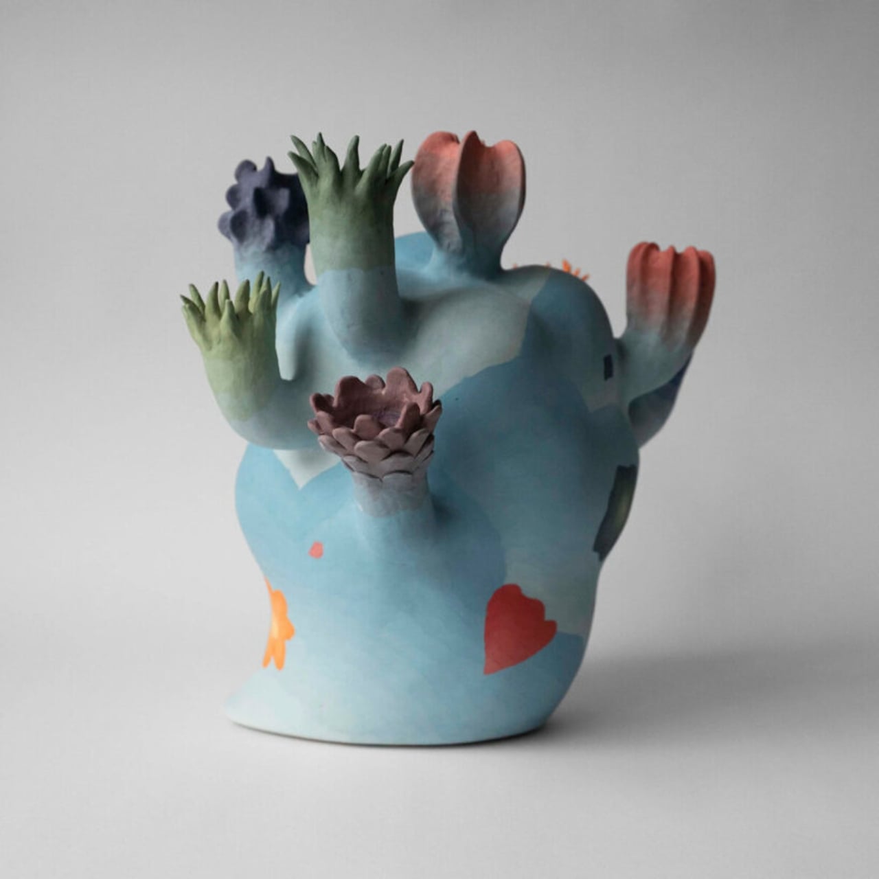
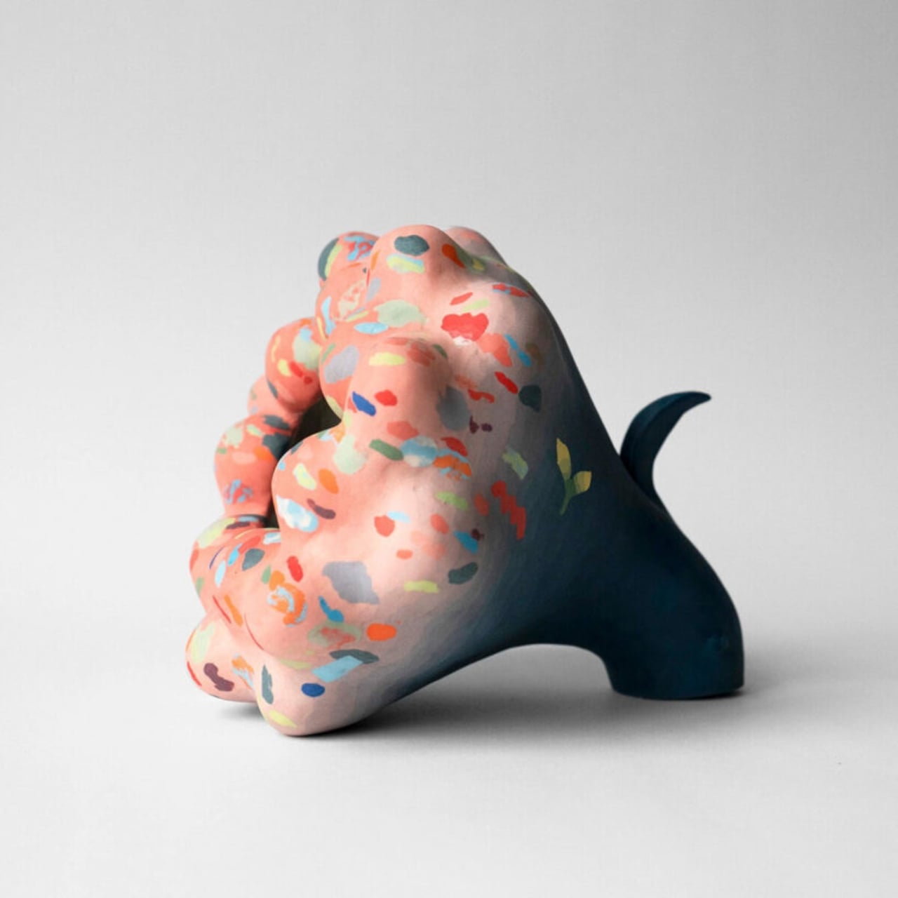
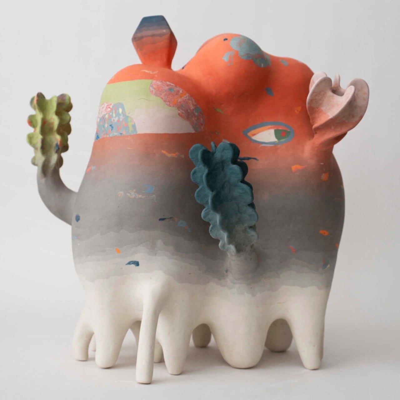
Most ceramic art asks you to admire it from a distance. Janny Baek’s work makes you want to lean in closer and check if it’s breathing. Her upcoming solo exhibition, Life Forms, opens at Joy Machine gallery in Chicago on March 20, running through May 9, 2026, and from everything I’ve seen of it, it might be one of the more visually arresting shows to land this spring. The pieces gather across the gallery space like inhabitants of an ecosystem you’ve never visited but somehow recognize. Some forms open outward like blossoms. Others stretch upward with limbs that suggest wings, or stems, or shells. None of them fully commit to being any one thing, and that’s exactly the point.

What makes Baek’s ceramics so compelling is the feeling that the firing process didn’t quite finish the job. The sculptures look caught mid-transformation, as though another hour in the kiln might have resolved them into something more familiar. Instead, they hold their ambiguity like a posture. That deliberate incompleteness is one of the most interesting creative choices an artist can make, and Baek has built an entire body of work around it.

Designer: Janny Baek

Her path to ceramics is almost as unusual as the work itself. Born in Seoul and raised in Queens, she studied ceramics at the Rhode Island School of Design before taking a turn into animation and toy design as a sculptor. Then she earned a graduate degree in architecture from Harvard, co-founded an architecture practice in Manhattan, and spent years designing high-end residential spaces. When the pandemic hit, she returned to clay, setting up a studio in the back of her Flatiron District architecture office. The ceramics world should be grateful for the timing.

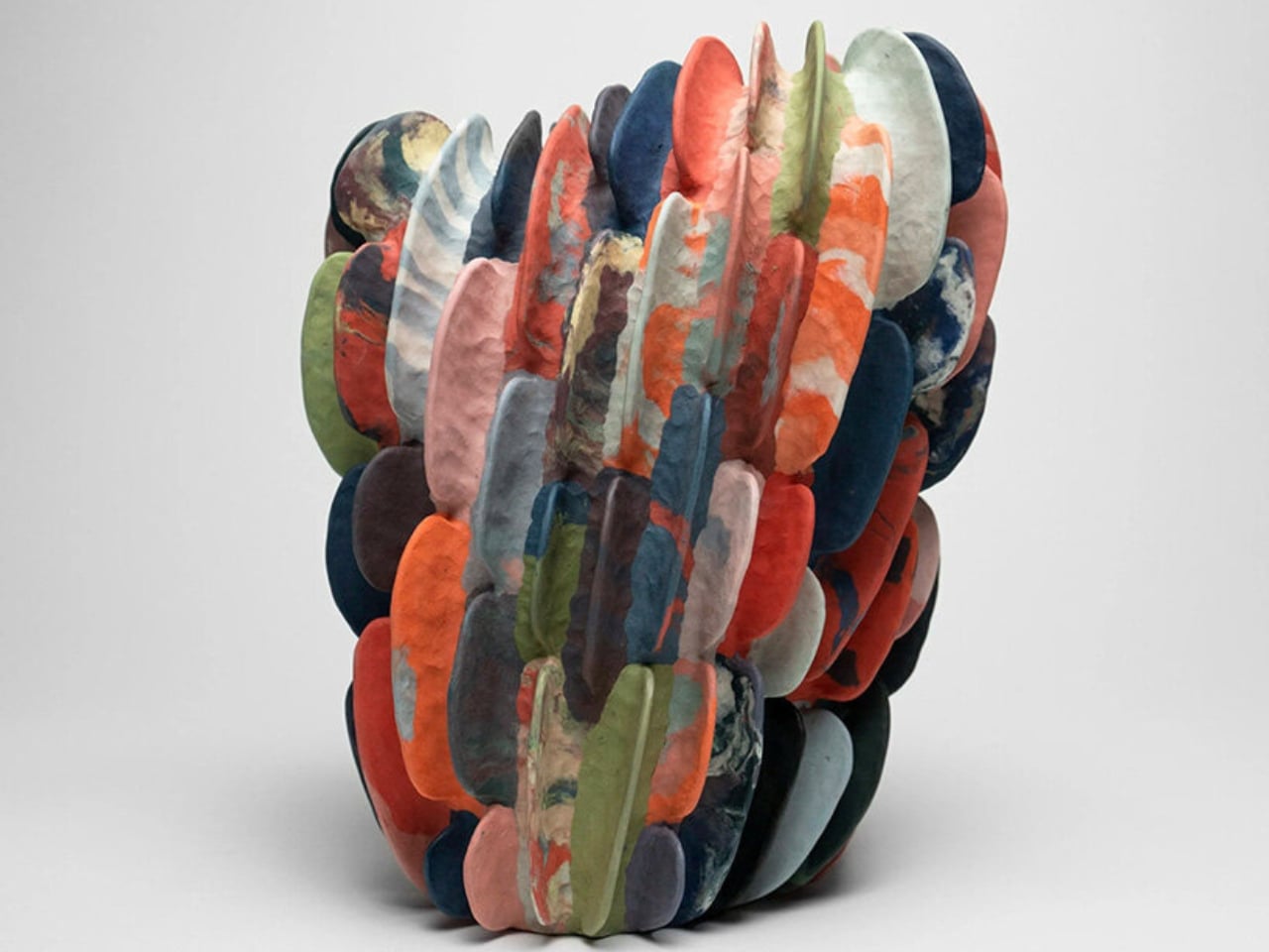
That architectural background isn’t incidental. You can see it in the structural logic of the pieces, which begin with coiled bases and build upward through successive additions of clay, each element branching from the last. The result is less like sculpting and more like construction, or perhaps like watching something grow. Her larger work, Plant Life (2025), stoneware with colored sections rising from white shoots, reads almost like a site plan for a garden on a planet where the plants decided to do their own thing.

The technique she relies on is nerikomi, a traditional Japanese method that involves stacking clay of different colors and slicing through it to reveal the pattern within. But Baek’s application of it feels more contemporary than the technique’s origins might suggest. Color, in her hands, is structural rather than decorative. It moves through the clay like a current, not like paint on a surface. She has described color gradients as “the continuous nature of change,” and a multitude of colors as “potential, abundance, and vitality.” That framing matters. It tells you the work isn’t just pretty, it’s philosophic.

The piece titles reinforce this. Micro-organisms, Glow Sticks, and Outer Galaxies. Prismatic Walking Cloud. 5 Eyes (Dream State Series). Cloudbloom. They read like entries in a field guide to a world that hasn’t been discovered yet, which is probably the most accurate way to describe what Baek is building. Her ceramics operate on what one description of the work calls “dream logic, one that accepts incongruity and dissonance as necessary to play and experimentation.” That’s a generous creative framework, and it shows. The work never feels confused or unresolved. It feels deliberate in its strangeness.

What I find most refreshing about Life Forms is that it doesn’t ask you to bring any specific context to it. You don’t need to know the theory behind nerikomi or have an opinion about contemporary ceramics to stand in front of one of these pieces and feel something. They work on a more basic level, the level of looking at something unfamiliar and recognizing it anyway. Like you’ve seen its kind before, somewhere between a dream and a nature documentary.

The post Janny Baek’s Ceramics Look Like They’re Still Evolving first appeared on Yanko Design.
When Loss Becomes Something You Can Touch

There’s a particular kind of quiet that settles after a wildfire. Not peaceful, not comfortable, just a heavy stillness where something used to be. In January 2025, the Eaton Fire burned through Altadena in the foothills of Los Angeles for twenty-five days, taking nineteen lives and destroying more than 9,000 structures. It became the second most destructive wildfire in California history, leaving behind charred earth and the skeletal remains of trees that once shaded neighborhoods and backyards.

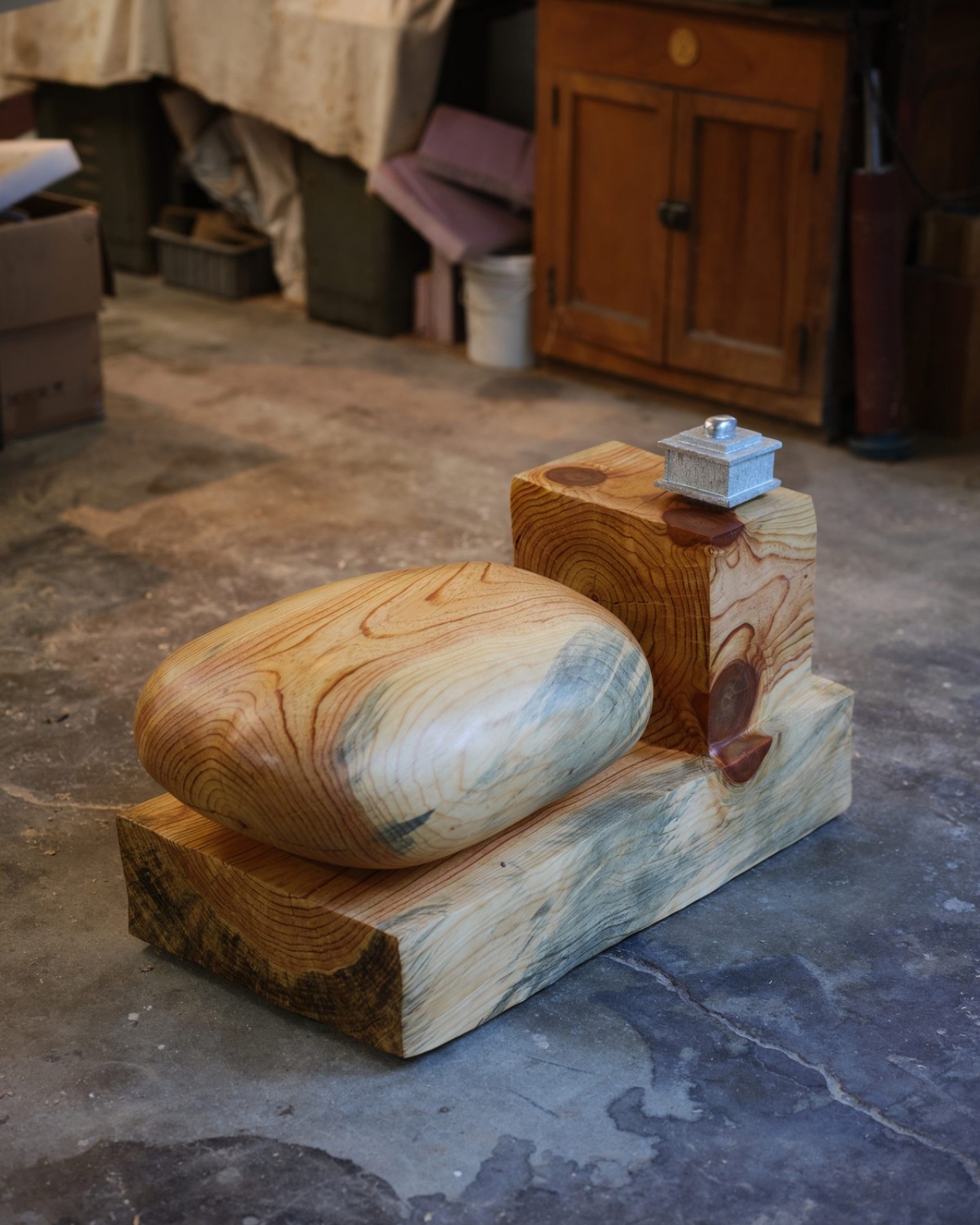
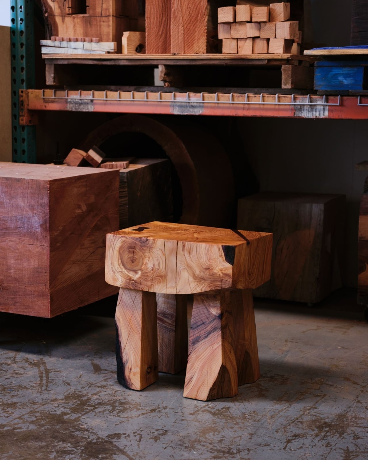
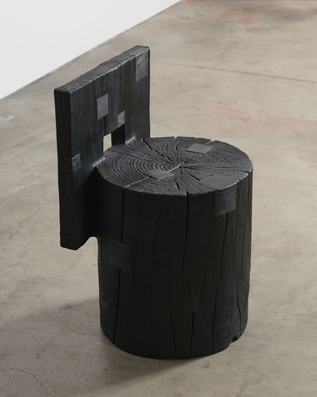
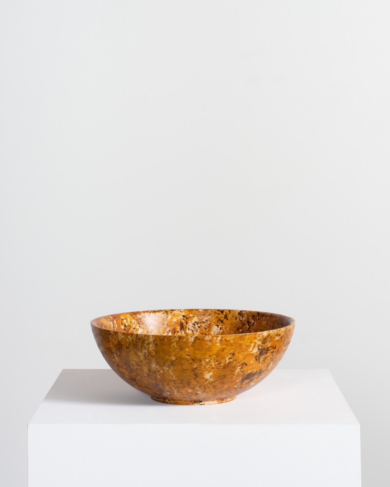
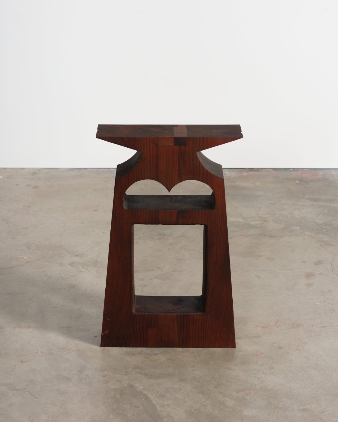
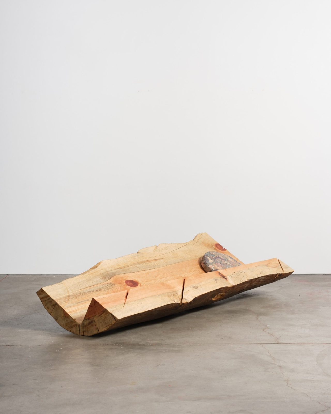
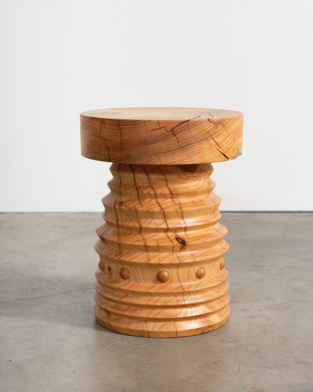
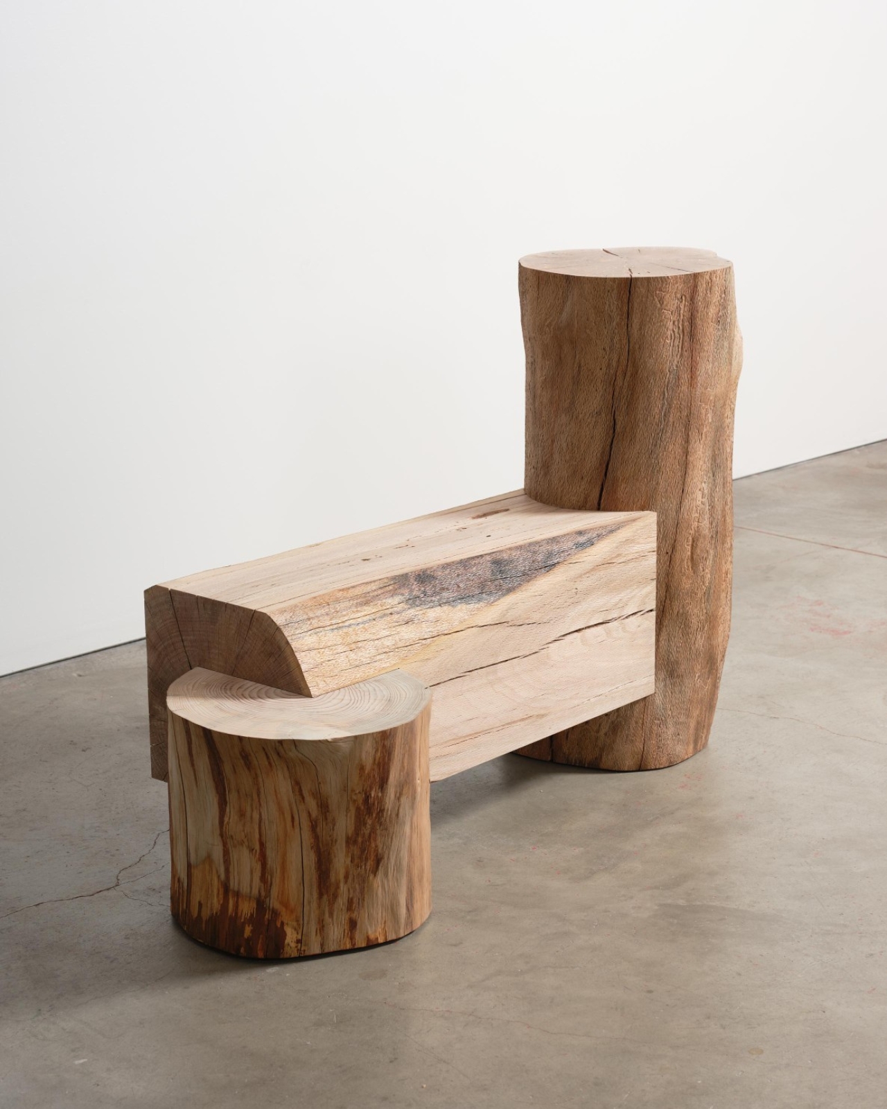
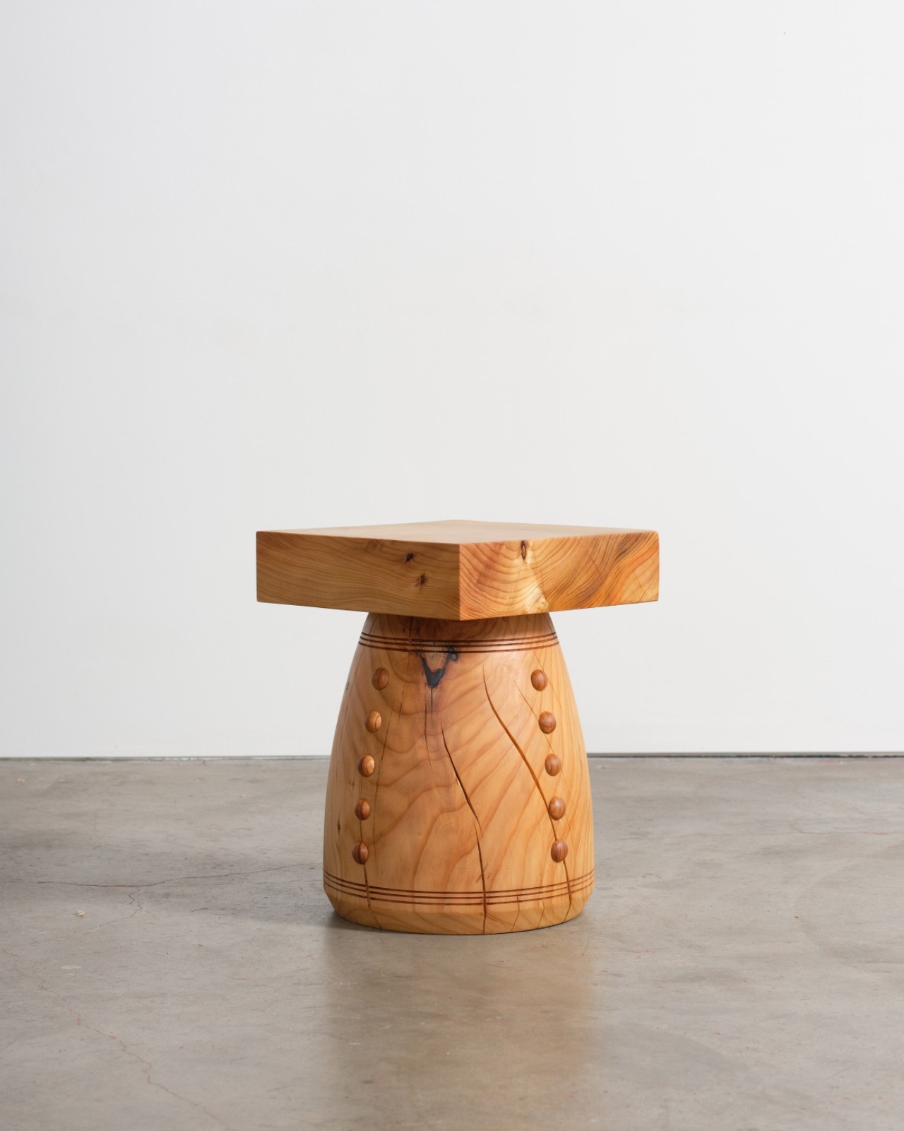
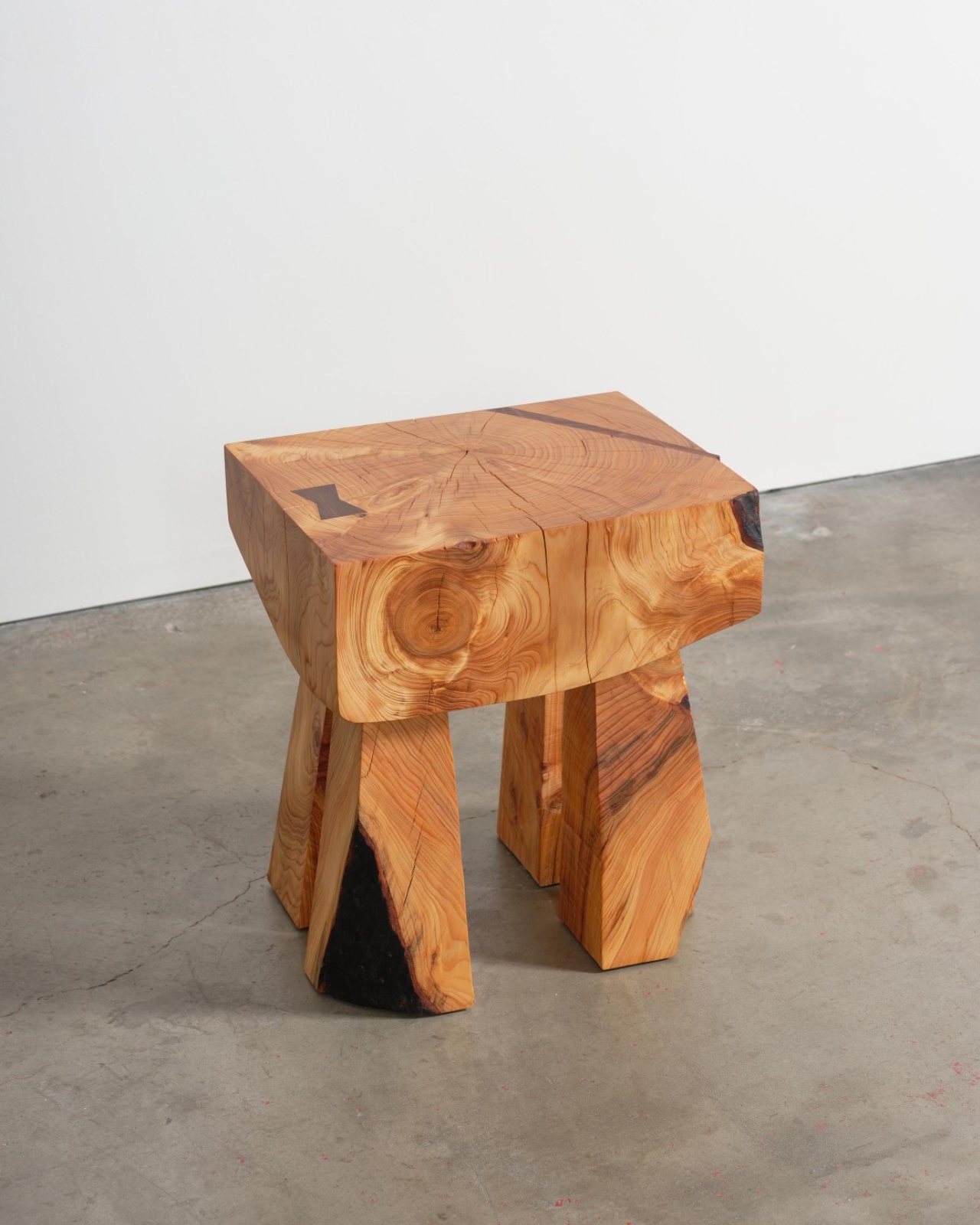
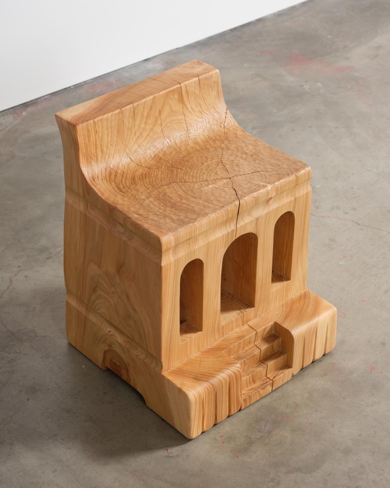
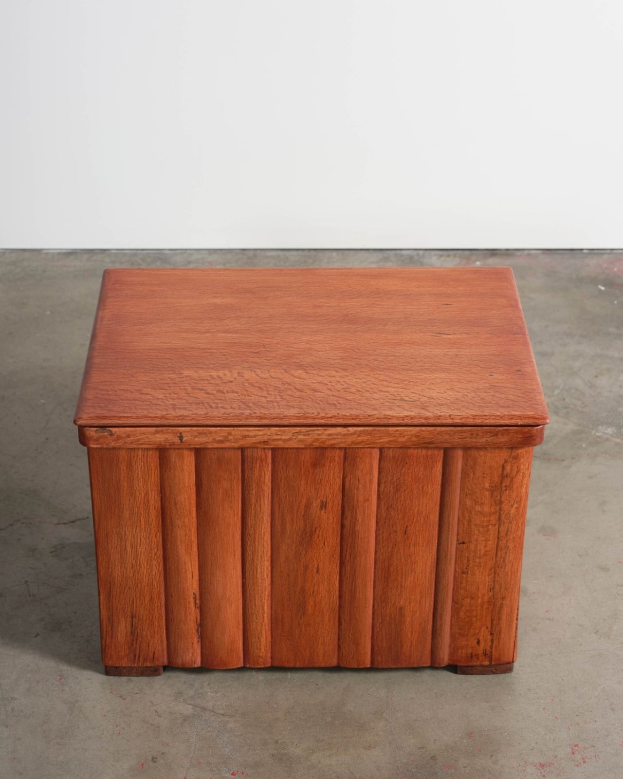
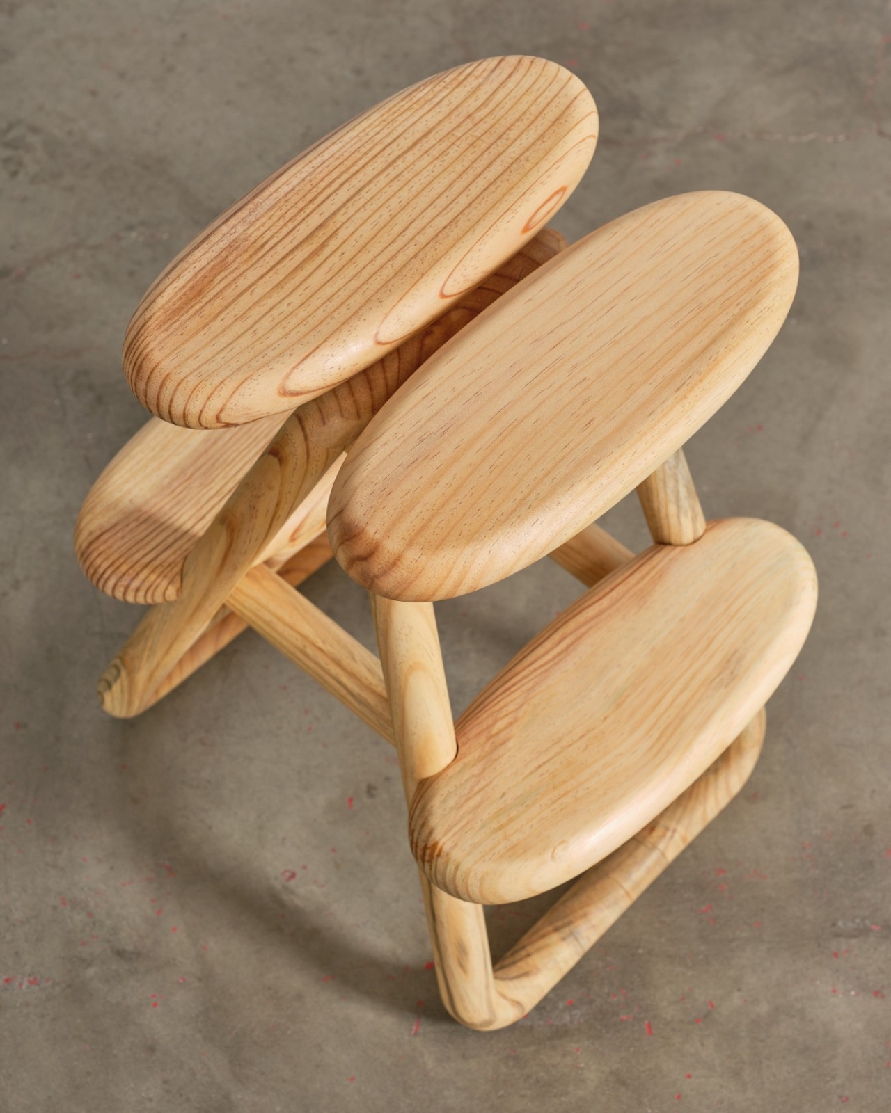
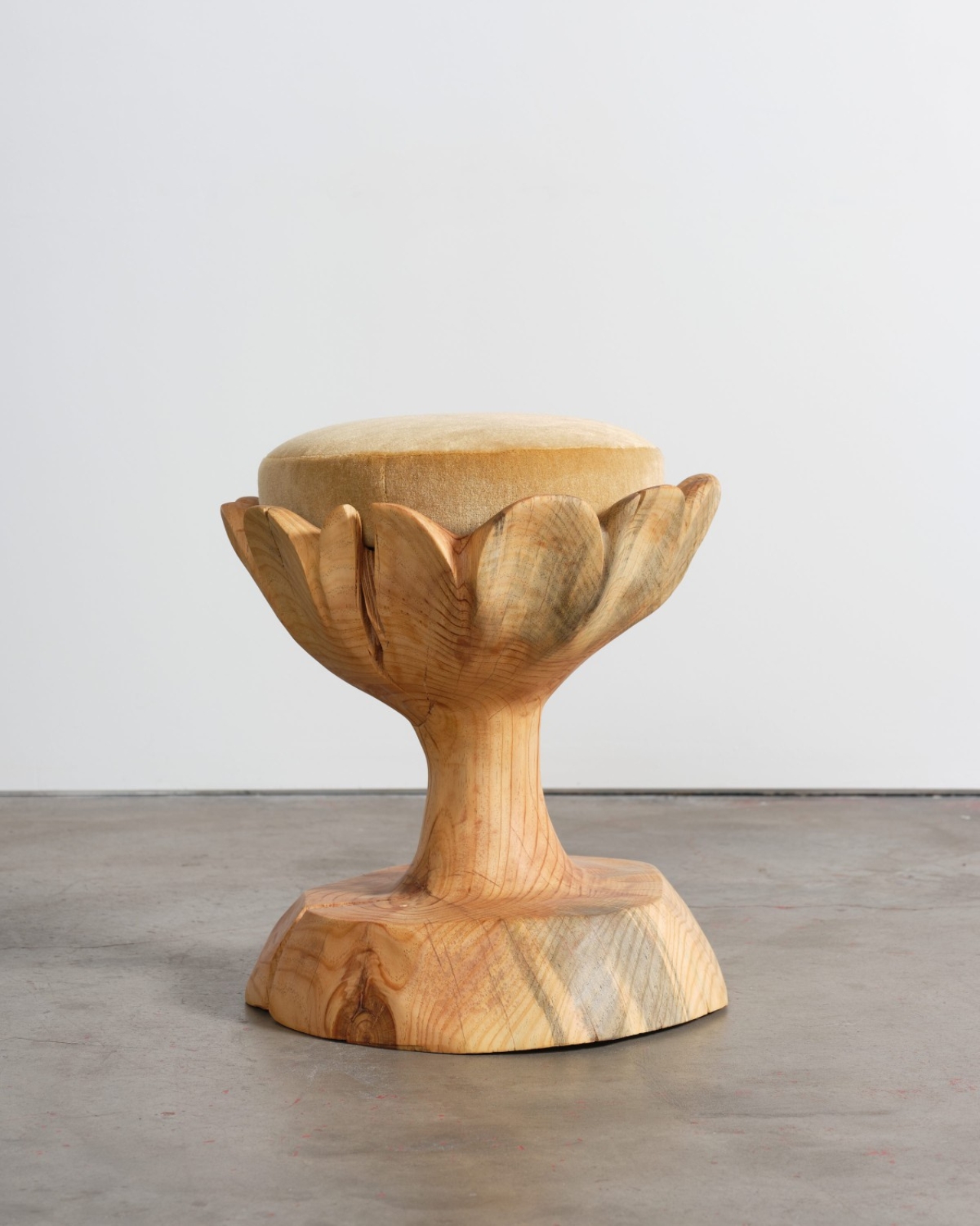
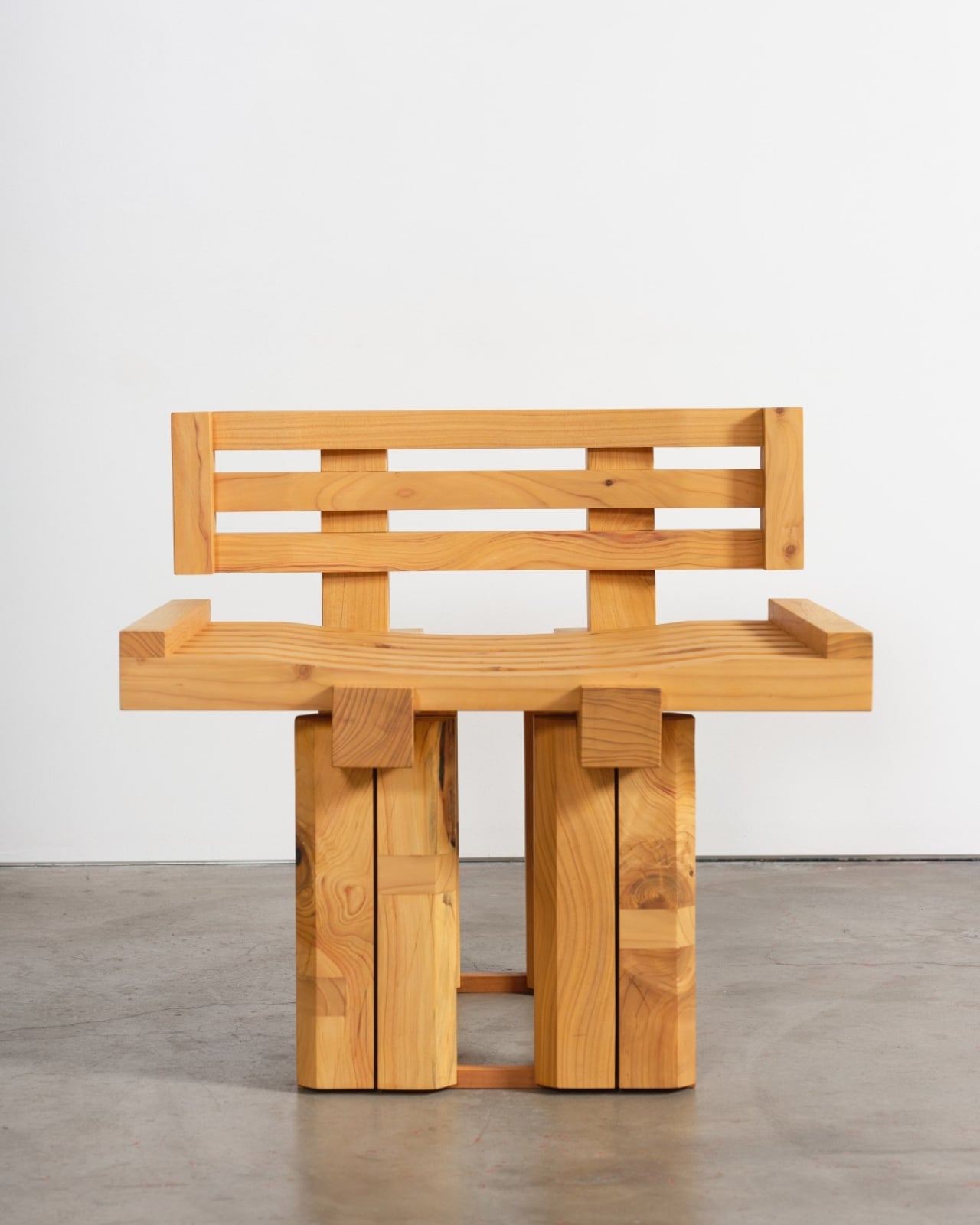
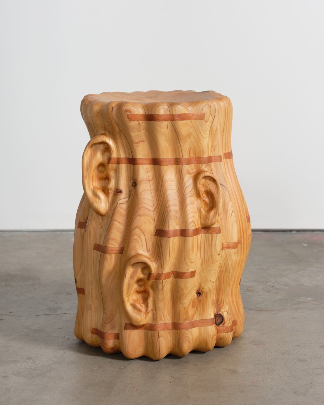
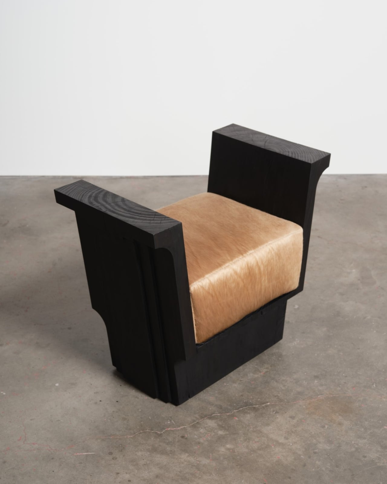
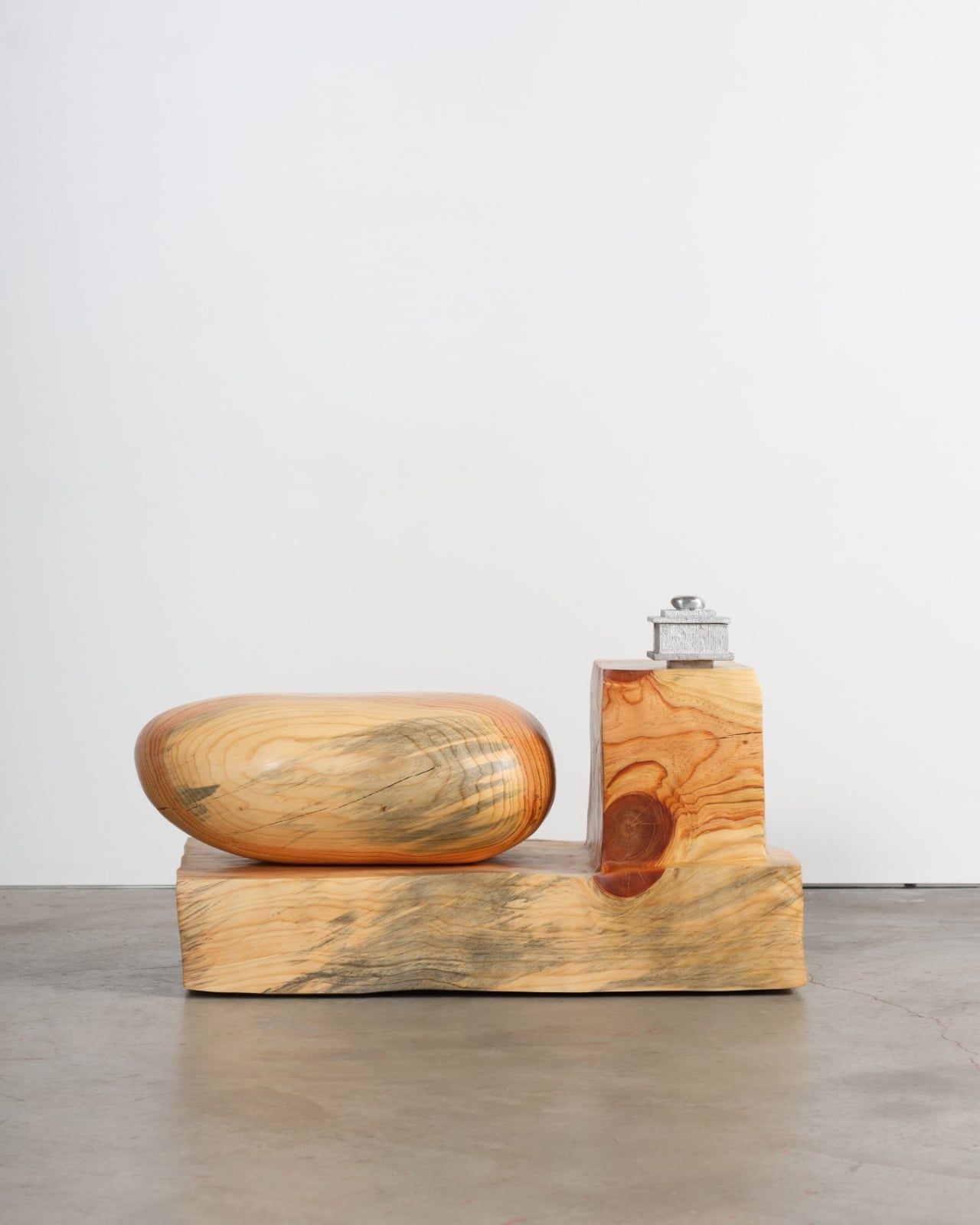
A year later, at Marta gallery in Los Angeles, 22 local artists and designers are doing something quietly radical with what’s left. The exhibition “From the Upper Valley in the Foothills” transforms salvaged wood from those burned Altadena trees into chairs, stools, benches, bowls, and other functional objects. Curated by sculptor Vince Skelly with material support from Angel City Lumber, the show runs through January 31st and offers a different kind of memorial.

Designer: Vince Skelly (curator)

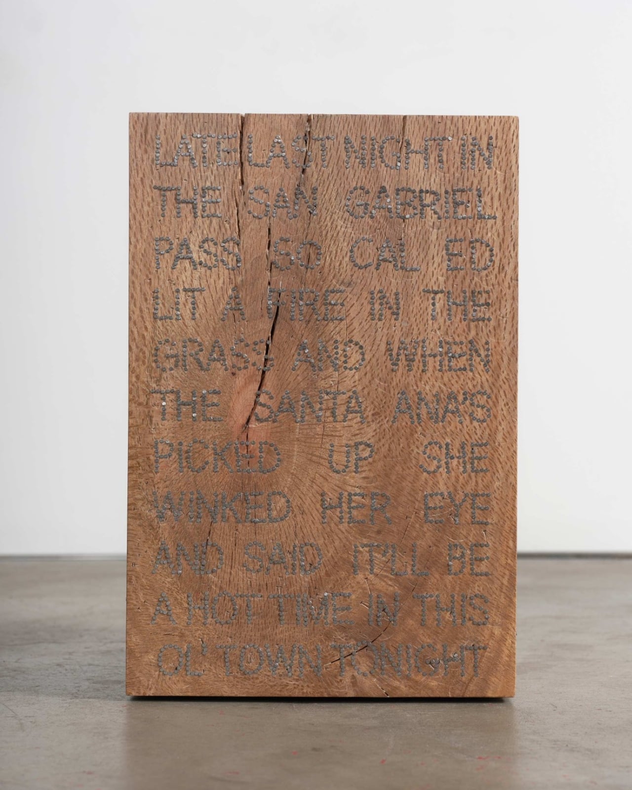
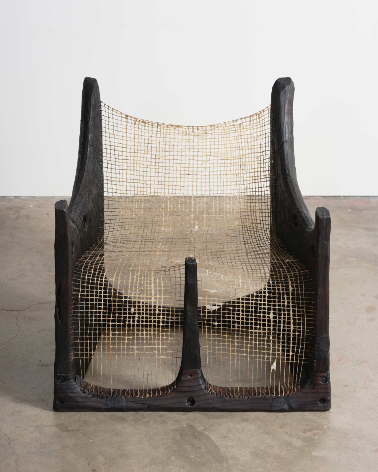
This isn’t your typical tribute. There are no plaques, no somber photographs, no distance between you and the disaster. Instead, you’re invited to sit on it, hold it, contemplate it. The wood itself, sourced from species like Aleppo pine, cedar, coastal live oak, and shamel ash, carries visible traces of fire damage, smoke marks, and irregular grain patterns. Each piece holds a kind of double existence: both the tree it was and the home it might have shaded.

Skelly wanted the exhibition to feel like a true community response, so he focused on local designers and artists who each had their own experiences with the fires. The resulting collection is remarkably varied. Some pieces lean sculptural and contemplative, others embrace pure functionality. There’s Doug McCollough’s decorative bowl, Tristan Louis Marsh’s floral stool, and Base 10’s Watari bench, each handling the material’s history differently.

What makes this work compelling is the tension between destruction and creation. Angel City Lumber, a local mill that sources downed trees for community projects, collected the wood cleared from Altadena after the fire. By transforming debris into design objects, the exhibition reframes devastation not as an ending but as an uncomfortable, complicated beginning. The burned wood becomes a vessel for memory, loss, and whatever regeneration might look like.
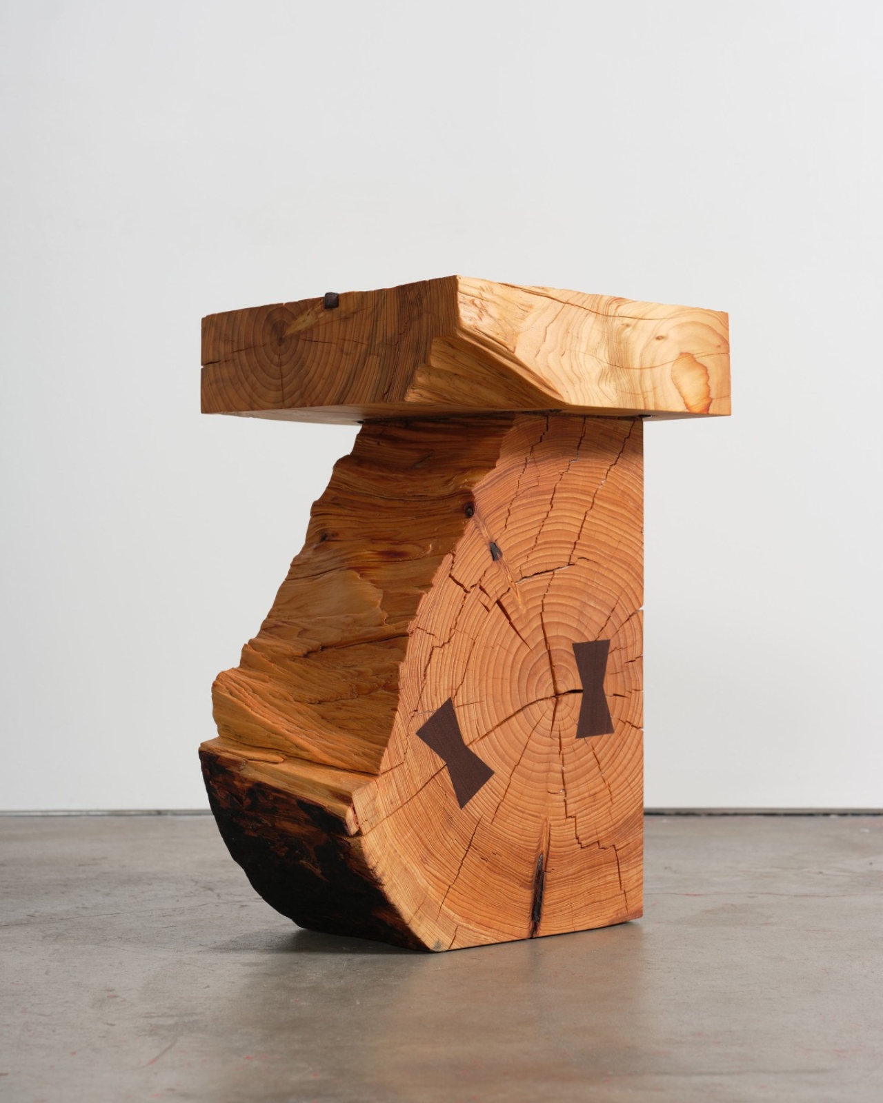
Function here isn’t just practical. It’s conceptual. These chairs and benches aren’t simply places to rest, they’re propositions about how devastated spaces might once again support everyday life. The act of sitting on a stool made from fire-damaged oak becomes a small gesture of reclamation, a way of saying that what was lost can still hold weight, still serve a purpose, still matter.

The exhibition also raises quieter questions about the role of artists and designers during climate instability. Is it enough to make beautiful objects from catastrophe? Does craft honor the loss or aestheticize it? The show doesn’t offer easy answers, but it does suggest that making something useful from what remains is its own kind of resistance. There’s dignity in refusing to let devastation be the final word.

Marta’s presentation feels particularly resonant because it acknowledges that these objects are meant to be touched and experienced, just like the forests they come from. In an era when wildfires are becoming annual events and California’s landscape is increasingly defined by cycles of burning and rebuilding, this direct engagement feels necessary. The wood doesn’t let you forget what happened, but it also doesn’t let you look away.

What stays with you after visiting “From the Upper Valley in the Foothills” isn’t any single piece but the cumulative effect of seeing 22 different responses to the same material. Each designer grappled with the same scarred wood and found their own way through it. Some leaned into the damage, others smoothed it away. Some made monuments, others made chairs. Together, they create a portrait of a community trying to process an event that reshaped not just the landscape but the psyche of an entire city.

The exhibition is both memorial and workshop, grief and pragmatism sitting side by side. It suggests that sometimes the best way to honor what’s lost is to build something from the wreckage, to take what the fire left behind and give it a second life. Not as a replacement for what was, but as a reminder that even in the aftermath, there’s still wood to work with, still hands to shape it, still a future that needs furniture.

The post When Loss Becomes Something You Can Touch first appeared on Yanko Design.