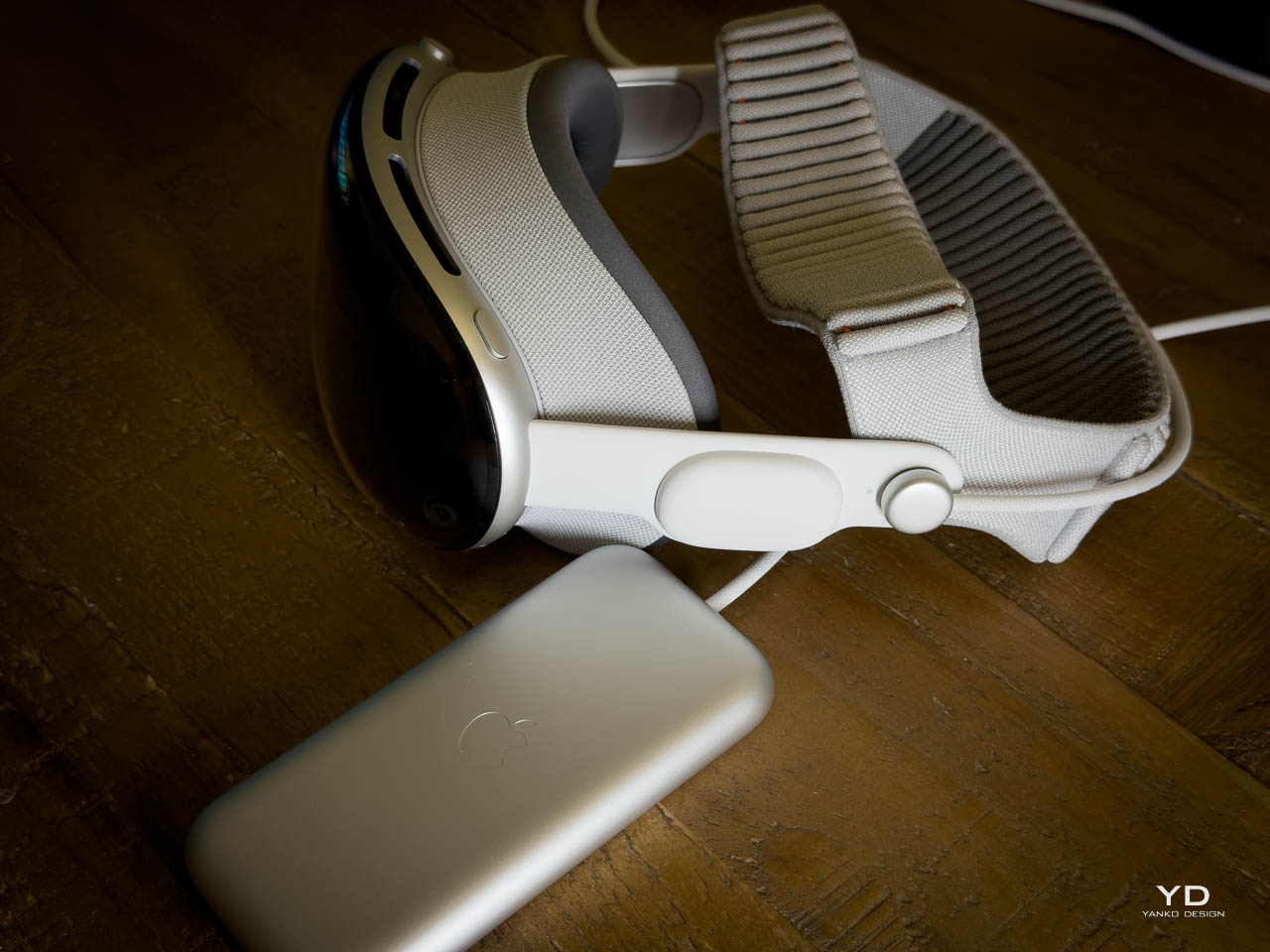
Modularity. The word appears constantly in appliance marketing, usually meaning nothing more than optional accessories. Hisense’s CES 2026 lineup treats it as structural philosophy.
The home appliance category has long resisted meaningful design evolution. Refrigerators grow larger. Washers add cycles. Connectivity features accumulate. None of this fundamentally changes how these objects occupy space or interact with human behavior.
Designer: Hisense
Hisense’s collection spans kitchen, laundry, and climate control. What unifies the products is methodology: each addresses a specific behavioral friction point rather than adding features to existing forms. A dehumidifier repositions its tank to eliminate bending. A laundry system provides parallel processing for incompatible fabric types. A refrigeration line achieves visual coherence across separately purchased units.
Miguel Becerra, Hisense’s Director of Smart Home, framed the approach explicitly. These are reconceptions, not refinements. Machine intelligence operates autonomously rather than demanding constant user input. Ergonomic reconsideration shapes maintenance rituals. Adaptable configurations replace fixed proportions.
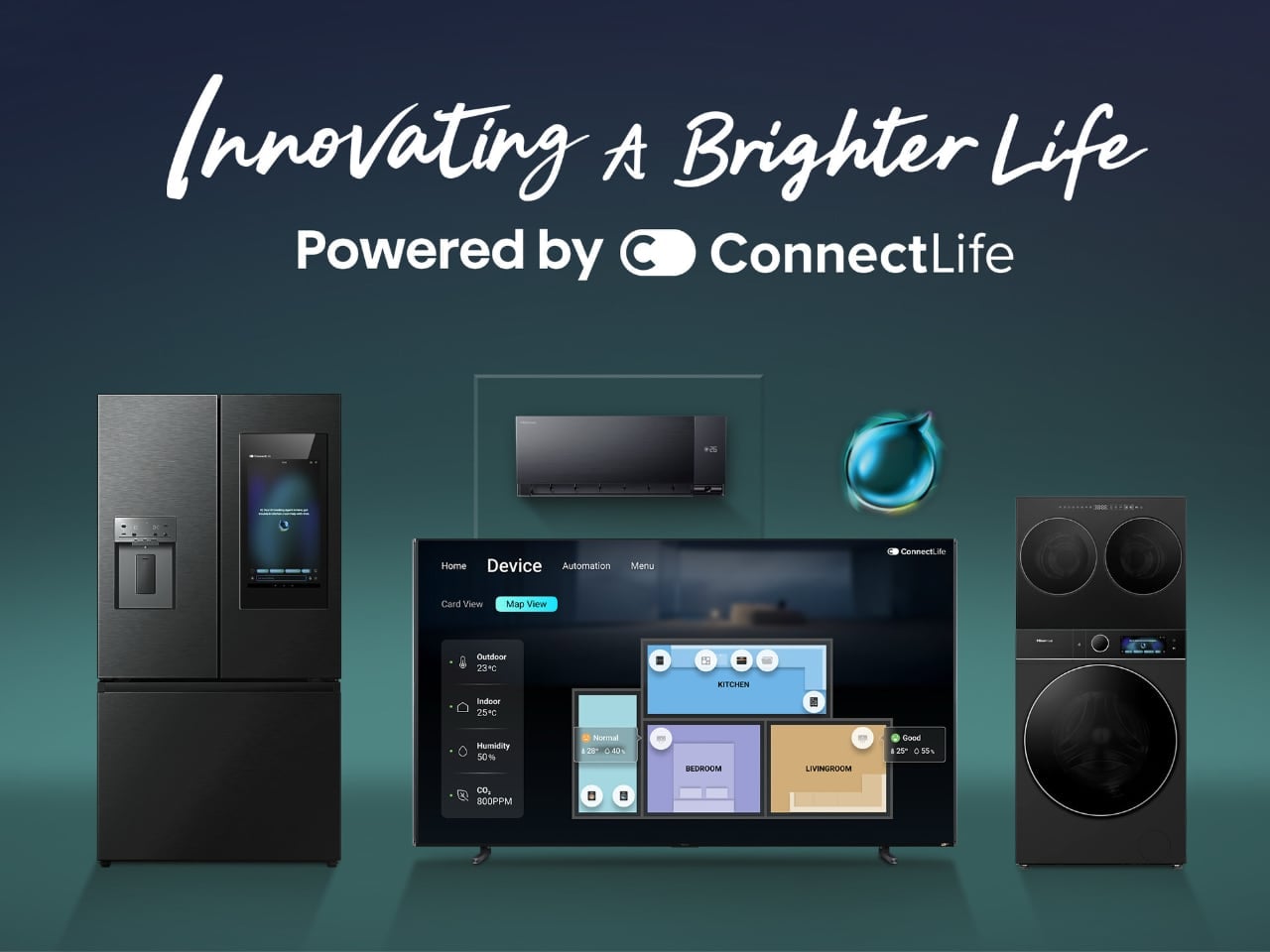
Connect Life: Distributed Intelligence Across Domestic Systems
Five AI agents. Air. Cooking. Laundry. Energy. Support. Each monitors a domain and acts without waiting for commands. The system design reflects a philosophical shift: reactive control gives way to anticipatory automation.
The air agent illustrates the approach. Paired with third-party motion and air quality sensors, it adjusts climate based on occupancy and particulate levels rather than thermostat schedules. Empty room detected: cooling reduces. Elevated particles registered: ventilation increases. No user input required. The system anticipates discomfort before it registers.
Cooking and laundry agents follow similar logic. The cooking agent coordinates oven and cooktop timing, ensuring stovetop preparation and oven completion align appropriately. The laundry agent accepts phone-scanned fabric and stain images, selects cycles autonomously, and provides completion estimates. Meal recommendations integrate with appliance coordination.
Matter compatibility prevents ecosystem lock-in. Thousands of certified devices integrate. Users maintaining existing relationships with Apple Home, Google Home, or Alexa retain those interfaces while Connect Life adds capability layers. No ecosystem abandonment required. The support agent monitors device health proactively, flagging failures before they disrupt operation.
This is automation that reduces cognitive load rather than relocating it from physical buttons to digital interfaces. The distinction matters: complexity handled invisibly differs fundamentally from complexity shifted to a new control surface.
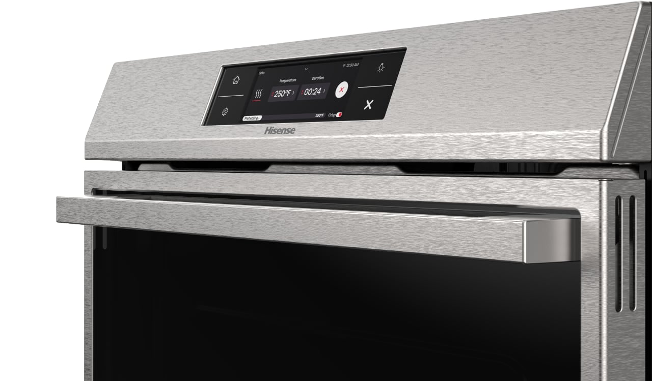
Kitchen Suite: Screens as Interface, Coordination as Function
Screens everywhere. The Connect Life Cap refrigerators carry two: a 21-inch primary display and a 3.5-inch secondary dedicated to temperature controls.
The bifurcation acknowledges interaction hierarchy. Not every interaction requires the full interface. Temperature adjustment happens quickly on the smaller screen. Recipe browsing, wine pairing suggestions, and smart home management occupy the larger surface.
Configuration options span counter-depth, French door, and cross-door layouts. Counter-depth models integrate flush with cabinetry. French door provides traditional accessibility. Cross-door offers alternative organization. Display consistency across configurations means interface logic transfers regardless of which form factor fits a particular kitchen.
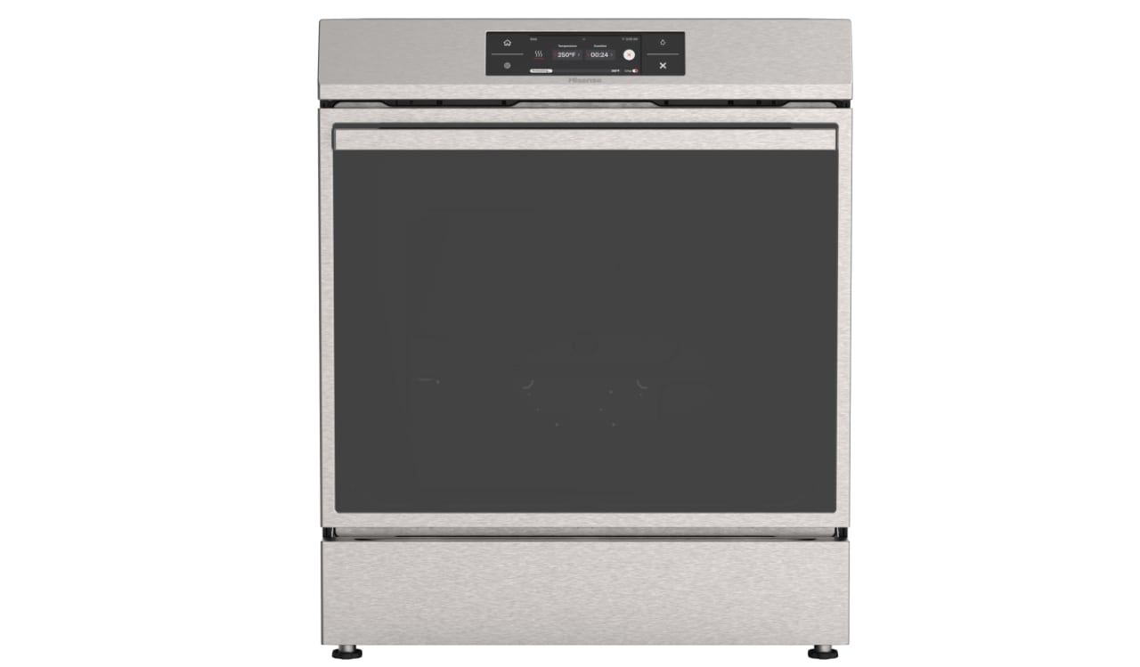
The smart induction range adds a seven-inch cooktop display with bridge functionality that combines heating zones for oversized cookware. Rapid preheat technology reduces the waiting period between intention and cooking. The AI cooking agent coordinates timing across appliances, ensuring stovetop preparation and oven completion align appropriately.
Most distinctive: the S7 Smart Dishwasher’s cooking pattern detection. Connected to compatible ovens, it recognizes what was prepared and queues appropriate cycles before loading occurs. Greasy steak dinner triggers heavy-duty settings automatically.
This appliance-to-appliance communication eliminates the guesswork that typically accompanies cycle selection. The dishwasher transforms from passive receptacle into active kitchen workflow participant.
PureFit Refrigeration: Modularity as Aesthetic Principle
The new wine cabinet shares exact dimensional precision with existing PureFit refrigerator and freezer columns. Minimal side gaps. Coordinated panel finishes. The slim profile accommodates kitchens where standard depths would protrude awkwardly from cabinet lines. Multiple units read as built-in cabinetry rather than assembled appliance collection.
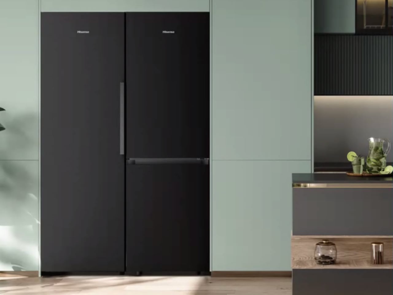
The significance is relational, not individual. Units matter less than the system they form, and this modularity serves both functional and aesthetic purposes. Households configure refrigerator-to-freezer ratios according to actual usage patterns rather than accepting manufacturer-determined proportions. Wine collectors gain dedicated storage without sacrificing visual coherence. Growing families expand freezer capacity later. A developing wine interest introduces the cabinet. The architecture accommodates temporal change without wholesale replacement.
Temperature zones maintain appropriate environments for different varietals. The AI cooking agent provides pairing recommendations, integrating storage and meal planning into a continuous experience.
The cabinet represents applied modularity: identical design language, precise dimensional matching, and functional independence within a coordinated system. Each column operates independently while contributing to a unified visual and functional whole.
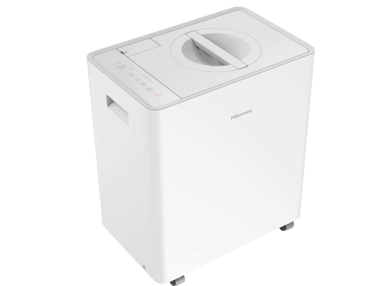
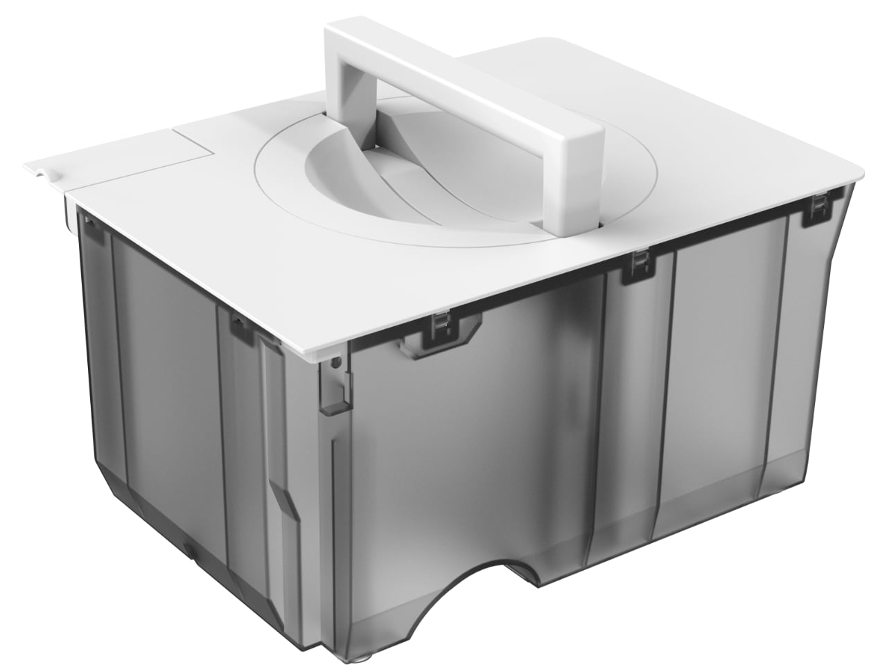
Top Lift Dehumidifier: Ergonomic Innovation in Overlooked Categories
Climate control appliances occupy a peculiar position in domestic design: essential for habitability yet engineered as if human bodies never interact with them. The dehumidifier category exemplifies this neglect. Manufacturers have refined compressor efficiency and moisture extraction rates for decades. What they never examined: the maintenance gesture. Crouching. Extracting a heavy tank from the unit’s base. Navigating stairs while managing slosh. The physical transaction that defines ownership remained unaddressed.
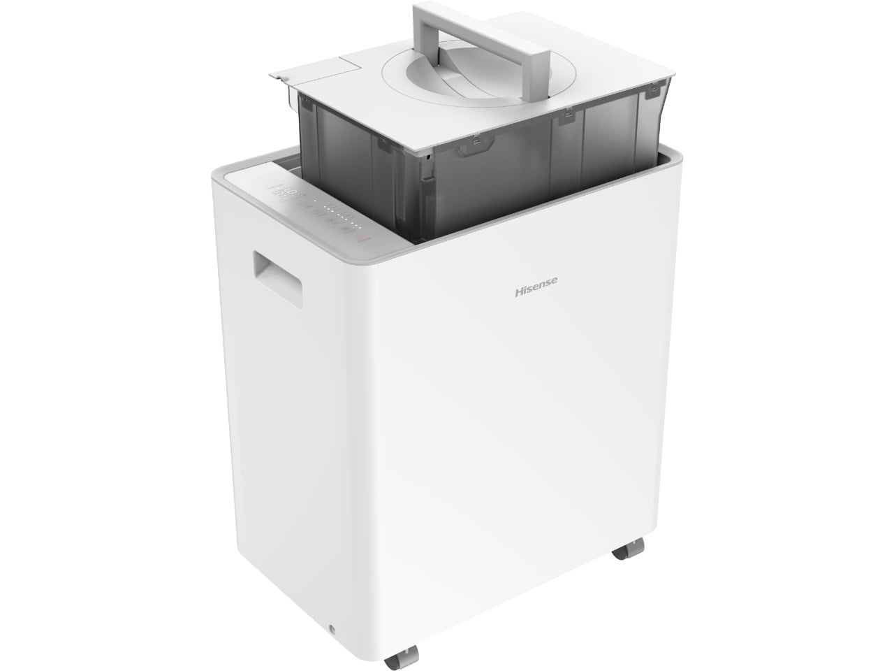
Hisense inverts the gravitational logic. The Top Lift positions its collection cartridge at the top rather than at the base where extraction demands bending and lifting against body mechanics. The gesture becomes a vertical lift from standing height. An enclosed design eliminates spillage during transport.
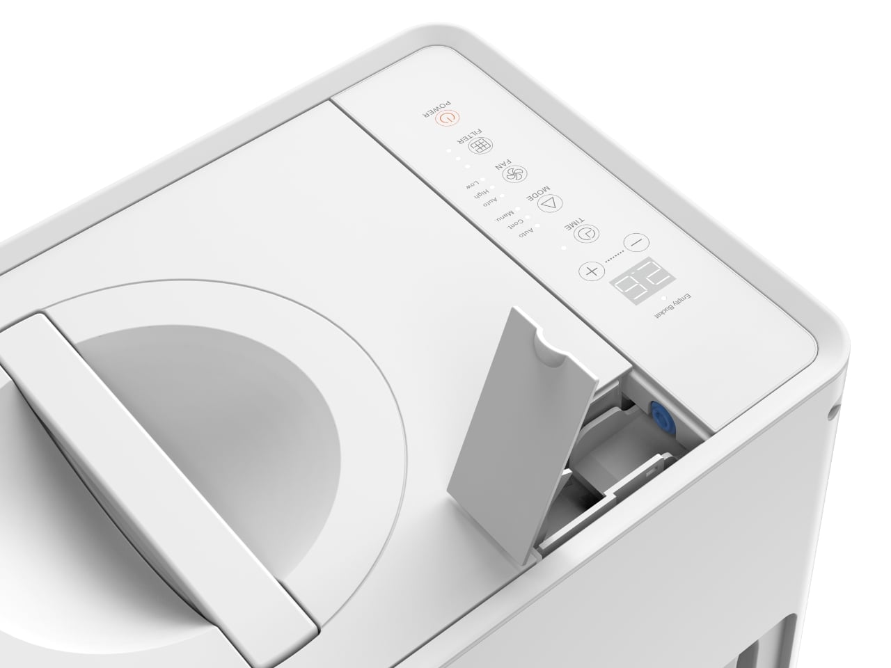
This represents ergonomic intervention at the interaction layer rather than the specification layer. Capacity increases 38% over traditional models. The user-centered logic: fewer emptying events mean fewer opportunities for physical strain. Acoustic engineering permits placement in finished living spaces rather than mechanical exile. Connectivity spans major ecosystems without demanding platform commitment.
Incremental specification improvement this is not. The intervention reflects a methodological shift toward designing around maintenance behavior rather than around extraction performance alone.
Fabric Care: Three Approaches to Laundry Space
Three laundry products address three different spatial logics. The U7 Smart Washer and Dryer targets American capacity expectations directly. Previous Hisense models were too small for U.S. household loads. The U7 corrects drum sizing, adds Connect Life integration, steam sanitization, and a Hi-Bubble detergent system that reduces waste.
The Stylish takes the opposite approach. Italian design influence. Matte finishes that read as furniture. Critical specification: 21 inches deep versus the typical 30-plus. Bedrooms and visible living areas become viable installation locations. The all-in-one drum handles washing, drying, sanitization, and odor removal.
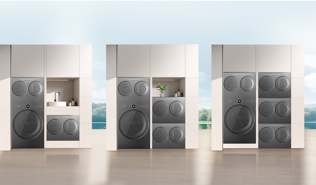
Excel Master represents the most significant departure, a modular system allowing infinite scalability. A main unit functions as conventional full-size washer and dryer using heat pump technology. Mini modules attach to expand capacity. Each mini module contains two separate wash and dry drums.
The insight: fabric care is a sorting problem, not a capacity problem. Households generate textile streams differing in soil type, fiber sensitivity, thermal tolerance. Traditional machines force temporal sequencing or compromised mixing. Excel Master provides parallel channels. Delicate synthetics, heavy cotton, specialized items run simultaneously in dedicated drums.
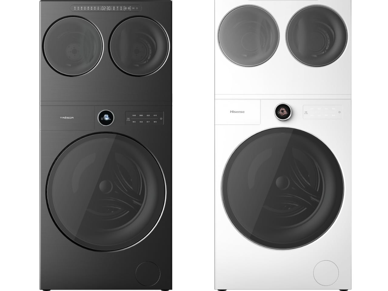
Mini modules employ ambient air condensation rather than heat. Room-temperature air removes moisture gradually, preserving fiber integrity at the cost of cycle duration. The trade-off suits the module’s purpose: items routed there prioritize care quality over speed.
Acoustics: below 46 decibels with multiple drums running. Quieter than conversation. Additional modules integrate as needs evolve. The system adapts rather than requiring replacement.
Implications: Design as Behavioral Response
The products share an underlying methodology: observe how people actually interact with domestic equipment, identify the friction points and compromises those interactions require, redesign fundamental configurations to eliminate rather than accommodate those problems.
The Top Lift Dehumidifier does not add features to compensate for awkward maintenance. It repositions the tank to make maintenance physically reasonable. Excel Master does not suggest workarounds for mixed laundry loads. It provides the infrastructure to handle them properly.
Modularity here means spatial flexibility and temporal adaptability. Households configure according to current needs, reconfigure as those needs change. Ergonomic reconsideration treats maintenance behavior as a design variable rather than a fixed constraint. Distributed intelligence reduces the cognitive burden of appliance management by handling routine decisions autonomously.
CES booth: Central Hall, January 6 through 9, 2026. Pricing and specific U.S. availability remain undetermined. Hisense conducts retailer and distributor meetings after CES, with decisions filtering through during Q1. A New Product Introduction event later in the quarter should provide concrete details.
Execution and pricing will determine market success. The conceptual framework, though, represents genuine departure: systematic reconsideration of domestic equipment design rather than incremental improvement to existing forms.
The post Hisense Reimagines Domestic Space Through Modularity and Ergonomic Intelligence at CES 2026 first appeared on Yanko Design.


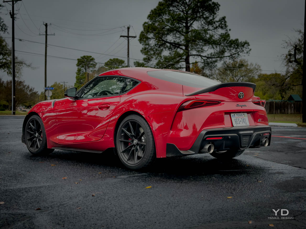
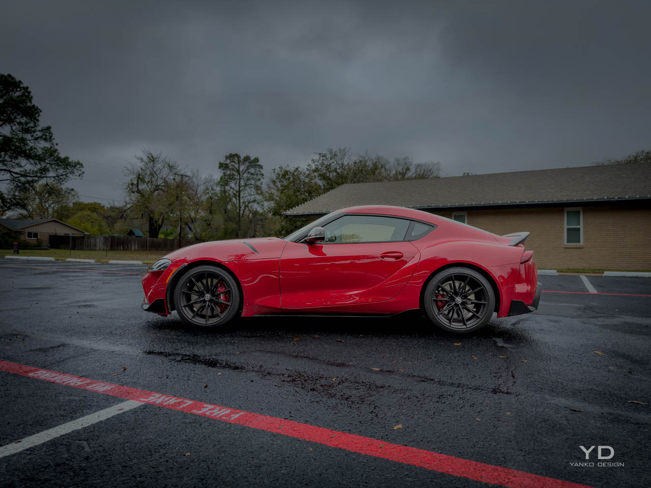
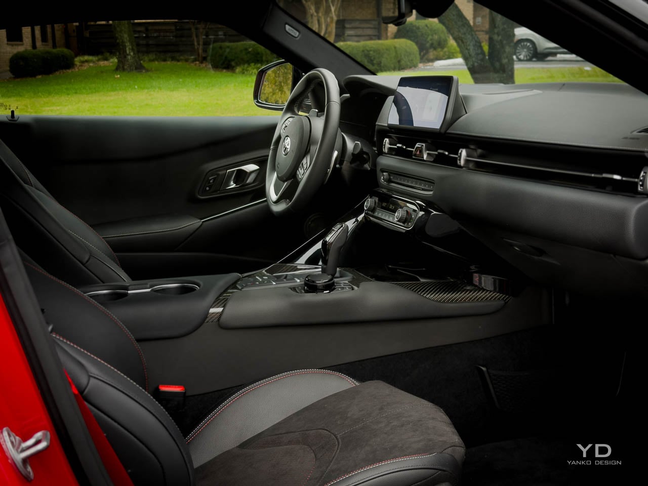
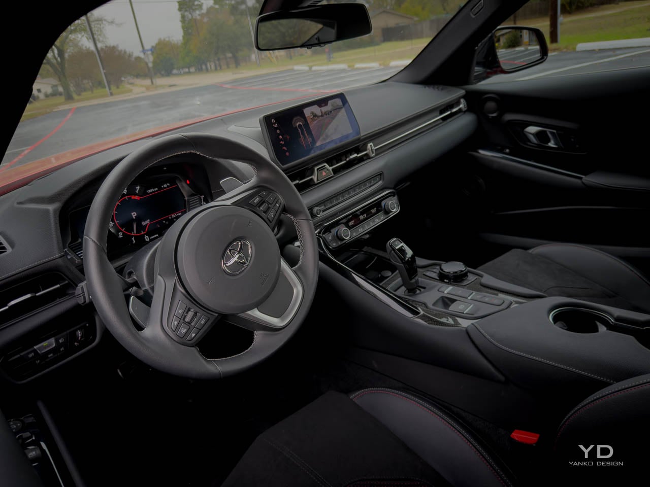
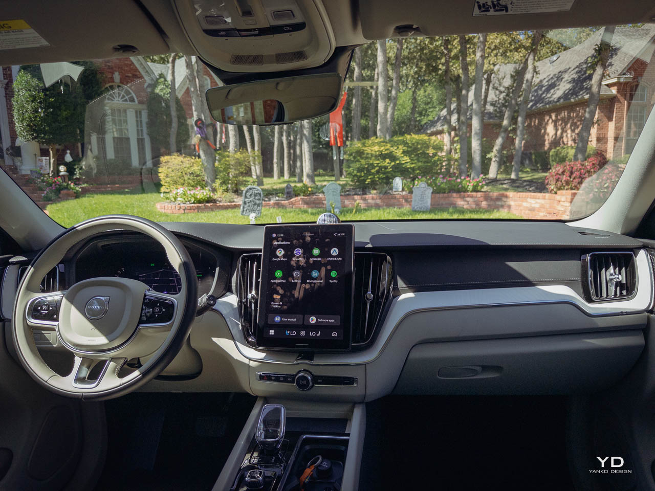
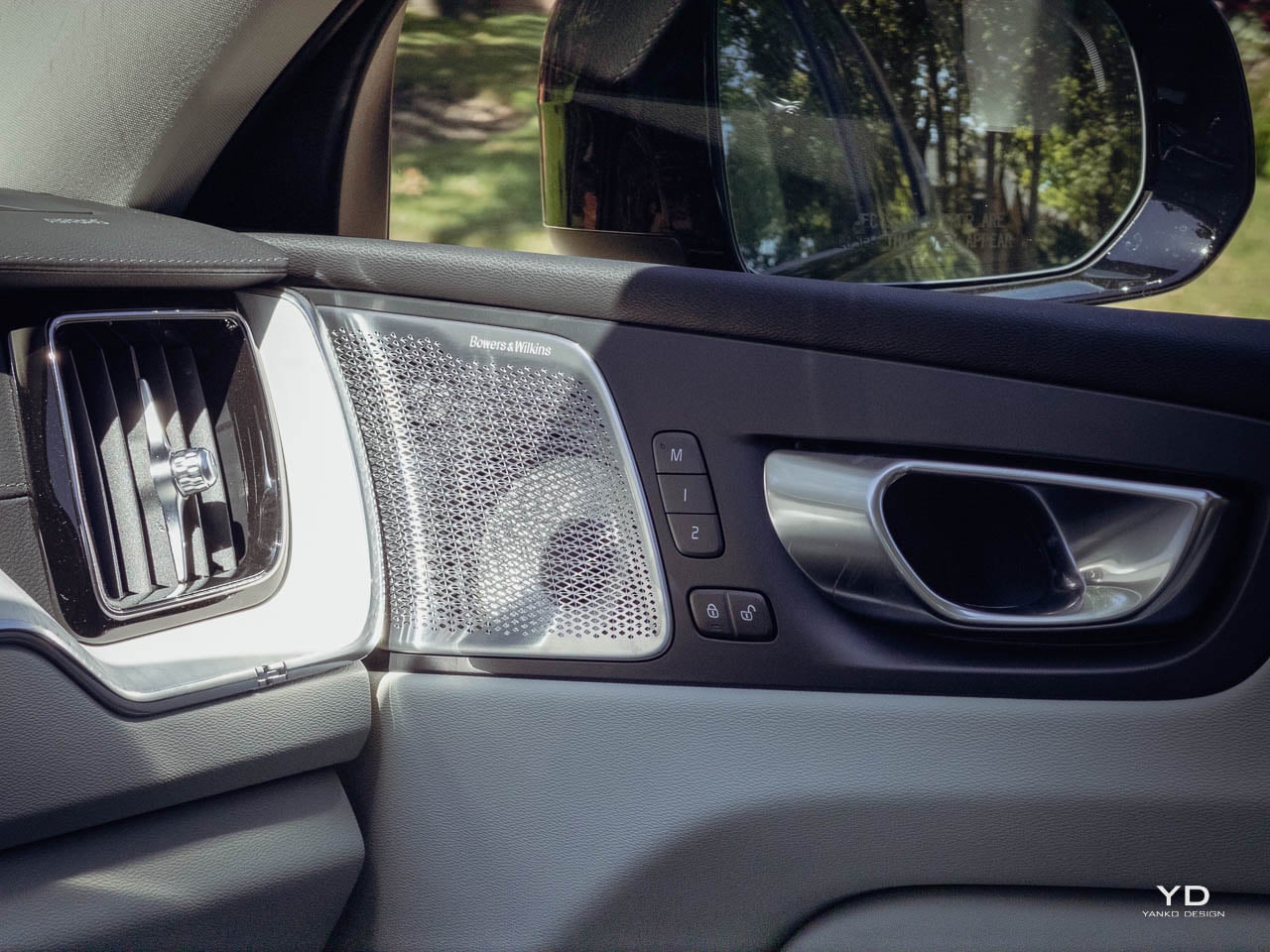
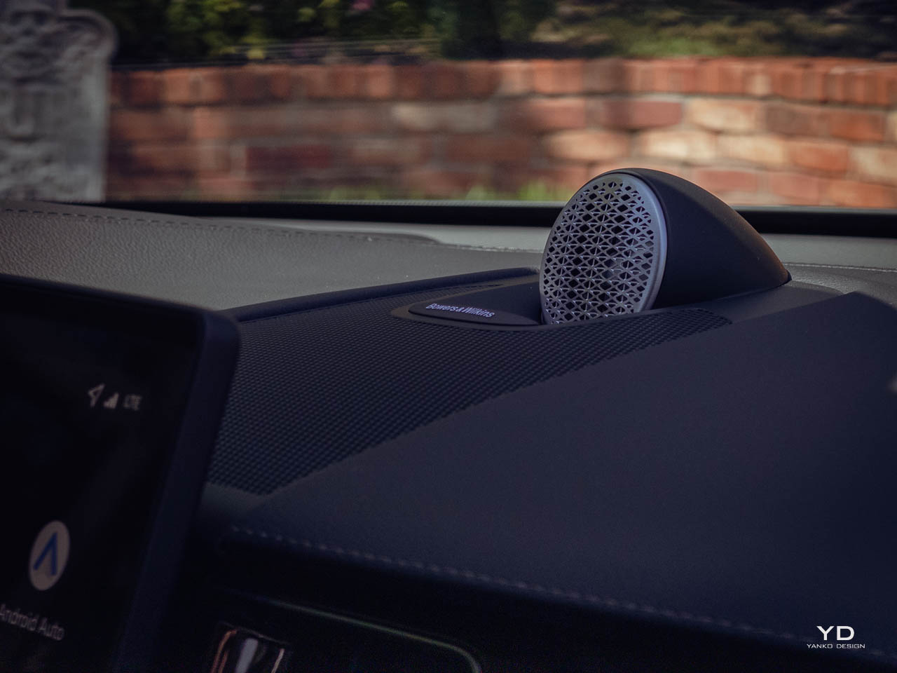
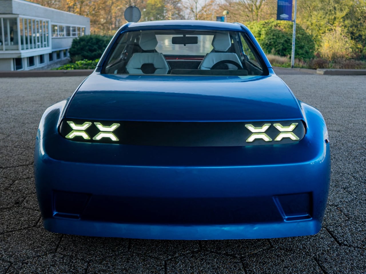
 Sound enters the cabin intentionally. Road surface changes come through the floor clearly enough to tell you about grip conditions. Wind noise picks up above highway speeds, a tradeoff for that slippery shape. The inline-six sounds smooth and present without needing artificial amplification through the speakers. This is a car that wants you engaged, not cocooned.