Huawei FreeClip 2 Review: Open-Ear Audio at Its Best

PROS:


  • Featherlight 5.1g design disappears on your ears within minutes

  • Dual-diaphragm drivers deliver bass that open-ear rarely achieves

  • Nod to answer, shake to reject: head gestures feel futuristic

  • Intelligent Volume Adaptation matches audio to your environment automatically

  • 38-hour battery and IP57 durability: built for all-day adventure

  • Perfect, secure fit stays locked through runs, shakes, and sleep

CONS:


  • No ANC means loud environments will always win

  • Huawei Audio Connect app unavailable on Google Play Store

RATINGS:

AESTHETICS
ERGONOMICS
PERFORMANCE
SUSTAINABILITY / REPAIRABILITY
VALUE FOR MONEY

EDITOR'S QUOTE:

FreeClip 2 is proof open-ear audio doesn't have to compromise.
award-icon

Three million units. Huawei’s original FreeClip proved open-ear audio could sustain mainstream adoption, not simply exist as a design curiosity for early adopters willing to sacrifice bass for situational awareness. The FreeClip 2 is the engineering-driven response to that market validation.

Designer: Huawei

Refinements. Huawei’s engineering team reworked acoustic design, material selection, ergonomic architecture, and battery systems, each adjustment responding to friction points that first-generation users identified during extended daily wear cycles. These aren’t incremental changes. They required rejecting constraints the open-ear category had normalized as acceptable trade-offs.

Ergonomics & Design: Solving Gen 1’s Friction Points

The original FreeClip launched in Dubai, December 2023. Three million units later, Huawei knows exactly where it succeeded and where users pushed back. The FreeClip 2 arrives two years later, same city, same month, with a focused brief: fix the comfort complaints without abandoning what worked.

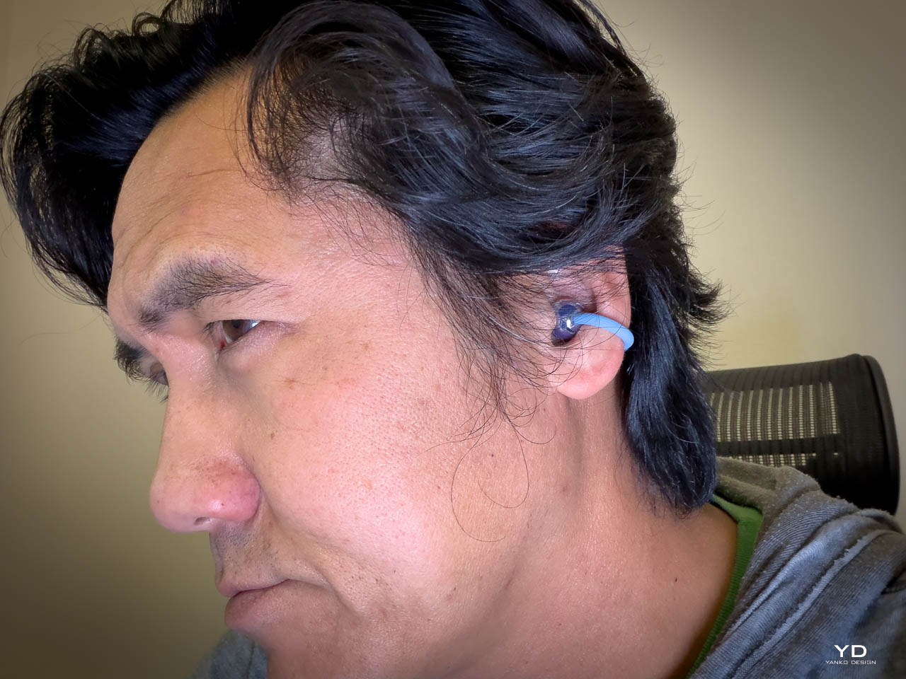
I’ve never worn open-ear earbuds before. My entire audio life has revolved around AirPods. The moment I clipped the FreeClip 2 on? Comfortable. Secure. It felt like they weren’t going anywhere, regardless of what I threw at them.

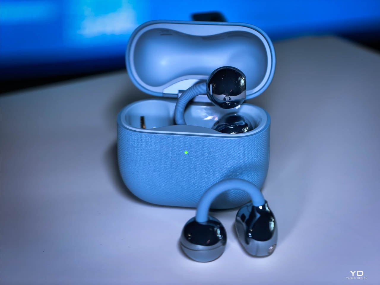
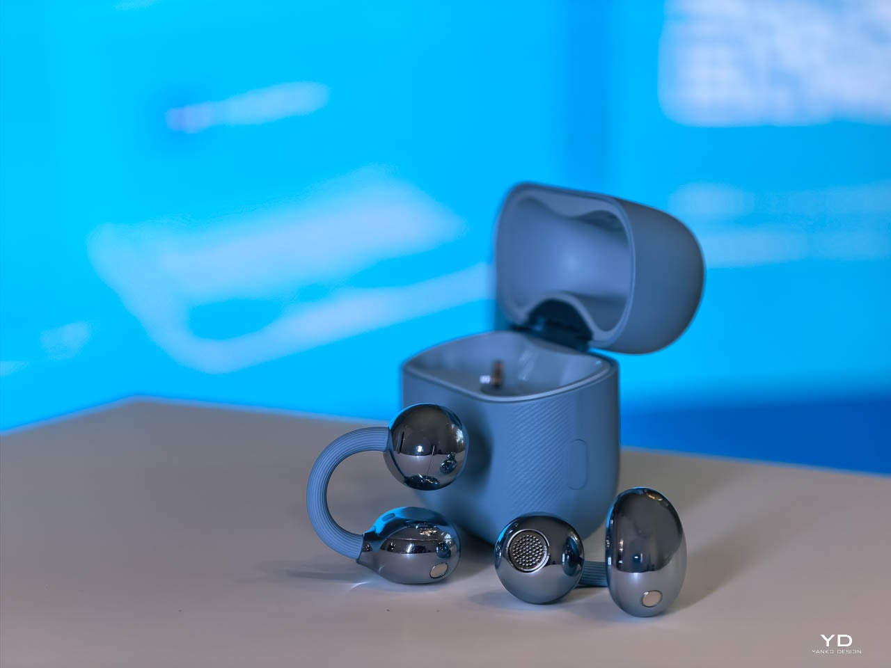
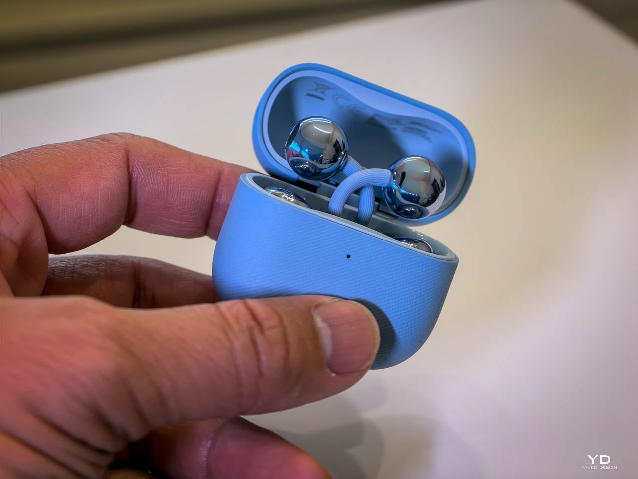
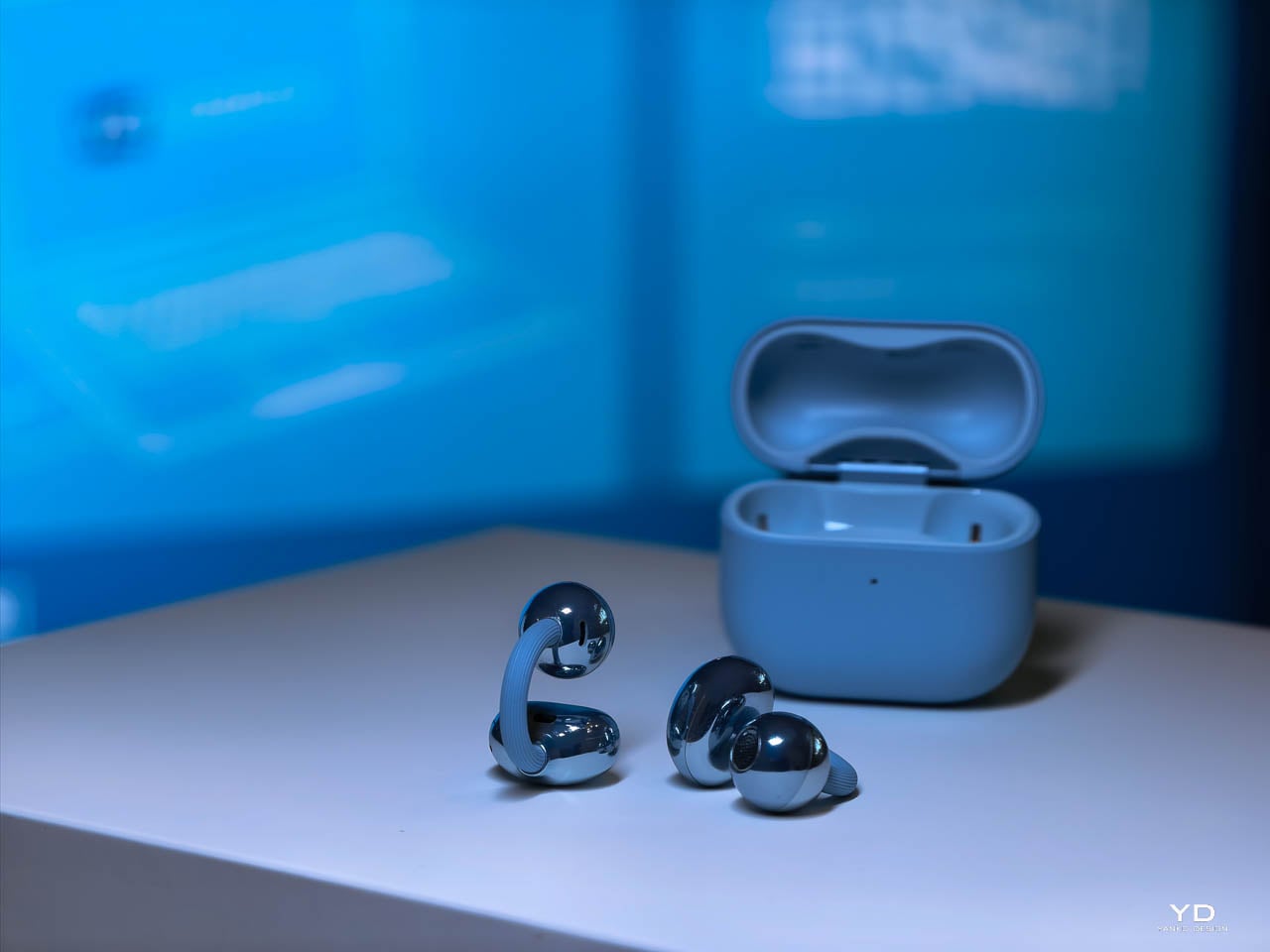
The architecture stays familiar: C-bridge, acoustic ball, comfort bean. Three components working as a unified clip mechanism. What changed is the material stack and dimensional tuning underneath.

The C-Bridge

Gen 1’s bridge gripped well but created pressure hot spots during extended wear. Huawei’s fix: a hybrid construction pairing skin-friendly liquid silicone over a shape-memory alloy core. The silicone adds 25% more flexibility. The alloy maintains consistent clamping force across temperature swings. No summer loosening. No winter tightening.

The new C-bridge doesn’t pinch. It doesn’t squeeze. It just… holds. Against my ear cartilage, the pressure distribution feels even rather than concentrated at specific contact points. “Cloud-like softness” sounds like marketing fluff until you’re six hours into a workday and realize you haven’t adjusted them once.

Huawei validated the design through 25,000 flex cycles. That’s lab durability. Real-world durability means the bridge returns to form after months of daily clipping and pocketing.

Acoustic Ball & Comfort Bean

The acoustic ball shrank by 11% in volume while achieving 95% internal space utilization. That’s engineering density: dual diaphragms, microphones, and acoustic venting packed tighter without adding visual bulk. The glossy finish on Denim Blue contrasts deliberately with the textured bridge.

The comfort bean, the counterweight behind the ear, reduced by 12.5% in volume. Huawei’s 10,000+ global ear scan database informed micrometer-level adjustments, expanding ear shape compatibility by 12.3%.

The bean tucks neatly into the anti-helix hollow, that curved ridge of cartilage behind your outer ear. It doesn’t fight for space or create awkward pressure points. The smaller footprint means it sits where anatomy intended rather than forcing the ear to accommodate the hardware. During head turns, it stays planted. During vigorous movement, same story.

Weight: The Competitive Edge

5.1g per earbud. Down from 5.6g. Half a gram matters because open-ear designs concentrate all mass on the helix rather than distributing it across the ear canal. At 5.1g, the FreeClip 2 is the lightest in its competitive set:

  • Bose Ultra Open: 6.5g
  • Shokz OpenDots One: 6.5g
  • SoundCore AeroClip: 5.9g

Glasses wearers gain the most. The softer bridge and smaller footprint reduce interference with temple arms.

Extended Wear Reality

After three to six hours, I forget I’m wearing them. That’s not hyperbole. That’s the actual experience. They disappear into background awareness the way a comfortable watch does.

Here’s where the open-ear advantage becomes obvious: car trips. The FreeClip 2 lets road noise through. Conversation reaches you unfiltered. But your podcast, your music, your navigation prompts, they’re all there too, layered on top of environmental audio rather than replacing it. Huawei’s “wear and forget” positioning isn’t aspirational marketing. It’s describing what actually happens.

The Sleep and Travel Test

Flying with AirPods is a gamble. Lean back in a business class seat, drift off, and wake up to find one earbud has slipped into the crevice where cushions meet armrest. Gone. The FreeClip 2’s clip mechanism eliminates that anxiety entirely. I wore them through an international flight, slept in them, and never once worried about losing a $200 earbud to upholstery.

They’ve become a sleep aid. For anyone managing tinnitus, the ability to wear comfortable earbuds to bed, playing low ambient audio to mask the ringing, is genuinely life-improving. Most earbuds create pressure points that make side-sleeping impossible. The FreeClip 2’s open design and featherweight construction don’t.
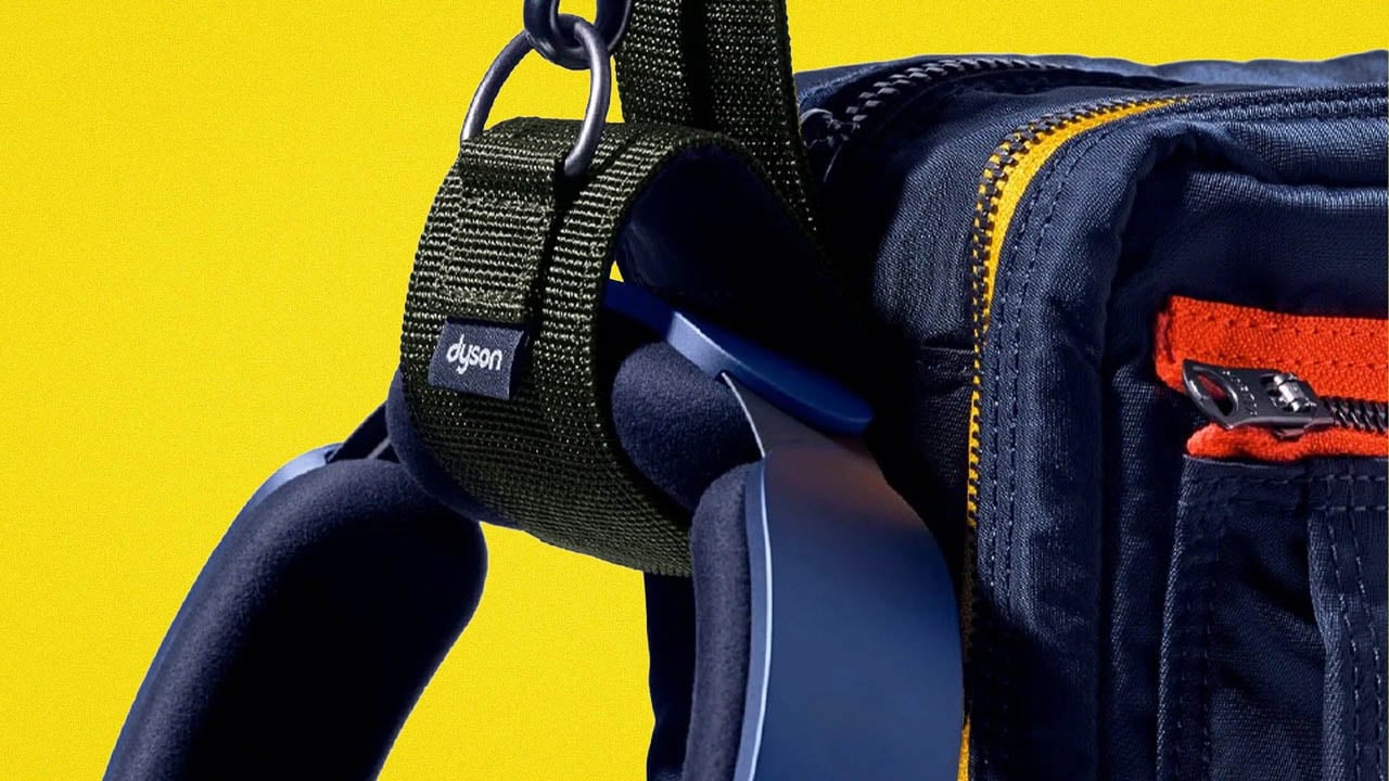
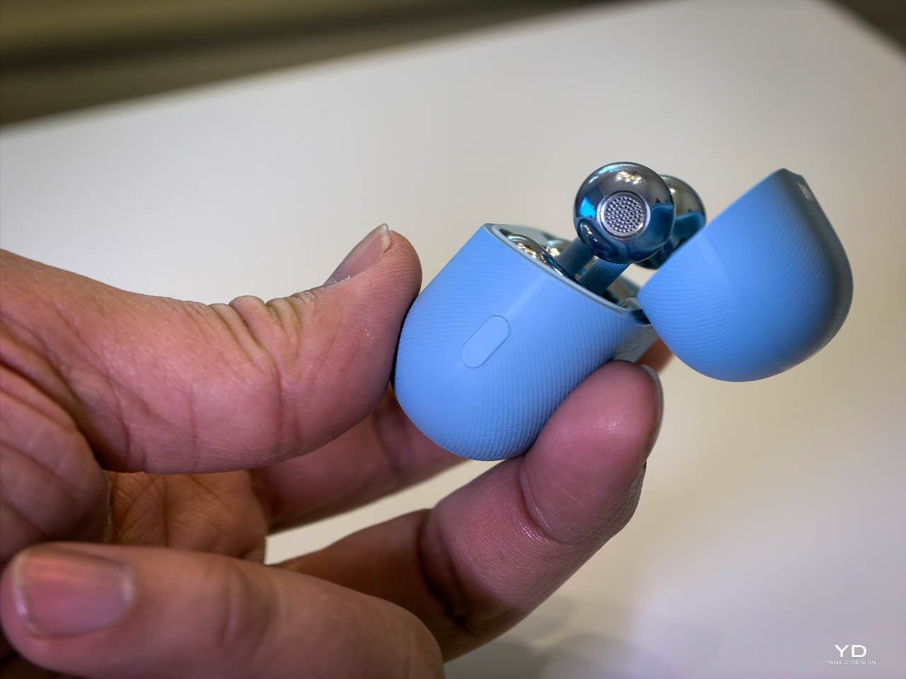
Case & Colorways

The case redesign matters for pocket carry. Crossed C-bridge arrangement inside achieves 17% narrower grip width and 11% smaller footprint. Case weight dropped 14%, from 45.5g to 37.8g. The larger 537mAh battery fits despite the shrinkage.

I love this form factor. The case slots perfectly into my jeans coin pocket, that small fifth pocket most people forget exists. It sits there all day without demanding attention. Always with me. Always ready.

Here’s an unexpected bonus: the slight bulge it creates actually works as a physical gate, preventing my phone from sliding up and out. The AirPods case does the same thing, but the FreeClip 2’s narrower profile makes it less intrusive while still providing that pocket security. It’s a small detail, but it means I don’t fish around wondering where I left them. They’re just – there. The compactness isn’t just a spec sheet flex. It translates directly to daily carry confidence.

Huawei offers four colorways: Denim Blue, Feather Sand White, Modern Black, and Rose Gold. I’d have picked Modern Black, but Huawei didn’t have one available for review. The Denim Blue unit I received turned out to be fine. It’s clearly the hero color, the one Huawei leads with in every press image, and after wearing it everywhere for weeks, I don’t mind it at all. The blue reads as understated rather than attention-seeking.

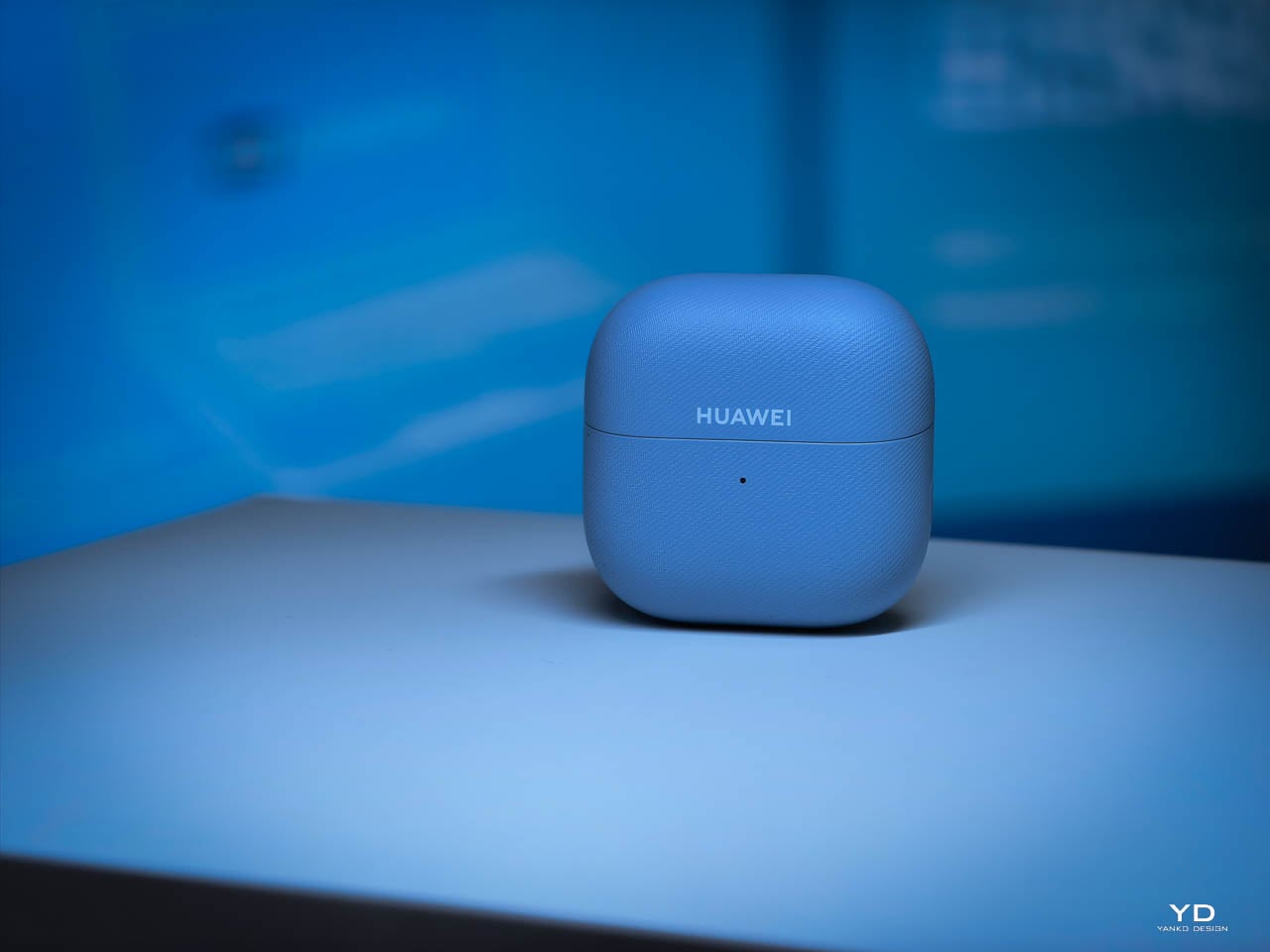
The Denim Blue and Feather Sand White cases feature micrometer-level molded denim weave texture, replicated from actual fabric. It’s stain-resistant (18 tests passed) and genuinely pleasant to the touch. The fabric-like surface adds grip without feeling gimmicky or cheap. Modern Black and Rose Gold ship with smooth matte finishes instead, trading the tactile detail for a more traditional premium look.

Durability

IP57 for the earbuds, up from IP54. The “7” rating certifies immersion to one meter for 30 minutes. Rain, sweat, accidental sink drops won’t end them. The case holds at IP54.

The Foundation

Here’s the thing about earbuds, headphones, any wearable audio that lives on your body: comfort isn’t a feature. It’s the prerequisite. Performance specs can dazzle on paper, but if the hardware pinches, slips, or annoys you into taking it off, none of those numbers matter. You won’t use them. They’ll collect dust in a drawer while you reach for something that actually feels right.

The FreeClip 2 nails this. Comfortable. Secure. Easy to forget you’re wearing them. Huawei got the foundation right, which means the performance conversation actually matters now. It’s worth having because you’ll actually wear these long enough to experience it.

So. How do they sound?

Performance: What Two Years of Engineering Buys You

Open-ear earbuds have always come with an asterisk. The form factor that keeps you connected to your environment also means no ear canal seal, no passive isolation, and historically, compromised bass. The first FreeClip accepted this trade-off. The FreeClip 2 challenges it.

The Dual-Diaphragm Difference

Huawei’s solution to open-ear bass limitations is architectural, not just algorithmic. The FreeClip 2 stacks two 11mm diaphragms inside the acoustic ball, sharing a single magnetic circuit. Think of it like a drum that can be struck from both sides simultaneously. The result: 100% more loudness and 100% more low-frequency power compared to Gen 1, all within a housing that’s actually 11% smaller.

On paper, that sounds like marketing. In practice, it translates to bass you can feel, not just hear. Electronic tracks have actual sub-bass presence. Podcast voices carry weight without sounding thin. The dual-diaphragm setup delivers what Huawei claims is the equivalent air volume of a 14mm driver, and my ears agree. Coming from AirPods, I expected the FreeClip 2 to sound hollow by comparison. It doesn’t. The bass extension surprised me, layered rather than boomy, with enough definition to distinguish kick drums from bass lines.

That said, let’s be realistic. These aren’t going to match the isolation and bass response of sealed in-ear monitors. They’re not trying to. The FreeClip 2 optimizes for a different use case: audio that coexists with your environment rather than replacing it. Within that constraint, the dual-diaphragm architecture delivers the best bass I’ve experienced from an open-ear design. And here’s the thing: these are on par with AirPods 4. Coming from someone who’s lived in Apple’s ecosystem for years, that’s not a statement I make lightly. The FreeClip 2 matches Apple’s latest in clarity, balance, and overall listening satisfaction. Different form factors, different philosophies, but the same tier of audio quality.

The elephant in the room: ANC. The FreeClip 2 doesn’t have it. It can’t, really. The open-ear clip form factor doesn’t create the seal needed for traditional active noise cancellation to work effectively. Huawei’s Intelligent Volume Adaptation compensates by boosting audio in noisy environments, but that’s fundamentally different from reducing ambient noise.

If you need to block out the world, the FreeClip 2 isn’t the answer. But here’s the thing: Huawei already makes that answer. The FreeBuds Pro 4 stays in the same ecosystem, uses the same Huawei Audio Connect app, and shares the same audio tuning philosophy. The difference is memory foam tips that create a proper seal and Ultra ANC mode that actually blocks external noise. I tested them on a Dubai-to-Dallas flight and they handled crying babies and engine drone beautifully. For Apple users, the AirPods 4 with ANC offers similar isolation in an open-ear-adjacent form factor.

The FreeClip 2 isn’t competing with those products. It’s serving a different need. Situational awareness first, isolation never. If that trade-off doesn’t work for your use case, Huawei has you covered with the FreeBuds Pro 4. Different tools, same ecosystem.

Sound Signature Across the Spectrum

Clarity over warmth. That’s the tuning philosophy here, and it works. Vocals sit forward with high stereo separation, positioned like you’re standing in front of a concert stage rather than lost in the crowd. High frequencies stay bright without crossing into harshness. Rich detail, zero sibilance. The mids avoid that muddy congestion that plagues open-ear designs trying to compensate for weak bass by boosting everything else.

How does this translate to actual listening? Electronic tracks stay layered. Individual synth lines remain distinct even when the producer stacks fifteen of them. Podcast voices sound full rather than thin. Acoustic guitar has actual body to the low strings.

I’ve spent time with the competitors, and they all make different tuning choices. The Bose Ultra Open leans warm with emphasized bass, which some listeners prefer for relaxed listening. The Shokz OpenDots One delivers strong low-end impact, though complex tracks can get congested. The SoundCore AeroClip emphasizes treble detail, which works well for acoustic content but may feel bright on certain recordings. The FreeClip 2 takes a different approach: balanced across all three frequency bands with no obvious peaks or valleys. Whether that’s “better” depends on your preferences, but for my listening habits, the neutral tuning works.

The NPU and Adaptive Audio

This is where the FreeClip 2’s third-generation audio chip with NPU AI processor starts to matter. The chip delivers 10x the processing power of Gen 1, and Huawei uses that headroom for something genuinely useful: Intelligent Volume Adaptation.

Enable it, and the FreeClip 2 continuously monitors environmental noise and adjusts volume in real-time. Quiet office? Volume drops to comfortable levels. Step onto a busy street? It ramps up automatically. Enter a subway car during rush hour? The system not only increases volume but activates voice frequency enhancement, boosting the specific frequencies that help speech cut through ambient noise.

I was skeptical. Automatic volume adjustment sounds like the kind of feature that would constantly annoy you with unexpected changes. But Huawei’s implementation is subtle enough that I stopped noticing it was happening. The transitions feel gradual rather than jarring. After a few days, I realized I was no longer manually adjusting volume when moving between environments. The earbuds just – handled it.

Call Quality: The VPU Advantage

Open-ear earbuds have traditionally struggled with calls. No seal means environmental noise bleeds into your voice pickup. The FreeClip 2 addresses this with a three-microphone system plus a VPU, a Voice Pickup Unit that uses bone conduction to capture your voice directly. It’s the first implementation of this technology in the open-ear category.

The DNN noise reduction algorithm running on the NPU has 9x the parameters of Gen 1. What does that mean in practice? I took calls from a coffee shop, from the street during traffic, from my home office with the window open. Every time, the person on the other end reported my voice was clear, not competing with background noise. The VPU captures vocal vibrations through bone contact, which the algorithm blends with the microphone feed to isolate your voice from everything else.

This isn’t the same as noise-canceling earbuds creating a bubble of silence around you. You still hear your environment. But the person you’re calling doesn’t, or at least not as much. That distinction matters for the always-in use case. You can take a work call while walking through an airport and remain aware of gate announcements while your colleague hears you clearly.

Controls: Swipe Volume Changes Everything

Gen 1 offered tap gestures. Double-tap for play/pause, triple-tap for next track. The FreeClip 2 keeps those but adds something I didn’t know I needed: swipe volume control on the comfort bean.

Slide your finger up or down, and volume adjusts accordingly. AirPods 4 introduced the same capability with swipe gestures on the stem, so this isn’t a differentiator. It’s table stakes for premium earbuds now, and both execute it well. The FreeClip 2’s larger touch surface on the comfort bean makes the gesture slightly easier to hit accurately during movement, but the difference is marginal. What matters is that both get the job done without forcing you to reach for your phone.

Head motion control is the feature I didn’t expect to love. Nod to answer calls, shake to reject. AirPods 4 has the same capability with Siri interactions, nodding for “yes” and shaking for “no.” I use it constantly on both. When your hands are full, carrying groceries, mid-workout, cooking dinner, the ability to manage calls with a simple head movement feels like the future arriving quietly. The FreeClip 2 matches AirPods here, not exceeds it. Both implementations work reliably, and both have become muscle memory.

Auto L/R Detection

Thanks to a six-axis attitude sensor and intelligent channel correction, either FreeClip 2 earbud works in either ear. Pop them on however you grab them from the case. The system detects orientation and assigns left/right channels automatically.

This sounds like a convenience feature until you’ve lived with it. No more squinting at tiny L and R markings. No more swapping buds when you realize you’ve got them reversed. Just clip and go.

Battery: Incremental but Meaningful

Gen 1 delivered 8 hours per earbud and 36 hours with the case. Gen 2 pushes to 9 hours and 38 hours respectively. Not a dramatic leap, but notable given that Huawei also increased loudness by 100%. More power output with longer battery life means meaningful efficiency improvements in the audio chain.

Quick charging remains at 10 minutes for 3 hours of playback, which covers most emergency situations. The case now supports wireless charging and, in an industry first for open-ear earbuds, can charge from a smartwatch charger. That last detail probably won’t matter to most people, but for Huawei ecosystem users who travel with a watch charger anyway, it’s one fewer cable to pack.

In practice, I’ve been getting through full workdays without needing a case top-up. The 9-hour claim holds if you’re not pushing volume to maximum constantly. At moderate listening levels, I’ve stretched past the rated time.
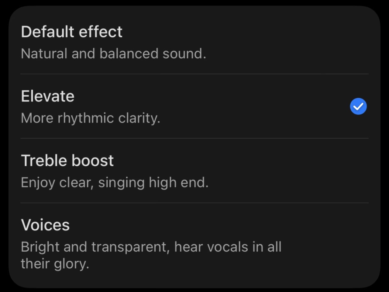
The App Situation

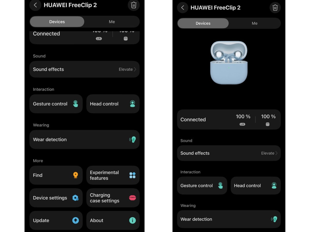
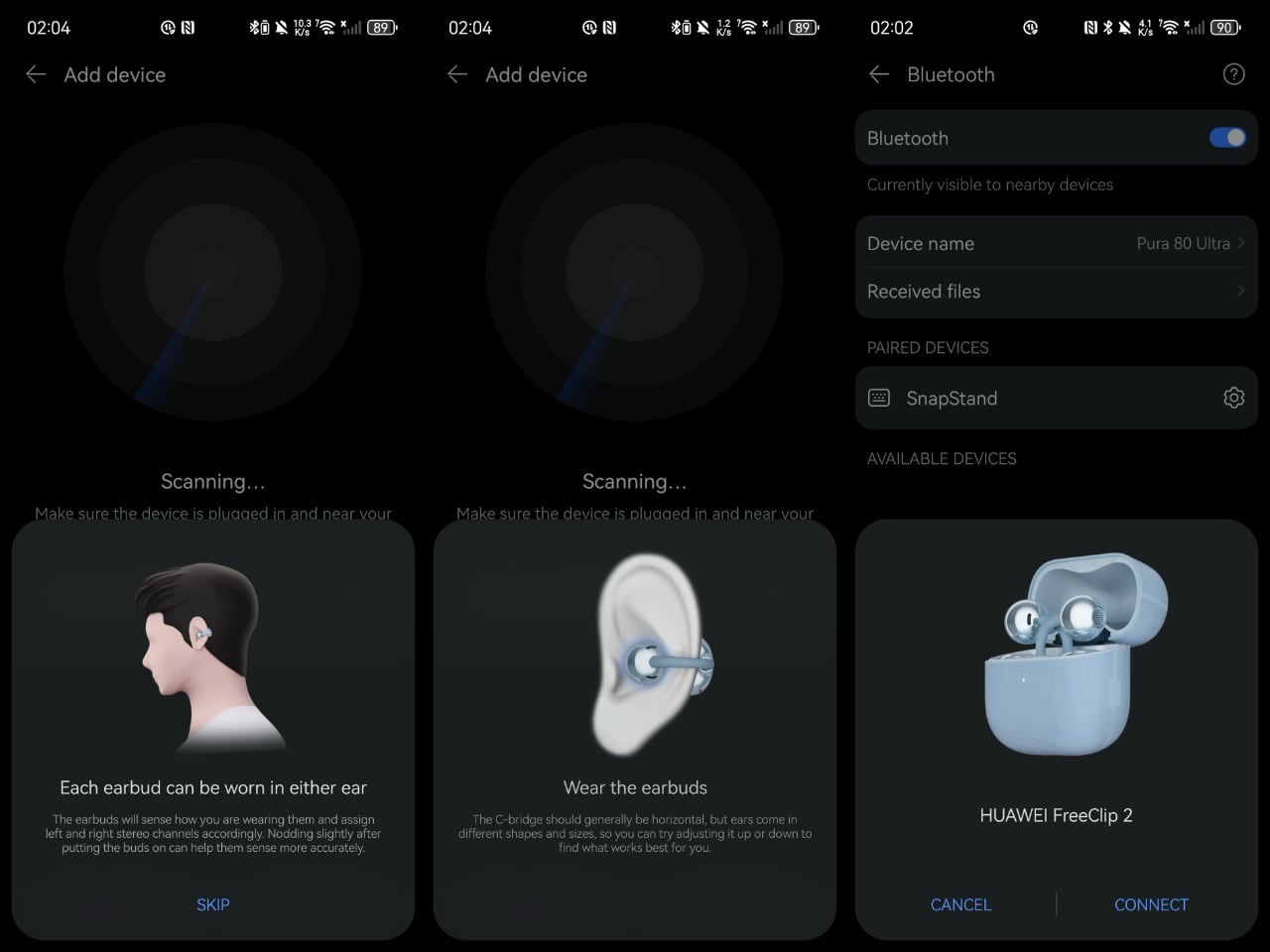
Huawei replaced the AI Live app with Huawei Audio Connect, a dedicated audio app for pairing, device management, EQ presets, and custom sound profiles. It’s available on the Apple App Store and Samsung Galaxy Store.

It’s not on Google Play.

For Pixel users or anyone running stock Android without Galaxy Store access, this means sideloading the APK or managing without the app entirely. The earbuds work fine via standard Bluetooth pairing, but you lose access to EQ customization, gesture configuration, and firmware updates. It’s not a dealbreaker, but it’s a friction point worth knowing about.

Spatial Audio 3.0 and Privacy Features

Two features worth mentioning, even if they won’t matter to everyone.

Spatial Audio 3.0 adds head tracking with 40% lower latency than Gen 1. Turn your head, and the soundstage adjusts. Three modes: Head Tracking, Fixed, and Off. The catch? You need compatible content. Huawei Music has a spatial audio library. Some streaming apps support Audio Vivid. But Spotify? Apple Music? The spatial features sit dormant. If you’re deep in the Huawei ecosystem, it’s a genuine enhancement. For everyone else, it’s a checkbox feature you’ll probably never activate.

More interesting: the reverse sound field system. Open-ear earbuds have always had a leakage problem. Your music becomes everyone’s music. Huawei’s solution uses openings at the rear of the acoustic ball to emit reverse sound waves that cancel what would otherwise leak outward. Does it work? Better than expected. At moderate volumes in a quiet room, someone sitting next to me couldn’t make out what I was listening to. Crank the volume in a silent library, and yeah, people will hear something. But for normal use? The privacy concern that plagued earlier open-ear designs feels mostly solved.

One more connectivity detail: dual-device connection. Pair to your laptop and phone simultaneously, switch between them without re-pairing. Useful if you’re bouncing between Zoom calls and mobile notifications. It’s table stakes for premium earbuds at this point, but worth confirming it works as expected. It does.

Performance Reality Check

The FreeClip 2 doesn’t rewrite the laws of physics. Open-ear audio will never isolate like sealed buds. In extremely loud environments, like a packed concert or a construction site, you’re going to struggle to hear your audio regardless of how much the NPU boosts volume.

But within the design constraints of the category, Huawei has pushed further than I expected. The dual-diaphragm architecture delivers bass that actually satisfies. The adaptive volume system works without being annoying. Call quality genuinely improved. The control additions, especially swipe volume, make daily use smoother.

For the always-in use case, situational awareness plus audio, the FreeClip 2 represents the most complete package I’ve tested in the open-ear space.

The Bottom Line

The FreeClip 2 lands in a category that’s still finding its identity. Open-ear earbuds don’t compete with AirPods Pro or Sony’s noise-canceling flagships. They serve a different need: audio without isolation. For runners who need to hear traffic. For office workers who can’t miss their name being called. For parents who want music but also want to hear if the kids are tearing the house apart.

Within that category, Huawei built something that feels genuinely refined rather than merely iterated. The comfort improvements matter because this form factor lives or dies by wearability. The dual-diaphragm architecture matters because open-ear bass has always been the weak point. The VPU matters because calls are half the reason people wear earbuds in the first place. The adaptive volume matters because open-ear listening happens in chaotic, shifting environments.

What works: Comfort across multi-hour sessions. Bass that actually shows up. Call quality that doesn’t embarrass you. Swipe volume control. Auto L/R detection. IP57 durability. The case size.

What doesn’t: No ANC (physics, not laziness). Spatial Audio limited to Huawei ecosystem content. The app isn’t on Google Play, which creates friction for Pixel users. Spatial audio content remains limited outside Huawei’s ecosystem.

Who should buy this: Anyone who wants all-day audio without cutting themselves off from their environment. Runners. Cyclists. Office workers. Parents. People with tinnitus who need sleep audio. Glasses wearers frustrated by traditional earbuds competing for ear real estate.

Who shouldn’t: Anyone who needs isolation. Loud environment workers. People who primarily listen in quiet spaces where open-ear leakage becomes more noticeable. If that’s you, consider the Huawei FreeBuds Pro 4 instead. Same ecosystem, same app, same Huawei audio tuning philosophy, but with memory foam tips that create a proper seal and Ultra ANC mode that actually blocks the world out. I tested them on a Dubai-to-Dallas flight and they handled crying babies and engine drone beautifully. For Apple users, the AirPods 4 with ANC offers similar isolation in an open-ear-adjacent form factor. Different tools for different jobs.

Three million Gen 1 units proved the market exists. The FreeClip 2 proves Huawei is serious about owning it. For the always-in use case, this is the most complete open-ear package available. It’s not perfect. Nothing is. But it’s the first open-ear earbud I’ve tested where the trade-offs feel worth making.

The post Huawei FreeClip 2 Review: Open-Ear Audio at Its Best first appeared on Yanko Design.

Vertical Aerospace Valo: The UK’s Electric Air Taxi Takes Flight

Imagine cutting a 90-minute airport transfer to 12 minutes. That is the value proposition Vertical Aerospace is selling with Valo, the electric air taxi it unveiled in London’s Canary Wharf on December 10. For business travelers, the pitch is straightforward. Skip ground traffic entirely on short-hop routes between major airports and city centers. Bring real luggage. Arrive in minutes instead of an hour.

Designer: Valo

If Vertical delivers on its technical targets and clears regulatory approval, Valo could reshape how time-sensitive travelers approach urban mobility. For cities, the calculus is different. Quiet electric aircraft designed to operate below 50 decibels in cruise might unlock airspace that conventional helicopters cannot access due to noise restrictions.

Vertiports on rooftops and waterfronts could become practical transit nodes rather than exclusive helipads. The infrastructure does not exist yet, but the partnerships to build it are forming.

The Aircraft

Valo is Vertical’s certification-intent production aircraft, not another prototype. The British company designed it from the ground up to clear regulatory approval rather than retrofit an experimental platform after the fact.

The cabin seats four passengers plus pilot at launch. Vertical plans to expand capacity to six as operator economics improve. Panoramic windows, generous space, and a cockpit divider create transport aesthetics distinct from early experimental aircraft.

Cargo capacity distinguishes Valo from competitors. The hold is designed to fit six cabin bags and six checked bags, with total payload around 550 kg. That addresses one of the persistent criticisms of early eVTOL concepts: nowhere to put your stuff.

Airline partners specifically requested this luggage capacity, and Vertical delivered.

Platform versatility extends beyond passenger service. Vertical has designed Valo to support EMS missions, cargo transport, and future defense applications.

Technical Targets

Vertical is targeting roughly 100 miles of range at cruise speeds approaching 150 mph. The company aims for zero operating emissions and noise levels below about 50 dBA.

If Vertical hits those acoustic targets, Valo cruising overhead would register quieter than typical street conversation. That matters for urban deployment. Helicopters face severe restrictions in noise-sensitive areas. Quiet electric aircraft could operate where rotorcraft cannot.

The propulsion system is designed with eight electric motors on multiple electrically isolated power lanes. Under-floor liquid-cooled battery packs, developed by Vertical’s Energy Centre using Molicel cylindrical cells, are intended to enable approximately 12-minute recharge cycles for short missions.

Honeywell supplies the fly-by-wire controls and avionics, purpose-built for eVTOL flight profiles. The tiltrotor configuration tilts forward propellers to manage vertical-to-horizontal transition. The aft array modulates based on wing lift. As speed increases, rear propellers reduce output and stop, transferring efficiency to cruise flight.

Carbon fiber composite blades and Low Noise Signature technology address specific frequency ranges that human hearing finds intrusive.

How It Got Here

The VX4 prototype generated thousands of test data points. Validated hover performance. Confirmed wingborne flight. Real maneuvers, not just simulation.

Vertical reports it is close to completing full piloted transition flight, the critical phase where the aircraft shifts from vertical lift into forward cruise. That accumulated knowledge shaped Valo’s production design.

The differences extend beyond surface refinements. A reworked airframe optimized for aerodynamics. New wing and propeller architecture. An under-floor battery system that redistributes weight and opens cabin space.

Syensqo and Aciturri contributed aerospace-grade composites for strength-to-weight optimization.

The VX4 received its Phase 4 Permit to Fly from the UK CAA in November 2025. This cleared final test sequences toward piloted transition. Hover, thrustborne, and wingborne phases have already been demonstrated.

Certification Path

Vertical is aiming for Type Certification under both UK CAA and EASA around 2028. The company plans to use the SC-VTOL Category Enhanced pathway.

This is the airliner-equivalent safety standard, requiring 10⁻⁹ failure probability. Approval at this level would enable commercial passenger operations with safety assurances travelers expect from scheduled airlines.

Seven UK-built certification aircraft will complete the full testing program. The redundant propulsion architecture, with eight motors on isolated power lanes, is mandatory to meet these standards.

Post-certification, Vertical holds roughly 1,500 pre-orders and MoUs from airlines including American and Japan Airlines, along with operators such as Bristow and Avolon. Deliveries could begin before decade-end if certification proceeds on schedule.

Planned Routes and Partnerships

Commercial structure is forming alongside the aircraft. Vertical, Skyports Infrastructure, and Bristow Group announced plans for what they describe as the UK’s first electric air taxi network.

The proposal centers on short-hop links between major airports and nearby city hubs.Canary Wharf would serve as the London node. Planned connections include Heathrow, Gatwick, Cambridge, Oxford, and Bicester. The partnership combines Vertical’s aircraft with Skyports’ London Heliport and Bicester Vertiport infrastructure, plus Bristow’s operational expertise.

Héli Air Monaco signed an MoU for Valo pre-orders, opening potential routes along the French Riviera. These are plans and memoranda of understanding that depend on certification and infrastructure buildout, not scheduled services.

Route economics favor corridors where time savings are most pronounced. Heathrow to central London currently consumes 60 to 90 minutes by ground. If Valo meets its performance targets, that could compress to roughly 12 minutes of flight.

Hybrid-Electric Expansion

Vertical announced a hybrid-electric variant in May 2025 targeting extended capabilities.

The hybrid version aims for 1,000 nautical miles of range, roughly ten times the all-electric envelope, with payload reaching 1,100 kg. Flight testing is scheduled for mid-2026.

This architecture would unlock market segments that battery-electric eVTOLs cannot currently serve: defense, logistics, air ambulance services where extended range is mandatory.

Economic Projections

According to company-cited projections from Frontier Economics, Vertical estimates the program could create over 2,000 skilled UK manufacturing and engineering positions. Annual economic contribution could reach £3 billion by 2035.

These are projections contingent on certification success and production scale-up, not guaranteed outcomes.

UK government backing adds context. The Department for Transport’s Plan for Change allocated over £20 million toward drone and air taxi development, signaling regulatory intent to streamline approval without compromising safety.

The Bottom Line

CEO Stuart Simpson positioned the reveal in manufacturing terms. The company is transitioning from prototype developer to production aerospace business.

Many eVTOL programs have demonstrated technology. Converting demonstrations into certified, commercially operating aircraft is the barrier that separates ambition from viable business.

The aircraft exists. The partnerships are signed. The certification path is defined.

What remains is execution against ambitious technical and regulatory targets. December 2025 marked a concrete step. Whether Valo becomes routine urban transport depends on what Vertical delivers over the next three years.

The post Vertical Aerospace Valo: The UK’s Electric Air Taxi Takes Flight first appeared on Yanko Design.

Kia’s Most Forgettable Crossover Gets a Personality Transplant and a Hybrid for 2027

Five years of anonymity ends here. The original Seltos did exactly what Kia asked of it: occupy a parking space in the subcompact crossover segment, return decent fuel economy numbers, and avoid offending anyone with strong aesthetic opinions. Mission accomplished. The problem was that avoiding offense also meant avoiding interest. While Kia’s design teams were busy making the K5 look like it wanted to fight you and turning the Sportage into something your neighbor would actually comment on, the Seltos sat in driveways across America looking like a placeholder for a vehicle that might arrive someday with actual visual presence.

Designer: Kia

The 2027 model is that vehicle. Kia has scrapped the safe approach entirely, replacing sheet metal that blended into rental car fleets with styling divisive enough to generate actual conversations. The interior no longer resembles a budget proposition from 2018. A hybrid powertrain finally joins the lineup, arriving roughly half a decade after competitors proved buyers would pay extra for efficiency in this segment. Whether the transformation justifies waiting for the 2027 model or signals that Kia finally understood what the Seltos needed all along depends on your tolerance for “better late than never” product development.

Platform Math That Actually Matters

Kia moved the Seltos onto the K3 platform. Platform migrations rarely excite anyone outside engineering departments, but this one delivers changes you’ll register without reading a spec sheet. Extensive use of ultra-high-strength and hot-stamped steel enhances body rigidity throughout the structure. Doors shut with a dampened authority the previous Seltos couldn’t manage. Road imperfections that used to send vibrations through the steering column now get absorbed somewhere between the pavement and your palms.

Dimensional changes favor passengers over parking. The new Seltos measures 4,430 mm long, 1,830 mm wide, and 1,600 mm tall, riding on a 2,690 mm wheelbase that redistributes interior volume where it counts. Rear seat legroom increases noticeably. The proportions trade some of the previous model’s upright greenhouse for a profile that looks like it belongs on the road rather than waiting nervously at a stop sign. The stance improvement alone suggests Kia’s designers finally got permission to make the Seltos look intentional.

Proportions that once read as generic now communicate purpose. Lower roofline changes how the vehicle photographs and how it feels from behind the wheel. You sit in something rather than on top of something.

Powertrains arrive with options across the efficiency and performance spectrum. The base 2.0-liter petrol engine makes 149 PS and 179 Nm, optimized for fuel efficiency and smooth everyday driving. The turbocharged 1.6-liter T-GDI comes in two flavors: a standard output version producing 180 PS and 265 Nm with a seven-speed dual-clutch or six-speed manual, and a high-output variant delivering 193 PS and 265 Nm through an eight-speed automatic. All-wheel drive swaps the base torsion beam rear suspension for a multi-link setup and adds Terrain Mode with settings for Snow, Mud, and Sand.

Hybrid Arrives Fashionably Late

Kia will add a hybrid sometime in 2026, trailing the gas models by several months. Specific output figures haven’t been disclosed yet, though the hybrid will bring higher efficiency and expanded everyday usability to the lineup.

The efficiency headline matters less than the features bundled with hybridization. Vehicle-to-Load capability transforms the battery pack into a portable power source. Tailgaters can run a TV. Contractors can charge tools. Campers can keep phones alive without hunting for outlets. That practical utility separates the Seltos Hybrid from efficiency-only competitors.

Kia’s Smart Regenerative Braking System 3.0 automatically adjusts regenerative braking based on traffic flow and navigation data to optimize energy recovery. For buyers who’ve watched the hybrid crossover segment mature while the Seltos offered only gasoline options, the wait has been frustrating. At least the delay allowed Kia to include features that early hybrid adopters had to do without.

Styling That Picks Fights

The front fascia abandons any pretense of subtlety. Kia’s star map lighting signature dominates the grille, paired with a dynamic welcome light sequence that animates on approach. Trim-dependent light signatures differentiate models. Flush door handles enhance aerodynamics and add visual sophistication.

Diagonal character lines run along the profile, while a floating roofline and strong shoulder contours create a dynamic silhouette that conveys forward motion even when stationary. Contrasting cladding and satin silver accents emphasize durability and refinement. The effect demands attention in ways the previous Seltos actively avoided.

Profile proportions stay recognizable but tighten considerably. Wheel arch cladding gains sculptural depth without the aggressive plastic additions that make some crossovers look like they’re wearing protective gear.

Three standout colors debut with the new model: Iceberg Green, Gravity Gray, and a bold matte Magma Red that photographs well enough to suggest Kia invested real effort in the paint development. The overall effect is polarizing by design.

Buyers who found the previous Seltos too bland may love this. Buyers who preferred blending in may find the new face exhausting. Kia appears comfortable with that trade-off, betting that memorable beats forgettable even when memorable divides opinion.

Interior Debt Repaid

Cabin improvements run deeper than the dual 12.3-inch screens dominating the dashboard, though those screens certainly establish the generational leap immediately. A dedicated climate control panel sits between the displays with physical buttons and knobs for temperature, fan speed, and the functions drivers adjust without looking.

Customizable 64-color mood lighting enhances the cabin ambience, providing visual depth without the purple-and-pink nightclub aesthetic that afflicts competitors trying too hard. The effect is modern without being desperate.

The gear shifter migrates to a column-type Shift-by-Wire system, freeing up the center console for storage bins deep enough to swallow a phone without drama and cupholders sized for actual beverages. This layout contributes to a more open cabin environment.

A low, horizontal dashboard enhances forward visibility and creates a sense of openness, while optimized packaging ensures generous headroom and legroom for all passengers. Second-row seats adjust by a total of 24 degrees, tilting 12 degrees forward and 12 degrees backward. Cargo volume reaches a class-leading 536 liters, with a foldable dual-level cargo board adding organizational flexibility. Passengers who suffered through the previous Seltos’s cramped quarters will notice the improvement immediately.

Premium materials convey both modernity and comfort throughout the interior. The previous Seltos interior felt perpetually compromised. This one suggests Kia finally treated the cabin as a priority rather than a cost-reduction opportunity. That shift in philosophy matters more than any individual feature upgrade.

Feature Density Matches Larger Siblings

Technology concentration reaches levels that would have seemed absurd for a subcompact crossover when the Seltos launched in 2019. Wide panoramic sunroof for an open atmosphere. A 12-inch windshield head-up display projects key driving information directly in the driver’s line of sight. USB ports delivering 100 watts rather than the trickle charging that used to pass for adequate.

Audio options from both Harman Kardon and Bose deliver immersive, high-fidelity sound optimized for the cabin’s acoustic architecture. The Kia Connect Store enables digital personalization and entertainment options, including collaborations with Disney and NBA. Feature-on-Demand brings YouTube, Netflix, and display theme options. The Kia AI assistant, powered by ChatGPT, enables natural conversational interaction. Over-the-air updates keep systems current without dealer visits. Digital Key 2 enables secure smartphone-based vehicle access and sharing.

The driver assistance package bundles Highway Driving Assist 2, Lane Following Assist 2, Forward Collision-Avoidance Assist 2, Safe Exit Warning, Surround View Monitor, Parking Collision-Avoidance Assist-Reverse, and Parking Distance Warning covering front, side, and reverse approaches. The previous Seltos consistently trailed its platform siblings in feature availability, as though Kia assumed subcompact buyers wouldn’t notice or care about the disparity. This generation closes that gap aggressively.

Timeline and Buyer Calculus

Global production begins December 2025 starting with India. South Korea, North America, Europe, and China follow throughout 2026. U.S. specifications and pricing should emerge within months. Hybrid details will arrive later.

The marketing campaign positions Seltos drivers as “protagonists” in their own narratives, which is exactly the aspirational corporate language that invites dismissal. Ignore it. The vehicle transformation underneath that messaging is substantive. The 2027 Seltos finally looks like it belongs in Kia’s current design portfolio rather than lingering as evidence of what the brand used to settle for.

Practical considerations: buyers who need a small crossover immediately can find excellent options from Toyota, Honda, and Mazda. Buyers specifically interested in hybrid efficiency should wait for the Seltos Hybrid or consider alternatives already on the market. Buyers who want something distinctive enough to locate in a parking lot without pressing the key fob, and who can tolerate the wait, might find the 2027 Seltos worth the patience.

After five years of forgettable competence, the Seltos finally demands attention. That’s either exactly what this segment needed or more personality than subcompact crossover buyers actually want. Sales figures will arbitrate.

The post Kia’s Most Forgettable Crossover Gets a Personality Transplant and a Hybrid for 2027 first appeared on Yanko Design.

F.P. Journe Turns 86 Carats of Rubies Into One Watch

Most gem-set watches treat stones as decoration. F.P. Journe’s Tourbillon Souverain Vertical Joaillerie Rubis treats them as the entire point. This unique piece took eight years to build because finding 93 rubies that match perfectly in color, then cutting 61 carats of material away to achieve that uniformity, requires a timeline most manufacturers would never approve. The result is 25 carats of baguette rubies wrapped around a platinum case that was engineered specifically to hold them.

Designer: F.P. Journe

Jeweled complicated watches have drawn serious collectors since Geneva’s golden era of the late twentieth century. Brands including Patek Philippe and Piaget established the category, and demand has only intensified over the past decade as colored stones moved from novelty to centerpiece. But what F.P. Journe delivered here operates on a different scale entirely. This is closer to a wearable ruby sculpture than a watch that happens to feature gems.

Image source: watchesbysjx.com

The arithmetic tells you everything. Eighty-six carats of rough ruby entered the workshop. Twenty-five carats survived. The remaining 61 carats were ground away in pursuit of identical size, clarity, and saturation across every stone. That ratio of loss would kill most projects before they started. F.P. Journe spent nearly a decade sourcing and recutting until the math worked.

The Case as Canvas

Every exterior metal surface carries rubies. Forty baguette-cut stones sit channel-set in the bezel, forming an unbroken red circuit around the dial. The lug hoods hold another 16 baguettes arranged in a fanned configuration that draws the eye outward and exaggerates the watch’s footprint on the wrist. The case band wraps the mid-section with 37 stones, the largest in the entire build.

Image source: watchesbysjx.com

F.P. Journe describes those 37 case-band rubies as the largest baguette-cut stones ever set in a watch. The claim matters because ruby’s natural crystal structure favors oval or cushion cuts. Producing elongated baguettes from material that resists that shape required sourcing oval-cut rubies of appropriate dimensions, then recutting them to fit the Tourbillon Vertical geometry. The case itself grew 2mm wider than the standard model specifically to receive stones of this size without leaving visible gaps between settings.

Image source: watchesbysjx.com

What you notice immediately is the seamlessness. No color variation breaks the surface. No pink tone drifts into orange. The 93 stones read as a single continuous shell rather than a patchwork of individual gems. Achieving that uniformity across bezel, lugs, and band demanded precise color matching at a level most jewelers would consider impractical.

That precision explains the eight-year development cycle. One stone that skews slightly warm or slightly cool would fracture the visual coherence of the entire case. Patience was not optional here.

Why Average Stone Weight Matters

Numbers put this in perspective. Each ruby on this watch averages 0.269 carats. Typical melee diamonds used in gem-set watches weigh under 0.02 carats and cost almost nothing because they trade as bulk commodities.

Image source: watchesbysjx.com

Patek Philippe’s fully set Grandmaster Chime carries 30.16 carats of baguette diamonds distributed across 392 stones, averaging 0.077 carats each. F.P. Journe’s diamond version of this same case averages 0.242 carats per stone. The ruby variant exceeds even that figure because ruby carries roughly 1.14 times the density of diamond: identical physical dimensions yield higher carat weight.

Image source: watchesbysjx.com

A Dial Built From Stone

The dial shifts the ruby theme into different territory. Instead of faceted gems, F.P. Journe selected cœur de rubis, a mineral combining red corundum growths with green zoisite matrix. The surface reads as ruby embedded in raw rock, textured and organic rather than polished to clarity.

Visually, the contrast works. The mottled dial recedes behind the geometric precision of the baguette case setting rather than competing with it. Thematically, the choice keeps everything on the watch connected to ruby in some form.

Image source: watchesbysjx.com

Machining corundum presents real difficulty. The material sits at 9 on the Mohs scale, just below diamond, and its brittleness makes drilling apertures for hands and the tourbillon window a high-risk operation. Scrap rates on dials like this run steep, adding another dimension of rarity to an already singular object.

F.P. Journe used ruby heart dials on the final 20-piece run of the Tourbillon Nouveau, so this represents continuation rather than experiment.

The Movement Behind the Gems

Caliber 1519 sits beneath the ruby exterior. This hand-wound movement carries one of F.P. Journe’s signature complications: a constant-force device built around a titanium blade-spring remontoir that François-Paul Journe designed in 1983 at the request of collector Eugene Gschwind.

Image source: watchesbysjx.com

The constant-force mechanism produces what the brand calls natural jumping seconds. The seconds hand advances in discrete one-second increments without requiring a separate dead-beat module. You see the hand step crisply rather than sweep, which provides immediate visual confirmation that the remontoir is functioning and makes accuracy checks against a reference signal straightforward.

Image source: watchesbysjx.com

The tourbillon departs from convention by rotating 90 degrees from the standard orientation, linked through a crown gear. This vertical positioning keeps the balance wheel perpendicular to most watch movements, theoretically reducing rate variation between dial-up, dial-down, and crown positions. Whether that translates to measurable real-world accuracy gains depends on wearing habits, but the engineering ambition registers clearly. Total power reserve runs 80 hours, with a guaranteed 42-hour chronometric window during which the constant-force system operates at full effectiveness.

Image source: watchesbysjx.com

Positioning the Piece

The crocodile strap intentionally recedes, letting the case dominate. The platinum folding clasp does not: it carries 18 additional baguette-cut rubies, extending the red-on-platinum language to every visible metal surface including the underside of the wrist.

Water resistance registers at 30 meters, a specification that signals jewelry-object status rather than any expectation of practical use. This watch exists for controlled environments, not daily wear.

F.P. Journe has not published pricing, listing availability only through boutiques with figures disclosed upon application. Given the material costs, the eight-year timeline, and the unique-piece designation, the number will occupy territory where inquiring about it implies you probably cannot reach it. More relevant than the price is what this watch demonstrates: how far an independent maker will push when schedules, budgets, and conventional production logic become secondary to a singular creative vision.

F.P. Journe Tourbillon Souverain Vertical Joaillerie Rubis

  • Case: 44mm × 13.76mm, platinum
  • Crystal: Sapphire
  • Water Resistance: 30m
  • Movement: Cal. 1519, manual wind
  • Functions: Hours, minutes, natural jumping seconds, power reserve, constant force device, tourbillon
  • Frequency: 21,600 vph (3 Hz)
  • Power Reserve: 80 hours total, 42 hours chronometric
  • Strap: Crocodile with ruby-set folding clasp (18 baguette-cut rubies)
  • Availability: Unique piece, F.P. Journe boutiques only
  • Price: Upon application

The post F.P. Journe Turns 86 Carats of Rubies Into One Watch first appeared on Yanko Design.

The Pebble Index 01 Strips the Smart Ring Down to a Single Gesture of Capture

A ring that does nothing but listen. In a category defined by biometric excess, the Pebble Index 01 arrives with radical minimalism: one button, one microphone, no display, no haptic motor, no health sensors whatsoever. Eric Migicovsky, the designer who created the original Pebble smartwatch before selling it to Fitbit, has returned with a device that treats subtraction as its primary design gesture. The result is a stainless steel band that costs $75 and exists for exactly one purpose: catching thoughts before they vanish.

The Form Language of Refusal

Where contemporary smart rings pile sensors beneath the surface, the Index 01 presents a deliberately quiet silhouette. The body arrives in stainless steel with three finish options: a matte black that absorbs light, a polished silver that catches it, and a polished gold that warms skin tones. Sizing spans from 6 to 13, covering the full range of adult finger dimensions. Submersion tolerance extends to one meter of depth, accommodating daily encounters with water but drawing the line at sustained swimming. A single tactile control rises slightly from the band surface, positioned where the thumb naturally falls during a closed fist. The metal arrives cool against skin, then gradually matches body temperature until the ring becomes thermally invisible.

This external button represents the entire interaction vocabulary. Press and hold to record. Single press for a customizable action. Double press for another. The tactile click either happens or it does not. Migicovsky designed this mechanical simplicity to eliminate the software failure states that plague capacitive touch surfaces. A button pressed is a button registered. The interaction model carries the directness of a light switch, with none of the ambiguity that haunts gesture-based interfaces where a swipe might be a scroll or a tap might be a hold.

Material Decisions and Lifecycle Architecture

The battery architecture reveals the sharpest design trade-off. The power source borrows from audiological medicine: silver oxide chemistry, the same electrochemical foundation that enables hearing aids to operate for extended periods without user intervention. Under typical usage patterns, this chemistry sustains the Index for roughly twenty-four months. The cells accept no recharge. When electrochemical capacity exhausts, the object transitions from functional tool to recyclable material, and the replacement cycle begins at the standard retail threshold.

Migicovsky frames this as liberation from charging infrastructure. No dock to pack for travel. No percentage to monitor across the day. No dead device at the moment of need. The battery simply works until it does not. Pebble accepts spent units for recycling, though the environmental calculus of disposable electronics remains uncomfortable regardless of end-of-life handling. The choice prioritizes reliability over sustainability, a trade-off that will resonate with users who have missed critical moments because a rechargeable device died at the wrong time.

Onboard storage accumulates voice data during periods of wireless disconnection. The device operates autonomously at the moment of capture, holding content until the paired phone returns to communication range. This independence from continuous connectivity means the critical instant of thought preservation never depends on signal strength. Total storage capacity approaches fourteen hours of compressed audio before the power source reaches depletion.

The component inventory reads like an exercise in restraint: a single mechanical switch, a voice-optimized transducer capable of cutting through ambient noise, and nothing else. The absence of a vibration motor removes one failure point. The absence of a screen removes another. The absence of haptic feedback removes a third. Migicovsky constructed this architecture around a singular reliability thesis: fewer components mean fewer opportunities for malfunction.

Privacy Embedded in Architecture

The conversion pipeline executes entirely within the paired phone’s processor. Voice becomes text through a speech recognition system distributed under open licensing. A secondary language model, also running locally, sorts each capture into categorical bins: reminder, timer, or unstructured thought. The data path terminates at the device boundary. No packet crosses to external infrastructure. No server receives the content. The application code itself lives in public repositories, enabling inspection of every function that touches the user’s recorded cognition.

This transparency represents a structural commitment rather than a policy promise. The architecture makes privacy violation technically difficult rather than merely prohibited. Over 100 languages receive support for transcription, and the app retains both raw audio and text transcription as a practical backup for moments when ambient noise garbles the speech-to-text conversion.

The Cognitive Friction of Remembering

Three months of prototype wear revealed Migicovsky’s personal rhythm: between ten and twenty capture events per day, most compressed into windows of three to six seconds. Micro-utterances preserved before cognitive decay erases them. The friction point he identifies sits between idea formation and idea preservation: the gap between thinking something and writing it down often exceeds the retention window of working memory. The ring attempts to close that gap by reducing the capture gesture to a thumb press.

No phone to extract from a pocket. No app to open. No interface to navigate. The ring lives on the finger, perpetually ready, requiring only mechanical activation. Recording duration extends to five minutes for longer thoughts, though Migicovsky’s own usage suggests most captures are momentary. This design philosophy treats the human mind as the bottleneck rather than the technology. The device does not attempt to augment cognition. It simply catches output before it disappears into the noise of the next distraction.

The absence of a display removes the temptation to glance. No notifications pull attention away from the present moment. The ring offers no visual feedback during recording, only the physical sensation of the button depression and the knowledge that somewhere inside, a microphone is capturing sound. This sensory reduction forces trust in the device rather than verification of it.

Market Position Through Aggressive Restraint

The market already contains an alternative philosophy. Sandbar’s Stream Ring arrives at a quarter-thousand-dollar entry point, layers a subscription model at ten dollars per month for full functionality, and frames itself as a conversational AI presence worn on the hand. Delivery timelines stretch into the following summer. The Index inverts every variable: seventy-five dollars during the preorder window, ninety-nine after the March 2026 ship date, zero recurring fees, complete feature access from activation.

The value proposition rests entirely on whether memory capture alone justifies a ring on the hand. For users who want biometric tracking, the Index offers nothing. For users who want AI interaction, the device provides only a side door accessed through a specific gesture, and Migicovsky admits this feature will not work consistently. The honesty is refreshing in a category saturated with overpromise.

The organization behind the Index operates with five employees and no external capital. Migicovsky constructed this structure deliberately after the original Pebble trajectory concluded with a Fitbit acquisition that generated minimal founder returns. The Index embodies an opposing growth philosophy: constrained scale, margin sustainability from the first unit sold, price points accessible without the pressure of venture expectations demanding hyperbolic expansion curves.

Designing for Disappearance

The Index 01 succeeds or fails based on its ability to vanish from conscious attention. A health-tracking ring demands engagement: it provides data that requires interpretation. The Index asks only to be worn and pressed. The interaction surface shrinks to a single gesture repeated throughout the day.

Whether this reduction represents design clarity or feature poverty depends entirely on the user’s relationship with their own thoughts. Some people remember what matters. Others watch ideas dissolve before they can act on them. For the second group, the Index offers external memory that requires no charging ritual, no subscription fee, and no data uploaded to distant servers. The stainless steel band catches light. The button waits under the thumb. Somewhere inside, a microphone stands ready. The design statement is the emptiness itself: a ring that does almost nothing, executing that nothing with perfect reliability.

The post The Pebble Index 01 Strips the Smart Ring Down to a Single Gesture of Capture first appeared on Yanko Design.

Toyota IMV Origin rethinks modular truck design with a vehicle that arrives unfinished

The Toyota IMV Origin arrived at the 2025 Japan Mobility Show stripped down to almost nothing, and that was entirely intentional. Where conventional vehicle concepts arrive polished and production ready, the IMV Origin presented itself as a skeletal flatbed with an open air single seat cab, barely recognizable as a truck at all. Toyota’s approach here inverts the typical automaker logic: instead of delivering a finished product, the company ships a foundation, a canvas, a system of parts that local communities complete on their own terms. The concept draws from Toyota’s long running Innovative International Multi-purpose Vehicle platform, which already emphasizes flexibility and regional adaptation. Revealed during the same press conference that showcased flashier vehicles and premium brand expansions, the IMV Origin quietly proposed something more radical: a vehicle that gains value and identity only after it leaves the factory.

Designer: Toyota

Koji Sato, Toyota’s president and CEO, described the underlying philosophy in direct terms during the Japan Mobility Show presentation. The first idea, he explained, was to ship the vehicle unfinished, allowing the local people who receive it to assemble and complete it themselves. The second idea extended that premise further: customers would define the vehicle on their own terms even after assembly, choosing whether it carries people or cargo, boxes or something else entirely. Toyota builds the base, and from there each user completes the vehicle to fit specific needs. This framing positions the IMV Origin not as a truck but as a design system, a physical framework for distributed creativity that shifts final authorship away from the factory floor and into the hands of communities scattered across emerging markets.

Designing a Vehicle That Arrives Unfinished

That philosophy becomes visible in the physical form itself. The Toyota IMV Origin reads less like a finished vehicle and more like a piece of industrial furniture waiting for context. A flat chassis defines the primary surface, interrupted only by a minimal open cab structure designed for a single occupant. There is no enclosed cabin, no rear bed walls, no cargo box, no secondary seating. The silhouette suggests a factory cart or a stripped down work platform rather than anything destined for public roads. This visual starkness serves a functional purpose: every absent panel, every missing enclosure represents space for local fabrication and adaptation.

Toyota’s shipping model borrows imagery from flat pack furniture, a comparison Sato made explicit during the Japan Mobility Show press conference. The idea is that the IMV Origin ships as a crate of assemble yourself components, packed efficiently enough to slide into a standard shipping container. Buyers receive the rolling chassis, the cab frame, the essential mechanical systems, and presumably a set of instructions and basic tools. Assembly happens on arrival, requiring some combination of included hardware and locally sourced equipment. The furniture analogy carries weight here: just as a bookshelf arrives as panels and fasteners awaiting configuration, the IMV Origin arrives as a vehicle skeleton awaiting completion. This approach compresses shipping volume, reduces transport costs, and distributes final assembly labor to regions where that labor already exists and seeks work.

The open cab structure reveals how Toyota communicates modularity through form. By leaving the driver’s area exposed rather than enclosed, the company signals that even this fundamental zone remains open to interpretation. A buyer might add a windscreen, side panels, a full roof, or leave the cab skeletal for maximum airflow in hot climates. The single seat default suggests solo commercial use, but the surrounding space invites expansion to two seats or more. Every surface of the IMV Origin exists as a potential attachment point, a mounting location, a starting place for fabrication. The form does not dictate function; it invites negotiation.

The visual openness of the chassis functions almost like an instruction diagram for local builders. Exposed rails, visible mounting surfaces, and unobstructed structural geometry signal exactly where modules can attach. A fabricator examining the modular truck concept does not need a manual to understand where a cargo box might bolt or where a cab enclosure could fasten. The stripped form communicates its own logic, revealing load paths and connection points through the simple act of leaving them visible. Toyota’s decision to ship the vehicle unfinished becomes, in this light, a form of design communication: the geometry itself teaches the user how to complete it.

How Local Assembly Shapes Everyday Use

The design logic extends directly into how people actually use the vehicle. The user experience of the Toyota IMV Origin begins not with driving but with building. A farmer in rural Africa might receive the crated components, unpack them with neighbors, and spend a day or a week assembling the base vehicle. The process itself becomes a form of ownership, a hands on introduction to every mechanical connection and structural joint. By the time the owner starts the engine for the first time, they already understand how the vehicle fits together, which fasteners hold the cab frame, where the chassis accepts additional load. This knowledge carries forward into repair and modification, lowering the barrier to maintenance and customization.

Toyota showed several example configurations at the Japan Mobility Show press conference, including a produce delivery truck with a tall cargo box and a logging truck with open stake sides. These illustrations suggest the range of possibilities without defining limits. A community workshop in a small agricultural town might fabricate a cargo bed with fold down sides, bolted directly to the exposed chassis rails, for transporting harvested crops over uneven dirt roads. Another shop could build a modular fire response carrier, using the visible mounting surfaces to secure water tanks and equipment racks for rapid deployment across scattered villages. A regional upfitter with welding equipment might create a lightweight camper module, fastening a sleeping platform and basic storage to the flatbed’s open connection points, transforming the IMV Origin into a mobile shelter for seasonal workers or traveling repair crews. Each scenario draws on locally available materials, locally developed skills, and locally understood needs.

The modularity extends beyond the initial build, allowing role changes across seasons without requiring a new vehicle purchase. A single IMV Origin might serve as a produce hauler during harvest season, then swap its cargo box for a flatbed configuration to transport building materials during construction months, then add a canopy and seating for passenger transport during community events. This flexibility mirrors the way rural economies actually function, where a single asset often serves multiple purposes across different seasons and circumstances. The design anticipates that reality rather than ignoring it.

Sustainability Through Local Fabrication and Modular Updates

These same structural choices carry environmental consequences that compound over time. Shipping a compact crate of components rather than a fully assembled vehicle reduces the volumetric footprint of each unit in transit. Fewer shipping containers, smaller cargo holds, and more efficient packing translate directly into lower fuel consumption and reduced emissions during international transport. The sustainability benefit begins before the vehicle ever reaches its destination, embedded in the logistics strategy rather than added as an afterthought.

Local assembly creates additional environmental value by distributing expertise and reducing dependence on distant supply chains. When communities build and maintain their own vehicles, they develop skills that support long term durability. A locally fabricated cargo box can be repaired with locally sourced materials when it sustains damage. A cab enclosure built by a regional shop can be modified or replaced without importing new parts from distant factories. In regions where replacement parts are expensive or difficult to obtain, this local capability becomes a practical necessity as much as an environmental virtue.

The IMV Origin’s intentional incompleteness encourages a culture of repair over replacement, extending the useful life of the base platform and reducing the frequency of full vehicle turnover. Rather than discarding an entire vehicle when needs change, owners upgrade or swap individual components. A farmer who expands operations might add a second seat to the cab rather than purchasing a larger truck. A delivery service that shifts from dry goods to refrigerated cargo might install an insulated box module rather than acquiring a purpose built refrigerated vehicle. Each modular intervention preserves the embedded energy and material value of the existing platform while adapting it to new requirements.

Durability emerges not from overengineering but from accessibility: the vehicle lasts longer because owners can fix it, adapt it, and extend its usefulness without specialized tools or imported components. Toyota’s willingness to leave the product unfinished becomes, paradoxically, a strategy for longevity.

Where the IMV Origin Fits in Toyota’s Modular Platform Roadmap

This approach did not emerge in isolation. The Toyota IMV Origin sits at the most stripped down end of a spectrum that already includes the IMV 0 concept and the production Hilux Champ. The IMV 0, revealed in 2022, offered a simplified small truck platform with strong modularity but still arrived as a recognizable vehicle. The Hilux Champ, which debuted in Thailand in 2023, translated that modularity into a production reality, spawning mini motorhomes, delivery trucks, food trucks, and overland campers through partnerships with regional body shops. Indonesia’s version, the Hilux Rangga, inspired a design competition that produced fire trucks, police tactical vehicles, agricultural transporters, and recreational campers. The IMV Origin steps further back along this trajectory, offering even less finished hardware and even more open ended potential.

This positioning reveals something about Toyota’s strategy for global mobility within the broader IMV platform family. Rather than designing a single truck and adapting it for different markets through factory options, the company designs a platform that markets adapt themselves. The factory provides the mechanical core, the structural integrity, the safety critical systems. Everything else becomes a canvas for regional creativity. This approach acknowledges that Toyota cannot anticipate every use case, cannot understand every local need, cannot predict how a vehicle will serve a community it has never visited. By stepping back from finished product design, the company creates space for distributed innovation.

The IMV Origin also signals a willingness to rethink what a vehicle manufacturer actually provides. Traditional automakers sell cars and trucks. Toyota, through this concept, proposes selling capability frameworks: mechanical systems and structural platforms that enable local economies to generate their own transportation solutions. The value proposition shifts from finished goods to enabling infrastructure. Whether this model scales into production remains to be seen, but the conceptual territory it explores challenges assumptions about how vehicles reach the people who need them.

Why the IMV Origin Acts as a Platform Rather Than a Product

What emerges from these choices is a rare form of restraint. By shipping a deliberately incomplete vehicle, Toyota acknowledges that the factory cannot know best, that distant engineers cannot anticipate the specific needs of a farming community in rural Africa or a delivery network in Southeast Asia. The concept trusts local fabricators to complete the design, trusts regional workshops to maintain and modify the platform, trusts communities to define what a truck should be in their specific context. This trust becomes a design decision as much as any chassis dimension or cab geometry.

The furniture shipping model, the open cab structure, the flatbed awaiting cargo solutions: all of these choices point toward a vehicle that exists as potential rather than product. As Koji Sato noted during the presentation, not finishing this vehicle was frustrating from a carmaker’s perspective, but not finishing it is what makes it a vehicle built for actual users, because people have different needs in their daily life and work. The IMV Origin does not try to be everything. It tries to be a starting point, a foundation, a system that gains identity through use and modification. Toyota builds the base. The world completes the truck.

The post Toyota IMV Origin rethinks modular truck design with a vehicle that arrives unfinished first appeared on Yanko Design.

Dyson x Porter OnTrac Limited Edition Redefines the Commuter Kit as a Unified Design System

The Dyson x Porter OnTrac Limited Edition collaboration arrives as a pointed departure from typical brand partnerships. Rather than applying co-branded graphics to existing products, this project positions two objects as components of a single system built around commuter behavior. The headphones and bag share materials, color logic, and ergonomic intent. They function as a kit, not a bundle. The production run is limited to 380 individually numbered sets distributed through select retail locations in Japan and China, plus official online channels.

Designer: Dyson x Porter

Porter, the accessories division of Yoshida & Co., approaches its 90th anniversary with a history rooted in textile construction and hardware refinement. Dyson enters audio as an engineering house known for motors, airflow systems, and computational design. The collaboration required both parties to subordinate individual brand language to a shared design constraint. The scarcity is intentional. This is not a mass market recommendation. It is a design artifact that demonstrates what becomes possible when two craft traditions converge on a single behavioral problem.

Collaboration Context

Porter operates under Yoshida & Co., a Japanese company founded in 1935. The brand built its reputation on hand construction, obsessive material selection, and a visual language drawn from military surplus, particularly the MA 1 flight jacket. Porter bags are assembled by hand in Japan, often incorporating dozens of discrete components into a single product. The 90th anniversary celebration, designated Project 006, called for a collaboration that would extend Porter’s construction philosophy into new territory.

Dyson’s audio division emerged more recently with the Zone headphones in 2022, combining noise cancellation with air purification in an ambitious but polarizing form factor. OnTrac followed as a more focused over-ear design, retaining Dyson’s emphasis on driver quality, noise isolation, and extended battery performance. Jake Dyson, chief engineer and son of founder James Dyson, supervised the Porter collaboration.

Both companies ceded ground to produce objects that read as parts of a single system rather than co-branded accessories. Porter’s expertise in understanding how objects move with the body informed Dyson’s thinking about where headphones rest when not in use.

Headphones as Object One

The OnTrac headphones in this collaboration begin with Dyson’s existing flagship architecture. The cups use angled geometry that exposes machined aluminum surfaces and microfiber cushions. What distinguishes this edition is the outer cap treatment. Custom panels carry the Porter logo, and the color blocking shifts to navy, green, and orange, tones drawn directly from the MA 1 flight jacket vocabulary that has defined Porter’s aesthetic for decades. The palette establishes visual continuity with the bag.

The driver assembly uses 40 millimeter neodymium transducers with 16 ohm impedance, spanning a frequency response from 6 Hz to 21 kHz. Eight microphones power the active noise cancellation system, capable of reducing ambient sound by up to 40 dB. Battery life extends to 55 hours with ANC engaged. USB-C fast charging restores usable runtime quickly. Bluetooth 5.0 handles connectivity, and the MyDyson app provides listening mode control and voice assistant integration. These specifications remain unchanged from the standard OnTrac.

The weight sits at approximately 0.45 kg, a figure that exceeds many competitors as a consequence of Dyson’s aluminum construction and driver housing decisions. The cushion geometry distributes pressure across a wider contact area, and the microfiber surface reduces heat buildup during extended sessions. The comfort profile favors long commutes over lightweight portability. The headphones are designed to be worn for hours, not minutes.

The industrial aesthetic leans toward precision equipment rather than consumer electronics. Exposed metal, visible fasteners, and functional geometry communicate that these headphones prioritize engineering integrity over lifestyle signaling. The joystick controls on the right cup allow volume adjustment, track navigation, and mode switching without reaching for a phone.

Technical Specification Snapshot

Specification Value
Driver configuration 40 mm neodymium transducers, 16 ohm impedance
Frequency response 6 Hz to 21 kHz
Active noise cancellation Up to 40 dB reduction via 8 microphones
Battery endurance Up to 55 hours with ANC active
Charging interface USB-C with fast charge capability
Total weight Approximately 0.45 kg
Wireless protocol Bluetooth 5.0, MyDyson app integration
Construction materials Aluminum body, microfiber cushions, CNC machined outer caps

Bag as Object Two

Porter’s contribution is a shoulder bag engineered specifically around headphone storage and deployment. The design is not a general purpose satchel with a headphone pocket added as an afterthought. The entire geometry responds to a single question: how does a commuter remove, wear, and store over-ear audio equipment with minimal friction? The construction involves 77 discrete components, each cut and stitched by hand in Japan.

The outer shell uses water-repellent nylon with abrasion-resistant weave, a material choice that protects against rain, scuffs, and the wear patterns of daily transit. Interior compartments accommodate the standard commuter loadout: phone, wallet, tablet, small camera, cables. Pockets are sized and positioned to prevent shifting during movement. The signature detail is the dedicated headphone loop integrated into the shoulder strap. When the headphones are not in use, they hang from this loop in a stable, accessible position at chest height. The strap itself employs Porter’s Carrying Equipment Strap mechanism, allowing one-handed length adjustment through a quick-pull system. This ergonomic decision accommodates different body types and carry positions without requiring two-handed manipulation.

Color story extends throughout the bag. The body is navy. The zipper tape is bright orange. Interior lining and webbing introduce green and khaki accents.

Every material surface echoes the headphone palette, creating a unified visual identity even when the two objects are separated. The bag was designed with the headphones’ 0.45 kg mass already calculated into its geometry, ensuring weight distribution remains balanced during movement.

System Integration

The value of this collaboration lies in the integrated ritual it enables. A commuter leaves home with headphones docked on the shoulder strap loop. The loop holds them securely against the bag body, eliminating swing and bounce during movement. On the platform, a single motion lifts the headphones from the loop to the ears and activates ANC. At the destination, the headphones return to the loop without opening the bag or searching for a case.

The strap adjustment system allows the bag to shift position for crowded trains or escalator navigation. The Porter logo on the headphone caps and the Dyson branding on the bag interior reinforce system identity through consistent placement and scale.

Design System Comparison

Design Element OnTrac Headphones Porter Shoulder Bag
Primary function High-fidelity audio with active noise cancellation optimized for commuting Compact daily carry satchel engineered around headphone storage and quick access
Material construction Aluminum frame, microfiber cushions, precision machined caps Water-repellent nylon, 77 hand-assembled components, reinforced stitching
Color language Navy headband and shells, green cushions, orange accent stitching Navy exterior, orange zipper tape, green webbing accents, khaki interior
Heritage reference MA 1 flight jacket palette adapted to audio hardware MA 1 flight jacket palette extended to bag construction
Signature feature Porter branded outer caps with co-branded engraving Integrated headphone loop on shoulder strap, one-pull length adjustment
System role Audio delivery and noise isolation during transit Storage, transport, and quick-access docking for headphones and daily essentials

Limited Edition Context

Production caps at 380 individually numbered sets. Each unit ships with a tech slice: a resin block containing frozen development components suspended like specimens. A steel aircraft-wire loop attaches this artifact to the bag. The tech slice serves no functional purpose. Its presence signals that this collaboration values process documentation as much as finished product. Pricing varies by region, with Japanese retail at ¥118,690, UK pricing at £649.99, and North American pricing in the $700 to $1,000 range depending on import and distribution variables.

This represents a significant premium over the standard OnTrac, which retails around $500. The delta purchases the Porter bag, the limited numbering, the tech slice, and the scarcity itself. Distribution is restricted to select Dyson and Porter retail locations in Japan and China, plus official online stores. The 380-unit cap ensures that most interested buyers will not acquire a set.

The collaboration positions itself as a design artifact rather than a mass-market commuter recommendation. This distinction matters. The limited production run is not a marketing tactic to generate urgency. It reflects the reality that hand-built Porter bags cannot scale beyond a certain output without compromising construction quality. The collaboration accepts that constraint rather than working around it.

The numbered tag and tech slice transform the set into a collector’s object, extending both companies’ internal prototype cultures outward to buyers.

Design Value and Trade-Offs

The integrated carry solves a genuine friction point in commuter life. Over-ear headphones are awkward to store and deploy in transit. The strap loop addresses this problem directly. Material quality on both objects meets expectations for premium products. The Porter bag’s hand construction and weather resistance exceed typical EDC pricing tiers. The 55-hour battery life and 40 dB ANC represent genuine engineering performance.

The trade-offs are equally visible. The headphones are heavy at 0.45 kg, heavier than many competing over-ears. This is a consequence of Dyson’s aluminum construction decisions. The premium pricing places this set beyond casual consideration. The 380-unit production run means that for most readers, this is an object to understand rather than acquire. Within the broader context of tech and fashion collaborations, this project signals a shift in approach. Most brand partnerships treat collaboration as a reskinning exercise: new colors, co-branded packaging, a press cycle. The Dyson and Porter set attempts something more structural. The bag exists because of the headphones. The strap loop exists because of the bag. The color palette exists because both objects needed to read as one. This is system design applied to the commute, not merchandise.

Closing Insight

Carrying sound functions as a design position in this collaboration, not as marketing language. Porter and Dyson asked a specific question: what would it mean to design a bag around the act of listening rather than the act of storing? The answer required rethinking strap ergonomics, loop placement, and access geometry. It required unifying two production cultures under a shared color language. It required limiting production to maintain the artifact status that justifies the premium.

Most products designed for commuting solve individual problems: block noise, carry belongings, protect against weather. This collaboration solves them together, as a system, with a coherence that most tech and fashion partnerships never attempt.

The project suggests a future where commuter accessories behave as a cohesive ecosystem, designed from the outset to interact seamlessly rather than coexist by accident. For the 380 people who acquire a set, the daily commute operates through a unified design language. For everyone else, the project demonstrates what becomes possible when two craft-driven houses apply system-level rigor to carrying sound.

The post Dyson x Porter OnTrac Limited Edition Redefines the Commuter Kit as a Unified Design System first appeared on Yanko Design.

Shantivale Botanical Incense Collection Review: Pure Design, Quiet Mind

PROS:


  • Hand-rolled with pure botanicals, no synthetic additives

  • TCM formulations create genuinely distinct scent profiles

  • Low smoke output suits sensitive users

  • Natural stone holder elevates the ritual

  • Full-stick construction means zero material waste

CONS:


  • Fragile sticks require careful, mindful handling

RATINGS:

AESTHETICS
ERGONOMICS
PERFORMANCE
SUSTAINABILITY / REPAIRABILITY
VALUE FOR MONEY

EDITOR'S QUOTE:

Shantivale does something rare-it makes slowness feel like a luxury, not a compromise. This is incense for people who've grown tired of optimizing everything.
award-icon

There is a ritual gap in modern wellness, and Shantivale fills it by bringing Traditional Chinese Medicine formulations to botanical incense, a collection where ancient herbal pairings meet modern wellness rituals. The industry has spent the last decade digitizing everything. Apps track your sleep. Wearables monitor your heart rate variability. Smart diffusers connect to your phone. But somewhere in all that optimization, the simple act of lighting something and watching it burn got lost. Wang Yuhao noticed this gap, watching people reach for their phones instead of pausing for breath.

Shantivale exists because of that observation. The Shangri-La based brand builds botanical incense using Traditional Chinese Medicine formulations, hand-rolling each stick with a rice-root binder that burns clean and steady. No synthetic additives. No perfume oils. Just plant matter shaped by artisan hands and informed by centuries of herbal knowledge. The result is incense that functions less like air freshener and more like a temporal anchor, a 30-50 minute ritual that creates structure in formless days.

The design philosophy here centers on what the brand calls “a sensory bridge between ancient wisdom and modern wellbeing.” That sounds like marketing language until you examine the ingredient sourcing. The Cliff Glow variant uses Ya Bai cypress harvested from high-altitude cliffs where the species grows above 2,000 meters. The wood matures over decades before collection. This is not the kind of supply chain that scales easily or cheaply, and the pricing reflects that reality.

Material Honesty in Stick Form

Most commercial incense follows a simple construction: fragrance oils coating a bamboo core. Light it, and half your stick is just wood burning. Shantivale eliminates that compromise entirely. Every millimeter of each stick is combustible incense material, bound together with rice-root plant binder rather than synthetic adhesives. The full-stick construction means zero waste, but it also creates a fragility that demands careful handling.

This material choice serves multiple purposes. The rice-root binder maintains a steady, even burn without chemical accelerants. The absence of a wooden core allows the herbal formulations to express themselves without interference. Customers consistently note the low smoke output, a direct result of using pure plant materials rather than fragrance-soaked substrates. The trade-off is structural: these sticks break more easily than their bamboo-cored competitors, requiring the kind of mindful handling that perhaps fits the product’s intended use case.

The packaging extends this material consciousness. Paper wrapping protects each bundle, preserving scent integrity during storage. A natural stone holder accompanies every purchase, a smooth river stone with a drilled hole that transforms utilitarian ash-catching into something approaching desktop sculpture. The presentation reads as gift-ready without excessive packaging material, threading the needle between premium positioning and environmental consideration.

This approach carries risk. Consumers accustomed to heavily scented, bamboo-cored sticks might find Shantivale’s output subtle by comparison. The fragrance does not announce itself across a room or linger for hours after burning. Instead, it creates presence within a defined radius, then fades. For those seeking ambient room scent, this restraint might read as weakness. For those seeking ritual objects, the ephemerality becomes the point.

Five Formulations, Five Functions

Shantivale structures its collection around specific use cases rather than arbitrary scent categories. Each blend draws from Traditional Chinese Medicine principles about how aromatics influence the body’s qi, or vital energy flow. Whether you subscribe to TCM philosophy or simply want incense that smells interesting, the formulation logic creates genuine differentiation between products.

The collection spans three price tiers: entry blends at $29.90, premium single-origin at $32.90, and the temple formula at the same premium price point. Each variant targets a specific time of day or mental state, creating a system rather than a random assortment. Users can build a rotation across the week or commit to a single favorite. The naming conventions (Purity Veil, Serene Sleep, Zen Flow, Dharma Rain, Cliff Glow) telegraph function without requiring deep TCM knowledge.

Purity Veil: Morning Reset

The cleansing blend combines cinnamon twig, fern root, and artemisia. Gui Zhi (cinnamon twig) brings warm, sweet notes traditionally associated with easing tension and promoting circulation. Guan Zhong (fern root) adds fresh, grassy character with subtle bitterness. Yin Chen (artemisia) contributes that just-cut-grass brightness TCM practitioners link to liver support and energy.

The scent profile lands somewhere between herbal tea and forest floor, neither as sweet as pure cinnamon nor as medicinal as straight artemisia. Users describe it as “clean” and “spacious,” with a natural campfire quality that dissipates rather than lingers. After burning Purity Veil during morning routines over two weeks, I found the scent genuinely resets a room without announcing itself. It creates absence of staleness rather than presence of perfume. Best deployed for morning routines or re-entry rituals after leaving the house.

The cleansing claim warrants examination. No incense literally purifies air in a measurable sense. What Purity Veil offers is perceptual reset: the scent marks a transition between states, creating an olfactory boundary between “outside” and “home” or between “work mode” and “rest mode.” The value lies in the ritual structure, not antimicrobial properties.

Purity Veil on Amazon ($29.90)

Serene Sleep: Evening Wind-Down

The nighttime blend shifts to calming territory: poria mushroom, jujube seed, and polygala root. Fu Ling (poria) grows on pine tree roots and carries soft, woody notes like dried sawdust or pine shavings. Suan Zao Ren (jujube seed) adds light nuttiness with faint sour undertones. Yuan Zhi (polygala) contributes earthy, slightly spicy depth traditionally used for memory support and nightmare reduction.

The combined effect reads as gentle cereal-like warmth with caramel touches and a soft herbal finish. I tested Serene Sleep during evening wind-down sessions for a week, lighting it about 45 minutes before bed while reading. The scent never demanded attention. It simply made the transition from screen time to sleep feel more deliberate, like drawing a curtain between day and night. Burn time extends toward 50 minutes depending on conditions, creating a substantial evening ritual window.

Serene Sleep on Amazon ($29.90)

Zen Flow: Meditation Anchor

The meditation blend brings out the premium ingredients: sandalwood, agarwood, and curcuma. Tan Xiang (sandalwood) delivers that smooth, sweet, woody foundation found in temples and high-end perfumery. Chen Xiang (agarwood) adds rare complexity, a resin formed only when specific trees heal from wounds over many years. The scent carries woody, sweet, and smoky layers that shift as the stick burns. Chuan Yu Jin (curcuma) grounds everything with warm, ginger-adjacent spice.

This is the collection’s most traditionally “incense” scent, the kind of aromatic profile that would feel at home in a meditation center or yoga studio. During a two-week meditation testing period, Zen Flow became my go-to: the sandalwood-agarwood combination created an immediate signal to my brain that focus time had begun, more effective than any app notification. Users note a masculine vibe and cleaner execution than typical sandalwood products. The thinner stick construction allows good scent diffusion without overwhelming small spaces.

The sandalwood and agarwood combination represents significant material investment. Authentic agarwood commands prices rivaling precious metals by weight, formed only when Aquilaria trees respond to specific fungal infections over years or decades. Most commercial “agarwood” incense uses synthetic approximations or diluted oils. Shantivale claims authentic sourcing, and the scent complexity suggests the claim holds merit. The resinous depth shifts as the stick burns, revealing different facets at beginning, middle, and end.

Zen Flow on Amazon ($29.90)

Dharma Rain: Clarity Blend

The temple formula combines agarwood, clove, patchouli, and curcuma. This multi-herb blend draws from classic incense traditions used during meditation and chanting, creating what reviewers describe as “light but powerful” and “intricately intriguing.” The scent sits somewhere between palo santo and cedar, with complexity that rewards attention.

At $32.90, Dharma Rain occupies the premium tier alongside Cliff Glow. I burned this during deep work sessions in my home office. The complexity kept revealing new facets over the 40-minute burn, which actually helped maintain focus longer than simpler scents that fade into background noise. This formulation particularly resonates with incense enthusiasts seeking something beyond single-note simplicity. Low smoke output and the absence of artificial undertones make it suitable for smaller spaces where typical incense would overwhelm.

Dharma Rain on Amazon ($32.90)

Cliff Glow: Single-Origin Expression

The collection’s most distinctive offering uses only one botanical: Ya Bai cliff cypress from Shangri-La highlands. This Thuja sutchuenensis grows above 2,000 meters on difficult-to-access cliffs, maturing over decades before harvest. The single-ingredient approach delivers pure, unmasked aromatic character without the blending that typically smooths rough edges.

The scent profile reads as rich, grounded wood tones with gentle smokiness and mellow sweet finish. Users compare it to stone warmed by afternoon sun, to a cozy wooden chest, to refined temple fragrance without overwhelming intensity. Testing Cliff Glow on a rainy Sunday afternoon confirmed its positioning: this is contemplative incense, not background scent. The single-origin expression demands you actually sit with it, which is either a feature or a limitation depending on your expectations. The 45-minute burn time and fragile construction demand careful handling, but the premium pricing ($32.90) finds acceptance among buyers who appreciate geographic authenticity and traditional harvesting practices.

The single-origin approach carries inherent variability. Unlike blended products where formulation balances inconsistencies, Cliff Glow expresses whatever character that particular harvest of Ya Bai cypress carries. Some batches may run slightly sweeter, others more resinous. For buyers accustomed to industrial consistency, this variability might frustrate. For those who appreciate terroir in wine or single-origin coffee, the variation becomes a feature rather than a bug.

Cliff Glow on Amazon ($32.90)

The Design of Slowness

Shantivale’s most interesting design decision might be what it refuses to optimize. In an era of smart diffusers and app-controlled aromatherapy, this is incense that requires a match, a holder, and time. The fragile sticks demand attention. The 30-50 minute burn times create temporal boundaries that push back against infinite scroll culture. The low-tech approach is not accidental; it is the product.

The stone holder exemplifies this philosophy. A smooth river stone with a single drilled hole performs the same function as elaborate brass holders or ceramic trays, but with material honesty that connects to the natural sourcing story. Some users note the stone does not catch ash particularly well, a valid functional criticism that the brand could address with a deeper groove or accompanying dish. But the current design prioritizes aesthetic integration over utilitarian optimization.

The educational content surrounding each product extends the slow design ethos. The website includes an herb dictionary explaining ingredient origins and traditional uses. Product pages detail not just what each blend contains, but why those specific botanicals pair together according to TCM principles. Whether customers engage with this information or simply burn the incense, its presence signals a brand that trusts its audience to appreciate depth over simplicity.

Who This Collection Serves

Shantivale positions itself clearly in the premium segment. Entry-level blends start at $29.90 for approximately 27-30 sticks, while premium single-origin and temple formulations reach $32.90. For context, mass-market incense runs $5-15 for comparable stick counts. The pricing justification rests on hand-rolling labor, authentic ingredient sourcing, traditional binder materials, and the included stone holder.

The value proposition depends entirely on use case alignment. Someone burning incense occasionally as background fragrance will find the cost per stick difficult to justify against drugstore alternatives. Someone building a daily meditation practice or seeking ritual structure for remote work will calculate differently, valuing the 30-50 minute burn time as temporal scaffolding worth the premium.

This is for you if:

  • You practice yoga, meditation, or breathwork and want aromatics that support rather than distract
  • You appreciate Traditional Chinese Medicine principles or herbal wellness approaches
  • You seek low-smoke alternatives because typical incense triggers sensitivities
  • You buy gifts for wellness-conscious friends who already own everything obvious
  • You want a screen-free ritual that creates temporal structure in work-from-home days

This probably is not for you if:

  • You want strong, room-filling fragrance that announces itself
  • Budget constraints make $30 per box of incense difficult to justify
  • You need robust sticks that survive being tossed in a bag or drawer
  • You prefer the immediate gratification of spray or plug-in aromatics

The Larger Context

Wang Yuhao frames Shantivale as more than an incense brand. “Consumers are no longer just buying a scent,” the founder notes. “They are seeking grounding, meaning, and a return to nature.” The regulatory environment around herbal products continues shifting globally, and interest in Traditional Chinese Medicine formulations extends well beyond Asian markets. Shantivale bets that Western wellness consumers will pay premium prices for authenticity, craftsmanship, and cultural translation done with respect rather than appropriation.

The bet seems to be paying off. Customer reviews across the collection emphasize packaging quality, natural scent profiles, and the thoughtfulness of included materials. Criticisms center almost exclusively on price point, a complaint that actually validates the premium positioning. When your negative reviews say “too expensive” rather than “does not work,” you have built something that delivers on its promises.

For designers and product developers, Shantivale offers a case study in material honesty, cultural translation, and the deliberate rejection of optimization. Not every product needs an app. Not every ritual needs to be tracked. Sometimes the design goal is simply to create 40 minutes of intentional pause in a world that rarely stops moving.

The Verdict

After testing all five formulations over several weeks, Shantivale delivers exactly what it promises: ritual-grade incense built for intentional use rather than ambient fragrance. The TCM formulations translate into genuinely distinct scent profiles (these are not five variations of “relaxing”), and the hand-rolled construction burns cleaner than mass-market alternatives.

Recommended if: You practice meditation, yoga, or breathwork and want aromatics that support focus without distraction. You appreciate premium craftsmanship and can justify $30+ for ritual tools. You’re sensitive to heavy smoke or synthetic fragrances. You want a screen-free anchor for work-from-home time boundaries.

Skip if: You want strong, room-filling fragrance that lingers for hours. You need durable sticks that survive rough handling. You’re primarily seeking value-per-stick pricing. You burn incense casually rather than intentionally.

Best entry point: Zen Flow ($29.90) offers the most universally appealing scent profile. Start there, then explore Cliff Glow if you appreciate single-origin expressions or Serene Sleep if evening ritual is your priority.

Bottom line: Shantivale isn’t trying to compete on price or convenience. It’s incense for people who understand that the ritual matters as much as the scent, and who are willing to pay for materials and craftsmanship that honor that understanding.

The post Shantivale Botanical Incense Collection Review: Pure Design, Quiet Mind first appeared on Yanko Design.

Robosen’s TRANSFORMERS Soundwave Does What the 1984 Original Only Pretended: It Actually Works as a Speaker

Robosen has spent years perfecting the art of making metal transform on command. Their latest collaboration with Hasbro takes that expertise and applies it to one of the most design-conscious characters in TRANSFORMERS history: Soundwave, the Decepticon whose cassette player form defined an entire era of toy aesthetics.

Designer: Robosen

The G1 Flagship Soundwave represents something more interesting than another collectible robot. It’s a study in how designers can honor iconic industrial design while pushing the technical boundaries of what consumer robotics can achieve. The original 1984 Soundwave toy worked because it made sense. A portable cassette player was something you carried. It had buttons, a display window, speakers. The disguise wasn’t just clever, it was culturally relevant.

Robosen’s interpretation maintains that design logic while adding functional depth that the original could only suggest. The robot actually works as a Bluetooth speaker when in cassette mode. The tape deck buttons on the front panel control playback, pause, and track skipping. There’s even an integrated recording feature accessible through those same retro-styled controls.

The Cassette Player as Design Icon

The Sony Walkman launched in 1979. By 1984, when Soundwave first appeared in toy form, the portable cassette player had become one of the most recognizable consumer electronics forms in existence. Rectangular, pocketable, with a clear window showing the tape spools and a row of tactile buttons along the bottom edge. This wasn’t arbitrary product design. It was the distillation of function into form that industrial designers spend careers trying to achieve.

Soundwave’s original toy designers understood something fundamental: the best disguises reference objects people already trust. A cassette player in 1984 was friendly technology. You saw them everywhere. The genius of Soundwave as a character lies in this design decision. He hides in plain sight by becoming an object so ubiquitous that nobody questions its presence.

Robosen’s 2025 interpretation carries this design philosophy forward while acknowledging that cassette players now occupy nostalgic rather than practical cultural space. The form factor triggers recognition and emotional response rather than functional expectation. This shift from utility to symbolism changes how the design needs to perform. It must read as authentic to fans who remember the original while communicating “premium collectible” to anyone encountering it fresh.

The proportions matter here. Original Soundwave toys were constrained by the need to fit actual toy cassettes inside the chest compartment. Robosen’s version maintains those proportions not because they’re functionally necessary, but because they’re aesthetically correct. Deviation would break the silhouette that defines the character.

Surface Language and Material Decisions

The G1 aesthetic demanded specific material choices that go beyond color matching. Original Soundwave toys used a particular shade of blue with silver and gold accents that fans recognize instantly. But the original also had the specific surface characteristics of 1980s injection-molded plastic: slight texture variations, mold lines, the particular way chrome-plated parts caught light differently than vacuum-metallized ones.

Robosen’s version matches those colors while upgrading the materials to support both the mechanical stress of repeated transformations and the visual expectations of collectors who will display these at eye level. The chest cassette window features actual transparency rather than a printed graphic. This seems like a small detail, but it fundamentally changes how the object reads. A printed graphic is decoration. A transparent window is architecture.

Surface textures vary intentionally across the figure. Some panels feature subtle grain that references the original toy’s plastic molding characteristics. Others present smoother finishes appropriate for their fictional function as viewscreens or armor plating. This attention to tactile variety creates what industrial designers call “material truth,” where surfaces communicate their purpose through texture rather than relying entirely on color or shape.

The shoulder cannon glows with animated lighting effects, adding dynamic visual interest without betraying the vintage inspiration. Gold paint applications use metallic finishes that catch light similarly to the chrome and vacuum-metallized plastics of 1980s toys, but with durability that modern collectors expect. The color temperature of the gold matters. Too warm reads as cheap costume jewelry. Too cool reads as modern and wrong. Robosen found the specific yellow-gold that triggers 80s nostalgia.

Engineering Constraint as Design Driver

The technical challenge of automated transformation created design constraints that ultimately improved the final object. Robosen developed new servo technologies specifically for Soundwave, paired with upgraded algorithms that coordinate dozens of moving parts into a smooth transformation sequence. But the interesting design story isn’t the technology itself. It’s how hiding that technology shaped the aesthetic decisions.

The servo placement had to account for the cassette player’s boxy proportions while still allowing the robot mode to achieve recognizable poses. Soundwave’s character design has always featured a relatively stocky build with prominent shoulder-mounted accessories, and Robosen needed their servo architecture to accommodate that silhouette without visible motor housings destroying the aesthetic. This is classic industrial design problem-solving: the mechanism disappears so the form can speak.

Weight distribution presented another constraint that became design opportunity. A Bluetooth speaker needs certain components in certain places for audio quality. A transforming robot needs weight balanced for stable standing poses. Robosen’s solution integrates the speaker components into the chest cavity in a way that actually improves the robot mode’s center of gravity while positioning drivers optimally for sound projection in cassette mode. Function serving multiple purposes simultaneously is elegant engineering, but it’s also the kind of solution that creates better products.

Accessories and Proportional Relationships

Soundwave’s neutron assault rifle and sonic cannon aren’t afterthoughts. They’re design elements that complete the character’s visual language. The rifle features proportions that reference the original toy’s weapon while scaling appropriately for the larger figure. It attaches and detaches through magnetic connection points that preserve the clean lines of the robot mode when weapons are removed.

The shoulder-mounted sonic cannon deserves particular attention. Its proportions relative to Soundwave’s shoulder width, its angle of mounting, its extension beyond the body envelope: these relationships were established in the original 1984 toy and refined through decades of subsequent figures. Robosen’s designers had to honor those proportions while engineering animated lighting into the accessory, creating a glowing effect that suggests the weapon is charged and ready.

Both accessories store within the cassette mode’s form factor, maintaining the object’s disguise integrity. This kind of design consideration, making sure every component has a home in both modes, separates serious transforming robot design from figures that simply fold into vaguely recognizable shapes. The accessories don’t just belong to Soundwave. They belong to his silhouette.

Functional Disguise as Design Philosophy

The Bluetooth speaker functionality represents a design philosophy that could influence the entire collectible robotics category. Most high-end collectible figures exist purely for display. They’re sculptures with premium price tags. Robosen’s approach suggests these objects can occupy space in our lives more actively.

A Soundwave that plays your music isn’t just a shelf piece you admire occasionally. It’s an object that earns its place through daily utility. The recording function, controlled through those satisfyingly tactile tape deck buttons, adds another layer of interaction. Leave yourself a voice memo through a transforming robot. It’s absurd and delightful, but it’s also philosophically interesting: the disguise becomes real.

This creates a design feedback loop. The original Soundwave disguised himself as a functional object. Robosen’s Soundwave actually is a functional object. The fiction collapses into reality in a way that feels appropriate for a property built around the idea of machines hiding among us. When your Bluetooth speaker transforms into a robot, the TRANSFORMERS concept stops being a story you remember and becomes an experience you have.

The $999 pre-order price (rising to $1,399 after the initial 30-day window) positions Soundwave alongside high-end audio products, not just toys. Robosen is essentially arguing that a collectible robot can be both display piece and functional device, and the design work supports that argument convincingly. The premium isn’t just for nostalgia. It’s for an object that justifies its existence through use.

Design Coherence Across the Lineup

Soundwave joins Optimus Prime, Bumblebee, and Grimlock in Robosen’s expanding TRANSFORMERS lineup. Each figure establishes different design challenges based on their alt-modes and character proportions. But what makes the collection work as a collection is consistent design language across mechanically diverse objects.

The servo placement follows similar principles across figures, creating comparable ranges of motion and transformation speeds. Joint articulation uses consistent detent patterns that give all four figures the same tactile feedback. Surface treatment applies metallic finishes at similar scales and positions. Lighting integration follows established brightness and color temperature standards. These unifying decisions mean the figures read as a coherent family rather than separate projects that happen to share a license.

When displayed together, Optimus, Bumblebee, Grimlock, and now Soundwave present a unified design statement about what premium TRANSFORMERS collectibles can be. They share DNA despite their radically different forms. This is harder to achieve than it sounds. Plenty of collectible lines feature individual great pieces that look awkward together. Robosen’s design discipline prevents that problem.

Pre-orders are live now at Robosen.com, with HasbroPulse.com availability coming soon. For design enthusiasts and TRANSFORMERS collectors who appreciate the intersection of nostalgia and engineering achievement, Soundwave represents the current peak of what consumer robotics can accomplish within the constraints of beloved intellectual property.

The post Robosen’s TRANSFORMERS Soundwave Does What the 1984 Original Only Pretended: It Actually Works as a Speaker first appeared on Yanko Design.

Shinzo Tamura Designs Sunglasses From the Inside Out

When the Lens Comes First: Most sunglasses begin as sketches. Designers draw frames that photograph well, then select lenses that match the aesthetic. Shinzo Tamura flips that sequence entirely. This Osaka-based brand starts with TALEX polarized lenses, then engineers frames specifically to house them. The result challenges how we think about eyewear design.

Designer: Shinzo Tamura

The approach stems from an uncomfortable truth about the sunglasses industry: dark lenses can actually damage your eyes. When non-polarized dark lenses block visible light without filtering UV rays, your pupils dilate to compensate for the darkness. More UV radiation reaches your retina than if you wore nothing at all. Shinzo Tamura positions itself against this paradox, treating eye protection as the foundation of design rather than an afterthought. That commitment traces back nearly a century, to a family workshop where lens-making became a generational obsession.

Three Generations in Tajima

The brand carries the name of its founder, a third-generation lens maker whose family began crafting eyeglass lenses in 1938. Tajima, the region near Osaka where the family workshop sits, has functioned as Japan’s optical manufacturing heartland for decades. This geographic heritage matters because it embedded generations of lens expertise into the company’s DNA before a single frame was ever designed.

The critical moment came in 1966 when Shinzo Tamura’s grandfather created what the company describes as the first fully balanced polarized lens. That balance refers to three properties TALEX has spent eight decades refining: natural color reproduction, contrast enhancement, and brightness optimization. Standard polarized lenses sacrifice one or more of these qualities. TALEX treats all three as non-negotiable.

Understanding this history reframes the brand’s design philosophy. When your family has spent 80 years perfecting lens technology, starting frame design with the lens feels obvious rather than contrarian. The lens expertise preceded the eyewear brand by multiple generations. What that expertise produced deserves examination.

Inside the TALEX Filter

The technical core of every Shinzo Tamura lens is a proprietary iodine compound filter that TALEX developed in Japan. Unlike standard polarization that simply blocks horizontal light waves, the iodine compound targets specific wavelengths that cause eye strain and fatigue. The company claims this approach eliminates glare without the characteristic darkening that makes cheap polarized sunglasses feel like wearing tinted windows.

Three distinct lens properties emerge from this filtration system. Natural color lenses render the world without the yellow or blue tint common to polarized eyewear. Contrast lenses sharpen edges and add depth, useful for activities requiring precise visual judgment. Brightness lenses intensify light transmission while still blocking harmful rays. TALEX tunes these three qualities for specific use cases, from driving to fishing to golf.

The technical claims carry weight because of how TALEX has positioned its lenses commercially. The Porsche Experience Center Japan equips its driving instructors with TALEX sunglasses. Professional fishing guides in mountain streams use them. Japanese women’s surfing champion Narumi Kitagawa competes in them. These partnerships suggest performance validation beyond marketing copy.

UV protection reaches 99% according to TALEX specifications. But the brand emphasizes something beyond UV numbers: the reduction of eye fatigue over extended wear. This positions the lenses as tools for sustained activity rather than accessories for brief outdoor moments. The newest lens technology pushes these principles further.

The HD Lens Series

TALEX’s latest lens advancement arrives in two specialized variants, both built from the company’s patented CACCHU® material. This proprietary compound achieves something that seemed mutually exclusive: the optical clarity of glass combined with the impact resistance and weight savings of polyurethane. Nine distinct layers work together in each lens, with a super-thin polarizing film infused with iodine compounds at the core. The construction passed ANSI Z87.1 certification, which TALEX describes as the world’s most demanding optical inspection standard.

Onyx HD targets everyday wear and driving applications. At 13% visible light transmission, the lens handles strong light intensity while preserving natural color reproduction with a slightly warmer character than conventional grey polarized lenses. The design prioritizes defined contours and enhanced contrast, making road markings, traffic signals, and distant objects appear with unusual clarity. Standard Onyx HD lenses price between $275 and $325, with an HD-M mirror finish option available at $360.

Zircon HD addresses outdoor sports and high-speed activities where visual precision determines performance. The lens shares the same 13% VLT as its Onyx sibling but optimizes for directional visibility at velocity. TALEX engineered this variant to recognize the smallest terrain changes and render object outlines with three-dimensional depth. Cyclists, skiers, and motorsport enthusiasts represent the target audience. Pricing mirrors the Onyx HD structure: $275 to $325 for standard versions, $360 for HD-M mirror coating.

Both HD lenses eliminate the discoloration and distortion that plague conventional polarized eyewear. The nine-layer CACCHU® construction maintains optical consistency across the entire lens surface, even at the edges where cheaper lenses typically degrade. With the lens technology established, the question becomes what holds it.

Premium Nylon Innovation

Frame design at Shinzo Tamura uses double-shot injection molding with premium nylon compounds. The material choice addresses specific failures in traditional eyewear materials. Acetate frames warp over time and develop surface whitening from sweat and plasticizers. Standard plastic loses structural integrity. Premium nylon resists all of these degradation patterns while achieving significantly lower weight than comparable materials.

The manufacturing collaboration with local Tajima factories applies Japanese precision standards to each frame. The Ultralight Collection pushes material efficiency to its limits, producing frames substantially thinner than industry standard constructions. The Classic Collection references 1960s and 1970s American and Japanese eyewear aesthetics, acknowledging the shared sunglass culture that developed between both countries during those decades. Material choice means nothing, though, if the wearer notices the frame at all.

The Disappearing Frame

Shinzo Tamura articulates its ultimate design goal through an unexpected metric: how quickly you forget you are wearing sunglasses. The brand wants frames so light, so precisely fitted, that by day’s end the wearer has no awareness of them. This invisible design philosophy runs counter to fashion eyewear that demands attention and signals status.

The goal requires solving weight distribution problems that most eyewear designers ignore. Nose pads must transfer minimal pressure. Temple arms must grip without squeezing. The combined weight of lens and frame must balance across contact points rather than concentrating at any single location. Low bridge fit options address additional anatomical variations, ensuring the disappearing frame experience extends to wearers with pronounced cheekbones and lower nose bridges.

This comfort obsession connects directly to the lens-first philosophy. If you are building eyewear around lenses designed for all-day outdoor activity, the frame must support that duration. Beautiful frames that cause headaches after two hours betray the lens technology they carry.

What Lens-First Design Means for Eyewear

The fashion industry spent decades training consumers to evaluate sunglasses by their frames. Designer names, trending shapes, and celebrity endorsements became the vocabulary of premium eyewear. Shinzo Tamura speaks a different language entirely, one where the invisible component determines value.

For designers watching this space, the lens-first approach suggests a broader principle: that the functional core of any product deserves design priority over its visible shell. The most elegant solution might be the one users forget they are wearing. Shinzo Tamura built an entire brand around that disappearance.

The post Shinzo Tamura Designs Sunglasses From the Inside Out first appeared on Yanko Design.