A Designer Just Gave the Sandwich Maker the Concept It Deserved

Small appliances are the forgotten middle children of industrial design. We obsess over espresso machines and standing mixers, but the humble sandwich maker? It usually gets whatever plastic shell a product team could push through engineering fast enough to hit a price point. That’s exactly why Dogac Can Sagirosmanoglu’s sandwich maker concept caught my attention, and I suspect it’s catching a lot more than mine.

Sagirosmanoglu is a Lead Industrial Designer based in Istanbul, and he posted this concept project on Behance, where the numbers speak for themselves: over 560,000 views and more than 4,000 appreciations. For a sandwich maker concept. That response says less about novelty and more about something the design community rarely applies to small countertop appliances: genuine intention.

Designer: Dogac Can Sagirosmanoglu
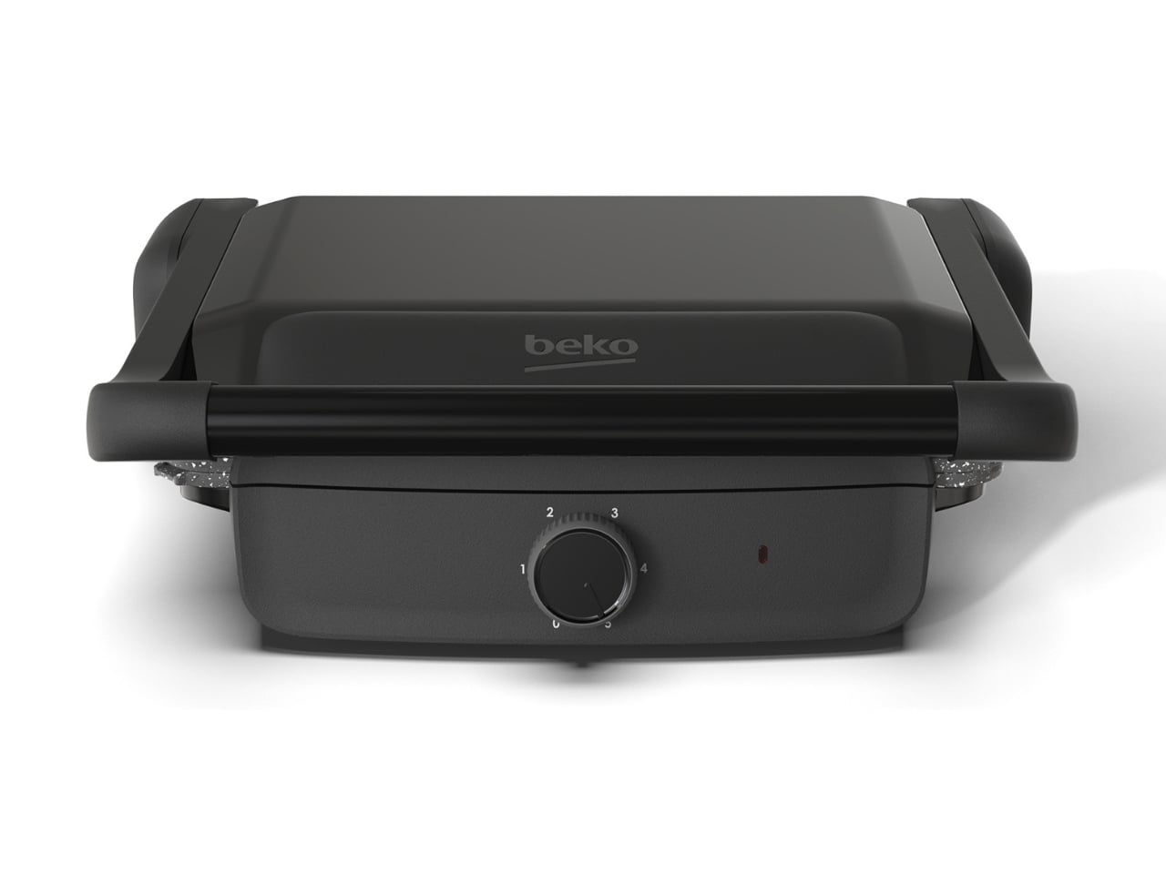
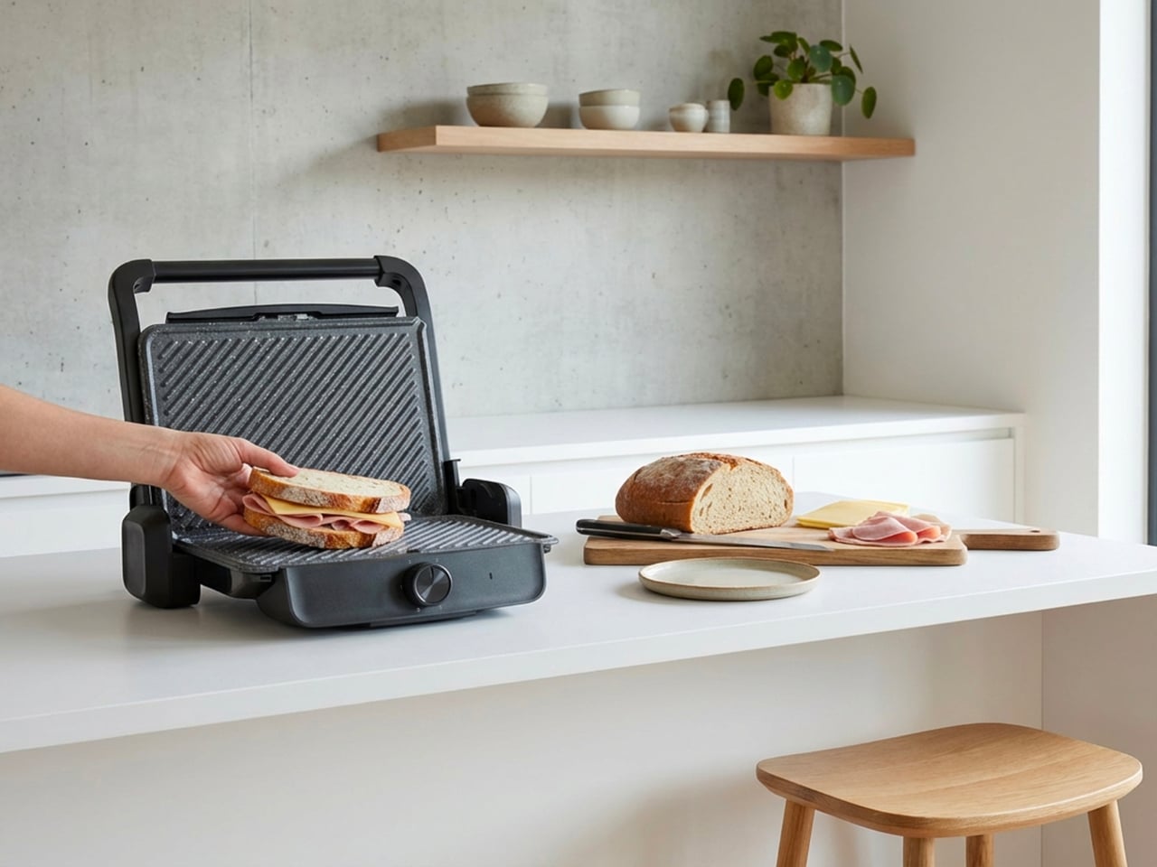
The concept is presented under the Beko name, though it exists as a portfolio project rather than an officially announced product. That distinction matters, but it doesn’t make the design any less compelling. If anything, it makes it more interesting. A designer working within the constraints of a real brand’s visual language, applying that kind of care to a product category that nobody asked him to elevate, is a different kind of creative statement than a fully unconstrained concept. It says something about what he thinks good design actually owes the everyday object.
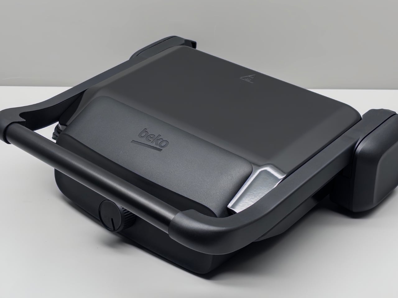
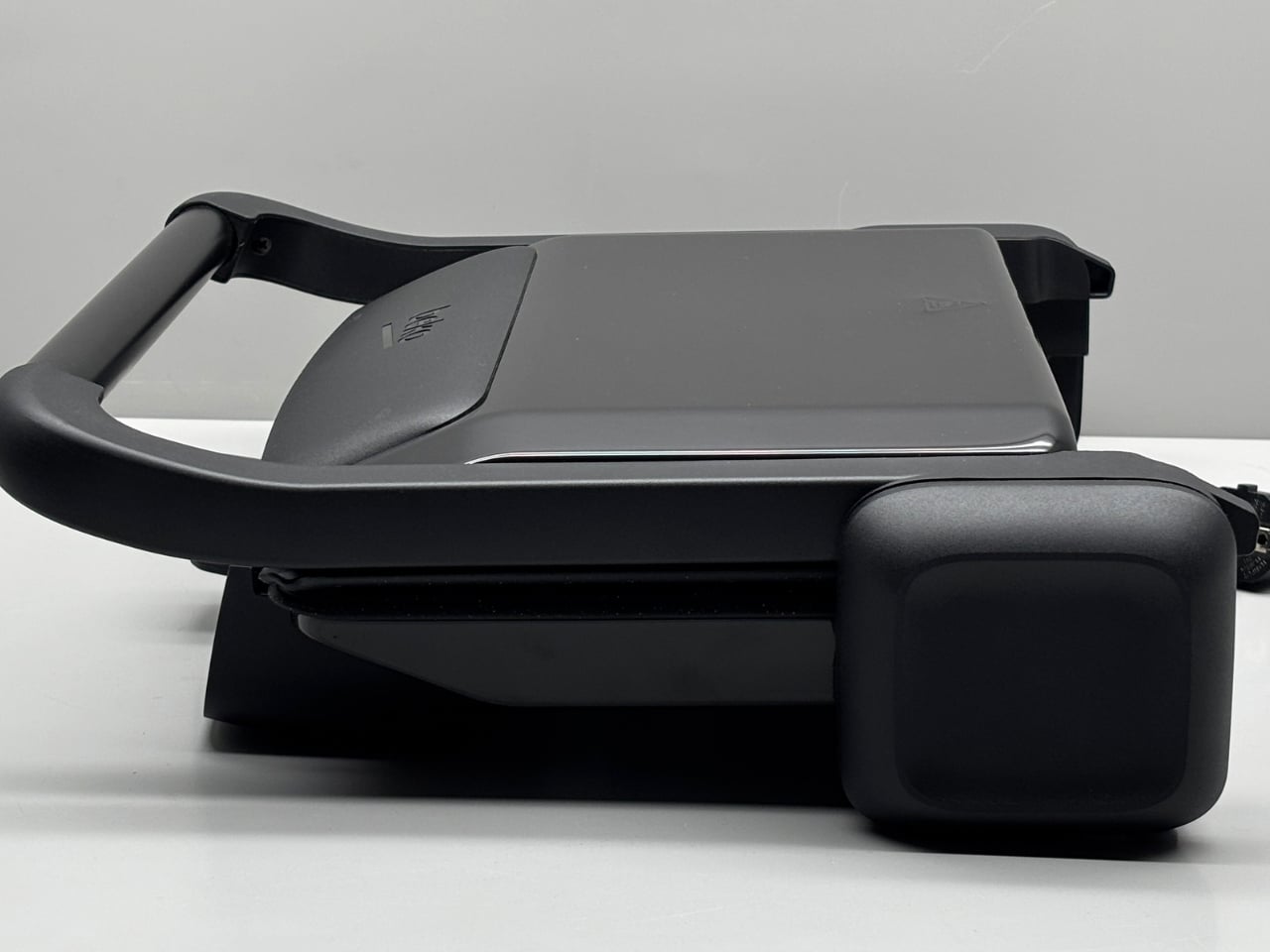
The design itself carries the kind of restraint that only looks effortless after a lot of work. Clean lines, a minimal form language, and a clear understanding that this object will live on someone’s kitchen counter, which means it has to look right whether it’s in use or not. Most sandwich makers are things you hide in a cabinet. This one looks like it was designed to stay out. That shift in thinking, from kitchen tool you tolerate to one you actually want to see, is a more significant design decision than it sounds.
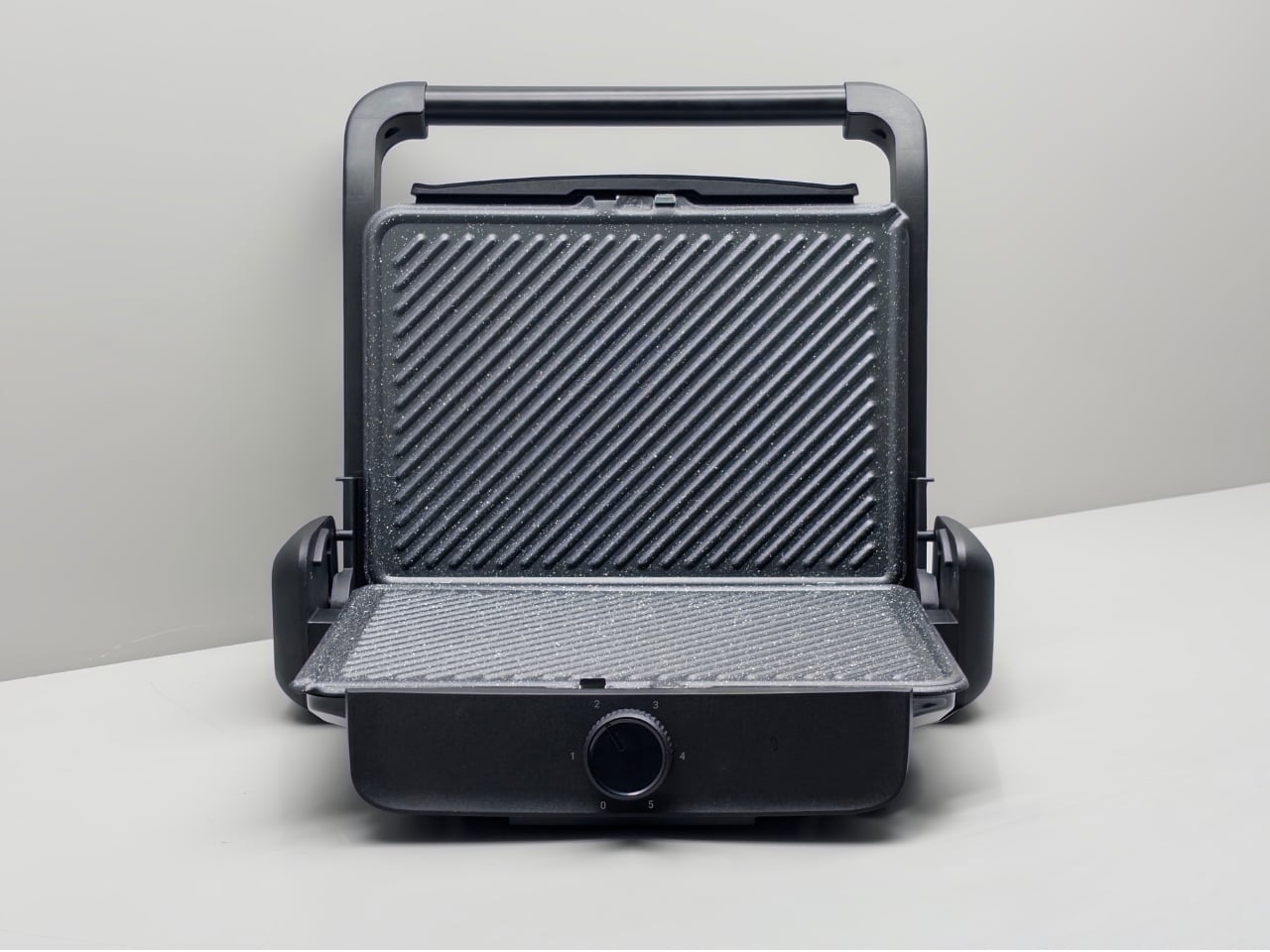
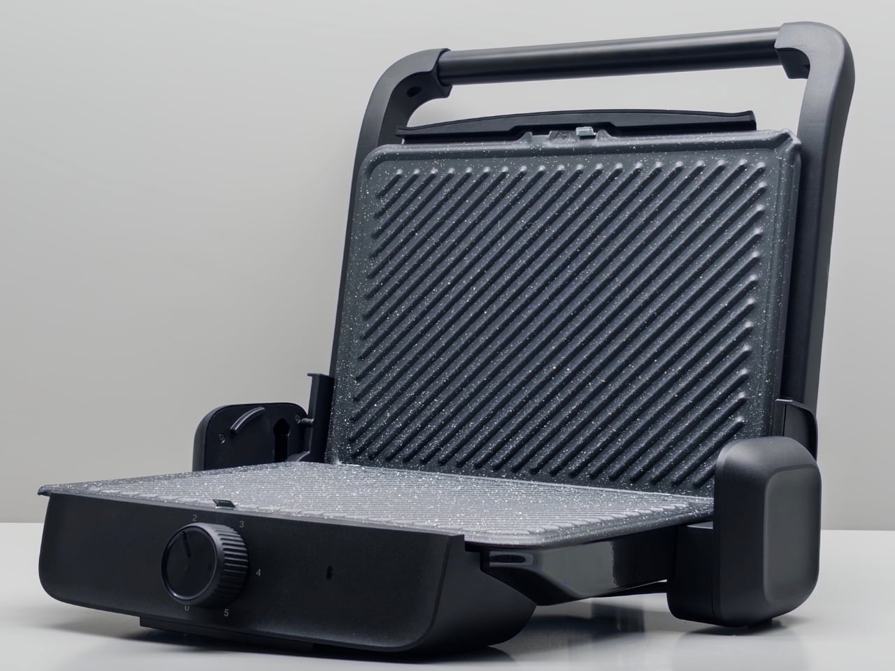
There’s also something honest about the proportions. This isn’t a concept that drifts into fantasy, all floating surfaces and materials that will never survive a production line. It feels buildable. Considered. The kind of design where you can tell the person behind it was asking whether every decision was earning its place, rather than simply asking whether it looked good in a render.
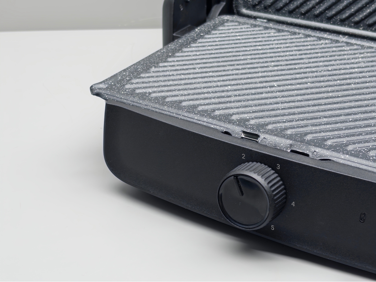
I’ll admit I’m personally drawn to small appliance design right now. We’ve reached a moment where the home, and specifically the kitchen, has become a genuine expression of identity for a lot of people. Social media has made countertops aspirational real estate. The appliances sitting on them aren’t invisible anymore, and the industry is only just beginning to catch up to that shift. Concepts like this one feel like someone who understands that change and is designing accordingly, even before the brief exists to demand it.
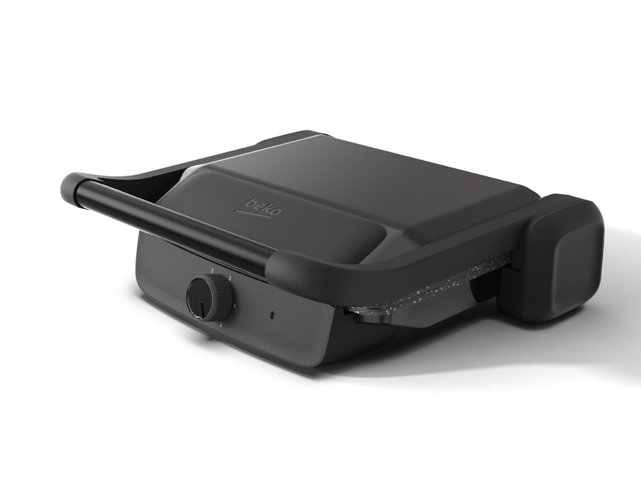
It’s also worth noting that this kind of work, a concept developed with real brand context and real production sensibility, is increasingly how design culture moves forward. The conversation doesn’t only happen at Milan or in the pages of Wallpaper. It happens on Behance, where a designer in Istanbul can rack up half a million views on a sandwich maker concept and start a conversation that ripples through the industry. That’s genuinely exciting, and more democratizing than most design institutions would like to admit.
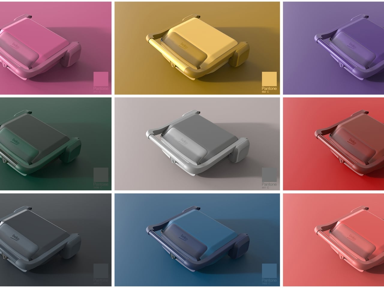
The bigger question this concept raises is why we settled for so long. Kitchen appliances are touched multiple times a day. They shape the experience of a space we spend real, meaningful time in. A sandwich maker that someone put thoughtful effort into isn’t a luxury, it’s just respect for the user. And once you see a design that gets it right, the ones that don’t become very difficult to look at.
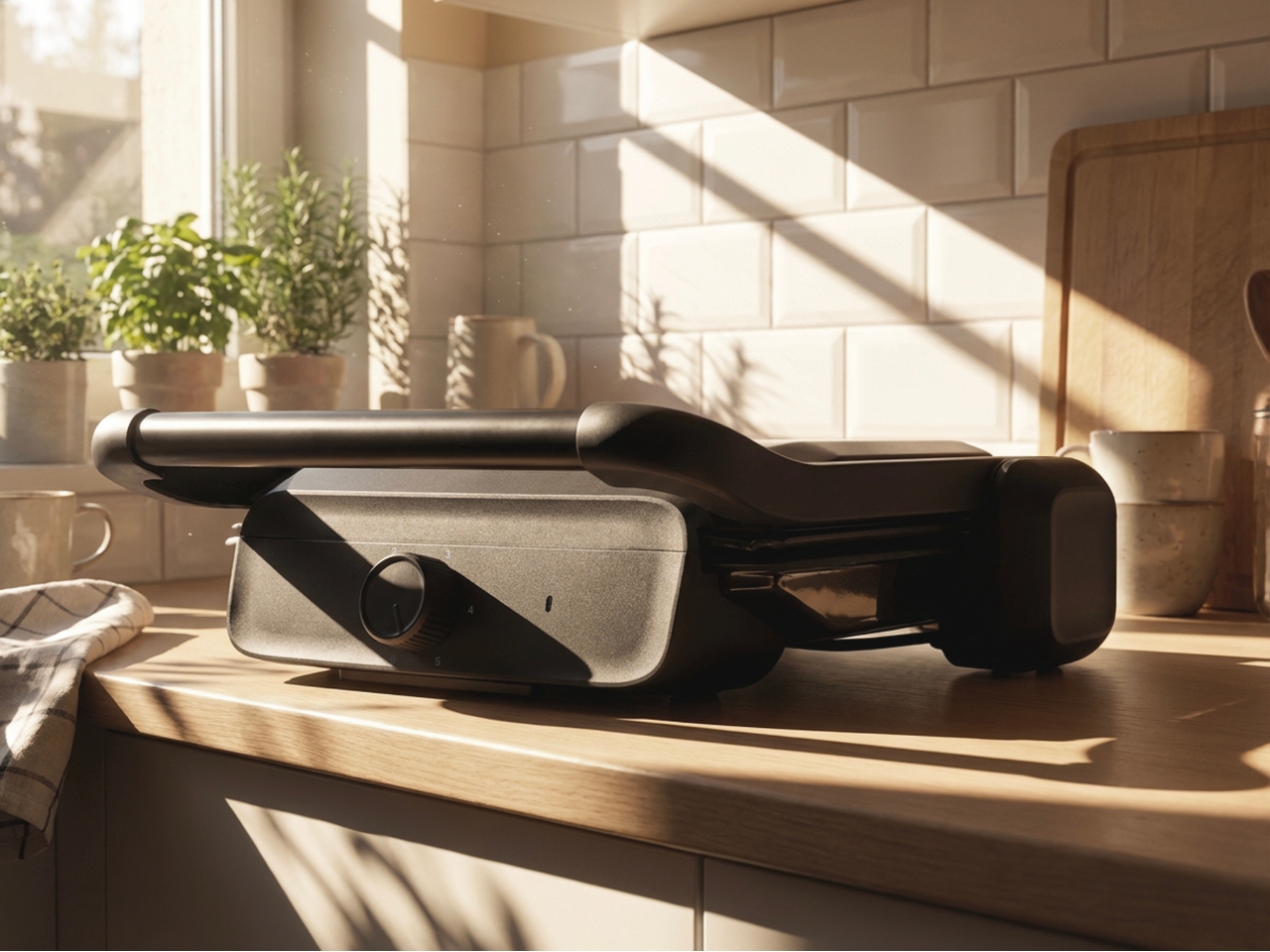
Sagirosmanoglu’s sandwich maker concept doesn’t solve every problem with small appliance design. But it makes a compelling argument that someone should be trying. Whether or not it ever gets made, that argument is already winning.

The post A Designer Just Gave the Sandwich Maker the Concept It Deserved first appeared on Yanko Design.

Samsung Just Solved the Biggest Problem with the Galaxy Z Fold 8

Samsung Just Solved the Biggest Problem with the Galaxy Z Fold 8 Close up of the near-invisible crease on the new Samsung foldable phone.

The Samsung Galaxy Z Fold 8 is poised to make a significant impact on the foldable smartphone market, introducing a new feature: a near-invisible crease. This long-anticipated improvement addresses one of the most persistent criticisms of foldable devices, positioning Samsung to compete more effectively with rivals such as the Oppo Find N6. Alongside this innovation, […]

The post Samsung Just Solved the Biggest Problem with the Galaxy Z Fold 8 appeared first on Geeky Gadgets.

Posted in Uncategorized

How One Loop of Bent Wood Became a Complete Chair

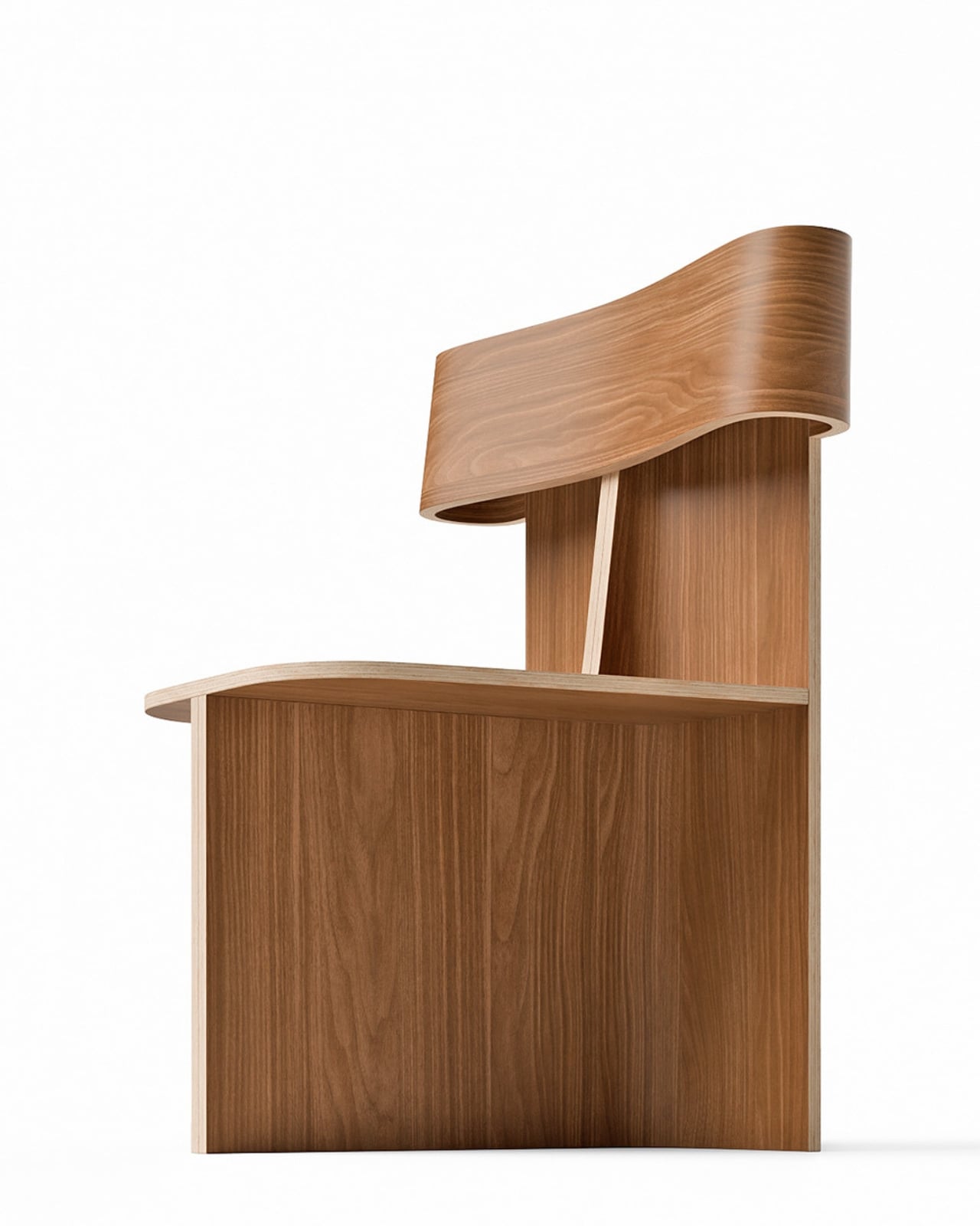
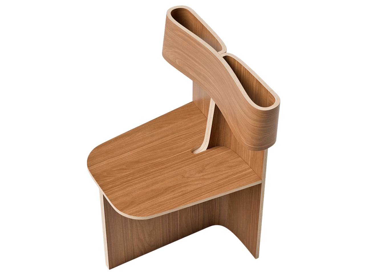
Every so often, a piece of furniture stops you the way a good sentence does. You read it once, then go back and read it again just to understand how it works. The Sori Chair by Portugal’s Teixeira Design Studio is exactly that kind of piece. It started, as the best ideas often do, from a daily ritual of sketching. Not a brief, not a client request, just the quiet, intuitive kind of drawing you do before the day gets loud. And somewhere in that process, a loop took shape that became something worth talking about.

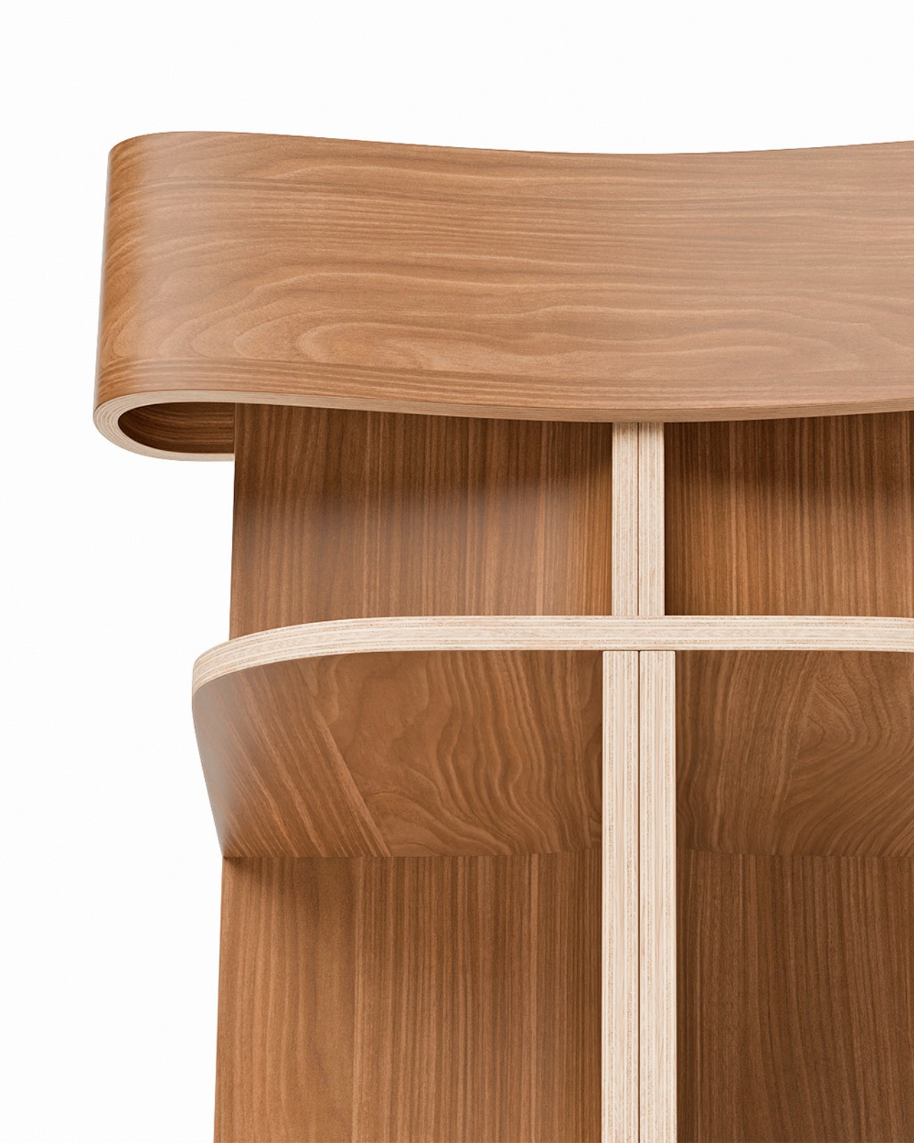
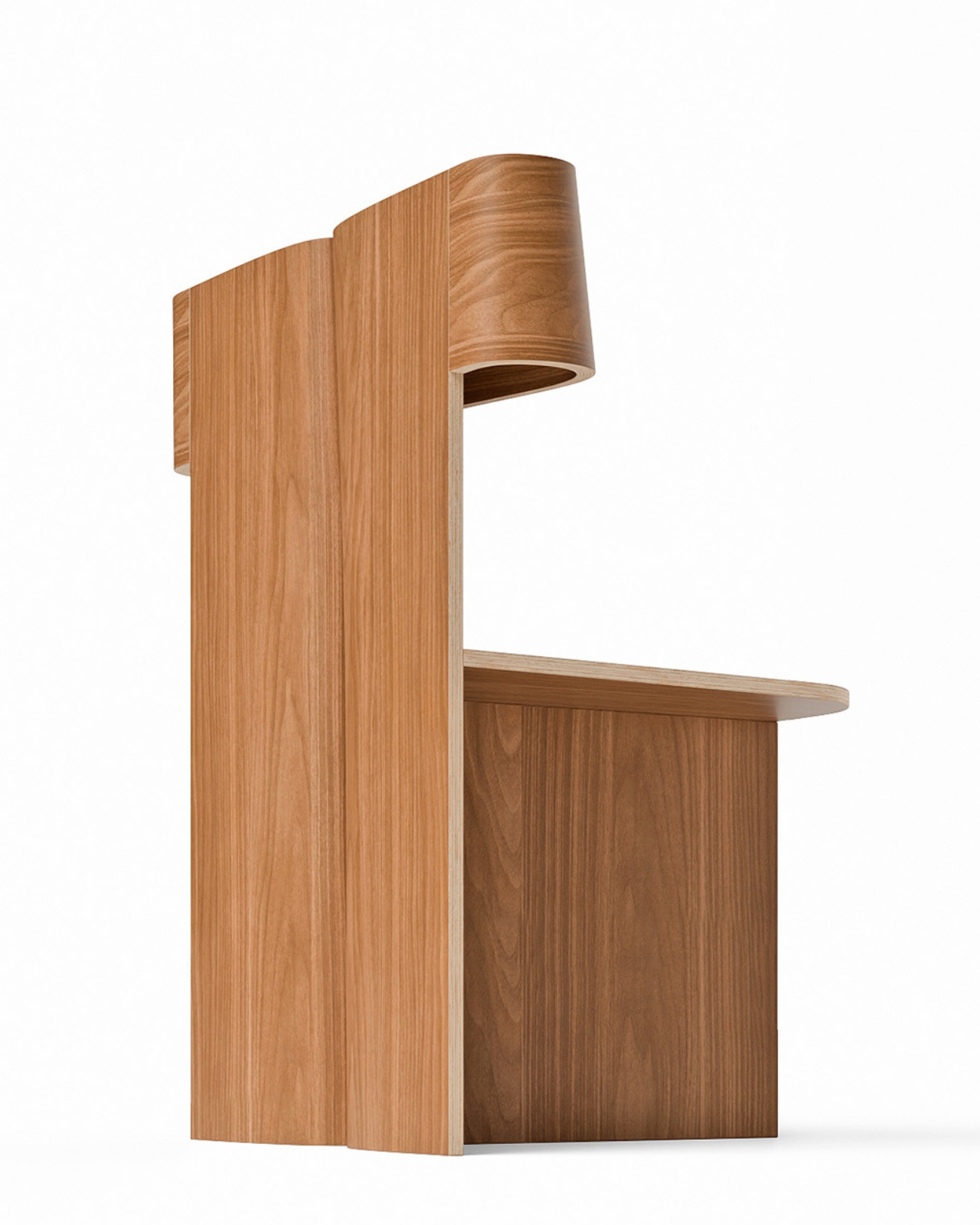
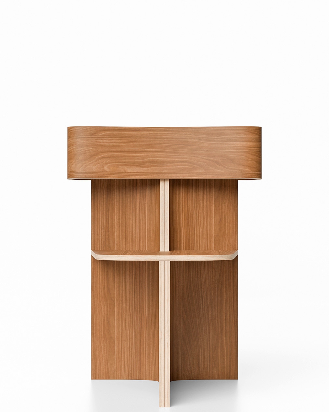
What came out of that ritual is a chair that feels completely resolved. A single, continuous ribbon of bent wood loops upward from the seat to form the double-ply backrest, open at the center like a hollow frame, and the contrast it creates against the chair’s firmly geometric base is fully intentional. Below that fluid loop, the structure is all right angles and clean planes, held together by a cross-shaped base that looks as if it was drawn with a ruler and a very steady hand. That tension between the organic and the architectural is where the Sori Chair lives, and it’s a genuinely compelling place to be.

Designer: Teixeira Design Studio

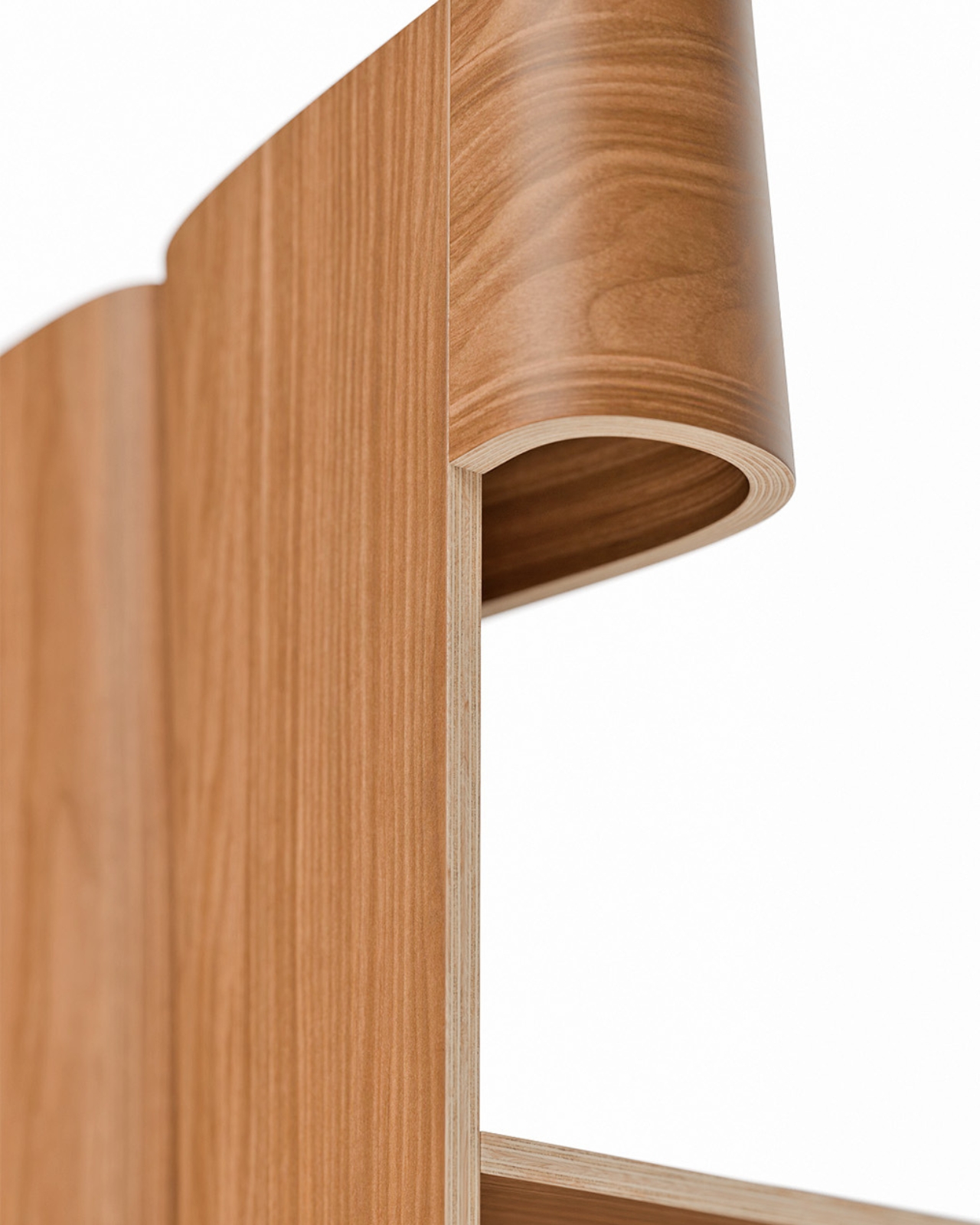
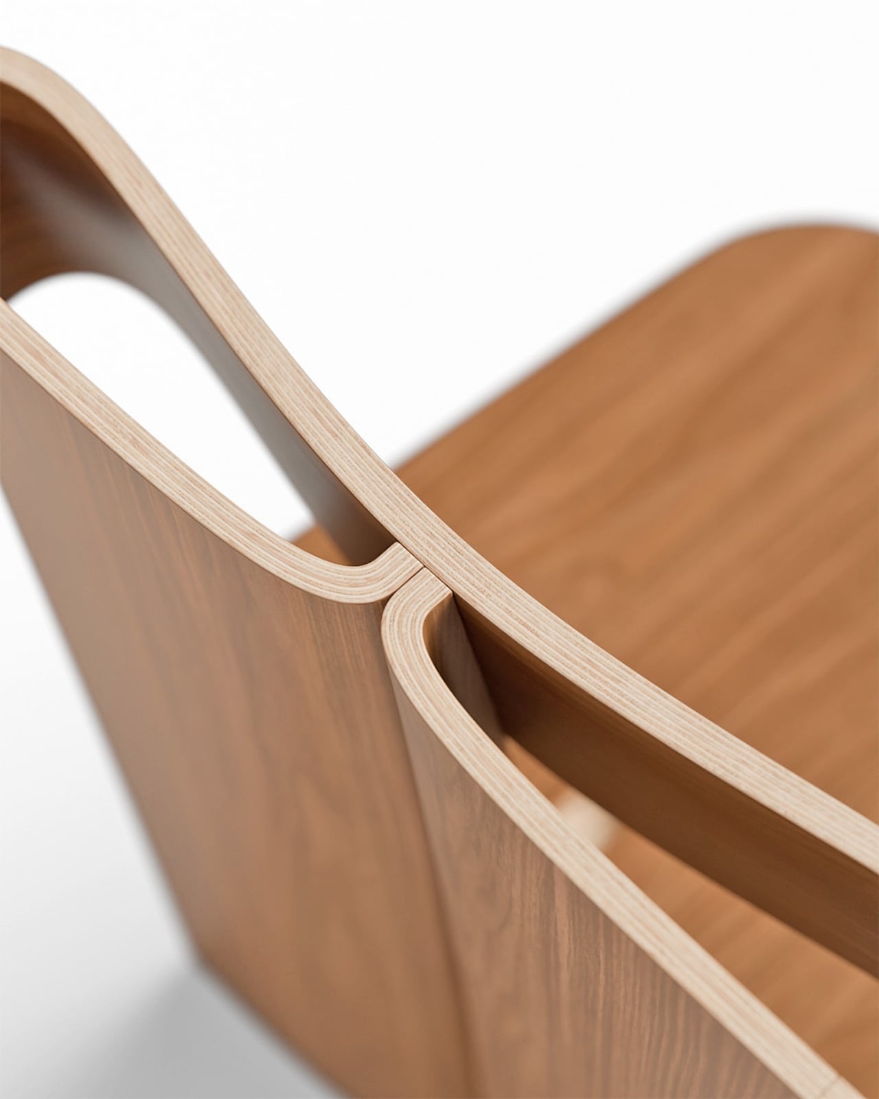
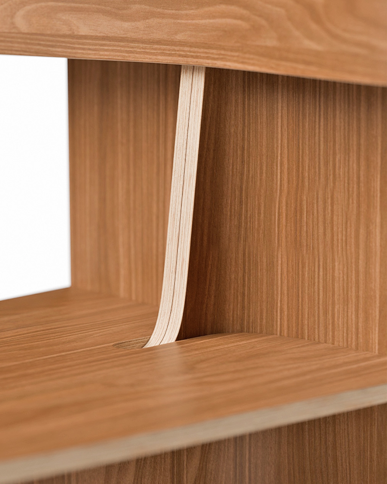
The technical side of this piece deserves more attention than it usually gets in design coverage. That backrest loop doesn’t just sit on top of the seat. It rises through it, emerging from a precise cutout with the kind of considered joinery that takes real craft to execute. The layered plywood edges are fully exposed throughout, and rather than hiding them, the design leans into them. You can see the pale strata of wood at every bend, every curve, every corner. It reads as an honest material and an honest process, and that matters more now than it perhaps ever has. In an era where furniture is increasingly flat-packed and finish-wrapped, a chair that shows you exactly how it was made feels almost countercultural.

The name is worth pausing on. Sori is a Japanese word for the natural curvature or warp of wood, the subtle bow that timber develops over time or when shaped under heat and pressure. Whether the studio intended that specific reference or landed on it instinctively, naming the chair after that particular quality of the material says something about how this work is approached: not as a battle against the material’s limits, but as a genuine conversation with them.

Teixeira Design Studio, based in Viana do Castelo in northern Portugal, has built a portfolio that consistently returns to this idea of using plywood and bent wood to find new formal possibilities. Earlier pieces like the Void Chair explored how a single sheet of plywood could fold into a form that contained seating and hidden storage simultaneously. With Sori, the focus narrows considerably. No secondary function, no added utility. Just the pursuit of one fluid, structural gesture, executed as cleanly as it possibly can be.

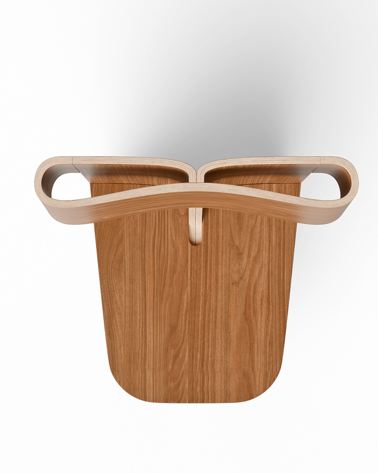
That restraint is what gives the chair its real weight. Designers who know how to do more but choose to do less are often the most interesting ones to follow, and Sori feels like a quiet, confident declaration of that philosophy. Every angle you approach it from reveals something new. From the front, it reads almost architectural, like a small building with an open courtyard. From the side, the loop of the backrest curls inward like a wave at the moment before it breaks. From above, the cutout in the seat and the twin arcs of the backrest create a composition that could hold its own as a flat drawing.

Good design holds up under scrutiny. It doesn’t just photograph well and vanish once you look too closely. The Sori Chair gets richer the longer you sit with it, and that, more than anything else, is the standard worth measuring any piece of furniture against.

The post How One Loop of Bent Wood Became a Complete Chair first appeared on Yanko Design.
Why Creators Are Switching to Google Omni for AI Video Editing

Why Creators Are Switching to Google Omni for AI Video Editing A multi-scene video generated using the Google Omni Flash model.

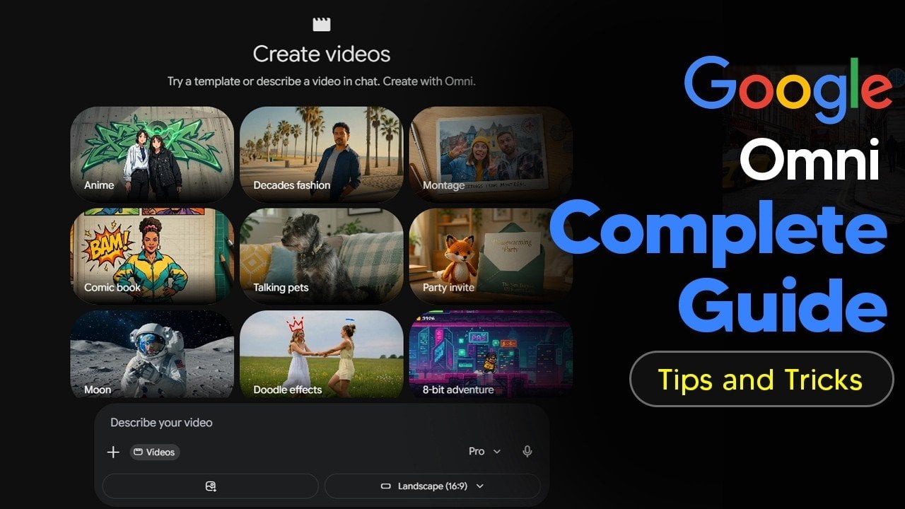
Google Omni is a platform developed by Google to streamline video creation by integrating text, images, audio and video into a unified workflow. According to AI Grid, one notable feature is the Omni Flash model, which enables automatic camera angle adjustments across multiple scenes. This feature reduces the need for manual editing, making it a […]

The post Why Creators Are Switching to Google Omni for AI Video Editing appeared first on Geeky Gadgets.

Posted in Uncategorized

Early iPhone 18 Leaks Point to One Major Design Flaw

Early iPhone 18 Leaks Point to One Major Design Flaw iPhone 18

Apple is making a significant shift in its product strategy by delaying the release of the standard iPhone 18 until 2027. Instead, the company is focusing on its premium models, including the iPhone 18 Pro and its first-ever foldable device, the iPhone Ultra. This strategic pivot signals a departure from Apple’s traditional approach, presenting both […]

The post Early iPhone 18 Leaks Point to One Major Design Flaw appeared first on Geeky Gadgets.

Posted in Uncategorized

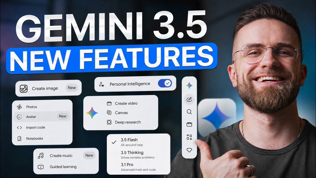
New Gemini 3.5 Flash is Changing App Development with Vibe Coding

New Gemini 3.5 Flash is Changing App Development with Vibe Coding Google Gemini 3.5 Flash interface showing new multimodal vision features

Google’s latest AI upgrade, Gemini 3.5 Flash, introduces advanced capabilities aimed at improving productivity and tackling complex workflows. Key features include multimodal vision for detailed image analysis, native video understanding with timestamped insights and expanded token limits for processing large datasets. According to AI Master, these updates address practical challenges like verbosity in reasoning-heavy outputs […]

The post New Gemini 3.5 Flash is Changing App Development with Vibe Coding appeared first on Geeky Gadgets.

Posted in Uncategorized

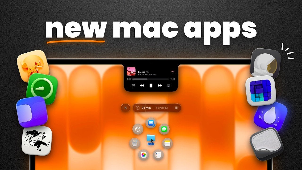
11 Mac Apps to Transform Your Daily Workflow In 2026

11 Mac Apps to Transform Your Daily Workflow In 2026 Dynamic island utility integrated into the MacBook notch

MacVince explores how specific Mac apps address productivity challenges by offering practical solutions for everyday workflows. For instance, Outpost Launcher provides quick access to frequently used files while also serving as temporary storage for short-term projects, helping users manage digital clutter more effectively. This functionality illustrates how small, focused changes can make routine tasks more […]

The post 11 Mac Apps to Transform Your Daily Workflow In 2026 appeared first on Geeky Gadgets.

Posted in Uncategorized

Why the Apple Watch Ultra 4 Redesign Changes Everything

Why the Apple Watch Ultra 4 Redesign Changes Everything Black anodized Apple Watch Ultra 4 with thinner bezels

The Apple Watch Ultra 4 represents a pivotal moment in the evolution of Apple’s premium smartwatch lineup. For the first time since its introduction, the Ultra series is undergoing a comprehensive redesign. This update promises a sleeker profile, advanced health monitoring capabilities and enhanced functionality, setting a new standard for wearable technology. By blending innovation […]

The post Why the Apple Watch Ultra 4 Redesign Changes Everything appeared first on Geeky Gadgets.

Posted in Uncategorized