A Folding Chair Designed to Stay Out, Not Hide Away

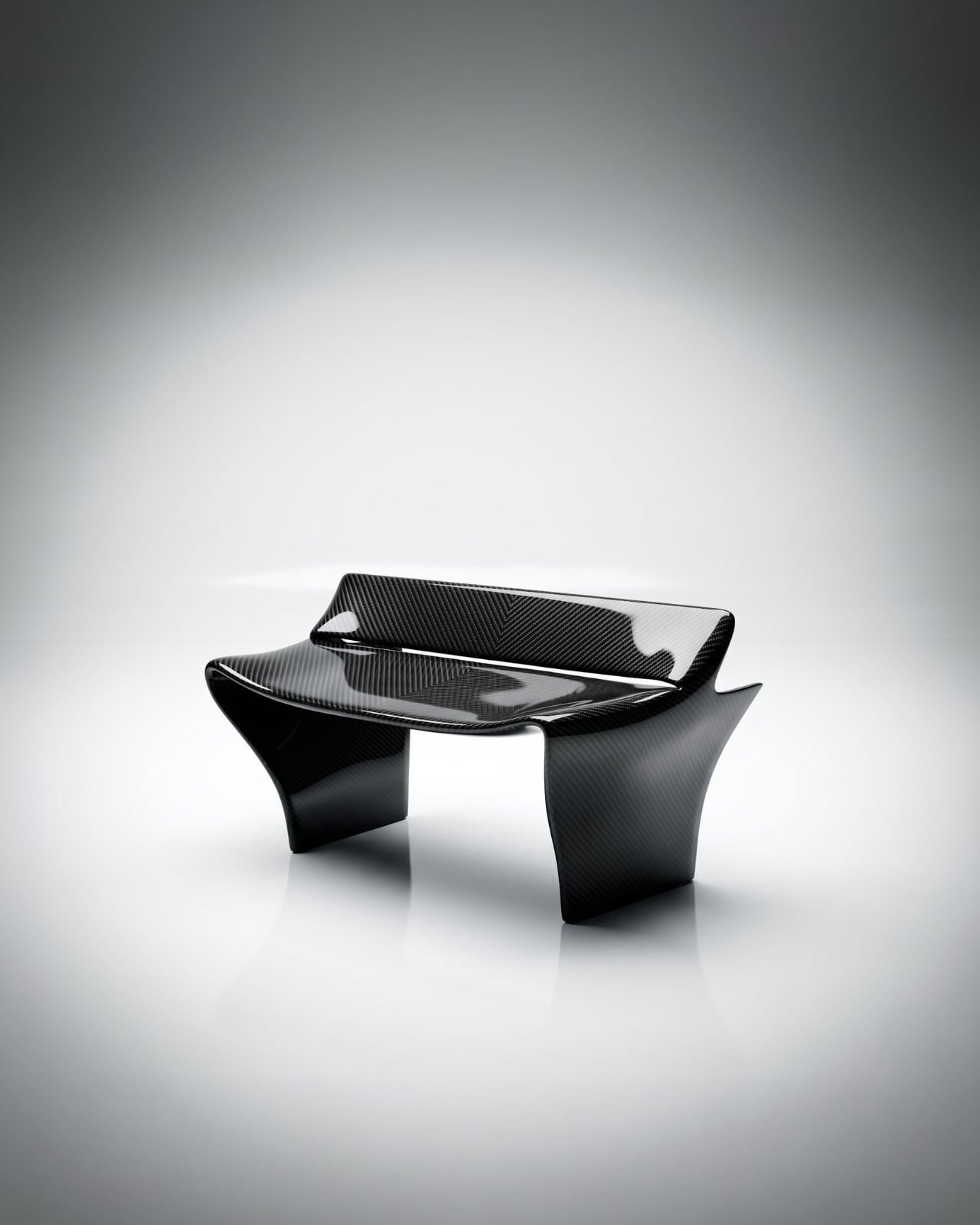
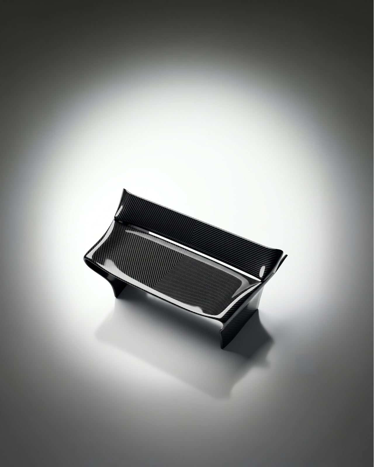
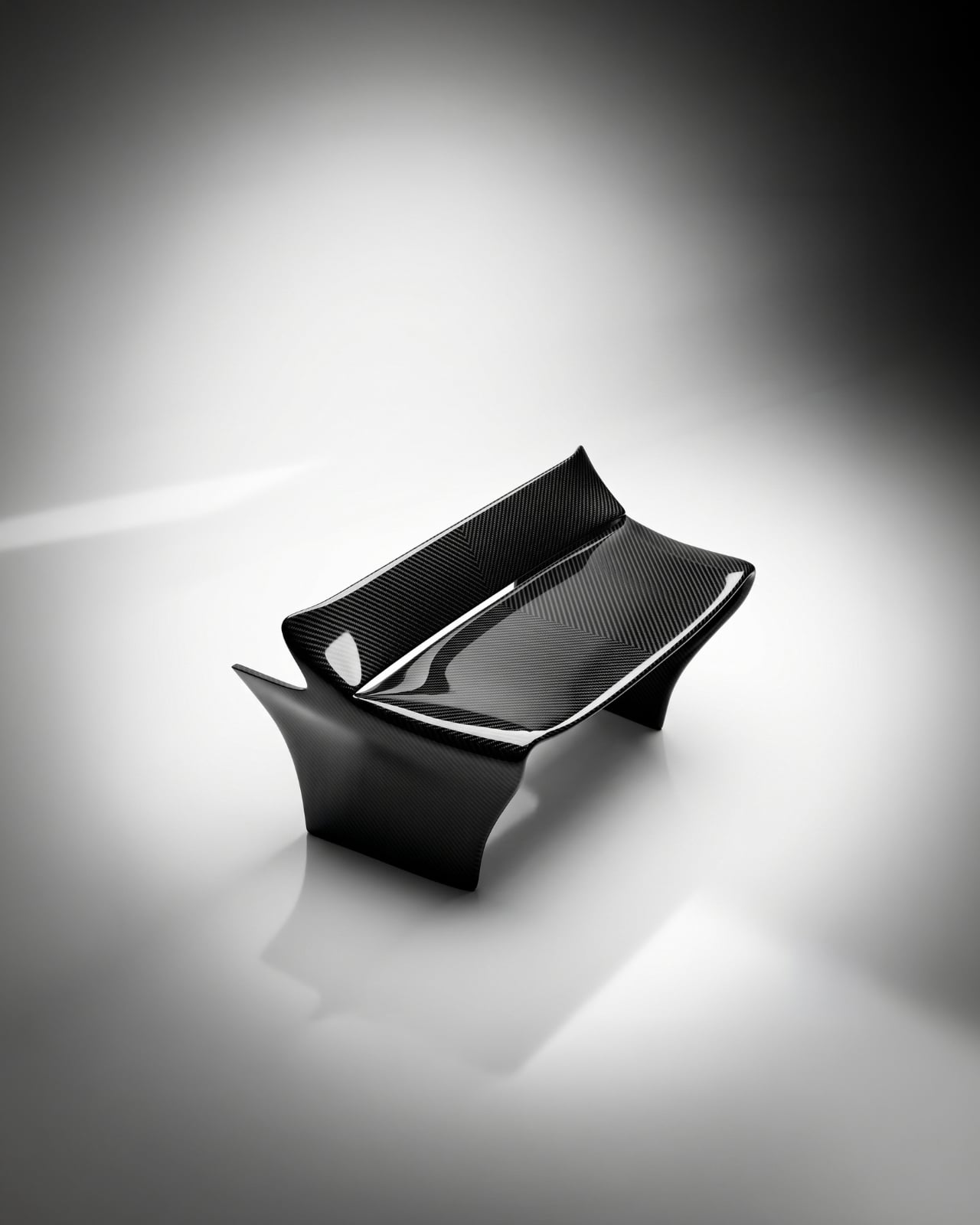
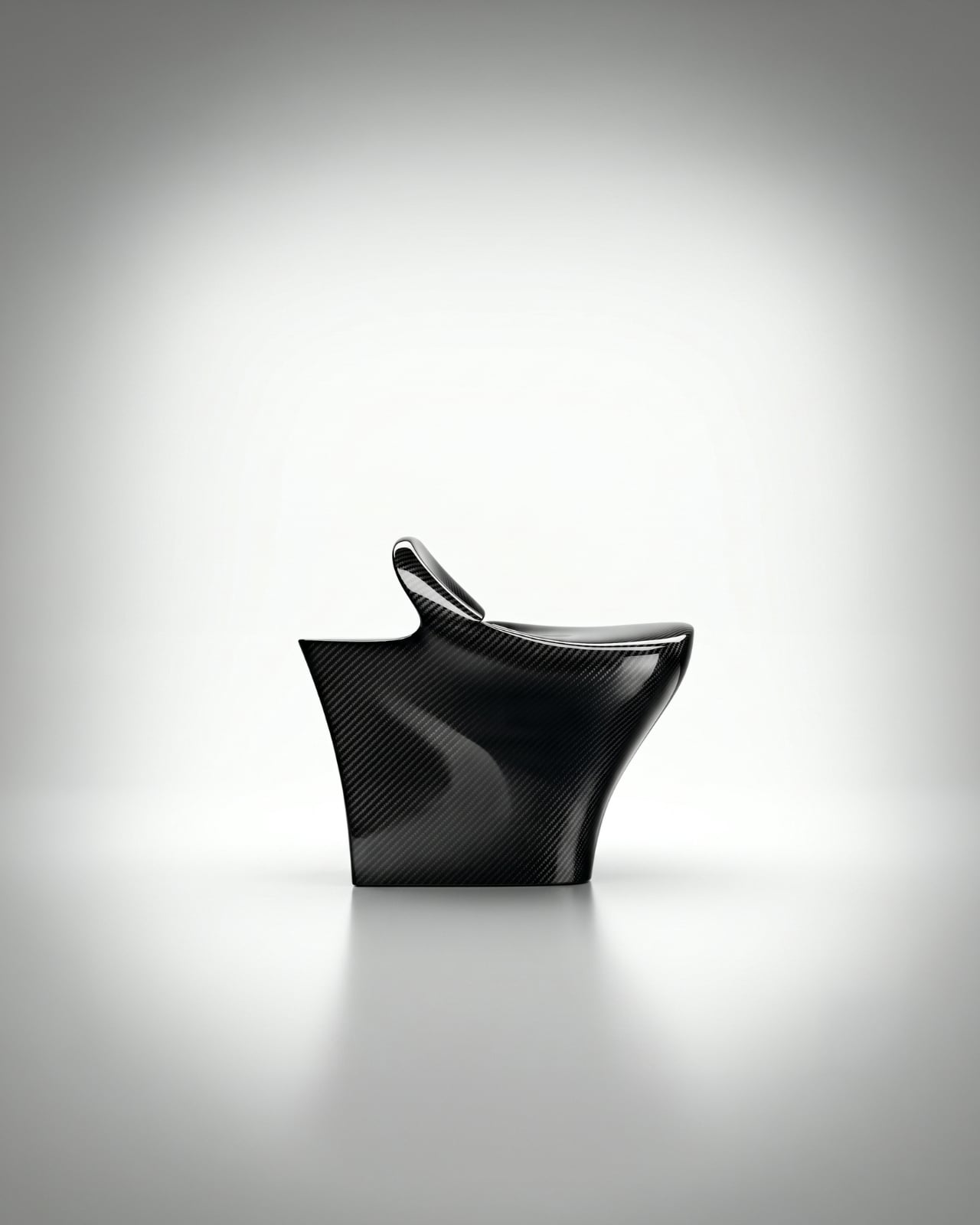
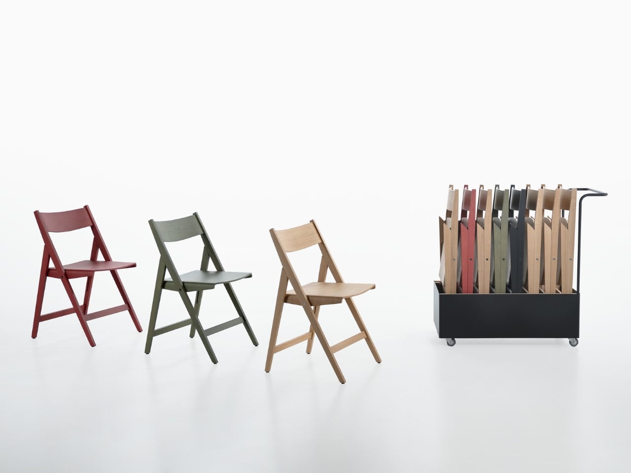
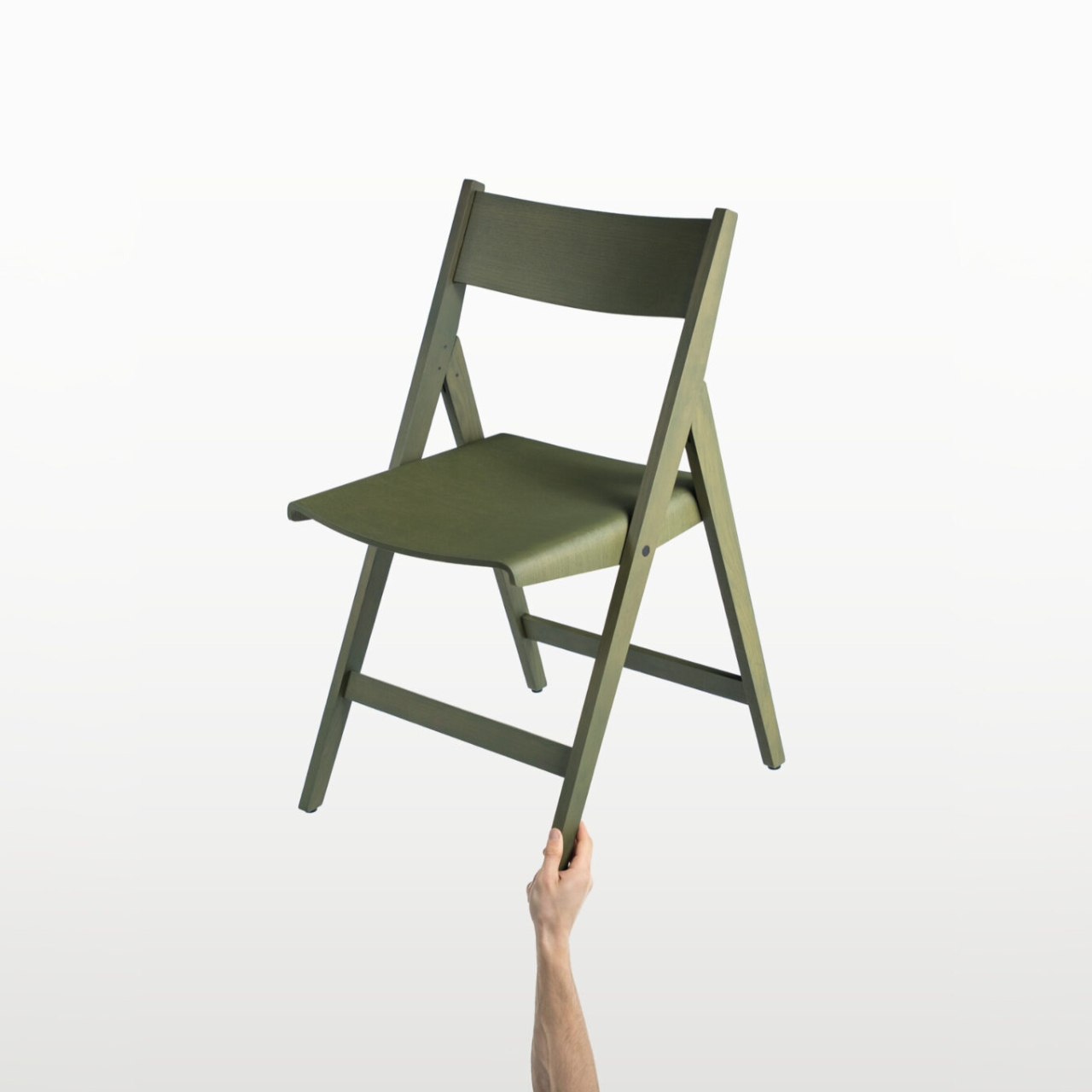
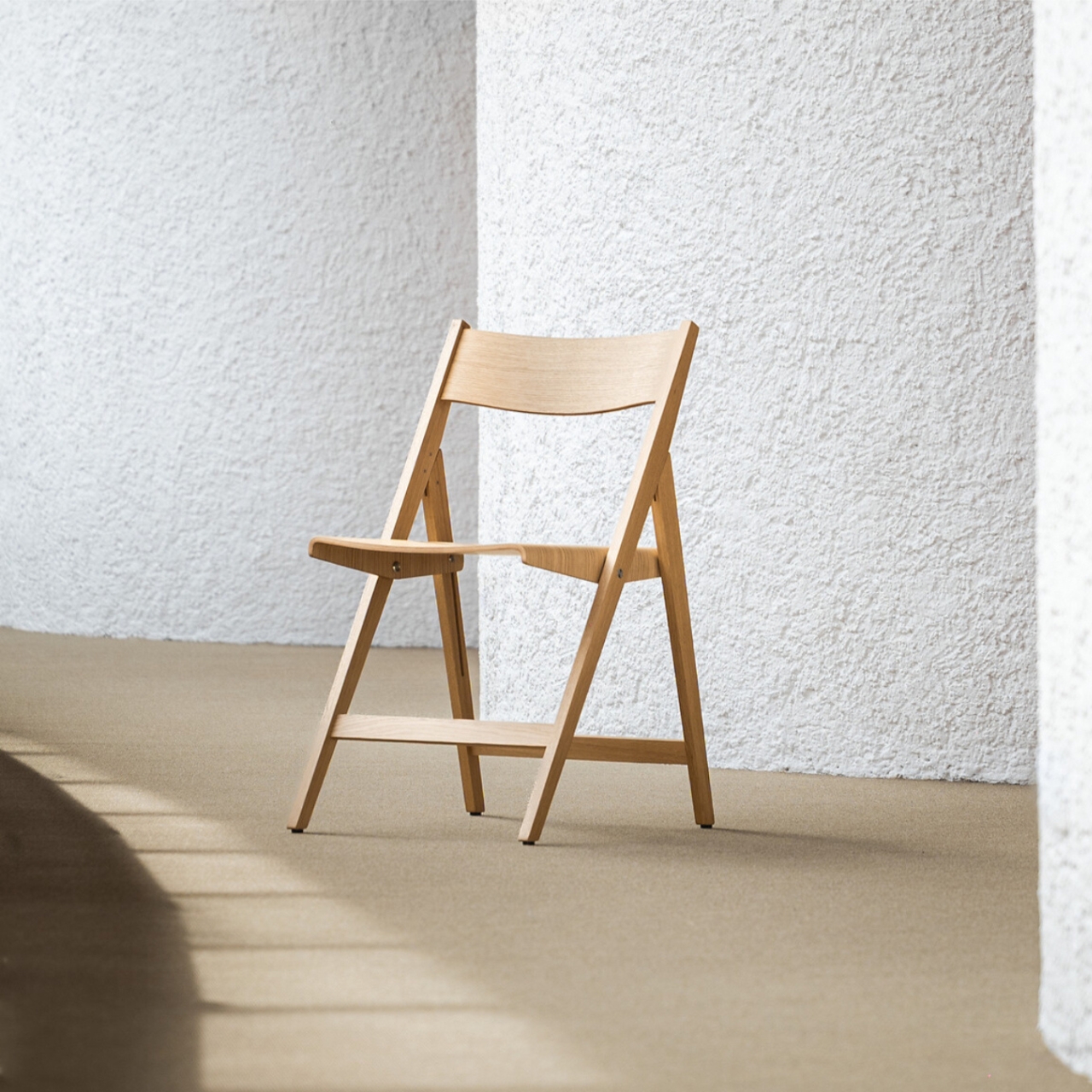
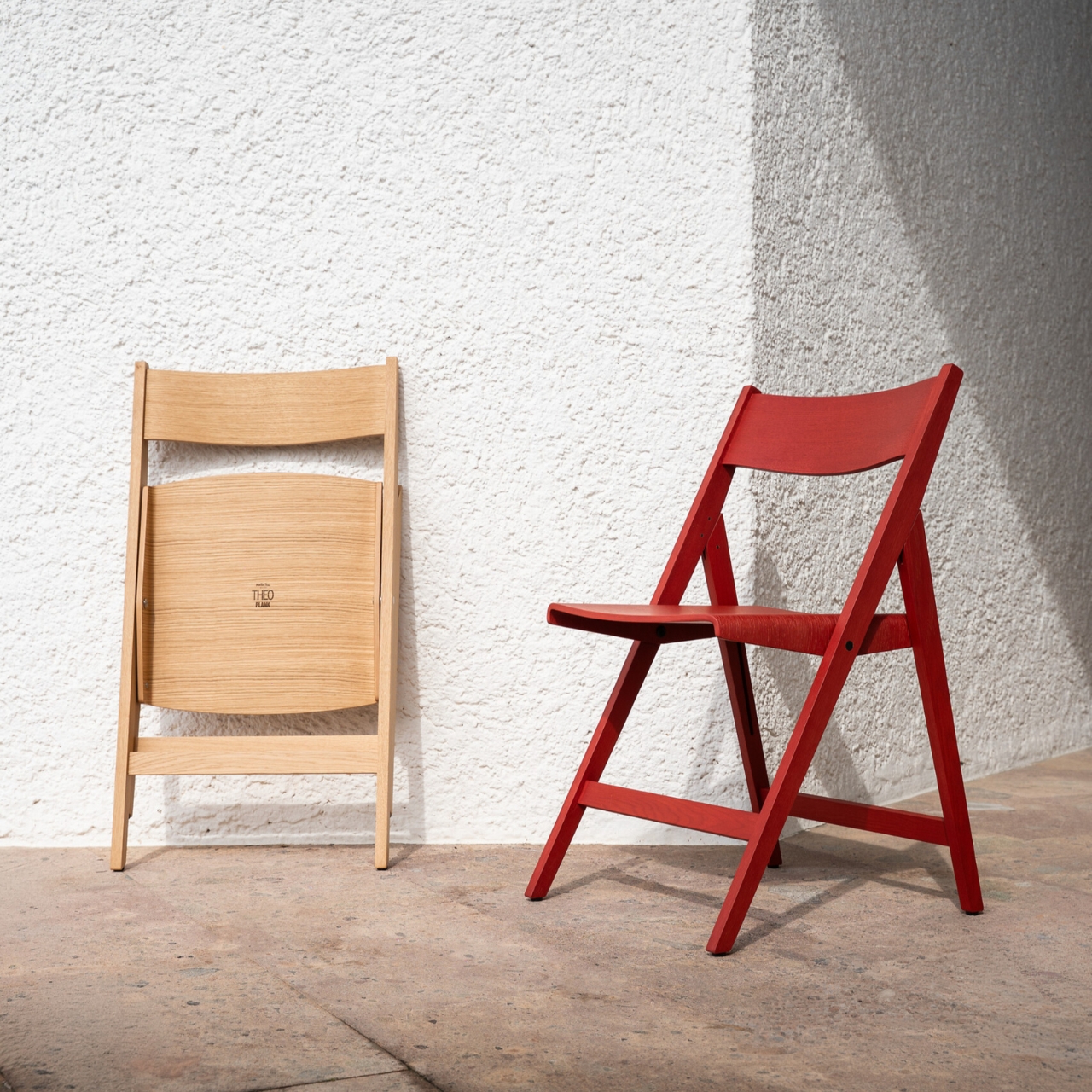
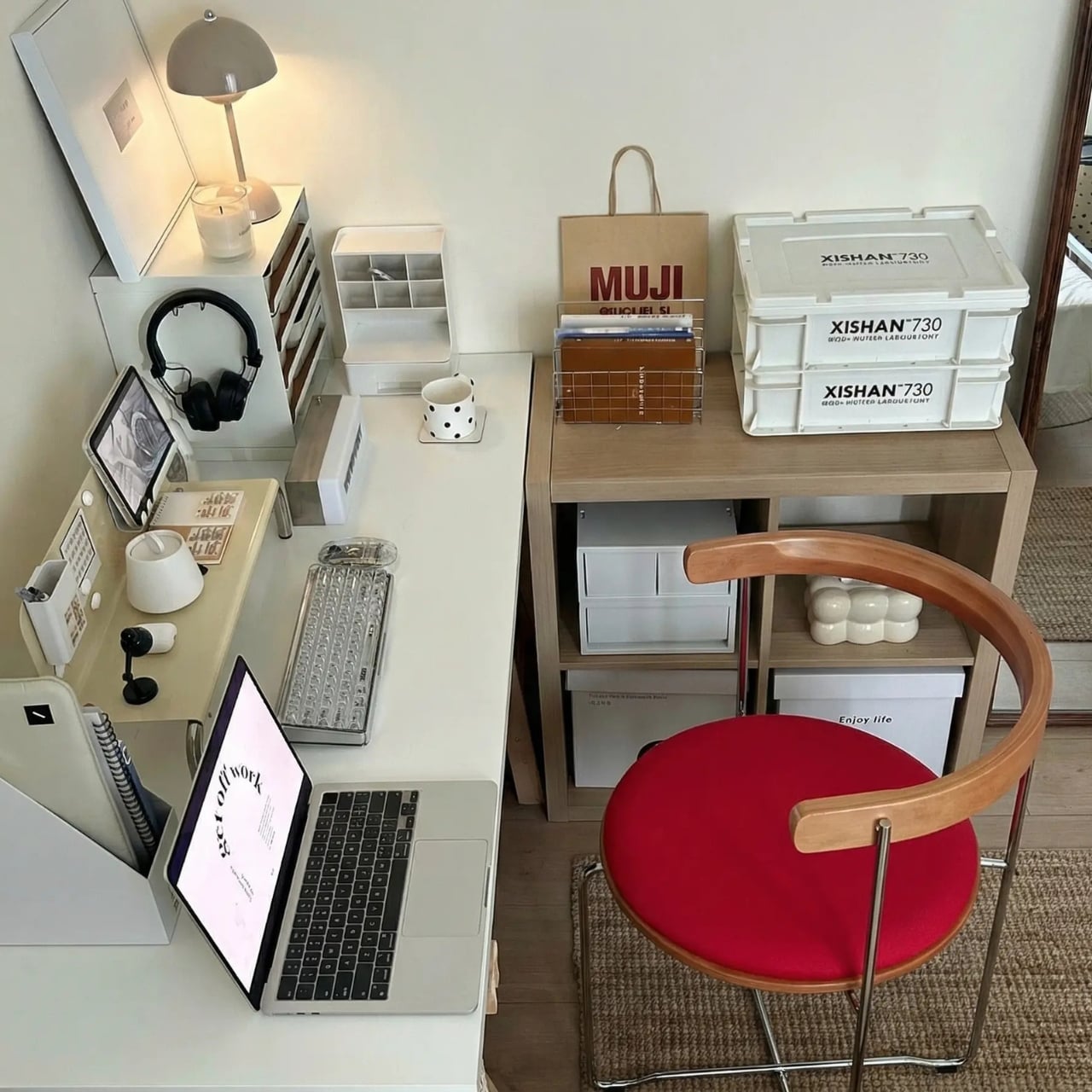
I have a complicated relationship with folding chairs. Not a hostile one, just complicated. They are one of those objects that exist in a permanent state of apology: useful when you need them, embarrassing when you don’t, and almost always the first thing you hide before company arrives. The folding chair has never quite managed to transcend its reputation as a placeholder for “real” furniture, and for decades, most designers haven’t really bothered trying. That’s what made the Kael Walnut Folding Chair by Esspur stop me mid-scroll.

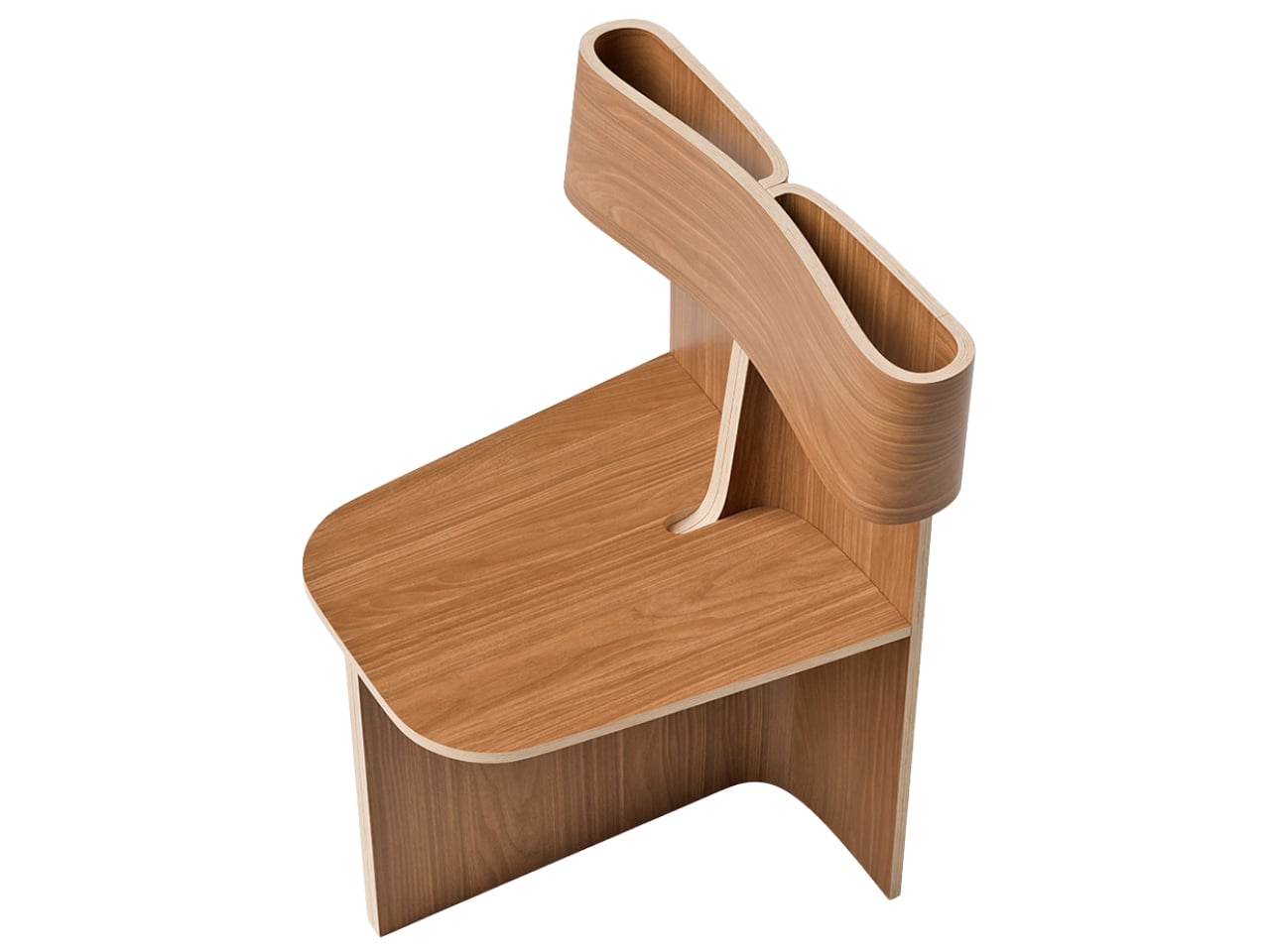
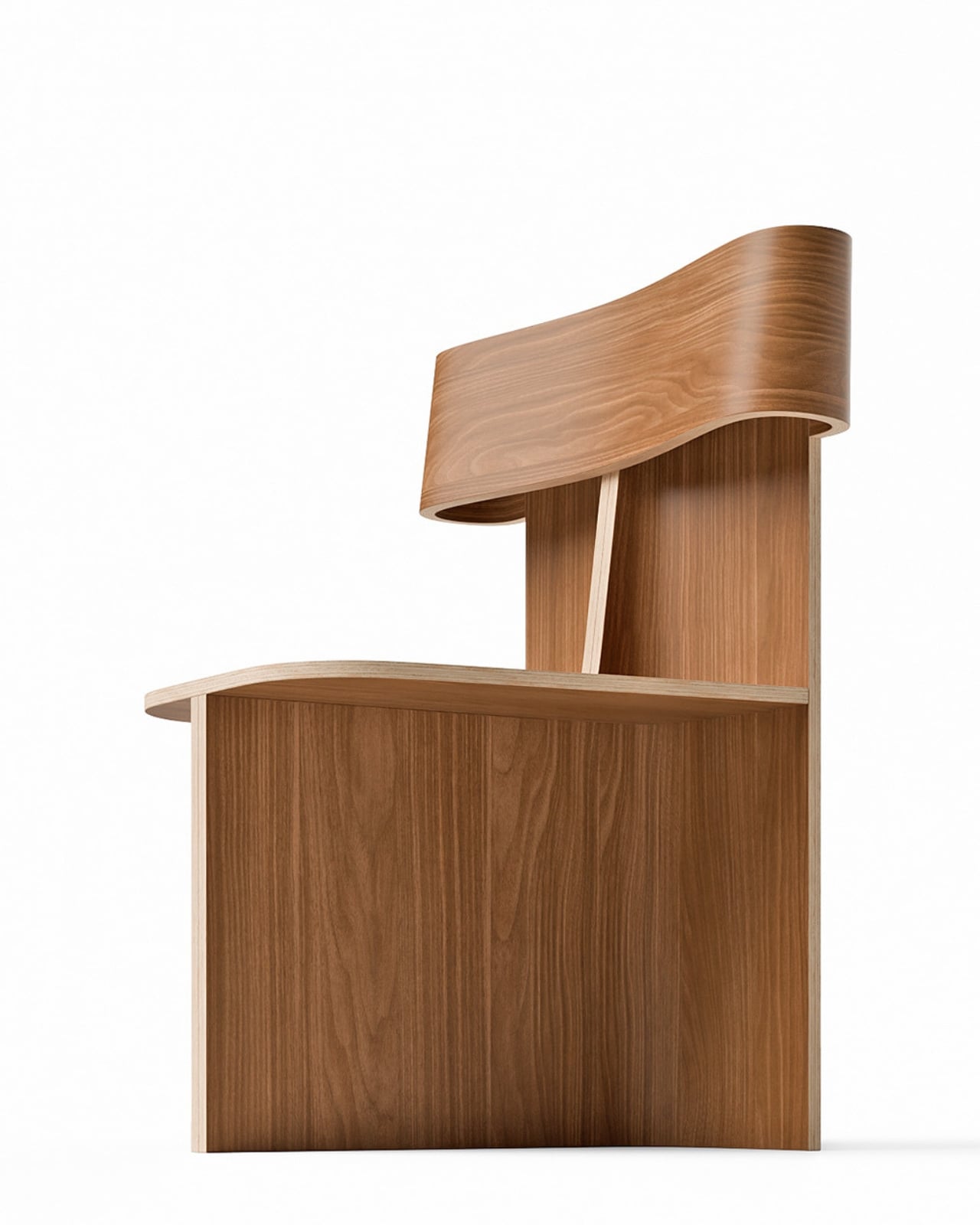
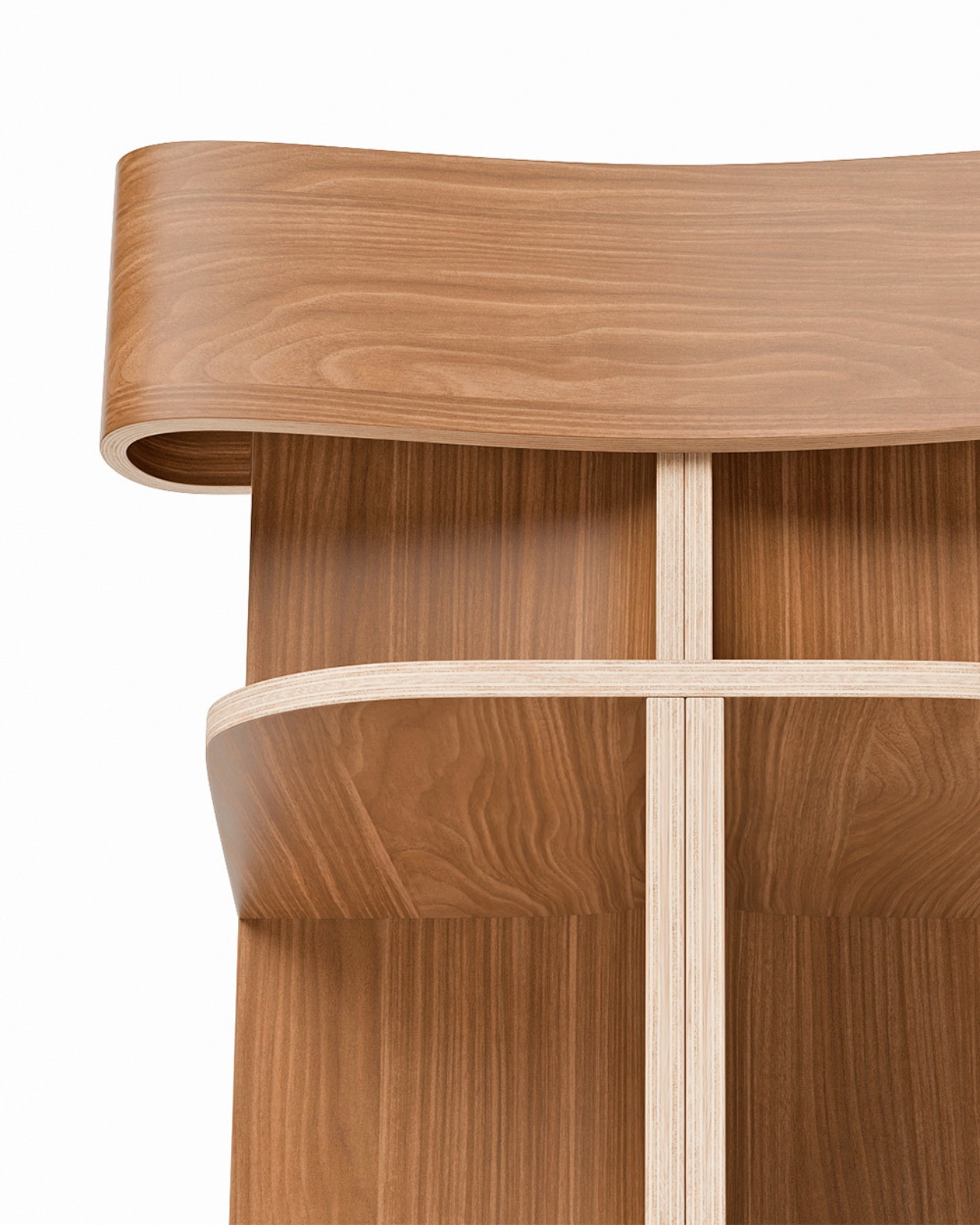
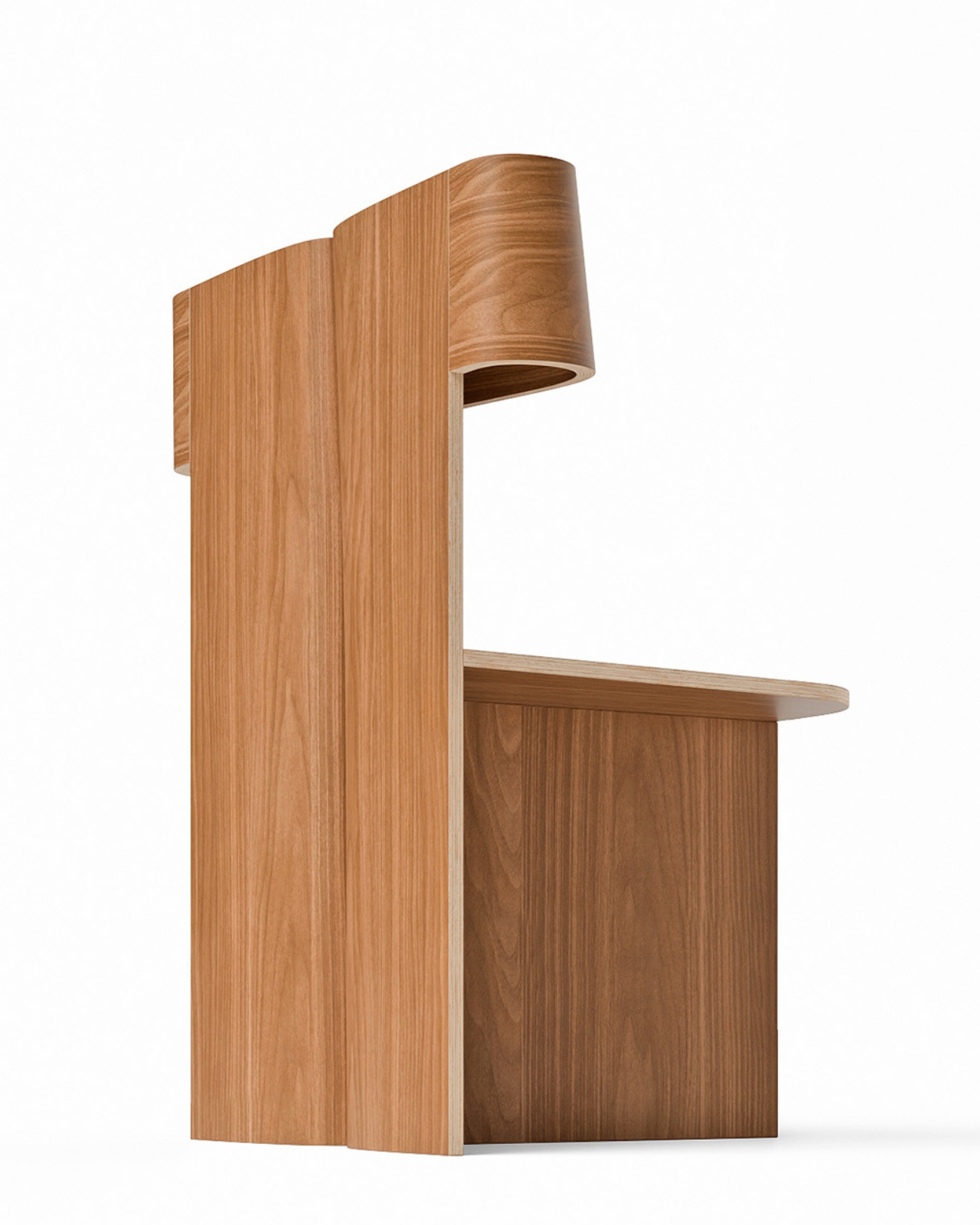
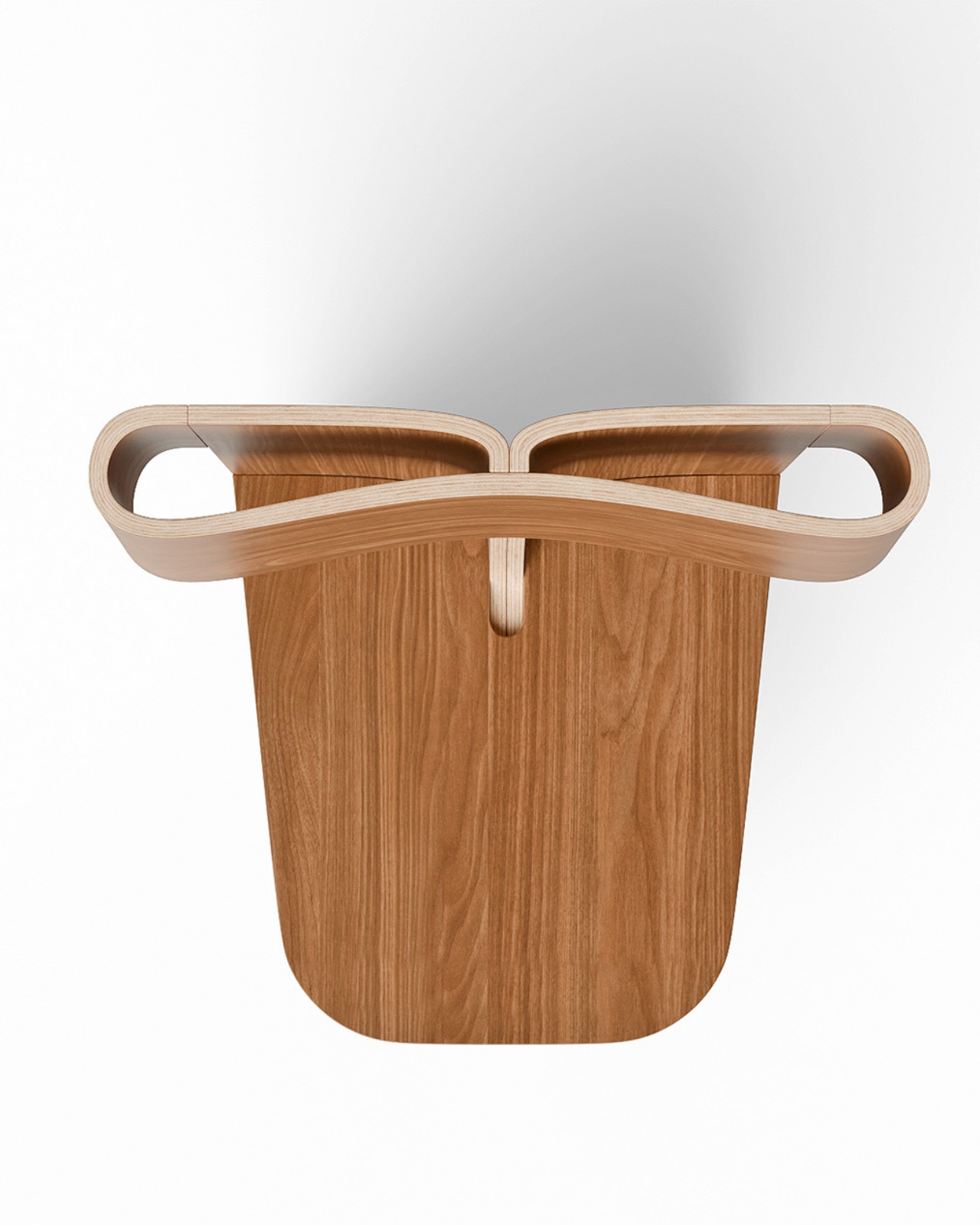
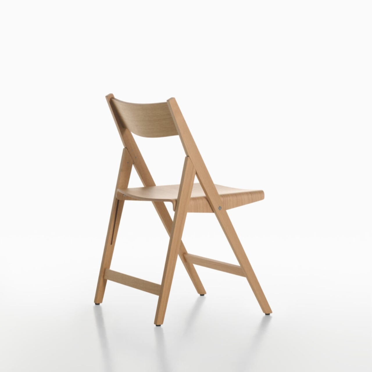
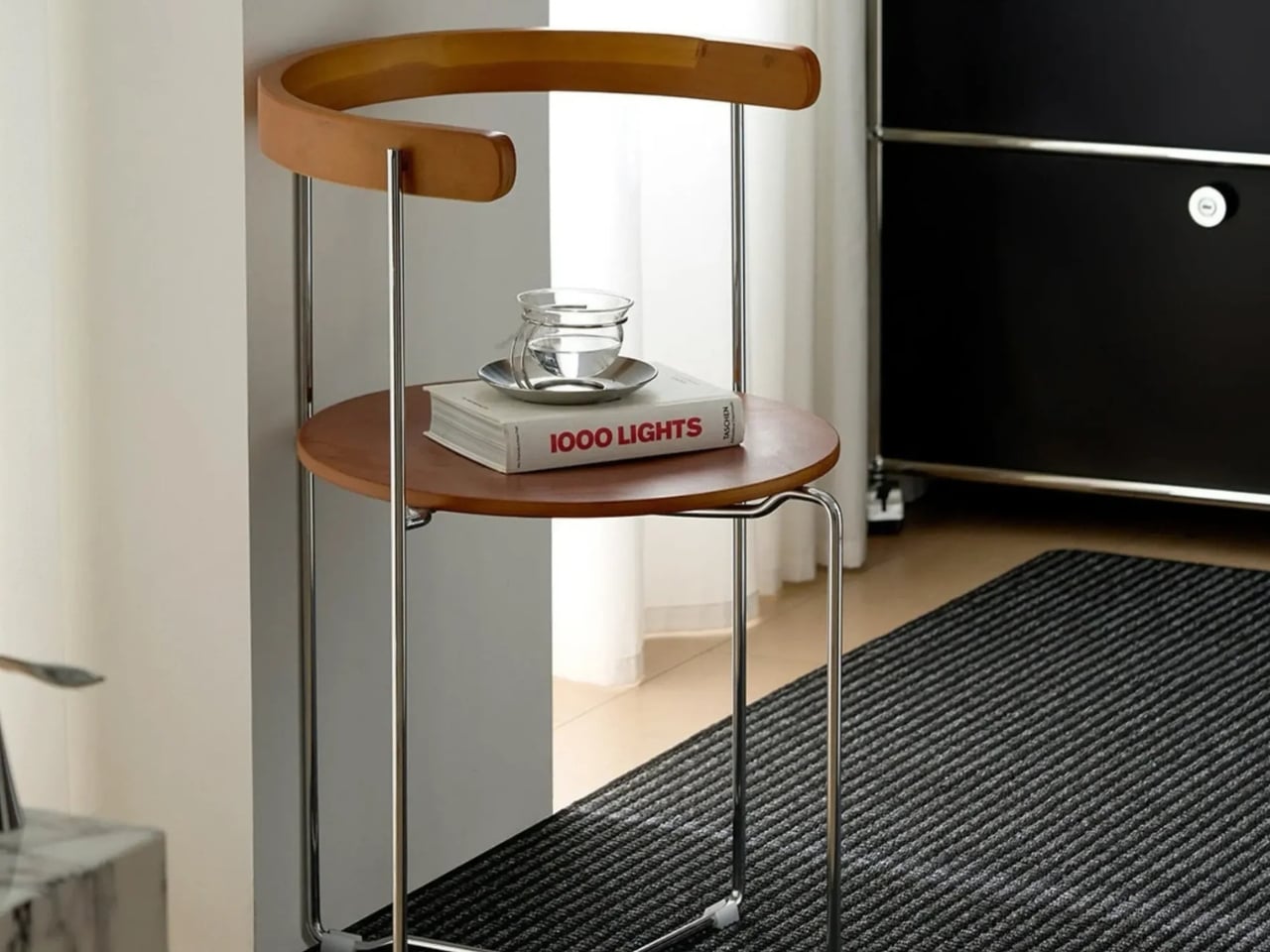
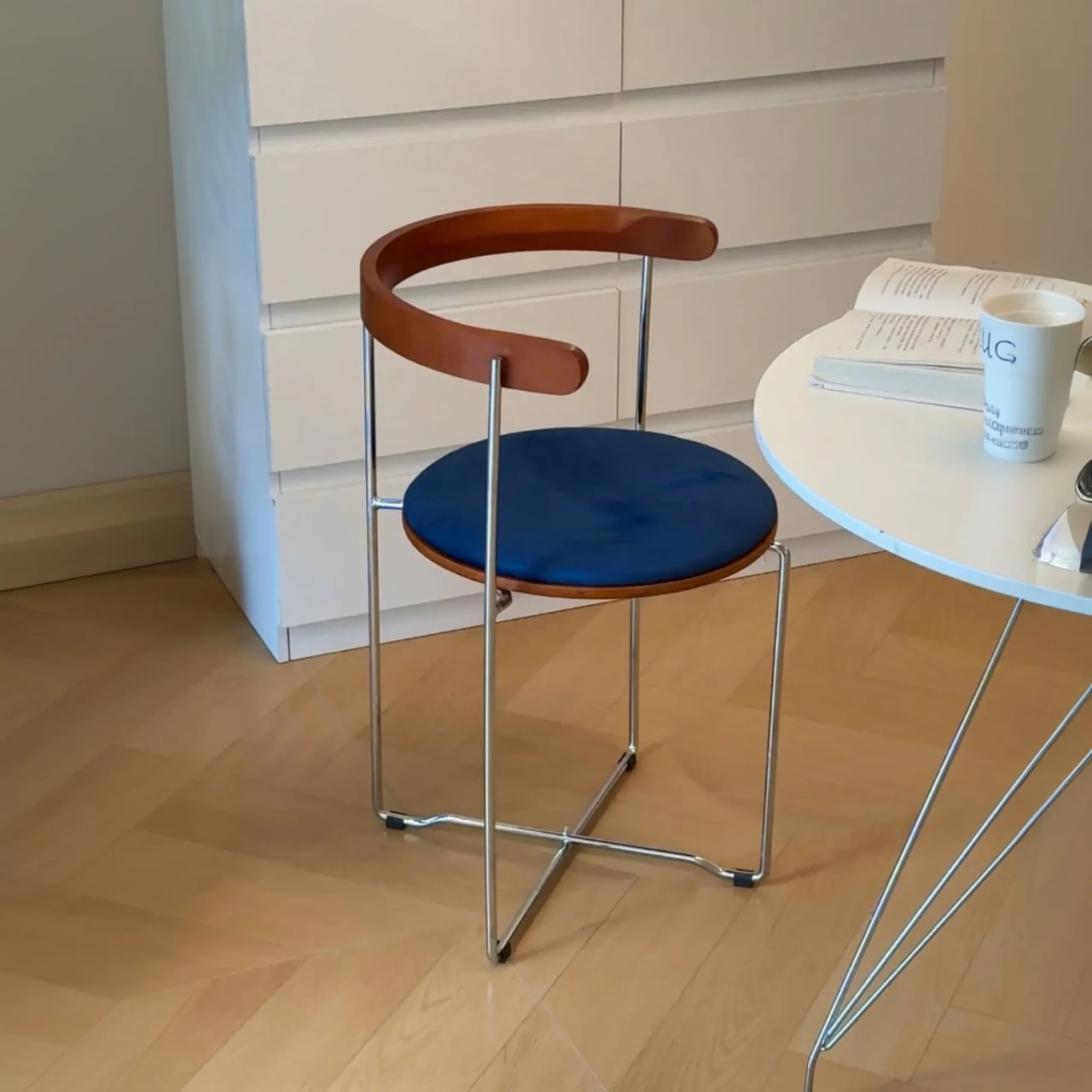
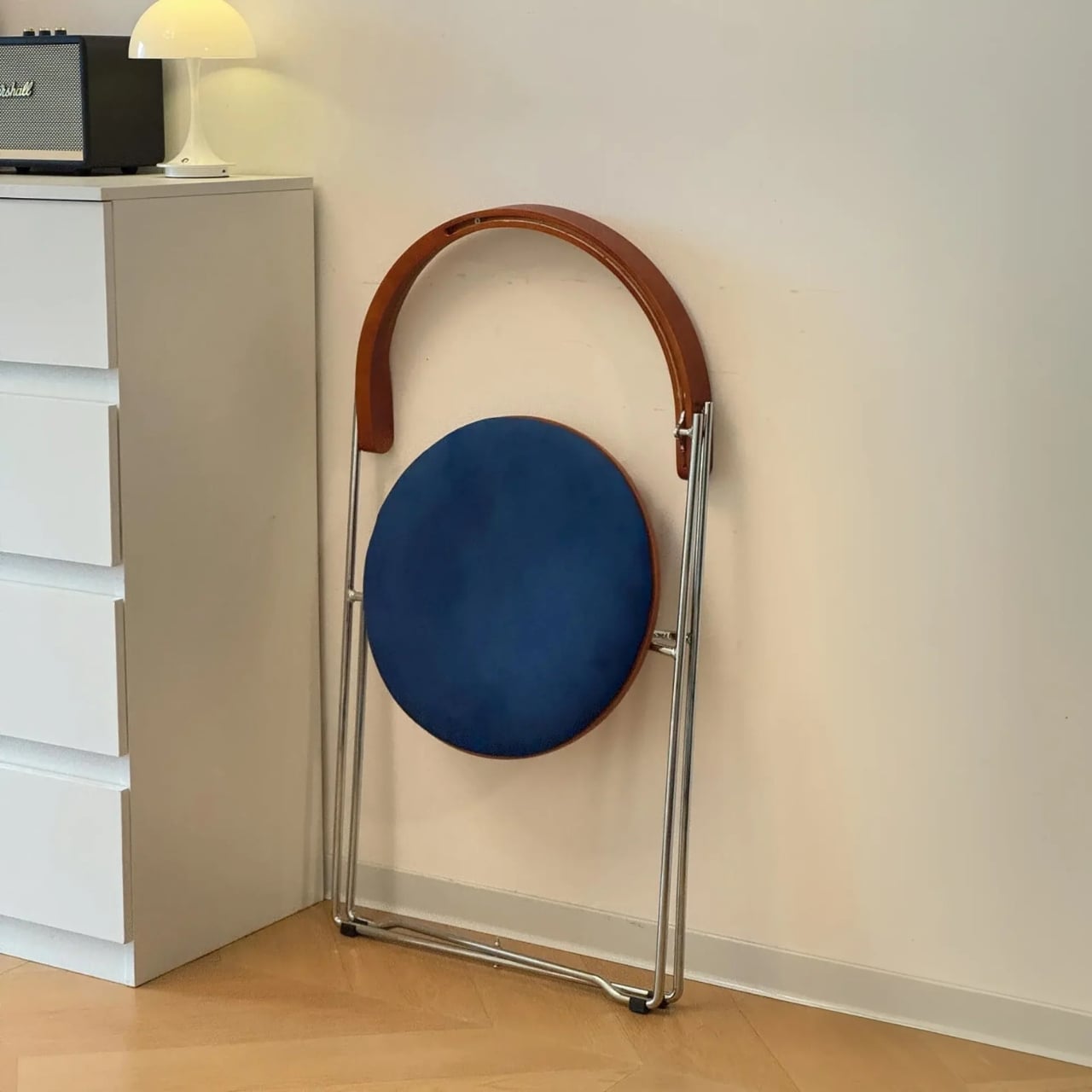
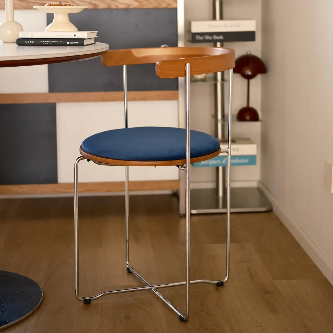
It doesn’t announce itself as a folding chair. If you saw it sitting in someone’s dining room, you’d probably assume it was a permanent fixture, a considered purchase, a statement piece. The seat and curved backrest are solid walnut, warm in tone and shaped to suggest permanence rather than portability. The frame is polished stainless steel, slim and structured without feeling cold or industrial. Taken together, the chair reads more like something you’d find in a well-edited boutique hotel lobby than something you’d unfold for a dinner party and tuck back behind a door before your guests could notice. The proportions are right. The materials are at least photographically convincing. And the overall silhouette holds a kind of quiet confidence that most folding chairs never come close to.

Designer: Esspur

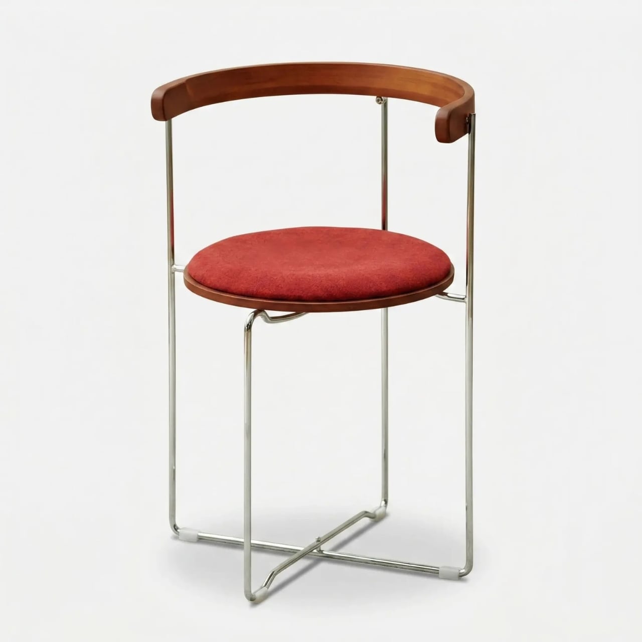
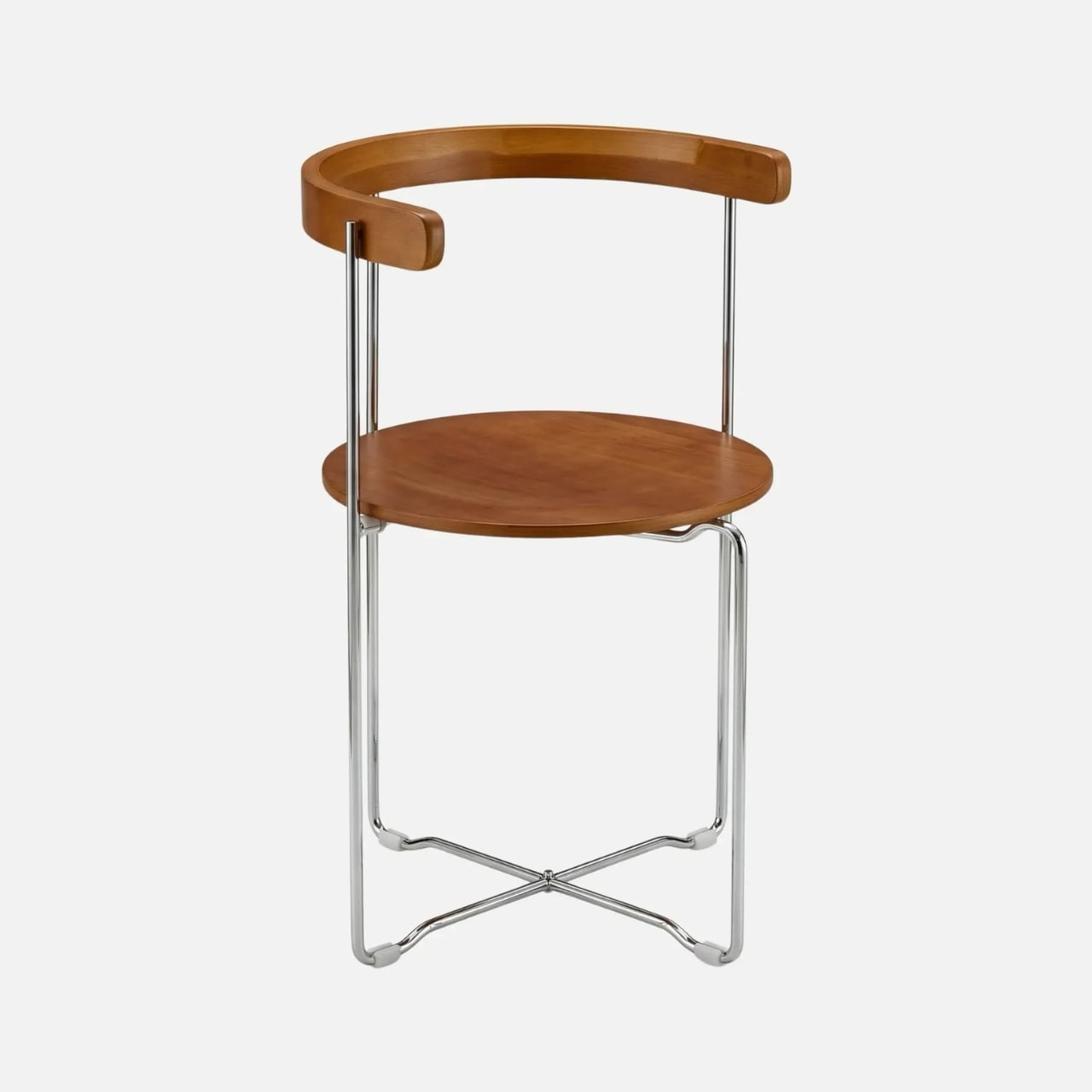
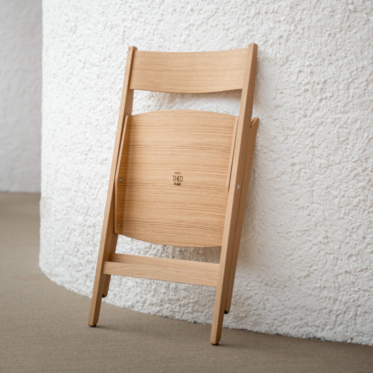
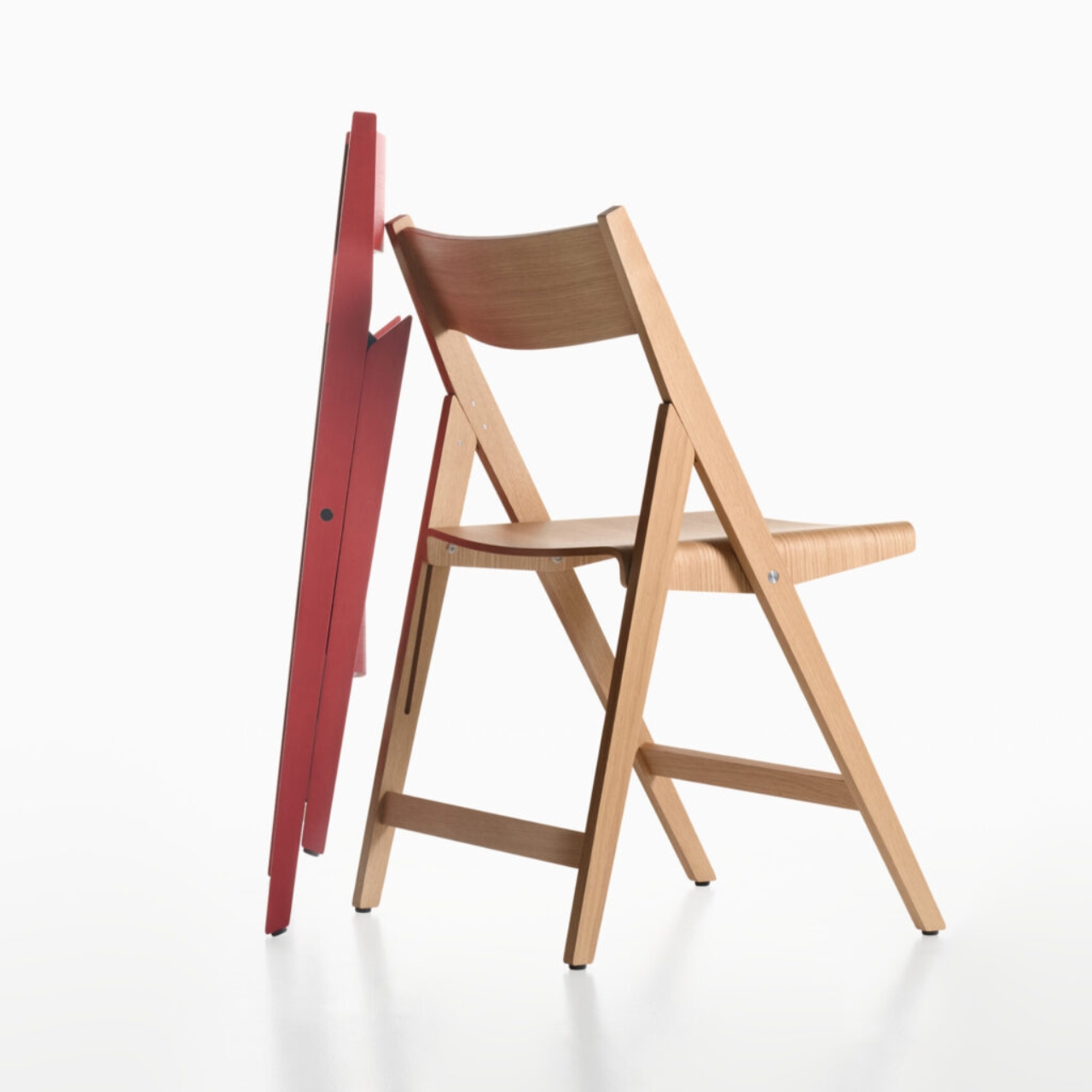
The design carries echoes of mid-century classics, and those references don’t feel like a stretch. There’s a rotational elegance to how the chair collapses that feels deliberate, almost theatrical, as if the whole point of the folding mechanism is to be watched. That’s not a common quality in budget-adjacent furniture. Most folding chairs fold in the most graceless way possible, a series of clicks and reversals that feel like you’re solving a problem rather than using a product. The Kael seems to understand that the fold is part of the design, not an afterthought.

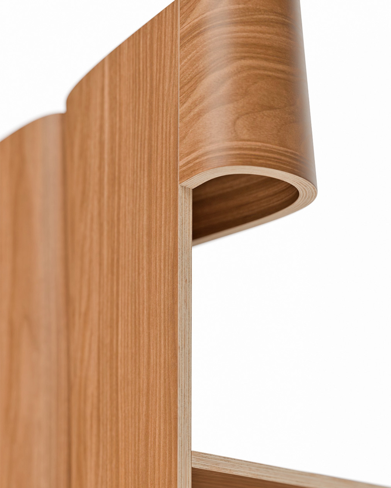
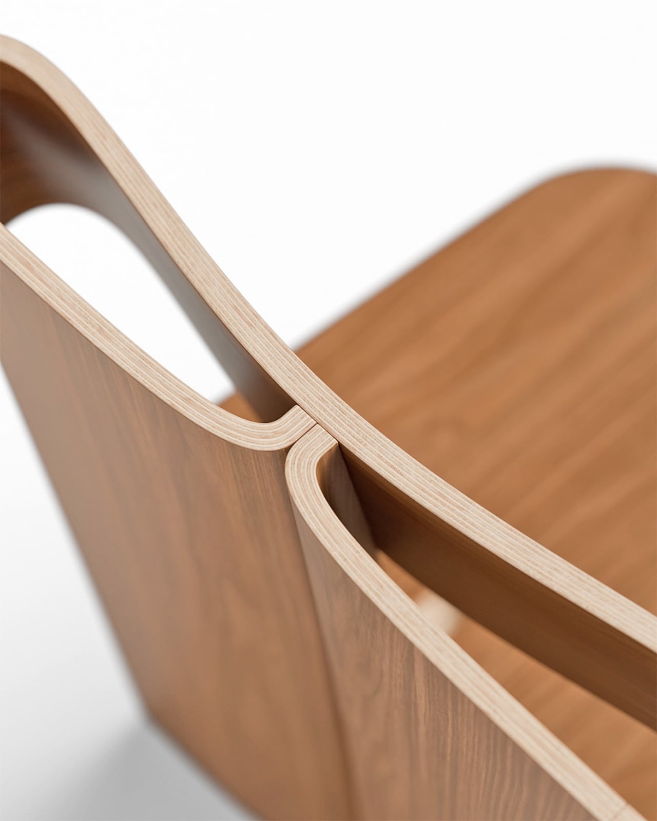
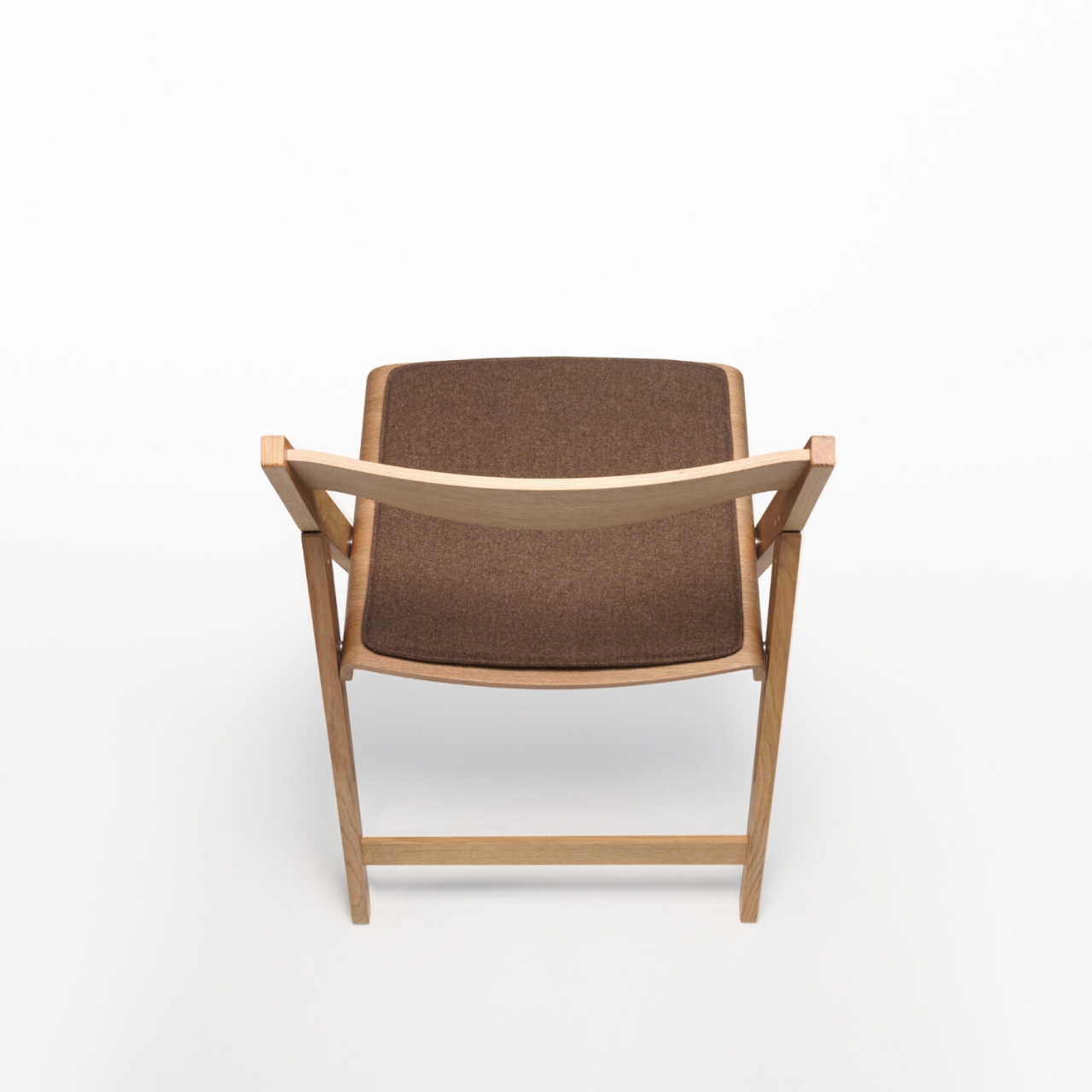
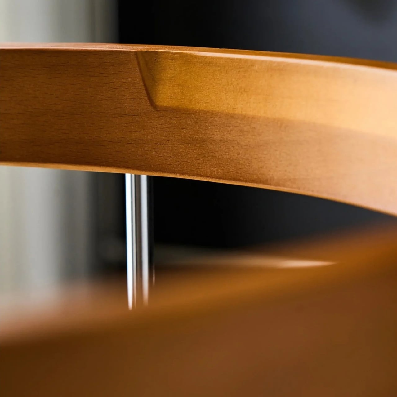
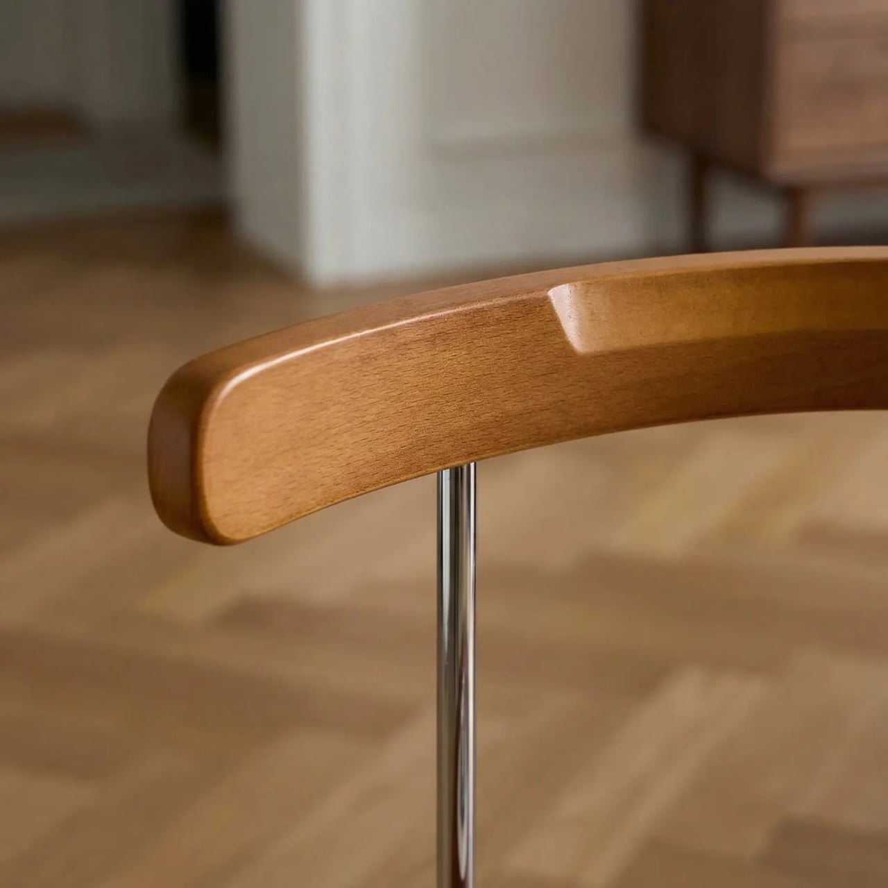
Esspur is a brand with virtually no history and no disclosed location, and their online presence raises more questions than it answers. The product description calls the seat and backrest solid wood in one place, then references veneer craftsmanship in the fine print. I think that’s worth sitting with for a moment. We live in an era of very convincing product photography, and the gap between how something looks on a screen and how it feels in your hands has never been wider. The walnut might be veneer rather than solid. The steel might feel lighter than it looks. These are legitimate concerns, and if you’re the kind of person who expects heirloom-grade furniture, this probably isn’t it. Shopping from an unknown brand with no verifiable track record is always a calculated risk.

But here’s the thing I keep turning over: the idea itself is nearly flawless. Whatever the material quality ends up being, someone thought carefully about the problem of the folding chair and came up with a solution that doesn’t feel like a compromise. The design respects the object. It doesn’t try to disguise the fact that it folds; the mechanism is visible, structural, part of the aesthetic. But it also doesn’t apologize for it. That’s a harder line to walk than it looks.

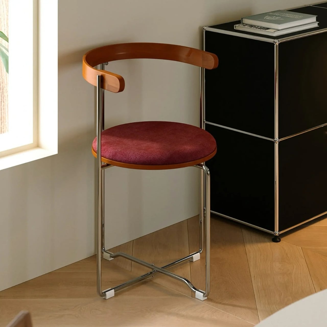
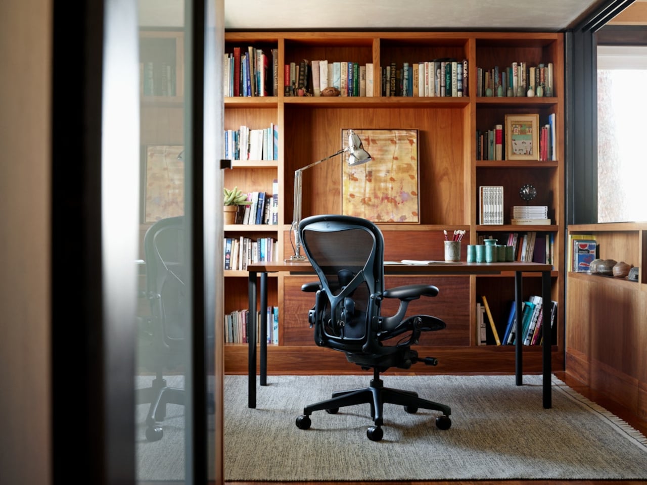
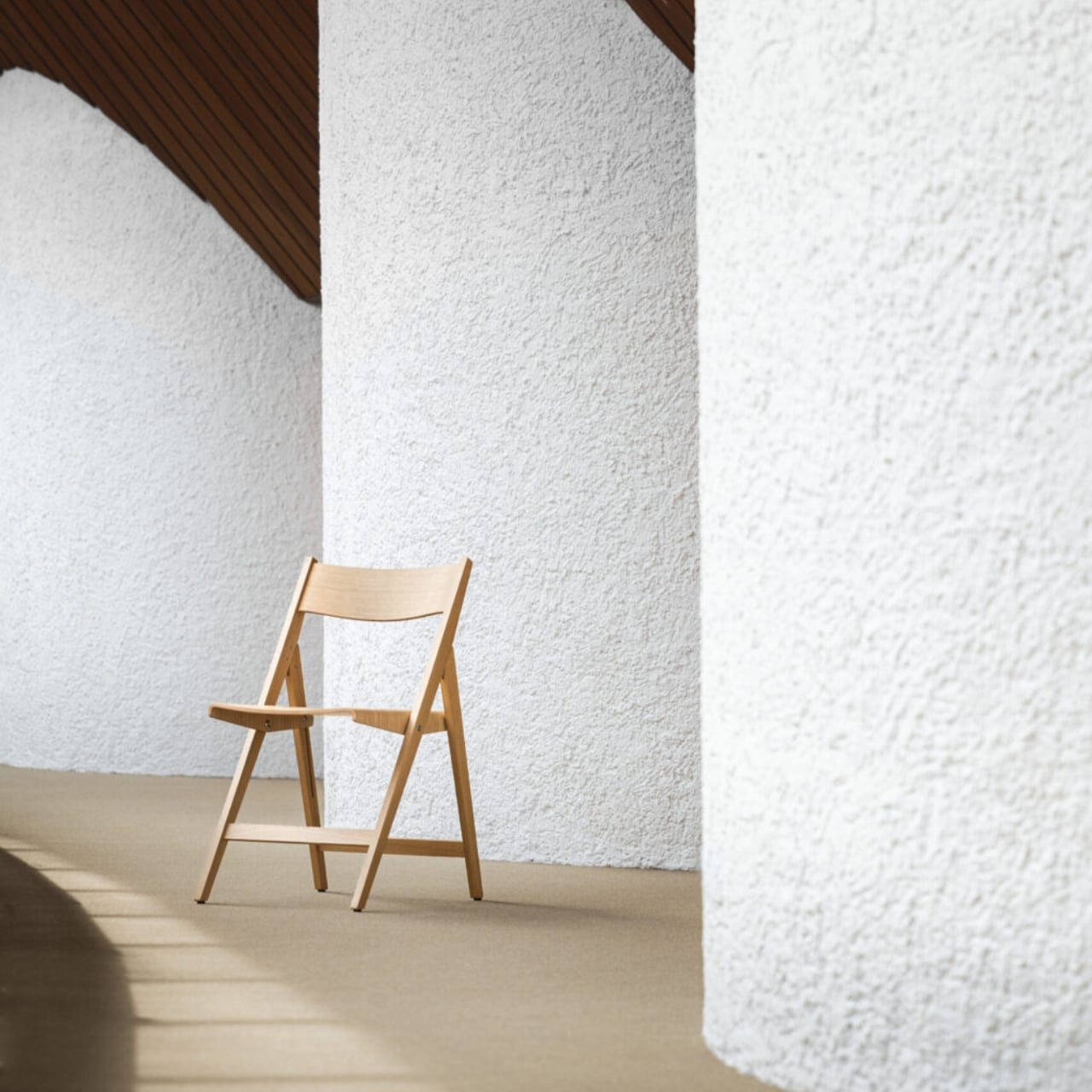
For anyone living in a city apartment, a studio, or a home where space is a constant negotiation, the Kael makes a quiet argument: good design shouldn’t require a permanent footprint. The best extra chair is one you’d want to leave out even when you don’t need it. Most folding chairs fail that test spectacularly. This one, at least in concept, passes with something to spare.

Whether Esspur refines the build quality over time or quietly disappears from the internet, the design itself has already done something useful. It’s asked the right question: what if the folding chair wasn’t the awkward option, but the intentional one? It’s a question the furniture industry hasn’t had much urgency to answer. Maybe now it does.

The post A Folding Chair Designed to Stay Out, Not Hide Away first appeared on Yanko Design.

LiberNovo Maxis Gives Bigger Builds the Chair They Actually Deserve

The ergonomic chair market has grown considerably over the past decade, with brands competing on lumbar support, adjustability, and build quality. For most people, the options are plentiful. For taller and broader users, though, the experience often tells the same uncomfortable story: seats that run out before the knee, backrests that stop short of the shoulders, and headrests that hover just out of reach.

LiberNovo’s answer to that gap is the Maxis, a chair that doesn’t try to stretch an existing design to fit bigger frames. It’s been built from the ground up with larger bodies in mind, carrying the slogan “Built for Bigger Builds” with some conviction. Everything from the seat platform to the backrest geometry has been re-engineered around what someone between 5’10” and 6’7″ needs from a chair.

Designer: LiberNovo

Click Here to Preorder Now: $10 deposit unlocks $30 discount on balance payment. Hurry, deal ends on 16th June.

The most immediate difference is the seat itself. At 52cm deep, it supports the full length of the thigh rather than cutting off too soon. That might seem like a minor detail, but anyone who’s worked long hours on a seat that runs out before it should know exactly how quickly that discomfort compounds. The reinforced frame also supports up to 399lbs.

The fit story continues further up. The neck support covers a wider vertical and horizontal adjustment range, so it can actually reach where taller users need it rather than floating somewhere above. The armrests are custom-sized with more span and travel than standard chairs allow. Their slightly curved shape also helps prevent the waist compression that straight-edged rests tend to cause for bigger frames.

This becomes more concrete in the upper half of the chair. LiberNovo says the Maxis back frame expands to a 430 mm shoulder span and a 520 mm waist width, giving bigger builds fuller contact instead of leaving pressure concentrated in narrower zones. The headrest is just as deliberate, with 140 mm of vertical travel and 120 mm of horizontal adjustment, plus a U-shaped design intended to support the neck more naturally.

What keeps the Maxis from feeling like a bigger version of an ordinary chair is how the backrest actually behaves. The Bionic FlexFit Backrest is designed to move with the body as posture shifts, rather than holding rigidly to one position. That’s the core idea behind LiberNovo’s Dynamic Support System, which maintains alignment through movement without needing constant manual readjustment.

The recline system follows a similar logic. The Maxis locks into five preset positions, from 105 degrees for focused, upright work up to 160 degrees for near-flat recovery. The stops in between cover the varied moments a long day actually involves: a video call, a longer solo session, a quick pause. Having distinct positions makes switching between them quick and intentional rather than endlessly fiddling with them.

The Maxis comes in three versions built on the same reinforced frame. The Manual keeps things simple with a physical dial for lumbar adjustment. The Electric adds motorized lumbar control alongside OmniStretch, a stretch-and-release cycle designed to relieve spinal compression after prolonged sitting. The Airflow builds on that with active seat ventilation, using a centrifugal fan embedded in the cushion to keep things cool and dry.

LiberNovo Omni Pro

OmniStretch and the Airflow ventilation both address the fatigue that builds gradually over long sessions. OmniStretch extends the lumbar support upward and gently releases it, creating a stretch-and-release motion intended to help relieve compression from prolonged seating. The ventilation system addresses heat accumulation in the seat cushion, helping the chair stay more comfortable through longer sessions. Both features treat comfort as something that has to hold up across a full day.

The Maxis launches alongside two new additions to the broader LiberNovo lineup. The Omni Pro brings motorized lumbar support, OmniStretch, and active seat ventilation to the standard-size Omni platform, making it the performance-oriented choice for users who don’t need the larger Maxis frame. The Omni SE takes a more stripped-back approach, pairing the same ergonomic architecture with a manual lumbar mechanism for a simpler, set-and-forget setup.

LiberNovo OmniStretch

LiberNovo opened the Maxis pre-order period in the US on May 12 at 7:00 PM PDT, with the official launch set for June 16 at 9:00 AM PDT and the first release window running through July 31 at 9:00 AM PDT. During that pre-sale stretch, orders qualify for super early bird pricing, with discounts reaching up to 44% in the US. A $10 deposit also unlocks a $30 discount on orders of $1,000 or more, along with a free 1-year extended frame warranty and access to a three-tier premium gift package for qualifying purchases.

What the LiberNovo Maxis gets right is treating a larger body as the actual design brief, rather than an afterthought dealt with by scaling up existing dimensions. Every adjustment range, support angle, and contact point has been calibrated around that focus. For taller and broader professionals who’ve spent years on chairs that never quite fit, that’s a meaningfully different sitting experience.

Click Here to Preorder Now: $10 deposit unlocks $30 discount on balance payment. Hurry, deal ends on 16th June.

The post LiberNovo Maxis Gives Bigger Builds the Chair They Actually Deserve first appeared on Yanko Design.

Herman Miller’s Aeron Just Broke Its Decades-Long Neutrals-Only Rule

Office chairs have largely operated on a color vocabulary of one. Black. Occasionally dark gray. The reasoning is defensible enough: a chair meant to work in any office, boardroom, or home studio needs to disappear into the background, and neutrals are the safest way to guarantee that. The Aeron has lived by that rule since its 2016 remaster, offering four restrained options that leaned charcoal and graphite and asked very little of the rooms they occupied.

Herman Miller is breaking from that constraint in 2026, though only just. The two new Aeron colors, Jasper and Nightfall, aren’t a departure toward the bold or the playful. Jasper is an earthy olive green calibrated to read almost as a neutral while gesturing toward the biophilic design sensibility that has been moving through workplace interiors for several years. Nightfall is a sophisticated midnight blue already present across the MillerKnoll portfolio, added partly to make specifying a cohesive space easier.

Designer: Herman Miller

The full palette now sits at six hues, Onyx, Graphite, Carbon, Mineral, Jasper, and Nightfall, all drawn from natural references and all quietly confident about their ability to belong without demanding attention. For designers specifying a lounge, a studio, or a home office with a more considered material palette, those two additions open the door to pairings that the existing neutrals couldn’t quite reach. The chair’s structure and ergonomics stay entirely intact.

But the more substantive changes in this update aren’t visible from across the room. The team mapped where the chair carried the most weight and substituted in lighter materials, including post-industrial recycled content and bio-based nylons, with the result that the chair’s global average embodied carbon drops by 12% compared to the previous version.

That 12% follows years of prior reductions. In 2021, the Aeron became the first Herman Miller chair to incorporate ocean-bound plastic. As of June 2026, the company has diverted more than 660 metric tons of that material since its last tally in 2023, the equivalent of roughly 79 million plastic water bottles. Today, the Aeron is composed of more than 50% recycled content and is up to 91% recyclable, carrying both BIFMA Level 3 and Indoor Advantage Gold certifications.

Size inclusivity received a quiet update as well. The Aeron has always come in three sizes, A, B, and C, covering nearly the full range of human body types. Recent testing confirmed that the largest size, C, now meets all structural requirements to support users up to 400 lb, a formal expansion of what the existing design had been capable of without being officially stated.

The new Aeron is debuting at Fulton Market Design Days in Chicago, June 8 through 10, as part of an exhibition called “Living with Change.” It’s available now through hermanmiller.com, Herman Miller showrooms, and MillerKnoll dealers, starting at around $1,520 in base configurations and $2,050 for fully specified versions. The new colors arrive on a chair that already sells one unit every 17 seconds, which says most of what needs to be said about whether the core design needed changing.

The post Herman Miller’s Aeron Just Broke Its Decades-Long Neutrals-Only Rule first appeared on Yanko Design.

How One Loop of Bent Wood Became a Complete Chair

Every so often, a piece of furniture stops you the way a good sentence does. You read it once, then go back and read it again just to understand how it works. The Sori Chair by Portugal’s Teixeira Design Studio is exactly that kind of piece. It started, as the best ideas often do, from a daily ritual of sketching. Not a brief, not a client request, just the quiet, intuitive kind of drawing you do before the day gets loud. And somewhere in that process, a loop took shape that became something worth talking about.

What came out of that ritual is a chair that feels completely resolved. A single, continuous ribbon of bent wood loops upward from the seat to form the double-ply backrest, open at the center like a hollow frame, and the contrast it creates against the chair’s firmly geometric base is fully intentional. Below that fluid loop, the structure is all right angles and clean planes, held together by a cross-shaped base that looks as if it was drawn with a ruler and a very steady hand. That tension between the organic and the architectural is where the Sori Chair lives, and it’s a genuinely compelling place to be.

Designer: Teixeira Design Studio

The technical side of this piece deserves more attention than it usually gets in design coverage. That backrest loop doesn’t just sit on top of the seat. It rises through it, emerging from a precise cutout with the kind of considered joinery that takes real craft to execute. The layered plywood edges are fully exposed throughout, and rather than hiding them, the design leans into them. You can see the pale strata of wood at every bend, every curve, every corner. It reads as an honest material and an honest process, and that matters more now than it perhaps ever has. In an era where furniture is increasingly flat-packed and finish-wrapped, a chair that shows you exactly how it was made feels almost countercultural.

The name is worth pausing on. Sori is a Japanese word for the natural curvature or warp of wood, the subtle bow that timber develops over time or when shaped under heat and pressure. Whether the studio intended that specific reference or landed on it instinctively, naming the chair after that particular quality of the material says something about how this work is approached: not as a battle against the material’s limits, but as a genuine conversation with them.

Teixeira Design Studio, based in Viana do Castelo in northern Portugal, has built a portfolio that consistently returns to this idea of using plywood and bent wood to find new formal possibilities. Earlier pieces like the Void Chair explored how a single sheet of plywood could fold into a form that contained seating and hidden storage simultaneously. With Sori, the focus narrows considerably. No secondary function, no added utility. Just the pursuit of one fluid, structural gesture, executed as cleanly as it possibly can be.

That restraint is what gives the chair its real weight. Designers who know how to do more but choose to do less are often the most interesting ones to follow, and Sori feels like a quiet, confident declaration of that philosophy. Every angle you approach it from reveals something new. From the front, it reads almost architectural, like a small building with an open courtyard. From the side, the loop of the backrest curls inward like a wave at the moment before it breaks. From above, the cutout in the seat and the twin arcs of the backrest create a composition that could hold its own as a flat drawing.

Good design holds up under scrutiny. It doesn’t just photograph well and vanish once you look too closely. The Sori Chair gets richer the longer you sit with it, and that, more than anything else, is the standard worth measuring any piece of furniture against.

The post How One Loop of Bent Wood Became a Complete Chair first appeared on Yanko Design.

Ovios and Studio F. A. Porsche Just Made Their First Furniture Collection Together

Ovios introduced Aero Evo at the launch event in California, a new outdoor furniture collection created with Studio F. A. Porsche. The line includes a sofa, lounge chairs, and a coffee table, and it marks the studio’s first outdoor furniture project. The collaboration brings together Ovios’s experience in premium furniture manufacturing and Studio F. A. Porsche’s minimalist, performance-led design approach, with comfort and function treated as part of the design rather than an afterthought.

Seen in person, Aero Evo feels softer and more sculptural than the Porsche connection might suggest. The woven side and back panel give the pieces presence, while the exposed metal frame and open structure keeps them visually open. It does not read like furniture trying to imitate a car. The link is more understated than that, showing up in the control of the lines and the clarity of the structure.

Designer: Ovios x Studio F.A. Porsche

Henning Rieseler, Design Director at Studio F. A. Porsche, said the collection was developed with the American market in mind, particularly California. That lighter, more relaxed mood comes through, but the collection stops short of the usual resort furniture look. The forms are cleaner and more restrained, which gives the pieces a stronger identity.

The woven rope is central to that. It is not there simply to soften the frame. It shapes the way the sofa and chairs are read, giving them texture and volume, while the visible frame keeps the overall profile open. That contrast is where much of the collection’s appeal lies.

Aero Evo works best when the frame and weave are read together. The stainless steel frame gives the collection its outline and support, while the woven rope adds warmth and softness. The raised base and open structure create a sense of airflow that keeps the furniture from feeling too solid. The pieces have enough presence to anchor a space, but they do not feel heavy.

Rieseler said the collection went through several iterations, including adjustments to the height of the back panel and the size of the cushions. The goal was to keep the metal frame and woven back visible while maintaining comfort. That helps explain why the final proportions feel so controlled. The cushions are generous, but they do not cover up the structure or blur the silhouette.

The collection comes in three woven rope colors, charcoal, brown, and beige, along with four cushion color options. The charcoal version brings out a more graphic side of the design, while the brown and beige versions feel warmer and more relaxed. The lighter combinations suit open terraces and poolside settings especially well, while the darker option gives the collection a sharper presence.

Seen together, the sofa, lounge chairs, and coffee table read as a complete outdoor setting rather than a group of separate products. The seating carries most of the visual identity, and the coffee table sits more quietly within the arrangement. That feels right for a collection aimed at terraces, patios, garden lounges, and hospitality spaces, where the atmosphere matters as much as the individual pieces.

Ovios is releasing Aero Evo as a limited collection of 919 pieces worldwide, a nod to the Porsche 919 Evo that informed the project. Even so, the most convincing part of the collection is not the automotive reference on its own. It is the way the design handles structure, texture, and comfort without pushing any one idea too hard. For Studio F. A. Porsche, it is a confident first move into furniture. For Ovios, it is a collaboration that feels well matched. The result is a collection that feels considered, distinctive, and easy to imagine in use.

Click Here to Know More!

The post Ovios and Studio F. A. Porsche Just Made Their First Furniture Collection Together first appeared on Yanko Design.

Scaffolding Was Never Meant to Be Beautiful, Estrade Disagrees.

Most furniture begins with a brief. A sketch. A mood board pulled from somewhere between a Scandinavian design blog and a decades-old auction catalog. French industrial designer Pierre Villez did something different. He started at the construction site.

His project Estrade, which takes its name from the French word for a raised platform or stage, is exactly the kind of design that makes you pause and rethink what you assumed you knew about materials and their purpose. It takes scaffolding, one of the most utilitarian objects in the built environment, and repurposes it into furniture with a presence that feels both raw and considered. The idea isn’t complicated. What’s remarkable is how clearly it works.

Designer: Pierre Villez

The execution is built around scaffolding tubes and components, the galvanized steel poles and fittings that temporarily hold up the facades of buildings under construction. These become the structural bones of a usable, liveable object. The material doesn’t get disguised or prettied up. It stays exactly as it is, marks and all, which is where the real honesty of the design lives. There’s no apology in it.

There’s a broader conversation happening right now in the design world about where materials come from and what happens to them once their original job is done. Construction materials sit at an interesting intersection: they’re industrial, abundant, and structurally engineered to last far longer than the projects that use them. Scaffolding in particular gets a rough deal in this sense. It does some of the most important work on a building site and then disappears entirely, either stacked away in a storage yard or eventually scrapped. Villez’s response is simply to ask whether disappearing is really necessary.

What makes Estrade worth paying attention to, beyond the sustainability angle, is that it doesn’t feel like it’s compensating for its origins. A lot of upcycled design falls into the trap of trying too hard to look polished, as if the designer was vaguely embarrassed by the material they started with. Estrade leans the other way. The scaffolding reads as scaffolding. The proportions are deliberately architectural, almost structural in feeling, and that industrial quality isn’t softened so much as it’s redirected. You’re not looking at furniture that happens to be made from scaffolding tubes. You’re looking at scaffolding that has decided to become furniture, on its own terms.

That kind of design thinking takes a real confidence in the material. It requires trusting that what you’re working with has enough inherent value to carry the work, without heavy intervention or stylistic decoration layered on top. Pierre Villez, who is based in Lille, France, clearly believes it does. His portfolio also includes ALAIN, a project that applies the same logic to crash barriers, which tells you this isn’t a one-off experiment. It’s a considered way of looking at the built world and asking what gets left behind, and why.

For anyone paying attention to where design is heading, Estrade feels like a meaningful signal. The sustainability conversation in design has been running for years and has sometimes drifted into the theoretical or the performative, becoming more about messaging than material reality. A project like this cuts through that. It’s grounded and specific. It takes one material, one context, and one question: can this be something else? The answer that comes back is yes, and it looks good while saying it.

The name is a small detail that rewards a second look. An estrade is a platform you stand on, a raised surface that offers a different vantage point. It’s a quietly clever choice for a project that asks us to look at a familiar, overlooked material from a completely different angle. Not everything in design needs to be precious or brand new. Some of the most interesting work happens when a designer takes what’s already there and asks a better question of it. Pierre Villez asked a good one.

Three metal stools with black seats lined up on a pink background.

The post Scaffolding Was Never Meant to Be Beautiful, Estrade Disagrees. first appeared on Yanko Design.

When F1 Engineering Becomes the Chair You Sit In

The first time I saw images of the Rear Wing Chair by Keon-Jo, I genuinely had to look twice. Not because it’s strange, but because it’s so precisely right that your brain takes a moment to catch up with what it’s actually looking at. That wide, sweeping profile. Those curved, grounded legs. The unmistakable geometry of an F1 rear wing, scaled and reoriented into something you can actually sit in.

And that’s the thing about this piece: it isn’t motorsport-themed furniture. It’s not a chair with a racing stripe or a decorative spoiler bolted on for effect. Designer Keon-Jo took the actual geometry of an F1 rear wing, the profile, the curvature, the aerodynamic structure, and translated every element with full fidelity into a functional object. The result is 100% carbon fibre, unmodified and unapologetic, with every surface showing the raw woven weave exactly as it comes. Nothing softened, nothing added.

Designer: Keon-Jo

I think that restraint is everything here. A lesser approach would have tried to make it more accessible, more livable, more palatable for people who might not know or care what a rear wing actually does. Keon-Jo didn’t do that, and the piece is stronger for it. The chair carries the authority of the original object because it commits to the original object, completely.

The question that started all of this was a good one: what would one of the most engineered components in motorsport look like if it stopped being a car part and became something you lived with? F1 rear wings are products of obsessive precision. Aerodynamicists and engineers spend entire seasons calculating the exact angles and curves that will shave fractions of a second off a lap time. Every millimetre is deliberate. Every surface has a reason. Keon-Jo took that same philosophy and asked what happens when you apply it to the home.

The answer is a chair that sits at the edge of sculpture and engineering in a way that very few objects manage. It doesn’t look like it’s trying to be art. It also doesn’t look like it’s trying to be furniture. It looks like what it is: an engineered object, repurposed through a specific creative lens, and built with a level of craft that the source material demands.

The launch timing is as considered as the chair itself. The Rear Wing Chair is debuting during Monaco Grand Prix weekend, June 6 to 8, 2026. Monaco is where engineering culture and design culture genuinely converge on the F1 calendar. The streets, the yachts, the paddock, all of it operates at a level of precision and detail that matches the ethos of this piece exactly. It’s a smart choice, and not an obvious one.

This is also only Keon-Jo’s second physical object. The first was the Front Wing Wall Art, a wall-mounted sculptural piece built from F1 front wing geometry, working from the same core idea: take what motorsport engineers obsess over and translate it into something people actually live with. Two pieces in, the studio already has a clear and convincing point of view. That’s harder than it sounds. A lot of design studios spend years finding their language. Keon-Jo arrived with theirs already formed.

At 1200 x 760 x 670mm, the Rear Wing Chair is a substantial presence in a space. This isn’t a subtle accent piece. It’s a statement, and it knows it. The kind of object that defines a room rather than decorates it. For anyone who grew up around motorsport, or who simply cares about the relationship between engineering and form, this is the piece that gives both equal weight.

Whether you follow F1 or not, the Rear Wing Chair makes an argument that precision has genuine aesthetic value, that the same thinking that wins races can produce something beautiful enough to own and live alongside. Keon-Jo is building a body of work around that idea, and with only two pieces, it already feels like a compelling one. See more at keon-jo.com.

The post When F1 Engineering Becomes the Chair You Sit In first appeared on Yanko Design.

A Chair With a Drawer, a Calendar, and a Point of View

The first thing you notice about Massimiliano Malagò’s chairs is that the bottom half looks like it’s giving up. The ceramic bases appear to be softening, pooling, their surfaces undulating in slow waves as if the weight of everything sitting on top has finally gotten to them. The upper halves, either blond plywood cut with clean geometric precision or yellow foam dense as old mattress padding, hold their shape with complete indifference. The contrast is the whole conversation.

Malagò is an Italian architect based in New York who teaches at Columbia University’s Graduate School of Architecture and runs the practice HHMM with set designer Helene Helleu. His body of work has a recurring habit of using furniture as intellectual argument, treating each piece as a spatial essay. These chairs, created as part of On the Calculation of Volume for a Greenpoint apartment renovation he developed alongside client Kathleen Pongrace, are his most layered statement yet. Literally and figuratively.

Designer: Massimiliano Malagò

Each chair is essentially two objects in a standoff. The bases are hand-sculpted ceramic glazed in a crackled off-white, decorated with small blue motifs that range from heraldic figures and crests to lunar phase calendars marked with numbers from one to thirty. Depending on which chair you’re looking at, the surface texture shifts too. Some bases have a wavy, rippled undulation. Others are pocked with circular voids, perforations from which actual small flowers grow, as if nature has decided to quietly move in through whatever gaps the city left open.

The upper chair structures sit on top of these organic, softened bases like they arrived from a different address entirely. The plywood versions are laminated and layered, their cut edges revealing the strata of material inside like a cross-section of something ancient, while the foam versions have a raw, utilitarian quality that reads somewhere between construction material and domestic comfort. Both feel deliberately unfinished in a way that is not careless but considered. Malagò is clearly not interested in making the perfect chair. He is interested in making a chair that has something to say about what living in New York actually costs you, in time, in money, and in compromises.

The storage element is where it gets genuinely clever. Pull open a drawer concealed within the ceramic base and you find a sliding metal mechanism holding books. The idea that a chair can house your library inside its own body, that seating and storage are so compressed in a small New York apartment that they must physically merge, is either a practical solution or a quiet diagnosis of how little room the city actually allows. I’d argue it’s both.

The lunar calendars printed across the ceramic surfaces in blue add another layer. Numbers arranged around moon phases suggest cycles, passing time, the rhythm of days that accumulate in a place where rent comes due whether you’re thriving or barely holding on. These aren’t decorative flourishes. They’re documentation. Malagò treats the surfaces of these chairs the way someone might treat the margins of a notebook, filling them with information that only makes full sense once you step back and read the whole thing together.

The material pairings are where the real honesty lives. Ceramic is permanent, archival, the kind of material you associate with objects meant to outlast the people who made them. Foam and plywood are impermanent, budget-conscious, the materials of first apartments and temporary solutions. Putting them together isn’t a design provocation for its own sake. It’s a portrait of how most people actually live, reaching for something lasting while working with whatever is available. The chair holds that tension without resolving it, which feels exactly right.

Design that tries to tell you something about city life usually does so at a comfortable, critical distance. These chairs plant themselves in the middle of it. They sit in a real apartment, used by a real person, and they carry the full weight of that reality in every surface.

The post A Chair With a Drawer, a Calendar, and a Point of View first appeared on Yanko Design.

PLANK Made a Folding Chair You’d Never Want to Put Away

Folding chairs have a reputation problem. For most of us, they conjure up images of bare banquet halls, plastic legs scraping across gymnasium floors, or that wobbly stack in the back of a relative’s garage. They are furniture by necessity, not by choice. So when a design studio manages to make one that you’d genuinely want to keep out in your living room, it’s worth paying attention.

That’s exactly what PLANK and designers Matteo Thun and Benedetto Fasciana have done with the Theo folding chair, quietly one of the most interesting pieces to come out of Salone del Mobile Milano 2026 this past April. Not because it does something shocking or avant-garde, but because it does something much harder: it makes the utilitarian feel considered.

Designers: Matteo Thun and Benedetto Fasciana for PLANK

PLANK has been at this since 1953, and that legacy shows in how Theo is built. The frame is solid oak, which already puts it in a different category from the folding chairs most of us know. The seat and backrest are made from molded plywood, shaped with a gentle curve that reads as both ergonomic and graceful. The folding mechanism uses natural or black oxidized stainless steel, and it integrates into the structure so cleanly that you almost forget it’s a functional joint and not just a detail. The chair opens and closes without any of the awkward fuss you’d expect. It simply works, and it looks good doing it.

I’ve always believed that the real test of a design isn’t how it performs in ideal conditions but how well it disappears into a life that isn’t perfectly curated. Most furniture is designed with a room in mind. Theo was designed with reality in mind. It’s built for contract spaces, meaning restaurants, event venues, conference rooms, places where chairs get used hard and stored constantly. But the visual language doesn’t give that away. If you didn’t know, you’d assume it was a permanent resident of whatever room it happened to be in.

The finish options only add to that versatility. You can get Theo in natural or stained oak veneer, or in a matte open-pore lacquer in Walnut, Brown Red, Olive Green, or Black. Each feels deliberate rather than decorative. The seat cushion options go even further: a 100% wool Moessmer Dolo Loden fabric in four colors, or Dani Florida leather in 96 colors. That last number sounds excessive until you realize it’s actually kind of brilliant. It’s the difference between a chair that fits into a space and one that was made for it.

There’s also a companion Transport Trolley that was developed alongside Theo, designed to stack and move up to eight chairs at once. It’s a practical addition that rounds out the system nicely, especially for the hospitality and event sectors where Theo will likely see the most use. But even outside those contexts, the Trolley signals something important about how PLANK approaches design: everything has to work together, not just look good in isolation.

Matteo Thun is no stranger to pieces that carry a quiet authority. He’s had a long career built on the idea that good design should be sustainable, functional, and beautiful in equal measure, and Theo reflects all three. The fact that PLANK uses solid wood and always-recyclable materials isn’t incidental. It’s the whole point. Longevity is designed in from the start, not marketed as an afterthought.

What makes Theo genuinely compelling is how little it asks of you. It doesn’t demand a particular aesthetic or a specially styled room. It doesn’t need to be the centerpiece. It can be stacked in a closet and brought out for dinner parties, or it can live at the head of a table year-round, and it holds up either way. That’s a rare quality in furniture, and it’s even rarer in a folding chair.

The best designs tend to solve problems you didn’t realize had elegant solutions. Theo is a folding chair that looks like it was never trying to be anything else, and that, more than any other detail, is the thing that makes it worth talking about.

The post PLANK Made a Folding Chair You’d Never Want to Put Away first appeared on Yanko Design.

Why Does Every Kids Chair Feel Disposable? ROCCO Disagrees

Kids furniture has a peculiar habit of lying about its usefulness. You buy it, your child loves it for roughly eight months, and then it either disappears into a donation pile or gets repurposed as a makeshift step stool. The furniture industry has been quietly trying to solve this problem for years, but designer Nidhun K M may have found an answer worth paying attention to. ROCCO is a modular chair concept for children that challenges the idea of a seat being a single, fixed thing.

ROCCO isn’t just a small chair. It’s a modular system, which means its components can be reconfigured, reused, and adapted as a child grows and as the context around them changes. Shared on Behance, the concept has been picking up attention from the design community, and it’s easy to see why. The proposal isn’t flashy in the way that kids furniture often tries to be, with primary colors and cartoon motifs that scream “this is for children.” ROCCO looks like it was designed with a quieter kind of intelligence.

Designer: Nidhun K M

The modular approach to kids furniture is not a new idea, but it rarely gets executed with this kind of intention at the seating level. Most modular children’s furniture applies to beds, storage units, or room systems. A chair, by comparison, seems too small to bother with. And yet the chair is one of the most-used pieces of furniture in a child’s day. They sit to eat, to draw, to read, to play. A chair that could shift configuration as the child’s proportions change, or as the task at hand demands something different, is genuinely useful in a way that a novelty dinosaur sofa simply isn’t.

What makes ROCCO feel credible as a design concept is its commitment to the idea over pure aesthetics. The form is considered without being overdesigned. There’s no attempt to win the child’s attention through gimmick. Instead, the design seems to trust that a well-proportioned, adaptable piece of furniture is interesting enough on its own terms. That restraint is harder to achieve than it looks, especially in a market segment that tends to equate loudness with appeal.

The broader conversation that ROCCO fits into is one about sustainability and longevity in children’s product design. Parents who are thinking carefully about consumption are increasingly reluctant to replace furniture every two years. The global kids furniture market is projected to grow significantly over the next decade, with a meaningful portion of that demand driven by parents who want adaptive, durable pieces that don’t become obsolete. Modular systems address this directly. When you can reconfigure rather than replace, you reduce waste and, over time, potentially reduce cost.

There’s also a less practical dimension to this that I keep thinking about. Children learn by doing, by arranging, by making their environments their own. A modular chair invites a small but meaningful degree of participation. If a child can shift a piece, adjust a configuration, and see the result of that choice, the chair becomes part of how they understand space and autonomy. That might sound like a stretch for a piece of seating, but design has always had this double life: the functional and the formative.

Nidhun K M’s work is currently a concept, which means ROCCO doesn’t yet exist in the way that you could order one and have it arrive at your door. That’s actually fine. The value of concept work in product design is that it forces a conversation before manufacturing decisions set in. It asks: what if we took this more seriously? What if a child’s chair were worthy of the same design thinking we apply to adult furniture? I think the answer is yes. And ROCCO, even at the concept stage, makes a decent case for it.

The post Why Does Every Kids Chair Feel Disposable? ROCCO Disagrees first appeared on Yanko Design.