
What kind of cooling system do EV batteries use and how does it work?
Electric cars need incredibly large batteries that offer long driving ranges and charge quickly, but remain cool when under load. This is how they do so.

An empty vase can make a shelf look oddly unfinished, as though the flowers were supposed to do all the decorating. Aleksander Kozera’s Neo-Brutalist Vases offer a convincing way around that small domestic problem. Created under his Warsaw-based Yird Ceramics brand, these ceramic vessels have enough architectural detail to hold attention on their own. I’d be inclined to leave them empty before deciding what, if anything, belongs inside.
Their cylindrical bodies are divided into rectangular panels, with tiny indentations that suggest construction details on a concrete facade. Circular recesses interrupt that grid, while curved projections extend from the sides like abbreviated balconies or exposed joints. The effect lands somewhere between an architectural model and a piece of science-fiction set dressing. They look a little like infrastructure for a very small, very design-conscious civilization, which is part of their appeal.
Designer: Aleksander Kozera
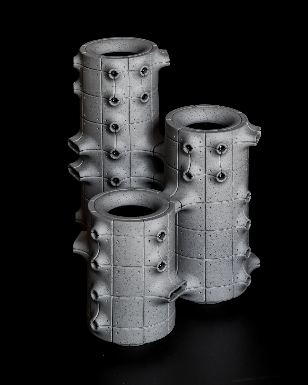
The concrete resemblance comes from the ceramic body itself. According to the collection’s Łódź Design Festival description, Kozera uses porcelain casting slip with ceramic pigments and black grog to produce that raw, concrete-like finish. In the close-up photographs, dark speckles break up the gray surface. That texture matters visually: without it, the panel lines and repeated circles could read as a smooth plastic prop. Instead, the surface gives the geometry some grit.
The modular approach also makes the collection more interesting than a row of differently sized cylinders. The festival describes vessels that can be combined and arranged into larger compositions. In the photographs, neighboring forms create narrow gaps, overlapping projections, and changing silhouettes. I like the possibility of treating a shelf as a small architectural composition rather than lining up three matching accessories. The vessels share a vocabulary without looking identical from every angle.

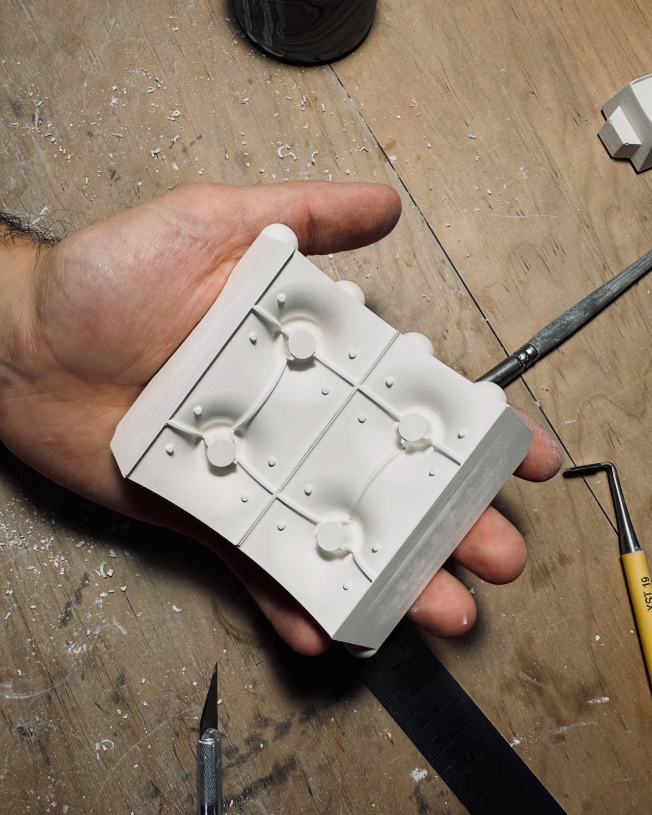
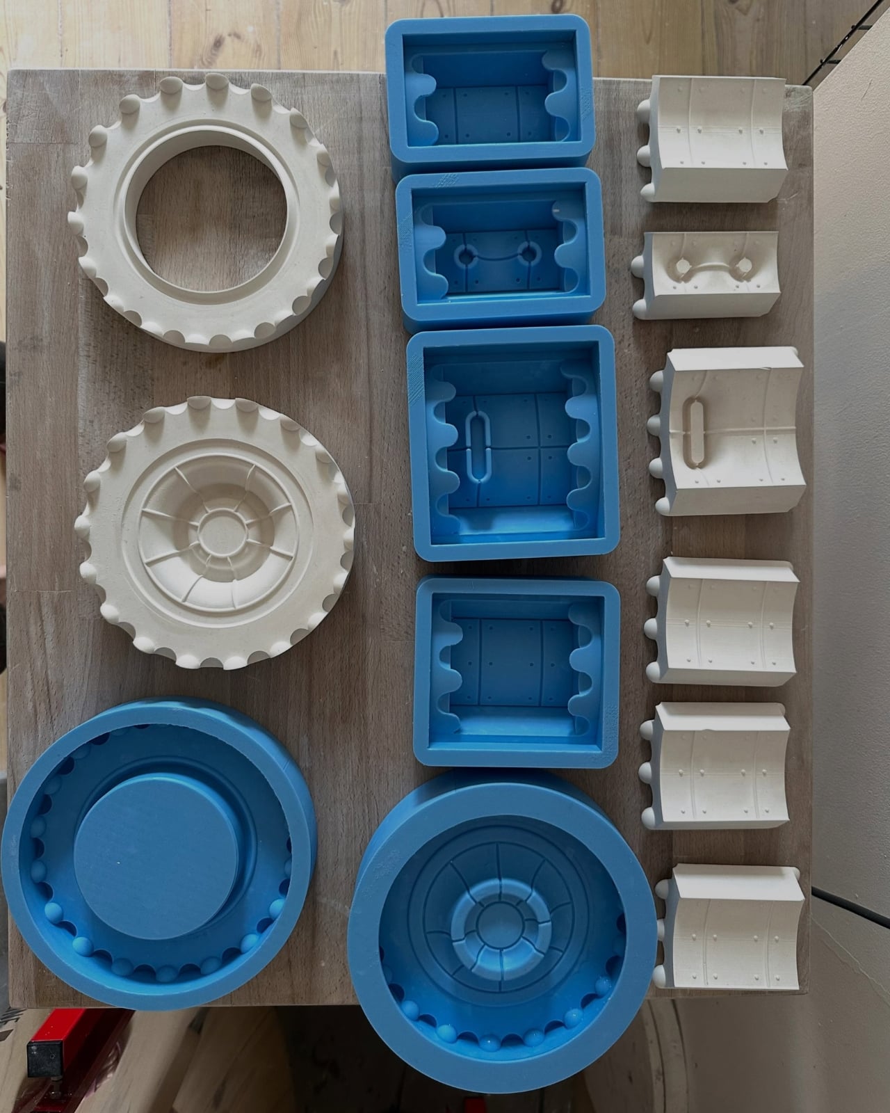
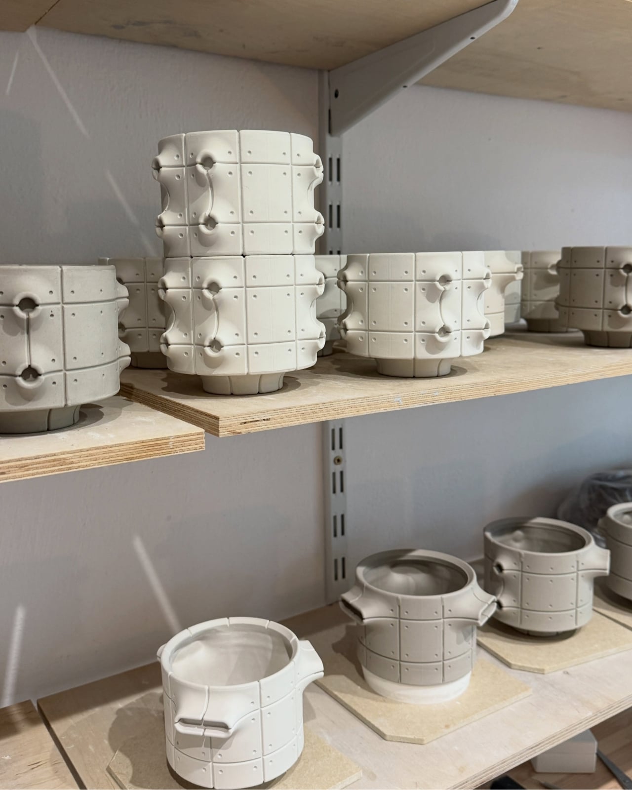
Kozera’s broader studio process helps explain that controlled repetition. He describes beginning with digital modeling, then 3D-printing master forms used to make plaster molds for slip-casting porcelain. That’s a useful distinction for anyone assuming these are printed plastic objects or directly printed ceramics. Digital tools establish the geometry, while casting translates it into ceramic. The workshop photographs make that relationship tangible, showing shaped components and molds alongside vessels at different stages of production.
The finish introduces another layer of detail. The collection description specifies a translucent green glaze, with the small exterior “windows” individually glazed by hand. The green is restrained enough that the photographed pieces still read predominantly as gray architectural objects. I prefer that decision to an all-over glossy finish. Small glazed areas give the eye somewhere to pause without obscuring the panel divisions or competing with the speckled body.
Flowers change the balance considerably. In the styled photograph, branching stems stretch above and across the vessels, disrupting all those disciplined horizontal and vertical lines. The arrangement is sparse enough that the ceramic remains visible, which seems the right approach. A dense supermarket bouquet might conceal much of the detail that makes these worth looking at. A few irregular branches would let the architecture and the plant material each have some breathing room.
My reservation is mostly about where they would live. These are visually busy objects, even with their limited palette. On a shelf already crowded with books, collectibles, and patterned ceramics, the small recesses and projecting edges could get lost. I’d give one a relatively clear stretch of console or place a group against a plain wall. That’s a styling preference, but the design rewards enough space to read its silhouette.
These are physical ceramic works rather than render-only proposals, and the collection is listed as selected for the make me! 2026 exhibition at Łódź Design Festival. That listing does not establish retail pricing or US availability, so it shouldn’t be mistaken for a confirmed shopping announcement.
For me, the strongest choice is the attention given to the sides of each vessel. Turn one, and the relationship between grid, recess, and projection changes. That gives the object a reason to stay on display after the stems are gone, without asking an empty vase to pretend it’s waiting for its next assignment.
The post Neo-Brutalist Vases Look Like Tiny Towers, Even Without Flowers first appeared on Yanko Design.


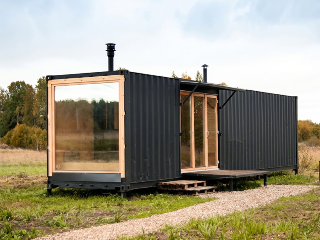
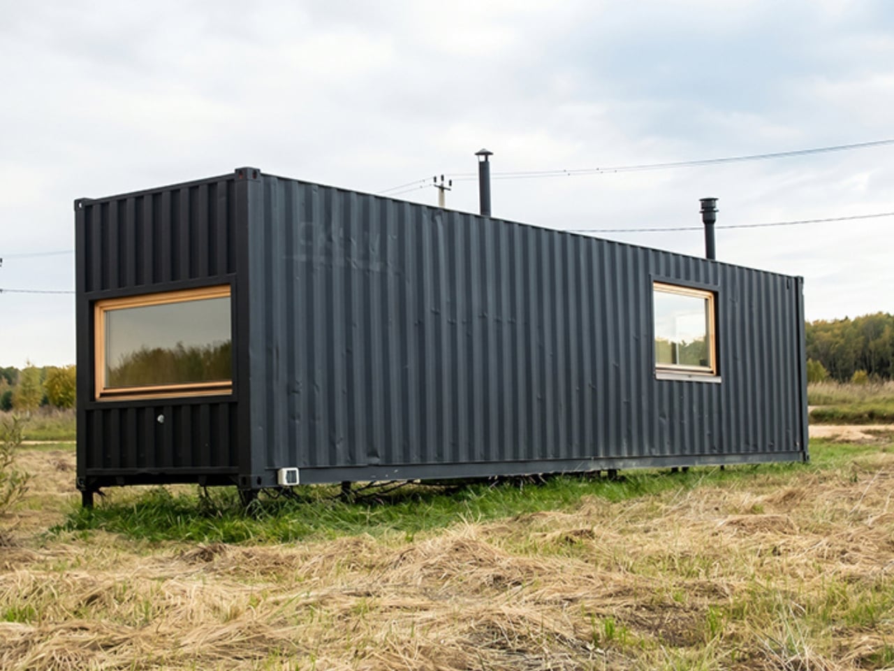
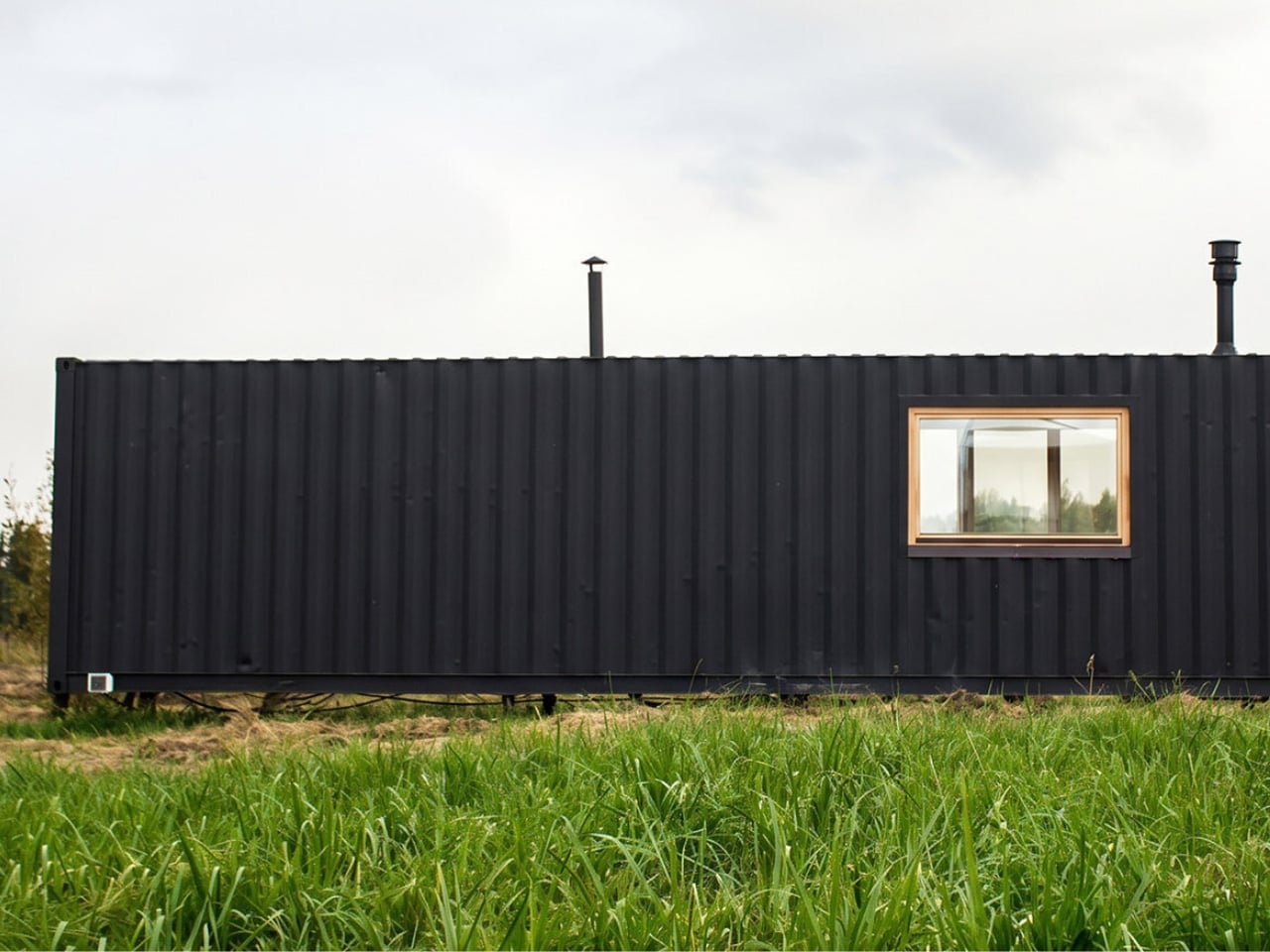
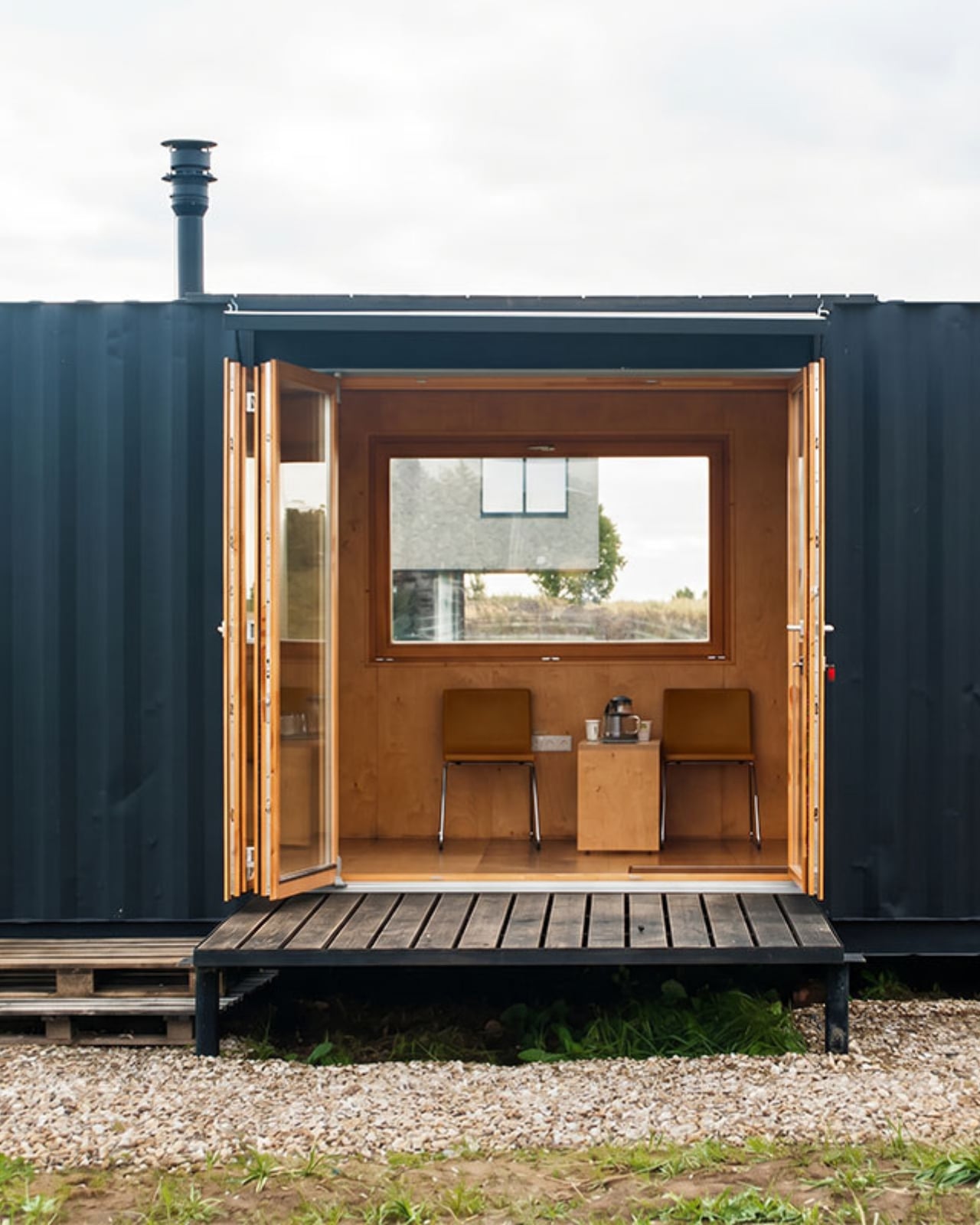
A home shouldn’t make you negotiate with the furniture just to walk across the room. That becomes a design problem when the entire floor plan measures roughly 258 square feet. The Flacon Cargo Module addresses the squeeze by integrating furniture and concealed storage into its interior surfaces. Architects Evgeny Makarenko and Andris Shneps-Shneppe have converted a shipping container into a micro-cabin organized around keeping the center clear.
Built for two, the cabin sits in Derevnya, a creative community in Znamenka in Russia’s Moscow region. Its domestic ambitions are refreshingly specific: make an old freight container feel like somewhere people would want to spend time. I like that as a brief. Before getting carried away with the appeal of living small, there’s the more immediate business of making a narrow industrial shell feel welcoming enough to consider staying.
Designers: Evgeny Makarenko and Andris Shneps-Shneppe
Birch plywood does much of that work. The interior uses selected BB-grade panels, with flush joints and concealed mounting hardware. A semi-matte lacquer finishes the surfaces. Those are restrained choices, but they give the interior a consistent treatment: fewer visible interruptions, less competing hardware, and a material whose grain supplies detail without requiring additional decoration. I prefer that approach to making every cabinet a separate design statement.
The plywood choice also feels appropriate to the container’s origins. Both belong to a vocabulary of practical, manufactured components, so the conversion doesn’t need to dress itself up as a traditional log cabin. Earlier coverage of the project highlighted how plywood creates broad wall surfaces with relatively few seams. To me, that’s the persuasive move here. The architects have given the space a domestic character without abandoning the straightforward material logic that makes the underlying structure interesting in the first place.
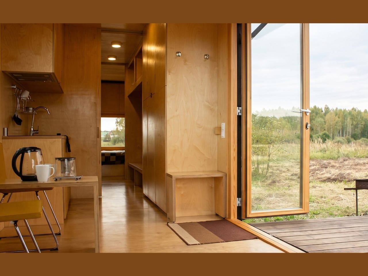
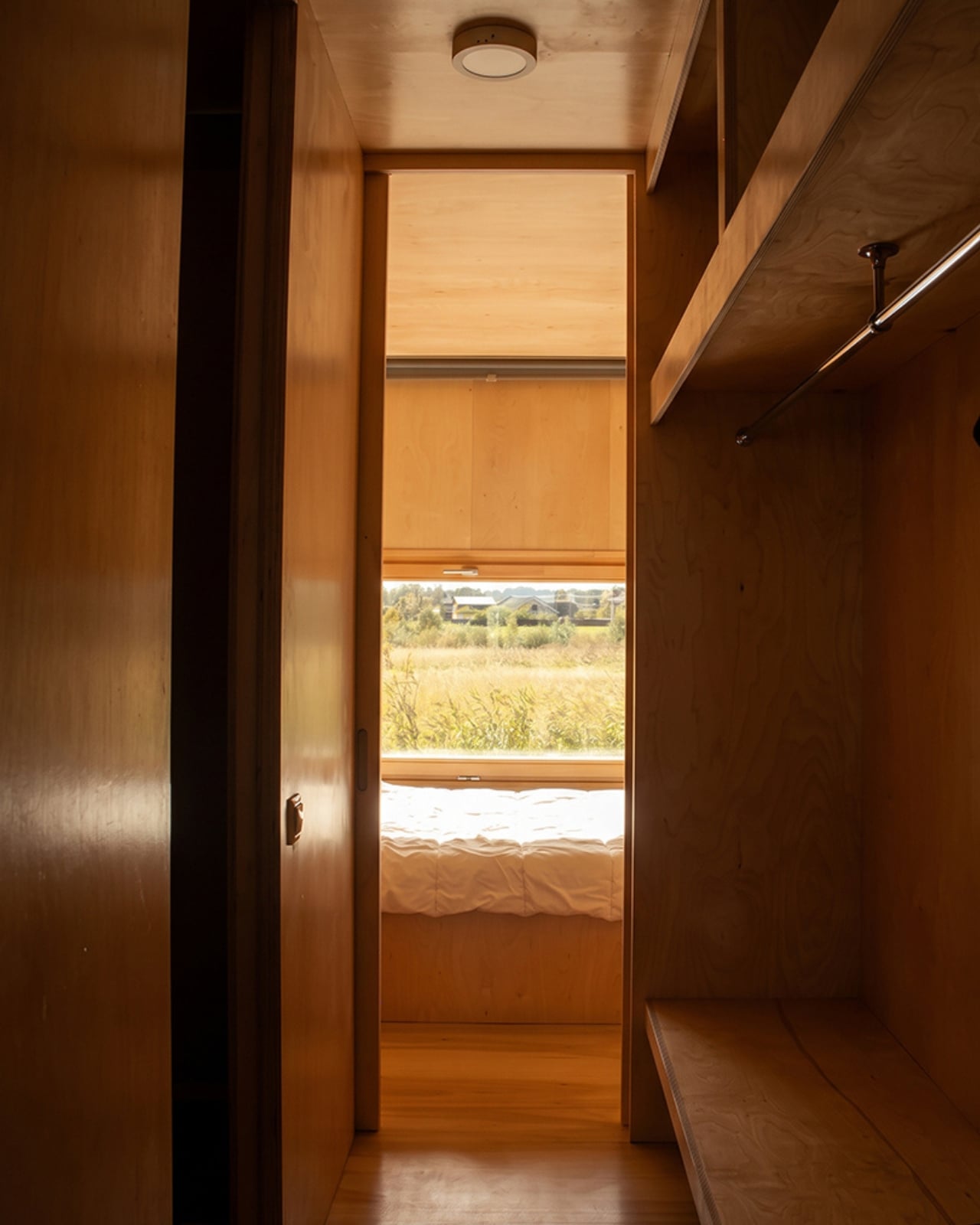
The layout accommodates a double bedroom toward the rear, a kitchen, a living area with a fireplace, and a shower room. The kitchen fits flush into the plywood perimeter. That last detail matters more to me than the checklist of rooms. A kitchen can technically fit inside a tiny home while still dominating everything around it. Folding it into the surrounding surfaces is a more considerate way to share limited space.
An expansive glazed end wall connects the living area to a wooden terrace. I wouldn’t confuse a view with extra square footage, but I appreciate what that opening contributes to the plan: an obvious place for the room to look beyond itself. The terrace also makes sense as somewhere to step away from the carefully fitted interior. Even an appealing small room benefits from an exit that leads somewhere you’d actually want to linger.
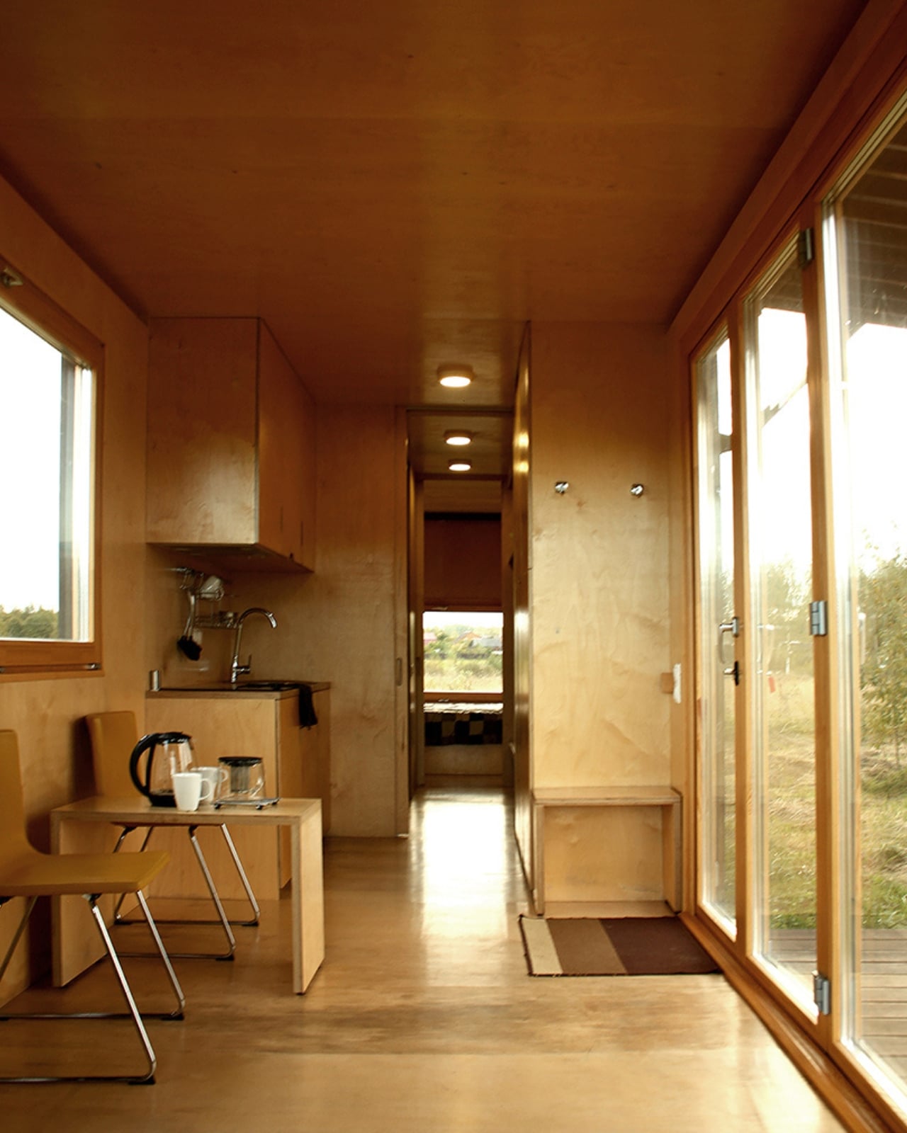

It’s worth placing the project in time, too. This is an existing cabin with a history, rather than a newly unveiled housing concept. It received the public-choice award in the interior category at ARHIWOOD in 2020. Reporting from that year’s ceremony also recorded Makarenko discussing its Airbnb listing at the time. That doesn’t establish today’s rental availability, but it does put the project on firmer ground than a set of speculative renderings.
My hesitation would be the permanence of all that integration. Built-ins offer an orderly arrangement, but I’d want to know how well it accommodates habits that weren’t anticipated in the drawings. Where does the half-unpacked weekend bag go? What happens when someone’s preferred chair doesn’t fit the plan? Those aren’t objections to the cabin. They’re the questions that make compact-home design interesting, because an uncluttered interior still has to leave room for people to be a little untidy.
I’d be drawn to Flacon as a retreat before I’d imagine it as my permanent address. Its appeal is the care given to ordinary activities inside a restrictive shape, especially the decision to protect circulation instead of filling every gap. The useful lesson reaches beyond container architecture: storage deserves to be designed alongside the room, early enough that it doesn’t become another obstacle added later. I’d happily borrow that thinking for a much larger home.
The post A 258-Square-Foot Container Cabin Without the Visual Clutter first appeared on Yanko Design.
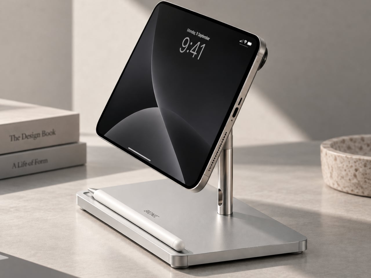
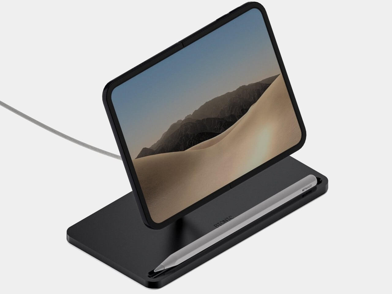
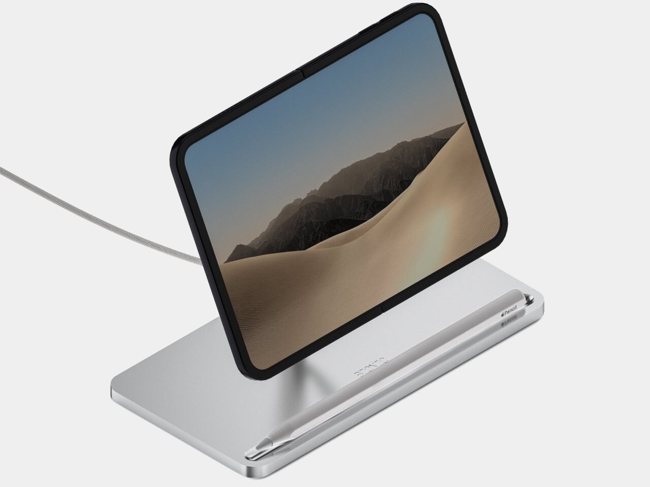
Opening a folding phone gives you more screen, but it doesn’t tell you where to put it when your hands are busy. BIONIC’s iPhone Duo Charger offers a dedicated desktop perch, combining an adjustable support with a mount for Apple’s MagSafe charging puck. Currently available for preorder, the stand keeps the unfolded display above the desk rather than lying flat beside your keyboard.
The arrangement has something of a miniature desktop monitor about it, with a broad rectangular base and a narrow upright behind the phone. Anodized aluminum forms the broad base, while polished stainless steel adds a brighter curve to the supporting arm. Available in Silver or Black, the stand follows Apple’s familiar accessory palette without adding a border around the phone’s existing bezel.
Designer: BIONIC
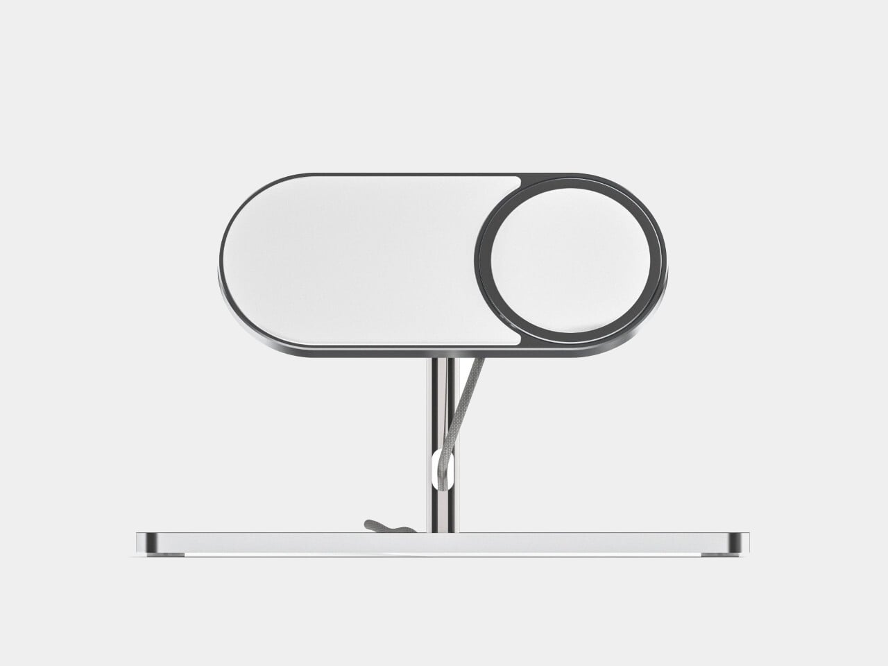

The articulated arm lets you change the viewing angle, so a screen tilted toward you for reading doesn’t have to stay there during a video call. You could keep a reference document beside your laptop without repeatedly picking up the phone. It’s a more deliberate setup than leaning an expensive foldable against whatever happens to be sitting behind the keyboard that morning.
A long slot along the front of the base gives an Apple Pencil somewhere to rest between tasks. It’s a small organizational detail, but one that keeps the stylus from becoming another loose object competing with cables and stationery. BIONIC describes this as storage, not a Pencil charging connection, so parking it there doesn’t take care of the stylus’s battery as well.
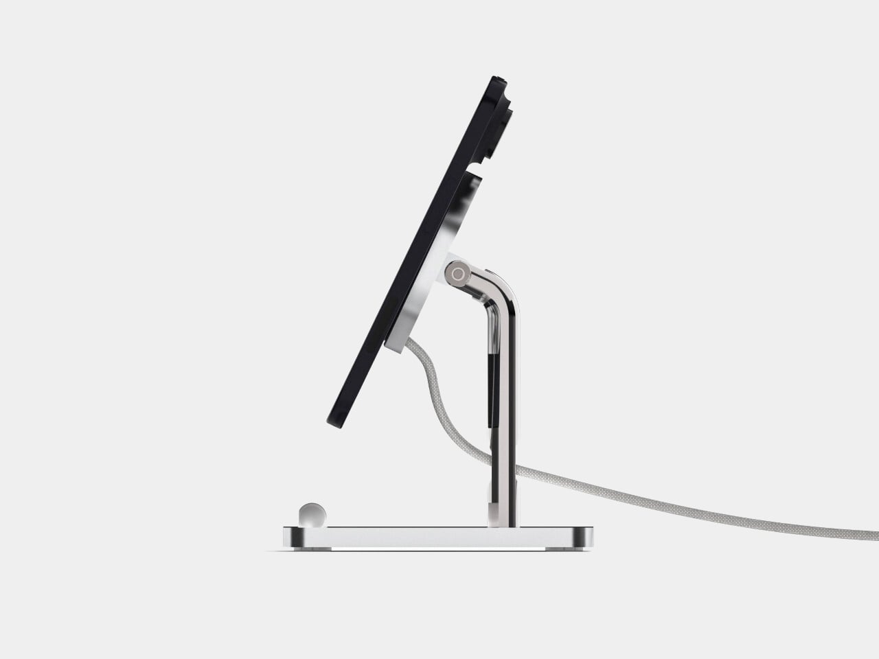
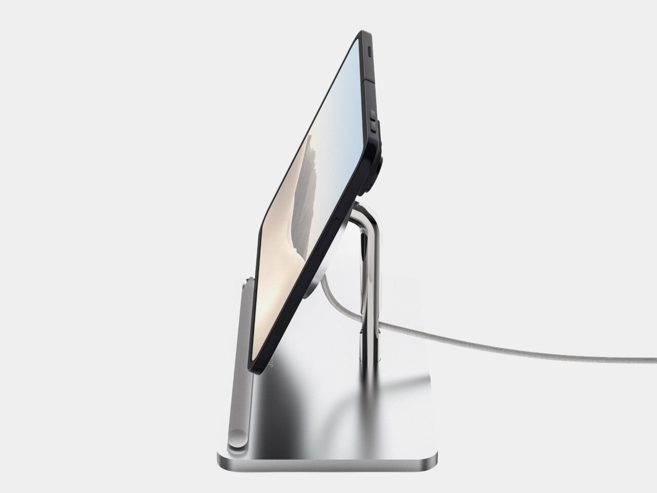
The charger in the name needs a little unpacking, too. At the listed base price, Apple’s MagSafe puck isn’t included; the stand is designed to hold one. You’ll need that charging hardware and a suitable power source before the phone can replenish its battery. The metalwork organizes the setup, but it doesn’t replace the electronics doing the actual charging behind the screen.
BIONIC lists the stand at 18.05 ounces, with a footprint approximately 7.32 inches wide and 3.74 inches deep. That footprint matters when the phone is joining a desk already crowded with other devices. A weighted base, rubber contact surfaces, and non-slip feet are intended to keep the assembly steady and protect the phone, although resistance to tapping hasn’t been independently established through testing.
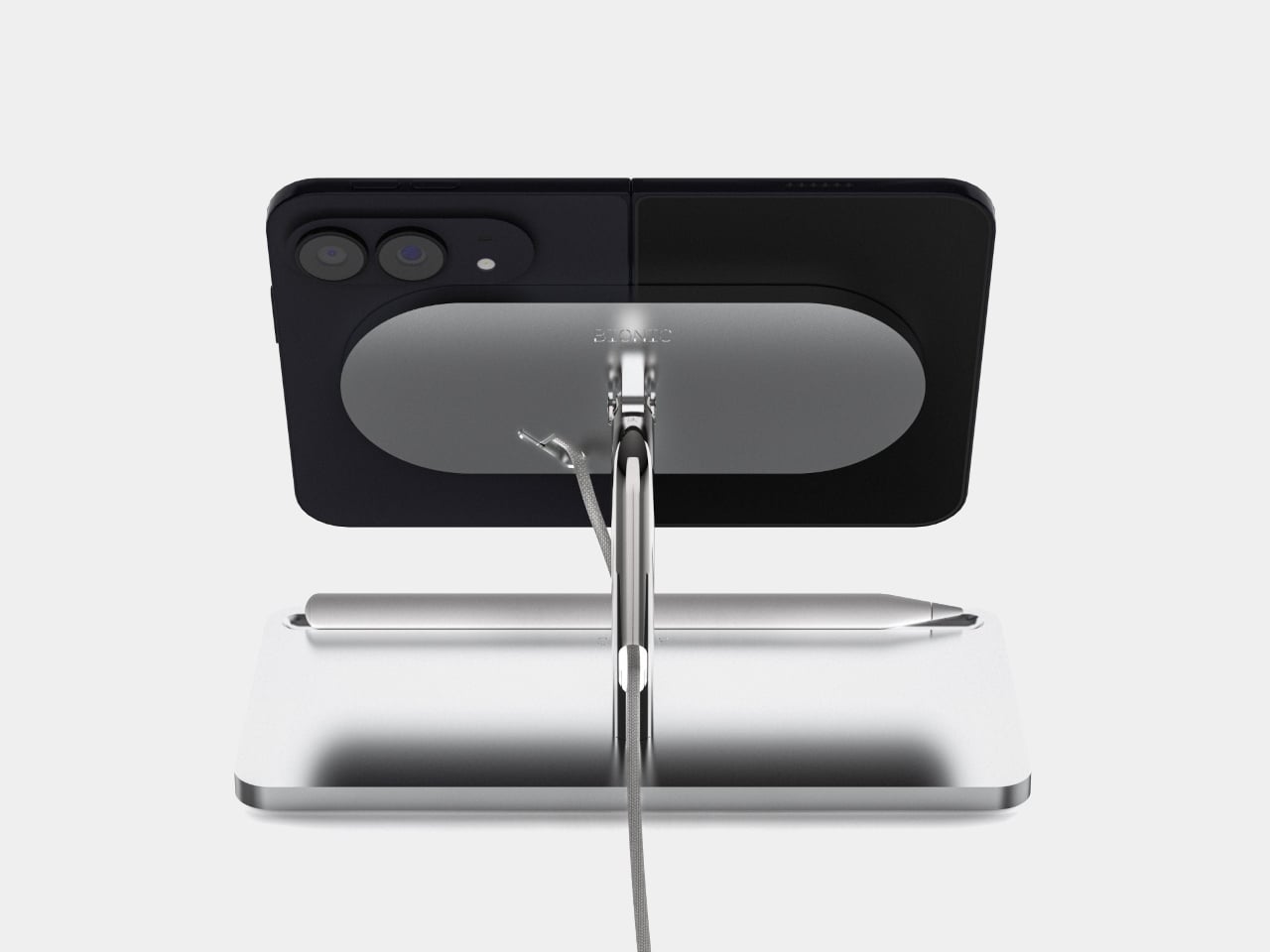
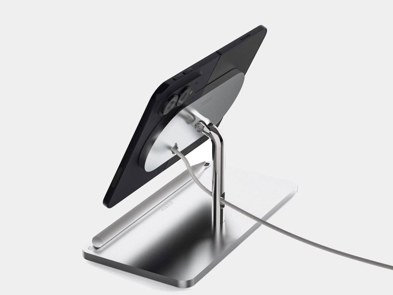
Wireless charging doesn’t make the cable disappear, either. It still runs from the MagSafe mount toward a power source, with a visible loop behind the supporting arm. The open construction makes that compromise fairly honest. Rather than enclosing everything in a bulky dock, BIONIC keeps the support slender and lets the charging cable remain part of the setup sitting on your desk.
The preorder price is €219 (about $245), compared with a listed regular price of €239 (about $268), before any separate charging hardware. That’s a considerable amount for organizing a phone and stylus. It makes more sense as a permanent home for a Duo you regularly use at your desk than as a travel accessory, especially when the phone already folds neatly into your pocket.
The post BIONIC’s iPhone Duo Stand Makes the Foldable Look Like a Miniature Monitor first appeared on Yanko Design.