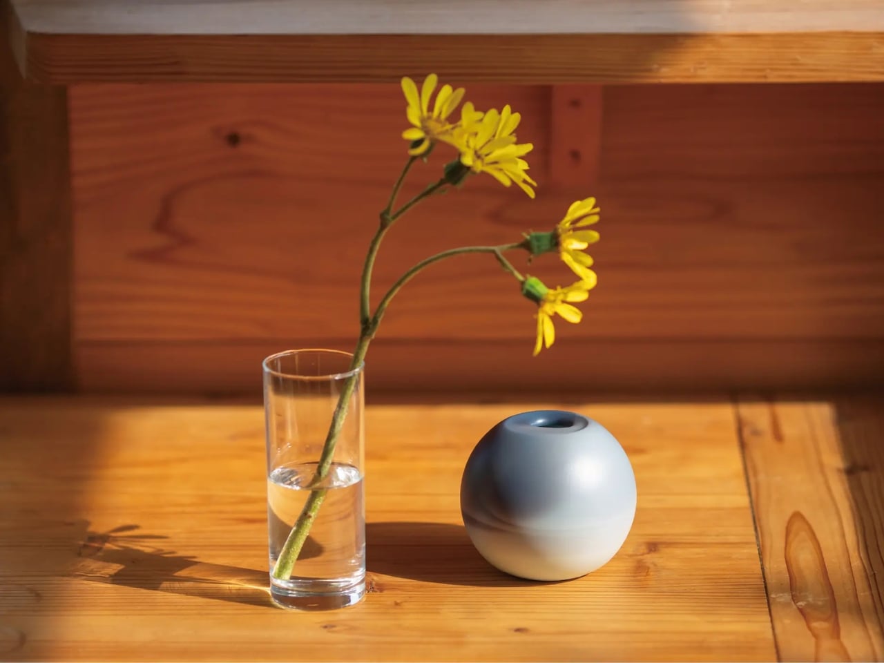
This Vase Was Made From Aluminum Tubes That Would’ve Been Thrown Away

Vases occupy an awkward corner of product design. Most exist somewhere between functional and decorative without committing to either, and the result is a category that rarely surprises. Ceramic ones carry craft tradition, glass ones depend on color and transparency, and the novelty options try to be sculptural without much conviction behind them. It’s a crowded space that doesn’t often ask interesting questions.

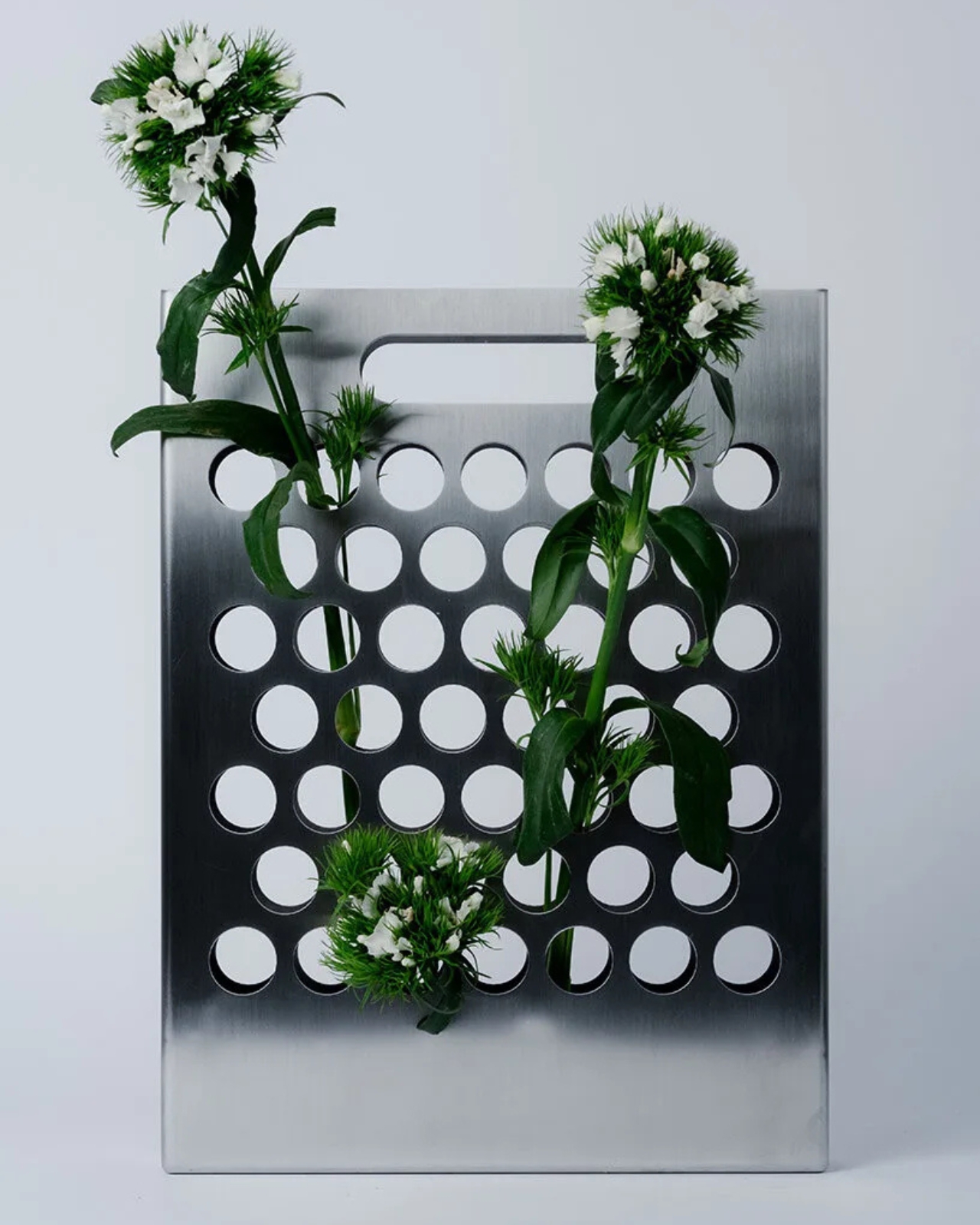
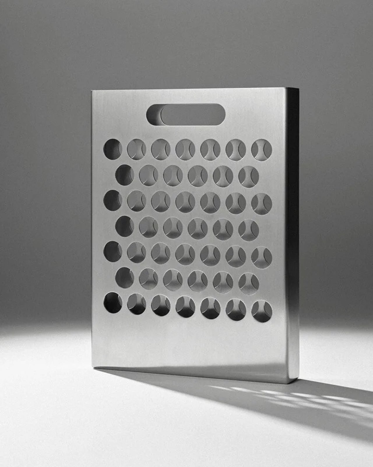
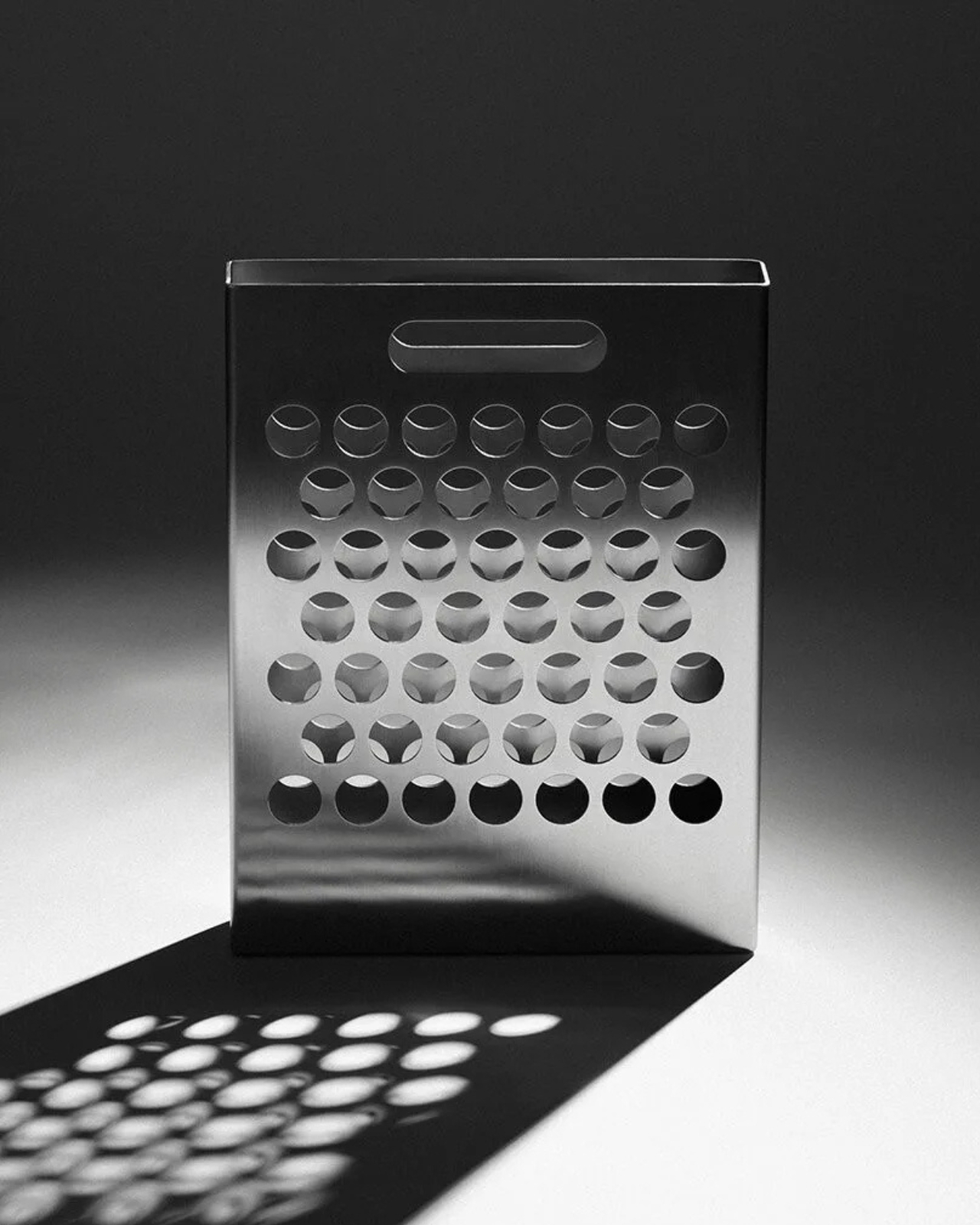
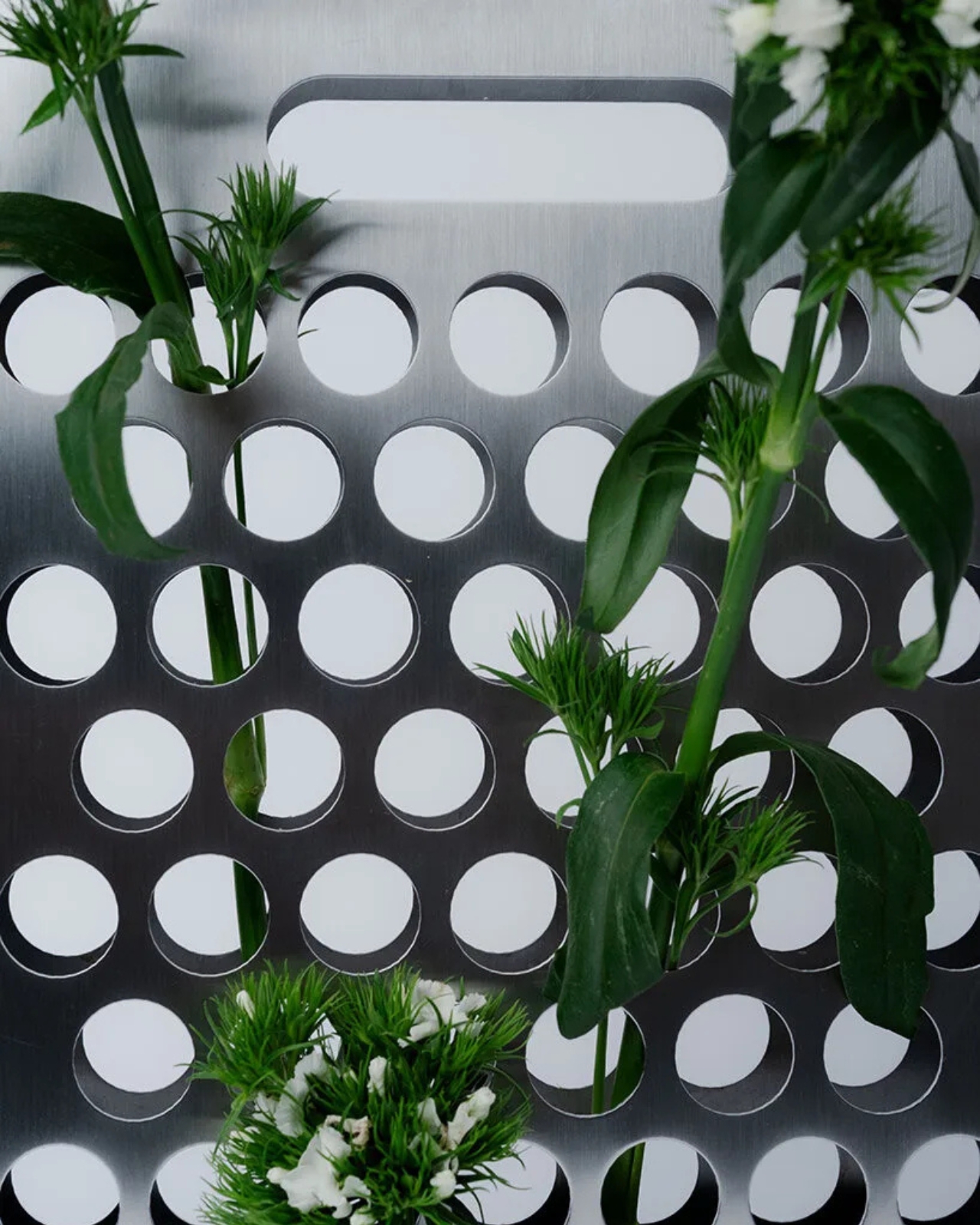
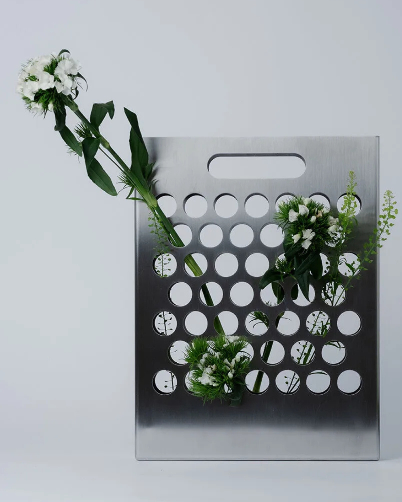
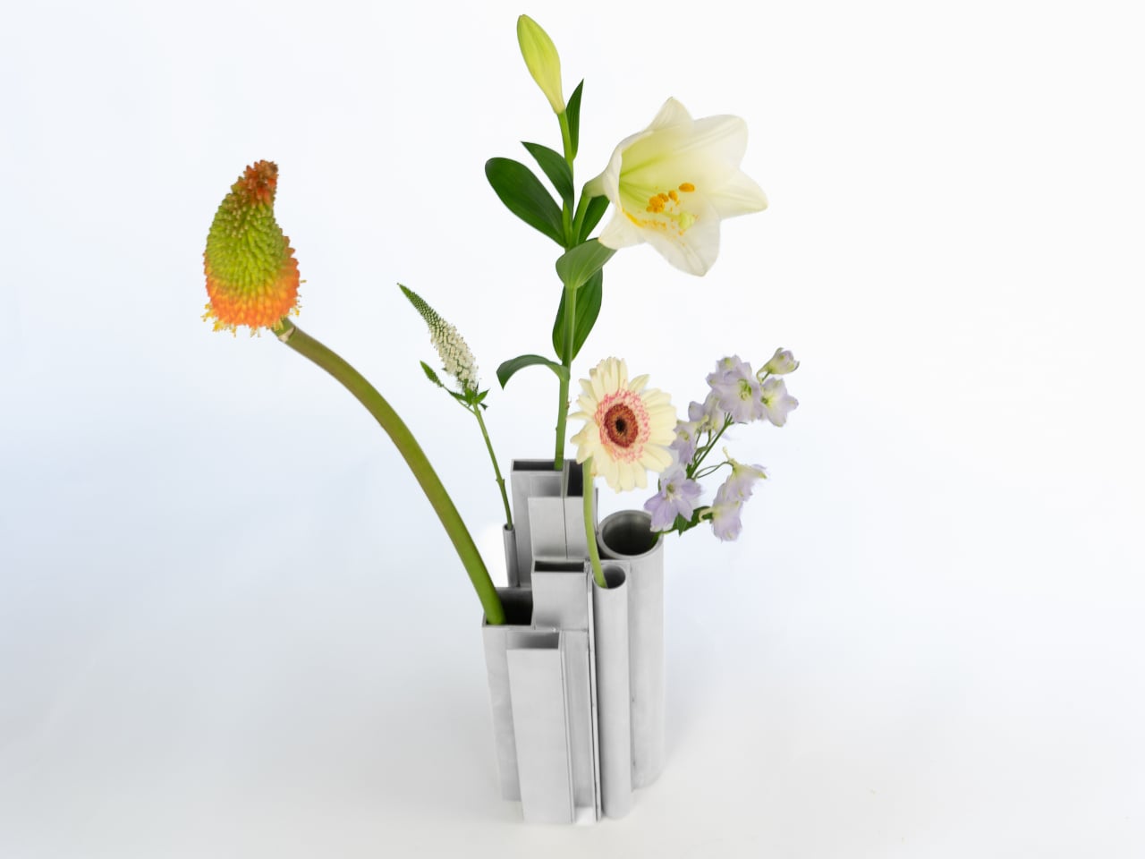
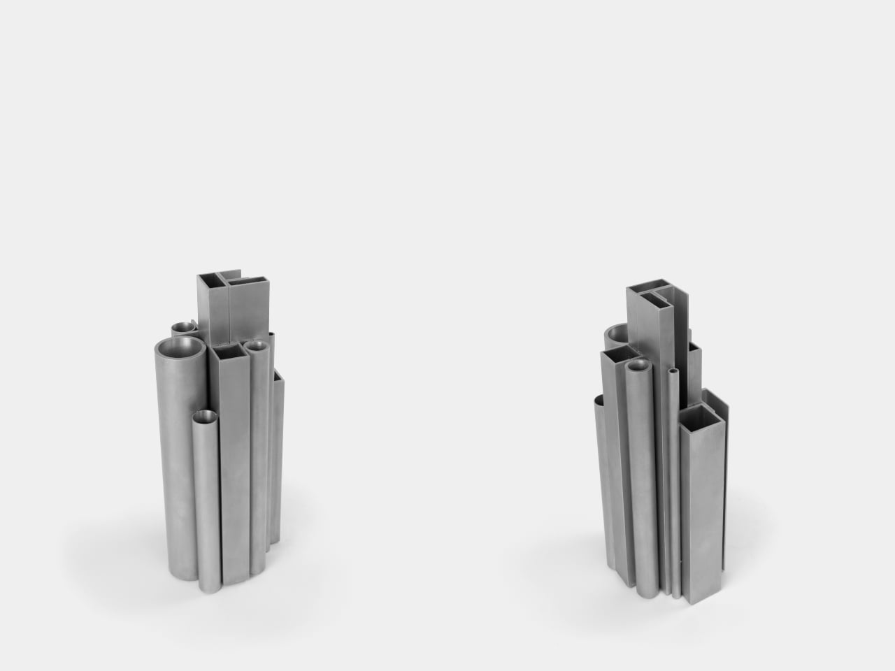
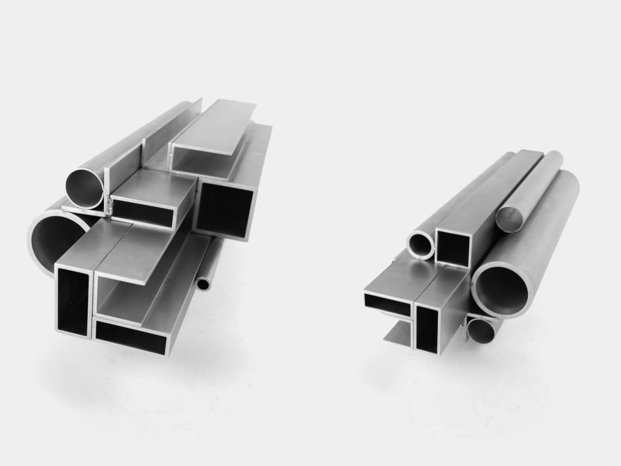
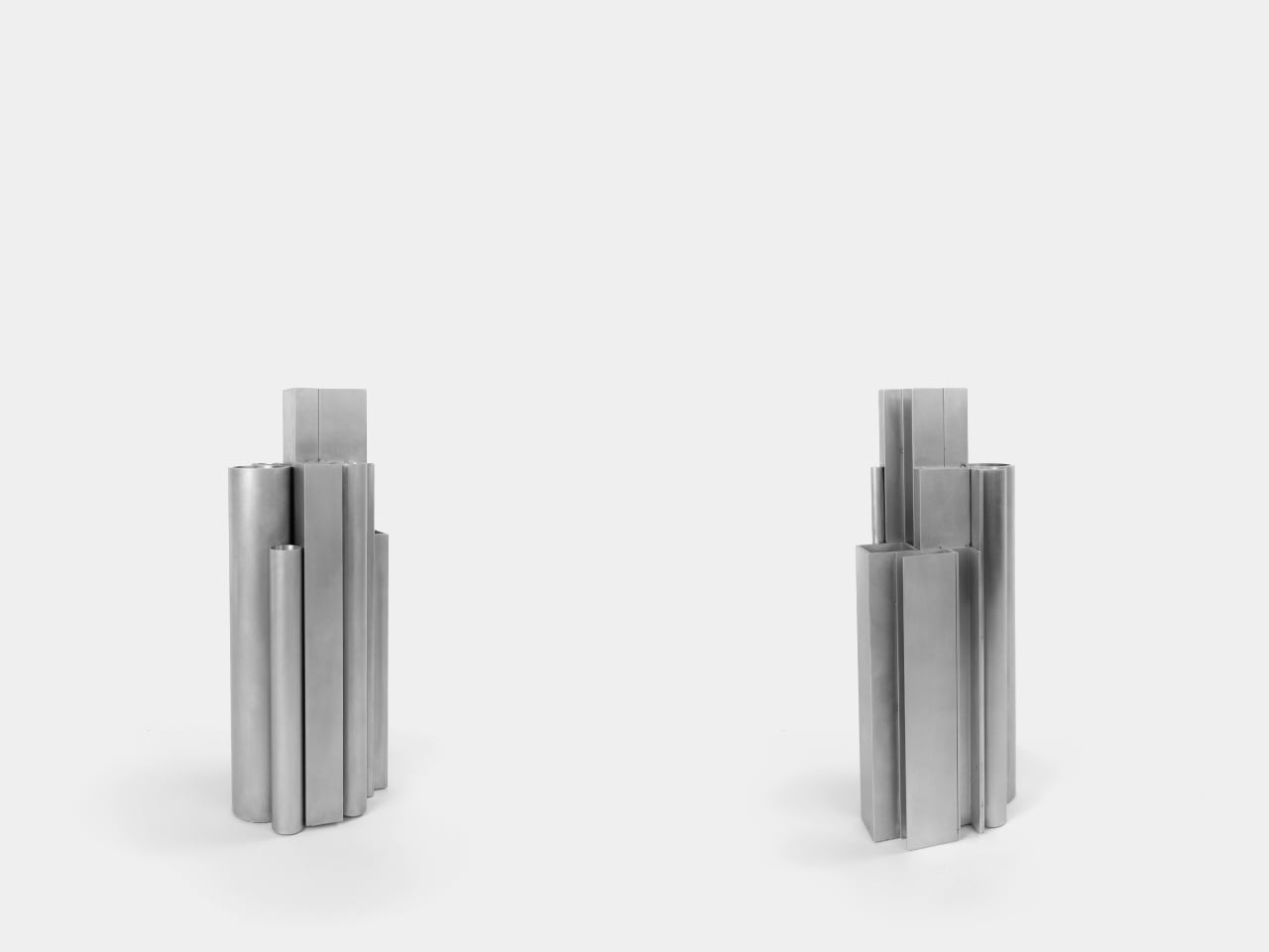
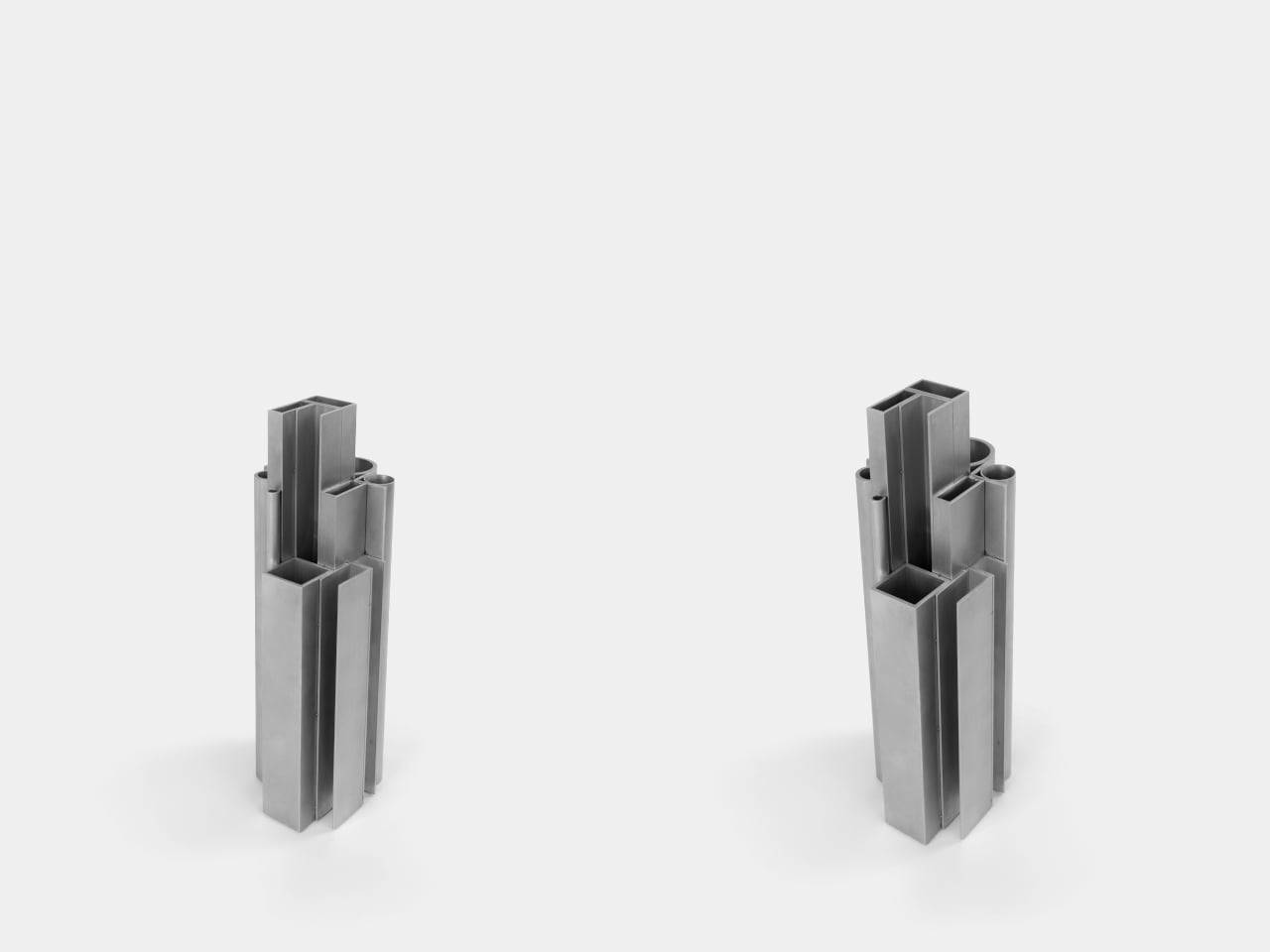
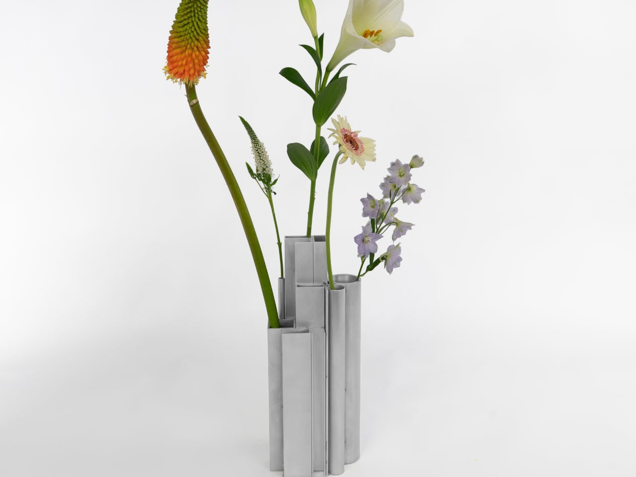
The Offcut Aluminum Vase starts from a different premise. Its form didn’t come from sketching vessel shapes or looking for the next minimalist curve. It came from staring at the end of a rack of industrial aluminum profiles, tubes, and sections waiting to be put to use. That cross-sectional view of bundled profiles, the overhead pattern nobody usually notices, is where the whole design began.

Designer: Raphael Klug

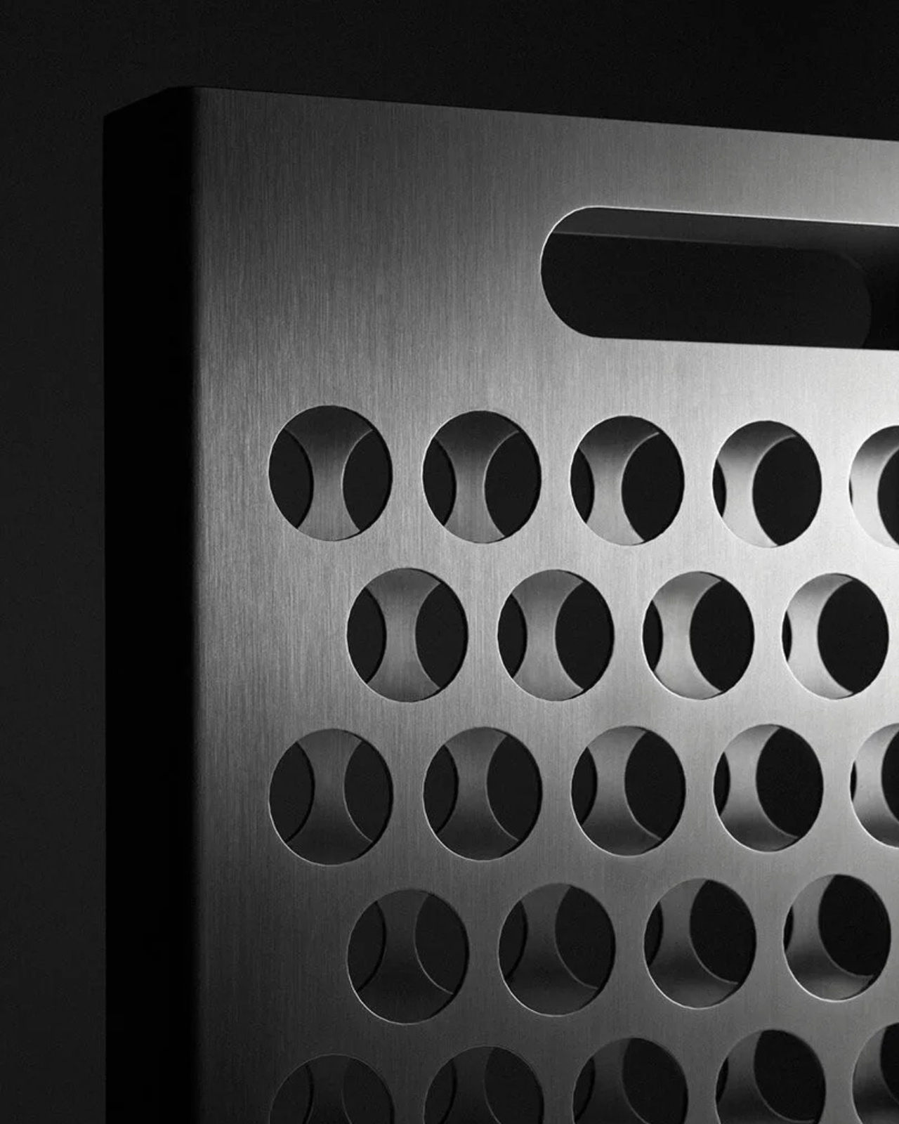
The construction is direct: actual aluminum offcuts bundled together, each piece a different cross-section. Circular tubes of varying diameters sit alongside square and rectangular hollow channels, all cut to different lengths that create a staggered, stepped silhouette when assembled. The look is instantly readable to anyone who has spent time near a metalworking shop or materials supplier, and distinctly strange to everyone else.

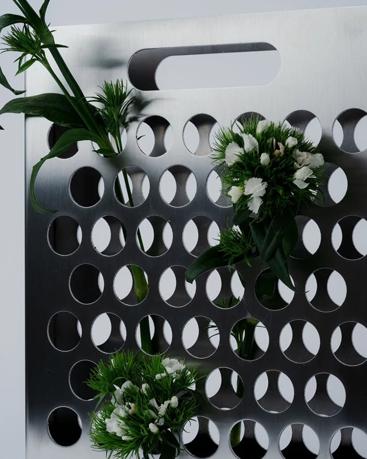
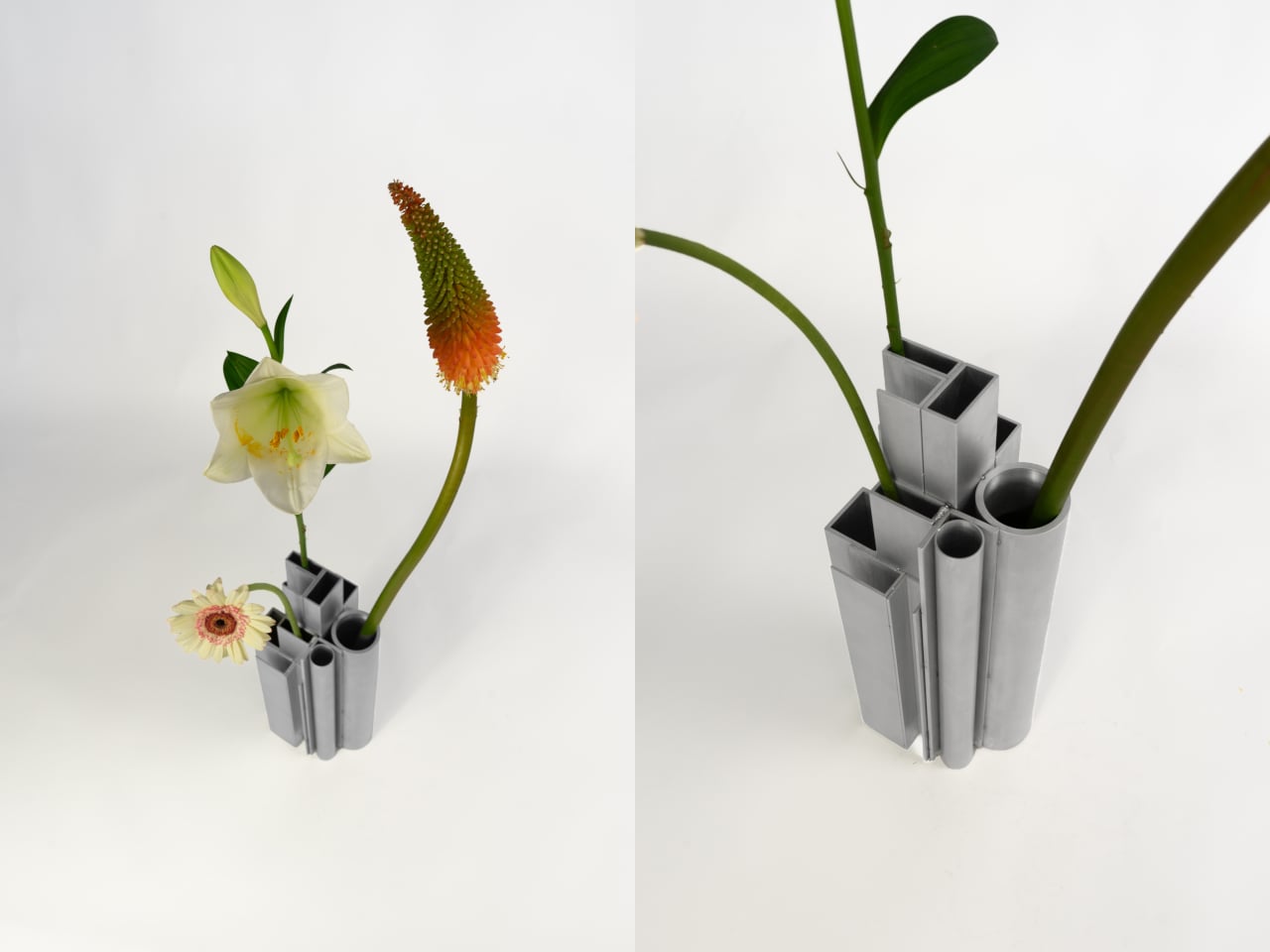
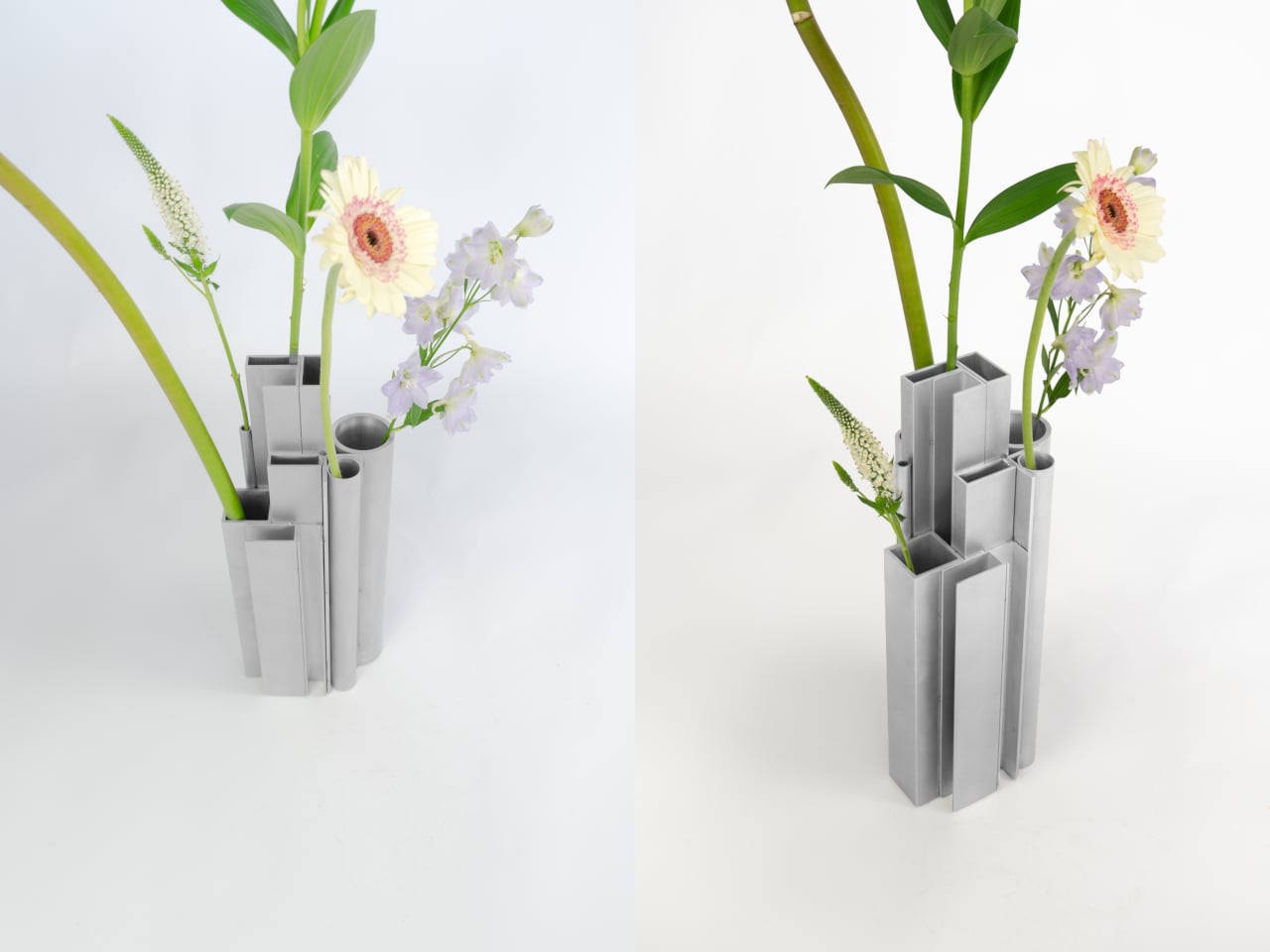
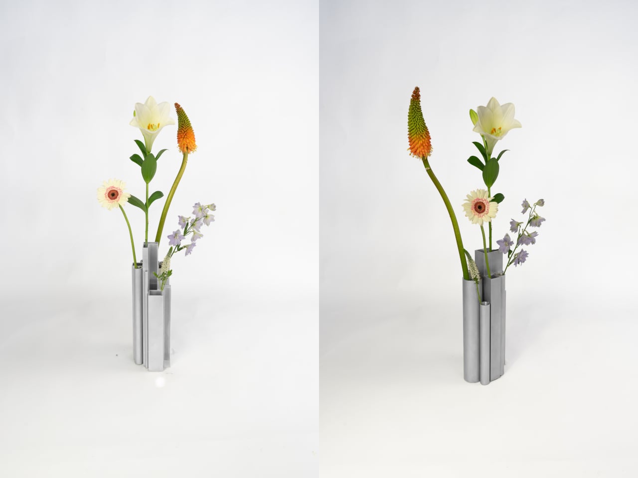
What’s surprising is how naturally it functions as a vase. Each opening, whether a round tube or a square channel, holds a single stem at a height set by that profile’s cut length. A tall flower finds one tube, a shorter bloom another, a delicate, small-stemmed flower a third. The structure of the object quietly distributes stems at different levels without any deliberate arrangement on your part.

The visual tension between the material and its setting is part of the appeal. Aluminum profiles don’t belong on a shelf with fresh flowers, and that friction is doing real work. The matte silver surface reads as cold and precise until something organic is placed inside it, and the contrast becomes the whole point. The industrial origin doesn’t disappear; it becomes what makes the flowers harder to ignore.

The choice to use actual offcuts rather than new aluminum cut to look like offcuts also matters. Most of this material would otherwise end up as leftover stock or be discarded at the end of a production run. Using it this way doesn’t require additional processing; the profiles arrive already shaped, already finished, and carrying the full character of their industrial origin without modification.

The vase holds its own even without flowers in it. The stepped arrangement of sections at different heights reads as a small sculptural object that could sit on a shelf as comfortably empty as it does full. The form doesn’t need flowers to complete it, which means that when you do add them, the combination feels considered rather than accidental.

It’s a rare thing when a design object’s material, form, and function all trace back to exactly the same source. Here they do. The offcuts are the structure, the structure is the form, and nothing about their industrial origin has been hidden or softened along the way. The workshop and the shelf turn out to have considerably more in common than most vases would ever admit.

The post This Vase Was Made From Aluminum Tubes That Would’ve Been Thrown Away first appeared on Yanko Design.

Fiore Is a Wall Light, a Vase, and a Fragrance All at Once

Most lighting does one thing: it illuminates. If it’s beautiful, that’s a bonus. If it fits the space, you’re winning. But every once in a while, a design comes along and quietly expands the definition of what an object is supposed to be, and Fiore by Jimmy Rojas is doing exactly that.

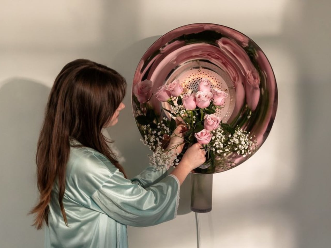
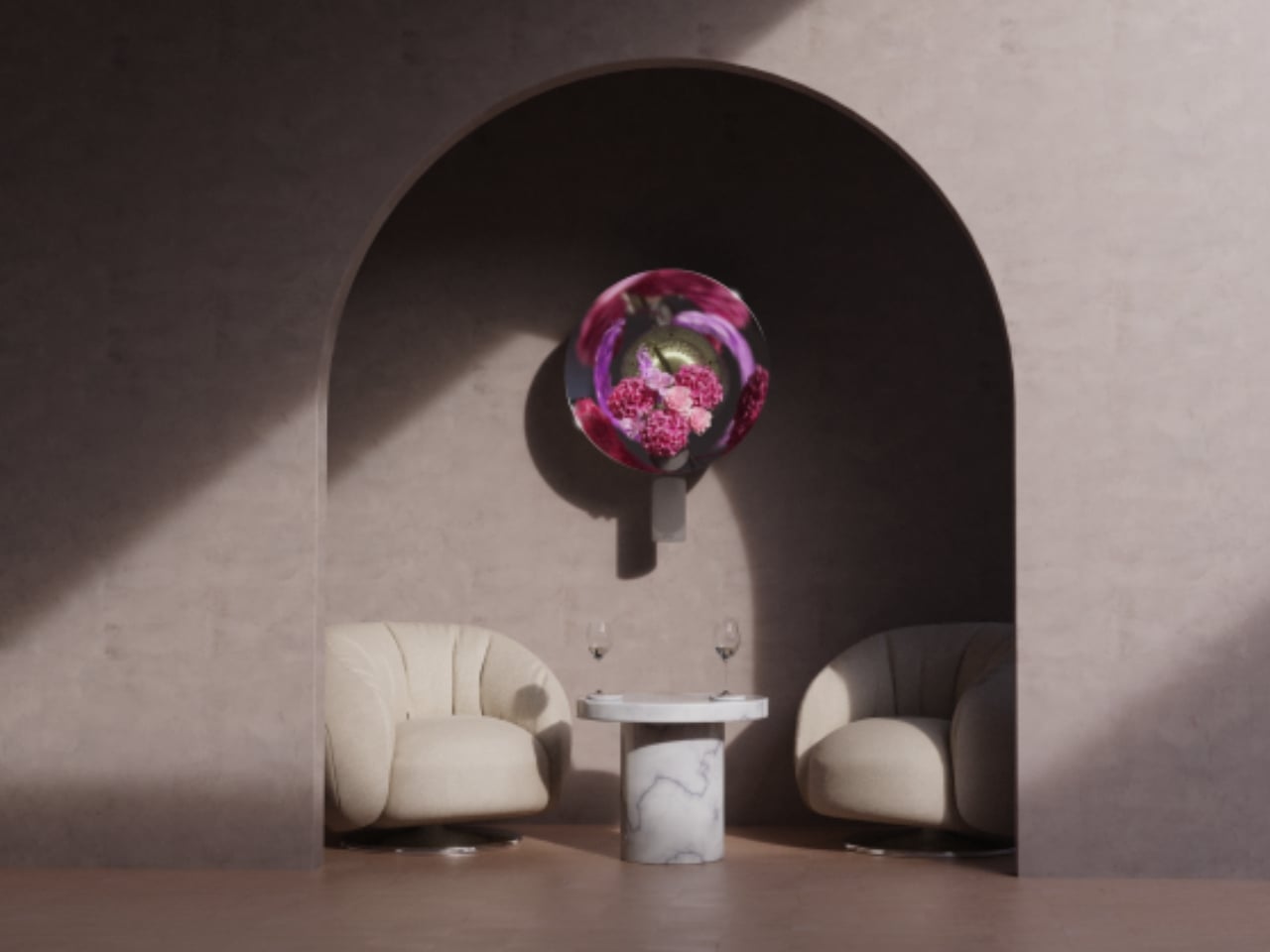
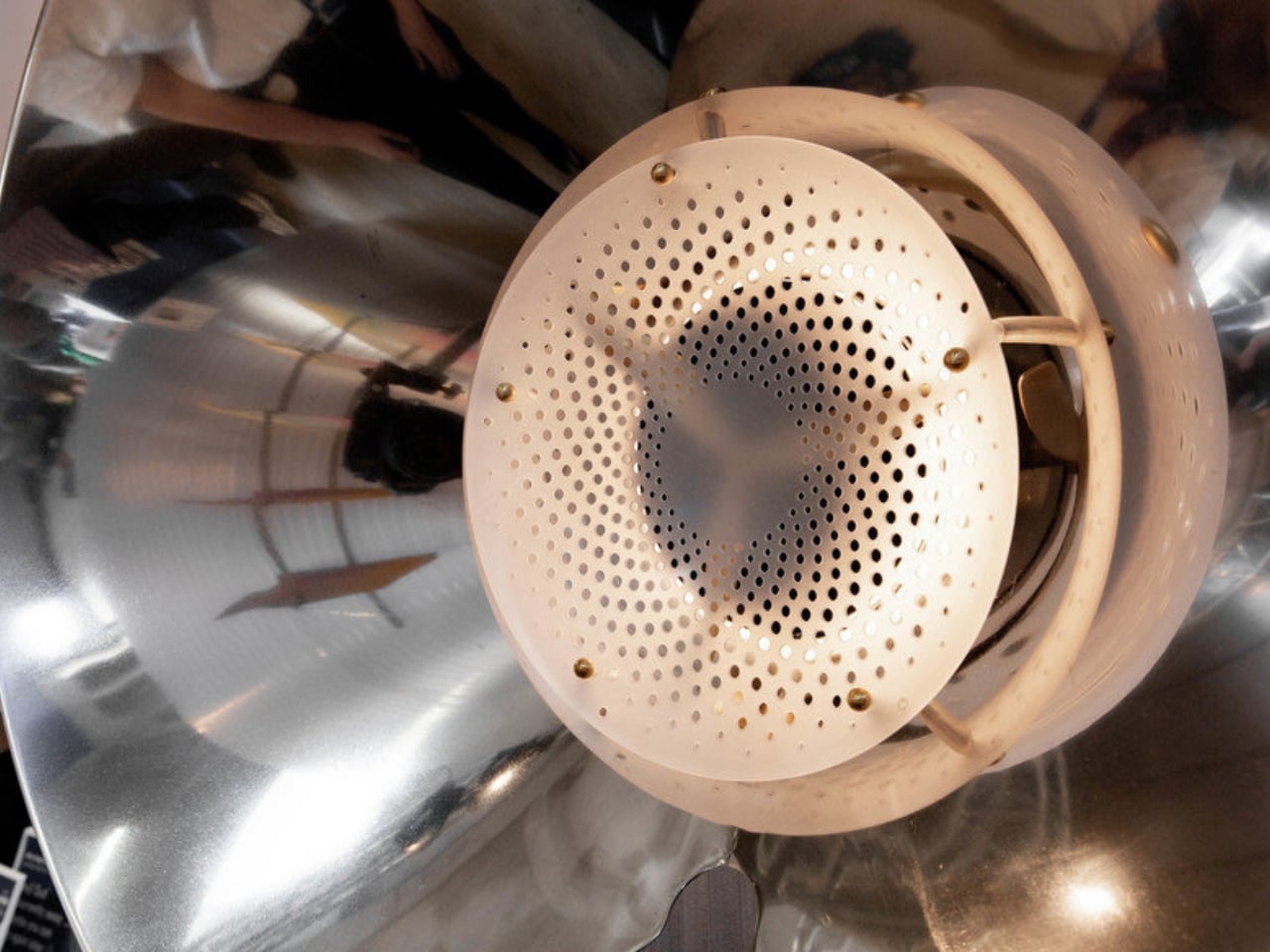
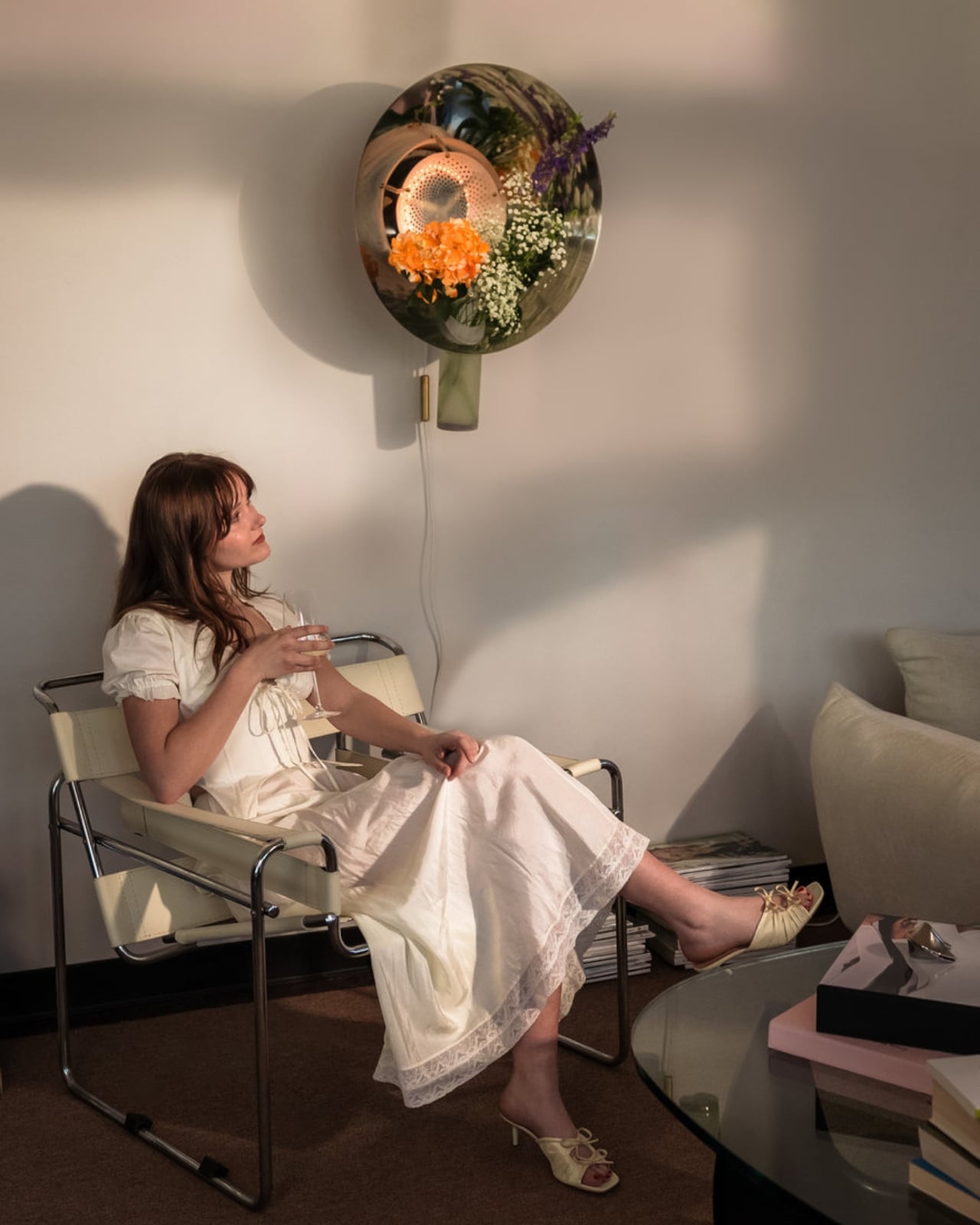
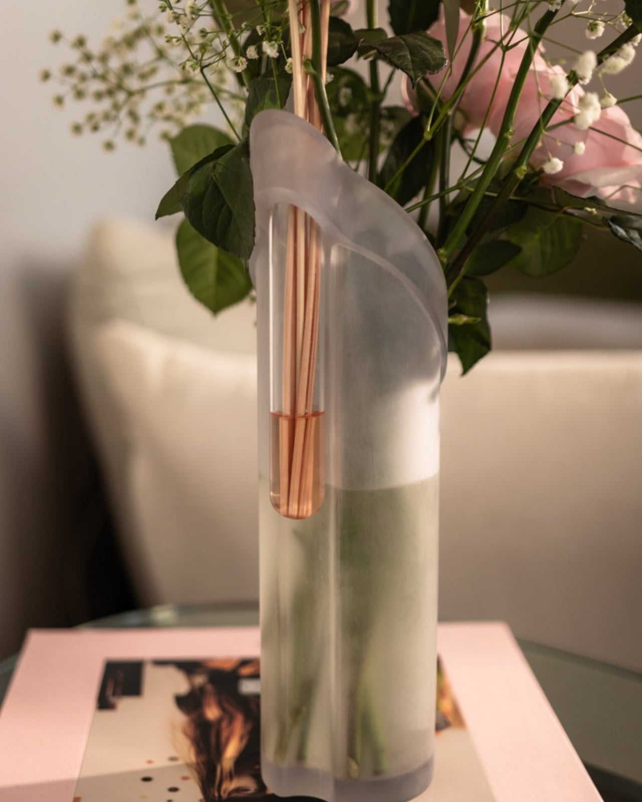
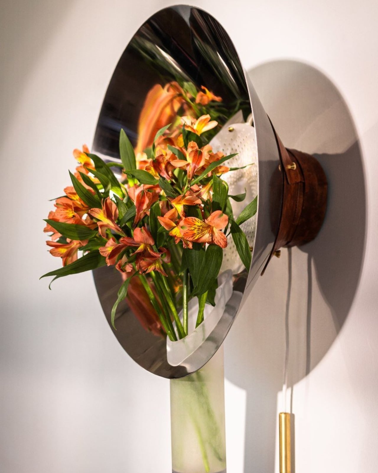
Fiore is a wall-mounted sconce, but to call it only that would be selling it short. At its core, it’s a multisensory piece that combines light, living flowers, and fragrance into a single wall-mounted object. The concept is elegantly simple: a built-in vase holds real blooms, and a signature scent designed to complement their natural aroma diffuses into the room. You’re not just looking at a beautiful light fixture; you’re experiencing it. You smell it. You watch the flowers change as the week goes on.

Designer: Jimmy Rojas

The design came out of Jimmy Rojas’ time at the Savannah College of Art and Design, and it’s been collecting recognition ever since. Fiore earned a Silver at the International Design Awards in the Conceptual Products category, was a People’s Choice honoree at the 2025 NYCxDESIGN Awards, and made its way to Salone Satellite in Milan, one of the most competitive stages for emerging designers in the world. These aren’t small accolades. They signal that the design community is paying attention, and for good reason.

What makes Fiore feel particularly relevant right now is the way it taps into something a lot of us are quietly craving: interiors that actually engage more than just our eyes. Biophilic design, the idea of bringing natural elements into our living spaces, has been a conversation in design circles for years. But Fiore takes that concept and makes it literal in the most delicate way possible. A real flower in your wall, radiating fragrance into the room. No screen, no app, no complicated setup. Just nature, light, and scent.

I’ll be honest, I have a slight bias here. I’ve always believed that the best design doesn’t announce itself loudly. It earns its place in a room by making life feel slightly better, slightly richer, in ways you notice over time rather than all at once. Fiore operates on that frequency. It’s the kind of object you come home to and slowly appreciate more as the days pass.

It’s also worth looking at how Fiore fits into the current interior design moment. Maximalism is back with force, from statement furniture to bold wallpapers to gallery walls stacked floor to ceiling. Within that landscape, Fiore manages to feel both bold and restrained. It’s wall-mounted, so it doesn’t compete for floor or shelf space. But it holds living flowers and diffuses scent, so it commands presence in a way that a standard sconce never could. Balancing those two qualities is genuinely difficult to pull off.

Rojas clearly understands that fragrance is one of the most underused tools in interior design. Candles and reed diffusers have long dominated the home fragrance space, and while they work well, they’re objects that sit on a surface and do their thing passively. Fiore integrates scent into the architecture of the room itself, into the wall, which feels like a genuinely new idea. The fact that the fragrance is designed to pair specifically with the real flowers in the vase adds another layer of intentionality that sets this apart from a concept piece that’s merely clever.

If Fiore moves into full production, there are real-world questions worth asking: how often do the flowers need replacing, what happens in winter when fresh blooms are harder to source, and whether the fragrance component can be made refillable and sustainable. Those aren’t dealbreakers, just the details that turn a great concept into a great product. But as a concept, Fiore is one of the more complete design ideas in recent memory. It knows what it wants to be, and it commits fully. Lighting has always been foundational to how a space feels. Fiore is simply asking whether it couldn’t also shape how a space smells, and how alive it feels. The answer, apparently, is yes.

The post Fiore Is a Wall Light, a Vase, and a Fragrance All at Once first appeared on Yanko Design.

6 Murano Glass Lamps That Glow Without a Single Cord

If you’ve ever wished your lamp could double as a sculpture, or that a piece of Venetian craft could actually travel with you from room to room rather than stay anchored to the nearest outlet, Flowers in Wonderland might just ruin every other lamp you’ve ever owned. Not dramatically. Just quietly, the way really good things do.

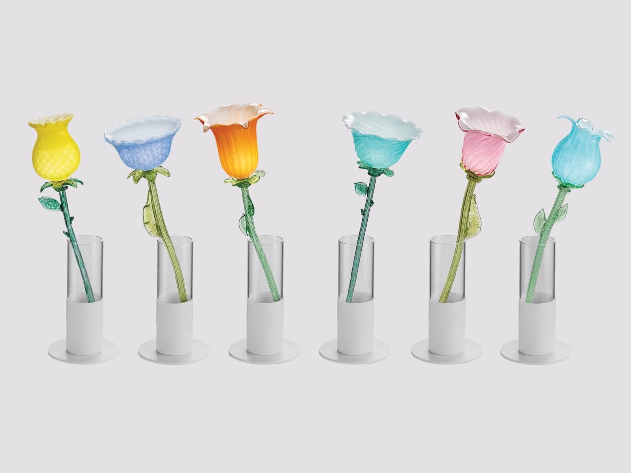
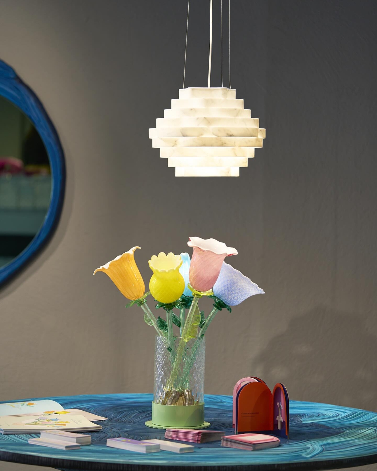
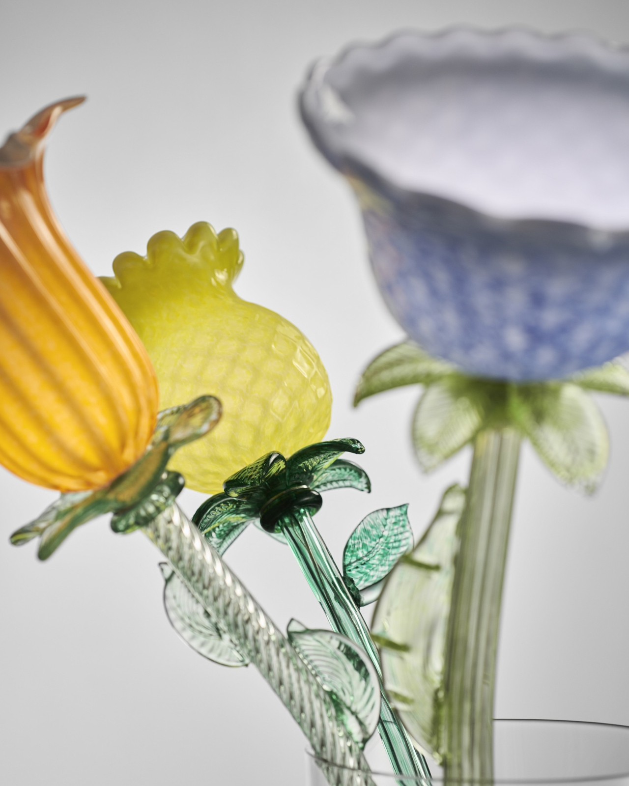
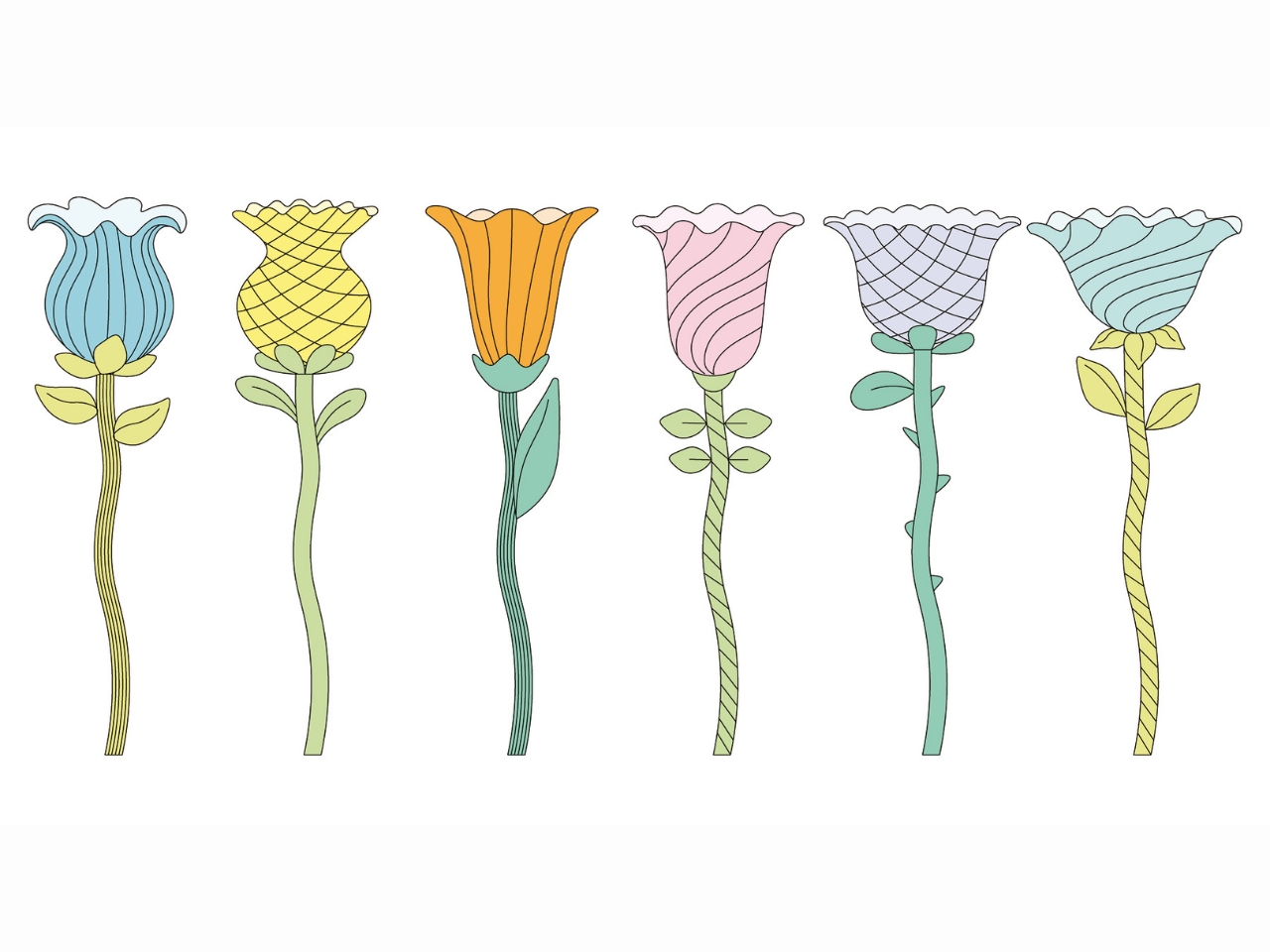
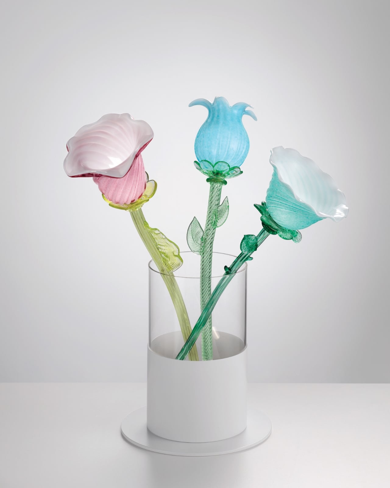
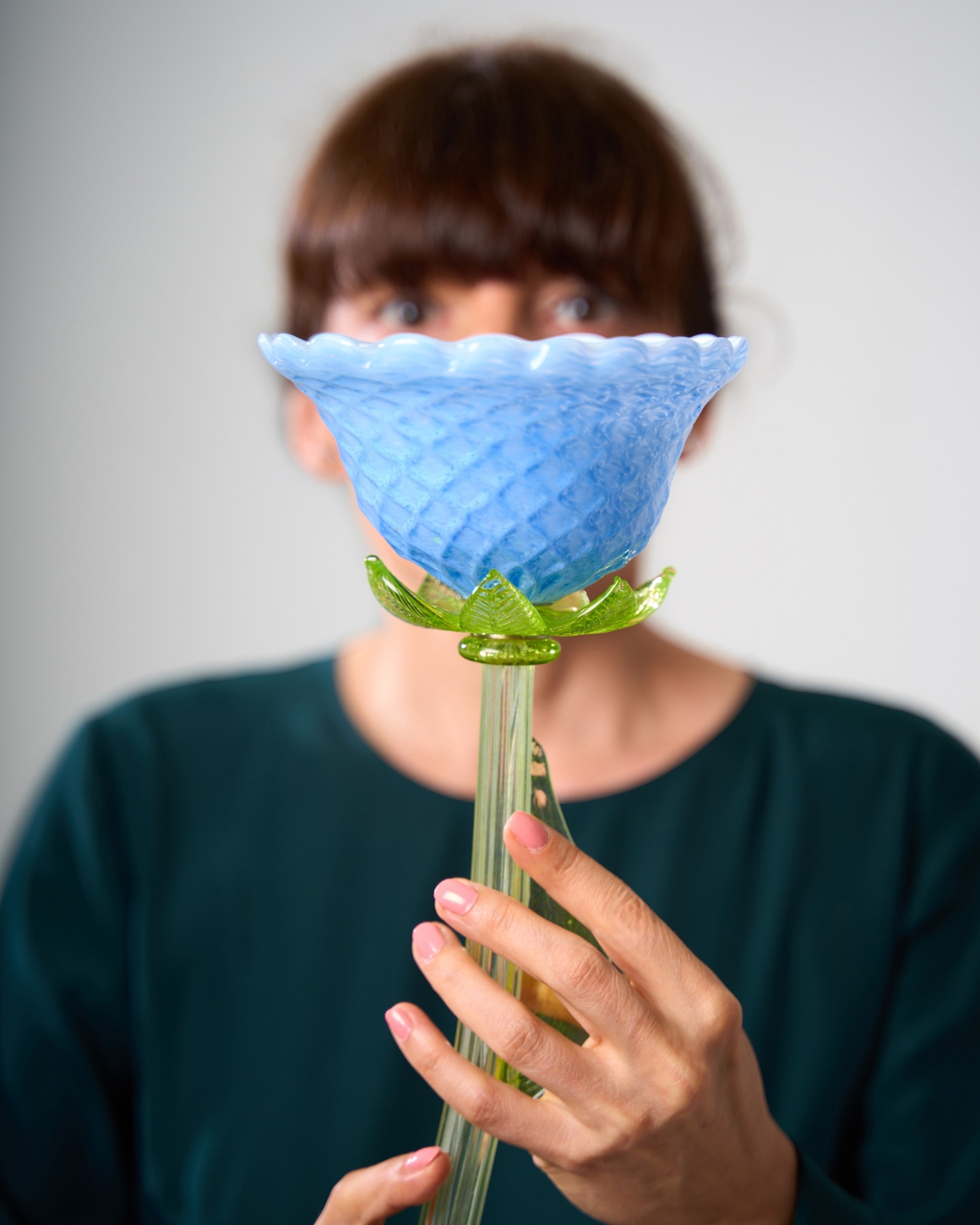
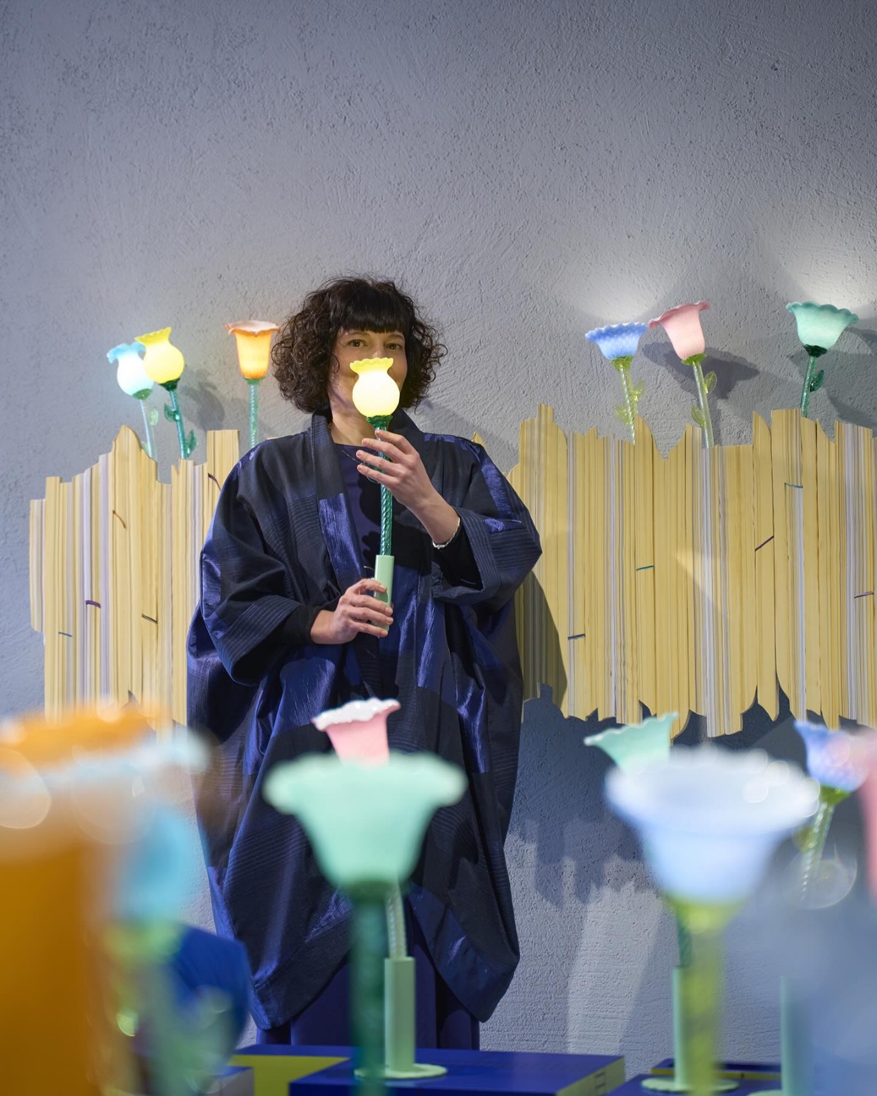
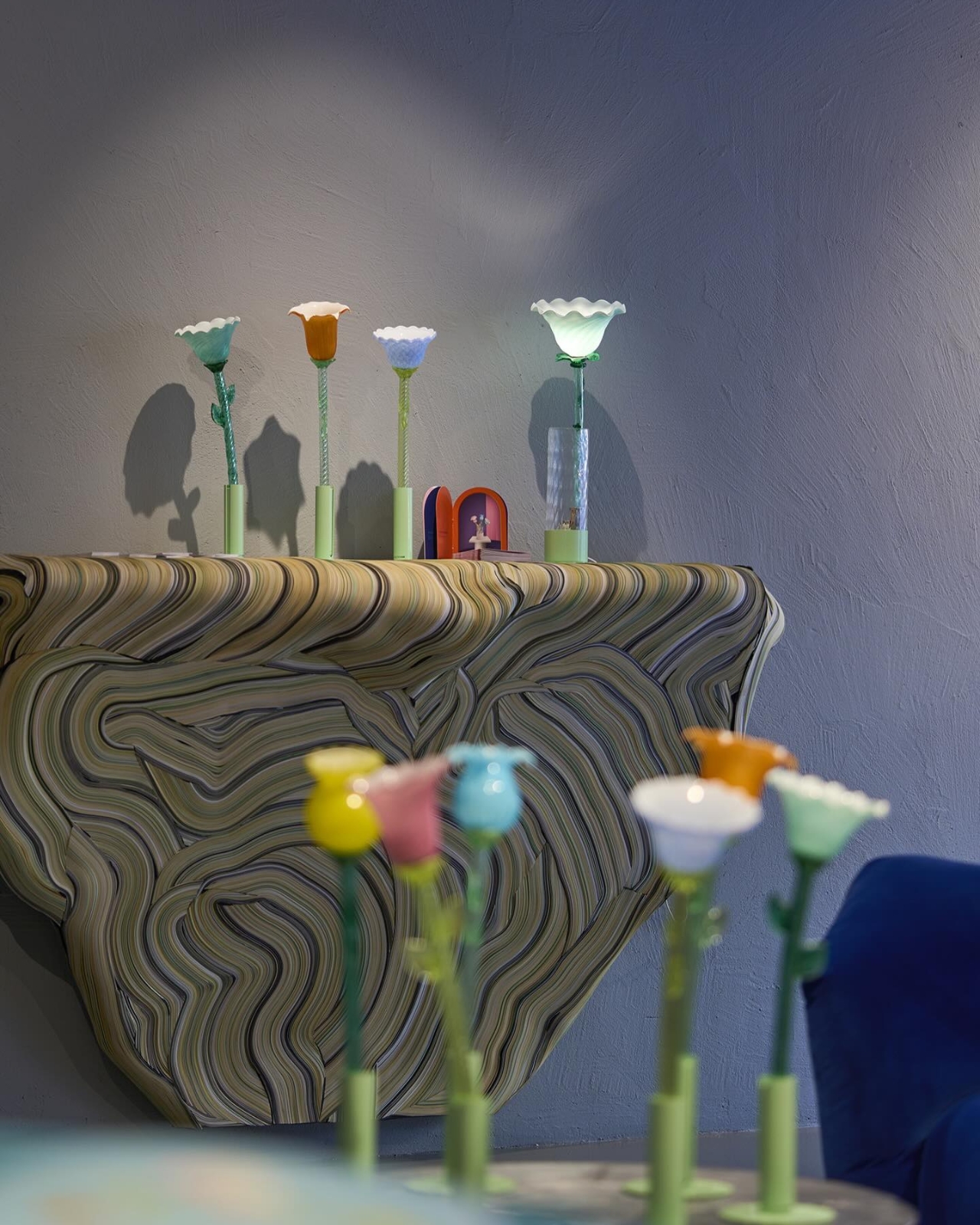
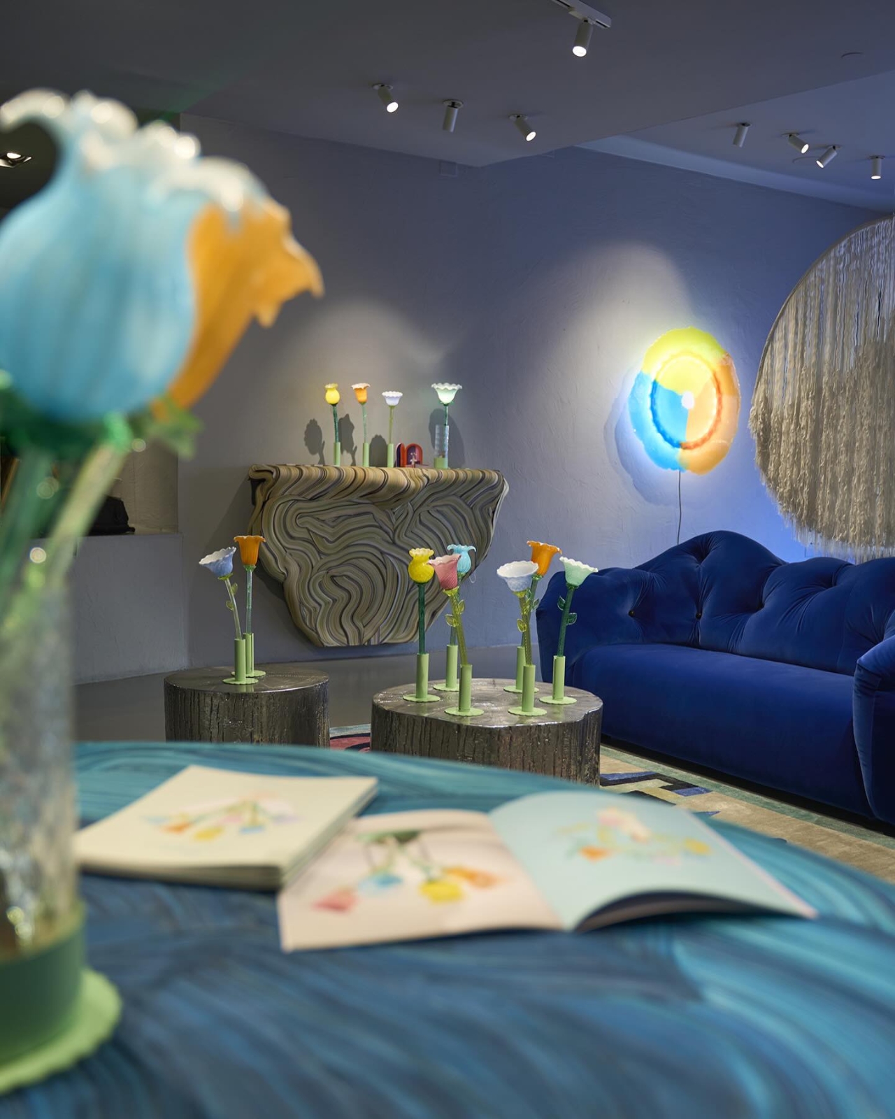
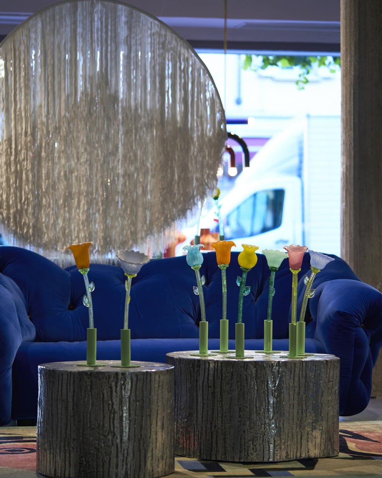
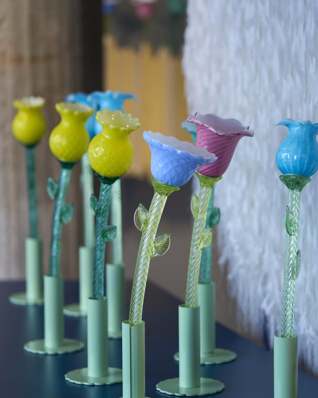
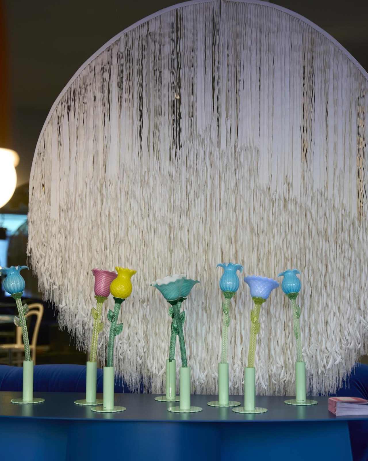
Designed by Alessandra Baldereschi for Multiforme, the collection is made up of six table lamps, each shaped like an unopened flower bud and hand-blown in artistic Murano glass. They come in soft pastel tones, they’re touch-activated, and they glow. Quietly, beautifully, and completely without a cord.

Designer: Alessandra Baldereschi

That last part matters more than it sounds. Portable lighting has been around for a while, but most of it still skews practical or industrial. A camping lantern. A rechargeable desk light you forget to charge. The cordless lamp category hasn’t exactly been known for elegance, or for the kind of visual impact that makes you actually want to own one. Baldereschi’s Flowers in Wonderland steps into that gap with a very different idea of what a portable lamp can look and feel like. These are objects you place somewhere because they’re beautiful, and the light just happens to be part of that.

The Murano glass angle is worth sitting with. Venice’s glassblowing tradition goes back to the 13th century, when the city relocated its glassmakers to the island of Murano to reduce the risk of fire in its densely packed streets. The craft has stayed there ever since, producing work that ranges from decorative to ceremonial to, yes, commercially mass-produced. What Multiforme does differently is keep the handmade core alive while pushing the design language somewhere genuinely contemporary. Each piece in the collection is hand-blown, which means no two are exactly alike, and the light that filters through the glass carries a warmth and depth that manufactured materials simply can’t replicate.

Baldereschi herself is a Milanese designer with a sensibility that’s harder to pin down than most. She trained at Domus Academy in Milan, one of the more rigorous design schools in Europe, and then spent time in Japan developing ceramic tableware with companies in the Gifu district. That combination of Italian craft tradition and Japanese restraint shows up quietly in her work. She brings a precision to how she handles materials, but also a kind of playfulness that keeps things from ever feeling stiff. Her portfolio spans glassware, décor, and lighting, and she’s shown at the Triennale di Milano, the Seoul Design Festival, and the Moss Gallery in New York. She’s not a newcomer with a single viral moment. She’s a designer who’s been building a coherent body of work for decades.

Flowers in Wonderland premiered at Fondaco dei Tedeschi in Venice, which is already a statement. It then went on to win the Curiouz Award at Venice Design Week 2025, a recognition dedicated to the most innovative projects in contemporary design. The win acknowledged the collection’s ability to combine technology and craftsmanship in a way that doesn’t feel like a compromise. Usually, when a product leans hard into one, it sacrifices the other. Here, the battery-powered portability and the centuries-old glassblowing technique feel like they belong together.

The collection comes in six flower shapes, each capturing a bud that’s almost open. Not fully bloomed, not completely closed. That specific in-between moment is where Baldereschi seems most interested, and it translates beautifully into objects that feel like they’re holding their breath. You want to place them on a windowsill, a dining table, or a nightstand, and then just watch the light shift as the day changes around them.

Lighting design rarely gets the cultural attention it deserves. We spend a lot of time talking about furniture and architecture, and considerably less thinking about how the quality of light in a room actually shapes the way we experience it. A lamp like this makes that conversation unavoidable. You can’t ignore it. You don’t really want to.

The post 6 Murano Glass Lamps That Glow Without a Single Cord first appeared on Yanko Design.

Rebloom Studio Just Turned Flower Market Waste Into Art”

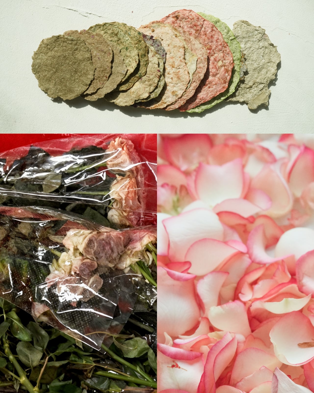
Most vases hold flowers. This one is made of them, specifically the ones that never got the chance to be admired. Rebloom Studio, a Korean design studio, has been quietly working on a problem that most people don’t think twice about: the staggering volume of flowers incinerated or discarded at flower markets every day. Because of their short shelf life, thousands of tons of cut flowers are thrown out before they ever reach a buyer, contributing to environmental pollution in a way that feels almost cruelly ironic. The flowers get grown, transported, arranged in stalls, and then burned or dumped because no one got there in time. Flowers, of all things, become waste.

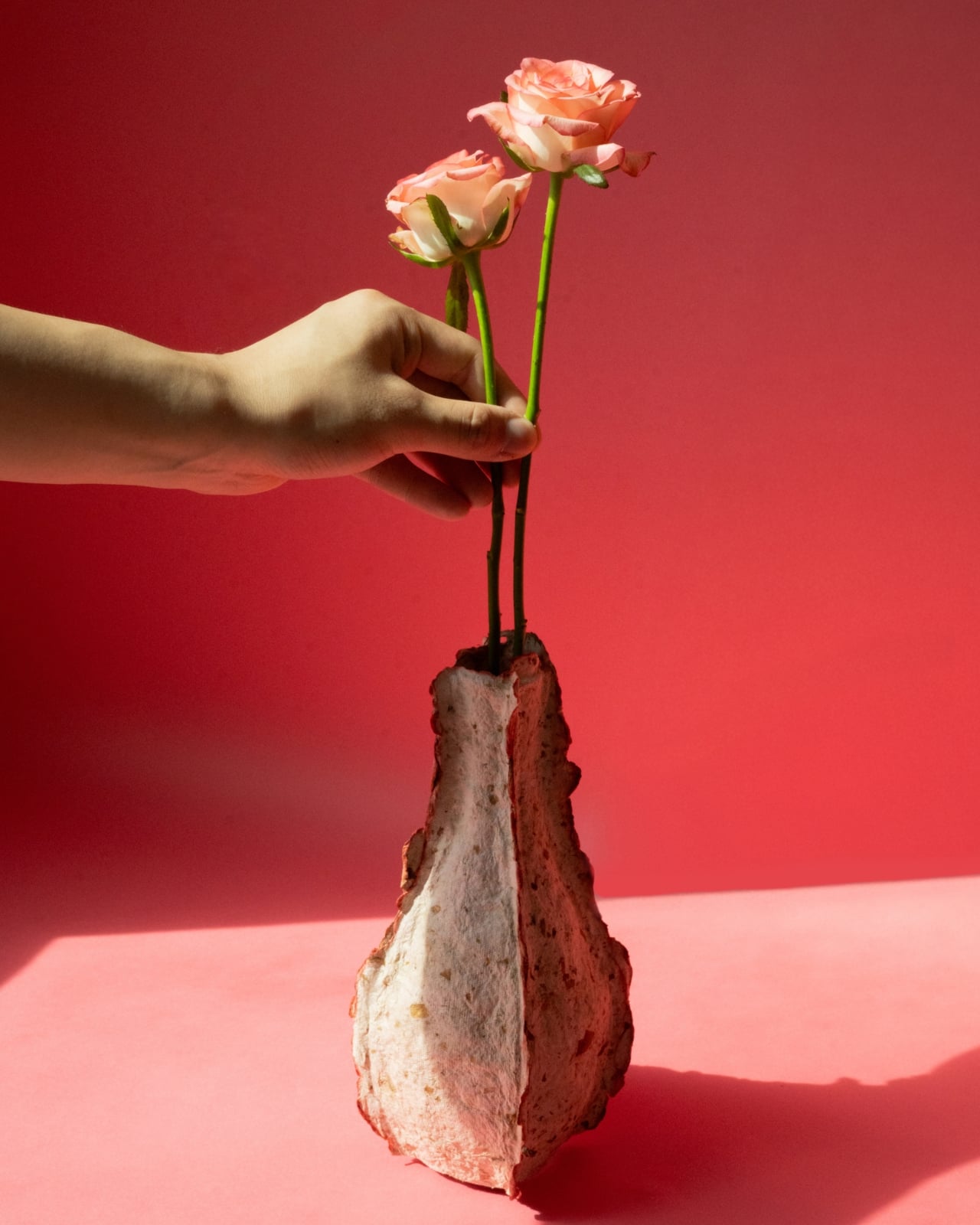
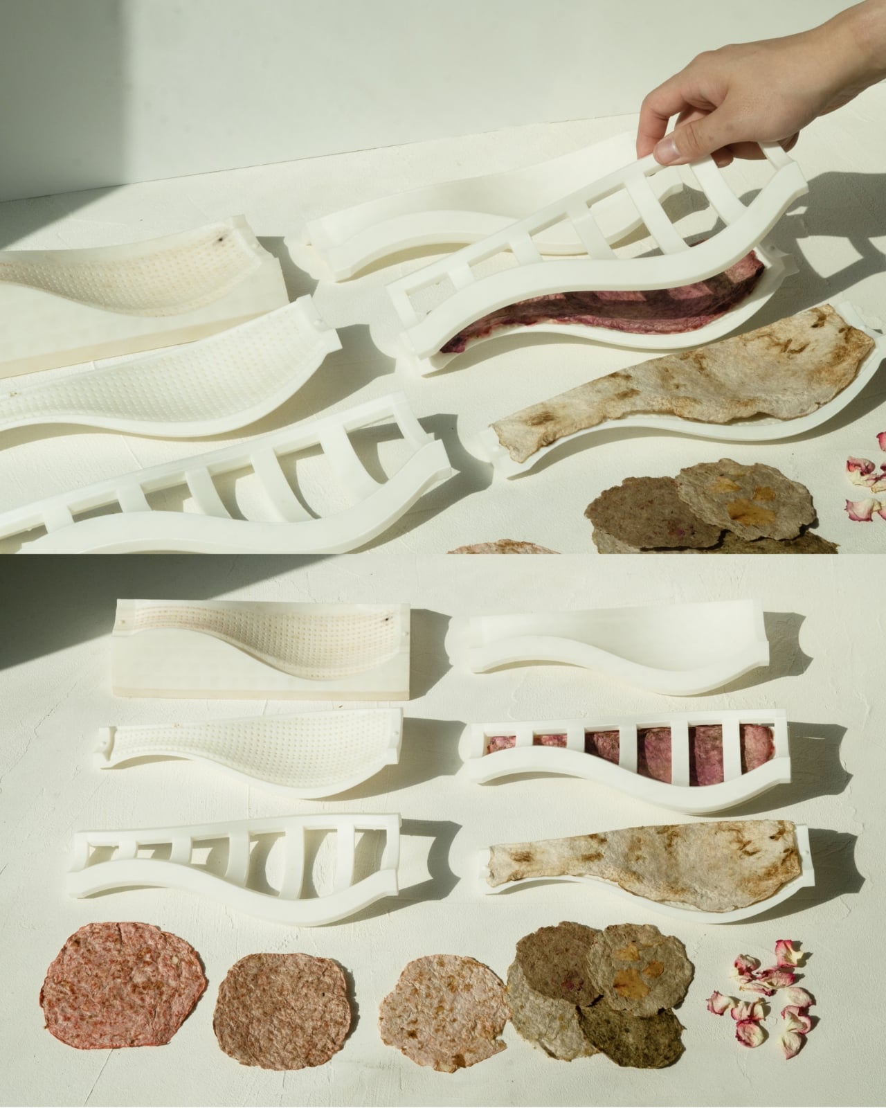
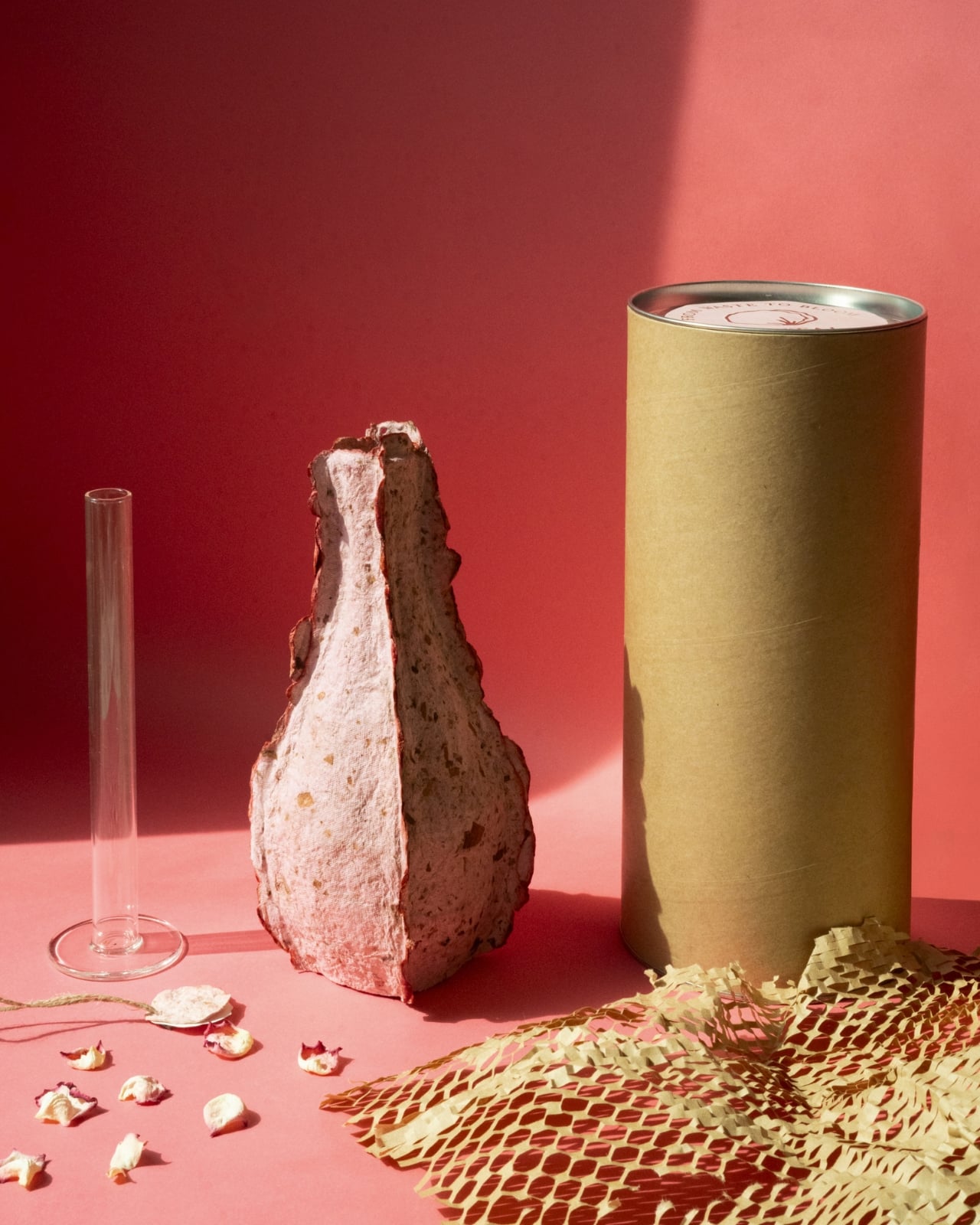
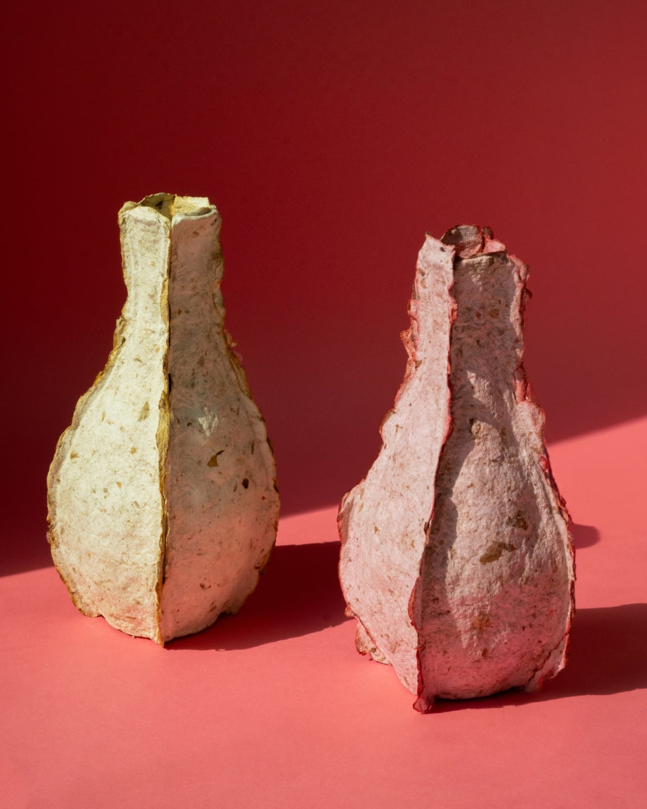
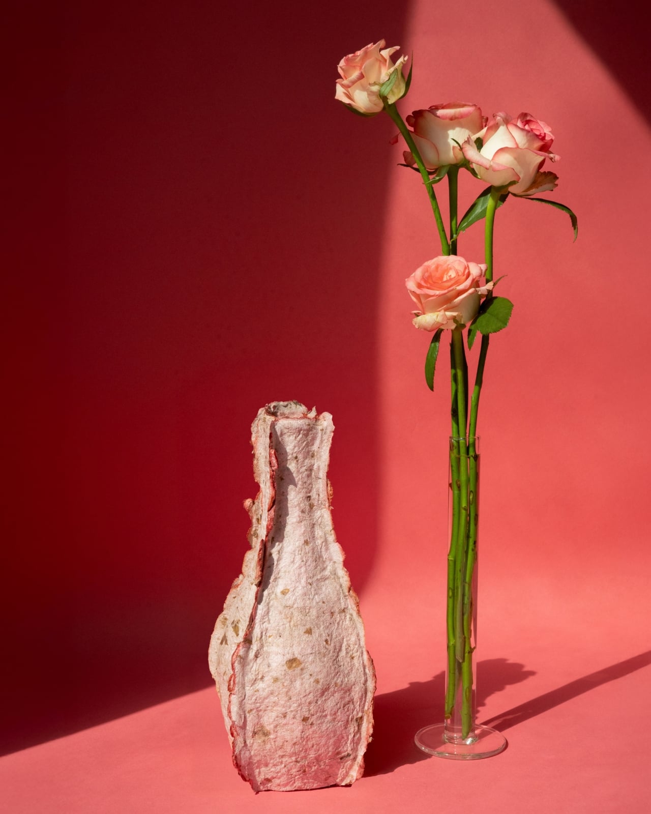
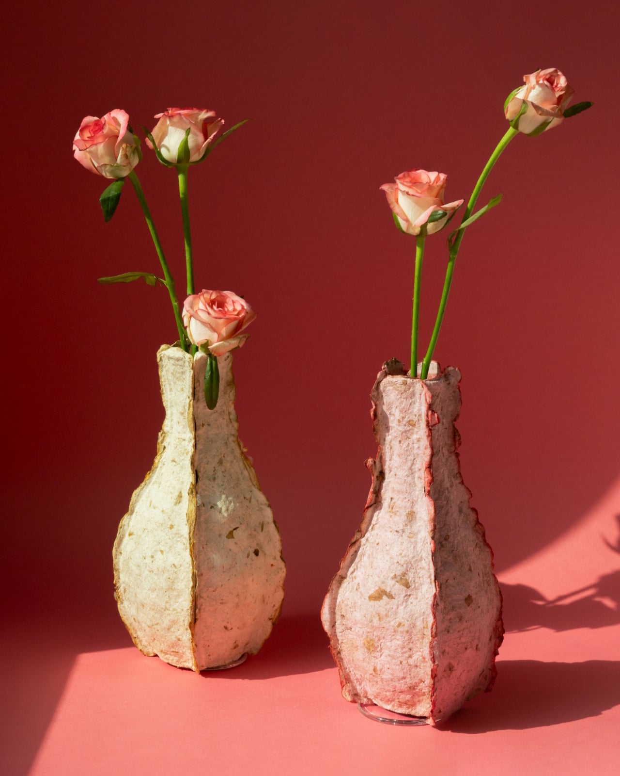
The Petal Vase is Rebloom Studio’s answer to that. Discarded flowers are collected, processed into pulp, combined with Korean paper pulp and a natural binder, and then molded into a vase form. The result is a sculptural object that carries its origins in every surface. Irregular edges, pocked textures, and soft blush and cream tones make it look less manufactured and more like something you’d find washed ashore after a long journey. Each vase is genuinely one of a kind because the flowers used to make it determine its final color and texture. No two will ever look exactly alike, which is either poetic or just good design. Probably both.

Designer: Rebloom Studio

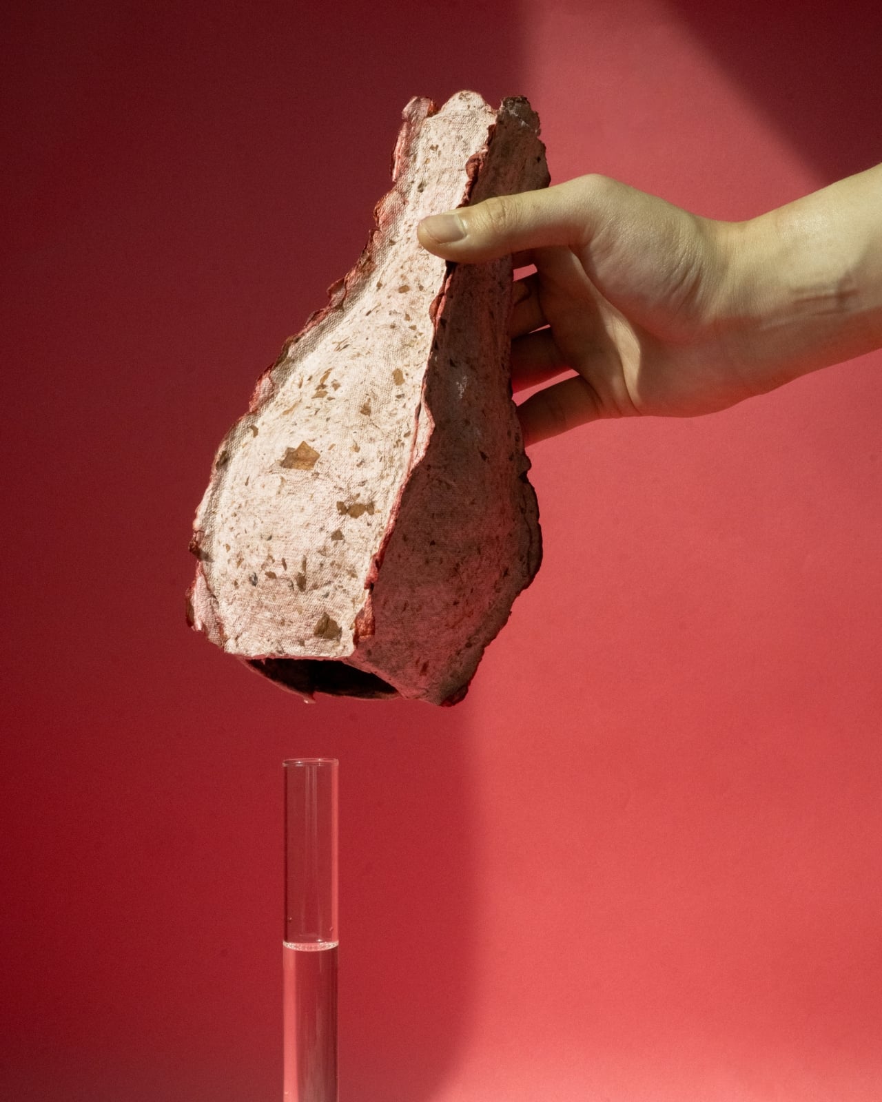
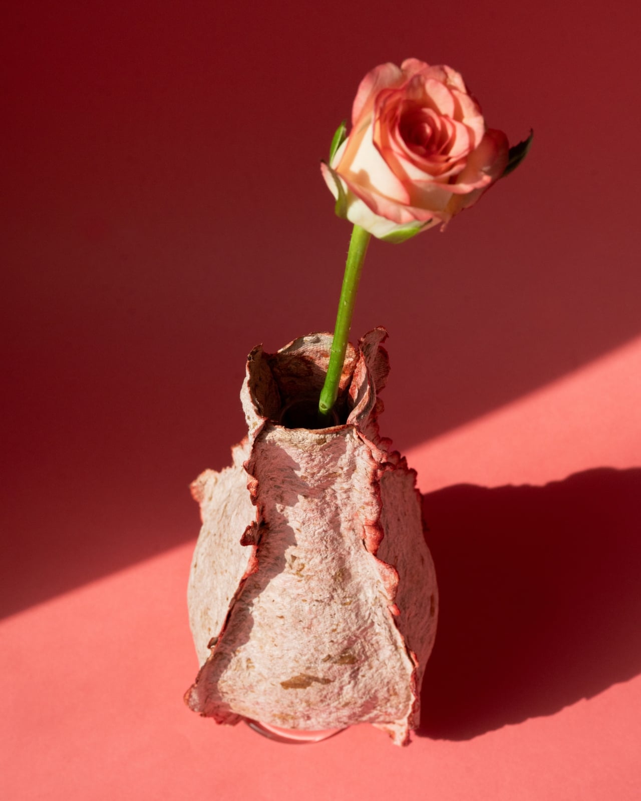
Structurally, it’s smart. The outer shell, built from the flower pulp composite, wraps around a slender glass cylinder insert that holds the water and the stems, keeping the biodegradable exterior dry and intact while fresh flowers bloom inside. When the vase has run its course, it returns to the earth. No trash pile. No incineration. No contradiction.

I’ll be honest: sustainable design can sometimes feel like a pitch dressed up as a product. The concept lands cleanly in a press release but wobbles the moment you actually have to live with the object. The Petal Vase sidesteps that trap. The material story is compelling on its own, but the vase also earns its place aesthetically, full stop. Looking at the photographs, it reads like something between a craft relic and an art object, rough where ceramics would be smooth, warm where glass would be cold. It has weight and quiet character, and it doesn’t try to look like anything other than what it is.

That honesty feels intentional. Rebloom Studio didn’t smooth down the imperfections or disguise the process. The jagged edges at the mouth of the vase, the visible compression of petals and pulp in the walls, the slight asymmetry in the silhouette, all of it stays visible. It’s design with nothing to hide because the entire point is transparency: this object was made from something the industry had already written off.

The floral trade’s waste problem is much larger than most people realize. Supply chains built around freshness and speed leave very little room for error, and unsold flowers don’t get a second chance. That loss isn’t only environmental. It also represents agricultural labor, water use, and energy that went into growing and transporting flowers that never met a buyer. Rebloom Studio doesn’t claim to fix any of that, but the Petal Vase does something important anyway: it makes the invisible visible and puts the problem in your hands, literally, in a way that tends to stick with you.

The vase measures 120 x 120 x 230mm and weighs 200 grams. It comes packaged with the glass cylinder insert in a cylindrical box. It was released in July and August of 2025. Compact. Considered. Purposeful. At a moment when the design world is full of objects that use sustainability as marketing language, the Petal Vase makes its case through the object itself. You can see where it came from. You can feel it. And eventually, it disappears back into the ground, leaving room for something new to grow. That’s not just a concept. That’s a complete design idea.

The post Rebloom Studio Just Turned Flower Market Waste Into Art” first appeared on Yanko Design.

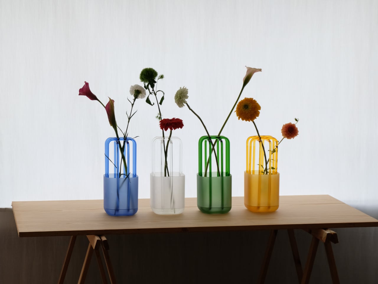
This Vase Has a Glass Lattice That Lets Stems Find Their Own Angle

Flower arranging gets credit for being meditative and creative, but for most people, it’s actually a bit of a guessing game. Stems slide around, flowers lean in unexpected directions, and what started as a simple bouquet ends up looking haphazard, no matter how much you fiddle. Most vases don’t help much; they hold the water, hold the stems, and leave the rest up to you.

That’s the problem that Rila, a 2026 vase by London- and Düsseldorf-based studio nikola & florian, quietly tries to solve. Rather than leaving every stem to fend for itself, the design adds structure that guides flowers into place without forcing them into any fixed arrangement. The idea isn’t to make flower arranging feel like a chore but to let it happen almost on its own.

Designer: Nikola Gaytandjiev and Florian Neubacher (nikola & florian)

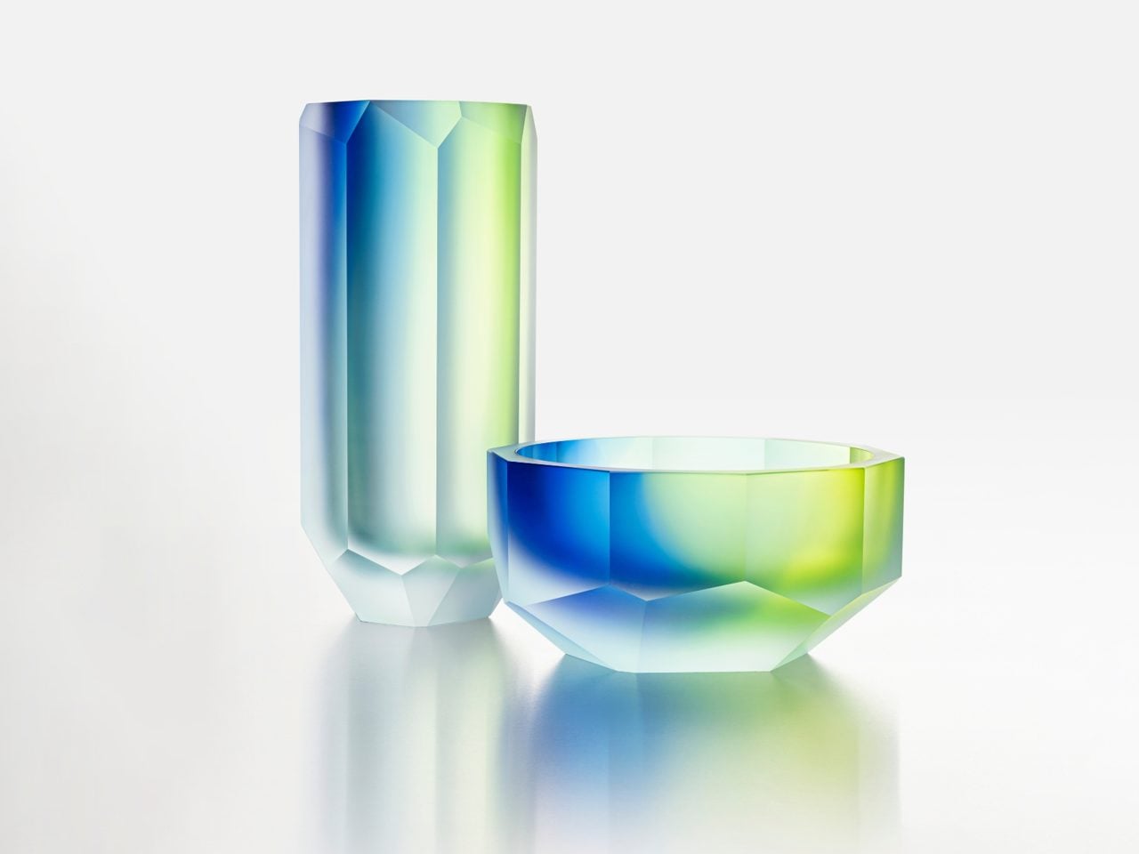
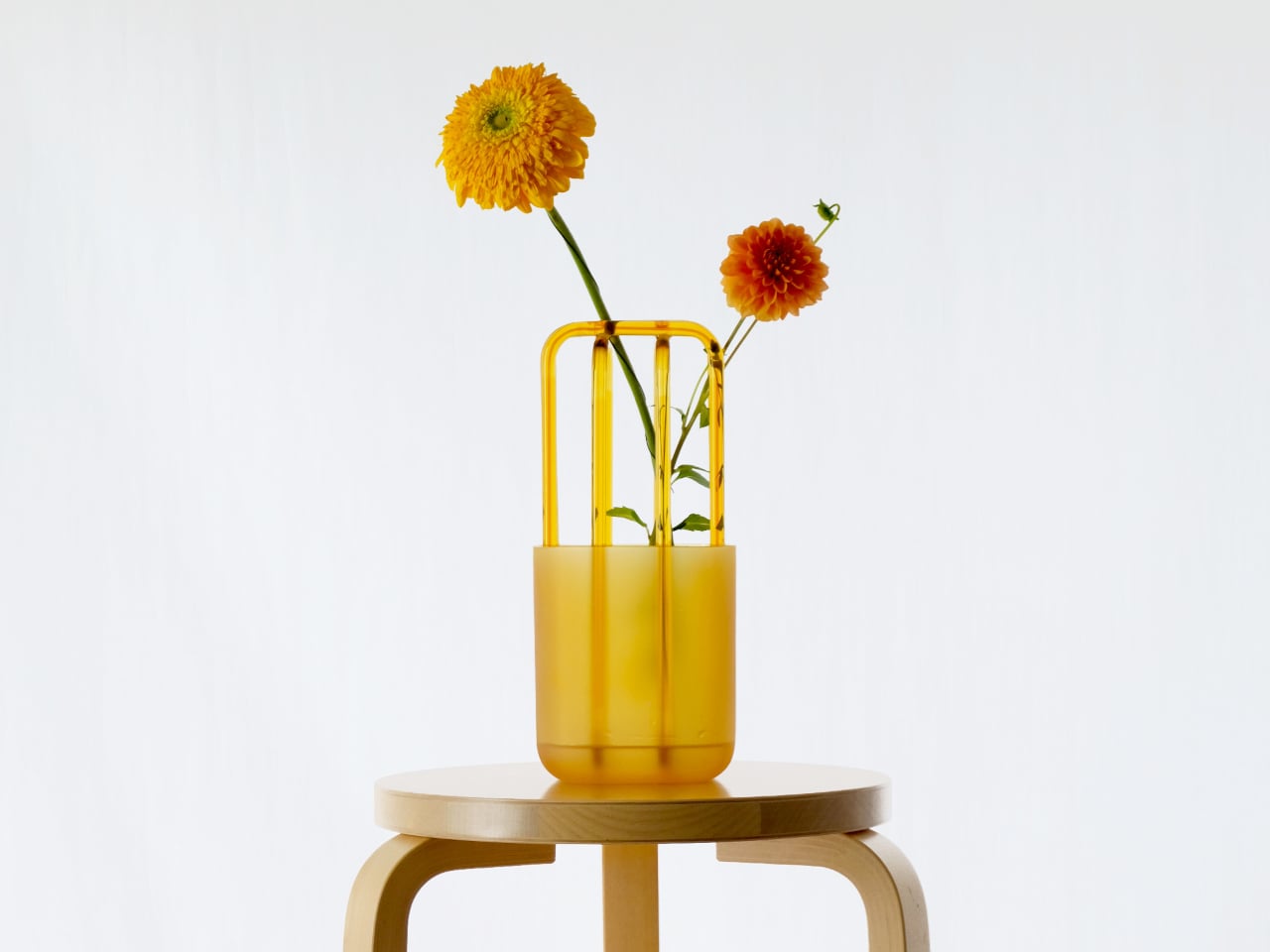
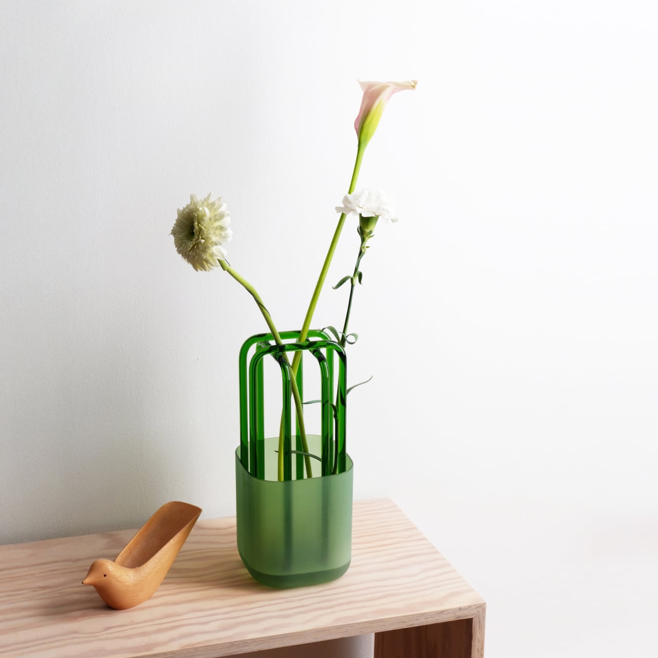
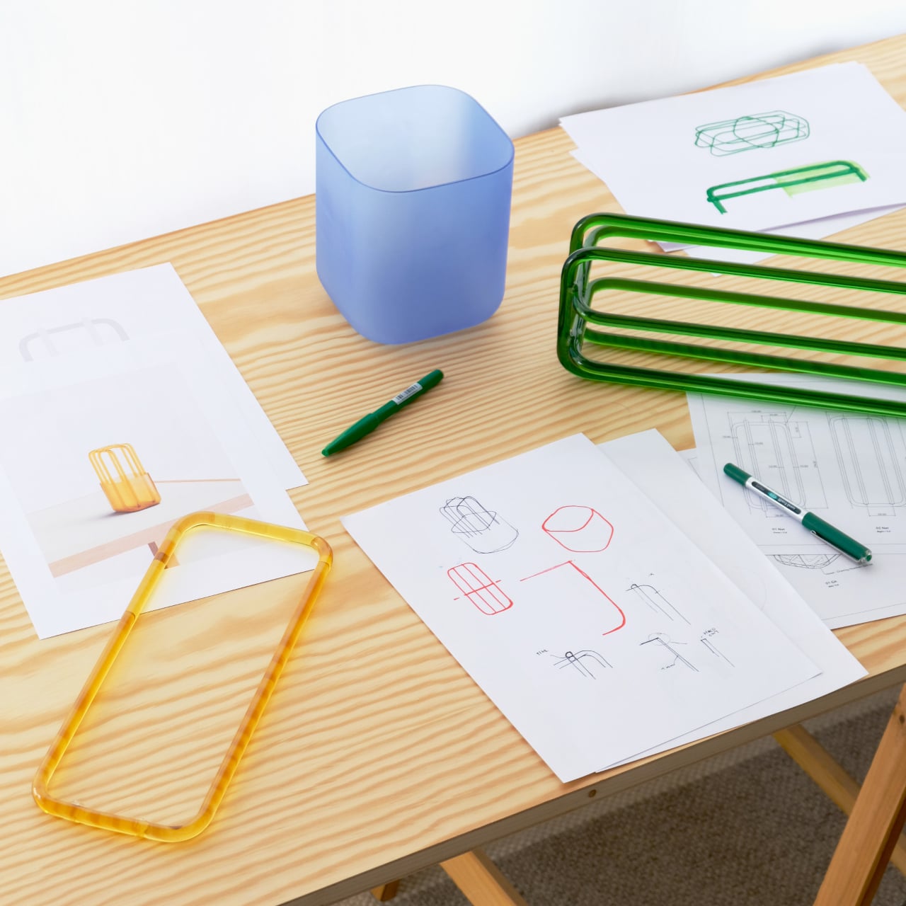
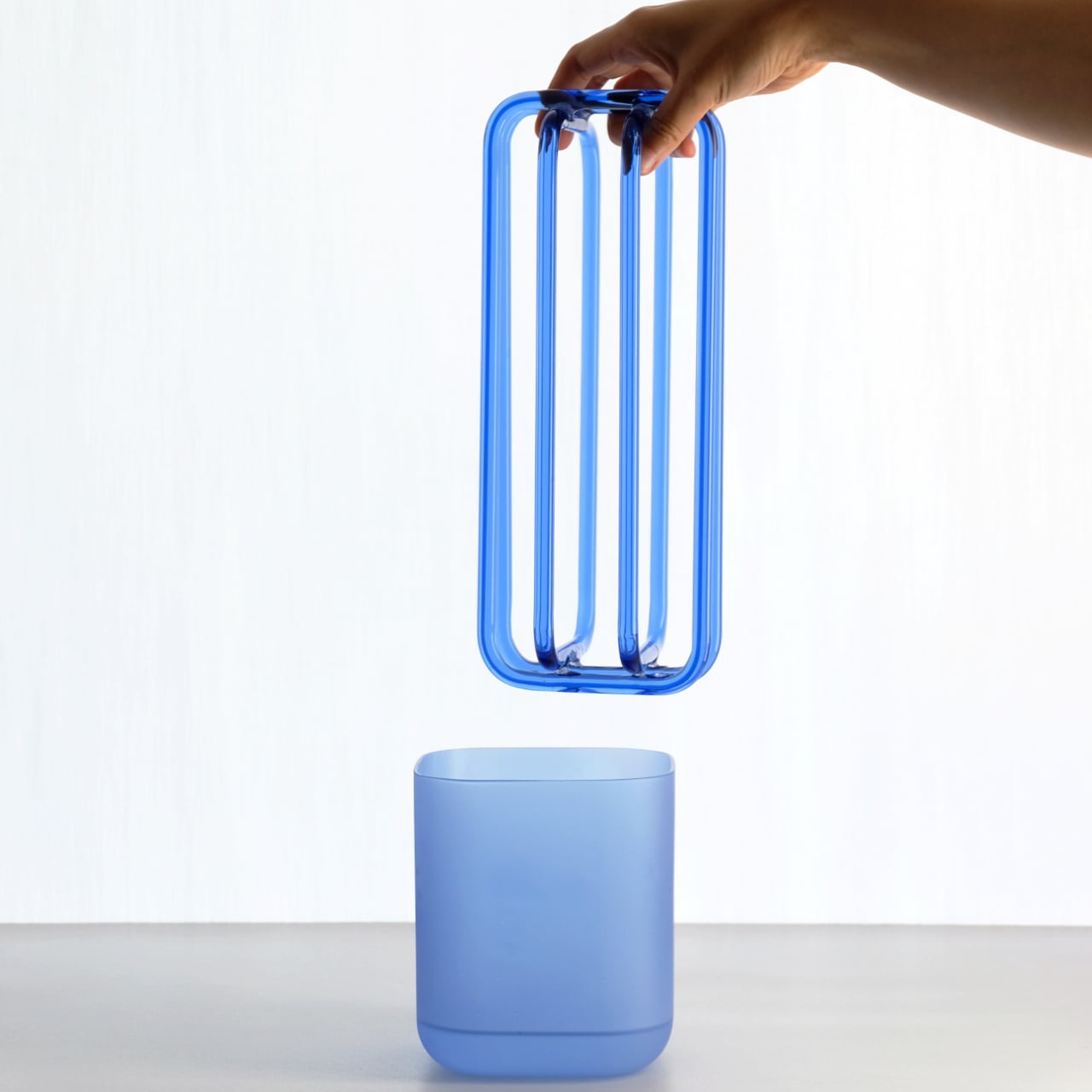
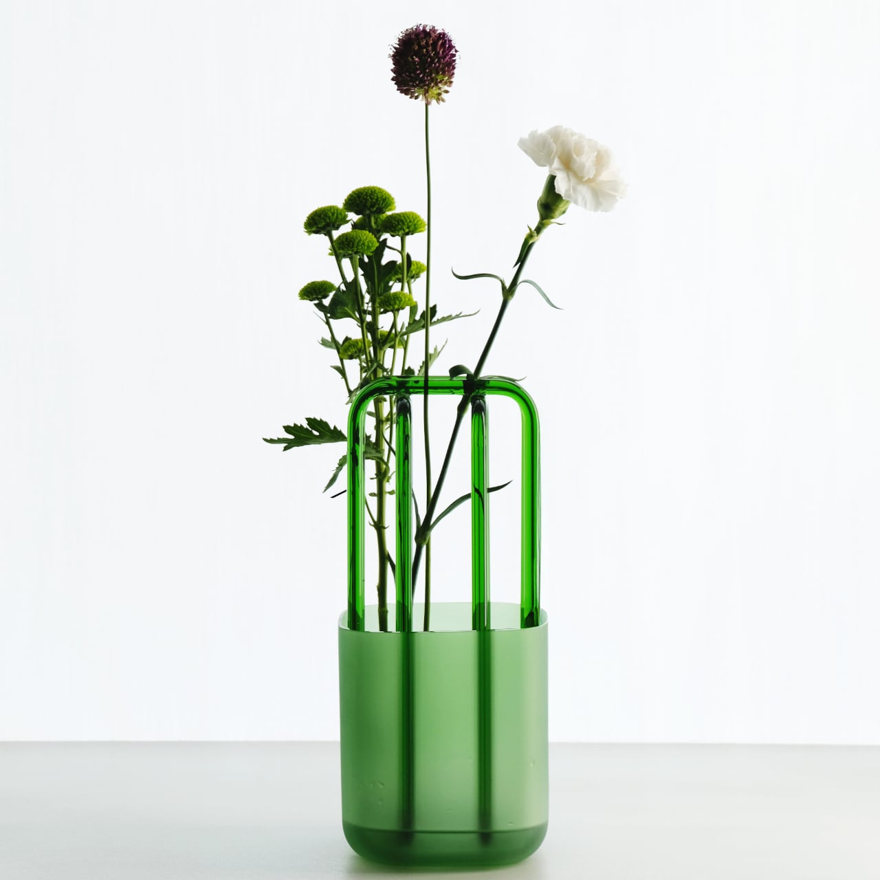
The vase consists of two separate pieces: a frosted glass vessel that holds water, and a clear glass structure that sits right inside. The structure has a net-like form, with arched glass rods that gently space and guide each stem as it passes through, without locking anything into place. The two pieces lift apart, which makes the whole thing simple to clean.

Both parts are made from borosilicate glass, chosen for its strength and optical clarity. What makes the pairing interesting is the contrast between them: the frosted vessel has a soft, muted look and a slightly tactile surface, while the clear structure above lets light pass straight through. That interplay of opacity and transparency gives the object a quiet visual richness that most flower holders don’t have.

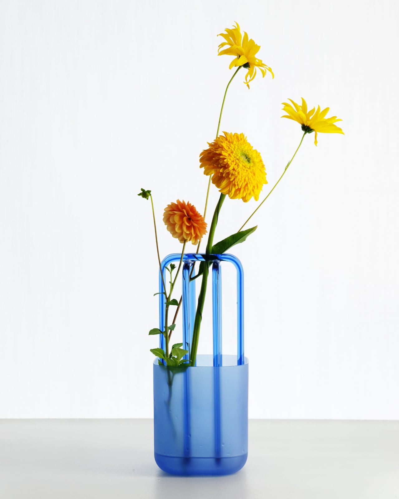
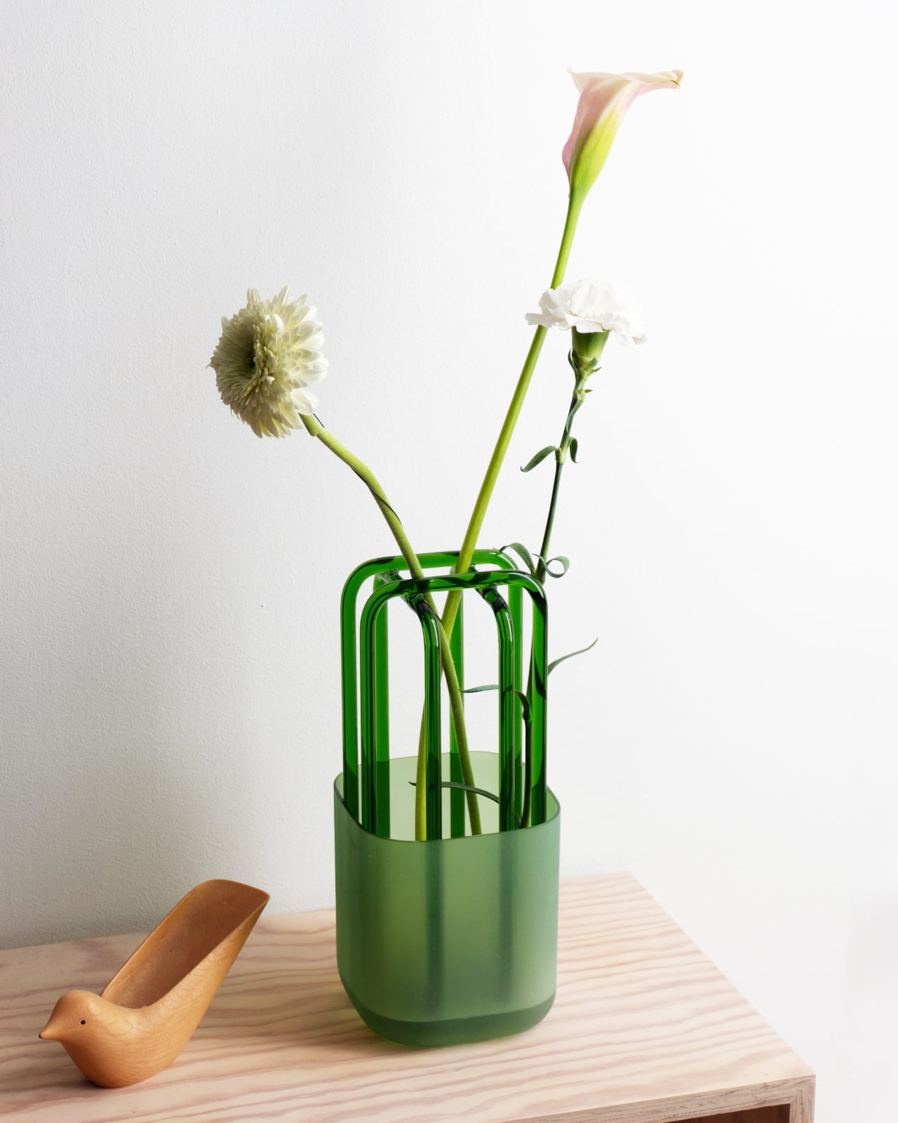
In practice, using Rila feels less like a task and more like something you’ll stop thinking about. Drop a few stems through the lattice, and each one finds the angle it naturally wants. You don’t end up with a perfectly symmetrical arrangement, and that’s kind of the point. The flowers get room to look like themselves, with the structure providing just enough order.

Rila comes in a handful of colorways, with matching tones running through both the frosted vessel and the clear structure. Blue, green, amber, and white are among the available options, each creating a slightly different mood without changing the fundamental character of the piece. The frosted base absorbs and deepens whatever color it carries, while the transparent structure stays open and light, keeping things airy.

What makes Rila particularly easy to live with is that it earns its place in a room even on days when there aren’t any flowers in it. The frosted vessel and clear glass structure together form an object with enough sculptural character to hold attention on its own. You’d place it on a side table the same way you’d display any other piece you genuinely liked.

The post This Vase Has a Glass Lattice That Lets Stems Find Their Own Angle first appeared on Yanko Design.

Pilot Just Turned a 400-Year-Old Japanese Craft Into Living Art

There’s something hypnotic about watching things change color. Remember those mood rings from the 90s? Or those hypercolor t-shirts that turned purple wherever you got warm? That same technology just got a serious upgrade, and it’s sitting on the cutting edge where centuries-old craftsmanship meets modern science.

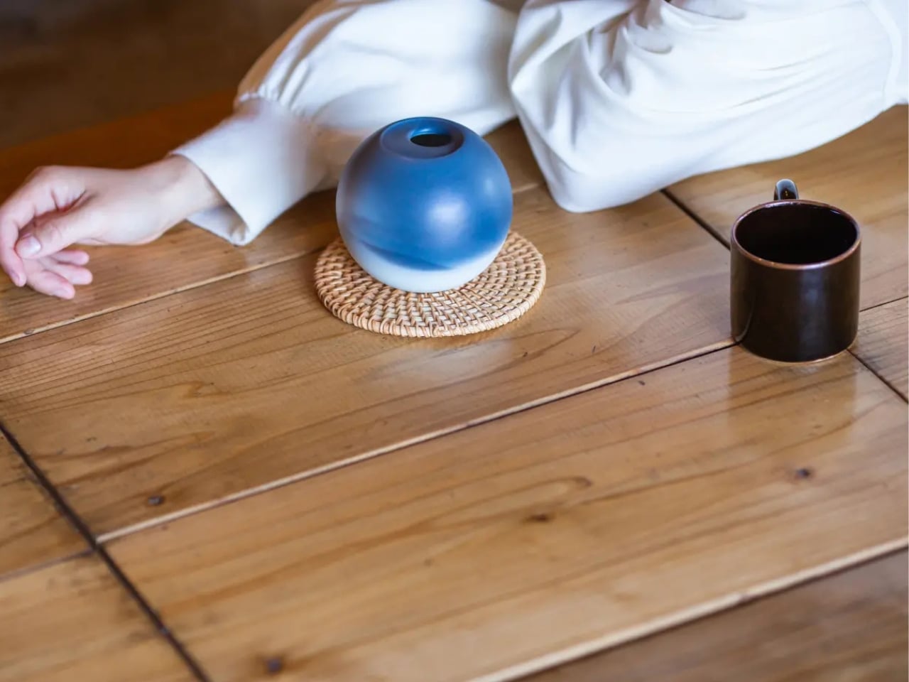
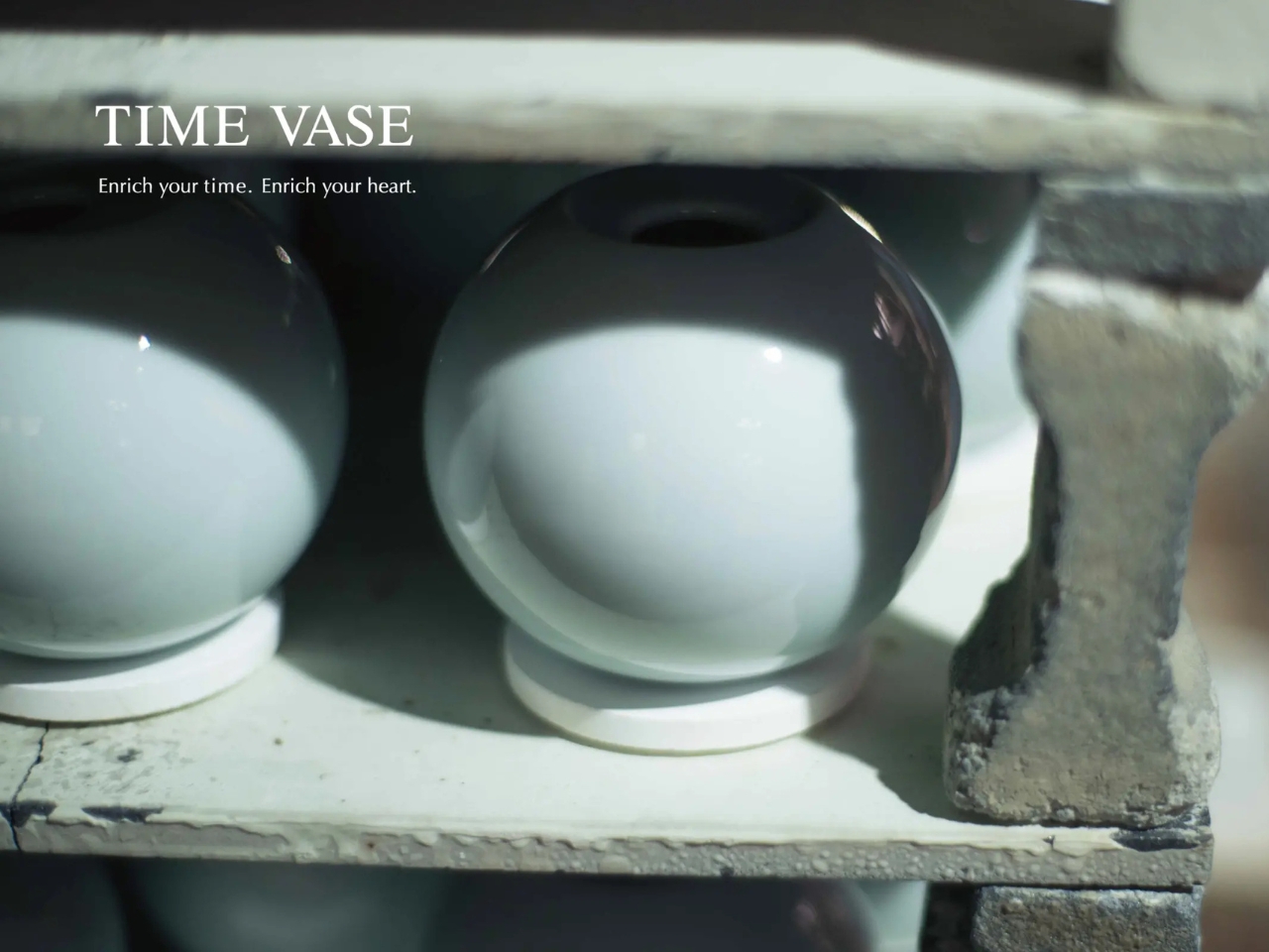
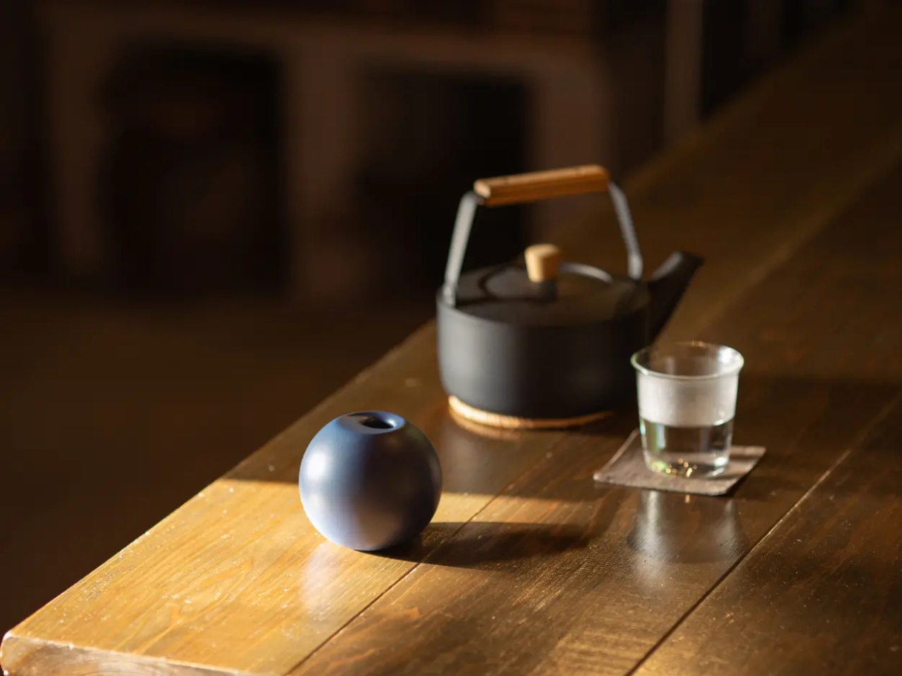
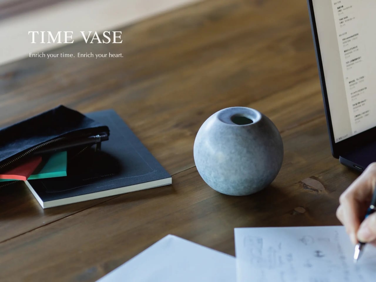
Enter TimeVase, a collaboration between Pilot Corporation (yes, the pen company) and traditional Arita porcelain artisans in Japan. This isn’t your grandmother’s ceramic vase, even though it’s made using techniques that have been perfected over 400 years in one of Japan’s most historic pottery towns.

Designer: Pilabot

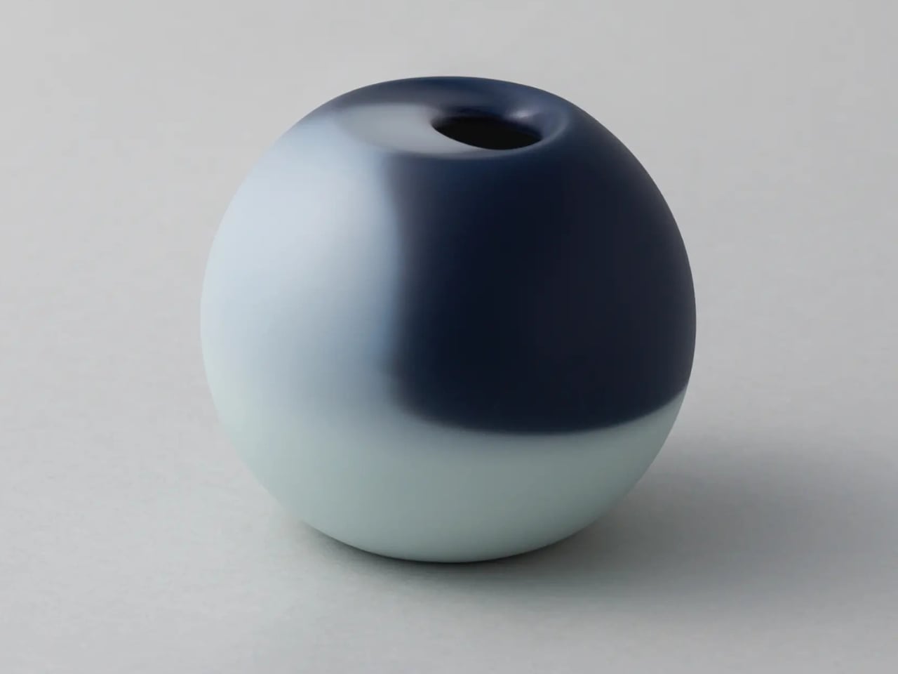
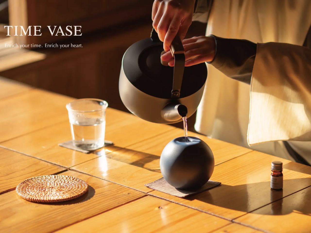
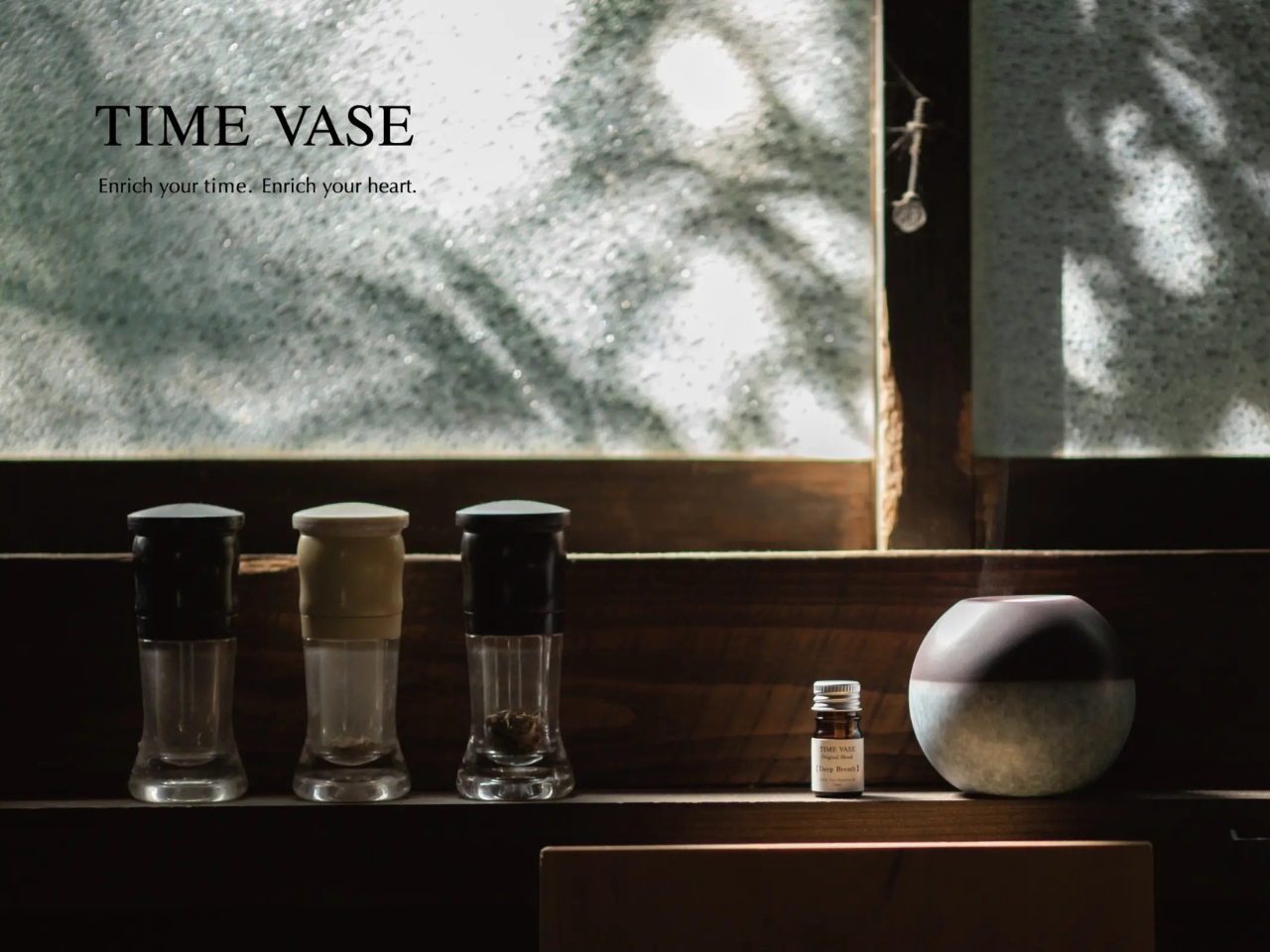
The concept is beautifully simple. The entire surface of the porcelain vessel is coated with Pilot’s thermochromic ink, the same temperature-reactive technology they developed for their erasable pens. At room temperature, the vase appears as a deep, rich navy blue. But pour in hot water, and something magical happens. The heat triggers a color transformation that gradually reveals a stunning celadon glaze underneath, one of the most prized colors in traditional Arita ware.

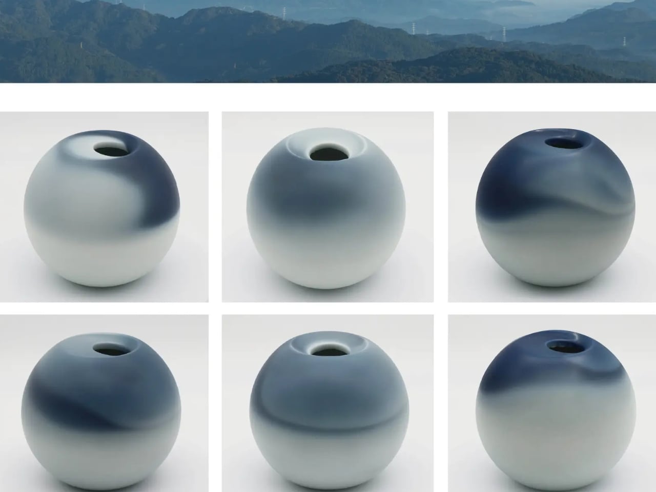
What makes this particularly fascinating is how the change unfolds. It’s not an instant flip from one color to another. The transformation is organic and unique each time, with different patterns emerging as the heat spreads through the ceramic. Then, over the next 30 to 60 minutes, you watch as the color slowly returns to its original deep blue state as the water cools. It’s like having a living piece of art that breathes with temperature.

Thermochromic ink has been around since the 1970s, initially showing up in novelty items. The technology works through leuco dyes that change their molecular structure when heated, typically becoming translucent or shifting to lighter shades. Pilot has been a pioneer in this field, particularly after developing erasable ink pens in 2006 that used thermochromic properties to create ink that disappears above 65°C.

But applying this technology to traditional ceramics required something different. The ink had to work at the right temperature range for hot beverages and withstand the demands of daily use while maintaining the aesthetic integrity of Arita porcelain. Arita ware has a reputation for its delicate beauty and that distinctive celadon color, a jade-like blue-green that has captivated collectors for centuries. Covering it entirely with color-changing ink and trusting it to reveal that beauty at just the right moment takes both technical precision and artistic courage.

The practical applications are surprisingly versatile. Sure, it works as a traditional vase for flowers, but it’s also designed to function as a tea vessel or even an aroma pot. Add a few drops of essential oil to the hot water, and you’ve got a piece that engages both sight and smell, creating what the designers call “luxurious blank time” for contemplation.

There’s something distinctly Japanese about this design philosophy. The concept of finding beauty in transience, of appreciating the moment as it unfolds and then lets go, feels deeply connected to traditional aesthetics like mono no aware (the pathos of things) or wabi-sabi (finding beauty in imperfection and impermanence). You’re not just using a vase. You’re watching time made visible through color.

This fusion of old and new, analog and digital, craft and chemistry represents a growing trend in contemporary design. We’re seeing more collaborations where traditional artisans partner with tech companies to create objects that honor heritage while pushing boundaries. It’s not about replacing one with the other but finding where they can amplify each other’s strengths. TimeVase launched in January 2026 through Pilot’s creative division, Pilabot, which focuses on experimental projects that explore new applications for their ink technology. It’s part of a broader movement where stationery and office supply companies are thinking beyond paper, asking what else their specialized materials can do.

For anyone interested in design, this piece sits at a fascinating intersection. It’s functional art that performs differently each time you use it. It’s tech that doesn’t scream its presence but quietly enhances the everyday ritual of making tea or arranging flowers. It’s a reminder that innovation doesn’t always mean adding more features or screens but sometimes means taking technologies we’ve mastered and applying them in unexpected ways. The TimeVase proves that magic doesn’t require batteries. Sometimes it just needs hot water and patience.

The post Pilot Just Turned a 400-Year-Old Japanese Craft Into Living Art first appeared on Yanko Design.

Lotus Effect Vase Lets Stems Drift Across Edges Like Leaves on Water

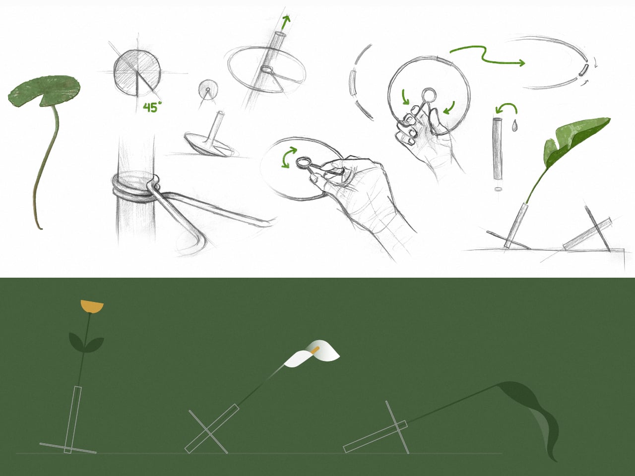
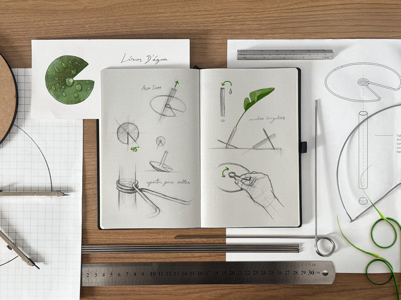
The lotus effect is a phenomenon where aquatic plant leaves shed water and dirt through microscopic surface structures, staying clean and efficient under heavy rain. The symbolism runs deeper, plants like Victoria regia and white lotus that emerge from murky depths to float serenely on the surface, occupying the boundary between water and air. That mix of resilience, lightness, and boundary dwelling becomes the starting point for a vase that treats support as spatial action rather than neutral containment.

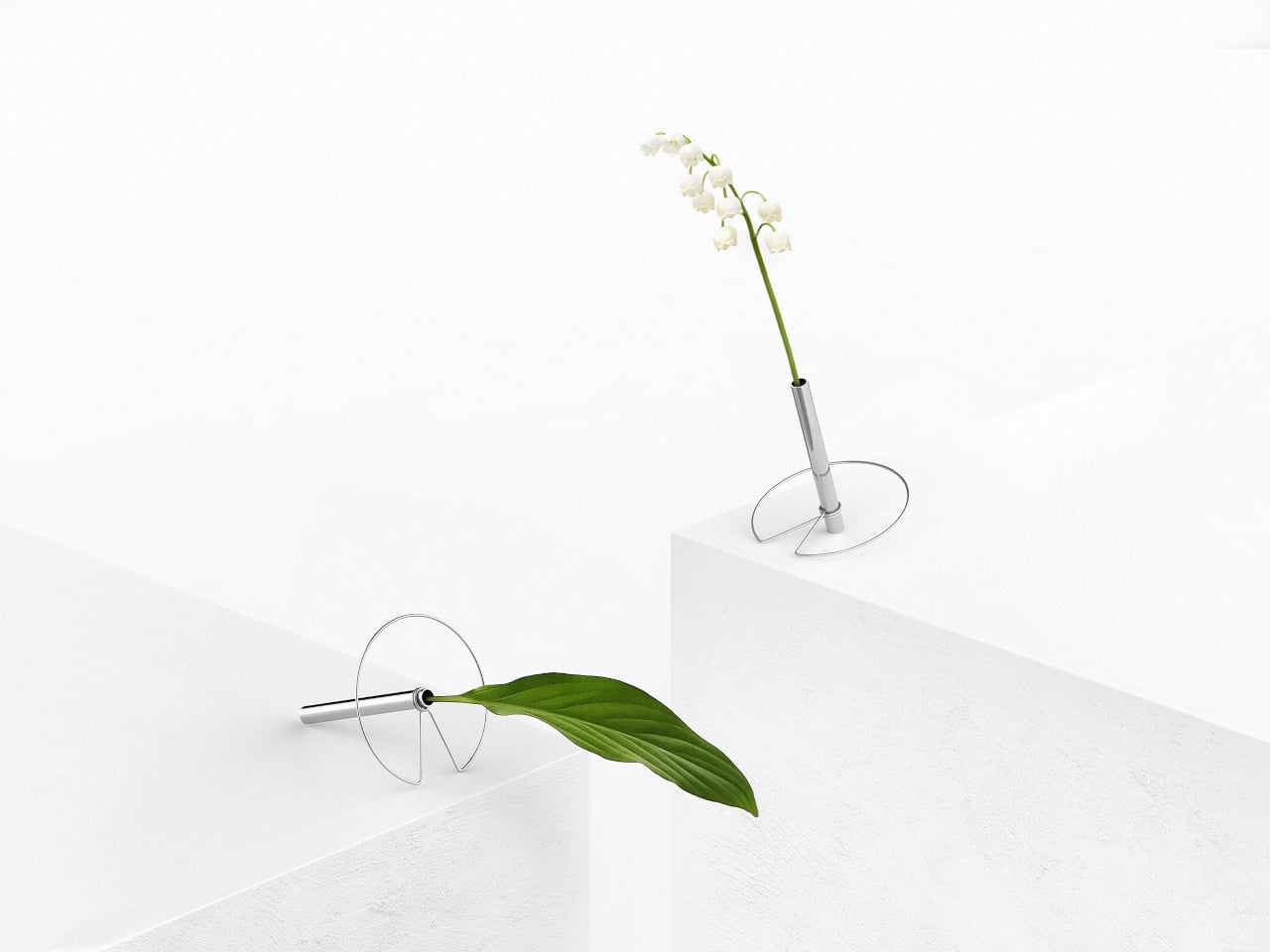
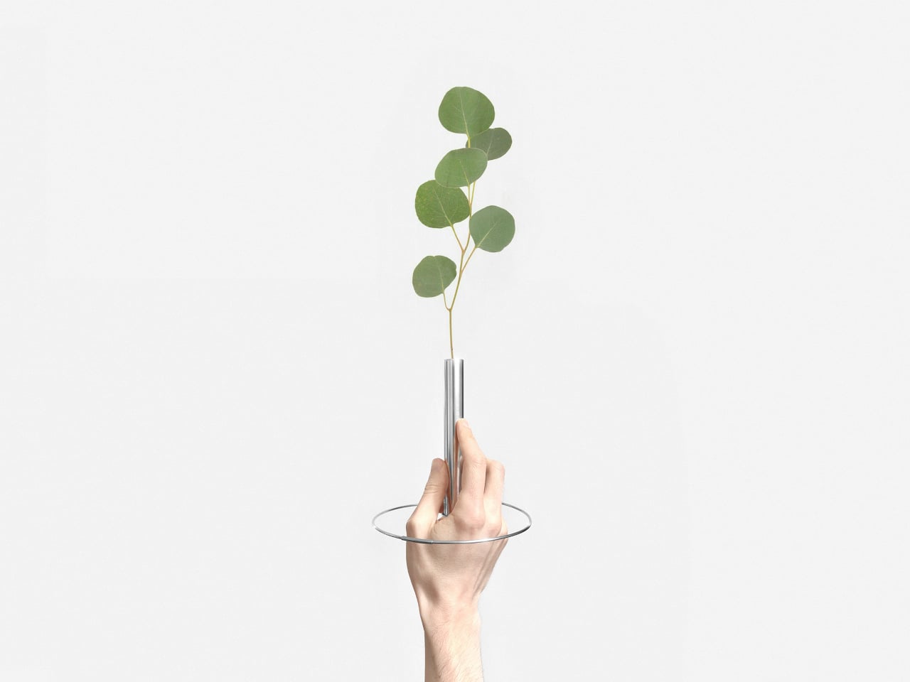
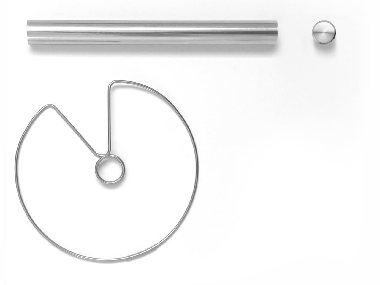
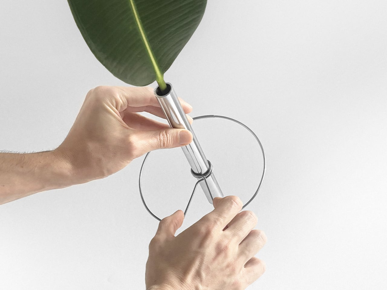
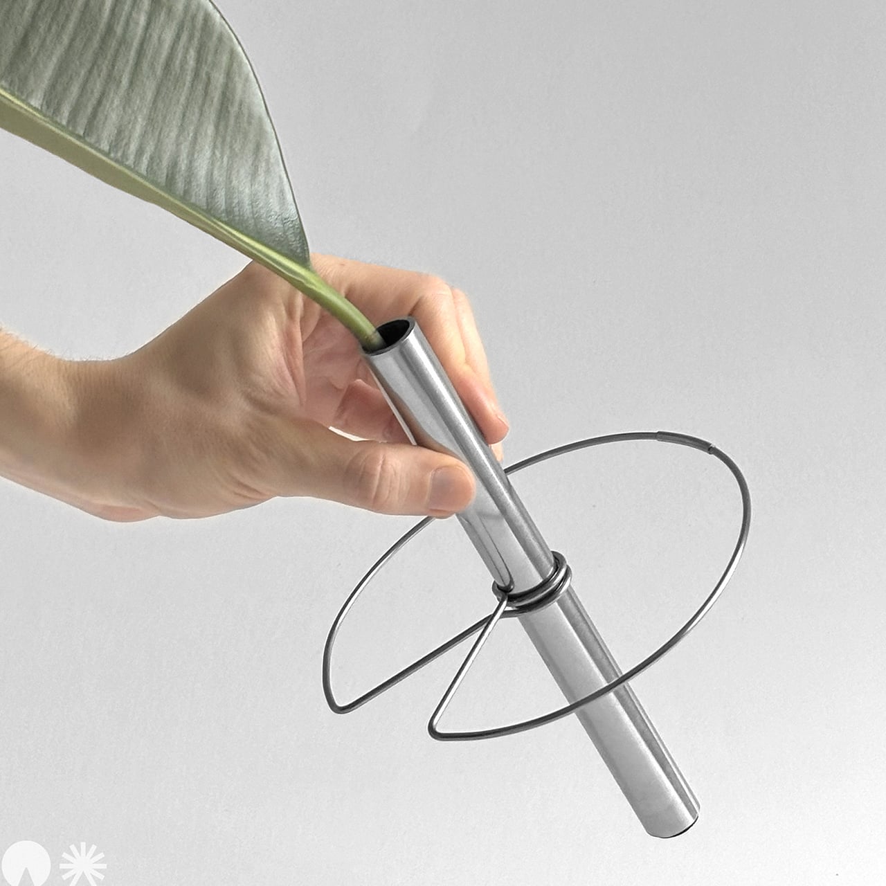
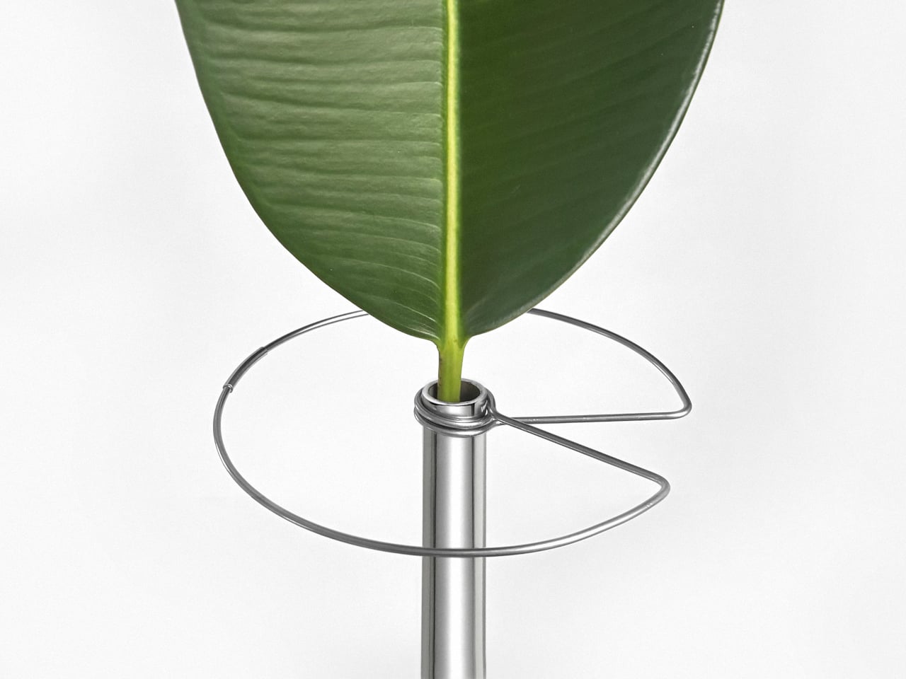
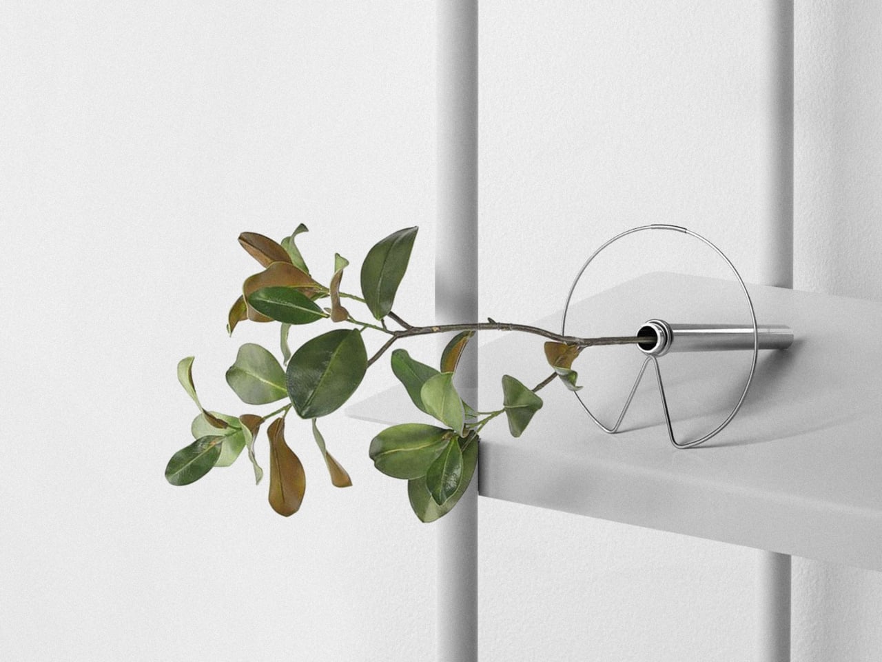
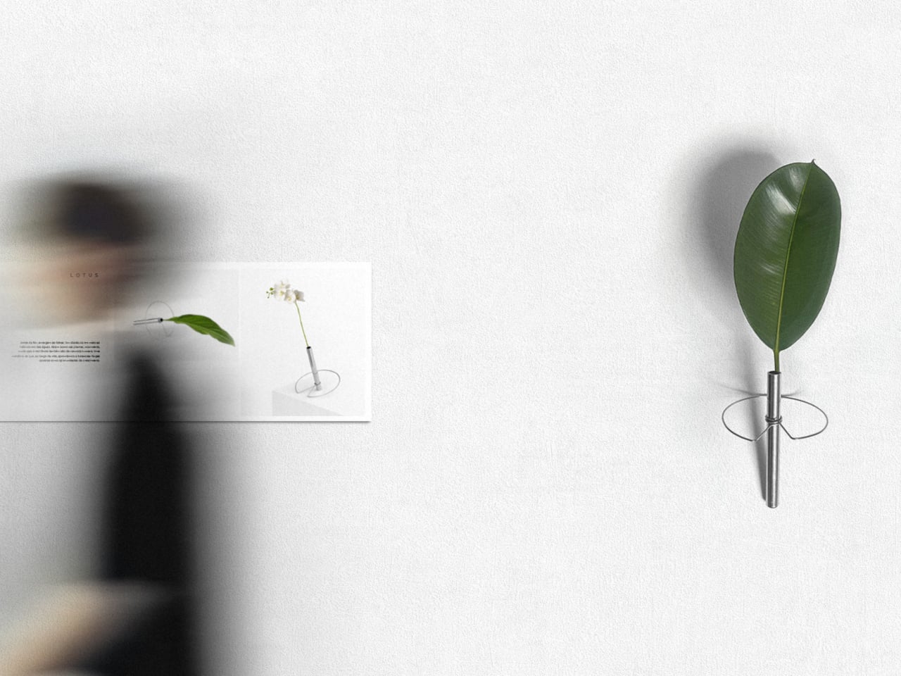
The Lotus Effect Vase is a minimal object that borrows the outline of aquatic leaves and turns it into structure. It combines a circular metallic element, echoing a floating leaf, with a slim cylindrical container, both in stainless steel. It is not trying to imitate the lotus leaf literally; it is translating its posture and presence into a support for cut stems, turning the ring into both a base and a way to guide where the plant can go.

Designer: Fabrício Auler

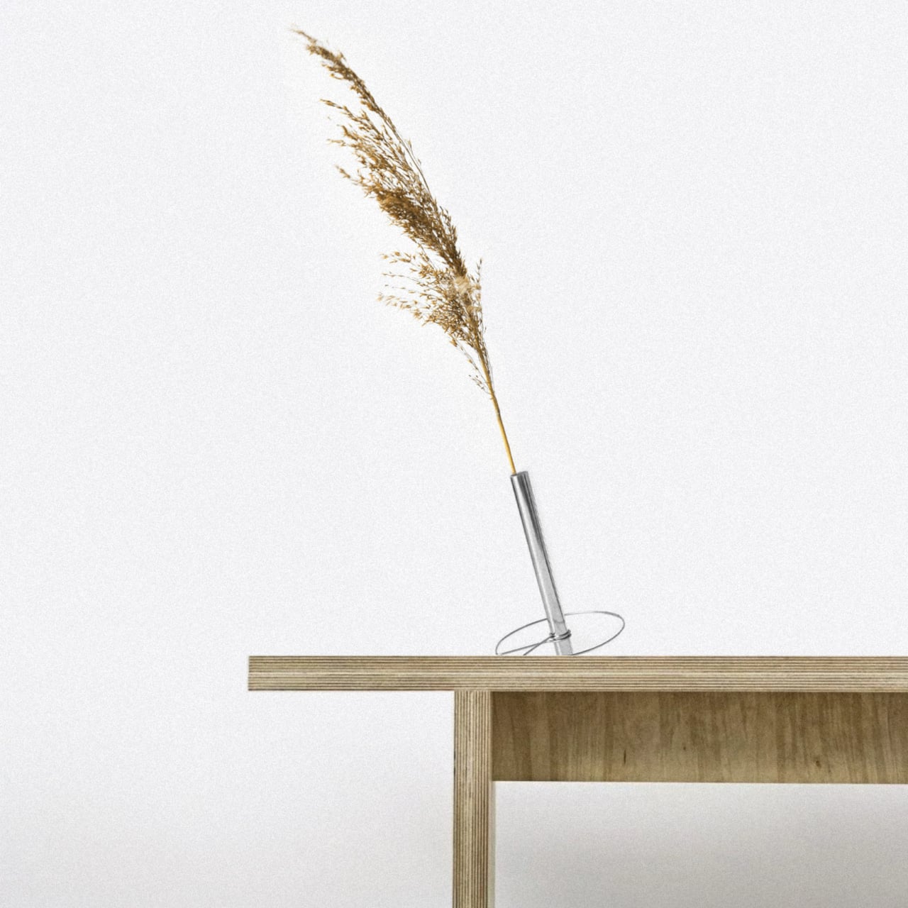
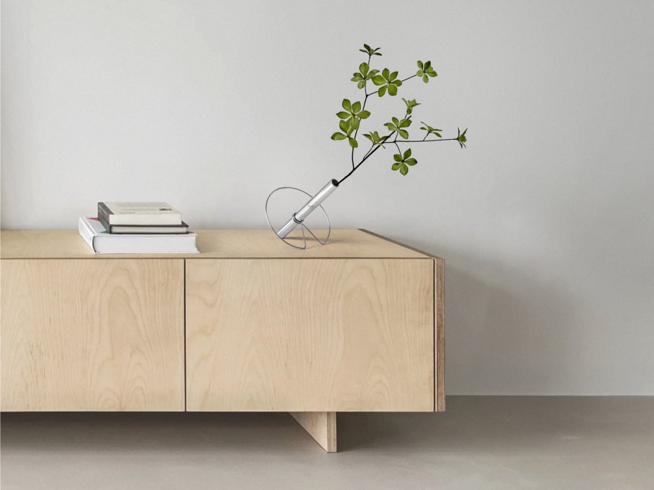
Most vases center the plant, holding stems upright in the middle of a table or shelf and making the container disappear behind the flowers. This design treats the support as an active part of the composition. The ring and cylinder let the plant lean, angle, and extend, so it stops being in the right place and starts inhabiting different positions relative to furniture and space, with the steel structure visible and intentional rather than hidden.

The circular structure invites the vase to live on edges and thresholds, resting across the corner of a bench, near the lip of a shelf, or slightly off-center on a sideboard. The plant can project into the room, skim along a surface, or cross from one plane to another. It feels closer to how a leaf floats at the boundary between water and air than to a bouquet locked in a vertical cylinder, turning what would normally be a centerpiece into something more provisional and spatial.

1

The choice of stainless steel, cold and permanent, confronts the organic and ephemeral character of the natural. The technical gesture tries to capture the movement of a leaf in a fixed line and ring, freezing a moment of tilt or drift. The living stem then reintroduces change, growing, wilting, and being replaced, so the object becomes a frame for ongoing variation rather than a static centerpiece that always looks the same.

The project extends beyond the object into a small visual system, with circular green forms, modular layouts, and the LOTUS wordmark echoing lily pads on a calm surface. This suggests that the designer is thinking about the vase not as a one-off sculpture, but as part of a family of gestures and surfaces that could populate a room, each one giving plants a slightly different way to occupy space and relate to the furniture around them.

The Lotus Effect Vase quietly questions how we bring nature into interiors. Instead of forcing stems into a single, upright pose, it lets them behave more like they do outside, leaning, reaching, and crossing boundaries. It turns the vase into a small negotiation between leaf and line, water and steel, reminding you that even uprooted and repositioned, a plant can still find new ways to express itself in built scenarios, given the right kind of support.

The post Lotus Effect Vase Lets Stems Drift Across Edges Like Leaves on Water first appeared on Yanko Design.
Mirrored tabletop accessories create illusions that have you questioning your sanity

We put a lot of things on top of our desks, dining tables, and shelves, whether for functionality or decoration. Over time, we get so used to their presence that they become almost invisible, at least until something changes that shocks us awake to reality. Being mindful of the things around us isn’t so bad a thing, especially when it causes you to stop and think, even for a brief moment. Things that give us pause don’t have to be outlandish, loud, or unsettling. They just have to be unusual enough for our minds to be puzzled and stomped. This tabletop collection does that effectively not with sophisticated mechanisms or intricate designs but my simple shapes and materials create an illusion of something that isn’t what it seems at first glance.

Designer: Bo Zhang

Optical illusions work by making our eyes and our brains disagree with each other. Something that isn’t logical but clearly looks that way could send our heads in a loop. Most of these illusions use diagrams and illustrations on flat paper, but there are times when they can also be made with solid, three-dimensional objects. You just need some creative thinking and a devious use of forms, colors, and mirrors.

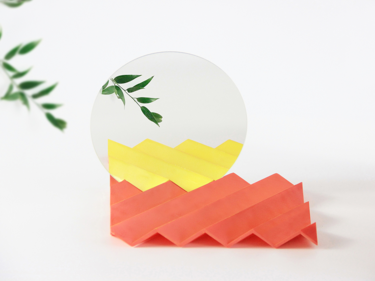
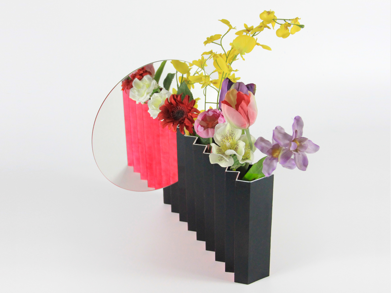
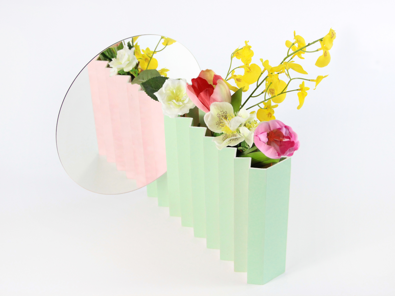
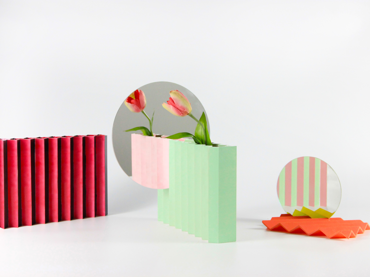
The Zig/Zag collection is a pair of table accessories, namely a vase and a tray, that sport the eponymous shape. That alone is enough to call attention to them because of their uncommon design, but that novelty doesn’t last really long. A properly placed mirror on the edge of these objects, however, reveals a whole new dimension you might have not seen before, almost literally. The wave that you see reflected on those discs doesn’t seem to be the same one standing before you, definitely not the same color, at least.

Imagine seeing a reflection that is the same yet slightly different. The shape of the vase or tray is exactly the same, and so are the objects that they hold. Everything’s mirrored perfectly as you would expect, except for the color of the tray. Orange is yellow, black is hot pink, and green is pale peach. It’s almost as if you’re peering into an alternate reality instead of looking at a mirror, but in truth, the design is just messing with your head. The secret is actually simple: The “zig” side in front is painted with a different color from the “zag” behind it. Unless you’re looking at the objects from a specific angle, you wouldn’t even know that they have two different colors. Only that mirror reveals this duality in a way that seems mysterious and magical.

Mirrors are often seen as functional objects, but the Zig/Zag tabletop collection design transforms it into an art object. The vase and the tray don’t lose nor gain any functionality, but they do gain new value as aesthetic pieces that straddle the line between form and function. It’s a simple gimmick that urges you to take another look, perhaps to solve the mystery that you never knew existed. It makes your mind zig-zag between reality and fantasy, making you pause and simply enjoy the moment of being there.

The post Mirrored tabletop accessories create illusions that have you questioning your sanity first appeared on Yanko Design.
Paper vases lets you play around with shapes, colors, patterns

Vases usually take a back seat to the flowers and plants that they house since the main attraction are the flora. Usually they are just functional or if they do have designs, they’re not always that eye-catching and can sometimes be minimalist. But who says you can’t have attractive flowers and also beautiful vases with various colors and patterns?

Designer: Super Nature Design

The Dot Dot Dot Paper Vase is one kind of vase that will catch your attention even before you put flowers or plants in them. From its name of course you can deduct that they are made from paper but it’s not just any ordinary paper but ones that have different colors, patterns, and shapes. It can spark creativity in the “viewer” and can also serve as an interactive canvas together with what you’ll put in it.

Since the material is paper, you will also be able to fold, shape, and decorate it in any way you want. You can use it to either complement the flora that you’ll put in it or provide a startling contrast to add to the visual smorgasbord. Minimalists will probably not be that fond of it because of the vibrant colors and the textured patterns.

The paper vases have different colorways like green, red, violet, yellow, and pink, but always with the white color creating patterns. There are also different shapes like circles, spirals, half moons, and lines. They can add an artful feel to your space aside from serving its function as a vessel.

The post Paper vases lets you play around with shapes, colors, patterns first appeared on Yanko Design.
Ikebana vessel looks like a puddle of water with a flower sprouting out of it

I rarely display flowers in my space for a lot of reasons. Fresh ones are a bit expensive and hard to come by, my apartment is a bit humid and already overstuffed, I’m too lazy to take care of them and prolong their life, etc. So many excuses but basically I don’t have time or space. Also I don’t have vases or vessels to place them in although it’s pretty easy to find one in the nearest mall and there is no shortage of interestingly designed ones to choose from.
Designers: Naoki Ono and Yuki Yamamoto

If these were produced and made available commercially, I might have actually gotten them. Puddle is a series of unique-looking flower vessels that were designed to look like what it’s name after. I really can’t call them vases since there is a limit to the amount of flowers it can hold. The body is designed to look like different water puddle patterns so the flower you place in (on?) it looks like it’s sprouting from that puddle.

The transparent body which has different organic water puddle shapes has a wall that’s just 1.55 m high, just enough to have a cup of water. There’s a tiny needle in the middle where you can insert a single plant stem. You just have to pour water over the needle to fill the vessel with it and even creating actual puddles while doing so with water spilling over into the ledge. I don’t know how long that single stem of flower can last given the way the vessel is designed.

But it’s a pretty interesting and unique kind of flower vessel to have around your space. You can maybe even fool some guests to thinking that you have spilled some water and there’s a flower that grew out of that. Well, if they don’t really look that closely. Sadly it didn’t get produced for commercial purchase, maybe due to practicality reasosns.

The post Ikebana vessel looks like a puddle of water with a flower sprouting out of it first appeared on Yanko Design.