Escape Tiny Homes’ N2 Is the Tiny Home That Makes You Question Why You Ever Needed More Space

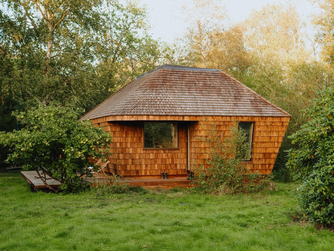
Somewhere between a weekend cabin and a permanent address, the N2 finds its footing. The N2 by Escape Tiny Homes doesn’t try to pretend it’s anything other than a compact, well-considered dwelling — and that clarity is precisely what makes it compelling.

Built by Escape Tiny Homes, the Wisconsin-based manufacturer that has spent years refining the craft of small-space living, the N2 is a tiny home on wheels designed for people who want permanence without the footprint. It sits on a steel trailer frame, certified by NOAH, meaning it meets rigorous construction standards that most DIY tiny homes never approach. That certification isn’t just a badge — it’s the difference between a home that lasts decades and one that warps after a few winters.

Designer: Escape Tiny Homes

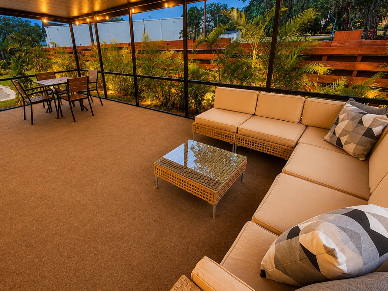
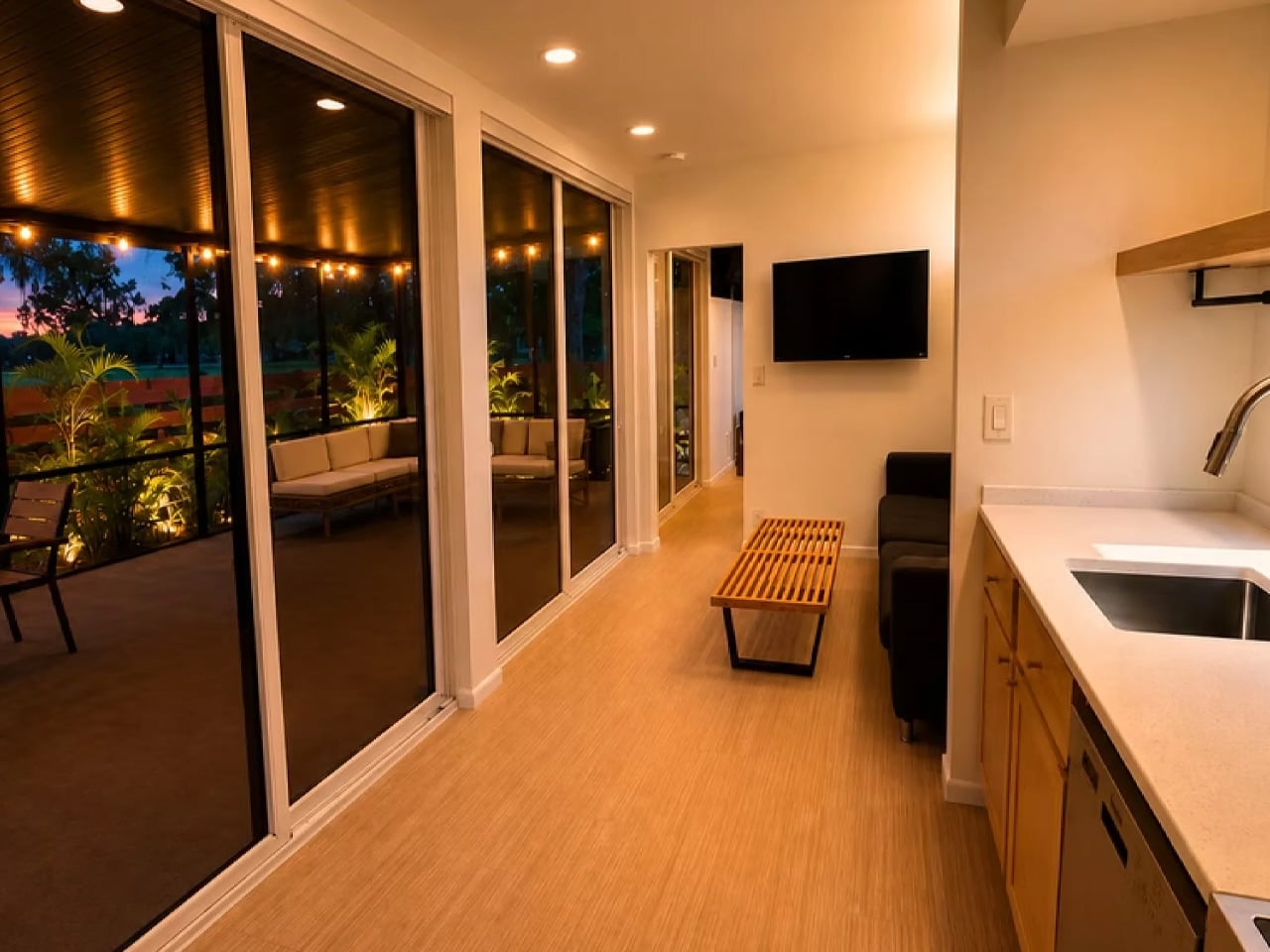
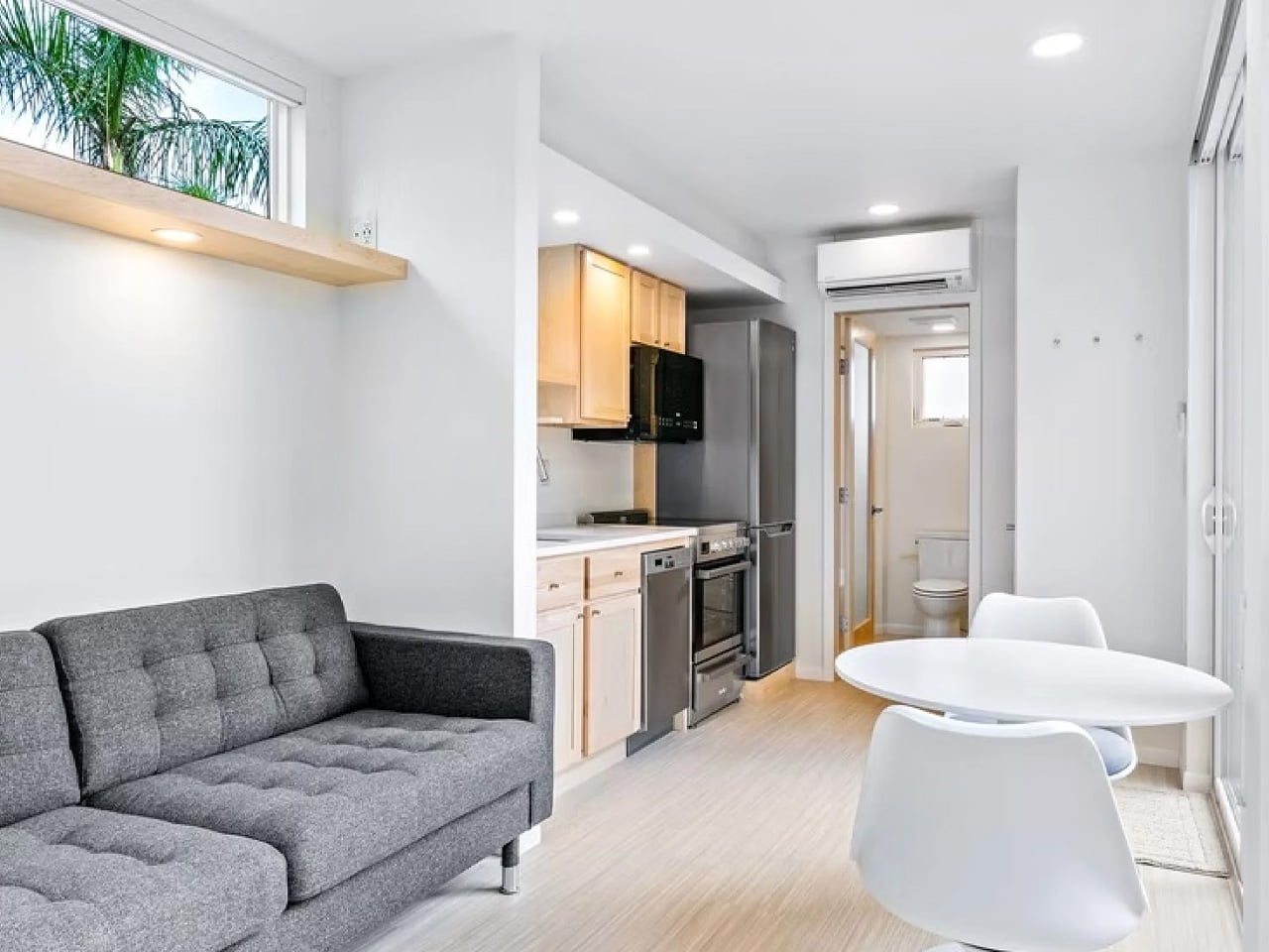
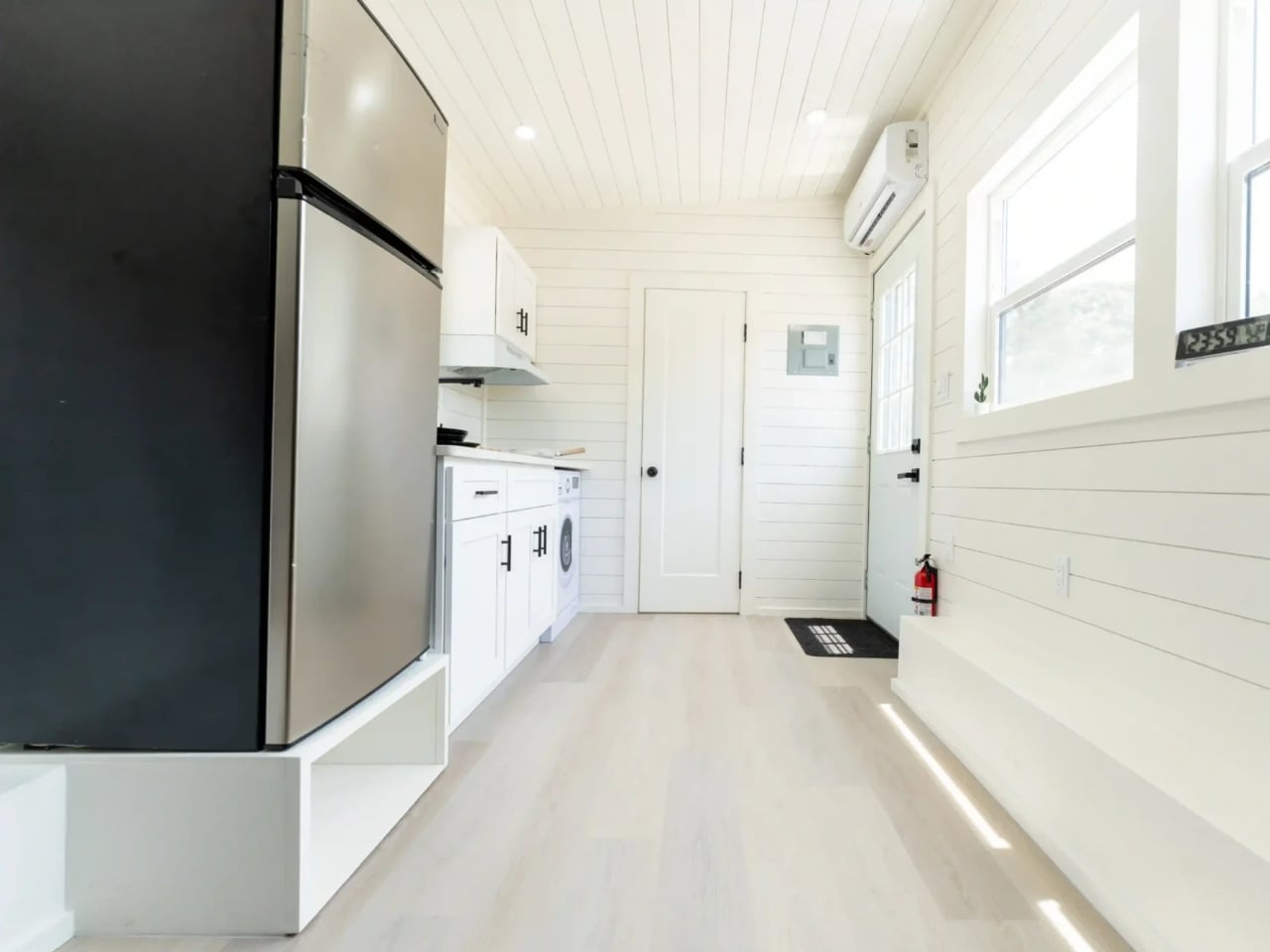
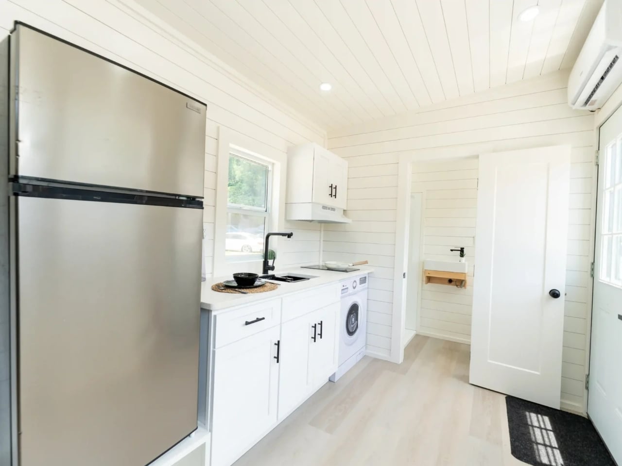
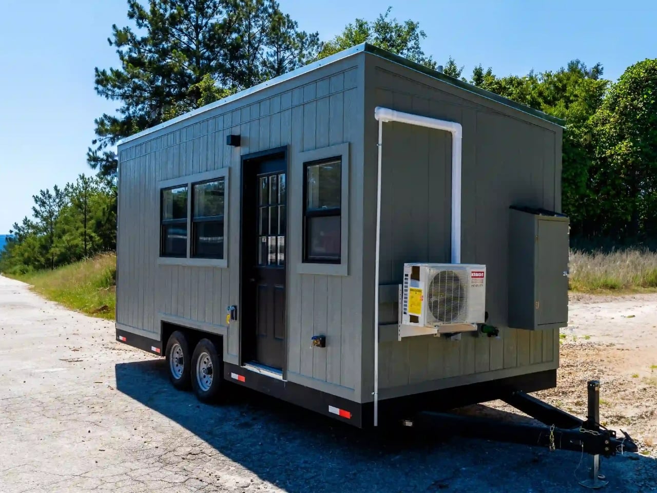
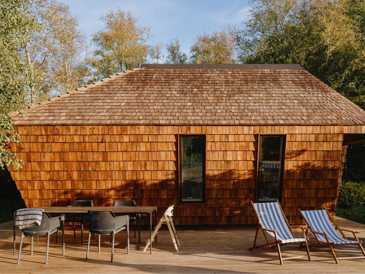
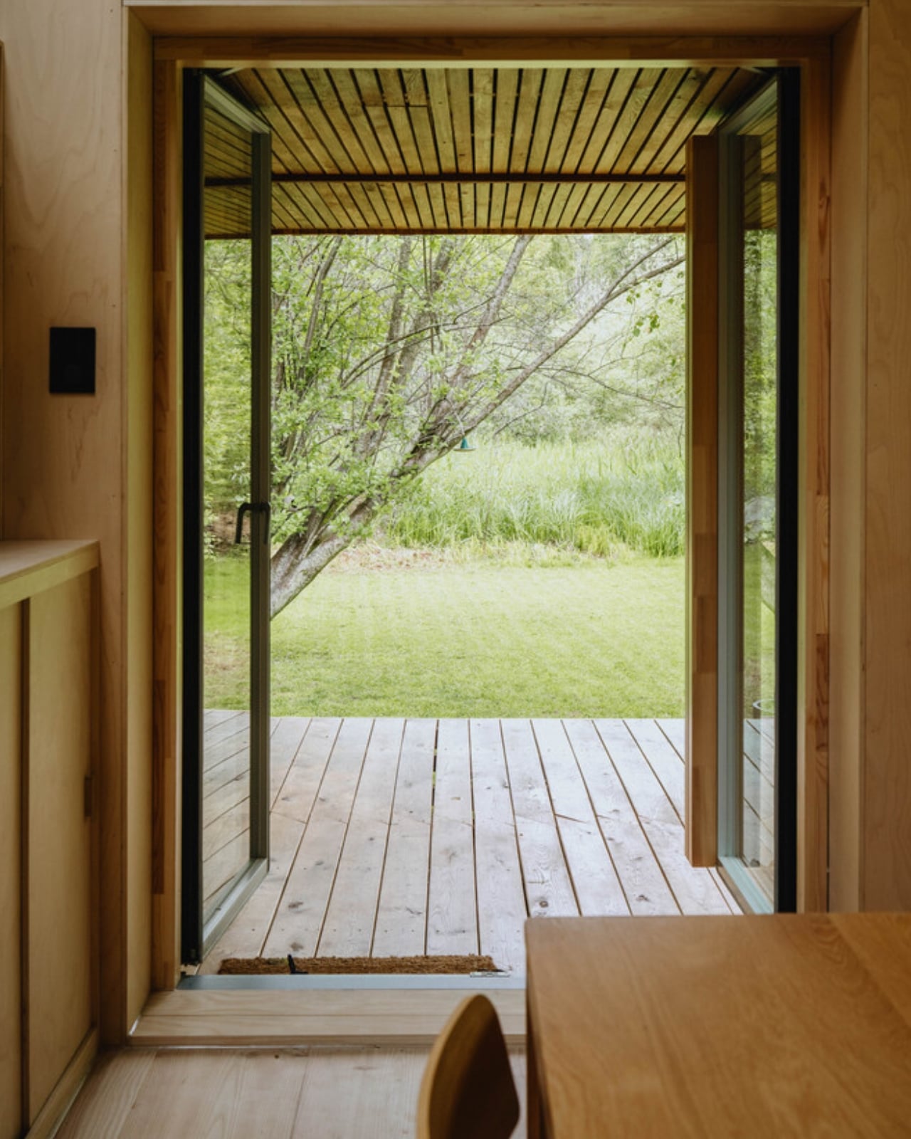
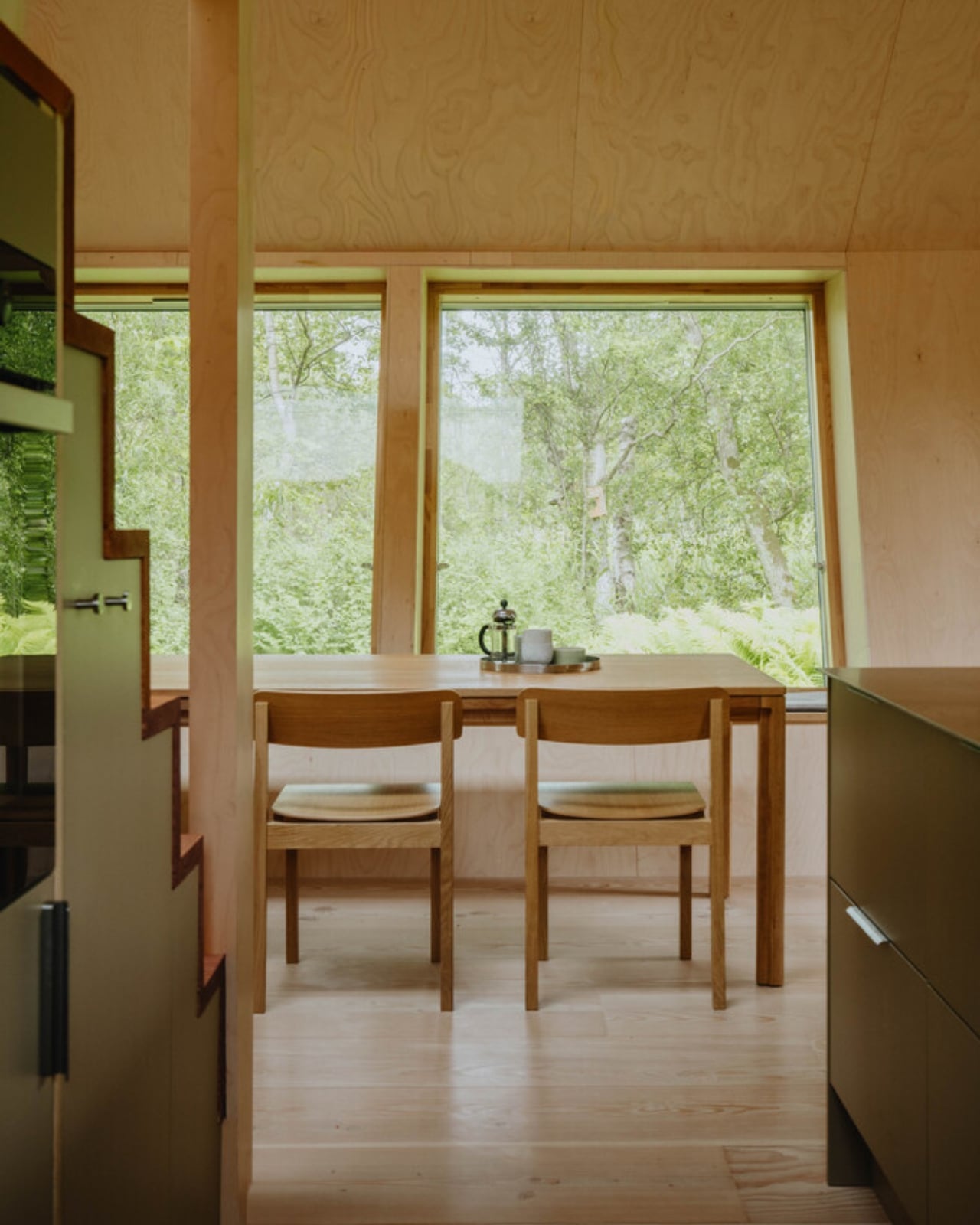
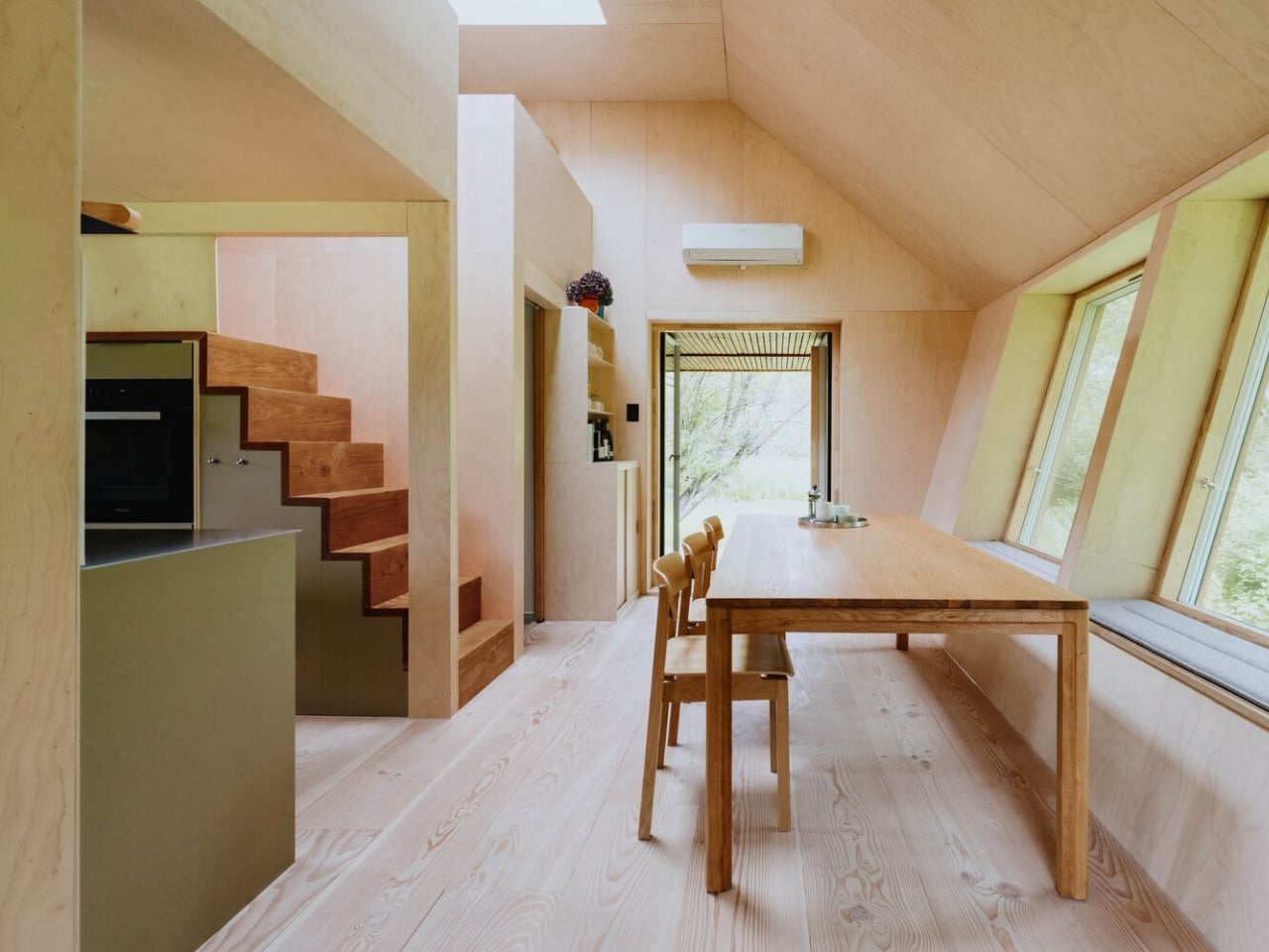
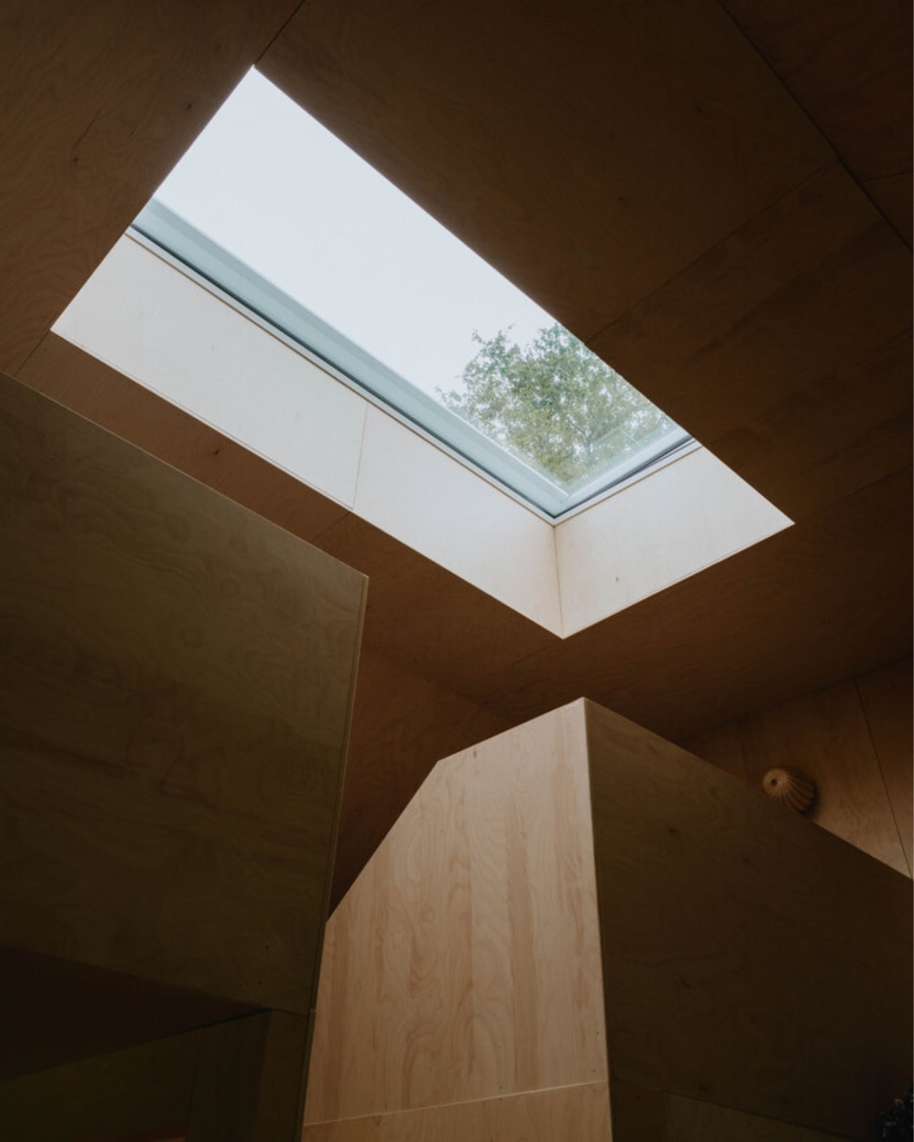
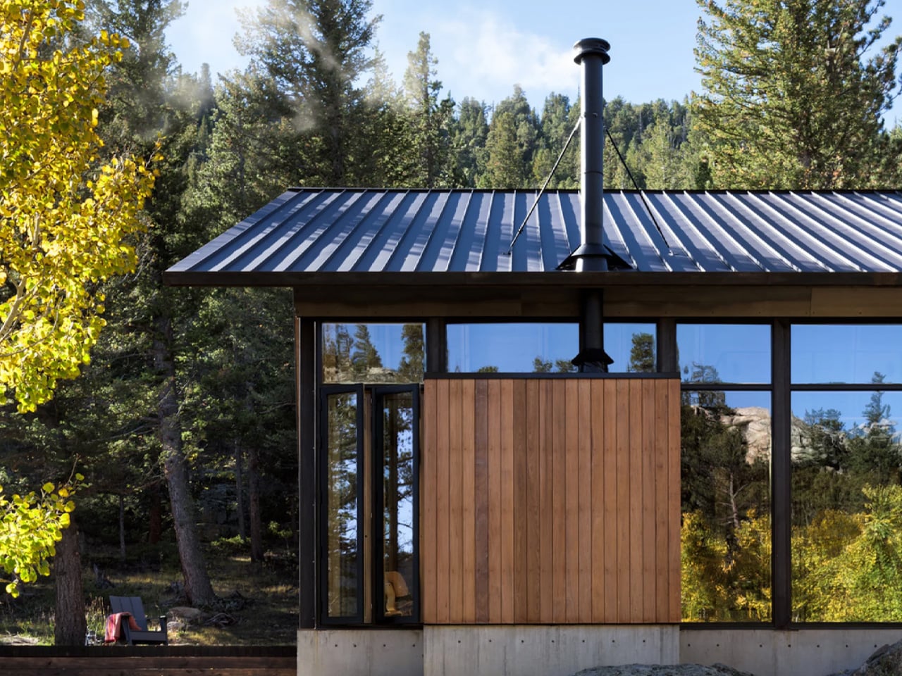
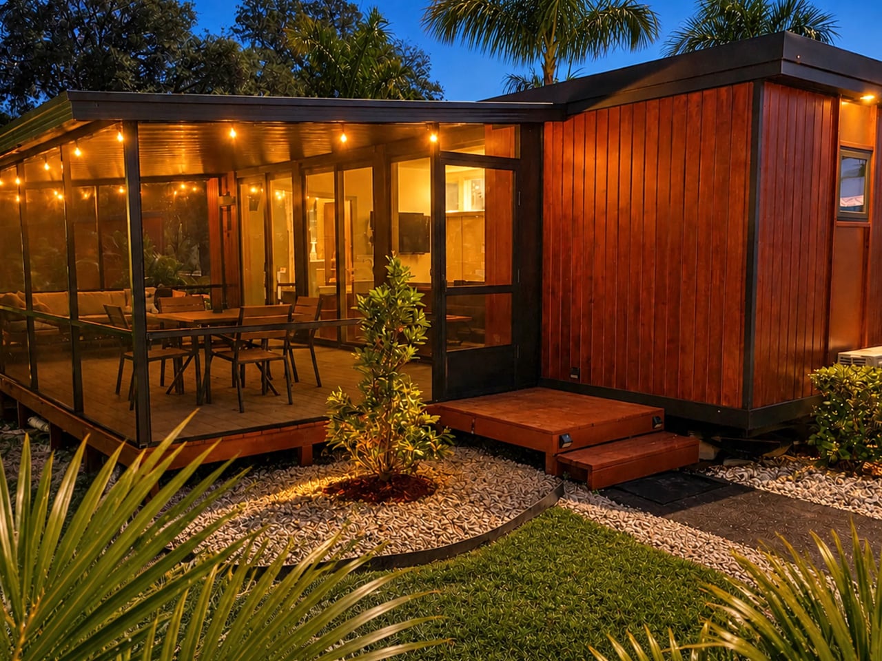
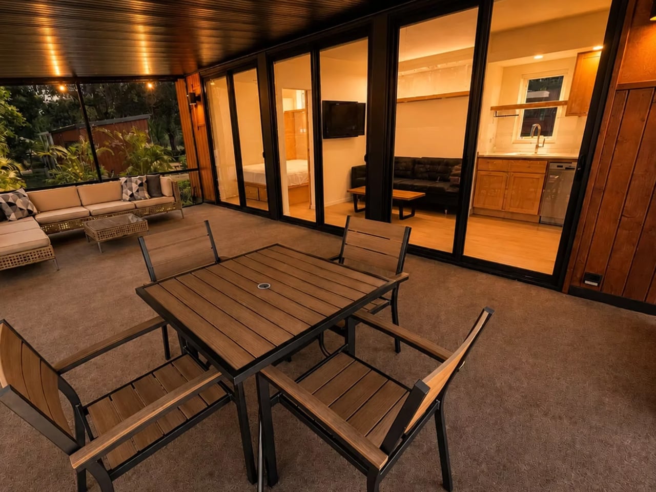
The exterior carries Escape’s signature modern aesthetic: clean lines, board-and-batten siding, and a low-profile roofline that reads more like a Scandinavian cabin than a road-bound structure. It photographs beautifully, which matters in an era where the first impression of any home happens on a screen. Inside, the design logic is just as deliberate. The layout prioritizes flow over square footage, with an open-plan living and kitchen area that feels generous despite its dimensions. Large windows pull in natural light throughout the day, doing the work that extra square footage usually does in a conventional home.

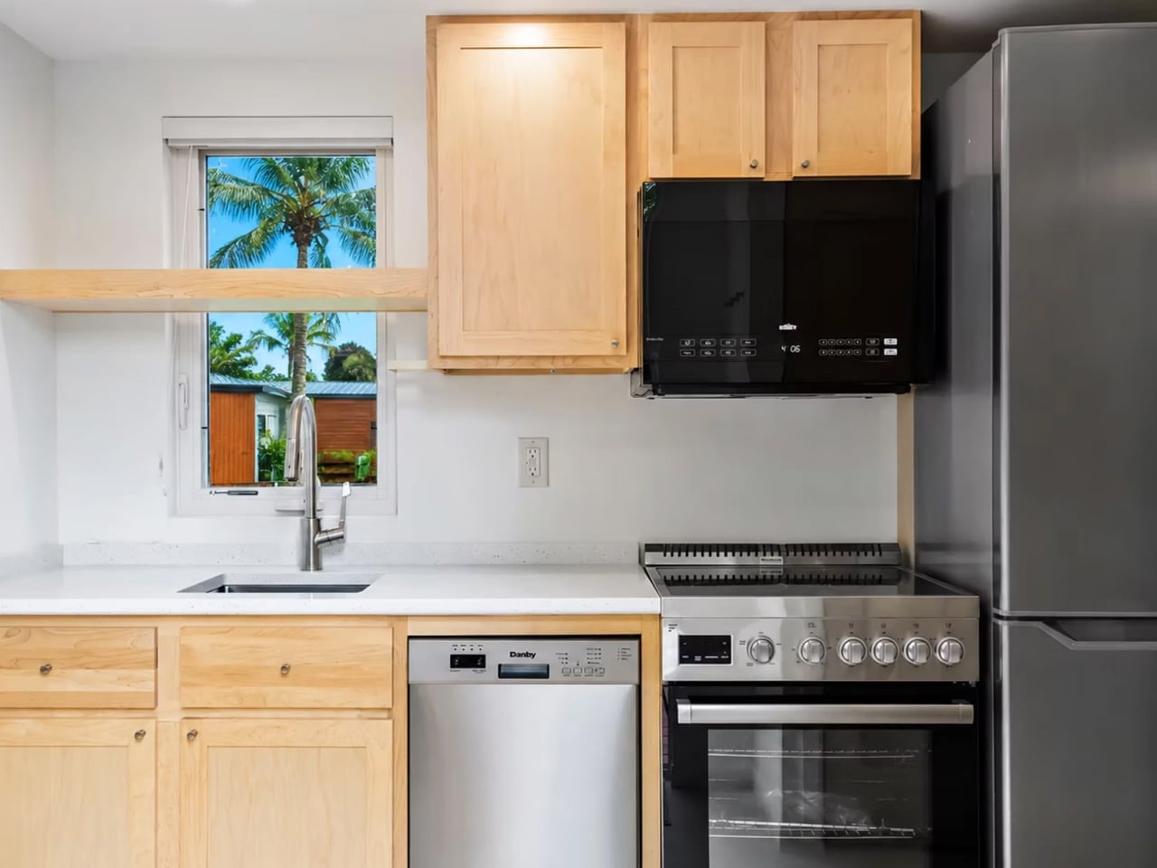
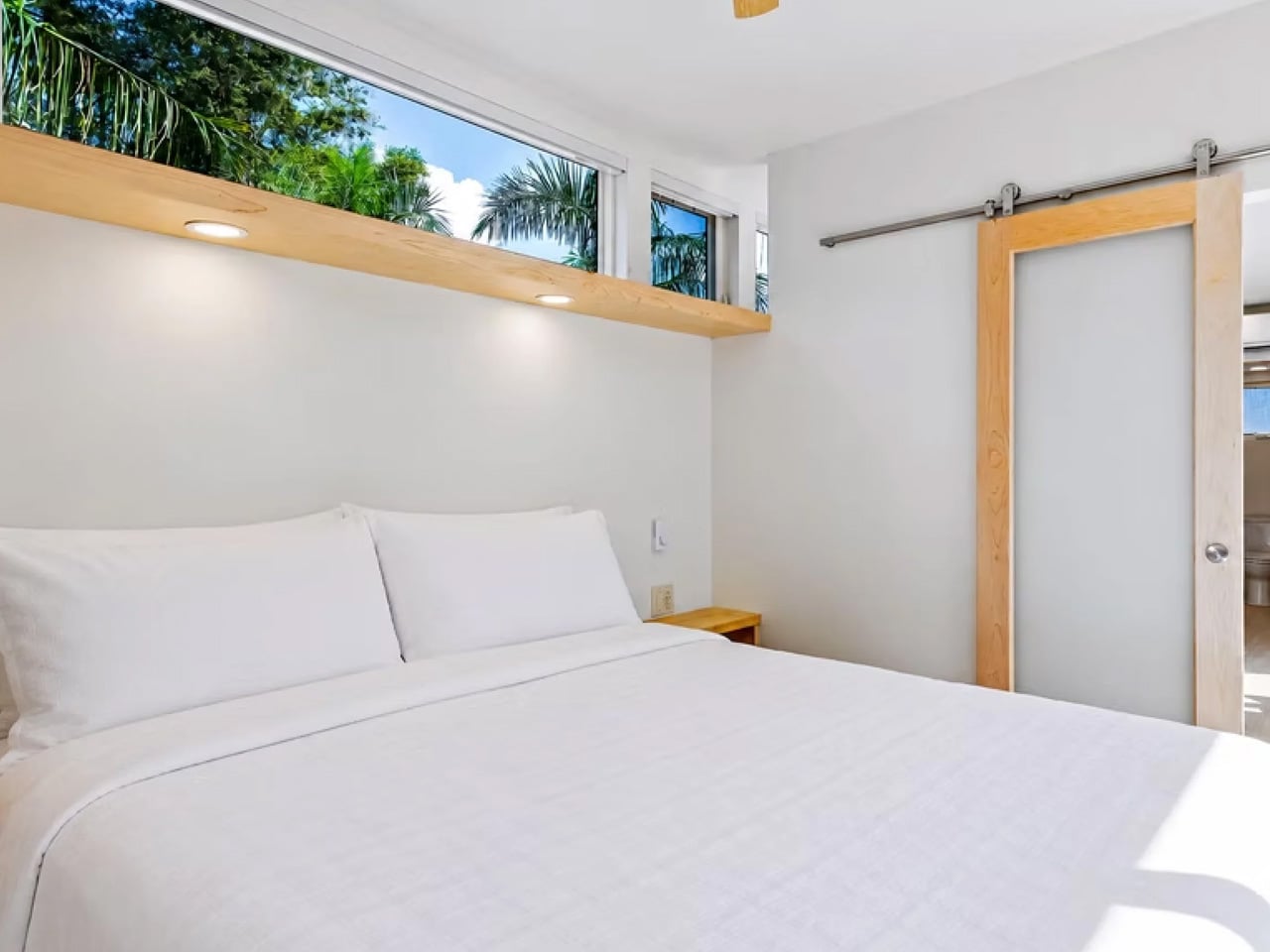
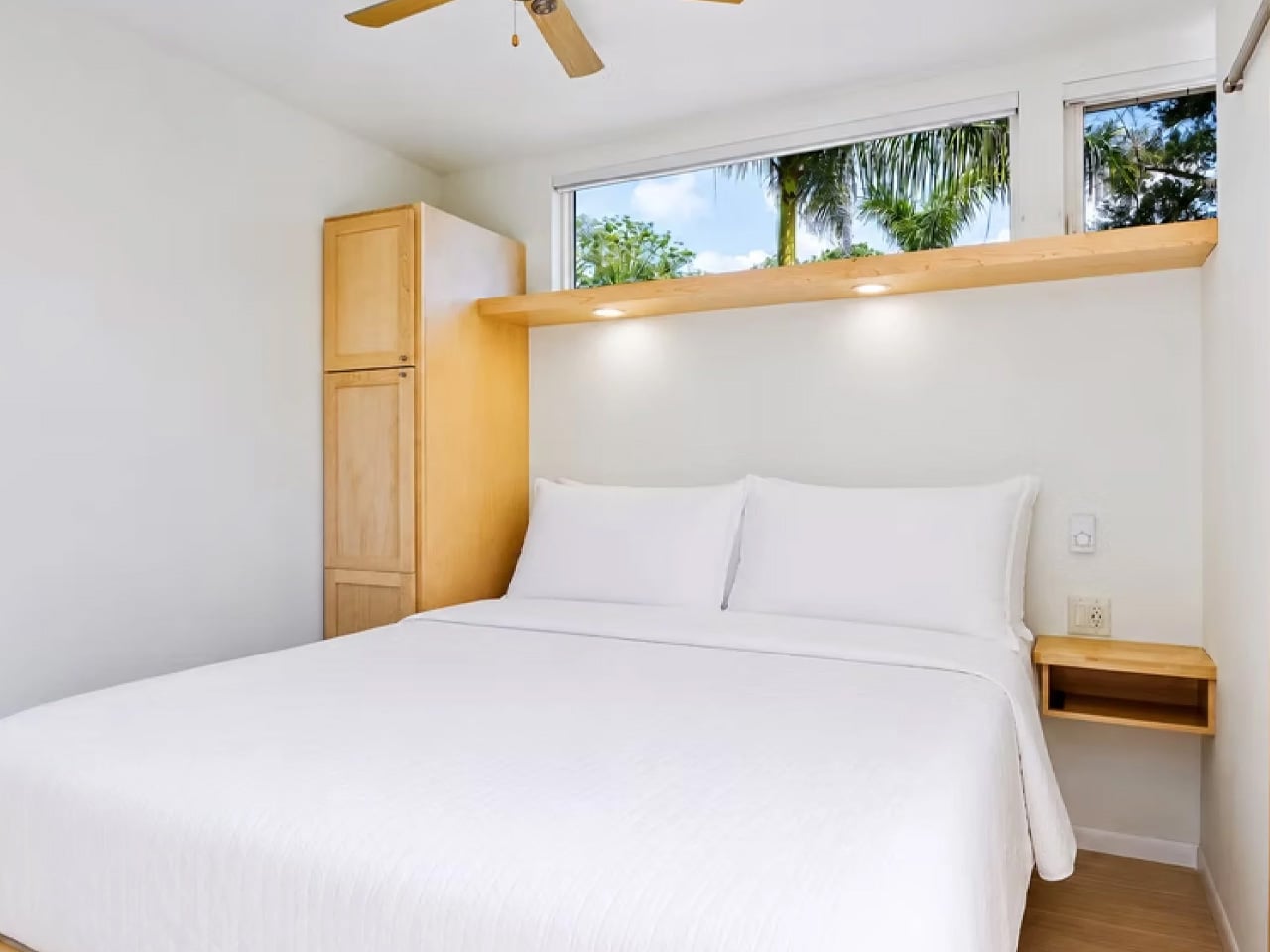
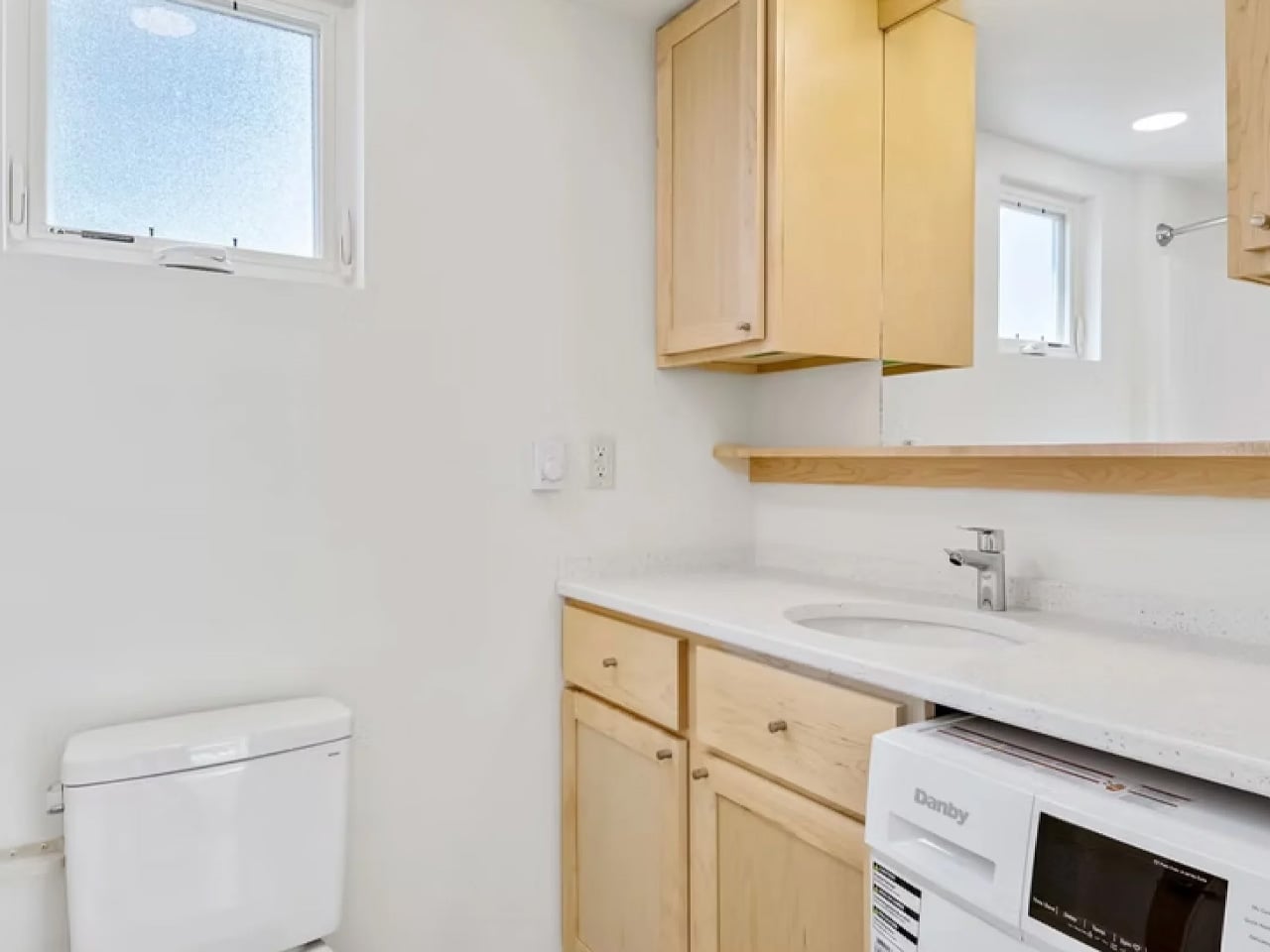
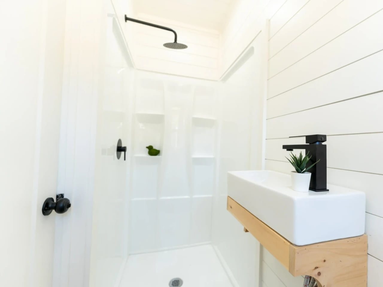
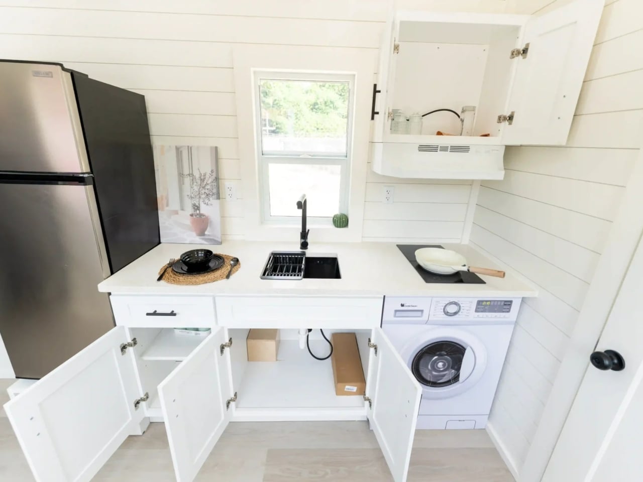
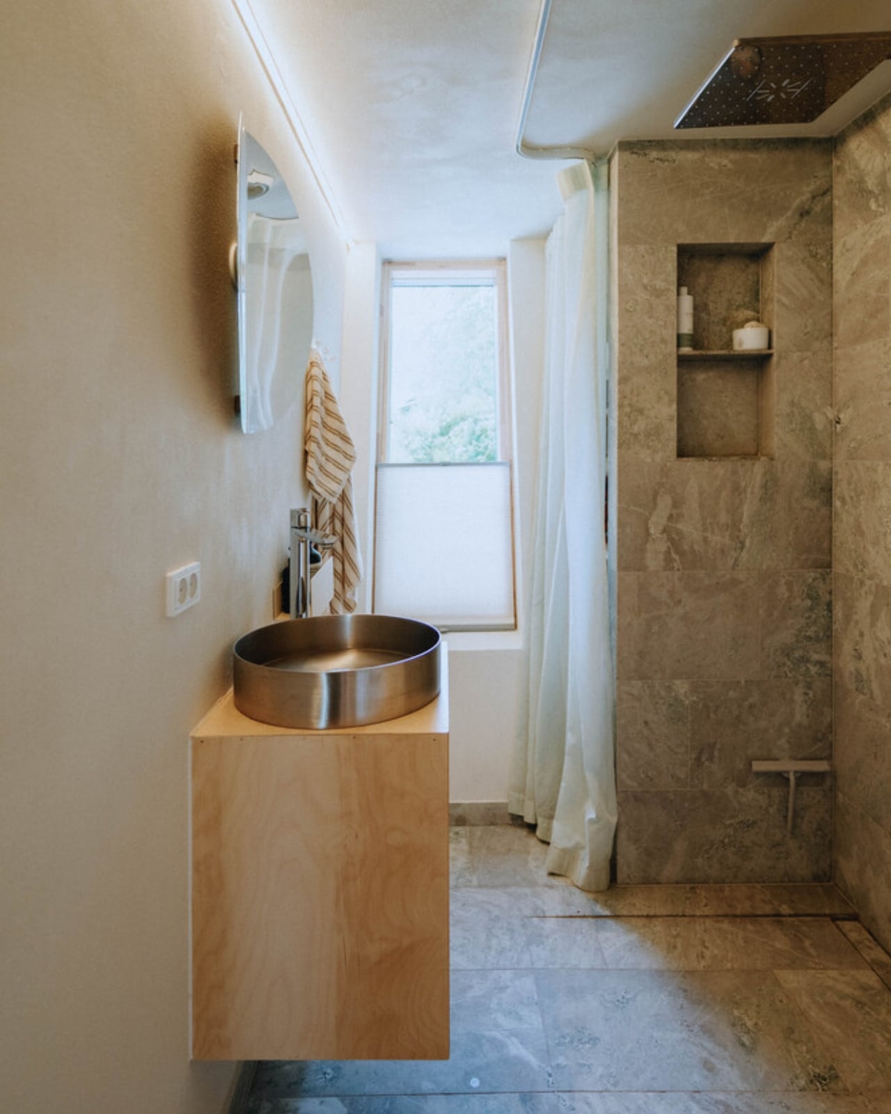
The kitchen is functional without being minimal to the point of frustration — there’s actual counter space, cabinetry that reaches the ceiling, and room for a full-size refrigerator. The loft bedroom above offers a sleeping area that, depending on your ceiling preferences, works best for those who prefer a cozy, nest-like rest environment rather than something you can stand up in. The bathroom is compact but finished with the same attention to detail as the rest of the space.

What Escape understands, and what the N2 demonstrates well, is that tiny home living is a mindset shift before it’s a spatial one. The home doesn’t ask you to sacrifice comfort — it asks you to reconsider what comfort actually requires. For remote workers, weekend retreat seekers, or anyone looking to reduce overhead without reducing quality of life, the N2 presents a genuinely livable answer.

At a price point that undercuts most traditional builds by a significant margin, the N2 makes the case that thoughtful design doesn’t demand a large canvas. Sometimes the most interesting work happens when the constraints are real.

The post Escape Tiny Homes’ N2 Is the Tiny Home That Makes You Question Why You Ever Needed More Space first appeared on Yanko Design.

This Tiny Home Is a Wine-On-Tap, Off-Grid Luxury Retreat in the Australian Bush

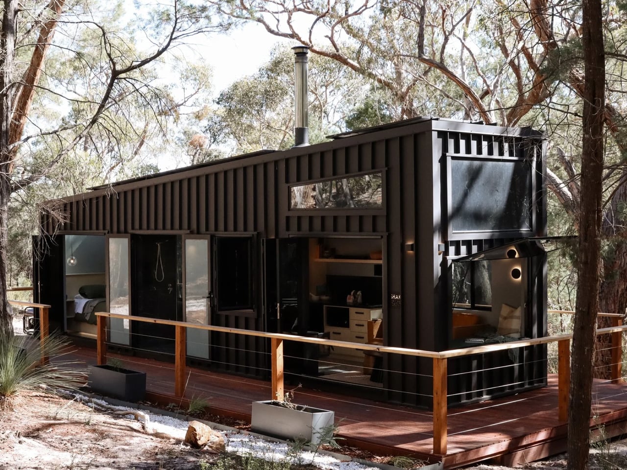
There are tiny homes, and then there is the SHAK. Built by Gold Coast-based Removed Tiny Homes as a bespoke one-off commission, it won “Best Weekender” at the 2025 Tiny House Industry Awards — and once you see it, the reason is immediately obvious. Tucked into the Grampians of Victoria, Australia, it reads less like a transportable dwelling and more like a piece of architecture that grew out of the landscape itself.

The exterior sets the tone. Dark vertical cladding, an angular stepped roofline, and a wraparound timber deck give SHAK a sculptural presence that most permanent homes never achieve. It runs completely off-grid, fully self-sufficient with no power line in sight, and that sense of self-reliance is woven into every design decision inside it.

Designer: Removed Tiny Homes

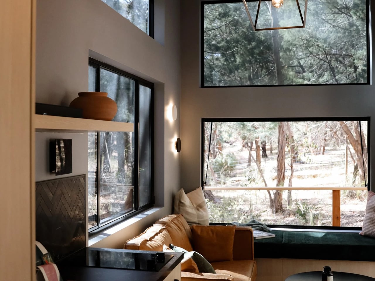
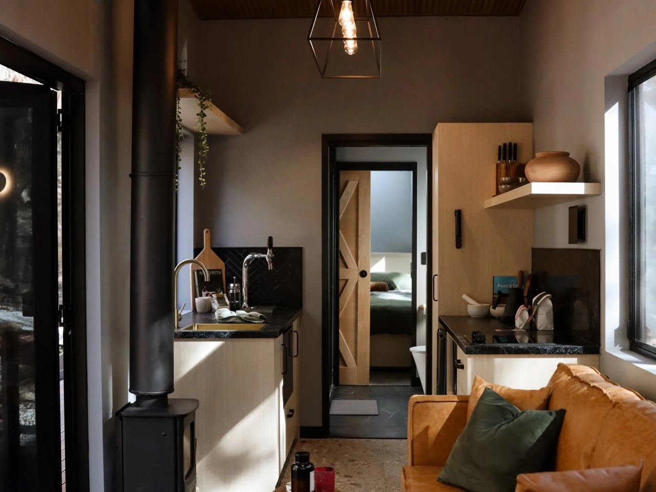
The living space is compact but deliberate. A tan leather sofa and a built-in green velvet window seat sit beneath stacked picture and clerestory windows that frame the surrounding gum trees like a moving painting. A sculptural brass pendant and floating timber shelves warm the dark interior palette, turning what could feel confined into something genuinely calm. It is the kind of room you settle into, not just pass through.

The kitchen is where SHAK makes its most memorable statement. Dark stone benchtops, timber cabinetry, a black herringbone-tile splashback, and brass tapware already read as high-end — but the detail that everyone remembers is the wine on tap, plumbed straight to the bench. A black wood-burning fireplace anchors the living end and keeps the retreat warm without a single grid connection. A timber barn door slides closed to separate the bedroom beyond, and the whole space feels more like a carefully styled bar than a tiny-house galley.

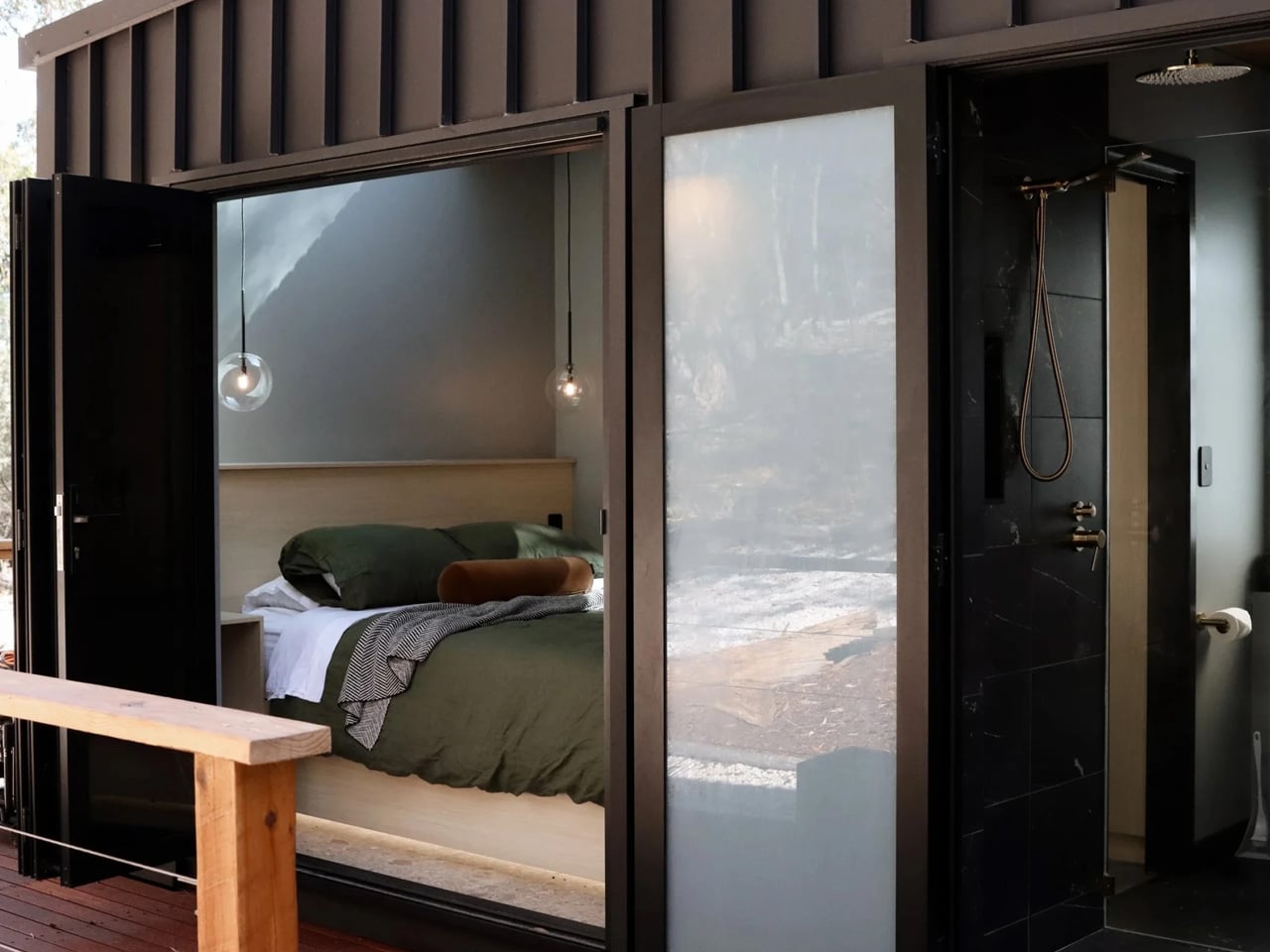
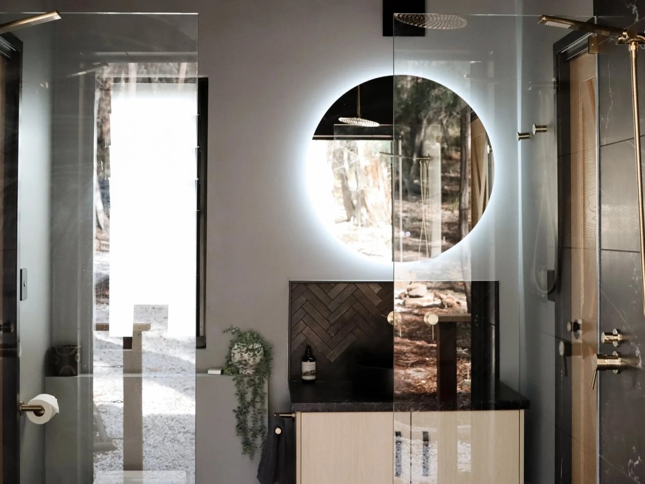
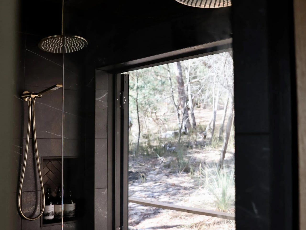
The bathroom earns its own category. Two brass rainfall heads hang from a timber-lined ceiling over a dark marble-tiled double shower. A full-height glass door swings open directly onto the bush, turning a morning shower into an open-air ritual with nothing but trees in view. The round backlit mirror, the vessel basin, the dark stone vanity top — it is spa-grade specification in a footprint most architects would dismiss as impossible.

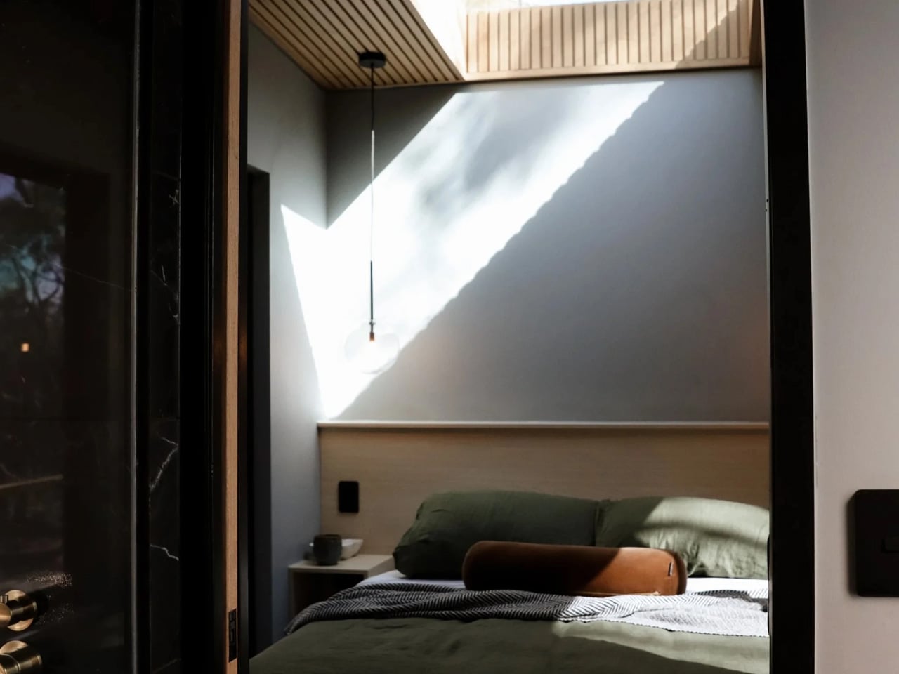
Behind the bathroom, the bedroom keeps the mood: a queen bed dressed in olive-green linen beneath a timber-slat ceiling and a large skylight that pours daylight across the room throughout the day. Removed describes SHAK as “a showcase of what’s possible when you design for experience, not just square metreage.” That framing is exactly right. SHAK does not feel like a compromise. It feels like a choice.

The post This Tiny Home Is a Wine-On-Tap, Off-Grid Luxury Retreat in the Australian Bush first appeared on Yanko Design.

The Madrid House Built From 5 Interlocking Cylinders

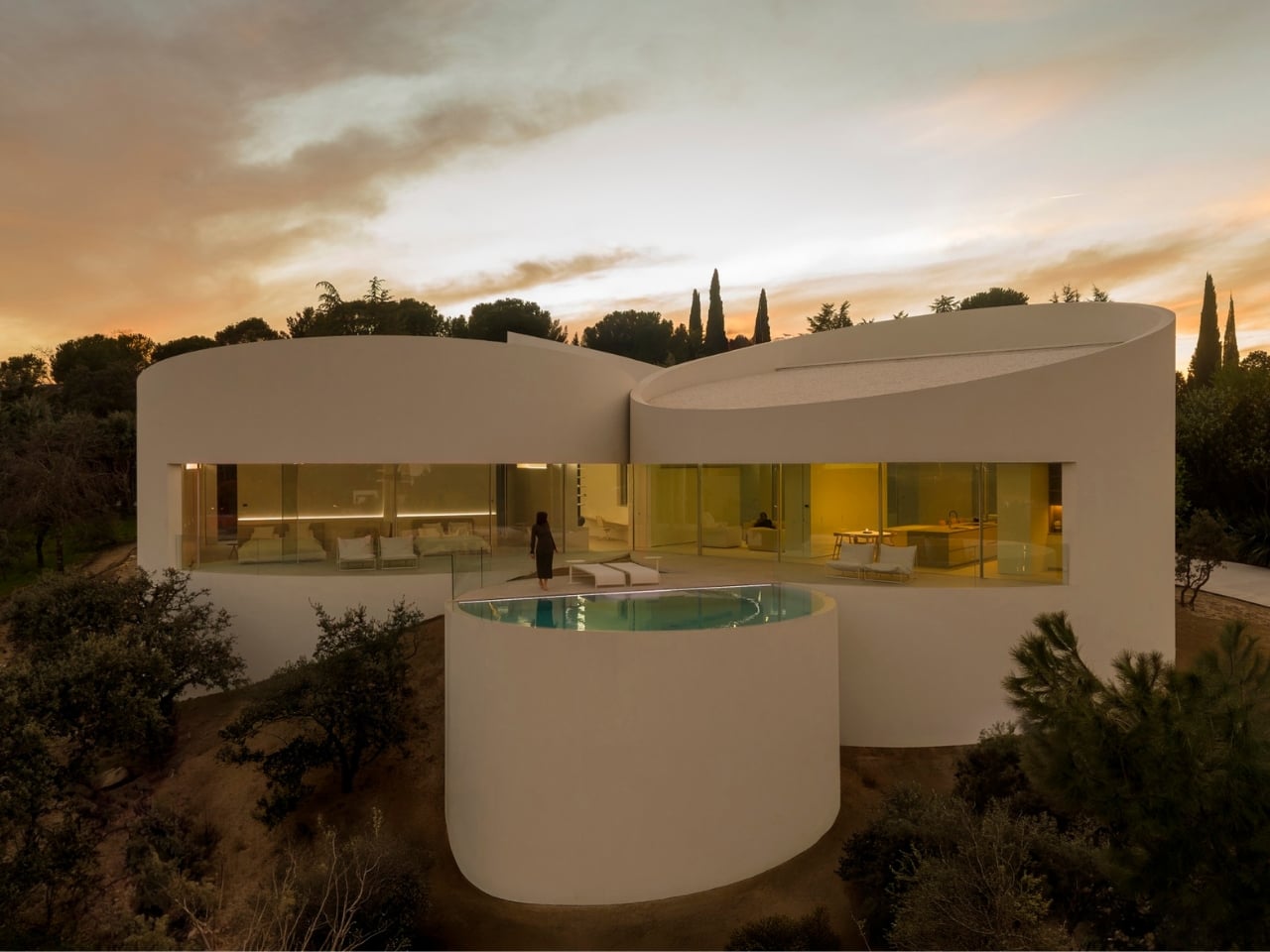
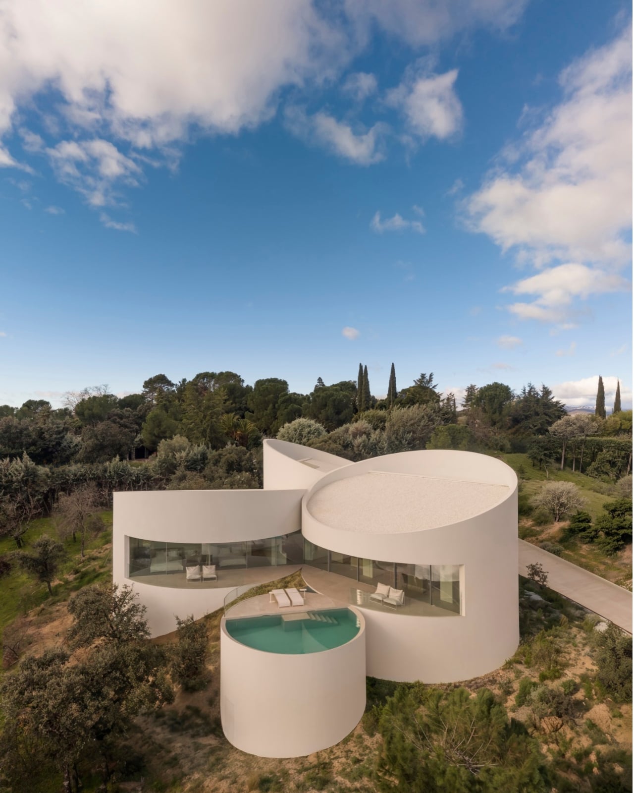
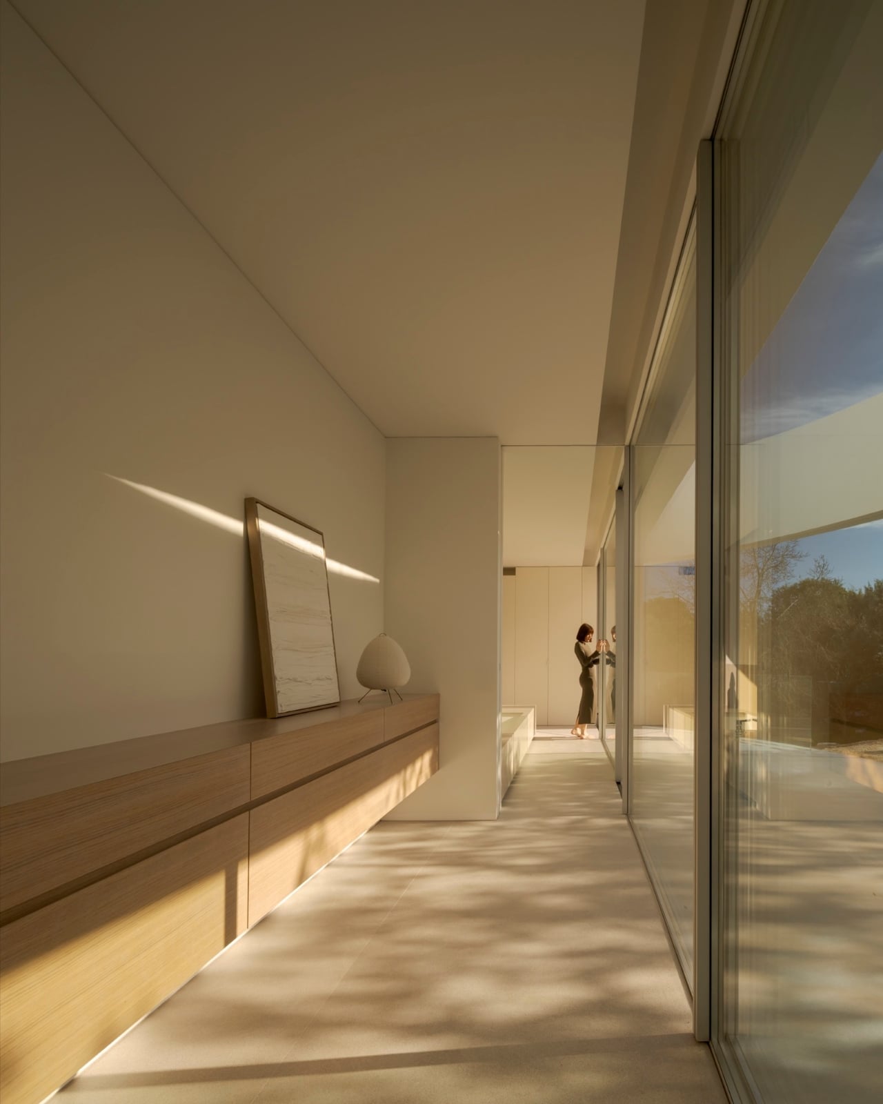
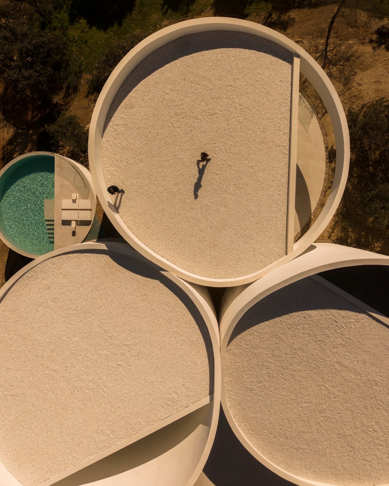
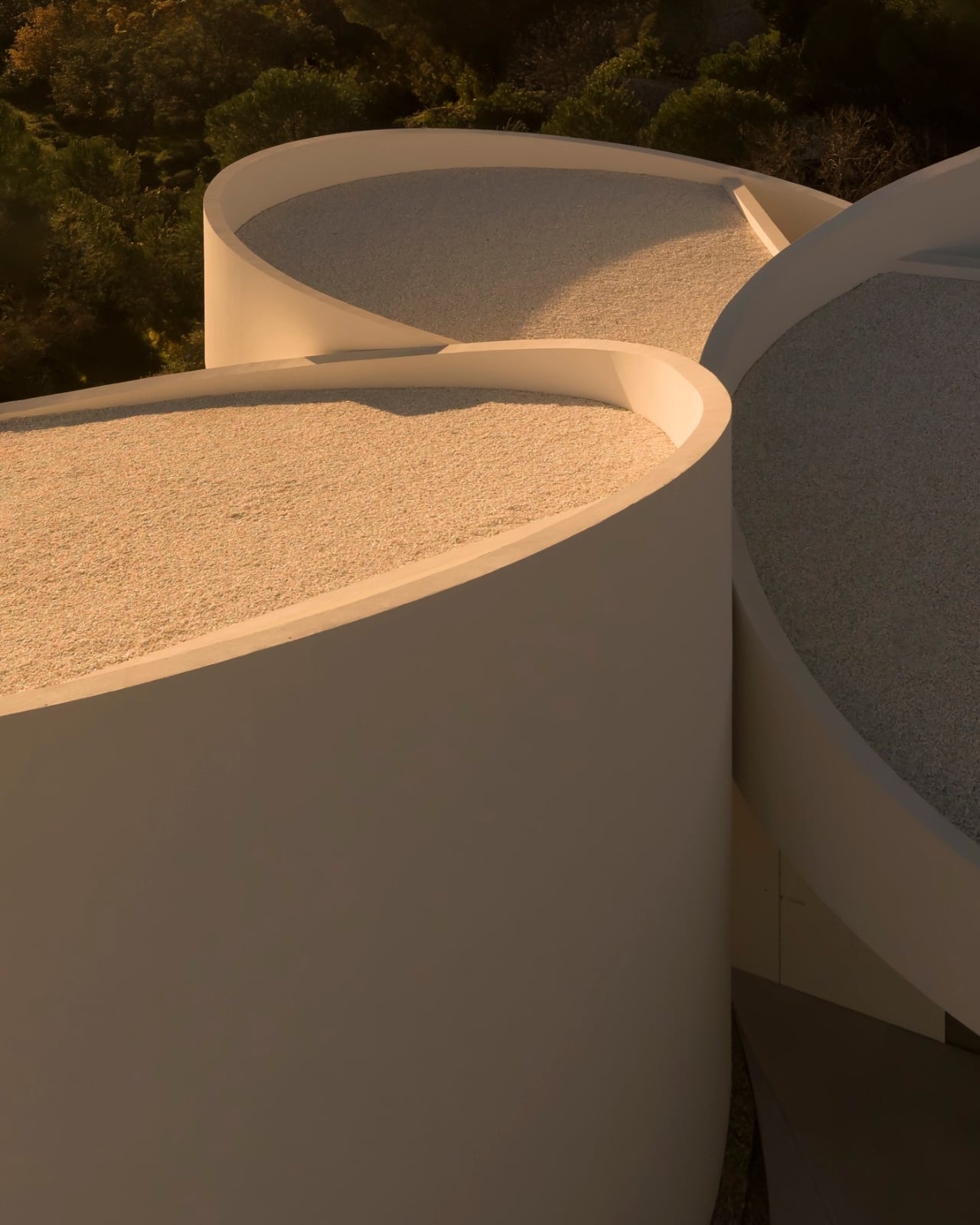
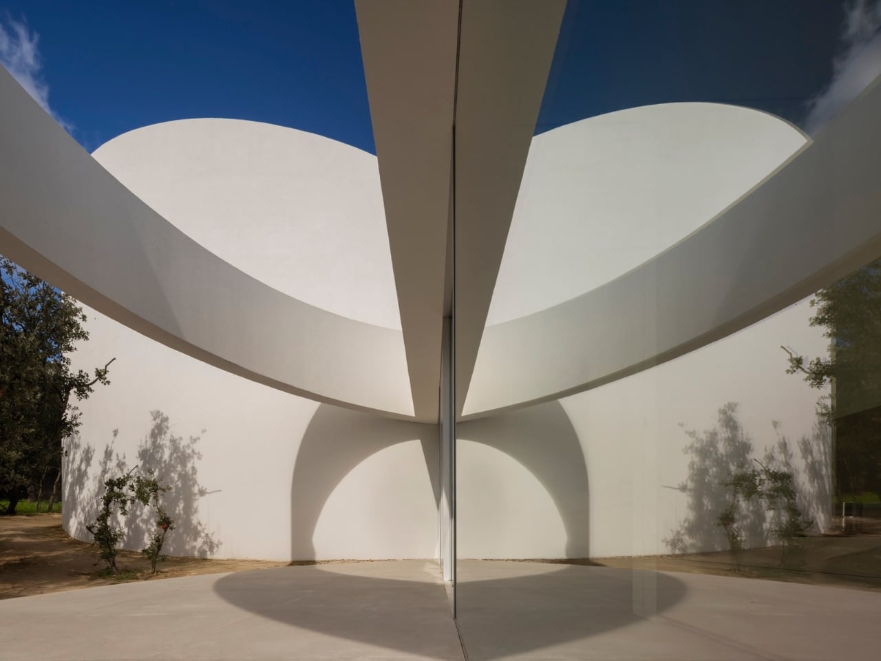
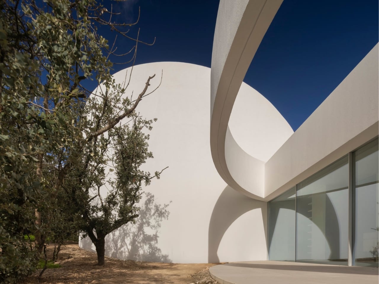
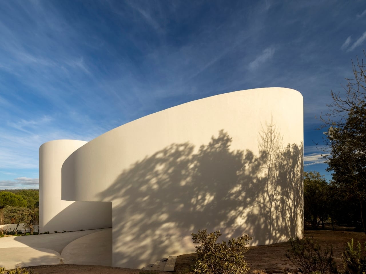
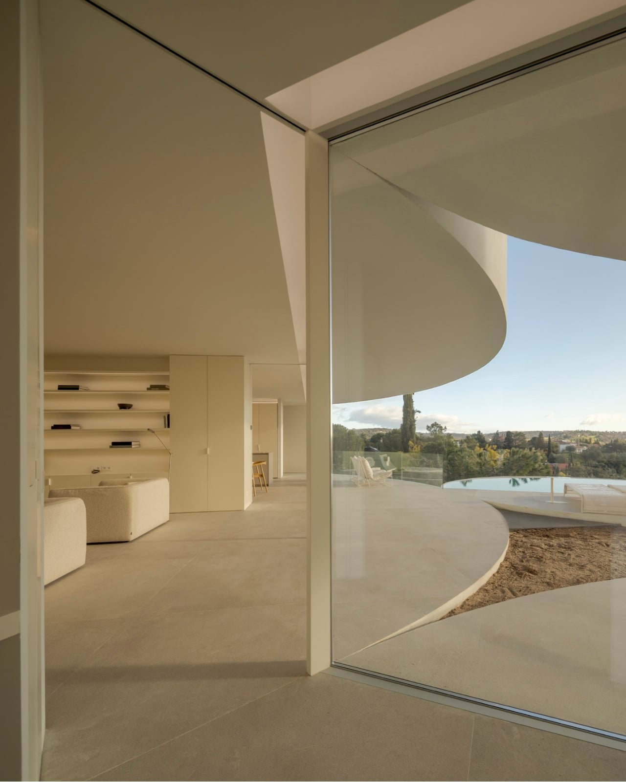
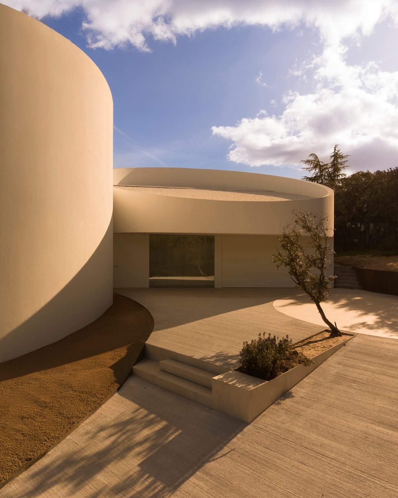
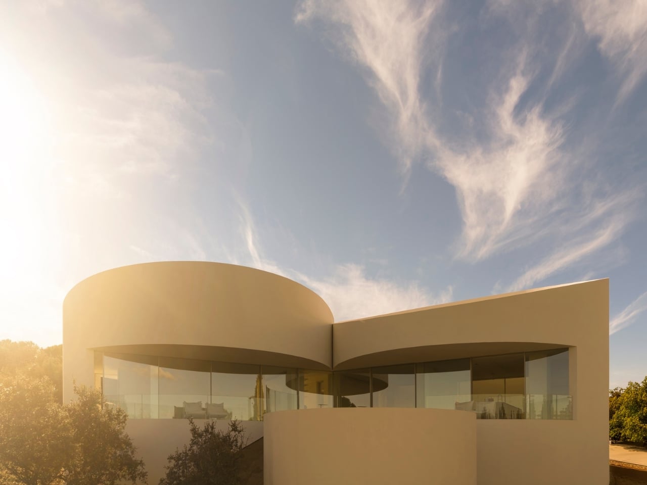
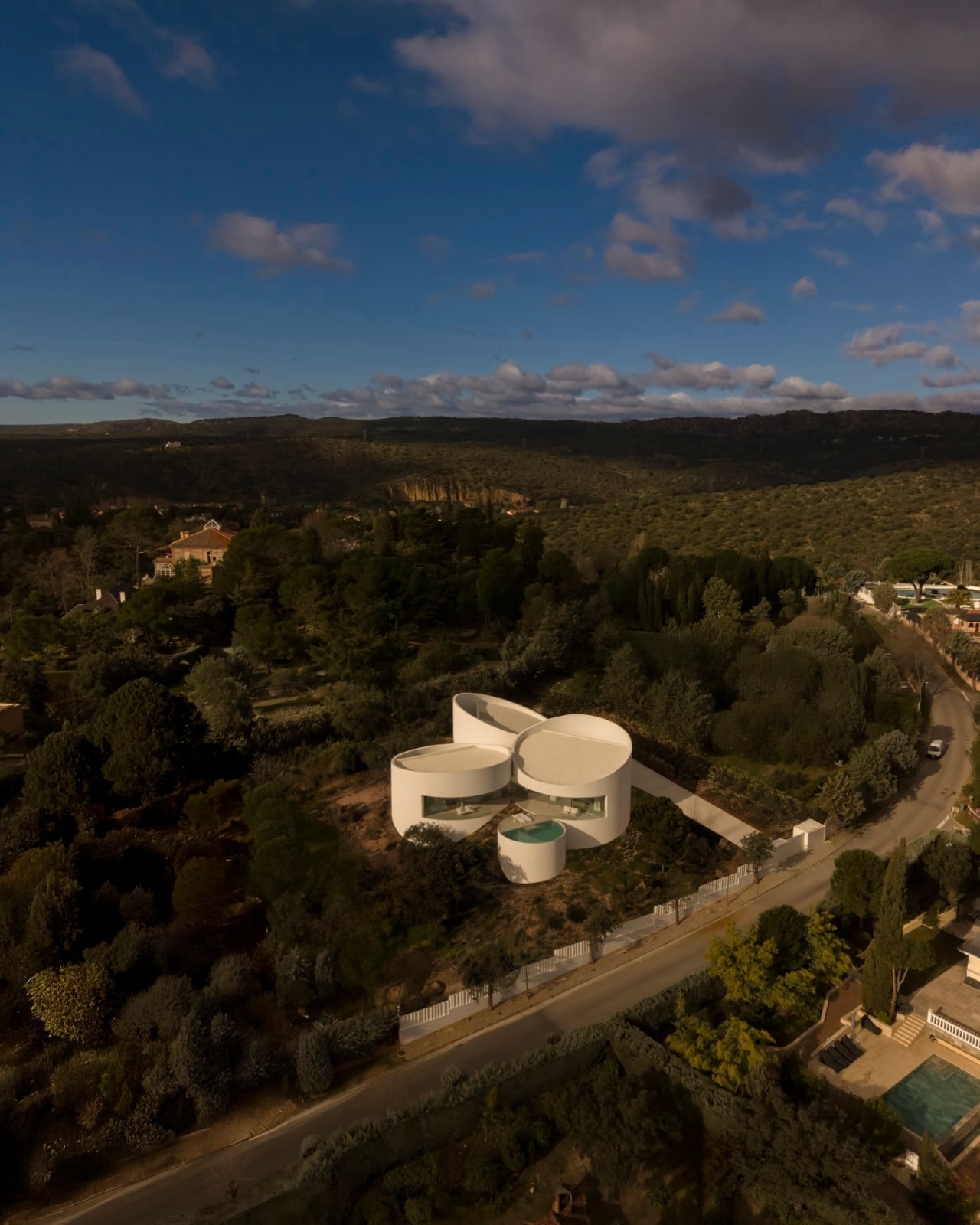
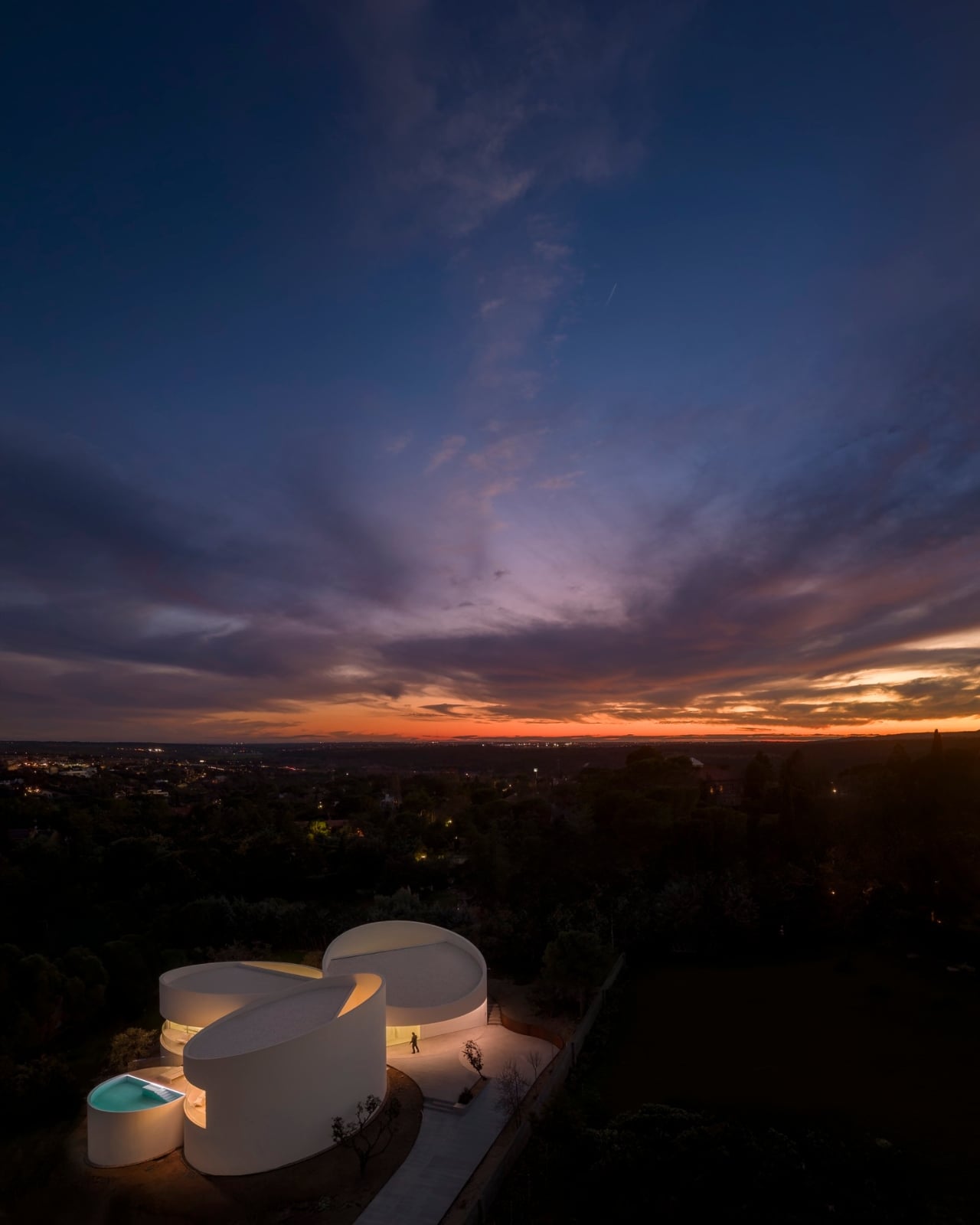
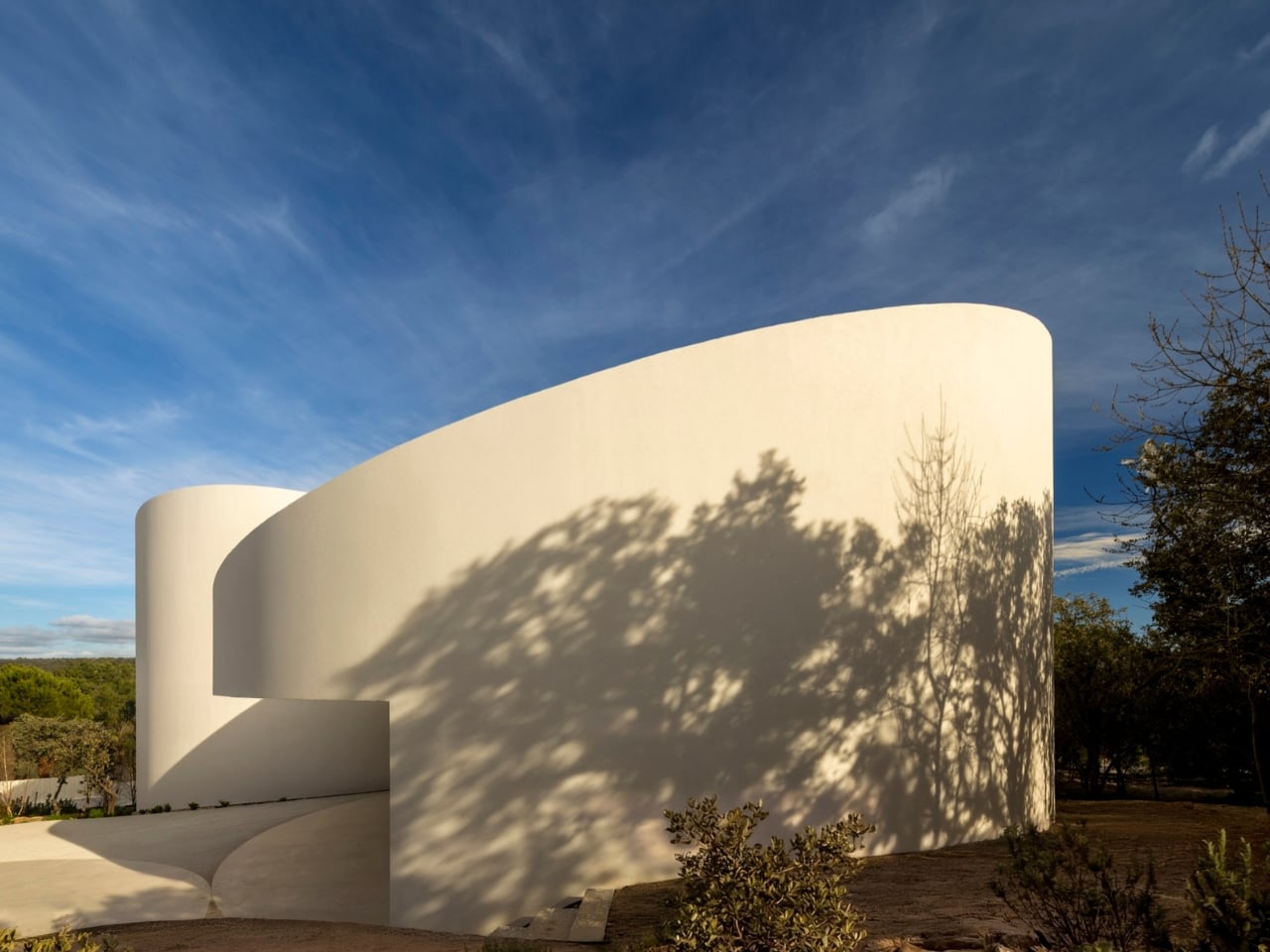
The first time I saw photos of the House in Las Rozas, I genuinely thought it was a render. Not because it looked fake, but because it looked too intentional to be real. Five white cylinders, intersecting and overlapping on a gently sloping hillside just outside Madrid, with the Sierra de Guadarrama stretched out behind them like a painting. It’s the kind of house that makes you pause, tilt your head, and wonder exactly what kind of mind looked at an empty plot of land and thought: cylinders.

That mind belongs to Fran Silvestre Arquitectos, a Valencia-based firm that has quietly become one of the most compelling architectural studios working today. Their portfolio already includes some breathtaking residential work, but the House in Las Rozas feels like a step further out on the ledge. It’s a 370-square-meter home built not just around a geometry, but entirely because of one.

Designer: Fran Silvestre Arquitectos

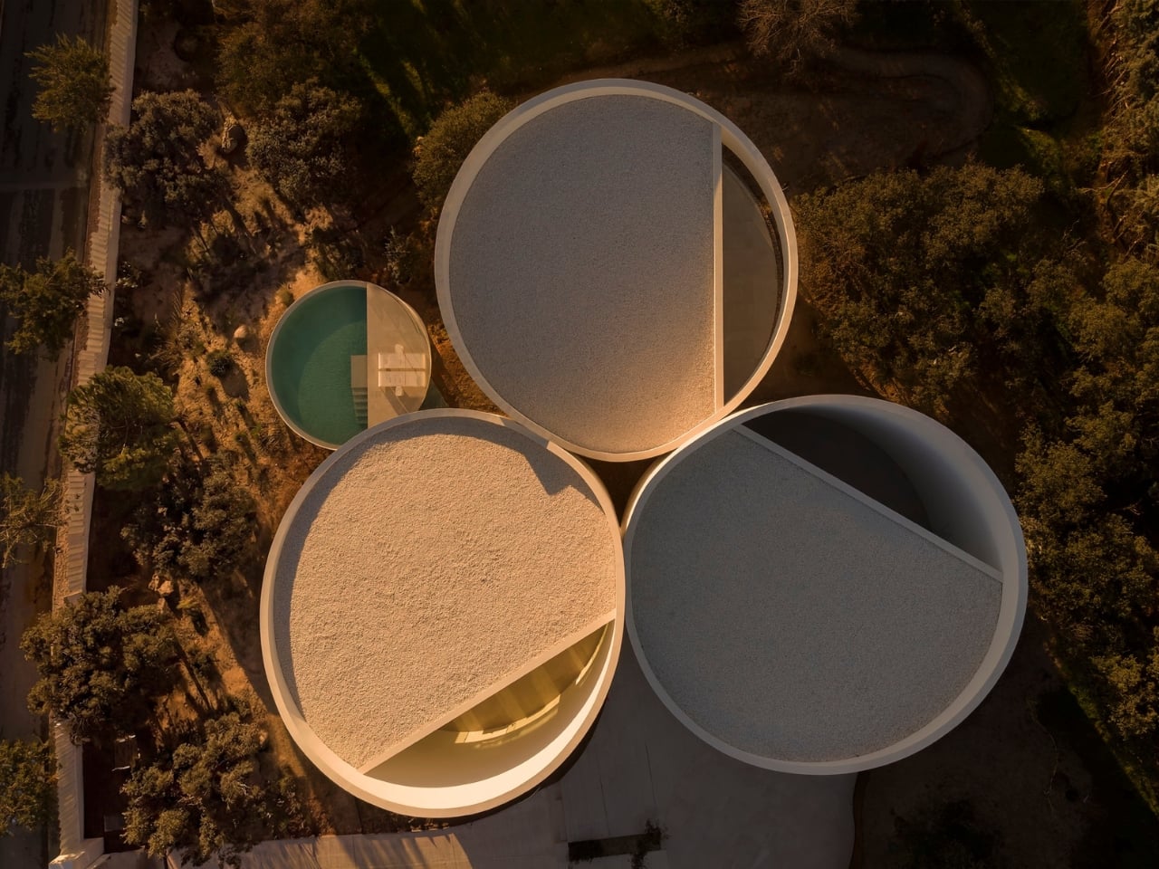
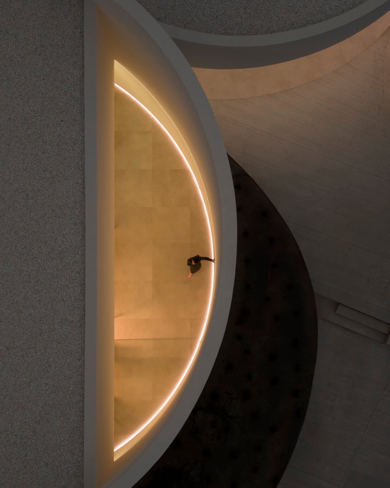
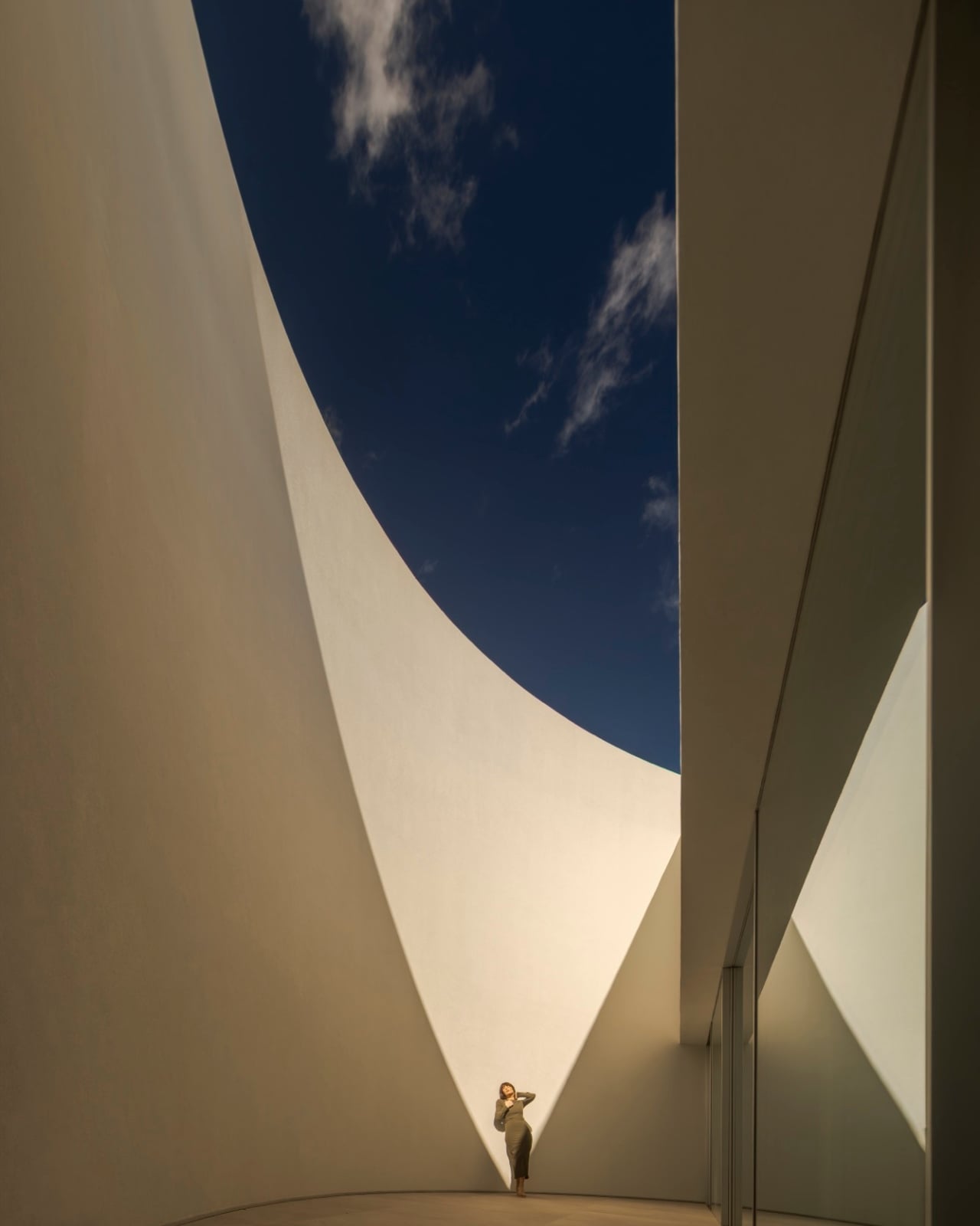
Here’s what makes this project genuinely interesting rather than just visually provocative: the cylinders aren’t decorative. Each one houses a specific function. One holds the bedrooms. Another wraps around the main living area. A third integrates the garage and wellness space. The fourth contains the pool and technical facilities. The fifth marks the entrance. The form follows the function so precisely that you almost feel the logic in your body before you consciously understand it. You just know where you are in the house, because the architecture tells you.

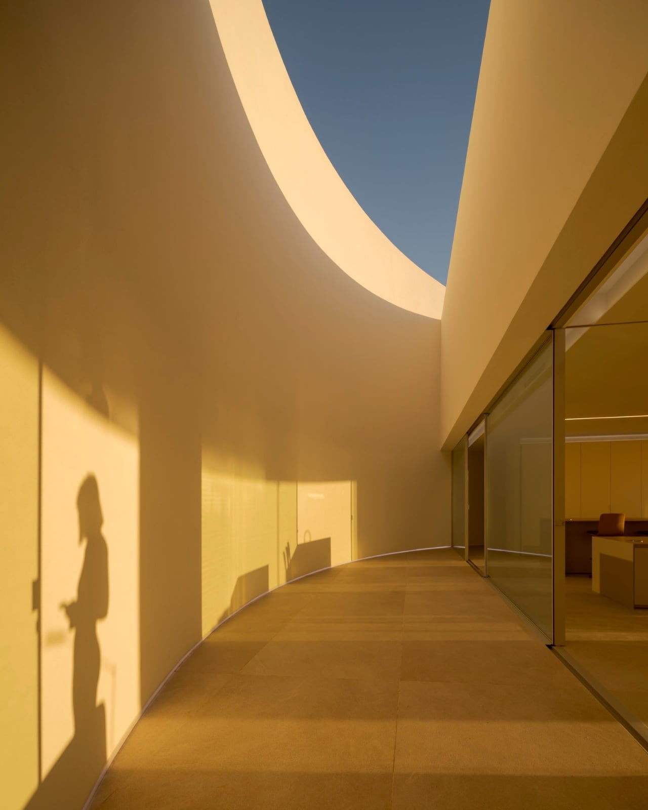
The site itself shaped a lot of the decisions here. The natural slope of the terrain meant that cutting the base of each cylinder at an angle was the most honest solution. Rather than leveling the ground to accommodate the building, the building accommodates the ground. Oblique cuts at the base of each volume let the cylinders sit naturally in the landscape, giving the whole composition a sense of growing from the earth rather than being placed on top of it. That distinction sounds small but it changes everything about how the house feels, and how it reads against those sweeping views toward the mountains.

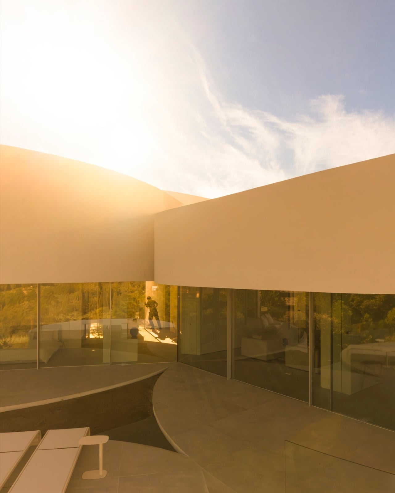
Light is handled with the same level of intentionality. Skylights and carefully positioned openings track the movement of the sun throughout the day, so the interior is never static. Curved walls catch light differently than flat ones do, and the architects lean into that fully. The effect is a home that shifts its mood depending on the hour, which is the kind of livability that doesn’t photograph well but makes a place genuinely worth living in. At the center of the five cylinders, a compact courtyard acts as the spatial anchor, pulling natural light deep into the house and creating visual connections between each volume and the landscape beyond.

Minimalism is the interior language, and it works. Alfaro Hofmann handled the interiors, keeping the detailing clean enough that the cylindrical walls remain the main event. Each volume also opens onto its own terrace or courtyard, which means privacy is built directly into the plan. You don’t need curtains or clever furniture arrangements to carve out a personal corner. The architecture does that work already.

There’s a broader conversation happening in residential architecture right now about whether formal experimentation can coexist with genuine livability. A lot of striking houses look incredible from the outside and feel exhausting to actually inhabit. The House in Las Rozas seems determined to prove that the two don’t have to be in conflict. The curved walls, the natural light, the sequenced privacy, the connection to the terrain, none of these are trade-offs made for the sake of an interesting photograph. They are outcomes of a coherent idea applied rigorously from concept to completion.

What separates work like this from pure architectural ego is the sense that every unusual decision was made in service of the people who will live there. The cylinders are not a statement for the street. They are an organizing principle for a life. And somehow that makes them feel less radical and more inevitable, which is probably the highest compliment you can give a house.

The post The Madrid House Built From 5 Interlocking Cylinders first appeared on Yanko Design.

A $33,700 Tiny Home That Finally Gets the Floor Plan Right

The tiny home movement has been having its moment for years now, and yet every time I think it has peaked, something like the Fairfax 20 shows up and reminds me why people keep choosing to go smaller. Dragon Tiny Homes’ latest model is a 20-foot, single-floor build priced at $33,700, and it’s the kind of design that makes you stop scrolling and actually look.

Let me be clear upfront: I’m not a full-time tiny house convert. I like my closet space too much. But I can recognize good design when I see it, and the Fairfax 20 has it. The whole point of this build is simplicity, and Dragon Tiny Homes committed to that idea without flinching.

Designer: Dragon Tiny Homes

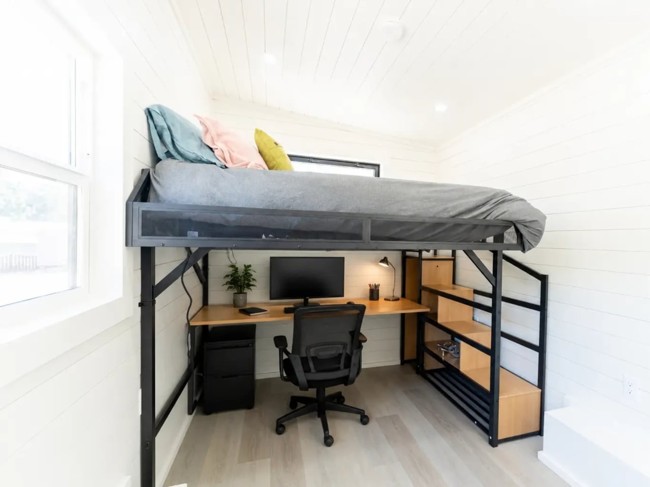
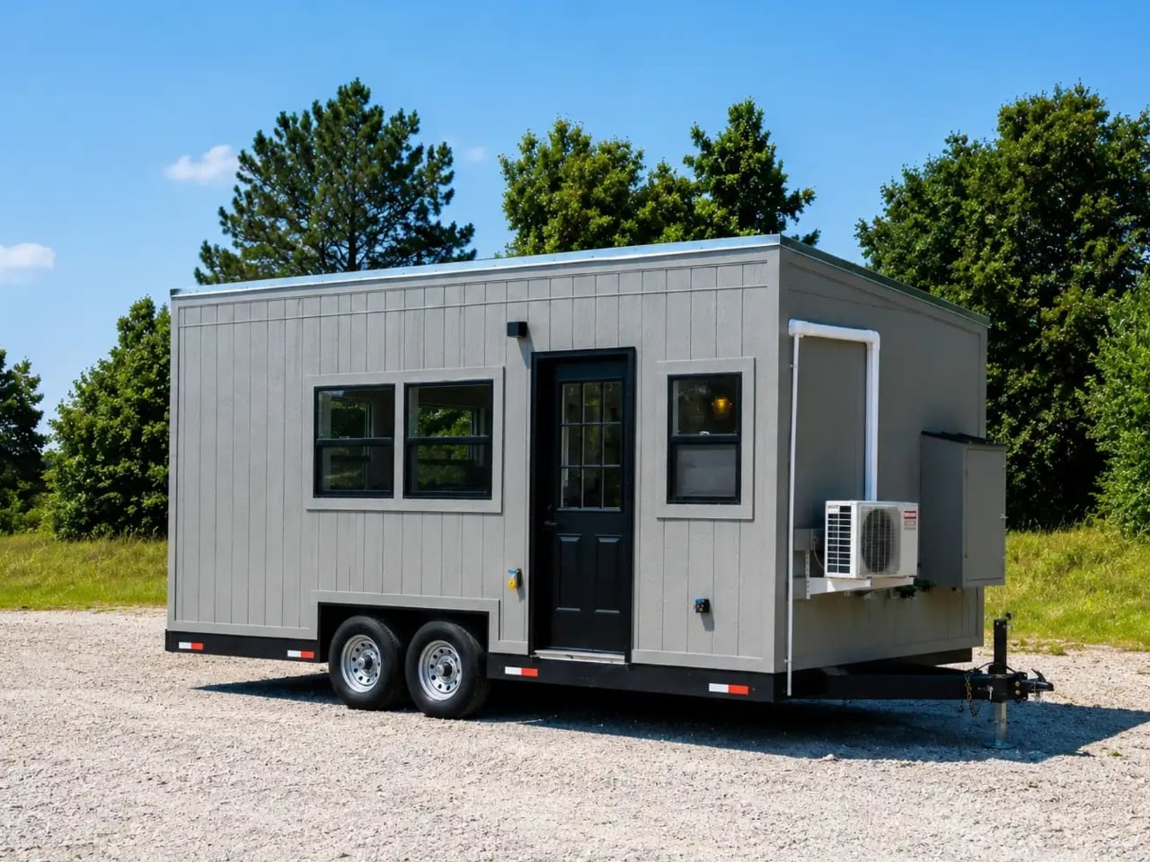
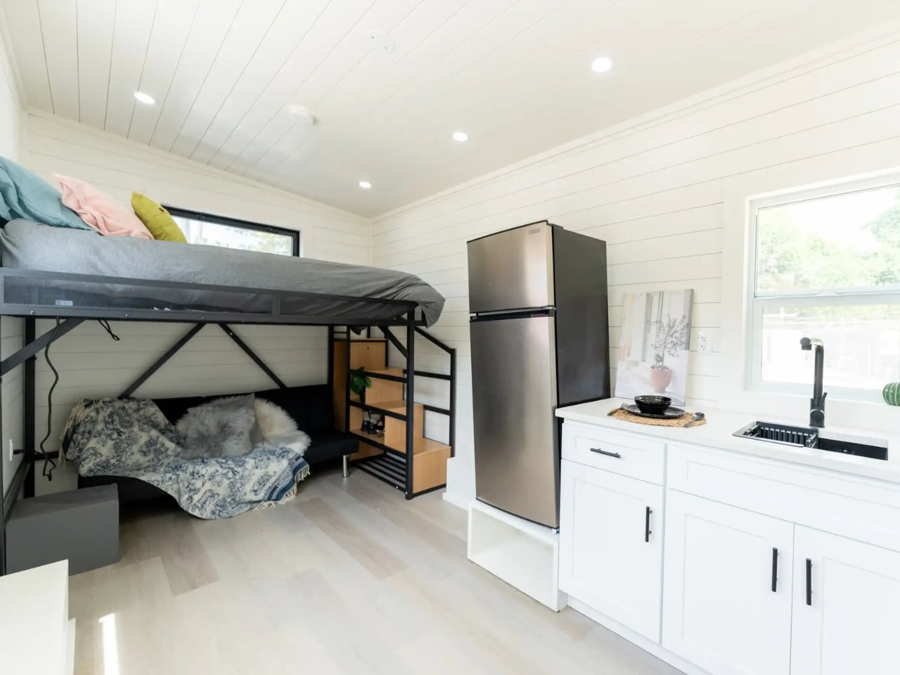
At 170 square feet on a single floor, the Fairfax 20 bets on a layout that feels more intuitive than most compact homes do. There’s a lofted sleeping area, but the overall design resists the urge to stuff extra function into every vertical inch. The flow is horizontal and intentional, which sounds unremarkable until you walk through a tiny home that got it wrong. Many compact builds feel like puzzle boxes where everything is technically possible but nothing is quite effortless to live with. The Fairfax 20 leans into clarity instead, and the space breathes because of it. That’s a harder design problem to solve than it looks.

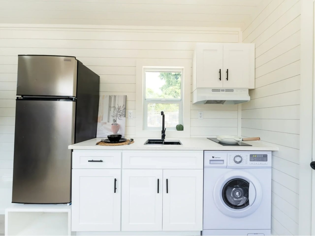
The kitchen is where the design earns its keep. It’s fitted with an induction cooktop, a 7.1 cubic foot refrigerator/freezer, and a washer/dryer unit. That’s not a kitchenette. That’s an actual, functional kitchen compressed into a footprint that forces you to be intentional about how you cook and store. The cabinetry is generous for the size, and the overall layout is clean rather than cluttered, which speaks to how seriously the design team thought about what someone actually needs versus what just looks good in a floor plan render.

The bathroom follows the same principle: a full bathroom, not a wet room compromise, which matters far more than it sounds when you’re considering whether a space is livable long-term. Six picture windows and two opening windows run throughout the home, and the gray siding with metal roof exterior gives the Fairfax 20 the kind of understated curb appeal that photographs well from every angle.

At $33,700, the Fairfax 20 sits in territory that’s genuinely accessible by current housing market standards. For context, that’s less than a lot of people spend on a car, and significantly less than the average down payment on a traditional home right now. The pricing is one of the more interesting parts of this story because it reframes tiny living not as a lifestyle aesthetic but as a legitimate economic option. That’s a shift worth paying attention to.

The Fairfax 20 also works across multiple scenarios, and Dragon Tiny Homes seems well aware of that. It functions as a primary residence for someone committed to minimalist living, but it’s equally appealing as a backyard ADU, a rental unit, or a guest space. The versatility isn’t incidental. It’s built into the design DNA of the thing.

What makes the Fairfax 20 land differently from the dozens of compact homes that cycle through my feed is the lack of pretension in its design. It’s not trying to make 170 square feet look like 400. It’s not performing luxury. It’s making a clear-eyed case for what’s actually necessary and building it well. The single-floor plan, the full-size appliances, the thoughtful storage, the windows pulling in enough natural light to make the space feel bigger than the measurements suggest. These are all quiet decisions that add up to something that feels considered rather than compromised.

Whether or not tiny home living is for you, designs like the Fairfax 20 have something to say about how we think about space, value, and what we actually need a home to do. And right now, that conversation feels more relevant than ever.

The post A $33,700 Tiny Home That Finally Gets the Floor Plan Right first appeared on Yanko Design.

This Vine-Shaped Winery Concept Can Grow Just Like a Real Vine

Winery architecture has long struggled to find the right balance between the rustic identity of viticulture and the ambitions of contemporary design. Most wineries reach for one extreme or the other, either leaning on stone barns and old-world aesthetics or commissioning cold modernist boxes that feel disconnected from the land around them. Few have tried to use the vineyard itself, quite literally, as the architectural concept.

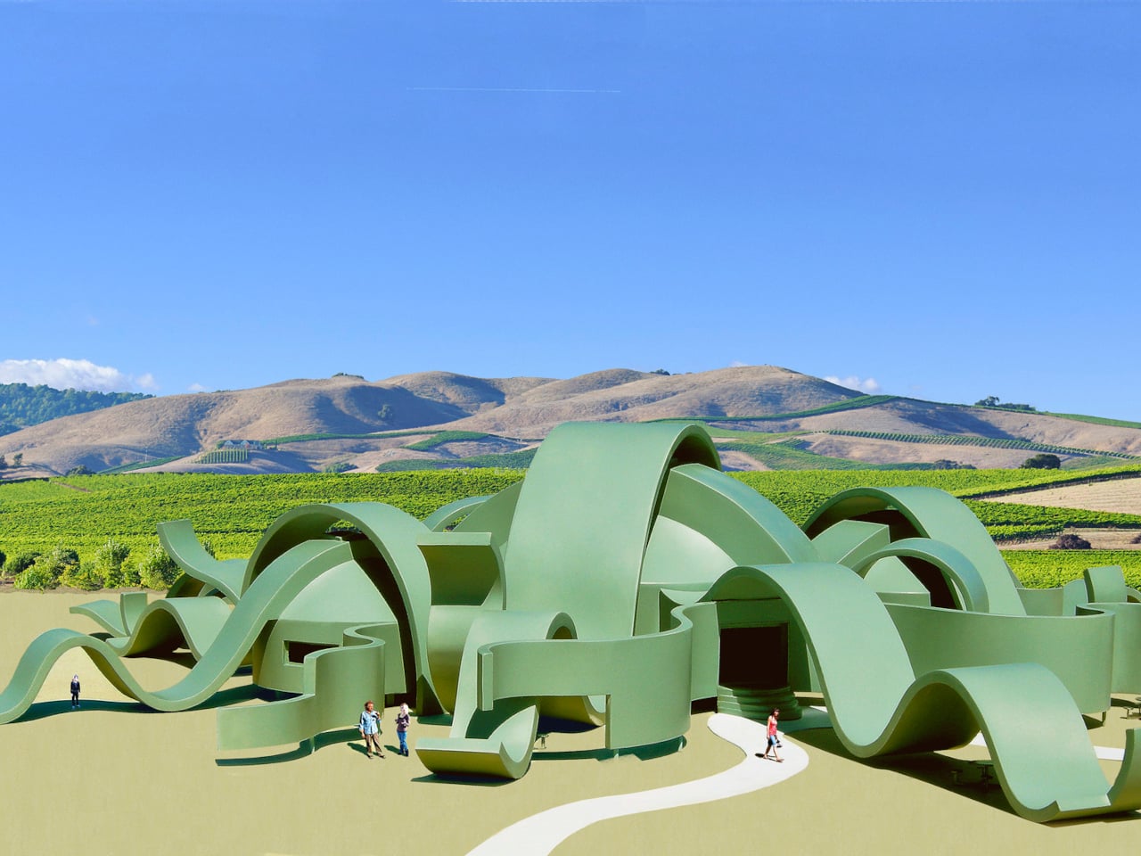
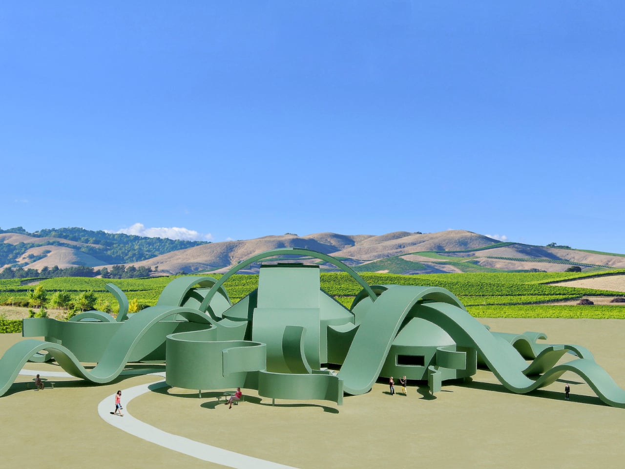
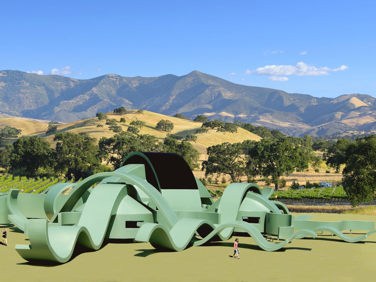
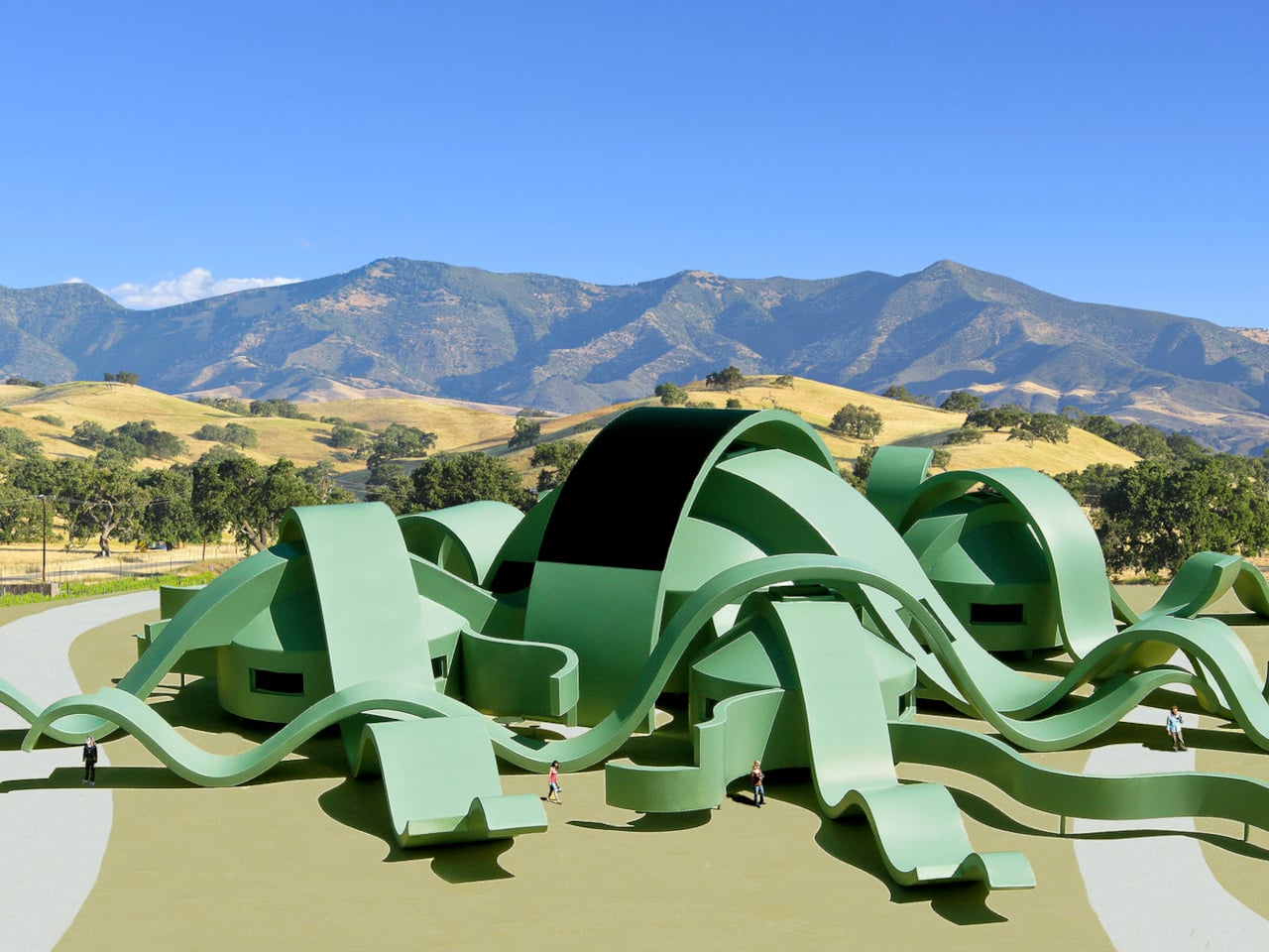
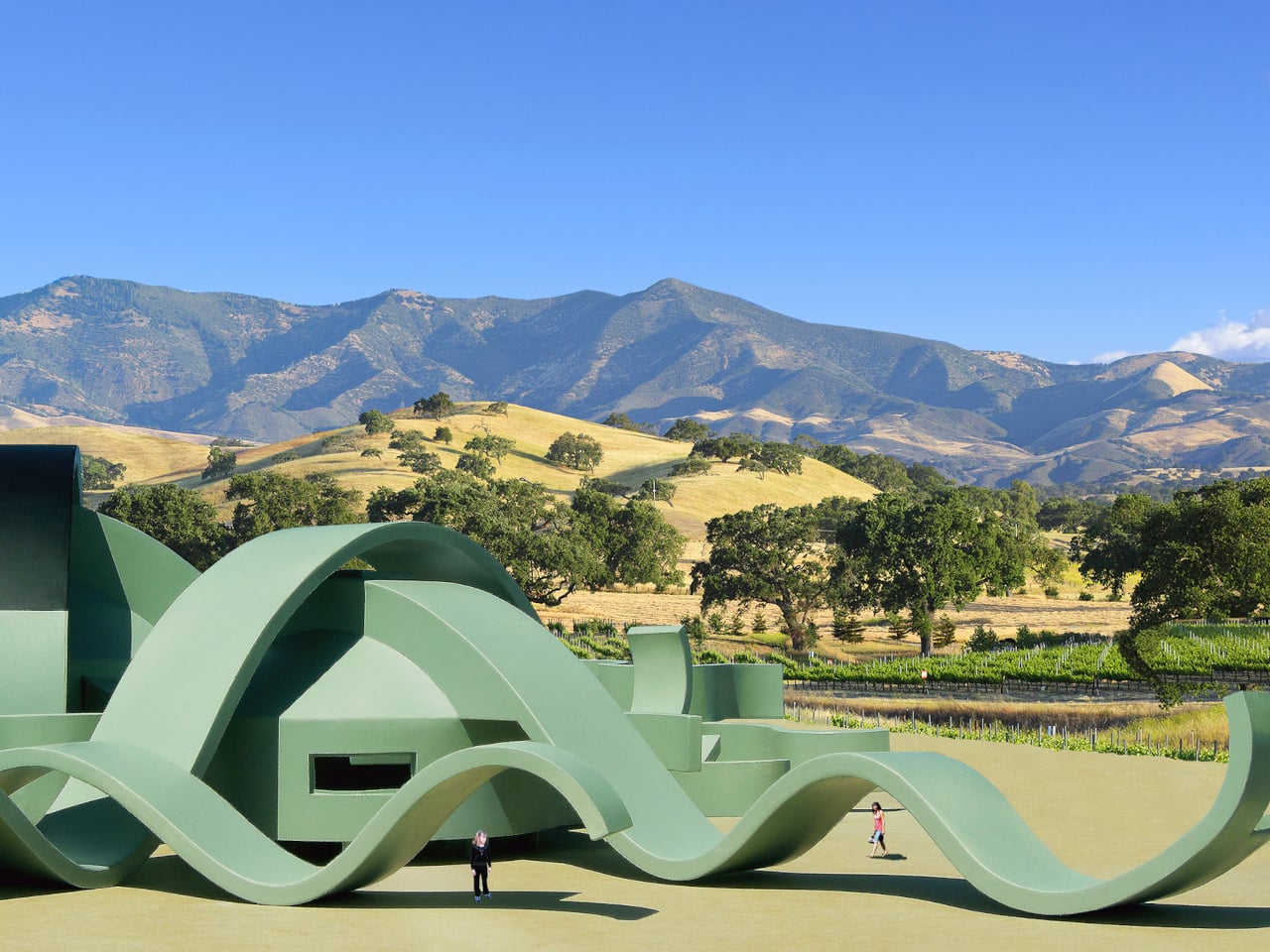
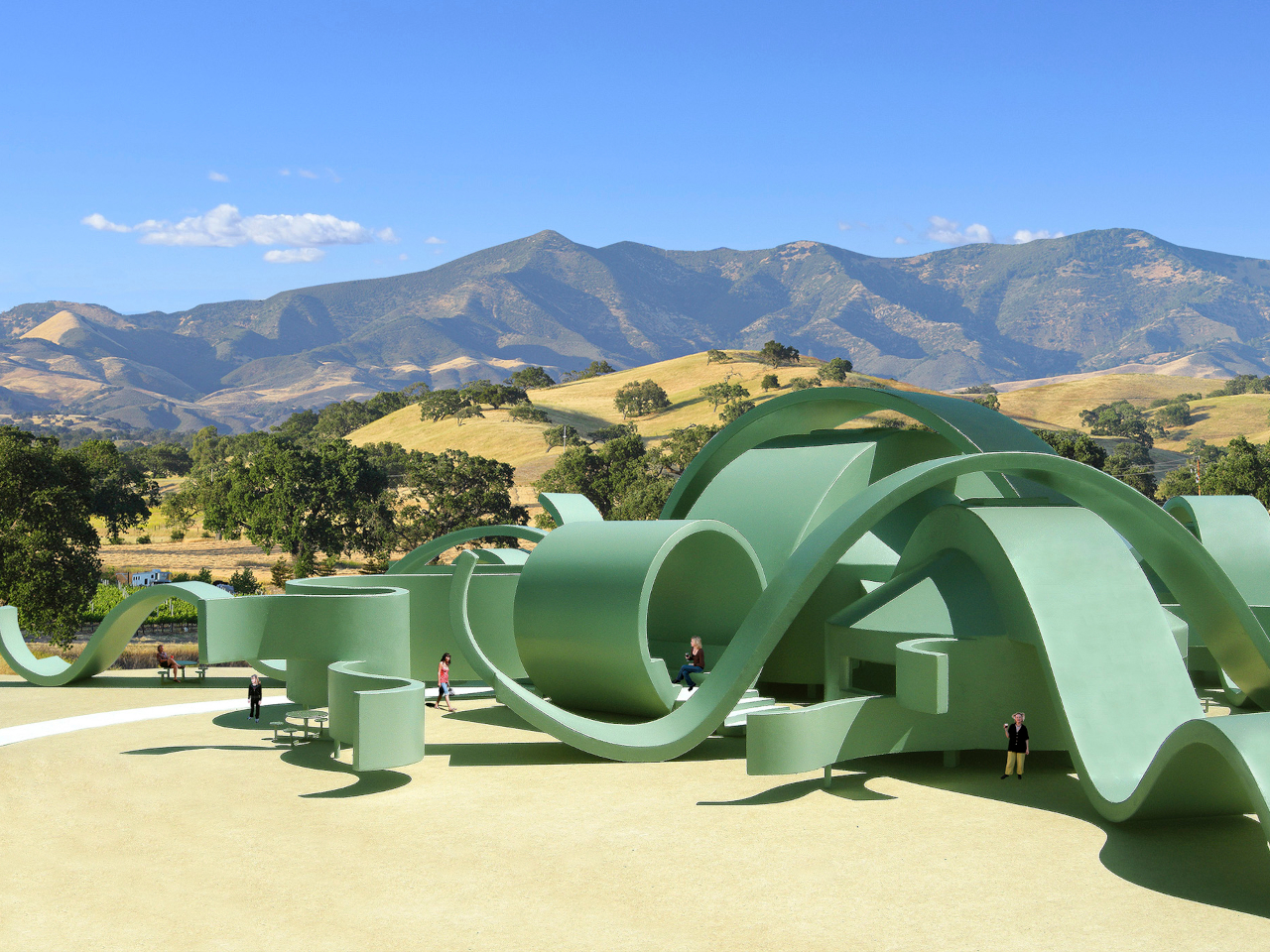
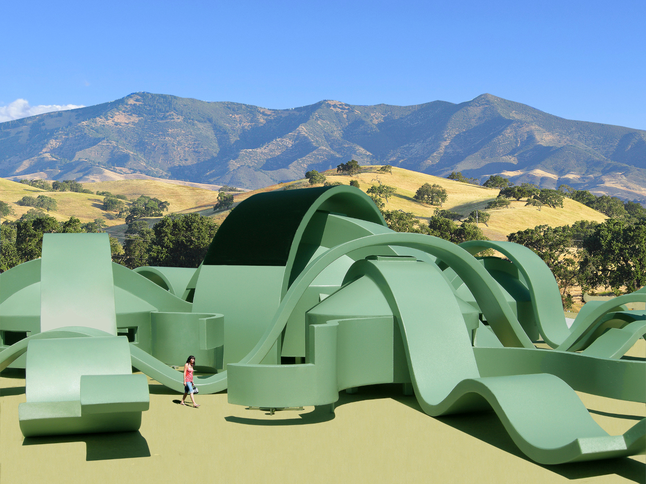
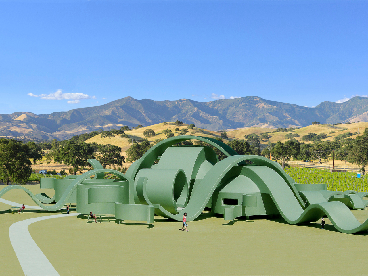
The Great Vine Winery is an unbuilt conceptual proposal that takes that idea seriously. It envisions a two-story winery whose entire form reads as a giant grape vine that has grown organically from the ground. It’s a structure that doesn’t just sit in a vineyard but tries to feel like a living, functional part of it, with every curve evoking something the landscape itself might have produced.

Designer: Michael Jantzen

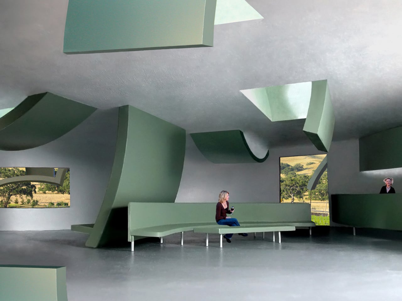
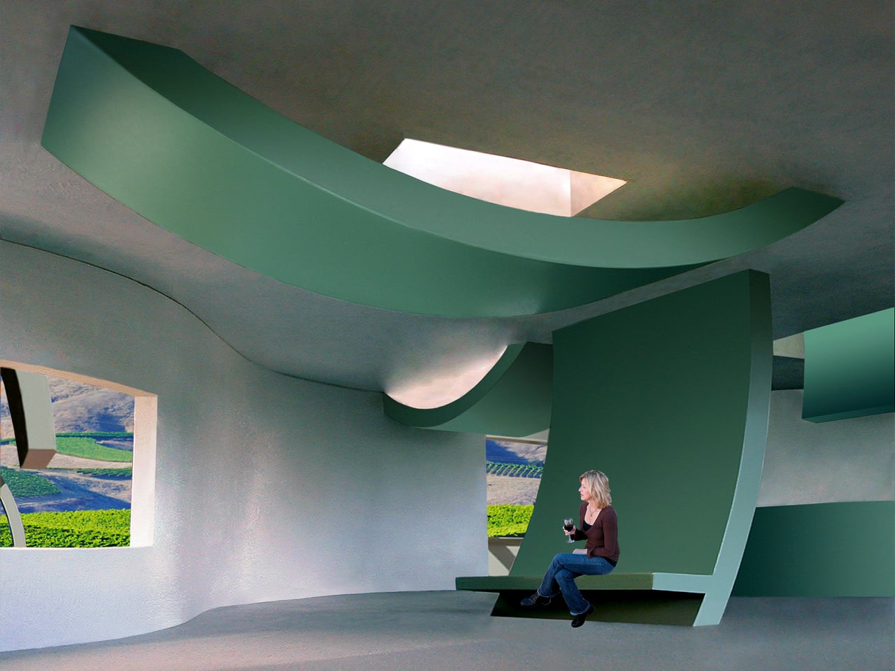
Inside, the building accommodates tasting rooms, retail, and offices across its two levels. Outside, the structure extends into a series of shaded exterior areas, formed by large curved green panels, that are meant for tasting, picnics, and special events. The boundary between indoor and outdoor experience is deliberately blurred, with the architecture guiding visitors through the building the way a path through an actual vineyard might.

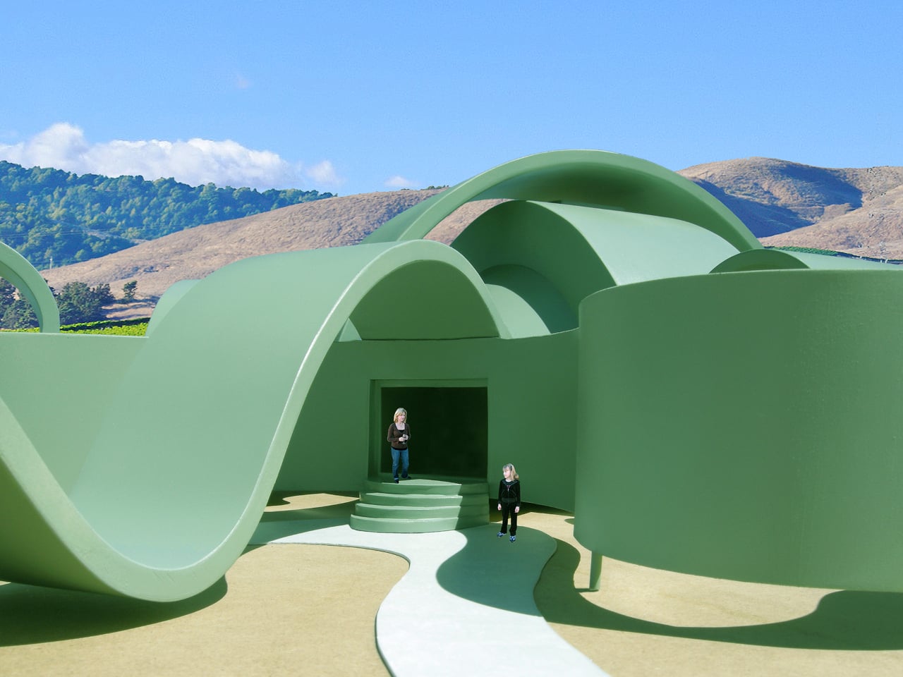
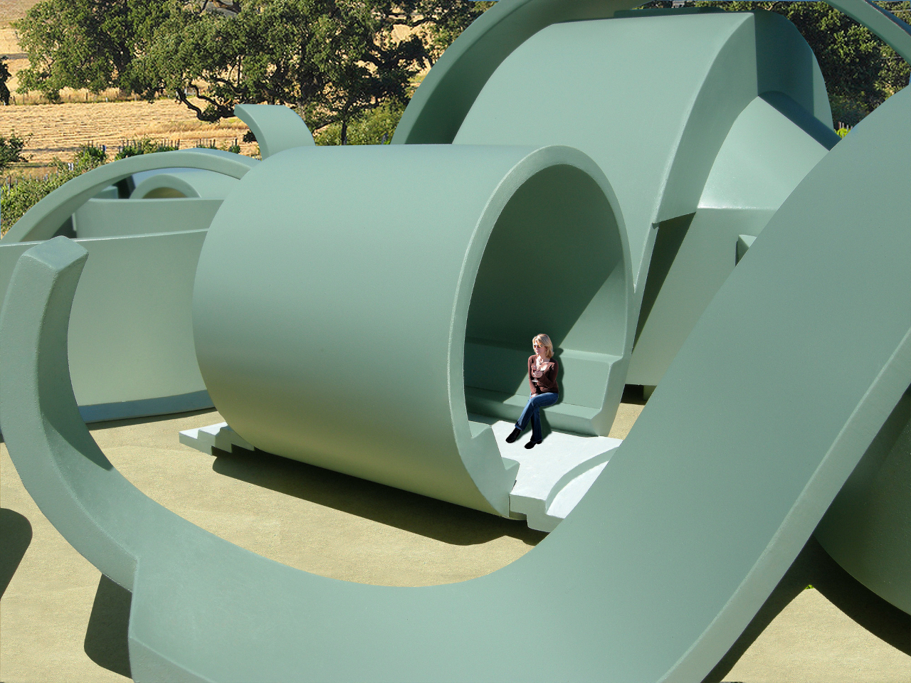
The enclosed spaces within the structure are cylindrical, calling to mind the cross-section of a real vine. Skylights set into their roofs are shaded by more of the curved panels, delivering natural light without solar glare. Underfloor vents channel cool air into each space from below, while perimeter windows and doors contribute additional ventilation and open views of the vineyard to anyone sitting inside.

Sustainability runs quietly through the whole concept. A large dark curved solar array, mounted on the central arched section of the structure, generates enough electricity to power the entire facility. Rainwater collected from the curved panels is channeled into underground reservoirs, where it’s held for use in daily winery operations and the upkeep of the surrounding grounds.

What makes the design particularly interesting is its built-in logic for growth. If the winery ever needs more space, the vine metaphor simply continues, with new sections of structure branching outward in any direction to suit whatever the program demands at a given time. This adaptability isn’t just a technical feature; it’s an extension of the central concept, where the building grows the same way an actual vine would.

Everything is intended to be fabricated from lightweight, colored concrete composite, an eco-friendly material that suits the complexity of the organic forms and keeps construction practical at a scale this ambitious. The muted green finish running consistently through every surface, inside and out, reinforces the vine reference without needing any additional ornamentation or applied symbolism to make the concept legible.

Winery visits have grown more intentional over the past few decades, with visitors expecting a sense of place as much as a good pour. The Great Vine Winery concept answers that expectation in a way most tasting room designs don’t, offering a building that’s as immersive to move through as the vineyard around it. As unbuilt concepts go, it’s a rare one where the metaphor genuinely earns its keep.

The post This Vine-Shaped Winery Concept Can Grow Just Like a Real Vine first appeared on Yanko Design.

“Adaptive Reuse” Housing in NYC Reshapes Aging Brick Superblock Into An Interconnected Society

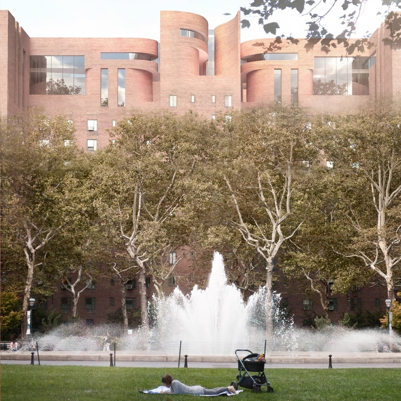
Cities have gotten very good at stacking people on top of each other and very bad at getting those people to actually interact. High density housing solves a real estate problem while quietly creating a social one, isolating seniors on one floor and young families on another with nothing but an elevator connecting them. Architect Yi Lu looked at this fragmentation and asked what it would take to reverse it without bulldozing the buildings already holding millions of people. Her answer, submitted to the A’ Design Award, treats an aging superblock not as a liability but as raw material for a new kind of social infrastructure. It is ambitious, a little sculptural, and grounded in something most housing renewal proposals ignore entirely.

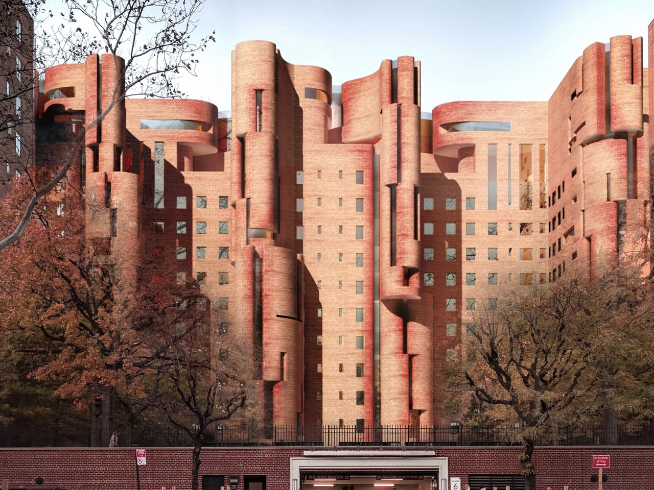
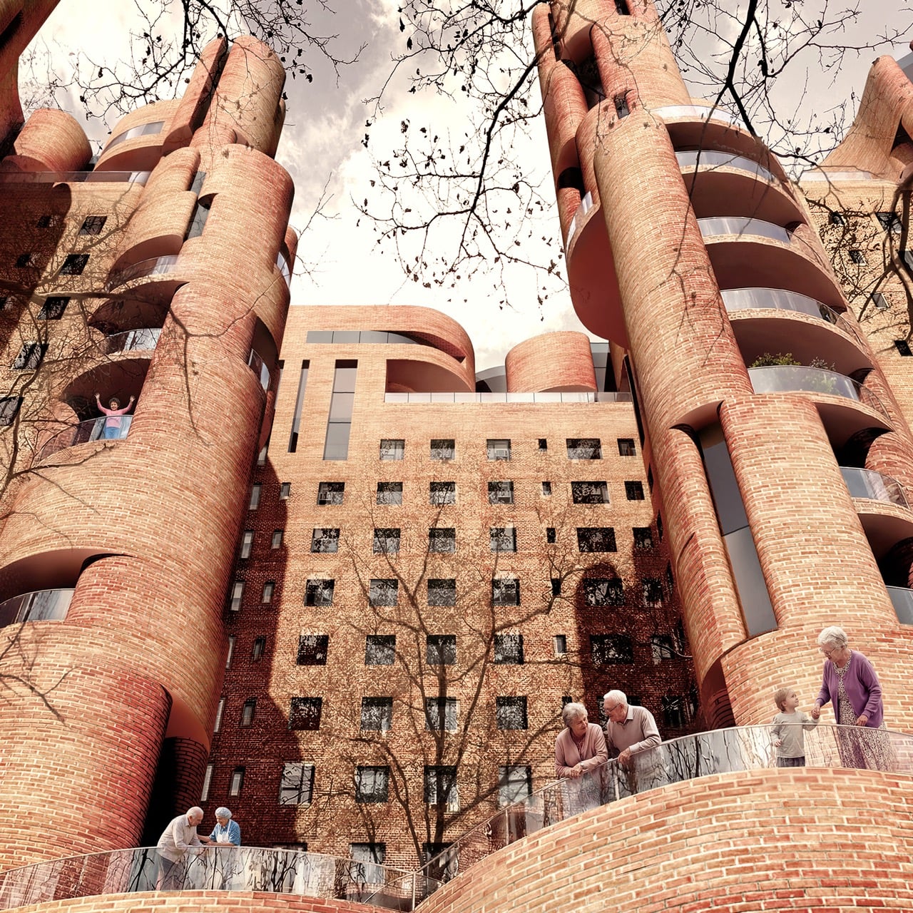
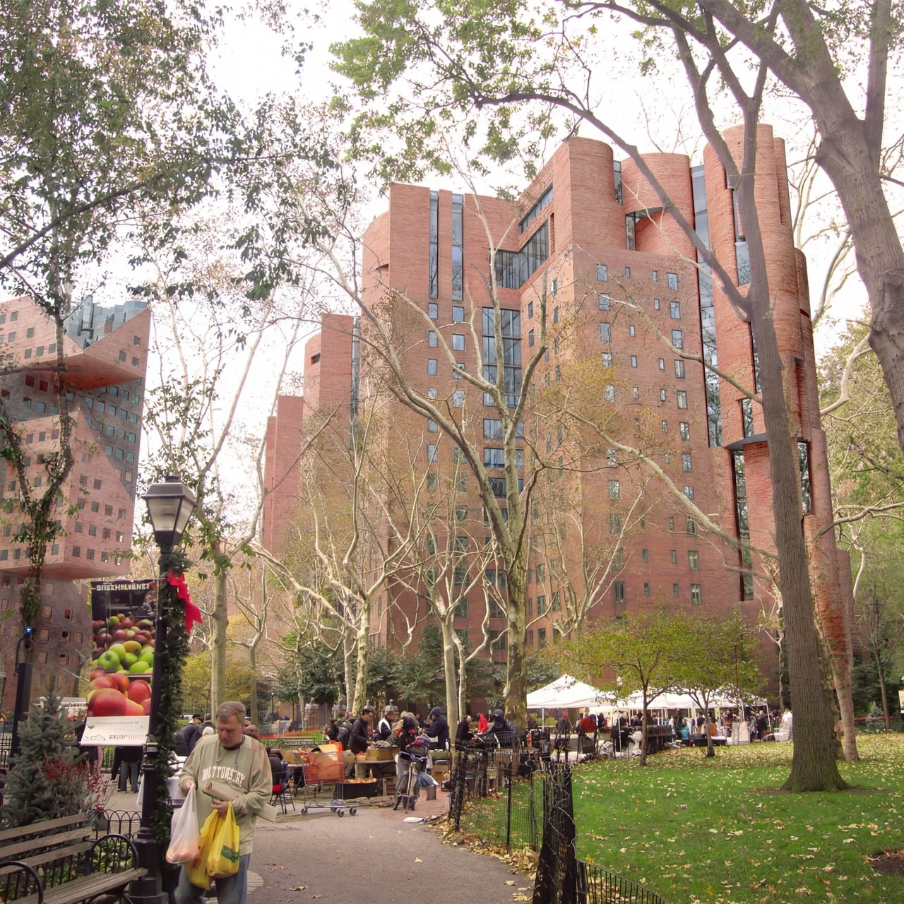
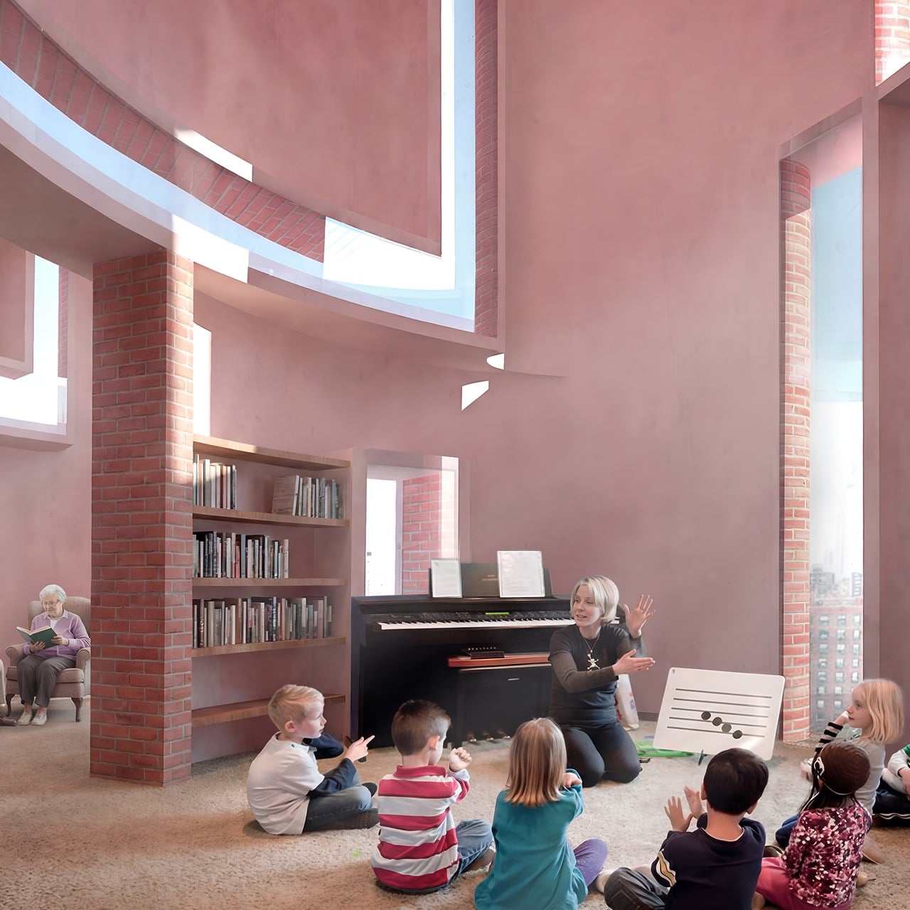
The project, titled The Intergenerational Commons, targets Stuyvesant Town, New York City’s massive postwar housing development, as its test case. Lu’s proposal keeps roughly 75 to 85 percent of the existing floor area as housing while converting the rest into a revitalized podium, rooftop kindergartens, and a network of terraces threading through the brick shell. The renderings have a strange, compelling silhouette to them, cylindrical brick towers twisting up past staggered floor plates, like Michel de Klerk got handed Frank Gehry’s sketchbook. A horizontal community spine activates street level life, while stairs, lifts, and terraces stitch the floors together into what Lu describes as a continuous social landscape. The result looks sculptural from the outside and feels intentional from within, which is a harder balance to strike than either quality on its own.

Designer: Yi Lu

Stuyvesant Town was built as postwar efficiency housing, rows of near identical brick towers designed to move people through the city’s housing shortage as fast as possible. That efficiency came at the cost of any real social texture, and decades later the superblock reads as functional but flat, a place people live rather than a place people encounter each other. Lu’s retrofit does not fight that brick language so much as bend it, pulling curved, tower-like volumes out of the existing grid and letting them collide at odd angles. Load-bearing steel reinforcement and reversible insertions allow the new geometry to sit on top of the old structure without gutting it. The brick stays, but its logic changes completely, from repetition to rupture.

A standardized kit of parts, built around 3,600 millimeter modular bays and lightweight steel framing, lets construction happen in phases without displacing current residents, a constraint that kills most ambitious renewal proposals before they leave the page. Bolt on terraces extend outward from the existing brick shell, adding outdoor space that the original superblock never had. A 1,200 square meter community hub anchors street level activity, while stacked shared terraces and a 300 millimeter green roof system carry that social infrastructure upward through the building. None of it requires the wholesale demolition that usually accompanies large scale housing renewal.

The interesting part is how Lu orchestrates ‘intergenerational’ overlapping zones, connecting seniors and children rather than the more common strategy of designating separate zones for each. Rooftop kindergartens sit close enough to senior learning spaces on the revitalized podium that informal encounters happen without anyone having to schedule them. Interaction stays optional throughout, preserving privacy for residents who want it while making mutual support available for those who do not. That flexibility separates the proposal from the well-meaning but rigid intergenerational housing models that came before it. Whether a project this structurally ambitious ever gets built at Stuyvesant Town is a separate question from whether it should, and Lu’s entry makes a genuinely compelling case for the second one.

The post “Adaptive Reuse” Housing in NYC Reshapes Aging Brick Superblock Into An Interconnected Society first appeared on Yanko Design.

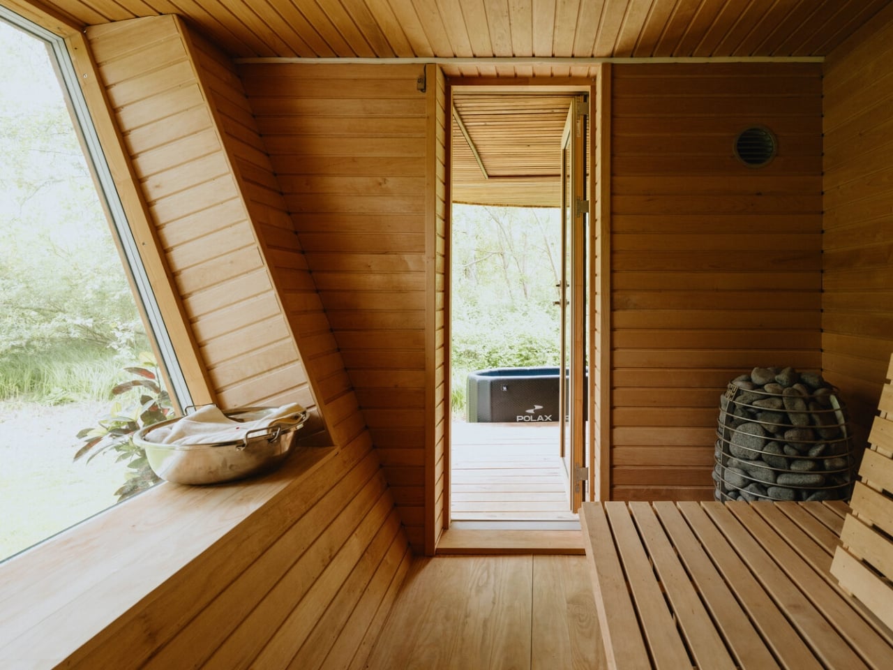
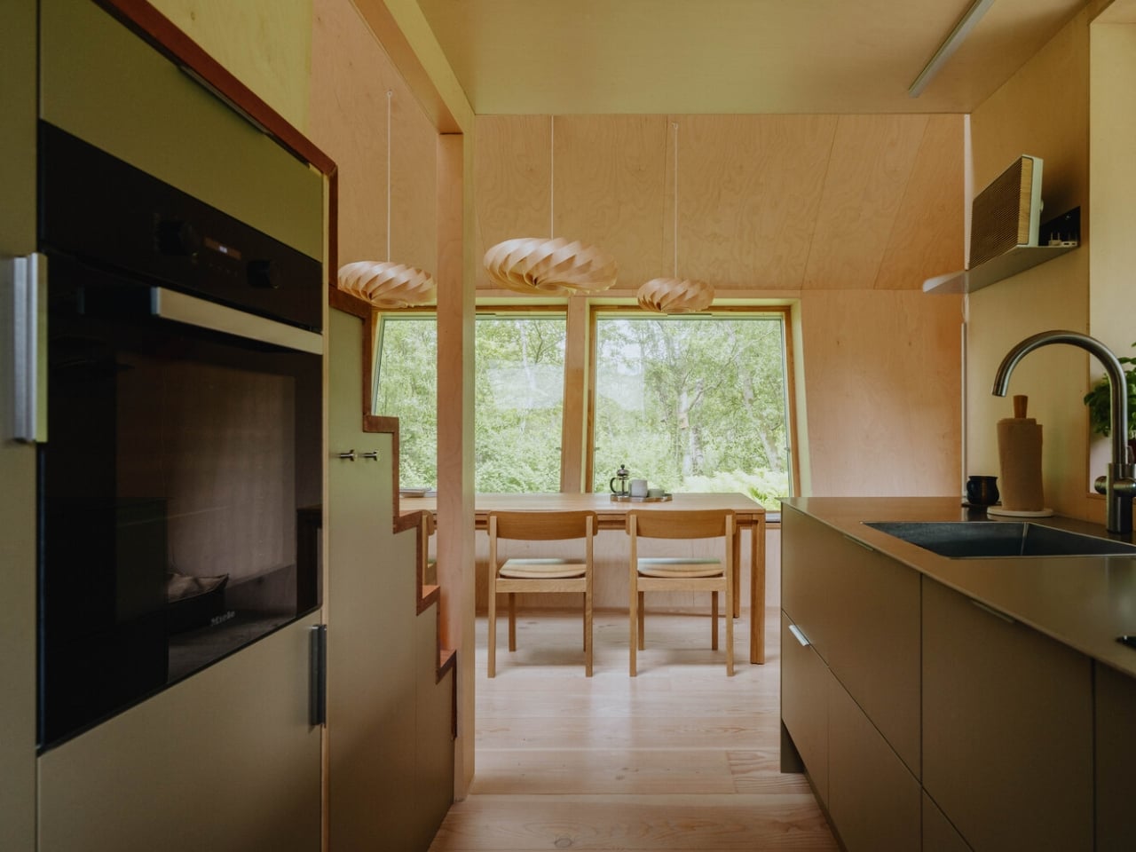
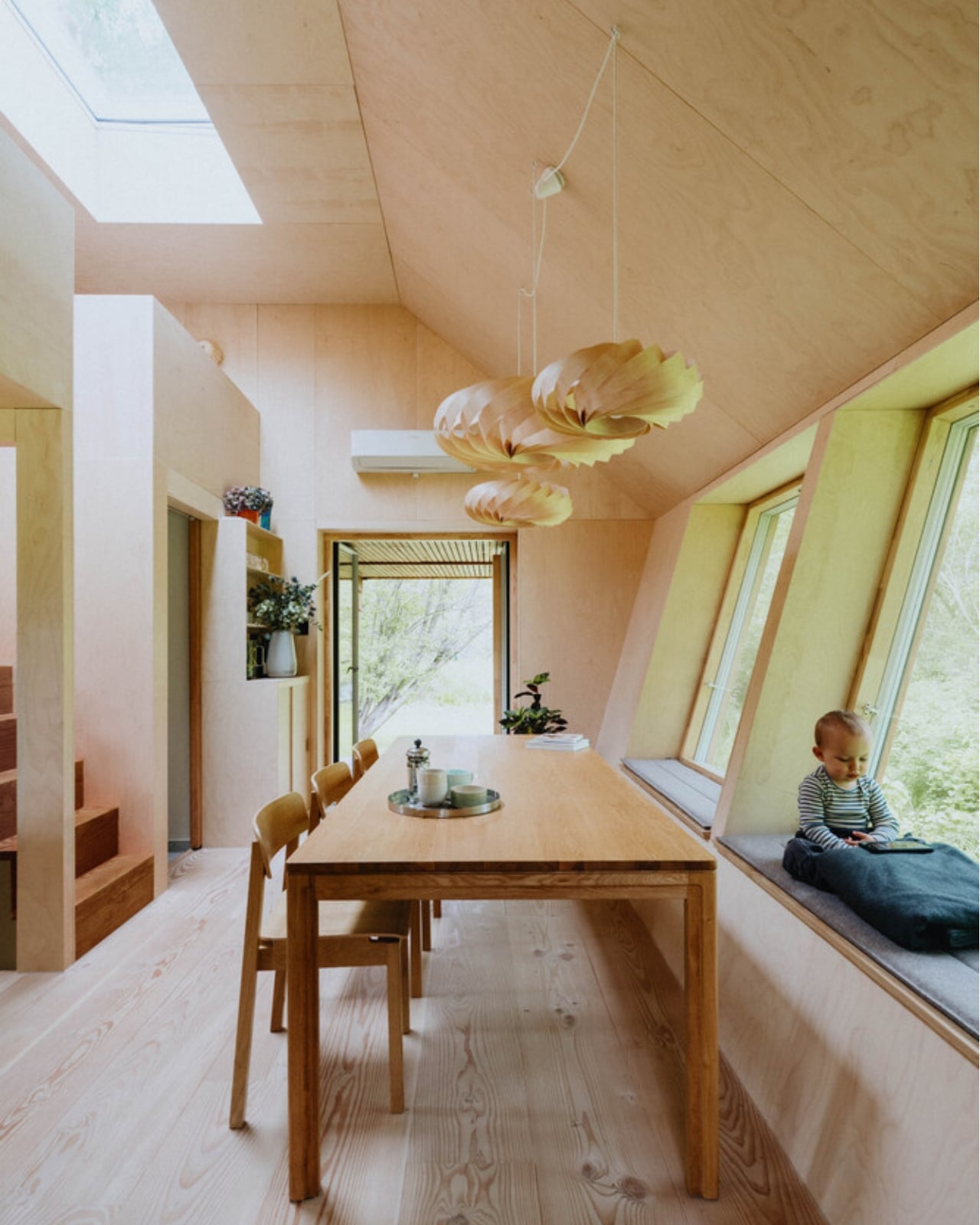
A 35m² Summerhouse Designed Like a Space Habitat

Most summerhouses don’t start as thought experiments about the moon. EcoNeo did. Designed by SAGA Space Architects and sitting quietly in Asnæs on the Danish island of Zealand, it measures just 35 square meters and sleeps a family of six. It also has an indoor sauna. The fact that all of this coexists within a space roughly the size of a large studio apartment says everything about what SAGA is doing differently. This is a house designed by people who take small spaces very, very seriously.

SAGA Space Architects was founded in 2018 by Danish architects Sebastian Aristotelis and Karl-Johan Sørensen, and their portfolio reads nothing like a traditional residential practice. These are the people behind LUNARK, a simulated lunar habitat tested during a 100-day expedition in Greenland. They also developed the Circadian Light system installed on the International Space Station and built FLEXHab, a habitat prototype for the European Space Agency. Their methodology is built around extreme-environment logic, where every centimeter, every kilogram, and every watt is a decision that matters. EcoNeo takes that same discipline and applies it to a Danish holiday home, and the result is genuinely worth paying attention to.

Designer: SAGA Space Architects

The studio calls its approach “Terra-Tech,” a marriage of technical precision and material awareness that keeps the design grounded in lived experience rather than spectacle. EcoNeo is built from biogenic materials, including OSB panels, wood-fiber insulation, Douglas fir, oak, birch, and plywood, all chosen for their low environmental footprint and warm sensory quality. Digital fabrication shapes the structure with the kind of accuracy you don’t typically associate with a weekend retreat. The architects estimate EcoNeo reduces annual carbon emissions by roughly 80 percent compared to an average new Danish summerhouse. That is not a rounding error. That is a structural rethinking of what holiday architecture can be.

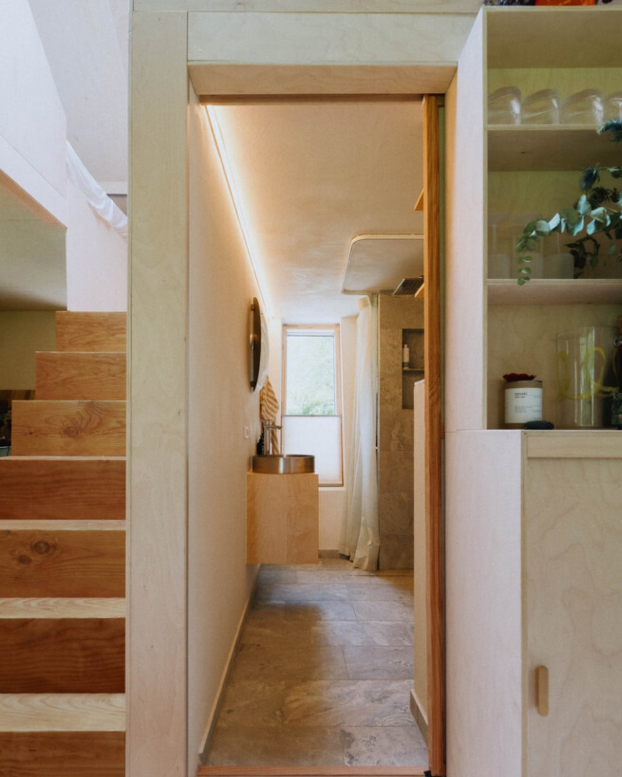
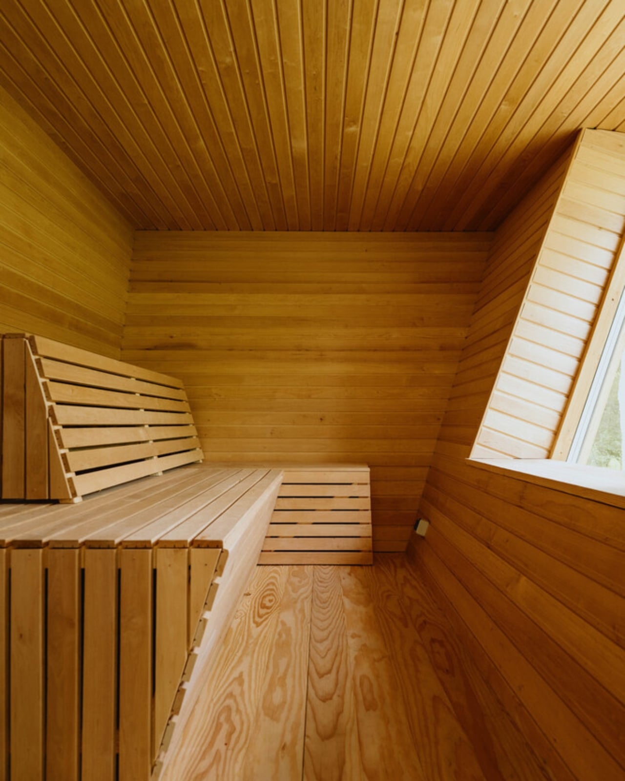
On the inside, the floor plan is organized around a central living space that works harder than most rooms twice its size. The ground floor brings together the kitchen, bathroom, integrated storage, the sauna, and a dining table that can seat the whole family. Upstairs, sleeping space is tucked in a way that feels considered rather than compromised. Every piece of the interior is designed to serve more than one purpose, because SAGA knows from its space habitat work that generosity of experience does not require generosity of space. You feel that difference the moment you look at the photographs. The rooms have a quietness to them, a sense that everything belongs exactly where it is.

That, to me, is where EcoNeo gets genuinely interesting as a cultural object. The conversation around sustainable housing often leans into austerity, as though living with a lighter footprint requires accepting a diminished quality of life. EcoNeo makes the opposite argument without raising its voice. The house does not look like a sacrifice. It looks like a place people would actually want to spend a summer in, with its warm timber surfaces, considered proportions, and an undeniable calm that reads clearly even in photographs. Sustainability, when done right, does not ask you to give anything up. It asks you to think more carefully about what you actually need.

The collaborators list tells its own story: Velux, Dinesen, GROHE, Svane Køkkenet, Velfac, and ThermoCell, among others. These are not budget-line names. SAGA was not chasing a price point with EcoNeo. They were chasing a standard, and it shows in every decision, from the material palette to the fabrication method.

Whether EcoNeo becomes a scalable template for sustainable residential housing or remains a singular prototype is a question worth watching. The studio intends to develop it further for broader residential applications. Given their track record of designing for environments where there is genuinely no margin for error, I would take that intention seriously. EcoNeo is proof that the best ideas about how to live on Earth might just be the ones we developed while thinking about how to live somewhere else entirely.

The post A 35m² Summerhouse Designed Like a Space Habitat first appeared on Yanko Design.

This Zero-Carbon Colorado Cabin Was Built for a Family — and the Next Century of Mountain Living

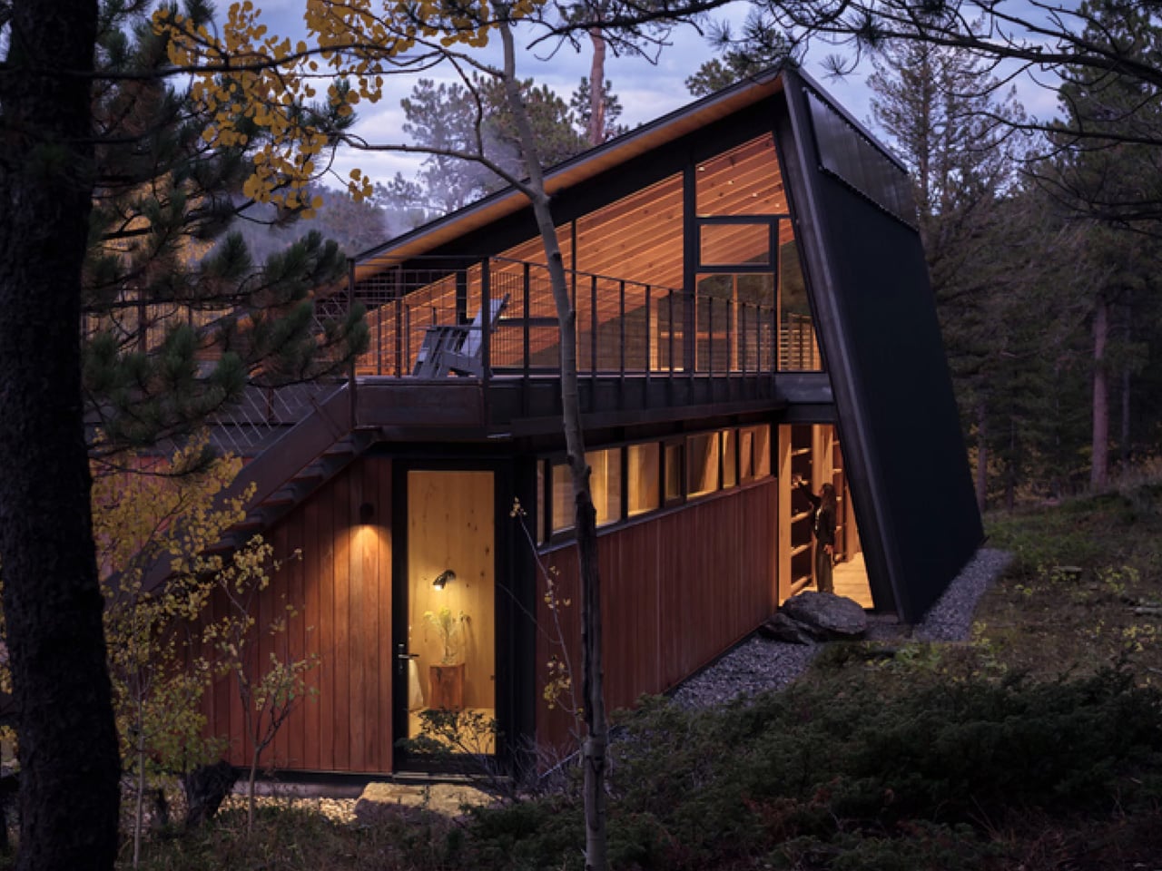
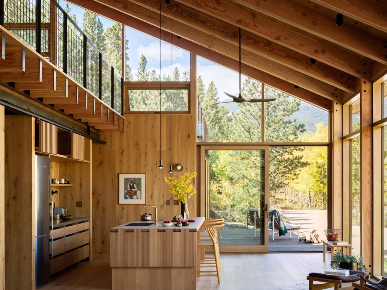
There are cabins built for weekends, and then there’s Camp Meeker. Designed by Renée del Gaudio Architecture and completed in 2026, this 2,100-square-foot retreat in Allenspark, Colorado sits at the base of Mt. Meeker — a landscape a single family has returned to for nearly a century. The cabin wasn’t designed to impress. It was designed to endure.

The brief was rooted in something rare in contemporary architecture: restraint with purpose. Rather than loading the home with the usual domestic conveniences, the architects stripped the program back entirely. No television. No dishwasher. No microwave. What remains is exactly what a mountain retreat should be — a place that places the landscape first and forces you to look at it.

Designer: Renée del Gaudio Architecture

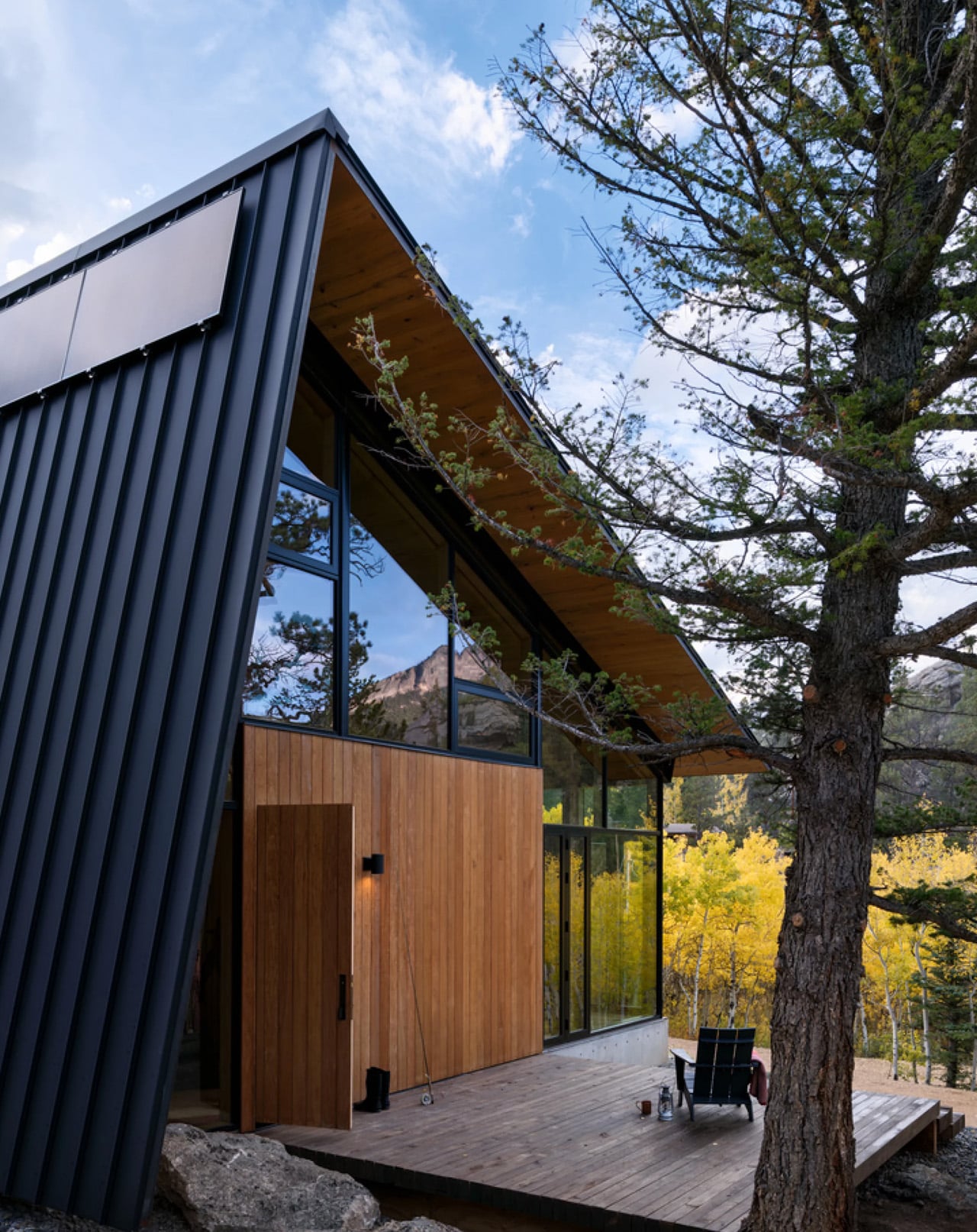
Structurally, the cabin is built for the realities of its environment. A concrete base and steel frame anchor the building to the site, while ironwood siding wraps the exterior in a material chosen specifically for fire resistance — a non-negotiable in Colorado’s high-elevation terrain. The steep metal roof does double duty: it deflects winter winds and gains enough height to accommodate a sleeping loft above the main floor, designated as the children’s quarters, giving the whole structure a playful, camp-like energy that its name earns honestly.

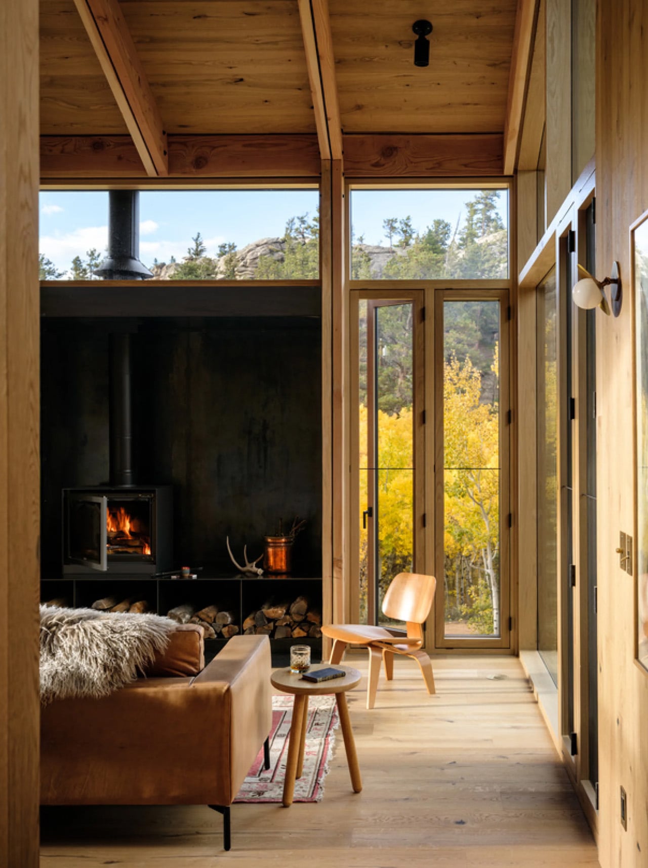
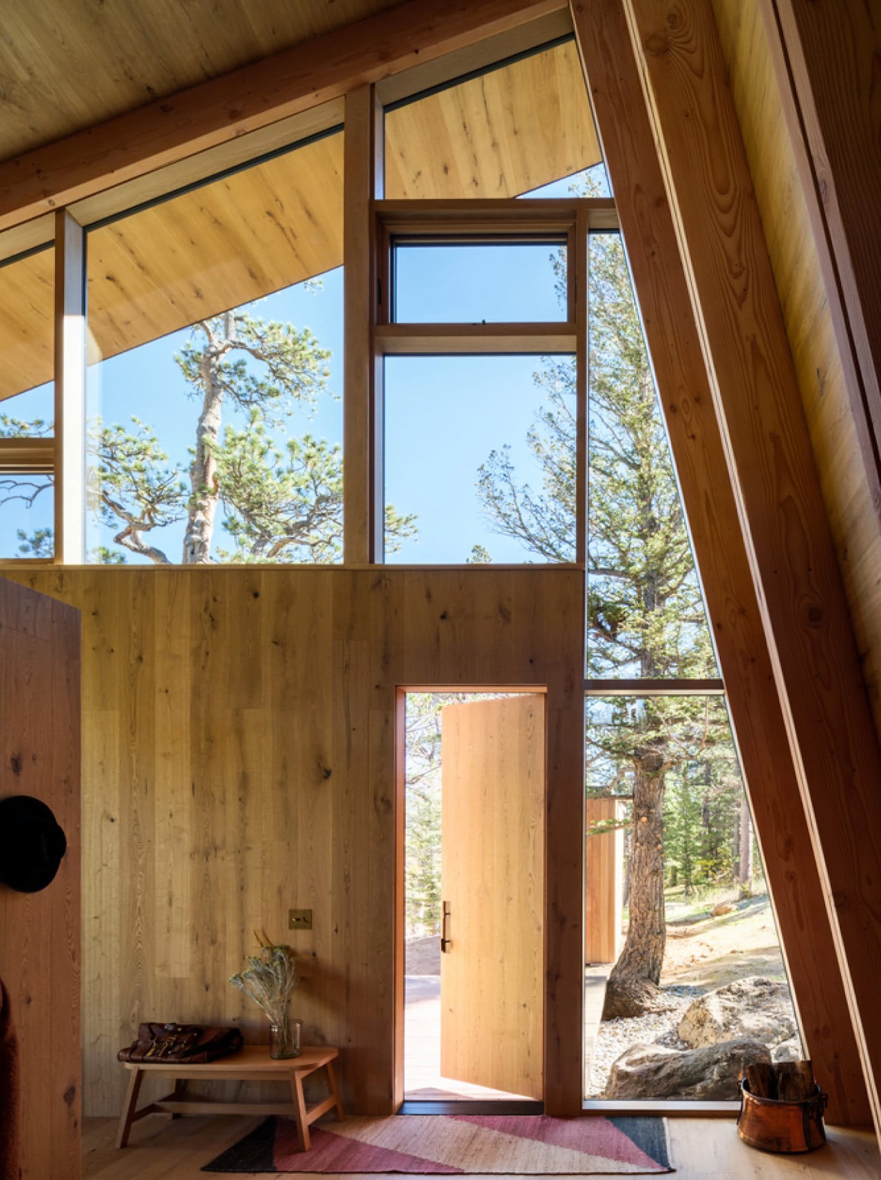
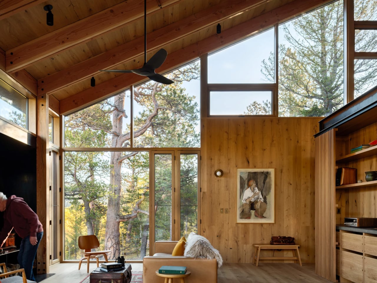
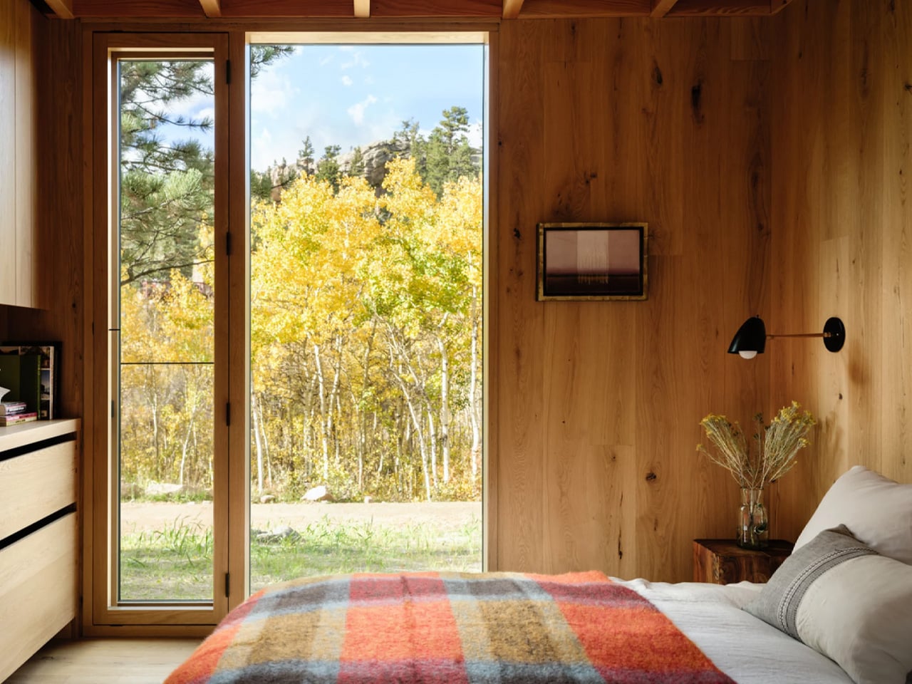
Inside, Renée del Gaudio made one decisive material call and committed to it completely. Rustic-grade oak covers the floors, walls, and ceilings in a continuous warm finish that collapses the boundary between surfaces. The main living area is organized around a central fireplace, flanked by vaulted timber ceilings and floor-to-ceiling windows that pull the surrounding alpine scenery directly into the room. Two double bedrooms and a single bedroom anchor one end of the main floor, each connected to a large outdoor terrace. Above, a rooftop deck offers unobstructed views of the mountain — built equally for afternoon sun and sleeping under open sky.

What makes Camp Meeker genuinely forward-looking is what’s hidden beneath it. A geothermal system draws on the earth’s stable temperature to heat and cool the cabin, replacing conventional fuel-based systems and bringing the home’s day-to-day operational carbon to zero. It’s sustainability framed not as a feature, but as a baseline expectation.

The architects describe it as a model for the next century of cabin design in the region. Looking at it, that doesn’t feel like overreach. Camp Meeker isn’t a trophy house dressed in rustic materials. It’s a building that understands exactly what it is, where it is, and who it’s for — and builds every decision around that clarity.

The post This Zero-Carbon Colorado Cabin Was Built for a Family — and the Next Century of Mountain Living first appeared on Yanko Design.

This Cantilevered Forest Home in Washington Hovers Above The Trees

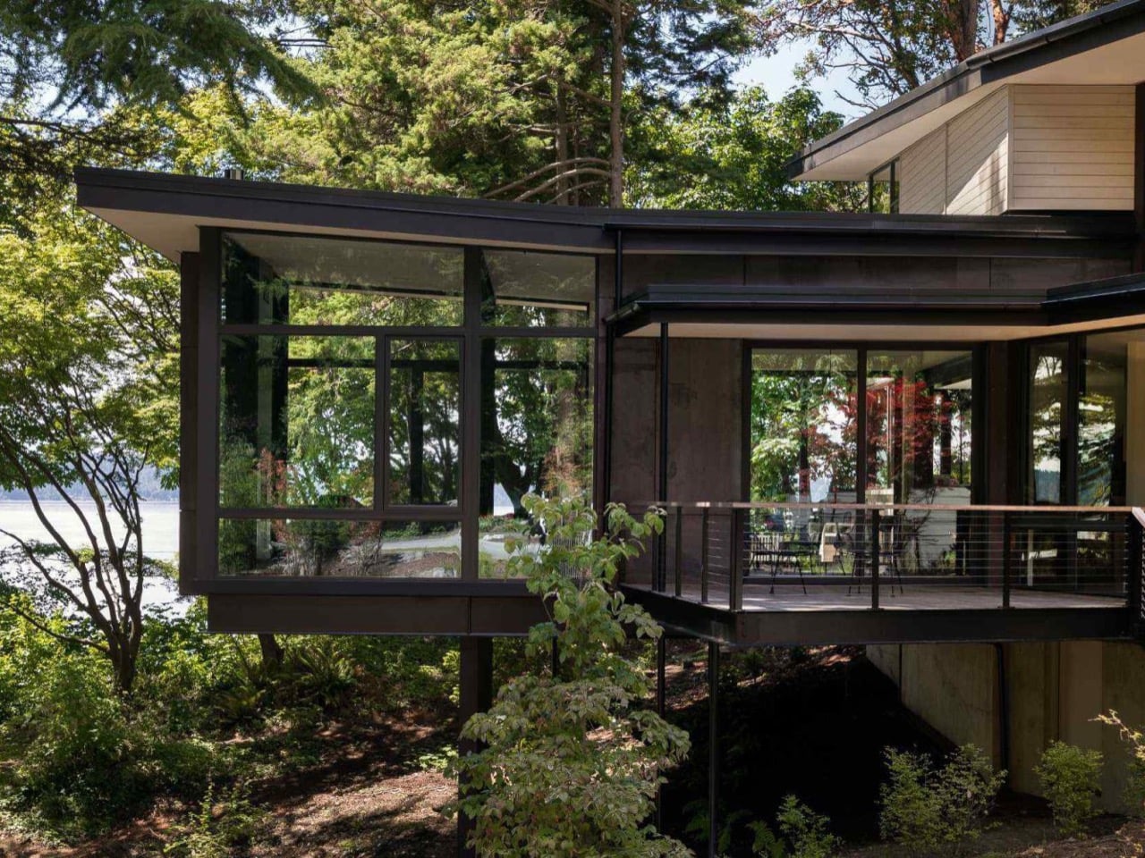
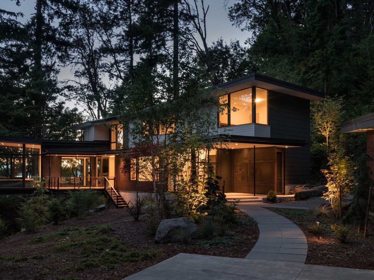
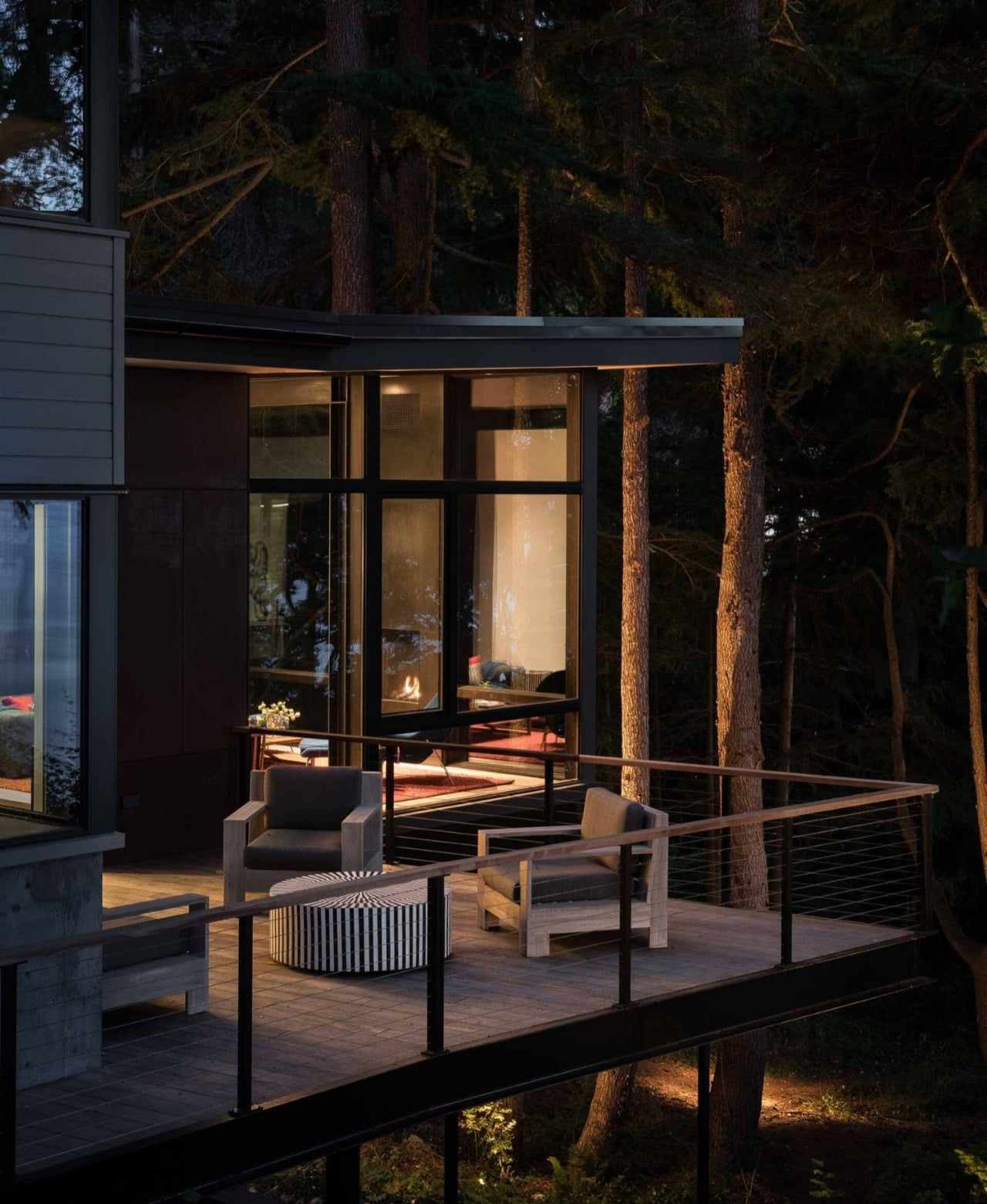
Frank Lloyd Wright hung a house over a waterfall back in the 1930s, and architects have been trying to one up that flex for nearly a century now. Most of them cop out with one dramatic overhang, snap the hero shot for the brochure, and call it a day. DeForest Architects wasn’t interested in that shortcut when they took on a one acre bluff above Puget Sound in Burien, Washington. Instead of picking a single showpiece moment, they let the whole house negotiate its steep, forested site room by room. Some volumes tuck into the hillside, others push out past the tree line, and the living room goes furthest of all, floating above the forest floor like a treehouse that happens to have a structural engineer on payroll. It’s a bold move, and somehow it never tips into spectacle.

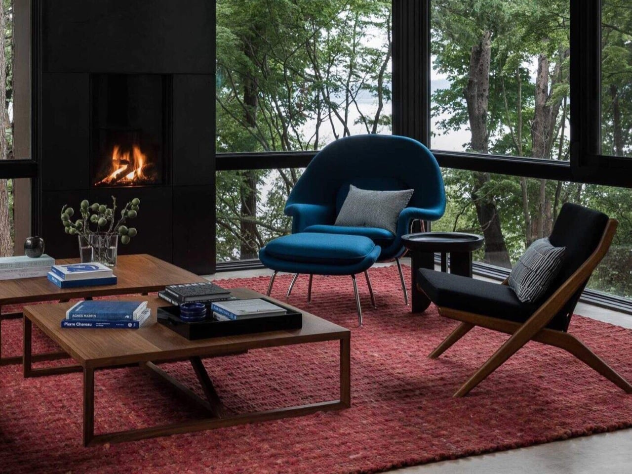
Ore Studios handled interiors alongside DeForest’s architecture, and you can tell the two teams never stopped talking to each other, because the shell and the furniture never feel like separate decisions. Floor to ceiling windows framed in thick black steel wrap the living room, turning the surrounding pines into part of the interior instead of scenery you glimpse through glass. Decks stretch off both sides of that suspended room, one facing a woodland meadow, the other facing open water, so the house pulls off two completely different outdoor relationships without moving a single wall. A fireplace anchors the room dead center, and against an otherwise calm, dark palette, a red rug and a blue lounge chair do basically all the emotional heavy lifting. Toth Construction built it, and photographer Haris Kenjar’s shots make it obvious just how restrained the material story stays everywhere else the color doesn’t show up.

Designers: DeForest Architects (John DeForest, Michael Knowles), interiors by Ore Studios
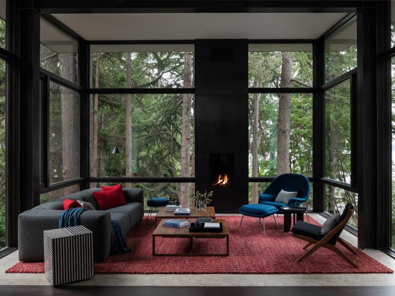
Surrounded by trees on three sides, that living room earns the treehouse comparison honestly rather than just leaning on it as marketing language. The owners wanted something peaceful with room left over for surprise, which sounds like a contradiction until you see how DeForest solved it. Instead of piling on decorative flourishes, they varied elevation and let the forest do most of the visual work through all that glass. A red sofa cushion here, a cobalt lounge chair there, and the room reads as calm and lived in rather than staged for a shoot. It helps that the steel framing is thick enough to feel structural rather than decorative, which keeps the whole glass box from feeling fragile despite hanging in midair above the slope.
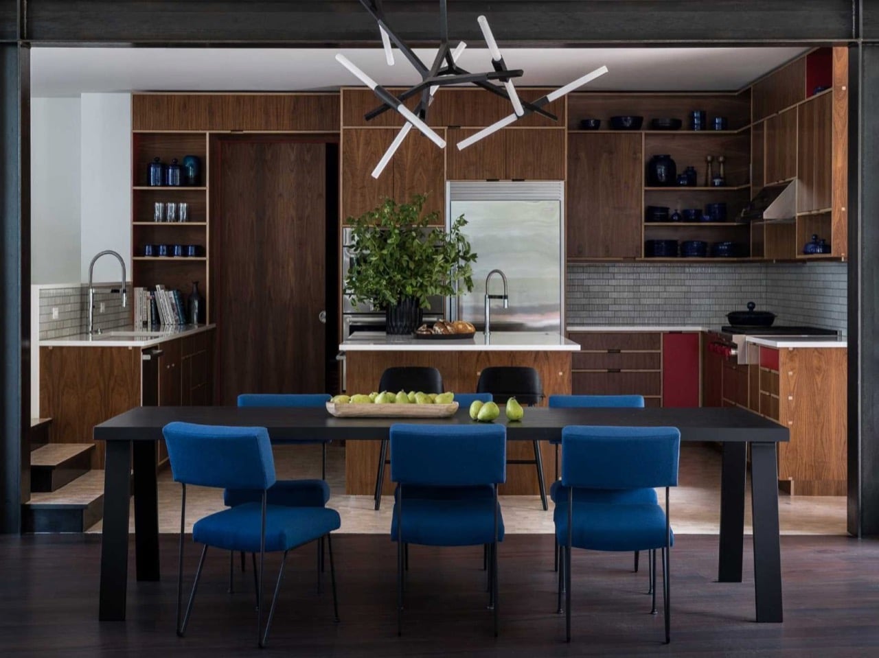
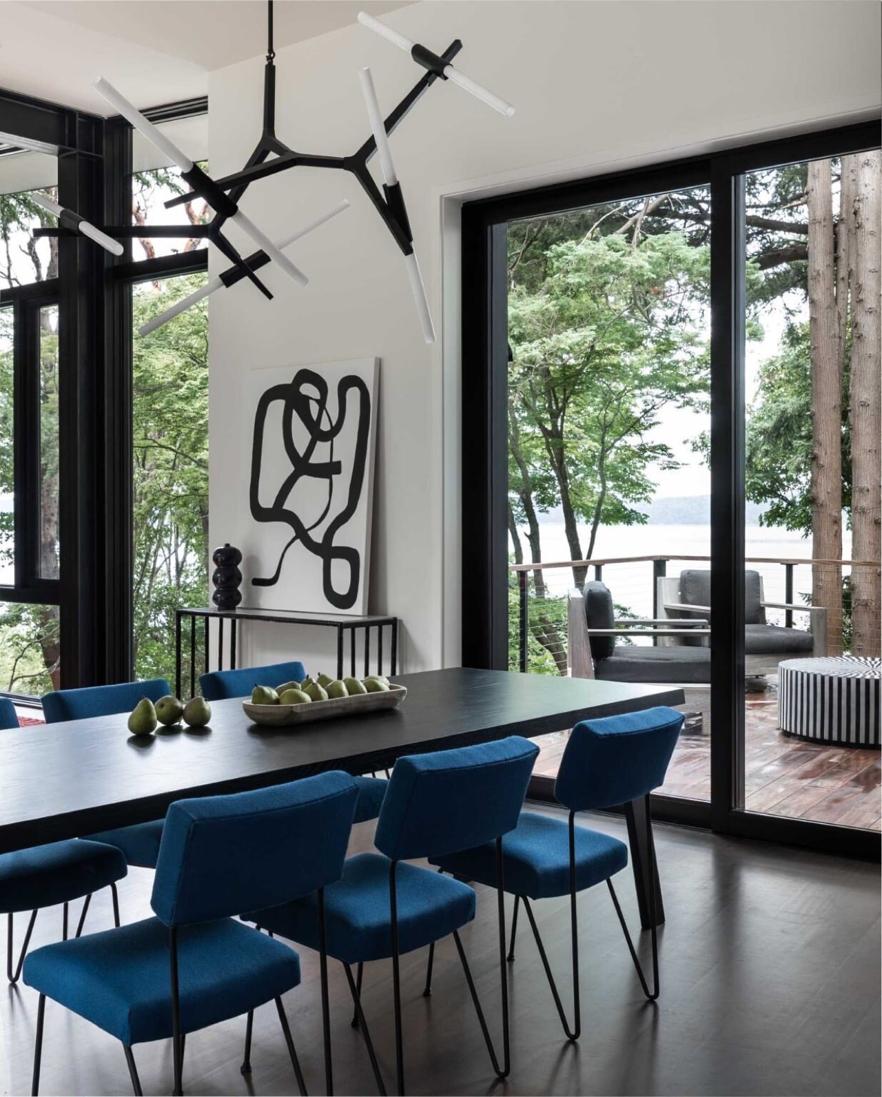
That same color language keeps traveling once you leave the living room, which is where a lot of ambitious houses start to lose their nerve. Blue dining chairs with slim metal frames pick up where the lounge chair left off, adding personality without competing with the water views outside. The kitchen sits just beyond, wrapped in walnut cabinetry that swaps the cool palette for something warmer and more tactile. Red accent panels show up again here, a quiet callback to the rug two rooms over, proof that DeForest and Ore Studios were working from the same script rather than improvising room by room. Nothing about the furniture distracts from the forest outside, which seems to be the entire design brief in a nutshell.
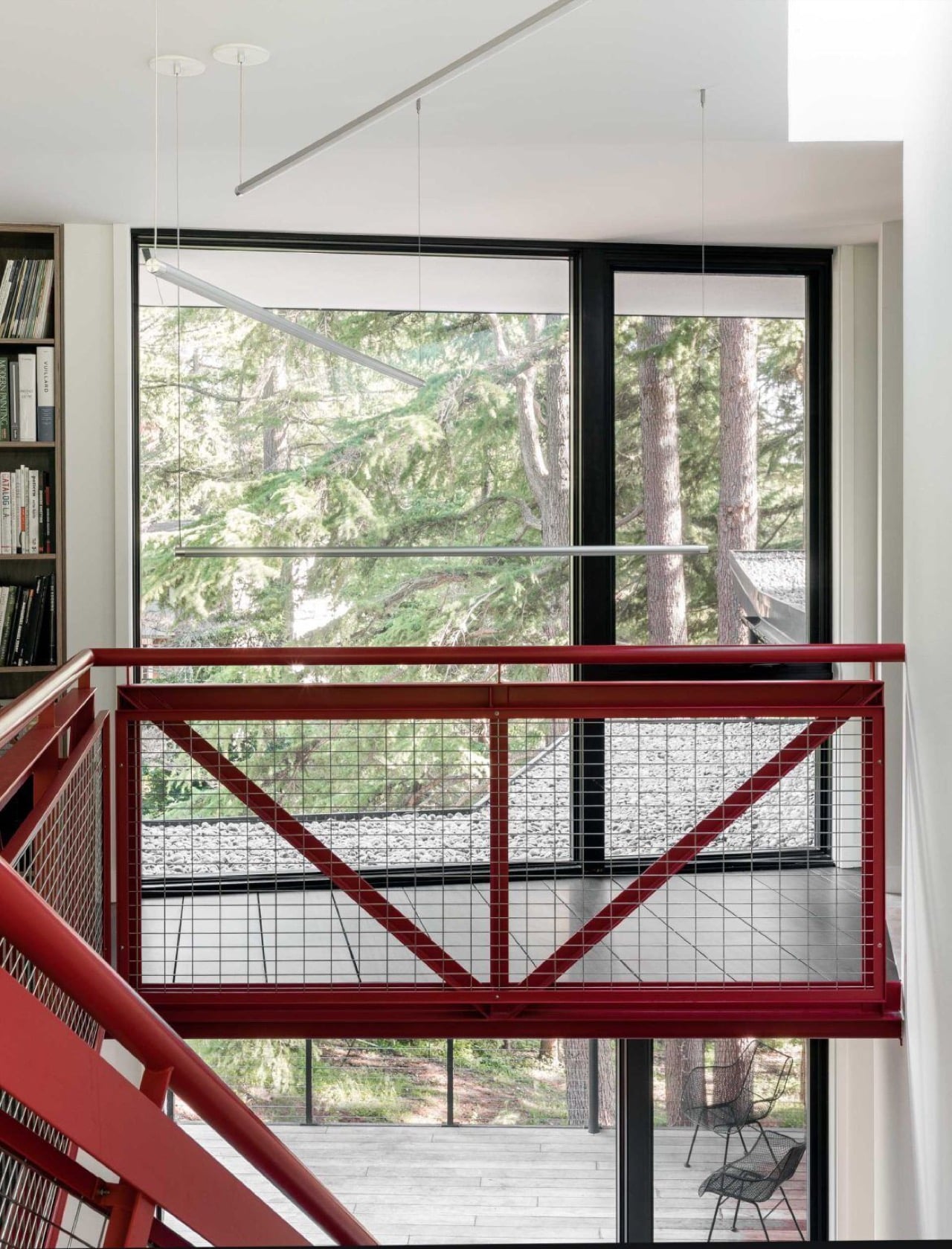
The most theatrical detail in the whole house doesn’t come from the glass at all, it comes from a staircase. DeForest based its red steel structure on the fire lookout towers that used to dot ridgelines across the Pacific Northwest, spare utilitarian buildings meant for spotting smoke before anyone else could. As it climbs through the house, the staircase echoes the actual climb up the hillside outside, turning a purely functional element into the closest thing the home has to a sculpture. It’s a small footprint, structurally speaking, but it carries an outsized share of the house’s personality. Painted a saturated red against white walls, it reads less like circulation and more like a piece the owners could have commissioned separately.
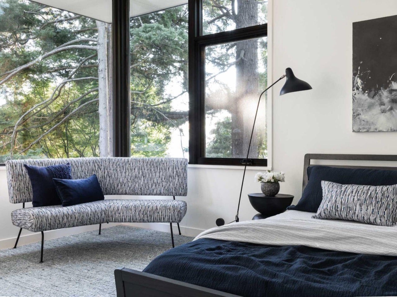
Upstairs, the bedroom dials the energy back down without abandoning the color story that runs through the rest of the house. Deep blues show up in the cushions and bedding, playing against grey and black finishes for something that feels genuinely restful rather than sparse. It’s the same restrained material palette found everywhere else in the home, just recalibrated for a room where the goal is sleep rather than entertaining. Large windows keep the forest close even here, so the connection to the site never fully disappears even in the most private room of the house. It’s a quieter moment, but it fits the same internal logic as everything that came before it.
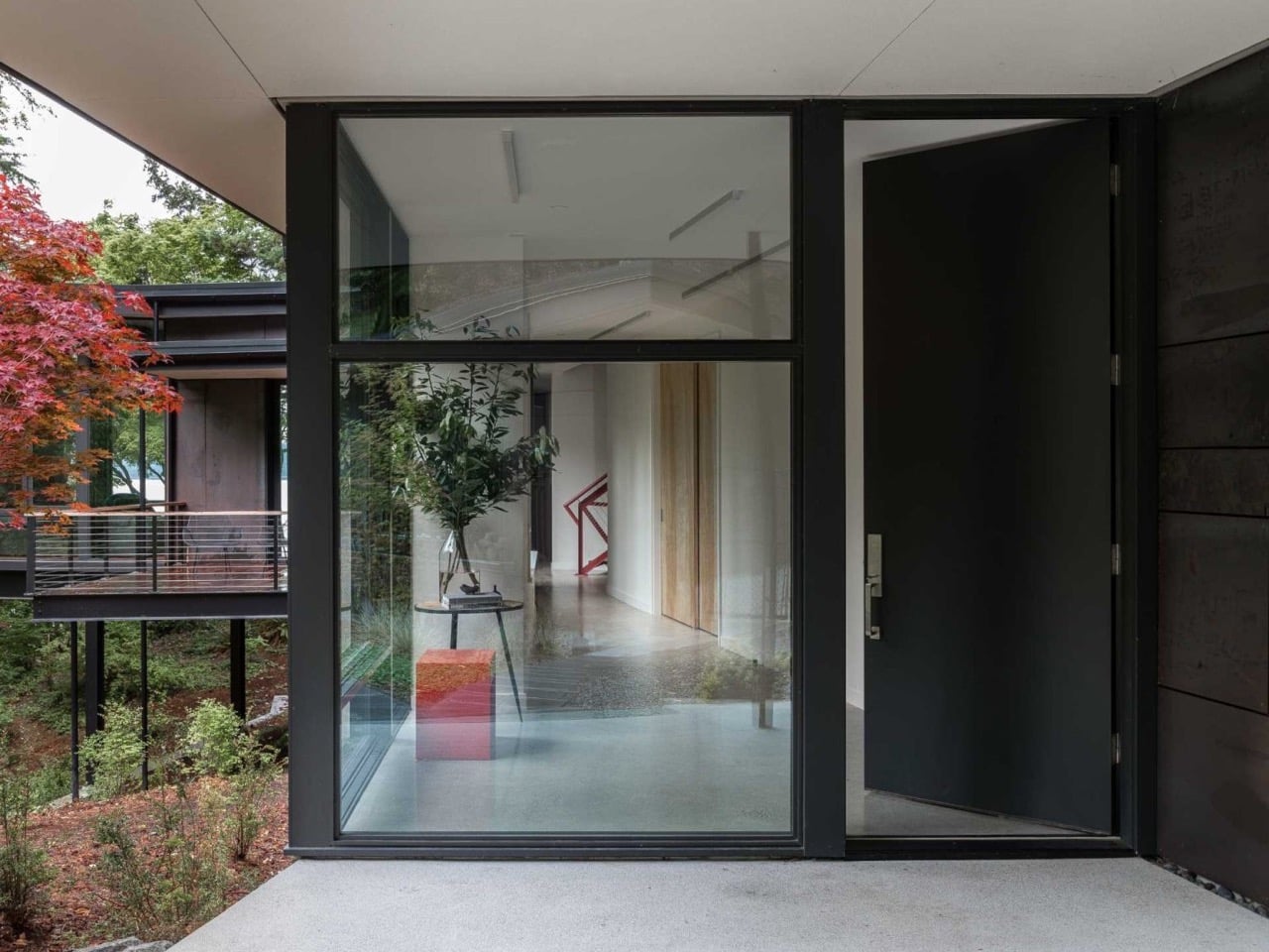
Cantilevered houses tend to live or die by whether the drama feels earned or bolted on as an afterthought, and this one earns it. DeForest Architects and Ore Studios didn’t settle for one showpiece room and call the rest of the house filler, they built an entire structure that keeps renegotiating its relationship to a genuinely difficult site. The fire lookout staircase and the suspended living room could have each carried a project on their own, and here they exist in the same house without stepping on each other. Toth Construction gets credit too, since none of this works if the execution doesn’t match the ambition on paper. Burien, Washington isn’t exactly known as an architecture destination, but this house makes a decent case that it should be.
The post This Cantilevered Forest Home in Washington Hovers Above The Trees first appeared on Yanko Design.
China Just Built a Mirrored Heart at the Lake Called ‘The Last Tear

Sayram Lake sits in a remote corner of Xinjiang, China, at an altitude that makes the air feel thinner and the colors feel brighter. It’s the kind of place that deserves a nickname, and it has a good one: “the last tear of the Atlantic.” The story goes that moisture from the Atlantic Ocean travels thousands of miles across the Eurasian continent, losing itself to evaporation along the way, and what finally arrives at Sayram is what’s left. A last, quiet exhale. A tear. It’s a beautiful piece of geography wrapped in a beautiful piece of poetry, and that combination has now inspired a beautiful piece of design.
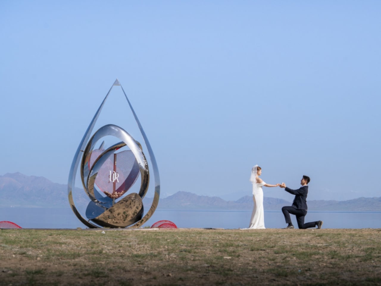
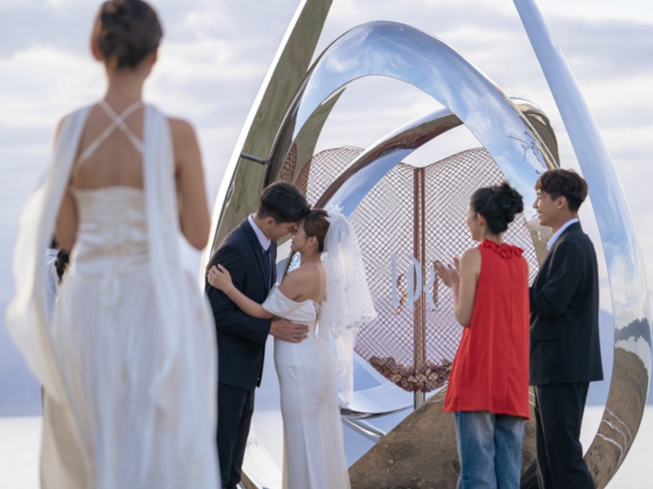
Beijing-based Zhide Architectural Design Consulting recently unveiled Heart of Sayram Lake, a mirrored installation built along the lake’s edge for Chinese jewelry brand DR (Darry Ring), a label known for its philosophy of “One Life, One Only, One True Love.” The partnership makes sense. DR built its entire identity on the idea of a single, lifelong commitment. Sayram Lake built its mythology on the same idea, just in water. Marrying the two was either an obvious move or a brilliant one, and I’d argue it’s a little of both.

Designer: Zhide Architectural Design Consulting (Beijing) Co., Ltd.

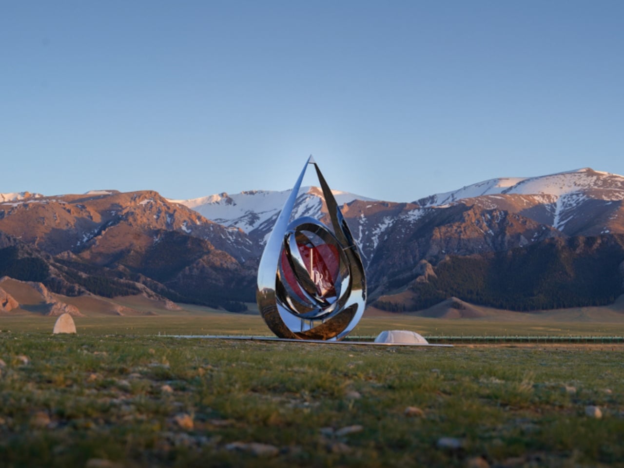
The installation is shaped like a water drop, which reads as a literal nod to the lake’s tearful lore and a visual echo of DR’s engagement-ring sensibility. It’s ground-mounted with circular ripples spreading outward from the base, mimicking the moment a drop hits still water. At its center, two interlocking rings suggest matching diamond bands. It’s sentimental, yes, but the execution keeps it from tipping into kitsch. The full structure is built from mirrored metal, and the effect is genuinely stunning. It doesn’t sit in the landscape so much as absorb it. Snow peaks, meadow grass, the sky, and the lake all fold into its surface, making it look less like an installation and more like a fragment of the world folded back on itself.

Hollow red wire mesh elements run through the design as a secondary layer, contrasting the hard polish of the mirrored metal with something warmer and more open. That contrast works. The red feels intentional against the pale highland palette of the surrounding area: ice blue, snow white, meadow green. The designers clearly understood that the installation would compete with one of the most visually dramatic natural environments in China, and rather than trying to stand apart from it, they let the lake win. The mirror borrows the landscape’s beauty. The result feels collaborative rather than intrusive.
The design also carries a participatory layer that extends its purpose beyond spectacle. Couples visiting the site can place natural Sayram Lake stones and DR custom heart locks inside dedicated compartments built into the installation. As these accumulate, engraved love mottos inscribed on the interior walls gradually become visible. Filled units can eventually be arranged into a larger matrix of interconnected structures, turning the whole thing into something that grows with each visit, each person, each relationship. A landmark that updates itself through the people who come to see it is a more interesting proposition than one that simply stands there being beautiful.

Public art commissioned by brands tends to make critics nervous, and I get it. The line between meaningful cultural contribution and elaborate marketing is often thin. But looking at Heart of Sayram Lake, it feels like the design team at Zhide prioritized the landscape and the experience above the brand’s visibility. Nothing about it screams advertisement. It sits quietly in one of the most dramatic settings in the country, doing its job, which is to give people a way to feel connected to a place and to each other.

Sayram Lake has been turning people poetic for centuries. That a jewelry brand and a Beijing architecture firm found a way to add to that tradition without overwhelming it is worth pausing on. The best design doesn’t shout. It reflects.

The post China Just Built a Mirrored Heart at the Lake Called ‘The Last Tear first appeared on Yanko Design.