
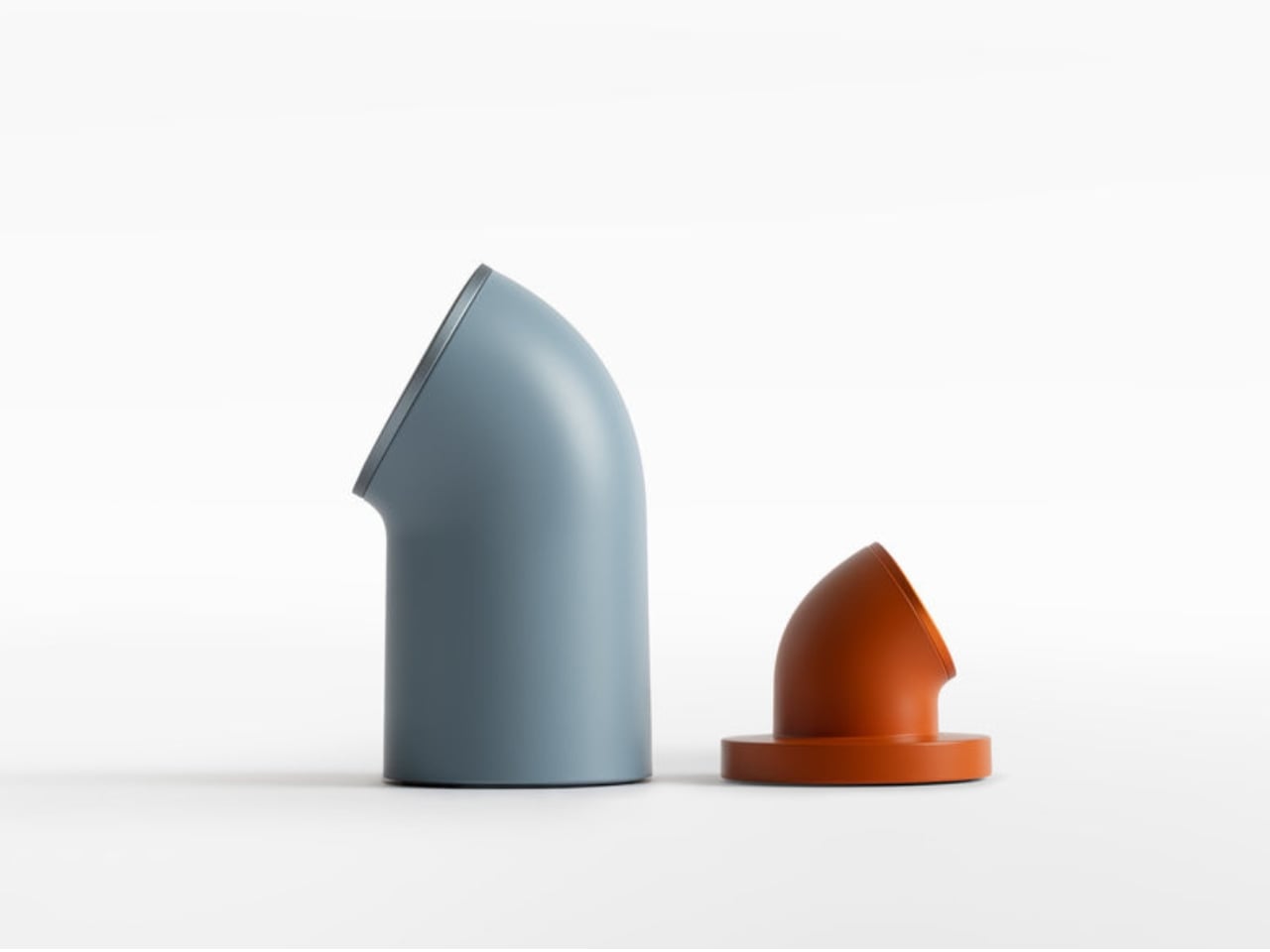
Spain will require carriers to keep mobile networks live during power outages
Spain's mobile networks will need to stay live for at least four hours during power outages, per new rules.
At some point, most of us stopped caring what our charging setup looks like. A tangle of cables here, a plastic brick there, maybe a few adapters scattered across the desk like tech confetti. It works, so why fuss? London-based design studio LAYER is making the case that we’ve been setting the bar way too low, and once you see Node and Loft, it’s pretty hard to disagree.
LAYER, the studio founded by award-winning British designer Benjamin Hubert, recently unveiled Node and Loft, a new family of charging products developed for lifestyle brand Daily Objects. The premise is simple but smart: what if your charging accessories actually looked like something you chose on purpose?
Designer: LAYER

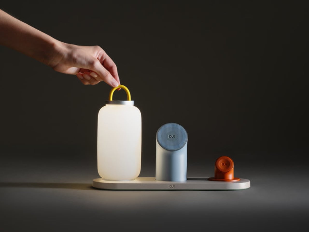
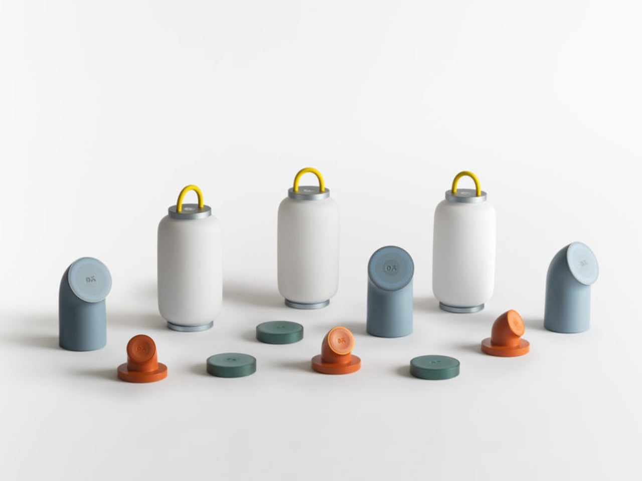
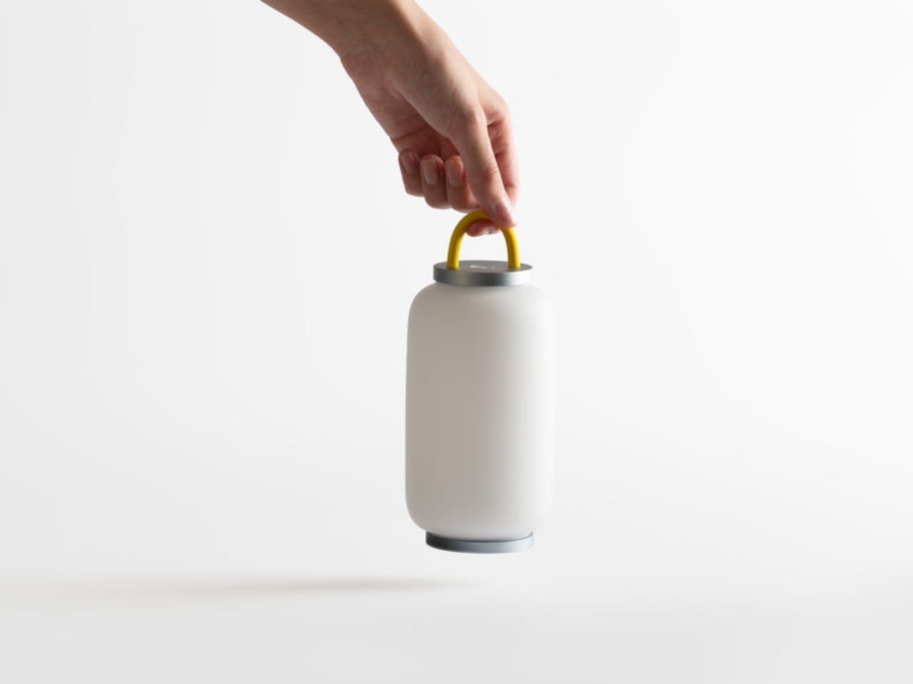
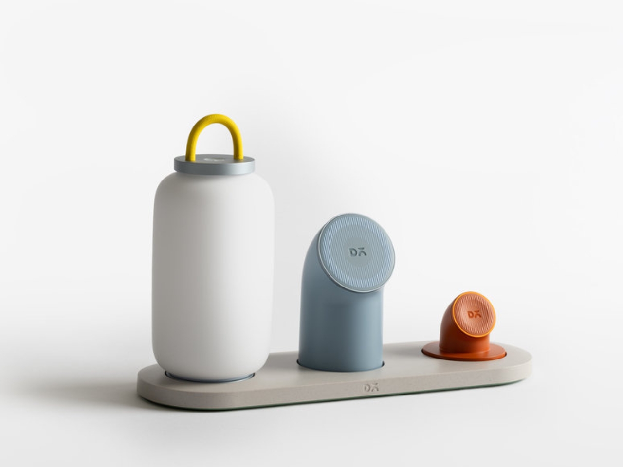
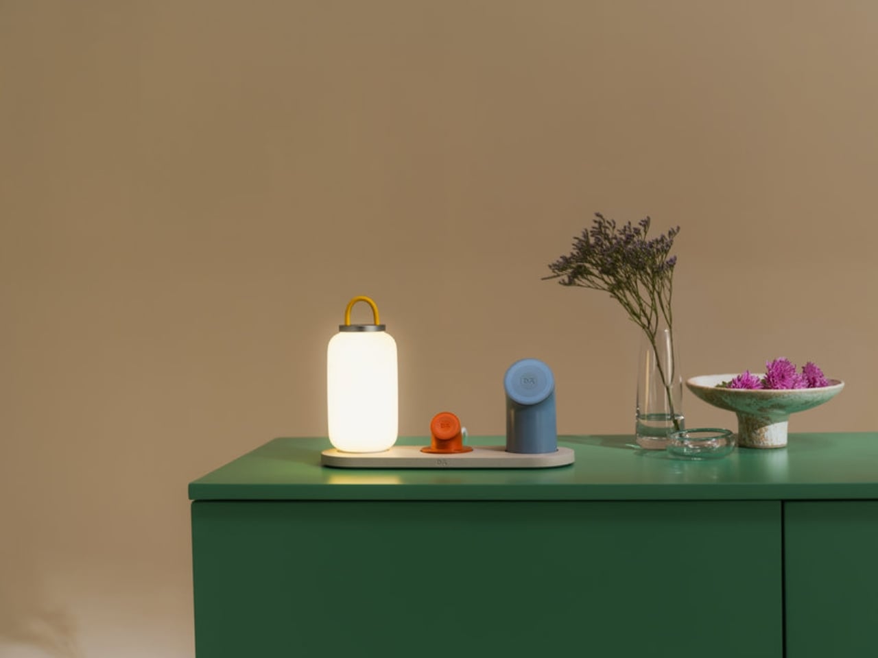
Node is the modular piece of the duo, and it’s genuinely clever. Built around a one-wire setup, it works as either a 2-in-1 or 3-in-1 dock, with four interchangeable modules to mix and match: a Wireless Charging Phone Stand, a Wireless Charging Disk, an Apple Watch Charging Stand, and a Portable Lamp. Each module clicks in when you need it at the desk and lifts off just as easily when you’re heading into a different room or packing a bag. The whole thing feels less like cable management and more like a system you’d actually enjoy using.
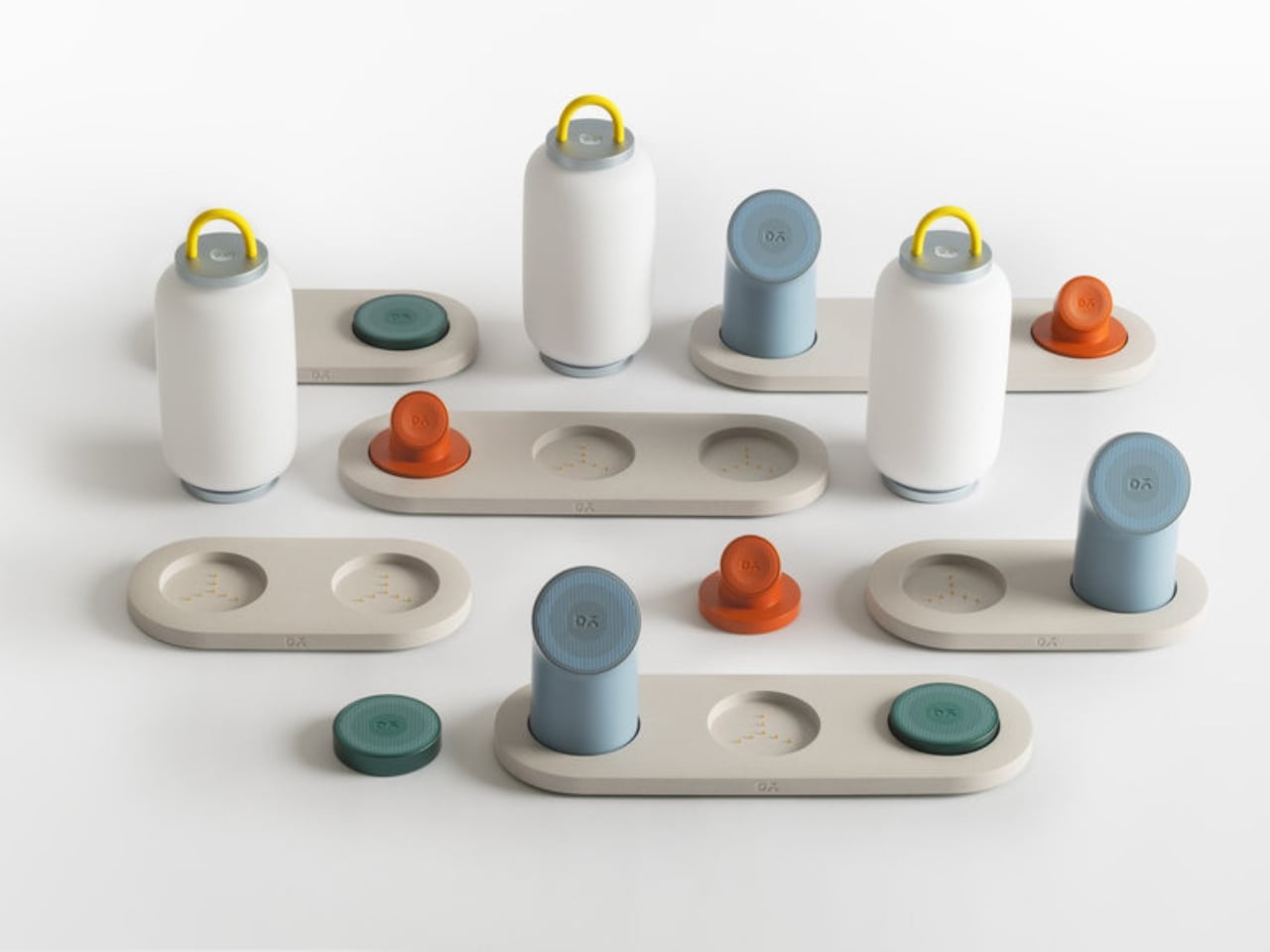
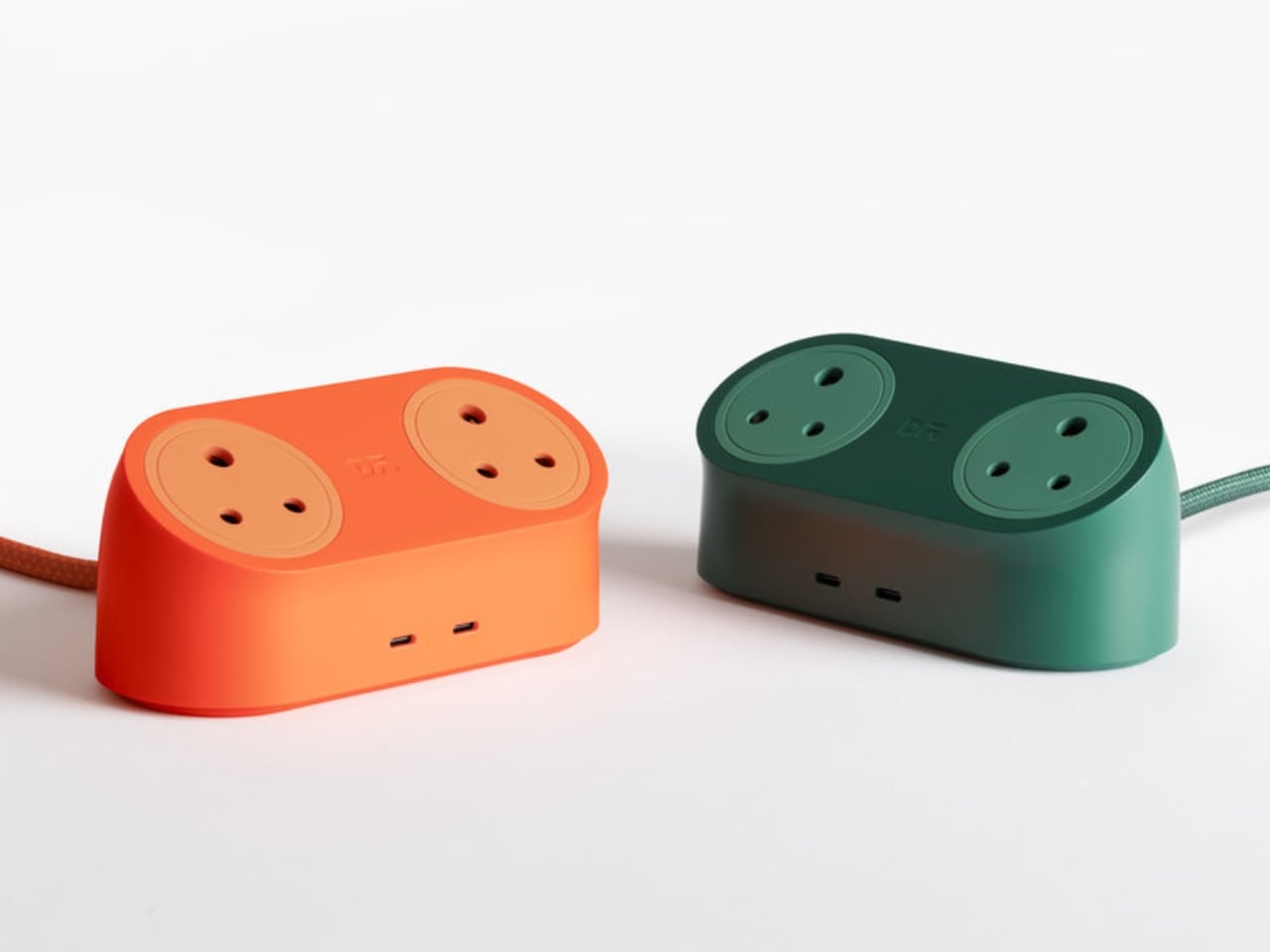
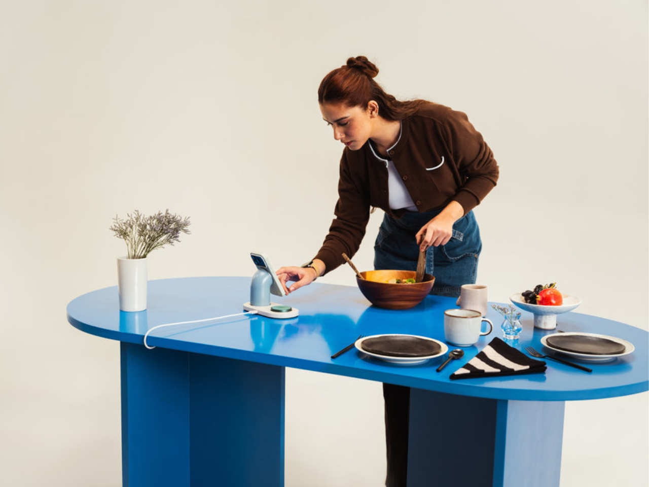
Loft, the other half of the collection, is a 65W charging station designed to sit on your desk without apology. It handles up to four devices at once, mains and USB-C included, all packed into a compact, sculptural form that looks far more intentional than what most charging stations have to offer. The silhouette is arched and minimal. The materials feel considered. It’s the kind of object you leave out because you want to, not because you forgot to tidy it away.
What LAYER has done here, and what makes this more than just another tech accessory launch, is commit fully to a design language rather than just a functional brief. Soft forms, arched silhouettes, tactile materials, a recurring circular charging motif: it all adds up to something cohesive. The goal isn’t just to make charging look prettier. It’s to make it feel like part of how you live, whether at a home desk, in a hotel room, or on a kitchen counter.
Hubert described charging as “one of the most repeated interactions in daily life, yet the products that enable it are often treated as background objects.” That observation is so obvious you’d think more designers would have acted on it sooner. The ugly charging block has been a design blind spot for years, and the solutions that have come before Node and Loft have largely fallen into two camps: clinical and all-white, or trying so hard to look “lifestyle” that they end up feeling performative. Node and Loft feel like neither. They feel like objects with actual personality.
For Daily Objects, an Indian lifestyle brand that’s been steadily building a reputation for design-forward tech accessories, collaborating with LAYER on this makes a lot of sense. The studio is known for a philosophy rooted in what Hubert calls humanising technology, taking things that usually feel cold or utilitarian and giving them warmth and presence. That’s a harder balance to strike than it sounds, especially in a category as commoditised as charging hardware. It’s a thread that runs consistently through LAYER’s work, and it’s very visible here.
The broader trend Node and Loft belong to is worth paying attention to. We’re moving away from the idea that tech accessories have to look like tech accessories. People are putting more thought into how objects feel in a space, not just how they function in one. The line between product design and interior design keeps getting blurrier, and collections like this one are a big reason why.
You probably don’t spend a lot of time thinking about where your charger lives on your desk. Node and Loft are betting that, given the right option, you might start.
The post LAYER Just Made a 65W Charger You’d Actually Want on Your Desk first appeared on Yanko Design.


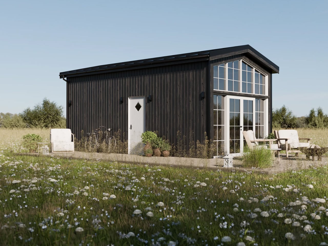
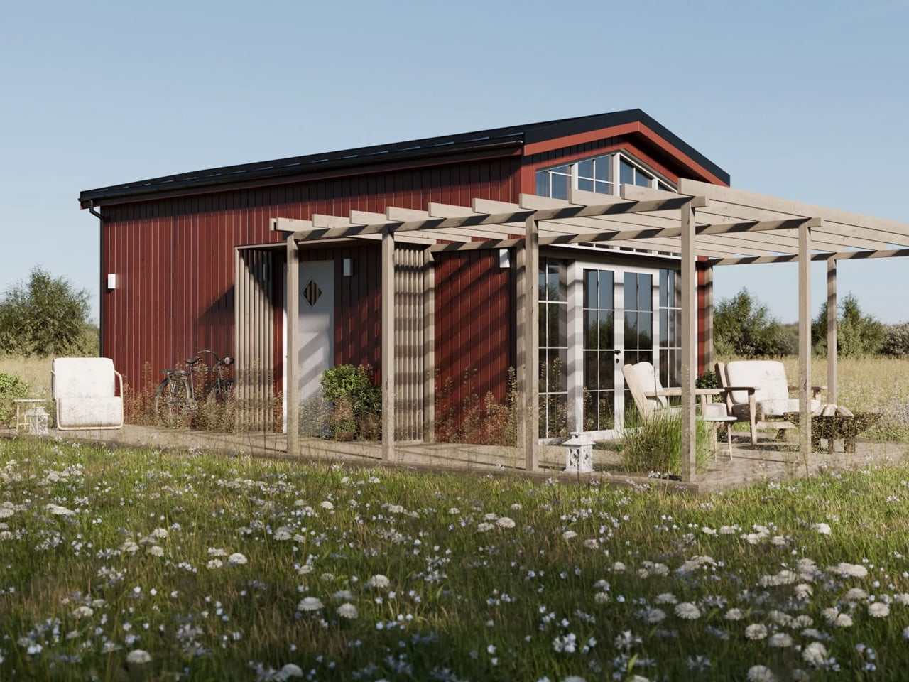
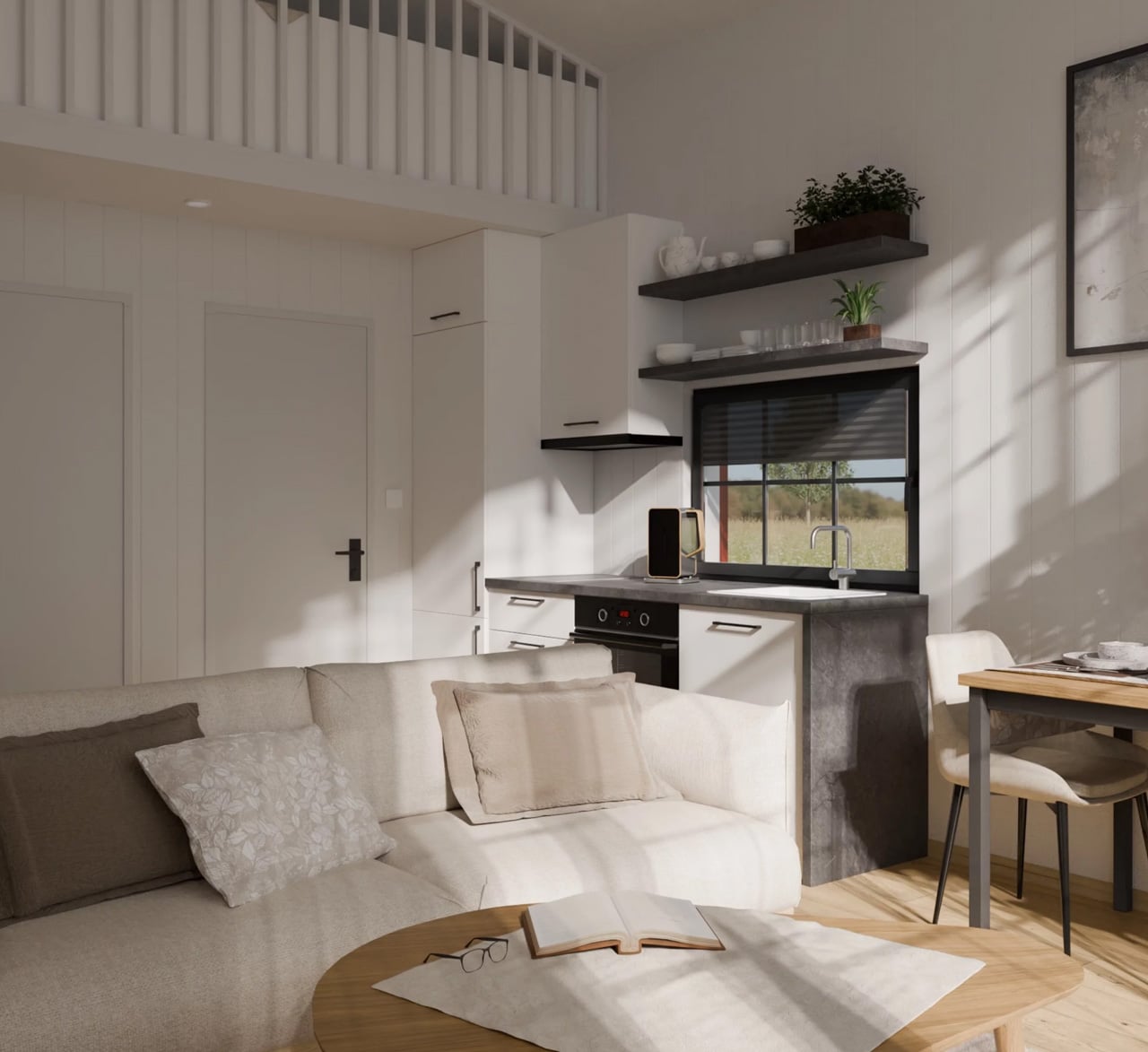
Tiny living has never looked this composed. Vagabond Haven, the Scandinavian tiny home builder known for architect-designed structures built to withstand year-round Nordic conditions, taps directly into that feeling with their latest modular offering: the Lucia. The Lucia sits in Vagabond Haven’s modular homes lineup, meaning it’s fixed to a steel frame on a permanent foundation rather than road-towable — a deliberate trade-off that unlocks noticeably more interior breathing room.
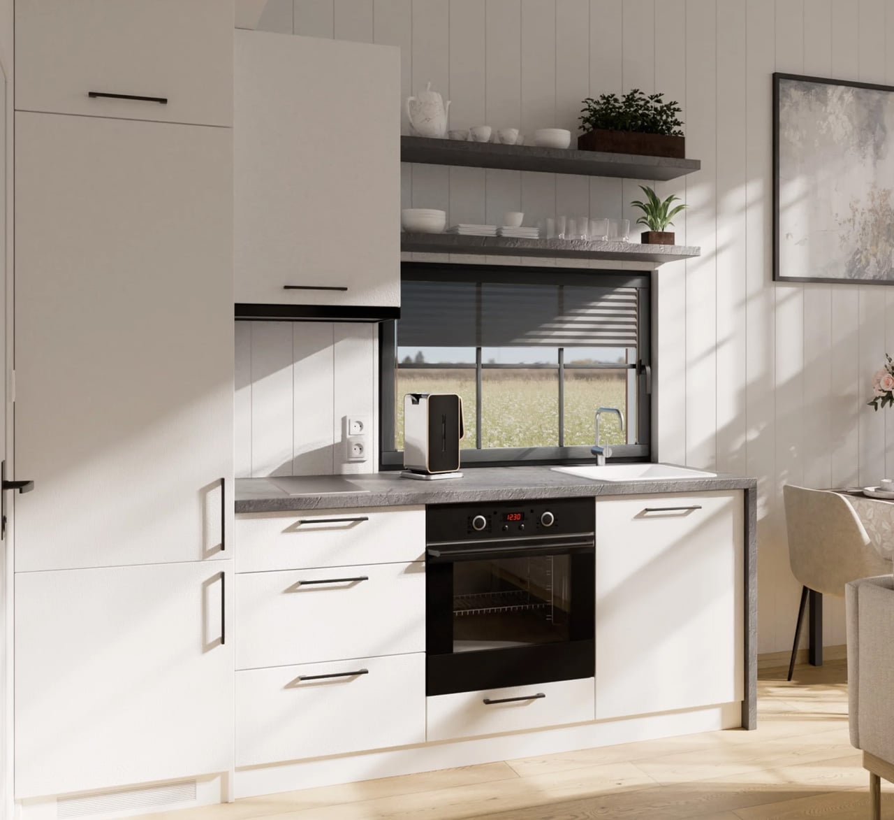
At 39 square meters across a 7.5-meter frame, it’s one of the more generously proportioned models in the lineup, and it reads that way from the moment you step inside. From the outside, the Lucia earns its cottage comparison immediately. It’s clad in either spruce or engineered wood siding, finished with a clean metal roof, and offered in a range of color options — the deep black exterior and the natural wood tone being the most visually striking. A large glass façade opens up the front face of the home, pulling light deep into the ground floor and creating a visual connection to the landscape that most small structures simply can’t achieve.
Designer: Vagabond Haven
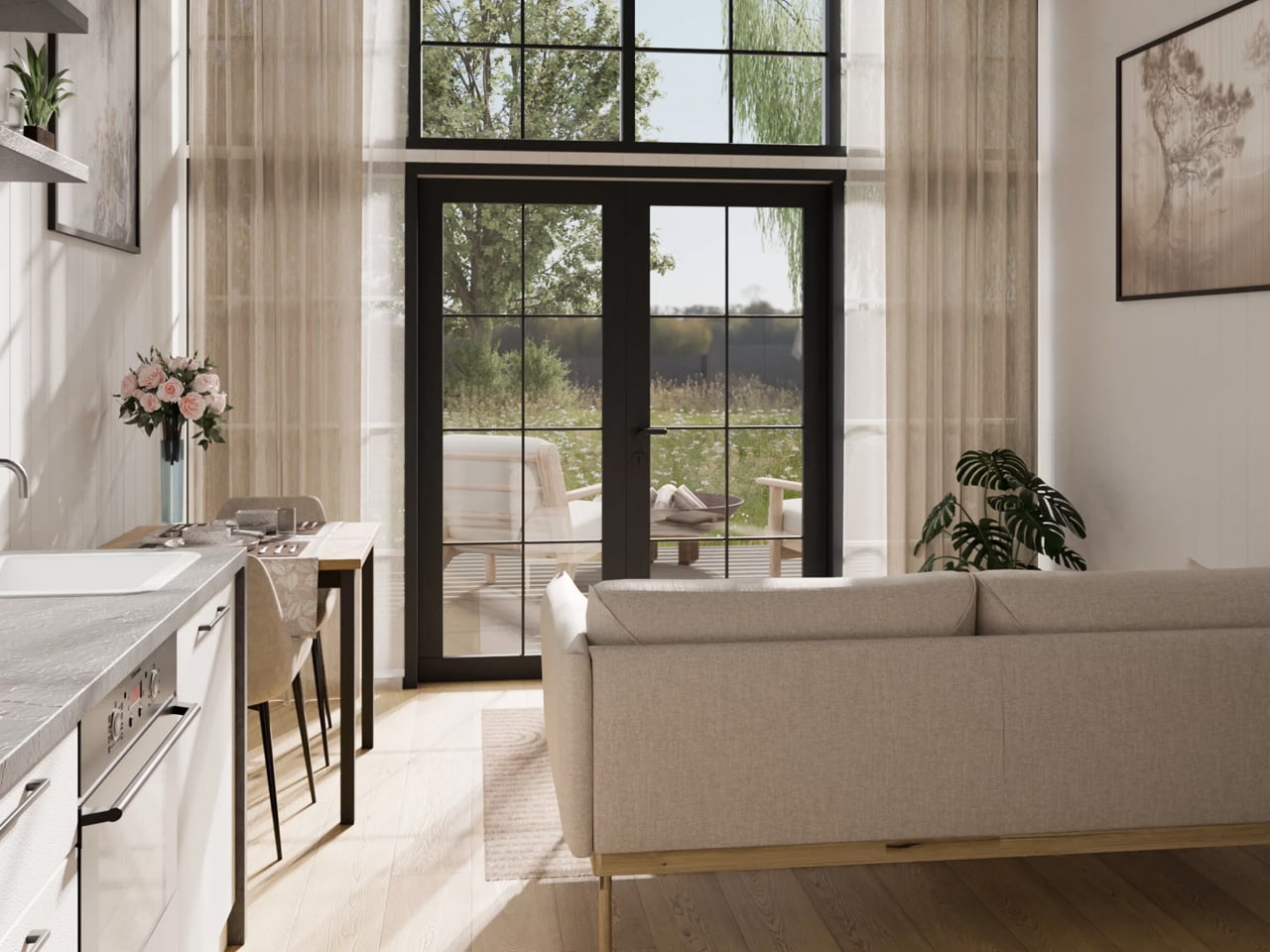
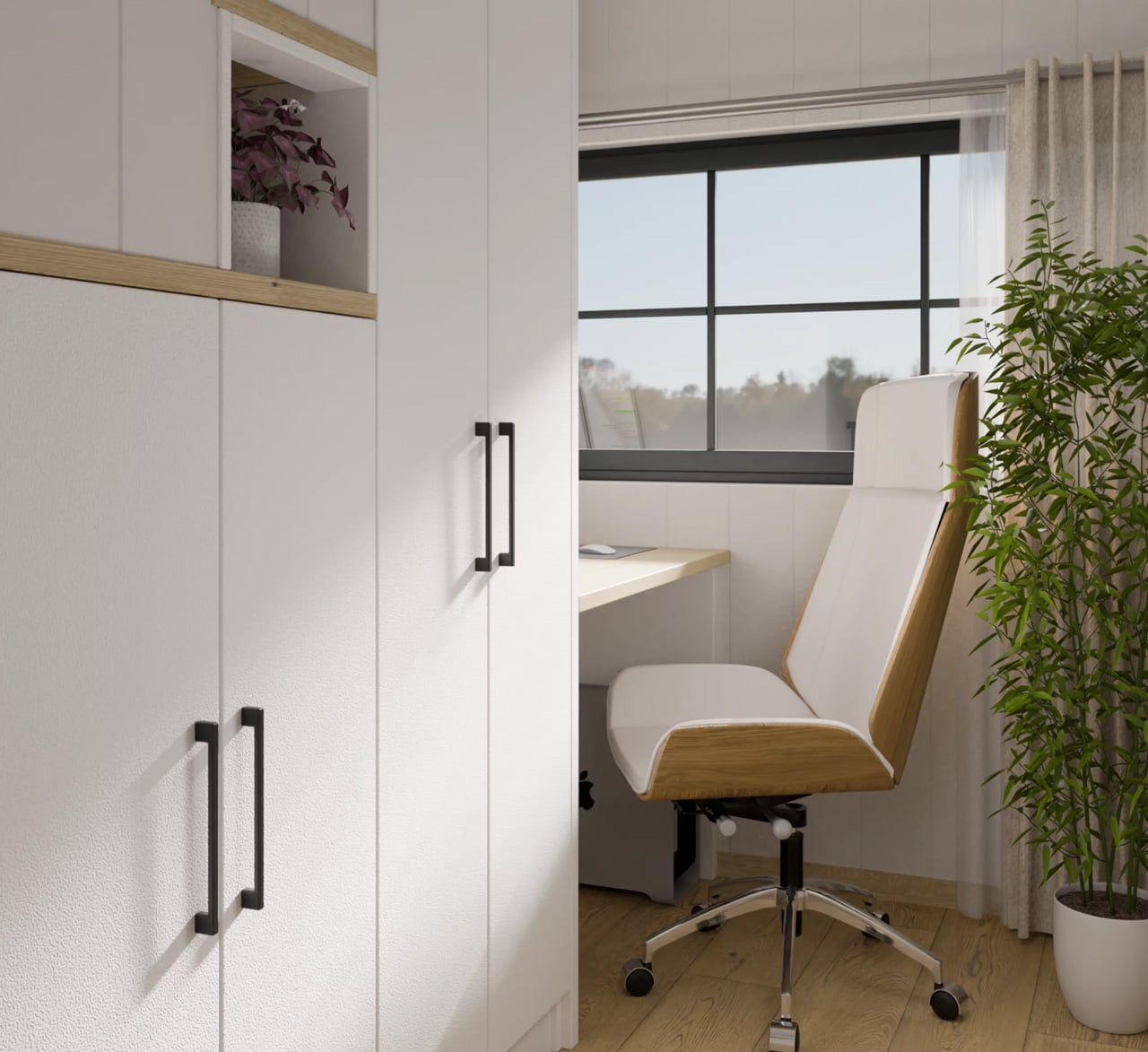
Inside, the layout is smarter than its square footage suggests. The ground floor holds a full kitchen, a living area, and — the detail that really sets the Lucia apart — a dedicated home office with a built-in desk and integrated storage. In a moment when remote work has become a non-negotiable consideration for homebuyers at every scale, this is a meaningful design decision rather than a gesture. The space feels intentional, not squeezed in.
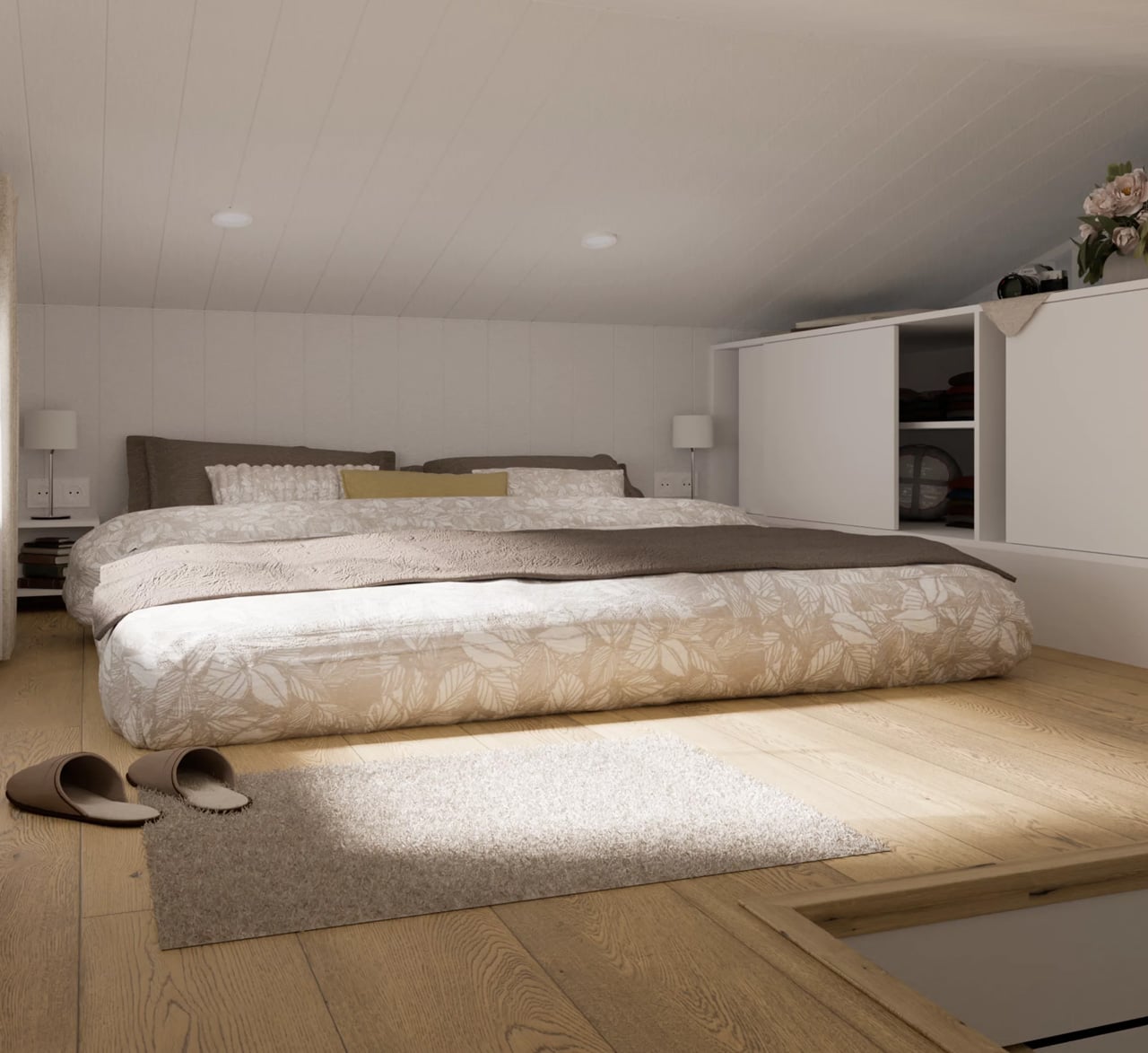
The bedroom lives in the loft, accessed by a staircase that earns its keep twice over — each step doubles as a storage nook or cupboard. The ceiling runs low up there, as loft ceilings do, but the double bed fits comfortably alongside additional built-in storage, and the proportions feel cozy rather than cramped.
The Lucia starts at $97,000, with the final number climbing depending on customization choices — a terrace and pergola add-on, furnishing packages, and color selections among them. For a modular home built to Scandinavian standards, using eco-friendly materials and designed by architects rather than assembled from a catalog, that entry price is competitive. What the Lucia ultimately offers isn’t a compromise on living — it’s an argument that thoughtful design at 39 square meters can outperform thoughtless design at twice the size.
The post This Scandinavian Tiny Home Has a Dedicated Office & Trades Wheels For 39 Square Meters of Smarter Living first appeared on Yanko Design.