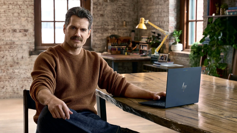
Google partners with known nerd Henry Cavill on a video game to showcase Googlebooks
The final result will be published in November.

Bugatti has never done anything quietly — and its first American residential project is no exception. On the Miami River, Brandon Haw Architecture is designing a 60-story tower that carries the weight of one of the most storied names in automotive history, and the pressure to deliver is very much part of the brief.
Bugatti Residences Miami is the French marque’s first foray into the American residential market, following the announcement of its Dubai skyscraper in 2023. The site sits at 75 SW Miami Avenue Road in Brickell, commanding over 300 feet of Miami River frontage with sight lines toward Biscayne Bay. Developed by Prosper Group and Belgium’s Versluys Group, the $650 million tower will house 183 residences and four signature penthouses — a deliberately limited collection that keeps the exclusivity intact.
Designer: Brandon Haw Architecture

What Brandon Haw Architecture has pulled off visually is genuinely interesting. The tower is split into four distinct blocks with double-height spaces punctuating the vertical stack — a move that breaks the monotony of the typical glass curtain-wall high-rise and gives the building a sculptural, segmented rhythm that reads as kinetic from the street. The formal language draws from Bugatti’s C-line motif, a design element that has appeared on the brand’s cars since the 1930s, reinterpreted here in the building’s profile and detailing rather than applied as decorative branding.
Inside, Yabu Pushelberg handles the interiors — a pairing that makes immediate sense. The Toronto and New York-based studio brings a sensibility that is simultaneously refined and spatially generous, qualities that align with what Bugatti’s residential arm is chasing. According to Bugatti International managing director Wiebke Ståhl, the vision extends well beyond aesthetics: “every aspect, from exquisite design to seamless service and operations” is considered part of the experience. Rhodium has been named the residential operating partner, reinforcing that the project is being built as much around lifestyle delivery as an architectural statement.

What makes this project worth watching isn’t the brand name — it’s the combination of players. Brandon Haw Architecture has shown a consistent ability to work at the intersection of high design and urban context, and Miami’s river corridor is one of the few remaining sites in the city with genuine spatial drama. The Brickell location gives residents immediate access to one of Miami’s most active neighborhoods, but the river sets a different tempo — quieter, more considered, more architectural.
The residential offering is expected to launch in 2027. Between now and then, the anticipation alone will do exactly what Bugatti has always understood: make people wait for something worth waiting for.

The post Bugatti Residences Miami Is the Most Ambitious Branded Tower to Ever Hit the Miami River first appeared on Yanko Design.



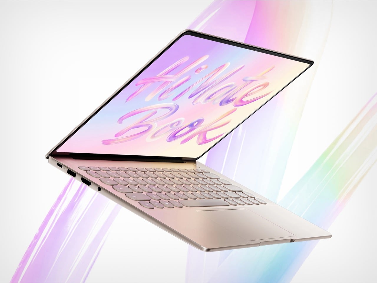
WIKO started in Marseille, spent a decade making budget Androids, got acquired by a Chinese telecom group in 2021, found its way into Huawei’s retail ecosystem, and is now selling a laptop with a patterned keyboard. Quite the corporate journey. The Hi MateBook 14 Core Edition 2026 is the result: a Windows ultrabook built around a 14.2-inch OLED touchscreen with 120Hz and touch support, running Intel’s Panther Lake Core Ultra 5 325. Scrolling through a long document on a 3:2 screen just hits differently, and that taller aspect ratio separates it from the 16:10 default most ultrabooks settle for. WIKO is betting on the display as the machine’s loudest selling point, and on paper, that bet is defensible.
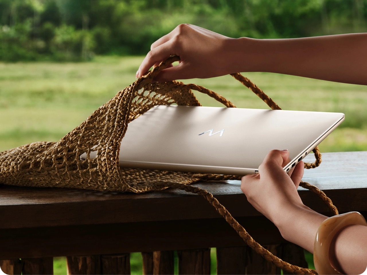
The MateBook name borrows aesthetic language from Huawei’s own laptop family, but WIKO and Huawei are separate companies, and this is WIKO’s product running Windows on Intel silicon. Right now it is a China-market release at CNY 8,199, roughly $1,220, with no confirmed availability outside that region. The port selection tells you something about the intended use case: two USB-A ports, a full-size HDMI, a USB-C, and a headphone jack on a 14.5mm body weighing 1.33 kg (about 2.93 lbs). It is a laptop that genuinely wants to live at a desk, while still dressing like it has somewhere nicer to be.
Designer: WIKO
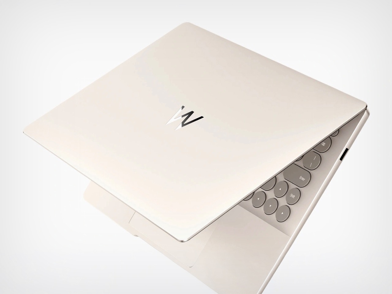
At 2880 by 1920 pixels across a 14.2-inch panel, the Hi MateBook 14 Core Edition runs a resolution and aspect ratio that most Windows machines at this price simply skip. The 3:2 format gives you meaningfully more vertical space than the 16:10 panels most premium ultrabooks default to, which changes how a document or spreadsheet actually feels to navigate. OLED, touch support, and 120Hz simultaneously under $1,300 is a short list in the current Windows market, and the Hi MateBook 14 checks all three on its documented spec sheet. LG’s gram Pro 16 makes a similar display argument but at a higher price. On paper, WIKO is building a screen story worth paying attention to.
Reflectivity, color accuracy, hinge stability, and real-world battery life are all measured quantities that require physical testing to confirm, and none of those numbers exist yet for this machine. WIKO claims 450 nits of peak brightness, sitting slightly below the 500 nits Apple quotes for the MacBook Air M5’s IPS Liquid Retina display. Whether that 50-nit gap matters under different lighting conditions is genuinely unknown at this stage. The primary product documentation is in Mandarin and has not been independently tested yet. The display spec is compelling on paper; the only responsible thing to do is leave it there for now.
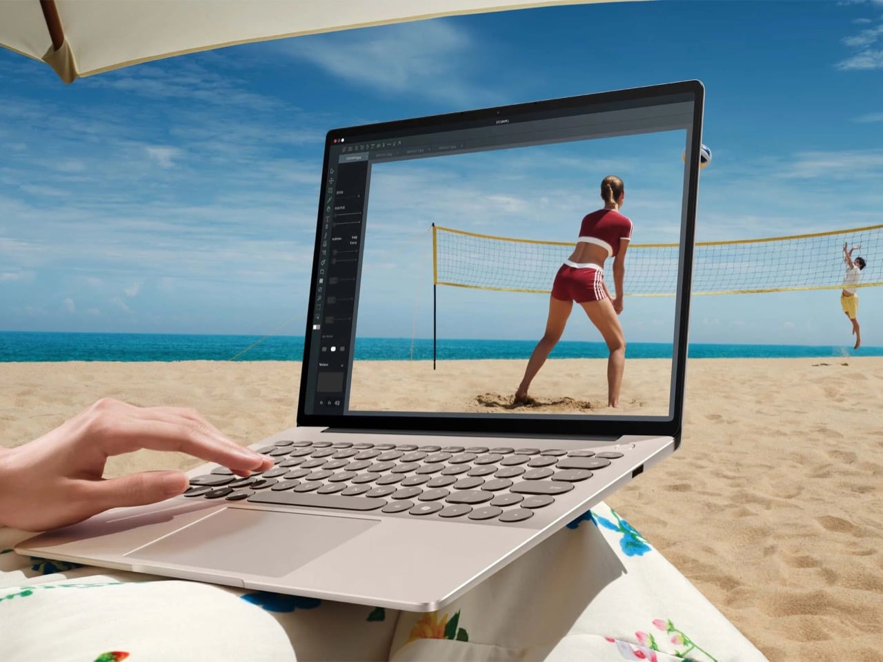
Two USB-A ports and a full-size HDMI on a 14.5mm (0.57-inch) chassis is a statement about who this laptop is designed for. Most premium ultrabook design over the past several years has treated legacy connectors as things to discreetly remove in the name of thinness. The Hi MateBook 14 goes the other direction, covering the ports most desk setups still rely on, then adding a USB-C and a 3.5mm jack alongside them. The result is a machine that does not need a dongle to connect a monitor or flash drive on day one. That is a practical courtesy that has largely disappeared from the premium thin laptop segment.
WIKO puts the keyboard front and center in the Hi MateBook 14’s product photography, with a patterned keycap treatment that differentiates the machine from the generic anodized-slab look most ultrabooks default to. Rounded corners carry the same softened sensibility through the chassis, which at 1.33 kg and 14.5mm thick is legitimately bag-carry friendly. Whether the keycap pattern applies to all regional configurations or is market-specific needs direct confirmation from WIKO. Memory options, storage tiers, and keyboard localization are similarly unconfirmed in the English-language documentation. These are open questions worth pinning down before treating any spec here as settled.
The Core Ultra 5 325 inside the Hi MateBook 14 is a U-series entry-level part from Intel’s Panther Lake family, launched Q1 2026. Panther Lake generated real performance enthusiasm at the H-series end, with top-tier chips delivering substantial gains over Lunar Lake and AMD’s Ryzen AI equivalents in independent testing. The U-series 325 runs a different brief, built for efficiency rather than peak throughput. For document editing, browser workflows, and video calls, it is a capable match for what the Hi MateBook 14 appears designed around. Comparing it to the H-series benchmarks that drove February’s coverage would be a misread of the spec sheet.
CNY 8,199 converts to roughly $1,220, placing the Hi MateBook 14 Core Edition alongside the MacBook Air M5 entry config and a wide field of Windows ultrabooks. For most readers outside China, this is a machine to follow rather than to buy right now, since US availability is unconfirmed. YD covered a similarly geographically restricted machine with the VAIO T Series earlier this month, and the dynamic feels familiar: a compelling design case with no current purchase path for most of the world. WIKO is building something that competes at the spec-sheet level in a segment where that matters. The gap between the paper and the product is still waiting to be closed.

The post WIKO’s $1,220 Hi MateBook 14 puts a gorgeous 3:2 OLED on a very practical laptop first appeared on Yanko Design.

I have spent enough time in enough apartments with enough uneven floors to know that four legs are a promise most chairs cannot keep. Old buildings settle, floorboards cup, tile grout dips half a millimeter here and there, and a standard four-legged chair ends up rocking under you at the worst possible moment, usually right as you lean back with a full glass in hand. It is a small annoyance, but it is the kind of small annoyance that designers have somehow never bothered to fix, because four legs is what a chair is supposed to have.
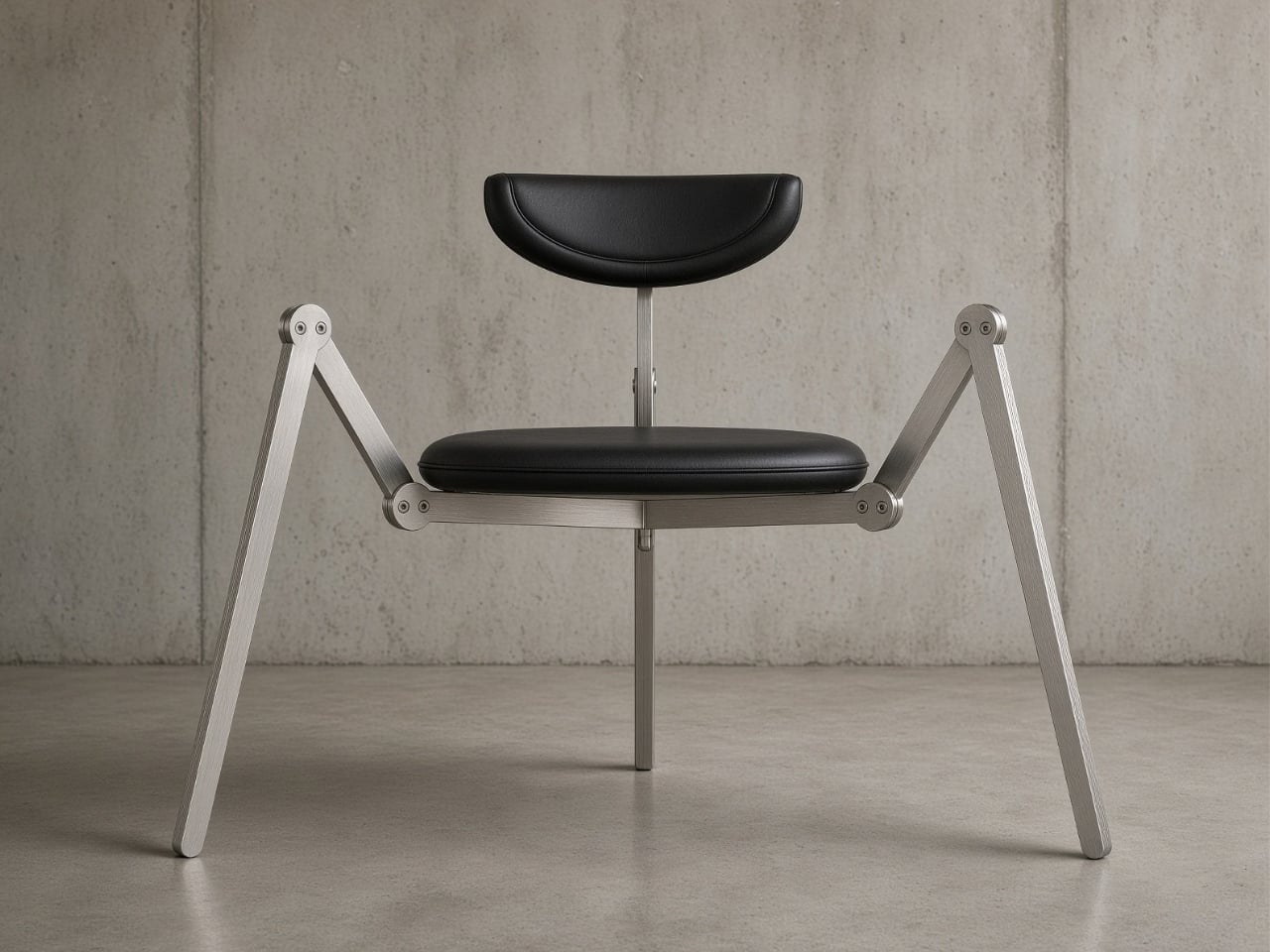
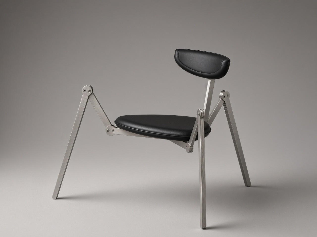
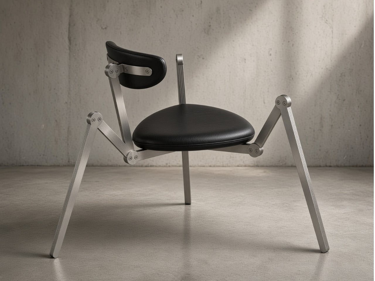
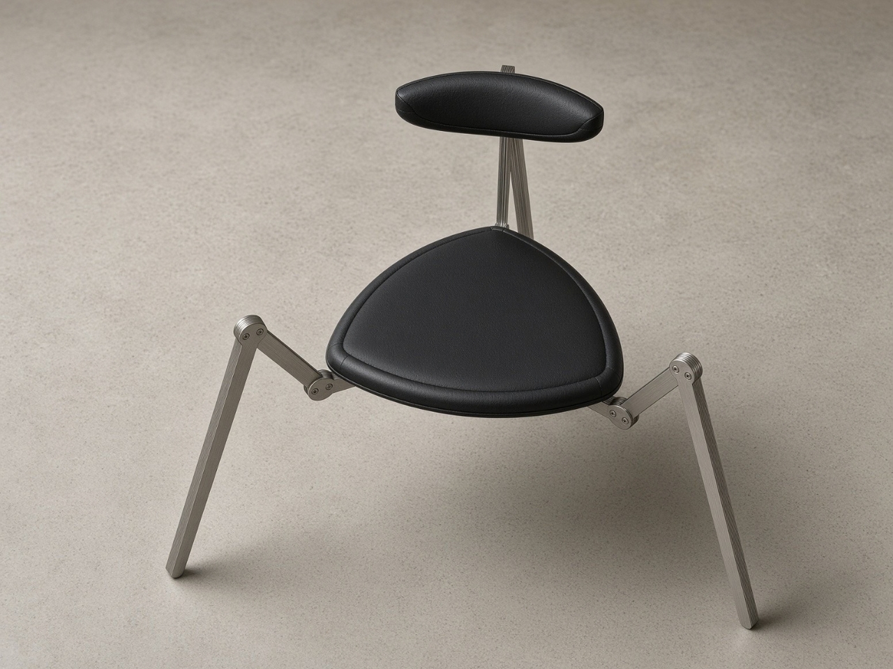
A Russian workshop called alter ST. decided the fix was to stop pretending four points of contact make sense on a surface that is never actually flat. Their piece, called Spider, uses three legs instead. Three points always define a single plane, so the chair cannot rock no matter what the floor is doing underneath it. The name comes from how the legs move. Each one is a flat steel bar that breaks at a pivot joint and swings outward like an insect’s leg, and the whole thing reads less like furniture standing at attention and more like something that has quietly decided to crouch where it landed.
Designer: Alexander Ivanov (alter ST.)
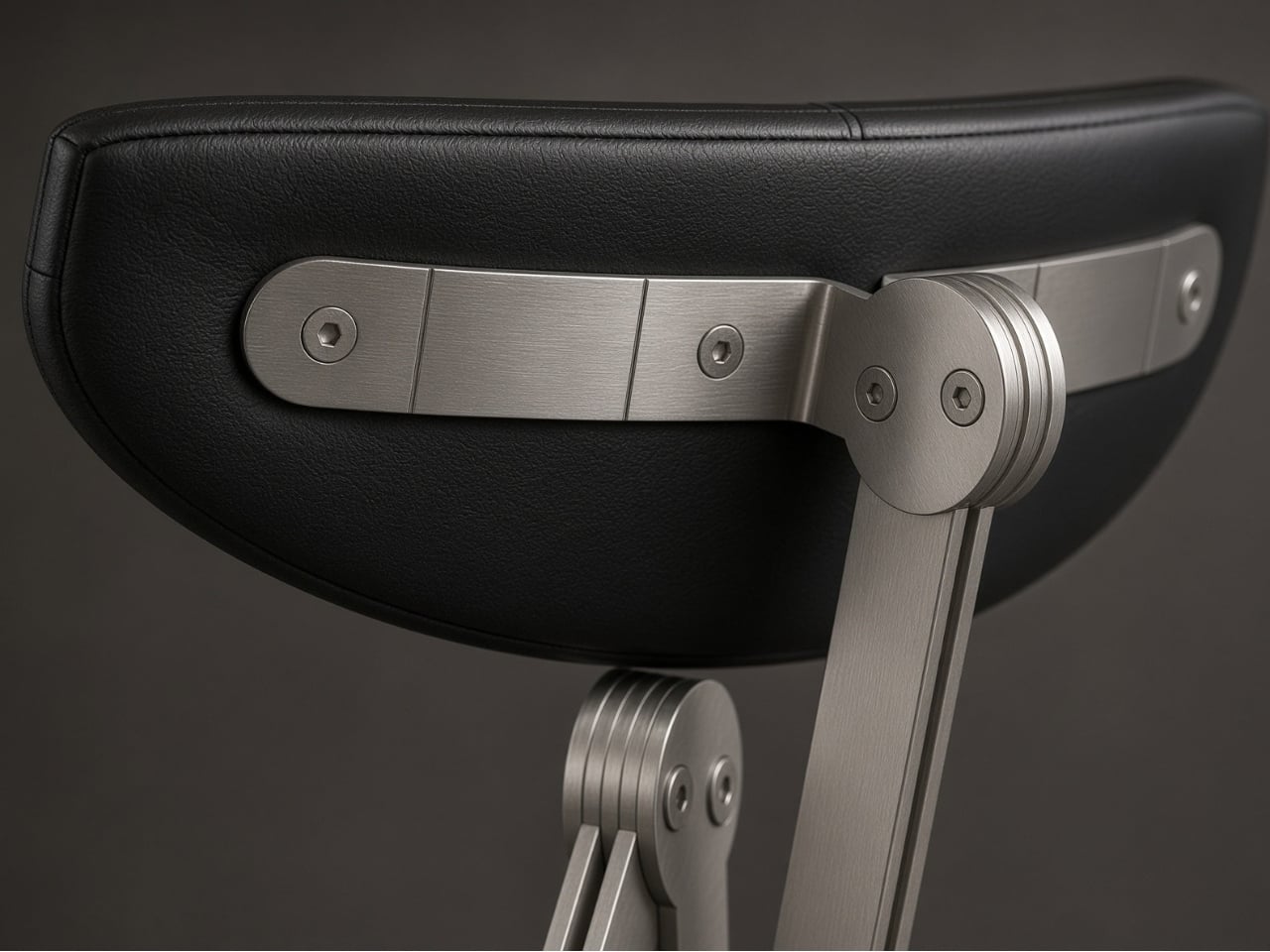
What I like about this piece is that it does not try to hide its own engineering. So much furniture design spends its energy disguising the joints, tucking screws under upholstery, sanding away any evidence that the object was assembled rather than grown. Spider does the opposite. The round lugs, the axles, the countersunk hex fixings, all of it is left exposed on purpose, because that hardware is not decoration bolted onto a hidden frame. It is the frame. Take those pieces away and the chair has nothing left to stand on. I find that kind of honesty rare in a category that usually prefers illusion.
The seat is a soft rounded-triangle cushion in black leather with a stitched welt, and the backrest is a separate leather pad mounted at shoulder-blade height on its own stem, positioned for a low lounge conversation rather than a desk session. Both the seat and the back can be removed and reupholstered without touching the steel frame underneath, which means the chair does not need to be replaced just because the leather eventually wears through. That is a detail people rarely notice when they buy furniture and almost always wish they had once a cushion starts cracking five years in.
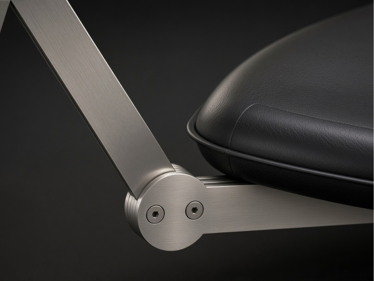
The finish work is where the piece earns its second look. The steel carries a 4N satin finish, brushed in a single direction, and it hides fingerprints far better than a polished surface would, which matters on something meant to be touched constantly while you talk with a coffee in hand. For anyone who wants a different mood, the frame can be polished to a mirror or powder-coated in any RAL color, so the same silhouette can go from industrial gray to something closer to a lacquered accent piece.
None of this makes Spider a practical everyday chair in the way a dining chair or an office chair needs to be practical. At 700 by 680 by 760 millimeters and eight kilograms, it is light enough to move around a room, but it is clearly built for a corner, a reading nook, a spot next to a window where one person sits with a drink and maybe a book. I do not think that is a flaw. Not every object in a home needs to justify itself through utility, and a chair that never wobbles, never hides its own skeleton, and never asks you to compromise the leather for the steel or the steel for the leather feels like it earned its spot regardless of how often it gets sat in.
alter ST. builds Spider and its other pieces out of a small shop in Aleksandrov, cutting, bending, welding, and finishing everything under one roof rather than farming the work out. That kind of small-batch production is not going to compete with mass furniture on price, but it explains why a chair this specific, this stubborn about solving one particular floor problem, exists at all. Somebody had to care enough about a wobble to redesign the entire leg.
The post The 8kg Spider Chair That Refuses to Wobble on Any Floor first appeared on Yanko Design.
I have spent enough time in enough apartments with enough uneven floors to know that four legs are a promise most chairs cannot keep. Old buildings settle, floorboards cup, tile grout dips half a millimeter here and there, and a standard four-legged chair ends up rocking under you at the worst possible moment, usually right as you lean back with a full glass in hand. It is a small annoyance, but it is the kind of small annoyance that designers have somehow never bothered to fix, because four legs is what a chair is supposed to have.
A Russian workshop called alter ST. decided the fix was to stop pretending four points of contact make sense on a surface that is never actually flat. Their piece, called Spider, uses three legs instead. Three points always define a single plane, so the chair cannot rock no matter what the floor is doing underneath it. The name comes from how the legs move. Each one is a flat steel bar that breaks at a pivot joint and swings outward like an insect’s leg, and the whole thing reads less like furniture standing at attention and more like something that has quietly decided to crouch where it landed.
Designer: Alexander Ivanov (alter ST.)
What I like about this piece is that it does not try to hide its own engineering. So much furniture design spends its energy disguising the joints, tucking screws under upholstery, sanding away any evidence that the object was assembled rather than grown. Spider does the opposite. The round lugs, the axles, the countersunk hex fixings, all of it is left exposed on purpose, because that hardware is not decoration bolted onto a hidden frame. It is the frame. Take those pieces away and the chair has nothing left to stand on. I find that kind of honesty rare in a category that usually prefers illusion.
The seat is a soft rounded-triangle cushion in black leather with a stitched welt, and the backrest is a separate leather pad mounted at shoulder-blade height on its own stem, positioned for a low lounge conversation rather than a desk session. Both the seat and the back can be removed and reupholstered without touching the steel frame underneath, which means the chair does not need to be replaced just because the leather eventually wears through. That is a detail people rarely notice when they buy furniture and almost always wish they had once a cushion starts cracking five years in.
The finish work is where the piece earns its second look. The steel carries a 4N satin finish, brushed in a single direction, and it hides fingerprints far better than a polished surface would, which matters on something meant to be touched constantly while you talk with a coffee in hand. For anyone who wants a different mood, the frame can be polished to a mirror or powder-coated in any RAL color, so the same silhouette can go from industrial gray to something closer to a lacquered accent piece.
None of this makes Spider a practical everyday chair in the way a dining chair or an office chair needs to be practical. At 700 by 680 by 760 millimeters and eight kilograms, it is light enough to move around a room, but it is clearly built for a corner, a reading nook, a spot next to a window where one person sits with a drink and maybe a book. I do not think that is a flaw. Not every object in a home needs to justify itself through utility, and a chair that never wobbles, never hides its own skeleton, and never asks you to compromise the leather for the steel or the steel for the leather feels like it earned its spot regardless of how often it gets sat in.
alter ST. builds Spider and its other pieces out of a small shop in Aleksandrov, cutting, bending, welding, and finishing everything under one roof rather than farming the work out. That kind of small-batch production is not going to compete with mass furniture on price, but it explains why a chair this specific, this stubborn about solving one particular floor problem, exists at all. Somebody had to care enough about a wobble to redesign the entire leg.
The post The 8kg Spider Chair That Refuses to Wobble on Any Floor first appeared on Yanko Design.