
Apple will reportedly skip the M6 Pro and Max and jump straight to M7
Apple may skip the M6 Pro and Max chips.


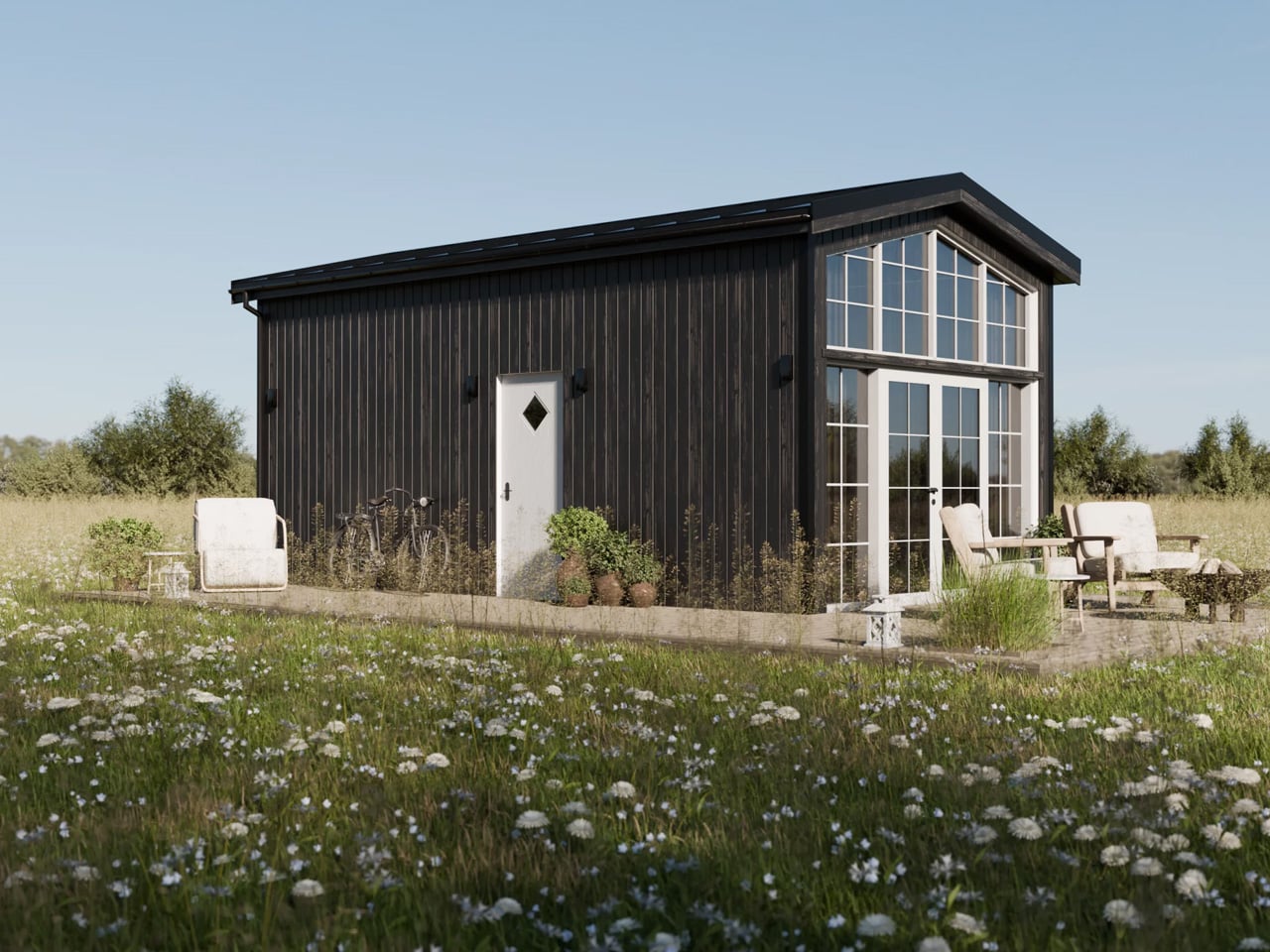
Tiny living has never looked this composed. Vagabond Haven, the Scandinavian tiny home builder known for architect-designed structures built to withstand year-round Nordic conditions, taps directly into that feeling with their latest modular offering: the Lucia. The Lucia sits in Vagabond Haven’s modular homes lineup, meaning it’s fixed to a steel frame on a permanent foundation rather than road-towable — a deliberate trade-off that unlocks noticeably more interior breathing room.
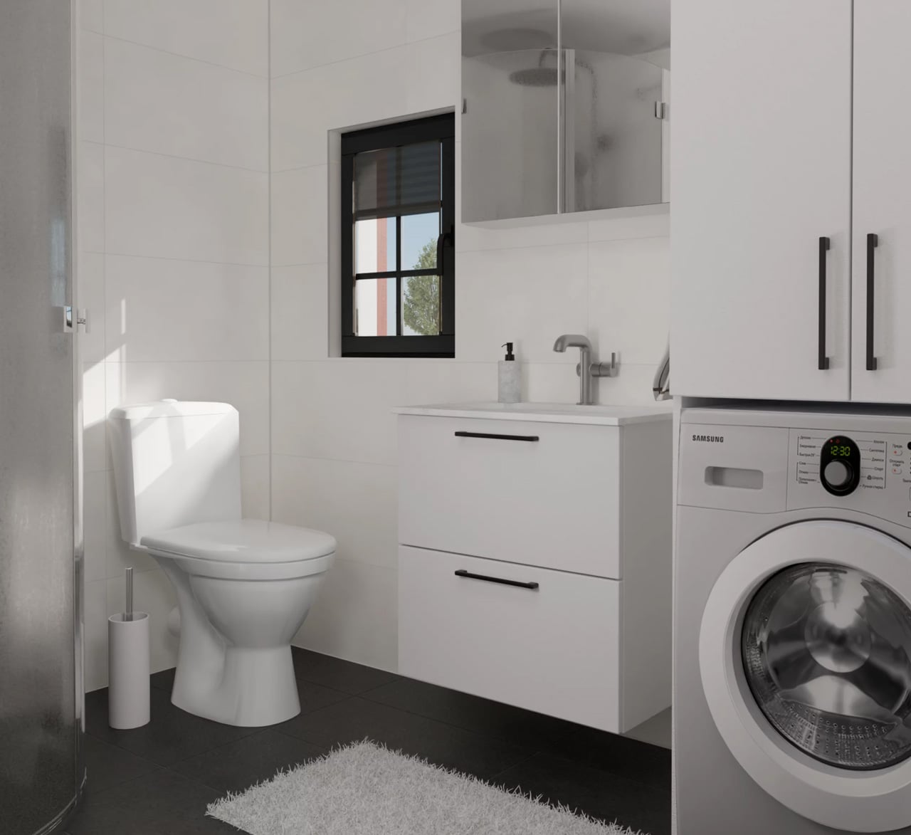
At 39 square meters across a 7.5-meter frame, it’s one of the more generously proportioned models in the lineup, and it reads that way from the moment you step inside. From the outside, the Lucia earns its cottage comparison immediately. It’s clad in either spruce or engineered wood siding, finished with a clean metal roof, and offered in a range of color options — the deep black exterior and the natural wood tone being the most visually striking. A large glass façade opens up the front face of the home, pulling light deep into the ground floor and creating a visual connection to the landscape that most small structures simply can’t achieve.
Designer: Vagabond Haven

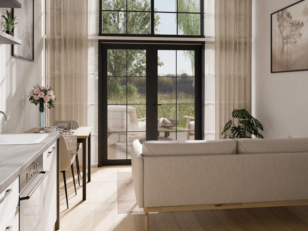
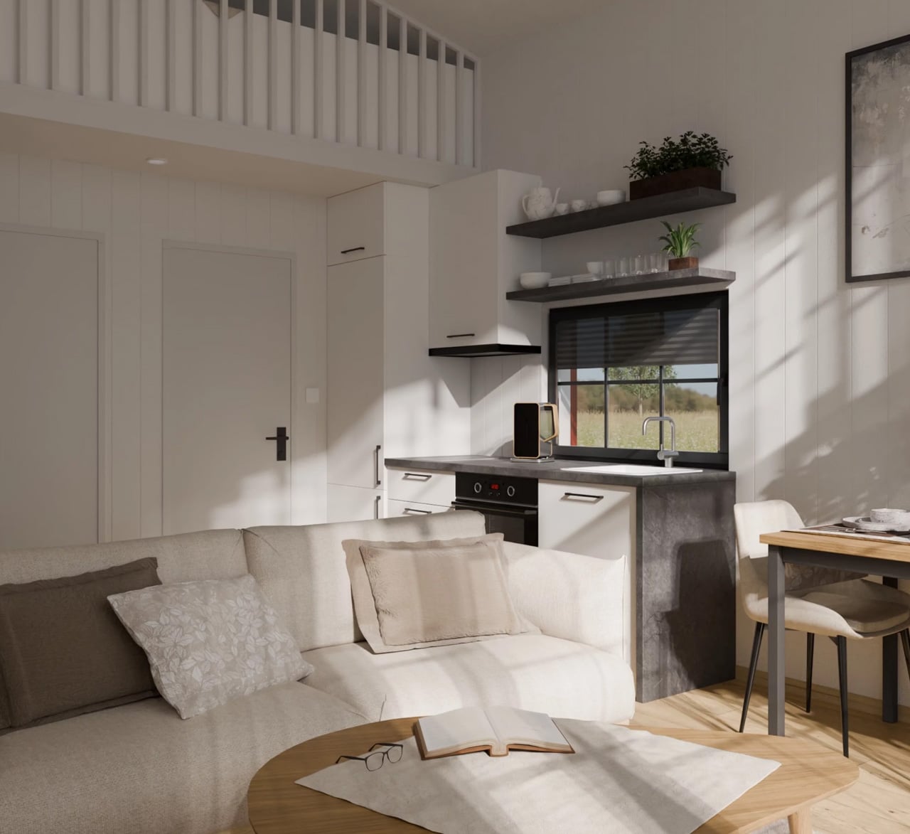
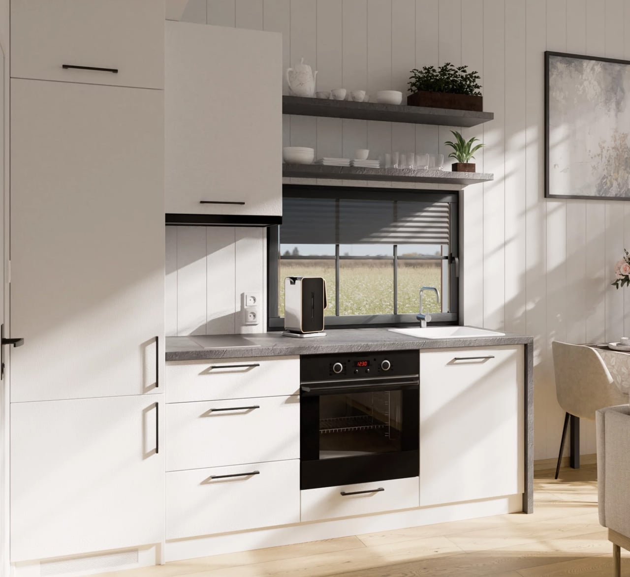
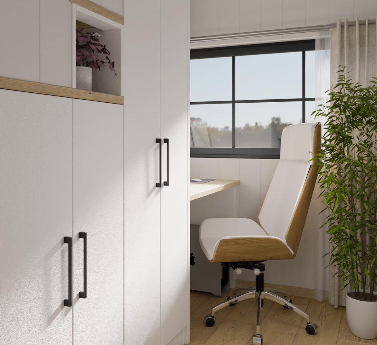
Inside, the layout is smarter than its square footage suggests. The ground floor holds a full kitchen, a living area, and — the detail that really sets the Lucia apart — a dedicated home office with a built-in desk and integrated storage. In a moment when remote work has become a non-negotiable consideration for homebuyers at every scale, this is a meaningful design decision rather than a gesture. The space feels intentional, not squeezed in.
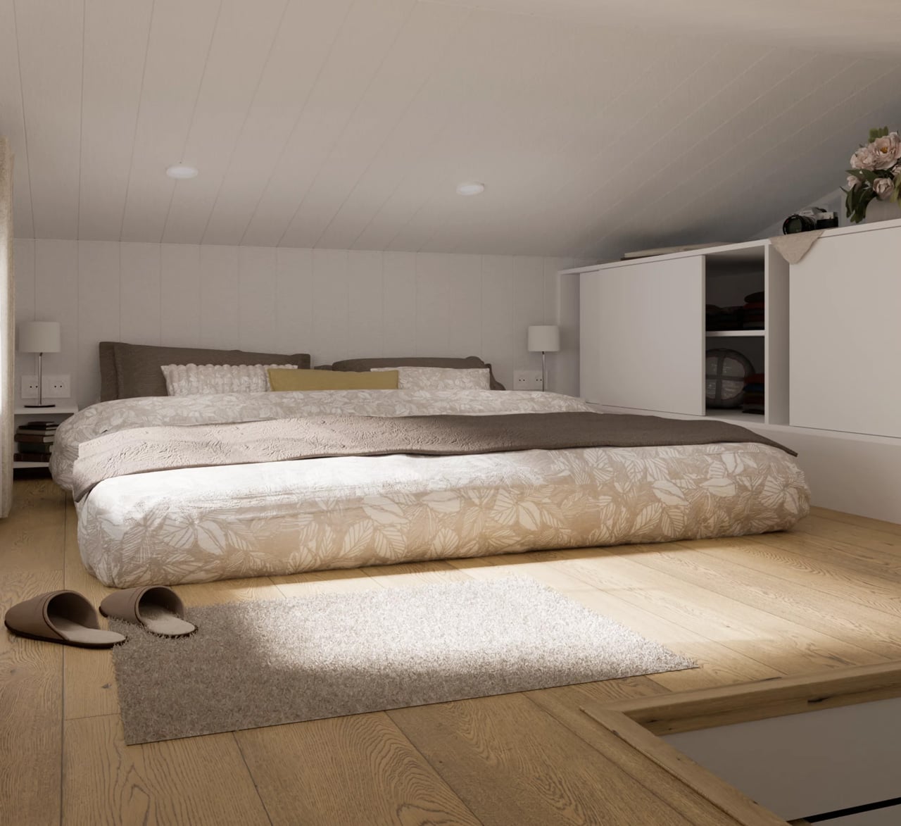
The bedroom lives in the loft, accessed by a staircase that earns its keep twice over — each step doubles as a storage nook or cupboard. The ceiling runs low up there, as loft ceilings do, but the double bed fits comfortably alongside additional built-in storage, and the proportions feel cozy rather than cramped.
The Lucia starts at $97,000, with the final number climbing depending on customization choices — a terrace and pergola add-on, furnishing packages, and color selections among them. For a modular home built to Scandinavian standards, using eco-friendly materials and designed by architects rather than assembled from a catalog, that entry price is competitive. What the Lucia ultimately offers isn’t a compromise on living — it’s an argument that thoughtful design at 39 square meters can outperform thoughtless design at twice the size.
The post This Scandinavian Tiny Home Has a Dedicated Office & Trades Wheels For 39 Square Meters of Smarter Living first appeared on Yanko Design.


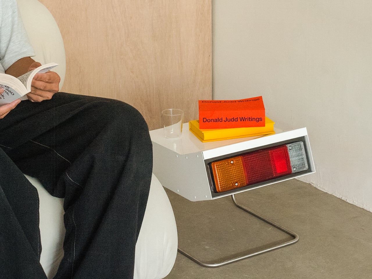
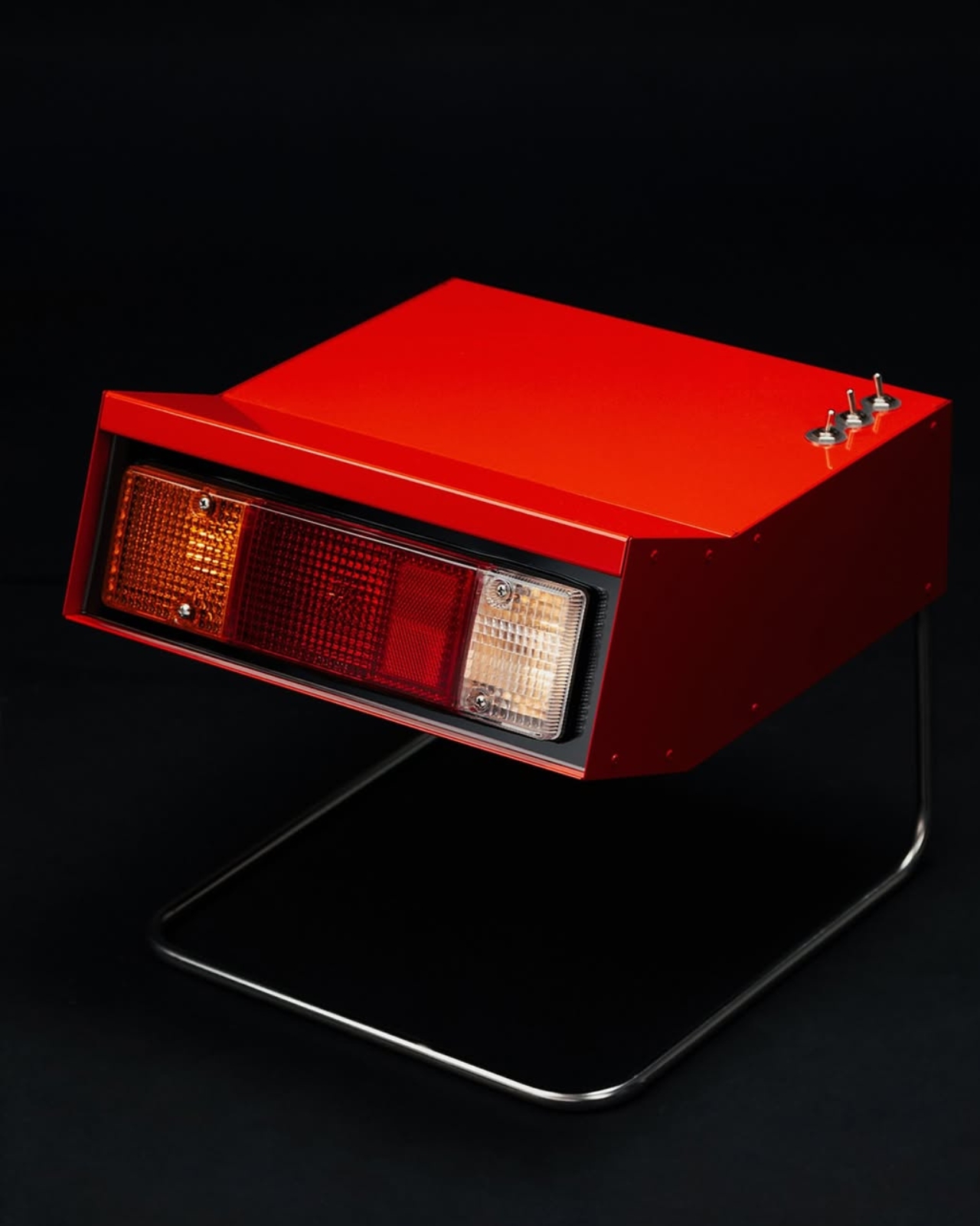
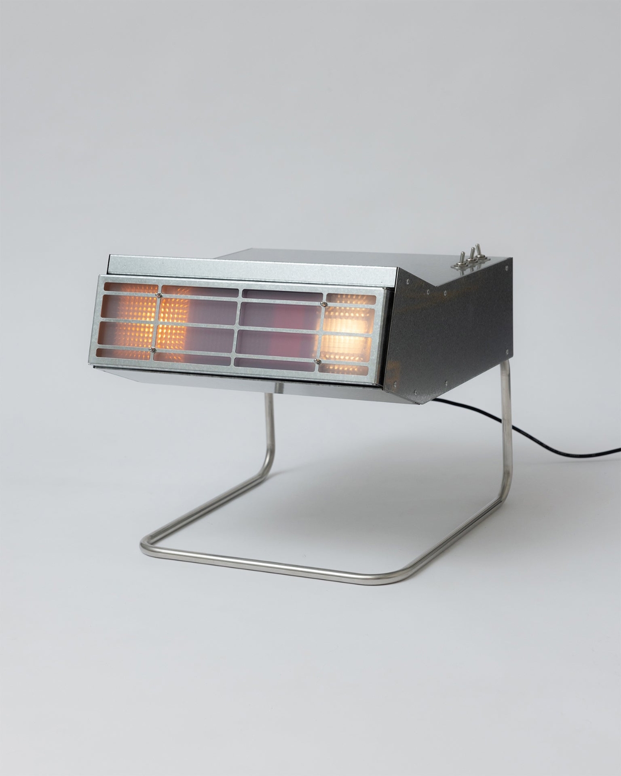
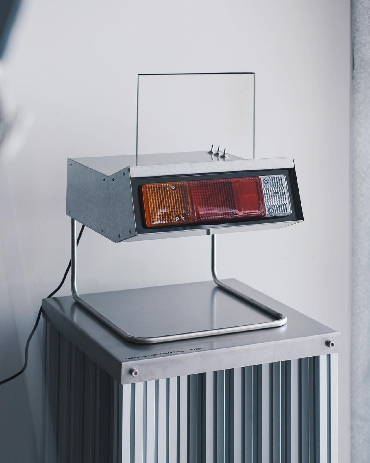
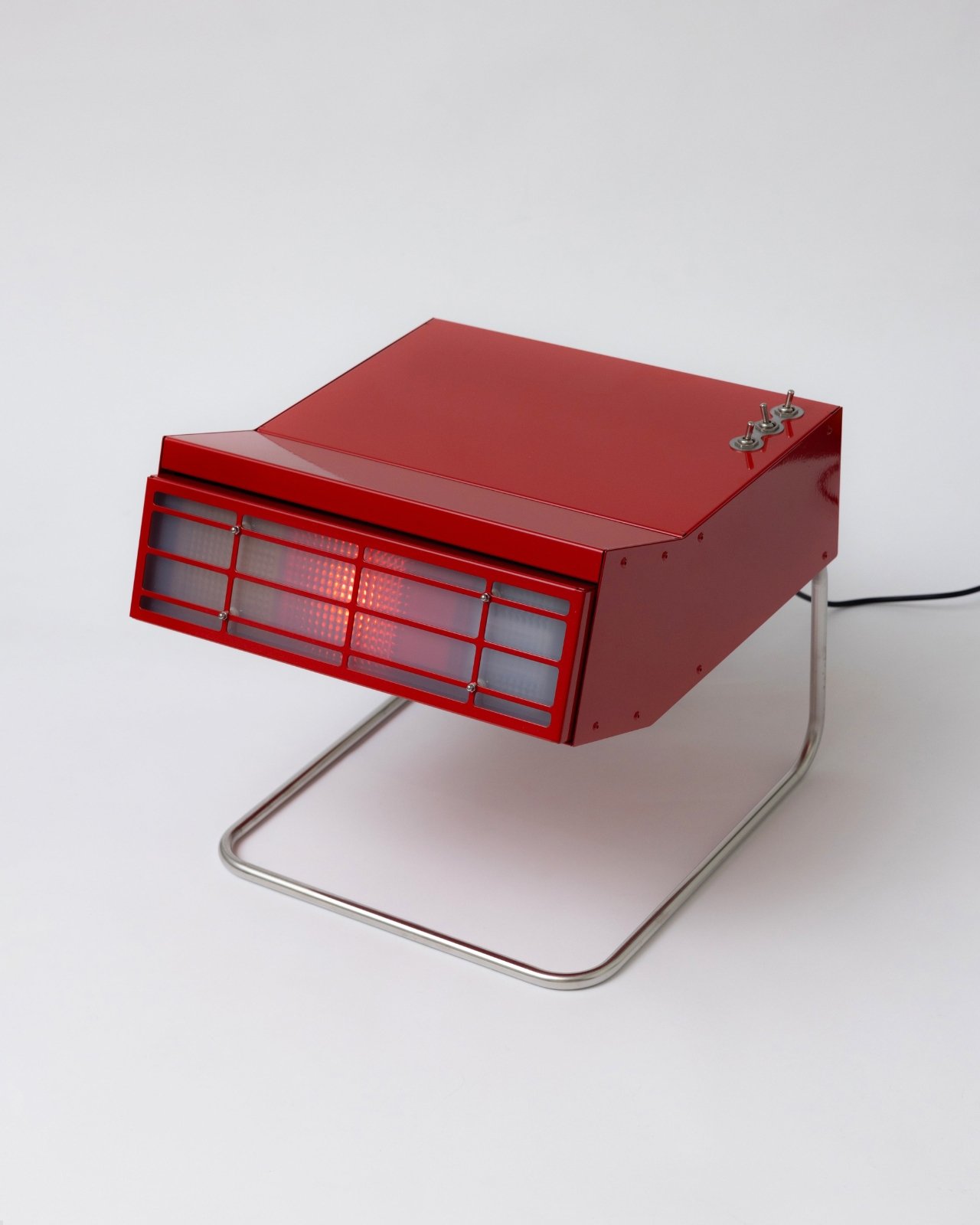
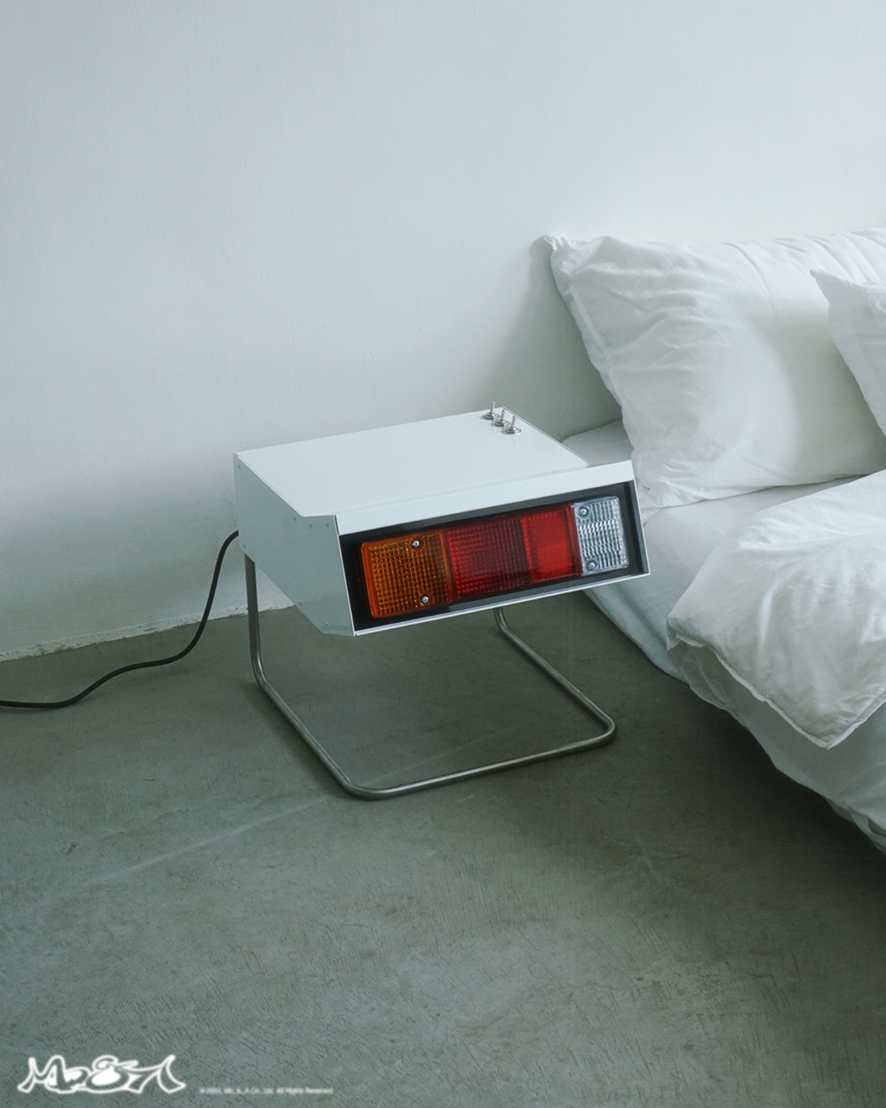
Most furniture draws its inspiration from architecture, nature, or the clean geometric vocabulary of modernist design. Occasionally, a designer looks at the back of a van and decides that’s the most interesting starting point in the room. That’s exactly what happened at Mo & A, the Taipei and London-based studio, when they lifted the rectangular taillights off a Mitsubishi Delica and rebuilt them into a fully functioning night stand. The result is one of the more unexpected pieces of furniture you’ll come across this year.
The Mitsubishi Delica, for anyone who didn’t grow up around automotive culture, is a Japanese minivan with a cult following that extends far beyond car enthusiasts. It’s boxy, capable, and has the kind of clean, angular aesthetic that ages well. In Taiwan, where Mo & A is rooted, it’s been a fixture on the road for decades, which probably explains why the studio saw storytelling potential in those taillights rather than just, well, taillights.
Designer: Mo & A
Mo & A’s entire design philosophy orbits around that idea: reinterpreting existing hardware and translating it into everyday objects. The studio describes its work as blurring the line between outdoor materials and the domestic environment. It sounds like a design-school brief when you read it as a mission statement, but the Delica night stand is proof that the concept holds up past the theoretical. The studio has applied the same thinking to other pieces, including a taxi lamp and a bamboo floor lamp, but this one might be the most complete expression of it yet.
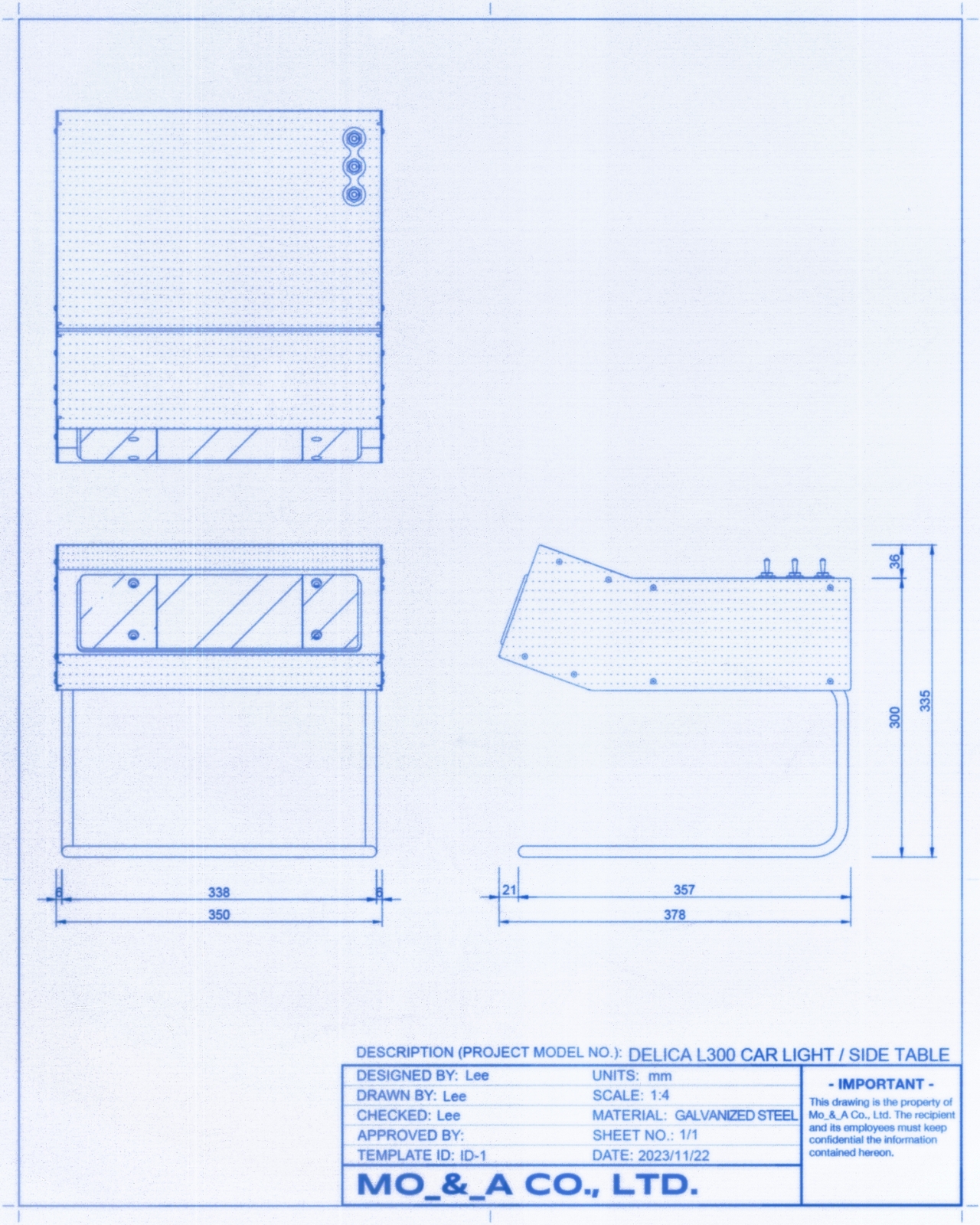
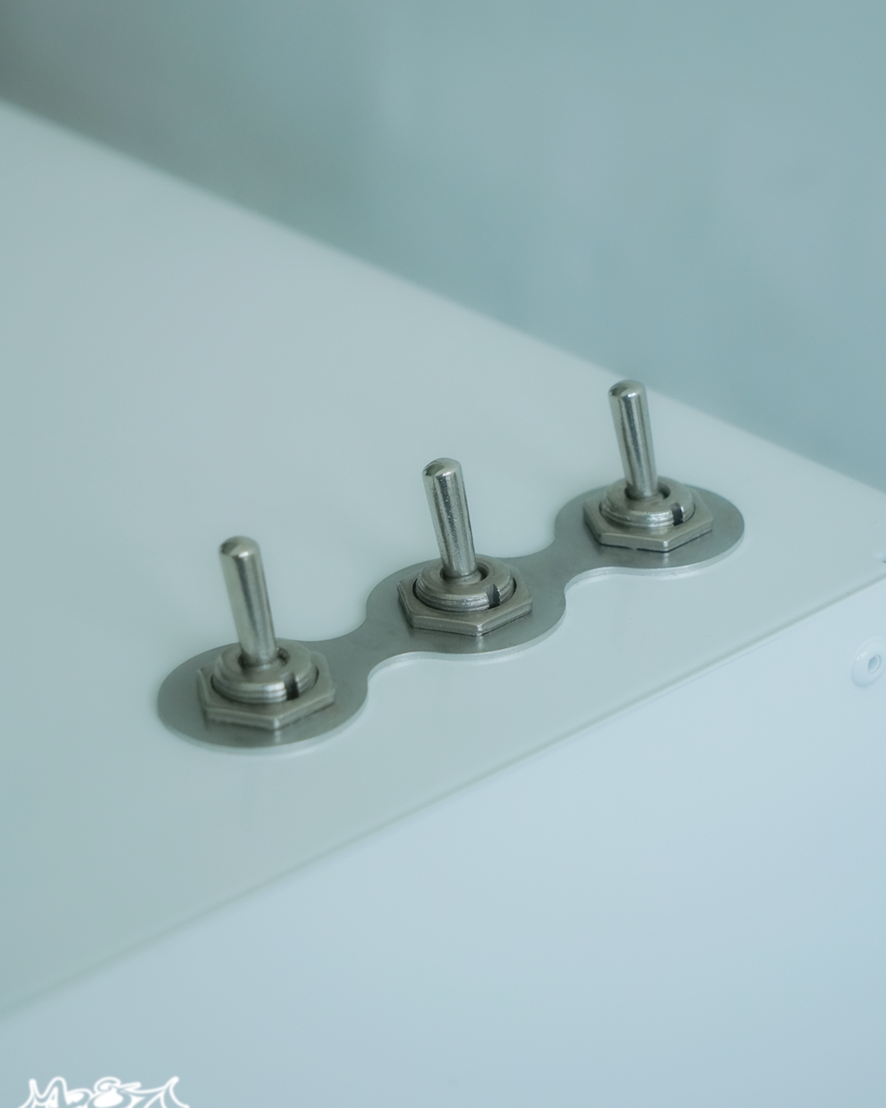
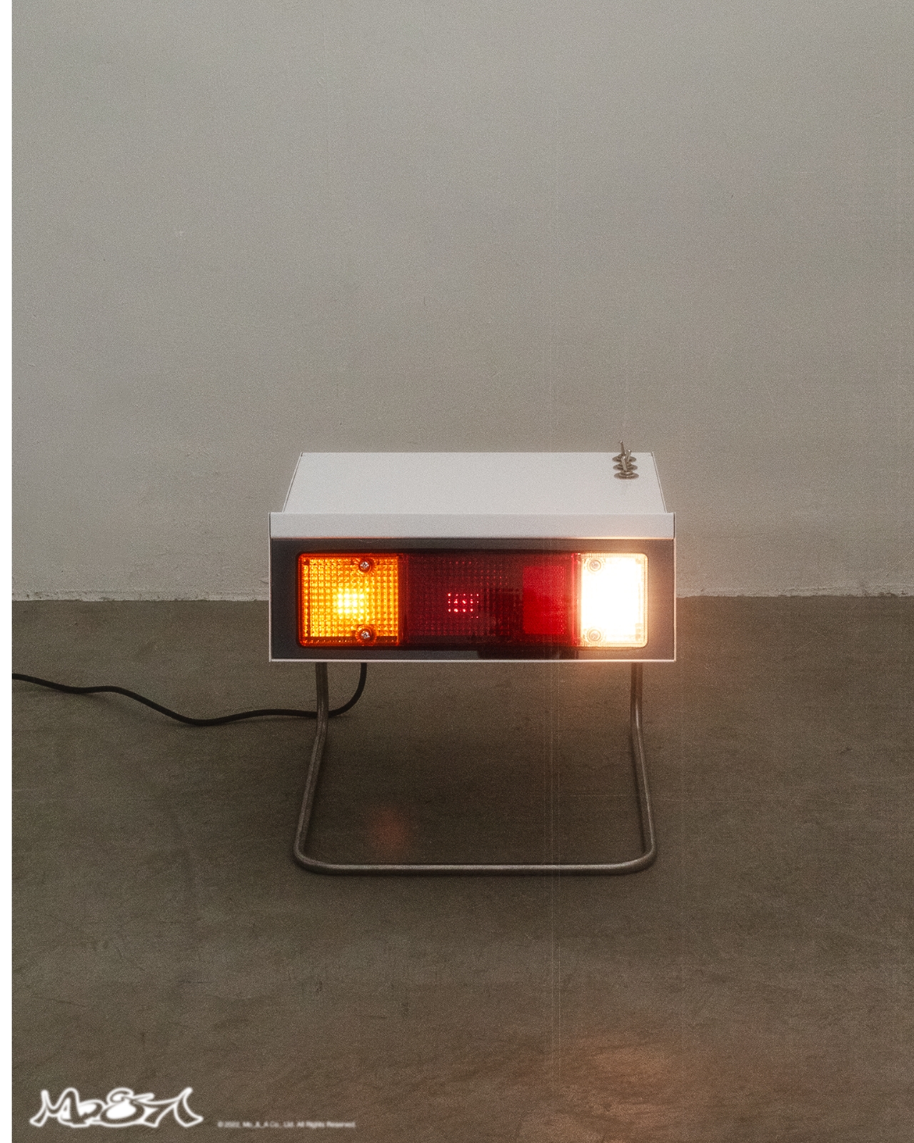
The piece itself is built around the Delica’s signature rectangular taillight housing, mounted on an angular metal stand. The construction leans into its automotive origins, featuring riveted joints and steel toggle switches that look and feel industrial in the best possible way. The lights come in four modes across amber, red, and white, and a light diffuser is available if you want to soften the glow depending on the mood you’re going for. At $267 and up, it sits in that considered-purchase territory: intentional without being extravagant.

The piece opens up a broader conversation worth having about what furniture is allowed to reference. Design has always borrowed from other disciplines, but there’s typically a sanitizing step in between, where the source material is abstracted just enough to feel polished and domestic. Mo & A skipped that step almost entirely. The taillight looks like a taillight. The toggle switches look like they belong on a piece of industrial equipment. That’s not a flaw in the design; it’s the whole point of it.
The Delica night stand also earns its nostalgia, which is harder to pull off than it sounds. So much of what passes for nostalgic design right now is surface-level: a retro color palette, a vintage-adjacent font, a vague reference to something mid-century. Mo & A’s approach is more direct than that. The physical object carries actual material history. The form has a reason for existing the way it does, and that translation from road to room feels deliberate rather than decorative. There’s a kind of honesty to it that a lot of trend-chasing furniture simply doesn’t have.
From a purely practical standpoint, it functions as a light source in four variations, which is more flexibility than most conventional bedside lamps offer. The amber setting alone would probably justify the purchase for anyone who has ever tried to wind down at night next to a lamp that comes in one setting, and that setting is aggressively bright.
Pieces like this are a useful reminder that the most interesting design problems aren’t always about inventing new forms. Sometimes the better question is what happens when you take something familiar out of its original context and relocate it somewhere it was never supposed to go. Mo & A asked that question about a Japanese van’s taillight, put it next to a bed, and the answer turned out to be more compelling than most purpose-built furniture ever manages to be.
The post Mo & A Turned a Mitsubishi Taillight Into a Night Stand first appeared on Yanko Design.


Ayaneo has a good foothold in the portable console gaming market with its versatile handhelds for every type of gamer. It wasn’t surprising that their upcoming Android-powered handheld was pretty much on the hype train and shrouded in speculative leaks for a few weeks. Now, the fog has finally cleared, and Ayaneo has teased the highly anticipated Pocket Micro 2 gaming handheld, poised to compete with Android devices from competitors like 8BitDo and Retroid.
The gaming handheld has been officially announced on the brand’s X channel, with some details still kept under wraps for later. This device will come in two classic color options: black and silver, indicating that the gadget is targeted towards more serious gamers.
Designer: Ayaneo
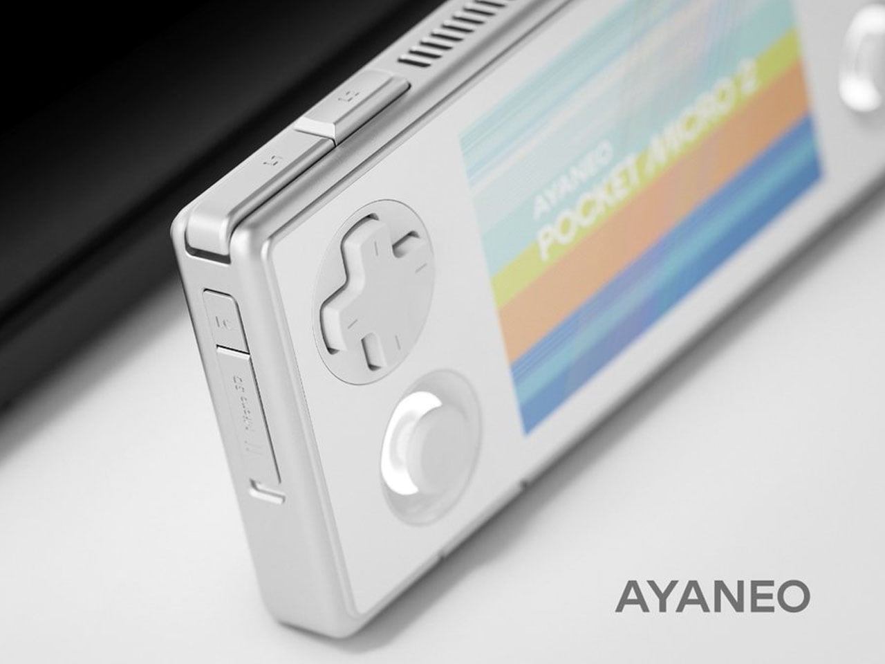
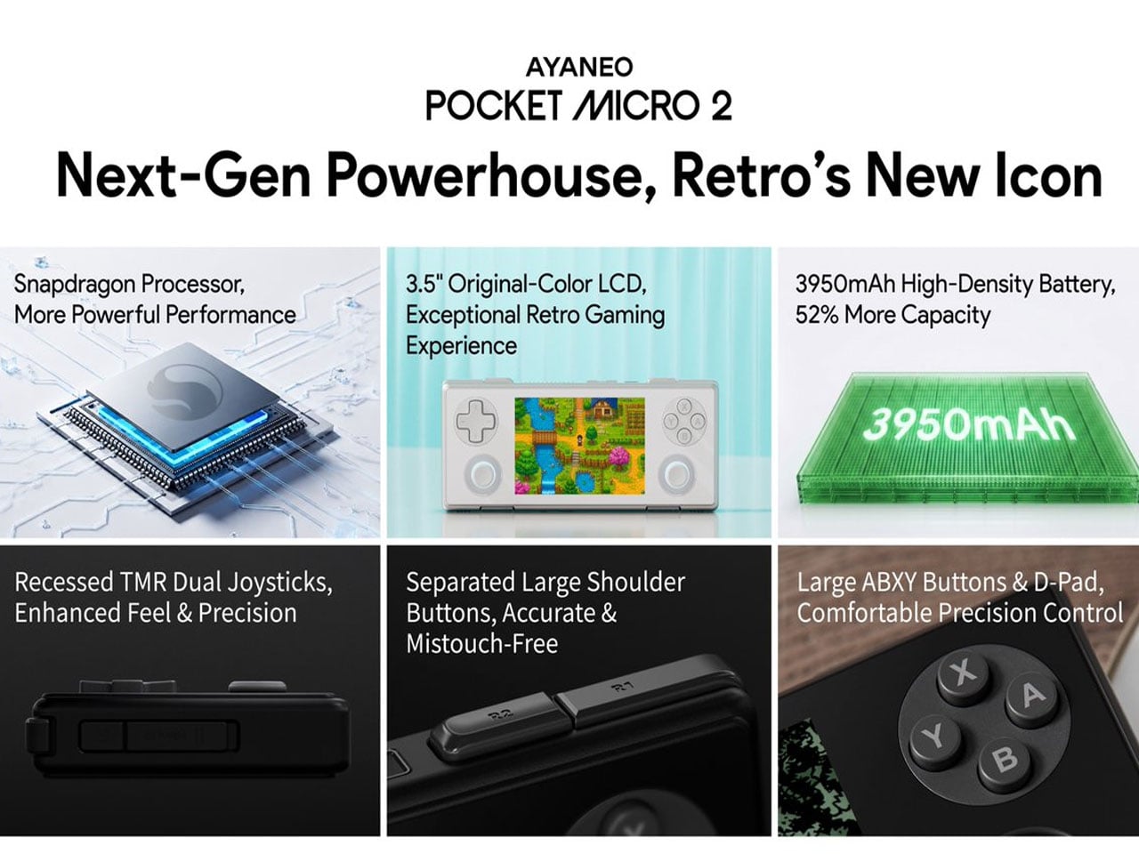
This device builds on the 3.5-inch screen Pocket Micro launched way back in 2024, powered by a MediaTek Helio G99 processor. The latest one has the updated joystick design based on the feedback given by the gamer community. The processing hardware also gets a good bump up for enjoying demanding titles, sans any lag. To keep the winning design going, the handheld has the same familiar rectangular form factor.

The official post clearly reveals the front section of the device, and more of the device is slated to come in a couple of days when the company reveals it fully in a livestream. Just like many other handhelds by Ayaneo, the Pocket Micro 2 also features a front glass panel with a borderless display and menu buttons on the chin that could be susceptible to accidental touches. Buttons on the handheld are fairly similar to the predecessor, albeit they’ve gone a little small compared to other handhelds.
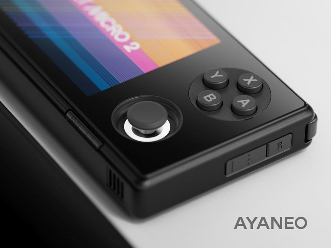
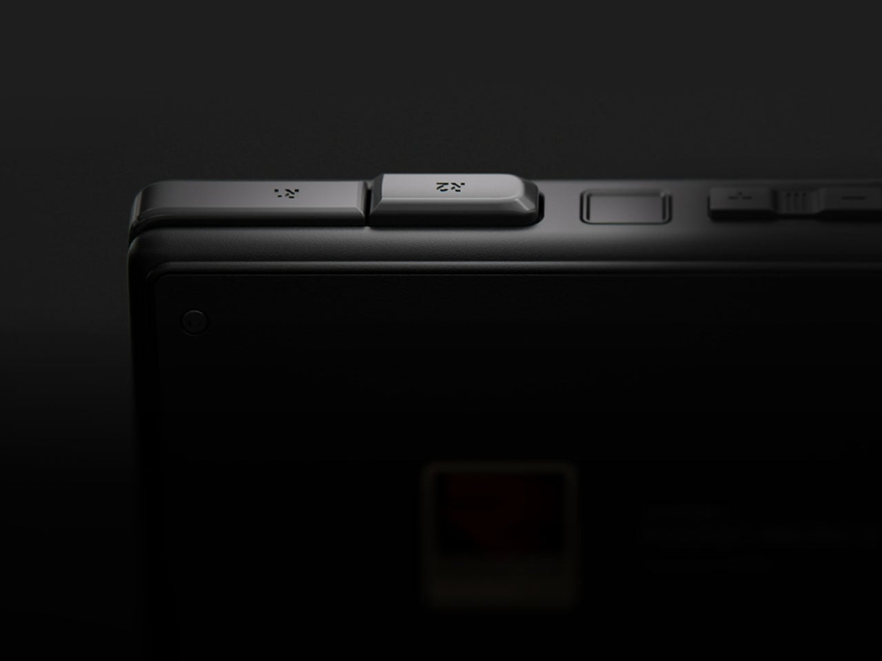
On the other hand, the analog sticks take the biggest design change, being recessed deeper into the device for better fused LED lighting and adaptability with customization. Those TMR recessed joysticks ensure there is no stick drifting at all for a more consistent gaming experience. Shoulder buttons on the handheld are slightly larger, along with the enhanced DPAD and action buttons for a better ergonomic feel and precise input. It’ll also get a larger 3,950mAh battery paired to an energy-efficient Snapdragon processor for longer gaming sessions. For connectivity, the Android gaming device has a 3.5 mm jack and a fully featured USB Type-C port.
We’ll have more on the specifications, pricing, and the official pre-order dates as soon as the live stream revelations are out in the open.

The post Ayaneo Pocket Micro 2 handheld gets better ergonomic design, boasts beefier battery inside first appeared on Yanko Design.