iOS 27 Public Beta Is Out: How to Get It on Your iPhone Today

iOS 27 Public Beta Is Out: How to Get It on Your iPhone Today A smartphone screen showing the iOS 27 public beta download progress

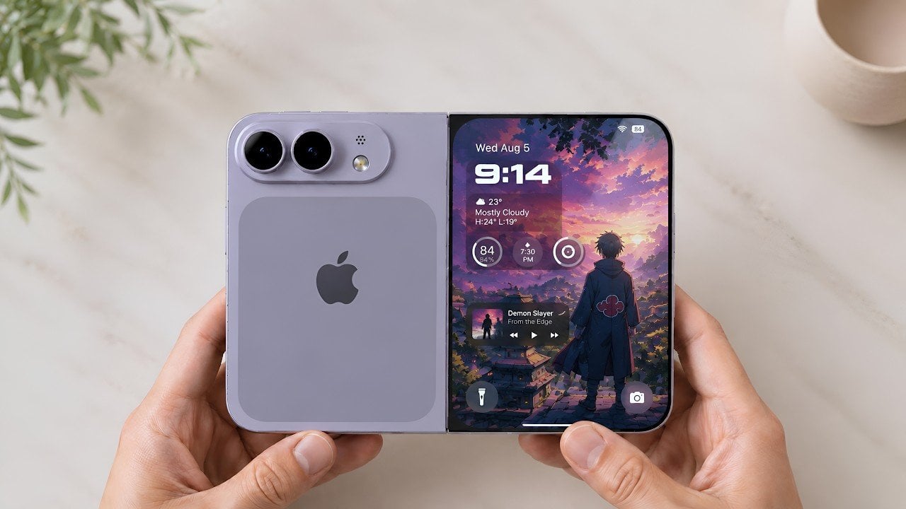
Apple has officially released the iOS 27 public beta, giving you an opportunity to explore its latest features ahead of the final launch. This version offers a preview of enhancements and improvements that aim to refine your iPhone experience. Whether you’re a seasoned beta tester or new to the process, the video below from Zollotech […]

The post iOS 27 Public Beta Is Out: How to Get It on Your iPhone Today appeared first on Geeky Gadgets.

Posted in Uncategorized

Ever wondered how gearboxes and torque work? MetMo’s latest EDC turns the physics into fidget fun

There is a piece by kinetic artist Arthur Ganson called Beholding the Big Bang, a gear train stretching over a meter long, where the final gear is embedded in solid concrete. With a motor running at one end, the reduction is geared down so severely that even with the first gear spinning at speed, it would take 13.7 billion years for the last gear to turn. Ganson built it as an art piece, a meditation on cosmic time. But buried inside that sculpture is an engineering principle so tactile and immediate that it feels almost criminal to lock it in a gallery. Gear reduction, in its raw form, is one of the most satisfying mechanical phenomena a person can interact with.

MetMo appears to have agreed with that assessment. The Brass Gear Train takes the same physics and compresses it into a palm-sized, hand-assembled object machined to aerospace tolerances in a UK workshop. The reduction ratio is 16,384:1, which means the top gear and the bottom gear are functionally living in different time zones. Every gear in the stack doubles the torque of the previous one. What reads on paper as an engineering spec feels, in practice, like a magic trick that happens to be fully explainable… and a treat for the eyes and hands.

Designers: Sean Sykes & James Whitfield (MetMo)

Click Here to Buy Now: $148.58.

The trick plays out immediately the moment you start turning the gears. Spin the topmost gear at a comfortable pace, and the lowest gears in the stack appear frozen, barely registering motion. The visual disconnect is mesmerizing because your brain knows they should be moving, but the reduction is so steep that a full rotation at the top translates to near-invisibility at the bottom. You can reverse the operation too, gripping the lower gears and turning them while the top spins wildly out of control, the torque climbing exponentially as you work your way down the train. The interaction is simple enough for anyone to understand within seconds, but satisfying enough that most people who pick it up will keep spinning it for several minutes straight. If you are someone who thinks while touching things, who solves problems by turning objects over in your hands, or who just appreciates when engineering reveals itself rather than hiding behind a housing, this is built for exactly that impulse.

Each gear in the stack doubles the torque input from the gear above it, which means by the time you reach the bottom of the train, your effort has been multiplied 16,384 times over. Turning the first gear feels effortless, barely any resistance. Move down one level and there is a slight increase in drag. By the third or fourth gear, you start feeling real resistance. By the sixth gear, most people will struggle to turn it with just their fingers. The lower you go, the more mechanical advantage you are fighting against, and the feedback is immediate, visceral, and surprisingly addictive. It turns an abstract engineering principle into a tangible workout for your hand, and the challenge of working your way down the entire gear stack becomes a desk-toy dare that most visitors cannot resist attempting.

The gears are precision CNC-machined from solid brass, chosen specifically to echo the clockwork mechanisms of old. The warm metallic tone, the weight distribution, and the smooth meshing of teeth all call back to antique engineering, when gears were visible, celebrated, and built to outlast their makers. The gears sit on a hard anodized aluminum base, which serves a dual purpose: it provides a low center of gravity that makes the object comfortable to hold, and the hard anodizing prevents corrosion, ensuring the base stays flawless even after years of desk duty. The Gear Train comes with a pin that holds everything in place – taking the pin out lets you fidget with the gear’s movement. When you’re done testing the laws of physics, you can slide a pin back through the gears, locking them in place so they don’t shift around in your pocket and accidentally snag your earphone cable.

The only way to reinsert the pin is to rotate the gears back into perfect alignment, a 16,384-revolution journey where all the holes must line up simultaneously. It is planetary alignment in miniature, a needle threading that requires patience, memory, or just a willingness to turn the stack slowly until everything clicks into place. Some users will treat this as a one-time puzzle, solving it once and leaving the pin in. Others will pull it out deliberately, turning the Gear Train into an ongoing fidget challenge that resets itself every time.

Every component is machined by Metmo in their UK workshop, running solid metal stock through CNC mills to the same tolerances used in aerospace engineering. There are no mass-manufactured parts anywhere in the assembly. Each gear is hand-finished, with edges smoothed to perfection so there are no sharp bits, no rough patches, nothing that interrupts the tactile pleasure of turning the stack over in your hands. The gears mesh perfectly, tight enough to eliminate backlash but smooth enough that the motion feels like silk. When the product page says the gears fit together like a Swiss watch, that is not marketing poetry, it is an accurate description of what you feel when you spin them.

MetMo built this object to live on a desk, and the visual presence reflects that intent. The stacked brass gears catch light beautifully, the gear-tooth profiles creating a repeating pattern that reads as both mechanical and decorative. The weight feels substantial without being cumbersome, and the passivated brass doesn’t patina like regular brass does, ensuring your gear-train looks shiny and precise even after years. People walking past will stop and ask what it is, which gives you the opportunity to demonstrate the reduction ratio in real time, and most onlookers will immediately want to try it themselves. It functions as a conversation piece, an engineering demo, and a desk sculpture simultaneously, occupying the same category as premium perpetual motion toys or kinetic sand timers, objects that justify their presence through sheer fascination rather than utility. For designers, engineers, makers, or anyone whose workspace doubles as a place to think, this belongs within arm’s reach.

The Brass Gear Train is available in two material configurations. The brass version featured here uses solid brass gears with a hard anodized aluminum base, delivering that warm, vintage-clockwork aesthetic MetMo designed it around. There is also a stainless steel variant, which trades the brass warmth for a more industrial, corrosion-resistant finish with a heavier feel in hand. Both versions are hand-assembled, both carry the same 16,384:1 reduction ratio, and both come with the removable alignment pin for puzzle play. MetMo backs both configurations with a 200-year guarantee, the same confident warranty they extend across their entire product line, a statement that this object was built to outlast you, your desk, and probably your great-grandchildren.

The MetMo Brass Gear Train is priced at £99 GBP (approx $149 USD) and ships directly from MetMo’s UK workshop. For those interested in the stainless steel version, pricing and availability can be found on the MetMo website. Both versions qualify for free shipping on orders over £200.

Click Here to Buy Now: $148.58.

The post Ever wondered how gearboxes and torque work? MetMo’s latest EDC turns the physics into fidget fun first appeared on Yanko Design.

This elastic band-powered car proves you don’t need an engine to experience real mechanical thrills

Kinetic energy is a fascinating thing, a fact I first realized after becoming obsessed with pull-back toy cars as a child. The simple act of rolling the car backward to store energy before watching it shoot forward at surprising speed felt almost magical. I didn’t understand the physics back then, but I knew there was something immensely satisfying about turning stored energy into motion.

Tell that to James Bruton, and you’ve got an engineering challenge rather than a toy. The inventive YouTuber is back with another delightfully unconventional experiment, this time asking whether a vehicle can be powered entirely by elastic bands. Not the thin rubber bands you’d find in a desk drawer, but heavy-duty resistance bands designed for fitness training, capable of storing far more energy than their humble appearance suggests.

Designer: James Bruton

Bruton begins by building a test rig from industrial 4040 aluminum extrusions to understand how much energy these bands can store when twisted rather than stretched. The setup uses inexpensive Lazy Susan thrust bearings to let the mechanism rotate with minimal friction while a single resistance band is wound tighter and tighter. The initial tests prove surprisingly encouraging, with the band accepting dozens of twists before reaching its limit, hinting that there may be enough stored energy to propel a person.

Turning that potential into useful motion, however, proves far more complicated. A pair of 3D-printed bevel gears delivers a 2:1 reduction to increase torque before driving a set of lightweight wheels. The prototype manages to move Bruton, but only for a couple of meters before the band eventually snaps under excessive winding. Rather than dismissing the concept, he treats the failure as valuable data, redesigning the drivetrain with an additional reduction stage that increases the overall ratio to 6:1. The improvement isn’t dramatic in terms of distance. Still, it delivers smoother power without permanently deforming the elastic band, confirming that gearing plays a bigger role than simply storing more energy.

The next logical step is to increase the amount of stored energy itself. Instead of making the vehicle impractically long with one giant elastic band, Bruton develops an ingenious routing system that sends multiple bands back and forth through the chassis using intermeshing gears. CNC-machined aluminum brackets, industrial extrusions, custom 3D-printed components, and dozens of modified bearings come together to create a rigid frame capable of containing the enormous twisting forces generated by the growing elastic drivetrain.

Experiments with six bands connected in series reveal an unexpected lesson in physics. While the system stores more energy, it doesn’t produce a proportional increase in usable torque, leaving much of the stored potential untapped. Rather than forcing the design to work, Bruton completely rethinks the layout by arranging eighteen resistance bands into three parallel columns, each feeding a common output shaft through bevel gears. The configuration increases available torque while preserving a useful amount of unwinding time, striking a far better balance between power and efficiency.

After countless iterations, careful winding, and more than a few anxious moments trying not to snap another band, the elastic-powered machine finally delivers the result Bruton had been chasing. The vehicle carries him almost 10 meters on nothing more than the energy stored in twisted resistance bands, with a best run measuring just under 9.9 meters before a final all-out attempt stretches that distance beyond 12 meters. It may not be replacing electric drivetrains anytime soon, but that’s hardly the point.


The post This elastic band-powered car proves you don’t need an engine to experience real mechanical thrills first appeared on Yanko Design.

This Lithuanian Forest Retreat Glows Like a Lantern at the Edge of the Trees

There’s a moment, just after dusk, when the Sanctum nature retreat reveals its most compelling quality. The gabled timber structures, dark and quiet against the Lithuanian woodland all day, begin to glow from within — large lanterns at the forest edge, warm light spilling through panoramic glass toward the treeline. It’s the kind of image that makes the architecture feel less like a building and more like an invitation.

Designed by Vilnius-based studio Arches and completed in 2026, Sanctum sits in a forest clearing near Bezdonys, Lithuania. The project spans 1,035 square metres and was conceived as a nature therapy retreat — a place where architecture actively participates in slowing people down, rather than simply providing shelter while they do it themselves.

Designer: Arches

The studio’s approach to form is rooted in familiarity. The silhouette of a traditional rural building is taken as a starting point, then stretched — proportions shifted, rooflines extended upward — until the gabled shapes enter a quiet conversation with the silhouettes of the surrounding treetops. The rhythm feels deliberate. Nothing about Sanctum is trying to announce itself.

Material choices reinforce that restraint. The exterior is clad in ecologically modified pine using Kebony technology, left entirely untreated to weather naturally over time — no maintenance, no intervention, just timber doing what timber does. Natural copper cladding runs alongside it, and together the two materials give the buildings their characteristic dark, almost monastic exterior. Inside, the same pine timber and cross-laminated timber panels are softly whitewashed, shifting the mood entirely from exterior to interior: severe outside, warm within.

The spatial organisation centres on a semi-covered inner courtyard, partially sheltered by coffered timber structures with glazing that draws natural light into the heart of the complex. It’s designed for communal outdoor activities — yoga, movement sessions, shared time. From there, the space connects directly to a transformable main hall: an elevated room filled with natural light, panoramic glazing opening toward the forest, and an acoustic partition that allows it to split into two independent spaces when needed.

What Arches has built here is not particularly loud. There are no dramatic cantilevers, no glass boxes engineered to shock. The ambition is subtler — to create architecture that makes you feel the wood, notice the shifting light, and register the silence. Sunlight filtering through the buildings casts moving shadows across the timber volumes throughout the day. By evening, the glow takes over. For a retreat that promises to return attention to fundamental human needs — nature, emotion, perception — Sanctum makes a convincing case with almost every surface it shows you.

The post This Lithuanian Forest Retreat Glows Like a Lantern at the Edge of the Trees first appeared on Yanko Design.

How A Simple Angle Makes Outdoor Seating Feel More Social

Public furniture has a quiet way of shaping how people move through the day. A bench can make someone pause. A table can turn an empty courtyard into a lunch spot. A slight angle in a seat can change whether people feel separate, side by side, or gently invited into conversation. Take-Out Wedge, part of Landscape Forms’ Take-Out collection designed by Rodrigo Torres, works within that subtle space between object and behavior.

The Take-Out collection expands Landscape Forms’ connected seating and dining table category through a system that feels clean, adaptable, and easy to reconfigure. The family includes singles, doubles, triples, wheelchair-accessible triples, tall versions, wedge units, and mini pieces for younger users. Each piece can stand on its own or come together with others, allowing outdoor spaces to shift throughout the day as people gather, separate, work, eat, wait, or simply linger.

Designer: Rodrigo Torres

The Wedge is especially compelling because its form is doing more than creating a distinctive silhouette. Its angle changes the relationship between people. Traditional seating often places us in familiar social positions. Side by side feels relaxed and effortless, with both people sharing the same outward view. Face to face feels more direct, suited to conversation, focus, or collaboration. The Wedge creates something softer between the two: a posture where people can look outward together while still feeling naturally turned toward one another.

That middle ground is what gives the design its social intelligence. It does not push people into interaction, but it makes interaction easier. It allows connection to happen casually, without the intensity of a formal setup. In a campus courtyard, public plaza, hotel terrace, office garden, retail district, or civic space, that kind of nuance matters. People often need places that support informal moments: a quick chat, a shared break, a quiet lunch, a spontaneous meeting, or a pause between destinations.

The beauty of Take-Out Wedge lies in how much spatial variety comes from such a simple geometric move. The wedge form allows designers and users to create soft arcs, faceted curves, radial clusters, and enclosed hexagonal hubs. A few units can support a small conversation. More pieces can shape a larger social zone. Arranged differently, the same system can feel open, intimate, directional, playful, or communal.

This is where Take-Out begins to feel less like standalone furniture and more like a framework for outdoor life. It does not need walls to define space. It can frame a pause point, activate an overlooked corner, shape a gathering area, or bring rhythm to an open setting. Placed side by side, the pieces can create long runs of seating for meals, meetings, or collaborative work. In a grid, they can give an outdoor area the energy of a café. Face to face, they become an expandable communal table.

The system also understands that flexibility has to work in real life. Color-matched connector brackets can secure adjoining units when a more permanent arrangement is needed. One-sided tables help make better use of edges, walls, or tighter spaces. An umbrella-hole tabletop option brings shade into the setup, with semi-circular cutouts that align when two units are placed across from each other. These details make the collection feel practical without taking away from its visual simplicity.

Comfort is handled with the same restraint. The form is minimal, but not cold. Gently curved edges soften the points where elbows and knees meet the furniture. Users can enter from either side or from behind, avoiding the awkwardness that often comes with shared outdoor tables. Sheet metal tops, extruded aluminum verticals, powdercoated finishes, and durable nylon glides support the realities of public use, where furniture has to withstand weather, movement, cleaning, and constant rearrangement.

Take-Out also feels relevant because public and commercial spaces are being asked to do more. A campus lawn may need to support outdoor study in the morning, lunch in the afternoon, and casual hangouts by evening. A workplace terrace might shift between focused solitude and team conversation. A commercial plaza may need to feel active without becoming crowded. Take-Out responds to these changing needs by keeping the space open-ended.

The mini version brings the same thinking into children’s environments, from schoolyards and outdoor classrooms to family-friendly public spaces. It recognizes that younger users also need furniture that encourages gathering, movement, play, and shared experience. Good public furniture should work across ages, settings, and rhythms of use.

What makes the Wedge memorable is that it treats connection as something spatial. The way people sit in relation to one another carries emotional meaning. A small angle can make a space feel more open, more welcoming, or more alive. Public furniture has always had this potential, especially in urban commons where small moments of social life happen between larger routines. A good seating system can make people stay a little longer, notice each other more, and feel more at ease in shared space.

The same value carries into commercial environments. Offices, mixed-use developments, hospitality spaces, and retail campuses often bring people into proximity without really helping them connect. A system like Take-Out Wedge softens that distance. It creates casual opportunities for people to gather without making the moment feel staged. It helps shared spaces feel warmer, more active, and less siloed.

Take-Out Wedge is versatile because it understands that connection does not happen in one fixed format. Sometimes people want to sit beside each other and look out at the world. Sometimes they want to face each other and talk. Sometimes they need something in between. The Wedge gives form to that in-between moment, turning a simple angle into an invitation to share space more naturally.

The post How A Simple Angle Makes Outdoor Seating Feel More Social first appeared on Yanko Design.

Galaxy Z Fold 8: July 22 date confirmed, S Pen returns

Samsung has spent years pushing the Galaxy Z Fold toward a cleaner, slimmer silhouette, treating thinness like the ultimate expression of foldable progress. That approach gave the Fold 7 a sharper visual identity, but it also stripped away one of the features that helped define the device as a serious productivity tool. Now, with the Galaxy Z Fold 8 expected to bring back S Pen support, Samsung seems ready to revisit the balance between elegance and utility.

That shift could make the Fold 8 one of the most revealing foldables the company has made yet. A fractionally thicker body may sound minor on paper, yet in design terms it signals a broader change in priorities. The next Fold may show that maturity in foldable design comes from restoring capability, refining ergonomics, and building a device people want to live with every day.

Designer: Samsung

The Fold 7 was a genuinely impressive piece of engineering, arriving at 4.2mm when unfolded and claiming the title of the thinnest book-style foldable on the market at the time. That number made headlines and performed well in comparison videos. What it cost, though, was the S Pen digitizer layer, a piece of hardware Samsung had to physically remove to achieve that profile. For users who bought into the Fold precisely because of its large-screen, stylus-ready workflow, that tradeoff landed hard.

The S Pen on earlier Galaxy Z Fold devices was never a casual accessory. It turned the inner display into a note-taking canvas, a sketching board, and a precision annotation tool, especially useful for professionals bouncing between documents and apps on the go. Removing it reduced the Fold 7 to a premium hardware story without the software depth to back it up for power users. Thinner, yes. More complete, arguably not.

What makes the lead-up to July 22 particularly interesting is how complicated the S Pen picture has become. According to multiple leaked spec sheets and tipster reports, the standard Galaxy Z Fold 8 and the new Fold 8 Wide variant may both launch without S Pen support, with Samsung reportedly continuing its thinness-first approach for those models. The standard Fold 8 could come in at 4.1mm unfolded, the Wide at an even leaner 3.9mm (pre-empting Apple’s own wide iPhone Ultra), numbers that suggest Samsung has no intention of walking back the Fold 7 philosophy across the board. The S Pen story, if it holds, belongs to a third model entirely. A Fold 8 Ultra appears to be where Samsung is routing the stylus comeback, alongside a wider display orientation and a 5,000mAh battery that would represent the first meaningful capacity upgrade for the Fold line since the Fold 3.

The Fold 7 used a titanium backplate, a strong and lightweight choice that also happens to be poorly suited to the digitizer layer S Pen functionality requires. Reports have suggested Samsung may shift the Fold 8 Ultra to a combination of titanium and carbon fiber reinforced plastic, a material used in earlier Fold models that works far more naturally with stylus hardware. The material choice, in other words, may be less about aesthetics and more about what the device is structurally allowed to do.

Samsung is also reportedly researching a digitizer-free stylus solution that would remove the hardware dependency altogether, potentially allowing S Pen-style input on ultra-thin builds in future generations. That research, if it eventually ships in a product, would be one of the more significant industrial design developments in the foldable category, because it decouples a core productivity feature from physical bulk entirely.

What Samsung appears to be attempting with the Fold 8 lineup is something more architecturally ambitious than a single model update. A tiered approach, with the standard Fold chasing thinness, the Wide offering a tablet-like aspect ratio, and the Ultra absorbing the S Pen and flagship camera system, is a bet that different foldable buyers want fundamentally different things from the same category. Whether that structure serves users better than one well-resolved device is a question worth raising, because fragmentation across three models can dilute the identity of each one. Ask Apple how they felt about launching 3 iPhone SKUs in the same September launch. Rumor has it Ternus is changing that, and only announcing the Pro iPhones this September.

Still, the design direction Samsung is pointing toward with the Ultra is the more honest one. A foldable that accepts a few extra millimeters in exchange for a stylus, a bigger battery, and a wider display is a device making peace with what the form factor actually needs to be useful. Thinness is a compelling engineering goal. Usability is a more durable design ambition, and the Fold 8 Ultra, if the leaks hold, may finally be the version of this phone that stops apologizing for being a productivity tool.

The July 22 Unpacked event in London will confirm how much of this actually ships. But the shape of what Samsung is building already says something worth paying attention to.

The post Galaxy Z Fold 8: July 22 date confirmed, S Pen returns first appeared on Yanko Design.