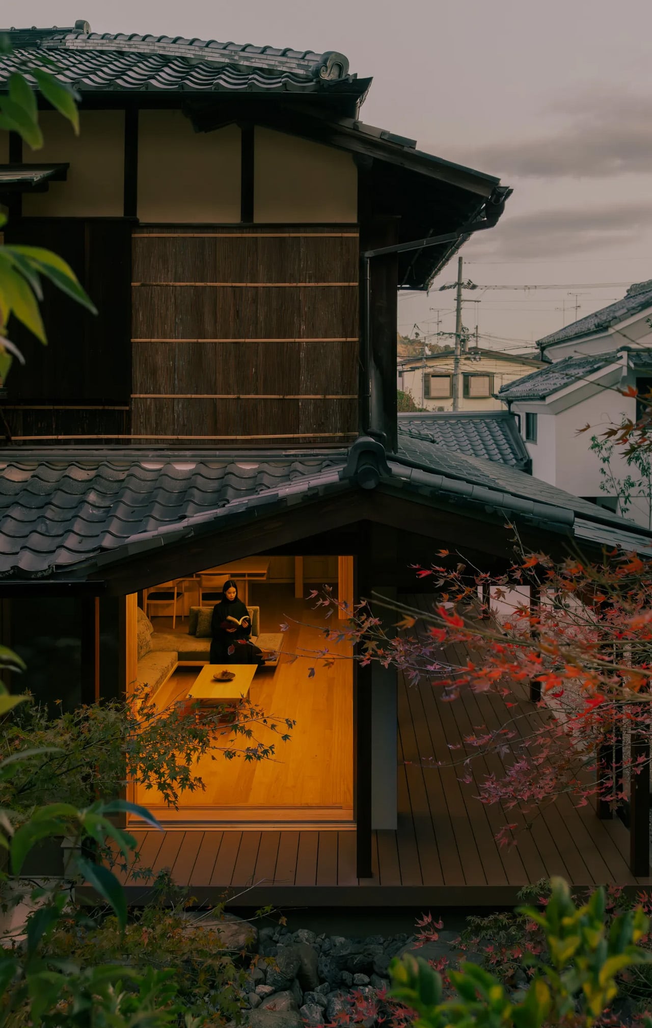
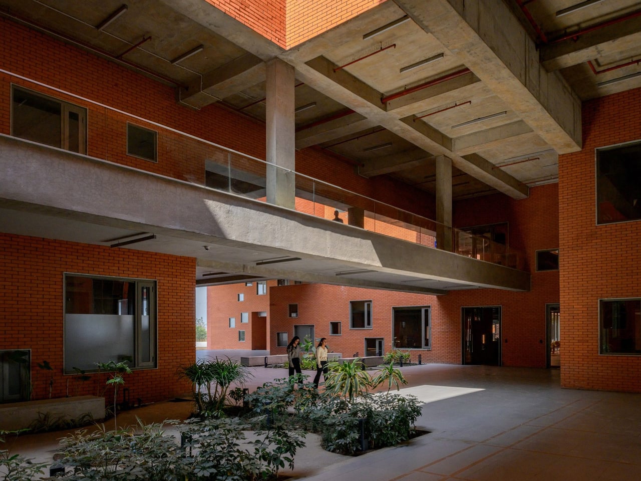
Kyoto’s preservation codes make renovation a negotiation between what a building was and what its residents need it to become. In the Narutaki district, kooo architects recently completed that negotiation on a traditional Sukiya-style residence, stripping back decades of piecemeal alterations to recover the spatial clarity the original structure once had. The result is not a museum piece or a minimalist showroom. It is a home that treats historical material as a living framework rather than a frozen artifact, and the distinction matters more than it might seem.
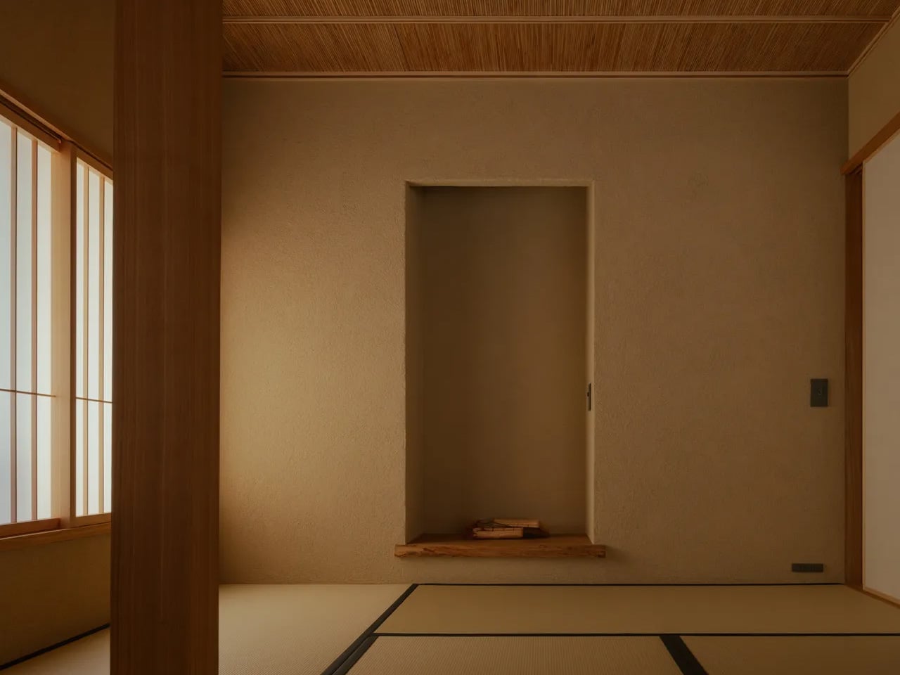
Sukiya architecture grew out of the Japanese tea ceremony tradition, where timber construction, open spatial flow, and natural materials created rooms designed for contemplation rather than display. The original home had lost much of that character over the years as its tatami rooms were modified beyond recognition through successive, uncoordinated changes.
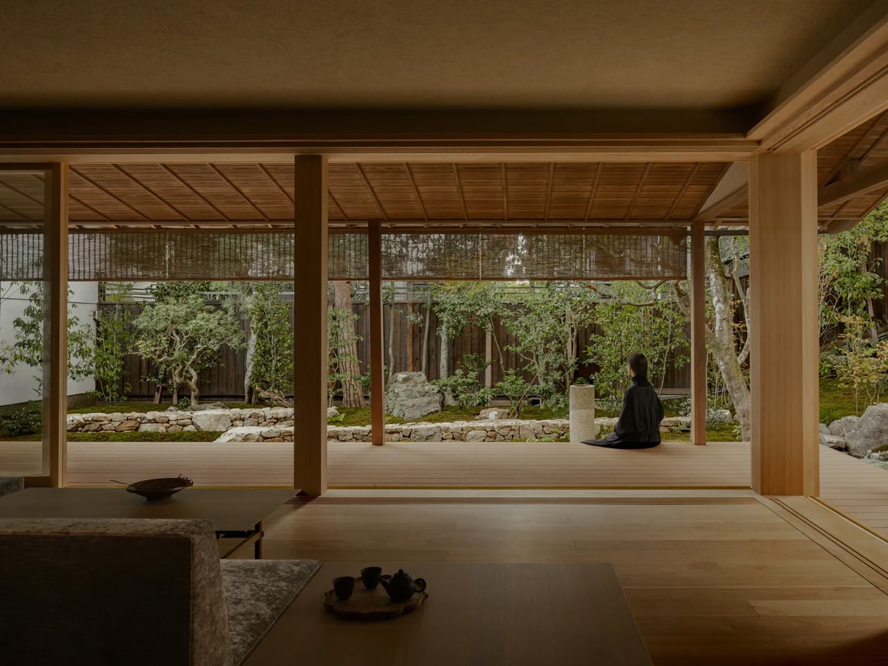
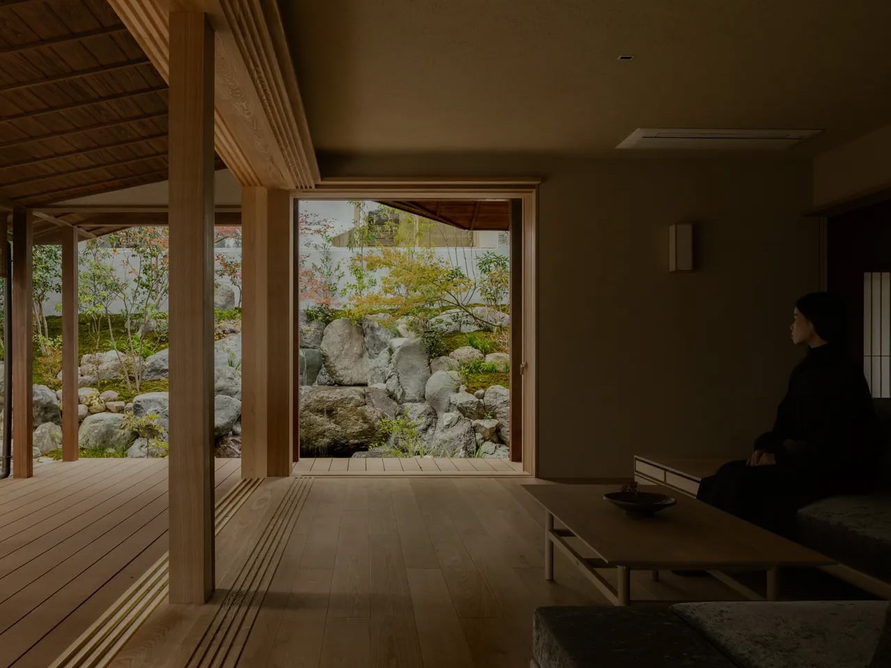
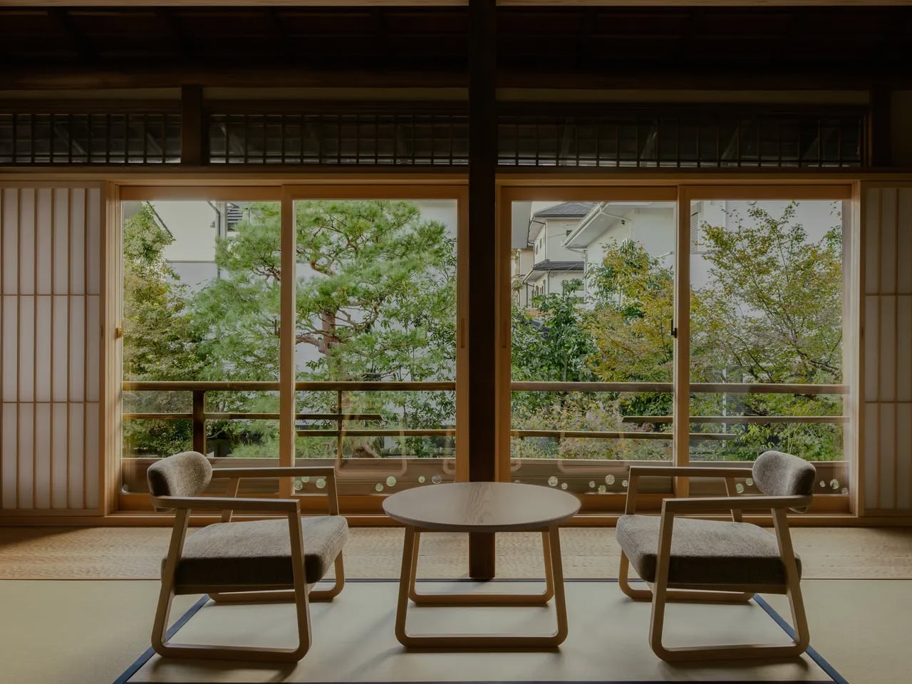
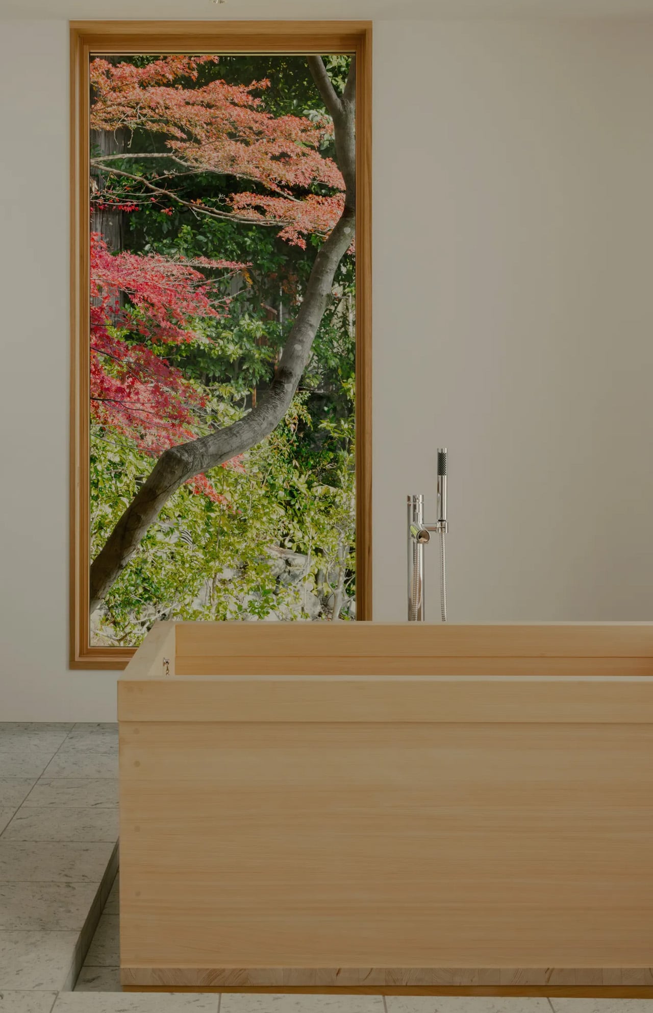
kooo architects responded by reorganizing the interior into three distinct yet connected spaces: an earthen-floored passage linking the main structure’s two wings to a smaller detached annex, a generous reception room, and a dedicated garden room built for nothing more than sitting with the landscape outside. Western Kyoto’s Rakusei area provides long views and mature plantings that shift dramatically with the seasons, and the architects oriented an entire room around the act of watching that change happen. No program, no storage, no secondary function. A room that exists to frame a view is a commitment most residential renovations cannot afford, and its presence here signals that the project’s priorities sit closer to atmosphere than to square-footage optimization.
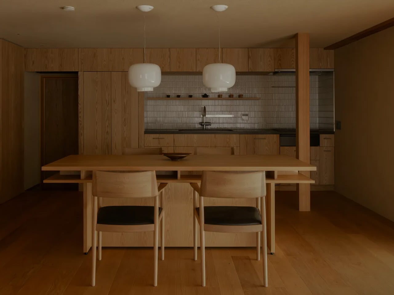
Material choices reinforce the connection to Sukiya tradition without replicating it literally. Exposed cherry wood beams run through the interiors. Juraku plaster, a finish historically associated with Kyoto’s architectural identity, covers walls and ceilings. Fusuma sliding doors crafted by Noda Hanga Studio separate the spaces, and all of this work was executed by local craftspeople rather than standardized contractors.
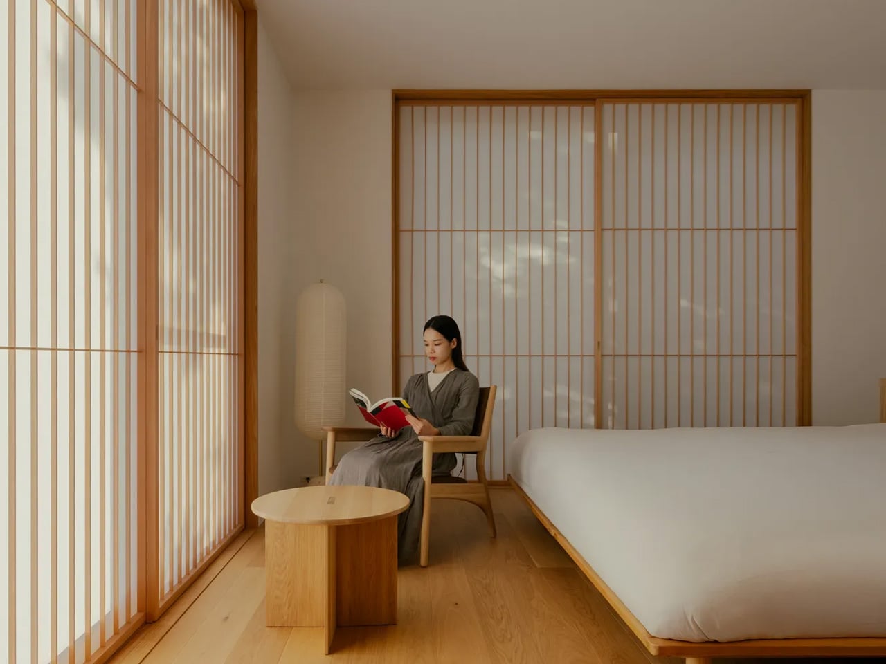
The annex, which is entirely new construction, contains the primary living quarters, including three guest rooms, hinoki wood baths, and translucent window screens that soften incoming light into something closer to atmosphere than illumination. Pairing new construction with a restored historical shell is a familiar strategy, but the success here lies in how seamlessly the two registers communicate across the earthen passage connecting them.
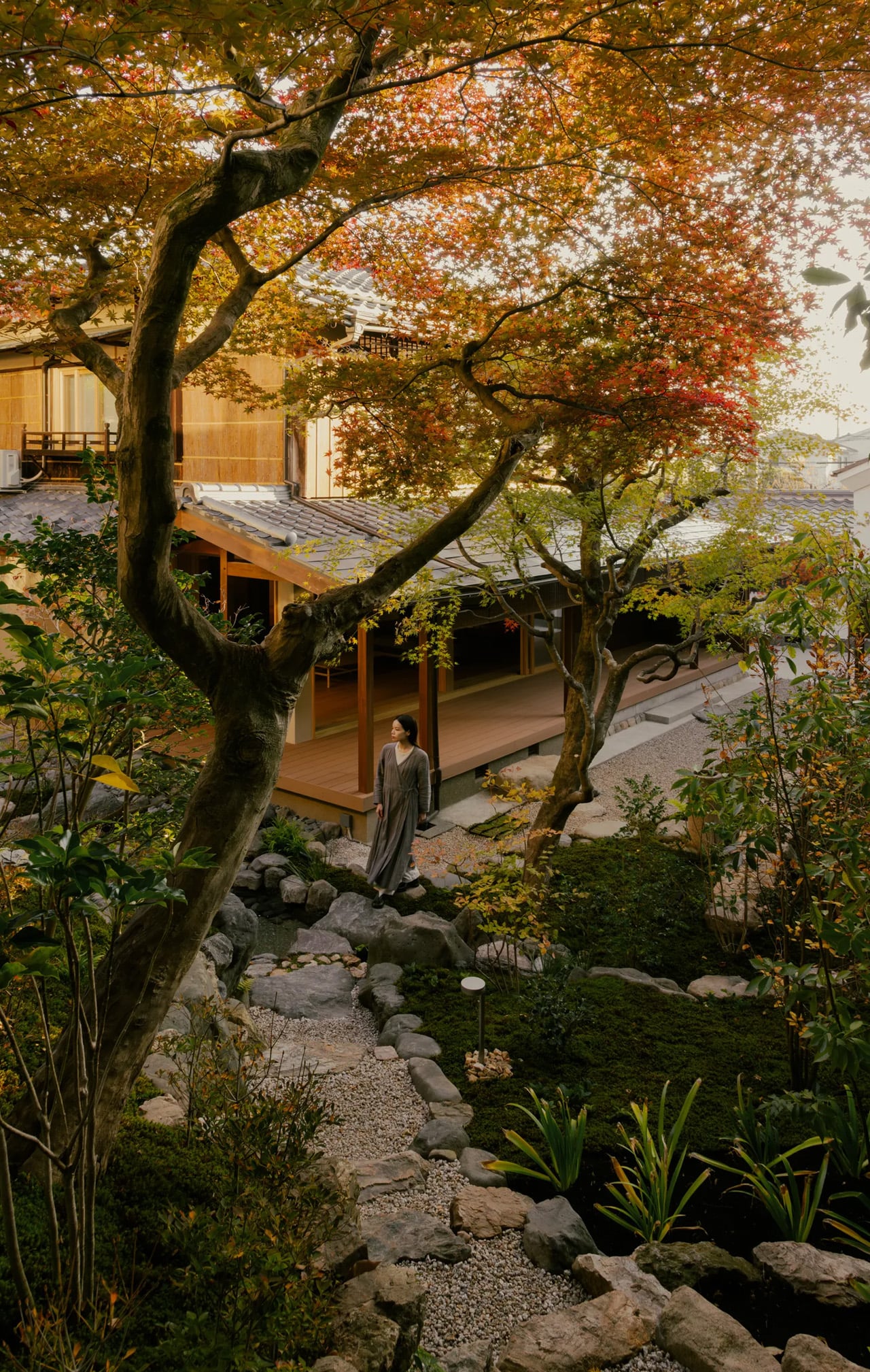
The tension in any heritage renovation sits between preservation and livability, and most projects tip too far in one direction. kooo architects avoided both the replica trap and the gut-renovation impulse. Narutaki’s strict historical context demanded sensitivity, but the home’s new layout reads as contemporary in its spatial logic even while its surfaces and materials carry the weight of a much older architectural vocabulary. Whether the balance holds over years of daily use is a question only the residents can answer, but the framework is sound.
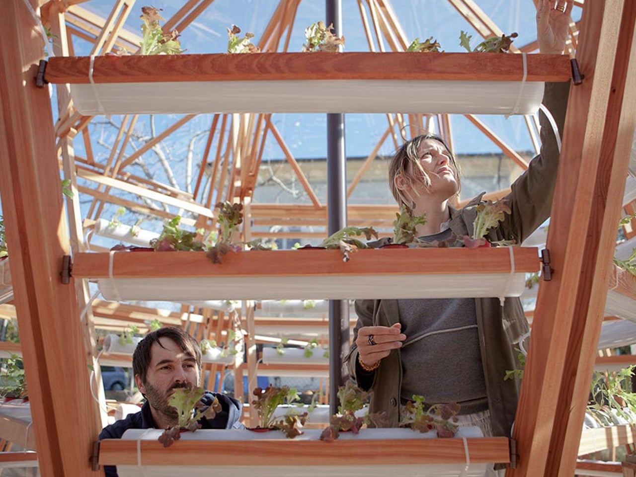
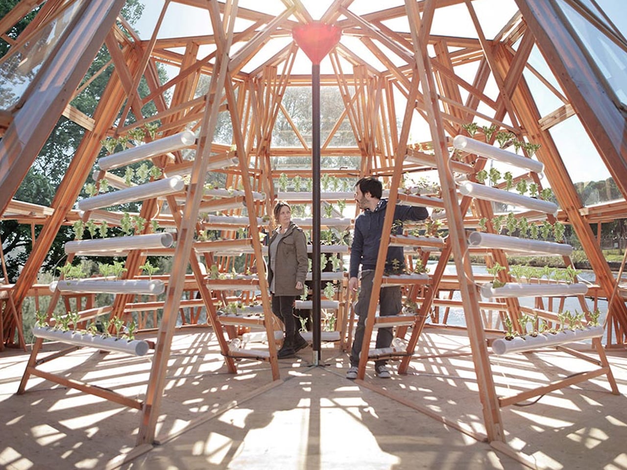
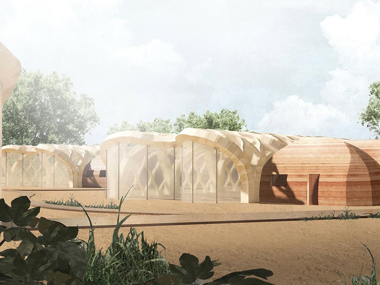
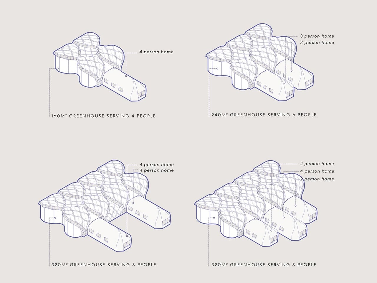
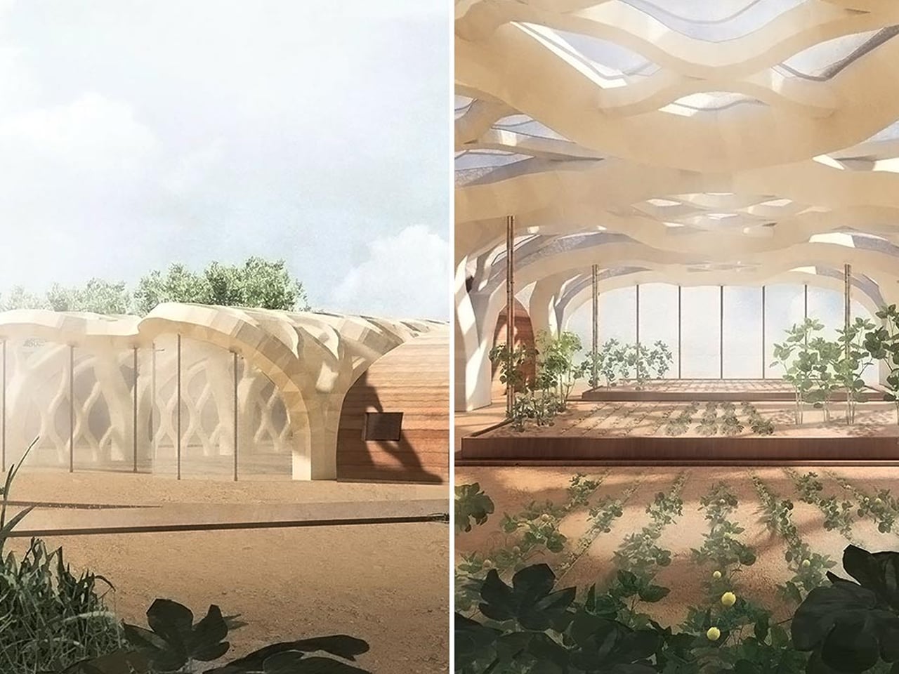
The meeting of home design and food production is no longer a trend as it marks a fundamental shift toward self-sustaining living. The Transparent Farm reimagines the greenhouse as more than a growing chamber; it becomes an integral architectural feature. It merges carbon efficiency with the desire for a biophilic home, creating a new relationship between structure and landscape where true luxury equals independence.
For modern homeowners and designers, this represents the next evolution. Integrated greenhouse systems, expressed through double-height glass and thoughtful spatial planning, enhance energy performance and bring natural materials into daily life. This design approach boosts productivity, reduces external reliance, and positions the greenhouse as a fully self-supporting component of the home.
1. Designs with Sustainable Water Cycles
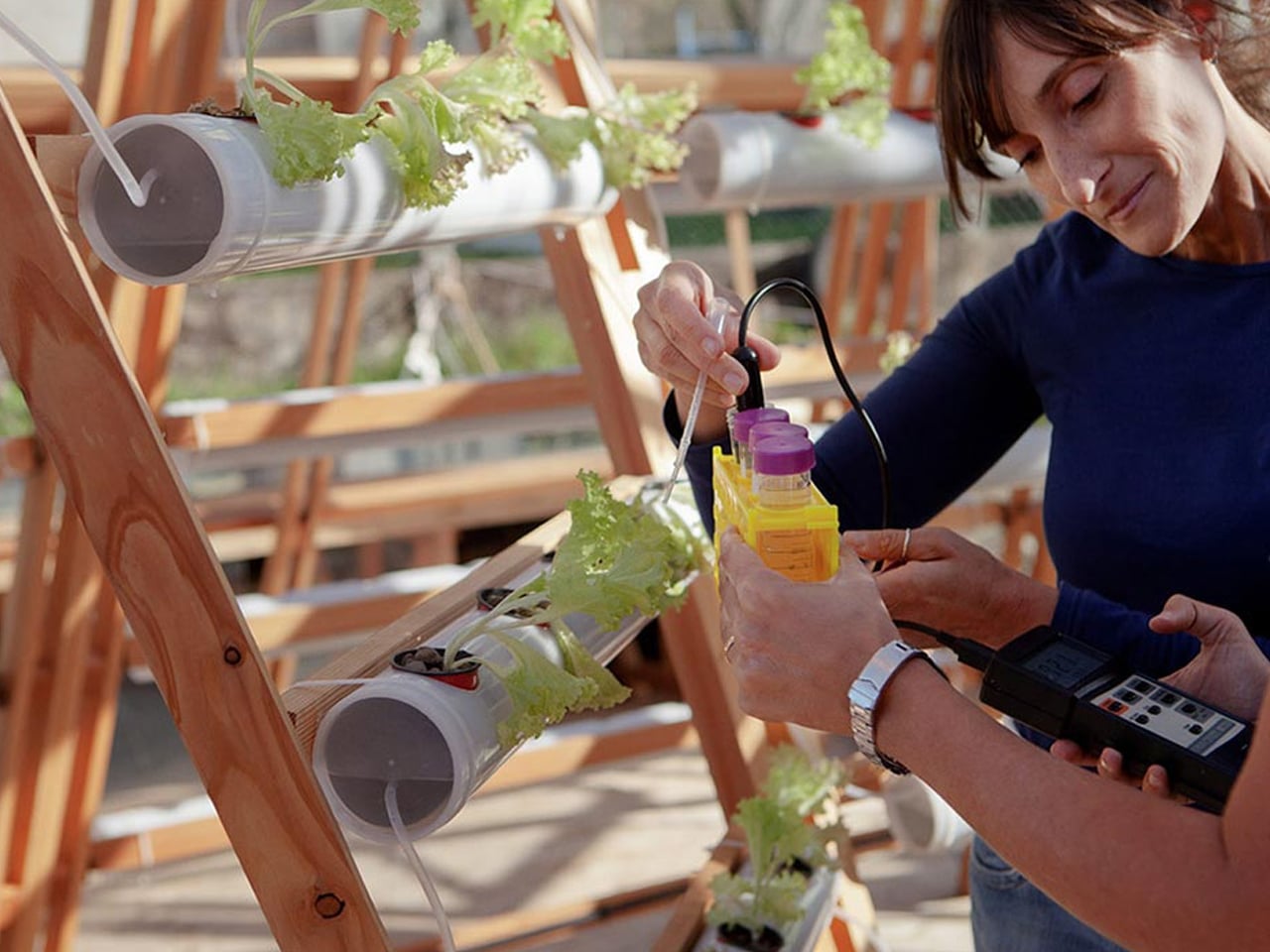
For any glasshouse-based farm, the real metric of success is resource conservation. Traditional agriculture consumes large amounts of water, but hydroponic and aquaponic systems cut usage by up to 90%. These methods create a far more efficient growing environment.
Architecture makes this possible. Internal reservoirs and advanced filtration systems clean, recycle, and repurpose greywater from the residence. The result is reduced utility demand and a long-term financial benefit grounded in minimal waste and maximum autonomy.
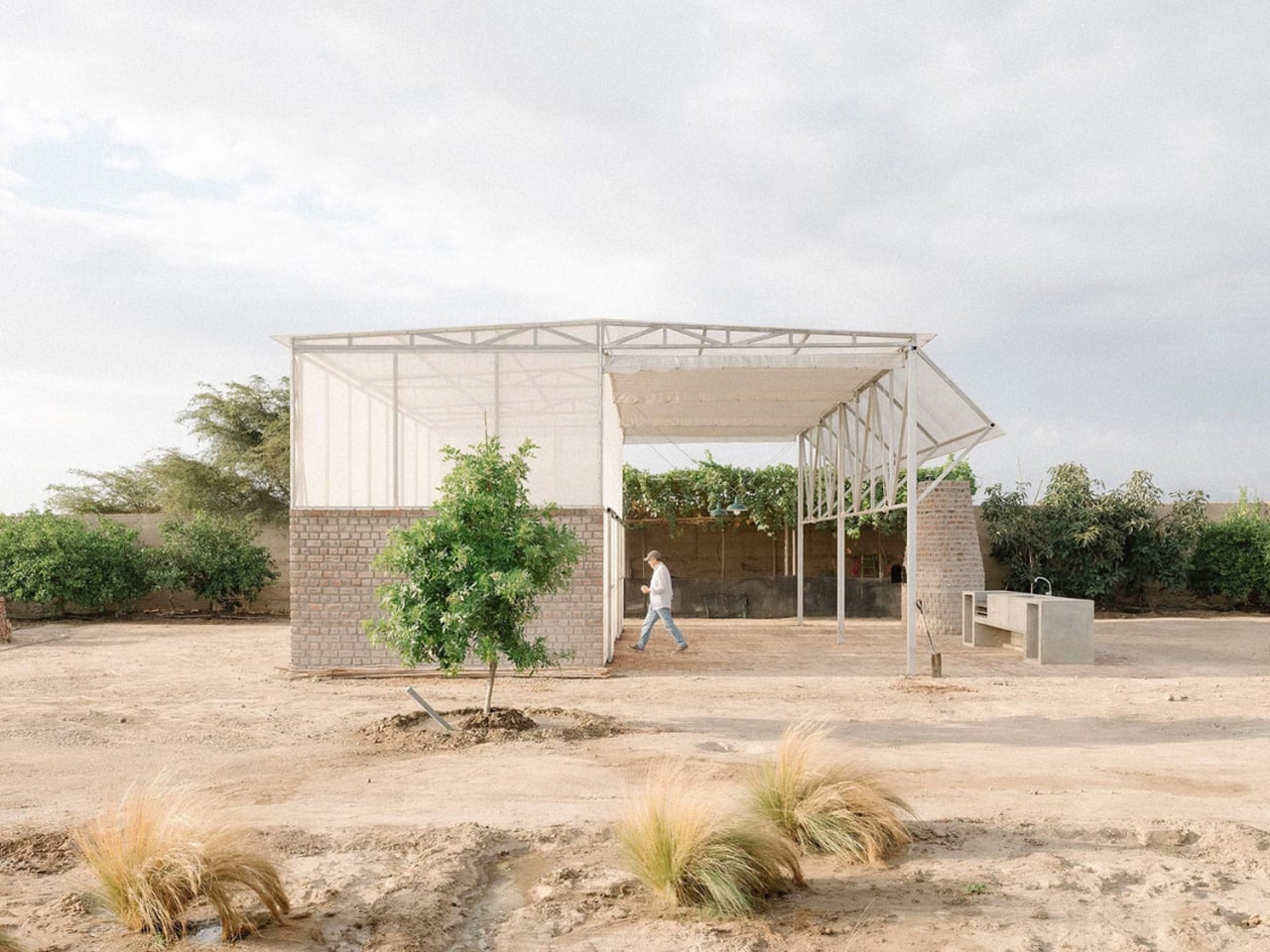
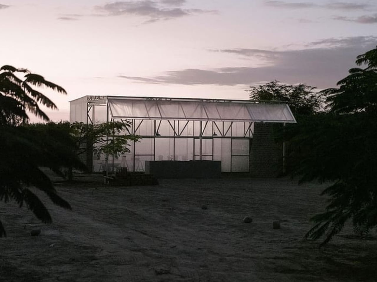
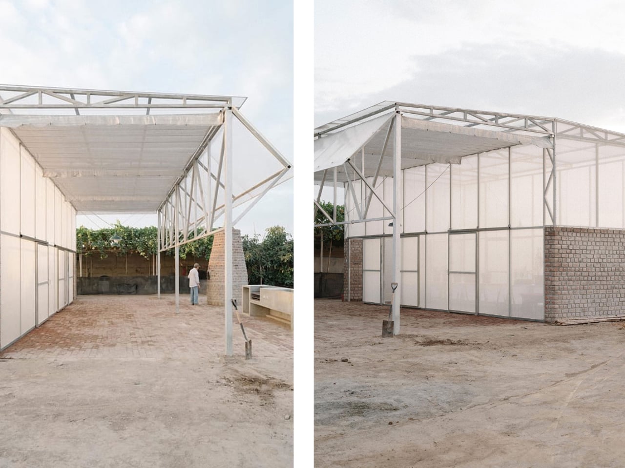
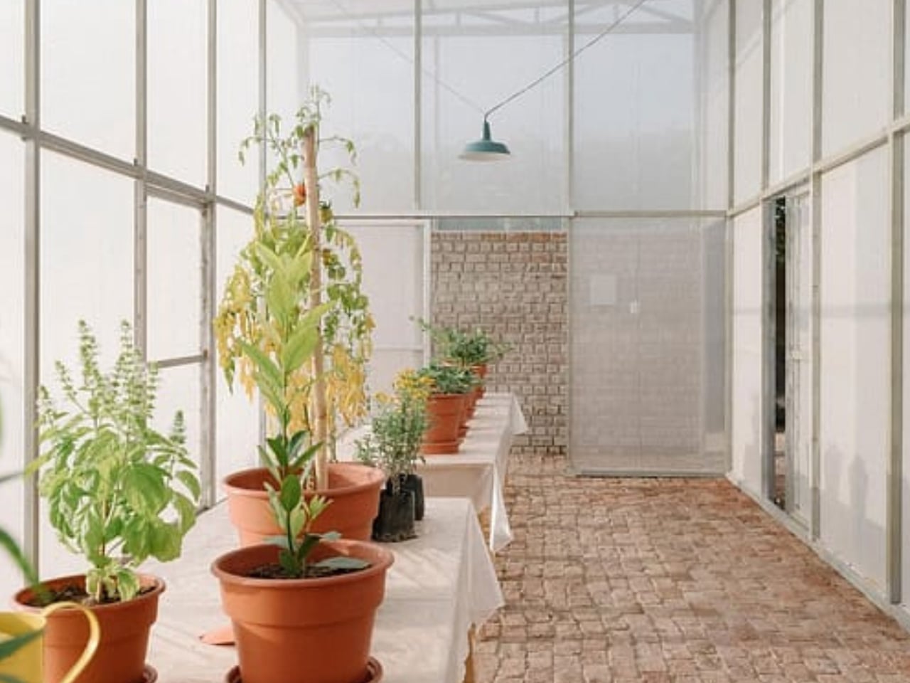
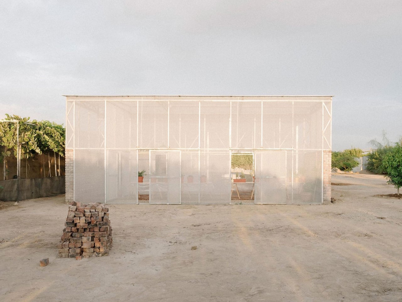
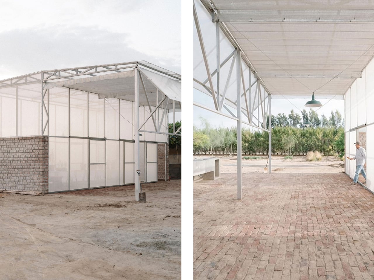
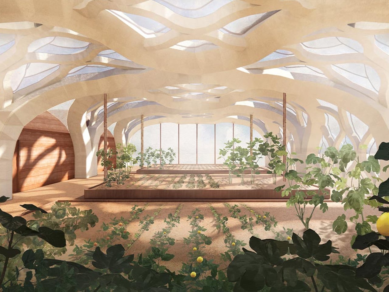
The Livable Greenhouse Home in El Carmen, Peru, redefines sustainable living by merging modern architecture with ecological principles. Drawing inspiration from Peru’s rich cultural heritage and traditional structures, this innovative dwelling blends indoors with outdoors, creating a seamless harmony with nature. Designed as a habitable greenhouse, it supports plant growth within the living space, improving air quality and enhancing well-being while minimizing energy use through passive design strategies such as natural ventilation and abundant daylight.
Constructed with a robust brick base using salvaged “ladrillo recocho” overfired bricks and topped with a lightweight metal structure made from recycled agricultural components, the home embraces both permanence and adaptability. The result is a tranquil living environment that reconnects residents with nature while championing sustainability and responsible material use. The Livable Greenhouse Home is not just a structure, but a vision of a regenerative, eco-conscious future where architecture and nature coexist effortlessly.
2. Indoor Greenhouse With Adaptive Thermal Control
Thermal performance defines the functionality of a transparent greenhouse. The building envelope must act as a climatic instrument, not a simple shell of glass. This is why photovoltaic-integrated glazing and low-emissivity systems are becoming standard, allowing the façade to generate energy while moderating solar gain.
Automated shading, passive ventilation stacks, and phase-change flooring materials stabilize the interior climate. Together, they maintain optimal conditions for plants while reducing the energy load on the main home.
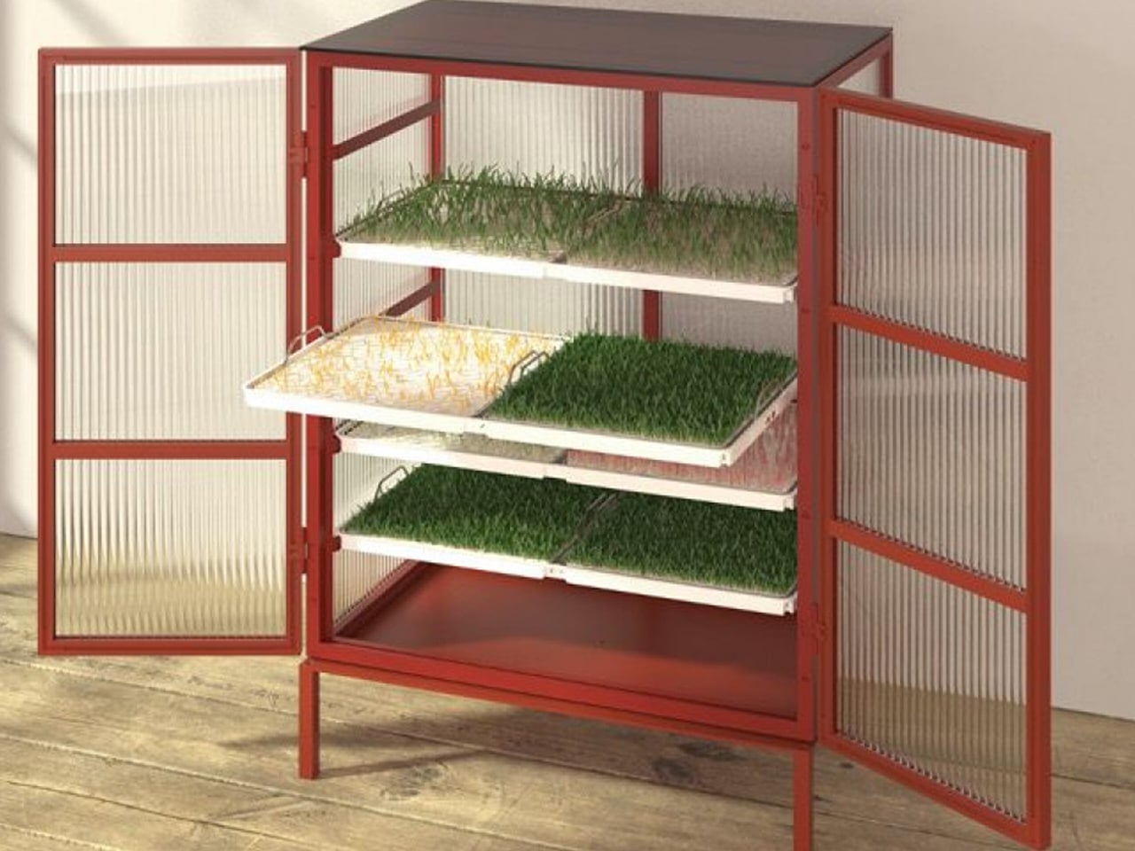
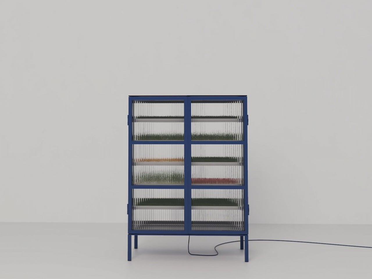
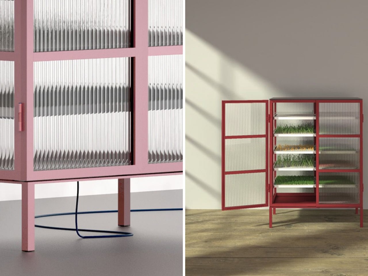
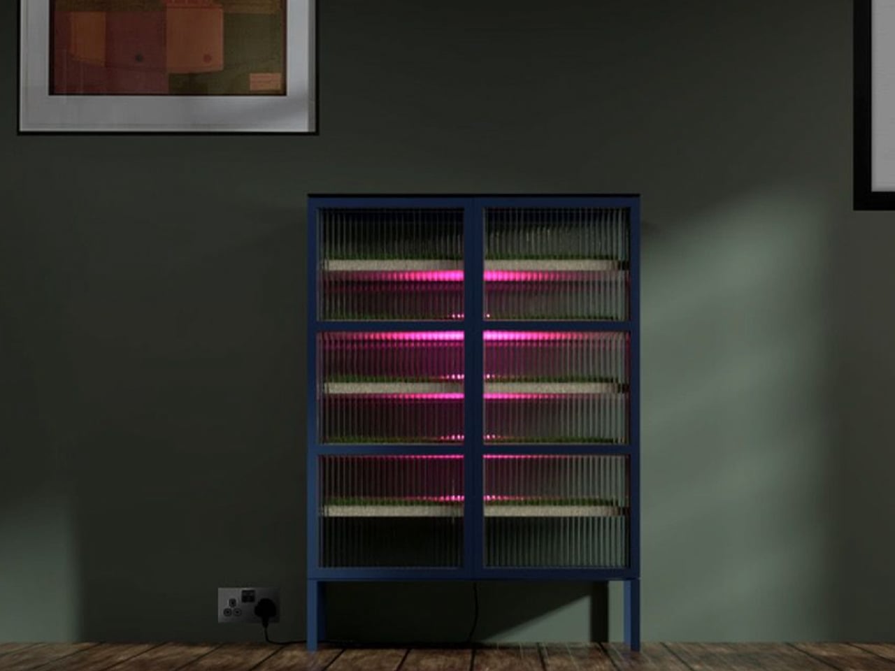
Farmhouse features a five-tiered structure that replaces soil with nutrient-rich water and root-supporting materials such as Rockwool. Each tray provides oxygen, filtered water, and the right support for plant growth, while adjustable LED or HID lights supply each plant with ideal light based on its Daily Light Integral (DLI).
As a sustainable farming method, hydroponics enables year-round cultivation anywhere. Farmhouse aims to reduce food miles, plastic waste, and pollution by offering an indoor farming solution that allows families to grow fresh, healthy produce at home.
3. Seamless Spatial Flow Delivers Circulation
A greenhouse becomes truly intentional when it’s embedded within the home’s natural circulation. Many contemporary designers place it beside, or above, the kitchen or dining area, creating a continuous dialogue between everyday domestic routines and the living landscape.
This connection enhances the experience. Descending into a winter garden that doubles as a larder replaces the sterility of a typical pantry with the scent of herbs and earth, elevating daily harvests into memorable spatial experiences.
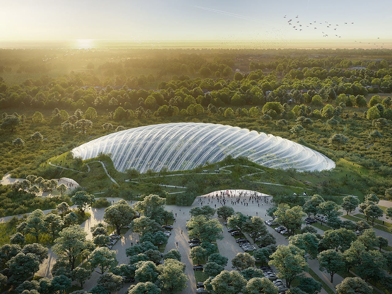
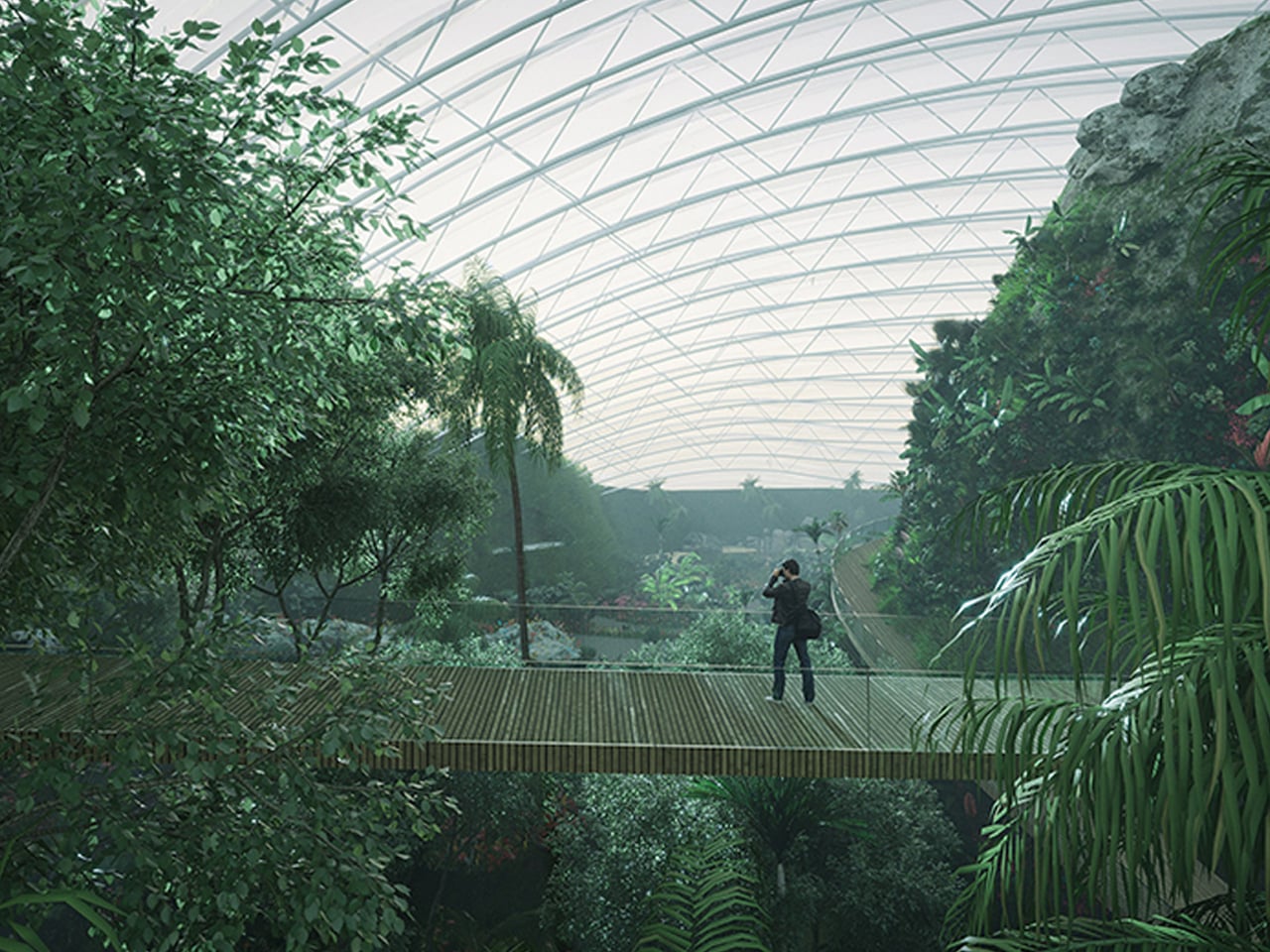
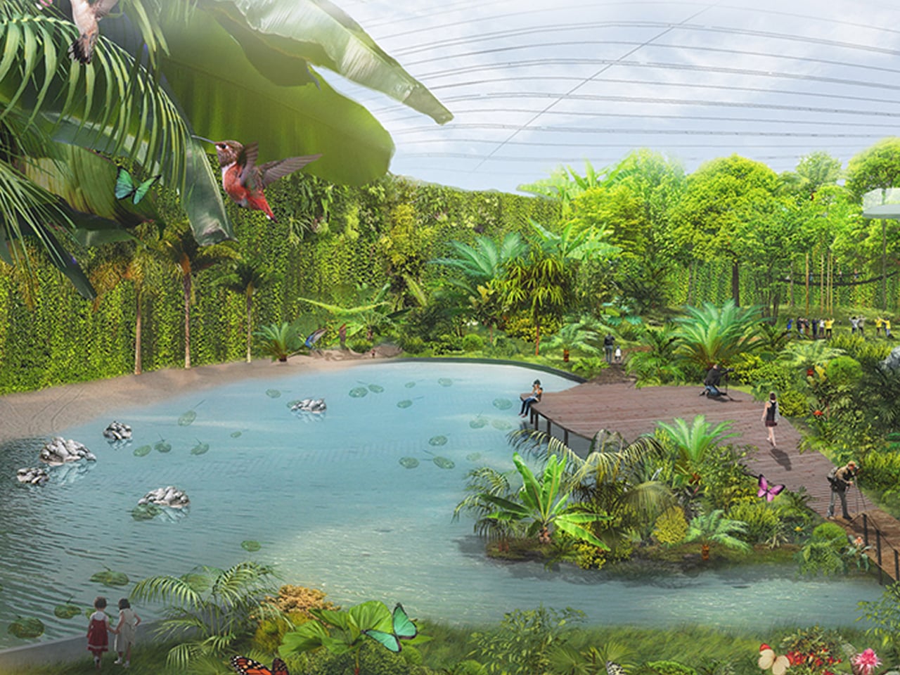
Hydroponic systems in greenhouses enable water recycling and support sustainable agriculture, while also aiding natural pollination. These controlled environments are emerging as a key solution to global food challenges by reducing resource waste. Leading this evolution is Tropicalia, a groundbreaking greenhouse that immerses visitors in a lush tropical world.
Designed by Coldefy & Associates in collaboration with an energy partner, Tropicalia is set to open in Northern France. This vast greenhouse maintains a stable tropical climate and functions without internal support columns, allowing biodiversity to thrive freely. Its innovative design captures and reuses the heat it generates, powering nearby buildings and addressing inefficiencies typical of traditional greenhouses. Inside, visitors can explore winding paths, waterfalls, and vibrant aquatic life.
4. Modular Greenhouse Design
A sustainable greenhouse must be designed for longevity. Durable, non-corrosive materials such as marine-grade aluminum and treated glulam ensure structural integrity while enabling easy reconfiguration.
Modularity protects function and beauty over time. Homeowners can shift from vertical farming to traditional planting without disrupting the architectural language, preserving long-term relevance and aesthetic harmony.
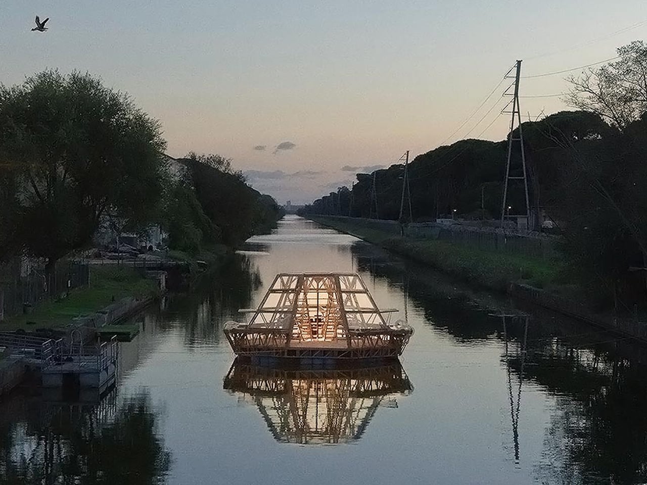
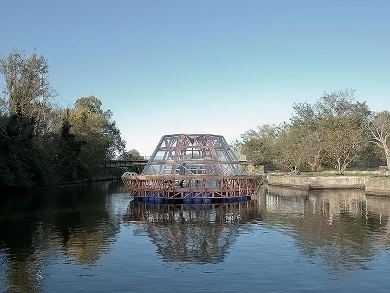
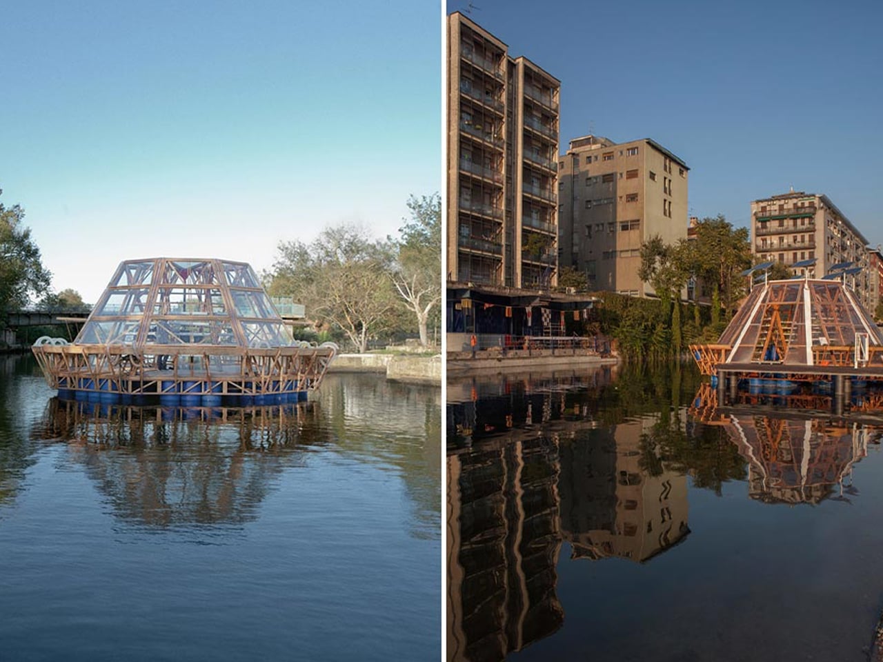
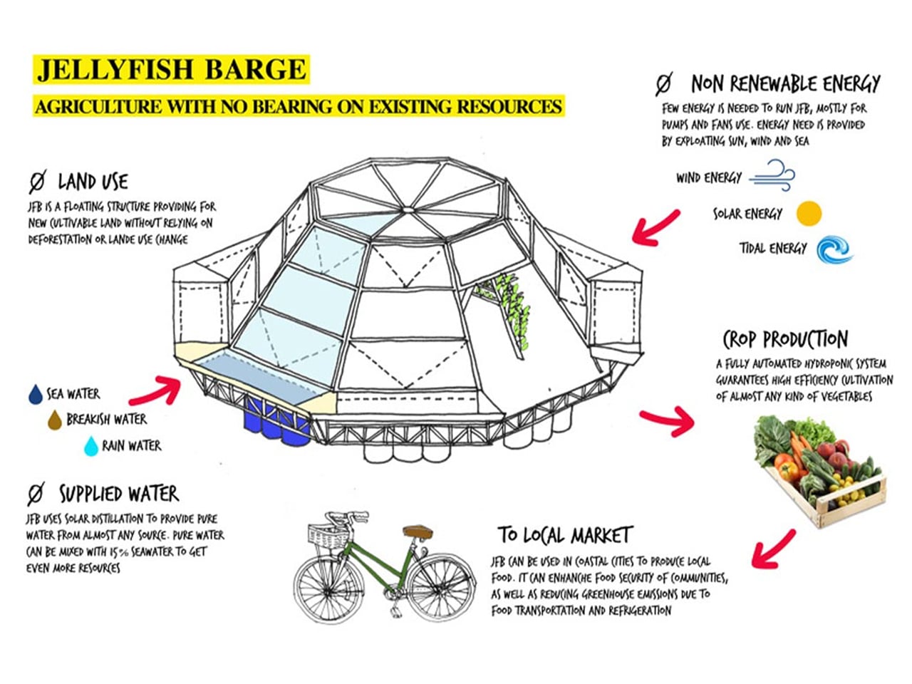
Studies indicate that by 2050, global food demand is expected to rise by up to 70%, yet cultivable land and fresh water are rapidly diminishing due to climate change. Flooding, extreme weather, and soil degradation are already impacting agricultural productivity, pushing the need for resilient and sustainable food systems. One innovative solution is the Jellyfish Barge, a modular floating greenhouse designed to support food production in coastal communities without relying on soil, fresh water, or fossil fuels.
Created by Studiomobile and Pnat, the Jellyfish Barge harnesses solar energy to desalinate water, producing enough clean water to sustain its crops. Built on a wooden platform supported by recycled plastic drums, it uses efficient hydroponic methods to reduce water usage by 70% compared to traditional systems. Its modular structure allows the design to be scaled, replicated, or adapted, even serving as floating markets or community farms. This sustainable, affordable greenhouse offers a promising model for future urban food resilience.
5. Renewable Power Systems For Growth
A transparent greenhouse reaches full sustainability when it demands little to no external power. Beyond energy-generating façades, integrating renewables like compact wind turbines or ground-source heat pumps ensures consistent energy for grow lights and environmental controls.
This autonomy transforms the greenhouse from a home feature into a self-reliant sanctuary, an off-grid, future-ready asset that resonates with the values of high-net-worth homeowners.
In many Southeast Asian countries, plastic-covered greenhouses remain common, especially in India, where over 60% of the population relies on agriculture. Polythene sheets are inexpensive and convenient, but their environmental impact is often overlooked due to limited awareness and a lack of alternatives.
Architect Eliza Hague offers a sustainable solution with her inflatable bamboo greenhouses. Designed during her Master’s at the University of Westminster, Hague’s concept uses shellac-coated bamboo inspired by biomimicry. The structure mimics the Mimosa Pudica plant, incorporating collapsible beams and inflatable hinges to create a unique, origami-like form that can be flat-packed for easy transport.
These bamboo-paper greenhouses can connect to soil-based dwellings that regulate temperature naturally. Hague envisions them as shared spaces for families in rural communities, providing food self-sufficiency and reducing plastic use.
The Transparent Farm becomes an architectural imperative, more than an amenity, signaling a genuine commitment to ecological responsibility. It unites nourishment and shelter within a single experiential volume. For the discerning homeowner, the integrated sustainable greenhouse represents the ultimate expression of biophilic, intelligent, and forward-thinking luxury.
The 2026 escape is no longer a simple departure. It is an architectural arrival. Cabin designs have evolved into spaces for sensory realignment, where design shapes the experience itself. Light, stillness, and proportion now define luxury. The way a space holds the fading glow of sunset has become central to how it is felt and remembered.
This shift demands material honesty and a closer dialogue between built form and landscape. When architecture responds with restraint and intent, it becomes a biophilic cocoon, reducing carbon impact while elevating well-being.
1. Polygonal Spatial Cabins
The dominance of the rectilinear box is giving way to faceted architectural forms inspired by mineral geometries and fractured landscapes. Polygonal structures introduce a more dynamic spatial language, where walls and planes are angled with intent rather than symmetry. These forms create a constantly shifting play of light and shadow, allowing the architecture to change character throughout the day and feel visually alive.
Beyond aesthetics, angular geometry reshapes perception. By moving away from rigid right angles, compact footprints feel larger and more layered. Circulation becomes experiential, as movement through faceted corridors reveals framed views, unexpected pauses, and a heightened awareness of the surrounding terrain.
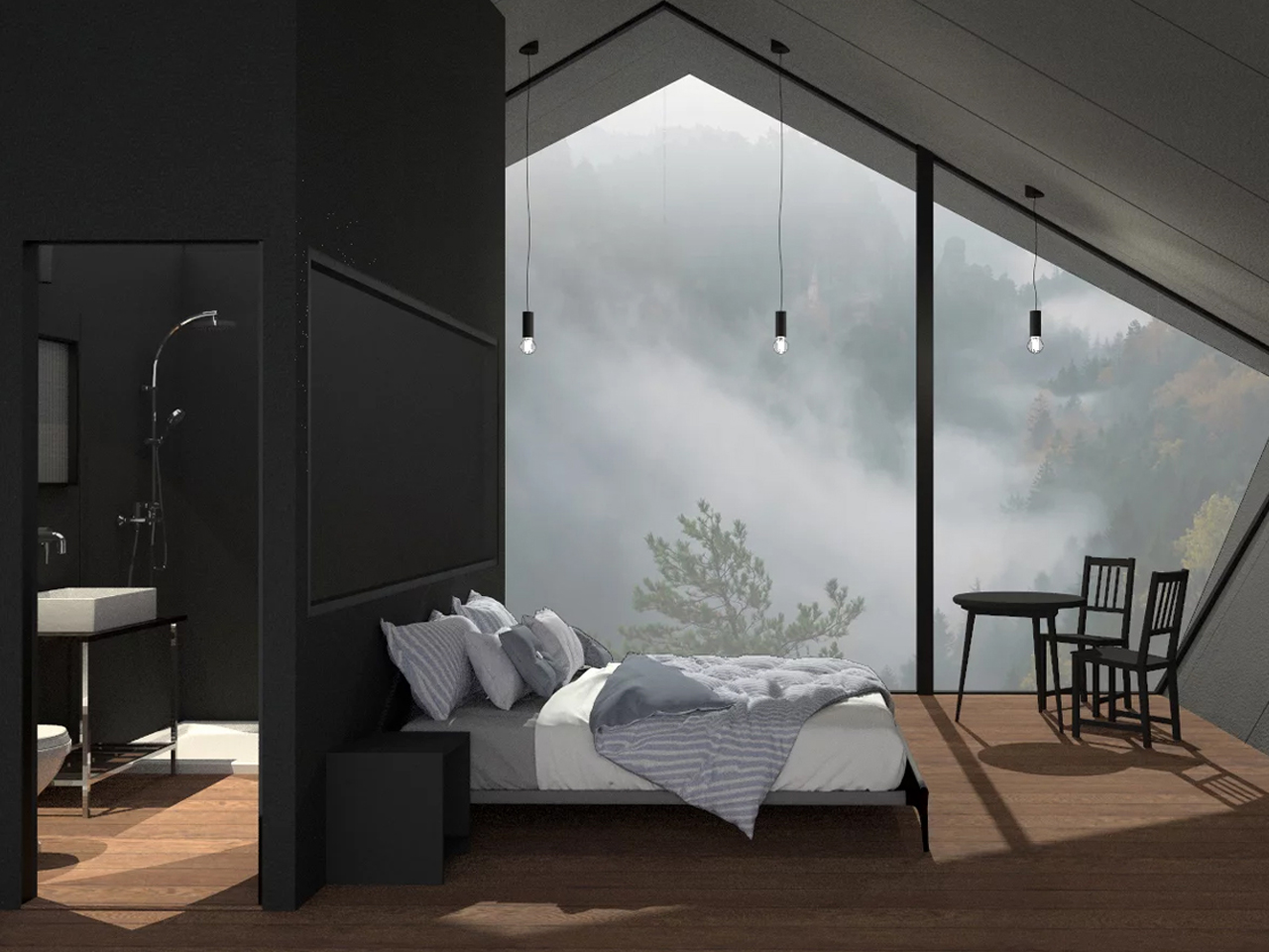
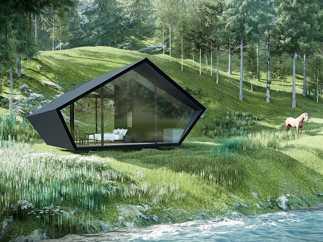
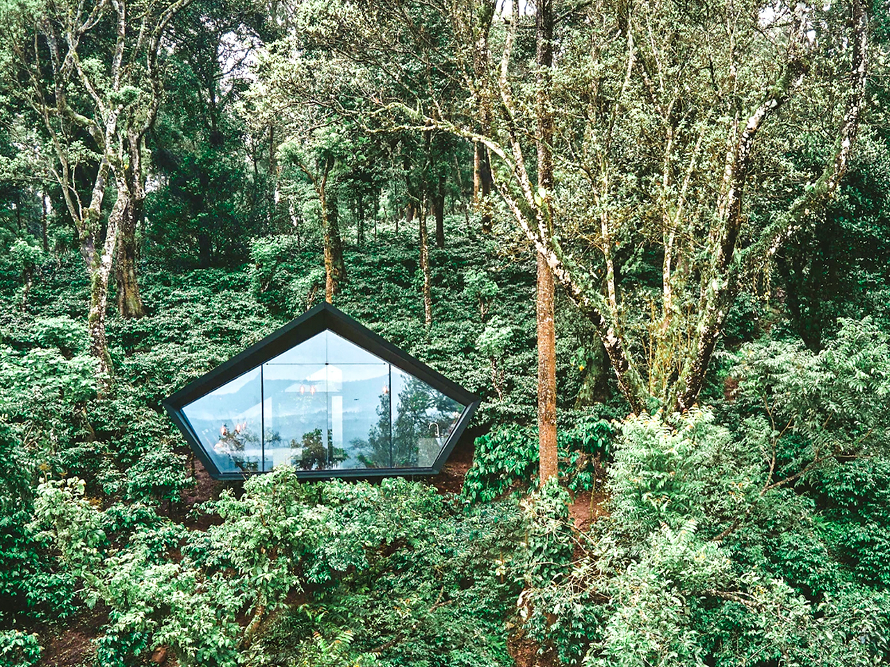
Cabin A24 is a 21-square-metre prefabricated tiny cabin designed for peaceful escapes among forests and mountain valleys, offering all the essentials for short, comfortable stays. Created by DDAA (Dev Desai Architects and Associates), the cabin stands out with its distinctive pentagonal form and strong architectural identity, without sacrificing everyday functionality. Fully furnished, it includes a living area, sleeping space, kitchenette, and bathroom, all carefully planned to make the most of its compact footprint while maintaining a sense of openness and privacy.
The layout is divided into two efficient zones, with a generous bedroom and lounge on one side and the bathroom and kitchenette on the other. A floor-to-ceiling glazed window brings natural light into the sleeping area, while walnut flooring and matte interior finishes create a warm, contemporary feel. With integrated service areas that support self-sufficient living, Cabin A24 is designed to fit effortlessly into wooded, mountainous, or coastal landscapes, offering comfort without disturbing the calm of its surroundings.
2. The Living Roof Cabin
The green roof has evolved beyond a sustainability add-on into a critical architectural layer that binds building and landscape. It becomes a living surface, softening the structure while improving performance. The depth of soil acts as a thermal buffer, naturally enhancing insulation and reducing dependence on mechanical heating and cooling across seasons.
Equally important is its long-term value. Indigenous planting transforms the roof into a suspended ecosystem that supports biodiversity while absorbing carbon. Over time, the system protects the waterproof membrane from UV exposure and extreme temperature shifts. This significantly extends roof life, making the return less about immediate savings and more about durability, resilience, and lasting architectural intelligence.
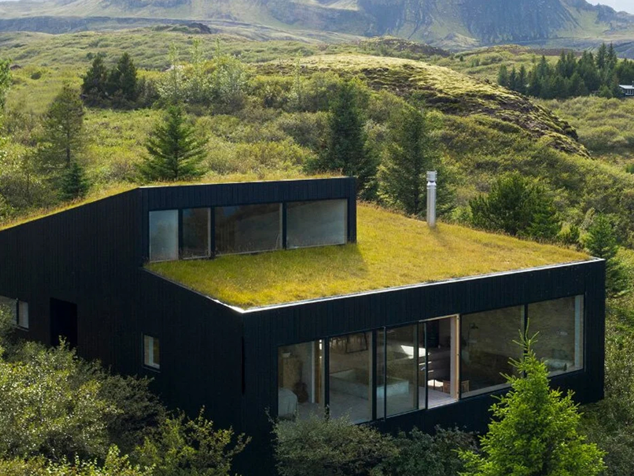
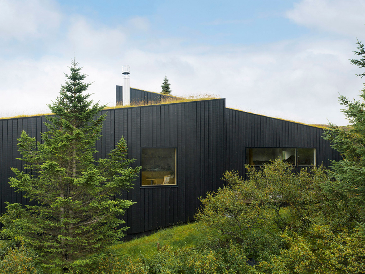
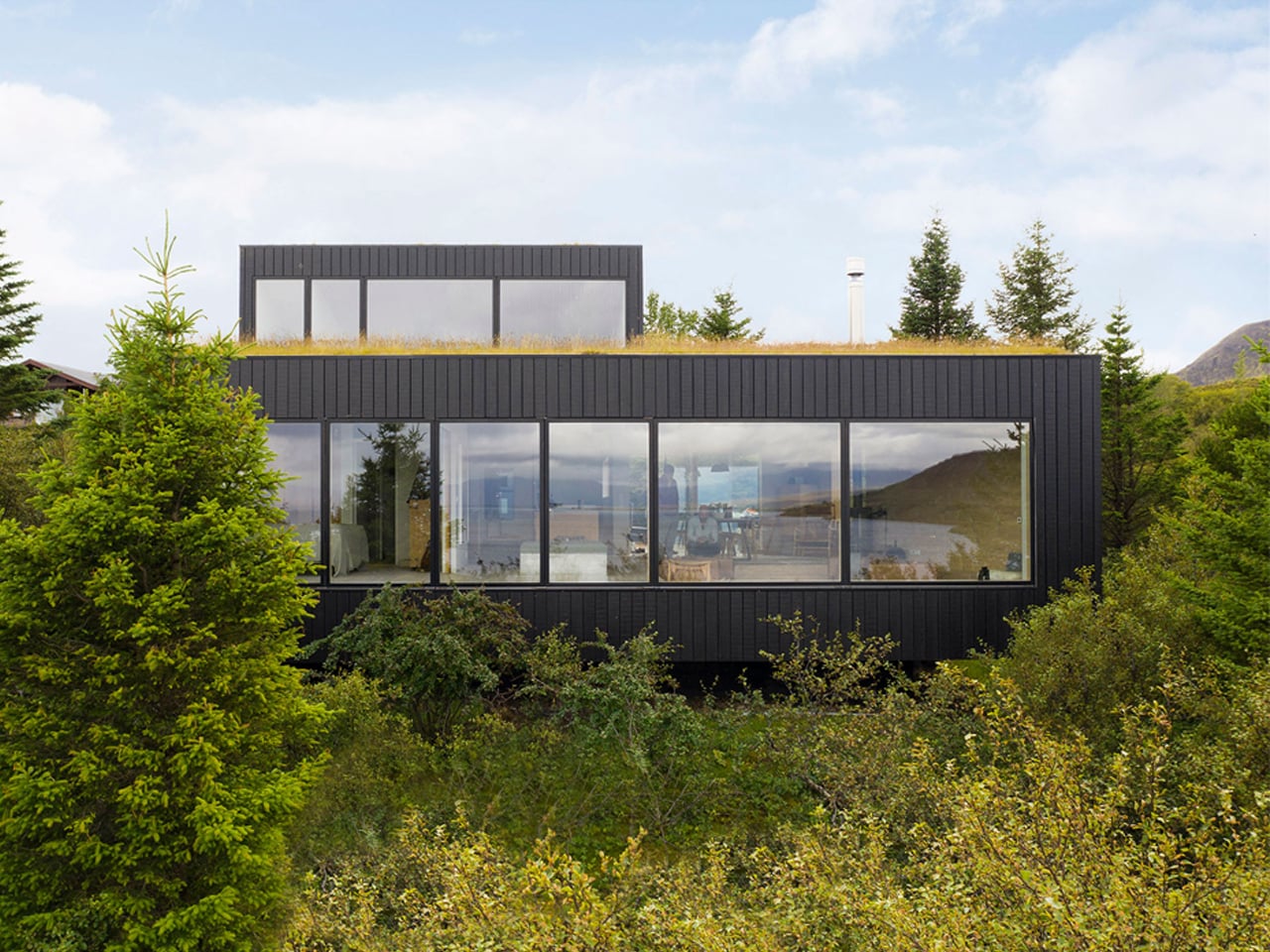
Homes carved into mountainsides always spark the imagination, offering sweeping views and a sense of calm that feels worlds away from everyday life. In southwestern Iceland, architectural studio KRADS has completed a secluded holiday home overlooking Lake Þingvallavatn, the country’s second-largest natural lake. Designed for musicians Tina Dickow and Helgi Jónsson, the retreat is carefully positioned to capture expansive views of the lake and surrounding wilderness while remaining quietly anchored within the rugged terrain. The design prioritises intimacy and comfort, making it an ideal escape that balances dramatic scenery with a warm, sheltered interior experience.
To achieve this harmony, KRADS built the home on three staggered concrete planes that follow the natural slope of the land. Each level aligns with the shifting topography, allowing the structure to feel embedded rather than imposed. The accessible rooftop extends the living experience outdoors, offering uninterrupted views of sky and the forest. Covered with moss, grasses, and native shrubs, the green roof further blends the home into its environment, reflecting a strong commitment to preserving the landscape.
3. Rustic Modern Material Cabin
Rustic Modernism defines the new language of rural luxury, balancing industrial precision with organic warmth. It is rooted in material honesty, where finishes are chosen for what they are rather than how they imitate. Board-formed concrete sits confidently alongside reclaimed timber, creating a dialogue that feels both contemporary and deeply grounded in place.
The experience is tactile as much as visual. Cool stone, textured concrete, and live-edge wood invite touch and slow engagement. Regional sourcing strengthens this connection, reducing transport impact while anchoring the building to its landscape.
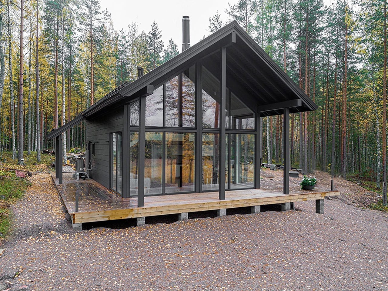
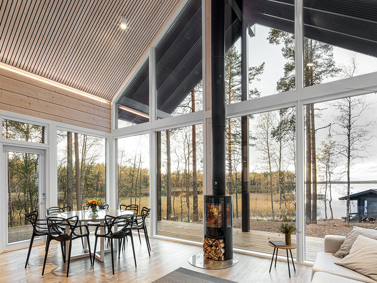
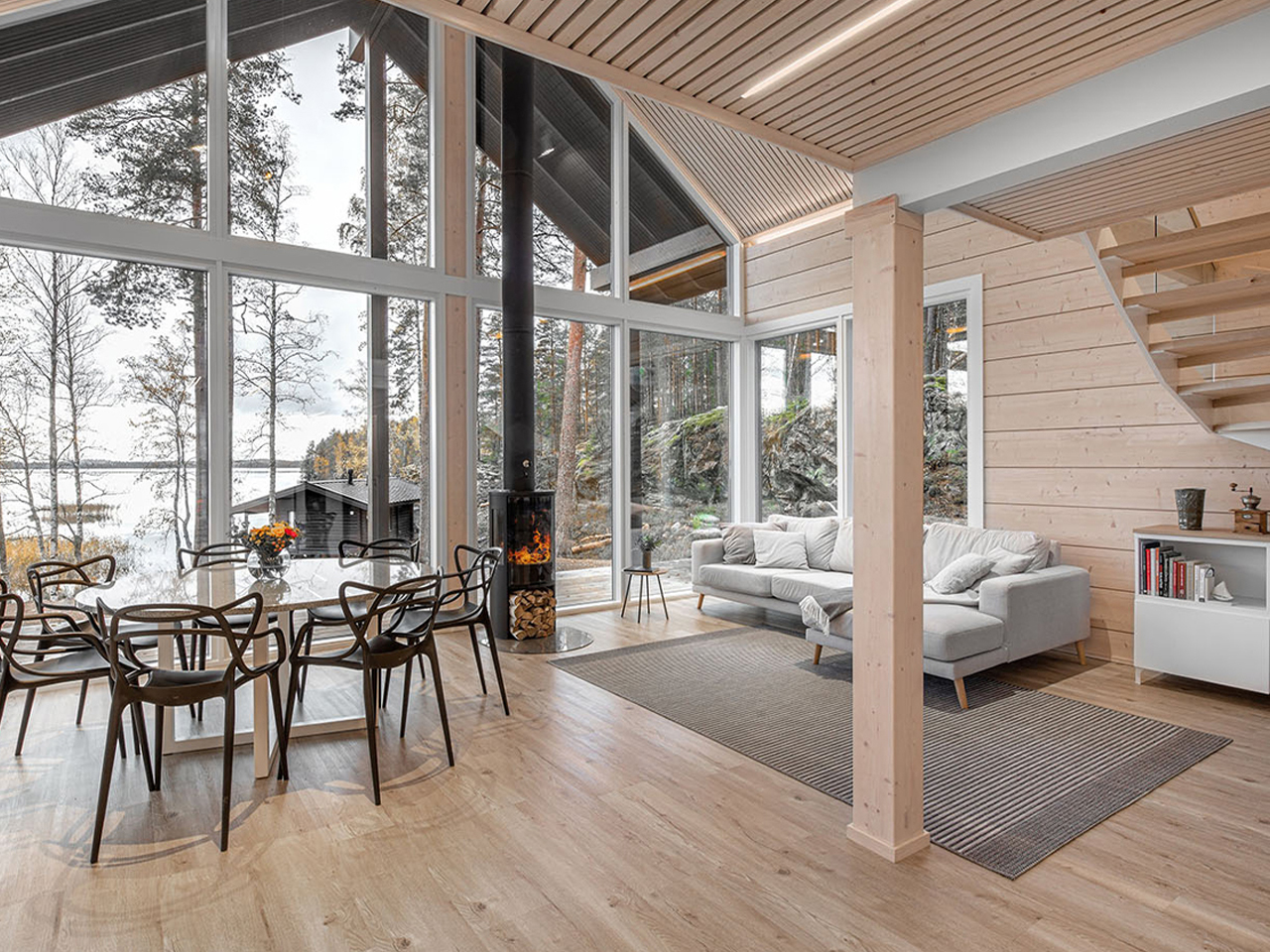
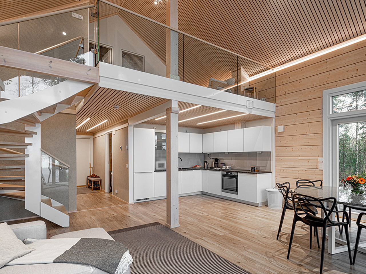
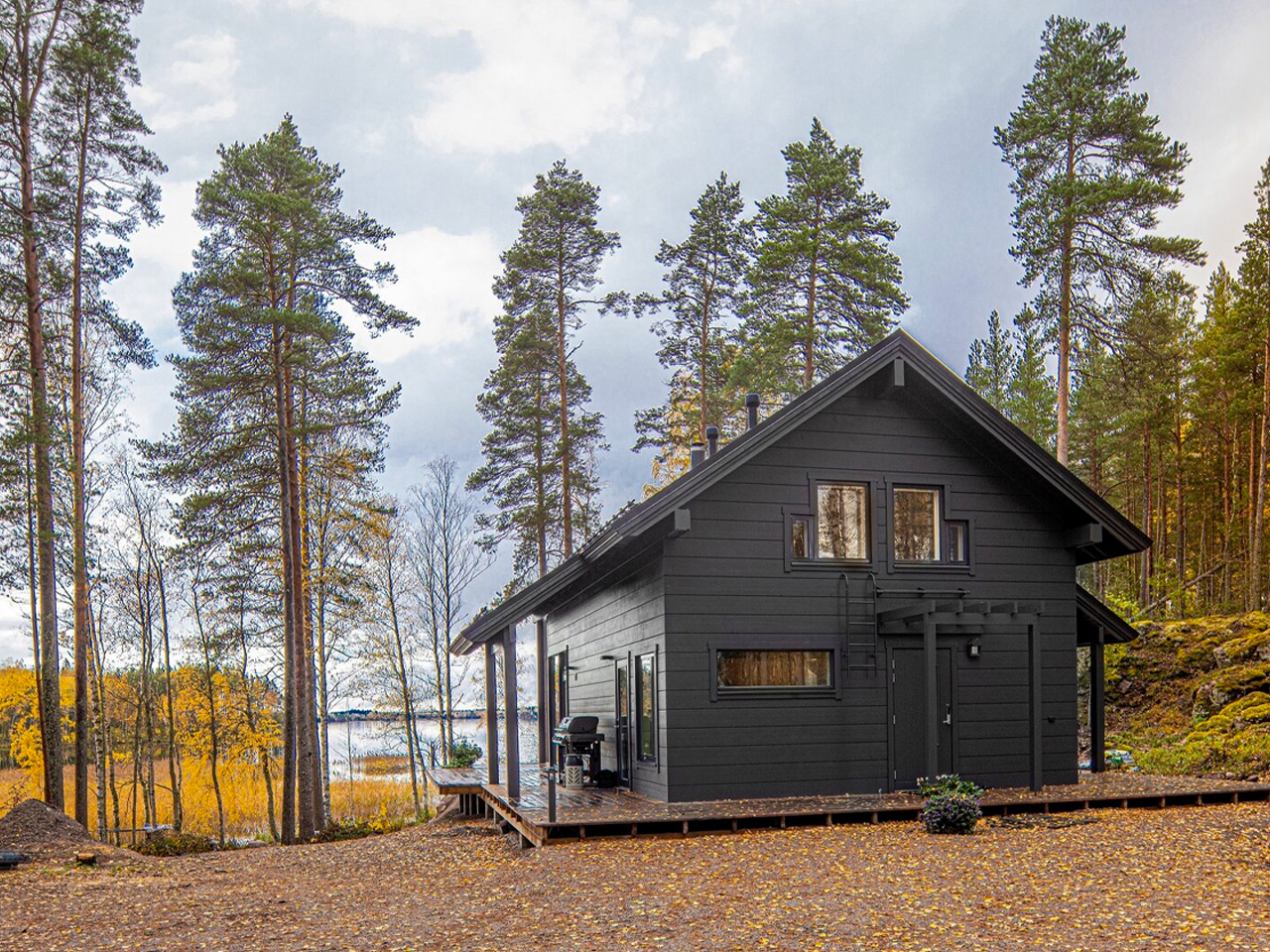
Iniö is a prefabricated log home by Pluspuu, designed as a holiday retreat for a Finland-born couple now living in Switzerland, who wanted to reconnect with their roots in Heinola. Known for its mastery of log construction, the Helsinki-based company worked with Ollikaisen Hirsirakenne Oy to create a home that blends rustic charm with modern clarity. Chosen from Pluspuu’s catalogue, Iniö stands out for its clean-lined form, light-filled interiors, and expansive floor-to-ceiling windows that frame the surrounding forest while keeping the interior warm and inviting.
Planned as a two-level, three-bedroom home, Iniö features deep eaves and a wraparound patio that extends living spaces outdoors. The couple customised the interior with a traditional Finnish rimakatto ceiling, adding texture and softer acoustics. Thick spruce logs, wood-fibre insulation, triple-glazed windows, and geothermal heating ensure year-round comfort, delivering a retreat that feels timeless, grounded, and quietly contemporary.
4. Hobbit-Inspired Cabin
Hobbit-inspired subterranean homes are being redefined as a sophisticated response to privacy, climate, and belonging to the earth. These earth-sheltered dwellings act as biophilic cocoons, where the surrounding ground becomes a protective envelope. The thermal mass of the soil stabilizes interior temperatures throughout the year and reduces energy demand while enhancing comfort.
Drawing from ancient troglodyte traditions and principles of grounding, these homes offer a sense of refuge that elevated structures rarely achieve. Carefully choreographed spatial sequences introduce light through glazed openings and sunken courtyards, ensuring interiors feel open and serene. The result is a luminous underground sanctuary rooted in performance and imagination.
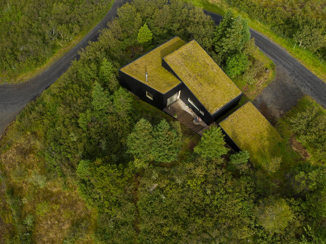
Tiny homes have a special kind of magic, and this cabin captures it with a form that feels straight out of a storybook, yet firmly rooted in modern design. Set on a sloping site, the structure rises organically from the ground, with its surface folding upward to shape both the exterior and the interior. The result is a home that gives subtle hobbit-like charm, reinterpreted through smooth lines and contemporary architecture. A vertical glass strip runs from floor to ceiling, visually stitching the space together and creating a strong connection between levels.
At the entrance, two existing trees frame the volume, softening the transition between nature and architecture while guiding you inside. Being slightly elevated improves natural ventilation, keeping the space fresh and comfortable. The contrast of black finishes with warm timber stands out against the forest, yet the flowing form helps the cabin blend into its surroundings. Inside, the mood is minimal, refined, and spa-like, with the bedroom’s glass detailing creating a striking floating effect.
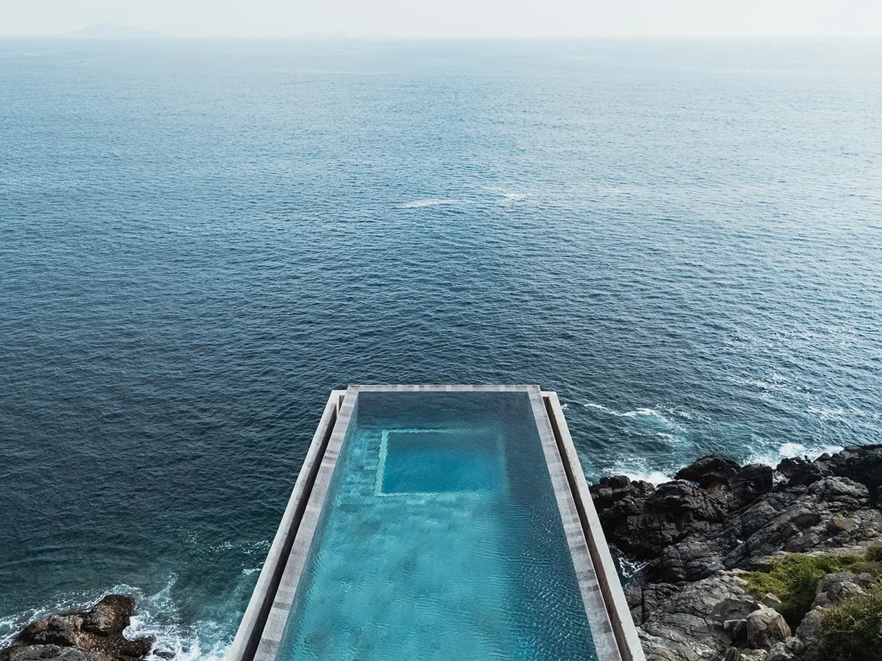
5. Cantilevered Cliff Living Cabin
Clifftop architecture represents the boldest expression of contemporary luxury, where design engages directly with gravity and exposure. Cantilevered forms extend living spaces into open air, creating a suspended relationship between structure and landscape. Steel and post-tensioned concrete enable this architectural daring, allowing the building to hover with precision rather than force.
Performance is as critical as poetry. These homes are engineered to withstand extreme wind loads and seismic movement, making resilience part of the design narrative. Floor-to-ceiling glazing transforms the interior into a viewing instrument, capturing shifting light and distant horizons. The reward lies in rarity, offering a perspective that feels elevated in every sense.
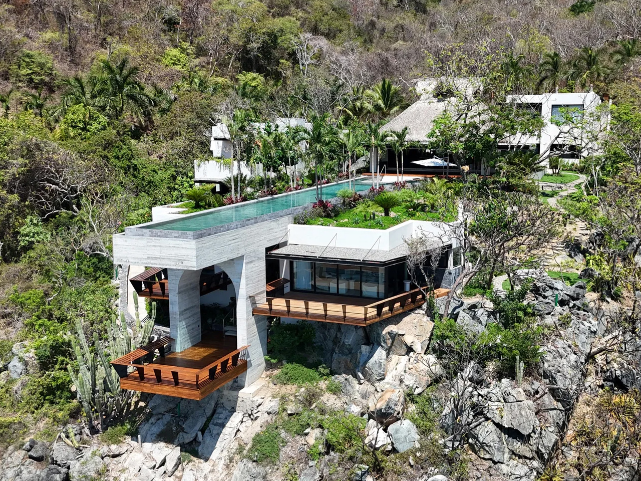
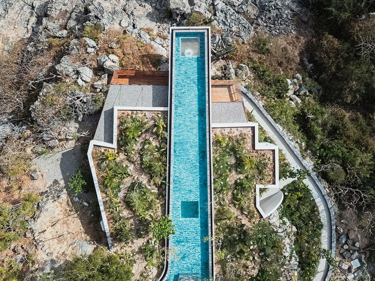
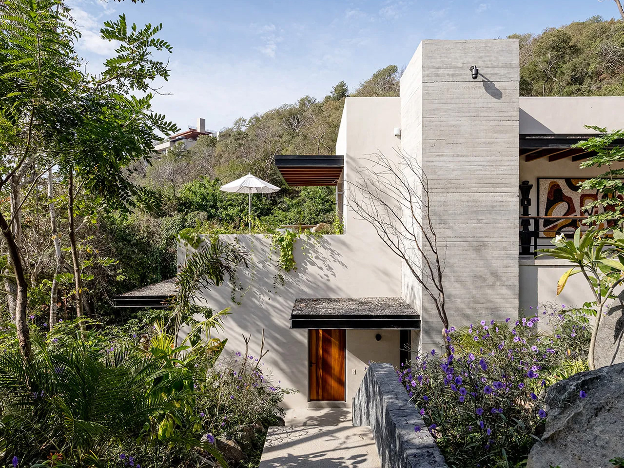
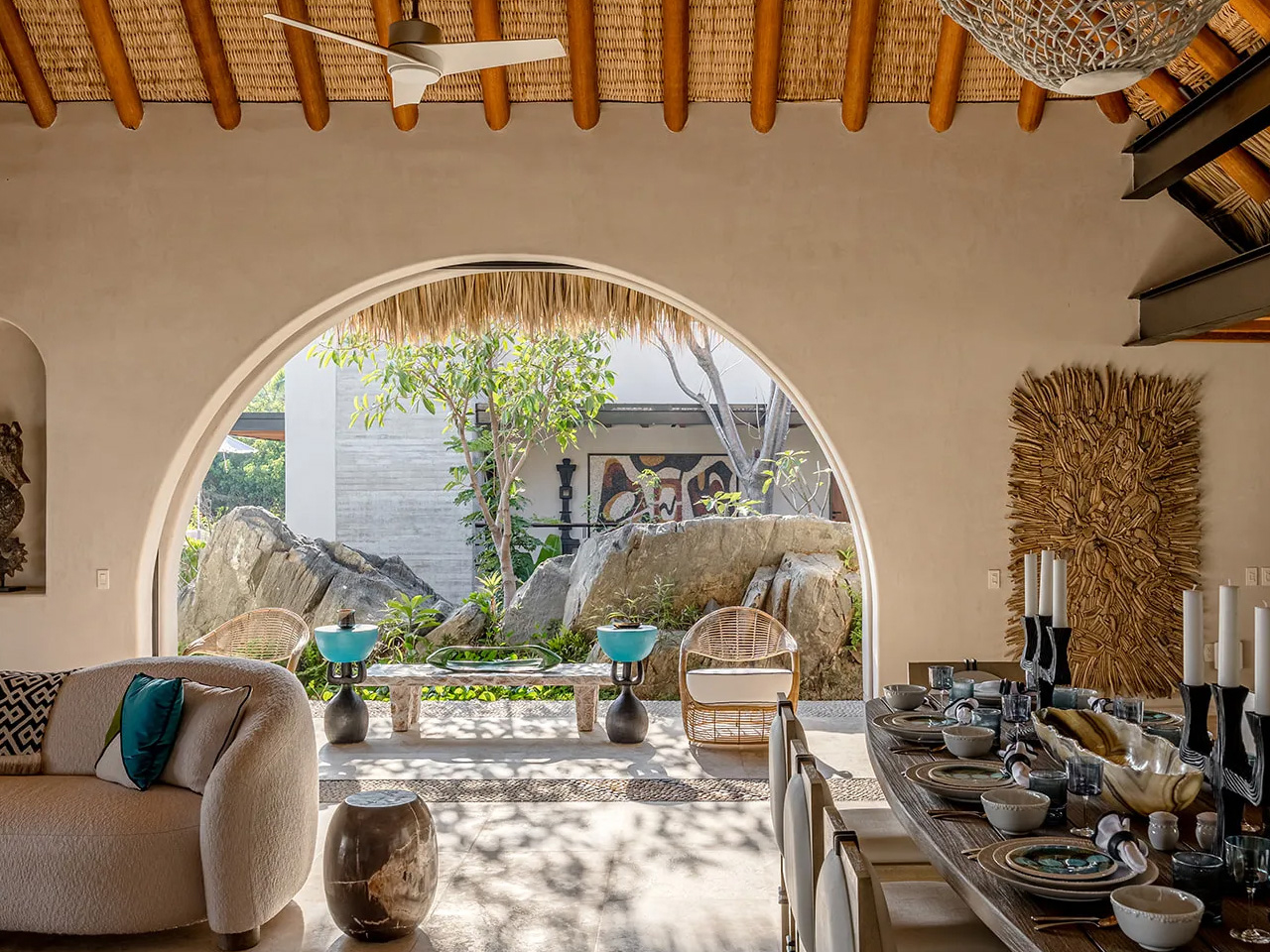
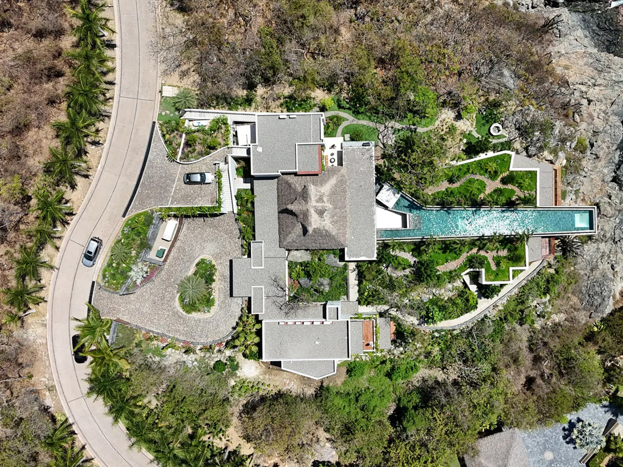
Perched on the dramatic cliffs of Ixtapa-Zihuatanejo, Casa Yuri appears almost carved into the coastline. Completed in 2023, this expansive oceanfront home reinterprets traditional Mexican architecture through a contemporary lens, creating a space that feels striking and deeply personal. The arrival experience builds anticipation, with a landscaped ramp rising from the motor lobby and gradually revealing the house across a vast, nearly 3,000-square-metre site. Designed by Daniel Zozaya Valdés and Enrique Zozaya with full creative freedom, the residence unfolds as a sequence of open, fluid spaces shaped by the surrounding sea and sky.
At its heart is a monumental 17-metre-wide palapa, the largest the firm has built for a private home, forming a shaded social hub where indoor and outdoor living seamlessly merge. A dramatic cantilevered pool extends over the rocks, creating the sensation of floating above the Pacific. Beyond its visual impact, the house is thoughtfully sustainable, using passive cooling, water-recycling systems, and native stone and wood. By blending time-honoured coastal building traditions with bold modern gestures, Casa Yuri captures a refined vision of contemporary Mexican living by the sea.
In 2026, weekend retreats are less about escape and more about return. Architecture becomes a place of alignment, not distance. Through polygonal forms, living roofs, and honest materials, these sanctuaries deliver lasting value in well-being. When buildings respond to landscape, they create spaces that quietly restore the human spirit.
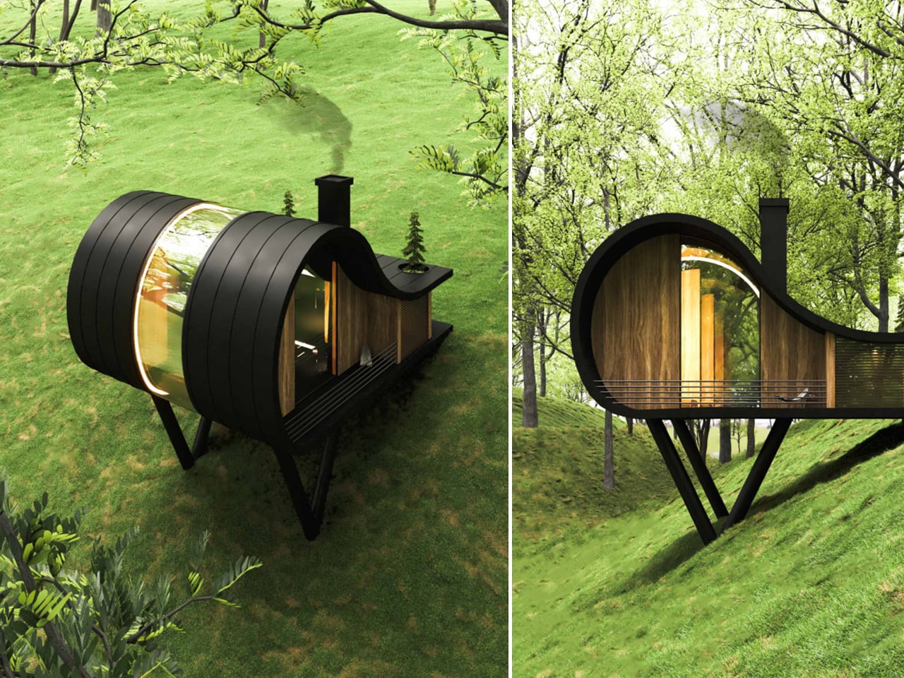
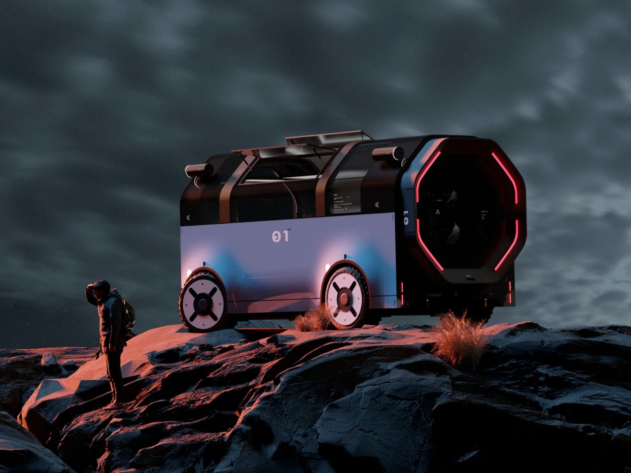
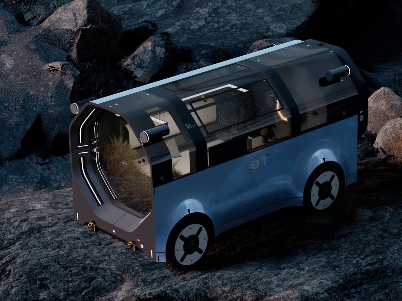
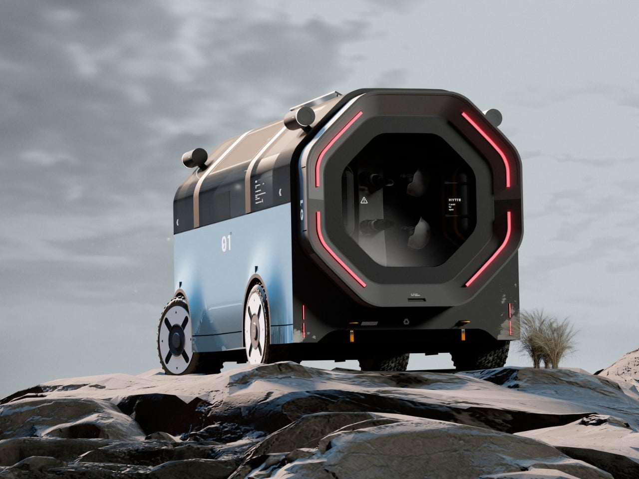
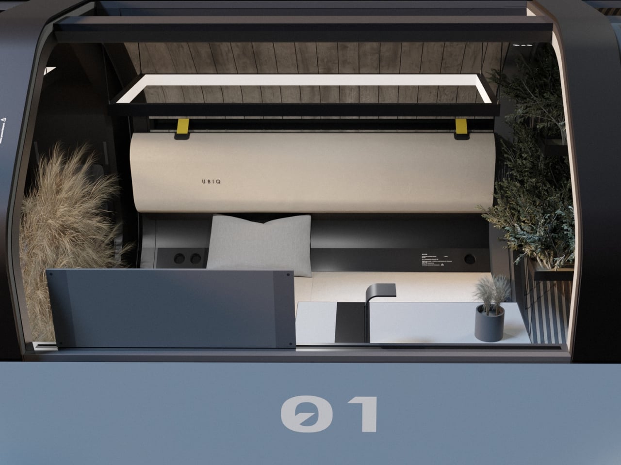
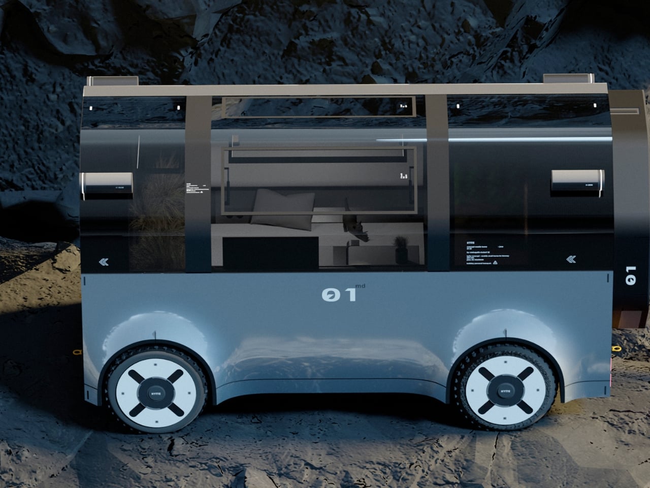
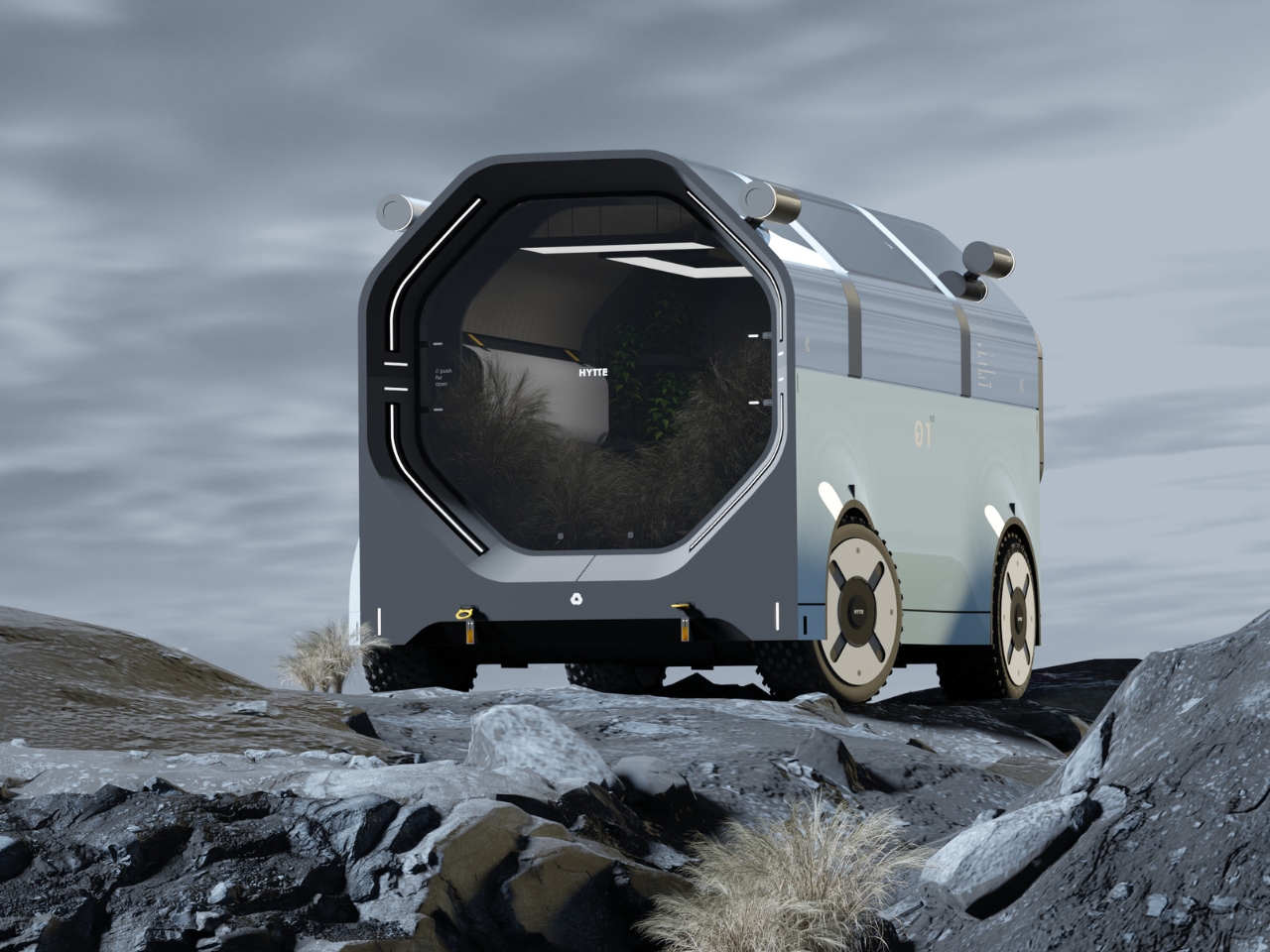
The motorhome has always had an identity problem on wheels. It is supposed to feel like home, but most of the time it looks and feels like neither a proper vehicle nor a proper house. It sits awkwardly in that middle ground, too big to be elegant and too cramped to be genuinely comfortable. RE:BURO, a studio that defines itself as a bureau of technical aesthetics, decided to take that problem seriously, and the result is HYTTE, a mobile home concept that genuinely earns the word “home.”
The name comes from the Scandinavian tradition of the hytte, a simple countryside cabin. That cultural reference is not decorative. It is the philosophical backbone of the entire project. RE:BURO’s stated goal was to create a mobile dwelling that is utilitarian and practical, but that also blends seamlessly into the natural environment without compromising its aesthetics. That is a harder brief to execute than it sounds, and the fact that HYTTE largely pulls it off is what makes it worth discussing.
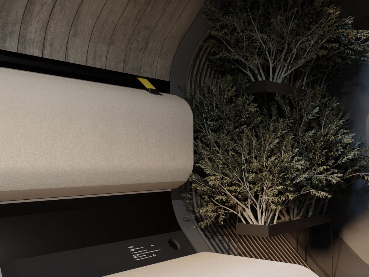
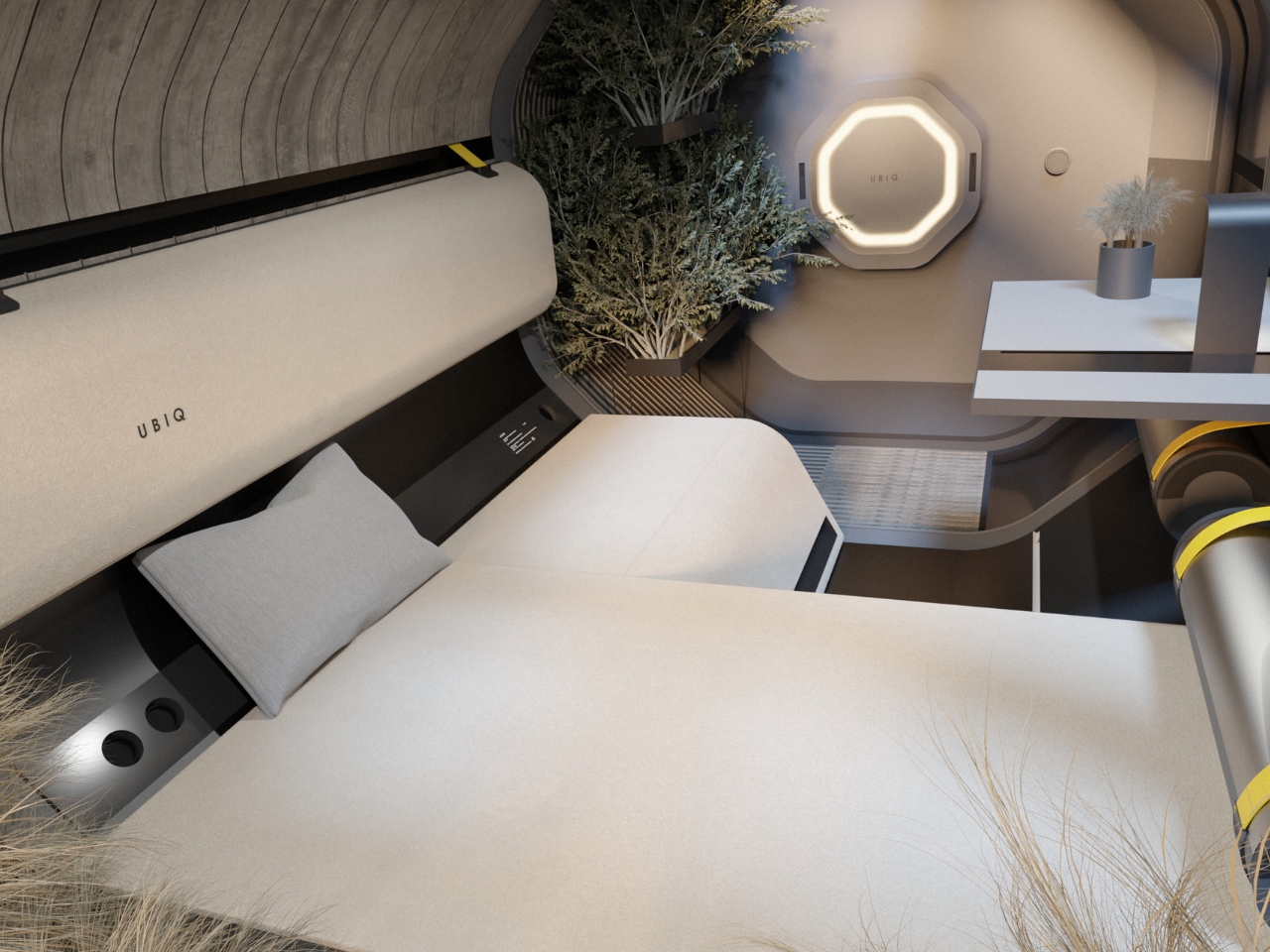
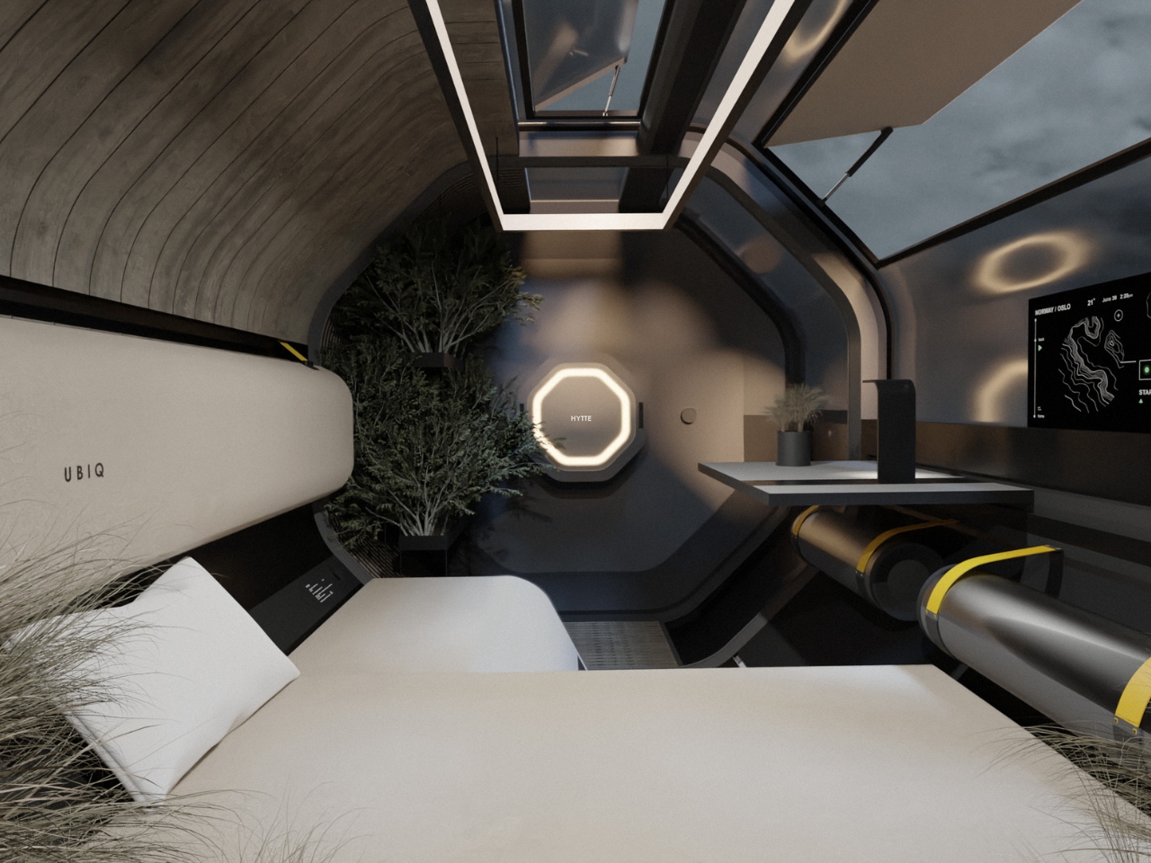
From the outside, HYTTE looks nothing like the motorhomes lining the highways. The exterior is compact and barrel-shaped, finished in dark matte tones, with a signature octagonal face that gives the whole vehicle an almost architectural quality. The red LED ring framing that face is the one moment of drama in an otherwise restrained design, and it works precisely because everything else is so controlled. Viewed from the side, the proportions feel more like a piece of land architecture than a road vehicle, which is exactly the intention. RE:BURO described the project as creating a vehicle similar to modern architecture that blends seamlessly into the natural environment while remaining a functional mobile home, and looking at the renders placed against those raw, rocky landscapes, that ambition holds up.
The structural platform is one of the more inventive aspects of the concept. The chassis uses two clamp-like grippers, similar in principle to a crab’s claws, that bind the living compartment on both sides using cables and fasteners. That modular logic means the platform is not locked into one configuration. It can be adapted to different use scenarios, which pushes HYTTE beyond a single-purpose vehicle and into something more like a system.
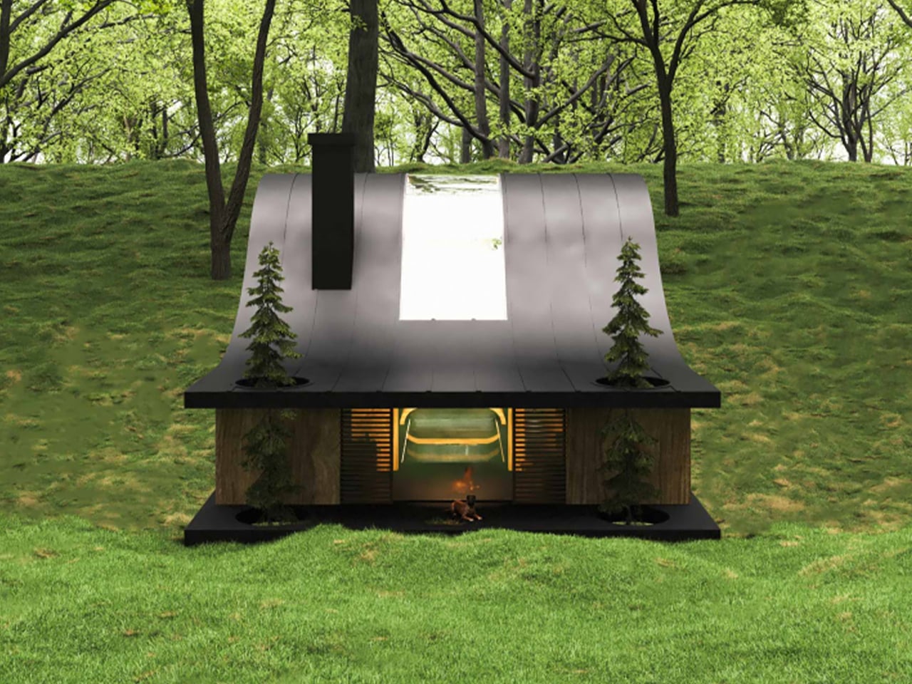
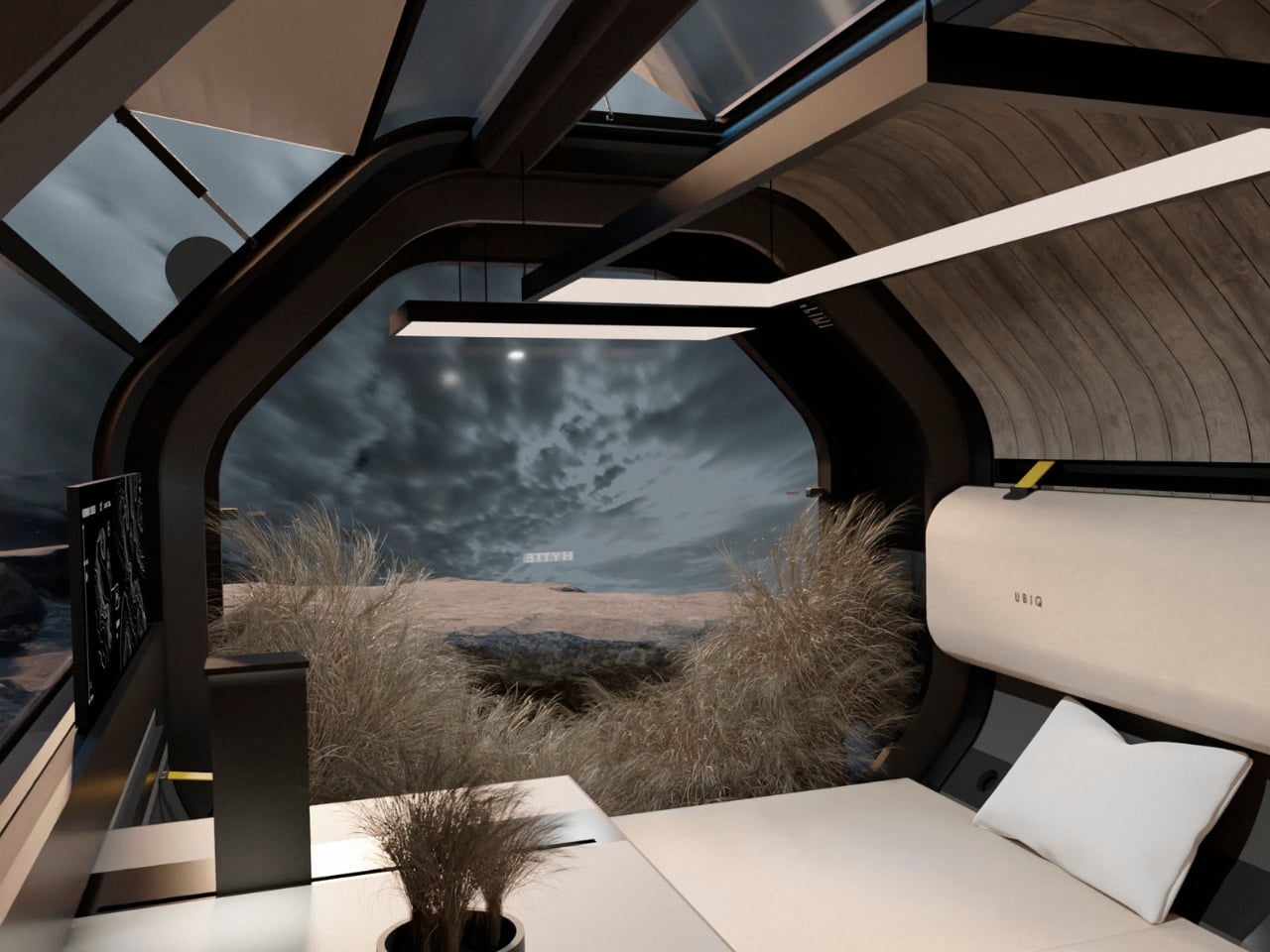
The interior is where the design thinking becomes most layered. RE:BURO chose to work within a simple geometric form and let those constraints generate solutions rather than fight them. That kind of design discipline is genuinely rare. The result is an interior that feels intentional rather than improvised. The dominant feature is an electric heater styled as a modern fireplace, which does more than provide warmth. It anchors the space psychologically, reinforcing the idea that this is a home rather than a vehicle cabin. The team noted that this element emphasises the idea of the object both visually and ideologically, creating an atmosphere of warmth and comfort, and that framing makes complete sense. A fireplace, even a reimagined one, signals rest and permanence in a way that no amount of clever storage ever could.
The rest of the interior follows that same ethos. Parts of the space are designed to transform into different structures for different usage scenarios, making the limited footprint feel versatile without feeling cluttered. The concept also includes dedicated spaces for houseplants and pets, details that seem minor but signal a design team that thought about how people actually live rather than just how spaces photograph in renders.
What RE:BURO has done with HYTTE is essentially make the case that the motorhome category has been underselling itself for decades by defaulting to the same visual and functional template. The concept draws on Scandinavian ideas of lagom, of getting the balance exactly right, and applies them to a vehicle type that has historically leaned toward excess or compromise. Neither approach tends to produce good design.
HYTTE is still a concept. But as a piece of thinking about what mobile living could look like when someone genuinely applies architectural rigour to it, it is one of the more compelling proposals I have come across in a while. The motorhome industry could learn a great deal from it.
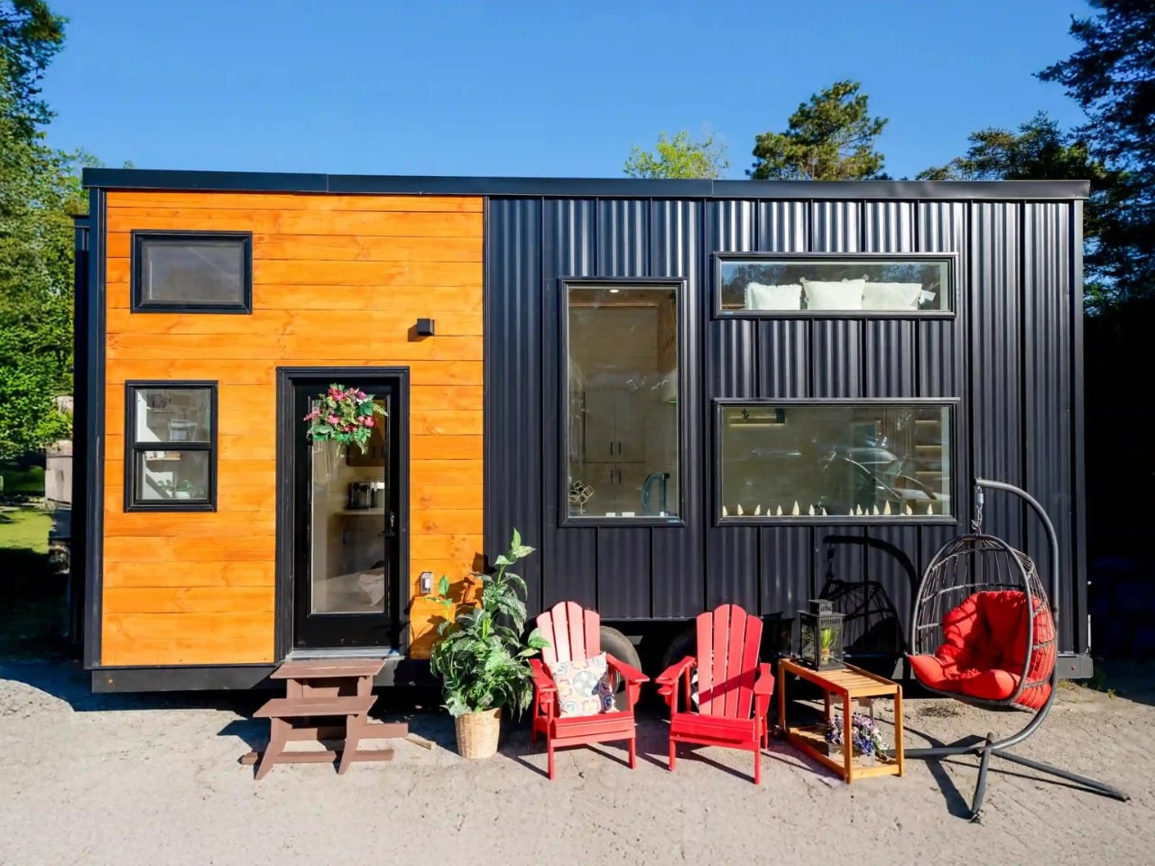
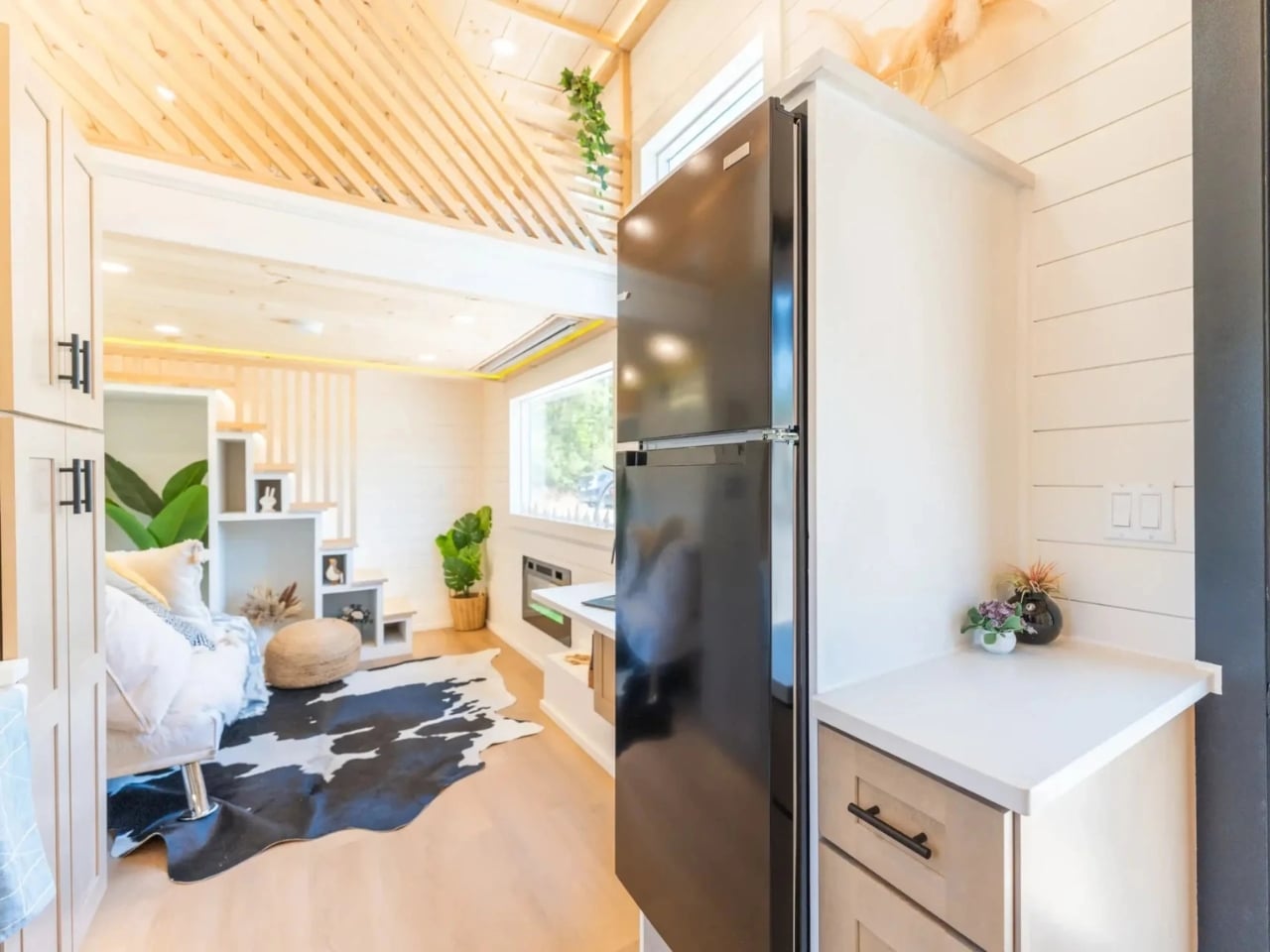
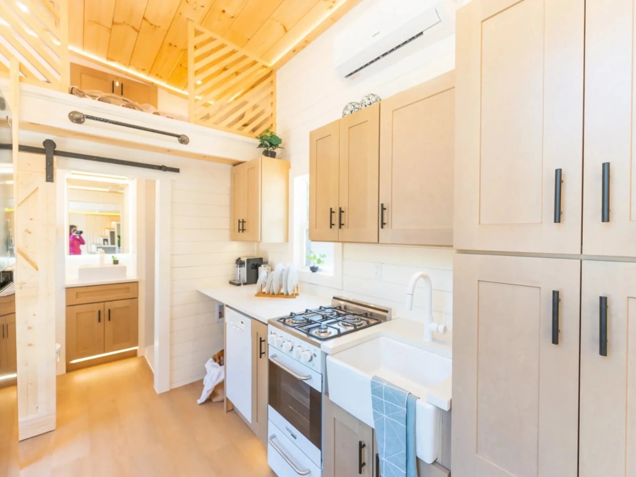
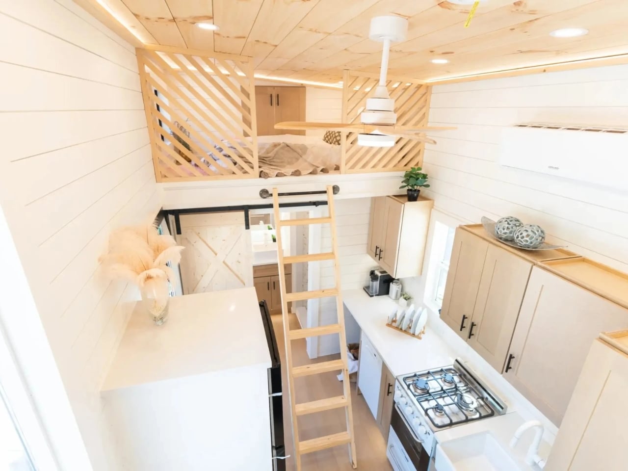
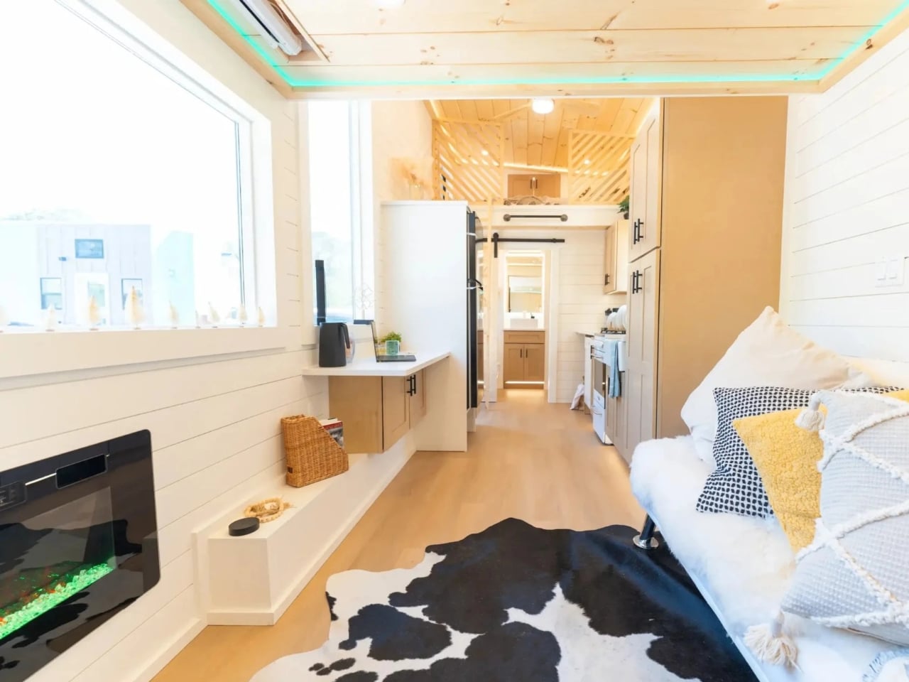
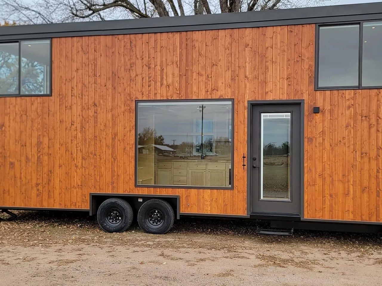
Tiny homes have been having a moment for a while now, and I know what you might be thinking: how many of these can there be before they all start looking the same? Fair point. But every so often, one comes along that genuinely earns your attention, and Dragon Tiny Homes’ Premium Vista is exactly that kind of design.
At just 24 feet long, the Premium Vista is built on a double-axle trailer and finished in metal siding with pine accenting and a metal roof. From the outside, it has that clean, modern aesthetic that tiny homes pull off really well when they’re not trying too hard. But the more interesting story is what’s happening once you step inside.
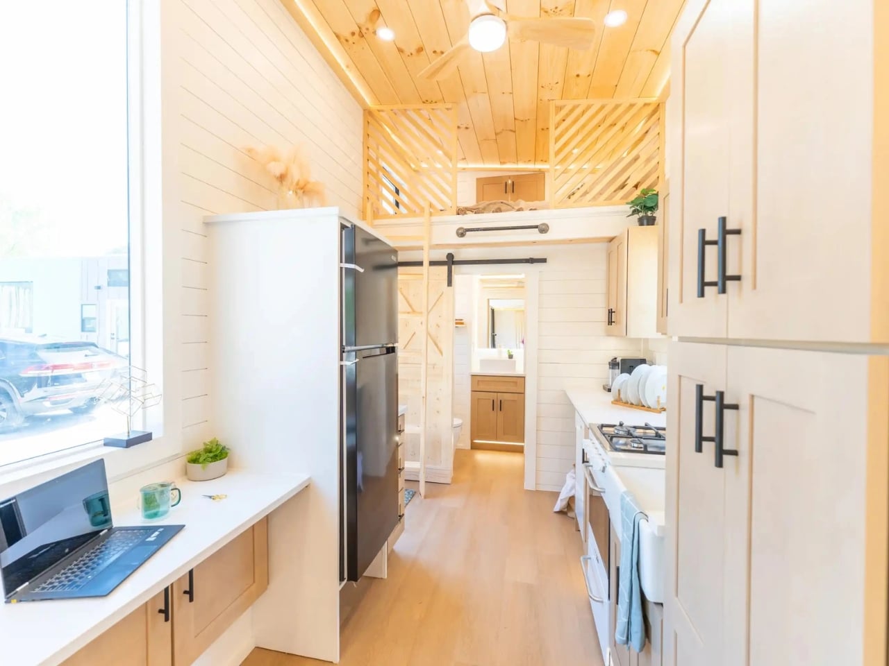
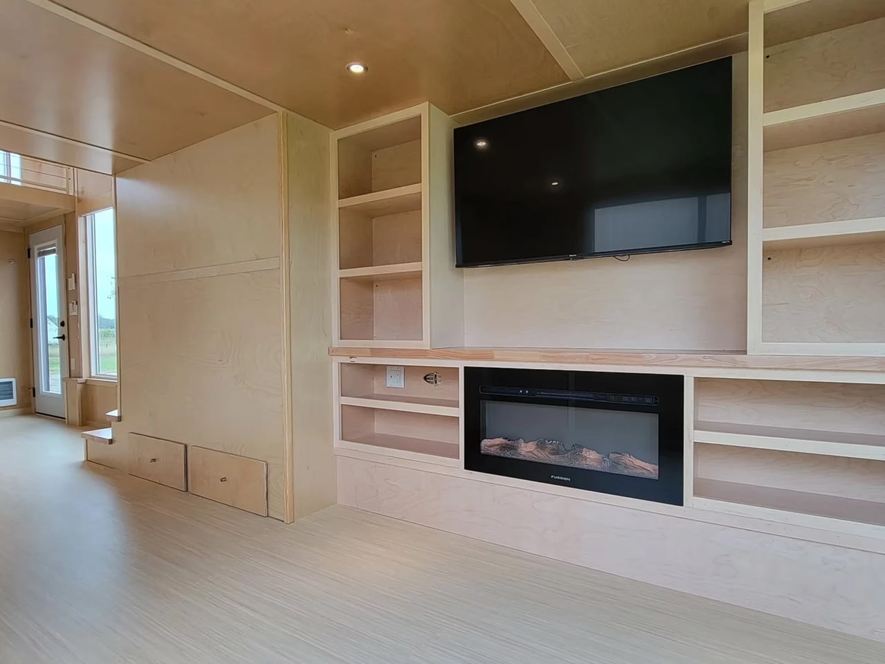
The ground floor clocks in at 204 square feet and is finished in pine throughout, which immediately gives the space a warm, cabin-adjacent quality that makes you want to stay put for a while. The kitchen is where things get serious: a four-burner gas range, a mid-size refrigerator, a dishwasher, and a farmhouse sink, all topped with quartz countertops. There is also a floating quartz desk built in, which is the kind of detail that tells you someone was genuinely thinking about how people actually use a space and not just how it photographs.
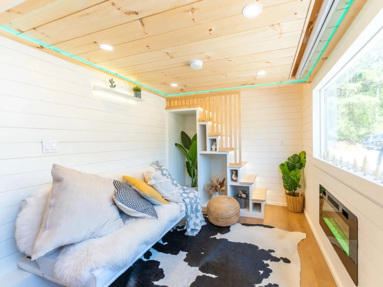
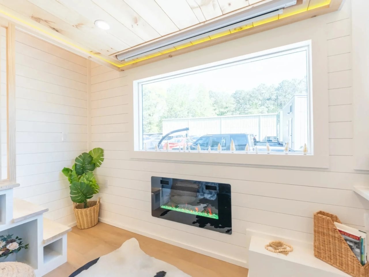
The living room has a sofa, an electric fireplace, and a pull-down projector screen, though you’ll need to supply your own projector. That last part is a small miss in an otherwise very complete setup. But the fact that a projector screen is woven into the design at all says something about the priorities here. This is not a show unit staged for a magazine shoot. It’s a space made for actual evenings in, for movie nights, for living.
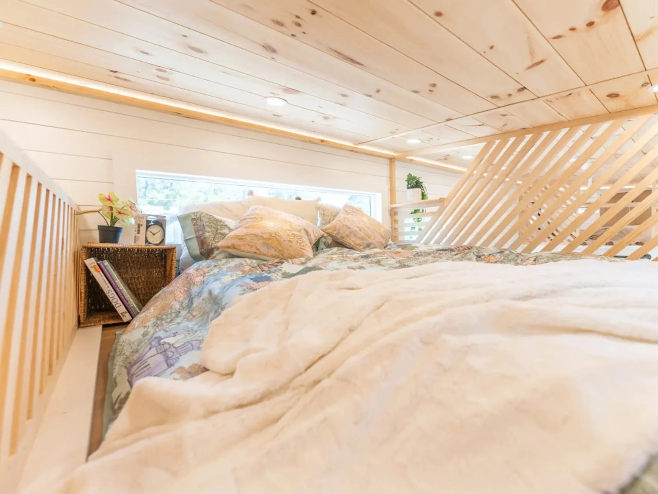
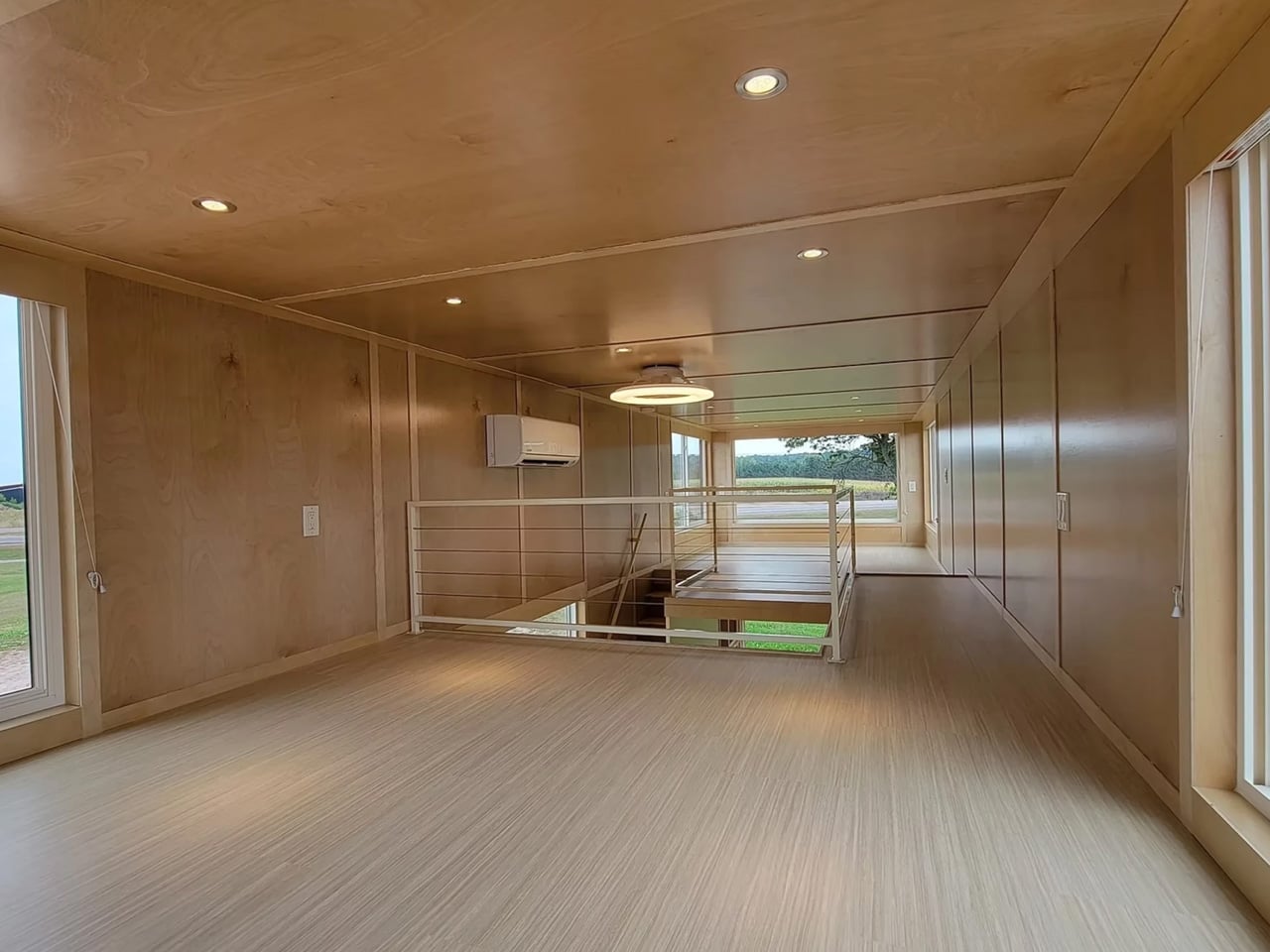
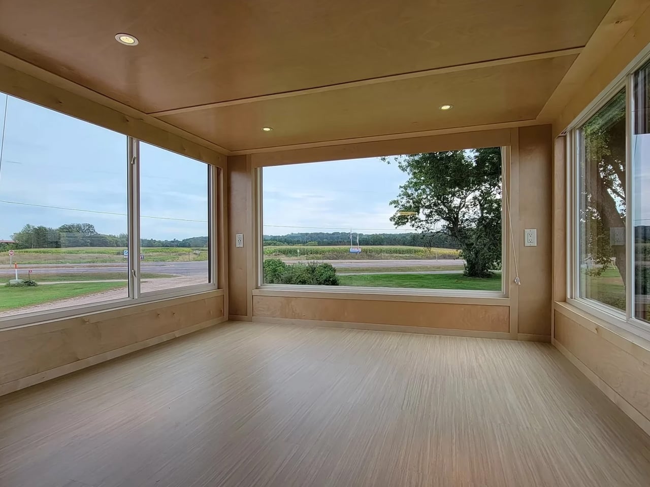
Two loft bedrooms sit above the main floor, and this is where tiny home design can either win or lose you. Lofts done poorly feel like sleeping shelves you have to apologize for. Dragon’s version is more considered. Six-foot wide windows are installed in both the living area and the loft, so the light is genuinely good and the views are part of the everyday experience. In a compact home, getting the windows right is not a nice-to-have. It’s everything.
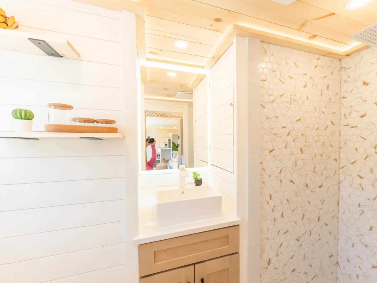
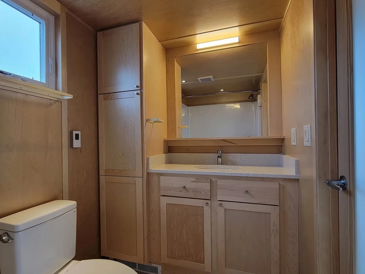
The bathroom rounds things out with a tiled shower, a vessel sink, and an LED anti-fog mirror. These are choices that feel considered rather than budget-constrained. It is not trying to mimic a hotel retreat, but it doesn’t have to. It just works, and in a 24-foot home, “it just works” is exactly the right standard.
The Premium Vista is Dragon’s highest-end build and sits at the top of their Vista lineup, which starts at $60,000. Units are currently available in Georgia and New York. It is also NOAH-certified, meaning it’s been validated by the National Organization of Alternative Housing for structural integrity, safety, and building code compliance. That certification doesn’t always come up in conversation about tiny homes, but it should. When you’re buying a home on wheels, knowing it was built to a real standard matters a great deal.
What I find most compelling about the Premium Vista is that it doesn’t try to be a novelty. It doesn’t lean into the whimsical, Instagram-optimized version of tiny living that looks great in a reel but unravels in daily life. It reads like a serious design exercise: given strict constraints on size and mobility, how well can you actually build a home? The answer, if this build is anything to go by, is very well.
Is it for everyone? No, and it knows that. If you have kids, three pets, and a strong attachment to walk-in closets, you’ll need to look elsewhere. But for a couple, a solo traveler, or someone genuinely done with paying for square footage they never use, the Premium Vista makes a compelling case. Not a vague, aspirational case, but a practical, well-finished, every-detail-accounted-for case. That kind of quiet confidence in design doesn’t come around nearly enough.
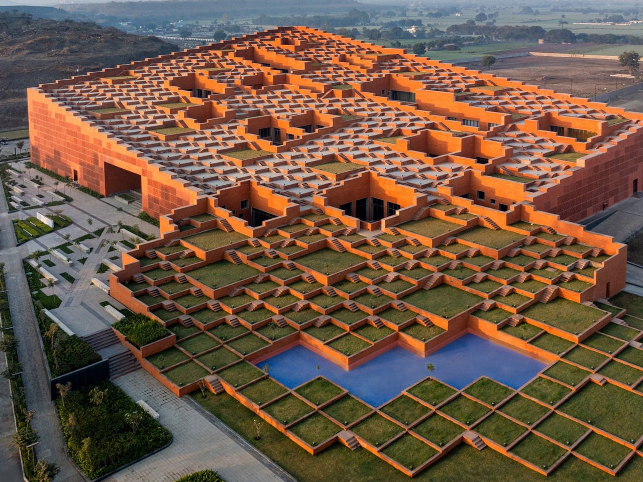
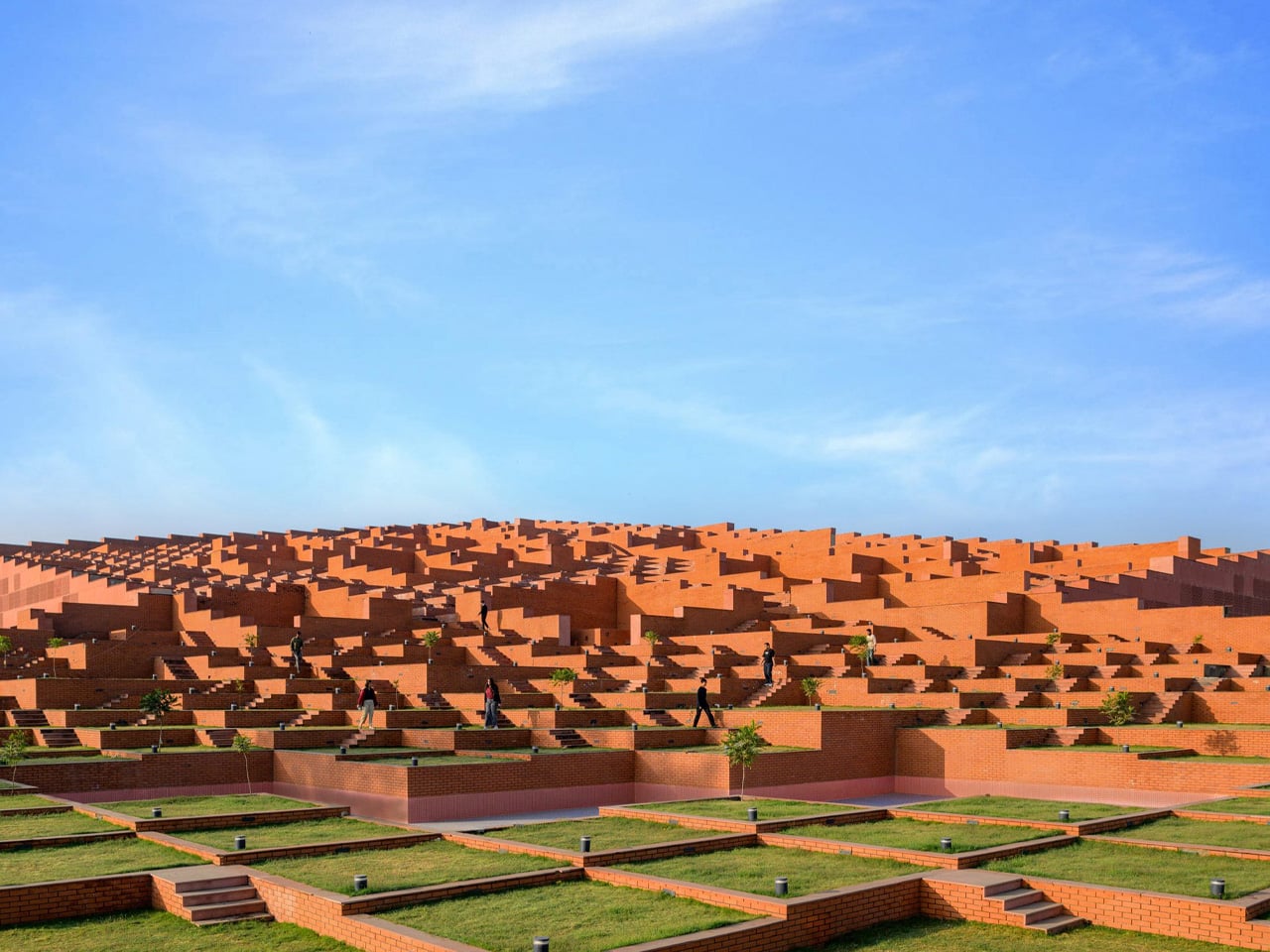
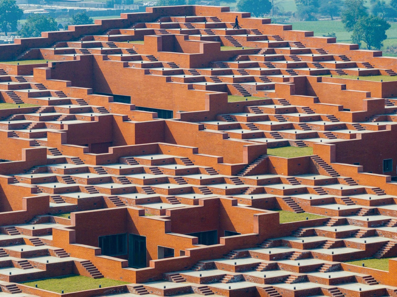
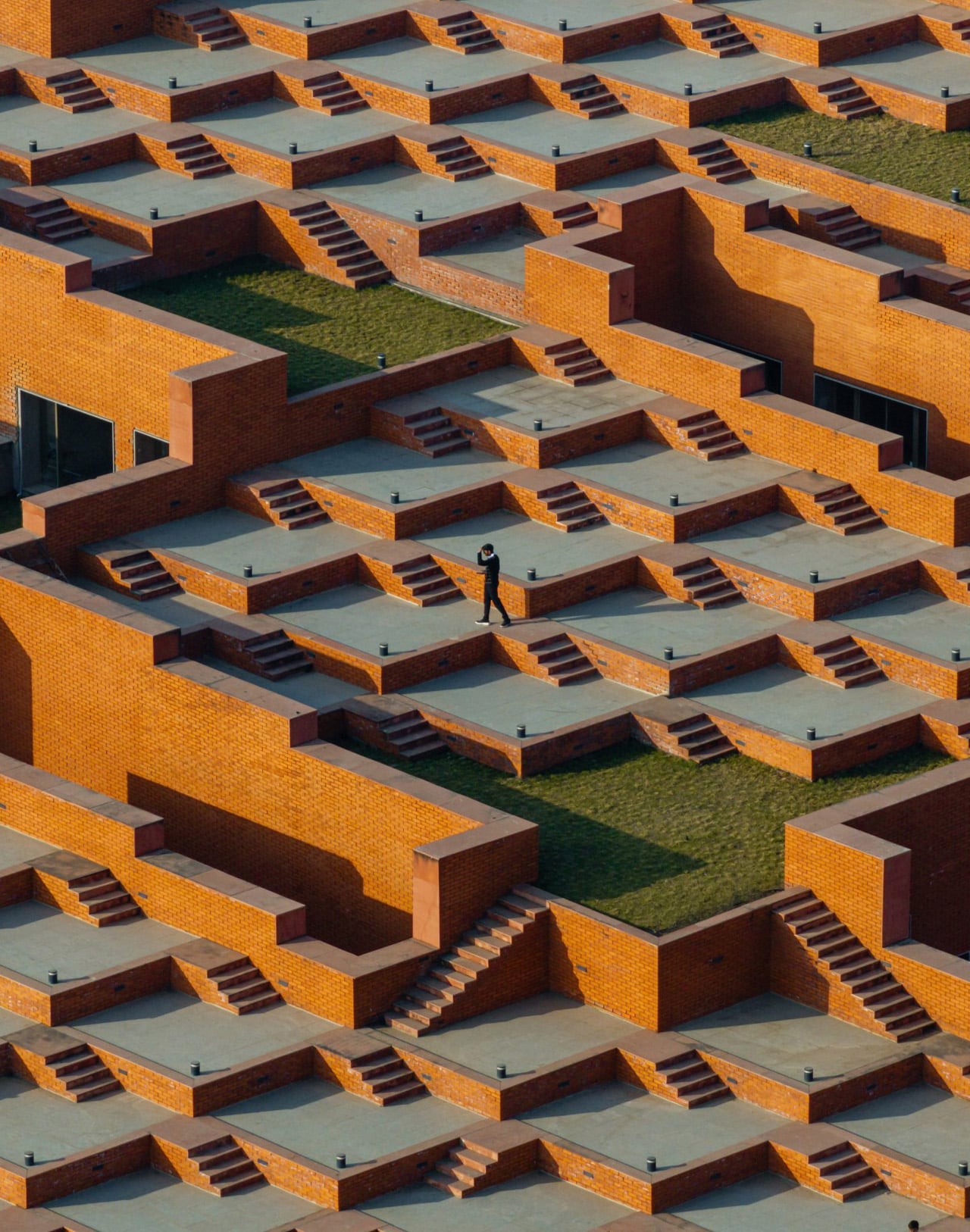
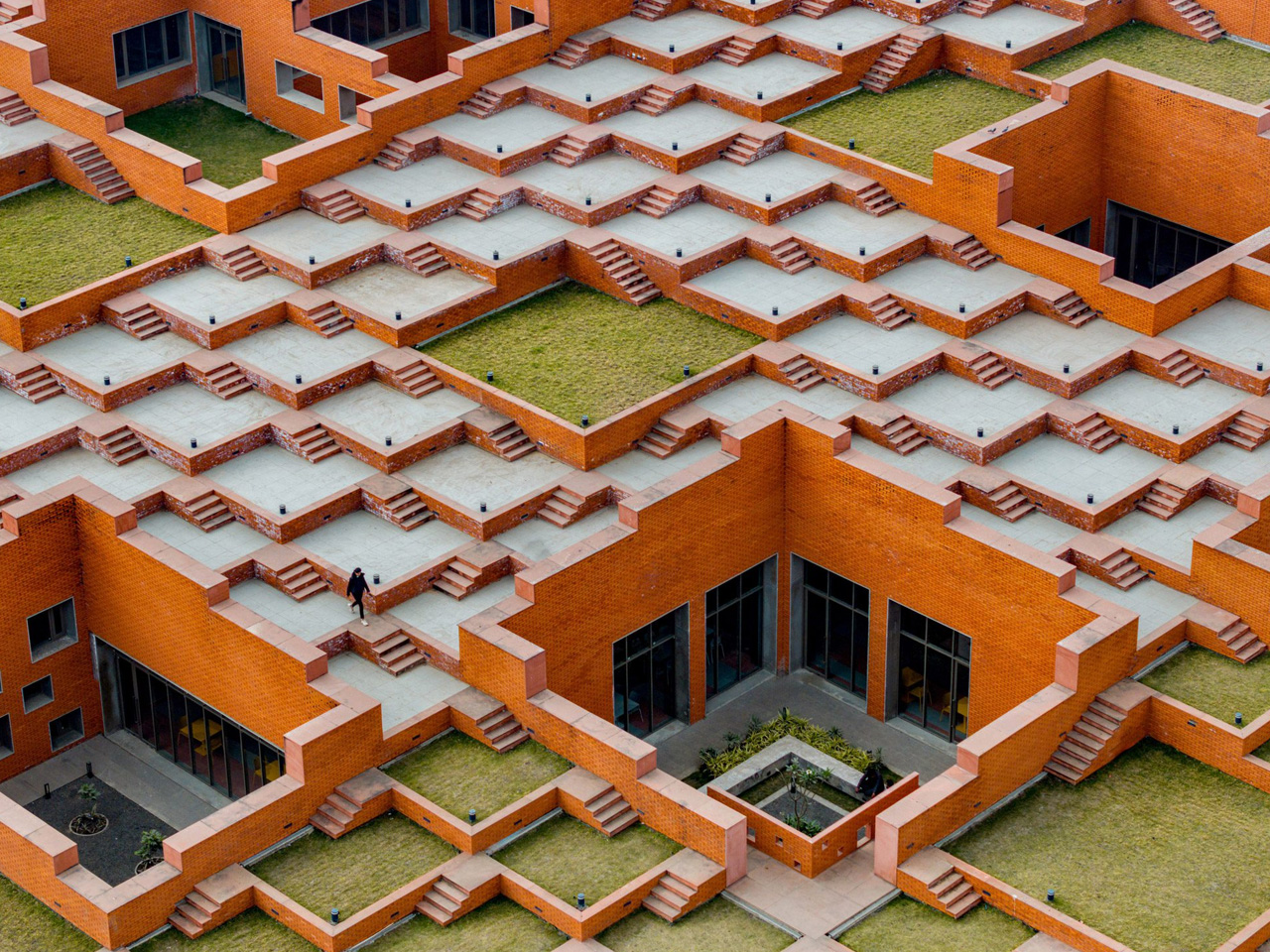
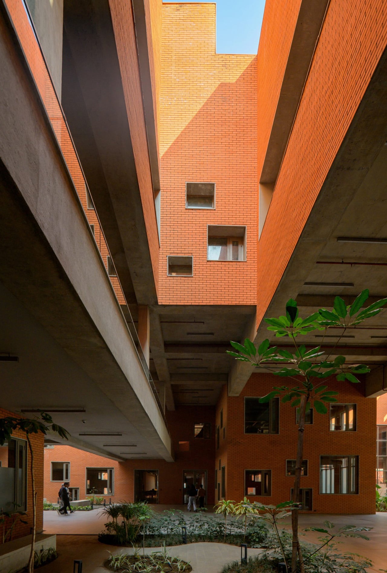
Most university buildings treat their rooftops as mechanical afterthoughts, a surface for HVAC units and waterproofing membranes that no one is meant to see. Sanjay Puri Architects inverted that logic entirely at Prestige University in Indore, turning a 97,000-sq-ft roofscape into a stepped public landscape that seats 9,000 people. The five-story building beneath it almost reads as infrastructure for what happens above.
The roof is composed of 463 individual stepped platforms that rise diagonally from the building’s northern point, with landscaped courtyards breaking up the geometry at intervals to allow natural light into the floors below. The formal reference is India’s historic stepwells, subterranean water storage structures built between the 7th and 19th centuries across western India. Stepwells like Rajasthan’s Chand Baori were never purely utilitarian; they doubled as gathering spaces for social and religious life. Sanjay Puri’s interpretation lifts that same dual-purpose logic above ground, and the campus has already used the roofscape for lectures, games, and a flag hoisting on India’s Independence Day.
Indore’s climate demanded more from the design than a compelling silhouette. Temperatures sit between 86°F and 104°F for most of the year, and the stepped form itself reduces the vertical circulation load needed to cool the building. A continuous diagonal indoor street running the length of the ground floor drives natural ventilation through internal spaces, while perforated glass fiber reinforced concrete screens wrap the eastern, western, and southern elevations to limit heat gain. A shallow pool at the base of the main building adds passive cooling. None of these strategies are novel in isolation, but layering all of them into a single structure shows a climate response that goes beyond token gestures.
The 32-acre campus is built for 3,000 students. Ground-floor programming includes a 700-seat cafeteria, the shaded courtyards, and an indoor auditorium. A first-floor library features a bridge that spans the corridor below. Forty-five classrooms occupy the second and third floors, with faculty offices and administration on the fourth.
Material choices stay regional and direct. Clay brick cladding covers the concrete and fly ash brick structure on the exterior. Inside, exposed concrete pairs with Indian sandstone flooring, creating interiors that feel grounded without relying on applied finishes to manufacture warmth.
Sanjay Puri Architects, now 34 years into practice, has a deep portfolio of climate-responsive work across India. Prestige University pushes that lineage further by making the passive strategy legible; the stepped roofscape is not hidden engineering but the building’s most public face. Whether that openness survives the wear of 3,000 students and Indore’s punishing summers will determine if the idea scales beyond spectacle.
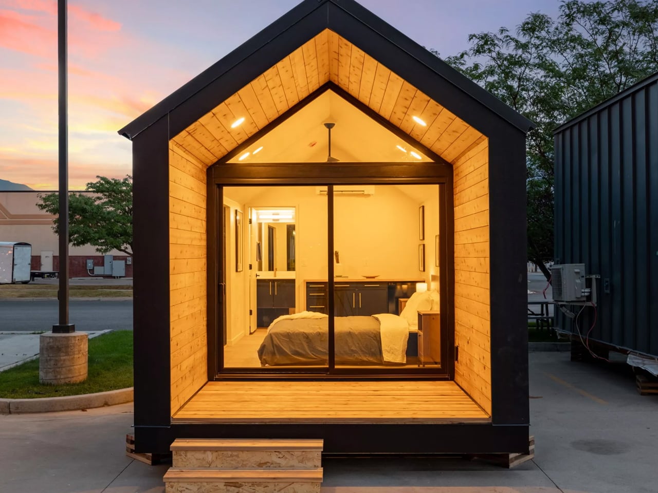
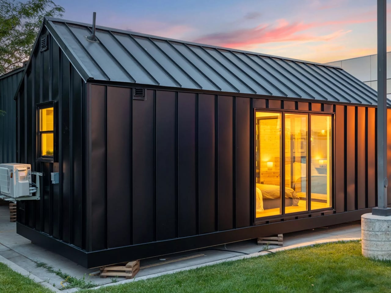
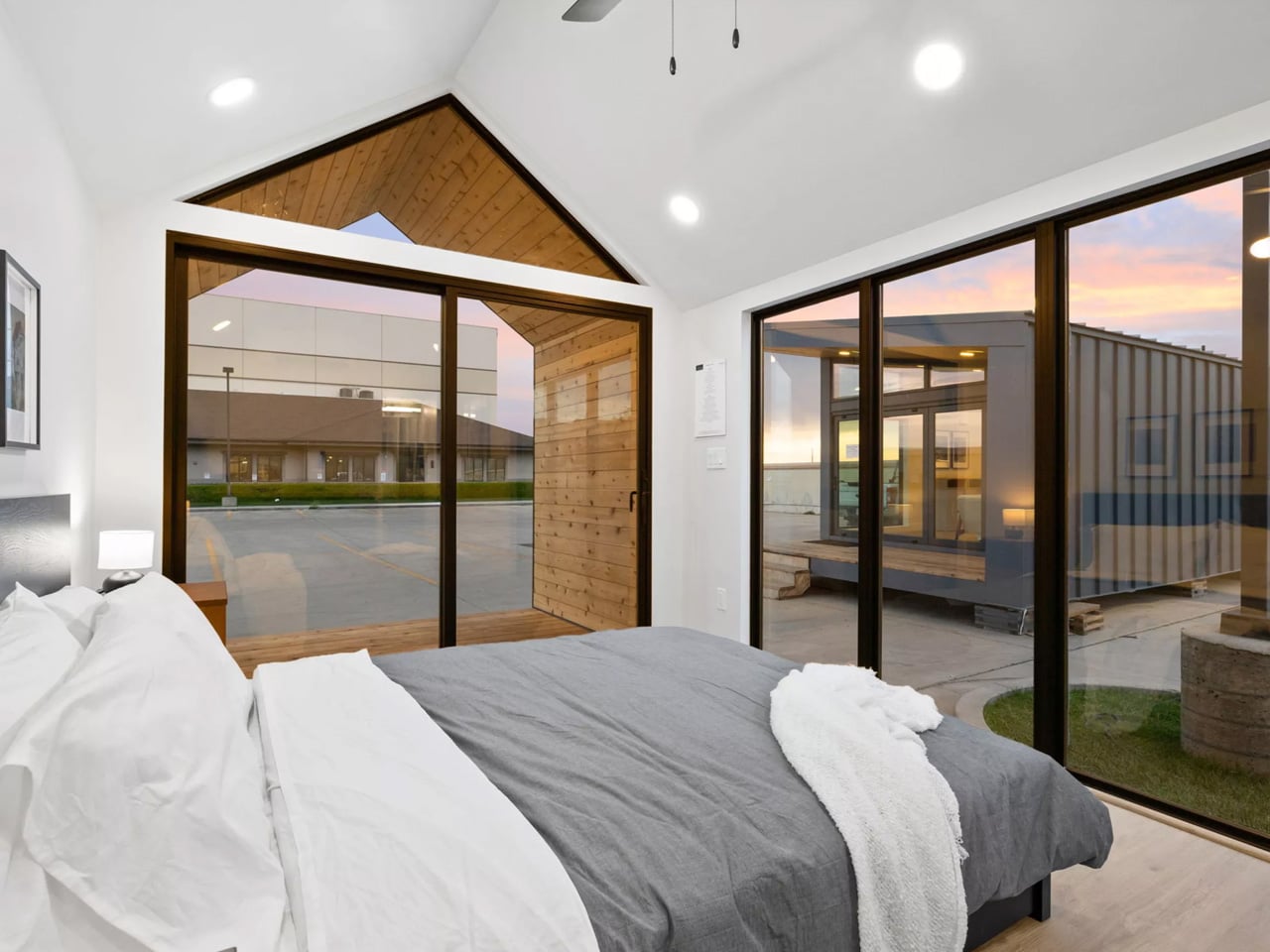
Most tiny houses compete on how much they can cram into a small footprint, with fold-out tables, lofted beds, and hidden compartments behind every surface. The Mysa 200, built by Utah-based Irontown Modular, goes the other direction entirely, delivering a compact, single-level dwelling that trades clever gimmicks for genuine livability.
Named after the Swedish word for “cozy,” the Mysa 200 reads more like a small cabin than a typical tiny house. At 20 ft long and 10 ft wide, it’s noticeably broader than the standard 8.5-ft width most tiny houses stick to to remain towable. That extra foot and a half might not sound like much on paper, but inside, it transforms the space from corridor-like to something that actually feels like a room you’d want to spend time in. Because it isn’t built on a trailer, the home requires a truck and crane for delivery, making it better suited as a permanent or semi-permanent structure like a vacation retreat, backyard guesthouse, or weekend getaway tucked into a wooded lot.
The exterior pairs metal and wood finishes, giving it a modern rustic look that would blend comfortably into most rural or semi-rural settings. An optional porch extends the living space outdoors, and generous windows pull natural light deep into the interior. Step inside the 200-sq-ft floor plan and the restraint becomes immediately apparent. Irontown Modular hasn’t attempted to squeeze a full household into this footprint.
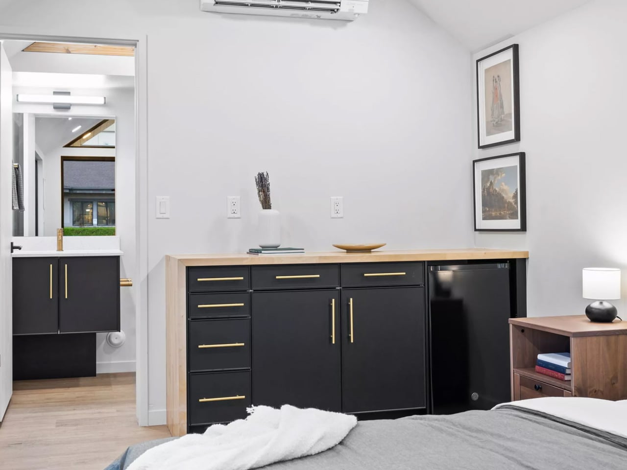
The bulk of the space serves as a combined living and sleeping area anchored by a large double bed that doubles as a general lounging spot. A dry bar with built-in storage and a fridge sits nearby, though buyers can opt for a proper kitchenette if they prefer. Climate control comes courtesy of a mini-split air-conditioning unit paired with a ceiling fan.
The bathroom punches above its weight class. A full-width glass-enclosed shower, vanity sink, and flushing toilet give it a sense of completeness that many tiny houses at this size struggle to achieve. Pricing starts at $50,700, which positions the Mysa 200 at the more accessible end of the tiny house market.
Buyers can customize exterior materials, adjust the interior layout, and add a porch extension. Delivery details aren’t listed, so interested buyers will need to contact Irontown Modular directly. In a category that often rewards complexity, the Mysa 200 makes a quiet case for doing less and doing it well.
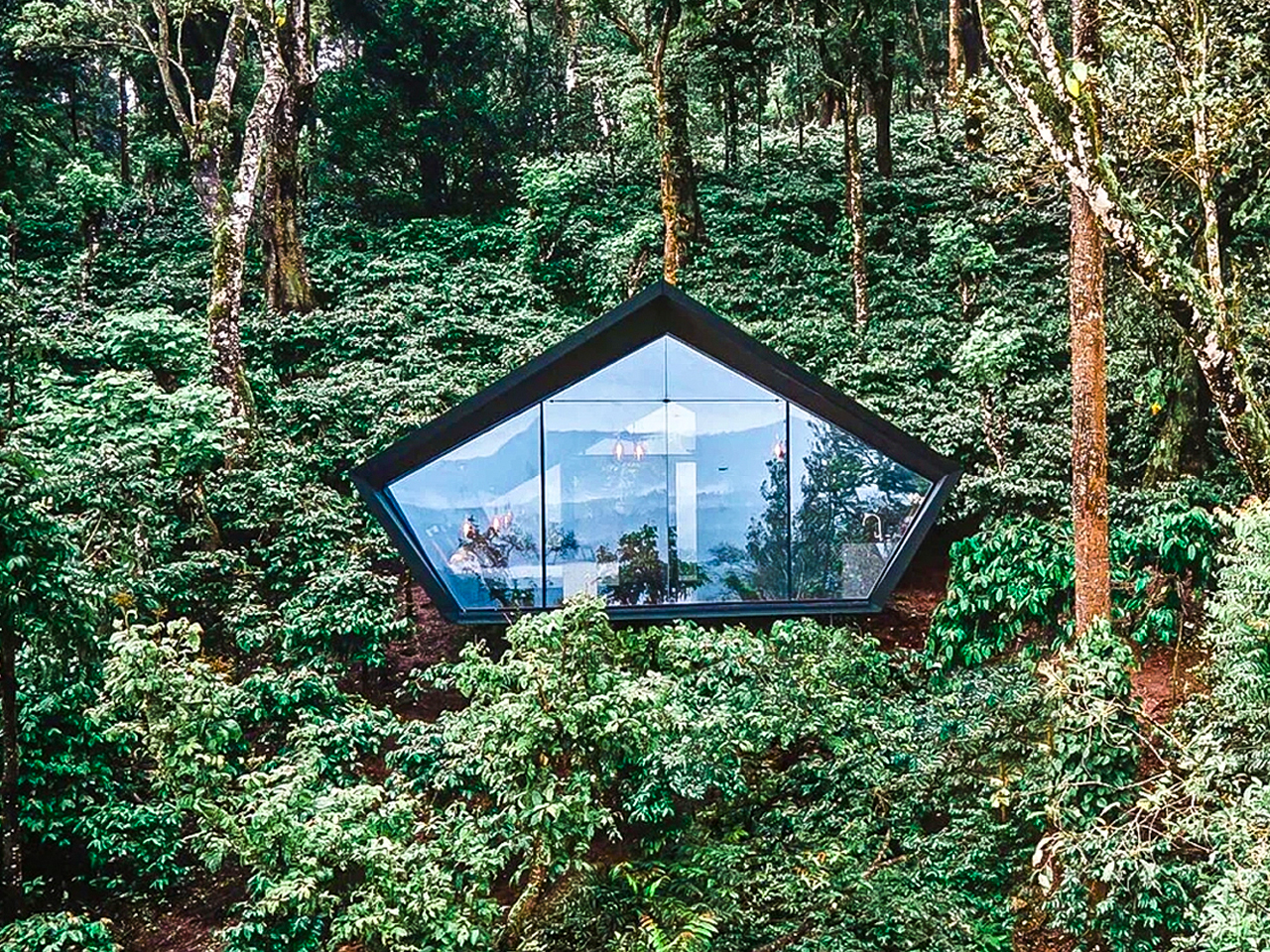
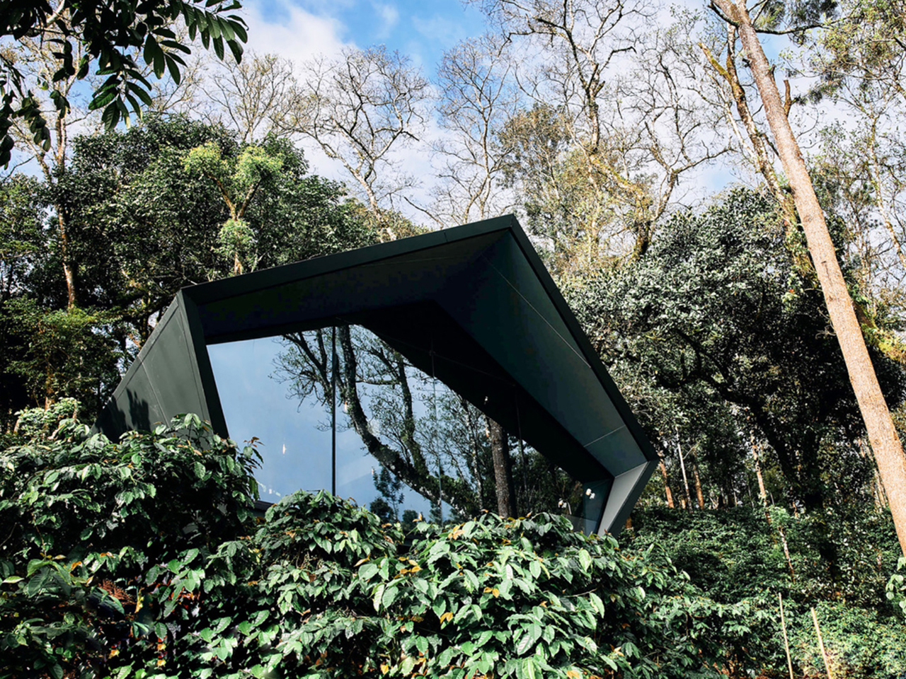
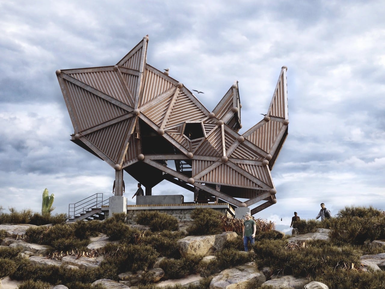
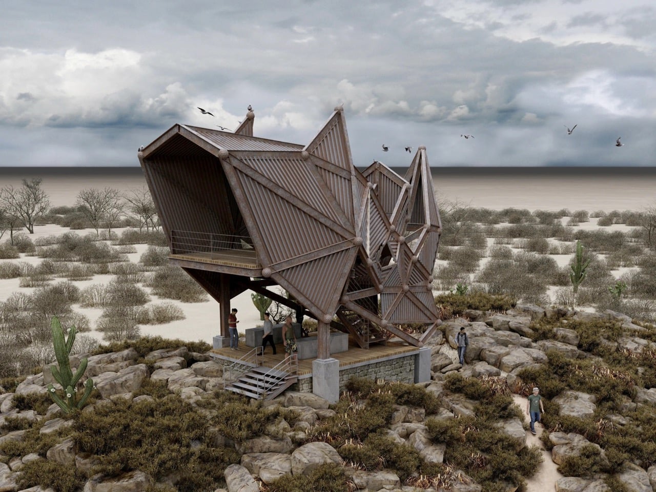
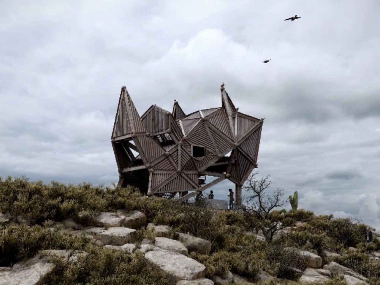
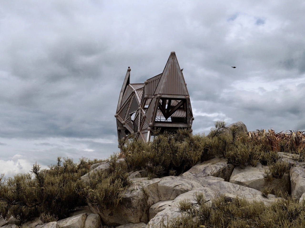
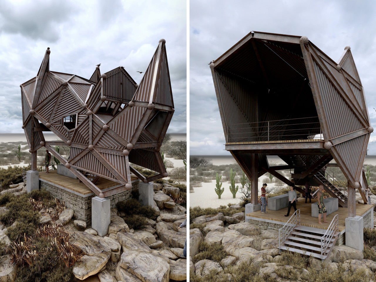
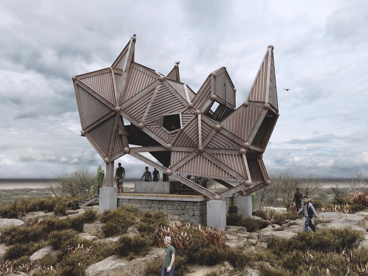
Sri Lankan designer Thilina Liyanage has built a recognizable portfolio around one core idea: that architecture in wild spaces should speak the language of those spaces. His previous concepts have drawn from bird forms, insect geometries, and the angular logic of animal skeletons, earning him a following among readers who track biomimetic architecture with the same enthusiasm others reserve for gadgets. His latest, the Rhino Safari Deck, takes that approach to one of its most literal and structurally ambitious expressions yet. Rendered under overcast skies above a scrubby, semi-arid landscape scattered with cacti and boulders, the structure earns its name in full. From a distance, you are looking at a rhino. The silhouette is unmistakable: a squat, armored mass with a pronounced horn erupting from the roofline, flanked by secondary angular spires that read as ears, the whole thing hunched forward on its platform like the animal mid-charge.
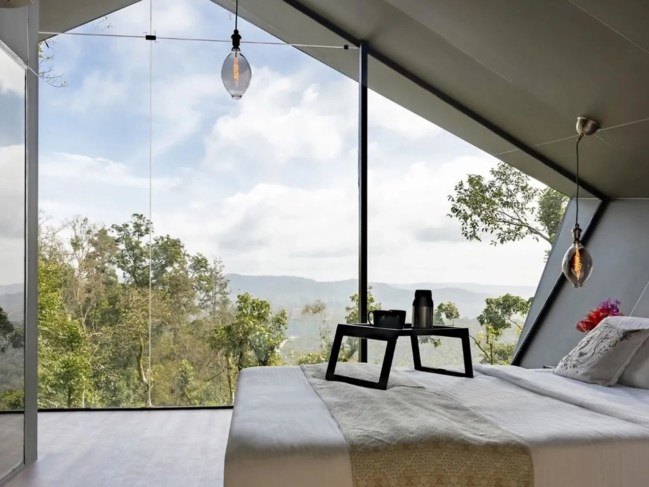
Liyanage named the project “Kifaru Point,” using the Swahili word for rhino, which sets the geographic and tonal intention clearly. The structure is conceived as a wildlife observation deck, elevated above the terrain on a concrete plinth with a timber-decked lower platform that wraps around the base. A set of steel-railed stairs leads visitors up from the rocky ground level, and the shaded gathering area beneath the main structure provides a transition space before the ascent continues to the upper observation level. The interior views glimpsed in the renders show open, framed apertures that funnel sightlines out across the flat scrubland below, the kind of panoramic sweep that makes the elevated position feel earned rather than arbitrary. As a piece of safari infrastructure, Kifaru Point is doing something most viewing platforms do not bother attempting: it turns the act of looking at animals into an architectural experience that is itself worth looking at.
Designer: Thilina Liyanage
The entire form is built from triangulated steel frames, with each panel clad in ribbed, corrugated steel slats that create a warm, striated texture across the facets. Spherical steel nodes connect the struts at every junction, giving the whole skeleton a Meccano-meets-brutalism quality that suits the rugged setting perfectly. There is no smooth surface anywhere on this building. Every plane is either angled, folded, or interrupted, and the aggregate effect genuinely reads as armored hide from the outside while remaining open and structurally legible from within. The corrugated steel and timber combination ages well in outdoor conditions, which matters for a structure intended to sit in a landscape indefinitely rather than perform at an exhibition and disappear.
What Liyanage is clearly working through in this series is the question of how a building earns its place in a landscape. The typical eco-lodge answer involves receding into the environment through natural materials and muted palettes, becoming invisible by design. Kifaru Point goes the opposite direction: it announces itself as a landmark, a destination, something you orient toward from across the plain. The rhino reference gives it a totemic presence that goes beyond novelty. Rhinos are ancient, armored, and critically endangered, and a safari deck that reads visually as one of those animals is making an argument about the relationship between the people who come to observe wildlife and the wildlife itself. Biomimetic architecture has a long tradition of borrowing animal logic for structural efficiency, but borrowing it for symbolic weight, for the purpose of rhino conservation awareness built into a building’s silhouette, is a less common move and a more interesting one.
The rendered setting positions Kifaru Point among desert shrubs and saguaro-like cacti, suggesting a location somewhere in southern or eastern Africa, though the landscape has a looseness that keeps the concept legible across multiple possible sites. The palette of weathered steel and warm timber sits comfortably against the muted greens and grays of the terrain, and the overcast sky in most of Thilina Liyanage’s renders gives the structure a moody weight that a blue-sky backdrop would have undercut entirely. He knows how to light his visualizations for atmosphere, and that skill is doing real work here, making a conceptual project feel like a building that already exists and is already waiting for visitors to climb its stairs and look out across the plain at whatever is moving in the distance.
Most tiny houses on double-axle trailers share a common flaw. They prioritize portability over livability, squeezing interiors into standard widths that leave occupants navigating corridors rather than rooms. Escape’s eONE XL Wide & Tall rejects that compromise. At 9.6 ft (2.9 m) wide and 13.6 ft (4.2 m) tall, it exceeds standard tiny house dimensions on both axes, trading easy towing for something more difficult to find in this category: breathing room.
The trade-off is real, though. Those expanded dimensions mean a permit is required to tow it on public roads, which limits the spontaneous mobility that draws many buyers to trailer-based homes in the first place. Built on a double-axle trailer with a total length of 31 ft (9.45 m), the exterior is finished in custom-engineered wood siding topped by a metal roof. The eONE XL Wide & Tall is an upgraded version of Escape’s ONE XL, and the proportions immediately set it apart from the company’s other models.
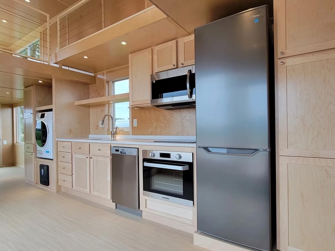
Step through the glass door entrance, and the kitchen occupies the first section of the ground floor. For a tiny house, the appliance list reads more like a residential spec sheet: electric oven, induction cooktop, sink, microwave, dishwasher, fridge/freezer, and a washer/dryer. Cabinetry lines the space generously. Where many tiny home kitchens force owners to choose between a cooktop and counter space, this layout accommodates both without the usual spatial tug-of-war. The dishwasher alone is a rarity at this scale, a small detail that signals Escape designed this for full-time habitation rather than weekend escapes.
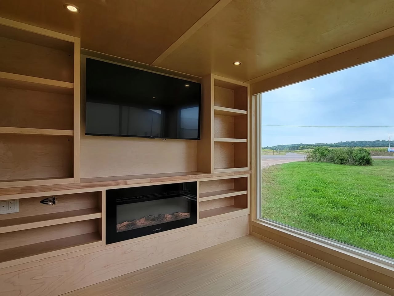
The kitchen flows into the living room, and the extra width becomes most apparent here. Generous glazing wraps a space large enough for a sofa, a full entertainment center with TV and electric fireplace, and additional storage. One large window frames the view and floods the room with daylight, turning what could feel like a dark box into something closer to a studio apartment. On the opposite end, the bathroom fits a vanity sink, flushing toilet, and a shower/bath combo, a feature that separates this from the shower-only compromises typical of the category.
A storage-integrated staircase (not a ladder, which matters for daily use) leads to the upper floor. The loft is a single open area divided into two connected sections joined by a small gangway. Ceiling height remains low, as expected in any lofted tiny home, but the extra overall height of the structure provides marginally more headroom than most competitors manage. The two sections can be configured as dual bedrooms or split between sleeping and storage, offering flexibility that a single undivided loft cannot match.
The eONE XL Wide & Tall is typically built to order, but the model shown is currently listed at $88,015. No delivery details have been published, so prospective buyers will need to contact Escape directly. At that price point, it sits in the upper range for trailer-based tiny homes, but the wider frame, full appliance suite, and dual-loft configuration position it closer to a permanent dwelling than a mobile novelty. Whether the permit-required towing is a dealbreaker depends entirely on how often the home will actually move.
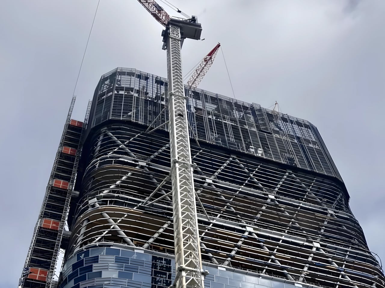
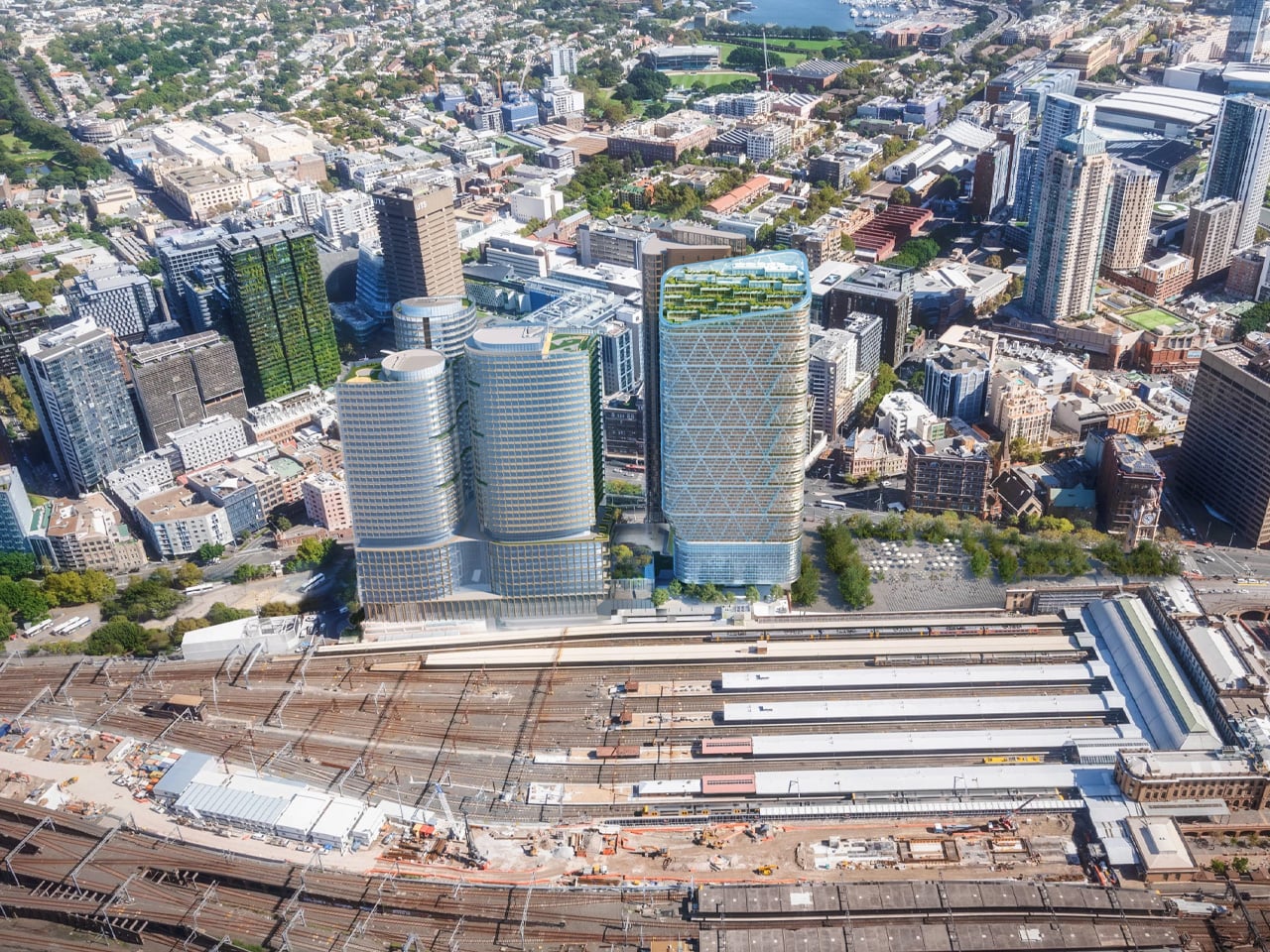
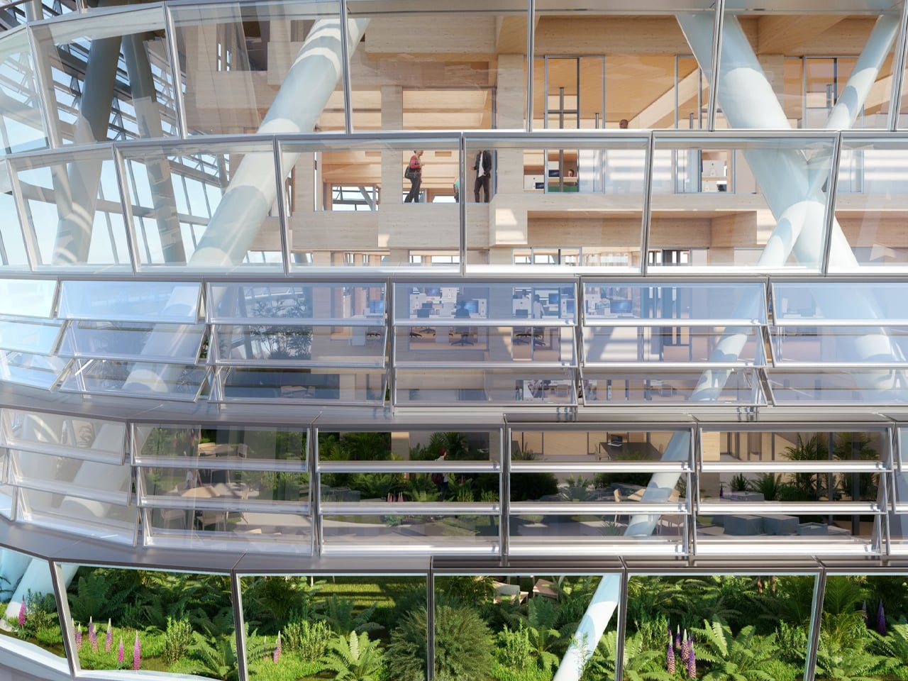
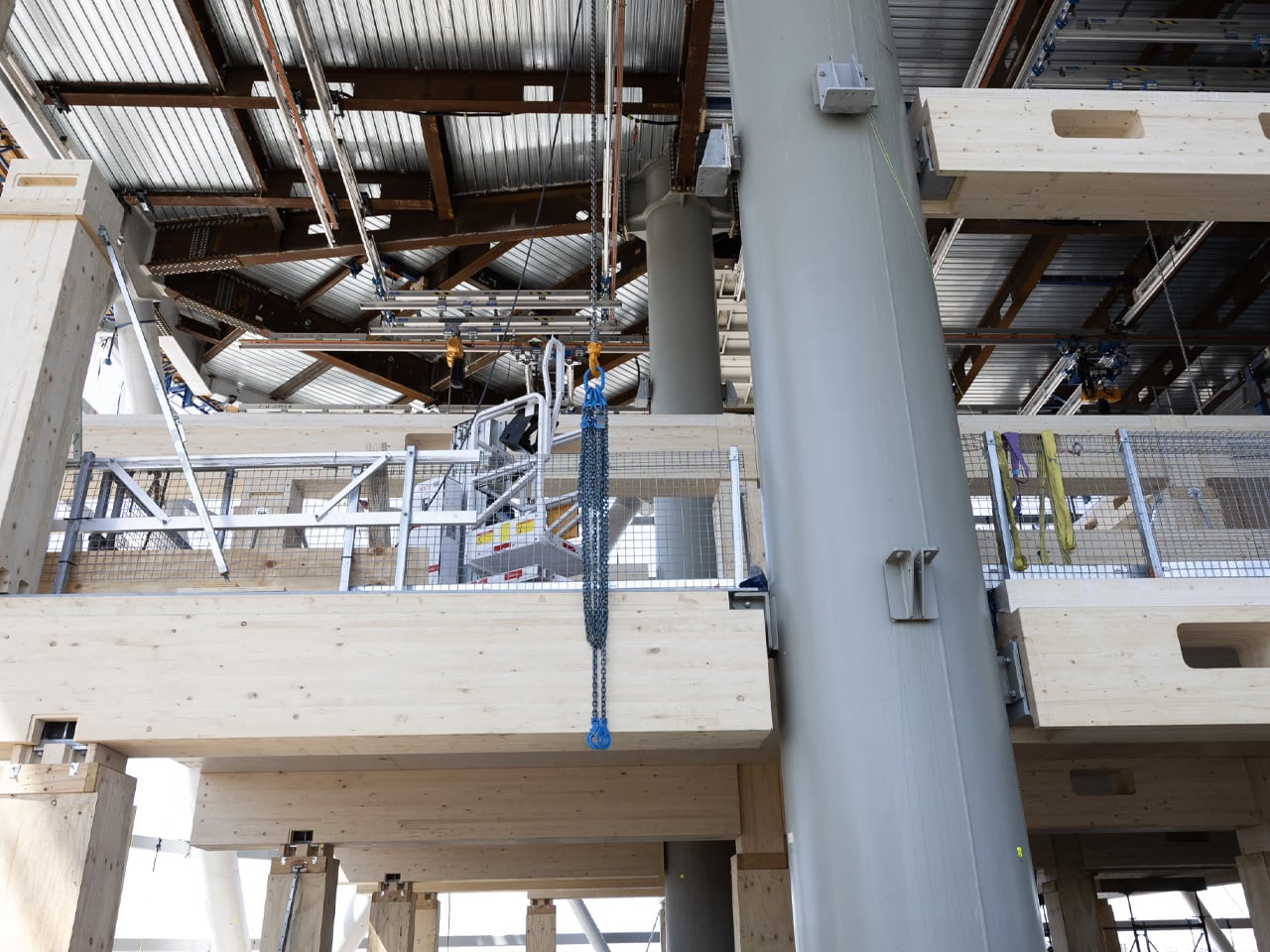
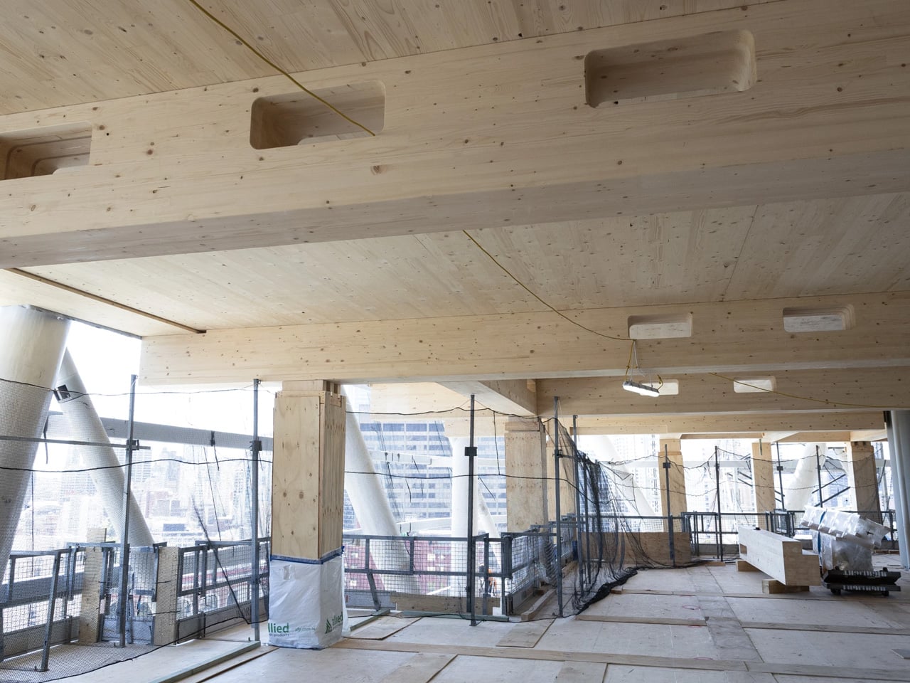
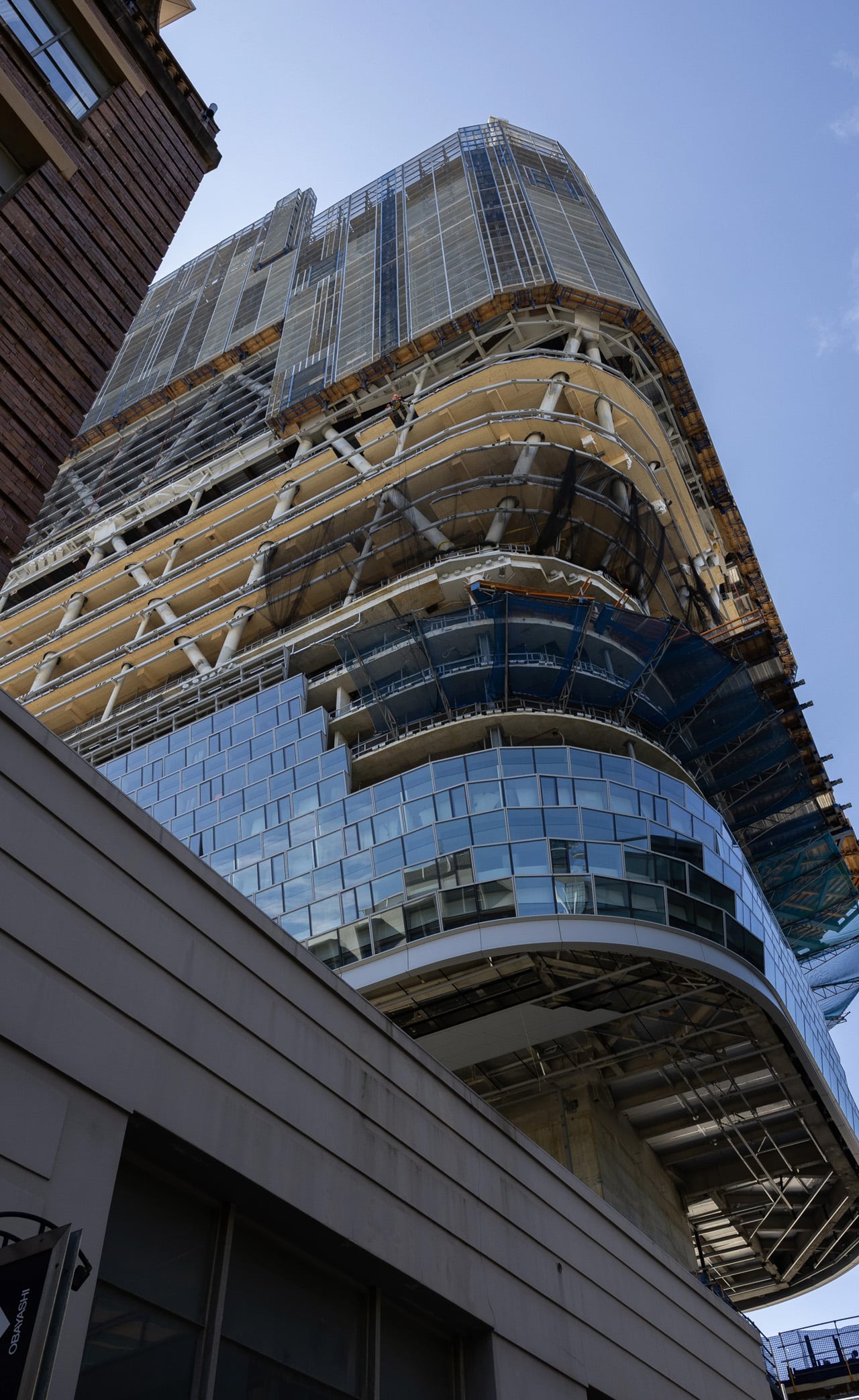
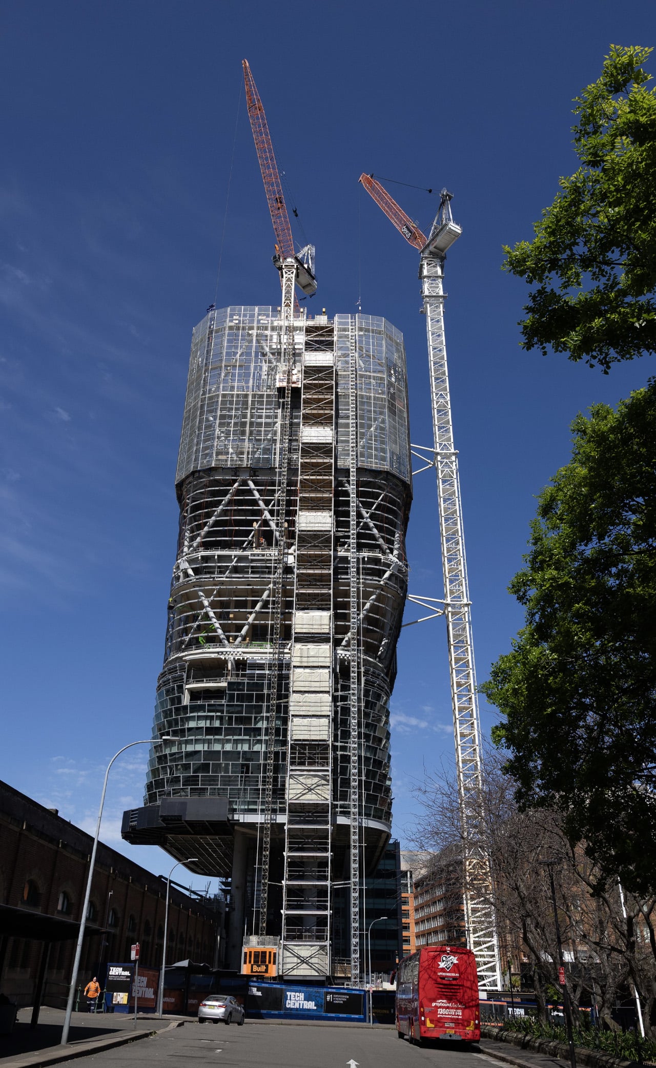
Sydney is on the verge of claiming a significant architectural milestone. Atlassian Central, a 39-floor hybrid timber tower currently nearing completion, is set to become the world’s tallest building of its kind, surpassing the existing record holder by a considerable margin.
Designed by BVN and SHoP Architects as part of a larger development in Sydney, Australia, the tower will top out at 183 m (600 ft). That makes it more than twice the height of Milwaukee’s Ascent, which currently holds the title of world’s tallest hybrid timber skyscraper at 86.6 m (284 ft). According to the Council on Tall Buildings and Urban Habitat (CTBUH), the premier authority on building heights, Atlassian Central will claim the record upon completion, ahead of any proposals not yet approved.
The structure relies on a hybrid system of concrete, steel, and engineered wood, a combination that sets it apart from purely timber towers like Norway’s Mjøstårnet. The use of concrete and steel allows the building to reach heights that timber alone could not sustain, while glued-laminated timber columns and cross-laminated timber slabs, sourced from Europe, are incorporated throughout. In total, roughly 10,000 cubic meters (353,000 cubic ft) of engineered wood will be used in the build.
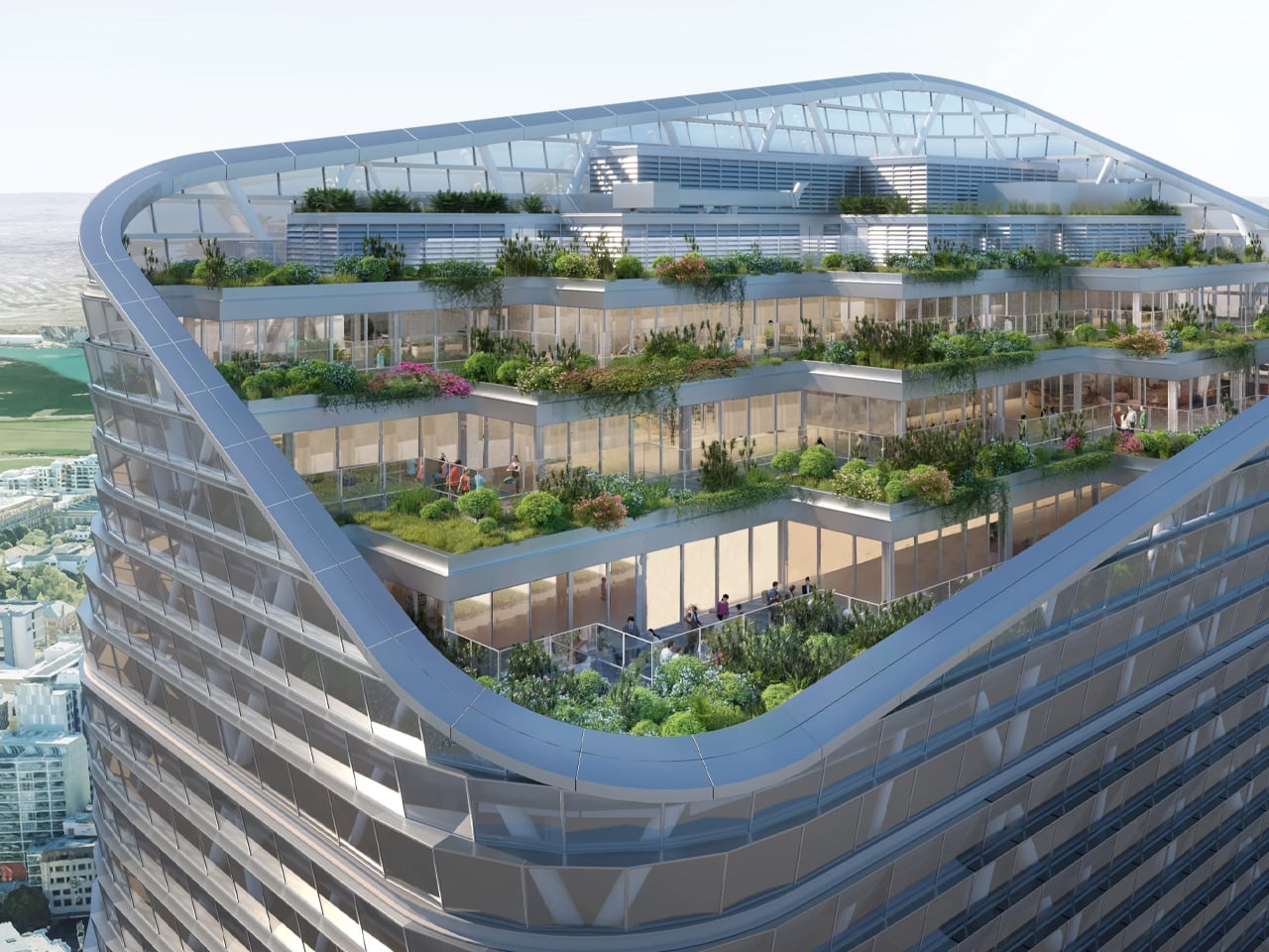
Sustainability is woven into the design beyond the choice of materials. The facade integrates solar panels alongside an automation system developed by specialist EBSA, which is expected to significantly reduce the building’s mechanical cooling requirements. SHoP Architects describe the commercial floors as being organized into seven stacked four-story “habitat” modules, each framed by the hybrid timber structure and designed to maximize natural ventilation, provide access to landscaped terraces, and support workplace well-being through a connection to natural environments.
The tower’s program is varied. The lower floors will house a hostel, and the project will incorporate an existing building on the site, which is being restored and folded into the lobby. The majority of the remaining floors are dedicated to office space, interspersed with multiple open garden areas that reinforce the building’s emphasis on greenery and natural light.
An exact completion date has not been confirmed, but Atlassian Central is expected to be finished in late 2026 or sometime in 2027. When it opens, it will represent not just a new height record for hybrid timber construction, but a meaningful step forward in demonstrating what sustainable high-rise architecture can look like at scale.