Desk accessories concepts help reduce risk of sitting at the desk the whole day

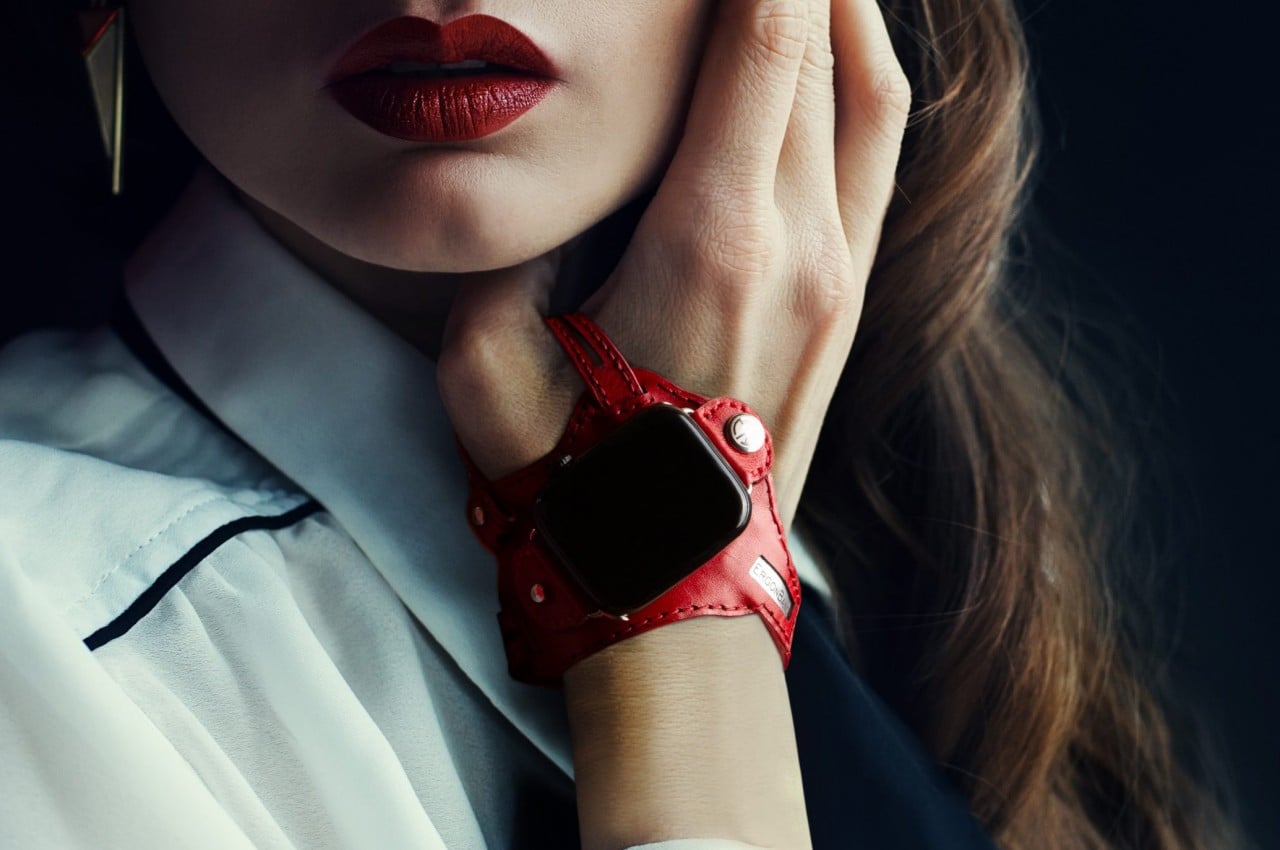
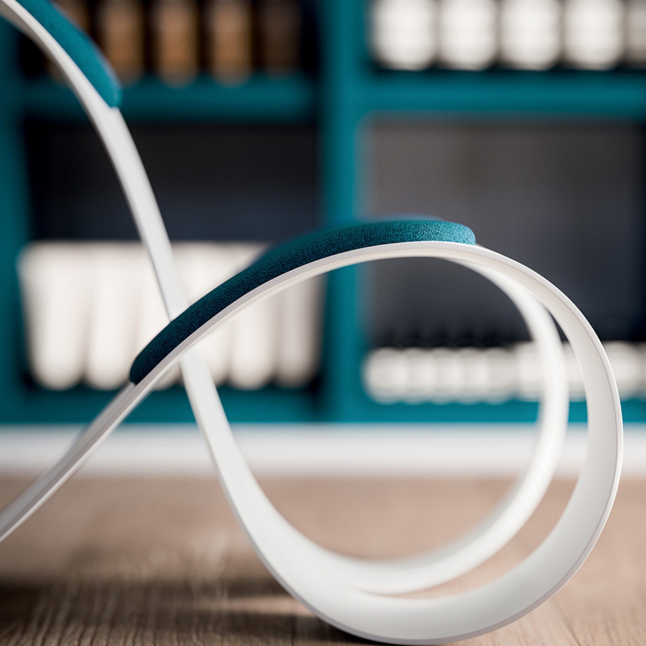
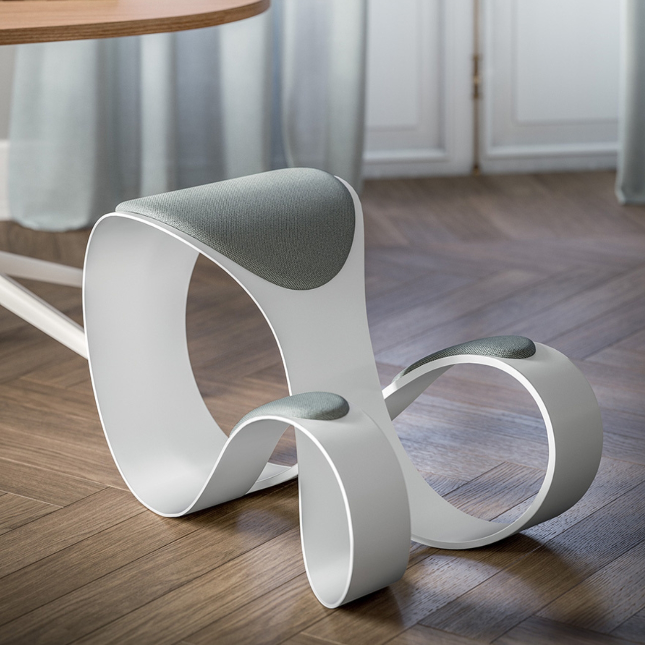
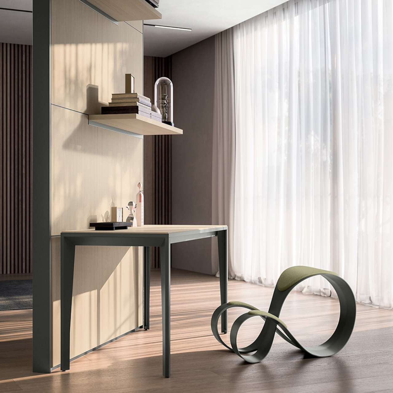
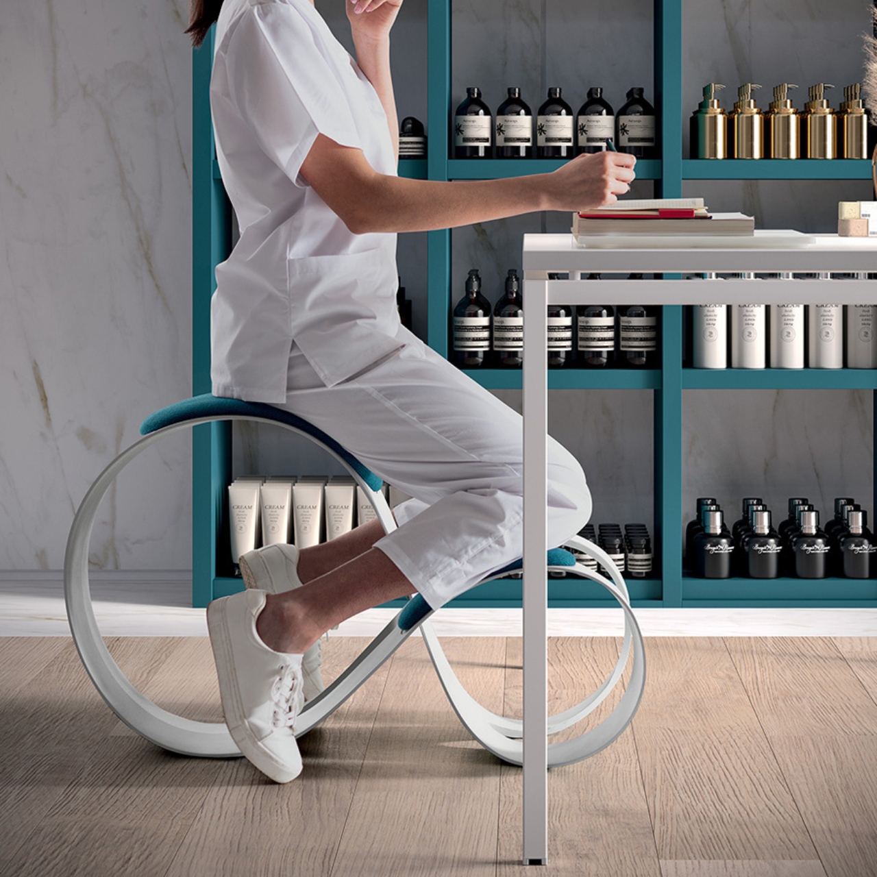
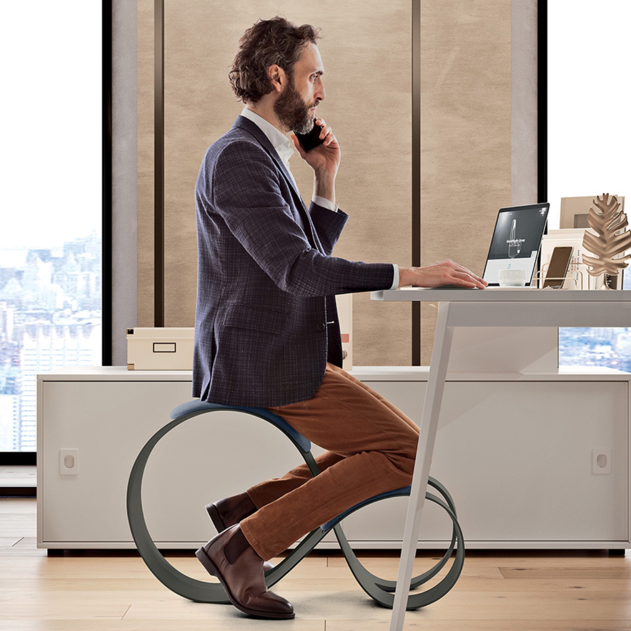
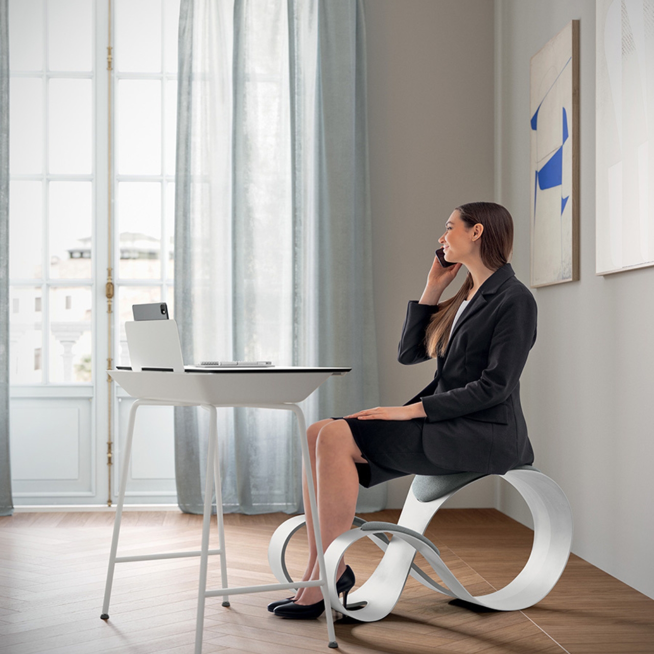
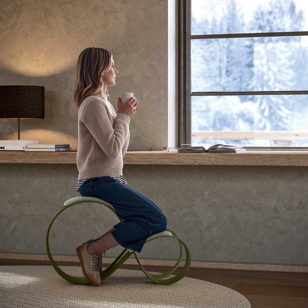
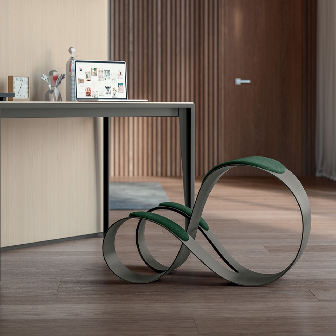
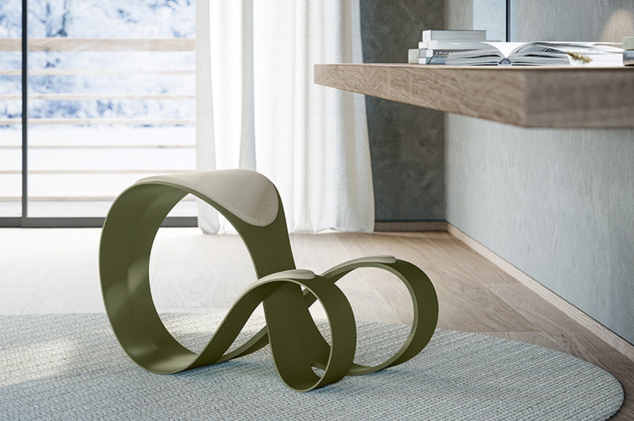
As someone who spends almost the entire working day (and sometimes beyond) at a desk and in front of the computer, you can say that I face a lot of issues when it comes to my posture, my eyesight, and my muscles. I’ve tried several ergonomic products and also exercises to help me take a break from my regular work and literal position but I’m still having some regular problems from being a desk potato. I know that there are a lot of risks that will eventually (and some have already) make an appearance in my health journey so products that can help alleviate the strain on my body are always welcome.

Designers: Haneul Kang, Dohui Kim, Dagyeong Kim, Jeongyoon Kim, Yunseo Jung

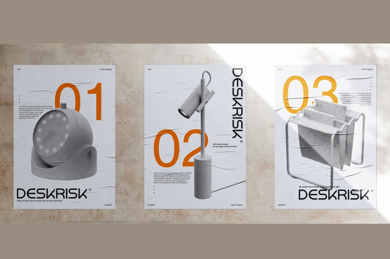
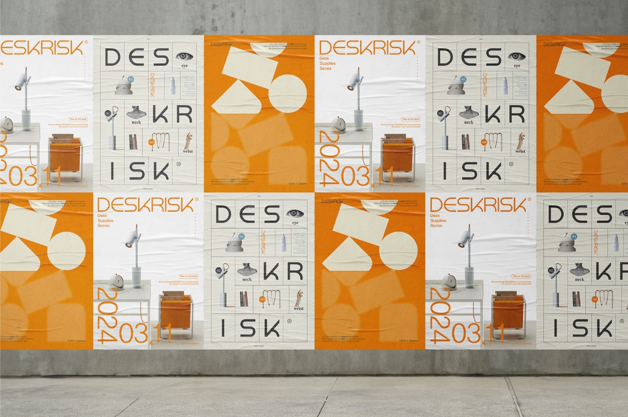
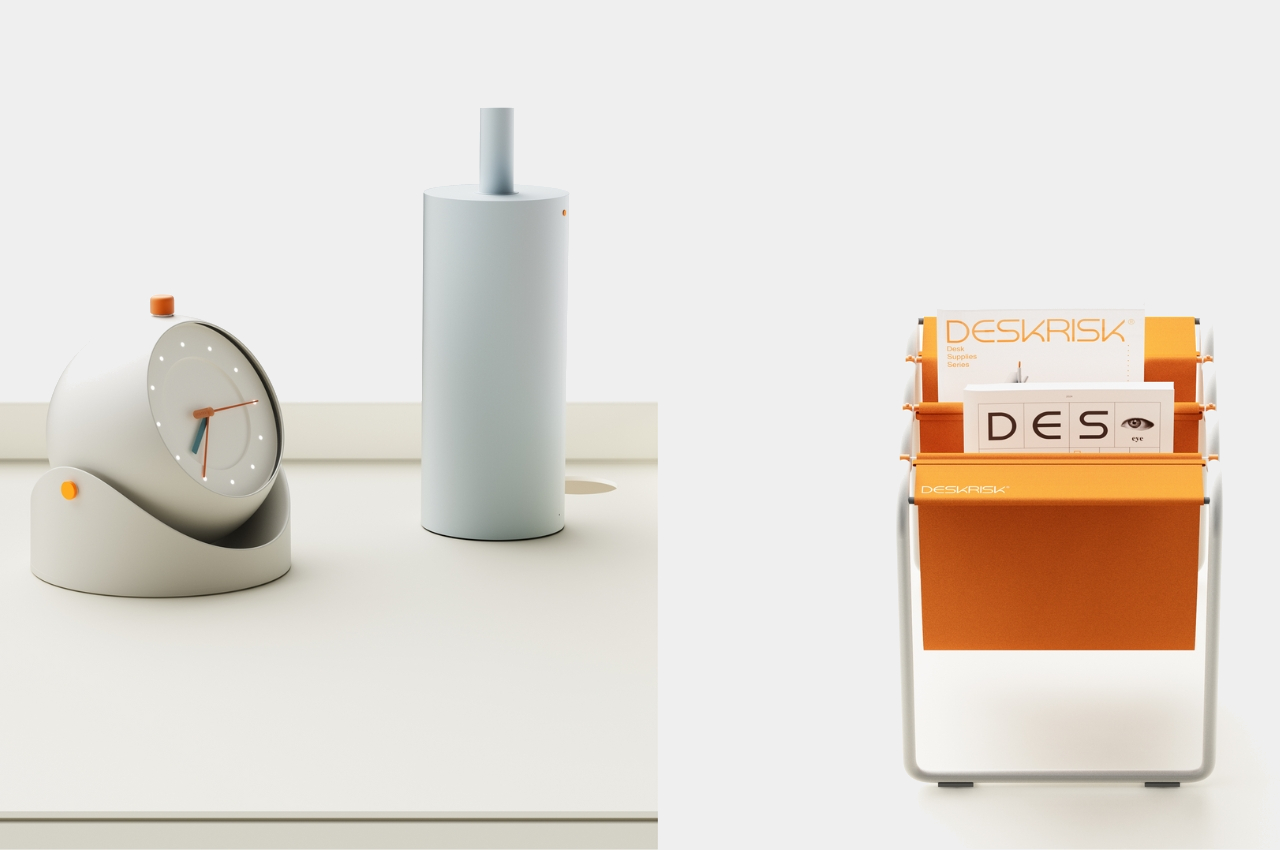
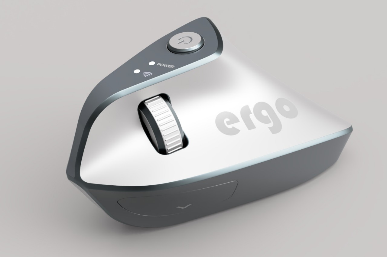
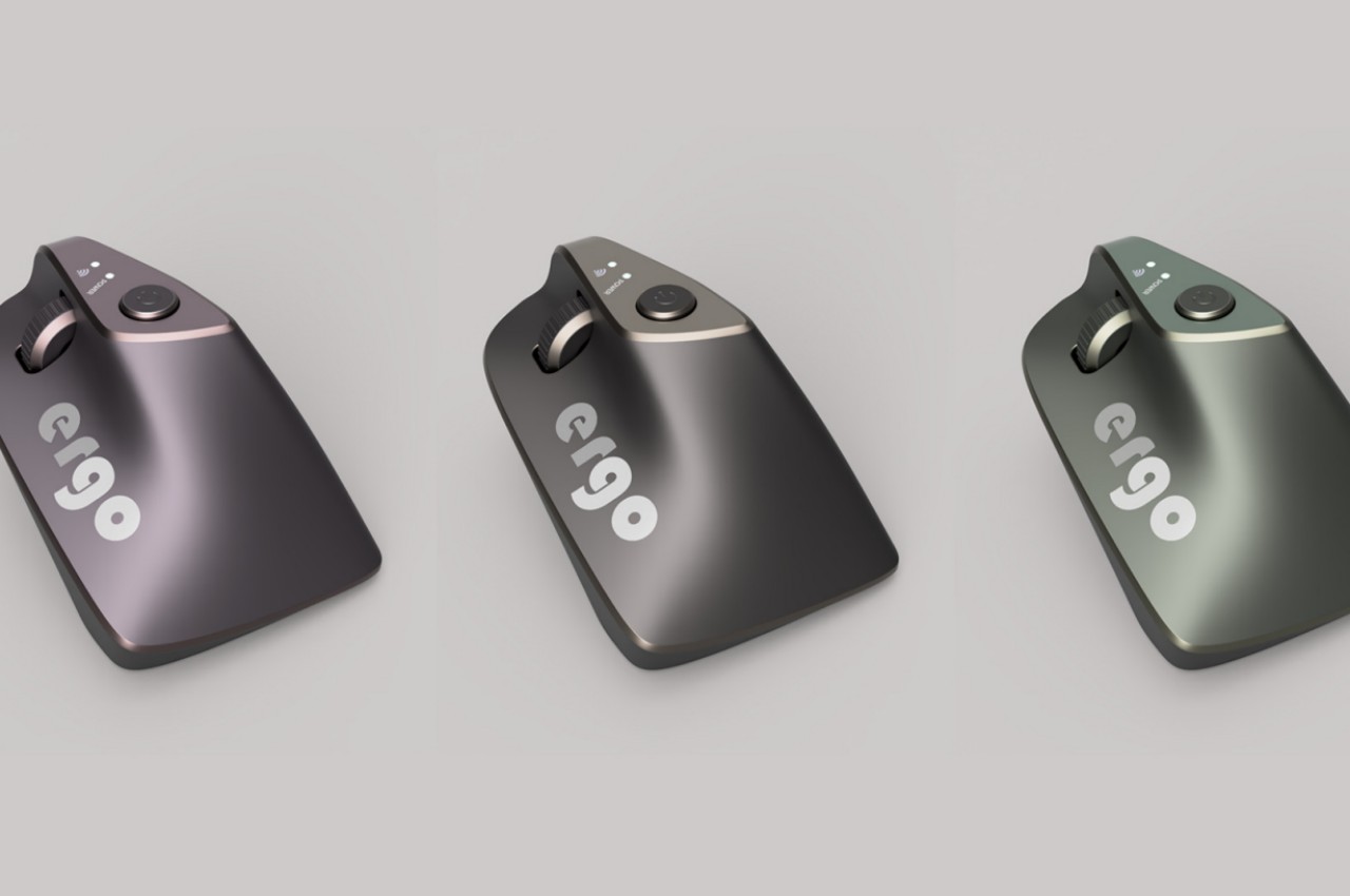
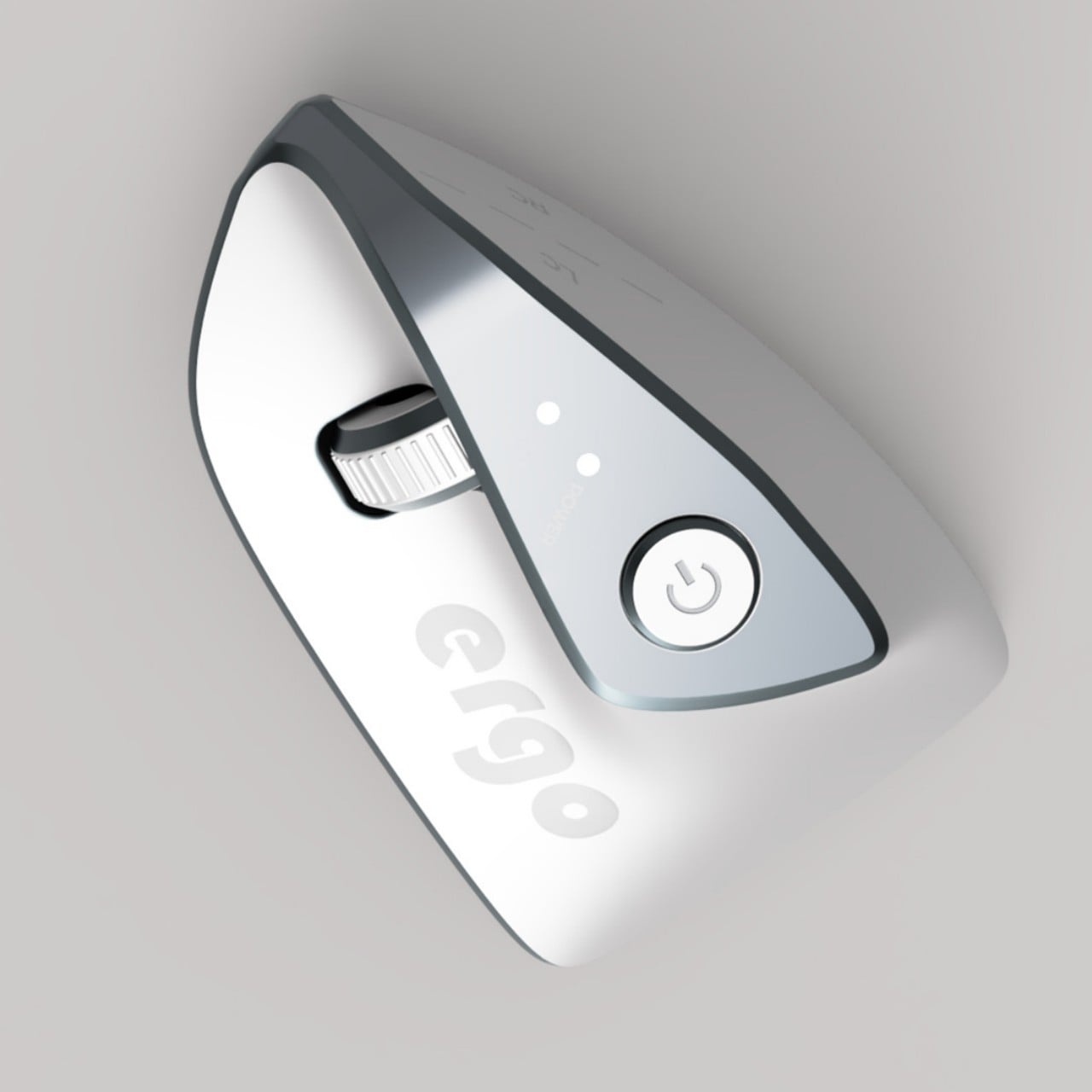
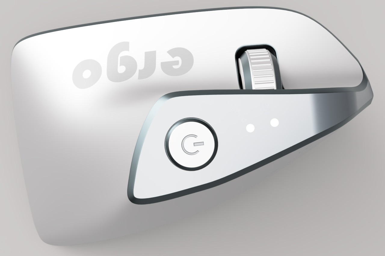
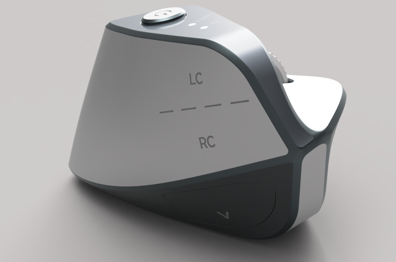
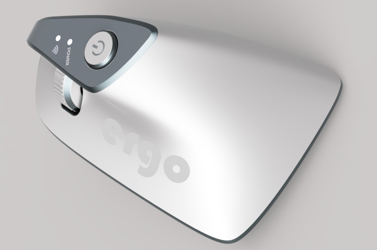
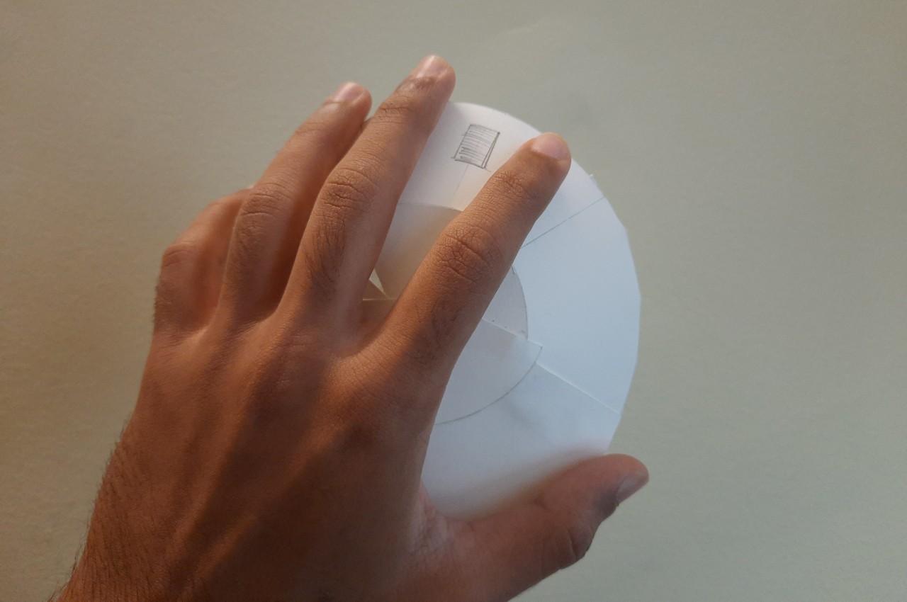
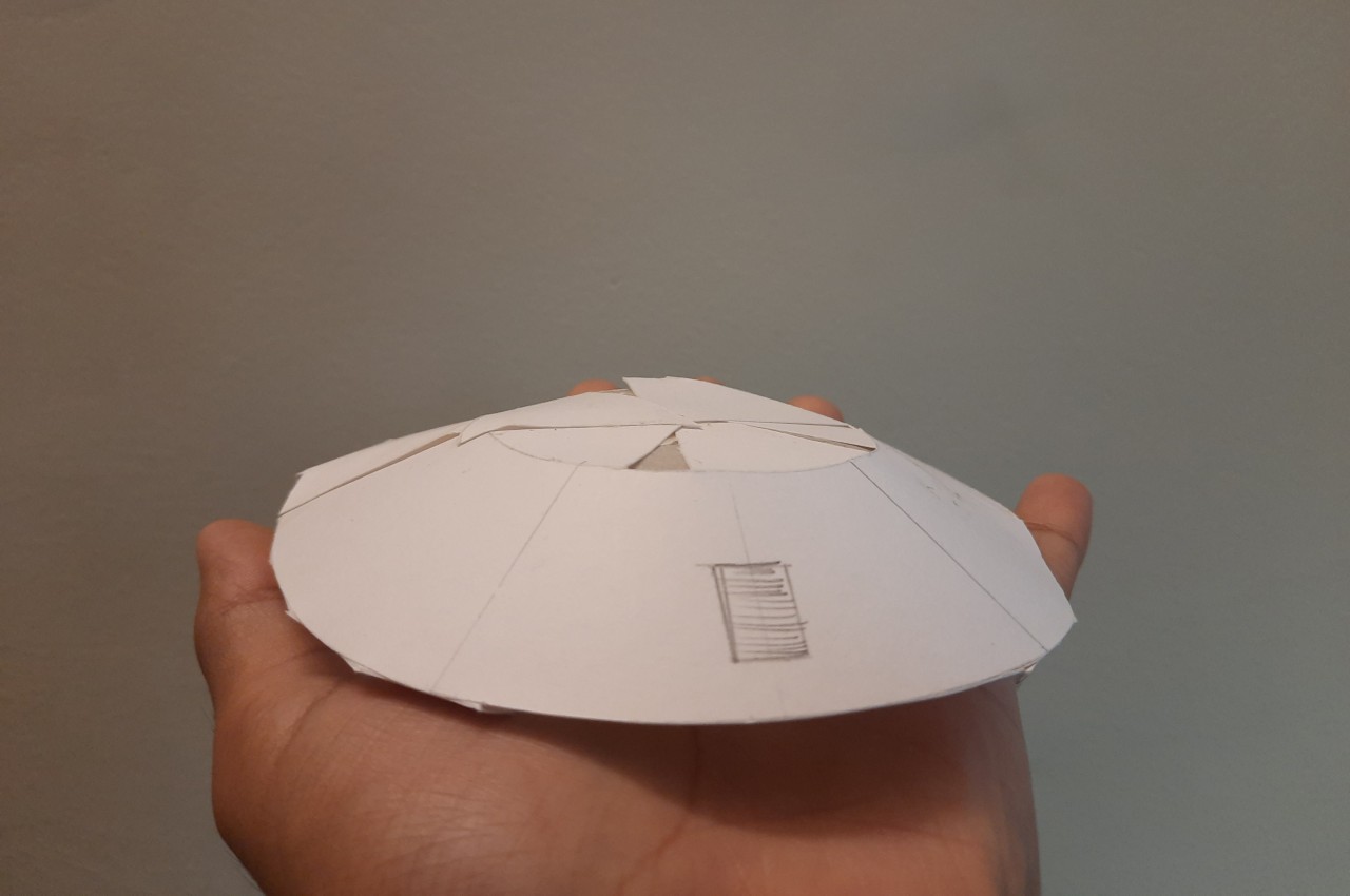
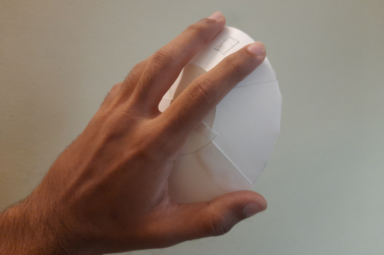
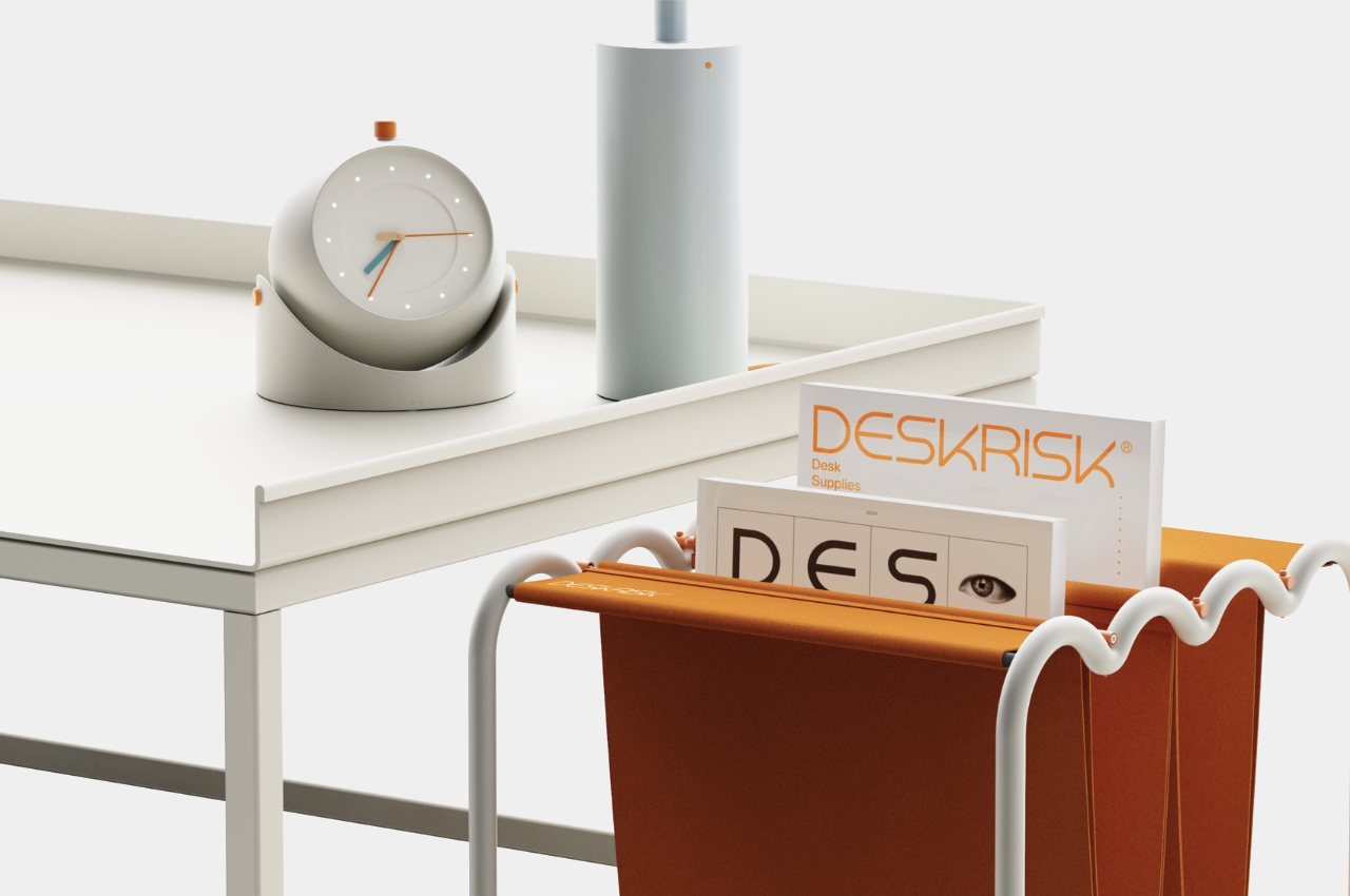
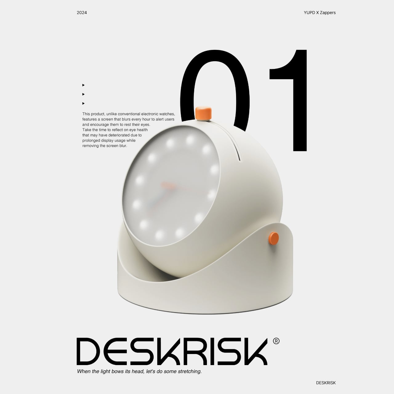
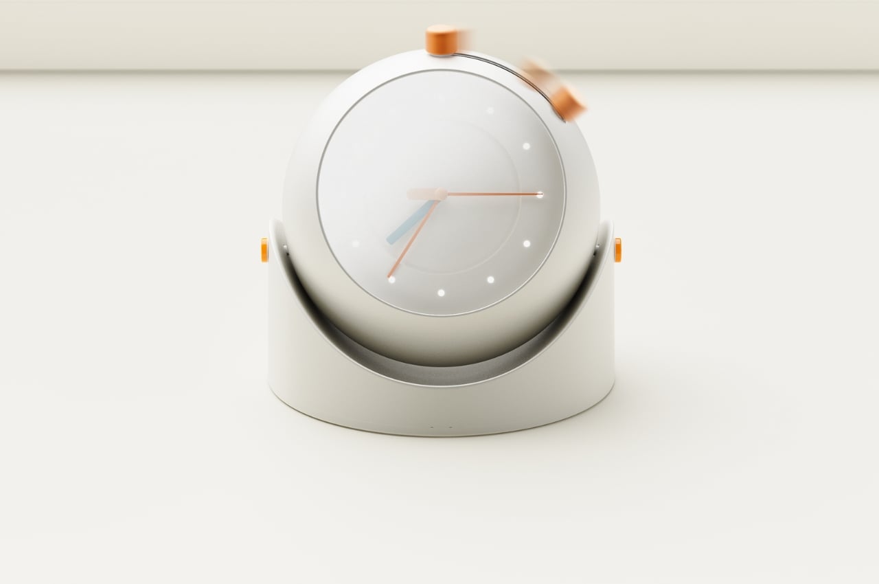
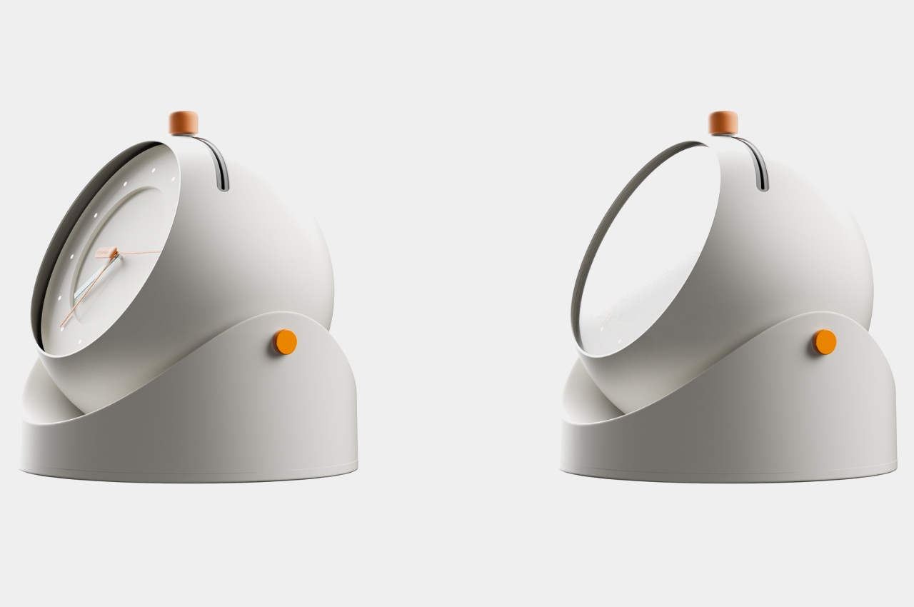
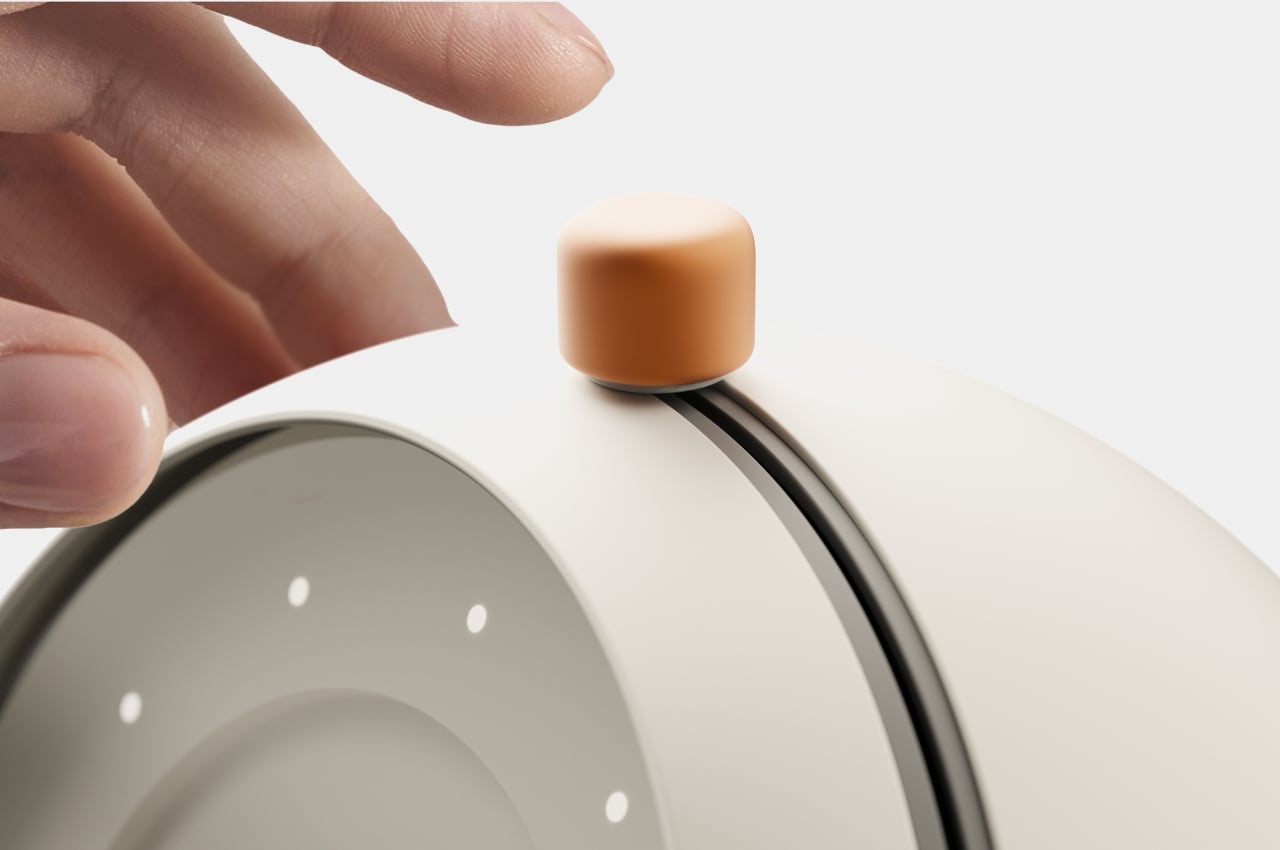
A group of designers have come up with concepts for a series of products that can help with this problem. The collection is appropriately called DESKRISK as we all know that even if we are sitting seemingly safely at our desks, we’re still exhibiting risky behavior that will eventually need some sort of intervention. The first product is a desk clock that will remind us to take a break from staring at our screens to take better care of our eyes. The screen will blur after some time which resembles the dry eyes we experience a lot of times. After you’ve rested for a few minutes, you can move the button on the clock sideways to wipe away the blur and start the countdown all over again.

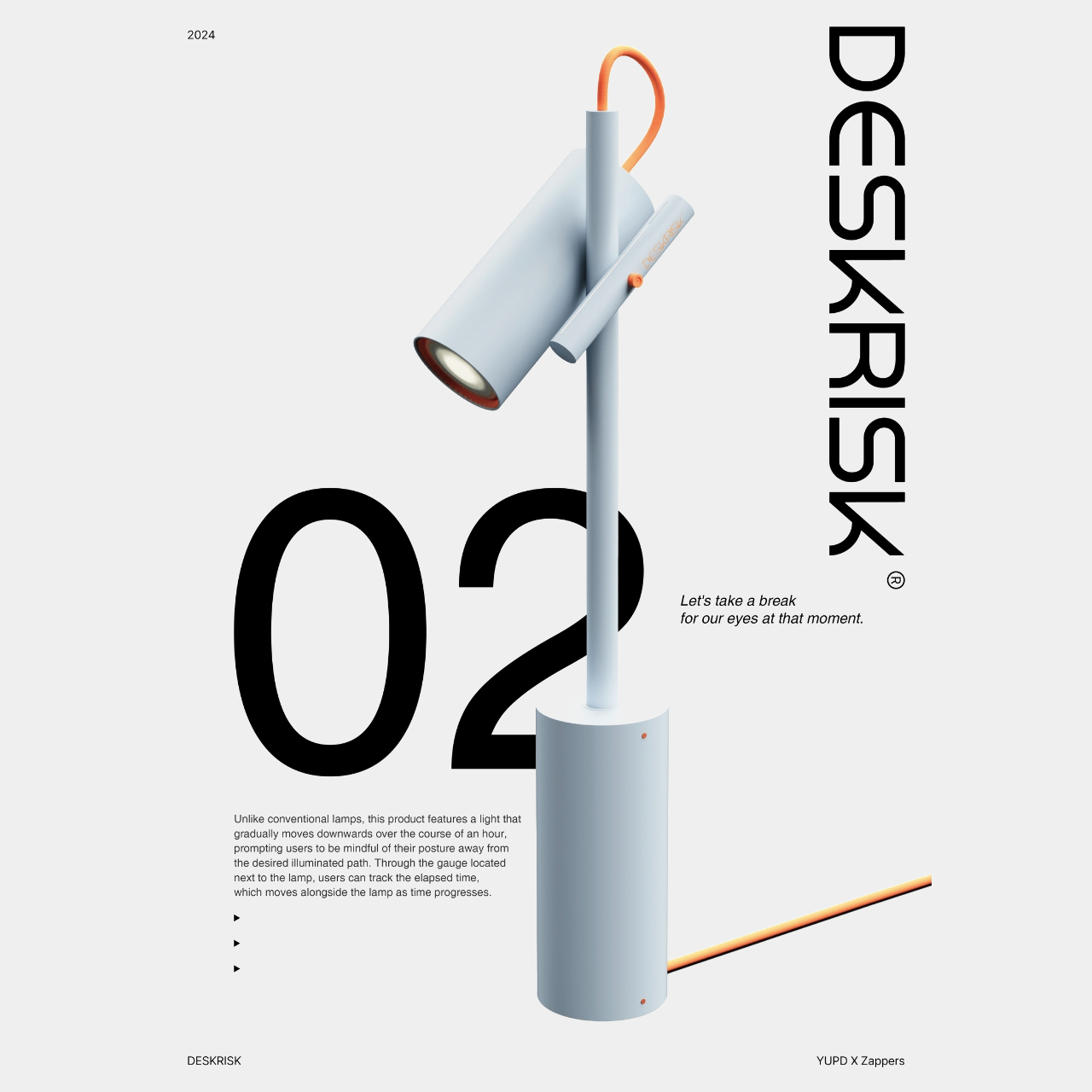
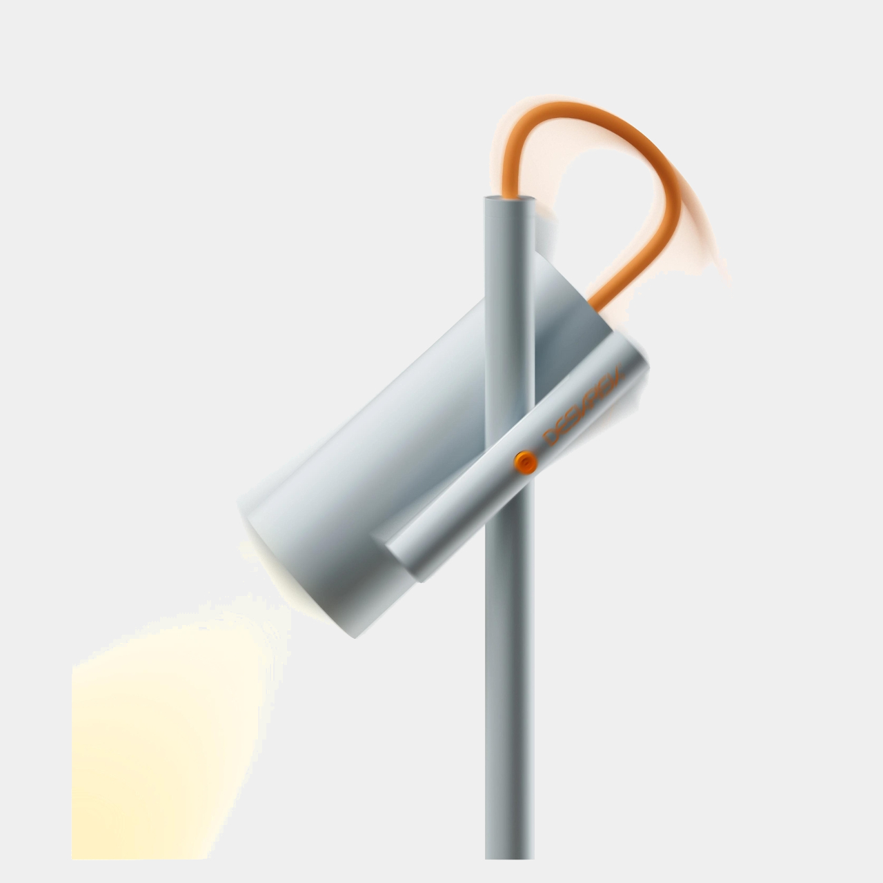
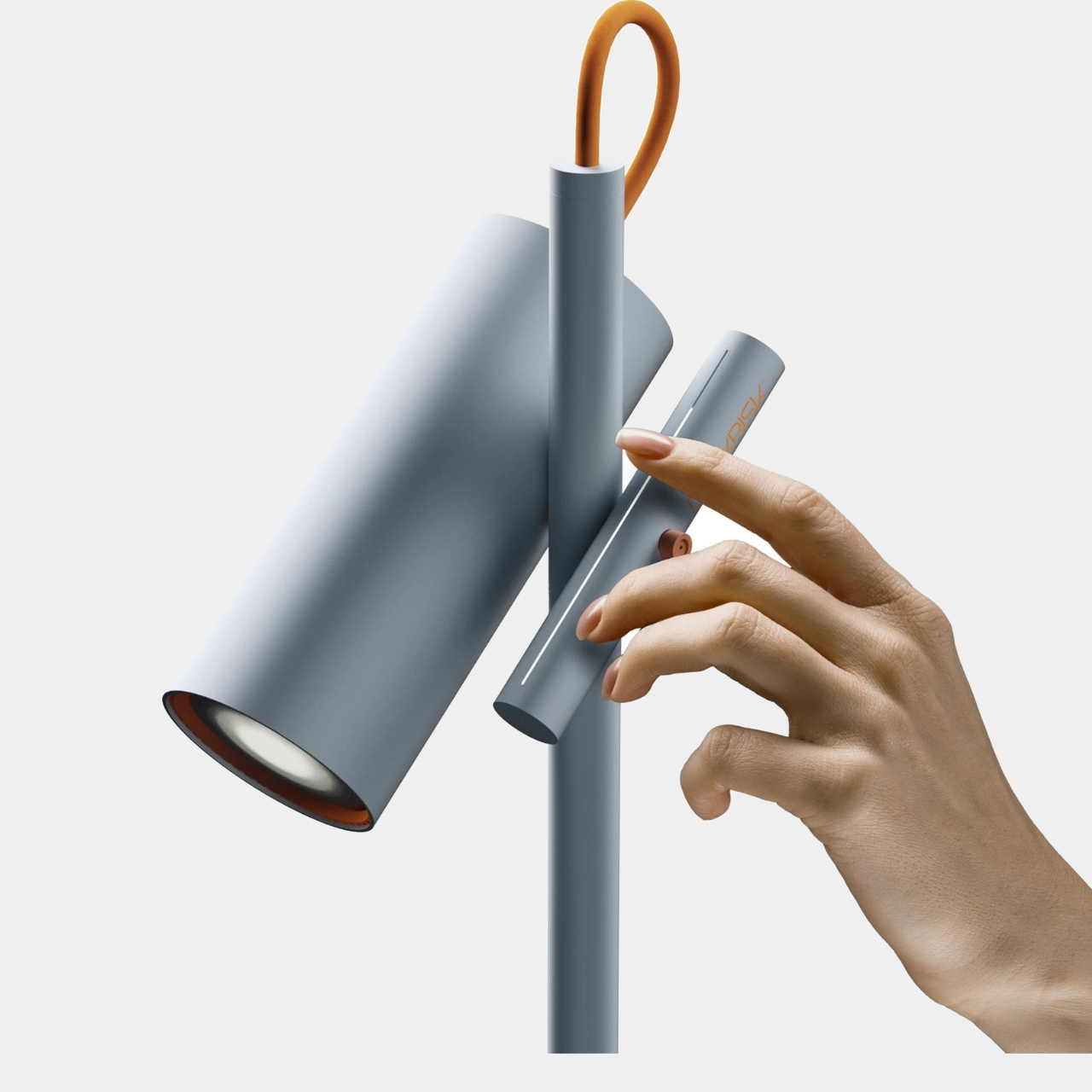
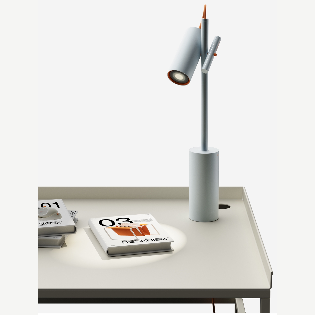
The next product is for those who need help with their posture while sitting at the desk for a long time. Well this is for if you’re using a lamp light source at your desk. The lamp has a light that will gradually move downwards from the angle you set after an hour. This way you are reminded to move along with the light source so that we’re not just bowing down towards our screens. There’s a gauge next to the lamp that also helps you track how much time has elapsed. You can also adjust and reset the angle by moving this gauge bar.

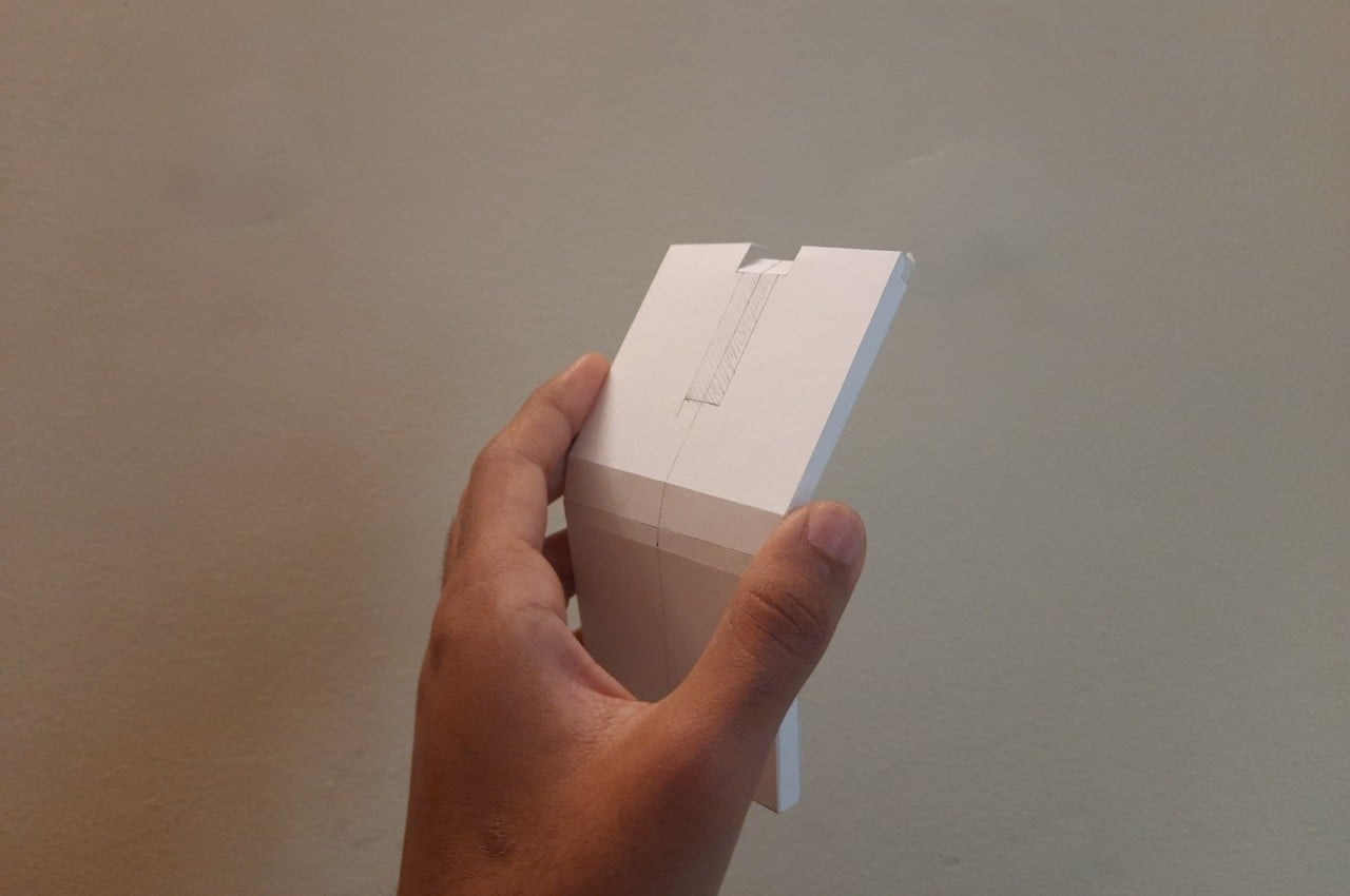
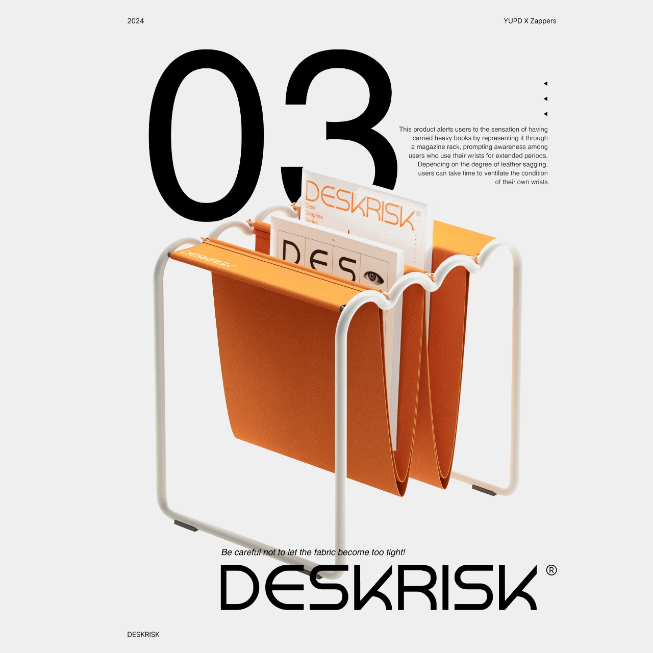
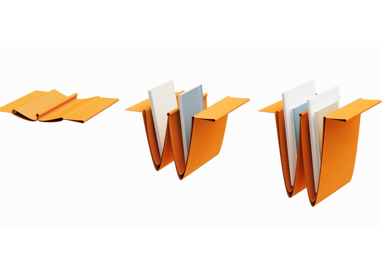
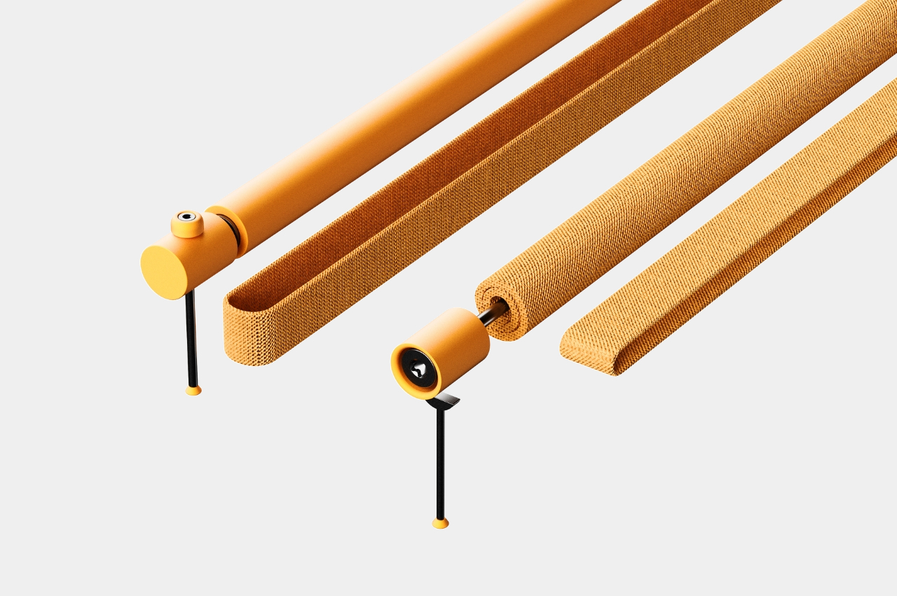
The last one may probably be the most useless for me, at least from what I understand from their product description. It’s a magazine rack that will supposedly resemble carpel tunnel syndrome or at least the overstretched wrist ligaments that come from having the same position at your keyboard for a long period of time. The sagging fabric will lengthen according to the size or weight of the books or magazines inserted. How this will help me with my wrist problem is unsure at this point. But aside from that, the other Deskrisk products are pretty useful for people like me who are at risk with the nature of our work.

The post Desk accessories concepts help reduce risk of sitting at the desk the whole day first appeared on Yanko Design.

Ergonomic Apple Watch band puts the smartwatch on the back of your hand

We wear watches on our wrists because that’s been the standard design of wristwatches, hence the name, for decades or even centuries. It’s a more convenient design compared to the classy yet antiquated pocket watches, but that doesn’t exactly mean they’re the best design available. For some people, that design can actually cause some pain in the wrist whenever you have to lift your hand and turn it so that you can see that time. That action is perhaps even worse with smartwatches, considering how often you have to do that to see not just the time but other information and notifications as well. That’s the kind of design flaw that this odd-looking Apple Watch “band” tries to address by simply moving the smartwatch from the back of your wrist to the back of your hand.

Designer: ErgonBand

The appearance of this Apple Watch accessory looks a little ridiculous, at least until you hear the reasonable explanation behind its design. The band, which is actually more like a strap, looks like one of those thumb or hand braces that athletes use for protection. The Apple Watch, sans the straps, is locked in place using clips that utilize the standard lugs and is placed below the joint of your thumb.

This location isn’t based on a whim but on how it makes the screen almost always visible without having to twist your wrist. At least that will be the case for people who need to see the watch face while holding something or with their hands swinging in front of them, like athletes doing training or people exercising. In fact, this kind of ergonomic design was made exactly for sports uses, though that doesn’t stop it from being used by anyone interested in a different way to wear a smartwatch.

1

While the theory might does sound plausible, there might be a few practical hurdles to such an ergonomic design. For one, waking up the Apple Watch is often done using that twisting gesture, so you’ll have to resort to actually touching the screen or pressing a button to turn on the screen. That defeats the purpose of not requiring your other hand just to glance at information quickly, which ironically makes it a bit less ergonomic in the process.

The other issue is that this kind of band might get in the way of using your hand for other things, especially ones that could make the strap dirty. Most of us are probably unused to wearing such a strap, so there will be some awkwardness and discomfort at the start. The hand-stitched leather material does try to make it a little bit comfortable and stylish, but that might also raise concerns about using it for intense workouts and sports activities. The ErgonBand is admittedly a curious attempt at solving this ergonomic problem, but it might remain just a curiosity rather than a solution that Apple Watch owners can rely on.

The post Ergonomic Apple Watch band puts the smartwatch on the back of your hand first appeared on Yanko Design.

Ergonomic and stylish chair can relieve some pressure from your knees

When looking for a chair that I’ll use for work (a.k.a the chair I’ll be sitting in for around 6 hours), the number one consideration is if it’s comfortable enough. How it’s designed is not so much of a factor when choosing the chair since what’s important is I can work properly while sitting on it. As I get older however, ergonomics is also a factor in choosing a chair especially since hours are spent in that piece of furniture. But what if it looks like an art piece more than a chair?

Designer: Serena Papait

That was my first impression when I saw the Moon Chair design. Like, how in heavens am I going to be comfortable sitting on that? Sure, it looks like an interesting piece of design but it does look like it belongs more in a museum than at my workspace. But the chair is actually created to be functional, ergonomic, and have a pretty unique design, inspired by the idea of infinity.

The chair is shaped to be an infinity symbol and the part where your legs are placed is able to relieve the pressure point on your knees. That is, if you want to place your knees there since you also have the option to just sit on it like a regular chair. You can also rock it so you are in an active sitting position in case you need to be non-static. It is made from polypropylene with neoprene inserts at the contact points. It also has a CATAS EN 1728 certification.

The Moon Chair is available in white, beige, shadow gray, and olive green colors but you can also customize the fabric in case you have a different color preference. I’m still not sure if it’s a chair I’d like at my desk, given that I also have back issues. But I could probably sit on it for a couple of hours if I need some kind of movement while I’m working.

The post Ergonomic and stylish chair can relieve some pressure from your knees first appeared on Yanko Design.

Ergonomic mouse concept oddly looks like a familiar home appliance

Computer mice have been around for decades, and despite their form making no objective sense, they remain the most basic and most common pointing device that we now use intuitively. The core design of the mouse hasn’t changed significantly since its inception, which unfortunately means they’re still one of the biggest causes of repetitive strain injury or RSI for many people. Ergonomic mice are starting to gain traction, particularly the vertically oriented designs that promise a more natural and comfortable grip for your hand. This device concept builds on that same premise, but the execution is a bit puzzling considering how it looks less like a mouse and more like a miniature clothes iron.

Designer: Pranav Kuber

The rationale behind vertical mice is that the normal orientation of human hands has the palms facing inward rather than downward. With a regular mouse, users are forced to keep their hands at an unnatural angle, whether or not they’re moving the mouse at that moment. Of course, a vertical mouse would still need to provide the basic functions of a conventional mouse, which includes left and right buttons as well as a scroll wheel.

At first glance, the Ergo ergonomic mouse concept is just like any other vertical mouse now available for purchase, but examining its form and silhouette generates a slightly different image. The top plane’s wide surface tapers sharply toward the front, while the wide middle section looks rectangular when viewed from above. If not for the actual bottom of the mouse, which merges two vertical sides like the keel of a ship, the Ergo looks almost like a clothes iron, albeit one without a handle to grip.

Aside from the peculiar shape, the mouse design also raises a few other questions. The buttons on the outer or right side are clearly marked, but they don’t look like buttons you can physically click at first glance. The position of the mouse wheel on the opposite side is even more puzzling, as it will require a lot of swinging movement from the thumb that could actually put more strain on its joint. The rather wide rear might also make it harder to grasp the mouse, potentially resulting in more discomfort in the long run.

The post Ergonomic mouse concept oddly looks like a familiar home appliance first appeared on Yanko Design.

Ergonomic mouse concept gives left-handed users the comfort they deserve

The vast majority of computer products are designed to favor the biggest groups of users, sometimes to the exclusion of the minority. We’re not speaking about accessibility for persons with physical disabilities, but that is especially true for them as well. Even just the common keyboard and mouse are designed with the presumption that they will be used by right-handed people. And while ambidextrous mice do exist, those tend to sacrifice comfort for the sake of a symmetrical design. That doesn’t have to be the case, as this concept design tries to prove, promising both comfort as well as proficiency, regardless of which hand you hold it with.

Designer: Sameeraj Dronamraju

There has been an increasing awareness and demand for ergonomic mice, sadly due to the equally rising cases of computer-related injuries. But while there are plenty of ergonomic designs now available, most of them only cater to right-handed users. You’d be lucky if the manufacturer produced a left-handed design, but most don’t because of the costs involved in another product with only a few minor differences.

The proper solution would be to mix ergonomics and symmetry to create a mouse that is comfortable to hold for both kinds of people. Vertrous, a portmanteau of “vertical” and “ambidextrous,” takes its cue primarily from the plethora of ergonomic mice now in existence, most of which adopt a vertical design that attempts to reduce the strain placed on the wrist by offering a more natural grip. But rather than have your hand holding it sideways, you almost grip it like a claw, with your index and middle fingers still resting on top.

At the same time, the mouse’s shape is more or less equally balanced on both sides. Great care is taken to ensure that textured areas are found on both sides, so no one hand has the advantage over the other. That said, there are some features that can really be found in only one place, like the power button, but that’s really a minor detail that has no significant impact on the use of the mouse itself.

While Vertrous does present an interesting solution, there are still some considerations left unanswered by the design. For example, gripping the mouse like a claw could actually end up being more uncomfortable and strenuous than a regular mouse. The symmetrical design also leaves out features like extra buttons that would normally be found only on one side, an absence that many power users will feel acutely. These aren’t flaws per se but more like points for further improvement, paving the road for the day that we finally land on a standard ergonomic mouse design that will really leave no one out, whichever hand they prefer to use.

The post Ergonomic mouse concept gives left-handed users the comfort they deserve first appeared on Yanko Design.