Damien Chazelle made La La Land as a love letter to a Los Angeles that barely exists anymore, and to a style of filmmaking that Hollywood had largely abandoned. The big-studio musical, with its choreographed sidewalks and color-saturated dreamscapes, had been gathering dust since the golden age of MGM. Chazelle dusted it off, handed it to two impossibly charming leads, and aimed it squarely at the part of your chest that still believes in chasing something impossible. The result was fourteen Oscar nominations, six wins, and one of the most recognizable movie posters of the decade.
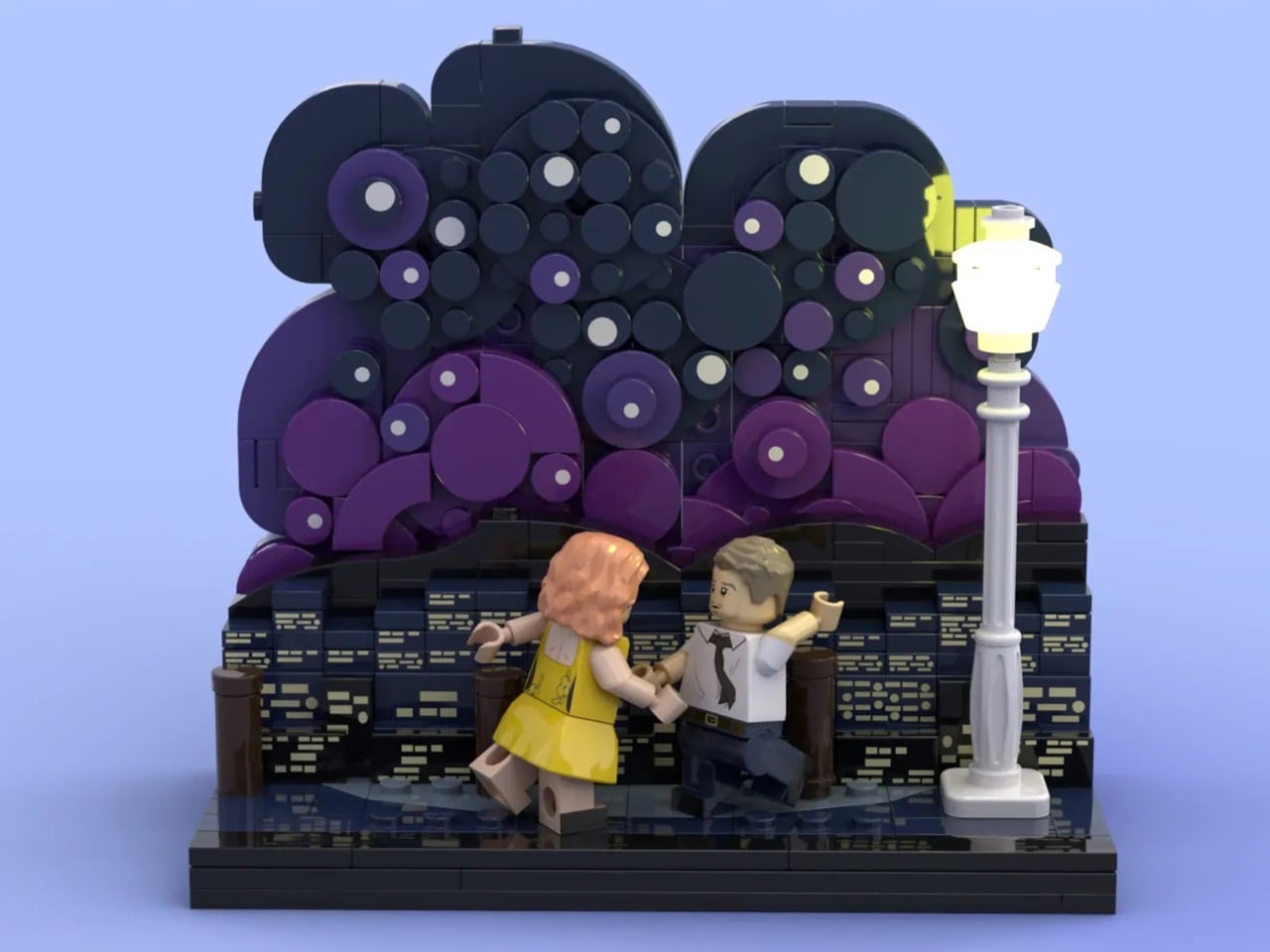
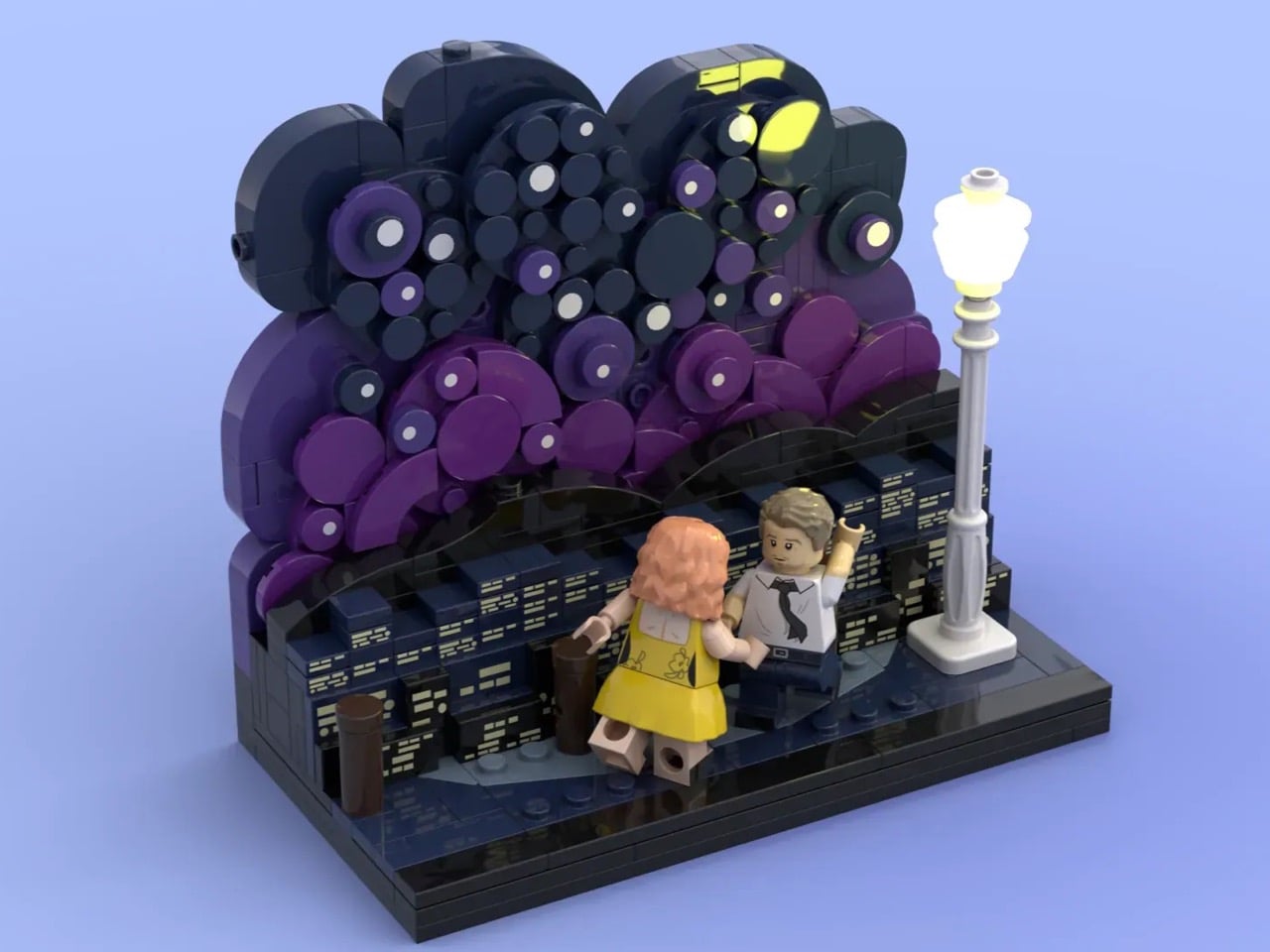
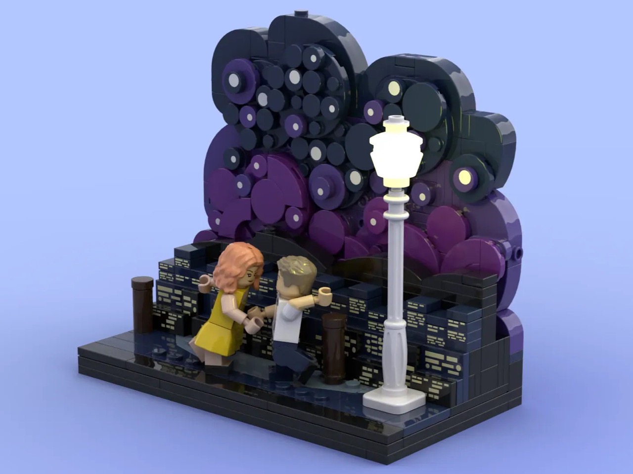
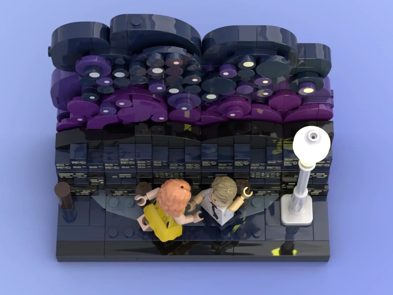
The scene that lives on that poster, Mia and Sebastian dancing above the lights of Los Angeles on a clear, impossible evening, is the film distilled to its purest emotional frame. TesrYer, a LEGO Ideas builder, had the good sense to freeze it in plastic. The resulting diorama layers a deep gradient night sky in dark navy and purple, studded with circular brick elements that somehow read as stars and rolling hills simultaneously, with two minifigures caught mid-step below a glowing streetlamp. The city of stars shimmers behind them in stacked dark tiles, each lit window implied rather than stated.
Designer: TesrYer
The building technique behind that night sky is a bit of LEGO ingenuity. TesrYer has used round plates and dish elements of varying diameters, packed together in overlapping clusters across multiple shades of dark blue, dark purple, and near-black, to create a backdrop that feels organic and volumetric rather than flat. It reads as clouds, as hills, as a stylized abstract sky all at once, which is exactly the kind of visual ambiguity that Chazelle’s cinematographer Linus Sandgren was doing with light and color on the actual film. My favorite detail, though, is the streetlamp. A single white gas-lamp post rising at the right edge of the composition, its globe rendered in translucent white bricks, warm and slightly luminous. It anchors the whole scene the way a key light anchors a stage, and without it the diorama would lose half its atmosphere.
The minifigures are pitch-perfect. Mia arrives in her yellow dress, printed with the small floral detail visible in the film, while Sebastian stands opposite in his white shirt and black tie, one arm raised mid-movement. Whether his hand is positioned correctly is a matter I will leave between TesrYer and Ryan Gosling.
LEGO Ideas is the fan-design platform where community-built MOCs (My Own Creations) gather votes toward the 10,000-supporter threshold required for official LEGO review. TesrYer’s diorama is currently in the early stages of its run, with nearly a 1,000 supporters and 334 days left on the clock. If you want to see this lovely little slice of cinematic nostalgia make it to a box, head to the LEGO Ideas page and cast your vote here.
Harvey Specter kept a chess set on his office coffee table. It was never really explained, never made into a plot point, just always there, sitting on the glass surface between Harvey and whoever was about to lose an argument. It suited the room perfectly. The whole space was engineered as a performance of control: the signed basketballs, the glass desk with nothing to hide behind, the painting of his mother as the one admitted vulnerability in an otherwise impenetrable presentation. Production designers on Suits understood that Harvey’s office had to do half his character work for him before he even spoke.
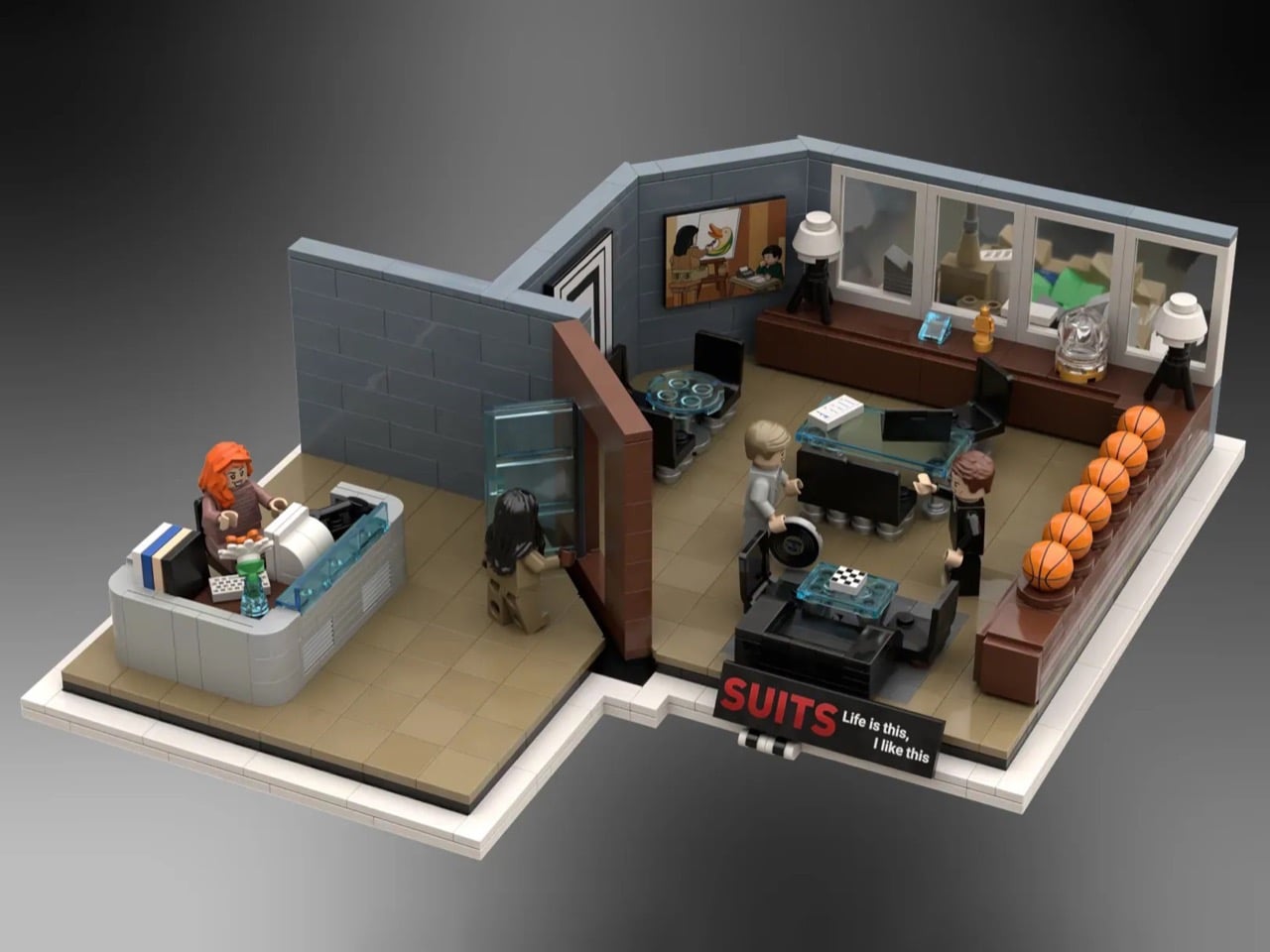
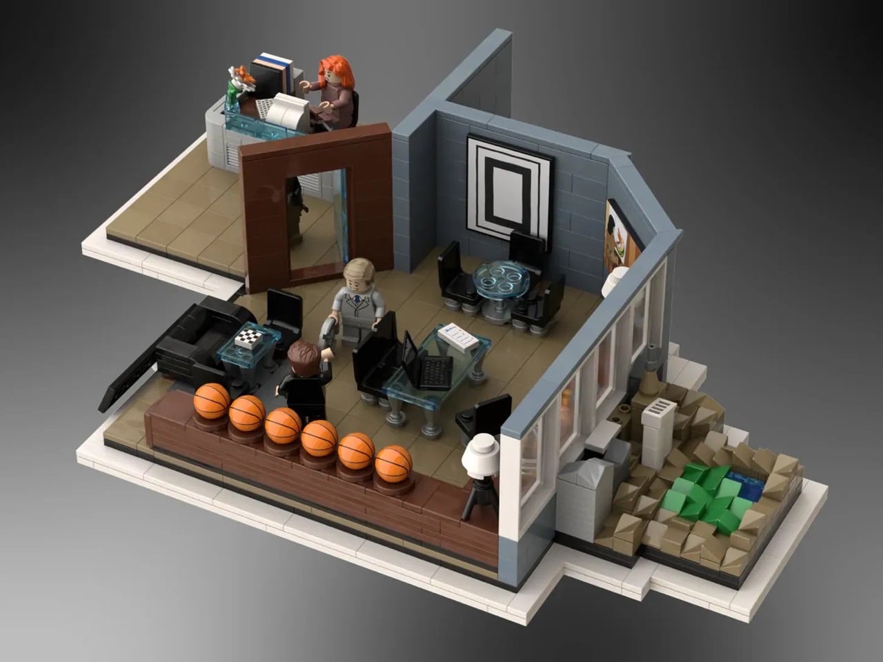
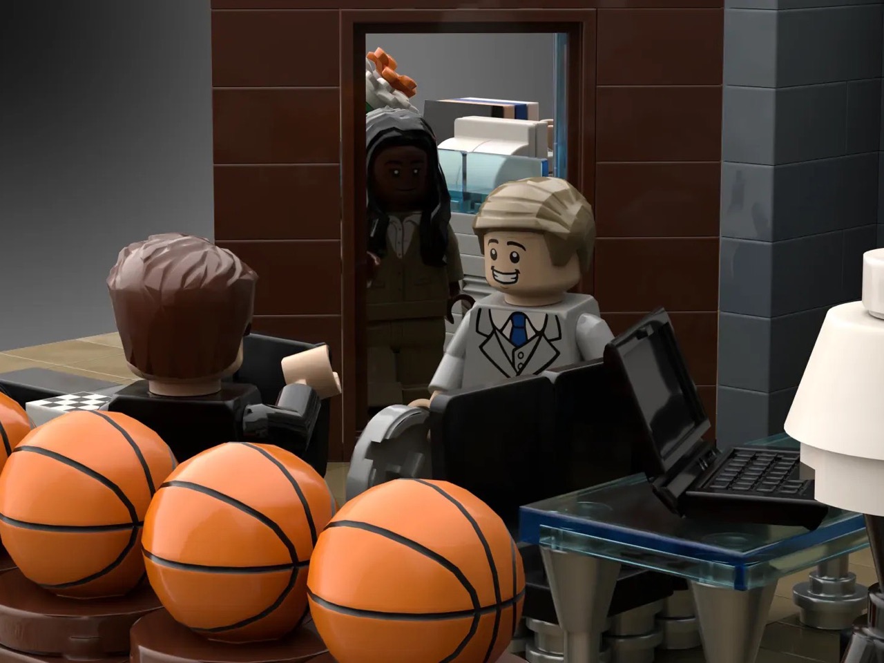
Gentvilas, building on the LEGO Ideas platform, understood the same thing. The chess set makes it into the brick version. So does the painting. So do the basketballs, rendered as a satisfying row of orange LEGO spheres along a dark wood shelf. Donna sits at her reception desk out front, composed as ever. Harvey and Mike are positioned mid-conversation inside the glass-walled inner office, and Jessica is stepping through the door with the specific energy of someone who already knows what you did. The forced-perspective window view, a microscale Central Park and skyline built to suggest height, finishes the illusion.
Designer: Gentvilas
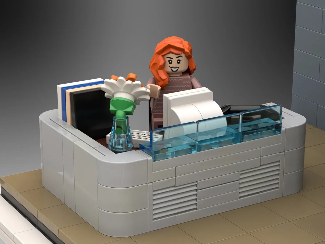
The build splits cleanly into two zones. Donna’s curved reception desk anchors the entrance, built from smooth grey elements with a transparent blue front panel that captures the cool, corporate modernism of the Pearson Hardman lobby perfectly. Her desk is stocked with a monitor, stacked books, and a small flower vase, the kind of considered personal touches that tell you this is someone’s space, not just a gatekeeping station. Step past the dark wood doorframe and you’re in Harvey’s inner office, where a glass-topped desk sits center stage, black leather seating flanks a low coffee table, and the basketball shelf runs the full length of the side wall. Gentvilas has used transparent blue elements throughout for the glass surfaces, a smart and consistent material choice that gives the whole build a visual coherence the show’s set designers would appreciate.
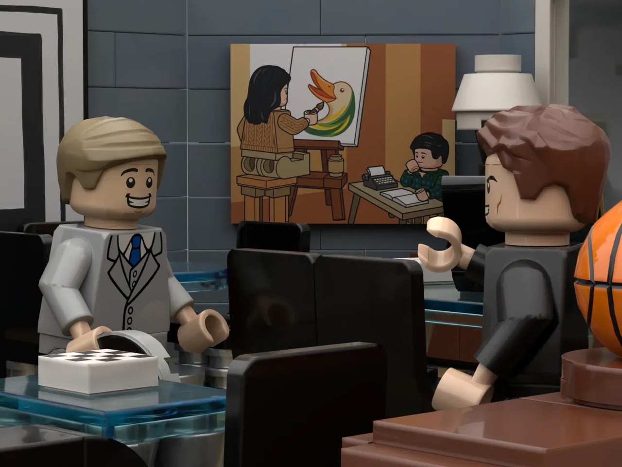
My favorite detail, though, is that painting. Harvey’s mother is a complicated figure in the show’s emotional architecture, and the fact that Gentvilas rendered her as a custom decal, painting a duck at an easel while young Harvey watches, and hung it exactly where it belongs on the back wall, is the kind of deep-cut accuracy that separates a fan-made tribute from a generic office diorama. The builder notes that the actual painting couldn’t be reproduced due to copyright considerations, so this bespoke interpretation is entirely original, and honestly, it works just as well.
The forced-perspective exterior is the other standout move. A microscale build outside the windows creates a convincing illusion of height, with a tiny Central Park visible in the skyline, making the model feel like it genuinely occupies a Manhattan high-rise rather than sitting on someone’s display shelf.
Suits found a second life on Netflix in 2023, pulled in an entirely new generation of fans, and spun off into Suits LA. The timing for a LEGO set feels right. This MOC is currently gathering supporters on the LEGO Ideas platform, where builds need to cross 10,000 votes to trigger an official LEGO review. You can head to the LEGO Ideas page here and cast your vote.
Finland’s contribution to global tech culture is quietly staggering for a country of 5.5 million people. Linux, SSH, Nokia, and then, in 2009, a little Helsinki studio called Rovio dropped Angry Birds on the App Store and rewrote the rules of mobile gaming entirely. The slingshot physics were deceptively simple, the characters instantly readable, and the loop so satisfying that it racked up billions of downloads and made Finland the unlikely architect of a second major chapter in mobile technology. What Pokémon did for Japan, Angry Birds did for Finland, a piece of pure software creativity that transcended its original platform and embedded itself into a generation’s muscle memory.
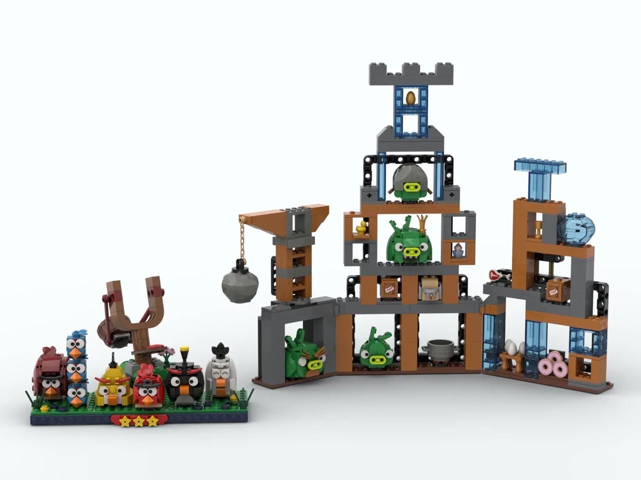
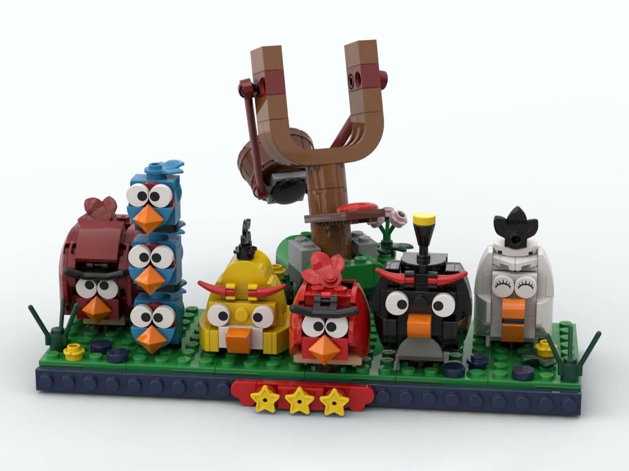
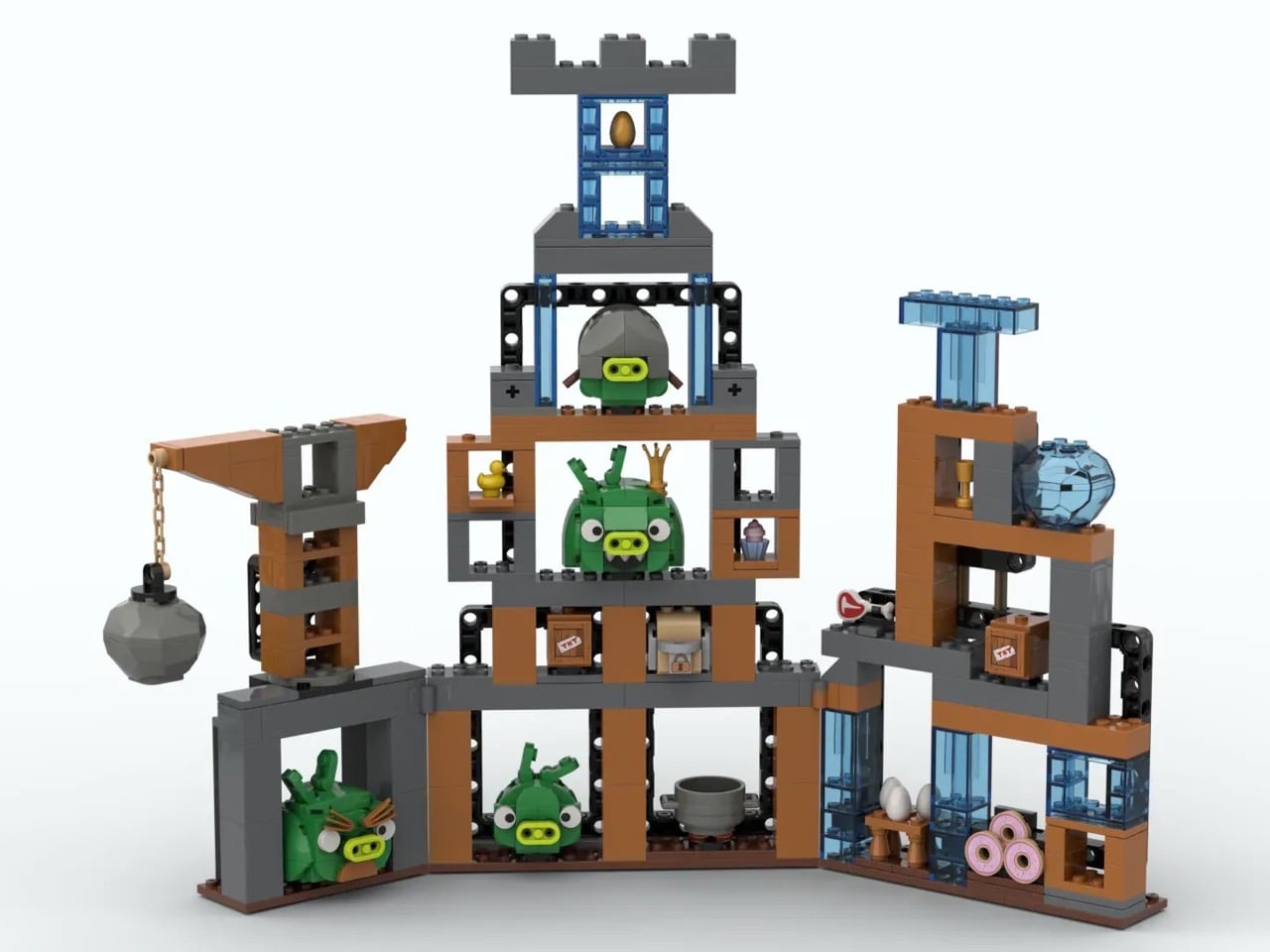
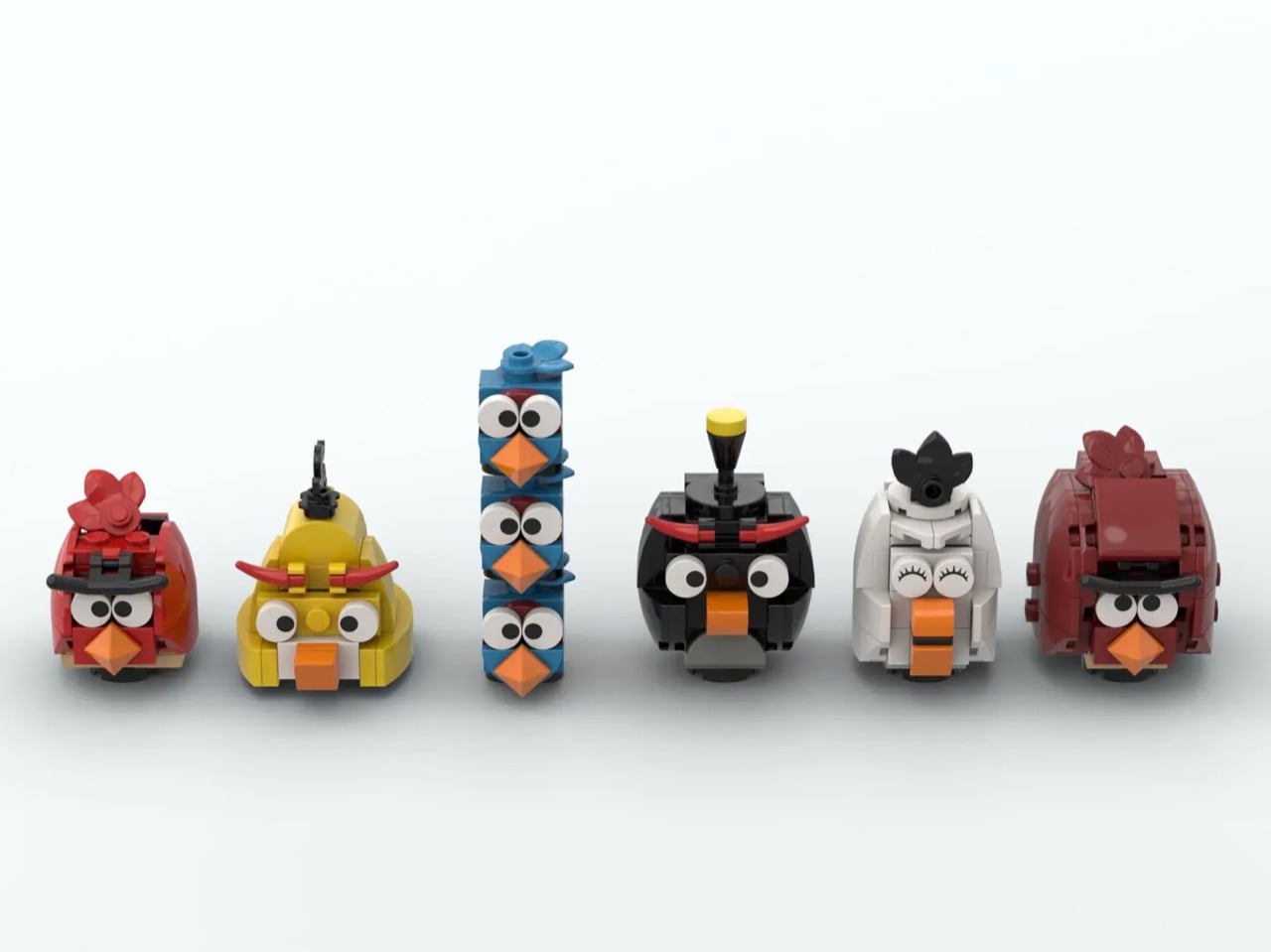
Now, builder Thornbeard has translated that legacy into LEGO form with a MOC (My Own Creation) that covers the full cast: Red, Chuck, the Blues stacked in their trademark tower, Bomb, Matilda, Terence, and a pig fortress that looks lifted straight from World 1-1. The three-star rating display along the base is the kind of detail that immediately tells you this builder actually played the game, a lot.
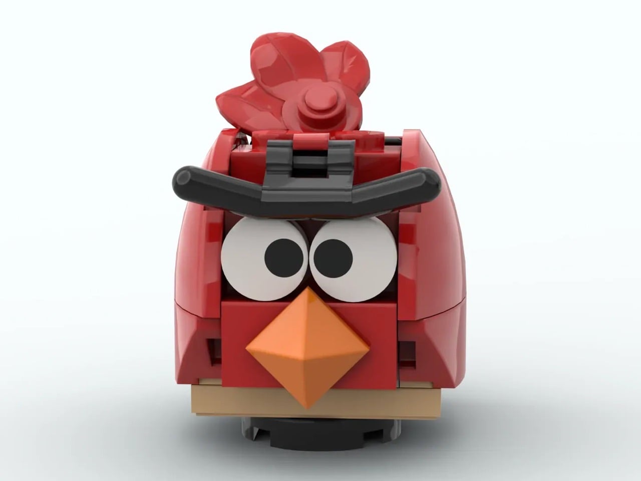
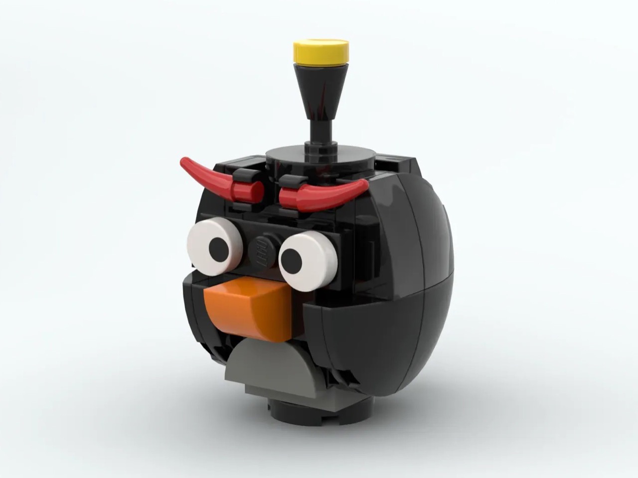
Red’s scowl comes through in the angle of his brow elements, Chuck’s yellow wedge shape captures that pointed aerodynamic silhouette, and the Blues are stacked three-high in a tower arrangement that is both spatially clever and completely faithful to how they functioned in the game. Bomb’s round black form sits wide and heavy, Matilda reads instantly in white with her eyelash detailing, and Terence looms in dark red at the end of the lineup with the quiet menace of a bird who has absolutely seen some things. Each bird is built to express personality through brick geometry rather than leaning on stickers or printed parts, and the orange-beak detail carried consistently across the flock ties them all together as a visual family.
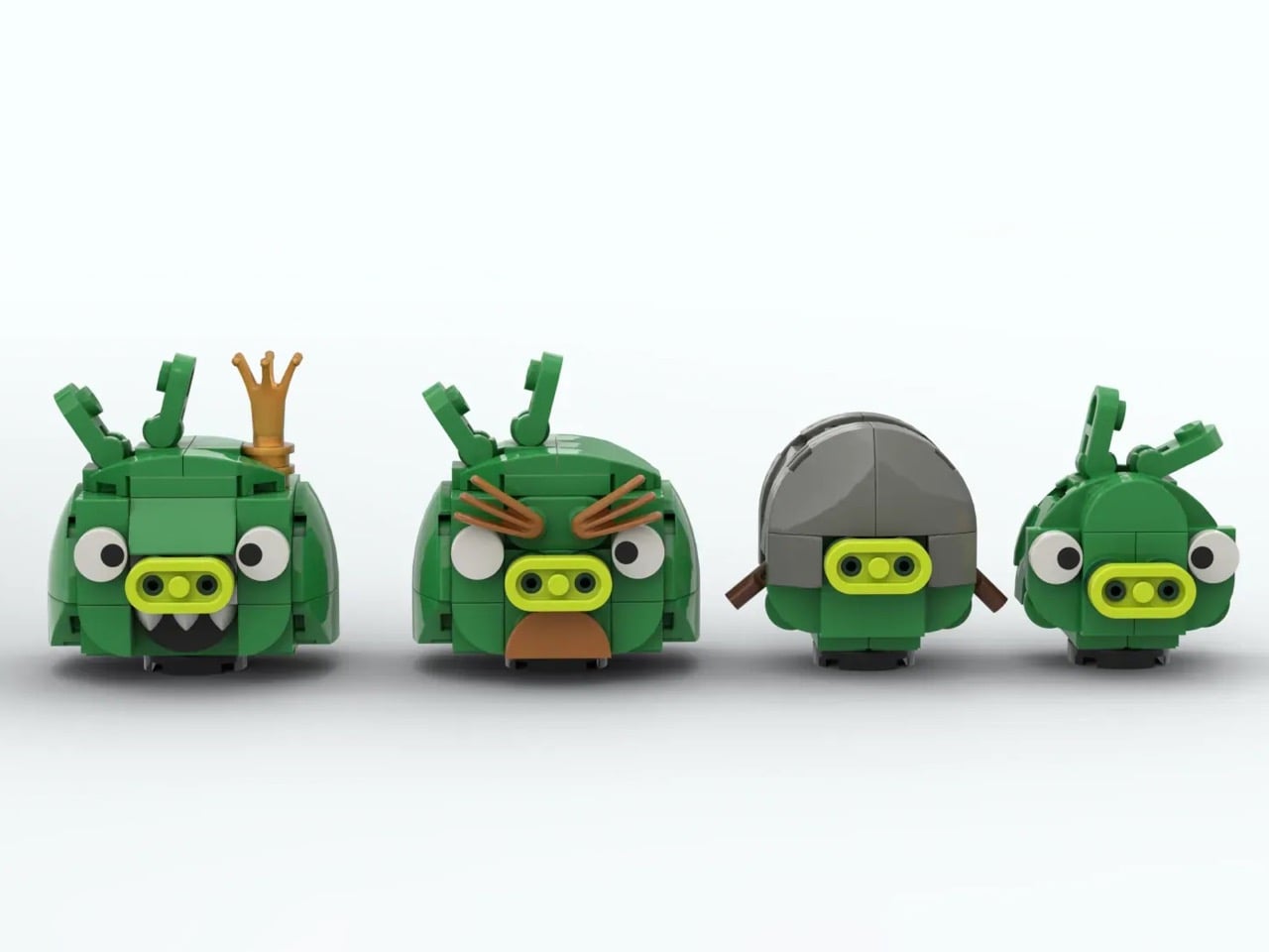
Thornbeard built the fortress in an open-frame style using brown and gray elements that mimic those rickety wood-and-stone structures from the original game levels, and the decision to leave the frames open rather than walling them in puts every pig on full display. King Pig sits center stage with his golden crown rendered in warm gold bricks, Mustache Pig has that distinctive facial hair built in brown clip elements, Helmet Pig wears a gray domed construction that reads immediately, and a basic minion pig rounds out the quartet. The golden egg displayed at the very top of the fortress tower is a detail that will hit differently depending on how many hours you spent trying to unlock those bonus levels.
My favorite detail is the wrecking ball hanging off the left side of the fortress on a chain. It adds a sense of physics and instability to the structure, a visual suggestion that this whole edifice is one well-aimed bird away from coming down. That is exactly the kind of environmental storytelling that made the original game levels feel alive rather than static, and Thornbeard carried it over into brick form without making a big deal of it.
Mounted on its wooden post with the rubber band mechanism rendered in dark red curved elements, the slingshot sits opposite the fortress on a green grass platform with small flower details tucked into the corners. The three yellow stars along the front edge of the base are the finishing touch that elevates the whole composition from a character display into an actual scene, a frozen moment from a game that a significant portion of the planet has played.
Angry Birds turned 16 this year, which means there is now a generation of builders on LEGO Ideas who grew up with it as a childhood touchstone rather than a novelty download. Thornbeard’s MOC is currently gathering votes on the LEGO Ideas platform, where fan-created builds need to reach 10,000 supporters before LEGO’s internal team reviews them for potential production as a retail set. Given that LEGO has previously leaned into gaming nostalgia with sets like the Atari 2600 and various Nintendo collaborations, a build this polished and this culturally resonant feels like exactly the kind of submission the review team would take seriously. You can head to the LEGO Ideas page and cast your vote here.
The bus bench scene in Forrest Gump was never supposed to be the heart of the film. It was a framing device, a structural trick borrowed from the original Winston Groom novel, a way to let Tom Hanks narrate three decades of American history to a rotating cast of strangers. And yet, somehow, that bench in Chippewa Square, Savannah, became the most iconic seat in 1990s cinema. The original bench now lives in the Savannah History Museum, behind a velvet rope, because apparently plastic and wood can become sacred objects when the right story happens around them.
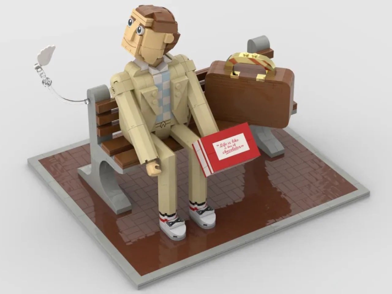
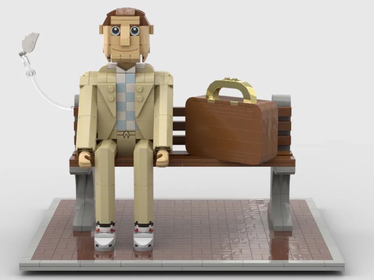
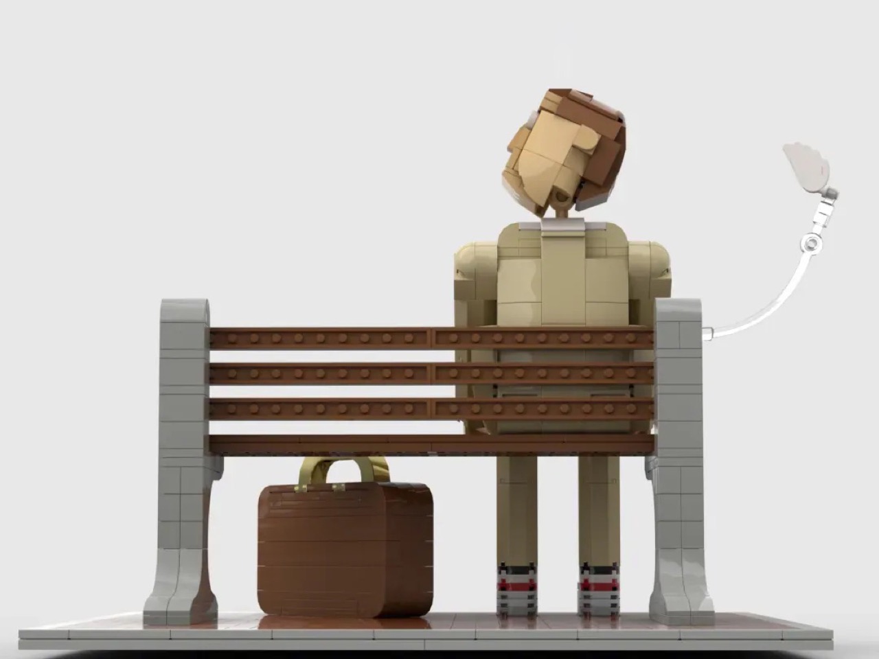
Avid Builder, a LEGO Ideas community member, has now given that bench a second life in brick form. The 871-piece build seats a fully articulated, custom-scaled Forrest on the bench, complete with his tan suit, his chocolate box, his trusty suitcase, and the floating white feather that opens and closes the film’s entire emotional arc.
Designer: Avid Builder
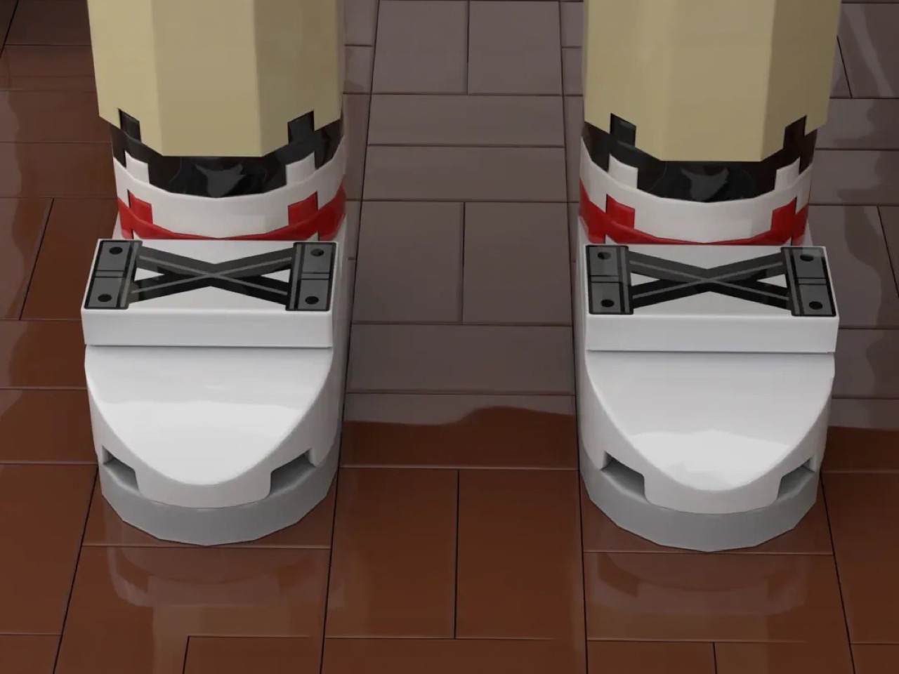
At 871 pieces, this build operates at a scale well above your standard minifigure, and that choice pays off enormously. The figure of Forrest is brick-built from the ground up, with poseable arms, a rotating neck joint, and a custom-engineered head that Avid Builder describes as their first attempt at this scale. It shows the right kind of ambition. The face carries a gentle, open expression, eyes wide and slightly upward, a small smile that reads as the precise emotional register Tom Hanks spent two hours maintaining in 1994. The tan suit is rendered faithfully across the torso, with the checked shirt and striped socks accounted for in the color blocking. And then there are the shoes. Look closely and you’ll find white curved-slope sneakers with Technic cross-brace elements sitting on top, suggesting the laces on Forrest’s Nike Cortez runners, the ones Mama said were his magic shoes.
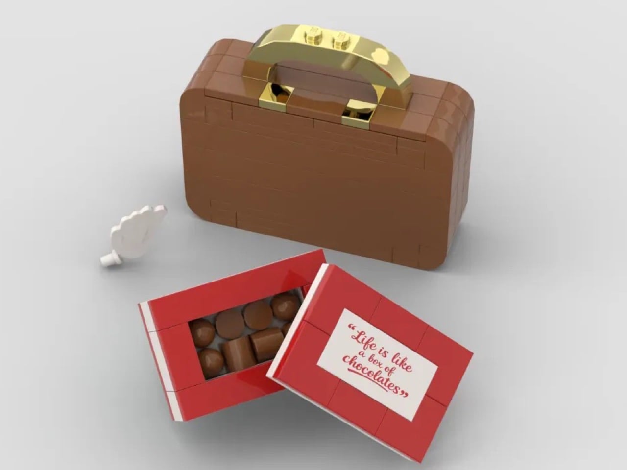
The accessories add some interactive whimsy to the MOC (My Own Creation). The red chocolate box opens, and inside sit individual rounded chocolate elements in a warm brown, arranged exactly as you’d expect a proper box of assorted chocolates to look. The lid carries a custom-printed tile with the famous quote. The brown brick-built suitcase beside Forrest uses a gold bar and handle assembly that catches the light beautifully, and the whole thing reads as a piece of luggage that has genuinely been somewhere. My favorite detail, though, is the feather, a white element suspended on a clear articulated bracket arm extending from the side of the scene, hovering at just the right height to feel like it caught a current of air and stopped there.
The build also offers two display configurations. Face it forward and you have the bus stop scene, Forrest waiting patiently for a ride that will take him somewhere extraordinary. Rotate it 180 degrees and the composition mirrors the film’s official poster, the bench receding into the frame, Forrest’s back to you, the world ahead of him.
The Forrest Gump bench MOC is currently gathering votes on LEGO Ideas, the community platform where fan submissions that cross the 10,000 vote threshold get reviewed by LEGO’s internal team for potential production as a retail set. With 855 supporters logged so far, it has runway ahead of it, and 362 days left on the clock. If you grew up quoting this film at the dinner table, or if you just appreciate a brick build that understands what it’s trying to say, head over and cast your vote here.
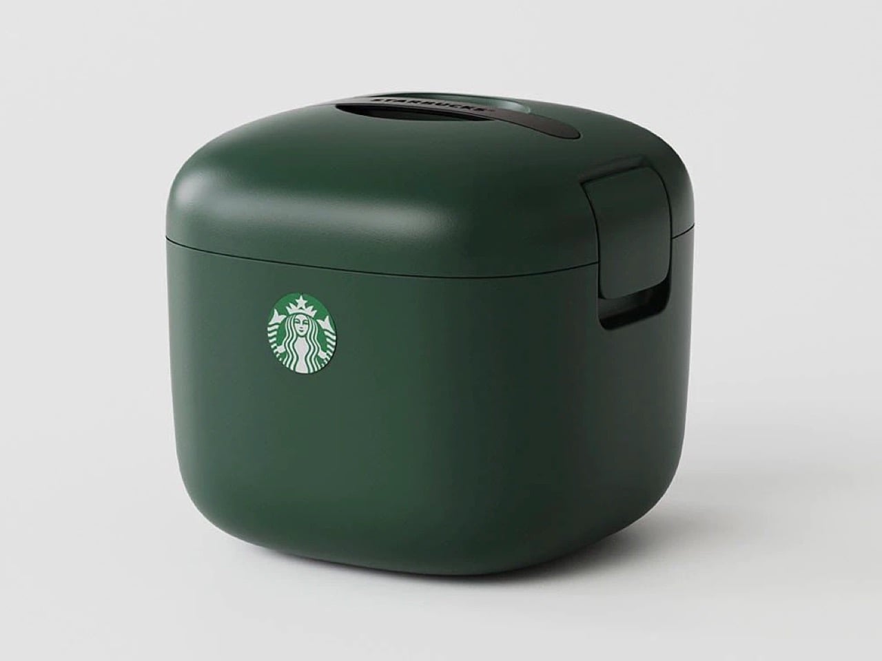
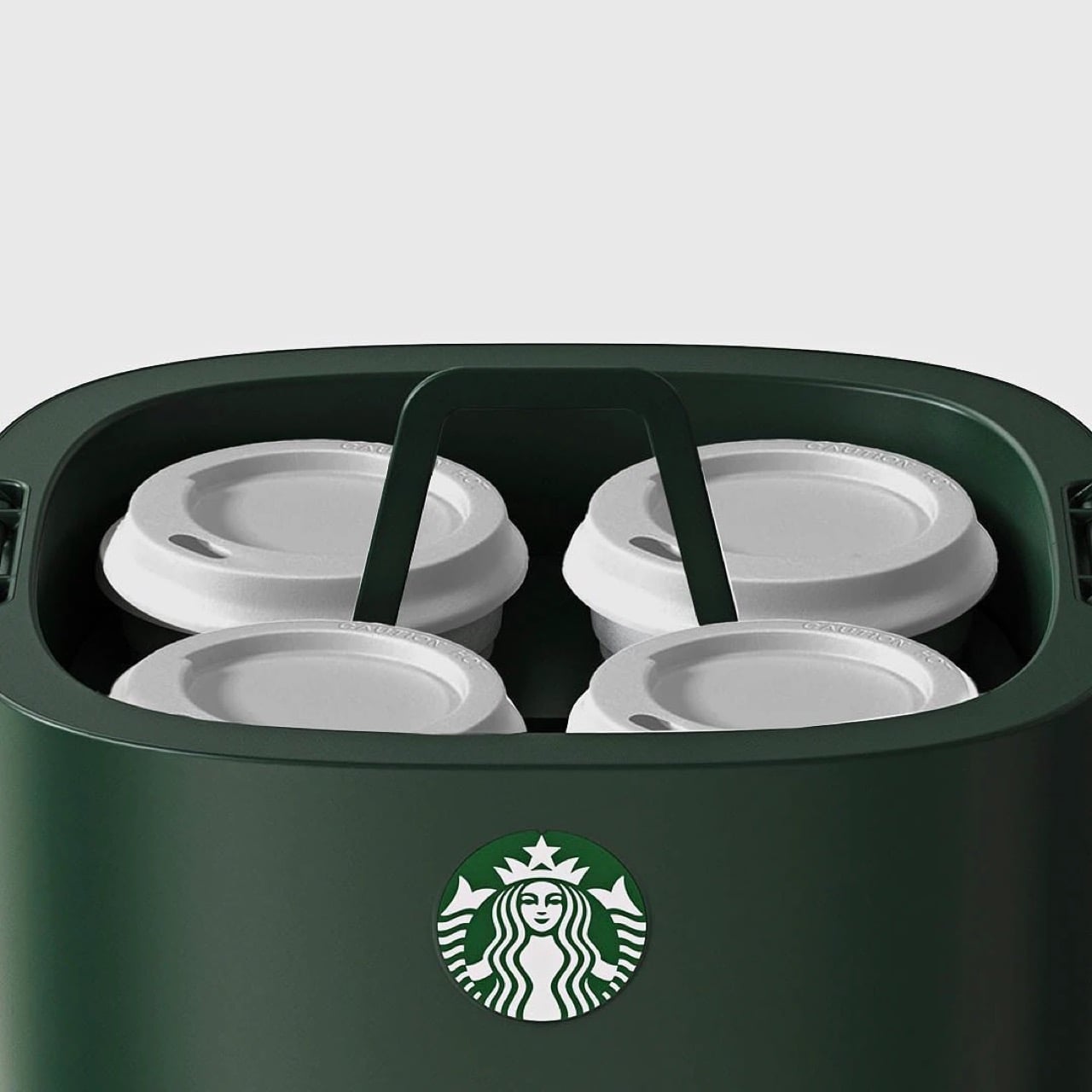
You know what’s ‘vertical integration’? Starbucks building its own cooler box for its own beverages. Meet the Yeti-alternative that’s designed not for your Budweisers, but for your venti iced lattes. It’s called the Starbucks Ice Box, and while it looks perfect from top to bottom, it has one problem: it’s only available in South Korea.
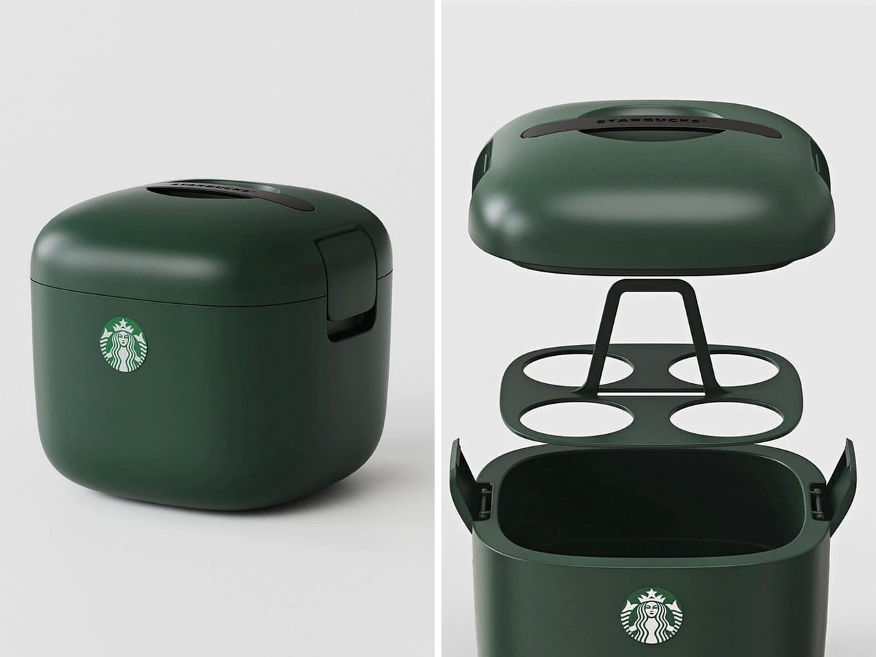
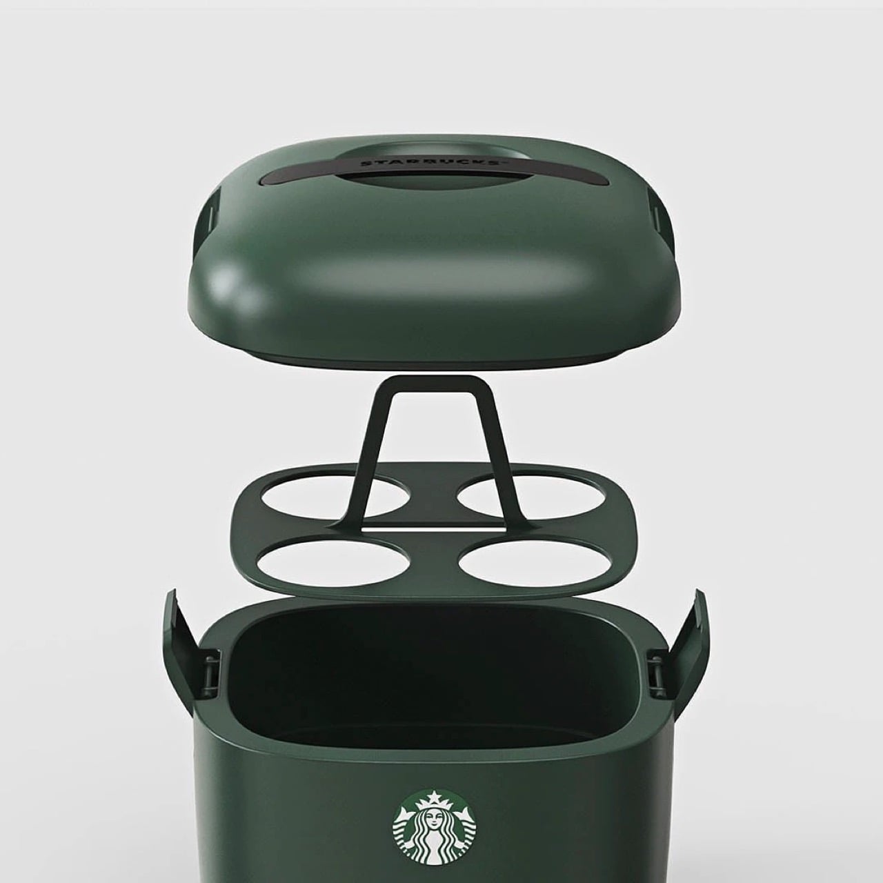
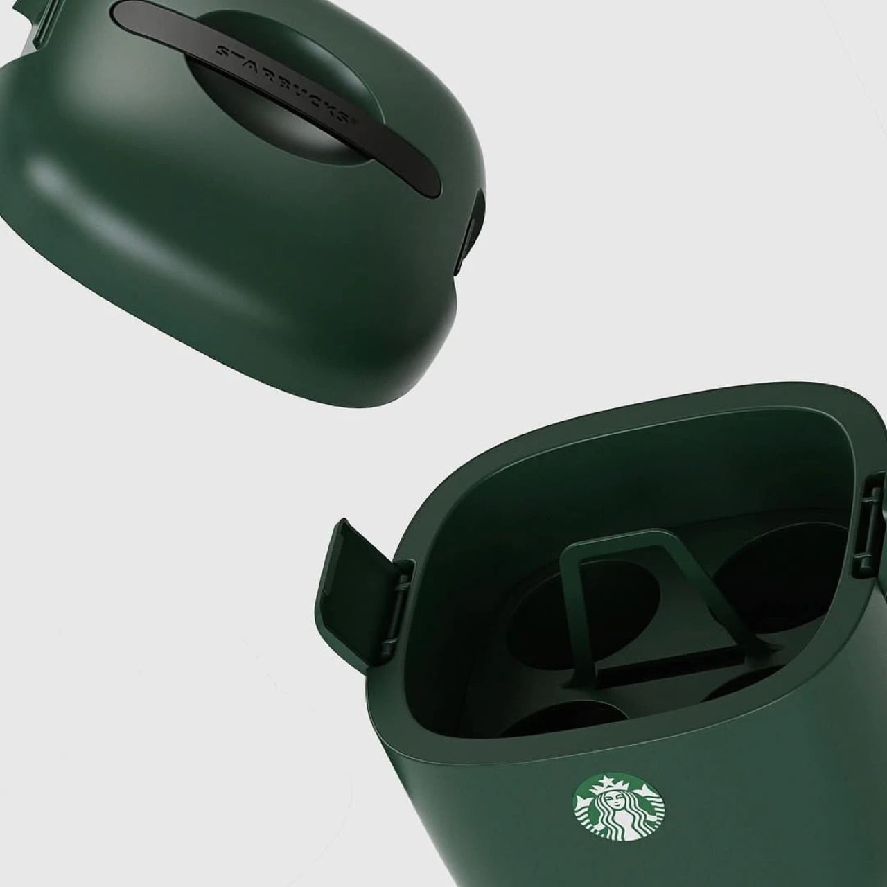
The design is deceptively simple but gets every detail right. Four individual cup slots keep drinks stable and separated, eliminating the float-and-tip chaos that happens when you throw tall cups into a standard cooler. A dedicated ice compartment sits at the bottom, isolated from the drinks themselves so you’re not fishing cups out of melted ice water an hour later. The domed lid has ventilation slots that allow air circulation without sacrificing insulation, and those side latches look substantial enough to actually keep everything secure when you hit a pothole. It’s wrapped in Starbucks’ forest green colorway, compact enough to fit behind a car seat or in a trunk corner, and clearly designed by people who have done the group coffee run enough times to know exactly where the pain points are. The proportions feel right in a way that general-purpose coolers never quite nail when you’re dealing with tall, narrow vessels.
Design: Starbucks Korea
This isn’t Starbucks’ first merch attempt. They’ve consistently pushed out loads of accessories over the years, mostly in eastern markets (like these TWS earbuds in collaboration with Samsung, and these $28 retro cameras that they debuted in China) although this one feels way more purposeful than any of their other launches. It’s something people will buy and use for years, rather than becoming just another collectible, and you know that if someone’s buying a Starbucks cooler, they’re a customer for life. Vertical integration for the win!
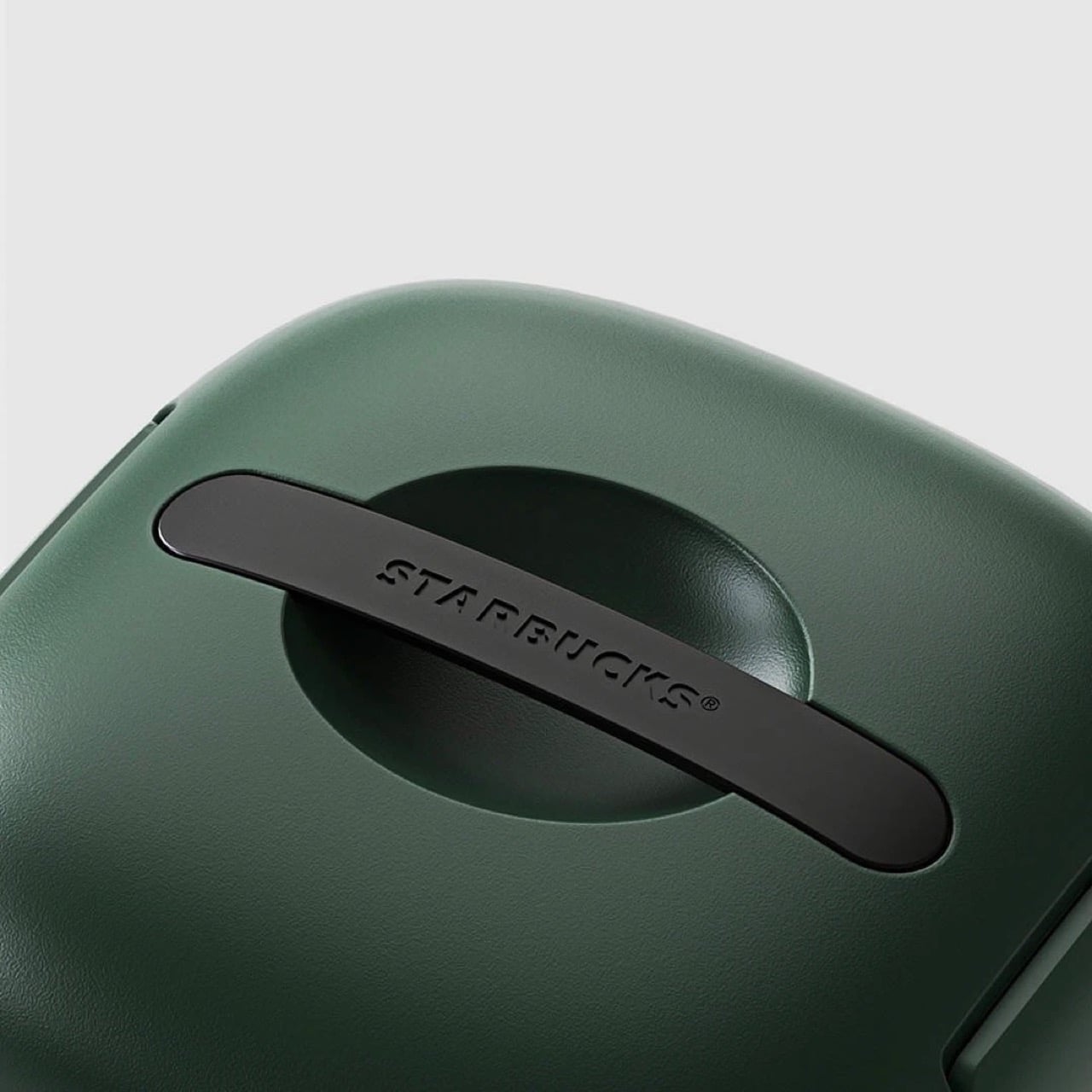
The design is as simple as it gets. The insulated walls keep the insides whatever temperature you want. Although built for iced drinks, you can put your hot beverages in too and have them piping even after hours. For iced drinks, you can also add ice packs into the cooler to chill them down further – just be careful they don’t drip or the cups could get soggy. A lift-out tray holds four venti drinks, because if you’re the kind to drink regulars, you probably wouldn’t be keeping them for hours. The clamp-lid ensures everything is locked in tight, and a Starbucks-branded handle sits flush against the top, giving the entire thing a gorgeously monolithic design.
The only place you can grab this right now is on obscure sites online. A Japanese website has it listed for ¥26,530 or $169 USD, not including shipping. If anyone in Starbucks’ global team is reading this, consider it your sign to manufacture this for the American and European audiences too, trust me, your annual turnover will thank you!
Cubism was, at its core, an act of radical fragmentation. Picasso and Braque looked at the world and decided that a single perspective was a lie, that the honest way to render a face was to show every angle simultaneously, cheekbone beside profile beside full-frontal stare, all collapsed into one electric, disorienting plane. The result was a new visual language built entirely from geometric shards, bold outlines, and colors that had no interest in behaving themselves.
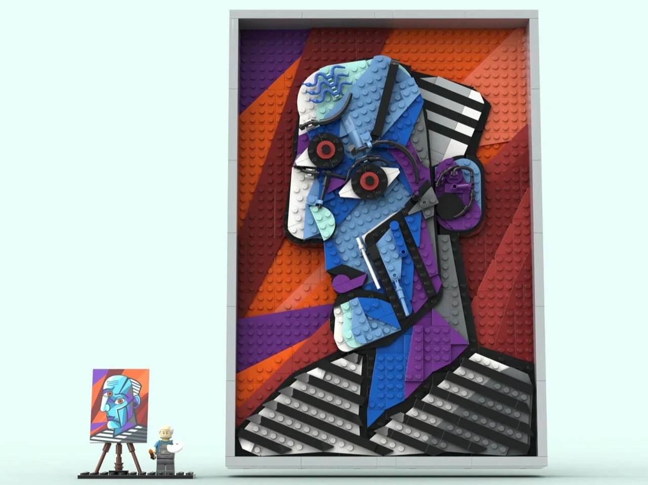
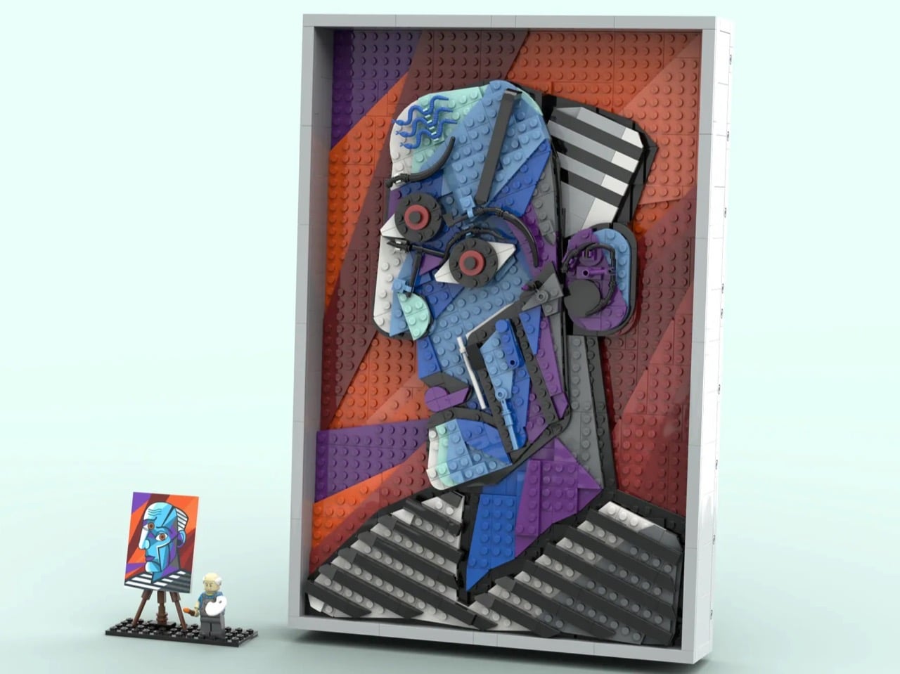
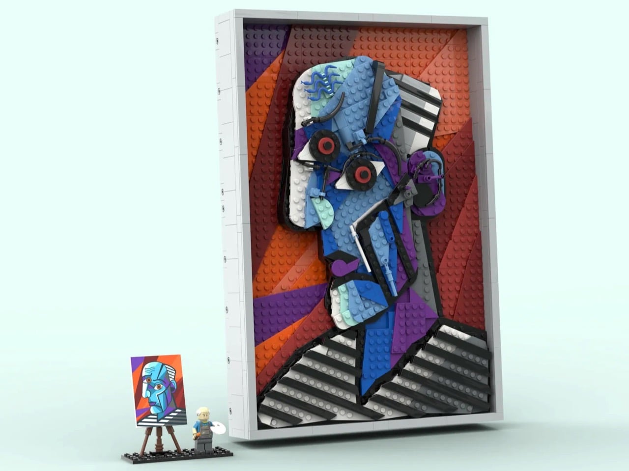
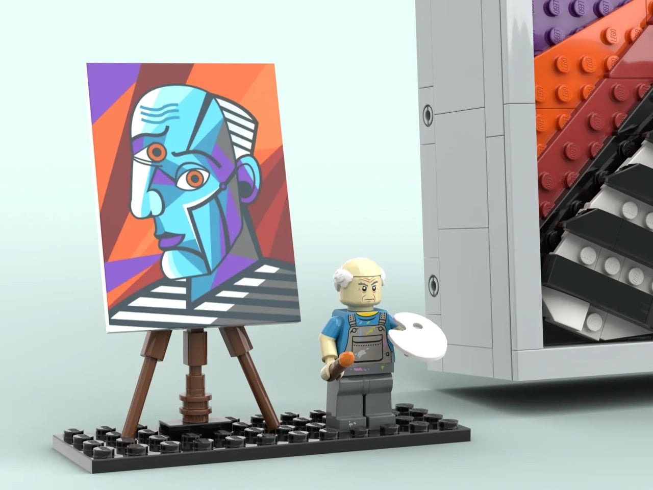
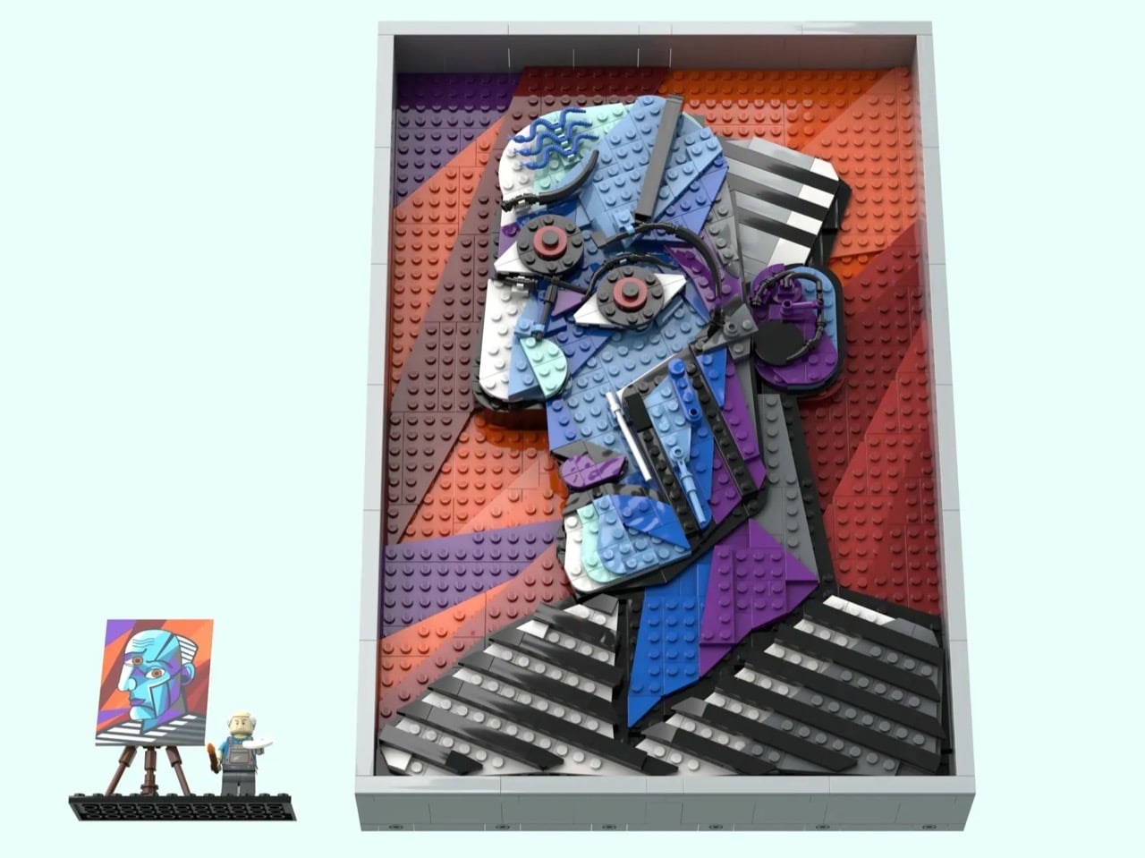
Which makes the literally cube-shaped LEGO brick the perfect medium to translate it. LEGO builder CountVitalCauliflower102 has submitted a 1,117-piece wall-hanging MOC (My Own Creation) to LEGO Ideas that recreates Picasso’s 1953 painting “The Great Painter Face” in brick form, and the moment you see it, something clicks. The angularity, the bold color blocking, the hard-edged geometry, it all lands with the kind of inevitability that makes you wonder why LEGO was focused on Monet and Van Gogh when Picasso’s work translate so perfectly into brick-based art.
Designer: CountVitalCauliflower102
The painting itself is an interesting choice, and a deliberate one. “The Great Painter Face” sits outside Picasso’s most celebrated canon, less famous than Guernica or Les Demoiselles d’Avignon, but it is precisely that underdog status that makes it compelling. The subject is rendered in profile with the full Cubist vocabulary: fractured planes, simultaneous perspectives, a face that is somehow also a diagram of a face. Its bold, high-contrast outlines and vivid color fields translate visually into brick zones with a clarity that a softer, more painterly work simply could not offer. The builder understood exactly what he was choosing, and why.
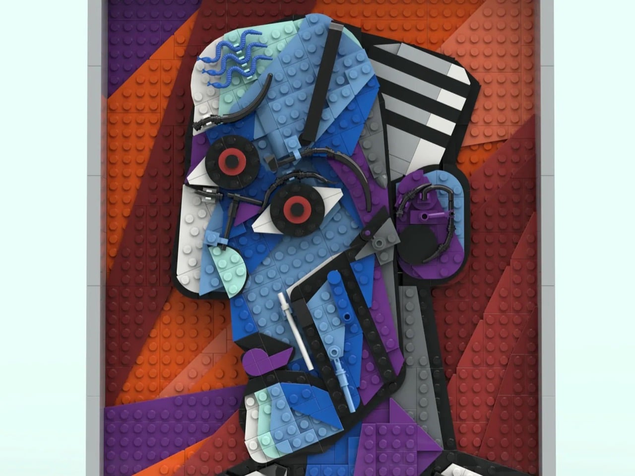
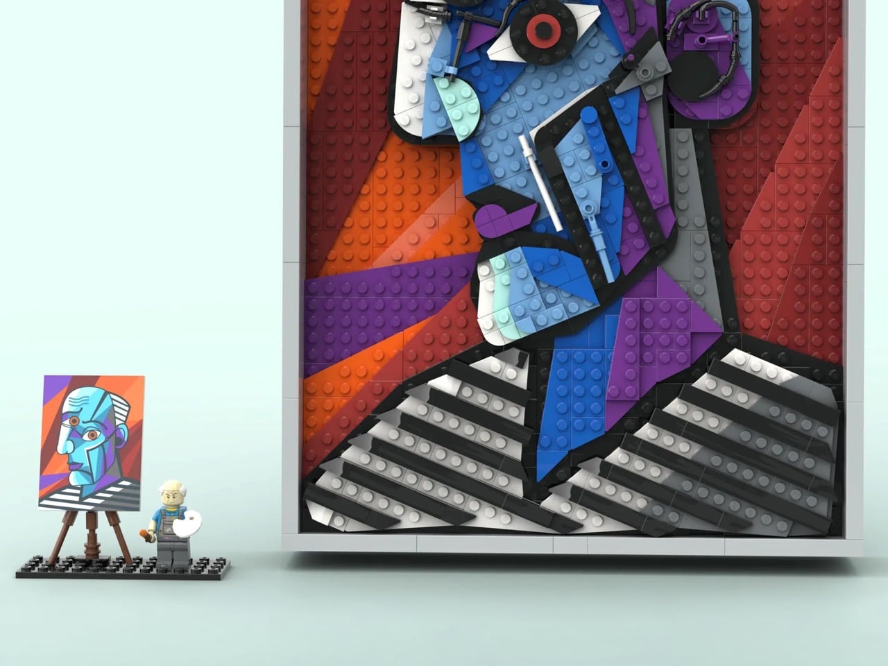
At 34 studs wide and 50 studs tall, roughly 27 by 40 centimeters, the panel is substantial enough to command a wall. The color story is where it immediately grabs you: sweeping diagonal fields of orange, red, and purple form the background, layered at angles that give the composition real energy and depth. Over that, the face emerges in blues, aquas, grey, and white, outlined in black with the bold authority of a stained-glass window. What makes this genuinely impressive from a building standpoint is that CountVitalCauliflower102 avoided the pixel-mosaic approach entirely, opting instead for whole plates and bricks to build continuous color planes, which is absolutely the right call for Cubism’s broad, confident geometry.
My favorite detail, though, is the parts usage in the facial features. The eyes are built around large circular elements with red centers staring out from dark gear-like surrounds, radiating exactly the kind of confrontational intensity Picasso put into his subjects. The wavy blue hair rendered in flexible LEGO tubing is a lovely touch, loose and organic against all that hard geometry. The ear is a cluster of curved and mechanical-looking pieces that somehow reads immediately as an ear while also looking like something you might find in a Technic gearbox. And then there is the nose: a single white bar element, almost dismissively simple, and absolutely perfect. The builder also solved some genuinely tricky structural problems, using Pythagorean geometry to achieve diagonal stud lines at precise integer intervals so that every angled section locks in at two secure endpoints rather than hanging off a single ratchet joint.
The set also includes a minifigure of Picasso himself, wearing paint-splattered overalls and a blue shirt, holding a brush with wet orange paint and a white mixing palette. He stands on a 12×4 black base alongside a brick-built easel displaying a miniature printed canvas of the original painting. It is a lovely piece of editorial wit: the master surveying his own recreation, the tiny figure dwarfed by the monumental panel beside him. The whole build can be displayed either propped on a surface or hung on a wall, with an optional grey frame that gives it that final gallery-ready finish.
LEGO Ideas is the official platform where fan-designed sets earn their shot at becoming real retail products. Any submission that crosses 10,000 supporter votes gets sent to LEGO’s internal review team, which evaluates it for potential production as a boxed set. CountVitalCauliflower102’s Picasso MOC is currently in the early stages of gathering support, with plenty of runway left on the clock. Given that LEGO has released Art sets celebrating Warhol, Hokusai, and even their own brick motif as wall art, a Picasso feels like a genuinely logical next chapter. If you want to help make that happen, you can head to the LEGO Ideas page and cast your vote.
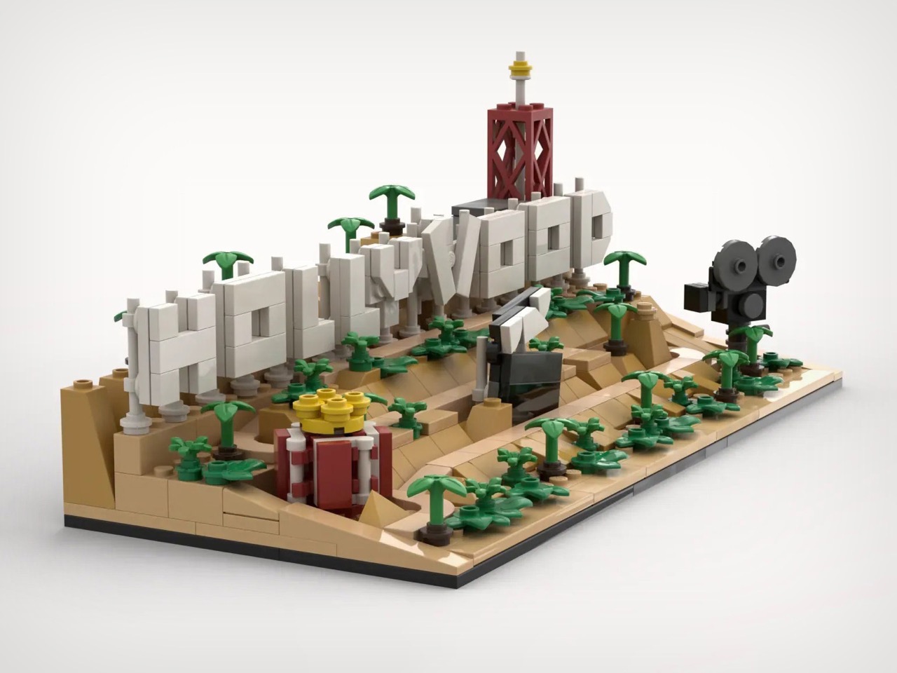
Every year, roughly ten million tourists visit Los Angeles specifically to photograph a sign they will never get closer than a few hundred meters to. There are no public trails to the Hollywood Sign’s base. The entire surrounding area is fenced, monitored, and actively defended against the kinds of people who once scaled those letters for a prank or a protest or a particularly committed selfie (remember the Hollyweed prank from 2017?) It is, by design, a landmark you admire from a distance. Which makes a LEGO version of it feel surprisingly appropriate.
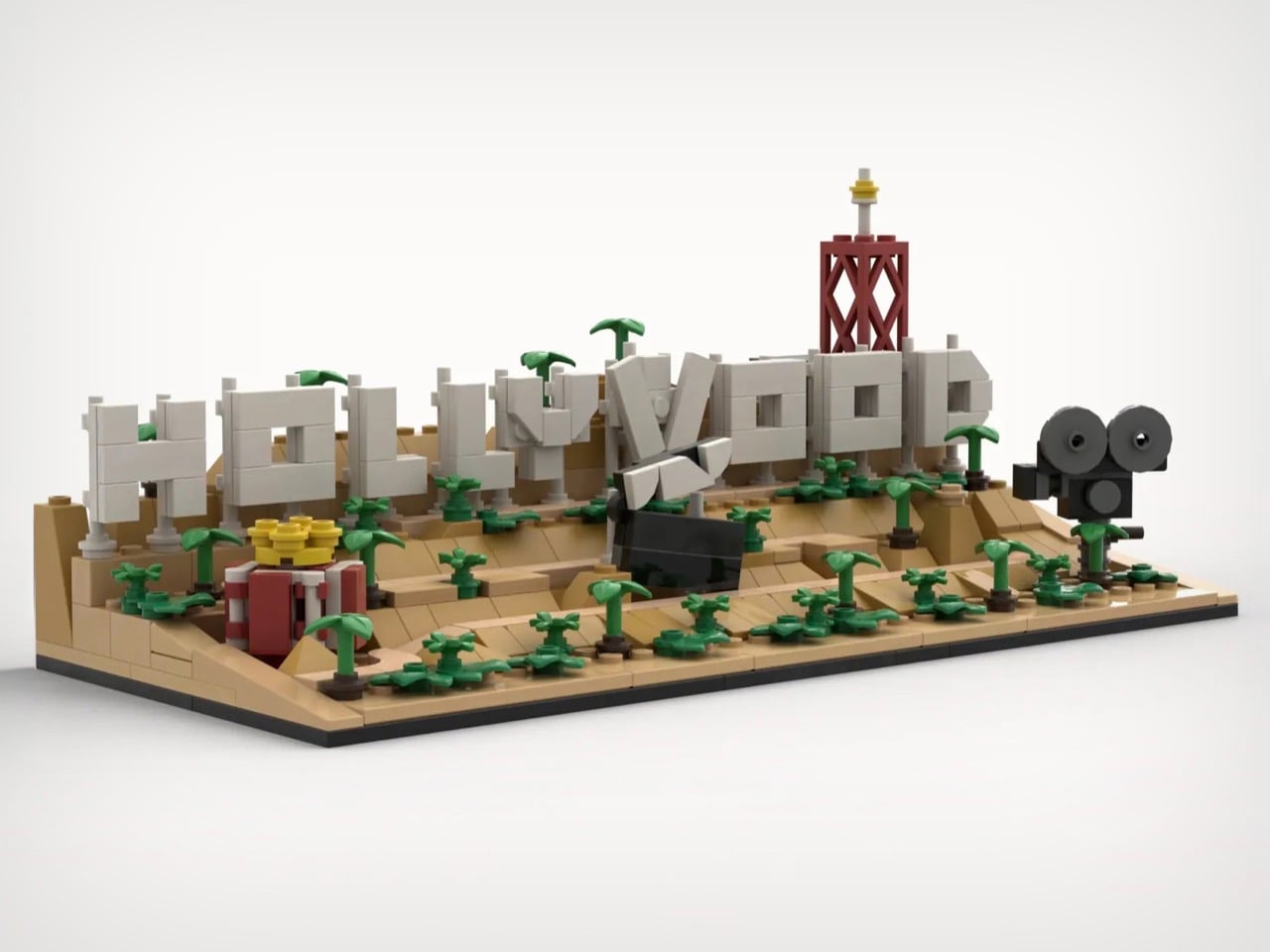
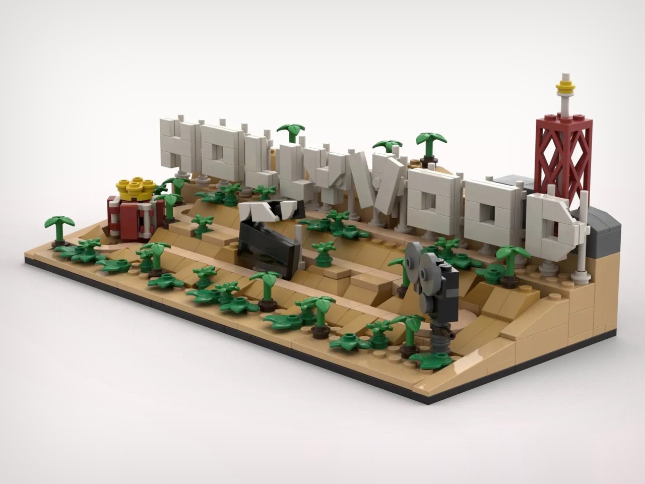
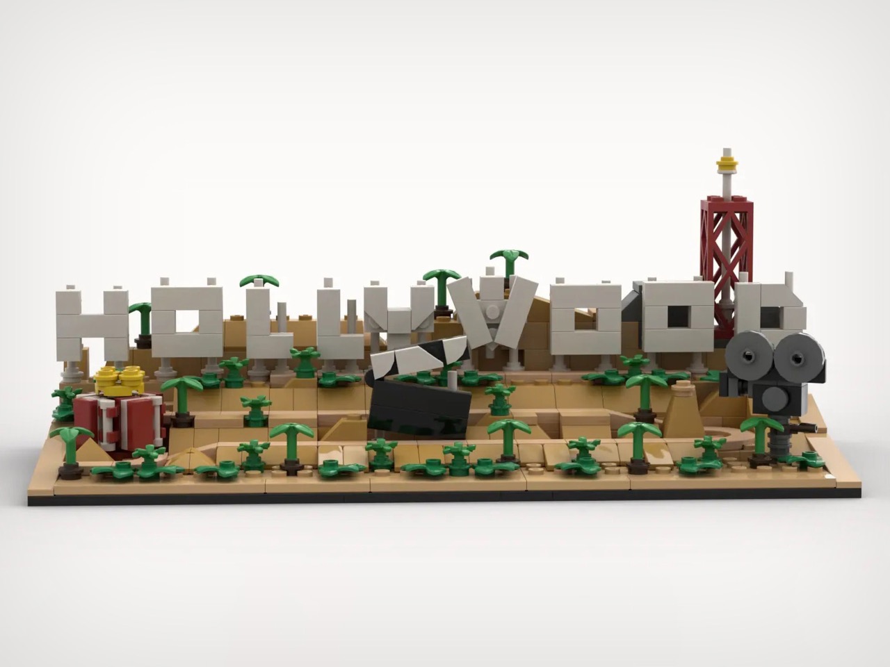
Builder imaxedlp has rendered the sign and its Mount Lee surroundings in 496 pieces, and the result is genuinely charming. The build captures the hillside as a full landscape: tiered sandy slopes, clusters of miniature palms, a clapperboard lying open mid-scene, a vintage camera set up as if waiting for action. The broadcast tower rising behind the letters is an accurate detail that most people probably forget exists. All of it lands on a compact diorama footprint that earns its shelf space.
Designer: imaxedlp
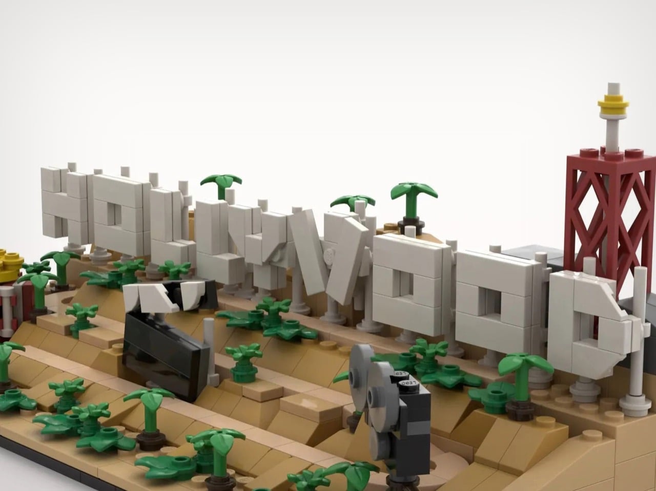
The terraced hillside, built up in warm tan with angled slope bricks stepping from the base to the letter line, gives the model genuine topographic depth from every viewing angle. The nine letters are rendered in light gray with visible stud detailing and subtle column supports underneath, closely echoing the real sign’s steel-frame mounting system. A couple lean at a slight angle, mirroring how the actual letters sit unevenly on the hillside. The clapperboard lying open on the slope, mid-scene, as if a crew just called cut and walked away, is my favorite detail. Small, but it does a lot of narrative work.
The vintage film camera on the right flank, built from dark gray cylindrical pieces with a twin-lens silhouette, grounds the whole scene in old Hollywood specifically. The popcorn bucket on the left pulls in the audience side of the equation. The broadcast antenna tower rising above the D at the far right is the detail that will genuinely surprise people who have only ever seen the sign in photographs cropped to exclude everything but the letters.
imaxedlp’s Hollywood Sign is currently sitting just under 1,000 supporters on LEGO Ideas, where fan-designed builds need 10,000 votes to trigger an official LEGO review for potential production as a retail set. You can head to the LEGO Ideas page here and cast your vote.
There’s a reason every retro emulation console of the last decade keeps cribbing from the same 1980s Japanese design playbook. The Famicom and the original SNES established a visual grammar for home gaming hardware that has never really been improved upon, just iterated, simplified, or fetishized. Cream-colored ABS plastic, primary-red accents, ribbed black ventilation grilles borrowed from HiFi separates, and chunky cross d-pads big enough to register through a winter glove. Analogue has built an entire premium business on faithfully reissuing this language. Anbernic and Miyoo have built equally large businesses on cheaply approximating it. What nobody has really done is take that grammar and warp it through a fashion-house sensibility.
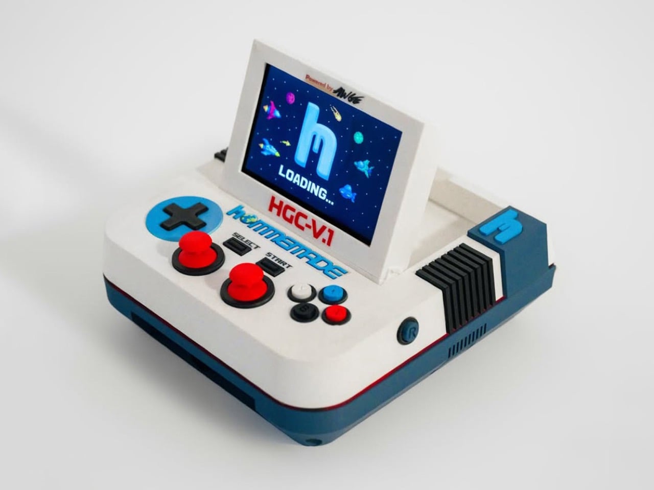
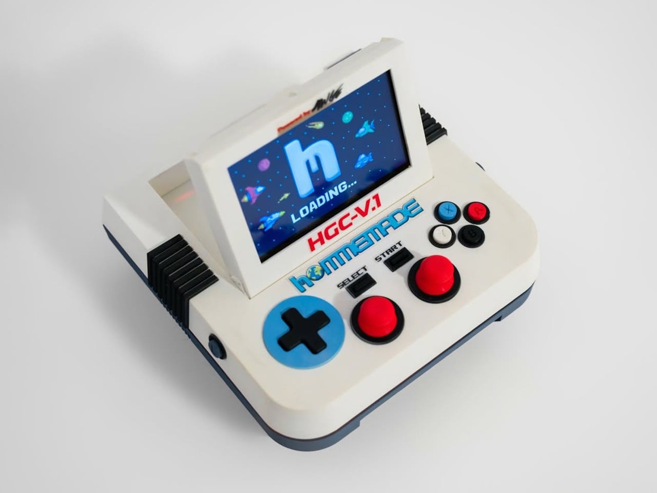
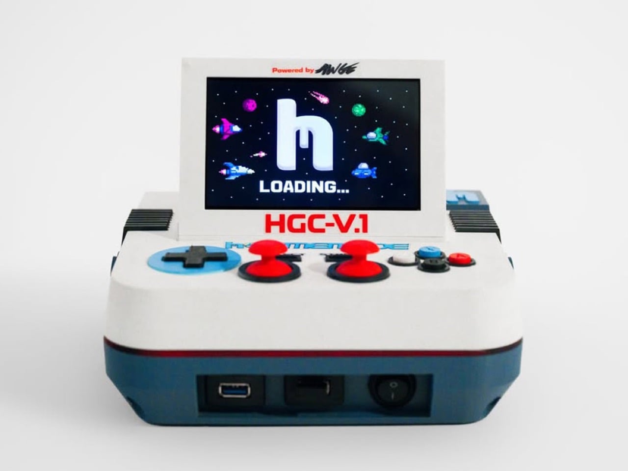
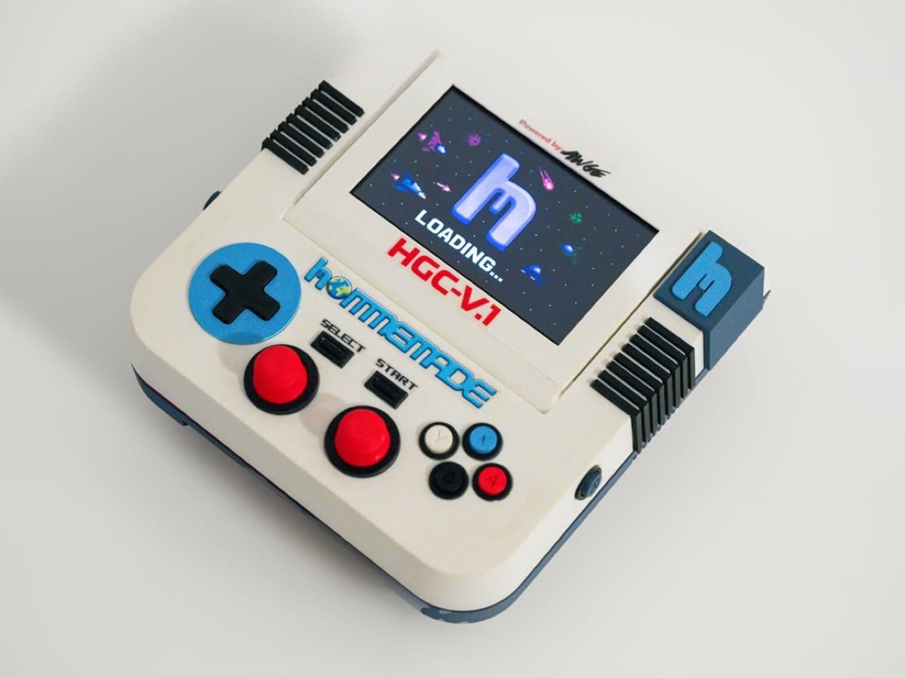
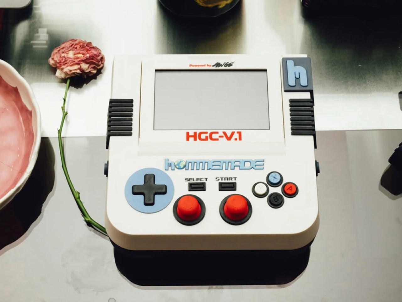
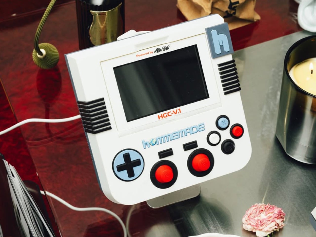
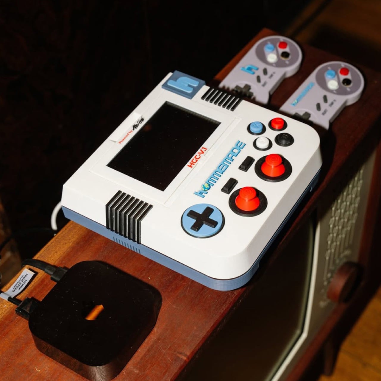
A$AP Rocky’s Hommemade studio just gave it a shot. The HGC-V.1, or Hommemade Gaming Console Version One, is a flip-screen retro emulation system designed in-house at AWGE and built around a chunky, almost cartoonishly oversized form factor that reads like a Famicom rendered as a desk sculpture. Cream and slate-blue body panels, two red arcade-style thumbsticks, a cobalt cross d-pad, SNES-coded face buttons, and black ribbed heat sinks flanking a flip-up LCD that boots into a pixelated starfield with the Hommemade “h” logo glowing front and center. It’s a console designed to be looked at as much as played.
Designer: AWGE / Hommemade
The form language here rewards a closer look. Most retro consoles fall into one of two camps, the faithful reissue (Analogue Pocket, Mega Sg) or the all-in-one emulation handheld (the entire Anbernic catalog), and both prioritize either accuracy or portability. The HGC-V.1 ignores both briefs. It’s a tabletop unit, roughly the proportions of a 1980s portable TV, with a flip-up screen that gives it a clamshell silhouette closer to a Game Boy Advance SP scaled up to coffee-table size. The d-pad, joysticks, and face buttons are all deliberately oversized, pushing past ergonomic logic into something more sculptural. You don’t pick this up the way you’d pick up an Anbernic RG35XX. You sit at it.
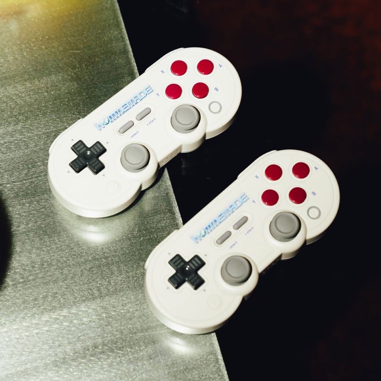
The detailing is where the AWGE handprint gets loud. “HGC-V.1” sits in red Famicom-style lettering across the bezel, “Powered by AWGE” gets stamped in that scrappy hand-drawn type Rocky has used across his whole creative universe, and the chunky blue “h” logo on the right shoulder behaves less like a brand mark and more like a structural element, almost a handle. Around the back you get USB, what looks like HDMI out, and a physical toggle switch with the satisfying mechanical heft those late-90s appliances always had. The package ships with two wireless gamepads that crib NES proportions while smuggling in twin analog sticks and a four-button face cluster, essentially a hybrid retro-modern pad capable of running anything from NES ROMs through to early PS1 emulation.
No public price has been announced, which fits the Hommemade pattern. The label operates on a made-to-order basis through a single email address (hommemade@awge.com if you’re interested), and the rest of the Galaxy Collection ranges from $13,500 dividers to the $300,000 CBNT.V1 entertainment console covered by Hypebeast last week. Expect this to land somewhere in art-object territory rather than competing with the upcoming Steam Machine. The HGC-V.1 isn’t trying to win on specs or library size. It’s trying to win on the simpler proposition that gaming hardware can be a piece of furniture worth designing properly, and on that front, it makes a genuinely compelling case.
John Cena’s spinning championship belt should not have worked. It was gaudy, it was hip-hop inflected, it belonged more to a music video than a wrestling ring, and it absolutely captured a generation of young fans who grew up treating it as the definitive image of what a championship looked like. That belt stayed on WWE television long after Cena’s character stopped spinning it, because WWE understood that the object itself had taken on a life independent of the man who introduced it.
That is the particular power that championship belts hold over wrestling. Mick Foley took three of the most brutal falls in WrestleMania history and walked away as champion, and the belt validated every bit of the punishment. Bray Wyatt’s Fiend character carried a Universal Championship with his own face grotesquely incorporated into the design, because for that character, the belt had to be an extension of the horror. These objects absorb the identity of whoever holds them, and they carry that identity forward long after the reign ends.
A Tradition Borrowed From Boxing
Championship belts predate professional wrestling entirely. The tradition traces back to 1810, when British boxer Tom Crib defeated American boxer Tom Molino in a grueling 35-round fight, and King George III presented Crib with what historians consider the first championship belt, reportedly constructed from lion skin decorated with silver claws. One popular theory holds that early boxers would bring colored cloths to tie around their waists before fights, and winners would take their opponents’ colors and wear them as a belt to signal victory. The symbolism was immediately legible and it stuck.
When professional wrestling emerged as a competitive sport in the late 19th century, it borrowed the championship belt wholesale from boxing. The first recognized wrestling championship arrived in 1905, with George Hackenschmidt becoming the inaugural World Heavyweight Wrestling Champion. Early WWE belts were plain objects, basic leather straps with small metal plates, and during Bruno Sammartino’s legendary seven-year reign in the 1960s, the design featured little more than the shape of the United States pressed into leather. The wrestling mattered more than the prop, and nobody pretended otherwise.
From Simple Leather to Cultural Artifact
The 1980s changed everything. As wrestling transformed from regional athletic competition into globally televised entertainment, the belts transformed with it. The winged eagle championship arrived during the Golden Era and was perfectly calibrated for the personalities carrying it, Hulk Hogan, Randy Savage, the Ultimate Warrior, larger-than-life characters who needed a larger-than-life object to hold above their heads. Reggie Parks, a former wrestler turned belt maker, created that winged eagle design, and it remains the belt most commonly cited when fans argue about the greatest championship design in history.
The 1990s brought the Big Gold Belt, originally from NWA and WCW, featuring 24-karat gold, silver, diamonds, and rubies, a genuinely opulent object that looked like it belonged in a museum case. Then came the spinner, Cena’s spinner, which arrived in 2005 and did something no belt had done before: it became a product. Kids wanted replicas not because they idolized the championship lineage but because the belt itself was cool, in the same way a sneaker or a video game peripheral was cool. The customizable side plates introduced in 2013 pushed this further, allowing each new champion to stamp their own identity onto the physical object, making every title change feel like a genuine handover rather than just a storyline beat.
The People Who Actually Build Them
Creating a WWE Championship belt is not a factory operation. It is a craft practiced by a small number of artisans working out of workshops in the United States, and the knowledge passes between them the way apprenticeships work in watchmaking or leatherwork. Dave Millican is one of the primary belt makers working with WWE today, responsible for the WWE Championship, the World Heavyweight Championship, the Intercontinental Title, and the tag team titles among others. He learned his craft directly from Reggie Parks, the man who built the winged eagle, and credits Parks entirely for his credibility when he was starting out.
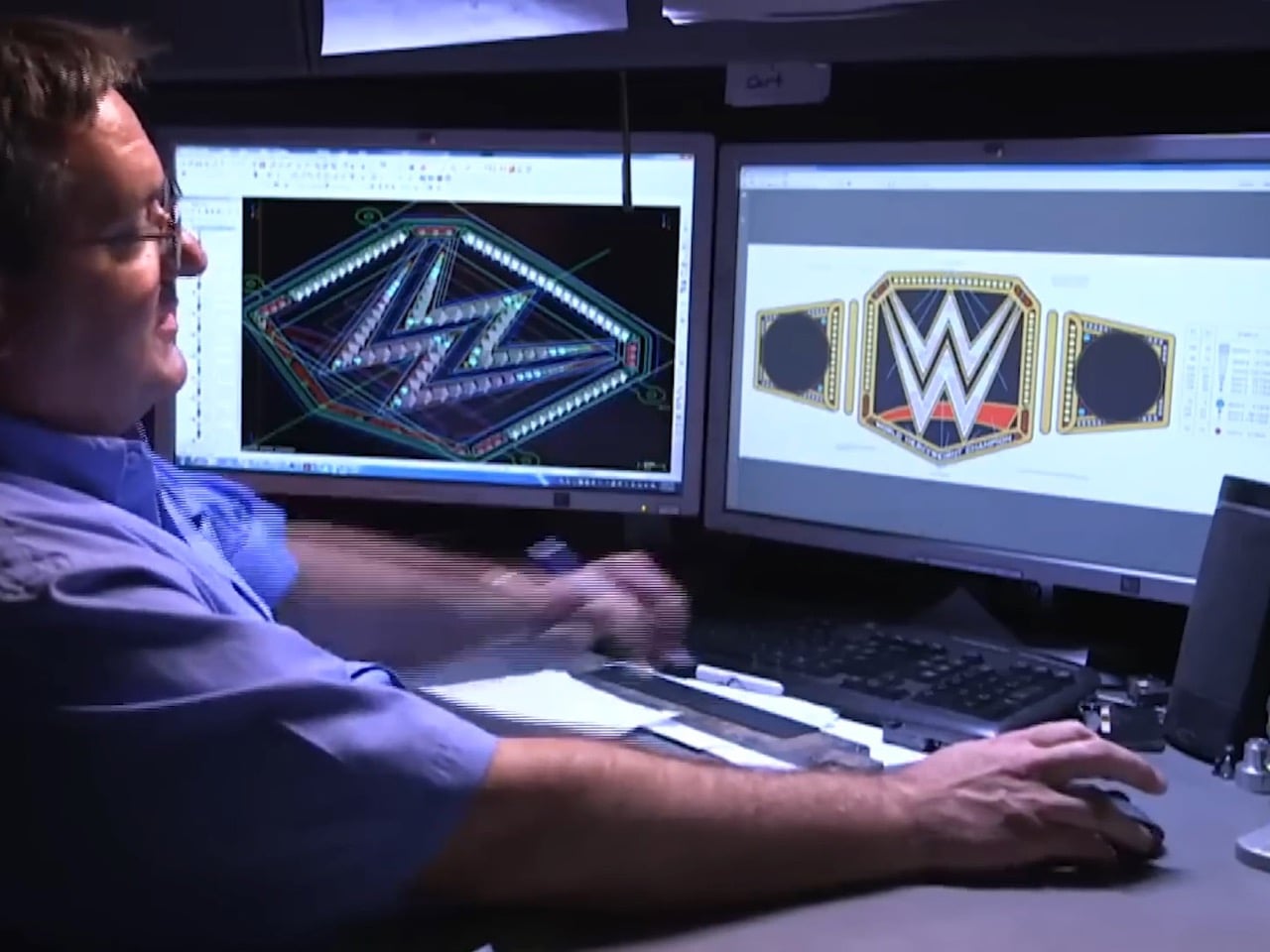
Millican works from a garage workshop, which tells you something important about the scale of this industry. There is no belt-making facility, no assembly line, no team of technicians running shifts. There is a craftsman, a set of specialized tools, and months of painstaking handwork. WWE contacts belt makers with a set of requirements, the two collaborate through sketches and revisions, and once a design is locked, the real work begins.
Clay, Tin, and Months of Handwork
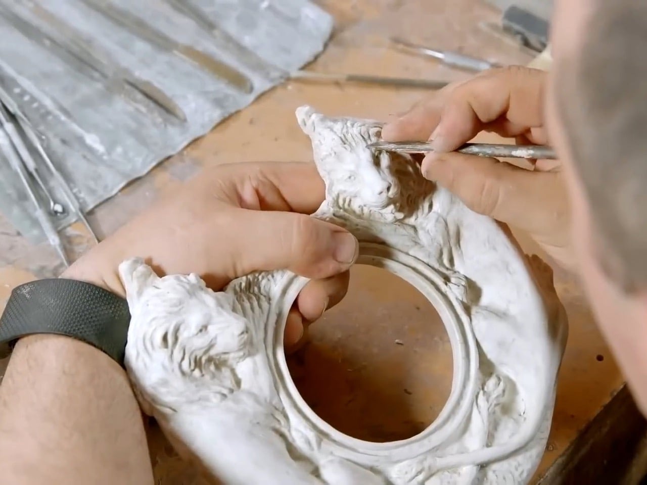
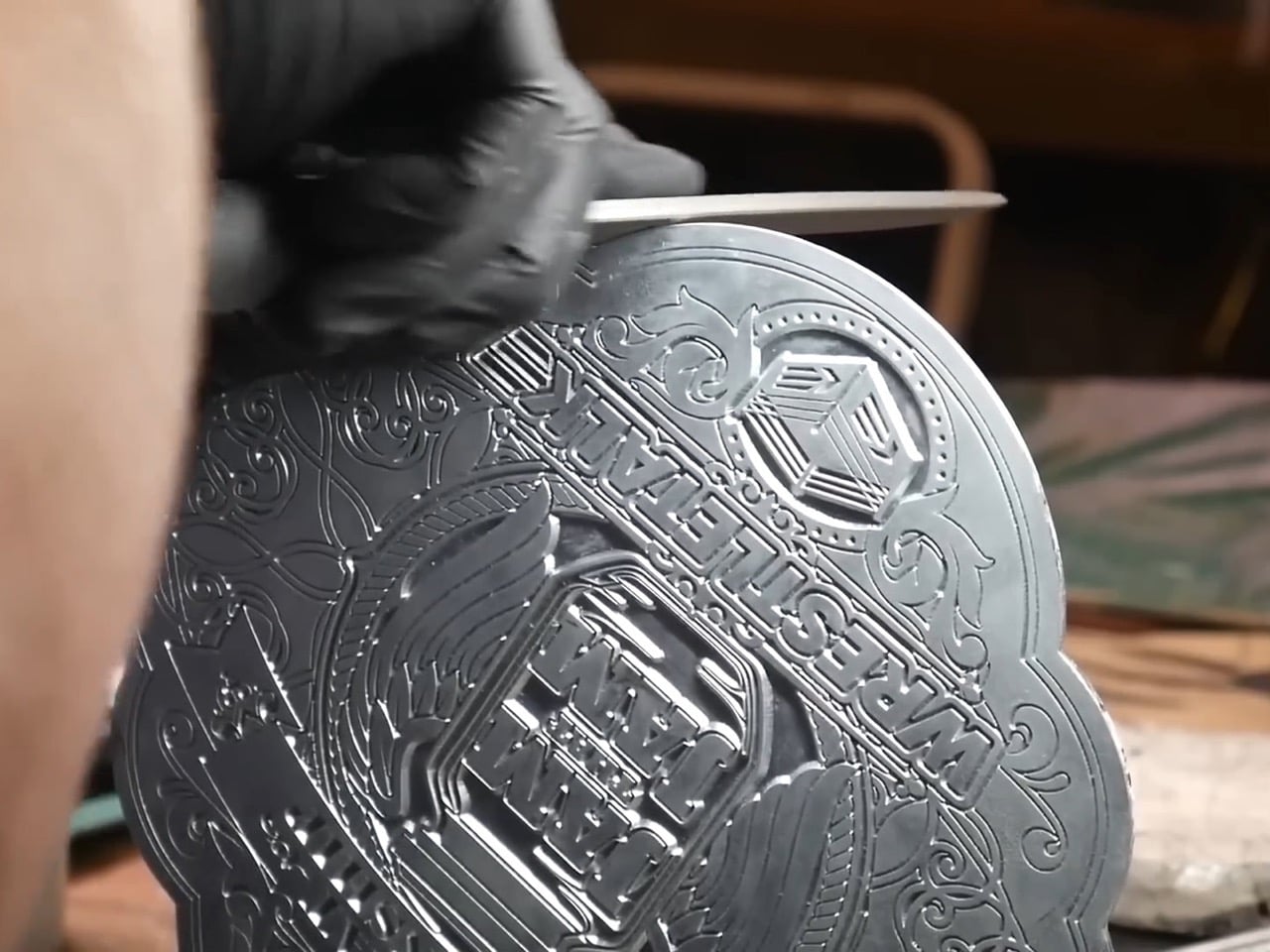
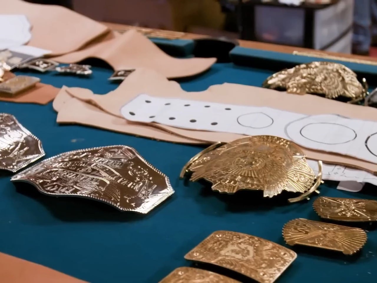
The process starts with clay. The belt maker hand-sculpts a detailed three-dimensional model of each plate from soft clay, capturing every ridge, letter, and decorative element by hand. Once the clay dries and hardens, plaster is poured around it to create a negative mold. That plaster mold produces a soft metal model, typically aluminum, which the artist then spends considerable time refining, sharpening details, smoothing transitions, and preparing for the next stage. This refined metal model becomes the template for the final casting mold.
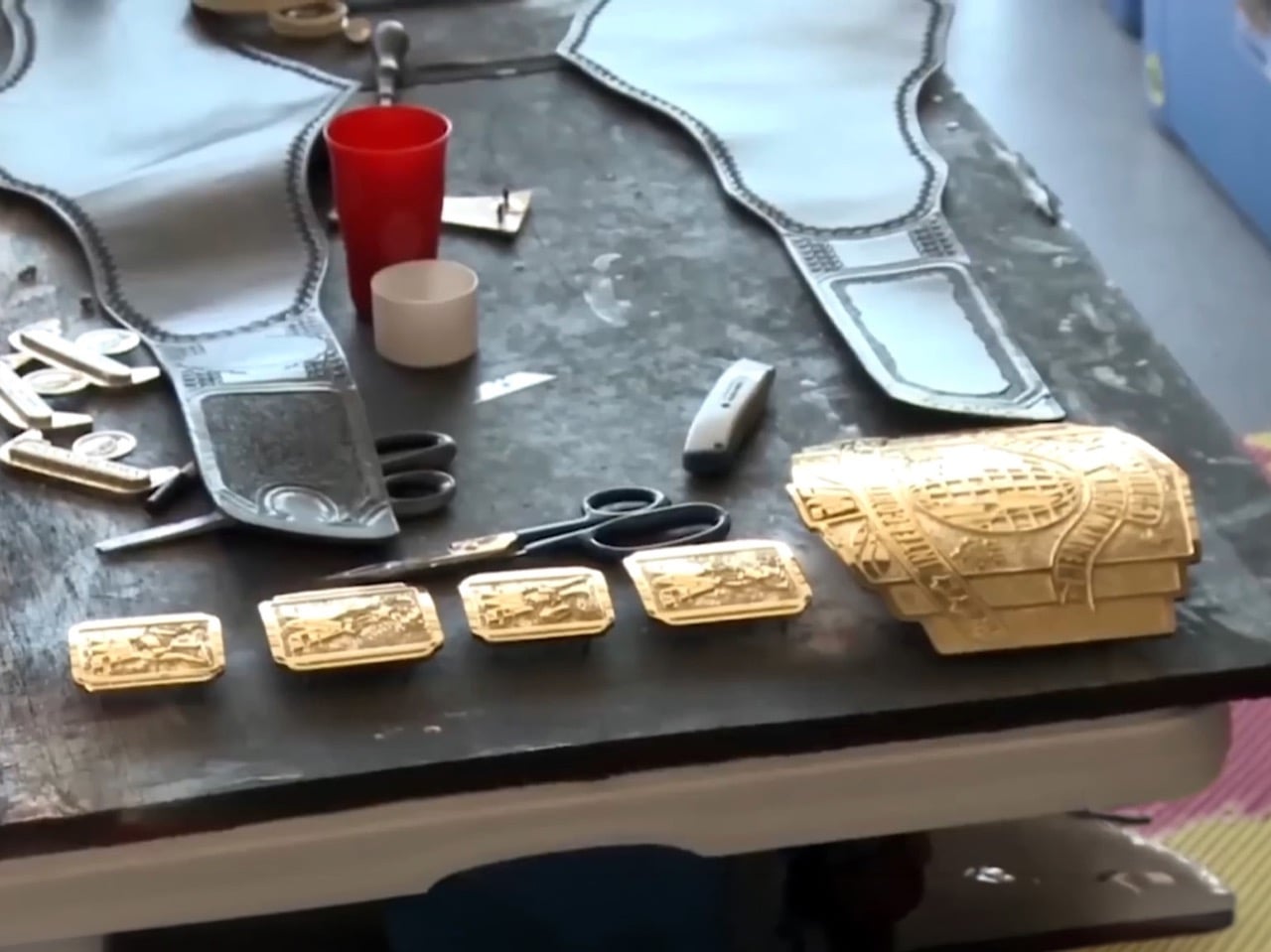
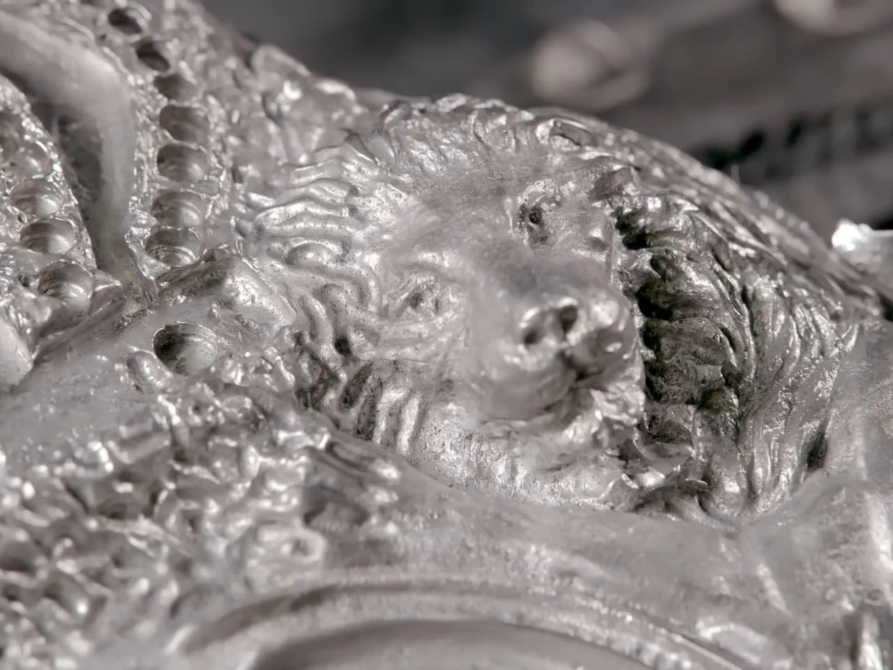
The actual plates are cast from molten tin. Liquid metal is poured into the mold, left to cool completely, and then pulled out in a state that is nowhere near finished. Freshly cast plates have rough edges, shallow details, and a surface that requires hours of hand-finishing using files, chisels, and specialized tools. Elements that cannot be achieved through casting alone, particularly sharp lettering and small sculptural details, are crafted as separate pieces and attached to the main plate, then refined by hand until they blend seamlessly with the surrounding surface.
Electroplating and the Gold Finish
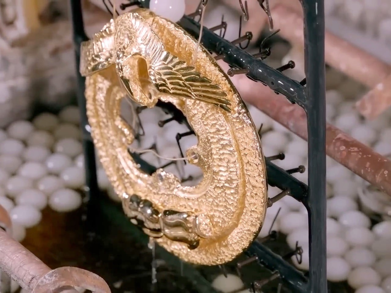
Tin is structurally workable but visually unimpressive, so once the plates are refined, they go through electroplating. The plates are cleaned thoroughly to remove any residual metal shavings or surface contamination, then polished on a rotating buffing wheel until they shine. From there, they are submerged in an electrolyte solution while connected to an electrical circuit, and the current slowly deposits a layer of precious metal onto the surface. Most WWE belts receive a gold finish, though silver and rhodium are also used depending on the design requirements. For belts featuring multiple metal tones, different sections are masked during separate plating stages to create a two-tone effect.
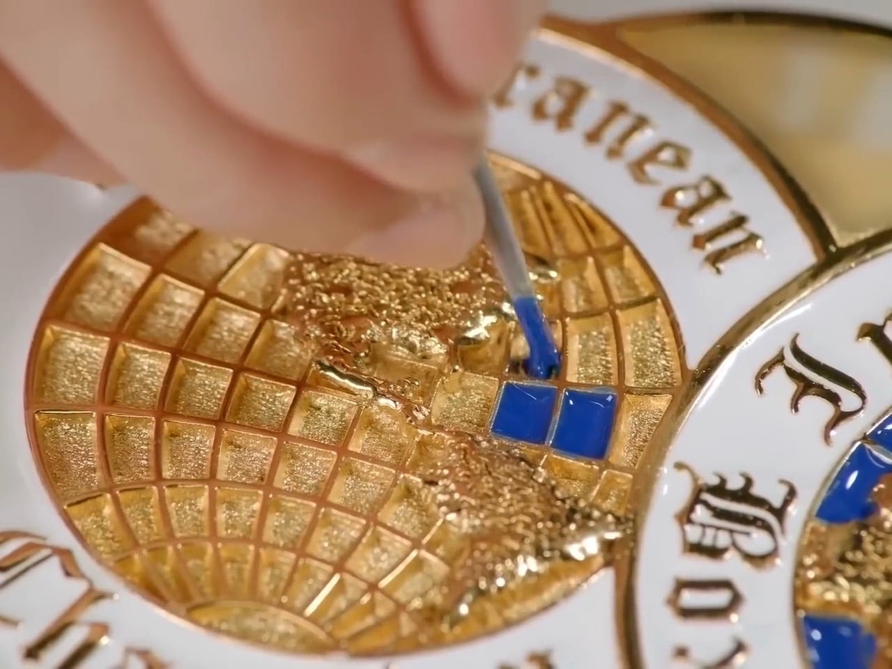
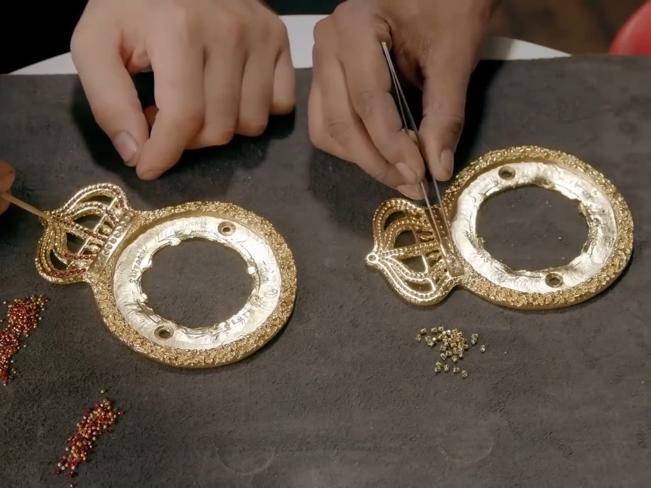
After plating, three finishing techniques add the visual complexity that makes these objects so immediately striking. Etching applies a chemical to specific areas and then submerges the plate in an etching solution, creating textured patterns that contrast against the polished metal. Enamel painting involves applying thick enamel paint to designated sections and baking the plates to lock in a durable, colorful finish. Gemstone setting, the most labor-intensive of the three, has a jeweler attaching rubies, sapphires, diamonds, or crystals directly to molded cavities in the metal surface. The Crown Jewel Championships, the most expensive belts in WWE history, reportedly contain 50-karat diamonds and carry a value exceeding one million dollars. Champions are not permitted to take them home; they remain in Saudi Arabia, and winners receive rings instead.
Leather, Assembly, and the Finished Object
With the plates complete, attention moves to the leather strap that holds everything together. The belt maker hand-traces and cuts the strap from high-quality leather, dyes it to the required color (typically black, though the Universal Championship famously used red), then waxes and polishes it to a durable finish. An inner lining of spandex or felt is added for comfort against bare skin, all layers are stitched together, and the plates are secured using thick leather-working string or industrial-strength adhesive. A closing mechanism, either buckles or snap hooks depending on the design, is added, high-grade vinyl finishes the outer edges, and the inside is branded with both WWE’s logo and the belt maker’s own insignia before the whole thing is packed and shipped.
WWE maintains multiple copies of each belt design. HD belts are built specifically for television, engineered to catch light perfectly under arena conditions. Champions also receive separate travel belts for appearances, signings, and live events. According to Millican, when a new HD belt is produced or refurbished, the previous version gets demoted to road use, which explains the occasional moments when attentive fans spot a belt with slightly wrong plates or minor inconsistencies on broadcast. The pristine version simply did not make it to the venue in time.
WWE creates what it calls HD belts, versions built specifically to perform under television lighting and capture every engraved detail on camera, while champions carry separate travel belts to appearances and signings on the road. When a new HD belt is made, the previous one gets demoted to road duty, which explains the occasional glimpse of a belt with slightly wrong plates or an unfamiliar finish on a live broadcast. Even the logistics of managing these objects reflects how seriously WWE treats them as artifacts rather than accessories.
A replica belt sells at retail because fans understand instinctively that what they are buying is a piece of wrestling history in miniature, a connection to the moment their favorite wrestler finally hoisted the real thing overhead. That impulse makes complete sense when you understand what went into building the original: months of clay sculpting, metal casting, electroplating, gemstone setting, and leather work, all converging into an object that a 10-year-old sees on television and immediately understands means everything.
Twenty years after Hannah Montana premiered on Disney Channel, Miley Cyrus stepped back onto a replica of the Stewart family living room for a Disney+ anniversary special that sent millennials and Gen Z into a collective spiral. The show, which ran from 2006 to 2011, quickly snowballed from a children’s series about a girl living a double life into something much bigger: sold-out tours, chart-topping hits, a blockbuster movie, and the making of a generation-defining superstar. Cyrus had famously declared Hannah dead back in 2013, and spent the better part of a decade distancing herself from the blonde wig. Coming back, then, felt like something. The artist has come full circle, at peace with her past and embracing it as an important part of who she is.
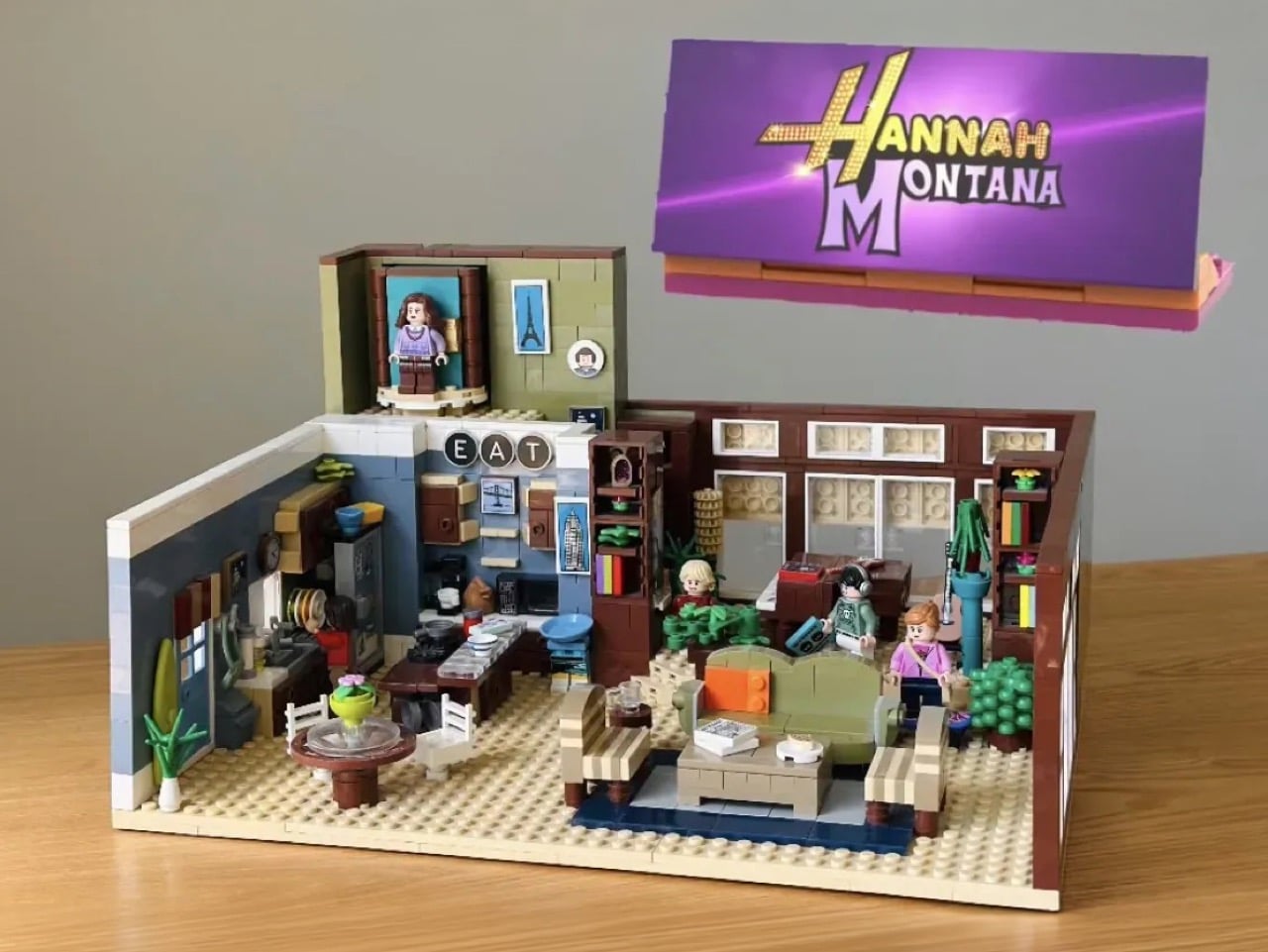
Riding that wave of perfectly timed nostalgia, LEGO Ideas builder KnightVibrantKnees100 has submitted a brick-built recreation of the Stewart family home that is, frankly, just as detailed as anything Miley walked back into. The MOC (My Own Creation) covers the living room, the kitchen, and a transformation mechanism that actually rotates a Miley minifigure into Hannah Montana, which is either the most delightful play feature of the year or the most emotionally loaded one, depending on how much of your childhood this show occupied.
Designer: KnightVibrantKnees100
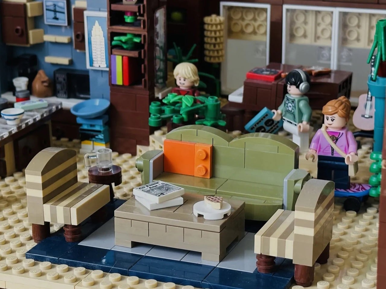
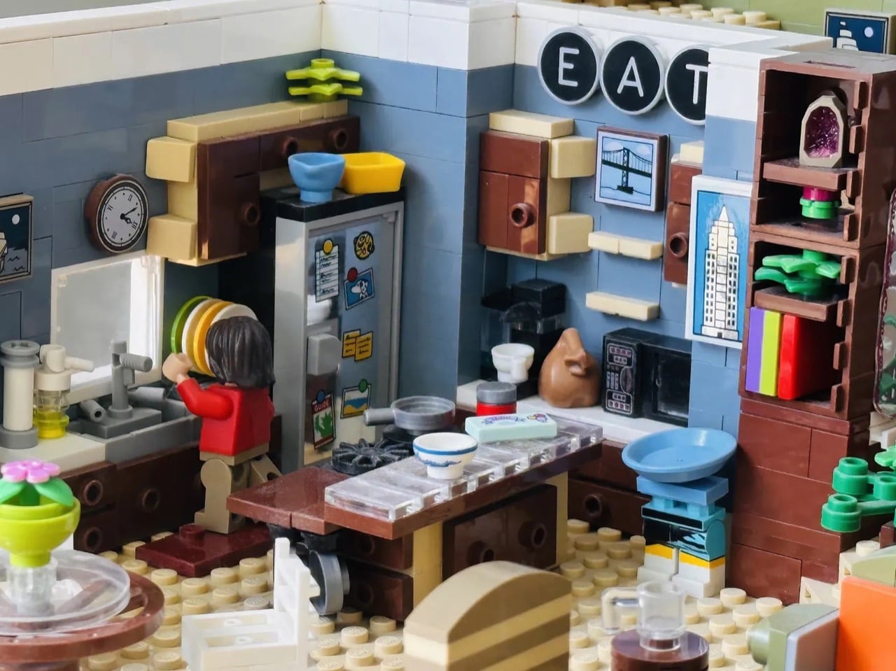
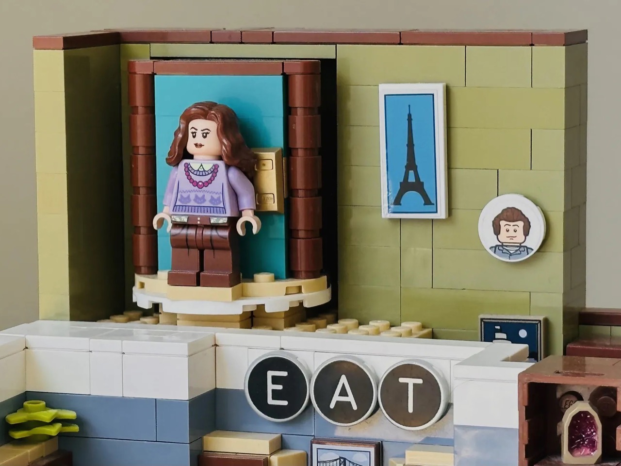
The build is an open-plan interior display, and the amount crammed into it is impressive. The living room anchors the right side of the model with the green sofa, a pair of striped armchairs, a coffee table scattered with magazine tiles, and a red boombox sitting on the shelf behind. A guitar leans in the corner. Bookshelves with colorful spines run along the back wall. Plants are everywhere, which feels accurate to the show’s slightly overstuffed, lived-in aesthetic. The kitchen on the left is even more packed: a stickered fridge covered in magnets, a stovetop, a wall clock, a sink with a minifig doing dishes, and the “EAT” sign spelled out in round letter tiles on the wall above, exactly as it appeared on screen. The warm browns, tans, and muted blues hold together as a color palette in a way that genuinely evokes the show’s production design rather than just approximating it.
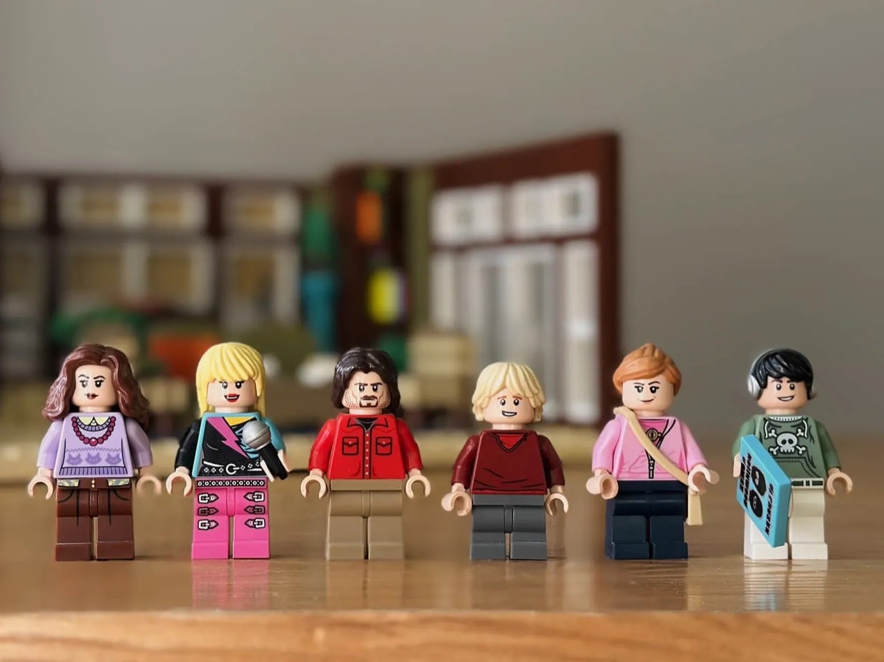
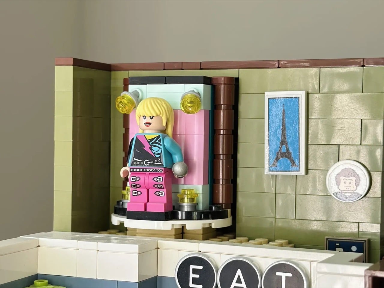
The minifigure lineup covers the full Stewart household and then some. Miley, Robby Ray, and Jackson are all present, alongside Lily (complete with crossbody bag and skateboard) and Oliver, decked out in his green hoodie and headphones and carrying a boombox tile. Hannah Montana gets her own separate minifigure in full pink-and-teal pop star gear, microphone in hand.
My favorite detail, though, is the transformation mechanism. Tucked into the upper level of the build, a rotating turntable platform sits inside a pink-lined doorframe niche flanked by small yellow globe lights, like a backstage dressing room that doubles as a stage entrance. Miley stands on it as her everyday self, and a simple rotation reveals Hannah in her place. It is a genuinely clever building solution, and it captures the show’s central gimmick with more wit than you’d expect from a handful of plastic bricks.
The build currently has 621 supporters on the LEGO Ideas platform, with 418 days left to reach the 10,000-vote threshold that would put it in front of LEGO’s internal review team. If you grew up watching Miley Stewart fumble her way through a double life in that Malibu living room, this one is worth your vote. Head to the LEGO Ideas page and cast it here!