Tai Lung might be the best villain DreamWorks Animation ever put on screen. Not because he’s the most powerful, or the most menacing, but because his grievance is genuinely sympathetic. He trained his entire life to receive the Dragon Scroll, was denied it by the master who raised him, and then spent years chained in a mountain prison nursing a rage that was, arguably, justified. The film never quite lets you root for him, but it absolutely lets you understand him, which is a far harder thing to pull off in a children’s animated movie.
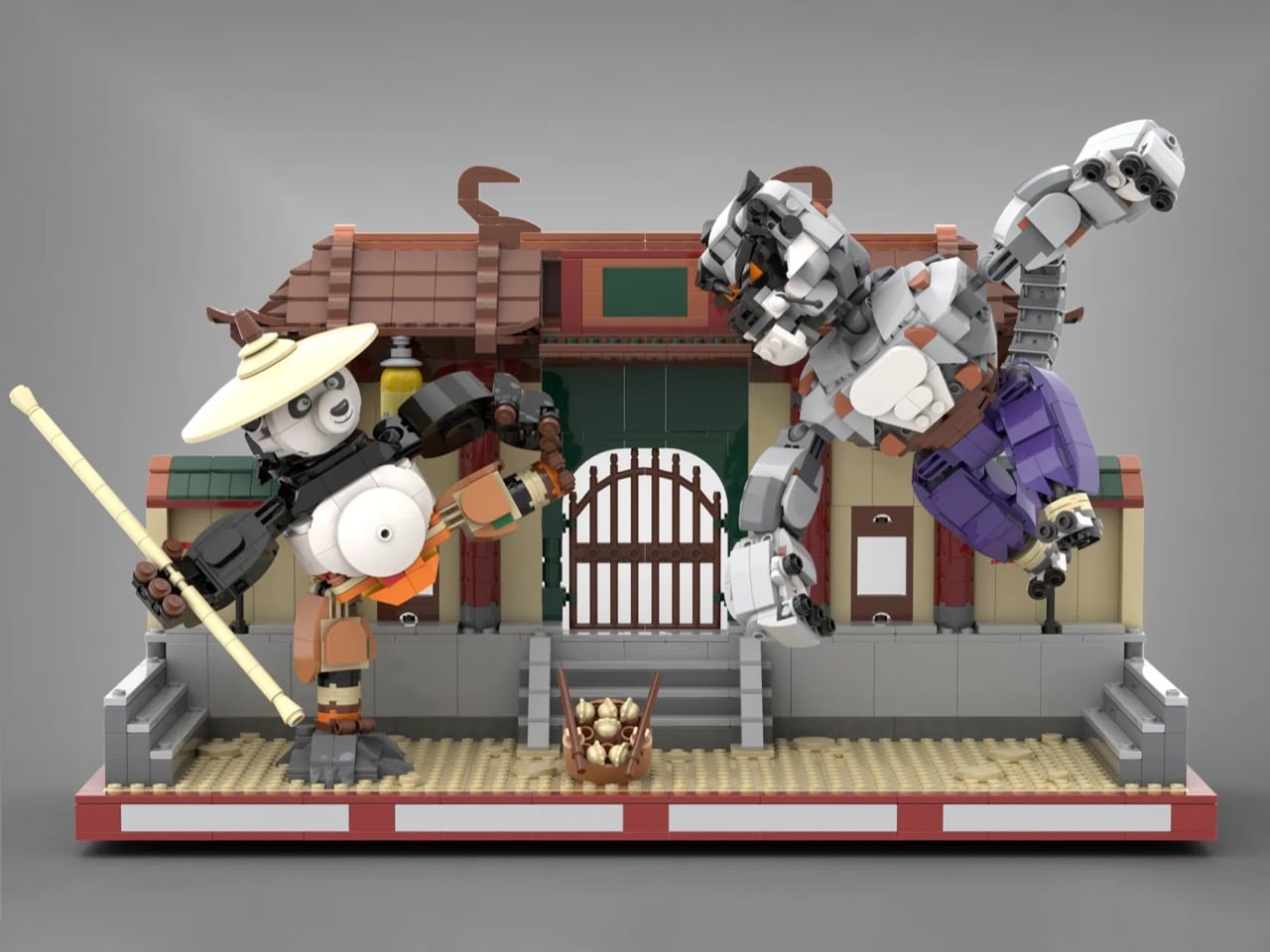
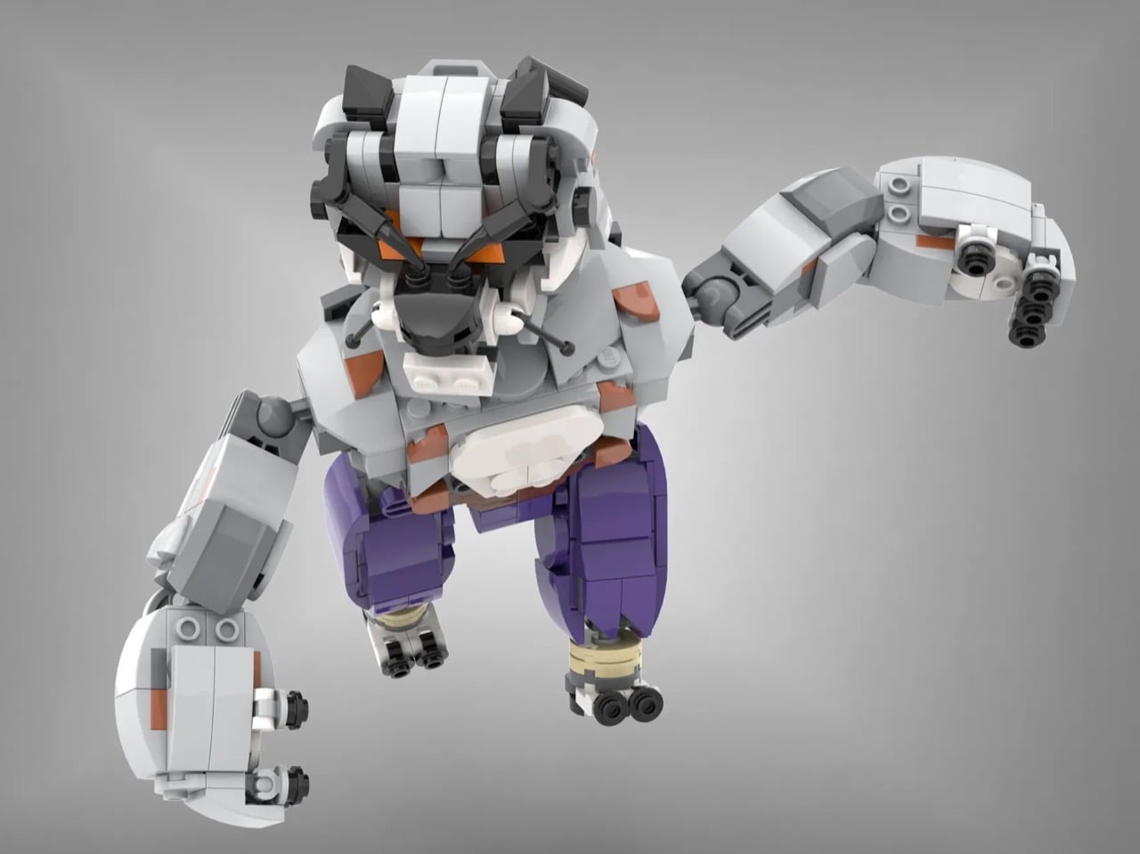
That moral complexity makes him a fascinating subject for a LEGO build, and Memorph’s 1,300-piece Ideas submission leans right into it. The set captures Tai Lung mid-lunge, all coiled fury and airborne menace, with removable Chorh-Gom Prison chains that let you display him in either his fighting form or his captive one. This is a MOC (My Own Creation) with a genuine point of view, and it shows.
Designer: Memorph
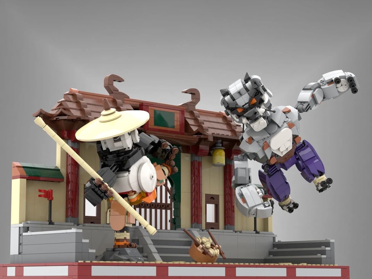
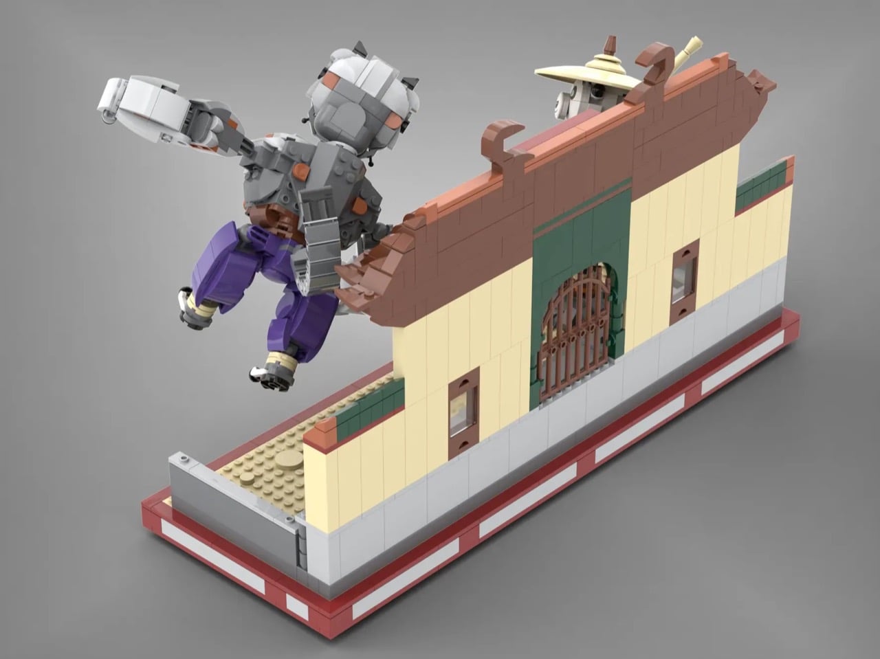
The scene is set against a dojo facade that earns its place in the composition. Curved terracotta roof tiles, an ornamental barred gate, warm tan walls trimmed in green and red, and a red-bordered display base that frames the whole courtyard like a stage. A small bowl of dumplings sits at the bottom of the steps between the two fighters, a nod to Po’s legendary appetite that is easy to miss and completely delightful when you do. The overall silhouette, two large brick-built figures in dynamic combat poses against a detailed architectural backdrop, reads immediately and confidently, even from across a room.
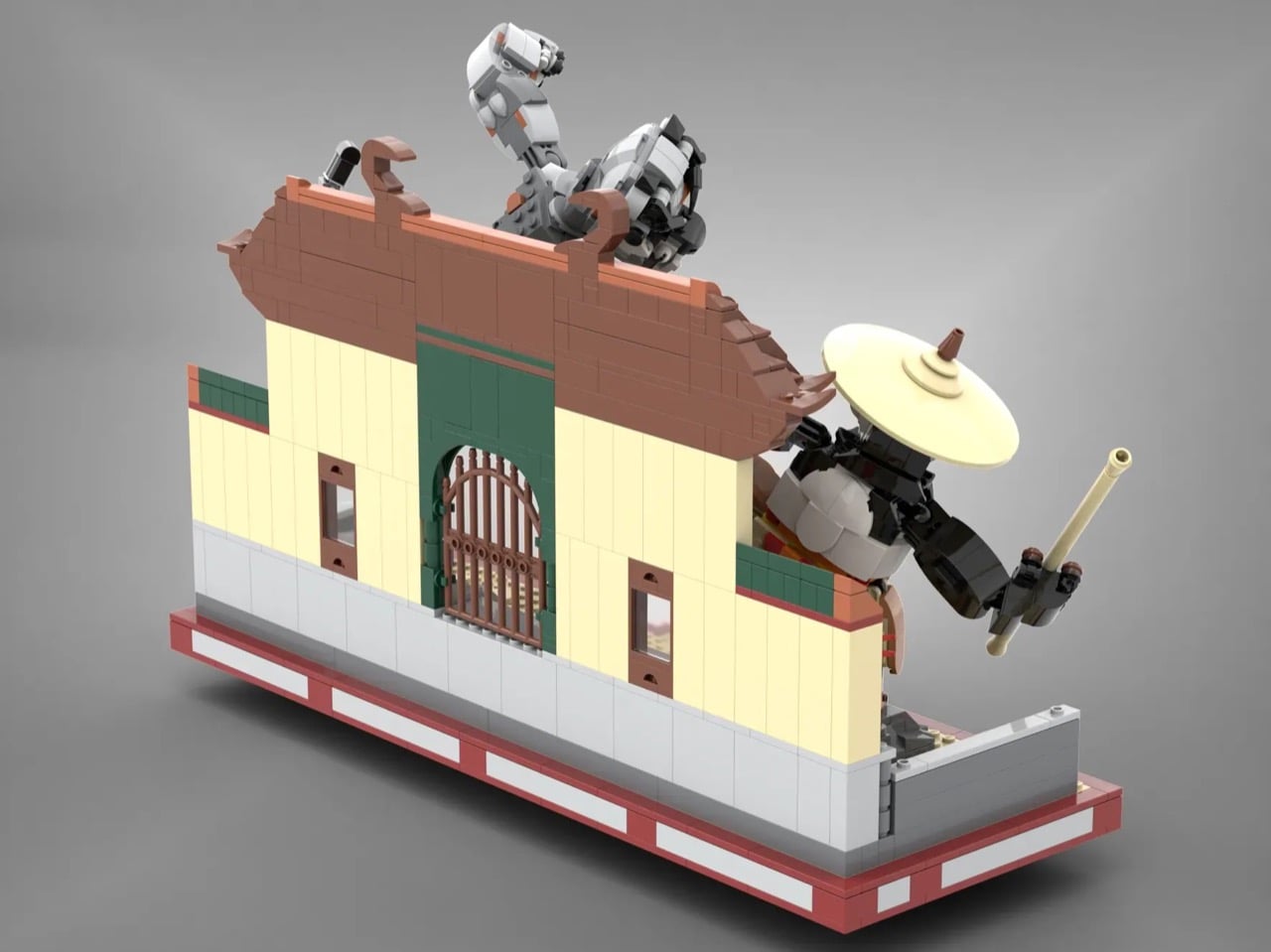
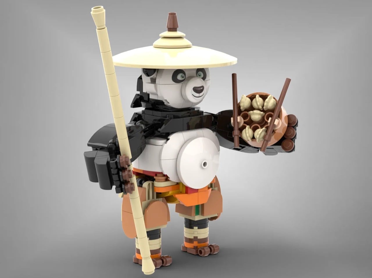
Po himself is a genuinely fun engineering challenge solved well. His belly is rendered as a single large smooth white sphere element, which captures the character’s rotund silhouette without resorting to awkward stacking. He carries his bamboo staff in one hand and a bowl of dumplings complete with chopsticks in the other, and his arms, wrists, legs, and neck all articulate, meaning you can cycle through kung fu poses to your heart’s content. The traveler’s hat, a wide dish piece in light tan, sits perfectly over his expressive brick-built face. “Po was a really fun character to build,” says Memorph, and you can feel that enthusiasm in every considered detail.
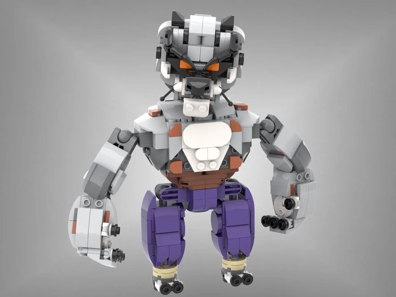
My favorite part of the whole build, though, is Tai Lung’s alternate display configuration. Detach him from the main scene, clip on the Chorh-Gom Prison chains, and suddenly you have a completely different piece of storytelling on your shelf. The gray chain-link elements wrap around his torso with just enough dramatic tension to evoke that mountain prison sequence, and his articulated tail curls behind him with the kind of coiled, barely-restrained energy the character radiates throughout the film. Memorph has said that Tai Lung’s face was the most challenging element of the entire build, and the result justifies every iteration. The orange accent tiles at the brow, the layered white and gray fur geometry of the head, and the overall aggressive posture all land exactly where they need to.

Memorph’s Kung Fu Panda: Po vs Tai Lung Showdown is currently gathering votes on LEGO Ideas, the community platform where fan-made builds compete for the chance to become official retail sets. Submissions that reach 10,000 votes are sent to LEGO’s internal review team for potential production consideration. With [VOTE COUNT] votes on the board, this one has runway to work with. Head to the LEGO Ideas page and cast your vote here!
The post This Kung Fu Panda LEGO Build Lets You Recreate the Po vs Tai Lung Fight Yourself first appeared on Yanko Design.