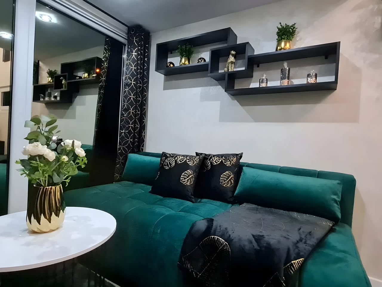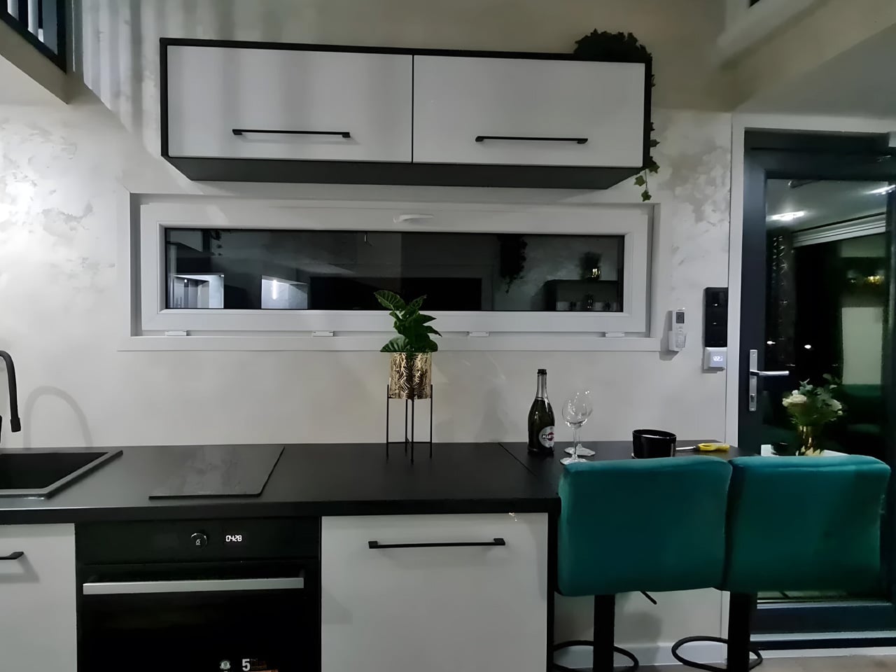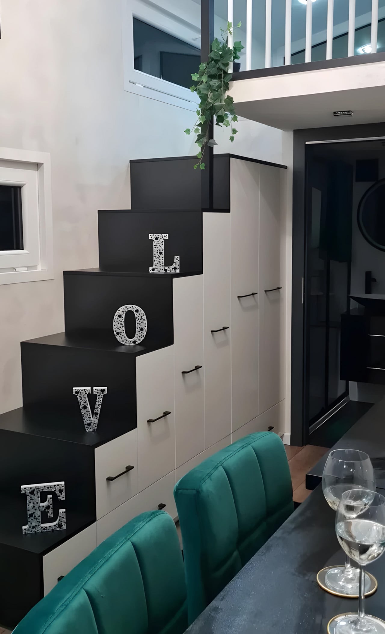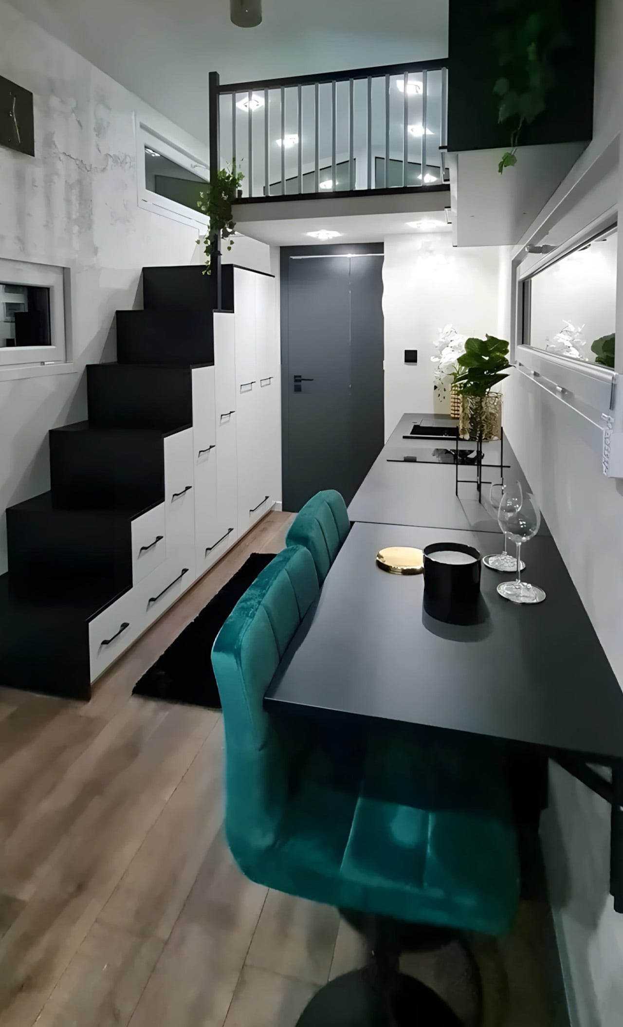
What Happens When You Stop Fighting the Rain and Design With It

Most architects treat rain as an obstacle. Drain it. Redirect it. Keep it away from the interior at all costs. Australian architect Steven Chu had a different idea entirely, and it just earned him the Grand Prize at the NOT A HOTEL DESIGN COMPETITION 2026.

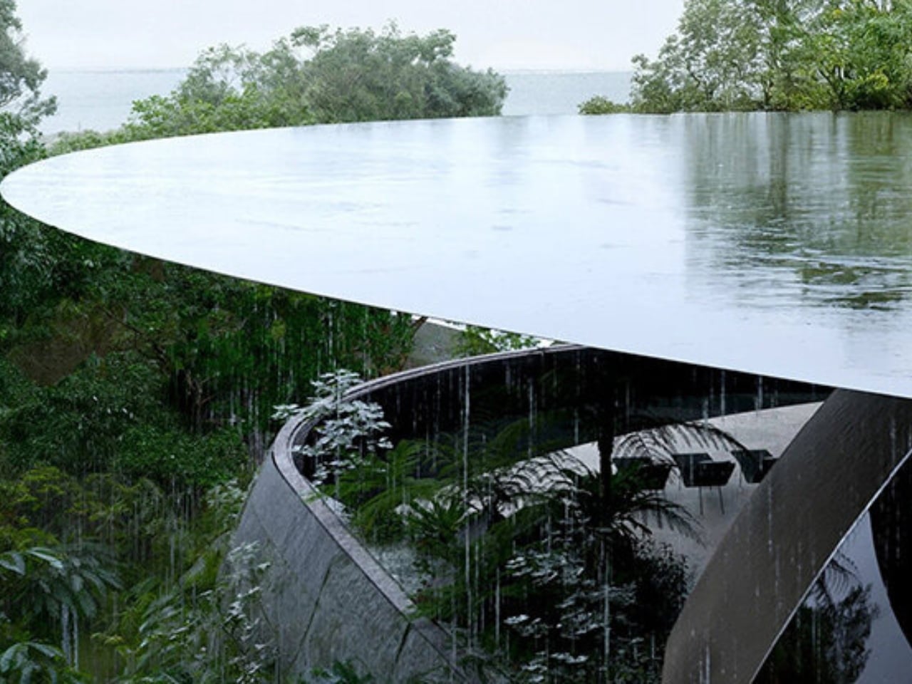
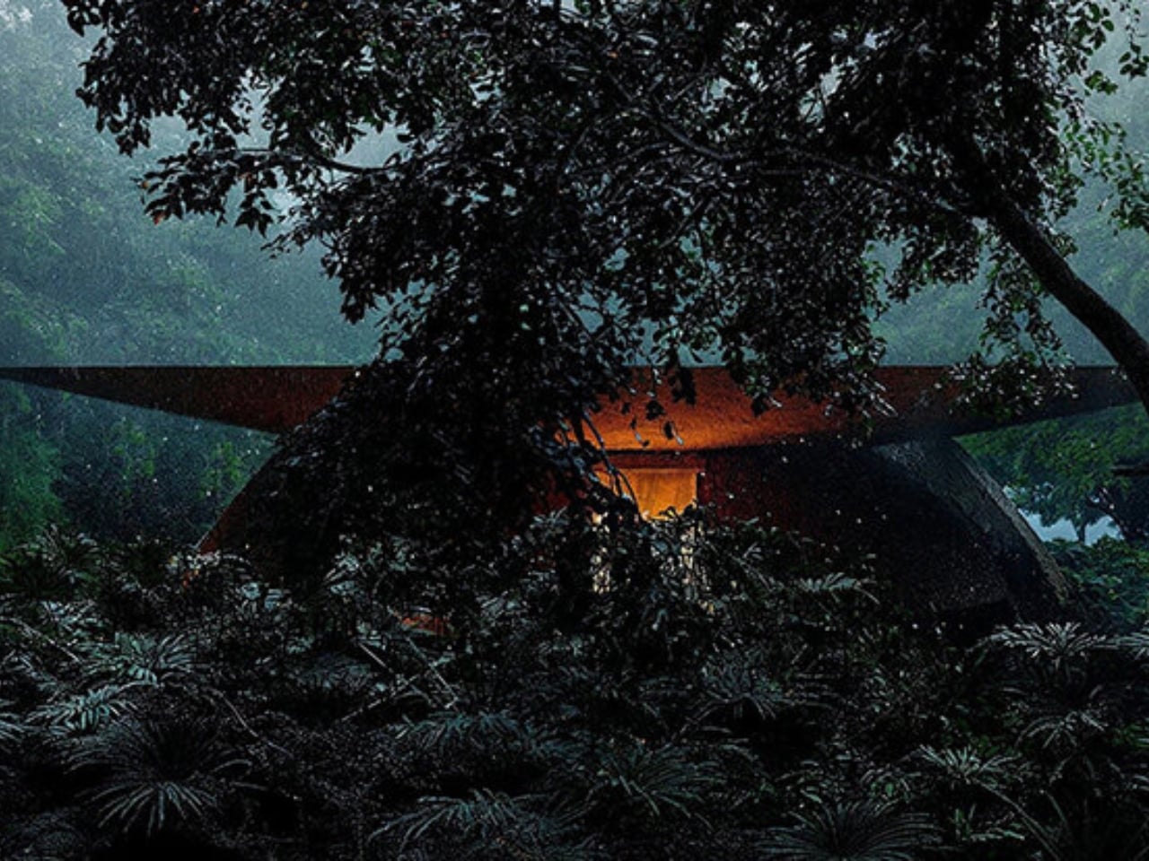
His winning entry is called Sound of Rain, a proposed villa on Yakushima, a densely forested island off the southern coast of Kyushu, Japan. It’s a UNESCO World Heritage site known for its ancient cedar forests and, predictably, a lot of rain. Rather than treating that rain as a logistical problem to solve, Chu built his entire design around it.

Designer: Steven Chu (Artefact Architects)
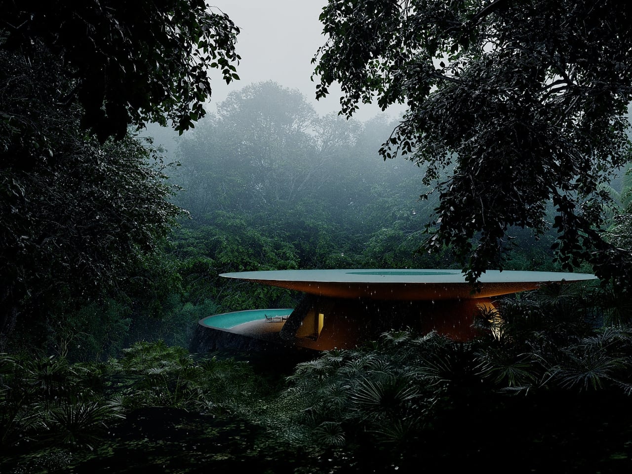
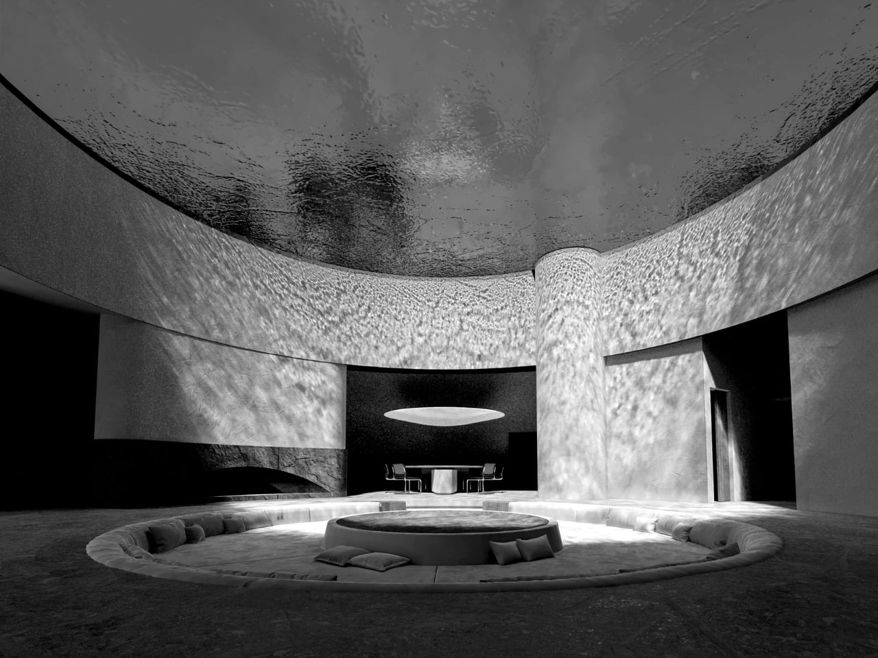
The concept is beautifully straightforward. A broad, bowl-shaped rooftop sits above the structure, collecting rainfall and releasing it slowly along the roof’s perimeter. Water traces a continuous line around the building’s edge, creating a living curtain that shifts and moves depending on the weather. That boundary between inside and outside isn’t a wall or a window. It’s water.

Circulation paths, sheltered zones, and open terraces are all arranged around the movement of that water. It’s the kind of design thinking that sounds almost obvious in hindsight but rarely gets executed with this much commitment. Chu didn’t just reference the climate in a mood board. He made it load-bearing.
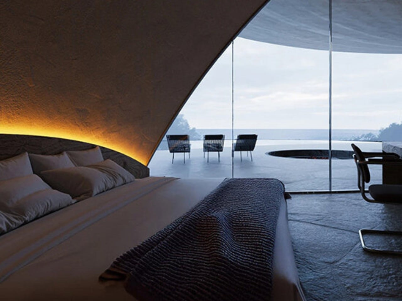
Inside, the approach stays consistent. Materials are restrained and surfaces curve gently, guiding movement without feeling prescriptive. Glass openings frame the surrounding forest and coastline. A bedroom sits along the perimeter, positioned specifically to receive filtered light and the ambient sound of rain falling outside. The atmosphere in every room is meant to shift throughout the day as weather changes, because in this house, weather isn’t background noise. It’s the whole point.
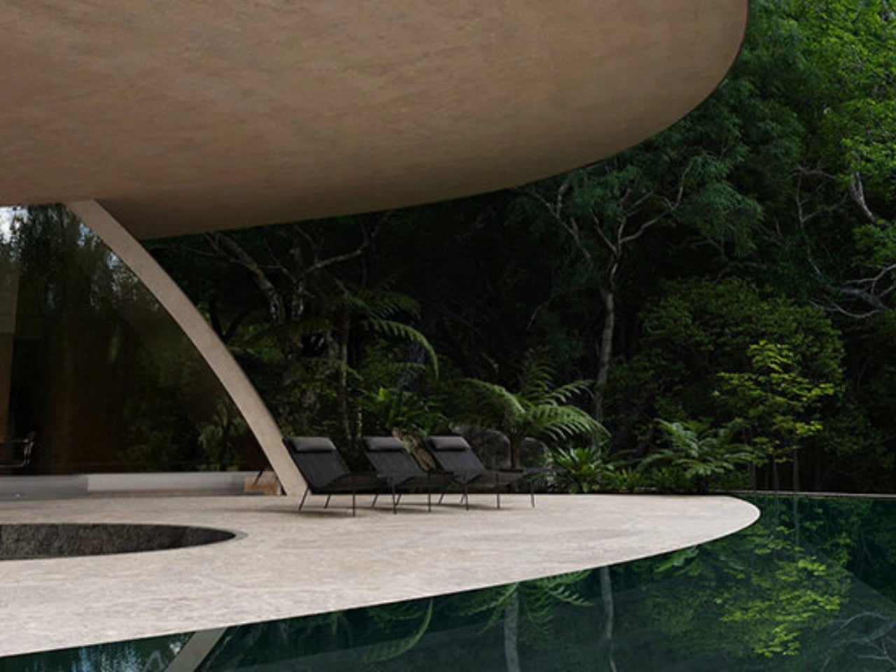
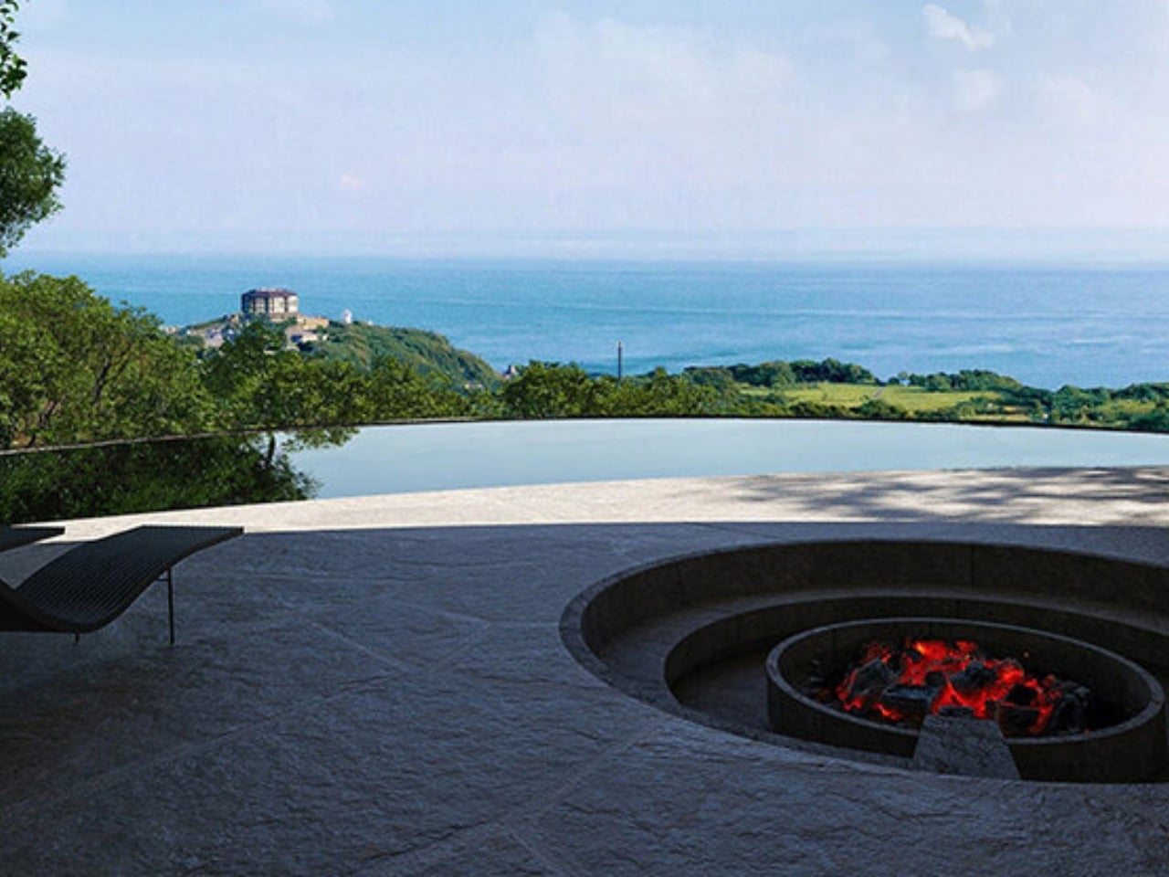
A circular outdoor space anchors the main living area, with a sunken fire element at its center. It’s a pairing that works precisely because neither element announces itself. The contrast between the water perimeter and the fire core feels like it’s pulled directly from the island’s own logic: rain on the outside, warmth on the inside. As a design gesture, it’s earned rather than decorative.

The competition itself adds weight to the win. NOT A HOTEL, the Japanese luxury hospitality brand, opened the 2026 edition to architects under 40, asking them to design a hybrid between a private residence and a boutique hotel on Yakushima. Sound of Rain was selected from 1,058 entries submitted across 112 countries and regions. That’s a significant shortlist to come out on top of, and the scale of the competition makes Chu’s win feel genuinely meaningful, not just for him, but for a generation of architects rethinking what place-responsive luxury design can be.
The restraint of this project is remarkable. It would have been very easy to over-design a property on an island as visually rich as Yakushima. The temptation to layer in dramatic architectural gestures must be significant when your backdrop is ancient cedar forest, rugged coastline, and a UNESCO-protected landscape. Instead, Chu did the quieter, harder thing. He listened to what the site was already doing and made that the architecture.

Sound of Rain fits into a broader conversation about how design can respond to climate without trying to conquer it. So much of contemporary architecture is still fundamentally about control, about managing and minimizing natural elements rather than working alongside them. This project offers a different model, one that treats the environment as a collaborator instead of a variable to be resolved. It’s a building that knows where it is and what that means, and it doesn’t pretend otherwise.
Whether the villa ever gets built is another question, but as a competition entry, it’s already doing something valuable. It’s expanding the conversation about what a high-end retreat can look like, and what the relationship between a building and its environment should be. Sometimes the most sophisticated thing a designer can do is step back and let the rain do some of the talking.
The post What Happens When You Stop Fighting the Rain and Design With It first appeared on Yanko Design.
The Eames House Was Always Meant to Be Yours

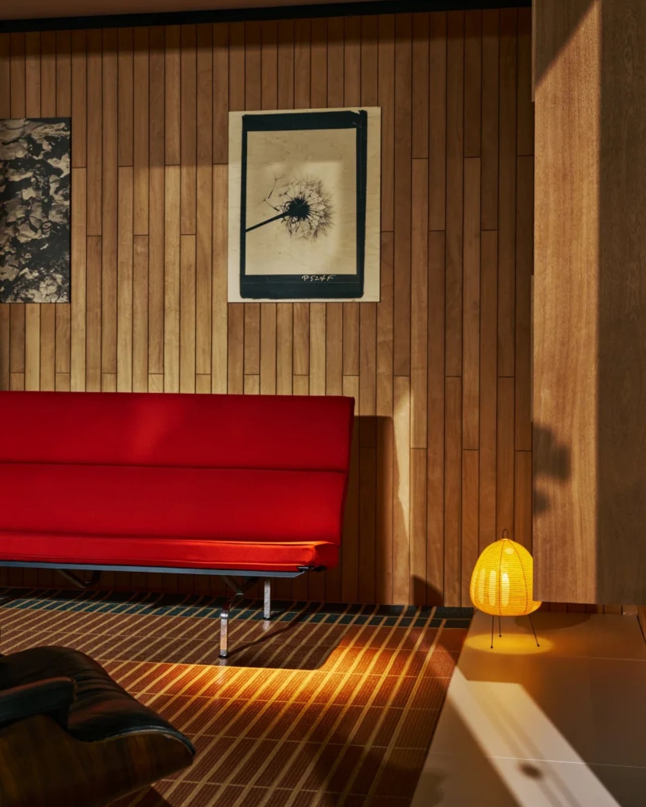
If you’ve ever stood in front of a photograph of the Eames House and felt a quiet longing, you’re not alone. That black steel frame, the jewel-toned panels, the floor-to-ceiling glass looking out onto a California meadow. It’s one of those images that lodges itself somewhere deep in your design-brain and refuses to leave. Most of us just assumed it would stay a photograph. Turns out, Charles and Ray Eames had other plans all along.

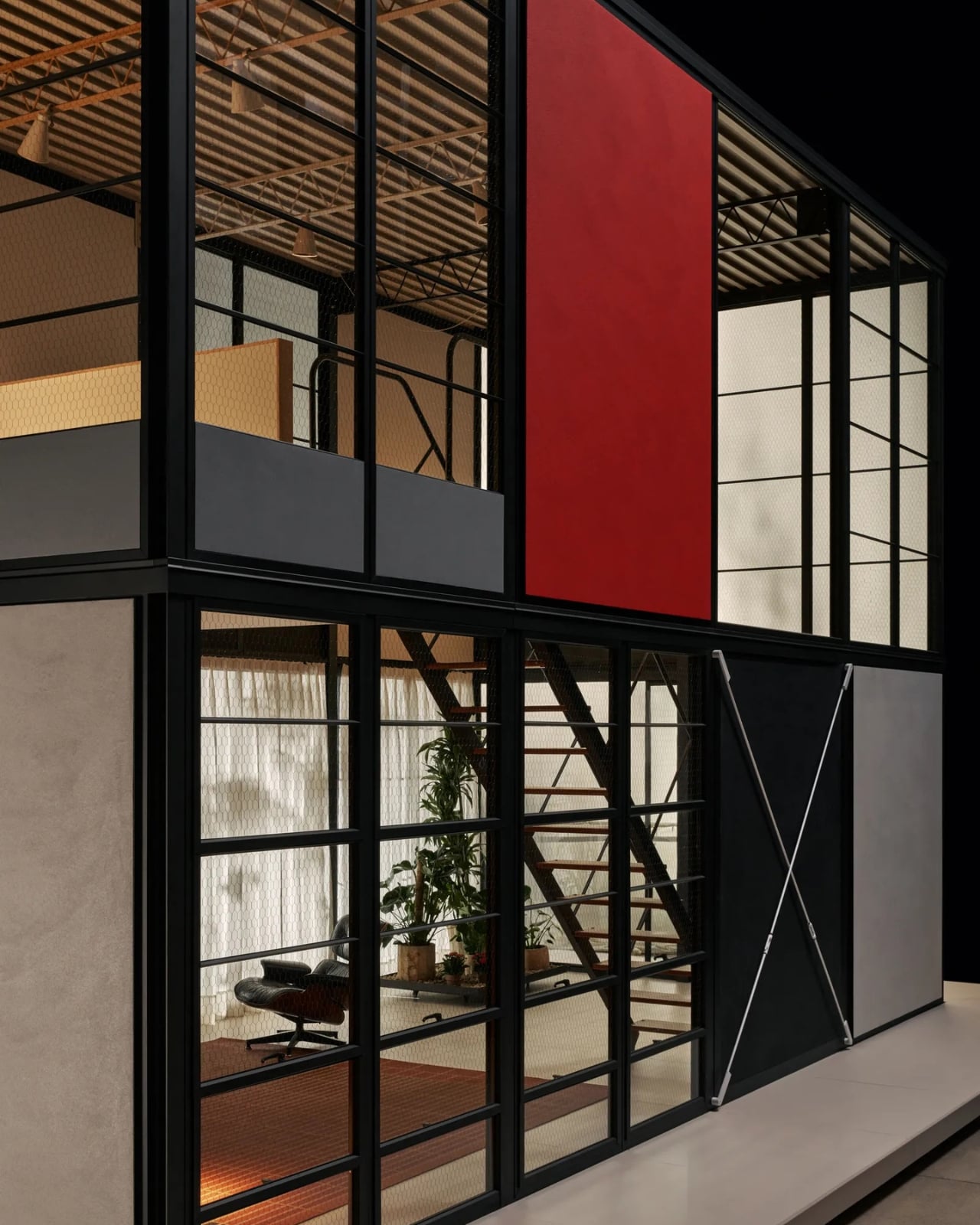
The Eames House, or Case Study House #8, was completed in 1949 in Pacific Palisades, California. It was built as part of Arts & Architecture magazine’s Case Study House program, which challenged architects to design homes using post-war industrial materials and techniques. Charles and Ray made something so effortlessly beautiful that it became one of the most photographed residences of the 20th century. But here’s the part most people miss: they always saw it as a starting point, not a masterpiece. Their real goal was a universal architectural system, one accessible to almost anyone and deployable almost anywhere. They never got there. That dream stayed tucked in archives, in sketches, in proposals that never left the studio. There was even a flat-pack modular concept the couple researched independently, informally called the “Supermarket House.” That name alone tells you exactly what they were going for.

Designer: Kettal

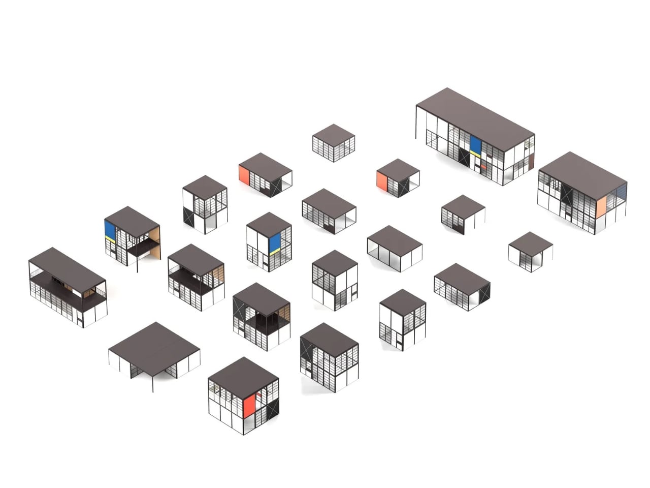
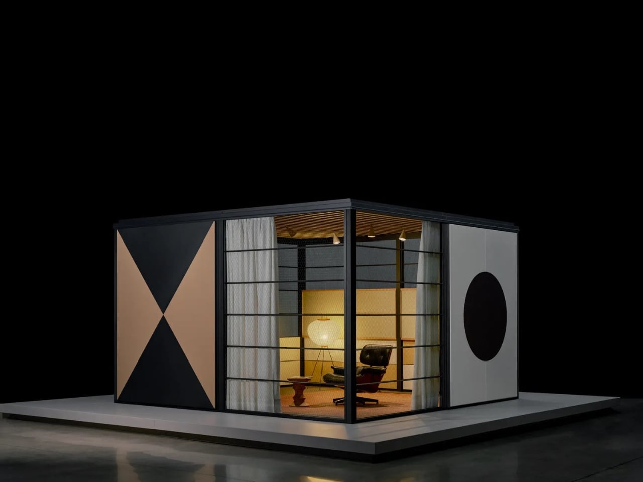
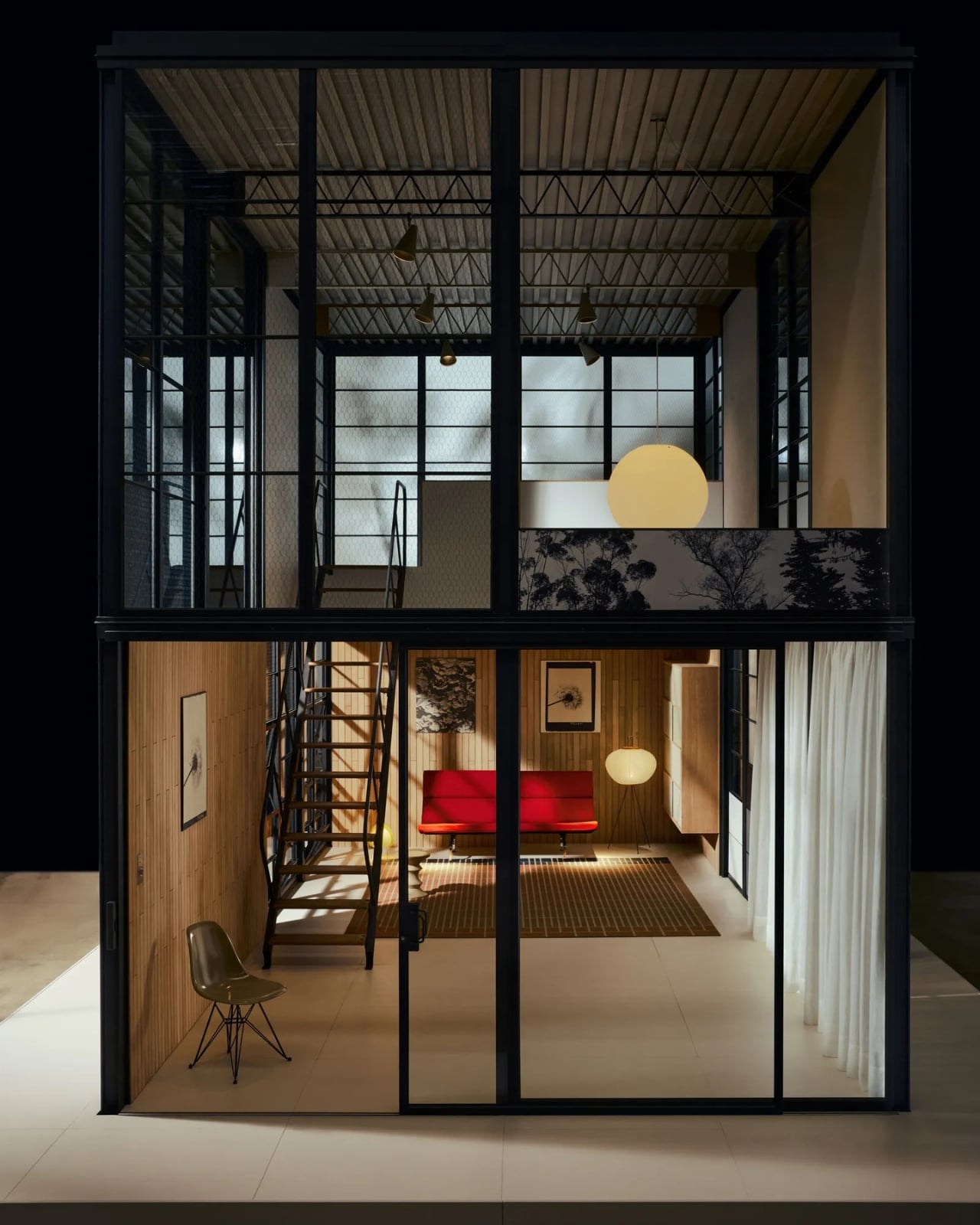
Nearly 80 years later, the Eames Office and Spanish manufacturer Kettal are finally making it happen. The Eames Pavilion System is a modular building kit that draws directly from those decades of unpublished drawings and ideas. Eckart Maise, former chief design officer at Vitra, spent three years digging through the Eames archives to surface material that had largely never been seen, including an unrealized California dome home and those flat-pack housing studies. What emerged is not a replica of Case Study #8, but something more faithful to its spirit: a system built on the same principles of efficiency, flexibility, and honest materiality.

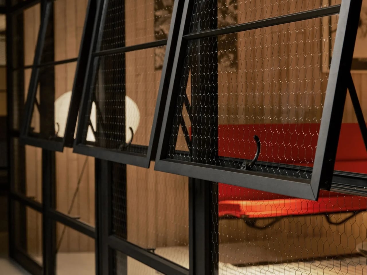
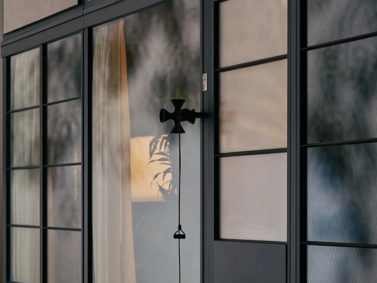
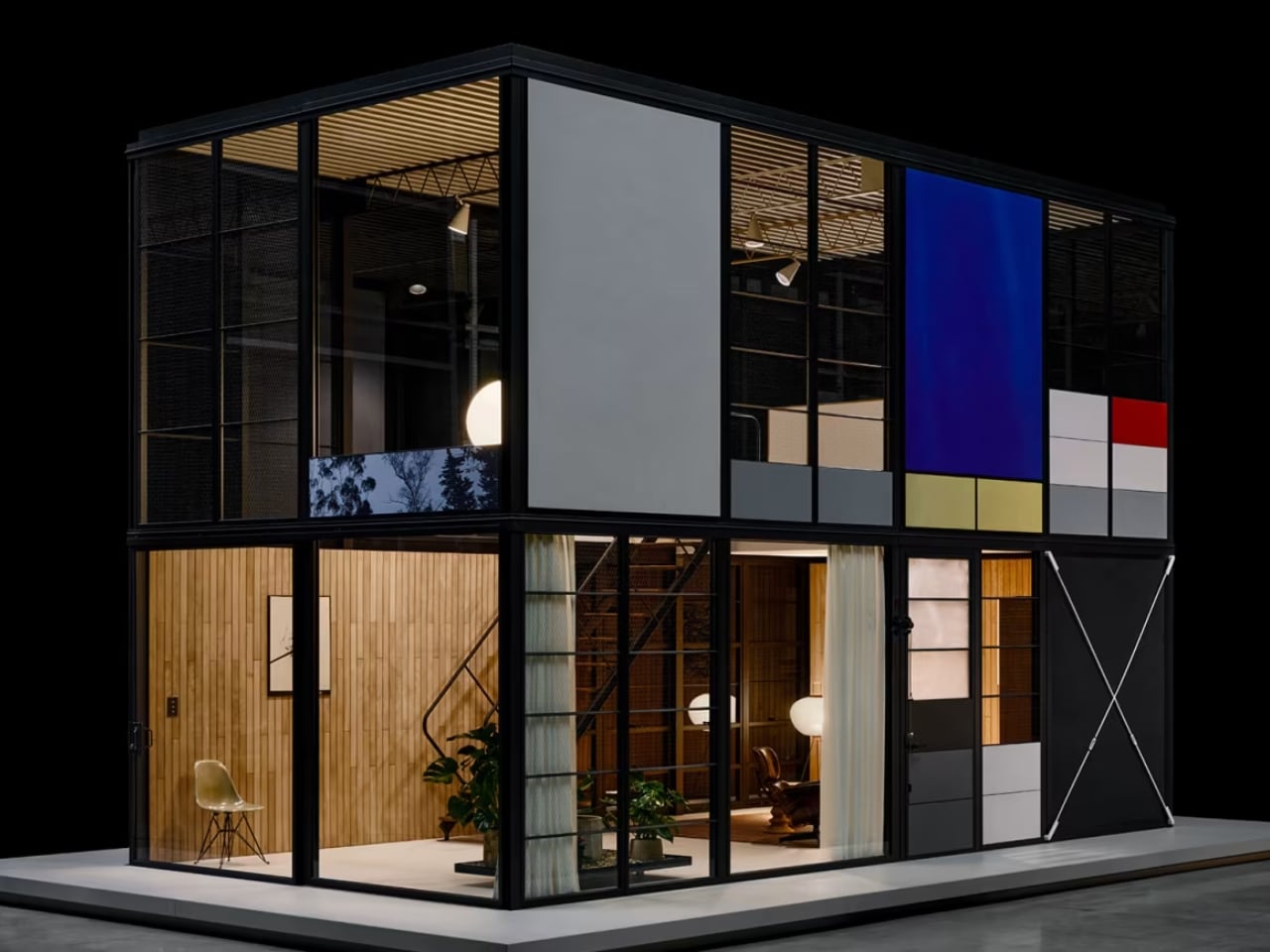
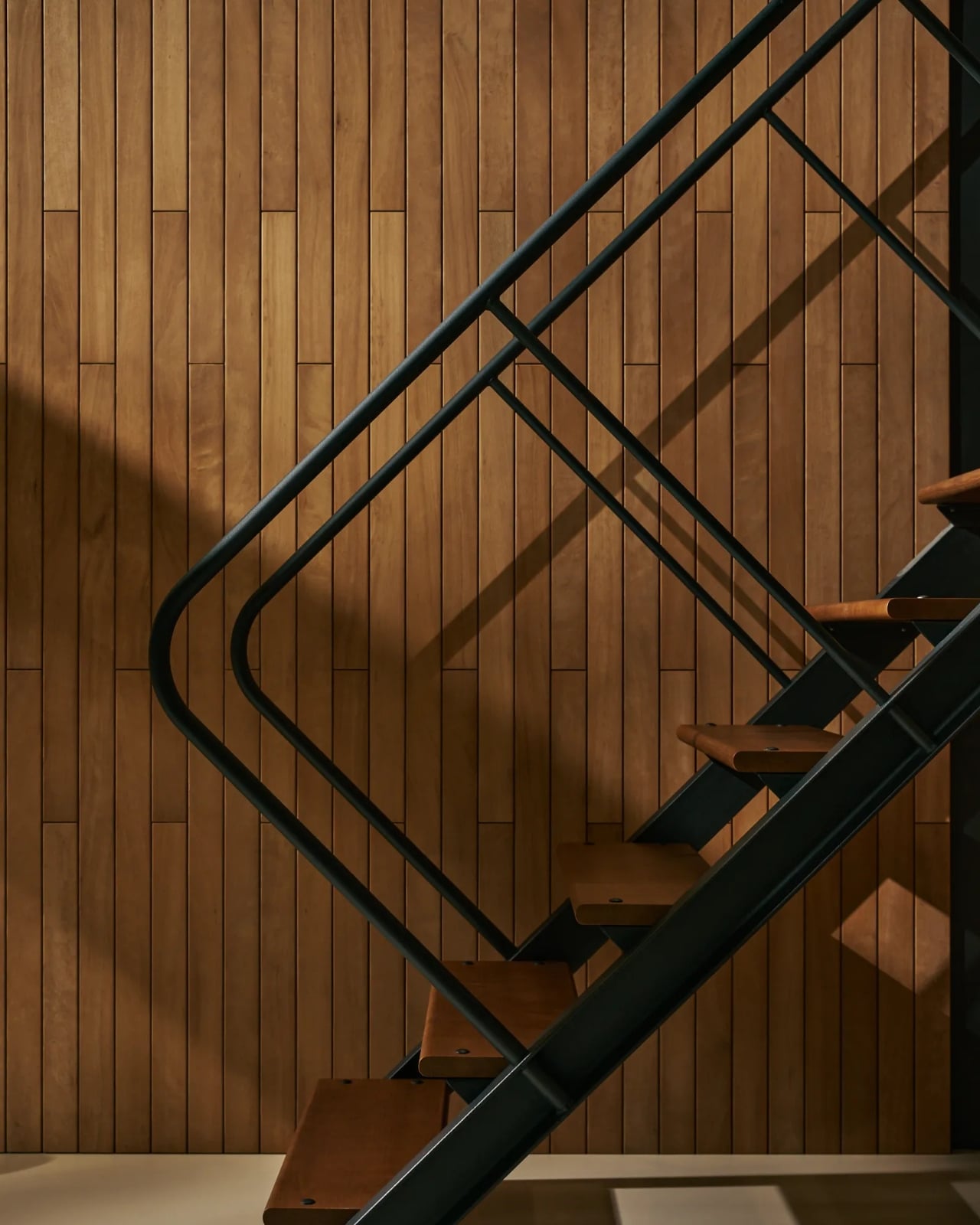
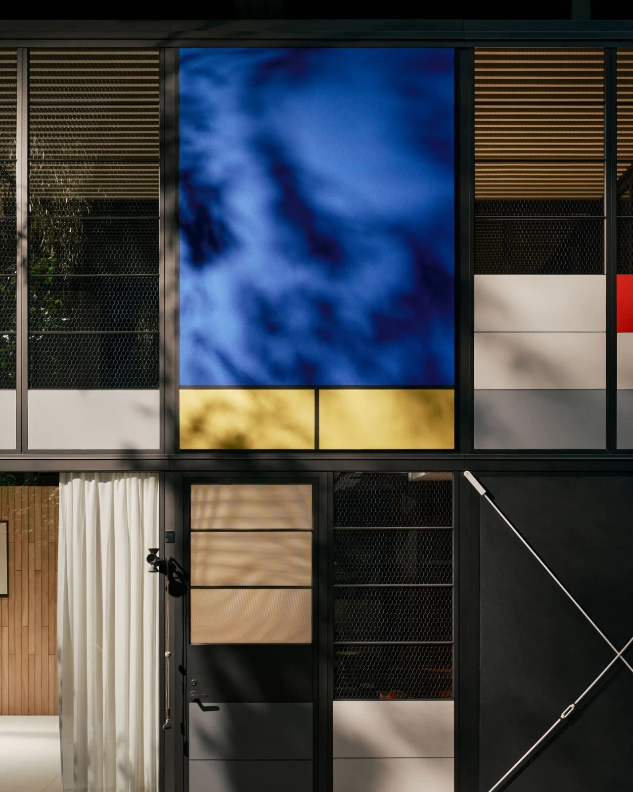
The structure is made from aluminum throughout, a significant upgrade from the original steel and considerably more weather-resistant. You get interchangeable roof types, triple-glazed windows, and wall panels that echo the bold primary colors Ray loved. The visual DNA is unmistakable. Zig-zag trusses, black-painted frame, chicken wire-reinforced glass. It is recognizably Eames without pretending to be a museum piece.

Pricing starts at around $325 per square foot. A 4-by-4-meter indoor pavilion begins at roughly €45,000 (about $52,000), and an outdoor version of the same size starts at €60,000. The double-height configuration that most closely resembles Case Study #8 comes in at €145,000. For a lot of people, that’s still a stretch. But compare it to what custom architecture typically costs, and it starts to read more like a genuine offer than a luxury souvenir.

The use cases are broad by design. A home recording studio, a backyard office, a guest pavilion, a poolside retreat. With enough modules assembled and stacked, a full two-story house is achievable. Kettal also factors in the support of a trained advisor, someone who makes sure the configuration you choose actually works for your specific site and climate conditions. The indoor version hits the market at the end of 2026, with the outdoor version following in 2027.

The Eames Pavilion System is making its debut at Milan Design Week 2026, as part of a Triennale di Milano exhibition called “The Eames Houses,” opening in April. Seeing it presented there feels appropriate. The Triennale has always been a place where design gets to ask bigger questions than just whether something looks good. The question this project raises is genuinely worth sitting with: what does it mean to actually democratize an icon, and not just sell the idea of one?

I think Charles and Ray would have approved of the answer Kettal and the Eames Office arrived at. Not a knockoff. Not a nostalgia play. A real building system, rooted in the same rigorous thinking that produced the original house, finally getting the chance to do what it was always supposed to do: show up wherever someone needs it.

The post The Eames House Was Always Meant to Be Yours first appeared on Yanko Design.

Four Dark Cedar Volumes Stepping Down a Tahoe Slope — This Is What a Smart Cabin Looks Like

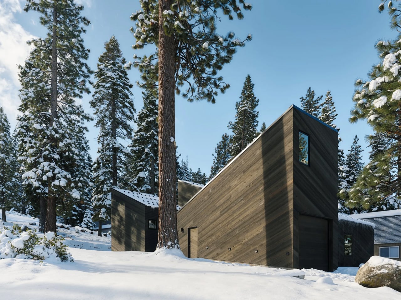
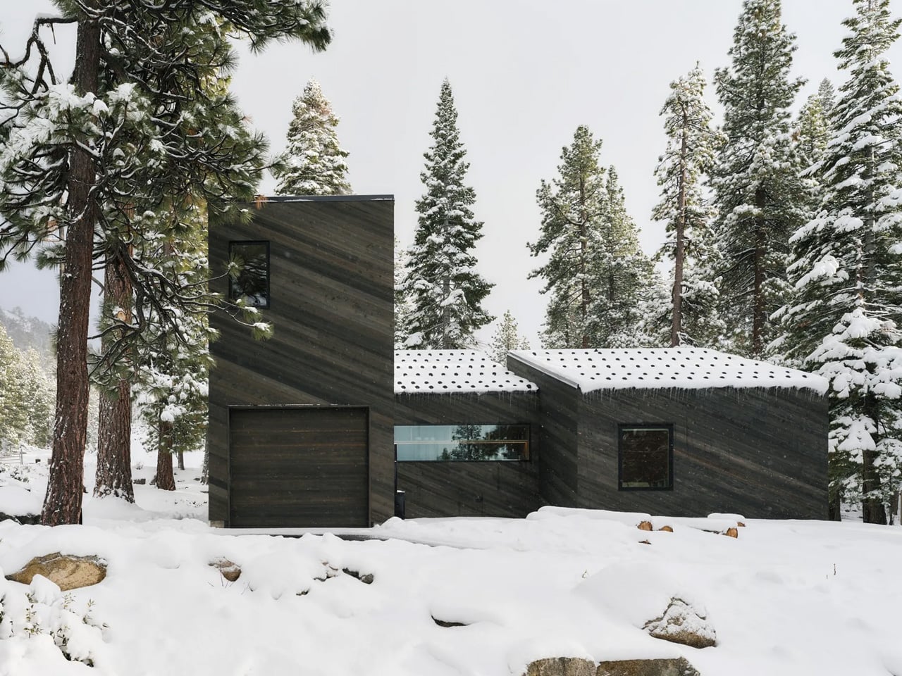
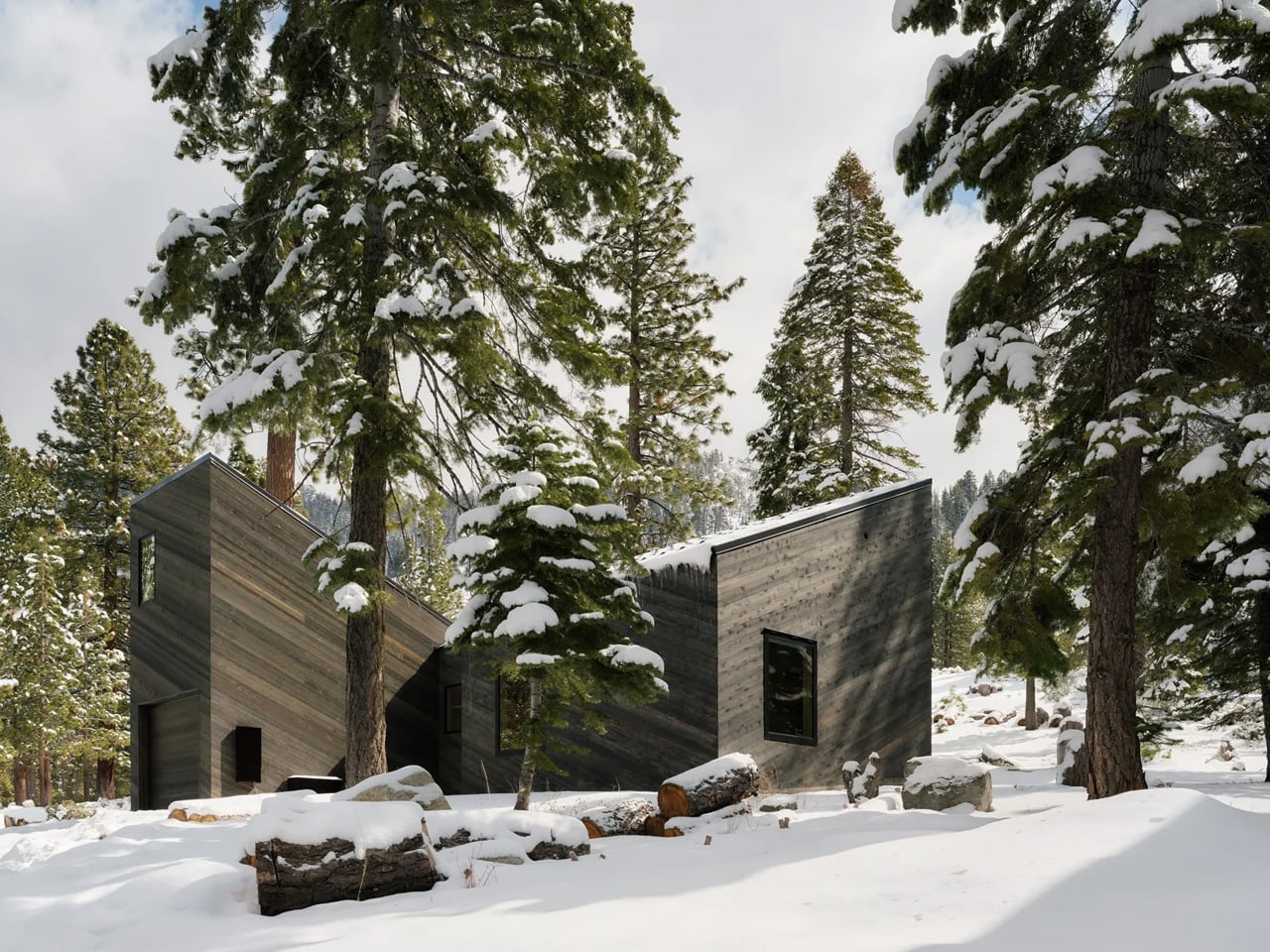
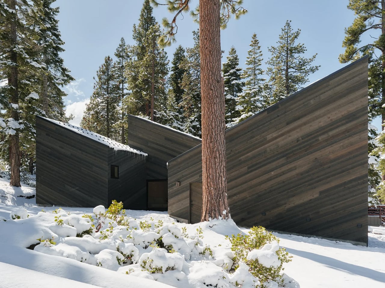
Most mountain cabins treat the landscape as a backdrop. Mork-Ulnes Architects’ Staggered Cabin treats it as a collaborator. Completed in the summer of 2024 and situated at an elevation of over 6,000 feet where South Lake Tahoe meets the foot of the Sierra Nevada, the project doesn’t fight the slope it sits on — it moves with it. Four dark-stained cedar-clad volumes shift and step down the alpine terrain, preserving existing granite boulders and Jeffrey Pines rather than displacing them, a decision that sets the entire design logic in motion from the outset.

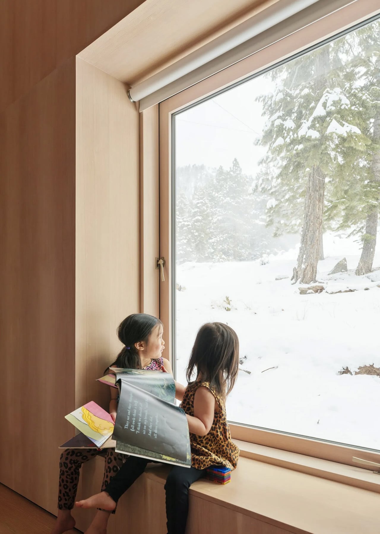
The staggered footprint does more than navigate the slope. As the volumes shift against each other, they carve out compact exterior courtyards between them, creating protected outdoor pockets that catch the sun and shelter from the wind. These aren’t residual spaces. They extend daily life outdoors for much of the year, whether that means a morning coffee in a snow-framed clearing or children moving freely between the cabin’s interior and the forest edge. It’s a quiet but considered move, one that turns the gaps in the architecture into some of the most usable square footage on the site.

Designer: Mork-Ulnes Architects

The exterior reads as restrained and deliberate. Rough-sawn western red cedar is clad in a deep dark stain, with boards running diagonally to emphasize the pitch of the roofs and reinforce the sense of directional movement down the hill. Standing-seam metal roofs cap each volume, with engineered snow guards holding a continuous layer of snow in place through winter, adding insulation and moderating melt. Over time, the finish will weather toward the tones of bark and shadow, letting the cabin settle further into the forest rather than announce itself against it.

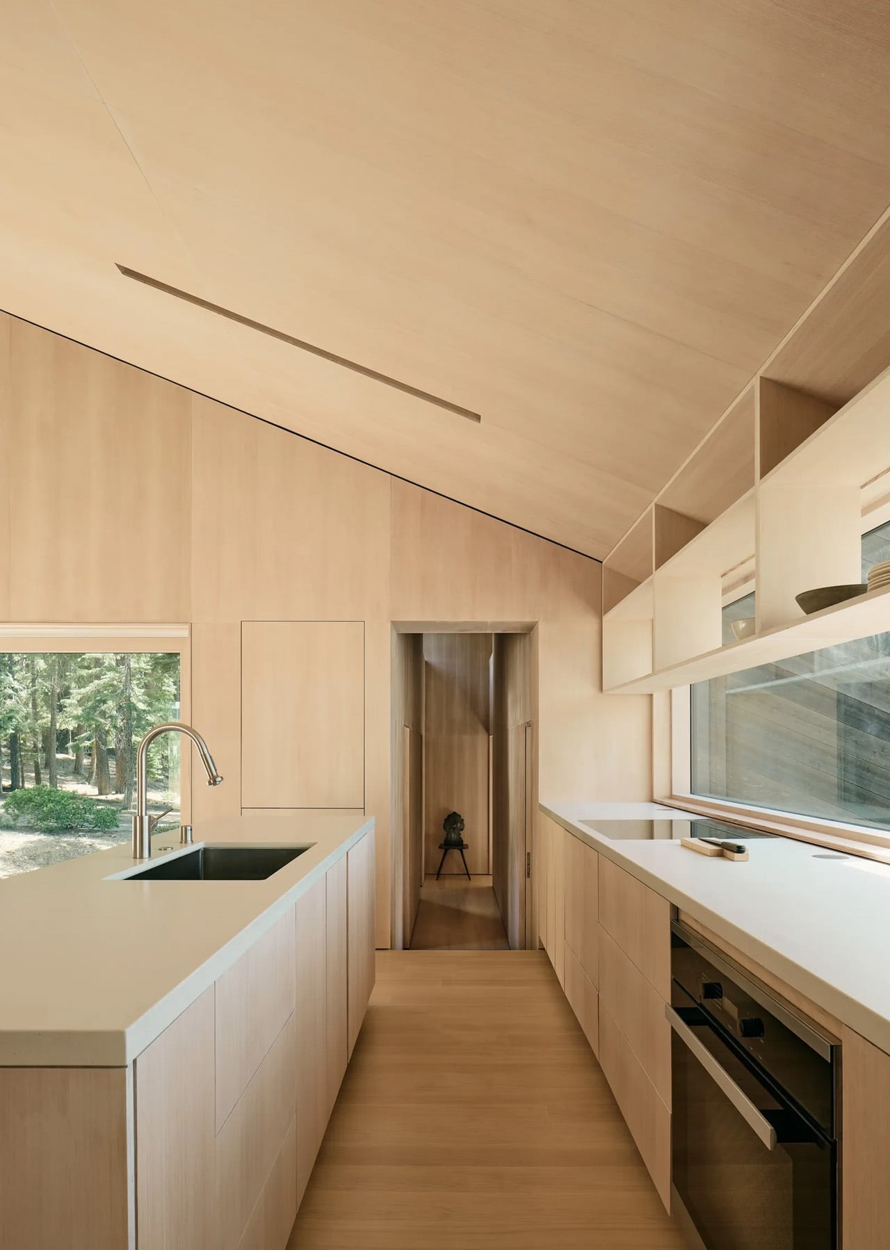
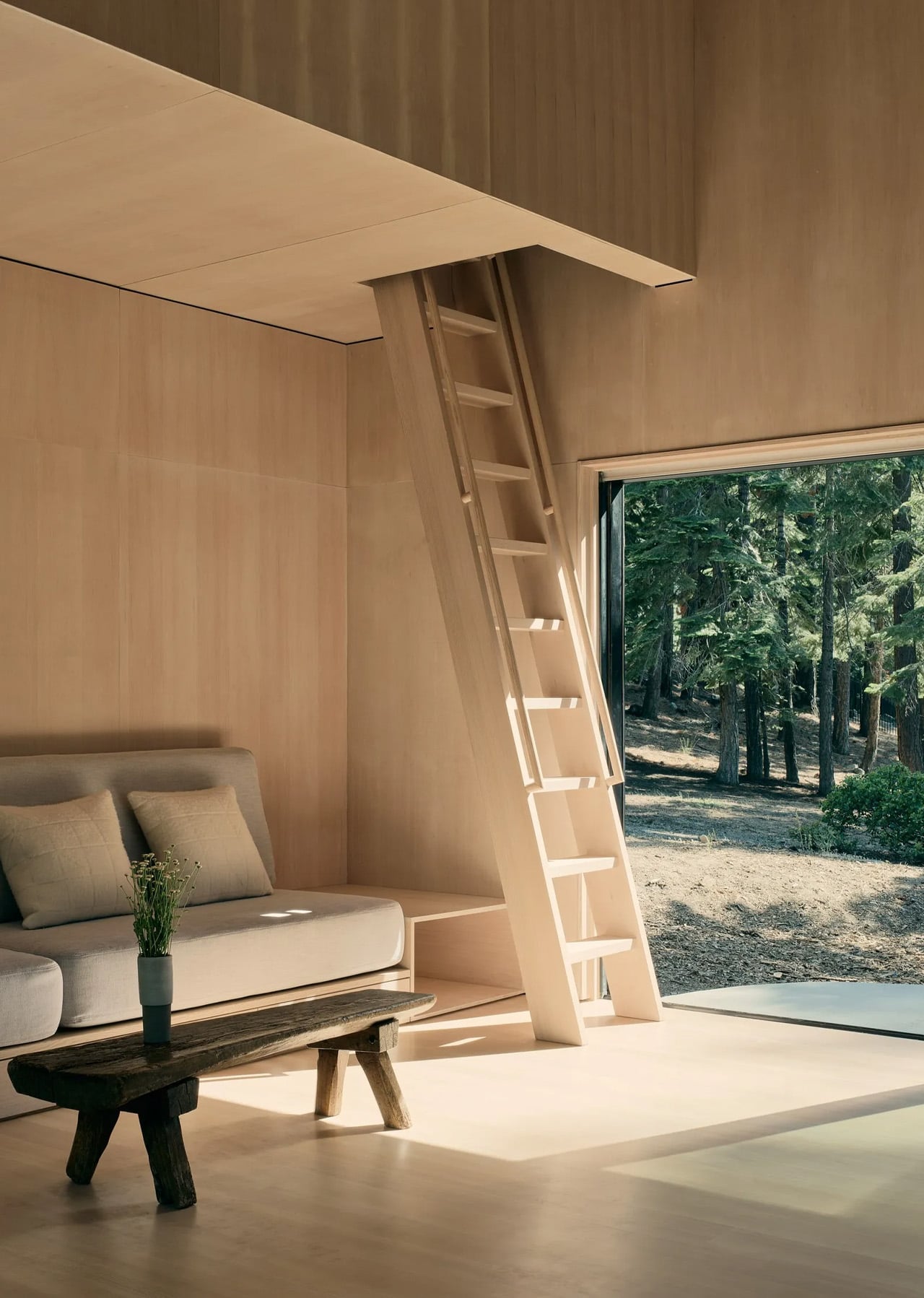
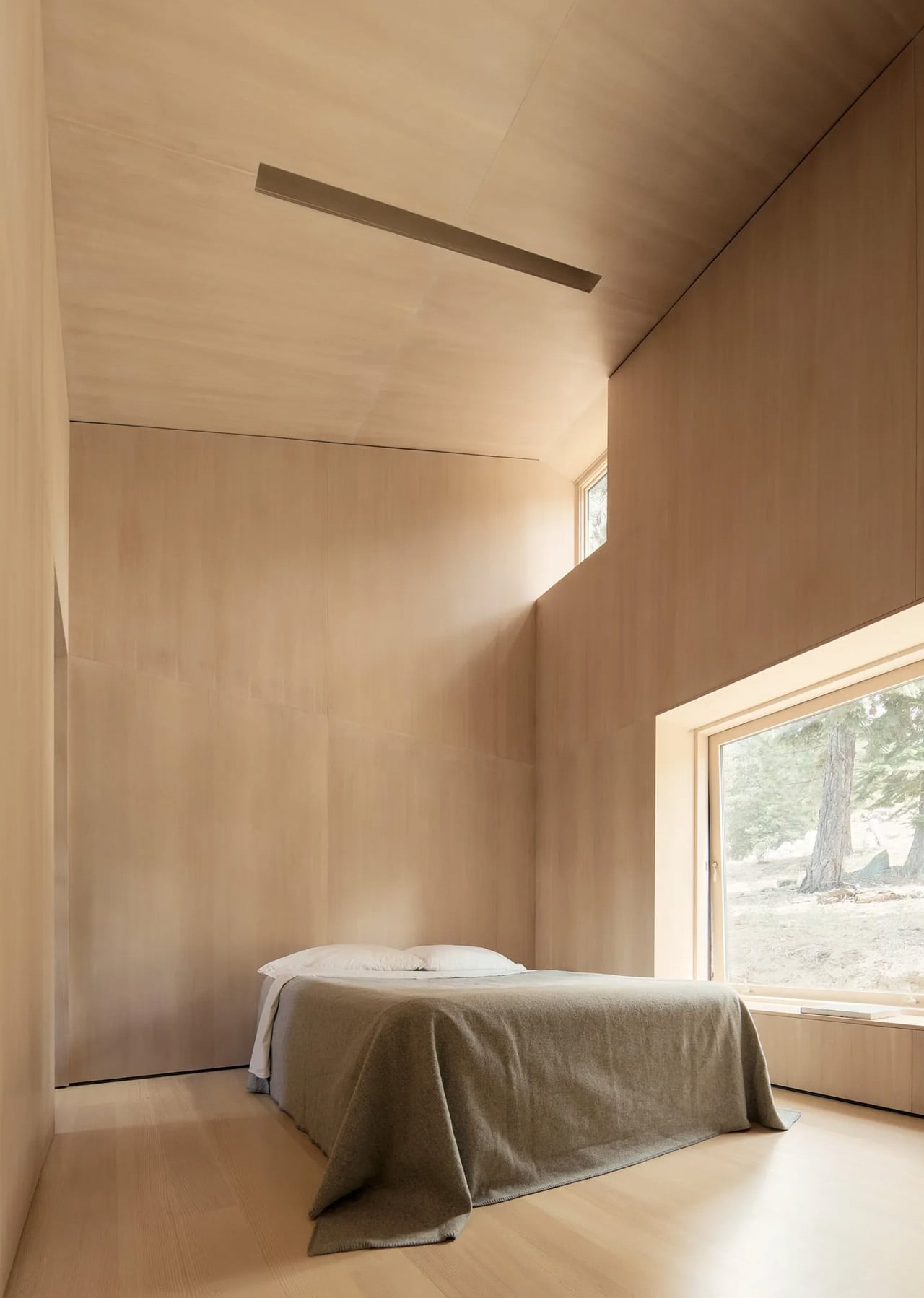
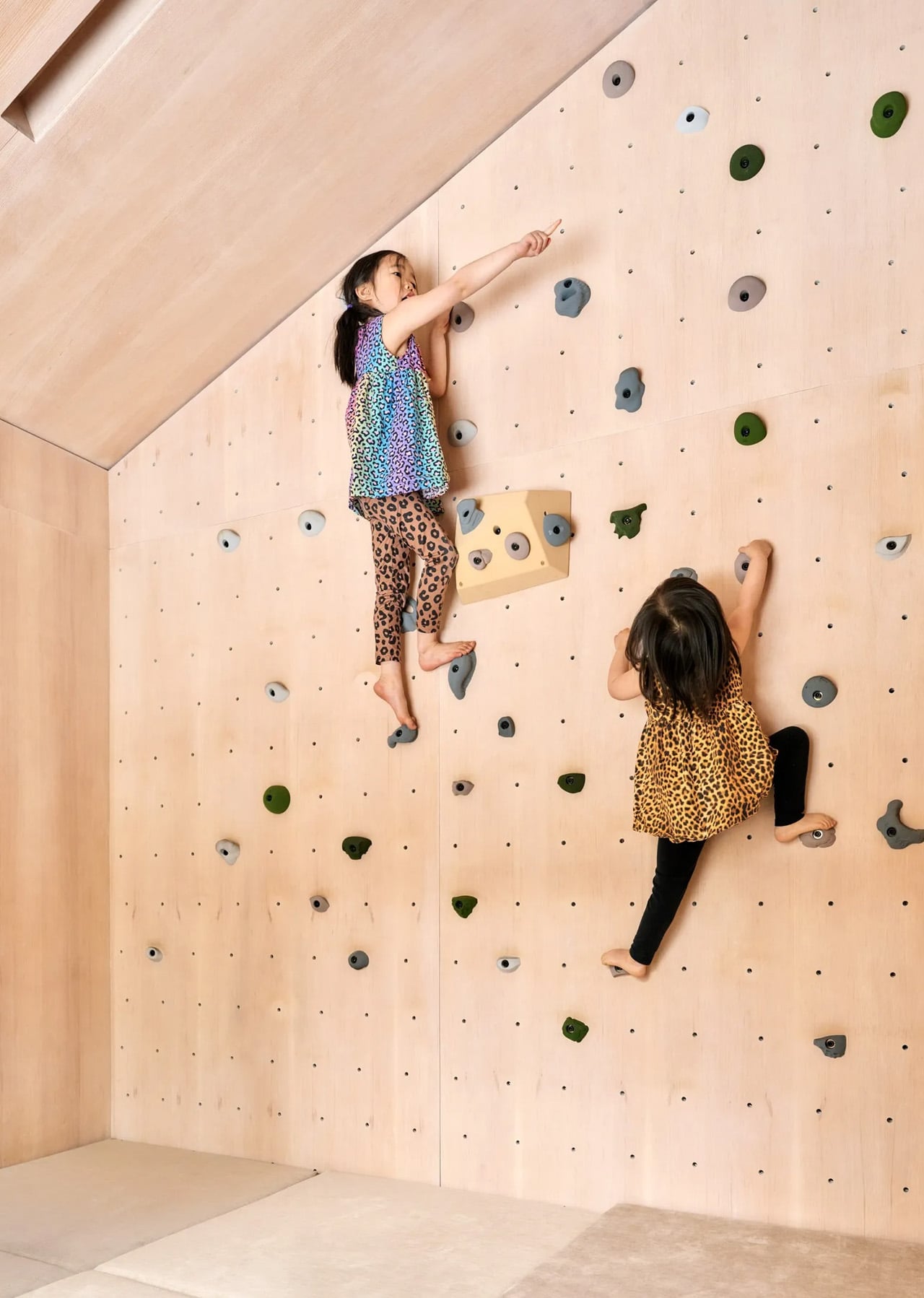
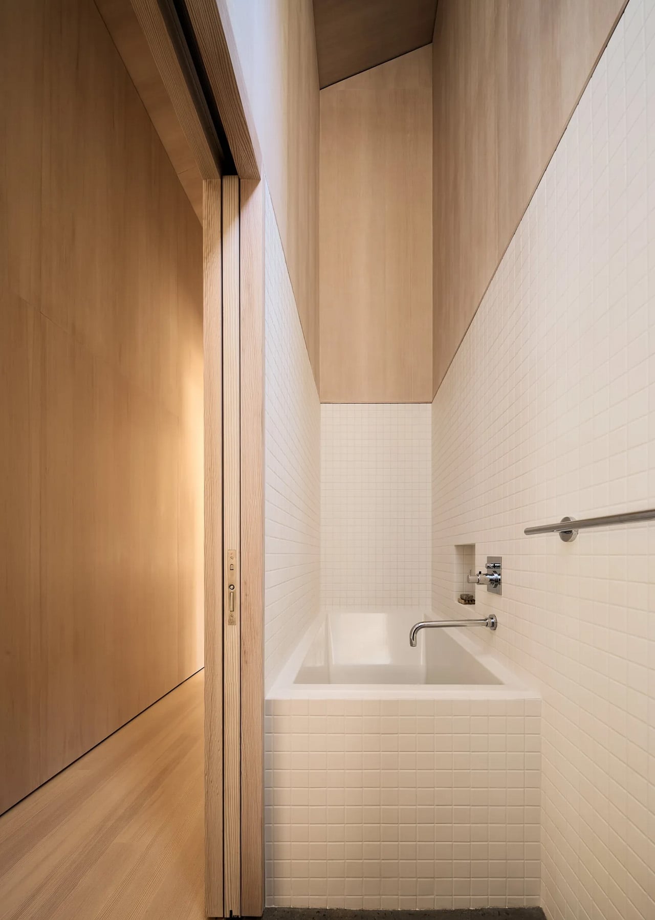
Inside, the 1,400-square-foot plan organizes sleeping quarters around a central living and dining space that opens to the outdoors on either side. Douglas fir plywood runs continuously across walls, ceilings, and custom cabinetry, creating a unified warmth that glows under Sierra light. The steeply pitched shed-roof geometry is put to work capturing mezzanine spaces above, with a plywood ladder accessing a compact home office tucked beneath the roofline. Clerestory windows frame the pine canopy overhead, drawing the eye upward and making the 1,469-square-foot footprint feel considerably more generous than its dimensions suggest.

The work of Mork-Ulnes has long bridged Scandinavian and Northern Californian sensibilities, and the Staggered Cabin sits squarely within that lineage. The shed-roof silhouettes recall Nordic precedents while nodding to the A-frame tradition of the Sierra. Designed as a full-time residence for a young family of four, it’s a cabin that doesn’t ask you to trade comfort for place. It offers both, at 6,000 feet, without compromise.

The post Four Dark Cedar Volumes Stepping Down a Tahoe Slope — This Is What a Smart Cabin Looks Like first appeared on Yanko Design.

This Tiny House Has 30 Feet of Glass and Feels Nothing Like a Tiny House

The tiny house world has long wrestled with one unavoidable tension — the desire for light, openness, and space against the hard constraints of a compact footprint. Escape’s Shoreline Glass House doesn’t just address that tension; it dissolves it entirely. This recently completed park model is one of the most spatially generous and light-saturated tiny homes to come out of the category in recent memory, and it earns that distinction without resorting to multi-level gymnastics or lofted sleeping quarters.

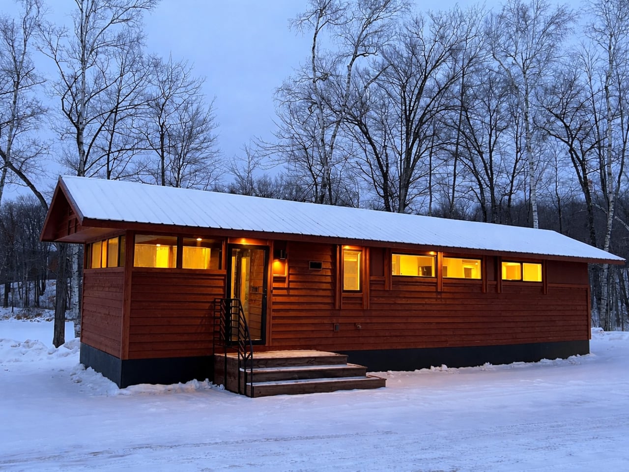
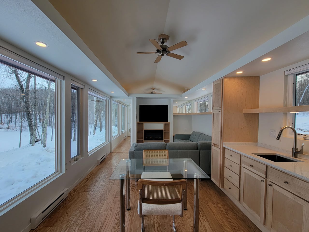
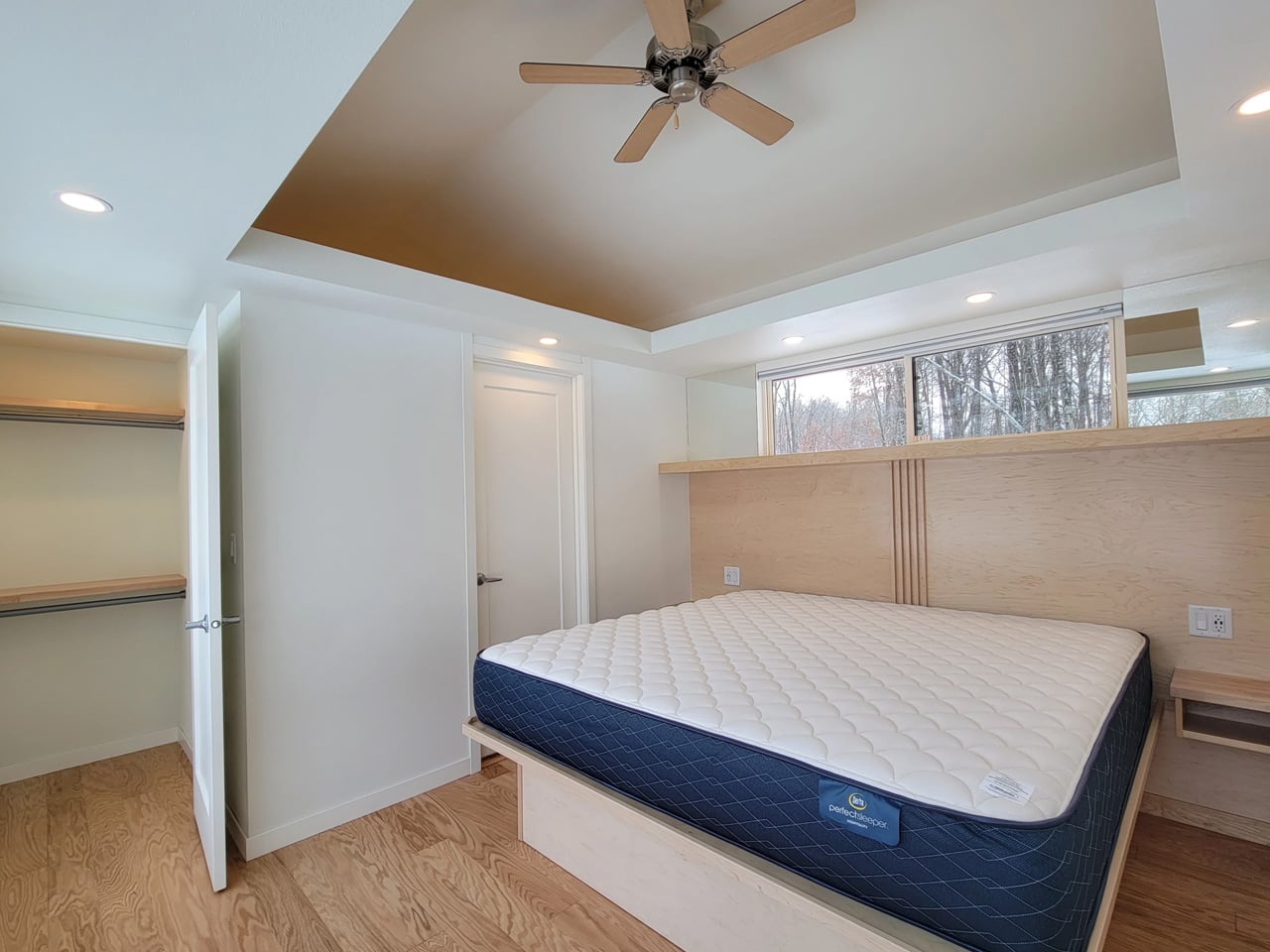
What immediately sets the Shoreline Glass House apart is its commitment to single-floor living. It has a length of 47 ft (14.3 m) and an increased width of 12 ft (3.6 m), which makes for a much larger interior than is typical for the format, comparable in fact to a small apartment. That extra width is the key differentiator. Where most tiny homes feel like corridors with furniture squeezed in, the Shoreline opens up laterally, giving rooms a genuine sense of proportion that doesn’t demand you constantly recalibrate your spatial expectations.

Designer: Escape

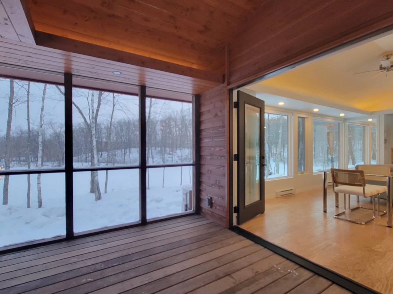
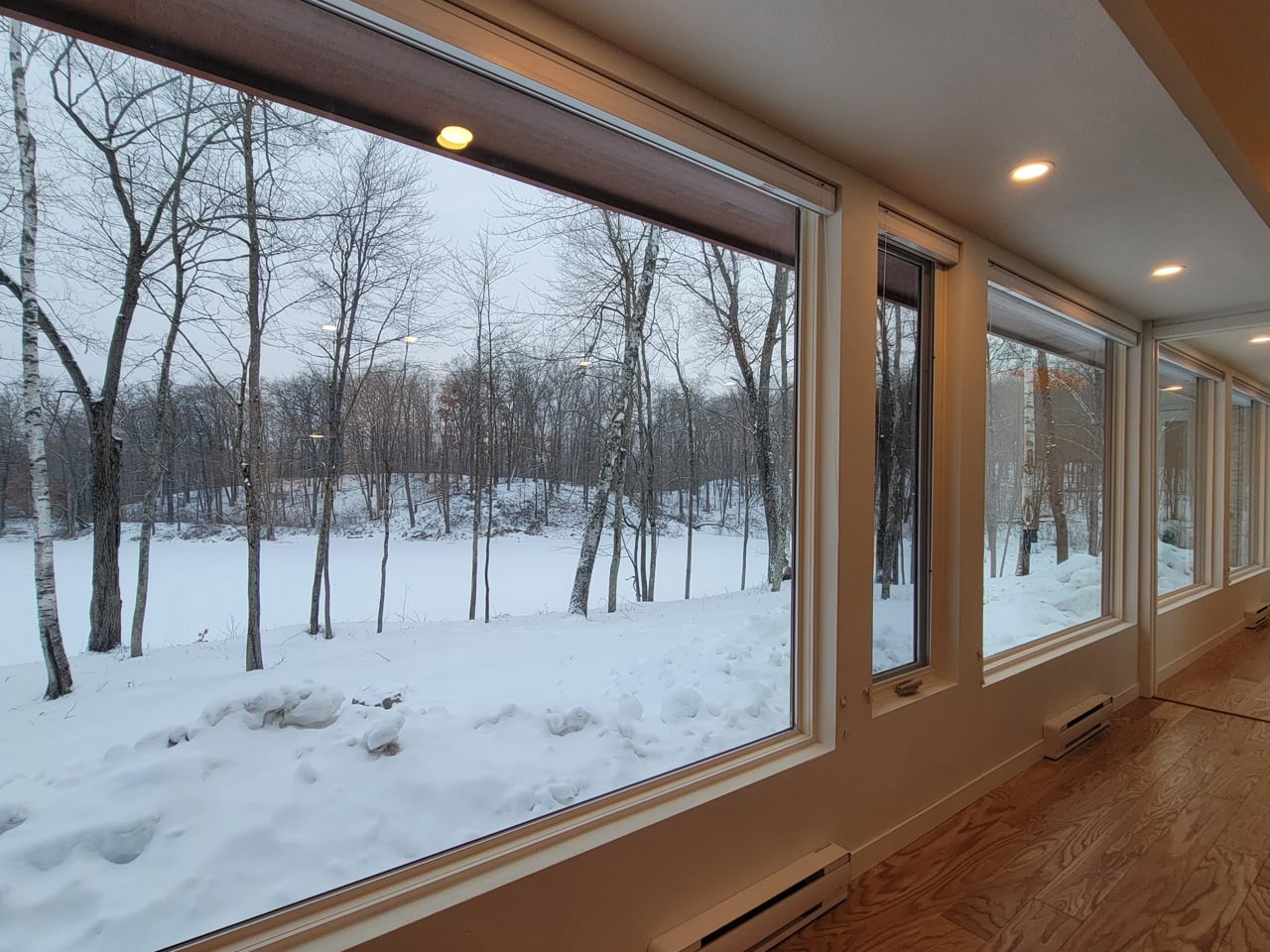
The name earns its keep on the exterior, too. The Shoreline Glass House features a light-filled interior thanks to 30 ft (9 m) of glazing running along one wall, flooding every corner of the home with natural light throughout the day. It’s a design move that blurs the line between inside and out, making the home feel anchored to its surroundings rather than sealed off from them. Entry is through a large enclosed porch, a smart buffer zone that expands the functional living area while adding that coveted semi-outdoor layer that tiny home dwellers often sacrifice first.

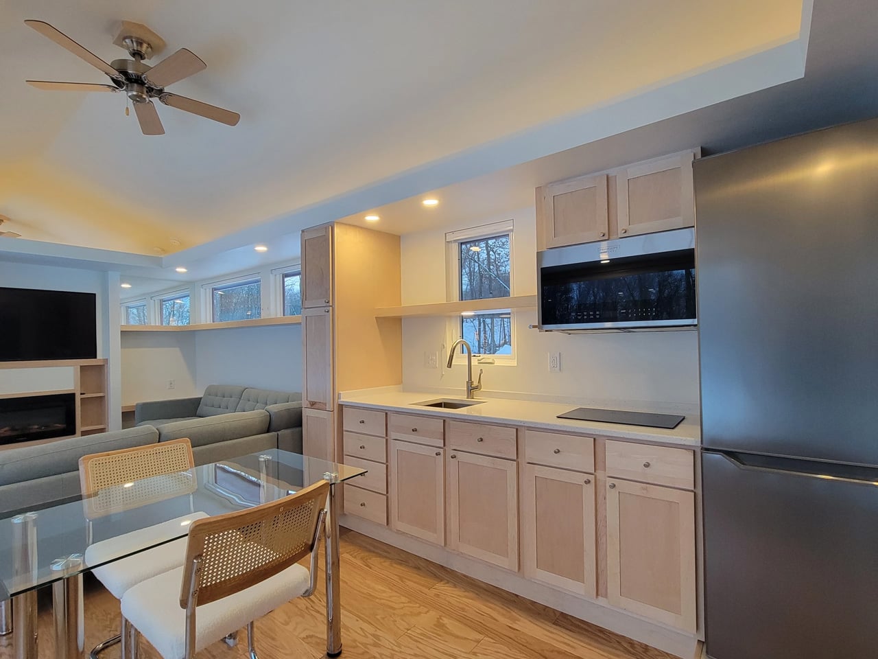
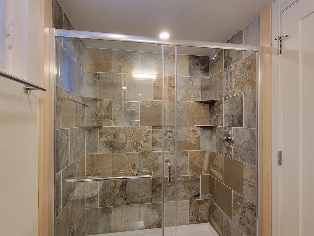
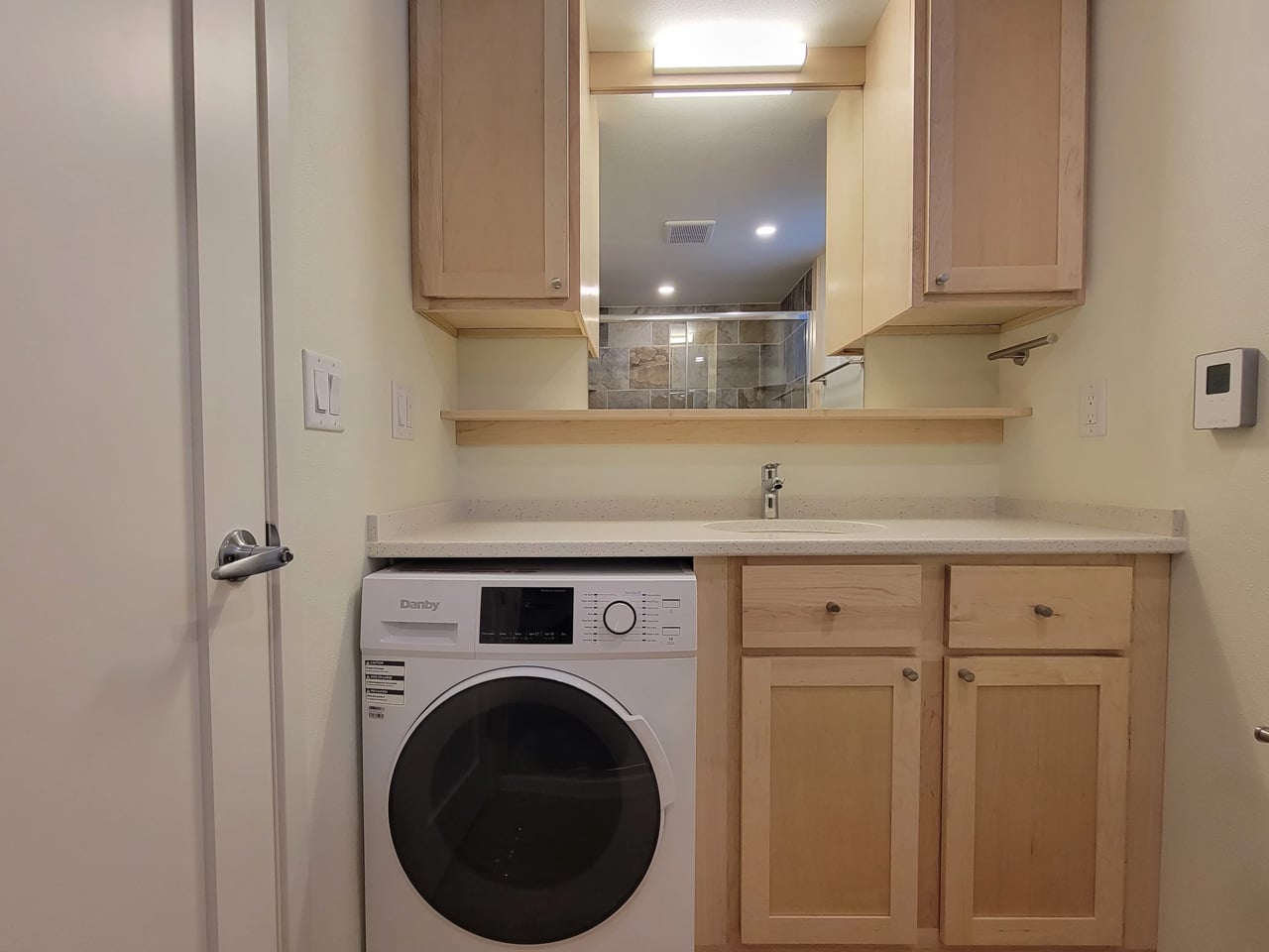
Inside, the layout is open-plan, with the living and kitchen area flowing seamlessly from one end to the other. The bathroom includes a large glass-enclosed shower with a width of 5 ft (1.5 m), a specification that sounds modest until you realize most tiny house showers are barely wide enough to raise both arms. A walk-in closet rounds out the domestic comforts, alongside an oversized sofa that signals Escape’s intent clearly: this is a home designed for staying in, not just passing through.

As a non-towable park model, the Shoreline Glass House isn’t chasing the nomadic lifestyle that defines much of the tiny house market. It’s built for permanence, or at least long-term settlement, and the design reflects that. Every decision, from the floor-to-ceiling glazing to the full-width bathroom, prioritizes livability over portability. The result is a tiny house that finally makes the case that going small doesn’t have to mean giving anything up.

The post This Tiny House Has 30 Feet of Glass and Feels Nothing Like a Tiny House first appeared on Yanko Design.

Biomimetic Architecture Reaches New Heights With This Bird-of-Paradise Yoga Space

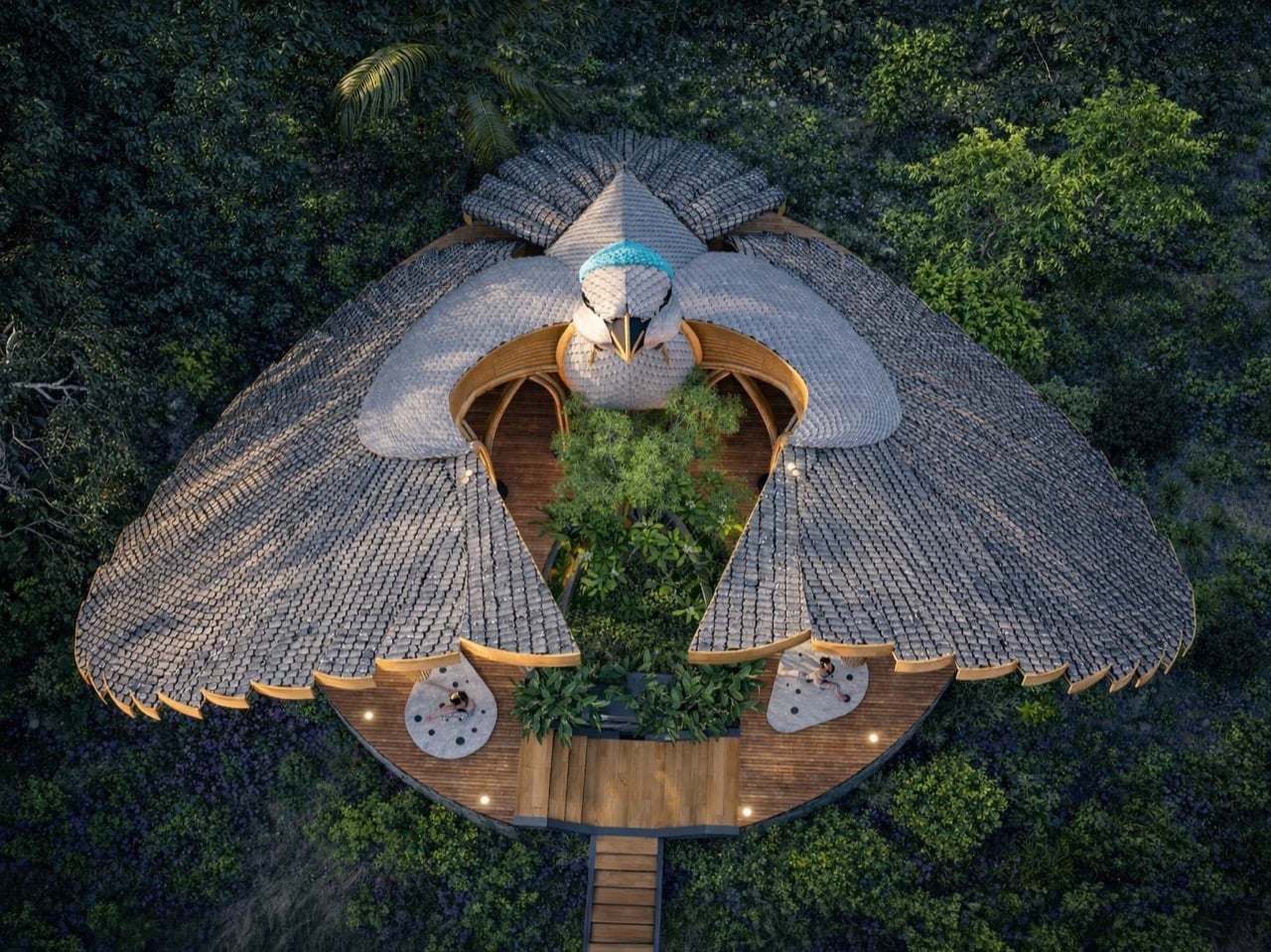
Biomimicry in architecture usually means borrowing structural logic from nature. Honeycomb patterns for strength, lotus leaves for water repellency, termite mounds for passive cooling. Thilina Liyanage takes a different approach. He’s interested in the moment when an animal does something so visually arresting that the form itself becomes a kind of language. His latest project, the Rifle Bird Yogashala, translates the courtship display of the Victoria’s riflebird into a bamboo yoga pavilion that looks like the bird caught mid-performance.

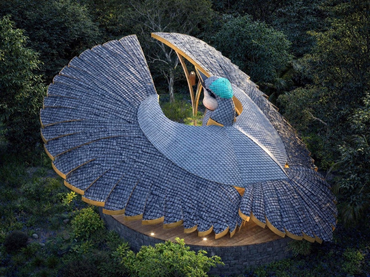
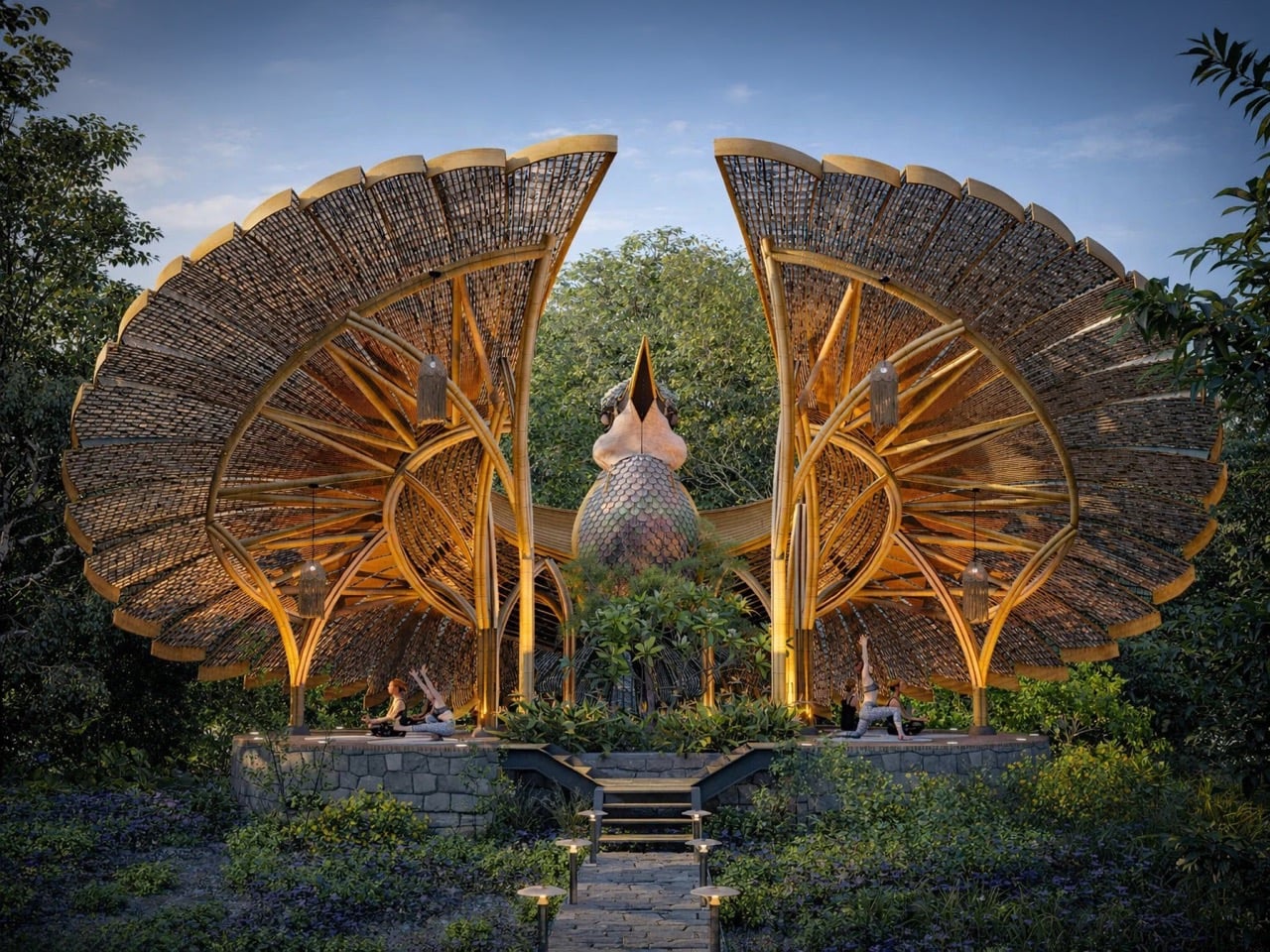
The riflebird, a bird-of-paradise endemic to northeastern Queensland, performs one of nature’s most dramatic mating displays. Males curve their wings into semi-circular arcs above their bodies, creating a dark cape of feathers that frames an iridescent throat patch. They sway, bob their heads, and scrape their beaks against wing feathers to produce a percussive rhythm. Liyanage’s yogashala mirrors that gesture with two sweeping bamboo canopies that arch skyward from a central sculptural element, their layered surfaces reading like individual feathers arranged in radial patterns. The building doesn’t just reference the bird. It performs the same gesture at architectural scale.

Designer: Thilina Liyanage

Liyanage has been doing this for years now. We’ve covered his manta ray yacht club, his deer observation deck for Yala National Park, his moose-head viewing platform in Alaska, his orchid-shaped villa, and most recently his rhino safari deck at Kifaru Point. The pattern is consistent: he finds an animal or plant with a visually distinctive form, usually something mid-gesture or mid-bloom, and translates that exact shape into a functional building using bamboo and timber. What separates this from novelty architecture is how seriously he treats the biomimicry. The proportions stay true. The radial geometry of the riflebird’s fanned wings translates directly into the roof structure here, with individual bamboo ribs following the same outward-spreading pattern you’d see in the actual feathers. The canopies tilt at the same angle the bird holds its wings during display, roughly 60 degrees from vertical based on the renders. Each layered section of the roof mimics a cluster of feathers, creating a texture that catches light the way the bird’s plumage would in dappled forest sunlight.

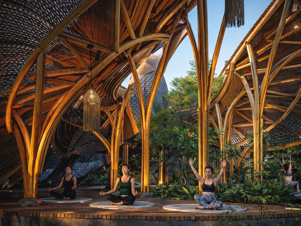
The central element between the two wing canopies reads as the bird’s body and head, complete with what looks like a sculptural interpretation of the throat and beak pointing skyward. It’s a bold move because it commits fully to the metaphor instead of softening it. You’re looking at a building shaped like a bird in the middle of a courtship display, and Liyanage doesn’t hedge. The yoga platform sits at the base on a raised stone deck accessed by stairs, giving practitioners an elevated view of the surrounding forest. The structure appears to be around 15 feet tall at the wing peaks based on the human figures in the renders, which puts it at a scale that’s monumental without being absurd. A real Victoria’s riflebird measures about 24 centimeters. This version scales that gesture up roughly 20 times while keeping the anatomical relationships intact.

Bamboo’s role in this design exists beyond aesthetics. The material bends without breaking, which is critical when you’re trying to replicate the curved ribs of a wing structure. It’s also native to Sri Lanka where Liyanage is based, and it handles moisture well, which matters in a forest setting. The layered roof sections appear to use bamboo slats or woven panels clad over a bent bamboo frame, creating the feathered texture while maintaining structural integrity. You can see the individual ribs in the renders, each one following the arc from the central support out to the wing edge. The underside of the canopies shows the same radial pattern, so anyone practicing yoga beneath them gets the full effect of looking up into the bird’s wing architecture. That’s where the concept justifies itself. You’re not just in a bird-shaped building. You’re occupying the exact spatial position a female riflebird would during courtship, looking up at a display designed to be overwhelming.

The post Biomimetic Architecture Reaches New Heights With This Bird-of-Paradise Yoga Space first appeared on Yanko Design.

A 1930s French Cabin Brought Back the Pit, and It’s the Best Part

If you grew up watching old movies or flipping through your parents’ architecture magazines from the 70s, you probably remember the conversation pit. That sunken, circular seating area built into the floor, ringed with cushions, usually occupied by someone in a turtleneck holding a glass of wine. It felt like the most optimistic design idea of its era: a room within a room, purpose-built for the act of simply talking to each other. Then open-plan living came along and flattened everything, and the pit more or less disappeared.

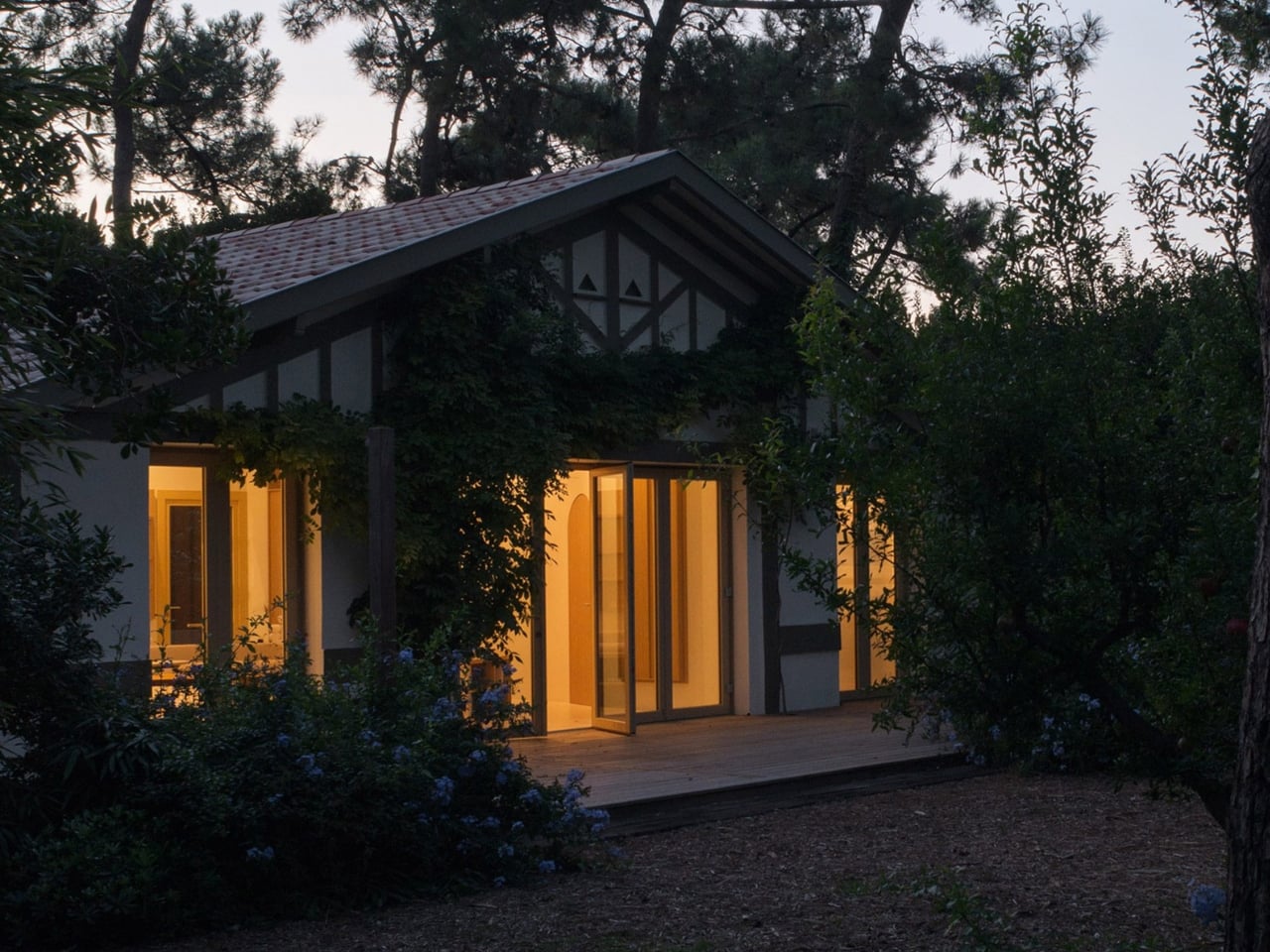
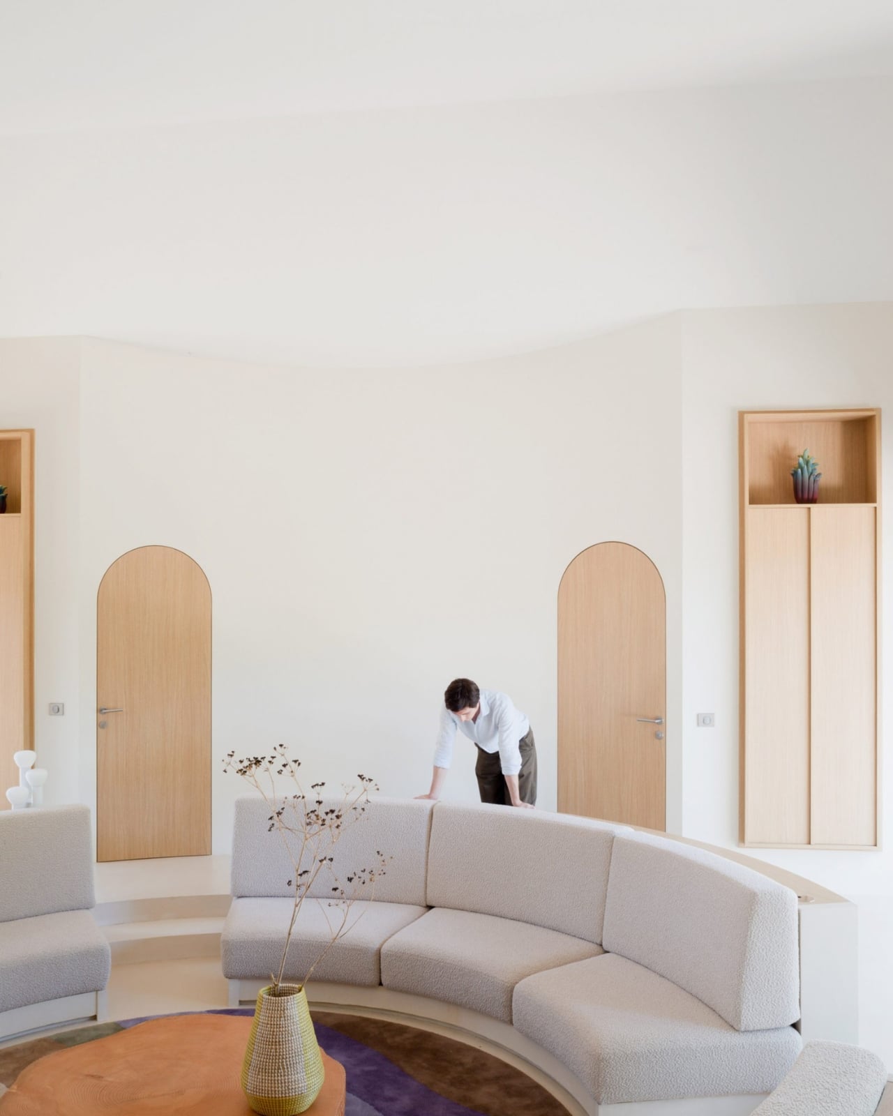
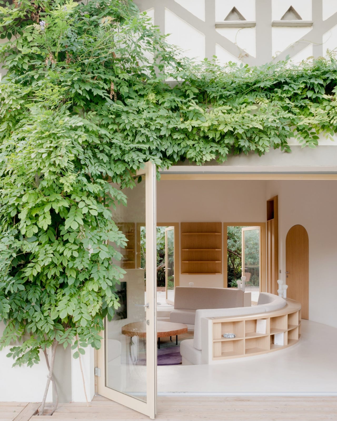
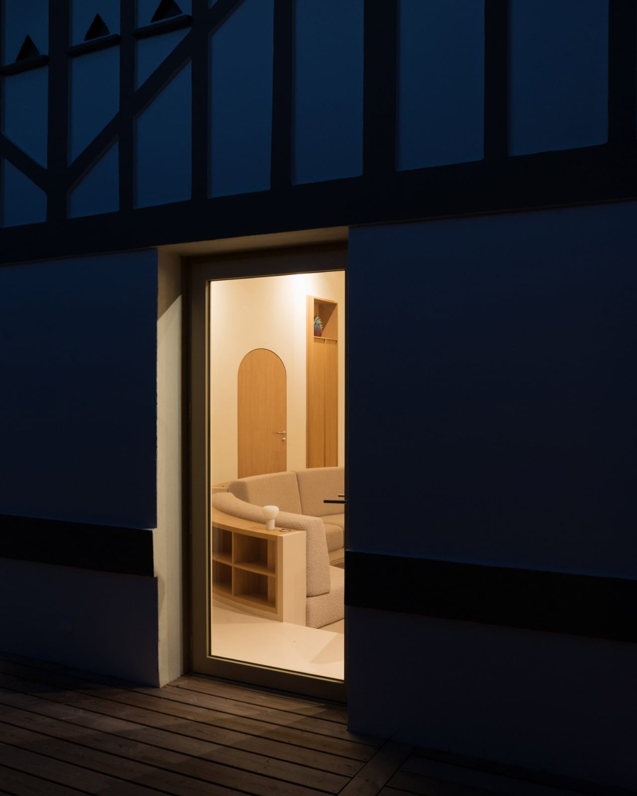
Studio Razavi just brought it back, and they did it in about the best possible setting you could imagine. The Paris, London, and New York-based firm recently completed Seaside House, a renovation of a 1930s coastal cabin at the tip of Cap Ferret, a narrow peninsula near Bordeaux, France. The structure sits nestled among towering pine trees, which is already a lot for any building to live up to. But the interior is where things get quietly radical.

Designer: Studio Razavi

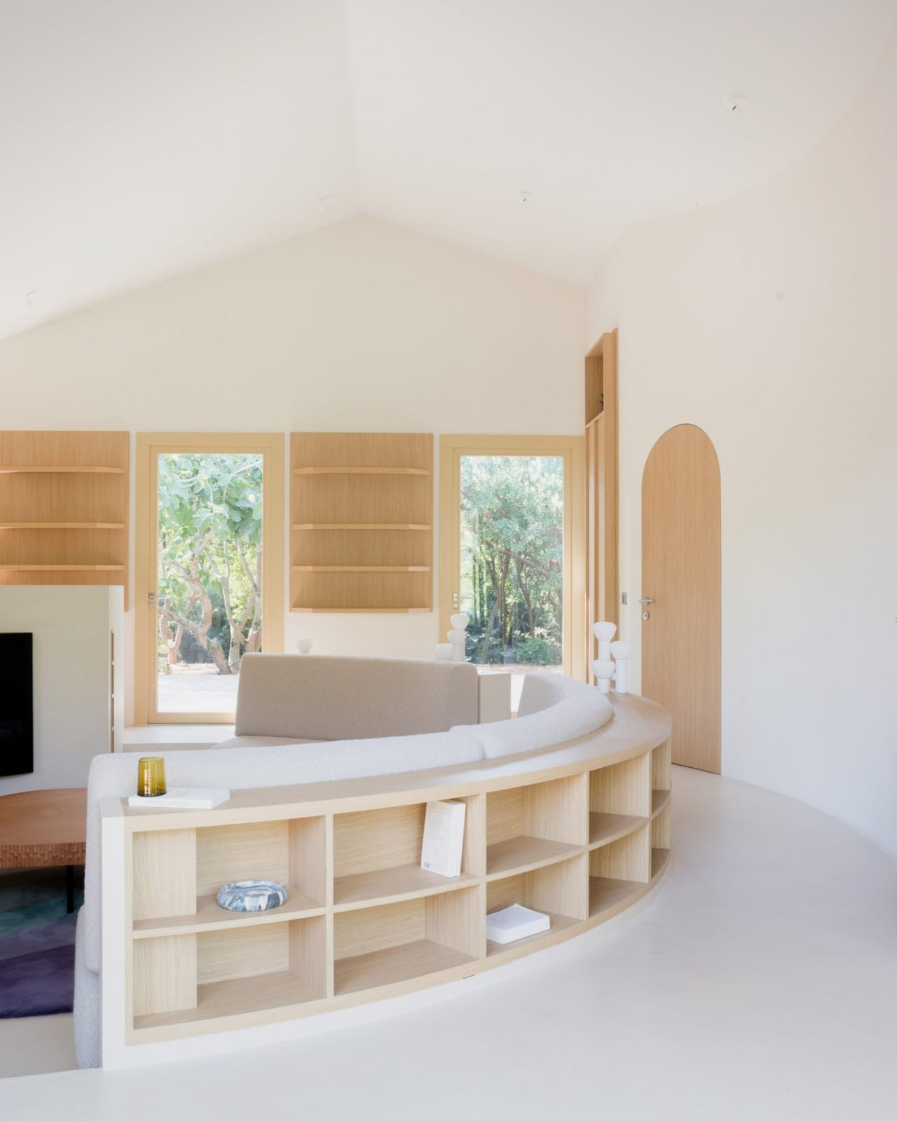
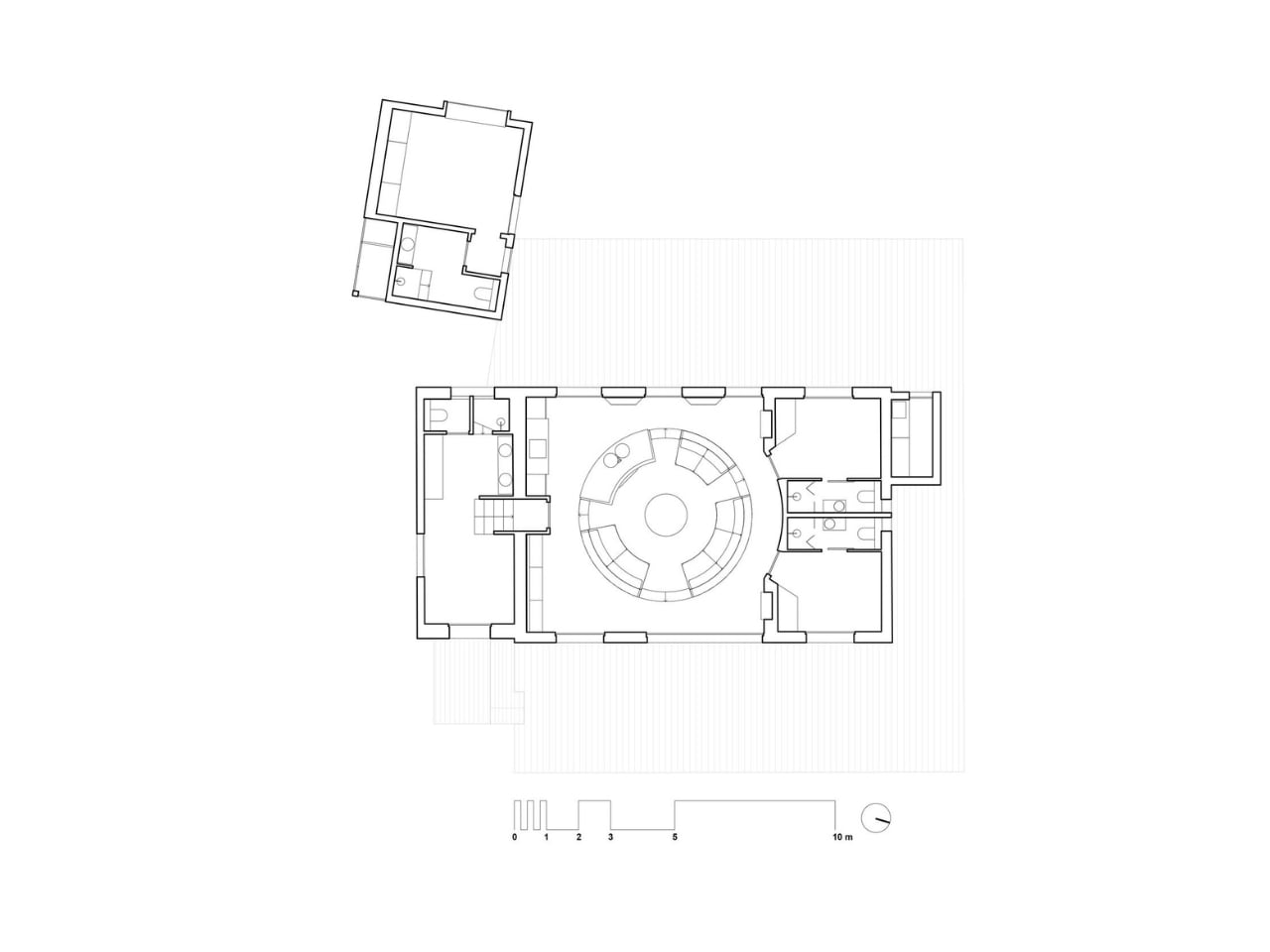
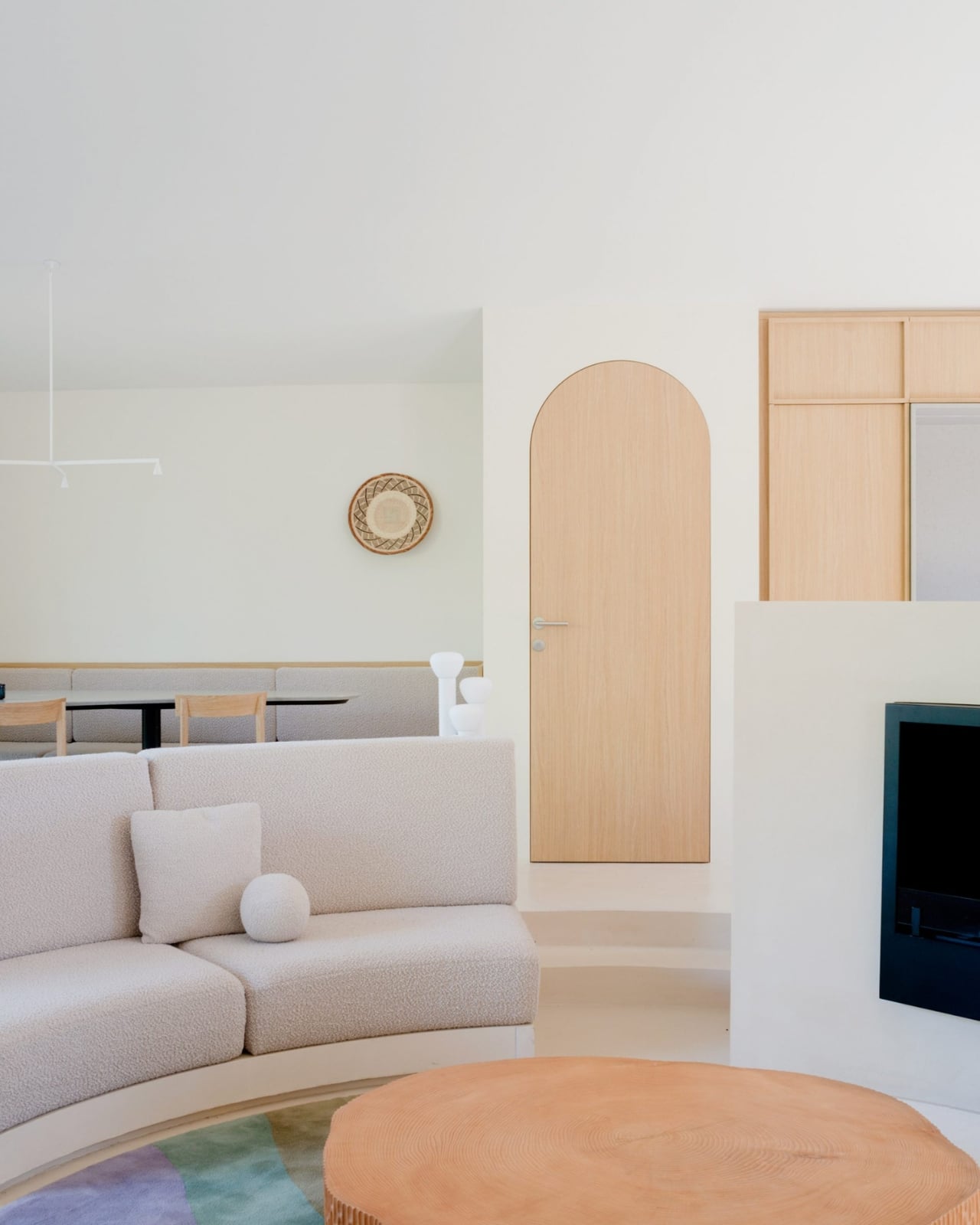
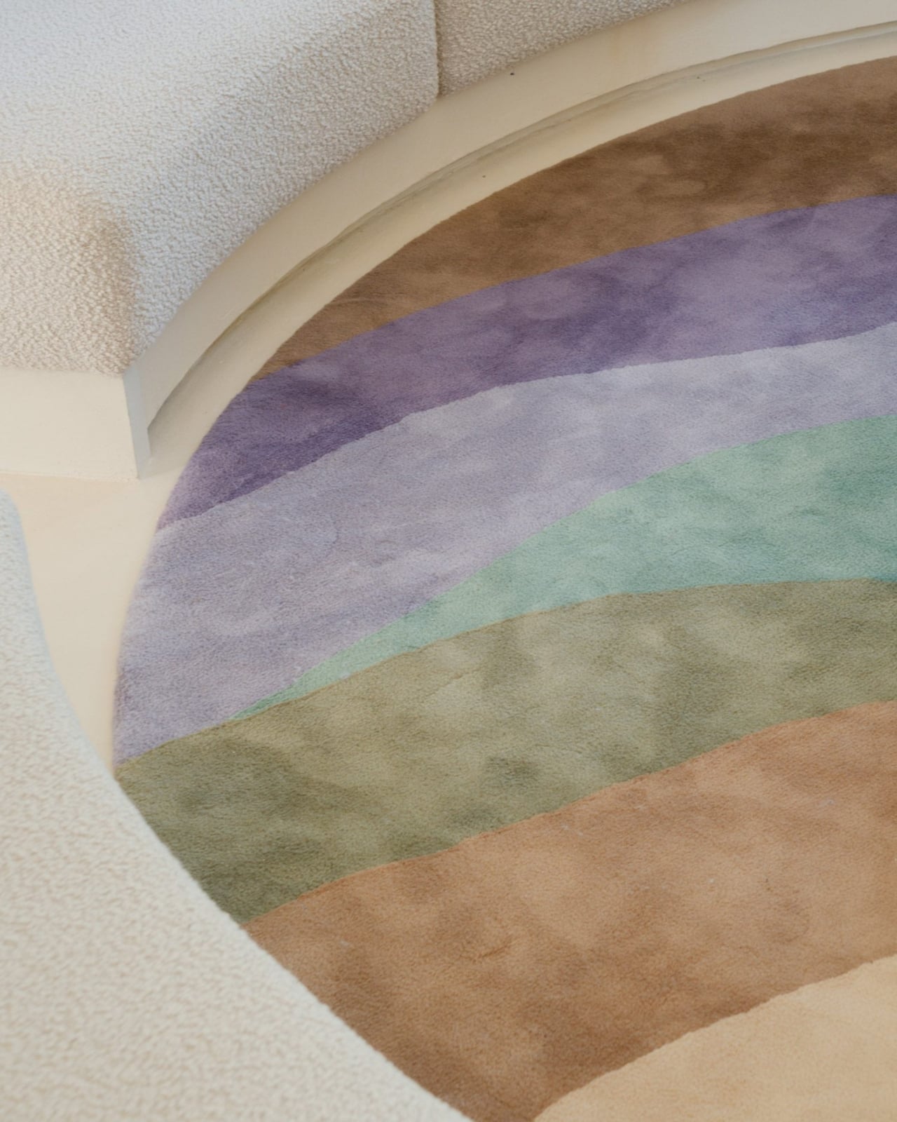
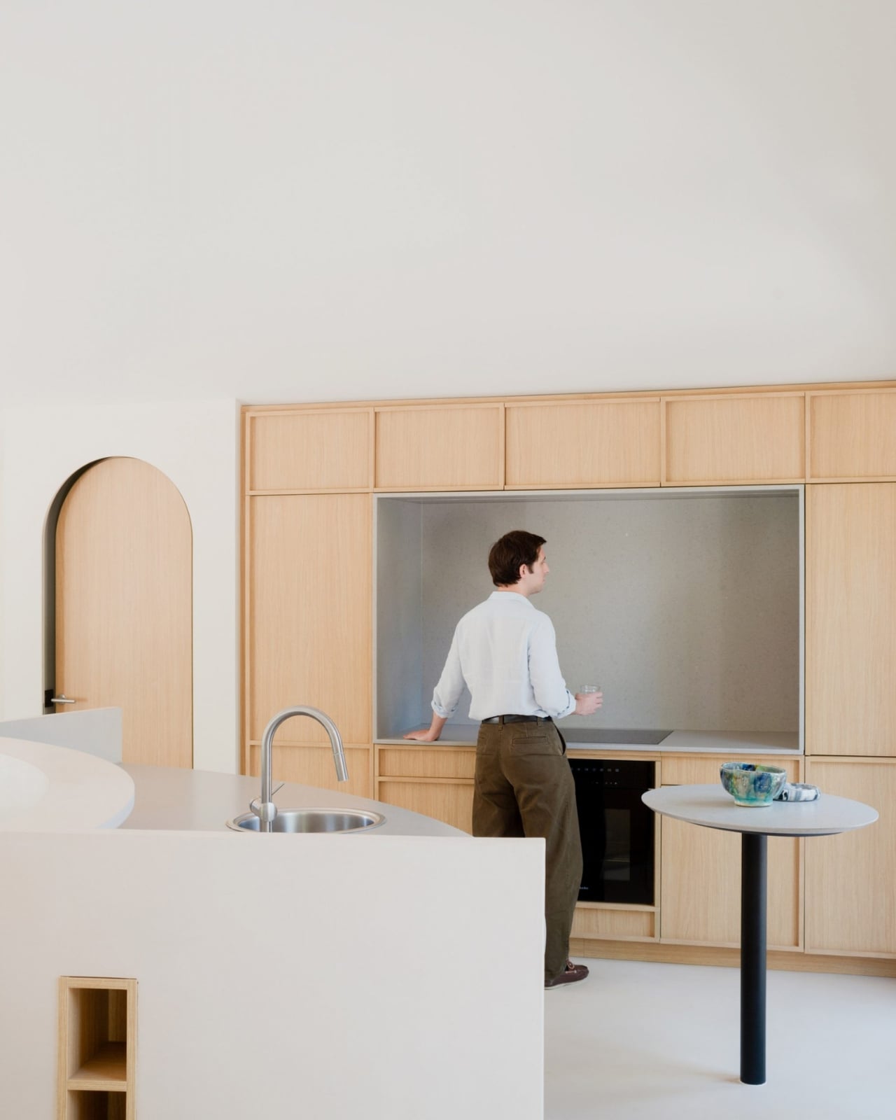
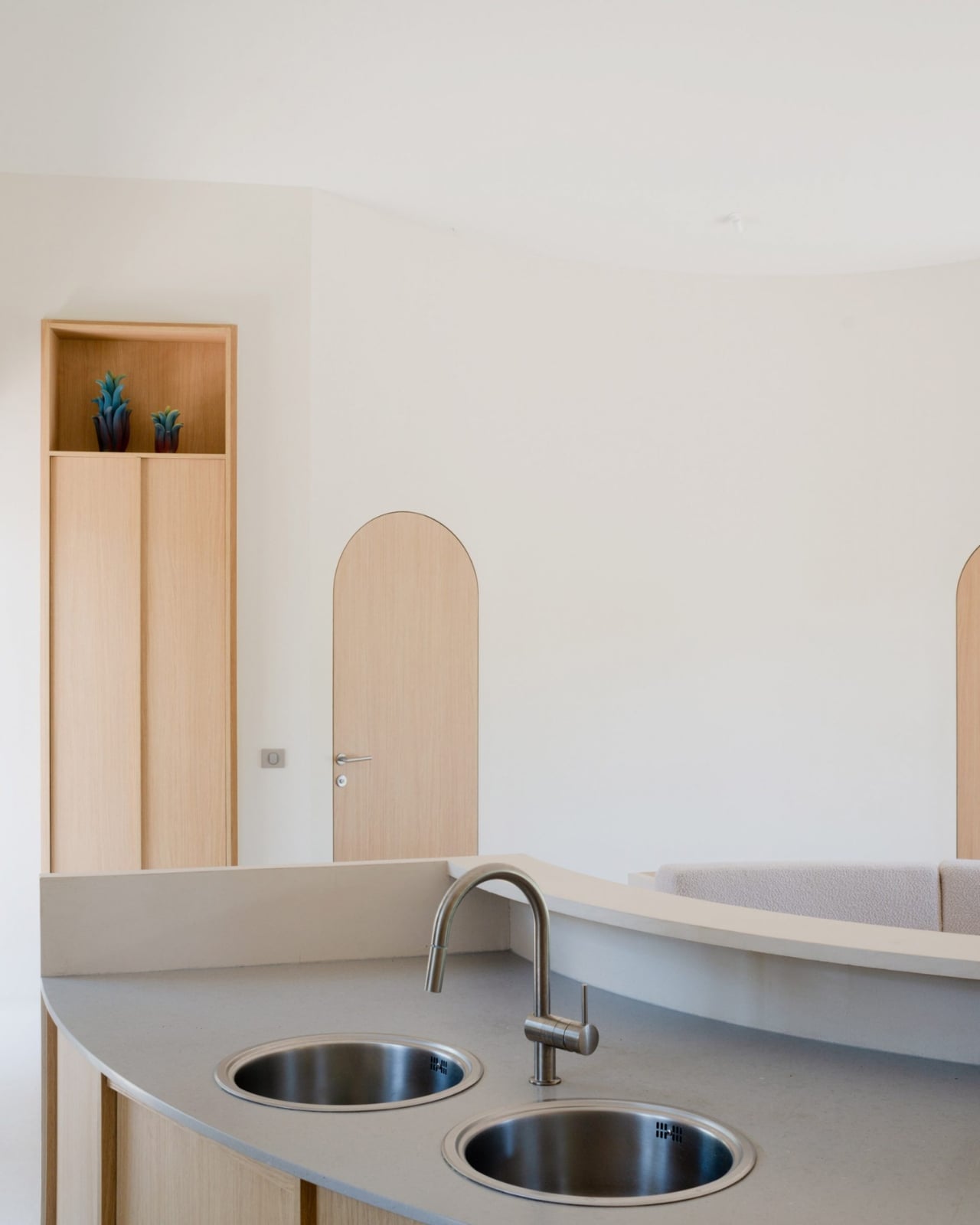
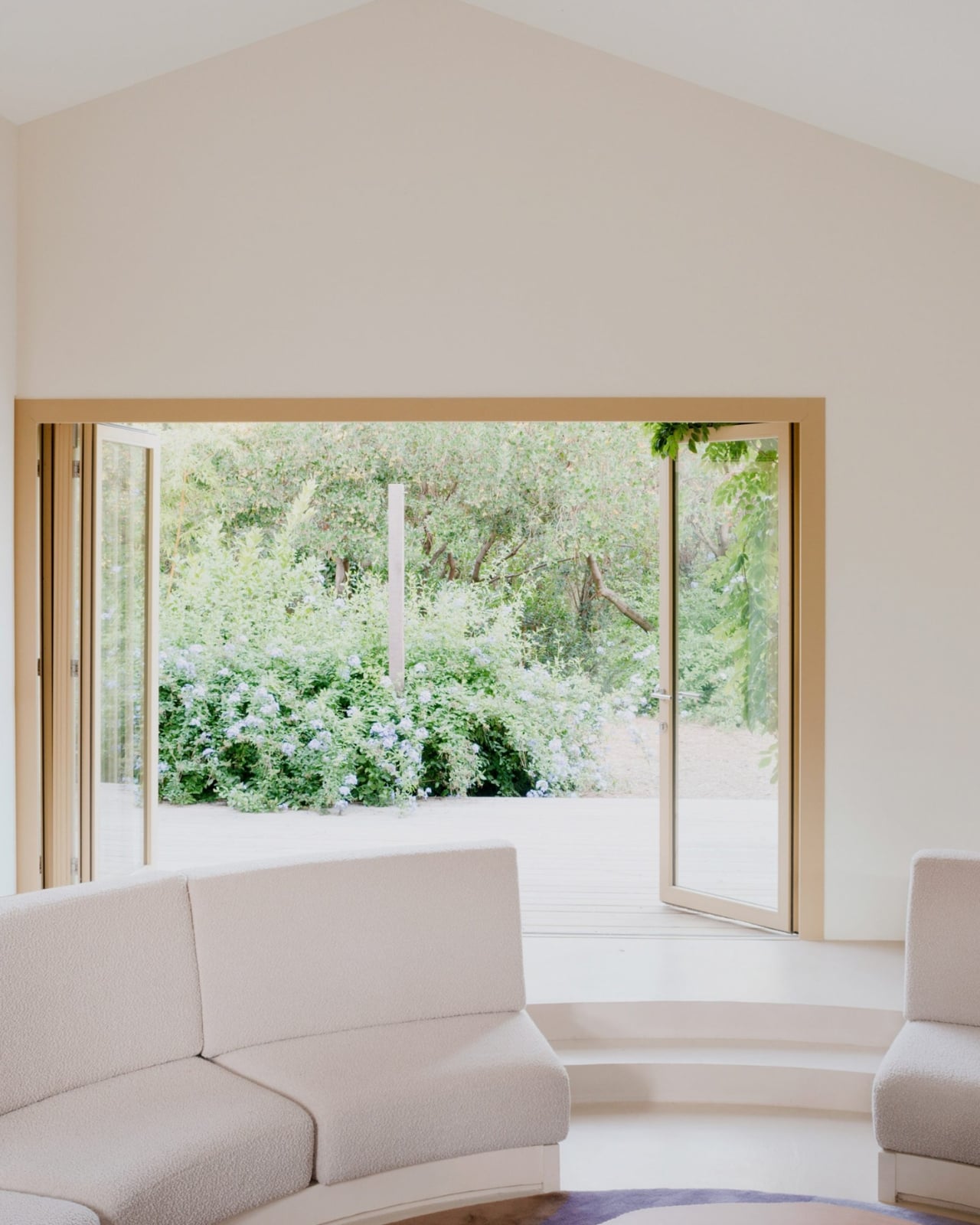
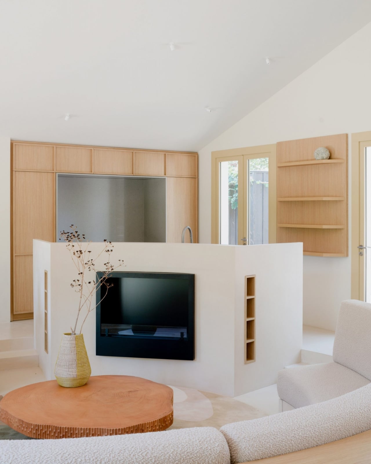
All of the cabin’s original partition walls were stripped out entirely, leaving just the building’s envelope standing. In the center of what became one long, open living space, the architects placed a circle. A sunken circular living room, specifically, with a low perimeter wall that integrates the kitchen sink and storage on one side, and steps leading down into the seating area on the other. Two decked terraces bookend the space, one on each facade of the house.

Project architects Guillen Berniolles and Michele Sacchi described it as a direct response to the local lifestyle around Cap Ferret, where people are constantly moving between indoors and outdoors. “The local lifestyle revolves around constantly moving in and out of houses, which led us to opt for a centrally sunken living room that creates a circulation flow all around,” they told Dezeen. The pit, in other words, isn’t just decorative. It gives the house its entire traffic pattern.

That reasoning matters because it pushes back against the way we usually justify bold design choices. We tend to dress them up in language about “flow” and “intention,” which often means nothing. Here, the logic is actually grounded in how real people use a real place. You come in from the terrace, the circle pulls you in, and then you drift out the other side. It’s a house that choreographs you without you noticing, and that kind of invisible architecture is genuinely hard to pull off.

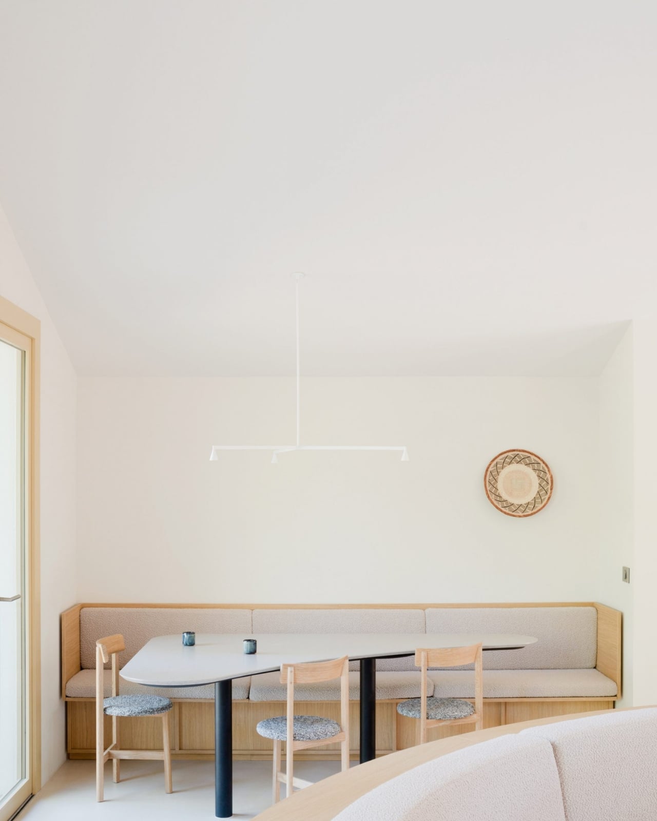
The material choices are just as considered. Solid wood furniture and veneer are used throughout as a nod to the surrounding Landes forest, which is not only France’s largest but also Europe’s most extensive man-made forest. That context matters. A coastal house in Cap Ferret sits at the intersection of sea and forest, and the design doesn’t pretend otherwise. It leans into both, which gives the whole renovation a rootedness you don’t always see in coastal homes.

A separate guest annexe, clad in dark timber, sits to the west of the main cabin, blending quietly into the tree trunks around it. It’s the kind of restrained detail that separates a thoughtful renovation from a merely stylish one.

The conversation pit feels timely for a reason that goes beyond nostalgia. We spend so much time designing spaces for productivity, for content, for function, that a space designed specifically for conversation feels almost radical now. A sunken circle in a beach house that says, essentially, sit here and talk to each other, is a quiet but pointed statement. I don’t think it’s a coincidence that it lands now.

Studio Razavi has always been good at finding the architectural move that feels both inevitable and completely unexpected once you see it. Seaside House is that in full. The shell stayed. Everything else became about the circle at the center of it, and somehow, that’s more than enough.

The post A 1930s French Cabin Brought Back the Pit, and It’s the Best Part first appeared on Yanko Design.
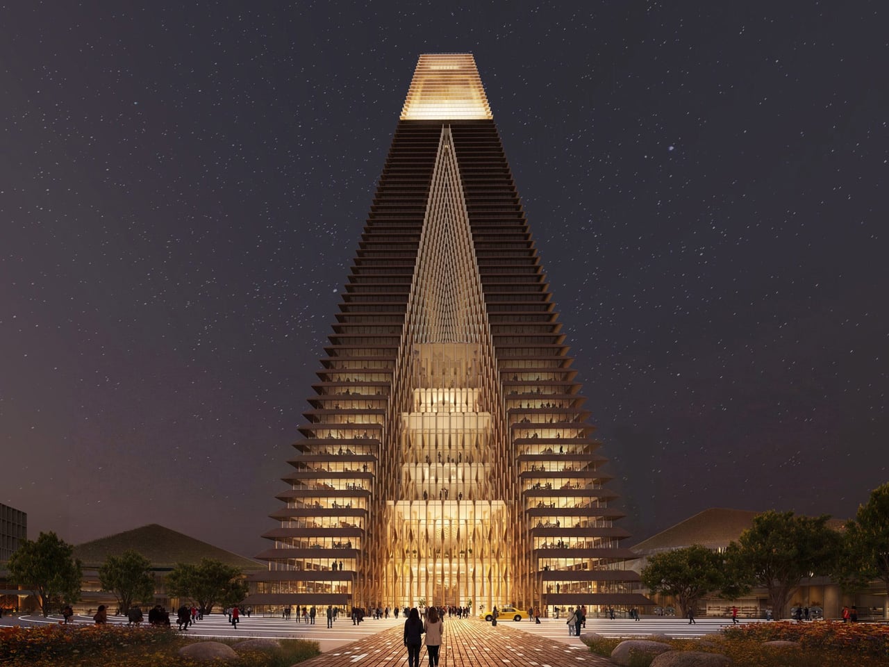
SOM’s New Kazakhstan Towers Look Like a Sci-Fi Set. They’re Not.

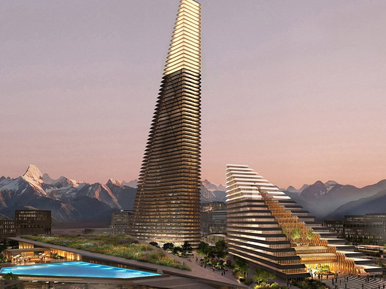
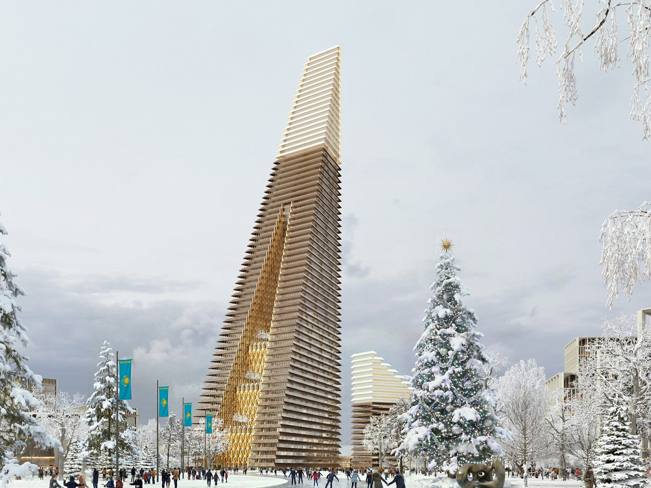
Kazakhstan is building a new city, and it just got a centerpiece worthy of the ambition. On March 5, 2026, Skidmore, Owings & Merrill unveiled the Alatau Iconic Complex and Gateway District, a pair of pyramidal towers set to define the skyline of Alatau, a brand-new city rising along the Almaty–Qonaev highway in south-eastern Kazakhstan. This is the same firm behind the Burj Khalifa, One World Trade Center, and Jin Mao Tower. The pedigree speaks for itself.

Alatau is planned to span 88,000 hectares across four districts, positioned along the Western Europe–Western China transport corridor, with a master plan stretching through 2050. SOM’s Iconic Complex sits at the heart of the city’s fourth zone, the Gateway District, designed as a dense, walkable neighborhood anchored by multimodal transit. It’s not just a building drop. It’s a full urban proposition.

Designer: Skidmore, Owings & Merrill

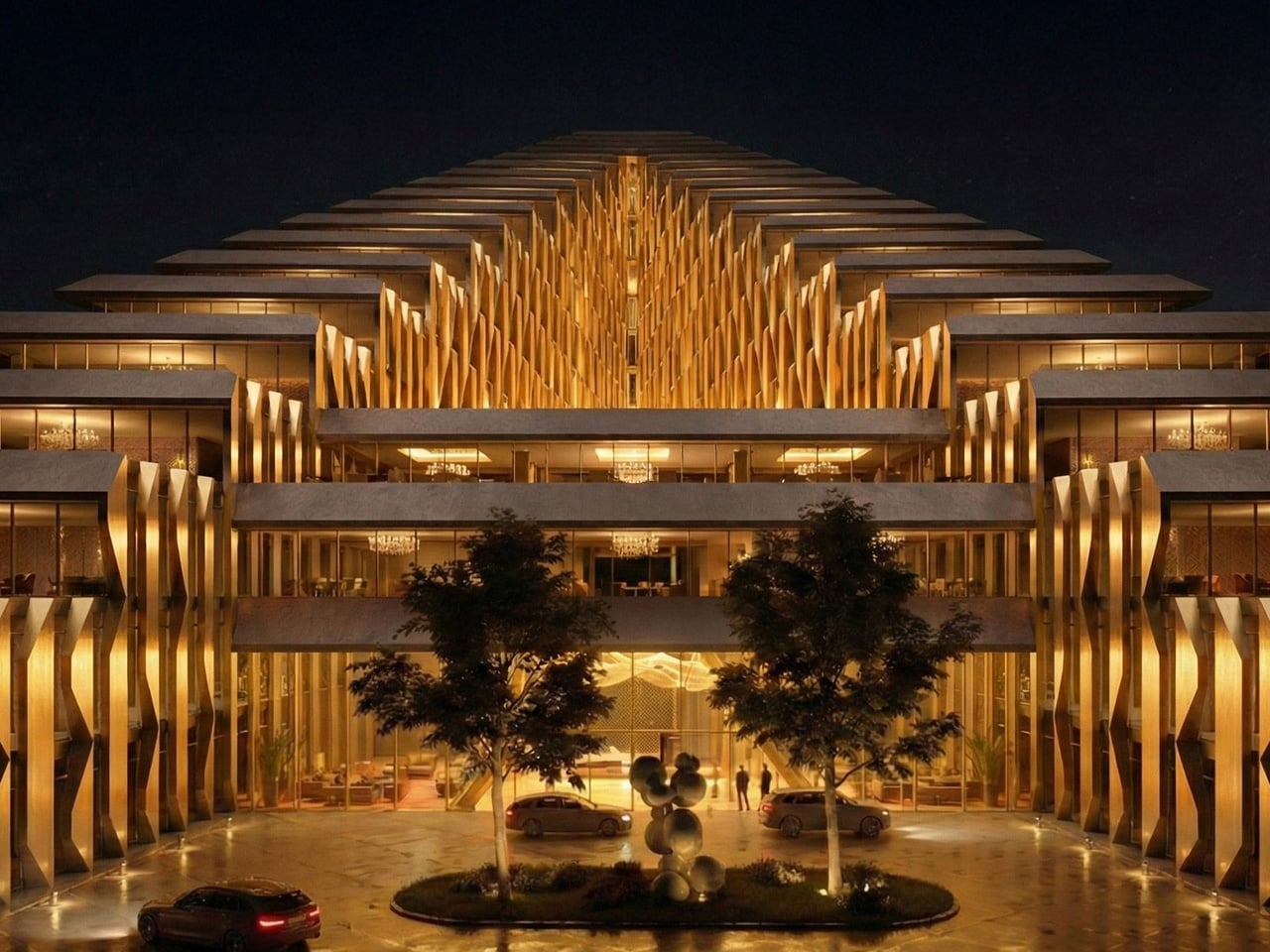
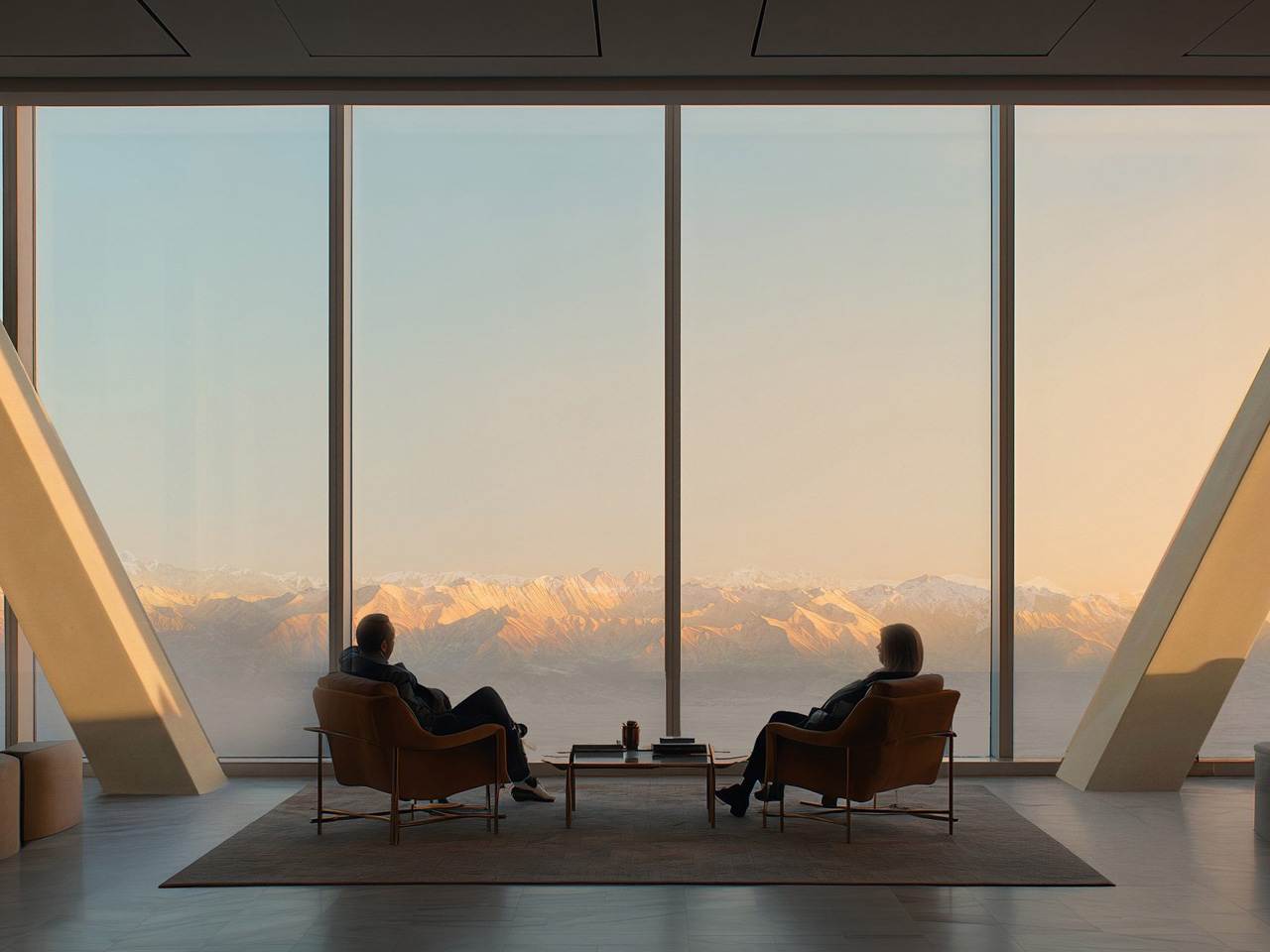
The complex totals 276,800 square meters across two towers: a 272-meter, 56-floor primary skyscraper housing offices and premium residences, and an 80-meter luxury hotel tower with branded residences and retail. When complete, the taller structure will be the tallest building in the region. The design concept, titled “Mountain Landscape,” pulls directly from the Trans-Ili Alatau, a 350-kilometer range of valleys, glaciers, and stratified terrain that forms the natural backdrop to the site. SOM translated that geology into architecture through stepped, wedge-shaped volumes, each level lined with external terraces and large central atria that pull light deep into the interiors.

Engineering the towers required serious thinking. The region sits in a high-seismic zone, which led to a dual structural strategy: a Japanese seismic damping model that absorbs earthquake energy through controlled structural movement, paired with an American reinforced framework built around a high-strength steel skeleton. The project also integrates eVTOL infrastructure alongside pedestrian and transit networks, future-proofing the complex well beyond its 2029 completion date.

Construction has been handed to China State Construction Engineering Corporation, a partnership announced during President Kassym-Jomart Tokayev’s state visit to China in September 2025. Full-scale excavation is scheduled to begin in May 2026, with total private investment exceeding $800 million.

For Kazakhstan, this goes beyond architecture. With Parliament recently approving a Constitutional Law on Alatau’s special status, the Iconic Complex is set to become the economic and cultural core of Central Asia’s most closely watched new city. SOM has built skyline-defining towers before. This one carries the weight of an entire nation’s next chapter.

The post SOM’s New Kazakhstan Towers Look Like a Sci-Fi Set. They’re Not. first appeared on Yanko Design.
The Ping Pong Tables at This French School Have No Rules

Most of us learned to play ping pong the same way: flat table, net in the middle, bounce, smash, repeat. The rules were never really up for debate. You either knew them or you didn’t, and the table gave you very little room to imagine doing things differently. That’s exactly the kind of thinking French architecture studio Exercice decided to challenge.

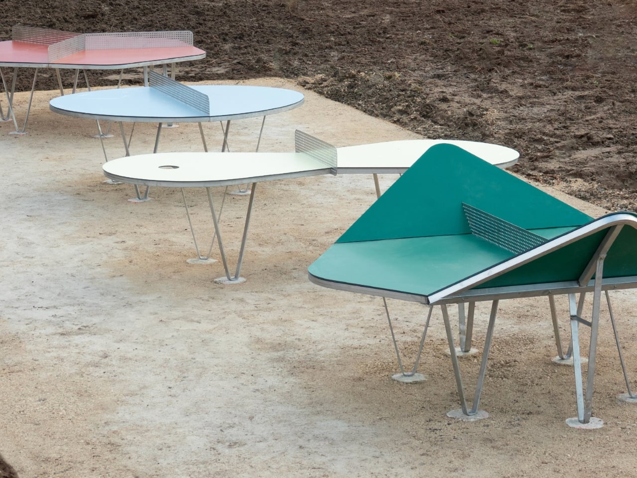
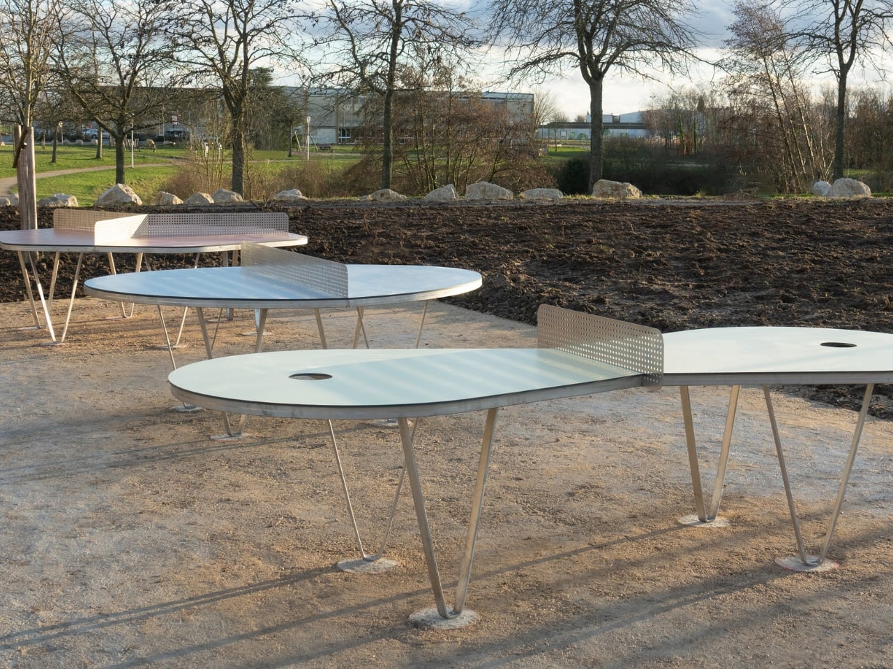
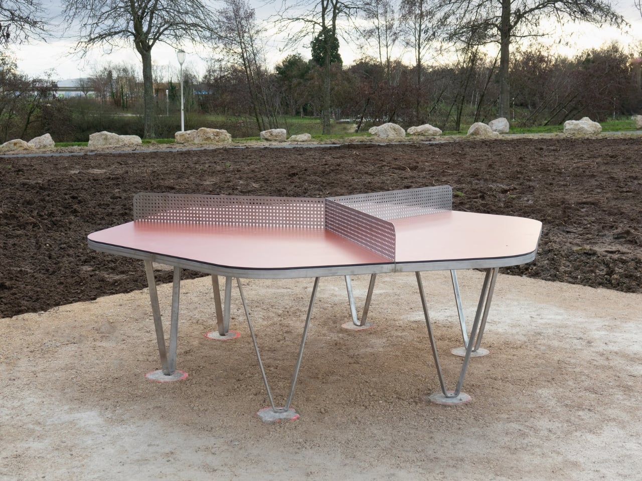
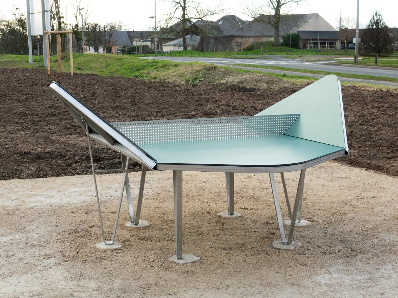
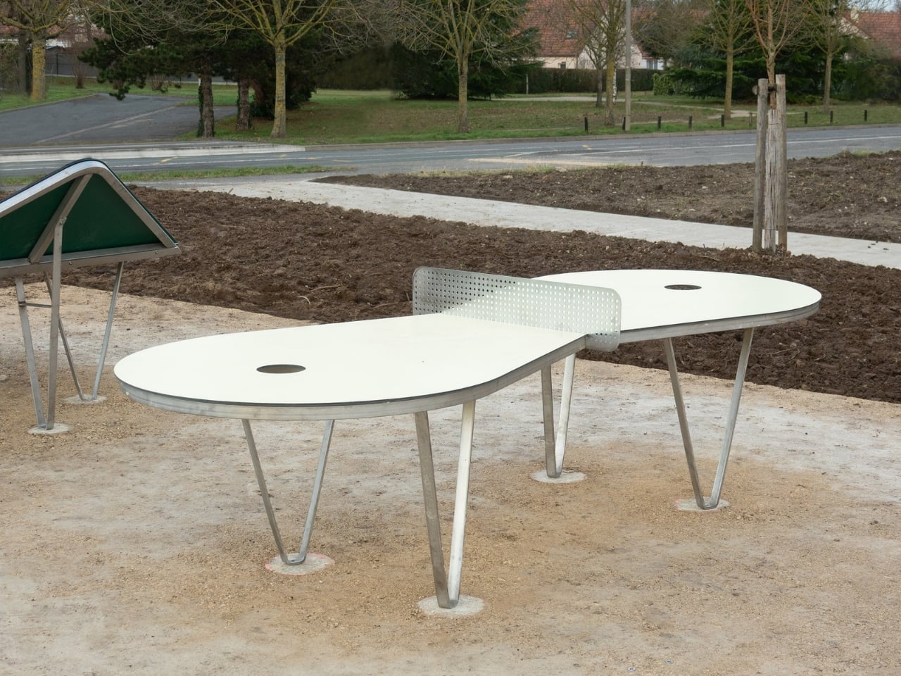
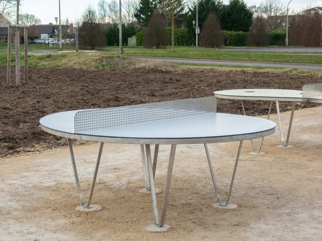
Their project, called Ping Pong Park, recently landed at a high school in Ingré, France, and it is not your standard schoolyard furniture. Exercice installed four table tennis tables on the school grounds, each one looking like it wandered out of an art gallery and accidentally became a playground fixture. They were designed to make children question the rules, experiment with play, and figure out how the game works for them, not for a referee.

Designer: Exercise

The four tables each have a distinct character. The Rebound table has raised sides that expand the playing surface vertically, so the ball doesn’t just travel across the table. It can careen off walls you didn’t anticipate. Every rally becomes a small physics experiment. The Golf table narrows at the centre and features holes on either side that can count as a winning point or a foul, depending entirely on what players decide before the match starts. Even the geometry pushes you toward longer, more strategic shots. Then there’s the Rotating table, which is circular and designed for tournante, the French schoolyard favourite where multiple players run around the table taking turns hitting the ball. The round shape accommodates up to six or seven players and keeps everyone moving, which means the social energy is essentially designed into the form.

Exercice describes these as “social sculptures: accessible, participatory and constantly evolving through collective appropriation.” That’s a mouthful, but it’s also kind of perfect. The tables aren’t static objects kids use and then forget. They change meaning every time a new group decides what the rules are going to be that afternoon. One day the holes in the Golf table are winning points. The next, they’re instant fouls. The table is genuinely indifferent either way, and that neutrality is the whole idea.

I love this approach because it trusts kids to be more interesting than we usually give them credit for. The whole premise assumes that children are capable of designing their own experience if you give them the right starting point. A regulation ping pong table says: here are the rules, now compete. The Ping Pong Park tables say: here’s a surface, now figure it out. That’s a subtle but genuinely different message about what play is for, and what sports equipment is really supposed to do.

The design itself holds up visually, which matters more than it might seem. The tables are made from galvanised steel and high-pressure laminate, built to survive daily use, not just an exhibition. They have clean, confident shapes that could hold their own as standalone sculptures in a public space. Exercice has framed them that way deliberately, noting that each table has a “distinctive aesthetic identity” that allows it to function as an autonomous artwork. The fact that they’re also durable enough for a schoolyard is the point. Art that only survives gallery conditions is less interesting to me than art that survives contact with twelve-year-olds.

The complete range, including indoor and outdoor versions, is available through French brand Nedj. So while the Ingré school installation is the most visible showcase right now, these aren’t a one-off concept piece locked behind a museum velvet rope. They’re in production, which means the logic behind them, that sports equipment can also be social infrastructure, is something other schools and public spaces could genuinely access. That’s the part that feels most exciting. Good ideas should travel.

Play is serious business when it’s done well. Exercice seems to understand that the best playground equipment doesn’t hand children a script. It hands them a question. And a ping pong paddle.

The post The Ping Pong Tables at This French School Have No Rules first appeared on Yanko Design.
The Erica by Craft House Is the Tiny Home That Thinks Vertically

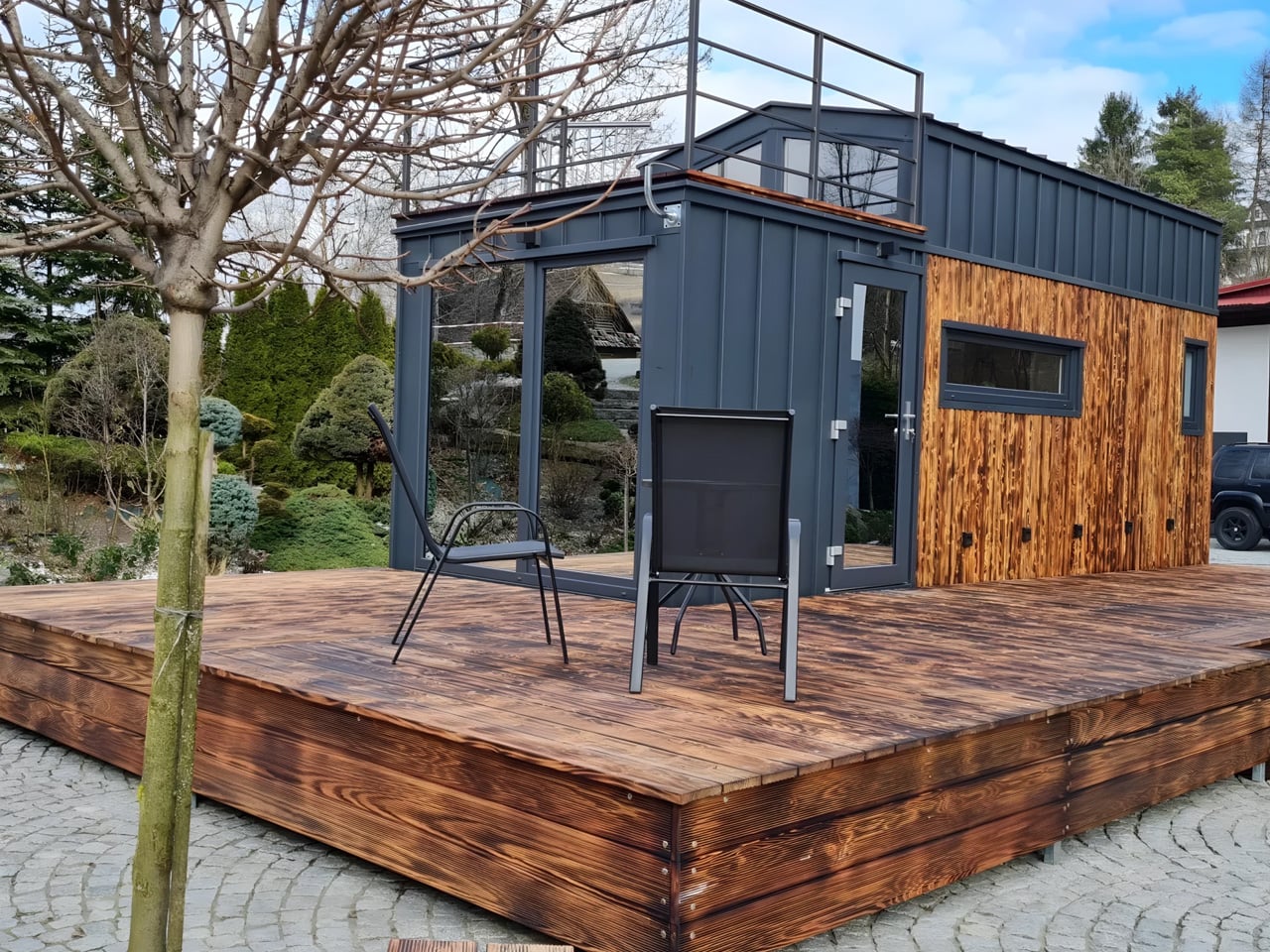
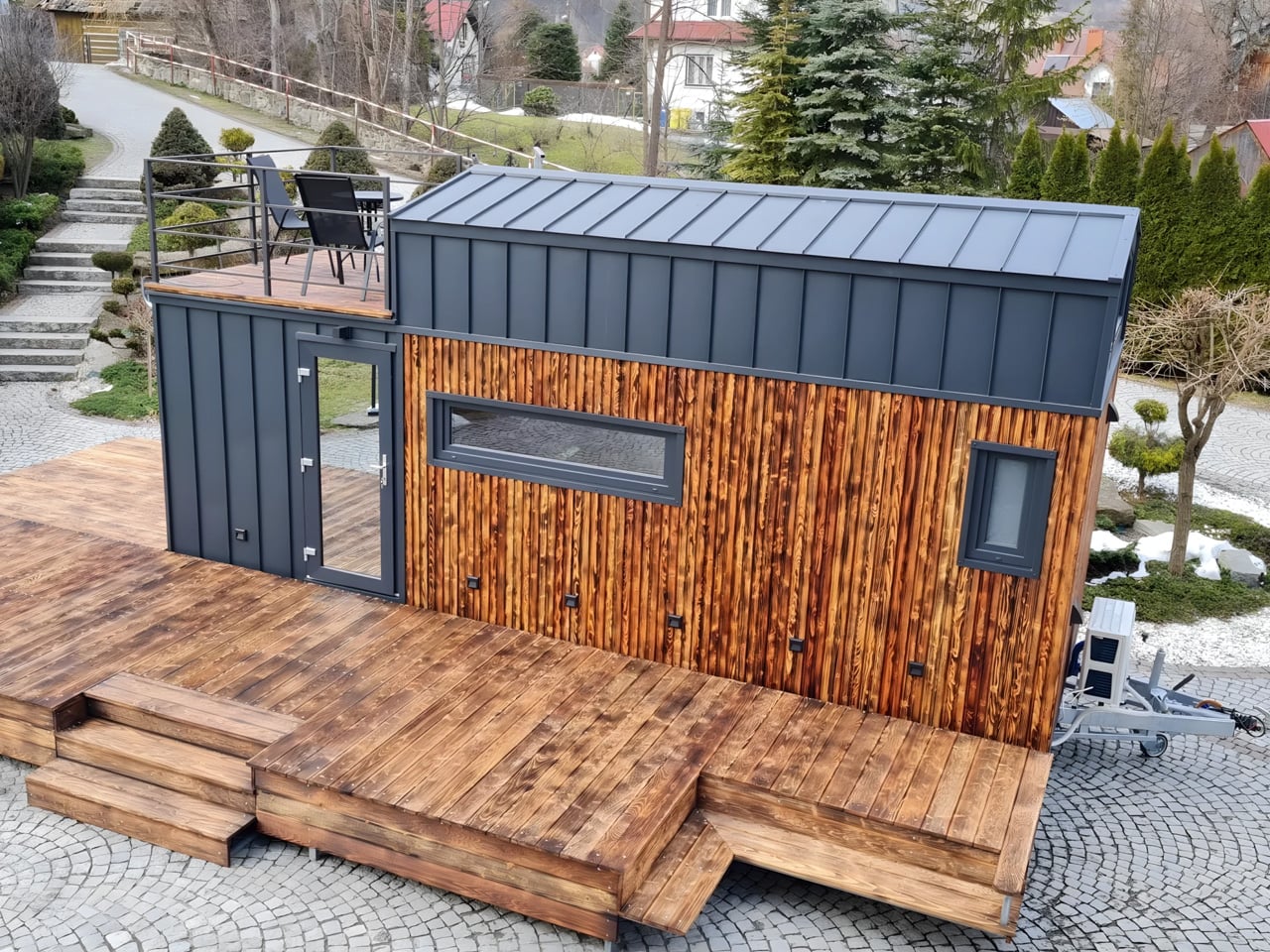
Tiny living has always been a negotiation. You trade square footage for freedom, density for mobility, and somewhere in that exchange, comfort usually takes the first hit. The Erica by Craft House is a direct response to that tradeoff, a 24-foot towable tiny home that refuses to accept the ceiling as a ceiling. Craft House, a builder with roots across Poland, Austria, and Ireland, designed the Erica around a simple but underused idea: when you can’t build out, build up.

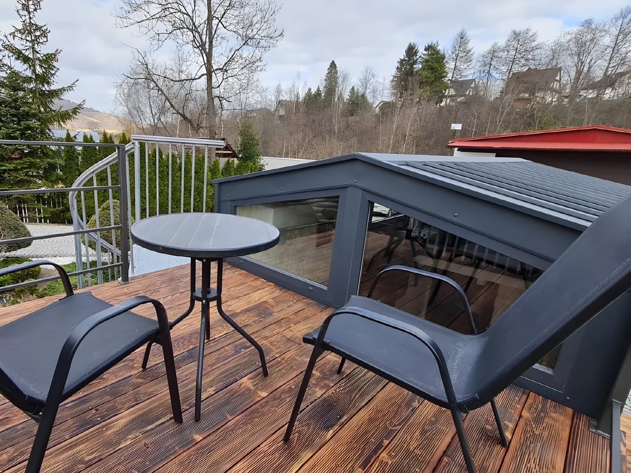
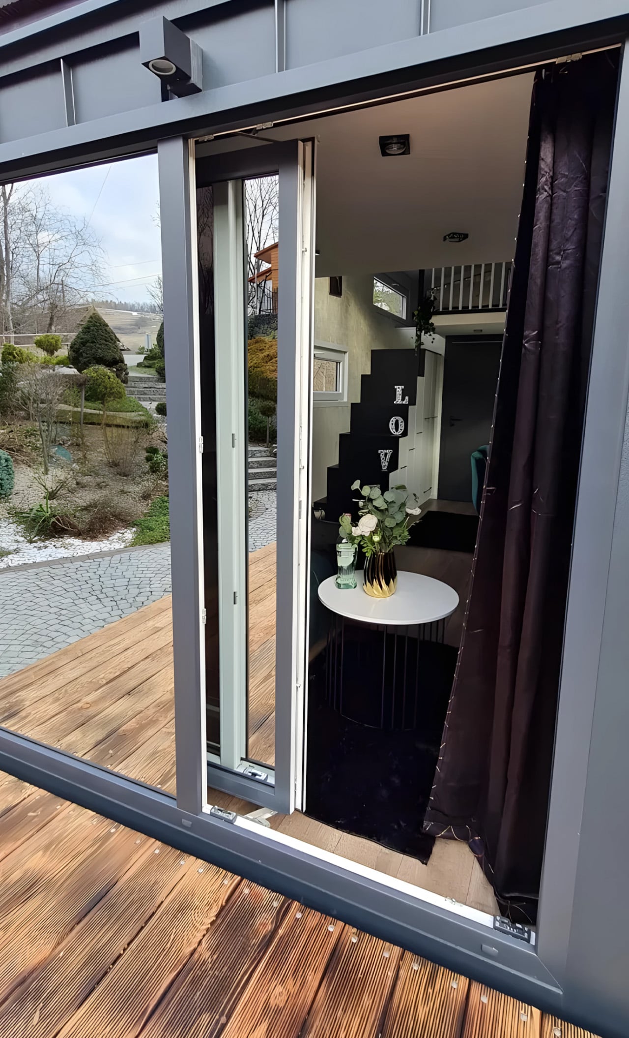
The rooftop terrace is the home’s defining move — an accessible outdoor space that extends livable square footage without touching the home’s road-legal width. It’s the kind of solution that makes you wonder why more tiny home builders haven’t gone there. The home sits on a double-axle trailer and can be fitted with an optional ground-level deck, shifting it from purely mobile to something closer to semi-permanent. That flexibility is part of the appeal; Erica doesn’t force you to choose between a life on wheels and a home that actually feels settled.

Designer: Craft House

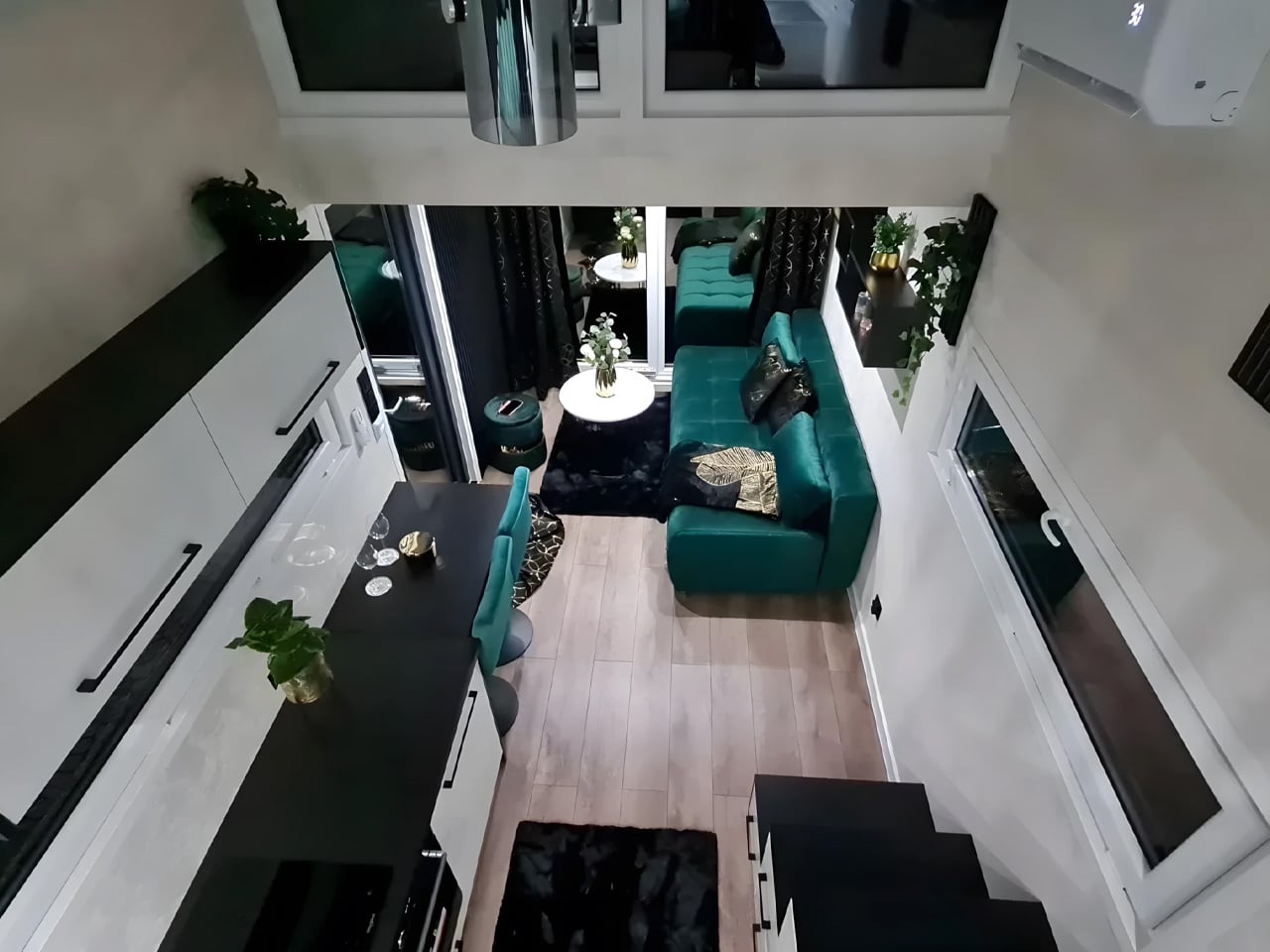
Step inside, and the ground floor, finished in Scandinavian spruce, does a convincing job of feeling larger than its 129 square feet. The open-plan layout keeps the kitchen and living area in conversation with each other, which does a lot of the heavy lifting spatially. It’s a simple design decision that pays off immediately.

The kitchen is well-equipped: induction cooktop, oven, fridge, sink, and enough cabinetry to keep things from feeling like a camping setup. The breakfast bar seats two and doubles as a work surface…exactly the kind of multitasking that earns its keep in a space this size. The bathroom sits at the opposite end of the home with a flushing toilet, vanity sink, and glass-enclosed shower. Tight, but complete.

The bedroom is a loft reached via a staircase smartly built out with integrated storage underneath. The ceiling is low, as loft ceilings in tiny homes tend to be, but the tradeoff is a ground floor that stays clear and breathable. A mini-split air conditioning unit handles climate control; a practical choice that doesn’t eat into the floor plan the way bulkier systems would.

Solar power is available as an optional add-on, giving owners a path toward off-grid living without hardwiring it into the base spec. It’s a considered choice that keeps the entry point accessible while leaving room to grow. The Erica isn’t trying to reinvent tiny living — it’s trying to do it better. And in a market full of homes that look alike, that rooftop terrace alone makes it worth a second look.

The post The Erica by Craft House Is the Tiny Home That Thinks Vertically first appeared on Yanko Design.
The Most Creative Public Space Design Right Now Is Made of Trash

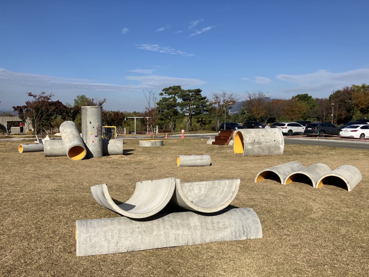
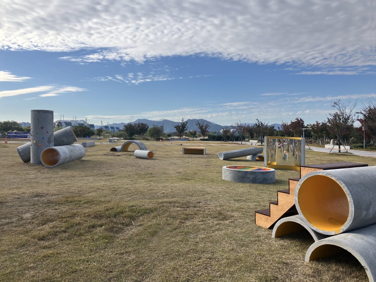
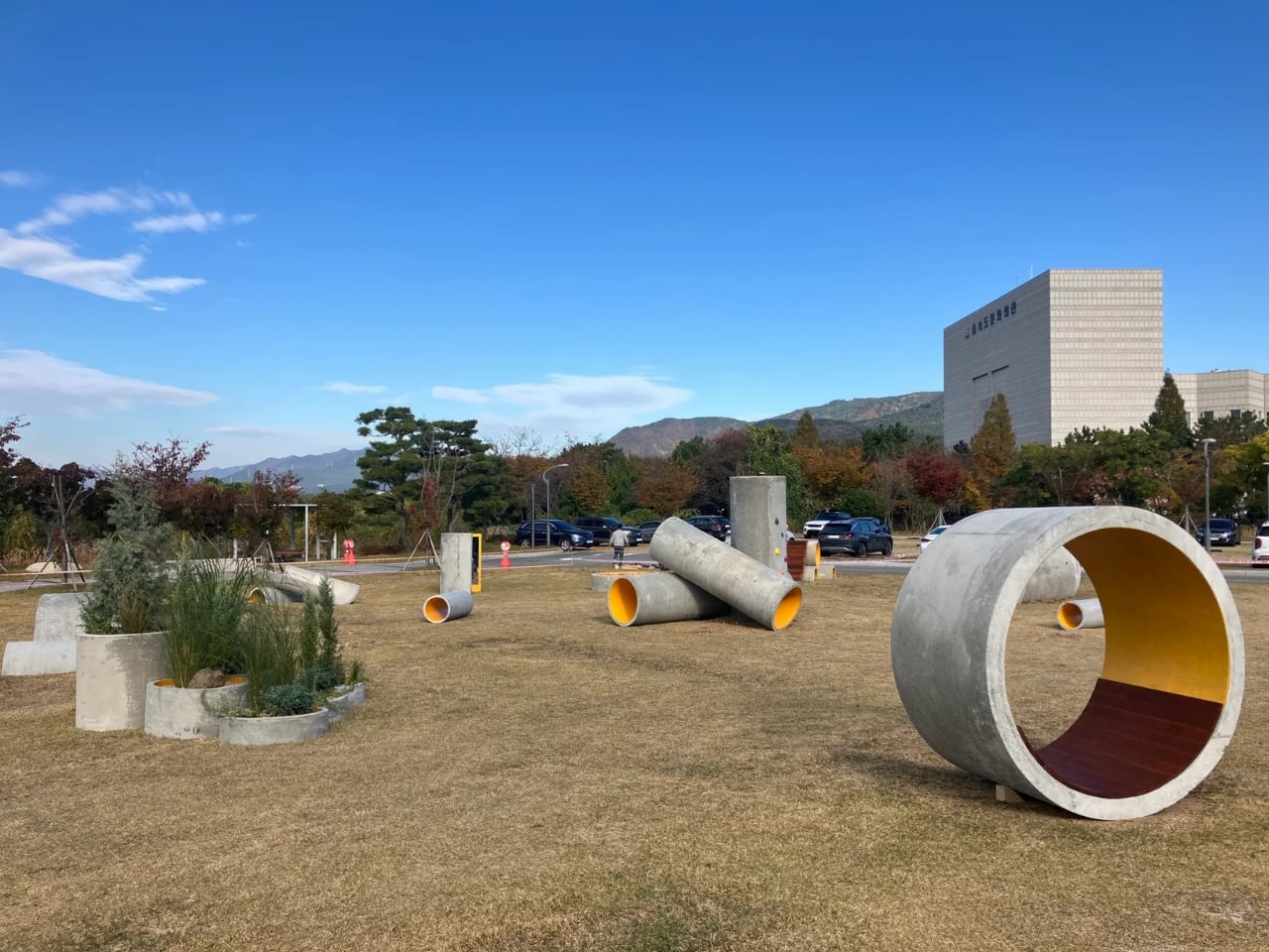
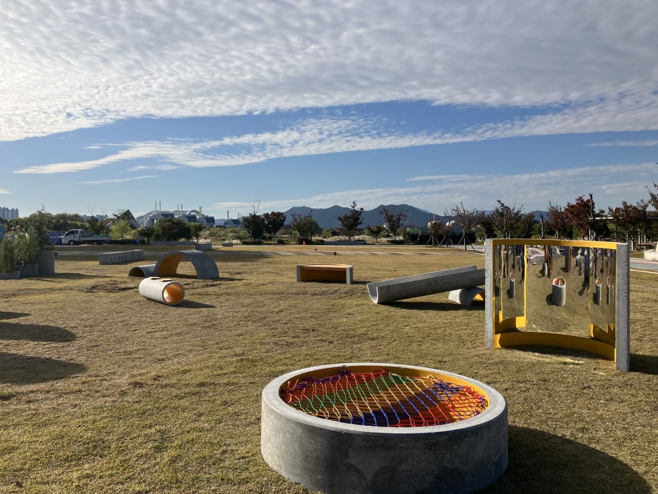
The first time I saw images of Concrete Utopia, I assumed it was a render. The kind of thing that circulates on design Instagram before quietly disappearing into the “concepts that never got built” pile. Chunky grey pipes arranged in an open courtyard, people moving through and around them like it was always supposed to be this way. But the project is real, it lives outside the Museum of Contemporary Art Busan in South Korea, and the more I sat with the images, the more I found myself studying them the way you study something that seems simple until it isn’t.

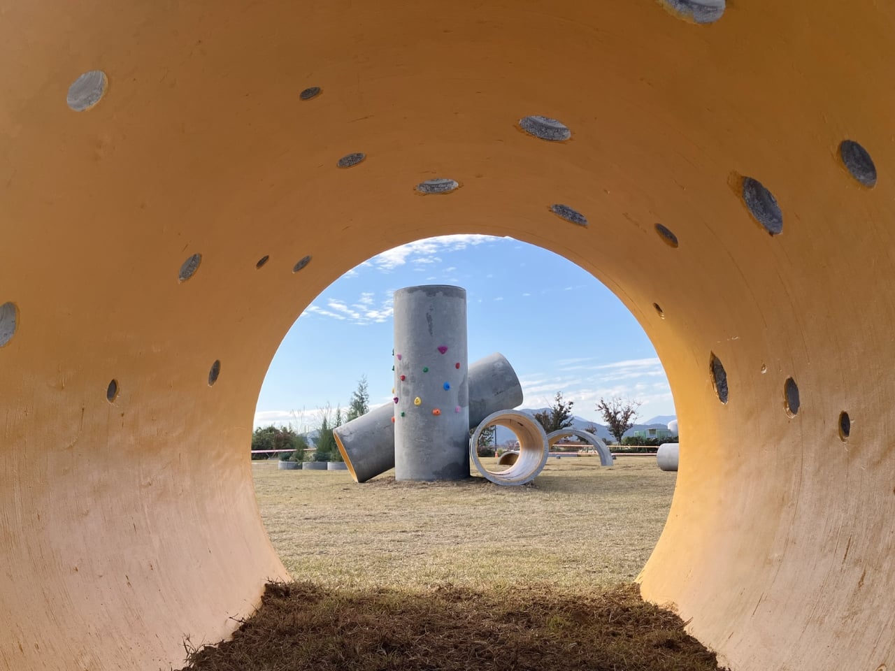
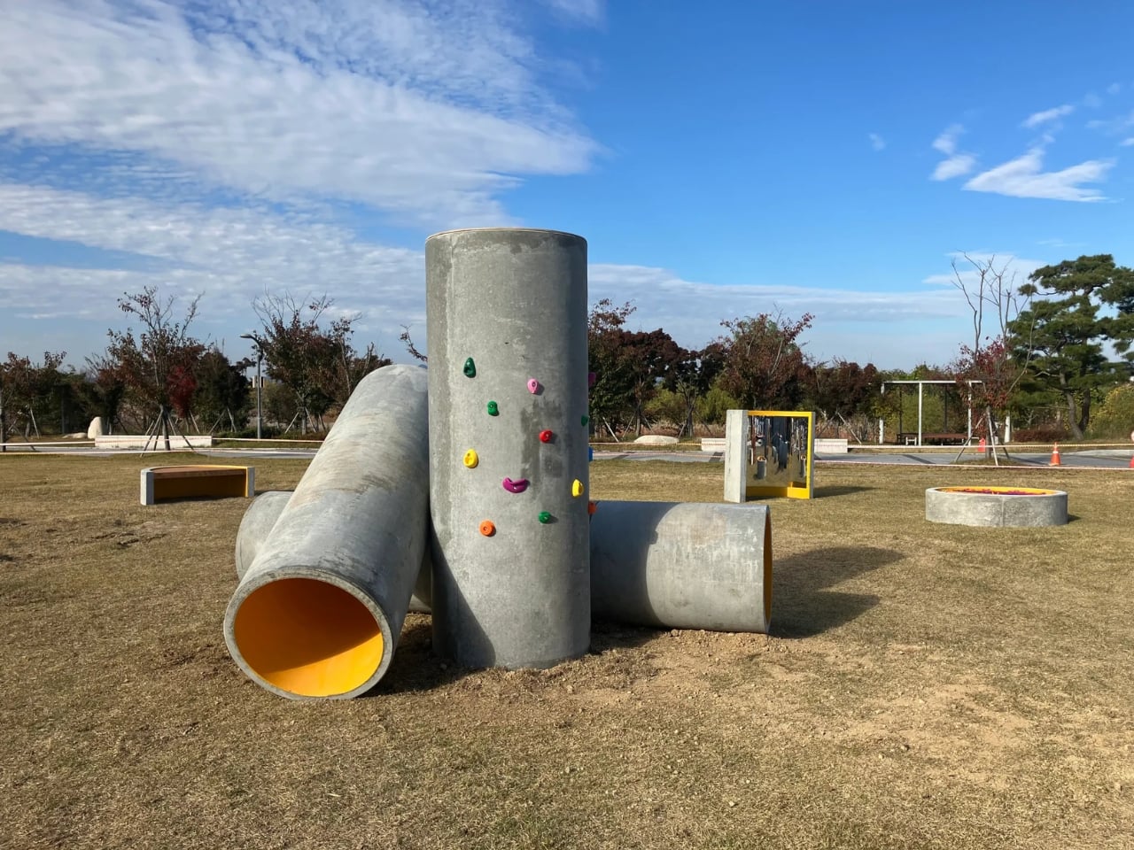
Concrete Utopia is the work of South Korean designer Hyunje Joo. The material is straightforward: discarded concrete pipes, the kind used in construction infrastructure and typically hauled away once a build wraps up. What Joo does with them is the interesting part. Rather than disguising or dramatically transforming them, he arranges the pipes into a configuration that preserves exactly what they are while completely changing what they do. The cylinders are grouped and stacked at varying orientations, creating a composition that reads less like a salvage pile and more like a spatial argument. You can tell it was designed. You just can’t immediately tell how.

Designer: Hyunje Joo

The circular geometry is doing a lot of work here. Repetition is a classic design tool, but it tends to flatten things when overused. Joo avoids that by letting the pipes vary in how they cluster and orient without introducing anything new to the material vocabulary. The result is a rhythm that feels considered without feeling controlled. There’s a looseness to the arrangement that invites you in rather than holding you at a visual distance, which is harder to pull off than it looks.

What the design gets genuinely right is the question of scale. These are large industrial pipes, and placing them in a public setting without any softening or mediation could easily read as aggressive or alienating. Instead, the proportions end up working in the project’s favor. The openings in the pipes are wide enough to pass through, to sit inside, to lean against. The structure accommodates a body without being designed around one specific use. A child runs through it differently than an adult pauses inside it, and the design makes room for both without trying to orchestrate either. That kind of spatial generosity is something a lot of more considered, more expensive design projects fail to achieve.

The surface quality matters too. Concrete has a particular visual weight that doesn’t disappear regardless of context. It doesn’t soften under museum lighting or become decorative just because it’s been repositioned. Joo leans into that rather than working against it. The rawness of the material is part of the design language, not an obstacle to it. Up close, the texture of the pipes carries the evidence of their previous life, which gives the project a material honesty that polished surfaces simply can’t replicate.

The layout itself avoids fixed hierarchy, meaning there’s no obvious front or back, no primary axis that tells you where to stand or which direction to face. That’s a deliberate compositional choice, and it changes how the space feels to move through. Most public structures, even good ones, have a logic that steers you. Concrete Utopia doesn’t. You arrive at your own reading of it, and that openness is built into the arrangement rather than incidentally landing there.

Placed within the grounds of a contemporary art museum, the project sits in an interesting position between sculpture and architecture. It functions like a building but doesn’t resolve like one. It reads like an installation but behaves like infrastructure. That in-between quality is where the design lives, and it’s what makes Concrete Utopia more compelling than a straightforward sustainability gesture or a purely formal exercise would have been. Joo found a space where the design question and the material answer are the same thing. That’s not a given. Most design keeps those two things at a distance from each other for the whole project.
The post The Most Creative Public Space Design Right Now Is Made of Trash first appeared on Yanko Design.