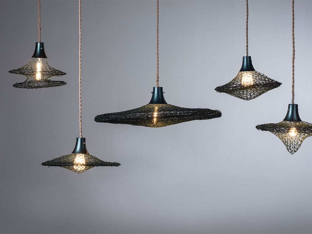
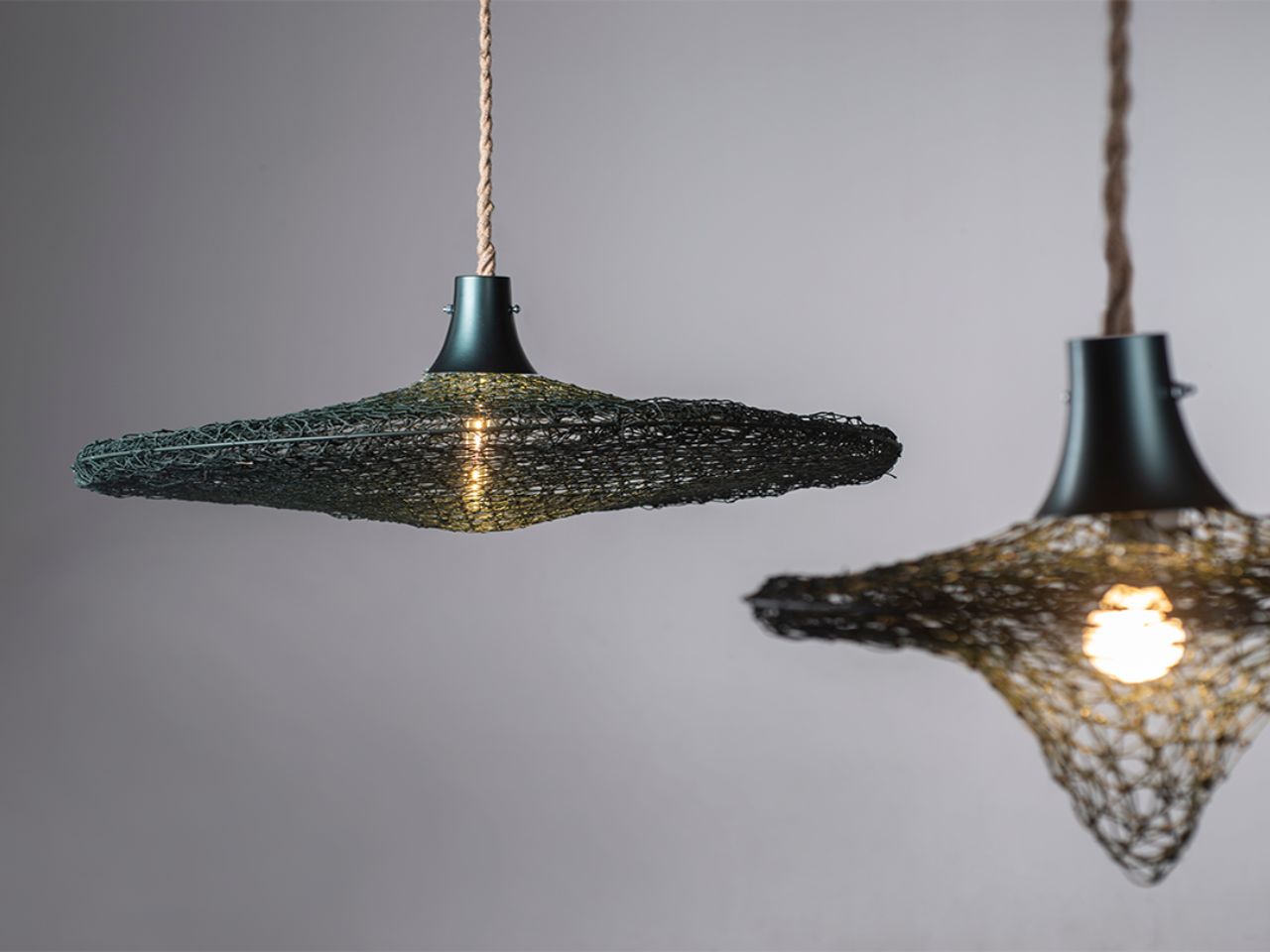
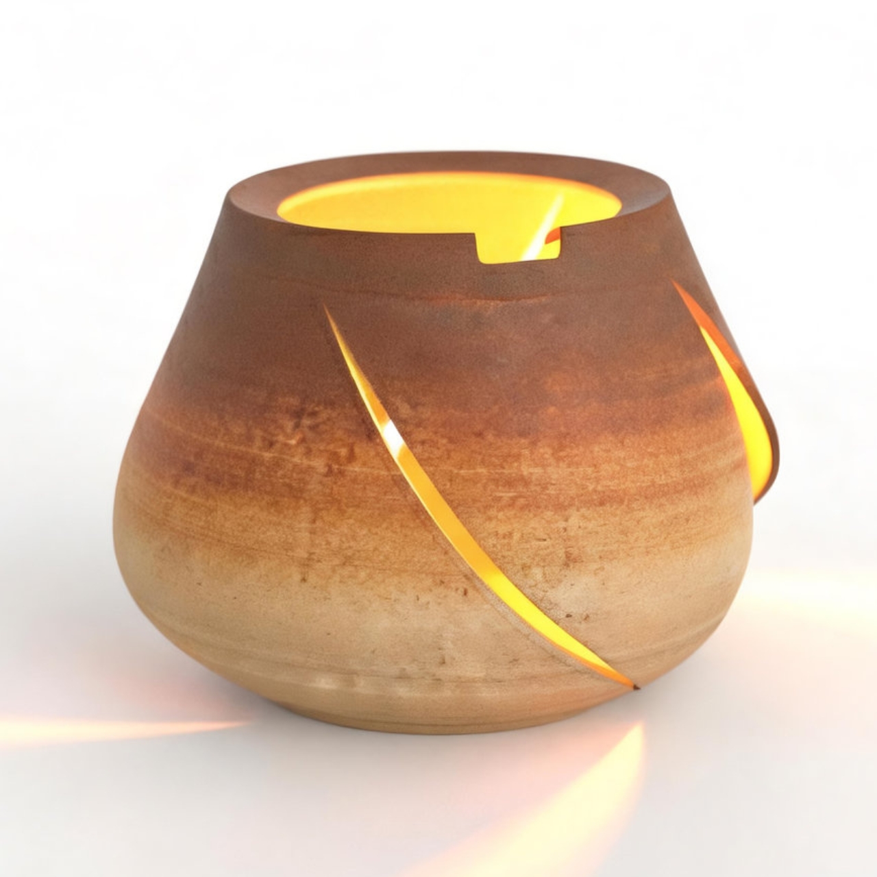
Some objects arrive in our homes with perfect surfaces and polished silence. Tides Rewoven Light does the opposite. It carries its past visibly. Its fibers remember the sea, its textures hold the marks of use, and its form tells a story of rescue rather than reinvention.
Created from abandoned fishing nets and plastic marine debris collected from Wengzi Fishing Harbor, the project transforms waste into a functional lighting object through a process of cleaning, sorting, weaving, repairing, and reshaping. But what makes the work compelling is not simply that it recycles material. It refuses to erase the material’s history.
Fishing nets are strangely contradictory objects. In human hands, they are flexible, useful, and finely engineered. In the ocean, once abandoned, they become ghostly hazards: trapping marine life, degrading into microplastics, and remaining painfully difficult to recover through conventional systems. Tides Rewoven Light begins exactly at this contradiction. Instead of treating discarded nets as anonymous raw matter to be crushed, melted, or chemically reprocessed, the design asks: what if the net could continue being a net, just in another life?
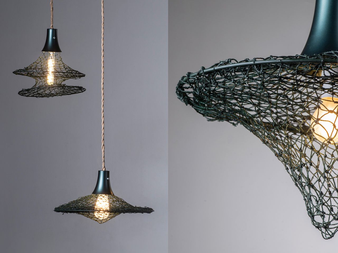
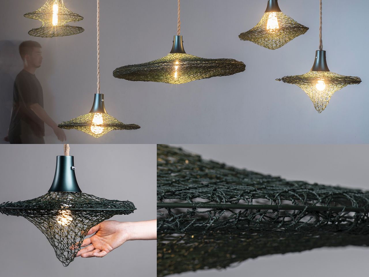
That question shapes the project’s entire circular design approach. The broken fishing nets are not hidden under a new skin. They are repaired and joined through weaving, allowing their fiber structure, flexibility, and aged texture to remain visible. Collected marine plastic is also brought into the process, not only as material, but as part of the making system itself. Plastic bowls, columnar objects, and other debris are used as molds, supported by a temporary metal framework for shaping and resin coating. Once the form is set, the framework is removed, leaving behind an object shaped by the very waste it seeks to address.
This is where the project moves beyond the familiar language of “upcycling.” Many recycled products depend on energy-intensive transformation, where waste must be broken down until it becomes unrecognizable. Tides Rewoven Light takes a quieter, more localized route. It works with the material’s existing properties instead of fighting them. The net’s flexibility becomes structure. Its knots become memory. Its weathered surface becomes an aesthetic value.
The result is not just a lamp made from marine debris, but a design argument: circularity does not always have to mean purification. Sometimes it can mean continuity. By preserving the traces of salt, labor, time, and damage, the product invites users to live with an object that still points back to the place it came from. It turns environmental crisis into domestic presence without softening the urgency behind it.
There is also something deeply poetic about turning discarded fishing nets into light. Nets are objects of capture; here, they become objects of release. They once pulled life from water. Now they diffuse light into living spaces. This shift gives the project emotional depth, making sustainability feel less like a technical checkbox and more like a cultural act of repair.
The team’s future vision strengthens this potential. By building partnerships with fishing ports and local communities, the project could become more than a single product. It could grow into a localized circular ecosystem for collecting, processing, and upcycling marine waste. Such a system would not only reduce environmental harm but also create social and economic value around materials that are usually seen as burdens.
The lifecycle thinking is equally important. The object is designed with future disassembly and recycling in mind, aligning with a cradle-to-cradle philosophy where use is not the final chapter. Instead of ending in disposal, the product is imagined as part of an ongoing material cycle.
Tides Rewoven Light is powerful because it does not romanticize waste, nor does it disguise it. It lets the material speak. It shows that circular design can be local, low-energy, emotionally resonant, and materially honest. In a world often obsessed with making sustainable products look untouched, this project suggests something more interesting: maybe the most responsible objects are the ones brave enough to show where they have been.
The best desk objects don’t announce themselves. They sit there, do something precise, and let the result speak. This list is built around that standard. Each product here lives under $100 and does something that either shouldn’t be possible at the price, or solves a problem so cleanly you wonder why nobody designed it this way sooner. Some make things. Some reveal things. Some remove friction you stopped noticing years ago.
The $100 ceiling matters because it’s where expectations drop. It’s the bracket where most people accept products that are simply fine. The eight objects on this list are not fine. They’re quietly exceptional, each one capable of a moment that makes whoever sees it on your desk stop and ask where you found it. No trade show exclusives, no luxury markups. Just products that deliver something genuinely impressive and cost less than a dinner for two.
1. OrigamiSwift Folding Mouse
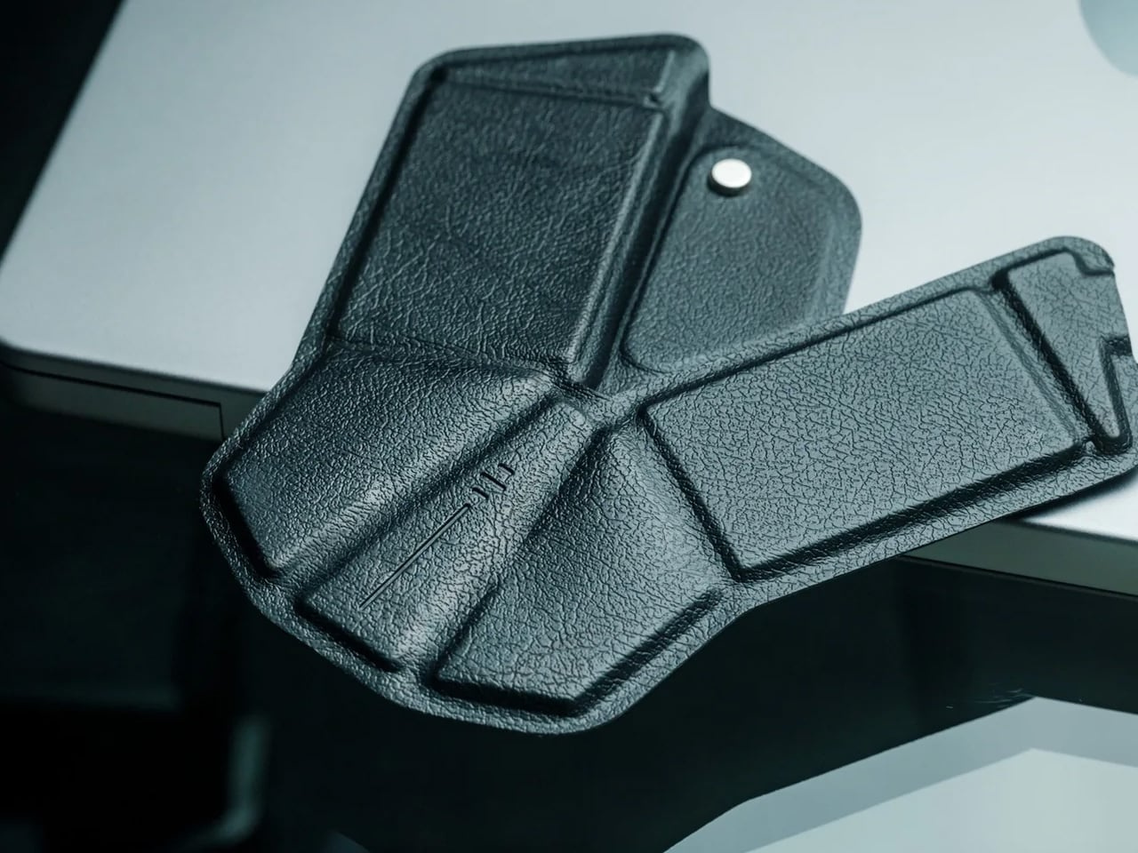
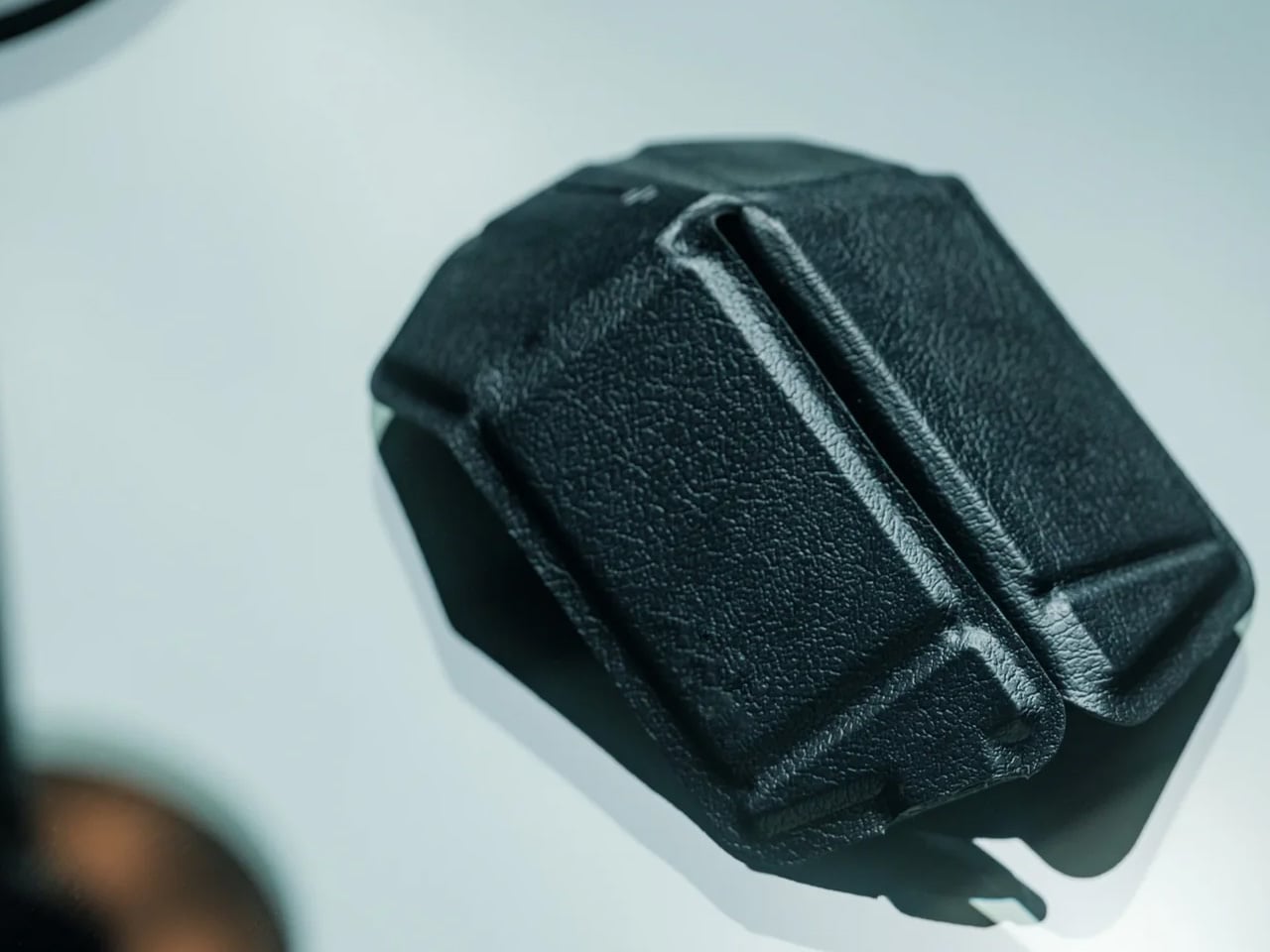
The OrigamiSwift folds completely flat at 4.5mm and weighs 40 grams. Unfold it, and the triangular origami-inspired structure opens into a full-sized ergonomic Bluetooth mouse in under half a second. Designed by Horace Lam, its geometry draws from the structural logic of origami, where the same fold that makes paper rigid under load makes this mouse precise and comfortable under a hand. It connects over Bluetooth without a dongle and performs with the accuracy you’d expect from a standard desktop mouse.
The impressive quality is the transition between states. The mechanism that takes it from 4.5mm of folded geometry to a full ergonomic mouse is a single gesture and works every single time. For anyone working from a bag, a café, or a hotel desk, a mouse that packs to the thickness of a few credit cards removes the last reason not to carry one. The design is precise enough to leave out on a desk as an object in its own right. At $85 from the YD Shop, it is one of the few mice that earns the word beautiful without trading function away to get there.
Folds to 4.5mm and 40 grams, making it genuinely pocketable for the first time
The design holds up as a standalone object on any desk, not just inside a bag
What we dislike
No traditional raised scroll wheel, which takes a brief adjustment period
Higher price point than other compact mice operating at the same performance level
2. Hanboost T1 Portable Laser Engraver
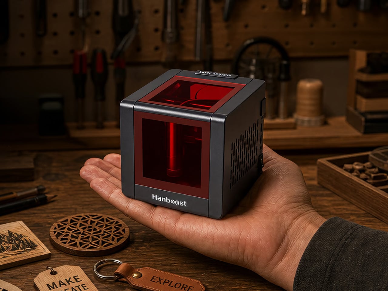
Most laser engravers come with requirements: a dedicated room, a wall outlet, protective eyewear, and a ventilation setup that rules out most apartments before you’ve even turned the machine on. The T1 removes all of it. It measures 115 by 115 by 115 millimeters, weighs 400 grams, runs off any standard USB-C connection including a power bank you already own, and comes fully enclosed with an OD4+ viewing window that lets you watch the engraving process without any eye protection required.
The engraving area covers 60 by 40 millimeters and handles wood, leather, fabric, cork, and cardstock on the standard 500mW module, with bamboo, painted metal, and dark acrylic opening up on the optional 1.6W Pro upgrade. Accuracy sits at 0.05mm, fine enough to render botanical line work or small portrait engravings you’d expect from equipment many times its size. It works with LightBurn and LaserGRBL for experienced makers, and with the MKSLaser mobile app for a clean three-step phone-based workflow.
Fully enclosed OD4+ window means no goggles, no workshop, no excuses
USB-C and power bank compatible, making it the most portable capable laser engraver at this price
What we dislike
The 60 by 40mm engraving area limits it to smaller objects and flat surfaces
3. iMicro Q3p Phone Microscope Lens
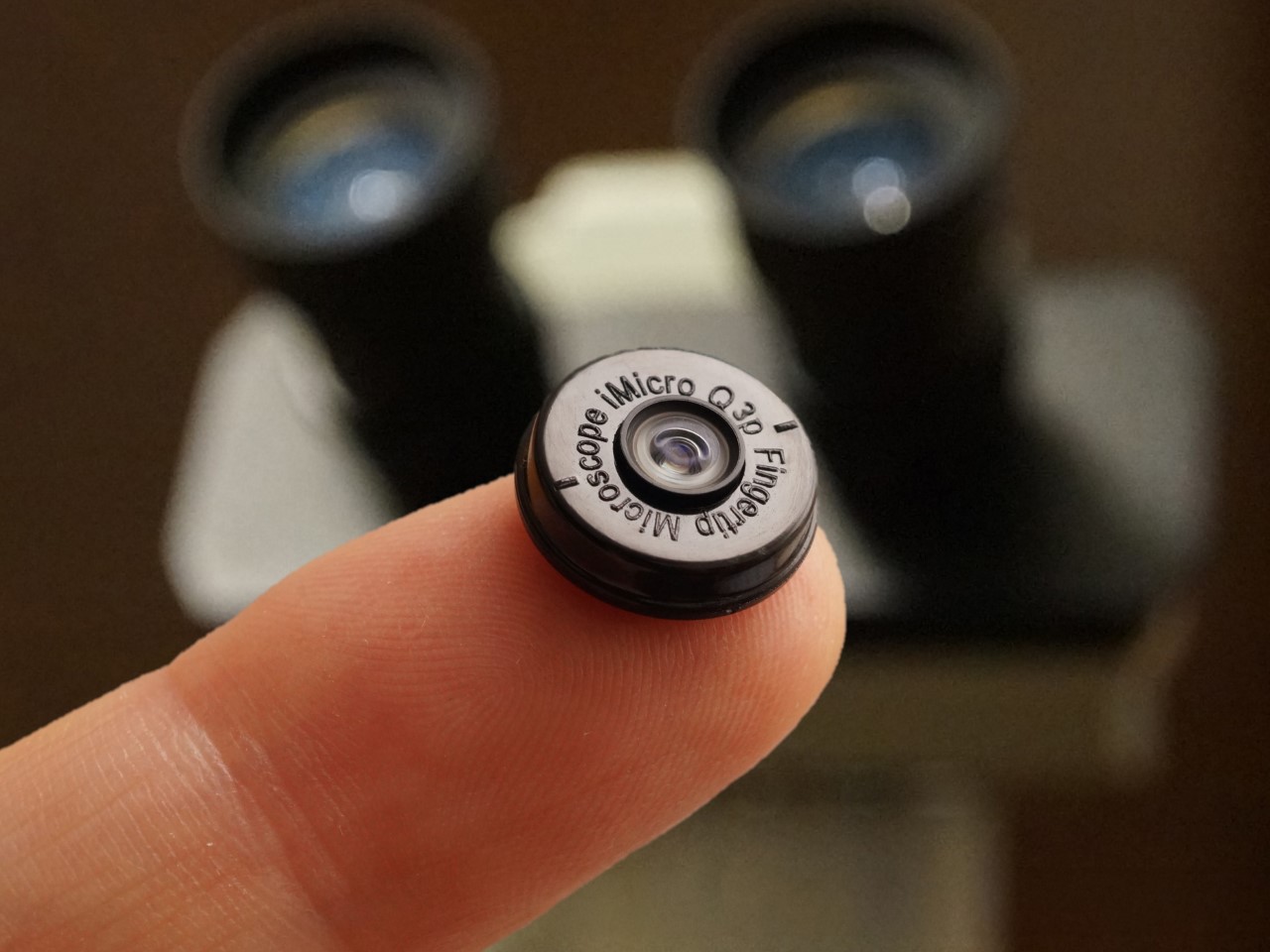
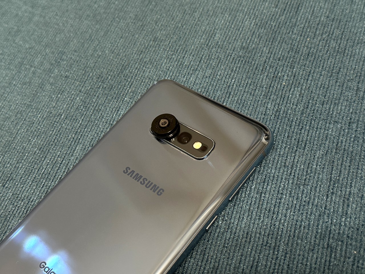
The iMicro Q3p is a fingertip-sized clip-on lens that gives your phone camera 1200x magnification. That number doesn’t mean much until you point it at something ordinary. The fiber weave of a cotton T-shirt looks like aerial rigging. A single grain of salt becomes a translucent cube the size of a building block. The printed surface of a business card reveals ink dots arranged in formations too fine for the naked eye to register. The whole attachment weighs almost nothing and fits in a pocket alongside the phone it transforms.
At $40, it sits at the most satisfying end of the price-to-capability ratio available in consumer products right now. No software installation, no charging, no compatibility friction — if your phone has a camera, this works with it immediately. For designers, the material and surface detail it reveals is genuinely useful reference. For anyone curious about the physical world at a scale they’ve never seen, it’s the kind of object you expect to use once for novelty and end up reaching for regularly. Point it at the output from the T1 laser engraver on this list and the 0.05mm linework looks like it came from a machine ten times the size.
What we like
1200x magnification from something the size of a fingertip, costing $40
No charging, no software, no setup required — clips on and works immediately on any phone
What we dislike
Any hand movement is heavily amplified at this magnification, requiring a very steady hand
Best results need bright, even lighting to get clean detail
4. HubKey Gen2
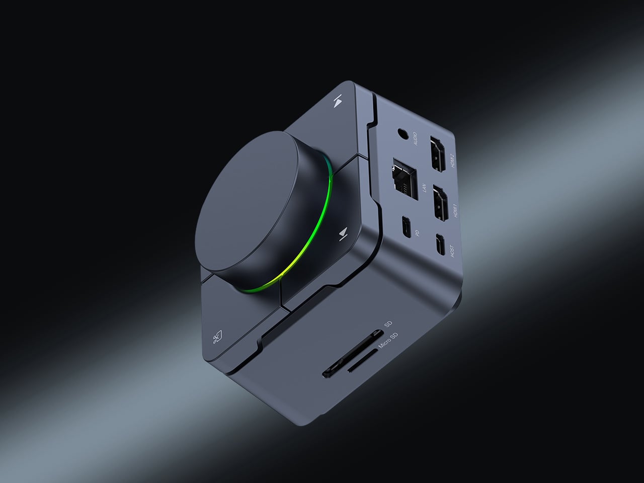
The HubKey Gen2 is a compact USB-C hub that consolidates an entire desk’s worth of connectivity into one object small enough to sit beside a laptop without demanding its own footprint. A single USB-C cable opens up ports for storage, display output, charging, and peripherals simultaneously. The design principle is one cable in, everything out — the kind of desk simplification that sounds obvious until you’ve actually lived without cable sprawl for the first time and noticed how much visual noise the old setup quietly carried.
What separates it from most hubs is where it lives. The majority of hubs are functional objects that hide behind monitors or dangle mid-cable. The HubKey is designed to sit on the desk surface in plain sight, which means its proportions and finish are considered the same way the rest of the objects on this list are. For remote workers and anyone who moves between spaces regularly, it removes the ritual of reconnecting everything from scratch every single time.
What we like
One USB-C cable replaces an entire tangle of individual connections
Designed to sit on the desk surface in plain sight rather than hide behind equipment
What we dislike
Requires a USB-C host device — not compatible with older USB-A-only machines
Confirm current price and availability directly before purchasing
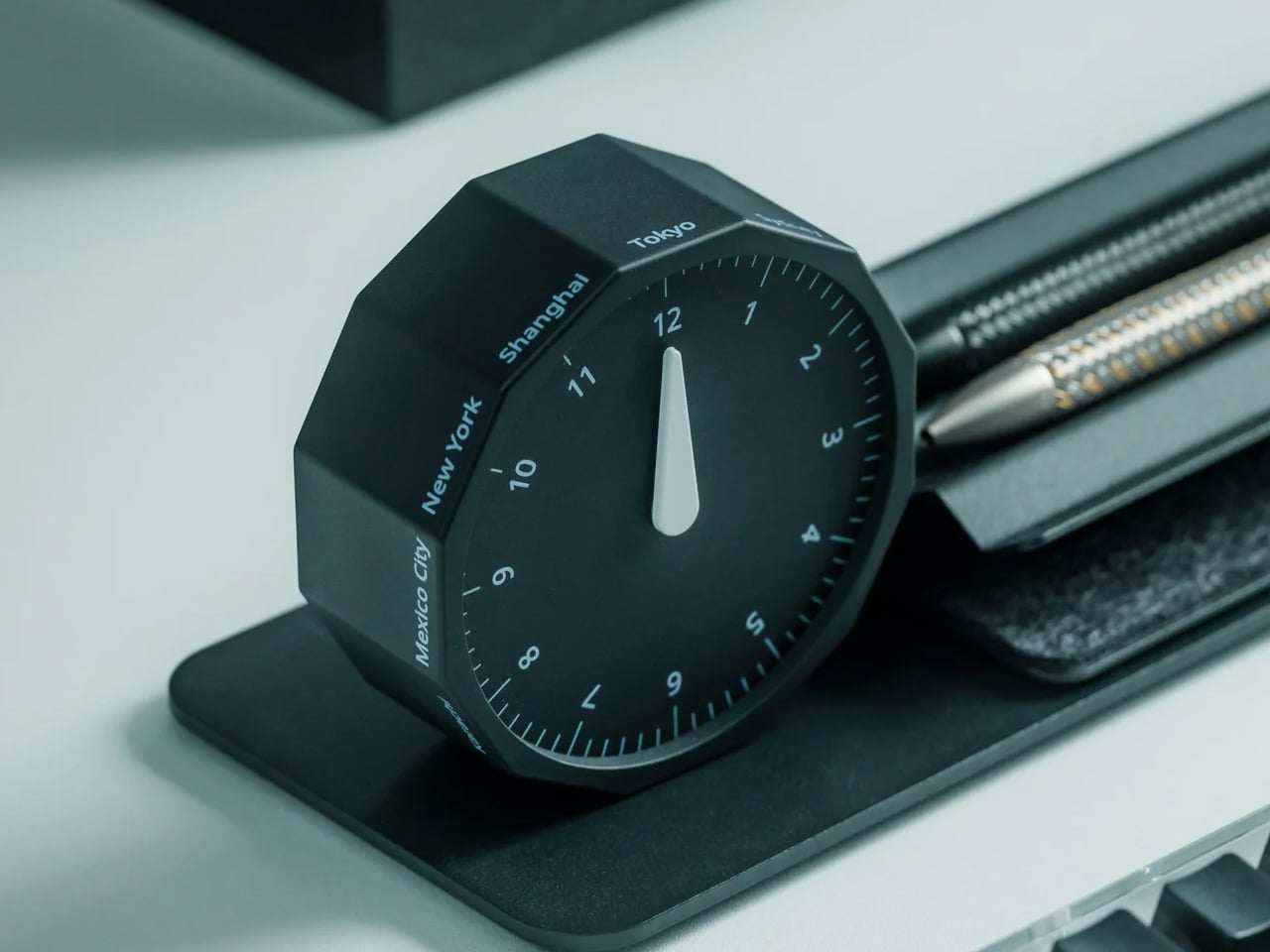
5. Rolling World Clock
The Rolling World Clock is a 12-sided form with a major timezone city on each face and a single analog hand that tells the correct time in whichever city is pointing straight up. To check the time in Tokyo, you roll it until Tokyo reaches the top position. The mechanism is entirely physical — no battery swap, no digital display, no application required. At 3.2 inches, it sits on a desk without dominating it, and in black or white it reads as a precision object rather than a novelty one.
The quality that earns it a permanent place is conceptual. Every piece of software in the world solves world time zones with a dropdown menu or a settings panel buried three taps deep. The Rolling World Clock solves the same problem with your hand and a dodecahedron. The tactility of rolling it to the city you need and feeling it settle into position is a more satisfying interaction than most digital interfaces have managed. For anyone working across time zones, it earns its desk space on pure utility.
Solves a digital problem through physical interaction, with no screen involved whatsoever
The 12-sided form is precise enough to function as a design object in any setting
What we dislike
The city labels on each face require decent ambient lighting to read quickly at a glance
Limited to 12 cities, so not every timezone has a dedicated face
6. Nothing Power (1) Battery Bank
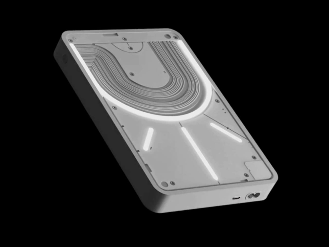
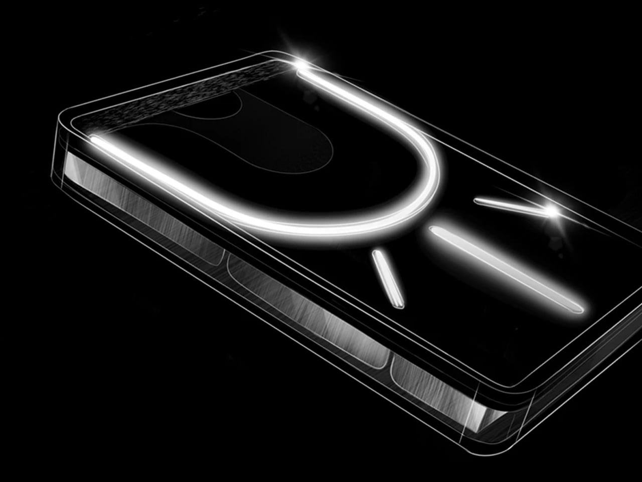
Nothing’s design philosophy is visibility. The Power (1) shows its internals through a transparent casing, turning the battery cells, circuit board, and internal wiring into the aesthetic rather than something to hide behind a matte plastic shell. Most power banks are identical black rectangles that exist purely as utilities. This one is an object you put on a desk because it looks good there, applying the same logic Nothing brought to its phones: the engineering is interesting enough to show, so show it.
The practical case is clean enough on its own — USB-C in and out, covering the everyday needs of a desk setup without the bulk most competing units carry at the same capacity. The design case is stronger. On a desk alongside other considered objects, a power bank that looks like it was designed deserves its place there. It pairs naturally with the T1 laser engraver on this list, which runs off any USB-C source and makes this the most aesthetically coherent way to power it. Nothing has built a following on the idea that objects used daily should be worth looking at. The Power (1) makes that case without needing to say it.
What we like
Transparent design makes the internal engineering visible and genuinely worth looking at
USB-C in and out, compatible with every other device on this list
What we dislike
The transparent casing shows fingerprints and dust far more readily than opaque alternatives
7. Inseparable Notebook Pen
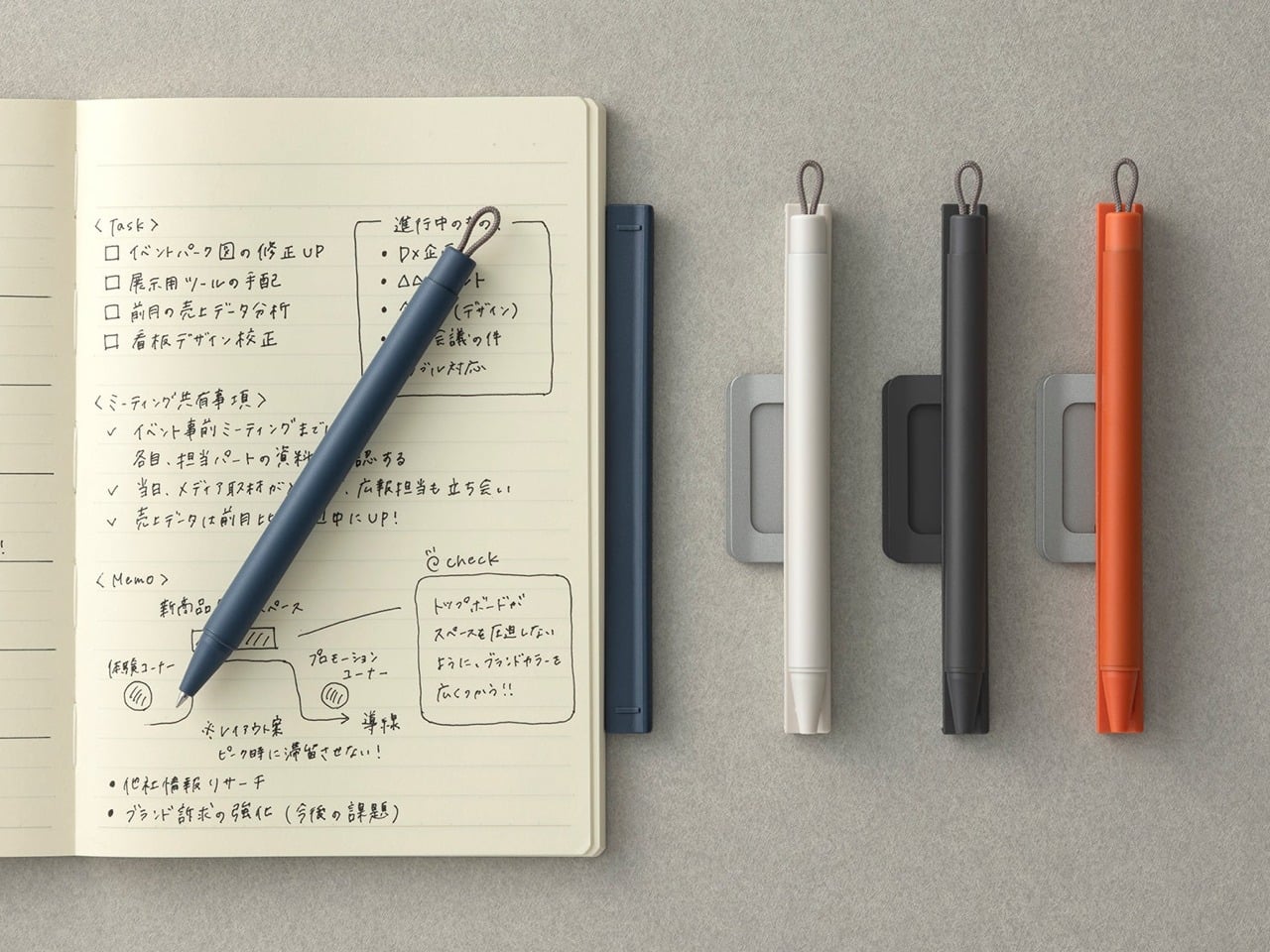
The premise of the Inseparable is exactly what the name describes. The pen and the notebook are one object. The pen lives within the notebook permanently, so reaching for one means having the other. That sounds like a minor convenience until you’ve spent time hunting for a pen that wandered three feet from the notebook you were actively using. The design removes that friction entirely by treating the two as a single tool rather than two separate objects that happen to belong near each other.
What earns it desk space rather than just bag space is how it looks when closed. The combined form is considered enough to sit out in the open without needing to be stored away. For anyone who still does meaningful thinking on paper — real notes, sketches, diagrams, lists that behave differently on a physical surface than on a screen — having that tool presented as one well-made object changes the relationship with the act itself. The desk stops being a surface with things scattered across it and starts being a workspace. That shift is worth considerably more than the price of the pen.
Pen and notebook treated as a single object, permanently solving the searching problem
The closed form is refined enough to leave out on a desk as a design object in its own right
What we dislike
Pen refill replacement requires checking compatibility before sourcing a new one
Confirm current price and availability directly before purchasing
8. Flow Timer
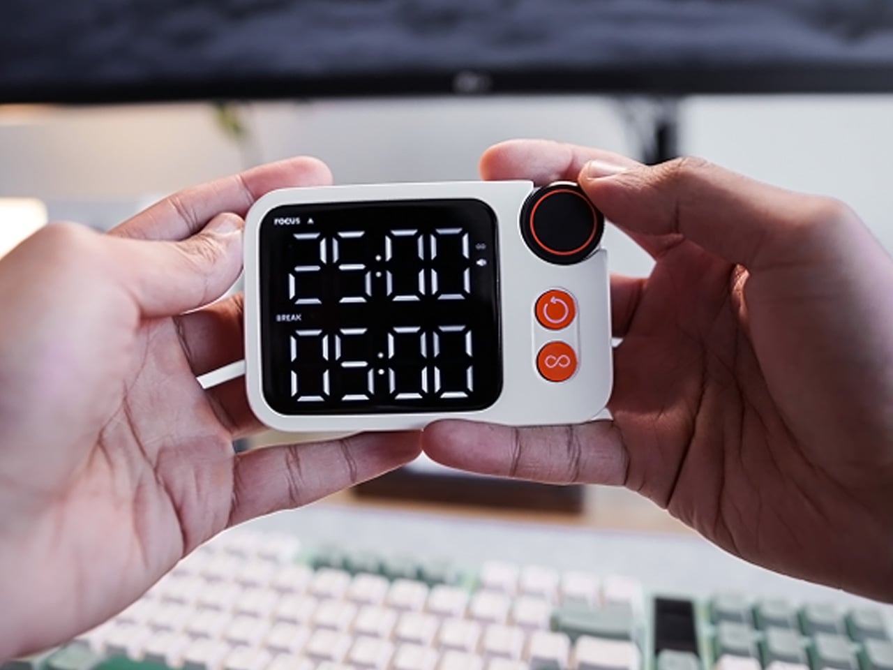
The Flow Timer is a physical desk timer built for focused work sessions. The discipline it creates comes from being a dedicated object — you set it, it counts, it ends the session. Unlike setting a timer on a phone, using this one doesn’t place you on the same surface as your notification feed. Every time you reach for a phone to time something, the phone wins the next several minutes. A timer that lives on the desk doesn’t make that trade and never will.
The design is minimal enough to sit alongside any of the other objects on this list without adding visual noise. Its presence on the desk is a signal: when it’s running, work is happening. When it isn’t, it isn’t. That binary is harder to achieve with software and easier than expected with a well-made physical object. For anyone who wants their desk to do more than hold a laptop, the Flow Timer is a low-cost way to build structure into the environment rather than rely entirely on willpower. It does one thing and asks for nothing back.
What we like
A dedicated physical timer removes the distraction loop that comes with using a phone
Minimal design contributes to the desk environment rather than competing with it
What we dislike
Requires a manual reset after each session, though this quickly becomes part of the ritual
Confirm current price and availability directly before purchasing
The $100 Ceiling Has Moved
The $100 ceiling used to mean compromise. A cheaper version of something better. What this list suggests is that the ceiling has moved — not because manufacturers became more generous, but because design thinking at small scales got genuinely good. The T1 laser engraver, the iMicro lens, the Rolling World Clock: none of them feel like budget versions of something else. They feel like the right versions of themselves, built at exactly the right size and price.
What they share is a refusal to look or behave like their price tag. That’s the quality worth paying attention to — not the spec sheet, not the feature list, but the moment you first use one and realize the number on the label didn’t prepare you for what it actually does. Eight objects. One desk. All of them under $100. None of them feel like it.
The modern workflow is often a series of disconnected actions; typing in one window, clicking in another, and plugging in peripherals just to get started. What’s missing is a central instrument to orchestrate it all, a kind of conductor’s baton for our digital lives. Such a tool would need to do more than just advance a slide; it would need to capture spoken ideas, summon information on command, and translate language in real time, all from a single, intuitive point of control.
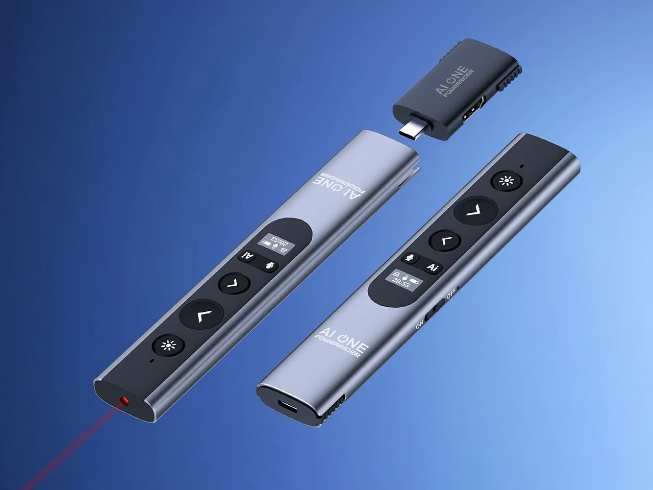
This is the thinking embodied in the PowerRider P1, a device that adopts the familiar form of a presentation remote for a far more ambitious purpose. Its slender, metallic body is designed to feel like a natural extension of the hand, but its power lies in consolidating complex tasks into simple actions. A dedicated AI button puts a language model in your palm, ready for quick queries. The integrated microphone turns the device into a voice input tool for instant transcription, while the clever detachable receiver doubles as a complete connectivity hub for power and video.
The PowerRider handles the fundamentals of presentation control with a modern upgrade. Traditional laser pointers work fine in a physical room, but they become invisible the moment you share your screen over a video call. The P1 addresses this with five digital highlight modes that appear directly on the shared display, visible to every participant regardless of how they’re viewing. These modes include a digital spotlight, a magnifier for fine details, and an annotation tool for marking up slides in real time. The device still includes a physical red laser for in-person settings, rated for visibility up to 100 meters, but the digital tools are clearly designed for the hybrid meeting environment that has become standard.
Artificial intelligence is woven throughout the device, accessible through a single button press. The AI feature connects to GPT-5 through the companion AI ONE software, offering 14 dedicated productivity categories that range from document conversion and mind mapping to code assistance and image analysis. You can ask questions, generate presentation content, or get real-time help while you’re speaking. The company has made a point of offering this AI access without monthly subscription fees, providing free tokens for everyday use. That decision removes one of the usual friction points with AI-powered hardware, where the upfront purchase is followed by ongoing costs.
Voice input mirrors something we’ve seen in smart remotes for TVs – except now it’s a work productivity feature. The PowerRider captures spoken words and converts them to text in over 50 languages, allowing you to dictate notes, emails, or meeting minutes without stopping your workflow. Real-time translation extends this further, making it possible to present to multilingual audiences with live interpretation. The built-in microphone also serves as a backup audio input for meetings, projecting your voice through any connected speaker system. This transforms the presenter into a wireless microphone when needed, a useful feature for larger rooms or when laptop microphones fall short.
The detachable receiver plugs into a USB-C port and acts as a wireless bridge to the presenter, but it also functions as a compact hub. The receiver supports 4K video output at 60Hz, 100W power delivery for laptop charging, USB-A data transfer, and a standard audio jack. This means you can connect a display, charge your laptop, and maintain wireless control with a single palm-sized dongle. It eliminates the need for a separate dock during presentations, consolidating connectivity into the same system that controls your slides.
The PowerRider weighs 63 grams, light enough to disappear in your hand during long sessions. A small LCD display on the body shows battery level, connectivity status, microphone activity, and the current time, providing at-a-glance information without needing to check your computer. The 280mAh battery delivers up to 10 hours of active use and can remain on standby for a full week. Wireless range extends to 10 meters, using either Bluetooth or 2.4GHz connectivity depending on your preference. Both modes can be toggled with a physical switch, offering flexibility for different environments and compatibility needs.
The device runs on Windows 10, Windows 11, and macOS 13 or later, covering the majority of professional users. It connects to monitors, televisions, and projectors without additional adapters, and the included accessories provide everything needed to get started. The package contains the presenter, the hub receiver, a protective travel case, USB-C and USB-A cables, and a card reader adapter for file transfers.
The PowerRider P1 is available now with early pricing starting at $139, a 30 percent reduction from its standard retail price of $199. A two-pack bundle is offered at $269, and a three-pack configuration reaches $415. Optional add-ons include power adapters ranging from 65W to 140W and an 8K HDMI cable for high-resolution setups. Shipping is calculated at $12 for most regions, with fulfillment expected to begin in October 2026.
Japanese design has always understood something that took the rest of the world considerably longer to figure out: a small space only feels limiting when the objects inside it aren’t doing enough. The country’s most enduring domestic products aren’t space-savers in the utilitarian sense — they’re space-earners, pieces that justify every square inch they occupy through beauty, purpose, or both. That distinction is subtle until you live with it, and then it becomes the only distinction that matters.
The eight pieces here come from studios, foundries, and workshops rooted in Japan’s craft traditions, alongside makers who have absorbed that same design philosophy. Some are subtle enough to disappear into a shelf. Others carry enough presence to anchor a room. What they share is an indifference to the idea that small living requires compromise. Each one proves, in its own way, that constraint and quality are not opposites — and that the most considered rooms are rarely the largest ones.
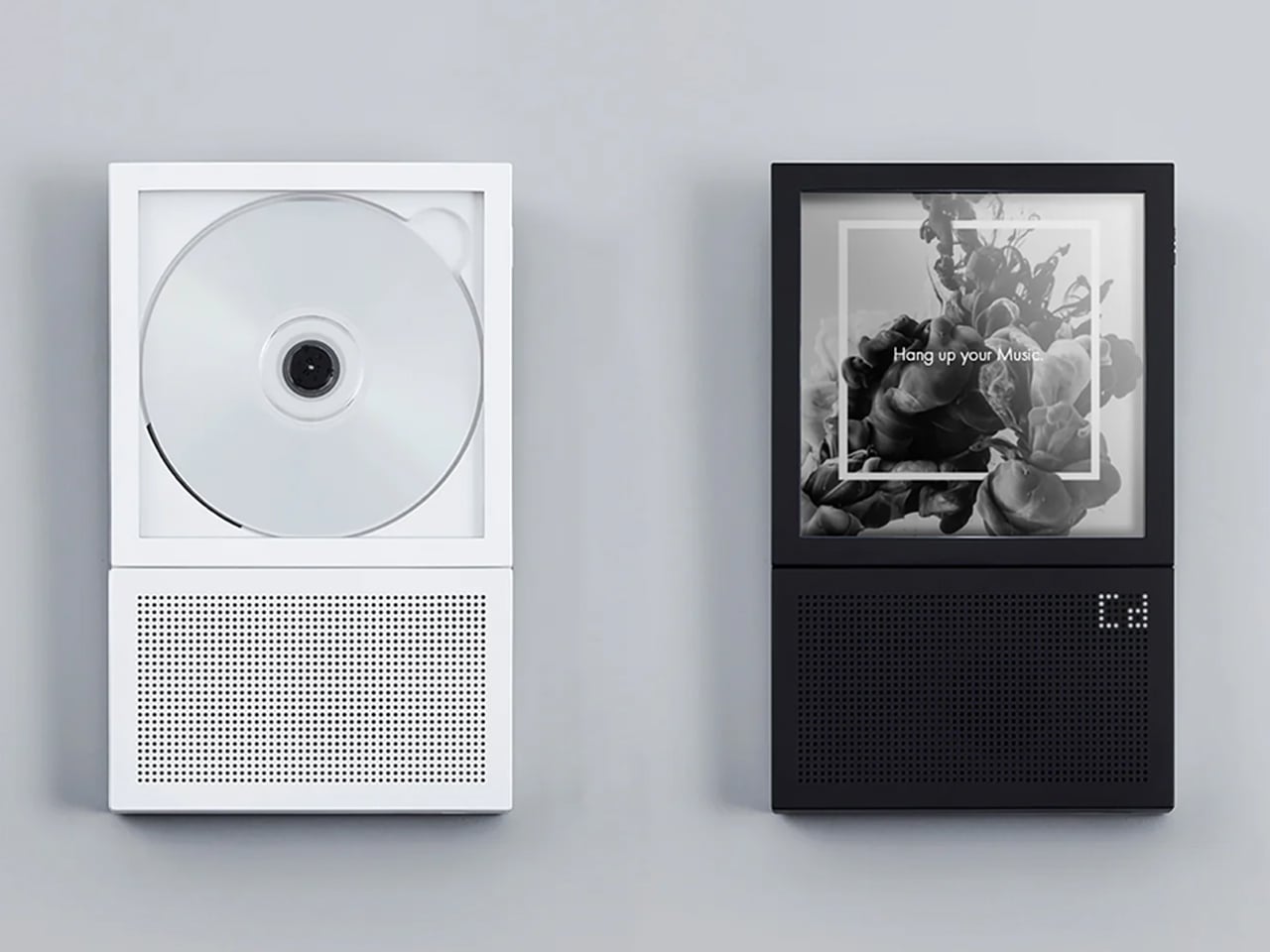
1. Portable CD Cover Player
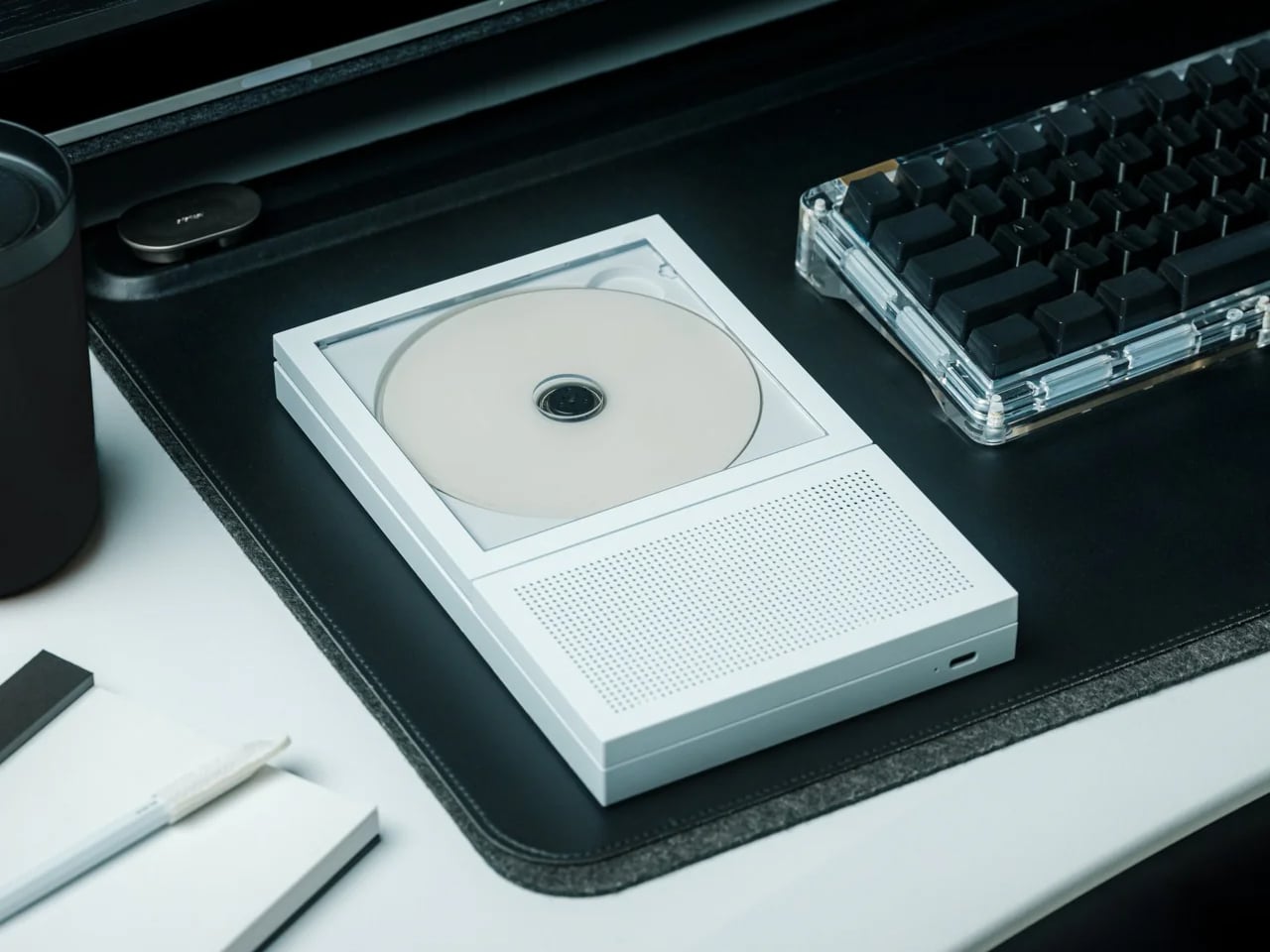
There is something specific about the weight and ritual of a CD that streaming never quite replicated. You hold the case, read the liner notes, make a choice that takes slightly more commitment than a tap. This portable player leans into that ritual without apologizing for it, designed to sit alongside the disc itself in a form thin enough to slide into a bag or stand upright on a shelf. It belongs in the same category as the best Japanese audio objects: things built for an experience, not merely a function.
In a small home, audio gear tends to bulk up the room. Amplifiers, cable nests, speaker pairs that demand real estate — they all negotiate with the architecture in ways that rarely end quietly. This doesn’t. Its proportions are closer to the music than to the equipment, and in a tiny apartment that distinction changes the whole register of a shelf. Pick an album, commit to it, and let the room fill with something chosen rather than algorithmically served.
The physical form reinforces intentional listening in a way a streaming app simply cannot
Slim enough to share shelf space with the very collection it plays
What we dislike
Limited to physical media, which requires maintaining an actual disc collection
Output depends on headphones or an additional speaker to fill a room
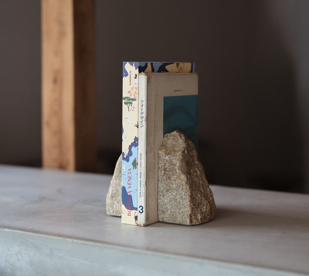
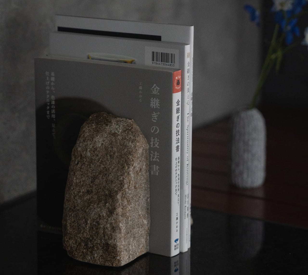
2. Aji Stone Book End Large
Quarried exclusively from the northeastern corner of Takamatsu City in Kagawa Prefecture, Aji granite has been considered Japan’s diamond of stone for centuries — dense, refined in grain, and resistant to moisture in ways that most decorative stone is not. The Large Book End is split from a single piece. No two are identical. Its surface carries the particular quality that only extraction rather than manufacture can produce: the sense that the material was always this way, waiting to be found rather than made.
What sets this apart from conventional bookends is what it refuses to do. It doesn’t decorate. It doesn’t try to be noticed. It simply holds what you’ve placed beside it with enough physical authority that the shelf around it immediately reads as more considered. In a small home where books live in plain sight — on open shelving, stacked on side tables — the presence of Aji stone changes how the whole arrangement reads. It turns a collection into a curation, which is a more significant shift than it sounds.
What we like
Split from a single stone, making each piece genuinely one of a kind
Dense enough to anchor the heaviest books without shifting or lifting
What we dislike
At $240, it asks for real confidence in its permanence as a purchase
Significant weight makes repositioning effortful once it has found its place
3. Frying Pan Omurice Chopstick Rest
Made in Mino Province — a region with over 1,300 years of ceramic production history and the source of roughly half of Japan’s tableware output — each of these rests is a miniature cast-iron frying pan with a curled dome of omurice sculpted in stoneware inside it. The craftsmanship is so specific and so unselfconscious about its playfulness that it reads as genuine rather than precious. Set it beside a bowl, or a plate, and the table shifts immediately from functional to considered.
In a small home, the dining table is rarely only a dining table. It doubles as a desk, a landing pad, a reading surface, a gathering point. When it becomes a table again for an actual meal, small objects like these do significant emotional work — they signal that the meal was planned, that the setting was thought about, that eating is worth a moment’s attention. The Mino tradition behind this rest gives that signal real weight.
What we like
Authentic Mino Province stoneware carries 1,300 years of regional craft tradition into an everyday ritual
Small enough to earn its place without competing with the food or the company
What we dislike
Textured stoneware requires more careful cleaning between uses than a glazed alternative
The omurice reference lands most fully for those already familiar with Japanese comfort food
4. Rolling World Clock
The Rolling World Clock treats time as something physical rather than abstract — a globe-like form that lets you reach out and find where the world’s hours currently sit. For anyone living across time zones, whether that means remote work, family spread across continents, or the particular restlessness of people who travel often, the constant mental arithmetic disappears. What remains is an object that earns its place on a desk or shelf not through utility alone but through the quiet pleasure of its form.
Small homes accumulate necessities that rarely pull their weight visually. A conventional world clock reads as office furniture regardless of where you put it. This one reads as an object you chose deliberately, which in a space where every surface is permanently on display is the difference between clutter and character. The minimal form holds its own without competing for attention — present without being loud, functional without being forgettable.
The form turns a practical need into a considered object worth displaying
Works as a conversation piece and a functional tool in the same breath
What we dislike
Requires some familiarity with the interface to read quickly at a glance
May need repositioning as your primary time zones change over time
5. Kinto Aqua Culture Vase
Kinto has built one of Japan’s most internationally trusted design practices on a single principle: objects for daily use deserve the same clarity of form as objects made purely for display. The Aqua Culture Vase applies that principle to water propagation — growing plants directly in water, without soil, without mess, without the maintenance schedule that keeps most people from keeping anything alive. A clean borosilicate vessel, a single stem or cutting, a windowsill. That is the entire arrangement, and it is entirely enough.
In a small home, anything requiring ongoing care competes for the same attention as everything else. Plants are often the first thing to go. This removes the friction almost entirely. The vase holds water, supports a cutting, and does both in a form so stripped of anything unnecessary that it could sit beside a stack of books or on the edge of a kitchen shelf without announcing its presence. The plant does the announcing. The vase makes it possible, which has always been Kinto’s design posture.
What we like
Removes almost every barrier to keeping something living in a small space
The borosilicate glass form is completely honest about its purpose and its beauty
What we dislike
Works best with propagating cuttings rather than established root systems
Water clarity requires more attention than a soil-based planter over time
6. Yamazaki Home Tower Step Trash Can
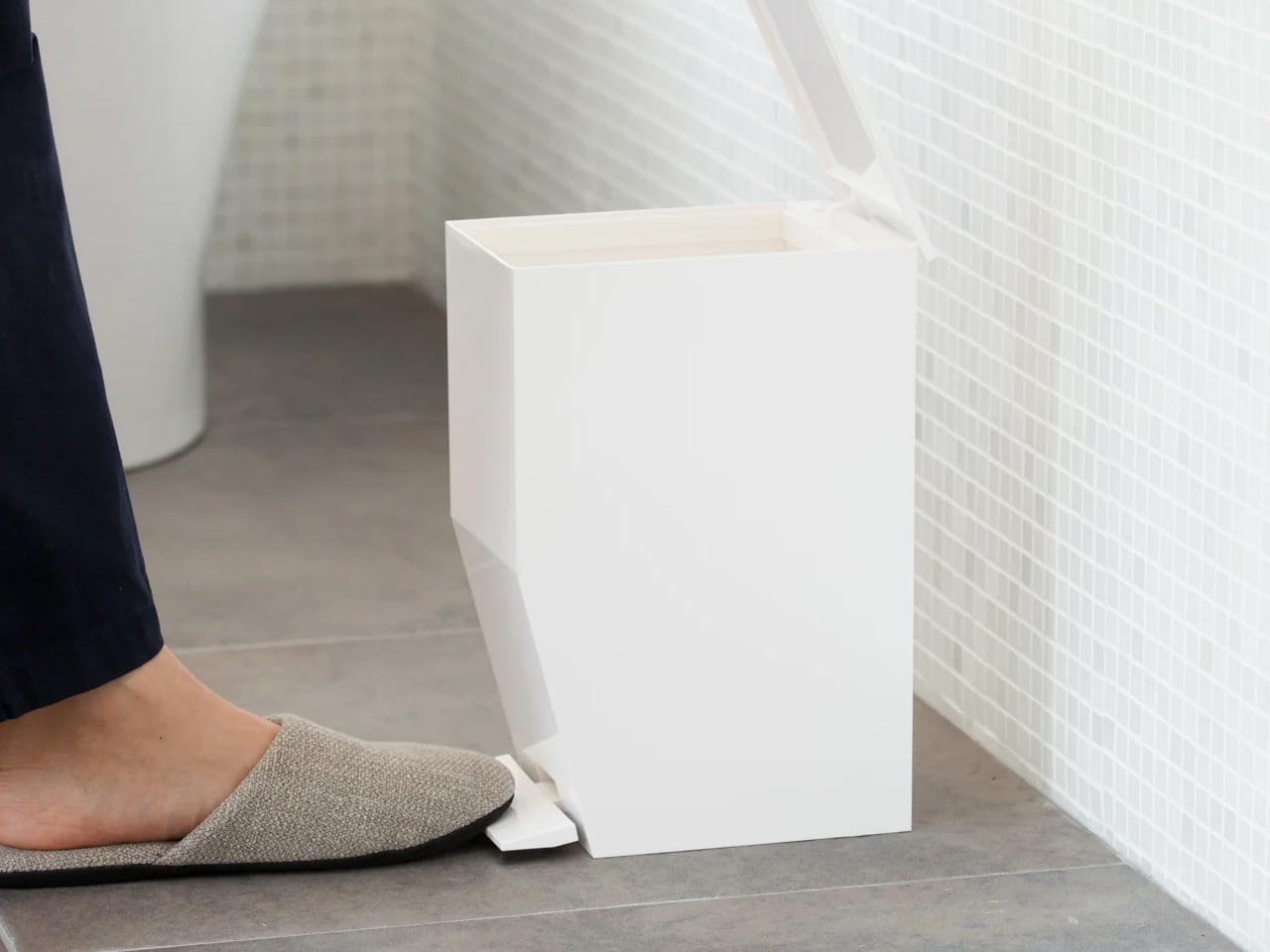
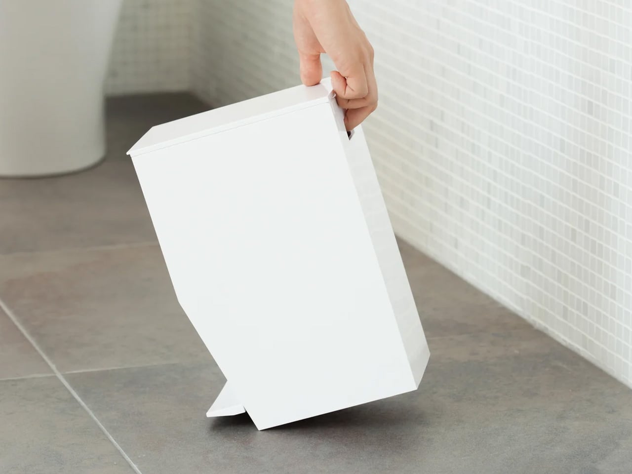
Yamazaki Home’s Tower collection has become one of the most reliable benchmarks for Japanese functional minimalism at an accessible price point, and the Step Trash Can is central to that reputation. The step mechanism opens the lid without contact — genuinely useful in a bathroom or kitchen where hands are occupied — and the one-gallon capacity is sized for the spaces where it actually belongs rather than the idealized rooms in which most home goods are photographed. It holds liner bags without clips or visible hardware. The integrated handle makes emptying effortless.
In a small apartment, the waste bin is rarely hidden behind a cabinet door. It sits beside the toilet or under the counter in full view, which means it is part of the room’s visual language whether anyone intended it to be or not. The Tower can treats that reality with enough seriousness to design a bin worth looking at. Matte white or black ABS resin, no ornamentation. It looks like a choice — and in a small space, that quiet distinction between something assembled and something designed makes the whole room feel more intentional.
What we like
No-touch lid mechanism works for hygiene and convenience in equal measure
The slim profile fits flush beside toilets and under counters without claiming floor plan
What we dislike
One-gallon capacity means more frequent emptying than larger household bins
The liner ring is an additional component to source and replace over time
7. Corcelain Modular Porcelain Cups
224 Porcelain operates in Ureshino City in Saga Prefecture, a region whose ceramic tradition — Hizen-Yoshidayaki — stretches back through centuries of tea culture and meticulous clay work. Designer Kosuke Takahashi arrived at the studio with a specific question: what happens when you build a porcelain cup not as a finished object but as a platform? The result is Corcelain, the first modular porcelain system, where each cup accepts 3D-printed attachments — feet, handles, lids, decorative elements — through a precision mounting system integrated directly into the ceramic surface.
The appeal for a small home is not just the modularity. It is the philosophy underneath it. These cups evolve rather than accumulate. You don’t replace them when your needs or aesthetic shifts — you adapt them, download new components from MakerWorld, print what you need and nothing more. In a space where every object must justify its continued presence, a cup that changes alongside you is worth considerably more than one that doesn’t. The porcelain is serious. The system around it is generous. That combination is harder to achieve than it sounds.
What we like
Open-source attachments via MakerWorld keep the design evolving without requiring replacement
Hizen-Yoshidayaki ceramic tradition grounds a genuinely forward-looking concept in centuries of real craft
What we dislike
Full modularity requires access to a 3D printer or a printing service to realize
Mounting points need careful handling to avoid wear from frequent component changes
8. 3-in-1 Luminous Diffuser
Most diffusers ask you to choose between function and appearance, settling somewhere in the middle of both. This one refuses that negotiation by combining scent diffusion, ambient light, and a third mode into a single object whose form is considered enough to leave out permanently. The luminous element is not a decorative afterthought — it anchors a corner of a small room at low light, turning it into the kind of atmosphere you usually have to travel somewhere to find. Japan has always been good at making objects that shift a room without announcing how.
For a tiny home, the real value of a 3-in-1 is not the three functions — it is the three objects it replaces. No separate night light sitting on a cable. No ceramic diffuser vessel with a reservoir you forget to fill. No ambient lamp taking up a full socket and a surface. This consolidates all three into something with enough visual restraint to disappear when you want it to and enough presence to hold its own when you don’t. That economy of space and decision is exactly the point.
Three functional modes in a form minimal enough to leave permanently on display
Handles scent, light, and atmosphere without a separate object for each
What we dislike
Diffuser capacity suits smaller rooms better than open-plan living areas
Three functions mean one item to troubleshoot when something eventually needs attention
Small Rooms, Considered Objects
Japan’s design output at its best doesn’t ask you to reshape your life around what you own. It works the other way — finding the form that fits the space and routine you already have, then making that space feel more like itself. These eight pieces come from different regions, different craft traditions, and different centuries of making, but they share the same posture. None of them demands attention. Each one earns it through what it does and what it quietly refuses to do.
The tiny home movement has always been as much about intention as square footage. Living small works when every object in a room is genuinely worth having. These eight don’t fill a space — they complete one, each in its own register, from the density of Aji granite holding a shelf together to a modular porcelain cup that adapts alongside the person drinking from it. Start with one. The room will tell you what comes next.
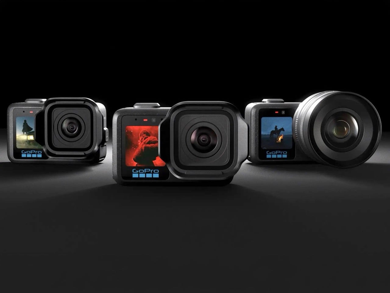
Framework laptops let you swap the motherboard. Fairphone lets you replace the battery with a coin. Teenage Engineering builds entire product ecosystems around interoperability. Somewhere between the maker-movement idealism of the mid-2010s and the sustainability push of the pandemic years, modularity graduated from hobbyist curiosity to a legitimate consumer electronics strategy. Now GoPro has quietly joined that movement, and almost nobody has noticed because the packaging looks like a standard product launch.
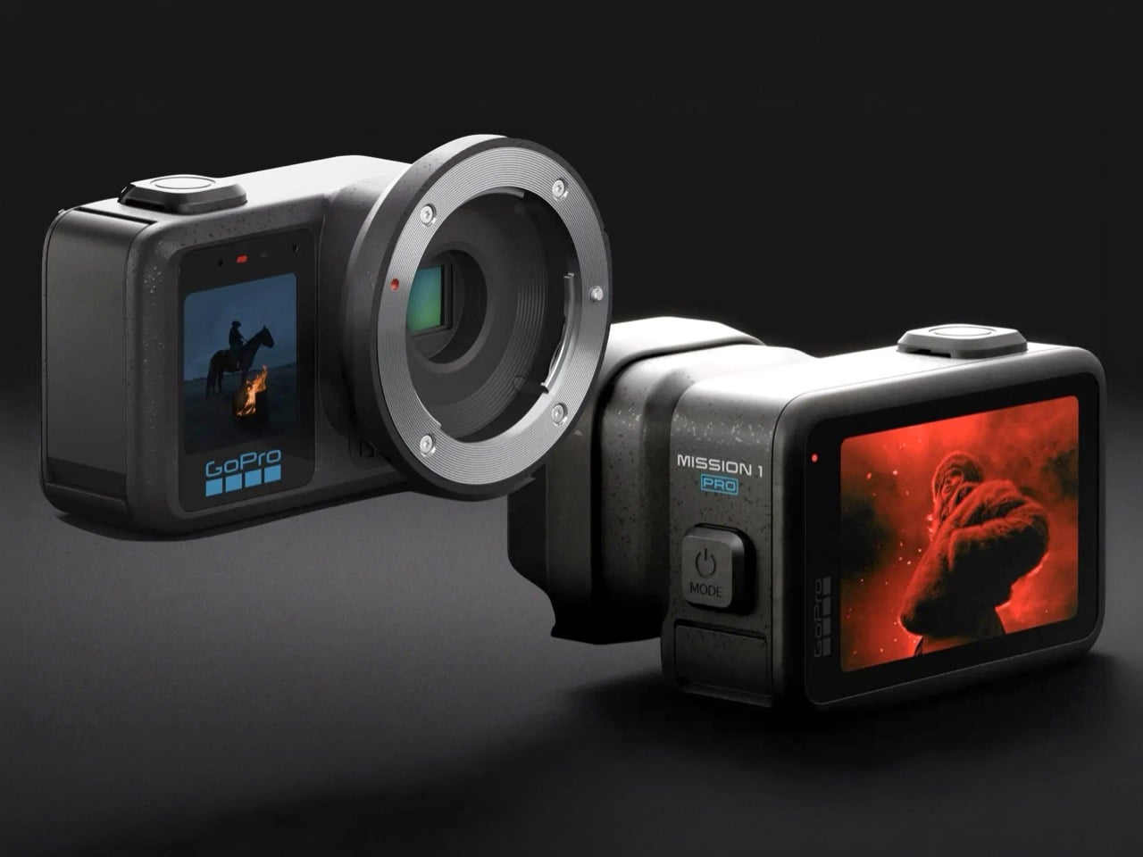
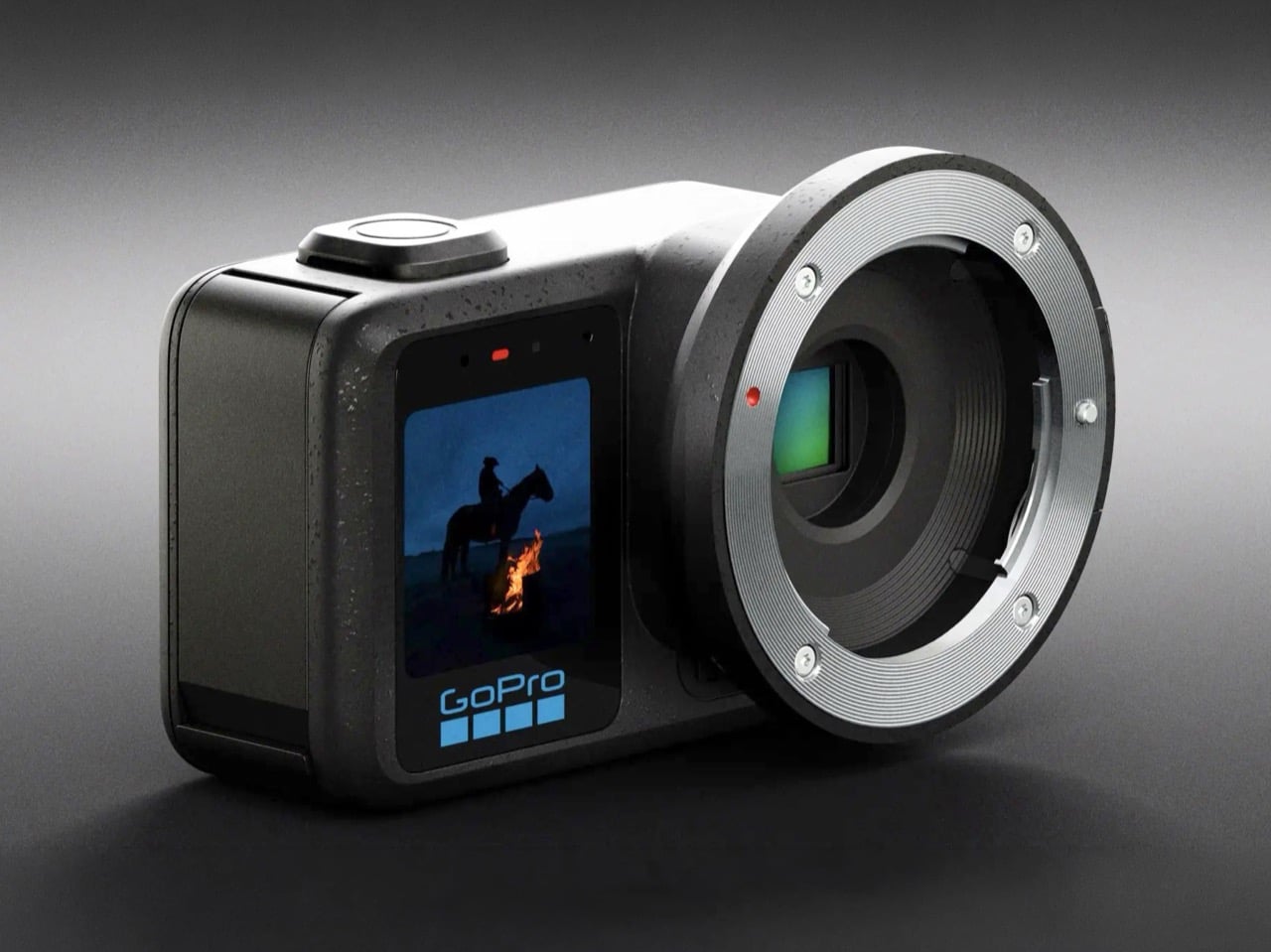
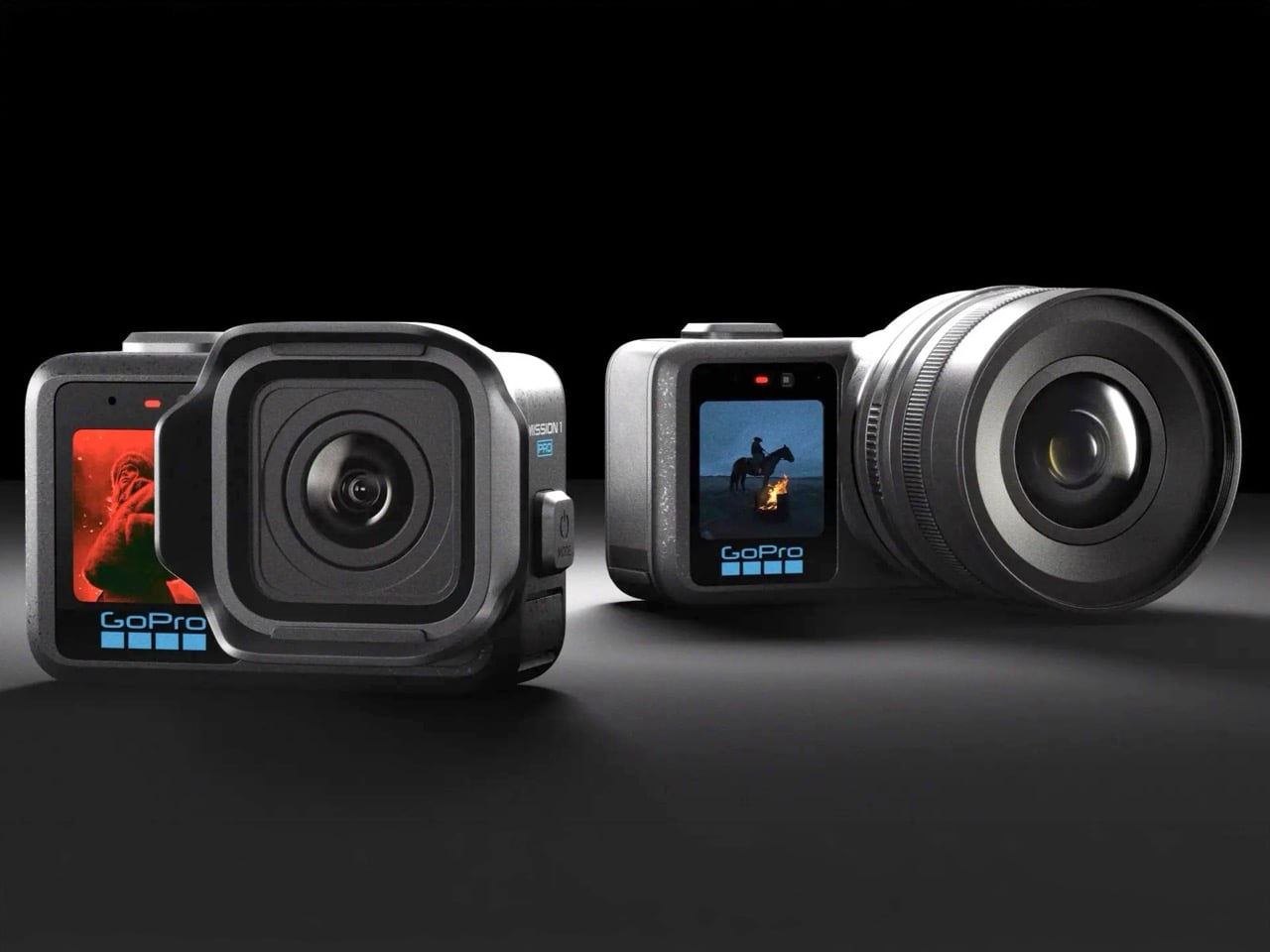
The MISSION 1 lineup contains six distinct configurations built around a single hardware core: a 50MP 1-inch sensor and GP3 processor, wrapped in a rugged compact body waterproof to 20 meters. There’s the base MISSION 1, the MISSION 1 PRO, the PRO Grip Edition, the PRO ILS with a Micro Four Thirds mount, the PRO Creator Edition, and the PRO Ultimate Creator Edition. Preorders opened May 21, 2026, with the ILS and Creator variants shipping in Q3. Pricing wasn’t announced at launch, which is its own kind of tell. What GoPro has actually built here is a hardware platform wearing the clothes of a product line.
Designer: GoPro
The base MISSION 1 caps at 4K120 Open Gate and 8K30 in 16:9, positioned for creators who want the new sensor without paying flagship money. The MISSION 1 PRO unlocks 8K60, 4K240, and 1080p960 slow motion, all recorded in 10-bit with the GP Log2 profile for grading headroom. The PRO Grip Edition bundles a dedicated handle for run-and-gun work. The Creator and Ultimate Creator Editions add production accessories aimed at YouTubers who want a boxed kit rather than a shopping list. Every variant shares the same 14-stop dynamic range, the same 32-bit float audio, and the same waterproofing without an external housing. Firmware caps and bundled accessories, in other words, do all the heavy lifting across five of the six SKUs.
Micro Four Thirds compatibility on the PRO ILS is where the platform argument stops being subtle. The mount opens the door to hundreds of existing lenses from Panasonic, OM System, Sigma, Voigtländer, and Laowa, meaning GoPro inherits nearly two decades of glass engineering without designing a single optical element themselves. HyperSmooth stabilization keeps working with any rectilinear prime, which is genuinely wild given how stabilization algorithms usually assume a fixed lens with known distortion characteristics. The body stays waterproof despite the mechanical mount, which required custom sealing work that GoPro has been notably quiet about. This is Framework’s motherboard-swap philosophy transplanted into a category where interchangeable parts were reserved for cameras that cost five times more. MFT also carries mature adapters for Canon EF, Nikon F, and PL cinema glass, quietly extending the effective lens library into the thousands.
Six SKUs from a single sensor line is also a hedge, and a smart one. If the ILS flops with videographers because Blackmagic and Panasonic own that mindshare, the base MISSION 1 still sells to adventure creators on brand recognition alone. If 8K60 pricing scares off the semi-pro tier, the 4K120 base model catches the mid-market. The recent industry chatter that GoPro may be for sale following the MISSION 1 pivot reads very differently through this lens. Whether Nicholas Woodman is building for the next decade or quietly pitching to potential acquirers like DJI or Sony, a modular platform tells a far more compelling story than a single hero product ever could. The action camera market that GoPro invented has been eating itself for years, and platforms tend to survive longer than products in categories that are actively contracting.
Every great Apple product from the last thirty years came out of a partnership. Steve Jobs had Jony Ive, a designer with more operational power than anyone at Apple except Jobs himself. Tim Cook inherited that dynamic in 2011, and over the next fifteen years the industrial design studio slowly lost its seat at the executive table, with finance and operations gaining a larger say over product direction. Bloomberg’s Mark Gurman has described the current studio as a shell of what it used to be, briefed by other teams rather than briefing them. That is the Apple John Ternus takes over on September 1, 2026, and his choice of number two says everything about where the next decade is headed.
Johny Srouji became Apple’s Chief Hardware Officer on April 20, 2026, a title that did not exist a day earlier. The role folds Apple’s hardware engineering group, previously run by Ternus himself, into the hardware technologies organization Srouji has led since 2015. He now controls silicon, batteries, cameras, sensors, displays, storage controllers, cellular modems, product design engineering, and every reliability lab in Cupertino. Ternus is his only boss, which effectively makes Srouji operational number two at a four trillion dollar company. The last time one Apple executive held this much hardware authority, Steve Jobs was still alive and Bob Mansfield was running the show.
Srouji was born in 1964 in Haifa, the third of four children in a middle-class Arab Christian family, his father a carpenter who built casting molds by trade. He studied computer science at Technion, graduating summa cum laude on his bachelor’s and magna cum laude on his master’s. Before Apple came calling, he had already done processor design at Intel Austin and managed IBM’s POWER7 CPU. Bob Mansfield recruited him in 2008 to build a chip Apple did not yet know how to design, which became the A4 that launched inside the first iPad and iPhone 4. Colleagues describe him as no-nonsense, allergic to technical vagueness, and unwilling to accept anything less than the hard truth about what silicon can and cannot do.
Every A-series and M-series chip you have ever used came out of Srouji’s org. His team pulled off the 64-bit A7 in 2013 that caught Qualcomm completely flat-footed, then engineered the M1 transition in 2020 that made Intel Macs obsolete overnight. Apple’s whole vertical integration story, the one that lets a MacBook Air outperform Windows laptops twice its price on battery life, is essentially his life’s work. His team also introduced the Neural Engine in 2017 with the A11 Bionic, quietly laying the groundwork for on-device AI half a decade before the industry decided AI was a talking point. The man who liberated Apple from Intel’s silicon almost got poached by Intel to be their CEO in 2019.
Ive read Dieter Rams and treated industrial design as the ordering principle of a product, sketching an object first and asking engineering to solve for it. Srouji operates from the opposite pole, treating silicon as the ordering principle and letting form factor, material, and thermal envelope adapt to what the chip can do at what power draw. The $599 MacBook Neo Apple launched in March 2026 is the perfect case study, because it only exists as a product because the A18 Pro from last year’s iPhone 16 Pro became efficient enough to run macOS without cooking itself or eating the battery. Ternus led the keynote and got the credit, but Srouji built the runway. That reframing of where design begins, at the wafer rather than the render, is the first coherent thesis about form and function anyone has articulated at Apple since Ive walked out in 2019.
Ternus and Srouji together cover the full stack from atom to product enclosure, which is the tightest hardware leadership Apple has run since Jobs, Ive, and Jon Rubinstein were setting product direction from the same conference room. Srouji has already started restructuring aggressively, splitting hardware into five groups and moving product design authority from veteran VP Kate Bergeron to Shelly Goldberg on Mac and Dave Pakula on Watch, iPad, and AirPods. He has also stood up a new Ecosystems Platforms and Partnerships team led by Matt Costello and Kevin Lynch, the latter of whom runs Apple’s still-secret robotics group. In his internal memo to staff, Srouji wrote that he intends to deepen integration between the silicon teams and the product-creating teams. Translation: the chip designers will now sit closer to the people deciding what the next iPhone actually looks like.
Everyone keeps asking whether Ternus and Srouji will turn Apple into a Xiaomi or Samsung style product factory, launching sub-brands and price tiers across every possible category. I don’t think that is where this goes. Xiaomi wins on volume and value engineering, Samsung wins on being first to try every new form factor, and Apple under Srouji looks positioned to do something closer to the Jobs-era iPod strategy: one core capability, several related form factors, each tuned to a different lifestyle. AI camera glasses in 2027, camera-equipped AirPods, a rumored wearable pendant, a HomePad with a swiveling display, and a foldable iPhone all sit on the same roadmap, and they are fundamentally the same argument as iPod versus Nano versus Shuffle was in 2005. Discipline stays intact, but the surface area for hardware expands into whatever new form the current silicon can actually support without turning your pocket into a hand warmer.
Srouji’s promotion is Apple’s bet that AI-era consumer devices will be won by whoever can co-design chip, sensor, battery, and enclosure as a single integrated object. That is a bet Apple can uniquely make because it already owns the whole stack, and one that Meta, Google, and even OpenAI (currently building its own hardware future with Ive, Evans Hankey, and Tang Tan poached straight out of Cupertino) still cannot fully replicate. The risk sits on the software side, where Apple’s own AI models trail rivals and Siri keeps getting delayed for reasons nobody at Apple wants to explain in public. Srouji cannot fix that himself. What he can do is make sure that whenever Apple finally ships a competent generative model, the hardware waiting to receive it has been designed around what the model actually needs, rather than retrofitted around it after launch.
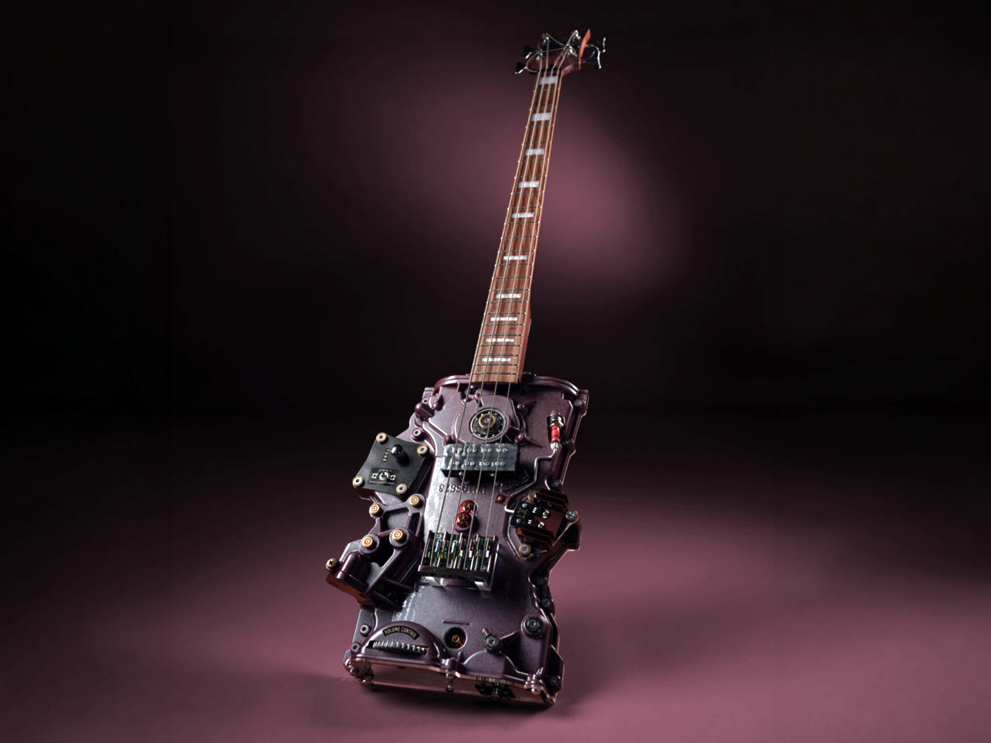
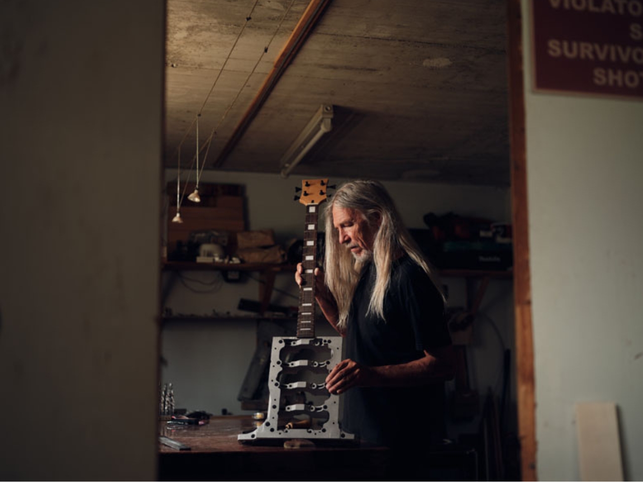
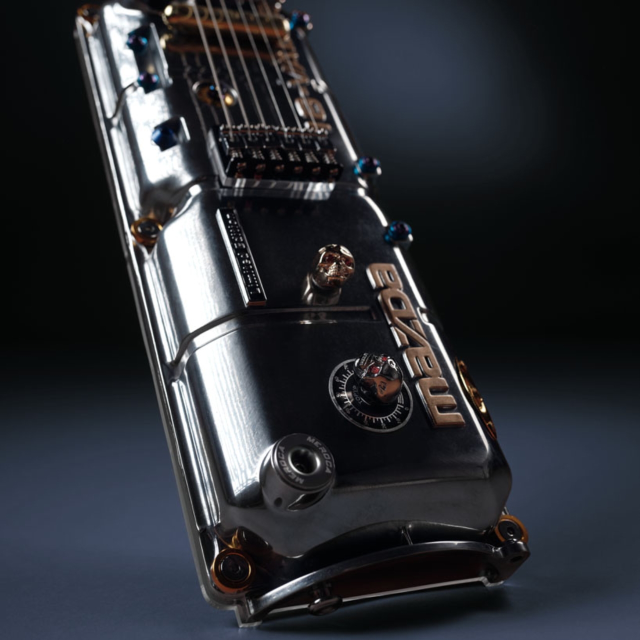
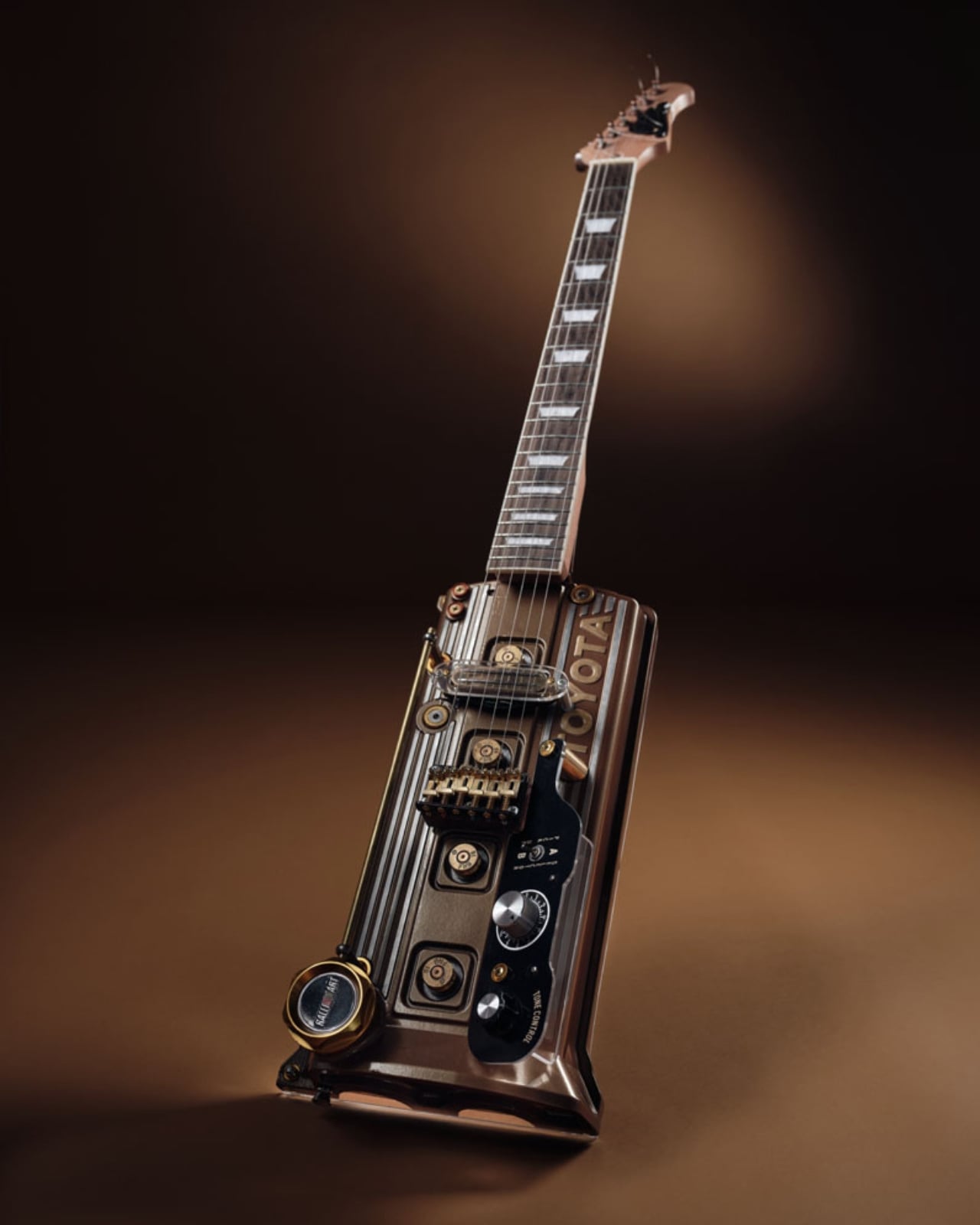
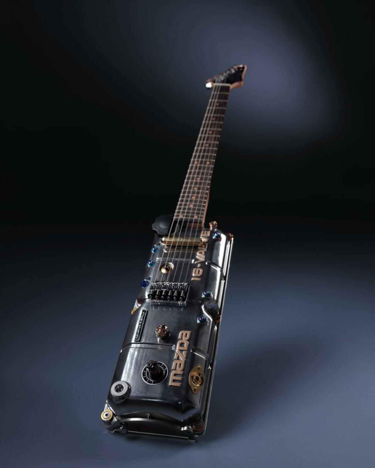
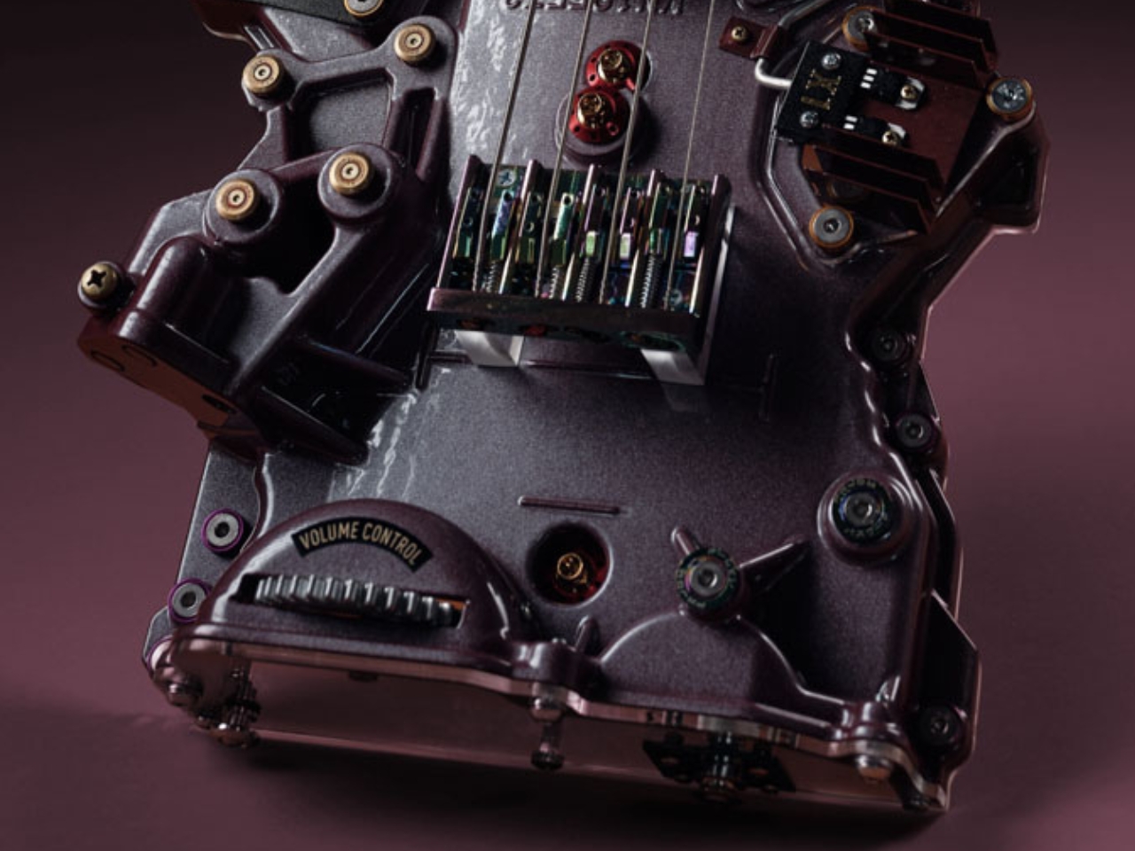
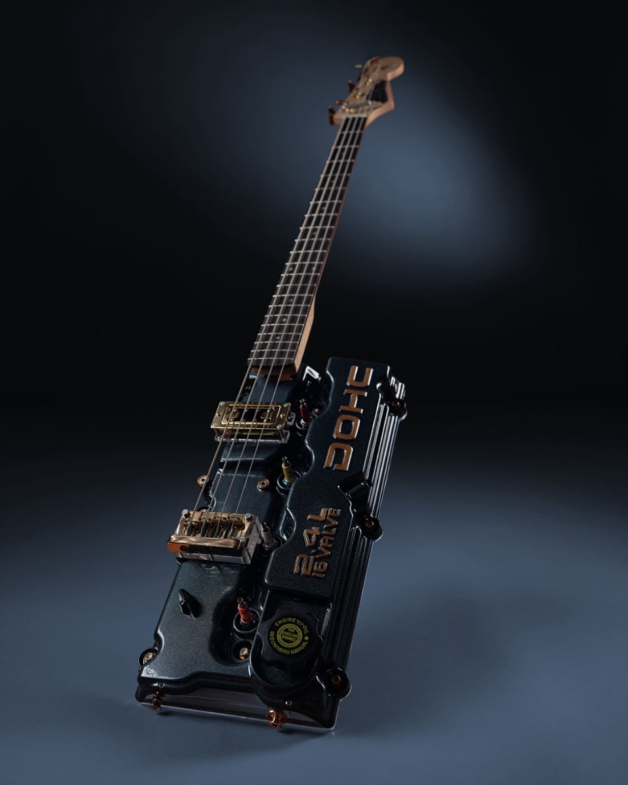
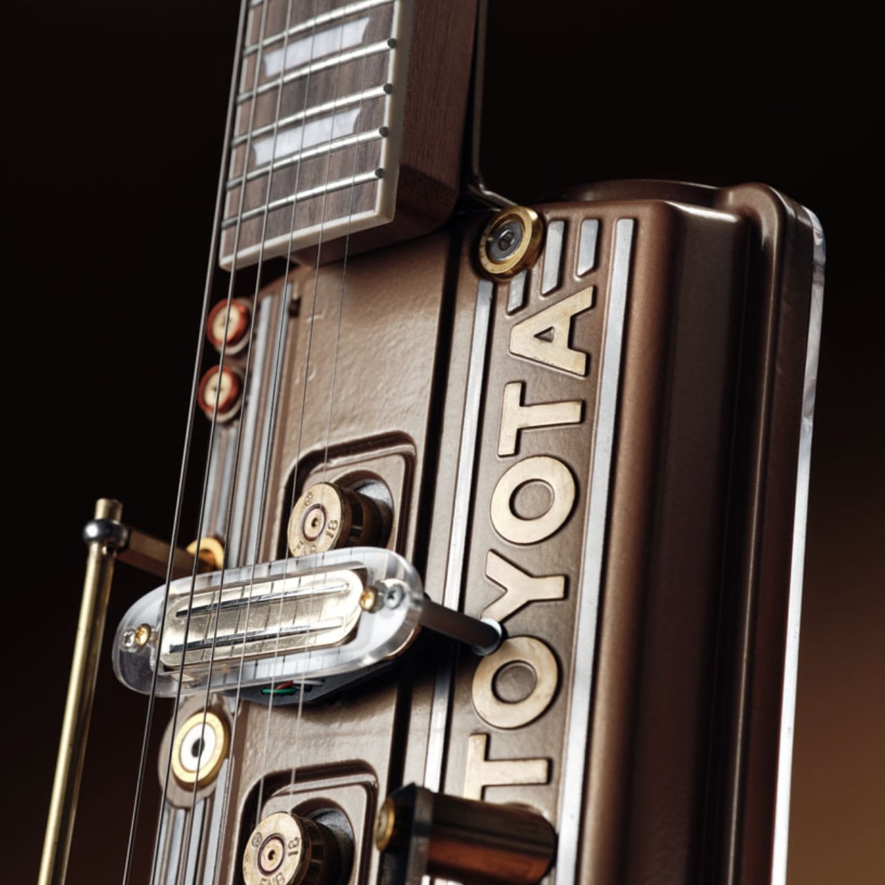
I’ve been thinking about this one for days. A Slovenian craftsman named Vlado Plateis is turning discarded car engine heads into fully playable electric guitars, and every time I look at the photos, I still can’t decide if I’m staring at a musical instrument or a sculpture. Maybe that’s exactly the point.
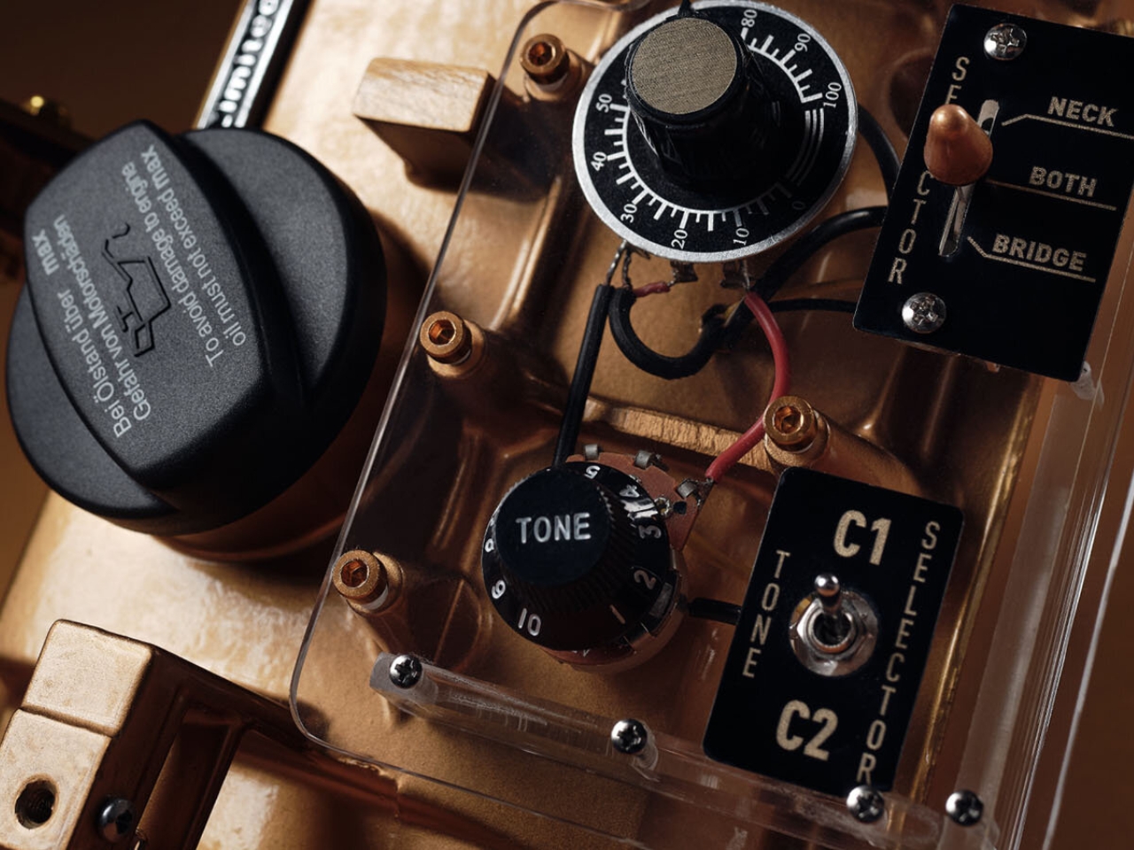
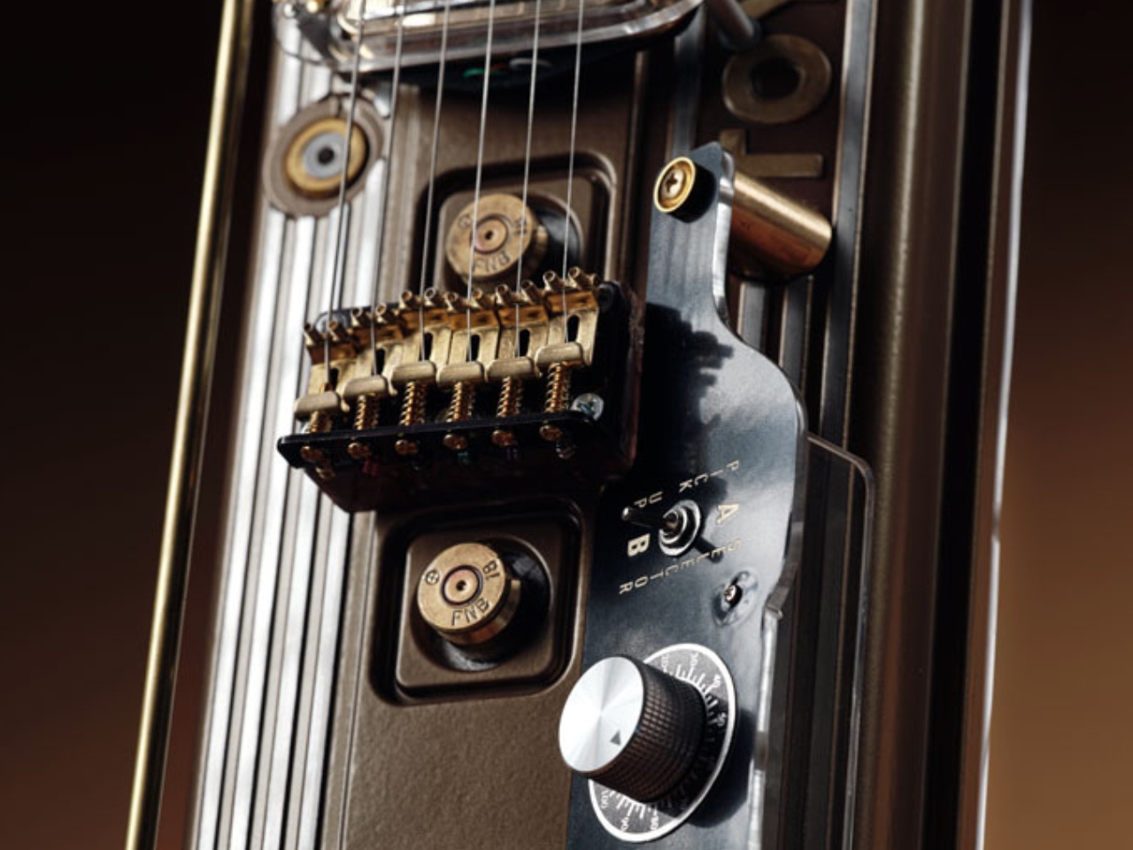
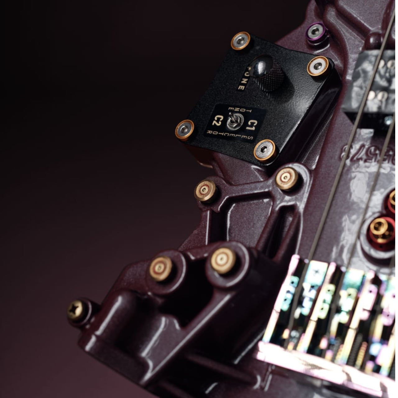
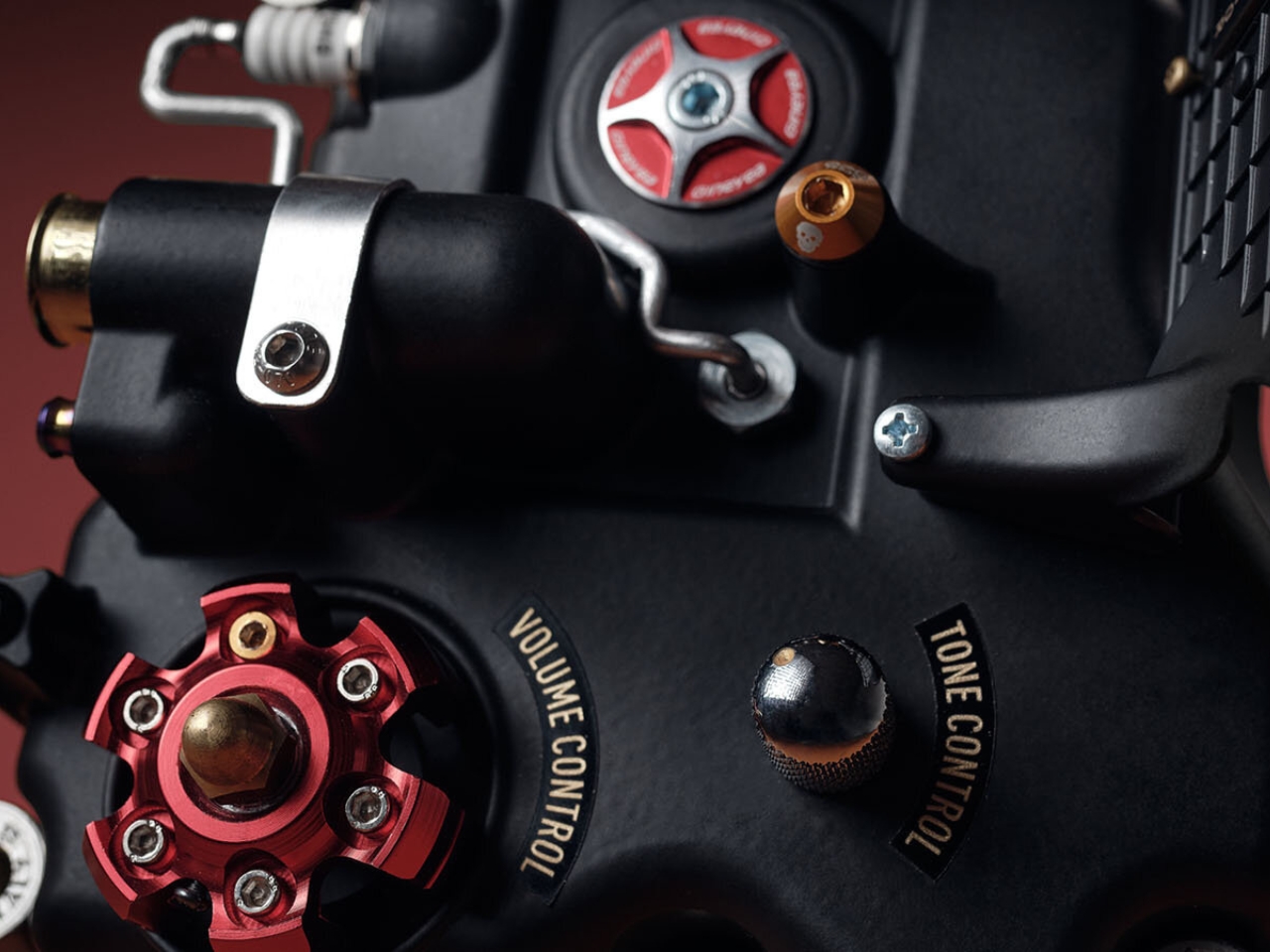
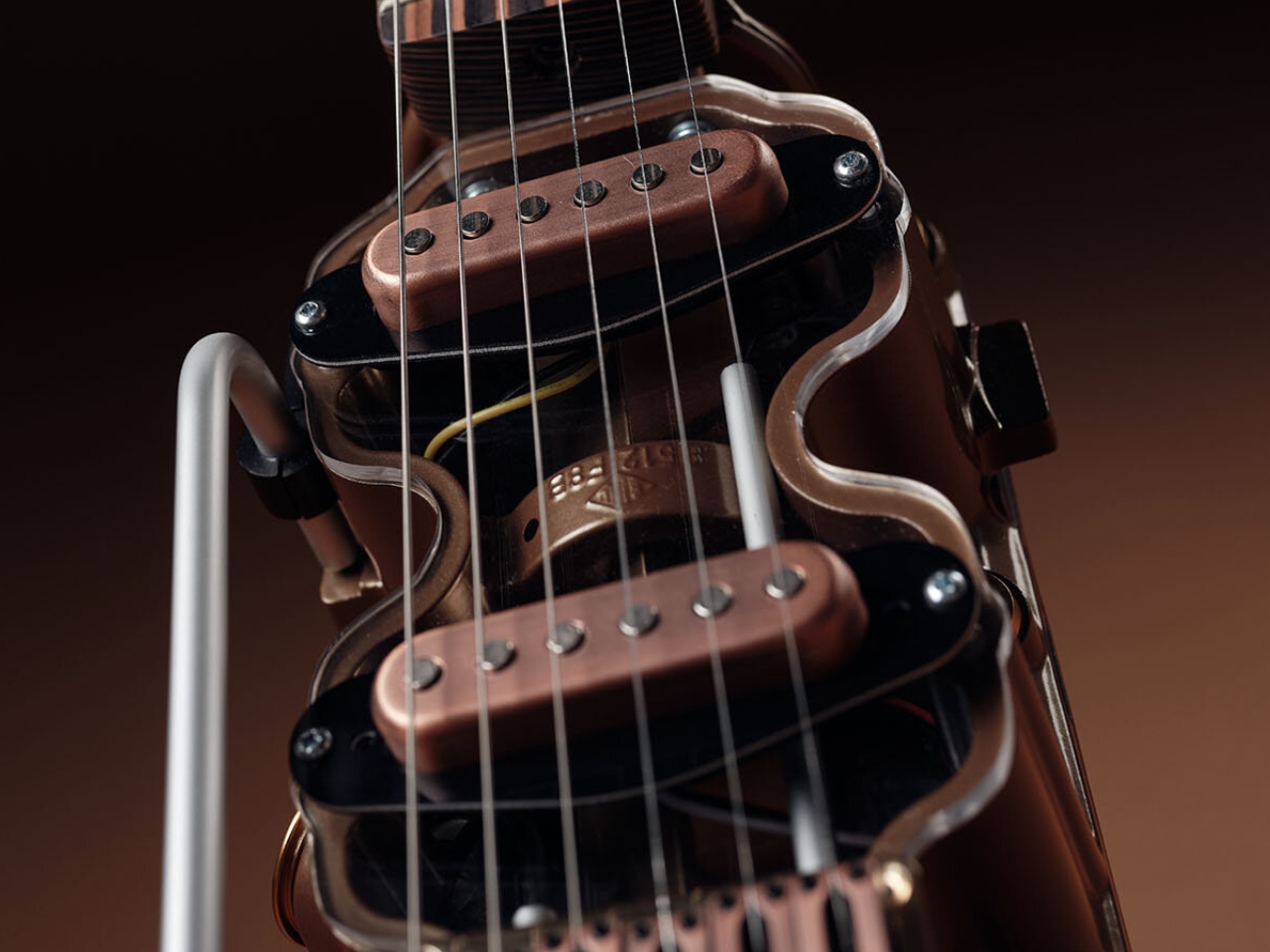
The design logic here is deceptively simple: take the engine head as the body of the guitar, preserve its raw industrial form, and build around it rather than in spite of it. Nothing is polished away, sanded smooth, or disguised. The cast metal arrives with its own surface history of machined edges, bolt holes, and combustion chamber cavities, and all of it stays. The visible scars and geometry of the original part become the visual language of the finished instrument. That restraint is a design decision, and it’s a brave one. Most makers would be tempted to refine. Plateis resists that impulse entirely.
What makes the objects so visually arresting is the tension between their two identities. The pickups, tuning pegs, and strings are all standard guitar hardware, clean and purposeful. Set against the rough, irregular topography of the engine casting, they create a contrast that reads as almost confrontational. One material is mass-produced and precise. The other is heavy, asymmetrical, and marked by mechanical life. Together, they don’t clash so much as they hold a conversation, and that conversation is what you keep looking at.
Each engine head also brings an entirely different geometry to the design, which means every guitar has a silhouette that could never be repeated. A guitar built from a Toyota Corolla head looks nothing like one built from a Mitsubishi Colt. The donor car determines the form. The bolt pattern, the fin arrangement, the overall mass and proportion are all inherited rather than designed, which paradoxically makes the final object feel more authored, not less. Plateis isn’t imposing a shape. He’s discovering one that was already there.
The weight is part of the design too, and I think it matters more than people initially consider. These are dense, substantial objects. You don’t pick one up and forget what it’s made from. That physicality communicates something about permanence that most contemporary design actively avoids. We’re so conditioned to lightweight, minimal, and frictionless that an object with genuine heft feels almost transgressive. It asks you to be present with it.
I also want to talk about what Plateis doesn’t do, because restraint is underrated in design. He doesn’t paint the metal. He doesn’t add decorative elements that aren’t structurally necessary. He doesn’t try to make the engine head look like something it isn’t. The honesty of the material is the aesthetic. That’s a philosophy rooted in the same tradition as Shaker furniture and Braun electronics, the idea that a thing should look exactly like what it is and nothing more. Applied to a guitar made from automotive scrap, it produces something genuinely unexpected.
Upcycling in design is popular right now, often to the point of feeling performative. Brands slap the word “reclaimed” on something and call it sustainable, but the object itself is forgettable. Plateis sidesteps all of that because the material isn’t incidental to the design. It is the design. Because every engine head has a different geometry, every guitar is structurally and visually unique. You cannot order the same one twice. The scarcity isn’t manufactured. It’s inherent to the process.
As someone who pays close attention to design, I think Plateis Guitars represents something genuinely interesting happening at the intersection of material culture, craft, and form-making. It’s a reminder that the most compelling design doesn’t always come from the biggest studios or the most advanced technology. Sometimes it comes from someone in Slovenia, a scrapped engine head, and a very considered eye for what already exists inside a piece of discarded metal.
Whether or not you play guitar, whether or not you care about cars, these objects deserve your attention. They are proof that constraints can be generative, and that found form, treated with patience and respect, can produce something completely new.
Every year during the Ghost Festival, millions of people across East Asia stand at street corners, in parking lots, or on sidewalks, setting fire to paper offerings for their ancestors. It is one of the most intimate acts a person can perform in public. It is also, increasingly, a problem for the cities around it. The smoke is real. The fire hazard is real. And the tension between a deeply rooted cultural practice and modern urban living is just as real. That is the space where the Peace Urn was born.
Designed by a team of five students, Hao Qian, Xiyue Yang, Zetong Song, Chenchen Du, and Yichen Fan, the Peace Urn is a clay vessel built specifically for burning joss paper in dense urban environments. It took home a Student Notable in the Lifestyle Accessories category at a 2026 design awards program, and while the recognition might sound understated, the thinking behind the project is anything but.
Designers: Hao Qian, Xiyue Yang, Zetong Song, Chenchen Du, Yichen Fan
What the designers understood, and what I think gets missed in a lot of conversations about modernizing tradition, is that the goal was never to replace the ritual. It was to protect it. Burning joss paper is an act of grief and connection, a way of sending material offerings through fire to ancestors in the afterlife. You do not solve that by eliminating the fire. You solve it by giving the fire somewhere better to live.
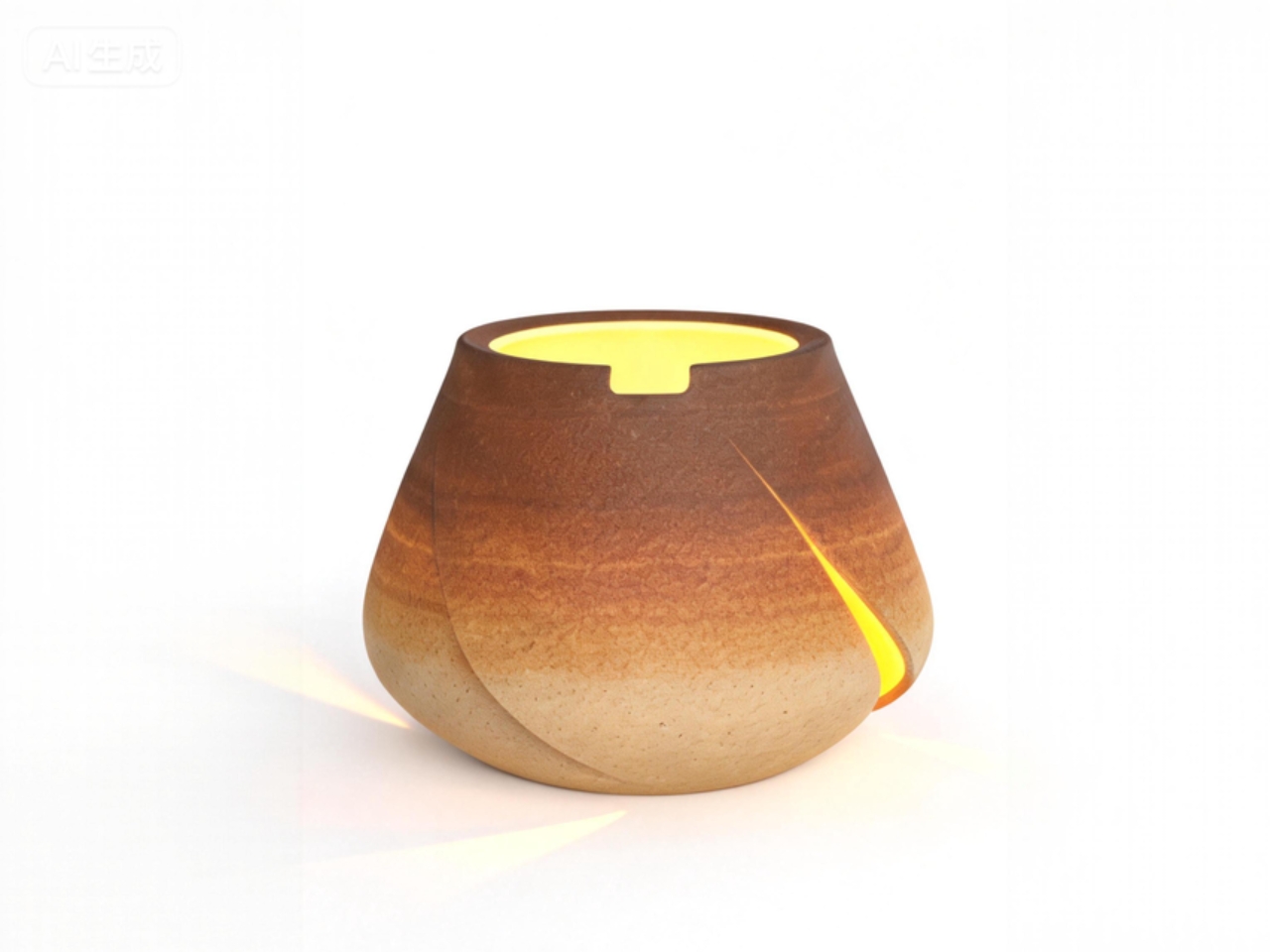
The Peace Urn does exactly that through airflow. The geometry of the vessel is engineered so that air moves through it in a specific pattern, slowing ash as it rises and drawing it back down rather than letting it scatter across streets and neighbors’ windshields. Smoke is managed similarly. The result is a contained burn that still looks and feels like a burn, which matters more than it might seem.
The designers were deliberate about keeping the visual experience intact. Flames remain visible through openings in the vessel because that visibility is not decorative. It is the whole point. Watching the offerings transform is part of the ritual itself. A closed, purely functional container would have technically solved the problem while emotionally gutting it. The Peace Urn refuses to make that trade.
The material choice is worth noting too. The urn is made from unglazed heat-resistant clay, chosen for its thermal stability, affordability, and cultural familiarity. But the choice goes beyond practicality. As the urn ages and accumulates soot, heat marks, and residue from repeated use, it becomes a record of the rituals performed in it. The surface changes. It holds memory in a tangible way, which feels entirely fitting for an object designed to help people honor the dead.
There is also a structural proposal embedded in the design: moving the practice from informal street corners into designated public spaces. The urn is not just a personal object. It is part of a system, a piece of infrastructure that allows the practice to be relocated into designated spaces, improving safety and spatial order while maintaining the privacy and emotional intimacy of the ritual. That shift from “this is someone’s private act happening in public” to “this is a supported civic practice” is, I think, quietly significant. It is an argument that tradition deserves planning, not just tolerance.
The geometry carries one more layer of meaning. The circular form of the urn references the traditional practice of drawing a circle on the ground when burning joss paper, where the boundary defines sacred space and the opening represents the direction of spiritual transmission. Translating that into the vessel’s shape is the kind of detail that separates thoughtful design from clever design. The circle does not just look good. It means something.
The Peace Urn will not end up in a museum as an object of aesthetic appreciation, and it is not trying to. It is trying to show up every Ghost Festival, on a designated corner somewhere, smelling like smoke and doing its job. That restraint is admirable. Not every design needs to be timeless. Some just need to be useful at the right moment, for the right people.
Pull up the baggage carousel at any major international airport and you will see a parade of soft-shell fabric or hard-shell plastic cases, most of them a muted color palette, most of them indistinguishable from one another, most of them showcasing the abuse of frequent travel (a massive scratch here, ripped fabric there, disintegrated airline stickers, cracked wheels that creak when dragged). That is the baseline the travel industry has accepted for decades. The expectation has been function within limits, not function beyond them.
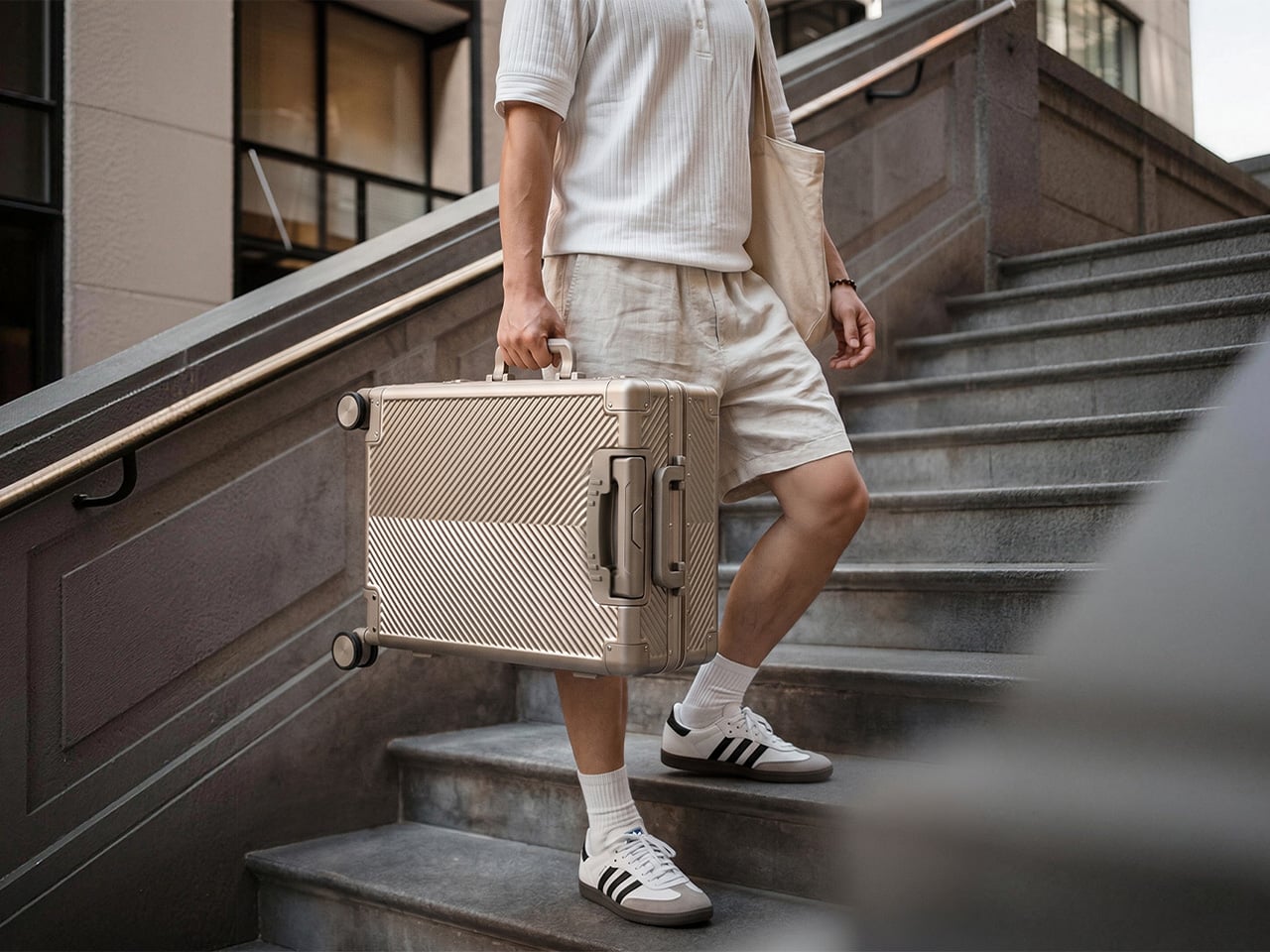
Titaner’s Voyager arrives as the carry-on that resets that expectation entirely. The 20-inch titanium shell is ribbed with chevron patterning that doubles as structural reinforcement, sealed without a single zipper on its exterior, and coated with a hydrophobic treatment that sends water beading off its surface. Designed for travelers who see their gear as long-term equipment rather than seasonal accessories, it signals a broader shift in what premium carry-ons are supposed to be made of.
The shell physically, visually, practically, and literally sets the Voyager apart from any other travel carry you’ve currently got stowed underneath your bed or in your closet. Made from Grade 1 pure titanium, the kind typically reserved for aerospace applications and medical implants, the Voyager carries the same corrosion resistance and impact tolerance that have made the material legendary in other industries. Titanium does not rust, does not dent easily, and ages with a patina that adds character rather than degradation. The angled chevron texture machined across its surface does three things at once: it creates visual drama, it distributes impact force across a wider structural field, and it hides minor surface wear far better than a polished or matte finish ever could. This is luggage that looks more refined the longer you own it.
The zipperless body is where Titaner makes its clearest departure from conventional luggage logic. Most hard-shell cases still rely on zipper closures because they are familiar, flexible, and cheap to manufacture. They are also the first thing to fail under repeated stress. The Voyager uses a continuous waterproof gasket seal instead, wrapping the entire case perimeter in a material that keeps rain out and dust at bay. Pop the latches, and the case opens in two clean halves with a 180-degree flat lay. No zipper teeth to snag. No fabric track to tear. Just a mechanical hinge and a seal that either works or it does not. It is the kind of decision that makes soft-shell luggage feel like it was designed around cost, not longevity.
Travel is a series of small interactions repeated hundreds of times: extending the handle, rolling through terminals, lifting it into overhead bins, setting it down on uneven pavement. Titaner has refined each one. The telescoping handle uses a 13-stage adjustment system with no visible punch holes running down the tube, which means a cleaner visual line and a mechanism that locks at every height with a button press at the base. The handle grip itself uses a slow-return damper, so when you let go, it eases back into place instead of snapping against the shell. The eight independent spinner wheels are modular, which means if one gets damaged after years of airport abuse, you replace that single wheel instead of the entire case. Underneath, a spider-web reinforcement structure distributes the stress from each wheel across the corner assembly, so no single impact point can compromise the frame. Even the side feet are trapezoidal, designed to keep the case stable when stood upright and lifted without effort when you need to move it.
Inside, the Voyager offers a layout most frequent travelers will recognize: dual compression straps, zippered divider panels, interior pockets on both halves. The lining is stain-resistant and wipes clean. But the real interior innovation is the optional Waterproof Vault, a removable airtight inner bag with a triple-side zipper seal. Cameras, drones, passports, medication, anything that cannot afford even brief water exposure gets sealed inside. The vault can also be fitted with modular foam inserts for shock protection, turning the Voyager into a hybrid between a carry-on and a protective equipment case. It is the kind of feature that expands the product’s identity beyond clothing transport into the realm of gear protection, where soft-shell luggage has never been able to compete.
What Titaner has done with the Voyager is take the material obsession and mechanical precision that defined its EDC products (pens, multi-tools, pocket knives) and scaled that philosophy up to travel dimensions. The result feels less like luggage in the traditional sense and more like a precision mobility tool. It is cabin-approved at 20 inches, light enough to lift with one hand despite the titanium construction, and visually distinct enough that you will spot it on a carousel from across the terminal. The chevron-patterned shell catches light at angles soft fabric never could. The hardware has the same machined confidence you would expect from a high-end knife or watch. Travelers who have spent years cycling through polycarbonate shells and torn nylon cases will recognize this as something different: a carry-on designed to outlast your travel habits, not replace them every few seasons.
The Titaner Voyager is currently available at $579, discounted over the $1079 MSRP for the base 20-inch carry-on in titanium, with options to add the Waterproof Vault module and additional accessories. The campaign ships internationally, with estimated delivery starting in late 2026.
Outdoor equipment has moved beyond endurance-based use and is now expected to integrate comfort, adaptability, and everyday usability. This shift is shaping a new design direction often referred to as soft utility, where outdoor essentials feel less technical and more lifestyle-oriented. Whether used for camping, commuting, or light travel, modern gear is designed to move with the user and not just simply provide protection.
This evolution is primarily visible across product categories like tents, lighting systems, jackets, backpacks, and footwear. Each category is being reimagined to serve multiple roles while balancing function, durability, and ease of use. The focus is no longer on single-purpose equipment but on interconnected systems that support flexible living across environments.
1. Adaptive Layering Systems: Jackets and Apparel
Outdoor jackets and apparel are increasingly designed as adaptive systems so that they can respond to changing weather conditions, movement intensity, and temperature shifts through modular construction and smart material use. Convertible layers allow adjustment across climates, while lightweight insulation replaces traditional bulk. Breathable, waterproof fabrics enhance comfort without limiting mobility.
Functional additions such as hidden pockets and ergonomic tailoring make them suitable for urban and outdoor settings. The core idea is that a single garment should perform across multiple environments without compromise, supporting continuous movement and variable conditions.
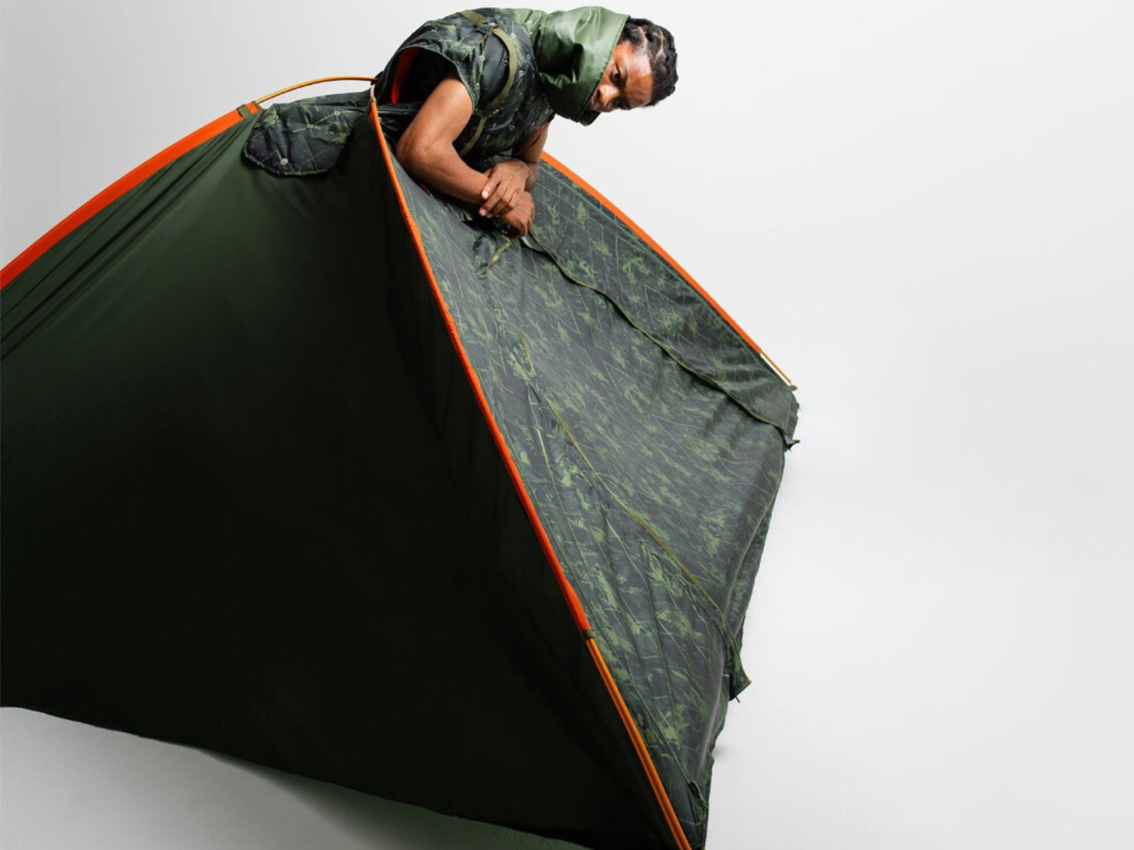
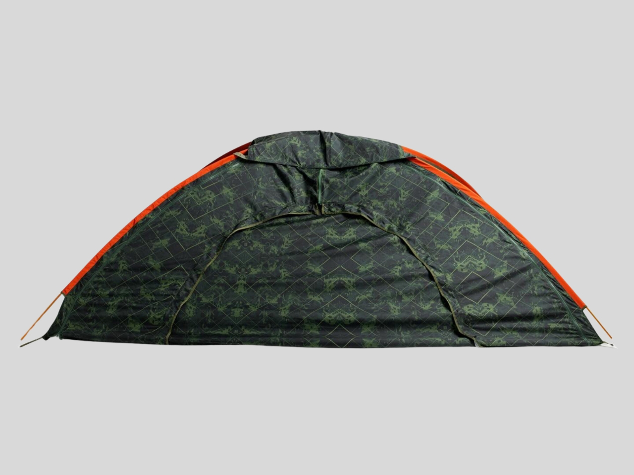
Tokyo-based fashion student Yoon Myat Su Lin has designed Shelter Wear, a product that redefines clothing as emergency infrastructure. At first glance, it appears as a structured utilitarian vest with a high collar and technical paneling, shaped in a clean techwear aesthetic. The sleeves function as detachable backpacks, turning everyday wear into portable storage. Built with ripstop fabrics and precise fastening systems, the garment is engineered for real-world stress rather than conceptual display. It moves beyond fashion into functional survival design, where what you wear becomes what you rely on in crisis conditions.
The concept transforms completely when activated. With a series of unclips and folds, the vest expands into a triangular tent that wraps around the body, forming immediate shelter. This transformation is not symbolic but practical, intended for disaster situations where infrastructure has failed. Inspired by Yoon’s experience of an earthquake in Myanmar, the design reframes clothing as the first layer of safety. Shelter Wear treats the human body as mobile architecture, turning apparel into a life-support system that responds directly to displacement and emergency needs.
2. Ground Mobility: Footwear That Adapts to Terrain
Outdoor footwear has expanded beyond rugged terrain use to support everyday mobility across diverse environments. Modern designs combine cushioning systems, flexible construction, and advanced grip technology to ensure stability on city surfaces and natural trails. Lightweight materials and breathable uppers enhance comfort during long wear, while shock-absorbing soles reduce strain across movement.
This hybrid approach allows footwear to function seamlessly between travel, work, and outdoor activity. The emphasis has shifted toward continuous usability, where shoes are not limited to specific conditions but support fluid movement across changing terrains and contexts.
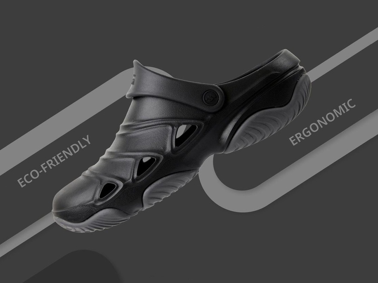
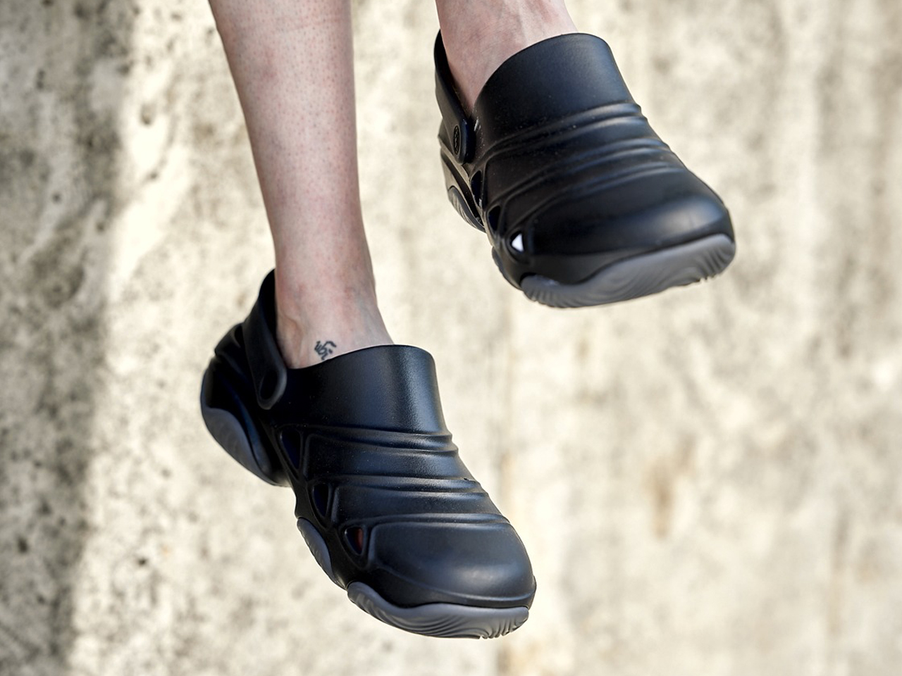
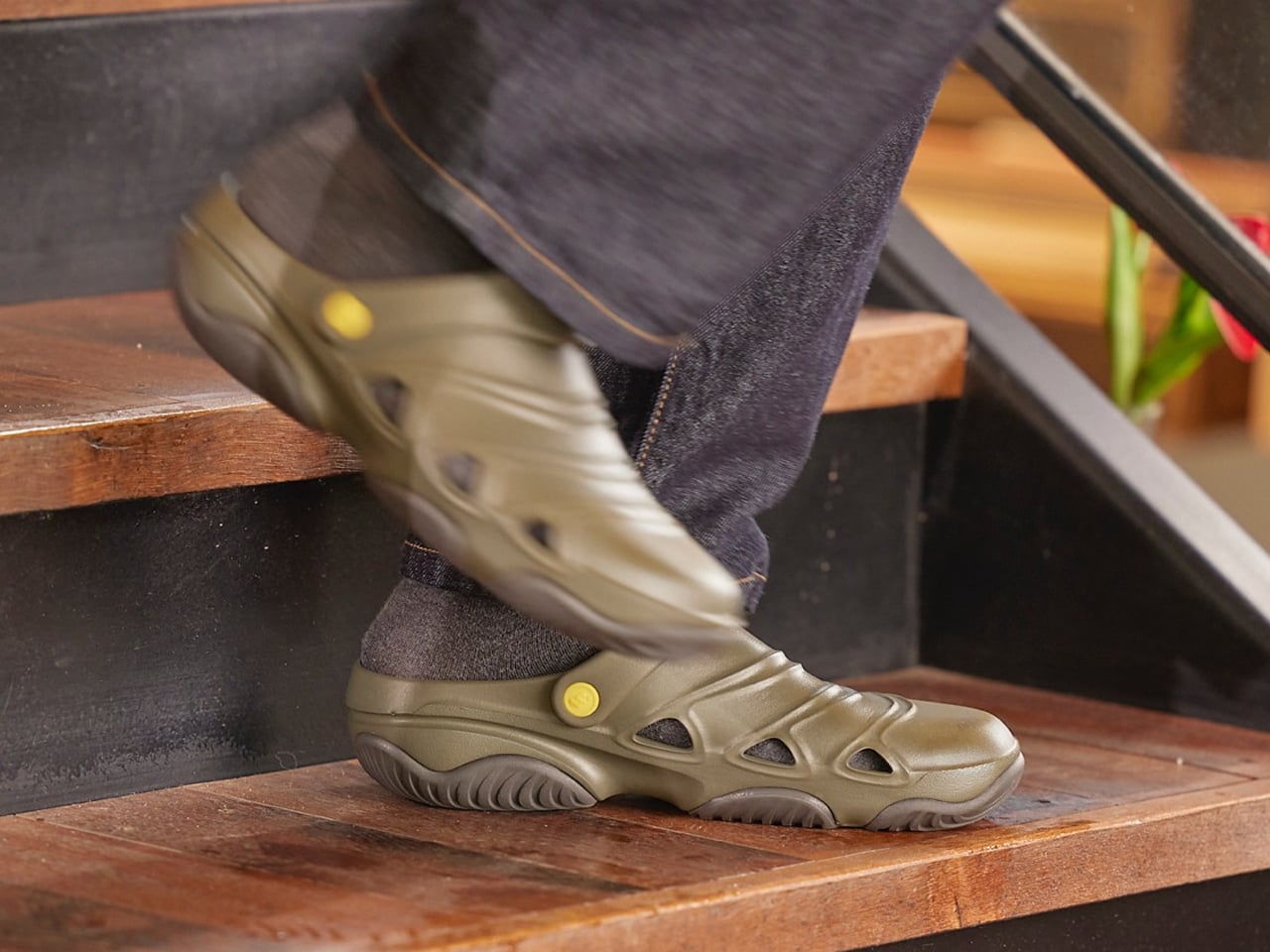
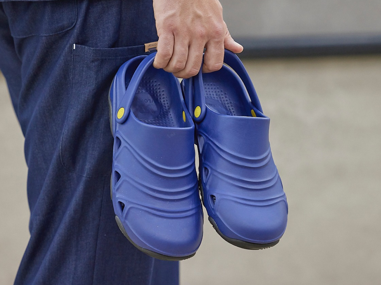
ACTMOS repositions the modern clog as a performance-driven utility shoe designed for long hours of standing and movement. Developed by designers Sul A Han, Da Heen Jung, and Hyun Ju Lee, the footwear addresses real-world fatigue faced by workers in healthcare, food service, and other standing-intensive professions. Built with an ergonomic, ultra-wide silhouette, it prioritizes posture support, pressure distribution, and long-wear comfort. The design moves away from style-first clog stereotypes and focuses instead on function, comfort, and daily endurance across demanding environments.
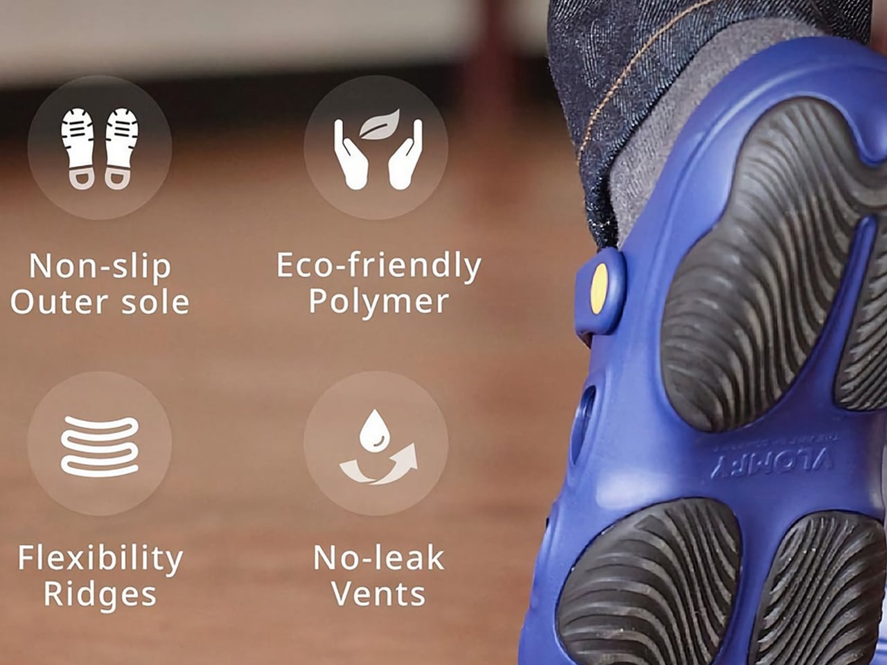
The shoe features a slip-on unibody structure with a supportive heel strap, flexible, ridged upper, and grippy outsole for multi-surface stability. Ventilated side openings improve airflow while preventing liquid intrusion, making it suitable for wet and high-activity environments. Constructed with 34% biopolymers and 5% biomass materials, ACTMOS also reduces synthetic dependency while improving durability. Its soft elastomeric build allows natural foot movement, making it suitable for work, travel, gardening, and light outdoor use. Positioned as a universal utility shoe, it blends sustainability with long-duration ergonomic performance.
3. Mobile Organization: Backpacks for Hybrid Living
Backpacks have evolved into structured carrying systems designed for flexible, hybrid lifestyles. Instead of a single storage space, they now feature modular compartments that separate and organize essentials such as electronics, clothing, hydration, and tools. Ergonomic designs reduce physical strain, while weather-resistant materials improve durability in changing conditions. Expandable sections and detachable units allow quick transitions between daily commuting and travel use.
This transformation positions backpacks as mobile organization systems that support efficiency, accessibility, and adaptability in urban and outdoor environments.
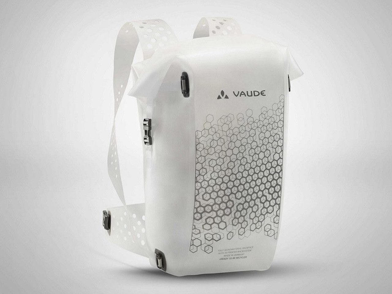
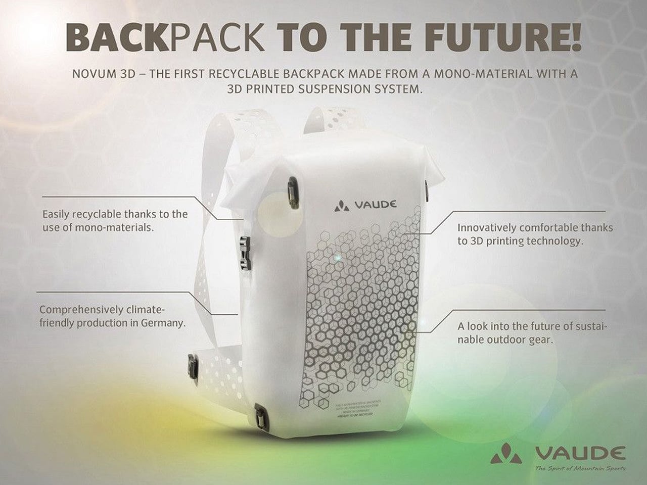
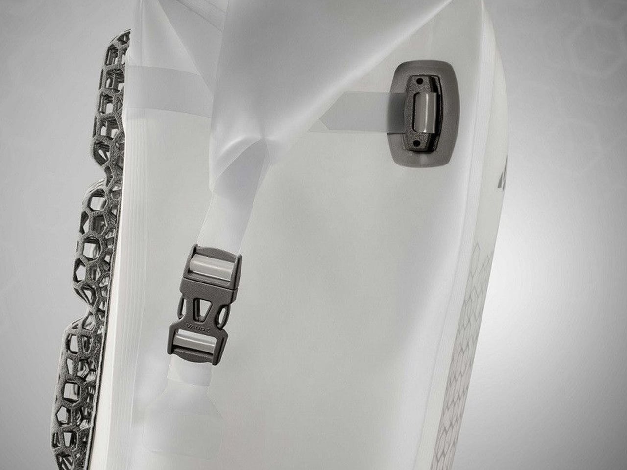
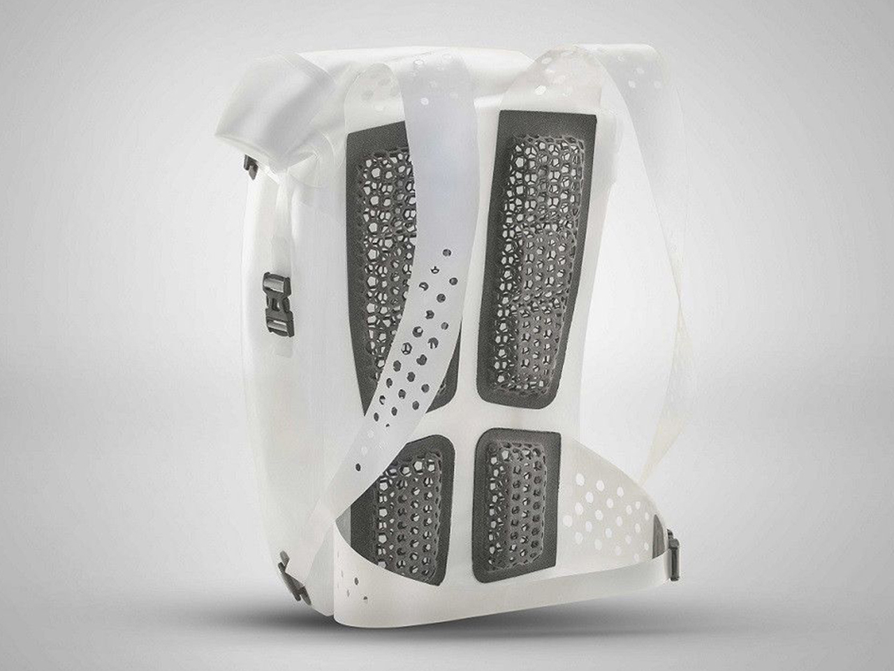
Vaude’s Novum 3D backpack represents a shift toward fully sustainable outdoor carry systems, designed within a circular economy model. Developed as a mono-material product, it is engineered to be completely recyclable at the end of its life cycle. Built using 3D printing technology, the backpack reduces material complexity while maintaining structural performance, aligning with Vaude’s broader commitment to responsible outdoor gear production for future generations of hikers and adventurers.
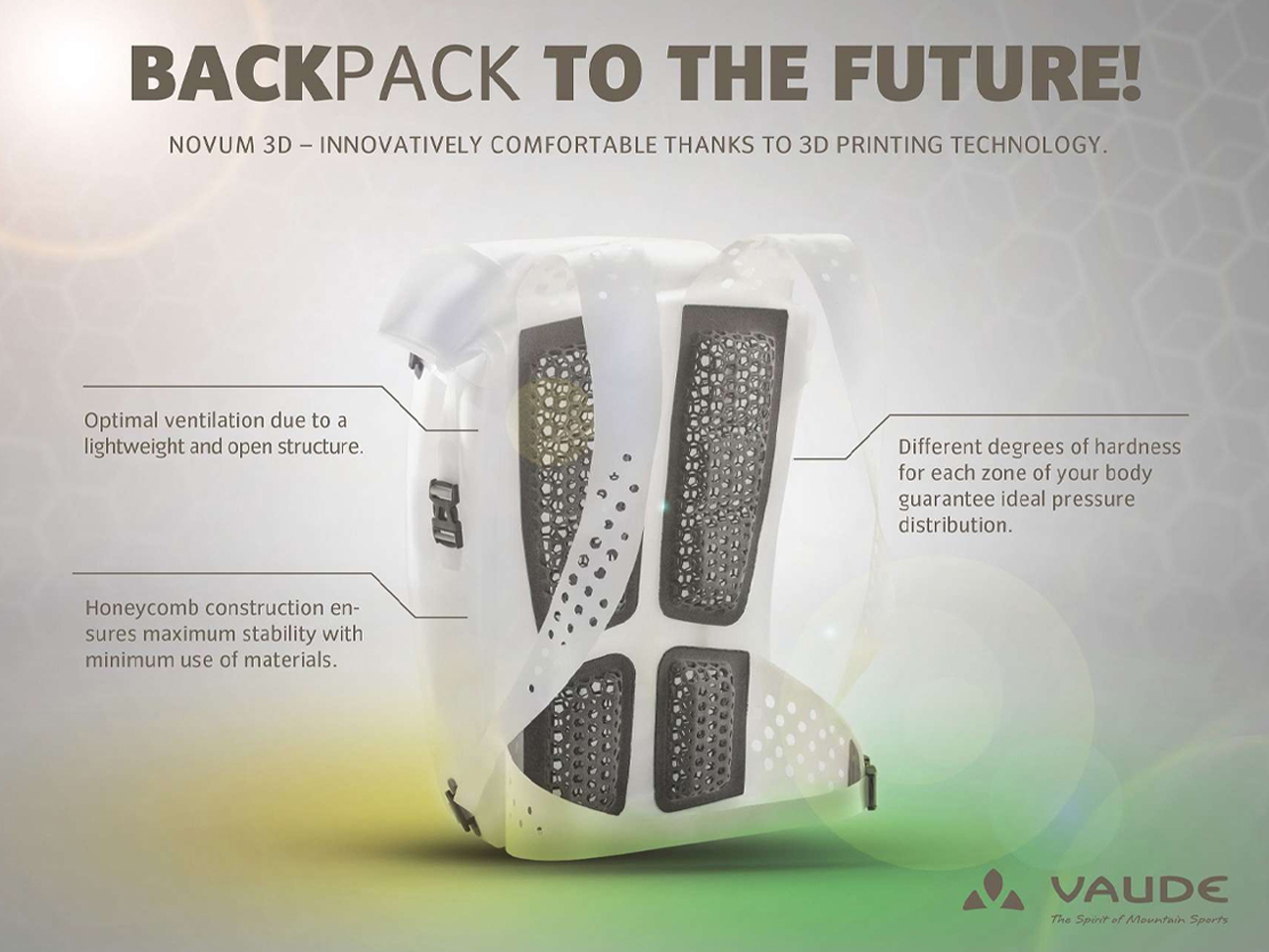
The design features a honeycomb structure made entirely from thermoplastic polyurethane (TPU), applied across the straps, packsack, and back support system. This geometry ensures high stability with minimal material use while also improving ventilation and weight reduction. Each component is removable and designed for recycling, supporting full material recovery. Inspired by natural structural efficiency, the backpack distributes pressure evenly while maintaining comfort. The result is a lightweight, breathable, and fully circular carry system that combines sustainability with functional performance in outdoor environments.
4. Ambient Utility: Lighting as Experience and Function
Outdoor lighting systems have shifted from basic visibility tools to multi-functional ambient devices. Modern lamps combine adjustable brightness, rechargeable batteries, and solar charging capabilities, making them suitable for outdoor use and indoor backup. Their design allows them to hang, stand, or attach to equipment, increasing usability across situations.
Some units also function as power banks, adding another layer of utility. Beyond illumination, lighting now shapes atmosphere and experience, extending usable time into the night while maintaining practicality. It acts as a bridge between survival function and environmental comfort.
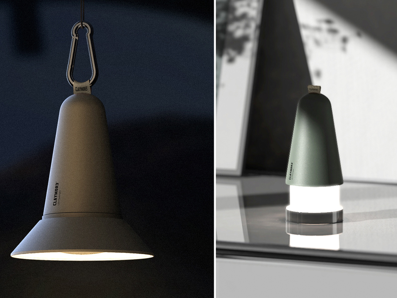
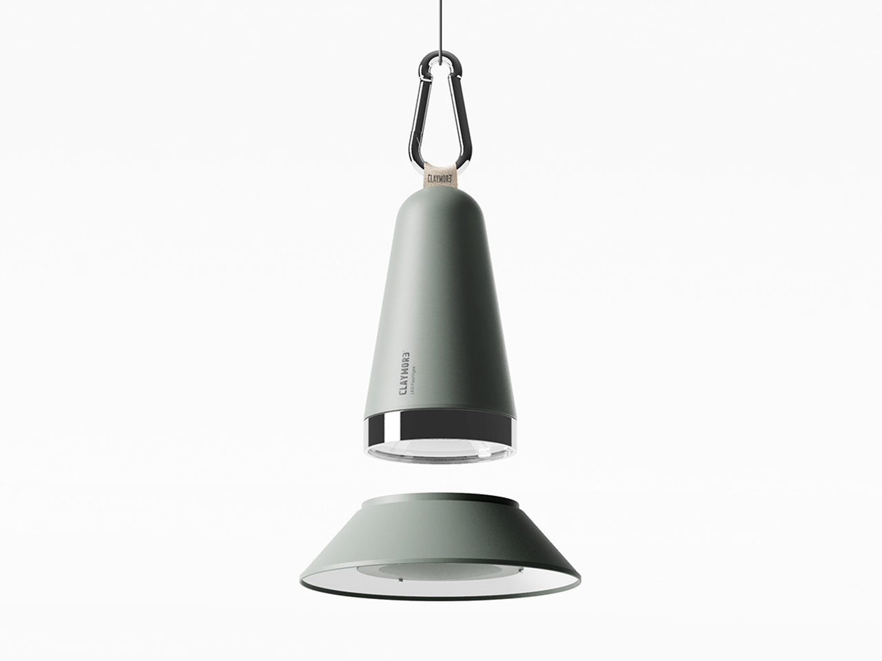
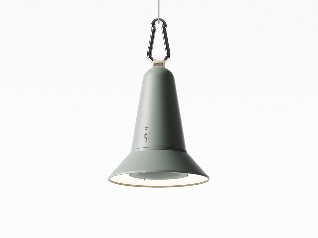
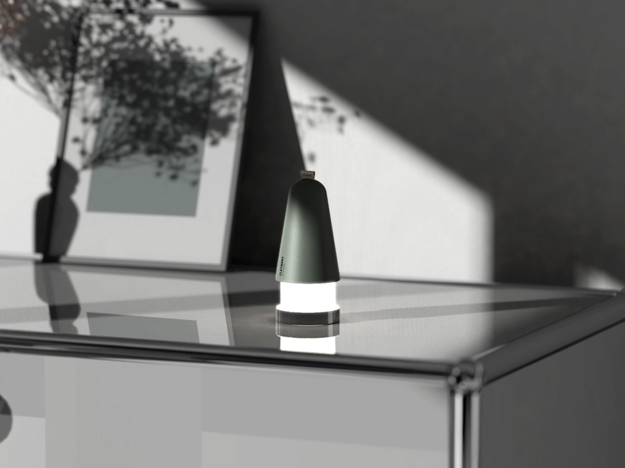
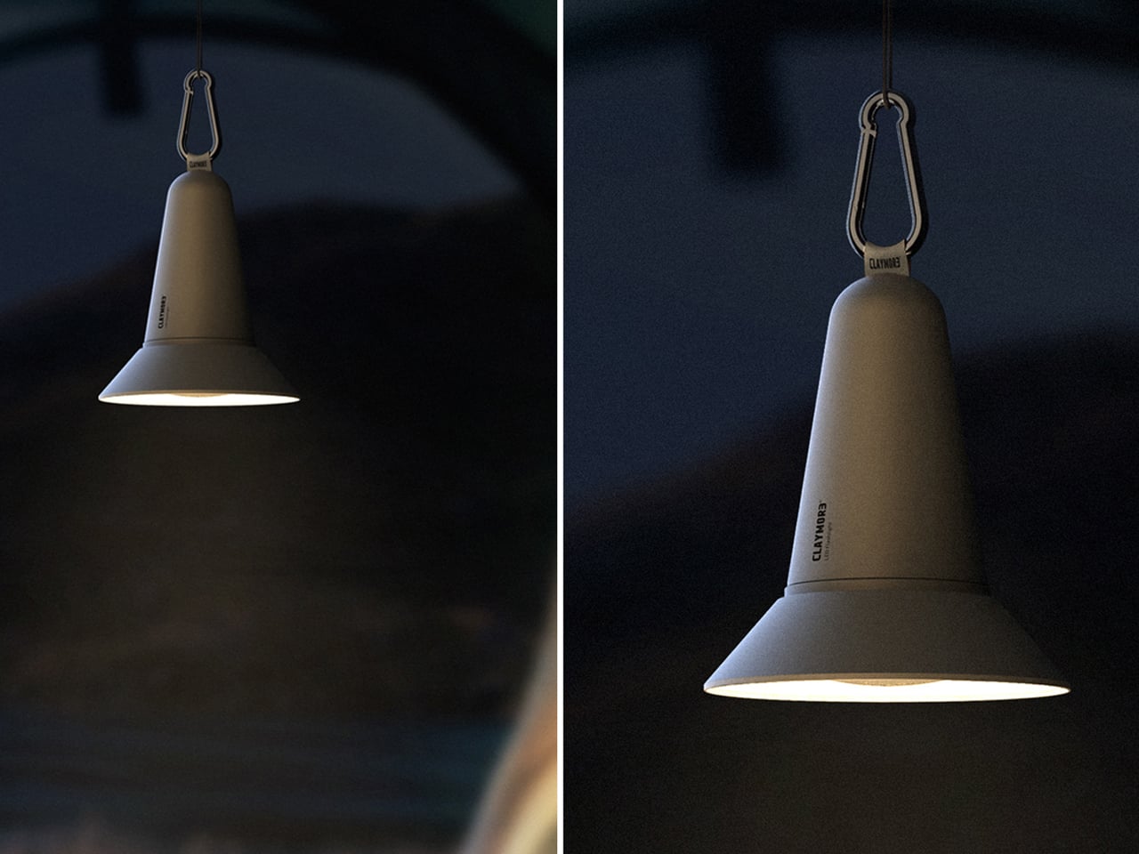
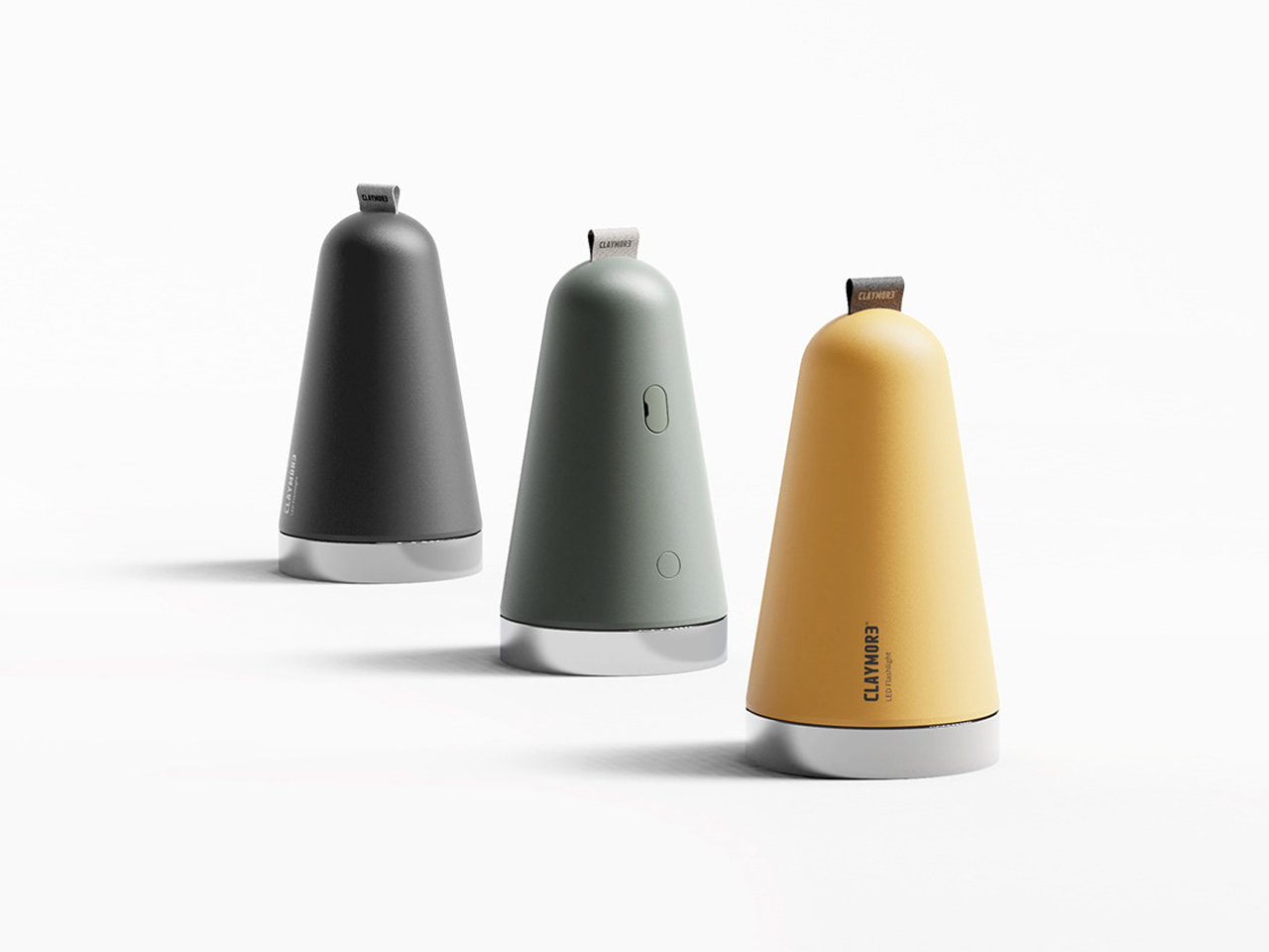
Conic, designed by Han Youngseok and Park Jaehyeon, redefines the boundary between flashlight and lantern by merging into a compact outdoor lighting system. Built for camping, RV travel, and off-grid use, it functions as a versatile light source that is easy to carry and intuitive to operate. Its conical form keeps it lightweight and portable, while still delivering wide-area illumination suitable for campsite activities such as cooking, organizing gear, or group tasks. The design reflects a shift toward multi-use outdoor tools that reduce the need for separate lighting equipment.
The lamp features a simple rotational metal ring interface for power control, along with an extendable and detachable front section that allows for focused or diffused lighting. A built-in carabiner enables easy attachment to backpacks or overhead suspension for full-area lighting. Conic also integrates USB-C charging with power bank functionality, extending its utility beyond illumination. Designed for outdoor and indoor use, it transitions seamlessly from campsite lighting to everyday desk or ambient home lighting, making it a hybrid tool for modern mobility and utility-focused living.
5. Portable Shelter: Tents as Livable Micro-Architecture
Tents have evolved from temporary survival shelters into adaptable living spaces. Lightweight structures, fast-setup mechanisms, and breathable materials make them more comfortable and efficient for extended use. Modern designs often include modular sections that allow space expansion or compression depending on need.
Features such as ventilation systems, internal storage pockets, and weather-responsive coatings improve livability across conditions. This shift reflects a change in intent, which is from simple protection to creating a sense of temporary home in outdoor environments. The tent now functions as a form of portable micro-architecture within a broader utility system.
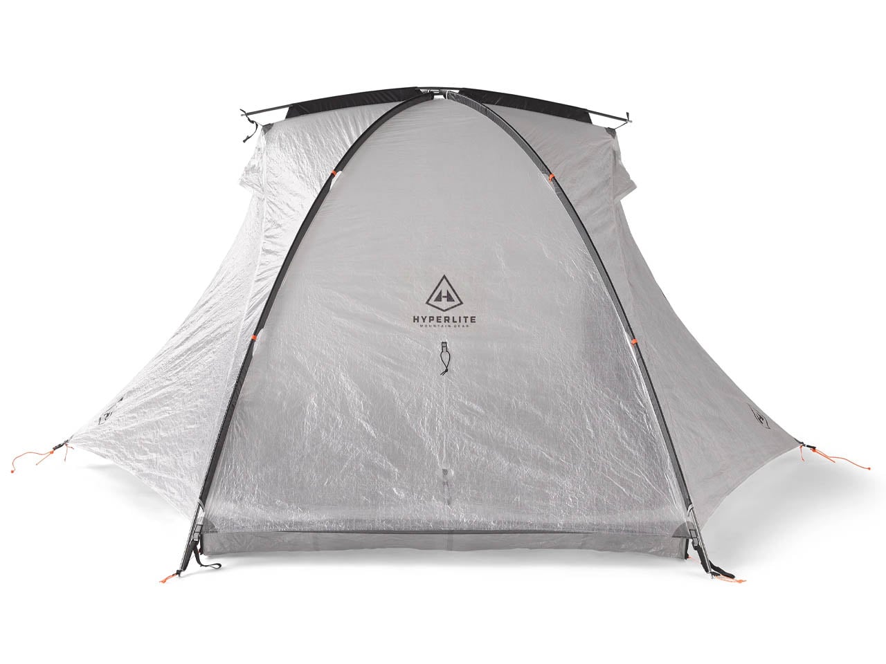
Hyperlite Mountain Gear’s Crosspeak 2 is a freestanding ultralight tent designed for minimalist outdoor use. Weighing just 2 lbs, it prioritizes portability and quick setup over extensive feature sets. Built for two people, it offers a compact yet functional shelter solution for hikers and backcountry travelers who value low weight and efficiency. Its Dyneema Composite Fiber construction ensures strength while keeping the overall structure extremely light, placing it among leading ultralight tents in its category.
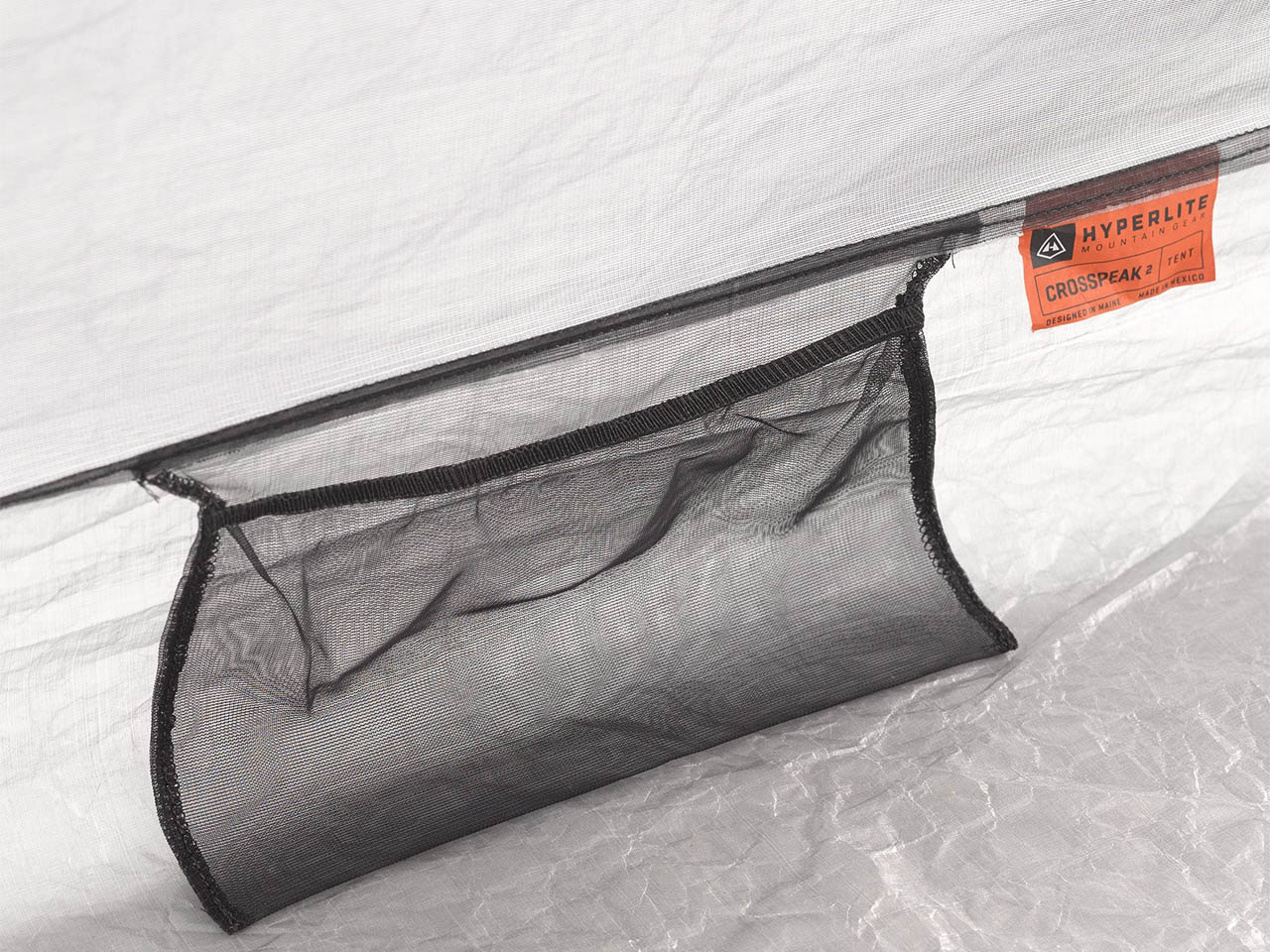
The tent uses a crossed-pole system secured with webbing and ladder locks, topped with a small bridge pole for stability. Once pitched, it reaches 42 inches in height with an 88 x 48-inch floor area and includes a Dyneema vestibule for gear storage. Dual doors, ventilation control, and magnetic tie-backs enhance usability, while its minimal design keeps it highly packable. It is intended for fair-weather use where speed and simplicity are the priority.
Outdoor gear has transitioned into a layered ecosystem where each element supports a different aspect of modern mobility. The result is a shift from isolated survival tools to fluid, lifestyle-driven utility designed for continuous movement across environments.