When Zoo Design Tells the Story of Life Itself

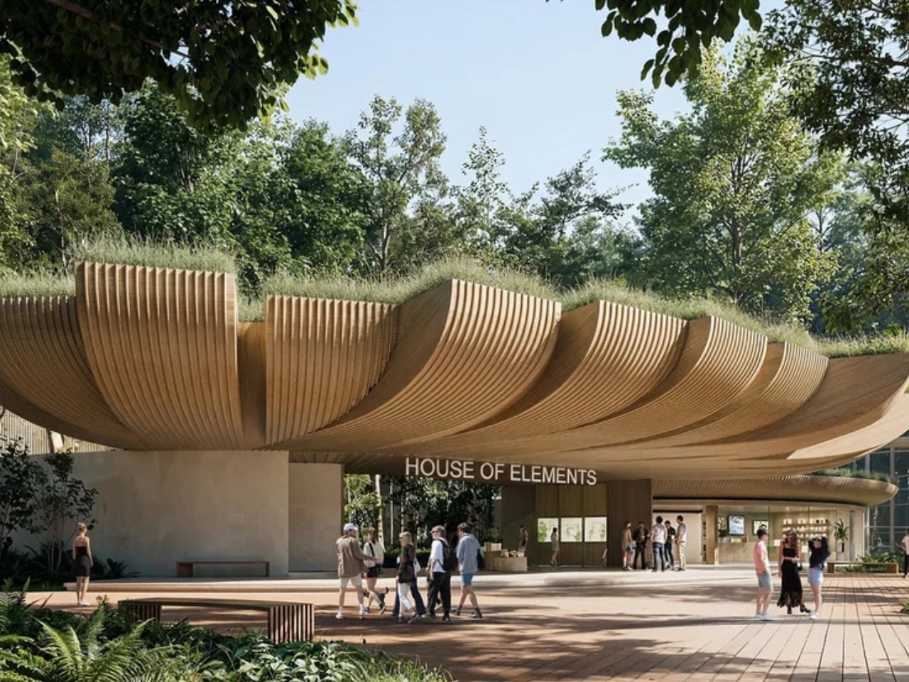
Forget everything you think you know about zoo buildings. Bangkok-based VMA Design Studio just won first prize for a zoological pavilion that reads less like a typical animal enclosure and more like an architectural journey through Earth’s creation story.

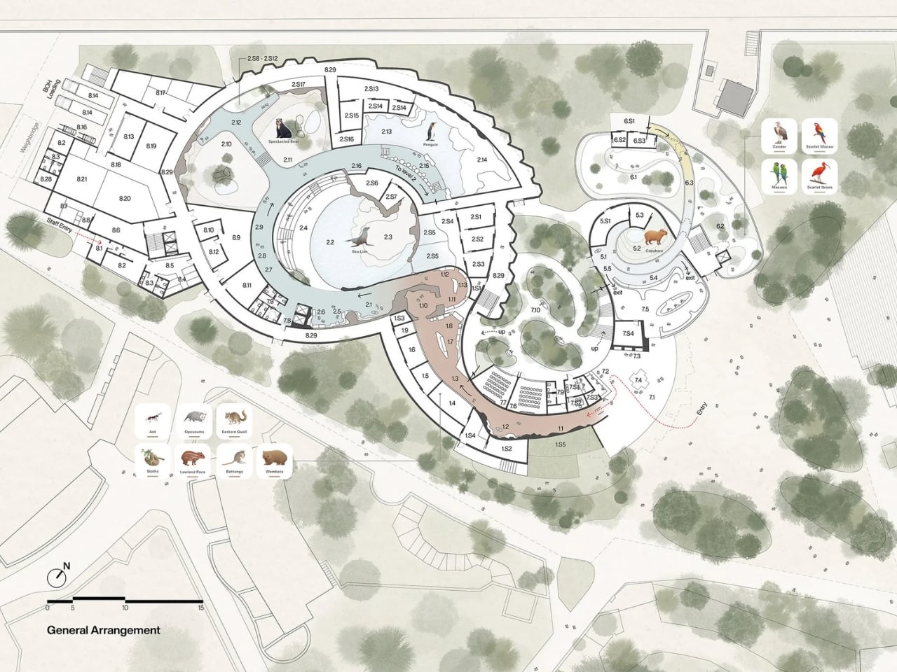
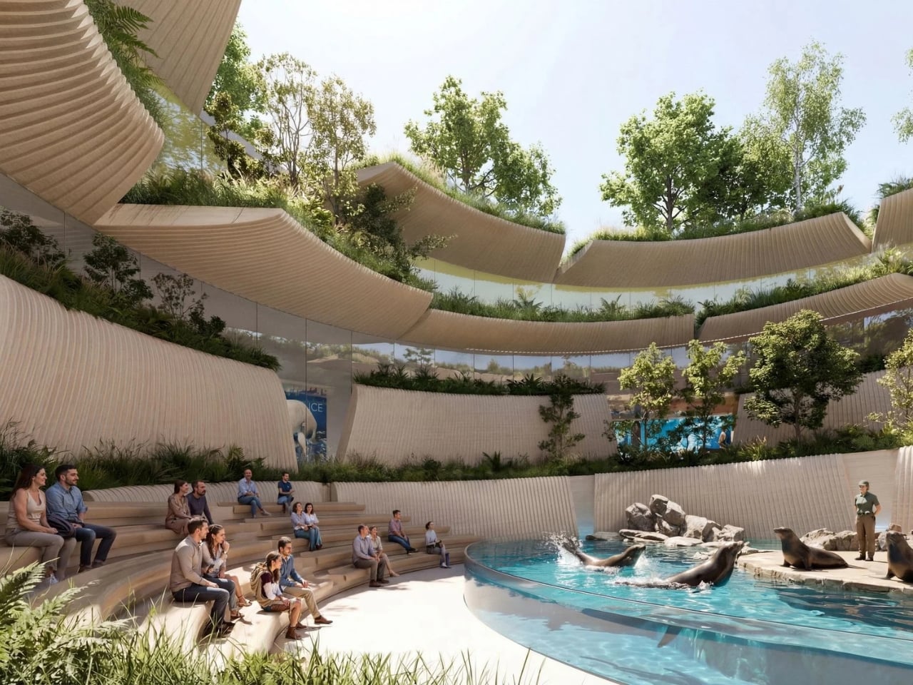
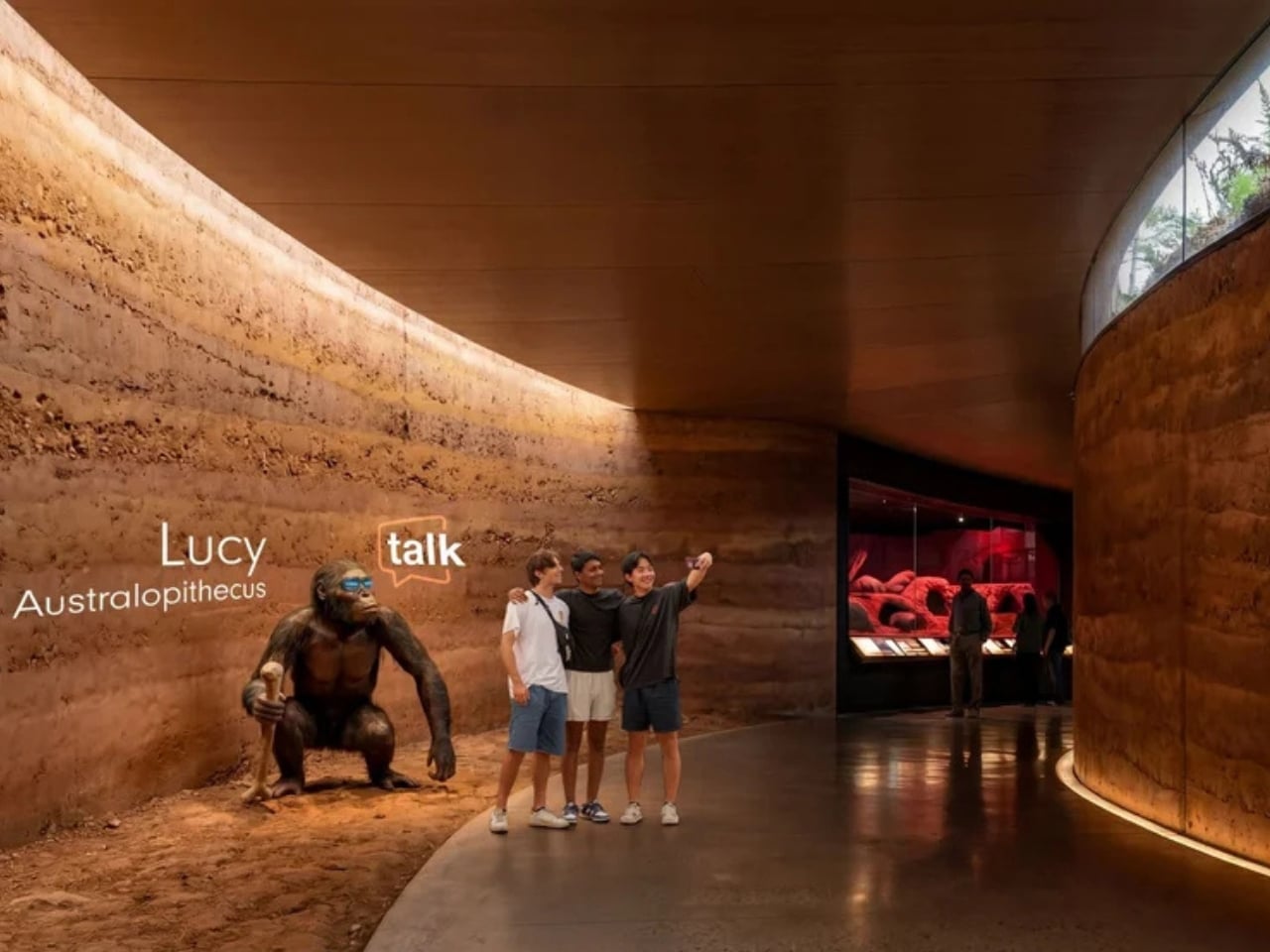
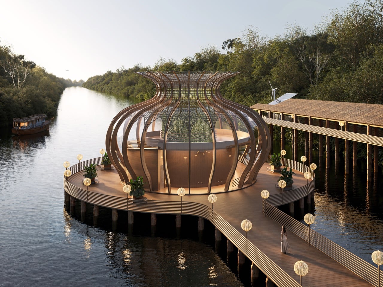
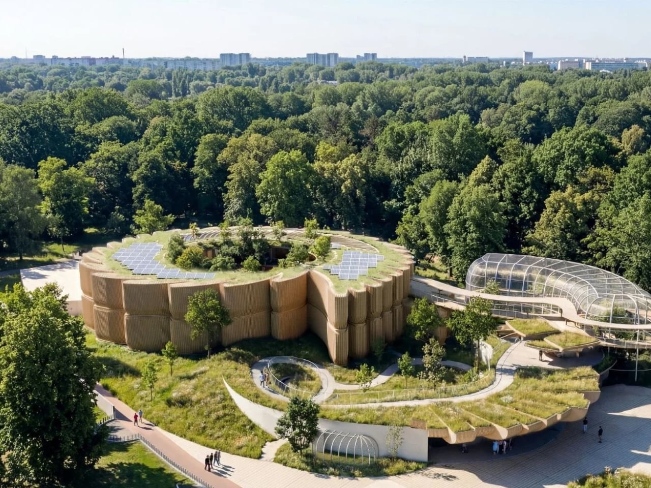
The House of Elements, set to become the crown jewel of Orientarium Zoo in Łódź, Poland, takes the classical elements (earth, ice, water, fire, and air) and transforms them into a 6,000-square-meter narrative experience. Rather than designing a building where you walk from exhibit to exhibit, VMA created a continuous downward-then-upward journey that mirrors the evolution of life itself.

Designer: VMA Design Studio for Orientarium Zoo

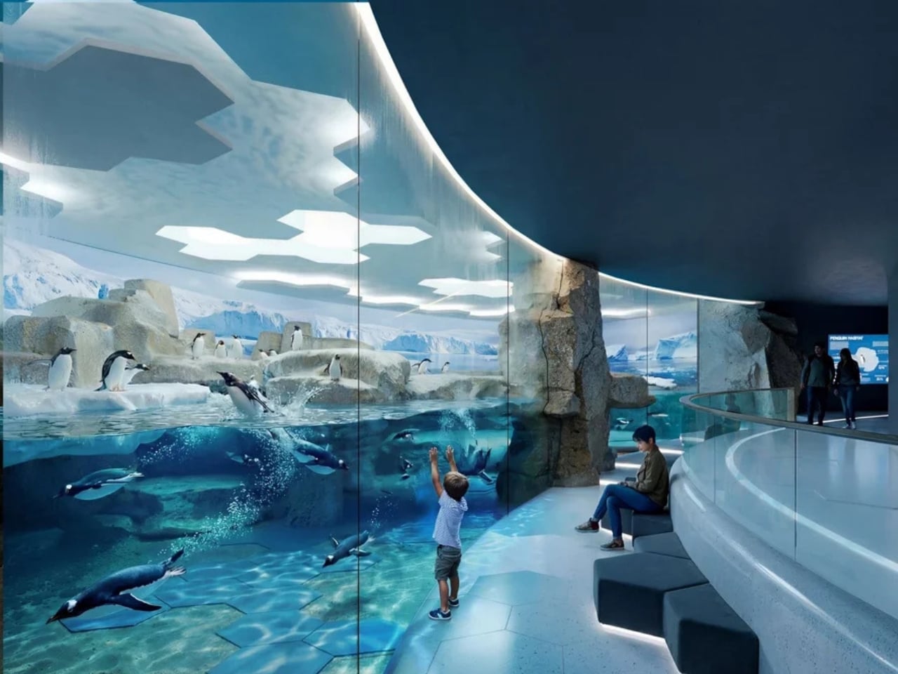
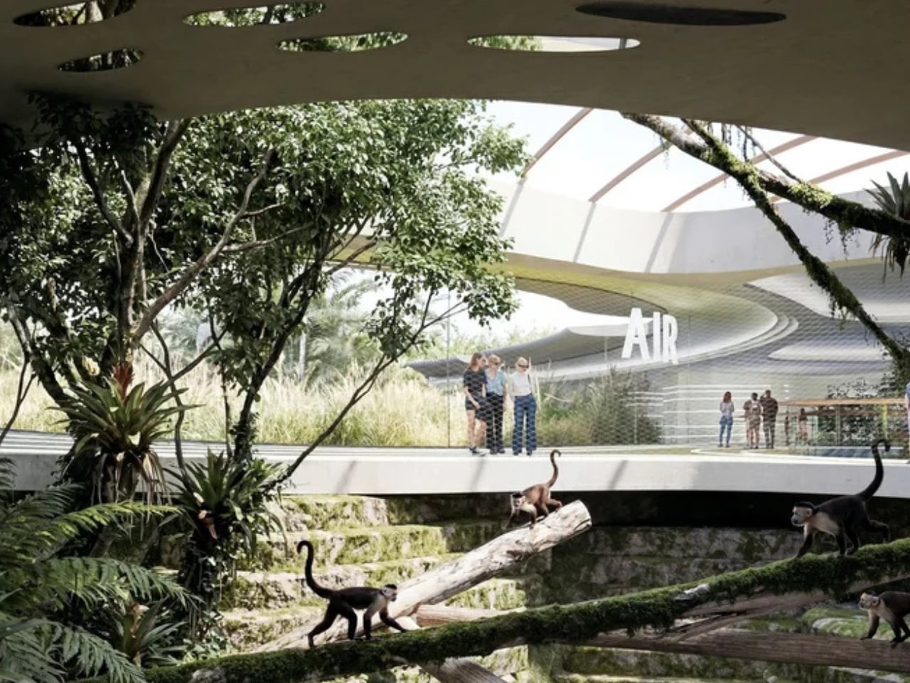
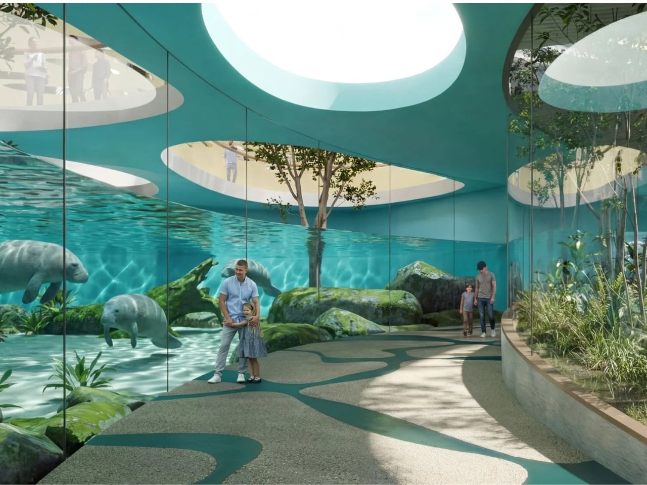
Picture this: you enter the pavilion and immediately begin descending underground into Earth. From there, the path rises through zones dedicated to Ice, Water and Fire, and finally Air. Each section tells the story of how these elements have shaped life on our planet, with the animals serving as living characters in that epic tale.

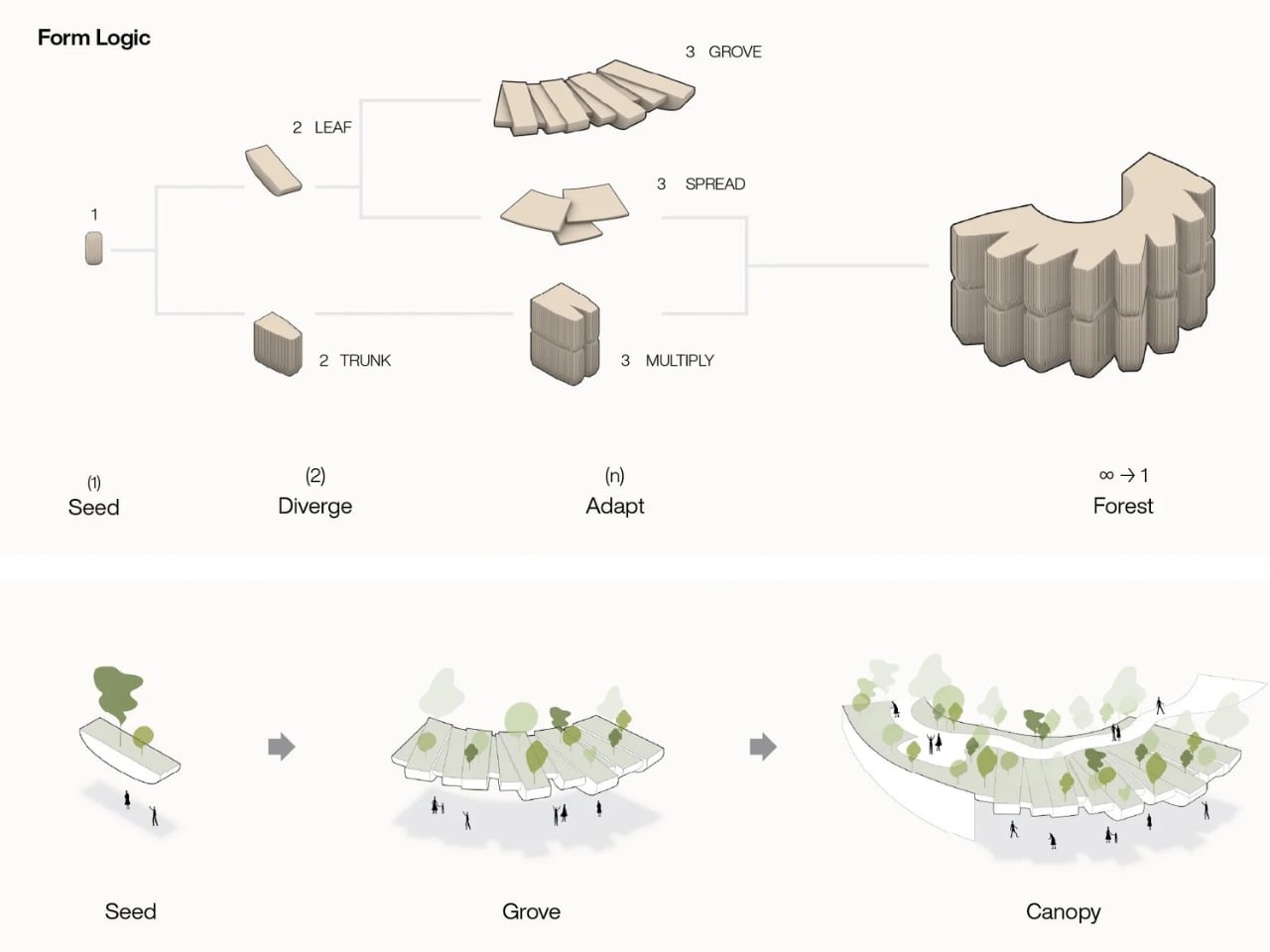
What makes this design fascinating is how VMA used a single architectural seed profile that diverges and adapts throughout the building. Think of it like watching one musical theme morph and transform across a symphony. The result? A unified facade that looks like a forest of timber-clad profiles rising like tall planters, each capped with green roofs. This modular approach means the building can respond individually to different needs (enclosure, shading, circulation, landscape integration) while still feeling like one cohesive whole.

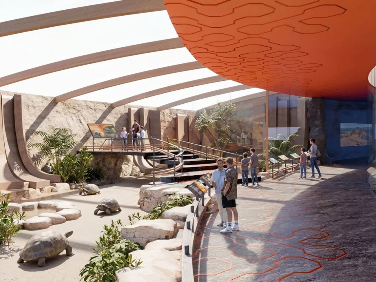
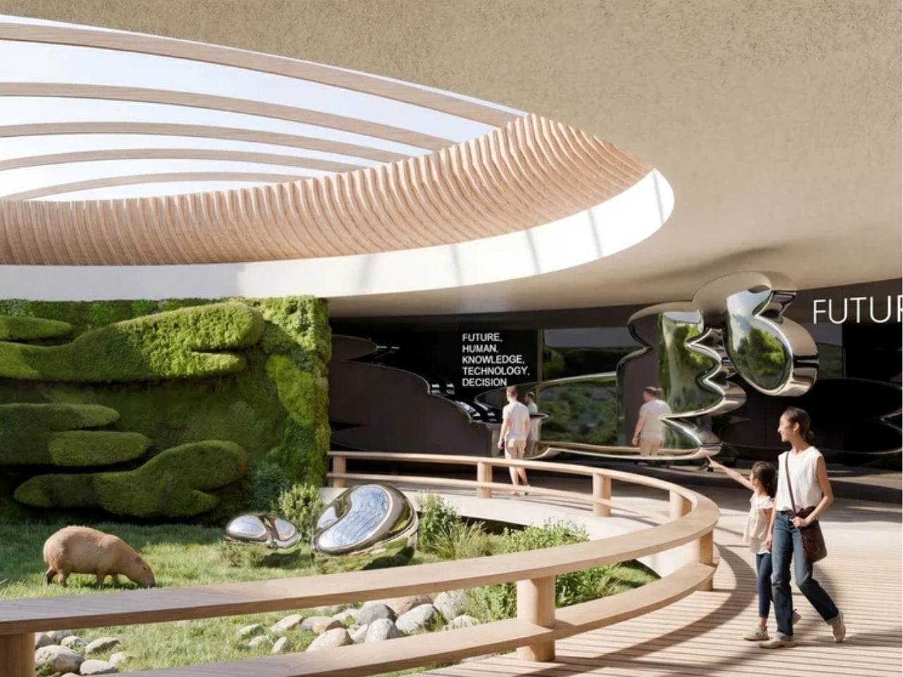
The animal habitats themselves are impressively diverse. Giant tortoises live among volcanic terrain with elevated walkways tracing along their space. Capybaras hang out near living moss walls and chrome sculptures. There’s even a sea lion courtyard and a central garden connected by a spiral path. Each zone captures the essence of its element without resorting to theme park theatrics.

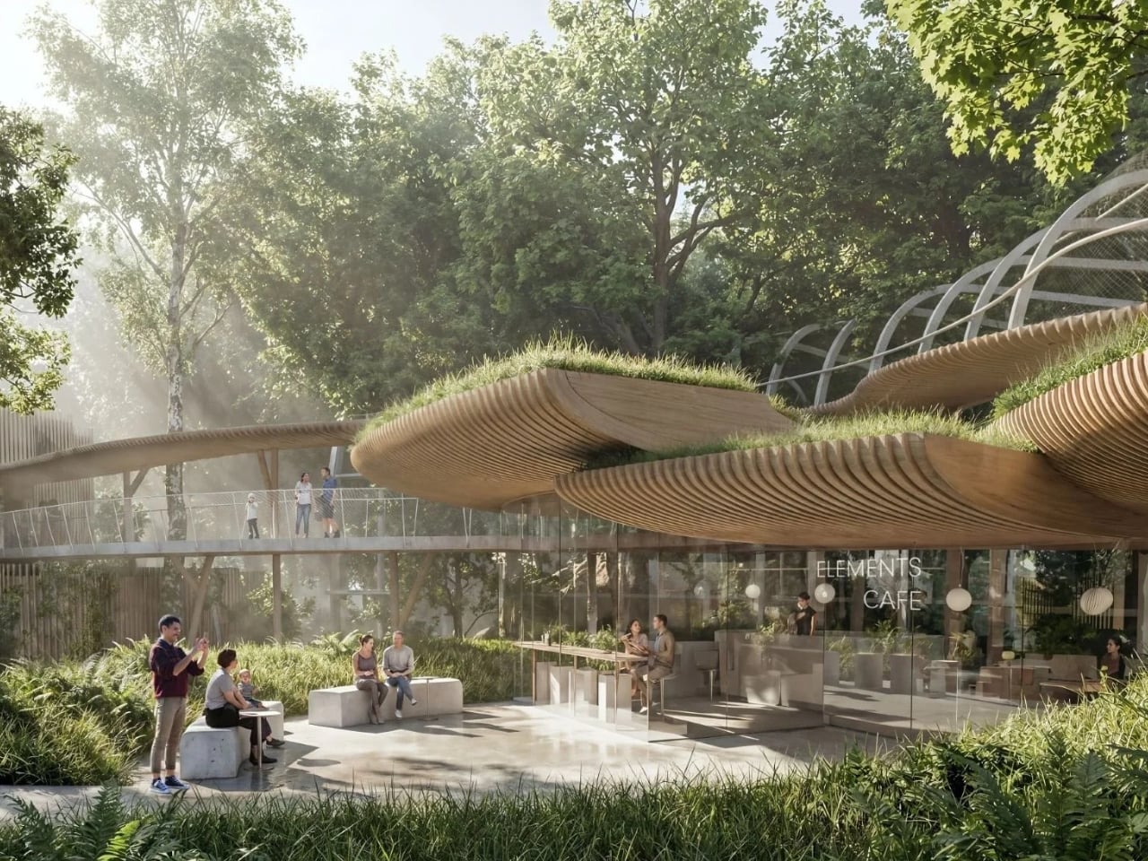
VMA didn’t just think about the building in isolation either. The project establishes a new public open space that connects the zoo’s main entrance, the existing Orientarium complex (a Southeast Asian wildlife facility completed in 2022), and this new pavilion. The design includes a series of planted roof decks and ramps serving a cafe and aviary, creating multiple layers of experience both inside and outside the main structure.

There’s something particularly clever about how the building treats humans as the fifth element. Visitors aren’t just passive observers walking through glass corridors. The architecture positions people as part of the evolutionary narrative, making the experience feel less like watching nature behind barriers and more like understanding our place within it.

The competition itself attracted international attention, with architects given until December to submit proposals that included visualizations of the building integrated into the zoo’s landscape plus three floor plans showing different levels. That VMA, a Bangkok-based studio, won a competition in Poland speaks to how universal their design language became. The elements, after all, are the same everywhere.

Looking at the renderings, what strikes you most is the facade. Those timber profiles create rhythm and texture while the green roofs blur the line between building and landscape. It’s biophilic design done right, not as decoration but as fundamental architectural strategy. The structure looks like it grew from the ground rather than being imposed on it.

This project represents a bigger shift in zoo design philosophy. The best contemporary zoos recognize they’re not just about displaying animals but about telling stories of conservation, evolution, and interconnection. Architecture becomes the narrative framework that makes those stories visceral rather than abstract. VMA understood this assignment perfectly.

The House of Elements follows the completion of the Orientarium Southeast Asian wildlife complex and represents the second major development at Łódź Zoo. Together, these projects are transforming what was once a standard municipal zoo into something far more ambitious: a place where architecture, animals, and ideas converge to create experiences that stick with you long after you leave.

When the pavilion eventually opens, visitors will walk through earth and ice and fire and emerge changed, having experienced not just animal habitats but the fundamental forces that make life on this planet possible. That’s the kind of design ambition we need more of.

The post When Zoo Design Tells the Story of Life Itself first appeared on Yanko Design.

This Japanese House Hides From the Street, Opens to the Sea

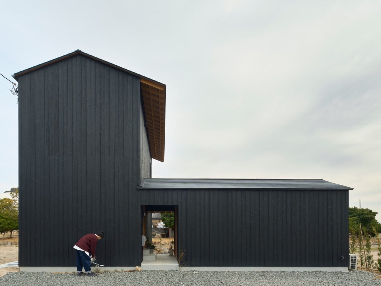
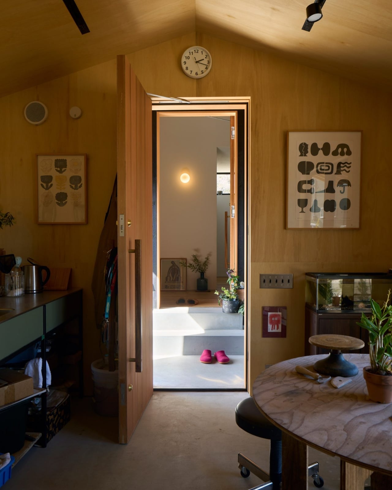
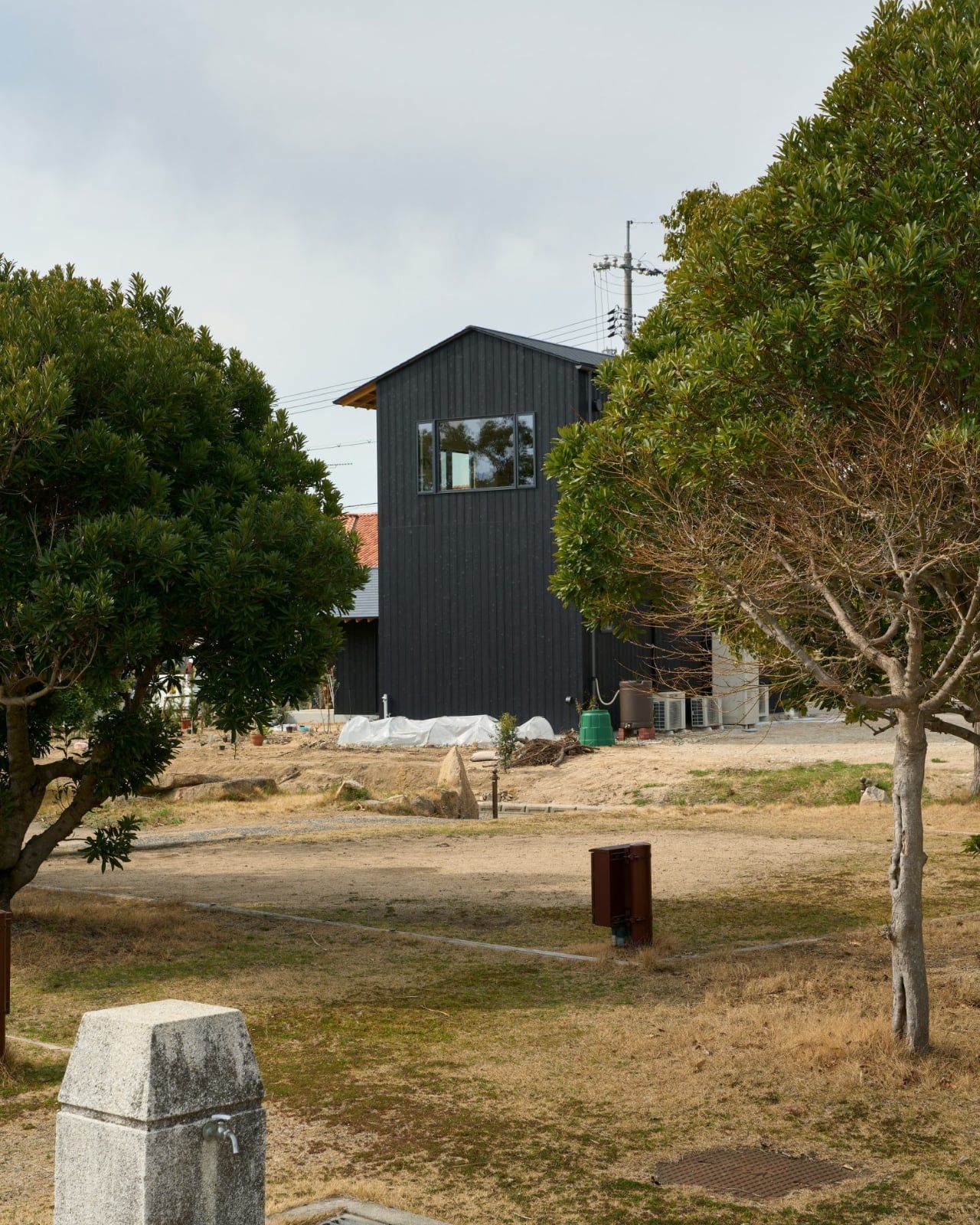
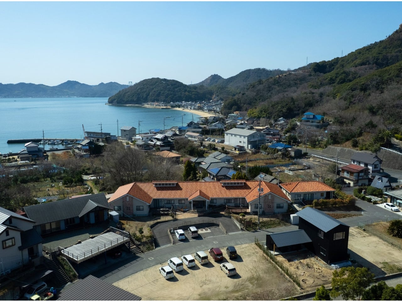
Sometimes the best architecture knows when to turn away. UK studio Denizen Works just completed their first project in Japan, and it does exactly that. The House in Onomichi presents an almost entirely blank facade to the street, creating what founder Murray Kerr calls an “enigmatic quality.” But this isn’t architecture being rude. It’s architecture understanding that privacy can be the ultimate luxury.

The clients are a couple who spent years living in London before deciding to return to Japan for a quieter life. What they wanted wasn’t just a house but a private sanctuary, and Denizen Works delivered by looking backward and forward at the same time. The design references traditional Japanese residential arrangements while feeling completely contemporary, which is the sweet spot where the best cultural translations happen.

Designer: Denizen Works

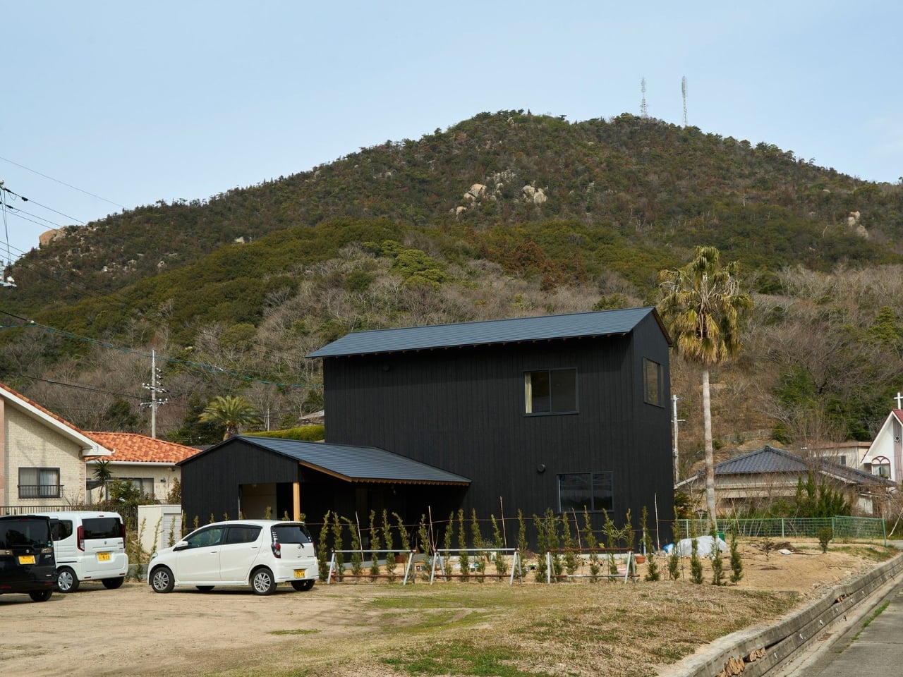
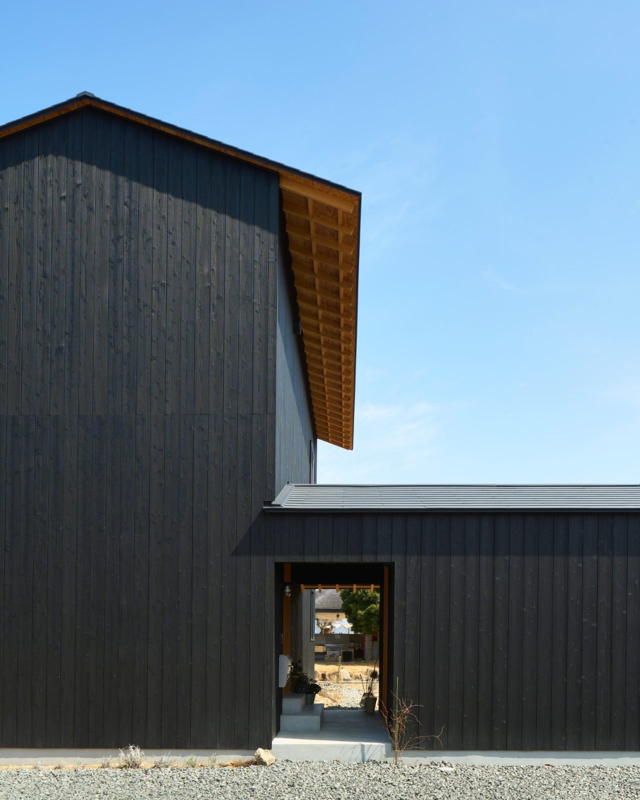
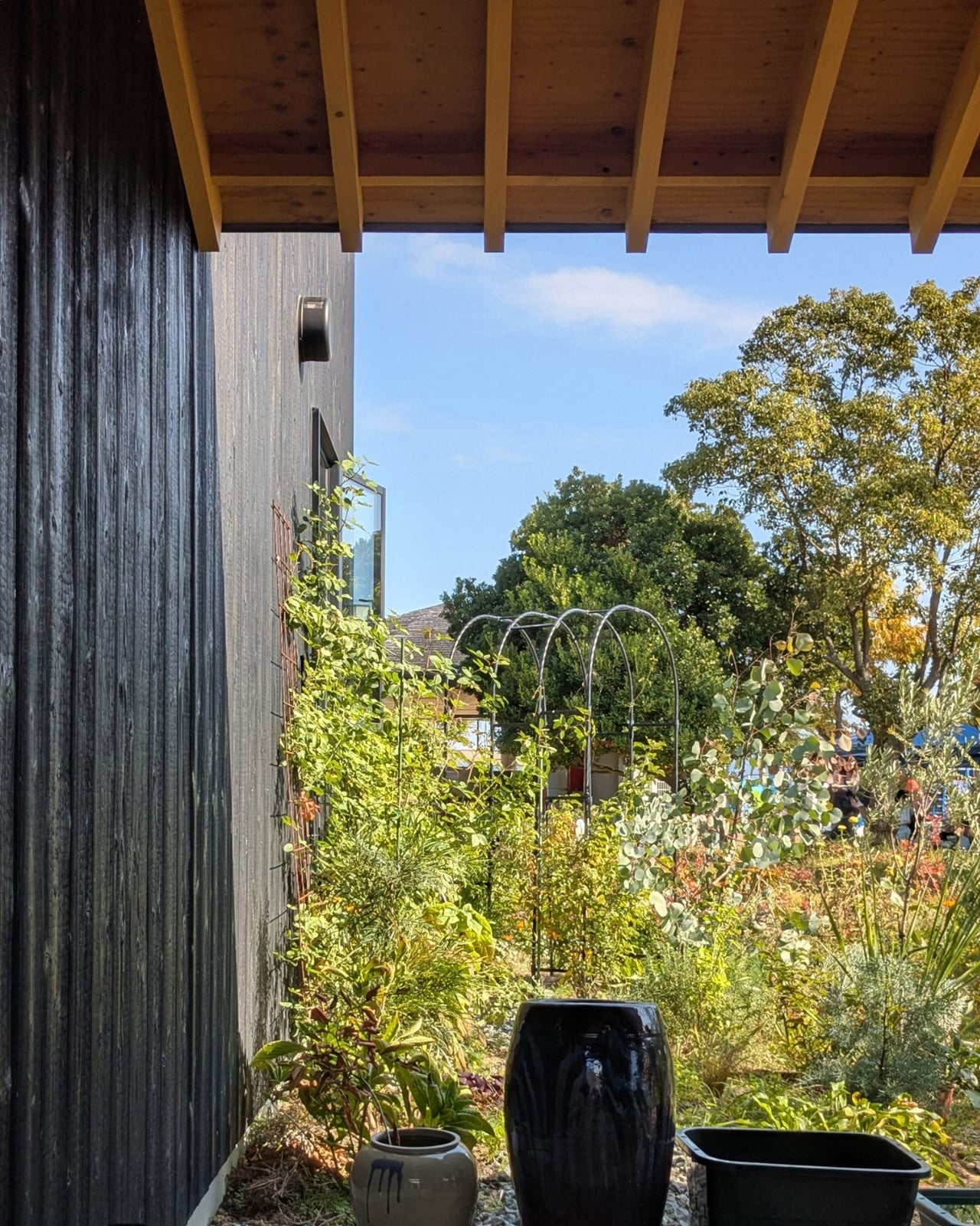
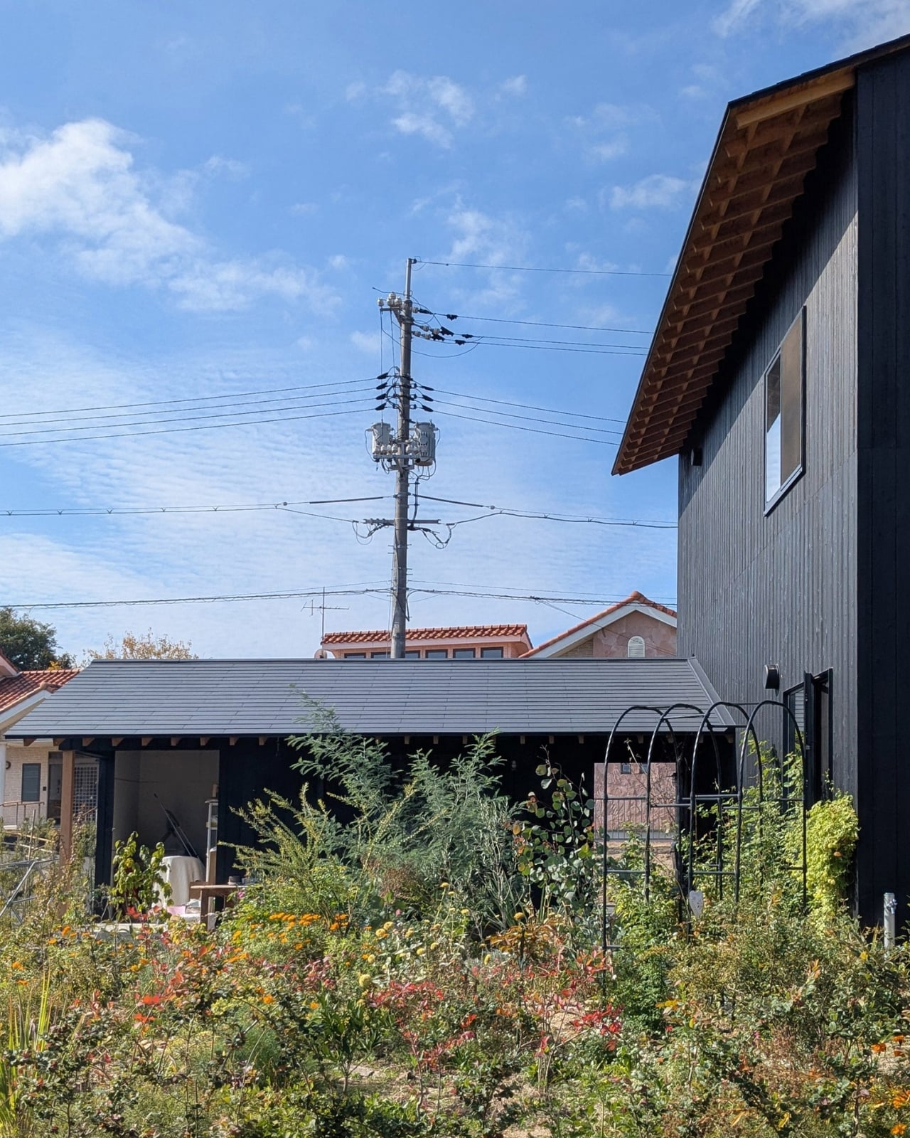
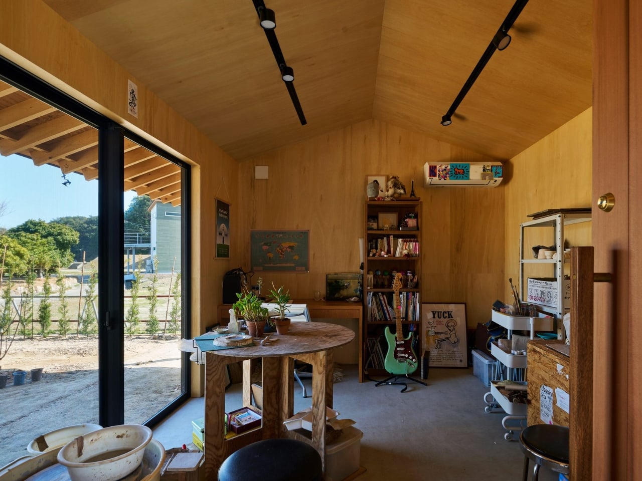
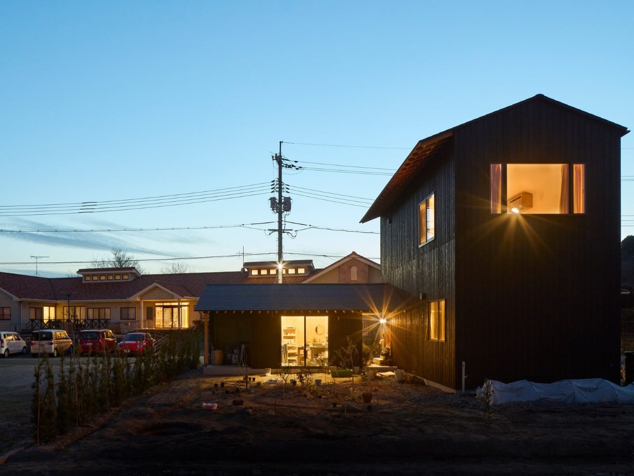
The house is split into two distinct structures connected by a covered entrance walkway. There’s a two-storey main house containing a single bedroom, and a single-storey studio that extends from it, partially enclosing a small garden. This arrangement follows the traditional Japanese concept of Omoya and Hanare, which translates roughly to main house and annexe. In this case, the separation creates a clear division between living and working, which anyone who has tried to work from home during the past few years knows is absolutely essential for sanity.

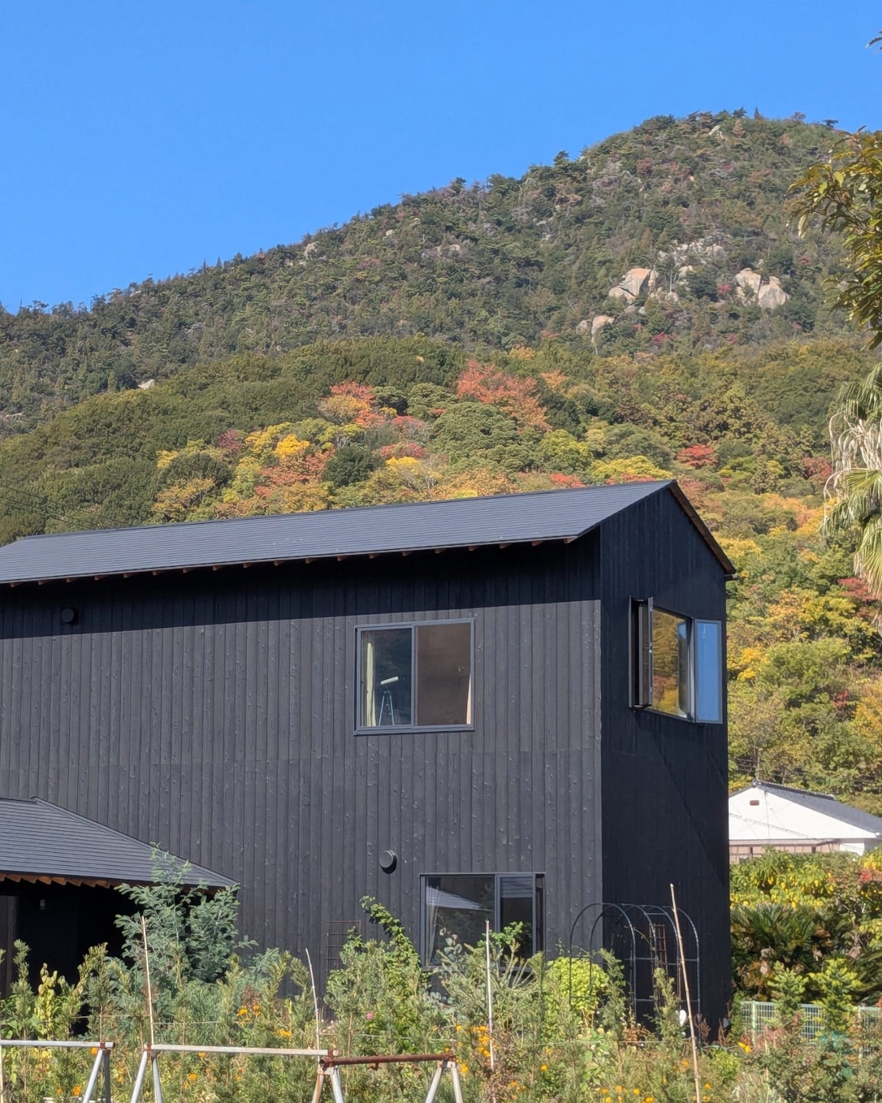
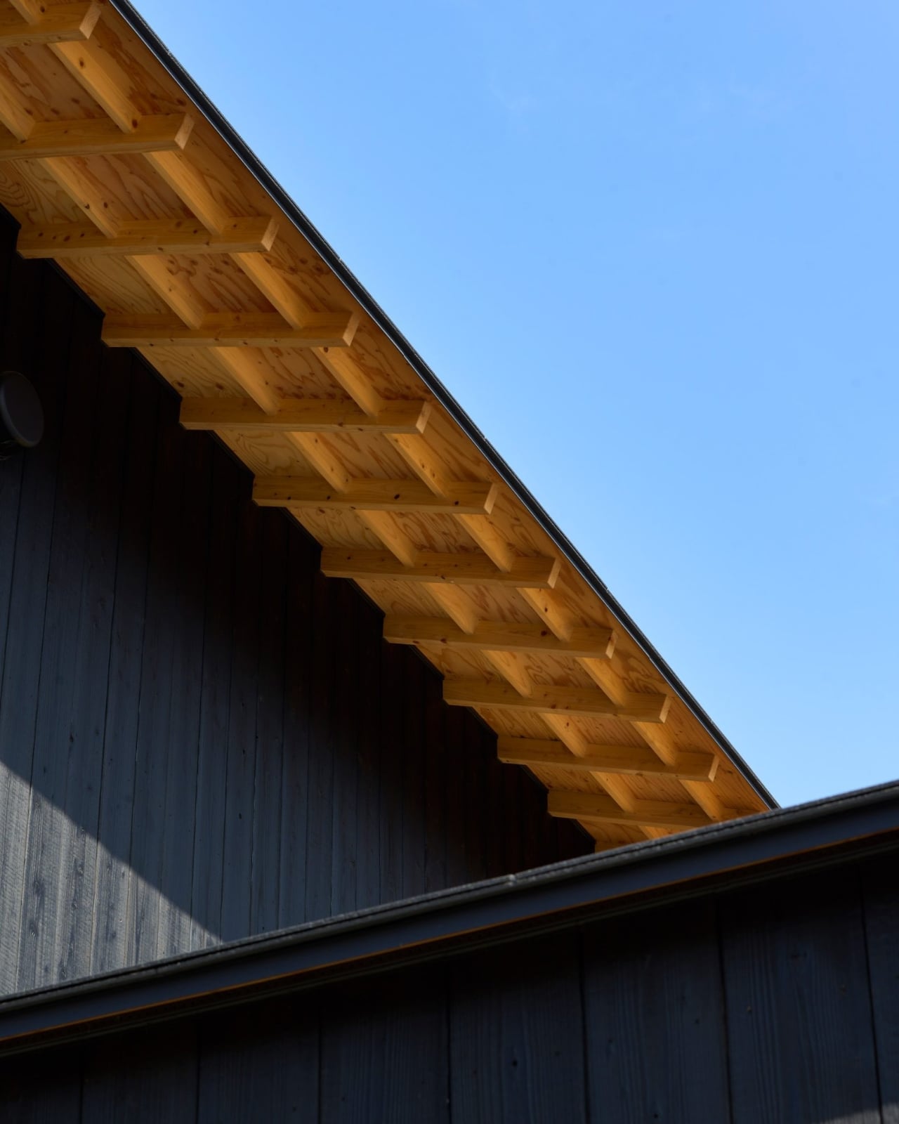
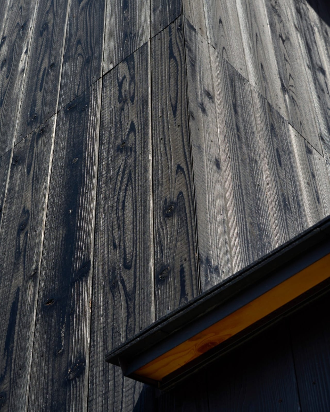
The real star of the show is the cladding. Both structures are wrapped in vertical burnt-timber Yakisugi, a traditional Japanese technique that involves charring wood to preserve it. The result is a deep black finish that’s both protective and beautiful. Yakisugi has been having a moment in contemporary architecture, but here it feels completely appropriate rather than trendy. The technique originated in Japan centuries ago, and using it for a house in Onomichi creates a visual conversation between old and new.

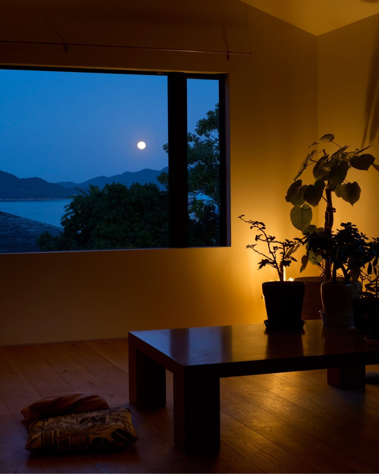
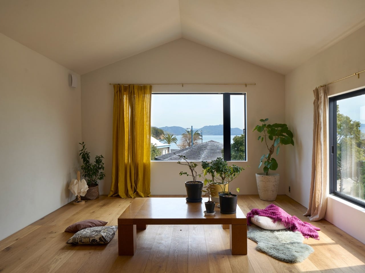
What makes this project particularly interesting is how it handles the relationship between inside and outside. The street-facing side might be closed off, but the other side opens up completely to capture views of the Setonaikai islands. It’s a classic move in Japanese architecture, this idea of creating a private world within a public context. The garden, small as it might be, becomes a buffer zone that allows the interior to breathe without sacrificing the sense of enclosure.

The collaboration aspect deserves attention too. Denizen Works worked with Tokyo-based Take Architects on the project, and you can see how that partnership allowed a UK studio to navigate the complexities of building in Japan while still maintaining their design vision. Cross-cultural architectural collaborations can sometimes feel like compromise stacked on compromise, but this one seems to have found genuine synthesis.

For a practice known for their thoughtful residential work in the UK, this first Japanese project shows that good architecture can translate across cultures when it’s rooted in understanding rather than imposition. The clients wanted calm, privacy, and a connection to place. They got a house that uses traditional materials and spatial concepts but doesn’t feel like it’s playing dress-up. The burnt timber will weather and age, the garden will grow in, and the whole thing will settle into its context over time.

There’s something appealing about architecture that doesn’t shout. In an era where so much residential design seems desperate for Instagram likes, a house that presents a closed face to the street and saves its drama for private moments feels almost radical. The blank facade isn’t about being mysterious for the sake of it. It’s about creating the conditions for a specific kind of life, one where the views of the Setonaikai islands matter more than the views from the street.

This is Denizen Works understanding that when clients say they want calm, they mean it. And sometimes the best way to achieve that is to build a beautiful wall and focus all the energy on what happens behind it.

The post This Japanese House Hides From the Street, Opens to the Sea first appeared on Yanko Design.

An Art Retreat in the Himalayas Where Architecture Follows the Mountain’s Rhythm

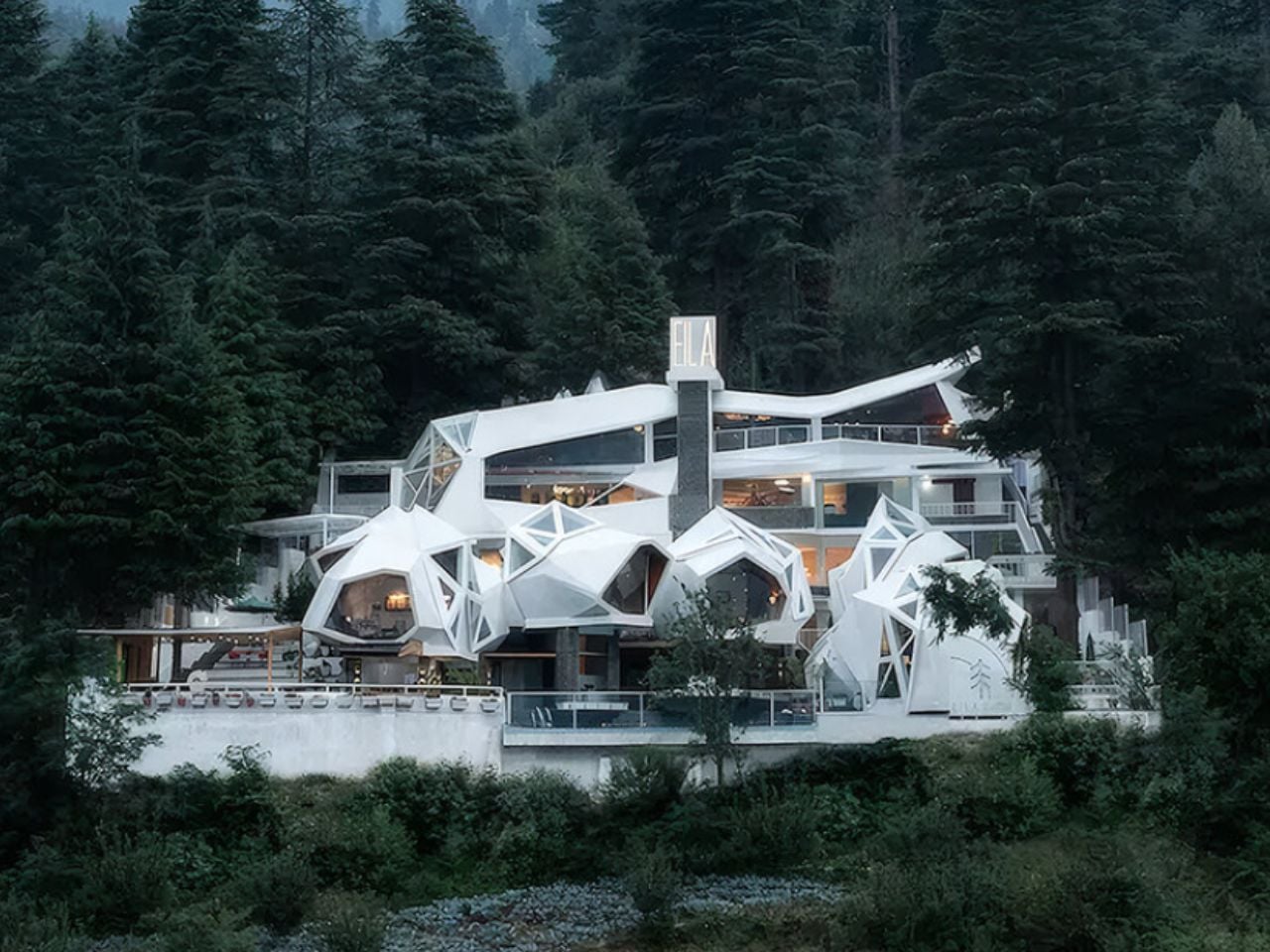
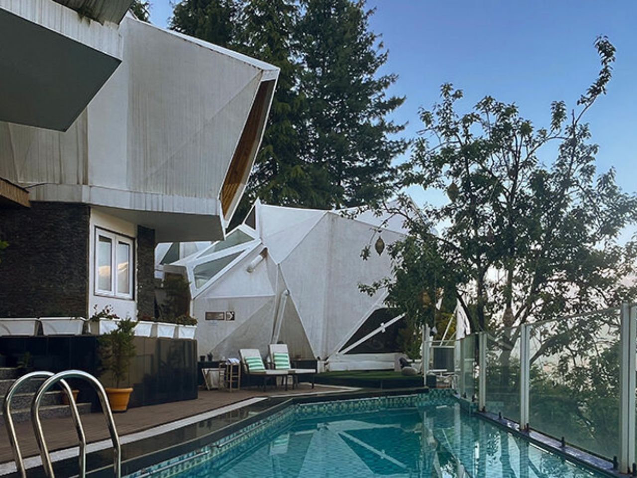
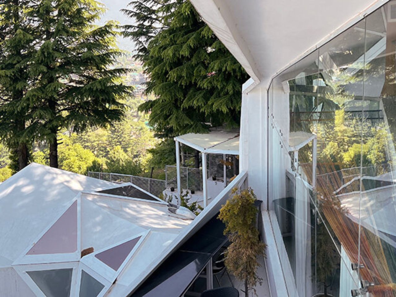
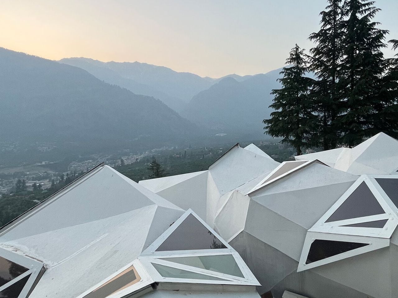
High above the Naggar valley in Himachal Pradesh, Eila reveals itself slowly. It is not the kind of resort that announces its presence with grand façades or rigid terraces. Instead, it feels as if the architecture has quietly grown out of the mountainside. Soft, organic forms follow the contours of the land, echoing the rhythms of the terrain rather than resisting them. Designed by MOFA Studio, the art retreat treats architecture as a natural extension of the landscape. Shaped through advanced computational design, the cottages respond to the slope, the light, and the horizon, creating spaces that feel less constructed and more discovered.

The masterplan follows a stepped strategy that respects the steep terrain. Rather than flattening the hillside, the retreat is organized as a gentle terraced descent that preserves topsoil and natural rainwater paths. This decision is both ecological and experiential. It protects the site while also shaping the visitor’s journey. The sequence begins at the Gate of Confluence, a stone inscribed pavilion that marks the transition into Eila’s creative world. From here, the path moves gradually downward through shared and quiet spaces, allowing art, landscape, and architecture to unfold together.

Designer: MOFA Studio

MOFA Studio, founded in 2007 by architect Manish Gulati, approaches design through what it calls a five-dimensional framework: spatial, ecological, social, temporal, and systemic fluidity. At its core, this philosophy places life before form. Buildings are meant to adapt to their context rather than impose themselves upon it. At Eila, this thinking is supported by the use of artificial intelligence as a creative collaborator. Working alongside a research-driven team, AI tools help refine structural and environmental performance, while the final decisions remain guided by human intuition. The project reflects almost two decades of the studio’s exploration into systems-led, non-conformist architecture.

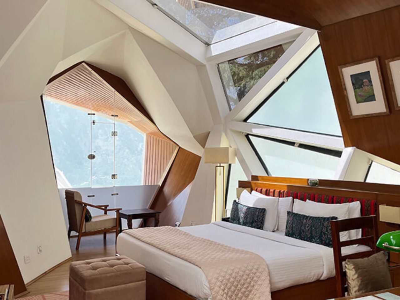
The most distinctive element of Eila is its biomorphic shells. These pod-like cottages, built from lightweight steel frames and thin concrete shells, are designed as insulated enclosures that reduce energy demand while keeping the overall footprint low. Their rounded forms are structurally efficient and visually subtle, allowing the retreat to blend into the sensitive Himalayan setting. Each cottage is carefully placed to capture wide, uninterrupted views of the valley, turning the mountains into an ever-changing backdrop.

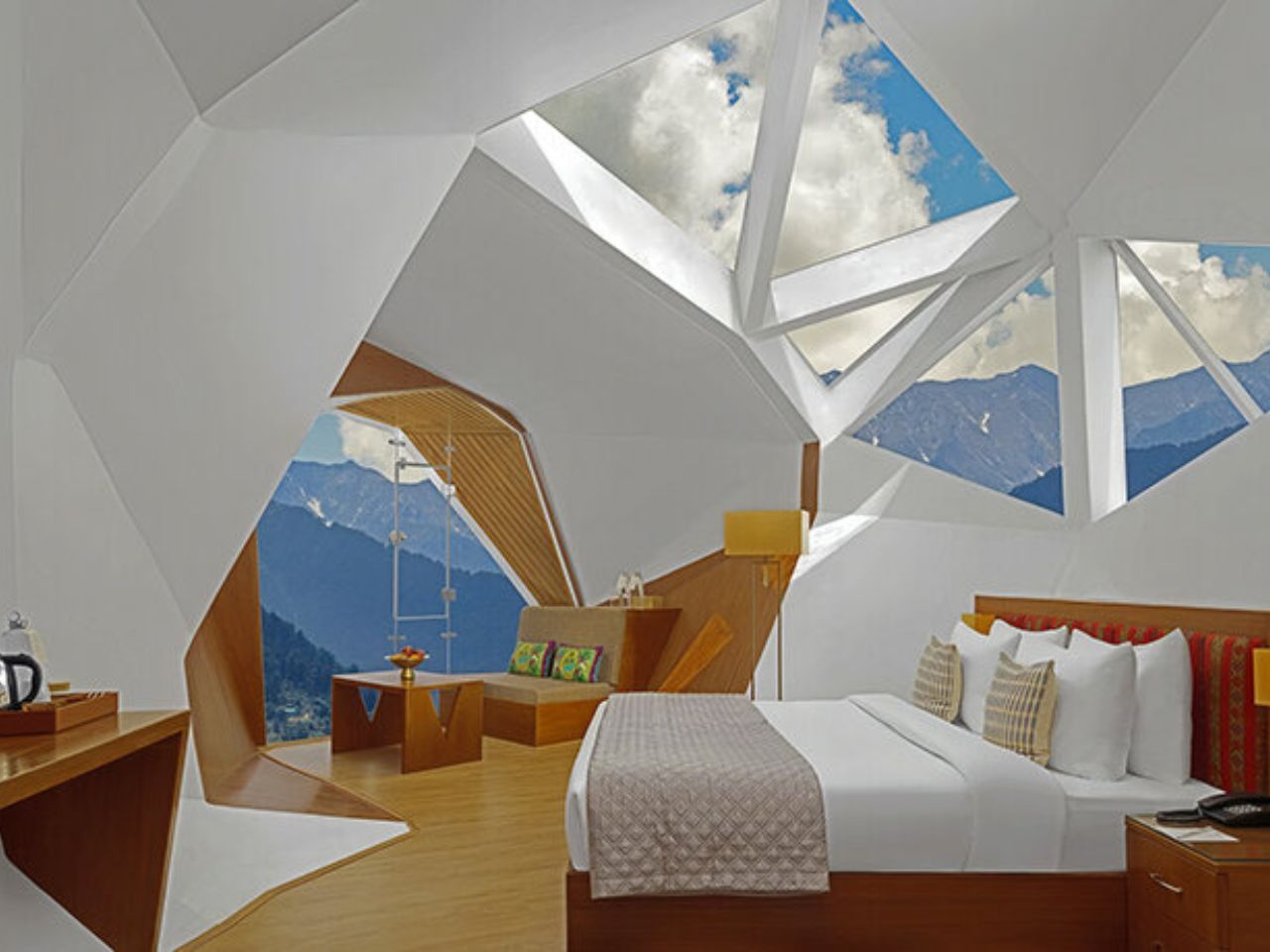
Openings throughout the architecture are treated as visual instruments rather than just windows. Skylights and apertures are positioned to draw the landscape deep into the interiors. From almost every angle, the valley appears framed like a living mural. Light, shadow, and scenery become part of everyday life, keeping the architecture in constant dialogue with its surroundings.

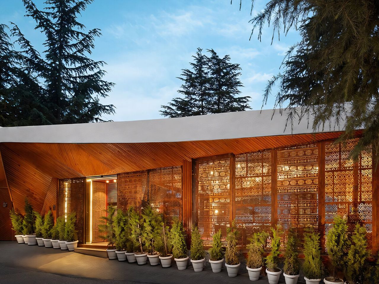
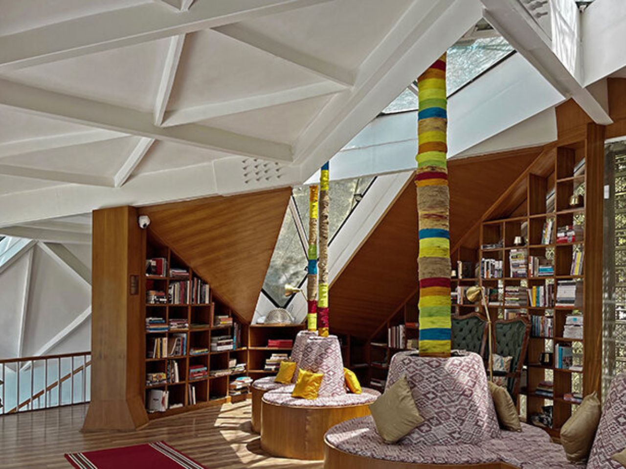
At Eila, art is not treated as decoration but as the foundation of the experience. Under the art direction of client Shri Rama Shankar Singh and his daughter Palak Singh, creativity is woven into daily rituals. One of the first spaces visitors encounter is the Kitaabkhana, a library where light filters softly through jaali screens and embroidery frame lamps. Communal areas such as the open-air amphitheatre and the heated infinity pool are aligned with the horizon, allowing social activity to merge with the vastness of the valley. Even the masterplan is presented as an artwork, reinforcing the idea that art, architecture, and life belong to the same continuous field.

Material choices further ground the project in its context. Much of the construction relies on locally sourced materials, reducing transportation emissions and supporting regional building practices. The lightweight frame and thin shell system use less material overall, helping the retreat remain visually quiet against the Himalayan backdrop. Over time, the concrete shells are intended to host local vegetation, gradually blending into the ecology around them. In this way, the architecture is not seen as a finished object, but as something that evolves with the landscape.

Eila is the result of a twenty-year collaboration between Manish Gulati and Shri Rama Shankar Singh. It represents a long process of questioning, refining, and aligning form with place. Every curve, opening, and pathway reflects an effort to resonate with the history and spirit of the valley. The final result is a retreat that does not compete with nature, but settles gently into it, as if it has always belonged there.

The post An Art Retreat in the Himalayas Where Architecture Follows the Mountain’s Rhythm first appeared on Yanko Design.

An Abandoned Building Just Became China’s Most Reflective Museum

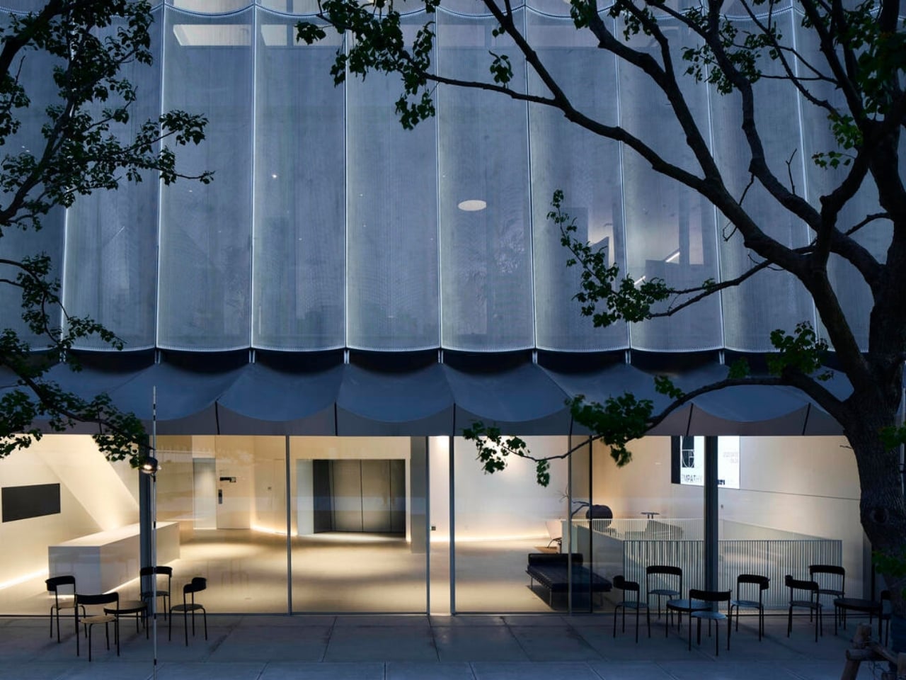
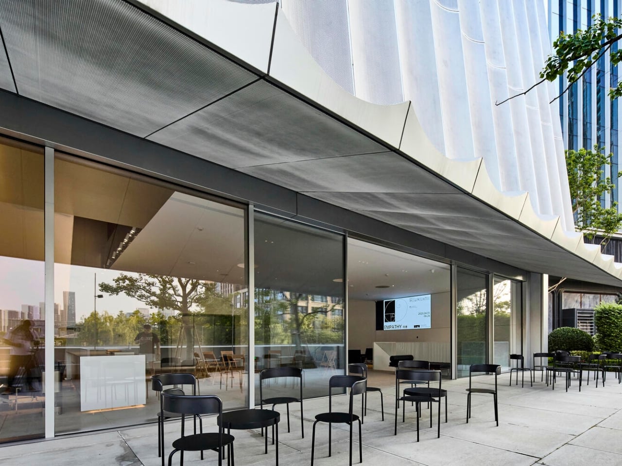
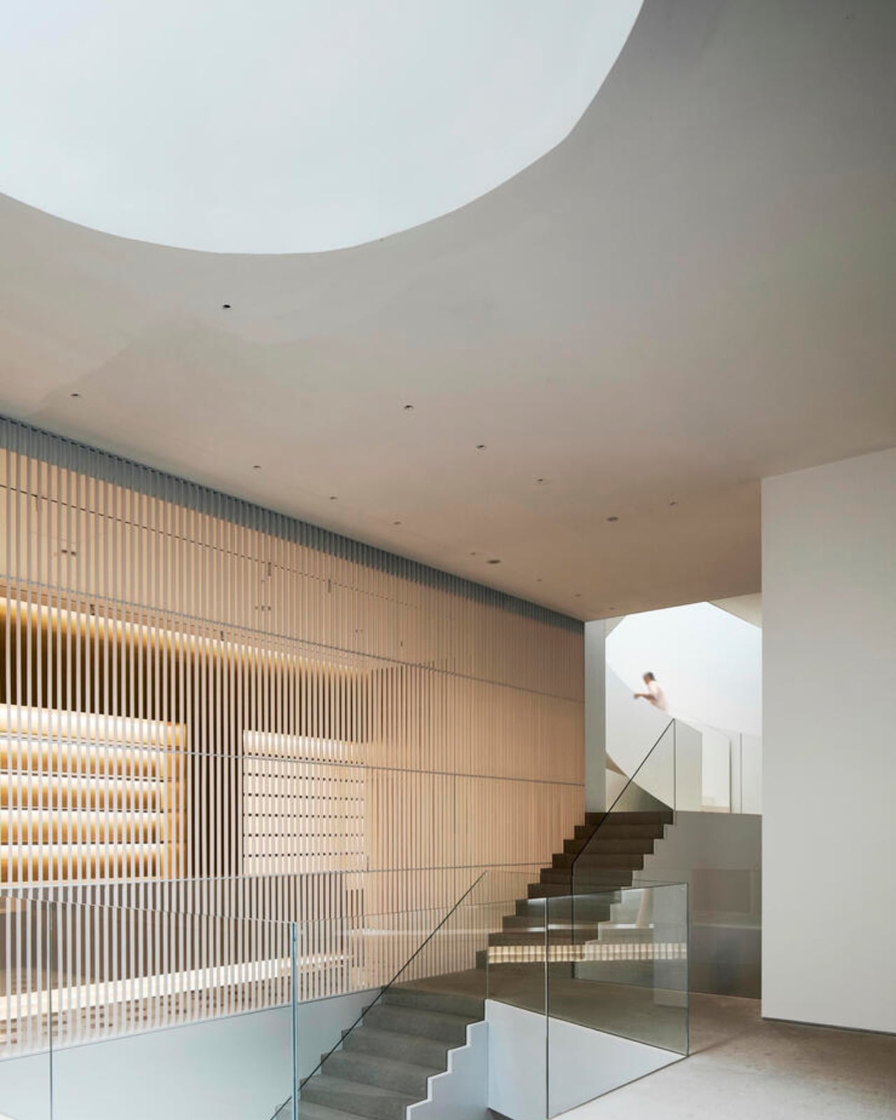
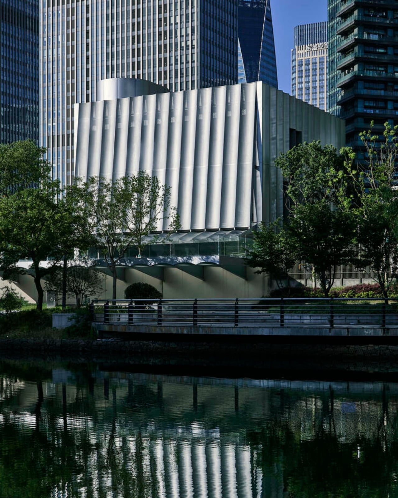
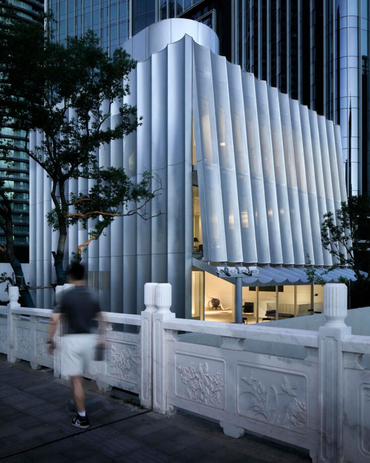
Sometimes the best architecture happens when designers refuse to accept what’s been left behind. The Hangzhou Empathy Museum, completed in 2025 by TAOA, is one of those rare projects that transforms architectural leftovers into something genuinely captivating. What started as an abandoned community project in Hangzhou’s Xiaoshan District has become a striking contemporary art space that seems to hover above the ground.

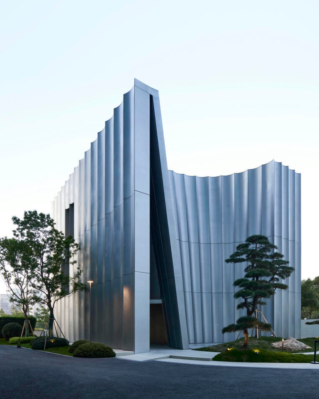
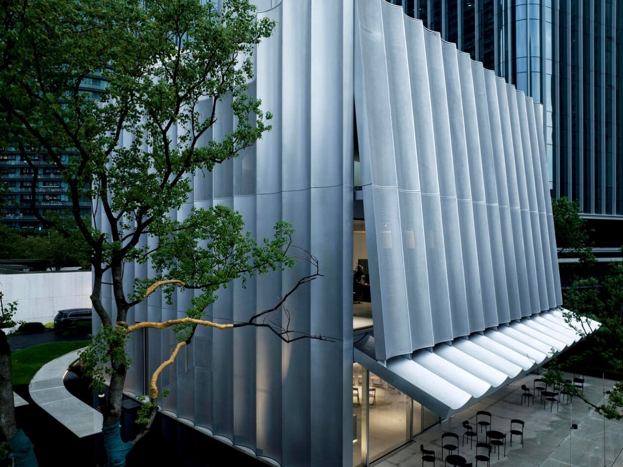
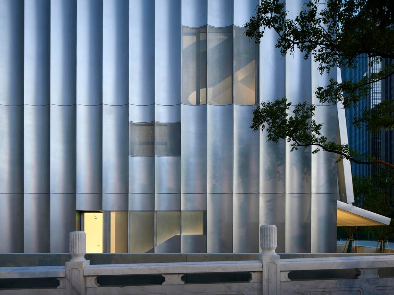
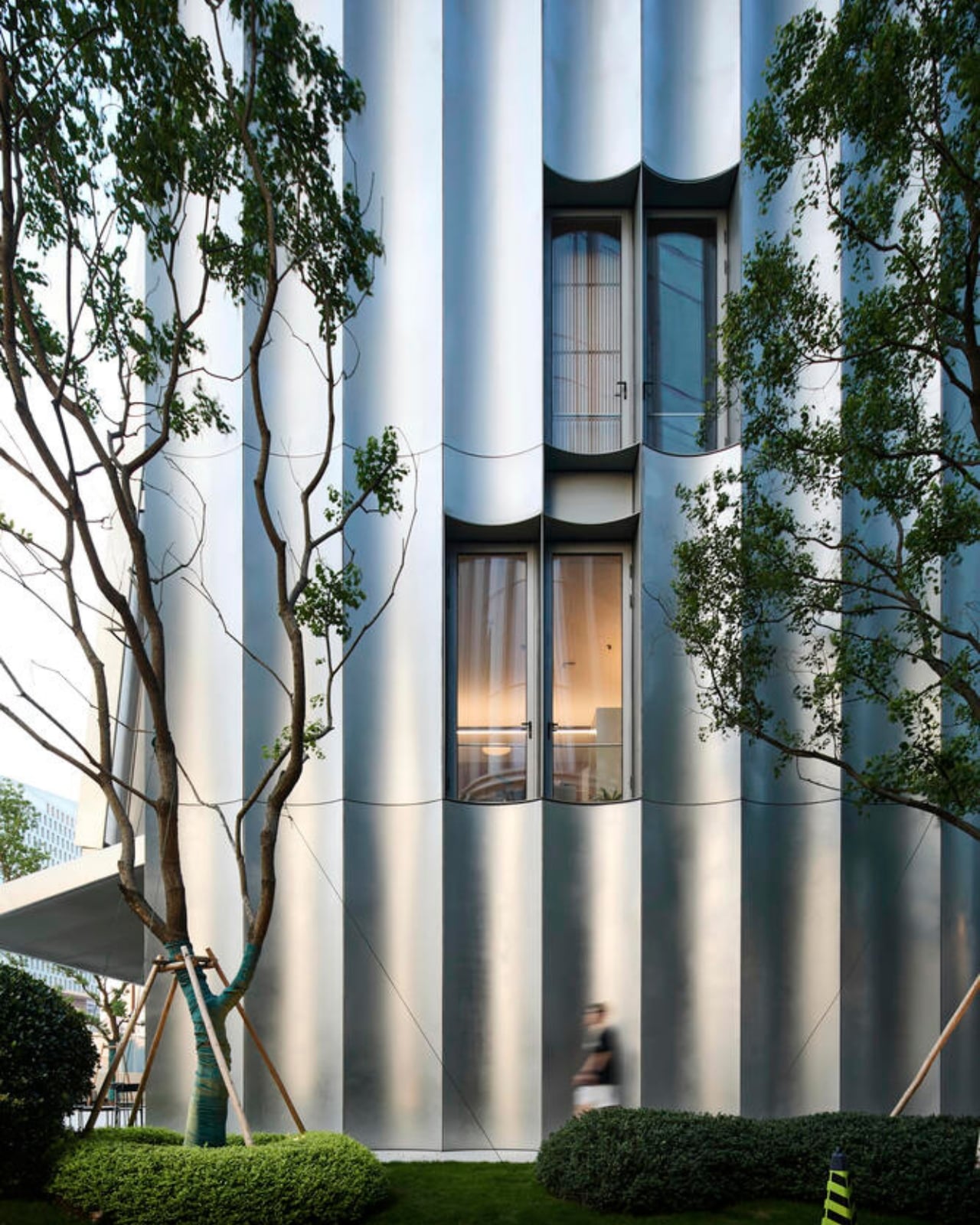
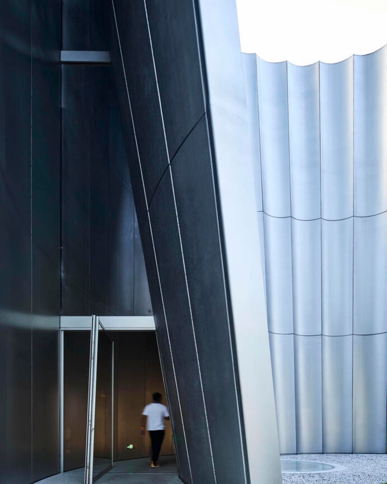
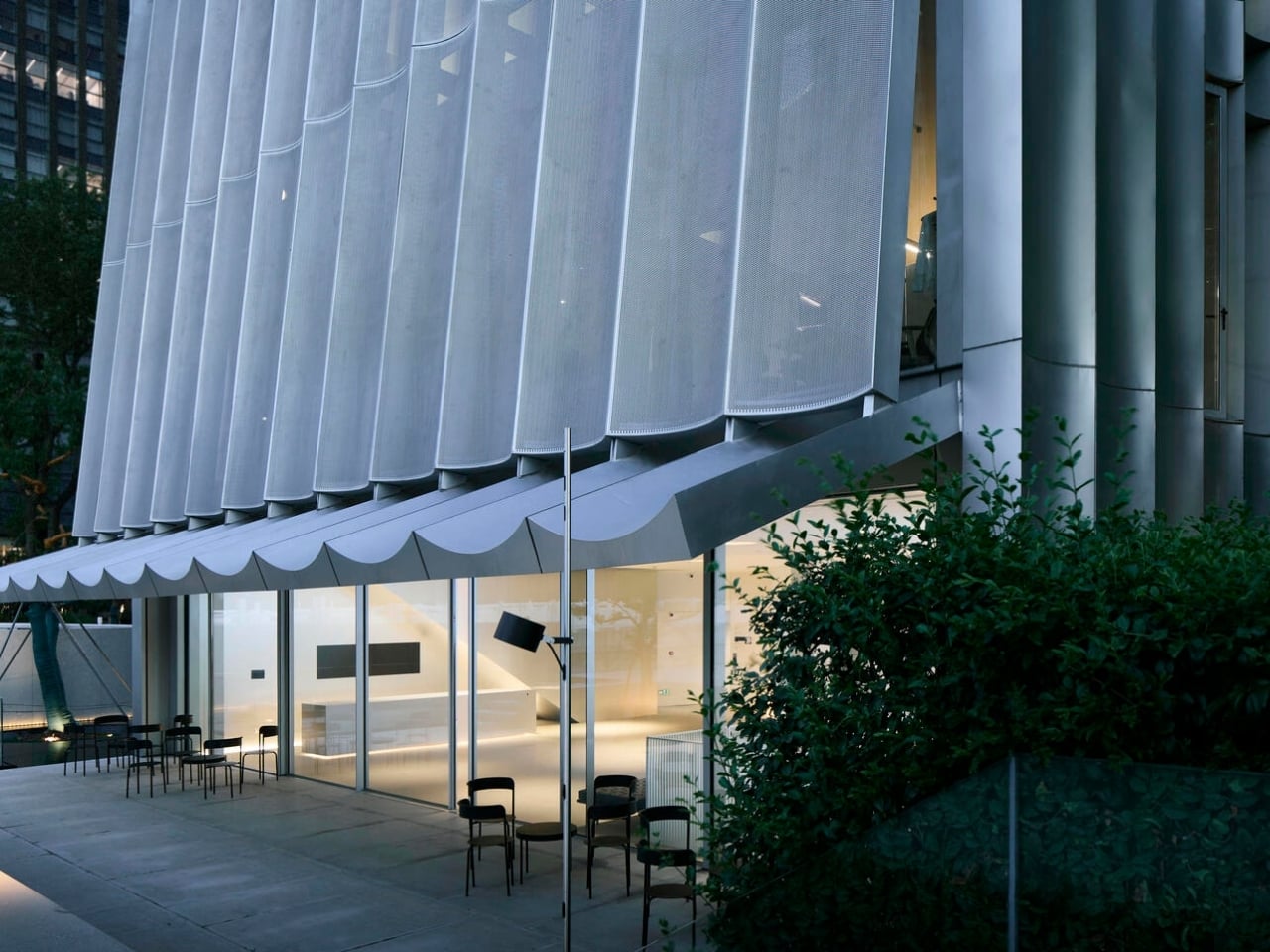
The museum’s exterior is its boldest statement. TAOA wrapped the structure in wave-like stainless steel and anodized aluminum panels that create this hypnotic, continuous curve around the building. It’s the kind of facade that changes throughout the day as light hits it from different angles, turning reflections into part of the architectural experience. The transparent curved panels don’t just look beautiful, they give the building its own visual rhythm that sets it apart from the typical boxy structures you’d expect in a residential neighborhood.

Designer: TAOA

At just 1,628 square meters total, with only 570 square meters above ground, this isn’t a sprawling cultural complex. It’s intentionally compact, which actually works in its favor. The smaller footprint means every space has to earn its place, and architect Tao Lei’s team made that constraint part of the design philosophy. Instead of spreading out horizontally, the museum digs down with two basement levels dedicated to exhibition space while the upper floors handle reception areas and more intimate gathering spots.

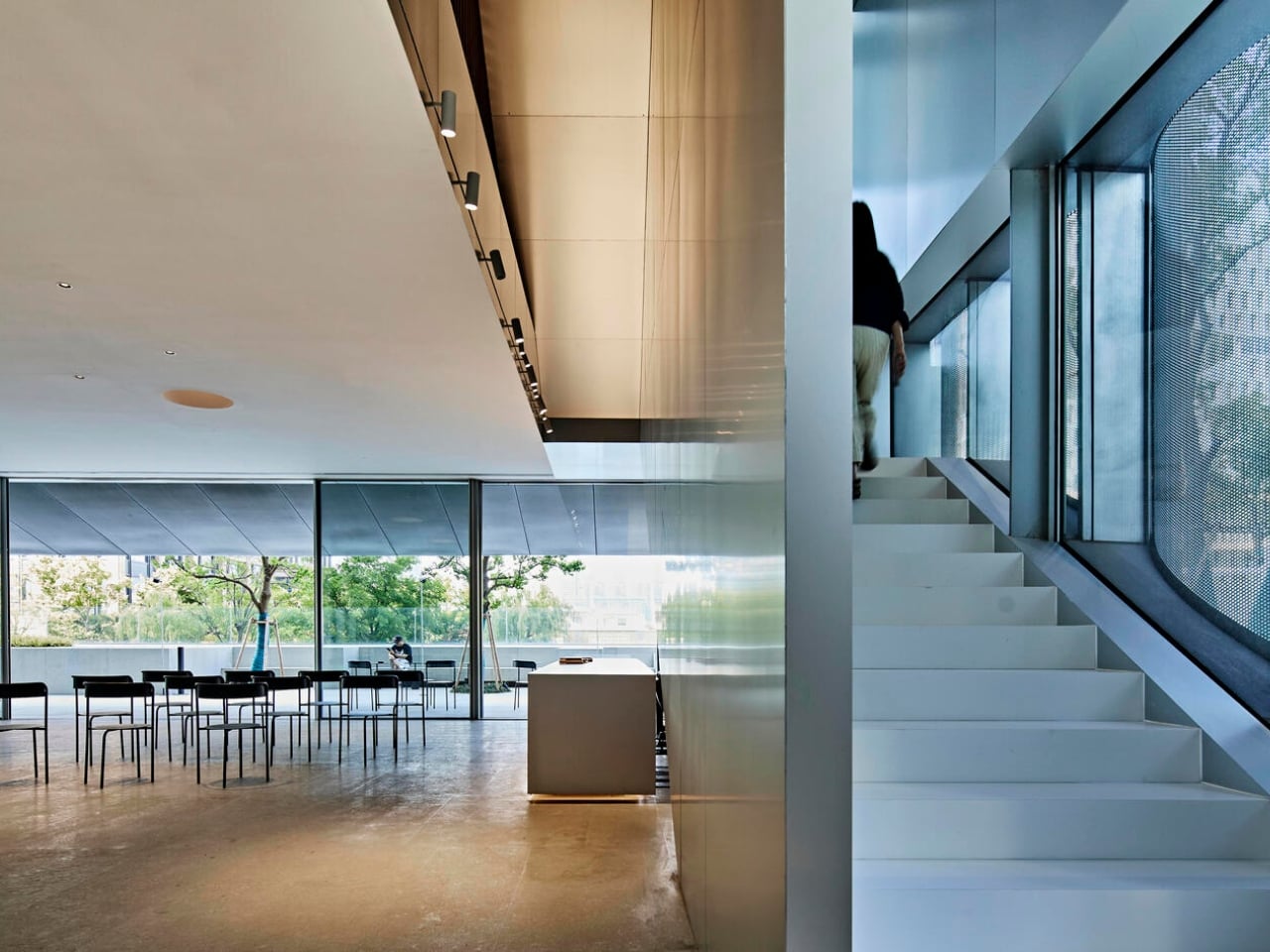
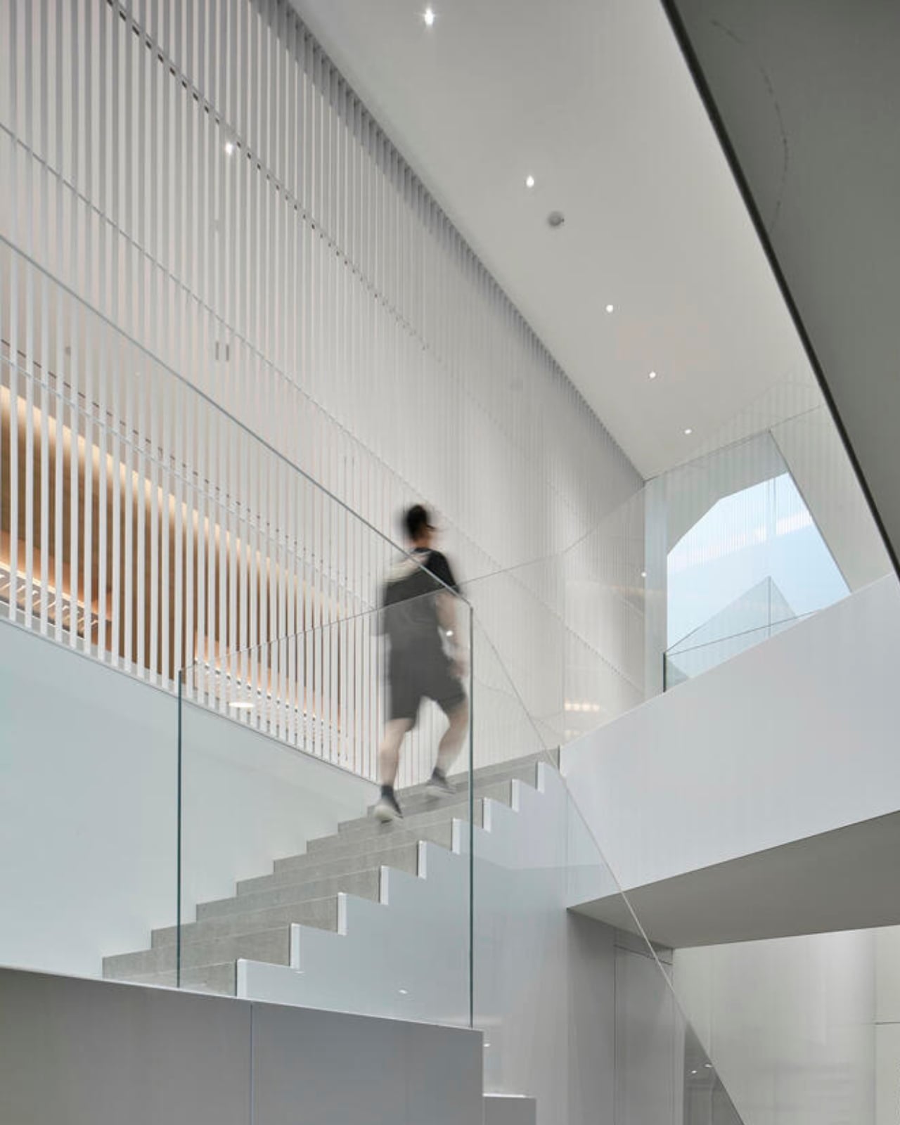
What makes this project particularly interesting is how it solves the problem most underground galleries face: the dungeon effect. Nobody wants to view art in a windowless concrete box that feels disconnected from the outside world. TAOA created a vertical void that cuts through the building, tapering as it moves up through each floor. This central opening brings natural light down into those basement galleries, so even when you’re two floors below street level, you’re not completely cut off from daylight and sky.

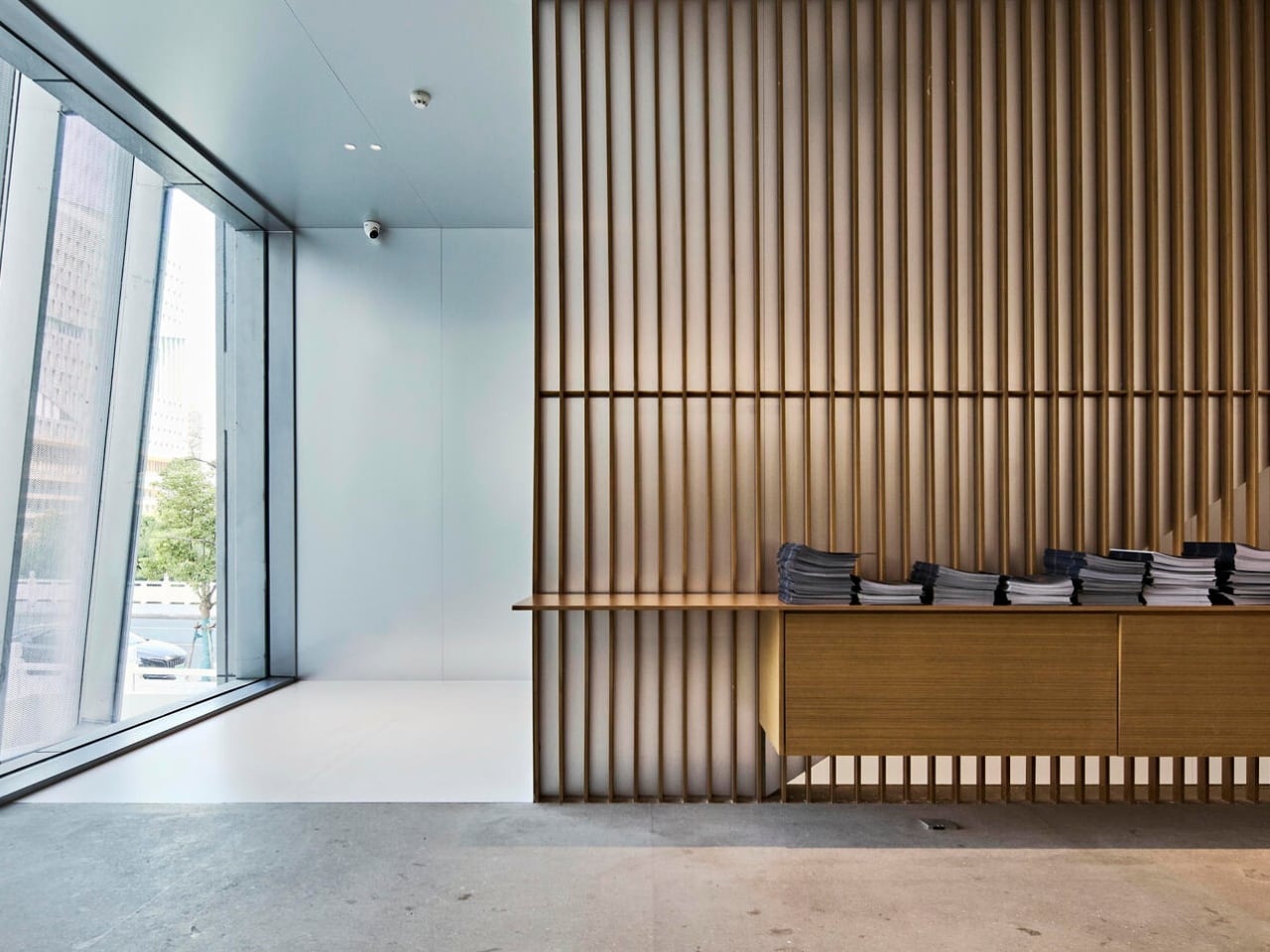
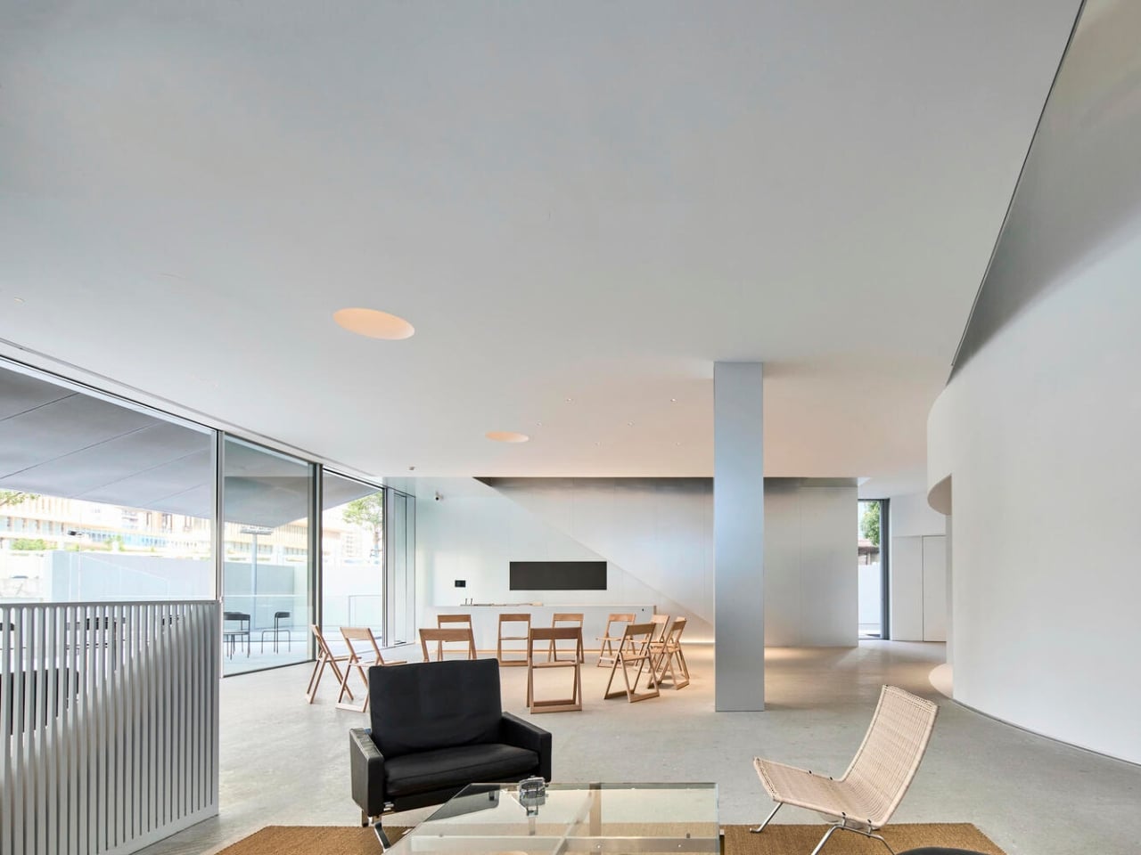
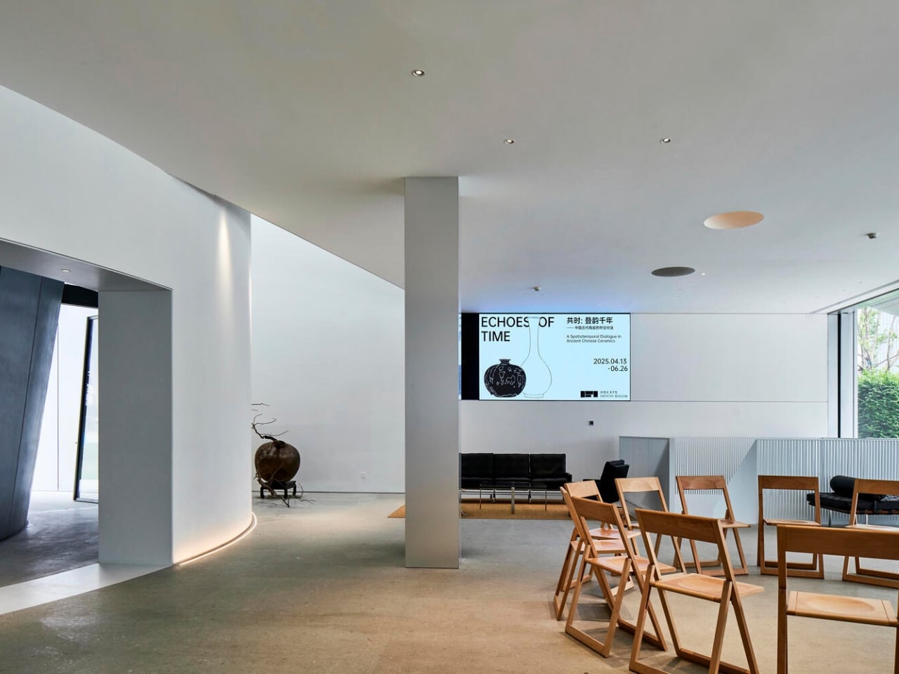
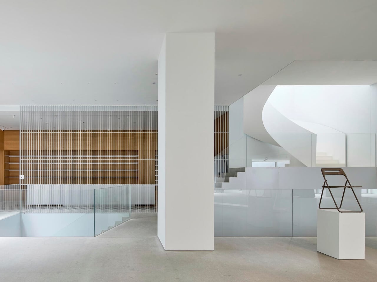
The interior spaces balance openness with intimacy. The first floor serves as the main reception and leisure area, easing visitors into the experience before they descend to the exhibition spaces. On the second floor, stairs hide behind decorative louvers that add texture and filter light. By the time you reach the third floor, you find an island platform and a lounge area, perfect for those moments when you need to step away from the art and just process what you’ve seen.

The material palette is restrained but sophisticated. Alongside the stainless steel and aluminum exterior, TAOA incorporated aluminum mesh, stone, and rock panels throughout the building. These aren’t flashy choices, but they create subtle variations in texture and light that keep the spaces from feeling monotonous. It’s the kind of design thinking that doesn’t announce itself loudly but rewards people who actually spend time in the space.

What’s refreshing about the Hangzhou Empathy Museum is its purpose. This isn’t a vanity project or a billionaire’s private collection disguised as public culture. It’s genuinely meant to serve the community, with a focus on contemporary art exhibitions that will rotate and evolve. The name itself, Empathy Museum, suggests an intention to create connection rather than just display objects behind glass.

The renovation took three years from initial design in 2022 to completion in 2025, which seems reasonable given the complexity of converting an unfinished shell into a functioning cultural space. TAOA collaborated with specialists in curtain walls, structural engineering, landscape design, lighting, and construction to pull this off, which explains the cohesive feel of the final result.

Architecture like this matters because it shows what’s possible when designers look at incomplete or abandoned structures not as problems to demolish but as opportunities to reimagine. Every city has these half-finished projects, relics of changed plans or economic shifts. Most get torn down or sit empty. The Hangzhou Empathy Museum proves that with the right vision, these spaces can become community assets that add beauty and culture to their neighborhoods.

The post An Abandoned Building Just Became China’s Most Reflective Museum first appeared on Yanko Design.

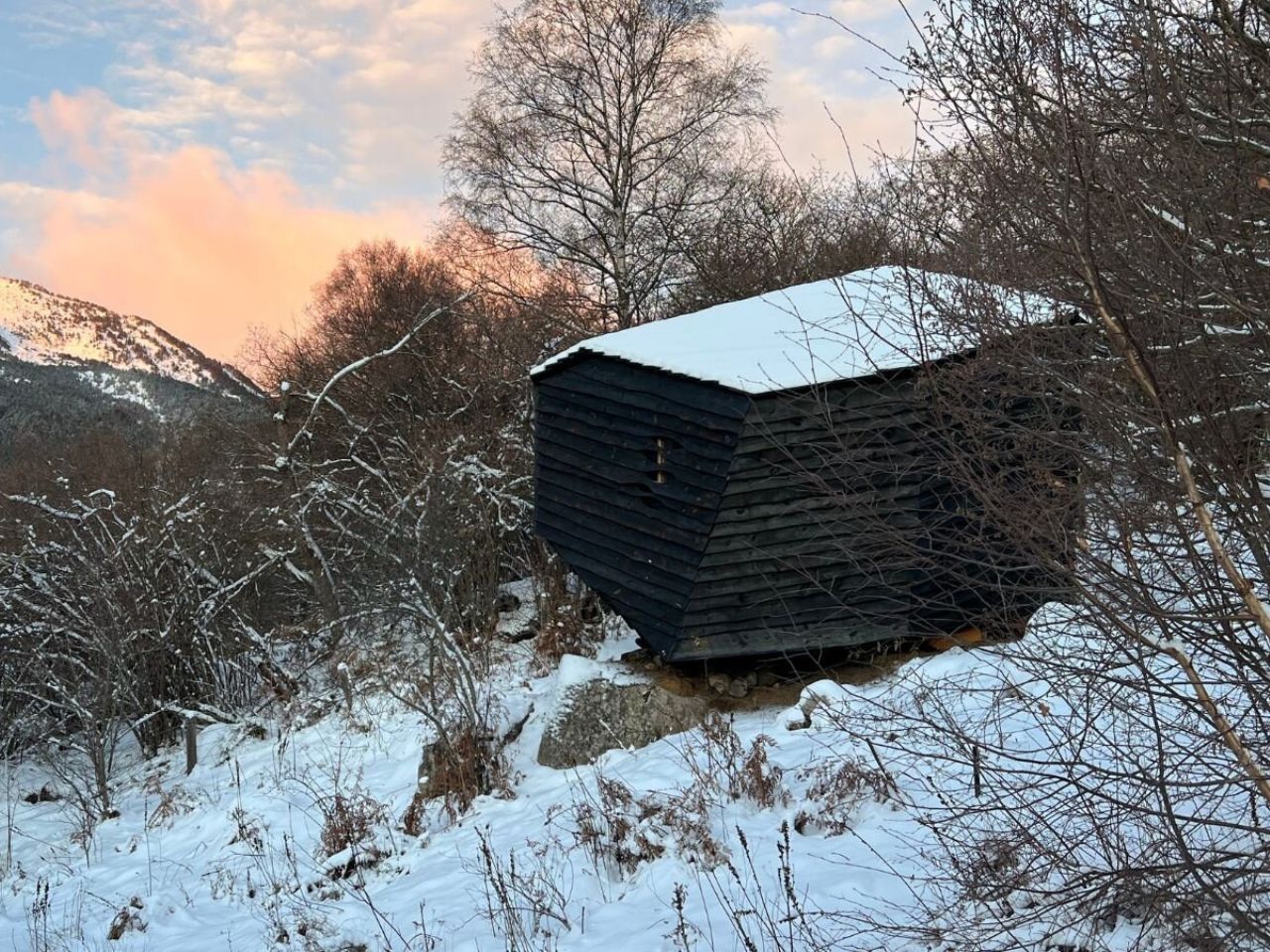
A 20-Square-Meter Boulder-Shaped Cabin That Blends Right Into The Pyrenees

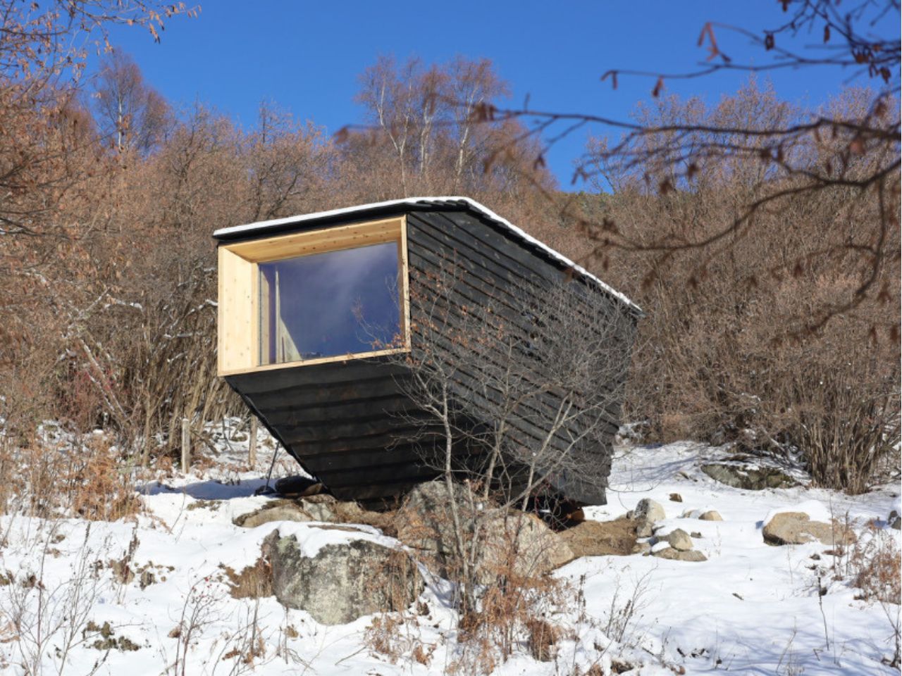
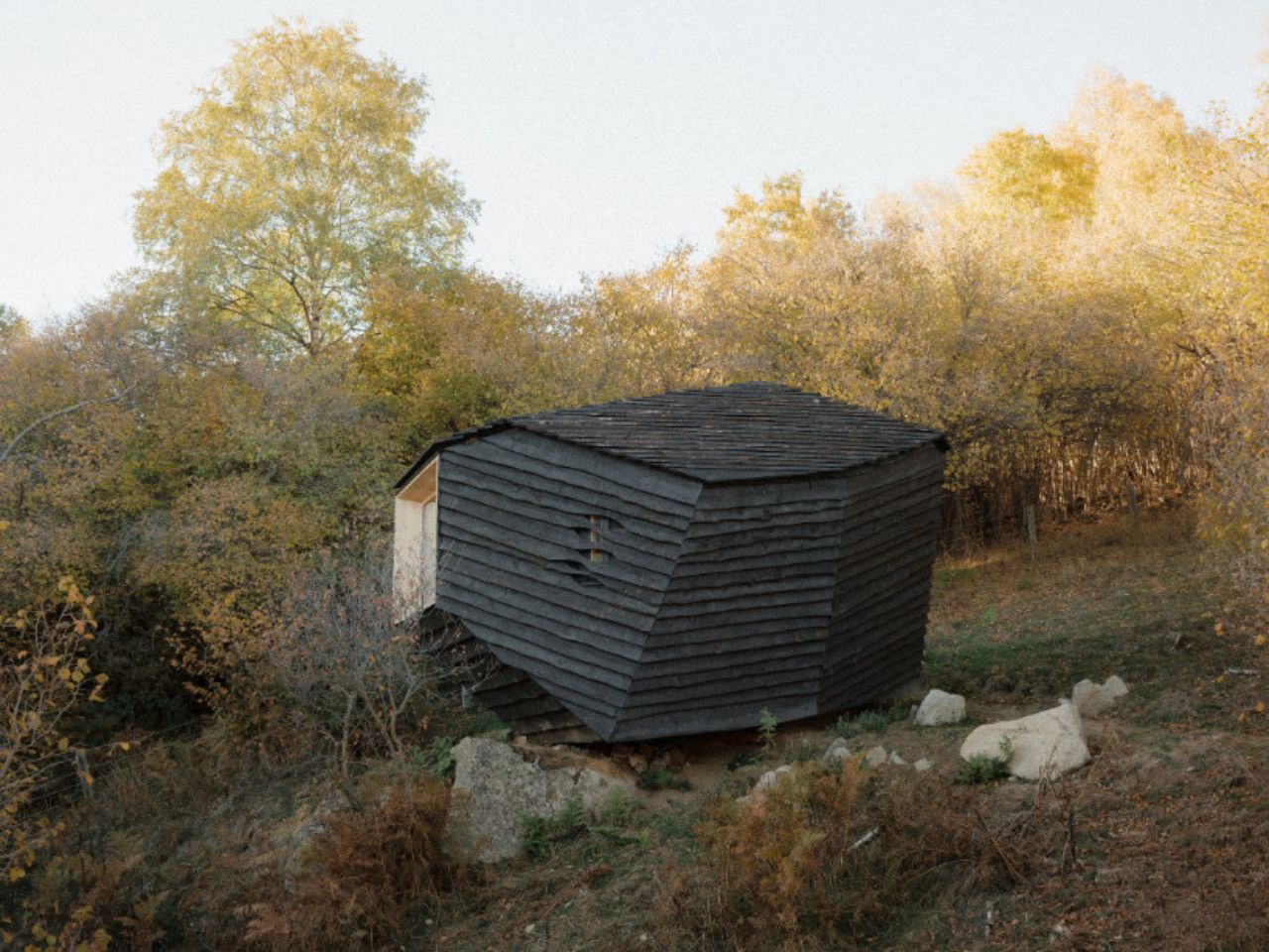
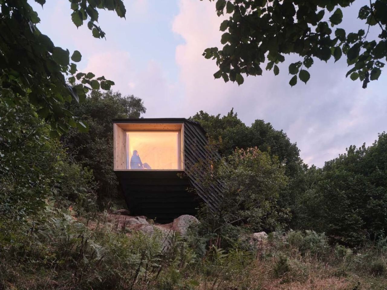
High in the Pyrenees, where forests, rock, and weather dictate their own quiet rules, Forestone Cabin appears less like a building and more like a geological event. At just 20 square meters, this experimental wooden dwelling does not announce itself as architecture in the conventional sense. Instead, it feels as though it has always been there, something solid that rolled down the mountain long before anyone thought to give it a name.

Designed and built by the 2025 cohort of the Master’s in Ecological Architecture and Advanced Construction at IAAC – Institute of Advanced Architecture of Catalonia, Forestone Cabin is part of the Bio for Piri initiative, led by Fundació Catalunya La Pedrera and funded by the Biodiversity Foundation through European Next Generation funds. The project champions regenerative forestry and the intelligent use of local timber sourced from Pyrenean forests in Alinyà, Lleida, an ambition that is embedded into every layer of the cabin.

Designer: IAAC – Institute for Advanced Architecture of Catalonia

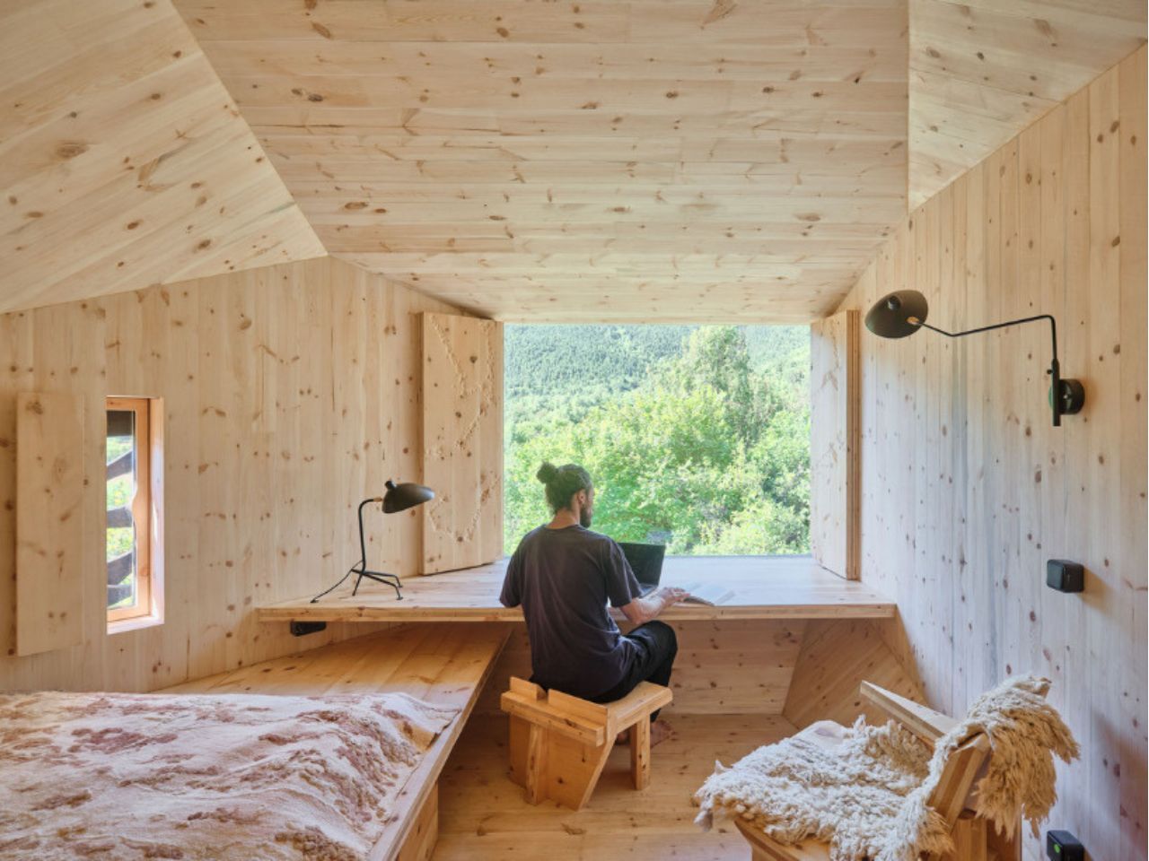
Installed at MónNatura Sort, the cabin occupies a sloping site near an existing mountain hostel. Designed to host two people, it compresses a sleeping area, workspace, and bathroom into a compact yet carefully calibrated interior. Nothing here is excessive. Every surface, angle, and opening earns its place.

Formally, the cabin takes its cues directly from the landscape. Its faceted geometry, composed of inclined walls and a sloping roof, responds to solar exposure, climatic conditions, and internal program, subtly shaping how the interior is experienced. Ceiling heights shift almost imperceptibly to define zones, while precisely positioned openings frame views of the Pyrenean mountains and allow cross ventilation. At night, operable wooden shutters seal the cabin into complete darkness, eliminating light pollution and supporting the site’s astronomical activities. It is a reminder that sometimes the most sustainable gesture is knowing when to disappear.

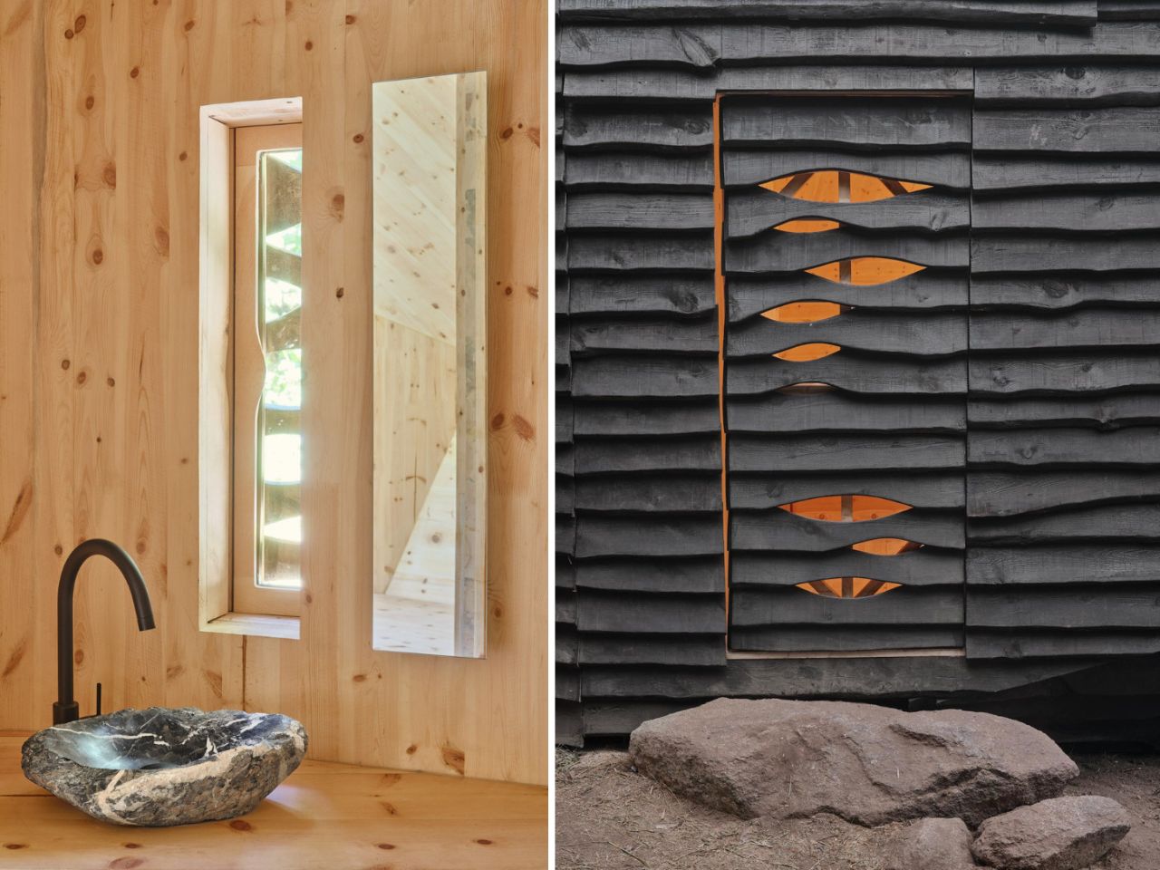
The exterior is clad in pine boards with natural edges, charred using the Japanese Yakisugi, or Shou Sugi Ban, technique. Burned by the students themselves, the wood gains resistance to insects, water, mold, and fire, while also carrying symbolic weight. Fire is a constant presence in Pyrenean forest management, and even the name Pyrenees traces back to pyros, the Greek word for fire. Here, charring becomes both protection and narrative.

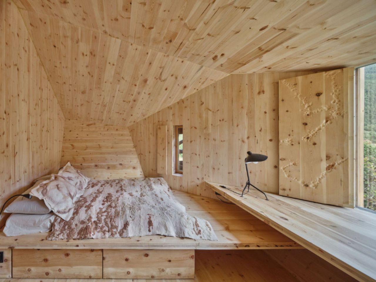
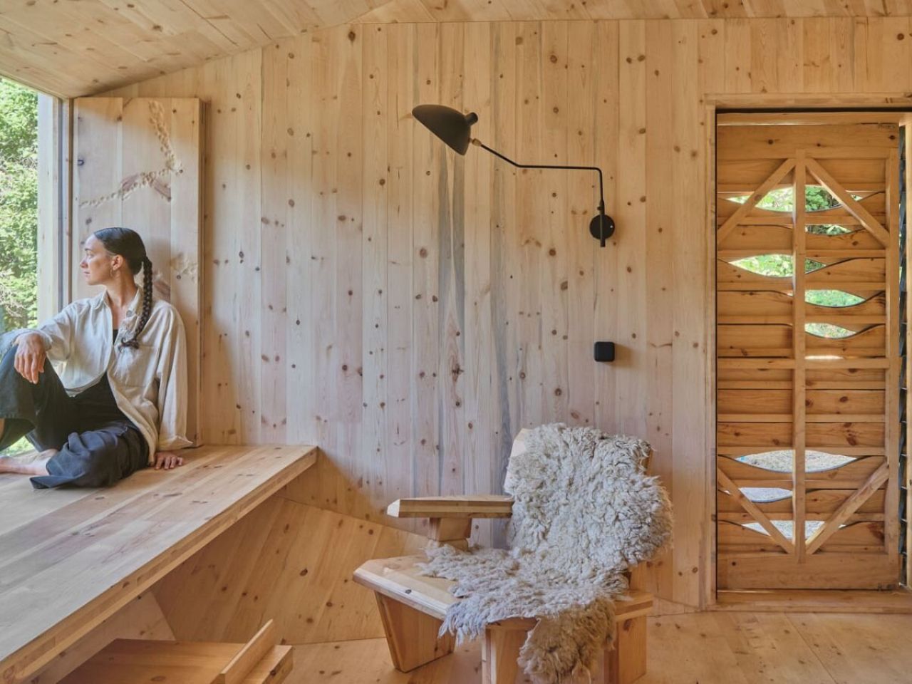
Inside, Forestone transforms into a fully integrated wooden environment. Custom-designed CLT elements form not only the structure but also the furniture, including beds, seating, storage, and the washbasin counter. All components were fabricated by students at Valldaura Labs. Architecture, structure, and furniture collapse into a single material system, reinforcing a hands-on approach where making is inseparable from thinking.

The material story does not end with timber. During a wool festival in the nearby town of Sort, students collaborated with local farmers to collect sheep’s wool, later transformed into felt with the support of Dutch artist Rian van Dijk. The resulting blankets, rugs, and pillowcases introduce softness and warmth while grounding the project in local agricultural cycles. A stone sourced from the surrounding landscape was hand-carved into a washbasin, turning a found object into a daily ritual.

From the outset, Forestone Cabin was designed as a prototype. Its modular CLT system, dry assembly methods, and reliance on local materials allow it to be adapted, replicated, or dismantled with minimal impact. More than a cabin, it proposes a model for inhabiting forest landscapes responsibly, one that aligns education, craftsmanship, and ecological stewardship.

Opening to guests in January 2026 at MónNatura Pirineu, Forestone Cabin offers visitors more than shelter. It offers a way of thinking about forests not as resources to extract from, but as systems to participate in, carefully, thoughtfully, and with respect.

The post A 20-Square-Meter Boulder-Shaped Cabin That Blends Right Into The Pyrenees first appeared on Yanko Design.

This Costa Rican Home Chooses Air, Rhythm, and Silence Over Walls

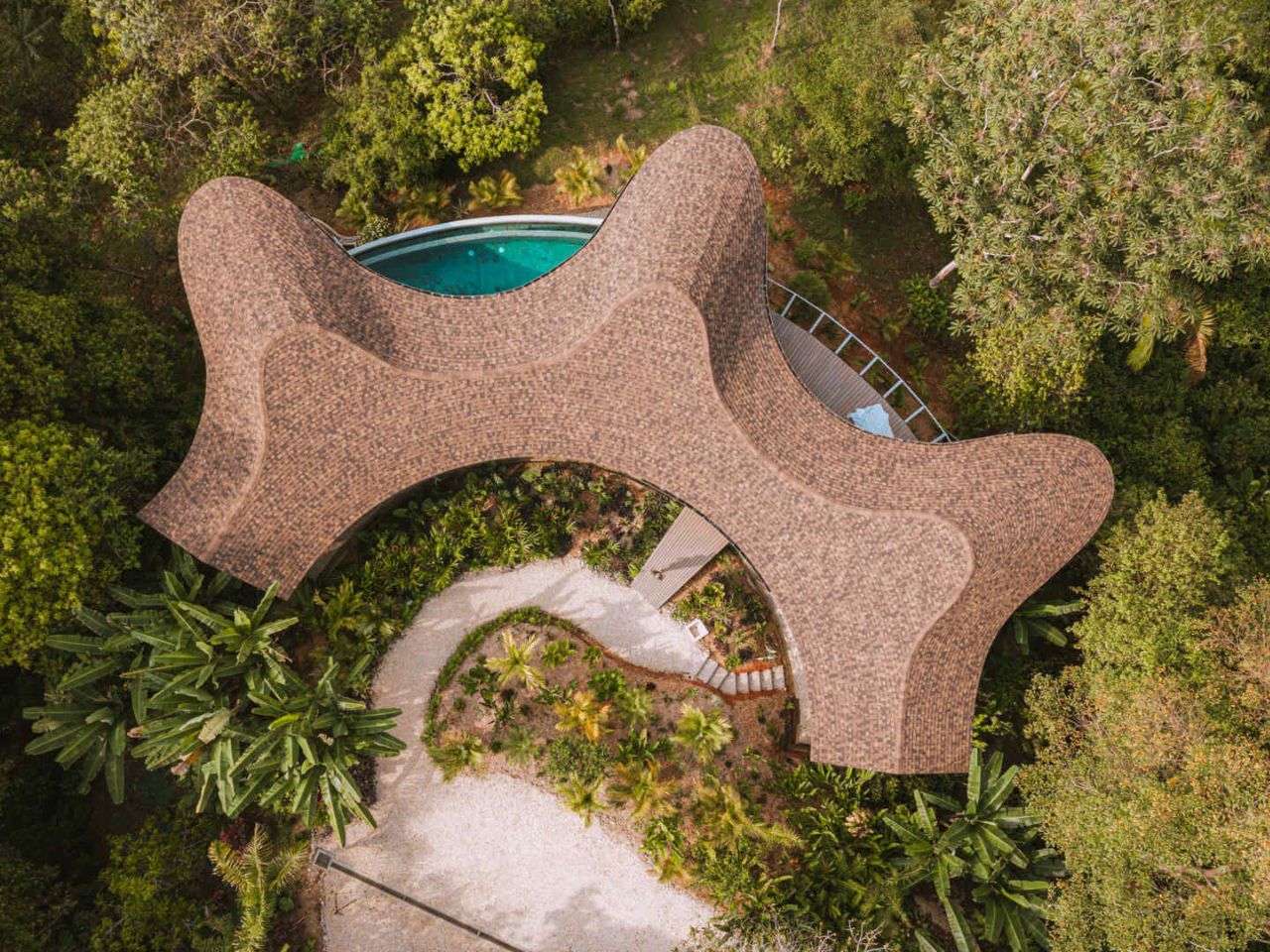
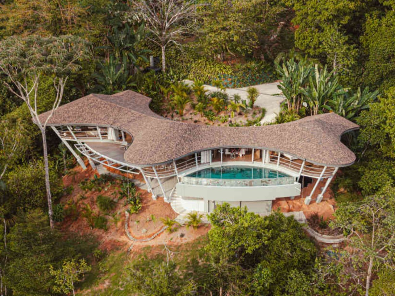
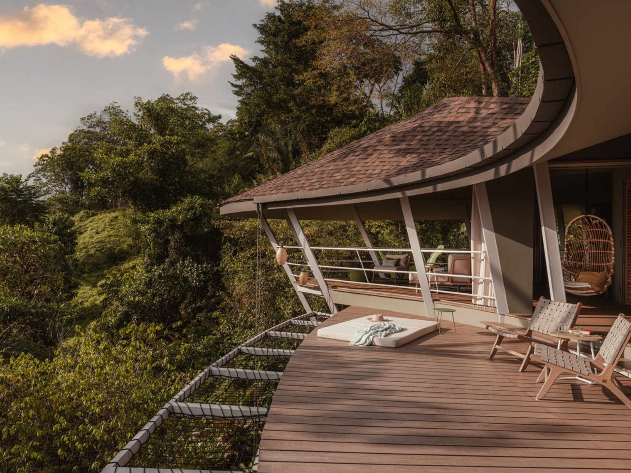
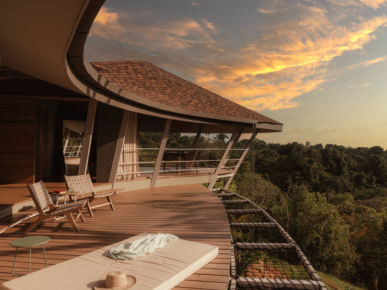
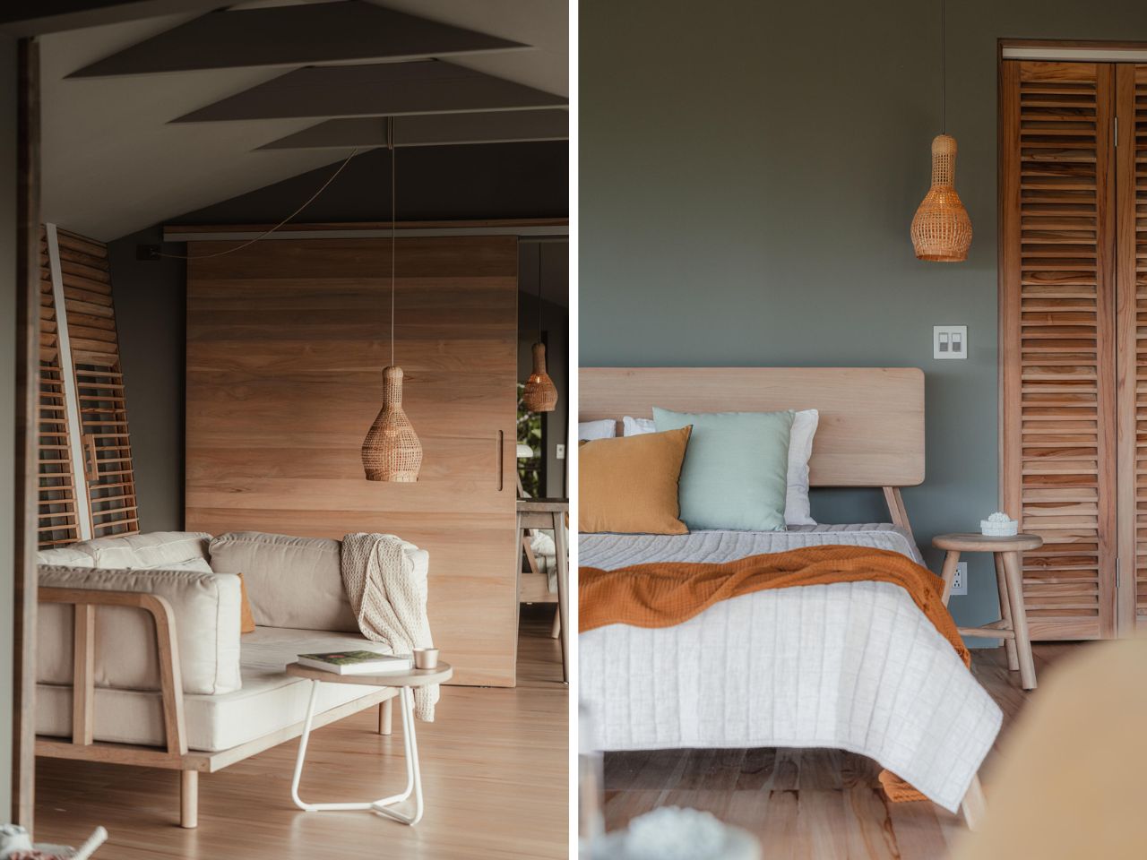
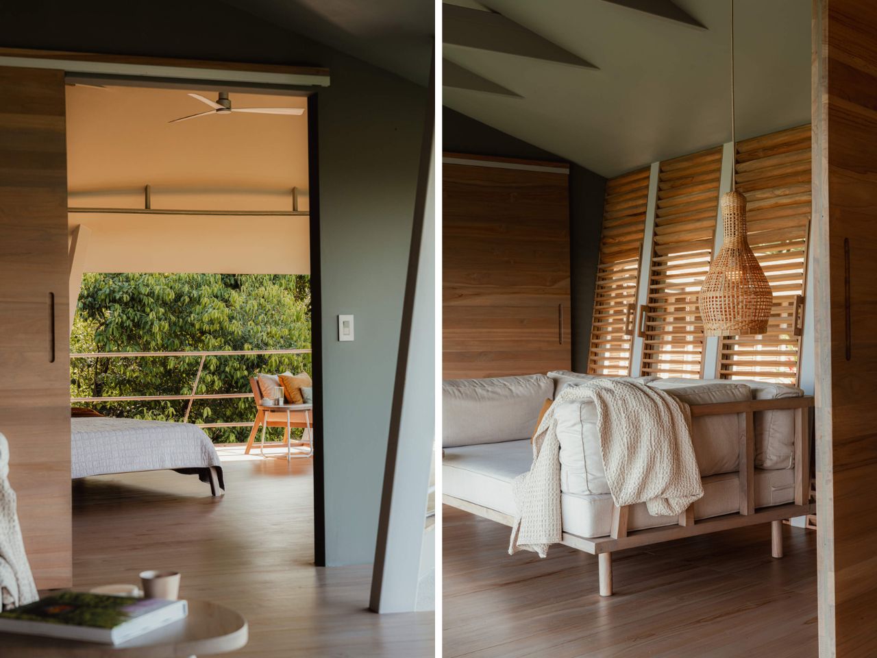
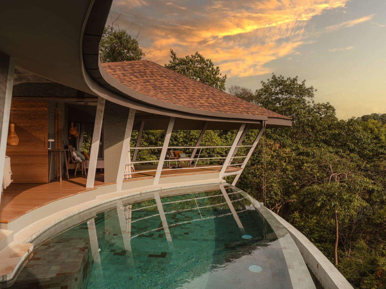
Perched high above the Pacific coastline in Bahía Ballena, Costa Rica, Ojo de Nila is a house that feels less like an object placed on land and more like a continuation of it. Designed by Studio Saxe, with interiors by Atelier Sandra Richard, the home was created for a Swiss couple seeking a slower, more elemental way of living shaped by air, light, and landscape rather than mechanical systems and rigid enclosures.

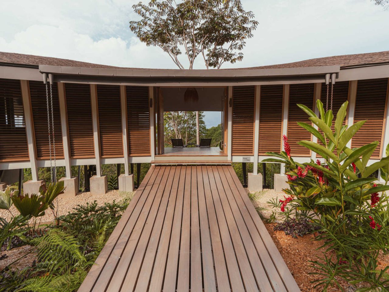
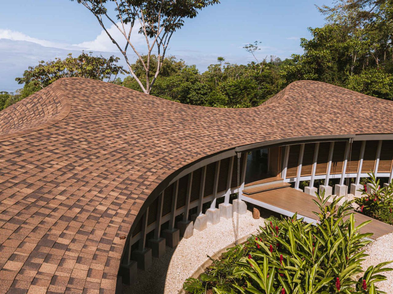
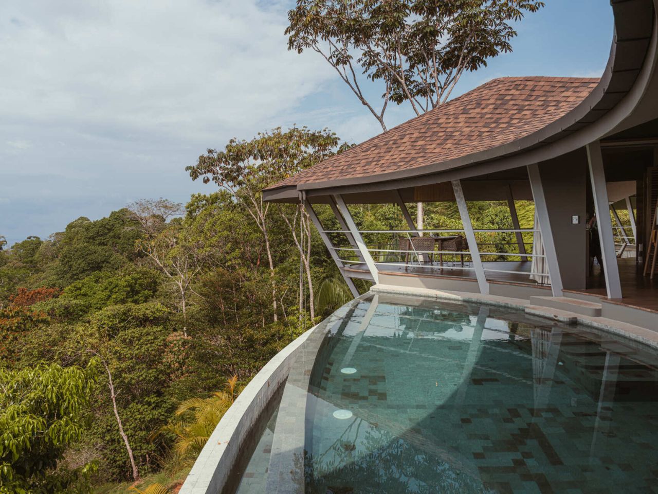
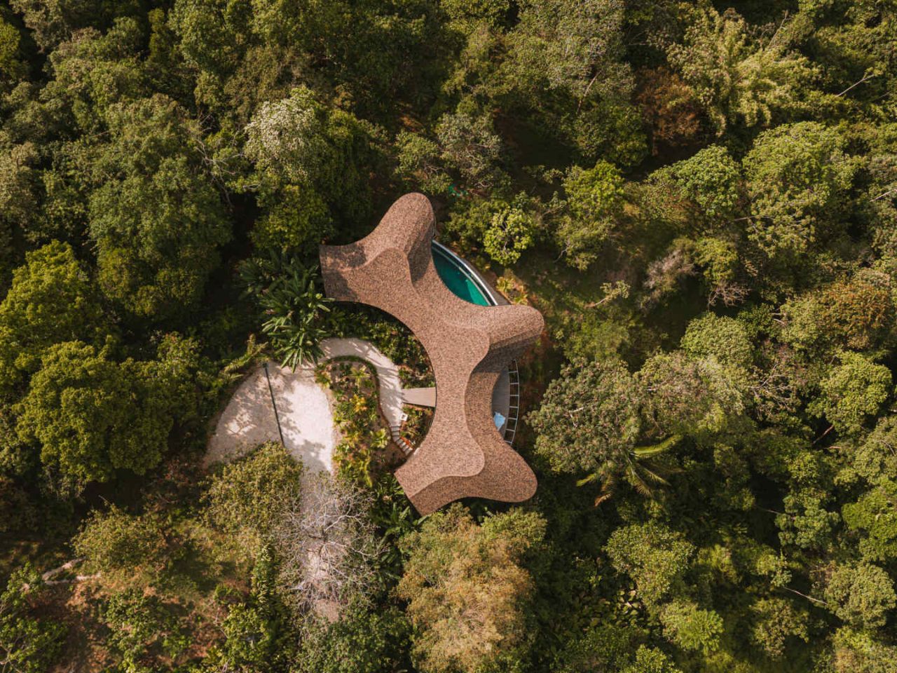
A clear modular logic guides the architecture. A repeating series of structural bays follows the natural contours of the hillside, allowing the house to hover above the forest canopy instead of cutting into it. This decision preserves vegetation and natural water flow beneath the home while giving the structure a lightness that feels respectful of its setting. The modules do not read as repetition in the conventional sense. Instead, they become the framework for movement, rhythm, and flow.

Designer: Studio Saxe and Atelier Sandra Richard

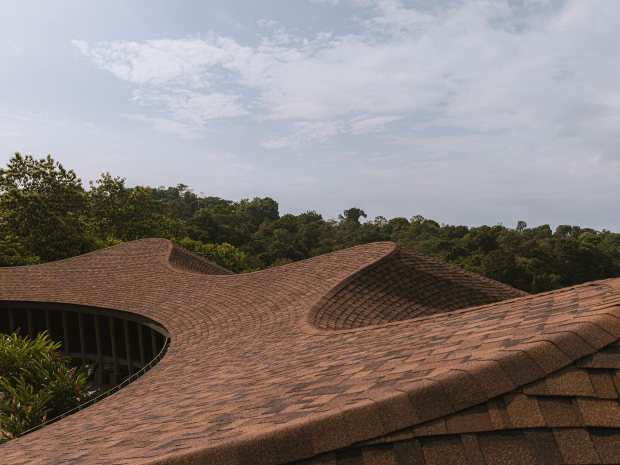
Above these modules, the roof undulates in soft waves, behaving almost like a newly formed landform. Rather than acting as a simple cover, it mirrors the rolling topography of the surrounding hills and establishes a calming visual cadence as one moves through the house. The roofline continuously frames the Pacific Ocean, ensuring that the horizon remains a constant presence, never a backdrop but always an active participant in daily life.

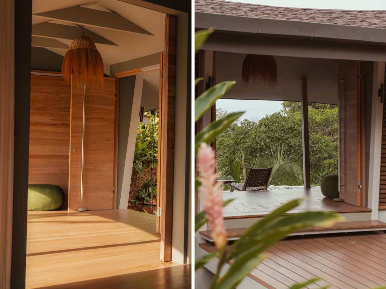
Arrival is defined by elevation and openness. As you enter, there is no dramatic reveal or enclosed threshold. Instead, the house immediately opens itself to the ocean. The absence of enclosure on the ocean-facing side dissolves any clear boundary between inside and outside. Movement through the home is accompanied by the sound of wind through the forest, shifting light, and the distant rhythm of waves below.

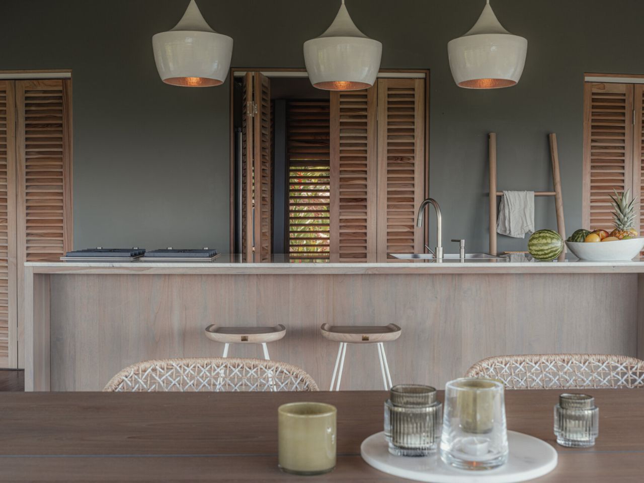
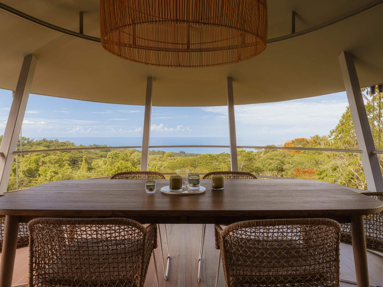
The dining area is fully open to the landscape, with no windows or doors separating it from the environment. Meals unfold in direct conversation with climate and view, reinforcing a lifestyle centered on natural comfort. Adjacent to this space, the kitchen sits within the same modular grid. A long island anchors the room, illuminated by three pendant lights, while additional storage is discreetly tucked behind folding doors to maintain visual calm.

The living room balances structure and softness. A solid wood frame sofa grounds the space, layered with neutral cushions and tactile throws that invite rest. Rich timber flooring adds warmth underfoot, tying the interior palette back to the surrounding forest.

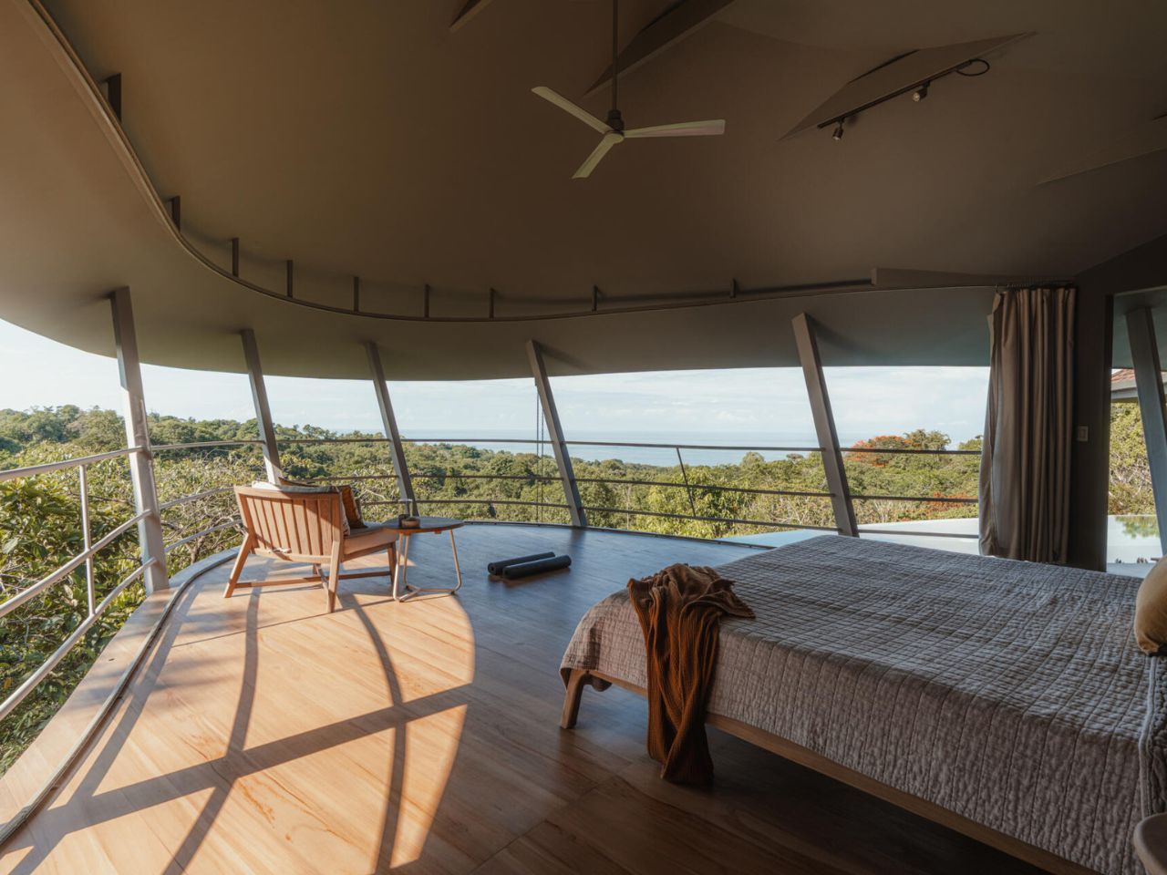
The bedroom continues this dialogue with nature through a curved open-air form. The sweeping roof and angled supports frame uninterrupted views of both forest and ocean. A low timber bed and minimal furnishings ensure that attention remains on light, air, and the ever-changing landscape beyond.

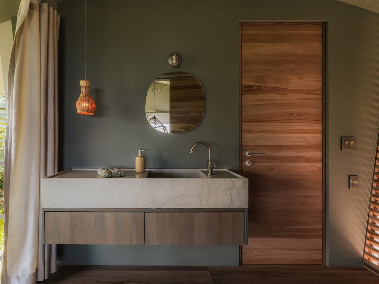
In the bathroom, restraint becomes luxury. A floating timber vanity topped with stone sits at the center of the space, while slatted wood and soft curtains filter light and create privacy without full enclosure. The result is a room that feels tactile, quiet, and gently connected to its surroundings.

Outside, the pool extends toward the horizon, visually blending with the sky and ocean. From above, its circular form reads like an eye, like a reflection, inspiring the home’s name. This gesture reinforces the idea of the house as an observer, always in dialogue with the landscape it inhabits. The deck echoes the pool’s curves, creating shaded and open zones shaped by the modular structure and flowing roof.

Ojo de Nila ultimately demonstrates how modular construction can enable expressive architecture without overpowering its context. Through repetition that allows curvature and structure that guides airflow, the house achieves a quiet, deeply considered balance between design and environment, inviting its inhabitants to live with nature rather than against it.

The post This Costa Rican Home Chooses Air, Rhythm, and Silence Over Walls first appeared on Yanko Design.

5 Biomimicry-based Architectural Designs That Copy Nature’s Best Ideas

Designers working across product design and interior architecture view the Amazon not as a backdrop, but as a lesson in how materials, forms, and systems perform under real conditions. Designing in this context means moving away from rigid objects and fixed layouts, and learning from the forest’s logic of layering, adaptation, and response to heat, moisture, and constant change. From furniture to spatial planning, every decision must align with the environment rather than resist it.

This mindset shapes interiors and products that prioritize durability, comfort, and reduced environmental impact. Light is softened through screens, textures, and surfaces that gently diffuse glare, while materials are selected for resilience and tactile warmth. Let’s understand how strong design is defined by solutions that behave like living systems, adaptive, efficient, and quietly luxurious in harmony with nature.

1. Layered Roofs Inspired by the Canopy

In the Amazon, a roof is more than just a cover. It must work like the forest canopy, using layers to control heat and handle heavy rainfall. Instead of a single surface, a layered roof helps reduce heat build-up and protects the interior from extreme weather, creating a naturally cooler living environment.

This can be achieved through a double-layer roof system, with an outer protective layer and an inner insulated ceiling. The space between them allows hot air to escape, improving natural ventilation. Deep roof overhangs further protect interiors by blocking harsh midday sun while letting in soft morning light, creating comfortable, shaded spaces that feel connected to nature.
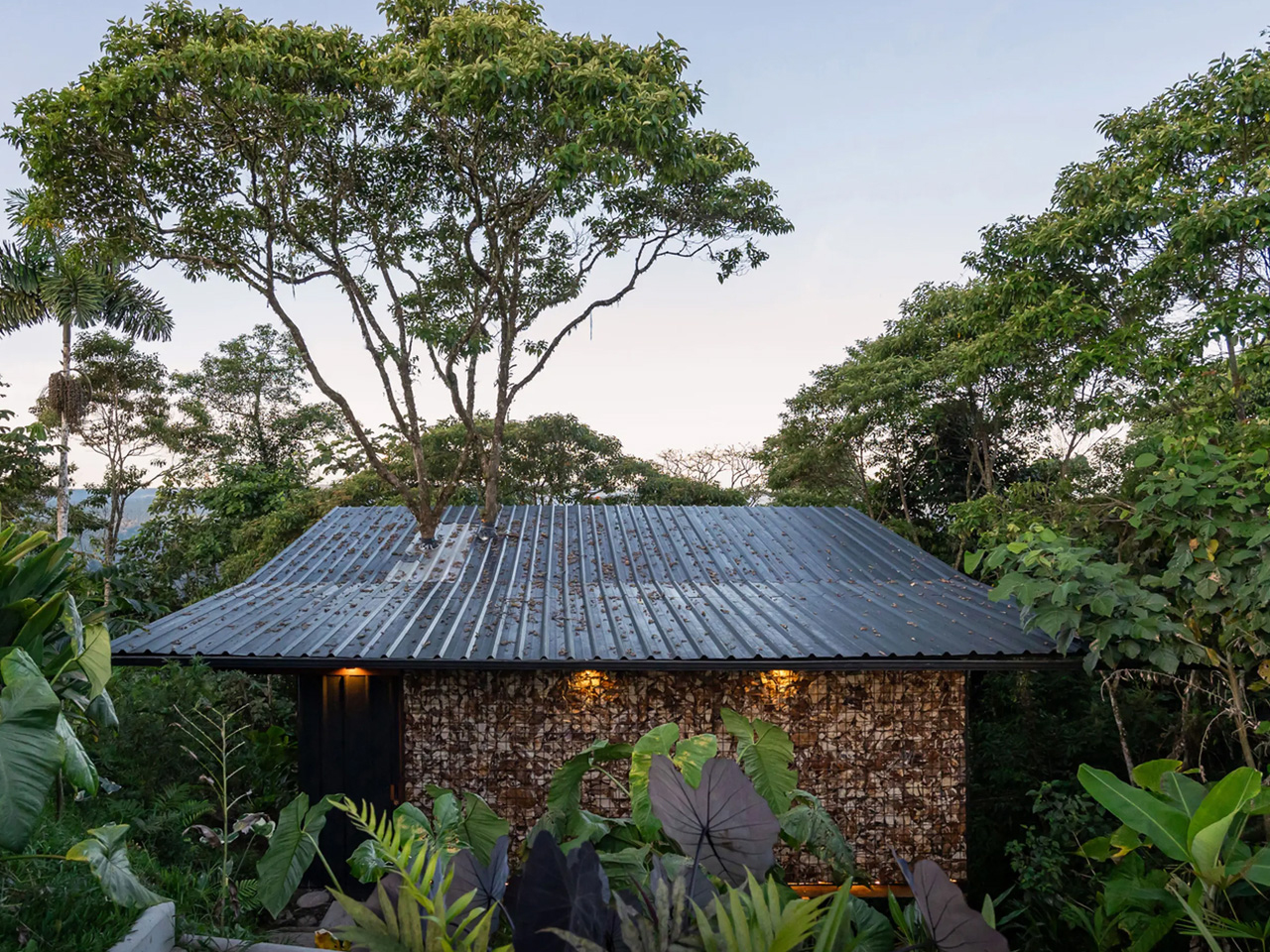
Tucked deep within Ecuador’s Amazon rainforest, A Lodging in the Pigüe is a 484-sq-ft cabin that forges an intimate dialogue between architecture and nature. Designed around a pre-existing Pigüe tree, the structure gently rises around it, allowing the tree to remain untouched while becoming a living component of the home. Located near El Calvario, the cabin seamlessly blends industrial and organic materials, drawing inspiration from tree houses to create a quiet retreat immersed in the forest landscape.
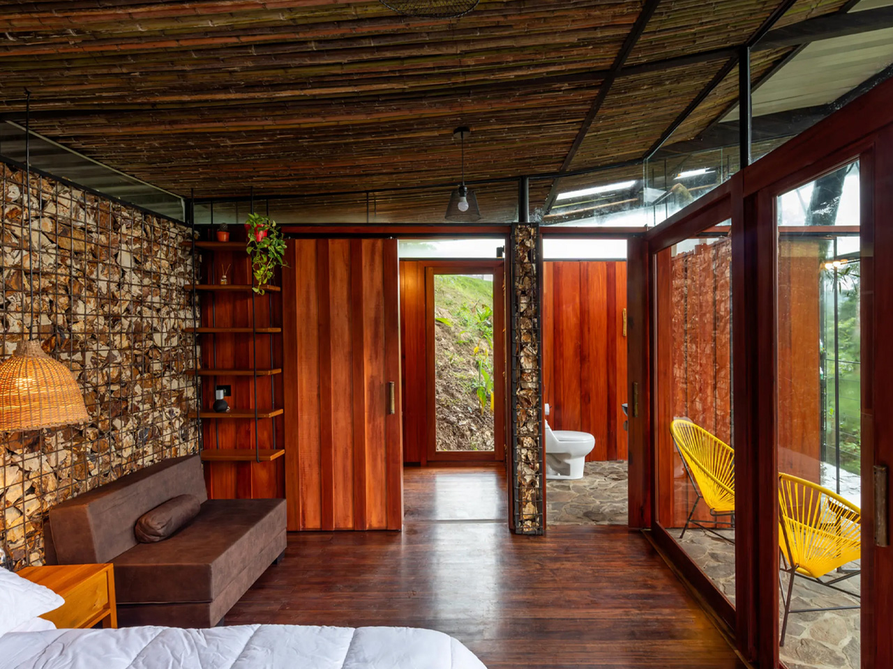
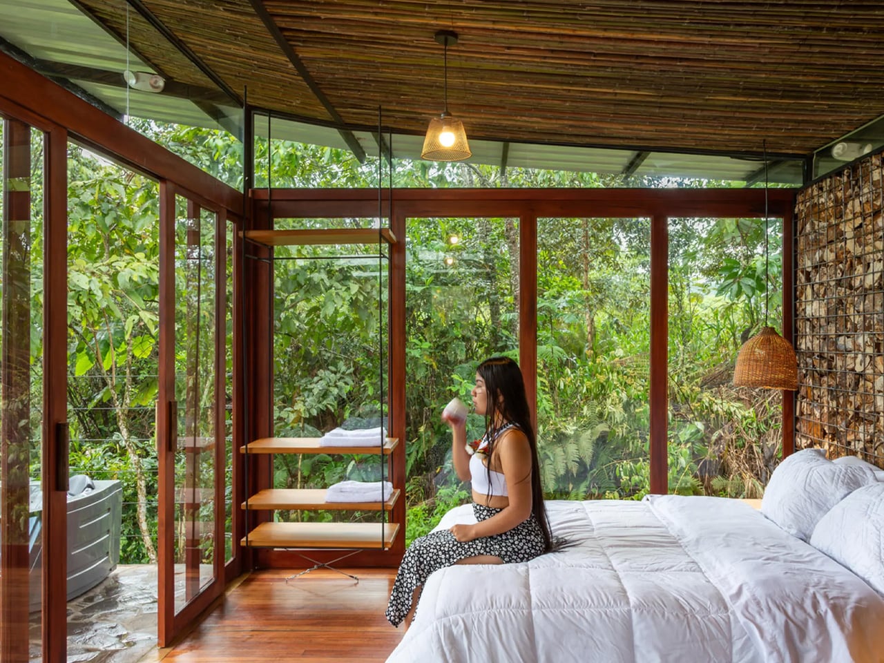
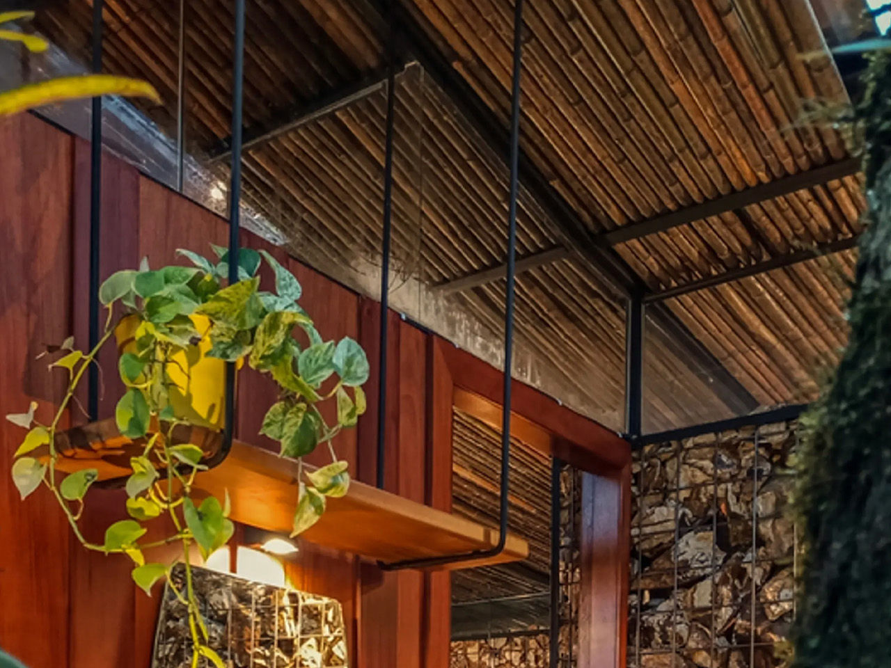
Elevated on stilts made from recycled metal pipes, the home appears to float among the trees, protecting it from ground moisture while preserving natural water flows and encouraging the growth of vegetation below. This raised design also enables bio-filters for wastewater treatment. Inside, a warm, earthy palette dominates, with gabion stone walls, locally sourced bamboo and wood, and polished timber floors. Living spaces extend outdoors through a terrace and net balcony, while floor-to-ceiling glass in the bedroom, along with a compact kitchen, bathroom, and semi-outdoor shower, deepens the connection to nature.

2. Water-Smart Design from Leaf Patterns

In the Amazon, water shapes every design decision. Instead of fighting moisture, buildings should work with it. Surfaces and details must guide rain away quickly, reducing damage while improving long-term performance in a high-humidity climate.

Drainage systems can take cues from leaf veins, where water flows naturally and efficiently. Gutters and channels are integrated into the structure, turning heavy rainfall into a controlled, visible flow rather than a problem to fix later. Materials also matter as moisture-friendly woods and modern bio-based materials perform better in damp conditions, aging slowly and beautifully while reflecting the climate they belong to.
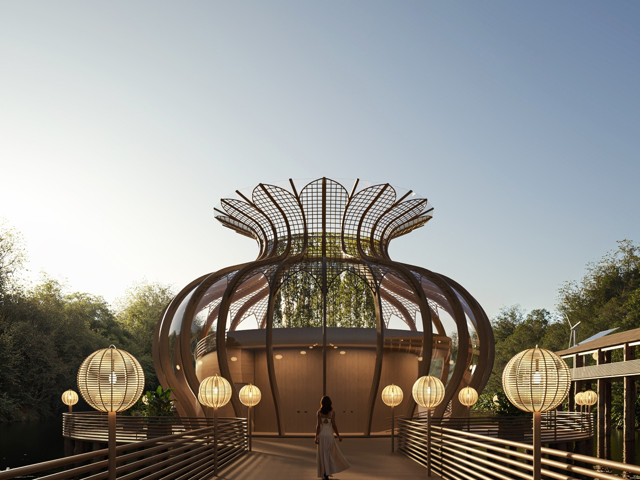
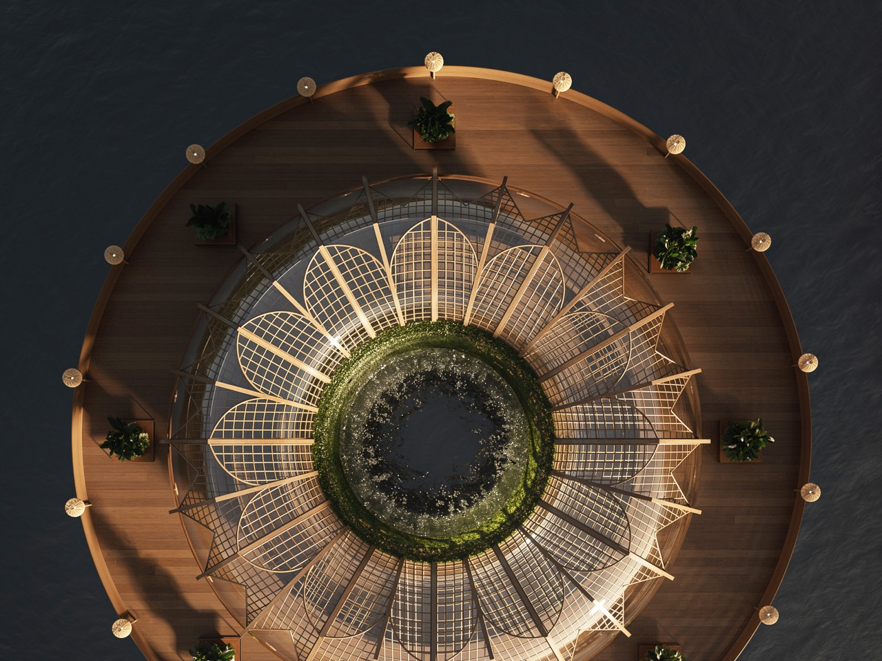
As technology-driven lifestyles pull people further from nature, the Amazon Immersion Pavilion is imagined as a quiet architectural counterpoint rooted in presence and ecological respect. Conceived as a conceptual project for Iquitos, Peru, the pavilion invites visitors to experience the rainforest through sound, light, texture, and movement. Rather than treating the Amazon as a backdrop, the design approaches it as a living partner, encouraging deliberate sensory engagement. Shaped by biomimicry and local ecological understanding, the pavilion uses bamboo as its primary material, reflecting regional building traditions while supporting low-impact construction and environmental responsibility.
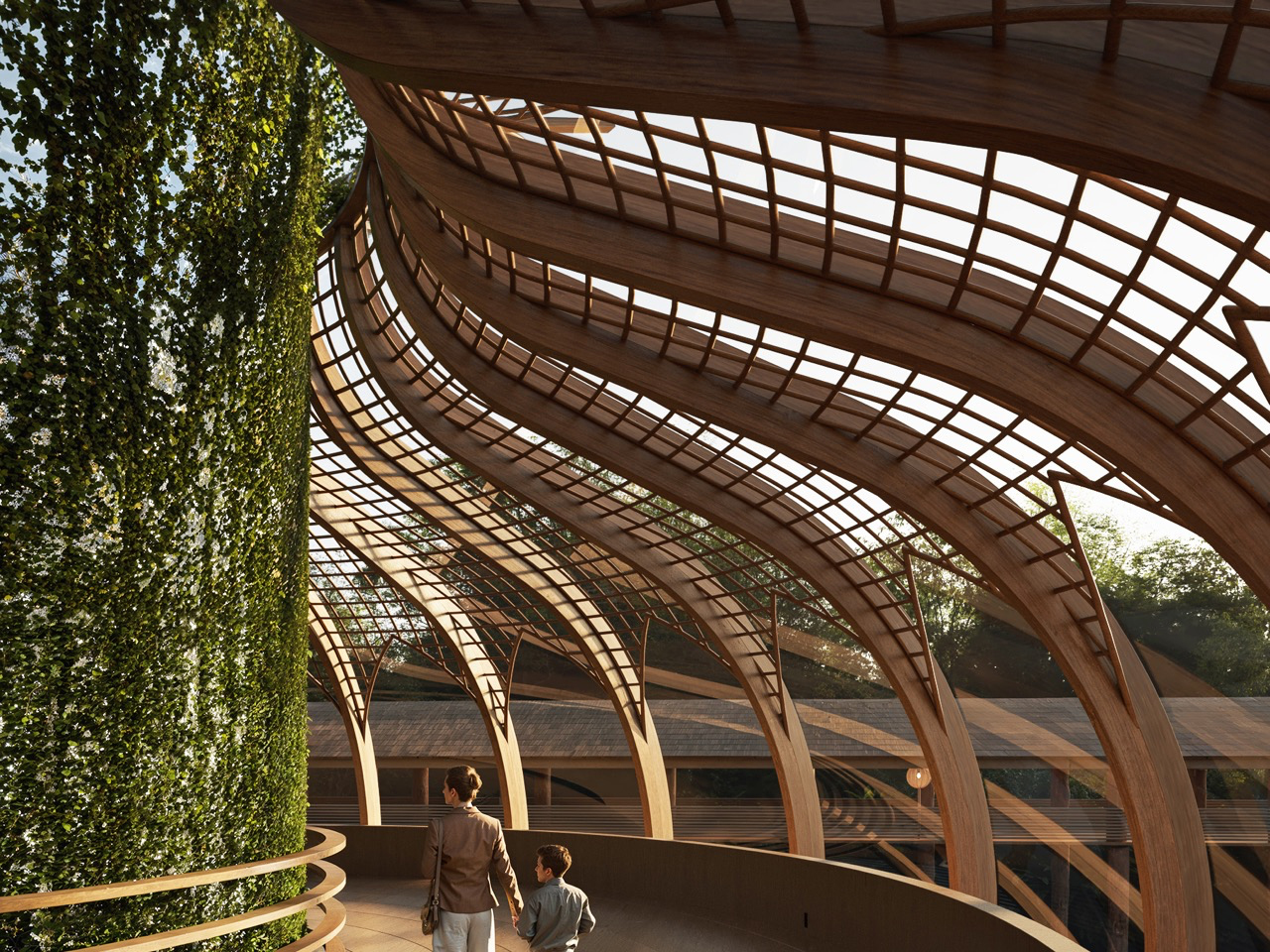
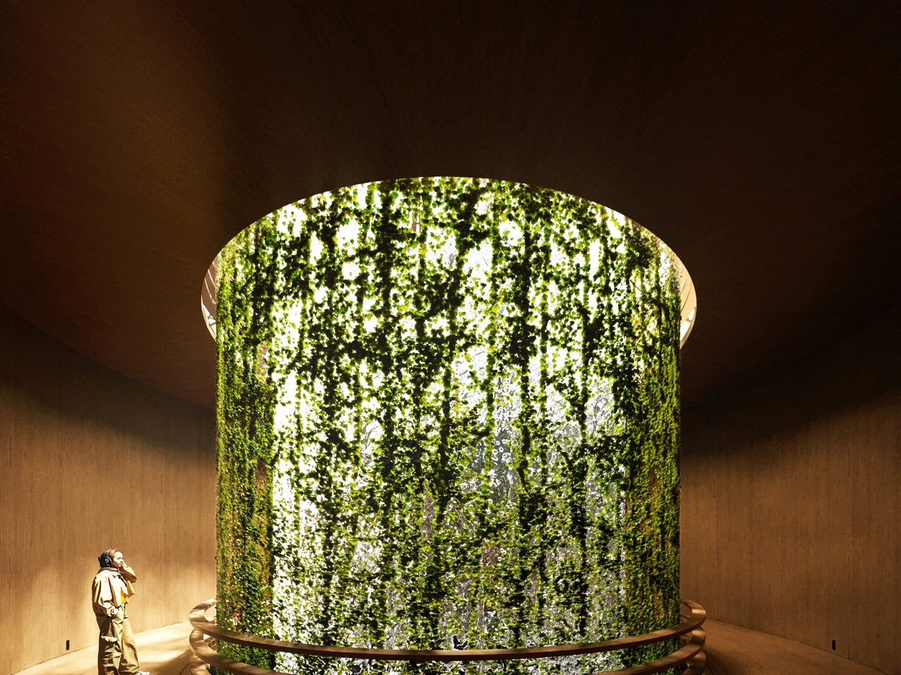
The spatial journey unfolds across two levels, creating a clear emotional progression. The lower level offers an introspective, cocoon-like atmosphere, where filtered daylight, flowing water, and dense vegetation heighten sensory awareness. As visitors move upward, the pavilion opens toward expansive views of the Amazon River, allowing the architecture to recede in favor of the landscape. Passive ventilation, natural light, and low-impact assembly techniques enable the structure to align quietly with the rhythms of the forest.

3. Floating Floors That Respect the Ground

In sensitive ecosystems like the Amazon, real luxury means building without disturbing the land. Lifting structures above the forest floor allows natural water flow, plant life, and biodiversity to continue untouched. The building becomes a guest, not an intruder.

Raised floor systems on stilt-like foundations let air move freely beneath the structure, improving cooling while protecting interiors from moisture and insects. This approach also draws from regional building traditions, where homes are elevated to adapt to the climate and terrain. By combining this wisdom with modern design, architecture stays rooted in culture while meeting contemporary performance needs.
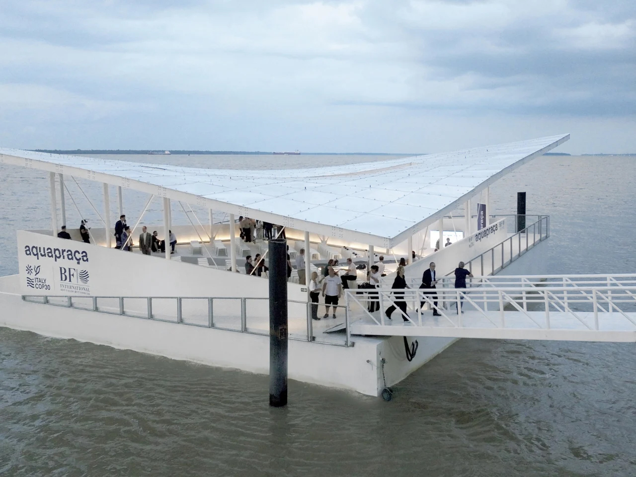
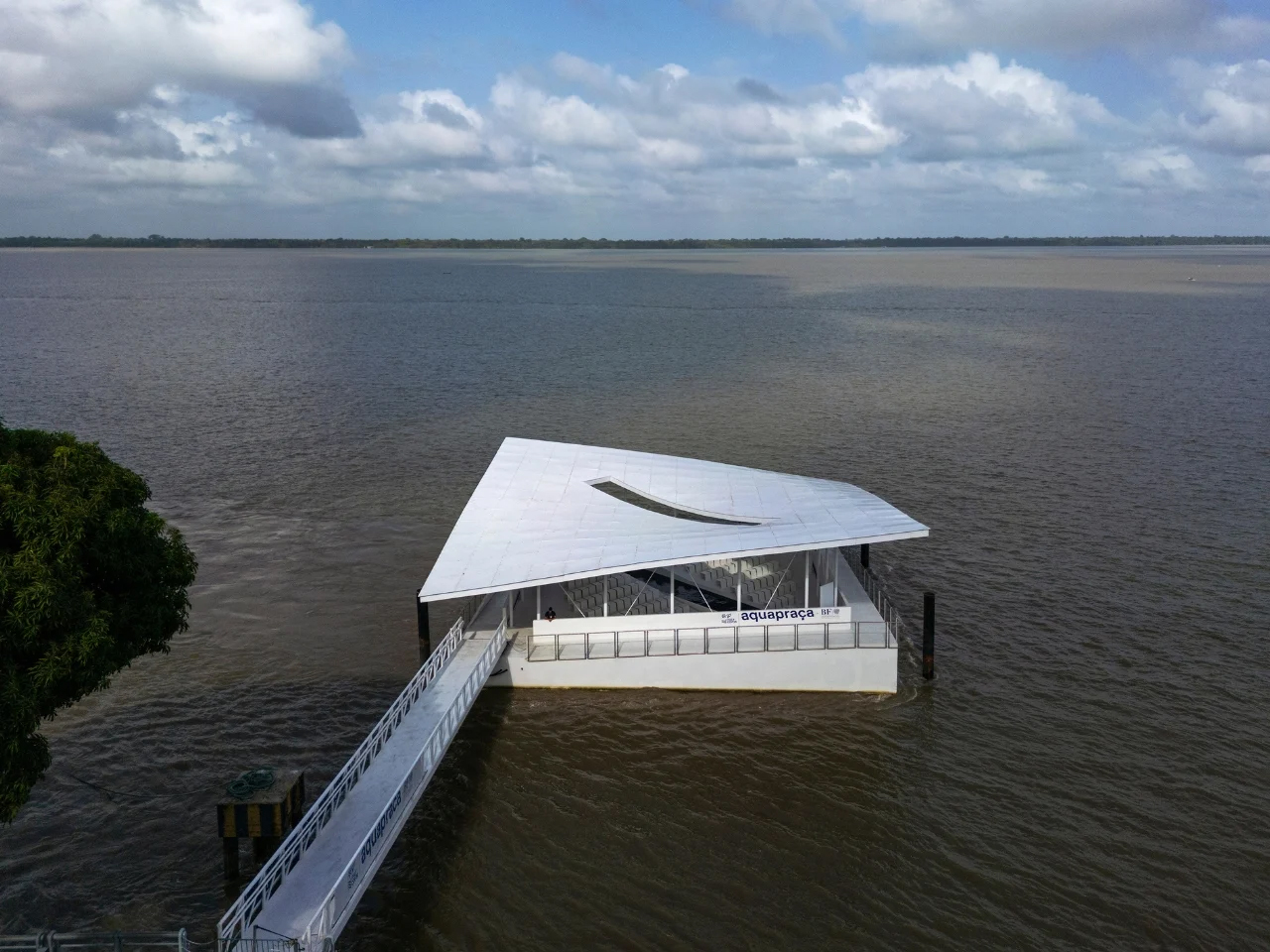
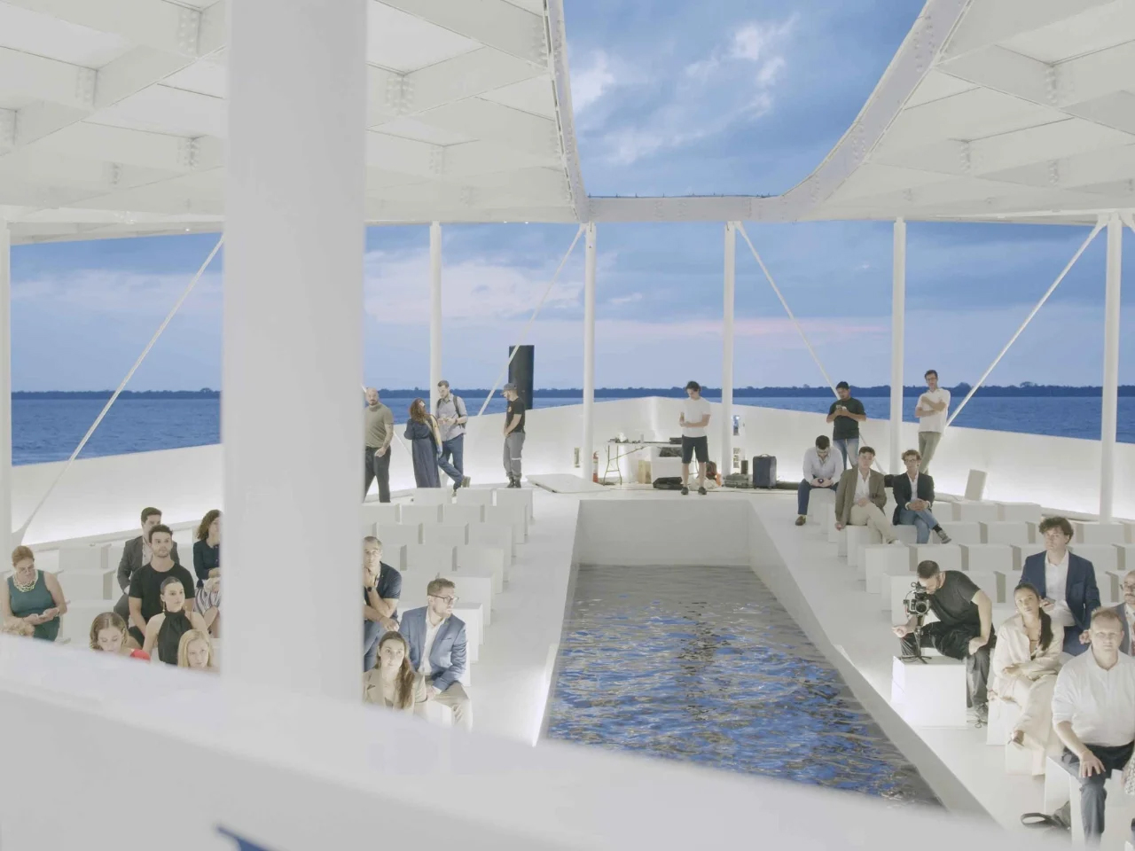
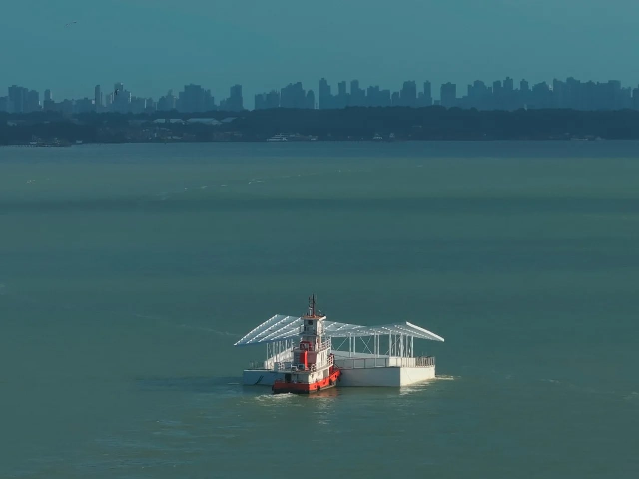
AquaPraça is a floating public square that responds directly to tidal movement, rising and falling with the water. Unveiled at the UN Climate Change Conference COP30 in Belém, Brazil, the 400-square-metre platform is conceived as a permanent cultural and civic space rather than a temporary installation. Designed by CRA–Carlo Ratti Associati in collaboration with Höweler + Yoon, the structure is anchored in Guajará Bay and adapts to daily tidal variations of up to four metres through buoyancy-based engineering. By positioning visitors at eye level with the river, the project transforms environmental change into a perceptible spatial experience.
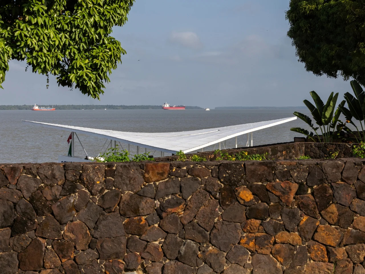

First presented at the Venice Architecture Biennale, AquaPraça later arrived in Belém as part of Italy’s pavilion at COP30 and will be donated to Brazil for continued public use. Its sloped surfaces respond in real time to shifting water levels, offering a physical demonstration of sea-level rise. Located at the confluence of the Amazon River and the Atlantic Ocean, the project exemplifies adaptive architecture that aligns environmental responsibility with long-term cultural engagement.

4. Breathing Buildings for Tropical Comfort

In the Amazon, sealed glass buildings simply do not work. The forest itself breathes, and architecture must do the same. Instead of airtight enclosures, buildings should allow air to move naturally, responding to heat, humidity, and daily climate shifts.

Walls can be designed as adjustable layers using louvers made from sustainable wood, perforated brick walls, or recycled metal. These openings act like breathing pores, letting fresh air flow through while maintaining shade and comfort. Compared to fully air-conditioned spaces, breathable facades consume less energy and create a stronger connection to the surroundings, allowing occupants to experience natural airflow, sounds, and scents of the forest.
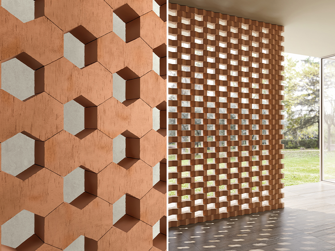
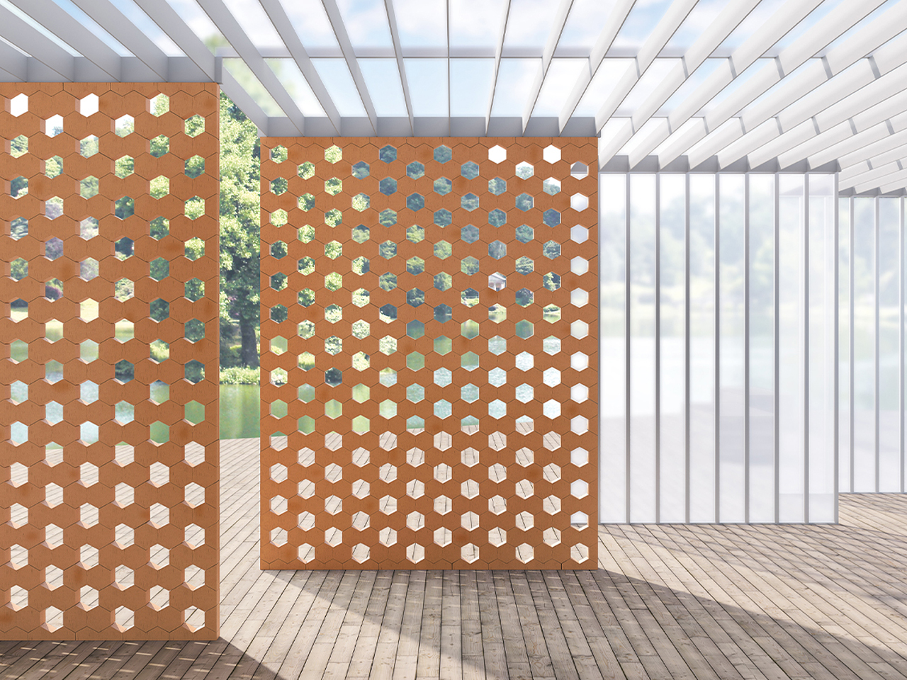
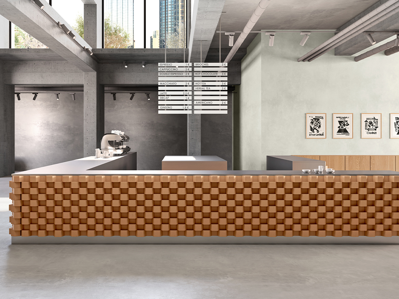
Hives is a modular system of hexagonal terracotta bricks designed to create flexible interior furnishings and architectural structures. Developed for Mutina, the Italian ceramics brand known for collaborating with leading designers, the collection reflects its commitment to material innovation and expressive form. Konstantin Grcic was commissioned to rethink the fixed nature of traditional brick construction, drawing inspiration from the intricate geometry of beehives. Each brick appears as two fused hexagonal units, resulting in a distinctive three-dimensional form that supports a wide range of spatial compositions.
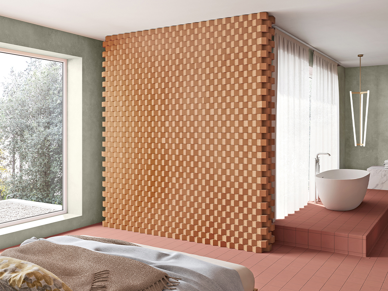
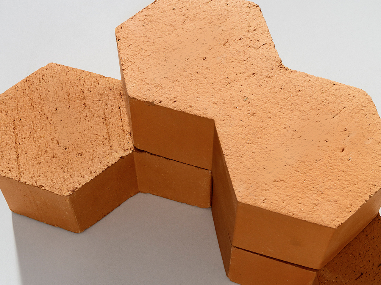
The bricks can be arranged vertically to produce semi-open structures with pronounced cavities, or laid horizontally in staggered or flush patterns to create dynamic, undulating surfaces for columns, walls, and counters. Measuring 13 × 22.5 × 7 cm, the terracotta units offer excellent thermal and acoustic properties alongside durability and tactile warmth.

5. Designing for Circular Living

In the Amazon, nature shows that growth and decay are part of the same cycle. Architecture should follow this logic by using materials that can return safely to the earth over time, without pollution or waste.

Low-impact materials such as mycelium-based insulation and responsibly sourced mass timber help reduce carbon footprint while storing carbon instead of releasing it. Interiors can extend this thinking through natural finishes like local stone, clay plasters, and handwoven elements. The result is a calm, tactile environment that feels connected to the forest, reinforcing the idea of the building as a respectful, temporary presence within a living ecosystem.
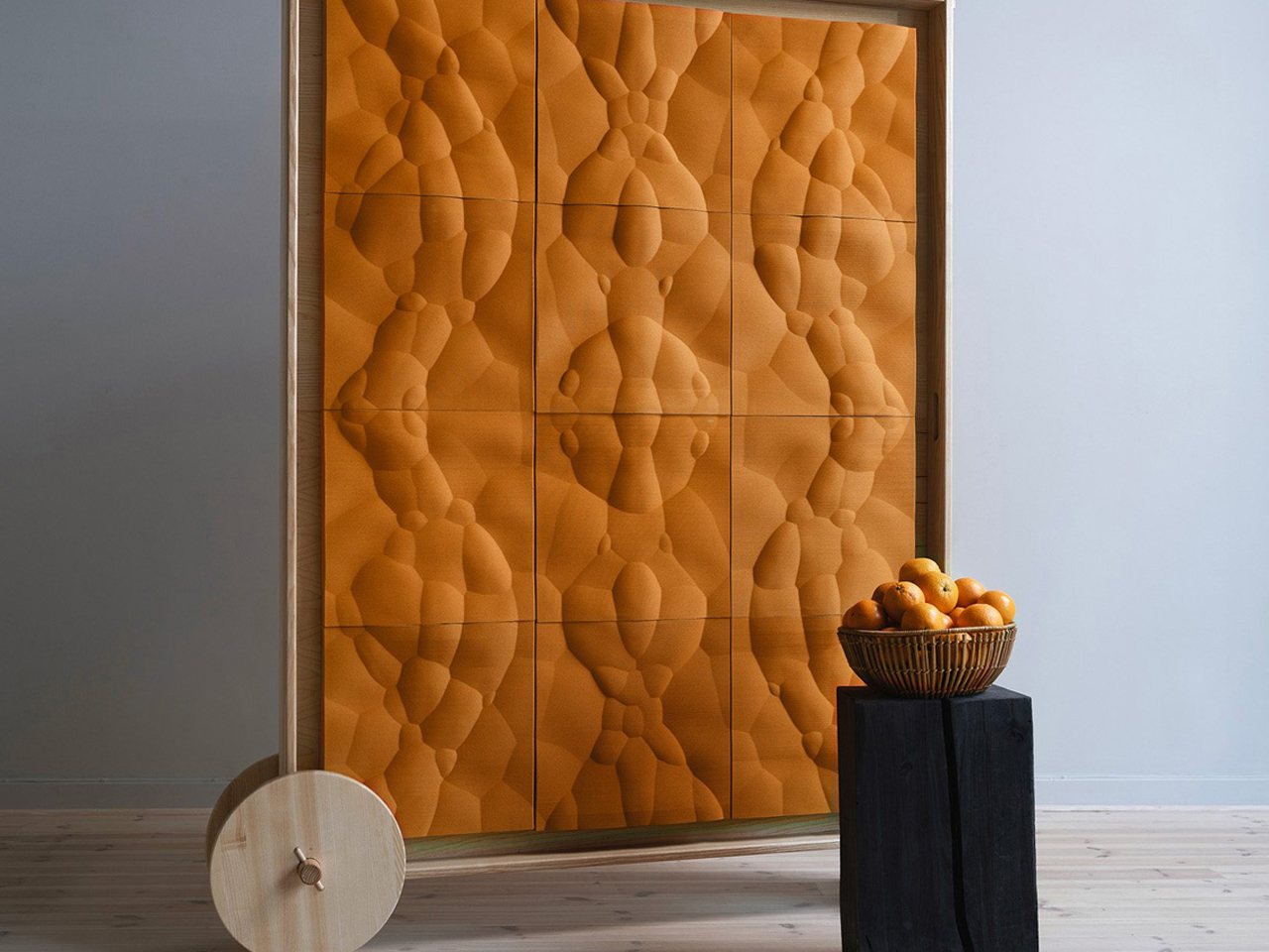
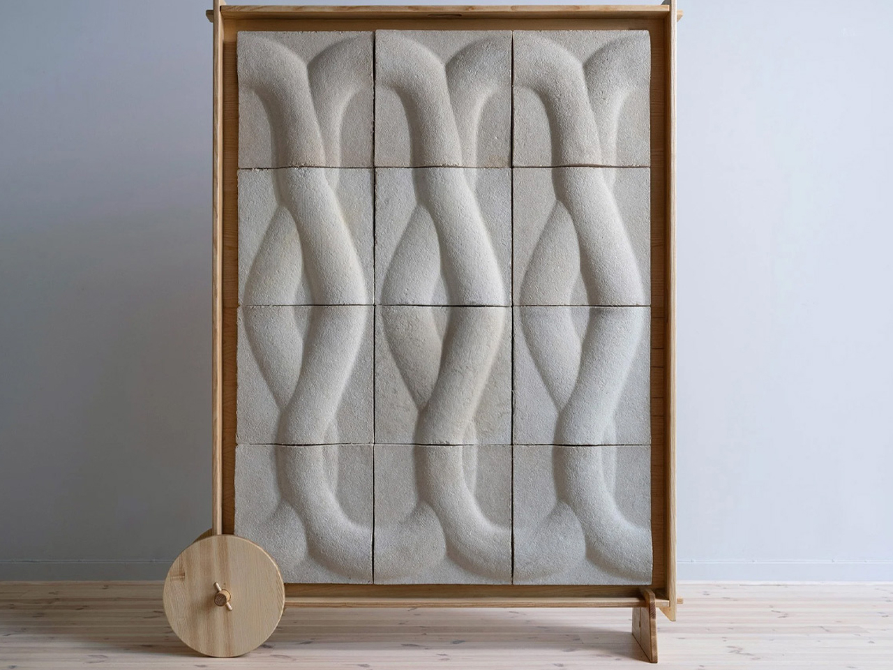
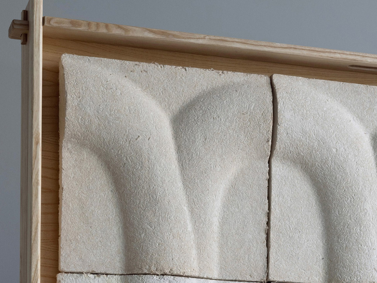
Design studio Interesting Times Gang, in collaboration with cooperative homebuilder OBOS, has introduced Veggro, a collection of sustainable partitions made from biomaterials such as mycelium and orange peel. The Loom design uses mycelium grown on agricultural waste to create textured, mushroom-inspired panels, while Jugoso features 3D-printed orange rinds arranged in geometric patterns shaped by natural fruit vesicles.
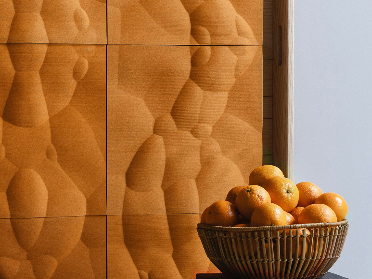
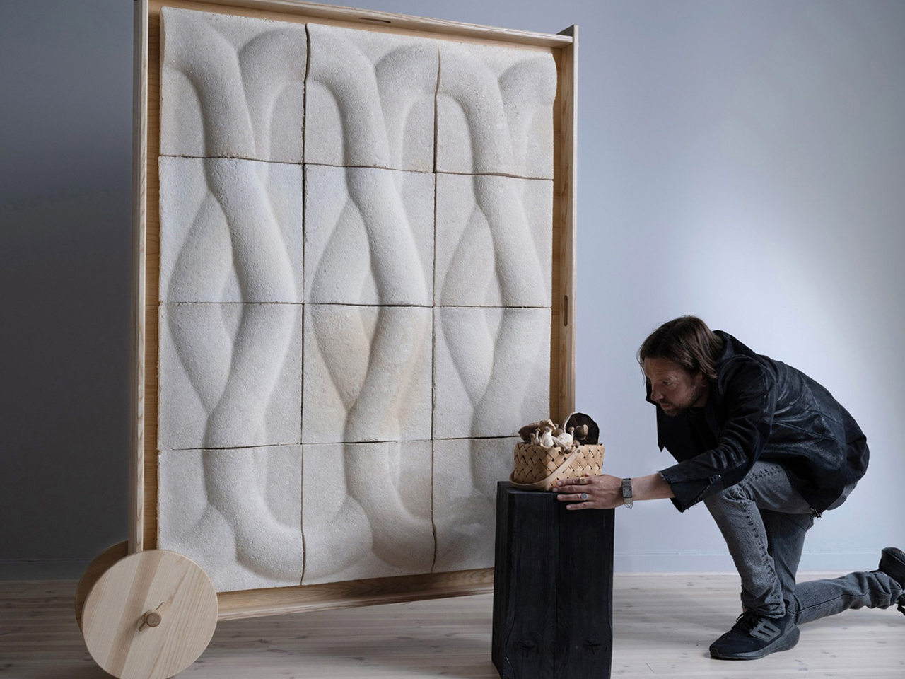
Described as a biophilic “wall-as-furniture” concept, Veggro offers acoustic insulation, decorative value, and modular flexibility, representing the first outcome of the partners’ research into low-carbon construction materials.

Designing for the Amazon tests both humility and intelligence. It demands moving away from monumental statements toward buildings that behave like living organisms. By translating rainforest strategies into design, architecture becomes responsive and poetic. This defines a new luxury where spaces that breathe, adapt, and exist in balance with nature.

The post 5 Biomimicry-based Architectural Designs That Copy Nature’s Best Ideas first appeared on Yanko Design.
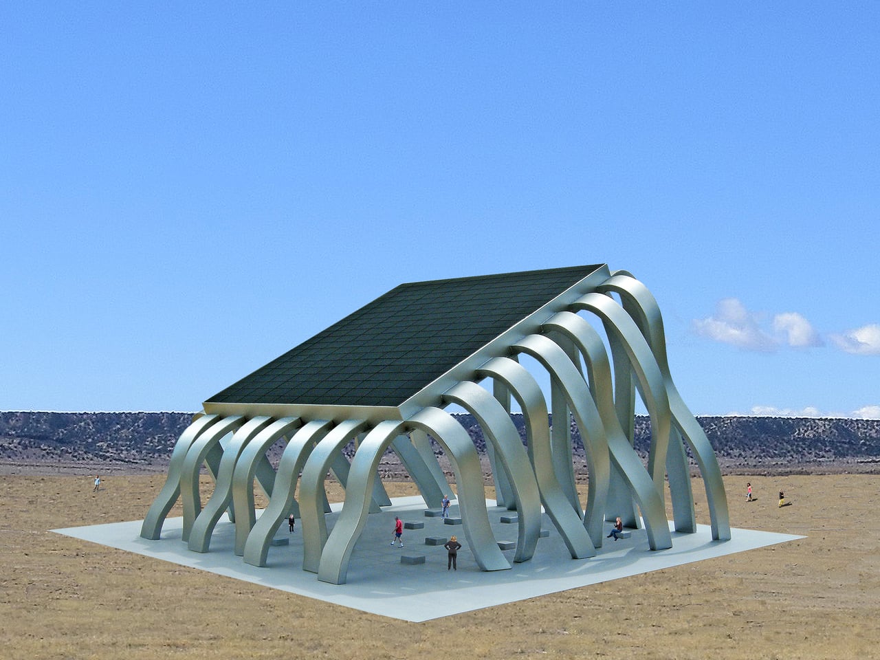
Lie Under This Solar Roof and Watch the Sun Move in Real-Time

Most solar infrastructure is treated as background hardware, panels on roofs or fields that quietly feed the grid while public life happens somewhere else. That separation makes renewable energy feel abstract, a number on a bill rather than an experience. The Solar Eclipse Pavilion imagines a different approach, where the act of harvesting sunlight becomes the centerpiece of a place where people actually gather, making energy visible and social at the same time.

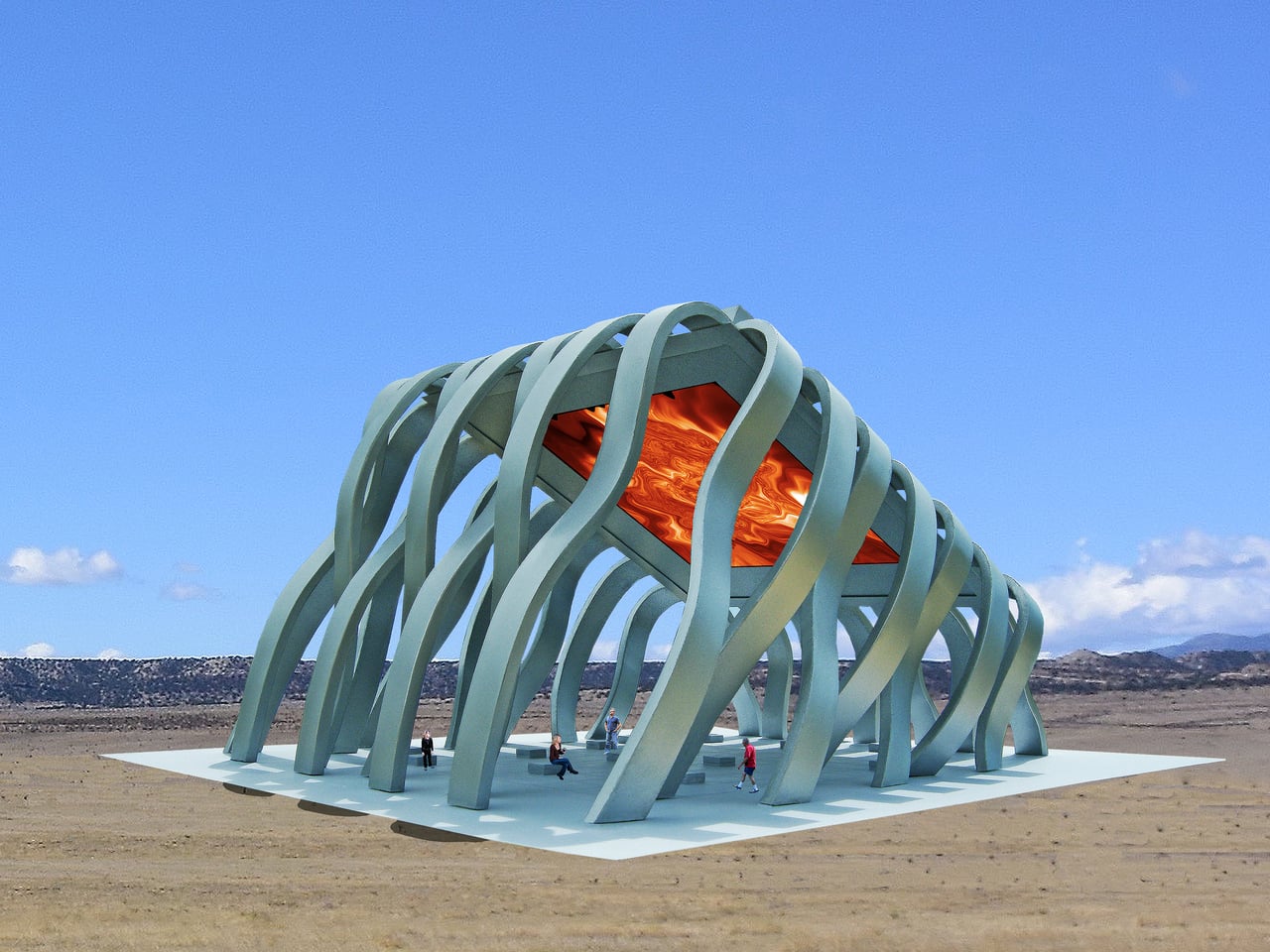
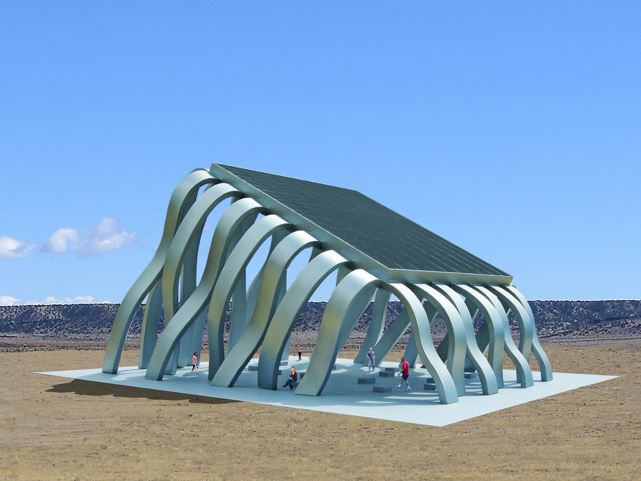
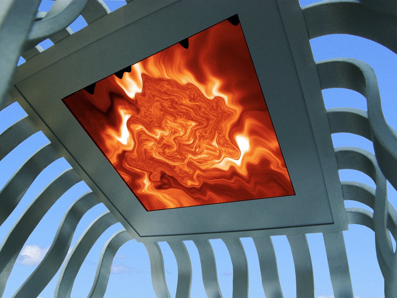
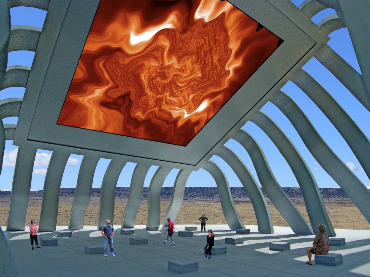
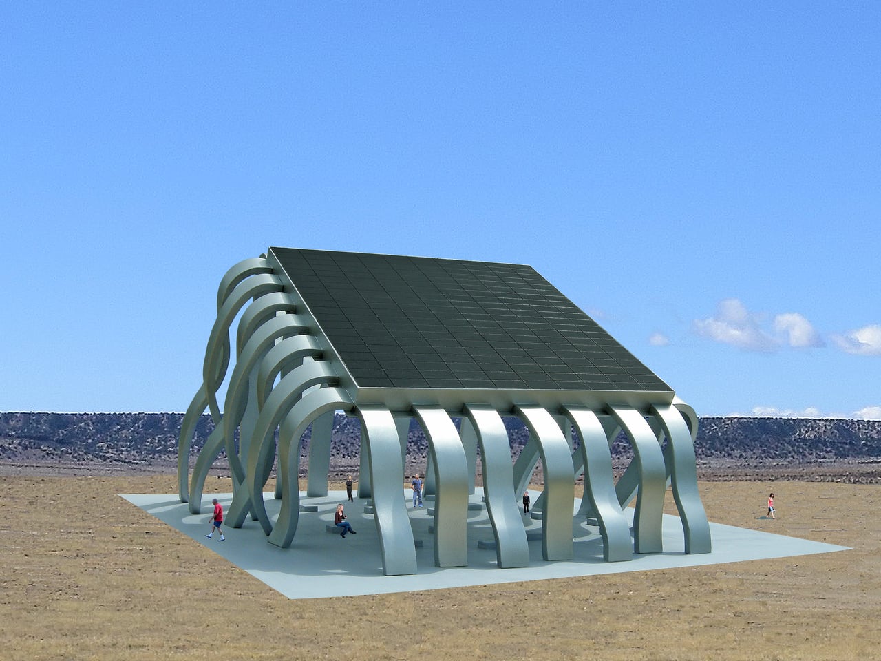
The Solar Eclipse Pavilion is a large steel public art structure that doubles as a small power plant. A 7,000 square foot photovoltaic array forms its roof, converting energy from the sun into electricity for the surrounding community. Some of that power goes straight into the local grid, while some is reserved to run a low-energy LED display mounted on the underside of the canopy, turning the ceiling into a kind of artificial sun overhead.

Designer: Michael Jantzen

The LED surface does not just loop a stock animation. Sensors embedded in the solar array continuously record variations in light and heat across the surface, and those fluctuations drive the graphics and sound. The ceiling shows graphic color images of the sun that morph in response to clouds, temperature shifts, and the angle of light, while an electronic soundscape shifts along with them, making the invisible behavior of the sun legible as color and tone.

After sunset, the photovoltaic cells stop generating power, but the pavilion does not go dark. Pre-recorded images and sound, captured from earlier solar activity, play back through the night until the sun rises and takes over the controls again. For special public events, the default sun imagery and audio can be swapped out for other content, turning the LED ceiling into a programmable media surface for performances, data visualizations, or civic messages.

The solar array shades a large plaza beneath, with built-in seating that invites people to sit, talk, or lie back and watch the ceiling. The pavilion becomes a place for markets, concerts, or informal hangouts, with the energy infrastructure quietly doing its work overhead. Instead of separating technical function from social function, the project fuses them, so the same structure that generates electricity also generates shade, spectacle, and a reason to linger.

The designer describes the pavilion as a gigantic computer chip, a surface where information and energy are manipulated to do work for the people who use it. In that reading, the photovoltaic modules are like transistors, the LED ceiling is like a display bus, and the plaza is the user interface. It is a speculative project, but it points toward a future where renewable energy systems are not hidden away, but turned into civic landmarks that make the sun’s power feel tangible, shared, and even a little theatrical.

The post Lie Under This Solar Roof and Watch the Sun Move in Real-Time first appeared on Yanko Design.
Quiet on the Street, Joyful at Heart! An Adelaide Cottage That Reveals Its Playful Soul

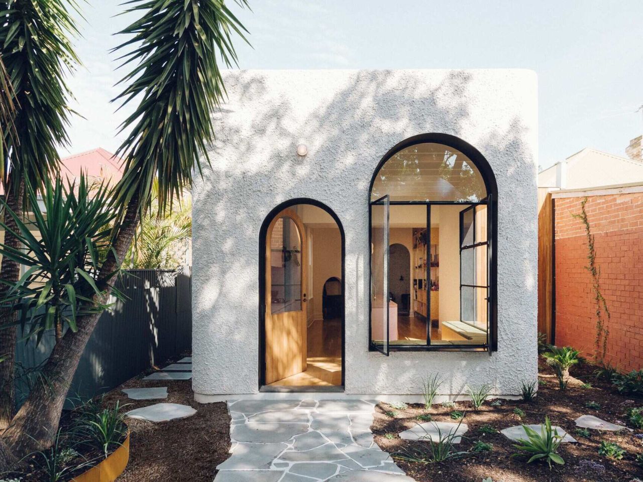
From the street, this Adelaide cottage keeps its composure. It presents itself as calm, familiar, and almost reserved, another quiet presence in a suburban streetscape. But crossing the threshold reveals an entirely different energy. Designed by Sans-Arc Studio, this art deco-inspired addition transforms the home into a space that is playful, expressive, and deliberately designed around how its young owners like to live and entertain.

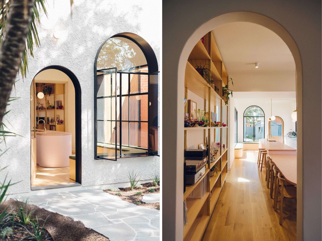
The extension announces itself subtly from the outside. Wrapped in a clean white facade, it avoids loud gestures while still feeling intentional. Deep window reveals lined in black introduce contrast and rhythm, adding a graphic sharpness to the exterior. These recesses are not merely aesthetic; they also shade the interior, reducing glare while allowing light to filter in thoughtfully. The result is an exterior that feels both refined and quietly dramatic, simple in form, but rich in detail.

Designer: Sans-Arc Studio

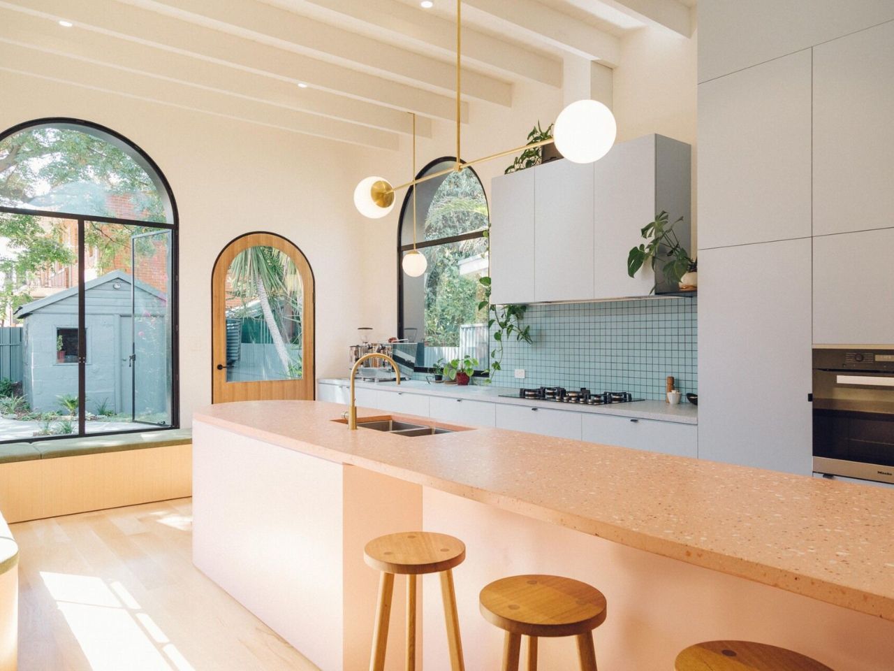
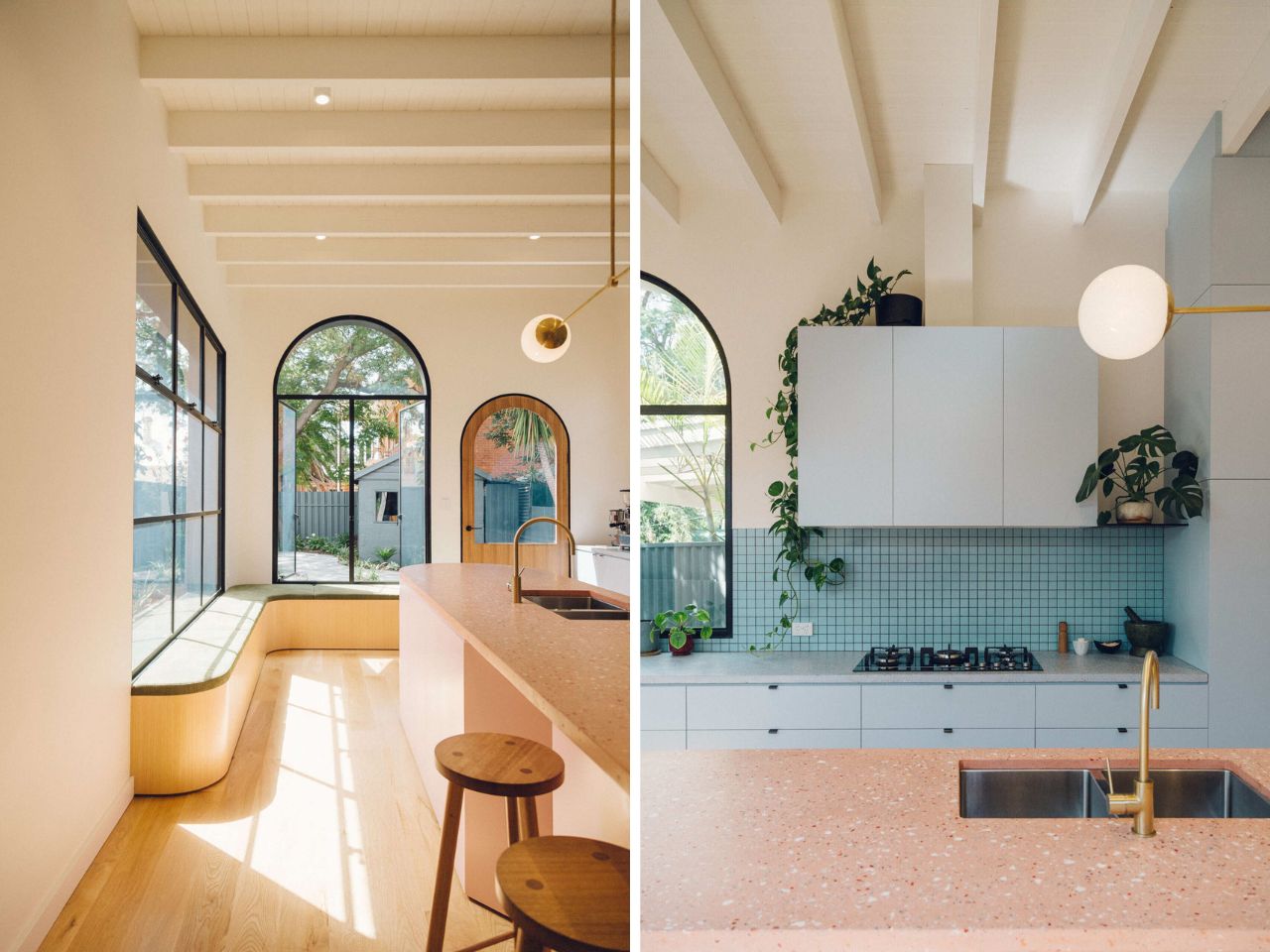
Inside, curves take over. One of the more understated yet memorable moments is a custom corner bench tucked beside a window. Its curved timber base and slim upholstered cushion are a gentle nod to art deco design language, where form and elegance coexist. More than a stylistic flourish, the bench offers a comfortable place to sit, pause, and look out toward the backyard, an everyday moment elevated through thoughtful design.

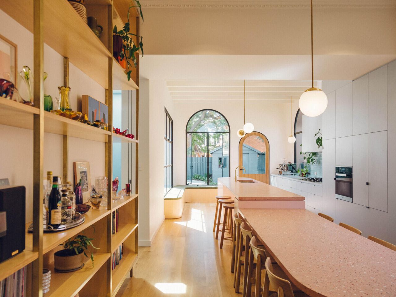
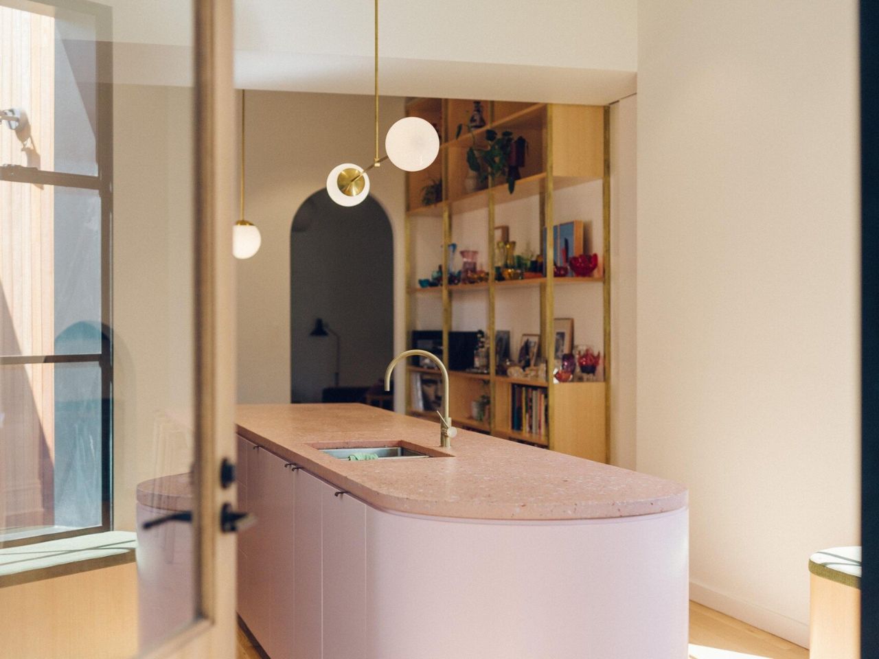
At the heart of the addition is the kitchen, conceived not as a secluded workspace but as a social anchor. Hosting is clearly central to how this home functions. The kitchen opens itself to conversation, movement, and connection, allowing the homeowners to cook without stepping away from their guests. A tiled accent wall brings light and texture into the space, catching reflections throughout the day and reinforcing the sense of warmth and character.

Rather than erasing the past, the project carefully weaves old and new together. A long kitchen island extends through the original cottage and into the new addition, doubling as a dining table. This linear element physically and visually stitches the home together. In the extension, the dining area drops slightly below the island, a subtle level change that defines zones without interrupting flow. It is a quiet architectural move that makes the space feel dynamic while remaining cohesive.

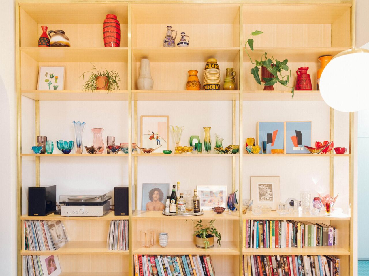
Running alongside the dining area is a timber shelving unit designed as both storage and display. Here, the homeowners’ collection of Italian and Czech glassware, books, and German pottery becomes part of the architecture itself. Bright yet restrained colors and sculptural forms animate the space, turning everyday objects into storytelling elements that reinforce the home’s playful aesthetic.

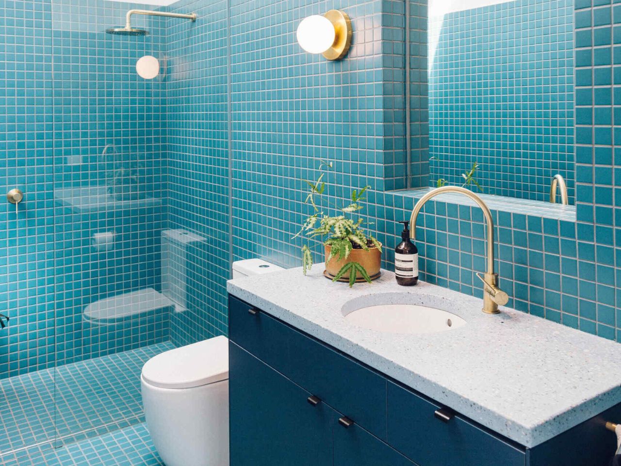
That sense of joy continues into the bathroom. Expanded from its original footprint, the space is wrapped in small square tiles in a vivid blue, instantly energizing the room. A skylight pours natural light from above, while a curved mirror softens the geometry, echoing the rounded forms found throughout the house. The bathroom feels lively, expressive, and deeply personal, a direct reflection of the homeowners’ desire for spaces filled with personality.

An arched doorway off the dining area gently reconnects the new addition to the original cottage. Acting as both a physical passage and a visual cue, it bridges eras while reinforcing the curvy, art deco-inspired language that defines the project. By embracing color, curvature, and the realities of entertaining, Sans-Arc Studio has created a home that feels generous, joyful, and unapologetically fun, proof that quiet exteriors can still hold bold, expressive lives within.

The post Quiet on the Street, Joyful at Heart! An Adelaide Cottage That Reveals Its Playful Soul first appeared on Yanko Design.
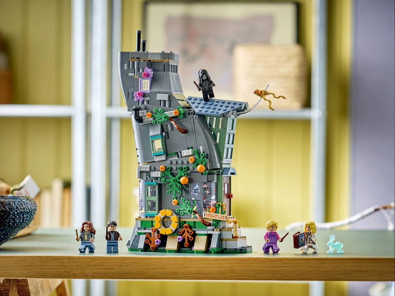
LEGO Finally Made Luna Lovegood’s House and It Has a Working Light Projector

The Lovegood house appeared in just one Harry Potter film, yet its impact resonates throughout the entire Deathly Hallows storyline. Within those curved walls, Harry, Ron, and Hermione learned the truth about the Deathly Hallows. Within those same walls, they discovered the painful lengths a desperate father would go to save his daughter. The location became synonymous with both revelation and betrayal.
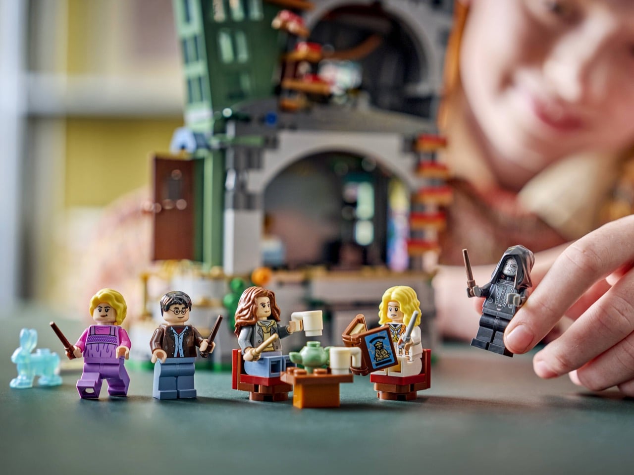
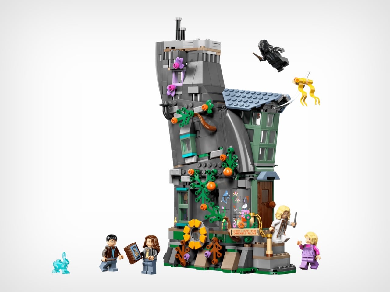
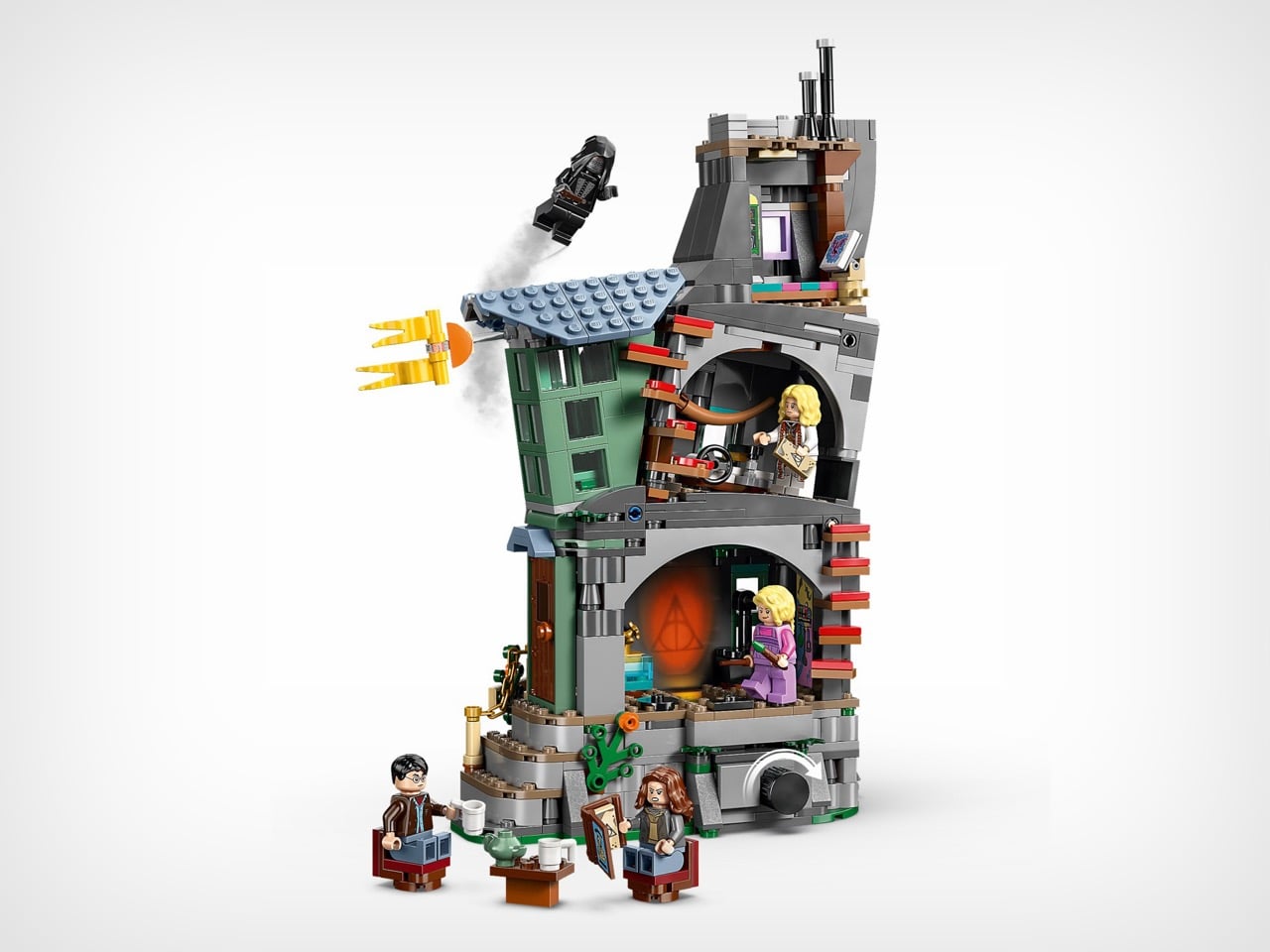
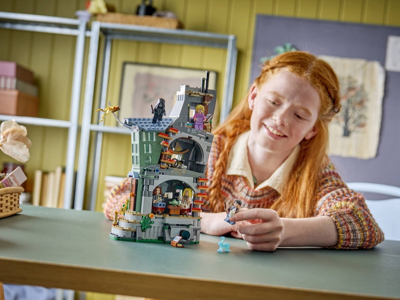
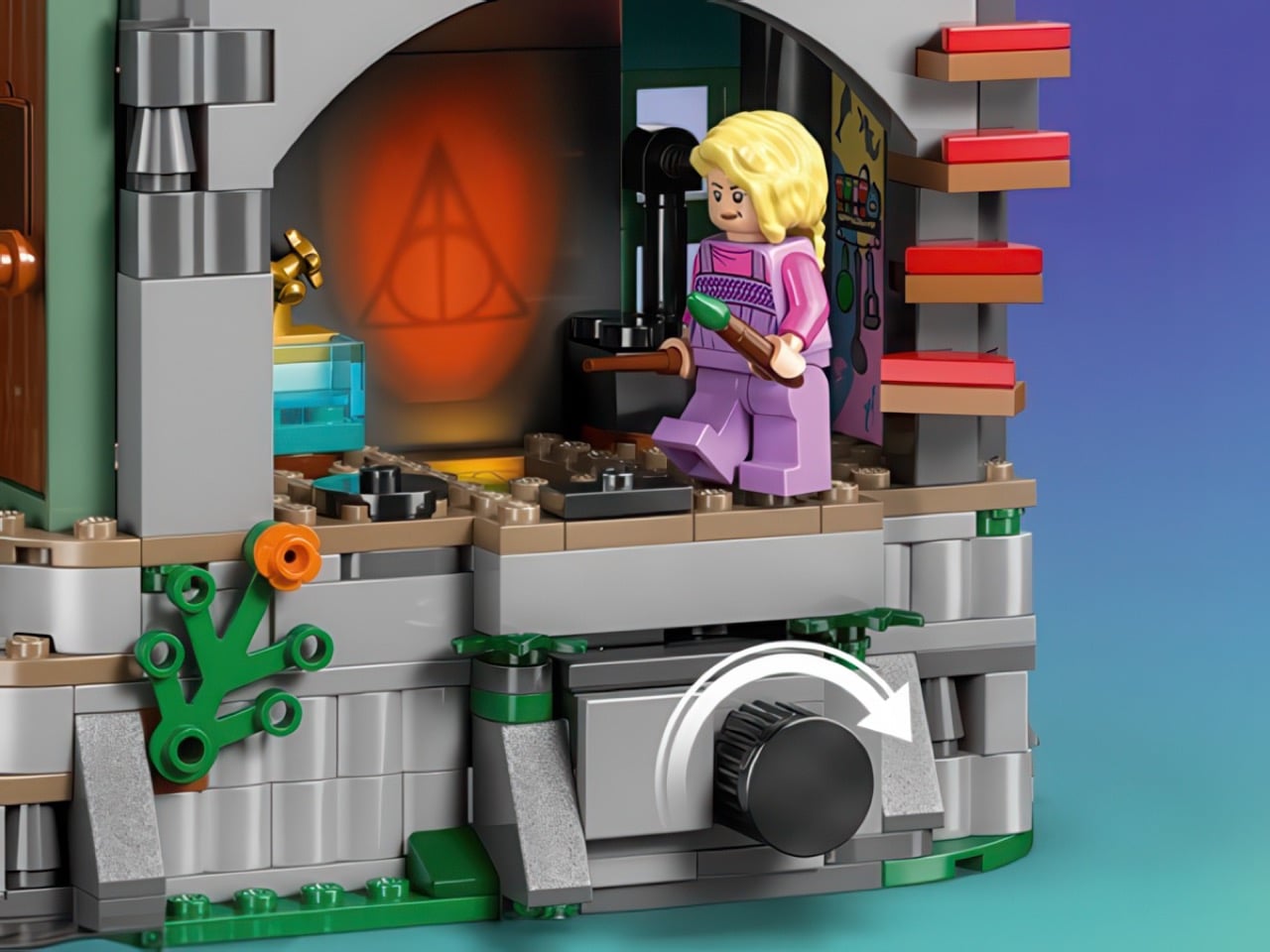
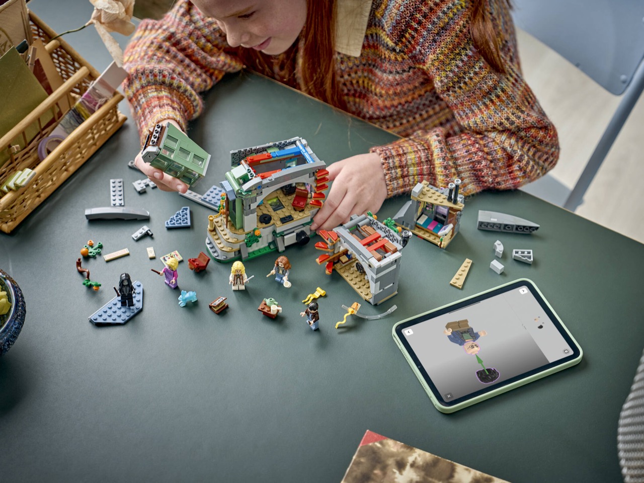
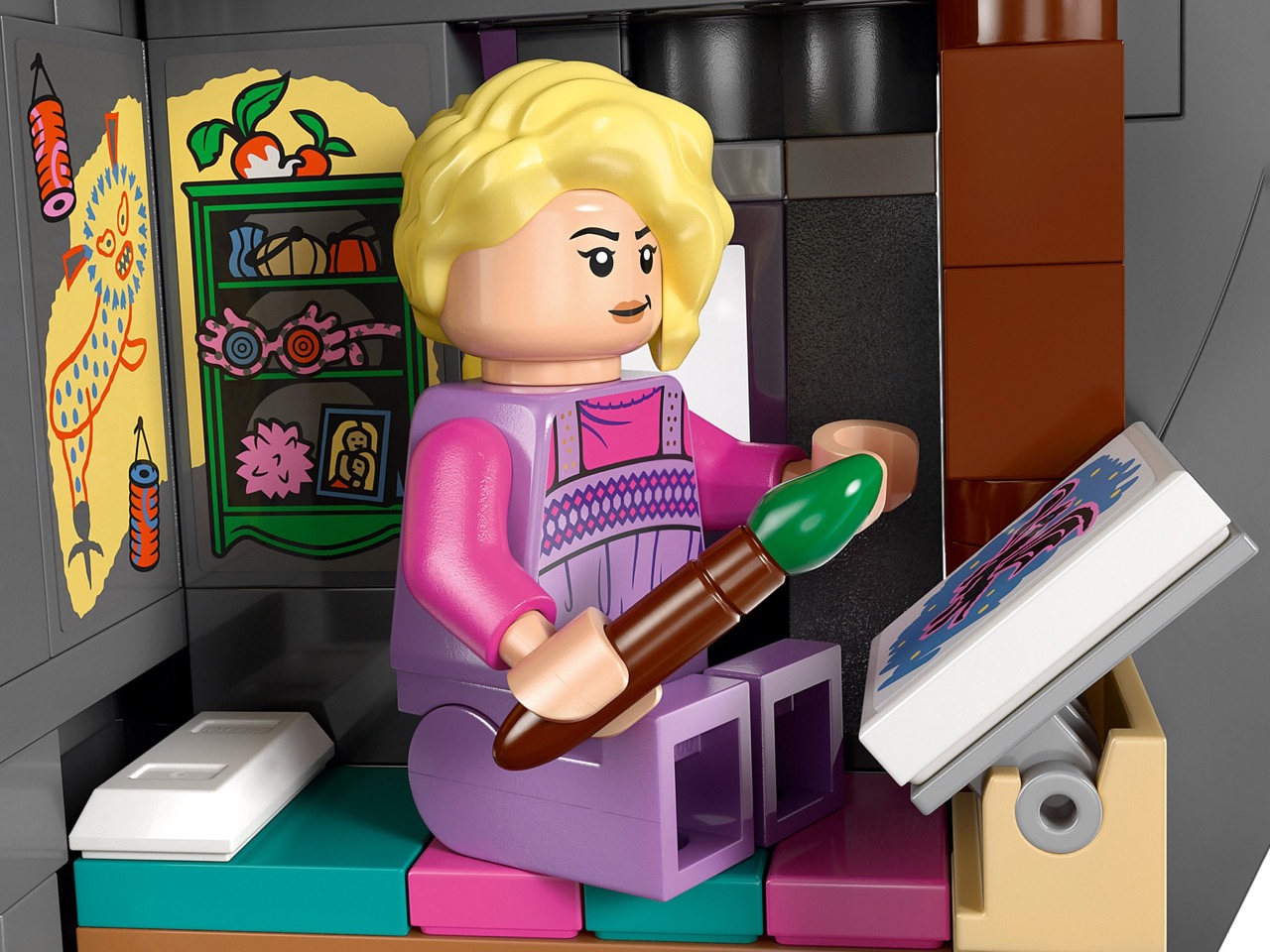
LEGO set 76467 transforms this cinematically significant dwelling into a buildable display piece. The design showcases half of the cylindrical structure, allowing access to meticulously crafted interior spaces across multiple floors. Five minifigures, including Luna in her distinctive purple outfit and a menacing Death Eater, let builders recreate the tense confrontation that defined this chapter of the story.

Designer: LEGO

LEGO’s decision to finally produce this set feels long overdue. The Harry Potter line has given us Hogwarts in every configuration imaginable, multiple iterations of Diagon Alley, the Knight Bus, the Burrow, and even Hagrid’s Hut. But the Lovegood residence, despite its narrative weight in Deathly Hallows Part 1, has remained conspicuously absent until now. Perhaps the unusual architecture made it a challenging prospect. That cylindrical tower, leaning slightly, covered in eccentric vegetation, doesn’t fit the typical LEGO building aesthetic. The cross-section approach solves this beautifully, giving you the iconic silhouette while making the interior actually playable.

At 764 pieces for $89.99, the pricing sits right in LEGO’s mid-range sweet spot. That breaks down to roughly 11.8 cents per piece, which aligns with their standard Harry Potter pricing model. The set measures 29 cm tall, 22 cm wide, and 10 cm deep when completed. For context, that’s roughly the height of a standard wine bottle, so it commands presence on a shelf without dominating your entire display space. The proportions work because the Lovegood house always looked like it defied physics anyway, so the compressed depth of the cross-section design feels authentic to the source material.

They stuck a light brick projector in there that casts images from the Tale of the Three Brothers onto a wall panel. Could they have just printed a tile with the Deathly Hallows symbol and moved on? Absolutely. Did anyone expect them to build a functional projection mechanism? Not really. But here we are. You can actually stage that scene where Xenophilius lays out the entire legend while Harry, Ron, and Hermione sit there processing the fact that they’ve been hunting MacGuffins this whole time. The Erumpent horn sits nearby waiting to explode and wreck everything, because of course it does.

The minifigure roster mirrors the famous Deathly Hallows scene. Harry and Hermione show up in their grim Deathly Hallows gear, not their Hogwarts uniforms. Xenophilius looks appropriately wrecked, which tracks for a father about to betray three teenagers to Death Eaters. Luna appears in purple pajamas because she’s literally imprisoned upstairs during this whole mess. Speaking of Death Eaters, one comes included to represent the threat bearing down on everyone. Then there’s that translucent blue Hare Patronus, part of LEGO’s 25th anniversary collectible series. If you’re chasing the full Patronus collection, you need this set. LEGO knows exactly what they’re doing with that incentive structure.

Available now at LEGO’s standard retail channels, this set fills a gap that honestly shouldn’t have existed this long. The Lovegood house carries weight in the Potter narrative that far exceeds its single-film appearance, and watching LEGO finally commit to that weird cylindrical architecture feels oddly validating. Will it fly off shelves like a Hogwarts Castle release? Probably not. But for people who actually care about Deathly Hallows beyond the surface-level plot points, having Xenophilius’s desperate gambit immortalized in brick form matters. Plus that light projector gimmick will look absurdly cool in low lighting, which might be reason enough to grab it before LEGO inevitably retires the set and secondary market prices get stupid.

The post LEGO Finally Made Luna Lovegood’s House and It Has a Working Light Projector first appeared on Yanko Design.