Canyon’s New Bike Knows a Crash Is Coming Before You Do

Road cycling has always been a sport that rewards the rider who pays the most attention. You watch the road, you watch the traffic, you watch the rider in front of you. You’re constantly processing information, making micro-decisions at every turn. Which is exactly why Canyon’s Predict concept bike, which made its debut at Eurobike 2026, feels less like a cycling product and more like a quiet but serious rethinking of what a bike is allowed to be.

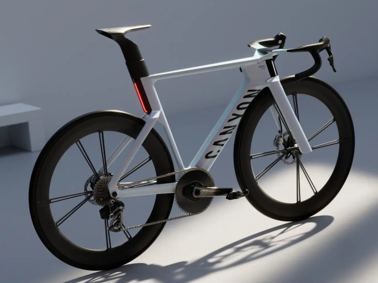
The premise is deceptively simple: rather than reacting to danger, the bike anticipates it. Canyon built the Predict with a 360-degree sensor array, combining radar, cameras, and a multi-dimensional motion sensor, all working together under an Edge AI system that assigns risk scores to what it detects and communicates those scores to the rider in real time. Four radar sensors total, three at the front and one at the rear, plus a data screen built directly into the handlebar. The whole setup is compact, integrated, and far sleeker than you’d expect from something packing this much hardware.

Designer: Canyon
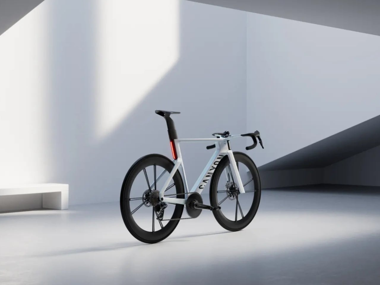
What makes the Predict genuinely interesting isn’t the specs list, though. It’s the shift in design philosophy behind it. Cyclists have had cameras and GPS computers bolted onto their bikes for years, but those tools are still fundamentally passive. You look at the screen when you want to. You check the rearview camera on your own time. The Predict doesn’t wait for you to ask. It tracks group-ride dynamics, advises on cornering speeds, and predicts hazardous road surfaces, all before the rider even registers a problem. The bike talks to you through haptic signals in the handlebars, which means your eyes don’t have to leave the road for the alert to land.
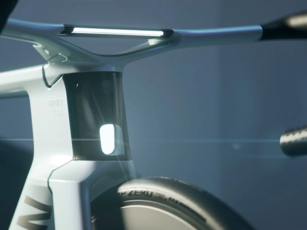
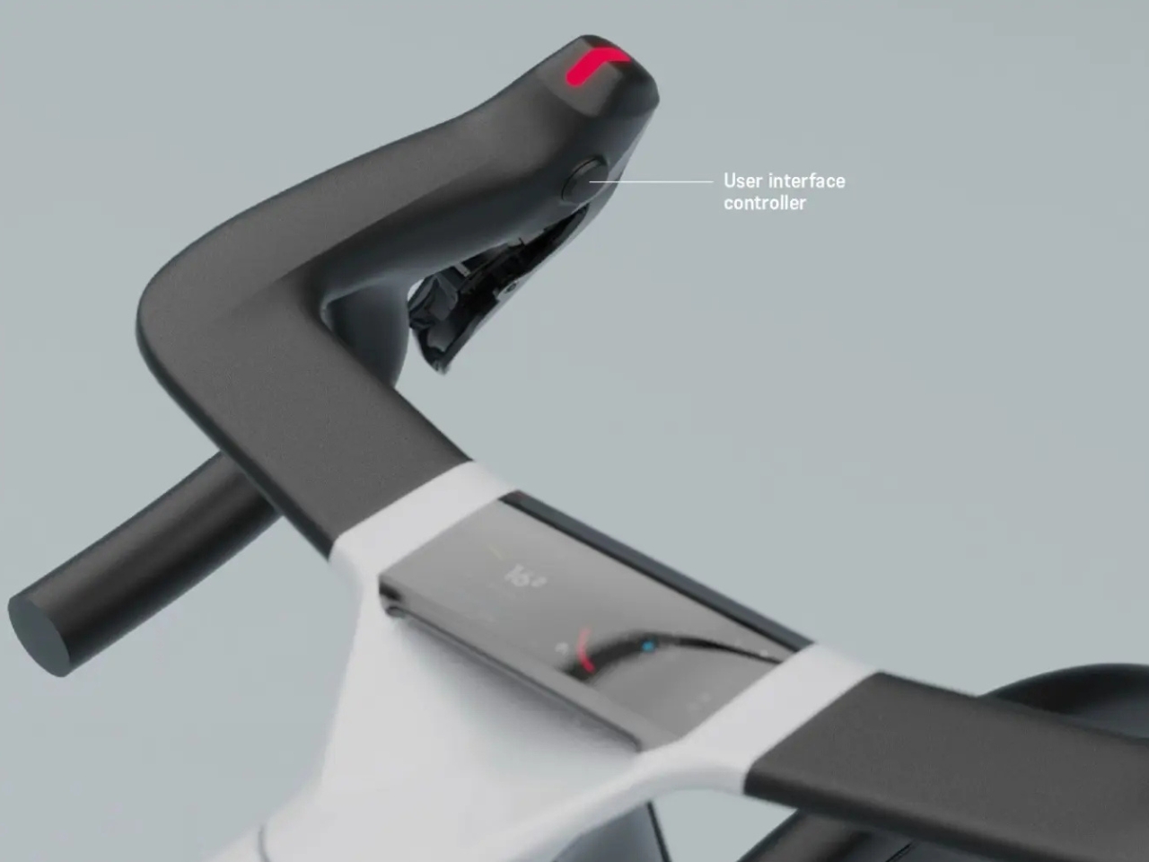
That detail matters more than people might realize. Most cycling safety gear operates on the assumption that the rider has a free moment to process information. The Predict is designed around the fact that sometimes you simply don’t. It’s a subtle but meaningful distinction, and it tells you a lot about where Canyon’s thinking really is right now.
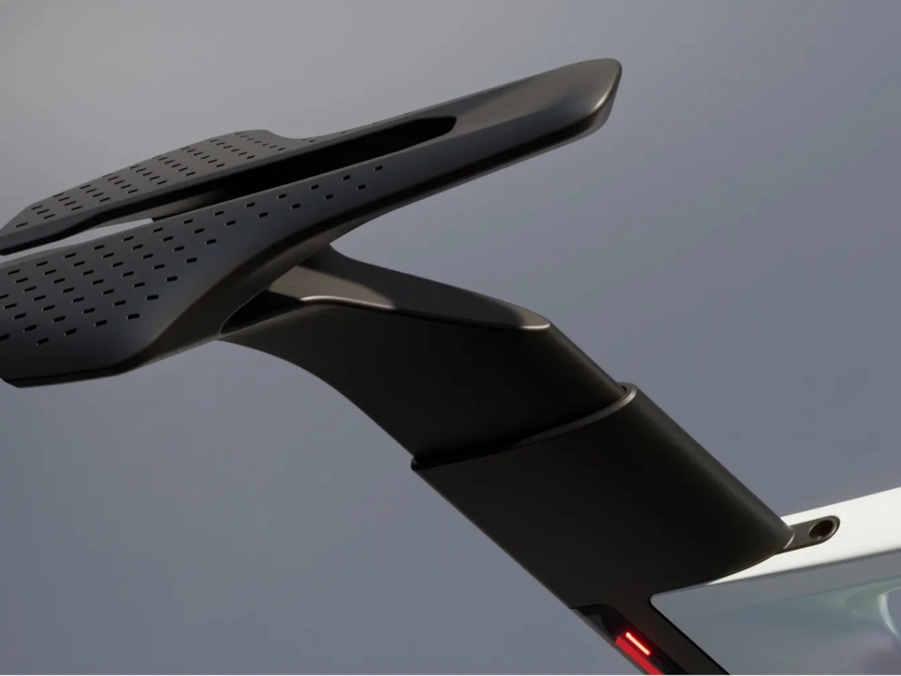
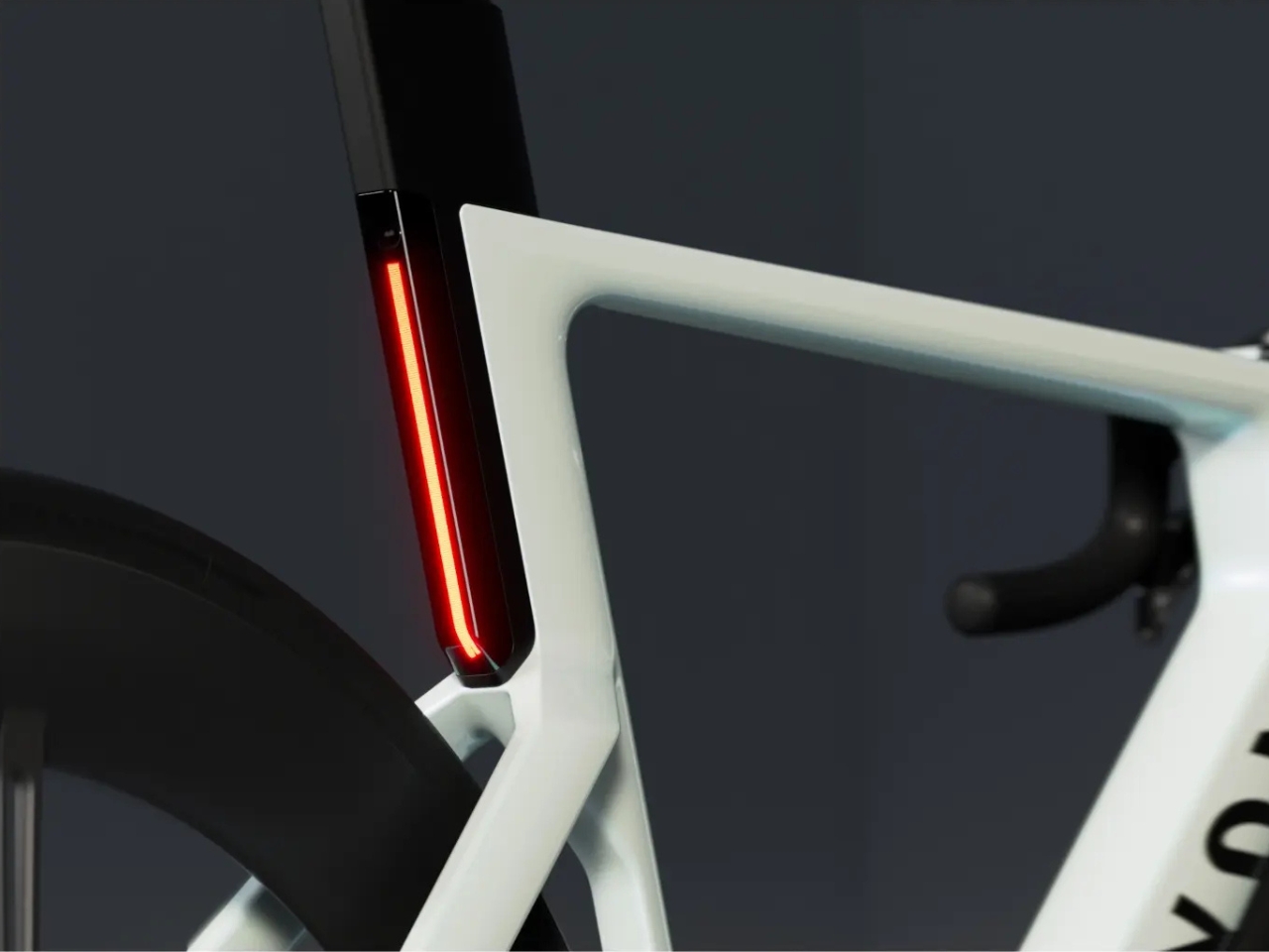
The bike also pairs with the Canyon Stingr Smart Helmet, which features a drop-down visor with its own data visualization screen. Wearing that helmet while riding the Predict, you’d essentially have a full 360-degree awareness system wrapped around you, the kind of setup that until recently existed only in motorsport or military contexts. Seeing it applied to a road bike is either thrilling or slightly unsettling, depending on your disposition. I lean toward thrilling.
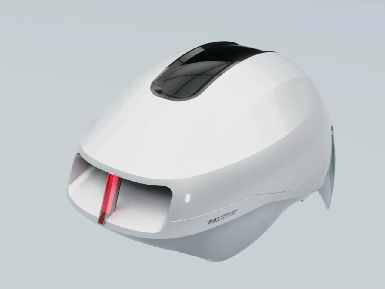
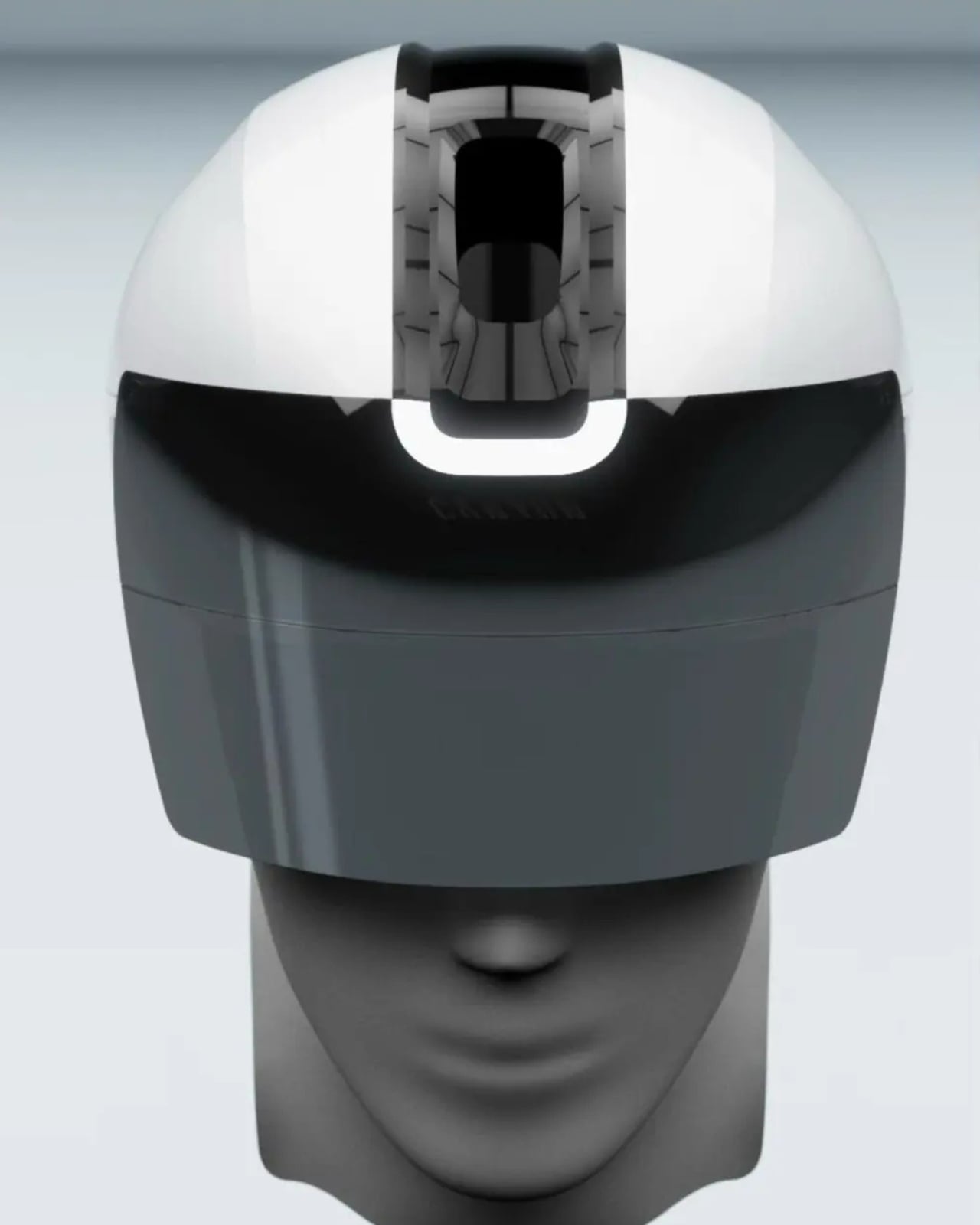
There’s a natural question worth naming directly: at what point does all this technology change the experience of riding rather than just enhancing it? Cycling has a deeply personal quality to it. The appeal, for a lot of people, is the relationship between body, machine, and road, the very human act of reading the environment yourself. The Predict does a portion of that reading for you, and I don’t think that’s a bad thing, but it’s worth sitting with.
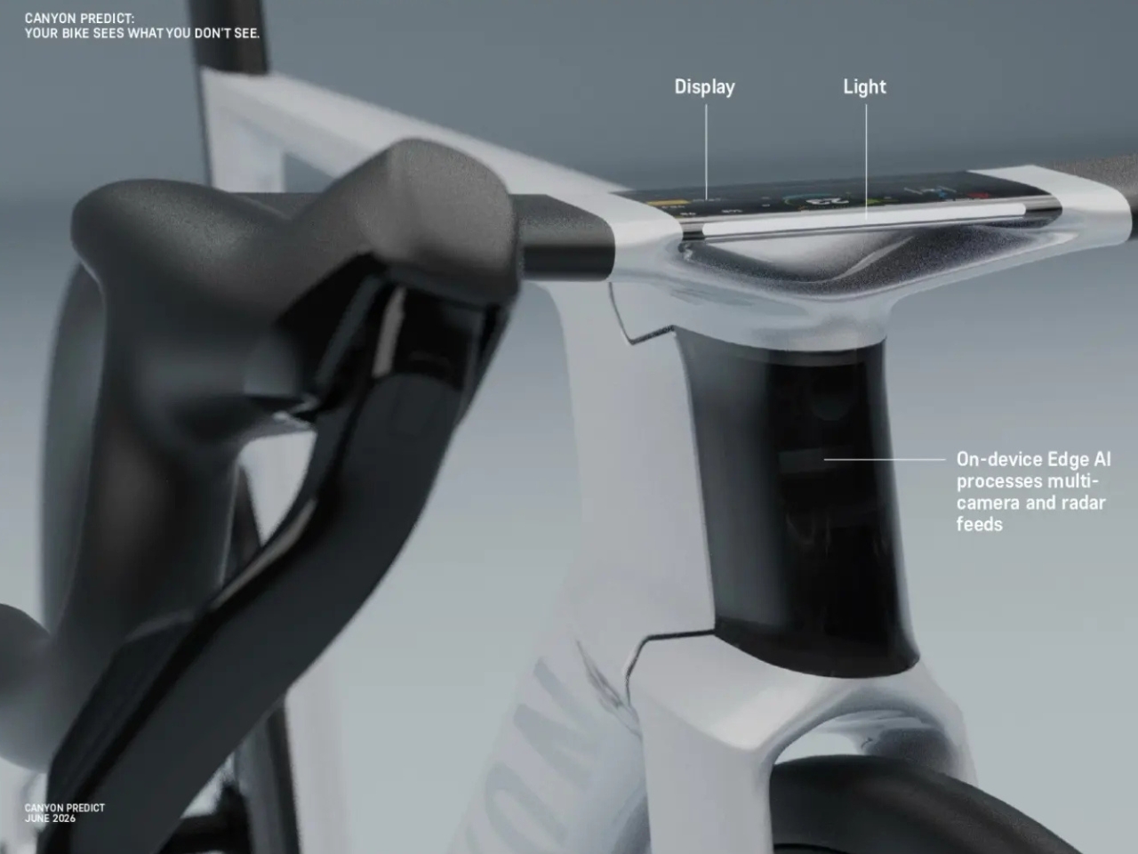
My honest take is that Canyon isn’t trying to automate the rider out of the experience. They’re trying to buy back the rider’s attention for the things that matter most: the road, the ride, the moment. The safety layer runs in the background so you don’t have to. That’s a thoughtful design goal, and it shows in how cleanly the technology is packaged. Nothing about the Predict looks bolted on or retrofitted. It looks like what a bike is supposed to look like, with the tech quietly embedded inside.

The Predict is still a prototype. It’s not heading to market tomorrow, and real-world software testing still stands between this convention floor concept and a commercially viable product. But the hardware is largely functional today, the vision is clear, and the intent is serious. Canyon isn’t just imagining a safer bike. They’re doing the actual work to build one, and that alone is worth paying attention to.
The post Canyon’s New Bike Knows a Crash Is Coming Before You Do first appeared on Yanko Design.

4 Students Just Designed a Cargo Bike With a Built-In Forklift

Most design conversations are obsessed with the “last mile,” that final stretch of delivery between a warehouse and your front door. It’s where billions of dollars in innovation have been poured: electric vans, autonomous robots, drone deliveries. But quietly neglected is what happens before any of that. The “first mile” problem, getting raw goods from the source to any kind of distribution point, barely makes the headlines. Four industrial design students from the University of Bologna just made a strong argument for why it should.

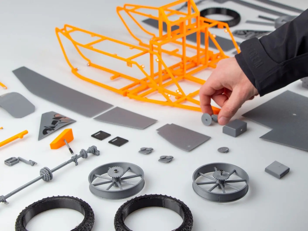
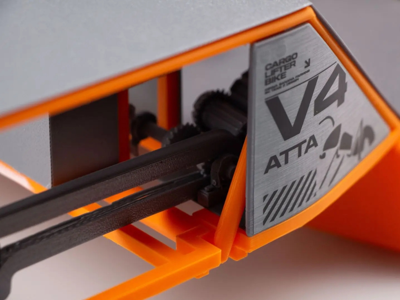
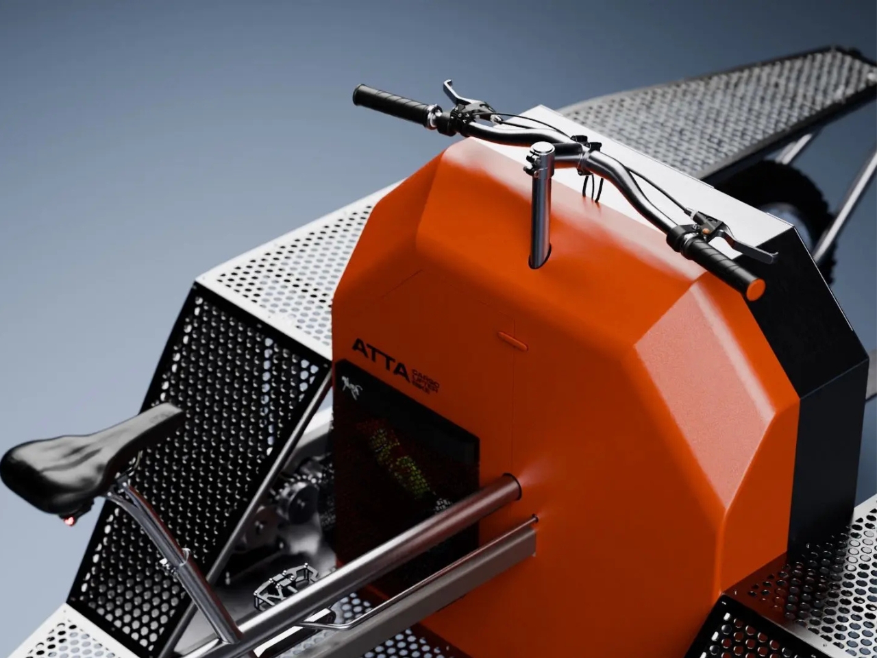
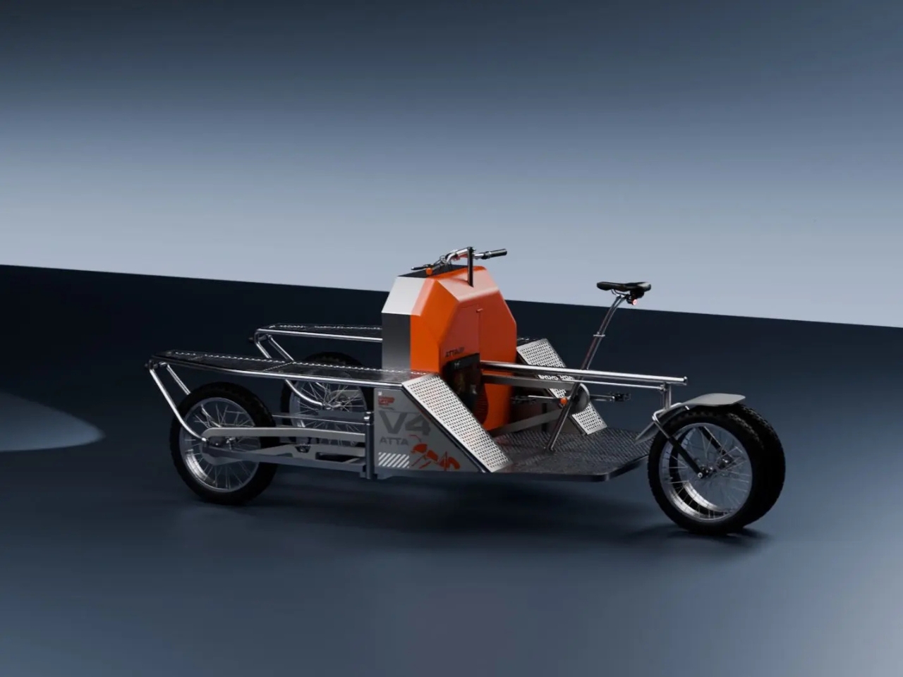
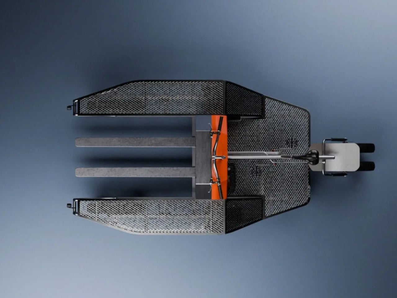
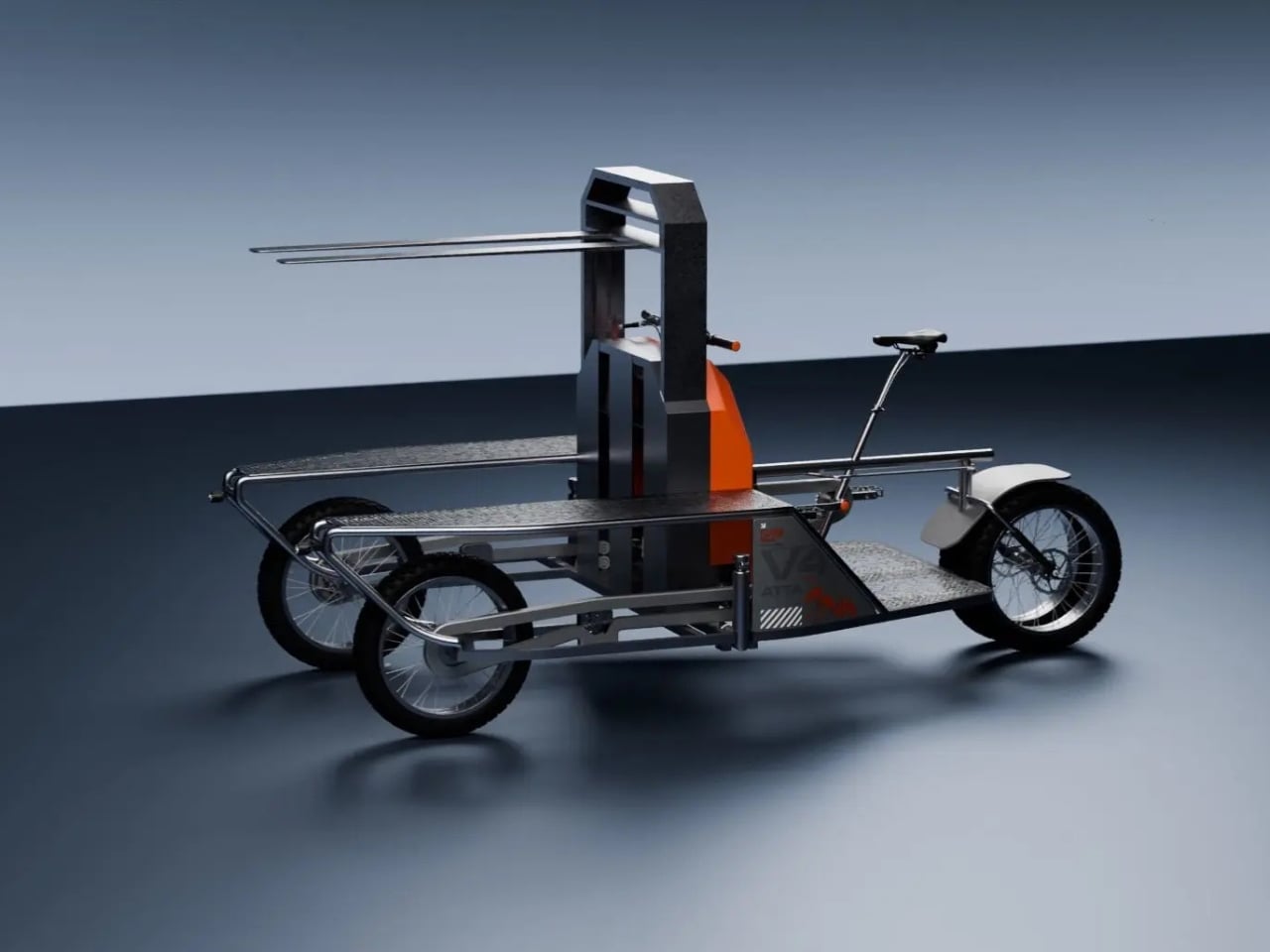
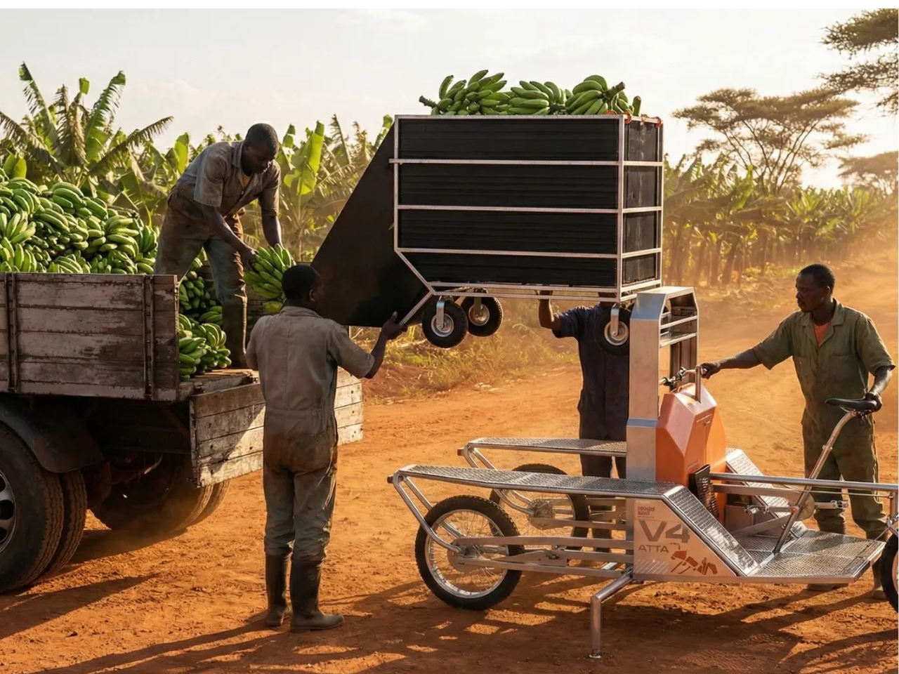
Their project is called ATTA, a human-powered cargo tricycle with an integrated lifting mechanism, designed specifically for banana farmers in rural Kenya. The name is no coincidence. It’s borrowed from the genus of leafcutter ants, those remarkable insects that carry loads far exceeding their own body weight with near-mechanical precision. The designers, Irene Ponteduro, Edoardo Govoni, Filippo Murotti, and Matteo Marinaro, leaned into that metaphor completely, and it paid off. ATTA won first place in the Product Design category of the Toyota Logistic Design Competition 2026, a global competition that drew students and recent graduates from around the world to solve logistics challenges across Africa.

Designers: Irene Ponteduro, Edoardo Govoni, Filippo Murotti, and Matteo Marinaro

That naming choice matters more than it might seem. Choosing an ant as your design muse isn’t a branding exercise. It’s a philosophical stance. Ants don’t overthink a problem; they optimize around it. They work with what the terrain gives them. ATTA follows the same logic. Rather than conjuring up some solar-powered, sensor-loaded machine that would require imported parts and a technical specialist to service, the team focused on something that could actually exist in the hands of a smallholder farmer. Human-powered. Locally maintainable. Built for the reality of the road, not the dream of one.

The problem they were solving is more specific than “Africa needs better logistics,” which is a frustratingly vague framing that designers and development agencies have circled for decades without much progress. Banana farming in Kenya has a particular, stubborn challenge: harvesting involves moving heavy bunches across uneven terrain with little to no infrastructure support. The process is slow, physically punishing, and often damages the fruit before it even reaches a collection point. For a smallholder farmer operating on thin margins, bruised fruit isn’t an aesthetic concern. It’s a financial one.

ATTA addresses this with a cargo frame built for load stability, paired with an integrated forklift-style lifting system that takes the strain out of loading and unloading. The result is a tricycle that doesn’t just transport produce. It handles it carefully, cutting down on the bruising and waste that eat into a farmer’s income before the supply chain has even properly begun. The forklift integration is the detail that stands out to me. It’s not flashy, but it shows how deeply the designers thought about the actual work being done, not just the transportation of it.

What strikes me about ATTA is the discipline it took to arrive at this. Student design competitions have a gravitational pull toward spectacle. The bigger, the bolder, the more futuristic, the better. ATTA resisted that completely. It went precise instead of grand, and that is genuinely harder to pull off. Anyone can propose a sweeping technological vision. Building something that works exactly where it needs to work, for exactly the people who need it, requires a different kind of ambition.

It also raises a quiet question about who design is actually for. A classroom in Bologna thinking about rural Kenya isn’t the obvious pairing, but it might be exactly the right one. Design problems don’t live in the polished neighborhoods we’re used to seeing on mood boards and in design magazines. They live in the first mile, on unpaved roads, in the physical labor that no app has streamlined and no algorithm has bothered to optimize.

ATTA didn’t reinvent the bicycle. It asked what the bicycle could actually do for someone who genuinely needed it, and then it built that. Sometimes that is exactly the point.

The post 4 Students Just Designed a Cargo Bike With a Built-In Forklift first appeared on Yanko Design.
The Dutch Just Built a Ferry You Power Yourself With a Crank

The Netherlands has long held the reputation for being the gold standard of cycling culture, and yet somehow, they keep finding new ways to surprise you. The latest? A self-powered, chain-driven floating platform that lets cyclists cross the Piushaven river in Tilburg without a bridge, without a motor, and without waiting for anyone else to make it happen. It’s exactly the kind of design that should make the rest of us feel both inspired and slightly embarrassed that we hadn’t thought of it sooner.

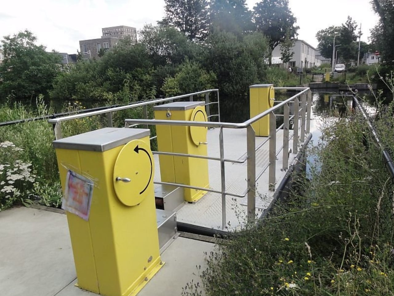
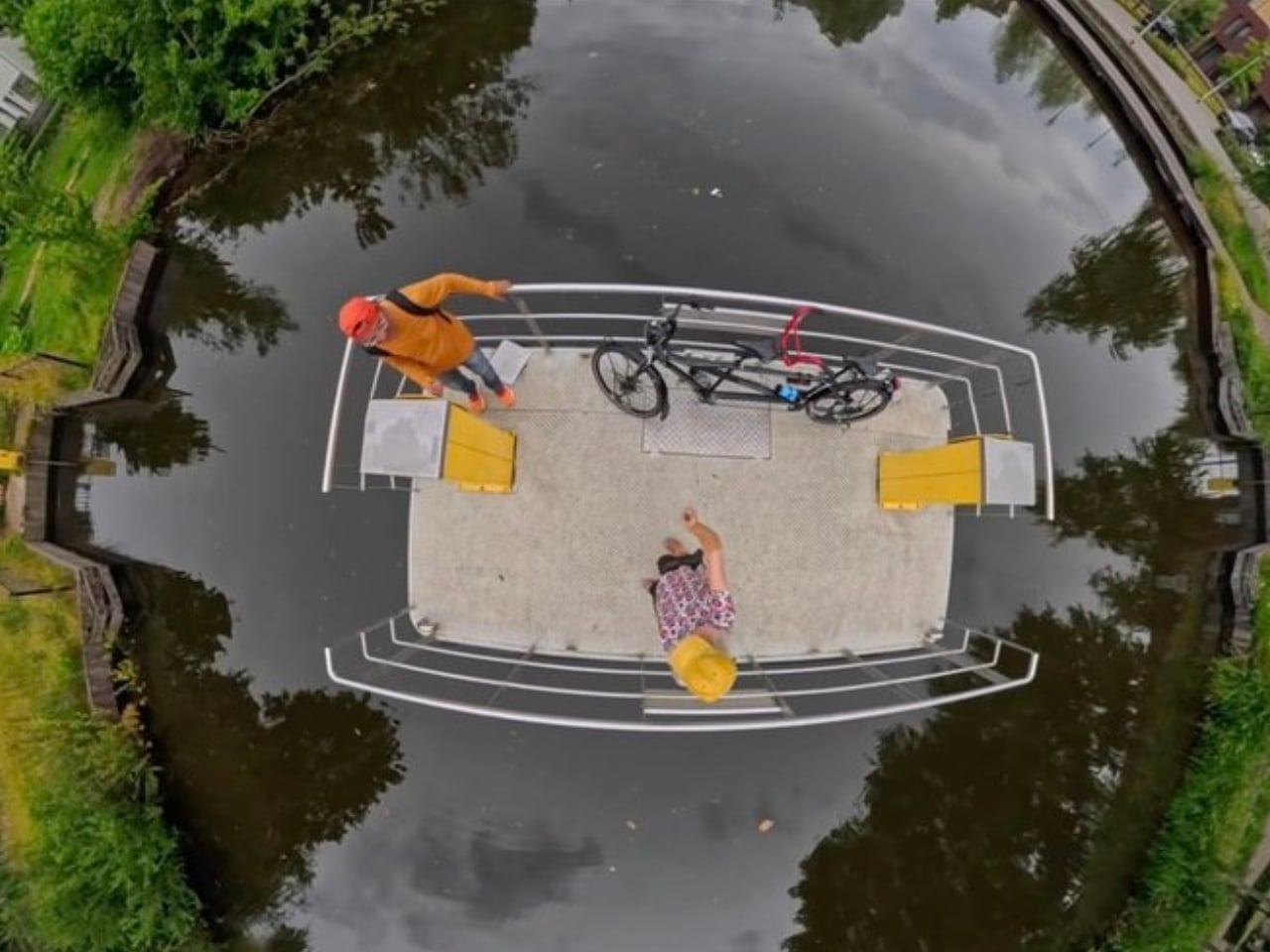
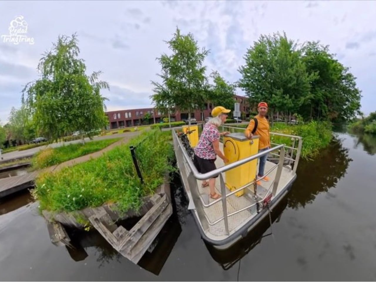
The setup is deceptively simple. A flat floating platform sits on the water, connected to a submerged chain that stretches from one bank to the other. When you arrive at the edge of the Piushaven, you roll your bike onto the platform and turn a crank. That’s it. The crank mechanism pulls the platform along the chain, and you slowly drift to the other side. No waiting for a scheduled ferry. No detour to the nearest bridge. No fuel, no emissions, no infrastructure beyond what’s already in the water. Cranks are installed on both sides of the canal, so if the platform is docked on the opposite bank, you simply crank it over to your side first.

Designer: Tilburg City

The Dutch have been managing waterways for centuries, which is probably why they’ve refined the logic of crossing them down to something this clean. The Netherlands is famously threaded with canals, many of which predate modern transit planning by hundreds of years. The challenge has never been the water itself but the question of how you move people across it without making the whole thing a logistical nightmare. A massive bridge requires significant investment. A permanent ferry service requires staff, a schedule, operating costs, and inevitably, maintenance headaches. What Tilburg built is neither. It’s closer to a tool than a transit system, a piece of infrastructure that behaves more like a piece of outdoor furniture than a public works project.

The restraint in that decision is the most clever part of the whole thing. The municipality didn’t try to solve the problem with more technology. They solved it with less. And the result is a crossing that works around the clock, requires minimal upkeep, and asks the user to contribute exactly as much energy as the task needs, no more. That runs counter to almost everything we tend to celebrate in modern design, where the default move is to add features, add connectivity, add intelligence. We rarely stop to ask whether less would simply work better.

Vijay Malhotra, an Indian bicycle vlogger who travels the world on two wheels, documented his encounter with the Tilburg ferry and the video has been making the rounds online. Watching it, you understand almost immediately why people are sharing it. Malhotra stumbles upon the crossing while following a bike route, and the whole encounter has this wonderfully mundane quality, like discovering a secret that the locals have simply accepted as ordinary life. That gap between “this is remarkable” and “this is just how we do things here” is where the best design tends to live.

It also puts a useful frame around what cycling infrastructure can actually look like when a city commits to it seriously. We talk a lot about bike lanes and protected paths, and those conversations matter enormously. But the Tilburg river crossing is a reminder that cycling infrastructure isn’t just about the roads. It’s about removing every friction point between a person and where they’re trying to go, whether that’s a missing sidewalk, a poorly timed signal, or a river with no crossing in sight. A hand-cranked floating platform is a solution that costs far less than a bridge and works far better than nothing.

The design won’t go viral the way a sleek concept car or a flashy product launch does, and that seems perfectly fine. The things that actually improve daily life rarely make headlines. They just show up quietly, sit on the water, and wait for someone to turn the crank.

The post The Dutch Just Built a Ferry You Power Yourself With a Crank first appeared on Yanko Design.

Tesla Dropped a $225 Kids Bike That’s Already Worth $8,000

When Tesla drops something new, the internet tends to spiral. Sometimes that’s deserved, sometimes it’s a little much. But I’ll say this: the Tesla Balance Bike for Kids landed last week and the reaction makes complete sense to me, even if the bike itself is a little absurd.

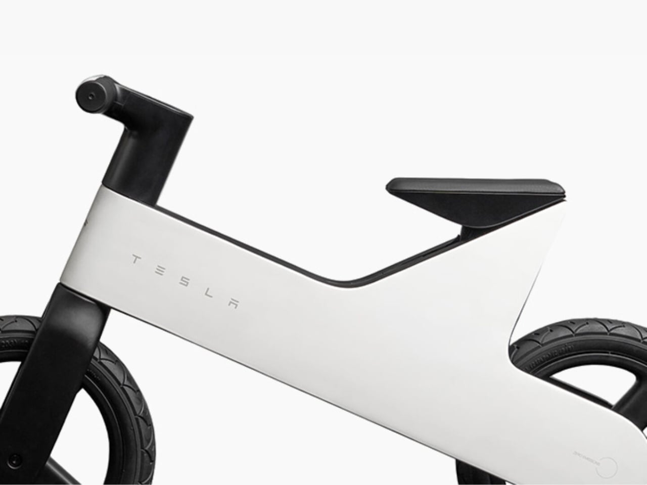
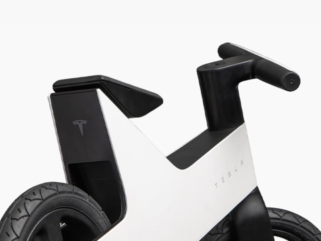
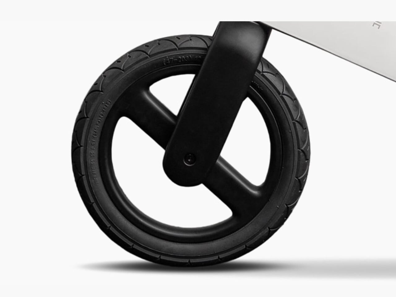
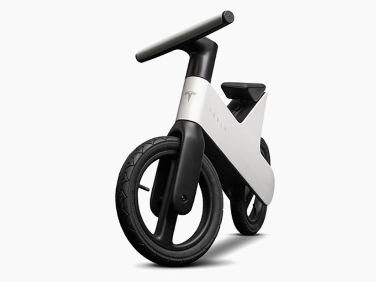
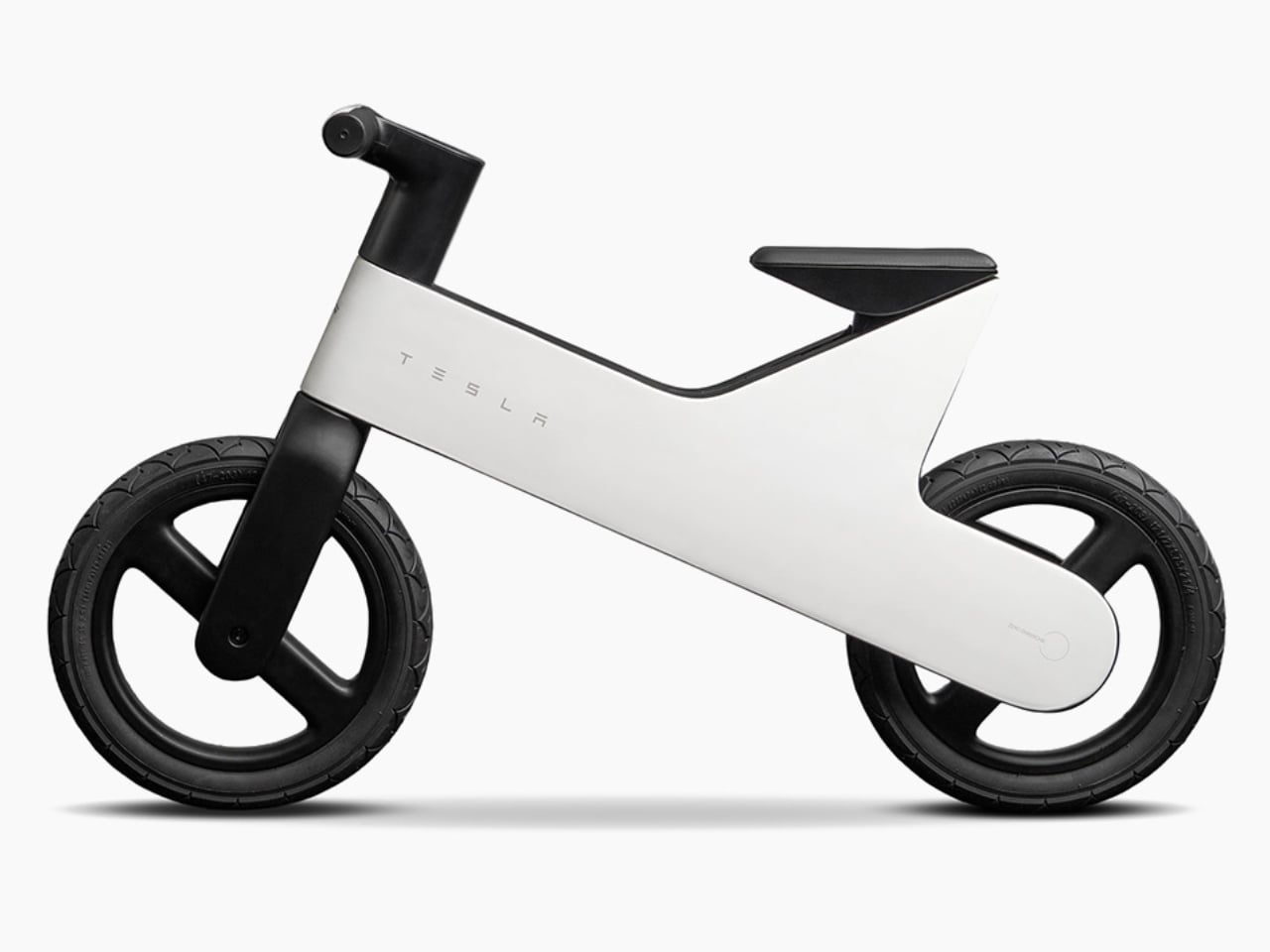
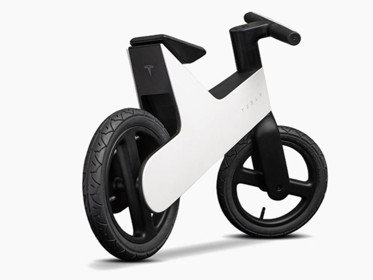
Let’s set the scene. On July 16, Tesla quietly added a balance bike to its official shop, priced at $225. It’s designed for children between two and five years old, features a lightweight magnesium frame, five adjustable seat heights, and the Tesla wordmark stamped on the side with the signature “T” logo on the front. No pedals. No motor. No battery. Just a very sleek, very branded piece of equipment for a toddler to scoot around on. It was sold out within days, and eBay listings are already floating around for as much as $8,265. Yes. Eight thousand dollars. For a children’s balance bike.

Designer: Tesla

I want to be clear that the bike itself is not a bad product. A magnesium frame is genuinely impressive at this price point and for this type of product. Magnesium is lighter than both aluminum and steel while still being structurally solid, which actually matters a lot when a two-year-old is trying to figure out how gravity works. Balance bikes work because children push themselves forward with their feet and learn to steer and stabilize before ever touching a pedal. Weight is the enemy of that process. A lighter frame means less frustration and a faster learning curve, so using magnesium here is not just a styling choice; it is a practical one.

The five adjustable seat heights are another smart detail. The bike is supposed to grow with the child across those early years rather than becoming obsolete the moment your kid hits a growth spurt. At $225, you’d expect it to last at least a few seasons, and the design accommodates that.

But here’s where I start to have mixed feelings. The design language is unmistakably Tesla. Clean, minimal, slightly futuristic, and built around the brand as much as the product itself. That’s fine for adults who’ve chosen to invest in the Tesla ecosystem. For a toddler, the “T” logo on the front doesn’t mean much yet. So who is this bike really for? I’d argue it’s mostly for the parents. It’s a lifestyle object dressed up as a children’s product, which isn’t necessarily wrong, but it’s worth naming. That’s also the reason it sold out so fast and why resellers are already treating it like a limited sneaker drop. The product value isn’t just in the magnesium frame or the adjustable seat. It’s in the logo. And a lot of people clearly want that. That’s not a criticism. Brand value is real, even when it takes the shape of a toddler’s first bike.

For $225, the bike lands at a premium relative to average balance bikes on the market, which typically run anywhere from $50 to $150. You’re paying a significant markup for the branding, and I don’t think Tesla is hiding that. The product doesn’t pretend to be competing with generic options. It knows its buyer. That kind of confidence is either admirable or a little audacious depending on where you’re standing. If you’re a Tesla owner, or even just a Tesla fan, this bike makes total sense as a purchase. The design is clean, the materials are quality, and it’s the kind of thing that photographs beautifully next to a Model Y in the driveway. That’s part of the pitch, whether or not it’s stated outright.

For everyone else, I’d say the bike is a perfectly fine product at a price you’re paying partly for aesthetics and partly for the story of handing your two-year-old something built by the same brand as their parent’s car. Is that worth $225 to you? That’s a personal call. Shipping is expected to begin in late August. If you missed the initial drop, you’ll either have to wait for a restock or politely decline to spend eight thousand dollars on eBay.

The post Tesla Dropped a $225 Kids Bike That’s Already Worth $8,000 first appeared on Yanko Design.
LEGO Icons Road Bike is an intricate 1,015-piece buildable set for grown-ups

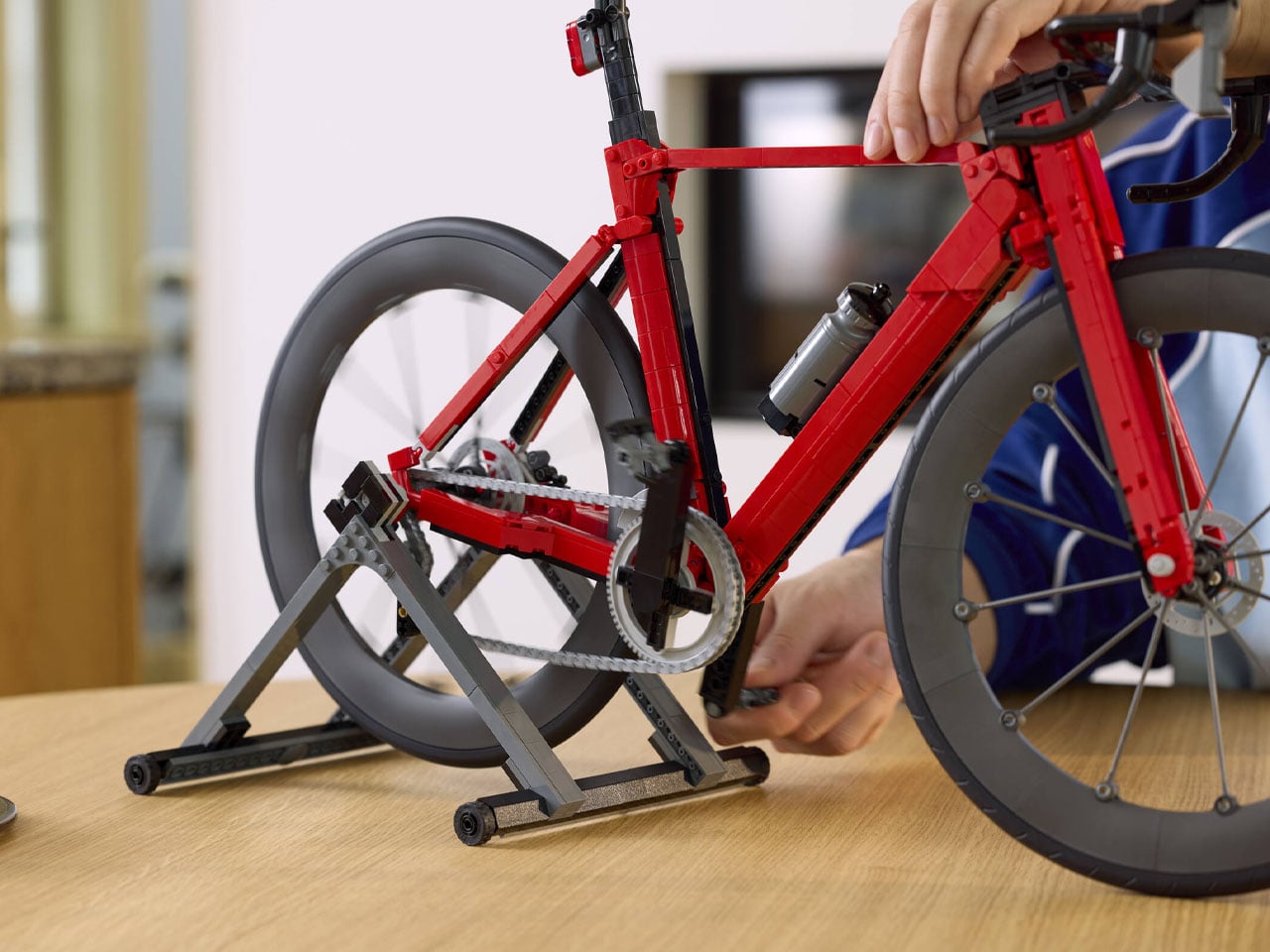
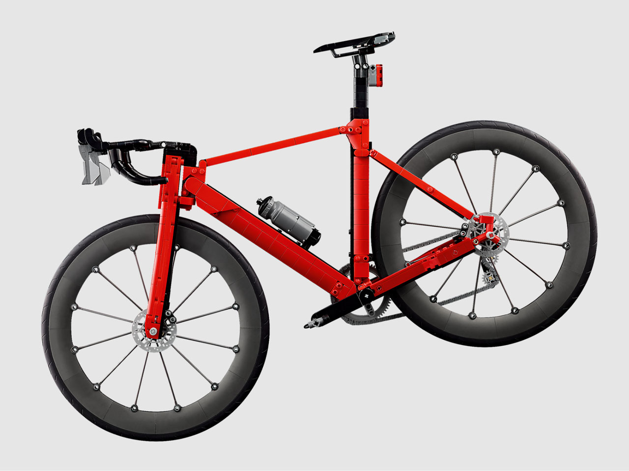
There’s something about the intricately scaled-down models of vehicles that takes me back to the nostalgic times. The memory of the miniature bicycle model that I used to play with as a kid flashed right in front of my eyes as soon as I laid my eyes on this latest LEGO release. The 1,015-piece set dubbed Road Bike is a more modern interpretation of the aero bicycles that we see these days.

Apparently, this is the first-ever road bike model in LEGO Group’s portfolio, and I’m glad they made it under the LEGO Icons moniker. No surprise, the set that was up on LEGO Ideas for years has now finally made it to the official lineup. According to the official press release, the bike is a “sports-inspired décor that celebrates the world of cycling.” Perhaps the perfect prop for Tour de France fans.

Designer: LEGO Group

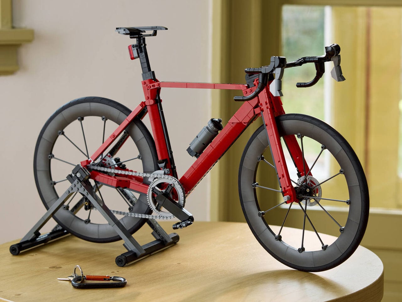
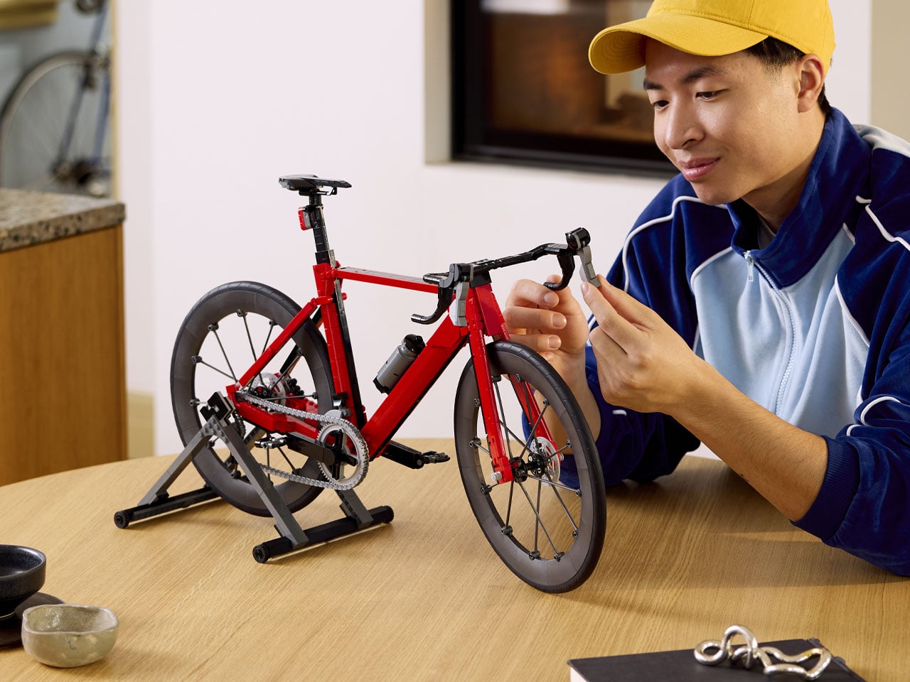
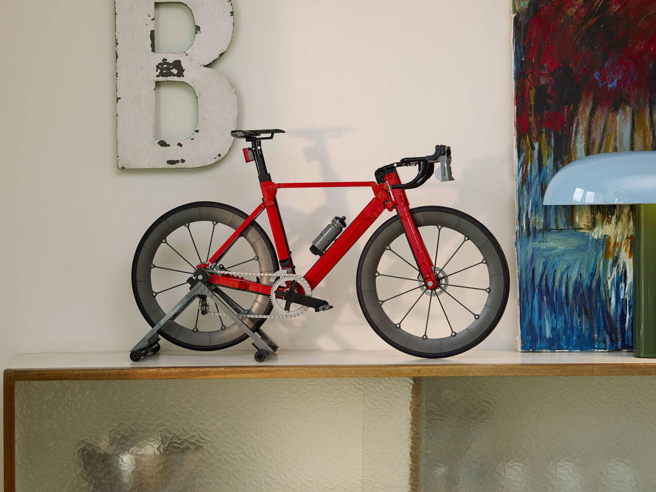
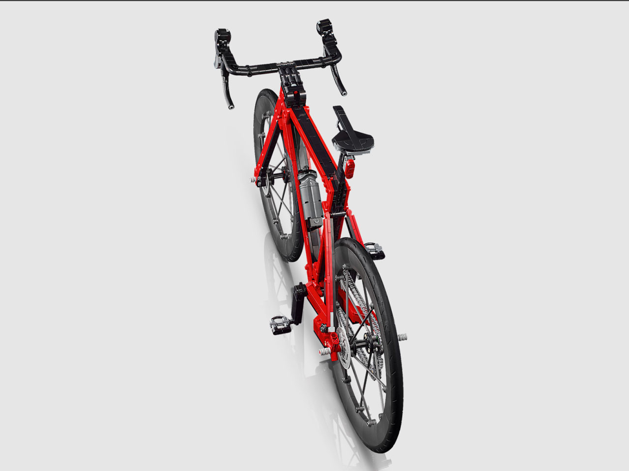
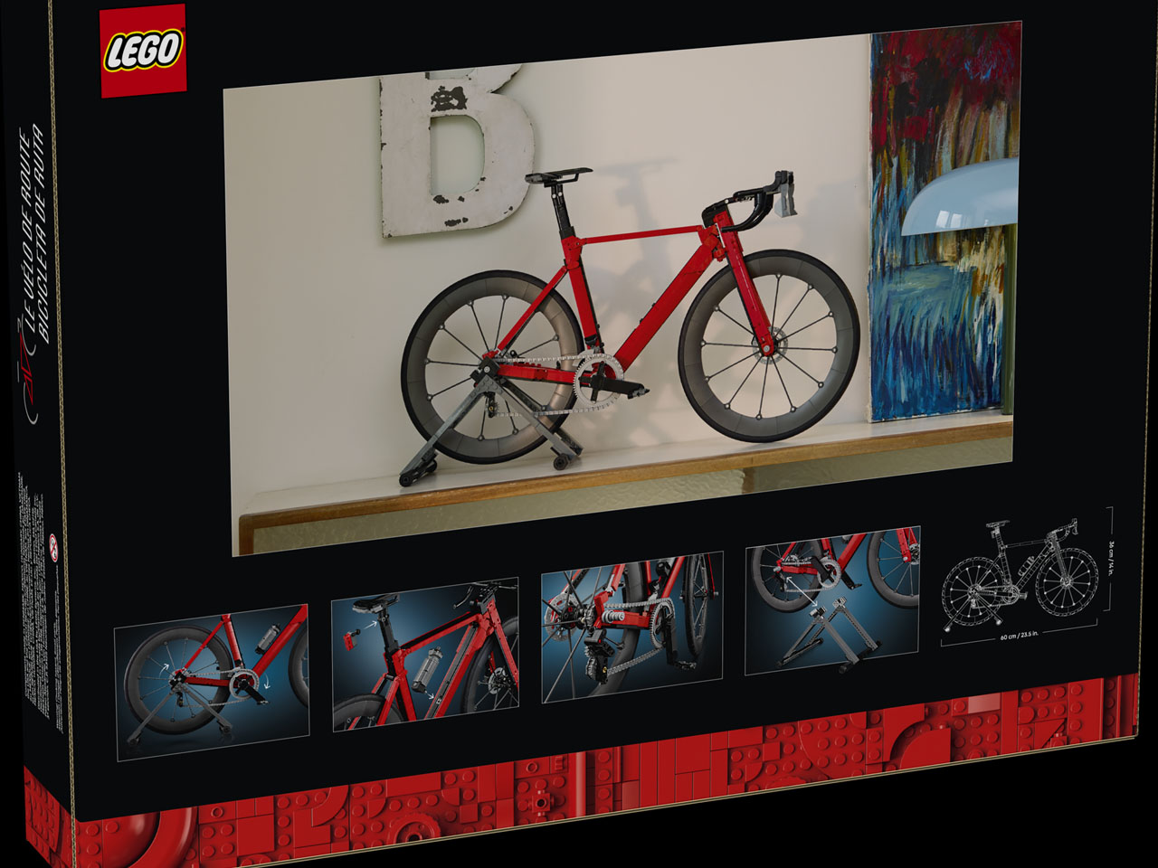
This set comes just in time for the summer sporting season, as cycling enthusiasts gear up for adventures unknown. Indeed, a true replica bicycle to build from scratch and place on their living room shelf to go with the mood. Just like with other LEGO Icons models in the lineup, the set captures every little detail of the real thing, and when completely put together, it stands at 24 inches long and 14.2 inches tall. That’s quite a sizeable LEGO set that would need some clearing up of space on your desk.

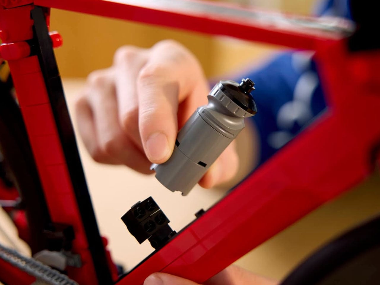
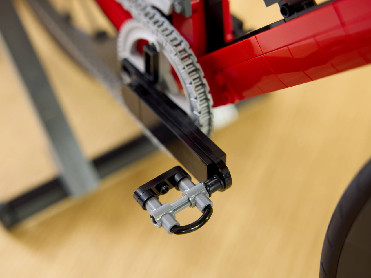
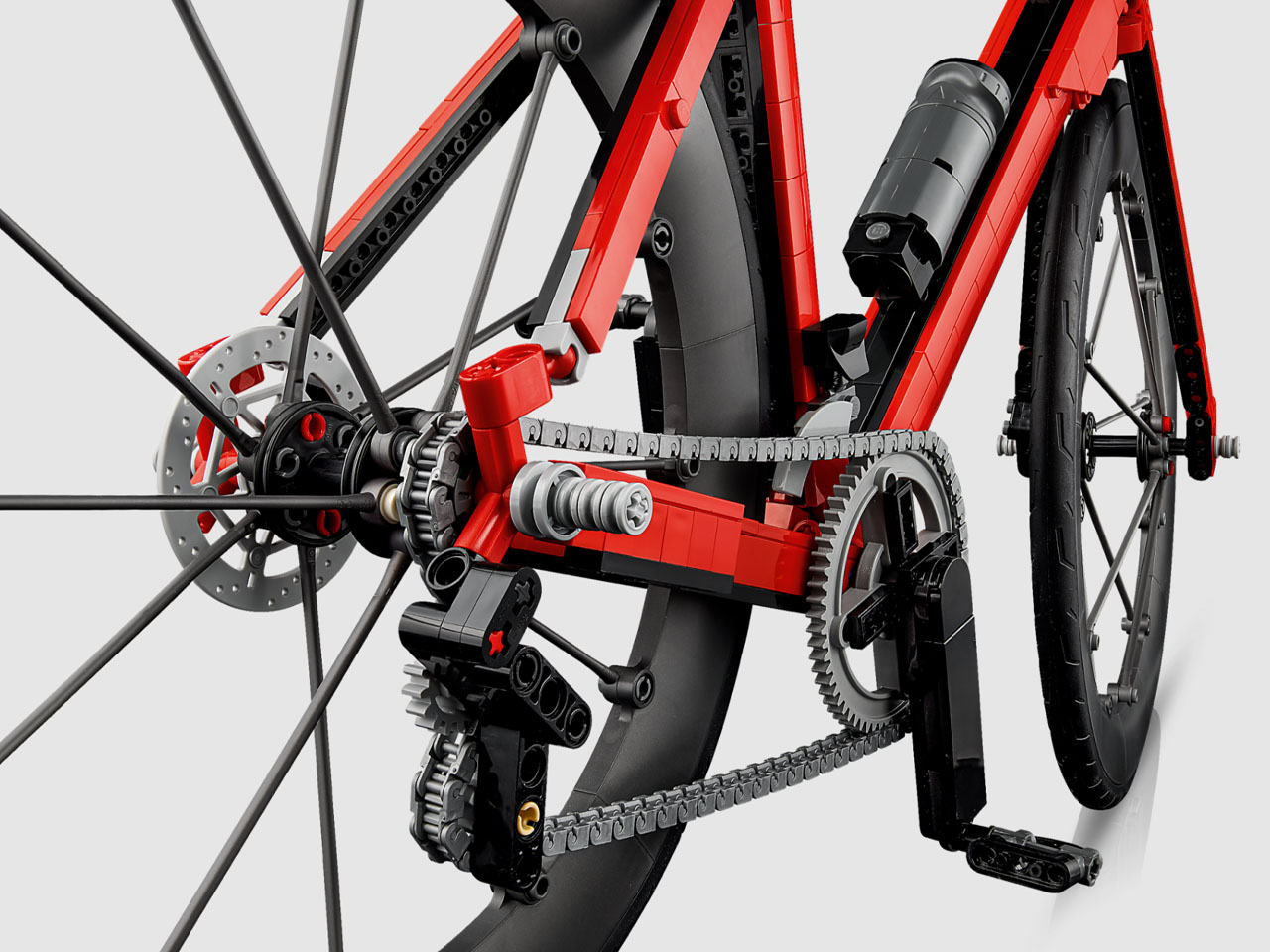
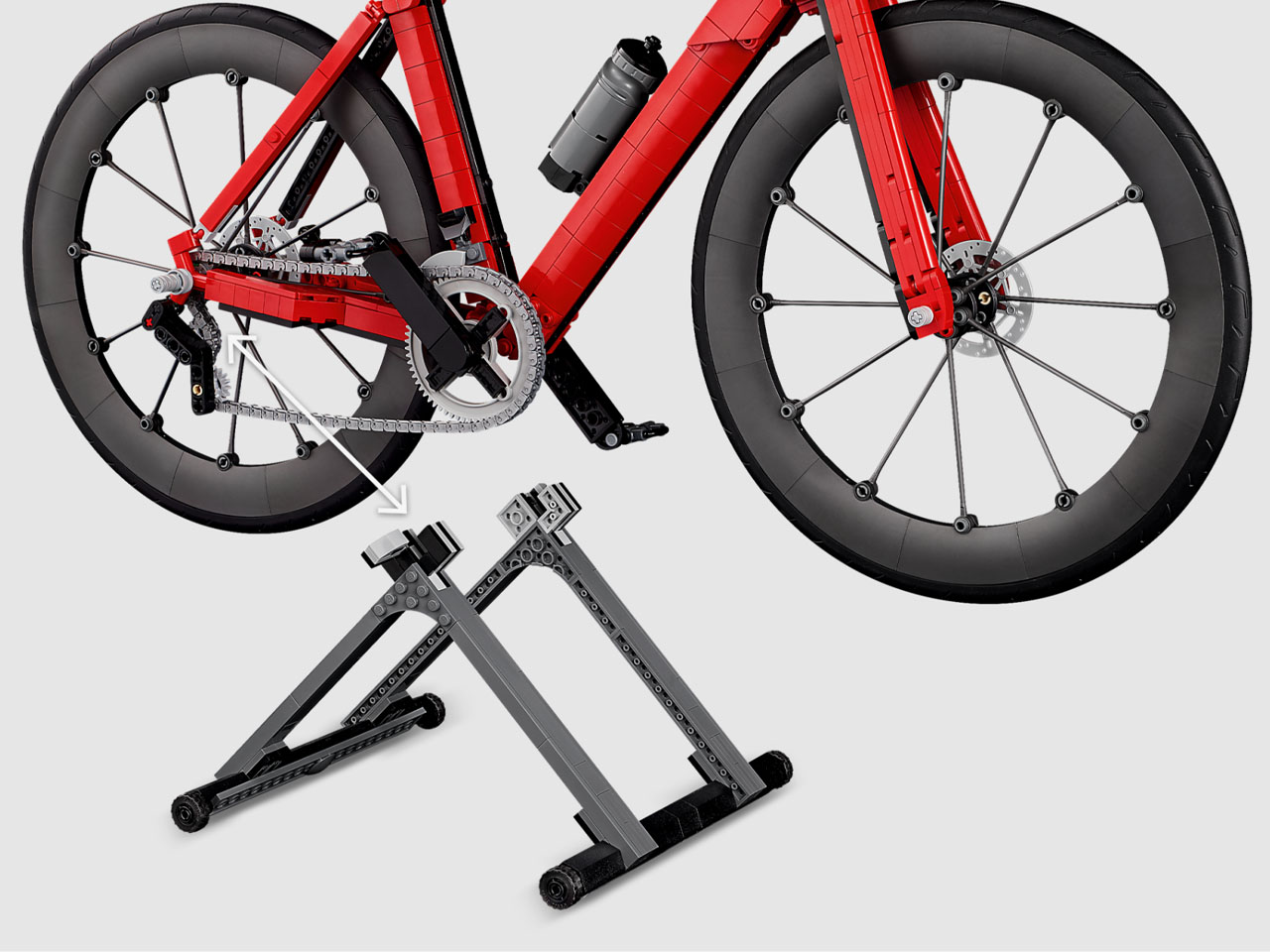
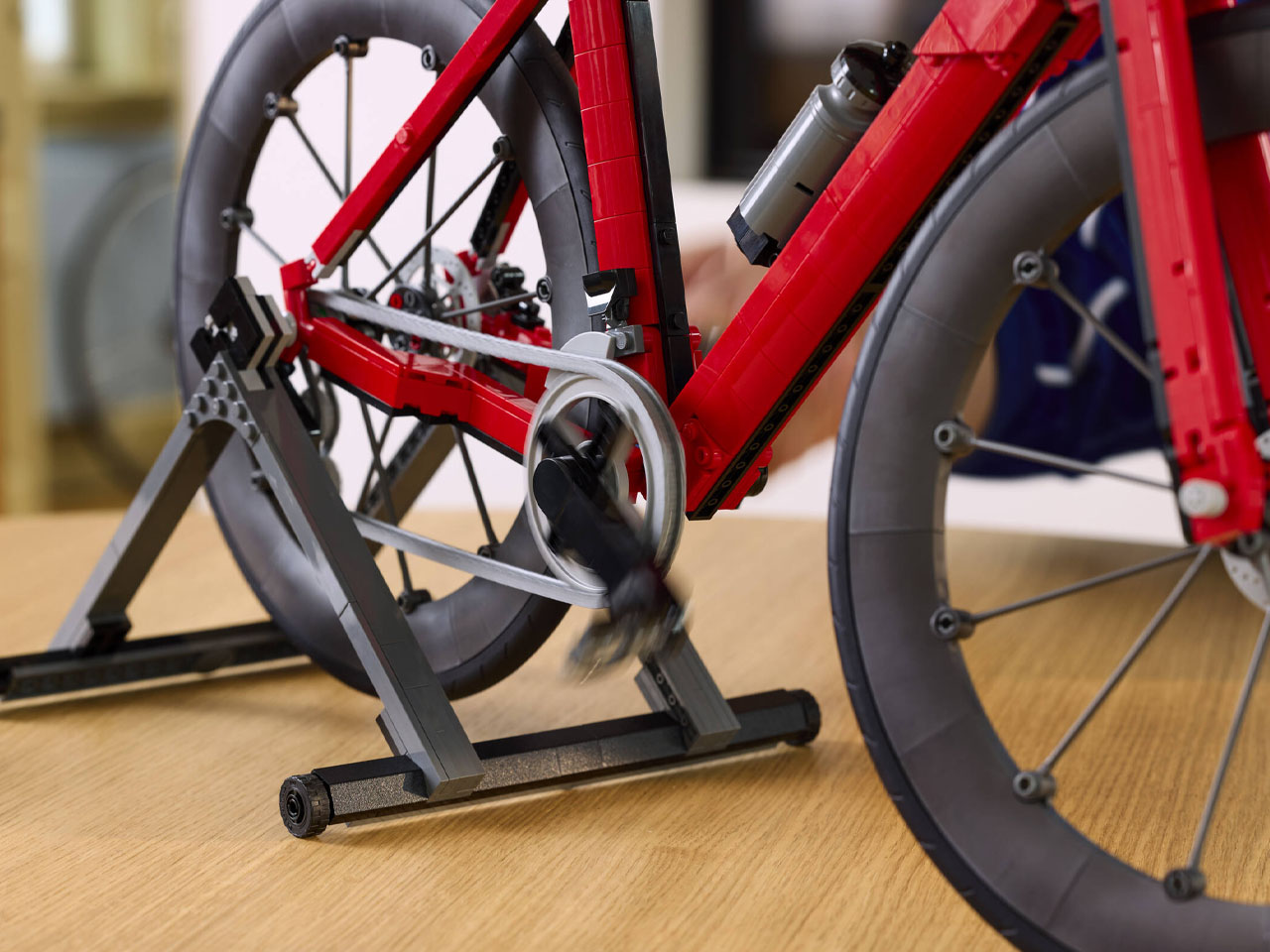
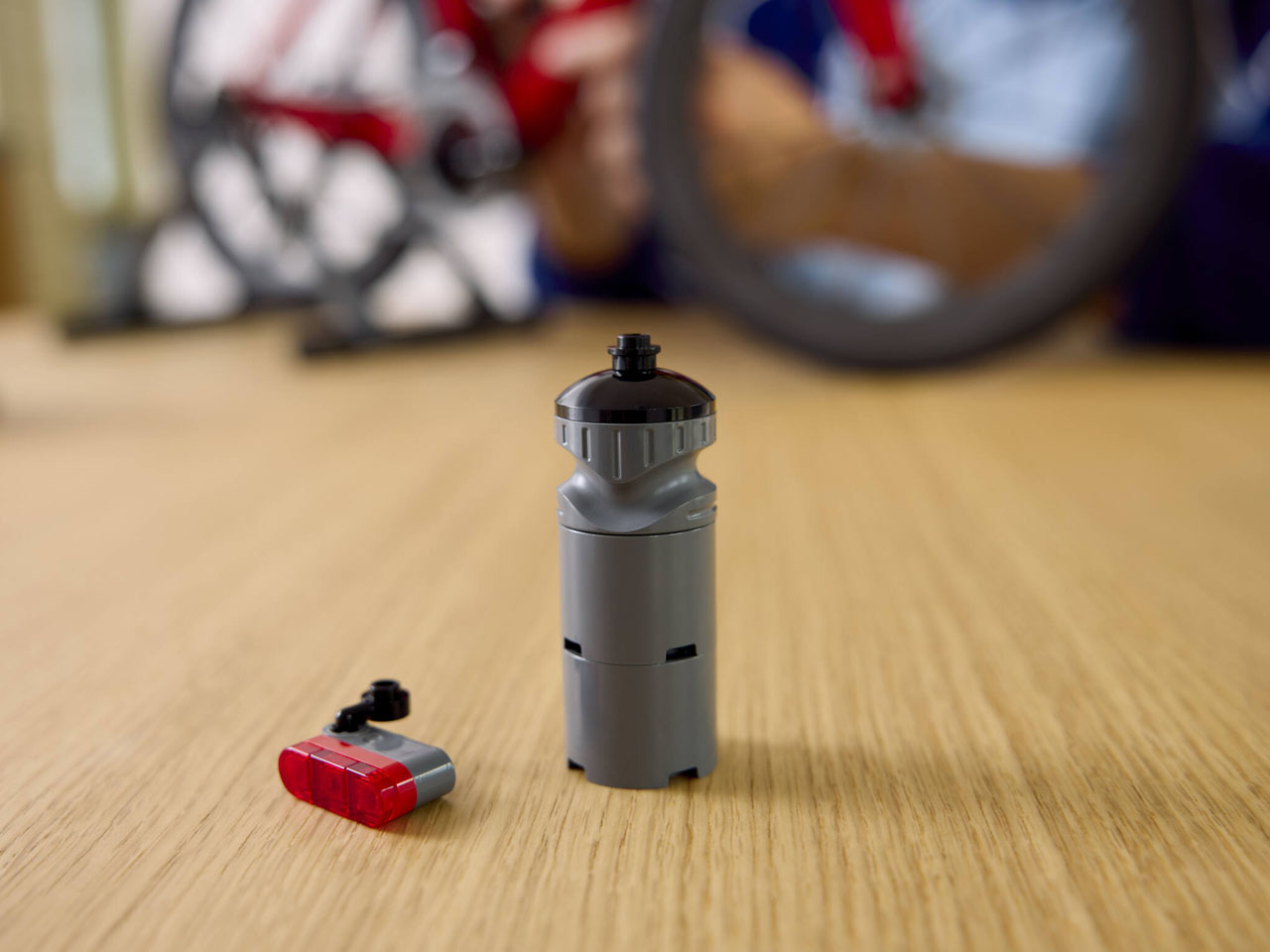
It’s not just the looks that are impressive. The LEGO Road Bike comes with a fully functional drivetrain and freewheel to indulge in the fun. Since it is a two-wheeler, putting it up on the flat surface is done courtesy of the wheel-lift bike stand. In this configuration, the bike wheel can be pedaled freely with the one-way gear chain drive mechanism in the signature silver colorway. The level of detail flows into the brake calipers, derailleurs, clipless pedals, and the removable water bottle.

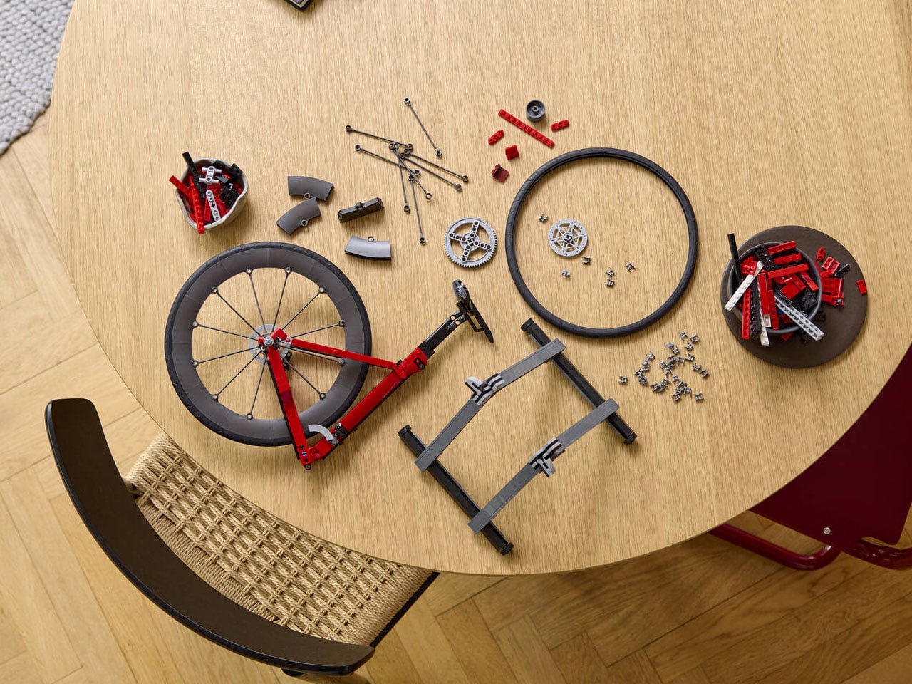
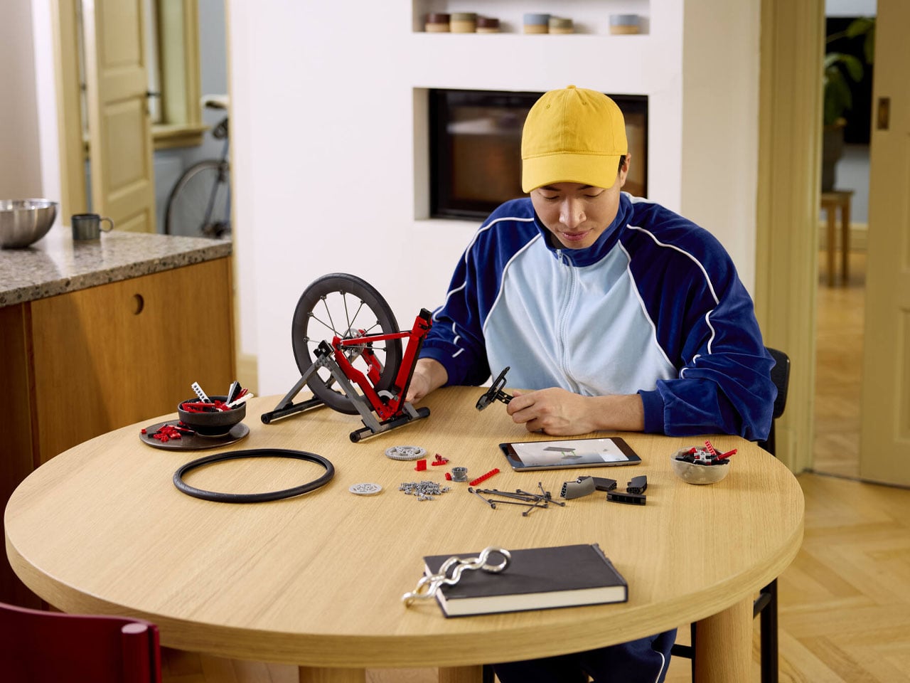
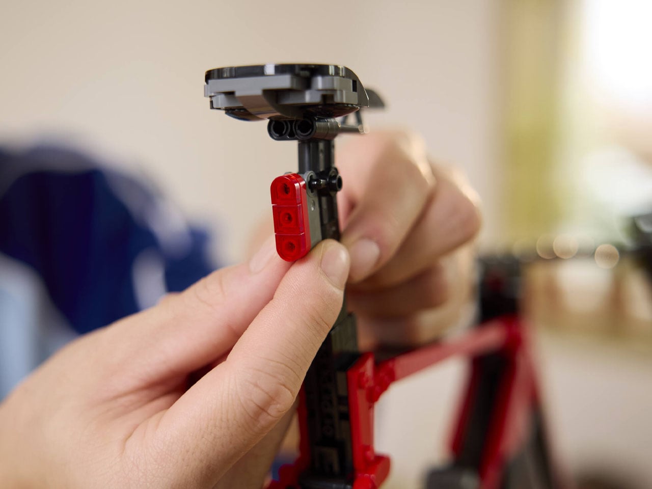
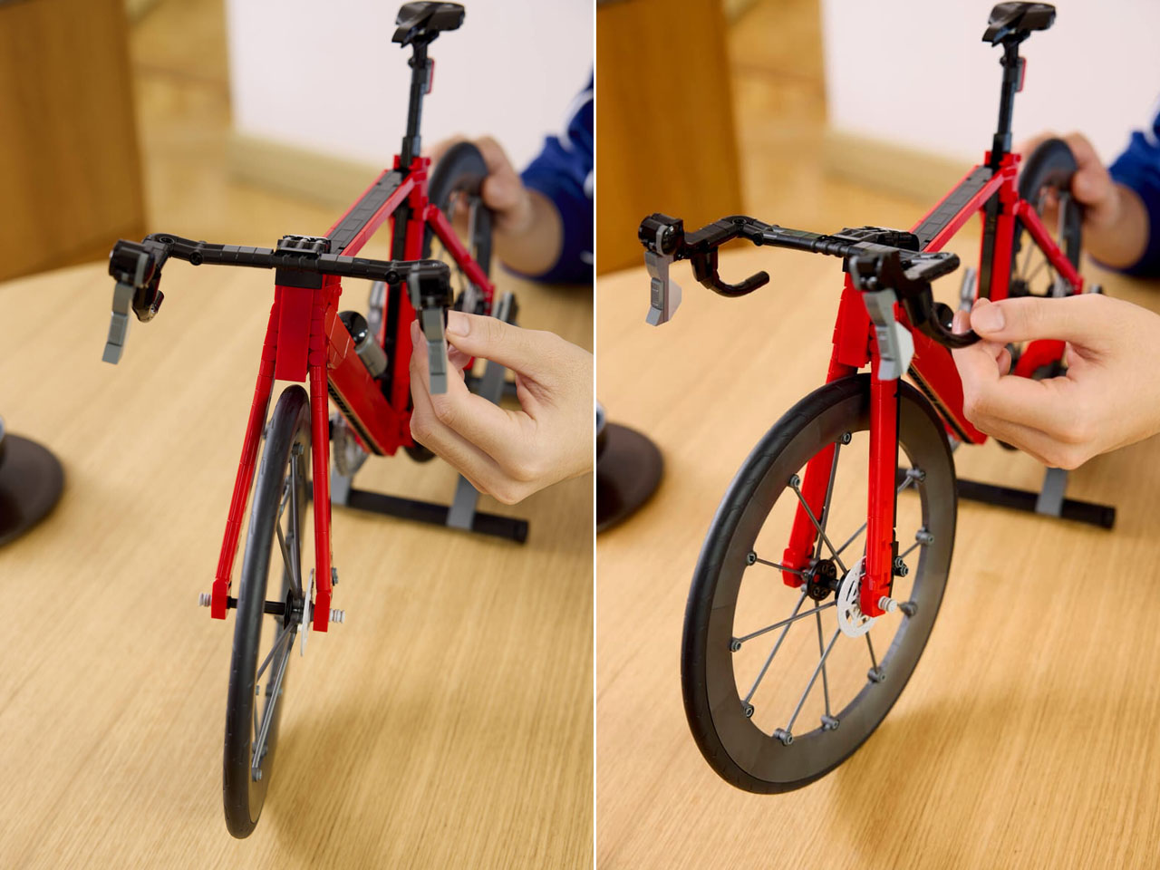
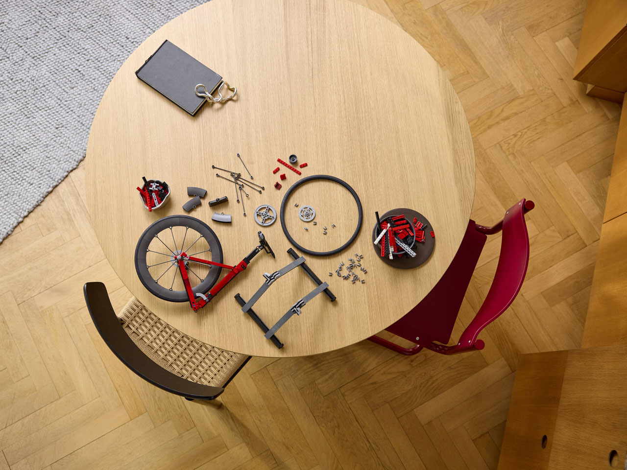
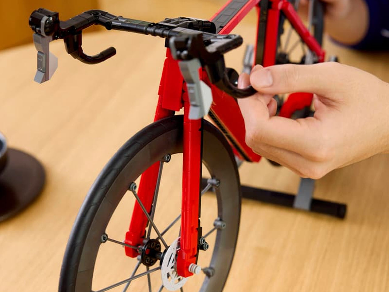
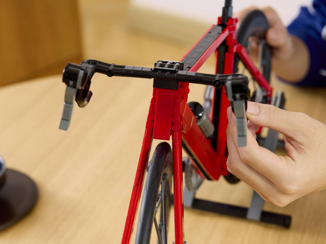
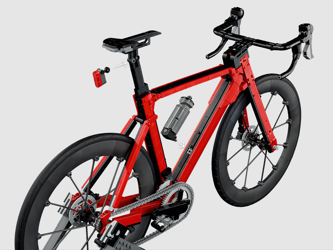
The build from scratch starts off with a red and black composite frame, on which the intricate brick pieces connect to form the handlebars, movable steering, rear light attached to the saddle, and the realistic rubber wheels with spokes. Although the bicycle is formed from plastic brick pieces, the end product gives off the look of a welded metal commuter. To make things interesting, the attachments are removable for easy cleaning to maintain the pristine look of the display set.

The only thing missing in the set is a giant minifigure (just nitpicking), but you can easily pick up another fitting prop from your collection to complete the look. LEGO Road Bike is all set for a June 1 launch with pre-orders already open for a $130 price tag.


The post LEGO Icons Road Bike is an intricate 1,015-piece buildable set for grown-ups first appeared on Yanko Design.
LEGO Icons Road Bike is an intricate 1,015-piece buildable set for grown-ups

There’s something about the intricately scaled-down models of vehicles that takes me back to the nostalgic times. The memory of the miniature bicycle model that I used to play with as a kid flashed right in front of my eyes as soon as I laid my eyes on this latest LEGO release. The 1,015-piece set dubbed Road Bike is a more modern interpretation of the aero bicycles that we see these days.

Apparently, this is the first-ever road bike model in LEGO Group’s portfolio, and I’m glad they made it under the LEGO Icons moniker. No surprise, the set that was up on LEGO Ideas for years has now finally made it to the official lineup. According to the official press release, the bike is a “sports-inspired décor that celebrates the world of cycling.” Perhaps the perfect prop for Tour de France fans.

Designer: LEGO Group

This set comes just in time for the summer sporting season, as cycling enthusiasts gear up for adventures unknown. Indeed, a true replica bicycle to build from scratch and place on their living room shelf to go with the mood. Just like with other LEGO Icons models in the lineup, the set captures every little detail of the real thing, and when completely put together, it stands at 24 inches long and 14.2 inches tall. That’s quite a sizeable LEGO set that would need some clearing up of space on your desk.

It’s not just the looks that are impressive. The LEGO Road Bike comes with a fully functional drivetrain and freewheel to indulge in the fun. Since it is a two-wheeler, putting it up on the flat surface is done courtesy of the wheel-lift bike stand. In this configuration, the bike wheel can be pedaled freely with the one-way gear chain drive mechanism in the signature silver colorway. The level of detail flows into the brake calipers, derailleurs, clipless pedals, and the removable water bottle.

The build from scratch starts off with a red and black composite frame, on which the intricate brick pieces connect to form the handlebars, movable steering, rear light attached to the saddle, and the realistic rubber wheels with spokes. Although the bicycle is formed from plastic brick pieces, the end product gives off the look of a welded metal commuter. To make things interesting, the attachments are removable for easy cleaning to maintain the pristine look of the display set.

The only thing missing in the set is a giant minifigure (just nitpicking), but you can easily pick up another fitting prop from your collection to complete the look. LEGO Road Bike is all set for a June 1 launch with pre-orders already open for a $130 price tag.


The post LEGO Icons Road Bike is an intricate 1,015-piece buildable set for grown-ups first appeared on Yanko Design.
The Bike Saddle 3D-Printed and Hand-Stitched in France

Most conversations about technology and craft follow the same script. Technology is fast, scalable, cold. Craft is slow, precious, warm. The two might share a showroom floor or a mood board, but they rarely share a philosophy. Mahdi Naïm’s AERIS bicycle saddle disagrees with that entire premise, and the disagreement is worth paying attention to.

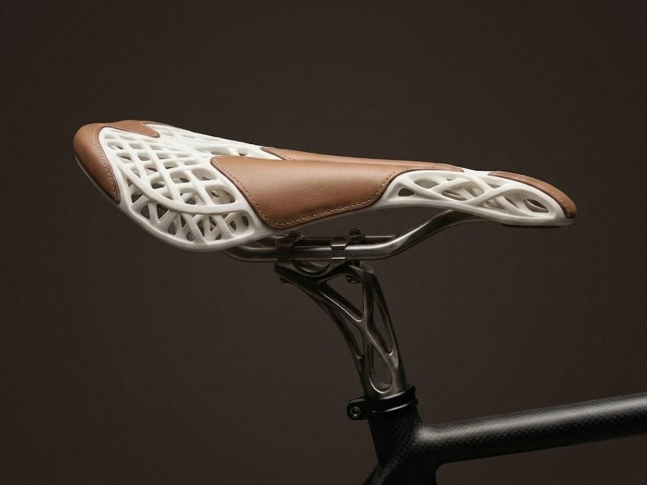
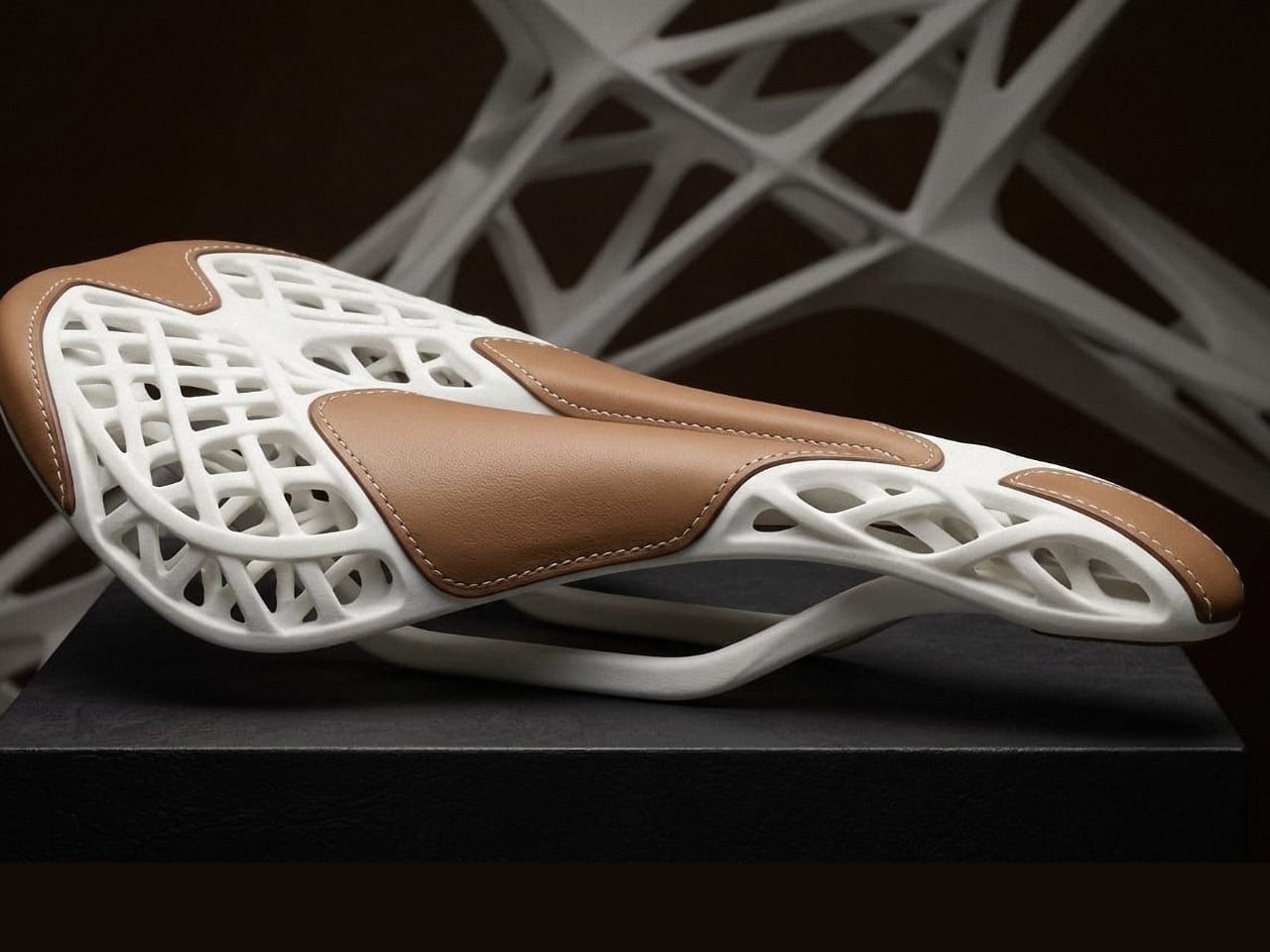
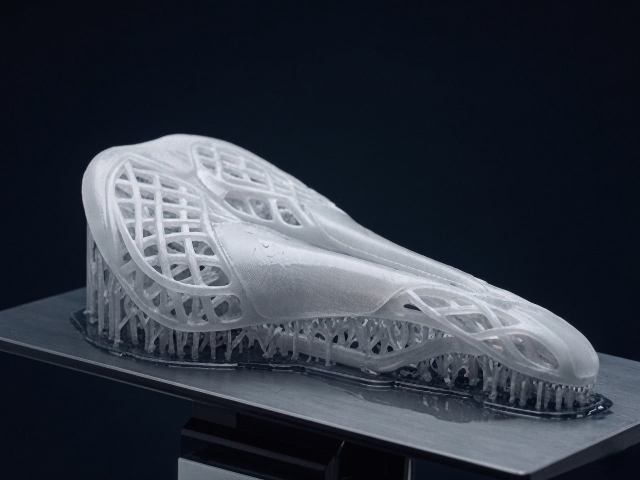
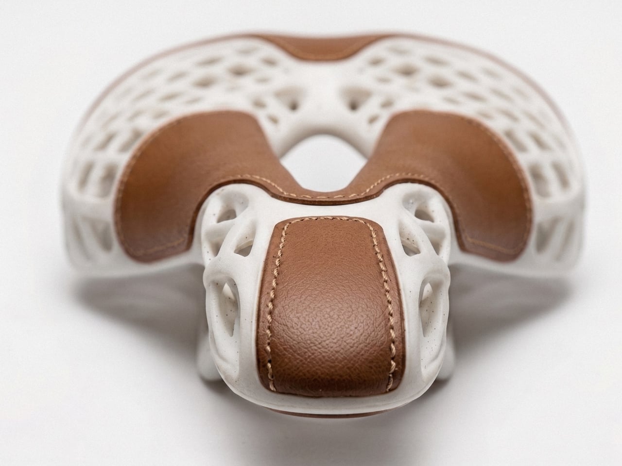
AERIS is not a bicycle saddle that happens to look interesting. It is a bicycle saddle built around a single, demanding question: what if 3D printing and traditional craft weren’t layered on top of each other, but designed together from the very first sketch? That shift in thinking, from assembly to co-authorship, is what separates AERIS from the dozen other “tech meets heritage” products that surface at design fairs every season.

Designer: Mahdi Naim

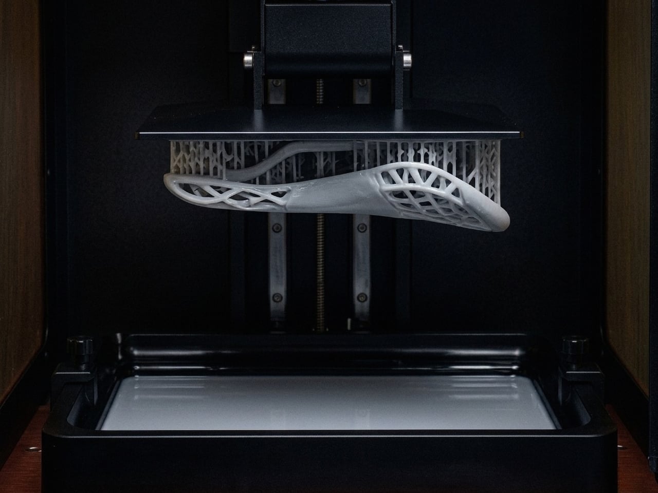
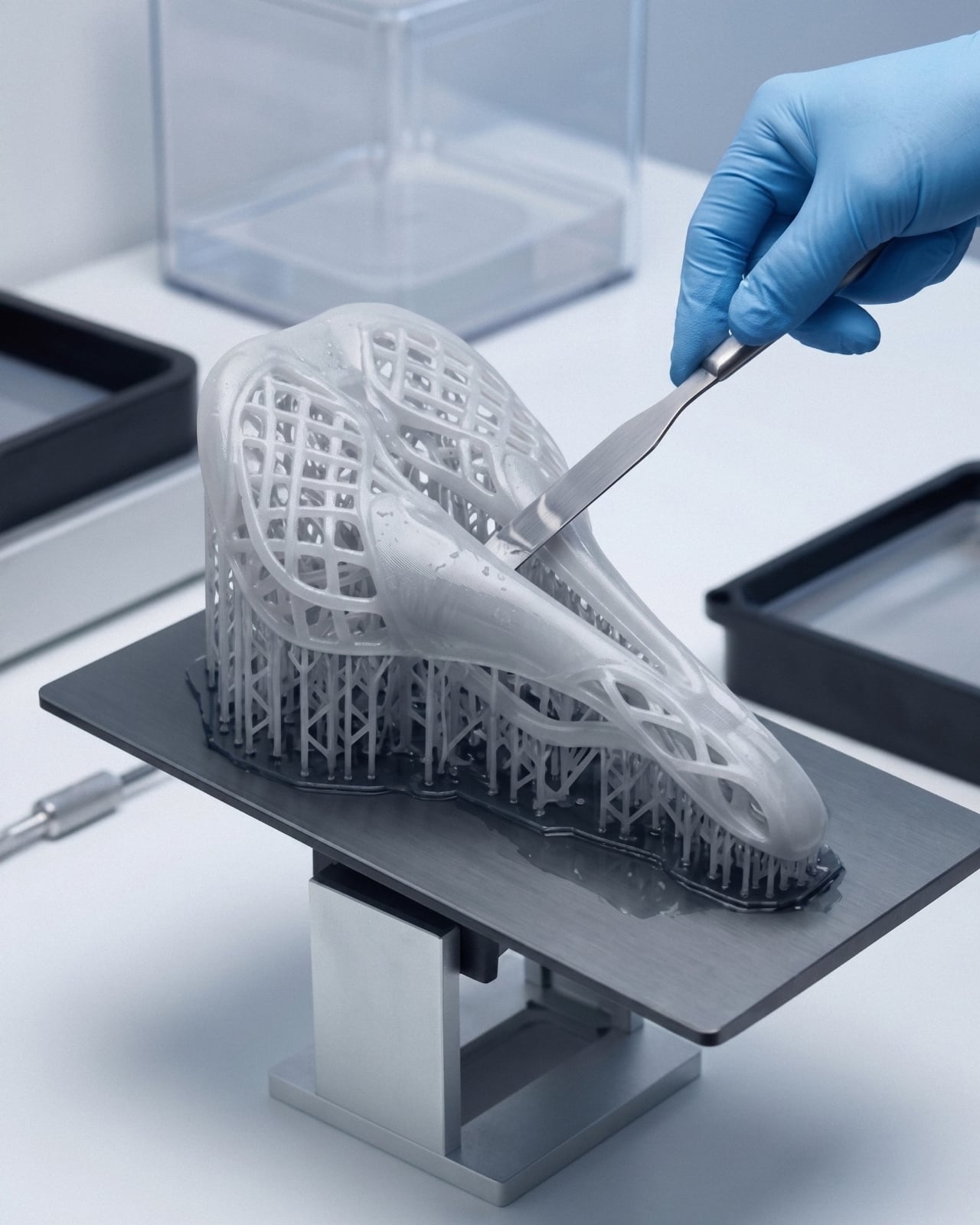
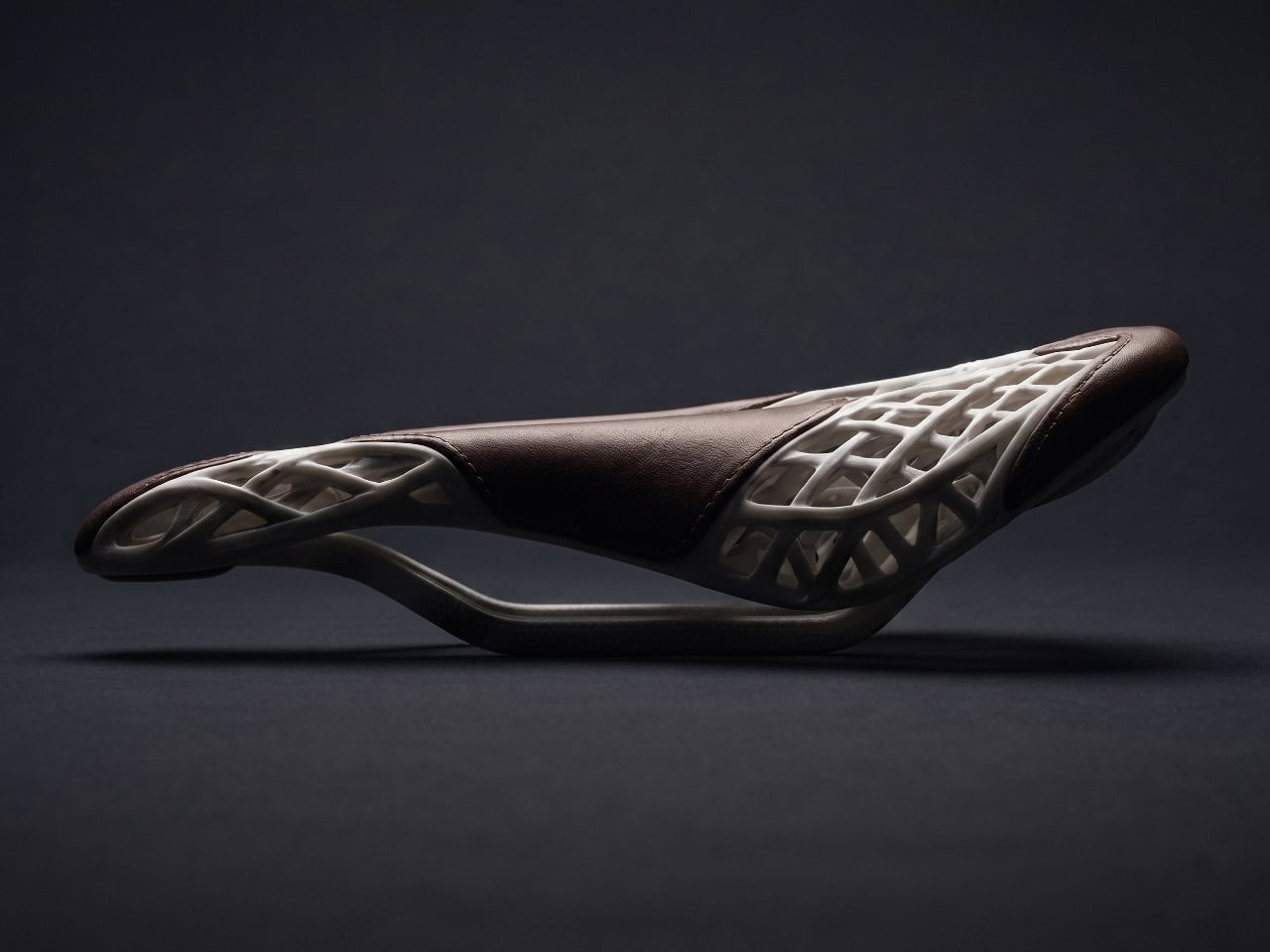
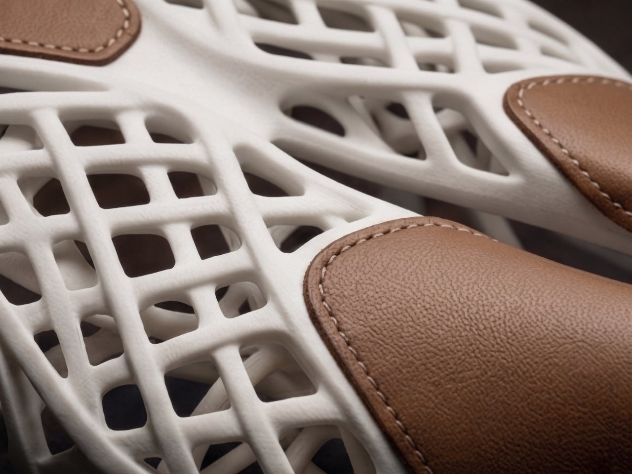
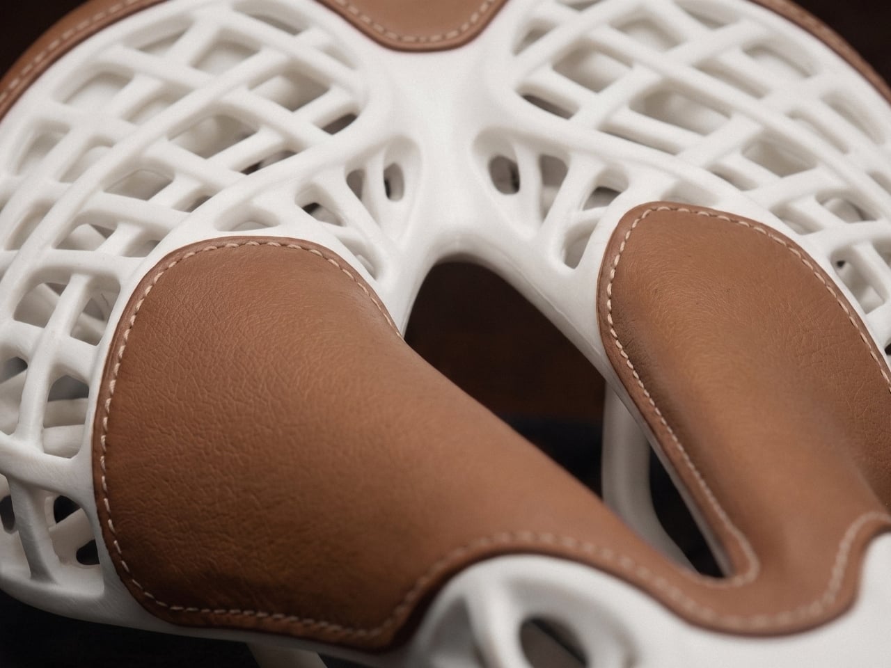
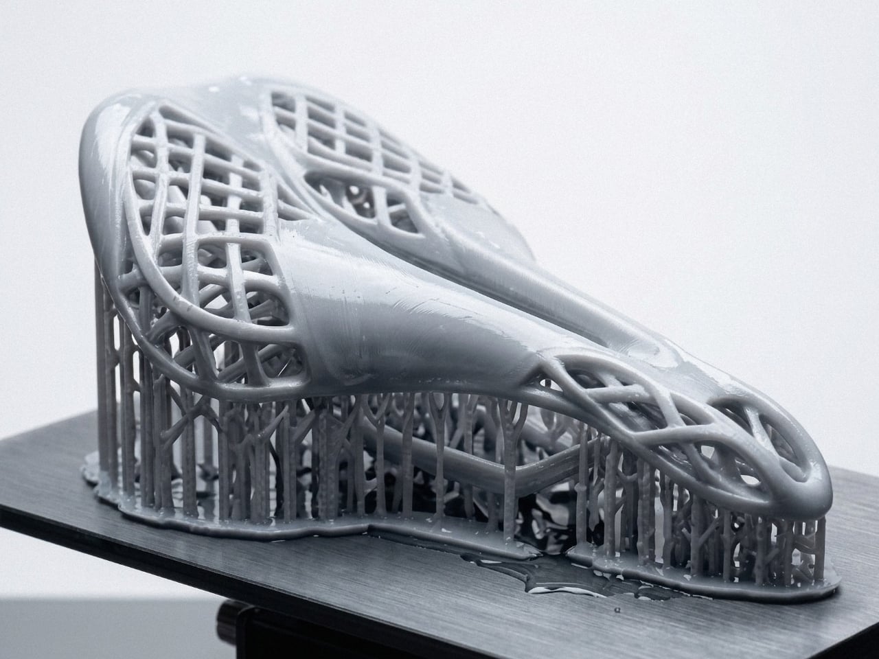
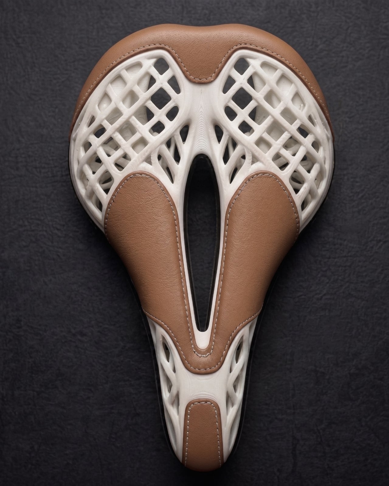
The structure is built on a lattice produced through high-precision photopolymerization, specifically SLA and DLP printing, in high-performance elastomer resin. The geometry is not decorative. It is functional in the most literal sense: the lattice density changes across three zones of the saddle, denser where firm support is needed under an aerodynamic riding position, progressively softer through the transition zone, and open at the perineal relief zone to minimize pressure. No foam. No padding added to compensate for poor design thinking. The structure itself is the comfort system.

That kind of discipline is rare, and I say that as someone who has watched a lot of product design lean on material additions to solve problems that should have been solved earlier. Foam is easy. Getting the geometry right from the start is not. It takes conviction to design without a fallback.

The second layer, and I do mean the second design logic rather than a second material slapped on afterward, is where a French master saddler comes in. Full-grain vegetable-tanned leather, hand-stitched. The studio is clear that this is not an aesthetic decision. The leather works mechanically with the resin, distributing pressure and shear forces in ways that neither foam nor synthetic materials can match at equivalent weight. The interface between the two materials was designed during the modelling phase, not decided once the print came out of the machine.

This is the part I keep coming back to. The leather isn’t a finish. It isn’t branding. It is the second structural argument in the same conversation, and the conversation started before any material was touched. That level of intentionality is genuinely unusual, even among products that wear the word “craft” proudly on their labels.

Mahdi Naïm himself is worth knowing, if you don’t already. He is an industrial designer, a Grand Maître Artisan, and a German Design Award laureate who runs his studio between Lyon and Casablanca. His practice sits at the intersection of French engineering and Moroccan craftsmanship, and AERIS reads like a project that could only come from someone fluent in both languages. The saddle doesn’t feel like a technology demonstration with craft applied on top, or a heritage object with a 3D-printed frame underneath. It feels like one object, made by two disciplines that had to agree on every decision before anything was built.

AERIS is still in active development and moving toward small-series production. The studio is in conversation with industrial partners in additive manufacturing and premium cycling. That means this isn’t a concept in the gallery-piece sense, displayed under glass and admired from a distance. It is a product that intends to be ridden.

Whether you cycle or not, whether you follow product design closely or just occasionally land on something that makes you stop scrolling, AERIS is the kind of object that rewards a second look. Not because it is visually striking, though it is, but because the thinking behind it is genuinely coherent. The lattice, the leather, the hand-stitching, the parametric modelling: none of it is decoration. All of it is argument. That is harder to pull off than it looks, and considerably rarer than the design world likes to admit.

The post The Bike Saddle 3D-Printed and Hand-Stitched in France first appeared on Yanko Design.

This Bike Cargo System Gives Your Bike a Face With 12 Color Zones

Bike cargo gear has always been the part of cycling that nobody really gets excited about. Racks, panniers, and baskets exist to haul things, and most of them look exactly like what they are, brackets and platforms bolted on as an afterthought. Cyclists who care about aesthetics often treat this hardware as a necessary compromise, something you’d tolerate rather than actually want.

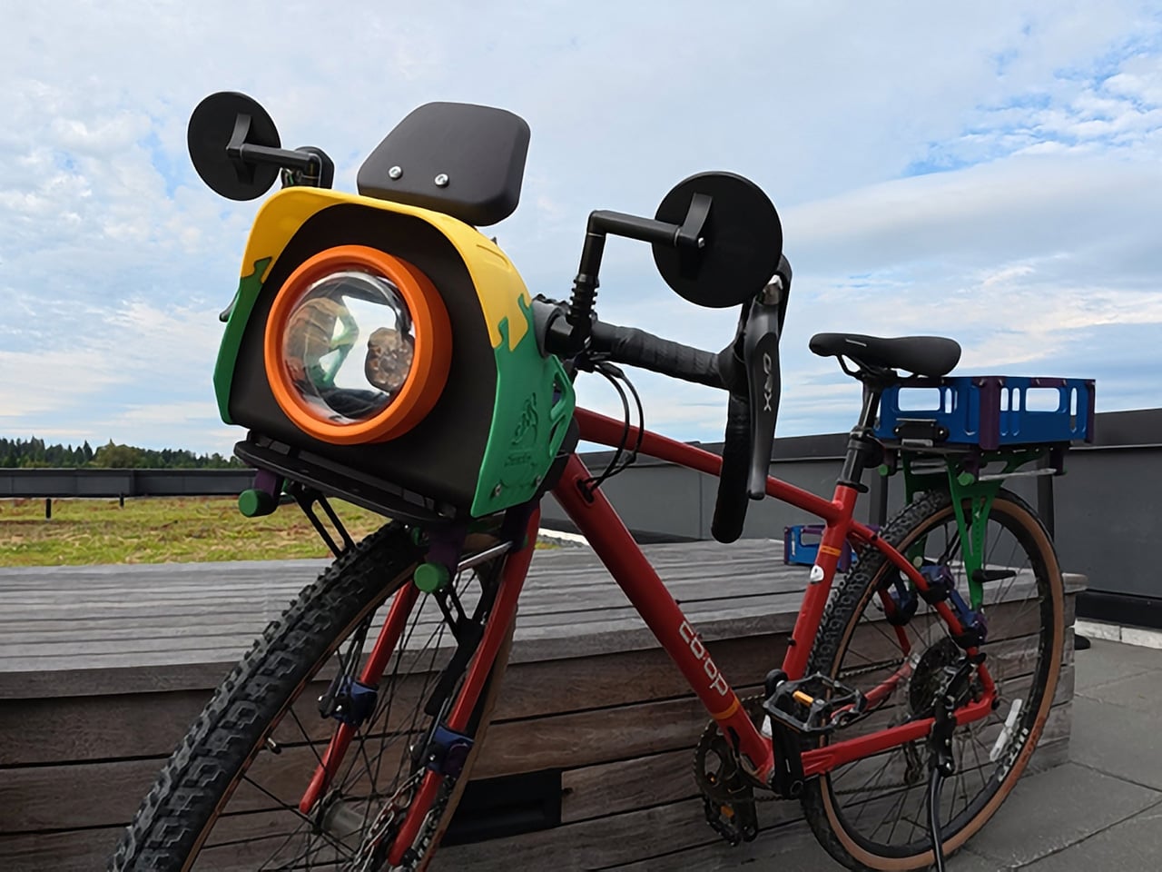
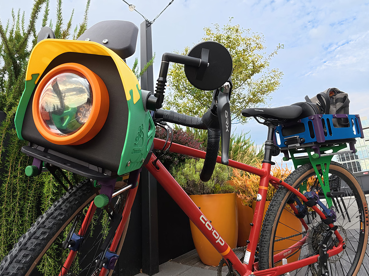
Chamelion begins with the idea that bikes deserve the same sense of character other vehicles already have. That inspiration drives a modular, color-customizable cargo platform from Seattle that includes front and rear racks, pannier rails, aluminum baskets, and a front assembly the designers call the “bike face,” treating cargo gear as part of your bike’s actual identity.

Designer: Yu-Chu Chen

Click Here to Buy Now: $986. Hurry, only a few left!

The bike face is the most interesting part of the system, and it does more than look distinctive. It consolidates everything that typically clutters the handlebars into one organized front unit. Your phone’s got a dedicated mount with a sunshade, rear mirrors attach at the sides with wide spacing for better sightlines, and your headlight sits front and center behind a transparent shell.

The racks do serious work. The front has been tested to hold up to 20 kg (44 lbs), and the rear handles up to 27 kg (60 lbs), which is enough for a full grocery haul or a heavily loaded bikepacking setup. The aluminum baskets drop in when you need proper containment, or you can skip them and just strap a bag directly to the platform.

One of the quieter design details is how the racks handle rough terrain. Rather than transmitting every bump directly into your load, the material has enough flex to absorb vibration, so things ride more smoothly on uneven surfaces. Add the pannier rails when you need side-hanging capacity, and the same bike that’s carrying your lunch on a weekday is hauling camping gear on a trail by Saturday.

Installing the system takes some effort upfront, but once that’s done, removing and remounting the racks requires no tools at all. The front rack’s handlebar connectors rotate to fit different bar types and the fork clamps have bearings inside that move with your suspension. The rear rack adjusts between 110mm and 180mm between the clamps, wide enough to accommodate most bikes, including full-suspension mountain bikes.

Of course, the color customization goes well beyond picking a finish. Every component has its own configurable color zone, from the rack platform and frame connectors down to the pannier cap and handlebar connector buckle. The bike face alone has more than 12 individually configurable areas. It sounds excessive until you realize that kind of specificity is exactly what makes the system feel genuinely personal.

What makes that level of customization possible is the manufacturing behind it. The plastic components are produced using powder bed fusion 3D printing in PA12 or PA11 nylon, with coloring handled by Dyemansion. That process gives the parts rich, durable color without relying on conventional painted finishes, and it allows for small-batch production without injection mold tooling, which is what makes individual configurations feasible.

Assembly is guided by interactive 3D step-by-step instructions that let you zoom in, rotate, and inspect every connection from multiple angles before putting it all together. It’s the kind of manual that actually makes you want to read it, which is more than can be said for most flat-pack furniture and certainly more than anyone expects from a bike cargo system.

The broader idea here isn’t a one-off accessory set, but a system that can keep expanding over time, with new modules and accessories already being developed. The 3D-printed version stays the lightest and most configurable option, and the design accommodates future additions as the lineup expands. For a category that’s spent decades being mostly forgettable, this one at least gives your bike the kind of personality it probably should have had all along.

Click Here to Buy Now: $986. Hurry, only a few left!

The post This Bike Cargo System Gives Your Bike a Face With 12 Color Zones first appeared on Yanko Design.

This $175 Bike Stand Finally Solved Our Garage Storage Mess

If you own a bike, you’ve probably played the garage Tetris game at least once. You know the drill: your bike leans against a wall, falls over at 2 AM with a crash, or blocks the path to literally everything else you need. It’s the kind of everyday design problem that makes you wonder why nobody’s come up with something better.

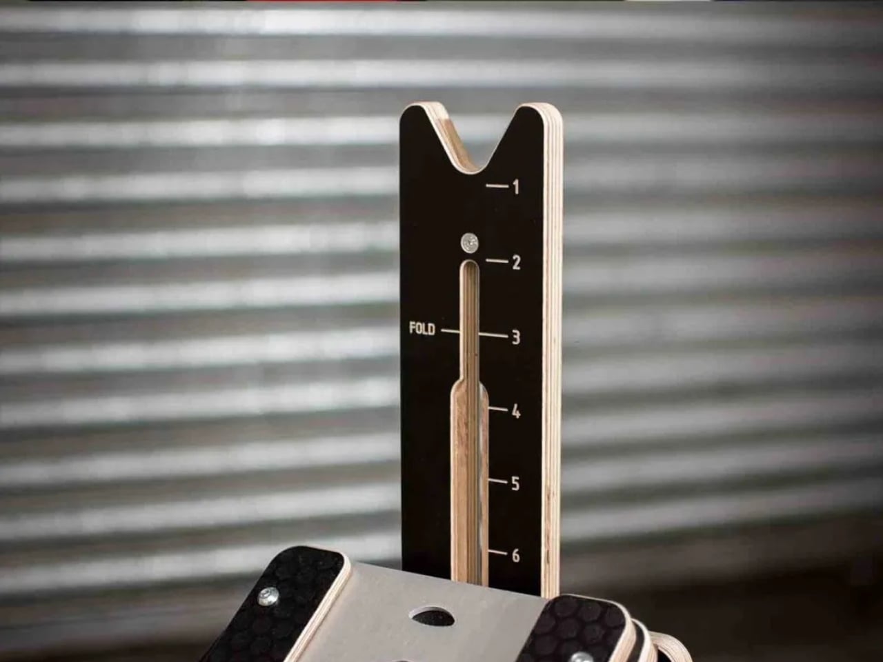
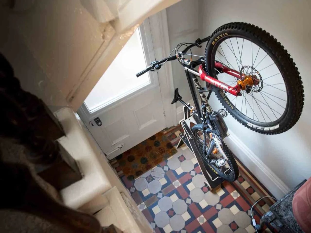
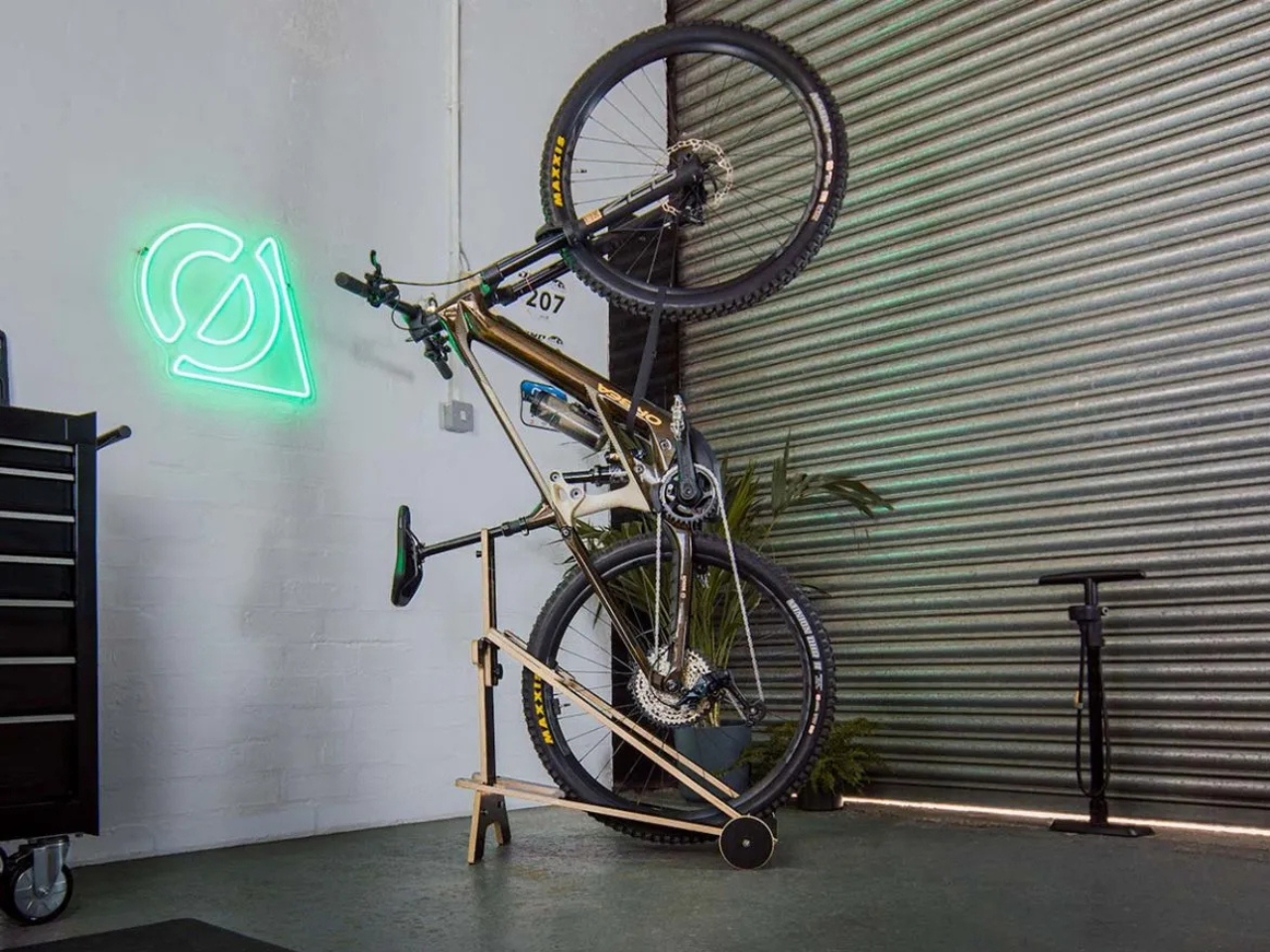
Well, someone finally has. British industrial designer George Laight created the Flip, a freestanding bike stand that’s so cleverly designed, it makes you question why we’ve been settling for wall hooks and pulley systems all this time.

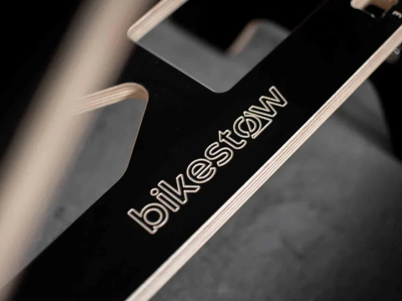
Designer: George Laight for BikeStow

The origin story is pretty relatable. Laight was studying Product Design Engineering at Loughborough University when he hit a wall, literally and figuratively. He had a bike and a tiny student flat with a strict no-holes-in-the-walls policy. Vertical storage made the most sense for his cramped space, but he couldn’t use traditional wall-mounted solutions without losing his security deposit. So he did what any frustrated design student would do: he invented his own solution.

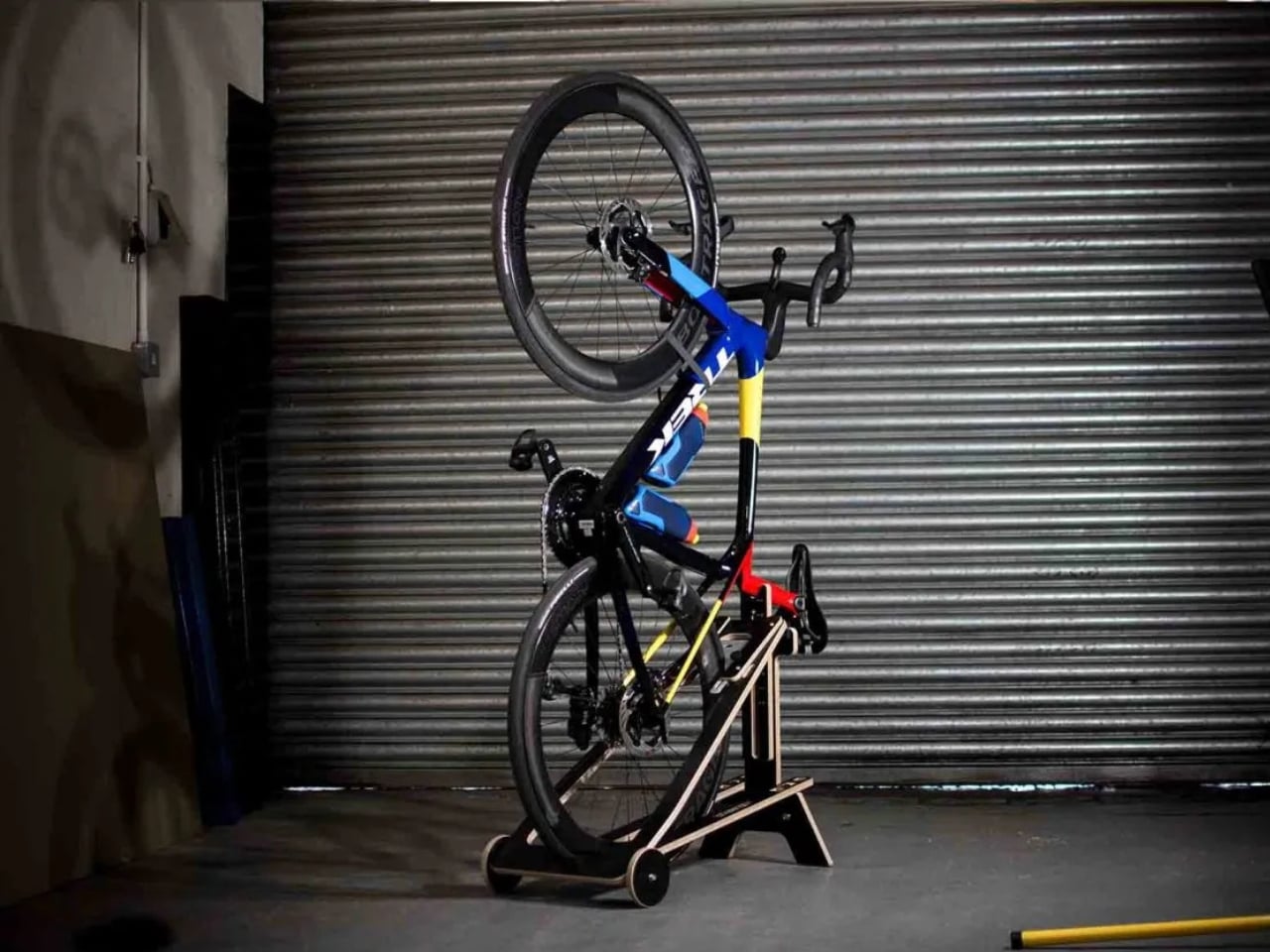
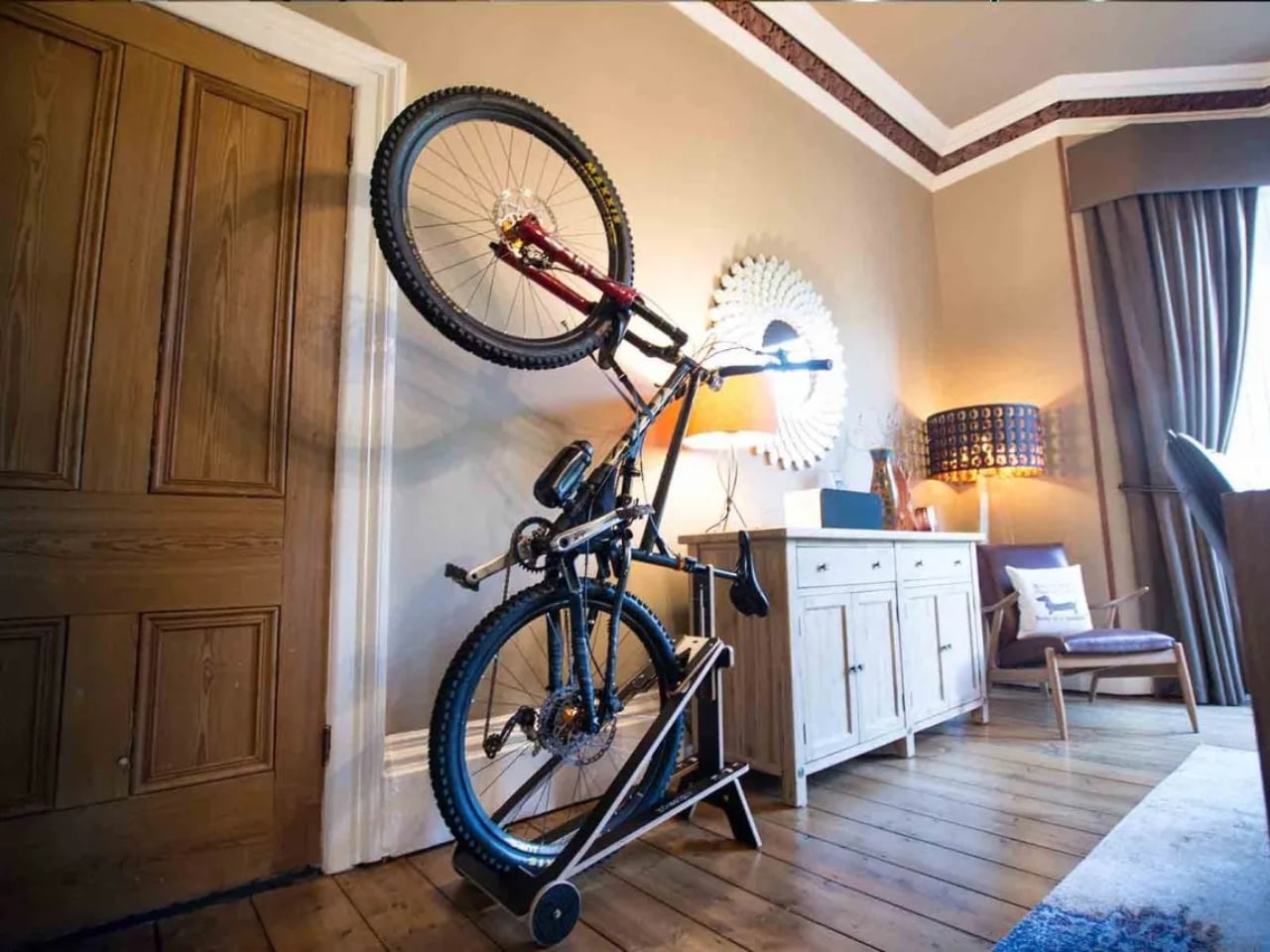
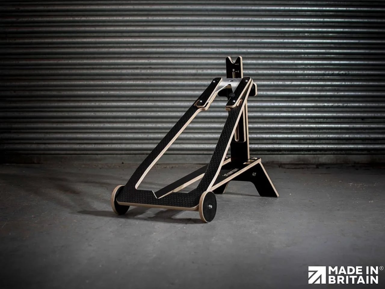
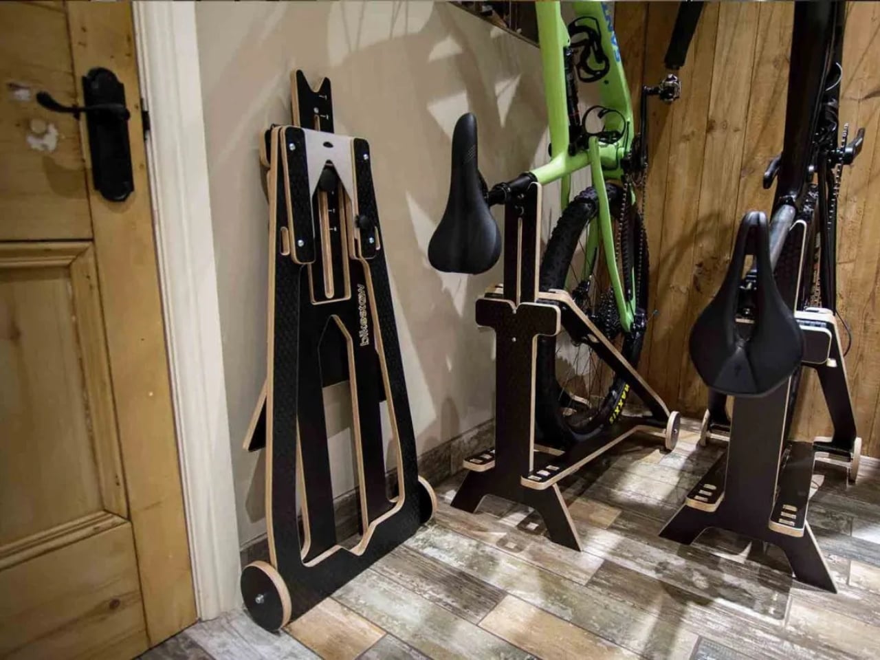
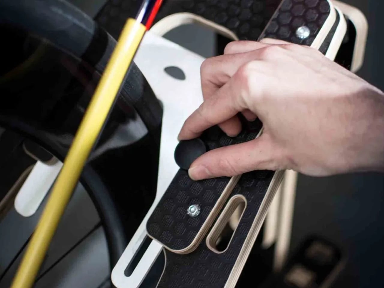
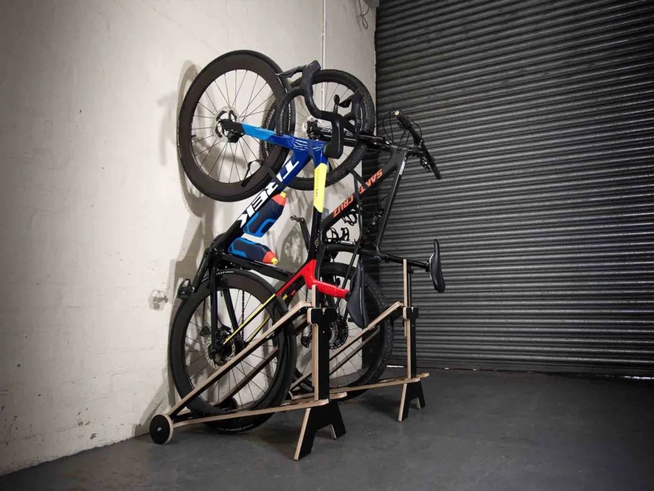
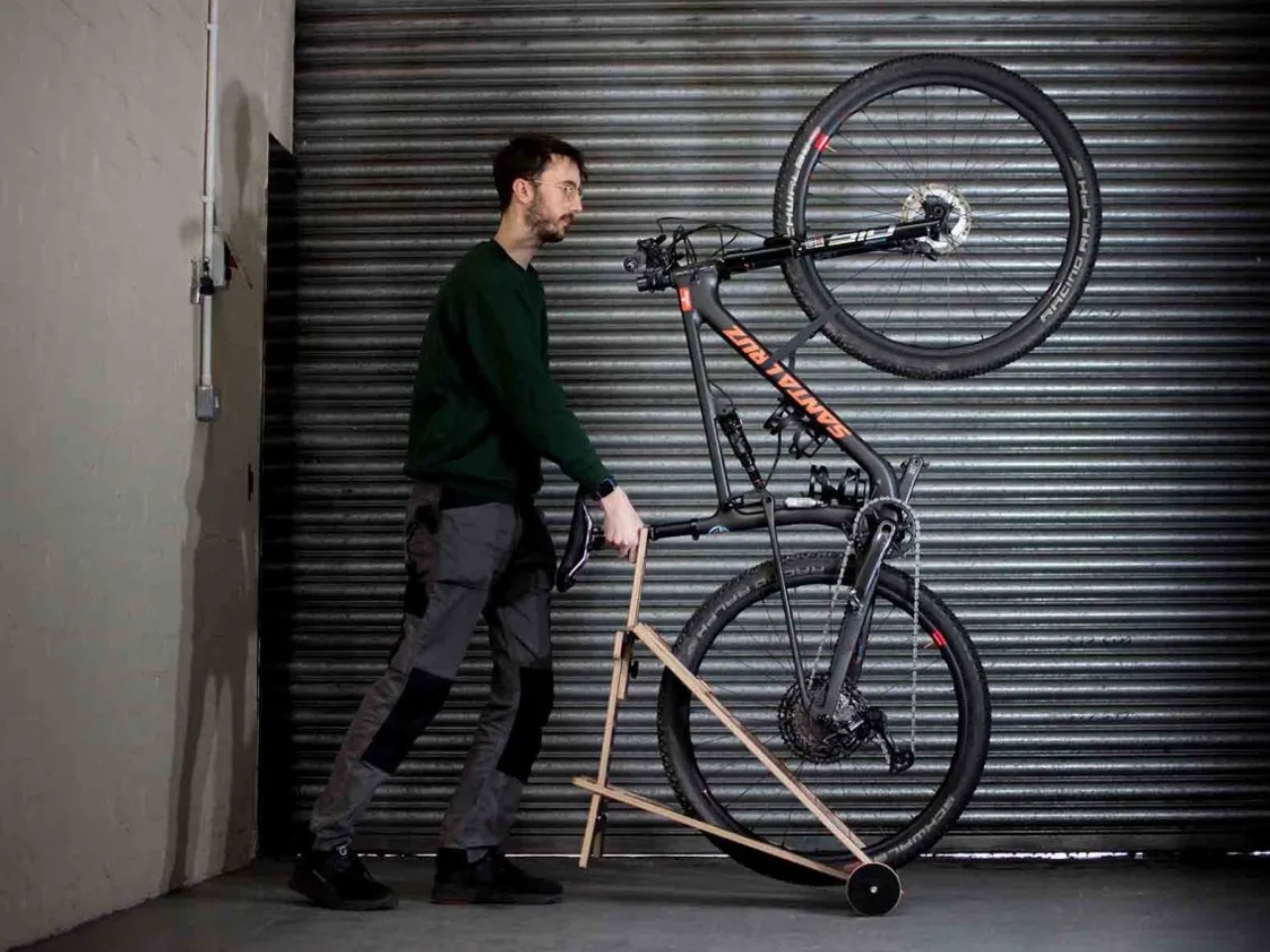
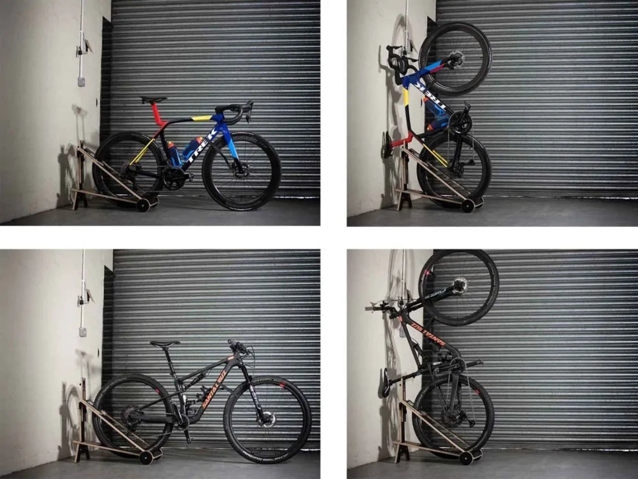
The Flip is essentially a portable bike stand with wheels that lets you store your bike vertically or horizontally, depending on what works for your space. The genius is in its flexibility. Unlike fixed storage solutions that require you to commit a specific area of your garage or apartment to bike storage forever, the Flip rolls around wherever you need it. Cleaning out the garage? Wheel it aside. Reorganizing your storage shed? Move it in seconds. It’s bike storage that adapts to your life instead of demanding you work around it.

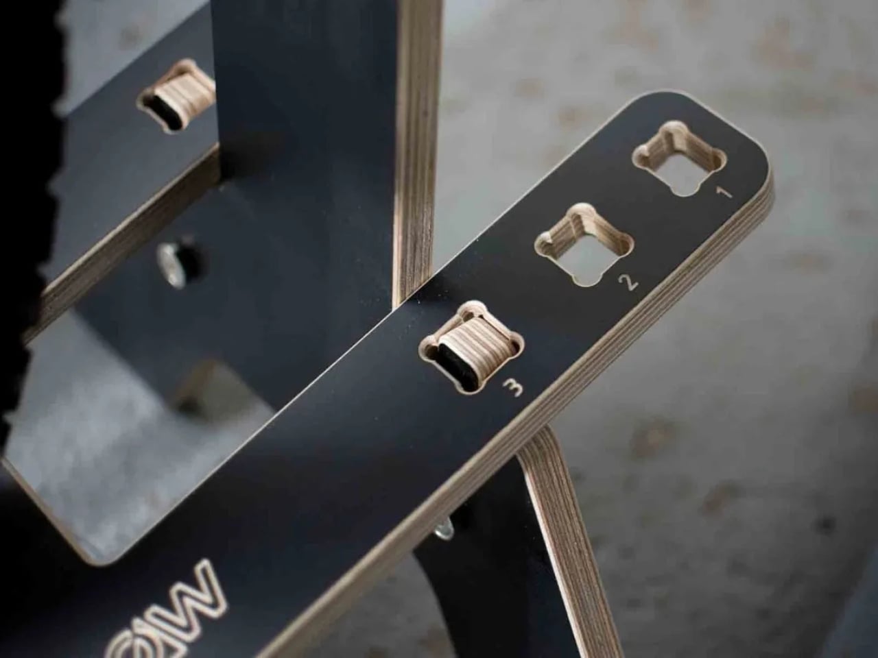
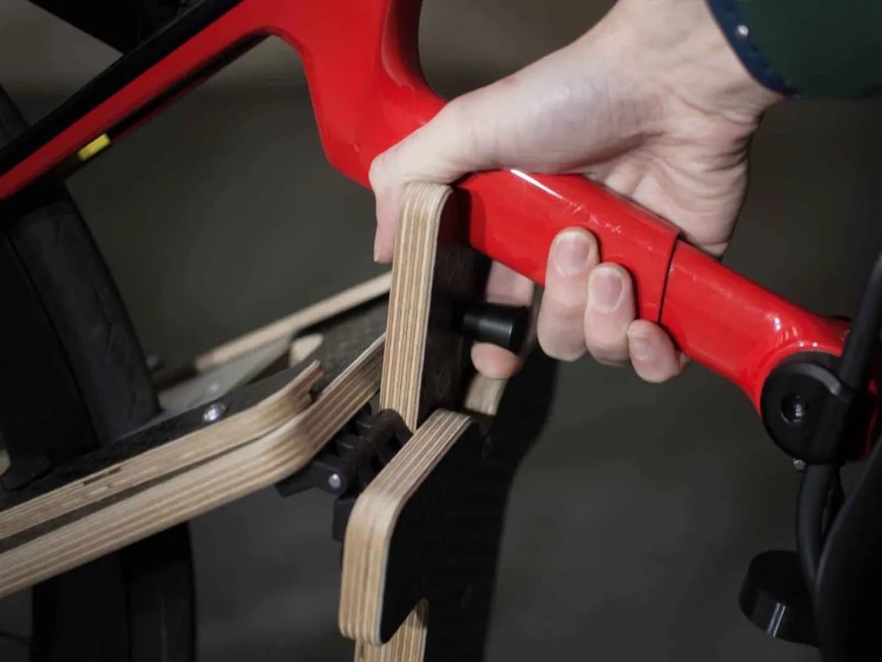
Here’s how it works: you roll your bike into the stand while it’s in the horizontal position, then rotate it upright if you want vertical storage. There’s a slider mechanism that locks the bike in place, keeping it stable in either orientation. The wheels on the base make maneuvering surprisingly easy, even in tight spaces. And when you’re not using it at all, the entire stand folds flat for storage.

That last feature is particularly brilliant for anyone dealing with limited space. Heading out on a bike trip and your bike won’t be home for a week? Fold the stand flat and tuck it away. Living in a city apartment where every square foot counts? Same deal. The Flip essentially disappears when you don’t need it, which is more than you can say for permanent wall hooks or ceiling-mounted systems.

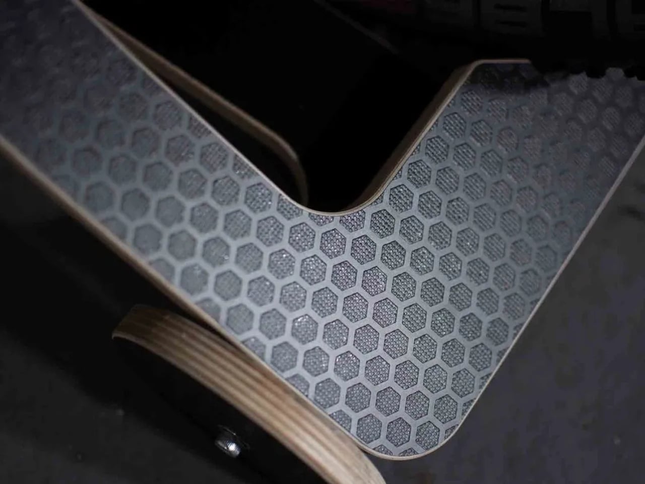
The stand is made from plywood, giving it a clean, modern aesthetic that doesn’t look out of place in contemporary homes. Customer reviews consistently mention that it’s attractive enough to display openly, whether you’re storing your bike in a hallway, office, or living space. One reviewer specifically noted that they’re “more than happy to have it on display in the office, with or without a bike in it.”

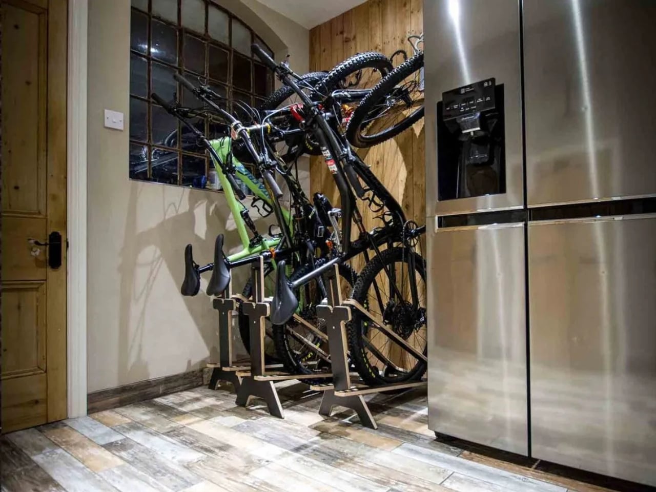
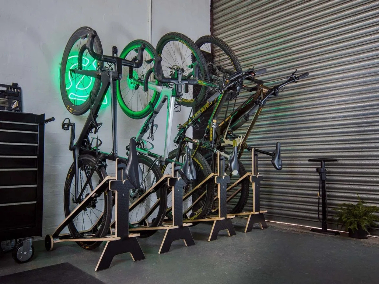
The Flip works with pretty much any bike you throw at it: road bikes, mountain bikes, electric bikes, even fat bikes with tires up to five inches wide. Multiple stands can be nested close together if you’ve got a household with several bikes, creating an organized parking area that doesn’t devolve into the usual tangled-handlebars chaos.

At around $175, it’s not the cheapest bike storage option out there, but it’s also significantly more versatile than a basic wall hook. BikeStow backs it with a two-year warranty and includes a custom Restrap securing strap to keep your bike stable. Customer ratings sit at a perfect five stars, with reviewers praising both its functionality and build quality.

Most bike storage solutions fall into two categories: cheap and flimsy, or expensive and permanent. The Flip occupies an interesting middle ground. It’s well-made and thoughtfully designed, but it doesn’t require you to drill holes in your walls or dedicate a chunk of your home to bike storage forever. It’s the kind of practical, human-centered design that solves a real problem without creating new ones.

For anyone tired of tripping over their bike or playing storage Tetris every time they need garage space, the Flip offers a refreshingly simple solution. Sometimes the best designs aren’t revolutionary, they just make everyday life a little bit easier.

The post This $175 Bike Stand Finally Solved Our Garage Storage Mess first appeared on Yanko Design.
This Designer Turns Abandoned Bikes Into Museum-Worthy Furniture

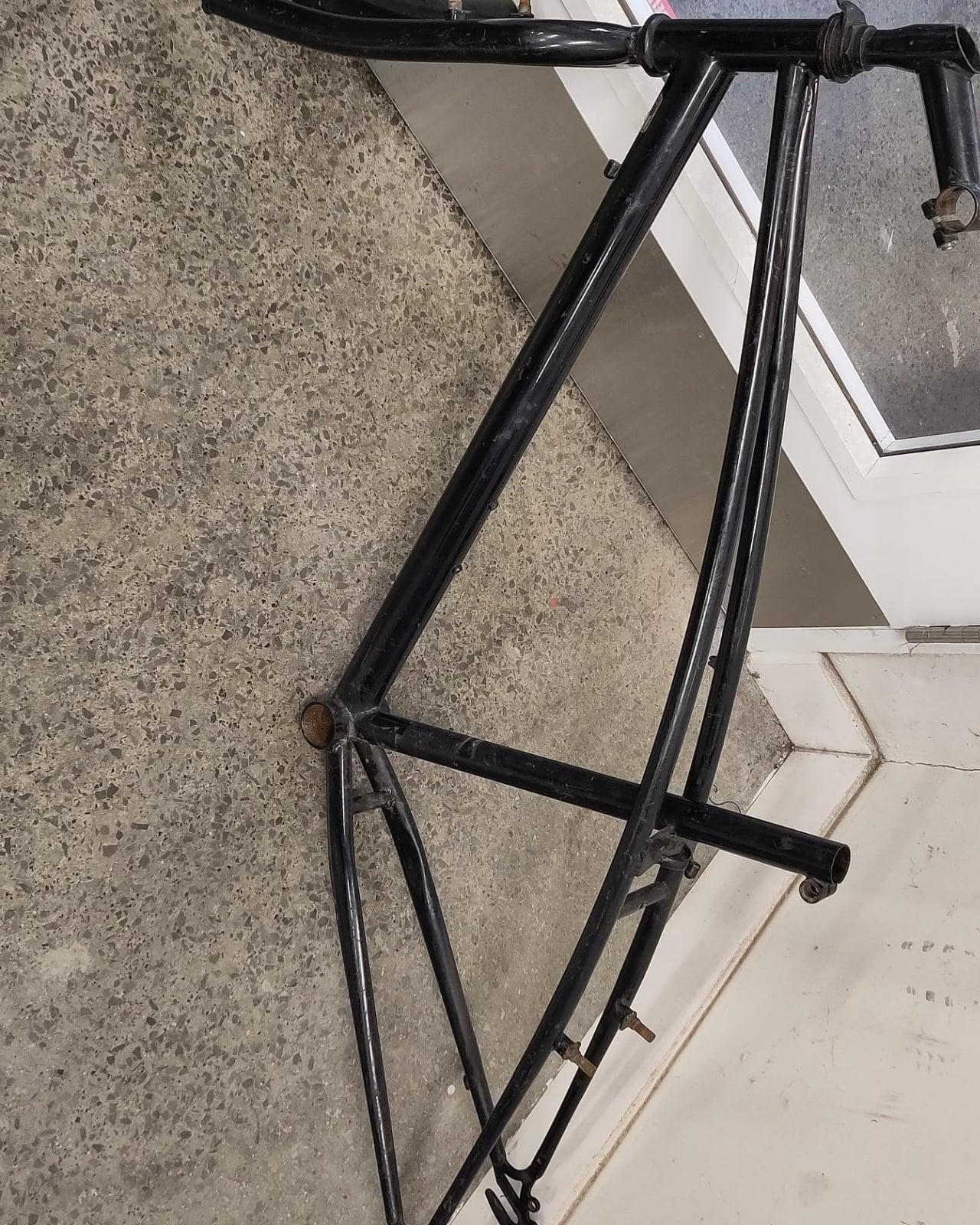
There’s something poetic about seeing a lonely bicycle chained to a pole, slowly rusting away in the rain. Most of us walk past these urban ghosts without a second thought. But Dublin-based designer Cara Campos sees something entirely different: potential.

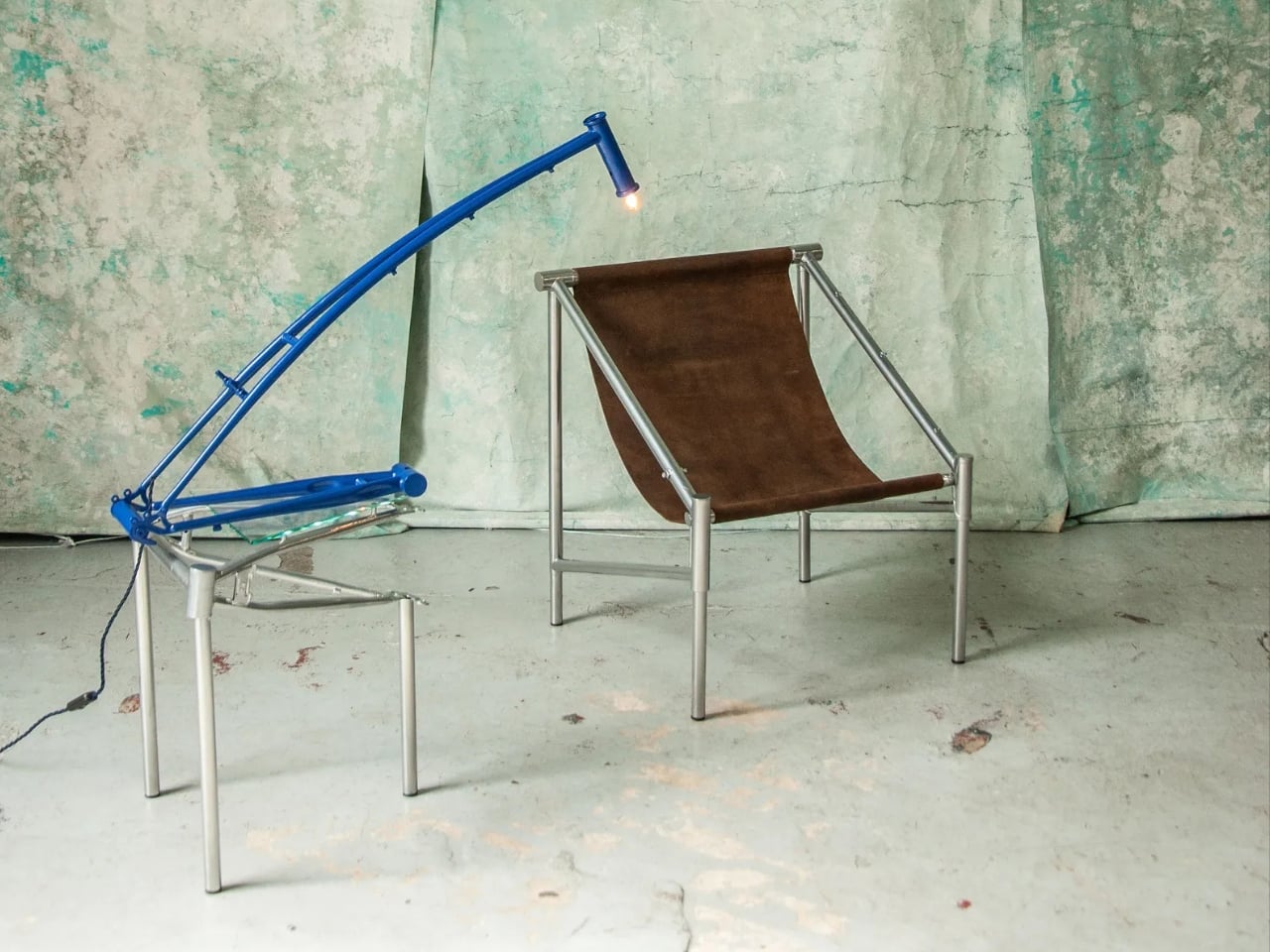
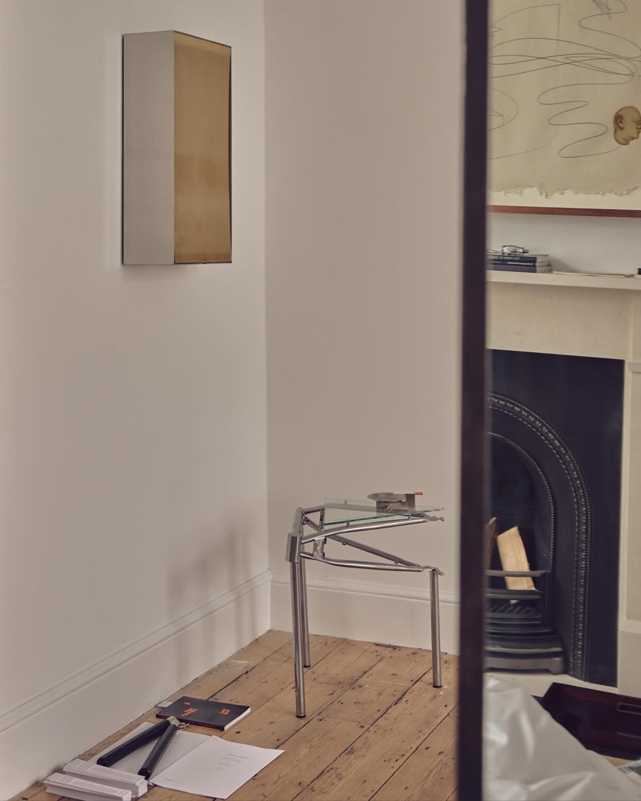
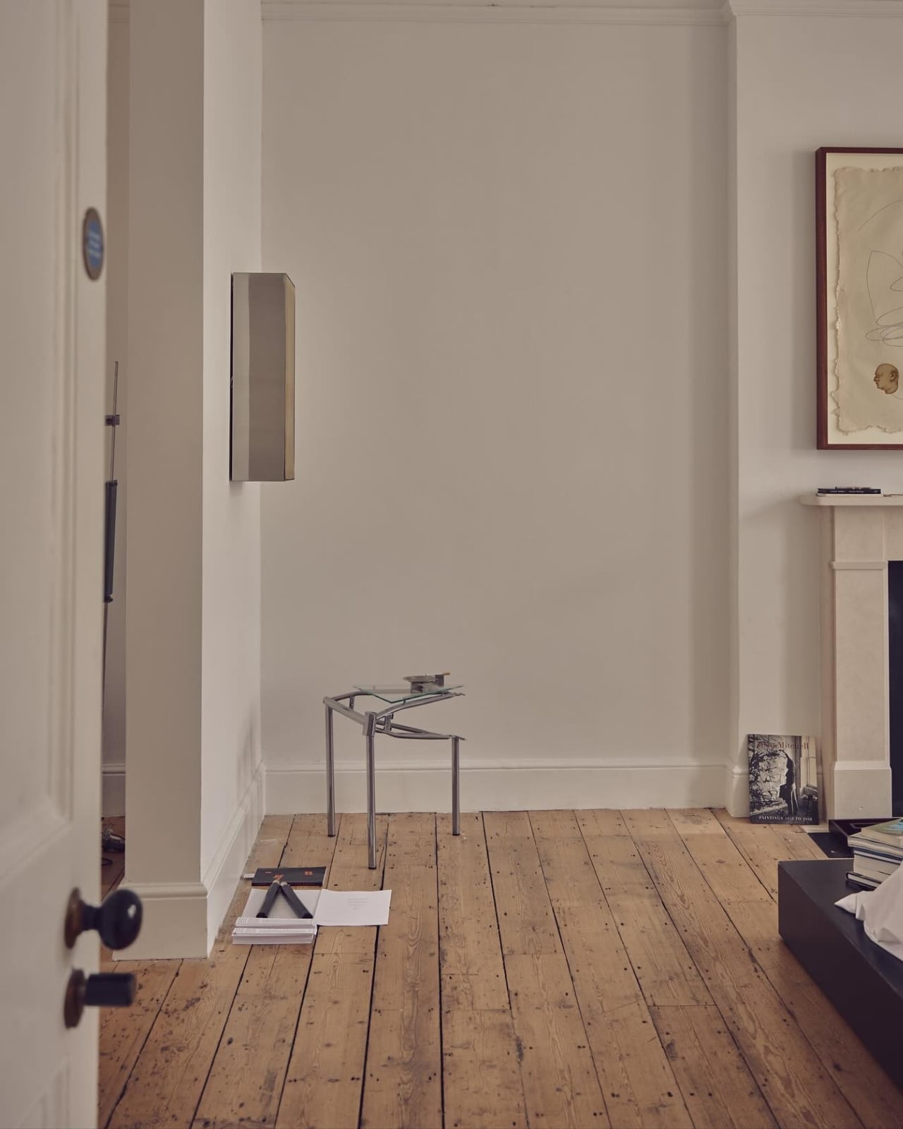
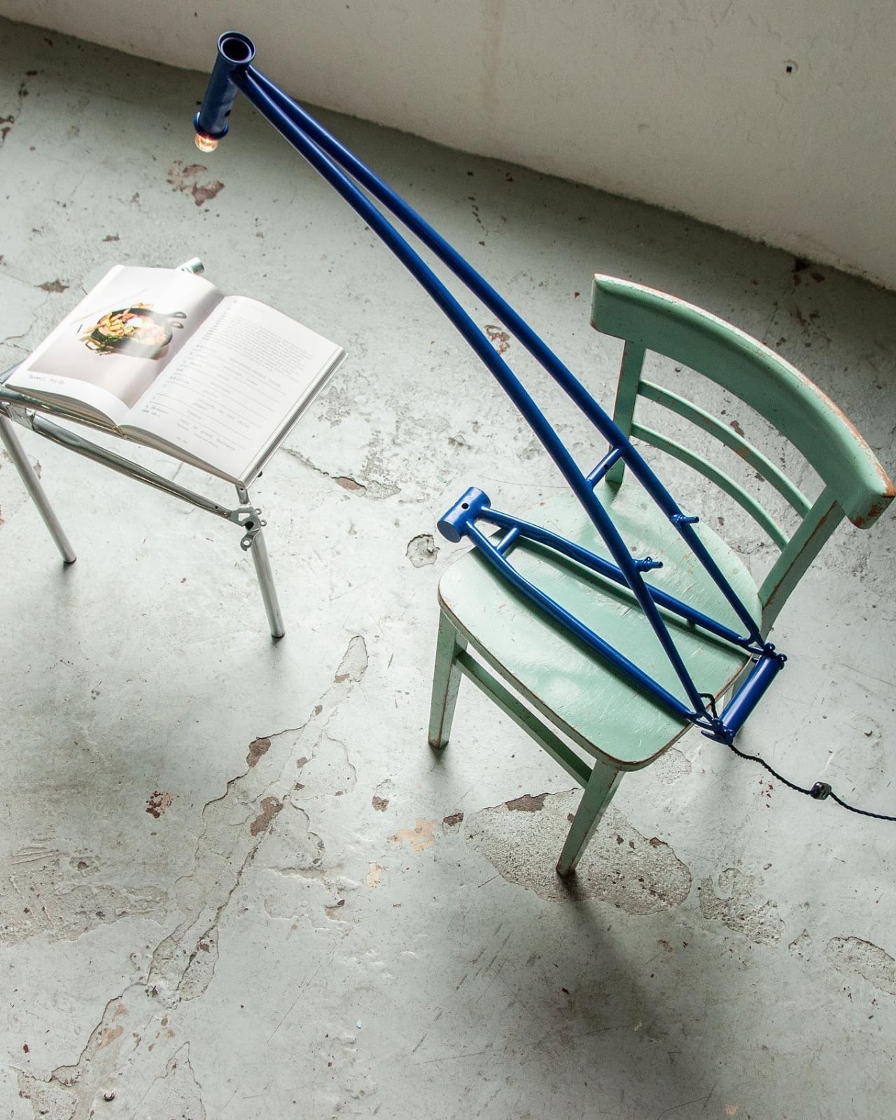
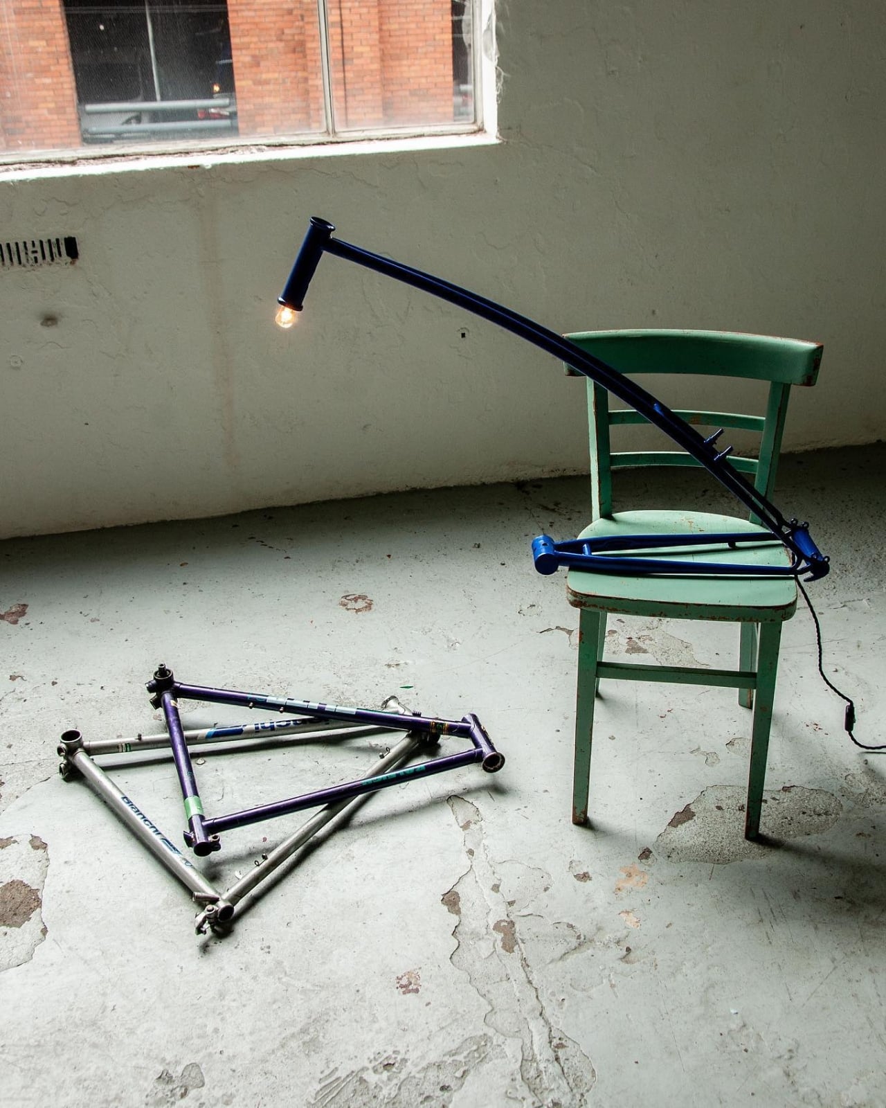
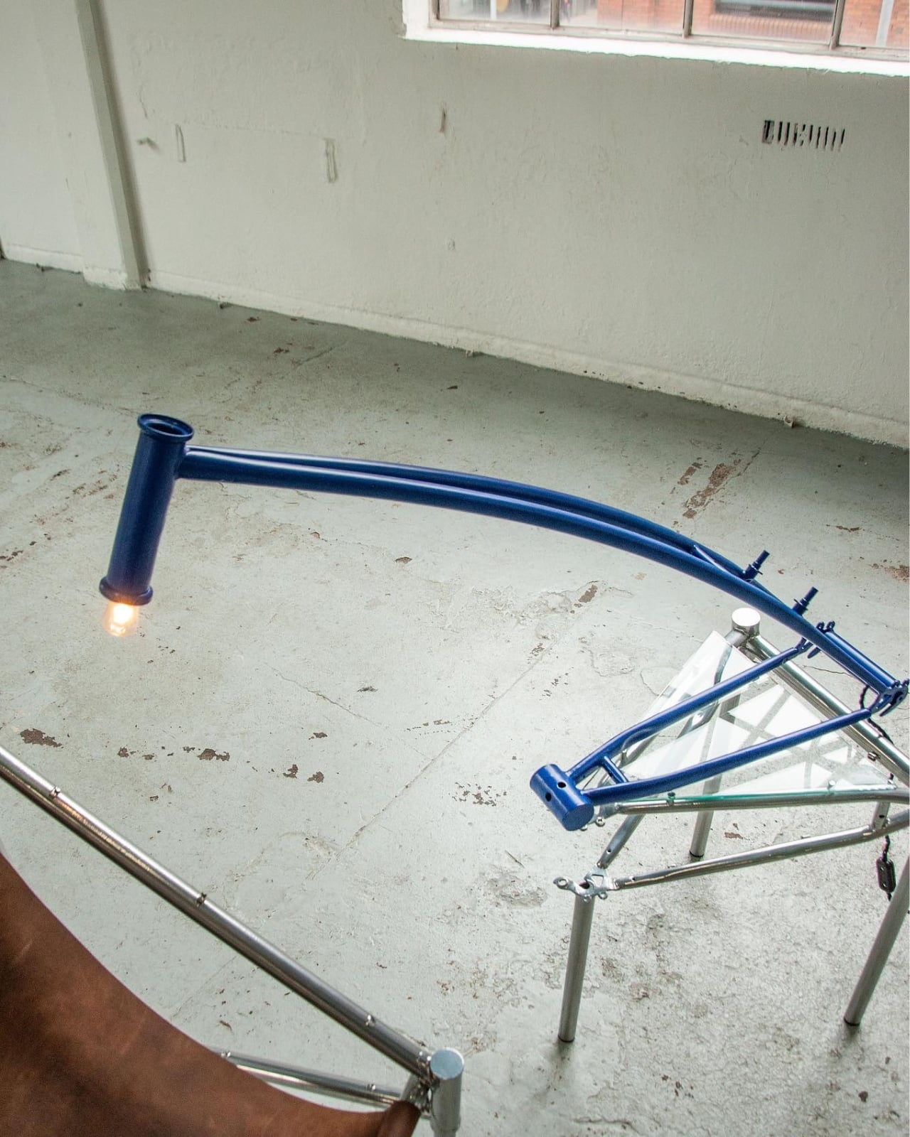
Her Objects from Frames collection, which has earned her recognition as a Wallpaper* Future Icon for 2026, transforms abandoned bicycle parts into sleek, minimalist furniture that looks like it belongs in a design museum. And honestly? It’s kind of genius.

Designer: Cara Campos

Campos didn’t grow up in Dublin. Raised in Saudi Arabia to a French father and Irish mother, she brings a multicultural perspective to her work that makes it feel both globally conscious and locally grounded. Now based in Ireland, she’s developed a design philosophy rooted in sustainability, adaptability, and what she calls “the lives of objects.” It’s this last bit that makes her work so compelling. She’s not just recycling materials. She’s honoring their stories.

The Objects from Frames collection started, like many great ideas, as a university project. Campos kept noticing abandoned bicycles scattered across different cities, slowly deteriorating, and wondered if she could give them a second act in Dublin. The bicycle, after all, holds a special place in human innovation. American writer William Saroyan once called it “the noblest invention of mankind,” and Campos clearly agrees. Why let such noble machines end their days as scrap metal?

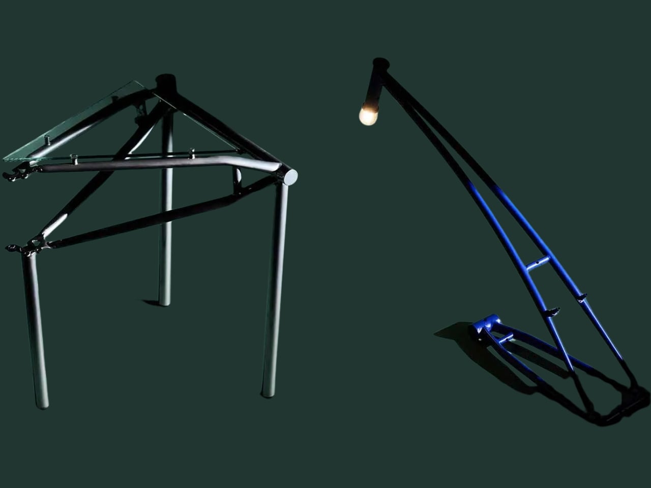
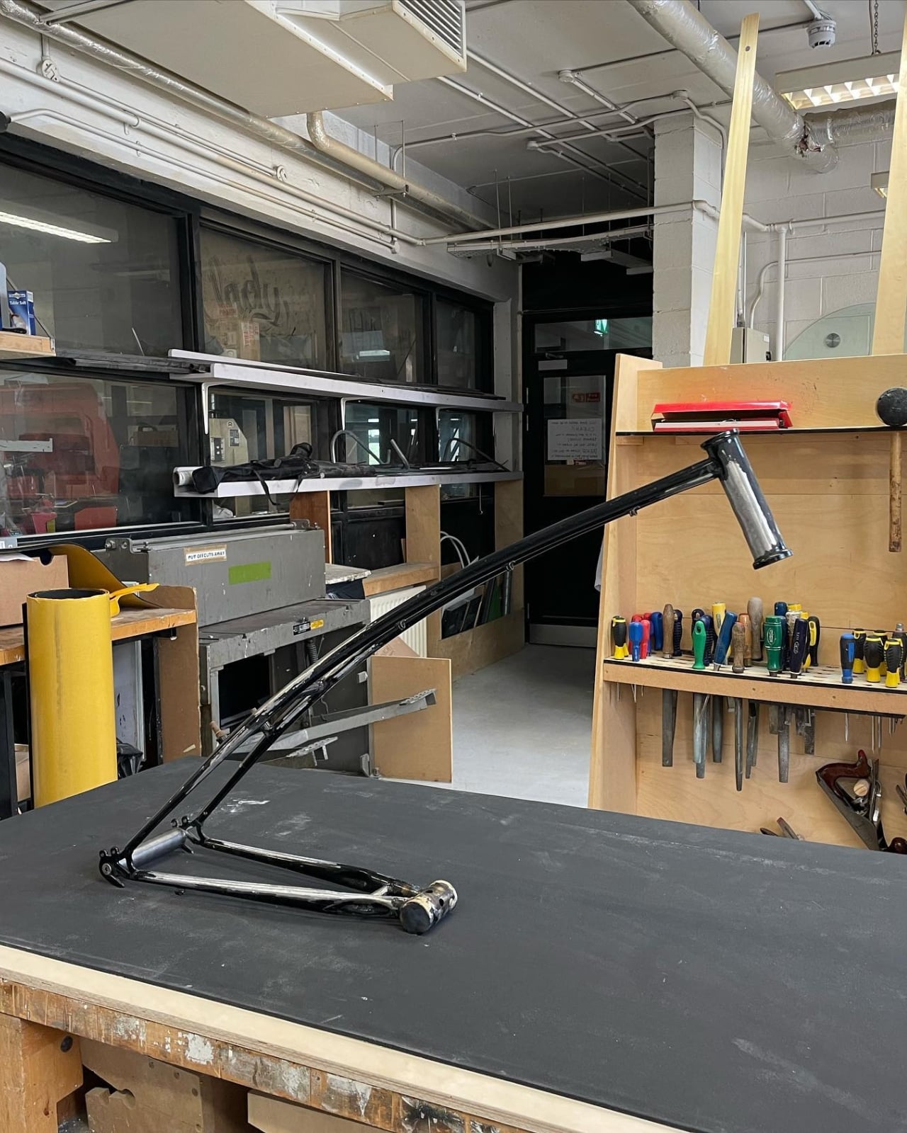
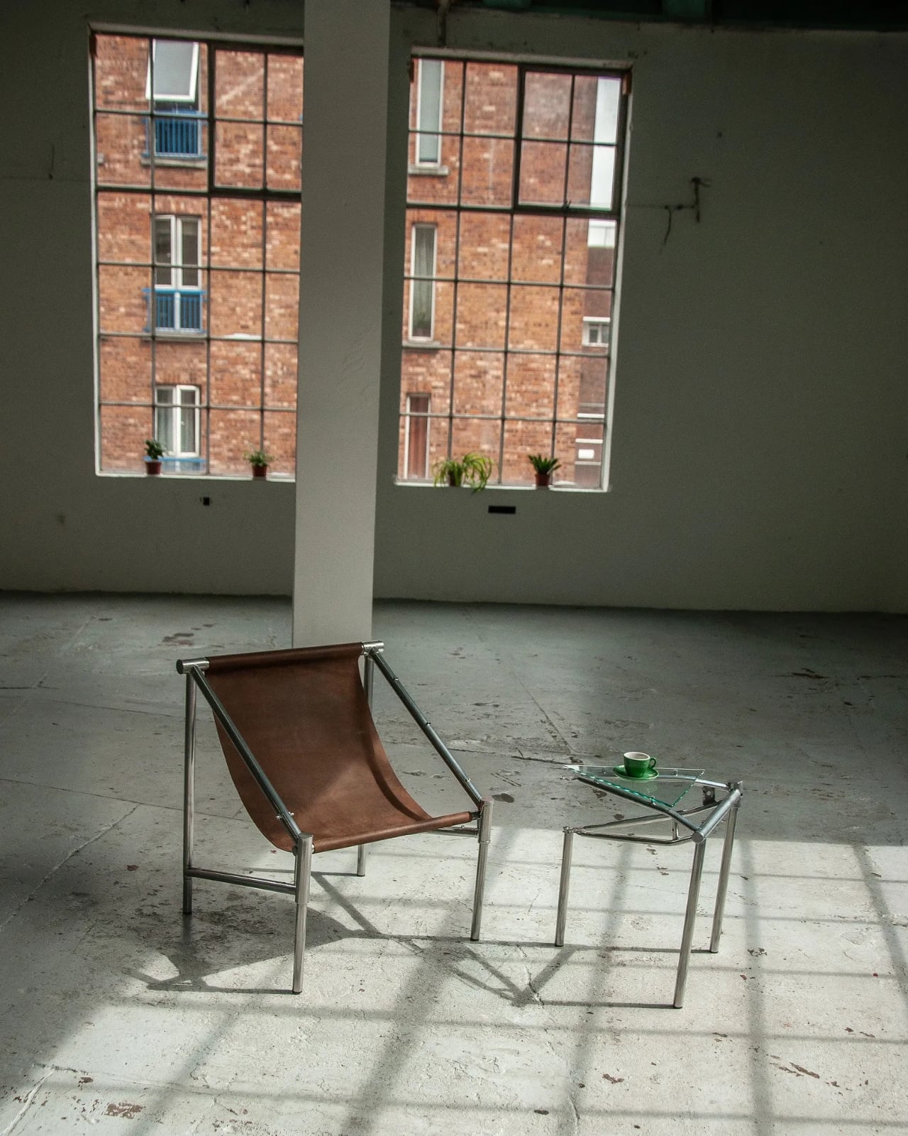
What she’s created is a collection of furniture that feels impossibly light and modern while celebrating the inherent beauty of industrial design. Her Steel Lounge Chair incorporates front triangles from road bikes, transforming the most recognizable part of a bicycle into something you’d want in your living room. There are also table lamps and side tables, each piece maintaining the elegant lines and structural integrity that made bicycles such revolutionary machines in the first place.
But here’s what makes Campos’ approach different from your typical upcycling project. She’s adamant that her work goes beyond simply repurposing discarded materials. As she explains it, the collection “pays homage” to the intangible value these objects carry. Each bicycle frame has history. It carried someone to work, helped a student get to class, maybe even facilitated a first date. That emotional and practical legacy doesn’t disappear just because the bike gets abandoned. Campos captures it, preserves it, and gives it new purpose.

The technical execution is impressive too. Steel is one of the most recyclable materials on the planet. More steel gets recycled annually than aluminum, paper, glass, and plastic combined. It’s a true cradle-to-cradle material, which means it can be recycled infinitely without losing its properties. By working with bicycle frames specifically, Campos taps into structures that were already engineered for strength, lightness, and efficiency. She’s not starting from scratch. She’s remixing existing excellence.

The collection also arrives at a perfect cultural moment. We’re increasingly aware of how much waste our consumption habits generate, and we’re hungry for alternatives that don’t require us to sacrifice style for sustainability. Campos proves you can have both. Her furniture looks contemporary and sophisticated, not like something cobbled together from trash. The clean lines and minimalist aesthetic would fit seamlessly into any modern space, and the origin story only adds to the appeal.

There’s also something refreshingly honest about furniture that wears its past life openly. In an era of mass production and throwaway culture, these pieces stand as quiet rebellion. They celebrate repair, reuse, and reinvention. They ask us to look differently at the objects around us and consider what else might be hiding in plain sight, waiting for transformation. Campos’ work joins a growing movement of designers who see waste not as an endpoint but as a starting point. Her approach reminds us that good design doesn’t always mean creating something entirely new. Sometimes it means recognizing the potential in what already exists and having the vision to set it free.
So next time you pass an abandoned bicycle slowly oxidizing in the weather, maybe you’ll see it differently. Maybe you’ll see a future lamp, a potential chair, a table waiting to happen. That’s the gift of designers like Cara Campos. They don’t just make beautiful things. They change how we see the world.

The post This Designer Turns Abandoned Bikes Into Museum-Worthy Furniture first appeared on Yanko Design.