The CD Player Is Back – And These 7 Designs Are Gorgeous

Streaming hasn’t killed physical media. It’s made us crave it more. CDs are back in rotation, showing up in record stores, apartments, and design studios with a renewed sense of purpose. Some of it comes down to sound: a format that doesn’t compress or buffer. A lot of it is about the object itself. A disc, a sleeve, a machine worth looking at. Things that feel considered in a world that mostly isn’t.

The players featured here range from transparent sculptures to boombox revivals, from minimalist concept blocks to award-winning portables with genuine design credentials. Each one has a clear point of view. Whether you’re rebuilding a hi-fi setup or just want something to put a CD in that doesn’t feel like a relic, this list proves that the format and the hardware around it can be genuinely beautiful. Seven players. Seven reasons to press play.

1. ClearFrame CD Player

Most CD players hide their engineering. The ClearFrame does the opposite, wrapping everything in crystal-clear polycarbonate so the circuit board becomes part of the experience. The result sits somewhere between gadget and display piece: you see the disc spin, the components work, the music moves through the machine. It’s built for people who love the ritual of physical media and want that ritual to look good doing it, on a shelf, a desk, or mounted on a wall.

Slide in the disc and prop the album sleeve in the front window. The ClearFrame turns your favorite record into a framed display. With Bluetooth 5.1, a seven-hour rechargeable battery, and multiple playback modes, it’s practical enough to go wherever you do. The square silhouette keeps things gallery-clean while the exposed circuitry underneath adds texture and personality. It’s the kind of object that makes you want to rebuild a CD collection just to have something worth putting on display.

Click Here to Buy Now: $200.00

What We Like

  • The transparent body doubles as an album frame, making the sleeve a visible part of the experience
  • Bluetooth 5.1 and a seven-hour battery make it genuinely portable without sacrificing the display concept

What We Dislike

  • The clear polycarbonate housing will show fingerprints and dust more readily than any solid casing
  • Wall mounting requires a separately purchased bracket, which adds to the overall cost

2. Bumpboxx BB-777

The BB-777 doesn’t whisper. It makes a statement. Bumpboxx pulled directly from the GF-777, one of the most iconic boomboxes of the 1980s, and rebuilt it for the present day. Stretching 29.6 inches across with dual cassette bays, four large front-facing drivers, a long analog tuner strip, and two telescoping antennas, it reads instantly as the kind of machine that belongs center stage. CD, cassette, radio, Bluetooth: a format-agnostic system that refuses to stay in the background.

At 270W, it fills a room without asking permission. The wide horizontal body, the carry handle, the spacing of the controls — every detail is faithful to the original without veering into nostalgia-trap territory. The BB-777 plays CDs, cassettes, and the radio while connecting wirelessly via Bluetooth. It’s designed to be heard and seen in equal measure, the kind of system that changes the energy of whatever space it lands in. Not a background device. A destination.

Click Here to But Now: $649 $1049 ($400 off). Hurry, only 262/1400 left! Raised over $4.3 million.

What We Like

  • The faithful ’80s aesthetic is executed with full commitment, not as a gimmick or a costume
  • 270W output paired with multi-format playback makes it a genuine room-filling entertainment system

What We Dislike

  • At 29.6 inches wide, it demands a significant and very specific amount of physical space
  • The maximalist retro aesthetic won’t suit every interior or every taste

3. CD-P1

This concept takes Teenage Engineering’s most recognizable quality, restraint, and applies it to a format that usually gets treated as background technology. The result is a metallic square block with almost nothing readable on its surface. The CD bay barely announces itself, just a thin circle scored into the top face, until you realize the entire top surface lifts as one. For a machine built around spinning discs, the absence of visual noise is startling and exactly right.

Every control element earns its place. A volume knob disappears into one of the rounded corners, flush with the body until your fingers find it. The headphone jack breaks from the minimalist logic: a small knurled cylinder jutting from the bottom edge, textured and tactile, almost inviting you to pull or twist it. The concept leaves some functional details open, but the design language is unambiguous. This is what a CD player looks like when you refuse to make compromises anywhere.

What We Like

  • The volume knob hidden inside a rounded corner is a quietly brilliant piece of design thinking
  • The metallic square format sits in any space without drawing unnecessary attention to itself

What We Dislike

  • As a concept, key functionality and production specifications remain unconfirmed
  • The extreme minimalism may make basic operations less intuitive in everyday use

4. SYITREN R300

The R300 arrived wearing its intentions clearly. Those finish options, wood grain, clean white, and a fruit green that has no business looking as good as it does, signal that audio equipment doesn’t need to default to satin black to be taken seriously. A MUSE Design Gold Award in the Audio and Video Devices category validated what you can already see: this is a player that understood the brief and executed it with genuine care for the object.

The dynamic area button on the right side is designed for intuitive, tactile control, the kind of physical interaction you want from a portable you pick up and put down regularly. It supports CD, CD-R, and CD-RW formats, covering virtually every disc in most collections. Whether it sits on a kitchen shelf or a coffee table, the R300 settles into a space without looking like an afterthought. It carries the quiet confidence of a product that knows exactly what it is.

What We Like

  • The fruit green finish is a bold, deliberate choice that actually earns its place in any room
  • The MUSE Design Gold Award reflects a product that delivers well beyond the surface of its aesthetics

What We Dislike

  • Three colorway options may still feel limiting for those wanting something more singular or custom
  • The retro-leaning design language will resonate more naturally with some aesthetics than others

5. Portable CD Cover Player

This one solves a problem most people didn’t know they had: what to do with the album art while the music plays. The CD Cover Player keeps the sleeve front-facing while the disc spins, turning a listening session into something closer to a gallery moment. A built-in speaker and rechargeable battery mean you can carry it from room to room or hang it on a wall. It shifts how you relate to your collection by making the visual half of it fully visible.

The minimalist form keeps everything balanced. Nothing competes with the artwork’s framing. Music becomes visual here, and that’s deliberate. There’s real value in slowing down enough to look at what you’re listening to, and the Cover Player builds that pause into its design. Whether it sits on a desk or mounts like a picture frame, it handles both functions without compromise, suiting anyone who thinks of their CD collection the same way they think about the art on their walls.

Click Here to Buy Now: $199.00

What We Like

  • Displaying the album cover while music plays adds a genuinely new dimension to the listening ritual
  • The wall-mountable design functions as striking home decor even when music isn’t playing

What We Dislike

  • The wall mount bracket is sold separately, which adds to the overall cost of the experience
  • The built-in speaker, while practical, may not satisfy more critical or discerning listeners

6. FiiO DM15 R2R

The DM15 R2R is where the CD revival gets serious. FiiO built this successor to the DM13 around a compact aluminum chassis with a transparent top panel that lets you watch the disc spin, a small but satisfying detail for anyone drawn to the physicality of the format. The R2R discrete ladder DAC architecture underneath is the real draw, bringing a level of engineering to a portable form that most standalone players at this size simply don’t attempt.

Beyond disc playback, the DM15 R2R works as a full USB DAC outputting up to 32-bit/384kHz PCM and native DSD256, figures that put it well above what its compact size suggests. A seven-hour rechargeable battery handles long sessions wire-free, while optical, coaxial, 3.5mm, and balanced 4.4mm outputs cover every system you’re likely to connect it to. For anyone building a physical media setup around sound quality, this is the component that makes everything around it perform better.

What We Like

  • R2R discrete ladder DAC architecture is genuinely rare to find in a portable CD player at any price
  • USB DAC mode at 32-bit/384kHz PCM and native DSD256 extends its usefulness well beyond CDs

What We Dislike

  • The depth of technical specification may exceed what casual listeners need or want from a portable
  • The understated aluminum chassis, while elegant, won’t appeal to those wanting a more expressive object

7. Orion

Designed by Vladimir Dubrovin, the Orion doesn’t bother with flaps or hinged lids. You slide the disc in through a thin front slot, and that’s it. A powder-coated metal body gives it an industrial calm, with almost nothing on the surface to distract from its form. An eject button, an IR receiver at the front, a power socket at the back — the controls are so reduced they barely register. It’s the kind of restraint that takes more confidence to execute than decoration ever would.

What keeps it from tipping into cold territory is the top surface. The perforations up there follow a parametric logic: holes grow larger toward the center, then taper back out toward the edges. The pattern was generated using Grasshopper 3D, a node-based parametric system that creates a logical relationship between each perforation and its proximity to the device’s outer contour. It’s a quiet flourish in an otherwise clinical design — the one place where the Orion lets geometry do the talking, and it’s enough.

What We Like

  • The parametric perforation pattern is engineered with genuine logic, making it feel earned rather than decorative
  • Front-loading slot design removes all mechanical clutter, keeping every surface clean and purposeful

What We Dislike

  • As a concept, it remains unproduced with no confirmed specifications or release timeline
  • The extreme restraint in controls may feel inaccessible to those who prefer tactile, readable interfaces

The Disc Is Back. And It Brought Better Hardware With It.

The CD player doesn’t need defending anymore. These seven designs make the case without argument: physical media is back, and it looks better than ever. Whether you want transparency, volume, minimalism, or award-winning color, there’s a player here that fits the shelf space and the listening habit. The format never lost its quality. It just needed the hardware to catch up with what the moment demands.

Put a disc in something beautiful and see what happens. The ritual is still there, the sleeve, the track listing, the deliberate act of choosing a record and committing to it. These players don’t compete with streaming. They offer something streaming can’t: a reason to sit still and listen. That’s the real comeback. Not nostalgia. A better way of paying attention to music you already love.

The post The CD Player Is Back – And These 7 Designs Are Gorgeous first appeared on Yanko Design.

Marka Is The Chair That Carries Culture and Quietly Connects People

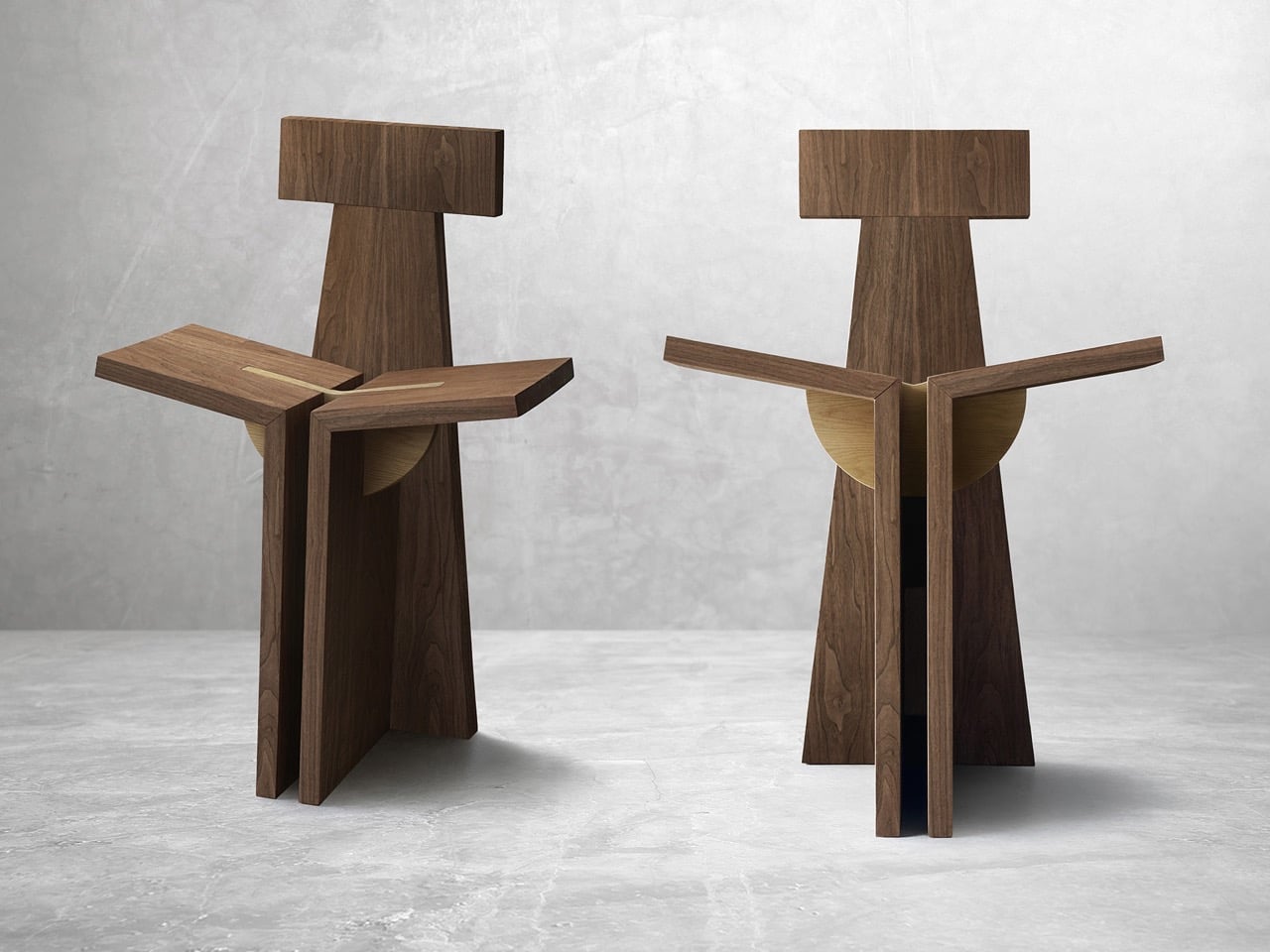
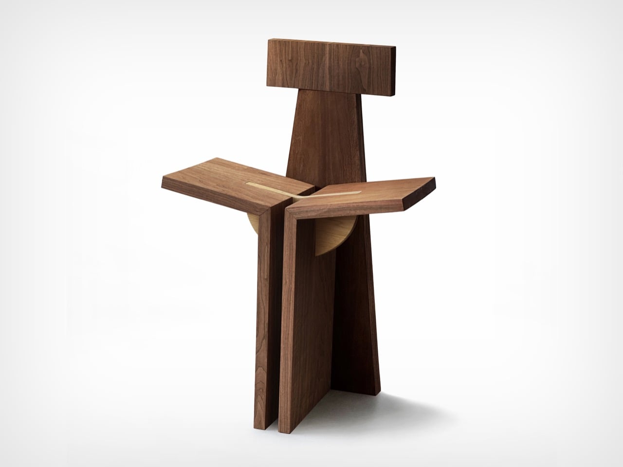
Marka feels less like furniture and more like a cultural memory taking shape in the present. The idea comes from the Bedouin way of life, where movement, adaptability, and shared living shaped everything. In that world, objects had to be light, versatile, and deeply connected to how people lived together. Marka brings that spirit forward and places it into the context of contemporary living. At its core, Marka raises a simple question. Can furniture bring people closer together again?

The story begins in the desert. For Bedouin communities, mobility defined life. Objects were designed to move with people, to shift between uses, and to serve multiple roles. What was once a saddle support for camel riding slowly evolved into a low seating form when nomadic groups began to settle. That transition reflects something meaningful. It shows how design evolves when lifestyles shift, and how culture is carried through objects.

Designer: Adel Alserhani

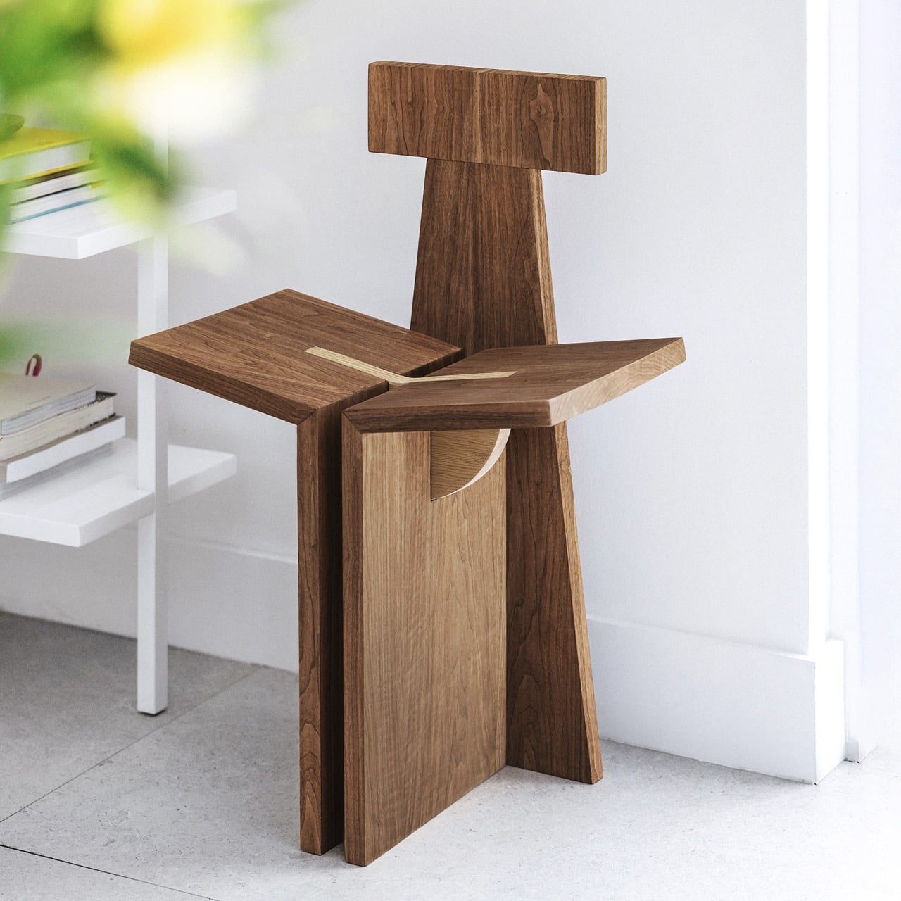
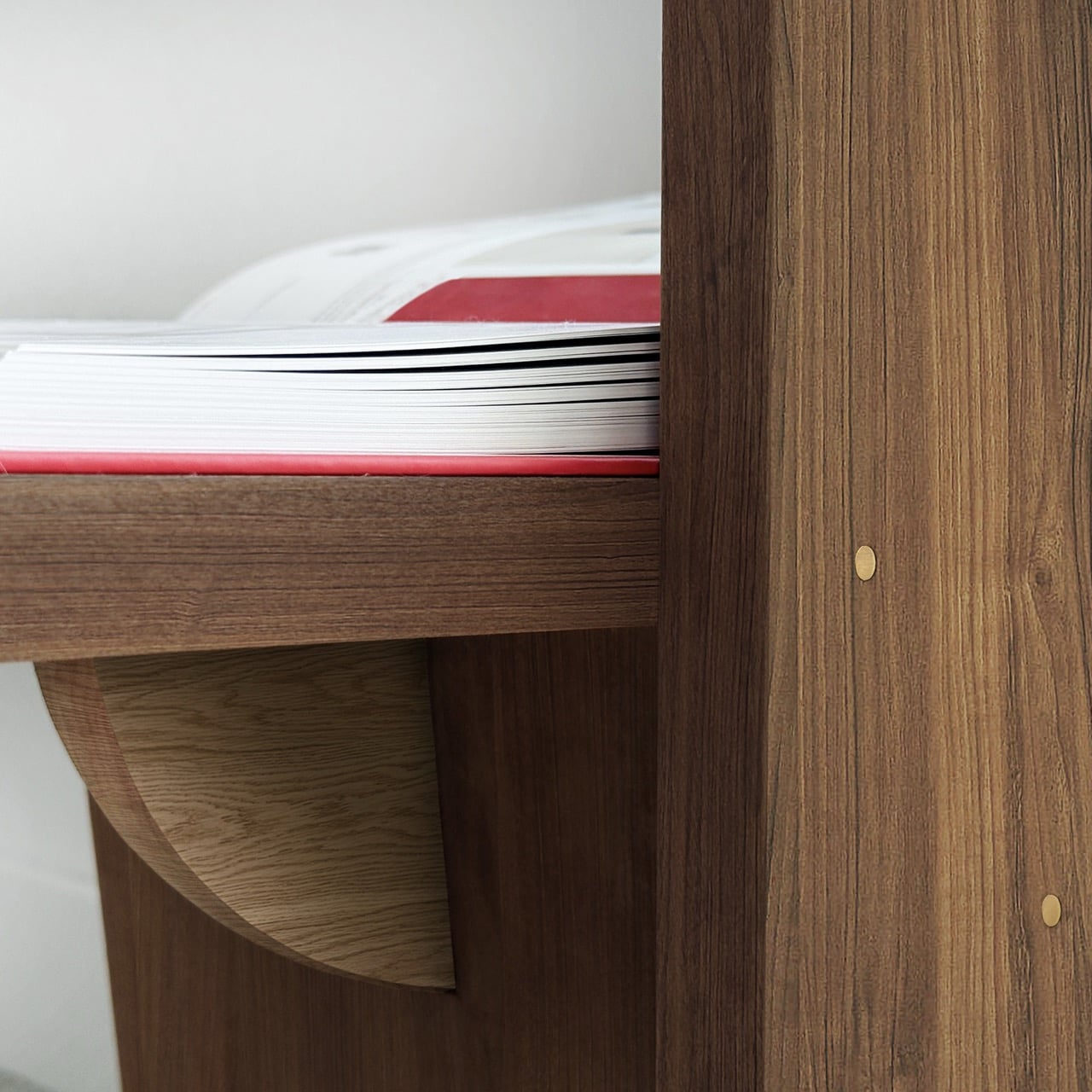
Marka builds on that idea. It reinterprets a traditional object through the lens of modern needs. The design is a modular seating system that changes form without the need for tools. It invites the user to assemble and reassemble it with ease. One configuration supports two people sitting close, encouraging conversation and shared time. Another configuration transforms into a low personal chair designed for solitude, comfort, and reflection. These changes happen through simple interlocking joinery, which makes the object playful and intuitive to use.

The two structural panels and the padded cover come together to create a flexible and tactile experience. The triangular cushion allows different sitting postures, making it easy to shift between relaxation, conversation, and quiet personal moments. There is a subtle intention behind this flexibility. The design acknowledges the human need to connect, and the equally important need to be alone.

The choice of material adds another layer of meaning. The structure is made from recycled and recyclable polypropylene sourced from local manufacturing waste. This choice reflects a conscious approach to sustainability and an understanding of resourcefulness that aligns with the traditions that inspired the design.

Marka also responds to a larger social shift. Research conducted during the project explored how urban development and economic growth have changed social behaviors. Many people living in fast-growing cities experience loneliness and a weakening of community bonds. Digital tools keep people connected across distances, yet face-to-face interaction is becoming less frequent. This shift can create feelings of isolation and a loss of belonging.

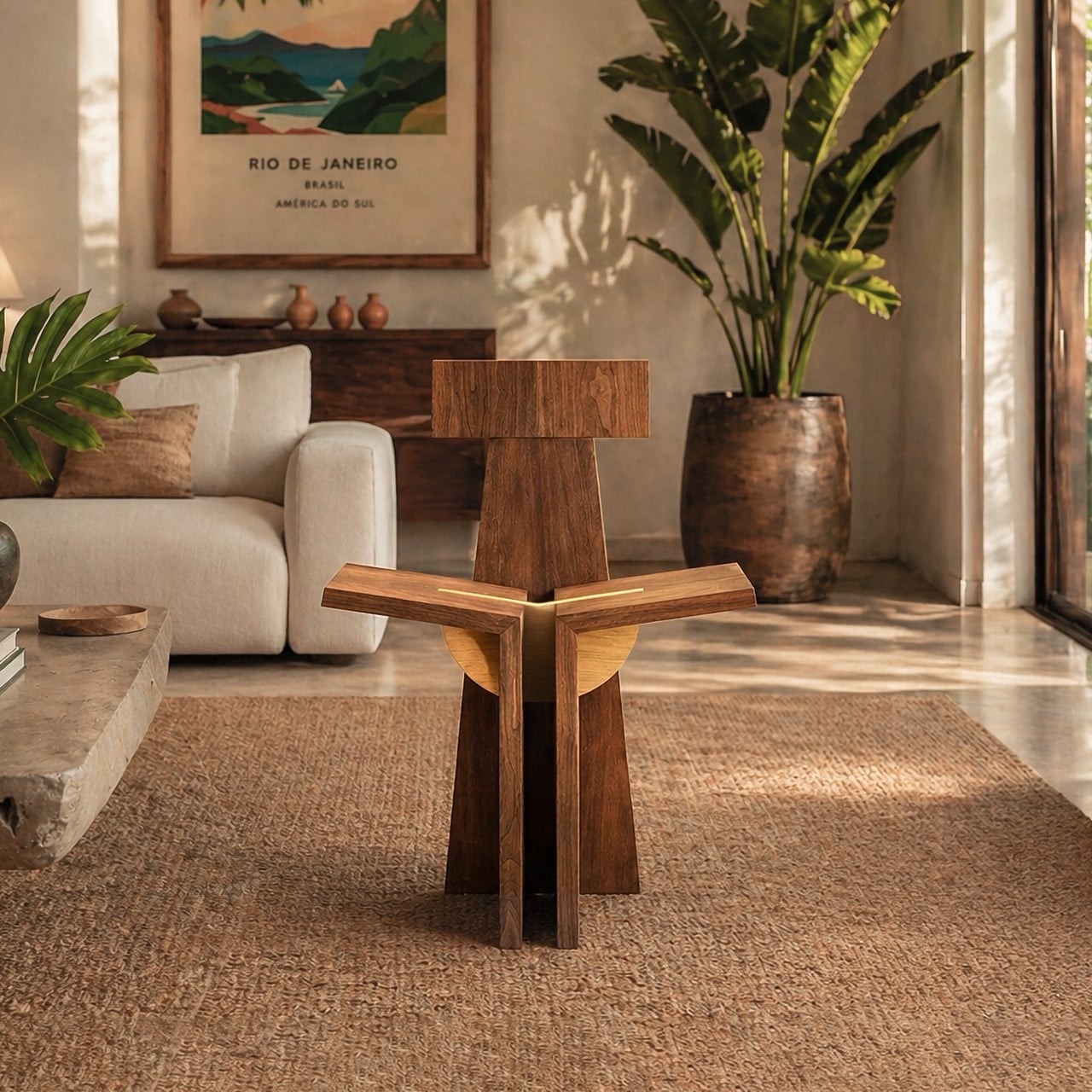
Marka does not claim to fix these issues. Instead, it creates small opportunities for connection. Placed in a home or shared space, it invites people to sit, talk, and spend time together. It encourages presence without forcing interaction. It allows a quiet space for solitude when needed. In doing so, it gently brings back the idea of shared moments in a world that often moves too quickly.

Marka stands as a reminder that design can hold memory and respond to contemporary needs at the same time. It blends heritage, function, and social intention into one object. In a quiet and thoughtful way, it asks us to slow down, gather, and find moments of human connection again.

The post Marka Is The Chair That Carries Culture and Quietly Connects People first appeared on Yanko Design.

Sabine Marcelis Built Coachella’s Best Spot Out of Thin Air

Every April, Coachella does that thing where it reminds you it’s not just a music festival. It’s a full-sensory exercise in spectacle, one that has always treated its art program with just as much ambition as its headliner lineup. This year, Dutch designer Sabine Marcelis is the one making that case loudest, with an installation called Maze that has, by most accounts, become one of the most talked-about spots on the entire festival grounds.

Maze is exactly what it sounds like, and also nothing like what you’d expect. Built from curved, inflated PVC walls that rise at varying heights, the structure winds across the Coachella grounds as a walkable labyrinth, one that feels less like an obstacle course and more like stepping into a fever dream of color and calm. The walls shift in a gradient from pale yellow at the outer edges to a deep, saturated red at the core, mimicking the warm, layered tones of a desert sunset. It’s the kind of color palette that looks deliberately, almost suspiciously perfect, and yet it doesn’t feel forced. It feels inevitable.

Designer: Sabine Marcelis

That’s what Marcelis does. The Rotterdam-based designer has built a body of work around the idea that light and material don’t just coexist. They perform together. Her practice leans into pure geometric forms and refined material investigations, always pushing manufacturing processes toward something surprising and sensory. At Coachella, that philosophy scales up beautifully. What could have been a gimmicky, oversized balloon art moment instead reads as something genuinely thoughtful: a structure designed to slow people down in a place that rarely stops moving.

And that’s the part that gets me. Coachella is famously relentless. Stages overlap, schedules are brutal, and the heat does not negotiate. Maze was built with that reality in mind. The inflated walls create shaded pockets, filtering both light and sound from the surrounding chaos. Seating runs along the outer edges, giving visitors actual places to stop and breathe. Clearings open up toward the stages, framing views of performances from inside the structure, so you never entirely lose the festival. You just get to experience it at a different speed.

Inspired by the natural contours of the Coachella Valley, the design has a landscape quality to it that reads as more than an aesthetic reference. The curved forms echo the rolling terrain of the desert, and the color gradient mirrors the sky at the specific hours when the California desert looks like it was art-directed by someone very talented. Marcelis didn’t try to compete with the landscape. She translated it. At night, the whole thing transforms. The PVC walls glow from within, turning the maze into an illuminated field of warm color that sits somewhere between architectural installation and light sculpture. If the daytime version is about refuge, the nighttime version is pure atmosphere. It hits differently against the dark, and I mean that in the best way.

I’ll be honest. I’ve watched the Coachella art program grow more ambitious over the years, and my reaction to any given installation tends to hover somewhere between “impressive” and “Instagram bait.” Maze clears that bar and then some. It works because it has an actual point of view. Marcelis built something that functions, that shelters, that engages the senses, and that happens to be visually stunning. That’s a harder balance to strike than it looks.

The installation was curated by Public Art Company, and it’s part of a broader 2026 art program that continues to push Coachella’s visual ambitions. But Maze stands out not because it’s the biggest or the flashiest. It stands out because it treats the people walking through it as the point, not the backdrop. That’s good design. And at a festival where you’re constantly being asked to witness things, it’s genuinely refreshing to walk into something that simply asks you to sit down and stay a while.

The post Sabine Marcelis Built Coachella’s Best Spot Out of Thin Air first appeared on Yanko Design.

Sabine Marcelis Built Coachella’s Best Spot Out of Thin Air

Every April, Coachella does that thing where it reminds you it’s not just a music festival. It’s a full-sensory exercise in spectacle, one that has always treated its art program with just as much ambition as its headliner lineup. This year, Dutch designer Sabine Marcelis is the one making that case loudest, with an installation called Maze that has, by most accounts, become one of the most talked-about spots on the entire festival grounds.

Maze is exactly what it sounds like, and also nothing like what you’d expect. Built from curved, inflated PVC walls that rise at varying heights, the structure winds across the Coachella grounds as a walkable labyrinth, one that feels less like an obstacle course and more like stepping into a fever dream of color and calm. The walls shift in a gradient from pale yellow at the outer edges to a deep, saturated red at the core, mimicking the warm, layered tones of a desert sunset. It’s the kind of color palette that looks deliberately, almost suspiciously perfect, and yet it doesn’t feel forced. It feels inevitable.

Designer: Sabine Marcelis

That’s what Marcelis does. The Rotterdam-based designer has built a body of work around the idea that light and material don’t just coexist. They perform together. Her practice leans into pure geometric forms and refined material investigations, always pushing manufacturing processes toward something surprising and sensory. At Coachella, that philosophy scales up beautifully. What could have been a gimmicky, oversized balloon art moment instead reads as something genuinely thoughtful: a structure designed to slow people down in a place that rarely stops moving.

And that’s the part that gets me. Coachella is famously relentless. Stages overlap, schedules are brutal, and the heat does not negotiate. Maze was built with that reality in mind. The inflated walls create shaded pockets, filtering both light and sound from the surrounding chaos. Seating runs along the outer edges, giving visitors actual places to stop and breathe. Clearings open up toward the stages, framing views of performances from inside the structure, so you never entirely lose the festival. You just get to experience it at a different speed.

Inspired by the natural contours of the Coachella Valley, the design has a landscape quality to it that reads as more than an aesthetic reference. The curved forms echo the rolling terrain of the desert, and the color gradient mirrors the sky at the specific hours when the California desert looks like it was art-directed by someone very talented. Marcelis didn’t try to compete with the landscape. She translated it. At night, the whole thing transforms. The PVC walls glow from within, turning the maze into an illuminated field of warm color that sits somewhere between architectural installation and light sculpture. If the daytime version is about refuge, the nighttime version is pure atmosphere. It hits differently against the dark, and I mean that in the best way.

I’ll be honest. I’ve watched the Coachella art program grow more ambitious over the years, and my reaction to any given installation tends to hover somewhere between “impressive” and “Instagram bait.” Maze clears that bar and then some. It works because it has an actual point of view. Marcelis built something that functions, that shelters, that engages the senses, and that happens to be visually stunning. That’s a harder balance to strike than it looks.

The installation was curated by Public Art Company, and it’s part of a broader 2026 art program that continues to push Coachella’s visual ambitions. But Maze stands out not because it’s the biggest or the flashiest. It stands out because it treats the people walking through it as the point, not the backdrop. That’s good design. And at a festival where you’re constantly being asked to witness things, it’s genuinely refreshing to walk into something that simply asks you to sit down and stay a while.

The post Sabine Marcelis Built Coachella’s Best Spot Out of Thin Air first appeared on Yanko Design.

CMF Phone 3 Concept Keeps the Screws and Colors, Adds iPhone-Style Triple Camera

Nothing’s CMF sub-brand exists because someone at the company realized that modularity and affordability could coexist, and that a phone doesn’t need to cost 800 dollars to feel thoughtfully designed. A Reddit user just took that philosophy and ran with it, crafting a CMF Phone 3 concept that feels like a natural progression from the Phone 1 and Phone 2 Pro. The renders keep the modular accessory system intact, preserve the visible screws that signal user serviceability, and lean into CMF’s signature color palette with options in orange, olive green, white, and black. The triple camera layout might look familiar (it echoes the iPhone Pro design), but Nothing’s never been shy about using proven form factors when they make sense.

The concept introduces a few new ideas, most notably a side-mounted accessory point that looks like a strap or handle attachment. Whether that’s useful or gimmicky depends entirely on execution, but it signals an interesting direction: expanding CMF’s modularity beyond the back plate and into the frame itself. The textured side rails add grip and visual interest, and the overall form factor stays clean and contemporary without trying too hard to be different. The real test for any CMF Phone 3 will be whether it expands the accessory ecosystem in meaningful ways while keeping prices accessible.

Designer: Glum_Good_6414

Nothing has kept quiet about a CMF Phone 3, which means this concept exists in a vacuum of official information. The CMF Phone 2 Pro launched with a MediaTek Dimensity 7300 chip, 8GB of RAM, and a 50MP main camera, all for around 209 dollars. Any successor would need to justify its existence by either pushing specs higher or doubling down on modularity, and this concept seems to bet on both. The triple camera setup suggests CMF might be ready to play in mid-range camera territory, while the expanded accessory mounting points hint at a deeper commitment to customization.

The color choices feel quintessentially CMF. Orange has been a brand signature since the Phone 1, and the olive green adds an earthy, utilitarian vibe that fits the repairable, modular ethos. The white-and-orange combo keeps things clean and approachable, while the dark variant with coral accents offers something moodier for users who want subtlety with a pop of personality. These aren’t experimental colors, they’re practical ones that CMF has already proven people will buy.

Whether Nothing actually builds a Phone 3 that looks anything like this remains unknown, but the concept does something valuable: it shows what fans expect. They want the screws, the modularity, the playful colors, and the accessible price. They’re okay with familiar camera layouts if it means better photo quality. They want CMF to evolve without losing what made it compelling in the first place. This concept delivers on that brief, and that’s probably the best compliment you can give fan-made speculation.

The post CMF Phone 3 Concept Keeps the Screws and Colors, Adds iPhone-Style Triple Camera first appeared on Yanko Design.

CMF Phone 3 Concept Keeps the Screws and Colors, Adds iPhone-Style Triple Camera

Nothing’s CMF sub-brand exists because someone at the company realized that modularity and affordability could coexist, and that a phone doesn’t need to cost 800 dollars to feel thoughtfully designed. A Reddit user just took that philosophy and ran with it, crafting a CMF Phone 3 concept that feels like a natural progression from the Phone 1 and Phone 2 Pro. The renders keep the modular accessory system intact, preserve the visible screws that signal user serviceability, and lean into CMF’s signature color palette with options in orange, olive green, white, and black. The triple camera layout might look familiar (it echoes the iPhone Pro design), but Nothing’s never been shy about using proven form factors when they make sense.

The concept introduces a few new ideas, most notably a side-mounted accessory point that looks like a strap or handle attachment. Whether that’s useful or gimmicky depends entirely on execution, but it signals an interesting direction: expanding CMF’s modularity beyond the back plate and into the frame itself. The textured side rails add grip and visual interest, and the overall form factor stays clean and contemporary without trying too hard to be different. The real test for any CMF Phone 3 will be whether it expands the accessory ecosystem in meaningful ways while keeping prices accessible.

Designer: Glum_Good_6414

Nothing has kept quiet about a CMF Phone 3, which means this concept exists in a vacuum of official information. The CMF Phone 2 Pro launched with a MediaTek Dimensity 7300 chip, 8GB of RAM, and a 50MP main camera, all for around 209 dollars. Any successor would need to justify its existence by either pushing specs higher or doubling down on modularity, and this concept seems to bet on both. The triple camera setup suggests CMF might be ready to play in mid-range camera territory, while the expanded accessory mounting points hint at a deeper commitment to customization.

The color choices feel quintessentially CMF. Orange has been a brand signature since the Phone 1, and the olive green adds an earthy, utilitarian vibe that fits the repairable, modular ethos. The white-and-orange combo keeps things clean and approachable, while the dark variant with coral accents offers something moodier for users who want subtlety with a pop of personality. These aren’t experimental colors, they’re practical ones that CMF has already proven people will buy.

Whether Nothing actually builds a Phone 3 that looks anything like this remains unknown, but the concept does something valuable: it shows what fans expect. They want the screws, the modularity, the playful colors, and the accessible price. They’re okay with familiar camera layouts if it means better photo quality. They want CMF to evolve without losing what made it compelling in the first place. This concept delivers on that brief, and that’s probably the best compliment you can give fan-made speculation.

The post CMF Phone 3 Concept Keeps the Screws and Colors, Adds iPhone-Style Triple Camera first appeared on Yanko Design.
Xbox CEO called Game Pass ‘too expensive for players’ in a leaked memo

Xbox's new chief exec, Asha Sharma, has only been in charge for a few months but things already seem like they might be changing for the better. Or at the very least, they might be getting cheaper. The Verge reported that the new Xbox CEO wrote a memo to employees addressing the current pricing of the Game Pass subscription service. 

"Game Pass is central to gaming value on Xbox. It’s also clear that the current model isn’t the final one," Sharma allegedly said. "Short term, Game Pass has become too expensive for players, so we need a better value equation. Long term, we will evolve Game Pass into a more flexible system which will take time to test and learn around."

After Microsoft upped the price for Game Pass twice within 15 months, many of us certainly felt that the service had gotten too costly to keep. Xbox is still offering a wide range of titles on Game Pass; the April update is adding indies like Hades 2 and new Double Fine project Kiln alongside AAA hits like the remake of Call of Duty: Modern Warfare. The Verge's sources suggested that the addition of the CoD franchise might have been a factor in some of the Game Pass price increases, since Microsoft would lose out on revenue by making the latest entries in the series available under the subscription. 

It's too early to say whether this memo from Sharma means Xbox is on the brink of a resurgence. And there are changes the company could make, like adding ever more complicated tiers, that would further hamper interest and uptake of Game Pass. But acknowledging the problem, even internally, is refreshing to see after so many baffling moves from Xbox in recent years.

This article originally appeared on Engadget at https://www.engadget.com/gaming/xbox/xbox-ceo-called-game-pass-too-expensive-for-players-in-a-leaked-memo-194749597.html?src=rss

Xbox CEO called Game Pass ‘too expensive for players’ in a leaked memo

Xbox's new chief exec, Asha Sharma, has only been in charge for a few months but things already seem like they might be changing for the better. Or at the very least, they might be getting cheaper. The Verge reported that the new Xbox CEO wrote a memo to employees addressing the current pricing of the Game Pass subscription service. 

"Game Pass is central to gaming value on Xbox. It’s also clear that the current model isn’t the final one," Sharma allegedly said. "Short term, Game Pass has become too expensive for players, so we need a better value equation. Long term, we will evolve Game Pass into a more flexible system which will take time to test and learn around."

After Microsoft upped the price for Game Pass twice within 15 months, many of us certainly felt that the service had gotten too costly to keep. Xbox is still offering a wide range of titles on Game Pass; the April update is adding indies like Hades 2 and new Double Fine project Kiln alongside AAA hits like the remake of Call of Duty: Modern Warfare. The Verge's sources suggested that the addition of the CoD franchise might have been a factor in some of the Game Pass price increases, since Microsoft would lose out on revenue by making the latest entries in the series available under the subscription. 

It's too early to say whether this memo from Sharma means Xbox is on the brink of a resurgence. And there are changes the company could make, like adding ever more complicated tiers, that would further hamper interest and uptake of Game Pass. But acknowledging the problem, even internally, is refreshing to see after so many baffling moves from Xbox in recent years.

This article originally appeared on Engadget at https://www.engadget.com/gaming/xbox/xbox-ceo-called-game-pass-too-expensive-for-players-in-a-leaked-memo-194749597.html?src=rss

adidas Originals’ Two Ring watch shrinks digital timekeeping into a minimalist retro-modern timepiece

Smartphones have shrunk to the size of a wrist, and now smartwatches are beginning to appear on the fingers. Some of the better names in the industry have already tried ring watches. Casio did so with the Ring Watch CRW-001-1JR, and Timex collaborated with Beams on the Beams Boy x Timex Original Camper Ring Watch. Now it’s adidas Originals, which is expanding its athletic heritage to the jewelry and fashion industry with the new Digital Two Ring.

The timepiece is created under the Timex license, so in many ways, this miniature watch sits at the intersection of both brands’ identities. That partnership isn’t new, as Timex has long produced adidas timepieces, translating the sportswear giant’s aesthetic into accessible watches that balance function and street-ready styling.

Designer: adidas

What defines the Digital Two Ring is its intentional minimalism, which is to be worn on the ring. The interface strips away everything non-essential, focusing entirely on a highly legible digital display, punctuated only by the iconic Trefoil logo. There are no extra graphics or complications: just time, presented clearly. This clarity is amplified by the display layout, which is deliberately large and easy to read despite the compact form.

The design itself leans into a bold, industrial aesthetic. Built around a 20mm stainless steel case, the ring emphasizes a clean yet edgy metal texture that feels both contemporary and slightly retro. Despite its miniature proportions, it carries a surprising visual weight, giving it a strong sense of individuality. The absence of decorative elements further enhances its understated, almost architectural presence.

Functionally, the watch keeps things straightforward. It runs on a digital quartz movement and offers 3 ATM water resistance, enough for daily wear and light exposure, reinforcing its role as a practical yet style-forward accessory. The construction includes a stainless steel expansion band, designed to flex like a spring. This allows it to fit multiple fingers comfortably, starting from approximately size 11, while maintaining a secure, stress-free fit.

The Digital Two Ring arrives on April 17 in two metallic finishes that further position it as jewelry as much as a timepiece. The gold variant leans into statement styling, adding a subtle sense of luxury that pairs easily with other accessories. The silver version, on the other hand, offers a calmer, more understated tone, making it versatile enough for everyday wear across different outfits and occasions. The ring watch is expected to retail around the $125, placing it firmly in the accessible fashion accessory category rather than the high-end watch segment.

The post adidas Originals’ Two Ring watch shrinks digital timekeeping into a minimalist retro-modern timepiece first appeared on Yanko Design.

Games Workshop brings seven classic Warhammer games to Steam for the first time

Fans of miniature plastic soldiers, rejoice. Games Workshop has brought a host of older Warhammer and Warhammer 40K video games to Steam for the first time, alongside a dozen games that haven't been available on Valve's storefront for a few years. The new to Steam releases consist of three games from the Warhammer fantasy range — Shadow of the Horned Rat, Mark of Chaos – Gold Edition and Dark Omen — and four from its sci-fi 40K universe — Chaos Gate, Fire Warrior, Final Liberation and Rites of War.  

If you're a Warhammer fan of a certain age, some of these may be formative experiences for you. I know they are for me. I can't count how many hours I spent playing Chaos Gate when I first discovered 40K at the age of 10. Yes, it was an XCOM clone, but by that point I didn't know about the MicroProse original, and Space Marines were cool. 

Years later and as a Tau collector at the time, I also loved Fire Warrior, even if it wasn't the most polished or deep first-person shooter. I haven't played the other five games included in today's announcement, but I've heard Warhammer: Shadow of the Horned Rat and Warhammer 40K: Rites of War are pretty good if you're into the setting or, in the latter case, a fan of the Eldar.  

To celebrate the re-release of these old gems, Games Workshop is running a Classics sale on Steam, with discounts on all 19 re-releases. Plus, you can get discounts on some more recent releases, including the excellent Dawn of War – Definitive Edition and Dawn of War 2 – Anniversary Edition. If you're new to the Warhammer 40K universe, and would rather avoid a plastic addiction, one of those would be my first port of call, along with the excellent Space Marine 2.


This article originally appeared on Engadget at https://www.engadget.com/gaming/pc/games-workshop-brings-seven-classic-warhammer-games-to-steam-for-the-first-time-185432304.html?src=rss