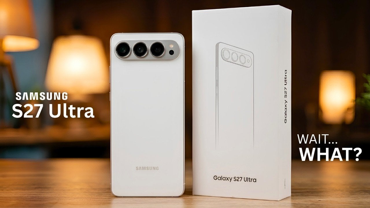
Samsung’s highly anticipated Galaxy S27 series has been officially confirmed through a GSMA database listing, offering a glimpse into what the next flagship lineup will bring. The listing reveals the model number SM-S952U, which corresponds to the carrier-locked US variant of the Galaxy S27 Ultra. This confirmation not only validates earlier rumors but also sets […]
The way natural light moves through a home is something architects spend considerable effort thinking about and homeowners rarely control. A room that gets good morning light may feel completely flat by afternoon. A basement office might go weeks in dim, color-distorted artificial light that strains your eyes and makes every hour feel identical. The architecture of most homes simply wasn’t designed around the idea that the ceiling could do more than hold a light fixture.
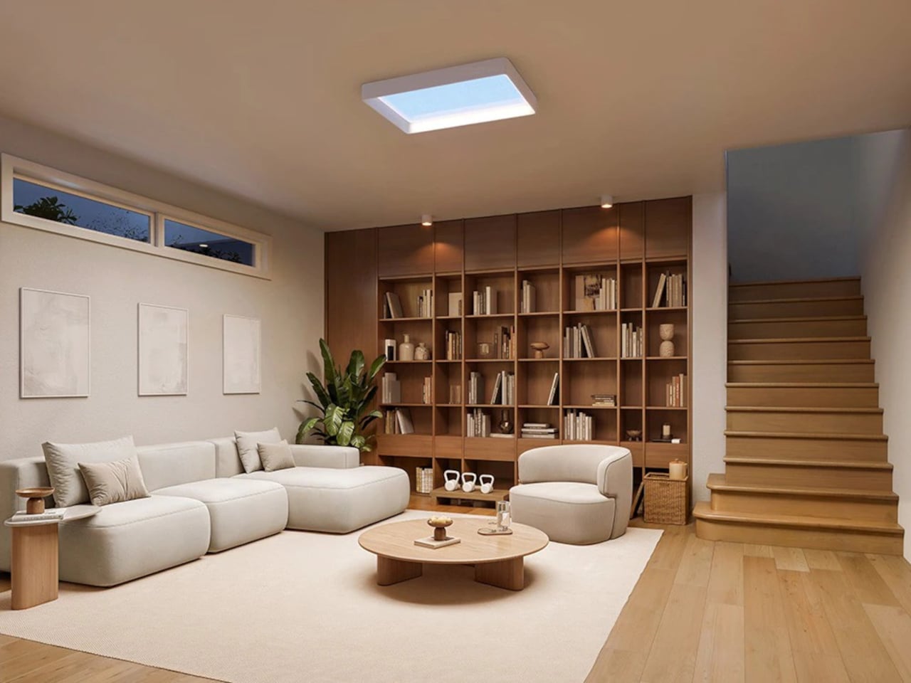
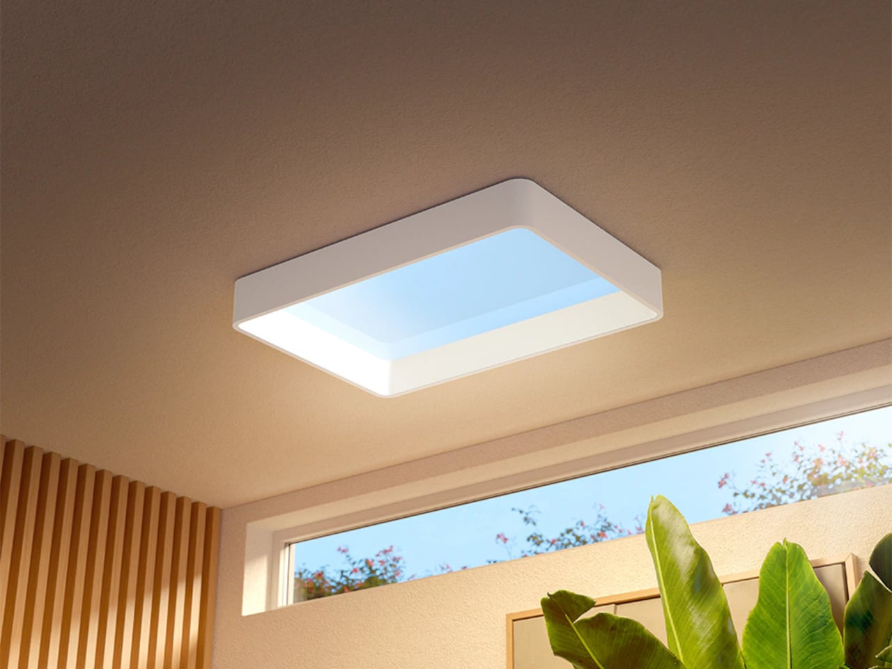
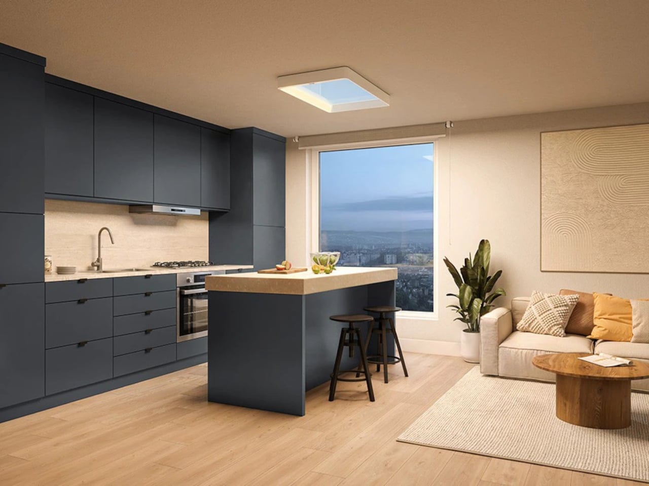
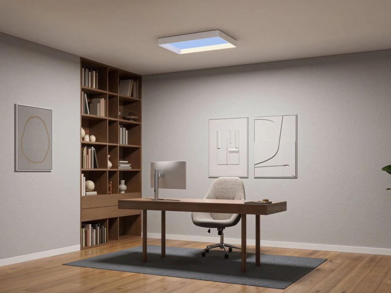
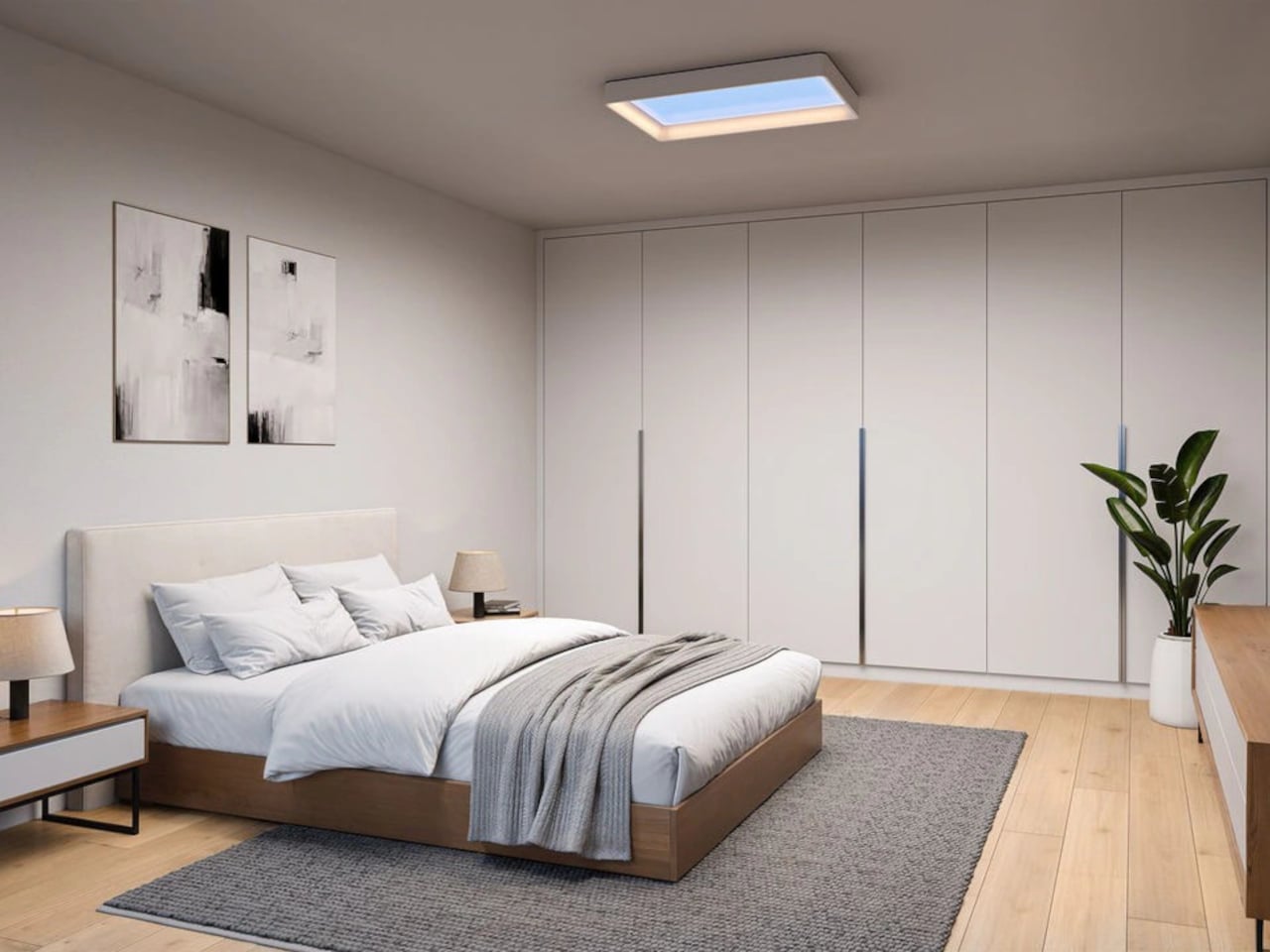
The Philips Skylight is a ceiling panel that started as a professional product, used in offices, lobbies, and medical practices, and has since been adapted for the consumer market. Designed around Signify’s NatureConnect LED technology, it’s built to recreate not just the brightness of daylight but also its depth, color variation, and the way those qualities shift over the course of a day.
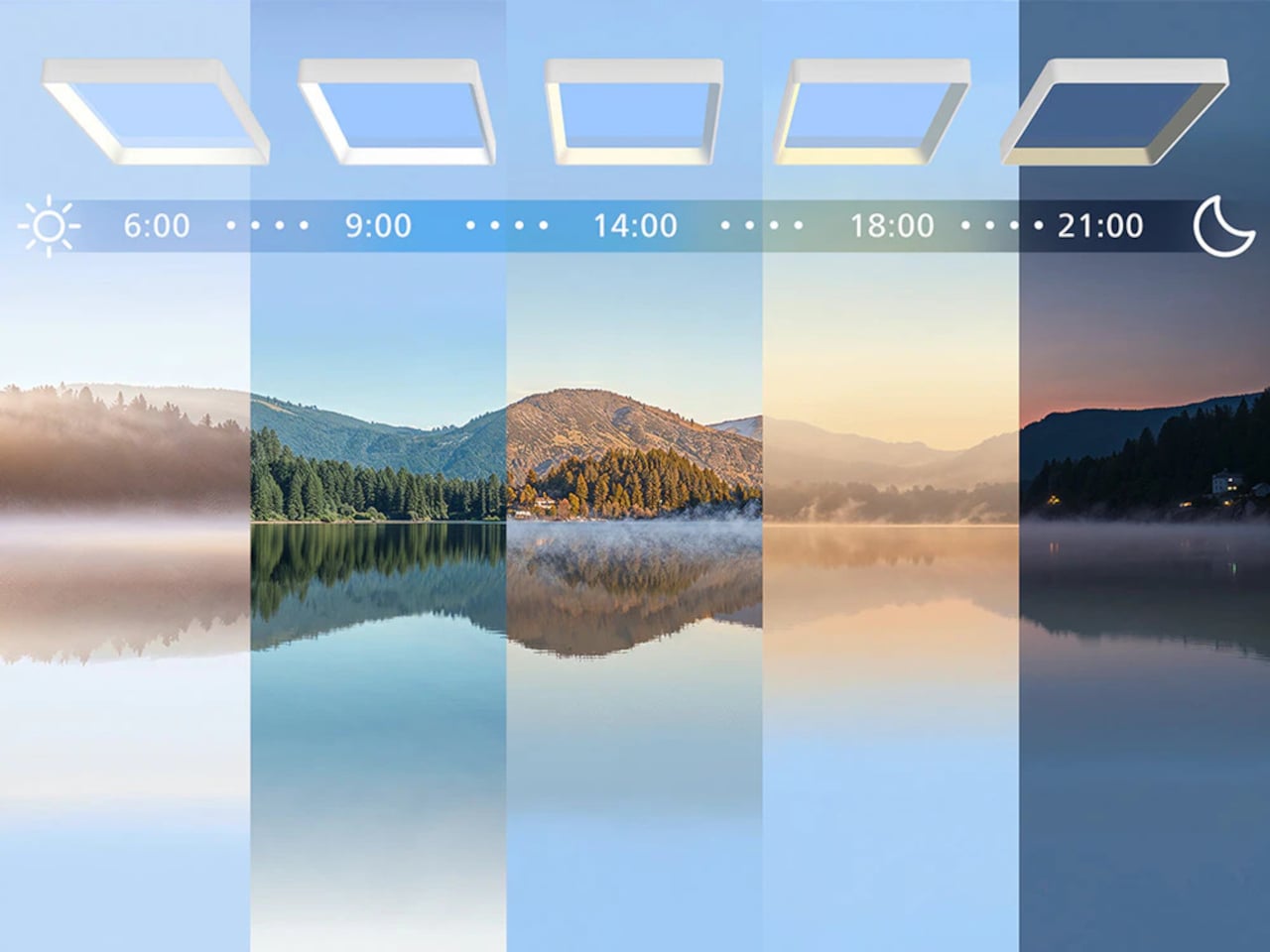
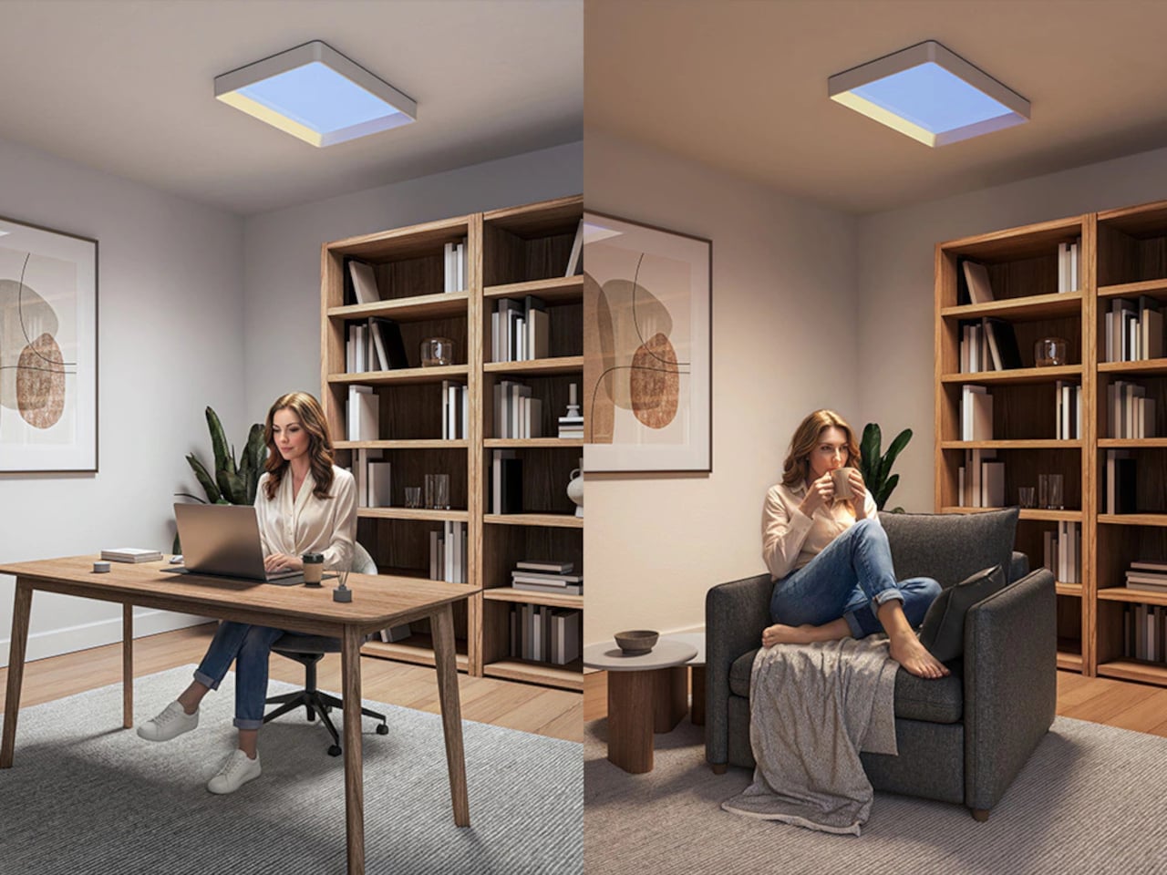
The panel’s visual framing creates a depth effect that reads more like a window to the sky than a flat ceiling-mounted fixture. The light isn’t static: an Auto Day Rhythm feature automatically adjusts brightness and color temperature throughout the day following a fixed schedule. During the day, BioUp LEDs deliver blue-enriched light to support alertness and focus. As evening arrives, the spectrum shifts to warmer, more relaxed tones.
That kind of passive, scheduled behavior is one of the Skylight’s cleaner design decisions. There’s no app to configure, no smart home hub required, and no automation to build. The included remote handles manual control, and five preset lighting scenes cover the range from an energized home office session to something closer to winding down. The absence of smart home integration has drawn some criticism given the price, but for anyone who finds smart home setups a hobby in themselves, the simpler approach may actually be the selling point.
The range comes in four variants: a Philips Skylight Medium, Philips Skylight Large, Philips Skylight VitaUp Medium, and Philips Skylight VitaUp Large. The VitaUp versions include an integrated UV-B module designed to support the body’s natural vitamin D production indoors, with a safety feature that automatically cuts the UV-B output off after eight hours. The product carries a disclaimer that it’s not a medical device and doesn’t replace actual sunlight, which is probably the right framing for something that lives on a ceiling.
An IP44 rating across the entire range means the Skylight can also be installed in bathrooms and other humid spaces, which changes the calculation considerably. A bathroom that gets no natural light is exactly the kind of room where spending two hours on a winter morning begins to feel like something is actively wrong with the day before it’s even started. Placing a light that actually follows the rhythm of daylight in that space addresses a very specific, rarely solved problem.
European markets have the Skylight from June 2026, starting at €499.99, with US availability expected in September 2026. The technology backing it has already spent time in settings where lighting quality genuinely matters, which gives it a credibility that consumer-only smart bulbs have historically struggled to carry. How well the depth effect translates from professional installation to an ordinary home ceiling is something that hands-on testing will eventually settle.
Google’s Diffusion Gemma introduces a bold shift in AI language modeling by adopting a diffusion-based architecture that processes tokens in parallel, rather than sequentially. As explained by Prompt Engineering, this design enables the model to generate tokens in fixed 256-token patches, significantly enhancing speed while maintaining contextual understanding. With 26 billion parameters, 4 billion active […]
Apple is reportedly preparing to make its debut in the foldable phone market with the much-anticipated iPhone Ultra Fold. Leaked images of a prototype suggest a bold step forward for the tech giant, showcasing a book-style foldable design that could redefine its iconic aesthetic. With a compact, square-like profile when folded and a near-tablet-sized display […]
Google’s experimental AI system, Gemini Spark, introduces advanced automation and personalization features within its ecosystem. According to Skill Leap AI, it is currently available to select Ultra plan users and includes functions such as summarizing email threads, preparing meeting briefs and organizing files across Google Drive. A notable capability is its ability to cross-reference data […]
The Mangmi Air X is a $99 Android handheld designed with retro gaming in mind, offering a mix of affordability and functionality. As noted by Gadgets Guardian, it features hall-effect joysticks and a 5.5-inch 1080p IPS LCD display, which cater to fans of classic games by delivering precise controls and vibrant visuals. Its lightweight build […]
Apple’s macOS 27 “Golden Gate” marks a pivotal moment in the evolution of its desktop operating system. With the release of the first developer beta, Apple has unveiled a host of new features, performance enhancements, and design updates. This version also signifies a major shift, as it officially ends support for Intel-based Macs, focusing exclusively […]