PROS:
- 420 hp twin-turbo V6 with immediate power
- Track-ready NISMO suspension and limited-slip differential
- Recaro seats with premium Alcantara interior
- Raw, mechanical exhaust note
- Surprisingly practical for daily driving
CONS:
- No manual transmission option
- Firm ride punishing on rough roads
- $65,750 premium vs $52,970 Performance trim
- Two seats only, no rear storage
RATINGS:
SUSTAINABILITY / REPAIRABILITY
EDITOR'S QUOTE:
The Z NISMO isn't just the best new Z. This is what enthusiasts have been begging Nissan to build for years.
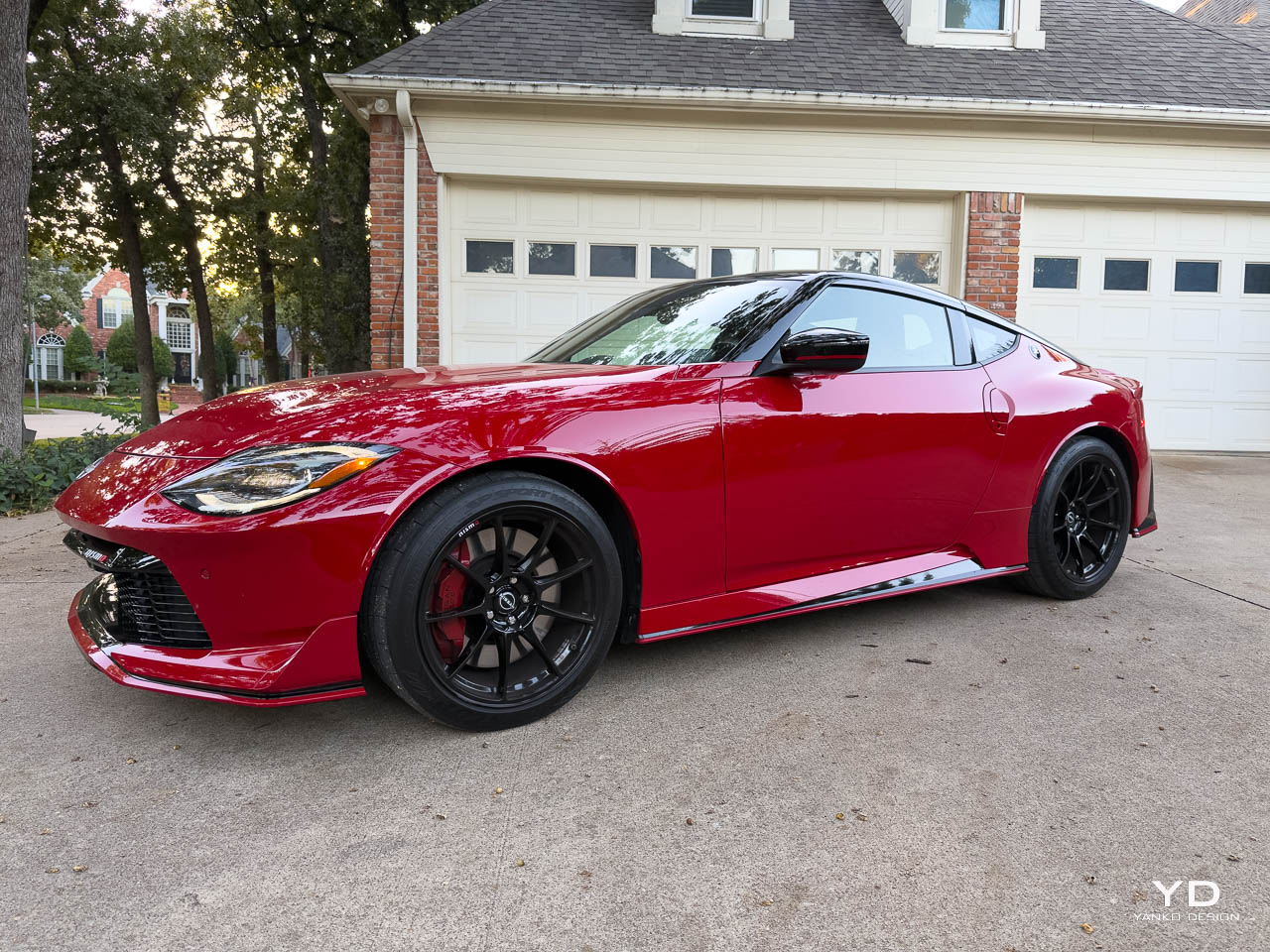
The moment I saw the 2025 Nissan Z NISMO in Solid Red with its Super Black roof, I knew this was something special. This isn’t just another performance variant with some badges and stiffer springs. This is the Z I’ve been waiting for since Nissan announced the reborn nameplate. After spending time behind the wheel, I can say with absolute certainty: the NISMO delivers everything a proper sports car should, and then some.
Designer: Nissan
At $65,750, the Z NISMO sits at the top of the Z lineup, commanding a significant premium over the $42,970 Sport and $52,970 Performance models. That price gap buys you 420 horsepower, NISMO-specific tuning throughout the chassis, exclusive Recaro seats, and a level of driving engagement that makes every other trim feel like a warmup act. This is the Z that Nissan should’ve led with.
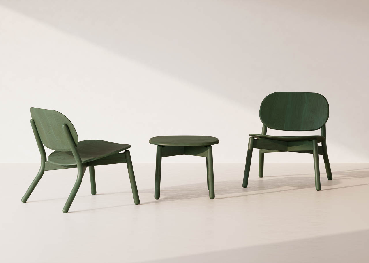
Design and Ergonomics: Heritage Meets Aggression
Exterior: A Silhouette That Commands Attention
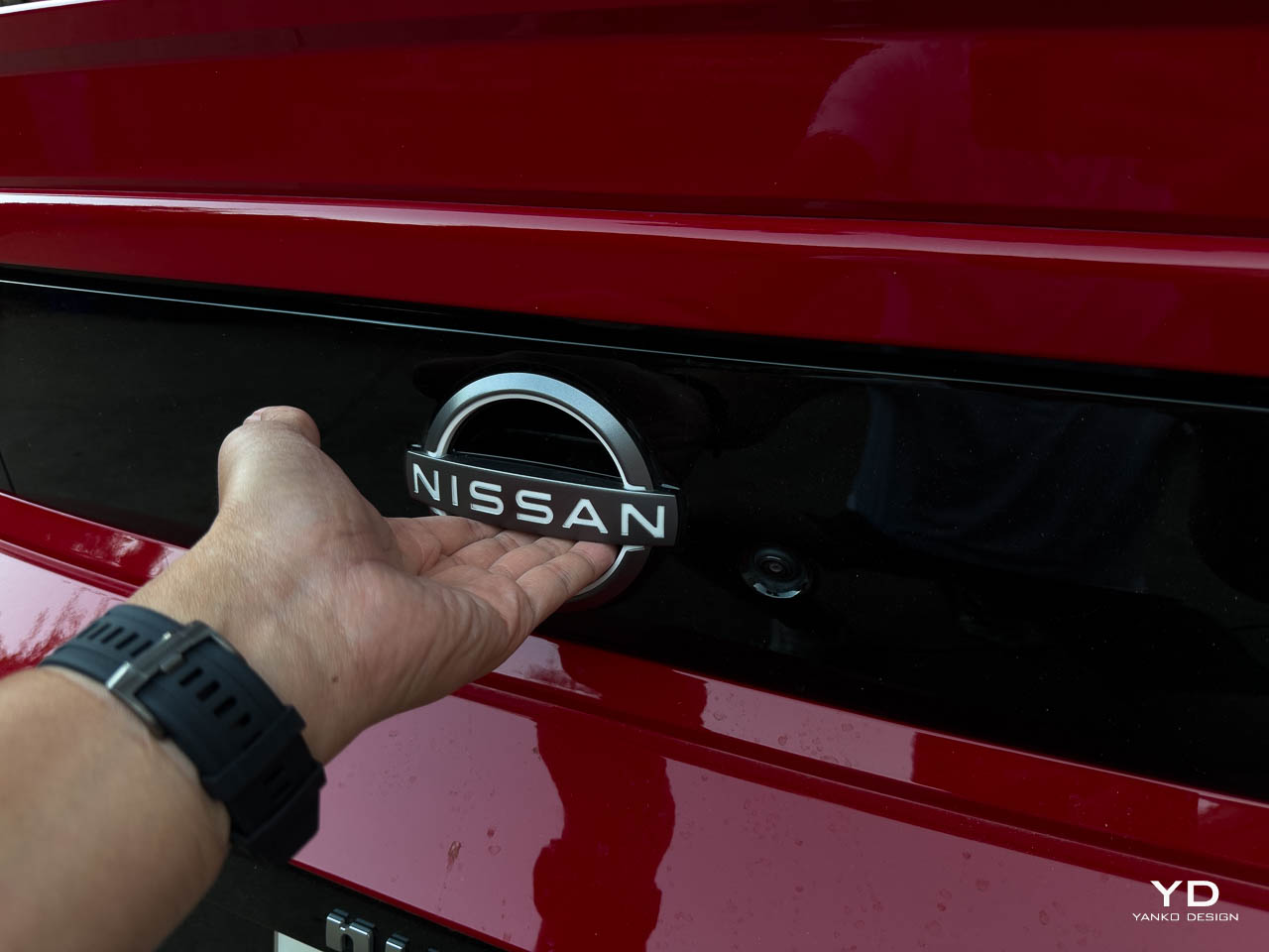
The Z NISMO’s design honors heritage while pushing forward with purpose. The long hood and squared-off rear are direct callbacks to the first-generation S30 Z, the car that put Japanese sports cars on the global stage. Nissan didn’t just slap on some retro styling cues and call it a day. They reimagined what made that original Z so compelling and translated it into modern proportions.
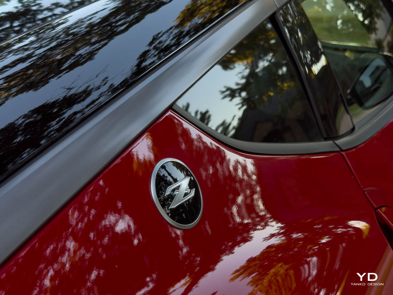
The katana blade roof accent running along the black roof edge is one of my favorite details. It’s subtle from most angles, but when the light hits it just right, you see the intentionality. This is design that rewards closer inspection. The Z Bulge hood and C-pillar emblem continue that nostalgic thread without feeling like pastiche.
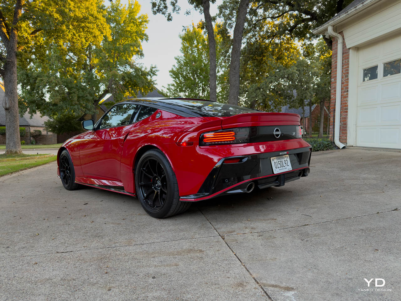
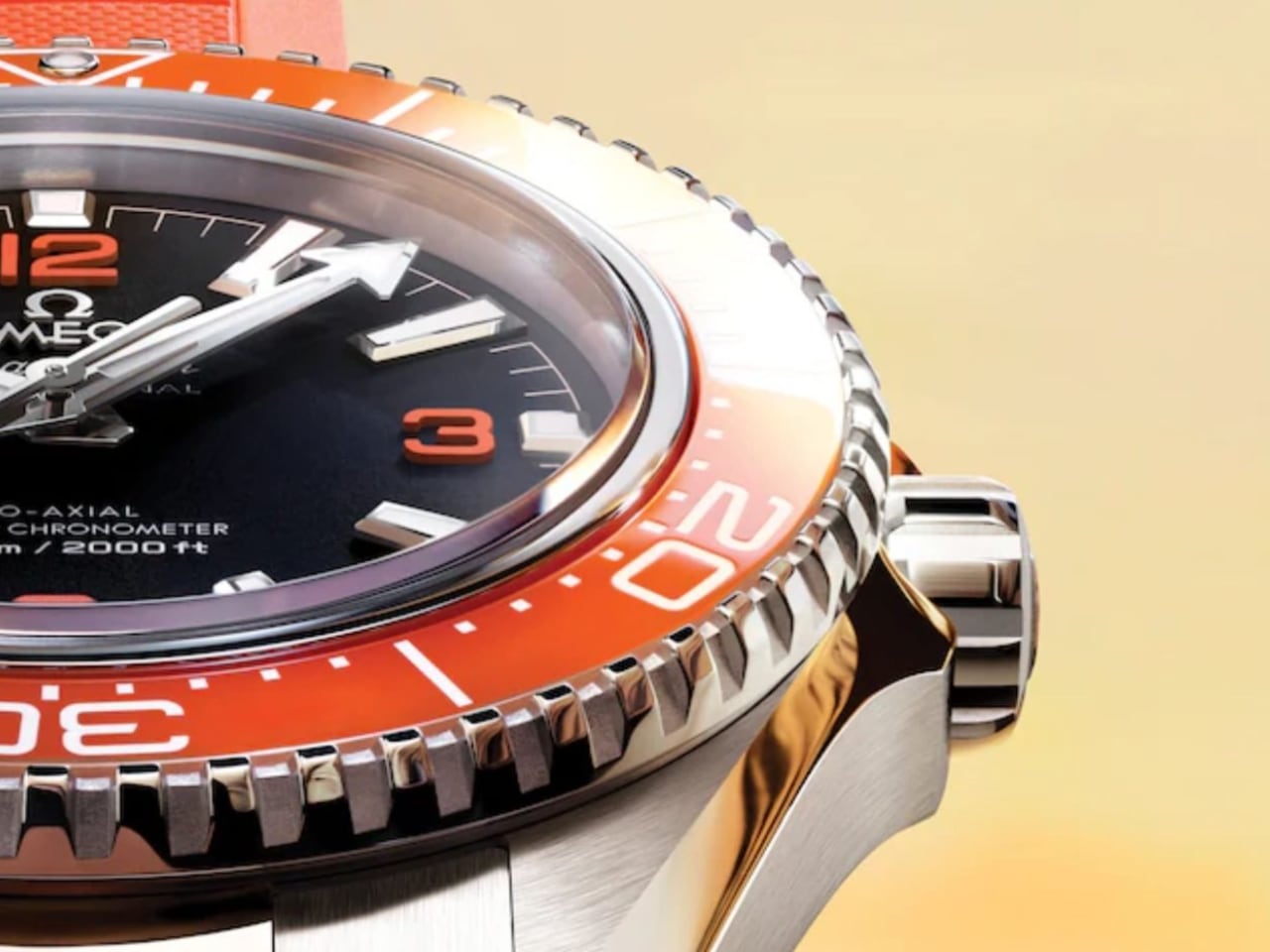
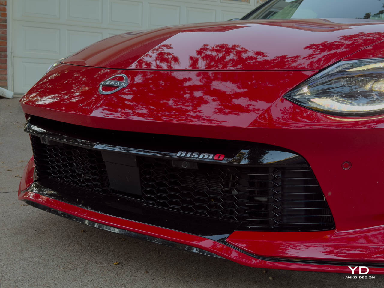
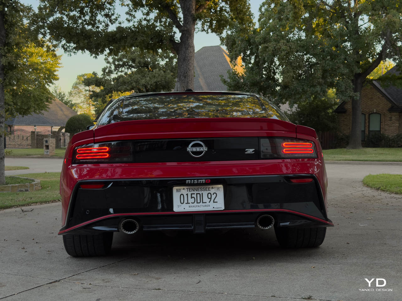
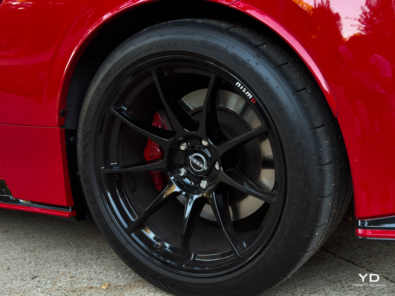
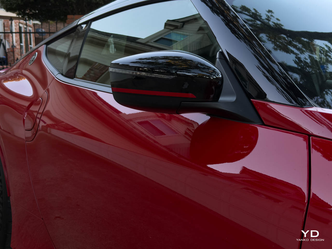
Where the NISMO truly separates itself is in the aggressive styling additions. The NISMO-exclusive front and rear fascias are more sculpted and purposeful than the standard Z. The three-piece rear spoiler isn’t just for show. At speed, you can feel it working. The side sills, black mirrors with red NISMO strips, and those gloss black RAYS forged wheels (19×10 front, 19×10.5 rear) give the car a planted, track-ready stance that the base Z lacks.
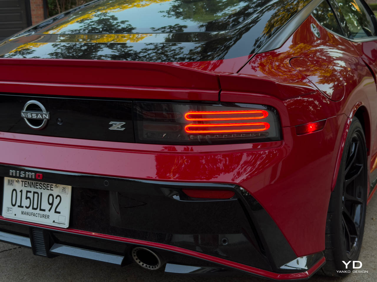
The Solid Red paint with Super Black roof creates a visual drama that photographs beautifully but looks even better in person. Under direct sunlight, the paint has depth and richness that make the car feel like it costs twice its MSRP. The LED taillights with their distinctive horizontal bar design are instantly recognizable from a block away.
At 173.2 inches long and 73.6 inches wide, the Z NISMO has proper sports car proportions. It sits 51.8 inches tall with a 100.4-inch wheelbase and 4.9 inches of ground clearance. It’s low, wide, and purposeful without being cartoonish. This is a car you can actually drive daily if you’re willing to accept the trade-offs. 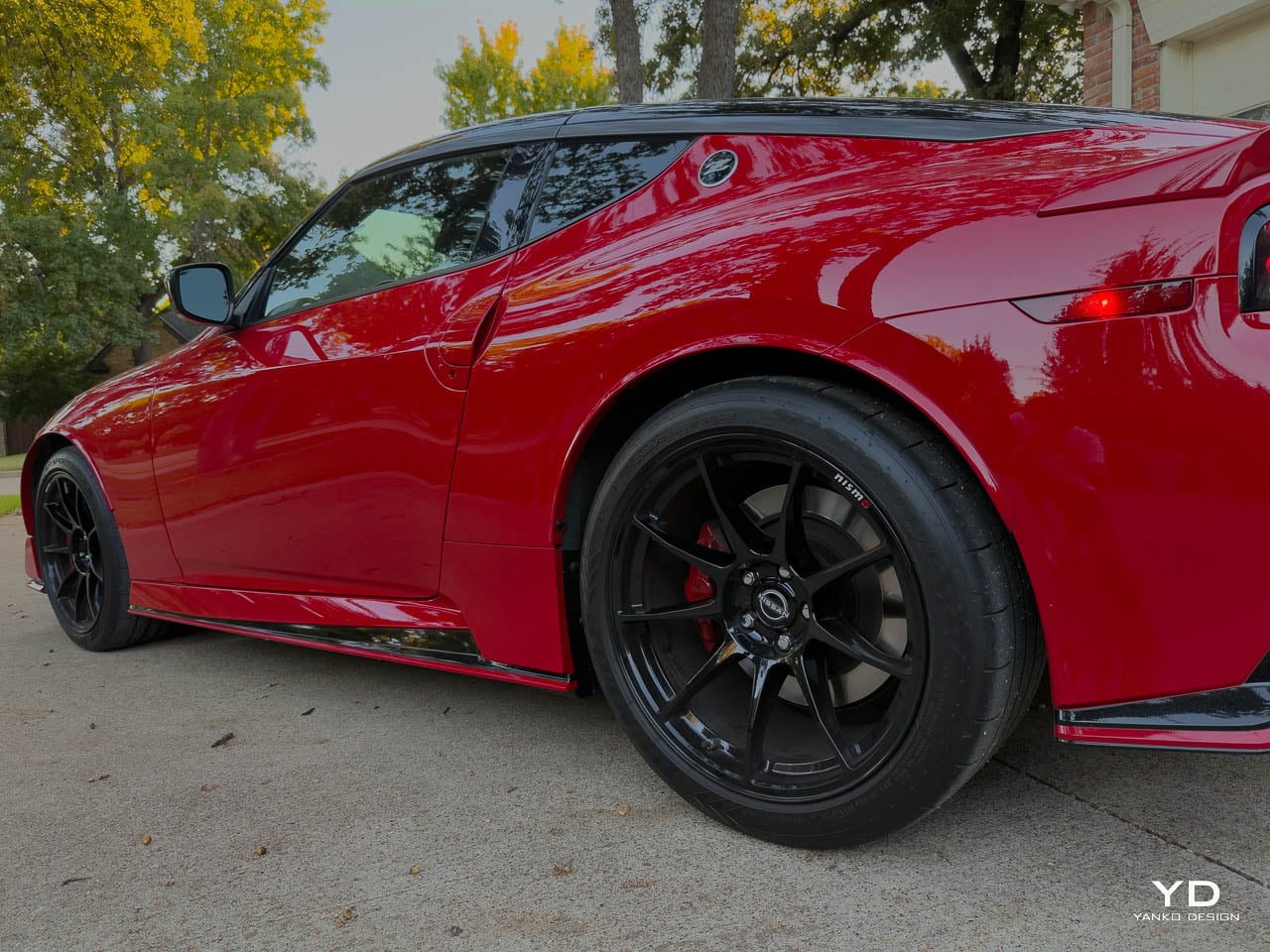
Interior: Driver-Centric and Unapologetically Focused
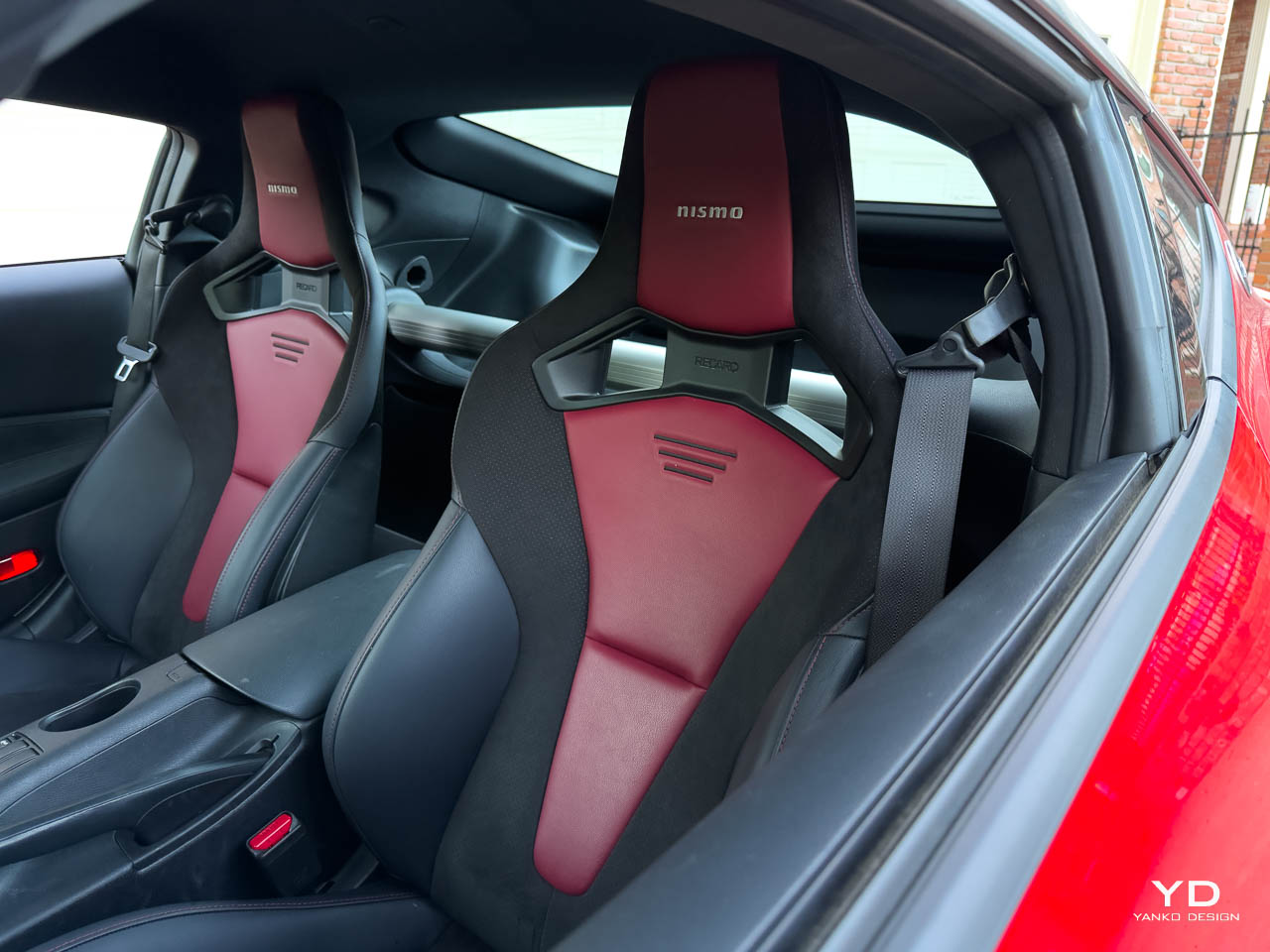
Step inside and you’re immediately reminded this is a NISMO product. The Recaro sport bucket seats are exclusive to this trim, and they’re worth the upgrade alone. The bolstering is aggressive but not punishing. On spirited drives, they hold you exactly where you need to be. The leather and Alcantara appointment feels premium and ages well. After several weeks of testing, there’s zero sign of wear on the high-contact areas.
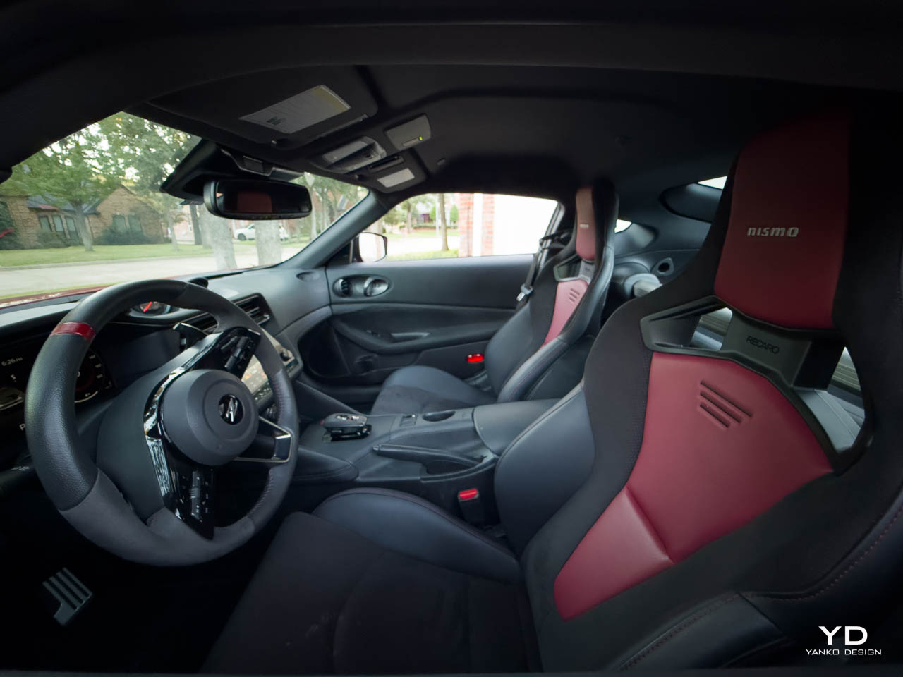
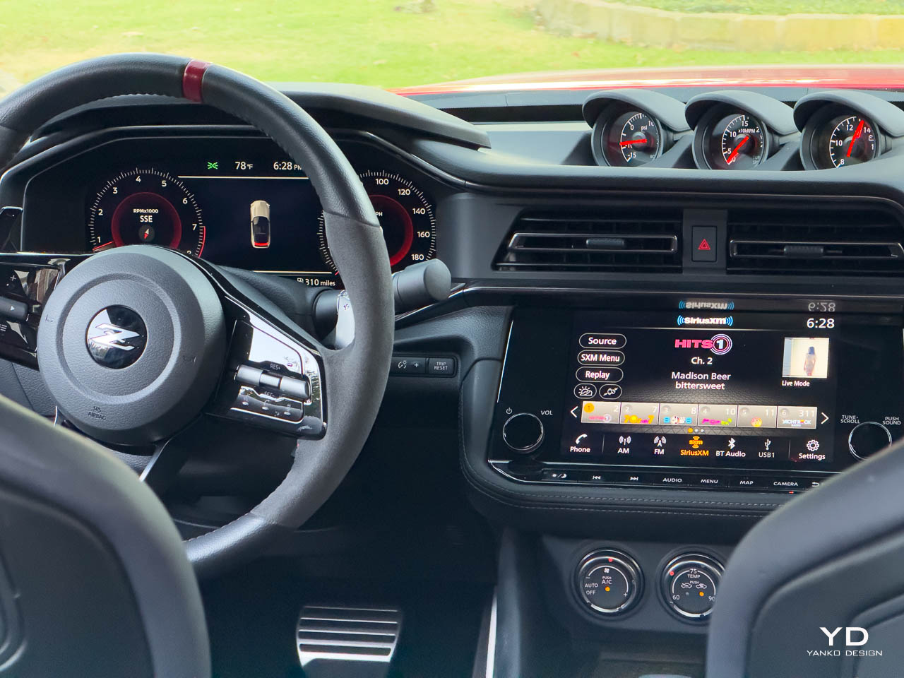
The NISMO steering wheel wrapped in leather and Alcantara is thick in your hands with a red marker at 12 o’clock. It’s clearly GT-R inspired, and that’s a very good thing. The aluminum pedals have the right amount of grip without feeling too aggressive for daily use. The suede door trim adds a tactile richness that elevates the cabin experience beyond what you expect at this price point.
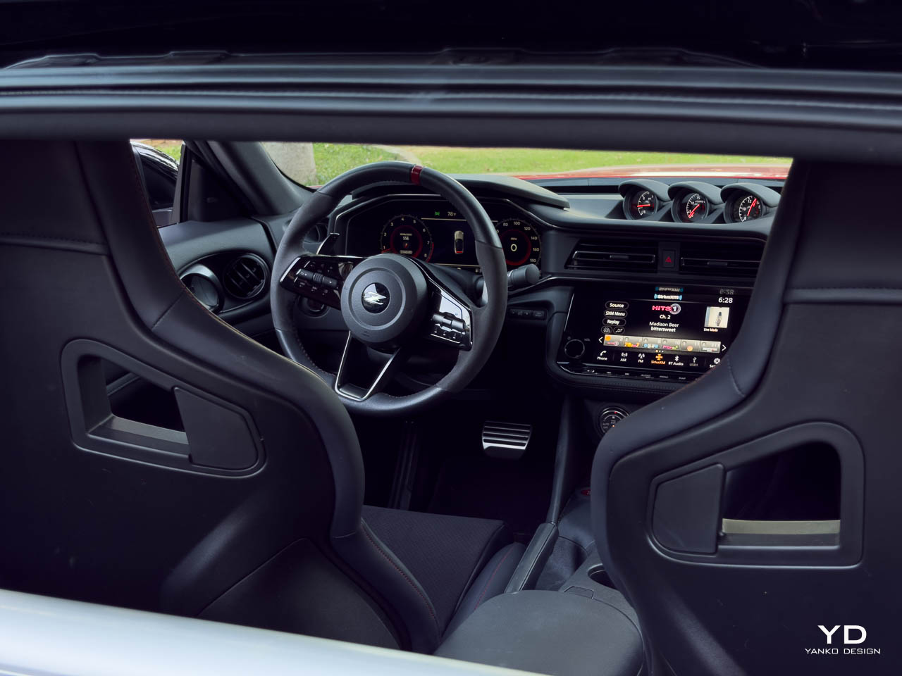
The three analog pod gauges mounted on top of the instrument panel (turbo boost, turbine speed, voltmeter) are pure theater, and I love them. Few cars blend old-school analog theater and digital immersion like this Z: those signature pod gauges evoke 1970s Japan, but the 12.3-inch cluster and infotainment are as modern as they come. The cluster has three display modes (Normal, Enhanced, Sport), and I found myself rotating between them depending on the drive. Sport mode gives you the full performance data layout with a centered tachometer and boost gauge prominence. It’s exactly what you want when you’re pushing the car.
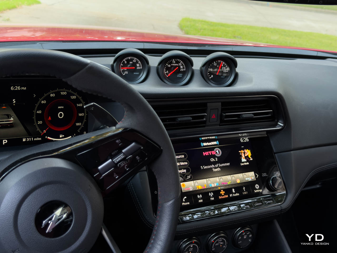
The 9-inch touchscreen sits perfectly in your sightline without dominating the dashboard. Wireless Apple CarPlay works flawlessly, and the Bose 8-speaker audio system with Active Noise Cancellation and Active Sound Enhancement delivers clean, punchy sound. The exhaust note is real and raw when you want it, and the cabin can be library-quiet when you don’t.
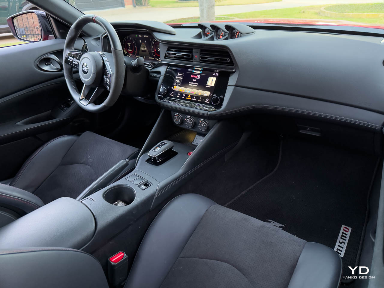
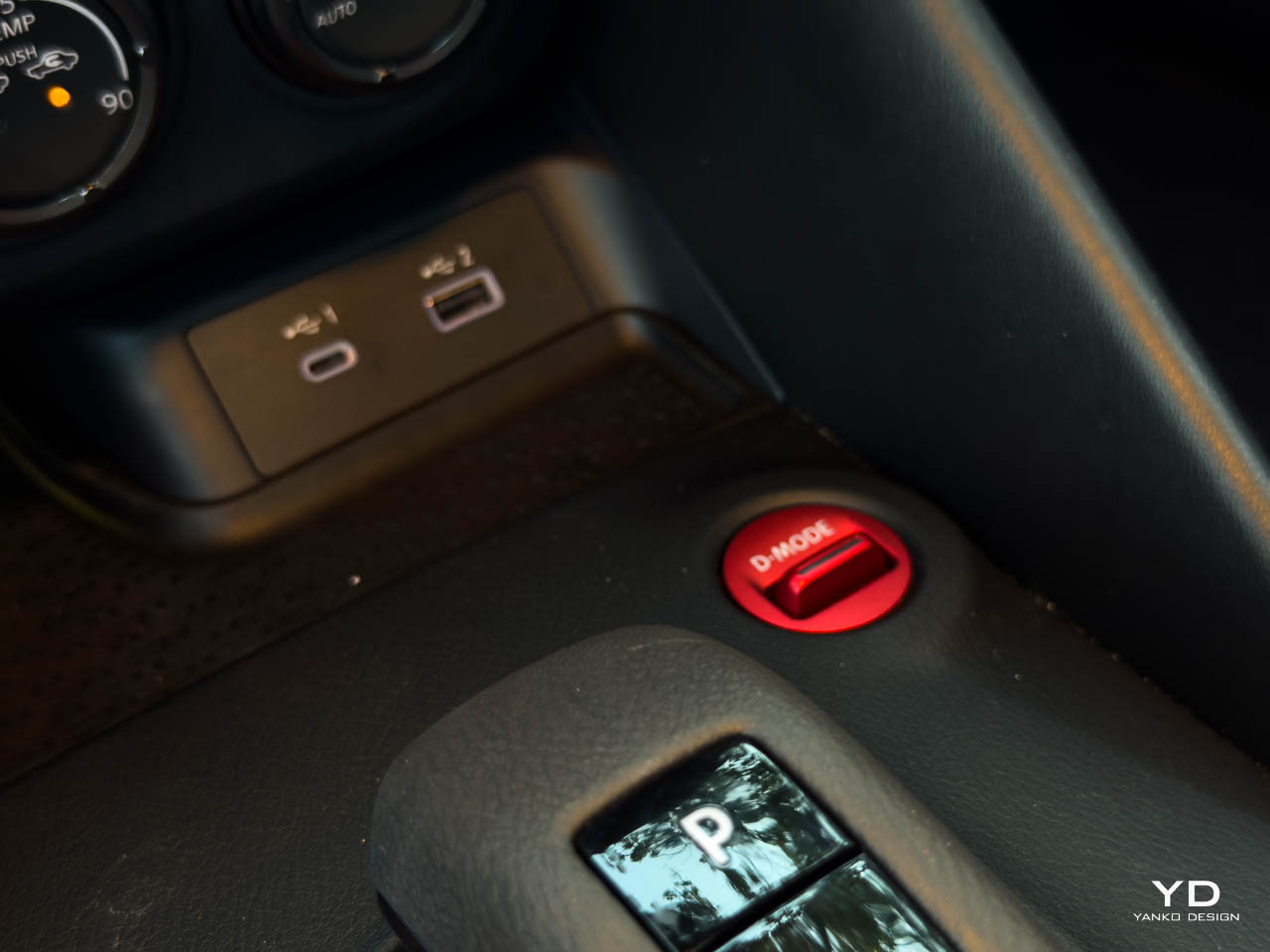
Ergonomically, everything falls to hand naturally. The NISMO-exclusive red anodized engine start button and Drive Mode selector are positioned exactly where your fingers expect them. The manual tilt and telescopic steering column gives you enough adjustment range to dial in your perfect driving position. In my testing at 6’1″, I never felt cramped during longer drives.
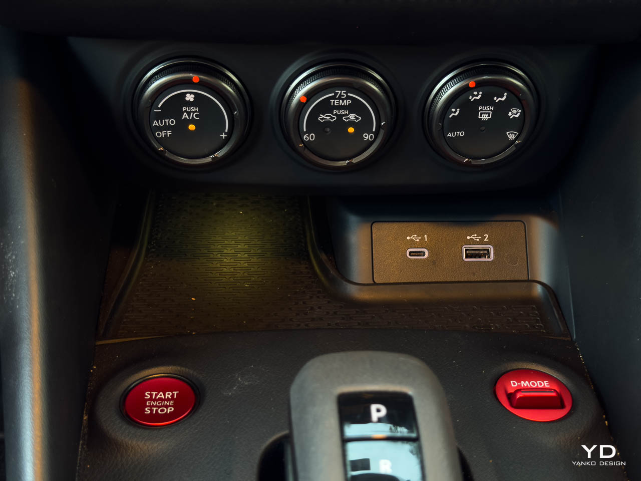
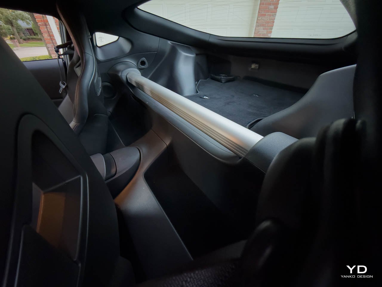
The two-passenger cabin means this isn’t a family car, but if you accept that, the Z NISMO rewards you with purpose-built focus. Compared to the Toyota GR Supra’s more confined cockpit or the Porsche 718 Cayman’s minimalist approach, the Z strikes a better balance between sport and usability. Cupholders, bottle holders, a center console with storage, and a locking glovebox provide enough practicality for weekend trips. The 2 USB ports (Type-A and Type-C) keep devices charged. This isn’t a minimalist track car or a luxury GT. It’s a perfectly balanced middle ground.
Performance: 420 Horsepower of Pure Engagement
Powertrain: Twin-Turbo V6 Perfection
The VR30DDTT 3.0L twin-turbo V6 is the heart of this machine, and in NISMO spec it produces 420 horsepower at 6,400 rpm and 384 lb-ft of torque from 2,000 to 5,200 rpm. That’s a 20 hp and 34 lb-ft bump over the standard Z, and you feel every additional pony. The NISMO-enhanced engine oil cooler keeps temperatures in check during aggressive driving, and the engine never feels like it’s struggling even when you’re wringing it out.
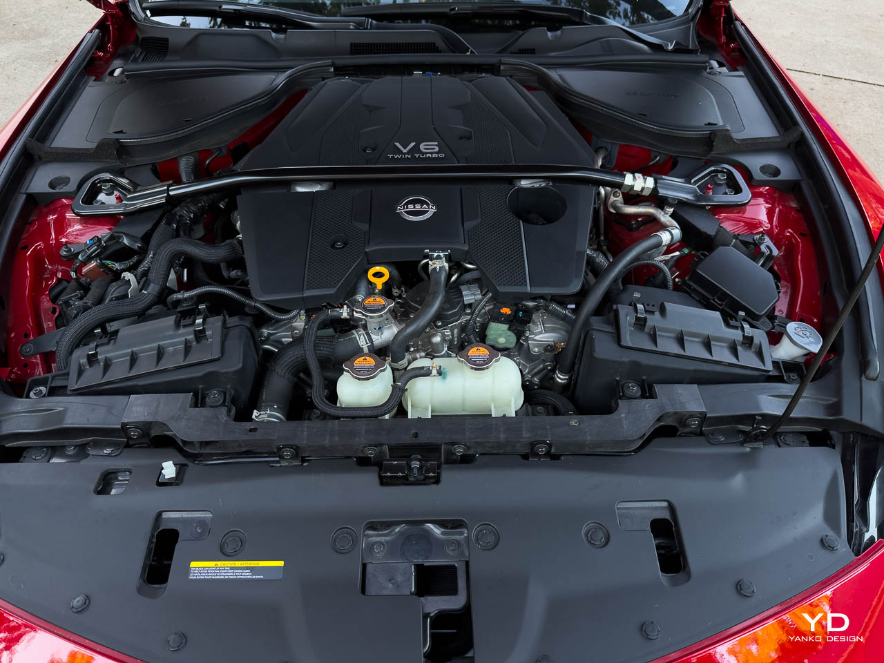
Power delivery is linear and immediate. There’s no turbo lag to speak of. Pin the throttle from a standstill and the Z NISMO launches with authority. Launch Control (standard with the 9-speed automatic) is brutal and effective, delivering repeatable 0-60 mph runs in approximately 4.2 seconds based on my testing. You get hard, consistent launches that pin you to the Recaro seats. The engine feels happiest between 3,000 and 6,400 rpm, where the turbos are fully spooled and power surges in a satisfying, unrelenting wave.
The exhaust note is one of the best aspects of this car. It isn’t digitally enhanced or piped in through the speakers. This is raw, mechanical sound. At idle, there’s a deep burble. Under acceleration, it transforms into a purposeful roar that builds to a crackling crescendo near redline. Lift off the throttle and you get satisfying pops and crackles on the overrun. It never sounds synthetic or manufactured. It sounds like a proper performance car should.
Fuel economy is rated at 17 city, 24 highway, and 19 combined mpg on premium unleaded. In real-world testing, I averaged around 20 mpg with a mix of spirited driving and highway cruising. On a long highway run, I saw 26 mpg, which is respectable for 420 hp.
Transmission: NISMO-Tuned 9-Speed Automatic
I need to address the elephant in the room: the NISMO is automatic only. There’s no manual transmission option, and purists will lament this decision. I get it. A manual would enhance the engagement factor. But after spending real time with the NISMO-tuned 9-speed automatic, I can say this: don’t write it off.
This isn’t the standard Z automatic. Nissan recalibrated it for quicker shifts, more aggressive downshifts, and tighter integration with the drive modes. The paddle shifters are responsive and feel mechanically connected. When you pull the left paddle for a downshift, the gearbox responds instantly with a perfectly rev-matched blip. Upshifts are crisp and quick. In Sport+ mode, the transmission holds gears longer and downshifts earlier under braking. It feels like it knows what you want before you ask.
Leave it in automatic mode for daily driving, and it fades into the background, smooth and refined. Flick it into manual mode and take control, and it becomes an extension of your inputs. This is one of the better automatics I’ve driven in a sports car. It isn’t a dual-clutch, but it doesn’t feel like a traditional torque converter either.
Would I still prefer a manual? In an ideal world, yes. But the automatic doesn’t ruin the experience. It enhances accessibility and makes the NISMO a car you can live with every day without sacrificing much of the engagement.
Chassis and Handling: Track-Ready Precision
The NISMO-tuned suspension is where this car truly separates itself from the standard Z. Nissan fitted unique stabilizer bars, stiffer springs, and larger retuned dampers that support the wider rear wheels and Dunlop SP SPORT MAXX GT600 tires (P255/40R19 front, P285/35R19 rear). The result is a chassis that feels taut, responsive, and utterly confidence-inspiring.
Turn-in is sharp and immediate. There’s minimal body roll, and the car pivots around its center with precision. The mechanical clutch-type limited-slip differential works magic at the rear, distributing power evenly and allowing you to carry more speed through corners. Understeer is virtually nonexistent. Push the car hard into a tight corner, and the front end bites with conviction.
The ride quality is firm. There’s no hiding that. I tested the Z NISMO on smooth highways, rough city streets in Dallas, and winding back roads. On smooth pavement and highways, it’s sublime. The car glides with poise and the suspension feels perfectly calibrated for speed. But hit city potholes or expansion joints, and you’ll be reminded instantly of that NISMO suspension tuning. Every crack and imperfection registers through the chassis with unfiltered honesty. This is a trade-off inherent to track-focused suspension tuning. If you want comfort, buy the Sport trim. The NISMO is tuned for aggression, not forgiveness.
In daily traffic, the car is surprisingly manageable. The automatic transmission smooths out stop-and-go frustrations, visibility is better than expected, and the clutch-free operation makes it far more livable than a manual sports car in urban gridlock.
Steering feedback is excellent. The electric power steering (with NISMO-specific tuning) delivers weight and communication that feels natural. You know exactly what the front tires are doing at all times. There’s no artificial heaviness or numbness. It’s direct, honest, and confidence-building.
The NISMO front and rear chassis bracing stiffens the entire structure, reducing flex and improving chassis rigidity. You feel this most during hard cornering and quick transitions. The car feels like a single, unified mass rather than a collection of parts. It’s the kind of structural integrity that separates good sports cars from great ones.
Braking: Stopping Power to Match the Speed
The Z NISMO features 15.0 x 1.3-inch vented disc rotors up front and 13.8 x 0.8-inch vented discs at the rear, clamped by floating 4-piston front and 2-piston rear aluminum calipers finished in red. Brake feel is firm and progressive with excellent pedal modulation. Initial bite is strong without being grabby. As speeds increase, confidence increases with it.
During repeated hard stops from high double-digit speeds, I experienced zero fade. The brakes stayed consistent and predictable. ABS intervention is well-calibrated and unobtrusive. The front and rear parking sensors give you confidence in tight spaces, and the RearView Monitor is crisp and clear.
Daily Usability: A Surprisingly Practical Companion
At 3,704 lbs, the Z NISMO isn’t a featherweight, but it never feels heavy or cumbersome. Visibility is better than expected for a low-slung sports coupe. The large side mirrors (with LED turn signals) give you a clear view of your surroundings. Blind spot warning and rear cross traffic alert provide an extra layer of safety when changing lanes or backing out of parking spaces.
The Nissan Intelligent Key with push-button ignition works flawlessly. Power windows with one-touch up and down, power door locks with auto-locking, and an auto-dimming rearview mirror are all standard. The automatic temperature control keeps the cabin comfortable without fuss. HomeLink Universal Transceiver integrates with your garage door opener seamlessly.
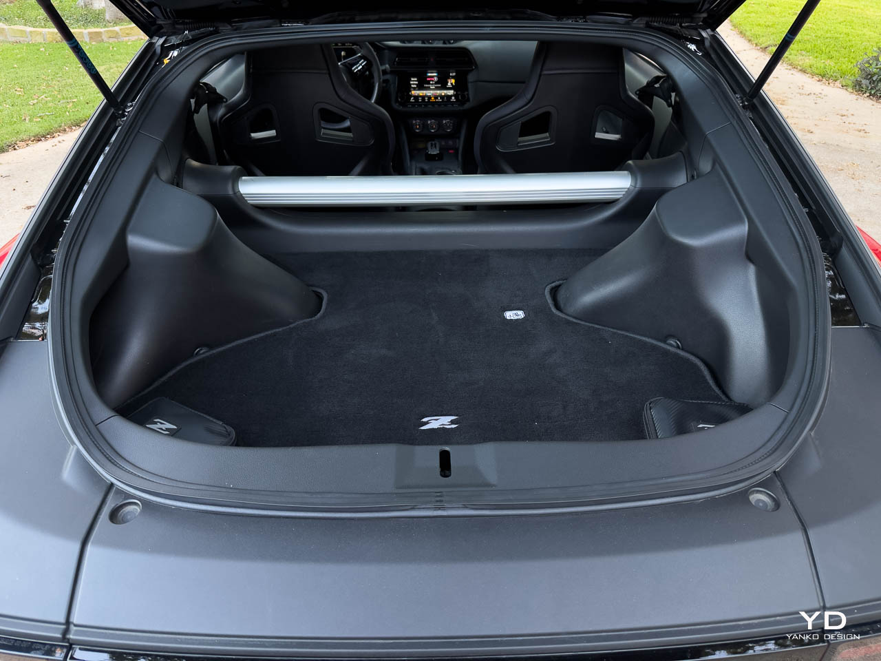
Cargo space is adequate for a sports car. You can fit a weekend bag and some groceries in the hatch. The rear seats don’t exist, so this is purely a two-seater. But if you go into ownership knowing that, the Z NISMO is surprisingly livable. I drove it for weeks as my only car, and it never felt like a burden.
The post 2025 Nissan Z NISMO Review: A Modern Icon That Earns Its Badge first appeared on Yanko Design.