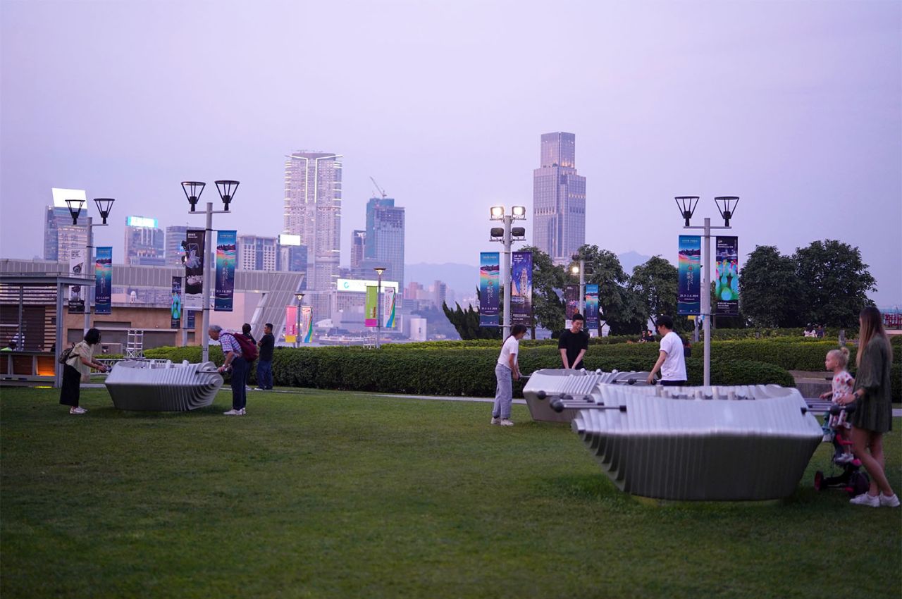
LAAB Architects, renowned for their innovative blend of art and architecture, has introduced a captivating new installation at the Science in Art exhibition along Hong Kong’s Central Harbourfront promenade. Titled Harbour Cup, this interactive artwork transcends traditional boundaries by merging elements of sports, science, and art into a single, engaging experience.
Designer: LAAB Architects

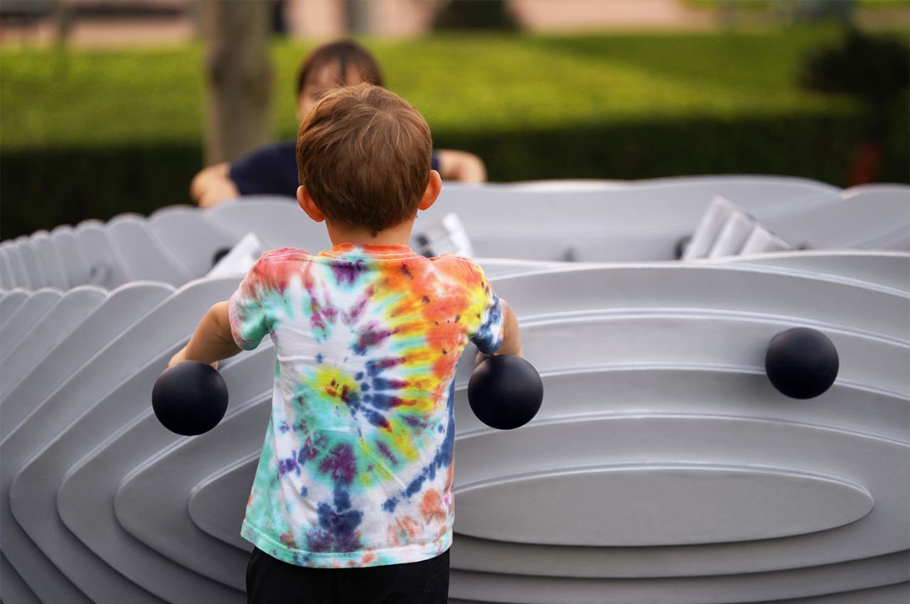
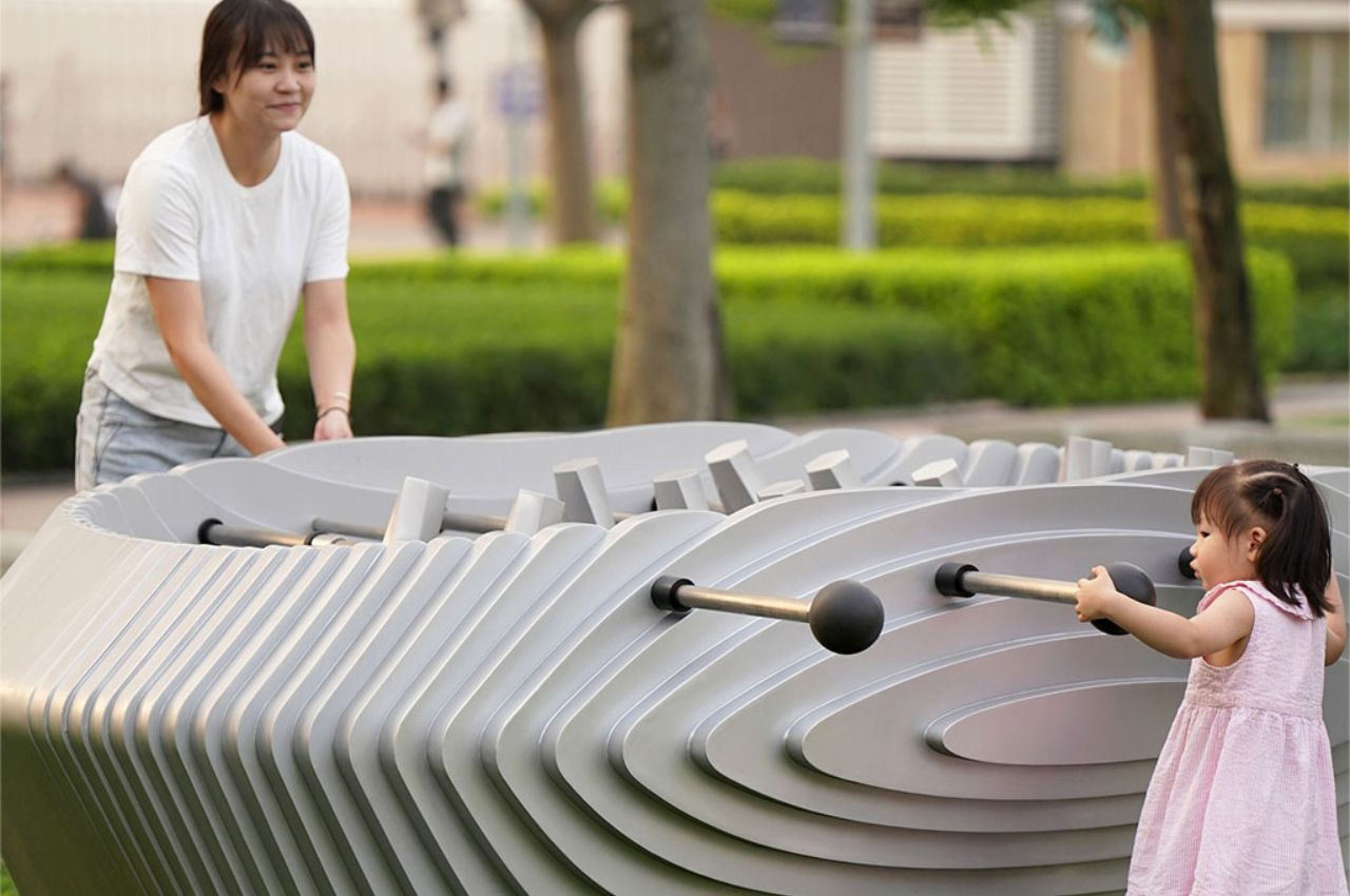
Inspired by the classic game of table soccer, or foosball, Harbour Cup presents a fresh take on this beloved pastime. Unlike the traditional game, the Harbour Cup features no goals and no predefined teams. Instead, players are encouraged to negotiate and decide whether to compete or collaborate, transforming a familiar game into a platform for reflection and communication. This innovative approach fosters social interaction and introspection, making Harbour Cup more than just a game—it’s a conversation starter.
LAAB Architects, co-led by Otto Ng and Yip Chun Hang, is a collective of artists, architects, designers, engineers, makers, and sociologists dedicated to bringing visionary ideas to life. Their work is characterized by a seamless blend of cutting-edge digital technology and traditional craftsmanship, aimed at creating inventive spatial experiences that connect people with nature, community, and culture.
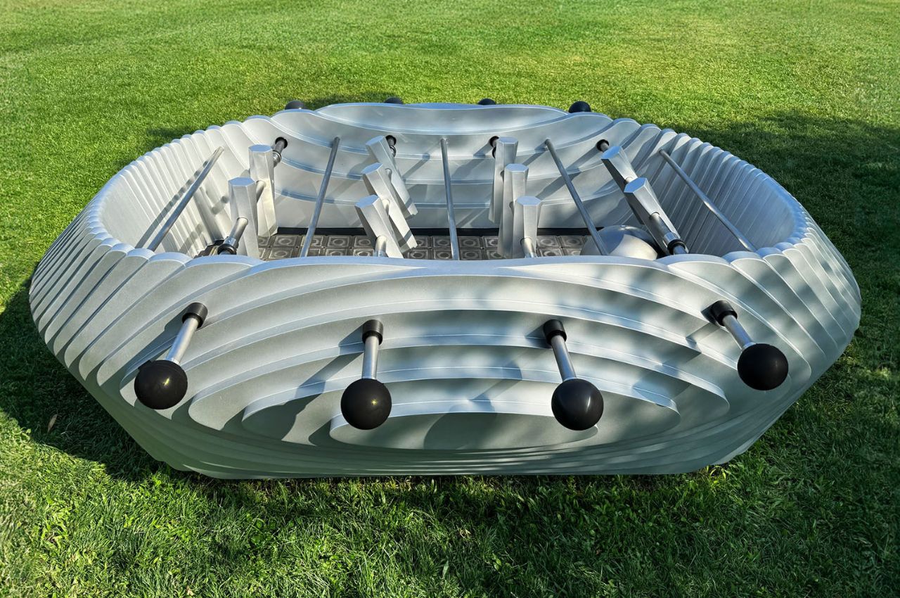
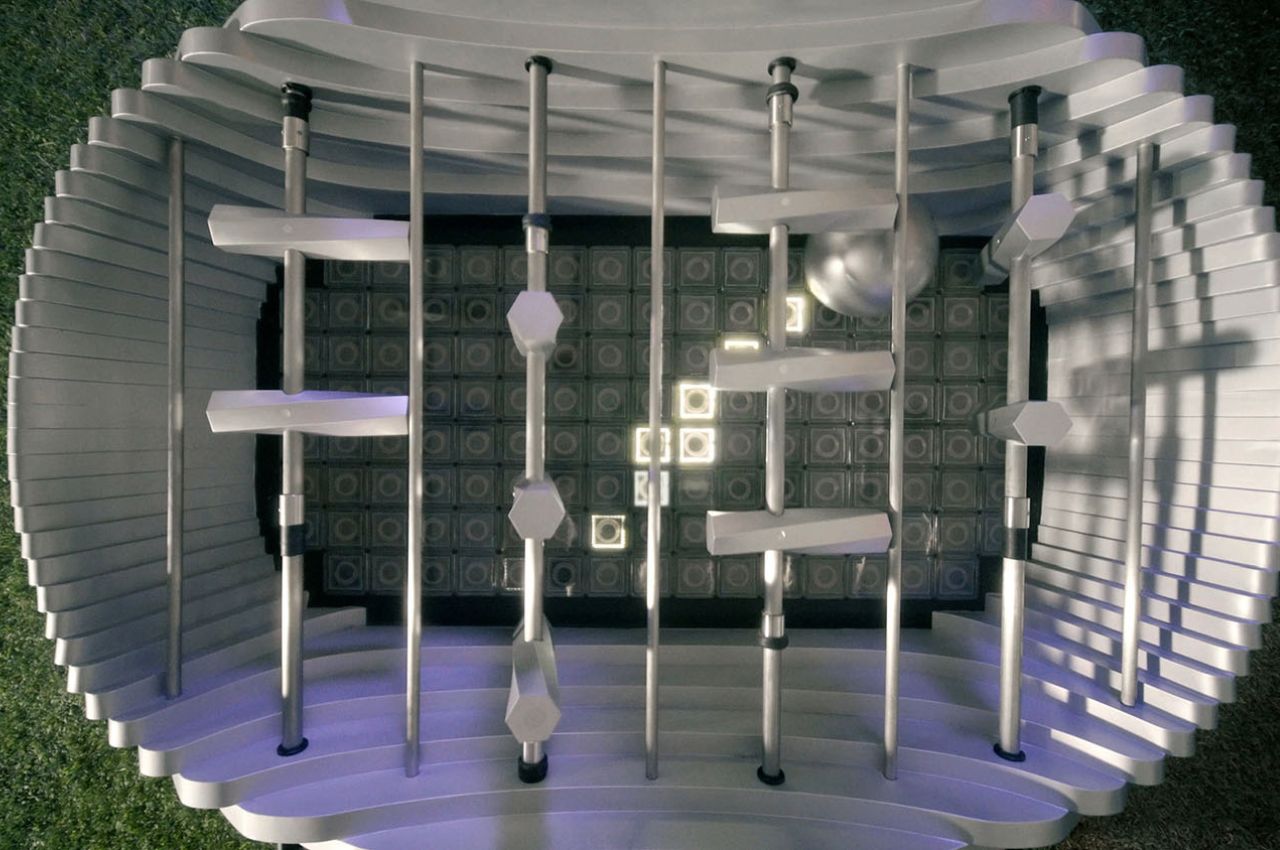
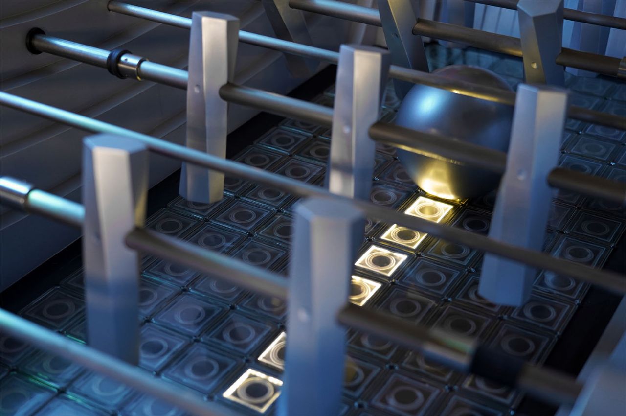
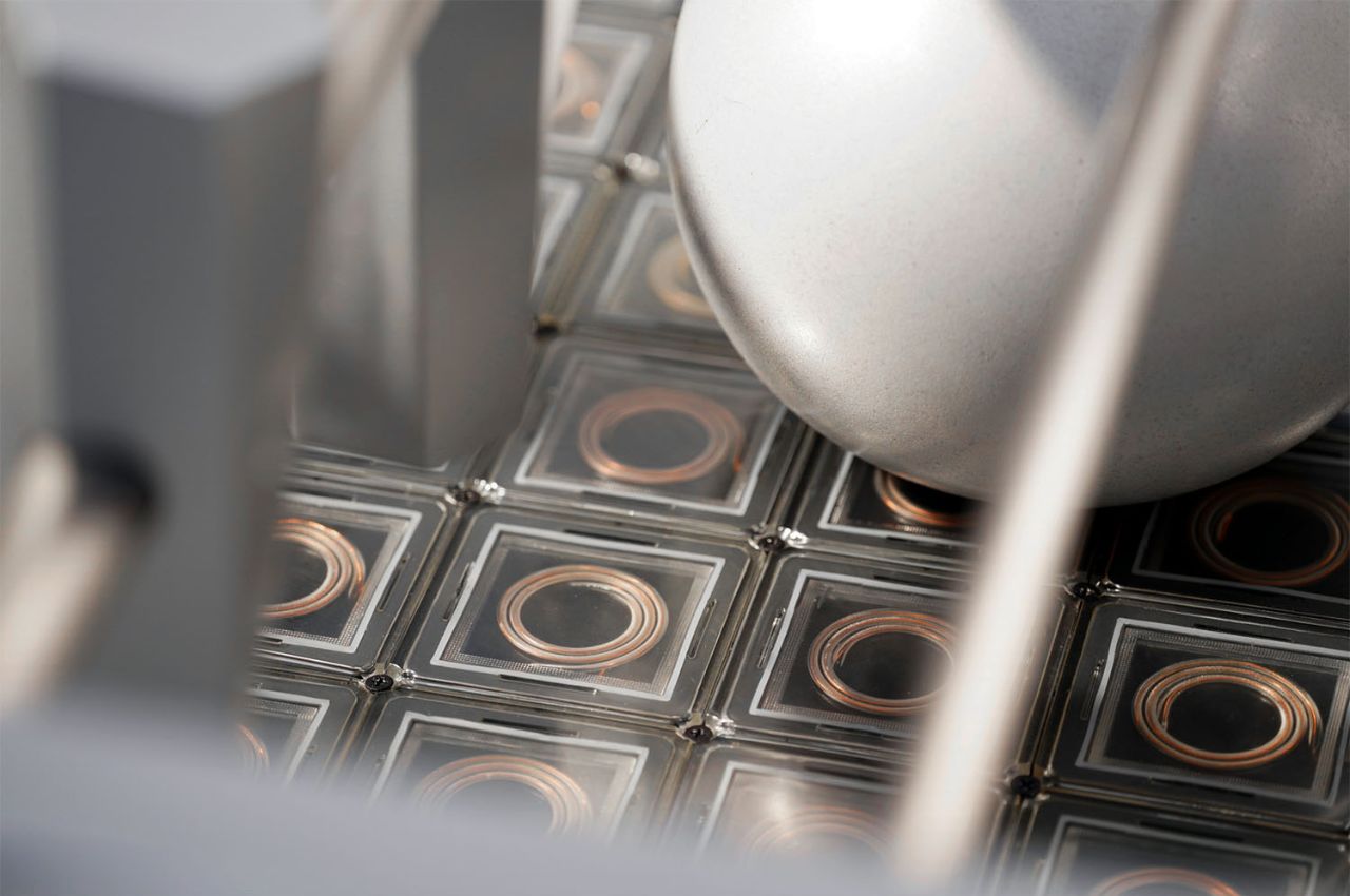
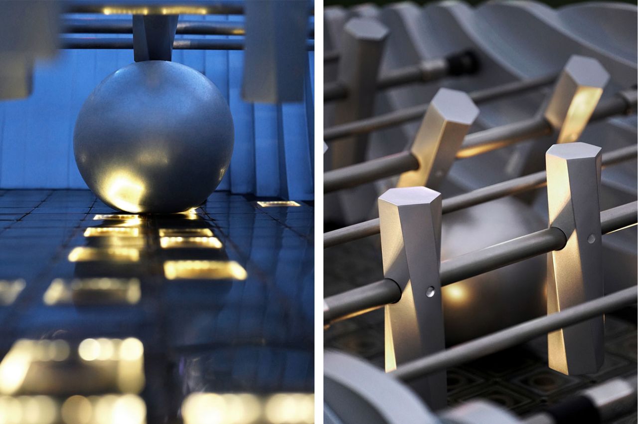
One of the standout features of Harbour Cup is its array of solar-powered LED lights, which illuminate the ball’s trajectory when kicked. These solar cells contain silicon, a semiconductor material that excites electrons when exposed to sunlight, creating a flow of electricity. This mesmerizing effect is achieved through capacitive sensors housed in watertight 3D-printed consoles.
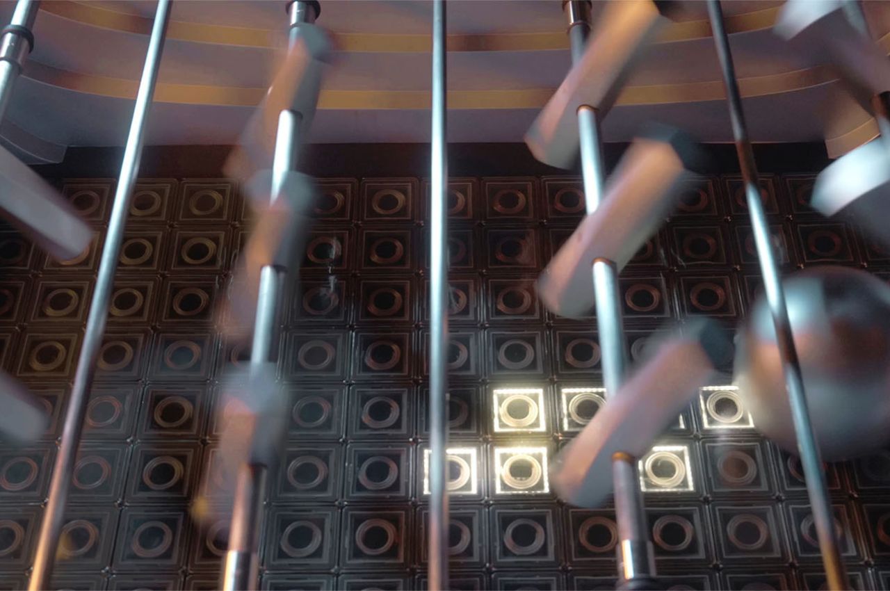
At night, Harbour Cup transforms into a dazzling display of light and motion. The movement of the ball activates the capacitive sensors, triggering the LED lights to illuminate its trajectory. The metallic body of the installation reflects the multicolored lights from Hong Kong’s towering buildings, creating a visually dynamic and immersive experience that captivates both players and onlookers.
Harbour Cup comprises three pieces of varying heights and dimensions, accommodating people of all sizes and ages. This thoughtful design ensures that everyone, regardless of their physical stature, can participate and enjoy the installation. By encouraging physical play and social interaction, LAAB aims to bring people together, inviting them to engage with each other and their environment in meaningful ways.
LAAB Architects’ Harbour Cup is more than just an art installation—it’s a call to action. By encouraging people to put down their phones and engage in physical play, the installation fosters social interaction and community building. Through the process of rendering the familiar unexpected, LAAB creates an environment that encourages introspection, dialogue, and negotiation.
The post Foosball Table Art Installation in Hong Kong lets people enjoy the game without teams or points first appeared on Yanko Design.