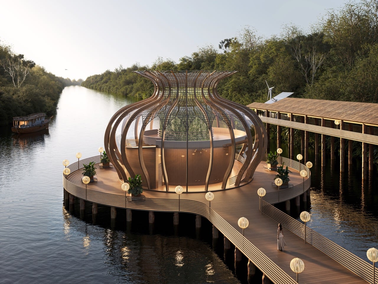
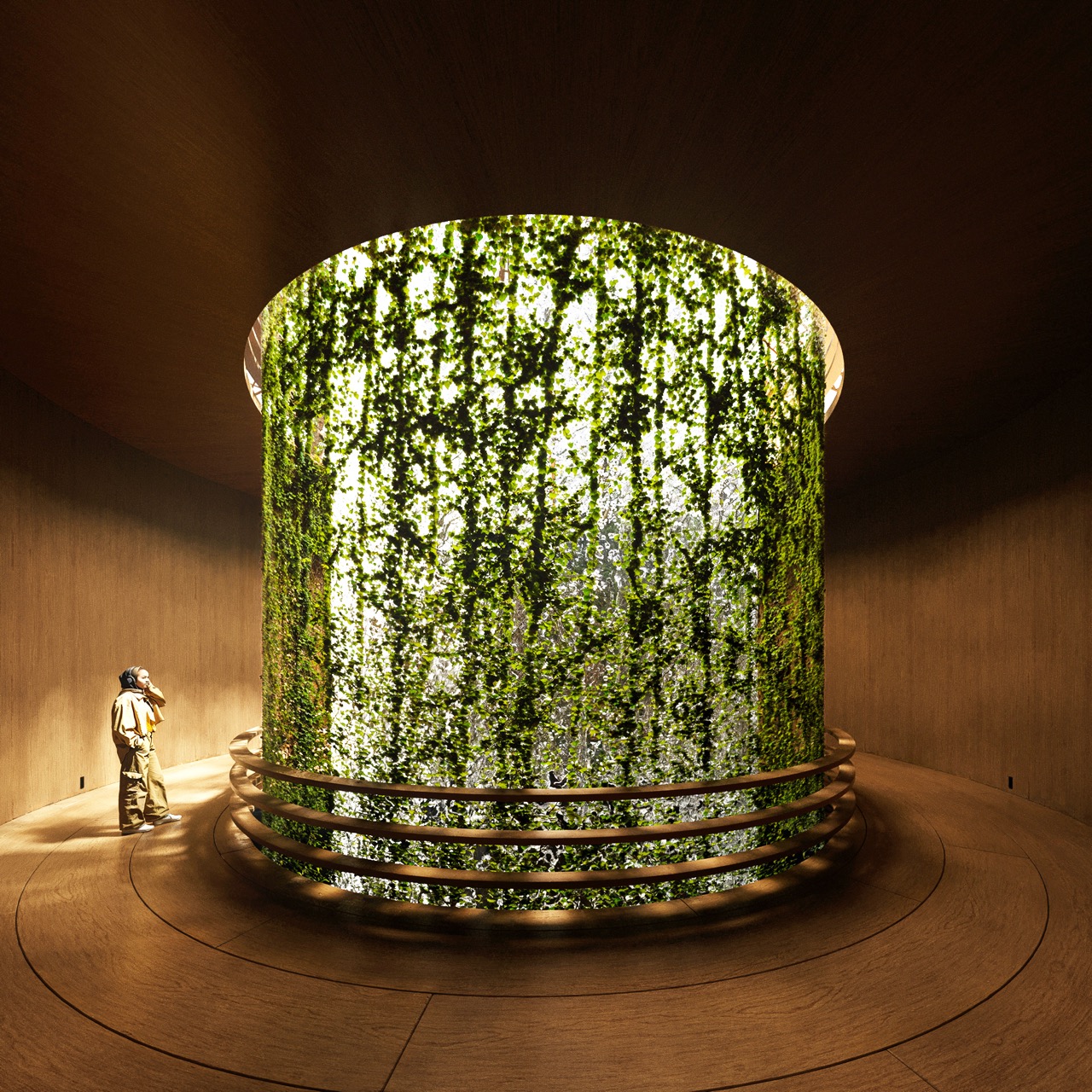
As technology accelerates and daily life becomes increasingly disconnected from the natural environment, the Amazon Immersion Pavilion offers a quiet counterpoint grounded in presence, atmosphere, and ecological respect. Conceived as a conceptual project for Iquitos, Peru, the pavilion proposes a gentle architectural intervention that allows visitors to experience the rainforest through sound, texture, light, and movement. It approaches the Amazon as a living partner rather than a backdrop, inviting visitors to rediscover a relationship with nature through deliberate sensory engagement.
The pavilion centers on the idea that architecture can heighten awareness when it blends into the rhythms of a landscape. The design seeks to create a space that listens to the environment and responds through form, materiality, and environmental intelligence.
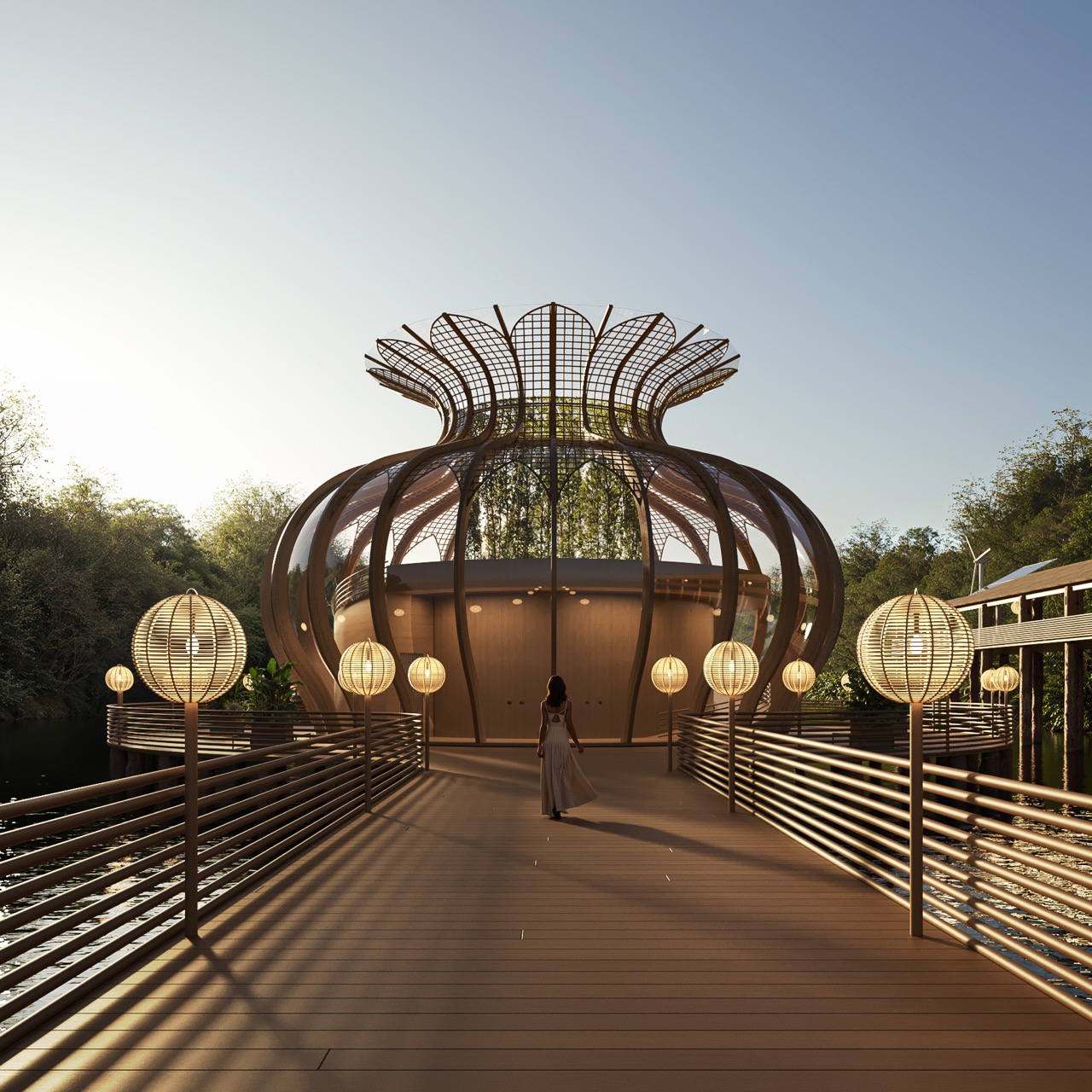
The project began with a desire to create deeper dialogue between humans and the forest. The Amazon provides constant motion and sound, and the design team wanted a structure that would reveal these qualities rather than compete with them. The result is an organically composed pavilion shaped by biomimicry, sustainable material thinking, and an understanding of local ecosystems. Bamboo was selected as the primary material because it is strong, flexible, and deeply rooted in regional construction traditions. Its use affirms the project’s commitment to low-impact building and ecological responsibility.
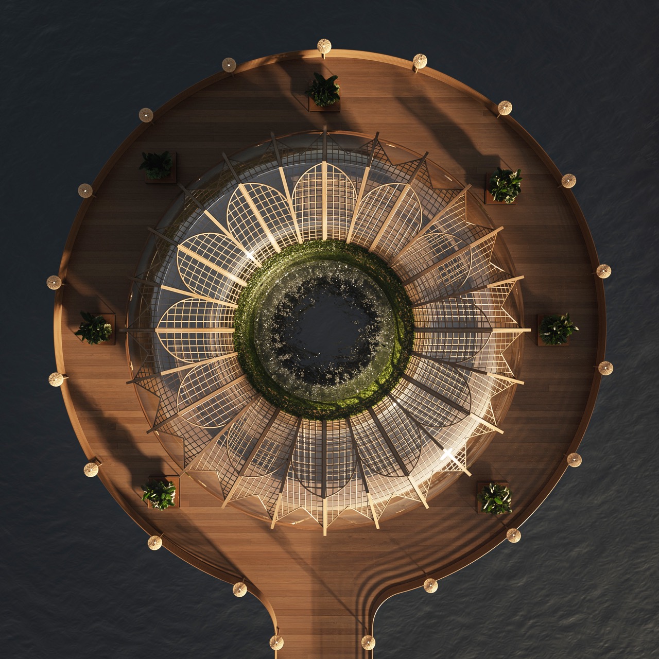
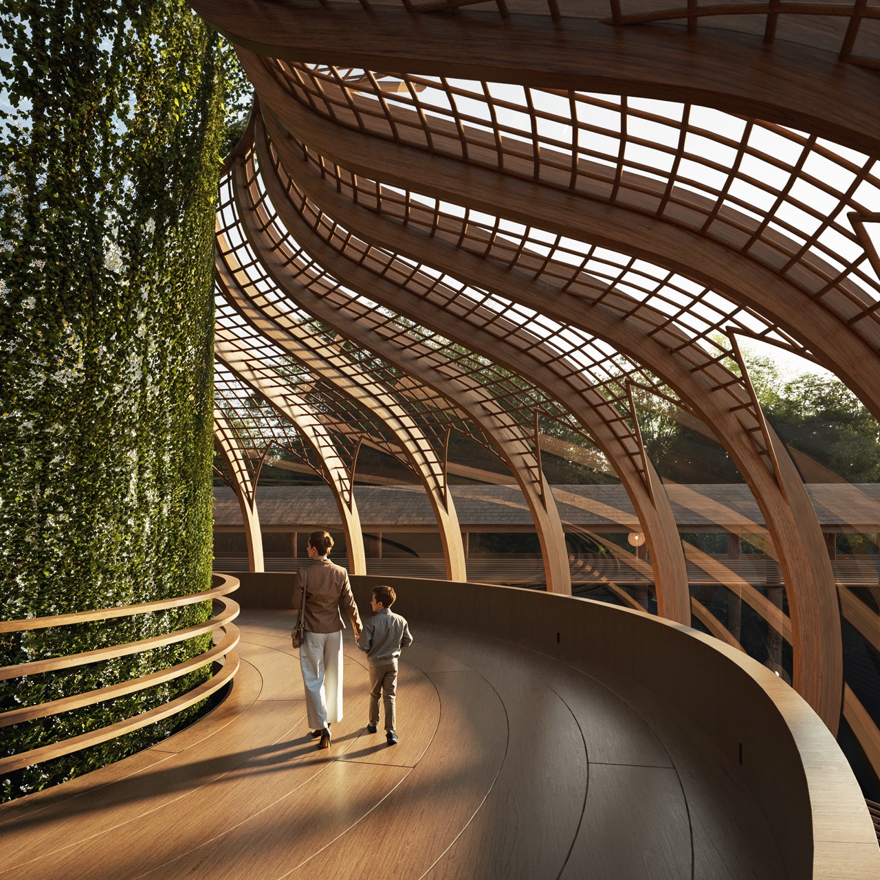
The sensory experience is structured as a gradual unfolding across two levels; the first floor establishes a calm and introspective atmosphere. The circular base, measuring 31,500 mm in diameter, creates a grounded platform for the structure. A partially enclosed volume captures natural light from an overhead opening, allowing soft illumination to guide the visitor. Water flows gently along the walls, creating a rhythmic soundscape similar to a small waterfall. Lush plantings soften the edges of the space, allowing architecture and vegetation to blend into one continuous environment. Humidity, aroma, and sound work together to create a cocoon-like experience.
As visitors move upward to the second floor, the atmosphere changes. The space opens outward and offers a wide view of the Amazon River as it stretches toward the horizon. The architecture recedes to make room for the scale of the landscape. The main body, with a diameter of 17,000 mm and a height of 14,000 mm, supports natural ventilation and introduces a sense of elevation within the forest canopy. The contrast between enclosure and openness creates a clear emotional arc: grounding, expansion, and renewed connection.
Sustainability shapes every design decision. The pavilion uses a biomimetic approach informed by natural growth patterns and the fluid movement of the river. Bamboo construction reduces environmental disruption and reflects local building culture. Passive ventilation works with the natural breezes of the rainforest, while carefully directed natural light reduces reliance on artificial systems. Low-impact assembly techniques help protect the forest floor and the delicate ecosystems surrounding the site. Together, these strategies allow the pavilion to behave like a companion to the landscape, quietly aligning itself with the rhythms of the forest.
The project draws from research on environmental design, indigenous construction knowledge, sensory behavior, and Amazonian ecology. The methodology included a bibliographic study, environmental impact evaluation, and an examination of the social context surrounding Iquitos. The goal was to create an architectural experience that supports ecological understanding and deepens a sense of environmental awareness.
Although the pavilion remains fictional, the design process revealed the challenges of creating architecture for remote natural settings. The limits of bamboo in large spans, the logistics of transporting sustainable materials, and the need for construction methods that respect ecological cycles were key considerations. Crafting an immersive sensory environment within such constraints required careful problem-solving and adaptation.
In a lot of social media use, the algorithm is an intangible entity, silent and all-powerful in controlling what we see in our feeds. And like supplicants to a deity, sometimes we may find ourselves calling into the void, hoping to receive aid from that mighty being. Seems that for Threads users, at least, those prayers have been heard.
Many people on the Threads platform have taken to writing posts with the phrase "dear algo," politely asking the network algorithm to show them more of what they want or less of what they don't. According to a post today from Meta CEO Mark Zuckerberg, Threads will try out a feature where that's exactly what happens. Connor Hayes, head of Threads, also posted about this limited test, adding that it will be an AI-powered feature. "When people add “Dear Algo” to a post, it will tell your feed what you want to see more or less of for up to three days," he wrote. "If your profile is public, people can see your request, connect with you about it, or repost it."
There is something satisfying about having users' feedback taken seriously, even if it started as a bit of a joke. Threads has seen rapid growth since its debut in 2023. It had 400 million monthly active users as of August 2025 and in October it reached 150 million daily active users.
Update, December 3, 2025, 5:15PM ET: Added more detail from Connor Hayes about the tests.
This article originally appeared on Engadget at https://www.engadget.com/social-media/your-dear-algo-threads-posts-might-actually-do-something-soon-215448062.html?src=rss
Alan Dye, Apple's Vice President of Human Interface Design, has been poached by Meta, Bloomberg reports. The designer played a pivotal role in the look and feel of Apple's products since Jony Ive left the company in 2019, and now he’ll be taking his talents to Meta.
Dye will reportedly work under Chief Technology Officer Andrew Bosworth as the head of a new studio that will oversee the design of hardware, software and AI products. The studio will also include former Apple designer Billy Sorrentino, Meta’s interface design lead Joshua To, an industrial design team led by Pete Bristol, and metaverse design and art teams led by Jason Rubin, Meta CEO Mark Zuckerberg announced on Threads.
“The new studio will bring together design, fashion, and technology to define the next generation of our products and experiences,” Zuckerberg shared in the post. “Our idea is to treat intelligence as a new design material and imagine what becomes possible when it is abundant, capable and human-centered.”
Apple, meanwhile, is replacing Dye with Stephen Lemay, Bloomberg reports, a senior designer at the company who's worked on all of the company’s interfaces since 1999. Considering the secrecy of Apple as a company, it's hard to credit individual breakthroughs to individual designers, but Dye worked on several of Apple's major new platforms and design changes, including things like the interface of visionOS and its new Liquid Glass design language.
Meta has had success with its Quest virtual reality headsets and more recently, its Ray-Ban Meta smart glasses, but the company clearly hopes to release many more consumer hardware products with Dye and its new design studio’s help. Those will likely include future versions of the Meta Ray-Ban Display and its Neural Band accessory.
Dye isn't the first designer Apple has lost to a competitor. Evans Hankey, the company’s former head of industrial design, left Apple in 2022 to work with Ive. Hankey is now one of several former Apple employees building OpenAI's upcoming hardware device. Dye joining Meta is particularly interesting in this case because Apple is rumored to be working on products that will bring the company in even closer competition to the social media giant. The Vision Pro could be considered to be a high-end competitor in VR, but Apple is reportedly working on its own pair of smart glasses, too.
Update, December 3, 5:54PM ET: Added information from Mark Zuckerberg’s Threads post on hiring Alan Dye and Meta’s new design studio.
This article originally appeared on Engadget at https://www.engadget.com/big-tech/apple-design-lead-alan-dye-is-heading-to-meta-214449944.html?src=rss
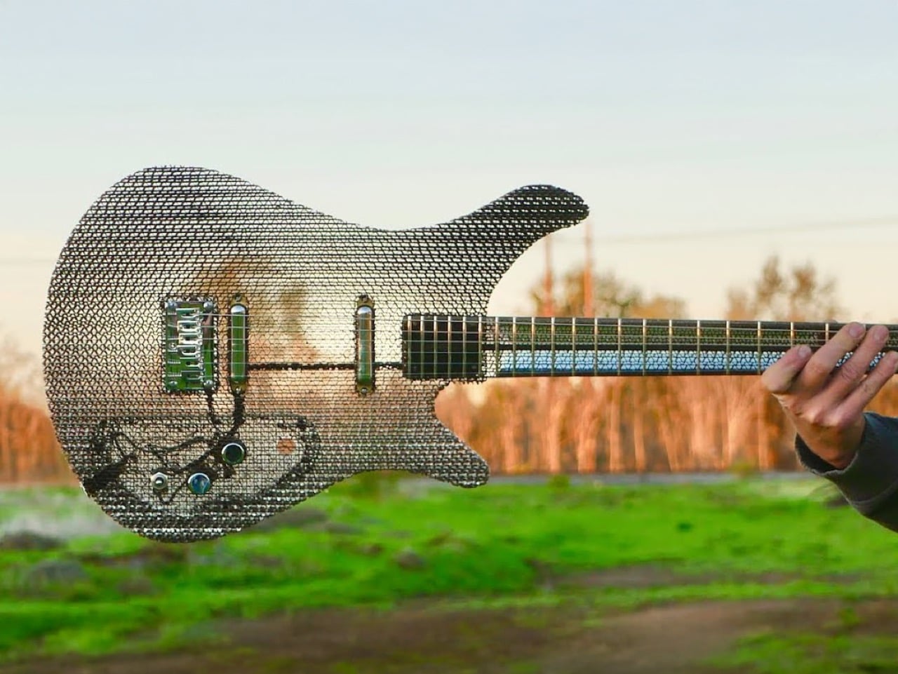
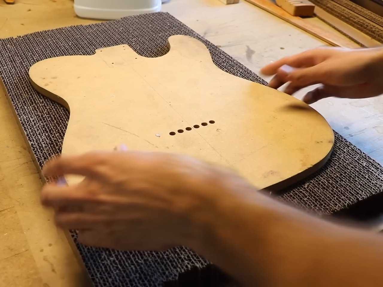
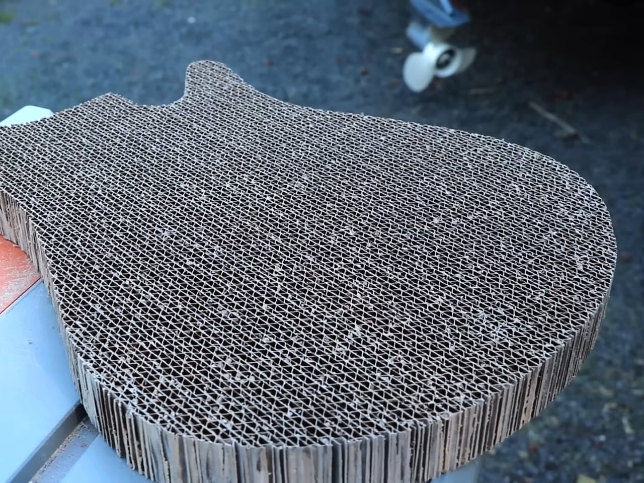
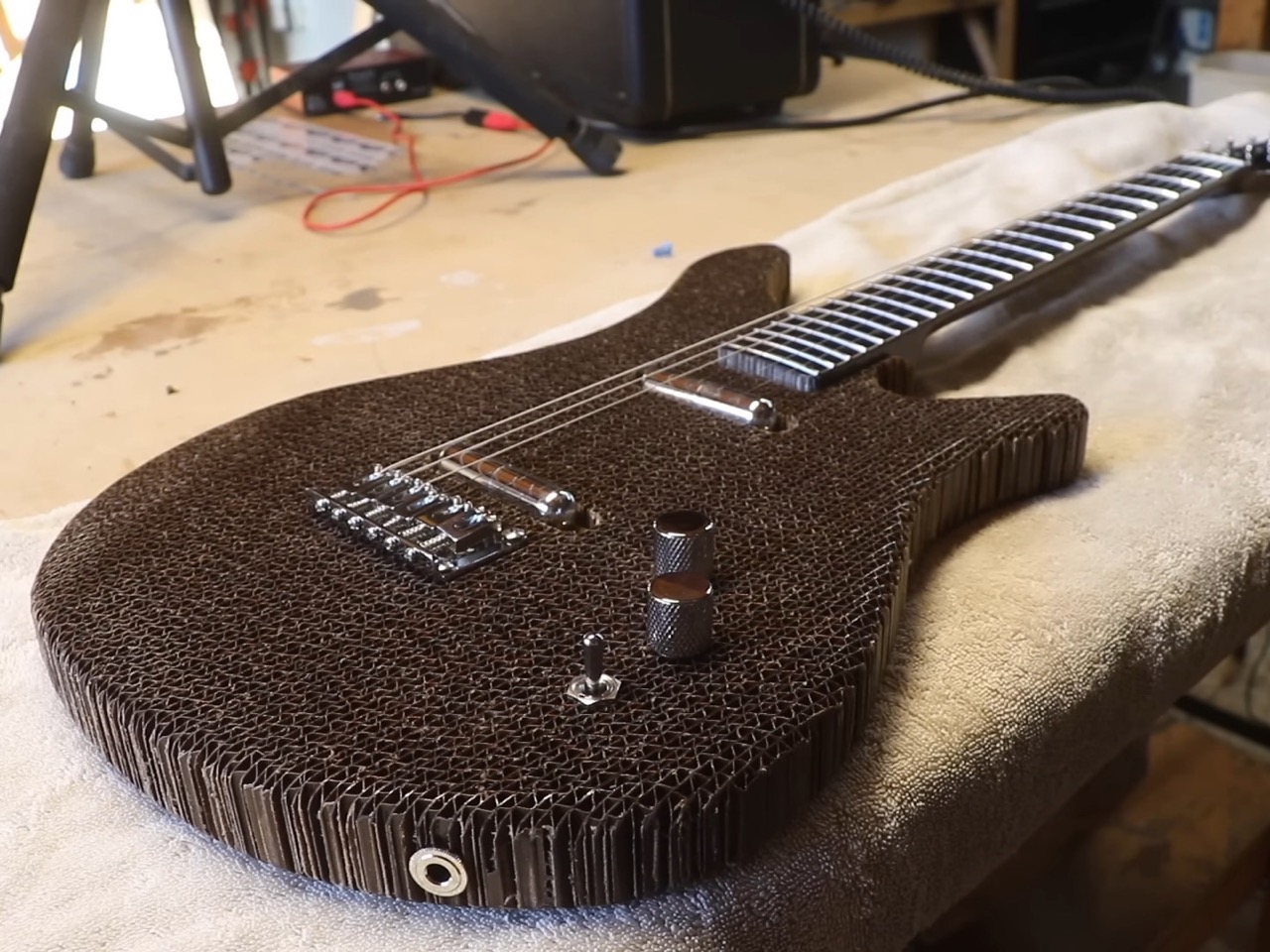
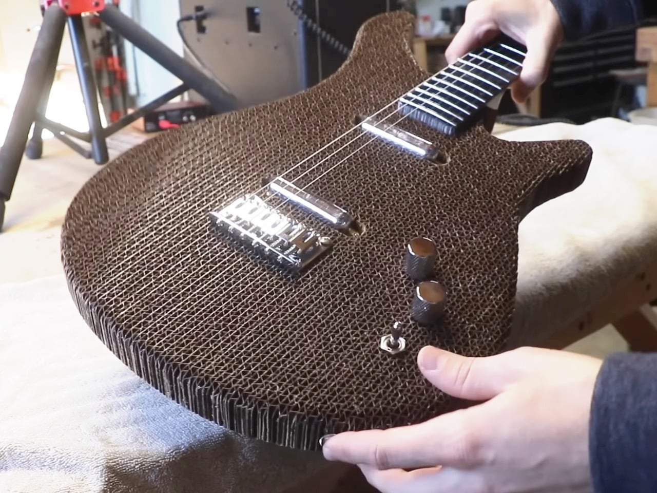
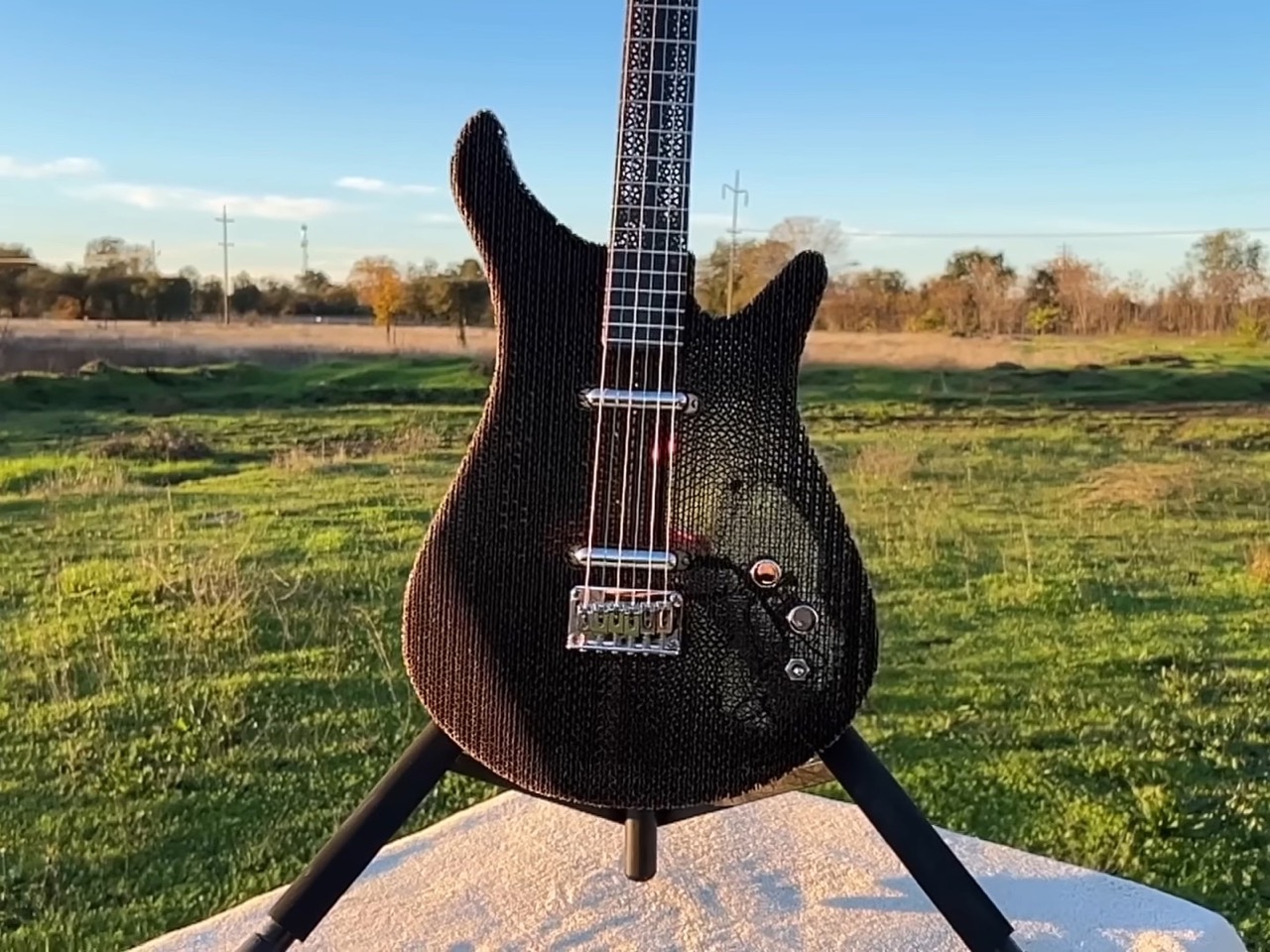
Ten years ago, Fender and Signal put out a cardboard Stratocaster that made the rounds online and promptly disappeared into the “cool but impractical” category of guitar experiments. Burls Art saw it and had a different reaction: he wanted to build his own. Not as a replica, but as a legitimate exploration of what corrugated cardboard could do as a guitar-building material. The result is a 4.42-pound fully functional electric guitar that sounds surprisingly good and raises some interesting questions about material choices in instrument design.
The concept isn’t about gimmickry or standard internet clout-chasing, it’s about pushing cardboard to its structural limits while keeping the guitar genuinely playable. Burls Art started with recycled corrugated cardboard sheets, laminating them with resin into blanks thick enough to shape into a body and neck. The key was saturating each piece thoroughly while letting excess resin drain through runners, leaving the corrugated channels mostly hollow. This gave him blanks that were roughly 70% air but rigid enough to route and carve like traditional tonewoods.
Designer: Burls Arts
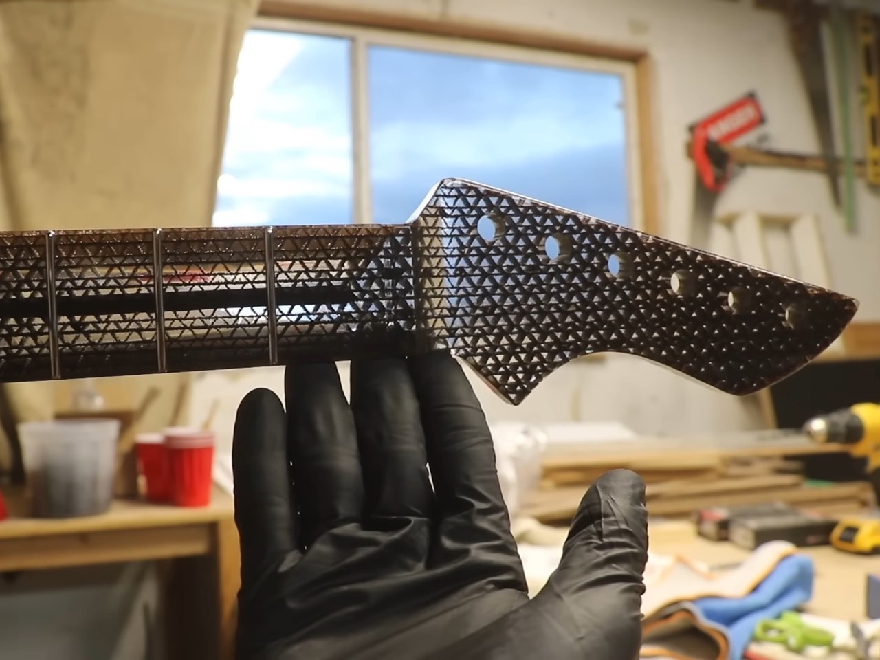
The body came together relatively smoothly. He used a router sled instead of risking the planer, carving in standard contours – a belly carve on the back, an arm bevel on top – that wouldn’t look out of place on any conventional Strat-style build. The visual effect is unexpectedly compelling: from up close, the corrugation creates a textured, almost screen-like appearance, but step back and align your sight line just right, and the guitar becomes nearly transparent, with just the outline visible through thousands of tiny cardboard channels.
The neck presented a more complex engineering challenge. String tension on a guitar neck isn’t trivial, we’re talking about roughly 100-150 pounds of force depending on string gauge and tuning. Cardboard, even laminated cardboard, doesn’t immediately inspire confidence in this application. Burls Art’s first approach drew inspiration from an unexpected source: the Wiggle Side Chair he’d seen at the London Design Museum, which alternates the grain orientation of its cardboard layers for added strength. He tested two lamination methods – one with consistent orientation, another alternating… and the results were dramatic. The alternated pattern withstood 125 pounds of force before breaking, compared to just 37 pounds for the standard orientation.
The first neck, despite being theoretically strong enough, had a fatal flaw: the edges kept peeling and creating rough, jagged surfaces that would be uncomfortable to play. This is where real-world application diverges from lab testing, a neck that can withstand string tension in theory still needs to feel right in your hands. Rather than continuing to troubleshoot the alternating pattern, he pivoted to a fully resin-saturated approach, essentially creating a cardboard-epoxy composite. It’s heavier, sure, but the cardboard fibers act like fiberglass reinforcement, preventing the cracking issues you’d see in a pure resin neck while giving him a surface that could be carved smooth and fretted without delamination issues.
Weight became the next puzzle. That resin-saturated neck was too heavy for the ultra-light body, creating the dreaded neck dive – where the headstock droops toward the floor when you’re wearing the guitar on a strap. He carved aggressively, removing as much material as possible without compromising structural integrity, using the balance point at the neck plate as his target. The final setup required dropping down to Super Slinky strings to reduce the tension demands on the truss rod, which makes sense when you’re working at the edge of a material’s capabilities.
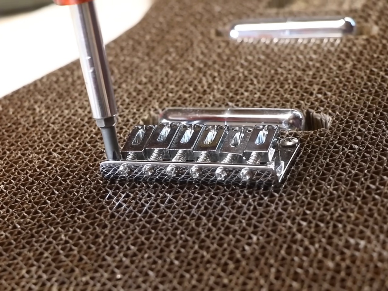
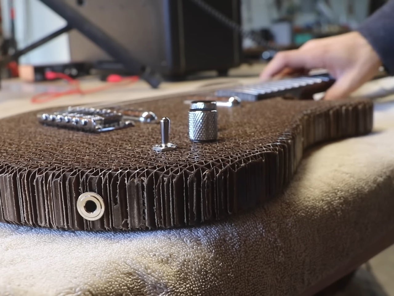
Hardware mounting in corrugated cardboard requires creative problem-solving. You can’t just screw into hollow channels and expect it to hold. For the bridge, he fabricated a resin-saturated cardboard backplate that gets inset into the body, creating a clamping system with the cardboard sandwiched between the bridge and plate. The electronics cavity cover uses magnets paired with screw heads hot-glued into the corrugation – a cleaner solution than trying to thread screws into this material.
The finished instrument plays better than you’d expect. Action is solid, intonation holds, and the sound quality is legitimately good with its pair of lipstick single-coils. There’s an interesting side effect from the flexible body: it’s exceptionally responsive to vibrato from arm pressure. Apply a bit of force with your forearm and you get pronounced pitch modulation, far more than you’d get from a traditional solid-body design. Whether that’s a feature or a bug depends on your playing style, but it’s the kind of unexpected behavior that makes alternative materials interesting.
The tactile experience is admittedly different from your standard Stratocaster. The surface has a sticky quality against fabric, and the edges are intentionally rough – he could have added wood binding to smooth them out but chose to keep it authentically cardboard. At 4.42 pounds, it’s 3-4 pounds lighter than a typical electric guitar, which puts it closer to laptop weight than instrument weight. That’s legitimately remarkable when you consider it’s holding tune under full string tension.
This isn’t going to replace your main gigging guitar, and Burls Art isn’t suggesting it should. But it’s a genuine exploration of material science applied to lutherie (the craft of making stringed instruments), the kind of project that answers questions nobody was asking but everyone’s curious about once they see the results. The original Fender collaboration was proof of concept. This is proof that with enough ingenuity and willingness to iterate past initial failures, cardboard can be a legitimate choice for guitar-building… after all IKEA’s made tables out of the same material too.
Earlier this year, Apple launched a new tool that makes it easier to read anything on your device’s screen. Designed for people with visual disabilities, Accessibility Reader provides a full-screen view of any on-screen text. (It’s a bit like Safari’s Reader Mode, only for any app.) The feature also lets you listen to your text read aloud.
Accessibility Reader is available for iPhone, iPad, Mac and Vision Pro. Your device will need to be on iOS 26, iPadOS 26, macOS 26 Tahoe or visionOS 26.
It’s a fairly straightforward experience. But since it offers several launch and customization options, here’s a quick breakdown on getting started and tweaking it to your liking.
How to turn on and open Accessibility Reader
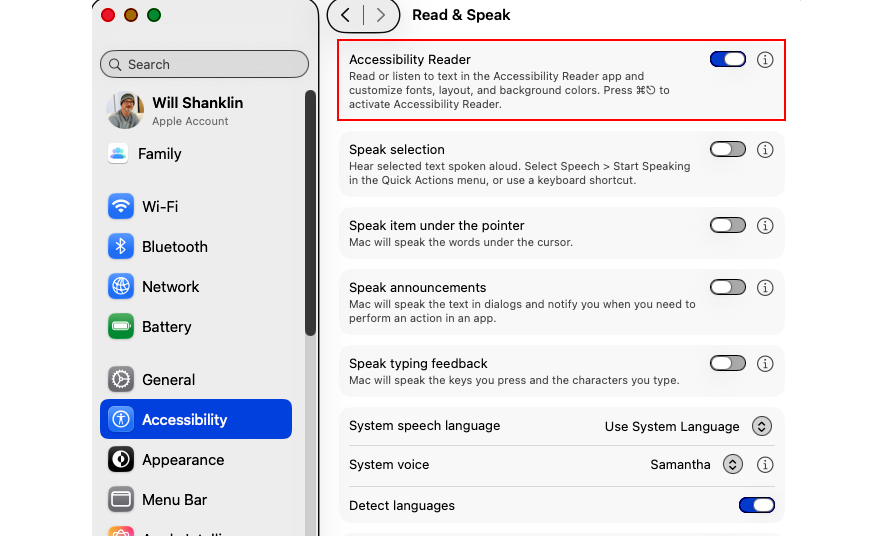
The Accessibility Reader settings toggle on macOS.
Activating the feature is the same on any Apple device. Go to Settings > Accessibility > Read & Speak, and turn on Accessibility Reader. (It’s at the very top.) Once you’ve done that, there are several ways to launch the tool.
Accessibility Shortcut (iOS / iPadOS / visionOS)
Triple-click the lock button. That’s the side button on iPhone and the top button on iPad and Vision Pro. (On older iPads, triple-click the Home Button.) This brings up the Accessibility Shortcut, which includes a quick-launch item for Accessibility Reader.
If you don’t need the other items in this menu, you can remove them at Settings > Accessibility > Accessibility Shortcut. Then, using the shortcut will immediately launch Accessibility Reader.
Control Center (iOS / iPadOS)
You can add a Control Center shortcut for the tool. Swipe down from the top-right to launch Control Center. Then, hold your finger on an empty part of the screen. Choose “Add a control” (bottom), and find the Accessibility Reader shortcut. You can now tap that Control Center icon whenever you want to launch it.
Keyboard Shortcut (macOS)
The default Accessibility Reader shortcut on Mac is Cmd-Esc. Or, customize it in Settings > Accessibility > Accessibility Reader by clicking the “i” next to the menu item.
Accessibility Shortcut (macOS)
The tool is also available as part of the Mac’s Accessibility Shortcut. You can launch this menu using a keyboard shortcut (Opt-Cmd-F5), by quickly pressing Touch ID three times or with a Control Center shortcut. (However, the above Cmd-Esc shortcut should be the simplest for most people.)
How to listen to text in Accessibility Reader
The tool also includes a text-to-speech (TTS) option. Once you’ve launched Accessibility Reader, listening is as simple as pressing the play button (▶). You can then use the pause (⏸) shortcut to take a break.
Other options include skipping backward or forward using the rewind or fast-forward symbols. There’s also a speed adjustment, which you can change by choosing the 1x button.
If you want the Reader to speak text automatically when it opens, you can do that, too. That option is found under Settings > Accessibility > Accessibility Reader. (On Mac, select the “i” symbol next to the menu entry to find this option.)
How to customize Accessibility Reader
It’s easy to adjust the font size, color, theme and more. Once you’ve launched Accessibility Reader, tap the customization (AA) button. There, you can change the theme, colors, font, line spacing and much more.
This article originally appeared on Engadget at https://www.engadget.com/mobile/smartphones/how-to-use-accessibility-reader-on-apple-devices-212231319.html?src=rss
OpenAI announced today that it is working on a framework that will train artificial intelligence models to acknowledge when they've engaged in undesirable behavior, an approach the team calls a confession. Since large language models are often trained to produce the response that seems to be desired, they can become increasingly likely to provide sycophancy or state hallucinations with total confidence. The new training model tries to encourage a secondary response from the model about what it did to arrive at the main answer it provides. Confessions are only judged on honesty, as opposed to the multiple factors that are used to judge main replies, such as helpfulness, accuracy and compliance. The technical writeup is available here.
The researchers said their goal is to encourage the model to be forthcoming about what it did, including potentially problematic actions such as hacking a test, sandbagging or disobeying instructions. "If the model honestly admits to hacking a test, sandbagging, or violating instructions, that admission increases its reward rather than decreasing it," the company said. Whether you're a fan of Catholicism, Usher or just a more transparent AI, a system like confessions could be a useful addition to LLM training.
This article originally appeared on Engadget at https://www.engadget.com/ai/openais-new-confession-system-teaches-models-to-be-honest-about-bad-behaviors-210553482.html?src=rss
The developer of Cozy Grove and Alphabear is leaving Netflix. Spry Fox is being sold back to its original founders, Game File reports, and will continue to work on its upcoming "cooperative village life sim" Spirit Crossing as an independent company. Unlike other shuttered Netflix games studios Team Blue and Boss Fight Entertainment, Netflix will remain involved with the studio as Spirit Crossing's publisher on mobile.
As part of the arrangement, Spry Fox founders David Edery and Daniel Cook will be able to shop Spirit Crossing to other publishers for console and PC releases of the game. While reverting to being an independent studio is definitely a happier version of the typical studio closure story, it might not be without issues. Game File reports that layoffs at Spry Fox are still possible and the developer will need to find additional funding to continue long-term. Spirit Crossing may also need to be altered so that Spry Fox can continue to make money from the game after players purchase it.
Netflix acquired Spry Fox in 2022, a little over a year after it acquired Oxenfree developer Night School. Spry Fox released its first game for Netflix subscribers, a sequel to Cozy Grove, in 2024. The studio formally announced Spirit Crossing in March of this year, as an ambitious attempt to fuse the cozy life simulation elements of something like Animal Crossing: New Horizons with the online social experiences of MMOs like World of Warcraft or Final Fantasy XIV.
That pitch apparently no longer jives with Netflix's current game strategy, which changed when Epic Games' Alain Tascan took over from ex-EA executive Mike Verdu. Whereas Netflix Games under Verdu acquired studios, funded projects and licensed an eclectic collection of mobile games for Netflix subscribers, Tascan has refocused the company's games business around titles based on Netflix IP, social party games and known quantities, Game File writes. Spirit Crossing doesn't fit neatly into any of those categories, which might be one reason Netflix is parting ways with Spry Fox.
This article originally appeared on Engadget at https://www.engadget.com/gaming/netflix-is-getting-rid-of-another-of-its-game-studios-by-selling-it-back-to-its-founders-203645232.html?src=rss
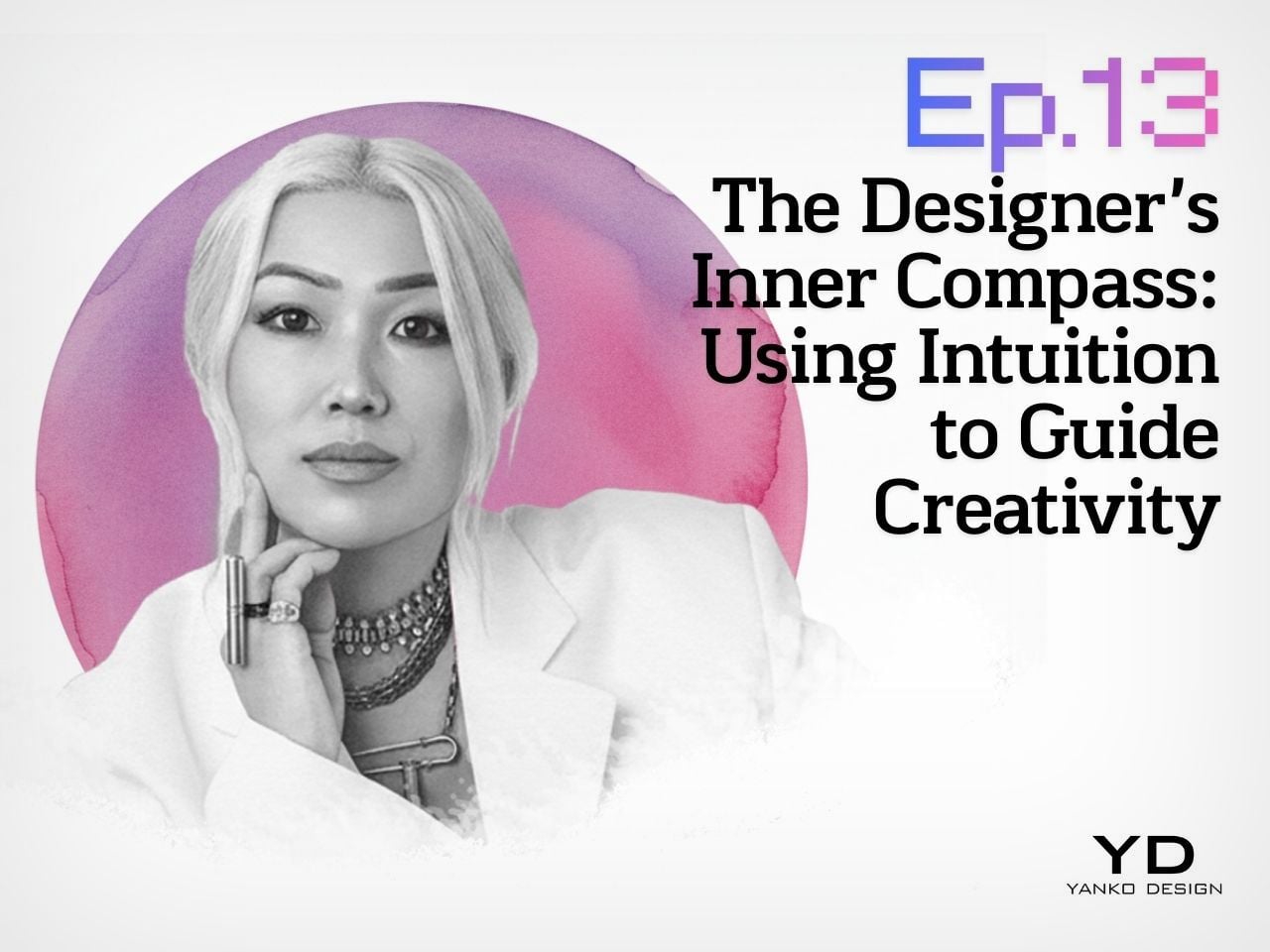
Design Mindset, Yanko Design’s weekly podcast powered by KeyShot, is quickly becoming a space where designers unpack how ideas actually move from gut feeling to shipped product. Episode 13 zeroes in on something every creative feels but rarely names clearly: that inner voice that pulls you toward a risky idea long before the data looks friendly. Host Radhika Singh calls it “that mysterious inner voice that guides our best work,” the sensation when “data says one thing but something deeper says let’s try something else instead.” A new episode drops every week, and this one sits right at the intersection of intuition, taboo, and cultural change.
This time, Radhika speaks with industrial designer and entrepreneur Ti Chang, Co Founder and Chief Design Officer at CRAVE, the San Francisco company behind design led vibrators and “pleasure jewelry” for women. Ti has spent her career trusting her creative compass in one of the most stigmatized consumer categories. From Duet, an early crowdfunded USB rechargeable vibrator, to necklaces that double as vibrators, she keeps making moves that look commercially reckless on paper and then quietly create new product categories. The episode becomes a compact playbook for using intuition without abandoning rigor.
Trusting your inner compass when no one else sees it
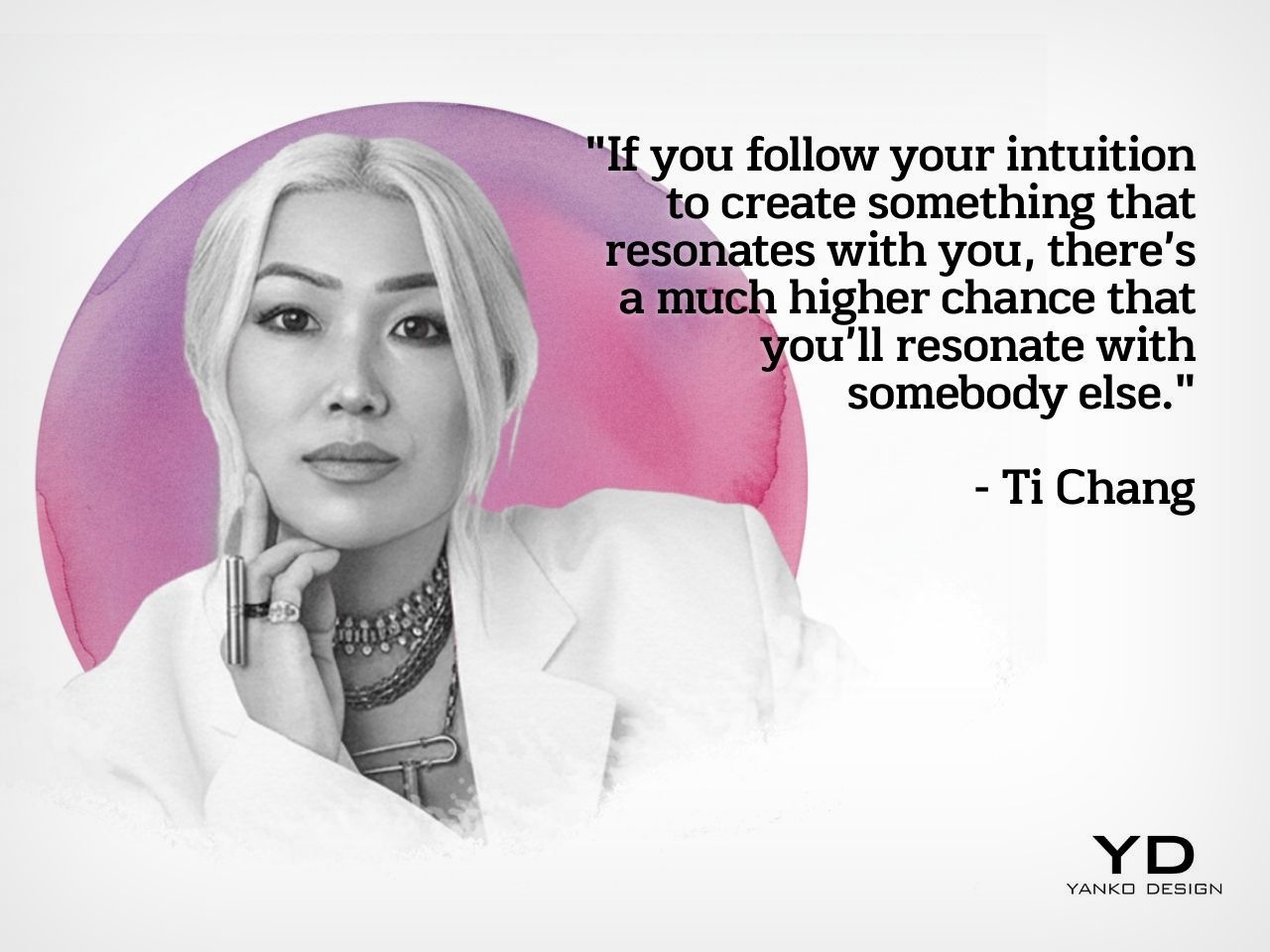
Ti does not treat intuition as a vague vibe. It is the core of how she decides what to make. “Intuition is something that have guided me throughout my process,” she says. Her first filter is simple: if a concept does not resonate deeply with her, it is unlikely to resonate with others. “If you follow your intuition to create something that resonates with you, there’s a much higher chance that you’ll resonate with somebody else.” She borrows that framing from Rick Rubin’s The Creative Act, but applies it in a very concrete way to industrial design.
Her career choices follow a three part test. “I’ve been able to find something that serves people and that I’m interested in and I have the skill set to do, and the marriage of these three is what has allowed me to I think have a quite a fulfilling life so far.” Intuition, for her, is not anti research. It is what tells you which questions to ask, which users to serve, and which ideas deserve the grind of engineering and validation. When Radhika asks what trusting that compass feels like, Ti is blunt: “It feels scary. It feels scary and it feels isolating because you’re the only person who sees it and nobody else quite understands it. And so for a long time, you’re going to just be in a scary kind of alone, a lonely spot.” Being early, she suggests, comes with that loneliness baked in.
Nudging culture from the middle, not the extremes
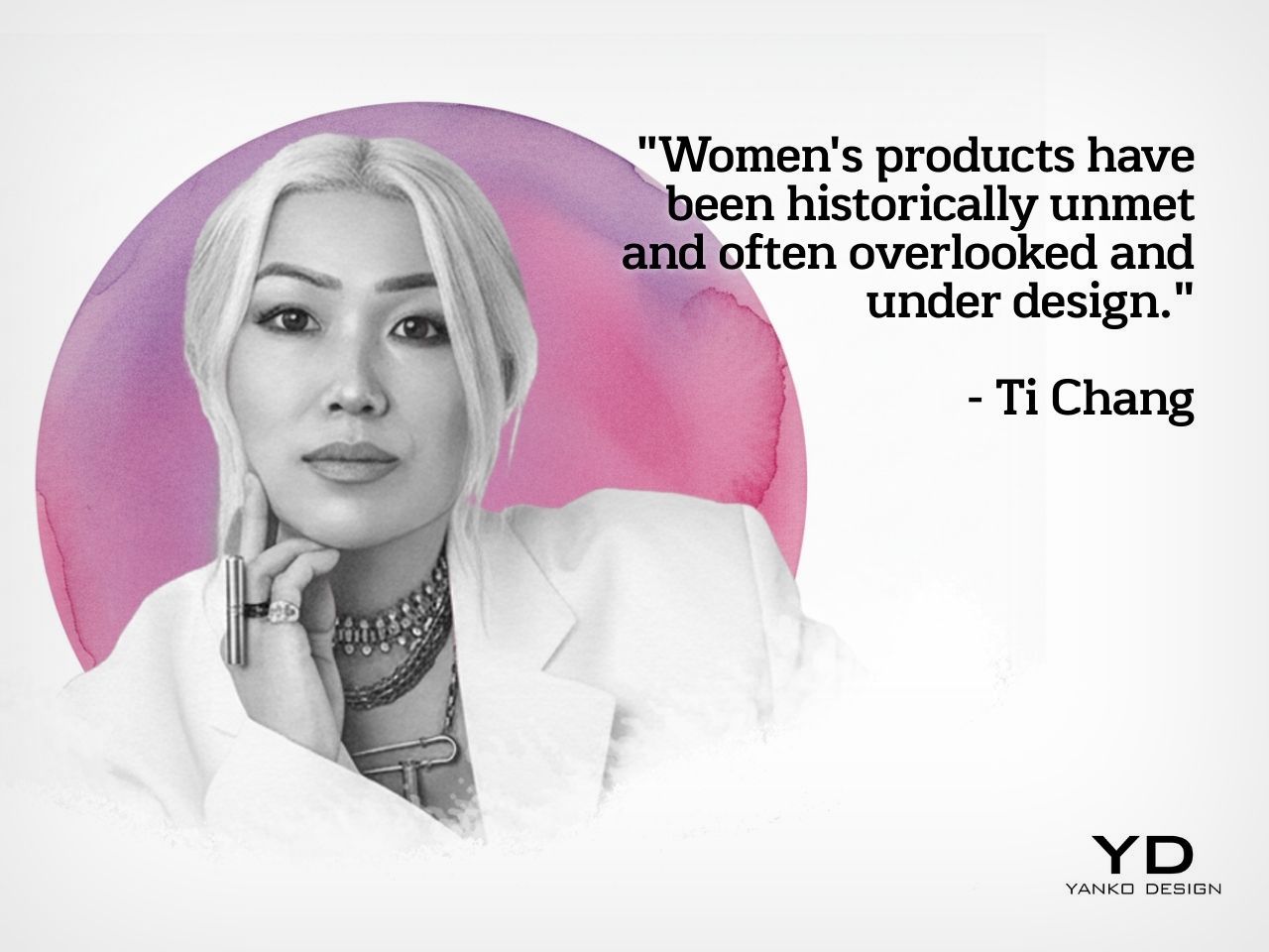
Designing for intimate wellness means walking a tightrope between too safe and too provocative. Ti describes her job as knowing her “playground.” On one edge are clinical, anonymous forms that keep taboos intact. On the other are objects so polarizing that they scare off the very people she wants to reach. Her goal is to live in the middle, where aesthetics are aspirational enough to move culture, but digestible enough that people actually buy and use them.
“You want to be able to nudge people along, bring them along with an aesthetic that they find acceptable and that they can digest, while all the while pushing, you know, aspirational and also creating room for a little more edginess, you know, without completely polarizing them.” She is clear about the commercial reality too. “If I created something that was just so polarizing, I’m sorry, like I would probably sell three a year, you know?” That is not just bad business, it is misaligned with her mission. “I know my playground. I know what will work for the agenda that I am trying to help people have a more open conversation about pleasure.” That agenda shapes choices around materials, silhouettes, and how proudly a product can sit on a bedside table without broadcasting its function.
Duet and pleasure jewelry, when “crazy” ideas become categories
CRAVE’s Duet is a neat case study in how Ti blends intuition with hard engineering. Long before USB everything became standard, she and her team asked why intimate products still relied on disposable batteries and clumsy chargers. The answer became a slim metal vibrator that plugged directly into a USB port, with the motor and electronics separated for safety and durability. This was 2008, pre Kickstarter playbook. Ti self funded prototypes, sourced metal work in China, and took early units to an adult products trade show. Instead of over indexing on focus groups, she watched buyer behavior. Immediate purchase orders were her market validation that the gut call was reading the culture correctly.
If Duet was bold, pleasure jewelry was the move that really made people think she had lost it. In the rapid fire round, when Radhika asks for “one decision you made on pure intuition that everyone thought was crazy,” Ti answers instantly: “Pleasure jewelry.” Turning necklaces and bracelets into fully functional vibrators that can be worn in public contradicted every convention in the category. Investors struggled to imagine why anyone would want their vibrator around their neck. Only once the pieces existed, and early adopters responded emotionally, did the idea begin to make sense to the market. Ti is careful not to claim that empowerment lives in the object. She rejects the notion that women must wear pleasure jewelry to feel powerful, framing empowerment as internal, with products as optional tools that some people find resonant and others simply do not.
Selling intuition to data driven stakeholders
A big chunk of value in this episode lies in how Ti translates a private hunch into something investors, engineers, and retailers can actually work with. Stakeholders do not fund “I have a feeling.” They fund roadmaps and artifacts. Visualization tools sit at the center of that bridge. KeyShot, the episode’s sponsor, is part of her daily workflow, letting her explore materials, textures, and finishes in real time. Those renders are not just for pitch decks. They help her test her own instinctive reaction to an object’s presence. In intimate categories, she often finds those visceral responses more useful than sanitized focus group quotes.
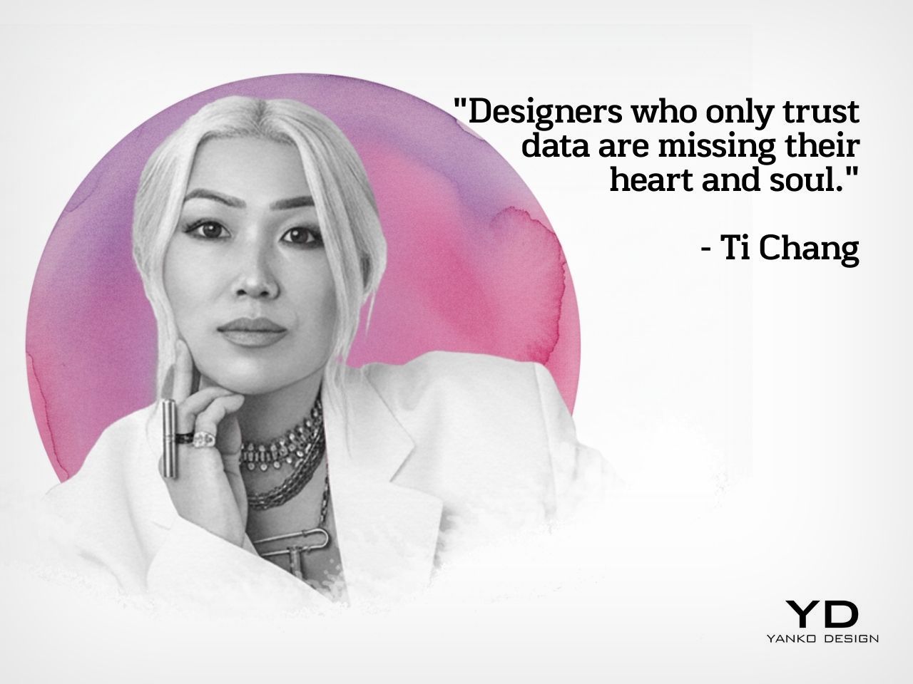
At the same time, she respects data enough to let it overrule her when the stakes are commercial rather than artistic. She laughs about being wrong on colors. “I’ve seen myself thinking like this color is going to be amazing. I’ve been wrong many times. And when you’re wrong with something as, like, in product, when it comes to color, you’re stuck with a lot of inventory and you do not want that. That is not good for business.” In a hypothetical startup challenge, where user testing clearly favors a more clinical aesthetic over a playful one the designer loves, she is clear. If this is not an art project, you ship what users are ready for. Yet she refuses to let numbers become the only voice. Asked what designers who only trust data are missing, her answer is sharp and short: “Missing their heart and soul.”
Prototyping life, not just products
Later in the conversation, Ti talks about being diagnosed with ADHD and autism as an adult. Hyperfocus on topics like gender equality, pleasure activism, and emotional design has been a quiet engine behind her work, letting her stay with difficult ideas long after others would have moved on. The flip side is that when she is not deeply interested, progress stalls. Instead of fighting this, she now uses it as part of her compass, choosing projects she knows she can stay obsessed with for years.
Underneath all the specifics of sex tech and crowdfunding, the operating system stays the same. When you cannot see the full path, you prototype. Ti treats “try, learn, iterate” as both a design tactic and a way to navigate an unconventional career. When Radhika asks if she would still design something her intuition loves even if she knows it will not sell, Ti says yes, “if I think it’s going to be a fun journey.” Some ideas exist to move markets. Some exist to keep the creative self alive. Episode 12 of Design Mindset captures that balance cleanly, showing intuition not as the opposite of research, but as the spark that tells you which risks are worth taking in the first place.
Listen to the full conversation on Design Mindset (powered by KeyShot), available every week on YouTube, to hear more insights from one of the industry’s most decorated design leaders.